
UXpin's Blog, page 75
August 13, 2021
Storybook-UXPin: Review of the New Merge Integration
Before releasing the Storybook integration (which is now available fully on paid plan and with public library access on trial), UXPin gave me a chance to try this Merge’s new feature. I decided to share my impressions on how it influenced the designer-developer collaboration in our team.
For reference, UXPin is already a widely used design tool that allows you to design and create prototypes. What sets it apart from other design tools is that it’s code-based, so more flexible, providing a lot of advanced interactions for prototyping. It brings the UI closer to development.
Merge is a part of UXPin – that’s technology providing two main integrations with developers’ tools (Git and Storybook). It allows you to quickly prototype using ready UI code components that are React-based for Git integration, or any framework-based for Storybook integration. We tested the newest Merge integration, with Storybook.
The review was written by Roy S. Kim, the CEO, and Jacobo Moreno Quiroga – Front end engineer & Digital Content Designer from Fixel Inc., the Japanese UX/UI design consulting company specializing in Design Systems.
Table of contentsTrying out UXPin’s Merge and its Storybook integration UXPin – designing to coding The UXPin Merge approach Connecting Storybook Thoughts for the future Trying out UXPin’s Merge and its Storybook integrationI have both an engineering and design background, and I work on a daily basis on finding solutions to processes inside an application and then writing them in code. The designer part comes in handy when I need to consider and improve the user’s perspective. This involves more than defining visual aesthetics, it requires considering how the application interface can be subtle enough for someone to not notice it so that they can focus on what they are trying to achieve in the app.
I usually struggle with the back and forths between iterations of coding that aim to improve user experience.
Those kinds of improvements are not the same as fixing the product because something doesn’t work. It’s more of intuitive work when a user reports that something feels off. Even if you apply all the design and UX good practices, the user could still complain, and they would be 100% right. This is where a coded Design System or an organized UI component library can help. If you have tested and polished the components approved for your Design System, then you can treat them as ready building blocks for new applications without spending too much time thinking or adjusting them.
UXPin with Merge technology allows you to import all your Design System components stored in Git or Storybook to the design editor so that you can prototype with them right away. Thanks to this designers can use actual coded elements to speed up the prototyping. UXPin Merge’s motto is “The single source of truth” because what you see in the prototype is combining design with actual working code that developers use as well.
UXPin – designing to codingLet’s start with just UXPin. Essentially, UXPin is a UI/UX design tool similar to Sketch, AdobeXD, or Figma. It’s similar to other competitors so you can get used to it very quickly. You can start with wireframing and end with advanced prototyping in this single tool.
 UXPin’s UI is rather standard
 In most of the similar tools, there is a big difference between what the designer creates in the design tool and what happens in the dev environment, where the real working product is coded. Features like the inspect tab in Figma enable you to see roughly what the CSS behind a certain object would look like. However, this is not always an accurate depiction between what is designed and what is coded.
Designers and developers essentially come from two different worlds when it comes to the tools used in their daily work. Trying to find a common language between them can lead to way too many meetings and back-and-forths. This might be the very issue that UXPin Merge aims to solve, by having “The single source of truth” which the whole team can treat as the ultimate place of the right components and documentation.
The UXPin Merge approachMerge is UXPin’s technology. Essentially, what Merge does is that it brings coded Design Systems stored in Git repositories or Storybooks to UXPin. Hence, a designer can use real components in their mock-ups and prototypes. These components are already coded in the repository, and the designer can access its different versions inside UXPin as needed. This way, the integrity of each component is never compromised. It minimizes possibilities for a designer to make mistakes and use elements that aren’t in line with the company’s standards.
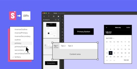
 The components from your repository are stored in UXPin library
 Once you have a Design System and repositories ready to go, you won’t be really modifying them often as their purpose is to store and unify all the versions of the possible elements to speed up the product development process and create governance. So, using UXPin Merge and the imported components, controls the design process as elements are predefined. The changes can be made without a problem but it must be done by developers, so that the chances for casual mistakes are pretty low.
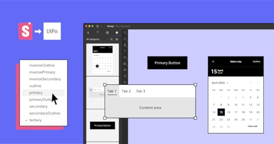
 Once imported, you can have a component with all its variations. In this case you can change the Type, Size, Disabled, Label, Click properties of a Button which are defined in the props of the React Component.
 These limitations actually simplify the work of a designer. They can use fully interactive and prepared elements to focus on the most crucial part – user experience. Sure; color, padding, fonts, and other visual elements are important parts of the experience, but choosing every single little detail can slow down the process. If all of that is already sorted out in the Design System and repositories, building prototypes with real code components gets easier and faster. Also, it helps keep the consistency even if the components get updated in code as the imported UI is in sync with the components stored in devs’ libraries. No need to worry that elements will be outdated and designers will have to redesign the projects.
Connecting StorybookOne of the UXPin Merge integrations I got to see was Storybook. Storybook serves as a sort of developers’ Design Systems to store all the coded UI. It is used by many companies, and it’s very flexible framework-wise as it provides support for around 15 of them. Now, for teams that are not supported by developers, setting up a Storybook project and placing all the components there may be a struggle. However, once it’s ready, it neatly holds and displays all the components that are in the Design System.
UXPin Merge aims to bring what is stored and defined in Storybook to UXPin so that components made in whichever framework can be used for prototyping. The integration part is very simple; grab the URL of a published Storybook project to import the components to the UXPin library for designing. I tested it and it seemed to work perfectly with React components – all the elements behaved in the design editor just as they should.
Thoughts for the futureThe design process including UXPin Merge in it can be visualized like this:
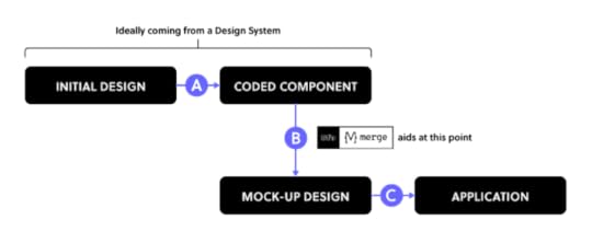
UXPin Merge plays a big part in Step B since it provides production-ready UI-coded components that you can use to iterate faster when creating prototypes. With a defined Design System or a component repository, you really shouldn’t worry about Step A because you most probably already have the organized components. Still, there is a possibility that you need to adjust something within the coded components, especially if you are in the middle of creating your own Design System.
With Step C, which is the build-up step of the application, the developers look at the Merge prototype to see how code components are put together, as well as what code corresponds to which part of the design. However, they won’t just copy and paste the whole code to build the product instantly – they will still need to adjust it so that the prototype becomes a product.
UXPin Merge seems to be a great solution for rapid prototyping and keeping the consistency thanks to making the most of Design Systems. However, it appears that certain steps are still to be covered.
To some extent, the work of designers is limited as they mostly can use pre-prepared components, however, it saves time and prototyping with code components brings the world of design and development together.
Want to try out the integration? Sign up for a 14-day trial!
Try out Storybook integrationThe post Storybook-UXPin: Review of the New Merge Integration appeared first on Studio by UXPin.


August 12, 2021
These Storybook Examples Will Inspire Your Component Library
Now that UXPin has a Storybook integration that breaks down design-dev inconsistencies and makes it easier than ever to manage your UI components library, you might want to take some time to look at Storybook examples.
Plenty of world-renowned websites use Storybook. In this post, we’ll look at some of the best Storybook examples that you can use as inspiration for developing your digital products.
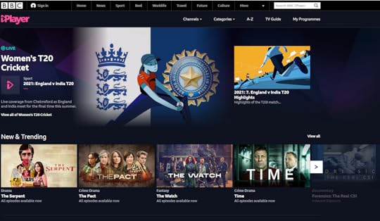
BBC iPlayer Web switched to Storybook when it needed more custom components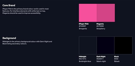
A growing number of movie and television show producers now have streaming platforms that let people watch specific content when they like. BBC iPlayer Web makes it incredibly easy for viewers to find specific types of content by title, category, or topic.
When the streaming service started, it built its back end with Node.js. It didn’t take long, though, before the development team decided to make the migration to React. React components were an obvious improvement as the platform grew.
Around 2019, though, the team realized that its approach didn’t work as well as expected. The UX professionals and developers didn’t have a common language that helped them work toward goals. They also found it difficult to locate the components they needed to add content and update the website’s appearance.
Ultimately, the BBC iPlayer Web team realized that they were spending way too much time maintaining their component library.
Storybook became a significant tool that helped them address these problems.
BBC iPlayer Web has a public design system, so you can look at it to learn a few tricks and find inspiration when you feel stuck on a project.
The design system includes everything from iconography to navigation.
Spend some time browsing BBC iPlayer’s Storybook example. Then, visit the website. You will immediately see how the designers and developers combined components to create a tool that works exceptionally well for viewers.
Related reading: Top 8 Design System Examples
The Guardian has an extensive Storybook UI component library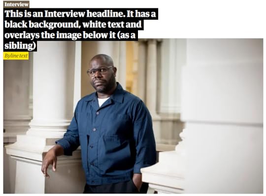
The Guardian publishes a tremendous number of articles daily. It’s often one of the first news outlets to report on breaking news. It also has frequent articles about sports, culture, and lifestyle topics. Considering that The Guardian covers events all over the world, it needs a fast, reliable way to turn written text into published web pages.
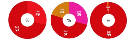
The Guardian Storybook components library streamlines the design and publication process. Building the design system, however, must have taken quite a bit of time because it includes every component that the well-designed website could possibly need. It even features slightly different versions of designs. For example, the CaptionBlockComponent Story includes:
with defaultsPhotoEssay using htmlwhen paddedwith width limitedwith creditwhen overlayedNo matter what type of caption block the designers want to include, they just have to search the component library, choose the correct option, and add text for the specific story.
The design team even created multiple donut graphs to fit unique circumstances.
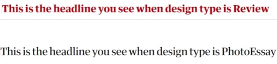
Of course, The Guardian also maintains designs that help readers identify what type of content they’re reading.
A Review headline doesn’t look the same as a Photo Essay headline.
Again, it took a lot of effort to build this system design. Now that The Guardian editors and publishers have it, though, they can quickly publish coherent content that keeps readers informed without misdirecting them.
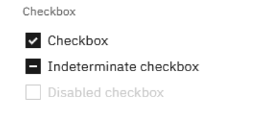
Storybook helps IBM design product UIs quicklyCarbon, the design system used by IBM, primarily gets used to build digital products with specific functions, such as adding files to a project, submitting reports, and tracking an activity’s progress. IBM uses Carbon for internal and external products, so you might recognize some of the components in the Storybook UI design system.
This Storybook example contains countless components. You’ll find everything from tabs to pagination. The company just wants to make sure that it has functional tools that share an aesthetic.
The components in Carbon’s design system also tend to have extensive Stories that let coders make subtle changes when necessary.
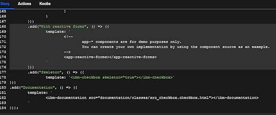
Even the Basic Checkbox component has 184 lines of JavaScript code in its Story.
A significant advantage of using Storybook is that designers and developers can see how components respond to interactions.
Three interactions with the select button:
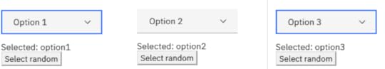
The designer or developer can see all of these interaction results from within the same environment. They don’t need to export it to a prototyping app or add it to a designing app. The interactions happen right there to save time and meet expectations.
Related reading: What Is a Component Library and Why Should You Use One for UI Development
UXPin Merge and Storybook make product development easier than everFind more Storybook examples by visiting this page. Companies like Audi, Lonely Planet, Wix, and Salesforce Lightning have public design systems you can explore.
Storybook isn’t the only tool you need to build successful digital products quickly. UXPin Merge’s Storybook integration lets you import your components within one minute. It doesn’t even require any technical knowledge, especially when you maintain a public Storybook design system.
Once you integrate these tools, you can use your Storybook components to build and test interactive prototypes. Since both tools take a code-based approach, your designers and developers can work together to create your products more efficiently than ever.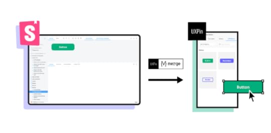
If you haven’t already, get the Storybook integration or test it on trial for faster design and more control over your UI interactive components library. You should quickly notice a significant change in how your team works.
Try out Storybook integrationThe post These Storybook Examples Will Inspire Your Component Library appeared first on Studio by UXPin.
August 11, 2021
Does Your Team Need a Design Operations Manager?

Design operations managers have become increasingly important as more companies turn to digital products that help them connect with customers and streamline processes. If your design team members work on several projects simultaneously, it makes sense to bring in someone who knows how to manage designers and developers.
As a relatively new position, design operations managers often wear a lot of hats. Plus, the job description may vary, so you can customize your position to fulfill specific tasks. But no matter how you define it, a design operations manager can improve your product development process.
A design operations manager can improve project workflowsBuilding a successful digital product means time and money. Today, most teams assume the best results arise from collaborative Agile project management. Perhaps that’s true. But knowing which approach is best for your group to make successful products efficiently means reviewing project guidelines and testing other concepts.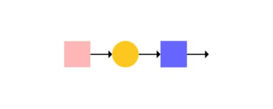
A knowledgeable design operations manager can explore options like Scrum and Kanban to decide whether they could improve your project workflows.
Design and development teams that use code-based design tools like UXPin Merge might find they get the best results from creating unique workflows. PayPal, for example, uses a system that integrates design and DevOps into a single flow.
Encourage your design operations manager to explore opportunities for workflow improvement. It may take some time now, but the effort will save your team time and effort in the long run.
Build a team of professionals who can contribute specific skills to projectsA design operations manager should know how to review your project requirements and build a team of professionals with the specific skills needed to meet goals.
Maybe your team makes fairly simple products, so you only need one designer and a couple of developers. But creating more interactive, expressive digital products might mean bringing in new talent. Your design operations manager should know how to vet applicants to hire:
Animation designersProject managersBrand managersArt directorsContent creatorsUI/UX testersThe more advanced your products become, the more skills you’ll need to complete projects. A design operations manager can ensure that you hire the right people.
Save money by keeping your team at the perfect size (and scale when needed)Does your team work together to create user-friendly designs, generate prototypes, and build market-ready products?
If you have too few people on your team, you’ll struggle to meet milestones and keep up with your competitors. With too many employees, potential contributors lack challenges and you waste money. An experienced design operations manager can audit your team to determine whether you need fewer or more members and proceed with onboarding new members of the product design team.
Like many companies, you probably have projects that require extra help from time to time. Instead of overextending your team, the design operations manager can help you scale quickly by reaching out to reliable freelance designers and developers and help collaborate.
The manager should also know which tools and processes make scaling the design process easier. For example, your team can move much faster when it already has a design system that defines UI patterns, establishes consistency, and provides access to approved assets to facilitate design work.
Get quality assurance from a design operations managerYou make digital products that look terrific to your employees, managers, and stakeholders. Have you taken the extra step to test your products for quality assurance?
The best approach to quality assurance testing depends on your goals. If your design operations program manager has a clear vision of these goals, they can manage testing to ensure the target market finds value in your product.
That said, some internal products might not require extensive testing. Here, you might just send prototypes to a few coworkers and ask them for feedback.
But market-facing products that generate revenue need in-depth testing. Your design operations manager might recruit users to test and provide feedback. A/B testing could settle questions about whether one version of an app works better than the other. Perhaps this is an opportunity to get AI involved in usability testing.
You don’t want to release products that people won’t buy or result in complaints and poor reviews. That may seem obvious, but risky, untested products can hurt your company. Get a designops manager who knows how to provide quality assurance to improve products and avoid failure.
Know your team completes every task before releasing productsIdeally, you maintain checklists that show when project tasks are complete. Let’s say Robert is designing an app’s navigation, so he reports when it’s finished. Adelle is adjusting the code to ensure the app looks perfect on every device, so she reports when she completes that job.
This approach usually works well. But is someone overseeing the checklist to ensure tasks get completed on time and in the right order? A project manager can handle this, but does that person know which approach in the design team works best for each type of project?
Here is another opportunity for a design operations manager to step in and improve the product development process. Plenty of apps exist to assign tasks and monitor completion. Someone experienced with these tools can choose the best option for each project. The project manager might monitor progress, but it takes someone with a broader vision to decide how to measure and ensure that progress.
UXPin Merge makes your design operations manager’s job easierNearly all design and development teams that build digital products can benefit from a design operations manager’s insight.
You don’t want to overburden your new manager, though. That’s certain to create a stressful work environment that damages relationships and makes progress more difficult.
Make challenges easier by requesting access to UXPin Merge. Merge helps streamline your development process by taking a code-based approach to design. Designers use imported interactive components from developers’ libraries like Git or Storybook, so it cuts down the design process time. Plus, you can test the fully functional prototypes before sending designs to the development team.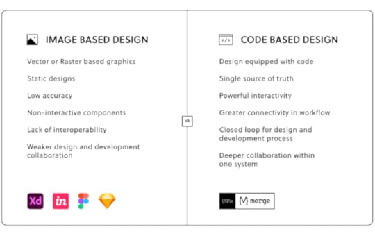
Get access to Merge today so you can make your design operations manager job easier and improve your product development process.
Discover MergeThe post Does Your Team Need a Design Operations Manager? appeared first on Studio by UXPin.
August 10, 2021
9 Principles of Mobile App Design
 What is app design and what makes it good?
 App design is a combination of UI and UX design to build out a usable piece of software. Modern users don’t have patience for apps that are confusing to use. Ideal mobile app design is good-looking, functional, and straightforward all at the same time.
So, how do you measure good app design? A good app is measured by good UX.
Users should be able to navigate your application without needing to think. If they can instinctively figure out the design, they’ll continue to use your application again and again.
In this article, we’re going to look at the 9 principles of mobile app design and how you can incorporate them into your design work.
Here at UXPin, we use these principles on a regular basis. If you’re looking to boost your design skills, get on to the UXPin free trial and start prototyping now.
Principle 1: Make it Easy
Prove your app’s value by giving users what they want right away.
Normally, when someone downloads an app, he or she wants to use it for performing a specific task. Try to make a great first impression once they open your app. Don’t interrupt them while they’re using your app – or at least don’t interrupt them immediately.
Let users do what they want to do. Users are there to find specific information, perform an action or consume some kind of content. If they can’t do what they want easily, they might close your app and never come back.
Break down big tasks into really easy stepsCognitive load measures the mental effort needed to complete a task. Minimize the cognitive load of using your app so that users can navigate step-by-step. They shouldn’t view it as a chore that needs to be done.
Let’s take a checkout process as an example: you could ask users for information all at once, but they’ll find it easier to fill in information over multiple steps: their shipping address, billing information, credit card information, etc.
Tell the user exactly what they need to do
Your design should make it clear what the user needs to do. If you suspect that an integral part of your layout may confuse your users, use visual aids to explain what needs to be done. For instance, you can use a tooltip or a caption to provide instructions.
Don’t hide important informationIf you want the user to use your application effectively, turn their attention to the most important elements of your app. You can do so by increasing the font size, adding whitespace, and making sure that the element’s color contrasts well with the background color.
Navigation elements should always be visible and they should facilitate the completion of high-value tasks.
Principle 2: Make the navigation of your app predictable
People get used to the design patterns they encounter every day. For instance, they will expect to be able to swipe through pictures. Make sure you adhere to the typical navigation methods of the Internet.
Your users have an expectation of how to navigate the appYour users’ past experiences of using other apps will inform their expectations for using all applications, including yours. Incorporate these common patterns into your design to allow them to easily navigate your app.
Take inspiration from UX design trends and most common patterns used today, but don’t blindly implement them without considering their fit with your application. If necessary, slightly modify these patterns to fit the overall context of your design.
Make sure to follow the commonly accepted navigational principles for the structure of your app. Sometimes users will instantly understand the purpose of a certain feature or a page. For instance, people will recognize the purpose of the “what’s new” page, or “search” field. Use these universally recognized concepts to simplify your app’s design.
Make sure to check out the design guidelines published by developers of iOS and Android operating systems. These documents describe proven design patterns used in excellent layouts today.
Follow the 3-click rule
Users should be able to access any part of your app in less than three clicks. Keep the hierarchy of your navigation bar simple.
Doing so will make sure it’s easy for your users to keep a mental map of what’s going on in your app. Also, make sure your app shows the name of the page.
Whenever there’s an error, let people return to the homepage or try to redirect them to other pages that might interest them.
Save users’ progressUsers today are busy and easily distracted. They might close your app to respond to an email or watch a new episode of their favorite TV show. Save their progress so that they can come back and finish their task without having to start over.
Make it accessible across multiple devices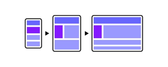
If you have a desktop website and a smartphone app, both channels should automatically save the activities and progress of logged-in users. People should be able to use the app and the website interchangeably. For instance, online shoppers might browse products on their phones, but they’ll usually place an order on a desktop computer.
Principle 3: Follow the basic laws of app navigationDon’t make up your own languageIn some cases, it’s better to rely on basic principles of app design. People easily understand the design frameworks they encounter every day. Your layout should fall in line with those expectations.
X in the top right-hand corner
A lot of applications feature X in the top right corner. Users instinctively know that clicking it will close the application.
Avoid dramatically changing the function of common symbols. For instance, the user expects X to close the window. Don’t use X as a symbol for any other action.
Save ButtonYour app should also have a Save button at the bottom of a page.
Light coloured text field for inputsNormally, input field lines are light-colored. Ideally, they should match the color that the users associate with your brand. It is rare to see input fields with black borders.
Principle 4: Have a great, clear, and prioritized page design Label products descriptively
Make sure the names you choose for products are descriptive and appealing. For instance, a customer might find it hard to see the difference between “standard shipping” and “regular shipping”. Pick labels that showcase the differences between the two options.
You can use techniques like Card Sorting to get the feel of customers’ mental models.
Showcase the most important menu itemsYour navigation should facilitate the completion of the most important and high-value tasks. Show the most important features in the primary menu and leave everything else for the secondary menu. Use Visual Weight techniques to divert users’ attention to where it matters.
Changing font size, background contrast, and surrounding whitespace can help you divert users’ attention to the most important features of your application.
F pattern vs. Z pattern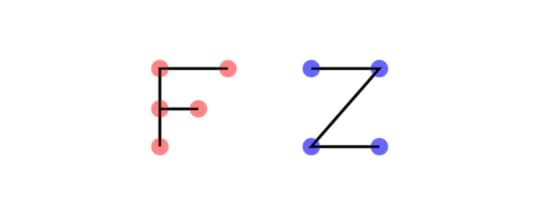
Most users aren’t going to read text from start to finish. They are more likely to scan multiple paragraphs of text. The first few words of the opening paragraphs get the most attention. That’s where you should place your most important messages to ensure that users don’t miss them. This scanning behavior is described as an F pattern.
Users scan visual content in a Z-shaped pattern. Place your most important visuals in the areas where they are most likely to be seen by the users, following the Z-shape pattern on your webpages.
Principle 5: Have brand image consistency
The buttons, input fields, and other elements of your application should be based on your brand image.
Have navigation consistencyIf your application is based on an existing website, make sure its navigation works similarly to that of a website. Don’t change the color palette or other basic functionality to avoid confusion.
Make sure your users can predict most of the time how your app will work and look.
Mobile users don’t have the advantage of hovering and having a cursor to help them guess the outcome of their actions. Carefully design the elements to help users recognize their purpose.
Principle 6: Minimize input and commitment from the user Don’t ask for set-up information up front
Users see your app as a solution. Most people are focused on solving their problems. Don’t bother them with questions, account registrations, or signup forms right away.
Let users use your app freely until it’s absolutely critical to login, give a credit card, or whatever the action may be.
For example, Medium allows its users to enjoy a limited number of high-quality articles before asking them to create an account and subscribe.
Minimize the need for typingUsers find it hard to precisely type on their smartphones. Try to get the desired information without asking them for text input.
If you can’t think of an alternative, provide input masks as a formatting guideline.
Prefill as much data as possible
Instead of asking users to write down their location, ask them to share their location and use a smart tool to fill in their address based on GPS data.
Provide optional inputsDon’t ask users for unnecessary information. If you’d like to collect the data, give users the option to fill out the form or leave it empty if they wish.
Autofill wherever possibleIn some cases, you can use the phone’s features to automatically fill in the fields. For instance, some apps allow their users to provide payment information by holding their credit cards in front of the camera.
Principle 7: Loading should be fast and well communicatedUsers are impatient when it comes to waiting for the app to load. Make sure your app loads fast to minimize any friction.
Show something
If you’re loading, make sure your user knows it’s loading and not broken.
Seeing a blank loading screen might lead your users to think that your app doesn’t work. People are used to seeing some sort of loading indicator – a progress bar or a loading spinner.
Load parts of the content gradually to display something as soon as possible. This way, users can start using the app right away, even if their Internet connection is unstable.
Offer a visual distraction during loadingYou can use simple loops or progress bars to display loading progress, but users are more likely to keep waiting if you create a simple, but entertaining loading animation.
Principle 8: Optimize your app for mobile, and diverse mobile users.If your app is going to include a lot of text, make sure that it scales well on all types of screens. Text is much easier to read when each line contains no more than 40 characters. You should also adjust the line spacing.
If your app involves visual content like images and videos, make sure your app can be viewed in both – portrait and landscape modes.
Make sure your pages are built for mobile
When building a layout for your app, design easily clickable and properly spaced-out buttons. Users shouldn’t accidentally click something they’re not supposed to. For instance, put enough space between the Back and Next buttons to avoid accidental clicks.
Make sure your pages are built for different kinds of devicesYour app will be viewed on smartphones with 4-inch screens as well as 12+ inch tablets. Make sure your content properly scales to fill available space on larger screens. Make sure pages don’t look crowded on small screens.
Principle 9: Do app design for humansFont Size
A sizable portion of Internet users today have impaired vision. Use a font size of at least 16px so that your text is legible to everyone.
Color blindnessYou shouldn’t rely solely on colors to communicate with your users. You should also use symbols so that color-blind people can understand the message.
DeafnessYour app should be adapted for the deaf and hard of hearing, especially if it contains sound components. Video and audio content should be captioned and subtitled.
Disabilities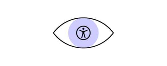
HTML has built-in features to communicate the meaning of the content. For instance, you can use alt attributes to describe the visual images for people who can’t see.
Gender selectionsUnless the core functionality of your app revolves around the user’s gender, don’t ask them to specify their gender. If you run a simple business like a car rental service, there’s no need to know the customer’s gender.
ConclusionDesigning an app from scratch is a lot of work. Thankfully, you can use UXPin and its built-in accessibility features to design an app that is accessible to everyone. You can start creating beautiful code-based designs right away by signing up for a 14-day free trial.
The post 9 Principles of Mobile App Design appeared first on Studio by UXPin.
August 6, 2021
Negative Space – How Best to Use It in Website and App Design
Have you ever viewed an image or photograph that you really like and wondered why it looks so interesting and engaging? Or maybe you’ve wondered why a scene in a movie or TV show triggers a strong emotional response. Is it the subject matter or the artist’s use of perspective? Perhaps. But then think about your favorite websites or user interfaces; what is it about how they look that makes you enjoy using them. Maybe it’s something about the colors or the fonts used on the webpage or app. Or maybe what you’re reacting to in all these examples is something else altogether: negative space.

At its most straightforward, negative space is the space around or between the subject of an image. You can see it all the time, whether it’s the white space surrounding the text of this blog post or the black background behind a model’s face in a stylish black and white photo. But beyond that, negative space can also add more information or meaning to the subject. But more on that later.

First, let’s look at what design looks like without negative space.
A world without negative space.Chances are, as a kid, you might have encountered the Where’s Waldo (also called Where’s Wally) series of books. You know the ones, with all the intricately drawn bustling crowd scenes with hundreds of characters. And somewhere within each scene is the subject of the image, Waldo (or Wally). Sometimes it could take hours to find the little figure with his distinctive round black glasses and red and white striped clothes and hat. There’s not a shred of negative space to be found in any of those drawings.

Well, imagine if that’s how we all created our designs. Imagine trying to read this post if all the letters and lines were squeezed up tight against each other, or worse still, covered in text from other blog posts. Or imagine trying to use an app designed with all the layout elements crammed together, like Where’s Waldo. It just wouldn’t work. An app or website designed like Where’s Waldo would be unusable. If you’re old enough to remember what some website designs looked like in the 1990s, you’ll understand why.
How to use negative space in designWhen it comes to web pages and app design, negative space has a vital role to play. The considered use of negative space allows a web page or app to “breathe,” which helps draw greater attention to the crucial elements included on a page or app screen. Plus, clever use of negative space can help create a hierarchy of information so that not all aspects compete for the viewer’s attention simultaneously.
A thoughtful approach to negative should try to achieve:
better scannability of a page or app.enhanced visual hierarchy.intuitive bonds between the different elements of a page or screen.an overall less cluttered feel.improved user focus on core features while reducing distraction.added style and elegance to a page or screen.The difference between big and small spacesHow you use negative space in web design or app screen also depends on whether you are applying it to a small or large space.
Larger spacesWhen working with larger spaces, such as the overall design and layout of a web page or app screen, you need to look at the overall content when applying negative space. Questions to ask yourself include:
Can negative space be used to separate elements?Does your text need to be divided into columns?How big should you size your margins and padding?How much distance between images should you use?This type of negative space significantly affects the user’s visual flow. Whether it is potential guidance or strong push, it can let the attention lead to where you want them to stay.
Smaller spacesSmaller spaces require a different kind of negative spacing. These include design elements such as:
FontsLine spacingParagraphsListsButtonsIconsThe negative space you assign to smaller design elements primarily emphasizes the overall clarity of a website or app screen, especially the amount of negative spacing associated with typography.
Negative space directly influences the readability of text on a page or screen. If there’s not enough space between your lines of text, they become hard to read and demand additional effort from the user.
What is negative space: Creative negative spacesOne example of a creative negative space is the image known as Rubin’s Vase. It was developed in the early 20th Century by the Danish psychologist Edgar Rubin and is a famous example of an optical illusion.

In the image on the left, the yellow vase is the subject, and the white background is the negative space. But if you look at the black and white image on the right, you might instead see the profiles of two male faces. Now look back at the picture on the left. The negative space in the original image also contains the same two male faces. The yellow vase is still the subject, but the negative space conveys additional information to the viewer.
You don’t think optical illusions are relevant to corporate designs? Well, think again. Take a look at the FedEx logo.
Look between the E and the X. Notice anything? It’s an arrow. A subliminal reinforcement of the kind of business FedEx is known for. Another example of the creative use of negative space.
How UXPin can help you improve your use of negative spaceThe next time you begin a new design, remember to consider the impact of negative space on your design and user experience. With UXPin, you can create designs and prototypes and preview your work across multiple devices. Collaborate with your team members or business partners to get feedback on your use of negative space. Get started on your next negative-spaced design project with UXPin today- on free 14-day trial.
The post Negative Space – How Best to Use It in Website and App Design appeared first on Studio by UXPin.
August 5, 2021
Storybook Design System: It’s Time to Reap Its Many Benefits
Since you’re here, there’s a good chance that you have used our design-with-code Merge technology to build fully functional prototypes. (If you haven’t taken that step yet, try for free our Storybook integration.)
Recently, we took a giant leap forward by releasing an integration with Storybook.
We don’t want to assume that you know a lot about Storybook and the advantages you get from combining it with Merge. To make sure you and everyone else understand why this matters so much, we’ve put together some of the top benefits of using the Storybook design system and write a quick tutorial to get you started.
By the time you get to the end of this post, we know you’ll feel our excitement!
Storybook design system as a single source of truth
Digital design projects can get messy, especially when you have multiple people working on several jobs at once. The Storybook design system reigns in the chaos to give everyone involved a single source of truth and make it easy to test components
Your fellow product team members may not be on the same page with all the standards and there might be just too many back-and-forths about making sure that the design has everything that’s needed for the development stage. In that case, you need to centralize all your knowledge in a better way. An interactive design system that keeps everyone on the same track is the answer.
With the Storybook design system, any change that you make gets updated everywhere. You don’t run into problems with one person having the 20.2 version while someone else follows the 21.1 version. You eliminate that madness by creating a digital design system that gives the same information to everyone.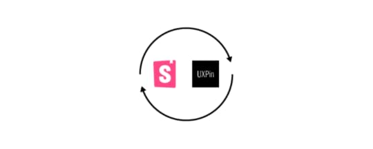
Storybook also makes it easier than ever for your team members to find the components they want. The component finder and sidebar will direct them to results that match their search queries. If you can use Google, you can find the right components in your Storybook design system. (If you can’t use Google… how did you even get here?)
Storybook design system inspires creativity without (adverse) consequencesUnlike a lot of design and development tools, Storybook lets you build UI components and test them in isolated sandboxes.
So, you can create interactive components without damaging other aspects of your design system or components library.
You can explore your most creative ideas without fear. You might find a unique approach that adds to your brand’s aesthetic and functionality. Even if you don’t reach those goals, you can’t hurt anything by trying.
Integrating Storybook and Merge eliminates design-development inconsistenciesClearly, we’re big fans of code-based design at UXPin. We saw a lot of designers and developers working against each other. The problems almost always came from miscommunication and the lack of a single source of truth. The two types of professionals didn’t have a common language, so they often struggled to understand each other. Designers worked with image-based technology, whereas development focused on code.
Merge helps solve those problems by giving your teams a no-code, drag-and-drop design environment that’s still powered by code. Designers can create new products by pulling from the component library, making a few adjustments, and sending it on to the developers. The developers already have the code for those elements, so they cut down the time to build digital products.
When we discovered Storybook, we knew that we had found kindred spirits who understood that visual design needed to evolve into the code-based design.
After a lot of work, we built an integration that would let our users access their Storybook design systems. You don’t have to worry about add-ons or APIs. You integrate the two and start using your Storybook design system within Merge’s editing and prototyping platform.
The remarkable thing is that your prototypes will function just like the final product. Storybook excels at building atomic components that make testing extremely easy. Basically, if the components work correctly, the user interface will also work correctly.
Now, you don’t have to think about inconsistencies between your original design and the finalized product.
How to integrate Storybook with UXPin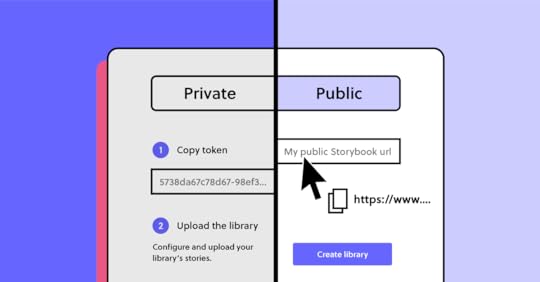
It’s time to wade into the technicalities of integrating Merge and Storybook. Hold your breath! Just kidding. It’s actually very easy.
First, you need a UXPin trial account. Sign up and we can make that happen.
You also need a Storybook, which you can install from here. (Make sure you get version 6 or above.) If you have a private Storybook URL, contact us at sales@uxpin.com for some extra help. Import your components to Storybook if you already have some.
Assuming that you have a public Storybook, just follow these steps:
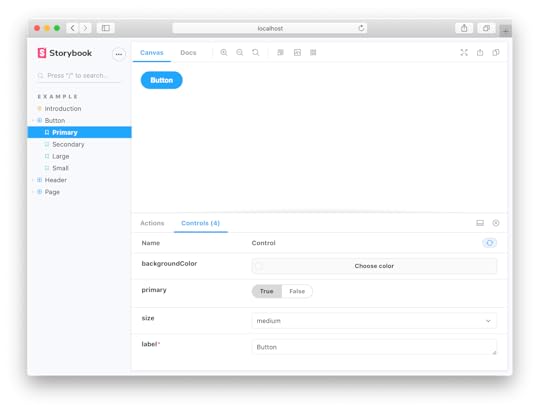
Open a new prototype in the UXPin Dashboard.Choose “Design System Libraries” and click “New Library”.Choose “Import Components from Storybook” (see, we made it simple!)Paste the URL of your Storybook.Start making something amazing!From now on, any change that you make to your Storybook design system will also get updated in UXPin.
Not getting the results you want? You can find more detailed integration instructions here.
Experience the advantages of integrating StorybookSeveral editing and prototyping tools have add-ons and plug-ins that let you move designs to Storybook for development. We decided to be the first ones to do this the other way around so that you won’t have to design everything from scratch.
Get your Storybook integration today so you can start designing faster with code-based, interactive components. You won’t believe how quickly your team members start building digital problems once you’ve integrated with Storybook.
 Try out Storybook integration
The post Storybook Design System: It’s Time to Reap Its Many Benefits appeared first on Studio by UXPin.
August 4, 2021
How to Design an Unforgettable Splash Screen that Delights Your Users
“You never get a second chance to make a first impression” that’s how the saying goes. This applies to interacting with new people and when users experience your application for the first time. Research shows that it takes 50 milliseconds for users to decide whether they are going to stay on your app or leave. That’s why splash screens are important, they set the stage for how your users are going to perceive and experience your application. This article will discuss what splash screens are, why they are important, and the best practices for designing them.
What is a splash screen?A splash screen is an introductory screen that users see when they launch your app or website. It is a chance to build your brand identity and it keeps users occupied while your app loads in the background. This screen can either be an image, graphic, logo, or animation sometimes coupled with a progress bar.
Why do you need a splash screen?Splash screens were frequently used when devices were slow and the internet was even slower. Nevertheless, they still matter today with fast internet and faster devices because of the following reasons:
Keep users occupied during startupEven though apps have become much faster, the truth is that they still require a few seconds to set up before users can interact with them. Maybe your user needs to enter their log-in details again or some images need to be loaded or some homepage data needs to be loaded before the user enters the app. The splash screen keeps the user occupied while these background tasks are executed so that they can have a seamless experience. 
Plus, splash screens with progress bars reduce app abandonment. They tell the user exactly what’s going on and how long they have to wait which reduces anxiety and makes the wait feel shorter.
Welcome users and set the stage for their in-app experienceA splash screen sets the standard of what your users should expect when they start interacting with your app. Welcoming users and setting expectations is very important because if users perceive your app positively in the early instances of interacting with it, they are likely to perceive that they had a positive experience. 
The splash screen serves the same purpose as the grand entrance in a hotel or a business complex. The entrance signifies that you are entering into a sophisticated and high-quality establishment. Similarly, when a user taps onto your app’s icon they are immediately transported into your app’s world. A splash screen is a chance to welcome the user and set the stage for a phenomenal experience.
Best practices for designing a splash screenBefore we talk about the best practices for creating a great splash screen, it’s important to note that not all mobile apps need to have splash screens. Sometimes splash screens create unnecessary friction especially when an app is used often. For instance, imagine having to go through a 3-second splash screen every time you checked your WhatsApp messages (even after 3 minutes), that would be annoying right?
Here are the best practices for creating splash screens that welcome your visitors and create a great first impression.
Make it as short as possibleSplash screens should follow the 3-second rule which states that they should not last for more than 3 seconds. If your splash screen lasts for more than 3 seconds, then it will frustrate regular app users and take away from the user experience. Additionally, if you expect users to use your app regularly (at least once a day, like messenger apps) then use the 1-second rule or eliminate it altogether.
If your application takes longer than 3 seconds to load, use a skeleton screen instead of a splash screen. Skeleton screens show a skeleton of the final user interface which reduces user anxiety. Slack uses skeleton screens very well.
 Keep simple but memorable
 Since you only have 3 seconds to make an unforgettable first impression, use simple but bold designs. You need to strike a delicate balance between overloading your users with a million different animations and creating a cold and sterile splash screen.
Most designers use bold colors, arresting images, and animated logos on their splash screens. Kindle app is a great example of a simple but eye-catching splash screen. Avoid putting adverts and other self-serving messages that users don’t care about on your splash screen.
 Reduce wait time anxiety
When users don’t know if your app has crashed or if it is still loading, there is a high chance that they will abandon it. That’s why progress bars and progress animations are very useful in reducing user anxiety. They let users know how long they need to wait which reduces the chances of them abandoning your app. If your app has a short wait time, you can use spinners but if it has a longer wait time, progress bars are more appropriate because spinners can cause frustration when they seem to be spinning forever. Google Workspace uses a progress bar very well.
 Add an element of surprise and delight
 If you have enough time and budget on your hands, you can add some fun and personality to your splash screen. Fun animations and splash screens that fade seamlessly into the UI are some of the ways that you can delight your users. As always, be careful of going overboard. A great way of doing this is by making the elaborate splash screen appear only when the user first launches the app. Check out these examples:
SourceSourceSourceDesign unforgettable splash screensA splash screen is a gateway that opens up your app to your users. A great splash screen can increase user perceptions of your app and strengthen your brand awareness. Design an unforgettable welcome screen with UXPin’s all-in-one tool that merges design and engineering.
The post How to Design an Unforgettable Splash Screen that Delights Your Users appeared first on Studio by UXPin.
August 3, 2021
Git for Designers – All You Need to Know

As designers, our final goal is to make great products for the end user. This is why our collaboration with developers is paramount in every product we build.
We come up with a product’s concept. Create mockups and prototypes. Then hand over the final design to developers to get the project live.
In this scenario, a designer’s role is supposed to end once the final design is delivered to the development team.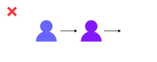
But in reality, this linear system (from designer to developer) barely exists in the product development lifecycle. Here’s why:
Designers need to be part of the product development, from concept to launch for the project to be successful.The fact that the first prototypes rarely become the final product. So designers must follow up to make changes based on reviews from users and other team members – as well as provide guidance on how to implement certain designed elements for proper user experience.This is why real-time collaboration, even during launch, between designers and developers, is vital to the success of every project. Your team needs to go back and forth on features, change design elements, and get reviews from other team members.

This is no big deal for us as designers. Of course, there are a lot of tools and features for us to collaborate.
But the trouble arises when we need to collaborate with developers. Here’s why:
Designers don’t work with code, and developers don’t work with design resources.As teams, we also use different tools to get the work done.Question is, as teams that need to work together, how can we collaborate when we don’t even use the same tools?
Ultimately, the solution lies in finding a common ground – a single source of truth.
UXPin with Merge technology allows developers and designers to work together to get projects live. UXPin Merge allows you to pull your git elements into the UXPin design editor, so you can easily design with components that already exist on your site or other teams have developed. On top of that, those components are production-ready, so you don’t need to add interactions or wonder if they are in line with the standards. You also don’t need to know how to code or dive in Git as the component is presented visually, whereas for developers that is still ready code that they can use to build a product. Apart from Git integration, UXPin offers syncing with Storybook libraries to bring ready UI components from there as well. 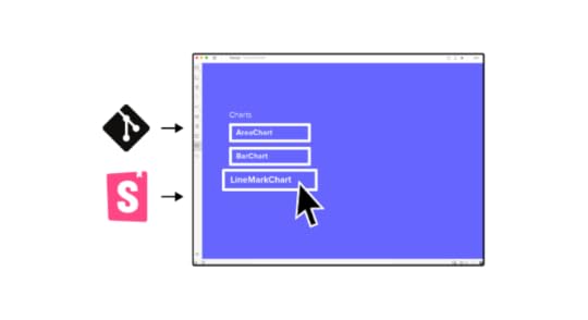

Git, in technical terms, is a version control software. It is a program that tracks changes made by developers to code and saves these changes for future references.
It allows developers to revisit their previous changes. You can undo code changes without messing with the entire source code. In short, it helps to quickly find the issue and fix it.
Git is open-source, free software that can be downloaded and used on your personal computer. Since it works locally on your PC, once installed, you don’t need an Internet connection to use it.
As a designer, the closest example of how Git works is how the “History Panel” in Photoshop operates. In Photoshop, the history panel lists all the moves, additions, edits, effects, and everything that you added to get your final image. That’s what Git does for developer teams.
What is GithubIn technical terms, Github is a cloud-based, repository hosting service. Thus, it’s an online interface for storing and accessing all your Git resources. Most popular GitHub alternatives are BitBucket and GitLab. 
All the edits developers make to their code, which are tracked and saved by Git, are stored inside Github. Here, developers are able to access this code once they’re online. They can share their code with other developers, and receive feedback and edits. They can also make changes to code shared by other developers.
Github offers seamless collaboration for developers to work on one another’s code.
If Git represents the images, documents, files, and pages of a website, then Github is the hosting provider where these resources (Git repos) are stored.
Git and Github differences summarizedGit can be used to track your changes offline without sharing it with the others. Github on the other hand is cloud-based and is more of a collaboration platform. Git creates snapshots or paper trails of all the changes developers make to a project, and saves these changes. Github is where these paper trails or snapshots are stored and made accessible to other developers for collaboration.Git is completely free and open-source. Github offers free plans for individuals and small organizations, and paid plans for big teams and enterprises.So in short, these two are complementary tools that help you collaborate, build softwares, record and rewind any change to fix errors real quick.
Git for Designers: When Designers Need GitGit may be built primarily for developers and IT teams, but the need for designers to work closely with developers these days means Git has become an important tool for us as well.
But at what point Git will come in handy for a designer?
When you create mockups and prototypes and need to submit your final work to developers.When you need to make certain design changes to a product that is already in production or already launched.You also use Git when you need to give guidance to developers on how to implement certain design elements for excellent user experience.When you need to build a shareable workflow that is accessible by both design and developer teams.Git for designers: using Git vs GithubThese days, everybody is using Github. But that journey starts from Git. With Git, you’re able to build a design workflow that can be shared with developers. Every change or addition you make is saved, allowing you to go back in time to make changes.
While Git gives you this paper-trail power, Github gives you the power to collaborate with other designers and share your designs with developers.
How to get started with GitHub using the GitHub desktop appWhile you could just use Github from your browser, the desktop app offers great features as well and allows you to contribute to projects from your operating system. Here’s how to get started:
How to create a Github AccountTo get started, go to https://github.com/. Once on the homepage, go to the top-right corner of the page and click on the “Signup” button.
Follow the prompts to enter your email address, create a password for your account as shown below:
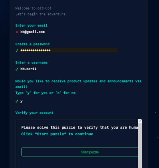
In your next steps, head over to your email and enter the launch code from Github into the next window. This will take you to your first dashboard.
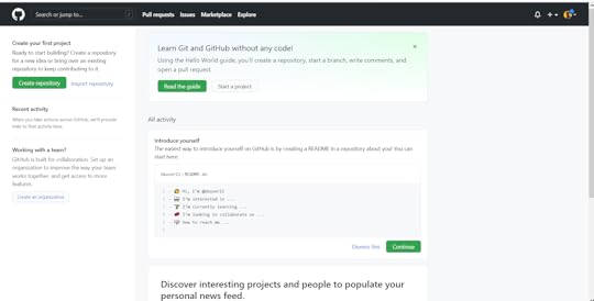
Once in your dashboard, you can configure your two-factor authentication and add a bio to your profile using the “Settings” pane, which you can access by clicking on the arrow beside your profile picture.
How to Install Github on your computerTo get the Github desktop app, you need to visit https://desktop.github.com/ and select the appropriate operating system to download.
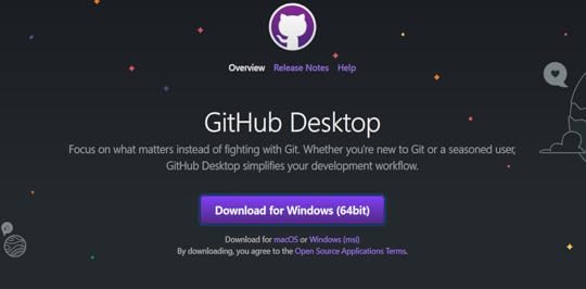
Launch the application after the download is complete and follow the prompts to install Github on your desktop.
You’ll be taken to the welcome page once the app is done installing.
Once installed, you may get prompts to help you link your desktop app to your account – Github calls this Authentication.
If you don’t get these prompts, here’s how to link your desktop app and your Github account you created a while ago:
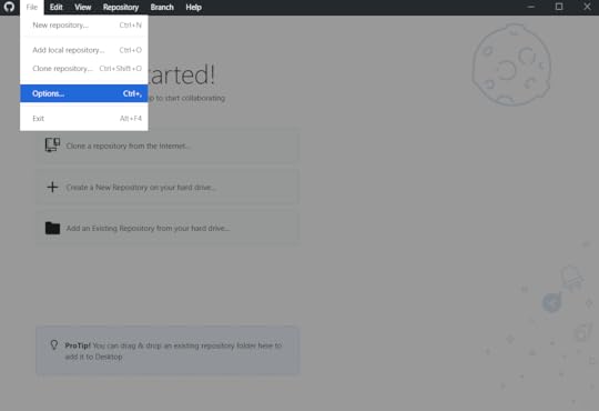
Step 1: Click on “File” on the upper left of the desktop app and select “Options” from the drop-down list.
Step 2: Click on “Sign In” beside the “Github.com” option. You’ll be prompted to sign in using the browser.
Step 3: Click “Continue with browser” to continue. This will take you to Github.com on your browser where you enter your email/username and password.
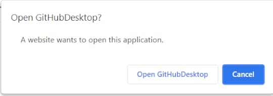
Once you enter your details, your browser will prompt you to open this link using your desktop app
Step 4: Click on “Open GitHubDeskTop” from the browser prompt.
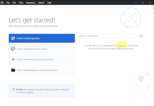
This will bring you back to your desktop app, now displaying your username as shown below:
At this point, you’re ready to start using your Github account by creating a repository. Here’s how to get started.
Git for Designers: How to Make a Repository on GithubFirst, what’s a repository?
In the layman sense of the word, a repository is a receptacle or place where things are deposited, or stored. This is the same for a repository in Git.
A Git repository is a storage location for your code. It is where versions of your coded designs are found, which you can access anytime you need them. It tracks all the changes you make to your project and builds a history of these changes throughout the project’s lifecycle.
Once you start the project, you can create a repo/repositories inside the project. Here’s how:
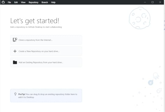
Since your desktop app is new, you will see a list of options on what to do on the homepage.
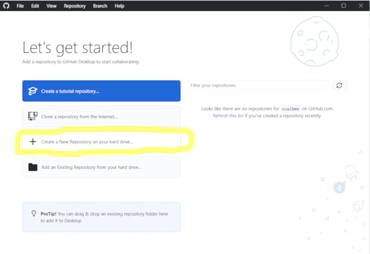
Step 1: Click on “Create a New Repository on your hard drive”
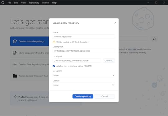
Step 2: In the next window that pops up, enter the repository name and description, and click on “Crete repository”
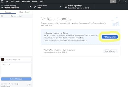
Step 3: In the next step, you’ll see that your repository is only available on your PC. You alone can see and edit it.
To collaborate with other teams or let someone else review your work, you need to publish this repository.
Click on “Publish repository” to get it live.
And your Git repository is now live.
How to Commit a Change in GithubCommitting a change in Github means you’re saving the changes and edits you made to your local repository.
For instance, when you make changes to a Google Doc online, these changes are saved automatically. But this isn’t the case with Github. You have to save these changes, thus, commit a change.
Here’s how to commit changes.
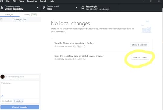
Step 1: On your Github desktop app, click on “View on Github” next to the “open the repository page on Github in your browser” window.
This will take you to the repository page on your browser where you can make changes.
Step 2: In the browser window that opens, click on the Edit icon on the upper-right corner of the repository window.
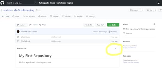
In the next window, your repository will open for you to make all the changes you want.
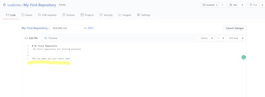
Step 3: Once you’re done making all the changes, scroll down and click on “Commit Changes”
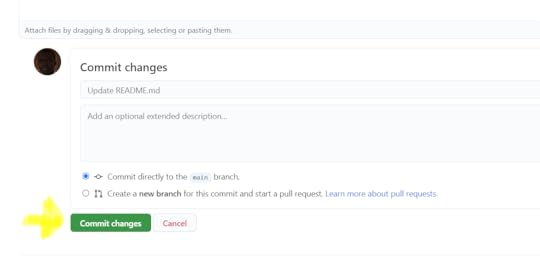
Now, all your changes are saved to the repository.
What are Branches and how do you merge them?Just like how tree branches protrude away from the main tree, Github branches do the same. They’re a set of codes or changes that you make to your repository that have their own unique name.
Designers and developers use branches to experiment with new features and ideas or fix certain problems without touching the main repository.
When you create a branch, you do so to work on certain things that you don’t want to affect other changes made by your team.
How do I create a branch and merge it?Once you’re done building a feature or fixing the bugs that you created the branch for, a way to add it to the original project is to merge it.
Go to the “Branch” button on the top menu of the Github desktop app. Clicking on it will bring up a list of drop-down options.
To create a branch, click on “New Branch” and follow the steps. Use the “merge into current branch” menu if you want to merge different branches.
 Git for Designers: What other popular Git libraries are there for designers?
At this point, we all know that Github is a library or a database where we host our Git repositories. It’s also where we are able to collaborate with others.
But Github isn’t the only library or database platform out there for hosting Git resources. Here are other options available:
GitlabThe closest to Github in terms of interface and use and an open-source tool, Gitlab is an excellent Git library used by many teams. It has many features, including issue tracking, code management, Wikis, and continuous integration with a lot of development tools among others.
BitbucketAnother great Git repository hosting platform is Bitbucket. Available for Windows, Mac, Android, iOS, and Linux, Bitbucket has great features including commit history, code management, branch comparisons, and offers developers unlimited private repositories for free for up to 5 users.
Other notable Git Repository hosting platforms.SourceForgeLaunchpadGoogle Cloud Source RepositoriesAWS CodeCommitApache AlluraSummaryGit and Github are built for developer teams. But as designers, these tools have become powerful for us not just for creating and saving projects, but also for collaborating with developer teams. If you’re a designer out there working with developers or just wanting to keep a clean workflow, Git and Github are great tools to get you started. Remember that you can leverage Git repositories with UXPin Merge technology to bring the design and development process together and use a single source of truth.
Discover MergeThe post Git for Designers – All You Need to Know appeared first on Studio by UXPin.
July 30, 2021
Make Fully Functional Prototypes to Improve Usability Testing
Launching a successful digital product takes a lot of effort. Working hard, however, does not ensure that users will adopt your product.
The truth is users may resign from your product because you haven’t tested the product before release. If you skipped creating an advanced, fully functional prototype and decided to go with a low-fidelity one and then went into the development stage, there was no room for any reliable usability tests.
Only now do you realize that you spent countless hours building a product that is not as successful as you anticipated.
Let’s learn from this hypothetical mistake by taking a closer look at the importance of usability testing and why you need functional prototypes to get accurate results from your trials.
Most digital products fail ☹️The odds of success are not in your favor. That’s not a pessimistic outlook. That’s just what the numbers say.
Only about 0.5% of apps succeed. Let that sink in. If you build 200 apps, the statistics say that only one of them will succeed. What happens to the rest of them?
67.8% never reach 1,000 downloads.17.9% never reach 1,000 active users.5.8% don’t retain users, meaning they probably get deleted and forgotten.5.8% don’t earn any revenue. Nothing in return for all of that work!1.4% make some money but never turn a profit.You can’t deny the math, but you can test your products before committing to launch. 
After this heavy dose of reality, you might wonder why user testing even matters. What’s the point?! One out of 200 apps turns out to be successful!
Fully functional prototypes give you perspectiveLet’s put this into perspective so you can see the true benefits of working prototypes and user testing.
First, a lot of those apps are worthless. They don’t perform functions that anyone wants. If you have seen the second season of Silicon Valley, you probably remember the “Bro app.” All it does is send the word “bro” to other people who have the app. Silicon Valley did an excellent job skewering some of the insane trends in technology. With the Bro app, the show lampooned all of the meaningless products out there.
The internet has thousands upon thousands of Bro apps.
Second, a lot of companies don’t spend enough time developing and testing their apps. According to appinventiv, 24% of developers spend three months or less working on their products before launch. Some of those companies launched their apps within one month. Is it feasible to research the market, design your product, develop your product, test it for quality assurance, and launch within a month? That seems unlikely.
Third — and this brings us to the heart of the matter — very few designers have the benefit of user testing with fully functional prototypes with interactive features and real data.
If you casually say to someone, “I’m going to make an app that sends the word ‘Bro’ to people,” you’ll probably get some encouragement from well-meaning friends. You’ll get a much different response when you put the app in their hands and tell them how much it will cost to develop, launch, and market.
With functional prototypes, you gain a perspective that you rarely get from mockups that don’t do anything except sit on the page (or screen).
Early usability testing saves you time and moneyYou’re a project manager with two designers and three developers on your team. Over one year, you can expect to pay your designers about $53,400 each and your developers about $114,300 each. Your small team costs $449,700 per year, plus benefits. (These are the median salaries in the United States. Professionals might get paid different amounts in your area.)
Obviously, you want to get as much productivity as possible from your staff. You cannot make that happen when you wait until the end of the development process to test your products. When you enter the usability testing phase, you might discover that your developers spent a week adding a feature that no one even wants to use. What a waste!
Early usability testing that happens during the design phase speeds up your process (and shifts more of the responsibility to employees who earn lower salaries). With fully functional prototypes, you might discover that an interaction doesn’t perform as expected. You might learn that most users prefer one layout over another. You might find out that people despise the core concept of your product!
It’s always better to learn these things early in the process. If usability testing shows that you have a terrible concept, throw it out now before you dedicate more money toward it. You can always come up with a better idea.
By creating interactive components in your prototypes with states, conditions, and interactions, you do not need to rely on your developers to create a feature before you test it. 
Also, you can send your prototype to anyone. They don’t need UXPin accounts. As long as someone has the right link to your project, they can interact with the prototype and leave comments.
Not sure how to improve product usability? Start with these 5 User Experience Principles to Help Guide Your Work . Nothing’s more effective than doing the job right the first time.
Working prototypes break down barriers between designers and developers
You might worry that your prototype — as functional as it seems — might not perform as precisely as your end product does. Merge eliminates your concerns as each component is fully coded. No, you don’t need to know how to write a single line of code! It’s easy because as a designer you look at the interactive UI and developer looks at the production-ready code of the same component. One element, yet two perspectives.
Merge’s code-based approach to design also means that your developers can create new products from existing components. You already know how the features behave, so you can fit them together in inventive ways and offer your users new tools. Once you have a library of React components or a Storybook, it’s easy to put them together and know how they will interact.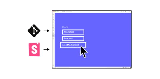
Merge isn’t one of those prototyping tools that only give you an imitation of the final product. You get fully functional prototypes that you can start testing immediately. What’s most important, it takes you 10x faster to build a hi-fi prototype to test out.
Get started with Merge today so you can see how much easier, faster, and less expensive digital products become when you can improve usability testing with prototypes that work just like the final product.
Discover Merge_______________________The post Make Fully Functional Prototypes to Improve Usability Testing appeared first on Studio by UXPin.
July 28, 2021
4 tips for User Testing Your Prototype
Even the best ideas can’t guarantee success. No matter how certain you are about a new concept, the only way to create a good product is by getting real feedback and building upon it.
That’s why building a prototype and going forward with testing it should be essential regardless of the scale of your project. It’s one of the foundation stones of the whole cycle.
It may seem intimidating at first, but as you dive into the process, you’ll soon discover how intuitive it is and that by being thorough you can save resources in the long run and make your launch as smooth as possible.
Here are our tips that will help you make the most out of your user testing.
1. Start testing earlyIf you’re waiting on your product to be complete, you’re missing out on valuable insights. Of course, you can’t exactly start user testing the day you land on a decent idea, but you shouldn’t hold back until you’re ready for launch.
Even though you can’t cover every detail, by gathering early insights you can start correcting issues and removing problems from the get-go. You should always have in mind that you’re not designing for yourself, so the users should help you discover issues before it gets too time-consuming to fix them.
As long as you’re aware of what your prototype can do in each phase, every failure will serve as a lesson to improve the next version. This also makes it cheaper, in the long run, saving you fixes that would come after the launch and take more time to solve. Usually, you can split your phases in a way that will help you set expectations:
 Wireframes and sketches – provide you with minimal insights, as they can be as simple as one-page setups. They won’t get you far with the overall picture, but they can form basic expectations from the users, how they understand the concept and what would be their next steps.Low to medium-fidelity prototype – with these you can already start gathering basic insights about UI interaction, the ways in which the users move forward if they understand the content, is there something distracting, etc. This step helps you form a strong foundation for later on.High fidelity prototype – while technically not a complete product, in this phase you can start grasping all of the users’ issues and the ways they interact with most of the elements. By now you should know if you’re ready to proceed to build the final product and if you managed to solve the issue you set out to respond to.
If you don’t have time to go through the whole process or building a high-fidelity prototype with all the interactions is just too time-consuming, you can build prototypes with fully interactive code components instead. Coming straight from your developers’ libraries, UI code components can help you speed the design process 10 times.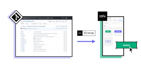
Every testing session should have a clear goal. Of course, you’re after all the insights you can get, but you should have an actionable plan in place to help you be efficient and solve as many issues as possible.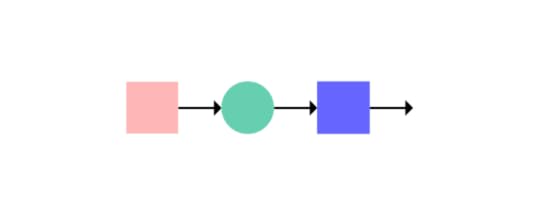
One of the most common mistakes when providing tasks for your test users is going too broad with a lot of vague questions, which can leave you with a lot of “It’s fine, I guess” answers.
Aim for getting an answer about specific experiences through actionable steps that are simple to track and gather insights from. Instead of pointless subjects such as „does everything work“ (spoiler alert: it doesn’t, it’s a prototype), go for something that will provide you with clear next steps.
First, limit each session based on the aspects of the product you want to get more information about and sort them by priority. Then you should explain to your testers what is expected of them, for example, “go through the interface and find the option to edit a video” or “navigate to the checkout page”.
All of these should also have goals to be achieved, either as a desired step-by-step process or the time needed, but users don’t need to have the information for the test to be successful.
It’s important to remember that usability is key when testing prototypes, so don’t overdo it with design and any additional data that may take away from the point and overwhelm the users in this phase. To make a test clear, simple, and reliable, try to go for maximum interactivity in a prototype, without too much hand-holding and explaining.
3. Pick the right usersWhen you’re starting the testing process, you don’t have to make the audience take a technical skills assessment before you show them the prototype, but you do need to make sure that you have a relevant pool of testers.
Representative users are those who you actually see as user personas that will (hopefully) use the product when you launch it. If you’re, for example, building a cooking app, it would be a good idea to have users that cook at home at least three or four times a week. Of course, not every person should be exactly the same – you should have a mix that will allow you to notice different issues.
It may be tough finding the right group to test your prototype and that’s one of the reasons some teams skip testing altogether, but it’s always worth it in the end. You should always go for quality over quantity, as it’s most important to have relevant users with a fresh perspective. You may actually learn a lot with just under ten people.
The need to have fresh eyes on the product is also why you should avoid your family and friends. Even though they want to help, it’s hard for them to have the same approach as real people who have no previous knowledge of the product. It would also be a good idea to use an NDA in this case, especially if you haven’t announced your product yet.
Another thing you should keep in mind is the nature of the product and where the users will interact with it. This means that if you’re working on an international product or service, you need testers from various markets, as they each have their own specifics. This also goes for devices – place the users in an environment that they would actually be in.
In the later phases of testing, you should also gather insights from internal stakeholders in order to have a clear overview of what’s possible and what needs to be changed before launch. This includes people such as distributors that should already have experience with similar processes.
4. Do multiple iterationsYou should always be ready to adjust. The testing process isn’t always linear, so flexibility is key to achieve the best results.

For example, if you notice a feature is drawing focus away from the main functionalities of the product, you should be ready to change your direction as a response.
This feedback loop also applies to the tasks you give your test audience – if you see something isn’t working, you can improvise and switch up the questions to get the best insights.
Users will also have their suggestions on how you could improve even if the task itself doesn’t involve that. That’s why your whole team should be involved in the process, ready to implement a new solution you didn’t have in mind before.
It’s also important to avoid trying to solve every issue at once – your prototype should and will undergo multiple changes along the way so you should be patient and try fixing the biggest problems first. After that, do another test and see how the feedback changes. While you’re going through the phases, keeping a database backup will save you from having to roll back too far if something needs to be reverted to the starting position.

Each new feature added should be followed by a new test. It may look excessive and you’ll want to just bulk everything together, but going small will help you get more detailed insights, also saving the trouble of massive changes, which is especially important when it comes to design.
Putting everything togetherYou should aim to have eyes on your prototype as soon as possible. By introducing real people to the process, you will get a new perspective that will help you change and improve in unexpected directions.
Don’t be afraid to roll up your sleeves and redesign. Involve your whole team and remember that the testing won’t always go over smoothly, but through each step, you get to know your product better, which brings you that much closer to a seamless launch. Go through the prioritization process and invest additional effort through the testing, keep perfecting your prototype with a feedback loop, and, before you know it, you’ll have a product you can be proud of! But first things first – sign up for a free trial at UXPin to start building your prototypes.
The post 4 tips for User Testing Your Prototype appeared first on Studio by UXPin.
UXpin's Blog

- UXpin's profile
- 68 followers

