
UXpin's Blog, page 73
September 21, 2021
Prototype vs Wireframe vs Mockup – What Are the Differences?
A successful UX project relies heavily on testing to achieve a project’s goals and objectives. Wireframes, mockups, and prototypes allow designers to create blueprints and models of the final product for usability testing.
The problem is that many people use wireframes, mockups, and prototypes interchangeably, when in fact, they’re all different and used at separate stages of the design process.
UXPin is a powerful design tool for UX teams to use, from concept to wireframing, usability testing, and final handover to developers. Sign up for a 14-day free trial to start building better products faster with UXPin!
We will explore wireframes, mockups, and prototypes in the order they appear during the design process.
What are Wireframes?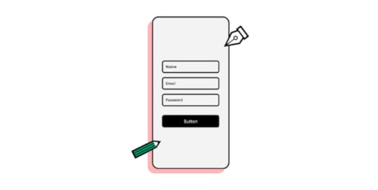
Wireframes form the initial blueprint of a digital product—website, app, game, or other pieces of software. These illustrations use lines and shapes to outline each screen with annotations to explain functionality.
Designers can create wireframes using a pen and paper (paper wireframes) or a design tool like UXPin (digital wireframes).
UX teams use paper wireframes to develop concepts and ideas before committing time to design cleaner, more refined digital wireframes on the PC.
Whether paper or digital, wireframes are referred to as low-fidelity designs because they’re usually black and white with limited or no functionality.
UX teams rarely share wireframes outside their department because the designs lack fidelity, making it difficult to get meaningful feedback.
Designers use paper and digital wireframes during low-fidelity prototyping—which we cover later in this article.
Paper WireframesPaper wireframes are hand-drawn sketches UX designers use to visualize page layouts and ideas—often using a black marker and A4 printer paper.
Paper wireframing is often a collaborative effort where teams get together to share and sketch ideas often with annotations for clarity.
Remote teams might use digital whiteboards to replace physical paper wireframes with apps like Google Jamboard, Mirro, or Mural.
The major benefit of paper wireframing is that teams can create tons of design ideas fast in a collaborative environment at a minimal cost. It’s easy to cross something out or grab another piece of paper (or digital whiteboard) and start again.
Digital WireframesDigital wireframes appear similar to their paper counterparts using simple lines and shapes. Many designers use their final paper wireframes to reference when creating a digital version in a design tool.
While digital wireframes lack color and features, they start to look like an app or website with buttons, inputs, text areas, and headings. Most designers use boxes (square or rectangle with an X through the middle) and dummy text as content placeholders.
UXPin comes ready with a library of inputs and icons, so designers don’t waste time drawing every wireframe element. You can edit these basic elements and save them as components to quickly copy/paste throughout your design. Sign up for a free trial to create your first digital wireframe with UXPin.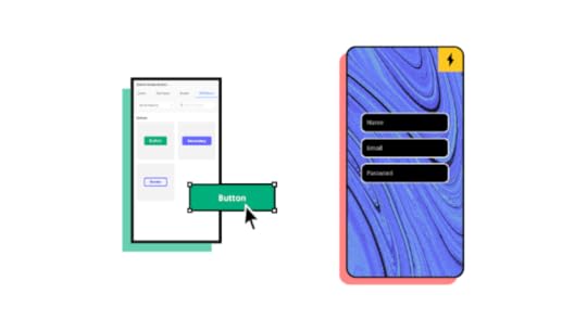
Once UX teams have finalized the information architecture and exhausted testing wireframes, UX designers can begin the next design phase—creating mockups!
What are Mockups?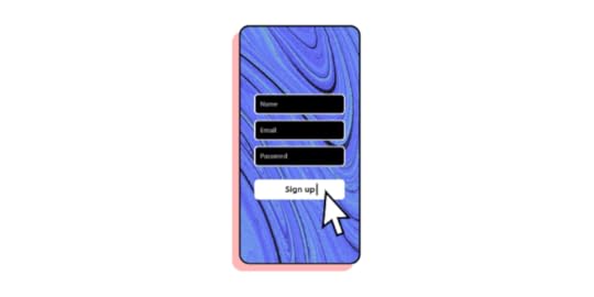
Mockups are accurate visual representations of a final product, app, or website. These illustrations include color, contrast, content (text/images/video thumbnails), icons, and other design details.
Where wireframes are the blueprints, mockups are the artist’s representation.
Mockups are often referred to as high-fidelity designs because they include features that enable users and stakeholders to visualize the final product.
Unlike wireframes, UX designers can only create mockups digitally using a design tool like UXPin. Even full-color paper wireframes are still low-fidelity designs because they don’t accurately represent the final product.
UX teams often use mockups for presentations to stakeholders or clients because they can explain features and design concepts. Mockups are also useful for certain usability studies but lack functionality, limiting any meaningful testing or feedback.
Many people confuse mockups with prototypes. While mockups might look like the final product, they don’t have any navigation or functionality. It is true, however, that designers use mockups and wireframes to create prototypes.
What are Prototypes
A prototype is “A simulation or sample version of a final product, which UX teams use for testing before launch.”
Designers can create prototypes using a single wireframe or mockup. As soon as you add any functionality to a screen, it becomes a prototype—for example, a click or tap on a hamburger icon to open the navigation menu.
Prototypes come in two forms:
Low-fidelity prototypesHigh-fidelity prototypesLow-Fidelity PrototypesLow-fidelity prototypes use paper or digital wireframes primarily to test user flows. These low-fidelity prototypes also play a crucial part in creating the information architecture for a product or website.
During the concept stage, UX teams will use paper prototypes to test concepts and ideas. Team members will spread paper “screens” out on a desk/floor or pin them to a whiteboard.
Paper prototyping sometimes gets quite adventurous, with team members simulating taps, scrolls, and swipes to visualize how users navigate a product.
Moving from paper to digital low-fidelity prototypes allows UX designers to add basic click/tap interactions to test user flows. Like paper prototypes, digital low-fidelity prototypes use wireframes without color or content.
High-Fidelity PrototypesOnce designers complete a design’s mockups, it’s time to connect all the buttons and links to create a functioning high-fidelity prototype.
UX designers need high-fidelity prototypes to look and function as close to the final product as possible so they can fix any usability issues before shipping the final draft to engineering.
Most design tools lack the capability to display real data, capture information from inputs, play video/audio content, or complete other actions you can only achieve using code.
High-fidelity prototyping is where UXPin exceeds expectations. With UXPin Merge, UX teams can create prototypes that perform exactly like the final product.
UXPin Merge allows designers to connect design elements to React components from a Git repository, thus bridging (or merging) the gap between design and code.
When a user clicks a video thumbnail, it plays like it would in the final product!
Using UXPin’s Variables feature, you can capture data from user inputs and take actions based on the provided data inside the prototype. Users can complete a signup form, and UXPin will capture all of that data to present it on a profile page, for example—something other design tools simply cannot do!
When to use Wireframe vs. Mockup vs. Prototype?Now that we’ve defined wireframes, mockups, and prototypes, it’s time to consider where we might use them in the design process.
It’s important to emphasize that there are no rules for using these design elements in any specific order. It all depends on the project and its team. We’re simply outlining the standard process for most products or websites.
When to Use WireframesUX teams typically use wireframes in the early design stages. Once a wireframe becomes a mockup, there’s no reason to go back—unless you’re redesigning the product!
When to Use MockupsUX designers will create mockups from wireframes in preparation for hi-fi prototyping. UX Teams also use mockups for presenting designs to stakeholders or clients.
When to Use PrototypesYou’ll find prototypes throughout the design process, from conception to final handover. Without prototypes, usability testing wouldn’t exist. UX teams create lo-fi and hi-fi prototypes at every stage to test, get feedback, make changes, and repeat.
Low-fidelity prototypes rarely leave the UX department, while teams regularly use high-fidelity prototypes for testing or presentations to clients and stakeholders. Read our article on how to shift from lo-fi to high-fi.
Tools Used for Wireframe vs. Mockup vs. PrototypeUX teams use many tools throughout the design process, including designing, messaging, presenting, testing, not taking, and more. For this article, we’ll focus on design-specific tools.
Paper wireframes use simple stationery items like pens, paper, and post-it notes. Sometimes teams will use cardboard to build a mobile device to hold paper screens.For remote collaborations, UX teams use Google Jamboard, Mirro, or Mural to outline concepts and ideas. These tools are also helpful for organizing notes collected from usability studies and stakeholders. There are many tools UX designers use to create wireframes, mockups, and prototypes, but most of these produce vector-based designs. UXPin is a full-stack, code-based tool that allows designers to build far superior mockups and prototypes. We’ve put together a comparison for many popular design tools, including Figma, Sketch, and Adobe XD to name a few. You can check these out to see how we (full)-stack up against the competition.There are tons of tools for usability studies (we could write a whole article), but here are just a few for remote testing: Lookback, Checkealos, and UsabilityHub.Summary
Hopefully, this article has given you a better understanding of the differences between wireframes, mockups, and prototypes and where to use them in the design process.
Here is the TL;DR version:
Wireframes use simple lines, shapes, and annotations to create screen layouts. UX teams use these low-fidelity designs in the early stages of the design process.Mockups are high-fidelity designs that look like the final product but without any functionality. Prototypes are simulations of a final product used throughout the design process for usability testing. Low-fidelity prototypes use wireframes to test user flows and information architecture, while high-fidelity prototypes use mockups to test interactions, animations, transitions, and user interactions.Getting Started with UXPinUXPin provides designers with advanced tools and functionality to build better wireframes, mockups, and prototypes.
Use ready-made forms, buttons, icons, and more to create wireframes fast.Build reusable high-fidelity components to create mockups of your final design.Lastly, use UXPin Merge to connect React components to design elements for fully functioning high-fidelity prototypes for accurate usability testing and meaningful feedback from participants and stakeholders.Ready to get started with UXPin? Sign up for a free 14-day trial and explore the capability of a full-stack design tool.
The post Prototype vs Wireframe vs Mockup – What Are the Differences? appeared first on Studio by UXPin.


September 17, 2021
Product development and design: Tips to improve collaboration between designers and developers
Today’s technology means it’s never been easier to foster a collaborative culture between multi-discipline teams. Yet, here’s the rub: while 75% of employers say teamwork and collaboration are important, 39% of employees believe people don’t collaborate enough in their organization.
In today’s article, we’re going to talk about:
What impacts team collaboration during design and development of products The tips to make work between designers and developers more effective during software product designShare two brands that you can draw inspiration from.Let’s dive right in.
Table of contentsProduct development and design – key factors that influence team collaborationNumbers and types of design team rolesTeam setup1. Centralized2. Embedded3. Flexible4. Contractual5 tips to improve collaboration between design & development teams1. Assess what your current team setup is and what it needs2. Designers should know to whom they report to3. Make sure designers don’t feel disregarded4. Give designers access to the right tools5. A framework for developer handoffsSoftware product development – examples of effective cross-team collaborationSegmentAirbnbSummaryProduct development and design – key factors that influence team collaborationThere are two major areas that impact the way teams work with each other. These are: the numbers and variety of roles and the design team setup. Let’s take a look at them below.
Numbers and types of design team rolesDesign teams are an incredibly diverse group. In some organizations, it may only be one person, or it could be a large group, with each person bringing their own skills to a collaborative project.

In the pursuit of greater collaboration, it’s more practical to think of members like medical professionals (it’s not that far a reach) or a marketing team (perhaps, an easier comparison) with writers, social media handlers, data analysts, SEO execs.
Similarly, each person on the design team has a unique role and specialization, from usability research and UX design, all the way through to user interface, branding, and interaction design. Every role connects with internal and external projects differently.
Team setupDesign team structures, which influence how designers and developers work together, come in four flavors.
1. Centralized
A centralized structure is characterized by a single decision-maker and a central base. It’s the most traditional and recognizable method of team management. Separate teams of designers work on separate projects under design managers who report to the UX VP or director. Centralized teams offer simpler collaboration and a shared vision for projects, however, design processes are slower and teams are siloed.
2. Embedded
Embedded teams, sometimes known as decentralized or distributed teams, are cross-functional, with members from different departments working together on a particular project. For example, a new website landing page might bring together a designer, a back-end developer, a copywriter, all overseen by a project manager. Embedded teams foster greater company-wide trust and collaboration, focusing on each team member’s specific expertise, although it’s a structure that’s not always efficient.
3. Flexible
Flexible teams take a pinch of centralized and a dab of embedded to form a hybrid hierarchy. Designers act as part of a multi-discipline cross-functional team, working day-to-day under a team leader, while being managed by a design manager. A flexible team is focused on the design process and is generally better suited to adapt to changing objectives. But the structure often leads to confusion over the chain of command, making it unsuitable for larger organizations.
4. Contractual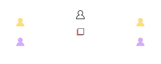
Contractual teams are external designers hired as freelancers. This method is often used by businesses that don’t have the budget for a full-time in-house team, or an existing team that needs additional support on a specific project.
5 tips to improve collaboration between design & development teamsLet’s now take a look at the tips that will help you improve the design and development of products and boost cooperation between your teams.
1. Assess what your current team setup is and what it needsHierarchies and processes will vary across organizations, and it’s important to explore the type that best works for your teams. This will depend on a number of factors, including:
Company sizeSize of design teamDesign project typeDesign project demands.Alongside key stakeholders, examine your current setup. Consider where it’s working and where you can make improvements. Where possible obtain feedback from those ‘in the thick of it’, who will likely have valuable insights into the process.
This is an important – and often overlooked – aspect of any organizational transformation: employees want to feel valued and heard. Gaining buy-in from those affected by any change is critical if it is to be successfully embraced across teams.
For example, you may currently deploy an embedded design team, but it’s apparent that multiple members are repeating the same tasks as each other. That’s a costly and inefficient endeavor (and it’s not going to have a positive impact on employee morale, either). At that stage, it may be time to trial a more flexible approach, which champions speedy, design-focused collaboration.
Always have a clear, attainable objective before making any changes to team structure.
2. Designers should know to whom they report toEvery team in every business needs a clear chain of command. It establishes expectations, increases efficiencies, and helps team members seeking support.

It’s one of the biggest problems for designers in a flexible team setup. Designers find themselves wondering whether to discuss matters with the project manager or their own design team lead. It’s the sort of problem that’s all-too-easily papered over with quick fixes and promises of ‘next time…’, without ever addressing the real problem.
At heart, it’s a communication breakdown. One wide-ranging study ‘cited an average loss per company of $62.4 million per year because of inadequate communication to and between employees.’ And poor communication kills collaboration. Teams face an endless carousel of projects with no direction, no purpose, no ownership, and no shared vision in an environment where no one dares innovate.
Shifting to a centralized or embedded team type may be more desirable here. Both offer recognizable command hierarchies, improving communication either within a single team (centralized) or driving collaboration across departments (embedded).
3. Make sure designers don’t feel disregardedDevelopers almost always outnumber designers. It doesn’t matter the size of the business or the type of work. If there’s only one designer on a team with multiple devs, there’s always the risk that a designer’s opinions are disregarded. In emotional terms, it’s an empathy deficit.
Developers and designers approach projects from very different angles. They don’t see what the other is seeing, because they’re not looking for it in the first place, so they can’t understand it.
This should be addressed swiftly to boost morale and team cohesion. Encourage mutual respect by highlighting the roles, responsibilities, and authority of every team member. Also, make sure to clearly define their areas of expertise. It’ll make it easier for designers to have their say and advocate from a design expert perspective.
4. Give designers access to the right toolsTechnology has made collaboration quicker, faster, and easier than ever before – no matter where in the world your team is. But choosing the wrong technology or keeping outdated tools and obsolete systems can be a costly decision. Efficiency. Competitiveness. Innovation. All of these can be increased by making sure designers have access to not just the best tools but the right tools.
UXPin Merge transforms how designers and developers work together.
And it works by bringing teams into the same ecosphere, instead of reinventing the wheel (or overhauling every system and process in the organization, at least).

Featuring powerful Git and Storybook integrations, designers can either use the same React components or any components existing in Storybook. It lets designers use the same technology as developers to achieve full consistency with the final product. At the same time, designers can focus on what’s most important to them: be it a clean UI, perfect UX, or immersive interactions.
As an end-to-end collaboration tool, Merge facilitates smooth communication. Because the same system is used by your designers and devs, both will be working seamlessly together throughout the design process.
5. A framework for developer handoffsThe handoff process is one of the most important stages of the product development and design cycle.
Among others, a good handoff will:
Stop avoidable last-minute changesCommunicate clear next stepsIncrease efficiencies and prevent delaysPlug information gapsGain internal buy-in from key stakeholders early onHighlight what each team needs from the other.Clarity and accessibility should take precedence to ensure a smooth transition as teams work simultaneously on development and design.
Software product development – examples of effective cross-team collaborationHere are a couple of brands that you can draw inspiration from when it comes to software product design.
SegmentSegment, a leading customer data platform, focuses its software product development process on two stages: discovery and delivery.
The discovery phase, driven by product managers and designers, explores whether an idea makes sense. It questions a product’s usability and value to the customer, whether it’s even feasible, and at what cost.
During this stage, user feedback, data analytics, competitive analysis, and experiments are all deployed. For Segment, discovery ‘drives a shared understanding of the problems customers are facing — without any indication (yet) of how exactly they might be solved.’
The delivery phase occurs after a successful ‘discovery’ has been made and handed over to a mixed team of designers and engineers. At this stage, the focus is on how exactly the product works. This may involve creating and documenting interactive prototypes that meet the software design descriptions, showing devs how a product should look, feel, and behave. The team will also review and agree on the final designs.
AirbnbOnline vacation home company Airbnb was among the first to start thinking of code as a software product design tool.
Recognizing a collaboration gap at the company, Alex Schleifer, former CDO, said, ‘we’re investing in code as a design tool. Moving closer to working with assets that don’t only include layout and design, but also logic and data. This helps bridge the gap between engineers and designers, thus reducing the need for design specs or redlines and the steps between vision and reality.’
The Air/shots tool is one example. Starting life as an off-hand comment – according to design technologist Luke Carter, ‘Schleifer mentioned in passing that it would be cool if we had some sort of tool where designers could see all of the different views of our app. This was exactly the type of project I felt could affect several departments within Airbnb.’
Carter’s hunch was right.
Not only was the product development and design initiative useful to software developers, but the entire company. Engineers found they could use Air/shots to run experimental flows before launch; the tool made it easier for the localization department to improve translations.
SummaryOrganizations today understand the power of collaboration to boost productivity and efficiency and build a workplace culture to be proud of. However, attaining that goal can feel somehow just out of reach. It’s all too expensive and too complicated.
It’s true, successful projects like Airbnb’s Air/shot take time. And few organizations have the resources to spare creating design teams to research innovative ideas and build collaborative tools – but everyone can use powerful, accessible tools like UXPin Merge.
Merge makes it easy to nurture true collaboration between teams, simplifying workflows and communication without curbing creativity. Take it for a test drive, and see for yourself!
Discover MergeThe post Product development and design: Tips to improve collaboration between designers and developers appeared first on Studio by UXPin.
September 15, 2021
High-Fidelity Prototyping vs. Low-Filedity Prototypes: Which to Choose When?
Prototyping is an essential part of the UX design process. Prototypes allow designers to test design ideas and user flows before committing to the final product.
Prototypes help validate what works but also expose missing elements and features. Without the prototyping phase, companies would waste precious resources iterating over the final product.
Low-fidelity prototypes allow teams to test information architecture and user flows, while high-fidelity prototypes introduce UI elements and how the user might interact with the final design.
In this article, we will explore low-fidelity and high-fidelity prototypes—which to use and when?
UXPin is a collaborative design tool allowing teams to create low-fidelity and high-fidelity prototypes to test at every stage of the design process. Sign up for a 14-day free trial today and start designing better products with UXPin.
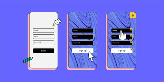
What is a Prototype?Before we begin, it’s important to define a prototype. Many people confuse prototypes with static wireframes and mockups.
Prototypes use wireframes and mockups with clickable elements to simulate interactions and user flows.
UX teams might even create low-fidelity paper prototypes in the early design stages to demonstrate how a user might navigate through a product.
Low-Fidelity Prototyping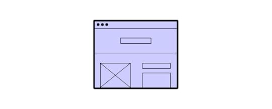
Whether UX designers use paper or digital wireframes, low-fidelity prototyping is the first step in testing design ideas and user flows.
Low-fidelity prototypes are either hand-drawn or basic digital wireframes without color or content. These low-tech designs allow UX teams to visualize each screen’s layout, test navigation, and experience user flows.
A great example of a digital low-fidelity prototype is a typical eCommerce checkout flow. After creating a wireframe or low-fidelity mockup, UX designers will use buttons or links to connect each screen and create a checkout flow.
The checkout flow might look something like this:
home page > product page > cart > payment/checkout > confirmation > thank you.
Using a low-fidelity prototype, UX designers can experience the checkout flow—ensuring each screen has the correct elements and the user can navigate forwards and backward throughout the flow.
Types of Low-Fidelity Prototypes Paper prototypes are the fastest way for teams to create user flows and imagine interactions. Paper prototyping is particularly beneficial during design sprints when teams have limited time to develop flows and iterations. With paper “screens” laid out on the desk or whiteboard, teams can visualize flows together, allowing effective collaboration and idea-sharing. None of the elements are clickable, but paper prototypes enable teams to design screen layouts and flows, reducing the time needed to create initial digital wireframes. Clickable wireframes are a low-fidelity digital representation of how screens and flows. Each frame will usually have simple lines and shapes with a prominent CTA for navigation. Modern UX tools like UXPin enable teams to collaborate effectively with comments, replicating the energy and excitement of a paper prototyping session.Pros of Low-Fidelity PrototypingDesigners can make low-fidelity prototypes fast! This speed allows designers to make quick changes during testing or meetings to visualize fresh ideas.Low-fidelity prototypes are time efficient – inexpensive, which means teams can test multiple variations and iterations at a low cost.Anyone can create low-fidelity prototypes because they only use simple lines and shapes—even non-design team members can provide valuable input.Cons of Low-Fidelity PrototypesDue to the basic layout and functionality, low-fidelity prototypes don’t provide accurate results during testing. Stakeholders might also battle to visualize the final product resulting in poor feedback or confusion.Without color, interactions, transitions, or animations, low-fidelity prototypes can feel dull and underwhelming.High-Fidelity Prototyping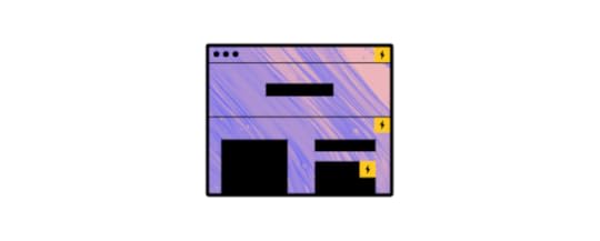
High-fidelity prototyping is where a product begins to take shape. Using mockups with color and content, designers can create hi-fi prototypes that look and function as close to the final product as possible.
Now designers can add interactions, transitions, and animations to create an immersive user experience—making high-fidelity prototypes perfect for usability studies and presenting to stakeholders.
If we go back to our eCommerce example, designers can include product images and colored CTAs to entice users down a particular flow—like completing a checkout.
UX designers can also add interactions, like an overlay showing the user’s cart when adding a new item. They might also add screen transitions to indicate a user’s movement through the checkout flow.
Types of High-Fidelity PrototypesA high-fidelity prototype using mockups gives users an accurate sense of how a product will look and function. The designs will include color and content, while every link and button should work as it would in the final product.A high-fidelity prototype using code takes prototyping one step further. For example, with UXPin Merge, designers can use React or Storybook components to create prototypes that function exactly like the final product. Research teams using prototypes from UXPin Merge get better results from usability studies and testing and cut down time to market.Pros of High-Fidelity PrototypingHigh-fidelity prototypes provide meaningful feedback during usability studies because participants can interact with the prototype like they would the final product.UX designers can test interactions, animations, and transitions.Hi-fi prototypes provide stakeholders with an accurate representation of the final product. These prototypes could help startups get early-stage funding or pitch product concepts to clients.Cons of High-Fidelity PrototypesUX designers must spend more time making changes with greater detail, so high-fidelity prototypes cost more to produce.Without clear objectives, UX designers can get distracted trying to find the “perfect” interactions, animations, or transitions while creating high-fidelity prototypes. This fixation could lead to unnecessary delays.Which Prototype to Use and When?Now that you have a solid foundation of high-fidelity vs. low-fidelity prototyping, we can begin to explore which you would use and when.
When to Use Low-Fidelity PrototypesLow-fidelity prototypes are best for the early stages of the design process. UX teams can use paper prototypes before they even sit down at the PC. These low-tech paper designs are also great for collaboration and exploring lots of ideas at speed—perfect for design sprints!
Digital low-fidelity prototypes help UX teams organize information architecture and user flows before committing to mockups.
When NOT to Use Low-Fidelity PrototypesUnless you’re testing basic user flows, low-fidelity prototypes do not provide meaningful feedback during usability studies. Users might get distracted by the unfamiliarity of the product and thus focus on the wrong elements.
When to Use High-Fidelity PrototypesUX teams should only move from lo-fi to hi-fi prototyping once designers have completed mockups to complete at least one user flow for testing.
These mockups must include clickable links and elements, color, and content—but might not require interactions, animations, and transitions for the first round of usability studies.
High-fidelity prototypes are helpful for testing layouts and how page transitions or scrolling might affect content and elements. UX designers can also test how interactions, animations, and transitions affect the user experience.
High-fidelity prototypes should be the last stage of the design process before handing over to engineering.
When NOT to Use High-Fidelity PrototypesUX designers must not build high-fidelity prototypes before researchers have thoroughly tested lo-fi prototypes and created mockups with content, and color.
If teams want to test design concepts fast, creating and editing high-fidelity prototypes will severely hamper progress.
UXPin – The Best Prototyping ToolUXPin provides design teams with powerful tools for prototyping at every stage of the design process.
Teams can preview prototypes in the browser or scan a QR code to preview prototypes on any mobile device using UXPin Mirror—great for getting feedback from usability participants and stakeholders using multiple devices.
Lo-Fi Prototyping in UXPinUX designers can design beautiful wireframes quickly with UXPin’s pre-built form fields and icons—create buttons, input fields, dropdowns, radios, checkboxes, icons, and more with just a few clicks.
With your wireframes complete, you can create basic lo-fi navigation between pages with tap/click interactions. Achieve vertical or horizontal scrolling with a single click.
With your lo-fi prototypes complete, you can preview your design in the browser or test on any device using UXPin Mirror.
Provide feedback and assign changes to designers using UXPin’s comments feature. Designers can create private notes for themselves and click resolve once complete.
Hi-Fi Prototyping in UXPinWith lo-fi prototyping complete, UX teams can begin high-fidelity prototyping in UXPin.
If you have ever worked with Figma, Adobe XD, and other popular design tools, then you’ll LOVE the added functionality UXPin provides—enabling you to take your high-fidelity prototyping to the next level and beyond!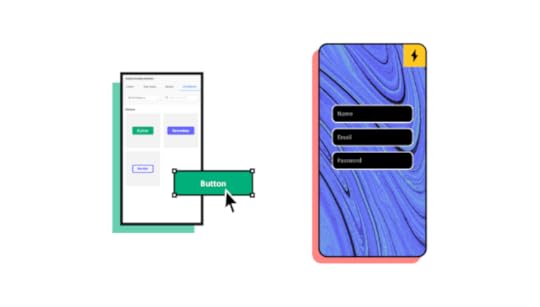
Create reusable components to maintain consistency and build page layouts fast! If you need to make changes, simply edit the master, and the changes copy to all child components.
UXPin’s variables feature allows you to store data from user inputs and take actions based on the data provided. For example, on a signup page, the user enters their name. On the next page, you can use the name (let’s say John) to personalize the experience—Welcome to UXPin, John!
You might also want to store dummy credit card details so users can get a clearer sense of how the product will capture and display credit card information at checkout.
UXPin Merge lets DesignOps take prototyping beyond the next level! Design high-fidelity prototypes with React components from your Git repository or any components from Storybook.
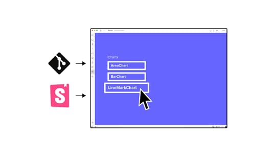
Create functional and interactive elements generated from production code to give usability participants, stakeholders, and clients that “final product experience” you can’t get from other design tools.
Start Prototyping with UXPin TodaySign up for a 14-day free trial and experience the endless possibilities of prototyping with UXPin.
The post High-Fidelity Prototyping vs. Low-Filedity Prototypes: Which to Choose When? appeared first on Studio by UXPin.
September 14, 2021
DesignOps – How to Improve Your Design Workflow and Operations
With the fierce competition on the market, hiring top design talent is no easy feat. However, bringing a group of experienced, skilled people into one place is only part of success. Among others, to build a thriving product design team you must also invest in design operations (also known as DesignOps).
In this article, we’ll explain what DesignOps is and how you can use it to improve the digital design system in your organization. We’ll discuss areas such as cross-team collaboration, goal setting, and information exchange systems, along with using the right DesignOps software.
Ready? Let’s begin.
What is DesignOps?
DesignOps (short for Design Operations) refers to the optimization of processes, people, and technologies to improve the product’s design and business value. Among others, it circles around:
building a team of people with the right skillset and common purpose,reducing operational inefficiencies, such as miscommunication or silos,and – perhaps most importantly – building efficient design workflows.DesignOps is a relatively new term, which is why you might be wondering – how did it come to life?
In the past, designers used to wear many hats. They did the UX research, wrote UX stories, wireframing, and even the frontend coding. While this approach might still work well for small teams, it is unproductive at scale. Here’s where DesignOps comes in, helping orchestrate teamwork and building clear structure and roles.
That being said, DesignOps isn’t an isolated, ‘design-team-only’ exercise. It requires lots of information sharing with other stakeholders (especially, software developers). By following a set of practices, your designers can enhance the quality of these interactions and focus on effective goal completion.
Why is design operations gaining more ground?
For starters, both business and customer requirements are becoming more complex (which also means that clients are also becoming more unforgiving). According to a report by PwC, one in three customers will leave a business after just one bad customer experience. Unsurprisingly, the challenge to keep up with client expectations also accelerates product development life cycles. And, as teams try to keep up with a growing workload, there’s the risk of miscommunication among designers and between designers and developers.
Teams might work in isolation on the basis of inconsistent requirements, which negatively affects the delivery timelines and, ultimately, the UX. DesignOps practices help companies to overcome these blockers and create harmony between design and development teams.
Let’s now take a closer look into the role of DesignOps Management.
The Role of DesignOps
The main role of design operations management is to protect the time of the design team so that they can focus on doing their jobs without obstacles or distractions. Here is how this role plays out day-to-day:
Operations managementThis role involves creating a clear design roadmap of what the long-term goals of the design team are and how they can be achieved. It is also their job to assess the headcount of the design team and identify any skill gaps.
Process designDesignOps plan and manage the design process by creating design systems and mapping out the design tools that the team needs. They create the frameworks of how the design team should collaborate with other teams within the organization.
Project managementThey are in charge of design workflows and assign projects and set timelines. The DesignOps team schedules daily stand up meetings to find out the progress of design projects. They also organize and run design sprints.
Creating a communication strategyThe design operations manager acts as the liaison between the design team and the rest of the organization. They evangelize the importance of design and set team meeting agendas. DesignOps creates a system for storing all the files and resources that the design team needs for easy retrieval.
Onboarding new hiresThey orient new staff, train them, and ensure that they fit into the design team. Hiring new design staff is also part of their mandate.
Building the culture of the design teamThe DesignOps team organizes workshops and training for the professional development of the design team. They also provide professional and emotional support for designers within their team and organize team-building activities to create a sense of community in the design team.
Budget allocation and controlDesignOps establishes how much it costs to run the design team and justifies these costs. Once the budget is approved, they are in charge of how it is distributed within the design team.
LegalWorking with the legal team to create NDAs and participant release forms that are used during user testing
Managing the procurement processLiaising with the procurement department to streamline how the design team makes purchasing decisions.
IT and SecurityComing up with the technological roadmap of the design team and working with the IT department to ensure the compatibility and security of design tools.
Tips to improving your design workflow and operationsWith the above in mind, let’s now discuss some tips that will help you improve DesignOps practices in your organization.
1. Let your designers focus on designingWhile it might seem like a no-brainer, as mentioned earlier, some companies still expect designers to play multiple roles. Sometimes, a single designer conducts user research, designs the information architecture, UI, and handles UX writing. While this approach might be effective if you’re a small team or an early-stage startup, bear in mind that it’s not a scalable approach. In the long run, burdening designers with other tasks may hamper the quality of their work.
2. Check the efficiency of your design processOrganizations use various product design and development methods. Some organizations might follow the Design Thinking process, while others might focus primarily on Google’s Design Sprints.
The bottom line is making sure you’re applying the best methodology out there.
With DesignOps, you can find and eliminate inefficiencies in the design workflow. This lets your design team achieve more with less time and resources. As a result, by optimizing work and team performance, you might avoid unnecessary hiring.
3. Use tools for effective remote product design collaborationsWhile, at small organizations, collaboration between designers might happen organically, it’s not the case with larger (and, especially, remote) teams. To collaborate effectively, it’s important to equip your designers and other product development team members with the right set of tools. Here’s where DesignOps software brings immense value.
UXPin’s Merge is one such tool. For starters, your designers can use UI components imported from your software developers’ Git repo or Storybook. Instead of spending time on creating prototypes from scratch, they can design directly with elements made with real-life code. This way, your team can focus more time on the actual design and maintain consistency with the coded product.
That being said, tools are just part of the puzzle – the remaining element is following the right communication practices, which we discuss next.
4. Establish collaboration routinesCollaboration routines, such as daily standups or weekly meetings, encourage your designers to share regular status updates and – if needed – ask for support.
An example of how you can instill effective collaboration routines comes from none else but Google. Sophia Chiu, who started off as an intern and now works as an Interaction Designer for the tech giant, says that routines helped her find common ground with the rest of the team. Each week, UX specialists have the opportunity to present their design iterations in front of others and engage in a brainstorming and feedback session. After working in a modest group, they are then given the option to share their designs with the entire, cross-functional product development department.
This is just one of the many ways you can create an open communication flow among your team members.
5. Make sure that all designers have a clear career path for progressionWhile hiring people with the right skillset is not an easy task, retaining them is even harder. Fortunately, DesignOps practices can help to tackle these challenges by creating clear career development paths. As the design process matures, the team can feature more specialized roles which will enable designers to acquire new skills. All the while, more experienced individuals will get the opportunity to be promoted to more senior roles.
6. Encourage designers to work collaboratively
Pair programming is frequently used among developers as a way to reduce bugs and errors. In DesignOps, designers can adopt similar models to enhance the efficiency of the design process.
Here are three such pair designing models.
Generator and synthesizerIn this model, two designers are paired together to try to generate as many designs as they can. At the same time, they evaluate and synthesize them to create the best one. One designer, i.e., the ‘navigator’, focuses on brainstorming and generating ideas. Meanwhile, the other designer acts as the ‘synthesizer’, and analyzes and raises questions to validate the designs. This approach can help the pair of designers to come up with ideas and evaluate them effectively.
Cross-disciplinary pairingThis method is appropriate for product development team members who specialize in different disciplines. It can be used by both designers and non-designers. For example, when designing for an extremely specialized sector, the designer can pair with a domain expert who can provide valuable insights for the design.
A designer can also pair with a front-end engineer in the so-called cross-disciplinary pairing. It will provide the designer with an opportunity to experiment with the real-life, coded UI rather than a wireframe.
Pair sketchingDesigners can use the pair sketching method to develop wireframes together. In this model, one designer takes the role of the navigator and describes the concept, while the other creates the sketches accordingly. Next, they can switch roles and repeat the same process.
7. Set clear goals for the design teamClearly communicating the company’s or project’s goals can act as a great motivator for the design team. After all, it helps them to understand the significance of their contribution.
Objectives and Key Results (OKRs) are one way of achieving a sense of greater, cross-team purpose.
Individual (i.e., per-employee) OKRs will help your designers see how their work objectives fit as an element of the greater design puzzle. As a result, they’ll know how their work contributes to the overall outcome of the project.
That being said, it’s also important to measure goals’ achievement progress. A metrics dashboard displaying progress within the team will help keep team members motivated and understand where they might be falling behind.
8. Create a cross-team information sharing systemRemoving silos is arguably the top most important reason for building out information sharing systems as part of your DesignOps strategy. To illustrate its importance, let’s once again refer to an analogy from the software development operations’ world.
Michael Mazyar of Samanage makes a great point of stating that “within silos, the development team might not report a software bug to operations out of fear of being reprimanded. Without an honest and open information sharing system, workflow is not only delayed, but the potential for misinformation increases.”
The same could potentially happen within your design team, who might not inform others of an ongoing situation. For instance, if they were to encounter a usability glitch, your developers, designers, and operations should all get together to discuss a number or areas, for instance:
With a clear cross-team information communication system, you’ll be able to proactively identify and rectify problems with minimum impact on the end-users.
9. Consider creating a shared vocabulary
A typical content marketing team has a set of editorial guidelines they follow which helps them communicate effectively, and retain the right communication standard. Similarly, design teams should adopt a set of guidelines and a common design language to retain consistency across all their projects.
As an example, Airbnb has adopted a DLS (Design Language System). It consists of a set of components that comply with clearly established principles and patterns. DLS enables all employees to use a shared vocabulary understood by all departments within the organization. This greatly enhances the quality of communication while eliminating ambiguities and discrepancies.
SummaryThe number of challenges that companies face today is growing; customers become more demanding, new products are launched faster, while product life cycles shorten. One of the ways to tackle these challenges is by introducing DesignOps. Not only will it improve your design workflow, but it will also let designers focus on what they do best i.e. design products. All of this will help you build products and services that perfectly correspond to clients’ needs and that are intuitive to use which will positively impact the user experience. If you’re looking for a tool that will improve your design workflow by making collaboration between your designers and software engineers smoother then check out UXPin Merge.
Discover MergeThe post DesignOps – How to Improve Your Design Workflow and Operations appeared first on Studio by UXPin.
September 13, 2021
Best React Open-Source Projects for Beginners

Of all the frameworks out there, React may be the best choice for beginners. React can do what other frameworks can, but it doesn’t obscure your code. It is easy to learn and equally easy to master, as opposed to some other frameworks which can sometimes be difficult to understand. Software development is one of the fastest-growing industries around the world and contributing to open-source projects is an excellent way to improve coding skills in general aside from tutorials.
Getting started with React is a great way to start building web apps and it’s easy to learn for beginners thanks to a huge community of developers and free tools to make development faster. There are many great open-source projects that are available for free so you can start playing around with React.
If you are a UI developer who likes playing around with HTML, and wants to get deeper into styling with CSS, and JavasScript to create visually impressive web and mobile app interfaces with high interactivity, this is the way to go. You might be thinking of Vue or Angular but React is your best option since it is the most beginner-friendly and currently the most popular javascript library.
These help people learn how to use React to build simple web apps and e-commerce websites or just learn the basics and reuse the source code and React components for a project at work, practically as a template, so you can be more efficient at your work. It will also help you generate project ideas if you want to create a personal project to show off your skills and boost your portfolio.
What makes a React open-source project good?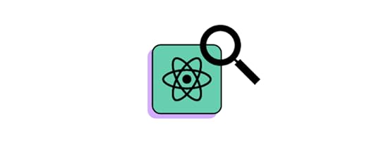
Choose a project that will keep your needs fulfilled. Avoid picking an open source project that’s too uncomplicated to change or debug. Find a project that you think will look appealing and useful to others.
1. Best Practices In The IndustryOpen source projects can serve as guidance in front-end development and UX design to new and seasoned developers, especially when working with React is a big advantage in a startup environment that is working on cross-platform app development projects that requires an all-around when it comes to both front and backend dev.
2. Improve Your SkillsSharing your knowledge, experience, and code with others (while they share the same in return) can prove quite a unique and effective method of learning new things.
3. Networking And Self Promoting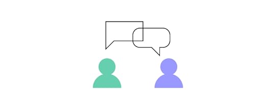
Being a part of an active open source community is also often a great way to polish your skills! Taking opportunities to get acquainted with other open source developers can help you build and establish a reputation for yourself within your targeted field.
How To Choose Worthwhile React Open Source ProjectChoosing the right project can be tough if you don’t know where to start looking. However, to be certain of selecting an appropriate open-source project in the React ecosystem, keep these things in mind:
1. Active CommunityIt turns out that it is crucial to discuss the project with someone if a difficult problem appears that needs resolving.
2. Project Popularity (think GitHub)If there’s a lively community of contributors working on open-source React projects. You can be sure that the project has grown in popularity and there will be thorough documentation to help you out along with plenty of help from other contributors.
3. Organized Documentation
The last piece of the puzzle to look for in an open-source React project should be clear and concise documentation so you can read up on any issues with a specific codebase or library.
Best React Projects for BeginnersIt is crucial to learn the basics before diving into more complicated projects. Before you learn the fundamentals of how to build a site, it’s best to have a good understanding of the tools you will be using.
1. React Bootstrap Source
React Bootstrap is available for free and it’s a powerful tool for building production-ready apps. If you’re looking for best practices for building the front-end framework for your project, check out React Bootstrap! It’s a great starting point for anyone looking to add interactivity and responsiveness to their app. React Bootstrap gives you the freedom to choose how you want to build your app. You have the option of using the framework by itself or using it as a starting point for future integrations. Whether you’re looking for inspiration or you need a new tool to work with, React Bootstrap is a great option.
2. User Interface React Select Source
The team behind React.js has made a UI experiment for select inputs. See how it works and learn how to develop your own version. When it comes to making an application, it’s important to have a good user interface(UI).
Re-select is a library that allows people to select options from a list. This is a great tool for people who are building websites or web applications. It has many different features that make it easy for developers to create a rich user interface. The best part is, it’s open-source and available for free on Github.
3. Storybook Source
Storybook is an open-source tool that allows you to develop UI components in isolation. One of the many benefits of this tool is that it doesn’t require a lot of overhead since it runs outside of your app and on a separate page. This helps you focus solely on the development process without worrying about application-specific dependencies. Storybook creates test-driven projects by keeping track of different states or variations and helping product developers visually implement changes in each example without starting from scratch every time based on the end goal or specifications they must abide by.
4. Draft.js Source
Draft.js is a library you can use to create a new open-source project. It’s used for writing markdown and transforming it into a wide range of formats. You can take what you’ve written, and export it to a website, PDF, ePub, or a blog post. It’s used for web and mobile development and is easily customizable with a vast library of plugins and components. It’s maintained by a small group of developers, and the community is very active in creating new plugins.
Use React components in designHow about saving some time and reusing your React UI components in the design stage? Now, with UXPin Merge, you can connect our prototyping tool with any Git repo where you store the UI code or directly to Storybook. Then, simply bring the components to the design tool so that UX/UI designers can work with them in the design process. The benefit? You don’t need to code the component from scratch – just copy and paste the ready code from the Spec Mode in UXPin design editor. The whole product development process gets easier and designs get in line with the standards!
ConclusionGetting started with React.js can be overwhelming at first. And so, if you’re just starting out with coding, we highly recommend looking into open source projects on GitHub.com as a way to dip your toes in UI development and UX design or get adept at iOS web apps, and maybe even tackle full-stack dev. You can learn a lot by working on a project that’s already been developed by other people & take your web development skills to the next.js level (pun intended). Want to include your React components in the design process? Get Merge technology.
Discover MergeThe post Best React Open-Source Projects for Beginners appeared first on Studio by UXPin.
September 10, 2021
Top 10 Good Website Designs
Good website design must accomplish many functions—it’s an advertisement, but it’s also a tool. A website sells products and services, but it’s also a tool to acquire customers and educate users.
All of these examples provide a service to the user, so a good website starts with a user-centered design.
UXPin is a powerful collaborative design tool for web designers to create beautiful websites. Get a 14-day free trial and start designing better websites with UXPin today!
What is Good Website Design?Good web design starts with two questions, “what is this website for?” and “who is this website for?”
Understanding the who and the what will enable you to design a website that best serves the user.
For a website to stand out, designers must use creativity but not at the expense of usability and utility. There’s a fine line between form and function. You want to impress visitors, but your web design must allow users to navigate to their end goal easily.
How Good Website Design Delivers ResultsGood web design must perform across multiple metrics, including conversion rates (sales, email signups, etc.) and SEO.
And, to make things even more challenging, you have 15 seconds to grab the user’s attention and steer them towards a conversion. According to Crazy Egg, an industry-leading analytics tool, 15 seconds is the average time spent on a website.
Whether you’ve invested in content (SEO) or paid ads, you must ensure you optimize your web design for conversions. You must grab the user’s attention immediately and provide directions to solve their problem fast. And, you gotta look good doing it!
Designers must also consider responsive design and how a website will look and perform across multiple devices and screen sizes.
10 Best Website Designs for 2021We scoured the internet to find our 10 best website designs for 2021. We looked at how designers used visual assets, color palettes, and typography to deliver a strong user experience while exercising creativity and maintaining brand identity.
We also considered each website’s call to actions (CTAs) and how the web design might inspire users to take action.
Fipadoc – France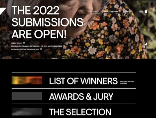
Fipadoc is an international film festival in Biarritz, France. The website features a unique design with extra-large sans-serif headings to draw the user’s attention to take action.
Designers use smaller sans-serif typography for less important CTAs, but use a small rectangle to the right of the text to indicate a link. There are no buttons on the Fipadoc website, providing a clean aesthetic while elegant animations enhance the user experience.
The Fipadoc website features a black and white color palette with full-color images and video to create an engaging and immersive user experience—the perfect web design for a documentary website!
Spotify Design – Sweden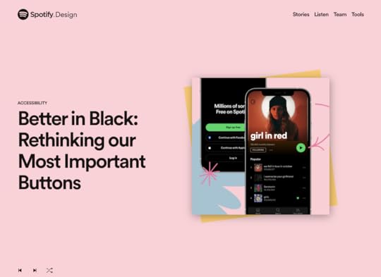
The Spotify Design website is an absolute gem to explore if you’re into art and pop culture! The vibrant colors and abstract shapes create excitement and intrigue that’s irresistible to explore.
The Spotify Design website is a window into Shopify’s global design team and how they create the streaming platform’s visuals and user interfaces.
The web design is clean with bold san-serif typography and large headings for CTAs. Spotify Design uses animations when loading a page or highlighting CTAs, like the eye-catching footer email signup. Every element and animation has a clear intent serving to guide the user through the website.
Slate Milk – United States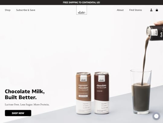
Slate Milk is a lactose-free, protein-rich chocolate milk brand. Their e-commerce website is a wonderful example of on-brand web design.
Designers have captured Slate Milk’s brand image perfectly with color, custom animated icons, and bold typography. The website uses animations intelligently to draw the user’s attention to the product’s benefits.
Slate Milk’s product pages closely resemble the product itself, elevating the brand and making the website appear more professional. This professional aesthetic also helps establish trust with the user, which ultimately benefits conversion rates.
HALEYS – United States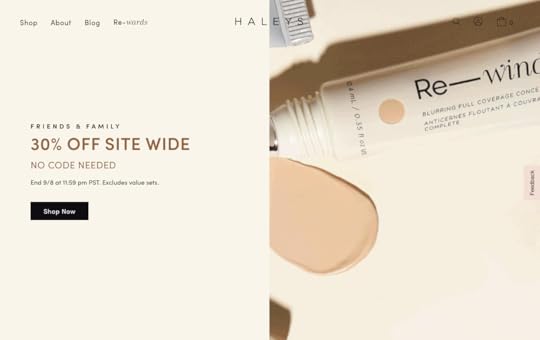
HALEYS is a female-founded cruelty-free beauty brand from the United States. The website’s home page has an immersive scrolling effect taking the user on a journey through the brand and the product. Designers use a clever hero image where the model’s eyes steer the user to the “Shop Now” CTA.
The website’s color palette features earth tones to complement the brand’s cruelty-free, wholesome image. An elegant, custom icon set helps strengthen this brand image. The typography matches the product beautifully—a bold san-serif font with serif accents for product names.
HALEYS also does a fantastic job of using high-quality products and lifestyle images. Using a diverse mix of models, HALEYS demonstrates that the brand is fully inclusive with a product for every skin tone.
Wisr – Australia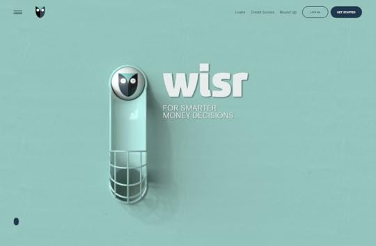
Wisr is an Australian financial service company. In a highly competitive market, Wisr has intelligently used web design to separate itself from the competition.
The Wisr home page is one of the most innovative website designs we’ve seen, where users follow an animation as they scroll down, reading snippets of the company’s product offerings with relevant CTAs. It’s a truly immersive experience that instantly envokes interest and trust in the brand.
Even though Wisr uses several vibrant colors, the navy blue CTAs always stand out. The menu’s full-screen overlay allows the user to focus on the navigation and find precisely what they’re looking for. A light san-serif typeface helps deliver clear messaging and instructions to the user.
The unique page transitions and interesting scrolling effects provide interest and excitement, something you wouldn’t usually say about personal finance!
Krave Jerky – United States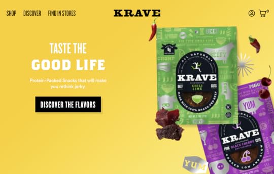
Krave Jerky‘s website design captures the brand’s fun, energetic spirit wonderfully. The bright colors and prominent CTA’s help steer users toward checkout in an entertaining, interactive flow.
The large plus icons and vibrant hover effects for products on the shop page encourage users to add multiple mouth-watering flavors to the cart. The bright colors complement each product’s packaging, strengthening the brand experience.
Most of the website features a san-serif font with a custom typeface for product names or brand name. Custom bulky icons help give the web design professionalism and originality.
Singita – South Africa
Singita is a luxury resort group dedicated to “sustainability, environmentally conscious hospitality and the empowerment of local communities.”
The website’s earthy color palette and a mix of light san-serif for the copy with elegant serif headings complement the brand’s image. The home page features a soft scroll effect with HD images and video to tell the brand’s story and what guests can expect from a Singita African safari experience.
The website uses an off-white background with dark text using the brand’s light brown color for CTAs. As you scroll, a booking form appears, encouraging the user to explore and book one of Singita’s many African safari destinations.
Everything about the Singita website design exudes premium luxury, which closely aligns with the brand’s high-quality visuals and exquisitely furnished properties.
Au Club Alpin – Switzerland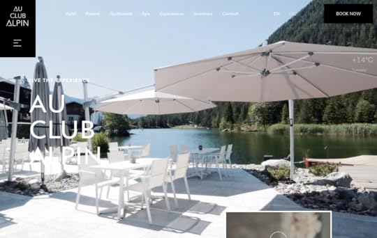
Au Club Alpin is a Swiss resort with stunning Alpine scenery and luxury heavy wood accommodations. Designers have done a fantastic job capturing the resort’s atmosphere above the fold with short video clips and a prominent call to action to book a stay.
The Au Club Alpin web design uses black and white with slate grey accents, mimicking the resort’s minimalist luxury aesthetic. At the same time, custom icons enclosed in large boxes showcase Au Club Alpin’s activities and facilities.
The website uses beautiful pictures and videos with a vintage filter to support the brand’s rugged luxury aesthetic.
Superlist – United Kingdom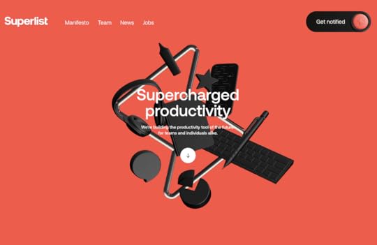
Superlist is a UK productivity startup “building the productivity tool of the future.” The futuristic loading sequence and website design with mouse tracking effects and scrolling animations help confirm the brand’s innovation statement.
The website features a blend of black-on-white and white-on-black with orange accents to attract users to important information and CTAs. Superlist’s minimalist sans-serif typeface complements the brand while delivering a clean, professional aesthetic.
Sneak in Peace – United Kingdom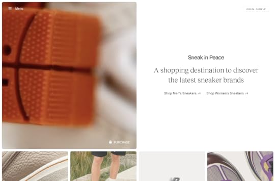
Sneak in Peace is a premium sneaker merchant in the United Kingdom where customers can find the latest (and unreleased) sneakers.
The clean and elegant home page shows a featured product with an attractive video sequence above the fold along with CTAs to men’s and woman’s sneakers. A sleek serif typeface establishes Sneak in Peace as a premium sneaker brand.
Immediately below are more featured collections, including “Upcoming Launches” to get the user shopping as quickly as possible.
The clean layout and original product photography help establish Sneak in Peace as a premium, trustworthy brand. Clicking on any product opens a slide-in with the product’s details and more images.
Sneak in Peace uses a black and white website design with the only color coming from the high-quality product images—effectively drawing the customer’s attention to the website’s premium offerings.
Final Thoughts on Good Website DesignWe hope this article provided some fresh ideas for good website design. With multiple pre-installed canvas sizes, UXPin makes it easy to design beautiful, fully responsive websites.
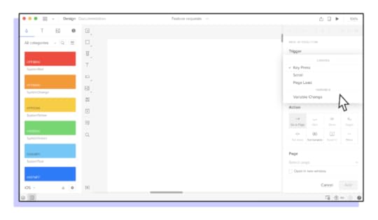
UXPin also allows designers to set up Key Press, Scroll, Page Load, and many more interactions to visualize how the final website will perform.
Take your website design to the next level with UXPin—get a 14-day free trial and start designing better websites today!
The post Top 10 Good Website Designs appeared first on Studio by UXPin.
September 9, 2021
Designing with Parallax Scrolling: The Do’s and Don’ts
Parallax scrolling is a creative tool for designers to create 3D experiences on a two-dimensional screen. The parallax scrolling effect can add depth and dimension, giving the user an immersive, engaging experience—something brands constantly strive to achieve!
What is Parallax Scrolling?Parallax scrolling is a web design technique where elements appear to be moving at different speeds to produce a 3D scrolling effect.
Similar to the depth perception of driving in a car where close objects pass by the vehicle fast while things in the distance pass slower.
There are several types of parallax scrolling patterns, but they all use separate layers of content to produce the desired effect. By setting different scrolling speeds for each layer, designers create the illusion of objects moving around the screen as the user scrolls.
Want to create a parallax scroll in your design? It’s easy in UXPin! Get a 14-day trial and see how to do it quickly.
A Brief History of Parallax ScrollingParallax scrolling dates back to the 1930s as a motion picture technique for animated films like Disney’s Snow White and the Seven Dwarfs. In the early 1980s, video game designers used parallax scrolling to create 3D effects for 2D games, most notably 1981’s Jump Bug.
It wasn’t until 2007 that parallax scrolling made its web design debut using Javascript and CSS 2 on Internet Explorer 6. With the introduction of HTML5 and CSS 3 in 2011, parallax scrolling effects became easier to produce and thus grew in popularity.
Today parallax scrolling can be incredibly complex, where web designers create immersive visual experiences.
When to Use Parallax ScrollingAlthough it’s a highly effective tool for creating unique user experiences, designers must consider the downsides of parallax scrolling—it can have adverse effects!
Page SpeedParallax scrolling is a page speed killer, especially for websites on shared hosting plans. According to Google, two seconds is the threshold for eCommerce websites. But for most other websites, the average is between 3-6 seconds.
So, when it comes to eCommerce, what are your goals? To impress the user with your web design skills or sell products? Unless you’re able to optimize your page speed, you might want to avoid parallax scrolling for eCommerce or websites where speed matters.
Check out this article on how to improve page speed for parallax scrolling .
How Does it Affect the Content?Another question you must ask before adding a parallax scrolling effect is, how does it affect the content?
For example, on the Collage Crafting website, designers chose to add a parallax effect for the point of sales outlets.
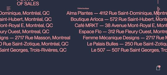
But it’s difficult to read some of the content as it gets cut off at the top and bottom as you scroll. This isn’t a good user experience as the user cannot consume all of the content properly.
If you need users to read your content, keep it simple! There are other ways designers can present content to users and still maintain legibility.
Does Your Parallax Scrolling Effect Distract or Annoy the User?Parallax scrolling has its place. For a creative agency, it makes sense to impress potential clients with your web design skills.
But if I’m looking for car insurance quotes, do I really want to waste time scrolling through some fancy parallax effect to get to the quotation form? Probably not!
For competitive industries where users want information fast, parallax scrolling could adversely affect bounce rates and conversions.
Always think about the content, context, and how the website is trying to serve the user.
9 Examples of Great Parallax ScrollingWe’ve found ten great examples of parallax scrolling. One theme that stands out for most of these websites is how designers have used parallax to help tell a story.
As you will see from these examples, parallax can be a powerful storytelling tool, but it takes a lot of careful thought and planning.
NIIKA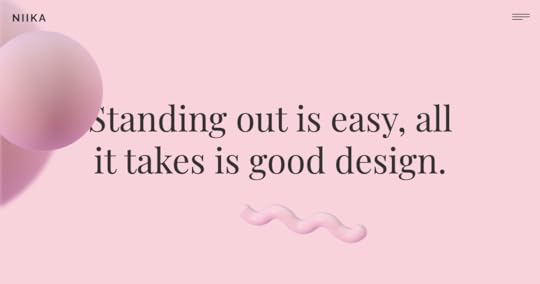
NIIKA is an Australian-based creative agency. The hero image features a beautiful abstract design with some subtle movement. Abstract objects move about the page while large moving headlines display the agency’s services as you scroll.
Further down, another parallax scrolling effect uses a custom map fixed in the background with the agency’s contact details scrolling over the top.
NIIKA also uses a parallax effect for its “WORK WITH US” call to action near the footer.
Even though NIIKA uses a lot of copy in its parallax scrolling, you never lose critical information or messaging.
CANN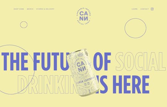
CANN is an American cannabis-infused tonic drink producer. The website uses an immersive, seamless parallax scrolling effect to tell its brand story.
The developers have done a fantastic job optimizing CANN’s website to accommodate such a complex parallax scrolling effect.
The copy and content are legible, and the parallax effect helps tell the brand’s story, complete with bubbles representing an effervescent tonic. The web design also uses color effectively to represent CANN’s three flavors.
Web designers have also done a fantastic job with CANN’s store, ditching fancy effects to optimize the design for conversions.
Toy Fight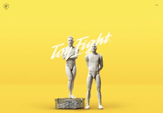
Toy Fight is a UK-based creative agency. The website features a simple yet elegant parallax scrolling effect on the home page, with a clear call to action appearing in the center of the page.
Toy Fight uses a parallax effect on each page to transition from the hero into the page’s content. These transitions are clever because the animations are somewhat silly, while the rest of the content explains the company’s services and past work—almost like pulling back the curtain.
Toy Fight’s website is a fantastic example of how parallax scrolling can help tell a story.
GardenGarden is an award-winning Portuguese design studio. The website uses a beautiful parallax effect for the hero image of a garden sunset with the sun going down as you scroll.
Further down, lines and icons appear as if being sketched as you scroll. The subtle effects draw your eyes to important information, like Garden’s services and headlines.
Smart Move
Smart Move is an initiative to attract and retain expertise in the Greater Örebro Area in Sweden. The website’s home page features an impressive horizontal parallax scrolling effect showcasing Örebro’s features and culture with relevant links to each.
The parallax effect cleverly takes you through several Swedish settings, including nature, commerce, home life, entertainment, and nightlife.
Bertani Wines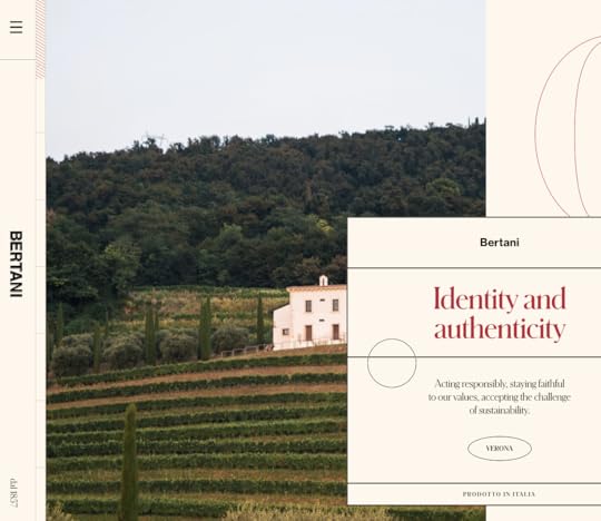
Bertani is an Italian winemaker. The website features a horizontal parallax effect with images, videos, and copy to tell the brand’s story.
The effect uses a mix of horizontal and vertical movement to take you on a journey through the brand, its vineyard, and its wines. Bertani’s designers have done well to balance a complex horizontal parallax effect with compelling storytelling. Everything makes sense, and the messaging stands out.
Quentin Goupille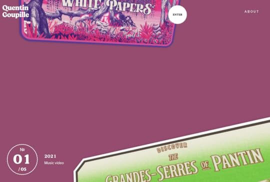
Quentin Goupille is a freelance art director, illustrator & filmmaker from Paris. His portfolio uses parallax scrolling effects to help tell the story behind each project.
Each page is different, and Quentin uses parallax effects to take the user on a journey through each of his films. The result is impressive as it helps showcase Quentin’s storytelling and creativity.
Quentin Goupille’s website is an excellent example of how creatives can use parallax effects to showcase their work in a unique and engaging way.
Crazy About Eggs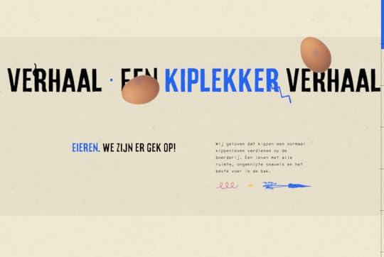
Crazy About Eggs is a Dutch egg farmer passionate about free-range and ensuring their chickens live a healthy farm life.
The website uses subtle parallax scrolling effects to introduce small elements and subheadings. The company’s egg boxes remain static as you scroll to halfway while the product’s benefits scroll on either side.
This is an incredibly creative way to keep the brand front and so that the user becomes familiar with the product. Next time the user is in the supermarket, they’ll likely recognize Crazy About Eggs’ packaging.
Kibana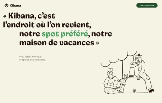
Kibana is a resort in France with accommodations, events spaces, gardens, a market, and other outdoor experiences.
The hero image features a text introduction. As you scroll, you’re immersed into one of Kibana’s beautiful gardens and instantly wish you were there!
As you scroll further, subtle movements draw the user’s attention to Kibana’s key features and beautiful images. Near the footer, designers use a clever parallax effect to introduce Kibana’s team.
SummaryParallax scrolling is a powerful tool, but designers must use it to help tell a story rather than frivolous animations to impress users. Using parallax as effectively as the examples we showcase above takes a lot of time, collaboration, and planning.
Always keep the user’s needs in mind and don’t use parallax effects if they adversely affect the user experience.
Using UXPin to Design Amazing User ExperiencesUXPin is a powerful collaborative design tool, allowing you to invite the entire team to contribute to a project’s success. UX designers can use UXPin to design immersive visual experiences and user interfaces.
Start creating beautiful user experiences with a free 14-day UXPin trial today!
The post Designing with Parallax Scrolling: The Do’s and Don’ts appeared first on Studio by UXPin.
September 8, 2021
What Is ResearchOps and Why Is This Role So Useful
ResearchOps is an emerging practice in the UX space. Companies have realized the importance of effective user research to create products that best serve the customer.
Traditionally, user research was part of a UX designer’s role, but companies are now dedicating entire teams to manage user research, including the people, tools, processes, and operations.
ResearchOps manages these elements to optimize and streamline an organization’s user research.
UXPin is a design tool ResearchOps can use for effective collaboration between UX designers, researchers, and developers. With UXPin, researchers can use high-fidelity prototypes with actual data for usability studies.
What is ResearchOps?In early 2018, user researchers worldwide came together to discuss and shape ResearchOps, and define its place within the organizational structure.
A team of 60 organizers ran 34 workshops worldwide in a project aptly named #WhatisResearchOps. Together these “ResearchOps-ers” arrived at the following definition:
“ResearchOps is the people, mechanisms, and strategies that set user research in motion. It provides the roles, tools, and processes needed to support researchers in delivering and scaling the impact of the craft across an organization.”
Why ResearchOps MattersAs UX and user research teams grow, so too do the people, tasks, costs, communications, processes, and tools necessary to maintain them. ResearchOps absorbs these time-consuming components so UX teams can focus on design and research.
ResearchOps also connects user research teams with the rest of the organization to communicate with stakeholders.
Essentially, ResearchOps takes care of the bureaucratic processes that often slow down UX deadlines, thus making teams more efficient.
ResearchOps ResponsibilitiesThe #WhatisResearchOps project came up with a fantastic mind map outlining the ResearchOps’ roles and responsibilities. We can summarize this mind map as follows:
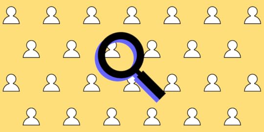
RecruitingRecruiting participants is one of ResearchOps’ primary responsibilities. ResearchOps must recruit, screen, schedule, and compensate research participants. 
This important administrative task frees user research teams to focus on conducting research and compiling the necessary reports.
GovernanceTo comply with increasing data privacy regulations and maintain a high standard of ethics, ResearchOps must continually update an organization’s research privacy policies while managing user data responsibly.
ResearchOps plays a crucial role in minimizing access to personally identifiable information (PII) within an organization.
ResearchOps governance tasks include:
Understanding data privacy regulations and applying relevant standard operating procedures to user research, communications, and data storageEstablishing ethical standards for user research and communicationFormulating consent forms in line with data privacy regulationsManaging PII study materials’ storage, sharing, and disposal—interview scripts, audio, and video recordingsKnowledge ManagementCompanies that conduct a lot of research build extensive libraries of data. ResearchOps must collect and organize this data to make it easy for teams to find and reference through research repositories.
These research repositories also prevent teams from repeating studies, saving precious time and resources.
ToolsUser research and ResearchOps rely on many tools, including equipment, software, and hardware. These tools require admin processes such as procurement, licensing, permissions, onboarding, and planning.
Here is a breakdown of how ResearchOps manages tools:
Applications to handle and store PIIEnsuring that research tools conform to data privacy regulationsResearch tools for usability studies, surveys, and interviews (AV equipment, etc.)Managing access and permissionsFacilitating the onboarding and training for tools and processes.Maintaining subscriptions and licenses for toolsResearch SpacesResearch spaces are vital for conducting effective, accurate user research. ResearchOps must find and manage both virtual and physical spaces for teams to conduct research.
This important logistical role gives research teams adequate space to conduct research while providing participants with a comfortable environment for accurate feedback.
Training & MentoringResearchOps plays a vital role in training researchers and non-researchers with the latest and best research practices. This training also extends to ethics and compliance, so teams never stray onto the wrong side of regulation.
ResearchOps must also provide mentoring for new researchers to streamline onboarding.
As well as physical training, ResearchOps must create the standard operating procedures for research methods and which studies to apply.
Some training and mentoring responsibilities include:
Arranging outside speakers and trainingHosting team training eventsTeam building exercisesSocial eventsPeer review sessionsBrainstorming sessions to improve user researchInternal CommunicationsResearchOps is responsible for all internal UX research communications, including providing reports and updates to the rest of the organization. This feedback helps the company recognize the importance of user research, which can help secure funding and resources.
ResearchOps’ internal communication might include:
Creating a UX research-team purpose to align with the organization’s mission statementCommunicating research winsGenerating case studies to showcase how user research contributed to solving product issues or increasing revenue/user signupsSharing regular progress reports and research insightsBudgetingBudget management is another essential ResearchOps responsibility. This fiscal responsibility ensures teams have the resources to conduct quality studies.
ResearchOps must also prioritize spending to align with the rest of the organization’s projects and goals.
ResearchOps budgeting includes:
Tracking operational spendingSyncing with inter-departmental budgetingFacilitating budget approvalsAllocating budgets at the project and user research levelThe Value of ResearchOpsThe most significant benefit of ResearchOps for an organization is efficiency. With the support of ResearchOps, UX teams can focus on the tasks that directly enhance the user experience.
This efficiency helps organizations achieve their goals faster while maintaining high research standards and staying compliant.
For small teams, a dedicated ResearchOps team or individual might not be feasible, but as a startup scales, the necessity for this department increases.
How ResearchOps & DesignOps Work TogetherAs ResearchOps and DesignOps have evolved from UX, it’s only natural that these entities align to optimize teams and workflows. For many companies, ResearchOps is not its own department but rather a DesignOps division.
The DesignOps role has been around for some time, while ResearchOps is still in its infancy. As the discipline evolves, we’ll likely see more companies, including DesignOps and ResearchOps roles.
When you look at each department’s core purpose and responsibilities, you notice a clear division between the two, but there are areas of overlap.
ResearchOps & DesignOps OverlapThe biggest overlap between DesignOps and ResearchOps is shared goals and values. While their processes and responsibilities don’t always overlap, they must align towards a common goal.
These teams must also work together to compile comprehensive, big-picture insights and reports for the rest of the organization.
ResearchOps ToolsAnother area where ResearchOps overlaps with DesignOps is through shared tools. UXPin Merge, for example, helps cross-functional collaboration where research teams can use fully functional high-fidelity prototypes built with ready React or Storybook components for testing.
ResearchOps tools fall into several categories, including:
Managing assets and insights—research repositoriesData analysis, analytics, & trackingProject managementTeam collaboration and communicationWireframing, prototyping & mockupsStorytelling and reportingSchedulingAccessibility testingSurvey, polling, & research toolsVirtual research spacesDesign collaborationTranscribing and note-takingUser journey mappingInformation architectureBudget managementOutside of these tools, ResearchOps might also need AV and recording equipment for lab studies.
How to Get Started with ResearchOpsGetting started with ResearchOps begins with identifying your researcher’s biggest pain points. What tasks and processes slow research progress? These tasks and processes will likely be administrative for most companies, the core function of a ResearchOps role.
Other questions you might want to consider include:
Does your organization need a better way to manage and access research data?Do you ever have trouble recruiting the right study participants?Have you ever found yourself accidentally repeating user studies?Does your user research ever go over budget?Are research insights and reports comprehensive enough, and do teams deliver these on time?Are your organization’s research practices compliant? Do your usability studies operate smoothly?A good place to start is surveying your research teams to find out where their pain points lie. You can also connect with other departments and stakeholders to find out if they experience any problems with user research.
By answering these questions and assigning a cost to your user research teams’ issues, you can measure the feasibility of a ResearchOps position.
The Individual’s Path to ResearchOpsAlthough ResearchOps manages user research, it’s actually a project management discipline. While it’s helpful to understand the UX process, it’s more beneficial to have a project management background for a ResearchOps position.
TL;DRResearchOps is an emerging role born from UX with a growing international community.
ResearchOps aims to provide support to researchers by managing and optimizing the time-consuming administrative processes that slow progress.
UXPin for ResearchOpsUXPin is a collaborative design tool that enables teams to scale products and features faster.
With UXPin Merge, ResearchOps can equip researchers with high-fidelity prototypes with React or Storybook components and actual data. These interactive prototypes provide users with an authentic user experience, thus producing valuable, accurate study data.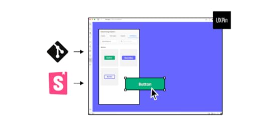
Discover Merge and start designing better products with UXPin.
Discover MergeThe post What Is ResearchOps and Why Is This Role So Useful appeared first on Studio by UXPin.
September 7, 2021
UX Architect vs. UX Designer – What’s the Difference?
The UX space is continually growing and evolving, with new UX roles and departments emerging to accommodate specific tasks and research.
One question we see pop up regularly is UX architect vs. UX designer—what’s the difference? And does my company need to fulfill both of these positions to improve the design process?
We’ll explore what a UX architect does, and the roles and responsibilities for UX designers and UX architects differ and overlap. At the end of this article, we provide a brief overview of how UXPin can help UX teams collaborate effectively.
UXPin is a collaborative tool for UX designers and UX architects to design better product experiences. Sign up for a 14-day free UXPin trial today!
Table of contentsWho is a UX Architect?Organizing ContentHierarchy, Sitemaps, and NavigationInternal Wireframing & Low-Fidelity PrototypingWho is a UX Designer?Persona DevelopmentWireframes, Mockups, and PrototypesUser TestingThe Main Differences of UX Architect vs. UX DesignerHow UX Architects & UX Designers Work TogetherA Typical UX Architect & UX Designer WorkflowDoes Your Company Need a UX Architect & a UX Designer?How UXPin Increases Productivity for UX TeamsA 14-Day Free Trial AwaitsWho is a UX Architect?A user experience architect is essentially a UX specialist with a high-level view of a product or design. UX architects are concerned with the structure and flow based on in-depth user and market research.

To achieve this, UX architects will often work closely with research teams or even conduct research themselves. This research guides UX architects to make informed decisions about how a user will use the product and organize the information architecture accordingly.
A brief outline of a UX architect’s responsibilities:
Ensure the product fulfills the user’s needsMakes sure information is organized and easily accessibleFixes usability and accessibility problemsOrganizing ContentRather than creating content and assets, a UX architect organizes and arranges content to best serve the user. This organization falls into three categories:
Content inventory—a list of all the product’s digital content.Content grouping—a logical structure for organizing the product’s content, defining the relationships between different pieces of information and how they all connect.Content audit—a regular review of the product’s content to determine what needs updating and if new content is required.UX architects must organize the content on each page and determine where to add titles, subheadings, links, and navigation to help users find what they’re looking for.
Hierarchy, Sitemaps, and Navigation
Information architecture arranges a product or website’s hierarchy, sitemaps, and navigation. These crucial elements determine how easy and accessible an app or website is to use.
Sitemap – all of the app or website pages.Hierarchy – how to arrange a page’s content in order of importance.Navigation – how a user moves through an app or website.Internal Wireframing & Low-Fidelity PrototypingUX architects create wireframes and low-fidelity prototypes for internal UX teams to use as an architectural reference for designing a product or website.
UX teams will only use these mockups for design purposes and usually won’t use them for usability studies or sharing amongst stakeholders.
Who is a UX Designer?A UX designer is a broad term encompassing design and research roles. But in the context of a UX designer vs. a UX architect, the designer is responsible for designing user interfaces. Ultimately, a UX designer makes a product usable.
A UX designer will take a UX architect’s wireframes, prototypes, and architectural instructions and turn them into a working product. UX designers also work with UX researchers to determine which fonts, colors, buttons, and other design elements to use.

UX designers are responsible for early research and creating user personas. Larger organizations might have a dedicated user researcher or team, but they still fulfill a UX design role.
User personas tell UX designers about the user’s demographic information, motivations, desires, potential responses, and more to design user interfaces that accommodate these user needs.
Wireframes, Mockups, and PrototypesUX designers create wireframes and mockups for the product’s pages and flows with initial user research and the UX architect’s information architecture.
UX designers also look at the UX architect’s sitemap to link the pages and navigation to make working low-fidelity and high-fidelity prototypes.
Research teams will use these high-fidelity prototypes for usability studies to learn how users interact with the final product.
User TestingWhere companies don’t have a dedicated research team, UX designers conduct the necessary usability studies. This crucial part of UX design provides UX designers with valuable feedback on how users will interact with the final product.
With the results from usability studies, UX designers tweak their designs to improve the user experience.
The Main Differences of UX Architect vs. UX DesignerThe most significant difference between a UX architect and a UX designer is that the UX architect looks at the bigger picture while the UX designer focuses on the details.
The UX architect focuses on navigation and user flows while the UX designer creates the user interfaces and interactions for each screen or page.
While both UX architects and UX designers review research, the UX architect considers what features and content the user needs. In contrast, the UX designer wants to know how the user will interact with these elements.
We can summarize the roles of a UX architect vs. a UX designer as follows:
UX architect – who are the users, and what do they need?UX designer – who are the users, and how do we meet their needs?How UX Architects & UX Designers Work TogetherIt’s important to note that a UX designer performs the UX architect’s responsibilities in many companies, especially small businesses.
Where these roles are split, the UX designer is often referred to as a UI designer (user interface designer) because they focus on the interfaces and interactions.
A UX architect is a UX specialist in information architecture rather than focusing on design.
UX architects and UX designers work closely on content. The UX designer focuses on the content’s details while the UX architect decides how to structure the content. To get this right, designers and architects must work closely together.
A Typical UX Architect & UX Designer WorkflowThe following workflow is a broad overview to show the separation of responsibilities between a UX architect and a UX designer.
A project will start with a UX architect analyzing market and user research to determine what the project needs and how to structure the content—similar to an architect designing a physical structure.The UX architect puts together a blueprint (wireframes & prototypes) for the UX designer to start the build process.The UX designer analyzes user research and the UX architect’s blueprints to start designing each user interface.The UX designer will create wireframes, mockups, and high-fidelity prototypes for stakeholders and usability studies.During usability studies – the UX architect wants to know how the user accesses content and navigates through the product. The UX designer wants to see how the user interacts with the elements and content on each screen.Once a product is live – the UX architect’s job is to ensure accurate and up-to-date content. They will also look at accessibility issues and recommend updates accordingly. The UX designer will take the UX architect’s recommendations and analyze interaction data to optimize each screen to best serve the user.Does Your Company Need a UX Architect & a UX Designer?With each team focusing on different design aspects, separating the UX/UI designer and UX architect roles can improve the quality and efficiency of a product or website.
There might not be enough work for a dedicated UX architect for smaller projects and cash-strapped startups. It’s important to note that UX designers are capable of fulfilling a UX architect’s role.
As projects scale, information architecture becomes complex and time-consuming to manage. In situations like this, a UX architect is critical to a project’s success.
While agencies generally work in small teams, they often work on multiple apps and websites for clients. Having a UX architect can help to streamline productivity by handing UX designers all the information they need to start building immediately—effectively creating a tech production line.
Businesses should ask a series of questions to determine if they need a UX architect:
How much time do UX designers spend on building layouts and information architecture?Do these tasks create production delays?Do users often struggle with navigation issues in usability studies?What is the cost of a dedicated UX architect in relation to the benefits from an increase in quality and efficiency?Does your product frequently struggle with usability and accessibility issues?Is someone monitoring your product’s content? Do you regularly find out-of-date content or unused product features?How UXPin Increases Productivity for UX TeamsUXPin is a powerful design tool for UX teams to build better products collaboratively. UX architects can use UXPin to create layouts, wireframes, and lo-fi prototypes, with comments for guidance and context.
UX designers can use this information to design beautiful screens and interfaces with mockups to present to stakeholders and use for usability studies.
A 14-Day Free Trial AwaitsGet a free 14-day trial and see how UXPin can help your UX teams collaborate effectively to build better products for your customers.
The post UX Architect vs. UX Designer – What’s the Difference? appeared first on Studio by UXPin.
September 2, 2021
Best UI Development Tools to Improve Your UI Design Process

As industry leaders increasingly adopt code-based design, you will need to compare the best UI development tools to improve your UI design and product development process. Many team leaders are surprised to find that choosing the right user interface development tool leads to better communication between designers and developers, streamlined processes, and improved user experiences.
Before you invest any time learning how to use new tools, read the following comparison so you can pick the best UI development tools for your team. You don’t want to waste hours learning a system that doesn’t meet all of your goals. Save yourself the trouble by starting with the best option.
Features to look for in the best UI development toolsBefore diving into individual UI development tools, let’s take stock of critical features you should look for. Some of the top features your team needs for front-end development include:
Plenty of tutorials that shorten your team’s developers’ learning curve.Flexibility to connect with other platforms and design apps.Add-ons that let you customize the tool for the types of projects you develop.Folders that make it easy for you to store and find UI libraries for all projects.Sandboxes that let you design features in isolation.Collaboration features that help team members work together, even when they don’t share an office.Design system creation that serves as a single source of truth.Version control that lets you compare differences.A toolkit that lets you see what components will look like on web applications, iOS devices, and Android devices.Accessibility tests that make your designs easier for more people to use.This isn’t a complete list of features that you should look for, but it includes some of the critical traits you want to find in the best UI development tools. A tool that misses any of these features probably won’t work well for your development team.
Storybook

Storybook stands out as potentially the best UI development tool. It’s an open-source tool with abundant add-ons, a sandbox for playing with new concepts in isolation, and creating code-based design systems.

It’s also extremely easy to use. Storybook has robust, step-by-step tutorials. If it’s your first time using Storybook, you will probably want to start by reading:
Introduction to Storybook for ReactIntroduction to Storybook for VueIntroduction to Storybook for AngularIntroduction to Storybook for Web ComponentsThe platform also has a thriving community of people willing to help each other when they encounter challenges. Regardless of your issue, someone has already encountered it and found a solution.
Many developers love Storybook because it allows for comprehensive documentation for every component in their libraries and design systems.

At UXPin, we like Storybook so much that we built an integration for it, as a part of UXPin Merge. Now, you can create component-based design systems in Storybook and let your designers access the components through UXPin editor to design with the elements right away. When you update anything in Storybook, the components in UXPin Merge update, also.
Knapsack

Knapsack is another tool that can help you in developing UI. In fact, it shares several of Storybook’s features. You can use it to:
Take a code-based approach to design and design systems.Make designs more accessible.Improve performance with version control.
Knapsack is a bit secretive about what it offers apart from being a design system platform in general. When you look at Storybook’s site, it offers a wealth of information about the platform’s abilities. You can find use cases that teach you how to use the features more easily. Storybook even has public design systems that you can use without designing new components! That’s probably not something you want to do for user-facing products, but it could save time building your business’s internal tools. So, it would have been great to see a more open-source attitude of this design system platform so that the community can grow.
Choose the best UI development tool for your teamDesigners have a ton of options when they browse app and web design tools. UXPin Merge, for example, has a drag-and-drop environment that improves workflows by connecting worlds of design and code. Designers can use UXPin to make interactive prototypes without having any code skills. When the UX design comes to developers, they just need to approve the work or open a code editor to make minor changes.
Finding an empowering tool for developers isn’t always easy. With Storybook, though, you and UX designers can work together to build cross-platform, component-driven designs that improve the usability of iOS, macOS, Android, and Windows applications.
Don’t let handoff between designers and developers slow your workflows. Streamline every aspect of the process by adopting a code-based tool that lets developers contribute as much to design as they do functionality.
Get started with Storybook and UXPin Merge
UXPin Merge now offers Storybook integration that lets your developers build components in Storybook and connect UI libraries to UXPin Merge. When they update components in Storybook, the integration synchronizes to update them in UXPin Merge. Now, you have an even more effective code-based approach to building apps and web pages quickly without miscommunications between your development and design teams.
Start designing with code components with the UXPin and Storybook integration, now – you can try it out on a 14-day trial!
Try out Storybook integrationThe post Best UI Development Tools to Improve Your UI Design Process appeared first on Studio by UXPin.
UXpin's Blog

- UXpin's profile
- 68 followers

