
UXpin's Blog, page 77
July 1, 2021
Try Storybook Integration: Say Goodbye to Design-Dev Inconsistencies
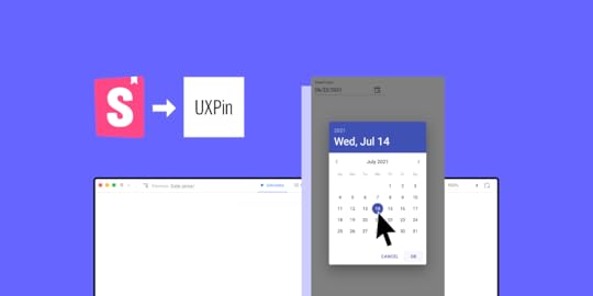
Just a few weeks ago, we wrote about our game-changing Storybook integration, which helps designers and developers break the silos and improve the UI consistency by using code components when building prototypes. Based on our Merge technology, the integration lets you harvest the power of code, use it to build advanced prototypes faster and massively reduces the complexity of the handoff process. The bottom line is, both designers and devs get to build products with the same components.
Now, we’ve decided to go one step further – today, we’re enabling Storybook integration on trial. Check us on Product Hunt!
Why product teams need the real single source of truthThe single source of truth in product development is this one place that stores all the documentation and elements needed to design and build products. In the ideal world, it’s easily shared, is always up to date and is used by everyone involved in the process. We all know how things end up – messy, scattered and siloed.
Design systems were supposed to solve the problem of disorganized information across product teams. Now, we know that this solution is a great first step to systematize UI and documentation but won’t completely remove the disconnect between design and development.
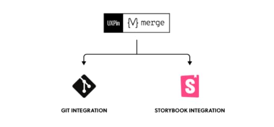
The revolution is the Merge technology, which allows product teams to leverage dev tools such as Git repos or Storybook to improve their DesignOps processes and maintain parity between design and code. As a result, designers and developers can all use the same UI elements, documentation, and code from one source.

Imagine taking all the production-ready, code-based, fully interactive components from the dev library and just dragging and dropping them on the canvas to use them in the design editor. Here’s why this is so exciting:
Don’t ever ask again, “Where’s that component?”Just like with the puzzle pieces scattered around, it takes a lot of time to find and match the right product development collaterals. It’s a real challenge to keep the components and documentation up to date. But with a centralized place to store all the information, you won’t need to search for the right version of the component or its code.
When you bring UI elements from the developers’ library to a design editor, you only need to maintain them in one place, and for designers, the libraries sync automatically.
Use the same technology as devsThe gap between what designers have created and what developers have built usually boils down to one thing – everyone used different technologies to do their work. Design tools are typically powered by vectors or pixels, whereas apps and websites are powered by specific programming languages and frameworks.
The vector or pixel-based approach is extremely limited and represents just a simple visualization of the end product. For example, when you want to add some advanced interactions to a prototype – it’s not always possible, because neither vectors nor pixels can work with variables, conditional logic or even simple input fields. However, when developers use code in UI components, those blockers disappear.
If you could prototype with code-powered technology, where design has its reflection in code, you and developers would speak the same unified language. So, instead of creating the UI elements in two different environments, you can remove the product drift by using the exact same one. What’s important, you could enjoy the complex built-in interactivity that works great already on the design stage.
10x designerWhen designing a product, you need to explain to developers what exactly should happen when a user clicks this or that. You can choose to build either lo-fi prototypes to start the development process faster but sacrifice some details which you’ll need to catch up later or build hi-fi prototypes that, with all the interactions, explain the product behavior better. Building advanced prototypes takes a lot of time and usually getting the details right, ends up with a lengthy conversation in comments about interactions and the prototype’s functionalities.
This is not an efficient workflow from a design operations point of view. But if you decide to use the coded UI components in the design editor, you critically speed up the entire design process.
When working with the elements that are fully interactive and in line with all production standards the design outcome you produce is way over 10x of what it takes to build a prototype in a conventional way. The time you save can be spent on other important things like user testing.
User testing perk: prototypes behave just like the end productHow can you test a prototype when all the UI parts aren’t fully interactive? User testing isn’t reliable enough when a user can’t click through a project on their own without a lot of handholding. Describing what will happen after clicking an accordion or hovering over the menu won’t give the same feedback quality as showing it.
When all the drifts are gone, and the code-powered prototype works exactly like the end product, you can support your research team with a fully immersive experience for their usability tests.
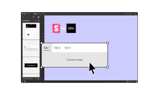
Design with code – try Storybook integration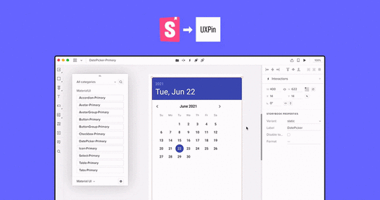
Storybook is this one place where developers can build and store the UI components. It’s also a great tool to test the elements and prepare clear documentation. Storybook supports a lot of frameworks, including the most popular ones like React, Angular, and Vue.
UXPin and Storybook IntegrationStorybook is one of two integrations (Git repo is the first one) that use Merge technology to sync coded components with our design tool, UXPin. The entire integration with Storybook takes around 1 minute, and lets you design with code components right away!
Private or public?Your Storybook library can be either private (hosted on your server with access for only chosen users) or public where people who know the URL can access it freely. As our integration supports both types, it doesn’t matter which one you use.
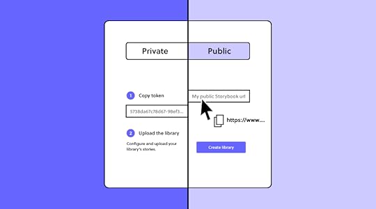
With public libraries, the process is as easy as copying and pasting the Storybook’s URL. With a private one, your developer needs to run just two simple commands. All is explained here. On trial, you can play with public libraries only. If you want to test a private one, go for a guided tour.
If you want to use public libraries of other companies, you will enjoy all these open source Storybook examples.
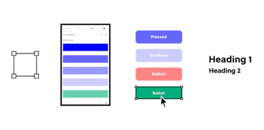
Freedom of designing with codeThe synced components are coded, which gives you the freedom to change the properties, inputs, and styles inside the UXPin editor without the developer’s help. This gives you the power to build prototypes that are always in line with the production standards. The constraints embedded in code guides you, making sure there is no miss-match in styles.

Designing with code can redefine how we structure DesignOps processes. PayPal is a great example of how transforming the design phase in product development empowered people with other roles than designers to visualize their ideas with code components in UXPin. Erica from PayPal and her team use Merge Git integration, but you can achieve the same results using Storybook.
It’s straightforward as non-designers just have to drag and drop the components on the canvas and play with the controls if needed. Then, with a design draft, UI professionals can take over by finishing off the projects and focusing on usability.
Taste the power of codeSign up and give it a try with a built-in Material UI library with components coming straight from Storybook or sync a new library yourself. Feel the power of code and see how the whole product team can benefit from using the single source of truth!
Try out Storybook integrationThe post Try Storybook Integration: Say Goodbye to Design-Dev Inconsistencies appeared first on Studio by UXPin.


9 Design Thinking Tools for Turning a Creative Vision into a Usable Interface
Design thinking is a collaborative, iterative process that, over time, delivers design solutions based on human feedback. The concept combines the problem-solving basis of design with empathy for the end-user. Design thinking tools are used to facilitate this evolutionary process.
Before we take a close look at some of the best design thinking tools on the market, let’s examine the different phases of the process involved.
The five phases of design thinkingEmpathize
Get to the heart of the problem you’re trying to solve. Talk to your customers and observe their interactions with your software. Where are the issues?
Define
Once you have gathered the relevant information by observing and talking, you can set about defining the core problem concisely.
Ideate
This phase of the design thinking process involves the generation of ideas. How can you solve the problem you defined? Are there creative and collaborative approaches that might solve the problem?
Prototype
You’ve fully understood the problem at hand, you’ve created a definition of the issue, and you’ve devised a few ideas on how to proceed. Now it’s time to make those ideas a reality. A scaled-down version of the software or service allows you to assess how it works in a practical setting.
Test
The final product must be tested stringently to ensure it solves the problem you defined at the beginning of the process. Usability testing may uncover further problems that require solutions.
Design thinking tools to empathizeEmpathizing involves gathering feedback from your customers on the problems they face when using the product. There are two excellent tools that facilitate this communication.
1. TypeformThis user-friendly software allows you to gather feedback via forms and questionnaires. You can integrate the platform with services such as Google Sheet to speed up the gathering of information. And a selection of intuitive customization options helps to keep the user engaged — giving you the in-depth responses your design thinking project needs.
2. Join.meSpeaking to all of your customers in person probably won’t be practical. Video conferencing software Join.me simplifies and streamlines video calls to ensure a seamless experience. A comprehensive list of functions includes the ability to share your screen. You can also organize invitations and record your calls for future use. Claim a unique URL, and share it with all your invitees. Access to Join.me is available via mobile, phone, VoIP, and desktop.
Design thinking tools to defineYou know there’s a problem, but what exactly is it? And how do you communicate to your collaborators? Here are two design thinking tools that might help.
3. SmaplySmaply is a user-friendly platform that allows you to manage and map the customer experience. Create a customer journey, and share it in the form of maps or personas. An intuitive journey mapping tool identifies so-called “pain points” and “moments of truth” within the customer journey. Interactions are visible to everyone involved in the project, so everyone gains an understanding of what customers are thinking.
4. MakeMyPersonaMakeMyPersona is an intuitive service that helps you to structure customer data in a simple, accessible way. Answer the questions asked during the set-up phase, and build your personas from scratch. Answers, and the personas they create, can be shared in Microsoft Word format via email. This tool is relatively simple, but it’s useful for beginners working on relatively simple projects.
Design thinking tools to ideateIdeate collaboratively to identify the heart of the problem with two functional tools.
5. StormboardThink of Stormboard as a digital way to brainstorm using virtual sticky notes. You can create templates for different ideas and allow collaborators to rate them — or add a few of their own. There are several reporting options available, so you can condense your main findings in a way that’s easy to assess. Organizing and prioritizing ideas from various contributors is easy with this intuitive software.
6. CoggleCoggle is an online tool designed to help people create and share mind maps. Users can take and share notes, plan ideas, collaborate on thought processes, and manage brainstorming sessions. Coggle also allows users to drag and drop images, text, and annotations — creating a highly visual collaboration on the screen.
Design thinking tools for prototypingOnce you know what you need to create, the only way to move forward is to design a prototype for testing. Use one of these two design thinking tools to make your ideas a reality.
7. UXPin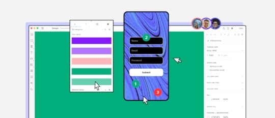
UXPin is a design online tool that simplifies the design process. From wireframing to prototyping, users can build interactive elements, code components, conditional interactions, and variables to turn a great idea into a working design. And through a collaborative approach, users can turn that prototype into a finished product. A sleek, easy-to-navigate interface brings every imaginable design element together.
Connecting design and engineering in a seamless way, UXPin makes up for a lot of tools to let you design at scale.
Design thinking tools for testingYou have a working prototype. The only way to ensure it can deliver as a finished product is to test it.
8. UserTestingUserTesting is one of the world’s most popular and respected testing applications. Select users based on what you’re testing and your ideal personas. And set a wide range of metrics to ensure the problems you’ve identified are addressed. This advanced software tracks everything the testers do while interacting with your prototypes. Then use the data to ascertain how people navigate your software and perform the various tasks you ask them to complete.
9. HotjarHotjar is a comprehensive analytics tool that makes gathering feedback exceptionally easy. The system collects data based on your chosen metrics. You get to see where people click, how they navigate, how they complete tasks, and how they interact with the functions you choose. And at the end of the testing process, you’re given instant feedback. Hotjar makes identifying potential problems with prototype software a quick and simple process.
Improve your design thinking process with UXPinDesign thinking is a highly collaborative, visual process that involves a wide range of components and skills. Bringing these elements together is both complex and time-consuming. But with a design thinking tool such as UXPin at your disposal, turning ideas into user-friendly interfaces has never been easier. For a free, no-obligation trial of the UXPin app, sign up for your free account.
The post 9 Design Thinking Tools for Turning a Creative Vision into a Usable Interface appeared first on Studio by UXPin.
June 25, 2021
Tips for Designers Interested in Advanced UX/UI
Your company website is more than a collection of related pages. It’s a dynamic place where two online entities meet and interact: the business behind the site and the visitor who lands there in search of information, services to use, or products to buy. What happens in that meeting place is a product of both UX (User Experience) and UI (User Interface)–two different, but overlapping, fields of website design and development. A good user interface leads to a quality user experience. Insights from a site’s user experience can inform interface design, which leads to a quality experience that engages visitors and keeps them coming back.
It’s possible for a company’s product, service, or profile to be so compelling that it overcomes bad design–including multiple inconveniences to visitors. But leading developers point out that good UI design makes it easy for users to engage not just with the website itself, but also with the brand behind it.
Not sure how to test your advanced designs to see how well they function? Join UXPin Merge so you can generate lifelike prototypes with real data and interactions.
What makes good UX/UI design?The key to good UI and UX design lies in their names: the needs and experiences of site users guide the design of all the components of a website. Interface design aims to create an outstanding experience. Visitors’ actual experience as they engage with those design elements reveals whether the interface is as user-friendly as developers think.
Designing user interfaces for ease of use and enjoyment starts with a keen understanding of a website’s visitors and what they need. Successful UI design begins with a deep understanding of the site’s target audience and its behaviors.

That includes considering how people use the site and what they expect to find there. Good UI design includes the physical aspects of using the site—motions such as swiping and tapping with fingers on mobile devices, or clicking and dragging with a mouse on a desktop or laptop. It’s also essential to give users clear guidelines on how to use the site and make the content as interesting and accessible as possible.
Each website has its own goals. Its content targets the wants and needs of a specific audience. But good UI and UX design principles apply to websites of all kinds. Here’s a rundown of five essential UI/UX design principles aimed at making a visitor’s experience the best it can be.
Be creative—but predictableYou want your site to be eye-catching, engaging, and full of entertaining and informative content. That means taking risks and trying new things. But it’s also important to give visitors familiar structures to help them navigate the site without confusion or distraction.
Essential navigation tools should follow standard formats. Buttons, menus, and other tools should look and behave in the same way they do on millions of other websites. Visitors need to perform basic functions without thinking about where those tools are, or what they look like. Essential information should also be front and center on the homepage, without requiring visitors to dig for it through layers of pages and links.
A site that’s heavily loaded with interactive features such as slideshows and carousels can interfere with a user’s goals for visiting the site. Research on visitor behavior reveals that as they watch each slide in a carousel, users are likely to forget the previous slides they viewed.
Use a code-based tool that creates a common language between designers and developersDesigners typically have to rely on developers to turn their creative visions into functional products. Unfortunately, designers can’t always determine the amount of work that goes into adding certain interactions. You might have an amazing idea, but the development team could send it back to you, slightly shocked that you even asked.
A code-based design tool like UXPin powered by Merge technology creates a common language that breaks down barriers between designers and developers. When you create a design with UXPin Merge, the tool uses the same code components that are stored in your devs’ library (Git or Storybook), all keeping full interactivity while prototyping. That’s why you can take your designs to another level. The code provides you with more interaction opportunities than any design tool can. 
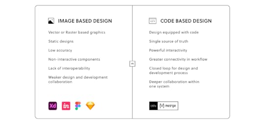
It’s time for design teams to switch from image-based to code-based tools. Code-based design streamlines the prototyping and development phases to get your product to market sooner. It also gives developers more power to tweak your designs to meet the needs of specific operating systems and devices.
If you doubt the power of code-based design, request access to UXPin Merge to see how much easier cross-team collaboration becomes.
Aim for maximum accessibilityGood UX/UI design targets the needs of a clearly defined audience, but that audience can still be pretty diverse. To be as broadly accessible as possible, a user-centered design must aim for maximum readability and ease of use for everyone. For example, navigation tools and other actionable elements need sufficient space between icons, links, and buttons to avoid tapping or clicking the wrong one.
Accessibility also includes giving users clear instructions on what to do on the site and telling them what will happen if they do or don’t take specific actions. As an example, buttons should be clearly labeled for the desired outcomes, such as signing up for a newsletter, buying now, or deleting information. Additional text can also warn users about unintended outcomes, such as leaving the main site or permanently removing data.
Be inclusiveInclusivity is an essential aspect of accessibility. Even if you’ve established the site’s target demographic, other users may be stopping by as well–and good UX design will anticipate their specific needs. Inclusive interfaces should accommodate people with disabilities by providing alternative options such as large fonts and high contrast text, and including audio content and navigation tools that are easy to find and manipulate on both mobile and desktop devices.
Keeping up with Web Content Accessibility Guidelines will help you add inclusive components to your design system.
UXPin and Piotr Źrołka, CEO and accessibility expert at Kinaole, recently hosted a webinar that shows how much easier inclusive design becomes when you follow a few simple guidelines within UXPin Merge.
Build a design system for creativity and controlIf you rely on a style guide to ensure consistency across your digital products, your teams are probably wasting a lot of time. Take the effort to convert your static style guides into dynamic design systems that contain all of your brand’s authorized design components, including features, color schemes, and language.

Design systems keep lead designers in control while giving others flexibility to create innovative products and features. Your design system might include all the components that designers and developers can use, but it also provides nearly unlimited opportunities for them to mix and match features to build new products.
As a result, you get advanced designs that still conform to your brand identity.
Join UXPin Merge and watch users become more engagedIt takes less than three seconds for a visitor to abandon a website–and many never return. User-centred design anticipates obstacles and works to eliminate them, with simple, clean interfaces that lead visitors to the information they need and points them toward the decisions you want them to make.
The principles of good UX and UI design work together to make the meeting place that is your website as welcoming as possible for any visitor who stops by. See how UXPin’s Merge blends design and engineering for better and faster site development.
Discover MergeThe post Tips for Designers Interested in Advanced UX/UI appeared first on Studio by UXPin.
June 23, 2021
Webinar Wrap-Up: From Style Guide to Interactive Design System in Enterprise
When Ben Shectman came to Johnson & Johnson as a Certified Design Leader, he found useful tools for establishing visual and verbal guidelines across digital design projects.
Unfortunately, the guides came as PDFs that made it challenging for designers to follow the established rules. Whenever uncertain, they would have to confirm their design choices by browsing a lengthy PDF document.
The PDF documents also made it difficult to keep everyone informed of design updates. If someone had an outdated version, they wouldn’t know how to follow the correct guidelines.
Shectman decided to undertake a project that would make designing easier for everyone. He and a small design team turned the PDF guides into an interactive design system. Although migrating from a static style guide to an interactive design system took about six months of work, it has resulted in faster product development for internal and client-facing tools.
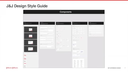
With UXPin, Shectman and his team built atomic UI components that they could use to create larger elements, templates, and pages. Instead of starting each design from scratch, they could pull from a Git repository that serves as their single source of truth. When they update the design system, the changes occur globally. That way, no one gets left with an outdated version.
The ongoing process of maintaining a design systemDesigners at Johnson & Johnson typically work in two-week sprints. During this time, product development runs parallel to product design.
When designers feel that they need a new component for a project, they can submit a request to add the idea. Johnson & Johnson has a very small design team, so it’s possible for them to move forward with their work before receiving approval. If the new component seems applicable to other projects, it can get added to the design system.
Getting developers involved in the design processA lead developer attends meetings to provide feedback. This gives the design and development teams opportunities to share their ideas and concerns. For example, a lead developer might recommend taking a different approach because the current plan will put significant strain on the development team.
Frequent meetings keep everyone focused on a common goal that offers aesthetic appeal and excellent functionality.
At the end of each design sprint, the entire development team meets with the designers to talk about moving the project forward toward a finalized product.
The meeting provides an opportunity for harvesting new ideas that might get added to the design system. As products, services, and technologies evolve, the design system must change to accommodate emerging needs. Not all of the new concepts get added to the design system. Those that stand out as critical new approaches, however, can be included easily.
A demonstration of UXPin in actionAbout halfway through the webinar with Johnson & Johnson, designer Gil Gerard Austria provides a demonstration of how the team uses UXPin and their in-house design system to turn old, static forms into interactive, code-based designs that they can test as prototypes.
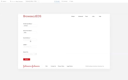
The demonstration shows the power of reusing components and testing fully functional prototypes. Gil completes his hi-fi design in less than 10 minutes. The result has a more pleasing look and functions better than the previous version.
What You Will LearnJohnson & Johnson’s approach to XD the design uses the Six-I strategy (Immersion, Insights, Ideate, Iterate, Implement, Improve) that focuses on building human-centred products [6:01].Ben Shectman describes the process he and his team followed while turning Johnson & Johnson’s static design guidelines into a dynamic design system [9:10].“Part of the reason we within the corporate business technology experience design team chose UXPin as our preferred prototyping tool of choice is because… we focus on applications that J&J’s workforce uses to get their jobs done… These transactions tend to be much more data-driven. Much more form-driven.” [10:04].The first step of creating the design system was taking content from earlier static guidelines and translating them into interactive, shareable pages [12:14].The design team created instructional videos to help employees use the JNJ design system [14:24].Translating a style guide into reusable components through atomic design [15:15].Gill Austria demonstrates turning a style guide into components of atomic design [17:49].Gill Austria offers a step-by-step demonstration of using UXPin and J&J’s design system to update an old tool [32:17].Sage Young demonstrates the benefits of code-based design with UXPin [55:45].Watch the whole webinar here!
The post Webinar Wrap-Up: From Style Guide to Interactive Design System in Enterprise appeared first on Studio by UXPin.
June 18, 2021
10 Error 404 Page Examples for UX Design

These 404 page examples show how designers can turn a simple computing error into a branded user experience (UX).
The earliest models of personal computers had 64k RAM or less. Programmers needed to keep things simple. They developed a classification system for program functions. Input errors got assigned to class 400.
400 Bad Request. The input is in the wrong syntax.401 Unauthorized. The user cannot access without a username and password.403 Forbidden. The user doesn’t have permission to access the file.404 Not Found. The user entered or linked to a URL that doesn’t exist.In the old days, users had to type in the exact URL. For example, If you wanted to visit Yahoo Finance, you had to type in the full URL address: http://www.finance.yahoo.com
If you “fat-fingered” the keyboard while entering the URL, you’d get an error code 400 or 404.
Nowadays, browsers let you enter an abbreviated address like www.finance.yahoo.com or even finance.yahoo.com. In fact, if you enter the full address in the search bar with the syntax in the example above, the browser will redirect you.
Why? Because it’s an old syntax using HTTP. The updated site is a more secure URL using HTTPS. The latest browsers automatically make the correction.
The 404 error is now a landing page where you can encourage users to continue using your website. Your 404 page design should keep the user from leaving.
Some elements you’d use might be:
Hyperlinks to the home page and other useful pages.A search bar.Graphic elements that reflect the site’s brand.A brief message to the user in the brand voice.In these 404 page examples, we’ll look at how different brands use these UX elements.
Table of contents404 page examples: homepage linkUXPinGoogle404 page examples: useful page linksAngiStarbucksGlassdoor.com404 page examples: graphics focusedeBayLego404 page examples: rotating elementsAmazon.comMarvel ComicsIMDBFinal thoughts404 page examples: homepage linkUXPin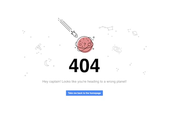
We’ll look at our own 404 page first.
As you can see, we like simplicity. We have lots of white space around outer-space-themed graphics. The message is simple, “Hey, Captain! Looks like you’re heading to a wrong planet!”
We include a call-to-action (CTA) button that takes the user back to the home page.
Google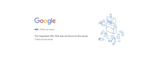
Google’s 404 page is also very simple and has lots of white space.
“The requested URL was not found on this server. That’s all we know.”
The broken-robot graphic reflects their high-tech brand. There’s no CTA, and you only discover that the Google logo is a link back to the home page if you mouseover.
A lot of UX writers will tell you that leaving out a CTA is a big no-no, and in most cases it is. Remember, you want visitors to keep using your site.
Google is an exception because they know their visitors will always come back.
404 page examples: useful page linksAngi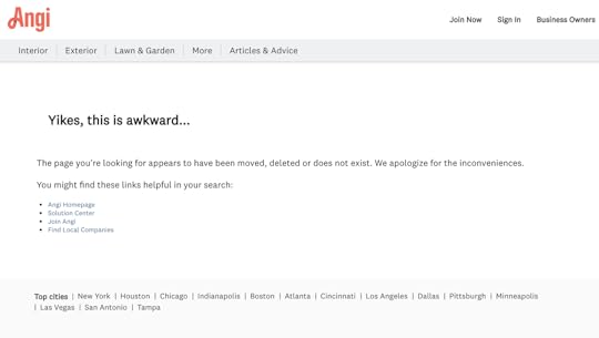
Formerly HomeAdvisor, this home services contractor site has a lot of links to other useful pages.
The message to the user is straightforward:
“Yikes, this is awkward…
“The page you’re looking for appears to have been moved, deleted, or doesn’t exist. We apologize for the inconveniences.”
The CTA is a list of links to suggested pages.
In the header, you also have links to home service types and blog posts.
The footer has links to find services in major metropolitan areas like New York, Chicago, Los Angeles, and Dallas. Other useful links are in the footer as well.
Angi keeps everything “above the fold.” That is, you don’t have to scroll to get to any of the links.
Starbucks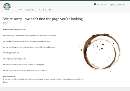
In Starbuck’s 404 the image of a coffee ring where there used to be a cup stands as a metaphor for a page that’s not there.
It offers an explanation of what might have gone wrong and some suggestions about what to do next.
It has a link where visitors can report broken links.
Glassdoor.com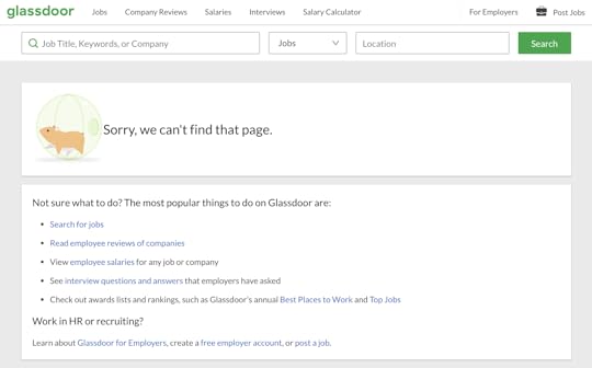
Taking look at Glassdoor’s 404 page, the popular jobs board suggests several actions.
Search for jobs.Read employee reviews of companies.View employee salaries.See interview questions and answers.Look up rankings of best places to work.404 page examples: graphics focusedeBay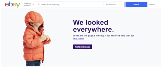
A photo of a child wearing a winter coat with the hood pulled over his eyes is the focal point of eBay’s 404 page.
“We looked everywhere.”
“Looks like this page is missing. If you still need help, visit our help pages.”
Below is a CTA button taking the visitor to eBay’s home page.
The bottom of the page contains a scroll box with trending deals.
Lego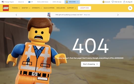
When you land on this 404 page, you see Emmet from The Lego Movie. He’s quoted as saying, “Everything is still awesome.”
404 page examples: rotating elementsAmazon.com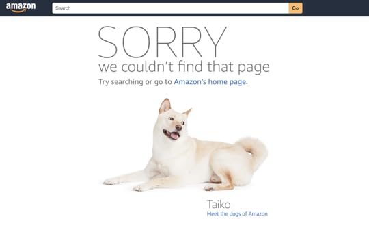
Amazon’s 404 page features the search bar at the top the message suggests a search or clicking the homepage link. It has a photo of one of the “dogs of Amazon.” It links to an Amazon news page about Amazon’s dog-friendly workplace.
If you refresh the page, an image of a different Amazon dog appears. Refresh several times and you’ll see many random dog photos. We don’t know how many they have for the 404 page, but more than 7,000 dogs “work” for Amazon.
Marvel Comics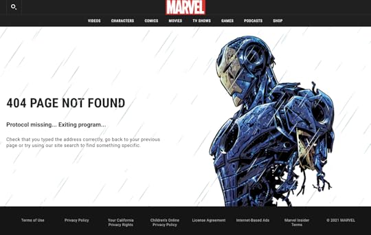
Like Amazon, Marvel rotates multiple versions of its 404 page. They show images from the Marvel Comics universe with messages like:
“Protocol missing… Exiting program…”“Hydra is currently attacking this page!”“$#&%, you just broke something! Just kidding.”“Not even the eye of Nuatu sees your request.”“Hydra has stolen this page from the S.H.I.E.L.D. database!”IMDB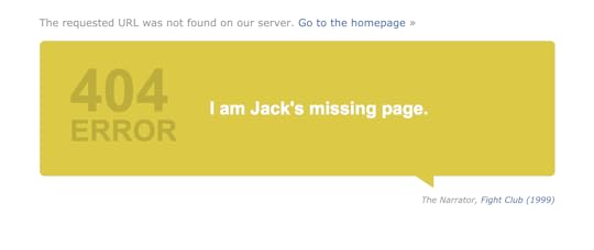
Another rotating 404 page from the International Movie Database (IMDB). They stay on brand and offer familiarity to their fans by offering up movie quotes.
“Webpages? Where we’re going we don’t need webpages.” – Dr. Emmett Brown, Back to the Future.“Someday we’ll find it… the website connection.” – Kermit the Frog, The Muppet Movie.“Surely, you can’t be serious.” “I am serious. And don’t call me Shirley.” –Ted Striker and Rummack, Airplane.“What we’ve got here… is a failure to communicate.” – Captain, Cool Hand Luke.“Page not found? INCONCEIVABLE!” – Vizzini, The Princess Bride.“I’ve got a feeling we’re not in Kansas anymore.” – Dorothy, The Wizard of Oz.Final thoughtsUXPin is a full-stack UX/UI design program that gives you the tools to take any project from concept to product launch in a single app.
When designing a 404 page, you can share with collaborators and stakeholders in real-time straight from the platform. They can add their comments to make iterations smoother, instead of lots of back-and-forth emails. Start your free trial today.
The post 10 Error 404 Page Examples for UX Design appeared first on Studio by UXPin.
June 16, 2021
What Is a Component Library and Why Should You Use One for UI Development?
A component library is a pretty handy thing to have, especially if you need to scale fast.
Take Netflix, Uber, and Twilio. They all leveraged speedy and impressive growth using design systems built from component libraries.
And while some would argue the case for building their own as part of their enterprise design system, the time and resources needed to build from scratch often outweigh any long-term gain.
Instead, when optimizing development across many platforms, it’s wise to consider using a component library.
By offering an accessible, open-source repository of production-ready, customizable, and reusable code components—like buttons and accordions—component libraries let UI and UX designers leverage faster development and growth.
A component library can offer a single source of truthAs part of any design system, a component library can reduce the risk of any variation between products, or ending up with different components in different places. They handle the source code for UI elements and usually leverage CSS and JavaScript.
React is a prime example of a popular open-source framework, developed by Facebook as a component library but since grown into a large ecosystem for creating apps, static sites, and desktop applications. 
Plus, there are many more advantages worth highlighting:
Accessibility: As a single repository for housing ready-made, reusable components, a component library offers quick access to developers and designers everywhere. This improves collaboration and communication between developers and designers working across teams.Reduced code duplication: Often, code gets duplicated across varying designs and projects. But with a component library, there’s no need to convert the design to code. Instead, you can use the code component to design with no further development.Consistency: Promoting a single source of truth is more likely with a component library. By enabling consistent UI and UX across entire projects, it’s easier to achieve uniformity. And this is a key advantage over different designers working across a range of designs. Speed: By avoiding building from the bottom up, teams save time. Instead of redesigning or creating a calendar, it’s already there to use. Plus, thanks to a set of ready-made, pre-set components, teams can avoid any drawn-out, time-draining decision-making processes they may have once faced. Compatibility: Frontend developers can struggle with ensuring cross-browser and cross-device compatibility. But a component library will go a long way to avoiding incompatibility through standardization.When is it best to use a component library?There are some particular situations where a component library can add measurable value to a project. So let’s look at what they are:
Code-first prototypingProjects that focus on functionality over visual design are more likely to benefit from a component library. Plus, prototyping with code is more efficient than starting with images and then converting them into code. So rather than expecting developers to interpret image-based designs and then create the codes, they simply take the code component from the ready-made design.

This also opens up the chance for developers to design with pre-built components without worrying about any lack of design skills.
When you lack the skills or experience to build your ownCreating your own component library or developing one as part of your own enterprise design system may be your dream. But this may not be a reality when your team lacks experience in building reusable UI components or you’re working to tight project deadlines.
Instead, integrated component libraries provide all the code components designers and developers need to test functionality, usability, and design before conversion to digital products.
If you’re a smaller company or teamStartups and small or medium-sized businesses may need to be more careful with financial resources. And with a wide range of effective, versatile, open-source component libraries around, smaller companies can set themselves up to scale, step by step. After all, no industry giant got there overnight. And many of them continue to stick with their original component library throughout their evolution.
There are some exceptional tools available to help you scaleIf it’s not yet clear how you’ll benefit from a component library, then here are some questions that could prompt your thinking:
1. Do you see developers building the same components for each project but with slight variations?
2. Are any developers confused about which UI or UX convention they should use in interfaces?
3. Do you need to release updates and changes fast?
4. Do you need a lot of customization?
5. Are you looking for a combined design system and component library?
If the answer to any of these questions is yes, then consider Storybook.
StorybookStorybook is an open-source tool for developing UI components in 15 different frameworks, among others the most popular ones: React, Vue, and Angular. It’s a combined coded design system and component library that acts as a sandbox for effective components and page development, testing, and documentation. Your developers can take a more effective component-driven approach over a visual one.
As Storybook is used by developers, there’s an integration with UXPin that can help you with designing as well. With UXPin Merge technology, you can sync any Storybook with UXPin editor to design with code components. The fully functional UI elements will show up in one of the UXPin libraries so that you have access to them right away.
Be the first to design withfrom code using innovative Merge technologyComponent libraries offer the chance to standardize development, reduce code duplications, improve collaboration between teams, and drive scalability. And with so much influence over your project deliverable and team motivation, it’s important to choose the right solution for your needs.
But if you’re looking to improve design consistency and development productivity, UXPin’s Merge technology offers a unique point of integration with Storybook.
So why not be one of the first to promote a code-first approach and use our innovative Storybook integration for your first component library?
Try out Storybook integrationThe post What Is a Component Library and Why Should You Use One for UI Development? appeared first on Studio by UXPin.
June 10, 2021
How UX/UI designers should write a design proposal
The humble design proposal is, perhaps, the most crucial text a UX/UI designer will ever write. This document outlines your specific approach to the client’s design brief — what you plan to do and how you plan to do it. If successful, your proposal will become part of the contract you sign with the client. It all starts with the first word you type.
Many designers struggle with proposals, and for good reason. What should you say? How should you say it? It’s tough. This guide tells you how to create an incredible proposal that lands you your next design job. So read on for more and check out UXPin’s blog for further insights for designers like you.
Pro-tip: Wow clients by sending a user research plan alongside your design proposal. This document goes into further detail about how you plan to tackle the design brief, with specific goals and timelines. Here, we tell you how to create a user research plan.
What is a design proposal?A design proposal is a document you send to clients (and sometimes stakeholders) that sets out your ideas for a specific design project. It’s not a resume. Or a cover letter. And each proposal should be unique to the project you are applying for. Prospective clients typically ask several designers to submit proposals at once and then compare these documents to determine the best person (or team) for the job.
Some clients might receive hundreds of proposals from designers, so you need yours to stand out from the crowd and not end up in the Trash folder.
 What to include in your design proposal
There’s no set list of rules for what to include in your document, but here are some of the most common things you’ll find in design proposals:
Your approach to the project. How will you prototype? How will you design? How will you meet the client’s needs (as outlined in the brief)?A brief bio. Your design history. Your credentials. Your skills. List the most important stuff. Sell yourself. Contact information. Don’t forget your phone number, email address, and a link to your website. Timeline. How long will it take you to complete the project? Are you working alone? Or with a team?Software/equipment. What tools will you use?Deliverables. How will you deliver the project?Testimonials from clients you have worked forPro-tip: Include your design budget in the proposal. It’s up to you. Some designers discuss financials later.
Your design proposal doesn’t have to be lengthy. Perhaps a page or two. You need just the right information to capture the client’s attention and convince everyone you are the right person for the project. You can detail the whats, whens, and hows of the project in your user research plan. We have templates for these documents, so you don’t have to create one from scratch. It’s just another reason so many world-class UX designers use the prototyping and design platform. Join us by starting a free trial.
Benefits of a design proposalAddress the client’s needsShowcase your skills and experienceSolve a design-related problemCommunicate your passion for the projectYou could land a dream design job with one documentIntroduce awkward topics like payments and deadlinesUse your design skills when creating your proposal (see below)How to create a design proposal for UX/UI projectsHere are the most important things to consider when creating a design proposal for UX/UI projects.
Adapt your tone and style to the clientAs a designer, you know how to engage with different audiences and demographics, so think of the proposal through this same paradigm. Research the company and choose the right language and style based on its values and culture. Use more formal language for a long-standing financial company, for example. Or adopt a casual approach when approaching a start-up in Brooklyn. This way, you can impress even the most difficult clients. Still not sure about how to approach the proposal? Discuss it with the rest of your design team and figure out the most appropriate solution.
 Think about design all the time
Few designers pay attention to design when creating proposals and consider this document another formality. Take a fresh approach and view your proposal as an innovative way to showcase your design flair. Think about the fonts, images, logos, color schemes, shapes, contrast, and other design and graphical elements to include in your proposal. Don’t clutter the document, but include elements that highlight your value as a designer.
Prove your worth
There’s no space in your proposal to be modest. Clients want you to get straight to the point: Tell the world why you’re the best designer for the project. If you have the right skills, list them. If you won an award for your last project, talk about it. In an ever-competitive UX design marketplace, prove your worth. It might feel uncomfortable, but you could land the biggest and best job of your career.
SummarySpend some time on your proposal because it could change your career. Clients want to see your experience, motivations, and ideas in one document, and with competition so fierce, you need to write a document that demands attention. Impress clients even more by coupling your proposal with a user research plan that details the specifics of the design project. UXPin has user research plan templates that speed up the process.
Access templates for the most important documents in design with UXPin, the design and prototyping tool for UX/UI professionals worldwide. Start your free trial.
The post How UX/UI designers should write a design proposal appeared first on Studio by UXPin.
June 9, 2021
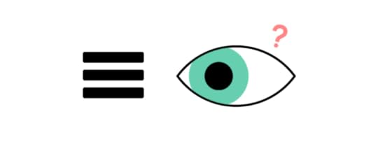
Does the Hamburger Menu Make Mincemeat of UX Design?
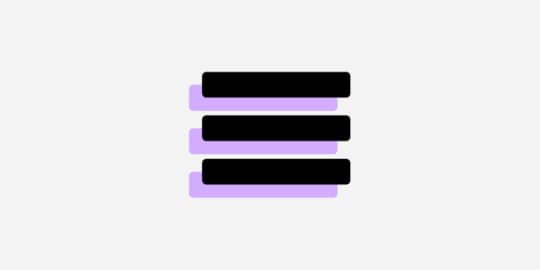
The hamburger menu looks as tasty as it sounds. It’s a design-cum-navigation element, now on almost all apps, that comprises three horizontal lines. It looks like a hamburger. Picture something like this:

Bun, patty, bun.
If you squint, it kind of looks like the Spotify logo:
 Photo credit
The UX designer’s hamburger menu saves time and space by storing relevant information in a universally recognized format. All that information is there in one place, and everyone knows where it is. Like how a diner learns what food a restaurant serves by reading the menu, a website visitor accesses different linked sections through one navigational element.
Well, that’s the theory, anyway.
This icon became pervasive in the mid-2010s, and similar to the classic hamburger itself, every UX designer has an opinion about it. For every designer who thinks it frees up screen real estate, another believes it’s a blot on the informational architectural landscape. You might fall somewhere in the middle, but you will change your mind after reading this.
ContentsWhat Is a Hamburger Menu, Anyway?It’s Just a Hamburger Menu. What’s the Problem?A Burger-Free MenuUltimately, It’s Your Choice as the DesignerLast BiteWhat Is a Hamburger Menu, Anyway?Those three lines at the top of almost every app or mobile-optimized website? They make up the hamburger menu. Designer Norm Cox cooked up the idea in the early 80s because he thought it was easier to communicate information to people in a list format.
There’s evidence that backs up this theory:
Humans remember facts better when presented with a list.Fifty-five percent of website users look at lists (seventy percent look at lists with bullet points).Lists improve the selection-making process for users.Even that short list above improves readability and breaks down content into digestible “chunks.”
But other research tells a different story.
It all has to do with discoverability. Some website visitors can’t find the links when they’re hidden in a hamburger menu, which affects click rates. And click rates are even lower when designers place the hamburger menu on the top-left of the screen because of how most people scan their devices (center first, then right).
“The implied message is that things at the top of the screen are to be glanced at, not clicked on,” says UX Planet.
Perhaps the most shocking statistic is this one: Forty-eight percent of internet users over 45 don’t know what the icon even means.
So, unless your creative brief is “create a design for only millennials because nobody else must visit our website,” maybe choose something different the next time you consider a hamburger.
It’s Just a Hamburger Menu. What’s the Problem?The hamburger menu certainly saves space; some would argue it’s easier on the eye. Instead of links stacked up against each other in the sidebar — or, God forbid, sprawled across the top of the home page like trash bags on a downtown sidewalk — the menu keeps everything hidden from sight, facilitating crisp and creative design. It’s like neatly placing everything in a drawer.
But it’s that drawer comparison that irks some designers.
Despite what IKEA tells you, humans put stuff in drawers for one reason:
There’s nowhere else to put it.
That’s why, for some designers, hamburgers are off the menu.
Think about the things you keep in drawers. Now think about the things you keep on shelves. Would you keep a framed photo of Mom in your drawer? Or your Master’s in User Experience Design? Probably not, because you want everyone to see it.
The hamburger menu suggests one thing: The items contained within are of little importance — concealed from public view and brushed under the carpet like a 20-year-old dirty secret that nobody wants to talk about.
Anti-hamburger designers think the menu is little more than an afterthought: There’s nowhere to put it, so let’s put it here. It’s lazy, if not necessarily bad, design.
So what are the alternatives?
A Burger-Free Menu Photo credit
The most popular alternative to the hamburger menu is probably tabs, especially for app navigation on smaller smartphone screens. Sure, you’re limited to four or five menu items, but the ones featured hold greater importance because you haven’t hidden them away.
“Tabs offer a more modern and useful method to navigate around an app, and the core sections of your application are immediately visible to the user,” says UX designer and software engineer Michael J. Fordham. “If you’re concerned about space, you can implement hide gestures that make the tabs disappear when you scroll down but reappear when you scroll up.”
What else is on the menu?
Floating HamburgerAgain, best served on apps, this alternative provides users with context when they click on the three-line icon. Like tabs, links no longer feel like an afterthought, and they feature more prominently on screens.
SwipesThink Tinder, where users scroll left or right to navigate apps. Swipes only provide sequential access to pages, though, so won’t suit contexts where users jump to different sections quickly, like store pages.
Ultimately, It’s Your Choice as the DesignerIf you’re still hungry for a hamburger, a couple of tips:
Supersize your burger: Make your menu more recognizable so visitors can see it. The links contained within could be critical for the website owner. Make sure people click on them.Create a secondary menu: Couple the hamburger with secondary access to important pages. (Use one of the menu alternatives above.) You’re probably thinking about the c-word (“clutter”), but you can avoid this by incorporating minimalist elements elsewhere in the design infrastructure. Try it.Last BiteMentioning the hamburger menu in UX design is like bringing up politics at a dinner party. Expect some controversial opinions. Despite what some designers think, it’s not a crime to use the hamburger, and it can be an incredibly effective navigational tool. Just realize its potential downfalls, consider the overall context and try out a couple of alternatives with UXPin before your next bite. When’s the next time you’ll serve up a hamburger?
Join the world’s best designers who use UXPin — not your average UI design and prototyping tool. Start your free trial.
The post Does the Hamburger Menu Make Mincemeat of UX Design? appeared first on Studio by UXPin.
June 8, 2021
Adopting Design Systems in Enterprise with Johnson & Johnson
When any new leader walks into an enterprise with more than a century of history—as Johnson & Johnson does—they know they must adapt to some of the existing processes. Improvements in technology, however, have made it necessary for all corporate designers to turn processes into even more efficient methods. If you start a new job tomorrow, you might find that you need to turn old style guides into design systems. Ultimately, these new systems make life easier for you, your design team, and other employees.
Ben Shectman, a UX design expert with decades of management experience, found himself in that situation. He became the Experience Design Expert Service Leader at Johnson & Johnson in 2019. The company had two style guides that UX designers used for language and graphics. Unfortunately, the style guides were only available as PDF files. It was clear to Shectman that he needed to adopt design systems and move away from the PDF style guides.
Table of Contents
Design systems offer a single source of truthAtomic-based design systems improve workflowsCreate design systems for developers and designersTry UXPin MergeDesign systems offer a single source of truthPDF and print style guides present a considerable problem: you can never know whether you have updated all of them to meet the enterprise’s current standards. You can hold as many meetings as humanly possible, but an outdated style guide will manage to sit in someone’s desk drawer, just waiting to make your life more difficult a year or two from now.
Design systems offer a single source of truth that exists in a digital format you control. Some companies get by fine using established design systems like Material Design, Carbon, or Fluent Design System. A robust, multinational corporation like Johnson & Johnson, however, needs a unique design system built from the ground up.
You maintain complete control over your design system, build it in a design tool such as UXPin, have the components coded and stored in a Git repository. When you make an update, everyone who accesses it will only experience the new version. You never have to worry about outdated copies because you control the source for the company’s digital products.
Design systems based on atomic design processes improve workflowsShectman decided to build the J&J interactive design system with atomic design. Atomic design serves J&J well because it lets designers break down features and designs into their most basic components (called “atoms”). Using UXPin, anyone in the company can potentially access the approved components and create new tools that comply with J&J’s guide.
In reality, Johnson & Johnson’s design team makes its internal products. The team even created a process that makes it easier for Shectman to approve new components and add them to the design system.
Regardless of who actually builds a prototype, the atomic design improves workflows by providing all of the approved components. From there, you just choose the components you need and adjust them to meet the project’s goal.
Create design systems for developers and designersJohnson & Johnson’s design team meets with developers regularly to gain insight into their approach to building products. Getting developers involved makes it easier for designers to avoid concepts that don’t function well when put into code.
Building an interactive design system is a great start to improve design consistency. You can go one step further and try out a new technology called Merge. It makes it even easier for enterprise users to bring designers and developers together. The all-in-one designing and prototyping app powered by code, allows you to bring components from developers’ libraries (from Git repository or Storybook) and use them in your designs. These components keep all the interactivity and are still production-ready, which saves a lot of handoff troubles. It speeds up building digital products; both the design and development process.

Everyone also benefits from Merge’s ability to make prototypes that function like finalized products. Whatever you design with Merge technology, will work exactly the same after the development team completes the project.
Try UXPin MergeShectman and members of his design team offer a deeper look into their process in this webinar. It includes a demonstration of a J&J designer using their interactive design system to transform an outdated tool into a new version with better functionality and aesthetic appeal. Go beyond a design system and bring UI code components to the UXPin editor. Make it easier for designers and developers to create prototypes from approved components in a design system. Request access to UXPin Merge so you can speed up your product development process and make it smoother.
Discover MergeThe post Adopting Design Systems in Enterprise with Johnson & Johnson appeared first on Studio by UXPin.
June 4, 2021
4 Testimonial Page Examples for UX/UI Design
These testimonial page examples will show you how to offer social proof of a product’s benefits.
In other words, when you design a page that shows visitors the wonderful ways the product or service helped other customers, they’re more likely to believe that it can help them too.
“Above the fold” is the part of the testimonial page the visitor sees without having to scroll down. Many UX designers choose to have only one featured testimonial above the fold.
The three most common testimonial types are:
Customer quotesVideosCase studiesYour customer quotes are more credible if you include the customer’s name and where they live. Both first and last names offer the most credibility. But many customers might have privacy concerns. You should have at least a first name and a location. If the customer lives in a small town or rural area, you can name the nearest metro area to protect their privacy. Privacy isn’t as great a concern in business-to-business (B2B) testimonials. Business owners and corporate execs are already visible on public records. To strengthen the credibility of a B2B testimonial, include both first and last name, their job title, and company name. Add the customer’s face to the testimonial. Place a photo or drawing next to customer quotes. Have the customer tell their story in a video.
Be specific. It’s not enough to have someone saying something generic like, “I really like this product.” A testimonial has a lot more credibility when it tells how the product is life-changing. “I used to dread preparing the sales tax deposits, but now I get them done in half the time,” is much better.
Testimonial Page Examples: Bizzabo Above the Fold
The testimonial page for the leading corporate event planning company features outer-space-themed graphics. Lots of white space surrounds the headline: “You are the center of our universe.” The layout helps draw your attention to three featured customer quotes.
Below the quotes is a paragraph promising Bizzabo’s commitment to its customers.
Below the FoldScroll down and you’ll see Bizzabo’s Captera rating of 5/5. A call to action (CTA) button encourages you to read more about their customer-centric approach.
Keep ScrollingNext, there’s a grid of case study links. This section features case studies from Sapphire Ventures, DataRobot, ServiceTitan, and more.
Further down, you’ll find a short video testimonial from CoinDesk. Above the embedded video, the heading quotes the operations manager.
The last section is a CTA to enter your work email and request a demo.
Testimonial Page Examples: Quickbooks Above the Fold
This leading accounting software from Intuit has a featured quote on its testimonials page. It includes a photo of the owner of Ecoscapes, Suraj Nayak.
Underneath there’s a CTA button to start a free trial.
Below the FoldNext, you’ll see a preview image for a customer video. Click on the preview and a YouTube video plays.
A horizontal scroll bar below lets you see two more videos.
Keep ScrollingBelow that there’s a section with more customer photos and their quotes. All of the personalities shown have titles such as “Founder,” “Business Owner,” and “Co-Founder.” This reveals Quickbooks’ target market of small businesses.
The last element before the footer is a CTA for those who keep books on Excel or Google Sheets to switch to QuickBooks with a free trial.
Testimonial Page Examples: Casper Above the Fold
When you land on the testimonial page for this manufacturer of mattresses and pillows, the heading reads, “See why customers love Casper.”
A paragraph states Casper’s commitment to “outrageous quality.”
Beneath the paragraph, there are some featured products. Then there’s the heading for the reviews, but to read them you have to go…
Below the FoldThe page has customer reviews that cite only the first name and location of the reviewer. They are in boxes that you can scroll through horizontally.
Most of the reviews have a note at the bottom of the box that reveals that the customer was entered into sweepstakes for writing a review.
Keep ScrollingNext, Casper touts its accomplishments of being named among Time magazine’s best inventions of 2015, its Google Reviews average rating of 4 ¾ stars, and a quote from Architectural Digest, “The perfect mattress according to science.”
Down further you’ll find quotes from articles on Casper from Fast Company and Good Housekeeping with links to the articles.
Testimonial Page Examples: UXPin
As a full-stack UX/UI design software provider, it’s fitting that we include our testimonial page among the examples.
Above the FoldHere we feature T. Rowe Price, an investment company that streamlined its UX design process with UXPin Studio.
The headline is simple: “T. Rowe Price Adopts and Scales Agile UX in the Enterprise.”
Below the headline, we have a call to action (CTA) button linked to the case study page.
Below the FoldScroll down and you’ll see the grid of other satisfied customers and links to their case studies.
PayPalHBOBlazeMeterSumologicLiquidPlannerLookThinkSapientKeep ScrollingIn the last section, we have quotes from satisfied UXPin users.
Larry Sawyer, PayPalAndrew Roberts, CitrixMarkus Knight, Adidas AGTracy Dendy, HBOResourcesNew to UXPin? Learning is easy. Check out our video tutorials on YouTube. Learn UX design. We have a wealth of ebooks covering virtually every UX/UI design subject. Best of all, they cost you nothing. Start using UXPin with a free trial and see the benefits of end-to-end project management.
The post 4 Testimonial Page Examples for UX/UI Design appeared first on Studio by UXPin.
UXpin's Blog

- UXpin's profile
- 68 followers

