
UXpin's Blog, page 79
May 13, 2021
Four persona examples for UX/UI design

As UX/UI designers, we have to keep in mind that we’re creating a product for real people. A user persona is a perfect tool to humanize our research data. We’ll look at some UX persona examples later.
When we say the target user is women 35-60 years of age, our brains read it as numbers and not people.
But if we say that 42-year-old Martha is married, has two teenage sons and one adult daughter, our brains recognize her as a person.
What is a user persona? UX persona basicsIn user experience and user interface (UX/UI) design, a persona is a fictional character that represents a typical user of an app, website, or other product.
A user persona helps clarify your target audience:
It helps with design iteration. During alpha and beta testing, the feedback you get will help you improve your user persona.It helps you identify the user. A persona helps you understand their needs.It gives you an understanding of user behavior.How to build a user personaYou’ll need to put a lot of thought and research into a persona. You want to be sure it accurately reflects real-life users.
Step 1: Give the persona a nameWhen naming your persona, give the character a first name and combine it with their function. This makes the persona memorable.

A SaaS product for CPAs could have a persona named Artie the Accountant. Millie the Mom could be a persona for a daycare website.
An app for a pet care business might have a persona named Pam the Pet Groomer.
Tip: Add a stock photo or drawing that represents your persona. This helps you identify with the persona and aids memory.
Step 2: Add demographics and interestsHere you give the personal data:
AgeGenderMarital statusOccupationLocationHave a summary of the character’s personality. You can condense it into a quote that represents attitudes and feelings.
Step 3: Identify frustrations
Here we look at what the user wants to move away from. What kinds of problems does the user want to solve with your product?
Step 4: Identify wants and aspirations
This helps us find what kind of experience the user wants from the product.
Step 5: Review and update frequentlyAs we mentioned earlier, you’ll need to refine your persona during the user testing phase of the project. After the product launch, user feedback will help you keep the persona up to date.
Persona examples for UX/UI design UX persona example #1: mobile website for a supermarket
A local supermarket has its store inventory on a mobile website. This allows shoppers to see what items are in stock and in which aisle they can be found. Users can log in and make a shopping list.
Helen the HomemakerAge: 35Gender: FemaleMarital status: MarriedChildren: Two girls, ages 7 and 9Occupation: Stay-at-home momEducation: Associate’s degreeIncome: Husband makes $65,000/yearLocation: Joplin, MissouriQuote: “Family comes first.”Influencers: Oprah, Church leadersSources of info: Blogs, Facebook groups, TV, radioGoals: Get quality groceries for her family and stay on budgetValues: Holds traditional family valuesFrustrations: Juggling many tasksAspirations: Wants her family, friends, and church acquaintances to see her as a successful homemaker UX persona example #2: university website
Both the mobile and desktop versions of the site give students access to class schedules, course syllabi, student events, sporting events, fraternity and sorority mixers, and more.
Freddie the FreshmanAge: 18Gender: MaleMarital status: SingleChildren: NoneOccupation: StudentEducation: High school diplomaIncome: Allowance from his parents of $500/month on prepaid debit cardLocation: Austin, TXQuote: “Enjoy life while you’re young.”Influencers: Professors, fraternity brothersSources of info: TV, the university newspaper, blogsGoals: To be well-liked by his peersValues: Good grades are important, but it’s also important to have a good timeFrustrations: He has to choose which college activities are going to let him keep up with his studiesAspirations: To get the most out of the college experience UX persona example #3: rental car virtual concierge
The app lets users reserve a car and check in when they arrive. Their car has a card inside with a scannable code to confirm they picked up the car. The app sends a confirmation that the user shows it to the security person at the exit. It makes dropping off the car convenient as well.
Business Class BenAge: 43Gender: MaleMarital status: MarriedChildren: Three girls, ages 13, 15, and 16Occupation: Manufacturing equipment salespersonEducation: MBAIncome: $140,000/yearLocation: Home in Gary, Illinois – travels all over the U.S., Canada, and the U.K.Quote: “You gotta make sacrifices to get ahead in life,”Influencers: Gary Vaynerchuk, Aaron Ross, Trish BertuzziSources of info: The Wall Street Journal, New York Times, finance blogs, sales blogsGoals: To earn enough to have a comfortable retirementValues: Providing good things for his family is the most importantFrustrations: Frequent travel is exhausting and wants to get hotels and rental cars without the hassleAspirations: Wants his business travel to be more enjoyable UX persona example #4: trucking dispatch system
This enterprise software is the next generation in trucking dispatch. It’s designed for trucking companies that specialize in oversize freight that requires a permit.
The system lets dispatch communicate load details, including pickup and drop-off locations, permits required, and appointment times. The driver can accept the work assignment and confirm the completion of pickup and drop-off.
As oversize loads may have route restrictions, the system assists the driver in finding the safest route. It helps the driver find the fueling locations with the best prices.
Heavy Haul HenryAge: 51Gender: MaleMarital status: DivorcedChildren: One daughter, age 22Occupation: Truck driver, oversize load specialtyEducation: Some collegeIncome: $112,000/yearLocation: Home in Tulsa, OK – travels all over the U.S. and CanadaQuote: “Six days on the road and I’m a-gonna make it home tonight.”Influencers: Radio talk show hostsSources of info: Mostly radio, some television, newspapersGoals: Find the safest routes, get the right permitsValues: Has a strong work ethicFrustrations: Inaccurate map programs, satellite link dead spots Aspirations: Find routes, fuel stops, and overnight parking easilyResourcesTry out UXPin design tool for free to build interactive prototypes just for your UX/UI personas.
See the UXPin blog and video tutorials for UX/UI design tips.
Master the craft. We have a heap of ebooks on UX and UI design you can download. They cost you nothing.
The post Four persona examples for UX/UI design appeared first on Studio by UXPin.


May 12, 2021
Interactive Components: Bring your Prototypes to Life
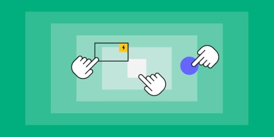
To visualize something well and make sure the design gets properly coded without too much back-and-forths with a developer, you’ll need a nice working prototype. Prototypes with interactive components also help when showing your design to stakeholders or other team members—or for usability testing. For a prototype to be great, it needs to resemble a real-life product—so it should include as many opportunities for user interactions, as possible, which will give it that WOW effect—and ultimately speed up your design process, making it more efficient and effective.
What is a product prototype?When you’re designing a UX/UI product, a prototype is basically an interactive design of a product, which gives you a glimpse at the design and features of the product, before the product is finalized. Prototypes are more complex and interactive than, say, initial sketches or wireframes. Instead, they explicitly test a user’s journey or experience with a site or product.
Prototypes are important because they help you avoid investing a lot of time and money into something that doesn’t work or doesn’t behave the way you want it to when it gets in the hands of a user. Product prototypes can help you find stumbling points or errors in your design, and they can help you resolve usability issues before you launch a product to the public. Finally, they also give you a glimpse into how people actually want to use your product, which can allow you to go in and tweak design, and even change up marketing and sales ideas based on how users actually interact with what you have to sell.
How (and why) interactive components improve product prototypesDesigning a product is often a collaborative process. You may collaborate with a designer who collaborates with a developer who collaborates with a marketing/branding team, etc. (and on and on). This process can get extremely clunky and complicated—and designing product prototypes with interactive components can help speed up and simplify the process. There are many types of prototypes, but the most effective for improving your process is a prototype with interactive components.
Interactive components in a prototype (and ones that actually pair with relevant devices) help users get a better sense of what it will be like to actually use what you’re creating. Rather than have to imagine what it will be like to click a button or fill out a form, they can actually feel what it will be like to have the experience. Making the prototype as close to the real product as possible helps you discover errors, flaws, or fixes you need your designer to work on. It also allows you to gauge what human behavior will be like when your product is in their hands—both how they use it, and how they want to use it. If you actually make a prototype usable, this will give you a better sense of how you can improve the product or actually have a better understanding of who you should market or sell your product to.
[image error]By creating a prototype that allows you to examine human behavior and ferret out potential flaws, you can minimize the number of times you and your designers have to go back and forth changing and improving the product and speed up how long it will take you to get your product out into the world.
How to incorporate interactive components in your product prototypesTo incorporate interactive components into your product prototypes, there are many steps you can take. Make sure that forms can actually be filled out; boxes can be checked; and links can be clicked on. Make as many components of your design actually workable as you can; this allows users to have the experience of trying to use the product, and it can give you some insight into how your product works and how people will (or want to) use it.
One helpful strategy is including pre-built components (called “forms” at UXPin) that you can easily drag and drop in our platform. (No need to design these from scratch!)
You can create interactions depending on the conditions like click, hover etc. on the ready components! Here are some examples:
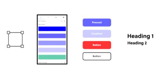
Button 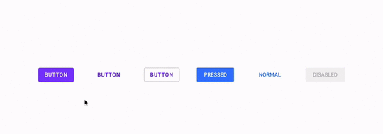
 Radio button
 [image error]
How about a ready sign-up form with all the interactions already added?
→ Download a ready .uxp file to import into your UXPin account.
Want to create one by yourself? Here’s a tutorial.
How UXPin can help bring your prototypes to life with interactive componentsNailing your product’s design prototype quickly doesn’t just save you the headache of having to go back and forth with your designer over and over again. It can also mean lower costs in the production of the product, which leaves more in your budget for things like marketing, sales, and more. One of the best ways to nail the design the first time you try is by using nice, realistic prototypes—especially ones with interactive components. You don’t want people to imagine what it’s like to use the product you’re creating, especially when testing it. You want them to know what it feels like, how it will behave and react to their manipulation. For that reason, it’s key to incorporate interactive components in your prototype design.
If you want help incorporating interactive components into your prototypes, consider using UXPin. UXPin offers easy-to-use tools that will help ensure that your prototype looks—and feels—like your real-life product. UXPin allows you to design and manage your entire UX/UI project in one tool. We have a selection of great pre-prepared solutions (built-in forms) that will save you some time. Using these tools in UXPin can help you wow potential users, your own team, and potential investors—which means that not only will you be happy with your prototype quickly with minimal stress (so you can get the production or release process started), but also that investors will feel excited about investing in what you have to offer, since they’ll have a true understanding of the product or business they’re ready to back.
Try out UXPin today with a free 14-day trial to learn more about how you can benefit from all they have to offer.
The post Interactive Components: Bring your Prototypes to Life appeared first on Studio by UXPin.
May 11, 2021
Aspect Ratios: All You Need to Know
Image-rich content drives website engagement, and making sure those images display properly is a crucial part of good UX design. Whether you’re working with photographs, illustrations, or video, an image that’s stretched, squashed, or poorly cropped makes a poor impression for on-site visitors and affects their overall experience on the site. Determining aspect ratios for optimal viewing on all kinds of devices can be both a chore and a challenge for designers, but today’s responsive design tools and an array of free aspect ratio calculators can make sure that images and video files are displayed in the best light everywhere.
What is aspect ratio?In the most basic way, aspect ratio is the relationship between an image’s width and height. Because aspect ratio reflects an image’s proportions, not its size, the aspect ratio remains the same regardless of size. For example, a square image has an aspect ratio of 1:1, since its height and width are the same. That ratio will hold no matter how large the image is. An image that’s 320x320px will have the same aspect ratio as one that’s 1080x1080px – 1:1.

For images that are not square- that is, horizontal or vertical rectangles of various sizes –aspect ratio can vary. Common aspect ratios used in photography, video, and other image-based design work include 4:3, 3:2 or 16:9, the basic ratio for many widescreen devices such as televisions and desktop computers.
Although the aspect ratio of an image comes from the relationship of its height and width, multiple subsets of this ratio also help to define image proportions.
Pixel aspect ratioPixel aspect ratio (PAR) refers to the proportion of the individual pixels that make up an image. Pixels are typically square, which results in a pixel aspect ratio of 1:1. But images that are optimized for certain types of displays can also have rectangular pixels with an aspect ratio of 4:3 or similar.
Display aspect ratioDisplay aspect ratio (DAR) is the most relevant kind of aspect ratio for designers, and it’s the one that’s most commonly associated with the general term. As the name suggests, display aspect ratio refers to the proportions of an image as it appears on screens of various kinds.

Some devices, such as cameras and televisions, have a fixed DAR, so for images to display well on these devices, they need to be optimized for their particular aspect ratio. For example, a typical display aspect ratio for widescreen video to be displayed on a monitor or television screen is 16:9. When images with a different aspect ratio are displayed on these devices, they appear distorted. Digital SLR camera sensors also have a fixed display aspect ratio, which controls how images captured by the camera will be saved and displayed.
Storage aspect ratioStorage aspect ratio (SAR) is an aspect ratio formula that pertains specifically to encoded digital video files. SAR refers to the width and height relationship in video frame size, and it needs to be consistent across all individual frames in order for the complete video to display properly. In a commonly used formula, SAR x PAR = DAR for most widescreen videos.
Aspect ratios affect UI/UX designAspect ratios play an important part in any kind of project that involves capturing and displaying photographs, videos, or other kinds of image-based files in the correct way. For photographers, the camera’s fixed aspect ratio can have a considerable impact on composing a photograph as well as displaying it later on other devices. And for videographers and anyone working with slideshows, animations, and other motion projects, aspect ratio is a key factor for correct display on widescreen and mobile devices.
The shift to responsive web design, which ensures that content displays properly across all devices, helps to resolve a number of problems with setting aspect ratios for individual images. But even in these environments, problems can arise, such as when an image can’t be adjusted for display without compromising either its content or its quality. A simple example is when a square image with a 1:1 aspect ratio needs to fit into a rectangular box on a website page. To accommodate varying image size requirements, proportions, as well as size, may have to be adjusted.
In an increasingly image-driven digital world, videos and images that look even slightly out of proportion contribute to a visitor’s negative impression of a website – and those that are clearly forced into the wrong configurations can even interfere with a site’s usability.
Poorly proportioned product images or a user guide video that’s too stretched to see clearly can affect both a visitor’s willingness and their ability to use the site. Designers, developers and anyone working with images will need to know how aspect ratios work and how to manipulate them for the best visual effect. To streamline the process, a number of aspect ratio calculators, both free and paid, have popped up on the web.
Aspect Ratio Calculators: A SolutionIt’s certainly possible to calculate an image’s aspect ratio and resize it manually with the help of some simple mathematics. But that becomes tedious when dealing with many images from multiple sources. With the help of one of the many online aspect ratio calculators, though, you can determine the optimal aspect ratio for any image in a number of different formats, allowing designers to fully optimize each image for optimal viewing.
To use a basic aspect ratio calculator, you’ll need to know the image resolution in pixels and select the type of environment where the image will appear, such as HDTV. The calculator then returns the result as an optimal aspect ratio. This can be especially helpful for video editing, where the video might include slides or images of varying sizes from different sources.
Image Editors have aspect ratio toolsOther image management tools can also help with getting the aspect ratio right. Image editors such as Photoshop and Canva provide templates designed with optimal aspect ratios in mind, suitable for use in typical situations such as designing website banners, headlines, or social media profiles. Most standard video editing software also allows users to determine and adjust aspect ratios of images to be included as individual frames in the video.
Correctly proportioned images that display well and perform properly are a powerful tool for businesses of all kinds. Getting aspect ratios right makes images look good wherever they’re displayed. Whether you’re selling a product, offering a service, creating an online course or something else, photographs, illustrations or video can attract visitors and keep them engaged.
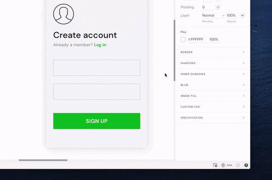
UXPin’s features make it easy to make sure images are sized and proportioned correctly. With Image Fill, you can choose from a variety of settings that allow you to adjust image size or crop the image while preserving its aspect ratio for perfect positioning. Find out how the UXPin design tool can help bring designers and developers together for faster, better product development.
The post Aspect Ratios: All You Need to Know appeared first on Studio by UXPin.
May 6, 2021
Want to Convert Design To Code? Here’s A Better Way

Whether creating a web page, Android app, or iOS app, most traditional designers start their work by creating static images with tools like Adobe XD, Figma, Invision, and Photoshop. The designs might look aesthetically pleasing but they are not even close to being production-ready.

After the designing phase, you need to add interactions that will show the developers and testers how components correspond with one another. Then, you handle the static images or time-consuming interactive prototypes to developers who turn designs into code.

It’s time to move beyond this tedious process by taking a code-based approach to design. Once you think about the challenges of image-based design and then adding just interactions, it quickly becomes obvious that your team needs a better way to create products that users will love.
Recommended reading: Why It’s Time for Designers to Switch From Image-Based to Code-Based Design
Challenges of design-first prototypingDesign-first prototyping creates more steps than you need to create a popular digital product. The process probably includes:
Coming up with ideas to be turned into products or features.Communicating ideas to the design team.Reviewing the work of the design team and giving some feedback.Designers struggling with the limited possibilities of adding advanced interactions in their design tool. A lot of back-and-forth in the designer-dev communication, trying to smoothen some prototype inconsistencies. Adding some tweaks until the product fulfills the original vision.
These steps can take weeks or months to complete. Even when you use a tool like Avocode and Anima to turn PSD, Figma, and others that turn designs into code, you still need relentless prototype and product testing to ensure that all interactions work as they were designed.
You still need to deal with unnecessary steps because Avocode and Anima can only convert designs into code. They do not offer a designing environment that can use code components on the prototyping phase to start with the code approach first.
Design to code handoff wastes time and moneyNot surprisingly, the serpentine process of passing work between product managers, designers, and developers quickly becomes expensive. In the United States, website developers with associate’s degrees can expect to earn about $35.46 per hour (€ 29.5). The longer development and prototyping take, the more it costs to bring the product to market.
Without code-based design, though, the process will always involve backtracking and repeating steps. It’s clear that the design to code handoff process wastes time and money.
Popular website designer Matthew Strom found that he could streamline his process by designing with code instead of starting with static images. While building a new homepage for WSJ. Magazine, he found that working with code was often more straightforward and rewarding than taking a vector-first approach. He discovered that the old process became sluggish as he created more images.
Thankfully, Strom knows enough code to build a complicated homepage without relying on design tools for every step. Unfortunately, few designers have the experience to create digital products from code.
Prototype functionality suffers without code-based designYou can improve the design to development process slightly by encouraging your designers to learn basic code. Knowing the fundamentals of HTML and CSS gives designers a shared understanding that helps them anticipate the needs of developers. It makes the process even better when designers know some front-end JavaScript and Ajax because it gives them insight into how much work it will take developers to turn their static designs into interactive components.

Some coding experience also helps designers understand the limitations of development. It can make a huge difference when graphic designers have a baseline understanding of what developers can and cannot do.
However, the code to design approach doesn’t mean that a designer must know all of that. It’s enough to sync developers’ repo where they store UI code components with the design tool editor to empower designers to use the production-ready parts in their designs. Not only is it faster but also much more consistent with the design standards. Thanks to this you can avoid all the reviewing and repetition stages in the whole product development process.
Without a code-based approach to design, you end up with prototypes that don’t function as anticipated, which inevitably means you end up wasting even more resources.
Recommended reading: Why Your Team Needs to Take a Code-Based Approach to Design
Make designing and prototyping easier with a design tool based on code generationA tool that enables having your UI code components imported to a design library is much more efficient than the one that converts an image to code. UXPin Merge bridges the gap between designers and developers by giving everyone a common language. A simple tutorial shows how designers can import existing React components into UXPin’s editor through Merge technology.

Instead of interpreting image-based designs and turning the ideas into code, developers just take the components that were used in a design from their library to build ready products.
As the code-powered prototypes already behave like a final product, there’s no need for additional reviewing steps – the result of developers’ work will be pixel-perfect to the designers’ work.
Recommended reading: You Can Become a Code-Based Designer Without Learning Code
Test user interfaces and interactive design elements with fully functional prototypesYou need to meet the project manager’s specifications before you embark on turning a prototype into a product you can release. UXPin Merge gives your team members an opportunity to test the functionality of interactive components before committing to a development process. With UXPin Merge, though, it’s often difficult to tell the difference between the prototype and the finalized product. That’s how strong initial testing becomes when you build digital products with code and use real data to test interactions.
Request access to UXPin Merge for code-based designing and prototypingYou don’t have to continue the tedious process of building products from a design-first perspective. Shorten your go-to-market process, improve collaboration between departments, and take control of your designs by requesting access to UXPin with Merge technology.
 Discover Merge
The post Want to Convert Design To Code? Here’s A Better Way appeared first on Studio by UXPin.
May 5, 2021
Improve Your UX Portfolio – Ask for a Review

Landing a UX design job often depends on the quality of your portfolio. It’s such an essential part of the hiring process that companies like uxfolio specialize in solutions for making online portfolios.
No matter what tools you use to put your portfolio together, though, you only win jobs when you have excellent designs to show project managers. People care much more about the quality of your UX designs than the quality of your portfolio presentation—although, you can use the presentation as an example of your skills.

Unfortunately, it’s nearly impossible for you to take an objective look at your UX portfolio. Getting reviews should make it easier for you to identify the strengths and weaknesses in your portfolio. Once you have several perspectives, you can put together a selection of UX designs that display your skills and talent.
UXPin gives you an easy way to share works-in-progress and completed prototypes so you can get the feedback you need.
Create a free UXPin account so you can share your work through a preview with anyone and get reviews.
Share your UX designs and get feedback from others
Sending someone a copy of your UX design portfolio doesn’t necessarily mean that you will get meaningful feedback. Even when the reviewer puts in a lot of effort to help you perfect your portfolio, you could end up with information that doesn’t help you very much.
Much of the difficulty comes from the ways that people communicate online. With most UX designs, prototypes, and portfolios, reviewers cannot place their opinions directly into the work. Instead, they send you an email or similar message that forces them to describe the feature they want to identify and how you can improve it.
In a visual medium, you need the ability to leave reviews directly on the design.
With UXPin, you can get more insightful UX portfolio reviews because mentors and colleagues can communicate with you in real-time within your workspace. Instead of writing something like, “I’m not sure that the blue icon you have near the upper right corner tells users what will happen when they click it,” they can place a comment near the icon that says, “This is a confusing icon. Try to make its function more obvious.”
You also get better UX portfolio reviews because you can share designs and fully functional prototypes. When your prototype review is based on real information and functional features, people can give you accurate advice without getting distracted by Lorem ipsum and fake data.
Recommended reading: How collaboration makes you a better designer
Use Spec Mode to implement brilliant design ideas
Sometimes, you need a more experienced person to show you how to improve your UX designs. UXPin Spec Mode gives them access to your design so they can make subtle changes that lead to dramatic results. Perhaps shifting a menu a little to the left creates a better balance that will appeal to users. Maybe you try to force too many features into a design, so you should consider adding drop-down menus to improve the UX.
You can even share your Spec Mode designs with developers to get portfolio reviews from people who turn static designs into digital products. You might learn that your UX design sets an unreasonable expectation for development teams. On the other hand, you might get praise from developers who appreciate your ability to generate CSS code from your work. UXPin makes the second part simple by automatically generating code from your graphics.
Start a free trial with UXPin so you can see the benefit of collaborating with reviewers in Spec Mode.
Recommended reading: Design trends 2021
Make fully functional prototypes that show off your concepts
You can’t get portfolio reviews with the deepest levels of insight until you can share fully functional prototypes. UXPin generates prototypes from your UX designs and lets you share them with your colleagues and mentors.
Ideally, you want to send prototypes that function so people can give you realistic feedback. A static design might look amazing. If you plan for it to become an interactive feature, though, you need your reviewers to experience how you expect it to function. Otherwise, you’re getting feedback on the wrong aspect of your work.
Yes, a brilliant design will help attract potential employers and project managers. A design feature that actually works as intended, though, will get much more attention and help you stand out from other applicants.
When you try to test a feature in your prototype, it might look like it functions fine. You’re expectation of what the feature should do, however, can cloud your judgment. An objective reviewer without any preconceived notions can approach the prototype’s features as a new user. If something doesn’t feel intuitive, they can point to opportunities for improvement.
Recommended reading: How to create clickable prototypes
Get started with UXPin to create and share your workSharing your UX portfolio with UXPin makes it simple for people to give you honest feedback that leads to a stronger representation of your abilities. Once you create a UXPin account, you can invite anyone to give you feedback, tweak your design, or iterate. The people giving you feedback do not need UXPin accounts. As long as you give them the correct link, they can contribute to your success.
Start your free UXPin trial today to create fully-functional UX prototypes that you can share with anyone. No matter where you are in your career, UXPin has a membership level that fits your needs and income.
The post Improve Your UX Portfolio – Ask for a Review appeared first on Studio by UXPin.
May 4, 2021
How to Write the Best Product Briefs

Writing a product brief helps everyone involved in the development process to understand what the product is and why it was created and as a result, it helps in creating a good product. This document provides an ultimate source of knowledge on the product, ensuring that everyone has the same level of understanding. By putting together a product brief, you avoid incorrect assumptions that could lead to design, development, and launch issues, solving problems before they appear and making it much easier for everyone to work together. So how can you write the best product brief for your team?
Sections to Include in Your Product BriefA comprehensive product brief is well-organized and covers the most important aspects of your product. These sections let you flesh out the what’s and why’s of the product.
What are the Product’s Purpose and Goals?Start by establishing the context for your product. You want people reading this document to have a strong understanding of the product’s background, the user problems it addresses, and how it helps your company meet objectives.

When you discuss user problems, you also want to define the demographic you’re targeting. You can further segment your potential customer base as needed. If you already have user personas, you’ll have an easy time covering this.
What does a successful product look like for your project? If possible, identify metrics that indicate whether you are on the right track.
What Features Does Your Product Have?When you’re writing a product brief, the features section is likely to be the largest one in your document. You’re doing more than describing your feature wishlist. You want to keep the user experience in mind when you present each feature. What are the users getting out of this interaction? How do they feel when using that feature? Those are open questions you should ask before starting the product design stage.

How do your features tie in with your product’s goals? What impact do they have on the user experience? Create a priority list of features if you need to cut any due to scope creep or scheduling problems.
When is Your Product Ready for Testing and Release?You need to establish the point where your product should move into beta testing and release. Otherwise, you could end up in a cycle of ever-increasing scope creep as you invest more time and resources than the product needs to reach a releasable state.

Create clear release criteria when you write product briefs with product managers, as well as the development and design managers. Start with the product’s functionality. You can use the priority list from the features section to establish the must-have features.
Does the product’s usability support the use cases for your target demographics? How user-friendly is the product?
Is your product performing well enough to be released? How stable is it? Does it have the support in place required to run?
How Long Will It Take to Develop Your Product?Schedules can shift drastically as your product scope changes, but you still want a general idea of the development time. Try to avoid setting a specific date for finishing up the project, as you can set your team up for failure with a hard deadline, the agile approach is always good but remember to not be too agile.

You can create a rough estimate by first looking at any factors that could impact the project timing. For example, you may anticipate that the budget won’t allow you to get the product done early, or team members may have long vacations planned during the project. You can’t anticipate everything that may affect your timeline, but you do want to cover the easily identifiable factors.
Tips for Writing a Product Brief
The ideal product brief is unique for your product and the team working on it. However, when you’re writing a product brief, these tips and best practices can put you on the right path to creating an effective document.
Use broad strokes: You don’t need to detail every single thing about the product. Touch on the most important aspects of the product in each section, but think of the brief as a map rather than an instruction manual.
Consider all audiences using the product brief: If you fill the brief with highly technical jargon, what happens when non-technical team members look through it? They may not understand critical parts of the product and walk away with the wrong expectations and assumptions. Keep it clear and explain anything that might not make sense to all the readers.
Limit the length: It’s right there in the name – brief. Since you’re writing a product brief as a product overview, it needs to be easy to reference. A few pages should be enough to cover the main details without being so long that the document is useless.
Avoid covering how questions: Describing how to develop the product goes outside of the brief’s scope. You want to keep your focus on the what and the why. The nitty-gritty details are more appropriate for other product documents.
Add visualizations where appropriate: Images, charts, graphs, tables, and other visualizations allow you to emphasize key parts of the product brief.
Product Briefs are Not Static DocumentsWriting a product brief is not a one-and-done process. You need to revisit the document whenever changes happen, so it always contains up-to-date information. For some products, you’ll need to add to the brief every day. For others, you might check in every week or month. Keep your team on track and ensure that you’re avoiding scope creep through these updates.
The topics you cover when writing a product brief are not set in stone. Some sections may not be as relevant to a particular product or your team’s collaboration. Don’t be afraid to experiment with your briefs to find the right mix of information that best serves your team and the product. It’s there to serve you and help the product succeed. Ready to move from your product brief to your prototype? Check out UXPin’s code-based design platform that delivers fully interactive prototypes.
The post How to Write the Best Product Briefs appeared first on Studio by UXPin.
April 29, 2021
Add GIFs to Your Prototypes to Build More Engaging Products

Adding movement to your landing pages plays a role in improving engagement and increasing conversions. The benefits of movement aren’t limited to your landing pages, though. People feel more engaged with digital products that include any type of movement, including video, interactions, and GIFs.
For many people, GIFs have become a fun way to respond to social media comments. Within the digital design world, though, GIFs play a notably more critical role. Whether you create web pages, smartphone apps, or other digital products, you will want to learn about the benefits of adding GIFs to your prototypes.
Recommended reading: Design Trends 2021
Benefits of adding GIFs to your prototypesThe most significant benefit that you can get from adding GIFs to your prototypes is that you improve user engagement. Most people prefer movement over static images. The moving image becomes even more engaging when users can interact with it. For example, scrolling down the screen might make a GIF of ocean waves move.
Using GIFs in a web page or mobile prototype increases engagement, but the benefits don’t end there. Motion design combined with interactions can:
Improve a product’s functionality by displaying essential information users need to make decisions.Encourage people to spend more time with your product, which can increase advertising revenues, sales, and authority.Lead consumers down the sales funnel so they’re more likely to complete purchases.Boost your brand recognition by making a lasting impression on users.Why not use video to increase engagement?Video can also increase engagement with users. In some instances, it makes sense for you to add a Quicktime MOV file to your design.
There are downsides to using video, though. For example:
It can take much more time for your creative team to make a video than a GIF.You might need to spend a lot of money on cameras, editing, and personnel when making a high-quality video.You might not reach consumers who have limited bandwidths or only access your product through mobile networks.There are also some benefits to choosing GIFs. Many people find that they prefer GIFs because:
They have small file sizes that tend to suit the needs of more users.The looping nature of GIFs can help emphasize a specific point.Most designers can create attractive, effective GIFs quickly and inexpensively.GIFs aren’t always the right choice, but they often work better than video when you want to keep your file sizes small and want to engage users with small amounts of information instead of long-form content.
Recommended reading: Create Clickable Prototypes
Add animated GIFs to your prototypes in UXPin
With UXPin you can easily add GIFs to your designs. You add GIFs by simply uploading them from your files or following the same steps you use to import other assets from software like Sketch.
Control states with interactionsYou also have a straightforward way to control states between interactions, giving another engagement boost. Controlling states with interactions means you can have an image change when a cursor hovers over it. For example, an app that helps people find hotel rooms could show a picture of the room but switch to information (price, size, amenities, etc.) when a mouse cursor hovers over the image.
You can also use interactions such as accordion menus that expand when someone clicks them or a carousel that swaps pictures every few seconds that someone remains on the page. All to make your prototype feel more real.
Examples of digital products that engage users with GIFs Source
 Source
 Source
 SourceTry UXPin for better prototyping
 UXPin lets you add GIFs to your prototype long before you release your product. The interactive and engaging prototyping lets you experience your designs exactly as they will work after you release them. When you know your prototype works, you know that your product will work.
Try how easy and engaging it is with a UXPin 14-days trial – you won’t even need to add your card details to start using the tool. Sign up now.
The post Add GIFs to Your Prototypes to Build More Engaging Products appeared first on Studio by UXPin.
April 28, 2021
How to Create a Rapid Development Process for Digital Products: Lessons from PayPal

Managers and efficiency experts have created several methodologies that promise to improve workflow. Some of the most popular frameworks include:
AgileWaterfallScrumKanbanSpiral modelEach of these approaches has its pros and cons. Countless teams have benefited from Agile software development and the waterfall model.
PayPal’s design department, however, faced a problem that an existing methodology couldn’t solve. While most companies hire about one designer for every 10 developers, PayPal’s focus on improving UX meant that it had about three designers for every thousand developers. To make matters even more difficult, the designers had to work with more than 100 products.

Erica Rider, UX design lead for developer tools at PayPal, and her team knew that they needed a better development process that would take them from initial idea to final product as quickly as possible.
Rider and her team called their new approach DesignOps 2.0. You can watch her entire presentation—which includes a UXPin demonstration from a PayPal product manager—on YouTube. The following article summarizes the most critical aspects of her rapid application development model.
Recommended reading: Agile vs. Scrum vs. Kanban: Which Project Management Methodology Is Right for Your Team?
Break down departmental silos that prevent rapid prototypingFirst, PayPal’s design team knew that they needed to establish a new development methodology. This needed to break down departmental silos that added unnecessary steps to the development life cycle and prevented rapid prototyping.
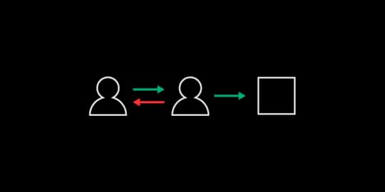
The traditional product design and development approach relies on a product manager to write down ideas that designers turn into images. Developers use the images as guides to create attractive products with exceptional functionality. The process rarely works as planned, though, so the prototype delivered by the development team needs several stages of tweaking.
A new approach to rapid product developmentDesignOps 2.0 takes a radically different approach by placing the product manager—or domain expert—and developer within a rapid collaboration user feedback and iterations process. Designers sit outside of that process. Instead of playing an intermediary role between domain experts and developers, they act as coaches that help domain experts reach their goals.
Once the product manager and design team members have working prototypes, they send their creations to the development teams to produce deliverables for end users. The approach uses less time because it lets the product manager build a basic prototype within a low-code design system instead of asking other people to interpret vague ideas.
Recommended reading: You Can Become a Code-Based Designer Without Learning Code
Create a code-based design system that anyone can useNo matter which development methods your teams prefer, it makes sense to create a code-based design system that serves as a single source of truth. UXPin Merge will allow you to keep components in sync with your Git repository.
The design system and Merge technology establish everything that project managers need to create prototypes with before sending their concepts to developers to begin the software development process.
Reduce development time by making components teams can reuseBy following the PayPal model, designers reduce development time. They do this by creating a library of everything that product managers can use. The designers create logos, buttons, color patterns, and other assets. Anyone trying to build a product can only pull from the design system.

The key is to make components that teams and individuals can reuse. Ideally, this shouldn’t take a lot of effort because your brand probably wants common aesthetics and functionality between products. For example, it wouldn’t make sense for a time-tracking app to look completely different from a ticket app.
They should offer common environments that make users feel comfortable. Also, designers have no reason to redo work when existing components fill the need already, as well as the developers.
Use code-based design tools that create functional prototypesUXPin Merge works well for PayPal’s design team because they can import and keep in sync coded components and use them in the UXPin editor. Thanks to that the components they use in the designs are almost production-ready. So both designers and developers get a common language that everyone understands.
Taking a code-based approach also makes it easier to build fully functional prototypes as the imported components are fully interactive and behave just as the final product! It’s a big time-saver as developers don’t need to leave this work to designers.
Many prototypes only offer a simulation of how software projects will work. With UXPin, PayPal’s employees can use real data and interact with components to ensure they behave as expected. Instead of using lorem ipsum of fake data, product managers can import real information from JSON, Google Sheets, or CSV.
Improve communication between designers and product managersDesigners at PayPal spend a lot of time building the components that other people will use to build products. They do not, however, sit completely outside of development projects. They serve in mentorship roles by working with product managers before finalizing software projects.
Anyone making a product at PayPal can reach the design team by scheduling time during office hours or using the design Slack channel. The design team has also made more than 3.5 hours of video tutorials that address common issues.
When a product manager comes to the design team, nearly all the work has been done. Still, designers might need to correct some small errors or use their keen observation to spot inconsistencies that the average person wouldn’t see. The result is quick iterative design that leads to a working product much faster than traditional approaches can.
Recommended reading: Design Your Own Design Process Step by Step
Request access to UXPin MergeUXPin Merge plays a crucial role in how Rider and her team built a better approach to product prototyping and development. Request access to UXPin Merge to learn more about how the app’s code-based design and prototyping features will benefit you.
Discover MergeThe post How to Create a Rapid Development Process for Digital Products: Lessons from PayPal appeared first on Studio by UXPin.
April 27, 2021
How to Improve Your Product Design and Development Model: Lessons From PayPal
The typical product modeling process takes an inefficient course that requires a lot of back and forth between departments. In the lifecycle of a traditional product design and development model:
A project manager has an idea that gets turned into a written description and sent to the design teamDesigners have to interpret the project manager’s written instructions and turn them into imagesThe designers send their visual work to developersDevelopers use their coding experience to recreate images and add functionality to featuresThe project manager reviews the product features made by the developers and requests revisionsThe process repeats until the product finally achieves the product manager’s vision.
PayPal’s design team recognized the problems in these traditional methodologies. It created a more streamlined approach that met the company’s needs. Read on to learn more about how PayPal’s approach can offer you greater insight into improving your own processes.
Table of ContentsMove your product model process toward a code-based, systemic approachEnable product managers and teams to do designBuild a library of reusable templates, visual assets, and interactive componentsEstablish significant guardrails to keep developers on trackMake it easy for new product developers to schedule time with designersAdopt UXPin Merge to streamline product developmentMove your product model process toward a code-based, systemic approachIt only takes a little insight to realize that the traditional product model process hurts business models and cuts into profitability. PayPal found a more efficient product developing an operating model that broke down silos between departments and gave developers and product managers more control over their work.
PayPal called their approach DesignOps 2.0. Designers created assets that everyone could use to build different products without straying from the aesthetics and features PayPal’s stakeholders expect. The code-based, systemic approach meant that they could often cut product design time in half.
Enable product managers and teams to do designPayPal has an impressive team of designers willing to tackle exceptional challenges. As they saw the number of UX developers grow within the company, the small team of designers decided to adapt. They expanded the scope of what people outside the design team could do, to improve the overall process. You can follow some of their steps to improve your product design and development model.
Build a library of reusable templates, visual assets, and interactive componentsPayPal’s design team built an original design system for everyone to use. To streamline things, you still need designers and developers in this process, but they don’t have to play such hands-on roles. The product manager doesn’t need to approach the design team to talk about wireframing the tool. Instead, the manager uses the design system to find an existing template. Designers don’t need to create unique logos, buttons, and other visual assets, either.
Build a design system that includes the templates, visual assets, and interactive components that managers need to make products without relying on designers and developers. For example, when a manager wants to add a digital tool that tracks defects, the person can open a template, make changes to reflect the tool’s goal, and test the prototype to make sure it functions as intended.
Recommended reading: 7 Best Reasons to Use React.js Components in Your Project
Establish significant guardrails to keep developers on trackCode-based design components need to give managers and developers some flexibility. Good product management, however, must prevent people from deviating too far from the company’s aesthetic and expected features. If a new IT product doesn’t function like similar products, it will confuse users.
Designers can keep everyone in line by establishing significant guardrails that do not let others stray too far from other tools in the company’s product portfolio.
Recommended reading: Design with Code
Make it easy for new product developers to schedule time with designersPayPal’s design team has found that developers can finish more than 80 percent of product development work without their assistance. A product that gets used by a lot of employees or sent to customers, however, needs input from the design team. They have made it easy for developers and product managers to get the direction they need.
First, the team provides exceptional training tools that help non-designers do as much of the work as possible. Employees have access to more than three hours of training videos. They can also:
Access 60+ prototyping componentsSchedule office hours to meet with a designer in person or virtuallyUse a Slack channel to get feedback and instructionsIn the end, the design team will go through full products before releasing them. The final step helps ensure accuracy and functionality. Changes rarely involve much additional work because the designers have set up their colleagues to succeed.
Recommended viewing: Watch Sandeep Yeole, a product manager at PayPal, build a product with UXPin Merge
Adopt UXPin Merge to streamline product developmentUXPin Merge plays a critical role in the success of PayPal’s design team. Without UXPin Merge, the small department couldn’t build a design system full of code-based components that make it simple for product managers and developers to create products.
When you have all of your approved digital assets in front of you, you can make design changes within minutes or seconds. After some experience, employees outside of the design department could make their own products within less than an hour.
UXPin’s prototyping capabilities also make it easier and faster for PayPal to take full products to market. Prototypes in UXPin work just like completed products. The prototypes use real data, let testers interact with components, and perform like complex products. It’s always a good idea to test digital products for bugs, but prototypes in UXPin rarely need much tweaking.
You can discover the advantages of code-based design, effective design systems, and fully functional prototypes by requesting access to UXPin Merge. The tool has revolutionized the way that PayPal’s designers work. Imagine what it could do for you.
Discover MergeThe post How to Improve Your Product Design and Development Model: Lessons From PayPal appeared first on Studio by UXPin.
April 22, 2021
How to Make Design Process Simple for Agencies and White Labeling

Anything you can create in code, you can design with UXPin powered by Merge technology. Designing with code components can cut down your time to market and simplify the handoff between designers and devs. It’s all thanks to using the single source of truth and designing with production-ready components.
 Device Viewer
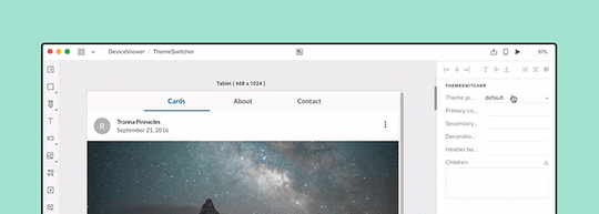 Theme Switcher
We’ve recently featured two really cool React components that you can use with UXPin Merge; the responsive design Device Viewer and Theme Switcher. You might think that UXPin’s technology is only useful for companies with a single design system, but we’ll show you how a large web agency, spanning several smaller portfolio teams, used these two components in an environment built around white labeling.
The troublesome design process in agencyDesign agencies can come in all shapes and sizes. Individual small or large agencies or even portfolio companies constantly acquiring smaller teams, each using different technologies. But what does stay the same, are the issues faced when managing branding and creating future-proof, scalable, and efficient design systems.

The software and tools these companies use are incredibly important for solving these issues. Imagine how much time and money is wasted on back-and-forth communication due to using and maintaining multiple design systems and sources of documentation over several technologies and how much more rewarding it would be if you could simplify and improve this.
Agencies using the power of Merge technologyAs mentioned in the Theme Switcher and Device Viewer articles, you see what amazing components you can create and how Merge can make complex design ideas easy; all thanks to designing with ready code components. Using your imagination, the possibilities of prototypes you can create seem endless.
Focusing on the Theme Switcher, you can see that it’s just a React component. It shows that anything you can imagine and code can be designed within Merge. It shows how agencies that use Merge can work efficiently with any number of clients, switching between clients’ brands with a click of a button. It’s also an incredibly powerful tool when it comes to requests for proposals (RFPs) and quick-turnaround demos. Imagine if all you had to do to create a new styled prototype to impress potential clients was to edit a simple style file, while your competitors had to create a new prototype from scratch. But, how is this different from using another piece of software and their theming tool?
Theme switching is not specific to UXPin Merge, some design tools have it, but how it’s implemented here is what makes it special, incredibly efficient, and design consistent.
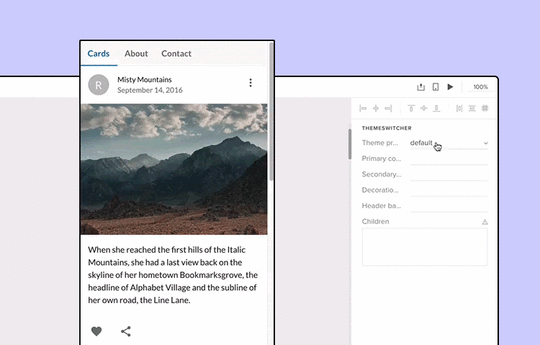
Unlike other design tools, Merge’s variable values are all predefined in the code and can be done at a component or layout level. Everyone, who uses the components, is designing with the same properties and values, hence everyone has the same tools. Consistency is created from the code itself – a single source of truth, meaning no more errors in branding and future proofs the design system. The library in the editor is also syncing with the Git repo, so there’s no need to remember about updating the components in two separate places.

Imagine having a design system with a single source of truth. How easy it would be to maintain documentation or have a playground where anyone, be it a designer, developer, or account manager can go and test component props and create prototype presentations. Merge can provide this and it’s only getting better.

As we keep mentioning, anything you can code you can design with. This means you don’t have to install a 3rd party plugin to enable theme switching. Why go through all the complicated steps of adding theme switching to your vector-based design system when you can do everything you need in UXPin powered by Merge technology alone.
SummaryChanging design tools can be a daunting task with lots of worry and problems. There’s currently a very rigid design process that people like to follow and it can be very difficult to step out of that comfort zone and try something new, even if they believe it will be better in the long run.
But there’s no need to worry as the UXPin team is with you every step of the way helping with any integration questions and issues.
Want to find out more about Merge technology or would like to try it for yourself?
Discover MergeThe post How to Make Design Process Simple for Agencies and White Labeling appeared first on Studio by UXPin.
UXpin's Blog

- UXpin's profile
- 68 followers

