
UXpin's Blog, page 82
March 5, 2021
Responsive Design with UXPin Merge

Responsive websites, mobile-friendly designs, adaptive images are crucial for user experience. So, being able to responsively design prototypes without using multiple layouts for different screen sizes is an extremely powerful and time-saving feature. It’s something that many people have wanted and thanks to the power of Merge, you can do just that by using actual React components to design with code.
Want to use the power of Merge yourself? – get access here. After the verification process and the setup, you can start your responsive prototyping!
 The Responsive Design Problem
A common requirement of modern prototyping tools is the ability to toggle between different device types and have the components in the prototype automatically adjust to fit the available space. This responsive design feature is something that is not present by default in UXPin (and many other prototyping tools either). You often end up having to create several responsive layouts, one for each device size you want to test. This approach isn’t very interactive, it kills productivity, especially when designing for mobile devices and responsive sites is something that you do on a daily basis. It just isn’t in line with an efficient design process.
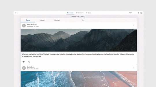
Using the Material UI library, we can show an example of this limitation. You can see in the video below that the Grid component is meant to span 12 columns on x-small and 6 on small devices, but there is no relationship between this layout component and the underlying UXPin canvas, and so, the changes don’t reflect on the canvas when resizing the component.
All Material UI components are responsive from the start but, by default, UXPin Merge can’t use the component’s media queries as the canvas is essentially fixed in size. So, even if you did a window refresh to change the size of the canvas then it wouldn’t reflect in the components layout, leaving you with a basic design.
The Power of Merge – Designing With Code SolutionEnter UXPin Merge. Since Merge allows you to design with real React code, what if you just made your coded components responsive? When designing with code you can reap the rewards of the endless possibilities that that freedom affords you. You are no longer tied down by the same limitations that a vector-based design tool presents you, instead, using a combination of your imagination and some intuitive programming, you are free to unshackle yourself and code past these limitations. That’s the real power of Merge.
So to provide a solution to the responsive prototyping issue, we just need to create a component that can adapt to different device sizes, then we can use this as a parent component in our prototype that manages the layout of all the components on the canvas. This post will show you how to create such a component, so that you can make your coded Design System responsive today.
Creating a Responsive ComponentFirst, we create a React component named DeviceViewer, that functions as a wrapper, passing props and styles to a nested resizable IFrame component. When components are nested in the IFrame, they’re no longer dealing with static canvas size, so all media queries, responsive properties, and styling will work perfectly, allowing us to test responsive prototypes without making multiple pages!
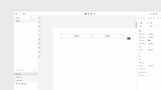
The image below shows the simplified structure of DeviceViewer and a breakdown of how it works will follow.
const useStyles = makeStyles((theme) => ({···})); function DeviceViewer(props) { const classes = useStyles(props); const [frameWidth, setframeWidth] = React.useState(0); const [frameHeight, setframeHeight] = React.useState(0); const [deviceView, setdeviceView] = React.useState(props.defaultView); React.useEffect(() => {··· }, [props]); const handleChange = (event) => { setdeviceView(event.target.value); }; const setViewportDimensions = () => {··· }; const IFrameResize = () => {··· }; return ( );}As you can see, it’s a fairly simple React component using the Material UI library. It has all the general architecture, it has styles, states, onChange event handlers, and the return statement structuring the HTML elements.
Inside the return statement, we have the Grid, Box, and IFrame components. The Grid component is the dropdown list of selectable viewport sizes (desktop, mobile, tablet, etc). The Box is essentially just a styling wrapper for containing the IFrame component.
useEffect()Using useEffect and default props, the device view size is changed on state load and update, each time passing nested component props and styles from the previous IFrame to a new one.
The if statement (shown below in pseudo-code) determines which styling to add to the canvas depending on if the user is in the editor or preview mode of UXPin.
React.useEffect(() => { setdeviceView(props.defaultView); // We’ve redacted this code for readability // UXPin mode change CSS handling if (in EDITOR mode)) { // remove drop-down styling } else if (in PREVIEW mode)) { // Change canvas margin properties } }, [props]); handleChange()To keep track of the device size when updating the IFrame, we pass the drop-down target value to an onChange handler function referencing drop-down list values.
const handleChange = (event) => { setdeviceView(event.target.value); };setViewportDimensions()You can hard code these values like we have done in setViewportDimensions or pass them in as json if you need dynamic canvas sizes.
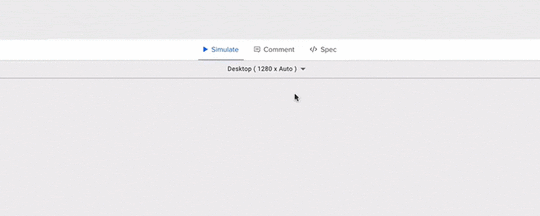
const setViewportDimensions = () => { switch (deviceView) { case "desktop": setframeWidth(1280); return; case "tablet": setframeWidth(768); setframeHeight(1024); return; case "tablet-landscape": setframeWidth(1024); setframeHeight(768); return; case "mobile": setframeWidth(375); setframeHeight(667); return; case "mobile-landscape": setframeWidth(667); setframeHeight(375); return; default: return; } };When in UXPin preview mode this is what the select menu populated from the setViewportDimensions would look like.
 IFrameResize()
IFrameResize is run from the IFrame component on state load and update. IFrameResize calls setViewportDimensions to resize the IFrame based on the state props, then clones the current IFrame (#target), passing its props and styles to the new IFrame. When the new IFrame is loaded, the components which were passed as props are then arranged within the new IFrame dimensions.
For the actual IFrame component and comparing it to the docs, it’s got all the props needed to pass data and CSS through to the children components that will be nested within. The sandbox tag is added to allow Frame to communicate with the canvas itself.
The FrameContextConsumer is where it takes all the jss and inserts the css rules into the designated location and passes that through to the children components.
That’s essentially it, just a wrapper component (DeviceViewer) passing properties to the IFrame component that allows for child elements to be updated and changed without refreshing the page or changing the layout directly.
SummaryComparing this solution to other design tools on the market, UXPin Merge is such an exciting proposition. In Merge, you don’t have to create or edit plugins or call APIs to add additional features or functionality to your design tools. Instead, anything that can be coded in a live React component can be used in exactly the same way in Merge, so you are free to make dynamic and intuitive components that help enhance your team’s design process and take care of responsive web design in no time. The possibilities are endless.
As UXPin Merge matures and an ever-increasing list of companies decide to adopt it in their design workflow, we are starting to see many interesting and exciting use cases that go beyond what even we imagined when we first created the feature. Like this case – thanks to Jack Behar and Taylor team we could tell you about this innovative responsive solution.
Hopefully, this post has got your creative juices flowing, and maybe you have one or two interesting ideas for React components that you would like to code and add to your Merge library. Have an idea how to make the most of Merge? Share your thoughts and ideas with our diverse UXPin community!
Want to find out more about Merge or would like to try it for yourself?
 Discover Merge
The post Responsive Design with UXPin Merge appeared first on Studio by UXPin.


March 4, 2021
The Rules of Material Design
 Material Design has become the standard for designing and developing Android applications and many websites. Before you can get the best results from Material Design, though, you need to learn a few rules that will improve your work’s consistency and help it operate on the Android platform.
You don’t have to accept the following as definite rules that you must follow. You can break most of the rules of Material Design while building terrific products. Overall, though, you and your users will have better experiences when you don’t deviate too far from the following guidelines.
Emphasize functionality before you focus on formDo you feel a little argument brewing between your graphic designer and your developer? That can happen when you start using Material Design. Material Design makes it easier than ever to add responsive animations, transitions, and other effects that thrill designers. These components can add to an app’s functionality. Using too many of them—or using them in the wrong ways—can have the opposite effect.
You want an app that looks terrific, but you can’t sacrifice functionality in favor of form. When in doubt, side with your developer. A beautiful app might attract a lot of users, but they will abandon the product when they discover that it doesn’t work well.
Rely on the types of layouts that users expect to findMaterial Design can tempt you to try some crazy things. It doesn’t take long to experiment, so why not build a layout unlike anything anyone has seen before?
Adrian Henry, found at Hungry Turtle Code, understands that impulse. “The urge is to always break the rules slightly to appear different,” he says. Going too far, however, “is just a jarring experience” for the user. Users “should know exactly where everything is and intuitively understand the UX flow.”
You can take a creative approach without breaking the rules of Material Design. Get feedback from as many people as possible, though. Hopefully, one of them will tell you when you need to rein in concepts that feel counterintuitive to new users.
UXPin makes it easy for you to get feedback before you release your product. When you create a link to your prototype, you make it possible for people to interact with it and leave feedback. You might feel disappointed when you learn that your favorite idea drives people mad. It’s better to discover the truth now than after you’ve released your app to the world.
Take advantage of interactive featuresKeeping the first rule in mind, use Material Design to add more interactive features to your apps. Users tend to prefer products that respond to motion. When you glide your finger across a smartphone’s screen, you expect the page to turn. When you tap an icon, you want it to open for you.
Dig deeper below the surface, though, to discover ways that you can make your apps even more interactive. Look for opportunities to add meaningful micro-interactions. Micro-interactions like tapping notification alerts keep people involved and interested. Users might only need the “big” interactive features every few minutes. They can use micro-interactions multiple times a minute, though. It becomes a conversation between the app and the user.
Tap into Material Design libraries that make your work easierDesigners often enjoy taking time to create unique icons and interactions. It’s why they became professional designers! Not every part of your product needs a brand new design, though. Sometimes, you’re just wasting time “reinventing the wheel.”
Besides, many icons have universal meanings that help users understand how to use products. Taking your designs too far could confuse people.
UXPin gives you access to a library with more than 600 Material Design icons. Icons that indicate common functions like “share,” “charge,” “add to cart,” and “volume” don’t need new designs. At least they don’t when you already have a library full of attractive icons that users expect to find when they use your apps.
Track your metrics to make sure products work as intendedIdeally, Material Design will help your team save time and develop better products that people look forward to using. Do you get those results? You can’t answer that question until you start tracking key performance indicators (KPIs).
Some of the most important metrics that you should track include:
User growth rateMobile downloadsInstallationsUninstallationsCrashesRetention ratesSession lengthThese pieces of information tell you a lot about how people use—or don’t use—your apps.
A high user growth rate probably indicates that you have a popular app that interests people. A lot of mobile downloads suggest the same, but it doesn’t mean much unless users follow through by installing the app on their devices.
Do users uninstall your product shortly after downloading and installing it? That’s likely a sign that they didn’t get what they expected.
Do people use your app for long periods at a time and return often? That probably means you’re doing something that your customers love.
If you discover a lot of crashes, it’s time to look under the hood of your app to see how you can improve its functionality. Users won’t tolerate frequent crashes. Solve the problem quickly or expect them to abandon your product and move on to the next thing that interests them.
Pay attention to user feedbackTracking metrics can tell you a lot about what does and doesn’t work in your Material Design app. You don’t always have to rely on the numbers, though. People will tell you what they love and hate about your work.
When someone posts feedback about your app on Google Play, take time to read the response, think about what the person wrote, and respond kindly for their help. You might get a profane-laden review that makes your whole team upset. It doesn’t matter. Learn from that user’s frustration so you can improve your app. Other users will appreciate your work.
Keep learning about Material Design to stay ahead of trendsGoogle constantly improves its products and services, so you can expect Material Design to evolve over the years. Visit the Material Design website often to see how it has changed.
You don’t have to read every document on the website. That would take far too much time. You should, however, take time to look at examples that Google chooses to showcase Material Design on the web. Pay close attention to what these examples show. A keen eye will help you stay ahead of emerging trends.
Choose designing and prototyping tools with Material Design in mindAdopting Material Design doesn’t mean that you can stop using design and prototyping software. It means that you need to make sure you choose tools that work in coordination with Material Design.
UXPin encourages designers to embrace Material Design. With UXPin prototypes, you can even test your designs before you finalize your products. An interactive prototype gives you an opportunity to test every aspect of your product before you hand it over to your boss or client.
Try UXPin for free to see how it can help you create prototypes and test your ideas. Thanks to its real-time collaboration features, you can even explore concepts with other designers.
The post The Rules of Material Design appeared first on Studio by UXPin.
March 3, 2021
Design with Code: UXPin Merge Tutorial
Today we’re introducing more about our enterprise feature UXPin Merge. We want to give more details and show you how easy it is to integrate a React-based library into Merge to design with code on a day-to-day basis. All that without designers learning how to code! 
UXPin Merge lets designers import developer’s existing custom React components in a seamless fashion to create interactive prototypes using real code, which is unlike anything else traditional design tools offer. This eliminates the need for designers to manually maintain a “second” design system within their design tool and instead provides the entire team with a single source of truth. The result? The disconnect between designers and developers is gone when building digital products.
We want to save you time so we’ve designed this tutorial to integrate Mozilla’s React Todo App example with Merge. After the integration, you’ll be able to use the app’s components to design an interactive Todo list prototype within UXPin!

Remember to start by requesting access to Merge – you can do it here. After the verification process and the setup, you’ll be ready to design with code!
The componentsThe Todo app has three React components:
1. Form – create a todo item.
2. FilterButton – filter todos by their current state.
3. Todo – a todo list item.
These components are in the `src/components` directory and are outlined in the screenshot below:
When this tutorial is completed, a designer will be able to create a prototype with these components. Your real-world custom design system (DS) likely has many more than three components. However, the concepts we’ll illustrate in this tutorial should apply to your DS as well.
Setup UXPin Merge
To begin, fork then clones the following link https://github.com/mdn/todo-react. Then install our UXPin Merge NodeJS package, which includes our CLI.
Navigate into your project folder cd todo-reactInstall UXPin Merge and It’s CLI NodeJS bundle with: yarn add @uxpin/merge-cli –devIgnore the UXPin Merge build directory with: echo ‘/.uxpin-merge’ >> .gitignoreA custom design system requires two additional config files:
uxpin.webpack.config.jsuxpin.config.jsUXPin typically doesn’t need to use your entire existing Webpack build process. We’ll use a more minimal and default build for UXPin. Create a uxpin.webpack.config.js file and paste the following code into it:
const path = require("path");const webpack = require("webpack"); module.exports = { output: { path: path.resolve(__dirname, "build"), filename: "bundle.js", publicPath: "/" }, resolve: { modules: [__dirname, "node_modules"], extensions: ["*", ".js", ".jsx"] }, devtool: "source-map", module: { rules: [ { test: /\.(s*)css$/, use: [ { loader: 'style-loader' }, { loader: 'css-loader', options: { importLoaders: 2 } }, ] }, { loader: "babel-loader", test: /\.js?$/, exclude: /node_modules/, options: { presets: ['@babel/preset-env', '@babel/preset-react'], } }, ] }}For components you want to use in UXPin merge, you must specify their file directory in the uxpin.config.js file at the top of the directory of the repo. As you can see in the code snippet below, we’ve only added the ‘Form’ component src/components/Form.js for now and will add the other components later in the tutorial.
Create a uxpin.config.js and paste the following content into the file:
module.exports = { components: { categories: [ { name: 'General', include: [ 'src/components/Form.js', ] } ], webpackConfig: 'uxpin.webpack.config.js', }, name: 'Learn UXPin Merge - React Todo list tutorial'};Lastly, Babel-loader will be used by Webpack to create the app bundle. To install babel use the following commands: yarn add babel-loader --dev then yarn install .
CONGRATULATIONS👏 You’re all good to go and have the minimum configuration required to view the Form component.
Experimental ModeExperimental Mode lets us prototype with our local components to verify their behavior before pushing to UXPin. Now, to open UXPin Merge Experimental mode to preview the Form component, run ./node_modules/@uxpin/merge-cli/bin/uxpin-merge --disable-tunneling. In Experimental Mode, using --disable--tunneling makes requests go directly to your localhost web server. Quick note: UXPin with --disable-tunneling option works only in Chrome .
Using the settings provided in `uxpin.webpack.config.js`, Experimental mode bundles your components and opens a browser window. You can lay out components in a similar fashion as the UXPin Editor. After Experimental Mode loads, drag and drop the Form component from the sidebar onto the project canvas:

We have the Form component but it lacks styling. For that, we’ll create a Global Wrapper Component.
Using a Global Wrapper Component to apply CSS stylesJust like your custom design system, this Todo app contains global styles. These are specified in the `src/index.css` file. All of our components need the styles specified in this file. We can load this file via a Global Wrapper Component. This component will wrap around every component we drag onto the UXPin canvas.
Create a wrapper file:
mkdir src/wrapper/
touch src/wrapper/uxpinwrapper.js
Copy and paste the following into `UXPinWrapper.js`:
import React from "react";import '../index.css';export default function UXPinWrapper({ children }) { return children;}The `import ‘../index.css’;` line ensures our CSS styles are loaded prior to rendering each component.
We need to tell UXPin to use this wrapper file. Add the following to uxpin.config.js:
wrapper: 'src/wrapper/UXPinWrapper.js',In your terminal, restart UXPin Experimental mode using ./node_modules/@uxpin/merge-cli/bin/uxpin-merge --disable-tunneling. A restart is required when updating the config file. A browser reload is only required when updating components.
Experimental mode should open a new browser window with a styled Form component:
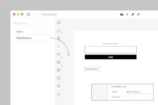
 Adding the FilterButton with a customizable name
Now we’ll work on adding the FilterButton to UXPin Merge. These buttons are displayed below the Form component:
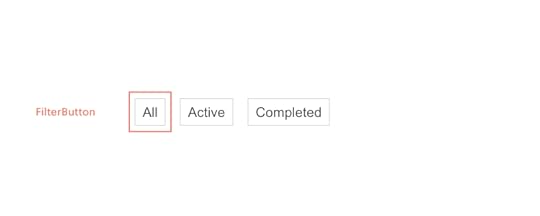
Adding this component will be similar to the Form component. However, I’d also like to give designers the ability to specify the text that is displayed within the button. We’ll do that via the `prop-types` package.
Component propTypes are mapped to the UXPin properties panel when editing a component. The existing FilterButton component doesn’t use prop-types so let’s add this to `FilterButton.js`:
import React from "react";+ import PropTypes from 'prop-types';function FilterButton(props) { return (@@ -15,4 +16,9 @@ function FilterButton(props) { );}+ FilterButton.propTypes = {+ name: PropTypes.string+ }+FilterButton.defaultProps = {+ name: 'Button Name'+};export default FilterButton;Add `’src/components/FilterButton.js’` to `uxpin.config.js` and restart using ./node_modules/@uxpin/merge-cli/bin/uxpin-merge --disable-tunneling. A restart is required as we’ve updated the config file. When Experimental Mode starts, you should see a new “FilterButton” component listed in the sidebar. Click and drag this onto the canvas.
Two of our three components are now working with UXPin Merge. We have one component remaining: the Todo component.
Adding the Todo component with a wrapperWe’re moving on to our final component: the Todo. These are displayed within the list of todo items in the UI:

When adding the FilterButton, we edited the FilterButton.js file to add propTypes. What if you want to isolate your Merge-specific changes and don’t want to modify the source code of your components? We can create a wrapper that is specific to the Todo component for this. It’s similar in concept to the Global wrapper component we used to apply CSS styles but will be specific to the Todo component.
Type the following:
mkdir -p src/components/merge/todo
touch src/components/merge/todo/Todo.js
Copy and paste the following code into Todo.js.
import React from 'react';import PropTypes from 'prop-types';// Import the original componentimport TodoM from '../../Todo';function Todo(props) { return }Todo.propTypes = { /** * If `true`, the todo will be marked as completed. */ completed: PropTypes.bool, /** * The name of the todo. */ name: PropTypes.string, toggleTaskCompleted: PropTypes.func,}Todo.defaultProps = { name: 'Do Laundry'};export default Todo;We’re importing the original Todo component as `TodoM` and returning this component in our newly defined `Todo` function. We specify propTypes just like we did with the FilterButton component on our newly defined `Todo` wrapper function.
Add ‘src/components/merge/todo/Todo.js’ to uxpin.config.js and restart using ./node_modules/@uxpin/merge-cli/bin/uxpin-merge --disable-tunneling. After Experimental launches a new window, click-and-drag the Todo component onto the canvas:

You’ll see the Todo component along with the default “Do Laundry” todo name. This default name is only applied when using Merge.
Pushing to UXPinUntil you push your design system to UXPin the components are only visible to you. To let your design team use these components we need to push the component bundle to UXPin. Creating and pushing a Merge design library requires two steps:
1. Create the library within the UXPin UI1. Go to your UXPin account
2. Enter the UXPin Editor
3. Create a new library
4. Select the option import React components
5. Copy the Auth token (don’t share it with anyone and do not place it in any files checked into git repository. This token provides direct access to the library on your account.) The process looks like this:
 2. Push the library via the uxpin-merge CLI
Using the token created from the previous stop, run the following from within the project repo:
./node_modules/@uxpin/merge-cli/bin/uxpin-merge push --token YOUR TOKEN
Your design team can now access the Merge library.
Using the Merge library within UXPinNow that the Merge design library has been pushed its time to test it out within the UXPin editor:
* Reload the UXPin Editor in your browser.
* Select the “Learn UXPin Merge” design system in the bottom left corner of the editor.
* Click and drag the components from the sidebar to the canvas.
You should have a solid looking prototype:

How does a designer hand off a prototype back to a developer?
Previewing and exportingNow that we’ve built a quick prototype in UXPin we’re ready to export it back to our app. We can preview the output and then use Spec mode to copy and paste the JSX code for our components.
Click the play button in the upper right corner of the editor. Once the preview loads click the “Spec” link at the top. You can now click on the components and view the JSX code to generate them in the right panel:

It’s great to push an initial version of our design system. However, you’ll likely need to push out quite a few updates over time.
Pushing an updateThe FilterButton has a “pressed” state to indicate the currently active filter. Looking at the live React app, here’s the difference between the pressed and not-pressed state:

Let’s add support for this state. Make the following change to `src/components/FilterButton.js`:
FilterButton.propTypes = {- name: PropTypes.string+ name: PropTypes.string,+ isPressed: PropTypes.bool}Commit the change to git and push to UXPin:
git add.
git commit -m “Added isPressed prop to button”
./node_modules/@uxpin/merge-cli/bin/uxpin-merge push --token YOUR TOKEN
Merge components are automatically synced to the most recently pushed code. To show the latest, reload the tab showing the UXPin editor. Select a FilterButton. In the right panel of the editor you should see a new “isPressed” property. Select it to activate this state:

Follow this same flow (git commit + uxpin-push) when you make future changes. Prototypes will automatically use the latest pushed version of components.
SummaryYou’ve taken a React app and pushed its components to UXPin Merge. You’ve also learned how to push updates when you modify components or add new ones. Now your design team can use these components to create high-fidelity prototypes within the UXPin editor.
You can browse the source code for this project on GitHub. To learn more advanced Merge techniques see our Merge docs or reach out to us at hello@uxpin.com.
Don’t have UXPin Merge yet? First, remember to go through the process of requesting access to make the most of designing with code!
Discover MergeThe post Design with Code: UXPin Merge Tutorial appeared first on Studio by UXPin.
March 2, 2021
Best Tools and Resources for Your Accessible Design

A good functional design is an accessible one. There are many reasons to go for an inclusive approach in designing and we believe that no one should be excluded from the benefits that bring the digital world. More than one billion people experience some form of disability, so remember that having accessibility in mind when designing matters.

There are best practices for accessible designs that you should follow. However, it’s best to test and analyze each design depending on which group of users you have in mind. Our last webinar presenter, Piotr Źrołka, Accessibility Expert and CEO of Kinaole decided to share some tools and resources that he finds useful when working on accessible designs. Here they are:
ANDITo check whether your site meets the standards of an inclusive design, it’s best to use a web accessibility evaluation tool.
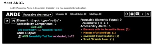
ANDI is a great free bookmarklet solution that will show accessibility issues on your site and instruct you on how to improve your accessibility design. It will also check 508 compliance right away.
You can count on this accessibility inspector to suggest solutions and offer some insights, just like an accessibility expert would do in the standard website development process.
headingsMapHeadings and website organization structure are especially important for the visually impaired. If your site lacks a proper use of headings and skips some headline levels, e.g., from H1 going to H4, then the screen reader will present the content to the user with the wrong page hierarchy. Taking care of the proper page organization is easy and can boost your website accessibility.

The site checker tool that can help you with this is headingsMap. It shows, browses, and audits the headings structure as it generates a document map or index of any web document structured with headings and shows the HTML 5 outline.
Landmark NavigationLandmark Navigation is another useful tool that helps in navigating screen readers through pages more effectively. It regions the page allowing users to skip to the content that they want instead of going through the whole page.

It will navigate via WAI-ARIA landmarks using the keyboard or a pop-up menu.
WCAG 2.1Web Content Accessibility Guidelines 2.1 is an invaluable resource on web content for people with disabilities. You will find all accessibility standards there such as text spacing, contrast levels, orientation, and many others.

It provides guidelines for all types of disabilities including visual, auditory, physical, speech, cognitive, language, learning, and neurological ones, and will help you enhance accessible user experience right away.
NVDAIt’s best to not only use accessibility tools for designers and developers but also test and analyze the site from a disabled person’s perspective.
NVDA is a great free auto-screen reader that allows you to switch perspectives and test on your own whether your website meets the needs of blind or visually impaired users.
Contrast checkerInstead of using external tools and plugins, you can work on accessibility with the help of built-in features in your design platform.
In UXPin, one of the features that can improve your accessibility is a contrast checker that analyzes the background color as well as the contrast ratios against the WCAG standards. It ensures that the text is readable and meets all contrast standards.
Blindness simulatorAnother built-in UXPin feature is a color blindness simulator that shows how some users may experience the end result of your design. It can simulate all types of color blindness such as:
Red-greenBlue-yellowComplete ResourcesRemember that aside from the tools to help you in your site analysis, it’s best to constantly keep up with accessibility resources. So, here are some extra links and books that may come in handy:
Mismatch by Kat Holmes Inclusive Design Patterns by Heydon PickeringInclusive Design by MicrosoftInclusive Design Toolkit by Cambridge UniversityWeb Accessibility Guide by UXPinSummaryMaking your designs inclusive is a process that ranges from choosing an accessible color palette, organizing the user interface well, using assistive technology, and finally testing the design. It’s very convenient to have a solution that at the same time will assist you with both designing and instructing what works best for some disabilities – without the need to install external tools. If you want to check how UXPin’s accessible features work, go ahead and sign up for a two-week free trial and check if your designs are accessible!
The post Best Tools and Resources for Your Accessible Design appeared first on Studio by UXPin.
February 25, 2021
How to Create Clickable Prototypes

Interactive prototyping helps ensure that your product works exactly as you plan. If you cannot test your prototypes before releasing products to the public, you could receive unexpectedly negative feedback. Learn how to create clickable prototypes so you can control the narrative and keep your users coming back often.
Interactive features have psychological effects on usersSome of the most successful apps rely on interactive features to keep users engaged. The social media industry, for example, has learned how to tap into numerous psychological traits that encourage people to keep using their apps. Instagram and Facebook have been accused of using “behavioral design” to condition people into treating their phones like addictive drugs.
Of course, you could level the same accusation at casino games. In a competitive industry, designers will find ways to make their products as appealing as possible. That may involve taking advantage of how humans interact with the world. Is it unfair, or just good design?
Interactive features like clickable buttons and icons create a physical connection between people and apps. Instead of passively watching content on a screen, they get to play a role in what happens. It has an obvious psychological effect that gives users rewarding feelings.
Interactive features make apps easier to useInteractive prototyping isn’t just about increasing the presence of feel-good neurotransmitters in the user’s brain. They can also provide helpful information that makes it easier for people to use products, improving user experience in general
Adding microinteractions to websites and apps can:
Improve navigation by making it obvious where users can find the features they need.Offer immediate feedback that tells users how to complete actions.Direct the user’s attention to other features, tools, and pieces of content.You know that you want your final product to have interactive features when you release it to customers. Why wouldn’t you use interactive prototyping to make sure all of those features work as intended?
First impressions matter, so test prototypes before you release productsInteractive prototyping lets you experience a mock version of your product before you face user reviews. It gives you a chance to check every detail to make sure they work perfectly. Honestly, you will probably miss a few tiny details. Don’t worry; users will let you know about any flaws they find.
The prototyping phase is where you test your ideas in an environment that’s nearly identical to the real world. UXPin makes clickable prototypes easier to test by letting you add real data to your tool. For example, you can simulate a data-sorting feature by including the feature and adding real data to make sure it sorts the information correctly.
You don’t get the same level of scrutiny when you use fake data or Lorem ipsum. With nonsense data in your table, you can’t determine whether clicking commands gives you the desired result. Did names in the column get sorted alphabetically? Or did the prototype just rearrange the letters randomly?
The first round of feedback that you get from users will influence whether other people choose to download and install your product. If they encounter interactive features that don’t work correctly, they will warn others to stay away. At that point, updating your product might not matter much. Some users have already been influenced to go elsewhere.
Interactive prototyping will make it easier for you to catch the major issues that annoy early users. When your new release gets positive reviews, more people will install your product to experience it.
Save money with interactive prototypingThe cost of developing a website or app can vary wildly depending on its size, what features you want, and who you hire. The U.S. Bureau of Labor Statistics estimates that software developers earn about $51.69 per hour. That assumes that you use full-time employees who also receive benefits, though. In reality, you will probably use some freelancers in addition to your core team of designers and developers.
When you hire an app developer in the U.S., you can expect to pay them about $121 per hour. You can save a lot of money by hiring developers from Eastern Europe, but there may be language, time, and geographic barriers. It’s hard to collaborate with someone who lives in a time zone that’s 6 to 9 hours ahead of you.
No matter which option you choose, you will spend a lot of money designing, developing, and testing your product. That doesn’t even include any marketing that you might use to reach new users.
An interactive prototyping tool that lets you create clickable prototypes that can save you a lot of time and money. Consider that graphic designers get paid about half as much as software developers. Letting your graphic designers create and test features in a virtual environment helps ensure that you spend as little as possible on costly developers.
Eventually, you will need someone who knows how to use the latest coding languages for apps. Until then, you can save money by relying on your graphic designers.
Clickable prototypes get more people involved in the design processCollaboration between cross-functional teams has become a useful trend in app development. When you want to perfect a product, it makes sense to get feedback from as many people as possible. Clickable prototypes make it easy for everyone from the lead developer to the graphic design intern to play with the product before it gets finalized and put into marketplaces.
When teams can’t interact with prototypes, they can only assume that the features work. If there’s a “share” button in the corner, pressing it must share content via social media or email. Does the feature actually work? No one knows until after production. Clickable, interactive prototypes let you identify and solve potential problems now so you can streamline every step of the production process. With a static prototype, you might have to go back to make repeated updates.
Create clickable prototypes in UXPinUXPin gives your team a simple way to create and test clickable prototypes. Interactive prototyping in UXPin doesn’t even require coding. When working in the UXPin canvas, you can add interactions with a few clicks of your mouse. During the prototyping stage, you get the same level of functionality.
UXPin’s real-time collaborative environment means that your team members can work on clickable features simultaneously. As long as you have a reliable internet connection, you can collaborate with UXPin as easily as you do in Google Docs.
Start your free trial with UXPin to create interactive prototypesWant to see how interactive prototyping works in UXPin? Get started today by signing up for a free trial. You don’t have to provide your credit card information, so don’t worry about getting automatically charged. Once you see how simple interactive prototyping becomes with UXPin, though, you will want to create an account that gives you and your team access to every feature.
The post How to Create Clickable Prototypes appeared first on Studio by UXPin.
February 24, 2021
Why Your Team Needs to Take a Code-Based Approach to Design

Traditionally, product designers have used image-based designs created with software that doesn’t communicate well with the programming that websites and mobile apps need. When your design team hands vector or raster graphics to the development team, the developers have to spend a lot of time finding ways to write code that creates attractive, functional features for users. Graphic designers play a critical role, but they also generate a lot of extra work for developers.
Taking a code-based approach to design changes several things about the relationships between graphic designers, developers, and products. If you’re unsure why your team needs to take a code-based approach to design, read on to learn more about the benefits everyone gets from a no-code tool that makes designs easier than ever.
Image-based design creates too many challengeshttps://uxpincommunity.cdn.prismic.io/uxpincommunity%2F469f590d-d37e-4741-ba52-5d81a4693ced_merge_3.mp4Teams that rely on image-based designs create numerous challenges for themselves and developers. When developers receive image-based designs, they have to make changes that can disrupt:
The overall aesthetic of the original design, which could have a negative impact on user experience.Force developers to reinterpret designs to make them more functional. This makes everyone unhappy because the developers have to do extra work and the designers see that they put a lot of effort into choosing colors, text, and other features that get changed during the production phase.Prototyping and production as developers try to translate static images into interactive components with dropdown menus, sorting capabilities, and other features. A lot gets lost in translation when your team sends image-based designs to the development team. Code-based design makes the handoff smoother.

Right now, your design and development teams probably speak completely different languages. You might think that your artboard of static images will make sense to anyone who sees it. In reality, the developers will often feel confused by what you want them to do.
Code-based design lets your designers and developers communicate with each other much more accurately. Instead of delivering image-based designs that the developers don’t understand, your team can adopt code-based design that uses:
Material DesignReact JavaScript libraryCA Technologies Mineral UIIBM CarbonAt first, this might sound like it puts a lot of extra work on designers by making them learn to code. That’s not the case, though, when you use a no-code designing and prototyping solution, like UXPin Merge. Instead of forcing anyone to learn new, challenging skills, you give designers and developers a common language that they both understand. You get better communication between teams simply by choosing the right application.
Code-based design streamlines your prototype and release processesDevelopers must turn everything that your design team gives them into code. The attractiveness of your design matters, but all digital products run on code.
Code-based design streamlines your prototype and release processes by giving developers designs that they don’t need to recreate with code. The developers might want to make some subtle adjustments, but they don’t have to redo your work. This solution already lets you use elements that are code-based. What’s in it for you? The elements that you use are already interactive so that your prototype will behave just like the end-product. Get a free trial for UXPin Merge to see how much your workflows improve. The hours you save add up quickly, which means you can work on more projects and earn higher revenues.
UXPin Merge offers a revolutionary no-code platform for code-based design
You need the right tool for your team to take a code-based approach to design. UXPin Merge makes the transition easy by:
Giving your team a no-code, drag-and-drop design environment.Using components that already exist in the code repository without any additional work or need for coding expertise.Saving reusable components to save you time on future projects.Controlling properties to ensure that they work when the product reaches consumers.Improving agile workflows without the time-consuming drawbacks of waterfall methods.Now, your designers can abandon static images in favor of realistic, interactive components. It’s difficult to underestimate the benefits of code-based design, especially when you have support from a no-code tool.
Help your designers succeed with UXPin MergeYou can read about the benefits of code-based design all day without truly appreciating how much value it adds to your team and workflows. Learn from experience by requesting access to UXPin Merge. The solution has a very slight learning curve that will help your designers adopt a more effective approach to creating digital products without learning a lot of new skills. Sign up now to see how you can improve communication between designers and developers and shorten your handoffs!
The post Why Your Team Needs to Take a Code-Based Approach to Design appeared first on Studio by UXPin.
February 23, 2021
Best Phone Design Pattern Ideas for Your Mockup

Want to create an awesome but not so time-consuming design? Phone design patterns will help you prepare a perfect design for a mockup. The best ones show you an easy way to present menus, features, and information to users. Ideally, a new user should intuitively know how to use your smartphone application just by looking at the design. For example, they might include:
“Play buttons” that people know will play a song or video.Hamburger menus that users know will open to show more navigation options.
Icons that communicate to users what they will find by pressing each button.
Whether you want to use lo-fi mockups without text or hi-fi mockups that draw from a design system, the following represent some of the best options.
Simple phone design pattern for an app’s first page Source
The first page of a smartphone app should present information in a simple, straightforward way. This simple design from Adobe gives you an idea of how to place your introductory image, a short message, and a button.
The design shows four well-matched colors. No matter which one you prefer, you get an eye-catching mockup that makes your logo stand out on the page.
If you don’t have a logo for your business or app, you can follow advice from Chiara Aliotta, the creative force behind the Italian design firm Until Sunday. In an interview with UXPin, she says that some of the latest branding and logo design trends include:
Using custom typography instead of relying exclusively on drawings and pictures.Creating logos that express something about the brand’s personality.
Developing animated, interactive logos.
A simple phone design pattern for your mockup can make your job easier, but you still need a memorable logo. A pattern and a mockup can’t get the job done on their own.
Productivity app transition mobile design pattern Source
Aliotta believes that designers will rely more often on animated logos. You can also apply that approach to your entire phone application design pattern.
In this design, you find a productivity app that tells users when they complete their goals. The app doesn’t open immediately to a static page, though. Instead, the phone’s screen dissolves away to reveal the app’s workstation.
The design works well because it engages users – exactly what you want from a productivity app! It also has a place to personalize the screen with the user’s name. You could replace it with your client’s name to make it a little more appealing. With UXPin, you can also make unique designs for each accomplishment in the mobile app design. Why not replace the existing icons and messages with real data that applies to the buyer’s real life?
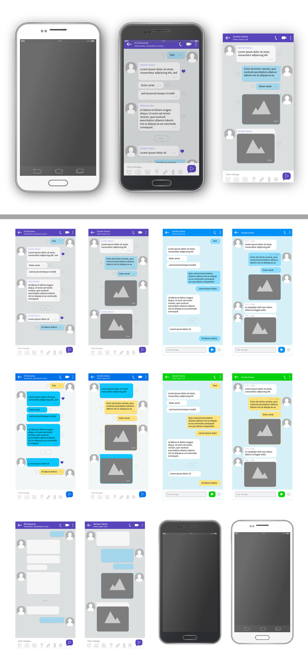
Smartphone design patterns for a messenger app Source
You don’t necessarily need to create a new design from scratch when you build a messaging app. Why reinvent the wheel when you really want to show how your technology works? A smartphone pattern like the one above provides all of the basic design elements that you need to present your app concept. So, all you need to do is simply include those in your design!
Later on, when you move from your design to a prototype, you may want to add some distinguishing features. When you first propose a messenger project, though, you don’t need to worry about design specifics. You just want an attractive layout that displays texts and images from more than one person.
Mobile design pattern for calendar and daily schedule Source
Google Play and the App Store have hundreds of calendar apps that users can download for free (with advertisements) or at low prices. Whether you want to break into this area of the app market or you need to create an in-house scheduling app for a company, you can start with a phone pattern that lets you concentrate on how the app works instead of what it looks like.
The above calendar app design works well because it lets users tap a date to see what they have scheduled for that day. It also lets multiple users share their accounts, which makes it useful for teams and families that need to communicate with each other quickly and easily.
The only problem with this phone mockup design pattern is that it uses lorem ipsum instead of real text. You might not mind using nonsense text during the first stage of your design process. Eventually, though, you will want a prototype that shows potential users what they can really expect from your app.
UXPin replaces lorem ipsum with real data instead of forcing you to waste time generating your own content for prototypes.
Get inspired by your design tool’s library patternsTo create your mobile app design you need some inspiration and some of the best ones you can probably find in your UX tool pattern library!
At UXPin we have a lot of ready design patterns that you can use right away in your design or mockup, like Material Design. Take a look:
 UXPin Library Pattern
We’ve all kinds of screens for apps like reports, music albums, events, players, etc.
View your design with a phone previewWhat’s the best way to preview your mobile design? Well, a phone of course! Your design tool should have an option of phone preview so that you can see the design on the phone model you choose.
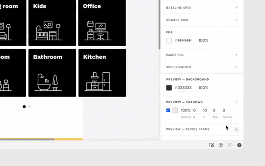 Preview design on the chosen phone model
You’re then sure whether some of your design choices work or maybe there’s room for improvement. Here’s how it looks at UXPin phone preview:
 UXPin PreviewFrame
We also have an option that can help you in viewing the prototype on your real mobile device! It makes your design come to life, allowing you to feel it and see how it behaves.
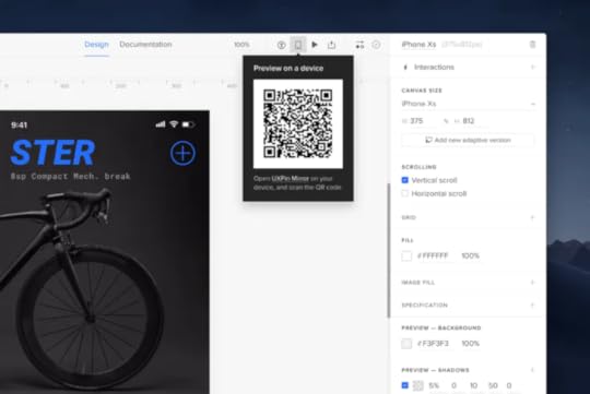 UXPin Mirror App
Use the Mirror app on your device and scan the code to view the prototype.

If you want to speed up the design process use UI kits to create mockups. No matter what approach you take, you will eventually need to develop elements that make your product unique.
Now, that you have all the ideas from design patterns and options to preview your prototype – it’s time to prepare a nice mockup!
UXPin gives you an easy way to create designs and prototypes that use real data. Additionally, you have all needed design pattern libraries if you want to get some inspirations or just need a quick mockup! Start a free trial today to see how UXPin can turn your ideas into impressive prototypes. You might find the tool so easy to use that you stop relying on phone design patterns for mockups from other people.
The post Best Phone Design Pattern Ideas for Your Mockup appeared first on Studio by UXPin.
The Best Phone Mockup Design Patterns
The best phone mockup design patterns give you an easy way to present menus, features, and information to users. Ideally, a new user should intuitively know how to use your smartphone application just by looking at the design.
For example, they might include:
“Play buttons” that people know will play a song or video.Hamburger menus that users know will open to show more navigation options.
Icons that communicate to users what they will find by pressing each button.
Whether you want to use lo-fi mockups without text or hi-fi mockups that draw from a design system, the following represent some of the best options.
Simple phone mockup design for an app’s first pageSourceThe first page of a smartphone app should present information in a simple, straightforward way. This simple phone mockup design from Adobe gives you a place to place your introductory image, a short message, and a button.
The design lets you choose between four colors. No matter which one you prefer, you get an eye-catching mockup that makes your logo stand out on the page.
If you don’t have a logo for your business or app, you can follow advice from Chiara Aliotta, the creative force behind the Italian design firm Until Sunday. In an interview UXPin, she says that some of the latest branding and logo design trends include:
Using custom typography instead of relying exclusively on drawings and pictures.Creating logos that express something about the brand’s personality.
Developing animated, interactive logos.
A simple phone mockup design can make your job easier, but you still need a memorable logo. A mockup can’t get the job done on its own.
Productivity app transition phone mockupSourceAliotta believes that designers will rely more often on animated logos. You can also apply that approach to your entire phone application mockup design.
In this design, you find a productivity app that tells users when they complete their goals. The app doesn’t open immediately to a static page, though. Instead, the phone’s screen dissolves away to reveal the app’s workstation.
The design works well because it engages users – exactly what you want from a productivity app! It also has a place to personalize the screen with the user’s name. You could replace it with your client’s name to make it a little more appealing. With UXPin, you can also make unique designs for each accomplishment in the phone mockup. Why not replace the existing icons and messages with real data that applies to the buyer’s real life?
Smartphone mockup design pattern for a messenger appSourceYou don’t necessarily need to create a new design when you build a messaging app. Why reinvent the wheel when you really want to show how your technology works? A smartphone mockup like the one above provides all of the basic design elements that you need to present your app concept.
When you move from a mockup to a prototype, you may want to add some distinguishing features. When you first propose a messenger project, though, you don’t need to worry about design specifics. You just want an attractive layout that displays texts and images from more than one person.
Phone mockup design for calendar and daily scheduleSourceGoogle Play and the App Store have hundreds of calendar apps that users can download for free (with advertisements) or at low prices. Whether you want to break into this area of the app market or you need to create an in-house scheduling app for a company, you can start with a phone mockup that lets you concentrate on how the app works instead of what it looks like.
The above calendar app design works well because it lets users tap a date to see what they have scheduled for that day. It also lets multiple users share their accounts, which makes it useful for teams and families that need to communicate with each other quickly and easily.
The only problem with this phone mockup design pattern is that it uses lorem ipsum instead of real text. You might not mind using nonsense text during the first stage of your design process. Eventually, though, you will want a prototype that shows potential users what they can really expect from your app.
UXPin replaces lorem ipsum with real data instead of forcing you to waste time generating your own content for prototypes.
UXPin makes it easier to create your own phone mockup design patternsPhone mockup design patterns from other creators can make your projects easier to begin. You can also speed up the process by using UI kits to create mockups. No matter what approach you take, you will eventually need to develop elements that make your product unique.
UXPin gives you an easy way to create responsive prototypes that use real data. Start a free trial today to see how UXPin can turn your ideas into impressive prototypes. You might find the tool so easy to use that you stop relying on phone mockup design patterns from other people.
The post The Best Phone Mockup Design Patterns appeared first on Studio by UXPin.
February 18, 2021
The Secrets of Effective Design Teamwork

Today’s designs often require the work of multiple professionals who have experience in areas like graphic design, animation, and coding. Whether you have two people or two dozen people working on a project, perfecting your approach to team design will streamline your processes and lead to better results.
The talents and personalities of your colleagues may influence how your team design projects, but you can typically rely on the following steps to make your work more effective.
Select design team members wiselyEffective design teamwork starts with having a team with the skills you need to complete the project. Team composition is crucial, so make sure you choose members for the team design who can work together. That doesn’t necessarily mean selecting people who get along well—although that could play a role, too.
Things to consider when selecting design team members include:
Whether they work during the same hours as other people.The skills they bring to the team.How well they follow guidelines to keep the project on track.You may have talented designers in your agency that don’t fit some projects. You don’t always need the best of the best. You need a team that can work toward a common goal.
Make an inventory of everyone’s skillsDon’t assume that everyone will fill a specific role during the team design project. As you move through design phases, it helps to know everyone’s skills so you can assign them tasks instead of forcing them to sit idle.
Your illustrator might have experience with animation. In today’s workplace, your illustrator might even have experience with development. They might not have the skills to develop a website or app, but they could have enough basic knowledge to move the first stage of the project along. That will speed things up for the team and boost your illustrator job satisfaction.
Choose a management methodology that fits your design teamEvery design team needs to use a management methodology that fits their needs. Popular methodologies include Agile, Scrum, and Kanban.
Agile prefers vague outlines and goals that make design projects more flexible. It also puts an emphasis on adapting to feedback for ongoing improvement.
ScrumScrum is a version of Agile that uses design sprints that typically end with one or two weeks.
KanbanKanban uses a visualized workflow that shows the status of tasks within the project. As tasks move toward the “completed” category, the project draws closer to a conclusion.
Set clear tasks and deadlinesDuring a team design, some people have to complete tasks before others can move forward. For example, the developer responsible for finalizing a website’s homepage can’t reach that goal until the graphic designer finishes creating all of the icons and other assets that will appear on the page.
You can integrate setting clear tasks and deadlines into any management methodology. Of course, unexpected things can happen during a project. The animator left a thumb drive at home, so you have to wait an hour while she retrieves it.
Since you know that delays will occur, give team members some flexibility with their deadlines. Make it clear, though, that they must communicate the delay to everyone. Accepting responsibility and solving the problem is good behavior. Sneaking away to fix a problem before others notice is unhelpful behavior that will get noticed eventually.
If you need a project management app to encourage communication, consider popular options like:
BasecampAsanaTrelloSlackCasualYou may already use one of these apps for team design projects. If not, try their free trial versions before you commit to an option.
Celebrate the achievements of your team membersTeam design can make some people feel anonymous. Eventually, they might start to neglect their work, show up a little late to meetings, or fail to check their messages.
A traditional approach to project management would use negative feedback to hold team members accountable. As a project lead, you may need to pull some people aside to point out their failures. Really, that should be your last option, though. Before you go negative, use positive reinforcement to keep team members encouraged and recognized.
It doesn’t take much to celebrate someone’s achievements. At the end of a mid-day meeting, you might say, “Great work on that layout, Anne. I really like it!” Everyone will hear the praise, which will make “Anne” feel included and responsible in a good way.
You can also celebrate team design accomplishments. Maybe you take a long lunch after meeting a milestone, or you have a pizza party when you send your first prototype off for approval. Gauge your team to choose a reward that they will appreciate.
Invite feedback from as many people as possibleIt doesn’t take long before design teams can become blind to the problems in their products. When you work on something long enough, cognitive dissonance can make you see what you want to see instead of what’s in front of you. 
You can fight cognitive dissonance by asking people outside of your team design project to give you feedback. Fresh eyes might notice irregularities immediately. That interactive arrow that the design team thought users would intuitively swipe might baffle a new person who picks up the product.
UXPin makes it easy for you to get feedback from as many people as possible. Once you make a prototype of your product, you can send a link to anyone and request feedback. They don’t need UXPin accounts to view your work and leave comments. By removing barriers, UXPin makes it more likely that colleagues and testers will take a few minutes to explore your product and give you feedback.
Use tools that offer features for real-time collaborationAs more companies move employees and freelancers to remote positions, you may not always have chances to gather your team in one place. Some people will miss the camaraderie of in-person collaboration. Remote work, however, has become increasingly normal. About 70% of business founders expect that they will let at least some of their employees work remotely even after the coronavirus pandemic ends.
UXPin makes it easier for design teams to adjust to remote collaboration by giving everyone a virtual environment where they can work together in real-time. If you can use Google Docs, you can use UXPin’s collaborative features. When one person changes the design, everyone sees the change happen simultaneously. It doesn’t matter whether your teammates are across the hall or on the other side of the world.
Start your free trial to see UXPin improve team design projectsLike any tool, you should try UXPin before you invest your money in it. Most design teams find that they get terrific results when they choose UXPin because the tool gives them features for real-time collaboration, creating design systems, and making prototypes easily.
Sign up for your free trial today so you can experience the benefits that companies like HBO and PayPal get from UXPin.
The post The Secrets of Effective Design Teamwork appeared first on Studio by UXPin.
February 17, 2021
Choosing a Color Palette for Your Project

Somewhere between wireframing and prototyping, you need to choose a color palette for your design project. In some respects, your color palette matters just as much as the structure of your design. Given its importance, you don’t want to pick colors without careful consideration.
The following information should help you choose a color palette that makes your products more attractive and useful.
Understanding color theoryThe color wheel has a deceptively simple look. At first glance, you might assume that it gives you little more than a selection of colors. The more you study it, the more complex it becomes. You will discover that it gives you examples of:
 Cool and warm colors. Cool colors include blue, green, and purple. Warm colors include red, orange, and yellow.Value (the tint or shade of a color).Saturation (the color’s intensity).
More insight reveals nearly countless ways that you can use the color wheel to create color palettes.
Different types of color palettesSome popular color palettes include:
 Analogous color schemes: Color palettes based on colors located next to each other on the color wheel.
 Complementary color schemes: Color palettes based on colors at opposite sides of the color wheel.
 Double complementary color schemes: Similar to a complementary color scheme, except you use four points on the color wheel instead of two.
 Monochromatic color schemes: Color palettes that use variations of the same color.
  Split Complementary color schemes: Color palettes that start like a complementary color scheme, except you choose one color and the two colors next to its complementary color.
 Triadic Complementary color schemes: Color palettes that use triangles on the color wheel60-30-10 rule for color use
The 60-30-10 rule gives you an easy way to choose a color palette and stick to it. When done well, it can also help establish a brand’s identity.
With this rule, you use a primary color 60% of the time; a secondary color 30% of the time; and an accent color 10% of the time.
The rule works especially well in website design because you can keep your work clean and simple. For example, you could use your secondary color as a light background for your page.
Headers, subheads, and other critical aspects of the design can appear in the primary color. Finally, you can use the accent color to add a little panache to buttons or small pieces of text.
Trending color palettesTrending color palettes change constantly. Don’t fall too deeply in love with one, because it will change before the year ends. Some color palette options expected to trend during 2021 include:
Human skin tones.Super-saturated colors.Textured colors that look faded.Surreal, eye-popping color combinations.Not every product wants a trendy color palette. A client with an established brand, for example, might reject new color palettes that feel contradictory to the personality customers and clients already know.
Color tools and appsStruggling to develop the perfect color palette for your design? Plenty of online tools and apps can help you explore creative options that will make your product stand out from the pack.
Coolors https://coolors.co/
One of the most popular color scheme generators in recent years, Coolors has tools designed to help you choose colors for websites, smartphone apps, and other products.
Many people like Coolors because they can create free accounts that let them generate color schemes by sampling online images, entering hex codes, or exploring trending color palettes.
Material Colors https://material.io/design/color/the-...
If you use Google’s Material Design, you might as well rely on the Material Design color system. The tool promises to help you use color in ways that add meaning to your UI.
Material Design has a wealth of tools that can use to create imaginative color combinations. It doesn’t assume that you’ve mastered the color wheel, though. If you feel lost, use Google’s tutorials and videos to learn more about how colors can influence the way people use your products.
Want to learn more about Material Design? Read An Introduction to Interactions With Material Design .
Color Supply https://colorsupplyyy.com/app/
If you don’t have a lot of experience choosing color palettes, you need to spend some time playing with Color Supply.
When you open the tool, you see a basic color wheel. Beneath the color wheel, you can change the type of color palette that you want to use. Options include:
ComplementaryAnalogousTriadSlit-ComplementSquareFreshMangaIt is quite straightforward and makes it easy for you to experiment with various color palettes.
Accessibility concerns for color blindness2020 design trends include increased accessibility for people who perceive visuals differently. Someone with color blindness, for example, often struggles to identify green, red, blue, or yellow colors.
About 300 million people in the world live with some type of color blindness, so it makes sense to choose color palettes that they can experience vividly. A tool like Venngage makes it easier to automatically use color palettes that are friendly for people with color blindness. You can also make designs easier to understand by using high-contrast colors, adding more textures to colors, and including more symbols that don’t rely on color for meaning.
Improve brand consistency with color palettes in UXPinNo matter what color palette you choose for your next design, you need to establish consistency that helps users understand how the products work. If your color palette changes from page to page, visitors will feel very confused.
You also need to make sure all of your designers know what color palette they should use on each project. UXPin helps managers retain control of projects by creating design systems that limit the color palettes designers can access. When you have a design system, you set up guardrails that let designers explore their creative impulses without going off-brand. A good design system can also streamline your process and limit the number of changes that you need to make before finishing the product.
Want to see how easy UXPin helps you build a design system that makes your design projects more successful? Sign up for a free trial today to test UXPin’s features. You don’t have to provide your credit card information, so you get a no-obligation way to experience the best designing and prototyping tool for teams.
The post Choosing a Color Palette for Your Project appeared first on Studio by UXPin.
UXpin's Blog

- UXpin's profile
- 68 followers

