
UXpin's Blog, page 76
July 27, 2021
Engaging, interactive websites and what you can learn from them
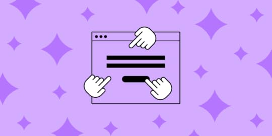
Some sites look good and some sites function well, but there are some interactive websites that do both with an extra sense of magic.
These websites engage us on a deeper level, command our attention, and take root in our imagination. They draw us into their world and make us forget our own — if only for a moment.
In this post, we’ll analyze 16 interactive websites with brilliant design. We’ll explain how you can learn from them to be a better designer.
Interactivity and enjoyment feed one another. In his book The Social Animal, psychologist Eliot Aronson explains that when performing a task, a person is likely to justify the action in their head. This can easily lead into a self-fulfilling prophecy of the user enjoying any given site that they invest even a small amount of time into.
But interactivity does not always need to be about interactions. Emotionally engaging content like videos or poignant visuals can achieve the same results. In this case, simply watching and/or reflecting on the content is the user’s role in the interaction. This experience is just as immersive — as anyone who’s ever seen a movie can tell you — and forms the same connection.

For a more detailed analysis of how to design interactivity and its best practices, as well as the techniques behind 9 other modern design trends, check out the free e-book Design Trends 2020. But don’t stop there. We’re also keeping an eye on emerging design trends in the coming years.
1. Nike Reactor
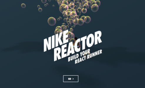
Source: Nike
We’ll start with a familiar name, Nike. This interactive website lets you build your own React running shoes using fun, seamless animation and eye-catching visuals. But you’re not building shoes in the strictest sense of the word. Instead of choosing stitches and fabrics, you’re given the option of using bubbles, stress balls, springs, and more. The use of these fun visuals boosts user engagement while selling the idea that Nike’s React footwear is extra comfortable.

Source: Nike
2. AirBnB Online Experiences

Source: AirBnB Online Experiences
The popular travel site is a perfect example of interactivity without many real interactions. AirBnB depicts the magic in the everyday moments experienced when traveling through a variety of attention-grabbing photos.
But AirBnB’s interactive website goes beyond the traditional travel site to give you unique online interactions hosted by others. Take tours of exotic locations, learn how to cook from other chefs, or even solve an escape room with these online experiences.
3. An Interesting Day

Source: An Interesting Day
This interactive website shows you don’t need to have cutting-edge graphics to create an engaging design. An Interesting Day documents a 2018 conference held by digital product studio Bakken & Bæck in Amsterdam. All of the animations are hand-drawn and simple, giving the site a handmade feel.
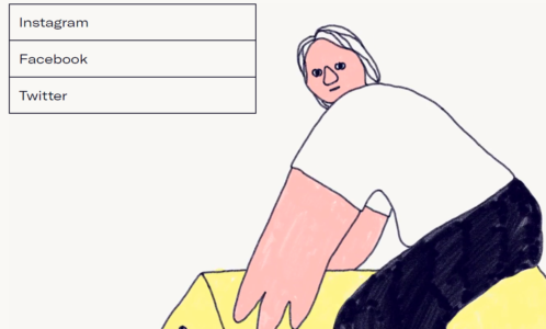
Source: An Interesting Day
The entire website exists on a single page, giving the user all the information they need without navigating.
4. Chanel: Spring-Summer 2021 Haute Couture Show

Source: Chanel: Spring-Summer 2021 Haute Couture Show
Chanel certainly knows how to create an atmosphere. They combine video, still images, and poetically written product descriptions — all united with an interactive scrolling navigation — to immerse the user in an environment rich with the elegance and fashionability the brand is known for.
5. Space Needle

Source: Space Needle
Scrolling in general is an excellent strategy for immersive interactions. The Seattle-centric site for the Space Needle shows off stunning visuals and displays content with scroll-activated, animated boxes — a far more entertaining method than simply listing facts about the city. Users aren’t normally accustomed to scrolling upwards on a site to learn more, but the navigation pattern works for this specific context because it matches the on-screen journey.
6. APPS

Source: APPS
Among the most interactive websites on this list, APPS first takes you through a guided tour of the cider making process. It prompts you to continue the journey with a few button presses. The animation is lifelike and fun, and the interactive elements keep the user engaged.
7. Aquatic Macroinvertebrate Collection
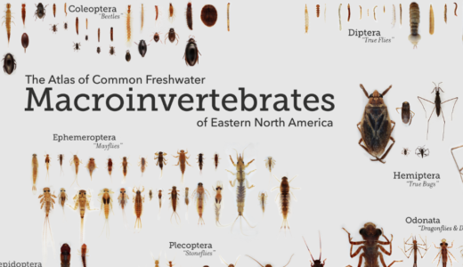
Source: Aquatic Macroinvertebrate Collection
Education facilities also understand the value of engaging the learner in increasing both memorability and enjoyment. In the case of the Aquatic Macroinvertebrate Collection, users can examine lesser-known species by zooming in and out of various body parts and reading the descriptions.
The effects themselves aren’t groundbreaking, but they definitely create the wonder of exploring something new and exciting. Never forget that when making interactive websites, it’s not about the best design but the right design.
8. The Happy Forecast

Source: The Happy Forecast
Our favorite interactive website elements include a hover state that leads to a color change and some motion indicating interactivity. Beautiful music and animations create an emotionally immersive and engaging experience.
9. Make Your Money Matter

Source: Make Your Money Matter
Our favorite interactive website elements are scrolling interactions that tell a story and take the user through an educational journey. Each scroll reveals a new part of the story. Stunning illustrations and animations are done on a muted and earthy color palette.
10. Mammut

Source: Mammut
Climb mountains without climbing mountains. Our favorite interactive website elements are a rotating 360-degree animation of Mt. Everest on the homepage. This draws users in by creating depth. A scrolling interaction takes users through an interactive and customizable climbing experience.
11. Hello Monday

Source: Hello Monday
Our favorite interactive elements include a horizontal parallax effect when the user clicks on the menu bar. Movement on the menu items when hovered over and quirky animated 2D illustrations are unexpected elements that grab attention.
12. Ocean School

Source: Ocean School
Our favorite interactive website elements include scrolling interaction that takes users deep into the ocean. A blue and white color palette and 3D animations create an immersive experience, along with animated and color changing hover states.
13. Cyclemon

Source: Cyclemon
Our favorite interactive website elements include a vertical parallax effect on scrolling interactions that tells users who they are by their bike type. A bold and fun color palette is customized for each bike type.
14. Fontsmith

Source: Fontsmith
Our favorite interactive website elements include a fun hover state that changes color and the size of the text. A bold and funky color palette grabs the user’s attention from the beginning.
15. Akita

Source: Akita
Our favorite interactive website elements include a scrolling interaction that defies the traditional top-down direction and charts the movement of data across the internet. Hover states reveal more information with popups.
16. Pete Nottage

Source: Pete Nottage
This voice actor’s interactive website makes use of hover states and fun animations for a memorable impression.
What We Learned from the Best Interactive WebsitesThe most common interactive feature we saw from these interactive websites is hover states. The reason for this? They’re easy to implement across a wide range of industries and don’t create too much distraction. You can try the simple hover states like Ocean School or go for a more animated one like Pete Nottage.
Scrolling interactions are another popular element because they’re also easy to implement and they create motion without using animation. You can use the parallax effect like Cyclemon or tell a story like Akita. To improve user experience, these interactive websites used more than interactive features and micro-interactions. They used fun color schemes like Make Your Money Matter or like Fontsmith to evoke emotions and create an immersive effect. The videos and animations used by Mammut and Happy Forecast can also create a very deep movie-like experience that captures the attention of users.
To drive interactions and increase engagement, the best interactive websites used a consistent design and combination of storytelling and excellent copywriting to create curiosity and get engagement. Interactive elements should not be used just for the sake of it, their role is to enhance the experience of users and pass on a message.
Need more help with your winning design? UXPin is a platform used by some of the best designers on the planet. You can manage your entire UX/UI project with a single tool. This is the design process simplified. Try UXPin today, completely risk-free.
The post Engaging, interactive websites and what you can learn from them appeared first on Studio by UXPin.


July 23, 2021
Selecting The Right Open-Source Project in React Ecosystem
Open source projects provide a unique way to work collaboratively with other people and learn through teamwork. It’s not rocket science, but it’s safe to say that a lot goes into choosing the right open source project in the React ecosystem.
So, for anyone looking to take up on a challenge and commit, we’ve made it our goal to provide you with useful information on how to choose the right open-source project in React.
Benefits of Contributing to React Open-Source ProjectsBefore you find out how to choose the right open-source project in the React ecosystem, let’s touch on the benefits and how contributing can help (junior) web developers and UX/UI designers.
As a UI developer who is just starting out, contributing to open-source projects can:
Be a great way to get inspired (since it’s a very good javascript library for building user interfaces)Help you learn the best practices of one of the best front end frameworksImprove your skills in a unique wayEnable you to experience every stage of a project’s development cycleBe a great networking opportunity and a way to promote yourselfA great way to boost up your portfolioWith that being said, let’s talk in more detail about the benefits we’ve mentioned so far.
Get InspiredReact open-source projects can serve as an inspiration to any UX/UI designer working with Merge technology since it fully supports React while being fully integrated with Git and Storybook. It allows you to design with code components and import components from other developers’ Git repositories.
 Learn the Best Practices
Learning the best practices related to open-source project participation via proper documentation and an active, helping community could serve as a form of guidance to new and seasoned front-end developers and UX designers.
And on the other hand, best practices are really important when just starting with open-source projects as a contributor in terms of knowing what to do and what not to do, how to properly send pull requests, submit an issue, and more.
Improve Your Skills in a Unique WaySharing your knowledge, experience, and code with other people while having them do the same can prove a very unique and effective way of sharpening your skills and learning new things.
Experience the Full Cycle of a ProjectThe React ecosystem gives you the chance to fully immerse yourself into the development cycle of a project from start to finish. Along with other contributors, you get to experience all the stages of a project, from ideation and prototyping to design, testing and implementation, where collaboration and commitment play a crucial role.
An Opportunity for Networking & Self-Promoting
Being a part of an active open source community and while connecting with its members can help you develop a reputation, which can, later on, help you get a job, which brings us to the next and last benefit.
Build a PortfolioSometimes an open-source project can be that push in the right direction for your career. So, when applying for a job or looking for a freelance gig, you can always showcase the projects you’ve contributed to.
That shows potential employers that you’ve been working on real-life projects, provided help, and solved existing problems instead of having just beginner-level tasks and fictional projects in your portfolio.
Regardless of your skill level, React open-source projects can help you develop a diverse portfolio which can, in turn, help you land a job.
Things to Consider When Selecting an Open-Source Project in ReactSelecting the right project can be challenging if you don’t know where to start looking or what deserves your time and effort. However, the rule of thumb when selecting an open-source project is to keep these things in mind:
An Active Community Project PopularityA Well Organized Documentation Active CommunityCommitting to a project with an active community means that there will always be someone willing to help you in case you get stuck. It also means that the project is future-proof in a way, knowing that the developers are willing to carry out the project to completion.
It’s important to be able to discuss the project with someone if a difficult problem appears that needs resolving. Open-source projects with active communities often have a slack or discord channel where they can discuss in more detail, share experiences, communicate, and more.
On the flip side of things, an active community is important if you decide to use the project’s source code as a dependency for a personal task.
Project PopularityIf there’s an active community around a certain React open-source project, it’s safe to say that the project has grown in popularity, and you can expect thorough documentation and plenty of help from fellow contributors.
A Well Organized Documentation
The last piece of the puzzle to consider when selecting an open-source project in the React ecosystem is well-organized documentation that you can reference. Proper documentation will make things easier for you in terms of familiarizing you with the issues the project is currently facing.
How to Get Started With Open-Source ProjectsThe best React open-source project to contribute to for beginners is one that you can learn the most from while keeping engaged. While for more experienced UI/UX developers, the best open-source project is the one they can contribute the most to.
Useful Tip: You’ll probably want to look for open-source projects on GitHub since it’s the best platform for developers. Also, when exploring GitHub, make sure you check out how many stars, comments, issues, pull requests, and views from stargazers a project has. Basically, any type of visual clue to help you determine whether it’s a good fit for you, your skills and your time.
ConclusionSo, to recap, contributing to an open-source project can help you improve your skills while expanding your knowledge and learning with the help of a community. It will help you build professional relationships with other people in your area of expertise and might land you a job one day.
It will also provide precious experience in terms of being a part of every stage of a project’s development cycle. Just remember to keep in mind the things we talked about before you commit to a specific project.
Well, we covered the most important aspects of how to choose an open-source project in the React ecosystem. When designing or developing your ideas, you may need a tool that works in harmony with dev tools and libraries. UXPin’s Merge technology is focused on effectively bridging the gap between design and development by making the most out of React code components coming from Git repos or all-framework components from Storybook. These can be synced with our design tool so that designers can reuse code components in different projects while retaining full functionality. And with that, you get the full benefit of smoother handoff and a faster product development process overall.
Discover MergeThe post Selecting The Right Open-Source Project in React Ecosystem appeared first on Studio by UXPin.
July 22, 2021
What is an Affinity Diagram and How It Can Help You
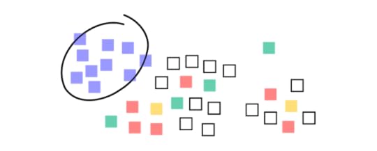
The affinity diagram offers a framework for grouping information, be it data, user needs, opinions, insights, or other data types.
Affinity diagrams are when you put each concept, idea, or thought onto a small piece of notepaper. Then, you group ideas by different categories to see what the affinity of the two ideas could be.
Invented by the Japanese anthropologist Jiro Kawakita in the 1960s, the diagram is an invaluable tool for idea creation. It allows teams to organize the large number of information found in the numerous phases of design thinking into their natural associative relationships.
Affinity diagrams are often used in design to figure out where you should be putting features, fields, and options throughout your apps.
That’s why we love them here at UXPin. Check out UXPin, where you can easily collaborate in real-time with your design team on outlines, documentation, wireframes, UI/UX designs, and hi-fi prototypes.
Examples of Affinity Diagrams1. New Ideas Affinity DiagramIn the example below, a UX team was brainstorming about community collaboration. You can see from the diagram that community collaboration was one of the ideas they were discussing. The category of community collaboration was later subdivided into other subcategories: Contributors, Users, Evaluation.
 Source: uxdict.io
2. Organizational Affinity Diagram
In the example below, the designer organizes their information on how best to meet their customer’s needs. When you look at the diagram at a glance, you get an idea of the brainstorming solutions.
 Source: Elegant Themes 3. Color-coded Affinity Diagram
 In this example, the designers organize their ideas by color-coding. It entails using several different colored sticky notes to organize ideas.
You could run the diagramming by choosing a different color for stats, ideas, or customer feedback. Or you label each cluster with a different color. The sub-categories could be a different color from the main categories. Then when you reorganize the sticky notes into new groups, they retain their color from the original organization.
 Source: Dribble
Once you’re done with your affinity diagram, you can start designing and planning your design. Check out UXPin for a great design tool that lets you design in real-time with your teammates and share previews with testers and stakeholders.
Why Use an Affinity Diagram When Doing App Design?App design involves a cluster of information and ideas. Without a coherent framework for those ideas, a team may find itself wasting time without coming to a consensus. With affinity diagram/affinity mapping, you uncover new patterns of thinking and you can easily break old patterns by sorting and clustering information into relationships. A team can discover categories and meta-categories within a cluster of information or ideas and, in doing so, find which ideas are common in the team.
The affinity diagram acts as a map for brainstorming and idea generation. The diagram helps teams create connections or find data and themes in their data. For instance, the tool is a great way to find connections after conducting qualitative user research, customer feedback, or ethnographic research.

There are lots of good reasons to do affinity diagrams – For starters, the diagram helps web and app designers find meaning in the complex web of user’s needs. You have various ways to collect customer feedback beyond usability tests, interviews, chats, etc. But it isn’t easy to measure all this data against the KPIs. Attempting to do so can be difficult. With the affinity diagram, designers can efficiently synthesize qualitative data from diverse sources into an actionable visual diagram.
The affinity diagram is also referred to as a method called “space saturate and group.” So at first, everyone comes with their ideas, and the board is “saturated” with research and ideas. To find meaning from all the data, the team must group the information since it’s saturating the space. The grouping process helps you draw connections between business perspectives, the individual information and thus develop deeper insights. This will help define the problem(s) and come up with potential solutions. Therefore, you transition from analysis to synthesis.
What are some great situations for Affinity Diagrams?Affinity diagrams help you plan your apps before you build them – it’s great for generating ideas. The affinity map helps find connections and meaning from qualitative user research or customer feedback during the pre-design stage to organize all the data gathered.
Early on in the process of app development, teams hold workshops where they collaborate and share ideas. These sessions involve members from various departments, from marketing to UX specialists, business analysts, legal experts, and many more. After that, there’s the research and analysis phase, where the app developers construct a user persona to identify the flaws and benefits of the upcoming app. This procedure can be overwhelming without a coherent framework for mapping all the variety of data, which varies from field studies, contextual inquiry, and user interviews.
Teams can use affinity diagrams to create categories or themes from a large amount of data. This mapping helps them find patterns and quickly discover what they’ve learned by grouping data and finding connections between the groups.
For example, with the affinity map, you can:
Find answers to specific research questions Organize results from the brainstorming sessionCreate/develop innovative solutions Improve processes Summarize related data/notesThe idea behind the affinity diagram is to simplify the process of innovation by creating an environment where everyone’s voice is heard, conflict is avoided, and similar patterns of ideas are favored.
a) Designing the operational workflow of an app so that it is a functional appThe affinity diagram is a great method, and when followed step-by-step, helps you create a clear overview and synthesis of your findings. Once you organize all your data, you can focus on turning that information into a functional app.
b) Making your app useableConcerning UX, it can be challenging to understand the needs of the end-user. The multiple sources of collecting customer feedback make it difficult to find connections and meaning from the vast data. But with the affinity diagram, you can map out the data obtained from users to understand their needs, behaviors, and motivations. Mapping out the user research gives you a way to handle your ideas so that it will help you deliver an exceptional user experience.
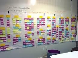
What are some not-so-great situations for Affinity Diagrams?In the affinity diagram, team members get to jot down their ideas onto sticky notes, cards, or pieces of paper and put them on wall charts, whiteboards, or chalkboards. You end up with post-it notes that are categorized based on similar themes, patterns, or groups.
However, the issue is that this approach is temporary and fragile as some of the notes could fall off, or someone could take it down (unless you use the extra-sticky ones or choose an online template). Also, it doesn’t work with remote teams, as well as in numerous other situations.
The process of physically writing the notes and placing them on the board is time-consuming. In most cases, you’ll have to wait until the end of the research to start mapping the information.
Try using a web tool for affinity mapping, and remember Affinity diagrams have a time and place and work best when there’s buy-in from multiple parties.
The best process for making Affinity DiagramsDuring the brainstorming process, be clear about the objective of the brainstorm, i.e.what problem are you out to solve? Put all the pieces of data, documented facts, ideas, observations into notes, cards, or pieces of paper and post them on a flat surface that’s visible to everyone. Based on the collaboration of the team, start making clusters by moving all the related sticky notes based on relationships. Involve your team members as much as possible to save time. Create a “parking lot” category for the sticky notes that don’t appear to fall into any category naturally. Avoid discarding sticky notes that you feel are already represented. Redundancy of ideas is fine as it reveals how many members of your team have the same idea. Once the content is clustered, ask the team to suggest categories representing the clusters and write the proposed categories at the top of each column. Don’t let the members spend too much time coming up with names for a category. For instance, if there’s a disagreement between “tools” versus “gadgets,” list them both. If the members produce significantly different categories, opt for the one that gets the most approval. Naming the clusters is essential as it helps you discover themes. You can rank the clusters in order of importance. For instance, what does your company prioritize? Let the company’s values, motives and priorities lead you in the ranking. You can draw lines to make connections within the clusters. Make meaning from the connections. For instance, is it the user’s pain points or needs? Look for gaps that haven’t been addressed. Focus on translating the synthesized information into practice rather than identifying similar information. The results of a great affinity diagramAffinity mapping unifies large sets of data by finding connections between concepts and ideas. It helps you organize facts, research, and opinions into clusters that will help you find solutions to complex problems or spot common issues. A great affinity mapping results in a natural form of relationships that can be converted into actionable results. It helps you to:
Identify problemsCreate ideas Convert complex ideas into simple solutionsHelp groups find a consensusAffinity diagrams are a collaborative process. For great results, you’ll need to delegate a leader who will properly organize the process. It would also help if you set a time limit to avoid an overflow of ideas. Set a plan and communicate the goal of the brainstorm to your teammates. That way you’ll improve productivity and output.

Remember that the goal of the affinity diagram is to organize vast amounts of data into a more coherent format. For best results, prioritize accuracy and don’t put limitations on your team over the number of ideas generated.
ConclusionHere at UXPin, we use affinity diagrams to do our information sharing and consensus making. We take our affinity diagrams and keep them on record during our design phases and project management.
If you’re ready to start designing, join UXPin so you can collaborate in real-time, share ideas, and generate life-like prototypes with real data and interactions.
The post What is an Affinity Diagram and How It Can Help You appeared first on Studio by UXPin.
July 20, 2021
10 Worst Design Failures of All Time

Design faux pas happen. But that doesn’t stop us from enjoying looking at some of the biggest problems and wondering who on earth thought that was a good idea. Bad product design is rampant and it can be pretty interesting to watch the car wreck from a distance.
The real problem starts when bad product design destroys products (Google Wave, Macintosh TV…), or whole companies (OQO). Let’s check out the top 10 worst product designs of all time. There’s an important lesson in each and every one of them. Have fun!
10. Motorola ROKR w/ iTunes (2004)

Author: Matt Ray. File licensed under Creative Commons Attribution-Share Alike 2.0 Generic
Way back in 2004, Apple decided to jump into the smartphone market with the Motorola ROKR. Motorola integrated the iTunes player into the operating system. The idea was a sound one, but the actual execution was a disaster. The interface was poorly designed. You could only save a limited number of songs. The end result was a total crash in sales once the iPod nano came out and Motorola no longer used iTunes with their next iteration of the phone.
9. OQO Model 1 (2004)

Author: Philosophygeek. File licensed under Creative Commons Attribution-Share Alike 2.0 Generic
When it comes to bad product design, tablets have also had their fair share of issues. The absolute worst though was OQO, a US-based hardware company. They designed the Model 1, announced as the world’s smallest Windows XP computer. The tiny 5×3″ screen made it completely unusable with Windows XP. OQO went out of business in 2009.
8. Eyetop Wearable DVD Player (2004)
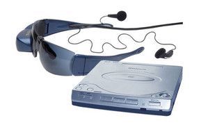
The concept of using glasses with a built-in screen has been around for a while, but Google Glass wasn’t the first one. In 2004, the first glasses with a 320-240 pixel screen built-in on one side were designed to let you watch a DVD. There were three major problems with the design. First, people got motion sick . . . a lot. Second, they had to carry the DVD player with them. And finally, the movie only played in one eyepiece, so people had trouble focusing on it.
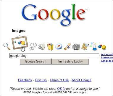
7. Google X (2005)
Not all bad product design occurred in physical products. Google X was a terrible online interface that debuted for a single day in 2005. It was meant to copy the Apple OS X design, but it was a complete mess with ugly icons and failed connections. It was immediately removed.
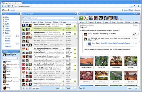
6. Google Wave (2009)
Author: Akae. File licensed under Creative Commons Attribution-Share Alike 2.0 Generic
Launched in 2009, Google Wave announced failure in 2010 and was completely gone by 2012. Google Wave was an interesting project that was supposed to improve collaboration. Again, a good concept was ruined by bad product design.
5. Macintosh TV (1993)
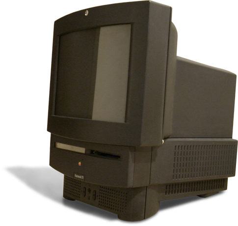
Author: Ben Boldt. File licensed under Creative Commons Attribution-Share Alike 2.0 Generic
Apple isn’t without a design sin. Originally, the company mixed TV and computer in the Macintosh TV and it was a case of doing nothing well. Just 10,000 units ran off the assembly line before Apple canceled the project due to bad product design.
4. Nokia N-Gage
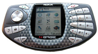
Author: J-P Kärnä. File licensed under Creative Commons Attribution-Share Alike 2.0 Generic
Nokia has a reputation for sturdy phones, but this phone/gaming console was a terrible idea. The speaker and microphone were on the side of the phone, which made using the phone awkwardly, plus you had to remove the battery every time you changed games. Not Nokia’s finest hour.
3. Sony Remote for Google TV
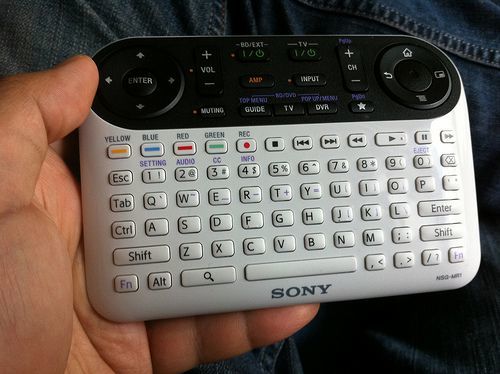
Author: Special*Dark. File licensed under Creative Commons Attribution-Share Alike 2.0 Generic
This remote was possibly the most ridiculous thing to ever come out of Google. Needless to say, the company updated the design fairly quickly.
2. Windows Mobile
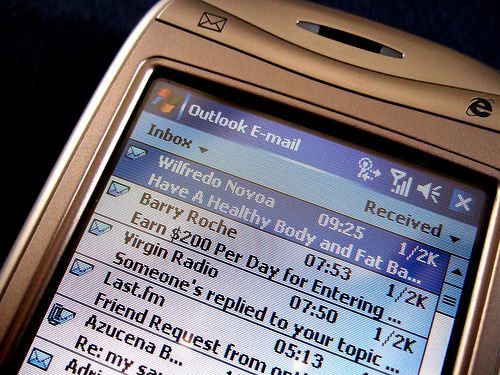
Photo Credit: James Cridland via Compfight cc
Windows never worked well on small screens, but Windows Mobile was originally an option for mobile devices. It was the worst OS to be used on a phone ever. With a major mess to deal with, even app designers gave up.
1. Shutdown process in Windows 8
If you were ever lucky enough to shut down a computer with Windows 8, you know just how difficult this was. It was such a poor design that it took a very long time to shut down your computer and most people rarely bothered to do it.
Want to avoid bad product design yourself? You should give us a try.
The post 10 Worst Design Failures of All Time appeared first on Studio by UXPin.
July 15, 2021
What is a Storybook and why you need it in your product team

Building a UI component library makes it so much easier for your team to create designs that work well, conform to your brand’s style guide, and pass their work on to the developers who ultimately code products and release them to the world.
In the long run, a UI component library saves more time and energy than you can calculate. That’s easy to forget when you’re in the middle of creating a UI component library. Depending on the size of your organization and the types of products it makes, the project could last weeks or months.
Given the difficulty of building a unique library full of reusable components, it makes sense to find an enjoyable tool for building and testing ideas.
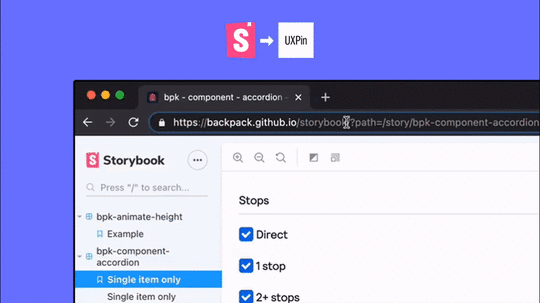
At this point, you’re probably thinking something like, “Here comes that call to action to start using UXPin.” Obviously, Merge is a fabulous way to make code-based components. That isn’t the topic of this article, though. Let’s talk about Storybook.
Also, let’s talk about how Storybook and UXPin now integrate so your product team can finally start exploring ideas in the best code-based, atomic environment. Yes, you were correct about expecting a gentle nudge toward UXPin. You were just a few sentences early.
In all seriousness, though, let’s take a closer look at why this integration matters.
(Ideally, you already know what component libraries are and why you should use them. If you don’t, catch up by reading this article. You will learn a lot within a few minutes.)
Test radical ideas in isolated sandboxes
When you create components, you undoubtedly go through several versions before you decide which one to use. Even if you’re just making the shape of a button, the designer in you insists that you try it with blocky edges, rounded edges, slightly more rounded edges, and ridiculously rounded edges. You cannot move on to the next task until you have seen what your component looks like on the screen,
Storybook understands this, so it lets you test all of your ideas—no matter how wild they might seem—in isolated sandboxes.
You’ll discover how much time this ultimately saves you when you start working with interactive components. What happens when you click the button with ridiculously rounded edges to submit text to a website? Turns out, the edges are way too round and the button is nearly impossible for someone with accessibility challenges to use. Now, throw that one out and test the others until you find the one that works best. You can play as much as you want without influencing anything outside of the sandbox.
Related tip: Storybook now has an add-on that will help you test components to make sure they meet accessibility standards.
Your designers have pre-approved components, so they can build freely!Atomic UI components break down the design into small pieces. Your new designer doesn’t have to stare at your style guide for an hour before feeling confident enough to make a password-retrieval request form.

Instead of working from scratch, they open your UI component library to find all of your approved components. If they can integrate Storybook with their design tool, it gives a whole new level of flexibility as well. From this point, the work becomes about as straightforward as possible. They:
Choose an empty text field from the component library.Adjust the field’s size just to make sure it looks attractive on the page.Add a “submit” button from—no surprise here—the component library.Adjust the button’s position.Add some text so users know what information to provide.That’s it. They don’t have to knock on your door, send you a Slack message, or try to reach you on Teams. The components in the UI library are already approved, so there’s no reason to seek permission.
This aspect alone is going to save your designers tons of time because they simply adjust components instead of creating them from nothing. Perhaps more importantly, you will have more time and fewer headaches because you get to concentrate on your work without getting interrupted millions of times a day (slight exaggeration, but it feels like that many on some days).
Designers hate code and coders hate design: Storybook is their peace treatyHow many visual designers do you know who have enough coding experience to work as developers? The answer is: very few.
How many sighs do you hear pour from your development team when your designers send over new visuals? The answer is pretty close to infinite.
Everyone knows why the disconnect between visual design and development teams exists. They don’t have a common language that makes them effective communicators. Of course, your developers are frustrated! The designers keep sending over ideas that will take too much time to figure out or they ask for tweaks in components that already exist!
Storybook erases this problem by giving designers and developers an interpreter that makes communication easier.
In Storybook, designers can combine and adjust components without knowing how to code. They just access the Controls function and make changes. It literally takes seconds to alter designs.
Just as importantly, Storybook will interpret the changes and update the design’s code. When it reaches your developers, they already have code that makes sense.
Yes, they should review and test UIs to make sure they function as intended. Yes, they should test the entire product in case some stray character ruins everything. For the most part, though, your developers become gatekeepers who can focus on other aspects of their jobs… like actually building behind-the-scenes functionality that will process payments, recommend products, and perform other tasks that help your company generate more revenue.
UXPin + Storybook = ❤️Now that UXPin and Storybook integrate, you can move your UI component library from Storybook and use it directly in your product design and prototyping application.
You get the best of both worlds. And you get it really, really fast without any complications.
Storybook is an open-source tool, so go get it and reap the benefits.
Don’t miss out on the other side of the equation! Sign up for a free UXPin trial so you can experience the benefits of prototyping and testing products quickly instead of sending them over to your overworked development team. Play with an integrated Storybook library on trial – get started now.
Try out Storybook integrationThe post What is a Storybook and why you need it in your product team appeared first on Studio by UXPin.
July 14, 2021
Top 8 Design System Examples

Many companies, such as Airbnb and Uber, have already switched to using a unique design system of their own.
Constant innovation within the industry is an essential aspect of setting a brand apart from the competition and improving the user experience, especially for brands that operate on a global scale.
Thanks to making the most out of repeatable and reusable components, brands who have created a design system in their workflow can increase speed, inspiration and efficacy among teams.
It’s important to note that having a pattern library or a collection of codes and UI elements only shouldn’t be treated as a finished design system. There’s a lot more to a comprehensive design system in terms of design fundamentals, building your own design system as well as overall implementation.
That said, let’s learn more about design systems in general and check out some great examples of other companies who are already using this technology to drive success and value for added inspiration.
What exactly is a design system?A design system presents a collection of all UI resources that a design company may have. These include all code snippets and development resources with necessary code, documentation, page screenshots and image examples, design guidelines, relevant tools, documents and articles, style guides, reusable components and philosophies, and all other digital assets useful for the overall web design workflow.
These design systems are then hosted as websites online and can be public and internal, whatever the brand decides.
We can think of a design system as a vast data library that acts as a valuable document with applicable instructions and examples, style guides and coding guidelines, and a part of the UI kit all at the same time.
Why do companies create design systems?Everyone who’s part of the company product team, such as developers, designers, engineers, product managers, etc., gets together to discuss and map out everything that’s currently an existing part of their digital product assets, from logos and colors to language and codes. Then they collaborate on creating this ultimate master plan that explains how exactly things should be presented (designed and coded).
That way, all teams have one full-proof source (there’s a reason why a design system is referred to as a single source of truth in the industry) of visual references, tools, articles, patterns and data libraries. It allows them to keep their work consistent and uniform, and have every single member on the same page – the ultimate goal of design systems.
The use and implementation of design systemsWhen it comes to implementing and developing design systems, developers don’t have to waste time on repeated code snippets when everything they need is right there to copy from reusable components and/or libraries.

Similarly, designers don’t have to create a new landing page from scratch when they have a library of standard design and UI elements such as colors, logos, headers, footers and other essential symbols to speed up the design process.
Also, web marketers don’t have to work out the tone and template of the newsletters repeatedly when they have everything they need within the system.
What is there to learn from design systems?The majority of design systems follow rather general setup patterns.
The system often features its top navigation with the main categories: Design, Code, Language, Components, etc.
Each of these main categories has its subcategories that discuss things in more detail, making the most out of the atomic design structure. For instance, these subcategories could be something like Typography, Color, Forms, Banners, etc.
Following this intuitive navigation can get you valuable information about best practices in terms of design.
What’s in it for other people and brands?A great thing about design systems that many companies host online publicly is that other people can also learn from them and even use them as examples for their own atomic design.
Let’s refer to Shopify for a moment; their shopping design system is publicly displayed on the Web. It means anyone trying to design an eCommerce website can use their set of standards, design components and design language and pattern library for every single design element and be 100% sure that they’re doing a great job.
That said, let’s take a look at some of the best design system examples that you can learn a lot from (and steal from if you want to).
Design system examplesBesides design systems mentioned below, we have a repository of design systems called Adele – get inspired!
1. Google Material Design System
One of the Big Four technology companies, together with Microsoft, Apple and Amazon, Google is a well-known tech giant that focuses on Web services and products, from online advertising and search engine to cloud computing and software.
Google created and publicly shared their Material Design System that goes into the tiniest details regarding everything there is to know about the design and design principles. Every UXPin user can easily use the Material Design components as they are one of the UXPin libraries.
Thanks to this system, users can get valuable information that perfectly unifies UI UX across different devices, platforms and input methods.
Furthermore, Material Design allows other brands and individuals to have a strong foundation for building upon when it comes to their own approach to atomic design, industry innovation and unique brand expression.
The main features of the Google Material Design System include:
Starter KitsDesign Source FilesMaterial ThemingLayoutTypographyColorComponentsMobile Guidelines2. Apple Human Interface Guidelines
Apple Human Interface Guidelines present a vast and rather valuable design system resource for the web design essentials and pattern libraries but downloadable templates. The iOS UI kit library is also available with a UXPin account.
The system follows Steve Job’s design principles:
Craft with great precision and attention to detailEmphasize user experience and connection with the usersFocus on what’s truly important on a larger scaleGenerate wanted user reactions thanks to the specific design language and practicesUtilize the friendly aspect of high tech for both novice and advanced usersSimplify everythingApple Human Interface Guidelines consist of practical resources, visual guidelines and style guides for both designers and developers for iOS, macOS, vOS and watchOS.
Its main features include:
Visual DesignVisual IndexApp ArchitectureSystem CapabilitiesUser InteractionThemesMenusButtonsIcons and ImagesFields and LabelsWindow and ViewTouch BarIndicatorsSelectorsExtensions3. Atlassian Design System
Atlassian Design System focuses on providing valuable assistance to teams from all over the world by making their collaboration seamless and easy. Atlassian Design Guidelines are also a part of UXPin’s library collection.
Atlassian design philosophy is all about utilizing the digital experience to improve the productivity and overall potential of teams and individual team members, perfectly reflected in their globally used collaboration tools Trello and Jira.
That said, Atlassian Design System features agile practices and efficient tracking of every single step within a project that ultimately yields valuable results in terms of product delivery and development:
Design PrinciplesBrand GuidelinesProductIllustrationPrototypingMarketingPersonality4. Uber Design System
According to Uber, movement ignites opportunity.
After all, Uber service bases on movement with ride-hailing, peer-to-peer ridesharing, food delivery and micro-mobility involving scooters and electric bikes.
For this type of service to work impeccably, from sub-brands to internal ones and products to programs, Uber requires an effective design system that the company shares with the rest of the world.
Main features of Uber Design System:
Brand ArchitectureCompositionTone of VoiceMotionIllustrationPhotographyIconographyColorLogoTypography5. Shopify Design System Polaris
Shopify is a global eCommerce platform that provides everything a brand may need to run and grow its business in one place.
It’s no wonder that their design principles focus on creating a better and more accessible commerce experience.
Shopify’s public design system called Polaris encompasses the company’s core values:
Be caring and considerate to the usersProvide people with the right tools to accomplish whatever they set out to doEnjoy the top level of craftsmanship that matches the brand imageMinimize the hustle by providing accurate and quick solutionsAlways build upon users’ trustMake the users feel comfortable with using the productsPolaris Design System provides an easy-to-follow and practical style guide for designing for the Shopify platform. It offers a vast knowledge base on utilizing UI components, visual elements, content, and design language for creating a better user experience and product in general. Polaris components are also a part of UXPin management.
Shopify Design System Polaris includes main features that follow the practices mentioned above to a tee:
Data VisualizationAccessibilityInteraction StatesColorsTypographyIconsIllustrationsSpacingSoundsResources6. IBM Carbon Design System
IBM operates on a global scale by meeting large enterprise IT needs.
Their services range from business consulting and financing, software development and IT hosting/management to software-to-hardware products.
IBM’s core belief revolves around making constant progress, be that human condition, society or a brand, by utilizing science, reason and intelligence.
According to IBM, a good design is not only a mere requirement but an actual responsibility to the users.
This is where their Carbon Design System shines with its main features, offering plenty of tools and visual resources for Adobe, Axure and Sketch designers as well as developers:
Data VisualizationPatternsComponentsGuidelinesTutorialsUXPin users can conveniently find everything they need from Carbon in their account as well.
7. Mailchimp Design System
Mailchimp has come a long way from being a renowned email marketing leader to providing an all-in-one marketing platform that goes beyond email only.
Mailchimp has one clear goal: to help small businesses grow while remaining true to their brand identity and image.
That is also one of the many reasons behind creating the Mailchimp Design System and its main features that focus on creative expression, better user experience and top quality:
Data VisualizationGrid SystemColorTypographyComponents8. Salesforce Lightning Design System
Salesforce goes above and beyond to deliver a personalized experience to its users through the integrated cloud-based CRM software.
The purpose of the Salesforce CRM is to improve marketing, commerce, IT, service and sales efforts – and allows their users to do the same with their users.
Their design philosophy is reflected in the Hawaiian word for intentional family, Ohana, with four core values that drive their company actions and overall culture:
InnovationEqualityTrustCustomer SuccessThat said, Salesforce has put out their own Lightning Design System that allows everyone working with content management systems to learn and benefit from its main features:
Design GuidelinesPlatformsAccessibilityComponents (and a lot of them)Lightning components are a part of the UXPin account libraries as well.
The benefits of creating a design system for your companyThanks to a comprehensive design system in place, businesses can considerably improve their teamwork and discipline.
One of the most significant benefits of design systems is that such collection of resources, elements, and data minimizes communication issues between designers and developers and minimizes the room for potential UX design bugs.
What’s more, having such a reference-rich library significantly reduces the necessary time to go from a prototype to an actual product.
For example, PayPal uses Fluent UI together with Merge technology. This allows them to incorporate the code components from Fluent to the UXPin library. That way, both designers and product team members alike can easily access these components and design with them over and over again. 
Design systems are a great way to minimize the disconnect between designers and developers but are still not the ideal solution on their own. Thanks to the Merge technology revolution, product team members can easily utilize dev tools and improve their DesignOps workflow processes, with a set design-code parity. This means that both developers and designers can access and use the same codes, documentation and UI elements from one single source.
 Make the most of design system: the UXPin Merge way
The UXPin’s Merge is a technology that makes it possible and easy for designers to design with code components.
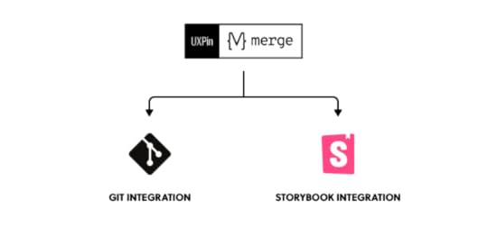
There are two available solutions on the matter:
Component synct withdevs’ Git repository such as GitHub, GitLab, BitBucket or others.Sync of components from Storybook.All those components are brought to the UXPin library.
Merge tech is created as an adequate solution to common challenges that often happen when there’s a communication gap between design and development teams. So, various UI components, coding and documentation inconsistencies can arise, affecting the product’s efficiency and maintenance.
With the design system that organizes all of the necessary components as a first step in the right direction, Merge will then take all those coded components right to the design editor.
You’ll save time and money by avoiding inconsistencies, not to mention the joy of seeing an end product that’s exactly the same as what you originally envisioned!
Design system challenges & solutionEven when companies try to create their design system, specific issues and consistency disconnects can still happen, especially when maintaining all the elements, documentation and code.
Learn more about design system challenges and solutions from one of the top design leaders – Johnson & Johnson. During our webinar, the J&J team shared all their best practices.
Merge tech focuses on design with code components, i.e., converting a code component into the design. In that respect, designers don’t simply create prototypes based solely on the visual aspect of the final product (while only faking the necessary interactions); instead, designers use already coded components to design the prototype image.
There’s no need to go back and forth between the design and dev team since the design team can take the already existing coded components, synchronize them with UXPin’s editor, and drag and drop the components they need to create new designs.
Essentially, designers don’t have to create fake interactions, add them or search for the right colors.

On the other end, developers get the prototype preview and continue to work with the available production-ready elements.
SummaryDesign systems consist of tons of UI components and guidelines that are meant to optimize and improve the design efforts and promote consistency among the teams.
However, if the design system is poorly maintained and implemented, the said system can turn into nothing more than many clunky and confusing code snippets, libraries and components. A design system can quickly educate team members and promote consistency while also allowing designers to deal with more complex UX issues. And when you add revolutionary Merge tech to the mix, you can truly take your design system organization to the next level.
Discover MergeThe post Top 8 Design System Examples appeared first on Studio by UXPin.
July 13, 2021
HTML Line Spacing: The Fine Line Between Good and Bad UX Design
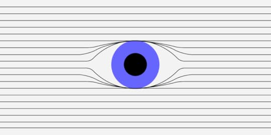
HTML line spacing — the vertical space between two lines of text within a paragraph — isn’t the most exciting thing in the UX design world, but it matters more than you think. This styling element involves Experience Strategy and Interaction Design — two of the four UX design quadrants used to create an incredible user experience. But it goes much deeper than that.
Here’s a quick lowdown on HMTL line spacing:
It has the power to make a text more or less readable. Line-height has an enormous impact on readability, and if users can’t read content, they’re going to hit the ‘back’ button or exit the app.It’s super-important for accessibility, and with ever-increasing legal standards and requirements that govern this practice, you need to use the correct spacing or risk alienating users. Good line spacing makes or breaks the success of a website or app. It’s that simple.In this guide, deep dive into HTML line spacing and discover how to get it right.
How does HTML line spacing make a design more readable?Line spacing isn’t a font thing. It’s a UX design thing. But when was the last time you heard designers talk about it? Line height matters because it makes text readable or unreadable.
If line spacing is too large, there’s too much white space. The text looks awkward. If line spacing is too small, letters appear all squished together. The text looks awkward.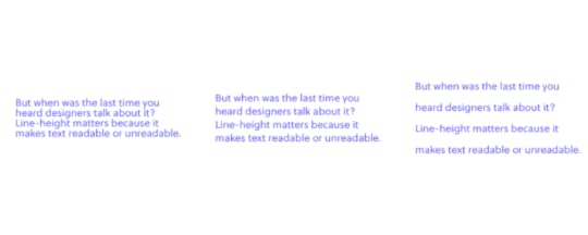
Most UX designers learn line spacing of 130-150 per cent is best for readability (1.3-1.5), with 140 per cent (1.4) the golden ratio, but that formula won’t benefit all users. Your client might have a style guide with a line spacing requirement that ranges anywhere from 120 per cent to 200 per cent, but someone might have written the style guide decades ago, long before anyone considered web accessibility. Consider changing the status quo if it improves readability. (More on accessibility in the next section.)
Unfortunately, there’s no magic number that designers agree on, so it’s all down to trial and error on CSS. Some calculators claim to work out the perfect line spacing and font size, like this one, but as a designer, you’ll make the final decision. Use a design tool like UXPin, which lets you experiment with line and character spacing before you go live. World-famous UX designers use it for a reason, so why not join us with a free trial?
Why HTML line spacing matters for accessibility Photo credit
Accessibility is a big deal in UX design right now, and rightly so. A good designer designs products that provide meaningful experiences to all users, including people with disabilities. Over 60 million adults in the United States alone have some kind of disability. That’s around one in four of the population. Still, few UX designers consider their requirements when creating prototypes and products. This needs to change. Now.
The World Wide Web Consortium (W3C), the international community that develops accessibility standards for the web, says:
Line spacing should be at least a space-and-a-half within paragraphs. So around 150 percent or 1.5 times the font size.Spacing following paragraphs should be at least two times the font size.Spacing between letters should be at least 0.12 times the font size.Spacing between words should be at least 0.16 times the font size.These are just guidelines, not laws, and the W3C can’t make UX designers do anything, but accessible design principles provide a moral obligation for design teams. Some people with disabilities still can’t engage with websites and apps for years, and the shift towards more accessible design all starts with UX designers like you. So be the change you want to see in the world.
HTML line spacing makes or breaks UX designHMTL line spacing might not be noticeable to users (unless it’s really bad), but this subtle style element drives the success of your prototypes and completed designs. Discuss this issue with your team at the start of a UX design project and consider the client’s brief, style guide or design system, demographic, and all the other design elements you plan to implement. Nothing’s set in stone: You can always adjust line spacing later on.
Always consider other typography elements. Font size, text length, and character spacing are all linked to line height, and it’s your job to get these components correct. As a general rule:
Larger fonts look better with less line spacing. Especially headers. Smaller text sizes work best with larger line-heights.Wider paragraphs work best with more spacing.So do longer paragraphs.A recent eye-tracking experiment saw 104 people read text on Wikipedia, where the researchers changed the line spacing of the text from 0.8 to 1.8 to measure readability and comprehension. The results? Line spacing at the two extremes, 0.8 and 1.8, impaired readability, suggesting text-heavy websites should use more conservative spacing. Adjusting your spacing to somewhere toward the middle of this range proves the most successful. Again, there’s an argument for line spacing of around 1.3-1.5, but it depends on context.
SummaryWhile there’s no golden ratio for HTML line spacing, consider readability, accessibility, and overall aesthetics when incorporating text into your next prototype. Few UX designers think about this styling element, so you’ll be on the front lines of a design revolution. Discover the perfect line and character spacing on UXPin, the No.1 UI design and prototyping tool that turbocharges typography and streamlines styling. Try it for free.
The post HTML Line Spacing: The Fine Line Between Good and Bad UX Design appeared first on Studio by UXPin.
July 9, 2021
How to Import Your Components into Storybook and Use Them in UXPin
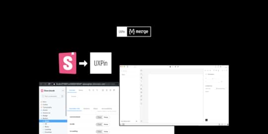
We’ve recently released our Merge-powered integration with Storybook that allows you to bring Storybook components to UXPin editor and design with them, keeping all the interactions available in Storybook. It helps break down the design and development silos and finally, let product teams use the single source of truth.
It’s the second integration (we also connect with Git libraries) supported by Merge technology that aims for keeping the parity between design and development, letting designers use the same components as devs do.
The UXPin-Storybook integration is the first like this on the market, so being a developer and seeing how much it can simplify things, I’ve decided to explore the topic from a developer-first perspective. Read on to learn more about the first step of using Storybook – importing UI code components. I’ve prepared a brief summary of what I experienced when making a project using create-react-app, installing the Storybook package and integrating it into my UXPin account powered by Merge tech for prototyping.
What is StorybookThat’s cool… but like me at the beginning of this journey, you might not have heard of Storybook. Let’s see what it is and what it solves.
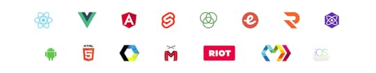
So for a TD; LR; If you’ve built projects that include component libraries using Frameworks such as React, Vue or Angular and don’t have a way to view or test each component with any possible state or combination of props quickly, then you can use Storybook to do this.
It allows you to build interactive component libraries alongside its own documentation internal to the project directory but outside of the main app in an isolated environment. Meaning, it makes your component build process and documentation more efficient and easier to use without changing your original code.
Want a little bit more and a real-life example, sure, here you go. You have a website that’s made up of components, which have several properties and several states. For example, a Form may have states for:
User inputValidation errors and messagesPromotions to be addedTo test these states you’d have to props manually and load local versions of the app, it’s just so tedious and I would very rarely test each state when making a change. But, with Storybook, you can test each prop live in a local isolated environment. It makes things so much quicker and easier.
 Storybook use cases
Storybook’s main purpose was to allow frontend developers who are working on projects utilizing Javascript frameworks to create and style component libraries. However, like most things, there are additional uses:
Project Managers – Improved QA time efficiency without having to load an app to view component changes. Instead just view them on Storybook.Dev ops & Backend developers – No longer do they need to keep the local environment always up-to-date so that other users can see component changes.Designers – Quickly verify the design of UI components and their states are true to your designs.UXPin Merge users – Import your public or private Storybook Library as live React components, where you can make functionally prototypes with no need for programming knowledge.Importing StorybookYou have to install Storybook in your project. It’s a package, so for my Storybook test I used npx create-react-app to create a React project then installed Storybook using yarn sb init. I chose React because it’s what I’m most comfortable with and the docs seem quite extensive, but in addition, there is support for Angular, Vue, Web Components, Ember and more.
Storybook is now immediately usable after installation, and after it’s complete, simply run yarn storybook to start the local Storybook server, which will open your browser at http://localhost:6006 displaying your local Storybook component library with some pre-installed examples.
My ComponentEven though Storybook isn’t plug-and-play as there is a little work to integrate your components, it’s still quite easy and fast. I was a bit confused about the syntax issues but their documentation is great and it didn’t take me long to fix them. Integrating your components is not all or nothing, meaning you can add each component one at a time, which makes the integration easy to troubleshoot.
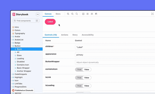
This is the first component I wanted to integrate – a simple Button which takes several props.
The next step is to integrate it into Storybook by writing a stories file.
import * as React from 'react'import PropTypes from 'prop-types';import ButtonStyles from './ButtonStyles'; const MyButton = (props) => ( {props.children} ); MyButton.propTypes = { disabled: PropTypes.bool, children: PropTypes.string, onClick: PropTypes.func, type: PropTypes.oneOf(['primary', 'secondary', 'success', 'error', 'warning']), size: PropTypes.oneOf(['xs', 's', 'm', 'l', 'xl', 'xxl', 'xxxl']),} export default MyButton;Adding a stories fileFirst, what is a Storybook story? A story is a possible rendered state that a component can support. You can have multiple stories each to describe a different state, for example, a Button component with stories for a warning, error or submit theme. For more information, look here.
I need to add a stories file for the Button with several args. A stories file contains a ‘story’ describing one or multiple states that your component will be rendered in Storybook by adding args. Each arg is what properties to give to a component when it renders. I can define several args in the same stories file, therefore, I can show all the different variations of each component. For my Button I’ve shown several args, I would need to add more to cover all variants but this is just for example. You don’t have to define the args in the stories file if you’ve defined props in your component file.;
import React from 'react';import MyButton from '../MyButton'; export default { component: MyButton, title: 'MyButton',}; const Template = (args) => ; export const Primary = Template.bind({});Primary.args = { children: 'primary', type: 'primary' }; export const Warning = Template.bind({});Warning.args = { children: 'Warning', type: 'warning' }; export const XXL = Template.bind({});XXL.args = { children: 'XXL Primary', size: 'xxl' }; export const Stretched = Template.bind({});Stretched.args = { children: 'Stretched Primary', stretched: 'true' }; export const Disabled = Template.bind({});Disabled.args = { children: 'Disabled Primary', disabled: 'true' };So put simply, to integrate a component into Storybook requires:
A src/components/[COMPONENT].stories.js which include your component stories in the needed format.Restart the server if you’ve added a component by running yarn storybookThis is what I meant when saying Storybook is outside of the main app in an isolated environment and doesn’t interfere with your existing code. All added functionality uses the story files, the original code doesn’t change. Additionally, no Storybook-specific libraries are required when creating a stories file.
Automated documentation generationAnother great feature of Storybook is its ability to create your basic documentation automatically based on your source code. This helps tremendously with sticking to a single source of truth and is a huge time saver.
Here are the docs for MyButton component:

It also lists all Args you have in your source code, so you see all the different variants of your components. You can even just copy and paste the code for each!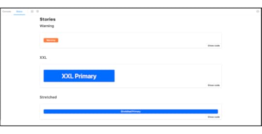
My experience of importing the components into Storybook hasn’t been too time-consuming – it actually was pretty simple as there is lots of documentation to help. The reason I felt inclined to learn more about this is because UXPin, using our Merge technology has added integrating your local or private Storybook as a library in the app, so I wanted to try it and also document my experience with this too.
So, following the UXPin Storybook integration documentation I got my components integrated into the UXPin editor in a minute. I could then (if I had more components) start to build prototypes using my integrated Storybook component library, in a live code environment, with all component interactions and functionality ready to play with.
 Summary
Importing components into Storybook is easy and comes with a lot of benefits. On top of that, it can work as a single source of truth for product teams, reducing handoff to a minimum, getting rid of all the design-dev inconsistencies in projects. If you want to try it out, go ahead – our integration is on trial!
Try out Storybook integrationThe post How to Import Your Components into Storybook and Use Them in UXPin appeared first on Studio by UXPin.
How to Import Your Components to Storybook and Use Them in UXPin
We’ve recently released our Merge-powered integration with Storybook that allows you to bring Storybook components to UXPin editor and design with them, keeping all the interactions available in Storybook. It helps break down the design and development silos and finally, let product teams use the single source of truth.
It’s the second integration (we also connect with Git libraries) supported by Merge technology that aims for keeping the parity between design and development, letting designers use the same components as devs do.
The UXPin-Storybook integration is the first like this on the market, so being a developer and seeing how much it can simplify things, I’ve decided to explore the topic from a developer-first perspective. Read on to learn more about the first step of using Storybook – importing UI code components. I’ve prepared a brief summary of what I experienced when making a project using create-react-app, installing the Storybook package and integrating it into my UXPin account powered by Merge tech for prototyping.
What is StorybookThat’s cool… but like me at the beginning of this journey, you might not have heard of Storybook. Let’s see what it is and what it solves.
So for a TD; LR; If you’ve built projects that include component libraries using Frameworks such as React, Vue or Angular and don’t have a way to view or test each component with any possible state or combination of props quickly, then you can use Storybook to do this.
It allows you to build interactive component libraries alongside its own documentation internal to the project directory but outside of the main app in an isolated environment. Meaning, it makes your component build process and documentation more efficient and easier to use without changing your original code.
Want a little bit more and a real-life example, sure, here you go. You have a website that’s made up of components, which have several properties and several states. For example, a Form may have states for:
User inputValidation errors and messagesPromotions to be addedTo test these states you’d have to props manually and load local versions of the app, it’s just so tedious and I would very rarely test each state when making a change. But, with Storybook, you can test each prop live in a local isolated environment. It makes things so much quicker and easier.
Storybook use casesStorybook’s main purpose was to allow frontend developers who are working on projects utilizing Javascript frameworks to create and style component libraries. However, like most things, there are additional uses:
Project Managers – Improved QA time efficiency without having to load an app to view component changes. Instead just view them on Storybook.Dev ops & Backend developers – No longer do they need to keep the local environment always up-to-date so that other users can see component changes.Designers – Quickly verify the design of UI components and their states are true to your designs.UXPin Merge users – Import your public or private Storybook Library as live React components, where you can make functionally prototypes with no need for programming knowledge.Importing StorybookYou have to install Storybook in your project. It’s a package, so for my Storybook test I used npx create-react-app to create a React project then installed Storybook using yarn sb init. I chose React because it’s what I’m most comfortable with and the docs seem quite extensive, but in addition, there is support for Angular, Vue, Web Components, Ember and more.
Storybook is now immediately usable after installation, and after it’s complete, simply run yarn storybook to start the local Storybook server, which will open your browser at http://localhost:6006 displaying your local Storybook component library with some pre-installed examples.
My ComponentEven though Storybook isn’t plug-and-play as there is a little work to integrate your components, it’s still quite easy and fast. I was a bit confused about the syntax issues but their documentation is great and it didn’t take me long to fix them. Integrating your components is not all or nothing, meaning you can add each component one at a time, which makes the integration easy to troubleshoot.
This is the first component I wanted to integrate – a simple Button which takes several props.
The next step is to integrate it into Storybook by writing a stories file.
import * as React from 'react'import PropTypes from 'prop-types';import ButtonStyles from './ButtonStyles'; const MyButton = (props) => ( {props.children} ); MyButton.propTypes = { disabled: PropTypes.bool, children: PropTypes.string, onClick: PropTypes.func, type: PropTypes.oneOf(['primary', 'secondary', 'success', 'error', 'warning']), size: PropTypes.oneOf(['xs', 's', 'm', 'l', 'xl', 'xxl', 'xxxl']),} export default MyButton;Adding a stories fileFirst, what is a Storybook story? A story is a possible rendered state that a component can support. You can have multiple stories each to describe a different state, for example, a Button component with stories for a warning, error or submit theme. For more information, look here.
I need to add a stories file for the Button with several args. A stories file contains a ‘story’ describing one or multiple states that your component will be rendered in Storybook by adding args. Each arg is what properties to give to a component when it renders. I can define several args in the same stories file, therefore, I can show all the different variations of each component. For my Button I’ve shown several args, I would need to add more to cover all variants but this is just for example. You don’t have to define the args in the stories file if you’ve defined props in your component file.;
import React from 'react';import MyButton from '../MyButton'; export default { component: MyButton, title: 'MyButton',}; const Template = (args) => ; export const Primary = Template.bind({});Primary.args = { children: 'primary', type: 'primary' }; export const Warning = Template.bind({});Warning.args = { children: 'Warning', type: 'warning' }; export const XXL = Template.bind({});XXL.args = { children: 'XXL Primary', size: 'xxl' }; export const Stretched = Template.bind({});Stretched.args = { children: 'Stretched Primary', stretched: 'true' }; export const Disabled = Template.bind({});Disabled.args = { children: 'Disabled Primary', disabled: 'true' };So put simply, to integrate a component into Storybook requires:
A src/components/[COMPONENT].stories.js which include your component stories in the needed format.Restart the server if you’ve added a component by running yarn storybookThis is what I meant when saying Storybook is outside of the main app in an isolated environment and doesn’t interfere with your existing code. All added functionality uses the story files, the original code doesn’t change. Additionally, no Storybook-specific libraries are required when creating a stories file.
Automated documentation generationAnother great feature of Storybook is its ability to create your basic documentation automatically based on your source code. This helps tremendously with sticking to a single source of truth and is a huge time saver.
Here are the docs for MyButton component:
It also lists all Args you have in your source code, so you see all the different variants of your components. You can even just copy and paste the code for each!
My experience of importing the components into Storybook hasn’t been too time-consuming – it actually was pretty simple as there is lots of documentation to help. The reason I felt inclined to learn more about this is because UXPin, using our Merge technology has added integrating your local or private Storybook as a library in the app, so I wanted to try it and also document my experience with this too.
So, following the UXPin Storybook integration documentation I got my components integrated into the UXPin editor in a minute. I could then (if I had more components) start to build prototypes using my integrated Storybook component library, in a live code environment, with all component interactions and functionality ready to play with.
SummaryImporting components into Storybook is easy and comes with a lot of benefits. On top of that, it can work as a single source of truth for product teams, reducing handoff to a minimum, getting rid of all the design-dev inconsistencies in projects. If you want to try it out, go ahead – our integration is on trial!
Try out Storybook integrationThe post How to Import Your Components to Storybook and Use Them in UXPin appeared first on Studio by UXPin.
July 8, 2021
5 User Experience Principles to Help Guide Your Work
 Discover potential usability problems in your app or website with heuristic evaluation
 Heuristic evaluation is the review of a user interface based on a set of usability principles.
It helps surface usability problems throughout the design process and can save countless hours of development time by fixing usability issues before they go live.
A formal heuristic evaluation consists of 3–5 usability experts examining an interface to highlight potential issues based on their guidelines.
Jakob Nielsen and Rolf Molich pioneered heuristic evaluation in the 90s, and their usability heuristics for user interface design still serve as a guide today. I highly recommend memorizing their 10 heuristics and learning more about how to conduct a heuristic evaluation.
Throughout my experience as a designer, I’ve defined and refined the heuristics I use to review web projects. Although I weigh countless variables and best practices when evaluating a UI, these 5 principles best encompass how I assess designs.
1. Users should know where they areThe user should always know where they are in an interface and understand how to navigate where they need to go. Establish straightforward navigation and sign markers throughout your app or website. Also, make your design interactive to thoroughly check what may cause troubles in the final product.
Example: Add an indication of progress and state in stepped flows and provide a descriptive header to communicate where they are and what’s next.
Rule exception: If the user derives entertainment or value from discovering where they are or what’s next, like in a game.
 2. Make user interfaces consistent and aesthetically pleasing
Elements and flows in a user interface should be consistent with each other.
Example: A design using a sentence case for some buttons and a title case for others is most likely violating this principle unless there is an overriding stylistic reason for the inconsistency.
I believe the value placed on different aesthetic styles is in the beholder’s eye, but the overall aesthetic appeal is not. How a creator uses balance, symmetry, hierarchy, and other visual principles can make universally pleasing designs.
Example: An interface with a lot of visual noise caused by unnecessary borders and drop shadows reduces aesthetic appeal and, in turn, usability.
 3. Reduce the need to read, wait, or memorize
“If you make me read, I leave.”
“If you make me wait, I leave.”
“If you make me think, I leave.”
The user
Unfortunately, people have extremely low attention spans when it comes to the digital world. Never rely on a user to read, wait, or memorize anything. Always omit unnecessary text and design for scannability.
Automate as much as possible, so the user doesn’t need to rely on their short-term memory.
Example: If your app has a long load time for specific processes or interactions, consider adding a fun loading animation with an indication of time left to ease the burden of waiting.
Example: If your app has a complicated setup process, don’t assume the user will read instructions or memorize requirements. Instead, break up a long setup process into short steps with concise and contextual information.
 4. Prevent errors and make actions reversible
Reduce the potential for errors by creating safeguards and clear communication in your application.
Example:
Make deleting important data a more dexterous interaction to reduce inadvertent deletions.Add extra steps to the deletion process and make sure the user knows the outcome of their action.Add the ability to undo critical actions.5. Enable experienced users and accommodate new usersDon’t overwhelm new users with complexity and choices. Provide a great first-time use experience that gets a user up to speed as fast as possible.
In making a powerful application easy to use, don’t limit the ability of experienced users. Provide optionality and customization for frequent users to achieve their goals and solve their needs as quickly as possible.
Example: Add keyboard shortcuts to actions presented in a user interface. New users don’t need to know the keyboard shortcuts to interact, but experienced users can interact faster with the shortcuts.
I hope these 5 principles help you evaluate designs. Together we can build a better user experience!
NextUX can accommodate your workflow in UXPin by enabling anyone on your team to quickly capture a screenshot and add markup directly on top of it. After reviewing feedback in NextUX and prioritizing changes, implement it in UXPin by creating prototypes that behave like real products.
The post 5 User Experience Principles to Help Guide Your Work appeared first on Studio by UXPin.
UXpin's Blog

- UXpin's profile
- 68 followers

