
UXpin's Blog, page 69
December 15, 2021
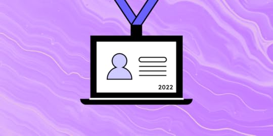
Best Design Conferences You Can’t Miss in 2022
One of the best things about being a part of the design community is that most designers love to exchange ideas, spread knowledge, and share their experiences regardless of their seniority level. You can be a starting designer or an established thought leader and it’s almost a given that you find a conference that may teach you something new.
What’s also great about UX conferences is that not all of them target the UX/UI community, but the people who work with them on a daily basis, which helps designers get a seat at the table and increases awareness about the importance of design. Product managers, developers and other professionals who work closely with design can find an event for themselves.
Let’s see upcoming design conferences that you should definitely add to your calendar.
January 2022 ConferencesThe first month of the year has two interesting conferences. The first one is QRCA which runs annually. Then, there’s a UXDX community event that’s open for all.
QRCA 2022 Annual Conference [Hybrid]QRCA stands for Qualitative Research Consultants Association. The conference focuses on qualitative research. It covers research methods, tools, and lessons from experts in the field. QRCA 2022 itheme is “REimage REsearch.”
Date: Jan 12-13; Jan 18-21, 2022Free: NoWhere: Virtual & San DiegoAudience: UX researchers, marketing researchersCommon topics: qualitative research, research methods, research toolsDefending Your Design System [Webinar]
We invited Carola Cassaro to tell you more about defending design systems. Carola helped IKEA implement their design system and establish a design operations practice. She will tell you how to get stakeholder buy-in for design systems.
Date: Jan 18, 2022Free: NoWhere: VirtualAudience: product designersCommon topics: design system, leadership, DesignOpsUXDX Community USA WESTUXDX is a popular conference for UX designers, developers and product people around the world. Usually the talks are centered around building better products, from ideation to execution.
Date: Jan 27, 2022Free: YesWhere: VirtualAudience: UX designers, UX researchers, developers and product managersCommon topics: product direction, scaling design, validation, product growthHighlighted sessions: Changying ‘Z’ Zhang “Building DesignOps As A Team Of 1.”Related content: DesignOps 101 ebook
February 2022 ConferencesWhat about the second month of the year? We’ve found a couple of conferences that may catch your eye. Let’s see them.
Product WorldIt advertises itself as the world’s largest product manager and product developer conference, and it’s lineup is truly impressive.
Date: Feb 2-4, 2022Free: NoWhere: VirtualAudience: product managers, developers, product designersCommon topics: product management, product growth, product workflowUX360 Research SummitAre you a UX researcher? This conference might be for you. You’ll learn more about gaining a stakeholder buy-in for research, influencing product management and new approaches to UX research.
Date: Feb 8-9, 2022Free: NoWhere: VirtualAudience: UX researchers, UX designersCommon topics: research for accessibility, career, leadershipProductConOrganized by Product School, ProductCon is a 1-day conference for product people who want to learn more about managing products and the future of product management.
Date: Feb 15, 2022Free: Yes (for Early Birds)Where: VirtualAudience: product managers, developers, product designersCommon topics: leadership, future of product management, product workflowDave Malouf’s webinar about DesignOps [Webinar]Dave Malouf is “the” person you think about when you hear the word “DesignOps.” In our 1-hour long webinar, he will tell you everything you need to know about DesignOps.
Date: Feb 17, 2022Free: NoWhere: VirtualAudience: product designersCommon topics: design system, leadership, DesignOpsExperience Design ConferenceThe conference is devoted to human-centered design and sharing best practices coming from the Experience Design industry leaders.
Date: Feb 29 – Mar 3, 2022Free: NoWhere: DenverAudience: UX designers, UI designers, product designersCommon topics: UX, product management, human-centered design, design thinkingMarch 2022 ConferencesMarch is going to be an exciting month for those of you who love tuning in for virtual conferences.
Interaction Week 22This interaction design conference has been running quite some time. It is still waiting for submissions, so we can say for sure what its lineup will be like. This year’s theme is “One year on, what have we learned?”
Date: Mar 2-4, 2022Free: NoWhere: VirtualAudience: UX designers, UI designers, researchersCommon topics: UX, human-centered design, interaction designAdvancing ResearchAnother interesting conference for researchers. This one is organized by none other than Rosenfeld Media, a famous publisher. It is still calling for speakers.
Date: Mar 9-11, 2022Free: NoWhere: VirtualAudience: UX researchersCommon topics: research operations, DesignOpsDesign Research by UX Australia [Hybrid]A great conference for anyone who’s engaged in doing research before design work. The conference is still accepting submissions.
Date: Mar 16-18, 2022Free: NoWhere: Virtual & On-site TBDAudience: UX researchers, product managers, product designersCommon topics: research operations, leadership, research methods, research toolsDesign Matters Pop-upA pop-up event hosted by a world-renowned conference, Design Matters. It’s theme is “Design a Sustainable Future,” and it will pose a question, “how to design for a sustainable consumption behavior?”
Date: Mar 23, 2022Free: NoWhere: VirtualAudience: UX researchers, product managers, product designersCommon topics: design sustainability, design process, leadershipUX CopenhagenA global event that brings together people from around the globe. The theme for this year’s conference is “Creating a Culture Change” which pertains to empowerment and leadership in the UX design field.
Date: Mar 28-29, 2022Free: NoWhere: VirtualAudience: UX designers, UX researchersCommon topics: human-centered design, leadership, careerUXDX USA 2022 [Hybrid]A hybrid event that takes place in New York and online at the same time. It’s mission is to bridge the gap between Product, UX, Design and Development.
Date: Mar 29-31, 2022Free: NoWhere: Virtual & New YorkAudience: product managers, developers, product designersCommon topics: product strategy, scaling design, validation, product growthApril 2022 ConferencesYou’ll get a couple of conferences that will be interesting for designers, researchers and product teams. What are they?
Front UtahThat’s an interesting event you need to mark in your calendar. Front Utah aims at teaching product people how to work together to create something great and valuable for the end-users.
Date: Apr 6-8, 2022Free: NoWhere: Salt Lake City, UtahAudience: product designers, researchers, product managersCommon topics: product strategy, product growth, leadershipUXistanbulOrganized by UXServices, this conference is a place for sharing the latest UX and usability know-how. The line-up comprises designers from industry leaders, such as Google, Netflix, and more.
Date: Apr 11-22, 2022Free: NoWhere: Virtual Audience: product designers, researchers, product managersCommon topics: product strategy, analytics, team growthCHI 2022 [Hybrid]This year’s annual ACM Computer Human Interaction conference will be a hybrid event, which means that it will take place on-site in New Orleans and online.
Date: Apr 15-16, 2022Free: NoWhere: Virtual & New OrleansAudience: researchersCommon topics: research tools, research methodsInformation Architecture Conference 2021It’s one of the leading conferences for information architects, designers, and others who create and manage UI and information environments.
Date: Apr 19-23, 2022Free: NoWhere: Virtual Audience: product designers, researchers, product managersCommon topics: information architecture, UX research, content strategyProductCon San Francisco [Hybrid]April is a month for another Product School’s ProductCon event is a 1-day conference for product people who want to learn more about managing products and the future of product management.
Date: Apr, 2022 (TBD)Free: Yes (for online)Where: Virtual & San FranciscoAudience: product managers, developers, product designersCommon topics: leadership, future of product management, product growthMay 2022 ConferencesMay will be the month for on-site UX and product conferences. Let’s see where we can travel to. Are you ready?
ConfabHey, content managers! There’s an event dedicated to increasing your skills. Confab is a conference dedicated to content strategy where you can get insights from industry leaders.
Date: May 9-12, 2022Free: NoWhere: MinneapolisAudience: content managers, product designers, UX writersCommon topics: career, content management, toolsWomen in ProductNeed inspiration and encouragement? Here’s a women-led conference to help women get leadership roles and find success working in product.
Date: May 10-11, 2022Free: NoWhere: VirtualAudience: product designers, product managersCommon topics: career, product management, leadershipFrom Business to ButtonsIt’s an annual UX and service design conference. To know more about this year’s event, read their manifesto.
Date: May 13, 2022Free: NoWhere: StockholmAudience: product designers, product managementCommon topics: product strategy, DesignOps, scaling design, leadershipHighlighted sessions: Andy Budd from Clearleft about Design LeadershipACE! [Hybrid]This Polish conference has two tracks: Agile Software Development and Product Design & Management. Yet, there will be a lot of content for product designers, too.
Date: May 19-20, 2022Free: NoWhere: Virtual & KrakówAudience: product managers, developers, product designersCommon topics: leadership, product strategy, product growthDesign2022A Croatian conference that focuses on a multidisciplinary approach to design and goes beyond the design process to include innovative methods and approaches to design and more.
Date: May 23-26, 2022Free: NoWhere: CavtatAudience: product designers, researchersCommon topics: human-centered design, leadership, accessibilityThe Global FinTech Design SummitAre you working on a FinTech product? Join the conference and meet other professionals who design and develop financial technology solutions.
Date: May, 2022 (TBD)Free: NoWhere: VirtualAudience: product designersCommon topics: scaling design, inclusive design, researchJune 2022 ConferencesThat month looks very exciting for those of you who got used to participating in events from the comfort of their homes. In other words, there will be a few interesting virtual meetups.
DesignOps Global ConferenceThe conference theme is “Design for Circular Economy” and it will focus on designing for a sustainable future. That’s a very relevant topic nowadays, isn’t it?
Date: Jun 7-10, 2022Free: NoWhere: VirtualAudience: product designers, researchers, product managersCommon topics: DesignOps, research operations, leadershipFluxible [Hybrid]This week-long UX design conference is based in Canada. You may expect meetups, workshops, and presentations by the world’s top UX speakers.
Date: Jun 7-11, 2022Free: NoWhere: Virtual & Waterloo, OntarioAudience: product designers, researchersCommon topics: human-centered design, leadership, researchPixel PioneersIt may be just a day-long, but the Pixel Pioneers is fully-packed with inspirational presentations from leading UX/UI designers and front-end developers.
Date: Jun 10, 2022Free: NoWhere: BristolAudience: product designers, developers, researchersCommon topics: human-centered design, inclusive design, future of designUX STRAT EuropeSign up for a European edition of a popular UX STRAT conference. Learn from the design and innovation experts.
Date: Jun 13-15, 2022Free: NoWhere: AmsterdamAudience: product designers, researchersCommon topics: design strategy, future of design, UXPA 2022Looking for inspirational talks? San Diego’s UXPA conference may be your cup of tea. Last year’s line-up was packed with speakers from Google, Instagram, Microsoft, etc. What about this year?
Date: Jun 21-23, 2022Free: NoWhere: San DiegoAudience: product designers, researchersCommon topics: human-centered design, leadership, researchUXDX APAC 2022It’s yet another UXDX event, but this one is an Audio-Pacific version. It’s dedicated to Product, UX, Design and Development teams that want to find a way of working together.
Date: Jun 21-23, 2022Free: NoWhere: San DiegoAudience: product managers, developers, product designersCommon topics: product direction, scaling design, validation, product growthHCI INTERNATIONAL 2022That international conference on human-computer interaction that is usually held in Gothenburg, Sweden.
Date: Jun 26-Jul 1, 2022Free: NoWhere: VirtualAudience: product designers, researchersCommon topics: human-centered design, research, leadershipAugust 2022 ConferencesWant to hear from product and design professionals? August has at least two interesting events.
UX AustraliaThat’s an event that is due to disclose more details. Last year, UX Australia included presentations from renowned UX practitioners. Can’t wait to see the 2022 program!
Date: Aug, 2022 (TBD)Free: NoWhere: VirtualAudience: product designers, researchersCommon topics: human-centered design, scaling design, leadershipAn Event ApartThis is a summer edition of a conference for UX designers and front-end developers who want to expand their knowledge about web design.
Date: Aug 18-20, 2022Free: NoWhere: SeattleAudience: product designers, developersCommon topics: design process, front-end design, leadershipProduct Design WeekCome to London and immerse yourself in a week packed with product design insights. It’s a multidisciplinary conference for product lovers who want to learn how to design better.
Date: Aug 30-Sep 2, 2022Free: NoWhere: LondonAudience: product designers, researchers, product managersCommon topics: DesignOps, scaling design, design strategy, design processSeptember 2022 ConferencesAfter a rather less intensive month of August, September is back on track and will be full of great events for UX designers and other professionals involved in building products.
User Research LondonThe conference focuses on UX and design research. It aims to spread knowledge about conducting research, sourcing candidates and interpreting results.
Date: Sep 8-9, 2022Free: NoWhere: LondonAudience: product designers, researchersCommon topics: research methods, design process, leadershipUX STRAT USAThis edition of the UX STRAT conference has a pretty impressive line up. We will hear from designers and product people from Spotify, Zoom, Best Buy, DoorDash, etc.
Date: Sep 12-14, 2022Free: NoWhere: Boulder, ColoradoAudience: product designers, product managersCommon topics: design process, leadership, product growthDesign Matters [Hybrid]It’s one of the most popular conferences in the design field hosted for UX/UI designers and anyone connected to tech and innovation.
Date: Sep 28-29, 2022Free: NoWhere: Virtual & CopenhagenAudience: product designers, product managersCommon topics: design strategy, design process, careerProductConTime for a fall edition of ProductCon. If the conference agenda will be similar to the 2021 one, we’re up for an amazing product conference.
Date: September, 2022 (TBD)Free: Yes (for Early Birds)Where: VirtualAudience: product managers, developers, product designersCommon topics: leadership, future of product management, product workflowIxDD 2022The World Interaction Design Day is an Adobe event that happens simultaneously in different parts of the world.
Date: September, 2022 (TBD)Free: Yes Where: VirtualAudience: product designers, researchersCommon topics: leadership, design process, careerOctober 2022 ConferencesOctober seems to be so far ahead, doesn’t it? Yet, there are some confirmed dates of conferences for designers and product teams.
ImpactA fully virtual product management conference that is perfect for product managers, business analysts, but product designers can learn something too.
Date: Oct 4, 2022Free: NoWhere: VirtualAudience: product designers, developers, product managersCommon topics: design process, inclusive design, leadershipAmuseA great event for the UI/UX practitioners to share ideas, experiences, and approaches to their everyday work.
Date: Oct 5-8, 2022Free: NoWhere: VirtualAudience: product designers, developers, product managersCommon topics: design process, inclusive design, leadershipUXDX EMEAFinally, there’s an EMEA edition of UXDX scheduled for October, but you don’t need to be from the region to sign up for it.
Date: Oct 6-8, 2022Free: NoWhere: VirtualAudience: product managers, developers, product designersCommon topics: product direction, scaling design, validation, product growthAn Event ApartUX designers and front-end developers can enroll in another conference from An Event Apart, that is it’s fall edition.
Date: Oct 10-12, 2022Free: NoWhere: DenverAudience: product designers, developersCommon topics: design process, front-end design, leadershipWhich design conference are you joining in 2022?It seems as if 2022 was full of inspiring and educational content coming from the best speakers in design and product management. Have you found a conference for you? We will definitely keep you posted if any new event comes our way.
The post Best Design Conferences You Can’t Miss in 2022 appeared first on Studio by UXPin.


December 14, 2021
Tools for DesignOps Specialists
 A List of DesignOps ToolsAll-around toolOptimizing performanceManaging projectsTeam buildingWhat about UXPin?
While most of DesignOps focuses on theory and strategy, design and development tools are vital for implementing and optimizing processes and workflows.
We’re going to dive into DesignOps tools for everything from optimizing performance to managing projects, building your design team, and creating great user experiences for your customers.
Before we get started, did you know that a single design tool can solve many DesignOps challenges?
UXPin Merge enables you to sync the editor with code components from a company repo (via Git or Storybook integrations) so designers can build fully functioning high-fidelity prototypes. Find out more about UXPin Merge and how you can request access to this revolutionary technology.
UXPin Merge–The Ultimate DesignOps ToolHere are four ways UXPin Merge helps DesignOps:
First, and most critically, UXPin Merge unifies design systems. Everyone (UX designers, product teams, developers) works with the same design system hosted in a company repository. DesignOps doesn’t have to worry about making sure each team and department works with the same elements and components because Merge syncs everything automatically.UXPin Merge ensures designers comply with organizational design standards. Every element and component is already fully coded, so designers and developers don’t have to go back and forth about what’s possible and what isn’t. Designers only have to drag-and-drop design system components to build new products and interfaces. After the design handoff, engineers can copy/paste any changes from UXPin and start developing the product without starting from scratch. Any changes to the design system sync back to UXPin’s design editor, so teams continuously work with the latest version.UXPin Merge saves an incredible amount of time and effort for DesignOps and DevOps. Without a tool like UXPin Merge, teams spend a lot of time ensuring everyone uses the same design system. With most development already complete, UXPin Merge also streamlines the design handoff process, making life easier for engineers.UXPin Merge empowers non-designers to build products. PayPal’s product teams (with very little UX knowledge) design fully functioning prototypes with Merge 8x faster than experienced designers using traditional vector-based design tools. This workflow frees UX designers to focus on solving user experience challenges rather than building and testing prototypes.Optimizing PerformancePerformance is a key indicator of a successful DesignOps strategy and team mentality. But how do you know if your team is operating at peak performance?
Level Up is a seven-question assessment that can help you answer that question. You can even benchmark against other similar-sized teams to gauge your organization’s performance.
Level Up produces a report which you can import to Excel or Sheets to evaluate areas for improvement.
Heather Phillips, former Design Manager at Designer Fund (now Design Director at Slack), developed the Level Up Framework from her experience of building and educating hundreds of design teams.
Tools for Project ManagementProject management is an area where DesignOps can increase efficiency. You should look for a project management tool that’s easy for your team to use and works with current organizational processes and procedures.
If you aren’t using a project management tool, the goal is to find something that teams will actually use that integrates with current administrative tools and processes.
Most project management tools offer a free trial, so take the time to test different options with your team(s). It’s important to find something that expedites workflows and scales as your company grows.
Trello : Famous for its kanban-style layout, Trello allows you to organize projects visually–giving you a holistic view of where you are at all times. Trello’s other notable features include task assignments, timelines, productivity metrics, calendars, and more. Asa n a : One of the world’s most popular project management tools. The tool allows users to customize how they want to see projects and tasks with lists, timelines, or boards. You can also automate certain tasks to optimize common flows and processes. Jira : A firm favorite for engineering teams for its ability to visualize releases and development-related integrations. The tool is part of the Atlassian suite, so Jira might make sense if your organization already uses Atlassian products. Jira is also great for planning, tracking, and running sprints. Confluence : Another Atlassian product optimized for remote-team collaboration. Confluence is marketed as a “single source of truth” because organizations can create a knowledge base to keep everyone on the same page. You can also build a social intranet to foster inter-department communication, collaboration, and company culture. Monday : Like Asana, Monday is a project management tool for building, running, and scaling team workflows. Monday’s simple and intuitive interface makes it easy to strategize, plan, execute, review and deliver projects consistently and on time. Notion : A unique project management tool that allows you to create project road maps and wikis to outline guidelines and expectations. You can also set up multiple views for each project, including timeline, calendar, kanban, list, and more.Tools for Team BuildingPeople are an essential component of any design and development process. DesignOps must promote team building so that people work together towards a common goal that serves the business and its customers.
These team-building tools help develop team cohesion and boost morale while encouraging teams and stakeholders to buy into your DesignOps mindset and processes.
TriviaMaker : Host games in a virtual or online environment, including grid, list, trivia, or wheel. You can use TriviaMaker’s pre-made games or create your own to have fun and energize the team. Pizzatime : Pizza parties are a firm favorite team-building exercise. Pizzatime allows you to host remote pizza parties by sending a slice to team members wherever they might be in the world. Virtual Zoom Games : Find a comprehensive list of games and activities teams can play over a video call. Game Word Generator : Word games are fun and encourage brainstorming and creative thinking–an essential skill for solving user experience challenges. Game Word Generator has simple word games for playing in-person or online.UXPin – A Comprehensive DesignOps Design ToolUXPin is more than a design tool. It helps promote collaboration and streamline many DesignOps processes. Here are a few key UXPin features that benefit DesignOps.
Design CollaborationUXPin’s Comments feature allows designers to collaborate on projects from wireframing to design handoff no matter where they are in the world. Tag people and assign comments to team members to take action–they can even mark as resolved once complete.
You can also comment on previews so researchers can take notes directly on prototypes during usability testing, or stakeholders can share their thoughts and feedback.
Design SystemsYour organization’s design system is the heart of your product. UXPin makes it easy to manage and maintain your design system. Take your design workflow to the next level with UXPin Merge, allowing you to maintain a single source of truth across the organization.
User ExperienceDesign user experiences your customers will love! Capture user data using Variables and use that information to take action–like building a fully functioning signup and login sequence. Prototyping with UXPin gives you better results during usability testing so your UX team can solve issues before engineers develop the final product.
AccessibilityDesignOps must ensure that products are accessible for users with visual impairments. Designers often have to install plugins or export files to external tools to test for accessibility.
UXPin features a built-in contrast checker and color blindness simulator so that designers can test colors and interfaces inside the design editor. These built-in accessibility features ensure designers check their work without leaving UXPin, thus saving time and reducing accessibility issues.
Design HandoffThe design handoff is often the most tense and stressful part of the design process. UXPin automates mundane tasks like design specs, CSS, and style guides–minimizing the work designers have to do before handing off to engineers.
You can also store assets and create written documentation inside UXPin, so developers don’t have to switch between cloud storage and word documents or PDFs–everything is in one place!
Looking AheadNo matter the size of your organization, DesignOps can benefit your team immensely. An effective DesignOps strategy can promote collaboration, cohesion, consistency, and efficiency, not only for design but for the whole organization.
You’ve learned about DesignOps tools and how they can benefit design teams, but there’s a lot more to the DesOps methodology and thinking.
UXPin collaborated with six DesignOps leaders globally to create a free eBook: DesignOps 101: Guide to Design Operations. In the book, we cover the following topics:
What is DesignOps?: Learn more about the roles and responsibilities of DesignOps specialists and how this discipline can resolve many design and business challenges.The Importance of DesignOps: See how DesignOps solve some issues, how to collaborate with your team better, and scale your design. Learn more about the needs of your team.Impact of DesignOps: A chapter written by Robin Klein Schiphorst – a DesignOps coach, explains how the discipline empowers designers and leaves you more time on what’s important.How DesignOps works: All about how to work together in the DesignOps mindset, harmonize, prioritize, and measure a team’s performance and capacity.How to get started with DesignOps in Your Company: Learn about implementing DesignOps in your team and organization. See what your roadmap and strategy should look like.DesignOps Tools (which we preview in this article): Discover tools that will help you optimize the performance of both design and product development teams. See which are suitable for project management and team-building.Download your free copy to learn about the world of DesignOps and how to get started–no matter if you have 1 or 100 designers in your team!
The post Tools for DesignOps Specialists appeared first on Studio by UXPin.
December 13, 2021
8 Mobile App Design Examples

We’re going to explore our top 8 mobile app design concepts to give you some design inspiration for your next project.
Are you still using vector-based tools for mobile app design? Step into the future of UX design with UXPin’s advanced code-based design tool. Sign up for a free trial to experience how one tool can revolutionize your product design workflows.
Top 8 Mobile App Design Examples1. Bananas App
Are you looking for less talk and more action? Bananas App is “reinventing group chats” with a swipe or pick idea-sharing concept for friends.
The goal? To turn endless group chats into actionable activities friends can enjoy together–like going for a drink, playing frisbee in the park, or going on a spontaneous road trip. When you swipe right, you enter a chat group where those attending can discuss details like times, where to meet, carpooling, etc.
The Bananas App’s designers went with an 80s retro user interface design with bold typography and exciting colors, aligning with the product’s fun concept. The app’s use of energetic microinteractions and animations creates an immersive user experience that’s fun and engaging. The minimalist, intuitive layout makes it easy for users to add a new activity with just a few clicks.
The Bananas App is a fantastic example of how designers can create a balance between technology and real-world engagement.
2. Zero
Zero is an app designed to track your fasting habits with advice and coaching from medical experts. Get insights on health markers like weight, resting heart rate, and sleep to see how they evolve with your fasting practice. There’s also a journal where you can use emojis to quickly tell the app how you feel during fasting.
Zero’s designers have done a fantastic job maintaining a minimalist UI while presenting an abundance of content with detailed insights and analytics. The app uses a vibrant green and orange color scheme to draw users to important call to action buttons and information.
The primary footer navigation provides users with four links to the app’s core features, making it easy to quickly find what you’re looking for. The app has over 345k reviews on the iOS App Store, with an average score of 4.8, showing how much people love the product and user experience.
3. Wealthsimple
Wealthsimple offers users a way to manage their wealth based on risk and investment goals. Weathsimple takes the hassle out of learning about stocks and diversification by recommending a portfolio to invest in your future.
Because this is a financial services app, Wealthsimple needs a lot more personal information than regular apps. Designers have done an excellent job carefully breaking up the onboarding flow to avoid cognitive overload and keep users engaged.
Waelthsimple’s intuitive mobile app UI design is easy to navigate and displays only the information necessary to view your portfolio or add funds to your investment account.
4. Sleepist
People who have Insomnia will love Sleepist, a meditation and sleep app designed to help you fall asleep! Choose from bedtime stories, sleeping soundtracks, or bedtime meditations to help relax you for a better night’s rest.
Designers have gone with a dark theme UI design to minimize the blue light impact, which adversely affects sleep. Bright orange CTAs allow users to quickly find what they’re looking for to reduce screentime. Users can also set a timer for the app to set everything for the night and not have to look at their phone again before drifting off.
5. Tumblr
Tumblr is one of the world’s biggest social media platforms popular with youth and students. It’s a fantastic platform to discover art and pop culture trends among young people, where you’ll find some of the internet’s best memes and GIFs.
Tumblr’s designers have designed a mobile app experience that mirrors the platform’s content and community. They’ve created a fun and immersive user experience with a vibrant color palette, intuitive buttons, and simple navigation.
6. Alive by Whitney Simmons
Alive by Whitney Simmons is a home wellness and fitness app to help women achieve their health goals. The goal was to make health and fitness easy and accessible, so busy women can form the habit effortlessly.
Designers have done well to mirror that concept with a simple and intuitive UI that makes it easy to find their desired workout. The soft color palette and minimal layout allow users to focus on the product’s content rather than getting sidetracked by unnecessary features and design elements.
Alive by Whitney Simmons has over 18k reviews on the iOS App Store with a 4.9 out of 5, showing just how much users appreciate the product and content. The Webby Awards recognized the app as a 2021 honoree for Best User Interface.
7. Evernote
Evernote is the world’s biggest note and productivity platform, with hundreds of millions of users globally. The company has successfully simplified capturing, categorizing, storing, and sharing notes to maximize productivity.
Apple lists Evernote as one of its “Editor’s Choice” and is a regular Webby Award winner under the Work & Productivity Apps and Software category.
Evernote’s mobile application design is as comprehensive and intuitive as the desktop version. Even with tons of features and options, UX designers have done well to ensure users are only one or two taps away from taking a note or creating a to-do list. The home screen Scratch Pad allows users to take notes without clicking any buttons! The signature “Evernote green” makes prominent CTAs easy to identify in both light and dark modes.
8. ASOS
ASOS is a popular eCommerce platform for 20-somethings seeking the latest fashion trends. The platform features more than 850 brands and over 85,000 products, including clothing, shoes, and accessories.
ASOS has recognized that their primary target market of young professionals is highly active on mobile devices. As a result, ASOS has one of the best mobile eCommerce apps with minimalist UI and high-quality images.
Designers only use color when highlighting CTAs to funnel shoppers to the checkout as fast as possible. ASOS also offers Apple Pay (iOS) and Google Pay (Android) for express checkouts on mobile devices. The ASOS app is optimized for speed and efficiency to ensure customers have minimal pain points when completing a purchase.
9 Principles for Better Mobile App DesignNow that you’ve seen some excellent mobile app design examples, it’s time to explore 9 mobile app design principles to build user-friendly experiences for your customers.
Make it Easy: Be aware of UX design psychology to avoid overloading people with content and information. Make sure directions are clear and break big tasks into digestible steps–as we saw with Weathsimple’s onboarding sequence.Make the navigation of your app predictable: Follow the “3-click rule,” where users can access any part of your application in three clicks or less. Also, make sure your mobile application experience mirrors the desktop and tablet versions. Wealthsimple, Evernote, Tumblr, and ASOS are all fantastic examples of this principle.Follow the basic laws of app navigation: Use globally accepted trends for mobile app navigation to minimize your product’s learning curve.Have a great, clear, and prioritized page design: Ensure your app has a clear content hierarchy with a layout that’s easy to digest. Label icons, features, and options clearly so users know exactly what tapping a link or button will do.Have brand image consistency: Keep your app’s UI on brand with consistent content and color palettes. Use the same navigational links for your mobile app as you do for the desktop and tablet versions.Minimize input and commitment from the user: Allow users to explore your mobile app without completing time-consuming onboarding forms. Offer things like Apple Pay/Google Pay, location tracking, credit card scanning, and other services to prefill forms and inputs. You can get app users to where they want to go much faster by reducing typing, thus creating an effortless user experience.Loading should be fast and well communicated: Communicate system tasks like loading and processing, so users know what’s happening at all times. Using percentage indicators or a countdown timer can further manage users’ expectations to reduce frustration.Optimize your app for mobile and diverse mobile users: Make sure content is easy to read on mobile devices and place links and CTAs apart to prevent users from accidentally clicking the wrong one.Do app design for humans: Mobile apps must meet accessibility guidelines so that users with visual impairments and disabilities can use your product too. UXPin’s built-in accessibility features include a contrast checker and color blindness simulator so designers can check their work to ensure it meets WCAG standards.Improve Mobile App Design With UXPinUXPin’s code-based design editor allows designers to build advanced mobile app prototypes to improve usability testing and reduce errors.
Use Iinteractions to create immersive mobile app user experiences. UXPin offers an extensive list of triggers for mobile apps, including tap/double-tap, swiping, scrolling, press hold, release hold, and focus, to name a few. Interactions can trigger all sorts of actions and animations to make your app interactive and engaging.
You can also create Javascript-like Conditional Interactions with “if-then” or “if-else” conditions, allowing you to create dynamic outcomes based on user and system triggers.
Unlike vector-based prototyping tools, UXPin’s code-based prototypes allow you to use Variables to capture user inputs and take actions based on the information they provide. For example, personalizing a welcome message after signup or confirming someone’s credit card details for a checkout sequence.
Set multiple States for elements and components, so your prototypes look and function like the final product. Designers can also use UXPin’s States to build complex components like drop-down menus, accordions, carousels, and more!
Ready to start building better mobile apps for your next design project? Sign up for a 14-day free trial to experience the power of UXPin’s code-based design tool.
The post 8 Mobile App Design Examples appeared first on Studio by UXPin.
December 10, 2021
How DesignOps Work – The Mindset of Design Operations
You’re about to read a rewritten chapter of our ebook – DesignOps 101. Get the full ebook for free and learn even more about Design Operations. This excerpt is about adopting the right focus for starting with DesignOps.
Key Things to Remember About How DesignOps WorkThere are three areas of DesignOps that focus on structure, process, and analysis.DesignOps mindset embraces those three areas and forms a methodology out of them.Getting into DesignOps may require a mindset shift on individual and team levels.The DesignOps mindset involves working together, harmony, defining priorities and success measurement.The DesignOps mindset is essential for teams of any size – even for a freelance designer working alone. It helps create long-term processes and efficiencies that result in better, more consistent work.
DesignOps MindsetGus Correia of UX Collective wrote about the DesignOps mindset as follows:
DesignOps is not a new design department. It’s ‘how’ interfaces between design, product, engineering are managed. Also DesignOps is about creating a culture of use centricity and agility over time. It puts design not as just another step along the way but as a continuous ritual of handovers and feedback.
The DesignOps mindset takes the same strategies and thinking for design projects and applies it to your company structure and work mentality. In Chapter 1, we looked at the Nielsen Norman Group’s definition of DesignOps in three main areas:
How we work together: Organize teams, collaborate, and humanize environments and gatherings for more efficient work.How we get work done: Standardize processes, harmonize, so there’s a shared understanding of design intelligence, and prioritize projects.How our work creates impact: Measure work to create accountability, socialize as a tool to educate others on the value of design, and enable the use of design thinking and related activities.The DesignOps mindset combines these three areas into one methodology, simplified as:
The DesignOps mindset helps us work together to get impactful things done.
This mindset is true for an individual as well as a team of multiple designers.

You apply the DesignOps mindset at the individual level when using common naming structures for files and folders. You know exactly where to look when you need to find something.
The DesignOps mindset uses standardized tools, templates, workflows, and processes and procedures for design-related tasks at the team level. Everyone follows the same process and protocols.
Airbnb’s DesignOps Mindset ShiftDuring Airbnb’s early stages, its Product Design Organization’s designers, product teams, and engineers worked closely. They all knew each other, and most of the org worked on the same floor.
As the Product Design Organization grew, new members brought new processes, workflows, and ideas. The cross-functional team structure meant designers were no longer together — access to information, design standards, collaboration, and design quality became serious issues.
What Airbnb needed was a new mindset. A DesignOps mindset!
Airbnb started by standardizing its Design Language System, a process that gave birth to Airbnb’s DesignOps. Next, the team set about answering several questions:
What are the criteria for disciplines that should be part of DesignOps?How do we identify and define entirely new roles? e.g., Design Tools.How do we avoid working in a silo and listen to our partners in Design and Engineering?How do we socialize, build awareness, and define the interaction with this new team?Education and adoption of new processes and tools are hard. Early and often is critical.Most importantly, how do we measure success?One thing that’s important to note is that DesignOps is never perfect. It’s about starting small and scaling. As Adrian Cleave, Director of DesignOps at Airbnb, says, “Of course it’s not as straightforward as it sounds, and not everything is running perfectly, but as long as we start to see small efficiencies compound, we know we’re moving in the right direction.”
Think about your organization and workflows. Is the start of a DesignOps mindset already there? Let’s take it a step further.
Work TogetherIn the Nielsen Norman Group model, team collaboration is the foundation of the DesignOps mindset — which isn’t a unique concept for organizations working with multiple teams.
Here is how it works:
Teams work together to organize tasks, structure, roles—your company’s organization chart with names, roles, and job descriptions. Well-organized teams help ensure the success of people in their roles, assigning appropriate functions and team structures.Teams create their processes, cultural norms, and communities. Meetings, the work environment, and even unwritten rules of governance for the organization incorporate this collaboration.Teams humanize the overall experience. Unlike computers or algorithms that assign tasks and roles, the DesignOps human experience emphasizes hiring and retaining talent in the workplace while facilitating personal and team growth. The mindset focuses on people as the key element of operations.HarmonizeWhile the Nielsen Norman Group model is the starting point for how DesignOps works, harmonizing is vital to define the mindset. When the design team harmonizes, it increases the potential for success and efficiency—the gold standard of productivity.
Here is what a harmonious workplace looks like with the right DesignOps mindset:
Standards for processes and tools that make work easierUse of design systemsManaging assets consistentlyCreating research hubs for data development and collectionAssuring balance of workflow and asset allocationWhen all these things happen together, the workplace and design flow are harmonious and efficient. It’s easy to envision and conceptualize, but it’s challenging to put into practice. That’s where prioritization comes in, particularly in the beginning stages of supporting a DesignOps workspace.

Get the DesignOps 101 ebook and discover everything you need to know to start with design operations.
PrioritizeCorrectly prioritizing DesignOps strategies will ensure you create the most impact. When a manages itself effectively, workflows operate smoothly.
Think about your last design project.
Was the workflow balanced between team members?Was the allocated time enough to complete the work?Did you have the right tools and resources to work effectively?If you answered no to any of these questions, you begin to understand the value of DesignOps mindset prioritization. DesignOps is only effective when you have what you need at the right time to complete the job.
When you instill a DesignOps mindset in your roadmap, it becomes a standardized process for your team.
Measure Team CapacityChange and goals are hard to accomplish without accurate metrics or KPIs. For DesignOps to be effective, you need to measure results, define goals with KPIs, and facilitate further development.
These KPIs and milestones can impact your team’s capacity and efficiency, as well as design quality and consistency.
Measurables for design teams could include:
A grading system or checklist that makes it clear when a project is completeScale for design quality to meet standards or project goalsUse of processes and systems during a pathSharing notations of success stories with the teamTraining hours for employees who learn new tools or systemsProject timelines from start to finishBy tracking these metrics, you can measure the effectiveness of your DesignOps mindset.
Is your DesignOps culture helping create better, more consistent work, or are people finding the new systems and processes challenging? Instilling culture with mindset before codifying DesignOps rules can make the process feel more natural.
Co-op Digital’s DIETUK-based Co-op Digital’s DIET (Design Impact Evaluation Tactic) helps measure three key design stages:
Strategy: When you first hear about the projectProblem: Once you have completed your researchSolution: When you have designed and testedDIET allows DesignOps to track and identify problems in workflows. If you have multiple teams and projects, this scoring system can help pinpoint common designer pain points for DesignOps to take action.
DIET is a perfect example of how DesignOps can influence a mindset change, prioritize problems, and measure the results. Like the design thinking process, DIET is iterative, where DesignOps identifies a problem, makes the necessary change, measures the results, and repeats the process.
DIET helps instill the DesignOps mindset because designers interact with the thinking and processes while providing feedback to DesOps managers daily.
DIET is a fantastic methodology for transparency. Teams and stakeholders can visualize design challenges and DesignOps’ impact in overcoming those issues.
 Looking Ahead
Now it is time to start thinking about how DesignOps roles or functions could benefit and work within your company or organization. Integrating DesignOps with the right tools and resources can be highly beneficial.
As we saw with Airbnb, DesignOps is not an overnight solution. Nor is it ever perfect. It’s about starting small and taking incremental steps. DesignOps requires planning, budgeting, and process management — whether it’s a single person, team, or simply a mindset change.
If your designers already follow a design thinking process, then you’re already on the right track. DesignOps will help refine those processes and streamline workflows while improving collaboration, consistency, design quality, and the overall user experience.
Adapting the DesignOps Mindset With UXPin MergeYour organization’s design system is at the core of quality, consistency, and user experience. As we saw with Airbnb, DesignOps’ first project was to standardize its Design Language System so that designers all worked with the same elements and components.
UXPin’s Merge technology can help organizations standardize design systems and ensure that every department and team member works with exactly the same version. Better yet, every component is a fully functioning replica of the final product!
Merge syncs UXPin’s editor with a repository containing your company’s design system. You can sync React components directly from a Git repo or use our Storybook integration for other technologies including, Vue, Angular, Web Components, Ember, and many more.
UXPin Merge creates a single source of truth for your organization. Find out more about UXPin Merge and how to access this revolutionary technology that’s changing how companies design user experiences.
The post How DesignOps Work – The Mindset of Design Operations appeared first on Studio by UXPin.
December 9, 2021
How to Use UI Kits to Create Quicker Mockups

You can find UI kits all over the internet. Many designers build custom UI kits as a design exercise and share the project on sites like Dribbble or Behance.
The beauty of a UI design kit is the limitless possibilities and outcomes you can create. Designers don’t have to worry about the intricacies of pieces together UI elements and components. They can only focus on designing screens and prototypes.
This article explores UI kits and how designers use them. We’ll also show you examples of some of the world’s best and most comprehensive UI kits.
Did you know that UXPin comes with popular UI kits built-in? There is no need to import external files or install plugins – they’re all there, ready for you to use. Sign up for a free trial and see how easy it is to start prototyping instantly with UXPin!
What is a UI Kit?A UI kit is a collection of assets, including icons, UI components, fonts, and other elements designers use to build user interface mockups and prototypes. Instead of designing from scratch, designers can drag and drop elements from the UI kit to create the desired interface.
UI Kit vs. Design System?Designers use UI kit and design system interchangeably, but there is a slight difference. A design system includes both code components and UI design elements. A UI kit is essentially a vector-based version of a design system, but it can also be a standalone collection without matching code components.
 Pros and Cons of UI Kits
 Let’s explore some of the pros and cons of using UI kits and the circumstances where designers might choose one.
Advantages of UI KitsAllow designers to create new user interfaces for fast prototyping.Designers can focus on building prototypes to test ideas rather than UI design.UI kits offer consistency with expert-designed elements and components.New designers can use UI kits to learn UI design principles.Disadvantages of UI KitsLittle room for customization and design creativity.Some UI kits aren’t comprehensive, meaning they might not offer everything your project needs.If a UI kit doesn’t have what a designer needs, they might compromise their innovative ideas to meet the UI kit’s constraints.Using a popular UI kit could result in your product looking mediocre and unoriginal.Many UI kits are incompatible with multiple tools. It’ll only work with the tool the creator used.When to Use a UI KitUI kits are great for building new product or website ideas. You can quickly put something together to see if your idea will work before committing to something more bespoke, which can take a lot of time when starting from scratch.
A UI kit isn’t only useful for new products. If an organization already has a design system but wants to expand the product, designers can use a UI kit to build prototypes to present ideas to stakeholders.
For example, you might want to use graphs and charts to present data to users, but your current design system doesn’t have these components. Designers can use a UI kit to build prototypes to identify what elements and components they’ll need to design new features.
How to Use UI KitsBefore you use a UI kit, it’s important to identify why you need one. Not every UI kit has everything you’ll need. So, you might see a style you like, but it won’t necessarily fulfill your requirements.
Here are some examples of niche UI kits:
Mobile UI kitWebsite UI kitiOS/Android UI kitAdmin/dashboard UI kiteCommerce UI kitFront-end UI kitSocial network UI kitIndustry-specific UI kit – cooking, marketing, corporate, etc.You also get comprehensive UI kits that feature just about thinkable element and component. A popular example is Bootstrap which both designers and developers use when prototyping new products and features.
Recommend UI Kit WorkflowThe following workflow will help you get the most out of a UI kit.
Start by writing a brief description of what you want to build and list the features you’ll need to include.Create rough sketches of the screens you want to design, noting the elements and components.Look for a UI kit that best matches what you want to build. Ensure you find something with the features and components you will need (we recommend using one of the comprehensive UI kits listed below). Using your sketches as a guide, drag and drop the elements and components you need to build each user interface.Connect your mockups to build a prototype and start testing!Side note: UXPin can save you time with popular UI kits built-in. Start building mockups straight away by signing up for a 14-day free trial!
Examples of UI KitsHere are some UI kit examples that you can use for your next project. All of these UI kits come pre-installed with UXPin, so you’re ready to start designing.
iOS UI KitDesigners use the iOS UI kit for building iOS-specific products. The iOS UI kit has everything you need including components, color palette, typography, and Apple’s icon library. Apple also provides complete documentation for the iOS UI kit, including guidelines and best practices.
Material Design UI KitGoogle’s Material Design UI kit is one of the most comprehensive and well-maintained in the world. The kit has every conceivable element and component for building applications, with a massive icon library available in five different styles.
Google also offers tools and resources for designers to customize Material UI to make it their own.
Foundation UI kitFoundation is a comprehensive UI kit designers can use to build responsive websites, mobile/web apps, and digital products. Within Foundation, you have several kits to create blogs, dashboards, eCommerce, marketing, emails, mobile app design, and much more!
Check out Foundation’s documentation for more info about building with this incredible UI kit.
Bootstrap UI KitBootstrap is a popular front-end toolkit for building responsive websites and products. The UI kit has everything you need to design fully responsive websites fast. The beauty of Bootstrap is that developers have an identical toolkit, so they can copy a design simply by using Bootstrap HTML classes and IDs to link to get the same CSS styling.
Bootstrap is the best UI kit for building responsive web-based projects like websites and web apps.
User Flows UI KitDesigners use the User Flows UI kit to design flowcharts and diagrams to outline a product vision. User Flows UI kit is also useful when designing a product or website’s information architecture, so designers know what screens and sequence they need to build.
How to Get More UI Kits to UXPinWant to import more UI kits to UXPin? UXPin is compatible with Sketch files.
Find the UI kit you want in Sketch format.Open a new project in UXPin.Drag and drop the Sketch file to UXPin.Wait for the upload and start designing.Using UI Kits in UXPin to Prototype Fast!UXPin’s built-in UI kits (design libraries) appear in the left-hand toolbar when you open a new project. Choose the UI kit you want, and the entire library of colors, text styles, assets, and components will appear.
Drag and drop the elements you need and start building screen layouts. It’s that easy!
Auto LayoutUXPin’s Auto Layout lets you automatically resize, align, fit, and fill chosen elements and components.
PrototypingOnce you have completed each user interface, you can connect each screen (or Page in UXPin) to begin prototyping.
Start by adding Interactions. UXPin has a comprehensive list of mobile and desktop triggers to accommodate any application, website, game, or other digital product.
Advanced InteractivityUXPin’s code-based editor lets designers take Interactions to the next level. Add animations to bring your interactions to life or add Conditional Interactions to create dynamic user experiences that mimic the final product.
Code-Based Features to Enhance PrototypingWith code-based design, you can create high-fidelity prototypes with States, Variables, data validation, Expressions, and more.
Create multiple States for a single element or component, each with different properties and interactions. For example, a button can have a default, hover, active, and disabled state–each triggered by different user interactions.Variables let you capture data users provide through inputs and take action based on that information. Like personalizing a user’s profile page with the information you captured during signup.Expressions allow designers to create users experiences, unlike any other design tool. Create a fully functioning eCommerce cart or check that a password meets specific criteria to build prototypes that work and function like the final product.Does your current design tool offer advanced prototyping features and built-in UI kits? Switch to the world’s most advanced UX design tool–design, prototype, test, and iterate design projects better and faster! Sign up for a 14-day trial today!
The post How to Use UI Kits to Create Quicker Mockups appeared first on Studio by UXPin.
December 8, 2021
Top 5 Prototyping Tools

With so many options available, choosing a UX prototyping tool can be overwhelming and confusing – they all seem to do the same thing, right? For the most part, yes.
But when you start comparing code-based design tools with their image-based counterparts, there are noticeable differences – primarily with prototyping, functionality, and fidelity.
We’re going to explore some of the best prototyping tools and demonstrate why designers should consider code-based alternatives for higher fidelity and better usability testing.
UXPin is one of the companies leading the code-based design revolution. Sign up for a 14-day free trial to explore UXPin’s advanced prototyping features for your next digital product or web design project.
What is a Prototyping Tool, and Why is Prototyping Necessary?Prototyping tools allow you to create a replica of the final product, which design teams use for testing and presenting to stakeholders. Most design tools offer a prototyping feature, but you also get dedicated prototyping software which typically provides better fidelity and functionality than an image-based tool.
Prototyping is a crucial part of the design process because it allows UX and product designers to validate ideas and fix usability issues before the product enters the engineering stage. Development is costly, and correcting errors can take time and potentially damage the brand through poor user experience.
Designers use prototypes to test the product comprehensively before handing it off to the developers. So, you need a prototyping tool that can offer as close to the same fidelity and functionality as the final product to perform tests that deliver accurate results.
Code-Based vs. Image-Based Design Tools
Before we get started, it’s important to define and differentiate between image-based (vector-based) and code-based design tools.
When you create elements on the canvas of an image-based design tool, you get a vector representation of that element, usually SVG. Conversely, creating the same element in a code-based design tool will render HTML, CSS, and Javascript.
The tools look and work identical on the surface, but you get improved fidelity and functionality with code-based prototypes. For example, an input field that can capture data or you can update a shopping cart, and it’ll accurately calculate the new total. Essentially, code-based prototypes look and perform identically to the final product.
Top 5 Prototyping Tools for 20221) UXPinUXPin is a code-based tool providing designers with an end-to-end design and prototyping solution. Unlike many leading design tools, UXPin doesn’t need plugins – everything you need for prototyping and testing is built-in!
UXPin gives you the option to download the software on your desktop (Mac & Windows) or use it in the browser. The benefit of downloading UXPin is that you can continue working even when you’re offline.
You can test prototypes in the browser or use UXPin’s Mirror app to run prototypes on mobile devices (including iOS and Android). UXPin’s documentation is excellent, covering every aspect of the tool with step-by-step instructions and video tutorials.
We’re going to quickly dive into four features that make UXPin’s code-based prototypes far superior to other leading vector-based design tools.
States allow you to different properties for a single element or component based on user and system triggers. A good example is how a button might have four states – default, hover, active, and disabled. Each of these will have separate properties and interactions. States also allow you to create complex components like drop-down menus, accordions, and carousels that function like they would in the final product.
Most image-based prototyping tools feature interactions, but UXPin allows you to take interactivity to the level with a multitude of triggers and immersive transitions and animations. You can even go one step further with Conditional Interactions, which lets you create a dynamic user experience with “if-then” or “if-else” conditions–like validating an email address or password!
With Variables, you can capture information from user inputs and take actions based on that data–like capturing personal information during sign-up and displaying them on their profile page.
Expressions allow you to program Javascript-like functions, so your prototypes can perform form validation, update a shopping cart (and the order total), or ensure a password meets specific security criteria. Designers don’t need to know any code and can set up Expressions with some basic naming and a few clicks!
UXPin also offers an add-on called Merge. Merge lets you sync fully coded design system components from a repository to UXPin’s editor.
Designers can build fully-functioning interactive prototypes using the same components used in the final product.
With Merge, you have the option to sync React components via Git or use the Storybook integration for other technologies, including Vue, Angular, Web Components, Ember, and more. It’s a truly revolutionary design technology that’s changing how organizations design user experiences for their customers.
UXPin offers a free 14-day trial to let you explore the product. You’ll need to request access to Merge separately.
2) FigmaFigma is one of the most widely used design tools. They have a big, engaged community with lots of YouTube content and detailed documentation.
Figma has built-in prototyping functionality with a mobile app to test prototypes on multiple devices. You can work in the browser or download Figma to work offline on your desktop.
While Figma is excellent for creating wireframes and mockups, this tool, like the rest image-based prototyping apps, lacks functionality and fidelity for prototyping. Interactions are limited, and you often have to design several artboards of the same screen to perform functions that UXPin does in a few clicks – like creating a drop-down menu.
Figma’s inputs aren’t functional, so UX researchers can’t test any actions that require users to enter information. You also can’t create dynamic user flows that adapt to user interaction.
3) Adobe XDAdobe XD is another popular user experience design tool. Unlike Figma and UXPin, Adobe XD doesn’t offer a browser version; you have to download the software to your desktop.
One of the major bonuses of working with Adobe UX is that on the full plan, you get access to 20+ Creative Cloud products, including Photoshop, Illustrator, After Effects, and more. You can also upload projects directly to Behance to showcase your work.
Adobe XD offers built-in prototyping, which runs in the browser, and an app for mobile devices. Unfortunately, XD lacks prototyping functionality and fidelity.
One interesting Adobe UX prototyping feature is Auto-Animate which can help save time for specific interactions. With Auto-Animate, you create the first and last frame of an animation sequence and Adobe XD fills in the rest. The feature doesn’t work for all animations, but it saves a significant amount of time when creating something like a parallax effect.
4) InvisionInvision offers a suite of UX tools from conceptualization to design and prototyping. Invision’s UI and functionality are very similar to Figma or Adobe XD. Like Adobe XD, Invision only works as a desktop application.
Invision’s prototypes are similar to Figma in that they look great but don’t offer functionality that mirrors the final product.
Invision has a similar feature to Adobe’s Auto-Animate called Motion. Motion is an impressive feature that automates some work but doesn’t offer your prototypes real value or fidelity.
Invision’s DSM (Design System Management) is handy for managing your design system and providing developers with CSS and starter code at handoffs. DSM integrates with Storybook so that designers and developers can sync their design systems. Unfortunately, designers can’t use the code components to build prototypes like you can with UXPin Merge.
5) FramerFramer’s biggest selling point is the speed at which designers can build user interfaces and reduce repetitive tasks. Essentially a rapid prototyping tool.
Notable features include Layout and Insert Menu, which allow you to design and iterate concepts fast. Although impressive, UXPin offers similar features with Auto-Layout and built-in design libraries.
Framer’s Smart Components feature offers similar functionality to UXPin’s States, but not as comprehensive. Using Variants and Variables, you can give elements a hover or pressed state, like toggling a switch or activating a checkbox.
While Smart Components is a step up from other vector-based design tools, it still doesn’t give you as much fidelity as you get from UXPin’s States, Interactions, Expressions, and Variables features.
More Design Tool ComparisonsCheck out more popular prototyping tools and how they stack up against UXPin:
Marvel AppJustinmindProto.ioAxureZeplinBalsamiqSummaryIf you’re looking for a design tool, there are plenty (including the five listed above) that designers can use to create beautiful low-fidelity wireframes and mockups.
But designing a user experience requires testing, which means you need high-fidelity prototypes, not mockups! UX designers design products for coded products but conduct user testing on image-based prototypes. It’s impossible to get accurate and meaningful results. Invariably there will be usability issues that make their way into the final product.
With code-based tools like UXPin, designers can build functioning high-fidelity prototypes. Usability participants don’t have to “imagine” that a button or input works; they can use it as they would with a final coded product.
With UXPin Merge, you can take prototyping to the next level by building user interfaces with code components. With UXPin synced to a repo hosting your design system, every team member uses the same elements and components, thus solving the single source of truth dilemma that many companies struggle with.
Join the code-based user experience design revolution. Sign up for a 14-day free trial and discover better prototyping and testing with UXPin.
The post Top 5 Prototyping Tools appeared first on Studio by UXPin.
December 7, 2021
Design System Maturity – How to Improve Your Design System

We write a lot about design systems and how they can help guide your product development process. Many people, including experienced designers, don’t understand that developing a design system is a marathon, not a sprint!
We want our design system to be as elegant and comprehensive as industry-leading systems like Polaris (Shopify), Carbon (IBM), iOS (Apple), Material (Google), or Lightning (Salesforce) without realizing the maturity model these organizations followed to achieve success.
This article will help you understand the roadmap to design system maturity and how to optimize the process to achieve your goals much quicker.
UXPin lets you store and manage your organization’s design system inside the design tool. You can set permissions to align with your design system governance to maintain cohesion and consistency. Sign up for a free trial to explore UXPin for your next design project.
Importance of a Design SystemIn a startup environment with a handful of designers can developers maintaining product consistency is relatively simple. But, as a product evolves and teams grow, the importance of a design system increases.
If multiple design teams arrive at a design handoff, each with their own interpretation of the design system’s components, the product’s features will lack cohesion and consistency. Developers have to code from scratch constantly, and users will be left scratching their heads in frustration or abandon the product altogether.
A design system keeps UX designers, product teams, and engineers on the same page. They can build interfaces faster while maintaining a high degree of consistency.
As the product evolves, designers must follow design system governance procedures to maintain integrity and consistency. The goal is to reach a stage where designers and engineers can launch a product with little or no coding because the design system offers the building blocks to scale.
Achieving that goal means organizations must follow a design system maturity model that promotes the flexibility to grow!
Stages of Design System MaturityOrganizations worldwide have used several design system maturity models, but we’ve found the one from Iress is easy to digest, replicate, and scale.
Design System Product Owner and Regional Head of Product Design at Iress, Nick Elliot, got the inspiration for this model from TJ Harrop, Design System Product Manager at the NSW Government. It’s a four-stage process that outlines the steps it takes to achieve design system maturity.
Stage one – Style guidesStage two – HTML & CSSStage three – Design & coded componentsStage four – Fully integratedIt’s important to note that it took Iress eight years to get from stage one to four. Which goes back to the point we made at the beginning of this article–“developing a design system is a marathon, not a sprint!”
Stage One – Style GuidesIf you’re at stage one, your organization doesn’t have a design system but might have a few common assets defined. Most startups will find themselves here, but many established organizations live in stage one too!
During this early stage of design system maturity, teams design product assets and develop brand consistency. The assets live in PDF style guides that designers use to create assets.
While these style guides provide some consistency, designers often have their own version of the design system saved in their design tool. Design handoffs are often chaotic because there’s drift and inconsistency due to multiple interpretations of the design system.
Another problem with stage one is that PDF style guides aren’t scalable–at least not with any accuracy or consistency. If you release a new version of your style guide, designers must note the changes and update their assets manually. Creating more work and increasing time to market!
If your organization is suffering from these design issues, it’s time to implement a strategy to develop a scalable design system.
Stage Two – HTML & CSSAt stage two, your design system components are defined in snippets of HTML and CSS. While this is an improvement, the design system is still a guideline rather than building blocks designers and engineers can grab to build an interface. It’s open for interpretation which means design drift and errors still occur regularly.
HTML and CSS snippets also need regular updates, which means DesignOps and DevOps need to communicate constantly to sync design systems manually.
Stage three – Design & Coded ComponentsMany companies linger in stage three indefinitely. The organization has a design system and follows governance procedures before updating pattern libraries and components.
The design system is fully documented, which streamlines onboarding and reduces errors.

Organizations usually have a dedicated team to maintain and update the design system, but DesignOps and DevOps must still work together to maintain a single source of truth. While this increases consistency, it’s a costly and inefficient process.
Still, prototyping and testing are much quicker because designers can use design system components to build interfaces. Because of this, the time to market is significantly faster because designers and engineers have the components they need.
Stage four – Fully IntegratedWith a fully integrated design system, designers and engineers work with a single source of truth. There’s no design drift and virtually no coding required to build new digital products.
Design systems sync automatically, so product teams, UX designers, and engineers always work with the same components. Consistency is no longer an issue, and team members spend more time focusing on user research and improving the user experience than fixing design and code issues.
Teams can design and launch a product seamlessly, requiring minimal communication during the handoff because developers can just copy/paste.
To many organizations, stage four of this design system maturity model might seem like an impossible dream. But the truth is you can skip a lot of heartaches, get to stage four and achieve your design system goals quicker than you think!
Getting to Stage Four With UXPin MergeAfter spending 12 months reviewing tools and solutions, Nick and the team at Iress discovered UXPin Merge.
UXPin Merge allows you to sync code components from a repository with the design editor, so designers and engineers work with exactly the same design system.
UXPin is a code-based editor meaning the design system components are fully functional! Designers can build fully functioning, high-quality prototypes in minutes by simply dragging and dropping the components they need onto the canvas. Prototypes have the same fidelity and functionality as the final coded product.
“With Merge integrating directly with the code repository, designers and engineers will be using the exact same components. Maintained centrally, with one set of components, this will free up our designers’ time.” Nick Elliot – Design System Product Owner and Regional Head of Product Design at Iress
Any changes to the design system in the repository automatically update to UXPin’s designer editor. UXPin even notifies team members of the update, so everyone is aware of the changes.
Design handoffs are seamless with UXPin because designers hand developers a fully coded prototype. Engineers can copy/paste the components, adjust the props and build the final product fast.
Drag and Drop DesignUXPin Merge also creates the opportunity for non-designers to design digital products and interfaces. PayPal’s product teams (most of whom have no experience with design tools) design all the organization’s internal products using UXPin Merge.
Most product designers can build a one-page, fully functioning prototype in under ten minutes! PayPal’s experienced UX designers can’t do the same job using a vector-based tool in less than an hour–without the functionality of code-based design!
Nick noticed the same benefit for Iress: “It will give non-designers access to a tool, whereby they can also experiment and have exposure to the same design considerations…It will allow more collaboration, allowing designers to be facilitators of the design process, not the owners of design.”
SummaryGetting to design system maturity level four takes time, but it doesn’t have to take eight years as it did for Iress. Code-based design tools like UXPin and Merge technology can help organizations achieve their design system goals much faster.
The goal is to get designers and engineers speaking the same language to overcome the same constraints. You cannot get to a fully integrated design system maturity level using traditional image-based design tools. Code-based design is the only way to bridge that gap.
Even if you’re still at stage one or a startup without a design system, code-based design tools can accelerate growth by improving prototyping and testing. If designers can build prototypes that result in meaningful feedback from usability participants and stakeholders, they can minimize errors and make it easier for engineers to develop the final product.

With a code-based solution from UXPin Merge, you can skip stages two and three to reach design system maturity without the headaches many organizations have to endure.
Using UXPin Merge, your design system maturity model becomes a two-phase iterative process:
Stage One – Component Design: Use UXPin to design your product’s elements and components. Engineers can use Spec Mode for an automatically generated style guide to code components. Designers can also save any component to a shared design system so every team member can access the same parts.Stage Two – Full Integration with UXPin Merge: Once you release the first version of your product, engineers store the components in a repository so designers can build new features using fully functional code components. When the design system needs updating, return to stage one and iterate.Reach your design system goals faster and take your prototyping to the next level with code-based design from UXPin. Sign up for a 14-day trial to explore UXPin’s features for your next design project.
The post Design System Maturity – How to Improve Your Design System appeared first on Studio by UXPin.
December 1, 2021
Bringing Auto Layout to UXPin
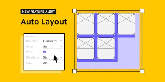
Exciting news in UXPin! From now on, you can design faster with our new feature – Auto Layout. Align all the components the way you want within seconds and speed up your design workflow.
At UXPin, our goal has always been to simplify design process and make sure designers have enough time to focus on meaningful work. We believe that Auto Layout will remove the pain of manual resizing and make your work more intuitive.
Challenges of designing without Auto LayoutHowever, we want it to be true, designing isn’t only creative and fun work. You have to adapt to the constraints of your UI/UX tool. As designs are static by nature, without the proper technology, you can’t expect them to behave like a coded product.
This means every element you draw only visualizes how it’s supposed to look and work. For example, when you design a simple button, first you draw a rectangle and then add text. The moment you want to expand your text, you need to adjust the length of the rectangle as well. It shows how designers need to think about every relation between all the UI elements.
The disconnect between components translates into more repetitive work – constantly resizing multiple elements, adjusting them separately so that they can create a coherent whole. It takes too much time to do everything manually. On top of that, you have to keep the changes consistent in all elements, and let’s be honest – it’s easy to forget about setting the right paddings and gaps, especially when adding new elements to your design.
That’s when Auto Layout can remove all those bottlenecks.
How Auto Layout workshttps://t.co/rXr0hFKg94 🆕 Take care of your responsive and consistent design with our new Auto Layout feature! 🔥Sign up and take it for a test ride. pic.twitter.com/Hox6bwhZY9
— UXPin (@uxpin) November 8, 2021
Auto Layout gives you the freedom to focus on what matters and remove all the repetitive and manual work. We made sure that your UI won’t be constrained by the laws of static design but can benefit from the code-approach that we like so much. Thanks to Flexbox – CSS Flexible Box Layout, you can apply Auto Layout to groups as well as components to make chosen elements depend on one another’s position.
Auto Layout removes all the hassle and will take you just a few seconds to adjust the components the way you want. Let’s take for example a simple button – whatever you need to change in the text, the rest of the elements will adapt to the new text length. It’s only one of many cases when Auto Layout speeds up your work. If you design repeated elements like a menu and want to swap the items’ places, or add an expanded/collapsed view, our new feature will save you a ton of work.
Get startedDrop elements to the canvas, select the group or pick a component from your library. Add Auto Layout in the properties panel and your design will behave in a flexbox-like manner. You can also add Auto Layout components to a Design System.
Align all the elements within a few clicks – Auto Layout can help you:
Group scattered elements and wrap them how you wantJust by wrapping the elements, you can align them right away and adjust how many lines they should take by controlling their width or height. Say goodbye to moving the separate boxes around.
Lay out and distribute elementsIf you want to distribute your components in relation to each other, just set the vertical or horizontal direction and choose how they should be laid out (start, center, end, or stretch).
Keep consistencyWith Auto Layout maintaining consistency among gaps, paddings, borders, and radiuses is easy. When you apply the wanted value, all the elements with Auto Layout will align accordingly.
ResizingResizing comes in handy when you want to change one chosen element in the Auto Layout group. You can still maintain all the properties set for the group and play around with one element by changing the width, height, or filling out the main group.
TL;TRAuto Layout will automate some of the manual work that you have to do when tweaking, aligning, and resizing elements. Groups of items can now align intuitively to work as a whole. Check all the functionalities in our documentation. Need help? Ask our community.
Sign up for a trial and align all your components in one click.
The post Bringing Auto Layout to UXPin appeared first on Studio by UXPin.
November 30, 2021
UI Animation – All You Need to Know and Examples

UI animation has come a long way over the last decade. Animations don’t just look cool, but they’ve evolved into a universal digital language people recognize and understand.
These microinteractions allow designers to communicate with users through movement and animation to provide guidance, context, and an immersive user experience.
This article explores UI animation, the types, principles, and everyday examples to improve user interaction for your digital product.
Create high-fidelity prototypes with advanced interactions and UI animations that perform exactly like the final product. Sign up for a free trial to explore code-based user experience design with UXPin.
What is UI Animation?UI animation or user interface animation adds visual effects to UI elements and components to make them interactive. This interactivity helps guide users through a website or digital product while creating an immersive and enjoyable user experience.
UI Animations & MicrointeractionsAs we discuss in an in-depth article, microinteractions occur in four stages:
Trigger: user action or system state changeConditions: system rules that define what microinteraction is triggeredFeedback: visual, audio, haptic changes to the user interfaceMode: what happens once the microinteraction is complete–state or UI changesUI animations occur during the feedback and mode stages when the user interface changes in relation to the trigger and conditions.
Why is UI Animation Important?The primary role of UI animations is to draw users’ attention to an important CTA or show them what to do next. UI animations allow designers to communicate with users without text.
For example, a progress bar will animate to draw your attention so you can see how much of a signup process you must still complete. The alternative would be text somewhere on the user interface saying something like, “you have completed 20% of this signup process.”
You can imagine that a user interface would get very cluttered and confusing if text replaced UI animation!
UI animation also allows designers to communicate with users across cultures and languages. Animating a button to show a user where to click (or tap) will attract their attention, no matter what language they speak.
Lastly, UI animation plays a crucial role in design psychology and reducing cognitive load. Designers minimize the mental effort required to use a digital product by providing context, familiarity, and consistency through animations.
Types of UI AnimationThere are four primary types of UI animations:
Loading and progressState changesNavigationMicrointeractionsBrandingLoading and ProgressLoading and progress allow users to visualize where they are or what’s happening.
Loading: an animation showing the user that the system is working. For example, a loading animation (throbber) or percentage indicator showing a user that a product is busy loading a page or processing information. These loading UI animations are critical because users might think that the product or website has stopped working without them–which could mean they abandon the product before it’s had a chance to load!Progress: animations that show users where they are in a flow and how much they still have to complete. For example, a progress bar at the top of an eCommerce checkout flow animates each time the user moves closer to completion.State ChangesDesigners often use animations to communicate a digital product or element’s state.
For example, a button might remain dark and unclickable until a user complete’s the required form fields. Once the form is complete, the button’s state changes to active (or clickable), letting users know they can click the button to proceed.
Structure & NavigationNavigational UI animations help users navigate user interfaces and find what they want. Designers will use animation to show users which page or tab they’re viewing or create page transitions that indicate which direction they’re moving.
UI animation is also helpful to communicate navigational hierarchy so users can understand the product or website’s structure–resulting in a more enjoyable user experience.
MicrointeractionsMicrointeractions convey feedback and information based on user interaction or system changes. This feedback and information almost always include some type of UI animation.

A microinteraction we see every day is a mobile text or message notification. When you receive a text, a popup appears on your phone to alert you. In some instances, the alert will show you the whole text message before minimizing it to show the sender’s name. This entire notification sequence is a UI animation triggered by the system.
Another common microinteraction is how a digital product responds to scrolling or swiping. As you perform these actions, multiple UI animations may take place, like a page transition, content loading, navigational changes, and more.
BrandingAnimations are a fantastic way to promote brand awareness and interaction with users. Designers will often use fun logo animations to give the brand a lighthearted, welcoming appeal.
UXPin’s code-based editor enables designers to create JS-based interactions that look and feel like the final product. With high-fidelity prototypes that behave like the final product, designers get significantly better feedback from usability testing and stakeholders. Sign up for a 14-day free trial to experience advanced interactions and animations with UXPin.
UI Animation ExamplesHere are four creative UI animation examples designers have used to improve a product’s user experience.
1. An Ecommerce UI Animation That Gives Users ControlDribbble freelance UI designer Dannniel uses UI animations to give users a sense of control while shopping online. In an animation UI design concept for a shoe-seller, Dannniel created an interface where users can learn basic information about a shoe (such as price and reviews).
Dragging to the left will open a screen overlay (simultaneously activating several UI animations) where customers can choose their size and color preference.
Why Does This UI Animation Matter?Even the most successful eCommerce stores struggle to make shopping engaging and fun. These sites often have cluttered page layouts that aren’t always obvious for users and involve lots of clicking or tapping to access dropdown menus. These cluttered user interfaces don’t create a sense of control or fulfillment.
With Dannniel’s UI animations, shoppers can access and select product variants using one hand–perfect for users on a mobile device. As you scroll through the sizes, the product changes too. These small details create an immersive, more enjoyable shopping experience.
2. A Budget App Built on Colorful Intuition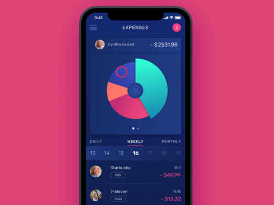
Design agency Tubik has made hundreds of animated user interfaces for its clients. This budgeting app stands out for its clever use of motion and color to help users with their financial goals.
When users open the app, they can see daily, weekly, and monthly expenses expressed in a segmented circle graph. Each segment represents a different expense with its own color, so users can easily differentiate between each one. When a user taps a segment, an exciting UI animation creates a horizontal bar chart to display the expenses differently.
Why Does This UI Animation Matter?Most people dislike budgeting and personal finance. It feels uncomfortable to confront financial decisions, especially when you might need to cut spending to focus on saving money or repaying debts.
Here are two ways Tubik’s mobile app design and UI animations make budgeting easier for users.
The UI animations gamify budgeting, making the experience of using the app and confronting your personal finance more enjoyable. The colors and motion help ease anxiety by connecting an undesired activity (budgeting) and something fun (video games). Users are more likely to use a personal finance app that gamifies the experience and rewards them with color and animation.The app allows users to visualize their personal finance in colors and charts rather than numbers on a page. These charts will enable you to absorb the information much easier, which could help you manage your finances better–at the very least, make you more aware of your income and expenses.3. Animation UI Makes Failures Less Frustrating
Animated components can minimize the frustration of errors. For example, if you make a typo in Grammarly, the app highlights the word in red. When you click the word, Grammarly displays the correct word or suggestions for you to choose.
When you click the correct word, Grammarly automatically changes the word for you–no need to retype the word to correct your error.
Why Does This UI Animation Matter?No one likes errors or failures. UX designers can create UI animations that make errors less frustrating and provide users with solutions to fix the problem.
4. UI Animations to Create Mood Improve Your Design with This Calming App Design Template
Designers can use UI animations to create mood or energy through the digital product. UXPin’s Calming App template uses slow, smooth animations to convey calm and peace.
On the Breathe page, a large circle pulses in and out. This simple UI animation compliments the physical action of someone breathing, thus creating an immersive user experience.
Why Does This UI Animation Matter?Designers must use appropriate UI animations for the product. Slow, smooth animations make sense for a breathing and meditation app because you want the user to be calm and peaceful while they’re using it.
SummaryUI animations play an essential role in guiding users through a product experience. Good product design uses UI animation to communicate with users to make digital products more straightforward and enjoyable to use.
UI Animation With UXPinUXPin’s advanced interactions and animations let designers create immersive user experiences for high-fidelity prototyping and testing. We even provide you with common ready-to-use UI patterns complete with animations for you to copy to your projects.
Take your UX projects to the next level with the world’s most advanced user experience design tool. Sign up for a 14-day free trial and explore how UXPin can enhance your prototyping and testing to build better products for your customers.
The post UI Animation – All You Need to Know and Examples appeared first on Studio by UXPin.
Research the Problem: How to Get Started with DesignOps

If your organization is implementing DesignOps for the first time, it’s likely that something isn’t working. The first step is to identify the problems and bottlenecks design teams experience—exactly like you would during early research for your users!
Start with a discovery process:
Interview design teams to identify common pain pointsInterview stakeholders to find out how design impacts other departmentsSurvey designers to find out job satisfaction, workload/productivity, time on task, roadblocks, tool/software satisfactionUnderstand that this discovery process will not be simple, especially when you’re trying to find time to interview people already stretched with their duties and responsibilities.
Look for opportunities to sit in with teams, including design, product, and engineering. So you can experience workflows and the challenges people must overcome.
When approaching your research and questions, think about the areas in chapter two where DesignOps is most helpful:
Seamless collaborationAbility to scale the design processManaging needsLook for the places where these core DesignOps responsibilities are most lacking.
In an insightful blog post, first-time DesignOps manager Dave Cunningham interviewed 50+ designers to create five “pillars of focus” to structure his initial research:
Process—where are the bottlenecks and roadblocks in the design process?Tools—what systems and services can optimize speed and execution?Knowledge—how do teams share knowledge and work?Strategy—how can you amplify existing strategies or implement new ones to optimize workflows?Culture—skills pairing, mentoring, education, hiring, and onboarding.You should also look for problems that most align with your strengths and have the potential to deliver the highest ROI, especially if you are working alone. Avoid taking on a big project you’re unsure of right at the beginning. Focus on the problems you’re most confident at solving first. These early wins will boost your confidence and build trust with your team(s) and stakeholders.
Pro Tip: Get into the habit of organizing and documenting everything from the start. If you’re starting DesignOps in your organization, you’re likely going to be the only person on the DesOps team!
Documenting your initial research will not only provide you with valuable references for your roadmap but help with onboarding or handing over to new DesignOps members later on.
Define the Value: How Will Your Team Benefit From DesignOpsOnce you’ve researched and listed the design problems you need to solve; the next step is to assign a value. Where are your organization’s most significant issues, and what is the potential return for fixing these?
Be careful of spending too much time researching the possible return on investment. It’s easy to start trying to come up with detailed solutions to assign value. Also, remember to keep your strengths in mind to solve the problems where you’re most capable and experienced.

Don’t only think of value in monetary terms. Sometimes solving workflow problems will increase job satisfaction and productivity while reducing time to market—ultimately improving business value.
Most importantly, keep your customers front and center when ascribing value. Returning to Dave Cunningham’s example, he used a pyramid system for assigning value with the user value & experience at the top, followed by:
Design impact – added value to outcomes and user knowledgeService standards – design quality, design efficiency & design principalsRisk reduction – Digital accessibility, content meaningWhen you’re evaluating the problems and assigning value, think beyond the UX design department. How will your changes impact the entire organization?
For example, streamlining design system governance processes positively impacts design, product, and engineering teams. This example goes back to a point we made earlier: interview stakeholders to find out how design impacts other departments.
Prioritize And Roadmap: What Does Your Implementation Strategy Look LikeLastly, it’s time to prioritize the problems you want to solve and pick your first challenge. Answer the following:
How do you plan to accomplish these goals?Who is involved in the process?Who are the decision-makers?What’s the timeline for implementing change?How do you generate buy-in from stakeholders?What are your measures of success?The last point is crucial for your implementation strategy. How do you measure where you are and where you want to be? What are your KPIs to determine if you’re on the right track? How do you report these metrics to teams and stakeholders? And what does success look like?

Use a holistic approach to measuring success rather than a single metric. For example, if you might need to consider several factors and KPIs to measure your strategy’s success, including (but not limited to):
Time-to-marketTime-on-taskEmployee retentionTeam member engagementEmployee happiness/job satisfactionDesign qualityAdministrative tasks (increase/reduction)DesignOps tool adoptionYou should also identify KPIs to abandon or pivot your strategies so that you’re continuously improving and evolving DesignOps.
The Nielsen Norman Group has a helpful Initiatives Worksheet for you to visualize the problems you want to solve. The worksheet lists your pain points and three areas to create “impact.”
Focus Areas: What are the biggest pain points?Strategic Goals: What high-level outcomes do you want to create?Tactical Goals: What tactics can you try implementing to reach your strategic goals?You should also assign realistic timelines for implementing each of your initiatives, with relevant metrics and KPIs.
Lastly, consider what DesignOps can do long-term so that designers only have to focus on design! And how would that benefit the organization? DesignOps’ goal is to eventually eliminate all of the tasks, processes, and systems that prevent designers from focusing on design.
If you have a small UX team that doesn’t need a dedicated manager, developing DesignOps thinking is highly beneficial to standardize design processes and workflows.
This DesignOps methodology will lay the foundation for scalability. It’ll also allow someone to step into a DesignOps management role without starting from scratch!
Your Company Isn’t AloneSome of the biggest teams in the world started thinking about DesignOps from this starting point level.
Airbnb wasn’t always the household name they are today. A DesignOps implementation strategy helped them evolve and expand with agility. The Very Group is another company that created a DesignOps plan and implemented it to facilitate their growth and change during the early months of the COVID pandemic.
“It’s a given that each designer rightly has their own flair, tools and methods when it comes to how they deliver projects — and having that freedom and individuality is a fundamental aspect of creativity.”
Liam Charnock, a senior product developer.

The reality is that as design scales, so do the ways of working—and this is where issues can start to occur.
When we talk about design documentation, we’re not just talking about UI specs and style guides. The growing stack of designer responsibilities results in a rising complexity of design deliverables. DesignOps becomes vital for teams to think about growth, change work processes, and ensure long-term success. Even if the mindset change is difficult, the long-term outcome will be worth the initial challenges.
The Very Group’s DesignOps structure is similar to the outline above but simplified for their work model:
Design it: When you get desired outcomes and a project goes well, document it to create a process.Contextualize: Create a resource framework that serves as the foundation for projects and processes.Store it: Set a codified file structure that makes file naming, storage, and finding things later a more seamless process.Looking AheadOnce the mindset and team structure are in place, all you need are tools and systems to facilitate the DesignOps process. Discovering what tools and systems will work for your team is the final step to cementing your DesignOps philosophy and workflow on the path to long-term growth and success.
5 Key Takeaways for Getting Started With DesignOpsStart with a process of discovery to identify the problems. Remember to look beyond the UX department to explore ways DesignOps can help the entire organization.Document early to avoid repeating research and processes.Measure the value of solving design issues. Prioritize problems and create a roadmap.Identify the metrics for success and KPIs to pivot or abandon a poor-performing strategy.The post Research the Problem: How to Get Started with DesignOps appeared first on Studio by UXPin.
UXpin's Blog

- UXpin's profile
- 68 followers

