
Top Tips To Design UX Text for Mobile Apps

When you are designing your app, you want to make sure not to gloss over your UX text design. Text copy is a key component of how users will utilize your app, and poor UX text can frustrate them and turn them away. Below are 9 fundamental tips on UX design that will enhance your product and, most importantly, your user’s experience.
1. Be Concise
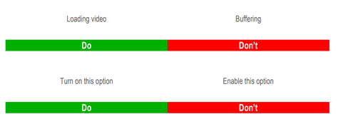
No one wants to read a block of text, especially when using an app. “One of the simplest tips for designing UX text is to keep it short and sweet”, said Lucas Bailey, UX/UI designer at Essaytigers. Of course, you have to make sure you get the point across, but it is important to do it in as few words as possible, unlike this:

Notice that the sign itself is quite intimidating with lots of small text all in one ugly block. Now imagine you open an app and see a warning like this, many users would just skip it instead of getting the necessary information. The flip side of this is being as concise as possible:

When you see this, you know exactly what it means. There are no arrows pointing to the house, talking about the type of house, price, etc. It is giving customers (users) the crucial information of the house being for sale (and if they want more information it can be available elsewhere).
2. Use Numbers/Numerals
If you want the user to pay attention to something, you need to somehow draw their eyes to the relevant text. The easiest way to do this is the use of numbers or numerals. Numbers often pop out to the average reader, and tend to be associated with something important:
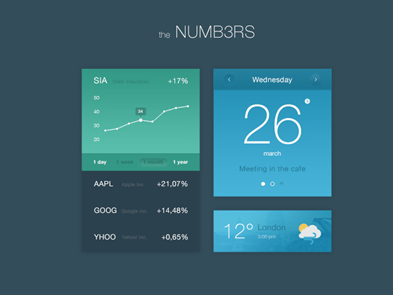
You will notice in this UI that the numbers are bigger than the text and really grabs your attention. You should also refrain from spelling out numbers (even 0-10!), as it takes up more space and blends in with other text. Even something as simple as changing “Pick Two Options” to “Pick 2 Options” will make a difference in grabbing the user’s attention.
3. Mix Up Your Fonts/Colors
Similar to using number/numerals, you want to use different fonts, text sizes, and colors to grab the user’s attention. Even if your text is interesting if all of the app’s text is in the same font/same color the user will likely get bored and frustrated that they can’t find the information they want. You need to be careful, however, because overdoing colors/font sizes (or just using the wrong ones) can make your app look ugly and hurt the user’s eyes.
Below is an example of good use of colors and fonts:
While this is what designers came up with to showcase a not so great use of fonts and colors:
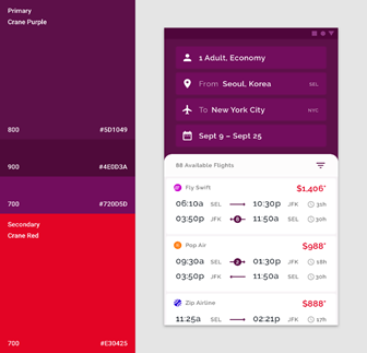
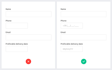
4. Nudge Your User In The Right Direction
Let’s say you need your users to input their birthday. There is a ton of way to input a date, from dd/mm/yyyy to yyyy/mm/dd. For data storing purposes, it is often useful to have a consistent date input from users. Where some designers mess up is that they forget to tell the user HOW they want the date to be input. Below is an example showing the difference between leaving your user to figure it out for themselves and showing them the desired format:
5. Avoid Confusing Terms
When designing UX text you want to make everything as clear as possible. Part of that is avoiding the use of terms that could throw off users. This includes things like slang and specialized jargon. Leave the “yolos” and ”legits” for your texts, and avoid the use of business terms like “core competency” or calling something “actionable”. You can see the difference here:
6. Be Consistent
Another common pitfall for UX design is inconsistency. Let’s say you ask the user to enter their birth date on one page, and the next you ask them to input their gender. This is a prime example of inconsistency within your text design. Being inconsistent makes your design look amateurish and forces the user to remember multiple terms for the same thing. Below are a few examples of inconsistent UX text design:
“Enter your name here” and “Put your address here”
“My name is” and “Your name is”
“Have you shopped with us before?” and “When was the last time you browsed with us?”
When you are reviewing your text copy, make sure you are using terms as consistently as possible.
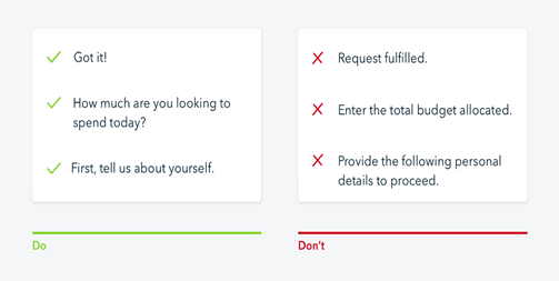
7. Personalize Instructions
We’ve already talked about how important it is to be clear and concise in UX text. However, another way to boost user retention is personalizing instructions. This essentially means avoiding instructions that sound like they were written by a robot, and instead of trying to recreate what the user would be asked in a real conversation. Below is an example showcasing the difference that personalizing your text can make in the user experience:
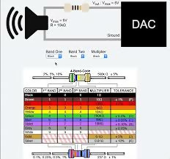
8. Utilize Graphics
Many people are visual learners, so if you have a particularly complex task or interaction the user will perform using a graphic that can help them understand it easier. A common example is when you are asked to enter credit card information some apps will have a graphic showing where users can find the credit card number, security code, etc. Smart use of graphics will make your app easier for users to navigate, making it much more attractive. Check out this graphic to see how you can use visuals to break down a more complex process to users:
9. Take Care With Error Messages
Any app is going to have errors. Whether they are user errors or connection errors, you need to have a message telling the user what is happening and what their options are to fix it. Make sure you never include an error message without at least linking to a help page that gives instructions on how to fix the error.
We hope that these tips help you create the best possible UX text for your future apps.
The post Top Tips To Design UX Text for Mobile Apps appeared first on Studio by UXPin.


UXpin's Blog

- UXpin's profile
- 68 followers

