
Allen B. Downey's Blog: Probably Overthinking It, page 16
March 14, 2019
Stop worrying and love the black box
In many engineering classes, computational methods are treated with fear, uncertainty, and doubt. At the same time, analytic methods are presented as if they were magic.
I think we should spend more time on computational methods, which means cutting back on analytic methods. But I get a lot of resistance from faculty with a dread fear of black boxes.
They warn me that students have to know how these methods work in order to use them correctly; otherwise they are likely to produce nonsense results and accept them blindly.
And if they let students use computational tools at all, the order of presentation is usually “bottom-up”, that is, a lot of “how it works” before “what it does”, and not much “why you should care”.
In my books and classes, we often got “top-down”, learning to use tools first, and opening the hood only when it’s useful. It’s like learning to drive; knowing about internal combustion engines does not make you a better driver.
But a lot of people don’t like that analogy. Recently one of the good people I follow on Twitter wrote, “No, doing fancy analyses without understanding the basic statistical principles isn’t like driving a car without knowing the mechanics. It’s like driving a car while heavily intoxicated, being in all kinds of accidents without knowing it.”
I replied, “I don’t think there is a general principle here. Sometimes you can use black boxes safely. Sometimes you have to know how they work. Sometimes knowing how they work doesn’t actually help.”
So how do we know which scenario we’re in, and what should we do about it? I suggest the following flow chart:
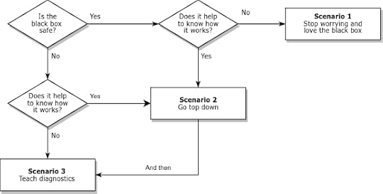
Many black boxes can be used safely; that is, they produce accurate results over the range of relevant problems. In that case, we should ask whether it (really) helps to know how they work. In Scenario 1, the answer is no; we can stop worrying, stop teaching how it works, and use the time we save to teach more useful things.
Of course, some black boxes have sharp edges. They work when they work, but when they don’t, bad things happen. In that case, we should still ask whether it helps to know how they work. In Scenario 3, the answer is no again. In that case, we have to teach diagnosis: What happens when the black box fails? How can we tell? What can we do about it? Often we can answer these questions without knowing much about how the method works.
But sometimes we can’t, and students really need to open the hood. In that case (Scenario 2 in the diagram) I recommend going top down. Show students methods that solve problems they care about. Start with examples where the methods work, then introduce examples where they break. If the examples are authentic, they motivate students to understand the problems and how to fix them.
With this framework, I can explain more concisely my misgivings about how computational methods are taught:
The engineering curriculum is designed on the assumption that we are always in Scenario 2, but Scenarios 1 and 3 are actually more common.


February 25, 2019
Bayesian Zig-Zag Webinar
On February 13 I presented a webinar for the ACM Learning Center, entitled “The Bayesian Zig Zag: Developing Probabilistic Models Using Grid Methods and MCMC“. Eric Ma served as moderator, introducing me and joining me to answer questions at the end.
The example I presented is an updated version of the Boston Bruins Problem, which is in Chapter 7 of my book, Think Bayes. At the end of the talk, I generated a probablistic prediction for the Bruins’ game against the Anaheim Ducks on February 15. I predicted that the Bruins had a 59% chance of winning, which they did, 3-0.
Does that mean I was right? Maybe.
According to the good people at the ACM, there were more than 3000 people registered for the webinar, and almost 900 who watched it live. I’m glad I didn’t know that while I was presenting 
February 21, 2019
Are men getting married later or never? Both.
Last week I wrote about marriage patterns for women in the U.S. Now let’s see what’s happening with men.
Again, I’m working with data from the National Survey of Family Growth, which surveyed 29,192 men in the U.S. between 2002 and 2017. I used Kaplan–Meier estimation to compute “survival” curves for the time until first marriage. The following figure shows the results for men grouped by decade of birth:
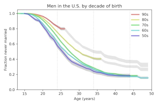
The colored lines show the estimated curves; the gray lines show projections based on moderate assumptions about future marriage rates. Two trends are apparent:
From one generation to the next, men have been getting married later. The median age at first marriage for men born in the 1950s was 26; for men born in the 1980s is it 30, and for men born in the 1990s, it is projected to be 35.The fraction of men never married at age 44 was 18% for men born in the 1950s, 1960s, and 1970s. It is projected to increase to 30% for men born in the 1980s and 37% for men born in the 1990s.
Of course, thing could change in the future and make these projections wrong. But marriage rates in the last 5 years have been very low for both men and women. In order to catch up to previous generations, young men would have to start marrying at unprecedented rates, and they would have to start soon.
For details of the methods I used for this analysis, you can read my paper from SciPy 2015.
And for even more details, you can read this Jupyter notebook.
As always, thank you to the good people who run the NSFG for making this data available.
February 6, 2019
The marriage strike continues
Last month The National Survey of Family Growth released new data from 5,554 respondents interviewed between 2015 and 2017. I’ve worked on several studies using data from the NSFG, so it’s time to do some updates!
In 2015 I gave a talk at SciPy called “Will Millennials Ever Get Married” and wrote a paper that appeared in the proceedings. I used data from the NSFG through 2013 to generate this plot showing marriage rates for women in the U.S. grouped by decade of birth:
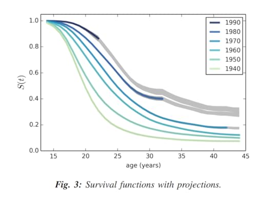
The vertical axis, S(t), is the estimated survival curve, which is the fraction of women who have never been married as a function of age. The gray lines show projections based on the assumption that each cohort going forward will “inherit” the hazard function of the previous cohort.
If you are not familiar with survival functions and hazard functions, you might want to read the SciPy paper, which explains the methodology.
Now let’s see how things look with the new data. Here’s the updated plot:
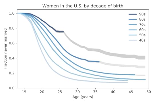
A few things to notice:
Age at first marriage has been increasing for decades. Median age at first marriage has gone from 20 for women born in the 1940s to 27 for women born in the 1980s and looks likely to be higher for women born in the 1990s.The fraction of women unmarried at age 44 has gone from 7% for women born in the 1940s to 18% for women born in the 1970s. And according to the projections I computed, this fraction will increase to 30% for women born in the 1980s and 42% for women born in the 1990s.For women born the 1980s and 1990s, the survival curves have been surprisingly flat for the last five years; that is, very few women in these cohorts have been married during this time. This is the “marriage strike” I mentioned in the SciPy paper, and it seems to be ongoing.
Because the marriage strike is happening at the same time in two cohorts, it may be a period effect rather than a cohort effect; that is, it might be due to external factors affecting both cohorts, rather than a generational change. For example, economic conditions might be discouraging marriage.
If so, the marriage strike might end when external conditions change. But at least for now, it looks like people will continue getting married later, and substantially more people will remain unmarried in the future.
In my next post, I will show the results of this analysis for men.
January 30, 2019
Data visualization for academics
One of the reasons I am excited about the rise of data journalism is that journalists are doing amazing things with visualization. At the same time, one of my frustrations with academic research is that the general quality of visualization is so poor.
One of the problems is that most academic papers are published in grayscale, so the figures don’t use color. But most papers are read in electronic formats now; the world is safe for color!
Another problem is the convention of putting figures at the end, which is an extreme form of burying the lede.
Also, many figures are generated by software with bad defaults: lines are too thin, text is too small, axis and grids lines are obtrusive, and when colors are used, they tend to be saturated colors that clash. And I won’t even mention the gratuitous use of 3-D.
But I think the biggest problem is the simplest: the figures in most academic papers do a poor job of communicating one point clearly.
I wrote about one example a few months ago, a paper showing that children who start school relatively young are more likely to be diagnosed with ADHD.
Here’s the figure from the original paper:
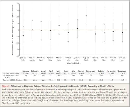
How long does it take you to understand the point of this figure? Now here’s my representation of the same data:
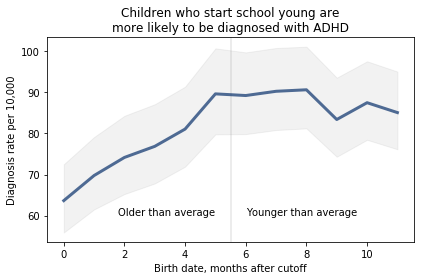
I believe this figure is easier to interpret. Here’s what I changed:
Instead of plotting the difference between successive months, I plotted the diagnosis rate for each month, which makes it possible to see the pattern (diagnosis rate increases month over month for the first six months, then levels), and the magnitude of the difference (from 60 to 90 diagnoses per 10,000, an increase of about 50%).I shifted the horizontal axis to put the cutoff date (September 1) at zero.I added a vertical line and text to distinguish and interpret the two halves of the plot.I added a title that states the primary conclusion supported by the figure. Alternatively, I could have put this text in a caption.I replaced the error bars with a shaded area, which looks better (in my opinion) and appropriately gives less visual weight to less important information.
I came across a similar visualization makeover recently. In this Washington Post article, Catherine Rampell writes, “Colleges have been under pressure to admit needier kids. It’s backfiring.”
Her article is based on this academic paper; here’s the figure from the original paper:
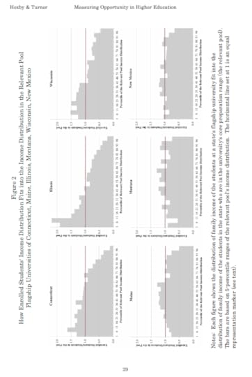
It’s sideways, it’s on page 29, and it fails to make its point. So Rampell designed a better figure. Here’s the figure from her article:
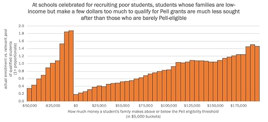
The title explains what the figure shows clearly: enrollment rates are highest for low-income students that qualify for Pell grants and lowest for low-income students who don’t qualify for Pell grants.
To nitpick, I might have plotted this data with a line rather than a bar chart, and I might have used a less saturated color. But more importantly, this figure makes its point clearly and compellingly.
Here’s one last example, and a challenge: this recent paper reports, “the number of scale points used in faculty teaching evaluations (e.g., whether instructors are rated on a scale of 6 vs. a scale of 10) substantially affects the size of the gender gap in evaluations.”
To demonstrate this effect, they show eight histograms on pages 44 and 45. Here’s page 44:

And here’s page 45:
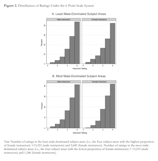
With some guidance from the captions, we can extract the message:
Under the 6-point system, there is no visible difference between ratings for male and female instructors.Under the 10-point system, in the least male-dominated subject areas, there is no visible difference. Under the 10-point system, in the most male-dominated subject areas, there is a visibly obvious difference: students are substantially less likely to give female instructors a 9 or 10.
This is an important result — it makes me want to read the previous 43 pages. And the visualizations are not bad — they show the effect clearly, and it is substantial.
But I still think we could do better. So let me pose this challenge to readers: Can you design a visualization of this data that communicates the results so that
Readers can see the effect quickly and easily, andUnderstand the magnitude of the effect in practical terms?
You can get the data you need from the figures, at least approximately. And your visualization doesn’t have to be fancy; you can send something hand-drawn if you want. The point of the exercise is the design, not the details.
I will post submissions in a few days. If you send me something, let me know how you would like to be acknowledged.
UPDATE: We discussed this example in class today and I presented one way we could summarize and visualize the data:
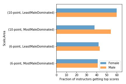 Students in the most male-dominated fields are less likely to give female instructors top scores, but only on a 10-point scale. The effect does not appear on a 6-point scale.
There are definitely things to do to improve this, but I generated it using Pandas with minimal customization. All the code is in this Jupyter notebook.
January 18, 2019
The library of data visualization
Getting ready for my Data Science class (starting next week!) I am updating my data visualization library, looking for resources to help students learn about visualization.
Last week I asked Twitter to help me find resources, especially new ones. Here’s the thread. Thank you to everyone who responded!
I’ll try to summarize and organize the responses. I am mostly interested in books and web pages about visualization, rather than examples of it or tools for doing it.
There are lots of good books; to impose some order, I put them in three categories: newer work, the usual suspects, and moldy oldies.

Newer books
The following are some newer books (or at least new to me).
Fundamentals of Data Visualization, by Claus O. Wilke (online preview of a book forthcoming from O’Reilly)
Data Visualization: A practical introduction Kieran Healy (free online draft)
Data Visualization: Charts, Maps, and Interactive Graphics Robert Grant
Data Visualisation: A Handbook for Data Driven Design by Andy Kirk
Dear Data by Giorgia Lupi, Stefanie Posavec
Established books
The following are more established books that appear on most lists.
The Functional Art: An Introduction to Information Graphics and Visualization by Alberto Cairo
The Truthful Art: Data, Charts, and Maps for Communication by Alberto Cairo
Interactive Data Visualization for the Web by Scott Murray
Storytelling with Data: A Data Visualization Guide for Business Professionals by Cole Nussbaumer Knaflic
Beautiful Visualization: Looking at Data through the Eyes of Experts by Julie Steele
Designing Data Visualizations: Representing Informational Relationships by Noah Iliinsky, Julie Steele
Visualization Analysis and Design by Tamara Munzner
Visualize This: The FlowingData Guide to Design, Visualization, and Statistics by Nathan Yau
Data Points: Visualization That Means Something by Nathan Yau
Show Me the Numbers: Designing Tables and Graphs to Enlighten by Stephen Few
Now You See It: Simple Visualization Techniques for Quantitative Analysis by Stephen Few
Older books
The Visual Display of Quantitative Information by Edward R. Tufte
The Elements of Graphing Data by William S. Cleveland
Websites and blogs
Again, I mostly went for sites that are about visualization, rather than examples of it.
The Data Visualisation Catalogue
More references and resources from MPA 635: DATA VISUALIZATION
Videos and podcasts
The Art of Data Visualization | Off Book | PBS Digital Studios
 Data Stories A podcast on data visualization with Enrico Bertini and Moritz Stefaner
Python-specific resources
Python Plotting for Exploratory Data Analysis
How to visualize data in Python
December 28, 2018
Race, religion, and politics
In their November 3, 2018 issue, The Economist published the following figure showing their analysis of data from YouGov.
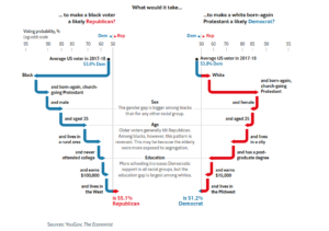
For the second edition of Think Bayes, I plan to use it to demonstrate conditional probability. In the following notebook, I replicate their analysis (loosely!) using data from the General Social Survey (GSS).
View the code on Gist.
December 27, 2018
How to write a book
All of my books were written in LaTeX. For a long time I used emacs to compose, pdflatex to convert to PDF, Hevea to convert to HTML, and a hacked-up version of plasTeX to convert to DocBook, which is one of the formats I can submit to my publisher, O’Reilly Media.
Recently I switched from emacs to Texmaker for composition, and I recommend it strongly. I also use Overleaf for shared LaTeX documents, and I can recommend that, too.
However, the rest of the tools I use are pretty clunky. The HTML I get from Hevea is not great, and my hacked version of plasTeX is just awful (which is not plasTeX’s fault).
Since I am starting some new book projects, I decided to rethink my tools. So I asked Twitter, “If you were starting a new book project today, what typesetting language / development environment would you use? LaTeX with Texmaker? Bookdown with RStudio? Jupyter?Other?”
I got some great responses. You can read the whole thread yourself, but I will try to summarize it here.
LaTeX
 Nelis Willers “wrote a 510 page book with LaTeX, using WinEdt and MiKTeX and CorelDraw for diagrams. Worked really well.”
Matt Boelkins likes “PreTeXt, hands down: It has LaTeX and HTML as potential outputs among many. See the gallery of existing texts on the linked page.”
makusu recommends “Emacs org-mode. Easy to just write your content, seamless integration with latex, easy output to latex, PDF, markdown and HTML.”
AsciiDoc
Luciano Ramalho recommends “AsciiDoc, for sure. That’s how I wrote @fluentpython. It’s syntax more user-friendly than ReStructuredText and way more expressive than Markdown. AsciiDoc was *designed for* book publishing. It’s as expressive as DocBook, but it ain’t XML. With @asciidoctor you can render locally.”
JD Long provides a useful reminder: “It’s dependent on the publisher as well as the content of the book. I like Bookdown for R, but if I were doing a devops book for O’Reilly I’d write directly in AsciiDoc, for example. So I think context matters highly.”
Yves Hilpisch says “AsciiDoctor is my favorite these days. Clear syntax, nice output, fast rendering (HTML/PDF). Have custom Python scripts that convert @ProjectJupyter notebooks into text files from which I include code snippets automatically.” His scripts are in this GitHub repository.
Markdown
Robert Talbot recommends “Markdown in a plain text editor, with Pandoc on the back end for the finished product. This is assuming that the book is mostly text. If it involves code, I might lean more toward Jupyter and some kind of Binder based process.” Here’s a blog post Robert wrote on the topic.
I got a recommendation for this blog post by Thorsten Ball, who uses Markdown, pandoc, and KindleGen.
One person recommended “writing Markdown then using pandoc to pass to LaTeX”, which is an interesting chain.
Visual Studio Code got a few mentions: “I haven’t written a full book using it, but VS Code plus markdown preview and other editing plugins is my current go-to for small articles”
“Bookdown in RStudio is wonderful to use.”
Jupyter
Chris Holdgraf is “working on a project to help people make nicely rendered online books from collections of Jupyter notebooks. We use it @ Berkeley for teaching at http://inferentialthinking.com.”
RestructuredText
Jason Moore recommends “your preferred text editor + RestructuredText + Sphinx = pdf/epub/html output; wrote my dissertation with it 6 years ago and was quite happy with the results.”
Matt Harrison uses his “own tools around rst (with conversion to LaTeX and epub).”
Other
Raffaele Abate recommends “ScrivenerApp: I’ve used their Linux beta in past for a short, nonscientific, book and I can say it’s an amazing software for this purpose. I’ve read that is usable also for scientific publishing with profit.”
Lak Lakshmanan wrote, “I used Google docs for my previous book and for my current offer. Not as composable as latex, but amazing for collaboration. Books need to fine-grained reviews and edits by several people spread around the world. Nothing like Google docs for that.”
And the winner is…
For now I am working in LaTeX with Texmaker, but I have run it through pandoc to generate AsciiDoc, and that seems to work well. I will work on the book and the conversion process at the same time. At some point, I might switch over to editing in AsciiDoctor. I also need to do a test run with O’Reilly to see if they can ingest the AsciiDoc I generate.
I will post updates as I work out the details.
Thank you to everyone who responded!
December 11, 2018
Cats and rats and elephants
 A few weeks ago I posted “Lions and Tigers and Bears“, which poses a Bayesian problem related to the Dirichlet distribution. If you have not read it, you might want to start there.
Now here’s the follow-up question:
Suppose there are six species that might be in a zoo: lions and tigers and bears, and cats and rats and elephants. Every zoo has a subset of these species, and every subset is equally likely.
One day we visit a zoo and see 3 lions, 2 tigers, and one bear. Assuming that every animal in the zoo has an equal chance to be seen, what is the probability that the next animal we see is an elephant?
And here’s my solution
View the code on Gist.
December 6, 2018
August causes ADHD
And it turns out that children born in August are about 30% more likely to be diagnosed with ADHD, plausibly due to age-related differences in behavior.
The analysis in the paper uses null-hypothesis significance tests (NHST) and focuses on the difference between August and September births. But if it is true that the difference in diagnosis rates is due to age differences, we should expect to see a “dose-response” curve with gradually increasing rates from September to August.
Fortunately, the article includes enough data for me to replicate and extend the analysis. Here is the figure from the paper showing the month-to-month comparisons.
Note: there is a typographical error in the table, explained in my notebook, below.
Comparing adjacent months, only one of the differences is statistically significant. But I think there are other ways to look at this data that might make the effect more apparent. The following figure, from my re-analysis, shows diagnosis rates as a function of the difference, in months, between a child’s birth date and the September 1 cutoff:

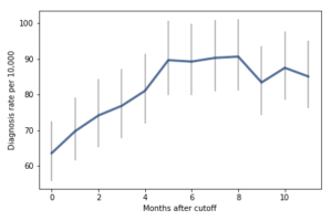
For the first 9 months, from September to May, we see what we would expect if at least some of the excess diagnoses are due to age-related behavior differences. For each month of difference in age, we see an increase in the number of diagnoses.
This pattern breaks down for the last three months, June, July, and August. This might be explained by random variation, but it also might be due to parental intervention; if some parents hold back students born near the deadline, the observations for these months include some children who are relatively old for their grade and therefore less likely to be diagnosed.
We could test this hypothesis by checking the actual ages of these students when they started school, rather than just looking at their months of birth. I will see whether that additional data is available; in the meantime, I will proceed taking the data at face value.
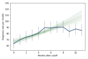
I fit the data using a Bayesian logistic regression model, assuming a linear relationship between month of birth and the log-odds of diagnosis. The following figure shows the fitted models superimposed on the data.

Most of these regression lines fall within the credible intervals of the observed rates, so in that sense this model is not ruled out by the data. But it is clear that the lower rates in the last 3 months bring down the estimated slope, so we should probably consider the estimated effect size to be a lower bound on the true effect size.
To express this effect size in a way that’s easier to interpret, I used the posterior predictive distributions to estimate the difference in diagnosis rate for children born in September and August. The difference is 21 diagnoses per 10,000, with 95% credible interval (13, 30).
As a percentage of the baseline (71 diagnoses per 10,000), that’s an increase of 30%, with credible interval (18%, 42%).
However, if it turns out that the observed rates for June, July, and August are brought down by red-shirting, the effect could be substantially higher. Here’s what the model looks like if we exclude those months:
Of course, it is hazardous to exclude data points because they violate expectations, so this result should be treated with caution. But under this assumption, the difference in diagnosis rate would be 42 per 10,000. On a base rate of 67, that’s an increase of 62%.
Here is the notebook with the details of my analysis:
View the code on Gist.
Probably Overthinking It

- Allen B. Downey's profile
- 236 followers

