The book explores the role that data plays in our lives and originates from a correspondence between the two authors - both data visualisation artists who met at a data conference and chose to keep in touch by sending weekly postcards composed of data visualisations in place of words. The result is described as “a thought-provoking visual feast”.
Giorgia Lupi is an award-winning information designer, author and artist.
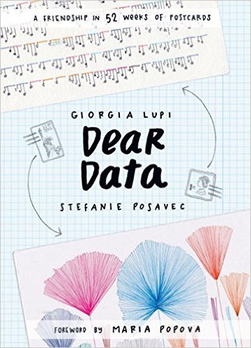
She is co-author of Dear Data (www.dear-data.com) published by Penguin in the UK and Princeton Architectural Press in North America,
She is co-founder and design director at Accurat a data-driven design firm with offices in Milan and New York.
Her work in information visualization frequently crosses the divide between digital and print, exploring visual models and metaphors to represent dense and rich data-driven stories.
Giorgia received her M-Arch at FAF in Ferrara and she then earned a PhD in Design at Politecnico di Milano in 2014. Her design work has been featured on the New York Times, Wired, the Guardian, Popular Science, Time Magazine, The Washington Post, Forbes, among all.
Her work has been exhibited at: The London Scienc eMuseum, the New York Hall of Science, The Storefront for Art and Architecture in New York, Triennale Design Museum in Milan, Milano Design Week and Somerset House in London.
I wish I could rate this higher than five stars - honestly, I really do. This book has inspired me endlessly! As a graphic design enthusiast (and budding graphic designer), this was a huge amount of motivation and it has inspired me to start collecting my own data sets and illustrating them in quirky ways.
This is a brilliant book and I would 100% recommend it! I am so happy that I read this - and I recommend all of you to at least flick through it; it's one of the most wonderful reads I have partaken in. I love the way it is presented too - it's so enjoyable, light but yet so intensely inspiring.
I just ADORE everything about it! BEAUTIFUL. Well worth the wait - I've been following dear data online for a little while now and it's so amazing to have a physical copy of these wonderful postcards.
4.5-stars. A delightful book, with some great ideas on collecting and displaying data. And a beautiful book. The only downside for me was that the data was almost entirely displayed as elaborate tally marks with details. I would have appreciated seeing some other types of infographics or statistical graphs incorporated. But I loved the way the authors experimented in trying to display their information creatively. A book to keep in my library.
Great concept: two designers who work a lot with data pick a theme each week for a year, and then collect their personal data based on that theme and send the other person a postcard with some hand-drawn data visualization on it. It is halfway between work and socialization / friendship-building, and they refer to it in the text as kind of both.
The execution didn't always work for me; I often had the feeling both authors tried to move away from very 'pictorial' visualizations, and the resultant abstract representations could be hard to interpret without constantly looking back and forth between the image and the legend. The same for colors: I frequently had the impression that the colors were picked for the image to have a harmonious but slightly offbeat color scheme, even at the expense of functionality. For example, I don't necessarily want men to be light blue and women to be pink on a data visualization (G-d forbid), but sometimes it felt like the authors were deliberately trying not to use any sort of conventionalized associations and this made for a harder interpretation. I did like how both of the authors had their own distinct visual language.
It took me a considerable amount of time to read this book, which I didn't expect (it doesn't read like a conventional coffee table book even though it's formatted like that), because I kept on examining details about the data! It was fun. I liked it how they also tried to make it slightly meta and refer back to the project itself, or each other, on as many cards as possible, and having a consistent color for that.
There was also an immigration theme running through the book, which was nice to see, though kind of different from my experiences because both authors moved from one Western country to another.
I liked that they examined their own tendencies for self-deprecation and overapologizing. I was wondering if that would happen while I was reading, and then it did! Very cool.
Something that I did not see coming was just how much alcohol they consumed, and often to excess. This came up even in non-drinking-related data. I guess this is a content warning that I did not see mentioned anywhere else.
Overall, I would like even more people to do something like this, can data art become fashionable? Is it fashionable already? I constantly had the "I want to try something like this too!" feeling while reading, which does mean that ultimately the book worked for me.
I would have liked to see not just data but also a tiny bit of quantitative analysis? Just vague correlations or something, maybe a bit of curve fitting, contingency tables etc. as appropriate. But this is their book, not my book - if it were my book, I would do all sorts of stuff like that, and I'd spend not just a few hours each week on the project but a few days, lol sigh.
(There wasn't a lot of qualitative analysis either, but what there was I enjoyed.)
Dvi profesionalios duomenų dizainerės (net nesu tikras, kaip teisingai vadinti duomenų atvaizdavimu užsiimančiuosius) – viena Londone, o kita Niujorke – ištisus metus kas savaitę viena kitai siųsdavo ranka pieštus atvirukus su duomenų schemomis, diagramomis ir grafikais. Kiekvieną savaitę jos pasirinkdavo vis naują temą – kiek kartų pasakei „ačiū“, kiek kartų per savaitę nusijuokei, kas kabo tavo spintoje, kas yra tavo geriausi draugai, kiek kartų nusikeikei ar kiek išgėrei alkoholio. Pasirodo, per septynias dienas tokių duomenų galima prikaupti devynias galybes, ypač jei žymėsiesi ne vien plikus faktus, bet ir su šiais faktais susijusias aplinkybes: ne visi pasakyti „ačiū“ yra vienodi, kai kurie būna ištarti kita kalba, kai kurie parašyti elektroniniame pašte, kai kurie buvo pasakyti tik iš mandagumo, o kai kurie ypač nuoširdūs, nes buvo sakyti su meile savo vyrui. Per daugiau nei penkiasdešimt savaičių šios dizainerės sugalvojo daug išradingų duomenų vaizdavimo būdų ir kone kiekviena atvirutė stebina detalių gausa – bet detalės neužgožia bendro duomenų piešiamo paveikslo, jos nenumaldomai traukia gilyn, ten kur abstraktūs agreguoti skaičiai nutrindami ribą tarp statistikos ir asmeninio intymumo pavirsta į atskirus išgyventus faktus. Kai dešimt kartų pasakytas žodis „ačiū“ tampa trimis „ačiū“ padavėjai už pateiktą sriubą, dviem „ačiū“ bendradarbiui už persiųstą emailą, padėka draugui už tai, kad jis šalia ir keturiais „ačiū“, kuriuos turėjai pasakyti, bet neišdrįsai, tai nebe plika statistika: tikrai jautiesi gerai pažįstantis autorę.
Peržvelgus šio projekto atvirutes pradedi suprasti, kad duomenimis savo gyvenime galima paversti beveik bet ką, tačiau vien pats duomenų rinkimas priverčia atkreipti dėmesį į tuos dalykus, kuriuos šiaip būtum praleidęs pro pirštus. Vien tai, kad skaičiuoji šypsenas, verčia tave daugiau šypsotis, vien tai, kad seki savo alkoholio suvartojimą, galbūt daro tavo blaivesniu, vien tai, kad surenki duomenis apie žmones, su kuriais bendravai per savaitę, primena tau, kad reiktų paskambinti seniai matytai tetai. Ką matuoji, tuo ir gyveni. Apie ką nuolat galvoji, su tuo ir susitapatini. Bet norint daugiau judėti neužtenka nuolat ant rankos nešioti Fitbit apyrankę – jei duomenys surenkami paprastai ir neskausmingai, į juos lengva numoti ranka ir užsimiršti. Kuo sunkiau duomenis teko rinkti ir analizuoti, tuo juos vertini rimčiau. Kartais nėra blogai duomenis sąmoningai užsirašinėti ranka: tai leidžia stabtelti ir pagalvoti apie kiekvieną konkretų stebėjimą.
After over 15 months, I finally managed to go through 'Dear Data.' One of the main reasons is that this is a book that needs time, it is far from being a page-turner, it's more like an arts album that you go back and forth, check few pages and put it aside for another couple of weeks.
I am full of awe for the two authors, who were able to commit themselves to collecting data every week of the year, and then spend hours turning the data into pieces of art. Hats off for that!
As art is subjective, I liked some drawings more than the others, same goes with the choice of the topics - my favorites would be the week of swearing, week of schedules, week of urban wildlife, and (of course) week of spying on boyfriends/ partners.
If you like data, art an colorful hand-made postcards, you will enjoy this book :-)
Unique and beautifully fascinating. I love the authors concept of using their common love of art and data to create a shared, adventurous correspondence.
I primarily flipped through the book to observe the types and styles of data. While I found it interesting how they translated their lives into a form of art, I just wasn't that interested in studying the actual data or the ongoings of their lives. I think the concept of data collecting is immensely fascinating and the various ways we can translate that information, but the personal details of these two women just did not interest me as much as data about my city, my school, people I know, etc.
An interesting approach to being mindful of the everyday, though it wasn't the original intention of the book. I found the graphics more intriguing than the data they represented. Many of them were downright beautiful!
I enjoyed looking at how each woman visualized the data she collected. After a while, it got a little boring. I borrowed this book from the library, and had it for several weeks, but didn't finish it before it had to go back.
TODO full review: +++ Amazingly creative project: two people meet through their weekly postcard exchange. The goal of each exchange is to reveal to the other who they are. i I liked this book so much, I've decided to give it as a gift. +++ I loved how creative the drawings/weekly projects turn out to be. It's all naive art, but the authors invent their own symbolic language for each drawing, bursting with ideas. What should each postcard reveal? How? Wonderful. (For anyone who thinks all this is easy, I suggest you try it yourself before trivializing. 52 unique languages x 2.) ++ The data is less than accurate, but presents an emotional complement to the comparatively cold, strictly data-driven, self-improvement projects now abundant on the Internet, e.g., Feltron's Annual Report (2005-2014). Every post-card seems bursting with personal trivia, rather than (equally meaningless) data about the number of Facebook messages and the total count of their expeditors, or the most visited gourmet shops in New York. (Feltron's Annual Report is not all bad, and there's quality in the visualizations, but the emotional part seems to me to be lacking.)
Giorgia Lupi and Stefanie Posavec, two data visualisation experts, exchanged a postcard per week, each time with a different graph showing an aspect of their lives: how much time they spent on some tasks, how many clothes do they have, and so on. To compile the result of their year-long project, they published this book, including the beautiful visualisations, some preparatory material, and tips on how to build great graphs.
It is a short, pleasant read that will be useful for anybody who works with data visualisation or want a study ($n$ = 2) of the datification of life. Of course, the book does not mean to present general answers to how we, as a society, should deal with data. But it is an elegant reminder of how, under the right conditions, quantification does not entail losing touch with beauty and the human condition in general, and, by extension, of how our relationships with technology might be (re)built along different lines than our current arrangements.
This was a fun book to read on my lunch breaks at work, as it didn't require close reading, but I could look at each page for a while, notice things and meditate on them, and then move on. Giorgia and Stefanie sent postcards to each other with hand drawn visualizations of data that they collected about themselves over the previous week. Each week the data topic changed, and topics ranged from tracking each time they thanked someone, to the times they were alone, to apps on their phones, to all the times they said goodbye.
Over the course of reading the book, you become acquainted with the different styles of the two women. Giorgia's drawings are filled with tiny details, and she often makes her visualization resemble the type of data she's tracking. Stefanie's drawings are often more blunt and expansive. Both add humourous commentary along the sides of their postcards.
I read this to try to learn something about how to do data visualization. I've read some manual-type books, but looking at an art book of data visualization put into practice was a much more pleasant way to learn.
I actually thought this was really cool and really interesting, but 104 postcards full of fairly granular data is a bit too much for me. I enjoyed seeing the ways these two women represented different aspects of their lives, and the way they managed to turn going through doors or schedules or complaining into art.
I'm glad their legends for interpreting the data are included here, but I also feel like that puts too much pressure on me to READ all the teeny tiny writing included in there, which takes away some of the enjoyment of seeing the data visualizations, especially when I'm not then using that information to actually ... interpret the data.
Non un testo che si legge, a meno che non si sia particolarmente interessati alla vita delle autrici :)
Ma un testo che si guarda, si ammira, si studia per prendere spunti su come sia sempre possibile visualizzare i propri dati.
Non credo sia un libro per tutti. Se cercate un how to, non è per voi. Lo trovo molto interessante, ma per me che mi sto appena avvicinando alla comunicazione visuale è per esempio poco utile (non sono al livello sufficiente x poterne trarre spunto), ma è bello e dà speranza :)
I love this book. 52 postcards between two artists who, each week collect data on their lives (how many times they look at their phone, what they ate, how they get to work) and send the information to one another, but in various artist forms. It’s so gorgeous and informative too. Definitely every teacher should have this book but it’s not really about teaching, it’s about expressing yourself in different ways and looking at your life. So cool!
Infinite stars for this book. Keren BANGET. Dari baca buku ini jadi tau bahwa ternyata ngumpulin data buat divisualisasiin ga perlu data yang serius2 amat; hal sehari2 di hidup kita juga bisa kita track. Cakep2 bgt visualisasi datanya, makes me happy with all those colours and shapes and textures and patterns AHHHHHHH. Now I have 20+ ideas of my own, mau ngetrack apa, dari baca buku ini. So excited to learn more!
This book is never-ending eye-candy and it gives me so much joy. I love flipping through it and everyone that comes through my living room will sit with it for hours. I am inspired by this fun journey of introspection and mindfulness - the data collection forcing them to be more present and conscious of their actions, actions of others, their surroundings - to better understanding of data and data representation. I can't wait to try my hands at this with their workbook!
As a data visualization geek and a marketing person, this book was fascinating and so fun to read. It tracks correspondence between two friends who decide on weekly themes and send each other postcards drawing data. Sometimes it’s charts and graphs, other times it is really creative art with legends and descriptions. I LOVED the whole concept
Precioso ejercicio de introspección, de meditación y búsqueda artística. Los datos son el hilo conductor, pero se convierten casi en una excusa para mirarse a uno mismo y reflexionar sobre la propia rutina. Me ha inspirado un montón
This was fun to browse through! Two designers forge a friendship through sending each other a postcard a week, each on a different theme - such as urban wildlife that they saw, doors they went through, smells, positive thoughts they had. They track data throughout the week on that theme, then send each other a postcard, displaying the data in different ways and providing a legend and explanations on the back of the postcard of how to read the data. Giorgia and Stefanie have quite different styles, and although I found Stefanie's a little more accessible I preferred Giorgia's more abstract illustrations.
A unique concept and interesting idea which was well executed throughout, I wish I had the energy to create something similar!
I usually don't add science books to goodreads, but this one is not only amazing, it's also fun and of interest to all sorts of people. I've given a few copies as gifts as I want to share it- an amazing book. A pair of talented artists/information designers square off to each find a novel way to clearly depict incredibly diverse data of one form or another- how many moments of happiness, word use, converting social media interactions into dance steps, and just about everything else - in a clear and insightful way. Each result was sent via postcard to the other artist, and the set of cards make up this book. An extraordinary work of creativity and clarity of vision. One example of the second author's work I find really fascinating (and of course ironic in the extreme) is the evolution of the text of the origin of species by Darwin, go to stefanieposavec . c o m and scroll down to the (en)tangled word bank link at the bottom of any secondary page (not on the landing page).
Interessant boek over een project van de schrijvers die elke week aan data visualisatie doen om zo in contact te blijven. Goede inspiratie voor mijn eigen school projecten rond data visualisatie en visual interaction.
Stefanie and Giorgia document their lives in colorful data art. Every week, they collect data on an element of each of their lives. They then make creative dataviz postcards from their data and send it to each other.
For readers looking for 💕: dataviz, a creative art project, and an examination of what makes up our daily moments.
My thoughts 💭: I loved reading this collection of #Dataviz postcards sent between Georgia and Stefanie. Each card visually represented elements of their daily lives, from the number of sounds heard in the first minute of every hour to the books on their shelves. I loved reading their postcards and seeing the different forms that their self-reflections took throughout the book. I recommend reading the physical book. I had a rough time trying to read the ebook. I'm also delighted that one of the authors is from Loveland, Colorado.
The concept of the book is good. It's pretty and inspiring, especially for anyone who wants to start bullet journaling or sketching out creative ways to display information for other purposes.
I do wish it would have had a bit more principles and best practices documented about data mapping and design, though--what Giorgia and Stefanie learned from the experience. I can infer some of it, but I'd love to walk away with a menu of shapes, chart formats, and quick tips on what tends to be most effective for different data types--what kinds of charts are best for yes/no answers, multi-variable data, or even data sets that involve decision trees and spin-off subsets of data. While that's lacking, I did enjoy paging through the book.
I'd recommend borrowing this one from the library, instead of buying it for your shelf. If you'd like a desk reference that has some of those menus of best practices and data display options, I recommend checking out Nancy Duarte's trilogy on preparing presentations and storytelling, especially book two in the series 'Resonate.'