
Allen B. Downey's Blog: Probably Overthinking It, page 15
August 6, 2019
Left, right, part 4
In the first article in this series, I looked at data from the General Social Survey (GSS) to see how political alignment in the U.S. has changed, on the axis from conservative to liberal, over the last 50 years.
In the second article, I suggested that self-reported political alignment could be misleading.
In the third article I looked at responses to this question:
Do you think most people would try to take advantage of you if they got a chance, or would they try to be fair?
And generated seven “headlines” to describe the results.
In this article, we’ll use resampling to see how much the results depend on random sampling. And we’ll see which headlines hold up and which might be overinterpretation of noise.
Overall trends
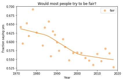
In the previous article we looked at this figure, which was generated by resampling the GSS data and computing a smooth curve through the annual averages.
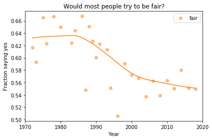
If we run the resampling process two more times, we get somewhat different results:

Now, let’s review the headlines from the previous article. Looking at different versions of the figure, which conclusions do you think are reliable?
Absolute value: “Most respondents think people try to be fair.”Rate of change: “Belief in fairness is falling.”Change in rate: “Belief in fairness is falling, but might be leveling off.”
In my opinion, the three figures are qualitatively similar. The shapes of the curves are somewhat different, but the headlines we wrote could apply to any of them.
Even the tentative conclusion, “might be leveling off”, holds up to varying degrees in all three.
Grouped by political alignment
When we group by political alignment, we have fewer samples in each group, so the results are noisier and our headlines are more tentative.
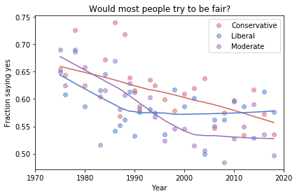
Here’s the figure from the previous article:
And here are two more figures generated by random resampling:
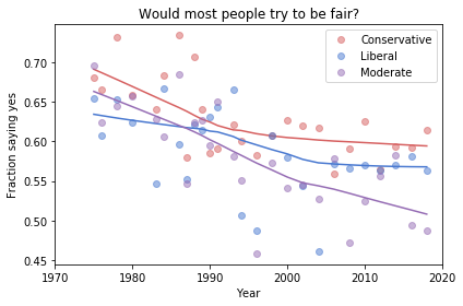
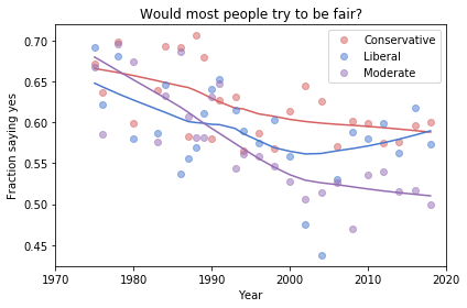
Now we see more qualitative differences between the figures. Let’s review the headlines again:
Absolute value: “Moderates have the bleakest outlook; Conservatives and Liberals are more optimistic.” This seems to be true in all three figures, although the size of the gap varies substantially.
Rate of change: “Belief in fairness is declining in all groups, but Conservatives are declining fastest.” This headline is more questionable. In one version of the figure, belief is increasing among Liberals. And it’s not at all clear the the decline is fastest among Conservatives.
Change in rate: “The Liberal outlook was declining, but it leveled off in 1990.” The Liberal outlook might have leveled off, or even turned around, but we could not say with any confidence that 1990 was a turning point.
Change in rate: “Liberals, who had the bleakest outlook in the 1980s, are now the most optimistic”. It’s not clear whether Liberals have the most optimistic outlook in the most recent data.
As we should expect, conclusions based on smaller sample sizes are less reliable.
Also, conclusions about absolute values are more reliable than conclusions about rates, which are more reliable than conclusions about changes in rates.


August 1, 2019
Left, right, part 3
In the first article in this series, I looked at data from the General Social Survey (GSS) to see how political alignment in the U.S. has changed, on the axis from conservative to liberal, over the last 50 years.
In the second article, I suggested that self-reported political alignment could be misleading.
In this article we’ll look at results from three questions related to “outlook”, that is, how the respondents see the world and people in it.
Specifically, the questions are:
fair: Do you think most people would try to take advantage of you if they got a chance, or would they try to be fair?trust: Generally speaking, would you say that most people can be trusted or that you can’t be too careful in dealing with people?helpful: Would you say that most of the time people try to be helpful, or that they are mostly just looking out for themselves?
Do people try to be fair?
Let’s start with fair. The responses are coded like this:
1 Take advantage
2 Fair
3 Depends
To put them on a numerical scale, I recoded them like this:
1 Fair
0.5 Depends
0 Take advantage
I flipped the axis so the more positive answer is higher, and put “Depends” in the middle. Now we can plot the mean response by year, like this:
Looking at a figure like this, there are three levels we might describe:
Absolute value: “Most respondents think people try to be fair.”Rate of change: “Belief in fairness is falling.”Change in rate: “Belief in fairness is falling, but might be leveling off.”
For any of these qualitative descriptions, we could add quantitative estimates. For example, “About 55% of U.S. residents think people try to be fair”, or “Belief in fairness has dropped 10 percentage points since 1970”.
Statistically, the estimates of absolute value are probably reliable, but we should be more cautious estimating rates of change, and substantially more cautious talking about changes in rates. We’ll come back to this issue, but first let’s look at breakdowns by group.
Outlook and political alignment
In the previous article I grouped respondents by self-reported political alignment: Conservative, Moderate, or Liberal.
We can use these groups to see the relationship between outlook and political alignment. For example, the following figure shows the average response to the fairness question, grouped by political alignment and plotted over time:
Results like these invite comparisons between groups, and we can make those comparisons at several levels. Here are some potential headlines for this figure:
Absolute value: “Moderates have the bleakest outlook; Conservatives and Liberals are more optimistic.”Rate of change: “Belief in fairness is declining in all groups, but Conservatives are declining fastest.”Change in rate: “The Liberal outlook was declining, but it leveled off in 1990.” or “Liberals, who had the bleakest outlook in the 1980s, are now the most optimistic”.
Because we divided the respondents into three groups, the sample size in each group is smaller. Statistically, we need to be more skeptical about our estimates of absolute level, even more skeptical about rates of change, and extremely skeptical about changes in rates.
In the next article, I’ll use resampling to quantify the uncertainly of these estimates, and we’ll see how many of these headlines hold up.
July 27, 2019
Left, right, part 2
In the previous article, I looked at data from the General Social Survey (GSS) to see how political alignment in the U.S. has changed, on the axis from conservative to liberal, over the last 50 years.
The GSS asks respondents where they place themselves on a 7-point scale from “extremely liberal” (1) to “extremely conservative” (7), with “moderate” in the middle (4).
In the previous article I computed the mean and standard deviation of the responses as a way of quantifying the center and spread of the distribution. But it can be misleading to treat categorical responses as if they were numerical. So let’s see what we can do with the categories.
The following plot shows the fraction of respondents who place themselves in each category, plotted over time:
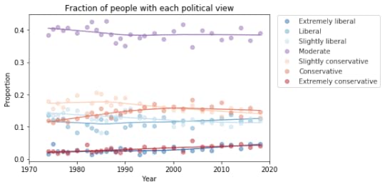
My initial reaction is that these lines are mostly flat. If political alignment is changing in the U.S., it is changing slowly, and the changes might not matter much in practice.
If we look more closely, it seems like the number of people who consider themselves “extreme” is increasing, and the number of moderates might be decreasing. The following plot shows a closer look at the extremes.
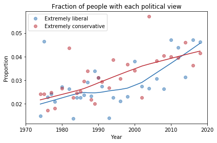
There is some evidence of polarization here, but we should not make too much of it. People who consider themselves extreme are still less than 10% of the population, and moderates are still the biggest group, at almost 40%.
To get a better sense of what’s happening with the other groups, I reduced the number of categories to 3: “Conservative” at any level, “Liberal” at any level, and “Moderate”. Here’s what the plot looks like with these categories:
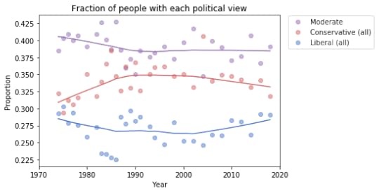
Moderates make up a plurality; conservatives are the next biggest group, followed by liberals.
From 1974 to 1990, the number of people who call themselves “Conservative” was increasing, but it has decreased ever since. And the number of “Liberals” has been increasing since 2000.
At least, that’s what this plot seems to show. We should be careful about over-interpreting patterns that might be random noise. And we might not want to take these categories too seriously, either.
The hazards of self-reporting
There are several problems with self-reported labels like this.
First, political beliefs are multi-dimensional. “Conservative” and “liberal” are labels for collections of ideas that sometimes go together. But most people hold a mixture of these beliefs.
Also, these labels are relative; that is, when someone says they are conservative, what they often mean is that they are more conservative than the center of the population, or where they think the center is, for the population they have in mind.
Finally, nearly all survey responses are subject to social desirability bias, which is the tendency of people to give answers that make them look better or feel better about themselves.
Over time, the changes we see in these responses depend on actual changes in political beliefs, but they also depend on where the center of the population is, where people think the center is, and the perceived desirability of the labels “liberal”, “conservative”, and “moderate”.
So, in the next article we’ll look more closely at changes in beliefs and attitudes, not just labels.
I am planning to turn these articles into a case study for an upcoming Data Science class, so I welcome comments and questions.
The code I used to generate these figures is in this Jupyter notebook.
July 26, 2019
Right, left, apart, together?
Is the United States getting more conservative? With the rise of the alt-right, Republican control of Congress, and the election of Donald Trump, it might seem so.
Or is the country getting more liberal? With the 2015 Supreme Court decision supporting same-sex marriage, the incremental legalization of marijuana, and recent proposals to expand public health care, you might think so.
Or maybe the country is becoming more polarized, with moderates choosing sides and partisans moving to the extremes.
In a series of articles, I’ll use data from the General Social Survey (GSS) to explore these questions. The GSS goes back to 1972; every second year they survey a representative sample of U.S. residents and ask questions about their political beliefs. Many of the questions have been unchanged for almost 50 years, making it possible to observe long-term trends.
In this article, I’ll look at political alignment, that is, whether the respondents consider themselves liberal or conservative. In subsequent articles, I’ll explore their political beliefs on a range of topics.
Political alignment
From 1974 to the most recent cycle in 2018, the GSS asked the following question, “We hear a lot of talk these days about liberals and conservatives.
I’m going to show you a seven-point scale on which the political views that people might hold are arranged from extremely liberal–point 1–to extremely conservative–point 7. Where would you place yourself on this scale?”
The following figure shows the distribution of responses in 1974 and 2018.
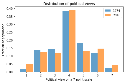
In 2018, it looks like there are more 1s (Extremely Liberal) and maybe more 7s (Extremely Conservative). So this figure provides some evidence of polarization.
We can get a better sense of the long term trend by taking the mean of the 7-point scale and plotting it over time. By treating this scale as a numerical quantity, I’m making assumptions about the spacing between the values. The numbers we get don’t mean much in absolute terms, but they provide a quick look at the trend.
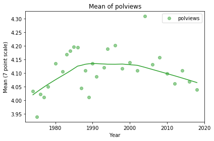
It looks like the “center of mass” was increasing until about 1990, which means more conservative on this scale, and has been decreasing ever since. On average the country might be a little more conservative now than it was in 1974.
With the same caveat about treating this scale as a numerical quantity, we can also compute the standard deviation, which measures average distance from the mean, as a way of quantifying polarization.

The trend is clearly increasing, indicating increasing polarization, but with the way we computed these numbers, it’s hard to get a sense of how substantial the increase is in practical terms.
In the next article, I’ll look more closely at changes in political alignment over time.
I am planning to turn these articles into a case study for an upcoming Data Science class, so I welcome comments and questions.
The code I used to generate these figures is in this Jupyter notebook.
July 25, 2019
Matplotlib animation in Jupyter
For two of my books, Think Complexity and Modeling and Simulation in Python, many of the examples involve animation. Fortunately, there are several ways to do animation with Matplotlib in Jupyter. Unfortunately, none of them is ideal.
FuncAnimation
Until recently, I was using FuncAnimation, provided by the matplotlib.animation package, as in this example from Think Complexity. The documentation of this function is pretty sparse, but if you want to use it, you can find examples.
For me, there are a few drawbacks:
It requires a back end like ffmpeg to display the animation. Based on my email, many readers have trouble installing packages like this, so I avoid using them.It runs the entire computation before showing the result, so it takes longer to debug, and makes for a less engaging interactive experience.For each element you want to animate, you have to use one API to create the element and another to update it.
For example, if you are using imshow to visualize an array, you would run
im = plt.imshow(a, **options)
to create an AxesImage, and then
im.set_array(a)
to update it. For beginners, this is a lot to ask. And even for experienced people, it can be hard to find documentation that shows how to update various display elements.
As another example, suppose you have a 2-D array and plot it like this:
plot(a)
The result is a list of Line2D objects. To update them, you have to traverse the list and invoke set_xdata() on each one.
Updating a display is often more complicated than creating it, and requires substantial navigation of the documentation. Wouldn’t it be nice to just call plot(a) again?
Clear output
Recently I discovered simpler alternative using clear_output() from Ipython.display and sleep() from the time module. If you have Python and Jupyter, you already have these modules, so there’s nothing to install.
Here’s a minimal example using imshow:
%matplotlib inline
import numpy as np
from matplotlib import pyplot as plt
from IPython.display import clear_output
from time import sleep
n = 10
a = np.zeros((n, n))
plt.figure()
for i in range(n):
plt.imshow(a)
plt.show()
a[i, i] = 1
sleep(0.1)
clear_output(wait=True)
The drawback of this method is that it is relatively slow, but for the examples I’ve worked on, the performance has been good enough.
In the ModSimPy library, I provide a function that encapsulates this pattern:
def animate(results, draw_func, interval=None):
plt.figure()
try:
for t, state in results.iterrows():
draw_func(state, t)
plt.show()
if interval:
sleep(interval)
clear_output(wait=True)
draw_func(state, t)
plt.show()
except KeyboardInterrupt:
pass
results is a Pandas DataFrame that contains results from a simulation; each row represents the state of a system at a point in time.
draw_func is a function that takes a state and draws it in whatever way is appropriate for the context.
interval is the time between frames in seconds (not counting the time to draw the frame).
Because the loop is wrapped in a try statement that captures KeyboardInterrupt, you can interrupt an animation cleanly.
You can see an example that uses this function in this notebook from Chapter 22 of Modeling and Simulation in Python, and you can run it on Binder.
And here’s an example from Chapter 6 of Think Complexity, which you can also run on Binder.
July 10, 2019
Report from SciPy 2019
Greetings from Austin and SciPy 2019. In this post, I’ve collected the materials for my tutorials and talks.
On Monday morning I presented Bayesian Statistics Made Simple in an extended 4-hour format:
Here are the slidesCode and Jupyter notebooks are in this repositorySetup instructions are here
In the afternoon I presented a tutorial on Complexity Science:
Here are the slidesCode and Jupyter notebooks are in this repositorySetup instructions are here
On Tuesday I presented a short talk for the teen track. Here are the slides, with links to the two notebooks on Binder:
Text analysis with Python (thanks, John Green)Game of Life implemented with NumPy
And tomorrow I’m presenting a talk, “Generational Changes in Support for Gun Laws: A Case Study in Computational Statistics”:
Abstract: In the United States, support for gun control has been declining among all age groups since 1990; among young adults, support is substantially lower than among previous generations. Using data from the General Social Survey (GSS), I perform age-period-cohort analysis to measure generational effects.
In this talk, I demonstrate a computational approach to statistics that replaces mathematical analysis with random simulation. Using Python and libraries like NumPy and StatsModels, we can define basic operations — like resampling, filling missing values, modeling, and prediction — and assemble them into a data analysis pipeline.
Here are the slidesAnd here’s the repository with the code and notebooks
If you are at SciPy, my talk is Thursday morning from 10:20 to 10:50 in the Zlotnik Ballroom.
June 18, 2019
Backsliding on the path to godlessness
In the last 30 years, college students have become much less religious. The fraction who say they have no religious affiliation tripled, from about 10% to 30%. And the fraction who say they have attended a religious service in the last year fell from 85% to 70%.
I’ve been following this trend for a while, using data from the CIRP Freshman Survey. The most recently published data is from “120,357 first-time, full-time students who entered 168 U.S. colleges and universities in the fall of 2017.”
One of the questions asks students to select their “current religious preference,” from a choice of seventeen common religions, “Other religion,” “Atheist”, “Agnostic”, or “None.”
The options “Atheist” and “Agnostic” were added in 2015. For consistency with previous years, I compare the “Nones” from previous years with the sum of “None”, “Atheist” and “Agnostic” since 2015.
The following figure shows the fraction of Nones over the 50 years of the survey.
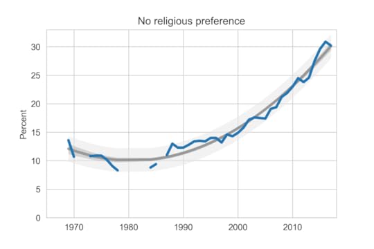 Percentage of students with no religious preference from 1968 to 2017.
The blue line shows actual data through 2017; the gray line shows a quadratic fit. The light gray region shows a 90% predictive interval.
For the first time since 2011, the fraction of Nones decreased this year, reverting to the trend line.
Another question asks students how often they “attended a religious service” in the last year. The choices are “Frequently,” “Occasionally,” and “Not at all.” Students are instructed to select “Occasionally” if they attended one or more times.
Here is the fraction of students who reported any religious attendance in the last year:
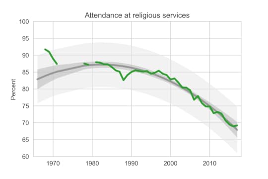 Percentage of students who reported attending a religious service in the previous year.
Slightly more students reported attending a religious service in 2017 than in the previous year, contrary to the long-term trend.
Female students are more religious than male students. The following graph shows the gender gap over time, that is, the difference in percentages of male and female students with no religious affiliation.
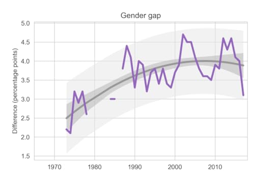 Difference in religious affiliation between male and female students.
The gender gap was growing until recently. It has shrunk in the last 3-4 years, but since it varies substantially from year to year, it is hard to rule out random variation.
Data from 2018 should be available soon; I’ll post an update when I can.
Data Source
The American Freshman: National Norms Fall 2017
Stolzenberg, E. B., Eagan, M. K., Aragon, M. C., Cesar-Davis, N. M., Jacobo, S., Couch, V., & Rios-Aguilar, C.
Higher Education Research Institute, UCLA.
Apr 2019
This and all previous reports are available from the HERI publications page.
May 16, 2019
Foundations of data science?
“Foundation” is one of several words I would like to ban from all discussion of higher education. Others include “liberal arts”, “rigor”, and “service class”, but I’ll write about them another time. Right now, “foundation” is on my mind because of a new book from Microsoft Research, Foundations of Data Science, by Avrim Blum, John Hopcroft, and Ravindran Kannan.
The goal of their book is to “cover the theory we expect to be useful in the next 40 years, just as an understanding of automata theory, algorithms, and related topics gave students an advantage in the last 40 years.”
As an aside, I am puzzled by their use of “advantage” here: who did those hypothetical students have an advantage over? I don’t think competitive advantage is the primary goal of learning. If a theory is useful, it helps you solve problems and make the world a better place, not just crush your enemies.
I am also puzzled by their use of “foundation”, because it can mean two contradictory things:
The most useful ideas in a field; the things you should learn first. The most theoretical ideas in a field; the things you should use to write mathematical proofs.
Both kinds of foundation are valuable. If you identify the right things to learn first, you can give students powerful tools quickly, they can work on real problems and have impact, and they are more likely to be excited about learning more. And if you find the right abstractions, you can build intuition, develop insight, make connections, and create new tools and ideas.
The problems come when we confuse these meanings, assume that the most abstract ideas are the most useful, and require students to learn them first. In higher education, confusion about “foundations” is the root of a lot of bad curriculum design.
For example, in the traditional undergraduate engineering curriculum, students take 1-2 years of math and science classes before they learn anything about engineering. These prerequisites are called the “Math and Science Death March” because so many students don’t get through them; in the U.S., about 40% of students who start an engineering program don’t finish it, largely because of the incorrect assumption that they need two years of theory before they can start engineering.
The introduction to Foundations of Data Science hints at the first meaning of “foundation”. The authors note that “increasingly researchers of the future will be involved with using computers to understand and extract usable information from massive data arising in applications,” which suggests that this book will help them do those things.
But the rest of the introduction makes it clear that the second meaning is what they have in mind.
“Chapters 2 and 3 lay the foundations of geometry and linear algebra respectively.”“We give a from-first-principles description of the mathematics and algorithms for SVD.”“The underlying mathematical theory of such random walks, as well as connections to electrical networks, forms the core of Chapter 4 on Markov chains.”“Chapter 9 focuses on linear-algebraic problems of making sense from data, in particular topic modeling and non-negative matrix factorization.”
The “fundamentals” in this book are abstract, mathematical, and theoretical. The authors assert that learning them will give you an “advantage”, but if you are looking for practical tools to solve real problems, you might need to build on a different foundation.
April 1, 2019
Local regression in Python
I love data visualization make-overs (like this one I wrote a few months ago), but sometimes the tone can be too negative (like this one I wrote a few months ago).
Sarah Leo, a data journalist at The Economist, has found the perfect solution: re-making your own visualizations. Here’s her tweet.

And here’s the link to the article, which you should go read before you come back here.
One of her examples is the noisy line plot on the left, which shows polling results over time.
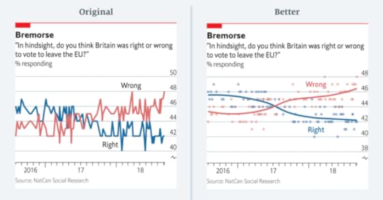
Here’s Leo’s explanation of what’s wrong and why:
Instead of plotting the individual polls with a smoothed curve to show the trend, we connected the actual values of each individual poll. This happened, primarily, because our in-house charting tool does not plot smoothed lines. Until fairly recently, we were less comfortable with statistical software (like R) that allows more sophisticated visualisations. Today, all of us are able to plot a polling chart like the redesigned one above.
This confession made me realize that I am in the same boat they were in: I know about local regression, but I don’t use it because I haven’t bothered to learn the tools.
Fortunately, filling this gap in my toolkit took less than an hour. The StatsModels library provides lowess, which computes locally weighted scatterplot smoothing.
I grabbed the data from The Economist and read it into a Pandas DataFrame. Then I wrote the following function, which takes a Pandas Series, computes a LOWESS, and returns a Pandas Series with the results:
from statsmodels.nonparametric.smoothers_lowess import lowess
def make_lowess(series):
endog = series.values
exog = series.index.values
smooth = lowess(endog, exog)
index, data = np.transpose(smooth)
return pd.Series(data, index=pd.to_datetime(index))
And here’s what the results look like:

The smoothed lines I got look a little different from the ones in The Economist article. In general the results depends on the parameters we give LOWESS. You can see all the details in this Jupyter notebook.
Thanks to Sarah Leo for inspiring me to learn to use LOWESS, and for providing the data I used to replicate the results.
March 20, 2019
Happiness, Mental Health, Drugs, Politics, and Language
The following are abstracts from 13 projects where students in my Data Science class explore public data sets related to a variety of topics. Each abstract ends with a link to a report where you can see the details.
A Deeper Dive into US Suicides
Diego Berny and Anna Griffin
The world’s suicide rate has been decreasing over the past decade but unfortunately the United States’ rate is doing the exact opposite. Using data from the CDC and Our World in Data organizations, we explored different demographics to see if there are any patterns of vulnerable populations. We found that the group at the most risk is middle aged men. Men’s suicide rate is nearly 4 times higher than women’s and the group of adults between the ages of 45 and 59 has seen 36.5% increase over the past 17 years. When comparing their methods of suicide to their female counterparts we found that men tend to use more lethal means, resulting is less nonfatal suicide attempts. Read more
The Opioid Epidemic and Its Socioeconomic Effects
Daniel Connolly and Bryce Mann
Between 2002 and 2016, heroin use increased by 40%, while the use of other seemingly similar drugs declined in the same period. Using data from the National Survey on Drug Use and Health, we explore how the characteristics of opioid users have changed since the beginning of the epidemic. We find that so-called “late-starters” make up a new population of opioid users, as the average starting age of heroin users has increased by 2.5 years since 2002. We find a major discrepancy between the household incomes of users and nonusers as well, a discovery possibly related to socioeconomic factors like marriage. Read more
What is the Mother Tongue in U.S. Communities?
Allison Busa and Jordan Crawford-O’Banner
By watching the news, a person can assume that diversity is increasing rapidly in the United States. The current generation has been heralded as the most diverse in the history of the country. However, some Americans do not feel very positively about this change, and some even feel that the change is happening too rapidly. We decided to use the data from the U.S. Census to put these claims to the test. Using linguistic Census data, we ask “Is cultural diversity changing over time?” and “How is it spread out?” With PMFs, we analyze the number of people who speak a language other than English at home (SONELAHs). There is a wide range of SONELAHs in the U.S., from only 2 % of West Viriginians to 42% of Californians. Compared inside individual states, however, variations are less extreme. Read More
Heroin and Alcohol: Could there be a relationship?
Daphka Alius
Alcohol abuse is a disease that affects millions in the US. Similarly, opioids have become a national health crisis signaling a substantial increase in opioids use. The question under investigation is whether the same people who abuse heroin, a form of opioid, are also drinking congruously throughout the year. Using data from National Survey of Drug Use and Health, I found that people who infrequently (< 30 days/year) drink alcohol in a year are consuming heroin 1.7 times longer in a year than those who frequently (> 300 days/year) drink alcohol. Additionaly, the two variables are weakly correlated with a Pearson correlation that corresponds to -0.22. Read More
Does Health Insurance Type Lead To Opioid Addiction?
Micah Reid, Filipe Borba
The rate of opioid addiction has escalated into a crisis in recent years. Studies have linked health insurance with prescription painkiller overuse, but little has been done to investigate differences tied to health insurance type. We used data from the National Survey on Drug Use and Health from the year 2017 single out variations in drug use and abuse prevalence and duration across these groups. We found that while those with private health insurance were more likely to have used opioids than those with Medicaid/CHIP or no health insurance (57.3% compared to 45% and 47.4%, respectively), those with Medicaid/CHIP or no health insurance were more likely to have abused opioids when controlling for past opioid use (24.6% and 27.2% versus 17.6%, respectively). Those with private health insurance were also more likely to have used opioids in the past, while those with Medicaid/CHIP or no health insurance were more likely to have continued their use. This suggests that even though those with private health insurance are more likely to use opioids, those without are more likely to continue use and begin misuse once started on opiates. Read more
Finding differences between Conservatives and Liberals
Siddharth Garimella
I looked through data from the General Social Survey (GSS) to gain a better understanding about what issues conservatives and liberals differ most on. After making some guesses of my own, I separated conservative and liberal respondents, and sorted their effect sizes for every variable in the dataset segment I had available, ultimately finding three big differences between the two groups. My results suggest conservatives most notably disagree more with same-sex relationships, tend to be slightly older, and attend religious events far more often than liberals do. Read more
Exploring OxyContin Use in the United States
Ariana Olson
According to the CDC, OxyContin is among the most common prescription opioids involved in overdose death. I explored variables related to OxyContin use, both medical and non-medical, from the 2014 National Survey on Drug Use and Health (NSDUH). I found that the median age that respondents tried OxyContin for the first time in a way that wasn’t prescribed for them is around 22, and that almost all respondents who had tried OxyContin non-medically did so before the age of 50. I also found that the overwhelming majority of respondents had never used OxyContin non-medically, but out of those who had, there was an 82% probability that they had used it over 12 months prior to the survey. People who used OxyContin also reported using the drug for fewer days total per year in a way that wasn’t prescribed to them than people who used it at all, prescribed or not. Finally, I found that the median age at which people first used OxyContin in a way that wasn’t directed by a doctor increased with older age groups, and the minimum age of first trying OxyContin non-medically per age group tended to increase as the age of the groups increased. Read more
Subjective Class Compared to Income Class
Cassandra Overney
Back in my hometown, many people consider themselves middle class regardless of their incomes. I grew up confusing income class with subjective class. Now that I am living in a new environment, I am curious to see whether a discrepancy between subjective and income class exists throughout America. The main question I want to answer is: how does subjective class compare to income class?
Income is not the only factor that Americans associate with class since most respondents consider themselves to be either working or middle class. However, there are some discernable differences in subjective class based on income. For example, respondents in the lowest income class are more likely to consider themselves working class than middle class (10.7% vs 6.3%) while respondents in the highest income class are more likely to consider themselves middle class than working class (13.3% vs 4.2%). Read more
The Contribution of the Opioid Epidemic on the Falling Life Expectancy in the United States
Sabrina Pereira
In recent years, a downward trend in the Average Life Expectancy (ALE) in the US has emerged. At the same time, the number of deaths by opioid poisoning has risen dramatically. Using mortality data from the Centers for Disease Control and Prevention, I create a model to quantify the effect of the increase of opioid-related deaths on the ALE in the US. According to the model, the ALE in 2017 would have been about .46 years higher if there had been no opioid-related deaths (79.06 years, compared to the observed 78.6 years). It is only recently that these deaths have created an observable effect this large. Read more
Exploring the Opioid Epidemic
Emma Price
People who use heroin are most likely to do so between the ages of 18 and 40, whereas people who misuse opiate pain relievers are consistently likely to misuse for the first time starting in their early teens. The portion of heroin and prescribed opiate users that stay in school until they complete high school is higher than that of people who do not use opiates; however, the portion of the population of heroin users drop very quickly in their likelihood to survive through college. The rate at which people who misuse opiate pain relievers drop out of school generally follows that of non-users once the high school tipping point is past. Read more
Drug use patterns and correlations
Sreekanth Reddy Sajjala
For users of various regulated substances, their exposure to and use of them varies greatly substance to substance. The National Survey on Drug Use and Health dataset has extensive data which can allow us to view patterns and correlations in their usage. Only 40% of the people who have ever tried cocaine have used it in the past year, but almost 60% of those who have tried heroin use it atleast once a week. People who have tried cannabis tend to try alcohol at an age 15% lower than users who haven’t tried cannabis do so. Unless drug use patterns change drastically, if someone has consumed cannabis at any point in their life they are over 20 times more likely to try heroin at some point in their life. Read more
Age and Generation Affect Happiness Levels in Marriage… A Little
Ashley Swanson
Among age, time, and cohort analysis, happiness levels in marriage are most drastically affected by the age of an individual up until their early 40’s. Between age 20 and age 40, the reported percentage of happy marriages drops by -0.45% percent a year, nearly 10% over the course of those two decades. The following 4 decades see a rebound of about 8%, meaning that 90-year-olds are nearly as happy as 20-year-olds, with those in their early 40’s experiencing the lowest levels of marital happiness. However, cohort effects have the highest explanatory value with an r-value of 0.44. Those born in 1950 experience 13.3% fewer happy marriages than those born in 1900, and those born in 2000 experience an average of 10.5% more happy marriages than those born in 1950. Each of these variables has a small effect size per year, a fraction of a percentage point, but the sustained trends over the decades are significant enough to have real effects. Read more
Associations between screen time and kids’ mental health
MinhKhang Vu
Previous research on children and adolescents has suggested strong associations between screen time and their mental health, contributing to growing concerns among parents, teachers, counselors and doctors about digital technology’s negative effects on children. Using the Census Bureau’s 2017 National Survey of Children’s Health (NSCH), I investigated a large (n=21,599) national random sample of 0- to 17-year-old children in the U.S. in 2017. The NSCH collects data on the physical and emotional health of American children every year, which includes information about their screen time usage and other comprehensive well-being measures. Children who spend 3 hours or more daily using computers are twice more likely to have an anxiety problem (CI 2.06 2.38) and four times more likely to experience depression (CI 3.97 5.11) than those who spend less than 3 hours. For kids spending 4 hours or more with computers, about 16% of them have some anxiety problems (CI 14.98 17.07), and 11% of them experience depression recently (CI 9.73 11.61). Along with the associations between screen time and diagnoses of anxiety and depression, how frequently a family has meals together also has strong linear relationships with both their children’s screen time and mental health. Children who do not have any meal with their family during the past week are twice more likely to have anxiety and three times more likely to experience depression than children who have meals with their family every day. However, in this study, I could not find any strong associations between the severity of kids’ mental illness and screen time, which leaves the open question, whether screen time directly affects children’s mental health. Read more
Probably Overthinking It

- Allen B. Downey's profile
- 236 followers

