
Allen B. Downey's Blog: Probably Overthinking It, page 12
April 15, 2021
Simpson’s paradox and real wages
I have good news and bad news. First the good news: after a decade of stagnation, real wages have been rising since 2010. The following figure shows weekly wages for full-time employees (source), which I adjusted for inflation and indexed so the series starts at 100.
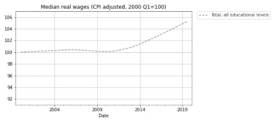
Real wages in 2019 Q3 were about 5% higher than in 2010.
Now here’s the bad news: at every level of education, real wages are lower now than in 2000, or practically the same. The following figure shows real weekly wages grouped by educational attainment:
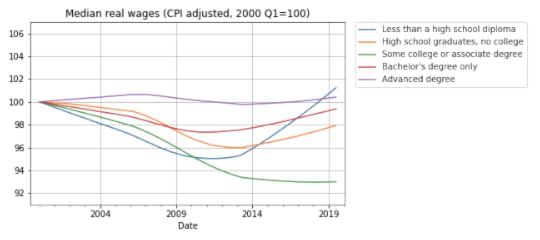
For people with some college or an associate degree, real wages have fallen by about 5% since 2000 Q1. People with a high school diploma or a bachelor’s degree are making less money, too. People with advanced degrees are making about the same, and high school dropouts are doing slightly better.
But the net change for every group is substantially less than the 5% increase we see if we put the groups together. How is that even possible?
The answer is Simpson’s paradox, which is when a trend appears in every subgroup, but “disappears or reverses when these groups are combined”. In this case, real wages are declining or stagnant in every subgroup, but when we put the groups together, wages are increasing.
In general, Simpson’s paradox can happen when there is a confounding variable that interacts with the variables you are looking at. In this example, the variables we’re looking at are real wages, education level, and time. So here’s my question: what is the confounding variable that explains these seemingly impossible results?
Before you read the next section, give yourself time to think about it.
Credit: I got this example from a 2013 article by Floyd Norris, who was the chief financial correspondent of The New York Times at the time. He responded very helpfully to my request for help replicating his analysis.
The answer
The key (as Norris explained) is that the fraction of people in each educational level has changed. I don’t have the number from the BLS, but we can approximate them with data from the General Social Survey (GSS). It’s not exactly the same because:
The GSS represents the adult residents of the U.S.; the BLS sample includes only people employed full time.The GSS data includes number of years of school, so I used that to approximate the educational levels in the BLS dataset. For example, I assume that someone with 12 years of school has a high school diploma, someone with 16 years of school has a bachelor’s degree, etc.With those caveats, the following figure shows the fraction of GSS respondents in each educational level, from 1973 to 2018:
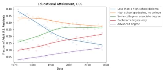
During the relevant period (from 2000 to 2018), the fraction of people with bachelor’s and advanced degrees increased substantially, and the fraction of high school dropouts declined.
These changes are the primary reason for the increase in median real wages when we put all educational levels together. Here’s one way to think about it:
If you compare two people with the same educational level, one in 2000 and one in 2018, the one in 2018 is probably making less money, in real terms.But if you compare two people, chosen at random, one in 2000 and one in 2018, the one in 2018 is probably making more money, because the one in 2018 probably has more education.These changes in educational attainment might explain the paradox, but the explanation raises another question: The same changes were happening between 2000 and 2010, so why were real wages flat during that interval?
I’m not sure I know the answer, but it looks like wages at each level were falling more steeply between 2000 and 2010; after that, some of them started to recover. So maybe the decreases within educational levels were canceled out by the shifts between levels, with a net change close to zero.
And there’s one more question that nags me: Why are real wages increasing for people with less than a high school diploma? With all the news stories about automation and the gig economy, I expected people in this group to see decreasing wages.
The resolution of this puzzle might be yet another statistical pitfall: survivorship bias. The BLS dataset reports median wages for people who are employed full-time. So if people in the bottom half of the wage distribution lose their jobs, or shift to part-time work, the median of the survivors goes up.
And that raises one final question: Are real wages going up or not?


April 7, 2021
Berkson Goes to College
Suppose one day you visit Representative College, where the student body is a representative sample of the college population. You meet a randomly chosen student and you learn (because it comes up in conversation) that they got a 600 on the SAT Verbal test, which is about one standard deviation above the mean. What do you think they got on the SAT Math test?
A: 600 or moreB: Between 500 and 600 (above the mean)C: Between 400 and 500 (below the mean)D: 400 or lessIf you chose B, you are right! Scores on the SAT Math and Verbal tests are correlated, so if someone is above average on one, they are probably above average on the other. The correlation coefficient is about 0.7, so people who get 600 on the verbal test get about 570 on the math test, on average.
Now suppose you visit Elite University, where the average score on both tests is 700. You meet a randomly chosen student and you learn (because they bring it up) that they got a 750 on the verbal test, which is about one standard deviation above the mean at E.U. What do you think they got on the math test?
A: 750 or moreB: Between 700 and 750 (above the mean)C: Between 650 and 700 (below the mean)D: 650 or lessIf you chose B again, you are wrong! Among students at E.U., the correlation between test scores is negative. If someone is above average on one, they are probably below average on the other.
This is an example of Berkson’s paradox, which is a form of selection bias. In this case, the selection is the college admission process, which is partly based on exam scores. And the effect, at elite colleges and universities, is a negative correlation between test scores, even though the correlation in the general population is positive.
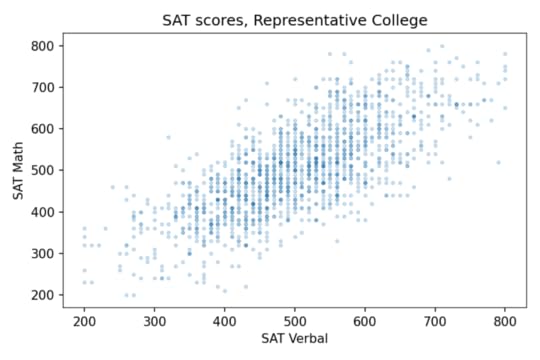
DataTo see how it works in this example, let’s look at some numbers. I got data from the National Longitudinal Survey of Youth 1997 (NLSY97), which “follows the lives of a sample of [8,984] American youth born between 1980-84”. The public data set includes the participants’ scores on several standardized tests, including the SAT and ACT.
About 1400 respondents took the SAT. Their average and standard deviation are close to the national average (500) and standard deviation (100). And the correlation is about 0.73. To get a sense of how strong that is, here’s what the scatter plot looks like.
Since the correlation is about 0.7, someone who is one standard deviation above the mean on the verbal test is about 0.7 standard deviations above the mean on the math test, on average. So at Representative College, if we select people with verbal scores near 600, their average math score is about 570.
Elite UniversityNow let’s see what happens when we select students for Elite University. Suppose that in order to get into E.U., your total SAT score has to be 1320 or higher. If we select students who meet or exceed that threshold, their average on both tests is about 700, and the standard deviation is about 50.
Among these students, the correlation between test scores is about -0.33, which means that if you are one standard deviation above the E.U. mean on one test, you are about 0.33 standard deviations below the E.U. mean on the other, on average.
The following figure shows why this happens:
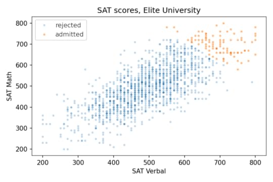
The students who meet the admission requirements at Elite University form a triangle in the upper right, with a moderate negative correlation between test scores.
Specialized UniversityOf course, most admissions decisions are based on more than the sum of two SAT scores. But we get the same effect even if the details of the admission criteria are different. For example, suppose another school, Specialized University, admits students if either test score is 720 or better, regardless of the other score.
With this threshold, the mean for both tests is close to 700, the same as Elite University, and the standard deviations are a little higher. But again, the correlation is negative, and a little stronger than at E.U., about -0.38, compared to -0.33.
The following figure shows the distribution of scores for admitted students.

There are three kinds of students Specialized University: good at math, good at language, and good at both. But the first two groups are bigger than the third, so the overall correlation is negative.
Sweep the ThresholdNow let’s see what happens as we vary the admissions requirements. I’ll go back to the previous version, where admission depends on the total of the two tests, and vary the threshold.
As we increase the threshold, the average total score increases and the correlation decreases. The following figure shows the results.
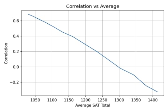
At Representative College, where the average total SAT is near 1000, test scores are strongly correlated. At Elite University, where the average is over 1400, the correlation is moderately negative.
Secondtier CollegeBut at a college that is selective but not elite, the effect might be even stronger than that. Suppose at Secondtier College (it’s pronounced “seh con’ tee ay'”), a student with a total score of 1220 or more is admitted, but a student with 1320 or more is likely to go somewhere else.
In that case, the average total score would be about 1260. So, based on the parameter sweep in the previous section, we would expect a weak positive correlation, but the correlation is actually strongly negative, about -0.8! The following picture shows why.
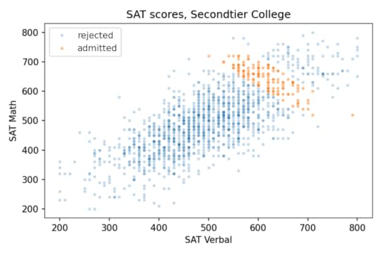
At Secondtier, if you meet a student who got a 690 on the math test, about one standard deviation above the mean, you should expect them to get a 580 on the verbal test, on average. That’s a remarkable effect.
SummaryAmong the students at a given college or university, verbal skills and math skills might be strongly correlated, anti-correlated, or uncorrelated, depending on how the students are selected. This is an example of Berkson’s paradox.
If you enjoy this kind of veridical paradox, you might like my previous article “The Inspection Paradox Is Everywhere“. And if you like thinking about probability, you might like the second edition of Think Bayes (affiliate link), which will be published by O’Reilly Media later this month.
If you want to see the details of my analysis and run the code, click here to run the notebook on Colab.
Finally, if you have access to standardized test scores at a college or university, and you are willing to compute a few statistics, I would love to compare my results with some real-world data. For students who enrolled, I would need
Mean and standard deviation for each section of the SAT or ACT.Correlations between the sections.The results, if you share them, would appear as a dot on a graph, either labeled or unlabeled at your discretion.
Protected: Berkson Goes to College
This content is password protected. To view it please enter your password below:
Password:
January 24, 2021
The Retreat From Religion Continues
A few years ago I wrote an article for the Scientific American blog where I used data from the General Social Survey (GSS) to describe changes in religious affiliation in the U.S.
And in this longer article I described changes in religious belief as well, including belief in God, interpretation of the Bible, and confidence in religious institutions.
Those articles were based on GSS data released in 2017, which included interviews up to 2016. Now the GSS has released additional data from interviews conducted in 2017 and 2018, including young adults born in 1999 and 2000.
So it’s time to update the results.
Religious affiliation by cohortThe following figure shows religious affiliation by year of birth.
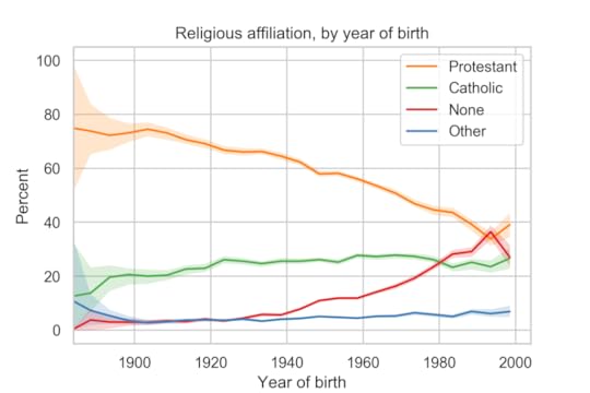
The youngest group in the survey, people born between 1996 and 2000, depart from several long-term trends:
They are more likely to identify as Protestant than the previous cohort, and slightly more likely to identify as Catholic.And they are less likely to report no religious preference.There are only 201 people in this group, so these results might be an anomaly. Data from other sources indicates that young adults are less religious than older groups.
Religious affiliation by yearThe following figure shows religious affiliation by year of interview along with predictions based on a simple model of generational replacement.
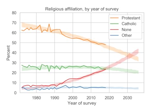
Despite the reversal of trends in the previous figure, the long-term trends in religious affiliation continue:
The fraction of people who identify as Protestant or Christian is declining and accelerating.The fraction who identify as Catholic has started to decline.The fraction with no religious affiliation is increasing and accelerating.Based on the previous batch of data, I predicted that there would be more Nones than Catholics in 2020. With the most recent data, it looks like the cross-over might be ahead of schedule.
On these trends, there will be more Nones than Protestants sometime after 2030.
In the next article, I’ll present related trends in religious belief and confidence in religious institutions.
January 18, 2021
College Freshmen are More Godless Than Ever
In the last 30 years, college students have become much less religious. The fraction who say they have no religious affiliation has more than tripled, from about 10% to 34%. And the fraction who say they have attended a religious service in the last year fell from more than 85% to 66%.
I’ve been following this trend for a while, using data from the CIRP Freshman Survey, which has surveyed a large sample of entering college students since 1966.
The most recently published data is from “95,505 first-time, full-time freshmen entering 148 baccalaureate institutions” in Fall 2019.
Of course, college students are not a representative sample of the U.S. population. Furthermore, as rates of college attendance have increased, they represent a different slice of the population over time. Nevertheless, surveying young adults over a long interval provides an early view of trends in the general population.
Religious preferenceAmong other questions, the Freshman Survey asks students to select their “current religious preference” from a list of seventeen common religions, “Other religion,” “Atheist”, “Agnostic”, or “None.”
The options “Atheist” and “Agnostic” were added in 2015. For consistency over time, I compare the “Nones” from previous years with the sum of “None”, “Atheist” and “Agnostic” since 2015.
The following figure shows the fraction of Nones from 1969, when the question was added, to 2019, the most recent data available.
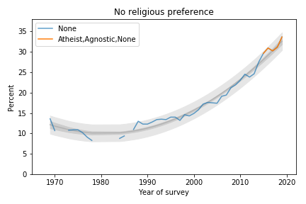 Percentage of students with no religious preference from 1969 to 2019.
The blue line shows data until 2015; the orange line shows data from 2015 through 2019. The gray line shows a quadratic fit. The light gray region shows a 95% predictive interval.
The quadratic model continues to fit the data well and the most recent data point is above the trend line, which suggests that the “rise of the Nones” is still accelerating.
AttendanceThe survey also asks students how often they “attended a religious service” in the last year. The choices are “Frequently,” “Occasionally,” and “Not at all.” Respondents are instructed to select “Occasionally” if they attended one or more times, so a wedding or a funeral would do it.
The following figure shows the fraction of students who reported any religious attendance in the last year, starting in 1968. I discarded a data point from 1966 that seems unlikely to be correct.
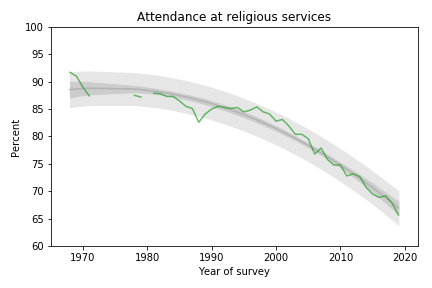 Percentage of students who reported attending a religious service in the previous year.
About 66% of incoming college students said they attended a religious service in the last year, an all-time low in the history of the survey, and down more than 20 percentage points from the peak.
This curve is on trend, with no sign of slowing down.
Gender GapFemale students are more religious than male students. The following graph shows the gender gap over time, that is, the difference in percentages of male and female students with no religious affiliation.
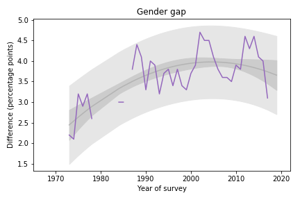 Difference in religious affiliation between male and female students.
The gender gap was growing until recently. It has shrunk in the last 3-4 years, but since it varies substantially from year to year, it is hard to rule out random variation.
Data SourceThe American Freshman: National Norms Fall 2019
Stolzenberg, Aragon, Romo, Couch, McLennon, Eagan, and Kang,
Higher Education Research Institute, UCLA, June 2020
This and all previous reports are available from the HERI publications page.
November 23, 2020
When will the haunt begin?
One of the favorite board games at my house is Betrayal at House on the Hill.
A unique feature of the game is the dice, which yield three possible outcomes, 0, 1, or 2, with equal probability. When you add them up, you get some unusual probability distributions.
There are two phases of the game: During the first phase, players explore a haunted house, drawing cards and collecting items they will need during the second phase, called “The Haunt”, which is when the players battle monsters and (usually) each other.
So when does the haunt begin? It depends on the dice. Each time a player draws an “omen” card, they have to make a “haunt roll”: they roll six dice and add them up; if the total is less than the number of omen cards that have been drawn, the haunt begins.
For example, suppose four omen cards have been drawn. A player draws a fifth omen card and then rolls six dice. If the total is less than 5, the haunt begins. Otherwise the first phase continues.
Last time I played this game, I was thinking about the probabilities involved in this process. For example:
What is the probability of starting the haunt after the first omen card?What is the probability of drawing at least 4 omen cards before the haunt?What is the average number of omen cards before the haunt?
My answers to these questions are in this notebook, which you can run on Colab.
October 21, 2020
Millennials are not getting married
In 2015 I wrote a paper called “Will Millennials Ever Get Married?” where I used data from the National Survey of Family Growth (NSFG) to estimate the age at first marriage for women in the U.S, broken down by decade of birth.
I found that women born in the 1980s and 90s were getting married later than previous cohorts, and I generated projections that suggest they are on track to stay unmarried at substantially higher rates.
Here are the results from that paper, based on 58 488 women surveyed between 1983 to 2015:
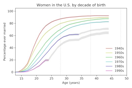 Percentage of women ever married, based on data up to 2015.
Each line represents a cohort grouped by decade of birth. For example, the top line represents women born in the 1940s.
The colored segments show the fraction of women who had ever been married as a function of age. For example, among women born in the 1940s, 82% had been married by age 25. Among women born in the 1980s, only 41% had been married by the same age.
The gray lines show projections I generated by assuming that going forward each cohort would be subject to the hazard function of the previous cohort. This method is likely to overestimate marriage rates.
These results show two trends:
Each cohort is getting married later than the previous cohort.The fraction of women who never marry is increasing from one cohort to the next.
New data
Yesterday the National Center for Health Statistics (NCHS) released a new batch of data from surveys conducted in 2017-2019. So we can compare the predictions from 2015 with the new data, and generate updated predictions.
The following figure shows the predictions from the previous figure, which are based on data up to 2015, compared to the new curves based on data up to 2019, which includes 70 183 respondents.
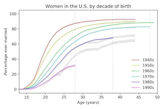 Percentage of women ever married, based on data up to 2019,
 compared to predictions based on data up to 2015.
For women born in the 1980s, the fraction who have married is almost exactly as predicted. For women born in the 1990s, it is substantially lower.
New projections
The following figure shows projections based on data up to 2019.
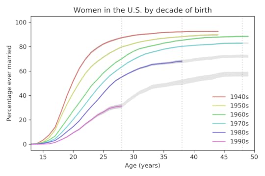 Percentage of women ever married, based on data up to 2019,
with predictions based on data up to 2019.
The vertical dashed lines show the ages where we have the last reliable estimate for each cohort. The following table summarizes the results at age 28:
Decade of birth1940s1950s1960s1970s1980s1990s% married
before age 2887%80%70%63%55%31%Percentage of women married by age 28, grouped by decade of birth.
The percentage of women married by age 28 has dropped quickly from each cohort to the next, by about 11 percentage points per decade.
The following table shows the same percentage at age 38; the last value, for women born in the 1990s, is a projection based on the data we have so far.
Decade of birth1940s1950s1960s1970s1980s1990s% married
before age 3892%88%85%80%68%51%Percentage of women married by age 38, grouped by decade of birth.
Based on current trends, we expect barely half of women born in the 1990s to be married before age 38.
Finally, here are the percentages of women married by age 48; the last two values are projections.
Decade of birth1940s1950s1960s1970s1980s1990s% married
before age 48>93%>90%88%83%72%58%Percentage of women married by age 48, grouped by decade of birth.
Based on current trends, we expect women born in the 1980s and 1990s to remain unmarried at rates substantially higher than previous generations.
Projections like these are based on the assumption that the future will be like the past, but of course, things change. In particular:
These data were collected before the COVID-19 pandemic. Marriage rates in 2020 will probably be lower than predicted, and the effect could continue into 2021 or beyond.However, as economic conditions improve in the future, marriage rates might increase.
We’ll find out when we get the next batch of data in October 2022.
The code I used for this analysis is in this GitHub repository.
October 13, 2020
Whatever the question was, correlation is not the answer
Pearson’s coefficient of correlation, ρ, is one of the most widely-reported statistics. But in my opinion, it is useless; there is no good reason to report it, ever.
Most of the time, what you really care about is either effect size or predictive value:
To quantify effect size, report the slope of a regression line.
To quantify predictive value, report a measure of predictive error that makes sense in context: MAE, MAPE, RMSE, whatever.
If there’s no reason to prefer one measure over another, report reduction in RMSE, because you can compute it directly from R².
If you don’t care about effect size or predictive value, and you just want to show that there’s a (linear) relationship between two variables, use R², which is more interpretable than ρ, and exaggerates the strength of the relationship less.
In summary, there is no case where ρ is the best statistic to report. Most of the time, it answers the wrong question and makes the relationship sound more important than it is.
To explain that second point, let me show an example.
Height and weight
I’ll use data from the BRFSS to quantify the relationship between weight and height. Here’s a scatter plot of the data and a regression line:
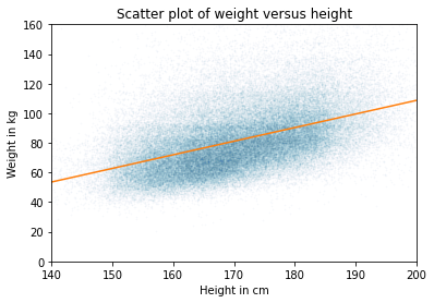
The slope of the regression line is 0.9 kg / cm, which means that if someone is 1 cm taller, we expect them to be 0.9 kg heavier. If we care about effect size, that’s what we should report.
If we care about predictive value, we should compare predictive error with and without the explanatory variable.
Without the model, the estimate that minimizes mean absolute error (MAE) is the median; in that case, the MAE is about 15.9 kg.
With the model, MAE is 13.8 kg.
So the model reduces MAE by about 13%.
If you don’t care about effect size or predictive value, you are probably up to no good. But even in that case, you should report R² = 0.22 rather than ρ = 0.47, because
R² can be interpreted as the fraction of variance explained by the model; I don’t love this interpretation because I think the use of “explained” is misleading, but it’s better than ρ, which has no natural interpretation.R² is generally smaller than ρ, which means it exaggerates the strength of the relationship less.
[UPDATE: Katie Corker corrected my claim that ρ has no natural interpretation: it is the standardized slope. In this example, we expect someone who is one standard deviation taller than the mean to be 0.47 standard deviations heavier than the mean. Sebastian Raschka does a nice job explaining this here.]
In general…
This dataset is not unusual. R² and ρ generally overstate the predictive value of the model.
The following figure shows the relationship between ρ, R², and the reduction in RMSE.
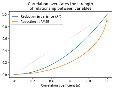
Values of ρ that sound impressive correspond to values of R² that are more modest and to reductions in RMSE which are substantially less impressive.
This inflation is particularly hazardous when ρ is small. For example, if you see ρ = 0.25, you might think you’ve found an important relationship. But that only “explains” 6% of the variance, and in terms of predictive value, only decreases RMSE by 3%.
In some contexts, that predictive value might be useful, but it is substantially more modest than ρ=0.25 might lead you to believe.
The details of this example are in this Jupyter notebook.
And the analysis I used to generate the last figure is in this notebook.
September 7, 2020
Fair cross-section
Abstract: The unusual circumstances of Curtis Flowers’ trials make it possible to estimate the probabilities that white and black jurors would vote to convict him, 98% and 68% respectively, and the probability a jury of his peers would find him guilty, 15%.
Background
Curtis Flowers was tried six times for the same crime. Four trials ended in conviction; two ended in a mistrial due to a hung jury.
Three of the convictions were invalidated by the Mississippi Supreme Court, at least in part because the prosecution had excluded black jurors, depriving Flowers of the right to trial by a jury composed of a “fair cross-section of the community“.
In 2019, the fourth conviction was invalidated by the Supreme Court of the United States for the same reason. And on September 5, 2020, Mississippi state attorneys announced that charges against him would be dropped.
Because of the unusual circumstances of these trials, we can perform a statistical analysis that is normally impossible: we can estimate the probability that black and white jurors would vote to convict, and use those estimates to compute the probability that he would be convicted by a jury that represents the racial makeup of Montgomery County.
Results
According to my analysis, the probability that a white juror in this pool would vote to convict Flowers, given the evidence at trial, is 98%. The same probability for black jurors is 68%. So this difference is substantial.
The probability that Flowers would be convicted by a fair jury is only 15%, and the probability that he would be convicted four times out of six times is less than 1%.
The following figure shows the probability of a guilty verdict as a function of the number of black jurors:
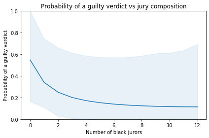
According to the model, the probability of a guilty verdict is 55% with an all-white jury. If the jury includes 5-6 black jurors, which would be representative of Montgomery County, the probability of conviction would be only 14-15%.
The shaded area represents a 90% credible interval. It is quite wide, reflecting uncertainty due to limits of the data. Also, the model is based on the simplifying assumptions that
All six juries saw essentially the same evidence,The probabilities we’re estimating did not change substantially over the period of the trials,Interactions between jurors had negligible effects on their votes,If any juror refuses to convict, the result is a hung jury.
For the details of the analysis, you can
Read this Jupyter notebook, orRun the notebook on Colab.
Thanks to the Law Office of Zachary Margulis-Ohnuma for their assistance with this article and for their continuing good work for equal justice.
July 26, 2020
Alice and Bob exchange data
Two questions crossed my desktop this week, and I think I can answer both of them with a single example.
On Twitter, Kareem Carr asked, “If Alice believes an event has a 90% probability of occurring and Bob also believes it has a 90% chance of occurring, what does it mean to say they have the same degree of belief? What would we expect to observe about both Alice’s and Bob’s behavior?”
And on Reddit, a reader of /r/statistics asked, “I have three coefficients from three different studies that measure the same effect, along with their 95% CIs. Is there an easy way to combine them into a single estimate of the effect?”
So let me tell you a story:
One day Alice tells her friend, Bob, “I bought a random decision-making box. Every time you press this button, it says ‘yes’ or ‘no’. I’ve tried it a few times, and I think it says ‘yes’ 90% of the time.”
Bob says he has some important decisions to make and asks if he can borrow the box. The next day, he returns the box to Alice and says, “I used the box several times, and I also think it says ‘yes’ 90% of the time.”
Alice says, “It sounds like we agree, but just to make sure, we should compare our predictions. Suppose I press the button twice; what do you think is the probability it says ‘yes’ both times?”
Bob does some calculations and reports the predictive probability 81.56%.
Alice says, “That’s interesting. I got a slightly different result, 81.79%. So maybe we don’t agree after all.”
Bob says, “Well let’s see what happens if we combine our data. I can tell you how many times I pressed the button and how many times it said ‘yes’.”
Alice says, “That’s ok, I don’t actually need your data; it’s enough if you tell me what prior distribution you used.”
Bob tells her he used a Jeffreys prior.
Alice does some calculations and says, “Ok, I’ve updated my beliefs to take into account your data as well as mine. Now I think the probability of ‘yes’ is 91.67%.”
Bob says, “That’s interesting. Based on your data, you thought the probability was 90%, and based on my data, I thought it was 90%, but when we combine the data, we get a different result. Tell me what data you saw, and let me see what I get.”
Alice tells him she pressed the button 8 times and it always said ‘yes’.
“So,” says Bob, “I guess you used a uniform prior.”
Bob does some calculations and reports, “Taking into account all of the data, I think the probability of ‘yes’ is 93.45%.”
Alice says, “So when we started, we had seen different data, but we came to the same conclusion.”
“Sort of,” says Bob, “we had the same posterior mean, but our posterior distributions were different; that’s why we made different predictions for pressing the button twice.”
Alice says, “And now we’re using the same data, but we have different posterior means. Which makes sense, because we started with different priors.”
“That’s true,” says Bob, “but if we collect enough data, eventually our posterior distributions will converge, at least approximately.”
“Well that’s good,” says Alice. “Anyway, how did those decisions work out yesterday?”
“Mostly bad,” says Bob. “It turns out that saying ‘yes’ 93% of the time is a terrible way to make decisions.”
If you would like to know how any of those calculations work, you can see the details in a Jupyter notebook:
Run the notebook on ColabRead the notebook on NBViewer
And if you don’t want the details, here is the summary:
If two people have different priors OR they see different data, they will generally have different posterior distributions.If two posterior distributions have the same mean, some of their predictions will be the same, but many others will not.If you are given summary statistics from a posterior distribution, you might be able to figure out the rest of the distribution, depending on what other information you have. For example, if you know the posterior is a two-parameter beta distribution (or is well-modeled by one) you can recover it from the mean and second moment, or the mean and a credible interval, or almost any other pair of statistics.If someone has done a Bayesian update using data you don’t have access to, you might be able to “back out” their likelihood function by dividing their posterior distribution by the prior.If you are given a posterior distribution and the data used to compute it, you can back out the prior by dividing the posterior by the likelihood of the data (unless the prior contains values with zero likelihood).If you are given summary statistics from two posterior distributions, you might be able to combine them. In general, you need enough information to recover both posterior distributions and at least one prior.
Probably Overthinking It

- Allen B. Downey's profile
- 236 followers

