
Allen B. Downey's Blog: Probably Overthinking It, page 26
September 18, 2013
How to consume statistical analysis
I am giving a talk next week for the Data Science Group in Cambridge. It's part six of the Leading Analytics series:
Building your Analytical Skill setExport Tell a friend Share
Tuesday, September 24, 20136:00 PM to 8:00 PMMicrosoft1 Memorial Dr, Cambridge, MA (map)CommonsPrice: $10.00/per personRefund policyThe subtitle is "How to be a good consumer of statistical analysis." My goal is to present (in about 70 minutes) some basic statistical knowledge a manager should have to work with an analysis team.
Part of the talk is about how to interact with the team: I will talk about an exploration process that is collaborative between analysts and managers, and iterative.
And then I'll introduce topics in statistics, including lots of material from this blog:
The CDF: the best, and sadly underused, way to visualize distributions.Scatterplots, correlation and regression: how to visualize and quantify relationships between variables.Hypothesis testing: the most abused tool in statistics.Estimation: quantifying and working with uncertainty.Visualization: how to use the most powerful and versatile data analysis system in the world, human vision.Here are the slides I'm planning to present:
Hope you can attend!


August 7, 2013
Are your data normal? Hint: no.
One of the frequently-asked questions over at the statistics subreddit (reddit.com/r/statistics) is how to test whether a dataset is drawn from a particular distribution, most often the normal distribution.
There are standard tests for this sort of thing, many with double-barreled names like Anderson-Darling, Kolmogorov-Smirnov, Shapiro-Wilk, Ryan-Joiner, etc.
But these tests are almost never what you really want. When people ask these questions, what they really want to know (most of the time) is whether a particular distribution is a good model for a dataset. And that's not a statistical test; it is a modeling decision.
All statistical analysis is based on models, and all models are based on simplifications. Models are only useful if they are simpler than the real world, which means you have to decide which aspects of the real world to include in the model, and which things you can leave out.
For example, the normal distribution is a good model for many physical quantities. The distribution of human height is approximately normal (see this previous blog post). But human heights are not normally distributed. For one thing, human heights are bounded within a narrow range, and the normal distribution goes to infinity in both directions. But even ignoring the non-physical tails (which have very low probability anyway), the distribution of human heights deviates in systematic ways from a normal distribution.
So if you collect a sample of human heights and ask whether they come from a normal distribution, the answer is no. And if you apply a statistical test, you will eventually (given enough data) reject the hypothesis that the data came from the distribution.
Instead of testing whether a dataset is drawn from a distribution, let's ask what I think is the right question: how can you tell whether a distribution is a good model for a dataset?
The best approach is to create a visualization that compares the data and the model, and there are several ways to do that.
Comparing to a known distribution
If you want to compare data to a known distribution, the simplest visualization is to plot the CDFs of the model and the data on the same axes. Here's an example from an earlier blog post:
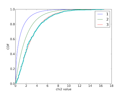
I used this figure to confirm that the data generated by my simulation matches a chi-squared distribution with 3 degrees of freedom.
Many people are more familiar with histograms than CDFs, so they sometimes try to compare histograms or PMFs. This is a bad idea. Use CDFs.
Comparing to an estimated distribution
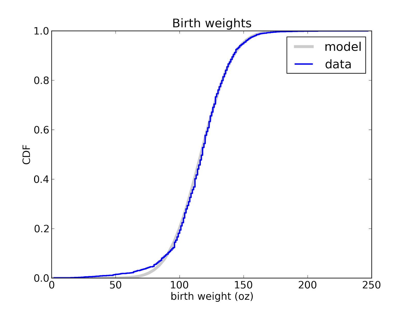
If you know what family of distributions you want to use as a model, but don't know the parameters, you can use the data to estimate the parameters, and then compare the estimated distribution to the data. Here's an example from Think Stats that compares the distribution of birth weight (for live births in the U.S.) to a normal model.
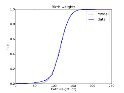
This figure shows that the normal model is a good match for the data, but there are more light babies than we would expect from a normal distribution. This model is probably good enough for many purposes, but probably not for research on premature babies, which account for the deviation from the normal model. In that case, a better model might be a mixture of two normal distribution.
Depending on the data, you might want to transform the axes. For example, the following plot compares the distribution of adult weight for a sample of Americans to a lognormal model:
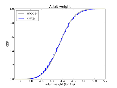
I plotted the x-axis on a log scale because under a log transform a lognormal distribution is a nice symmetric sigmoid where both tails are visible and easy to compare. On a linear scale the left tail is too compressed to see clearly.
Instead of plotting CDFs, a common alternative is a Q-Q plot, which you can generate like this:
def QQPlot(cdf, fit):
"""Makes a QQPlot of the values from actual and fitted distributions.
cdf: actual Cdf
fit: model Cdf
"""
ps = cdf.ps
actual = cdf.xs
fitted = [fit.Value(p) for p in ps]
pyplot.plot(fitted, actual)
cdf and fit are Cdf objects as defined in thinkbayes.py.
The ps are the percentile ranks from the actual CDF. actual contains the corresponding values from the CDF. fitted contains values generated by looping through the ps and, for each percentile rank, looking up the corresponding value in the fitted CDF.
The resulting plot shows fitted values on the x-axis and actual values on the y-axis. If the model matches the data, the plot should be the identity line (y=x).
Here's an example from an earlier blog post:
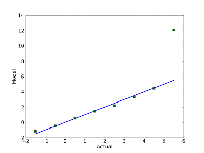
The blue line is the identity line. Clearly the model a good match for the data, except the last point. In this example, I reversed the axes and put the actual values on the x-axis. It seemed like a good idea at the time, but probably was not.
Comparing to a family of distributions
When you compare data to an estimated model, the quality of fit depends on the quality of your estimate. But there are ways to avoid this problem.
For some common families of distributions, there are simple mathematical operations that transform the CDF to a straight line. For example, if you plot the complementary CDF of an exponential distribution on a log-y scale, the result is a straight line (see this section of Think Stats).
Here's an example that shows the distribution of time between deliveries (births) at a hospital in Australia:
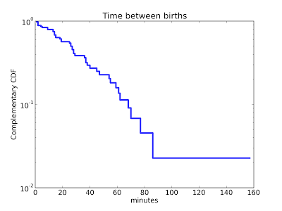
The result is approximately a straight line, so the exponential model is probably a reasonable choice.There are similar transformations for the Weibull and Pareto distributions.
Comparing to a normal distribution
Sadly, things are not so easy for the normal distribution. But there is a good alternative: the normal probability plot.
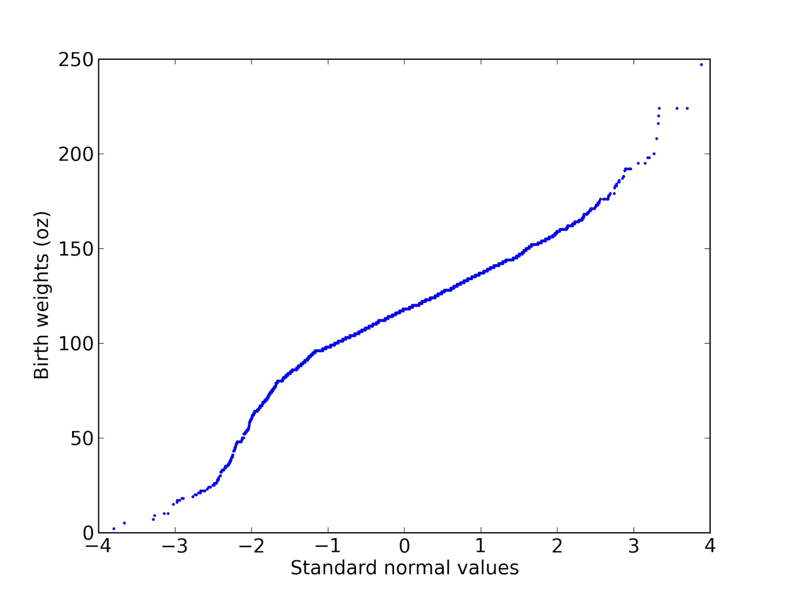
There are two ways to generate normal probability plots. One is based on rankits, but there is a simpler method:From a normal distribution with µ = 0 and σ = 1, generate a sample with the same size as your dataset and sort it.Sort the values in the dataset.Plot the sorted values from your dataset versus the random values.Here's an example using the birthweight data from a previous figure: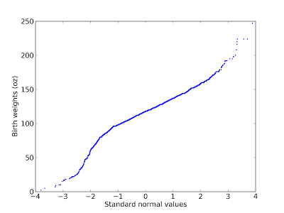
A normal probability plot is basically a Q-Q plot, so you read it the same way. This figure shows that the data deviate from the model in the range from 1.5 to 2.5 standard deviations below the mean. In this range, the actual birth weights are lower than expected according to the model (I should have plotted the model as a straight line; since I didn't, you have to imagine it).
There's another example of a probability plot (including a fitted line) in this previous post.
The normal probability plot works because the family of normal distributions is closed under linear transformation, so it also works with other stable distributions (see http://en.wikipedia.org/wiki/Stable_distribution).
In summary: choosing an analytic model is not a statistical question; it is a modeling decision. No statistical test that can tell you whether a particular distribution is a good model for your data. In general, modeling decisions are hard, but I think the visualizations in this article are some of the best tools to guide those decisions.
UPDATE:
I got the following question on reddit:
You can read the rest of the conversation here.
There are standard tests for this sort of thing, many with double-barreled names like Anderson-Darling, Kolmogorov-Smirnov, Shapiro-Wilk, Ryan-Joiner, etc.
But these tests are almost never what you really want. When people ask these questions, what they really want to know (most of the time) is whether a particular distribution is a good model for a dataset. And that's not a statistical test; it is a modeling decision.
All statistical analysis is based on models, and all models are based on simplifications. Models are only useful if they are simpler than the real world, which means you have to decide which aspects of the real world to include in the model, and which things you can leave out.
For example, the normal distribution is a good model for many physical quantities. The distribution of human height is approximately normal (see this previous blog post). But human heights are not normally distributed. For one thing, human heights are bounded within a narrow range, and the normal distribution goes to infinity in both directions. But even ignoring the non-physical tails (which have very low probability anyway), the distribution of human heights deviates in systematic ways from a normal distribution.
So if you collect a sample of human heights and ask whether they come from a normal distribution, the answer is no. And if you apply a statistical test, you will eventually (given enough data) reject the hypothesis that the data came from the distribution.
Instead of testing whether a dataset is drawn from a distribution, let's ask what I think is the right question: how can you tell whether a distribution is a good model for a dataset?
The best approach is to create a visualization that compares the data and the model, and there are several ways to do that.
Comparing to a known distribution
If you want to compare data to a known distribution, the simplest visualization is to plot the CDFs of the model and the data on the same axes. Here's an example from an earlier blog post:

I used this figure to confirm that the data generated by my simulation matches a chi-squared distribution with 3 degrees of freedom.
Many people are more familiar with histograms than CDFs, so they sometimes try to compare histograms or PMFs. This is a bad idea. Use CDFs.
Comparing to an estimated distribution
If you know what family of distributions you want to use as a model, but don't know the parameters, you can use the data to estimate the parameters, and then compare the estimated distribution to the data. Here's an example from Think Stats that compares the distribution of birth weight (for live births in the U.S.) to a normal model.
This figure shows that the normal model is a good match for the data, but there are more light babies than we would expect from a normal distribution. This model is probably good enough for many purposes, but probably not for research on premature babies, which account for the deviation from the normal model. In that case, a better model might be a mixture of two normal distribution.
Depending on the data, you might want to transform the axes. For example, the following plot compares the distribution of adult weight for a sample of Americans to a lognormal model:

I plotted the x-axis on a log scale because under a log transform a lognormal distribution is a nice symmetric sigmoid where both tails are visible and easy to compare. On a linear scale the left tail is too compressed to see clearly.
Instead of plotting CDFs, a common alternative is a Q-Q plot, which you can generate like this:
def QQPlot(cdf, fit):
"""Makes a QQPlot of the values from actual and fitted distributions.
cdf: actual Cdf
fit: model Cdf
"""
ps = cdf.ps
actual = cdf.xs
fitted = [fit.Value(p) for p in ps]
pyplot.plot(fitted, actual)
cdf and fit are Cdf objects as defined in thinkbayes.py.
The ps are the percentile ranks from the actual CDF. actual contains the corresponding values from the CDF. fitted contains values generated by looping through the ps and, for each percentile rank, looking up the corresponding value in the fitted CDF.
The resulting plot shows fitted values on the x-axis and actual values on the y-axis. If the model matches the data, the plot should be the identity line (y=x).
Here's an example from an earlier blog post:

The blue line is the identity line. Clearly the model a good match for the data, except the last point. In this example, I reversed the axes and put the actual values on the x-axis. It seemed like a good idea at the time, but probably was not.
Comparing to a family of distributions
When you compare data to an estimated model, the quality of fit depends on the quality of your estimate. But there are ways to avoid this problem.
For some common families of distributions, there are simple mathematical operations that transform the CDF to a straight line. For example, if you plot the complementary CDF of an exponential distribution on a log-y scale, the result is a straight line (see this section of Think Stats).
Here's an example that shows the distribution of time between deliveries (births) at a hospital in Australia:

The result is approximately a straight line, so the exponential model is probably a reasonable choice.There are similar transformations for the Weibull and Pareto distributions.
Comparing to a normal distribution
Sadly, things are not so easy for the normal distribution. But there is a good alternative: the normal probability plot.
There are two ways to generate normal probability plots. One is based on rankits, but there is a simpler method:From a normal distribution with µ = 0 and σ = 1, generate a sample with the same size as your dataset and sort it.Sort the values in the dataset.Plot the sorted values from your dataset versus the random values.Here's an example using the birthweight data from a previous figure:
A normal probability plot is basically a Q-Q plot, so you read it the same way. This figure shows that the data deviate from the model in the range from 1.5 to 2.5 standard deviations below the mean. In this range, the actual birth weights are lower than expected according to the model (I should have plotted the model as a straight line; since I didn't, you have to imagine it).
There's another example of a probability plot (including a fitted line) in this previous post.
The normal probability plot works because the family of normal distributions is closed under linear transformation, so it also works with other stable distributions (see http://en.wikipedia.org/wiki/Stable_distribution).
In summary: choosing an analytic model is not a statistical question; it is a modeling decision. No statistical test that can tell you whether a particular distribution is a good model for your data. In general, modeling decisions are hard, but I think the visualizations in this article are some of the best tools to guide those decisions.
UPDATE:
I got the following question on reddit:
I don't understand. Why not go to the next step and perform a Kolmogorov-Smirnov test, etc? Just looking at plots is good but performing the actual test and looking at plots is better.And here's my reply:
The statistical test does not provide any additional information. Real world data never matches an analytic distribution perfectly, so if you perform a test, there are only two possible outcomes:
1) You have a lot of data, so the p-value is low, so you (correctly) conclude that the data did not really come from the analytic distribution. But this doesn't tell you how big the discrepancy is, or whether the analytic model would still be good enough.
2) You don't have enough data, so the p-value is high, and you conclude that there is not enough evidence to reject the null hypothesis. But again, this doesn't tell you whether the model is good enough. It only tells you that you don't have enough data.
Neither outcome helps with what I think is the real problem: deciding whether a particular model is good enough for the intended purpose.
You can read the rest of the conversation here.
July 11, 2013
The Geiger Counter problem
I am supposed to turn in the manuscript for Think Bayes next week, but I couldn't resist adding a new chapter. I was adding a new exercise, based on an example from Tom Campbell-Ricketts, author of the Maximum Entropy blog. He got the idea from E. T. Jaynes, author of the classic Probability Theory: The Logic of Science. Here's my paraphrase
Finally, here's Tom's analysis of the same problem.
Suppose that a radioactive source emits particles toward a Geiger counter at an average rate of r particles per second, but the counter only registers a fraction, f, of the particles that hit it. If f is 10% and the counter registers 15 particles in a one second interval, what is the posterior distribution of n, the actual number of particles that hit the counter, and r, the average rate particles are emitted?I decided to write a solution, and then I liked it so much I decided to make it a chapter. You can read the new chapter here. And then you can take on the exercise at the end:
This exercise is also inspired by an example in Jaynes, Probability Theory. Suppose you buy mosquito trap that is supposed to reduce the population of mosquitoes near your house. Each week, you empty the trap and count the number of mosquitoes captured. After the first week, you count 30 mosquitoes. After the second week, you count 20 mosquitoes. Estimate the percentage change in the number of mosquitoes in your yard.
To answer this question, you have to make some modeling decisions. Here are some suggestions:I end the chapter with this observation:
Suppose that each week a large number of mosquitos, N, is bred in a wetland near your home. During the week, some fraction of them, f1, wander into your yard, and of those some fraction, f2, are caught in the trap. Your solution should take into account your prior belief about how much N is likely to change from one week to the next. You can do that by adding a third level to the hierarchy to model the percent change in N.
The Geiger Counter problem demonstrates the connection between causation and hierarchical modeling. In the example, the emission rate r has a causal effect on the number of particles, n, which has a causal effect on the particle count, k.
The hierarchical model reflects the structure of the system, with causes at the top and effects at the bottom.So causal information flows down the hierarchy, and inference flows up.
At the top level, we start with a range of hypothetical values for r. For each value of r, we have a range of values for n, and the prior distribution of n depends on r.When we update the model, we go bottom-up. We compute a posterior distribution of n for each value of r, then compute the posterior distribution of r.
Finally, here's Tom's analysis of the same problem.
May 30, 2013
Belly Button Biodiversity: The End Game
In the previous installment of this saga, I admitted that my predictions had completely failed, and I outlined the debugging process I began. Then the semester happened, so I didn't get to work on it again until last week.
It turns out that there were several problems, but the algorithm is now calibrating and validating! Before I proceed, I should explain how I am using these words:
Calibrate: Generate fake data from the same model the analysis is based on. Run the analysis on fake data and generate predictive distributions. Check whether the predictive distributions are correct.Validate: Using real data, generate a rarefied sample. Run the analysis on the sample and generate predictive distributions. Check whether the predictive distributions are correct.
If the analysis calibrates, but fails to validate, that suggests that there is some difference between the model and reality that is causing a problem. And that turned out to be the case.
Here are the problems I discovered, and what I had to do to fix them:
The prior distribution of prevalences
For the prior I used a Dirichlet distribution with all parameters set to 1. I neglected to consider the "concentration parameter," which represents the prior belief about how uniform or concentrated the prevalences are. As the concentration parameter approaches 0, prevalences tend to be close to 1 or 0; that is, there tends to be one dominant species and many species with small prevalences. As the concentration parameter gets larger, all species tend to have the same prevalence. It turns out that a concentration parameter near 0.1 yields a distribution of prevalences that resembles real data.
The prior distribution of n
With a smaller concentration parameter, there are more species with small prevalences, so I had to increase the range of n (the number of species). The prior distribution for n is uniform up to an upper bound, where I choose the upper bound to be big enough to avoid cutting off non-negligible probability. I had to increase this upper bound to 1000, which slows the analysis down a little, but it still takes only a few seconds per subject (on my not-very-fast computer).
Up to this point I hadn't discovered any real errors; it was just a matter of choosing appropriate prior distributions, which is ordinary work for Bayesian analysis.
But it turns out there were two legitimate errors.
Bias due to the definition of "unseen"
I was consistently underestimating the prevalence of unseen species because of a bias that underlies the definition of "unseen." To see the problem, consider a simple scenario where there are two species, A and B, with equal prevalence. If I only collect one sample, I get A or B with equal probability.
Suppose I am trying to estimate the prevalence of A. If my sample is A, the posterior marginal distribution for the prevalence of A is Beta(2, 1), which has mean 2/3. If the sample is B, the posterior is Beta(1, 2), which has mean 1/3. So the expected posterior mean is the average of 2/3 and 1/3, which is 1/2. That is the actual prevalence of A, so this analysis is unbiased.
But now suppose I am trying to estimate the prevalence of the unseen species. If I draw A, the unseen species is B and the posterior mean is 1/3. If I draw B, the unseen species is A and the posterior mean is 1/3. So either way I believe that the prevalence of the unseen species is 1/3, but it is actually 1/2. Since I did not specify in advance which species is unseen, the result is biased.
This seems obvious in retrospect. So that's embarrassing (the price I pay for this experiment in Open Science), but it is easy to fix:
a) The posterior distribution I generate has the right relative prevalences for the seen species (based on the data) and the right relative prevalences for the unseen species (all the same), but the total prevalence for the unseen species (which I call q) is too low.
b) Fortunately, there is only one part of the analysis where this bias is a problem: when I draw a sample from the posterior distribution. To fix it, I can draw a value of q from the correct posterior distribution (just by running a forward simulation) and then unbias the posterior distribution with the selected value of q.
Here's the code that generates q:
def RandomQ(self, n):
# generate random prevalences
dirichlet = thinkbayes.Dirichlet(n, conc=self.conc)
prevalences = dirichlet.Random()
# generate a simulated sample
pmf = thinkbayes.MakePmfFromItems(enumerate(prevalences))
cdf = pmf.MakeCdf()
sample = cdf.Sample(self.num_reads)
seen = set(sample)
# add up the prevalence of unseen species
q = 0
for species, prev in enumerate(prevalences):
if species not in seen:
q += prev
return q
n is the hypothetical number of species. conc is the concentration parameter. RandomQ creates a Dirichlet distribution, draws a set of prevalences from it, then draws a simulated sample with the appropriate number of reads, and adds up the total prevalence of the species that don't appear in the sample.
And here's the code that unbiases the posterior:
def Unbias(self, n, m, q_desired):
params = self.params[:n].copy()
x = sum(params[:m])
y = sum(params[m:])
a = x + y
g = q_desired * a / y
f = (a - g * y) / x
params[:m] *= f
params[m:] *= g
n is the hypothetical number of species; m is the number seen in the actual data.
x is the total prevalence of the seen species; y is the total prevalence of the unseen species. f and g are the factors we have to multiply by so that the corrected prevalence of unseen species is q_desired.
After fixing this error, I find that the analysis calibrates nicely.
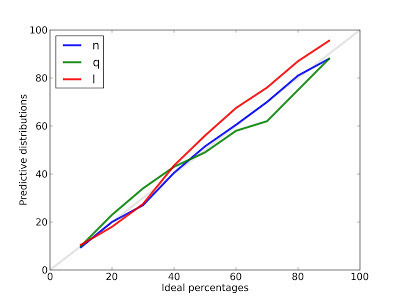
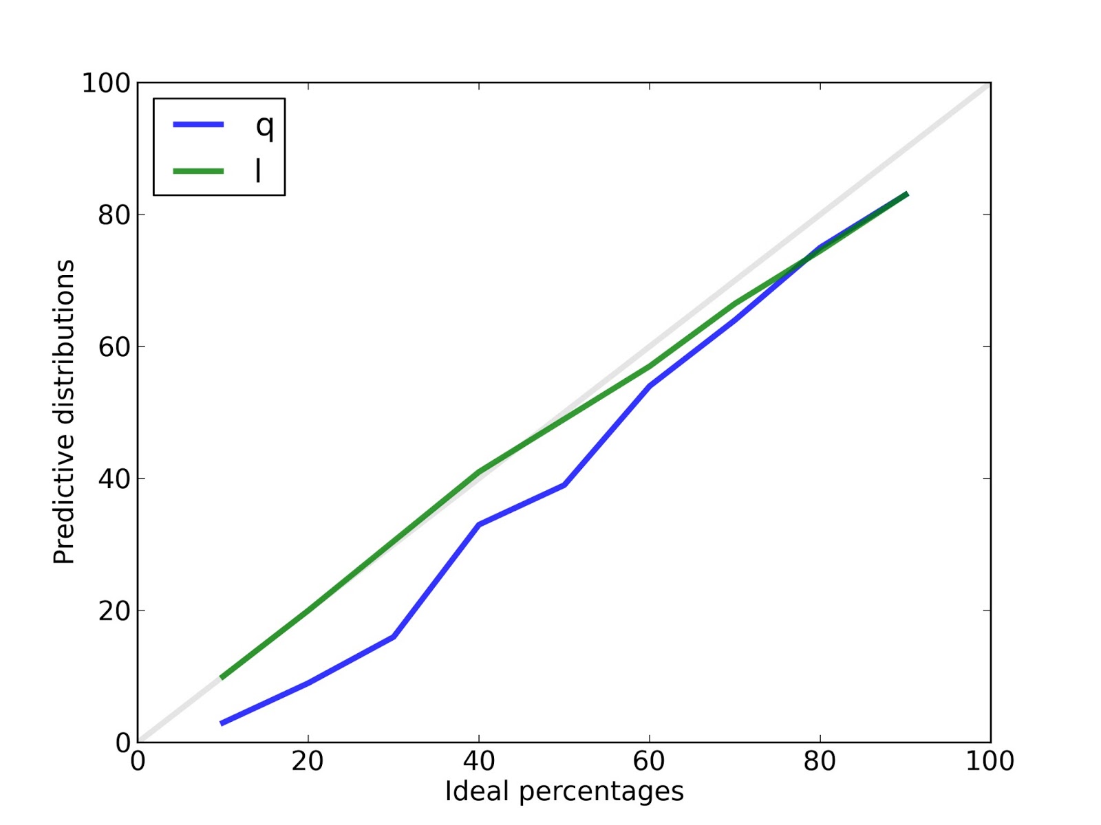
From each predictive distribution I generate credible intervals with ideal percentages 10, 20, ... 90, and then count how often the actual value falls in each interval.
For example, the blue line is the calibration curve for n, the number of species. After 100 runs, the 10% credible interval contains the actual value 9.5% of of the time.The 50% credible interval contains the actual value 51.5% of the time. And the 90% credible interval contains the actual value 88% of the time. These results show that the posterior distribution for n is, in fact, the posterior distribution for n.
The results are similar for q, the prevalence of unseen species, and l, the predicted number of new species seen after additional sampling.
To check whether the analysis validates, I used the dataset collected by the Belly Button Biodiversity project. For each subject with more than 400 reads, I chose a random subset of 100 reads, ran the analysis, and checked the predictive distributions for q and n. I can't check the predictive distribution of n, because I don't know the actual value.
Sadly, the analysis does not validate with the collected data. The reason is:
The data do not fit the model
The data deviate substantially from the model that underlies the analysis. To see this, I tried this experiment:
a) Use the data to estimate the parameters of the model.
b) Generate fake samples from the model.
c) Compare the fake samples to the real data.
Here's a typical result:
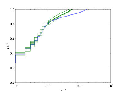
The blue line is the CDF of prevalences, in order by rank. The top-ranked species makes up about 27% of the sample. The top 10 species make up about 75%, and the top 100 species make up about 90%.
The green lines show CDFs from 10 fake samples. The model is a good match for the data for the first 10-20 species, but then it deviates substantially. The prevalence of rare species is higher in the data than in the model.
The problem is that the real data seem to come from a mixture of two distributions, one for dominant species and one for rare species. Among the dominant species the concentration parameter is near 0.1. For the rare species, it is much higher; that is, the rare species all have about the same prevalence.
There are two possible explanations: this effect might be real or it might be an artifact of errors in identifying reads. If it's real, I would have to extend my model to account for it. If it is due to errors, it might be possible to clean the data.
I have heard from biologists that when a large sample yields only a single read of a particular species, that read is likely to be in error; that is, the identified species might not actually be present.
So I explored a simple error model with the following features:
1) If a species appears only once after r reads, the probability that the read is bogus is p = (1 - alpha/r), where alpha is a parameter.
2) If a species appears k times after n reads, the probability that all k reads are bogus is p^k.
To clean the data, I compute the probability that each observed species is bogus, and then delete it with the computed probability.

With cleaned data (alpha=50), the model fits very nicely. And since the model fits, and the analysis calibrates, we expect the analysis to validate. And it does.

For n there is no validation curve because we don't know the actual values.
For q the validation curve is a little off because we only have a lower bound for the prevalence of unseen species, so the actual values used for validation are too high.
But for l the validation curve is quite good, and that's what we are actually trying to predict, after all.
At this point the analysis depends on two free parameters, the concentration parameter and the cleaning parameter, alpha, which controls how much of the data gets discarded as erroneous.
So the next step is to check whether these parameters cross-validate. That is, if we tune the parameters based on a training set, how well do those values do on a test set?
Another next step is to improve the error model. I chose something very simple, and it does a nice job of getting the data to conform to the analysis model, but it is not well motivated. If I can get more information about where the errors are coming from, I could take a Bayesian approach (what else?) and compute the probability that each datum is legit or bogus.
Or if the data are legit and the prevalences are drawn from a mixture of Dirichlet distributions with different concentrations, I will have to extend the analysis accordingly.
Summary
There were four good reasons my predictions failed:
1) The prior distribution of prevalences had the wrong concentration parameter.
2) The prior distribution of n was too narrow.
3) I neglected an implicit bias due to the definition of "unseen species."
4) The data deviate from the model the analysis is based on. If we "clean" the data, it fits the model and the analysis validates, but the cleaning process is a bit of a hack.
I was able to solve these problems, but I had to introduce two free parameters, so my algorithm is not as versatile as I hoped. However, it seems like it should be possible to choose these parameters automatically, which would be an improvement.
And now I have to stop, incorporate these corrections into Think Bayes , and then finish the manuscript!
It turns out that there were several problems, but the algorithm is now calibrating and validating! Before I proceed, I should explain how I am using these words:
Calibrate: Generate fake data from the same model the analysis is based on. Run the analysis on fake data and generate predictive distributions. Check whether the predictive distributions are correct.Validate: Using real data, generate a rarefied sample. Run the analysis on the sample and generate predictive distributions. Check whether the predictive distributions are correct.
If the analysis calibrates, but fails to validate, that suggests that there is some difference between the model and reality that is causing a problem. And that turned out to be the case.
Here are the problems I discovered, and what I had to do to fix them:
The prior distribution of prevalences
For the prior I used a Dirichlet distribution with all parameters set to 1. I neglected to consider the "concentration parameter," which represents the prior belief about how uniform or concentrated the prevalences are. As the concentration parameter approaches 0, prevalences tend to be close to 1 or 0; that is, there tends to be one dominant species and many species with small prevalences. As the concentration parameter gets larger, all species tend to have the same prevalence. It turns out that a concentration parameter near 0.1 yields a distribution of prevalences that resembles real data.
The prior distribution of n
With a smaller concentration parameter, there are more species with small prevalences, so I had to increase the range of n (the number of species). The prior distribution for n is uniform up to an upper bound, where I choose the upper bound to be big enough to avoid cutting off non-negligible probability. I had to increase this upper bound to 1000, which slows the analysis down a little, but it still takes only a few seconds per subject (on my not-very-fast computer).
Up to this point I hadn't discovered any real errors; it was just a matter of choosing appropriate prior distributions, which is ordinary work for Bayesian analysis.
But it turns out there were two legitimate errors.
Bias due to the definition of "unseen"
I was consistently underestimating the prevalence of unseen species because of a bias that underlies the definition of "unseen." To see the problem, consider a simple scenario where there are two species, A and B, with equal prevalence. If I only collect one sample, I get A or B with equal probability.
Suppose I am trying to estimate the prevalence of A. If my sample is A, the posterior marginal distribution for the prevalence of A is Beta(2, 1), which has mean 2/3. If the sample is B, the posterior is Beta(1, 2), which has mean 1/3. So the expected posterior mean is the average of 2/3 and 1/3, which is 1/2. That is the actual prevalence of A, so this analysis is unbiased.
But now suppose I am trying to estimate the prevalence of the unseen species. If I draw A, the unseen species is B and the posterior mean is 1/3. If I draw B, the unseen species is A and the posterior mean is 1/3. So either way I believe that the prevalence of the unseen species is 1/3, but it is actually 1/2. Since I did not specify in advance which species is unseen, the result is biased.
This seems obvious in retrospect. So that's embarrassing (the price I pay for this experiment in Open Science), but it is easy to fix:
a) The posterior distribution I generate has the right relative prevalences for the seen species (based on the data) and the right relative prevalences for the unseen species (all the same), but the total prevalence for the unseen species (which I call q) is too low.
b) Fortunately, there is only one part of the analysis where this bias is a problem: when I draw a sample from the posterior distribution. To fix it, I can draw a value of q from the correct posterior distribution (just by running a forward simulation) and then unbias the posterior distribution with the selected value of q.
Here's the code that generates q:
def RandomQ(self, n):
# generate random prevalences
dirichlet = thinkbayes.Dirichlet(n, conc=self.conc)
prevalences = dirichlet.Random()
# generate a simulated sample
pmf = thinkbayes.MakePmfFromItems(enumerate(prevalences))
cdf = pmf.MakeCdf()
sample = cdf.Sample(self.num_reads)
seen = set(sample)
# add up the prevalence of unseen species
q = 0
for species, prev in enumerate(prevalences):
if species not in seen:
q += prev
return q
n is the hypothetical number of species. conc is the concentration parameter. RandomQ creates a Dirichlet distribution, draws a set of prevalences from it, then draws a simulated sample with the appropriate number of reads, and adds up the total prevalence of the species that don't appear in the sample.
And here's the code that unbiases the posterior:
def Unbias(self, n, m, q_desired):
params = self.params[:n].copy()
x = sum(params[:m])
y = sum(params[m:])
a = x + y
g = q_desired * a / y
f = (a - g * y) / x
params[:m] *= f
params[m:] *= g
n is the hypothetical number of species; m is the number seen in the actual data.
x is the total prevalence of the seen species; y is the total prevalence of the unseen species. f and g are the factors we have to multiply by so that the corrected prevalence of unseen species is q_desired.
After fixing this error, I find that the analysis calibrates nicely.

From each predictive distribution I generate credible intervals with ideal percentages 10, 20, ... 90, and then count how often the actual value falls in each interval.
For example, the blue line is the calibration curve for n, the number of species. After 100 runs, the 10% credible interval contains the actual value 9.5% of of the time.The 50% credible interval contains the actual value 51.5% of the time. And the 90% credible interval contains the actual value 88% of the time. These results show that the posterior distribution for n is, in fact, the posterior distribution for n.
The results are similar for q, the prevalence of unseen species, and l, the predicted number of new species seen after additional sampling.
To check whether the analysis validates, I used the dataset collected by the Belly Button Biodiversity project. For each subject with more than 400 reads, I chose a random subset of 100 reads, ran the analysis, and checked the predictive distributions for q and n. I can't check the predictive distribution of n, because I don't know the actual value.
Sadly, the analysis does not validate with the collected data. The reason is:
The data do not fit the model
The data deviate substantially from the model that underlies the analysis. To see this, I tried this experiment:
a) Use the data to estimate the parameters of the model.
b) Generate fake samples from the model.
c) Compare the fake samples to the real data.
Here's a typical result:
The blue line is the CDF of prevalences, in order by rank. The top-ranked species makes up about 27% of the sample. The top 10 species make up about 75%, and the top 100 species make up about 90%.
The green lines show CDFs from 10 fake samples. The model is a good match for the data for the first 10-20 species, but then it deviates substantially. The prevalence of rare species is higher in the data than in the model.
The problem is that the real data seem to come from a mixture of two distributions, one for dominant species and one for rare species. Among the dominant species the concentration parameter is near 0.1. For the rare species, it is much higher; that is, the rare species all have about the same prevalence.
There are two possible explanations: this effect might be real or it might be an artifact of errors in identifying reads. If it's real, I would have to extend my model to account for it. If it is due to errors, it might be possible to clean the data.
I have heard from biologists that when a large sample yields only a single read of a particular species, that read is likely to be in error; that is, the identified species might not actually be present.
So I explored a simple error model with the following features:
1) If a species appears only once after r reads, the probability that the read is bogus is p = (1 - alpha/r), where alpha is a parameter.
2) If a species appears k times after n reads, the probability that all k reads are bogus is p^k.
To clean the data, I compute the probability that each observed species is bogus, and then delete it with the computed probability.
With cleaned data (alpha=50), the model fits very nicely. And since the model fits, and the analysis calibrates, we expect the analysis to validate. And it does.
For n there is no validation curve because we don't know the actual values.
For q the validation curve is a little off because we only have a lower bound for the prevalence of unseen species, so the actual values used for validation are too high.
But for l the validation curve is quite good, and that's what we are actually trying to predict, after all.
At this point the analysis depends on two free parameters, the concentration parameter and the cleaning parameter, alpha, which controls how much of the data gets discarded as erroneous.
So the next step is to check whether these parameters cross-validate. That is, if we tune the parameters based on a training set, how well do those values do on a test set?
Another next step is to improve the error model. I chose something very simple, and it does a nice job of getting the data to conform to the analysis model, but it is not well motivated. If I can get more information about where the errors are coming from, I could take a Bayesian approach (what else?) and compute the probability that each datum is legit or bogus.
Or if the data are legit and the prevalences are drawn from a mixture of Dirichlet distributions with different concentrations, I will have to extend the analysis accordingly.
Summary
There were four good reasons my predictions failed:
1) The prior distribution of prevalences had the wrong concentration parameter.
2) The prior distribution of n was too narrow.
3) I neglected an implicit bias due to the definition of "unseen species."
4) The data deviate from the model the analysis is based on. If we "clean" the data, it fits the model and the analysis validates, but the cleaning process is a bit of a hack.
I was able to solve these problems, but I had to introduce two free parameters, so my algorithm is not as versatile as I hoped. However, it seems like it should be possible to choose these parameters automatically, which would be an improvement.
And now I have to stop, incorporate these corrections into Think Bayes , and then finish the manuscript!
May 28, 2013
Python Epistemology at PyCon Taiwan
This weekend I gave a talk entitled "Python Epistemology" for PyCon Taiwan 2013. I would have loved to be in Taipei for the talk, but sadly I was in an empty room in front of a teleconference screen.
Python Epistemology: PyCon Taiwan 2013Python Epistemology: PyCon Taiwan 2013Open Python Epistemology: PyCon Taiwan 2013
As I explained, the title is more grandiose than accurate. In general, epistemology is the theory of knowledge: how we know what we think we know, etc. This talk is mostly about what Python has taught me about programming, and how programming in Python has changed the way I learn and the way I think.
About programming, I wrote:
Programming is not about translating a well-known solution into code, it is about discovering solutions by writing code, and then creating the language to express them.
I gave an example using the Counter data structure to check for anagrams:
from collections import Counter
def is_anagram(word1, word2): return Counter(word1) == Counter(word2)
This is a nice solution because it is concise and demonstrably correct, but I suggested that one limitation is that it does not extend easily to handle "The Scrabble Problem": given a set of tiles, check to see whether you can spell a given word.
We can define a new class, called Multiset, that extends Counter and provides
is_subset:
class Multiset(Counter):
"""A set with repeated elements."""
def is_subset(self, other):
for char, count in self.items():
if other[char] < count:
return False
return True
Now we can write can_spell concisely:
def can_spell(word, tiles):
return Multiset(word).is_subset(Multiset(tiles))
I summarized by quoting Paul Graham:
"... you don't just write your program down toward the language, you also build the language up toward your program.
"In the end your program will look as if the language had been designed for it. And ... you end up with code which is clear, small, and efficient."
Paul Graham, "Programming Bottom Up," 1993.
In the second half of the talk, I suggested that Python and other modern programming languages provide a new approach to solving problems. Traditionally, we tend to think and explore using natural language, do analysis and solve problems using mathematical notation, and then translate solutions from math notation into programming languages.
In some sense, we are always doing two translations, from natural language to math and from math to a computer program. With the previous generation of programming languages, this process was probably necessary (for reasons I explained), but I claim that it is less necessary now, and that it might be possible and advantageous to skip the intermediate mathematics and do analysis and problem-solving directly in programming languages.
After the talk, I got two interesting questions by email. Yung-Cheng Lin suggested that although programming languages are more precise than natural language, they might not be sufficiently precise to replace mathematical notation, and he asked if I think that using programming to teach mathematical concepts might cause misunderstandings for students.
I replied:
I understand what you mean when you say that programming languages are less rigorous that mathematical notation. I think many people have the same impression, but I wonder if it is a real difference or a bias we have.
I would argue that programming languages and math notation are similar in the sense that they are both formal languages designed by people to express particular ideas concisely and precisely.
There are some kinds of work that are easier to do in math notation, like algebraic manipulation, but other kinds of work that are easier in programming languages, like specifying computations, especially computations with state.
You asked if there is a danger that students might misunderstand mathematical ideas if they come to them through programming, rather than mathematical instruction. I'm sure it's possible, but I don't think the danger is specific to the programming approach.
And on the other side, I think a computational approach to mathematical topics creates opportunities for deeper understanding by running experiments, and (as I said in the talk) by getting your ideas out of your head and into a program so that, by debugging the program, you are also debugging your own understanding.
In response to some of my comments about pseudocode, A. T. Cheng wrote:
When we do algorithms or pseudocodes in the traditional way, we used to figure out the time complexity at the same time. But the Python examples you showed us, it seems not so easy to learn the time complexity in the first place. So, does it mean that when we think Python, we don't really care about the time complexity that much?
I replied:
You are right that it can be more difficult to analyze a Python program; you have to know a lot about how the Python data structures are implemented. And there are some gotchas; for example, it takes constant time to add elements to the end of a list, but linear time to add elements in the beginning or the middle.
It would be better if Python made these performance characteristics part of the interface, but they are not. In fact, some implementations have changed over time; for example, the += operator on lists used to create a new list. Now it is equivalent to append.
Thanks to both of my correspondents for these questions (and for permission to quote them). And thanks to the organizers of PyCon Taiwan, especially Albert Chun-Chieh Huang, for inviting me to speak. I really enjoyed it.
May 9, 2013
The Red Line problem
I've just added a new chapter to
Think Bayes
; it is a case study based on a class project two of my students worked on this semester. It presents "The Red Line Problem," which is the problem of predicting the time until the next train arrives, based on the number of passengers on the platform.
Here's the introduction:
Sadly, this problem has been overtaken by history: the Red Line now provides real-time estimates for the arrival of the next train. But I think the analysis is interesting, and still applies for subway systems that don't provide estimates.
One interesting tidbit:
The data for the Red Line are close to this example. The actual time between trains is 7.6 minutes (based on 45 trains that arrived at Kendall square between 4pm and 6pm so far this week). The average gap as seen by random passengers is 8.3 minutes.
Interestingly, the Red Line schedule reports that trains run every 9 minutes during peak times. This is close to the average seen by passengers, but higher than the true average. I wonder if they are deliberately reporting the mean as seen by passengers in order to forestall complaints.
You can read the rest of the chapter here. One of the figures there didn't render very well. Here is a prettier version:
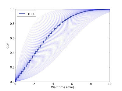
This figure shows the predictive distribution of wait times if you arrive and find 15 passengers on the platform. Since we don't know the passenger arrival rate, we have to estimate it. Each possible arrival rate yields one of the light blue lines; the dark blue line is the weighted mixture of the light blue lines.
So in this scenario, you expect the next train in 5 minutes or less, with 80% confidence.
UPDATE 10 May 2013: I got the following note from developer@mbta.com, confirming that their reported gap between trains is deliberately conservative:

Here's the introduction:
In Boston, the Red Line is a subway that runs north-south from Cambridge to Boston. When I was working in Cambridge I took the Red Line from Kendall Square to South Station and caught the commuter rail to Needham. During rush hour Red Line trains run every 7--8 minutes, on average.
When I arrived at the station, I could estimate the time until the next train based on the number of passengers on the platform. If there were only a few people, I inferred that I just missed a train and expected to wait about 7 minutes. If there were more passengers, I expected the train to arrive sooner. But if there were a large number of passengers, I suspected that trains were not running on schedule, so I would go back to the street level and get a taxi.
While I was waiting for trains, I thought about how Bayesian estimation could help predict my wait time and decide when I should give up and take a taxi. This chapter presents the analysis I came up with.
Sadly, this problem has been overtaken by history: the Red Line now provides real-time estimates for the arrival of the next train. But I think the analysis is interesting, and still applies for subway systems that don't provide estimates.
One interesting tidbit:
As it turns out, the average time between trains, as seen by a random passenger, is substantially higher than the true average.
Why? Because a passenger is more like to arrive during a large interval than a small one. Consider a simple example: suppose that the time between trains is either 5 minutes or 10 minutes with equal probability. In that case the average time between trains is 7.5 minutes.
But a passenger is more likely to arrive during a 10 minute gap than a 5 minute gap; in fact, twice as likely. If we surveyed arriving passengers, we would find that 2/3 of them arrived during a 10 minute gap, and only 1/3 during a 5 minute gap. So the average time between trains, as seen by an arriving passenger, is 8.33 minutes.
This kind of observer bias appears in many contexts. Students think that classes are bigger than they are, because more of them are in the big classes. Airline passengers think that planes are fuller than they are, because more of them are on full flights.
In each case, values from the actual distribution are oversampled in proportion to their value. In the Red Line example, a gap that is twice as big is twice as likely to be observed.
The data for the Red Line are close to this example. The actual time between trains is 7.6 minutes (based on 45 trains that arrived at Kendall square between 4pm and 6pm so far this week). The average gap as seen by random passengers is 8.3 minutes.
Interestingly, the Red Line schedule reports that trains run every 9 minutes during peak times. This is close to the average seen by passengers, but higher than the true average. I wonder if they are deliberately reporting the mean as seen by passengers in order to forestall complaints.
You can read the rest of the chapter here. One of the figures there didn't render very well. Here is a prettier version:

This figure shows the predictive distribution of wait times if you arrive and find 15 passengers on the platform. Since we don't know the passenger arrival rate, we have to estimate it. Each possible arrival rate yields one of the light blue lines; the dark blue line is the weighted mixture of the light blue lines.
So in this scenario, you expect the next train in 5 minutes or less, with 80% confidence.
UPDATE 10 May 2013: I got the following note from developer@mbta.com, confirming that their reported gap between trains is deliberately conservative:
Thank you for writing to let us know about the Red Line case study in your book, and thank you for your question. You’re right that the scheduled time between trains listed on the subway schedule card for rush hour is greater than what you observed at Kendall Square. It’s meant as a slightly conservative simplification of the actual frequency of trains, which varies by time throughout rush hour – to provide maximum capacity during the very peak of rush hour when ridership is normally highest – as well as by location along the Red Line during those different times, since when trains begin to leave more frequently from Alewife it takes time for that frequency to “travel” down the line. So yes it is meant to be slightly conservative for that reason. We hope this information answers your question.
Sincerely,
developer@mbta.com
May 6, 2013
Software engineering practices for graduate students
Recently I was talking with an Olin student who will start graduate school in the fall, and I suggested a few things I wish I had done in grad school. And then I thought I should write them down. So here is my list of Software Engineering Practices All Graduate Students Should Adopt:
Version Control
Every keystroke you type should be under version control from the time you initiate a project until you retire it. Here are the reasons:
1) Everything you do will be backed up. But instead of organizing your backups by date (which is what most backup systems do) they are organized by revision. So, for example, if you break something, you can roll back to an earlier working revision.
2) When you are collaborating with other people, you can share repositories. Version control systems are well designed for managing this kind of collaboration. If you are emailing documents back and forth, you are doing it wrong.
3) At various stages of the project, you can save a tagged copy of the repo. For example, when you submit a paper for publication, make a tagged copy. You can keep working on the trunk, and when you get reviewer comments (or a question 5 years later) you have something to refer back to.
I use Subversion (SVN) primarily, so I keep many of my projects on Google Code (if they are open source) or on my own SVN server. But these days it seems like all the cool kids are using git and keeping their repositories on github.
Either way, find a version control system you like, learn how to use it, and find someplace to host your repository.
Build Automation
This goes hand in hand with version control. If someone checks out your repository, they should be able to rebuild your project by running a single command. That means that everything someone needs to replicate your results should be in the repo, and you should have scripts that process the data, generate figures and tables, and integrate them into your papers, slides, and other documents.
One simple tool for automating the build is Make. Every directory in your project should contain a Makefile. The top-level directory should contain the Makefile that runs all the others.
If you use GUI-based tools to process data, it might not be easy to automate your build. But it will be worth it. The night before your paper is due, you will find a bug somewhere in your data flow. If you've done things right, you should be able to rebuild the paper with just five keystrokes (m-a-k-e, and Enter).
Also, put a README in the top-level directory that documents the directory structure and the build process. If your build depends on other software, include it in the repo if practical; otherwise provide a list of required packages.
Or, if your software environment is not easy to replicate, put your whole development environment in a virtual machine and ship the VM.
Agile Development
For many people, the most challenging part of grad school is time management. If you are an undergraduate taking 4-5 classes, you can do deadline-driven scheduling; that is, you can work on whatever task is due next and you will probably get everything done on time.
In grad school, you have more responsibility for how you spend your time and fewer deadlines to guide you. It is easy to lose track of what you are doing, waste time doing things that are not important (see Yak Shaving), and neglect the things that move you toward the goal of graduation.
One of the purposes of agile development tools is to help people decide what to do next. They provide several features that apply to grad school as well as software development:
1) They encourage planners to divide large tasks into smaller tasks that have a clearly-defined end condition.
2) They maintain a priority-ranking of tasks so that when you complete one you can start work on the next, or one of the next few.
3) They provide mechanisms for collaborating with a team and for getting feedback from an adviser.
4) They involve planning on at least two time scales. On a daily basis you decide what to work on by selecting tasks from the backlog. On a weekly (or longer) basis, you create and reorder tasks, and decide which ones you should work on during the next cycle.
If you use github or Google code for version control, you get an issue tracker as part of the deal. You can use issue trackers for agile planning, but there are other tools, like Pivotal Tracker, that have more of the agile methodology built in. I suggest you start with Pivotal Tracker because it has excellent documentation, but you might have to try out a few tools to find one you like.
Do these things -- Version Control, Build Automation, and Agile Development -- and you will get through grad school in less than the average time, with less than the average drama.
April 24, 2013
The Price is Right Problem: Part Two
This article is an excerpt from Think Bayes, a book I am working on. The entire current draft is available from http://thinkbayes.com. I welcome comments and suggestions.
In the previous article, I described presented The Price is Right problem and a Bayesian approach to estimating the value of a showcase of prizes. This article picks up from there...
Optimal bidding
Now that we have a posterior distribution, we can use it to compute the optimal bid, which I define as the bid that maximizes expected gain.
To compute optimal bids, I wrote a class called GainCalculator:
class GainCalculator(object):
def __init__(self, player, opponent):
self.player = player
self.opponent = opponent
player and opponent are Player objects.
GainCalculator provides ExpectedGains, which computes a sequence of bids and the expected gain for each bid:
def ExpectedGains(self, low=0, high=75000, n=101):
bids = numpy.linspace(low, high, n)
gains = [self.ExpectedGain(bid) for bid in bids]
return bids, gains
low and high specify the range of possible bids; n is the number of bids to try. Here is the function that computes expected gain for a given bid:
def ExpectedGain(self, bid):
suite = self.player.posterior
total = 0
for price, prob in suite.Items():
gain = self.Gain(bid, price)
total += prob * gain
return total
ExpectedGain loops through the values in the posterior and computes the gain for each bid, given the actual prices of the showcase. It weights each gain with the corresponding probability and returns the total.
Gain takes a bid and an actual price and returns the expected gain:
def Gain(self, bid, price):
if bid > price:
return 0
diff = price - bid
prob = self.ProbWin(diff)
if diff <= 250:
return 2 * price * prob
else:
return price * prob
If you overbid, you get nothing. Otherwise we compute the difference between your bid and the price, which determines your probability of winning.
If diff is less than $250, you win both showcases. For simplicity, I assume that both showcases have the same price. Since this outcome is rare, it doesn’t make much difference.
Finally, we have to compute the probability of winning based on diff:
def ProbWin(self, diff):
prob = (self.opponent.ProbOverbid() +
self.opponent.ProbWorseThan(diff))
return prob
If your opponent overbids, you win. Otherwise, you have to hope that your opponent is off by more than diff. Playerprovides methods to compute both probabilities:
# class Player:
def ProbOverbid(self):
return self.cdf_diff.Prob(-1)
def ProbWorseThan(self, diff):
return 1 - self.cdf_diff.Prob(diff)
This code might be confusing because the computation is now from the point of view of the opponent, who is computing, “What is the probability that I overbid?” and “What is the probability that my bid is off by more than diff?”
Both answers are based on the CDF of diff [CDFs are described here]. If your opponent’s diff is less than or equal to -1, you win. If your opponent’s diff is worse than yours, you win. Otherwise you lose.
Finally, here’s the code that computes optimal bids:
# class Player:
def OptimalBid(self, guess, opponent):
self.MakeBeliefs(guess)
calc = GainCalculator(self, opponent)
bids, gains = calc.ExpectedGains()
gain, bid = max(zip(gains, bids))
return bid, gain
Given a guess and an opponent, OptimalBid computes the posterior distribution, instantiates a GainCalculator, computes expected gains for a range of bids and returns the optimal bid and expected gain. Whew!
Figure 6.4

Figure 6.4 shows the results for both players, based on a scenario where Player 1’s best guess is $20,000 and Player 2’s best guess is $40,000.
For Player 1 the optimal bid is $21,000, yielding an expected return of almost $16,700. This is a case (which turns out to be unusual) where the optimal bid is actually higher than the contestant’s best guess.
For Player 2 the optimal bid is $31,500, yielding an expected return of almost $19,400. This is the more typical case where the optimal bid is less than the best guess.
Discussion
One of the most useful features of Bayesian estimation is that the result comes in the form of a posterior distribution. Classical estimation usually generates a single point estimate or a confidence interval, which is sufficient if estimation is the last step in the process, but if you want to use an estimate as an input to a subsequent analysis, point estimates and intervals are often not much help.
In this example, the Bayesian analysis yields a posterior distribution we can use to compute an optimal bid. The gain function is asymmetric and discontinuous (if you overbid, you lose), so it would be hard to solve this problem analytically. But it is relatively simple to do computationally.
Newcomers to Bayesian thinking are often tempted to summarize the posterior distribution by computing the mean or the maximum likelihood estimate. These summaries can be useful, but if that’s all you need, then you probably don’t need Bayesian methods in the first place.
Bayesian methods are most useful when you can carry the posterior distribution into the next step of the process to perform some kind of optimization, as we did in this chapter, or some kind of prediction, as we will see in the next chapter [which you can read here].

Probably Overthinking It

Probably Overthinking It is a blog about data science, Bayesian Statistics, and occasional other topics.
- Allen B. Downey's profile
- 236 followers

