
Allen B. Downey's Blog: Probably Overthinking It, page 18
September 26, 2016
Bayes's Theorem is not optional
IntroductionConversations about Bayesian statistics sometimes get bogged down in confusion about two separate questions:
1) The Bayesian interpretation of probability, as opposed to the frequentist interpretation.
2) The Bayesian approach to statistical inference, as opposed to frequentist approach.
The first is a philosophical position about what probability means; the second is more like a practical recommendation about how to make inferences from data. They are almost entirely separate questions; for example, you might prefer the Bayesian interpretation of probability by philosophical criteria, and then use frequentist statistics because of practical requirements; or the other way around.
Under the frequentist interpretation of probability, we can only talk about the probability of an event if we can model it as a subset of a sample space. For example, we can talk about the probability of drawing a straight in poker because a straight is a well-defined subset of the sample space that contains all poker hands. But by this interpretation, we could not assign a probability to the proposition that Hillary Clinton will win the election, unless we could model this event as a subset of all elections, somehow.
Under the Bayesian interpretation, a probability represents a degree of belief, so it is permissible to assign probabilities to events even if they are unique. It is also permissible to use probability to represent uncertainty about non-random events. For example, if you are uncertain about whether there is life on Mars, you could assign a probability to that proposition under the Bayesian interpretation. Under the frequentist interpretation, there either is life on Mars or not; it is not a random event, so we can't assign a probability to it.
(I avoid saying things like "a Bayesian believes this" or "a Frequentist believes that". These are philosophical positions, and we can discuss their consequences regardless of who believes what.)
In problems where the frequentist interpretation of probability applies, the Bayesian and frequentist interpretations yield the same answers. The difference is that for some problems we get an answer under Bayesianism and no answer under frequentism.
Now, before I get into Bayesian and frequentist inference, let's look at an example.
The Rain in Seattle problemSuppose you are interviewing for a data science job and you are asked this question (from glassdoor.com):
You're about to get on a plane to Seattle. You want to know if you should bring an umbrella. You call 3 random friends of yours who live there and ask each independently if it's raining. Each of your friends has a 2/3 chance of telling you the truth and a 1/3 chance of messing with you by lying. All 3 friends tell you that "Yes" it is raining. What is the probability that it's actually raining in Seattle?Take a minute to think about it before you go on. Then take a look at the responses on glassdoor.com. The top response, which uses Bayes's Theorem, is correct. I'll explain the correct solution first; then I want to comment on some of the other responses.
The question asks you to compute the probability of rain conditioned on three yesses, which I'll write P(rain|YYY).
Now, here's an important point: you can't give a meaningful answer to this question unless you know P(rain), the probability of rain unconditioned on what your friends say. To see why, consider two extreme cases:
1. If P(rain) is 1, it always rains in Seattle. If your friends all tell you it's raining, you know that they are telling the truth, and that P(rain|YYY) is 1.
2. If P(rain) is 0, it never rains in Seattle, so you know your friends are lying and P(rain|YYY) = 0.
For values of P(rain) between 0 and 1, the answer could be any value between 0 and 1. So if you see any response to this question that does not take into account P(rain), you can be sure that it is wrong (or coincidentally right based on an invalid argument).
But if we are given the base rate, we can solve the problem easily using Bayes's Rule, According to the Western Regional Climate Center, from 1965-99 there was measurable rain in Seattle during 822 hours per year, which is about 10% of the time.
A base rate of 10% corresponds to prior odds of 1:9. Each friend is twice as likely to tell the truth as to lie, so each friend contributes evidence in favor of rain with a likelihood ratio, or Bayes factor, of 2. Multiplying the prior odds by the likelihood ratios yields posterior odds 8:9, which corresponds to probability 8/17, or 0.47.
And that is the unique correct answer to the question (provided that you accept the modeling assumptions). More generally, if P(rain) = p, the conditional probability P(rain|YYY) is
Probability(8 Odds(p))
assuming that Odds() converts probabilities to odds and Probability() does the opposite.
What about the frequentist answer?Several of the responses on glassdoor.com provide what they call a frequentist or non-Bayes perspective:
Answer from a frequentist perspective: Suppose there was one person. P(Y|rain) is twice (2/3 / 1/3) as likely as P(Y|no rain), so the P(rain) is 2/3. If instead n people all say YES, then they are either all telling the truth, or all lying. The outcome that they are all telling the truth is (2/3)^n / (1/3)^n = 2^n as likely as the outcome that they are not. Thus P(YYY | rain) = 2^n / (2^n + 1) = 8/9 for n=3. Notice that this corresponds exactly to the Bayesian answer when prior(raining) = 1/2.And here's another:
I thought about this a little differently from a non-Bayes perspective. It's raining if any ONE of the friends is telling the truth, because if they are telling the truth then it is raining. If all of them are lying, then it isn't raining because they told you that it was raining. So what you want is the probability that any one person is telling the truth. Which is simply 1-Pr(all lie) = 26/27. Anyone let me know if I'm wrong here!These are not actually frequentist responses. For this problem, we get the same answer under Bayesianism and frequentism because:
1) Everything in this problem can be well-modeled by random processes. There is a well-defined long-run probability of rain in Seattle, and we can model the friends' responses as independent random variables (at least according to the statement of the problem).
AND
2) There is nothing especially Bayesian about Bayes's Theorem! Bayes's Theorem is an uncontroversial law of probability that is true under any interpretation of probability, and can be used for any kind of statistical inference.
The "non-Bayes" responses are not actually other perspectives; they are just incorrect. Under frequentism, we would either accept the solution based on Bayes's Theorem or, under a strict interpretation, we might say that it is either raining in Seattle or not, and refuse to assign a probability.
But what about frequentist inference?Statistical inference is the process of inferring the properties of a population based on a sample. For example, if you want to know the fraction of U.S. voters who intend to vote for Donald Trump, you could poll a sample of the population. Then,
1) Using frequentist inference, you could compute an estimate of the fraction of the population that intends to vote for Trump (call it x), you could compute a confidence interval for the estimate, and you could compute a p-value based on a null-hypothesis like "x is 50%". But if anyone asked "what's the probability that x is greater than 50%", you would not be able to answer that question.
2) Using Bayesian inference, you would start with some prior belief about x, use the polling data to update your belief, and produce a posterior distribution for x, which represents all possible values and their probabilities. You could use the posterior distribution to compute estimates and intervals similar to the results of frequentist inference. But if someone asked "what's the probability that x is greater than 50%", you could compute the answer easily.
So, how does this apply to the Rain in Seattle Problem? It doesn't, because the Rain in Seattle problem has nothing to do with statistical inference. It is a question about probability, not statistics. It has one correct answer under any interpretation of probability, regardless of your preferences for statistical inference.
Summary1) Conversations about Bayesian methods will be improved if we distinguish two almost unrelated questions: the meaning of probability and the choice of inferential methods.
2) You don't have to be a Bayesian to use Bayes's Theorem. Most probability problems, including the Rain in Seattle problem, have a single solution considered correct under any interpretation of probability and statistics.


September 16, 2016
Blow it up and start again
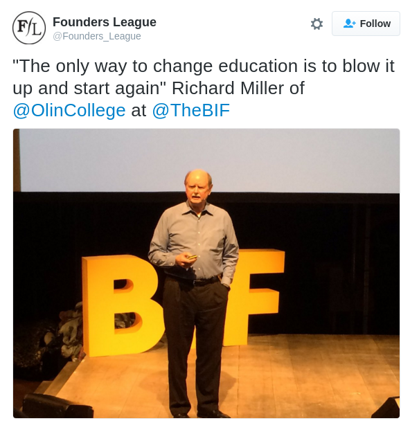
I agree, and I saw an example recently that helps make the point. The American Statistical Association recently published this Statement on p-Values. Here's how it starts:
In February 2014, George Cobb, Professor Emeritus of Mathematics
and Statistics at Mount Holyoke College, posed these
questions to an ASA discussion forum:
Q: Why do so many colleges and grad schools teach p = 0.05?
A: Because that’s still what the scientific community and journal
editors use.
Q: Why do so many people still use p = 0.05?
A: Because that’s what they were taught in college or grad school.
Cobb’s concern was a long-worrisome circularity in the sociologyThis "worrisome circularity" is a concrete example of why gradual change is so hard, and why sometimes the only solution is to blow it up and start again. That idea is scary to a lot of people, but it doesn't have to be. I have an example that might help, the statistics curriculum at Olin.
of science based on the use of bright lines such as p < 0.05:
“We teach it because it’s what we do; we do it because it’s what
we teach.”
Statistics at OlinFirst I'll explain what worked, then we'll look at what could have gone wrong.
In 2010, I proposed a new class called Computational Probability and Statistics, as a substitute for a very conventional statistics class that was offered at the time. My class was based on a library I developed while I was on sabbatical at Google, which is now the thinkstats module in ThinkX.
While teaching the class, I wrote Think Stats, which was published by O'Reilly Media in 2011. After a few semesters, I developed another course called Computational Bayesian Statistics, and wrote Think Bayes, which was published in 2013.
In 2014 I expanded CompProbStat from 2 credits to 4 and renamed it Data Science. I recruited external collaborators to provide data and motivating questions for student projects, and several other professors sat in and helped guide student projects. In 2016 one of those professors took over and taught his version of the class, adding his expertise in machine learning.
At the same time, two of my colleagues were developing their own statistics classes, focused on applications in diverse areas of engineering and science. None of these classes look much like the conventional statistics material, and they are much better for it.
In six years, we developed five new classes, published two books, got six additional professors involved in teaching data science and statistics, and, most importantly, we developed a curriculum that serves the goals and needs of our students.
How did that happen?This project would have been impossible at almost any other college.
At most colleges and universities, a professor of computer science (like me) who proposes a new statistics class will not get far, because of two fundamental and unquestioned assumptions of undergraduate education: (1) you need a Ph.D. in a topic before you can teach an introductory course, and (2) if you do research in a field, that makes you better at teaching it to undergraduates. Note: neither of these is true.
And the content of my courses would have been scrutinized by a committee with a checklist. To teach something new, you have to stop teaching something old, and it is nearly impossible to get permission to stop teaching anything. Every topic, no matter how obsolete, is defended by zealots with no respect for evidence or reason. Fun example: here are Time magazine's Five Reasons Kids Should Still Learn Cursive Writing. Note: none of them are good.
Every field has its obstructionists, but statistics has its own special kind: the anti-Bayesians. I can only imagine the howls if I proposed teaching Bayesian statistics to undergraduates. When I suggested teaching it before classical statistics, I would have been thrown out a window. And when I proposed to teach it instead of classical statistics, I would have been dragged through the streets.
At Olin, fixing engineering education is our mission. When someone proposes an experiment, we ask the right questions: Does it contribute to our mission by improving undergraduate education at Olin and other institutions? Is it a reasonable risk? And do we have the resources to do it? If the answers are yes, we do it. Note: if it's an unreasonable risk and we don't have the resources, sometimes we do it anyway.
The second reason my project would be impossible at most schools is that statistics is owned by the math or statistics department, and even though the faculty don't like teaching classes for non-majors, they get credit for providing "service classes" (a term I would like to ban), so they have an incentive to protect their territory.
And just as the math department would fight to keep me out, the computer science department would fight to keep me in. If the CS department owns my "faculty line" (another term I would like to ban), they want me to teach CS classes.
At Olin, we have no departments. We don't have to do this kind of bookkeeping, and that leaves us free to think about the students (remember them?) and design a curriculum that serves their needs.
The third reason my project wouldn't happen anywhere else is that I wouldn't do it anywhere else. At most universities, there is no incentive to develop new classes; in fact, there is a strong disincentive. If you try something new, you make enemies, because the new is an insult to the old. If it doesn't work, you get punished, and even if it works, you get no reward.
The one factor that drives hiring and firing is research. Even at liberal arts colleges that value good teaching, there is no expectation for innovation. If you do a decent job of teaching the same two or three classes over and over, that's good enough. At Olin, we are encouraged to take risks, supported while we work out the bugs, and rewarded for the effort.
Also, at most universities, there is no incentive to write textbooks. They don't count as research and they don't count as teaching; the time you spend on a textbook is just time you didn't spend on research. At Olin, we use broad categories to evaluate faculty work, and a successful textbook is valued because it benefits students (at Olin and other institutions) and contributes to our mission to change engineering education.
So blow it upYou don't get a lot of opportunities to blow it up and start again, but when you do, a lot of good things can happen. It's not as scary as it sounds.
Also, there is nothing special about p = 0.05.

September 14, 2016
It's a small world, scale-free network after all
The Watts-Strogatz (WS) network model has small world characteristics, but the degree distribution is roughly normal, very different from observed distributions.
The Barabasi-Albert (BA) model has low path lengths and a heavy-tailed degree distribution, but
It has low clustering, andThe degree distribution does not fit observed data well.
The Holmes-Kim (HK) model generates graphs with higher clustering, although still not as high as observed values. And the degree distribution is heavy tailed, but it still doesn't fit observed distributions well.
I propose a new model that generates graphs with
Low path lenths,Clustering coefficients similar to the HK model (but still lower than observed values), andA degree distribution that fits observed data well.
I test the models with a relatively small dataset from SNAP.
The proposed model is based on a "friend of a friend" growth mechanism that is a plausible description of the way social networks actually grow. The implementation is simple, comparable to BA and HK in both lines of code and run time.
All the details are in this Jupyter notebook, but I summarize the primary results here.
Comparing the modelsThe Facebook dataset from SNAP contains 4039 nodes and 88234 edges. The mean path length is 3.7 and the clustering coefficient is 0.6.
A WS model with the same number of nodes and edges, and with probability of rewiring, p=0.05, has mean path length 3.2 and clustering 0.62, so it clearly has the small world properties. But the distribution of degree does not match the data at all:
[image error]
A BA model with the same number of nodes and edges has very short paths (2.5), but very low clustering (0.04). The degree distribution is a better match for the data:
[image error]
If we plot CDFs on a log-log scale, the BA model matches the tail of the distribution reasonably well, but the WS model is hopeless.
[image error]
But if we plot CDFs on a log-x scale, we see that the BA model does not match the rest of the distribution:
[image error]
The HK model also has short path lengths (2.8), and the clustering is much better (0.23), but still not as high as in the data (0.6). The degree distribution is pretty much the same as in the BA model.
The FOF model
The generative model I propose is called FOF for "friends of friends". It is similar to both BA and HK, but it yields a degree distribution that matches observed data better.
It starts with a complete graph with m nodes, so initially all nodes have degree m. Each time we generate a node we:
Select a random target uniformly from existing nodes.Iterate through the friends of the target. For each one, with probability p, we form a triangle that includes the source, friend, and a random friend of friend.Finally, we connect the source and target.
Because we choose friends of the target, this process has preferential attachment, but it does not yield a power law tail. Rather, the degree distribution is approximately lognormal with median degree m.
Because this process forms triangles, it yields a moderately high clustering coefficient.
A FOF graph with the same number of nodes and edges as the Facebook data has low path length (3.0) and moderate clustering (0.24, which is more than BA, comparable to HK, but still less than the observed value, 0.6).
The degree distribution is a reasonable match for the tail of the observed distribution:
[image error]
And a good match for the rest of the distribution
[image error]
In summary, the FOF model has
Short path lengths, like WS, BA, and HK.Moderate clustering, similar to HK, less than WS, and higher than BA.Good fit to the tail of the degree distribution, like BA and HK.Good fit to the rest of the degree distribution, unlike WS, BA, and HK.
Also, the mechanism of growth is plausible: when a person joins the network, they connect to a randomly-chosen friend and then a random subset of "friends of friends". This process has preferential attachment because friends of friends are more likely to have high degree (see The Inspection Paradox is Everywhere) But the resulting distribution is approximately lognormal, which is heavy tailed, but does not have a power law tail.
ImplementationHere is a function that generates FOF graphs:
def fof_graph(n, m, p=0.25, seed=None):
if m < 1 or m+1 >= n:
raise nx.NetworkXError()
if seed is not None:
random.seed(seed)
# start with a completely connected core
G = nx.complete_graph(m+1)
for source in range(len(G), n):
# choose a random node
target = random.choice(G.nodes())
# enumerate neighbors of target and add triangles
friends = G.neighbors(target)
k = len(friends)
for friend in friends:
if flip(p):
triangle(G, source, friend)
# connect source and target
G.add_edge(source, target)
return G
def flip(p):
return random.random() < p
def triangle(G, source, friend):
"""Chooses a random neighbor of `friend` and makes a triangle.
Triangle connects `source`, `friend`, and
random neighbor of `friend`.
"""
fof = set(G[friend])
if source in G:
fof -= set(G[source])
if fof:
w = random.choice(list(fof))
G.add_edge(source, w)
G.add_edge(source, friend)
Again, all the details are in this Jupyter notebook.

September 2, 2016
Sleeping Beauty and the Red Dice
The late great philosopher David Lewis was a halfer. I'd be interested in any reactions to his paper on it: http://fitelson.org/probability/lewis_sb.pdfThe context of the paper is a disagreement between Lewis and Adam Elga; specifically, Lewis's paper is a response to Elga's paper "Self-locating belief and the Sleeping Beauty Problem".
Elga presents the Sleeping Beauty problem like this:
Some researchers are going to put you to sleep. During the two days that your sleep will last, they will briefly wake you up either once or twice, depending on the toss of a fair coin (Heads: once; Tails: twice). After each waking, they will put you to back to sleep with a drug that makes you forget that waking. [Just after you are] awakened, to what degree ought you believe that the outcome of the coin toss is Heads?And then he states the two most common responses to the problem
First answer: 1/2, of course! Initially you were certain that the coin was fair, and so initially your credence in the coin’s landing Heads was 1/2. Upon being awakened, you receive no new information (you knew all along that you would be awakened). So your credence in the coin’s landing Heads ought to remain 1/2.
Second answer: 1/3, of course! Imagine the experiment repeated many times. Then in the long run, about 1/3 of the wakings would be Heads-wakings — wakings that happen on trials in which the coin lands Heads. So on any particular waking, you should have credence 1/3 that that waking is a Heads-waking, and hence have credence 1/3 in the coin’s landing Heads on that trial. This consideration remains in force in the present circumstance, in which the experiment is performed just once.In his Section 2, Elga then proves that the correct answer is 1/3. His proof is correct (although there are a few spots where it would be helpful to fill in some intermediate steps). So Lewis is wrong to reject this proof.
But Elga's Section 3 introduces some confusion around the meaning of "information". Elga says:
Let H be the proposition that the outcome of the coin toss is Heads. Before being putAnd then in a footnote:
to sleep, your credence in H was 1/2. I’ve just argued that when you are awakened
on Monday, that credence ought to change to 1/3. This belief change is unusual. It is
not the result of your receiving new information — you were already certain that you
would be awakened on Monday.
To say that an agent receives new information (as I shall use that expression) is to say that the agent receives evidence that rules out possible worlds not already ruled out by her previous evidence.This is where Elga and I disagree. I would say that an agent receives information if they receive evidence that is not equally likely in all possible worlds. In that case, the evidence should cause the agent to change their credences (subjective beliefs) about at least some possible worlds.
In particular (as I explained in my previous article), when Sleeping Beauty is awakened, she observes an event, awakening, that is twice as likely under T (the proposition that the coin toss is Heads) than under H, and she should change her credences accordingly.
So in my solution, her belief change is not unusual; it is an application of Bayes's Theorem that is only remarkable because it is not immediately obvious what the evidence is and what it's likelihood is under the two hypotheses. In that sense, it is similar to the Elvis Problem.
In the rest of Section 3, Elga tries to reconcile the seemingly contradictory conclusions that Beauty receives no new information and Beauty should change her credences. I think this argument addresses a non-problem, because Beauty does receive information that justifies her change in credences. So I agree with Lewis that Elga is wrong to conclude that the Sleeping Beauty problem raises, "a new question about how a rational agent ought to update her beliefs over time".
In summary:
1) Lewis is wrong about the answer to the problem and wrong to reject Elga's proof,
2) Also, his claim that Beauty does not receive information is wrong.
3) However, he is right to reject the argument in Elga's Section 3.
The Red Dice
At this point, we have three arguments to support the "thirder" position:
1) The argument based on long-run frequencies (I quoted Elga's version above).
2) The argument based on the principle of indifference (Elga's section 2).
3) The argument based on Bayes's theorem (in my previous article).
But if you still find it hard to believe that Beauty gets information when she wakes up, the Red Dice problem might help. I wrote about several versions of it in this previous article:
Suppose I have a six-sided die that is mostly red -- that is, red on 4 sides and blue on 2 -- and another that is mostly blue -- that is, blue on 4 sides and red on 2.
I choose a die at random (with equal probability) and roll it. If it comes up red, I tell you "it came up red". Otherwise, I put the die back, choose again, and roll again. I repeat until the outcome is red.
If I follow this procedure and eventually report that the die came up red, what is the probability that the last die I rolled is mostly red?A halfer might claim (incorrectly) that you have received no relevant information about the die because the outcome was inevitable, eventually. The evidence you receive when I tell you the outcome is red is identical regardless of which die it was, so it should not change your credences.
A thirder would respond (correctly) that the outcome you observed is twice as likely if the die is mostly red, and therefore it provides evidence in favor of the hypothesis that it is mostly red. Specifically, the posterior probability is 2/3.
If you don't believe this answer, you can see a more careful explanation and a demonstration by simulation in this Jupyter notebook (see Scenario C).
The Red Dice problem suggests that we should be skeptical of an argument with the form "The observation was inevitable under all hypotheses, and therefore we received no information." If an event happens once under H and twice under T, it is inevitable under both; nevertheless, a random observation of the event is twice as likely under T, and therefore provides evidence in favor of T.

June 16, 2016
What is a distribution?
You can read a static version of the notebook on nbviewer.
OR
You can run the code in a browser by clicking this link and then selecting distribution.ipynb from the list.
The following is a summary of the material in the notebook, which you might want to read before you dive into the code.
Random processes and variablesOne of the recurring themes of my books is the use of object-oriented programming to explore mathematical ideas. Many mathematical entities are hard to define because they are so abstract. Representing them in Python puts the focus on what operations each entity supports — that is, what the objects can do — rather than on what they are.
In this article, I explore the idea of a probability distribution, which is one of the most important ideas in statistics, but also one of the hardest to explain. To keep things concrete, I'll start with one of the usual examples: rolling dice.
When you roll a standard six-sided die, there are six possible outcomes — numbers 1 through 6 — and all outcomes are equally likely.
If you roll two dice and add up the total, there are 11 possible outcomes — numbers 2 through 12 — but they are not equally likely. The least likely outcomes, 2 and 12, only happen once in 36 tries; the most likely outcome happens 1 times in 6.
And if you roll three dice and add them up, you get a different set of possible outcomes with a different set of probabilities.
What I've just described are three random number generators, which are also called random processes. The output from a random process is a random variable, or more generally a set of random variables. And each random variable has probability distribution, which is the set of possible outcomes and the corresponding set of probabilities.
Representing distributionsThere are many ways to represent a probability distribution. The most obvious is a probability mass function, or PMF, which is a function that maps from each possible outcome to its probability. And in Python, the most obvious way to represent a PMF is a dictionary that maps from outcomes to probabilities.
So is a Pmf a distribution? No. At least in my framework, a Pmf is one of several representations of a distribution. Other representations include the cumulative distribution function (CDF) and the characteristic function (CF).
These representations are equivalent in the sense that they all contain the same information; if I give you any one of them, you can figure out the others.
So why would we want different representations of the same information? The fundamental reason is that there are many operations we would like to perform with distributions; that is, questions we would like to answer. Some representations are better for some operations, but none of them is the best for all operations.
Here are some of the questions we would like a distribution to answer:
What is the probability of a given outcome?
What is the mean of the outcomes, taking into account their probabilities?
What is the variance of the outcome? Other moments?
What is the probability that the outcome exceeds (or falls below) a threshold?
What is the median of the outcomes, that is, the 50th percentile?
What are the other percentiles?
How can get generate a random sample from this distribution, with the appropriate probabilities?
If we run two random processes and choose the maximum of the outcomes (or minimum), what is the distribution of the result?
If we run two random processes and add up the results, what is the distribution of the sum?
Each of these questions corresponds to a method we would like a distribution to provide. But there is no one representation that answers all of them easily and efficiently.
As I demonstrate in the notebook, the PMF representation makes it easy to look up an outcome and get its probability, and it can compute mean, variance, and other moments efficiently.
The CDF representation can look up an outcome and find its cumulative probability efficiently. And it can do a reverse lookup equally efficiently; that is, given a probability, it can find the corresponding value, which is useful for computing medians and other percentiles.
The CDF also provides an easy way to generate random samples, and a remarkably simple way to compute the distribution of the maximum, or minimum, of a sample.
To answer the last question, the distribution of a sum, we can use the PMF representation, which is simple, but not efficient. An alternative is to use the characteristic function (CF), which is the Fourier transform of the PMF. That might sound crazy, but using the CF and the Convolution Theorem, we can compute the distribution of a sum in linearithmic time, or O(n log n).
If you are not familiar with the Convolution Theorem, you might want to read Chapter 8 of Think DSP.
So what's a distribution?The Pmf, Cdf, and CharFunc are different ways to represent the same information. For the questions we want to answer, some representations are better than others. So how should we represent the distribution itself?
In my implementation, each representation is a mixin; that is, a class that provides a set of capabilities. A distribution inherits all of the capabilities from all of the representations. Here's a class definition that shows what I mean:
class Dist(Pmf, Cdf, CharFunc):
def __init__(self, d):
"""Initializes the Dist.
Calls all three __init__ methods.
"""
Pmf.__init__(self, d)
Cdf.__init__(self, *compute_cumprobs(d))
CharFunc.__init__(self, compute_fft(d))
When you create a Dist, you provide a dictionary of values and probabilities.
Dist.__init__ calls the other three __init__ methods to create the Pmf, Cdf, and CharFunc representations. The result is an object that has all the attributes and methods of the three representations.
From a software engineering point of view, that might not be the best design, but it is meant to illustrate what it means to be a distribution.
In short, if you give me any representation of a distribution, you have told me everything I need to answer questions about the possible outcomes and their probabilities. Converting from one representation to another is mostly a matter of convenience and computational efficiency.
Conversely, if you are trying to find the distribution of a random variable, you can do it by computing whichever representation is easiest to figure out.
So that's the idea. If you want more details, take a look at the notebook by following one of the links at the top of the page.

June 14, 2016
Bayesian Statistics for Undergrads
The feedback we got was enthusiastic, and we hope the workshop will help the participants design new classes that make Bayesian methods accessible to their students.
Materials from the workshop are in this GitHub repository. And here are the slides:
The goal of the workshop is to show that teaching Bayesian statistics to undergrads is possible and desirable. To show that it's possible, we presented three approaches:
A computational approach, based on my class at Olin, Computational Bayesian Statistics, and the accompanying book, Think Bayes. This material is appropriate for students with basic programming skills, although a lot of it could adapted for use with spreadsheets.An analytic approach, based on Sanjoy's class, called Bayesian Inference. This material is appropriate for students who are comfortable with mathematics including calculus.We also presented core material that does not depend on programming or advanced math --really just arithmetic.Why Bayes?Reasons the participants gave for teaching Bayes included:Some of them work and teach in areas like psychology and biology where the limitations of classical methods have become painfully apparent, and interest in alternatives is high.Others are interested in applications like business intelligence and data analytics where Bayesian methods are a hot topic.Some participants teach introductory classes that satisfy requirements in quantitative reasoning, and they are looking for material to develop students' ability to reason with and about uncertainty.I think these are all good reasons. At the introductory level, Bayesian methods are a great opportunity for students who might not be comfortable with math to gradually build confidence with mathematical methods as tools for better thinking.
Bayes's theorem provides a divide-and-conquer strategy for solving difficult problems by breaking them into smaller, simpler pieces. And many of the classic applications of Bayes's theorem -- like interpreting medical tests and weighing courtroom evidence -- are real-world problems where careful thinking matters and mistakes have consequences!
For students who only take a few classes in mathematics, I think Bayesian statistics is a better choice than calculus, which the vast majority of students will never use again; and better than classical statistics, which (based on my observation) often leaves students more confused about quantitative reasoning than when they started.
At the more advanced level, Bayesian methods are appealing because they can be applied in a straightforward way to real-world decision making processes, unlike classical methods, which generally fail to answer the questions we actually want to answer.
For example, if we are considering several hypotheses about the world, it is useful to know the probability that each is true. You can use that information to guide decision making under uncertainty. But classical statistical inference refuses to answer that question, and under the frequentist interpretation of probability, you are not even allowed to ask it.
As another example, the result you get from Bayesian statistics is generally a posterior distribution for a parameter, or a joint distribution for several parameters. From these results, it is straightforward to compute a distribution that predicts almost any quantity of interest, and this distribution encodes not only the most likely outcome or central tendency; it also represents the uncertainty of the prediction and the spread of the possible outcomes.
Given a predictive distribution, you can answer whatever questions are relevant to the domain, like the probability of exceeding some bound, or the range of values most likely to contain the true value (another question classical inference refuses to answer). And it is straightforward to feed the entire distribution into other analyses, like risk-benefit analysis and other kinds of optimization, that directly guide decision making.
I mention these advantages in part to address one of the questions that came up in the workshop. Several of the participants are currently teaching traditional introductory statistics classes, and they would like to introduce Bayesian methods, but are also required to cover certain topics in classical statistics, notably null-hypothesis significance testing (NHST).
So they want to know how to design a class that covers these topics and also introduces Bayesian statistics. This is an important challenge, and I was frustrated that I didn't have a better answer to offer at the workshop. But with some time to organize my thoughts, I have a two suggestions:Avoid direct competitionI don't recommend teaching a class that explicitly compares classical and Bayesian statistics. Pedagogically, it is likely to be confusing. Strategically, it is asking for intra-departmental warfare. And importantly, I think it misrepresents Bayesian methods, and undersells them, if you present them as a tool-for-tool replacement for classical methods.
The real problem with classical inference is not that it gets the wrong answer; the problem is that is asks the wrong questions. For example, a fundamental problem with NHST is that it requires a binary decision: either we reject the null hypothesis or we fail to reject it (whatever that means). An advantage of the Bayesian approach is that it helps us represent and work with uncertainty; expressing results in terms of probability is more realistic, and more useful, than trying to cram the world into one of two holes.
If you use Bayesian methods to compute the probability of a hypothesis, and then apply a threshold to decide whether the theory is true, you are missing the point. Similarly, if you compute a posterior distribution, and then collapse it to a single point estimate (or even an interval), you are throwing away exactly the information that makes Bayesian results more useful.
Bayesian methods don't do the same things better; they do different things, which are better. If you want to demonstrate the advantages of Bayesian methods, do it by solving practical problems and answering the questions that matter.
As an example, this morning my colleague Jon Adler sent me a link to this paper, Bayesian Benefits for the Pragmatic Researcher , which is a model of what I am talking about.
Identify the goalsAs always, it is important to be explicit about the learning goals of the class you are designing. Curriculum problems that seems impossible can sometimes be simplified by unpacking assumptions about what needs to be taught and why. For example, if we think about why NHST is a required topic, we get some insight into how to present it: if you want to make sure students can read papers that report p-values, you might take one approach; if you imagine they will need to use classical methods, that might require a different approach.
For classical statistical inference, I recommend "The New Statistics", an approach advocated by Geoff Cumming (I am not sure to what degree it is original to him). The fundamental idea of is that statistical analysis should focus on estimating effect sizes, and should express results in terms that emphasize practical consequences, as contrasted with statistical significance.
If "The New Statistics" is what we should teach, computational simulation is how. Many of the ideas that take the most time, and seem the hardest, in a traditional stats class, can be taught much more effectively using simulation. I wrote more about this just last week, in this post, There is Still Only One Test, and there are links there to additional resources.
But if the goal is to teach classical statistical inference better, I would leave Bayes out of it. Even if it's tempting to use a Bayesian framework to explain the problems with classical inference, it would be more likely to confuse students than help them.
If you only have space in the curriculum to teach one paradigm, and you are not required to teach classical methods, I recommend a purely Bayesian course. But if you have to teach classical methods in the same course, I suggest keeping them separated.
I experienced a version of this at PyCon this year, where I taught two tutorials back to back: Bayesian statistics in the morning and computational statistical inference in the afternoon. I joked that I spent the morning explaining why the afternoon was wrong. But the reality is that they two topics hardly overlap at all. In the morning I used Bayesian methods to formulate real-world problems and answer practical questions. In the afternoon, I helped people understand classical inference, including its limitations, and taught them how to do it well, if they have to.
I think a similar balance (or compromise?) could work in the undergraduate statistic curriculum at many colleges and universities.

June 7, 2016
There is still only one test

Here are the elements of this framework:
1) Given a dataset, you compute a test statistic that measures the size of the apparent effect. For example, if you are describing a difference between two groups, the test statistic might be the absolute difference in means. I'll call the test statistic from the observed data
May 18, 2016
Learning to Love Bayesian Statistics
And here's a transcript of what I said:
Thanks everyone for joining me for this webcast. At the bottom of this slide you can see the URL for my slides, so you can follow along at home.
I’m Allen Downey and I’m a professor at Olin College, which is a new engineering college right outside Boston. Our mission is to fix engineering education, and one of the ways I’m working on that is by teaching Bayesian statistics.
Bayesian methods have been the victim of a 200 year smear campaign. If you are interested in the history and the people involved, I recommend this book, The Theory That Would Not Die. But the result of this campaign is that many of the things you have heard about Bayesian statistics are wrong, or at least misleading.
In particular, you might have heard that Bayesian stats are difficult, computationally slow, the results are subjective; and we don’t need Bayesian stats because they are redundant with more mainstream methods. I’ll explain what each of these claims is about, and then I’ll explain why I disagree.
At most universities, Bayesian stats is a graduate level topic that you can only study after you’ve learned a lot of math and a lot of classical statistics.
And if you pick up most books, you can see why people think it’s hard. This is from one of the most popular books about Bayesian statistics, and this is just page 7. Only 563 pages to go!
Also, you might have heard that Bayesian methods are computationally intensive, so they don’t scale up to real-world problems or big data.
Furthermore, the results you get depend on prior beliefs, so they are subjective. That might be ok for some applications, but not for science, where the results are supposed to be objective.
There are some cases where the prior is objective, the results you get from Bayesian methods are the same as the results from classical methods, so what’s the point?
Finally, and this is something I hear from statisticians, we’ve made 100 years of scientific and engineering progress using classical statistics. We’re doing just fine without Bayes.
Ronald Fisher, one of the most prominent statisticians of the 20th century, summed it up like this: “The theory of inverse probability [which he called it because Bayes is the theory that dare not speak its name] is founded upon an error, and must be wholly rejected.” Well, that’s the end of the webcast. Thanks for joining me.
Wait, not so fast. None of what I just said is right; they are all myths. Let me explain them one at a time (although not in the same order). I’ll start with #3.
The results from Bayesian methods are subjective. Actually, this one is true. But that’s a good thing.
In fact, it’s an I.J. Good thing. Another prominent statistician, and a cryptologist, summed it up like this, “The Bayesian states his judgements, whereas the objectivist sweeps them under the carpet by calling assumptions knowledge, and he basks in the glorious objectivity of science.”
His point is that we like to pretend that science is strictly objective, but we’re kidding ourselves. Science is always based on modeling decisions, and modeling decisions are always subjective. Bayesian methods make these decisions explicit, and that’s a feature, not a bug.
But all hope for objectivity is not lost. Even if you and I start with different priors, if we see enough data (and agree on how to interpret it) our beliefs will converge. And if we don’t have enough data to converge, we’ll be able to quantify how much uncertainty remains.
On to the next myth, that Bayesian methods are unnecessary because science and engineering are getting along fine without them.
Well, the cracks in that wall are starting to show. In 2005, this paper explained why many published findings are probably false because of unintended flexibility in experimental design, definitions, outcomes and analysis.
This 2011 paper introduced the term “researcher degree of freedom” to explain why false positive rates might be much higher than 5%
And in 2015 a psychology journal shook the foundations of classical statistics when it banned p-values and confidence intervals in favor of estimated effect sizes.
Most recently, there has been a large-scale effort to replicate effects reported in previous papers. The initial results are discouraging, with many failures to replicate, including some well-known and generally accepted effects.
So everything is not great.
Of course, I don’t want to dismiss every statistical method invented in the last 100 years. I am a big fan of regression, for example. But these particular tools: confidence intervals and hypothesis testing with p-values. We would be better off without.
In fact, here’s what the world would look like today if p-values had never been invented.
The next myth I’ll address is that Bayesian methods are redundant because they produce the same results as classical methods, for particular choices of prior beliefs. To be honest, I have always found this claim baffling.
Classical methods produce results in the form of point estimates and confidence intervals.
Bayesian methods produce a posterior distribution, which contains every possible outcome and it’s corresponding probability. That’s a different kind of thing from a point estimate or an interval, and it contains a lot more information. So it’s just not the same.
If you want to compare results from Bayesian methods and classical methods, you can use the posterior distribution to generate point estimates and intervals. But that’s not a fair comparison. It’s like running a race between a car and an airplane, but to make them comparable, you keep the plane on the ground. You’re missing the whole point!
Bayesian methods don’t do the same things better. They do different things, and those things are better. Let me give you some examples.
Suppose you run a poll of likely voters and you find that 52% of your sample intends to vote for one of the candidates, Alice. You compute a confidence interval like 42% to 62%, and you’ve got a p-value, 0.34. Now here’s what you really want to know: what is the probability that Alice will win?
Based on these statistics, I have no idea. This is a diagram from a friend of mine, Ted Bunn, explaining that p-values can answer lots of questions, just not the questions we care about.
In contrast, what you get from Bayesian statistics is a posterior distribution, like this, that shows the possible outcomes of the election and the probability of each outcome. With a distribution like this, you can answer the questions you care about, like the probability of victory, or the probability of winning by more than 5 points.
And when you get new data, Bayes’s theorem tell you how to update the previous distribution to get a new distribution that incorporates the new data. By the way, these figures are from Nate Silver’s blog, they guy who correctly predicted the outcome of the 2008 presidential election in 49 out of 50 states, and in 2012 he got 50 out of 50, using Bayesian statistics.
As this example shows, Bayesian methods answer the questions we actually care about, unlike classical methods, and produce results in a form that makes information actionable.
Let me give you another example. Suppose you are testing a new drug, A, compared to an existing drug B, and it looks like A is better, with a nice small p-value. But A is more expensive. If you’re a doctor, which drug should you prescribe?
Again, classical statistics provides almost no help with this kind of decision making. But suppose I gave you results in the form of probabilities, like the probability of survival, or positive outcomes, or side effects. Now if you have prices, you can do cost-effectiveness analysis, like dollars per life saved, or per quality adjusted life-year, and so on. That kind of information is actually useful.
I’ll do one more example that’s a little more fun. Suppose you are on The Price Is Right, and you are a contestant in the Showdown at the end of the show. You get to see a prize and then you have to guess the price. Your opponent sees a different prize and then they have to guess the price. Whoever is closer, without going over, wins the prize.
Well, here’s what you could do. If you know the distribution of prices for prizes in the past, you could use that as your prior. And conveniently, there’s a super-fan on the Internet who has done that for you, so you can download the results.
Then you can use your price estimate to do a Bayesian update. Here’s what it looks like: the darker line is the prior; the lighter line is the posterior, which is what you believe about the price after you see the prize.
Here’s what it looks like for the second contestant. Again, the dark line is the prior, the light line is what your opponent believes after they see the second prize.
Now you can each perform an opimization that computes your expected gain depending on what you bid. In this example, the best bid for you is about $21,000, and the best bid for your opponent is about $32,000.
This example is mostly for fun, but it makes a point: Bayesian methods suppose complex decision making under uncertainty. The Price Is Right Problem is not easy, it involves some discontinuties that make it hard to do with continuous mathematics. But using Bayesian statistics and some simple computational tools, it’s not that hard.
Ok, one more thing you hear about Bayesian methods is that they are too slow. Well, compared to what? If you want the wrong answer, you can have it very fast. If you want the right answer, there are a few ways to get there.
For a lot of problems, you can get away with brute force. It turns out that computers are fast, and computation is cheap. For many real world problems, a simple implementation of Bayesian statistics is fast enough. Maybe it takes a 10th of a second instead of a millionth of a second, but most of the time we don’t care.
If you do care, there are alternatives. MCMC stands for Monte Carlo Markov Chain, which is a killer computational technique for speeding up Bayesian methods, especially when the number of parameters you are trying to estimate gets big.
And if that’s not fast enough, sometimes there are analytic methods you can use. Here’s an example I worked on that uses a Dirichlet distribution, one of the cases where you can perform a Bayesian update just by doing a few additions.
Ok, last myth I’ll talk about is the idea that Bayesian methods are hard. Again, if you look at things like the Wikipedia page, it can be a little intimidating. But that’s a problem with the math, not the methods.
The fundamental ideas are very simple, and if you take a computational approach, they are really not hard.
I’ll show you an example, starting with a toy problem and then using it to solve a real problem. Suppose I have a box of dice where one is 4-sided, one is 6-sided, one 8-sided and one 12-sided.
I pick a die, but I don’t let you see it. I roll the die and report that I got a six. Then I ask, what is the probability that I rolled each die? Immediately you can figure that I didn’t roll the 4-sided die. And you might have intuition that the six-sided die is the most likely candidate. But how do we quantify that intuition?
I’ll show you two ways to solve this problem, first on paper and the computationally.
Here’s a table you can use to solve problems like this when you have a small number of possible hypotheses.
I’ll fill in the first column, which is the list of possible dice.
Now, let’s assume that I was equally likely to choose any of the dice. So the prior probability is the same for all of them. I’ll set them to 1. I could divide through and set them all to ¼ , but it turns out it doesn’t matter.
So that’s what you should believe before I roll the die and tell you the outcome. Then you get some data: I tell you I rolled a 6. What you have to do is compute the likelihood of the data under each hypothesis. That is, for example, what’s the probability of rolling a 6 on a 4 sided die? Zero. What’s the probability of getting a 6 on a six-sided die? One in six. So I’ll fill those in.
The chance of rolling a 6 on an 8-sided die is one in 8. On a 12-sided die it’s one in 12. And that’s it. Everything from here on is just artithmetic. First we multiply the prior probabilities by the likelihoods.
The result is the posterior probabilities, but they are not normalized; that is, they don’t add up to 1. We can normalize them by adding them up and dividing through.
But first, just to make the arithmetic easy, I’m going to multiply through by 24.
Now I’ll add them up… and divide through by 9. So the posterior probabilities are 0 (the 4-sided die has been eliminated from the running), 4 ninths, 3 ninths, and 2 ninths. As expected, the 6-sided die is the most likely.
Now here’s what that looks like computationally. I’ve got a function, likelihood, that computes the likelihood of the data under each hypothesis. The hypothesis is the number of sides on the die; the data is the outcome that I rolled, the 6.
If the outcome exceeds the number of sides, that’s impossible, so the likelihood is zero. Otherwise, the likelihood is one out of the number of sides. One you provide a likelihood function, you’re done. The Suite class knows how to do a Bayesian update; it does the same thing we just did with the table.
So, we solved the dice problem, which might not seem very interesting. But we also solved the German tank problem, which was very interesting during World War II.
When the Germans were making tanks, they allocated serial numbers to different factories, in different months, in blocks of 100. But not all of the serial numbers got used. So if you captured a tank and looked at the serial number, you could estimate how many tanks were made at a particular factory in a particular month.
To see how that works, let’s look at the likelihood function. The hypothesis now is the number of tanks that were made, out of a possible 100. The data is the serial number of a tank that was captured.
You might recognize this likelihood function. It’s the same as the dice problem, except instead of 4 dice, we have 100 dice.
Here’s what the update looks like. We create an object called Tank that represents the prior distribution, then update it with the data, he serial number 37. And here’s what the posterior distribution looks like.
Everything below 37 has been eliminated, because that’s not possible. The most likely estimate is 37. But the other values up to 100 are also possible. If you see more data, you can do another update and get a new posterior.
It turns out that this works. During WWII there were statisticians producing estimates like this (although not using exactly this method), and their estimates were consistently much lower than what was coming from conventional intelligence. After the war, the production records were captured, and it turned out that the statistical estimates were much better.
So Bayesian methods are not as hard as people think. In particular, if you use computational methods, you can get started very quickly.
I teach a class at Olin College for people who have almost prior statistical knowledge, but they know how to program in Python. In 7 weeks, they work on projects where they apply Bayesian methods to problems they choose and formulate, and I publish the good ones.
Here’s one where the students predicted the outcome of the 2015 Super Bowl, which the New England Patriots won.
Here’s one where they analyzed responses on Tinder, computing that probability that someone would respond. It sounds a little bit sad, but it’s not really like that. They were having some fun with it.
And here’s one that actually got a lot of attention: two students who used data from Game of Thrones to predict the probability that various characters would survive for another book or another chapter.
So people can get started with this very quickly and work on real world problems, although some of the problems are more serious than others.
In summary, most of what you’ve heard about Bayesian methods is wrong, or at least misleading. The results are subjective, but so is everything we believe about the world. Get over it.
Bayesian methods are not redundant; they are different, and better. And we need them more than ever.
Bayesian methods can be computationally intensive, but there are lots of ways to deal with that. And for most applications, they are fast enough, which is all that matters.
Finally, they are not that hard, especially if you take a computational approach.
Of course, I am not impartial. I teach workshops where I introduce people to Bayesian statistics using Python. I’ve got one coming up this weekend in Boston and another at PyCon in Portland Oregon.
And I’m also trying to help teachers get this stuff into the undergraduate curriculum. It’s not just for graduate students! In June I’m doing a one-day workshop for college instructors, along with my colleague, Sanjoy Mahajan.
And I’ve got a book on the topic, called Think Bayes, which you can read at thinkbayes.com
I’ve got a few more books that I recommend, but I won’t read them to you. Let me get to here, where you can go to this URL to get my slides. And here are a few ways you can get in touch with me if you want to follow up.

May 17, 2016
Does Trivers-Willard apply to people?
According to Wikipedia, the Trivers-Willard hypothesis:
"...suggests that female mammals are able to adjust offspring sex ratio in response to their maternal condition. For example, it may predict greater parental investment in males by parents in 'good conditions' and greater investment in females by parents in 'poor conditions' (relative to parents in good condition)."For humans, the hypothesis suggests that people with relatively high social status might be more likely to have boys. Some studies have shown evidence for this hypothesis, but based on my very casual survey, it is not persuasive.
To test whether the T-W hypothesis holds up in humans, I downloaded birth data for the nearly 4 million babies born in the U.S. in 2014.
I selected variables that seemed likely to be related to social status and used logistic regression to identify variables associated with sex ratio.
Summary of results
Running regression with one variable at a time, many of the variables I selected have a statistically significant effect on sex ratio, with the sign of the effect generally in the direction predicted by T-W.However, many of the variables are also correlated with race. If we control for either the mother's race or the father's race, most other variables have no additional predictive power.Contrary to other reports, the age of the parents seems to have no predictive power.Strangely, the variable that shows the strongest and most consistent relationship with sex ratio is the number of prenatal visits. Although it seems obvious that prenatal visits are a proxy for quality of health care and socioeconomic status, the sign of the effect is opposite what T-W predicts; that is, more prenatal visits is a strong predictor of lower sex ratio (more girls).Conclusion
This dataset provides strong evidence of a race effect: African Americans and Hispanics are more likely than whites to have girls. Asians are slightly more likely to have girls.
Other than than, there is no evidence to support T-W. The number of prenatal visits has strong predictive power, but the sign of the effect is the opposite of what T-W would predict.
And once we control for race and prenatal visits, no other variables have predictive power (despite the size of the dataset).
You can read all the details in this Jupyter notebook.
Note: Following convention, I report sex ratio in terms of boys per 100 girls. The overall sex ratio at birth is about 105; that is, 105 boys are born for every 100 girls.
UPDATE
I've run exactly the same analysis using data from 2013. Here's the notebook. All of the results and conclusions are substantially the same.

May 16, 2016
I will probably not win the Great Beat Run
Last year I wrote about my chances of winning my age group in a 5K. This is an update to that article, based on new data.
Almost every year since 2008 I have participated in the Great Bear Run, a 5K road race in Needham MA. I usually finish in the top 30 or so, and in my age group I have come in 2nd, 3rd, 4th (three times), 5th, and 6th.
So I have to wonder if I'll ever win my age group. To answer this question, I developed a Bayesian model of road racing.
The SOB model¶To understand the model, it helps to look at the data. Here is the list of people who beat me in each race:
In [1]: from __future__ import print_function, divisionfrom thinkbayes2 import Pmf, Cdf, Beta
import thinkbayes2
import thinkplot
%matplotlib inline
In [2]: data = {
2008: ['Gardiner', 'McNatt', 'Terry'],
2009: ['McNatt', 'Ryan', 'Partridge', 'Turner', 'Demers'],
2010: ['Gardiner', 'Barrett', 'Partridge'],
2011: ['Barrett', 'Partridge'],
2012: ['Sagar'],
2013: ['Hammer', 'Wang', 'Hahn'],
2014: ['Partridge', 'Hughes', 'Smith'],
2015: ['Barrett', 'Sagar', 'Fernandez'],
2016: ['McGrane', 'Davies', 'Partridge', 'Johnson'],
}
There are some regulars who show up and beat me almost every year, but they are not always in my age group. But there are other names that appear only once.
To predict my performance in future races, we need a model that includes the probability that regulars will show up, and well as the possibility that newcomers will appear.
I model this process with three factors, $S$, $O$, and $B$. In order to finish ahead of me, a runner has to
Show up,Outrun me, andBe in my age group.For each runner, the probability of displacing me is a product of these factors:
$p_i = SOB$
Some runners have a higher SOB factor than others; we can use previous results to estimate it.
But first we have to think about an appropriate prior. Based on casual observation, I conjecture that the prior distribution of $S$ is an increasing function, with many people who run nearly every year, and fewer who run only occasionally:
In [3]: ss = Beta(2, 1)thinkplot.Pdf(ss.MakePmf(), label='S')
thinkplot.Config(xlabel='Probability of showing up (S)',
ylabel='PMF', loc='upper left')
[image error]
The prior distribution of $O$ is biased toward high values. Of the people who have the potential to beat me, many of them will beat me every time. I am only competitive with a few of them.
(For example, of the 18 people who have beat me, I have only ever beat 2).
In [4]: os = Beta(3, 1)thinkplot.Pdf(os.MakePmf(), label='O')
thinkplot.Config(xlabel='Probability of outrunning me (O)',
ylabel='PMF', loc='upper left')
[image error]
The probability that a runner is in my age group depends on the difference between his age and mine. Someone exactly my age will always be in my age group. Someone 4 years older will be in my age group only once every 5 years (the Great Bear run uses 5-year age groups).
So the distribution of $B$ is uniform.
In [5]: bs = Beta(1, 1)thinkplot.Pdf(bs.MakePmf(), label='B')
thinkplot.Config(xlabel='Probability of being in my age group (B)',
ylabel='PMF', loc='upper left')
[image error]
I used Beta distributions for each of the three factors, so each $p_i$ is the product of three Beta-distributed variates. In general, the result is not a Beta distribution, but maybe we can find a Beta distribution that is a good approximation of the actual distribution.
I'll draw a sample from the distributions of $S$, $O$, and $B$, and multiply them out. It turns out that the result is a good match for a Beta distribution with parameters 1 and 3.
In [6]: n = 1000sample = ss.Sample(n) * os.Sample(n) * bs.Sample(n)
cdf = Cdf(sample)
thinkplot.PrePlot(1)
prior = Beta(1, 3)
thinkplot.Cdf(prior.MakeCdf(), color='grey', label='Model')
thinkplot.Cdf(cdf, label='SOB sample')
thinkplot.Config(xlabel='Probability of displacing me',
ylabel='CDF', loc='lower right')
[image error]
Now let's look more carefully at the data. There are 18 people who have beat me during at least one year, several more than once.
The runner with the biggest SOB factor is Rich Partridge, who has displaced me in 5 of 9 years. In fact, he outruns me almost every year, but is not always in my age group.
In [7]: from itertools import chainfrom collections import Counter
counter = Counter(chain(*data.values()))
len(counter), counter
Out[7]: (18,
Counter({'Barrett': 3,
'Davies': 1,
'Demers': 1,
'Fernandez': 1,
'Gardiner': 2,
'Hahn': 1,
'Hammer': 1,
'Hughes': 1,
'Johnson': 1,
'McGrane': 1,
'McNatt': 2,
'Partridge': 5,
'Ryan': 1,
'Sagar': 2,
'Smith': 1,
'Terry': 1,
'Turner': 1,
'Wang': 1}))
The following function makes a Beta distribution to represent the posterior distribution of $p_i$ for each runner. It starts with the prior, Beta(1, 3), and updates it with the number of times the runner displaces me, and the number of times he doesn't.
In [8]: def MakeBeta(count, num_races, precount=3):beta = Beta(1, precount)
beta.Update((count, num_races-count))
return beta
Now we can make a posterior distribution for each runner:
In [9]: num_races = len(data)betas = [MakeBeta(count, num_races)
for count in counter.values()]
Let's check the posterior means to see if they make sense. For Rich Partridge, who has displaced me 5 times out of 9, the posterior mean is 46%; for someone who has displaced me only once, it is 15%.
So those don't seem crazy.
In [10]: [beta.Mean() * 100 for beta in betas]Out[10]: [15.384615384615385,
15.384615384615385,
15.384615384615385,
15.384615384615385,
15.384615384615385,
23.076923076923077,
15.384615384615385,
15.384615384615385,
15.384615384615385,
23.076923076923077,
23.076923076923077,
15.384615384615385,
15.384615384615385,
46.15384615384615,
15.384615384615385,
15.384615384615385,
15.384615384615385,
30.76923076923077]
Now we're ready to do some inference. The model only has one parameter, the total number of runners who could displace me, $n$. For the 18 SOBs we have actually observed, we use previous results to estimate $p_i$. For additional hypothetical runners, we update the distribution with 0 displacements out of num_races.
To improve performance, my implementation precomputes the distribution of $k$ for each value of $n$, using ComputePmfs and ComputePmf.
After that, the Likelihood function is simple: it just looks up the probability of $k$ given $n$.
In [11]: class Bear2(thinkbayes2.Suite, thinkbayes2.Joint):def ComputePmfs(self, data):
num_races = len(data)
counter = Counter(chain(*data.values()))
betas = [MakeBeta(count, num_races)
for count in counter.values()]
self.pmfs = dict()
low = len(betas)
high = max(self.Values())
for n in range(low, high+1):
self.pmfs[n] = self.ComputePmf(betas, n, num_races)
def ComputePmf(self, betas, n, num_races, label=''):
no_show = MakeBeta(0, num_races)
all_betas = betas + [no_show] * (n - len(betas))
ks = []
for i in range(2000):
ps = [beta.Random() for beta in all_betas]
xs = np.random.random(len(ps))
k = sum(xs < ps)
ks.append(k)
return Pmf(ks, label=label)
def Likelihood(self, data, hypo):
n = hypo
k = data
return self.pmfs[n][k]
def Predict(self):
metapmf = thinkbayes2.Pmf()
for n, prob in self.Items():
pmf = bear2.pmfs[n]
metapmf[pmf] = prob
mix = thinkbayes2.MakeMixture(metapmf)
return mix
Here's what some of the precomputed distributions look like, for several values of $n$.
If there are fewer runners, my chance of winning is slightly better, but the difference is small, because fewer runners implies a higher mean for $p_i$.
In [12]: bear2 = Bear2()thinkplot.PrePlot(3)
pmf = bear2.ComputePmf(betas, 18, num_races, label='n=18')
pmf2 = bear2.ComputePmf(betas, 22, num_races, label='n=22')
pmf3 = bear2.ComputePmf(betas, 26, num_races, label='n=24')
thinkplot.Pdfs([pmf, pmf2, pmf3])
thinkplot.Config(xlabel='# Runners who beat me (k)',
ylabel='PMF', loc='upper right')
[image error]
For the prior distribution of $n$, I'll use a uniform distribution from 18 to 40.
In [13]: low = 18high = 40
bear2 = Bear2(range(low, high))
bear2.ComputePmfs(data)
And here's the update, using the number of runners who displaced me each year:
In [14]: for year, sobs in data.items():k = len(sobs)
bear2.Update(k)
Here's the posterior distribution of $n$. It's noisy because I used random sampling to estimate the conditional distributions of $k$. But that's ok because we don't really care about $n$; we care about the predictive distribution of $k$. And noise in the distribution of $n$ has very little effect on $k$.
In [15]: thinkplot.PrePlot(1)thinkplot.Pdf(bear2, label='n')
thinkplot.Config(xlabel='Number of SOBs (n)',
ylabel='PMF', loc='upper right')
[image error]
The predictive distribution for $k$ is a weighted mixture of the conditional distributions we already computed:
In [16]: predict = bear2.Predict()And here's what it looks like:
In [17]: thinkplot.Hist(predict, label='k')thinkplot.Config(xlabel='# Runners who beat me (k)', ylabel='PMF', xlim=[-0.5, 12])
predict[0] * 100
Out[17]: 1.3229375957878466 [image error]
According to this model, my chance of winning my age group is less than 2%. Disappointing.

Probably Overthinking It

- Allen B. Downey's profile
- 236 followers

