
Allen B. Downey's Blog: Probably Overthinking It, page 19
May 13, 2016
Do generations exist?
This article presents a "one-day paper", my attempt to pose a research question, answer it, and publish the results in one work day (May 13, 2016).
Copyright 2016 Allen B. Downey
MIT License: https://opensource.org/licenses/MIT
In [1]: from __future__ import print_function, divisionfrom thinkstats2 import Pmf, Cdf
import thinkstats2
import thinkplot
import pandas as pd
import numpy as np
from scipy.stats import entropy
%matplotlib inline
What's a generation supposed to be, anyway?
If generation names like "Baby Boomers" and "Generation X" are just a short way of referring to people born during certain intervals, you can use them without implying that these categories have any meaningful properties.
But if these names are supposed to refer to generations with identifiable characteristics, we can test whether these generations exist. In this notebook, I suggest one way to formulate generations as a claim about the world, and test it.
Suppose we take a representative sample of people in the U.S., divide them into cohorts by year of birth, and measure the magnitude of the differences between consecutive cohorts. Of course, there are many ways we could define and measure these differences; I'll suggest one in a minute.
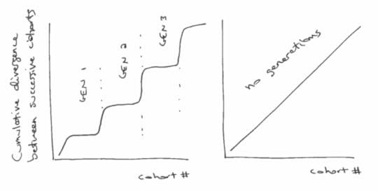
But ignoring the details for now, what would those difference look like if generations exist? Presumably, the differences between successive cohorts would be relatively small within each generation, and bigger between generations.
If we plot the cumulative total of these differences, we expect to see something like the figure below (left), with relatively fast transitions (big differences) between generations, and periods of slow change (small differences) within generations.
On the other hand, if there are no generations, we expect the differences between successive cohorts to be about the same. In that case the cumulative differences should look like a straight line, as in the figure below (right):
So, how should we quantify the differences between successive cohorts. When people talk about generational differences, they are often talking about differences in attitudes about political, social issues, and other cultural questions. Fortunately, these are exactly the sorts of things surveyed by the General Social Survey (GSS).
To gather data, I selected question from the GSS that were asked during the last three cycles (2010, 2012, 2014) and that were coded on a 5-point Likert scale.
You can see the variables that met these criteria, and download the data I used, here:
https://gssdataexplorer.norc.org/projects/13170/variables/data_cart
Now let's see what we got.
First I load the data dictionary, which contains the metadata:
In [2]: dct = thinkstats2.ReadStataDct('GSS.dct')Then I load the data itself:
In [3]: df = dct.ReadFixedWidth('GSS.dat')I'm going to drop two variables that turned out to be mostly N/A
In [4]: df.drop(['immcrime', 'pilloky'], axis=1, inplace=True)And then replace the special codes 8, 9, and 0 with N/A
In [5]: df.ix[:, 3:] = df.ix[:, 3:].replace([8, 9, 0], np.nan)df.head()
Out[5]: year id_ age wrkwayup fepol pillok premarsx spanking fechld fepresch ... patriot2 patriot3 patriot4 poleff18 poleff19 poleff20 govdook polgreed choices refrndms 0 2010 1 31 4 2 1 4 4 2 2 ... NaN NaN NaN NaN NaN NaN 3 2 NaN NaN 1 2010 2 23 5 2 1 4 3 2 3 ... NaN NaN NaN NaN NaN NaN 4 4 NaN NaN 2 2010 3 71 NaN 2 2 1 1 3 2 ... NaN NaN NaN NaN NaN NaN 3 4 NaN NaN 3 2010 4 82 2 2 1 3 3 3 2 ... NaN NaN NaN NaN NaN NaN 2 2 NaN NaN 4 2010 5 78 NaN NaN NaN NaN NaN NaN NaN ... NaN NaN NaN NaN NaN NaN NaN NaN NaN NaN
5 rows × 150 columns
For the age variable, I also have to replace 99 with N/A
In [6]: df.age.replace([99], np.nan, inplace=True)Here's an example of a typical variable on a 5-point Likert scale.
In [7]: thinkplot.Hist(Pmf(df.choices))[image error]
I have to compute year born
In [8]: df['yrborn'] = df.year - df.ageHere's what the distribution looks like. The survey includes roughly equal numbers of people born each year from 1922 to 1996.
In [9]: pmf_yrborn = Pmf(df.yrborn)thinkplot.Cdf(pmf_yrborn.MakeCdf())
Out[9]: {'xscale': 'linear', 'yscale': 'linear'} [image error]
Next I sort the respondents by year born and then assign them to cohorts so there are 200 people in each cohort.
In [10]: df_sorted = df[~df.age.isnull()].sort_values(by='yrborn')df_sorted['counter'] = np.arange(len(df_sorted), dtype=int) // 200
df_sorted[['year', 'age', 'yrborn', 'counter']].head()
Out[10]: year age yrborn counter 1411 2010 89 1921 0 1035 2010 89 1921 0 1739 2010 89 1921 0 1490 2010 89 1921 0 861 2010 89 1921 0 In [11]: df_sorted[['year', 'age', 'yrborn', 'counter']].tail()
Out[11]: year age yrborn counter 4301 2014 18 1996 32 4613 2014 18 1996 32 4993 2014 18 1996 32 4451 2014 18 1996 32 6032 2014 18 1996 32
I end up with the same number of people in each cohort (except the last).
In [12]: thinkplot.Cdf(Cdf(df_sorted.counter))None
[image error]
Then I can group by cohort.
In [13]: groups = df_sorted.groupby('counter')I'll instantiate an object for each cohort.
In [14]: class Cohort:skip = ['year', 'id_', 'age', 'yrborn', 'cohort', 'counter']
def __init__(self, name, df):
self.name = name
self.df = df
self.pmf_map = {}
def make_pmfs(self):
for col in self.df.columns:
if col in self.skip:
continue
self.pmf_map[col] = Pmf(self.df[col].dropna())
try:
self.pmf_map[col].Normalize()
except ValueError:
print(self.name, col)
def total_divergence(self, other, divergence_func):
total = 0
for col, pmf1 in self.pmf_map.items():
pmf2 = other.pmf_map[col]
divergence = divergence_func(pmf1, pmf2)
#print(col, pmf1.Mean(), pmf2.Mean(), divergence)
total += divergence
return total
To compute the difference between successive cohorts, I'll loop through the questions, compute Pmfs to represent the responses, and then compute the difference between Pmfs.
I'll use two functions to compute these differences. One computes the difference in means:
In [15]: def MeanDivergence(pmf1, pmf2):return abs(pmf1.Mean() - pmf2.Mean())
The other computes the Jensen-Shannon divergence
In [16]: def JSDivergence(pmf1, pmf2):xs = set(pmf1.Values()) | set(pmf2.Values())
ps = np.asarray(pmf1.Probs(xs))
qs = np.asarray(pmf2.Probs(xs))
ms = ps + qs
return 0.5 * (entropy(ps, ms) + entropy(qs, ms))
First I'll loop through the groups and make Cohort objects
In [17]: cohorts = []for name, group in groups:
cohort = Cohort(name, group)
cohort.make_pmfs()
cohorts.append(cohort)
len(cohorts)
Out[17]: 33
Each cohort spans a range about 3 birth years. For example, the cohort at index 10 spans 1965 to 1967.
In [18]: cohorts[11].df.yrborn.describe()Out[18]: count 200.000000
mean 1956.585000
std 0.493958
min 1956.000000
25% 1956.000000
50% 1957.000000
75% 1957.000000
max 1957.000000
Name: yrborn, dtype: float64
Here's the total divergence between the first two cohorts, using the mean difference between Pmfs.
In [19]: cohorts[0].total_divergence(cohorts[1], MeanDivergence)Out[19]: 31.040279367049521
And here's the total J-S divergence:
In [20]: cohorts[0].total_divergence(cohorts[1], JSDivergence)Out[20]: 6.7725572288951366
This loop computes the (absolute value) difference between successive cohorts and the cumulative sum of the differences.
In [21]: res = []cumulative = 0
for i in range(len(cohorts)-1):
td = cohorts[i].total_divergence(cohorts[i+1], MeanDivergence)
cumulative += td
print(i, td, cumulative)
res.append((i, cumulative))
0 31.040279367 31.040279367
1 28.3836530218 59.4239323888
2 23.5696110289 82.9935434177
3 26.2323801584 109.225923576
4 24.9007829029 134.126706479
5 26.0393476525 160.166054132
6 24.8166232133 184.982677345
7 21.6520436658 206.634721011
8 24.1933904043 230.828111415
9 25.6776252798 256.505736695
10 29.8524030016 286.358139696
11 26.8980464824 313.256186179
12 25.7648247447 339.021010923
13 26.1889717953 365.209982719
14 22.8978988777 388.107881596
15 21.8568321591 409.964713756
16 24.0318591633 433.996572919
17 26.5253260458 460.521898965
18 22.8921890979 483.414088063
19 23.2634817637 506.677569826
20 22.7139238903 529.391493717
21 21.8612744354 551.252768152
22 28.7140491676 579.96681732
23 25.3770585475 605.343875867
24 28.4834464175 633.827322285
25 26.5365954008 660.363917685
26 25.9157951263 686.279712812
27 24.5135820021 710.793294814
28 25.8325896861 736.6258845
29 23.3612099178 759.987094418
30 25.4897938733 785.476888291
31 33.1647682631 818.641656554
The results are a nearly straight line, suggesting that there are no meaningful generations, at least as I've formulated the question.
In [22]: xs, ys = zip(*res)thinkplot.Plot(xs, ys)
thinkplot.Config(xlabel='Cohort #',
ylabel='Cumulative difference in means',
legend=False)
[image error]
The results looks pretty much the same using J-S divergence.
In [23]: res = []cumulative = 0
for i in range(len(cohorts)-1):
td = cohorts[i].total_divergence(cohorts[i+1], JSDivergence)
cumulative += td
print(i, td, cumulative)
res.append((i, cumulative))
0 6.7725572289 6.7725572289
1 5.62917236405 12.4017295929
2 5.0624907141 17.464220307
3 4.17000968182 21.6342299889
4 4.28812434098 25.9223543299
5 4.82791915546 30.7502734853
6 4.68718559848 35.4374590838
7 4.68468177153 40.1221408553
8 5.05290361605 45.1750444714
9 4.73898052765 49.914024999
10 4.70690791746 54.6209329165
11 4.50240017279 59.1233330893
12 4.27566340317 63.3989964924
13 4.25538202128 67.6543785137
14 3.81795459454 71.4723331083
15 3.87937009897 75.3517032072
16 4.04261284213 79.3943160494
17 4.08350528576 83.4778213351
18 4.48996769966 87.9677890348
19 3.91403460156 91.8818236363
20 3.84677999195 95.7286036283
21 3.80839549117 99.5369991195
22 4.51411169618 104.051110816
23 4.08910255992 108.140213376
24 4.4797335534 112.619946929
25 4.89923921364 117.519186143
26 4.31338353073 121.832569673
27 4.2918089177 126.124378591
28 4.12560127765 130.249979869
29 3.9072987636 134.157278632
30 4.5453620366 138.702640669
31 8.30423913322 147.006879802
In [24]: xs, ys = zip(*res)
thinkplot.Plot(xs, ys)
thinkplot.Config(xlabel='Cohort #',
ylabel='Cumulative JS divergence',
legend=False)
[image error]
Conclusion: Using this set of questions from the GSS, and two measures of divergence, it seems that the total divergence between successive cohorts is nearly constant over time.
If a "generation" is supposed to be a sequence of cohorts with relatively small differences between them, punctuated by periods of larger differences, this study suggests that generations do not exist.


May 11, 2016
Binomial and negative binomial distributions
Today's post is prompted by this question from Reddit:
How do I calculate the distribution of the number of selections (with replacement) I need to make before obtaining k? For example, let's say I am picking marbles from a bag with replacement. There is a 10% chance of green and 90% of black. I want k=5 green marbles. What is the distribution number of times I need to take a marble before getting 5?
I believe this is a geometric distribution. I see how to calculate the cumulative probability given n picks, but I would like to generalize it so that for any value of k (number of marbles I want), I can tell you the mean, 10% and 90% probability for the number of times I need to pick from it.
Another way of saying this is, how many times do I need to pull on a slot machine before it pays out given that each pull is independent?
Note: I've changed the notation in the question to be consistent with convention.
In [1]: from __future__ import print_function, divisionimport thinkplot
from thinkstats2 import Pmf, Cdf
from scipy import stats
from scipy import special
%matplotlib inline
Solution
There are two ways to solve this problem. One is to relate the desired distribution to the binomial distribution.
If the probability of success on every trial is p, the probability of getting the kth success on the nth trial is
PMF(n; k, p) = BinomialPMF(k-1; n-1, p) pThat is, the probability of getting k-1 successes in n-1 trials, times the probability of getting the kth success on the nth trial.
Here's a function that computes it:
In [2]: def MakePmfUsingBinom(k, p, high=100):pmf = Pmf()
for n in range(1, high):
pmf[n] = stats.binom.pmf(k-1, n-1, p) * p
return pmf
And here's an example using the parameters in the question.
In [3]: pmf = MakePmfUsingBinom(5, 0.1, 200)thinkplot.Pdf(pmf)
[image error]
We can solve the same problem using the negative binomial distribution, but it requires some translation from the parameters of the problem to the conventional parameters of the binomial distribution.
The negative binomial PMF is the probability of getting r non-terminal events before the kth terminal event. (I am using "terminal event" instead of "success" and "non-terminal" event instead of "failure" because in the context of the negative binomial distribution, the use of "success" and "failure" is often reversed.)
If n is the total number of events, n = k + r, so
r = n - kIf the probability of a terminal event on every trial is p, the probability of getting the kth terminal event on the nth trial is
PMF(n; k, p) = NegativeBinomialPMF(n-k; k, p) pThat is, the probability of n-k non-terminal events on the way to getting the kth terminal event.
Here's a function that computes it:
In [4]: def MakePmfUsingNbinom(k, p, high=100):pmf = Pmf()
for n in range(1, high):
r = n-k
pmf[n] = stats.nbinom.pmf(r, k, p)
return pmf
Here's the same example:
In [5]: pmf2 = MakePmfUsingNbinom(5, 0.1, 200)thinkplot.Pdf(pmf2)
[image error]
And confirmation that the results are the same within floating point error.
In [6]: diffs = [abs(pmf[n] - pmf2[n]) for n in pmf]max(diffs)
Out[6]: 8.6736173798840355e-17
Using the PMF, we can compute the mean and standard deviation:
In [7]: pmf.Mean(), pmf.Std()Out[7]: (49.998064403376738, 21.207570382894403)
To compute percentiles, we can convert to a CDF (which computes the cumulative sum of the PMF)
In [8]: cdf = Cdf(pmf)scale = thinkplot.Cdf(cdf)
[image error]
And here are the 10th and 90th percentiles.
In [9]: cdf.Percentile(10), cdf.Percentile(90)Out[9]: (26, 78)
Copyright 2016 Allen Downey
MIT License: http://opensource.org/licenses/MIT

May 10, 2016
Probability is hard: part four
In the first article, I presented the Red Dice problem, which is a warm-up problem that might help us make sense of the other problems.In the second article, I presented the problem of interpreting medical tests when there is uncertainty about parameters like sensitivity and specificity. I explained that there are (at least) four models of the scenario, and I hinted that some of them yield different answers. I presented my solution for one of the scenarios, using the computational framework from Think Bayes.In the third article, I presented my solution for Scenario B.Now, on to Scenarios C and D. For the last time, here are the scenarios:
Scenario A: The patients are drawn at random from the relevant population, and the reason we are uncertain about t is that either (1) there are two versions of the test, with different false positive rates, and we don't know which test was used, or (2) there are two groups of people, the false positive rate is different for different groups, and we don't know which group the patient is in.Scenario B: As in Scenario A, the patients are drawn at random from the relevant population, but the reason we are uncertain about t is that previous studies of the test have been contradictory. That is, there is only one version of the test, and we have reason to believe that t is the same for all groups, but we are not sure what the correct value of t is.Scenario C: As in Scenario A, there are two versions of the test or two groups of people. But now the patients are being filtered so we only see the patients who tested positive and we don't know how many patients tested negative. For example, suppose you are a specialist and patients are only referred to you after they test positive.Scenario D: As in Scenario B, we have reason to think that t is the same for all patients, and as in Scenario C, we only see patients who test positive and don't know how many tested negative.
And the questions we would like to answer are:
What is the probability that a patient who tests positive is actually sick?Given two patients who have tested positive, what is the probability that both are sick?I have posted a new Jupyter notebook with a solution for Scenario C and D. It also includes the previous solutions for Scenarios A and B; if you have already seen the first two, you can skip to the new stuff.
You can read a static version of the notebook here.
OR
You can run the notebook on Binder.
If you click the Binder link, you should get a home page showing the notebooks in the repository for this blog. Click on test_scenario_cd.ipynb to load the notebook for this article.
Comments
As I said in the first article, this problem turned out to be harder than I expected. First, it took time, and a lot of untangling, to identify the different scenarios. Once we did that, figuring out the answers was easier, but still not easy.
For me, writing a simulation for each scenario turned out to be very helpful. It has the obvious benefit of providing an approximate answer, but it also forced me to specify the scenarios precisely, which is crucial for problems like these.
Now, having solved four versions of this problem, what guidance can we provide for interpreting medical tests in practice? And how realistic are these scenarios, anyway?
Most medical tests are more sensitive than 90% and yield false positives less often than 20-40% of the time. But many symptoms that indicate disease are neither sensitive nor specific. So this analysis might be more applicable to interpreting symptoms, rather than test results.
I think all four scenarios are relevant to practice:
For some signs of disease, we have estimates of true and false positive rates, but when there are multiple inconsistent estimates, we might be unsure which estimate is right. For some other tests, we might have reason to believe that these parameters are different for different groups of patients; for example, many antibody tests are more likely to generate false positives in patients who have been exposed to other diseases.In some medical environments, we could reasonably treat patients as a random sample of the population, but more often patients have been filtered by a selection process that depends on their symptoms and test results. We considered two extremes: in Scenarios A and B, we have a random sample, and in C and D we only see patients who test positive. But in practice the selection process is probably somewhere in between.
If the selection process is unknown, and we don't know whether the parameters of the test are likely to be different for different groups, one option is to run the analysis for all four scenarios (or rather, for the three scenarios that are different), and use the range of the results to characterize uncertainty due to model selection.
UPDATES
[May 11, 2016] In this comment on Reddit, /u/ppcsf shows how to solve this problem using a probabilistic programming language based on C#. The details are in this gist.

May 9, 2016
Probability is hard: part three
In the first article, I presented the Red Dice problem, which is a warm-up problem that might help us make sense of the other problems.
In the second article, I presented the problem of interpreting medical tests when there is uncertainty about parameters like sensitivity and specificity. I explained that there are (at least) four models of the scenario, and I hinted that some of them yield different answers. I presented my solution for one of the scenarios, using the computational framework from Think Bayes.
Now, on to Scenario B. For those of you coming in late, here are the Scenarios again:
Scenario A: The patients are drawn at random from the relevant population, and the reason we are uncertain about t is that either (1) there are two versions of the test, with different false positive rates, and we don't know which test was used, or (2) there are two groups of people, the false positive rate is different for different groups, and we don't know which group the patient is in.Scenario B: As in Scenario A, the patients are drawn at random from the relevant population, but the reason we are uncertain about t is that previous studies of the test have been contradictory. That is, there is only one version of the test, and we have reason to believe that t is the same for all groups, but we are not sure what the correct value of t is.Scenario C: As in Scenario A, there are two versions of the test or two groups of people. But now the patients are being filtered so we only see the patients who tested positive and we don't know how many patients tested negative. For example, suppose you are a specialist and patients are only referred to you after they test positive.Scenario D: As in Scenario B, we have reason to think that t is the same for all patients, and as in Scenario C, we only see patients who test positive and don't know how many tested negative.
And the questions we would like to answer are:
What is the probability that a patient who tests positive is actually sick?Given two patients who have tested positive, what is the probability that both are sick?I have posted a new Jupyter notebook with a Solution for Scenario B. It also includes the previous solution for Scenario A; if you read it before, you can skip to the new stuff.
You can read a static version of the notebook here.
OR
You can run the notebook on Binder.
If you click the Binder link, you should get a home page showing the notebooks and Python modules in the repository for this blog. Click on test_scenario_b.ipynb to load the notebook for this article.
I'll give you a chance to think about Scenarios C and D, and I'll post my solution in the next couple of days.
Enjoy!

May 6, 2016
Probability is hard, part two
Now I'll present the problem we are really working on: interpreting medical tests. Suppose we test a patient to see if they have a disease, and the test comes back positive. What is the probability that the patient is actually sick (that is, has the disease)?
To answer this question, we need to know:
The prevalence of the disease in the population the patient is from. Let's assume the patient is identified as a member of a population where the known prevalence is p.The sensitivity of the test, s, which is the probability of a positive test if the patient is sick.The false positive rate of the test, t, which is the probability of a positive test if the patient is not sick.
Given these parameters, it is straightforward to compute the probability that the patient is sick, given a positive test. This problem is a staple in probability classes.
But here's the wrinkle. What if you are uncertain about one of the parameters: p, s, or t? For example, suppose you have reason to believe that t is either 0.2 or 0.4 with equal probability. And suppose p=0.1 and s=0.9.
The questions we would like to answer are:
What is the probability that a patient who tests positive is actually sick?Given two patients who have tested positive, what is the probability that both are sick?
As we did with the Red Dice problem, we'll consider four scenarios:
Scenario A: The patients are drawn at random from the relevant population, and the reason we are uncertain about t is that either (1) there are two versions of the test, with different false positive rates, and we don't know which test was used, or (2) there are two groups of people, the false positive rate is different for different groups, and we don't know which group the patient is in.Scenario B: As in Scenario A, the patients are drawn at random from the relevant population, but the reason we are uncertain about t is that previous studies of the test have been contradictory. That is, there is only one version of the test, and we have reason to believe that t is the same for all groups, but we are not sure what the correct value of t is.Scenario C: As in Scenario A, there are two versions of the test or two groups of people. But now the patients are being filtered so we only see the patients who tested positive and we don't know how many patients tested negative. For example, suppose you are a specialist and patients are only referred to you after they test positive.Scenario D: As in Scenario B, we have reason to think that t is the same for all patients, and as in Scenario C, we only see patients who test positive and don't know how many tested negative.
I have posted a Jupyter notebook with solutions for the basic scenario (where we are certain about t) and for Scenario A. You might want to write your own solution before you read mine. And then you might want to work on Scenarios B, C, and D.
You can read a static version of the notebook here.
OR
You can run the notebook on Binder.
If you click the Binder link, you should get a home page showing the notebooks and Python modules in the repository for this blog. Click on test_scenario_a.ipynb to load the notebook for this article.
I'll post my solution for Scenarios B, C, and D next week.

May 5, 2016
Probability is hard
A few times we have hit a brick wall on a hard problem and made a strategic retreat by working on a simpler problem. At this point, we have retreated all the way to what I'll call the Red Dice problem, which goes like this:
Suppose I have a six-sided die that is red on 2 sides and blue on 4 sides, and another die that's the other way around, red on 4 sides and blue on 2.
I choose a die at random and roll it, and I tell you it came up red. What is the probability that I rolled the second die (red on 4 sides)? And if I do it again, what's the probability that I get red again?There are several variations on this problem, with answers that are subtly different. I explain the variations, and my solution, in a Jupyter notebook:
You can read a static version of the notebook here.
OR
You can run the notebook on Binder.
If you click the Binder link, you should get a home page showing the notebooks and Python modules in the repository for this blog. Click on red_dice.ipynb to load the notebook for this article.
Once we have settled the Red Dice problem, we will get back to the original problem, which relates to interpreting medical tests (a classic example of Bayesian inference that, again, turns out to be more complicated than we thought).
UPDATE: After reading the notebook, some readers are annoyed with me because Scenarios C and D are not consistent with the way I posed the question. I'm sorry if you feel tricked -- that was not the point! To clarify, Scenarios A and B are legitimate interpretations of the question, as posed, which is deliberately ambiguous. Scenarios C and D are exploring a different version because it will be useful when we get to the next problem.

May 3, 2016
Stats can't make modeling decisions
If effect sizes of coefficient are really small, can you interpret as no relationship? Coefficients are very significant, which is expected with my large dataset. But coefficients are tiny (0.0000001). Can I conclude no relationship? Or must I say there is a relationship, but it's not practical?I posted a response there, but since we get questions like this a lot, I will write a more detailed response here.
First, as several people mentioned on Reddit, you have to distinguish between a small coefficient and a small effect size. The size of the coefficient depend on the units it is expressed in. For example, in a previous article I wrote about the relationship between a baby's birth weight and its mother's age ("Are first babies more likely to be light?"). With weights in pounds and ages in years, the estimated coefficient is about 0.017 pounds per year.
At first glance, that looks like a small effect size. But the average birth weight in the U.S. is about 7.3 pounds, and the range from the youngest to the oldest mother was more than 20 years. So if we say the effect size is "about 3 ounces per decade", that would be easier to interpret. Or it might be even better express the effect in terms of percentages; for example, "A 10 year increase in mother's age is associated with a 2.4% increase in birth weight."
So that's the first part of my answer:
Expressing effect size in practical terms makes it easier to evaluate its importance in practice.
The second part of my answer address the question, "Can I conclude no relationship?" This is a question about modeling, not statistics, and
Statistical analysis can inform modeling choices, but it can't make decisions for you.
As a reminder, when you make a model of a real-world scenario, you have to decide what to include and what to leave out. If you include the most important things and leave out less important things, your model will be good enough for most purposes.
But in most scenarios, there is no single uniquely correct model. Rather, there are many possible models that might be good enough, or not, for various purposes.
Based on statistics alone, you can't say whether there is, or is not, a relationship between two variables. But statistics can help you justify your decision to include a relationship in a model or ignore it.
The affirmativeIf you want to argue that an effect SHOULD be included in a model, you can justify that decision (using classical statistics) in two steps:
1) Estimate the effect size and use background knowledge to make an argument about why it matters in practical terms. For example, a 3 ounce difference in birth weight might be associated with real differences in health outcomes, or not.
AND
2) Show that the p-value is small, which at least suggests that the observed effect is unlikely to be due to chance. (Some people will object to this interpretation of p-values, but I explain why I think it is valid in "Hypothesis testing is only mostly useless").
In my study of birth weight, I argued that mother's age should be included in the model because the effect size was big enough to matter in the real world, and because the p-value was very small.
The negativeIf you want to argue that it is ok to leave an effect out of a model, you can justify that decision in one of two ways:
1) If you apply a hypothesis test and get a small p-value, you probably can't dismiss it as random. But if the estimated effect size is small, can use background information to make an argument about why it is negligible.
OR
2) If you apply a hypothesis test and get a large p-value, that suggests that the effect you observed could be explained by chance. But that doesn't mean the effect is necessarily negligible. To make that argument, you need to consider the power of the test. One way to do that is to find the smallest hypothetical effect size that would yield a high probability of a significant test. Then you can say something like, "If the effect size were as big as X, this test would have a 90% of being statistically significant. The test was not statistically significant, so the effect size is likely to be less than X. And in practical terms, X is negligible."
The BayesianSo far I have been using the logic of classical statistics, which is problematic in many ways.
Alternatively, in a Bayesian framework, the result would be a posterior distribution on the effect size, which you could use to generate an ensemble of models with different effect sizes. To make predictions, you would generate predictive distributions that represent your uncertainty about the effect size. In that case there's no need to make binary decisions about whether there is, or is not, a relationship.
Or you could use Bayesian model comparison, but I think that a mostly misguided effort to shoehorn Bayesian methods into a classical framework. But that's a topic for another time.

April 27, 2016
Bayes on Jupyter
If you want to run the code, you can run the notebook in your browser by hitting this button

You should see a home page like this:
If you want to try the exercises, open workshop01.ipynb. If you just want to see the answers, open workshop01_soln.ipynb.
Either way, you should be able to run the notebooks in your browser and try out the examples.
If you run into any problems, let me know. Comments and suggestions are welcome.
Special thanks to the generous people who run Binder, which makes it easy to share and reproduce computation. You can watch their video here:

April 6, 2016
Bayesian update with a multivariate normal distribution
This notebook contains a solution to a problem posted on Reddit; here's the original statement of the problem:
A = {122.8, 115.5, 102.5, 84.7, 154.2, 83.7, 122.1, 117.6, 98.1,So, I have two sets of data where the elements correspond to each other:
111.2, 80.3, 110.0, 117.6, 100.3, 107.8, 60.2}
B = {82.6, 99.1, 74.6, 51.9, 62.3, 67.2, 82.4, 97.2, 68.9, 77.9,
81.5, 87.4, 92.4, 80.8, 74.7, 42.1}
I'm trying to find out the probability that (91.9 <= A <= 158.3) and (56.4 <= B <= 100). I know that P(91.9 <= A <= 158.3) = 0.727098 and that P(56.4 <= B <= 100) = 0.840273, given that A is a normal distribution with mean 105.5 and standard deviation 21.7 and that B is a normal distribution with mean 76.4 and standard deviation 15.4. However, since they are dependent events, P(BA)=P(A)P(B|A)=P(B)P(A|B). Is there any way that I can find out P(A|B) and P(B|A) given the data that I have?
The original poster added this clarification:
I'm going to give you some background on what I'm trying to do here first. I'm doing sports analysis trying to find the best quarterback of the 2015 NFL season using passer rating and quarterback rating, two different measures of how the quarterback performs during a game. The numbers in the sets above are the different ratings for each of the 16 games of the season (A being passer rating, B being quarterback rating, the first element being the first game, the second element being the second, etc.) The better game the quarterback has, the higher each of the two measures will be; I'm expecting that they're correlated and dependent on each other to some degree. I'm assuming that they're normally distributed because most things done by humans tend to be normally distributed.
As a first step, let's look at the data. I'll put the two datasets into NumPy arrays.
In [2]: a = np.array([122.8, 115.5, 102.5, 84.7, 154.2, 83.7,122.1, 117.6, 98.1, 111.2, 80.3, 110.0,
117.6, 100.3, 107.8, 60.2])
b = np.array([82.6, 99.1, 74.6, 51.9, 62.3, 67.2,
82.4, 97.2, 68.9, 77.9, 81.5, 87.4,
92.4, 80.8, 74.7, 42.1])
n = len(a)
n
Out[2]: 16
And make a scatter plot:
In [3]: thinkplot.Scatter(a, b, alpha=0.7)[image error]
It looks like modeling this data with a bi-variate normal distribution is a reasonable choice.
Let's make an single array out of it:
In [4]: X = np.array([a, b])And compute the sample mean
In [29]: x̄ = X.mean(axis=1)print(x̄)
[ 105.5375 76.4375]
Sample standard deviation
In [30]: std = X.std(axis=1)print(std)
[ 21.04040384 14.93640163]
Covariance matrix
In [32]: S = np.cov(X)print(S)
[[ 472.21183333 161.33583333]
[ 161.33583333 237.96916667]]
And correlation coefficient
In [33]: corrcoef = np.corrcoef(a, b)print(corrcoef)
[[ 1. 0.4812847]
[ 0.4812847 1. ]]
Now, let's start thinking about this as a Bayesian estimation problem.
There are 5 parameters we would like to estimate:
The means of the two variables, μ_a, μ_b
The standard deviations, σ_a, σ_b
The coefficient of correlation, ρ.
As a simple starting place, I'll assume that the prior distributions for these variables are uniform over all possible values.
I'm going to use a mesh algorithm to compute the joint posterior distribution, so I'll "cheat" and construct the mesh using conventional estimates for the parameters.
For each parameter, I'll compute a range of possible values where
The center of the range is the value estimated from the data.
The width of the range is 6 standard errors of the estimate.
The likelihood of any point outside this mesh is so low, it's safe to ignore it.
Here's how I construct the ranges:
In [9]: def make_array(center, stderr, m=11, factor=3):return np.linspace(center-factor*stderr,
center+factor*stderr, m)
μ_a = x̄[0]
μ_b = x̄[1]
σ_a = std[0]
σ_b = std[1]
ρ = corrcoef[0][1]
μ_a_array = make_array(μ_a, σ_a / np.sqrt(n))
μ_b_array = make_array(μ_b, σ_b / np.sqrt(n))
σ_a_array = make_array(σ_a, σ_a / np.sqrt(2 * (n-1)))
σ_b_array = make_array(σ_b, σ_b / np.sqrt(2 * (n-1)))
#ρ_array = make_array(ρ, np.sqrt((1 - ρ**2) / (n-2)))
ρ_array = make_array(ρ, 0.15)
def min_max(array):
return min(array), max(array)
print(min_max(μ_a_array))
print(min_max(μ_b_array))
print(min_max(σ_a_array))
print(min_max(σ_b_array))
print(min_max(ρ_array))
(89.757197120005102, 121.31780287999489)
(65.235198775056304, 87.639801224943696)
(9.5161000378105989, 32.564707642175762)
(6.7553975307657055, 23.117405735750815)
(0.031284703359568844, 0.93128470335956881)
Although the mesh is constructed in 5 dimensions, for doing the Bayesian update, I want to express the parameters in terms of a vector of means, μ, and a covariance matrix, Σ.
Params is an object that encapsulates these values. pack is a function that takes 5 parameters and returns a Param object.
In [10]: class Params:def __init__(self, μ, Σ):
self.μ = μ
self.Σ = Σ
def __lt__(self, other):
return (self.μ, self.Σ) < (self.μ, self.Σ)
In [11]: def pack(μ_a, μ_b, σ_a, σ_b, ρ):
μ = np.array([μ_a, μ_b])
cross = ρ * σ_a * σ_b
Σ = np.array([[σ_a**2, cross], [cross, σ_b**2]])
return Params(μ, Σ)
Now we can make a prior distribution. First, mesh is the Cartesian product of the parameter arrays. Since there are 5 dimensions with 11 points each, the total number of points is 11**5 = 161,051.
In [12]: mesh = product(μ_a_array, μ_b_array,σ_a_array, σ_b_array, ρ_array)
The result is an iterator. We can use itertools.starmap to apply pack to each of the points in the mesh:
In [13]: mesh = starmap(pack, mesh)Now we need an object to encapsulate the mesh and perform the Bayesian update. MultiNorm represents a map from each Param object to its probability.
It inherits Update from thinkbayes2.Suite and provides Likelihood, which computes the probability of the data given a hypothetical set of parameters.
If we know the mean is μ and the covariance matrix is Σ:
The sampling distribution of the mean, x̄, is multivariable normal with parameters μ and Σ/n.
The sampling distribution of (n-1) S is Wishart with parameters n-1 and Σ.
So the likelihood of the observed summary statistics, x̄ and S, is the product of two probability densities:
The pdf of the multivariate normal distrbution evaluated at x̄.
The pdf of the Wishart distribution evaluated at (n-1) S.
In [14]: class MultiNorm(thinkbayes2.Suite):def Likelihood(self, data, hypo):
x̄, S, n = data
pdf_x̄ = multivariate_normal(hypo.μ, hypo.Σ/n)
pdf_S = wishart(df=n-1, scale=hypo.Σ)
like = pdf_x̄.pdf(x̄) * pdf_S.pdf((n-1) * S)
return like
Now we can initialize the suite with the mesh.
In [15]: suite = MultiNorm(mesh)And update it using the data (the return value is the total probability of the data, aka the normalizing constant). This takes about 30 seconds on my machine.
In [16]: suite.Update((x̄, S, n))Out[16]: 1.6385250666091713e-15
Now to answer the original question, about the conditional probabilities of A and B, we can either enumerate the parameters in the posterior or draw a sample from the posterior.
Since we don't need a lot of precision, I'll draw a sample.
In [17]: sample = suite.MakeCdf().Sample(300)For a given pair of values, μ and Σ, in the sample, we can generate a simulated dataset.
The size of the simulated dataset is arbitrary, but should be large enough to generate a smooth distribution of P(A|B) and P(B|A).
In [18]: def generate(μ, Σ, sample_size):return np.random.multivariate_normal(μ, Σ, sample_size)
# run an example using sample stats
fake_X = generate(x̄, S, 300)
The following function takes a sample of $a$ and $b$ and computes the conditional probabilites P(A|B) and P(B|A)
In [19]: def conditional_probs(sample):df = pd.DataFrame(sample, columns=['a', 'b'])
pA = df[(91.9 <= df.a) & (df.a <= 158.3)]
pB = df[(56.4 <= df.b) & (df.b <= 100)]
pBoth = pA.index.intersection(pB.index)
pAgivenB = len(pBoth) / len(pB)
pBgivenA = len(pBoth) / len(pA)
return pAgivenB, pBgivenA
conditional_probs(fake_X)
Out[19]: (0.8174603174603174, 0.865546218487395)
Now we can loop through the sample of parameters, generate simulated data for each, and compute the conditional probabilities:
In [20]: def make_predictive_distributions(sample):pmf = thinkbayes2.Joint()
for params in sample:
fake_X = generate(params.μ, params.Σ, 300)
probs = conditional_probs(fake_X)
pmf[probs] += 1
pmf.Normalize()
return pmf
predictive = make_predictive_distributions(sample)
Then pull out the posterior predictive marginal distribution of P(A|B), and print the posterior predictive mean:
In [21]: thinkplot.Cdf(predictive.Marginal(0).MakeCdf())predictive.Marginal(0).Mean()
Out[21]: 0.7246540147158328 [image error]
And then pull out the posterior predictive marginal distribution of P(B|A), with the posterior predictive mean
In [22]: thinkplot.Cdf(predictive.Marginal(1).MakeCdf())predictive.Marginal(1).Mean()
Out[22]: 0.8221366197059744 [image error]
We don't really care about the posterior distributions of the parameters, but it's good to take a look and make sure they are not crazy.
The following function takes μ and Σ and unpacks them into a tuple of 5 parameters:
In [23]: def unpack(μ, Σ):μ_a = μ[0]
μ_b = μ[1]
σ_a = np.sqrt(Σ[0][0])
σ_b = np.sqrt(Σ[1][1])
ρ = Σ[0][1] / σ_a / σ_b
return μ_a, μ_b, σ_a, σ_b, ρ
So we can iterate through the posterior distribution and make a joint posterior distribution of the parameters:
In [24]: def make_marginals(suite):joint = thinkbayes2.Joint()
for params, prob in suite.Items():
t = unpack(params.μ, params.Σ)
joint[t] = prob
return joint
marginals = make_marginals(suite)
And here are the posterior marginal distributions for μ_a and μ_b
In [25]: thinkplot.Cdf(marginals.Marginal(0).MakeCdf())thinkplot.Cdf(marginals.Marginal(1).MakeCdf());
[image error]
And here are the posterior marginal distributions for σ_a and σ_b
In [26]: thinkplot.Cdf(marginals.Marginal(2).MakeCdf())thinkplot.Cdf(marginals.Marginal(3).MakeCdf());
[image error]
Finally, the posterior marginal distribution for the correlation coefficient, ρ
In [27]: thinkplot.Cdf(marginals.Marginal(4).MakeCdf());[image error]

March 28, 2016
Engineering education is good preparation for a lot of things
So you can imagine my reaction to a click-bait headline like, "Does Engineering Education Breed Terrorists?", which appeared recently in the Chronicle of Higher Education.
The article presents results from a new book, Engineers of Jihad: The Curious Connection Between Violent Extremism and Education, by Diego Gambetta and Steffen Hertog. If you don't want to read the book, it looks like you can get most of the results from this working paper, which is free to download.
I have not read the book, but I will summarize results from the paper.
Engineers are over-represented
Gambetta and Hertog compiled a list of 404 "members of violent Islamist groups". Of those, they found educational information on 284, and found that 196 had some higher education. For 178 of those cases, they were able to determine the subject of study, and of those, the most common fields were engineering (78), Islamic studies (34), medicine (14), and economics/business (12).
So the representation of engineers among this group is 78/178, or 44%. Is that more than we should expect? To answer that, the ideal reference group would be a random sample of males from the same countries, with the same distribution of ages, selecting people with some higher education.
It is not easy to assemble a reference sample like that, but Gambetta and Hertog approximate it with data from several sources. Their Table 4 summarizes the results, broken down by country:
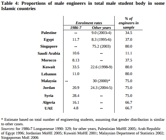
In every country, the fraction of engineers in the sample of violent extremists is higher than the fraction in the reference group (with the possible exceptions of Singapore and Saudi Arabia).
As always in studies like this, there are methodological issues that could be improved, but taking the results at face value, it looks like people who studied engineering are over-represented among violent extremists by a substantial factor -- Gambetta and Hertog put it at "two to four times the size we would expect [by random selection]".
Why engineers?
In the second part of the paper, Gambetta and Hertog turn to the question of causation; as they formulate it, "we will try to explain only why engineers became more radicalized than people with other degrees".
They consider four hypotheses:
1) "Random appearance of engineers as first movers, followed by diffusion through their network", which means that if the first members of these groups were engineers by chance, and if they recruited primarily through their social networks, and if engineers are over-represented in those networks, the observed over-representation might be due to historical accident.
2) "Selection of engineers because of their technical skills"; that is, engineers might be over-represented because extremist groups recruit them specifically.
3) "Engineers' peculiar cognitive traits and dispositions"; which includes both selection and self-selection; that is, extremist groups might recruit people with the traits of engineers, and engineers might be more likely to have traits that make them more likely to join extremist groups. [I repeat "more likely" as a reminder that under this hypothesis, not all engineers have the traits, and not all engineers with the traits join extremist groups.]
4) "The special social difficulties faced by engineers in Islamic countries"; which is the hypothesis that (a) engineering is a prestigious field of study, (b) graduates expect to achieve high status, (c) in many Islamic countries, their expectations are frustrated by lack of economic opportunity, and (d) the resulting "frustrated expectations and relative deprivation" explain why engineering graduates are more likely to become radicalized.
Their conclusion is that 1 and 2 "do not survive close scrutiny" and that the observed over-representation is best explained by the interaction of 3 and 4.
My conclusions
Here is my Bayesian interpretation of these hypotheses and the arguments Gambetta and Hertog present:
1) Initially, I didn't find this hypothesis particularly plausible. The paper presents weak evidence against it, so I find it less plausible now.
2) I find it very plausible that engineers would be recruited by extremist groups, not only for specific technical skills but also for their general ability to analyze systems, debug problems, design solutions, and work on teams to realize their designs. And once recruited, I would expect these skills to make them successful in exactly the ways that would cause them to appear in the selected sample of known extremists. The paper provides only addresses a narrow version of this hypothesis (specific technical skills), and provides only weak evidence against it, so I still find it highly plausible.
3) Initially I found it plausible that there are character traits that make a person more likely to pursue engineering and more likely to join and extremist group. This hypothesis could explain the observed over-representation even if both of those connections are weak; that is, even if few of the people who have the traits pursue engineering and even fewer join extremist groups. The paper presents some strong evidence for this hypothesis, so I find it quite plausible.
4) My initial reaction to this hypothesis is that the causal chain sounds fragile. And even if true, it is so hard to test, it verges on being unfalsifiable. But Gambetta and Hertog were able to do more work with it than I expected, so I grudgingly upgrade it to "possible".
In summary, my interpretation of the results differs slightly from the authors': I think (2) and (3) are more plausible than (3) and (4).
But overall I think the paper is solid: it starts with an intriguing observation, makes good use of data to refine the question and to evaluate alternative hypotheses, and does a reasonable job of interpreting the results.
So at this point, you might be wondering "What about engineering education? Does it breed terrorists, like the headline said?"
Good question! But Gambetta and Hertog have nothing to say about it. They did not consider this hypothesis, and they presented no evidence in favor or against. In fact, the phrase "engineering education" does not appear in their 90-page paper except in the title of a paper they cite.
Does bad journalism breed click bait?
So where did that catchy headline come from? From the same place all click bait comes from: the intersection of dwindling newspaper subscriptions and eroding journalistic integrity.
In this case, the author of the article, Dan Berrett, might not be the guilty party. He does a good job of summarizing Gambetta and Hertog's research. He presents summaries of a related paper on the relationship between education and extremism, and a related book. He points out some limitations of the study design. So far, so good.
The second half of the article is weaker, where Berrett reports speculation from researchers farther and farther from the topic.
For example, Donna M. Riley at Virginia Tech suggests that traditional [engineering] programs "reinforce positivist patterns of thinking" because "general-education courses [...] are increasingly being narrowed" and "engineers spend almost all their time with the same set of epistemological rules."
Berrett also quotes a 2014 study of American students in four engineering programs (MIT, UMass Amherst, Olin, and Smith), which concludes, "Engineering education, fosters a culture of disengagement that defines public welfare concerns as tangential to what it means to practice engineering."
But even if these claims are true, they are about American engineering programs in 2010s. They are unlikely to explain the radicalization of the extremists in the study, who were educated in Islamic countries in the "mid 70s to late 90s".
At this point there is no reason to think that engineering education contributed to the radicalization of the extremists in the sample. Gambetta and Hertog don't consider the hypothesis, and present no evidence that supports it. To their credit, they "wouldn’t presume to make curricular recommendations to [engineering] educators."
In summary, Gambetta and Hertog provide several credible explanations, supported by evidence, that could explain the observed over-representation. Speculating on other causes, assuming they are true—and then providing prescriptions for American engineering education—is gratuitous. And suggesting in a headline that engineering education causes terrorism is hack journalism.
We have plenty of problems
Traditional engineering programs are broken in a lot of ways. That's why Olin College was founded, and why I wanted to work here. I am passionate about engineering education and excited about the opportunities to make it better. Furthermore, some of the places we have the most room for improvement are exactly the ones highlighted in Derrett's article.
Yes, the engineering curriculum should "emphasize human needs, contexts, and interactions", as the
executive director of the American Society for Engineering Education (ASEE) suggests. As he explains, "We want engineers to understand what motivates humans, because that’s how you satisfy human needs. You have to understand people as people."
And yes, we want engineers "who recognize needs, design solutions and engage in creative enterprises for the good of the world". That's why we put it in Olin College's mission statement.
We may not be doing these things very well, yet. We are doing our best to get better.
In the meantime, it is premature to add "preventing terrorism" to our list of goals. We don't know the causes of terrorism, we have no reason to think engineering education is one of them, and even if we did, I'm not sure we would know what to do about it.
Debating changes in engineering education is hard enough. Bringing terrorism into it—without evidence or reason—doesn't help.

Probably Overthinking It

- Allen B. Downey's profile
- 236 followers

