
Allen B. Downey's Blog: Probably Overthinking It, page 2
March 19, 2025
Young Adults Want Fewer Children
The most recent data from the National Survey of Family Growth (NSFG) provides a first look at people born in the 2000s as young adults and an updated view of people born in the 1990s at the peak of their child-bearing years. Compared to previous generations at the same ages, these cohorts have fewer children, and they are less likely to say they intend to have children. Unless their plans change, trends toward lower fertility are likely to continue for the next 10-20 years.
The following figure shows the number of children fathered by male respondents as a function of their age when interviewed, grouped by decade of birth. It includes the most recent data, collected in 2022-23, combined with data from previous iterations of the survey going back to 1982.

Men born in the 1990s and 2000s have fathered fewer children than previous generations at the same ages:
At age 33, men born in the 1990s (blue line) have 0.6 children on average, compared to 1.1 – 1.4 in previous cohorts. At age 24, men born in the 2000s (violet line) have 0.1 children on average, compared to 0.2 – 0.4 in previous cohorts.The pattern is similar for women.

Women born in the 1990s and 2000s are having fewer children, later, than previous generations.
At age 33, women in the 1990s cohort have 1.4 children on average, compared to 1.7 – 1.8 in previous cohorts. At age 24, women in the 2000s cohort have 0.3 children on average, compared to 0.6 – 0.8 in previous cohorts. Desires and IntentionsThe NSFG asks respondents whether they want to have children and whether they intend to. These questions are useful because they distinguish between two possible causes of declining fertility. If someone says they want a child, but don’t intend to have one, it seems like something is standing in their way. In that case, changing circumstances might change their intentions. But if they don’t want children, that might be less likely to change.
Let’s start with stated desires. The following figure shows the fraction of men who say they want a child — or another child if they have at least one — grouped by decade of birth.

Men born in the 2000s are less likely to say they want to have a child — about 86% compared to 92% in previous cohorts. Men born in the 1990s are indistinguishable from previous cohorts.
The pattern is similar for women — the following figure shows the fraction who say they want a baby, grouped by decade of birth.

Women born in the 2000s are less likely to say they want a baby — about 76%, compared to 87% for previous cohorts when they were interviewed at the same ages. Women born in the 1990s are in line with previous generations.
Maybe surprisingly, men are more likely to say they want children. For example, of young men (15 to 24) born in the 2000s, 86% say they want children, compared to 76% of their female peers. Lyman Stone wrote about this pattern recently.
What About Intentions?The patterns are similar when people are asked whether they intend to have a child. Men and women born in the 1990s are indistinguishable from previous generations, but
Men born in the 2000s are less likely to say they intend to have a child — about 80% compared to 85–86% in previous cohorts at the same ages (15 to 24).Women born in the 2000s are less likely to say they intend to have a child — about 69% compared to 80–82% in previous cohorts.Now let’s look more closely at the difference between wants and intentions. The following figure shows the percentage of men who want a child minus the percentage who intend to have a child.

Among young men, the difference is small — most people who want a child intend to have one. The difference increases with age. Among men in their 30s, a substantial number say they would like another child but don’t intend to have one.
Here are the same differences for women.

The patterns are similar — among young women, most who want a child intend to have one. Among women in their 30s, the gap sometimes exceeds 20 percentage points, but might be decreasing in successive generations.
These results suggest that fertility is lower among people born in the 1990s and 2000s — at least so far — because they want fewer children, not because circumstances prevent them from having the children they want.
From the point of view of reproductive freedom, that conclusion is better than an alternative where people want children but can’t have them. But from the perspective of public policy, these results suggest that reversing these trends would be difficult: removing barriers is relatively easy — changing what people want is generally harder.
DATA NOTE: In the most recent iteration of the NSFG, about 75% of respondents were surveyed online; the other 25% were interviewed face-to-face, as all respondents were in previous iterations. Changes like this can affect the results, especially for more sensitive questions. And in the NSFG, Lyman Stone has pointed out that there are non-negligible differences when we compare online and face-to-face responses. Specifically, people who responded online were less likely to say they want children and less likely to say they intend to have children. At first consideration, it’s possible that these differences could be due to social desirability bias.
However, people who responded online also reported substantially lower parity (women) and number of biological children (men), on average, than people interviewed face-to-face — and it is much less likely that these responses depend on interview format. It is more likely that the way respondents were assigned to different formats depended on parity/number of children, and that difference explains the observed differences in desire and intent for more children. Since there is no strong evidence that the change in format accounts for the differences we see, I’m taking the results at face value for now.
The post Young Adults Want Fewer Children appeared first on Probably Overthinking It.


Young Adults Are Having the Children They Want — But They Want Fewer
The most recent data from the National Survey of Family Growth (NSFG) provides a first look at people born in the 2000s as young adults and an updated view of people born in the 1990s at the peak of their child-bearing years. Compared to previous generations at the same ages, these cohorts have fewer children, and they are less likely to say they intend to have children. Unless their plans change, trends toward lower fertility are likely to continue for the next 10-20 years.
The following figure shows the number of children fathered by male respondents as a function of their age when interviewed, grouped by decade of birth. It includes the most recent data, collected in 2022-23, combined with data from previous iterations of the survey going back to 1982.

Men born in the 1990s and 2000s have fathered fewer children than previous generations at the same ages:
At age 33, men born in the 1990s (blue line) have 0.6 children on average, compared to 1.1 – 1.4 in previous cohorts. At age 24, men born in the 2000s (violet line) have 0.1 children on average, compared to 0.2 – 0.4 in previous cohorts.The pattern is similar for women.

Women born in the 1990s and 2000s are having fewer children, later, than previous generations.
At age 33, women in the 1990s cohort have 1.4 children on average, compared to 1.7 – 1.8 in previous cohorts. At age 24, women in the 2000s cohort have 0.3 children on average, compared to 0.6 – 0.8 in previous cohorts. Desires and IntentionsThe NSFG asks respondents whether they want to have children and whether they intend to. These questions are useful because they distinguish between two possible causes of declining fertility. If someone says they want a child, but don’t intend to have one, it seems like something is standing in their way. In that case, changing circumstances might change their intentions. But if they don’t want children, that might be less likely to change.
Let’s start with stated desires. The following figure shows the fraction of men who say they want a child — or another child if they have at least one — grouped by decade of birth.

Men born in the 2000s are less likely to say they want to have a child — about 86% compared to 92% in previous cohorts. Men born in the 1990s are indistinguishable from previous cohorts.
The pattern is similar for women — the following figure shows the fraction who say they want a baby, grouped by decade of birth.

Women born in the 2000s are less likely to say they want a baby — about 76%, compared to 87% for previous cohorts when they were interviewed at the same ages. Women born in the 1990s are in line with previous generations.
Maybe surprisingly, men are more likely to say they want children. For example, of young men (15 to 24) born in the 2000s, 86% say they want children, compared to 76% of their female peers. Lyman Stone wrote about this pattern recently.
What About Intentions?The patterns are similar when people are asked whether they intend to have a child. Men and women born in the 1990s are indistinguishable from previous generations, but
Men born in the 2000s are less likely to say they intend to have a child — about 80% compared to 85–86% in previous cohorts at the same ages (15 to 24).Women born in the 2000s are less likely to say they intend to have a child — about 69% compared to 80–82% in previous cohorts.Now let’s look more closely at the difference between wants and intentions. The following figure shows the percentage of men who want a child minus the percentage who intend to have a child.

Among young men, the difference is small — most people who want a child intend to have one. The difference increases with age. Among men in their 30s, a substantial number say they would like another child but don’t intend to have one.
Here are the same differences for women.

The patterns are similar — among young women, most who want a child intend to have one. Among women in their 30s, the gap sometimes exceeds 20 percentage points, but might be decreasing in successive generations.
These results suggest that fertility is lower among people born in the 1990s and 2000s — at least so far — because they want fewer children, not because circumstances prevent them from having the children they want.
From the point of view of reproductive freedom, that conclusion is better than an alternative where people want children but can’t have them. But from the perspective of public policy, these results suggest that reversing these trends would be difficult: removing barriers is relatively easy — changing what people want is generally harder.
DATA NOTE: In the most recent iteration of the NSFG, about 75% of respondents were surveyed online; the other 25% were interviewed face-to-face, as all respondents were in previous iterations. Changes like this can affect the results, especially for more sensitive questions. And in the NSFG, Lyman Stone has pointed out that there are non-negligible differences when we compare online and face-to-face responses. Specifically, people who responded online were less likely to say they want children and less likely to say they intend to have children. At first consideration, it’s possible that these differences could be due to social desirability bias.
However, people who responded online also reported substantially lower parity (women) and number of biological children (men), on average, than people interviewed face-to-face — and it is much less likely that these responses depend on interview format. It is more likely that the way respondents were assigned to different formats depended on parity/number of children, and that difference explains the observed differences in desire and intent for more children. Since there is no strong evidence that the change in format accounts for the differences we see, I’m taking the results at face value for now.
January 20, 2025
Algorithmic Fairness
This is the last in a series of excerpts from Elements of Data Science, now available from Lulu.com and online booksellers.
This article is based on the Recidivism Case Study, which is about algorithmic fairness. The goal of the case study is to explain the statistical arguments presented in two articles from 2016:
“Machine Bias”, by Julia Angwin, Jeff Larson, Surya Mattu and Lauren Kirchner, and published by ProPublica.A response by Sam Corbett-Davies, Emma Pierson, Avi Feller and Sharad Goel: “A computer program used for bail and sentencing decisions was labeled biased against blacks. It’s actually not that clear.”, published in the Washington Post.Both are about COMPAS, a statistical tool used in the justice system to assign defendants a “risk score” that is intended to reflect the risk that they will commit another crime if released.
The ProPublica article evaluates COMPAS as a binary classifier, and compares its error rates for black and white defendants. In response, the Washington Post article shows that COMPAS has the same predictive value black and white defendants. And they explain that the test cannot have the same predictive value and the same error rates at the same time.
In the first notebook I replicated the analysis from the ProPublica article. In the second notebook I replicated the analysis from the WaPo article. In this article I use the same methods to evaluate the performance of COMPAS for male and female defendants. I find that COMPAS is unfair to women: at every level of predicted risk, women are less likely to be arrested for another crime.
You can run this Jupyter notebook on Colab.
Male and female defendantsThe authors of the ProPublica article published a supplementary article, How We Analyzed the COMPAS Recidivism Algorithm, which describes their analysis in more detail. In the supplementary article, they briefly mention results for male and female respondents:
The COMPAS system unevenly predicts recidivism between genders. According to Kaplan-Meier estimates, women rated high risk recidivated at a 47.5 percent rate during two years after they were scored. But men rated high risk recidivated at a much higher rate – 61.2 percent – over the same time period. This means that a high-risk woman has a much lower risk of recidivating than a high-risk man, a fact that may be overlooked by law enforcement officials interpreting the score.
We can replicate this result using the methods from the previous notebooks; we don’t have to do Kaplan-Meier estimation.
According to the binary gender classification in this dataset, about 81% of defendants are male.
male = cp["sex"] == "Male"male.mean()0.8066260049902967female = cp["sex"] == "Female"female.mean()0.19337399500970334Here are the confusion matrices for male and female defendants.
from rcs_utils import make_matrixmatrix_male = make_matrix(cp[male])matrix_malePred PositivePred NegativeActualPositive17321021Negative9942072matrix_female = make_matrix(cp[female])matrix_femalePred PositivePred NegativeActualPositive303195Negative288609And here are the metrics:
from rcs_utils import compute_metricsmetrics_male = compute_metrics(matrix_male, "Male defendants")metrics_malePercentMale defendantsFPR32.4FNR37.1PPV63.5NPV67.0Prevalence47.3metrics_female = compute_metrics(matrix_female, "Female defendants")metrics_femalePercentFemale defendantsFPR32.1FNR39.2PPV51.3NPV75.7Prevalence35.7The fraction of defendants charged with another crime (prevalence) is substantially higher for male defendants (47% vs 36%).
Nevertheless, the error rates for the two groups are about the same. As a result, the predictive values for the two groups are substantially different:
PPV: Women classified as high risk are less likely to be charged with another crime, compared to high-risk men (51% vs 64%).NPV: Women classified as low risk are more likely to “survive” two years without a new charge, compared to low-risk men (76% vs 67%).The difference in predictive values implies that COMPAS is not calibrated for men and women. Here are the calibration curves for male and female defendants.

For all risk scores, female defendants are substantially less likely to be charged with another crime. Or, reading the graph the other way, female defendants are given risk scores 1-2 points higher than male defendants with the same actual risk of recidivism.
To the degree that COMPAS scores are used to decide which defendants are incarcerated, those decisions:
Are unfair to women.Are less effective than they could be, if they incarcerate lower-risk women while allowing higher-risk men to go free.What would it take?Suppose we want to fix COMPAS so that predictive values are the same for male and female defendants. We could do that by using different thresholds for the two groups. In this section, we’ll see what it would take to re-calibrate COMPAS; then we’ll find out what effect that would have on error rates.
From the previous notebook, sweep_threshold loops through possible thresholds, makes the confusion matrix for each threshold, and computes the accuracy metrics. Here are the resulting tables for all defendants, male defendants, and female defendants.
from rcs_utils import sweep_thresholdtable_all = sweep_threshold(cp)table_male = sweep_threshold(cp[male])table_female = sweep_threshold(cp[female])
As we did in the previous notebook, we can find the threshold that would make predictive value the same for both groups.
from rcs_utils import predictive_valuematrix_all = make_matrix(cp)ppv, npv = predictive_value(matrix_all)from rcs_utils import crossingcrossing(table_male["PPV"], ppv)array(3.36782883)crossing(table_male["NPV"], npv)array(3.40116329)With a threshold near 3.4, male defendants would have the same predictive values as the general population. Now let’s do the same computation for female defendants.
crossing(table_female["PPV"], ppv)array(6.88124668)crossing(table_female["NPV"], npv)array(6.82760429)To get the same predictive values for men and women, we would need substantially different thresholds: about 6.8 compared to 3.4. At those levels, the false positive rates would be very different:
from rcs_utils import interpolateinterpolate(table_male["FPR"], 3.4)array(39.12)interpolate(table_female["FPR"], 6.8)array(9.14)And so would the false negative rates.
interpolate(table_male["FNR"], 3.4)array(30.98)interpolate(table_female["FNR"], 6.8)array(74.18)If the test is calibrated in terms of predictive value, it is uncalibrated in terms of error rates.
ROCIn the previous notebook I defined the receiver operating characteristic (ROC) curve. The following figure shows ROC curves for male and female defendants:
from rcs_utils import plot_rocplot_roc(table_male)plot_roc(table_female)
The ROC curves are nearly identical, which implies that it is possible to calibrate COMPAS equally for male and female defendants.
SummaryWith respect to sex, COMPAS is fair by the criteria posed by the ProPublica article: it has the same error rates for groups with different prevalence. But it is unfair by the criteria of the WaPo article, which argues:
A risk score of seven for black defendants should mean the same thing as a score of seven for white defendants. Imagine if that were not so, and we systematically assigned whites higher risk scores than equally risky black defendants with the goal of mitigating ProPublica’s criticism. We would consider that a violation of the fundamental tenet of equal treatment.
With respect to male and female defendants, COMPAS violates this tenet.
So who’s right? We have two competing definitions of fairness, and it is mathematically impossible to satisfy them both. Is it better to have equal error rates for all groups, as COMPAS does for men and women? Or is it better to be calibrated, which implies equal predictive values? Or, since we can’t have both, should the test be “tempered”, allowing both error rates and predictive values to depend on prevalence?
In the next notebook I explore these trade-offs in more detail. And I summarized these results in Chapter 9 of Probably Overthinking It.
This is the last in a series of excerpts from Elements of...
This is the last in a series of excerpts from Elements of Data Science, now available from Lulu.com and online booksellers.
This article is based on the Recidivism Case Study, which is about algorithmic fairness. The goal of the case study is to explain the statistical arguments presented in two articles from 2016:
“Machine Bias”, by Julia Angwin, Jeff Larson, Surya Mattu and Lauren Kirchner, and published by ProPublica.A response by Sam Corbett-Davies, Emma Pierson, Avi Feller and Sharad Goel: “A computer program used for bail and sentencing decisions was labeled biased against blacks. It’s actually not that clear.”, published in the Washington Post.Both are about COMPAS, a statistical tool used in the justice system to assign defendants a “risk score” that is intended to reflect the risk that they will commit another crime if released.
The ProPublica article evaluates COMPAS as a binary classifier, and compares its error rates for black and white defendants. In response, the Washington Post article shows that COMPAS has the same predictive value black and white defendants. And they explain that the test cannot have the same predictive value and the same error rates at the same time.
In the first notebook I replicated the analysis from the ProPublica article. In the second notebook I replicated the analysis from the WaPo article. In this article I use the same methods to evaluate the performance of COMPAS for male and female defendants. I find that COMPAS is unfair to women: at every level of predicted risk, women are less likely to be arrested for another crime.
You can run this Jupyter notebook on Colab.
Male and female defendantsThe authors of the ProPublica article published a supplementary article, How We Analyzed the COMPAS Recidivism Algorithm, which describes their analysis in more detail. In the supplementary article, they briefly mention results for male and female respondents:
The COMPAS system unevenly predicts recidivism between genders. According to Kaplan-Meier estimates, women rated high risk recidivated at a 47.5 percent rate during two years after they were scored. But men rated high risk recidivated at a much higher rate – 61.2 percent – over the same time period. This means that a high-risk woman has a much lower risk of recidivating than a high-risk man, a fact that may be overlooked by law enforcement officials interpreting the score.
We can replicate this result using the methods from the previous notebooks; we don’t have to do Kaplan-Meier estimation.
According to the binary gender classification in this dataset, about 81% of defendants are male.
male = cp["sex"] == "Male"male.mean()0.8066260049902967female = cp["sex"] == "Female"female.mean()0.19337399500970334Here are the confusion matrices for male and female defendants.
from rcs_utils import make_matrixmatrix_male = make_matrix(cp[male])matrix_malePred PositivePred NegativeActualPositive17321021Negative9942072matrix_female = make_matrix(cp[female])matrix_femalePred PositivePred NegativeActualPositive303195Negative288609And here are the metrics:
from rcs_utils import compute_metricsmetrics_male = compute_metrics(matrix_male, "Male defendants")metrics_malePercentMale defendantsFPR32.4FNR37.1PPV63.5NPV67.0Prevalence47.3metrics_female = compute_metrics(matrix_female, "Female defendants")metrics_femalePercentFemale defendantsFPR32.1FNR39.2PPV51.3NPV75.7Prevalence35.7The fraction of defendants charged with another crime (prevalence) is substantially higher for male defendants (47% vs 36%).
Nevertheless, the error rates for the two groups are about the same. As a result, the predictive values for the two groups are substantially different:
PPV: Women classified as high risk are less likely to be charged with another crime, compared to high-risk men (51% vs 64%).NPV: Women classified as low risk are more likely to “survive” two years without a new charge, compared to low-risk men (76% vs 67%).The difference in predictive values implies that COMPAS is not calibrated for men and women. Here are the calibration curves for male and female defendants.
For all risk scores, female defendants are substantially less likely to be charged with another crime. Or, reading the graph the other way, female defendants are given risk scores 1-2 points higher than male defendants with the same actual risk of recidivism.
To the degree that COMPAS scores are used to decide which defendants are incarcerated, those decisions:
Are unfair to women.Are less effective than they could be, if they incarcerate lower-risk women while allowing higher-risk men to go free.What would it take?Suppose we want to fix COMPAS so that predictive values are the same for male and female defendants. We could do that by using different thresholds for the two groups. In this section, we’ll see what it would take to re-calibrate COMPAS; then we’ll find out what effect that would have on error rates.
From the previous notebook, sweep_threshold loops through possible thresholds, makes the confusion matrix for each threshold, and computes the accuracy metrics. Here are the resulting tables for all defendants, male defendants, and female defendants.
from rcs_utils import sweep_thresholdtable_all = sweep_threshold(cp)table_male = sweep_threshold(cp[male])table_female = sweep_threshold(cp[female])
As we did in the previous notebook, we can find the threshold that would make predictive value the same for both groups.
from rcs_utils import predictive_valuematrix_all = make_matrix(cp)ppv, npv = predictive_value(matrix_all)from rcs_utils import crossingcrossing(table_male["PPV"], ppv)array(3.36782883)crossing(table_male["NPV"], npv)array(3.40116329)With a threshold near 3.4, male defendants would have the same predictive values as the general population. Now let’s do the same computation for female defendants.
crossing(table_female["PPV"], ppv)array(6.88124668)crossing(table_female["NPV"], npv)array(6.82760429)To get the same predictive values for men and women, we would need substantially different thresholds: about 6.8 compared to 3.4. At those levels, the false positive rates would be very different:
from rcs_utils import interpolateinterpolate(table_male["FPR"], 3.4)array(39.12)interpolate(table_female["FPR"], 6.8)array(9.14)And so would the false negative rates.
interpolate(table_male["FNR"], 3.4)array(30.98)interpolate(table_female["FNR"], 6.8)array(74.18)If the test is calibrated in terms of predictive value, it is uncalibrated in terms of error rates.
ROCIn the previous notebook I defined the receiver operating characteristic (ROC) curve. The following figure shows ROC curves for male and female defendants:
from rcs_utils import plot_rocplot_roc(table_male)plot_roc(table_female)The ROC curves are nearly identical, which implies that it is possible to calibrate COMPAS equally for male and female defendants.
SummaryWith respect to sex, COMPAS is fair by the criteria posed by the ProPublica article: it has the same error rates for groups with different prevalence. But it is unfair by the criteria of the WaPo article, which argues:
A risk score of seven for black defendants should mean the same thing as a score of seven for white defendants. Imagine if that were not so, and we systematically assigned whites higher risk scores than equally risky black defendants with the goal of mitigating ProPublica’s criticism. We would consider that a violation of the fundamental tenet of equal treatment.
With respect to male and female defendants, COMPAS violates this tenet.
So who’s right? We have two competing definitions of fairness, and it is mathematically impossible to satisfy them both. Is it better to have equal error rates for all groups, as COMPAS does for men and women? Or is it better to be calibrated, which implies equal predictive values? Or, since we can’t have both, should the test be “tempered”, allowing both error rates and predictive values to depend on prevalence?
In the next notebook I explore these trade-offs in more detail. And I summarized these results in Chapter 9 of Probably Overthinking It.
January 3, 2025
Confidence In the Press
This is the fifth in a series of excerpts from Elements of Data Science, now available from Lulu.com and online booksellers. It’s based on Chapter 16, which is part of the political alignment case study. You can read the complete example here, or run the Jupyter notebook on Colab.
Because this is a teaching example, it builds incrementally. If you just want to see the results, scroll to the end!
Chapter 16 is a template for exploring relationships between political alignment (liberal or conservative) and other beliefs and attitudes. In this example, we’ll use that template to look at the ways confidence in the press has changed over the last 50 years in the U.S.
The dataset we’ll use is an excerpt of data from the General Social Survey. It contains three resamplings of the original data. We’ll start with the first.
datafile = "gss_pacs_resampled.hdf"gss = pd.read_hdf(datafile, "gss0")gss.shape(72390, 207)It contains one row for each respondent and one column per variable.
Changes in ConfidenceThe General Social Survey includes several questions about a confidence in various institutions. Here are the names of the variables that contain the responses.
' '.join(column for column in gss.columns if 'con' in column)'conarmy conbus conclerg coneduc confed confinan coninc conjudge conlabor conlegis conmedic conpress conrinc consci contv'Here’s how this section of the survey is introduced.
I am going to name some institutions in this country. As far as the people running these institutions are concerned, would you say you have a great deal of confidence, only some confidence, or hardly any confidence at all in them?
The variable we’ll explore is conpress, which is about “the press”.
varname = "conpress"column = gss[varname]column.tail()72385 2.072386 3.072387 3.072388 2.072389 2.0Name: conpress, dtype: float64As we’ll see, response to this question have changed substantiall over the last few decades.
ResponsesHere’s the distribution of responses:
column.value_counts(dropna=False).sort_index()1.0 69682.0 244033.0 16769NaN 24250Name: conpress, dtype: int64The special value NaN indicates that the respondent was not asked the question, declined to answer, or said they didn’t know.
The following cell shows the numerical values and the text of the responses they stand for.
responses = [1, 2, 3]labels = [ "A great deal", "Only some", "Hardly any",]Here’s what the distribution looks like. plt.xticks puts labels on the
-axis.
pmf = Pmf.from_seq(column)pmf.bar(alpha=0.7)decorate(ylabel="PMF", title="Distribution of responses")plt.xticks(responses, labels);
About had of the respondents have “only some” confidence in the press – but we should not make too much of this result because it combines different numbers of respondents interviewed at different times.
Responses over timeIf we make a cross tabulation of year and the variable of interest, we get the distribution of responses over time.
xtab = pd.crosstab(gss["year"], column, normalize="index") * 100xtab.head()conpress1.02.03.0year197322.69647762.39837414.905149197424.84683555.75221219.400953197523.92807758.16044317.911480197629.32330853.58851717.088175197724.48436559.14837016.367265Now we can plot the results.
for response, label in zip(responses, labels): xtab[response].plot(label=label)decorate(xlabel="Year", ylabel="Percent", title="Confidence in the press")
The percentages of “A great deal” and “Only some” have been declining since the 1970s. The percentage of “Hardly any” has increased substantially.
Political alignmentTo explore the relationship between these responses and political alignment, we’ll recode political alignment into three groups:
d_polviews = { 1: "Liberal", 2: "Liberal", 3: "Liberal", 4: "Moderate", 5: "Conservative", 6: "Conservative", 7: "Conservative",}Now we can use replace and store the result as a new column in the DataFrame.
gss["polviews3"] = gss["polviews"].replace(d_polviews)With this scale, there are roughly the same number of people in each group.
pmf = Pmf.from_seq(gss["polviews3"])pmf.bar(color="C1", alpha=0.7)decorate( xlabel="Political alignment", ylabel="PMF", title="Distribution of political alignment",) Group by political alignment
Now we can use groupby to group the respondents by political alignment.
by_polviews = gss.groupby("polviews3")Here’s a dictionary that maps from each group to a color.
muted = sns.color_palette("muted", 5)color_map = {"Conservative": muted[3], "Moderate": muted[4], "Liberal": muted[0]}Now we can make a PMF of responses for each group.
for name, group in by_polviews: plt.figure() pmf = Pmf.from_seq(group[varname]) pmf.bar(label=name, color=color_map[name], alpha=0.7) decorate(ylabel="PMF", title="Distribution of responses") plt.xticks(responses, labels)


Looking at the “Hardly any” response, it looks like conservatives have the least confidence in the press.
RecodeTo quantify changes in these responses over time, one option is to put them on a numerical scale and compute the mean. Another option is to compute the percentage who choose a particular response or set of responses. Since the changes have been most notable in the “Hardly any” response, that’s what we’ll track. We’ll use replace to recode the values so “Hardly any” is 1 and all other responses are 0.
d_recode = {1: 0, 2: 0, 3: 1}gss["recoded"] = column.replace(d_recode)gss["recoded"].name = varnameWe can use value_counts to confirm that it worked.
gss["recoded"].value_counts(dropna=False)0.0 31371NaN 242501.0 16769Name: conpress, dtype: int64Now if we compute the mean, we can interpret it as the fraction of respondents who report “hardly any” confidence in the press. Multiplying by 100 makes it a percentage.
gss["recoded"].mean() * 10034.833818030743664Note that the Series method mean drops NaN values before computing the mean. The NumPy function mean does not.
Average by groupWe can use by_polviews to compute the mean of the recoded variable in each group, and multiply by 100 to get a percentage.
means = by_polviews["recoded"].mean() * 100meanspolviews3Conservative 44.410101Liberal 27.293806Moderate 34.113831Name: conpress, dtype: float64By default, the group names are in alphabetical order. To get the values in a particular order, we can use the group names as an index:
groups = ["Conservative", "Moderate", "Liberal"]means[groups]polviews3Conservative 44.410101Moderate 34.113831Liberal 27.293806Name: conpress, dtype: float64Now we can make a bar plot with color-coded bars:
title = "Percent with hardly any confidence in the press"colors = color_map.values()means[groups].plot(kind="bar", color=colors, alpha=0.7, label="")decorate( xlabel="", ylabel="Percent", title=title,)plt.xticks(rotation=0);
Conservatives have less confidence in the press than liberals, and moderates are somewhere in the middle.
But again, these results are an average over the interval of the survey, so you should not interpret them as a current condition.
Time seriesWe can use groupby to group responses by year.
by_year = gss.groupby("year")From the result we can select the recoded variable and compute the percentage that responded “Hardly any”.
time_series = by_year["recoded"].mean() * 100And we can plot the results with the data points themselves as circles and a local regression model as a line.
plot_series_lowess(time_series, "C1", label='')decorate( xlabel="Year", ylabel="Percent", title=title)
The fraction of respondents with “Hardly any” confidence in the press has increased consistently over the duration of the survey.
Time series by groupSo far, we have grouped by polviews3 and computed the mean of the variable of interest in each group. Then we grouped by year and computed the mean for each year. Now we’ll use pivot_table to compute the mean in each group for each year.
table = gss.pivot_table( values="recoded", index="year", columns="polviews3", aggfunc="mean") * 100table.head()polviews3ConservativeLiberalModerateyear197422.48243617.31207316.604478197522.33502510.88435417.481203197619.49541317.79448614.901257197722.39819013.20754714.650767197827.17622118.04878016.819013The result is a table that has years running down the rows and political alignment running across the columns. Each entry in the table is the mean of the variable of interest for a given group in a given year.
Plotting the resultsNow let’s see the results.
for group in groups: series = table[group] plot_series_lowess(series, color_map[group]) decorate( xlabel="Year", ylabel="Percent", title="Percent with hardly any confidence in the press",)
Confidence in the press has decreased in all three groups, but among liberals it might have leveled off or even reversed.
ResamplingThe figures we’ve generated so far in this notebook are based on a single resampling of the GSS data. Some of the features we see in these figures might be due to random sampling rather than actual changes in the world. By generating the same figures with different resampled datasets, we can get a sense of how much variation there is due to random sampling. To make that easier, the following function contains the code from the previous analysis all in one place.
def plot_by_polviews(gss, varname): """Plot mean response by polviews and year. gss: DataFrame varname: string column name """ gss["polviews3"] = gss["polviews"].replace(d_polviews) column = gss[varname] gss["recoded"] = column.replace(d_recode) table = gss.pivot_table( values="recoded", index="year", columns="polviews3", aggfunc="mean" ) * 100 for group in groups: series = table[group] plot_series_lowess(series, color_map[group]) decorate( xlabel="Year", ylabel="Percent", title=title, )Now we can loop through the three resampled datasets and generate a figure for each one.
datafile = "gss_pacs_resampled.hdf"for key in ["gss0", "gss1", "gss2"]: df = pd.read_hdf(datafile, key) plt.figure() plot_by_polviews(df, varname)

If you see an effect that is consistent in all three figures, it is less likely to be due to random sampling. If it varies from one resampling to the next, you should probably not take it too seriously.
Based on these results, it seems likely that confidence in the press is continuing to decrease among conservatives and moderates, but not liberals – with the result that polarization on this issue has increased since the 1990s.
December 20, 2024
Political Alignment and Outlook
This is the fourth in a series of excerpts from Elements of Data Science, now available from Lulu.com and online booksellers. It’s from Chapter 15, which is part of the political alignment case study. You can read the complete chapter here, or run the Jupyter notebook on Colab.
In the previous chapter, we used data from the General Social Survey (GSS) to plot changes in political alignment over time. In this notebook, we’ll explore the relationship between political alignment and respondents’ beliefs about themselves and other people.
First we’ll use groupby to compare the average response between groups and plot the average as a function of time. Then we’ll use the Pandas function pivot table to compute the average response within each group as a function of time.
Are People Fair?In the GSS data, the variable fair contains responses to this question:
Do you think most people would try to take advantage of you if they got a chance, or would they try to be fair?
The possible responses are:
CodeResponse1Take advantage2Fair3DependsAs always, we start by looking at the distribution of responses, that is, how many people give each response:
values(gss["fair"])1.0 160892.0 234173.0 2897Name: fair, dtype: int64The plurality think people try to be fair (2), but a substantial minority think people would take advantage (1). There are also a number of NaNs, mostly respondents who were not asked this question.
gss["fair"].isna().sum()29987To count the number of people who chose option 2, “people try to be fair”, we’ll use a dictionary to recode option 2 as 1 and the other options as 0.
recode_fair = {1: 0, 2: 1, 3: 0}As an alternative, we could include option 3, “depends”, by replacing it with 1, or give it less weight by replacing it with an intermediate value like 0.5. We can use replace to recode the values and store the result as a new column in the DataFrame.
gss["fair2"] = gss["fair"].replace(recode_fair)And we’ll use values to make sure it worked.
values(gss["fair2"])0.0 189861.0 23417Name: fair2, dtype: int64Now let’s see how the responses have changed over time.
Fairness Over TimeAs we saw in the previous chapter, we can use groupby to group responses by year.
gss_by_year = gss.groupby("year")From the result we can select fair2 and compute the mean.
fair_by_year = gss_by_year["fair2"].mean()Here’s the result, which shows the fraction of people who say people try to be fair, plotted over time. As in the previous chapter, we plot the data points themselves with circles and a local regression model as a line.
plot_series_lowess(fair_by_year, "C1")decorate( xlabel="Year", ylabel="Fraction saying yes", title="Would most people try to be fair?",)
Sadly, it looks like faith in humanity has declined, at least by this measure. Let’s see what this trend looks like if we group the respondents by political alignment.
Political Views on a 3-point ScaleIn the previous notebook, we looked at responses to polviews, which asks about political alignment. The valid responses are:
CodeResponse1Extremely liberal2Liberal3Slightly liberal4Moderate5Slightly conservative6Conservative7Extremely conservativeTo make it easier to visualize groups, we’ll lump the 7-point scale into a 3-point scale.
recode_polviews = { 1: "Liberal", 2: "Liberal", 3: "Liberal", 4: "Moderate", 5: "Conservative", 6: "Conservative", 7: "Conservative",}We’ll use replace again, and store the result as a new column in the DataFrame.
gss["polviews3"] = gss["polviews"].replace(recode_polviews)With this scale, there are roughly the same number of people in each group.
values(gss["polviews3"])Conservative 21573Liberal 17203Moderate 24157Name: polviews3, dtype: int64Fairness by GroupNow let’s see who thinks people are more fair, conservatives or liberals. We’ll group the respondents by polviews3.
by_polviews = gss.groupby("polviews3")And compute the mean of fair2 in each group.
by_polviews["fair2"].mean()polviews3Conservative 0.577879Liberal 0.550849Moderate 0.537621Name: fair2, dtype: float64It looks like conservatives are a little more optimistic, in this sense, than liberals and moderates. But this result is averaged over the last 50 years. Let’s see how things have changed over time.
Fairness over Time by GroupSo far, we have grouped by polviews3 and computed the mean of fair2 in each group. Then we grouped by year and computed the mean of fair2 for each year. Now we’ll group by polviews3 and year, and compute the mean of fair2 in each group over time.
We could do that computation “by hand” using the tools we already have, but it is so common and useful that it has a name. It is called a pivot table, and Pandas provides a function called pivot_table that computes it. It takes the following arguments:
values, which is the name of the variable we want to summarize: fair2 in this example.index, which is the name of the variable that will provide the row labels: year in this example.columns, which is the name of the variable that will provide the column labels: polview3 in this example.aggfunc, which is the function used to “aggregate”, or summarize, the values: mean in this example.Here’s how we run it.
table = gss.pivot_table( values="fair2", index="year", columns="polviews3", aggfunc="mean")The result is a DataFrame that has years running down the rows and political alignment running across the columns. Each entry in the table is the mean of fair2 for a given group in a given year.
table.head()polviews3ConservativeLiberalModerateyear19750.6256160.6171170.64728019760.6316960.5717820.61210019780.6949150.6594200.66545519800.6000000.5549450.64026419830.5724380.5853660.463492Reading across the first row, we can see that in 1975, moderates were slightly more optimistic than the other groups. Reading down the first column, we can see that the estimated mean of fair2 among conservatives varies from year to year. It is hard to tell looking at these numbers whether it is trending up or down – we can get a better view by plotting the results.
Plotting the ResultsBefore we plot the results, I’ll make a dictionary that maps from each group to a color. Seaborn provide a palette called muted that contains the colors we’ll use.
muted = sns.color_palette("muted", 5)sns.palplot(muted)
And here’s the dictionary.
color_map = {"Conservative": muted[3], "Moderate": muted[4], "Liberal": muted[0]}Now we can plot the results.
groups = ["Conservative", "Liberal", "Moderate"]for group in groups: series = table[group] plot_series_lowess(series, color_map[group])decorate( xlabel="Year", ylabel="Fraction saying yes", title="Would most people try to be fair?",)
The fraction of respondents who think people try to be fair has dropped in all three groups, although liberals and moderates might have leveled off. In 1975, liberals were the least optimistic group. In 2022, they might be the most optimistic. But the responses are quite noisy, so we should not be too confident about these conclusions.
December 14, 2024
Reject Math Supremacy
The premise of Think Stats, and the other books in the Think series, is that programming is a tool for teaching and learning — and many ideas that are commonly presented in math notation can be more clearly presented in code.
In the draft third edition of Think Stats there is almost no math — not because I made a special effort to avoid it, but because I found that I didn’t need it. For example, here’s how I present the binomial distribution in Chapter 5:
Mathematically, the distribution of these outcomes follows a binomial distribution, which has a PMF that is easy to compute.
from scipy.special import comb
def binomial_pmf(k, n, p):
return comb(n, k) * (p**k) * ((1 - p) ** (n - k))SciPy provides the comb function, which computes the number of combinations of n things taken k at a time, often pronounced “n choose k”.
binomial_pmf computes the probability of getting k hits out of n attempts, given p.
I could also present the PMF in math notation, but I’m not sure how it would help — the Python code represents the computation just as clearly. Some readers find math notation intimidating, and even for the ones who don’t, it takes some effort to decode. In my opinion, the payoff for this additional effort is too low.
But one of the people who read the draft disagrees. They wrote:
Provide equations for the distributions. You assume that the reader knows them and then you suddenly show a programming code for them — the code is a challenge to the reader to interpret without knowing the actual equation.
I acknowledge that my approach defies the expectation that we should present math first and then translate it into code. For readers who are used to this convention, presenting the code first is “sudden”.
But why? I think there are two reasons, one practical and one philosophical:
The practical reason is the presumption that the reader is more familiar with math notation and less familiar with code. Of course that’s true for some people, but for other people, it’s the other way around. People who like math have lots of books to choose from; people who like code don’t.The philosophical reason is what I’m calling math supremacy, which is the idea that math notation is the real thing, and everything else — including and especially code — is an inferior imitation. My correspondent hints at this idea with the suggestion that the reader should see the “actual equation”. Math is actual; code is not.I reject math supremacy. Math notation did not come from the sky on stone tablets; it was designed by people for a purpose. Programming languages were also designed by people, for different purposes. Math notation has some good properties — it is concise and it is nearly universal. But programming languages also have good properties — most notably, they are executable. When we express an idea in code, we can run it, test it, and debug it.
So here’s a thought: if you are writing for an audience that is comfortable with math notation, and your ideas can be expressed well in that form — go ahead and use math notation. But if you are writing for an audience that understands code, and your ideas can be expressed well in code — well then you should probably use code. “Actual” code.
December 11, 2024
Young Americans are Marrying Later or Never
I’ve written before about changes in marriage patterns in the U.S., and it’s one of the examples in Chapter 13 of the new third edition of Think Stats. My analysis uses data from the National Survey of Family Growth (NSFG). Today they released the most recent data, from surveys conducted in 2022 and 2023. So here are the results, updated with the newest data:
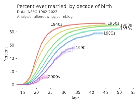
The patterns are consistent with what we’ve see in previous iterations — each successive cohort marries later than the previous one, and it looks like an increasing percentage of them will remain unmarried.
Data: National Center for Health Statistics (NCHS). (2024). 2022–2023 National Survey of Family Growth Public Use Data and Documentation. Hyattsville, MD: CDC National Center for Health Statistics. Retrieved from NSFG 2022–2023 Public Use Data Files, December 11, 2024.
My analysis is in this Jupyter notebook.
December 4, 2024
Multiple Regression with StatsModels
This is the third is a series of excerpts from Elements of Data Science which available from Lulu.com and online booksellers. It’s from Chapter 10, which is about multiple regression. You can read the complete chapter here, or run the Jupyter notebook on Colab.
In the previous chapter we used simple linear regression to quantify the relationship between two variables. In this chapter we’ll get farther into regression, including multiple regression and one of my all-time favorite tools, logistic regression. These tools will allow us to explore relationships among sets of variables. As an example, we will use data from the General Social Survey (GSS) to explore the relationship between education, sex, age, and income.
The GSS dataset contains hundreds of columns. We’ll work with an extract that contains just the columns we need, as we did in Chapter 8. Instructions for downloading the extract are in the notebook for this chapter.
We can read the DataFrame like this and display the first few rows.
import pandas as pdgss = pd.read_hdf('gss_extract_2022.hdf', 'gss')gss.head()yearidageeducdegreesexgunlawgrassrealinc01972123.016.03.02.01.0NaN18951.011972270.010.00.01.01.0NaN24366.021972348.012.01.02.01.0NaN24366.031972427.017.03.02.01.0NaN30458.041972561.012.01.02.01.0NaN50763.0We’ll start with a simple regression, estimating the parameters of real income as a function of years of education. First we’ll select the subset of the data where both variables are valid.
data = gss.dropna(subset=['realinc', 'educ'])xs = data['educ']ys = data['realinc']Now we can use linregress to fit a line to the data.
from scipy.stats import linregressres = linregress(xs, ys)res._asdict(){'slope': 3631.0761003894995, 'intercept': -15007.453640508655, 'rvalue': 0.37169252259280877, 'pvalue': 0.0, 'stderr': 35.625290800764, 'intercept_stderr': 480.07467595184363}The estimated slope is about 3450, which means that each additional year of education is associated with an additional $3450 of income.
Regression with StatsModelsSciPy doesn’t do multiple regression, so we’ll to switch to a new library, StatsModels. Here’s the import statement.
import statsmodels.formula.api as smfTo fit a regression model, we’ll use ols, which stands for “ordinary least squares”, another name for regression.
results = smf.ols('realinc ~ educ', data=data).fit()The first argument is a formula string that specifies that we want to regress income as a function of education. The second argument is the DataFrame containing the subset of valid data. The names in the formula string correspond to columns in the DataFrame.
The result from ols is an object that represents the model – it provides a function called fit that does the actual computation.
The result is a RegressionResultsWrapper, which contains a Series called params, which contains the estimated intercept and the slope associated with educ.
results.paramsIntercept -15007.453641educ 3631.076100dtype: float64The results from Statsmodels are the same as the results we got from SciPy, so that’s good!
Multiple RegressionIn the previous section, we saw that income depends on education, and in the exercise we saw that it also depends on age. Now let’s put them together in a single model.
results = smf.ols('realinc ~ educ + age', data=gss).fit()results.paramsIntercept -17999.726908educ 3665.108238age 55.071802dtype: float64In this model, realinc is the variable we are trying to explain or predict, which is called the dependent variable because it depends on the the other variables – or at least we expect it to. The other variables, educ and age, are called independent variables or sometimes “predictors”. The + sign indicates that we expect the contributions of the independent variables to be additive.
The result contains an intercept and two slopes, which estimate the average contribution of each predictor with the other predictor held constant.
The estimated slope for educ is about 3665 – so if we compare two people with the same age, and one has an additional year of education, we expect their income to be higher by $3514.The estimated slope for age is about 55 – so if we compare two people with the same education, and one is a year older, we expect their income to be higher by $55.In this model, the contribution of age is quite small, but as we’ll see in the next section that might be misleading.
Grouping by AgeLet’s look more closely at the relationship between income and age. We’ll use a Pandas method we have not seen before, called groupby, to divide the DataFrame into age groups.
grouped = gss.groupby('age')type(grouped)pandas.core.groupby.generic.DataFrameGroupByThe result is a GroupBy object that contains one group for each value of age. The GroupBy object behaves like a DataFrame in many ways. You can use brackets to select a column, like realinc in this example, and then invoke a method like mean.
mean_income_by_age = grouped['realinc'].mean()The result is a Pandas Series that contains the mean income for each age group, which we can plot like this.
import matplotlib.pyplot as pltplt.plot(mean_income_by_age, 'o', alpha=0.5)plt.xlabel('Age (years)')plt.ylabel('Income (1986 $)')plt.title('Average income, grouped by age');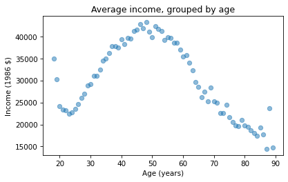
Average income increases from age 20 to age 50, then starts to fall. And that explains why the estimated slope is so small, because the relationship is non-linear. To describe a non-linear relationship, we’ll create a new variable called age2 that equals age squared – so it is called a quadratic term.
gss['age2'] = gss['age']**2Now we can run a regression with both age and age2 on the right side.
model = smf.ols('realinc ~ educ + age + age2', data=gss)results = model.fit()results.paramsIntercept -52599.674844educ 3464.870685age 1779.196367age2 -17.445272dtype: float64In this model, the slope associated with age is substantial, about $1779 per year.
The slope associated with age2 is about -$17. It might be unexpected that it is negative – we’ll see why in the next section. But first, here are two exercises where you can practice using groupby and ols.
Visualizing regression resultsIn the previous section we ran a multiple regression model to characterize the relationships between income, age, and education. Because the model includes quadratic terms, the parameters are hard to interpret. For example, you might notice that the parameter for educ is negative, and that might be a surprise, because it suggests that higher education is associated with lower income. But the parameter for educ2 is positive, and that makes a big difference. In this section we’ll see a way to interpret the model visually and validate it against data.
Here’s the model from the previous exercise.
gss['educ2'] = gss['educ']**2model = smf.ols('realinc ~ educ + educ2 + age + age2', data=gss)results = model.fit()results.paramsIntercept -26336.766346educ -706.074107educ2 165.962552age 1728.454811age2 -17.207513dtype: float64The results object provides a method called predict that uses the estimated parameters to generate predictions. It takes a DataFrame as a parameter and returns a Series with a prediction for each row in the DataFrame. To use it, we’ll create a new DataFrame with age running from 18 to 89, and age2 set to age squared.
import numpy as npdf = pd.DataFrame()df['age'] = np.linspace(18, 89)df['age2'] = df['age']**2Next, we’ll pick a level for educ, like 12 years, which is the most common value. When you assign a single value to a column in a DataFrame, Pandas makes a copy for each row.
df['educ'] = 12df['educ2'] = df['educ']**2Then we can use results to predict the average income for each age group, holding education constant.
pred12 = results.predict(df)The result from predict is a Series with one prediction for each row. So we can plot it with age on the x-axis and the predicted income for each age group on the y-axis. And we’ll plot the data for comparison.
plt.plot(mean_income_by_age, 'o', alpha=0.5)plt.plot(df['age'], pred12, label='High school', color='C4')plt.xlabel('Age (years)')plt.ylabel('Income (1986 $)')plt.title('Income versus age, grouped by education level')plt.legend();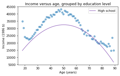
The dots show the average income in each age group. The line shows the predictions generated by the model, holding education constant. This plot shows the shape of the model, a downward-facing parabola.
We can do the same thing with other levels of education, like 14 years, which is the nominal time to earn an Associate’s degree, and 16 years, which is the nominal time to earn a Bachelor’s degree.
df['educ'] = 16df['educ2'] = df['educ']**2pred16 = results.predict(df)df['educ'] = 14df['educ2'] = df['educ']**2pred14 = results.predict(df)plt.plot(mean_income_by_age, 'o', alpha=0.5)plt.plot(df['age'], pred16, ':', label='Bachelor')plt.plot(df['age'], pred14, '--', label='Associate')plt.plot(df['age'], pred12, label='High school', color='C4')plt.xlabel('Age (years)')plt.ylabel('Income (1986 $)')plt.title('Income versus age, grouped by education level')plt.legend();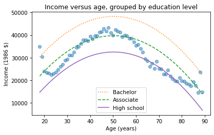
The lines show expected income as a function of age for three levels of education. This visualization helps validate the model, since we can compare the predictions with the data. And it helps us interpret the model since we can see the separate contributions of age and education.
Sometimes we can understand a model by looking at its parameters, but often it is better to look at its predictions. In the exercises, you’ll have a chance to run a multiple regression, generate predictions, and visualize the results.
November 28, 2024
Hazard and Survival
Here’s a question from the Reddit statistics forum.
If I have a tumor that I’ve been told has a malignancy rate of 2% per year, does that compound? So after 5 years there’s a 10% chance it will turn malignant?
This turns out to be an interesting question, because the answer depends on what that 2% means. If we know that it’s the same for everyone, and it doesn’t vary over time, computing the compounded probability after 5 years is a relatively simple.
But if that 2% is an average across people with different probabilities, the computation is a little more complicated – and the answer turns out to be substantially different, so this is not a negligible effect.
To demonstrate both computations, I’ll assume that the probability for a given patient doesn’t change over time. This assumption is consistent with the multistage model of carcinogenesis, which posits that normal cells become cancerous through a series of mutations, where the probability of any of those mutations is constant over time.
Click here to run this notebook on Colab.
Constant HazardLet’s start with the simpler calculation, where the probability that a tumor progresses to malignancy is known to be 2% per year and constant. In that case, we can answer OP’s question by making a constant hazard function and using it to compute a survival function.
empiricaldist provides a Hazard object that represents a hazard function. Here’s one where the hazard is 2% per year for 20 years.
from empiricaldist import Hazardp = 0.02ts = np.arange(1, 21)hazard = Hazard(p, ts, name='hazard1')The probability that a tumor survives a given number of years without progressing is the cumulative product of the complements of the hazard, which we can compute like this.
p_surv = (1 - hazard).cumprod()Hazard provides a make_surv method that does this computation and returns a Surv object that represents the corresponding survival function.
surv = hazard.make_surv(name='surv1')Here’s what it looks like.
surv.plot()decorate(xlabel='Year', ylabel='P(survival > t)')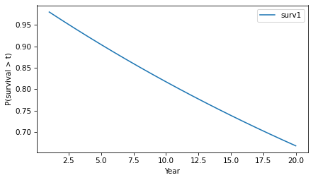
The y-axis shows the probability that a tumor “survives” for more than a given number of years without progressing. The probability of survival past Year 1 is 98%, as you might expect.
surv.head()probs10.98000020.96040030.941192And the probability of going more than 10 years without progressing is about 82%.
surv(10)array(0.81707281)Because of the way the probabilities compound, the survival function drops off with decreasing slope, even though the hazard is constant.
Knowledge is PowerNow let’s add a little more realism to the model. Suppose that in the observed population the average rate of progression is 2% per year, but it varies from one person to another. As an example, suppose the actual rate is 1% for half the population and 3% for the other half. And for a given patient, suppose we don’t know initially which group they are in.
As in the previous example, the probability that the tumor goes a year without progressing is 2%. However, at the end of that year, if it has not progressed, we have evidence in favor of the hypothesis that the patient is in the low-progression group. Specifically, the likelihood ratio is 3:1 in favor of that hypothesis.
Now we can apply Bayes’s rule in odds form. Since the prior odds were 1:1 and the likelihood ratio is 3:1, the posterior odds are 3:1 – so after one year we now believe the probability is 75% that the patient is in the low-progression group. In that case we can update the probability that the tumor progresses in the second year:
p1 = 0.01p2 = 0.030.75 * p1 + 0.25 * p20.015If the tumor survives a year without progressing, the probability it will progress in the second year is 1.5%, substantially less than the initial estimate of 2%. Note that this change is due to evidence that the patient is in the low progression group. It does not assume that anything has changed in the world – only that we have more information about which world we’re in.
If the tumor lasts another year without progressing, we would do the same update again. The posterior odds would be 9:1, or a 90% chance that the patient is in the low-progression group, which implies that the hazard in the third year is 1.2%. The following loop repeats this computation for 20 years.
odds = 1ratio = 3res = []for year in hazard.index: p_low = odds / (odds + 1) haz = p_low * p1 + (1-p_low) * p2 res.append((p_low, haz)) odds *= ratioHere are the results in percentages.
df = pd.DataFrame(res, columns=['p_low', 'hazard'], index=hazard.index)(df * 100).round(2).head()p_lowhazard150.002.00275.001.50390.001.20496.431.07598.781.02If we put the hazard rates in a Hazard object, we can compare them to the constant hazard model.
hazard2 = Hazard(df['hazard'], name='hazard2')hazard.plot(label='Known probability')hazard2.plot(label='Uncertain probability')decorate(xlabel='Year', ylabel='Hazard')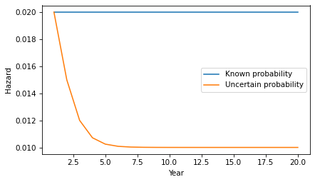
After only a few years, the probability is near certain that the patient is in the low-progress group, so the inferred hazard is close to 1%.
Here’s what the corresponding survival function looks like.
surv2 = hazard2.make_surv(name='surv2')surv2.plot(label='Uncertain probability')surv.plot(label='Known probability')decorate(xlabel='Year', ylabel='P(survival > t)')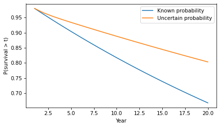
In the second model, survival times are substantially longer. For example, the probability of going more than 10 years without progression increases from 82% to 89%.
surv(10), surv2(10)(array(0.81707281), array(0.88795586))In this example, there are only two groups with different probabilities of progression. But we would see the same effect in a more realistic model with a range of probabilities. As time passes without progression, it becomes more likely that the patient is in a low-progression group, so their hazard during the next period is lower. The more variability there is in the probability of progression, the stronger this effect.
DiscussionThis example demonstrates a subtle point about a distribution of probabilities. To explain it, let’s consider a more abstract scenario. Suppose you have two coin-flipping devices:
One of them is known to flips head and tails with equal probability.The other is known to be miscalibrated so it flips heads with either 60% probability or 40% probability – and we don’t know which, but they are equally likely.If we use the first device, the probability of heads is 50%. If we use the second device, the probability of heads is 50%. So it might seem like there is no difference between them – and more generally, it might seem like we can always collapse a distribution of probabilities down to a single probability.
But that’s not true, as we can demonstrate by running the coin-flippers twice. For the first, the probability of two heads is 25%. For the second, it’s either 36% or 16% with equal probability – so the total probability is 26%.
p1, p2 = 0.6, 0.4np.mean([p1**2, p2**2])0.26In general, there’s a difference between a scenario where a probability is known precisely and a scenario where there is uncertainty about the probability.
Probably Overthinking It

- Allen B. Downey's profile
- 236 followers

