
Multiple Regression with StatsModels
This is the third is a series of excerpts from Elements of Data Science which available from Lulu.com and online booksellers. It’s from Chapter 10, which is about multiple regression. You can read the complete chapter here, or run the Jupyter notebook on Colab.
In the previous chapter we used simple linear regression to quantify the relationship between two variables. In this chapter we’ll get farther into regression, including multiple regression and one of my all-time favorite tools, logistic regression. These tools will allow us to explore relationships among sets of variables. As an example, we will use data from the General Social Survey (GSS) to explore the relationship between education, sex, age, and income.
The GSS dataset contains hundreds of columns. We’ll work with an extract that contains just the columns we need, as we did in Chapter 8. Instructions for downloading the extract are in the notebook for this chapter.
We can read the DataFrame like this and display the first few rows.
import pandas as pdgss = pd.read_hdf('gss_extract_2022.hdf', 'gss')gss.head()yearidageeducdegreesexgunlawgrassrealinc01972123.016.03.02.01.0NaN18951.011972270.010.00.01.01.0NaN24366.021972348.012.01.02.01.0NaN24366.031972427.017.03.02.01.0NaN30458.041972561.012.01.02.01.0NaN50763.0We’ll start with a simple regression, estimating the parameters of real income as a function of years of education. First we’ll select the subset of the data where both variables are valid.
data = gss.dropna(subset=['realinc', 'educ'])xs = data['educ']ys = data['realinc']Now we can use linregress to fit a line to the data.
from scipy.stats import linregressres = linregress(xs, ys)res._asdict(){'slope': 3631.0761003894995, 'intercept': -15007.453640508655, 'rvalue': 0.37169252259280877, 'pvalue': 0.0, 'stderr': 35.625290800764, 'intercept_stderr': 480.07467595184363}The estimated slope is about 3450, which means that each additional year of education is associated with an additional $3450 of income.
Regression with StatsModelsSciPy doesn’t do multiple regression, so we’ll to switch to a new library, StatsModels. Here’s the import statement.
import statsmodels.formula.api as smfTo fit a regression model, we’ll use ols, which stands for “ordinary least squares”, another name for regression.
results = smf.ols('realinc ~ educ', data=data).fit()The first argument is a formula string that specifies that we want to regress income as a function of education. The second argument is the DataFrame containing the subset of valid data. The names in the formula string correspond to columns in the DataFrame.
The result from ols is an object that represents the model – it provides a function called fit that does the actual computation.
The result is a RegressionResultsWrapper, which contains a Series called params, which contains the estimated intercept and the slope associated with educ.
results.paramsIntercept -15007.453641educ 3631.076100dtype: float64The results from Statsmodels are the same as the results we got from SciPy, so that’s good!
Multiple RegressionIn the previous section, we saw that income depends on education, and in the exercise we saw that it also depends on age. Now let’s put them together in a single model.
results = smf.ols('realinc ~ educ + age', data=gss).fit()results.paramsIntercept -17999.726908educ 3665.108238age 55.071802dtype: float64In this model, realinc is the variable we are trying to explain or predict, which is called the dependent variable because it depends on the the other variables – or at least we expect it to. The other variables, educ and age, are called independent variables or sometimes “predictors”. The + sign indicates that we expect the contributions of the independent variables to be additive.
The result contains an intercept and two slopes, which estimate the average contribution of each predictor with the other predictor held constant.
The estimated slope for educ is about 3665 – so if we compare two people with the same age, and one has an additional year of education, we expect their income to be higher by $3514.The estimated slope for age is about 55 – so if we compare two people with the same education, and one is a year older, we expect their income to be higher by $55.In this model, the contribution of age is quite small, but as we’ll see in the next section that might be misleading.
Grouping by AgeLet’s look more closely at the relationship between income and age. We’ll use a Pandas method we have not seen before, called groupby, to divide the DataFrame into age groups.
grouped = gss.groupby('age')type(grouped)pandas.core.groupby.generic.DataFrameGroupByThe result is a GroupBy object that contains one group for each value of age. The GroupBy object behaves like a DataFrame in many ways. You can use brackets to select a column, like realinc in this example, and then invoke a method like mean.
mean_income_by_age = grouped['realinc'].mean()The result is a Pandas Series that contains the mean income for each age group, which we can plot like this.
import matplotlib.pyplot as pltplt.plot(mean_income_by_age, 'o', alpha=0.5)plt.xlabel('Age (years)')plt.ylabel('Income (1986 $)')plt.title('Average income, grouped by age');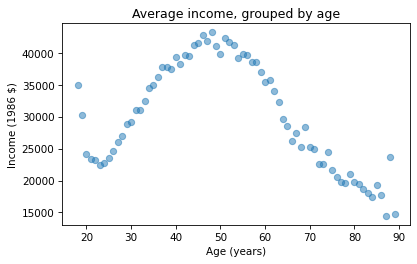
Average income increases from age 20 to age 50, then starts to fall. And that explains why the estimated slope is so small, because the relationship is non-linear. To describe a non-linear relationship, we’ll create a new variable called age2 that equals age squared – so it is called a quadratic term.
gss['age2'] = gss['age']**2Now we can run a regression with both age and age2 on the right side.
model = smf.ols('realinc ~ educ + age + age2', data=gss)results = model.fit()results.paramsIntercept -52599.674844educ 3464.870685age 1779.196367age2 -17.445272dtype: float64In this model, the slope associated with age is substantial, about $1779 per year.
The slope associated with age2 is about -$17. It might be unexpected that it is negative – we’ll see why in the next section. But first, here are two exercises where you can practice using groupby and ols.
Visualizing regression resultsIn the previous section we ran a multiple regression model to characterize the relationships between income, age, and education. Because the model includes quadratic terms, the parameters are hard to interpret. For example, you might notice that the parameter for educ is negative, and that might be a surprise, because it suggests that higher education is associated with lower income. But the parameter for educ2 is positive, and that makes a big difference. In this section we’ll see a way to interpret the model visually and validate it against data.
Here’s the model from the previous exercise.
gss['educ2'] = gss['educ']**2model = smf.ols('realinc ~ educ + educ2 + age + age2', data=gss)results = model.fit()results.paramsIntercept -26336.766346educ -706.074107educ2 165.962552age 1728.454811age2 -17.207513dtype: float64The results object provides a method called predict that uses the estimated parameters to generate predictions. It takes a DataFrame as a parameter and returns a Series with a prediction for each row in the DataFrame. To use it, we’ll create a new DataFrame with age running from 18 to 89, and age2 set to age squared.
import numpy as npdf = pd.DataFrame()df['age'] = np.linspace(18, 89)df['age2'] = df['age']**2Next, we’ll pick a level for educ, like 12 years, which is the most common value. When you assign a single value to a column in a DataFrame, Pandas makes a copy for each row.
df['educ'] = 12df['educ2'] = df['educ']**2Then we can use results to predict the average income for each age group, holding education constant.
pred12 = results.predict(df)The result from predict is a Series with one prediction for each row. So we can plot it with age on the x-axis and the predicted income for each age group on the y-axis. And we’ll plot the data for comparison.
plt.plot(mean_income_by_age, 'o', alpha=0.5)plt.plot(df['age'], pred12, label='High school', color='C4')plt.xlabel('Age (years)')plt.ylabel('Income (1986 $)')plt.title('Income versus age, grouped by education level')plt.legend();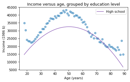
The dots show the average income in each age group. The line shows the predictions generated by the model, holding education constant. This plot shows the shape of the model, a downward-facing parabola.
We can do the same thing with other levels of education, like 14 years, which is the nominal time to earn an Associate’s degree, and 16 years, which is the nominal time to earn a Bachelor’s degree.
df['educ'] = 16df['educ2'] = df['educ']**2pred16 = results.predict(df)df['educ'] = 14df['educ2'] = df['educ']**2pred14 = results.predict(df)plt.plot(mean_income_by_age, 'o', alpha=0.5)plt.plot(df['age'], pred16, ':', label='Bachelor')plt.plot(df['age'], pred14, '--', label='Associate')plt.plot(df['age'], pred12, label='High school', color='C4')plt.xlabel('Age (years)')plt.ylabel('Income (1986 $)')plt.title('Income versus age, grouped by education level')plt.legend();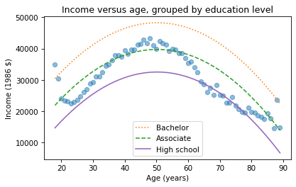
The lines show expected income as a function of age for three levels of education. This visualization helps validate the model, since we can compare the predictions with the data. And it helps us interpret the model since we can see the separate contributions of age and education.
Sometimes we can understand a model by looking at its parameters, but often it is better to look at its predictions. In the exercises, you’ll have a chance to run a multiple regression, generate predictions, and visualize the results.


Probably Overthinking It

- Allen B. Downey's profile
- 236 followers

