
Allen B. Downey's Blog: Probably Overthinking It, page 4
July 25, 2024
Where’s My Train?
Yesterday I presented a webinar for PyMC Labs where I solved one of the exercises from Think Bayes, called “The Red Line Problem”. Here’s the scenario:
The Red Line is a subway that connects Cambridge and Boston, Massachusetts. When I was working in Cambridge I took the Red Line from Kendall Square to South Station and caught the commuter rail to Needham. During rush hour Red Line trains run every 7-8 minutes, on average.
When I arrived at the subway stop, I could estimate the time until the next train based on the number of passengers on the platform. If there were only a few people, I inferred that I just missed a train and expected to wait about 7 minutes. If there were more passengers, I expected the train to arrive sooner. But if there were a large number of passengers, I suspected that trains were not running on schedule, so I expected to wait a long time.
While I was waiting, I thought about how Bayesian inference could help predict my wait time and decide when I should give up and take a taxi.
I used this exercise to demonstrate a process for developing and testing Bayesian models in PyMC. The solution uses some common PyMC features, like the Normal, Gamma, and Poisson distributions, and some less common features, like the Interpolated and StudentT distributions.
The video is on YouTube now:
This talk will be remembered for the first public appearance of the soon-to-be-famous “Banana of Ignorance”. In general, when the data we have are unable to distinguish between competing explanations, that uncertainty is reflected in the joint distribution of the parameters. In this example, if we see more people waiting than expected, there are two explanation: a higher-than-average arrival rate or a longer-than-average elapsed time since the last train. If we make a contour plot of the joint posterior distribution of these parameters, it looks like this:
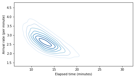
The elongated shape of the contour indicates that either explanation is sufficient: if the arrival rate is high, elapsed time can be normal, and if the elapsed time is high, the arrival rate can be normal. Because this shape indicates that we don’t know which explanation is correct, I have dubbed it “The Banana of Ignorance”:

For all of the details, you can read the Jupyter notebook or run it on Colab.
The original Red Line Problem is based on a student project from my Bayesian Statistics class at Olin College, way back in Spring 2013.


July 17, 2024
Elements of Data Science
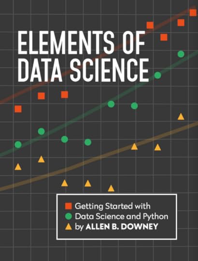
I’m excited to announce the launch of my newest book, Elements of Data Science. As the subtitle suggests, it is about “Getting started with Data Science and Python”.
Order now from Lulu.com and get 20% off!
I am publishing this book myself, which has one big advantage: I can print it with a full color interior without increasing the cover price. In my opinion, the code is more readable with syntax highlighting, and the data visualizations look great!
In addition to the printed edition, all chapters are available to read online, and they are in Jupyter notebooks, where you can read the text, run the code, and work on the exercises.
DescriptionElements of Data Science is an introduction to data science for people with no programming experience. My goal is to present a small, powerful subset of Python that allows you to do real work with data as quickly as possible.
Part 1 includes six chapters that introduce basic Python with a focus on working with data.
Part 2 presents exploratory data analysis using Pandas and empiricaldist — it includes a revised and updated version of the material from my popular DataCamp course, “Exploratory Data Analysis in Python.”
Part 3 takes a computational approach to statistical inference, introducing resampling method, bootstrapping, and randomization tests.
Part 4 is the first of two case studies. It uses data from the General Social Survey to explore changes in political beliefs and attitudes in the U.S. in the last 50 years. The data points on the cover are from one of the graphs in this section.
Part 5 is the second case study, which introduces classification algorithms and the metrics used to evaluate them — and discusses the challenges of algorithmic decision-making in the context of criminal justice.
This project started in 2019, when I collaborated with a group at Harvard to create a data science class for people with no programming experience. We discussed some of the design decisions that went into the course and the book in this article.
June 28, 2024
Have the Nones Leveled Off?
Last month Ryan Burge published “The Nones Have Hit a Ceiling“, using data from the 2023 Cooperative Election Study to show that the increase in the number of Americans with no religious affiliation has hit a plateau. Comparing the number of Atheists, Agnostics, and “Nothing in Particular” between 2020 and 2023, he found that “the share of non-religious Americans has stopped rising in any meaningful way.”
When I read that, I was frustrated that the HERI Freshman Survey had not published new data since 2019. I’ve been following the rise of the “Nones” in that dataset since one of my first blog articles.
As you might guess, the Freshman Survey reports data from incoming college students. Of course, college students are not a representative sample of the U.S. population, and as rates of college attendance have increased, they represent a different slice of the population over time. Nevertheless, surveying young adults over a long interval provides an early view of trends in the general population.
Well, I have good news! I got a notification today that HERI has published data tables for the 2020 through 2023 surveys. They are in PDF, so I had to do some manual data entry, but I have results!
Religious preferenceAmong other questions, the Freshman Survey asks students to select their “current religious preference” from a list of seventeen common religions, “Other religion,” “Atheist”, “Agnostic”, or “None.”
The options “Atheist” and “Agnostic” were added in 2015. For consistency over time, I compare the “Nones” from previous years with the sum of “None”, “Atheist” and “Agnostic” since 2015.
The following figure shows the fraction of Nones from 1969, when the question was added, to 2023, the most recent data available.
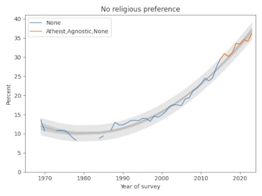
The blue line shows data until 2015; the orange line shows data from 2015 through 2019. The gray line shows a quadratic fit. The light gray region shows a 95% predictive interval.
The quadratic model continues to fit the data well and the recent trend is still increasing, but if you look at only the last few data points, there is some evidence that the rate of increase is slowing.
But not for womenNow here’s where things get interesting. Until recently, female students have been consistently more religious than male students. But that might be changing. The following figure shows the percentages of Nones for male and female students (with a missing point in 2018, when this breakdown was not available).
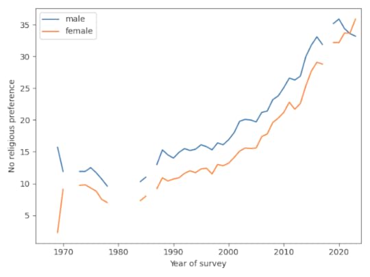
Since 2019, the percentage of Nones has increased for women and decreased for men, and it looks like women may now be less religious. So the apparent slowdown in the overall trend might be a mix of opposite trends in the two groups.
The following graph shows the gender gap over time, that is, the difference in percentages of male and female students with no religious affiliation.
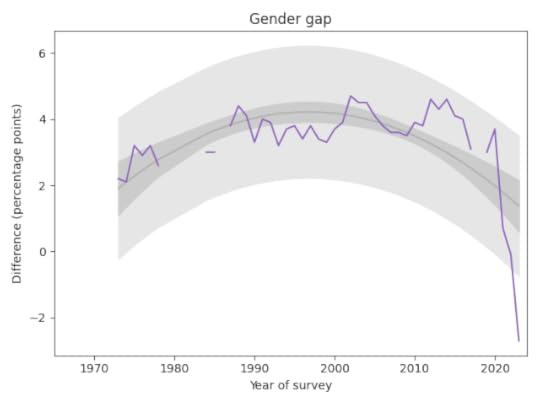
The gap was essentially unchanged from 1990 to 2020. But in the last three years it has changed drastically. It now falls outside the predictive range based on past data, which suggests a change this large would be unlikely by chance.
AttendanceThe survey also asks students how often they “attended a religious service” in the last year. The choices are “Frequently,” “Occasionally,” and “Not at all.” Respondents are instructed to select “Occasionally” if they attended one or more times, so a wedding or a funeral would do it.
The following figure shows the fraction of students who reported any religious attendance in the last year, starting in 1968. I discarded a data point from 1966 that seems unlikely to be correct.
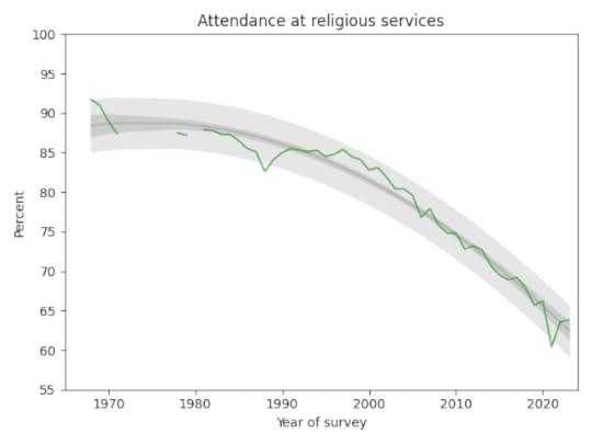
There is a clear dip in 2021, likely due to the pandemic, but the last two data points have returned to the long-term trend.
Data SourceThe data reported here are available from the HERI publications page. Since I entered the data manually from PDF documents, it’s possible I have made errors.
June 14, 2024
Should divorce be more difficult?
“The Christian right is coming for divorce next,” according to this recent Vox article, and “Some conservatives want to make it a lot harder to dissolve a marriage.”
As always when I read an article like this, I want to see data — and the General Social Survey has just the data I need. Since 1974, they have asked a representative sample of the U.S. population, “Should divorce in this country be easier or more difficult to obtain than it is now?” with the options to respond “Easier”, “More difficult”, or “Stay as is”.
Here’s how the responses have changed over time:
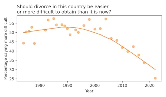
Since the 1990s, the percentage saying divorce should be more difficult has dropped from about 50% to about 30%. [The last data point, in 2022, may not be reliable. Due to disruptions during the COVID pandemic, the GSS changed some elements of their survey process — in the 2021 and 2022 data, responses to several questions have deviated from long-term trends in ways that might not reflect real changes in opinion.]
If we break down the results by political alignment, we can see whether these changes are driven by liberals, conservatives, or both.
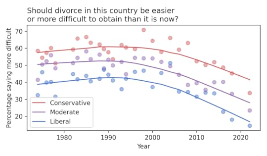
Not surprisingly, conservatives are more likely than liberals to believe that divorce should be more difficult, by a margin of about 20 percentage points. But the percentages have declined in all groups — and fallen below 50% even among self-described conservatives.
As the Vox article documents, conservatives in several states have proposed legislation to make divorce more difficult. Based on the data, these proposals are likely to be unpopular.
To see my analysis, you can run this notebook on Colab. For similar analysis of other topics, see Chapter 11 of Probably Overthinking It.
June 6, 2024
Migration and Population Growth
On a recent run I was talking with a friend from Spain about immigration in Europe. We speculated about whether the population of Spain would be growing or shrinking if there were no international migration. I thought it might be shrinking, but we were not sure. Fortunately, Our World in Data has just the information we need!
I downloaded data from OWID’s interactive graph, “Population growth rate with and without migration”, ultimately from UN, World Population Prospects (2022) and processed by Our World in Data.
It includes “The annual change in population with migration included versus the change if there was zero migration (neither emigration nor immigration). The latter, therefore, represents the population change based only on domestic births and deaths.”
I selected data from 1990 to 2022. Here are the results for Spain.
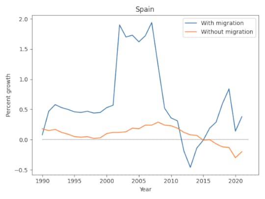
In this graph, we can see:
Without migration, population growth would have been close to zero – and negative since 2015.With migration, population growth has been substantially higher except for a few years from 2012 to 2014, during a period of high unemployment and austerity measures following the global financial crisis.I’m not sure what caused the increased migration around 2001. At first I thought it might be when several Eastern European and Baltic countries joined the EU, but that was not until 2004. If anyone knows the reason, let me know.
From the annual growth rates, we can compute the cumulative growth over the 32-year period.
With migration, Spain grew by 22% over 32 years, which is very slow. Without migration, it would have grown by only 2.6%.
So the answer to our question is that the population of Spain would have grown very slowly without migration – but it is so close to zero, we were probably right to be unsure if it was negative.
All CountriesLooking across other regions and countries (and some territories) we can see more general patterns. The following figure shows actual growth rates with migration on the x-axis, and hypothetical rates without migration on the y-axis. To see the interactive version of this figure, you can run this Jupyter notebook on Colab.
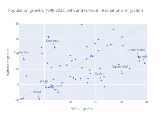
Many high-income countries and regions have low fertility rates; without migration, their populations would grow slowly or even shrink. For example, the population of Europe grew by only 3.3% in 32 years from 1990 to 2022, slower than any other region. But without migration – that is, with population change based only on domestic births and deaths – it would have shrunk by 2.1%.
During the same period, the population of Northern America grew by 37%, much more quickly than Europe. But more than half of that growth was due to international migration; without it, growth would have been only 18%.
Countries in the lower-right quadrant are growing only because of migration; without it, they would be shrinking. They include several European countries and Japan.
As fertility has decreased, the populations of high-income countries have aged, with fewer employed workers to support more retirees. These aging populations depend on the labor of immigrants, who tend to be younger, willing to work at jobs some native-born workers would not, and providing skills in areas where there are shortages, including child care and health care.
However, in some countries, the immigration levels needed to stabilize the population face political barriers, and even the perception of increased immigration can elicit anti-migration sentiments. Particularly in Europe and Northern America, concerns about immigration – real and imagined – have contributed to the growth of right wing populism.
May 20, 2024
Bertrand’s Boxes
An early draft of Probably Overthinking It included two chapters about probability. I still think they are interesting, but the other chapters are really about data, and the examples in these chapters are more like brain teasers — so I’ve saved them for another book. Here’s an excerpt from the chapter on Bayes theorem.
In 1889 Joseph Bertrand posed and solved one of the oldest paradoxes in probability. But his solution is not quite correct – it is right for the wrong reason.
The original statement of the problem is in his Calcul des probabilités (Gauthier-Villars, 1889). As a testament to the availability of information in the 21st century, I found a scanned copy of the book online and pasted a screenshot into an online OCR server. Then I pasted the French text into an online translation service. Here is the result, which I edited lightly for clarity:
Three boxes are identical in appearance. Each has two drawers, each drawer contains a medal. The medals in the first box are gold; those in the second box, silver; the third box contains a gold medal and a silver medal.
We choose a box; what is the probability of finding, in its drawers, a gold coin and a silver coin?
Three cases are possible and they are equally likely because the three chests are identical in appearance. Only one case is favorable. The probability is 1/3.
Having chosen a box, we open a drawer. Whatever medal one finds there, only two cases are possible. The drawer that remains closed may contain a medal whose metal may or may not differ from that of the first. Of these two cases, only one is in favor of the box whose parts are different. The probability of having got hold of this set is therefore 1/2.
How can it be, however, that it will be enough to open a drawer to change the probability and raise it from 1/3 to 1/2? The reasoning cannot be correct. Indeed, it is not.
After opening the first drawer, two cases remain possible. Of these two cases, only one is favorable, this is true, but the two cases do not have the same likelihood.
If the coin we saw is gold, the other may be silver, but we would be better off betting that it is gold.
Suppose, to show the obvious, that instead of three boxes we have three hundred. One hundred contain two gold medals, one hundred and two silver medals and one hundred one gold and one silver. In each box we open a drawer, we see therefore three hundred medals. A hundred of them are in gold and a hundred in silver, that is certain; the hundred others are doubtful, they belong to boxes whose parts are not alike: chance will regulate the number.
We must expect, when opening the three hundred drawers, to see less than two hundred gold coins the probability that the first that appears belongs to one of the hundred boxes of which the other coin is in gold is therefore greater than 1/2.
Now let me translate the paradox one more time to make the apparent contradiction clearer, and then we will resolve it.
Suppose we choose a random box, open a random drawer, and find a gold medal. What is the probability that the other drawer contains a silver medal? Bertrand offers two answers, and an argument for each:
Only one of the three boxes is mixed, so the probability that we chose it is 1/3.When we see the gold coin, we can rule out the two-silver box. There are only two boxes left, and one of them is mixed, so the probability we chose it is 1/2.As with so many questions in probability, we can use Bayes theorem to resolve the confusion. Initially the boxes are equally likely, so the prior probability for the mixed box is 1/3.
When we open the drawer and see a gold medal, we get some information about which box we chose. So let’s think about the likelihood of this outcome in each case:
If we chose the box with two gold medals, the likelihood of finding a gold medal is 100%.If we chose the box with two silver medals, the likelihood is 0%.And if we chose the box with one of each, the likelihood is 50%.Putting these numbers into a Bayes table, here is the result:
PriorLikelihoodProductPosteriorTwo gold1/311/32/3Two silver1/3000Mixed1/31/21/61/3The posterior probability of the mixed box is 1/3. So the first argument is correct. Initially, the probability of choosing the mixed box is 1/3 – opening a drawer and seeing a gold coin does not change it. And the Bayesian update tells us why: if there are two gold coins, rather than one, we are twice as likely to see a gold coin.
The second argument is wrong because it fails to take into account this difference in likelihood. It’s true that there are only two boxes left, but it is not true that they are equally likely. This error is analogous to the base rate fallacy, which is the error we make if we only consider the likelihoods and ignore the prior probabilities. Here, the second argument is wrong because it commits the a “likelihood fallacy” – considering only the prior probabilities and ignoring the likelihoods.
Right for the wrong reasonBertrand’s resolution of the paradox is correct in the sense that he gets the right answer in this case. But his argument is not valid in general. He asks, “How can it be, however, that it will be enough to open a drawer to change the probability…”, implying that it is impossible in principle.
But opening the drawer does change the probabilities of the other two boxes. Having seen a gold coin, we rule out the two-silver box and increase the probability of the two-gold box. So I don’t think we can dismiss the possibility that opening the drawer could change the probability of the mixed box. It just happens, in this case, that it does not.
Let’s consider a variation of the problem where there are three drawers in each box: the first box contains three gold medals, the second contains three silver, and the third contains two gold and one silver.
In that case the likelihood of seeing a gold coin is each case is 1, 0, and 2/3, respectively. And here’s what the update looks like:
PriorLikelihoodProductPosteriorThree gold1/311/33/5Three silver1/3000Two gold, one silver1/32/32/92/5Now the posterior probability of the mixed box is 2/5, which is higher than the prior probability, which was 1/3. In this example, opening the drawer provides evidence that changes the probabilities of all three boxes.
I think there are two lessons we can learn from this example. The first is, don’t be too quick to assume that all cases are equally likely. The second is that new information can change probabilities in ways that are not obvious. The key is to think about the likelihoods.
March 8, 2024
Think Python Goes to Production
Think Python has moved into production, on schedule for the official publication date in July — but maybe earlier if things go well.
To celebrate, I have posted the next batch of chapters on the new site, up through Chapter 12, which is about Markov text analysis and generation, one of my favorite examples in the book. From there, you can follow links to run the notebooks on Colab.
And we have a cover!
The new animal is a ringneck parrot, I’ve been told. I will miss the Carolina parakeet that was on the old cover, which was particularly apt because it is an ex-parrot. Nevertheless, I think the new cover looks great!
Huge thanks to Sam Lau and Luciano Ramalho for their technical reviews. Both made many helpful corrections and suggestions that improved the book. Sam is an expert on learning to program with AI assistants. And Luciano was inspired by the turtles to make an improved module for turtle graphics in Jupyter, called jupyturtle. Here’s an example of what it looks like (from Chapter 5):

If you have a chance to check out the current draft, and you have any corrections or suggestions, please create an issue on GitHub.
And if you would like a copy of the book as soon as possible, you can read the Early Release version and order from O’Reilly here or pre-order the third edition from Amazon.
.
February 18, 2024
The Gender Gap in Political Beliefs Is Small
In previous articles (here, here, and here) I’ve looked at evidence of a gender gap in political alignment (liberal or conservative), party affiliation (Democrat or Republican), and policy preferences.
Using data from the GSS, I found that women are more likely to say they are liberal, and more likely to say they are Democrats, by 5-10 percentage points. But in their responses to 15 policy questions that most distinguish conservatives and liberals, men and women give similar answers.
In other words, the gap is primarily in what people say about themselves, not in what they believe about specific policy questions.
Now let’s see if we get similar results with ANES data. As with the GSS, I looked for questions where liberals and conservatives give different answers. From those, I selected questions that were about specific policies, rather than general philosophy. And I looked for questions that were asked over a long period of time. Here are the topics that met these criteria:

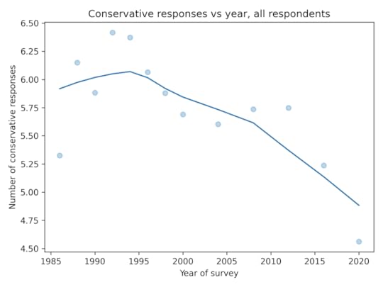
For each question, I identified one or more responses that were more likely to be given by conservatives. In most cases, conservatives are substantially more likely to select these “conservative responses”.
Not every respondent was asked every question, so I used a Bayesian method based on item response theory to fill missing values. You can get the details of the method here.
As in the GSS data, the average number of conservative responses has gone down over time.
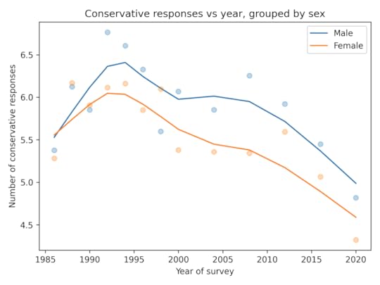
Men give more conservative responses than women, on average, but the differences is only half a question, and the gap is not getting bigger.
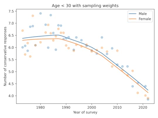
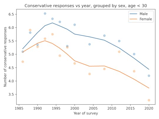
Among people younger than 30, the gap is closer to 1 question, on average. And it is not growing.
In summary:
In the ANES, there is no evidence of a growing gender gap in political alignment, party affiliation, or policy preferences.In both the GSS and the ANES the gap in policy preferences is small and not growing.February 15, 2024
Think Python third edition!
I am happy to announce the third edition of Think Python, which will be published by O’Reilly Media later this year.
You can read the online version of the book here. I’ve posted the Preface and the first four chapters — more on the way soon!
You can read the Early Release and pre-order from O’Reilly, or pre-order the third edition on Amazon.
Here is an excerpt from the Preface that explains…
What’s new in the third edition?The biggest changes in this edition were driven by two new technologies — Jupyter notebooks and virtual assistants.
Each chapter of this book is a Jupyter notebook, which is a document that contains both ordinary text and code. For me, that makes it easier to write the code, test it, and keep it consistent with the text. For readers, it means you can run the code, modify it, and work on the exercises, all in one place.
The other big change is that I’ve added advice for working with virtual assistants like ChatGPT and using them to accelerate your learning. When the previous edition of this book was published in 2016, the predecessors of these tools were far less useful and most people were unaware of them. Now they are a standard tool for software engineering, and I think they will be a transformational tool for learning to program — and learning a lot of other things, too.
The other changes in the book were motivated by my regrets about the second edition.
The first is that I did not emphasize software testing. That was already a regrettable omission in 2016, but with the advent of virtual assistants, automated testing has become even more important. So this edition presents Python’s most widely-used testing tools, doctest and unittest, and includes several exercises where you can practice working with them.
My other regret is that the exercises in the second edition were uneven — some were more interesting than others and some were too hard. Moving to Jupyter notebooks helped me develop and test a more engaging and effective sequence of exercises.
In this revision, the sequence of topics is almost the same, but I rearranged a few of the chapters and compressed two short chapters into one. Also, I expanded the coverage of strings to include regular expressions.
A few chapters use turtle graphics. In previous editions, I used Python’s turtle module, but unfortunately it doesn’t work in Jupyter notebooks. So I replaced it with a new turtle module that should be easier to use. Here’s what it looks like in the notebooks.

Finally, I rewrote a substantial fraction of the text, clarifying places that needed it and cutting back in places where I was not as concise as I could be.
I am very proud of this new edition — I hope you like it!
February 11, 2024
The Political Gender Gap is Not Growing
In a previous article, I used data from the General Social Survey (GSS) to see if there is a growing gender gap among young people in political alignment, party affiliation, or political attitudes. So far, the answer is no.
Young women are more likely than men to say they are liberal by 5-10 percentage points. But there is little or no evidence that the gap is growing.Young women are more likely to say they are Democrats. In the 1990s, the gap was almost 20 percentage points. Now it is only 5-10 percentage points. So there’s no evidence this gap is growing — if anything, it is shrinking.To 15 questions related to policies and attitudes, young men give slightly more conservative responses than women, on average, but the gap is small and consistent over time — there is no evidence it is growing.Ryan Burge has done a similar analysis with data from the Cooperative Election Study (CSE). Looking at stated political alignment, he finds that young women are more likely to say they are liberal by 5-10 percentage points. But there is no evidence that the gap is growing.
That leaves one other long-running survey to consider, the American National Election Studies (ANES). I have been meaning to explore this dataset for a long time, so this project is a perfect excuse.
This Jupyter notebook shows my analysis of alignment and party affiliation. I’ll get to beliefs and attitudes next week.
AlignmentThis figure shows the percent who say they are liberal minus the percent who say they are conservative, for men and women ages 18-29.
It looks like the gender gap in political alignment appeared in the 1980s, but it has been nearly constant since then.
AffiliationThis figure shows the percent who say they are Democrats minus the percent who say they are Republicans, for men and women ages 18-29.
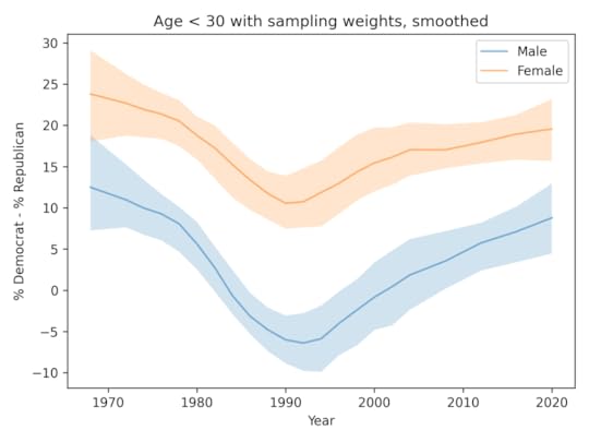
The gender gap in party affiliation has been mostly constant since the 1970s. It might have been a little wider in the 1990s, and might be shrinking now.
So what’s up with Gallup?The results from GSS, CES, and ANES are consistent: there is no evidence of a growing gender gap in alignment, affiliation, or attitudes. So why does the Gallup data tell a different story?
Here’s the figure from the Financial Times article again, zooming in on just the US data.

First, I think this figure is misleading. As explained in this tweet, the data here have been adjusted by subtracting off the trend in the general population. As a result, the figure gives the impression that young men now are more likely to identify as conservative than in the past, and that’s not true. They are more likely to identify as liberal, but this trend is moving slightly slower than in the general population.
But misleading or not, this way of showing the data doesn’t change the headline result, which is that the gender gap in this dataset has grown substantially, from about 10 percentage points in 2010 to about 30 percentage points now.
On Twitter, the author of the FT article points out that one difference is that the sample size is bigger for the Gallup data than the datasets I looked at — and that’s true. Sample size explains why the variability from year to year is smaller in the Gallup data, but it does not explain why we see a big trend in the Gallup data that does not exist at in the other datasets.
As a next step, I would ideally like to access the Gallup data so I can replicate the analysis in the FT article and explore reasons for the discrepancy. If anyone with access to the Gallup data can and will share it with me, let me know.
Barring that, we are left with two criteria to consider: plausibility and preponderance of evidence.
Plausibility: The size of the changes in the Gallup data are at least surprising if not implausible. A change of 20 percentage points in 10 years is unlikely, especially in an analysis like this where we follow an age group over time — so the composition of the group changes slowly.
Preponderance of evidence: At this point see a trend in one analysis of one dataset, and no sign of that result in several analyses of three other similar datasets.
Until we see better evidence to support the surprising claim, it seems most likely that the gender gap among young people is not growing, and is currently no larger than it has been in the past.
Probably Overthinking It

- Allen B. Downey's profile
- 236 followers

