
Allen B. Downey's Blog: Probably Overthinking It, page 17
December 3, 2018
Lions and tigers and bears
[image error]Here’s another Bayes puzzle:
Suppose we visit a wild animal preserve where we know that the only animals are lions and tigers and bears, but we don’t know how many of each there are.
During the tour, we see 3 lions, 2 tigers, and one bear. Assuming that every animal had an equal chance to appear in our sample, estimate the prevalence of each species.
What is the probability that the next animal we see is a bear?
Solutions
View the code on Gist.
Will Koehrsen posted an excellent solution here. His solution is more general than mine, allowing for uncertainty about the parameters of the Dirichlet prior.
And vlad posted another good solution using WebPPL.
Cats and rats and elephants
Now that we solved the appetizer, we are ready for the main course…
Suppose there are six species that might be in a zoo: lions and tigers and bears, and cats and rats and elephants. Every zoo has a subset of these species, and every subset is equally likely.
One day we visit a zoo and see 3 lions, 2 tigers, and one bear. Assuming that every animal in the zoo has an equal chance to be seen, what is the probability that the next animal we see is an elephant?


January 5, 2017
New notebooks for Think Stats
If you are reading the book, you can get the notebooks by cloning this repository on GitHub, and running the notebooks on your computer.
Or you can read (but not run) the notebooks on GitHub:
Chapter 1 Notebook (Chapter 1 Solutions)
Chapter 2 Notebook (Chapter 2 Solutions)
Chapter 3 Notebook (Chapter 3 Solutions)
I'll post more soon, but in the meantime you can see some of the more interesting exercises, and solutions, below.
Exercise: Something like the class size paradox appears if you survey children and ask how many children are in their family. Families with many children are more likely to appear in your sample, and families with no children have no chance to be in the sample.
Use the NSFG respondent variable numkdhh to construct the actual distribution for the number of children under 18 in the respondents' households.
Now compute the biased distribution we would see if we surveyed the children and asked them how many children under 18 (including themselves) are in their household.
Plot the actual and biased distributions, and compute their means.In [36]:resp = nsfg.ReadFemResp()
In [37]:# Solution
pmf = thinkstats2.Pmf(resp.numkdhh, label='numkdhh')
In [38]:# Solution
thinkplot.Pmf(pmf)
thinkplot.Config(xlabel='Number of children', ylabel='PMF')
[image error]In [39]:# Solution
biased = BiasPmf(pmf, label='biased')
In [40]:# Solution
thinkplot.PrePlot(2)
thinkplot.Pmfs([pmf, biased])
thinkplot.Config(xlabel='Number of children', ylabel='PMF')
[image error]In [41]:# Solution
pmf.Mean()
Out[41]:1.0242051550438309In [42]:# Solution
biased.Mean()
Out[42]:2.4036791006642821Exercise: I started this book with the question, "Are first babies more likely to be late?" To address it, I computed the difference in means between groups of babies, but I ignored the possibility that there might be a difference between first babies and others for the same woman.
To address this version of the question, select respondents who have at least live births and compute pairwise differences. Does this formulation of the question yield a different result?
Hint: use nsfg.MakePregMap:In [43]:live, firsts, others = first.MakeFrames()
In [44]:preg_map = nsfg.MakePregMap(live)
In [45]:# Solution
hist = thinkstats2.Hist()
for caseid, indices in preg_map.items():
if len(indices) >= 2:
pair = preg.loc[indices[0:2]].prglngth
diff = np.diff(pair)[0]
hist[diff] += 1
In [46]:# Solution
thinkplot.Hist(hist)
[image error]In [47]:# Solution
pmf = thinkstats2.Pmf(hist)
pmf.Mean()
Out[47]:-0.05636743215031337Exercise: In most foot races, everyone starts at the same time. If you are a fast runner, you usually pass a lot of people at the beginning of the race, but after a few miles everyone around you is going at the same speed. When I ran a long-distance (209 miles) relay race for the first time, I noticed an odd phenomenon: when I overtook another runner, I was usually much faster, and when another runner overtook me, he was usually much faster.
At first I thought that the distribution of speeds might be bimodal; that is, there were many slow runners and many fast runners, but few at my speed.
Then I realized that I was the victim of a bias similar to the effect of class size. The race was unusual in two ways: it used a staggered start, so teams started at different times; also, many teams included runners at different levels of ability.
As a result, runners were spread out along the course with little relationship between speed and location. When I joined the race, the runners near me were (pretty much) a random sample of the runners in the race.
So where does the bias come from? During my time on the course, the chance of overtaking a runner, or being overtaken, is proportional to the difference in our speeds. I am more likely to catch a slow runner, and more likely to be caught by a fast runner. But runners at the same speed are unlikely to see each other.
Write a function called ObservedPmf that takes a Pmf representing the actual distribution of runners’ speeds, and the speed of a running observer, and returns a new Pmf representing the distribution of runners’ speeds as seen by the observer.
To test your function, you can use relay.py, which reads the results from the James Joyce Ramble 10K in Dedham MA and converts the pace of each runner to mph.
Compute the distribution of speeds you would observe if you ran a relay race at 7 mph with this group of runners.In [48]:import relay
results = relay.ReadResults()
speeds = relay.GetSpeeds(results)
speeds = relay.BinData(speeds, 3, 12, 100)
In [49]:pmf = thinkstats2.Pmf(speeds, 'actual speeds')
thinkplot.Pmf(pmf)
thinkplot.Config(xlabel='Speed (mph)', ylabel='PMF')
[image error]In [50]:# Solution
def ObservedPmf(pmf, speed, label=None):
"""Returns a new Pmf representing speeds observed at a given speed.
The chance of observing a runner is proportional to the difference
in speed.
Args:
pmf: distribution of actual speeds
speed: speed of the observing runner
label: string label for the new dist
Returns:
Pmf object
"""
new = pmf.Copy(label=label)
for val in new.Values():
diff = abs(val - speed)
new[val] *= diff
new.Normalize()
return new
In [51]:# Solution
biased = ObservedPmf(pmf, 7, label='observed speeds')
thinkplot.Pmf(biased)
thinkplot.Config(xlabel='Speed (mph)', ylabel='PMF')
[image error]In [ ]:

November 22, 2016
Problematic presentation of probabilistic predictions
But it is not entirely our fault. In many cases, the predictions were presented in forms that contributed to the confusion. In this article, I review the forecasts and suggest ways we can present them better.
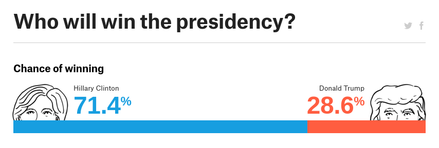
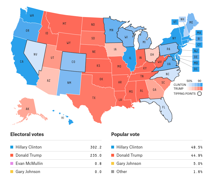
The two forecasters I followed in the weeks prior to the election were FiveThirtyEight and the New York Times's Upshot. If you visited the FiveThirtyEight forecast page, you saw something like this:
And if you visited the Upshot page, you saw
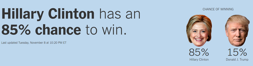
FiveThirtyEight and Upshot use similar methods, so they generate the same kind of results: probabilistic predictions expressed in terms of probabilities.
The problem with probabilityThe problem with predictions in this form is that people do not have a good sense for what probabilities mean. In my previous article I explained part of the issue -- probabilities do not behave like other kinds of measurements -- but there might be a more basic problem: our brains naturally represent uncertainty in the form of frequencies, not probabilities.
If this frequency format hypothesis is true, it suggests that people understand predictions like "Trump's chances are 1 in 4" better than "Trump's chances are 25%".
As an example, suppose one forecaster predicts that Trump has a 14% chance and another says he has a 25% chance. At first glance, those predictions seems consistent with each other: they both think Clinton is likely to win. But in terms of frequencies, one of those forecasts means 1 chance in 7; the other means 1 chance in 4. When we put it that way, it is clearer that there is a substantial difference.
The Upshot tried to help people interpret probabilities by expressing predictions in the form of American football field goal attempts:
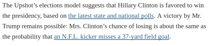 Obviously this analogy doesn't help people who don't watch football, but even for die-hard fans, it doesn't help much. In my viewing experience, people are just as surprised when a kicker misses -- even though they shouldn't be -- as they were by the election results.
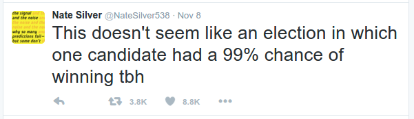
One of the best predictions I saw came in the form of frequencies, sort of. On November 8, Nate Silver tweeted this:
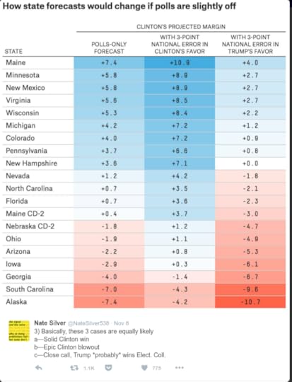
"Basically", he wrote, "these 3 cases are equally likely". The implication is that Trump had about 1 chance in 3. That's a little higher than the actual forecast, but I think it communicates the meaning of the prediction more effectively than a probability like 28.6%.
The problem with pinkI think Silver's tweet would be even better if it dropped the convention of showing swing states in pink (for "leaning Republican") and light blue (for "leaning Democratic"). One of the reasons people are unhappy with the predictions is that the predictive maps look like this one from FiveThirtyEight:
And the results look like this (from RealClear Politics):
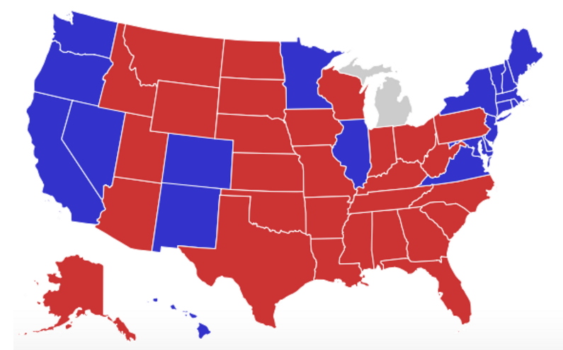
The results don't look like the predictions because in the results all the states are either dark red or dark blue. There is no pink in the electoral college.
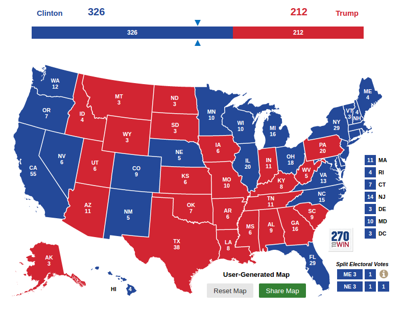
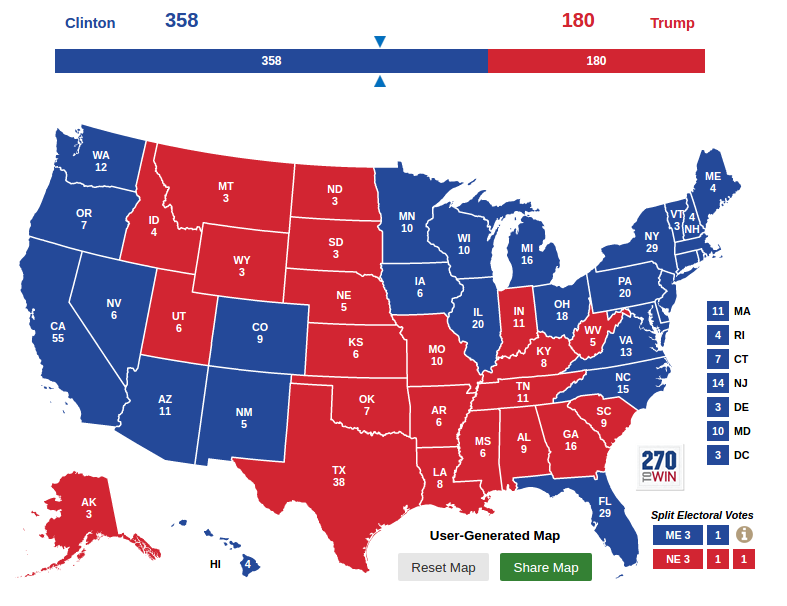
Now suppose you saw a prediction like this (which I generated here):
These three outcomes are equally likely; Trump wins one of them, Clinton wins two.

With a presentation like this, I think:
1) Before the election, people would understand the predictions better, because they are presented in terms of frequencies like "1 in 3".
2) After the election, people would evaluate the accuracy of the forecasts more fairly, because the results would look like one of the predicted possibilities.
The problem with asymmetryConsider these two summaries of the predictions:
1) "FiveThirtyEight gives Clinton a 71% chance and The Upshot gives her an 85% chance."
2) "The Upshot gives Trump a 15% chance and FiveThirtyEight gives him a 29% chance."
These two forms are mathematically equivalent, but they are not interpreted the same way. The first form makes it sound like everyone agrees that Clinton is likely to win. The second form makes it clearer that Trump has a substantial chance of winning, and makes it more apparent that the two predictions are substantially different.
If the way we interpret probabilities is asymmetric, as it seems to be, we should be careful to present them both ways. But most forecasters and media reported the first form, in terms of Clinton's probabilities, more prominently, and sometimes exclusively.
The problem with histogramsOne of the best ways to explain probabilistic predictions is to run simulations and report the results. The Upshot presented simulation results using a histogram, where the x-axis is the number of electoral college votes for Clinton (notice the asymmetry) and the y-axis is the fraction of simulations where Clinton gets that number:
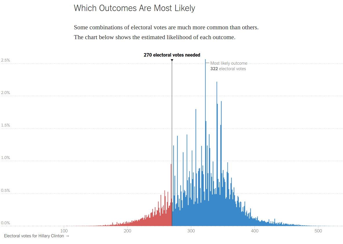
This visualization has one nice property: the blue area is proportional to Clinton's chances and the red area is proportional to Trump's. To the degree that we assess those areas visually, this is probably more comprehensible than numerical probabilities.
But there are a few problems:
1) I am not sure how many people understand this figure in the first place.
2) Even for people who understand it, the jagginess of the results makes it hard to assess the areas.
3) This visualization tries to do too many things. Is it meant to show that some outcomes are more likely than others, as the title suggests, or is it meant to represent the probabilities of victory visually?
4) Finally, this representation fails to make the possible outcomes concrete. Even if I estimate the areas accurately, I still walk away expecting Clinton to win, most likely in a landslide.
The problem with proportionsOne of the reasons people have a hard time with probabilistic predictions is that they are relatively new. The 2004 election was the first where we saw predictions in the form of probabilities, at least in the mass media. Prior to that, polling results were reported in terms of proportions, like "54% of likely voters say they will vote for Alice, 40% for Bob, with 6% undecided, and a margin of error of 5%".
Reports like this didn't provide probabilities explicitly, but over time, people developed a qualitative sense of likelihood. If a candidate was ahead by 10 points in the poll, they were very likely to win; if they were only ahead by 2, it could go either way.
The problem is that proportions and probabilities are reported in the same units: percentages. So even if we know that probabilities and proportions are not the same thing, our intuition can mislead us.
For example, if a candidate is ahead in the polls by 70% to 30%, there is almost no chance they will lose. But if the probabilities are 70% and 30%, that's a very close race. I suspect that when people saw that Clinton had a 70% probability, some of their intuition for proportions leaked in.
Solution: publish the simulationsI propose a simple solution that addresses all of these problems: forecasters should publish one simulated election each day, with state-by-state results.
As an example, here is a fake FiveThirtyEight page I mocked up:
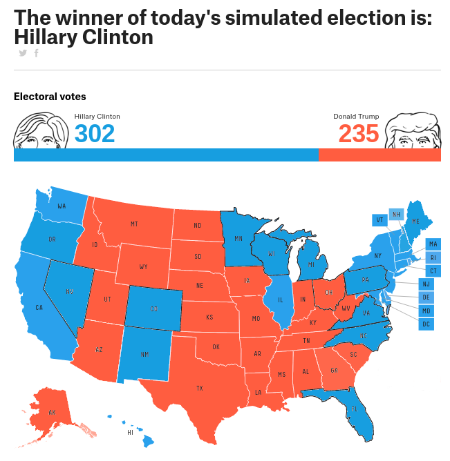
If people saw predictions like this every day, they would experience the range of possible outcomes, including close finishes and landslides. By election day, nothing would surprise them.
Publishing simulations in this form solves the problems I identified:
The problem with probabilities: If you checked this page daily for a week, you would see Clinton win 5 times and Trump win twice. If the frequency format hypothesis is true, this would get the prediction into your head in a way you understand naturally.
The problem with pink: The predictions would look like the results, because in each simulation the states are red or blue; there would be no pink or light blue.
The problem with asymmetry: This way of presenting results doesn't break symmetry, especially if the winner of each simulation is shown on the left.
The problem with histograms: By showing only one simulation per day, we avoid the difficulty of summarizing large numbers of simulations.
The problem with proportions: If we avoid reporting probabilities of victory, we avoid confusing them with proportions of the vote.
Publishing simulations also addresses two problems I haven't discussed:
The problem with precision: Some forecasters presented predictions with three significant digits, which suggests an unrealistic level of precision. The intuitive sense of likelihood you get from watching simulations is not precise, but the imprecision in your head is an honest reflection of the imprecision in the models.
The problem with the popular vote: Most forecasters continue to predict the popular vote and some readers still follow it, despite the fact (underscored by this election) that the popular vote is irrelevant. If it is consistent with the electoral college, it's redundant; otherwise it's just a distraction.
In summary, election forecasters used a variety of visualizations to report their predictions, but they were prone to misinterpretation. Next time around, we can avoid many of the problems by publishing the results of one simulated election each day.

November 14, 2016
Why are we so surprised?
Less surprising than flipping two headsFirst, let me explain why I think we should not have been surprised. One major forecaster, FiveThirtyEight estimated the probability of a Clinton win at 71%. To the degree that we have confidence in their methodology, we should be less surprised by the outcome than we would be if we tossed a coin twice and got heads both times; that is, not very surprised at all.
Even if you followed the The New York Times Upshot and believed their final prediction, that Clinton had a 91% chance, the result is slightly more surprising than tossing three coins and getting three heads; still, not very.
Judging by the reaction, a lot of people were more surprised than that. And I have to admit that even though I thought the FiveThirtyEight prediction was the most credible, my own reaction suggests that at some level, I thought the probability of a Trump win was closer to 10% than 30%.
Probabilistic predictionsSo why are we so surprised? I think a major factor is that few people have experience interpreting probabilistic predictions. As Nate Silver explained (before the fact):
The goal of a probabilistic model is not to provide deterministic predictions (“Clinton will win Wisconsin”) but instead to provide an assessment of probabilities and risks.I conjecture that many people interpreted the results from the FiveThirtyEight models as the deterministic prediction that Clinton would win, with various degrees of confidence. If you think the outcome means that the prediction was wrong, that suggests you are treating the prediction as deterministic.
A related reason people might be surprised is that they did not distinguish between qualitative and quantitative probabilities. People use qualitative probabilities in conversation all the time; for example, someone might say, "I am 99% sure that it will rain tomorrow". But if you offer to bet on it at odds of 99 to 1, they might say, "I didn't mean it literally; I just mean it will probably rain".
As an example, in their post mortem article, "How Data Failed Us in Calling an Election", Steve Lohr and Natasha Singer wrote:
Virtually all the major vote forecasters, including Nate Silver’s FiveThirtyEight site, The New York Times Upshot and the Princeton Election Consortium, put Mrs. Clinton’s chances of winning in the 70 to 99 percent range.Lohr and Singer imply that there was a consensus, that everyone said Clinton would win, and they were all wrong. If this narrative sounds right to you, that suggests that you are interpreting the predictions as deterministic and qualitative.
In contrast, if you interpret the predictions as probabilistic and quantitative, the narrative goes like this: there was no consensus; different models produced very different predictions (which should have been a warning). But the most credible sources all indicated that Trump had a substantial chance to win, and they were right.
Distances between probabilitiesQualitatively, there is not much difference between 70% and 99%. Maybe it's the difference between "likely" and "very likely".
But for probabilities, the difference between 70% and 99% is huge. The problem is that we are not good at comparing probabilities, because they don't behave like other things we measure.
For example, if you are trying to estimate the size of an object, and the range of measurements is from 70 inches to 99 inches, you might think:
1) The most likely value is the midpoint, near 85 inches,
2) That estimate might be off by 15/85, or 18%, and
3) There is a some chance that the true value is more than 100 inches.
For probabilities, our intuitions about measurements are all wrong. Given the range between 70% and 99% probability, the most meaningful midpoint is 94%, not 85% (explained below), and there is no chance that the true value is more than 100%.
Also, it would be very misleading to say that the estimate might be off by 15/85 percentage points, or 18%. To see why, see what happens if we flip it around: if Clinton's chance to win is 70% to 99%, that means Trump's chance is 1% to 30%. Immediately, it is clearer that this is a very big range. If we think the most likely value is 15%, and it might be off by 15%, the relative error is 100%, not 18%.
To get a better understanding of the distances between probabilities, the best option is to express them in terms of log odds. For a probability, p, the corresponding odds are
o = p / (1-p)
and the log odds are log10(o).
The following table shows selected probabilities and their corresponding odds and log odds.
Prob Odds Log odds
5% 1:19 -1.26
50% 1 0
70% 7:3 0.37
94% 94:6 1.19
99% 99:1 2.00
This table shows why, earlier, I said that the midpoint between 70% and 99% is 94%, because in terms of log odds, the distance is the same from 0.37 to 1.19 as from 1.19 to 2.0 (for now, I'll ask you to take my word that this is the most meaningful way to measure distance).
And now, to see why I said that the difference between 70% and 99% is huge, consider this: the distance from 70% to 99% is the same as the distance from 70% to 5%.
If credible election predictions had spanned the range from 5% to 70%, you would have concluded that there was no consensus, and you might have dismissed them all. But the range from 70% to 99% is just as big.
In an ideal world, maybe we would use log odds, rather than probability, to talk about uncertainty; in some areas of science and engineering, people do. But that won't happen soon; in the meantime, we have to remember that our intuition for spatial measurements does not apply to probability.
Single case probabilitiesSo how should we interpret a probabilistic prediction like "Clinton has a 70% chance of winning"?
If I say that a coin has a 50% chance of landing heads, there is a natural interpretation of that claim in terms of long-run frequencies. If I toss the coin 100 times, I expect about 50 heads.
But a prediction like "Clinton has a 70% chance of winning" refers to a single case, which is notoriously hard to interpret. It is tempting to say that if we ran the election 100 times, we would expect Clinton to win 70 times, but that approach raises more problems than it solves.
Another option is to evaluate the long-run performance of the predictor rather than the predictee. For example, if we use the same methodology to predict the outcome of many elections, we could group the predictions by probability, considering the predictions near 10%, the predictions near 20%, and so on. In the long run, about 10% of the 10% predictions should come true, about 20% of the 20% predictions should come true, and so on. This approach is called calibrated probability assessment.
For daily predictions, like weather forecasting, this kind of calibration is possible. In fact, it is one of the examples in Nate Silver's book, The Signal and the Noise. But for rare events like presidential elections, it is not practical.
At this point it might seem like probabilistic predictions are immune to contradiction, but that is not entirely true. Although Trump's victory does not prove that FiveThirtyEight and the other forecasters were wrong, it provides evidence about their trustworthiness.
Consider two hypotheses:
A: The methodology is sound and Clinton had a 70% chance.
B: The methodology is bogus and the prediction is just a random number from 0 to 100.
Under A, the probability of the outcome is 30%; under B it's 50%. So the outcome is evidence against A with a likelihood ratio of 3/5. If you were initially inclined to believe A with a confidence of 90%, this evidence should lower your confidence to 84% (applying Bayes rule). If your initial inclination was 50%, you should downgrade it to 37%. In other words, the outcome provides only weak evidence that the prediction was wrong.
Forecasters who went farther out on a limb took more damage. The New York Times Upshot predicted that Clinton had a 91% chance. For them, the outcome provides evidence against A with a Bayes factor of 5. So if your confidence in A was 90% before the election, it should be 64% now.
And any forecaster who said Clinton had a 99% chance has be strongly contradicted, with Bayes factor 50. A starting confidence of 90% should be reduced to 15%. As Nate Silver tweeted on election night:
In summary, the result of the election does not mean the forecasters were wrong. It provides evidence that anyone who said Clinton had a 99% chance is a charlatan. But it is still reasonable to believe that FiveThirtyEight, Upshot, and other forecasters using similar methodology were basically right.
So why are we surprised?Many of us are more surprised than we should be because we misinterpreted the predictions before the election, and we are misinterpreting the results now. But it is not entirely our fault. I also think the predictions were presented in ways that made the problems worse. Next time I will review some of the best and worst, and suggest ways we can do better next time.
If you are interested in the problem of single case probabilities, I wrote about it in this article about criminal recidivism.

November 8, 2016
Election day, finally!
My run to the pollsToday I left work around 11am, ran 2.5 miles from Olin College to Needham High School, voted, and ran back, all in less than an hour. It was all very pleasant, but I am acutely aware of how lucky I am:
I live in a country where I can vote (even if some of the choices stink),I am not one of the hundreds of thousands of people who are permanently disenfranchised because of non-violent drug offenses,I have a job that allows the flexibility to take an hour off to vote,I have a job,I have the good health to run 5 miles round trip,I live in an affluent suburb where I don't have to wait in line to vote,I have a government-issued photo ID, andI don't need one to vote in Massachusetts.And I could go on. When I got back, I posted this tweet, which prompted the replies below:
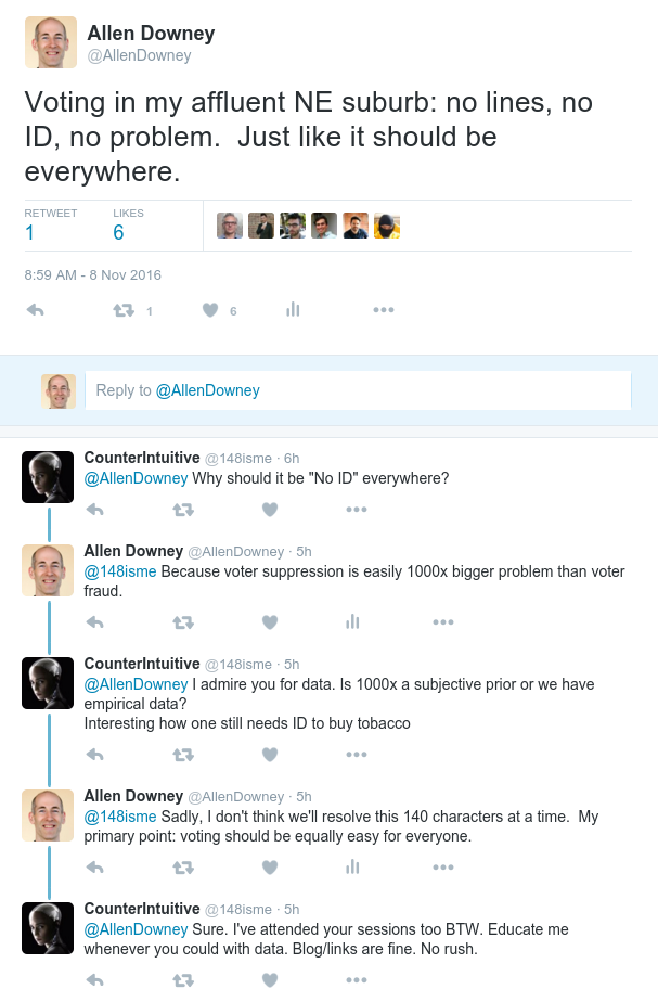
Data, please.As I said, my primary point is that voting should be equally easy for everyone; I didn't really intend to get into the voter ID debate. But the challenge my correspondent raised is legitimate. I posited a number, and I should be able to back it up with data.
So let me see if I can defend my claim that voter suppression is a 1000x bigger problem than voter fraud.
According to the ACLU, there are 21 million US citizens who don't have government-issued photo ID. They reference "research" but don't actually provide a citation. So that's not ideal, but even if they are off by a factor of 2, we are talking about 10 million people.
Presumably some of them are not eligible voters. And some of them, who live in states that don't require voter ID, would get one if they needed it to vote. But even if we assume that 90% of them live in states that don't require ID, and all of them would get ID if required, we are still talking about 1 million people who would be prevented from voting because they don't have ID.
So I am pretty comfortable with the conclusion that the number of people whose vote would be suppressed by voter ID laws is in the millions.
Now, how many people commit election fraud that would be prevented by voter ID laws? This Wall Street Journal article cites research that counts people convicted of voter fraud, which seems to be on the order of hundreds per election at most. Even if we assume that only 10% of perpetrators are caught and convicted, the total number of cases is only in the thousands.
Is that reasonable? Should we expect there to be more? I don't think so. Impersonating a voter in order to cast an illegal ballot is probably very rare, for a good reason: it is a risky strategy that is vanishingly unlikely to be effective. And in a presidential election, with a winner-takes-all electoral college, the marginal benefit of a few extra votes is remarkably close to nil.
So I would not expect many individuals to attempt voter fraud. Also, organizing large scale voter impersonation would be difficult or impossible, and as far as I know, no one has tried in a recent presidential election.
In summary, it is likely that the suppressive effect of voter ID laws is on the order of millions (or more), and the voter fraud it might prevent is on the order of thousands (or less). So that's where I get my factor of 1000.
But what about bias?Let me add one more point: even if the ratio were smaller, I would still be more concerned about voter suppression, because:Voter suppression introduces systematic bias: It is more likely to affect "low-income individuals, racial and ethnic minority voters, students, senior citizens, [and] voters with disabilities", according to the ACLU.Unless the tendency to commit fraud is strongly correlated with political affiliation or other socioeconomic factors, fraud introduces random noise.And as any statistician will tell you, I'll take noise over bias any day, and especially on election day.

November 1, 2016
The Skeet Shooting problem
At the 2016 Summer Olympics in the Women's Skeet event, Kim Rhode faced Wei Meng in the bronze medal match. After 25 shots, they were tied, sending the match into sudden death. In each round of sudden death, each competitor shoots at two targets. In the first three rounds, Rhode and Wei hit the same number of targets. Finally in the fourth round, Rhode hit more targets, so she won the bronze medal, making her the first Summer Olympian to win an individual medal at six consecutive summer games. Based on this information, should we infer that Rhode and Wei had an unusually good or bad day?
As background information, you can assume that anyone in the Olympic final has about the same probability of hitting 13, 14, 15, or 16 out of 25 targets.
Now here's a solution:
As part of the likelihood function, I'll use binom.pmf, which computes the Binomial PMF.
In the following example, the probability of hitting k=10 targets in n=25 attempts, with probability p=13/15 of hitting each target, is about 8%.In [16]:from scipy.stats import binom
k = 10
n = 25
p = 13/25
binom.pmf(k, n, p)
Out[16]:0.078169085615240511The following function computes the likelihood of a tie (or no tie) after a given number of shots, n, given the hypothetical value of p.
It loops through the possible number of hits, k, from 0 to n and uses binom.pmf to compute the probability that each shooter hits k targets.
To get the probability that both shooters hit k targets, we square the result.
To get the total likelihood of the outcome, we add up the probability for each value of k.In [17]:def likelihood(data, hypo):
"""Likelihood of data under hypo.
data: tuple of (number of shots, 'tie' or 'no tie')
hypo: hypothetical number of hits out of 25
"""
p = hypo / 25
n, outcome = data
like = sum([binom.pmf(k, n, p)**2 for k in range(n+1)])
return like if outcome=='tie' else 1-like
Let's see what that looks like for n=2In [18]:data = 2, 'tie'
hypos = range(0, 26)
likes = [likelihood(data, hypo) for hypo in hypos]
thinkplot.Plot(hypos, likes)
thinkplot.Config(xlabel='Probability of a hit (out of 25)',
ylabel='Likelihood of a tie',
ylim=[0, 1])
[image error]As we saw in the Sock Drawer problem and the Alien Blaster problem, the probability of a tie is highest for extreme values of p, and minimized when p=0.5.
The result is similar, but more extreme, when n=25:In [19]:data = 25, 'tie'
hypos = range(0, 26)
likes = [likelihood(data, hypo) for hypo in hypos]
thinkplot.Plot(hypos, likes)
thinkplot.Config(xlabel='Probability of a hit (out of 25)',
ylabel='Likelihood of a tie',
ylim=[0, 1])
[image error]In the range we care about (13 through 16 hits out of 25) this curve is pretty flat, which means that a tie after the round of 25 doesn't discriminate strongly among the hypotheses.
We could use this likelihood function to run the update, but just for purposes of demonstration, I'll use the Suite class from thinkbayes2:In [20]:from thinkbayes2 import Suite
class Skeet(Suite):
def Likelihood(self, data, hypo):
"""Likelihood of data under hypo.
data: tuple of (number of shots, 'tie' or 'no tie')
hypo: hypothetical number of hits out of 25
"""
p = hypo / 25
n, outcome = data
like = sum([binom.pmf(k, n, p)**2 for k in range(n+1)])
return like if outcome=='tie' else 1-like
Now I'll create the prior.In [21]:suite = Skeet([13, 14, 15, 16])
suite.Print()
13 0.25
14 0.25
15 0.25
16 0.25
The prior mean is 14.5.In [22]:suite.Mean()
Out[22]:14.5Here's the update after the round of 25.In [23]:suite.Update((25, 'tie'))
suite.Print()
13 0.245787744767
14 0.247411480833
15 0.250757985003
16 0.256042789397
The higher values are a little more likely, but the effect is pretty small.
Interestingly, the rounds of n=2 provide more evidence in favor of the higher values of p.In [24]:suite.Update((2, 'tie'))
suite.Print()
13 0.240111712333
14 0.243807684231
15 0.251622537592
16 0.264458065844
In [25]:suite.Update((2, 'tie'))
suite.Print()
13 0.234458172307
14 0.240145161205
15 0.252373188397
16 0.273023478091
In [26]:suite.Update((2, 'tie'))
suite.Print()
13 0.228830701632
14 0.236427057892
15 0.253007722855
16 0.28173451762
After three rounds of sudden death, we are more inclined to think that the shooters are having a good day.
The fourth round, which ends with no tie, provides a small amount of evidence in the other direction.In [27]:suite.Update((2, 'no tie'))
suite.Print()
13 0.2323322732
14 0.23878553469
15 0.252684685857
16 0.276197506253
And the posterior mean, after all updates, is a little higher than 14.5, where we started.In [28]:suite.Mean()
Out[28]:14.572747425162735In summary, the outcome of this match, with four rounds of sudden death, provides weak evidence that the shooters were having a good day.
In general for this kind of contest, a tie is more likely if the probability of success is very high or low:
In the Alien Blaster problem, the hypothetical value of p are all less than 50%, so a tie causes us to revise beliefs about p downward.
In the Skeet Shooter problem, the hypothetical values are greater than 50%, so ties make us revise our estimates upward.
Using a continuous prior¶For simplicity, I started with a discrete prior with only 4 values. But the analysis we just did generalizes to priors with an arbitrary number of values. As an example I'll use a discrete approximation to a Beta distribution.
Suppose that among the population of Olympic skeet shooters, the distribution of p (the probability of hitting a target) is well-modeled by a Beta distribution with parameters (15, 10). Here's what that distribution looks like:In [29]:from thinkbayes2 import Beta
beta = Beta(15, 10).MakePmf()
thinkplot.Pdf(beta)
thinkplot.Config(xlabel='Probability of a hit',
ylabel='PMF')
[image error]We can use that distribution to intialize the prior:In [30]:prior = Skeet(beta)
prior.Mean() * 25
Out[30]:14.999999999999991And then perform the same updates:In [31]:posterior = prior.Copy()
posterior.Update((25, 'tie'))
posterior.Update((2, 'tie'))
posterior.Update((2, 'tie'))
posterior.Update((2, 'tie'))
posterior.Update((2, 'no tie'))
Out[31]:0.088322129669977739Here are the prior and posterior distributions. You can barely see the difference:In [32]:thinkplot.Pdf(prior, color='red', alpha=0.5)
thinkplot.Pdf(posterior, color='blue', alpha=0.5)
thinkplot.Config(xlabel='Probability of a hit',
ylabel='PMF')
[image error]And the posterior mean is only slightly higher.In [33]:posterior.Mean() * 25
Out[33]:15.041026161545973

October 31, 2016
The Alien Blaster Problem
In preparation for an alien invasion, the Earth Defense League has been working on new missiles to shoot down space invaders. Of course, some missile designs are better than others; let's assume that each design has some probability of hitting an alien ship, x.
Based on previous tests, the distribution of x in the population of designs is roughly uniform between 10% and 40%. To approximate this distribution, we'll assume that x is either 10%, 20%, 30%, or 40% with equal probability.
Now suppose the new ultra-secret Alien Blaster 10K is being tested. In a press conference, an EDF general reports that the new design has been tested twice, taking two shots during each test. The results of the test are confidential, so the general won't say how many targets were hit, but they report: ``The same number of targets were hit in the two tests, so we have reason to think this new design is consistent.''
Is this data good or bad; that is, does it increase or decrease your estimate of x for the Alien Blaster 10K?
Now here's a solution:
I'll start by creating a Pmf that represents the four hypothetical values of x:In [7]:pmf = Pmf([0.1, 0.2, 0.3, 0.4])
pmf.Print()
0.1 0.25
0.2 0.25
0.3 0.25
0.4 0.25
Before seeing the data, the mean of the distribution, which is the expected effectiveness of the blaster, is 0.25.In [8]:pmf.Mean()
Out[8]:0.25Here's how we compute the likelihood of the data. If each blaster takes two shots, there are three ways they can get a tie: they both get 0, 1, or 2. If the probability that either blaster gets a hit is x, the probabilities of these outcomes are:
both 0: (1-x)**4
both 1: (2 * x * (1-x))**2
both 2: x**x
Here's the likelihood function that computes the total probability of the three outcomes:In [9]:def likelihood(hypo, data):
"""Likelihood of the data under hypo.
hypo: probability of a hit, x
data: 'tie' or 'no tie'
"""
x = hypo
like = x**4 + (2 * x * (1-x))**2 + (1-x)**4
if data == 'tie':
return like
else:
return 1-like
To see what the likelihood function looks like, I'll print the likelihood of a tie for the four hypothetical values of x:In [10]:data = 'tie'
for hypo in sorted(pmf):
like = likelihood(hypo, data)
print(hypo, like)
0.1 0.6886
0.2 0.5136
0.3 0.4246
0.4 0.3856
If we multiply each likelihood by the corresponding prior, we get the unnormalized posteriors:In [11]:for hypo in sorted(pmf):
unnorm_post = pmf[hypo] * likelihood(hypo, data)
print(hypo, pmf[hypo], unnorm_post)
0.1 0.25 0.17215
0.2 0.25 0.1284
0.3 0.25 0.10615
0.4 0.25 0.0964
Finally, we can do the update by multiplying the priors in pmf by the likelihoods:In [12]:for hypo in pmf:
pmf[hypo] *= likelihood(hypo, data)
And then normalizing pmf. The result is the total probability of the data.In [13]:pmf.Normalize()
Out[13]:0.5031000000000001And here are the posteriors.In [14]:pmf.Print()
0.1 0.342178493341
0.2 0.255217650566
0.3 0.210991850527
0.4 0.191612005565
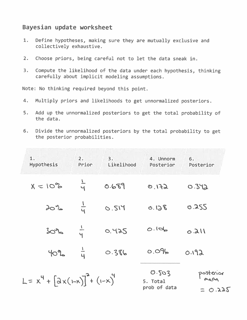
The lower values of x are more likely, so this evidence makes us downgrade our expectation about the effectiveness of the blaster. The posterior mean is 0.225, a bit lower than the prior mean, 0.25.In [15]:pmf.Mean()
Out[15]:0.2252037368316438A tie is evidence in favor of extreme values of x.
Finally, here's how we can solve the problem using the Bayesian update worksheet:
 In the next article, I'll present my solution to The Skeet Shooting problem.
October 25, 2016
Socks, skeets, space aliens
1) A good Bayes's theorem problem should pose an interesting question that seems hard to solve directly, but
2) It should be easier to solve with Bayes's theorem than without it, and
3) It should have some element of surprise, or at least a non-obvious outcome.
Several years ago I posted some of my favorites in this article. Last week I posted a problem one of my students posed (Why is My Cat Orange?). This week I have another student-written problem and two related problems that I wrote. I'll post solutions later in the week.
The sock drawer problemPosed by Yuzhong Huang:
There are two drawers of socks. The first drawer has 40 white socks and 10 black socks; the second drawer has 20 white socks and 30 black socks. We randomly get 2 socks from a drawer, and it turns out to be a pair (same color) but we don't know the color of these socks. What is the chance that we picked the first drawer?
[For this one, you can compute an approximate solution assuming socks are selected with replacement, or an exact solution assuming, more realistically, that they are selected without replacement.]
The Alien Blaster problemIn preparation for an alien invasion, the Earth Defense League has been working on new missiles to shoot down space invaders. Of course, some missile designs are better than others; let's assume that each design has some probability of hitting an alien ship, x.
Based on previous tests, the distribution of x in the population of designs is roughly uniform between 10% and 40%. To approximate this distribution, we'll assume that x is either 10%, 20%, 30%, or 40% with equal probability.
Now suppose the new ultra-secret Alien Blaster 10K is being tested. In a press conference, an EDF general reports that the new design has been tested twice, taking two shots during each test. The results of the test are confidential, so the general won't say how many targets were hit, but they report: ``The same number of targets were hit in the two tests, so we have reason to think this new design is consistent.''
Is this data good or bad; that is, does it increase or decrease your estimate of x for the Alien Blaster 10K?
The Skeet Shooting problemAt the 2016 Summer Olympics in the Women's Skeet event, Kim Rhode faced Wei Meng in the bronze medal match. After 25 shots, they were tied, sending the match into sudden death. In each round of sudden death, each competitor shoots at two targets. In the first three rounds, Rhode and Wei hit the same number of targets. Finally in the fourth round, Rhode hit more targets, so she won the bronze medal, making her the first Summer Olympian to win an individual medal at six consecutive summer games. Based on this information, should we infer that Rhode and Wei had an unusually good or bad day?
As background information, you can assume that anyone in the Olympic final has about the same probability of hitting 13, 14, 15, or 16 out of 25 targets.
I'll post solutions in a few days.

October 21, 2016
Why is my cat orange?
About 3/4 of orange cats are male. If my cat is orange, what is the probability that his mother was orange?To answer this question, you have to know a little about the genes that affect coat color in cats:
The sex-linked red gene, O, determines whether there will be red variations to fur color. This gene is located on the X chromosome...Males have only one X chromosome, so only have one allele of this gene. O results in orange variations, and o results in non-orange fur.Since females have two X chromosomes, they have two alleles of this gene. OO results in orange toned fur, oo results in non-orange fur, and Oo results in a tortoiseshell cat, in which some parts of the fur are orange variants and others areas non-orange.
If the population genetics for the red gene are in equilibrium, we can use the Hardy-Weinberg principle. If the prevalence of the red allele is p and the prevalence of the non-red allele is q=1-p:
1) The fraction of male cats that are orange is p and the fraction that are non-orange is q.
2) The fractions of female cats that are OO, Oo, and oo are p², 2pq, and q², respectively.
Finally, if we know the genetics of a mating pair, we can compute the probability of each genetic combination in their offspring.
1) If the offspring is male, he got a Y chromosome from his father. Whether he is orange or not depends on which allele he got from his mother:
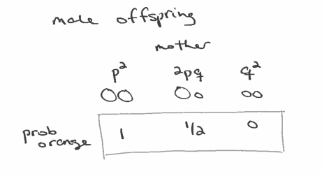
2) If the offspring is female, her coat depends on both parents:
 That's all the background information you need to solve the problem. I'll post the solution next week.
October 14, 2016
Millennials are still not getting married
I used data from the National Survey of Family Growth (NSFG) to estimate the age at first marriage for women in the U.S., broken down by decade of birth. I found evidence that women born in the 1980s and 90s were getting married later than previous cohorts, and I generated projections that suggest they are on track to stay unmarried at substantially higher rates.
Yesterday the National Center for Health Statistics (NCHS) released a new batch of data from surveys conducted in 2013-2015. I downloaded it and updated my analysis. Also, for the first time, I apply the analysis to the data from male respondents.
WomenBased on a sample of 58488 women in the U.S., here are survival curves that estimate the fraction who have never been married for each birth group (women born in the 1940s, 50s, etc) at each age.
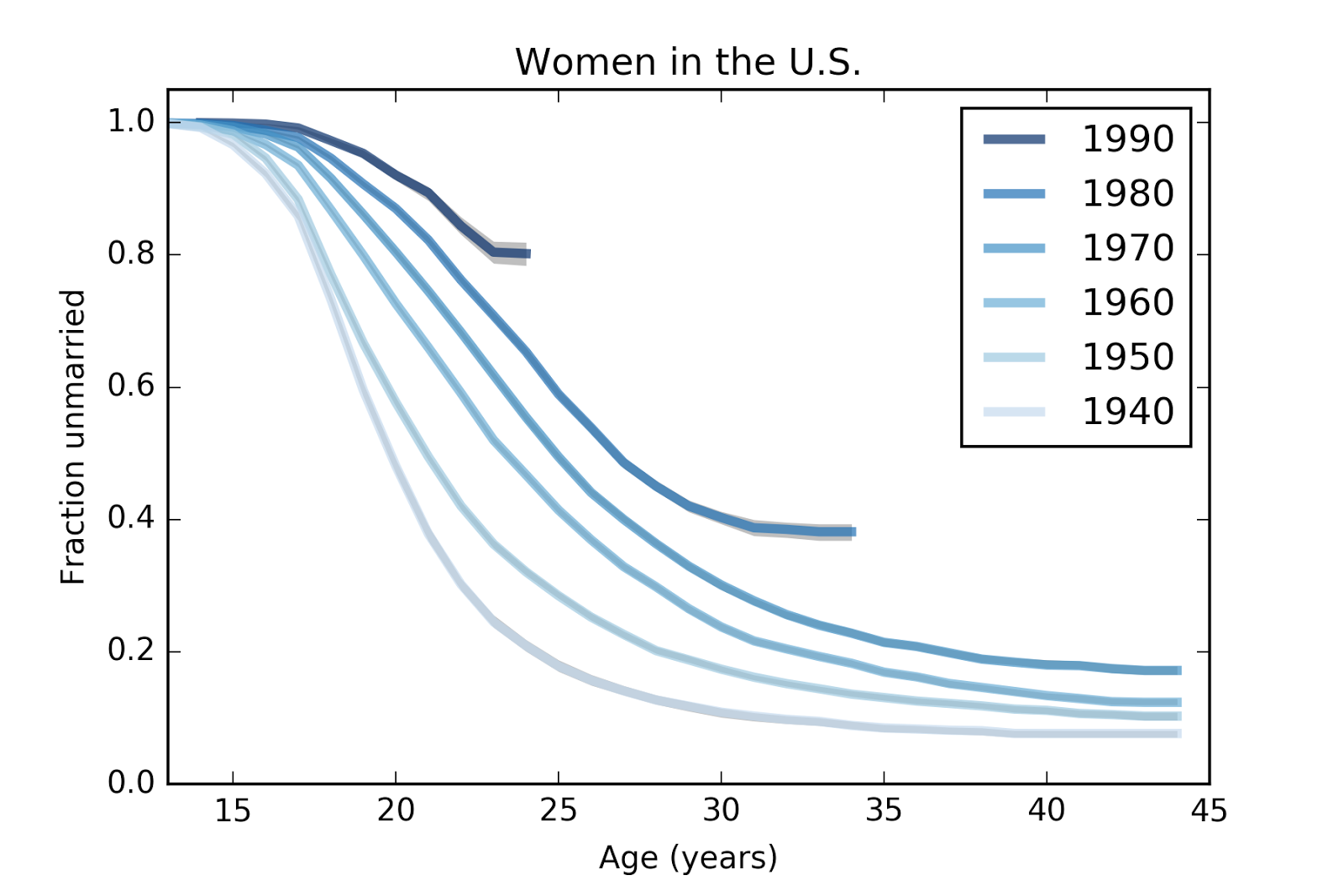
For example, the top line represents women born in the 1990s. At age 15, none of them were married; at age 24, 81% of them are still unmarried. (The survey data runs up to 2015, so the oldest respondents in this group were interviewed at age 25, but the last year contains only partial data, so the survival curve is cut off at age 24).
For women born in the 1980s, the curve goes up to age 34, at which point about 39% of them had never been married.
Two patterns are visible in this figure. Women in each successive cohort are getting married later, and a larger fraction are never getting married at all.
By making some simple projections, we can estimate the magnitude of these effects separately. I explain the methodology in the paper. The following figure shows the survival curves from the previous figure as well as projections shown in gray:
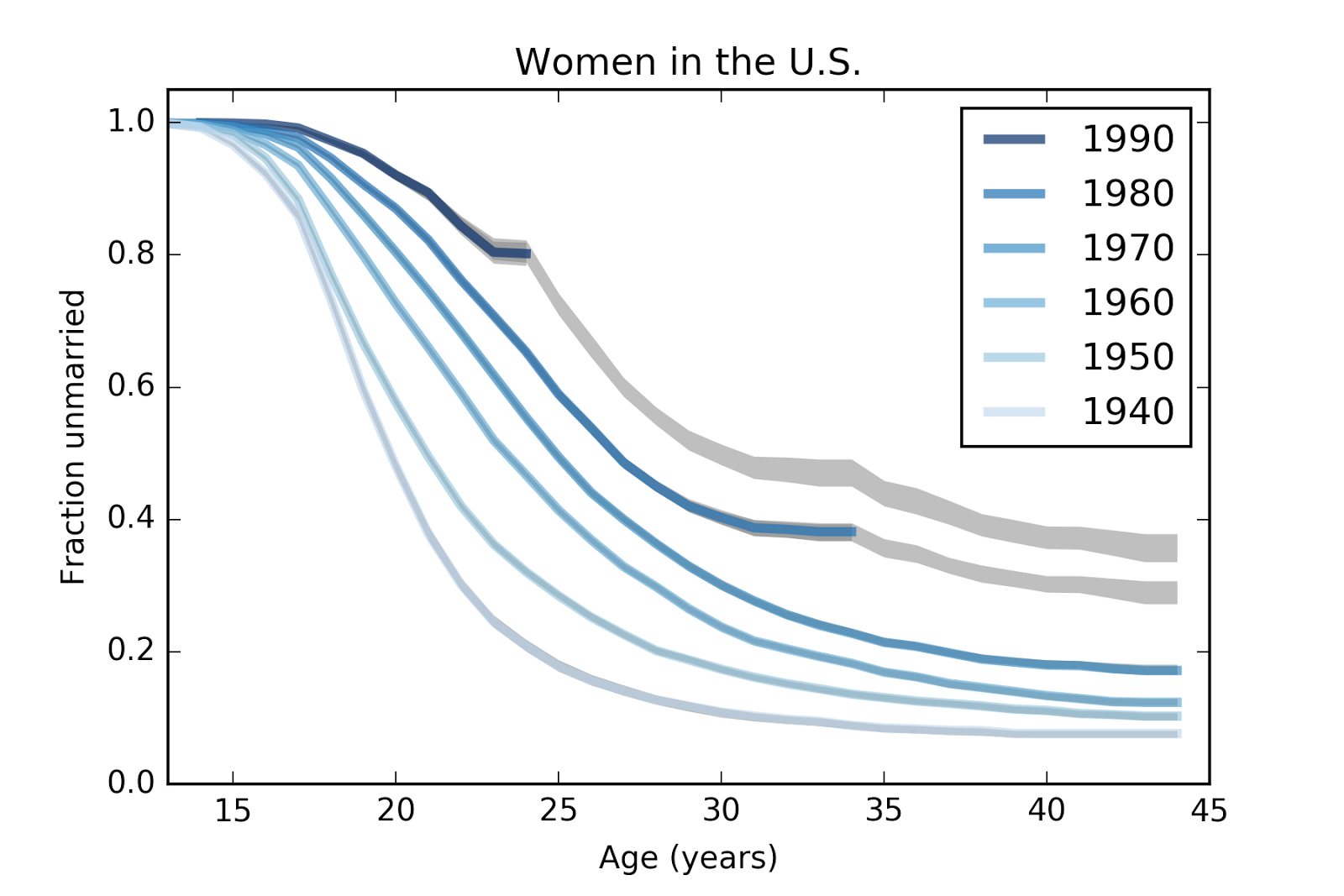
These results suggest that women born in the 1980s and 1990s are not just getting married later; they are on pace to stay unmarried at rates substantially higher than previous cohorts. In particular, women born in the 1980s seem to have leveled off; very few of them have been married between ages 30 and 34. For women born in the 1990s, it is too early to tell whether they have started to level off.
The following figure summarizes these results by taking vertical slices through the survival curves at ages 23, 33 and 43.
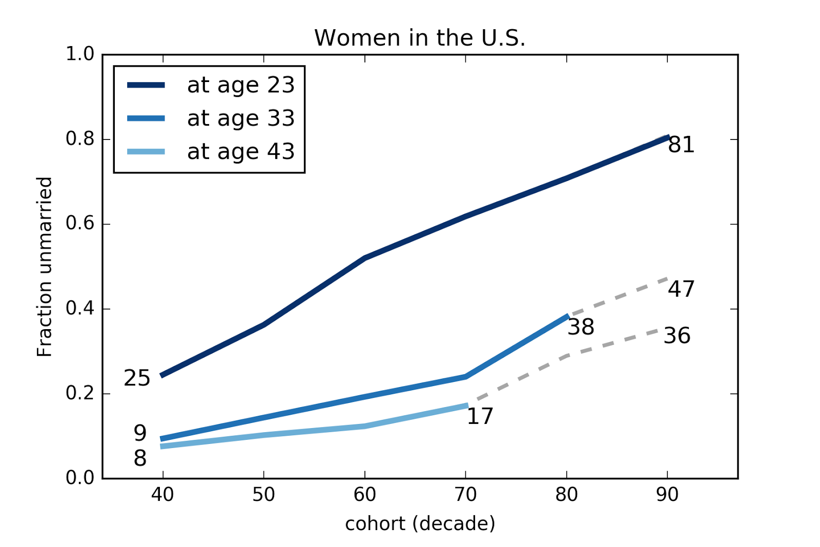
In this figure the x-axis is birth cohort and the y-axis is the fraction who have never married.
1) The top line shows that the fraction of women never married by age 23 has increased from 25% for women born in the 40s to 81% for women born in the 90s.
2) The fraction of women unmarried at age 33 has increased from 9% for women born in the 40s to 38% for women born in the 80s, and is projected to be 47% for women born in the 90s.
3) The fraction of women unmarried at age 43 has increased from 8% for women born in the 40s to 17% for women born in the 70s, and is projected to be 36% for women born in the 1990s.
These projections are based on simple assumptions, so we should not treat them as precise predictions, but they are not as naive as a simple straight-line extrapolations of past trends.
MenThe results for men are similar but less extreme. Here are the estimated survival curves based on a sample of 24652 men in the U.S. The gray areas show 90% confidence intervals for the estimates due to sampling error.
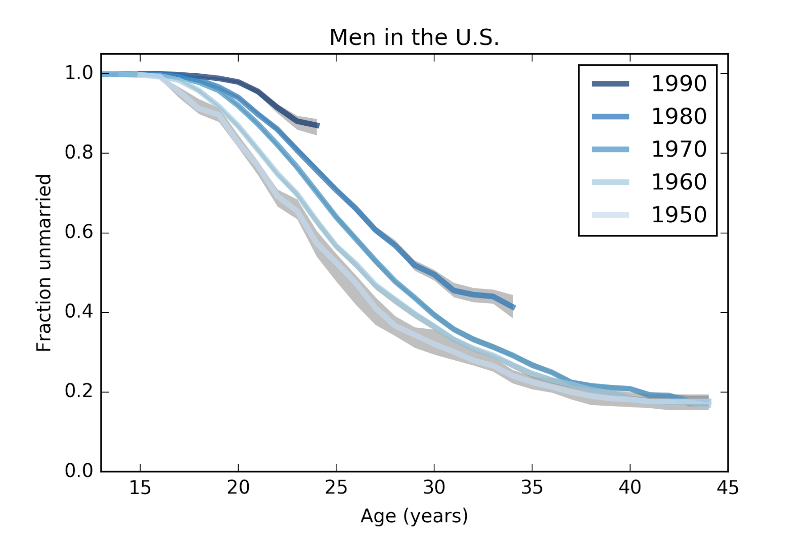
And projections for the last two cohorts.
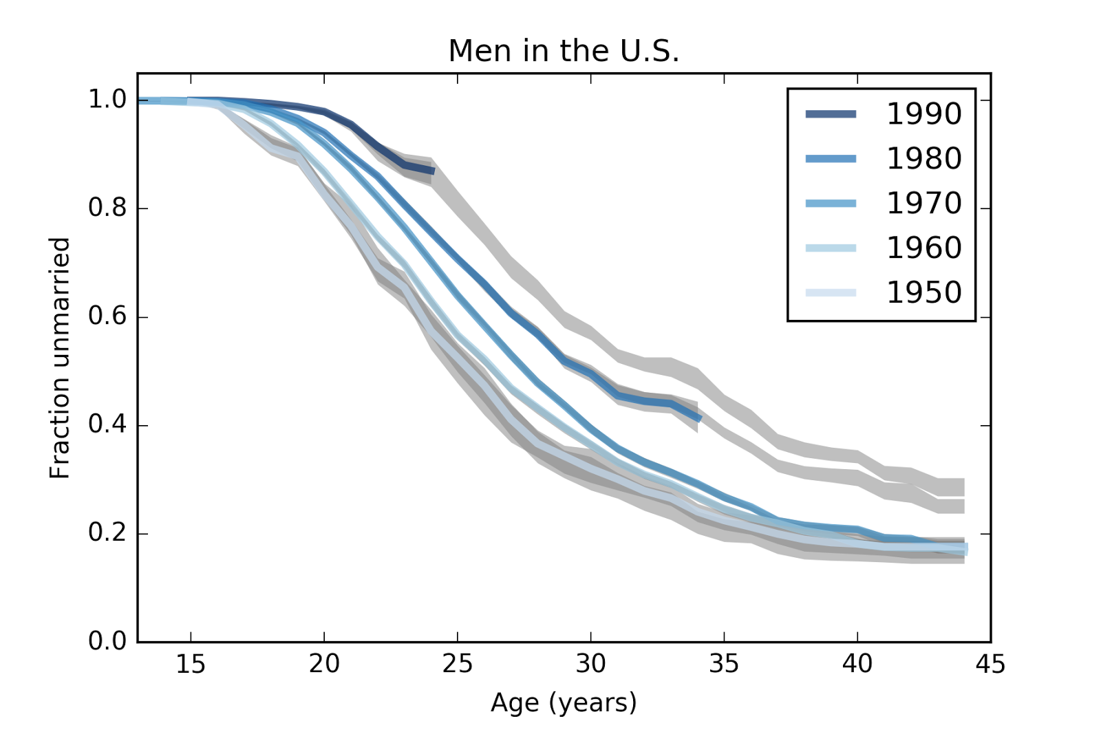
Finally, here are the same data plotted with birth cohort on the x-axis.

1) At age 23, the fraction of men who have never married has increased from 66% for men born in the 50s to 88% for men born in the 90s.
2) At age 33, the fraction of unmarried men has increased from 27% to 44%, and is projected to go to 50%.
3) At age 43, the fraction of unmarried men is almost unchanged for men born in the 50s, 60s, and 70s, but is projected to increase to 30% for men born in the 1990s.
MethodologyThe NSFG is intended to be representative of the adult U.S. population, but it uses stratified sampling to systematically oversample certain subpopulations, including teenagers and racial minorities. My analysis takes this design into account (by weighted resampling) to generate results that are representative of the population.
The survival curves are computed by Kaplan-Meier estimation, with confidence intervals computed by resampling. Missing values are filled by random choice from valid values, so the confidence intervals represent variability due to missing values as well as sampling.
To generate projections, we might consider two factors:
1) If people in the last two cohorts are postponing marriage, we might expect their marriage rates to increase or decrease more slowly.
2) If we extrapolate the trends, we might expect marriage rates to continue to fall or fall faster.
I used an alternative between these extremes: I assume that the hazard function from the previous generation will apply to the next. This takes into account the possibility of delayed marriage (since there are more unmarried people "at risk" in the projections), but it also assumes a degree of regression to past norms. In that sense, the projections are probably conservative; that is, they probably underestimate how different the last two cohorts will be from their predecessors.
All the details are in this Jupyter notebook.

Probably Overthinking It

- Allen B. Downey's profile
- 236 followers

