
Allen B. Downey's Blog: Probably Overthinking It, page 22
July 13, 2015
Will Millennials Ever Get Married?
At SciPy last week I gave a talk called "Will Millennials Ever Get Married? Survival Analysis and Marriage Data". I presented results from my analysis of data from the National Survey of Family Growth (NSFG). The slides I presented are here.
The video is here:
The paper the talk is based on will appear in the conference proceedings, which should be out any day now.
And here's the press release from Olin talking about the project:

The video is here:
The paper the talk is based on will appear in the conference proceedings, which should be out any day now.
And here's the press release from Olin talking about the project:
More women will get married later and the number of women who remain unmarried will increase according to a new statistical investigation into the marriage patterns of millennials by Olin College professor Allen Downey. The analysis was unveiled at the SciPy conference in Austin, Texas.
The data shows that millennials are already marrying much later than previous generations, but now they are on pace to remain unmarried in substantially larger numbers than prior generations of women.
“The thing that is surprising to me is the size of the effect,” said Downey.
Downey, a data scientist, set out to analyze marriage patterns for women born in the 1980s and 1990s using information from the National Survey of Family Growth compiled by the Center for Disease Control (CDC).
Women born in the 90s = 13 percent were married at age 22Women born in the 80s = 23 percent were married at age 22Women born in the 40s = 69 percent were married at age 22“Going from 69 percent to 13 percent in 50 years is a huge magnitude of change,” said Downey.
He then used a statistical survival analysis to project what percentage of women will marry later in life – or at all. Downey only studied numbers for women because the data from the CDC is more comprehensive for females.
Of women born in the 1980s, Downey’s statistical survival projections show 72 percent are likely to marry by age 42, down from 82 percent of women born in the 1970s who were married by that age. For women born in the 1990s, the projection shows that only 68 percent are likely to marry by age 42. Contrast these figures with the fact that 92 percent of women born in the 1940s were married by age 42.
“These are projections, they are based on current trends and then seeing what would happen if the current trends continue…but at this point women born in the 80s and 90s are so far behind in marriage terms they would have to start getting married at much higher rates than previous generations in order to catch up,” said Downey.


June 25, 2015
Bayesian Billiards
I recently watched a video of Jake VanderPlas explaining Bayesian statistics at SciPy 2104. It's an excellent talk that includes some nice examples. In fact, it looks like he had even more examples he didn't have time to present.
Although his presentation is very good, he includes one statement that is a little misleading, in my opinion. Specifically, he shows an example where frequentist and Bayesian methods yield similar results, and concludes, "for very simple problems, frequentist and Bayesian results are often practically indistinguishable."
But as I argued in my recent talk, "Learning to Love Bayesian Statistics," frequentist methods generate point estimates and confidence intervals, whereas Bayesian methods produce posterior distributions. That's two different kinds of things (different types, in programmer-speak) so they can't be equivalent.
If you reduce the Bayesian posterior to a point estimate and an interval, you can compare Bayesian and frequentist results, but in doing so you discard useful information and lose what I think is the most important advantage of Bayesian methods: the ability to use posterior distributions as inputs to other analyses and decision-making processes.
The next section of Jake's talk demonstrates this point nicely. He presents the "Bayesian Billiards Problem", which Bayes wrote about in 1763. Jake presents a version of the problem from this paper by Sean Eddy, which I'll quote:
The problem statement indicates that the prior distribution of p is uniform from 0 to 1. Given a hypothetical value of p and the observed number of wins and losses, we can compute the likelihood of the data under each hypothesis:
class Billiards(thinkbayes.Suite):
def Likelihood(self, data, hypo):
"""Likelihood of the data under the hypothesis.
data: tuple (#wins, #losses)
hypo: float probability of win
"""
p = hypo
win, lose = data
like = p**win * (1-p)**lose
return like
Billiards inherits the Update function from Suite (which is defined in thinkbayes.py and explained in Think Bayes) and provides Likelihood, which uses the binomial formula:

I left out the first term, the binomial coefficient, because it doesn't depend on p, so it would just get normalized away.
Now I just have to create the prior and update it:
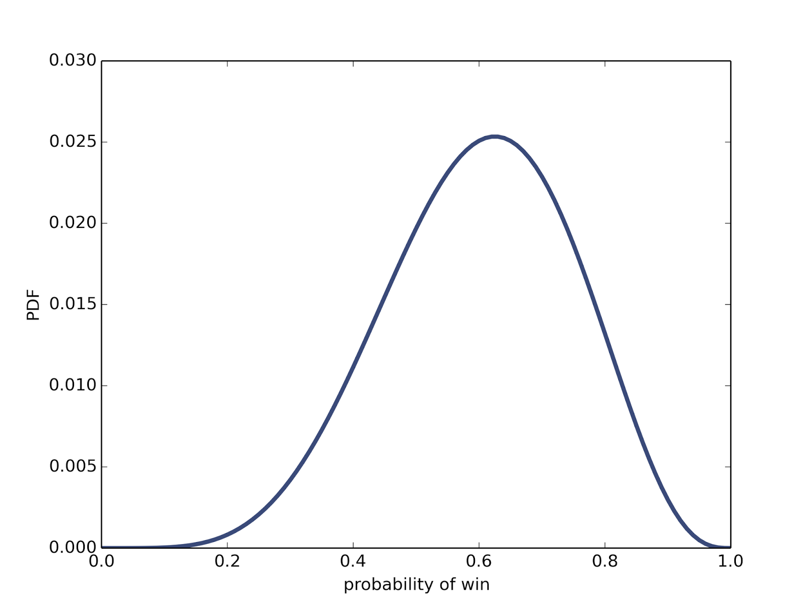
ps = numpy.linspace(0, 1, 101) bill = Billiards(ps) bill.Update((5, 3)) thinkplot.Pdf(bill)
The following figure shows the resulting posterior:

Now to compute the probability that Bob wins the match. Since Alice is ahead 5 points to 3, Bob needs to win the next three points. His chance of winning each point is (1-p), so the chance of winning the next three is (1-p)³.
We don't know the value of p, but we have its posterior distribution, which we can "integrate over" like this:
def ProbWinMatch(pmf): total = 0 for p, prob in pmf.Items(): total += prob * (1-p)**3 return total
The result is p = 0.091, which corresponds to 10:1 odds against.
Using a frequentist approach, we get a substantially different answer. Instead of a posterior distribution, we get a single point estimate. Assuming we use the MLE, we estimate p = 5/8, and (1-p)³ = 0.056, which corresponds to 18:1 odds against.
Needless to say, the Bayesian result is right and the frequentist result is wrong.
But let's consider why the frequentist result is wrong. The problem is not the estimate itself. In fact, in this example, the Bayesian maximum aposteriori probability (MAP) is the same as the frequentist MLE. The difference is that Bayesian posterior contains all of the information we have about p, whereas the frequentist result discards a large part of that information.
The result we are interested in, the probability of winning the match, is a non-linear transform of p, and in general for a non-linear transform f, the expectation E[f(p)] does not equal f(E[p]). The Bayesian method computes the first, which is right; the frequentist method approximates the second, which is wrong.
To summarize, Bayesian methods are better not just because the results are correct, but more importantly because the results are in a form, the posterior distribution, that lends itself to answering questions and guiding decision-making under uncertainty.
As I said at the Open Data Science Conference:


Although his presentation is very good, he includes one statement that is a little misleading, in my opinion. Specifically, he shows an example where frequentist and Bayesian methods yield similar results, and concludes, "for very simple problems, frequentist and Bayesian results are often practically indistinguishable."
But as I argued in my recent talk, "Learning to Love Bayesian Statistics," frequentist methods generate point estimates and confidence intervals, whereas Bayesian methods produce posterior distributions. That's two different kinds of things (different types, in programmer-speak) so they can't be equivalent.
If you reduce the Bayesian posterior to a point estimate and an interval, you can compare Bayesian and frequentist results, but in doing so you discard useful information and lose what I think is the most important advantage of Bayesian methods: the ability to use posterior distributions as inputs to other analyses and decision-making processes.
The next section of Jake's talk demonstrates this point nicely. He presents the "Bayesian Billiards Problem", which Bayes wrote about in 1763. Jake presents a version of the problem from this paper by Sean Eddy, which I'll quote:
"Alice and Bob are playing a game in which the first person to get 6 points wins. The way each point is decided is a little strange. The Casino has a pool table that Alice and Bob can't see. Before the game begins, the Casino rolls an initial ball onto the table, which comes to rest at a completely random position, which the Casino marks. Then, each point is decided by the Casino rolling another ball onto the table randomly. If it comes to rest to the left of the initial mark, Alice wins the point; to the right of the mark, Bob wins the point. The Casino reveals nothing to Alice and Bob except who won each point.
"Clearly, the probability that Alice wins a point is the fraction of the table to the left of the mark—call this probability p; and Bob's probability of winning a point is 1 - p. Because the Casino rolled the initial ball to a random position, before any points were decided every value of p was equally probable. The mark is only set once per game, so p is the same for every point.
"Imagine Alice is already winning 5 points to 3, and now she bets Bob that she's going to win. What are fair betting odds for Alice to offer Bob? That is, what is the expected probability that Alice will win?"Eddy solves the problem using a Beta distribution to estimate p, then integrates over the posterior distribution of p to get the probability that Bob wins. If you like that approach, you can read Eddy's paper. If you prefer a computational approach, read on! My solution is in this Python file.
The problem statement indicates that the prior distribution of p is uniform from 0 to 1. Given a hypothetical value of p and the observed number of wins and losses, we can compute the likelihood of the data under each hypothesis:
class Billiards(thinkbayes.Suite):
def Likelihood(self, data, hypo):
"""Likelihood of the data under the hypothesis.
data: tuple (#wins, #losses)
hypo: float probability of win
"""
p = hypo
win, lose = data
like = p**win * (1-p)**lose
return like
Billiards inherits the Update function from Suite (which is defined in thinkbayes.py and explained in Think Bayes) and provides Likelihood, which uses the binomial formula:
I left out the first term, the binomial coefficient, because it doesn't depend on p, so it would just get normalized away.
Now I just have to create the prior and update it:
ps = numpy.linspace(0, 1, 101) bill = Billiards(ps) bill.Update((5, 3)) thinkplot.Pdf(bill)
The following figure shows the resulting posterior:
Now to compute the probability that Bob wins the match. Since Alice is ahead 5 points to 3, Bob needs to win the next three points. His chance of winning each point is (1-p), so the chance of winning the next three is (1-p)³.
We don't know the value of p, but we have its posterior distribution, which we can "integrate over" like this:
def ProbWinMatch(pmf): total = 0 for p, prob in pmf.Items(): total += prob * (1-p)**3 return total
The result is p = 0.091, which corresponds to 10:1 odds against.
Using a frequentist approach, we get a substantially different answer. Instead of a posterior distribution, we get a single point estimate. Assuming we use the MLE, we estimate p = 5/8, and (1-p)³ = 0.056, which corresponds to 18:1 odds against.
Needless to say, the Bayesian result is right and the frequentist result is wrong.
But let's consider why the frequentist result is wrong. The problem is not the estimate itself. In fact, in this example, the Bayesian maximum aposteriori probability (MAP) is the same as the frequentist MLE. The difference is that Bayesian posterior contains all of the information we have about p, whereas the frequentist result discards a large part of that information.
The result we are interested in, the probability of winning the match, is a non-linear transform of p, and in general for a non-linear transform f, the expectation E[f(p)] does not equal f(E[p]). The Bayesian method computes the first, which is right; the frequentist method approximates the second, which is wrong.
To summarize, Bayesian methods are better not just because the results are correct, but more importantly because the results are in a form, the posterior distribution, that lends itself to answering questions and guiding decision-making under uncertainty.
As I said at the Open Data Science Conference:
June 12, 2015
The Sleeping Beauty Problem
How did I get to my ripe old age without hearing about The Sleeping Beauty Problem? I've taught and written about The Monty Hall Problem and
Of course, there's a Wikipedia page about it, which I'll borrow to provide the background:
Most, but not all, people who have written about this are thirders. But:On Sunday evening, just before SB falls asleep, she must believe the chance of heads is one-half: that’s what it means to be a fair coin.Whenever SB awakens, she has learned absolutely nothing she did not know Sunday night. What rational argument can she give, then, for stating that her belief in heads is now one-third and not one-half?As a stark raving Bayesian, I find this mildly disturbing. Is this an example where frequentism gets it right and Bayesianism gets it wrong? One of the responses on reddit pursues the same thought:
In the previous calculation, the priors are correct: P(H) = P(T) = 1/2
It's the likelihoods that are wrong. The datum is "SB wakes up". This event happens once if the coin is heads and twice if it is tails, so the likelihood ratio P(wake|H) / P(wake|T) = 1/2
If you plug that into Bayes's theorem, you get the correct answer, 1/3.
This is an example where the odds form of Bayes's theorem is less error prone: the prior odds are 1:1. The likelihood ratio is 1:2, so the posterior odds are 1:2. By thinking in terms of likelihood ratio, rather than conditional probability, we avoid the pitfall.
If this example is still making your head hurt, here's an analogy that might help: suppose you live near a train station, and every morning you hear one express train and two local trains go past. The probability of hearing an express train is 1, and the probability of hearing a local train is 1. Nevertheless, the likelihood ratio is 1:2, and if you hear a train, the probability is only 1/3 that it is the express.

Of course, there's a Wikipedia page about it, which I'll borrow to provide the background:
"Sleeping Beauty volunteers to undergo the following experiment and is told all of the following details: On Sunday she will be put to sleep. Once or twice during the experiment, Beauty will be awakened, interviewed, and put back to sleep with an amnesia-inducing drug that makes her forget that awakening.
A fair coin will be tossed to determine which experimental procedure to undertake: if the coin comes up heads, Beauty will be awakened and interviewed on Monday only. If the coin comes up tails, she will be awakened and interviewed on Monday and Tuesday. In either case, she will be awakened on Wednesday without interview and the experiment ends.
Any time Sleeping Beauty is awakened and interviewed, she is asked, 'What is your belief now for the proposition that the coin landed heads?'"The problem is discussed at length on this CrossValidated thread. As the person who posted the question explains, there are two common reactions to this problem:
The Halfer position. Simple! The coin is fair--and SB knows it--so she should believe there's a one-half chance of heads.
The Thirder position. Were this experiment to be repeated many times, then the coin will be heads only one third of the time SB is awakened. Her probability for heads will be one third.The thirder position is correct, and I think the argument based on long-run averages is the most persuasive. From Wikipedia:
Suppose this experiment were repeated 1,000 times. It is expected that there would be 500 heads and 500 tails. So Beauty would be awoken 500 times after heads on Monday, 500 times after tails on Monday, and 500 times after tails on Tuesday. In other words, only in one-third of the cases would heads precede her awakening. This long-run expectation should give the same expectations for the one trial, so P(Heads) = 1/3.But here's the difficulty (from CrossValidated):
Most, but not all, people who have written about this are thirders. But:On Sunday evening, just before SB falls asleep, she must believe the chance of heads is one-half: that’s what it means to be a fair coin.Whenever SB awakens, she has learned absolutely nothing she did not know Sunday night. What rational argument can she give, then, for stating that her belief in heads is now one-third and not one-half?As a stark raving Bayesian, I find this mildly disturbing. Is this an example where frequentism gets it right and Bayesianism gets it wrong? One of the responses on reddit pursues the same thought:
I wonder where exactly in Bayes' rule does the formula "fail". It seems like P(wake|H) = P(wake|T) = 1, and P(H) = P(T) = 1/2, leading to the P(H|wake) = 1/2 conclusion.I have come to a resolution of this problem that works, I think, but it made me realize the following subtle point: even if two things are inevitable, that doesn't make them equally likely.
Is it possible to get 1/3 using Bayes' rule?
In the previous calculation, the priors are correct: P(H) = P(T) = 1/2
It's the likelihoods that are wrong. The datum is "SB wakes up". This event happens once if the coin is heads and twice if it is tails, so the likelihood ratio P(wake|H) / P(wake|T) = 1/2
If you plug that into Bayes's theorem, you get the correct answer, 1/3.
This is an example where the odds form of Bayes's theorem is less error prone: the prior odds are 1:1. The likelihood ratio is 1:2, so the posterior odds are 1:2. By thinking in terms of likelihood ratio, rather than conditional probability, we avoid the pitfall.
If this example is still making your head hurt, here's an analogy that might help: suppose you live near a train station, and every morning you hear one express train and two local trains go past. The probability of hearing an express train is 1, and the probability of hearing a local train is 1. Nevertheless, the likelihood ratio is 1:2, and if you hear a train, the probability is only 1/3 that it is the express.
May 1, 2015
Hypothesis testing is only mostly useless
In my previous article I argued that classical statistical inference is only mostly wrong. About null-hypothesis significance testing (NHST), I wrote:
“If the p-value is small, you can conclude that the fourth possibility is unlikely, and infer that the other three possibilities are more likely.”
Where “the fourth possibility” I referred to was:
“The apparent effect might be due to chance; that is, the difference might appear in a random sample, but not in the general population.”
Several commenters chastised me; for example:
“All a p-value tells you is the probability of your data (or data more extreme) given the null is true. They say nothing about whether your data is ‘due to chance.’”
My correspondent is partly right. The p-value is the probability of the apparent effect under the null hypothesis, which is not the same thing as the probability we should assign to the null hypothesis after seeing the data. But they are related to each other by Bayes’s theorem, which is why I said that you can use the first to make an inference about the second.
Let me explain by showing a few examples. I’ll start with what I think is a common scenario: suppose you are reading a scientific paper that reports a new relationship between two variables. There are (at least) three explanations you might consider for this apparent effect:
A: The effect might be actual; that is, it might exist in the unobserved population as well as the observed sample.B: The effect might be bogus, caused by errors like sampling bias and measurement error, or by fraud.C: The effect might be due to chance, appearing randomly in the sample but not in the population.
If we think of these as competing hypotheses to explain the apparent effect, we can use Bayes’s theorem to update our belief in each hypothesis.
Scenario #1
As a first scenario, suppose that the apparent effect is plausible, and the p-value is low. The following table shows what the Bayesian update might look like:
PriorLikelihoodPosteriorActual700.5–1.0~75Bogus200.5–1.0~25Chance10p = 0.01~0.001
Since the apparent effect is plausible, I give it a prior probability of 70%. I assign a prior of 20% to the hypothesis that the result is to due to error or fraud, and 10% to the hypothesis that it’s due to chance. If you don’t agree with the numbers I chose, we’ll look at some alternatives soon. Or feel free to plug in your own.
Now we compute the likelihood of the apparent effect under each hypothesis. If the effect is real, it is quite likely to appear in the sample, so I figure the likelihood is between 50% and 100%. And in the presence of error or fraud, I assume the apparent effect is also quite likely.
If the effect is due to chance, we can compute the likelihood directly. The likelihood of the data under the null hypothesis is the p-value. As an example, suppose p=0.01.
The table shows the resulting posterior probabilities. The hypothesis that the effect is due to chance has been almost eliminated, and the other hypotheses are marginally more likely. The hypothesis test helps a little, by ruling out one source of error, but it doesn't help a lot, because randomness was not the source of error I was most worried about.
Scenario #2
In the second scenario, suppose the p-value is low, again, but the apparent effect is less plausible. In that case, I would assign a lower prior probability to Actual and a higher prior to Bogus. I am still inclined to assign a low priority to Chance, simply because I don’t think it is the most common cause of scientific error.
PriorLikelihoodPosteriorActual200.5–1.0~25Bogus700.5–1.0~75Chance10p = 0.01~0.001
The results are pretty much the same as in Scenario #1: we can be reasonably confident that the result is not due to chance. But again, the hypothesis test does not make a lot of difference in my belief about the validity of the paper.
I believe these examples cover a large majority of real-world scenarios, and in each case my claim holds up: If the p-value is small, you can conclude that apparent effect is unlikely to be due to chance, and the other possibilities (Actual and Bogus) are more likely.
Scenario #3
I admit that there are situations where this conclusion would not be valid. For example, if the effect is implausible and you have good reason to think that error and fraud are unlikely, you might start with a larger prior belief in Chance. In that case a p-value like 0.01 might not be sufficient to rule out Chance:
PriorLikelihoodPosteriorActual100.546Bogus100.546Chance80p = 0.018
But even in this contrived scenario, the p-value has a substantial effect on our belief in the Chance hypothesis. And a somewhat smaller p-value, like 0.001, would be sufficient to rule out Chance as a likely cause of error.
In summary, NHST is problematic but not useless. If you think an apparent effect might be due to chance, choosing an appropriate null hypothesis and computing a p-value is a reasonable way to check.
April 15, 2015
Two hour marathon by 2041 -- probably
Last fall I taught an introduction to Bayesian statistics at Olin College. My students worked on some excellent projects, and I invited them to write up their results as guest articles for this blog. Previous articles in the series are:
Bayesian predictions for Super Bowl XLIX
Bayesian analysis of match rates on Tinder
Bayesian survival analysis for Game of Thrones
Now, with the Boston Marathon coming up, we have an article about predicting world record marathon times.
Modeling Marathon Records With Bayesian Linear Regressionhttps://github.com/cypressf/ThinkBayes2Cypress Frankenfeld
In this blog article, Allen Downey shows that marathon world record times have been advancing at a linear rate. He uses least squares estimation to calculate the parameters of the line of best fit, and predicts that the first 2-hour marathon will occur around 2041.
I extend his model, and calculate how likely it will be that someone will run a 2-hour marathon in 2041. Or more generally, I find the probability distribution of a certain record being hit on a certain date.
I break down my process into 4 steps:Decide on a set of prior hypotheses about the trend of marathon records.Update my priors using the world record data.Use my posterior to run a monte-carlo simulation of world records.Use this simulation to estimate the probability distribution of dates and records.What are my prior hypotheses?Since we are assuming the trend in running times is linear, I write my guesses as linear functions,yi(xi) = α + βx + ei ,where α and β are constants and ei is random error drawn from a normal distribution characterized by standard deviation σ. Thus I choose my priors to be list of combinations of α, β, and σ.
intercept_estimate, slope_estimate = LeastSquares(dates, records)alpha_range = 0.007beta_range = 0.2alphas = np.linspace(intercept_estimate * (1 - alpha_range), intercept_estimate * (1 + alpha_range), 40)betas = np.linspace(slope_estimate * (1 - beta_range), slope_estimate * (1 + beta_range), 40)sigmas = np.linspace(0.001, 0.1, 40)hypos = [(alpha, beta, sigma) for alpha in alphas for beta in betas for sigma in sigmas]
I set the values of α, β, and σ partially on the least squares estimate and partially on trial and error. I initialize my prior hypotheses to be uniformly distributed.How do I update my priors?I perform a bayesian update based on a list of running records. For each running record, (date, record_mph), I calculate the likelihood based on the following function.
def Likelihood(self, data, hypo):alpha, beta, sigma = hypototal_likelihood = 1for date, measured_mph in data:hypothesized_mph = alpha + beta * dateerror = measured_mph - hypothesized_mphtotal_likelihood *= EvalNormalPdf(error, mu=0, sigma=sigma)return total_likelihood
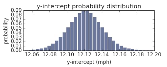
I find the error between the hypothesized record and the measured record (in miles per hour), then I find the probability of seeing that error given the normal distribution with standard deviation of σ. The posterior PMFs for α, β, and σ
 α
α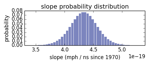 β
β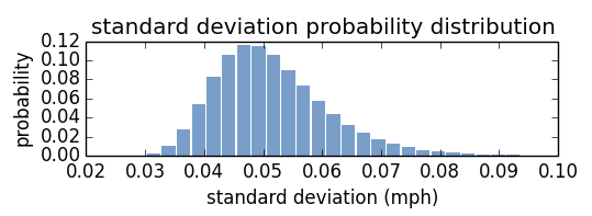 σ
σ
Here are the posterior marginal distributions of α, β, and σ after updating with all the running records. The distributions of α and β peak close to the least squares estimate. How close are they to least squares estimate? Here I’ve plotted a line based on the maximum likelihood of α, β, compared to the least squares estimate. Graphically, they are almost indistinguishable.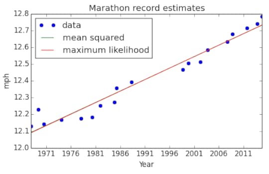 But I use these distributions to estimate more than a single line! I create a monte-carlo simulation of running records.How do I simulate these records?I pull a random α, β, and σ from their PMF (weighted by probability), generate a list of records for each year from 2014 to 2060, then repeat. The results are in the figure below, plotted alongside the previous records.
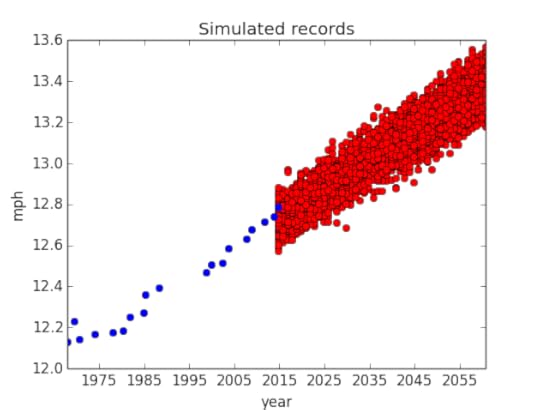 It may seem counterintuitive to see simulated running speeds fall below the current records, but it make sense! Think of those as years wherein the first-place marathon didn’t set a world-record.
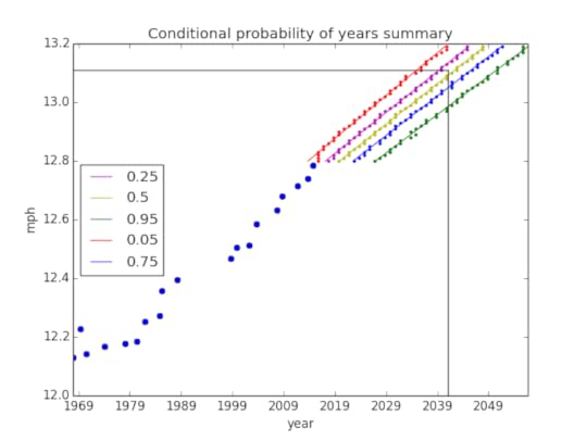
These simulated records are most dense where they are most likely, but the scatter plot is a poor visualization of their densities. To fix this, I merge the points into discrete buckets and count the number of points in each bucket to estimate their probabilities. This resulting joint probability distribution is what I’ve been looking for: given a date and a record, I can tell you the probability of setting that record on that date. I plot the joint distribution in the figure below.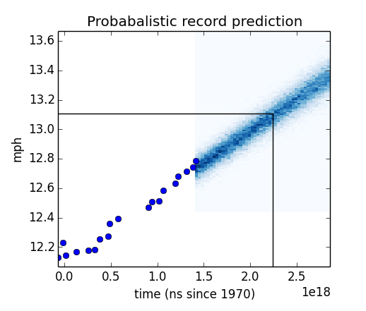 It is difficult to create a pcolor plot with pandas Timestamp objects as the unit, so I use nanoseconds since 1970. The vertical and horizontal lines are at year 2041 and 13.11mph (the two-hour marathon pace). The lines fall within a dense region of the graph, which indicates that they are likely.
To identify the probability of the two-hour record being hit before the year 2042, I take the conditional distribution for the running speed of 13.11mph to obtain the PMF of years, then I compute the total probability of that running speed being hit before the year 2042.
>>> year2042 = pandas.to_datetime(‘2042’)>>> joint_distribution.Conditional(0, 1, 13.11).ProbLess(year2042.value)0.385445
This answers my original question. There is a 38.5% probability that someone will have run a two-hour marathon by the end of 2041.
To get a bigger picture, I create a similar conditional PMF for each running speed bucket, convert it to a CDF, and extract the years corresponding to several percentiles. The 95th percentile means there is a 95% probability of reaching that particular running speed by that year. I plot these percentiles to get a better sense of how likely any record is to be broken by any date.
 Again, the black horizontal and vertical lines correspond to the running speed for a two-hour marathon and the year 2041. You can see that they fall between 25% and 50% probability (as we already know). By looking at this plot, we can also say that the two-hour marathon will be broken by the year 2050 with about a 95% probability.

Bayesian predictions for Super Bowl XLIX
Bayesian analysis of match rates on Tinder
Bayesian survival analysis for Game of Thrones
Now, with the Boston Marathon coming up, we have an article about predicting world record marathon times.
Modeling Marathon Records With Bayesian Linear Regressionhttps://github.com/cypressf/ThinkBayes2Cypress Frankenfeld
In this blog article, Allen Downey shows that marathon world record times have been advancing at a linear rate. He uses least squares estimation to calculate the parameters of the line of best fit, and predicts that the first 2-hour marathon will occur around 2041.
I extend his model, and calculate how likely it will be that someone will run a 2-hour marathon in 2041. Or more generally, I find the probability distribution of a certain record being hit on a certain date.
I break down my process into 4 steps:Decide on a set of prior hypotheses about the trend of marathon records.Update my priors using the world record data.Use my posterior to run a monte-carlo simulation of world records.Use this simulation to estimate the probability distribution of dates and records.What are my prior hypotheses?Since we are assuming the trend in running times is linear, I write my guesses as linear functions,yi(xi) = α + βx + ei ,where α and β are constants and ei is random error drawn from a normal distribution characterized by standard deviation σ. Thus I choose my priors to be list of combinations of α, β, and σ.
intercept_estimate, slope_estimate = LeastSquares(dates, records)alpha_range = 0.007beta_range = 0.2alphas = np.linspace(intercept_estimate * (1 - alpha_range), intercept_estimate * (1 + alpha_range), 40)betas = np.linspace(slope_estimate * (1 - beta_range), slope_estimate * (1 + beta_range), 40)sigmas = np.linspace(0.001, 0.1, 40)hypos = [(alpha, beta, sigma) for alpha in alphas for beta in betas for sigma in sigmas]
I set the values of α, β, and σ partially on the least squares estimate and partially on trial and error. I initialize my prior hypotheses to be uniformly distributed.How do I update my priors?I perform a bayesian update based on a list of running records. For each running record, (date, record_mph), I calculate the likelihood based on the following function.
def Likelihood(self, data, hypo):alpha, beta, sigma = hypototal_likelihood = 1for date, measured_mph in data:hypothesized_mph = alpha + beta * dateerror = measured_mph - hypothesized_mphtotal_likelihood *= EvalNormalPdf(error, mu=0, sigma=sigma)return total_likelihood
I find the error between the hypothesized record and the measured record (in miles per hour), then I find the probability of seeing that error given the normal distribution with standard deviation of σ. The posterior PMFs for α, β, and σ
αβσ
Here are the posterior marginal distributions of α, β, and σ after updating with all the running records. The distributions of α and β peak close to the least squares estimate. How close are they to least squares estimate? Here I’ve plotted a line based on the maximum likelihood of α, β, compared to the least squares estimate. Graphically, they are almost indistinguishable.
But I use these distributions to estimate more than a single line! I create a monte-carlo simulation of running records.How do I simulate these records?I pull a random α, β, and σ from their PMF (weighted by probability), generate a list of records for each year from 2014 to 2060, then repeat. The results are in the figure below, plotted alongside the previous records.It may seem counterintuitive to see simulated running speeds fall below the current records, but it make sense! Think of those as years wherein the first-place marathon didn’t set a world-record.
These simulated records are most dense where they are most likely, but the scatter plot is a poor visualization of their densities. To fix this, I merge the points into discrete buckets and count the number of points in each bucket to estimate their probabilities. This resulting joint probability distribution is what I’ve been looking for: given a date and a record, I can tell you the probability of setting that record on that date. I plot the joint distribution in the figure below.
It is difficult to create a pcolor plot with pandas Timestamp objects as the unit, so I use nanoseconds since 1970. The vertical and horizontal lines are at year 2041 and 13.11mph (the two-hour marathon pace). The lines fall within a dense region of the graph, which indicates that they are likely.
To identify the probability of the two-hour record being hit before the year 2042, I take the conditional distribution for the running speed of 13.11mph to obtain the PMF of years, then I compute the total probability of that running speed being hit before the year 2042.
>>> year2042 = pandas.to_datetime(‘2042’)>>> joint_distribution.Conditional(0, 1, 13.11).ProbLess(year2042.value)0.385445
This answers my original question. There is a 38.5% probability that someone will have run a two-hour marathon by the end of 2041.
To get a bigger picture, I create a similar conditional PMF for each running speed bucket, convert it to a CDF, and extract the years corresponding to several percentiles. The 95th percentile means there is a 95% probability of reaching that particular running speed by that year. I plot these percentiles to get a better sense of how likely any record is to be broken by any date.
Again, the black horizontal and vertical lines correspond to the running speed for a two-hour marathon and the year 2041. You can see that they fall between 25% and 50% probability (as we already know). By looking at this plot, we can also say that the two-hour marathon will be broken by the year 2050 with about a 95% probability.
March 25, 2015
Bayesian survival analysis for "Game of Thrones"
Last fall I taught an introduction to Bayesian statistics at Olin College. My students worked on some excellent projects, and I invited them to write up their results as guest articles for this blog.
One of the teams applied Bayesian survival analysis to the characters in A Song of Ice and Fire, the book series by George R. R. Martin. Using data from the first 5 books, they generate predictions for which characters are likely to survive and which might die in the forthcoming books.
With Season 5 of the Game of Thrones television series starting on April 12, we thought this would be a good time to publish their report.Bayesian Survival Analysis in A Song of Ice and FireErin Pierce and Ben KahleThe Song of Ice and Fire series has a reputation for being quite deadly. No character, good or bad, major or minor is safe from Martin’s pen. The reputation is not unwarranted; of the 916 named characters that populate Martin’s world, a third have died, alongside uncounted nameless ones.
In this report, we take a closer look at the patterns of death in the novels and create a Bayesian model that predicts the probability that characters will survive the next two books.
Using data from A Wiki of Ice and Fire, we created a dataset of all 916 characters that appeared in the books so far. For every character, we know what chapter and book they first appeared, if they are male or female, if they are part of the nobility or not, what major house they are loyal to, and, if applicable, the chapter and book of their death. We used this data to predict which characters will survive the next couple books.
MethodologyWe extrapolated the survival probabilities of the characters through the seventh book using Weibull distributions. A Weibull distribution provides a way to model the hazard function, which measures the probability of death at a specific age. The Weibull distribution depends on two parameters, k and lambda, which control its shape.
To estimate these parameters, we start with a uniform prior. For each alive character, we check how well that value of k or lambda predicted the fact that the character was still alive by comparing the calculated Weibull distribution with the character’s hazard function. For each dead character, we check how well the parameters predicted the time of their death by comparing the Weibull distribution with the character’s survival function.
The main code used to update these distributions is:
class GOT(thinkbayes2.Suite, thinkbayes2.Joint):
def Likelihood(self, data, hypo):
"""Determines how well a given k and lam predict the life/death of a character """
age, alive = data k, lam = hypo
if alive:
prob = 1-exponweib.cdf(age, k, lam)
else:
prob = exponweib.pdf(age, k, lam)
return prob
def Update(k, lam, age, alive):
"""Performs the Baysian Update and returns the PMFs of k and lam"""
joint = thinkbayes2.MakeJoint(k, lam)
suite = GOT(joint)
suite.Update((age, alive))
k = suite.Marginal(0, label=k.label), lam = suite.Marginal(1, label=lam.label)
return k, lam
def MakeDistr(introductions, lifetimes,k,lam):
"""Iterates through all the characters for a given k and lambda. It then updates the k and lambda distributions"""
k.label = 'K'
lam.label = 'Lam'
print("Updating deaths")
for age in lifetimes:
k, lam = Update(k, lam, age, False)
print('Updating alives')
for age in introductions:
k, lam = Update(k, lam, age, True)
return k,lamFor the Night’s Watch, this lead to the posterior distribution in Figure 3.
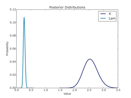 Figure 3: The distribution for lambda is quite tight, around 0.27, but the distribution for k is broader.
To translate this back to a survival curve, we took the mean of k and lambda, as well as the 90 percent credible interval for each parameter. We then plot the original data, the credible interval, and the survival curve based on the posterior means.
Jon Snow
Using this analysis, we can can begin to make a prediction for an individual character like Jon Snow. At the end of A Dance with Dragons, the credible interval for the Night’s Watch survival (Figure 4) stretches from 36 percent to 56 percent. The odds are not exactly rosy that Jon snow is still alive. Even if Jon is still alive at the end of book 5, the odds that he will survive the next two books drop to between 30 percent and 51 percent.
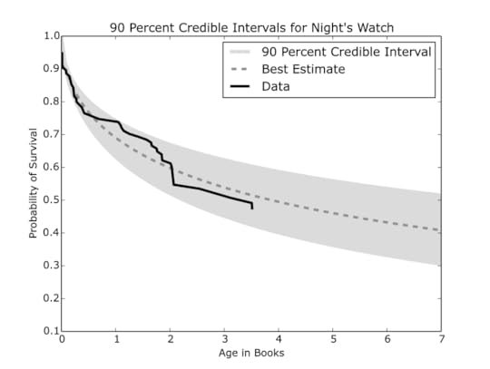 Figure 4: The credible interval closely encases the data, and the mean-value curve appears to be a reasonable approximation.
However, it is worth considering that Jon is not an average member of the Night’s Watch. He had a noble upbringing and is well trained at arms. We repeated the same analysis with only members of the Night’s Watch considered noble due to their family, rank, or upbringing.
There have only been 11 nobles in the Night’s Watch, so the credible interval as seen in Figure 5 is understandably much wider, however, the best approximation of the survival curve suggests that a noble background does not increase the survival rate for brothers of the Night’s Watch.
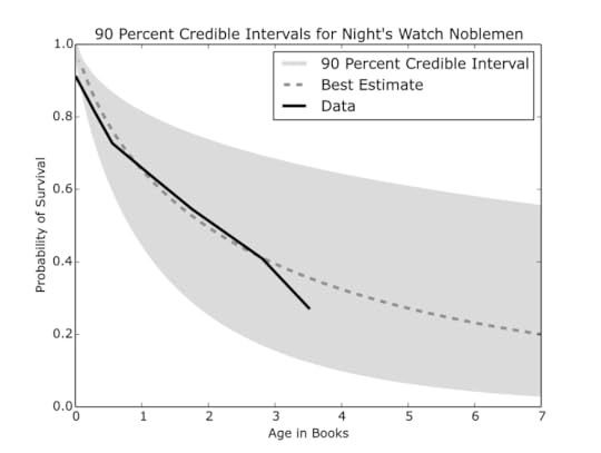 Figure 5: When only noble members of the Night’s Watch are included, the credible interval widens significantly and the lower bound gets quite close to zero.
The Houses of ASOIAFThe 90 percent credible intervals for all of the major houses. This includes the 9 major houses, the Night’s Watch, the Wildlings, and a "None" category which includes non-allied characters.
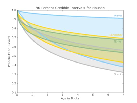 Figure 6: 90 percent credible interval for Arryn (Blue), Lannister (Gold), None (Green), and Stark (Grey)
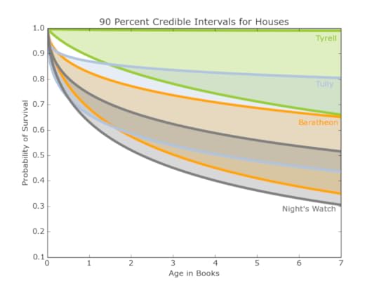 Figure 7: 90 percent credible interval for Tyrell(Green), Tully(Blue), Baratheon(Orange), and Night’s Watch (Grey)
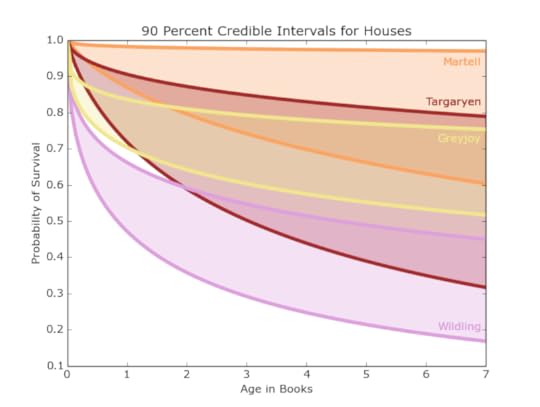 Figure 8: 90 percent credible interval for Martell(Orange), Targaryen (Maroon), Greyjoy (Yellow), and Wildling (Purple)
These intervals, shown in Figures 6, 7, and 8, demonstrate a much higher survival probability for the houses Arryn, Tyrell, and Martell. Supporting these results, these houses have stayed out of most of the major conflicts in the books, however this also means there is less information on them. We have 5 or fewer examples of dead members for those houses, so the survival curves don’t have very many points. This uncertainty is reflected in the wide credible intervals.
In contrast, our friends in the north, the Starks, Night’s Watch, and Wildlings have the lowest projected survival rates and smaller credible intervals given their warring positions in the story and the many important characters included amongst their ranks. This analysis considers entire houses, but there are also additional ways to sort the characters.Men and womenWhile A Song of Ice and Fire has been lauded for portraying women as complex characters who take an a variety of roles, there are still many more male characters (769) than female ones (157). Despite a wider credible interval, the women tend to fare better than their male counterparts, out-surviving them by a wide margin as seen in Figure 9.
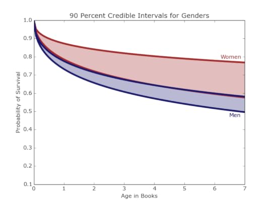 Figure 9: The women of Westeros appear to have a better chance of surviving then the men.
ClassThe ratio between noble characters(429) and smallfolk characters (487) is much more even than gender and provides an interesting comparison for analysis. Figure 10 suggests that while more smallfolk tend to die quickly after being introduced, those that survive their introductions tend to live for a longer period of time and may in fact outpace the nobles.
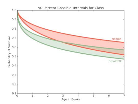 Figure 10: The nobility might have a slight advantage when introduced, but their survival probability continues to fall while the smallfolk’s levels much more quickly
Selected CharactersThe same analysis can be extended to combine traits, sorting by gender, house, and class to provide a rough model for individual characters. One of the most popular characters in the books is Arya and many readers are curious about her fate in the books to come. The category of noblewomen loyal to the Starks also includes other noteworthy characters like Sansa and Brienne of Tarth (though she was introduced later). Other intriguing characters to investigate are the Lannister noblewomen Cersei and poor Myrcella. As it turns out, not a lot noble women die. In order to get more precise credible intervals for the specific female characters we included the data of both noble and smallfolk women.
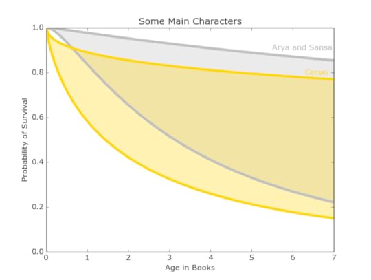 Figure 11: While both groups have very wide ranges of survival probabilities, the Lannister noblewomen may be a bit more likely to die than the Starks.
The data presented in Figure 11 is inconclusive, but it looks like Arya has a slightly better chance of survival than Cersei.
Two minor characters we are curious about are Val, the wildling princess, and the mysterious Quaithe.
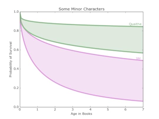 Figure 12: Representing the survival curves of more minor characters, Quaithe and Val have dramatically different odds of surviving the series.
They both had more data than the Starks and Lannisters, but they have the complication that they were not introduced at the beginning of the series. Val is introduced at 2.1 books, and so her chances of surviving the whole series are between 10 percent and 53 percent, which are not the most inspiring of chances.
Quaithe is introduced at 1.2 books, and her chances are between 58 percent and 85 percent, which are significantly better than Val’s. These curves are shown in Figure 12.
For most of the male characters (with the exception of Mance), there was enough data to narrow to house, gender and class.
 Figure 13: The survival curves of different classes and alliances of men shown through various characters.
Figure 13 shows the Lannister brothers with middling survival chances ranging from 35 percent to 79 percent. The data for Daario is less conclusive, but seems hopeful, especially considering he was introduced at 2.5 books. Mance seems to have to worst chance of surviving until the end. He was introduced at 2.2 books, giving him a chance of survival between 19 percent and 56 percent.
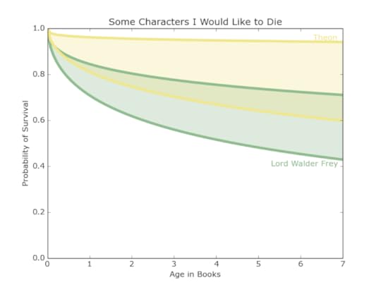 Figure 14: The survival curves of different classes and alliances of men shown through various characters.
Some characters who many wouldn’t mind seeing kick the bucket include Lord Walder Frey and Theon Greyjoy. However, Figure 14 suggests that neither are likely meet untimely (or in Walder Frey’s case, very timely) deaths. Theon seems likely to survive to the bitter end. Walder Frey was introduced at 0.4 books, putting his chances at 44 percent to 72 percent. As it is now, Hoster Tully may be the only character to die of old age, so perhaps Frey will hold out until the end.ConclusionOf course who lives and who dies in the next two books has more to do with plot and storyline than with statistics. Nonetheless, using our data we were able we were able to see patterns of life and death among groups of characters. For some characters, especially males, we are able to make specific predictions of how they will fare in the next novels. For females and characters from the less central houses, the verdict is still out.
Our data and code are available from this GitHub repository.Notes on the Data SetMost characters were fairly easy to classify, but there are always edge cases.Gender - This was the most straight forward. There are not really any gender-ambigous characters.Nobility - Members of major and minor Westeros houses were counted as noble, but hedge knights were not. For characters from Essos, I used by best judgement based on money and power, and it was usually an easy call. For the wildlings, I named military leaders as noble, though that was often a blurry line. For members of the Night’s Watch, I looked at their status before joining in the same way I looked at other Westeros characters. For bastards, we decided on a case by case basis. Bastards who were raised in a noble family and who received the education and training of nobles were counted as noble. Thus Jon Snow was counted as noble, but someone like Gendry was not.Death - Characters that have come back alive-ish (like Beric Dondarrion) were judged dead at the time of their first death. Wights are not considered alive, but others are. For major characters whose deaths are uncertain, we argued and made a case by case decision.Houses - This was the trickiest one because some people have allegiances to multiple houses or have switched loyalties. We decided on a case by case basis. The people with no allegiance were of three main groups:People in Essos who are not loyal to the Targaryens.People in the Riverlands, either smallfolk who’s loyalty is not known, or groups like the Brotherhood Without Banners or the Brave Companions with ambiguous loyalty.Nobility that are mostly looking out for their own interests, like the Freys, Ramsay Bolton, or Petyr Baelish.
March 2, 2015
Statistical inference is only mostly wrong
p-values banned!The journal Basic and Applied Social Psychology (BASP) made news recently by "banning" p-values. Here's a summary of their major points:
"...the null hypothesis significance testing procedure (NHSTP) is invalid...". "We believe that the p<0.05 bar is too easy to pass and sometimes serves as an excuse for lower quality research.""Confidence intervals suffer from an inverse problem that is not very different from that suffered by the NHSTP. ... the problem is that, for example, a 95% confidence interval does not indicate that the parameter of interest has a 95% probability of being within the interval.""Bayesian procedures are more interesting. The usual problem ... is that they depend on some sort of Laplacian assumption to generate numbers where none exist."There are many parts of this new policy, and the rationale for it, that I agree with. But there are several things I think they got wrong, both in the diagnosis and the prescription. So I find myself -- to my great surprise -- defending classical statistical inference. I'll take their points one at a time:
NHSTPClassical hypothesis testing is problematic, but it is not "invalid", provided that you remember what it is and what it means. A hypothesis test is a partial answer to the question, "Is it likely that I am getting fooled by randomness?"
Suppose you see an apparent effect, like a difference between two groups. An example I use in Think Stats is the apparent difference in pregnancy length between first babies and others: in a sample of more than 9000 pregnancies in a national survey, first babies are born about 13 hours earlier, on average, than other babies.
There are several possible explanations for this difference:
The effect might be real; that is, a similar difference would be seen in the general population.The apparent effect might be due to a biased sampling process, so it would not appear in the general population.The apparent effect might be due to measurement errors.The apparent effect might be due to chance; that is, the difference might appear in a random sample, but not in the general population.Hypothesis testing addresses only the last possibility. It asks, "If there were actually no difference between first babies and others, what would be the chance of selecting a sample with a difference as big as 13 hours?" The answer to this question is the p-value.
If the p-value is small, you can conclude that the fourth possibility is unlikely, and infer that the other three possibilities are more likely. In the actual sample I looked at, the p-value was 0.17, which means that there is a 17% chance of seeing a difference as big as 13 hours, even if there is no actual difference between the groups. So I concluded that the fourth possibility can't be ruled out.
There is nothing invalid about these conclusions, provided that you remember a few caveats:Hypothesis testing can help rule out one explanation for the apparent effect, but it doesn't account for others, particularly sampling bias and measurement error.Hypothesis testing doesn't say anything about how big or important the effect is.There is nothing magic about the 5% threshold.Confidence intervalsThe story is pretty much the same for confidence intervals; they are problematic for many of the same reasons, but they are not useless. A confidence interval is a partial answer to the question: "How precise is my estimate of the effect size?"
If you run an experiment and observe an effect, like the 13-hour difference in pregnancy length, you might wonder whether you would see the same thing if you ran the experiment again. Would it always be 13 hours, or might it range between 12 and 14? Or maybe between 11 and 15?
You can answer these questions by Making a model of the experimental process,Analyzing or simulating the model, andComputing the sampling distribution, which quantifies how much the estimate varies due to random sampling. Confidence intervals and standard errors are two ways to summarize the sampling distribution and indicate the precision of the estimate.
Again, confidence intervals are useful if you remember what they mean:The CI quantifies the variability of the estimate due to random sampling, but does not address other sources of error.You should not make any claim about the probability that the actual value falls in the CI.As the editors of BASP point out, "a 95% confidence interval does not indicate that the parameter of interest has a 95% probability of being within the interval." Ironically, the situation is worse when the sample size is large. In that case, the CI is usually small, other sources of error dominate, and the CI is less likely to contain the actual value.
One other limitation to keep in mind: both p-values and confidence intervals are based on modeling decisions: a p-value is based on a model of the null hypothesis, and a CI is based on a model of the experimental process. Modeling decisions are subjective; that is, reasonable people could disagree about the best model of a particular experiment. For any non-trivial experiment, there is no unique, objective p-value or CI.
Bayesian inferenceThe editors of BASP write that the problem with Bayesian statistics is that "they depend on some sort of Laplacian assumption to generate numbers where none exist." This is an indirect reference to the fact that Bayesian analysis depends on the choice of a prior distribution, and to Laplace's principle of indifference, which is an approach some people recommend for choosing priors.
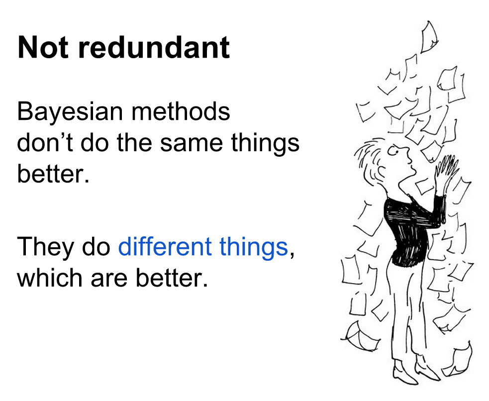
The editors' comments evoke a misunderstanding of Bayesian methods. If you use Bayesian methods as another way to compute p-values and confidence intervals, you are missing the point. Bayesian methods don't do the same things better; they do different things, which are better.
Specifically, the result of Bayesian analysis is a posterior distribution, which includes all possible estimates and their probabilities. Using posterior distributions, you can compute answers to questions like:What is the probability that a given hypothesis is true, compared to a suite of alternative hypotheses?What is the probability that the true value of a parameter falls in any given interval?These are questions we care about, and their answers can be used directly to inform decision-making under uncertainty.
But I don't want to get bogged down in a Bayesian-frequentist debate. Let me get back to the BASP editorial.
SummaryConventional statistical inference, using p-values and confidence intervals, is problematic, and it fosters bad science, as the editors of BASP claim. These problems have been known for a long time, but previous attempts to instigate change have failed. The BASP ban (and the reaction it provoked) might be just what we need to get things moving.
But the proposed solution is too blunt; statistical inference is broken but not useless. Here is the approach I recommend:The effect size is the most important thing. Papers that report statistical results should lead with the effect size and explain its practical impact in terms relevant to the context.The second most important thing -- a distant second -- is a confidence interval or standard error, which quantifies error due to random sampling. This is a useful additional piece of information, provided that we don't forget about other sources of error.The third most important thing -- a distant third -- is a p-value, which provides a warning if an apparent effect could be explained by randomness.We should drop the arbitrary 5% threshold, and forget about the conceit that 5% is the false positive rate.For me, the timing of the BASP editorial is helpful. I am preparing a new tutorial on statistical inference, which I will present at PyCon 2015 in April. The topic just got a little livelier!
AddendumIn a discussion of confidence intervals on Reddit, I wrote
"The CI quantifies uncertainty due to random sampling, but it says nothing about sampling bias or measurement error. Because these other sources of error are present in nearly all real studies, published CIs will contain the population value far less often than 90%."
A fellow redditor raised an objection I'll try to paraphrase:
"The 90% CI contains the true parameter 90% of the time because that's the definition of the 90% CI. If you compute an interval that doesn't contain the true parameter 90% of the time, it's not a 90% CI."
The reason for the disagreement is that my correspondent and I were using different definitions of CI:I was defining CI by procedure; that is, a CI is what you get if you compute the sampling distribution and take the 5th and 95th percentiles.My correspondent was defining CI by intent: A CI is an interval that contains the true value 90% of the time.If you use the first definition, the problem with CIs is that they don't contain the true value 90% of the time.
If you use the second definition, the problem with CIs is that our standard way of computing them doesn't work, at least not in the real world.
Once this point was clarified, my correspondent and I agreed about the conclusion: the fraction of published CIs that contain the true value of the parameter is less than 90%, and probably a lot less.

"...the null hypothesis significance testing procedure (NHSTP) is invalid...". "We believe that the p<0.05 bar is too easy to pass and sometimes serves as an excuse for lower quality research.""Confidence intervals suffer from an inverse problem that is not very different from that suffered by the NHSTP. ... the problem is that, for example, a 95% confidence interval does not indicate that the parameter of interest has a 95% probability of being within the interval.""Bayesian procedures are more interesting. The usual problem ... is that they depend on some sort of Laplacian assumption to generate numbers where none exist."There are many parts of this new policy, and the rationale for it, that I agree with. But there are several things I think they got wrong, both in the diagnosis and the prescription. So I find myself -- to my great surprise -- defending classical statistical inference. I'll take their points one at a time:
NHSTPClassical hypothesis testing is problematic, but it is not "invalid", provided that you remember what it is and what it means. A hypothesis test is a partial answer to the question, "Is it likely that I am getting fooled by randomness?"
Suppose you see an apparent effect, like a difference between two groups. An example I use in Think Stats is the apparent difference in pregnancy length between first babies and others: in a sample of more than 9000 pregnancies in a national survey, first babies are born about 13 hours earlier, on average, than other babies.
There are several possible explanations for this difference:
The effect might be real; that is, a similar difference would be seen in the general population.The apparent effect might be due to a biased sampling process, so it would not appear in the general population.The apparent effect might be due to measurement errors.The apparent effect might be due to chance; that is, the difference might appear in a random sample, but not in the general population.Hypothesis testing addresses only the last possibility. It asks, "If there were actually no difference between first babies and others, what would be the chance of selecting a sample with a difference as big as 13 hours?" The answer to this question is the p-value.
If the p-value is small, you can conclude that the fourth possibility is unlikely, and infer that the other three possibilities are more likely. In the actual sample I looked at, the p-value was 0.17, which means that there is a 17% chance of seeing a difference as big as 13 hours, even if there is no actual difference between the groups. So I concluded that the fourth possibility can't be ruled out.
There is nothing invalid about these conclusions, provided that you remember a few caveats:Hypothesis testing can help rule out one explanation for the apparent effect, but it doesn't account for others, particularly sampling bias and measurement error.Hypothesis testing doesn't say anything about how big or important the effect is.There is nothing magic about the 5% threshold.Confidence intervalsThe story is pretty much the same for confidence intervals; they are problematic for many of the same reasons, but they are not useless. A confidence interval is a partial answer to the question: "How precise is my estimate of the effect size?"
If you run an experiment and observe an effect, like the 13-hour difference in pregnancy length, you might wonder whether you would see the same thing if you ran the experiment again. Would it always be 13 hours, or might it range between 12 and 14? Or maybe between 11 and 15?
You can answer these questions by Making a model of the experimental process,Analyzing or simulating the model, andComputing the sampling distribution, which quantifies how much the estimate varies due to random sampling. Confidence intervals and standard errors are two ways to summarize the sampling distribution and indicate the precision of the estimate.
Again, confidence intervals are useful if you remember what they mean:The CI quantifies the variability of the estimate due to random sampling, but does not address other sources of error.You should not make any claim about the probability that the actual value falls in the CI.As the editors of BASP point out, "a 95% confidence interval does not indicate that the parameter of interest has a 95% probability of being within the interval." Ironically, the situation is worse when the sample size is large. In that case, the CI is usually small, other sources of error dominate, and the CI is less likely to contain the actual value.
One other limitation to keep in mind: both p-values and confidence intervals are based on modeling decisions: a p-value is based on a model of the null hypothesis, and a CI is based on a model of the experimental process. Modeling decisions are subjective; that is, reasonable people could disagree about the best model of a particular experiment. For any non-trivial experiment, there is no unique, objective p-value or CI.
Bayesian inferenceThe editors of BASP write that the problem with Bayesian statistics is that "they depend on some sort of Laplacian assumption to generate numbers where none exist." This is an indirect reference to the fact that Bayesian analysis depends on the choice of a prior distribution, and to Laplace's principle of indifference, which is an approach some people recommend for choosing priors.
The editors' comments evoke a misunderstanding of Bayesian methods. If you use Bayesian methods as another way to compute p-values and confidence intervals, you are missing the point. Bayesian methods don't do the same things better; they do different things, which are better.
Specifically, the result of Bayesian analysis is a posterior distribution, which includes all possible estimates and their probabilities. Using posterior distributions, you can compute answers to questions like:What is the probability that a given hypothesis is true, compared to a suite of alternative hypotheses?What is the probability that the true value of a parameter falls in any given interval?These are questions we care about, and their answers can be used directly to inform decision-making under uncertainty.
But I don't want to get bogged down in a Bayesian-frequentist debate. Let me get back to the BASP editorial.
SummaryConventional statistical inference, using p-values and confidence intervals, is problematic, and it fosters bad science, as the editors of BASP claim. These problems have been known for a long time, but previous attempts to instigate change have failed. The BASP ban (and the reaction it provoked) might be just what we need to get things moving.
But the proposed solution is too blunt; statistical inference is broken but not useless. Here is the approach I recommend:The effect size is the most important thing. Papers that report statistical results should lead with the effect size and explain its practical impact in terms relevant to the context.The second most important thing -- a distant second -- is a confidence interval or standard error, which quantifies error due to random sampling. This is a useful additional piece of information, provided that we don't forget about other sources of error.The third most important thing -- a distant third -- is a p-value, which provides a warning if an apparent effect could be explained by randomness.We should drop the arbitrary 5% threshold, and forget about the conceit that 5% is the false positive rate.For me, the timing of the BASP editorial is helpful. I am preparing a new tutorial on statistical inference, which I will present at PyCon 2015 in April. The topic just got a little livelier!
AddendumIn a discussion of confidence intervals on Reddit, I wrote
"The CI quantifies uncertainty due to random sampling, but it says nothing about sampling bias or measurement error. Because these other sources of error are present in nearly all real studies, published CIs will contain the population value far less often than 90%."
A fellow redditor raised an objection I'll try to paraphrase:
"The 90% CI contains the true parameter 90% of the time because that's the definition of the 90% CI. If you compute an interval that doesn't contain the true parameter 90% of the time, it's not a 90% CI."
The reason for the disagreement is that my correspondent and I were using different definitions of CI:I was defining CI by procedure; that is, a CI is what you get if you compute the sampling distribution and take the 5th and 95th percentiles.My correspondent was defining CI by intent: A CI is an interval that contains the true value 90% of the time.If you use the first definition, the problem with CIs is that they don't contain the true value 90% of the time.
If you use the second definition, the problem with CIs is that our standard way of computing them doesn't work, at least not in the real world.
Once this point was clarified, my correspondent and I agreed about the conclusion: the fraction of published CIs that contain the true value of the parameter is less than 90%, and probably a lot less.
February 24, 2015
Upcoming talk on survival analysis in Python
On March 2, 2015 I am presenting a short talk for the Python Data Science meetup. Here is the announcement for the meetup.
And here are my slides:
The code for the talk is in an IPython notebook you can view on nbviewer. It is still a work in progress!
And here's the punchline graph:
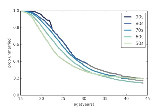
Each line corresponds to a different cohort: 50s means women born during the 1950s, and so on. The curves show the probability of being unmarried as a function of age; for example, about 50% of women born in the 50s had been married by age 23. For women born in the 80s, only about 25% were married by age 23.
The gray lines show predictions based on applying patterns from previous cohorts.
A few patterns emerge from this figure:
1) Successive generations of women are getting married later and later. No surprise there.
2) For women born in the 50s, the curve leveled off; if they didn't marry early, they were unlikely to marry at all. For later generations, the curve keeps dropping, which indicates some women getting married for the first time at later ages.
3) The predictions suggest that the fraction of women who eventually marry is not changing substantially. My predictions for Millennials suggest that they will end up marrying, eventually, at rates similar to previous cohorts.

And here are my slides:
The code for the talk is in an IPython notebook you can view on nbviewer. It is still a work in progress!
And here's the punchline graph:
Each line corresponds to a different cohort: 50s means women born during the 1950s, and so on. The curves show the probability of being unmarried as a function of age; for example, about 50% of women born in the 50s had been married by age 23. For women born in the 80s, only about 25% were married by age 23.
The gray lines show predictions based on applying patterns from previous cohorts.
A few patterns emerge from this figure:
1) Successive generations of women are getting married later and later. No surprise there.
2) For women born in the 50s, the curve leveled off; if they didn't marry early, they were unlikely to marry at all. For later generations, the curve keeps dropping, which indicates some women getting married for the first time at later ages.
3) The predictions suggest that the fraction of women who eventually marry is not changing substantially. My predictions for Millennials suggest that they will end up marrying, eventually, at rates similar to previous cohorts.
February 10, 2015
Bayesian analysis of match rates on Tinder
Last fall I taught an introduction to Bayesian statistics at Olin College. My students worked on some excellent projects, and I invited them to write up their results as guest articles for this blog. Just in time for Valentine's Day, here's the second in the series:
It’s (Not) a Match!Ankur Das and Mason del Rosario
All code for this post can be found on Github: https://github.com/mdelrosa/tinderStudy
Valentine’s day is fast approaching, and if you are anything like us engineering students, you will most likely be dateless on the 14th of February. Luckily, there are lots of great apps geared towards bringing singles together. One of the most popular is Tinder. For those unfamiliar with the app, Tinder presents the user with other users’ profiles, and the user then either swipes right for yes or left for no. When two people have swiped right on one another, they become a “match” and can chat with each other via text through the app.

 Images of our Tinder profiles. Aren’t we a couple of handsome devils?
Some time ago, two of our friends decided to conduct an experiment on Tinder. The friends, one male and one female, each swiped right on the next 100 profiles and recorded how many matches they got. Though our female friend received over 90 matches, the male garnered only one, giving a 90% match rate for the female and an abysmal 1% response rate for the male! The discrepancy we saw is not an isolated incident. This article from Godofstyle.com reports an experiment where male profiles at best garnered 7% match rates while a female profile received a 20% match rate.
Why such poor odds for men on Tinder? Women may be more discriminating with their swipes, but another possibility is that women are simply less active on Tinder. Pursuing the less depressing option, we set about trying to answer the following question: how does the activity rate of Tinder’s population affect a given user’s match rate?
p q r
Luckily for all us dateless men and women out there, the number of responses we get is not an accurate measure of your attractiveness on Tinder. Adapting Allen Downey’s work on “The Volunteer Problem,” a user’s total response rate p is the product of r, the true attractiveness rating, and q, the activity rating. For every 100 users we swipe, only some q fraction of them will even see our profiles, let alone swipe back. With that in mind, we have something to attribute our Tinder failures to: the inactivity of users who may not have logged in recently.
Still, it would be nice to know what our actual r response rate is. Finding p is simple --- simply measure the number of return swipes --- but we need to determine q to solve for r. With our set of Bayesian tools, Python scripts, and swiping fingers, we set out to estimate the activity rate, q, of other Tinder users.
How often do we Tinder?
For some of us, Tinder is a way of life. For a reasons we won’t get into here, we check Tinder hourly, keeping up to date with the latest swipes. But many users check the app more infrequently, going days or weeks without looking at new potential matches. Unfortunately Tinder’s best selling points also make life difficult for the amateur Bayesian statistician. The app provides minimal information on profiles and has no public history of past swipes and encounters. When seeing a new profile, the user’s last log-in time provides the only hint of her future activity, leaving us guessing if she chose to ignore our profile or simply never saw it.
Luckily, we can adapt Prof. Downey’s solution to “The Red Line Problem” to turn this sparse data into a predictive model. We start with an assumption that the average time between Tinder activity follows a normal distribution centered at 10 hours. Even then, someone who uses Tinder every 10 hours on average will occasionally check twice an hour or just once a week. We model this variance with an exponential distribution for each average activity period to show different activity rates for the same user.
(Note: all times and arrival rates are given in hours unless otherwise noted)
While some other user may go 10 hours without checking Tinder, our last arrival data only gives us a single point in that interval, skewing our results. First, we are 5 times more likely to observe someone during a 5 hour interval than a 1 hour interval, simply due to its length. We account for this bias towards larger intervals by multiplying each probability by time. Exponential PDF scaled by time for for a user with an average of 10 hours between activity
Even with these likelihoods, our data comes in the form of time since last activity. 15 minutes ago could indicate a future log in 10 minutes or 10 days later, so we need to adapt our distribution to this type of input. For every gap between activity, we have an equal chance of making our observation at any point in between. Combining the chances of each activity period happening with the chances of finding a time in that period produces a mixture of various observed last log-in times, specific to each hypothetical user with a different average activity rate. Exponential CDF for observed last activity time for a user with an average of 10 hours between activity
Now what?
That was a lot of work to get to a distribution within a distribution within a distribution, but now we finally have a chance to use our data! Looking back at our prior distribution of average activity rates, we now have a corresponding distribution of observed past log-in times for each. We sampled 100 users to record their activity times, giving us accurate information for the users relevant to us. Our findings vary between genders, areas, and age ranges, so new time data must be collected for each aspiring Tinder statistician. Updating each of our hypotheses with the chance of observing the times we saw shows the graph below, a steep distribution centered at 10 hours.
 Exponential PDF scaled by time for for a user with an average of 10 hours between activity
The posterior distribution peaks at the same central value as the prior, but with a smaller standard deviation, due the large amount of data. The small standard deviation likely indicates more about Tinder’s sorting algorithm than the true userbase, however. Given the number of people who have likely stopped using the app, we should see a much longer tail for users checking Tinder every 24 hours or longer. This data actually indicates that Tinder only shows us users that tend to be fairly active. This behavior makes sense: what dating app would match you with inactive users?
Predictive Modeling
After a bit of data collection and analysis, we now know the breakdown of our potential matches. Most of them check Tinder about every 10 hours on average, so they should respond promptly to our swipes. For the sake of modeling ease, let’s say that when someone checks Tinder, they instantly see our profile, regardless of the time they spend active or Tinder’s display algorithm. Not only does this make our analysis much easier, it also gives us a worst case estimate. If our results for Tinder success assume extra people see our profile, our true response rate can only be better.
Using the spread of potential Tinder matches, we can predict how many will use Tinder within some threshold time. If we check again in 5 hours, for instance, we will of course receive fewer views than 10 hours later. To find the distributions of response rates, we looked at each average response rate, finding the chance of activity for that rate within some threshold time. Scaling all these probabilities by the likelihood of that average response rate produces a distribution of q, the portion of users active within some time. q distributions for active users within 5 and 10 hours
True Response Rate
Now that we are able to generate a distribution for q, we are half way towards generating a distribution for a given user’s true response rate, r. Next, we need to know what the distribution of perceived response rate, p, looks like. Recalling that the product of q and r gives us p, we can reverse engineer our desired r distribution by taking the quotient of p over q! We’re working on that part of the problem now.
Conclusion
Clearly, we still have some work to do before we can say anything quantitative regarding a user’s true match rate, but we can say some positive things without going much further. One encouraging observation is that a user’s true match rate will always be better than the perceived match rate. While a user may see that only 10 out of every 100 profiles become matches, a percentage of those users have not even been on Tinder for quite some time. The upshot of this: you’re probably more attractive than Tinder makes you think you are!
That’s all for now. Happy swiping!
It’s (Not) a Match!Ankur Das and Mason del Rosario
All code for this post can be found on Github: https://github.com/mdelrosa/tinderStudy
Valentine’s day is fast approaching, and if you are anything like us engineering students, you will most likely be dateless on the 14th of February. Luckily, there are lots of great apps geared towards bringing singles together. One of the most popular is Tinder. For those unfamiliar with the app, Tinder presents the user with other users’ profiles, and the user then either swipes right for yes or left for no. When two people have swiped right on one another, they become a “match” and can chat with each other via text through the app.
Images of our Tinder profiles. Aren’t we a couple of handsome devils?
Some time ago, two of our friends decided to conduct an experiment on Tinder. The friends, one male and one female, each swiped right on the next 100 profiles and recorded how many matches they got. Though our female friend received over 90 matches, the male garnered only one, giving a 90% match rate for the female and an abysmal 1% response rate for the male! The discrepancy we saw is not an isolated incident. This article from Godofstyle.com reports an experiment where male profiles at best garnered 7% match rates while a female profile received a 20% match rate.
Why such poor odds for men on Tinder? Women may be more discriminating with their swipes, but another possibility is that women are simply less active on Tinder. Pursuing the less depressing option, we set about trying to answer the following question: how does the activity rate of Tinder’s population affect a given user’s match rate?
p q r
Luckily for all us dateless men and women out there, the number of responses we get is not an accurate measure of your attractiveness on Tinder. Adapting Allen Downey’s work on “The Volunteer Problem,” a user’s total response rate p is the product of r, the true attractiveness rating, and q, the activity rating. For every 100 users we swipe, only some q fraction of them will even see our profiles, let alone swipe back. With that in mind, we have something to attribute our Tinder failures to: the inactivity of users who may not have logged in recently.
Still, it would be nice to know what our actual r response rate is. Finding p is simple --- simply measure the number of return swipes --- but we need to determine q to solve for r. With our set of Bayesian tools, Python scripts, and swiping fingers, we set out to estimate the activity rate, q, of other Tinder users.
How often do we Tinder?
For some of us, Tinder is a way of life. For a reasons we won’t get into here, we check Tinder hourly, keeping up to date with the latest swipes. But many users check the app more infrequently, going days or weeks without looking at new potential matches. Unfortunately Tinder’s best selling points also make life difficult for the amateur Bayesian statistician. The app provides minimal information on profiles and has no public history of past swipes and encounters. When seeing a new profile, the user’s last log-in time provides the only hint of her future activity, leaving us guessing if she chose to ignore our profile or simply never saw it.
Luckily, we can adapt Prof. Downey’s solution to “The Red Line Problem” to turn this sparse data into a predictive model. We start with an assumption that the average time between Tinder activity follows a normal distribution centered at 10 hours. Even then, someone who uses Tinder every 10 hours on average will occasionally check twice an hour or just once a week. We model this variance with an exponential distribution for each average activity period to show different activity rates for the same user.
(Note: all times and arrival rates are given in hours unless otherwise noted)
While some other user may go 10 hours without checking Tinder, our last arrival data only gives us a single point in that interval, skewing our results. First, we are 5 times more likely to observe someone during a 5 hour interval than a 1 hour interval, simply due to its length. We account for this bias towards larger intervals by multiplying each probability by time.
Exponential PDF scaled by time for for a user with an average of 10 hours between activity
Even with these likelihoods, our data comes in the form of time since last activity. 15 minutes ago could indicate a future log in 10 minutes or 10 days later, so we need to adapt our distribution to this type of input. For every gap between activity, we have an equal chance of making our observation at any point in between. Combining the chances of each activity period happening with the chances of finding a time in that period produces a mixture of various observed last log-in times, specific to each hypothetical user with a different average activity rate.
Exponential CDF for observed last activity time for a user with an average of 10 hours between activity
Now what?
That was a lot of work to get to a distribution within a distribution within a distribution, but now we finally have a chance to use our data! Looking back at our prior distribution of average activity rates, we now have a corresponding distribution of observed past log-in times for each. We sampled 100 users to record their activity times, giving us accurate information for the users relevant to us. Our findings vary between genders, areas, and age ranges, so new time data must be collected for each aspiring Tinder statistician. Updating each of our hypotheses with the chance of observing the times we saw shows the graph below, a steep distribution centered at 10 hours.
Exponential PDF scaled by time for for a user with an average of 10 hours between activity
The posterior distribution peaks at the same central value as the prior, but with a smaller standard deviation, due the large amount of data. The small standard deviation likely indicates more about Tinder’s sorting algorithm than the true userbase, however. Given the number of people who have likely stopped using the app, we should see a much longer tail for users checking Tinder every 24 hours or longer. This data actually indicates that Tinder only shows us users that tend to be fairly active. This behavior makes sense: what dating app would match you with inactive users?
Predictive Modeling
After a bit of data collection and analysis, we now know the breakdown of our potential matches. Most of them check Tinder about every 10 hours on average, so they should respond promptly to our swipes. For the sake of modeling ease, let’s say that when someone checks Tinder, they instantly see our profile, regardless of the time they spend active or Tinder’s display algorithm. Not only does this make our analysis much easier, it also gives us a worst case estimate. If our results for Tinder success assume extra people see our profile, our true response rate can only be better.
Using the spread of potential Tinder matches, we can predict how many will use Tinder within some threshold time. If we check again in 5 hours, for instance, we will of course receive fewer views than 10 hours later. To find the distributions of response rates, we looked at each average response rate, finding the chance of activity for that rate within some threshold time. Scaling all these probabilities by the likelihood of that average response rate produces a distribution of q, the portion of users active within some time.
q distributions for active users within 5 and 10 hours
True Response Rate
Now that we are able to generate a distribution for q, we are half way towards generating a distribution for a given user’s true response rate, r. Next, we need to know what the distribution of perceived response rate, p, looks like. Recalling that the product of q and r gives us p, we can reverse engineer our desired r distribution by taking the quotient of p over q! We’re working on that part of the problem now.
Conclusion
Clearly, we still have some work to do before we can say anything quantitative regarding a user’s true match rate, but we can say some positive things without going much further. One encouraging observation is that a user’s true match rate will always be better than the perceived match rate. While a user may see that only 10 out of every 100 profiles become matches, a percentage of those users have not even been on Tinder for quite some time. The upshot of this: you’re probably more attractive than Tinder makes you think you are!
That’s all for now. Happy swiping!
February 5, 2015
Godless freshmen: now more Nones than Catholics
This article is an update to my annual series on one of the most under-reported stories of the decade: the fraction of college freshmen who report no religious preference has more than tripled since 1985, from 8% to 27%, and the trend is accelerating.
In last year's installment, I made the bold prediction that the trend would continue, and that the students starting college in 2014 would again, be the most godless ever. It turns out I was right for the fifth year in a row. The number of students reporting no religious preference increased to 27.5%, a substantial increase since last year's record-high 24.6%. Also, for the first time in the history of the survey, the number of "Nones" exceeds the number of Catholics (25.3%).
The number of people reporting that they never attended a religious service also reached an all-time high at 29.3%, up from 27.3% last year.
Of course, we should not over-interpret a single data point, but generally:
1) This year's data points are consistent with previous predictions, and
2) Data since 1990 support the conclusion that the number of incoming college students with no religious preference is increasing and accelerating.
This analysis is based on survey results from the Cooperative Institutional Research Program (CIRP) of the Higher Education Research Insitute (HERI). In 2014, more than 153,000 students at 227 colleges and universities completed the CIRP Freshman Survey, which includes questions about students’ backgrounds, activities, and attitudes.
In one question, students select their “current religious preference,” from a choice of seventeen common religions, “Other religion,” or “None.”
Another question asks students how often they “attended a religious service” in the last year. The choices are “Frequently,” “Occasionally,” and “Not at all.” Students are instructed to select “Occasionally” if they attended one or more times.
The following figure shows the fraction of Nones over more than 40 years of the survey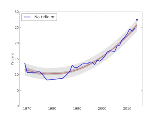 Fraction of college Freshmen with no religious preference.The blue line shows actual data through 2013; the blue square shows the new data point for 2014. The gray regions shows the predictions I generated last year based on data through 2013. The new data point falls at the high end of the predicted interval.
The red line shows a quadratic fit to the data. The dark gray region shows a 90% confidence interval, which quantifies sampling error, so it reflects uncertainty about the parameters of the fit. The light gray region shows a 90% confidence interval taking into account both sampling error and residual error. So it reflects total uncertainty about the predicted value, including uncertainty due to random variation from year to year.
Here is the corresponding plot for attendance at religious services:
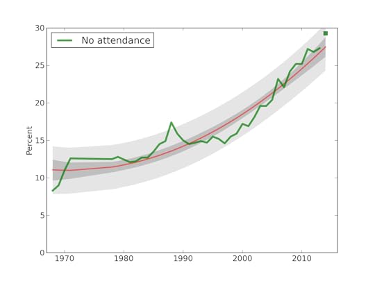 Fraction of college Freshmen who report no attendance at religious services.
Again, the new data point for 2014, 29.3%, falls in the predicted range, although somewhat ahead of the long term trend.
Predictions for 2015
Using the new 2014 data, we can generate predictions for 2015. Here is the revised plot for "Nones":
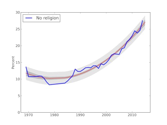 Predictive interval for 2015.This year's measurement is ahead of the long-term trend, so next year's is likely to regress, slightly, to 27.1% (down 0.4%).
And here is the prediction for "No attendance":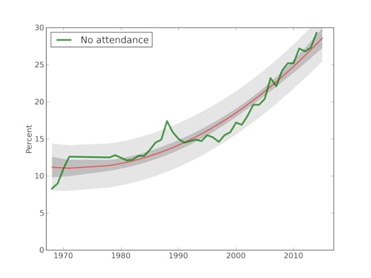 Predictive interval for 2015.
Again, because this year's value is ahead of the long term trend, the center of the predictive distribution is slightly lower, at 28.6% (down 0.7%).
I'll be back next year to check on these predictions.
Comments
1) As always, more males than females report no religious preference, and the gender gap appears to be growing.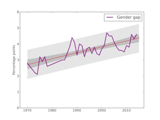 Difference between men and women, fraction reporting no religious preference.Evidence that the gender gap is increasing is strong. The p-value of the slope of the fitted curve is less than 1e-6.
2) I notice that the number of schools and the number of students participating in the Freshman Survey has been falling for several years. I wonder if the mix of schools represented in the survey is changing over time, and what effect this might have on the trends I am watching. The percentage of "Nones" is different across different kinds of institutions (colleges, universities, public, private, etc.) If participation rates are changing among these groups, that would affect the results.
3) Obviously college students are not representative of the general population. Data from other sources indicate that the same trends are happening in the general population, but I haven't been able to make a quantitative comparison between college students and others. Data from other sources also indicate that college graduates are slightly more likely to attend religious services, and to report a religious preference, than the general population.
Data Source
Eagan, K., Stolzenberg, E. B., Ramirez, J. J., Aragon, M. C., Suchard, M. R., & Hurtado, S. (2014). The American freshman: National norms fall 2014. Los Angeles: Higher Education Research Institute, UCLA.
This and all previous reports are available from the HERI publications page.
In last year's installment, I made the bold prediction that the trend would continue, and that the students starting college in 2014 would again, be the most godless ever. It turns out I was right for the fifth year in a row. The number of students reporting no religious preference increased to 27.5%, a substantial increase since last year's record-high 24.6%. Also, for the first time in the history of the survey, the number of "Nones" exceeds the number of Catholics (25.3%).
The number of people reporting that they never attended a religious service also reached an all-time high at 29.3%, up from 27.3% last year.
Of course, we should not over-interpret a single data point, but generally:
1) This year's data points are consistent with previous predictions, and
2) Data since 1990 support the conclusion that the number of incoming college students with no religious preference is increasing and accelerating.
This analysis is based on survey results from the Cooperative Institutional Research Program (CIRP) of the Higher Education Research Insitute (HERI). In 2014, more than 153,000 students at 227 colleges and universities completed the CIRP Freshman Survey, which includes questions about students’ backgrounds, activities, and attitudes.
In one question, students select their “current religious preference,” from a choice of seventeen common religions, “Other religion,” or “None.”
Another question asks students how often they “attended a religious service” in the last year. The choices are “Frequently,” “Occasionally,” and “Not at all.” Students are instructed to select “Occasionally” if they attended one or more times.
The following figure shows the fraction of Nones over more than 40 years of the survey
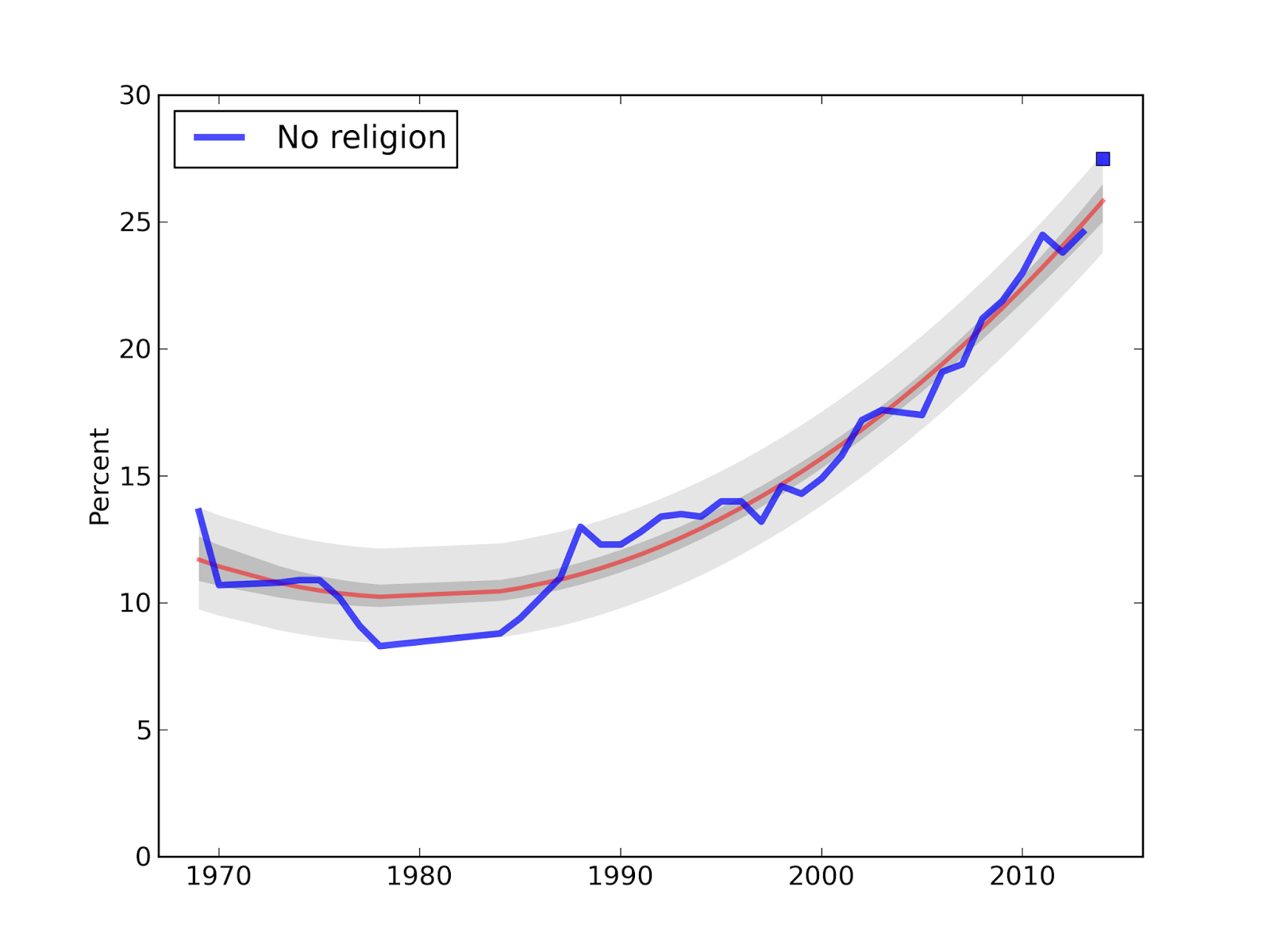 Fraction of college Freshmen with no religious preference.The blue line shows actual data through 2013; the blue square shows the new data point for 2014. The gray regions shows the predictions I generated last year based on data through 2013. The new data point falls at the high end of the predicted interval.
The red line shows a quadratic fit to the data. The dark gray region shows a 90% confidence interval, which quantifies sampling error, so it reflects uncertainty about the parameters of the fit. The light gray region shows a 90% confidence interval taking into account both sampling error and residual error. So it reflects total uncertainty about the predicted value, including uncertainty due to random variation from year to year.
Here is the corresponding plot for attendance at religious services:
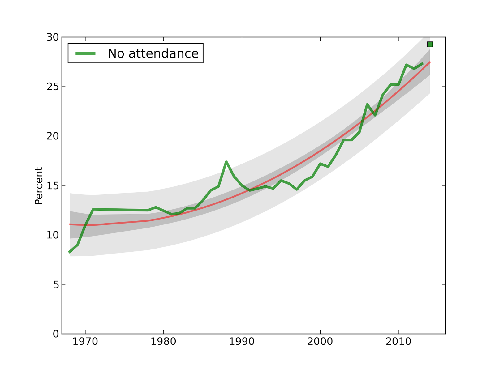 Fraction of college Freshmen who report no attendance at religious services.
Again, the new data point for 2014, 29.3%, falls in the predicted range, although somewhat ahead of the long term trend.
Predictions for 2015
Using the new 2014 data, we can generate predictions for 2015. Here is the revised plot for "Nones":
 Predictive interval for 2015.This year's measurement is ahead of the long-term trend, so next year's is likely to regress, slightly, to 27.1% (down 0.4%).
And here is the prediction for "No attendance":
 Predictive interval for 2015.
Again, because this year's value is ahead of the long term trend, the center of the predictive distribution is slightly lower, at 28.6% (down 0.7%).
I'll be back next year to check on these predictions.
Comments
1) As always, more males than females report no religious preference, and the gender gap appears to be growing.
 Difference between men and women, fraction reporting no religious preference.Evidence that the gender gap is increasing is strong. The p-value of the slope of the fitted curve is less than 1e-6.
2) I notice that the number of schools and the number of students participating in the Freshman Survey has been falling for several years. I wonder if the mix of schools represented in the survey is changing over time, and what effect this might have on the trends I am watching. The percentage of "Nones" is different across different kinds of institutions (colleges, universities, public, private, etc.) If participation rates are changing among these groups, that would affect the results.
3) Obviously college students are not representative of the general population. Data from other sources indicate that the same trends are happening in the general population, but I haven't been able to make a quantitative comparison between college students and others. Data from other sources also indicate that college graduates are slightly more likely to attend religious services, and to report a religious preference, than the general population.
Data Source
Eagan, K., Stolzenberg, E. B., Ramirez, J. J., Aragon, M. C., Suchard, M. R., & Hurtado, S. (2014). The American freshman: National norms fall 2014. Los Angeles: Higher Education Research Institute, UCLA.
This and all previous reports are available from the HERI publications page.
Probably Overthinking It

Probably Overthinking It is a blog about data science, Bayesian Statistics, and occasional other topics.
- Allen B. Downey's profile
- 236 followers

