
Allen B. Downey's Blog: Probably Overthinking It, page 11
August 9, 2021
Bayesian Dice
This article is available in a Jupyter notebook: click here to run it on Colab.
I’ve been enjoying Aubrey Clayton’s new book Bernoulli’s Fallacy. The first chapter, which is about the historical development of competing definitions of probability, is worth the price of admission alone.
One of the examples in Chapter 1 is a simplified version of a problem posed by Thomas Bayes. The original version, which I wrote about here, involves a billiards (pool) table; Clayton’s version uses dice:
Your friend rolls a six-sided die and secretly records the outcome; this number becomes the target T. You then put on a blindfold and roll the same six-sided die over and over. You’re unable to see how it lands, so each time your friend […] tells you only whether the number you just rolled was greater than, equal to, or less than T.
Suppose in one round of the game we had this sequence of outcomes, with G representing a greater roll, L a lesser roll, and E an equal roll:
G, G, L, E, L, L, L, E, G, L
Clayton, Bernoulli’s Fallacy, pg 36.
Based on this data, what is the posterior distribution of T?
Computing likelihoodsThere are two parts of my solution; computing the likelihood of the data under each hypothesis and then using those likelihoods to compute the posterior distribution of T.
To compute the likelihoods, I’ll demonstrate one of my favorite idioms, using a meshgrid to apply an operation, like >, to all pairs of values from two sequences.
In this case, the sequences are
hypos: The hypothetical values of T, andoutcomes: possible outcomes each time we roll the dicehypos = [1,2,3,4,5,6]outcomes = [1,2,3,4,5,6]If we compute a meshgrid of outcomes and hypos, the result is two arrays.
import numpy as npO, H = np.meshgrid(outcomes, hypos)The first contains the possible outcomes repeated down the columns.
Oarray([[1, 2, 3, 4, 5, 6], [1, 2, 3, 4, 5, 6], [1, 2, 3, 4, 5, 6], [1, 2, 3, 4, 5, 6], [1, 2, 3, 4, 5, 6], [1, 2, 3, 4, 5, 6]])The second contains the hypotheses repeated across the rows.
Harray([[1, 1, 1, 1, 1, 1], [2, 2, 2, 2, 2, 2], [3, 3, 3, 3, 3, 3], [4, 4, 4, 4, 4, 4], [5, 5, 5, 5, 5, 5], [6, 6, 6, 6, 6, 6]])If we apply an operator like >, the result is a Boolean array.
O > Harray([[False, True, True, True, True, True], [False, False, True, True, True, True], [False, False, False, True, True, True], [False, False, False, False, True, True], [False, False, False, False, False, True], [False, False, False, False, False, False]])Now we can use mean with axis=1 to compute the fraction of True values in each row.
(O > H).mean(axis=1)array([0.83333333, 0.66666667, 0.5 , 0.33333333, 0.16666667, 0. ])The result is the probability that the outcome is greater than T, for each hypothetical value of T. I’ll name this array gt:
gt = (O > H).mean(axis=1)The first element of the array is 5/6, which indicates that if T is 1, the probability of exceeding it is 5/6. The second element is 2/3, which indicates that if T is 2, the probability of exceeding it is 2/3. And do on.
Now we can compute the corresponding arrays for less than and equal.
lt = (O < H).mean(axis=1)array([0. , 0.16666667, 0.33333333, 0.5 , 0.66666667, 0.83333333])eq = (O == H).mean(axis=1)array([0.16666667, 0.16666667, 0.16666667, 0.16666667, 0.16666667, 0.16666667])In the next section, we’ll use these arrays to do a Bayesian update.
The UpdateIn this example, computing the likelihoods was the hard part. The Bayesian update is easy. Since T was chosen by rolling a fair die, the prior distribution for T is uniform. I’ll use a Pandas Series to represent it.
import pandas as pdpmf = pd.Series(1/6, hypos)pmf1 0.1666672 0.1666673 0.1666674 0.1666675 0.1666676 0.166667Now here’s the sequence of data, encoded using the likelihoods we computed in the previous section.
data = [gt, gt, lt, eq, lt, lt, lt, eq, gt, lt]The following loop updates the prior distribution by multiplying by each of the likelihoods.
for datum in data: pmf *= datumFinally, we normalize the posterior.
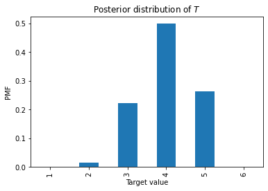
pmf /= pmf.sum()1 0.0000002 0.0164273 0.2217664 0.4989735 0.2628346 0.000000Here’s what it looks like.
As an aside, you might have noticed that the values in eq are all the same. So when the value we roll is equal to T, we don’t get any new information about T. We could leave the instances of eq out of the data, and we would get the same answer.


July 23, 2021
The Left-Handed Sister Problem
Suppose you meet someone who looks like the brother of your friend Mary. You ask if he has a sister named Mary, and he says “Yes I do, but I don’t think I know you.”
You remember that Mary has a sister who is left-handed, but you don’t remember her name. So you ask your new friend if he has another sister who is left-handed.
If he does, how much evidence does that provide that he is the brother of your friend, rather than a random person who coincidentally has a sister named Mary and another sister who is left-handed? In other words, what is the Bayes factor of the left-handed sister?
Let’s assume:
Out of 100 families with children, 20 have one child, 30 have two children, 40 have three children, and 10 have four children.All children are either boys or girls with equal probability, one girl in 10 is left-handed, and one girl in 100 is named Mary.Name, sex, and handedness are independent, so every child has the same probability of being a girl, left-handed, or named Mary.If the person you met had more than one sister named Mary, he would have said so, but he could have more than one sister who is left handed.I’ll post a solution only when someone replies to this tweet with a correct answer!
If you like this sort of thing, you might like the new second edition of Think Bayes.
June 21, 2021
Flipping USB Connectors
I am not the first person to observe that it sometimes takes several tries to plug in a USB connector (specifically the rectangular Type A connector, which is not reversible). There are memes about it, there are cartoons about it, and on sites like Quora, people have asked about it more than a few times.
But I might be the first to use Bayesian decision analysis to figure out the optimal strategy for plugging in a USB connector. Specifically, I have worked out how long you should try on the first side before flipping, how long you should try on the second side before flipping again, how long you should try on the third side, and so on.
For a high-level view of the analysis, see this article in Towards Data Science.
For the details, you can read the Jupyter notebook on the Think Bayes site or run it on Colab.
May 25, 2021
In Search Of: Simpson’s Paradox
Is Simpson’s Paradox just a mathematical curiosity, or does it happen in real life? And if it happens, what does it mean? To answer these questions, I’ve been searching for natural examples in data from the General Social Survey (GSS).
A few weeks ago I posted this article, where I group GSS respondents by their decade of birth and plot changes in their opinions over time. Among questions related to faith in humanity, I found several instances of Simpson’s paradox; for example, in every generation, people have become more optimistic over time, but the overall average is going down over time. The reason for this apparent contradiction is generational replacement: as old optimists die, they are being replaced by young pessimists.In this followup article, I group people by level of education and plot their opinions over time, and again I found several instances of Simpson’s paradox. For example, at every level of education, support for legal abortion has gone down over time (at least under some conditions). But the overall level of support has increased, because over the same period, more people have achieved higher levels of education. In the most recent article, I group people by decade of birth again, and plot their opinions as a function of age rather than time. I found some of the clearest instances of Simpson’s paradox so far. For example, if we plot support for interracial marriage as a function of age, the trend is downward; older people are less likely to approve. But within every birth cohort, support for interracial marriage increases as a function of age.With so many examples, we are starting to see a pattern:
Examples of Simpson’s paradox are confusing at first because they violate our expectation that if a trend goes in the same direction in every group, it must go in the same direction when we put the groups together.But now we realize that this expectation is naive: mathematically, it does not have to be true, and in practice, there are several reasons it can happen, including generational replacement and period effects.Once explained, the examples we’ve seen so far have turned out not to be very informative. Rather than revealing useful information about the world, it seems like Simpson’s paradox is most often a sign that we are not looking at the data in the most effective way,But before I give up, I want to give it one more try.
A more systematic searchEach example of Simpson’s paradox involves three variables:
On the x-axis, I’ve put time, age, and a few other continuous variables.On the y-axis, I’ve put the fraction of people giving the most common response to questions about opinions, attitudes, and world view.And I have grouped respondents by decade of birth, age, sex, race, religion, and several other demographic variables.At this point I have tried a few thousand combinations and found about ten clear-cut instances of Simpson’s paradox. So I’ve decided to make a more systematic search. From the GSS data I selected 119 opinion questions that were asked repeatedly over more than a decade, and 12 demographic questions I could sensibly use to group respondents.
With 119 possible variables on the x-axis, the same 119 possibilities on the y-axis, and 12 groupings, there are a 84,118 sensible combinations. When I tested them, 594 produced computational errors of some kind, in most cases because some variables have logical dependencies on others. Among the remaining combinations, I found 19 instances of Simpson’s paradox.
So one conclusion we can reach immediately is that Simpson’s paradox is rare in the wild, at least with data of this kind. But let’s look more closely at the 19 examples.
Many of them turn out to be statistical noise. For example, the following figure shows responses to a question about premarital sex on the y-axis, responses to a question about confidence in the press on the x-axis, with respondents grouped by political alignment.
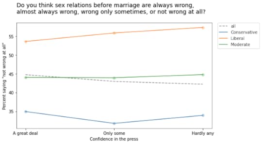
As confidence in the press declines from left to right, the overall fraction of people who think premarital sex is “not wrong at all” declines slightly. But within each political group, there is a slight increase.
Although this example meets the requirements for Simpson’s paradox, it is unlikely to mean much. Most of these relationships are not statistically significant, which means that if the GSS had randomly sampled a different group of people, it is plausible that these trends might have gone the other way.
And this should not be surprising. If there is no relationship between two variables in reality, the actual trend is zero and the trend we see in a random sample is equally likely to be positive or negative. Under this assumption, we can estimate the probability of seeing a Simpson paradox by chance:
If the overall trend is positive, the trend in all three groups has to be negative, which happens one time in eight.If the overall trend is negative, the trend in all three groups has to be positive, which also happens one time in eight.When there are more groups, Simpson’s paradox is less likely to happen by chance. Even so, since we tried so many combinations, it is only surprising that we did find more.
A few good examplesMost of the examples I found are like the previous one. The relationships are so weak that the trends we see are mostly random, which means we don’t need a special explanation for Simpson’s paradox. But I found a few examples where the Simpsonian reversal is probably not random and, even better, it makes sense.
For example, the following figure shows the fraction of people who would support a gun law as a function of how often they pray, grouped by sex.
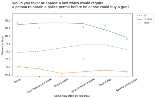
Within each group, the overall trend is downward: the more you pray, the less likely you are to favor gun control. But the overall trend goes the other way: people who pray more are more likely to support gun control. Before you proceed, see if you can figure out what’s going on.
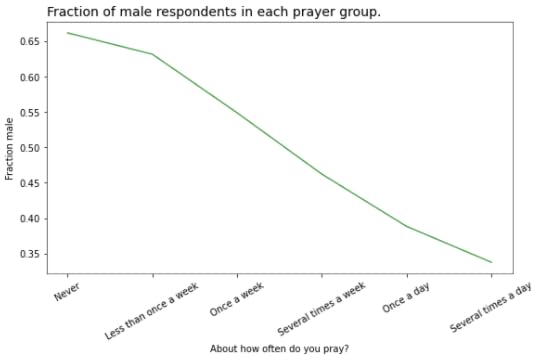
At this point you might guess that there is a correlation of some kind between the variable on the x-axis and the groups. In this example, there is a substantial difference in how much men and women pray. The following figure shows how much:
And that’s why average support for gun control increases as a function of prayer:
The low-prayer groups are mostly male, so average support for gun control is closer to the male response, which is lower.The low-prayer groups are mostly female, so the overall average is closer to the female response, which is higher.On one hand, this result is satisfying because we were able to explain something surprising. But having made the effort, I’m not sure we have learned much. Let’s look at one more example.
The GSS includes the following question about a hypothetical open housing law:
Suppose there is a community-wide vote on the general housing issue. There are two possible laws to vote on. One law says that a homeowner can decide for himself whom to sell his house to, even if he prefers not to sell to [someone because of their race or color]. The second law says that a homeowner cannot refuse to sell to someone because of their race or color. Which law would you vote for?
The following figure shows the fraction of people who would vote for the second law, grouped by race and plotted as a function of income (on a log scale).
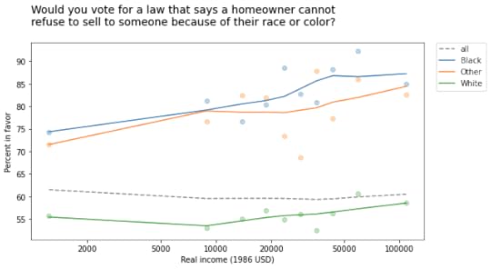
In every group, support for open housing increases as a function of income, but the overall trend goes the other way: people who make more money are less likely to support open housing.
At this point, you can probably figure out why:
White respondents are less likely to support this law than Black respondents and people of other races, andPeople in the higher income groups are more likely to be white.So the overall average in the lower income groups is closer to the non-white response; the overall average in the higher income groups is closer to the white response.
SummaryIs Simpson’s paradox a mathematical curiosity, or does it happen in real life?
Based on my exploration (and a similar search in a different dataset), if you go looking for Simpson’s paradox in real data, you will find it. But it is rare: I tried almost 100,000 combinations, and found only about 100 examples. And a large majority of the examples I found were just statistical noise.
What does Simpson’s paradox tell us about the data, and about the world?
In the examples I found, Simpson’s paradox doesn’t reveal anything about the world that is useful to know. Mostly it creates confusion, especially for people who have not encountered it before. Sometimes it is satisfying to figure out what’s going on, but if you create confusion and then resolve it, I am not sure you have made net progress. If Simpson’s paradox is useful, it is as a warning that the question you are asking and the way you are looking at the data don’t quite go together.
To paraphrase Henny Youngman,
The patient says, “Doctor, it’s confusing when I look at the data like this.”
The doctor says, “Then don’t do that!”
May 7, 2021
Founded Upon an Error
A recent post on Reddit asks, “Why was Bayes’ Theory not accepted/popular historically until the late 20th century?”
Great question! As always, there are many answers to a question like this, and the good people of Reddit provide several. But the first and most popular answer is, in my humble opinion, wrong.
The story goes something like this: “Bayesian methods are computationally expensive, so even though they were known in the early days of modern statistics, they were not practical until the availability of computational power and the recent development of efficient sampling algorithms.”
This theory is appealing because, if we look at problems where Bayesian methods are currently used, many of them are large and complex, and would indeed have been impractical to solve just a few years ago.
I think it is also appealing because it rationalizes the history of statistics. Ignoring Bayesian methods for almost 100 years wasn’t a mistake, we can tell ourselves; we were just waiting for the computers to catch up.
Well, I’m sorry, but that’s bunk. In fact, we could have been doing Bayesian statistics all along, using conjugate priors and grid algorithms.
Conjugate PriorsA large fraction of common, practical problems in statistics can be solved using conjugate priors, and the solutions require almost no computation. For example:
Problems that involve estimating proportions can be solved using a beta prior and binomial likelihood function. In that case, a Bayesian update requires exactly two addition operations. In the multivariate case, with a Dirichlet prior and a multinomial likelihood function, the update consists of adding two vectors.Problems that involve estimating rates can be solved with a gamma prior and an exponential or Poisson likelihood function — and the update requires two additions.For problems that involve estimating the parameters of a normal distribution, things are a little more challenging: you have to compute the mean and standard deviation of the data, and then perform about a dozen arithmetic operations.For details, see Chapter 18 of Think Bayes. And for even more examples, see this list of conjugate priors. All of these could have been done with paper and pencil, or chalk and rock, at any point in the 20th century.
And these methods would be sufficient to solve many common problems in statistics, including everything covered in an introductory statistics class, and a lot more. In the time it takes for students to understand p-values and confidence intervals, you could teach them Bayesian methods that are more interesting, comprehensible, and useful.
In terms of computational efficiency, updates with prior conjugates border on miraculous. But they are limited to problems where the prior and likelihood can be well modeled by simple analytic functions. For other problems, we need other methods.
Grid AlgorithmsThe idea behind grid algorithms is to enumerate all possible values for the parameters we want to estimate and, for each set of parameters:
Compute the prior probability,Compute the likelihood of the data,Multiply the priors and the likelihoods,Add up the products to get the total probability of the data, andDivide through to normalize the posterior distribution.If the parameters are continuous, we approximate the results by evaluating the prior and likelihood at a discrete set of values, often evenly spaced to form a d-dimensional grid, where d is the number of parameters.
If there are n possible values and m elements in the dataset, the total amount of computation we need is proportional to the product n m, which is practical for most problems. And in many cases we can do even better by summarizing the data; then the computation we need is proportional to n + m.
For problems with 1-2 parameters — which includes many useful, real-world problems — grid algorithms are efficient enough to run on my 1982 vintage Commodore 64.
For problems with 3-4 parameters, we need a little more power. For example, in Chapter 15 of Think Bayes I solve a problem with 3 parameters, which takes a few seconds on my laptop, and in Chapter 17 I solve a problem that takes about a minute.
With some optimization, you might be able to estimate 5-6 parameters using a coarse grid, but at that point you are probably better off with Markov chain Monte Carlo (MCMC) or Approximate Bayesian Computation (ABC).
For more than six parameters, grid algorithms are not practical at all. But you can solve a lot of real-world problems with fewer than six parameters, using only the computational power that’s been available since 1970.
So why didn’t we?
Awful People, Bankrupt IdeasIn 1925, R.A. Fisher wrote, “… it will be sufficient … to reaffirm my personal conviction … that the theory of inverse probability is founded upon an error, and must be wholly rejected.” By “inverse probability”, he meant what is now called Bayesian statistics, and this is probably the nicest thing he ever wrote about it.
Unfortunately for Bayesianism, Fisher’s “personal conviction” carried more weight than most. Fisher was “the single most important figure in 20th century statistics”, at least according this article. He was also, according to contemporaneous accounts, a colossal jerk who sat on 20th century statistics like a 400-pound gorilla, a raving eugenicist, even after World War II, and a paid denier that smoking causes lung cancer.
For details of the story, I recommend The Theory That Would Not Die, where Sharon Bertsch McGrayne writes: “If Bayes’ story were a TV melodrama, it would need a clear-cut villain, and Fisher would probably be the audience’s choice by acclamation.”
Among other failings, Fisher feuded endlessly with Karl Pearson, Egon Pearson, and Jerzy Neyman, to the detriment of statistics, science, and the world. But he and Neyman agreed about one thing: they were both rabid and influential anti-Bayesians.
The focus of their animosity was the apparent subjectivity of Bayesian statistics, particularly in the choice of prior distributions. But this concern is, in my personal conviction, founded upon an error: the belief that frequentist methods are less subjective than Bayesian methods.
All statistical methods are based on modeling decisions, and modeling decisions are subjective. With Bayesian methods, the modeling decisions are represented more explicitly, but that’s a feature, not a bug. As I.J. Good said, “The subjectivist [Bayesian] states his judgements, whereas the objectivist [frequentist] sweeps them under the carpet by calling assumptions knowledge, and he basks in the glorious objectivity of science.”
In summary, it would be nice to think it was reasonable to neglect Bayesian statistics for most of the 20th century because we didn’t have the computational power to make them practical. But that’s a rationalization. A much more substantial part of the reason is the open opposition of awful people with bankrupt ideas.
May 3, 2021
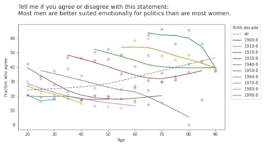
Simpson’s Paradox and Age Effects
As people get older, do they become more racist, sexist, and homophobic? To find out, you could use data from the General Social Survey (GSS), which asks questions like:
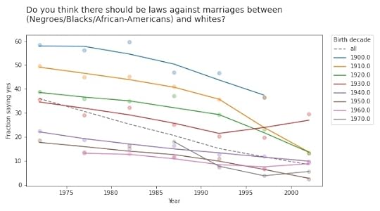
Do you think there should be laws against marriages between Blacks/African-Americans and whites?Should a man who admits1 that he is a homosexual be allowed to teach in a college or university, or not?Tell me if you agree or disagree with this statement: Most men are better suited emotionally for politics than are most women.If you plot the answers to these questions as a function of age, you find that older people are, in fact, more racist, sexist, and homophobic than younger people. But that’s not because they are old; it’s because they were born, raised, and educated during a time when large fractions of the population were racist, sexist homophobes.
In other words, it’s primarily a cohort effect, not an age effect. We can see that if we group respondents by birth cohort and plot their responses by age. Here are the results for the first question:
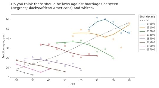
The circle markers show the proportion of respondents who got this question wrong (no other way to put it); the lines show local regressions through the markers.
The dashed gray line shows the overall trend, if we don’t group by cohort. Sure enough, when this question was asked between 1972 and 2002, older respondents were substantially more likely to support laws against marriage between people of difference races.
But when we group by decade of birth, we see:
A cohort effect: people born later are less racist.A period effect: within every cohort, people get less racist over time.The results are similar for the second question:
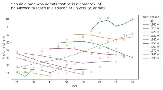
If you thought the racism was bad, get a load of the homophobia!
But again, all birth cohorts became more tolerant over time (even the people born in the 19-aughts, though it doesn’t look it). And again, there is no age effect; people do not become homophobic as they age.
They don’t get more sexist, either:
 Simpson’s Paradox
These are all examples of Simpson’s paradox, where the trend in every group goes in one direction, and the overall trend goes in the other direction. It’s called a paradox because many people find it counterintuitive at first. But once you have seen a few examples, like the ones I wrote about this, this, and this previous article, it gets to be less of a surprise.
And if you pay attention, it can be a hint that there is something wrong with your model. In this case, it is a symptom that we are looking at the data the wrong way. If we suspect that the changes we see are due to cohort and period, rather than age, we can check by plotting over time, rather than age, like this:
Every cohort is less racist than its predecessor, every cohort gets less racist over time, and the overall trend goes in the same direction, so Simpson’s paradox is resolved.
Or maybe it persists in a weaker form: the overall trend is steeper than the trend in any of the cohorts, because in addition to the cohort effect and the period effect, we also see the effect of generational replacement.
This article is part of a series where I search the GSS for examples of Simpson’s paradox. More coming soon!
Footnotes1 If you find the wording of this question problematic, remember that it was written in 1970 and reflects mainstream views at the time. It persists because, in order to support time series analysis, the GSS generally avoids changing the wording of questions.May 1, 2021
Simpson’s Paradox and Education
Is Simpson’s paradox a mathematical curiosity or something that matters in practice? To answer this question, I’m searching the General Social Survey (GSS) for examples. Last week I published the first batch, examples where we group people by decade of birth and plot their opinions over time. In this article I present the next batch, grouping by education and plotting over time.
The first example I found is in the responses to this question: “Please tell me whether or not you think it should be possible for a pregnant woman to obtain a legal abortion if she is married and does not want any more children?”
If we group respondents by the highest degree they have earned and compute the fraction who answer “yes” over time, the results meet the criteria for Simpson’s paradox: in every group, the trend over time is downward, but if we put the groups together, the overall trend is upward.
However, if we plot the data, we see that this example is not entirely satisfying.
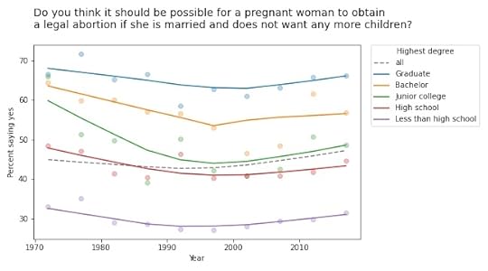
The markers show the fraction of respondents in each group who answered “yes”; the lines show local regressions through the markers.
In all groups, support for legal abortion (under the specified condition) was decreasing until the 1990s, then started to increase. If we fit a straight line to these curves, the estimated slope is negative. And if we fit a straight line to the overall curve, the estimated slope is positive.
But in both cases, the result doesn’t mean very much because we’re fitting a line to a curve. This is one of many examples I have seen where Simpson’s paradox doesn’t happen because anything interesting is happening in the world; it is just an artifact of a bad model.
This example would have been more interesting in 2002. If we run the same analysis using data from 2002 or earlier, we see a substantial decrease in all groups, and almost no change overall. In that case, the paradox is explained by changes in educational level. Between 1972 and 2002, the fraction of people with a college degree increased substantially. Support for abortion was decreasing in all groups, but more and more people were in the high-support groups.
Free speechWe see a similar pattern in many of the questions related to free speech. For example, the GSS asks, “Suppose an admitted Communist wanted to make a speech in your community. Should he be allowed to speak, or not?” The following figure shows the fraction of respondents at each education level who say “allowed to speak”, plotted over time.

The differences between the groups are big: among people with a bachelor’s or advanced degree, almost 90% would allow an “admitted” Communist to speak; among people without a high school diploma it’s less than 50%. (If you are curious about the wording of questions like this, remember that many GSS questions were written in the 1970s and, for purposes of comparison over time, they avoid changing the text.)
The responses have changed only slightly since 1973: in most groups, support has increased a little; among people with a junior college degree, it has decreased a little.
But overall support has increased substantially, for the same reason as in the previous example: the number of people at higher levels of education increased during this interval.
Whether this is an example of Simpson’s paradox depends on the definition. But it is certainly an example where we see one story if we look at the overall trend and another story if we look at the subgroups.
Other questions related to free speech show similar trends. For example, the GSS asks: “There are always some people whose ideas are considered bad or dangerous by other people. For instance, somebody who is against all churches and religion. If some people in your community suggested that a book he wrote against churches and religion should be taken out of your public library, would you favor removing this book, or not?”
The following figure shows the fraction of respondents who say the book should not be removed:
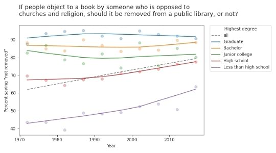
Again, respondents with more education are more likely to support free speech (and probably less hostile to the non-religious, as well). But in this case support is increasing among people with less education. So the overall trend we see is really the sum of two trends: increases within some groups in addition to shifts between groups.
In this example, the overall slope is steeper than the estimated slope in any group. That would be surprising if you expected the overall slope to be like a weighted average of the group slopes. But as all of these examples show, it’s not.
This article presents examples of Simpson’s paradox, and related patterns, when we group people by education level and plot their responses over time. In the next article we’ll see what happens when we groups people by age.
April 30, 2021
What’s new in Think Bayes 2?
I’m happy to report that the second edition of Think Bayes is available for preorder now.
What’s new in the second edition?
I wrote a new Chapter 1 that introduces conditional probability by using the Linda the Banker problem and data from the General Social Survey.I added new chapters on survival analysis, linear regression, logistic regression, conjugate priors, MCMC, and ABC.I added a lot of new examples and exercises, most from classes I taught using the first edition.I rewrote all of the code using NumPy, SciPy, and Pandas (rather than basic Python types). The new code is shorter, clearer, and faster!For every chapter, there’s a Jupyter notebook where you can read the text, run the code, and work on exercises. You can run the notebooks on your own computer or, if you don’t want to install anything, you can run them on Colab.More generally, the second edition reflects everything I’ve learned in the 10 years since I started the first edition, and it benefits from the comments, suggestions, and corrections I’ve received from readers. I think it’s really good!
If you would like to preorder, click here.
April 27, 2021
Old optimists and young pessimists
Years ago I told one of my colleagues about my Data Science class and he asked if I taught Simpson’s paradox. I said I didn’t spend much time on it because, I opined, it is a mathematical curiosity unlikely to come up in practice. My colleague was shocked and dismayed because, he said, it comes up all the time in his field (psychology).
Ever since then, I have been undecided about Simpson’s paradox. A lot of people think it’s important, but when I look for compelling examples, I find the same three stories over and over: Berkeley admissions, kidney stones, and Derek Jeter’s batting average. Yawn.
But last week I found a more interesting example:
Between 2000 and 2018, real wages for full-time employees increased.Over the same period, real wages decreased for people at every level of education.If that seems impossible, go read my article about it.
I also found an article (“Can you Trust the Trend: Discovering Simpson’s Paradoxes in Social Data“) where the authors search a dataset for instances of Simpson’s paradox and describe the ones they find.
And that got me thinking about my old friend, the General Social Survey (GSS). So I’ve started searching the GSS for instances of Simpson’s paradox. I’ll report what I find, and maybe we can get a sense of (1) how often it happens, (2) whether it matters, and (3) what to do about it.
I’ll start with examples where the x-variable is time. For y-variables, I use about 120 questions from the GSS. And for subgroups, I use race, sex, political alignment (liberal-conservative), political party (Democrat-Republican), religion, age, birth cohort, social class, and education level. That’s about 1000 combinations.
Of these, about 10 meet the strict criteria for Simpson’s paradox, where the trend in all subgroups goes in the same direction and the overall trend goes in the other direction. On examination, most of them are not very interesting. In most cases, the actual trend is nonlinear, so the parameters of the linear model don’t mean very much.
But a few of them turn out to be interesting, at least to me. For example, the following figure shows the fraction of respondents who think “most of the time people try to be helpful”, plotted over time, grouped by decade of birth. The markers show the percentage in each group during each interval; the lines show local regressions.
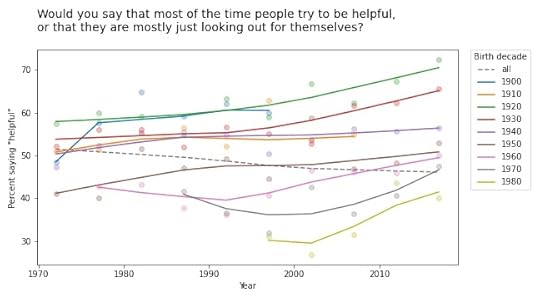
Within each group, the trend is positive: apparently, people get more optimistic about human nature as they age. But overall the trend is negative. Why? Because of generational replacement. People born before 1940 are substantially more optimistic than people born later; as old optimists die, they are being replaced by young pessimists.
Based on this example, we can go looking for similar patterns in other variables. For example, here are the results from a related question about fairness.

Again, old optimists are being replaced by young pessimists.
For a similar question about trust, the results are a little more chaotic:

Some groups are going up and others down, so this example doesn’t meet the criteria for Simpson’s paradox. But it shows the same pattern of generational replacement.
Old conservatives, young liberalsQuestions related to prohibition show similar patterns. For example, here are the responses to a question about whether pornography should be illegal.
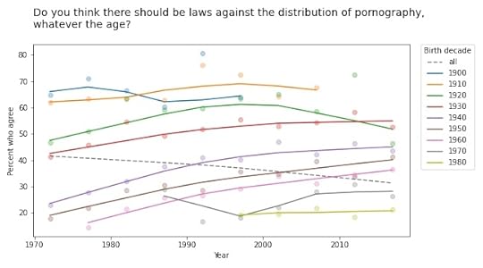
In almost every group, support for banning pornography has increased over time. But recent generations are substantially more tolerant on this point, so overall support for prohibition is decreasing.
The results for legalizing marijuana are similar.
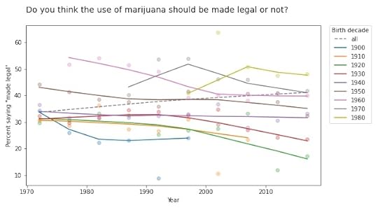
In most groups, support for legalization has gone down over time; nevertheless, through the power of generational replacement, overall support is increasing.
So far, I think this is more interesting than Derek Jeter’s batting average. More examples coming soon!
April 25, 2021
Bayesian and frequentist results are not the same, ever
I often hear people say that the results from Bayesian methods are the same as the results from frequentist methods, at least under certain conditions. And sometimes it even comes from people who understand Bayesian methods.
Today I saw this tweet from Julia Rohrer: “Running a Bayesian multi-membership multi-level probit model with a custom function to generate average marginal effects only to find that the estimate is precisely the same as the one generated by linear regression with dummy-coded group membership.” [emphasis mine]
Which elicited what I interpret as good-natured teasing, like this tweet from Daniël Lakens: “I always love it when people realize that the main difference between a frequentist and Bayesian analysis is that for the latter approach you first need to wait 24 hours for the results.”
Ok, that’s funny, but there is a serious point here I want to respond to because both of these comments are based on the premise that we can compare the results from Bayesian and frequentist methods. And that’s not just wrong, it is an important misunderstanding.
You can’t compare results from Bayesian and frequentist methods because the results are different kinds of things. Results from frequentist methods are generally a point estimate, a confidence interval, and/or a p-value. Each of those results is an answer to a different question:
Point estimate: If I have to pick a single value, which one minimizes a particular cost function under a particular set of constraints? For example, which one minimizes mean squared error while being unbiased?Confidence interval: If my estimated parameters are correct and I run the experiment again, how much would the results vary due to random sampling?p-value: If my estimated parameters are wrong and the actual effect size is zero, what is the probability I would see an effect as big as the one I saw?In contrast, the result from Bayesian methods is a posterior distribution, which is a different kind of thing from a point estimate, an interval, or a probability. It doesn’t make any sense to say that a distribution is “the same as” or “close to” a point estimate because there is no meaningful way to compute a distance between those things. It makes as much sense as comparing 1 second and 1 meter.
If you have a posterior distribution and someone asks for a point estimate, you can compute one. In fact, you can compute several, depending on what you want to minimize. And if someone asks for an interval, you can compute one of those, too. In fact, you could compute several, depending on what you want the interval to contain. And if someone really insists, you can compute something like a p-value, too.
But you shouldn’t.
The posterior distribution represents everything you know about the parameters; if you reduce it to a single number, an interval, or a probability, you lose useful information. In fact, you lose exactly the information that makes the posterior distribution useful in the first place.
It’s like comparing a car and an airplane by driving the airplane on the road. You would conclude that the airplane is complicated, expensive, and not particularly good as a car. But that would be a silly conclusion because it’s a silly comparison. The whole point of an airplane is that it can fly.
 https://slate.com/human-interest/2010...
And the whole point of Bayesian methods is that a posterior distribution is more useful than a point estimate or an interval because you can use it to guide decision-making under uncertainty.
For example, suppose you compare two drugs and you estimate that one is 90% effective and the other is 95% effective. And let’s suppose that difference is statistically significant with p=0.04. For the next patient that comes along, which drug should you prescribe?
You might be tempted to prescribe the second drug, which seems to have higher efficacy. However:
You are not actually sure it has higher efficacy; it’s still possible that the first drug is better. If you always prescribe the second drug, you’ll never know. Also, point estimates and p-values don’t help much if one of the drugs is more expensive or has more side effects.With a posterior distribution, you can use a method like Thompson sampling to balance exploration and exploitation, choosing each drug in proportion to the probability that it is the best. And you can make better decisions by maximizing expected benefits, taking into account whatever factors you can model, including things like cost and side effects (which is not to say that it’s easy, but it’s possible).
Bayesian methods answer different questions, provide different kinds of answers, and solve different problems. The results are not the same as frequentist methods, ever.
Conciliatory postscript: If you don’t need a posterior distribution — if you just want a point estimate or an interval — and you conclude that you don’t need Bayesian methods, that’s fine. But it’s not because the results are the same.
Probably Overthinking It

- Allen B. Downey's profile
- 236 followers

