
Menzie David Chinn's Blog, page 8
May 20, 2016
Kansas: Zero 12 Month Employment Growth
Or, “ouch!”
That figure is from this article. Total NFP employment is below levels of September 2014. I’m sure some people (see here for one example) will take a Panglossian view, but I can’t see how it’s a particularly good outcome.
More statistical analysis here.


May 19, 2016
Wisconsin Employment: Falling Further Behind
Wisconsin’s Department of Workforce Development released employment figures today. Nonfarm payroll employment down 12,000, private NFP down 11,000, month-on-month.
Figure 1 depicts US and Wisconsin (log) NFP employment normalized to 2011M01; Figure 2 shows the counterfactual of what Wisconsin employment should be, based on historical correlations holding over the 1990-2010 period (using a ECM with national employment).
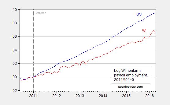
Figure 1: Log nonfarm payroll employment, 2011M01=0, for Wisconsin (red), and US (blue). Source: BLS, DWD, and author’s calculations.

Figure 2: Actual Wisconsin nonfarm payroll employment (red) and counterfactual forecast (blue), and 90% confidence band (gray). Source: BEA, DWD, author’s calculations. Counterfactual forecast from ECM using US, Wisconsin NFP, one lag of first differences, estimated 1990-2010, assumes US NFP weakly exogenous (see description here).
To sum up: Wisconsin NFP employment is declining, and is trending at a pace lagging the national rate, and is currently at a level statistically significantly different from that implied by historical correlations. Using a sample ending in 2009M06 instead of 2010M12 does not materially change these conclusions, as noted in this post.
John Koskinen, Chief Economist and Division Administrator for the Division for Research and Policy Analysis, in the Wisconsin Department of Revenue from 2007-15, had a more upbeat view, which is discussed here. He characterized Wisconsin employment growth as pretty good, although it was not clear to me what statistical benchmark he used. A more downbeat assessment is here.
May 17, 2016
More on Uncertainty in Open Economy Macro
In my last post, I noted a conference on uncertainty in macroeconomics. Here are two papers of particular interest to me.
The first, by Kimberly A. Berg and Nelson Mark, was entitled “Global Macro Risks in Currency Excess Returns”:
We identify country macroeconomic fundamentals, whose first and higher-ordered moments have predictive power for currency excess returns. Using this identification in conjunction with the carry trade, we form portfolios of profitable currency excess returns and study the determinants of their cross-sectional variation. We find that global macro factors are priced in currency excess returns. The high-minus-low conditional skewness of the unemployment gap is a factor consistently and significantly priced in these returns. Somewhat weaker evidence points to the high-minus-low volatility of the real exchange rate depreciation as a second global risk factor.
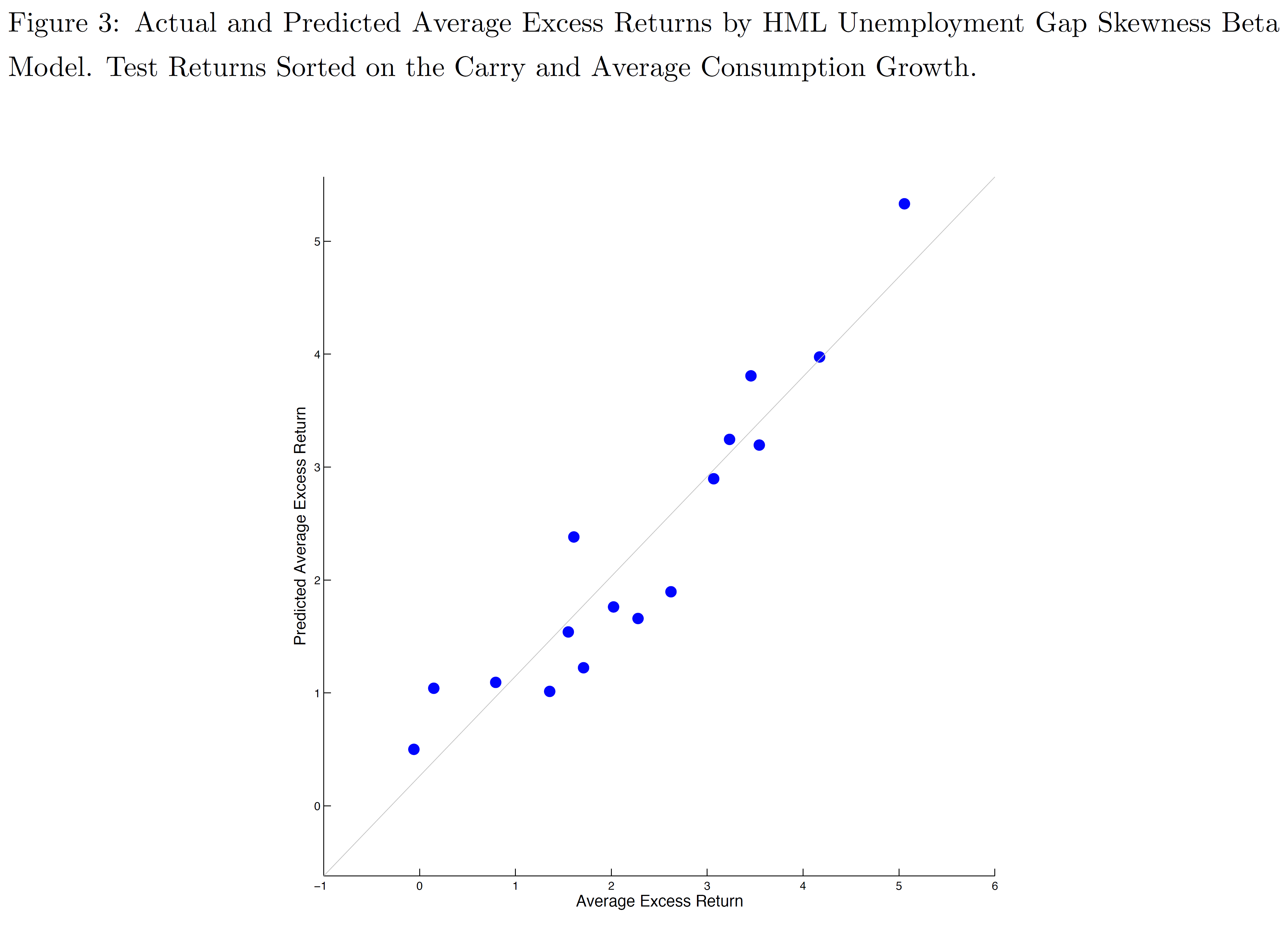
Figure from Berg and Mark (2016).
The second paper, by Lucas Husted, John Rogers, and Bo Sun (all Federal Reserve Board), was entitled “Monetary Policy Uncertainty”:
As the Federal Reserve poised itself to lift off from the zero interest rate policy in 2015, the intentions of monetary policymakers and the effects of their actions faced increased scrutiny. In this paper, we construct new measures of uncertainty that the public perceives about Federal Reserve policy actions and their consequences. This monetary policy uncertainty index (MPU) is then compared to several potentially-related measures. We show a strong link between our MPU index and direct measures of monetary policy uncertainty constructed from the FRB-NY Survey of Primary Dealers, for example, but a much lower correlation between MPU and the VIX. The correlation between MPU and market-based measures of policy interest rate uncertainty (swaptions volatility) is reasonably high prior to 2008 but near zero afterward as the latter measure fell close to zero. We then empirically examine the determinants of MPU, focusing on its relationship with newly-constructed measures of FOMC transparency and other quantitative indicators of the Fed’s evolving communication strategy. Finally, we identify shocks to monetary policy and monetary policy uncertainty in a VAR using the “external instruments” approach (Stock and Watson (2012); Gertler and Karadi (2014); Rogers, Scotti and Wright (2015)). We find that a one standard deviation surprise monetary policy tightening induces a roughly 10% increase in MPU that subsides within a year. Identified positive shocks to monetary policy uncertainty raise various interest rates and spreads, and lower output with about the same dynamic pattern as contractionary monetary policy shocks. Our VAR analysis thus suggests that policy rate normalization that is accompanied by a drop in uncertainty can help neutralize the contractionary effects of the rate increases themselves.
Here is a graph of the monthly average of the daily MPU, and relevant monetary policy events.

Figure from Husted, Rogers, and Sun (2016).
While not reported in the paper, Rogers discussed some of the empirical implications of MPU for excess currency returns. They find that MPU is indeed important for excess returns on constructed carry portfolios, particularly during the period of the zero lower bound.
May 12, 2016
“The Impact of Uncertainty Shocks on the Global Economy”
That’s the title of the conference being held today and tomorrow at University College London, and cosponsored by School of Slavonic and East European Studies at UCL, the Banque de France, University of Leicester, the Money, Macro and Finance group, and the Centre for Macroeconomics.
The conference has two keynote presentations, the first by Nicholas Bloom (Stanford) on “The impact of uncertainty shocks on real and financial activities”, and the second by Barbara Rossi (University Pompeu Fabra) on “Understanding the sources of macroeconomic uncertainty”.
The entire program is here.
The conference was organized by Wojtek Charemza (Leicester University), Menzie Chinn, Wisconsin University, Laurent Ferrara (Banque de France), Raffaella Giacomini (University College London), Klodiana Istrefi (Banque de France), Svetlana Makarova (University College London) and Xuguang (Simon) Sheng (American University).
May 10, 2016
“Spillovers of Conventional and Unconventional Monetary Policy”
That was a title of a conference last summer held at the Swiss National Bank, and noted in this post. Mark A. Wynne and Julieta Yung discuss the conference proceedings.
A key motivation for the conference is based on this graph.
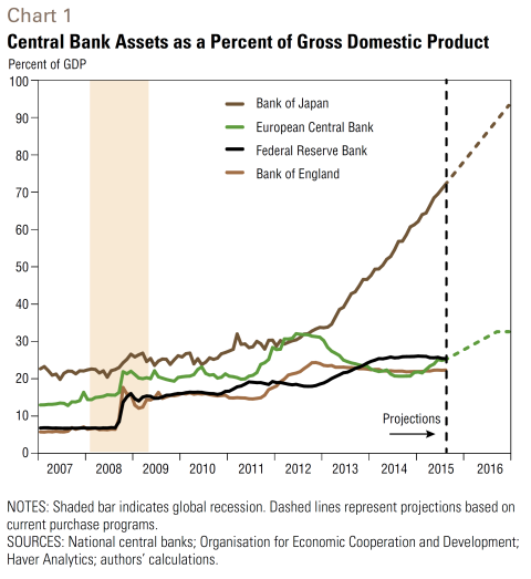
Source: Wynne and Yung (2016).
They write:
Central banks around the world launched extraordinary monetary policy responses to the global financial crisis of 2007–09 and the European debt crises that began in 2010. Some were coordinated; all were directed at fulfilling domestic mandates for price and financial stability and supporting real economic activity.
Fears that the dramatic expansion of central bank balance sheets (Chart 1)—a concomitant of the unconventional part of the policy response—would lead to higher inflation at the consumer level have so far proven unfounded, whether due to still abundant slack in many countries or to wellanchored inflation expectations.
But it has been argued that an extended period of ultra-easy monetary policy is manifesting itself in excessive risk taking, bubbles in certain asset classes and price pressures in countries that are recipients of internationally mobile capital. This capital, in search of higher yields, could ultimately lead to higher inflation globally.
The experience of recent years has challenged our understanding of the transmission of monetary policy across national borders as well as the implications of financial interconnections and the global financial cycle for inflation spillovers and monetary control. Moreover, it has prompted us to reconsider the short- and long-run tradeoffs between structural reforms and monetary policy during international crises and the global implications of policy responses to the financial crisis.
May 8, 2016
Expectations of inflation
The FOMC and professional forecasters expect the Fed eventually to achieve its 2% inflation target. The market seems more skeptical.
The U.S. Treasury began offering Treasury Inflation Protected Securities to investors in 1997. These insure against inflation risk by having a coupon and par value that rise with the headline CPI. The difference between the yield on a normal Treasury security (which has no guarantee against inflation) and a TIPS of corresponding maturity is known as the break-even inflation rate. The break-even inflation rate is sometimes used as an indicator of the rate of inflation that bond market participants are expecting. That number currently is around 1.6% for every maturity.
The blue line in the graph below plots the current break-even inflation rate on the vertical axis as a function of the maturity of the security on the horizontal axis. This comes from the difference in continuously compounded pure discount bond yields as calculated by Gurkaynak, Sack and Wright. The height of the graph corresponds to the average expected inflation rate (quoted at an annual rate) between today and n years from today, plotted as a function of n.
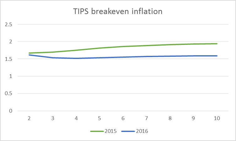
Horizontal axis: number of years looking ahead from indicated date. Blue: break-even inflation rates over that horizon as of May 4, 2016. Green: break-even inflation rates as of May 4, 2015. Data source: Gurkaynak, Sack and Wright.
The green line in the above graph plots the break-even inflation rate as of a year ago. At that time, the market seemed to have more faith that the Fed would gradually achieve its 2% inflation target.
A number of researchers have argued that risk premia and lack of liquidity in the market for TIPS make interpretation of the break-even inflation rate difficult. Haubrich, Pennacchi and Ritchken (2012) developed an alternative approach that relies on the prices of more liquid inflation swaps along with nominal interest rates and survey-based measures. Updates of their series are regularly posted by the Federal Reserve Bank of Cleveland. Although their series often differs from the TIPS break-even rates, at the moment they are virtually identical, signaling 1.6% inflation for most of the next decade.

Horizontal axis: number of years looking ahead from indicated date. Blue: average expected inflation rates over that horizon as of April 2016 as inferred from inflation swaps, nominal yields, and survey responses. Green: expected inflation rates as of April 2015. Data source: Inflation Central.
Boragan Aruoba has an interesting new approach to summarizing the answers given by survey respondents to questions about the future. The basic idea is to assume that graphs like the ones above can be represented using the functional form that is used in the dynamic Nelson-Siegel model of interest rates developed by Christensen, Diebold and Rudebusch (2011). The values of the functions at any point in time are then chosen to match as closely as possible the answers given to different questions in the Survey of Professional Forecasters as well as the Blue Chip forecasts. Unlike the TIPS- and swaps-based measures, Aruoba’s survey summary suggests an inflation rate that will average above the Fed’s 2% target. Moreover, the curve has moved up from where it was a year ago.

Horizontal axis: number of years looking ahead from indicated date. Blue: average expected inflation rates over that horizon as of April 2016 as inferred from Survey of Professional Forecasters and Blue Chip forecast. Green: expected inflation rates as of April 2015. Data source: Federal Reserve Bank of Philadelphia.
So who’s right? I know this much: inflation came in at 0.8% over the last 12 months and has averaged under 1.6% over the last 10 years.
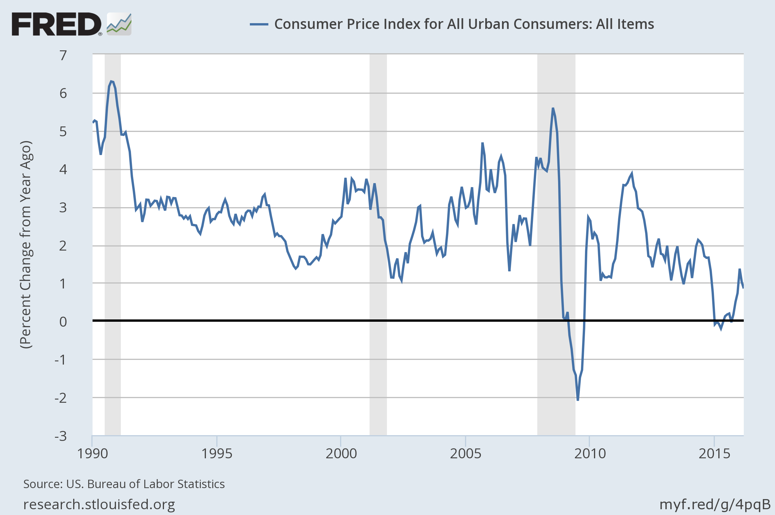
Year-over-year percent change in the seasonally unadjusted CPI. Source: FRED.
They say, “don’t bet against the Fed.” But the market seems to be doing just that.
May 7, 2016
Kansas Relative Employment Performance since 2005
Not terribly great, especially since 2013.
Some people think that Kansas would look good, if only one used a different normalization than the 2011M01 date I used in this post.
I think it’s downright dodgy for Menzie Chinn to normalize in 2011, when clearly if you want to compare those four states (Kansas, Wisconsin, Minnesota, California) you must immediately accept that Kansas is exceptional amongst the four in that it was the least hit by job losses during the 2009 recession (by a significant margin). You could normalize based on 2005 and get a completely different picture, it’s quite a deceptive presentation.
Here is private nonfarm payroll employment, normalized to 2011M01.
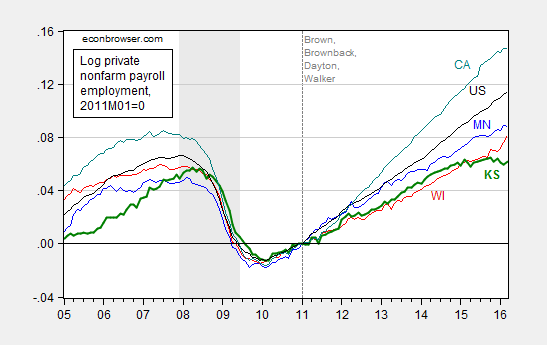
Figure 1: Log private nonfarm payroll employment in Minnesota (blue), Wisconsin (red), Kansas (green), California (teal), US (black), all 2005M01=0. NBER defined recession dates shaded gray. Source: BLS, NBER, author’s calculations.
And here is private nonfarm payroll employment, normalized to 2005M01.
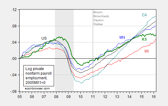
Figure 2: Log private nonfarm payroll employment in Minnesota (blue), Wisconsin (red), Kansas (green), California (teal), US (black), all 2005M01=0. NBER defined recession dates shaded gray. Source: BLS, NBER, author’s calculations.
Doesn’t look particularly impressive to me. (By the way, KS peak to trough decline in employment is comparable to MN peak to trough decline.) Maybe if one normalized on national peak as defined by NBER…
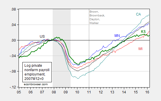
Figure 3: Log private nonfarm payroll employment in Minnesota (blue), Wisconsin (red), Kansas (green), California (teal), US (black), all 2007M12=0. NBER defined recession dates shaded gray. Source: BLS, NBER, author’s calculations.
Still looks like pretty poor performance, post-2011M01.
I fully expect another attempt to prettify the Kansas economic outlook. Like an appeal to unemployment rates, despite the fact that there are fixed effects in unemployment rates. By the standard of 1976-2010, Kansas is underperforming relative to history (see here).
In other news, Moody’s has dropped the credit outlook for Kansas government debt to negative.
May 5, 2016
Guest Contribution: “Exports, Exchange Rates, and the Return on China’s Investments”
Today, we’re fortunate to have Willem Thorbecke, Senior Fellow at Japan’s Research Institute of Economy, Trade and Industry (RIETI) as a guest contributor. The views expressed represent those of the author himself, and do not necessarily represent those of RIETI, or any other institutions the author is affiliated with.
Chinese leaders are determined to rebalance their economy away from an overdependence on exports. How are they progressing?
China’s Exports and Imports, 1993-2015
Figure 1 plots China’s processing imports and exports and Figure 2 its ordinary imports and exports. These are China’s principle customs regimes. Processing imports can only be used to produce goods for re-export (processed exports). This regime reflects the operation of global value chains in East Asia. Ordinary imports are destined primarily for the domestic market and ordinary exports are produced primarily using domestic inputs.
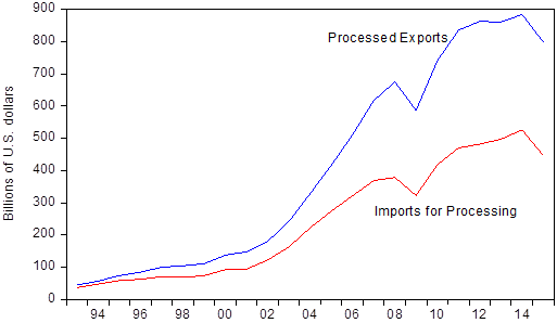
Figure 1. China’s Processing Trade, 1993-2015. Source: China Customs Statistics.
Figure 1 indicates that the gap between processed exports and imports for processing keeps growing. This implies that more and more of the value-added of processed exports such as smartphones, tablet computers, and consumer electronics goods comes from China. The gap is even wider than the figure indicates, since each year more than USD 70 billion of “imports” for processing are produced in China and round-tripped out of China and back in to take account of favorable tax provisions (see Xing, 2012).
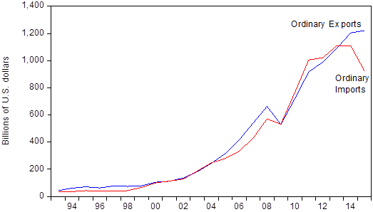
Figure 2. China’s Ordinary Trade, 1993-2015. Source: China Customs Statistics.
Figure 2 indicates that ordinary exports have grown very rapidly, and only started to decelerate in 2015. The figure also shows that ordinary imports have fallen in 2015. The fall in imports reflects the drop in the prices of primary products such as crude oil, as well as a decrease in import demand arising from China’s slowdown and from President Xi Jinping’s crackdown on government officials receiving luxury imported goods (Qian and Wen, 2015).
If we correct processing and ordinary trade for round-tripping imports, China ran a surplus in 2015 of $422 billion in processing trade and $330 billion in ordinary trade. China’s combined surplus in processing and ordinary trade thus equaled $752 billion or 6.7 percent of Chinese GDP in 2015. This implies that China ran a huge surplus in the manufactured products that make up the lion’s share of processing and ordinary trade. While its surplus in ordinary trade appeared in 2014, its surplus in processing trade has remained a little less than half a trillion dollars for the last five years.
Its total goods surplus, including other trade regimes such as customs warehousing trade, was over 5 percent of GDP in 2015 and its current account surplus just under 3 percent. According to Chinese balance of payments statistics, its current account surplus was below its merchandise trade surplus largely because of a deficit in tourism trade. Politically, the large surpluses in manufacturing goods are likely to lead to dislocation, extremist policies and protectionism in trading partners (Schwartz and Bui, 2016).
Determinants of China’s Exports
What drives China’s trade? Using dynamic ordinary least squares (DOLS) estimation and quarterly data over the 1994-2010 sample period, Cheung, Chinn, and Qian (2012) reported that a 10 percent RMB appreciation would reduce processed exports by between 9 and 12 percent and ordinary exports by between 13 and 19 percent. They also reported that income elasticities exceed unity for processed exports but are ambiguous for ordinary exports.
Equations (1) and (2) report DOLS results for China’s exports with the sample extending to the end of 2015. In addition to the CPI-deflated renminbi real effective exchange rate and real GDP in importing countries, the equations include weighted exchange rates in supply chain countries. Weighted exchange rates are included because processed exports such as smartphones contain parts and components such as processors produced in South Korea, Taiwan, Japan, and other supply chain countries (see Thorbecke, 2015, for details on calculating the weighted exchange rate).
The results for processed and ordinary exports, with standard errors in parentheses, are:
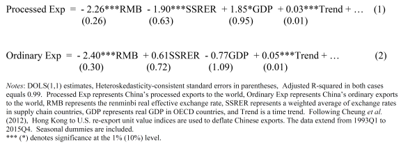
The results indicate that, for processed exports, a 10 percent appreciation of the renminbi would reduce exports by 23 percent and a 10 percent appreciation in East Asian supply chain countries would reduce exports by 19 percent. A 10 percent increase in real GDP in the rest of the world would increase processed exports by 19 percent. The results also indicate that, for ordinary exports, only the renminbi exchange rate matters. The finding that exchange rates in supply chains do not matter in equation (2) may be because more of the value-added of ordinary exports comes from China rather than from imported parts and components. In any case, since China’s supply chains keep becoming deeper, the Chinese exchange rate should matter more and more for both ordinary and processed exports going forward.
Figure 3 plots the CPI-deflated real effective exchange rate for the renminbi and for supply chain countries. It shows that China’s exchange rate has appreciated 47 percent between 2005Q2, when China abandoned its fixed peg to the U.S. dollar, and the end of 2015. By contrast, there has been a 4 percent depreciation in supply chain countries since the second quarter of 2005. With large capital outflows from China heading for housing, agriculture, companies, and other foreign investments and with South Korea and Taiwan reeling from competition with China, there is little prospect for an appreciation of either the renminbi or of exchange rates in supply chain countries.
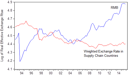
Figure 3. The RMB Real Effective Exchange Rate (REER) and the Weighted REER in Supply Chain Countries. Source: The Bank for International Settlements, China Customs Statistics, the International Monetary Fund International Financial Statistics, and calculations by the author.
How to Increase the Return on China’s Investments
The capital outflows represent a misallocation of resources, as the returns would be much higher from investing in the people of China. For instance, a study at Peking University found that air pollution in China reduces people’s life expectancy by 5.5 years (Chen, Ebenstein, Greenstone, and Li , 2013). Another study found that that polluting industries contaminated between 8 and 20 percent of China’s arable land and produced hundreds of “cancer villages” where residents die young because of exposure to toxins (see Chin and Spegele, 2013).
As another example, Fang et al. (2012) reported that the return to an additional year of education in the PRC equaled 20 percent per year. While schools are good for residents of Beijing and Shanghai, they are substandard for rural children. Rozelle (2010) noted that most rural children cannot afford pre-school, and that elementary school attendance is hampered by poor accessibility and long, dangerous commutes. Bad health, sanitation, nutrition, and psychology management also restrict students’ ability to learn. Problems such as anemia, vitamin deficiencies, visual difficulties are prevalent and can be remedied inexpensively. For instance, one multivitamin with iron will address both anemia and vitamin deficiencies and costs about 3 U.S. cents per student per day (Rozelle, 2010).
Smith, Rozelle, and Medina (2014) found that 34 percent of 3-5 year olds and 40 percent of 8-10 year olds in Guizhou Province were infected with intestinal worms, and that being infected significantly worsened academic performance, working memory, processing speed, height for age, and body mass index for age. In addition, deworming medicines are cheap and safe. The State Council initially allocated 60 million renminbi for deworming in Guizhou, but then did not follow through because it was “not a priority (Smith, Rozelle, and Medina, 2014). Rural students will be the urban workers of tomorrow, and investing in them now will pay high dividends later.
China’s leaders desire to move away from overdependence on exports. Currently exports and imports remain imbalanced. Large capital outflows from China will cause foreign trade to continue playing a disproportionate role. If investments could be rechanneled into the health, education, and welfare of its people, not only would China’s long run growth trajectory rise but the process would be more harmonious and peaceful.
References
Chen, Y., A. Ebenstein, M. Greenstone, and H. Li. 2013. Evidence on the Impact of Sustained Exposure to AiR Pollution on Life Expectancy from China’s Huai River Policy. Proceedings of the National Academy of Sciences, 2013; 110,12936-41. Available at: https://scholars.huji.ac.il/avrahameb...
Chin, J. and B. Spegele. 2013. China’s Bad Earth. The Wall Street Journal. 27 July. Available at: http://www.wsj.com/articles/SB1000142...
Cheung, Y, M. Chinn, and X. Qian. 2012. Are Chinese Trade Flows Different? Journal of International Money and Finance, 31, 2127-2146. Available at: http://www.ssc.wisc.edu/~mchinn/cheun...
Fang, H., K. Eggleston, J. Rizzo, S. Rozelle, and R. Zeckhauser. 2012. The Returns to Education in China: Evidence from the 1986 Compulsory Education Law. NBER Working Paper No. 18189, National Bureau of Economic Research, Cambridge.
Kaiman, J. 2013. China’s Reliance on Coal Reduces Life Expectancy by 5.5 Years, Says Study. The Guardian, 9 July.
Qian, N. and J. Wen. 2015. The Impact of Xi Jinping’s Anti-Corruption Campaign on Luxury Imports in China. Working paper, Yale University. Available at: http://aida.wss.yale.edu/~nq3/NANCYS_...
Rozelle, S. 2010. China’s 12th 5 Year Plan Challenge: Building a Foundation for Long-Term, Innovation-based Growth and Equity. Paper presented at NDRC-ADB International Seminar on China’s 12th Five Year Plan. Beijing, 19 January.
Schwartz, N. and Q. Bui. 2016. Where Jobs Are Squeezed by Chinese Trade, Voters Seek Extremes. The New York Times, April 27. Available at: http://www.nytimes.com/2016/04/26/bus...
Smith, S., S. Rozelle, and A. Medina. 2014. Executive Function: A Better Way to Evaluate the Impact of Deworming on Children’s Educational Outcomes? Paper presented at the Freeman- Spogli Institute for International Studies, Stanford University. Palo Alto, 14 March. Available at:
http://fsi.stanford.edu/multimedia/ex...
Thorbecke, W. 2015. Measuring the Competitiveness of China’s Processed Exports. China & World Economy, 23, 2015, 78-100. Working paper version available here:
http://www.rieti.go.jp/jp/publication...
Xing, Y. 2012. Processing Trade, Exchange Rates and China’s Bilateral Trade Balances. Journal of Asian Economics, 23, 540-547. Working paper version available here:
http://www.grips.ac.jp/r-center/wp-co...
Zhang, Y. 2016. Dumping Toxins in a Cloudy Legal Environment. Caixin, April 26. Available at: http://english.caixin.com/2016-04-26/...
This post written by Willem Thorbecke.
May 3, 2016
Guest Contribution: “Where is global economic growth heading?”
Today, we are pleased to present a guest contribution written by Laurent Ferrara (Banque de France, Head of the International Macro Division) and Clément Marsilli (Banque de France, Economist in the International Macro Division). The views expressed here are those of the authors and do not necessarily represent those of the Banque de France.
The latest update of the IMF WEO report has been released on April 12, 2016, and can be downloaded from the IMF web site (for a summary see also this Econbrowser post here). The salient fact of this report is that global GDP growth in 2016 has been revised downwards by -0.2pp years, from 3.4%, as assessed in the WEO update of January 2016, to 3.2%. Those revisions are quite homogeneous across countries (-0.2pp for both advanced and emerging/developing countries), although some commodity-exporters countries are more impacted.
Unfortunately, this is not the first time that IMF forecasts are revised downwards; it seems to be a stylized fact since 2011 (see Figure 1 below).
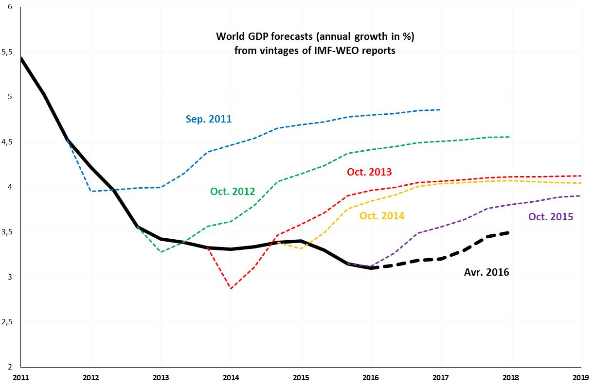
Figure 1: Evolution of IMF-WEO forecasts for world GDP (annual growth in %). Source: IMF-WEO
Remember that the first time the GDP growth rate for the year 2016 was predicted was in the WEO report published in April 2011: the estimated value was about 4.7% (see Figure 2). This large revision of 1.5 pp between April 2011 and April 2016 is mainly due to emerging countries (from 6.8% in to 4.1%), while forecasts for advanced economies were only moderately revised (from 2.4% to 1.9%). In fact, it seems that one of the major issues for forecasters was to integrate the structural shift in emerging economies, mainly in China, and to realize that the slowdown was more structural than conjunctural and was thus likely to persist.
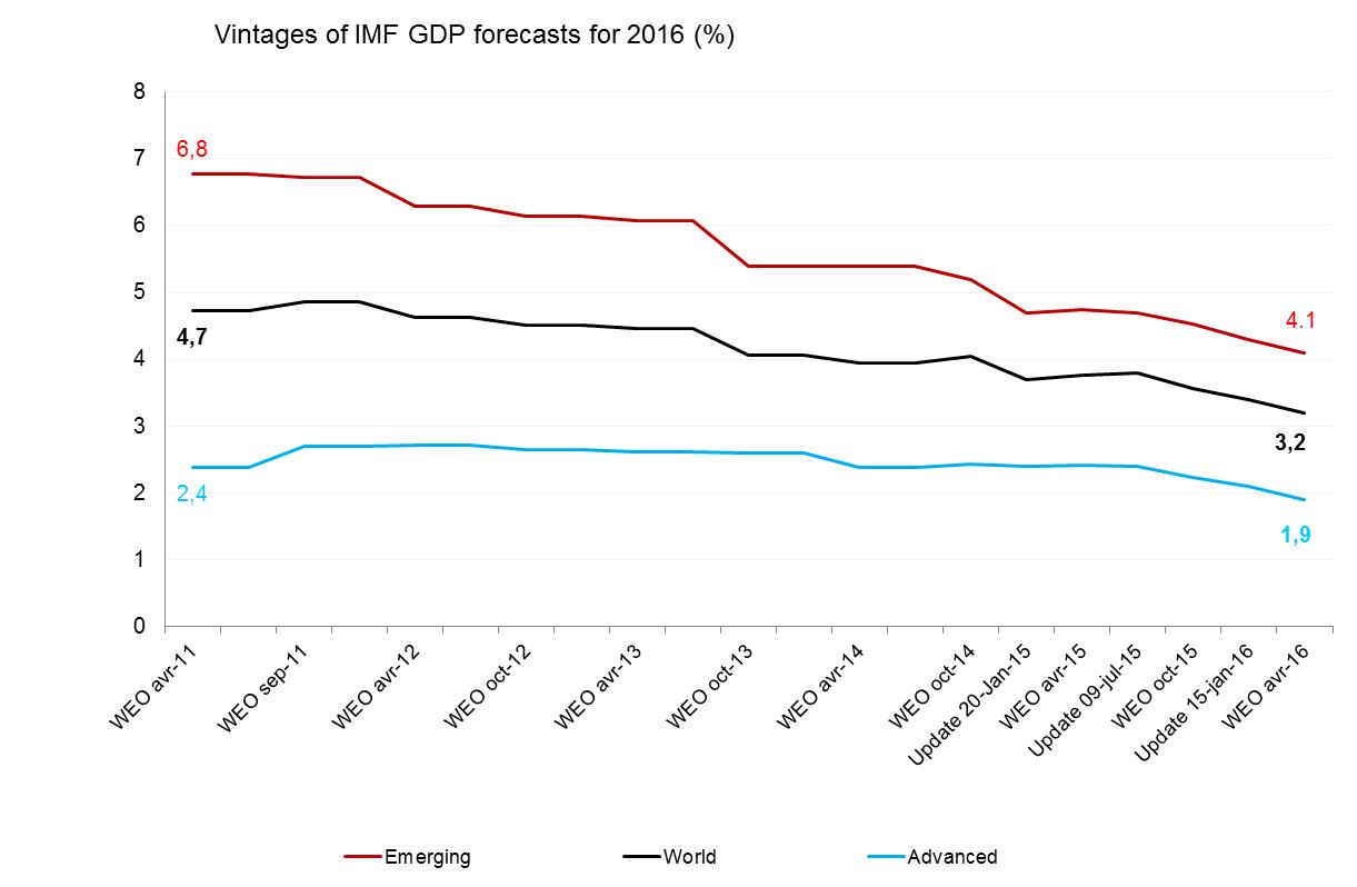
Figure 2: Vintages of IMF-WEO forecasts for world GDP in 2016 (annual growth in %). Source: IMF-WEO.
Against this background, one may wonder where the global economy is heading. Are we going to continue to follow this pattern of systematically downgrading economic growth? We recently developed a tool to monitor in real-time the global GDP growth on a high-frequency basis using a large database and recent econometric models (see a summary on Econbrowser). The latest results have been published in a Banque de France economic letter and show that with data used until April 4, the world GDP growth rate is estimated to be at 2.9%. This nowcast for 2016 is below IMF estimates, but close to OECD value estimated at 3.0%. Thus, the IMF estimation of world GDP could be revised downwards in the coming months, taking it to its lowest level since 2009.
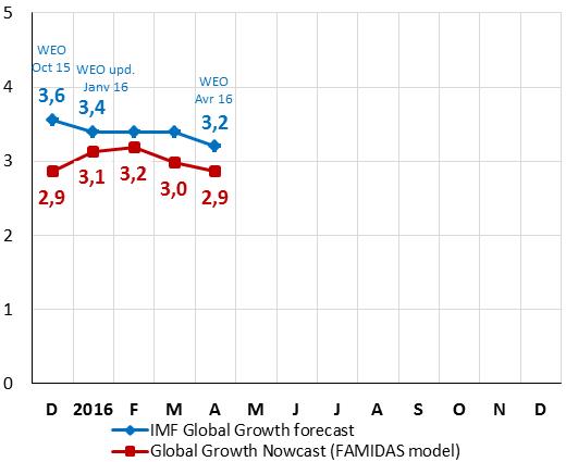
Figure 3: Nowcasts for world GDP in 2016 (annual growth in %). Source: Ferrara and Marsilli (2016), Rue de la Banque No. 23, Banque de France, April 2016.
This assessment has been reinforced by the recent GDP release for the US economy in Q1 2016 (see comments on Econbrowser here). The first GDP figure estimated by the BEA is about 0.5% (annual rate) for Q1, below expectations and well below growth rates observed in previous quarters. Today, the carry-over for 2016 is about 0.9%, meaning that it will likely be difficult to reach the IMF forecast of 2.4%. Two nowcasting tools for the US economy have been developed by the Atlanta Fed (GDPNow) and the NY Fed (FRBNY Nowcast). Both indicators point to a moderate GDP growth for Q2: The NY Fed estimates a GDP growth of about 0.8% (with data up to April 29) while Atlanta Fed is a bit more optimistic and nowcasts a GDP growth of 1.8% (with data up to May 2).
Looking forward, a key issue for international economists is to assess whether this sluggish global growth is likely to persist in upcoming years. In a recent FT post, Olivier Blanchard acknowledges that this slow growth is “a fact of life in the post-crisis world”. Indeed, it seems that the catching-up process of some large emerging countries comes to an end while we cannot expect in the upcoming months a huge boost to global growth stemming from more mature economies. A least in the short-run, it seems that the global economy is expected to grow below the pace of the pre-Global Financial Crisis period (around 4.5% on average over 2000-07).
This post written by Laurent Ferrara and Clément Marsilli.
May 1, 2016
Fed Tightening: Reasons to Go Slow from the GDP Release
The 2016Q1 advance release, discussed at length by Jim, provides additional evidence in favor extreme caution in tightening monetary policy — maybe even a reconsideration of the June rate hike that seems, according to conventional wisdom, a done deal.
First, the output gap increased slightly in 2016Q1. Even taking into account the uncertainty surrounding this sure-to-be revised estimate of first quarter growth, it doesn’t appear like the output gap (as implied by CBO’s estimate of potential) is still shrinking.
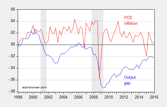
Figure 1: Output gap (blue) and q/q annualized PCE inflation (red), both calculated in log terms. NBER defined recession dates shaded gray. Source: BEA, CBO (January 2016), NBER, and author’s calculations.
Second, the interest sensitive components of aggregate demand — nonresidential investment and net exports — are exerting drag on growth, in accounting terms.
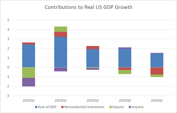
Figure 2: Contributions to real US GDP growth in percentage points, q/q SAAR, from nonresidential investment (red), exports (green), imports (purple), and rest of GDP (blue). Source: BEA, and author’s calculations.
While one might argue that investment is down because of the collapse in investment associated with the energy sector noted by Jim, what’s true is nonresidential investment excluding mining and well drilling is also down.
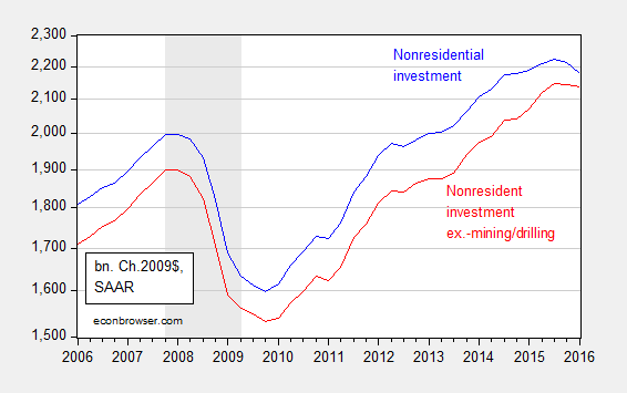
Figure 3: Nonresidential fixed investment (blue), and ex.-investment in structures, mining exploration, well shafts, and drilling (red), in billions of Ch.2009$, SAAR. NBER defined recession dates shaded gray. Log scale. Source: BEA and author’s calculations.
Third, net exports are likely to continue to stagnate, given the appreciation of the dollar that has already occurred.
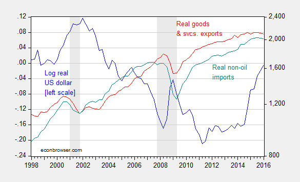
Figure 3: Log real value of the US dollar (against a broad basket) (blue, left scale), and exports of goods and services (red, right log scale), and imports of non-oil goods (teal, right log scale), both in billions of Ch.2009$, SAAR. NBER defined recession dates shaded gray. Source: Federal Reserve Board, BEA, and NBER.
Note that while US exports could decline because of either the surging dollar or the slowing world economy, the decline in US imports is striking. A stronger dollar (driven by interest differentials) implies a higher level of imports, so the decrease in imports is suggestive of a slowing US economy. Of course, there are only two months of trade data incorporated into the advance release, so it may be the March data (coming later this week) will erase this decline in imports.
My estimates using an error correction model involving exports, world GDP, and the real dollar and two lags of first differences over the 1973Q1-2016Q1 indicate a short run price elasticity of about 0.10, and a long run of 1.3. (See this post for a description of the methodology.) The half life of a deviation from long run (statistical) equilibrium in the export relation was about 2 years. That means that we have yet to see all of the depressing effects of the dollar appreciation that starts in 2014Q4.
A Fed tightening in June will likely further appreciate the dollar, thereby exacerbating the external drag on the US economy.
Menzie David Chinn's Blog


