
Menzie David Chinn's Blog, page 4
July 13, 2016
Decomposing Changes in Term Spreads around the World
There’s a lot of discussion of the flattening of the yield curve, and what it portends, in the US (see this post, Irwin/NYT). Interestingly, yield curves are flattening around the world, even in some emerging markets.
Figure 1 shows 10 year-3 month term spreads for selected countries.
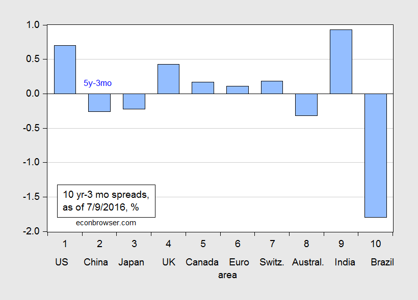
Figure 1: Ten year-three month term spread (blue bars), as of 9 July 2016. Source: Economist, July 9 issue.
In general, these spreads are smaller than they were four months ago. This is shown in Figure 2, which depicts the change in term spreads since 2 March 2016.
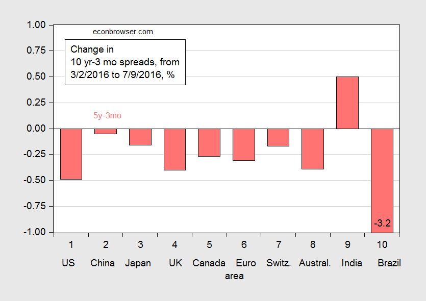
Figure 2: Change in the ten year-three month term spread (blue bars), from 2 March to 9 July 2016. Source: Economist, July 9 issue, and author’s calculations.
Negative values indicate a flattening of the curves. Only India stands out as a country with a steepening yield curve.
One interesting aspect of this flattening is that the change is being driven, in a mechanical sense, by falling long term rates, rather than rising short term rates, as has been true in the past (as noted by Spencer; see this nifty interactive graph for the United States). Figure 3 decomposes the change into that arising from falling ten year yields (green) and from rising three month yields (orange).
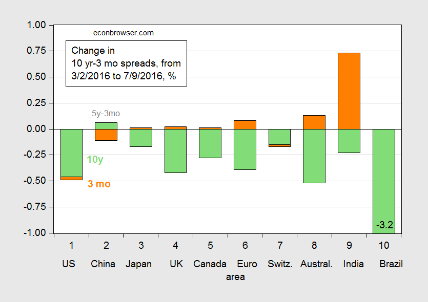
Figure 3: Change in the ten year-three month term spread arising from change in ten year yield (green bars), and from change in three month yield (orange), from 2 March to 9 July 2016. Source: Economist, July 9 issue, and author’s calculations.
The decomposition indicates that — by far — long term yields account the largest portion of the flattening of the curves.
Now, does this matter? If the pure expectations hypothesis of the term structure is an accurate depiction of the world, then maybe not: a declining long term rate is merely representing a decline in future expected short rates, associated with an imminent recession. If, on the other hand, long term government bonds of different maturities are imperfect substitutes, then one has to ask whether there are special aspects of the post-Crisis world that are pulling down long term bond yields. Regulatory requirements, decreased emission of Treasurys, overseas demand, and decreased risk appetite, should all exert a depressing effect on long term bond yields [1] [2].
This is not to say we shouldn’t worry about a yield curve inversion. But thinking about why the yield curve is flattening might lead to a more nuanced view of economic prospects.


July 12, 2016
Guest Contribution: “Importer and Exporter Market Share in Exchange Rate Pass-Through”
Today we are pleased to present a guest contribution written by Michael Devereux at the University of British Columbia and Wei Dong and Ben Tomlin at the Bank of Canada. The views expressed below are those of the authors and do not represent those of the Bank of Canada. This post is based on a revised version of this paper.
The extent to which exchange rates changes affect domestic prices is an empirical question that has been the subject of a large research effort. Since at least the 1980’s, soon after the beginning of the modern period of floating exchange rates, it has been recognized that the “pass-through” of exchange rate changes to imported goods depends on a complicated mix of macro and micro factors. Almost all the empirical studies estimate coefficients of exchange rate pass-through less than unity, but different models offer a wide variety of explanations for limited pass-through. At the macro level, the degree of price stickiness, the stance of monetary policy, and the choice of invoicing currency have important implication for exchange rate pass-through. However, pass-through will also depend on microeconomic factors associated with price and markup determination and the degree of competition in traded goods industries.
While the literature has made major contributions to the understanding of how price adjustment depends on the behavior of exporting firms, one aspect that has received much less attention is the other side of the trading relationship, the role of importing firms. This perspective has become more important, however, since it has increasingly been acknowledged that a large fraction of international trade is “granular”, in the sense that the role of individual firms as buyers and sellers may be critical for the way in which prices and quantities are determined.
Using a unique micro data set that allows us to identify transactions and characteristics of all importers and exporters into Canada over a six year period, we investigate the structural determinants of exchange rate pass-through at a highly disaggregated level. In particular, we focus on the importance of the market share of firms on both sides of the market, the exporting and importing firms. Our results support a U-shaped relationship between exporter market share and exchange rate pass-through at a highly disaggregated level. Both small and very large exporting firms, relative to the market, tend to have higher pass-through than firms with intermediate market shares.
Our novel new finding is that the size of importing firms also plays a key role in exchange rate pass-through. Exchange rate pass-through is negatively related to the market share of importing firms (Figure 1). Given the opportunity to invest (at a cost) in more flexible technologies, high-productivity importers will have a higher elasticity of demand. The result is that exchange rate pass-through is lower for sales to importers with a higher market share. The higher the elasticity of demand of the importer, the more an exporter’s market share will vary if it allows price to respond to exchange rate shocks. Therefore, conditional on the market share of the exporter, pass-through will be lower for sales to importers with higher market share. This joint dependence on the market share on both sides of the trade transaction continues to hold when we allow for exchange rate pass-through to depend simultaneously on market share of exporters and importers.
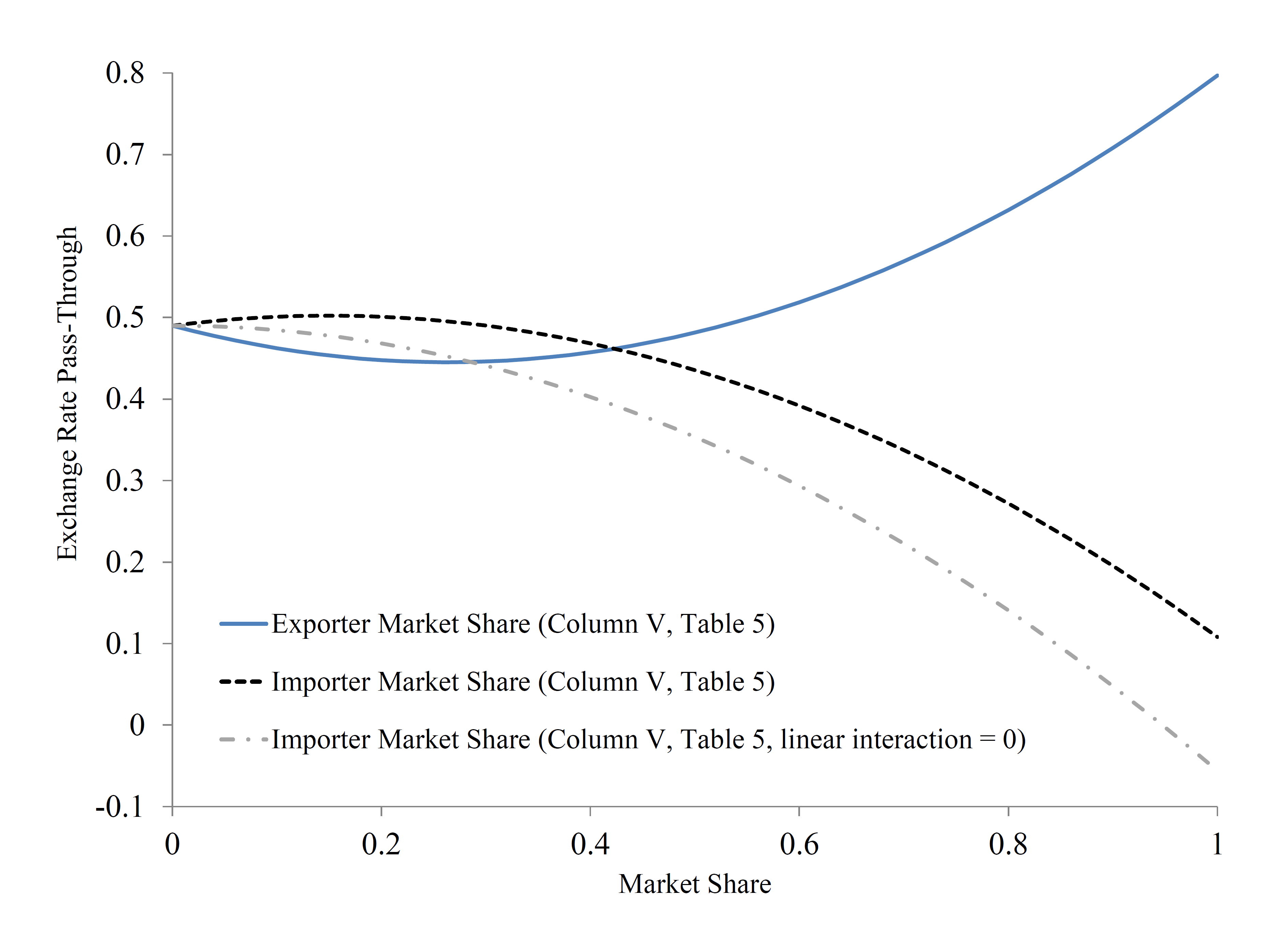
Figure 1: Exchange Rate Pass-Through and Market Share
We further explore the interrelationship between firm size and the currency of invoicing for imported goods. We find that the probability of U.S. dollar invoicing (as opposed to destination-currency invoicing) is related to market share of exporting and importing firms in exactly the same pattern as is our estimate of exchange rate pass-through itself. That is, U.S. dollar invoicing is non-monotonically related to the market share of exporting firms, again in a U-shaped relationship, and negatively related to the market share of importing firms. Thus, we find that the structural determinants of exchange rate pass-through at the micro level are the same as the determinants of currency invoicing; the factors related to exporting or importing firm size that generates low pass-through tend towards domestic currency invoicing of imported goods in the same direction.
This post written by Michael Devereux, Wei Dong and Ben Tomlin.
July 11, 2016
The Seattle Minimum Wage Increase: Disaster or Not?
Dark warnings were voiced in the wake of the passage of the minimum wage ordinance. “Seattle’s Minimum-Wage Hike Is Sure to End in Disaster”. “Seattle sees fallout from $15 minimum wage” In an early — and widely debunked — assessment, Mark J. Perry writes “New evidence suggests that Seattle’s ‘radical experiment’ might be a model for the rest of the nation not to follow”.
I think a good idea to first place into context the “$15 minimum wage”. It’s being phased in over time, and does not apply equally to all firms. Figure 1 depicts the Seattle minimum wage, over a long time span, differentiating the Schedule 1 rate (for firms over 500 employees) from Schedule 2 (less than 500).
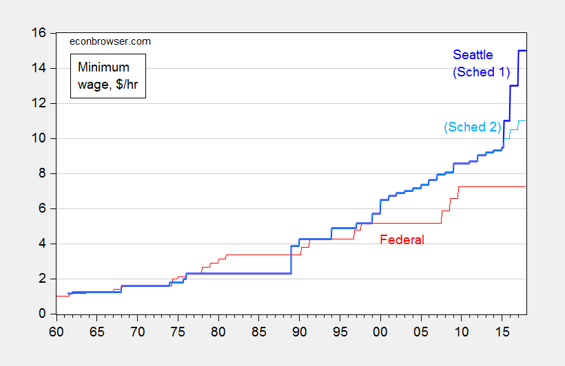
Figure 1: Minimum wage per hour in Seattle (blue), and for Schedule 1 (dark blue) and for Schedule 2 (light blue), and Federal (red). Source: BLS, and City of Seattle.
There does seem to be an alarmingly steep ascent in the minimum wage, particularly when focusing on the rate for large firms. Of course, these are nominal rates. Real rates paint a somewhat different picture.
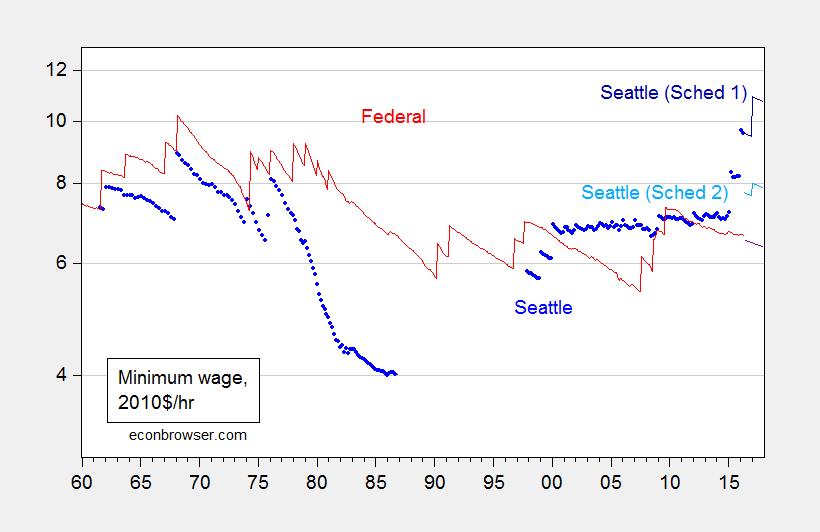
Figure 2: Real minimum wage per hour in Seattle (blue), and for Schedule 1 (dark blue) and for Schedule 2 (light blue), and actual Federal (red), and projected Federal (dark red), on log scale. Deflated using CPI-all for US, and n.s.a. CPI for Seattle; assumes projected inflation trends at the 2009M06-2016M05 rate, and no changes in the Federal minimum wage; assumes price level in Seattle is 21.3% higher than national in 2010. Source: BLS, and City of Seattle, BLS via FRED, City of Seattle, Forbes, and author’s calculations.
Note that once on adjusts for inflation, the Seattle real minimum wage is only slightly higher than that recorded in the late 1960’s. Further, when adjusting — admittedly in a crude fashion — for the higher cost of living in Seattle, the Schedule 2 (small firms, with less than 500 employees) minimum wage is not particularly high, in a national context.
What does the academic work say about the effects of the Seattle minimum wage? One paper by Heather Hill, Jennifer J. Otten, Emma van Inwegen, and Jacob Vigdor, entitled “Early Evidence on the Impact of Seattle’s Minimum Wage Ordinance” is summarized:
This paper provides an overview of Seattle’s 2014 ordinance mandating a gradual increase to a $15 minimum wage. It then outlines a research agenda for a comprehensive evaluation of the effects of this ordinance, to be executed concurrently with the phase-in period. The evaluation is using original data on area prices, and on employer and worker perspectives, as well as secondary survey and state administrative data. This paper presents results from a series of investigations of consumer prices, including intensive field collection from grocery stores and small businesses. Most investigations use difference-in-difference methodology comparing trends in Seattle to those in nearby jurisdictions. Results show no statistically significant impact of Seattle’s initial increase to an $11 minimum wage on consumer prices, though estimates are imprecise enough to be consistent with the small positive effects observed in other studies and suggestive of a more concentrated impact in the restaurant industry.
So, no Armageddon yet.
July 7, 2016
The Real Term Spread and Recessions
There’s an argument being made that because of the zero lower bound, the standard nominal term spread is unlikely to be as accurate a predictor of recessions as it has in the past. A prominent example of this view circulating now is that forwarded by Deutsche Bank’s Dominic Konstam; his analysis indicates a 60% likelihood of recession (WSJ RTE), in contrast to the estimates obtained from the standard model, ranging in the low teens (see for example this post).
Konstam adjusts the term spread by using the residual of the 10 year-3 month spread on the 3 month spread as a predictor of recessions. This, it’s asserted, removes the bias that comes about from the fact that the short rate has been bound in recent years.
What is true is that the real interest rate, both at short and long horizons, is not bound, so in principle one could examine how the real spread covaries with recessions. Two problems arise: (1) the real rate is unobservable, and (2) for observable proxies for the real rates, the time span is short relative to the number of observed recessions. Consequently, formal analysis is not possible (or, more accurately, not advisable). Still, I think it is of interest to see whether the real spread predates recessions. This is shown in Figure 1.
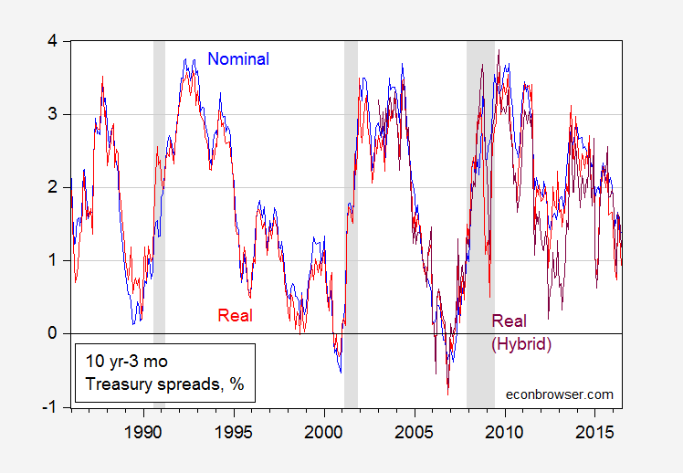
Figure 1: Nominal ten year (constant maturity) yield minus three month bond yield (secondary market) (blue), nominal ten year minus ten year expected CPI inflation minus three month yield adjusted by one year expected inflation (red), and TIPS ten year minus three month yield adjusted by one year expected inflation (purple). NBER defined recession dates. Source: Treasury yields from FRED, expected inflation from Cleveland Fed, NBER, and author’s calculations.
I’ve plotted the series for the period of the “Great Moderation”; it’s not possible to go much earlier, as the expected inflation series only goes back to 1982.
Observations:
A yield curve inversion need not precede a recession — in the 1990-91 recession both curves nearly invert, but do not.
The nominal and real curves have covaried substantially over the entire sample, with some divergence in 2012-13.
All measures of the 10 year-3 month term spread remain positive.
It would be inadvisable to take too much from these correlations. However, it would seem that an unconstrained measure of the slope of the yield curve is not too different from the constrained version, at the moment (or — more accurately — as of June 2016).
July 5, 2016
Assessing Industrial Policy in Wisconsin
The Wisconsin Budget Policy concludes “Costly Tax Credit has Done Little to Boost [manufacturing] Employment”.
From the study:
The Manufacturing and Agriculture Credit, which lawmakers passed in 2011, nearly wipes out income taxes for manufacturers and agricultural producers — at a very steep price.
…
Tax filers with incomes of $1 million and higher, who made up just 0.2% of filers, receive an estimated 78% of the 2016 tax cut that is distributed through the individual income tax.
Not only does the tax credit benefit primarily high income individuals, it has been pretty ineffective at boosting employment. The Wisconsin Budget Project does essentially a diffs-in-diffs test.
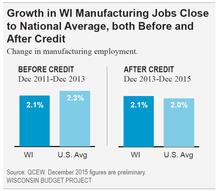
Source: Tamarine Cornelius, “The Big Giveaway Costly Tax Credit has Done Little to Boost Employment,” Wisconsin Budget Project, June 28, 2016. Note: Uses QCEW data through December 2015.
In other words, despite the generous terms of the tax credit, Wisconsin employment does not seem to have exhibited any different behavior from the national counterpart. (A similar conclusion holds for manufacturing vs. nonmanufacturing.)
A time series approach can yield additional insights. I check whether the relationship between national and Wisconsin manufacturing employment from 1990M04-2013M12 predicts well the 2014-16 evolution of manufacturing employment, using an error correction model.
(1) Δn_mfgWIt = –0.001 – 0.013n_mfgWIt-1 + 0.009 yUSt-1 + 0.759Δn_mfgUSt + 0.250Δn_mfgUSt-1 -0.015 Δn_mfgWIt-1 + 0.083 Δn_mfgWIt-2 + ut
Adj-R2 = 0.66, SER = 0.0026, N =285, DW = 2.03, Breusch-Godfrey Serial Correlation LM Test = 1.26 [p-value = 0.28]. Bold face denotes statistical significance at 10% msl, using HAC robust standard errors. n_mfg denotes log manufacturing employment.
The model fits the data fairly well, and implies a long run elasticity of Wisconsin manufacturing employment to national of about 0.67.
Using this model, I dynamically simulate out-of-sample using actually realized values of national manufacturing employment (i.e., I conduct an ex post simulation). The results are illustrated in Figure 1.
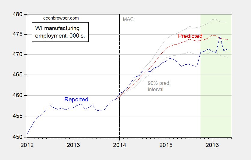
Figure 1: Reported manufacturing employment in Wisconsin (blue), predicted from model (1) (red), and 90% prediction interval (gray lines). Dashed line at implementation of the Manufacturing and Agriculture Credit (MAC); Light green shading indicates CES employment data that has not yet been benchmarked. Source: BLS and author’s calculations.
For a large portion of the time when the tax credit is increasingly in effect (it was phased in gradually), Wisconsin manufacturing employment was below what is predicted (and statistically significantly so). It’s of interest to note that when Wisconsin employment rises to within the 90% prediction interval, it is data that has not been benchmarked to incorporated the most recent Quarterly Census of Employment and Wages (QCEW) data. These data are likely to be measurably revised at the next benchmark date.
Regardless, employment in Wisconsin does not seem to have responded in the manner predicted by the proponents of the tax credit.
July 3, 2016
Markets post-Brexit
U.S. stock prices fell more than 5% in the two-day aftermath of the British vote to leave the European Union. But equities have since regained those losses and are back near all-time highs.

S&P 500 stock price index, Jan 4 to July 1. Source: FRED.
By contrast, the yield on 10-year U.S. Treasury bonds fell about 25 basis points post Brexit and stayed there. That puts long-term interest rates down about 75 basis points for the year and near their all-time low.
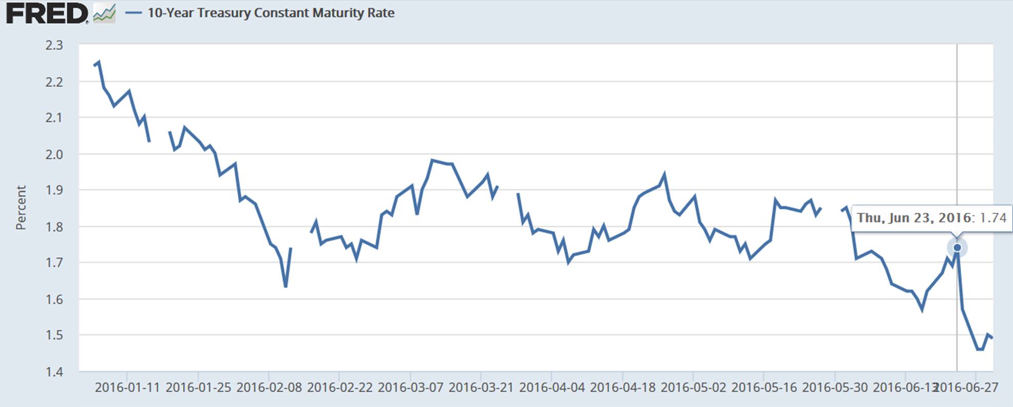
Yield on 10-year U.S. Treasury bond, Jan 4 to June 30. Source: FRED.
The inflation-compensated 10-year yield fell about 15 basis points post Brexit and 60 bp for the year. That leaves the other 10-bp decline in nominals post Brexit to be accounted for by lower expectations of inflation.
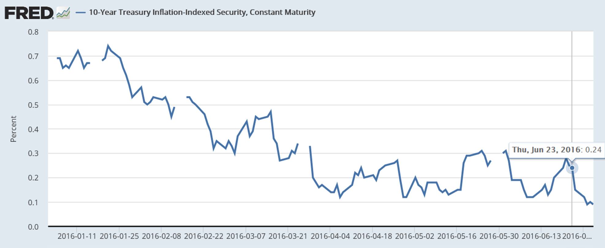
Yield on 10-year Treasury Inflation Protected securities, Jan 4 to June 30. Source: FRED.
All this is consistent with the view that Brexit initially sparked fears of substantial effects on economic growth. These fears may have since subsided. But the expectation remains that central banks around the world will be keeping real rates low for an even longer period than anticipated prior to the British vote.
Here’s a plot of the 10-year expected inflation rate that is implied by the difference between the previous two graphs. Currently it’s down to 1.4%. If you described this series as “well-anchored,” what you might mean is that it’s anchored well below the Fed’s long-run 2% target. And it seems to have drifted even lower as a result of events in Britain last week.
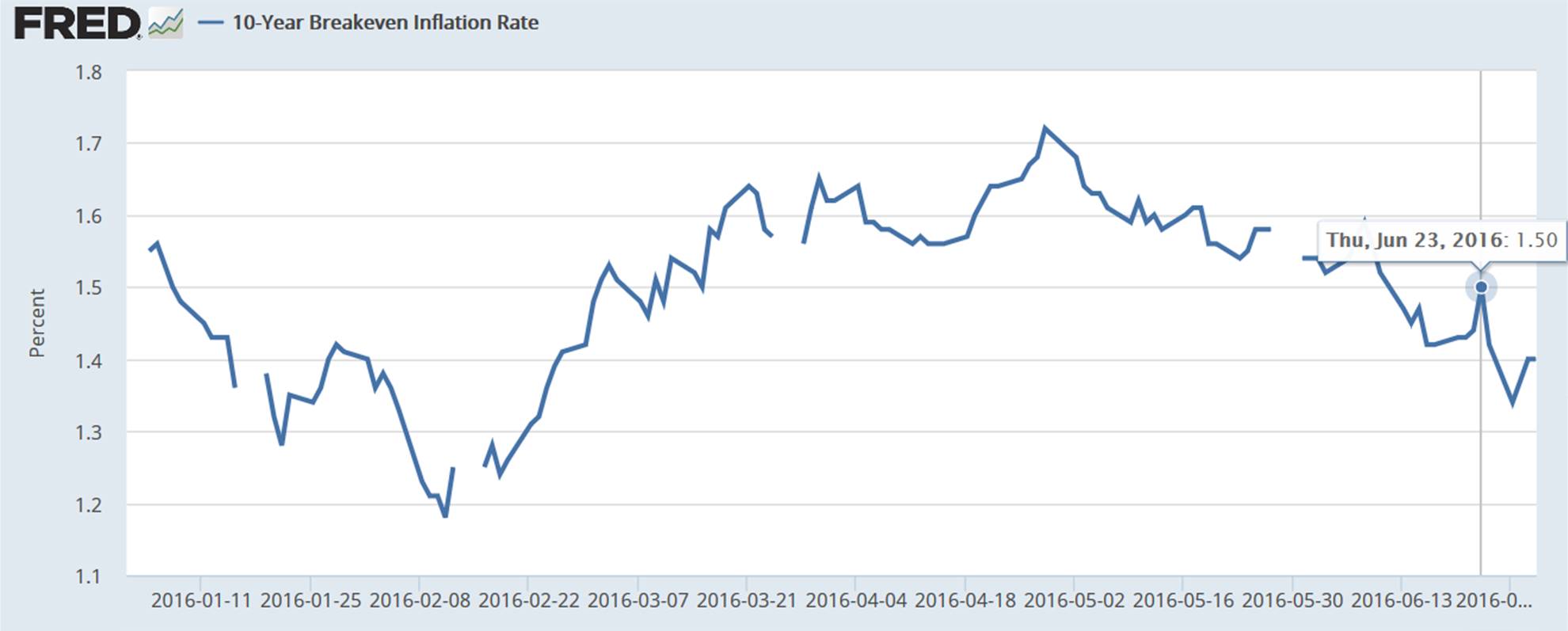
Breakeven inflation rate on 10-year Treasuries, Jan 4 to June 30. Source: FRED.
In other words, markets think the Fed will try a little harder, but be a little less successful, to achieve its long-run objectives.
July 1, 2016
US Policy Uncertainty post-Brexit Revised Down
But still looks darned high. Wonder what it is in the UK…
As reader Neil points out, the big spike in policy uncertainty was revised down. But still, uncertainty on 6/25 was still remarkably high, at 564.
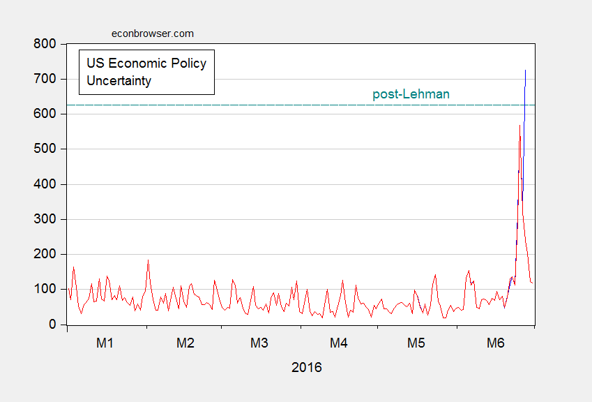
Figure 1: Daily economic policy uncertainty index, accessed 6/27 (blue), accessed 7/1 (red). Horizontal teal dashed line denotes maximum value post-Lehman. Source: Baker, Bloom and Davis, via Economic Policy Uncertainty accessed 6/27 and 7/1.
As Nick Bloom notes in a comment on the previous post on policy uncertainty post-Brexit:
It is also hard to compare Lehmans to Brexit and say which is worse – Lehmans was truly terrible as a financial shock but potentially narrower in scope, while Brexit is less damaging on impact but may be worse long-run if global trade and pro-growth centrist policies in Europe unravel. Ever since WWII these policies have helped promote European growth, and in a post-EU world Southern Europe could swing wildly to the left and Northern Europe become more insular.
Chinn-Ito Financial Openness Index Updated to 2014
The Chinn-Ito index revised and updated to 2014 is now available here.
Figure 1 depicts the evolution of this measure of financial openness for three groups of countries:
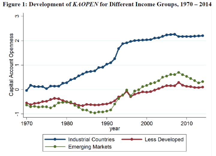
Figure 1: Evolution of KAOPEN for Different Income Groups. Higher values indicate greater financial openness.
To recap:
The Chinn-Ito index (KAOPEN) is an index measuring a country’s degree of capital account openness. The index was initially introduced in Chinn and Ito (Journal of Development Economics, 2006). KAOPEN is based on the binary dummy variables that codify the tabulation of restrictions on cross-border financial transactions reported in the IMF’s Annual Report on Exchange Arrangements and Exchange Restrictions (AREAER). This update is based on AREAER 2015, which contains the information on regulatory restrictions on cross-border financial transactions as of the end of 2014.
The CI index is a de jure measure, based on written (and self-reported) information (a characteristic it shares with most extant indicators). Moreover, it does not contain as much detailed information regarding the types of restrictions, nor does it differentiate between restrictions on inflows and outflows. On the other hand, it does cover a wider range of countries over a longer span than all others. (See Quinn, Schindler, and Toyoda (2011) for a discussion of the various measures.)
Capital openness measures are useful for assessing the international trilemma — the proposition that one cannot simultaneously pursue full financial openness, exchange rate stability, and monetary autonomy — as discussed here.
It’s of interest that financial openness has declined for emerging market economies (on the whole — this is a simple average); this result is not inconsistent with the increasing use of capital controls to stem capital inflows.[1]
The data files (in Stata, Excel), along with documentation, are available here. Previous posts on the Chinn-Ito index here and here.
June 29, 2016
Guest Contribution: “How to Save the UK (Inside the EU)”
Today, we are pleased to present a guest column written by Jeffrey Frankel, Harpel Professor at Harvard’s Kennedy School of Government, and formerly a member of the White House Council of Economic Advisers.
I see a possible way out for the trap that Brits now find themselves in, a way to keep Great Britain great.
The Scots, under Nicola Sturgeon (First Minister of Scotland), would decide immediately that they will hold a new referendum. This referendum would state explicitly that if the United Kingdom decides to stay in the EU then Scotland will stay in the UK, but if Britain leaves the EU then Scotland will leave the UK. The decision to hold a referendum on Scottish independence would be approved by the Westminster parliament.
That referendum would create a constitutional crisis in Great Britain. This constitutional crisis would genuinely justify a second UK referendum on whether to leave the EU (Brexit), in a way that mere second thoughts after the June 23 outcome do not otherwise justify. Historically, the “Great” was added when Scotland joined the union. It became the “United Kingdom” when Ireland joined. Symbolically: those patriotic Englishmen who campaigned on the Leave side were (mostly) waving the Union Jack. If Scotland were to leave, it would be the end of the Union Jack — where the cross of St. Andrew stands for Scotland, the cross of St. Patrick stands for Northern Ireland, and only the cross of St. George stands for England.
In this second Brexit referendum, the Remain campaign will pick up votes of those committed to preserving the UK intact — in addition to any who have now learned that the leaders of the Leave campaign cannot fulfill promises made regarding immigration, trade, and budget savings. Perhaps the outcome will come out pro-EU this time, which is what happened in the past when other European countries reversed initial anti-integration referenda, in both Ireland and Denmark. (If the EU were willing to make further concessions to the UK that would also help, of course; but it cannot be expected to do so.)
This plan would be pursued by a coalition of four: Sturgeon, some new anti-Brexit Tory leader, some new anti-Brexit Labor politician, and Tim Farron (of the Liberal Democrats). During the period of uncertainty over Scotland, the prime-ministership, the leadership of these three British parties and indeed the very existence of the parties would remain also uncertain. This political crisis further justifies the fundamental rethink. At some point there would be a new general election, fought along Remain/Leave lines. As part of the Remain campaign, its leaders should spell out policies to improve living standards for those who feel they have lost out to globalization and European integration.
Meanwhile, many continental EU leaders will demand that the UK invoke article 50, to start the process of actually leaving. But the UK parliament would nevertheless refrain from doing it, until the referendum process has played itself out.
This post is written by Jeffrey Frankel.
June 28, 2016
Policy Uncertainty (in America) in the Wake of Brexit
I find it remarkable that, going by the numbers, economic policy uncertainty is now higher than after the bankruptcy of Lehman — and even higher than in the days after 9/11.
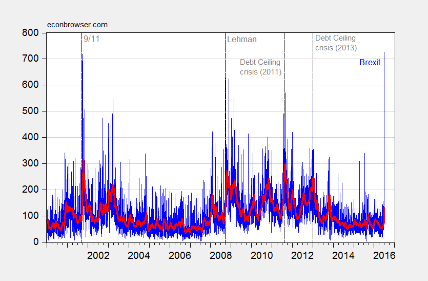
Figure 1: Daily economic policy uncertainty index (blue), and 30 day moving average (bold red). Source: Baker, Bloom and Davis, via Economic Policy Uncertainty accessed 6/27, and author’s calculations.
It would be interesting to know what economic policy uncertainty is in the UK as of today, but only a monthly index is available. Even so, the May index was at 417.13, exceeded only by the previous two months (March was 479.33, a record).
Menzie David Chinn's Blog


