
Menzie David Chinn's Blog, page 2
August 16, 2016
“Balance Sheet Effects on Monetary and Financial Spillovers: The East Asian Crisis Plus 20”
That’s the title of a new paper written by me, Joshua Aizenman and Hiro Ito:
…Extending our previous work (Aizenman et al. (2015)), we devote special attention to the impact of currency weights in the implicit currency basket, balance sheet exposure, and currency composition of external debt. Our results support the view that there is no way for countries to fully insulate themselves from shocks originating from the CEs. We find that for both policy interest rates and the real exchange rate (REER), the link with the CEs has been pervasive for developing and emerging market economies in the last two decades, although the movements of policy interest rates are found to be more sensitive to global financial shocks around the time of the emerging markets’ crises in the late 1990s and early 2000s, and since 2008. When we estimate the determinants of the extent of connectivity, we find evidence that the weights of major currencies, external debt, and currency compositions of debt are significant factors. More specifically, having a higher weight on the dollar (or the euro) makes the response of a financial variable such as the REER and exchange market pressure in the PHs more sensitive to a change in key variables in the U.S. (or the euro area) such as policy interest rates and the REER. While having more exposure to external debt would have similar impacts on the financial linkages between the CEs and the PHs, the currency composition of international debt securities matter. Economies more reliant on dollar-denominated debt issuance tend to be more vulnerable to shocks emanating from the U.S.
In other words, in contrast to the simplest — one might say simplistic — version of the trilemma thesis, floating exchange rates cannot completely insulate an economy. (In practical discussions, pure insulation is seldom posited.) Nonetheless, the nature of the exchange rate regime does have a measurable impact on the sensitivity of non-core financial variables to core-country financial variables. And that impact interacts with balance sheet variables.
The paper is here; Professor Ito’s presentation slides are here.


August 13, 2016
Why you should never use the Hodrick-Prescott filter
A common problem in economics is that most of the variables we study have trends. Even the simplest statistics like the mean and variance aren’t meaningful descriptions of such variables. One popular approach is to remove the trend using the Hodrick-Prescott filter. I’ve just finished a new research paper highlighting the problems with this approach and suggesting what I believe is a better alternative.
The Hodrick-Prescott filter can be motivated as choosing a trend that is as close as possible to the observed series with a strong penalty for changing the trend too quickly. The typical value for the penalty parameter used for analyzing quarterly data is 1600. I show in my paper that for an observation at some date t near the middle of a large sample, the deviation from trend (denoted ct) that emerges from this procedure can be characterized as![c_{t}=89.7206\times \{-\Delta ^{4}y_{t+2}+\sum\nolimits_{j=0}^{\infty}(0.894116)^{j}[\cos (0.111687j)+8.9164\sin (0.111687j)]q_{t}^{(j)}\}](https://i.gr-assets.com/images/S/compressed.photo.goodreads.com/hostedimages/1471187587i/20010150._SX540_.png)

Here  denotes the fourth difference– the change in the change in the change in the change. Maybe the growth rate (the first difference) has some trend, and maybe even the change in the growth rate (the second difference) has a trend too, but by the time we get to a fourth difference we’ve presumably taken all the trends out. All the other terms in the above expression put a lot of smoothness back in, but without any trends.
Is this a sensible procedure to apply to economic time series? The leading case we should consider is a random walk, which is a series for which the first difference (the change in the variable) is completely unpredictable. As I note in the paper [slightly rephrased]:
Simple economic theory suggests that variables such as stock prices (Fama, 1965), futures prices (Samuelson, 1965), long-term interest rates (Sargent, 1976; Pesando, 1979), oil prices (Hamilton, 2009), consumption spending (Hall, 1978), inflation, tax rates, and money supply growth rates (Mankiw, 1987) should all behave like random walks. To be sure, hundreds of studies have claimed to be able to predict the changes in these variables. Even so, a random walk is often extremely hard to beat in out-of-sample forecasting comparisons, as has been found for example by Meese and Rogoff (1983) and Cheung, Chinn, and Pascual (2005) for exchange rates, Flood and Rose (2010) for stock prices, Atkeson and Ohanian (2001) for inflation, or Balcilar, et al. (2015) for GDP, among many others. Certainly if we are not comfortable with the consequences of applying the Hodrick-Prescott filter to a random walk, then we should not be using it as an all-purpose approach to economic time series.
It’s easy to see what happens when you apply the filter to a random walk. As noted by Cogley and Nason (1995), if we only need one difference to produce something completely unpredictable ( ), then the other three differences plus all the other terms are simply adding all kinds of dynamics that have nothing to do with how the data really behave:
![c_{t}=89.7206\times \{-\Delta ^{3}e_{t+2}+\sum\nolimits_{j=0}^{\infty}(0.894116)^{j}[\cos (0.111687j)+8.9164\sin (0.111687j)]q_{t}^{(j)}\}](https://i.gr-assets.com/images/S/compressed.photo.goodreads.com/hostedimages/1471187587i/20010154._SX540_.png)

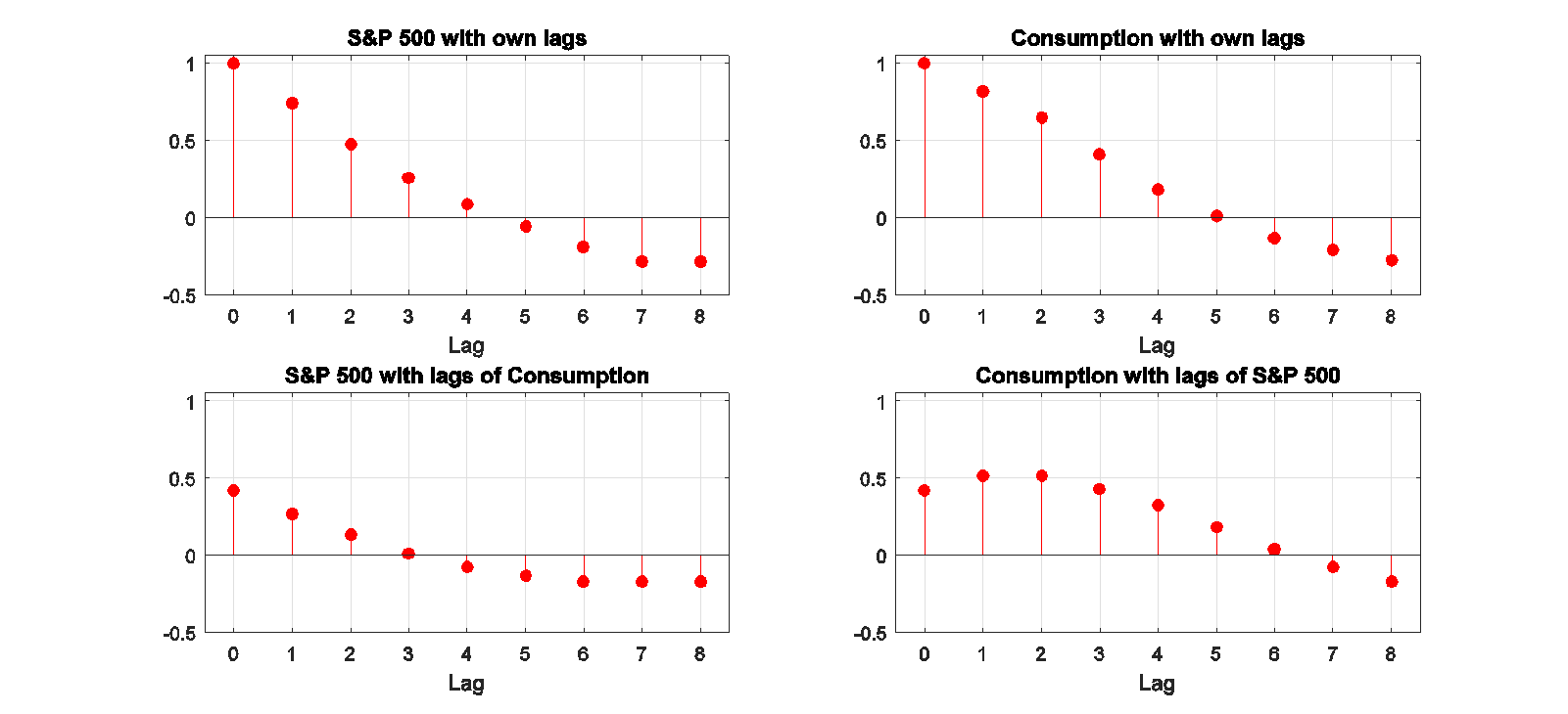
For example, the top left panel in the figure below shows the correlation between the change in the log of stock prices in quarter t and the change j quarters earlier. The top right panel does the same for changes in the log of consumption. As expected from the studies mentioned above, there is little evidence that you can predict changes in either of these variables from its own lagged values, or from lagged changes in the other variable (bottom panels), consistent with a random walk.

Autocorrelations and cross-correlations for first-difference of stock prices and real consumption spending. Source: Hamilton (2016).
By contrast, here’s what the correlations look like for HP-detrended stock prices and consumption. As I note in the paper:
The rich dynamics in these series are purely an artifact of the filter itself and tell us nothing about the underlying data-generating process. Filtering takes us from the very clean understanding of the true properties of these series that we can easily see in the first figure to the artificial set of relations that appear in the second. The values plotted in the second figure summarize the filter, not the data.
Autocorrelations and cross-correlations for HP-detrended stock prices and real consumption spending Source: Hamilton (2016).
There is one rather special case for which the HP filter is known to be optimal, which is if the second difference of the trend and the difference between the observed variable and its trend are both impossible to forecast. However, I show in my paper that if you took that specification seriously, you could estimate from the data the value for the smoothing parameter that would be consistent with the observed data. I found that when I did this for a dozen common economic variables, the implied value for the smoothing parameter is around one, which is three orders of magnitude smaller than the value of 1600 that everyone uses.
But the real contribution of my paper is to suggest that there’s a better way to do all this. I propose that we should define the trend as the component that we could predict two years in advance, and the cyclical component as the error associated with that two-year-ahead forecast. But don’t you need to know the nature of the trend in order to form this forecast? The surprising answer is no, you don’t.
The basic insight is that if  is stationary for some value of d, then you can write the value of the variable at date t + h as a linear function of the d most recent values of y as of date t plus something that is stationary. If you do a simple regression of yt+h on a constant on the d most recent values of y as of date t, the regression will end up estimating that linear function. The reason is that for those coefficients the residuals are stationary, while for any other coefficients the residuals would be nonstationary. Choosing coefficients to minimize the sum of squared residuals (which is what regression does) will try to find the coefficients that take out the trend, whatever it might be.
But what if we don’t know the true value of d? That’s again no problem. If we regress yt+h on a constant and the p most recent values of y as of date t for any p > d, , then d of the estimated coefficients will be used to uncover the trend and the other coefficients will help with forecasting the stationary component. If we use p = 4, we have the same flexibility of the HP filter (it can remove the trend even if we need 4 differences to do so), but without all the problems.
In the case of a random walk, we know analytically what this calculation would be. If the change is unpredictable, then the error you make predicting the variable h quarters ahead is just the sum of the changes over those h quarters. The easy way to calculate that sum is to just take the difference between yt+h and yt.
The figure below illustrates how this works for nonfarm payroll employment. The raw data are plotted in the top panel, and the cyclical or detrended component is in the bottom panel. I calculated the latter using both the residuals from a regression of yt+8 on a constant and yt, yt-1, yt-2, yt-3 (shown in black) and using just the sum of the changes between date t and t+8 (in red). The latter two series behave very similarly, as I have found to be the case for most of the economic variables I have looked at.
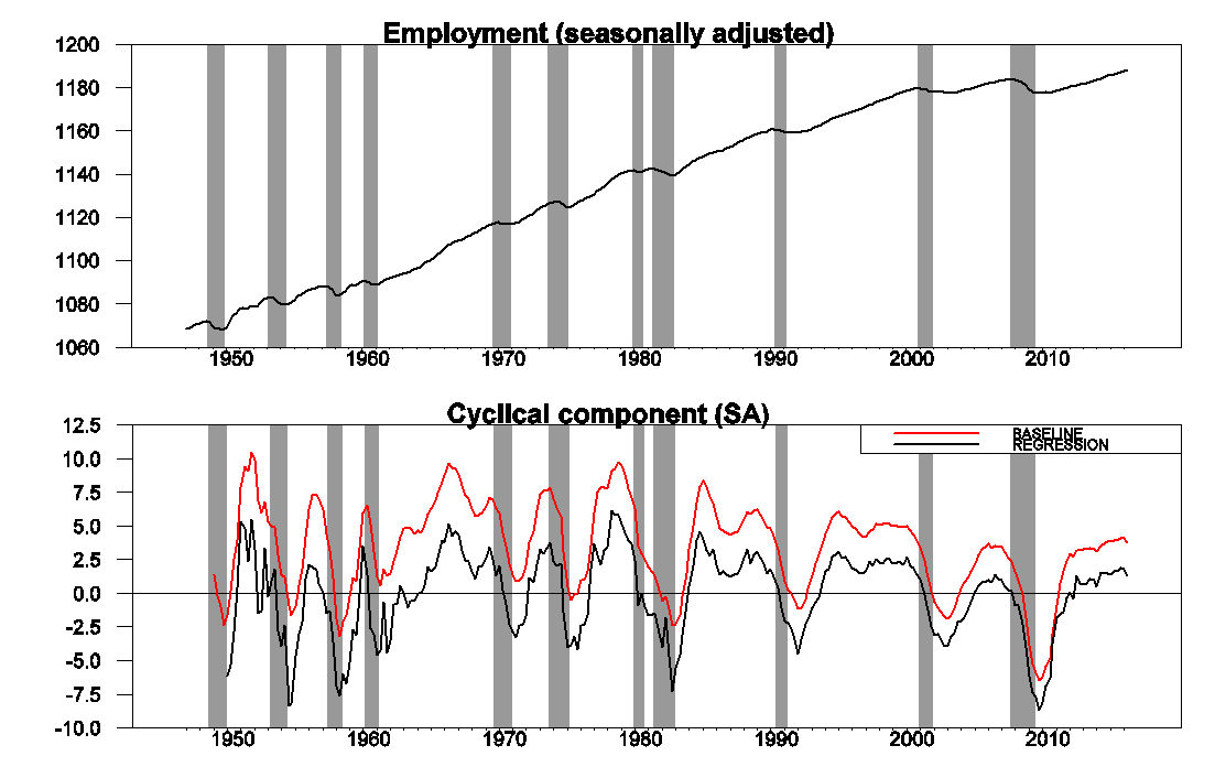
Upper panel: 100 times the log of end-of-quarter values for seasonally adjusted nonfarm payrolls. Bottom panel: residuals from a regression of yt+8 on a constant and yt, yt-1, yt-2, yt-3 (in black) and value of yt+8 – yt (in red). Shaded regions represent NBER recession dates. Source: Hamilton (2016).
One interesting observation is that the cyclical component of employment starts to decline significantly before the NBER business cycle peak for essentially every recession. Note that, unlike patterns one might see in HP-filtered data, this is summarizing a true feature of the data and is not an artifact of any forward-looking aspect of the filter.
Another benefit of this approach is that it will take out the seasonal component along with the trend. For example, the next figure shows the effects of applying the identical procedure to seasonally unadjusted employment data. The raw data (top panel) have a very striking seasonal component, whereas the estimated cyclical component (bottom panel) is practically identical to that derived from seasonally unadjusted data.

Source: Hamilton (2016).
The following graphs show the detrended behavior of the main components of U.S. real GDP. As I note in the paper,
Investment spending is more cyclically volatile than GDP, while consumption spending is less so. Imports fall significantly during recessions, reflecting lower spending by U.S. residents on imported goods, and exports substantially less so, reflecting the fact that international downturns are often decoupled from those in the U.S. Detrended government spending is dominated by war-related expenditures– the Korean War in the early 1950s, the Vietnam War in the 1970s, and the Reagan military build-up in the 1980s.
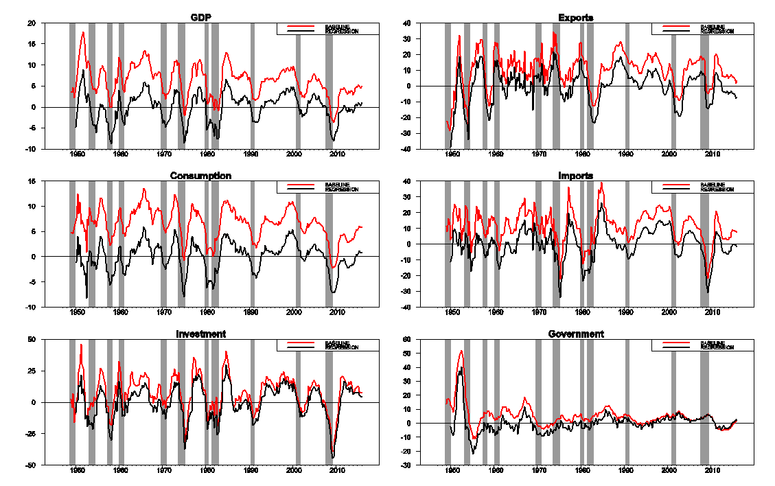
Source: Hamilton (2016).
Here’s a slight rephrasing of the paper’s conclusion:
The HP filter will extract a stationary component from a series whose fourth difference is stationary, but at a great cost. It introduces spurious dynamic relations that are purely an artifact of the filter and have no basis in the true data-generating process, and there exists no plausible data-generating process for which common popular practice would provide an optimal decomposition into trend and cycle. There is an alternative approach that can also isolate a stationary component from any series whose fourth difference is stationary but that preserves the underlying dynamic relations and consistently estimates well defined population characteristics for a broad class of possible data-generating processes.
August 12, 2016
Does the Aerospace Decline Explain the Kansas Collapse?
Ironman at Political Calculations thinks so. Unfortunately, in his calculation of Kansas GDP excluding agriculture and manufacturing, he made an error by simply subtracting (chain weighted) real agricultural output and real manufacturing from real GDP (as discussed in the addendum to this post). I’ll re-examine the importance of the shocks to the aerospace industry in Kansas to the slow pace of Kansas growth by looking at contributions to GDP growth, and contributions to employment growth.
Figure 1 depicts a mechanical decomposition of Kansas real GDP growth into agriculture (blue bar), durable manufacturing (red bar), and rest-of-economy (green bar). I focus on durable manufacturing because this encompasses aerospace production the best.
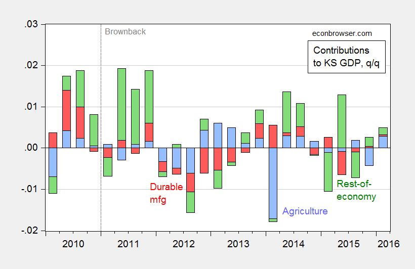
Figure 1: Quarter on quarter (not annualized) contributions of agriculture (blue bar), durable manufacturing (red bar) and rest-of-economy (green bar) to overall Kansas GDP growth, in Ch.2009%. Source: BEA 2016Q1 2nd release, and author’s calculations.
Note that there was substantial drag on growth from the durable manufacturing sector in 2012-13, but that drag has mostly abated; hence we do not have a good explanation for why overall GDP growth has been so slow over the past year.
If we look to employment, one sees a similar pattern, although the drag occurs in 2013-14. By the last quarter of data, aerospace employment (orange bar) is adding to (admittedly lackluster) nonfarm payroll employment growth.
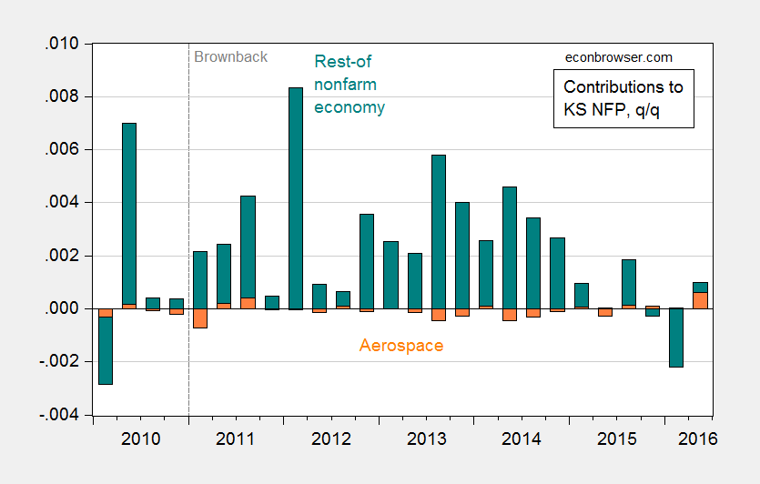
Figure 2: Quarter on quarter (not annualized) contributions of aerospace product and parts manufacturing (orange bar) and rest-of-nonfarm payroll employment (teal bar) to overall Kansas nonfarm payroll employment growth. Source: BLS June 2016 state level employment release, and author’s calculations.
Now, it’s important to recall that each of these graphs depict an accounting exercise. However, even if one thinks about fairly generous multipliers for spending and employment (e.g., 1.7, and 2.9, respectively, from [1]), it’s hard to see how the decline in the Kansas aerospace industry caused the Kansas collapse.
See this post for why drought doesn’t explain the Kansas experience.
Early Macro News and Lessons from the Brexit
What if you promise to withdraw from free trade agreements [1], limit capital mobility [2], and heighten immediately policy uncertainty? What will you get? We have early returns from an unnatural experiment in the UK.
The first bit of news is early estimates of monthly GDP, from the NIESR: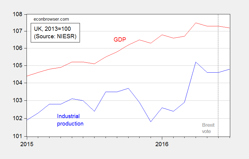
Figure 1: Industrial production (blue), and real GDP (red), both 2013=0. Log scale. Source: NIESR (August 9, 2016).
Our monthly estimates of GDP suggest that output grew by 0.3 per cent in the three months ending in July 2016 after growth of 0.6 per cent in the three months ending in June 2016. The month on month profile suggests output declined in July by 0.2 per cent. This estimate is consistent with our latest quarterly forecast, which forecasts a contraction of 0.2 per cent in the third quarter of this year, as a whole. We estimate that there is an evens
chance of a technical recession between the third quarter of 2016 and the final quarter of 2017.
The press release for the 3 August forecast is here.
Transforming the monthly GDP data into 3 month percent changes yields Figure 2, which is plotted against the Baker, Bloom and Davis policy uncertainty index for the UK.
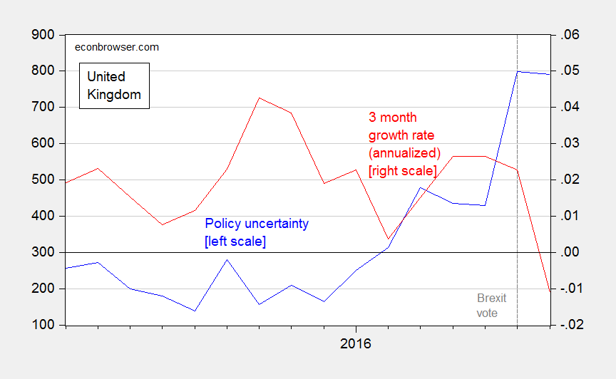
Figure 2: UK policy uncertainty index (blue, left scale), and three month change in real GDP, annualized (red, right scale). Source: NIESR (August 9, 2016), Policyuncertainty.com, accessed 8/12/2016.
In other news, house prices have declined markedly.
These are real side developments that were presaged by the collapse in consumer confidence, the flattening of the yield curve, and the persistent depreciation of the pound. (The latter is “real” in the sense that given price stickiness, the real exchange rate has depreciated, resulting in a terms of trade loss to the UK, as pointed out by Simon Wren-Lewis).
August 10, 2016
Does Drought Explain the Kansas Collapse?
Ironman at Political Calculations asserts it does. Unfortunately, he makes a mistake in calculating Kansas GDP ex.-agriculture by simply subtracting chained agriculture from chained state GDP (discussed in the addendum to this post). Here in Figure 1 is properly calculated GDP ex.-agriculture plotted against a drought index (lower values is a more severe drought).
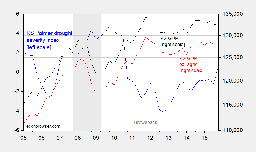
Figure 1: Palmer drought severity index for Kansas (blue, left scale), and Kansas GDP in millions of Ch.2009$, SAAR (black, right log scale), and ex.-agriculture (red, right log scale), calculated using Törnqvist approximation. NBER defined recession dates shaded gray. Source: BEA, NOAA, and author’s calculations.
Note that the slowdown is apparent in GDP excluding agriculture, post-Brownback. Drought is not the explanation. And as shown in this post, a hit to durables from the downturn in aircraft cannot be the answer.
August 9, 2016
Currency Casus Belli?
Is a current undervaluation of the Chinese yuan plausible?
President candidate Donald Trump has argued for the imposition of tariffs on Chinese imports as a proper response to Chinese manipulation of the currency.[0] [1] Figure 1 depicts the nominal USD/CNY exchange rate in the blue line (where down is a depreciation of the Chinese currency).
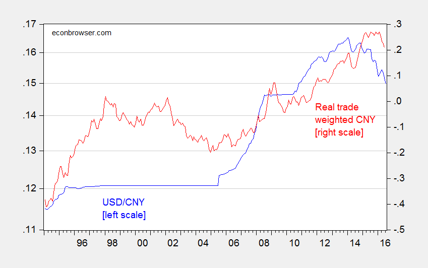
Figure 1: USD/CNY exchange rate (blue, left log scale), and log real trade weighted value of the Chinese yuan (broad basket), 2010=0 (red, right scale). Source: Federal Reserve via FRED, BIS, author’s calculation.
While the CNY has clearly depreciated against the US dollar, roughly 10% in log terms, the nominal bilateral exchange rate is pretty irrelevant in macro terms. The real, and effective, currency value is more important. And here, the depreciation is much less pronounced, roughly 6%.
Now, these are changes relative to some date; what we want to know is where the Chinese exchange rate is relative to where it should be. This is a much more involved question, taken up in many previous posts (see [2] [3] [4]). Rather than reviewing the material on currency misalignment, I’ll focus on the update to my previous work which views misalignment through the lens of the “Penn effect”, the phenomenon that the value of a currency in real terms varies with per capita income.
In a recent paper written by myself, Yin-Wong Cheung and Xin Nong, we find that by 2011, the Chinese currency was roughly at equilibrium. This is shown in Figure 2, which displays a quadratic fit of price level to per capita income (both in PPP terms).
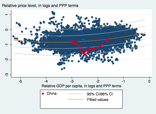
Figure 2: OLS fit of price level on per capita income (red line), 66% and 95% prediction intervals; CNY in solid red circles. Sample is developing countries, using PWT8.1 data. Source: Cheung, Chinn and Nong, “Estimating Currency Misalignment Using the Penn Effect: It’s Not As Simple As It Looks,” mimeo (July 29, 2016).
Even after the recent depreciation, the CNY is still some 20% above where it was in 2011, suggesting that the CNY is not currently undervalued. If significant undervaluation is an important component of one’s definition of currency manipulation, then the case for imposing massive tariffs on the order of 45% is very weak.
August 8, 2016
Recession Watch, August 2016
The implications of the tradables sector, the dollar, and Fed policy.
The employment numbers released on Friday were re-assuring, especially in light of the previous week’s GDP figures. But can we rule out an ongoing or incipient recession?
Figure 1 depicts the series that the NBER Business Cycle Dating Committee (BCDC) has in the past focused on.
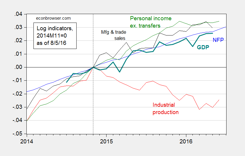
Figure 1: Log nonfarm payroll employment (blue), industrial production (red), personal income excluding transfers, in Ch.2009$ (green), manufacturing and trade sales, in Ch.2009$ (black), and Macroeconomic Advisers monthly GDP series (bold teal), all normalized to 2014M11=0, all as of August 5. Source: BLS (July release), Federal Reserve (June release), Macroeconomic Advisers (July 19), and author’s calculations.
All series have risen, save industrial production, since the IP peak in 2014M11. That decline is fairly marked, a 2.5% decline (in log terms). The initial read on June manufacturing and trade sales was also down.
Now, industrial production is less representative of overall output than it has been in the past. Nonetheless, it’s still a very important component. Value added in mining, utilities and manufacturing accounted for 19.2% of GDP in 1997, and still accounted for 15.4% in 2015. Hence, this drop is worrisome.
Why the decline? While manufacturing has not subtracted from industrial production, it has not added. Figure 2 shows the manufacturing production index (red line). The June 2016 value is the essentially the same as at the prior peak value in November 2014. (Manufacturing accounts for 12.1% of value added.)
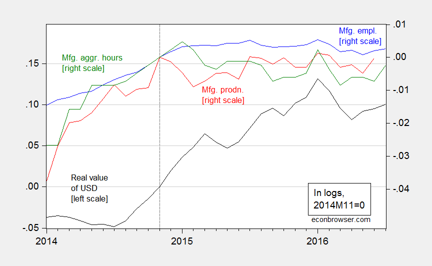
Figure 2: Real value of the US dollar against broad basket (black, left scale), manufacturing production (red, right scale), manufacturing employment (blue, right scale), aggregate hours index for manufacturing production and nonsupervisory workers, all in logs, 2014M11=0. Source: Federal Reserve Board, BLS, and author’s calculations.
The stagnation in employment and aggregate hours can be attributed, at least in part, to the 15% appreciation in the real value of the dollar since 2014M07. While the dollar is down since its recent peak, that decline is only 3%.
This is where Fed policy is of particular relevance. Fed funds futures indicate an 82% likelihood of a 25-50 bps increase by September 21 [CME, accessed 8/8]. (18% is for a 50-75 bps.) To the extent that one of the few things we know moves the dollar is the interest rate (and expectations of future interest rates), further tightening seems ill-advised.
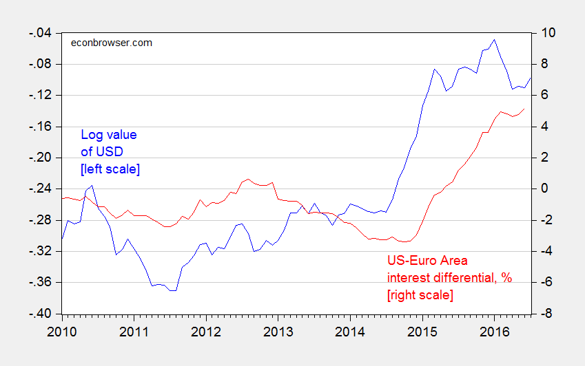
Figure 3: Log nominal value of US dollar (major currencies) (blue, left scale), and US-euro area interest differential, including shadow rates, % (red, right scale). Source: Fed, ECB, Wu-Xia, author’s calculations.
August 2, 2016
Observational Equivalence? Conspiracy Theory Kooks vs. Statistical Incompetence
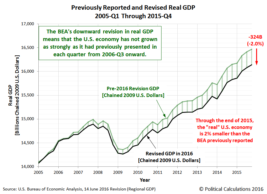
Remember this Political Calculations blogpost asserting that BEA, by virtue of releasing statewide GDP figures, was unwittingly telegraphing a massive downward revision in GDP come the July 29th benchmark revision? That development failed to occur. In fact GDP was on average revised up release [pdf].
First, let’s review the original graph asserting wildly different stories from the state level GDP series and the national.
There were subsequent amendations (e.g., 18 June update to the original post), but the basic story remained unchanged. Instead of the originally estimated 324 billion Ch.2009$ downward revision, a 226 billion was predicted (18 June).
As it turns out, here in Figure 1 is what pre-revision national GDP (green) and summed state level GDP (black) look like, compared to the post-benchmark revised GDP (red).
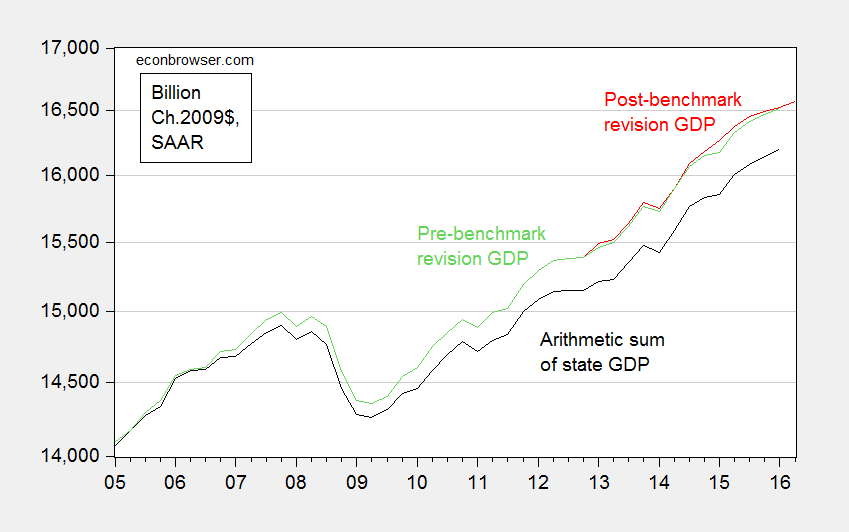
Figure 1: Real GDP pre-benchmark revision (green), post-benchmark revision (red), and arithmetic sum of state level GDP (black), all in Ch.2009$ SAAR. Source: BEA 2016Q1 3rd release, 2016Q2 advance release, BEA state level quarterly GDP, revision of 27 July 2016, and author’s calculations.
As shown, 2015Q4 real GDP was revised upwards, albeit only a small amount — 20.1 billion Ch.2009$ (SAAR) (10.4 billion in 2016Q1). The average revision over the 3 year revision period was 28.7 billion, or 0.2% in log terms.
Why did Political Calculations get it so wrong? Was it just bad luck? The answer is no. And this could’ve been determined the day this prediction was made. And in fact, I pointed out this issue back on June 18; additional reasons for doubt in comments from Ben Arownd.
The key to understanding where Political Calculations went wrong is to look to the nominal GDP figures from the national level and state level sources. Figure 2 depicts the two series.
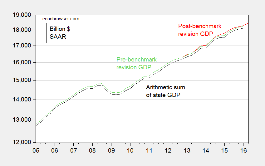
Figure 2: Nominal GDP pre-benchmark revision (green), post-benchmark revision (red), and arithmetic sum of state level GDP (black), all in current dollars SAAR. Source: BEA 2016Q1 3rd release, 2016Q2 advance release, BEA state level quarterly GDP, revision of 27 July 2016, and author’s calculations.
The gap between the two series, which are the nominal analogs to those in Figure 1, is relatively small and only slightly time varying. It would be hard conceive of seeing a big revision in real magnitudes, and a small one in nominal. This suggests PC’s interpretation of the widening gap in Figure 1 was mistaken.
In fact, the widening gap is due to inappropriate treatment of chain-weighted variables. In particular, using the simple arithmetic sum of the chain weighted state level GDP series provided an inaccurate measure of national level chain weighted GDP. It’s only on 27 July, 2 days before the benchmark revision release (29 July) did Political Calculations realize the nature of the error.
Hence, it appeared that the misunderstanding of the characteristics of chain-weighted indices combined with a preternatural disposition toward conspiracy theories led to a wildly off-the-mark prediction.
Let that be the lesson: know your data!
August 1, 2016
Brexit Fallout: Consumer Confidence Collapses
From GkF on Friday:
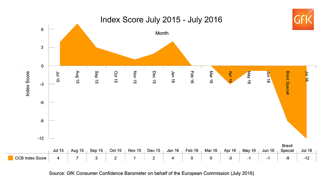
GfK’s long-running monthly Consumer Confidence Index dropped 11 points in July (since the June interviews conducted before the Referendum) from -1 to -12. The survey dates back to 1974 and July sees the sharpest month-by-month drop for more than 26 years (March 1990). This is also a further 3-point drop from the -9 recorded by the Brexit Special in early July. All five measures used to calculate the Index saw decreases this month.
July 29, 2016
Anemic economic growth
The Bureau of Economic Analysis announced today that U.S. real GDP grew at a 1.2% annual rate in the second quarter. Not good news.
The U.S. growth rate has historically averaged over 3%. Many of us have concluded that a long-term growth rate around 2% may be more realistic to expect at this point. But the last three quarters have fallen significantly below even that new lower bar.
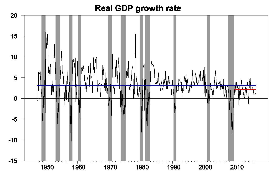
Real GDP growth at an annual rate, 1947:Q2-2016:Q2, with historical average (3.1%) in blue and post-Great-Recession average (2.1%) in red.
I had been among those who attributed the anemic first-quarter numbers in part to seasonal adjustment problems. This argued for some spring-back effect expected for the second quarter, to which reality has now answered with a cold shower. The Federal Reserve Bank of New York nowcast had been anticipating 2.2% growth for Q2. The Atlanta Fed nowcast was 1.8%, and the Wall Street Journal economists’ survey called for 2.6%.
Our Econbrowser Recession Indicator Index is starting to register more concern, with today’s data bringing it up to 22.5%. The index uses today’s release to form a picture of where the economy stood as of the end of 2016:Q1. However, that’s still significantly below the 67% threshold at which our algorithm would declare that the U.S. had entered a new recession.
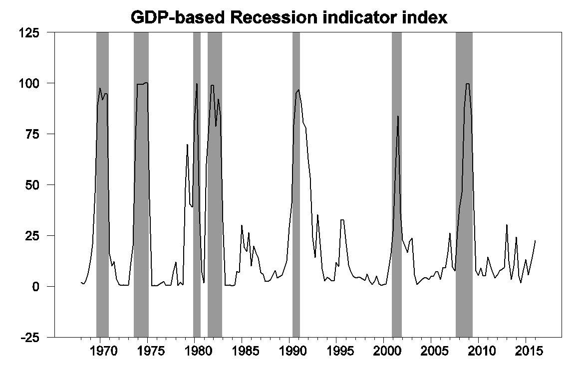
GDP-based recession indicator index. The plotted value for each date is based solely on information as it would have been publicly available and reported as of one quarter after the indicated date, with 2016:Q1 the last date shown on the graph. Shaded regions represent the NBER’s dates for recessions, which dates were not used in any way in constructing the index, and which were sometimes not reported until two years after the date.
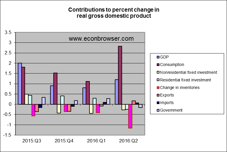
They key factor in today’s weak numbers was a drawdown of inventories. Real final sales grew at a 2.4% annual rate with half that growth being met by selling out of inventory rather than new production. Jason Furman, Chair of the White House Council of Economic Advisers, emphasizes that inventory changes are the most volatile and least persistent component of GDP growth, and sees a steadier and more reassuring picture if you focus just on real final domestic purchases.
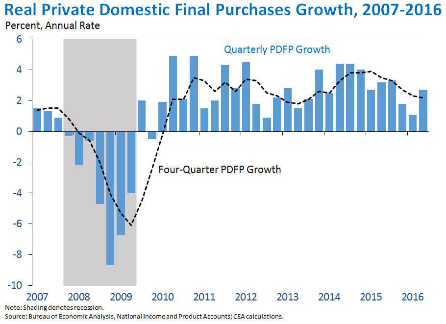
Source: White House Council of Economic Advisers.
Still, nonresidential and residential fixed investment also were both lower than they had been in the first quarter. The latter is where I still think the prospects for a better second half may be found.
But by “better”, I don’t mean 3% growth.
Menzie David Chinn's Blog


