
Menzie David Chinn's Blog, page 5
June 26, 2016
Economic consequences of Brexit
Here are my two pence on some of the consequences of Britain’s vote to leave the European Union.
A key goal of the EU was to allow freer movements of goods, services, and people across countries. The potential economic benefits of such freedom are well known. Access to a broader market means both buyers and sellers can secure better deals than would be available domestically. Relocation of workers to a place where they can be more productive should mean a larger size for the total economic pie.
But that’s very different from saying that everybody’s piece of the pie gets bigger. Some individuals are better off and others are worse off as a result of free trade or migration. For example, employers clearly benefit from hiring cheaper foreign labor, and for the foreign workers it is also a better opportunity than they had before. But this arrangement means a lower wage for the domestic worker who used to have that job. For those Britons who have seen themselves falling farther behind each year, the benefits of staying in the EU may not have seemed all that clear.
Balancing the competing interests of winners and losers is one of the goals of EU regulation. But getting free from the tens of thousands of EU standards, laws, and court decisions became the number one reason voters gave for exit. Some Britons questioned whether free trade should mean being forbidden to buy items such as incandescent light bulbs or powerful vacuum cleaners,
There will surely be some loss to UK GDP as a result of the move. But it is not as if leaving the EU suddenly tosses Britain into a trade war with the rest of the world. The U.S. and Canada have a huge volume of trade with Europe without being part of the EU. Notwithstanding, adjusting will be costly. Here’s Paul Krugman’s take:
Yes, Brexit will make Britain poorer. It’s hard to put a number on the trade effects of leaving the EU, but it will be substantial. True, normal WTO tariffs (the tariffs members of the World Trade Organization, like Britain, the US, and the EU levy on each others’ exports) are low and other traditional restraints on trade relatively mild. But everything we’ve seen in both Europe and North America suggests that the assurance of market access has a big effect in encouraging long-term investments aimed at selling across borders; revoking that assurance will, over time, erode trade even if there isn’t any kind of trade war. And Britain will become less productive as a result.
Where I have bigger concerns is what happens next. Our term “Brexit” for Britain’s exit from the European Union was preceded by discussion of “Grexit”– the possible exit of Greece from the euro. And although Greece’s economy is 1/10 the size of Britain’s, Greece’s exit from the euro would have been a huge, huge deal. Negotiating new trade agreements is one thing; abandoning a currency is altogether different. If Greece were to exit the euro or fail to honor its debts, it would mean big capital losses to banks and lenders. Fears that this might happen drove borrowing rates sky high in 2011-2012 and sent Greece into a depression from which the country has yet to recover. And in the case of Grexit, too, the worry was that not just Greece but a number of other countries might be forced to abandon the euro and default on their debt. Those fears put broader Europe into a second recession in 2011-2012 at the same time that the rest of the world was recovering.
My key concern therefore is whether Britain’s exit from the EU is just the opening volley of something much bigger. Immigration has been a huge strain and politically divisive issue throughout Europe. Which might be the next country where the possibility of opting out will move closer to reality? If that question and the future of the euro itself are actively put on the table, destabilizing financial flows are likely to follow.


June 24, 2016
Guest Contribution: “Does the Economy Really Do Better Under Democratic Presidents?”
Today, we are pleased to present a guest column written by Jeffrey Frankel, Harpel Professor at Harvard’s Kennedy School of Government, and formerly a member of the White House Council of Economic Advisers. This is an extended version of a column appearing at Project Syndicate.
Hillary Clinton has been saying that the US economy does much better when a Democrat is president than when a Republican is. When the press goes to fact-check the claim, they can be forgiven for having a presumption that it can’t be 100 per cent true. After all, if it were completely true, then wouldn’t we all already know it?
Well, there is no other way to say this: The claim is 100 per cent true.
The qualifier is that the president is only one of many influences of what happens to the economy. Luck of course plays a big role. Hillary’s speeches don’t include footnotes making this obvious point. But that doesn’t justify a rating of only “half true” for Clinton’s claim, as some fact-checkers proclaim. And the surprising reality is that the difference in economic performance between Democratic and Republican presidents is sufficiently systematic that it cannot be statistically attributed to mere chance alone.
The gap in economic performance
She says (e.g., June 5, 2016), “It is a fact that the economy does better when we have a Democrat in the White House.” What is the evidence for this claim?
A timely and careful statistical study was published in April in the American Economic Review [106(4): 1015-45] by Alan Blinder and Mark Watson of Princeton University: “Presidents and the US Economy: An Econometric Exploration.” The starting point, the central fact, is that the rate of growth of GDP has averaged 4.3 percent during Democratic administrations versus 2.5 under Republicans, a remarkable difference of 1.8 percentage points. This is postwar data, covering 16 complete presidential terms—from Truman through Obama. If one goes back further, before World War II, to include Hoover and Roosevelt, the difference in growth rates is even stronger.
The results are similar regardless whether one assigns responsibility for the first quarter of a president’s term, or the first few quarters, to him or to his predecessor.
Of course many political actors in Washington influence the course of events. Blinder and Watson find that the economy does better if the Democrats have appointed the Federal Reserve chairman and if they control the Congress. But these conditions are not necessary for the central result: it is the party of the presidency that makes the big difference.
Furthermore, over the 256 quarters in these 16 presidential terms, the US economy was in recession for 1.1 quarters during the average Democratic presidency and 4.6 quarters during the Republican terms, a startlingly big difference. These gaps in performance are highly significant statistically. The odds that they are the result of mere chance are 1 in a 100 or less.
The two Princeton economists find superior results by other measures as well, including the change in unemployment during the president’s term and the performance of the stock market. The unemployment rate fell by 0.8 percentage points under Democrats on average and rose by 1.1 under Republicans, a significant gap of 1.9 percentage points. Perhaps better known than the other economic statistics, returns in the S&P 500 have been higher under Democrats: 8.4% versus 2.7 % for a differential of 5.7% (though this differential is not as significant statistically, because stock market prices are so volatile). Also the structural budget deficit is smaller under Democratic presidents (1.5% of potential GDP) than Republicans (2.2%). But the authors mainly focus on GDP.
Could it be chance?
One does not need to understand fancy econometrics to understand how unlikely it is that chance alone could have produced such big differences in outcomes. Economists use sophisticated econometrics when publishing an article in the AER, the top peer-reviewed journal; but sometimes simpler calculations are more effective.] Consider some very simple facts, which anyone can easily check for themselves. The last four recessions all started while a Republican was in the White House. If the chances of a recessions starting during a Democrat’s term were equal to that of a Republican’s term, the odds of getting that outcome would be (1/2)(1/2)(1/2)(1/2), i.e., one out of 16. Just like the odds of getting “heads” on four out of four coin-flips. Not especially likely.
Still, four data points constitute a very small sample. So let’s go back ten business cycles. By my count nine of the last ten recessions have started under Republican presidents. The odds of the Democrats doing that well just by chance are about 1 in a hundred. (Anyone can easily check the recession dates for themselves, at the site of the NBER Business Cycle Dating Committee.)
An even more startling fact emerges from a review of the last 8 times when an incumbent from one party handed over the White House to a president from the other party. In four of these transitions, a Democrat was succeeded by a Republican; each time the growth rate went down from one term to the next. In four of the transitions, a Republican was succeeded by a Democrat; each time the growth rate went up. No exceptions, as Blinder and Watson point out. Eight out of eight. What are the odds of this happening by chance? The answer is the same as the odds of getting heads on 8 coin tosses in a row: ½ times itself 8 times, which is 1 out of 256. I.e., ¼ of 1 percent. Very unlikely.
Fact-checkers
Given the strength of these results, it is surprising that Hillary Clinton’s claims have been rated as only “half true” by some media, including the Pulitzer Prize-winning PolitFact. Its source appears to be a particular fact-checker in Arizona. (I feel a personal stake in setting the record straight, because I am inexplicably quoted as supporting this finding that the claim is only “half-true.” I had told the Arizona interviewer that the claim of a performance gap was clearly true, even though finding the gap was not the same as proving its cause.) The “false balance” syndrome strikes again.
The first half of the Blinder-Watson paper reports the aforementioned numbers showing the difference in how the economy has behaved under the two parties. This difference seems incontrovertible. The second half of the paper tries econometrically to identify causes for the gap. Here the authors are less successful, because it is inherently a much harder task. The precise reasons for the surprisingly big differential are unknown.
They find some evidence of four or five factors that may together explain 56% of the gap between growth rates under the two parties: oil shocks, productivity growth, defense spending, foreign economic growth, and consumer confidence. It is impossible to know whether some of these five factors may have been influenced by the policies of US presidents and we know still less about the channels that might explain the remaining 44% of the gap. Thus it is impossible to say to what extent specific policies adopted by presidents are responsible for the difference in economic performance.
This is the reason that the fact-checkers give for rating Hillary’s claim as only half true. But her claim was that the gap in performance exists, not what were the specific causal channels. The claim that a gap exists is not the same thing as a claim to have identified the policies that contributed to the gap, let alone a claim that they explain the entire gap.
The fact-checkers also make much of a finding by Blinder and Watson that, contrary to widespread assumptions, fiscal and monetary policies are not more “pro-growth” (i.e., expansionary) under Democrats than under Republican presidents, and therefore can’t explain any of the performance differential. But, in the first place, presidents make lots of policy decisions beyond fiscal and monetary stimulus, including energy, anti-trust, regulation, trade, labor, foreign policy, and much more. There is no way to test econometrically this myriad of policies.
In the second place, leading Republican politicians claim to believe that easy money and high spending hurt the economy rather than helping it. At least, they claim to believe that when they are out of office, and especially if the economy is weak, as in the post-2008 environment (which of course is precisely the time when the stimulus is needed). When they are in office, they tend to find that they rather like spending money, even if the economy doesn’t need it. Remember, for example, when Vice President Richard Cheney reportedly said “Reagan proved that deficits don’t matter.” It should not be news that Ronald Reagan and George W. Bush cut taxes and increased spending, whereas Bill Clinton acted to bring the budget deficit down.
Regardless, let’s be clear about the central finding. Hillary Clinton’s claim that the economy does better on average when a Democrat is in the White House is true, judging from past history. And the difference is large enough that it cannot be attributed to pure chance.
This post written by Jeffrey Frankel.
June 23, 2016
Looking at the UK Economy, Post-Brexit
Here are some assessments of the economic impact on the UK economy, over the short (business cycle horizon) to long run.
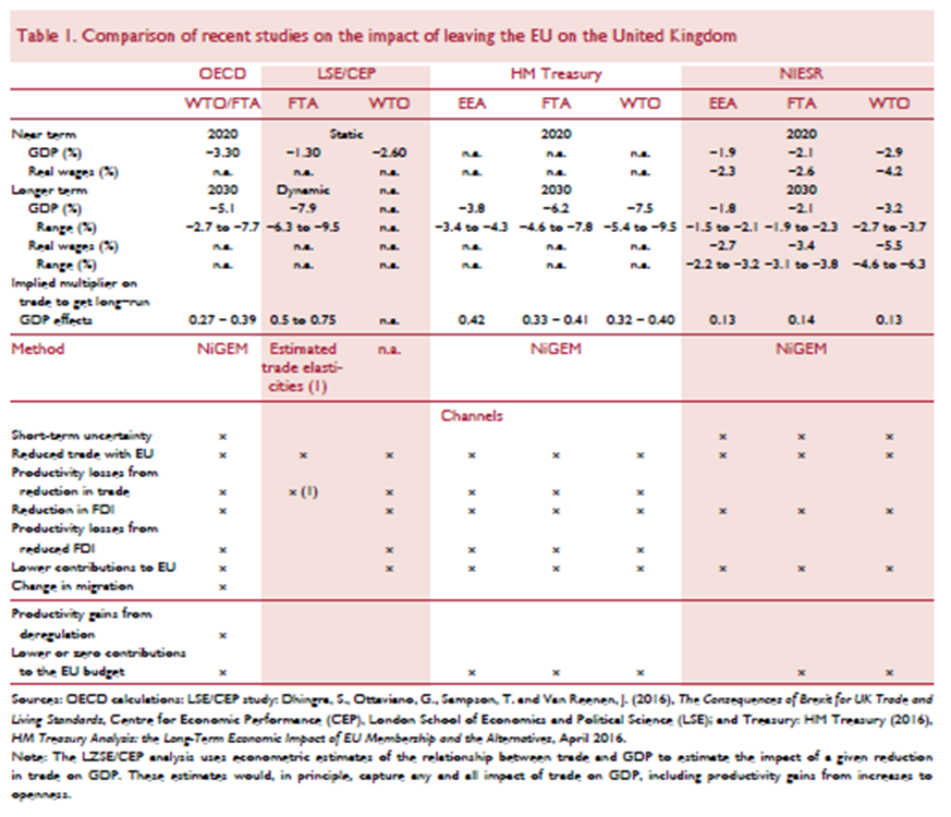
The IMF’s assessment came out in mid-June, and hence is not included in the above table; here’s the IMF’s view.
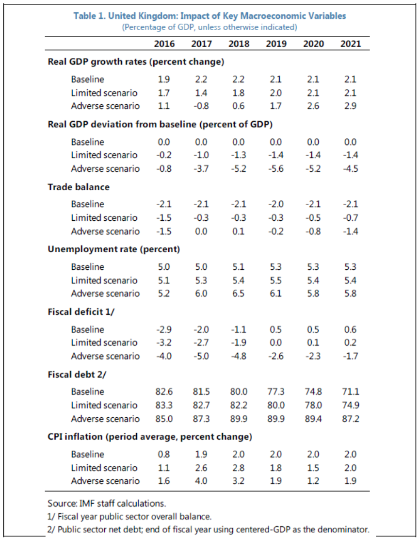
Table 1: from IMF, “United Kingdom-Special Issues,” IMF Country Report No. 16/169, June 17, 2016.
These are detailed model-based assessments, expressed relative to a baseline. What are investment bank economists predicting in terms of actual levels, rather than deviations?
Deutsche Bank does not forecast an outright contraction, expressed on a year-on-year basis.
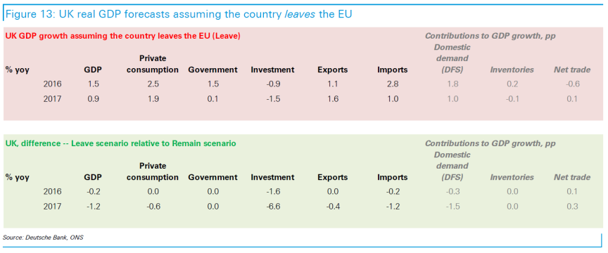
Source: “Special Report: Navigating in post-referendum Europe,” Deutsche Bank Research, June 23, 2016.
Going forward, keep your eyes on Simon Wren-Lewis’s Mainly Macro blog.
The Pound, 4AM London Time
As assessed probability of Brexit rises, the pound falls.
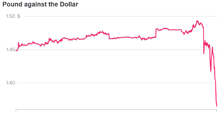
USD per Pound, last 5 days, as of 4AM London time. Source: Bloomberg.
Pound is down 9.29% against USD since London close (5PM local).
Kansas and Her Neighbors: GDP Edition
Some critics (e.g., [1]) have argued that employment and coincident indicators are too narrow of measures of economic activity to make relevant comparisons. Here I plot the real GDP — the broadest measure of economic activity — for Kansas and her neighbors.
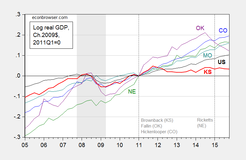
Figure 1: Log real GDP for Colorado (blue), Kansas (bold red), Missouri (teal), Nebraska (green), Oklahoma (purple), and US (bold black), all 2011Q1=0. NBER defined recession dates shaded gray. Source: BEA quarterly state GDP release, and BEA GDP 2016Q1 2nd release, NBER, and author’s calculations.
Now, it could be that Kansas has a flatter growth trend; however, as I noted in this post, based on pre-2010 correlations, Kansas should have done better (as shown in the red line), and done so by a statistically significant margin.
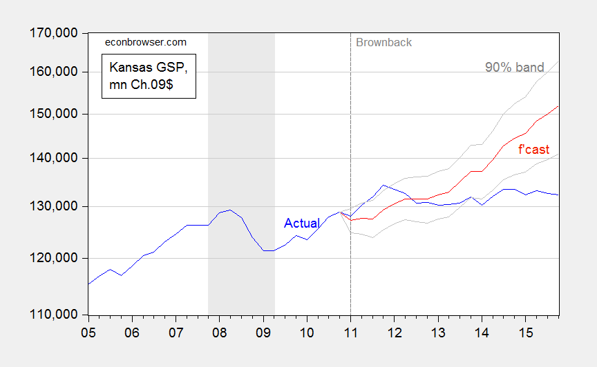
Figure 2: Kansas GDP, in millions Ch.2009$ SAAR (blue), ex post historical simulation (red), 90% prediction interval (gray lines). Forecast uses equation (1). NBER defined recession dates shaded gray. Log scale for vertical axis. Source: BEA, NBER, and author’s calculations.
The Kansas tax revenue shortfall has just forced the state government to borrow $900 million for the next fiscal year, and tap the highway fee and Medicaid fee funds. It’s already looking at a $45 million hole for the fiscal year about to end, despite previous fixes.[2]
June 22, 2016
Guest Contribution: “The Effects of Unconventional and Conventional U.S. Monetary Policy: The Role of Expected Inflation”
Today we are pleased to present a guest contribution by Yi Zhang, Ph.D. candidate at the University of Wisconsin-Madison. This post draws upon this paper.
Since 1982, the Fed has targeted the federal funds rate as the primary instrument of monetary policy. But from late 2008 onward, the federal funds rate has been effectively bound at zero, so that lowering it further to stimulate the economy has become infeasible. Consequently, the Fed implemented unconventional policy tools such as large-scale asset purchases (LSAPs) and forward guidance in order to affect long-term interest rates thereby stimulating the economy.
Researchers have long sought to understand how monetary policy announcements affect exchange rates. When the Federal Reserve switched from conventional to unconventional monetary policy measures, a major challenge has been to compare the effect of unconventional monetary policy announcements with that of conventional monetary policy announcements. The pioneering work by Glick and Leduc (2013) converts the unconventional monetary policy surprises into equivalent federal funds rate surprises, thereby enabling the comparison of unconventional and conventional monetary policy effects. They find the unconventional monetary policy has the same “bang” per unit of surprise as the federal funds rate previously had and that the exchange rate channel of monetary policy is still working effectively.
According to Gurkaynak, Sack, and Swanson (2005), the current federal funds rate surprise itself is inadequate to fully capture the effects of U.S. monetary policy announcements on asset prices. In addition to the “current federal funds rate target” factor, a “future path of policy” factor must be added to explain the bond yields and stock prices movements, especially for the longer-term Treasury yields.
Both the current and expected future federal funds rates determine the Treasury bond rates and consequently determine the exchange rate movements. Current federal funds rate surprises capture the “current federal funds rate target” factor, but contain little information about the “future path of policy” factor. Hence if the Fed maintains current federal funds rate, but at the same time provides forward guidance about future federal funds rate, the exchange rate would react to this Fed announcement, but it would be impossible to explain the exchange rate movement using the current federal funds rate surprises.
The FOMC meeting held on June 16-17, 2015 is such an example, where the current federal funds rate surprises cannot be used to explain the exchange rate movement since the current federal funds rate target remains at zero. In the press conference after the meeting, Chair Yellen (2015) said:
The Committee continues to judge that the first increase in the federal funds rate will be appropriate when it has seen further improvement in the labor market and is reasonably confident that inflation will move back to its 2 percent objective over the medium term … the Committee concluded that these conditions have not yet been achieved … the Committee will determine the timing of the initial increase in the federal funds rate on a meeting-by-meeting basis, depending on its assessment of incoming economic information and its implications for the economic outlook.
This speech was widely interpreted (e.g., Hilsenrath (2015), and Ramage (2015)) as a signal that the Fed would raise federal funds rate at a slower pace in coming years than the market projected. The market reacted to this speech instantaneously. The yield on the benchmark 10-year note decreased by 7.7 bps, down from 2.383% before the statement to 2.306% by the end of June 17, 2015. This reaction was spurred not by what the FOMC did, but rather by what it said: indeed, the decision to leave the current federal funds rate target unchanged was completely anticipated by the financial markets, but Yellen’s speech was read by the financial markets as indicating that the FOMC would raise federal funds rate at a slower pace than expected, which led the dollar to depreciate by 78 basis points (bps) against the Euro, from 1.1250USD/EUR by the end of June 16, 2015 to 1.1338USD/EUR by the end of June 17, 2015. Hence, treating the monetary policy action on this date as a zero surprise change in the current federal funds rate would be missing the whole story.
This paper augments Glick and Leduc (2013)’s model with an expected inflation surprise channel, which is used to approximate the expected future federal funds rate surprises (easy to see in an off-the-shelf open-economy New Keynesian model).
(1) For the conventional monetary policy period (before November 2008), the dollar’s value is affected by both the current federal funds rate surprises as well as the expected future federal funds rate surprises.
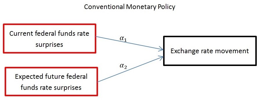
ExchRate_Mov = α0 + α1FedFund_surp + α2ExpInfl_surp
(2) For the unconventional monetary policy period (since November 2008), the dollar’s value is affected by the long-term rate surprises:
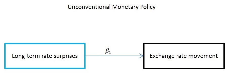
ExchRate_Mov = β0 + β1LongRate_surp
(3) I then decompose the long-term rate surprises into current federal funds rate surprises and expected future federal funds rate surprises, the latter of which is well approximated by a linear expression of the expected future inflation surprises. Thus, both conventional and unconventional monetary policy surprises can be contrasted in comparable measures.
LongRate_surp = γ0 + γ1FedFund_surp + γ2ExpInfl_surp
The above steps enable me to compare the unconventional monetary policy effect with the conventional monetary policy effect through two different channels: federal funds rate surprise channel, and expected inflation surprise channel. During the unconventional monetary policy period, a 1 bp long-term rate surprise is equivalent to 1/γ1 bps federal funds rate surprise if the long-term rate surprise solely comes from unexpected current federal funds rate tightening, and is equivalent to 1/γ2 bps unexpected inflation surprise if the long-term rate surprise solely comes from unexpected future federal funds rate tightening. Thus to compare effect of the unconventional monetary policy with that of the conventional monetary policy on the dollar value, I multiply the unconventional policy effect β1 by the adjustment parameter γ1 for the federal funds rate surprise channel, and multiply β1 by the adjustment parameter γ2 for the expected inflation surprise channel. This adjusted unconventional monetary policy effect β1γ1 and β1γ2 can be directly contrasted with the conventional monetary policy effect α1 and α2, where β1γ1 and α1 both measure the effect through federal funds rate surprise channel; and β1γ2 and α2 both measure the effect through expected inflation surprise channel.
The federal funds rate surprise channel is a revisit of Glick and Leduc (2013) in a more generalized model. Table 8 reports the estimated effects of adjusted unconventional monetary policy through the federal funds rate surprise channel during the unconventional monetary policy period, together with the estimated effects of conventional monetary policy through the federal funds rate surprise channel during the conventional monetary policy period, and the ratio of the two effects. It shows that 1 bp federal funds rate surprise easing leads to a 0.779 bps depreciation in the trade-weighted dollar during the unconventional monetary policy period. This magnitude is comparable to that during conventional monetary policy period’s 0.725 bps, with the ratios of unconventional to conventional period being 1.075. This outcome suggests that during the unconventional monetary policy period, the federal funds rate surprise channel indeed has similar “bang” per unit of surprise as during the conventional monetary policy period.
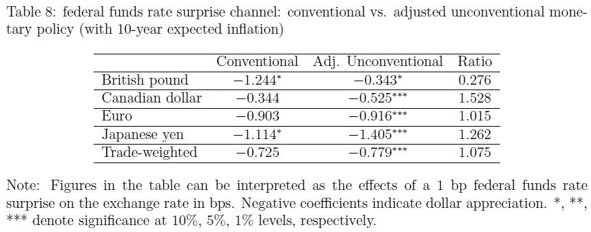
That said, it would be hasty to conclude that the federal funds rate surprise channel is still effective. Given the fact that β1γ1 is approximately the same as α1, the federal funds rate surprise channel is effective only when the Fed is still capable of freely adjusting the federal funds rate. However, during the unconventional monetary policy period, the federal funds rate is stuck at zero, so consequently there is almost no variation in the federal funds rate surprises (see Figure 4). Thus the federal funds rate surprise channel is irrelevant during this period, and the Fed can only affect the economy by manipulating the market’s expectation about future federal funds rate, i.e., via expected inflation surprise channel.
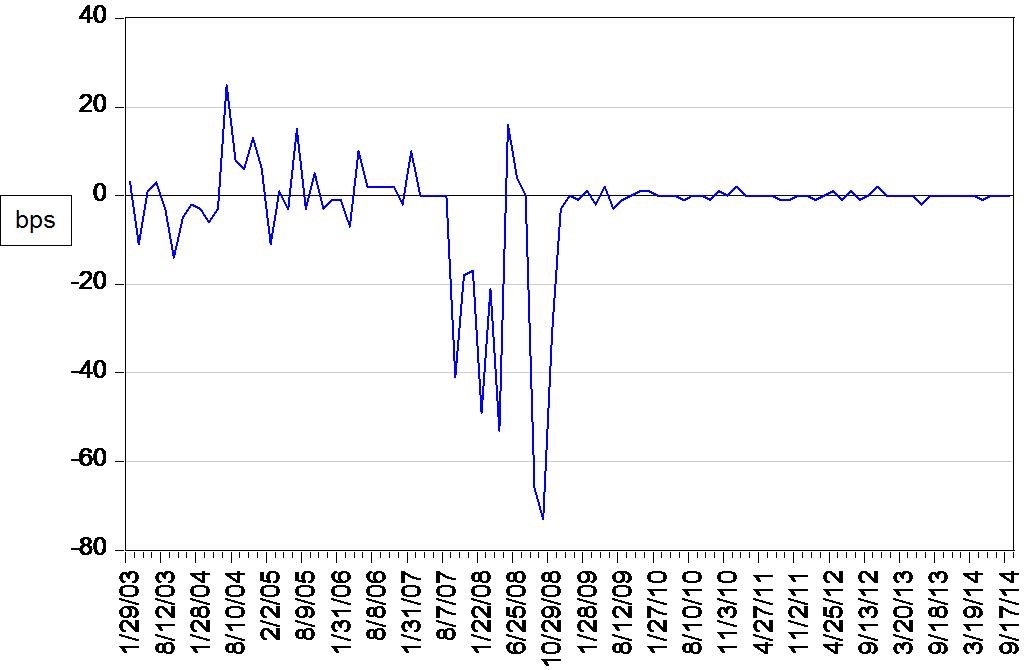
Figure 4: Effective federal funds rate interday changes. Notes: Sample: January 2003 – September 2014, 101 observations.
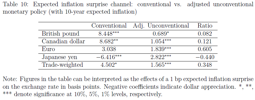
Table 10 reports the estimated effects of adjusted unconventional monetary policy through the expected inflation surprise channel during the unconventional monetary policy period, together with the estimated effects of conventional monetary policy through the expected inflation surprise channel during the conventional monetary policy period, and the ratio of these two effects. It shows that 1 bp expected inflation surprise leads to a 1.565 bps depreciation in the trade-weighted dollar during the unconventional monetary policy period. This magnitude is much smaller than that during conventional monetary policy period’s 4.502 bps, with the ratios of unconventional to conventional period being 0.348. This suggests that during the era of unconventional monetary policy, the expected inflation surprise channel is no longer as effective as during the conventional monetary policy period. That is, the relative importance of expected future federal funds rate in the determination of the exchange rate has weakened dramatically compared to the pre-crisis period.
This post written by Yi Zhang.
June 21, 2016
Drumpfarmageddon, Tabulated
Heretofore, I’ve approached in a piecemeal manner the assessment of the impact of massive tax cuts for the wealthy, building a really, really great wall, a final solution for the presence of undocumented immigrants, and the imposition a 45% tariff on Chinese imports. Moody’s Mark Zandi et al. have now done the hard work of trying to figure out what the macro impacts would be to implementing Mr. Trump’s agenda.
Figure 1 depicts realized real GDP (bn. Ch.2009$) through 2015, baseline (“current law”) GDP forecast through 2026, and GDP taking Trump at face value, and Trump lite (essentially, a smaller tax cut imposing only a revenue loss of 3.5 trillion dollars on a ten year basis).

Figure 1: Real GDP (dark blue), current law baseline (blue), under Trump agenda (red), under Trump-Lite scenario (teal), and potential GDP (gray). Light green shaded area denotes forecast period. Source: BEA, CBO (January 2016), and Zandi, et al. The Macroeconomic Consequences of Mr. Trump’s Economic Policies, June 17, 2016..
The cumulative loss relative to baseline GDP would be about 9.5 trillion Ch.2009$ in the Trump at face value scenario. Under Trump Lite, it’s 10.3 trillion Ch.2009$. (I don’t do the comparison relative to potential GDP, because almost surely, potential GDP would decline as the labor force shrank with the establishment of deportation processing centers, and eventual deportation of the undocumented.) For the sake of comparison, the cumulative GDP loss relative to potential GDP over the 2008-2015 period is 5.2 trillion Ch.2009$. In other words, the economic consequences of Mr. Trump would be larger — in terms of lost output — than the Great Recession.
It is also of interest to see the implications for debt-to-GDP ratios.

Figure 2: Debt to GDP (dark blue), current law baseline (blue), under Trump agenda (red), and under Trump-Lite scenario (teal). Light green shaded area denotes forecast period. Source: BEA, Fed via FRED, and Zandi, et al. The Macroeconomic Consequences of Mr. Trump’s Economic Policies, June 17, 2016..
Debt rises to 135% of GDP under Trump at face value, 111% under Trump lite, compared to 85% under current law. Notice that the plotted series is the debt held by the public, divided by GDP. Total Federal debt would be even higher.
On the plus side, under the Trump at face value scenario, the threat of deflation would be completely defeated — inflation in 2018 would surge to 5.4%.
Note: Not all provisions are scored. From the report:
Mr. Trump has brought up other potentially relevant economic policies that are not included here since either their macroeconomic impact is too small or they are at this point not sufficiently developed to quantify. These include, for example, his recent energy policy proposals, his seeming support for higher state-level minimum wages, and his ruminations on negotiating with investors in U.S. Treasury bonds and on bringing back the gold standard.
June 20, 2016
Contextualizing the North Carolina Experience
Defenders of the Kansas and Wisconsin misadventures in supply side economics keep on pointing to North Carolina as the counter-example that proves tax cuts do prompt faster growth (e.g., [1] [2]). A quick look at the data provides the following observations: (1) North Carolina GDP growth has merely matched nationwide growth since 2013Q1, (2) NC GDP has just been revised downward so that 2015Q3 GDP is now 1.5% lower than previously thought, and (3) NC GDP is less than the counterfactual indicated by historical correlations with national GDP.
Here’s an example of a statement that asserts tax cuts at the state level (combined with spending cuts due to balanced budget requirements) are expansionary:
Clearly the case of North Carolina throws water on the idea that reductions in gov’t spending are, generally speaking, a drag on economic growth. You seem to want to focus exclusively on the case of Kansas and completely ignore NC. Why?
First, not so sure about the first assertion. On the second point, I agree I have not paid enough attention to North Carolina. Let’s remedy that by looking at actual data!
North Carolina and the US
While NC GDP growth has accelerated relative to pre-2013, that has been an acceleration to match roughly the growth rate experienced over 1997-2015 period, and hence to match the US growth rate. This is shown in Figure 1.
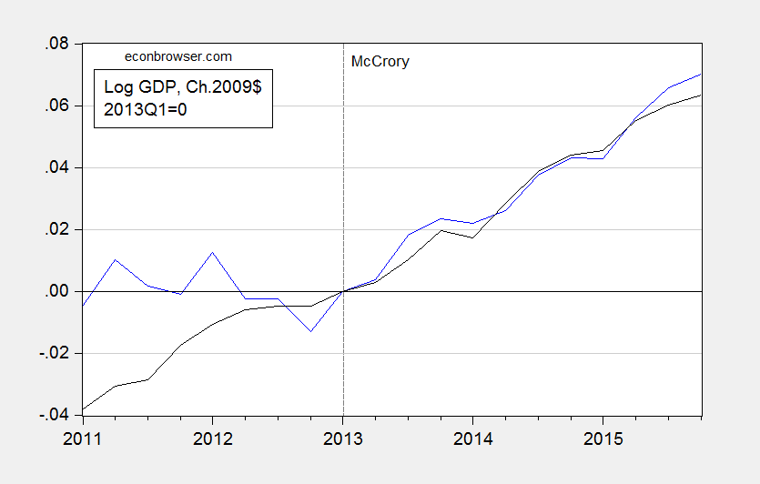
Figure 1: North Carolina GDP (blue), and US GDP (black), both in Ch.2009$, 2013Q1=0. Source: NC from state GDP release (June), and US from NIPA (2016Q1 2nd release).
Hardly a miracle. And there is more.
Revisions Take Off Some of the Gloss
In the latest release, quarterly GDP for North Carolina was revised downward perceptibly over the post-recession period. These downward revisions were particularly marked during the period starting from about mid-2013, right after Governor McCrory’s term began. This is shown in Figure 2.
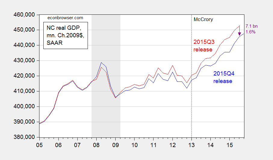
Figure 2: North Carolina GDP from 2015Q4 release (blue), and from 2015Q3 release (red). NBER defined recession dates shaded gray. Source: BEA and NBER.
North Carolina GDP in 2015Q3 has been revised downward by 1.6%, and over the 2013Q1-2015Q3 period was revised downward by 1.4% (in log terms).
Assessment against a Counterfactual
One way in which to more formally assess the impact of the policy framework implemented since 2013Q1 is to compare the actual outcomes, with respect to output, employment, income, etc., against a counterfactual. Following a procedure that I have used for Kansas [3], in terms of GDP, I retrieve data for 1997 to 2015, estimate the relationship between US and North Carolina GDP (incorporating a long run cointegrating relation), up to 2012, and then use the resulting equation to dynamically forecast out of sample the counterfactual. The estimated equation is:
(1) ΔyKSt = 0.419 – 0.142yNCt-1 + 0.148 yUSt-1 + 0.642ΔyUSt + 0.186 ΔyNCt-1 + ut
Adj-R2 = 0.39, SER = 0.0073, N = 62, DW = 1.84, Breusch-Godfrey Serial Correlation LM Test = 1.24 [p-value = 0.30]. Bold face denotes statistical significance at 10% msl, using HAC robust standard errors. y denotes log real GDP.
Figure 3 depicts the forecast, the actual and the 90 and 50 percent prediction intervals.
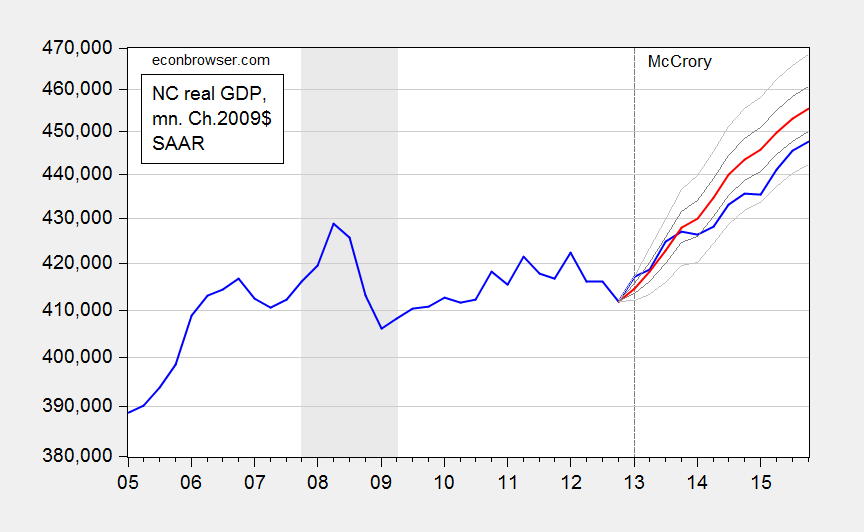
Figure 3: North Carolina GDP (blue), dynamic ex post simulation (red), 50% prediction interval (dark gray), and 90% prediction interval (light gray). NBER defined recession dates shaded gray. Source: BEA, NBER, and author’s calculations.
My calculations indicate that NC GDP as of 2015Q4 was 7.4 billion Ch.2009$ lower (SAAR) than that indicated by the level of US GDP. That is 1.6% (in log terms).
In contrast to my results for the case of Kansas, I cannot reject the null hypothesis that the level of GDP is within the 90% prediction interval. On the other hand, a less stringent 50% criterion suggests that the outcome is significantly worse than what we should have observed, based on the historical relationship between US and NC GDP.
Details of Estimation/Simulation
Step 1. I extended backward in time NC GDP to 1997 by using quadratic interpolation applied to annual data, and splicing this GDP series to reported quarterly GDP series. This step was necessitated because I could not reject the null of no cointegration using only the 2005-2012 period data.
Step 2. I apply unit root tests to log NC real GDP and US real GDP. They both fail to reject the ADF unit root tests (with constant, trend) at the 10% msl.
Step 3. I apply the Johansen cointegration test (constant in cointegrating vector, VAR) with 1 lag of first differences (2 lags in levels), and reject the no cointegration null at 10% msl. I fail to reject one cointegrating vector in favor of two.
Step 4. I estimate the error correction model (ECM) indicated in equation (1).
Step 5. I use the estimated ECM to conduct an ex post historical simulation, i.e., taking as given the actually realized values of US GDP to forecast NC GDP. This yields the red line in Figure 3.
Conclusion
A consistent meme forwarded by those who persistently view North Carolina as a counterpoint to the Kansas situation is that tax cuts accompanied by spending cuts have failed to reduce NC GDP growth, and in fact spurred growth, counter to the austerity-cum-recession thesis. This observation is true for NC relative to pre-2013 growth. However, to the extent that economists are wont to use the ceteris paribus proviso, we should be comparing not against pre-shock growth rates, but against a counterfactual. And doing so suggests that the policies have not accelerated, but rather decelerated, growth.
The manner in which I constructed the counterfactual can surely be criticized. But at least I have provided one. Adherents of the ALEC-Laffer-Moore-Williams Weltanschauung have yet to provide a statistically founded alternative.
June 18, 2016
No, I Don’t Think This Is the Reason BEA is Predicting a Massive Downward Revision in GDP
Political Calculations arrives at an alarming conclusion that real GDP will be downwardly revised by a large amount when the annual benchmark revision comes out in July.
The Assertion
In [releas[ing] its estimates of state level Gross Domestic Product through 2015-Q4], the BEA’s data jocks may have provided an unexpected sneak peek of how its estimates of national GDP for the U.S. will be officially changed when the agency releases is annual revisions for that data during the last week of July 2016.
The following picture is then displayed.
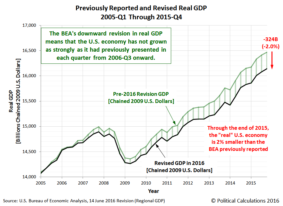
Ironman tries to track down the potential reasons for the differences; one is highlighted in the footnote which indicates that the sum of the state level variables doesn’t take into account overseas (mostly military) activities. He also takes note the fact that the state level series incorporates data yet to be incorporated into the GDP benchmark revision in July. He concludes:
That’s really weird. It’s a lot harder for the BEA to disentangle the state level contributions by industry from their national level source data, but once it’s done, it means that they’ve also updated and revised the national level data per all the most recently available information. It just doesn’t make sense to sit on that much revised data and not update the national level figures to reflect the entire scope of all the revision work that has been done.
What that means is that there will very likely be an ongoing discrepancy between the state-level GDP and its rollup to the national level, and the BEA’s reported national level data. The two datasets should largely match, except for that contribution by U.S. contractors who support U.S. military operations overseas, which falls outside the economic activity that occurs within the 50 states and the District of Columbia as noted by the BEA, and which should only represent a very small fractional contribution to the national GDP figures above the aggregate rollup of state level GDP for the 50 states and Washington DC.
A Plausible Resolution
Ironman has accurately displayed US GDP as reported in the national level NIPA, and the national GDP as indicated in the state level data.
However, I think he did not think deeply enough about the data. If there were massive revisions coming in on the real magnitudes, they almost assuredly would show up in the nominal magnitudes. I plot the nationwide GDP and the sum of the state level GDP in Figure 1.
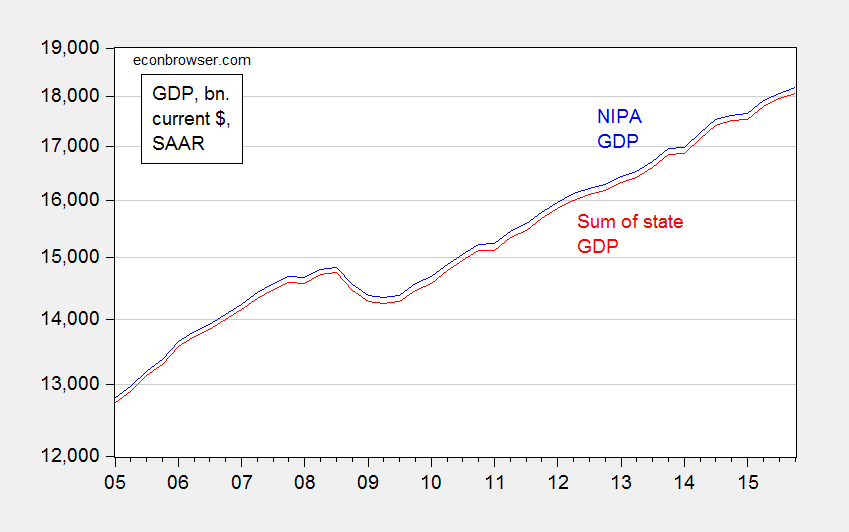
Figure 1: Nominal GDP from NIPA (blue) and sum of nominal state GDP from state GDP data (red). Source: BEA, 2016Q1 2nd GDP release, and 2015Q4 release (June).
Notice the variation in the difference is pretty small – it never varies more than the range 0.53 to 0.73 percentage points.
This suggests to me that the BEA is reporting for the real US GDP from state data … the sum of state GDP. This can be verified by downloading all the 50 states plus DC data for real GDP, summing them up and comparing to the reported GDP for the nation in the state-level database — and they match At this point, it is relevant to remember that the real GDP at the state level is measured in Chained 2009$, and chained indices do not sum up like nominal magnitudes and fixed weight deflated measures to the aggregate; for more discussion of this characteristic of chain weighted indices, see this post. A Tvörnquist approximation would likely have provided a series closer to the nationwide GDP series.
Conclusion
BEA may very well provide a drastically revised GDP series in its annual benchmark revisions. I highlighted how much can be changed when benchmark revisions occur, in this 2010 post. However, I do not think the state level GDP release has given us any particular insight into the likelihood of a big downward revision.
June 16, 2016
Wisconsin Employment Evaluated against a Counterfactual based on Historical Correlations
The Wisconsin Department of Workforce Development trumpeted May figures today. What if the relationship between US and Wisconsin employment over the 1994-2009M06 period persisted into the Walker era? We would have expected 60,000 more jobs than we got.
I use an error correction model estimated over the 1994M01-2009M06 period to conduct a dynamic out-of-sample forecast using actually realized values of the US employment (technically, an ex post historical simulation), and assuming US employment is weakly exogenous (one lag of first differences included); see this post for a discussion of the details. The results are shown in Figure 1.
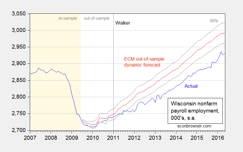
Figure 1: Wisconsin nonfarm payroll employment (blue), and forecasted (red), and 90% prediction interval (gray lines). Light tan shaded area denotes in-sample data. Log scale on vertical axis. Source: BLS, WI DWD, and author’s calculations.
Results are remarkably insensitive to including more lags, taking the sample period back to 1990, or extending the in-sample period up to 2010M12.
The shortfall is about 60,000; taking into account parameter uncertainty, it could be as large as 91,000, and as small as 29,000.
It is interesting to consider how well Wisconsin employment is doing relative to the August 2013 re-commitment by Governor Walker to create 250,000 new jobs by the end of his first term. He has clearly missed that target, but he might make the target before the end of his second term — the point estimate derived from an ARIMA(1,1,1) on log private NFP over 2011M01-2016M05 indicates November 2017 as hitting the threshold.
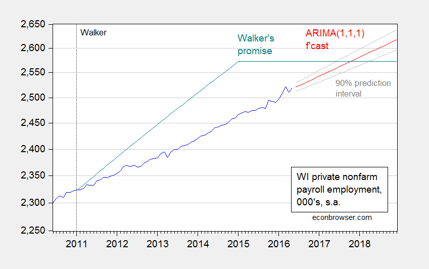
Figure 2: Wisconsin private nonfarm payroll employment (blue), and forecasted from ARIMA(1,1,1) (red), and 90% prediction interval (gray lines). Log scale on vertical axis.Source: BLS, WI DWD, and author’s calculations.
As of May 2016, Wisconsin is still 52,000 short of the target promised for January 2015. None of this is mentioned in today’s release.
How does these observations compare against the Administration’s forecasts. We have no idea, and we will have no idea for the foreseeable future. In response to my query to the WI Department of Revenue about the quarterly Wisconsin Economic Outlook, last released in May 2015, I received this very polite response:
[T]he report was becoming more irregular, and we have discontinued issuing the Outlook based upon the resources that were involved in producing it. We may still issue special reports from time to time, so please feel free to check our website in the future.
Consequently, those of us who are not privy to the inner workings of the Walker Administration do not know what the Administration is forecasting for GDP, employment, personal income, and so forth.
Menzie David Chinn's Blog


