
Menzie David Chinn's Blog, page 6
June 15, 2016
Mass Shooting Casualties, by Religion of Perpetrator: Muslim vs. Non-Muslim, Updated
A previous post on mass shooting casualties has been widely circulated. Here I update to include recent data, and to normalize by population. An upward trend indicates the incidence of casualties is rising.
Here is the aggregate series (expressed per million population).
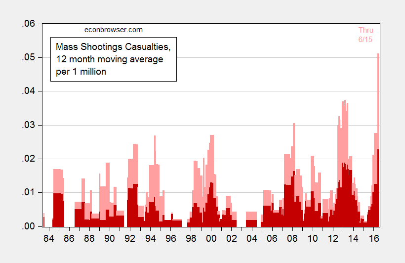
Figure 1: 12 month moving average of mass shooting casualties, per million population; deaths (dark red), wounded (pink). May and June 2016 population extrapolated using May and June 2015 growth rates. Source: Mother Jones through June 15, Census via FRED for mid-month population. and author’s calculations.
Here are the disaggregate figures.
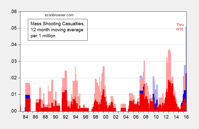
Figure 2: 12 month moving average of mass shooting casualties, per million population; deaths attributed to non-Muslims (dark red), wounded (pink); deaths attributed to Muslims (dark blue), wounded (light blue). May and June 2016 population extrapolated using May and June 2015 growth rates. Source: Mother Jones through June 15, Census via FRED for mid-month population, identification of religion from various news sources, and author’s calculations.
Non-normalized data can be seen here.


Manufacturing and the Dollar’s Value
New industrial output numbers, including for manufacturing, confirm a slowdown in at least part of the tradables sector.
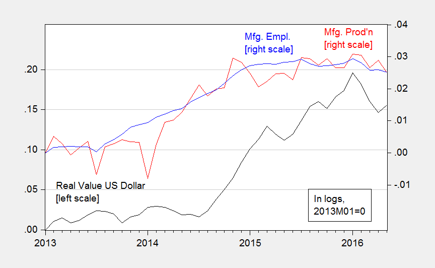
Figure 1: Real value of the US dollar against broad basket (black, left scale), manufacturing production (red, right scale), manufacturing employment (blue, right scale), all in logs, 2013M01=0. Source: Federal Reserve Board, BLS, and author’s calculations.
Both production and employment now on a slight downturn, despite recent dollar depreciation. The dollar is 14% higher in log terms relative to mid-2014.
June 14, 2016
Kansas in (Technical) Recession
The BEA released quarterly state GDP figures today. As of 2015Q4, Kansas has just experienced two consecutive negative GDP growth, a distinction shared with only three other states — Alaska, Oklahoma and Wyoming (North Dakota experienced three quarters of negative growth, but experienced positive growth in Q4). Over the past five quarters, Kansas has experienced four quarters of negative GDP growth.
Figure 1 illustrates how Kansas economic performance measured on the broadest basis (GDP) fares against that of the United States as a whole.
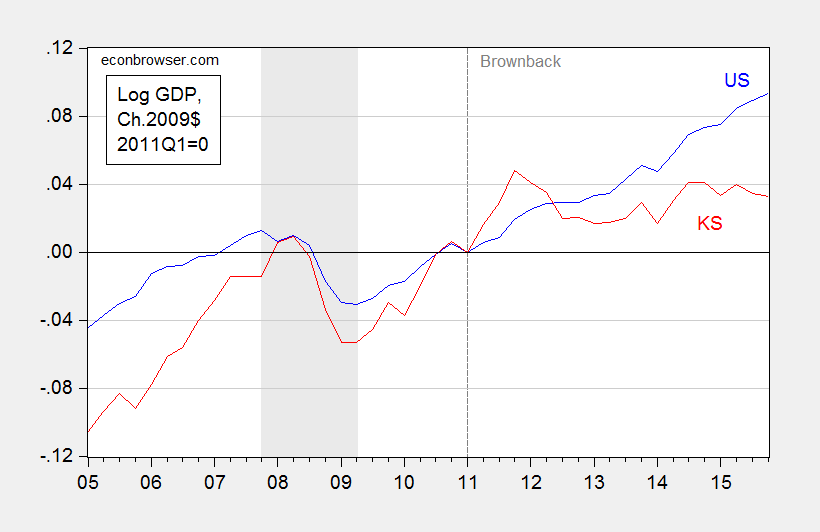
Figure 1: Log real GDP for US (blue), and for Kansas (red), all in Ch.2009$, 2011Q1=0. Dashed line at beginning of Brownback administrations. NBER defined recession dates shaded gray. Source: BEA, and author’s calculations.
It is of interest to note that prior to the Great Recession, Kansas was growing faster than the US. During the recession, it fell further than the Nation as a whole. And subsequently, it has been growing slower than the Nation, particularly post 2011Q1.
Is the deviation from pre-recession growth statistically significant? In order to answer this questions, one needs to establish the counterfactual of what would have happened if the historical relationship held. I do this formally be using the 2005-2010 period (2005 is the beginning of the quarterly state GDP series, 2010 is just before Governor Brownback begins his terms.) I use an error correction model involving Kansas real GDP, US real GDP (measured on the same basis as the Kansas GDP), and a variable to account for weather conditions in Kansas — the Palmer Drought Severity Index (PSDI) for Kansas. This particular specification implies that there is a long run cointegrating relationship between Kansas GDP and US GDP, and that drought has only a (statistically) short term impact on growth.
The estimated error correction model is:
(1) ΔyKSt = -7.26 – 0.29yKSt-1 + 0.65 yUSt-1 + 1.48ΔyUSt – 0.09 ΔyUSt-1+ 0.0016droughtt + ut
Adj-R2 = 0.53, SER = 0.0092, N = 22, DW = 1.87, Breusch-Godfrey Serial Correlation LM Test = 1.62 [p-value = 0.23]. Bold face denotes statistical significance at 10% msl, using HAC robust standard errors. y denotes log real GDP, and drought is the Palmer Drought Severity Index for Kansas (PDSI, lower is more severe). Regression results [PDF]. Data [XLSX].
The data used in this analysis (and for calculations in Figures 3 and 4) are here. Log Kansas and US GDP appear I(1) (fail to reject Elliott-Rothenberg-Stock unit root test) and Kansas PDSI (borderline) rejects a unit root.
Using this ECM to dynamically forecast out of sample in an ex post historical simulation (i.e., using realized values of US and Kansas GDP, and the drought variable), I find that (1) actual Kansas GDP is far below predicted (19.5 billion Ch.2009$ SAAR, or 14.8%, as of 2015Q4), and (2) the difference is statistically significant. This is shown in Figure 2.

Figure 2: Kansas GDP, in millions Ch.2009$ SAAR (blue), ex post historical simulation (red), 90% prediction interval (gray lines). Forecast uses equation (1). NBER defined recession dates shaded gray. Log scale for vertical axis. Source: BEA, NBER, and author’s calculations.
Why is Kansas lagging so much? Apologists have listed weather, aircraft manufacturing, and oil (since the original criticism by Prof. Russell has been deleted, see quotes in my post). In Figure 3, I show the contributions to state GDP growth, broken down into (i) agriculture, logging, hunting, fishing, (ii) durables manufacturing, (iii) mining, and (iv) rest-of-economy.
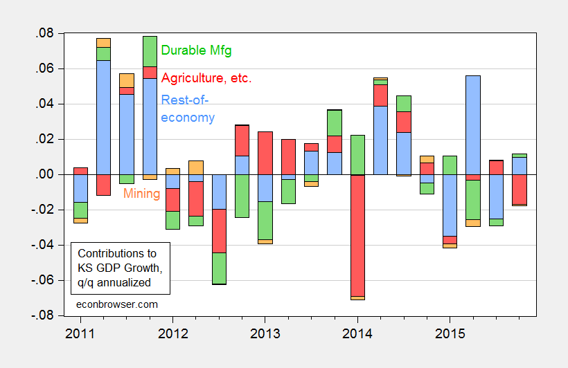
Figure 3: Contributions to Kansas real state GDP growth, from agriculture (red), durable manufacturing (green), mining (orange), and rest-of-economy (light blue). Source: BEA and author’s calculations.
Agriculture subtracted from growth in 2015Q4, and had an outsized impact in 2014Q1. However, it has added over most of the other quarters since 2011Q1. Of the cumulative output increase since 2011Q1, roughly one third is accounted for by agriculture. Note that mining (including energy extraction) can’t be claimed to be the culprit, since that category only accounts for a minimal negative contribution over the last year.
If none of the usual apologists’ suspects are plausible, then what might be the cause. One candidate is government spending on goods and services. In Figure 4, I plot real government spending by state and local authorities (this is a broader spending measure than used in this post), along with a 2005-2010 trend.
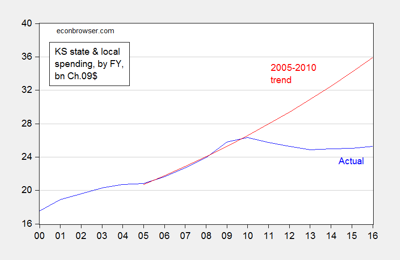
Figure 4: Spending by state and local authorities in bn. Ch.2009$, by Fiscal Year (blue), and log-linear time trend estimated from 2005-2010 (red). Nominal figures deflated using nationwide PCE deflator by Kansas FY; assumes 2016 inflation equals 2015 inflation. Note: Spending data is “estimated”. Source: US Government Spending website, BEA via FRED, and author’s calculations.
The shortfall as of FY2016 is about 10.6 billion Ch.2009$. The GDP shortfall as of 2015Q4 is about 19.5 billion Ch.2009$. The implied fiscal spending multiplier is about 1.8, holding constant tax cut effects. Taking into account tax cuts, the multiplier is smaller — although the extent to which it is depends on the composition of spending (transfers vs. purchases). In any case, 1.8 is not far from the conventional regional multiplier estimate of approximately 1.5 [1].
Update, 3:15PM Pacific: Given equation (1) contains nonsignificant coefficient on lagged growth in US income, it’s useful to see if the results change substantively when dropping that variable. The regression results remain largely unchanged, but the standard errors are slighty smaller, so the prediction interval is commensurately tighter. This is shown in Figure 5.
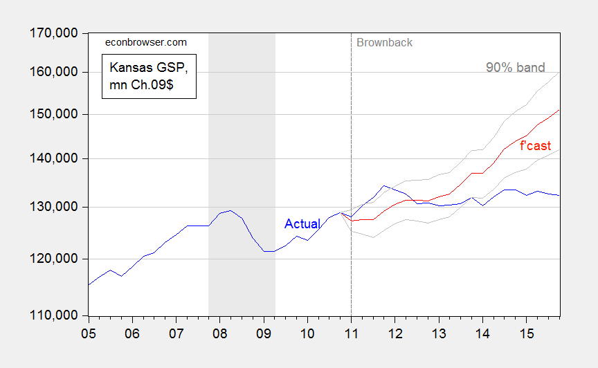
Figure 5: Kansas GDP, in millions Ch.2009$ SAAR (blue), ex post historical simulation (red), 90% prediction interval (gray lines). Forecast uses equation (1), dropping lagged first difference of US GDP. NBER defined recession dates shaded gray. Log scale for vertical axis. Source: BEA, NBER, and author’s calculations.
June 11, 2016
Recession Risks: The View from Wall Street Economists
The Wall Street Journal‘s June survey of economists is out. Interestingly, no one’s mean forecast is for two quarters of negative growth in 2016Q2-Q3 (or even one quarter!), but the assigned probabilities of recession remain elevated.
One point 1, see this histogram.
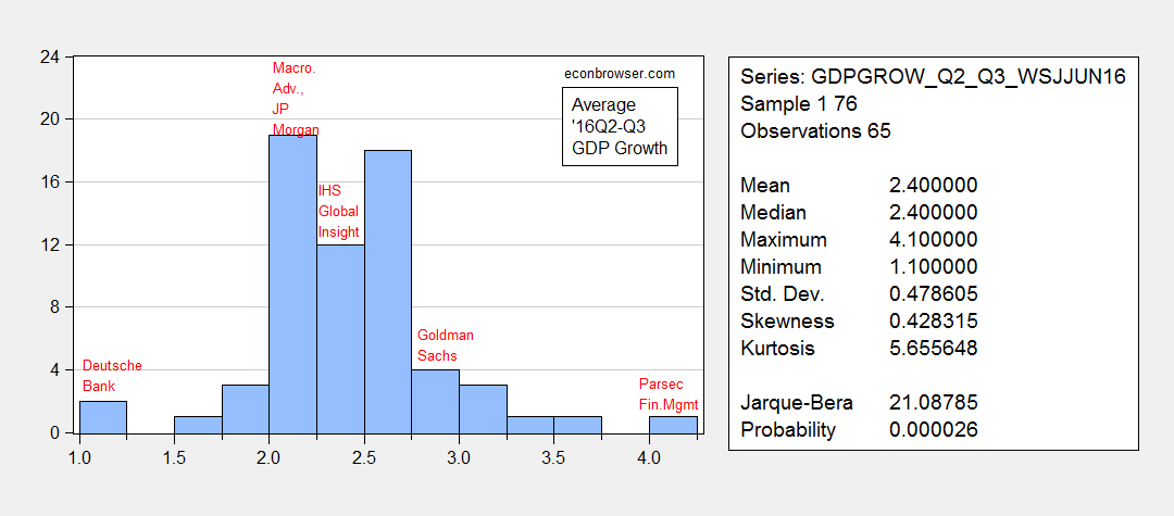
Figure 1: Histogram of average growth rates for 2016Q2-2016Q3 (SAAR). Source: June 2016 WSJ survey for economists, and author’s calculations.
On point 2, see this time series of recession probability assessments:
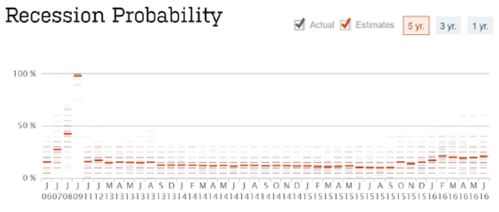
Figure 2: Recession probability assessments. Source: June 2016 WSJ survey for economists, and author’s calculations.
The mean probability assessment is 20.7% for a recession in the next 12 months. So while not a single forecaster predicts 2 quarters — or even a single — of negative growth in 2016Q1-Q2 (as shown in Figure 1), some forecasters do perceive substantial downside risks. The risks they see are recounted in Josh Zumbrun’s WSJ RTE post
So I won’t say definitively we are not in, or not close to, a recession (i.e., I won’t “Pull an Ed Lazear”). But Figure 1 contrasts strongly with the situation in May 2008, when the WSJ survey looked like this (as shown in this post), and several forecaster were predicting negative growth.
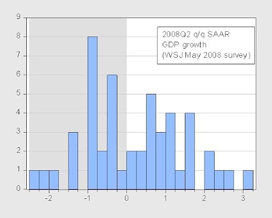
Figure 3: Quarter on quarter SAAR growth forecasts for 2008Q2, from Wall Street Journal May 2008 survey. Source: WSJ.
In fact the modal forecast was negative 1% when then CEA Chair Lazear said we were not in a recession.
Update, 2:30PM Pacific: New Deal democrat asks who in 2007Q3 foresaw a recession in 2007Q4. Figure 4 shows who forecasted average negative growth in 2007Q4-08Q1: Camilli Economics, and Combinatorics Capital.
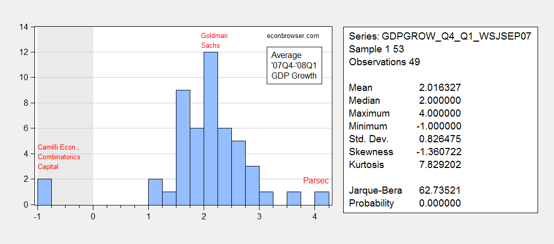
Figure 4: Histogram of average growth rates for 2007Q4-08Q1 (SAAR). Source: September 2007 WSJ survey for economists, and author’s calculations.
June 9, 2016
Data Paranoia Watch: Employment Edition
Which one of these texts is drawn from a real article?
What a coincidence. Just as momentum was building towards an interest rate hike by the Fed, along comes a dismal jobs report that takes any increase off the table. Contrary to the general perception, this is a lucky break for Democrats. … Given all that is stake, it is surprising that no one has questioned whether the jobs report might have been massaged by the Labor Department
Or.
Friday’s Bureau of Labor Statistics jobs report turned out to be a real doozy, as they say, with the number coming in way, way below expectations. Analysts were looking for 155,000 new non-farm payrolls, but the BLS statistical massaging and manipulation machine only managed to spit out a meager 38,000.
This is a trick question! They are both from actual articles, the first from Fox News, and the second from the Gilmo Report.
I’m not taking issue with the assertion that the estimates of employment growth could be wrong; it’s the assertion that they are deliberately manipulated to go one way or the other which troubles me. Like previous instances — Senator Barraso, Jack Welch, former Rep. Allan West, Zerohedge — it’s easy to dispense with the view that the numbers were massaged to get a certain, wildly distorted, picture.
First, 12 month changes in seasonally adjusted and not seasonally adjusted nonfarm payroll (NFP) employment series look similar.
Second, the BLS NFP seasonally adjusted and a series adjusted using a standard seasonal adjustment series, ARIMA X-12 (over the entire sample post-1986 sample) look quite similar in levels.
Third, the level of the BLS private nonfarm payroll series and the corresponding ADP series match almost exactly.
These points are illustrated in Figures 1-3.
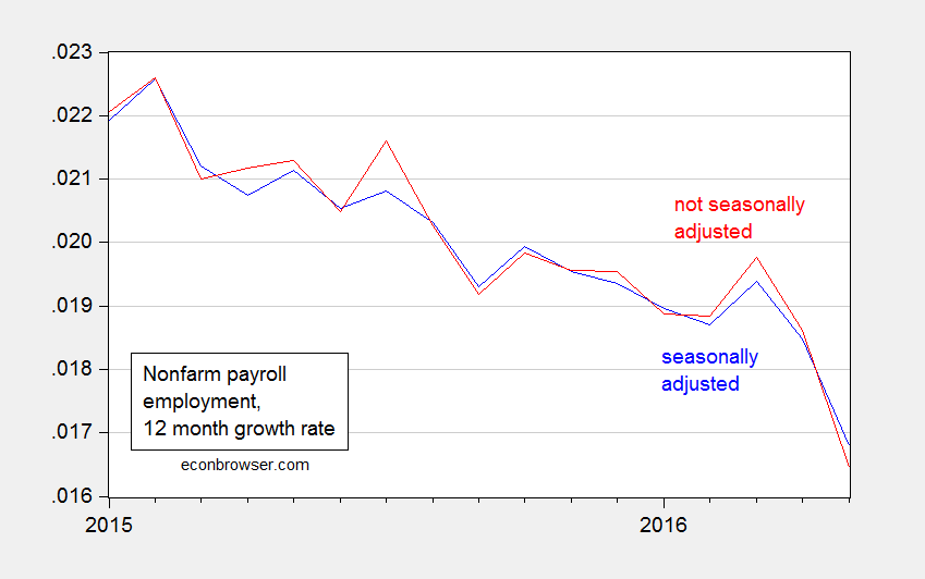
Figure 1: 12 month growth rates in seasonally adjusted nonfarm payroll employment (blue), and in not seasonally adjusted nonfarm payroll employment (red). Source: BLS via FRED, and author’s calculations.
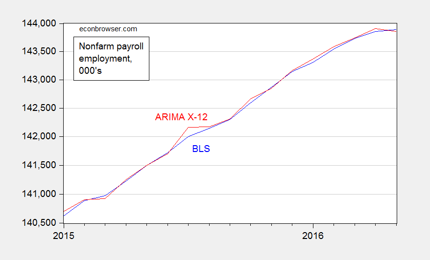
Figure 2: Seasonally adjusted nonfarm payroll employment as reported by BLS (blue), and not seasonally adjusted nonfarm payroll employment, seasonally adjusted using ARIMA X-12 over entire 1986-2016 period (red). ARIMA X-12 uses EViews default settings, including multiplicative seasonals. Log scale. Source: BLS via FRED, and author’s calculations.
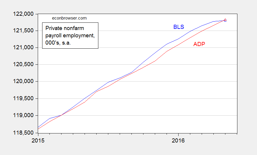
Figure 3: Seasonally adjusted private nonfarm payroll employment as reported by BLS (blue), and as reported by ADP (red). Log scale. Source: BLS and ADP via FRED.
If the BLS were really trying to manipulate the employment series to be lower than actual, then it did a poor job. If it were trying to manipulate it to be higher, it did a poor job — since it hit the mark on private NFP. (This is not to say there isn’t a bias; Owyang et al. (2014) notes a downward bias in preliminary vs. revised of about 18,000, since January 1980.)
It’s a slightly different story on m/m changes (rather than levels). Then BLS was too low relative to my (conventional) adjustment for NFP, and too high relative to ADP for private NFP.
On the other hand, if one wants to argue that adjustment for seasonals might possibly be improved, then we’re in agreement; see Jonathan Wright (his estimate is that the BLS series is 40,000 too high). Moreover, it’s always important to keep in mind that the margin of error for m/m changes is about plus/minus 100,000…[1]
Of course, these claims pale into insignificance when compared against Donald Trump’s assertion that the “real unemployment rate” is 42%. [2]
June 8, 2016
Thinking about Wages, Inflation and Productivity… and Capital’s Share
On the release of the Productivity and Costs release, the WSJ reports “Weak Productivity, Rising Wages Putting Pressure on U.S. Companies: Economists fret how trends may affect inflation and broader growth”.
When wage compensation outruns productivity, the result is an acceleration in labor costs per unit of output. In the first quarter, those costs rose 4.5% at a yearly rate and 3% from a year earlier. If companies can’t boost productivity, they must either absorb the costs in their profit margins or raise prices.
Corporate profits are being squeezed as a result, and the worry is that companies will slow hiring and further slash spending.
A different worry for the Fed is that firms will react to higher labor costs by raising prices, pushing inflation above the central bank’s 2% target.
I don’t disagree, but I think these developments can be cast in a slightly different light.
Ceteris paribus, lower productivity growth does imply faster inflation. And in any case, low productivity growth is nothing to cheer about.But I think we don’t want to think about faster wage growth as necessarily resulting in faster inflation.
Consider the price level. By definition:
p = μ + ulc
where p is the log price level, μ is the log price-markup ratio, and ulc is the log unit labor cost. Taking the time derivative yields:
π = Δulc
if the markup is constant. π is the inflation rate. The key issue is the constancy of the markup.
Figure 1 depicts a proxy measure for the nonfarm business sector’s μ.
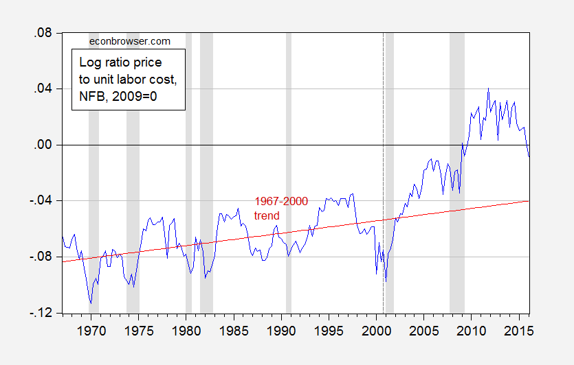
Figure 1: Log ratio of implicit price deflator to unit labor cost in nonfarm business sector. Red line is trend estimated over the 1967Q1-2000Q4 period. NBER defined recession dates shaded gray. Source: BLS, NBER and author’s calculations.
There is a linear trend in the ratio until 2000, at which time there appears to be a break in the relation; the price level rises relative to unit labor cost, i.e., the markup increases. One can loosely interpret this as a rise in capital’s share (in fact, this variable is the exact inverse of the labor share of the NFB as calculated in the Productivity and Cost release).
More formally, over the 1967-2000 period, (log) price and unit labor costs are cointegrated (according to the Johansen maximum likelihood cointegration test, allowing for a linear trend in the data). The cointegrating vector is (1 -1.02), borderline significantly different from (1 -1).
Over this period, unit labor costs adjusts to the disequilibrium, while the price level does not.
In contrast, this relationship does not appear to hold over the post-2000 period, according to formal cointegration tests (although that might be because the sample is too small). It doesn’t appear to hold over the entire 1967-2016 sample either.
Obviously, unit labor costs cannot continue to rise faster than prices indefinitely. However, there is some way to go before the ratio converges to the 1967-2000 trend.
So…one way to interpret the recent slowdown in productivity, acceleration in compensation growth, in the presence of quiescent inflation is that it represents a reversal of the deviation that started in the early 2000’s.
For reference, here are the inflation rates (measured using the implicit price deflator) for the nonfarm business sector.
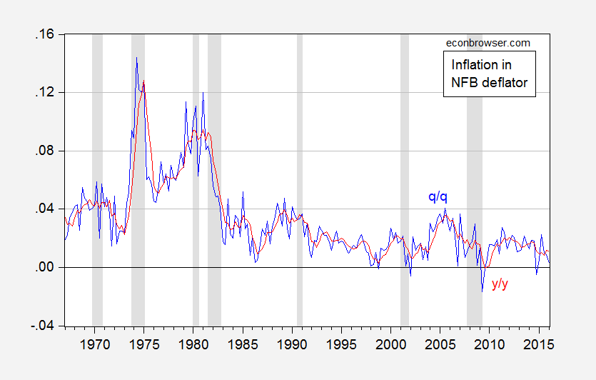
Figure 2: Inflation rate of the implicit price deflator in the nonfarm business sector, quarter-on-quarter (blue), and year-on-year (red), annual rates calculated as log differences. NBER defined recession dates shaded gray. Source: BLS, NBER and author’s calculations.
As of 2016Q1, year-on-year inflation is 1.1%, and quarter-on-quarter is 0.3%.
Digression: The Heritage Foundation’s James Sherk has recently argued that real compensation and productivity track each other very well, and presents this graph to prove his point. (He argues that other studies have inappropriately used differing deflators and measures with different sectoral coverage to obtain misleading inferences.) Clearly, my conclusions shown above are at variance with Mr. Sherk’s conclusion. What’s going on?
Using quarterly data over the same sample (extended to 2016Q1), and a different (log) scale, I show that a gap has widened between the two series, even for the NFB sector, and using the same deflator.
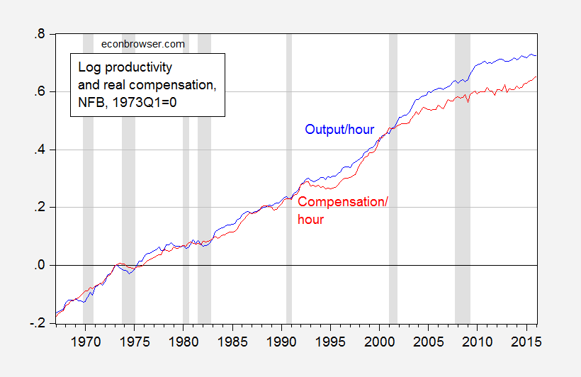
Figure 3: Log real output per hour (blue), and compensation per hour (red), in nonfarm business sector, normalized to 1973Q1=0. NBER defined recession dates shaded gray. Source: BLS, NBER and author’s calculations.
In fact, since 2001Q1, the cumulative growth divergence widened from 0 to as much 11% in 2010Q4, before shrinking to 6% in 2016Q1.
June 7, 2016
Recession Watch, June 2016
Since Friday’s employment release, there’s been a surge in articles discussing the possibility of a recession.
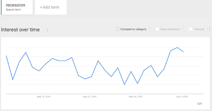
Figure 1: Google Trends index for “Recession”, last 30 days, in Business and Finance category. Source: Google, accessed 6/7, 11PM Pacific.
Time for a look at some key indicators the NBER Business Cycle Dating Committee [1] has looked at in the past.
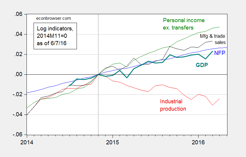
Figure 2: Log nonfarm payroll employment (blue), industrial production (red), personal income excluding transfers, in Ch.2009$ (green), manufacturing and trade sales, in Ch.2009$ (black), and Macroeconomic Advisers monthly GDP series (solid teal). Source: BLS (May release), Federal Reserve (April release), BEA, Macroeconomic Adviser (May 17), and author’s calculations.
While most series are still rising, as of latest reported observations, the decline in industrial production is worrisome.
The broadest measure of economic activity is GDP. Figure 3 presents the BEA series, and the Macroeconomic Advisers and e-forecasting monthly series, for comparison.
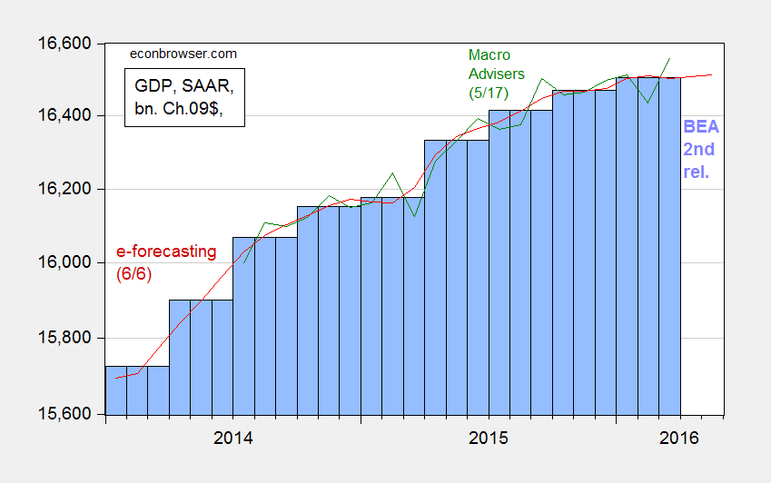
Figure 3: GDP as reported by BEA (blue bars), Macroeconomic Advisers (green line), and e-forecasting (red line), all in billions of Ch.2009$, SAAR. Log scale. Source: BEA (2016Q1 second release), Macroeconomic Advisers (5/17), and e-forecasting (6/6).
What’s obvious here is a flattening out of these series, although Jim’s recession indicator index still fails to call a recession as of the 2016Q1 advance release. Despite this, and an implied acceleration in GDP growth according most nowcasts of 2016Q2 GDP (see Jim’s post), count me worried.
I take some solace in the fact the yield curve has not inverted in the 6 months to one year prior to today, where an inversion of the yield curve has typically been a useful predictor of recessions (see this post, based on Chinn and Kucko (2015)). This point is shown by Figure 4.
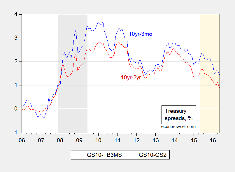
Figure 4: Ten year-three month Treasury spread (blue), and ten year-two year Treasury spread (red), in %. NBER defined recession dates shaded gray. Light tan shaded area pertains to the last year. Source: FRED and author’s calculations.
Note no inversion over the last year, denoted by the light tan shading; of course, the last 8 years has been an atypical period with short rates at the zero lower bound. In these conditions, it’s unclear whether the yield curve remains an accurate predictor given that the spread is being driven by changes in the long rate (see Fatas).
Despite the conflicting nature of the data, now does not seem the time to raise policy rates.
Guest Contribution: “China Should Rebalance by Following the Fed”
Today we are pleased to present a guest contribution written by Gunther Schnabl, Professor of Economics and Business Administration at Leipzig University.
Since 2015 China’s economic faith seems to have turned around. Capital flows are leaving, the Chinese yuan is under depreciation pressure, foreign reserves are shrinking and growth perspectives are gloomy. Up to recently, exports and property development have been the key growth engines. Now, growing domestic demand, supported by monetary and fiscal expansion, is regarded to be a promising growth strategy. Based on the Japanese experience I expect that this strategy is unlikely to be successful in the long run (see Schnabl 2016).
Japan is an important case study for China, as it shares similar macroeconomic characteristics. In both cases an export-oriented growth strategy has been reflected in current account surpluses, in particular versus the United States. Therefore, the exchange rates of yen and yuan against the dollar were crucial for growth. This has led – at different points of time – to exchange rate conflicts. Between 1985 and 1995, the United States exerted pressure on Japan to appreciate the yen against the dollar to reduce Japans trade surplus versus the US (“Japan Bashing”). Since the turn of the millennium, China was under pressure to let appreciate the yuan (“China Bashing”).
The fact that the Japanese and Chinese authorities allowed their currencies to appreciate paved the way to speculative bubbles, which became (Japan) or are likely to become (China) a pre-step for lasting stagnation. (The Figure shows the two real estate markets in different time periods.) With the Plaza Agreement (Sept. 1985) Japan was forced to let announce a strong appreciation of the yen against the dollar. This triggered tremendous capital inflows betting for revaluations gains. Between Sept. 1985 and Sept. 1987 the yen appreciated by 50% against the dollar, what caused a deep recession. To soften the pain, the Bank of Japan cut interest rates to an unprecedented low level. This created the breeding ground for the Japanese bubble economy. The bursting of the bubble in December 1989 is widely acknowledged to be the starting point of now 2.5 lost decades of economic stagnation.
In China, the decision to let the yuan move on a predictable appreciation path between July 2005 and July 2008 and between June 2010 and January 2014 triggered again large one-way bets on appreciation. These speculative capital inflows were often disguised as export revenues to circumvent inward-bound capital controls. Therefore, the speculative capital inflows showed up in growing current account surpluses. The capital inflows were funnelled either into additional capacities in the export sector (via the state-owned banking sector) or into the property market (often via shadow banks). This has led to overcapacities in industrial production and a real estate bubble. The paper shows how the sterilization of the monetary effects of rapid foreign reserve accumulation ensured for quite a long time via real exchange rate stabilization the clearance of the over-capacities in the export sector. Yet, now, both bubbles seem to have burst.
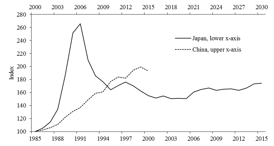
Figure 1: Real Estate Development in Japan and China. Source: Oxford Economics.
The monetary overinvestment theories by Hayek (1931) and Mises (1953) explain, why monetary and fiscal expansion in the face of bursting bubbles do not help to revive growth in the long run. Cheap liquidity provision paired with Keynesian stimulus programs in response to crisis impede the cleansing process, which is regarded as a prerequisite for the economic recovery. During the upswing – which is driven by too low interest rates – resources become bound in parts of the economy with low productivity. Therefore, a sustained recovery can only occur, when this non-productive investment is dismantled. Otherwise, growth is paralysed, because resources remain bound in non-productive parts of the economy. Higher interest rates encourage the reallocation of resources towards new investment with higher productivity. If monetary policy aims to prevent this adjustment process, a long-term economic stagnation as observed in Japan is the consequence.
This scenario is likely for China, if the country follows the Japanese crisis therapy path, which has been characterized by excessive fiscal and monetary expansion (lately dubbed Abenomics). China (as well as Japan) should therefore mimic the current attempts of the US Fed to tighten monetary policy. This would also send the right signals to the European Central Bank not to flood Europe with cheap liquidity, which paralyses growth in the south of Europe and encourages a real estate bubble in Germany.
References
Schnabl, Gunther (2016): Exchange Rate Rate Regime, Financial Market Bubbles and Long-term Growth in China: Lessons from Japan. CESifo Working Paper 5902. https://ideas.repec.org/p/ces/ceswps/...
Hayek, Friedrich August von (1929): Prices and Production, New York. https://mises.org/library/prices-and-...
Mises, Ludwig von (1953): The Theory of Money and Credit, New Haven.
https://mises.org/library/theory-mone...
This post written by Gunther Schnabl.
June 6, 2016
Currency Misalignment, 2016: FEER vs. Penn Effect
The Peterson Institute for International Economics’ William Cline has just published estimates of equilibrium exchange rates for May 2016; the USD is 7% overvalued, while the Chinese yuan (CNY) is at its “FEER level”.
Figure 5 from the Brief depicts the amount of exchange rate change (in real multilateral terms, or in USD terms) in order to achieve FEER levels, roughly medium term equilibrium. “Down” denotes depreciation.
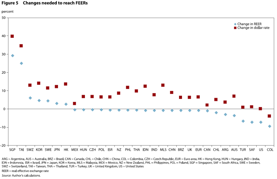
Source: William Cline, “Estimates of Fundamental Equilibrium Exchange Rates,” Policy Brief 16-6, May 2016.
Note that the USD is overvalued, in the sense a depreciation on a multilateral basis is required to achieve FEER levels. The CNY requires no such change in order to achieve FEER levels (although it needs appreciation with respect to the dollar given the USD requires depreciation to achieve FEER levels).
As noted in previous posts (see [1]), there are several many different measures of equilibrium exchange rates, and hence different estimates of currency misalignment. Indeed, even when a single conceptual measure of equilibrium exchange rate is used, one can obtain differing estimates of misalignment, depending on data sample used, empirical model specification, and estimation methodology.
The Cline/PIIE estimates are based upon the FEER (“Fundamental Equilibrium Exchange Rate”) approach, which begins with a judged equilibrium current account at full employment, and backs out — using trade elasticities — an implied real exchange rate (in this post, this fits into the “macroeconomic balance” approach). To the extent that the framework assesses equilibrium at full employment levels, the FEER is essentially a medium-run construct.
Other alternatives include the BEER (“Behavioral Equilibrium Exchange Rate”) approach, which is essentially a composite specification incorporating several models, such as real interest differential, portfolio balance, and Balassa-Samuelson approaches.
Yet another approach is to utilize the “Penn effect” — the positive empirical relationship between the real exchange rate in purchasing power parity terms and relative per capita income (also in PPP terms). This empirical relationship makes sense when prices have adjusted, and the external accounts are in equilibrium — making the predicted exchange rate essentially a long run construct. Cheung, Chinn and Fujii have utilized this approach to infer overvaluation/undervaluation of the CNY in a number of papers (see review in this post).
In ongoing work, Yin-Wong Cheung, Xin Nong and I have updated the analysis to use the most recent version of the Penn World Tables. We find that as of 2011, the CNY was at roughly levels consistent with the Penn effect. This is shown in Figure 1.
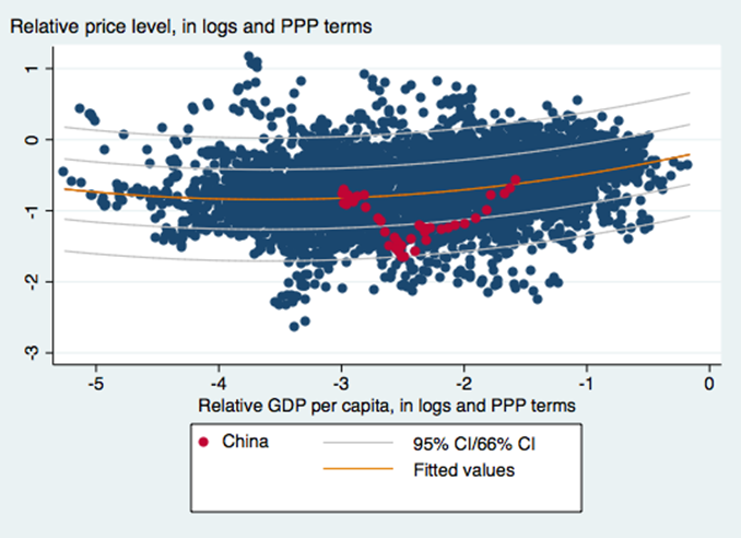
Figure 1: Log price level vs. log relative per capita income (both in PPP terms), for all developing countries. Red dots pertain to CNY. Orange line is fitted quadratic regression line, light blue lines are 66% and 95% confidence bands. Source: PWT8, and Cheung, Chinn and Nong, “Estimating Currency Misalignment using the Penn Effect: It’s Not As Simple As It Looks,” mimeo (June 2016).
With the CNY having appreciated on a trade weighted basis by about 20% (log terms) since 2011, our estimates suggest that by the Penn effect criterion, the CNY is not undervalued.
June 5, 2016
A Conspiracy So Vast…
One of the craziest posts I have read in recent years alleges that the US government has deliberately set out to destabilize the world economy in order to … lower Federal financing costs!
The Alleged Conspiracy
From MyCostGov blog comes the post with the following alarming title: “World Banks Panic Selling U.S. Treasuries”.
The U.S. government gets one major benefit from having the world in financial turmoil—the same panic that prompted foreign central banks to sell their U.S. Treasury holdings to prop up their currencies also prompted large numbers of U.S.-based individuals and institutions to buy more U.S. Treasuries, which pushed down their yields, which means that the U.S. government can borrow more money at lower interest rates to sustain its spending…
So far, so good (although I’m not sure it’s a “panic” that induces foreign central banks to conduct forex intervention, see this post). Mr. Eyermann then continues:
All of which would go a long way toward explaining the Obama administration’s active pursuit of a multitude of half measures in response to various developing global crises.
I find this description completely befuddling because for the preceding ten years, we had been pointing to foreign official sector acquisition of US Treasurys as propping of Treasury prices, and hence depressing Treasury yields. Remember “the conundrum”? Now, the US government finds it in its interest to foster panic to induce foreign central banks to deplete their Treasury holdings?
Anyway, let’s look at the data, and (gasp!) some research.
Forex Reserves and Official Sector Holdings of Treasurys
It’s true that official sector (i.e., central bank) foreign exchange holdings have declined in recent years. Figure 1 shows all foreign exchange holdings reported to the IMF.
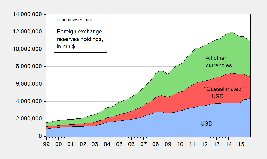
Figure 1: Holdings of foreign exchange reserves ex.-gold in USD (blue), guesstimated USD (red), and all other currencies (green), all in millions of $. Source: IMF, COFER, and author’s calculations.
As can be clearly seen known US dollar holdings have actually risen at the end of 2015. Now, much of the currency composition of foreign exchange holdings is not known, so it’s not completely clear what’s happened to total dollar holdings. I use the rule-of-thumb that assumes 60% of unallocated reserves are in USD. That yields the red shaded area. The decline in USD reserve holdings is then apparent, but much more modest than one might think just looking at total global reserves.
Now for the last link in the chain — it’s also typical to assume that when official reserve holdings of dollar assets declines, that’s equivalent to a decline holdings of US Treasurys. In point of fact, since guesstimated dollar holdings started declining from 2014Q1, measured holdings of Treasurys (via TIC; with the usual caveats regarding the accuracy of the monthly data [1]) indicate little change from beginning to end 2015.
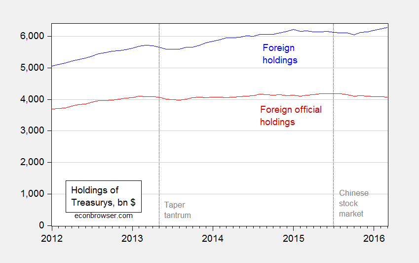
Figure 2: Foreign and international holdings of US Treasurys (blue), and foreign official sector holdings of US Treasurys (red). Source: TIC.
In fact, over the period highlighted by Mr. Eyermann (January onward), holdings of Treasurys fell only $23 billion from December 2015 to March 2016, i.e., 0.6 percent.
Now, on the other side of the ledger, whatever benefit is gained by lower interest rates due to global financial turmoil (of which I’m not particularly convinced), is the stronger value of the USD, and lower rest-of-world growth. These two phenomena result in a hit to net exports, and hence a drag on GDP: not exactly things desirable from the standpoint of the USG.
Global Financial Stress or Liquidity Stress?
Let’s return to Mr. Eyermann’s original premise. Is whatever decrease in Treasury holdings due to higher global stress? This is a hard question to answer, given that “global financial turmoil” is in the eye of the beholder. [2] The Bank of America/Merrill-Lynch index (the Global Financial Stress Index, discussed here) has risen fitfully since mid-2014, long before the official sector decumulation of Treasurys (which can be dated to August 2015).
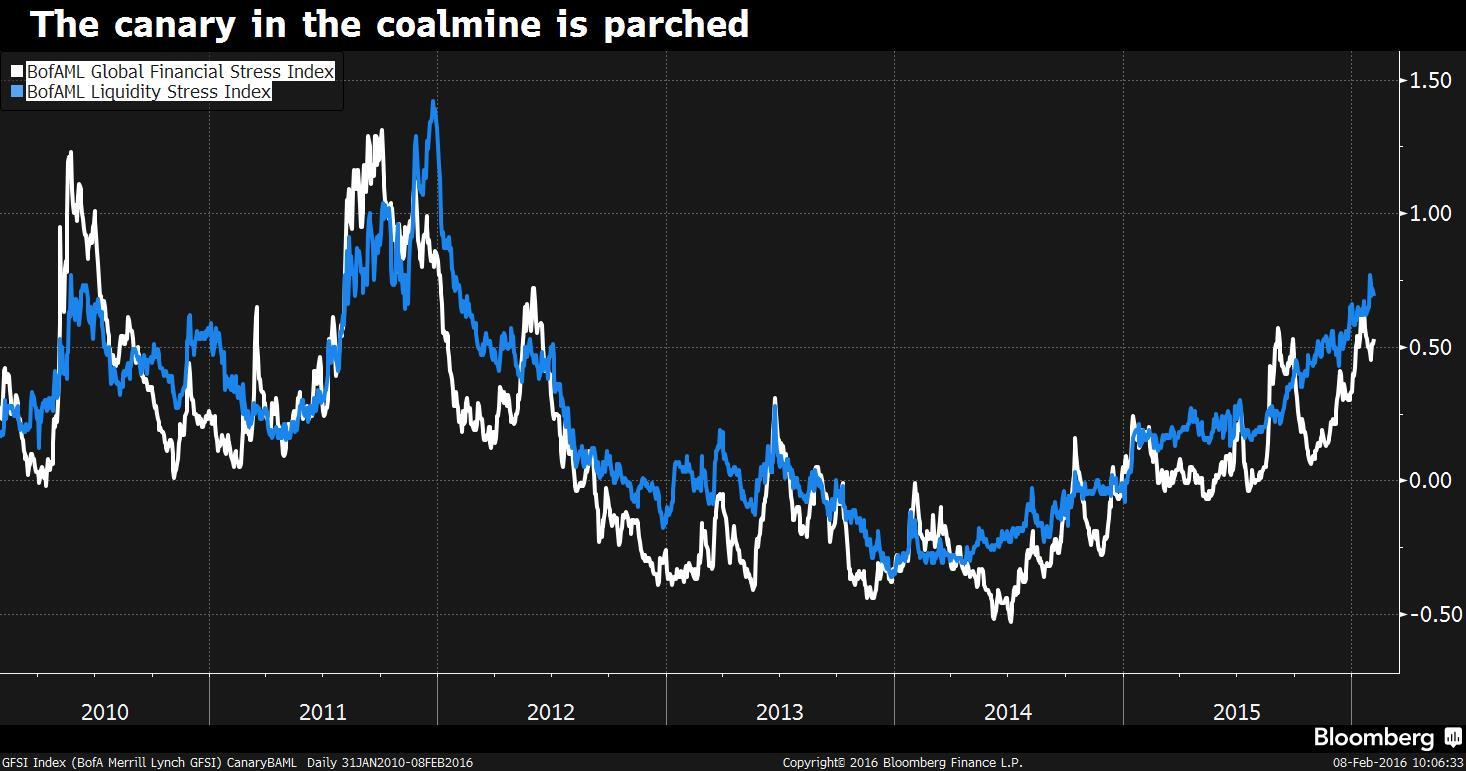
In the accompanying Bloomerger article, the author stresses the primary role of liquidity stress, as opposed to financial stress:
“Compared to the broader GFSI, liquidity stress has somewhat methodically and steadily risen over the past two years: while the GFSI has moved higher in fits and starts, liquidity stress has more persistently risen, only pausing its rise at times, before moving higher,” the strategists explained. “This persistence suggests to us that deteriorating liquidity is at the heart of and may be the primary driver of broader rising financial stress.”
Deteriorating liquidity conditions are attributed to higher capital regulatory requirements, lower commodity prices, and Fed tightening.
To sum up: It seems highly unlikely to me that the Administration is deliberately engineering global financial turmoil in order to lower Federal borrowing costs, as Mr. Eyermann concludes. Rather, this argument is what one gets when fevered ideological imagination collides with ignorance of the international finance literature.
A Side Note on China
Roughly two thirds of the Treasury decumulation since June 2014 is accounted for China, according to monthly TIC data. I think most observers would agree that whatever anxieties might be driving Chinese capital outflows, they are not “made in America” (and the always excellent and newly-returned Brad Setser argues that the anxieties are mostly regarding future depreciation).
Menzie David Chinn's Blog


