
Menzie David Chinn's Blog, page 7
June 3, 2016
Some Messages from the Employment Release
Employment growth is downgraded, according to several measures, and manufacturing employment is particularly hard hit.
Not only was net employment growth very low, at 38,000, the previous months’ estimates were revised downward. Even after accounting for the 37,000 subtraction due to the Verizon strike [CR], May’s number was not good.
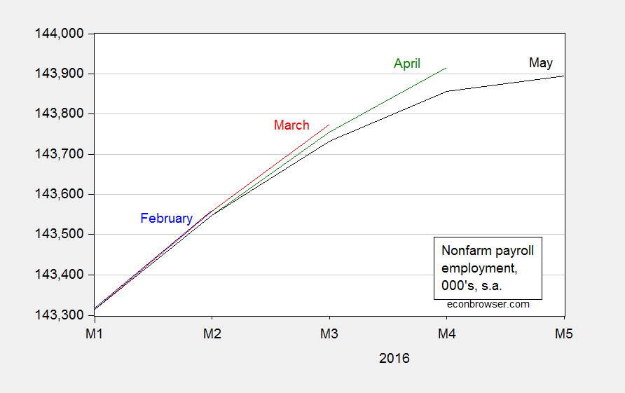
Figure 1: Nonfarm payroll employment, February release (blue), March release (red), April release (green), and May release (black). Source: BLS.
A longer span of data puts growth in perspective. The household series adjusted to the NFP concept also shows a slowdown.
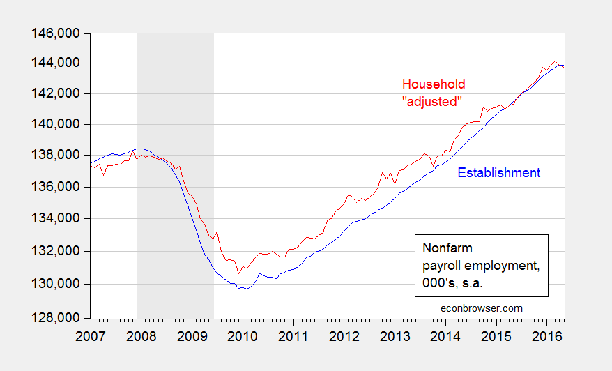
Figure 2: Nonfarm payroll employment, May release (blue), and household series adjusted to NFP concept (red). Source: BLS.
Of particular concern is the slowdown due to external conditions, including the dollar’s value.
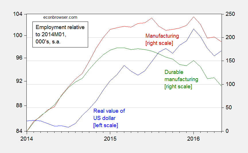
Figure 3: Real value of the US dollar (blue, left scale), manufacturing employment (red, right scale), and durable manufacturing employment (green, right scale), both relative to 2014M01, 000’s. Source: Federal Reserve Board and BLS.
Since January 2014, manufacturing has accounted for less than 200,000 of the 6.3 million cumulative net NFP employment gain.


Guest Contribution: “How Much Does the EMU Benefit Trade?”
Today we are pleased to present a guest contribution written by Reuven Glick at the Federal Reserve Bank of San Francisco and Andrew Rose at the University of California at Berkeley. The views expressed below do not represent those of the Federal Reserve Bank of San Francisco (FRBSF) or the Board of Governors of the Federal Reserve System. This blog is an updated version of FRBSF Economic Letter 2016-09, March 21, 2016.
Economic crises in some European countries over the past few years have stirred up new debate about the benefits and costs of belonging to the Economic and Monetary Union (EMU). The costs of forgone national control of monetary policy have become particularly apparent for member countries like Greece. Whether the economic benefits of sharing a currency—lower trade costs, lower exchange risk, and greater price transparency—outweigh the costs is a key part of the debate. To make this comparison, one must measure how much a common currency benefits a member country.
There has been considerable disagreement concerning the magnitude of the trade-stimulating effect of the EMU, or indeed of any currency union in which member countries use the same currency. This blog summarizes results from Glick and Rose (2016) regarding the effects of currency unions in general and the EMU in particular on international trade.
In earlier work (Glick and Rose 2002) we estimated how the amount of trade between two countries was affected by whether they were in a currency union. We looked at more than 200 countries from 1948 to 1997, before the establishment of the EMU. We found that bilateral trade approximately doubled as a pair of countries formed and halved when a currency union dissolved.
The relevance of this estimate for the EMU has been questioned on the grounds that it largely reflects the experiences of small dependent economies in currency unions with large anchor countries. In fact, as summarized in Head and Mayer (2014), more recent studies have estimated currency unions improve trade less than our earlier estimates suggest, on the order of 30% or less for the EMU.
Our recent paper (Glick and Rose 2016) extends our analysis to include the effect of currency unions on international trade through 2013, which includes the introduction of the EMU. In accordance with our gravity model specification, we explain bilateral trade as a function of the GDP income of the two countries in each pair, the distance between them, and a host of other variables that may facilitate trade, such as sharing a border, a common language, membership in a common regional trade agreement like the European Union, or a similar colonial past. To this framework, we add a measure of whether or not two countries share a common currency or have a stable one-for-one interchange of their currencies.
During our sample period, a large number of countries joined or left currency unions. By far the biggest recent event in monetary unions was the establishment of the EMU, which began with 11 member countries in 1999 and has since expanded to 19 members. To account for the possibility that trade effects for EMU countries may differ from that for other currency unions, which typically involve a developing country, we distinguish between the trade effects of EMU and non-EMU currency union pairs.
Estimation results
To see what the data can show about the effect of currency unions on international trade, we start with the approach of our earlier work: We measure trade as the average of exports and imports between each pair of countries and use a fixed effects estimator that accounts for the many characteristics associated with cultural, historical, political, or geographic factors that affect the volume of bilateral trade, but are difficult to observe, let alone quantify. Using least-squares panel estimation, we find with this approach that currency unions have a positive effect on trade. The EMU is estimated to raise trade by around 50%, while non-EMU currency unions boost exports by over 100%.
We also take account of more recent methodological developments in gravity model estimation (see Head and Mayer 2015). As Anderson and van Wincoop (2003) point out, the magnitude of exports between any two countries depends not only on their level of bilateral trade resistance but also on how difficult it is for each of them to trade with the rest of the world—what they call multilateral resistance.. We control for these multilateral resistance effects and hold constant all country-specific phenomena, including those that don’t vary over time, such as land area, and time-varying characteristics like GDP. We continue to control for country-pair fixed effects. With this second approach, the EMU still raises exports by roughly 50%, similar to our first estimation approach.
Dis-aggregating the non-EMU currency unions does not affect this estimate, though we find considerable heterogeneity across other currency unions. For example, trade raises by 60% or more for members of the African CFA zone and countries tied to the U.K. pound, but declined for members of East Caribbean Currency Union and countries linked to the U.S. dollar.
In other work, we show that if we focus on trade among the “older” members of the EMU, i.e. those who joined before 2007, trade still rises by more than 40%.
We also estimate the effects of currency unions over time, including how much trade is affected before and after the year of entry or exit from a currency union. Figures 1 and 2 show the effects of entry separately for EMU and non-EMU currency union pairs, along with 95% confidence bands. The conversion to actual percent change in exports can be calculated from the exponential value of the log change plotted in the figures minus 1.
As shown in Figure 1, the EMU has a positive effect on trade even before entry, and it increases further in the years after entry. This is consistent with the view that the path followed by policymakers as they prepared to launch the euro was credible enough to lock in expectations about exchange rates before the euro’s formal adoption in 1999. This prompted exporters and importers to move earlier to take advantage of new market opportunities. The continued growth in the estimated effect of EMU in the years after entry is consistent with the view that there are significant lags before international traders respond fully to changes in the environment created by a new currency union. As shown in Figure 2, there is no evidence of increased trade prior to joining currency unions between non-EMU countries, though trade does increase afterwards.
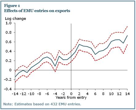
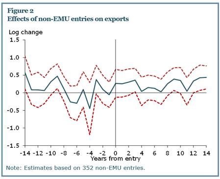
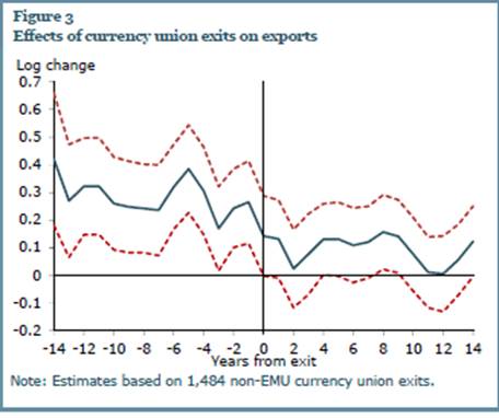
Figure 3 shows the effects of currency union exits over time; this is limited to non-EMU currency union members, since there have been no exits from the EMU to date. The results seem intuitive as well. The effect of currency union on trade is substantial before an exit. Upon exit, trade starts to shrink, though it lingers for a decade or more afterwards.
Comparison with Literature
How do our results compare with the literature? As noted earlier, the cottage industry has produced estimates of the trade effects of the Euro which are typically smaller (see the citations in our paper (2016) as well as in Head and Mayer (2014)). However, these studies invariably focus on the effects of the EMU, excluding other currency unions, and use samples that are smaller and shorter than ours. Limiting the sample to European and industrial countries precludes any direct comparison of the effects of EMU and other currency unions. Moreover, almost all of these papers include time trends for European Union pairs to control for ongoing economic integration among these countries. Including such trends significantly masks the possible euro effect on trade, both before and during the actual implementation of EMU.
Indeed, we show that the span of the data set, across both country and time, strongly affects the estimated effect of currency union on exports. In particular, the effects of the EMU fall significantly when the cross-country span is reduced to including only industrial countries or upper income countries. Thus, we conclude that a complete set of data, spanning a large number of countries and years, is critical when estimating the effect of currency unions on trade.
To summarize, our least squares panel results with time-varying country and dyadic fixed effects, which we consider to be our most plausible econometric model, deliver large positive effects for the effect of EMU membership on exports of 40-50%.
References
Anderson, James E., and Eric Van Wincoop. 2003. “Gravity and Gravitas: A Solution to the Border Puzzle.” American Economic Review 93(1), pp. 170–192.
Glick, Reuven, and Andrew K. Rose. 2002. “Does a Currency Union Affect Trade? The Time-Series Evidence.” European Economic Review 46(6), pp. 1,125–1,151.
Glick, Reuven, and Andrew K. Rose. 2016. “Currency Unions and Trade: A Post-EMU Reassessment.” Revised draft http://faculty.haas.berkeley.edu/arose/Glick2.pdf, earlier versions, and data available at
http://faculty.haas.berkeley.edu/arose/RecRes.htm#Reverse. Forthcoming European Economic Review.
Head, Keith, and Thierry Mayer. 2014. “Gravity Equations: Workhorse, Toolkit, and Cookbook.” Chapter 3 in Handbook of International Economics, volume 4, eds. G. Gopinath, E. Helpman, and K. Rogoff. Amsterdam: Elsevier, pp. 131–195.
This post written by Reuven Glick and Andy Rose.
June 2, 2016
Republican Outreach to Asian-American Voters Continues Apace
A poll conducted from April 11 to May 17 by the Asian and Pacific Islander American (APIA) Vote, Asian Americans Advancing Justice (AAJC) and AAPI Data provides some interesting results regarding the Republican project to increase influence in this demographic.
The poll included 1,212 registered Asian American voters, with a margin of error of plus or minus 3 percent. Here are the results for Asian Americans:
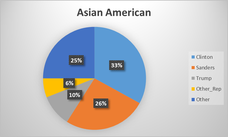
Figure 1: Candidate preference, % of Asian American registered voters. Source: Inclusion, Not Exclusion: Spring 2016 Asian American Voter Survey, Table 7. “Candidate Choice Among Asian American Registered Voters”.
Combined Republican (Trump others) vote preference is 16%.
Out of (personal) interest, here are the results for Chinese Americans.
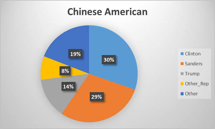
Figure 2: Candidate preference, % of Chinese American registered voters. Source: Inclusion, Not Exclusion: Spring 2016 Asian American Voter Survey, Table 7. “Candidate Choice Among Asian American Registered Voters”.
Previous data points for Asian Americans include 73% vote for Obama in 2012, vs. 26% for Romney, as noted in this post.
Nice summary from Politico:
Only 19 percent of Asian Americans hold a favorable view of the presumptive Republican nominee, according to a survey of more than 1,000 registered Asian Americans conducted by three Asian-American NGOs, while 61 percent view him unfavorably.
May 31, 2016
More on the Kansas Economy
With Philadelphia Fed leading indices out, I still don’t know if it constitutes a “disaster”, but it’s not particularly good.
While we have state GDP only up to 2015Q3 (2015Q4 figures to come out in mid-June), we do have personal income statistics through 2015Q4. The national and Kansas figures, deflated using the national personal consumption deflator, are shown in Figure 1.
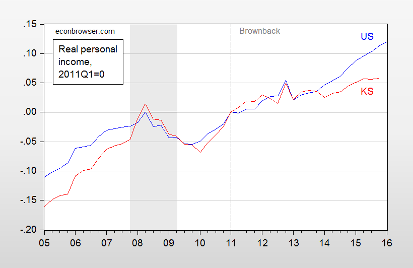
Figure 1: Log personal income for US (blue), and for Kansas (red), both deflated using national personal consumption deflator, both normalized to 2011Q1. NBER defined recession dates shaded gray. Source: BEA, NBER and author’s calculations.
Astute observers will note Kansas real personal income was rising faster than national income before the Great Recession, and is rising more slowly, particularly since mid-2013. (GDP figures, and a counterfactual, are shown in this post.)
What are the prospects for Kansas. The Philadelphia Fed published leading indicators today. They indicate Kansas will continue to lag.
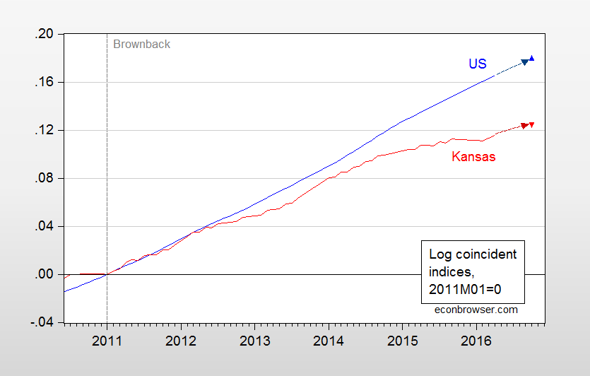
Figure 2: Log coincident index for US (blue), and for Kansas (red). Implied levels for October 2016 are based on leading indicators. Source: Philadelphia Fed, and author’s calculations.
For a graph depicting the trajectory of Kansas and her neighbors, see this post.
The Trade Slowdown, China, and the Rest of the World
“China and Asia in Global Trade Slowdown”
That’s the title of a just released IMF Working Paper by Gee Hee Hong, Jaewoo Lee, Wei Liao, Dulani Seneviratne:
Asia and China made disproportionate contributions to the slowdown of global trade growth in 2015. China’s import growth slowed starkly, driven by both external and domestic factors, including a rebalancing of demand. Econometric results point to weak investment and rebalancing as the main causes of the import slowdown. Spillover effects from China’s rebalancing are estimated for some 60 countries using value-added trade data, and are found to be more negative on Asia and commodity exporters than others.
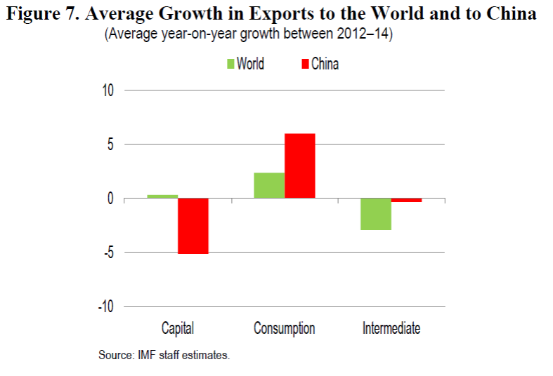
As noted in the abstract, rebalancing toward consumption is proceeding apace, albeit perhaps not as fast as might be desired. This is shown in Figure 7 (Box 3) from the paper.
The World
The slowdown in international trade is not a phenomenon specific; this point was highlighted in a recent FRB Richmond Focus by Jessie Romero, which asks the question “Why trade growth has slowed down — and what it might mean for the global economy?”.
after decades of rapid growth, trade suffered its greatest drop in the postwar era during 2008 and 2009, an episode known as the “Great Trade Collapse.” Today, growth rates are still well below the previous trend. The reasons for this sluggishness are unclear: Are there lingering effects from the global financial crisis and recession, or has some fundamental change occurred in the world economy?…
Source: FRB Richomond Economic Focus 2015Q4.
Early Warnings, and Anticipations of the Future
The concerns about the slowdown in trade are not new. Back in October, noted the slowdown, and through a different prism concluded:
Going forward, these results suggest world trade growth will remain subdued relative to pre-crisis averages. And the trade elasticity of global growth should not be expected to return to its pre-crisis level over the next few years for two reasons:
Global growth is expected to remain weaker than prior to the crisis, due to weaker global potential supply growth (see the recent IMF WEO chapter for more information). Given the higher variance of trade growth relative to GDP growth, that will continue to weigh on the trade growth to GDP ratio.
The weight on EMEs, which have low trade elasticities, is expected to continue rising (albeit at a slower pace than the past given the slowdown in potential growth expected over the next few years), further depressing the global trade elasticity. That will continue to weigh on world trade growth.
In a more recent Bank Underground post entitled “Bouncebackability of exports after the Great Trade Collapse of 2008/9”, John Lewis and Selien De Schryder argue that the slowdown, at least for many of the advanced economies, is temporary in nature. Here’s a graphical depiction of their forecast for this particular group:
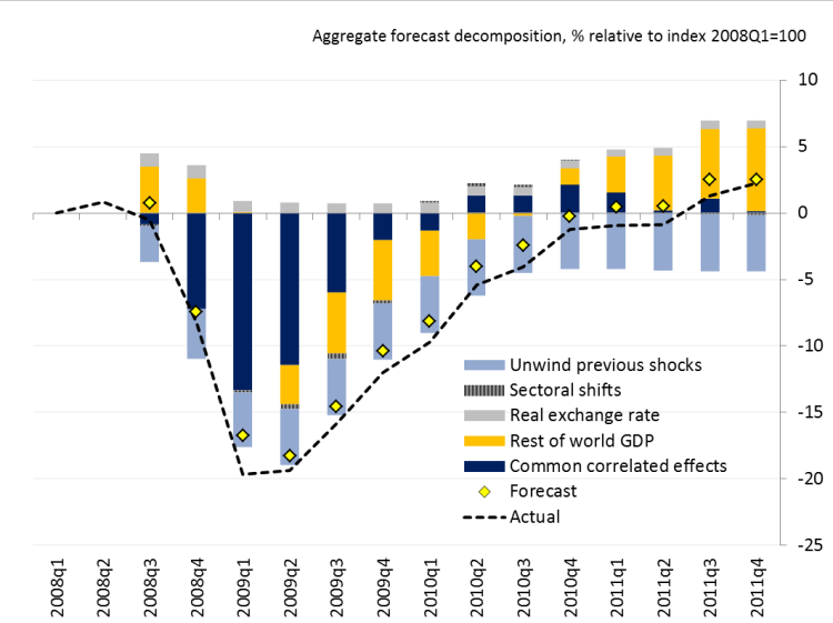
Source: John Lewis and Selien De Schryder, “Bouncebackability of exports after the Great Trade Collapse of 2008/9,” Bank Underground (December 2015).
…the key result of interest is what happens in the subsequent recovery — actual exports recovered to a very similar level to what a pre-crisis model would have predicted. The contribution of common correlated effects dies away to virtually zero. In short, exports bounced back to exactly the level we would have expected given the outturn of GDP and the pre-crisis relationships between GDP and trade, which is evidence in favour of the “temporary shock” explanation.
More discussion in the VoxEU ebook, “The Global Trade Slowdown: A New Normal?”, released in June 2015 (discussed in this post).
May 29, 2016
Trends in oil supply and demand
Here I review key trends in the oil market over the last decade.

World field production of crude oil, in thousands of barrels per day, monthly Jan 1973 to Nov 2015. Excludes natural gas liquids, biofuels, and refinery processing gain. Blue line segment connects June 2005 and June 2013. Data source: EIA Monthly Energy Review, Table 11.1b.
World oil production barely increased between 2005 and 2013. Yet this was a period when oil consumption from the emerging economies was growing rapidly. For example, Chinese imports of crude oil grew by a million barrels a day between 2005 and 2008 and increased by another two million barrels a day between 2008 and 2013.
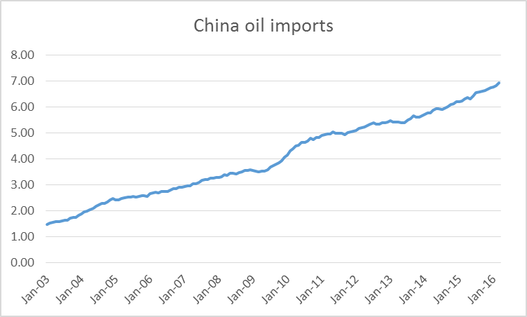
Chinese oil imports in millions of barrels a day, average over the previous 12 months, Jan 2003 to March 2016. Data source: JODI.
How could China realize such a big increase in consumption when very little additional oil was being produced worldwide? The answer is that consumption in places like the United States, Europe, and Japan had to fall. The primary factor that persuaded people in those countries to use less was the high average price of oil over 2007-2013.
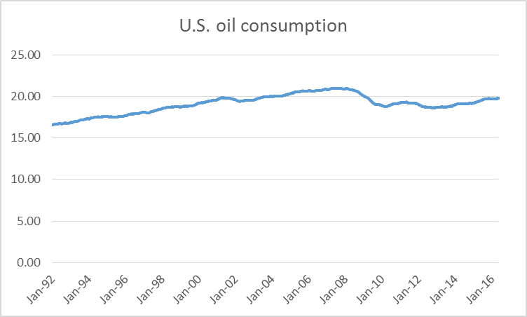
U.S. product supplied of petroleum products in millions of barrels per day, average over the previous 52 weeks, Jan 3, 1992 to May 20, 2016. Data source: EIA.
But in the last few years global oil production broke away dramatically from that decade-long plateau. In 2013-2014 the key factor was surging production from U.S. shale formations. That peaked and began to decline in 2015. But world production continued to grow during 2015 thanks to tremendous increases from Iraq. And increases in 2016 may come from new Iranian production now that sanctions have been lifted.

Iraqi field production of crude oil, in thousands of barrels per day, monthly Jan 1973 to Nov 2015. Data source: EIA Monthly Energy Review, Table 11.1a.
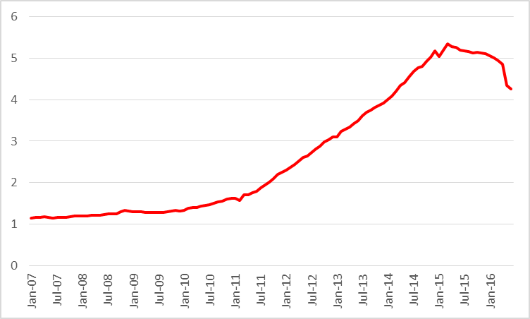
The new supplies from the U.S., Iraq, and Iran brought prices down dramatically. And in response, demand has been climbing back up. U.S. consumption over the last 12 months was 800,000 b/d higher than in 2013, a 4% increase. Vehicle miles traveled in the U.S. are up 6% over the last two years.
Average monthly U.S. vehicle distance traveled over the 12 months ended at each indicated date, in billions of miles, Jan 1992 to March 2016. Source: Federal Highway Administration.
Average fuel economy of new vehicles sold in the United States is no longer improving.
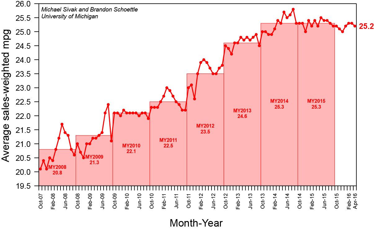
Average miles per gallon of new U.S. vehicles sold. Source: University of Michigan Transportation Research Institute.
Low prices are increasing demand and will also dramatically reduce supply. The EIA is estimating that U.S. production from shale formations is down almost a million barrels a day from last year.
Actual or expected average daily production (in million barrels per day) from counties associated with the Permian, Eagle Ford, Bakken, and Niobrara plays, monthly Jan 2007 to June 2016. Data source: EIA Drilling Productivity Report.
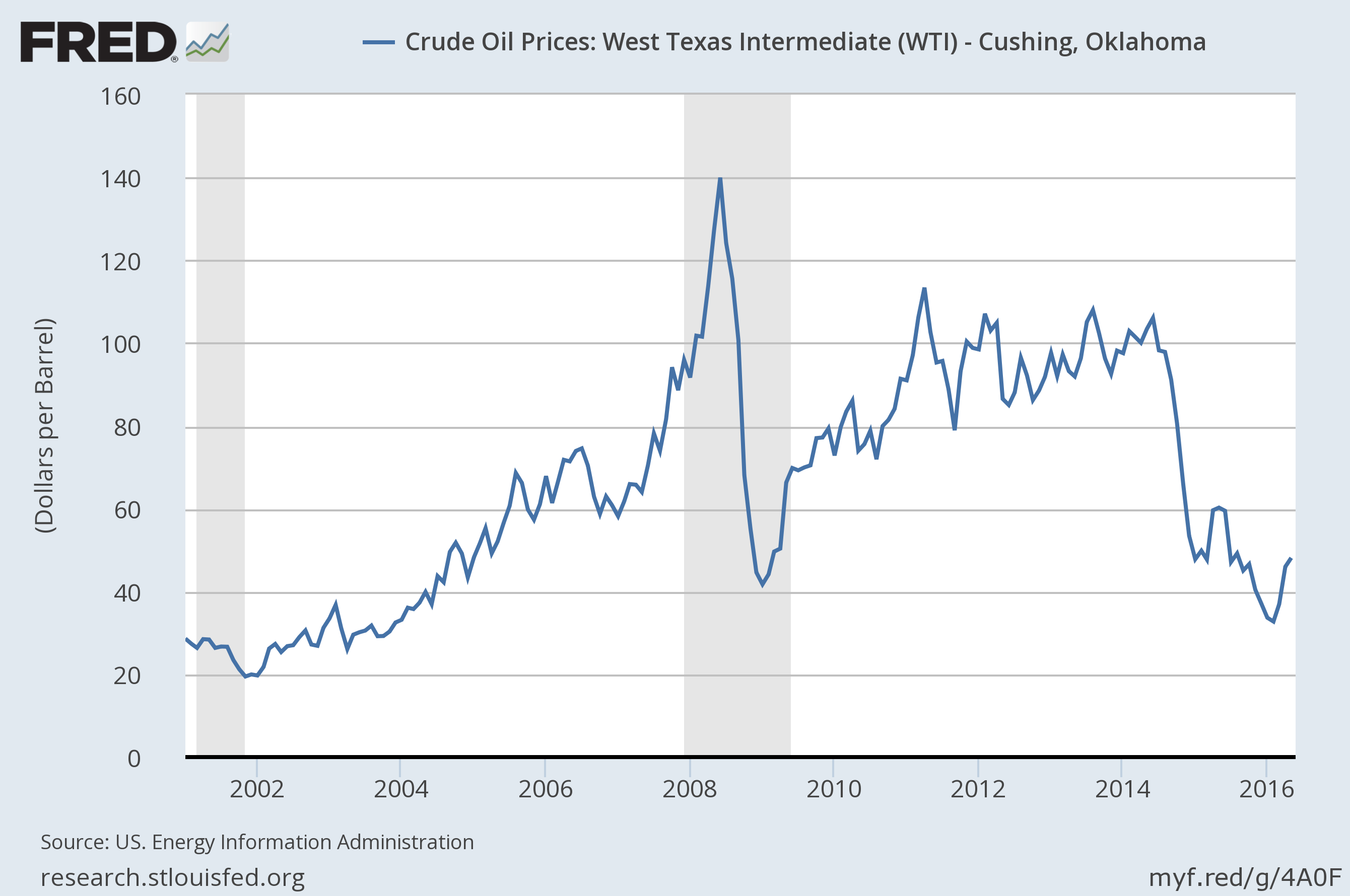
These factors all contributed to a rebound in the price of oil, which traded below $30/barrel at the start of this year but is now back close to $50.
Nevertheless, I doubt that $50 is high enough to reverse the decline in U.S. shale production. Nor is the slashing that we’ve seen in longer-term oil-producing projects about to be undone. And while there is enough geopolitical stability at the moment in places like Iraq and Iran to sustain significantly higher levels of production than we saw in 2013, there is no shortage of news elsewhere in the world that could develop into important new disruptions. For example, conflict in Nigeria may cut that country’s oil production by a million barrels a day.
Adding a million barrels/day to U.S. oil demand and subtracting 2 million b/d from U.S. and Nigerian supply would seem to go a long way toward erasing that glut in oil supply that we’ve been hearing about.
May 28, 2016
Costing the Forcible Removal of Undocumented Immigrants and Barring Entrance of Muslim Individuals from the Homeland
Republican presidential candidate Donald Trump has made two specific proposals purportedly aimed at safeguarding the Homeland. Presumably, these will be incorporated into the Republican party platform. How would those proposals be implemented and how much would implementation cost?
Forcible Removal
In order to assess costs, it is necessary to first lay out how to operationalize the goal of complete removal of all undocumented immigrants. In order for the solution to be complete, documentation of all individuals in the US would be required. That in turn would necessitate development and maintenance of a permanent national database incorporating documentation of location of birth. This would not be sufficient to complete Trump’s objective, if in fact citizenship is not based on location of birth (i.e., ending birthright citizenship [0], aka Jus Soli).
Current estimates of the number of undocumented immigrants in the United States (based on the current definition of citizenship, Jus Solis) center around 11.5 million [1]. Mass removal of this number of individuals would likely require centers to at least temporarily detain, isolate and then process the deportees. This presumes that speedy expulsion of deportees can be effected. If not, then the detention centers might involve holding population over more extended periods.
The American Action Forum has estimated a 20 year fiscal cost for removal at between $400 to $600 billion. [2]. That figure does not include supply side reductions in potential output arising from a reduced labor force; nor does it include costs of modifying the US-Mexico and/or US-Canada border walls.
More discussion here.
Barring Muslim Entrants
Mr. Trump has proposed that no Muslims be allowed to enter the United States, for some period yet to be determined. Since there is no exception indicated for US citizens, proper implementation requires that the national authority develop a registry of religious affiliation. In order to prevent individuals from circumventing the rules by providing false information, some means of verifying religious affiliation would be necessary for all US residents. (This is necessary because in order to determine who can be allowed to return to the United States after traveling abroad, religious affiliation of all US residents must be determined ahead of time). I am not aware of specific measures that have been proposed. One plausible method would be intensive interrogation combined with polygraph. Subjecting all US residents to such a procedure would be costly, but seems the only feasible way in which to prevent any travel of any Muslim into the US.
A similar means of assessing the religious affiliation of all individuals wishing to transit the United States could also be implemented.
One cost saving measure could be achieved by combining the national database registry on citizenship with the database on religious affiliation.
No cost estimates have been developed, to my knowledge, of implementing all aspects of such a policy. Some estimates have been generated for the cost in terms of lost travel from Middle Eastern/North African countries; one estimate is at $18.4 billion per year [4]. That estimate does not include screening costs, etc. It is merely the estimated cost of diverted travel (which enters the NIPA as an export). Additional discussion here.
It is interesting to note that a de jure travel ban based on religious affiliation is unprecedented in US history (of course, religious-based discrimination has been implemented in other countries at other times). Immigration bans on geographic origin do have some precedent, including the Chinese Exclusion Act of 1882 [5], and the National Origins Act of 1924, which applied to individuals of Japanese ancestry. In the former instance, US citizens of Chinese descent who left the United States were then denied the right to return, so there is precedent. Subsequent legislation clarified the restriction to apply to all ethnic Chinese regardless of national origin.
May 26, 2016
Guest Contribution: “Fiscal Education for the G-7”
Today, we are pleased to present a guest column written by Jeffrey Frankel, Harpel Professor at Harvard’s Kennedy School of Government, and formerly a member of the White House Council of Economic Advisers. This is an extended version of a column appearing at Project Syndicate.
As the G-7 Leaders gather on May 26-27 in Ise-Shima, Japan, the still fragile global economy is on their minds. They would like a road map to address stagnant growth. Their approach should be to talk less about currency wars and more about fiscal policy.
Fiscal policy vs. monetary policy
Under the conditions that have prevailed in most major countries over the last ten years, we have reason to think that fiscal policy is a more powerful tool for affecting the level of economic activity, as compared to monetary policy. The explanation can be found in elementary macroeconomics textbooks and has been confirmed in recent empirical research: the effects of fiscal stimulus are not likely to be limited, as in more normal times, by driving up interest rates, crowding out private demand, running into capacity constraints, provoking excessive inflation, or overheating in other ways. Despite the power of fiscal policy under recent conditions, economists continue to lavish more attention on monetary policy. Why?
Sometimes I think the honest reason we economics professors are attracted to monetary policy is that central bankers tend to be like us, with PhDs, and to hold nice conferences.
The answer that one usually hears is that fiscal policy is “politically constrained.” This is an accurate statement, but not a good reason for us to give up on it. Indeed, if the political process gets fiscal policy wrong, which it does, that is all the more reason for economists to offer their contributions.
Of course if one is a central banker, or is advising a central banker, then one must concentrate on the job at hand, which is monetary policy. But precisely because there is a limit to what central bankers can say about fiscal policy, there is more need for the rest of us to do it.
The heyday of activist fiscal policy was 50 years ago. The position “we are all Keynesians now” was attributed to Milton Friedman in 1965 and to Richard Nixon in 1971. In the late 20th century, most advanced countries managed to pursue countercyclical fiscal policy on average: generally reining in spending or raising taxes during periods of economic expansion and enacting fiscal stimulus during recessions. The result was generally to smooth out the business cycle (as Keynes had intended). It was the developing countries who tended to follow procyclical or destabilizing policies.
Advanced country leaders forget how to do counter-cyclical fiscal policy
After 2000, however, some countries broke out of their familiar patterns. Too many political leaders in advanced countries pursued procyclical budgetary policies: they sought fiscal stimulus at times when the economy was already booming, thereby exaggerating the upswing, followed by fiscal austerity when the economy turns down, thereby exacerbating the recession.
Consider mistakes in fiscal policy made by leaders in three parts of the world — the US, Europe, and Japan. US President George W. Bush began the century by throwing away the large fiscal surpluses that he had inherited from Bill Clinton, and then continued with big tax cuts and rapid spending increases even during 2003-07, as the economy reached its peak. It was during this period that Vice President Cheney reportedly said “Reagan proved that deficits don’t matter.” Predictably, the rising debt left the government feeling less able to enact fiscal stimulus when it was really needed, after the Great Recession hit in December 2007. At precisely the wrong time, Republicans “got religion” deciding that deficits were bad after all. Thus when President Obama took office in January 2009, with the economy in freefall, the opposition party voted against his fiscal stimulus. Fortunately they failed then, and the stimulus made a big contribution to reversing the freefall in the economy in 2009. But having regained the Congress in 2011, they did succeed in blocking Obama’s further attempts to stimulate the still-weak economy for three years. The Republicans appear to be consistently procyclical.
Greece is the “poster boy” of an advanced country that unhappily switched to a systematically procyclical fiscal policy after the turn of the current century. Its first mistake was to run excessive budget deficits during the expansionary period 2003-08 (like the Bush Administration). Then, as if operating under the theory that “two wrongs make a right,” Greece was induced after its crisis hit to adopt tight austerity in 2010, which greatly worsened the fall in GDP. The goal was to restore its debt/GDP ratio to a sustainable path; but instead the ratio rose at a sharply accelerated rate, because of the fall in GDP.
Europeans suffer even more than other countries from basing their budget plans on official forecasts that are unnecessarily biased, which can lead to procyclical fiscal policy. Before 2008, not just Greece, but all euro members were overly optimistic in their forecast and so at times “unexpectedly” exceeded the 3% ceilings on their budget deficits. After 2008, qualitatively similar stories of procyclical fiscal contraction, leading to falling income and accelerating debt/GDP, also held in Ireland, Portugal, Spain and Italy.
The native land of austerity philosophy is, of course, Germany. The Germans had (reluctantly) gone along with an agreement at the London G-20 Leaders Summit of April 2009 that the US, China, and other major countries would expand demand in order to address the Great Recession. But when the Greek crisis hit at the end of that year, the Germans reverted to their deeply held beliefs in fiscal rectitude.
At first the IMF went along with the other members of the troika in believing — or at least pretending to believe — that fiscal discipline in the European periphery countries would not greatly damage their GDPs and thus could restore their debt/GDP ratios to sustainable paths. But in January 2013, Fund Chief Economist Olivier Blanchard released a paper that was widely interpreted as a mea culpa. It concluded that fiscal multipliers were much higher than the IMF (among other forecasters) had thought, suggesting that the austerity programs might have been excessive. This conclusion was based on a statistical finding that the countries which had attempted the biggest fiscal retrenchment in response to the crisis turned out to experience the most damage to GDP relative to what the IMF forecasters had expected. Today, IMF Managing Director Christine Lagarde explains to the Germans that Greece cannot achieve the elusive path of a sustainable debt/GDP ratio if it is not given further debt relief and is instead told to run primary budget surpluses of 3 ½ percent of GDP.
Now to Japan, host of this week’s G-7 meeting. In April 2014, even though the economy had been so weak that the Bank of Japan had been pursuing aggressive quantitative easing, Prime Minister Abe went ahead with a planned increase in the consumption tax (from 5% to 8%). As many had predicted, Japan immediately went back into recession. Even though the first arrow of Abenomics, the monetary stimulus, had been fired appropriately, it was evidently less powerful than the second arrow, fiscal policy, which unfortunately had been fired in the wrong direction.
Very soon now, Prime Minister Abe must decide whether to go ahead with a further rise in the consumption tax (to 10%), currently scheduled for April 2017. It is easy to see why Japanese officials worry about the country’s huge national debt. But, as near-zero interest rates signal, creditworthiness is not the current problem; weakness in the economy is. A more effective way of addressing the long-run sustainability of the debt is to announce a 20-year path of very small annual increases in the consumption tax, calculated so as to demonstrate to investors that the ratio of debt to GDP will come down in the long term.
Developing countries
Not all is bleak on the country scoreboard of cyclicality. Some developing countries did achieve countercyclical fiscal policy after 2000. They took advantage of the boom years to run budget surpluses, pay down debt and build up reserves, which allowed them the fiscal space to ease up when the 2008-09 crisis hit. Chile is the poster boy of those who “graduated” from procyclicality. Others include Botswana, Malaysia, Indonesia, and Korea.
Unfortunately some, like Thailand, who achieved countercyclicality in the last decade have suffered backsliding since then. Brazil, for example, failed to take advantage of the renewed commodity boom of 2010-11 to eliminate its budget deficit, which explains much of the mess it is in today now that commodity prices have fallen. Politicians everywhere might improve their game if they re-read their introductory macroeconomics textbooks.
This post written by Jeffrey Frankel.
May 25, 2016
Kansas and Her Neighbors: Economic Activity
I don’t know if it counts as a “disaster”, but Kansas continues to lag its neighbors in economic activity, and to under-perform what is to be expected from historical correlations.
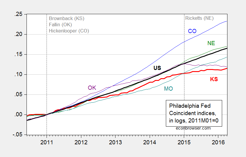
Figure 1: Log coincident indices for Colorado (blue), Kansas (bold red), Nebraska (green), Oklahama (purple), Missouri (teal), and United States (bold black), all 2011M01=0. Source: Philadelphia Fed, author’s calculations.
The Philadelphia Fed’s coincident indices are aimed at measuring total economic activity, calibrated to match the growth rate of real state GDP. The correlation of the index with state GDP varies across states, and for Kansas is between 0.55-0.70 (see this report for a discussion).
It would be preferable to use directly the quarterly GDP series to make comparisons. However, reporting of such figures lags the national statistics considerably; we only have the 2015Q3 figures as of early March.
I have used the historical correlation of Kansas GDP with US GDP, and a drought variable, to create a counterfactual by which to quantify the shortfall in Kansas economic performance (see this post for details of the procedure). The key graph is below.
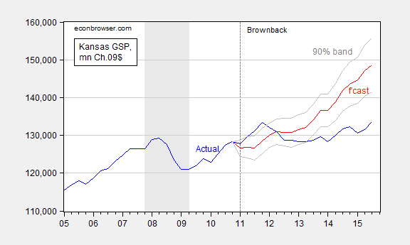
Figure 2: Kansas GDP, in millions Ch.2009$ SAAR (blue), ex post historical simulation (red), 90% band (gray lines). Forecast uses equation (1). NBER defined recession dates shaded gray. Source: BEA, NBER, and author’s calculations.
These results indicate that (1) actual Kansas GDP is far below predicted (5.3 billion Ch.2009$ SAAR, or 3.9%, as of 2015Q3), and (2) the difference is statistically significant. To place this in context, if US GDP were to fall 3.9% below trend, I am sure that plenty of folks would notice.
A digression regarding unemployment rates, and “fixed effects”. The state level unemployment rates are subject to high levels of measurement error given the relatively small sample available for each state (see discussion here). That being said, the average KS-US unemployment rate differential over the 1986-2010 period is -1.17, while the differential for 2016M04 is -1.2. In other words, as measured by unemployment rates, Kansas is doing about average. In contrast, the average MO-US differential is -0.24, with the 2016M04 reading at -0.70. In other words, by this metric, Missouri is doing better than average. (The post-1986 period conforms to the Great Moderation; December 2010 marks the end of the pre-Brownback period.)
May 22, 2016
Dueling nowcasts
The second quarter of 2016 is now more than half over, but we won’t receive the first reading on 2016:Q2 GDP from the BEA until the end of July. A forecast of something that is happening right now is sometimes described as a “nowcast”. The Federal Reserve Banks of New York and Atlanta are providing a valuable service by publishing continuously updated nowcasts of GDP. But what should we do if they’re giving us rather different numbers?
Right now the Atlanta Fed’s nowcast is calling for second-quarter real GDP growth of 2.5% at an annual rate while the New York Fed says 1.7%. That’s actually a smaller disagreement than the two models began with on April 29, when the advance estimate of first-quarter GDP was first released. At that date the Atlanta model was anticipating 1.8% second-quarter growth while the New York model was only predicting 0.8%.
The forecast the two approaches start the quarter with is one of the key differences between the two models. The Atlanta model begins with separate forecasts of 13 individual components of GDP, such as personal consumption expenditures on goods, PCE on services, and investment in equipment. The start-of-quarter forecast is based on a regression of each component on 5 quarters’ lags of all the components, with the regression coefficients heavily weighted toward a random walk using a Bayesian prior, according to which the best forecast of next quarter’s equipment investment is probably not too far from whatever the number was for this quarter. By contrast, the New York model begins with a “top-down” approach, starting with a forecast of overall economic activity based on the best current assessment of overall activity.
From that starting point, both models then process every major new piece of data as it comes in. Based on the historical correlation between each new measure and any variables of interest both models generate a continuously updated assessment of everything that might matter for the current values of all the variables that we observe. For example, the New York Fed GDP nowcast was lifted up by the solid reports on retail sales and industrial production and capacity utilization for April.
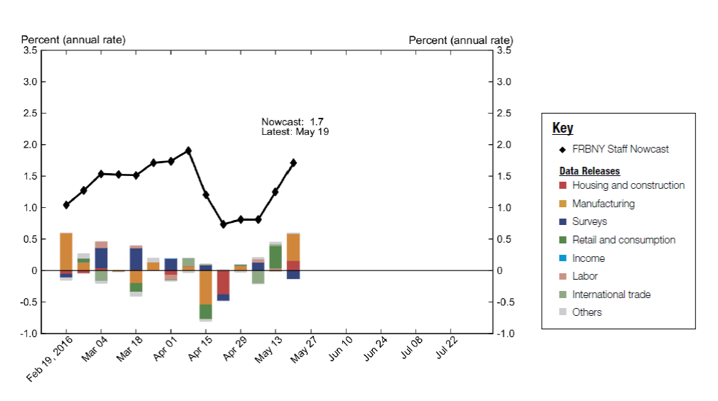
Evolution of Federal Reserve Bank of New York nowcast of 2016:Q2 real GDP growth rate (in black) along with contributions of specific news releases to the change (in color). Source: Federal Reserve Bank of New York.
The retail sales report was also the biggest single factor that lifted up the Atlanta nowcast.
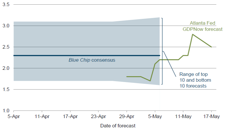
Evolution of Federal Reserve Bank of Atlanta nowcast of 2016:Q2 real GDP growth rate (in green). Source: Federal Reserve Bank of Atlanta.
A lot of economic research suggests that one of the best ways to reconcile conflicting forecasts is simply to go with their average, which in this case would be 2.1%. For that matter we might want to also throw in the pre-quarter Blue Chip consensus forecast (2.3%), Wall Street Journal survey of economic forecasts (2.2%), or the Survey of Professional Forecasters (2.1%), which all give us pretty much the same number as the average of the two Fed nowcasts.
In any case, the record of the large-data processing algorithms like those of either the New York or Atlanta Fed is that by the middle of July (a few weeks before the advance release of the Q2 GDP numbers) we should have a pretty good idea of what the BEA is going to tell us.
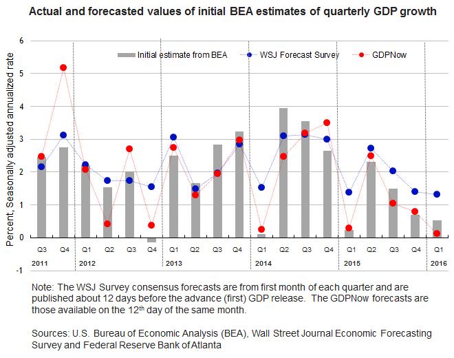
Blue: WSJ survey estimates 12 days before the advance GDP numbers were released. Red: Federal Reserve Bank of Atlanta nowcast as of the 12th day of the month in which the advance GDP numbers were released. Grey: advance GDP numbers for that quarter. Source: Macroblog.
Menzie David Chinn's Blog


