
Menzie David Chinn's Blog
August 25, 2016
Wisconsin in Last Place for Start-up Activity
The Kauffman Foundation has just released its report on startup activity. Wisconsin comes in last place in startup density.
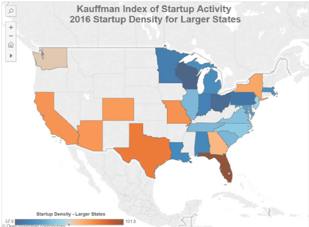
Figure 1: Source: Kauffman Foundation.
From the Milwaukee Journal Sentinel:
For the second year in a row, Wisconsin has earned a bottom-of-the-barrel ranking for start-up business activity, a new report says. Whether that’s as bad as it sounds or simply an unfairly skewed way of looking at the state’s economy depends on the beholder.
According to the report released Thursday by the respected Ewing Marion Kauffman Foundation, start-up activity in the U.S. overall rose in 2016 for the second year in a row. But among the 25 largest states, Wisconsin came in either last or second-to-last in each of the three categories the foundation evaluated.
…
Walker is committed to providing tools that ensure businesses’ long-term success once they’re up and running, Evenson said. Those tools include a tax credit for investors in qualified early-stage businesses, a micro-grant program that helps technology start-ups get federal R&D funding, an entrepreneurial training program on University of Wisconsin System campuses, and seed grant and accelerator programs.
WEDC, the state’s commerce agency, also plans to launch a program in the next few weeks to support “entrepreneurial assistance efforts,” Evenson said.
State policymakers, however, have drained funding from the start-up tax credits, said Joe Kirgues, a co-founder of gener8tor, which runs training programs for start-ups. They have also pursued additional cuts to the UW System and tried to pass stiffer non-compete legislation to further limit the supply of entrepreneurs, he said.
“The formula to turn around our job-creation performance includes a stronger UW system, the elimination of non-competes in Wisconsin and strengthening start-up tax credits to encourage additional investment in Wisconsin’s entrepreneurs,” Kirgues said. “Unfortunately, none of those things happened last year, and these rankings reflect the status quo.”
Given past performance, I have little faith in WEDC accomplishing much in this arena (see e.g., [1]. I also do not see a turn-around in the Governor’s approach to funding the UW system that would suggest a move toward strengthening the system.


Interpeting Performance: Japan since 2012
There is widespread belief that Abenomics has led to no increase in output in Japan. It therefore seems useful to examine the data.
Figure 1 shows real GDP normalized to 2012Q4 — just before the initiation of Abenomics — over time.
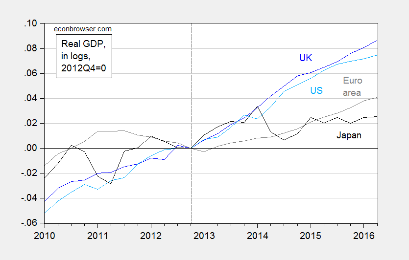
Figure 1: Log real GDP in UK (dark blue), US (light blue), euro area (gray), and Japan (black), all normalized to 2012Q4=0. Source: ONS, BEA, ECB, FRED, and author’s calculations.
Looking at aggregate real GDP seems to confirm lackluster performance in Japan, relative to other major economies — although it must be noted that Japanese GDP is 2.5% higher than it was in 2012Q4 (in log terms), which has occurred against a backdrop of elevated fuel imports due to closure of nuclear reactors, a big consumption tax hike, and the slowdown in China.
One important factor is that needs to be taken into account is population — particularly since population growth lags substantially in Japan. Per capita GDP presents a different picture.
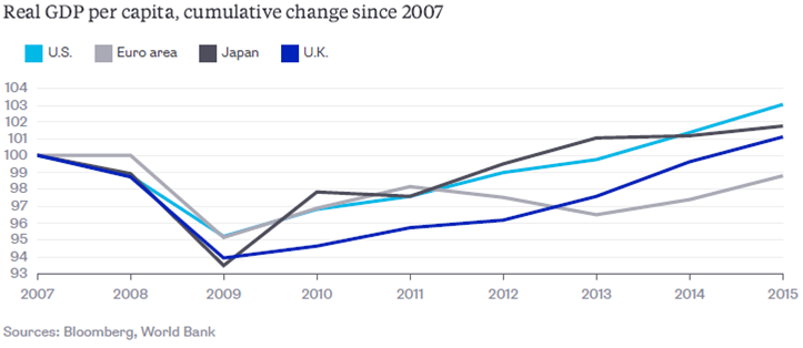
Source: N. Kocherlakota, “The U.S. Recovery Is Not What It Seems,” Bloomberg View, August 18, 2016.
Since the series are normalized to 2007, rather than 2012, it’s hard to see what the comparative performance looks like. Japanese per capita GDP has risen 2.3%, which is less than the United States’ 4.0%, but more than the Euro area’s 1.3%.
For more, see The Economist.
August 23, 2016
“The dollar will go down in value and inflation will start rearing its ugly head,”
So spake Donald J. Trump, September 13, 2012. Here’s what actually happened.
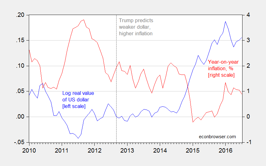
Figure 1: Log real value of US dollar against broad basket of currencies, 2012M09=0 (blue, left scale), and year on year CPI-all inflation, % (red, right scale). Source: Federal Reserve Board, BLS and author’s calculations.
If it’s not obvious, these predictions did not come to pass. Hence, Trump is in the company of Representative Ryan, John Boehner, and Ron Paul, among others.
Guest Contribution: “Trump’s Fiscal Brainstorm: Cut Taxes for the Rich”
Today, we present a guest post written by Jeffrey Frankel, Harpel Professor at Harvard’s Kennedy School of Government, and formerly a member of the White House Council of Economic Advisers. This is an extended version of a column that appeared at Project Syndicate.
Among the many ways in which this year’s US presidential election campaign differs radically from past patterns is the departure of Republican nominee Donald Trump from many of the policy positions traditionally taken by his party. For example on support for trade, military allies, or marriage. But when he released some positions on tax policy position recently, the differences with Hillary Clinton’s proposals fell very much along usual party lines. It’s the kind of tax cuts that have long been favored by Republican presidential candidates and congressmen: tax cuts that overwhelmingly benefit the rich, and that are not accompanied with any plans to pay for them.
Of course there are reasons for hesitating to judge presidential candidates by their platforms. Plans announced in the campaign are often a poor guide to what the president will actually do once in office. Candidate George W. Bush, for example, promised in 2000 to renounce nation-building adventures abroad, to respect fiscal responsibility, and to treat greenhouses gases as pollutants under the Clean Air Act. Needless to say, his administration rocketed off 180 degrees in the opposite direction on these issues.
Mr. Trump, in particular, changes his positions with head-spinning frequency, denying that he said things that he is on record as having said a short time before. A common tactic is to accuse the media of making up the earlier statements, even when the earlier statements are on tape. Another tactic is to say that he was only joking.
Are we supposed to take seriously, for example, his statements during the primary debates that American workers’ wages are too high? Or that he could and would happily contemplate negotiating the terms of the national debt with creditors, otherwise known as defaulting? Are we supposed to overlook such reckless statements, and ascribe them to an earlier period when he was young and irresponsible?
Compare the zig-zags that Trump has pulled off with the minor past shifts that have been sufficient in the past to get other politicians tarred with “flip-flopping”. Remember, for example, the reaction when John Kerry in 2004 said “I actually did vote for the $87 billion before I voted against it.” (The earlier Democratic measure that he supported would have paid for the $87 billion in Iraq war funding by reducing Bush’s tax cuts while the version that he voted against instead irresponsibly added the cost to the national debt.)
In any case, we policy wonks are obliged to try to evaluate the policy plans that the candidates offer. The alternative is to leave the national discussion focused entirely on the current week’s poll results, reporting whether the candidates are rising and falling among voters classified by various combinations of gender, ethnicity, and socioeconomic status.
Some positions that a candidate may truly hold don’t deserve the attention they receive because in practice he or she stands little or no chance of being able to bring them about if elected. An obvious case is when their proposals are blocked by the other party if it has a majority in congress. Another case is international constraints. Although there is a lot of attention to trade agreements this year, promises by presidential candidates to negotiate a new improved trade agreement are seldom if ever implementable once they get to office. (The truth is, in international negotiations such as TPP, the US has already gotten about the best deal it can get, one that is much better than most people realize.)
The difference between the two parties lies not in some fantasized ability to reverse the rise in inequality by turning the clock back 50 years on trade, or even on somehow reversing the long-term shift from manufacturing to services. Rather the difference lies in some very practical live policy issues, particularly some that would reverse the trend that leaves many workers behind. Examples include universal health care (extending the ACA, i.e., Obamacare, rather than abolishing it), infrastructure spending ($275 billion cumulative, in Secretary Clinton’s campaign proposal), compensation for those who lose jobs due to trade or other forces beyond their control, and a more progressive tax structure.
Trump made his most serious attempt at a fiscal plan on August 8. The tax proposal has four salient features, fairly described as tax cuts for the rich. There is no indication how the tax cuts will be paid for and every indication that they will sharply expand the budget deficit, as happened when Reagan and Bush enacted record budget-busting policies. All of this is very much in line with Republican proposals over the last four decades, all the while attacking Democrats for running deficits.
Trump proposes to abolish the estate tax entirely. Bush and congressional Republicans tried hard to do this, and got close, but didn’t quite make it. Trump, like other Republicans in the past, tries to hide the fact that only the very rich would benefit because the current estate exemptions are so high: $10.9 million for the estate of an married couple (and half that for an individual). In the most recent year available, only 4,700 estates in the entire country, out of 2.6 million deaths, required the reporting of some estate tax liability. Trump repeated the old fairy tale of farms or small businesses that have to be sold by heirs to pay the estate tax; but Republicans after all these years are still unable to come up with specific instances of this actually happening.
He proposes to cut corporate income taxes very sharply, to 15%. It is true that the US corporate income tax rate is among the highest in the world, at 35%, and that this probably contributes to companies keeping profits overseas, rather than repatriating them to the US. But as most tax policy experts will tell you, a reduction in the overall rate should be accompanied by base-broadening. In particular, we should abolish corporate tax deductions such as those designed to encourage corporate debt and oil drilling. We could thereby reduce harmful distortions in the economy while making up revenue.
Trump’s proposals to cut personal income tax rates have now changed.
Before the primaries, his fiscal proposals included cutting the top marginal income tax rate from 39.6 %, the current level, to 25%. Independent analysts pointed out that his tax policies would lose about $10 trillion in revenue over the first decade, a mind-bogglingly big number. They would rapidly driving to record levels the national debt as a share of GDP, which has been coming down over the last five years. His most recent proposal is to cut the marginal tax rate for high earners by about half as much, to 33%.
A new proposal, apparently added at the urging of daughter Ivanka Trump: Allow tax deductions for the entirety of average child care costs. Any such deductions benefit only those in high enough tax brackets to itemize deductions (like mortgage interest), which is mostly those who earn more than $75,000. That is well above US median household income of $54,462 in 2015.
The Democrats would love to be able to accuse Trump of designing his tax cuts so as directly to benefit him, his family, and people like them. It is harder to make this accusation because the candidate still refuses to release his own income tax records (as all previous candidates have done since Nixon). There is no shortage of guesses as to what it is that Trump must be trying to hide. One good guess is that in some years he has paid no taxes at all, by taking advantage of loopholes already available to big real estate developers. If so, his annual tax bill can’t be cut further. But he would still gain from the elimination of the estate tax.
Basic arithmetic says “government outlays minus tax receipts equals the budget deficit.” Republican presidential candidates have seemingly had trouble understanding this equation since 1980. They propose large specific tax cuts without specific spending cuts, and yet claim they are going to reduce the deficit. The outcome was the record increases in budget deficits during the terms of Ronald Reagan and George W. Bush.
Trump’s tax cut proposals follow in this tradition of fiscal irresponsibility. The budget plans are still too vague — particularly with respect to discretionary government spending, social security and Medicare – to allow an informed estimate of their impact on the federal deficit and national debt. But the candidate may be subjected to pressure to become more specific as the date of the election draws near.
Trump may look to his predecessors’ strategies for guidance. It is worth recalling the four magic tricks that politicians calling themselves fiscal conservatives have been using for 35 years, evasions to facilitate making fiscal promises with a straight face. These tricks are often deployed in sequence, one succeeding another as they fail to work.
The “Magic Asterisk.” The candidate promises to balance the budget at the same time as cutting taxes by spending cuts that are not specified (“future savings to be identified”), but supposedly will be in the future.
“Rosy Scenario.” One can forecast an increase in tax receipts if one forecasts an increase in the national rate of growth of income. One PhD economist has finally signed on as an adviser to the Trump campaign (though he has apparently yet to talk to the candidate); he has suggested that under a Trump presidency the American GDP growth rate will magically double. This is the same tactic adopted by Jeb Bush during the primaries, and many other politicians before (of both parties).
The Laffer hypothesis. But why should growth double? Reagan, Bush, McCain, and others have signed on to the proposition that their proposed cuts in tax rates will spur economic activity so much that total tax revenue (the tax rate times the economic base) will go up rather than down. Although this “Laffer proposition” has been disproved many times, and the economic advisers to those three candidates clearly disavowed it, the temptation to square the budgetary circle by making this claim is too strong to resist. Watch for Trump to come out with it.
The “Starve the Beast” hypothesis. Finally, after the other justifications for big tax cuts turned out wrong, Presidents Reagan and Bush fell back on the theory that, even though tax revenue had in fact fallen rather than rising, this was a good thing after all: it would politically force congress to approve spending cuts. But these are cuts that the president himself never gets around to proposing.
Perhaps it is inevitable that candidates at the platform-making stage wish away such real-world constraints as congressional politics or international realities, leaving voters disappointed by failed “promises” after taking office. But politicians shouldn’t be able to wish away the constraints of arithmetic — not when the promises reflect the same failed sleight of hand that has been tried and exposed so many times before.
This post written by Jeffrey Frankel.
August 21, 2016
Too systemic to fail
Bryan Kelly at the University of Chicago, Hanno Lustig at Stanford and Stijn van Nieuwerburgh at NYU had an interesting paper in the June issue of American Economic Review that used option prices to measure the magnitude of the implicit U.S. government guarantee of the financial sector during 2007-2009.
A put option is an agreement you could make that you gives you the opportunity (if you choose to exercise it) to sell a security at some specified price and future time. If the agreed-upon price is well below the current price, you are basically buying insurance against a very big move down in the stock price. How much you pay for the option depends on the likelihood you and the counterparty place on the stock price going that low and on how much you value being insured against that contingency.
You could buy put options on a variety of securities, both individual stocks and indexes constructed from groups of stocks. The key observation motivating Kelly, Lustig, and van Nieuwerburgh’s paper is a divergence in 2007-2009 between the combined price of put options on individual financial-sector stocks and the price on options for an overall financial-sector index. During the Great Recession, you started to pay much more for a dollar of insurance against any individual financial stock going down than you would for a dollar of insurance against the whole sector going down.
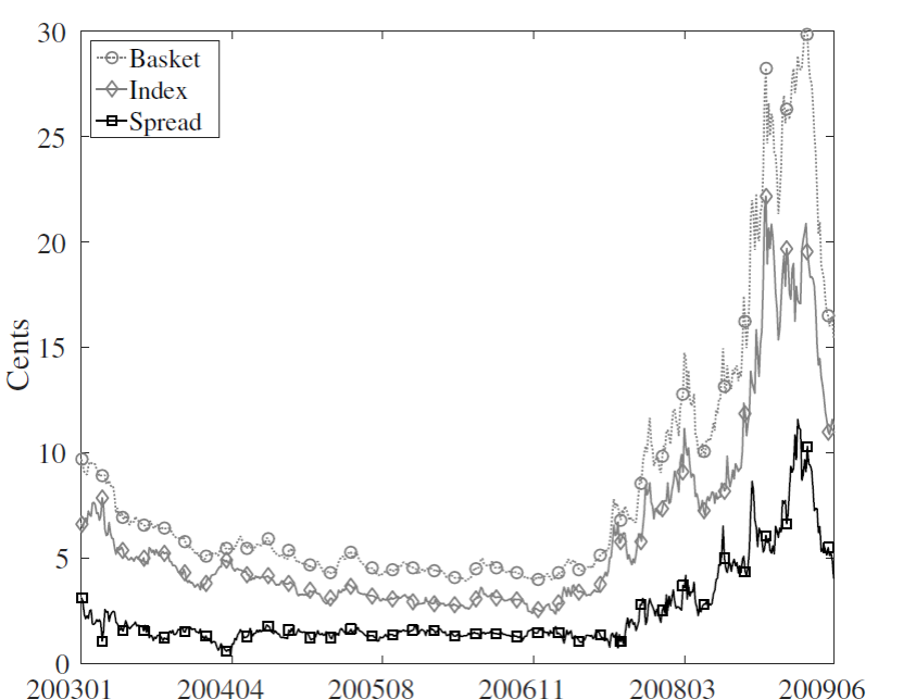
The cost of financial sector insurance based on 365-day put options (delta = -25%) on the index (solid gray line) and a basket of options on individual stocks (dotted gray line), as well as the basket-index spread (black line). Units are cents per dollar insured. Source: Kelly, Lustig, and van Nieuwerburgh (2016).
One possible explanation would be if firm-specific risks went up. But the correlation between financial-sector stocks increased rather than fell during this period. And we see no corresponding spread develop in the prices of call options (where I pay you for the option of buying at some future price).
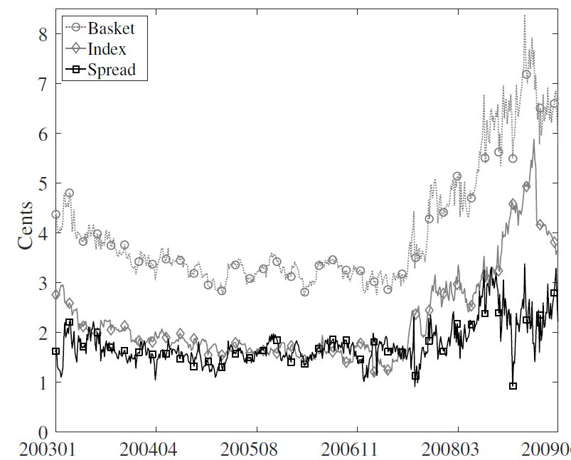
The cost of financial sector insurance based on 365-day call options (delta = +25%) on the index (solid gray line) and options on the basket (dotted gray line), as well as the basket-index spread (black line). Units are cents per dollar insured. Source: Kelly, Lustig, and van Nieuwerburgh (2016).
We also did not observe an analogous price spread between individual put options and sector-wide put options for nonfinancial stocks.
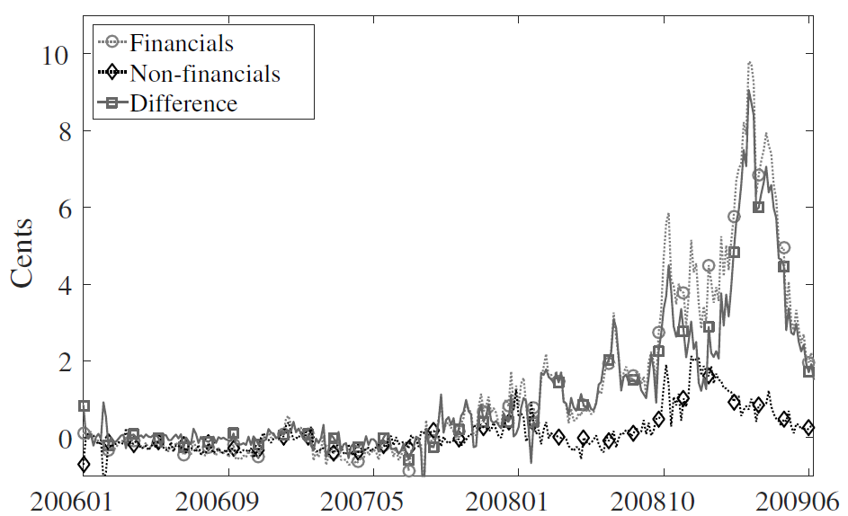
Basket-index spreads (puts minus calls) for the financial sector (marked by circles), the non-financial sector (marked by diamonds) and their difference (financials minus non-financials, marked by squares). Units are cents per dollar insured. Source: Kelly, Lustig, and van Nieuwerburgh (2016).
The authors examined a number of other possible factors, and concluded that the single most plausible explanation is that while the government may have been prepared to let individual banks suffer big losses, it stood ready to provide whatever assistance was necessary to prevent a big drop in the entire sector, a policy that some observers have referred to as the “Greenspan/Bernanke put”. The authors constructed an option-pricing model that incorporated this perception on the part of option traders which allowed them to estimate parameters of the perceived policy to be able to explain the observed option prices. They then used this model to ask, suppose there had been no government guarantee, but you wanted to buy an insurance policy covering the entire financial sector that would function the same way. They concluded that such a policy would have cost $282 billion. Here’s how the authors describe that number:
These estimates are admittedly coarse and derived from a highly stylized model, thus they are not to be interpreted as estimates with high statistical precision due to uncertainty about the correct model specification. Nonetheless they suggest meaningful effects of government guarantees on the value of equity and equity-linked securities.
There are those who claim that the government’s goal was to protect the banks. I do not share that view, and maintain that instead the government’s goal was to prevent collateral damage from a financial-sector collapse. The trade-off all along was to try to make sure that as much of the out-of-pocket costs as possible were paid by bank owners and management while minimizing collateral harm to the non-bank public. Whether we found the right way to balance those trade-offs is something that will still be debated.
But I think we can all agree that what the government did was a pretty big deal.
August 20, 2016
More on the Kansas-US Unemployment Rate Difference
Bruce Hall says changing dynamics in Kansas have meant that a simple average difference (what I’ve called a individual state fixed effect) in Kansas-US unemployment rates is misleading — or more succinctly put, “the average obfuscates the trend”. So, I allowed a time trend and a square in time trend, in a regression over the 1976-2010 period (data series start in 1976; Brownback takes power in 2011). The t-stats on both coefficients are highly significant. Here is a picture of actual Kansas-US difference and the quadratic trend.
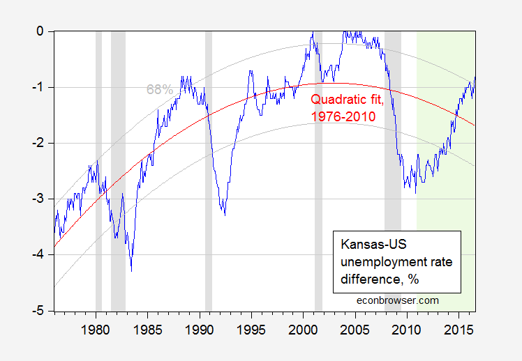
Figure 1: Kansas-US unemployment rate difference, in %, seasonally adjusted (blue), and quadratic fit (red), and 68% prediction interval (gray). NBER defined recession dates shaded gray. Out of sample period shaded green. Source: BLS, NBER, author’s calculations.
Kansas’s unemployment difference is 0.9 percentage points higher than “normal”, where normal is defined by historical correlations over the 1976-2010 period.
The regression is:
DIFF = -5.30 0.02time -0.00003time2
Adj-R2 = 0.59, SER = 0.71, nobs=420. bold denotes significance at the 5% level, using HAC robust standard errors.
In incorporating a quadratic in time trend, I am allowing for slow moving demographic changes to move the expected difference. One could add in a higher order polynomials in time — adding a cubic would increase the R2 statistic marginally, but would increase substantially (try it yourself!) the implied negative performance of Kansas relative to the US.
In any case, in evaluating performance, I’d say deviations from a level – as in Kansas employment relative to predicted, when long term trend movements are accounted for in a cointegration framework – is a better metric than a difference in a ratio from another ratio (which is what an unemployment rate is). Especially when at the state level the unemployment rate is very imprecisely measured.
I await the next re-interpretation of Kansas economic conditions with bated breath.
August 19, 2016
Kansas Employment Declines
Bruce Bartlett alerts me to the continuing economic downturn in the state.
First, two measures of employment (the household series in red is measured with much greater error, due to the small sample).
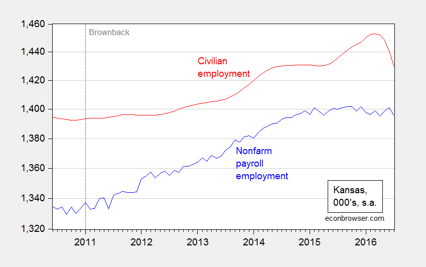
Figure 1: Kansas nonfarm payroll employment in Missouri (blue), and civilian employment (red), 000’s, on log scale. Short dashed line at Brownback inauguration. Source: BLS and author’s calculations.
The comparison of Kansas (private) employment trends to that of its neighbor Missouri’s is not flattering.
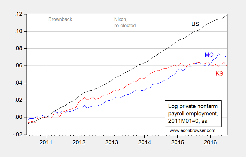
Figure 2: Log private nonfarm payroll employment in Missouri (blue), Kansas (red), and US (black), all normalized to 2011M01=0. Short dashed line at Brownback inauguration, long dashed line at Nixon second inauguration. Source: BLS and author’s calculations.
Kansas and Wisconsin Unemployment in Historical Perspective
Reader Bruce Hall asserts the two states aren’t doing too badly in terms of unemployment rates.
Different measures tell different stories. Kansas is much closer to “full employment” than most states; Wisconsin isn’t doing badly either. It’s nice to see the rest of the story.
At this point, it’s useful to look over time, as opposed to across states. Figures 1 and 2 present the Kansas-US and Wisconsin-US unemployment rate differences, over time, and compared against average differences for the 1986-2010 period (“Great Moderation”).
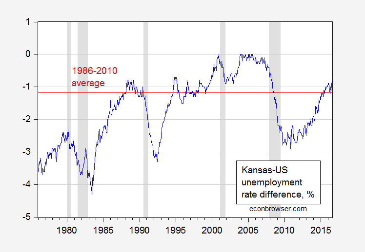
Figure 1: Kansas-US unemployment rate differential, in percentage points. Red line denotes average value over 1986-2010 period. NBER defined recession dates shaded gray. Source: BLS, NBER and author’s calculations.
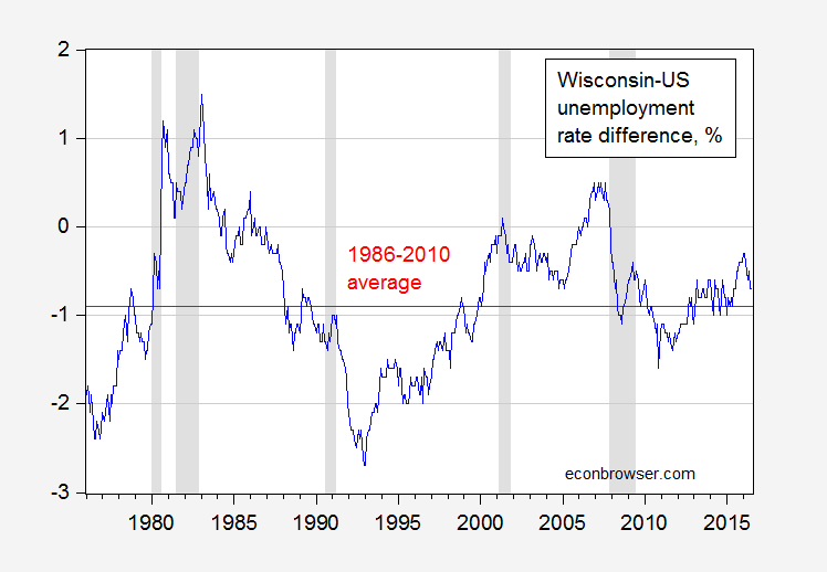
Figure 2: Wisconsin-US unemployment rate differential, in percentage points. Red line denotes average value over 1986-2010 period. NBER defined recession dates shaded gray. Source: BLS, NBER and author’s calculations.
In other words, in both states, the unemployment rate differential is now higher than their averages. In my view, that’s not so great…
August 18, 2016
Wisconsin Employment for July
DWD released data today. Wisconsin private employment in July is estimated to equal what we earlier thought it was in June…
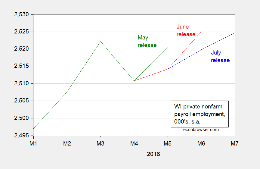
Figure 1: Wisconsin private nonfarm payroll employment from July release (blue), June release (red), and May release (green). Source: BLS, and DWD.
Notice that the past two preliminary estimates have been revised down.
Wisconsin private employment continues to increase at a lackluster pace; employment stands 47.9 thousand below the level Governor Walker stated in August 2013 was the goal for January 2016. This is shown in Figure 2.
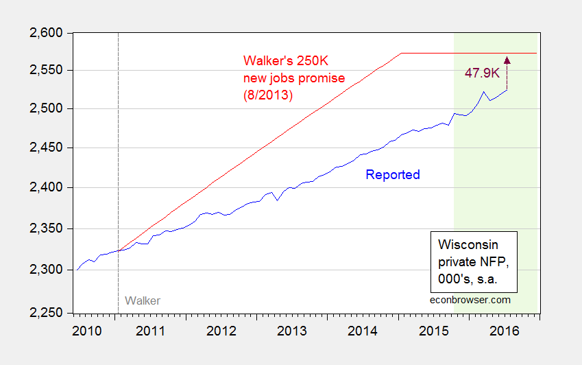
Figure 2: Wisconsin private nonfarm payroll employment (blue), and Governor Walker’s August 2013 commitment to create 250,000 new private sector jobs (red). Light green shading denotes data that has not been benchmark-revised. Source: BLS, Milwaukee Journal Sentinel, author’s calculations.
Note that the data in the green shaded area will be benchmark revised using Quarterly Census of Employment and Wage. The spikes in 2015M10 and 2016M03 will likely be benchmarked away (at least as suggested by data from QCEW through March 2016, also reported in the DWD release).
It’s of interest to see whether Wisconsin has gained on Minnesota, and the Nation. Since the beginning of the year, the gap has widened with respect to Minnesota.
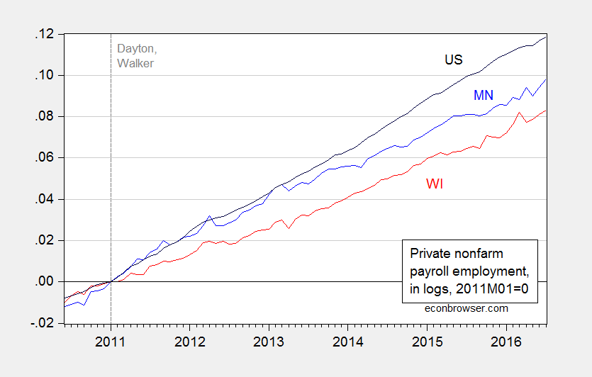
Figure 3: Log private nonfarm payroll employment in Minnesota (blue), Wisconsin (red), and US (black), seasonally adjusted, 2011M01=0. Source: BLS, DWD, DEED, and author’s calculations.
The correct comparison is what Wisconsin is doing relative to what it should be expected to do, based upon historical correlations. Using an error correction model (1 lag) estimated over the 1994-2010 period, with national private employment as the key exogenous variable, I find that current employment levels are below expected, by a statistically significant amount.
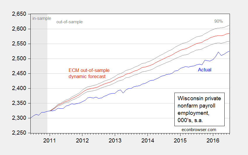
Figure 4: Wisconsin private nonfarm payroll employment (blue), and dynamic historical simulation (red), and 90% prediction interval (gray lines). Source: BLS, DWD, and author’s calculations.
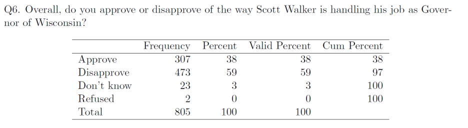
The current evaluation of the efficacy of the Governor’s economic policies can be seen in this Marquette Law School Poll (taken August 4-7) result:
August 17, 2016
Recession Watch, August 2016 Updated
New data came out on industrial production and monthly GDP over the last couple days. That allows us to update the picture of key indicators that the NBER Business Cycle Dating Committee focuses on continues to paint an ambiguous picture.
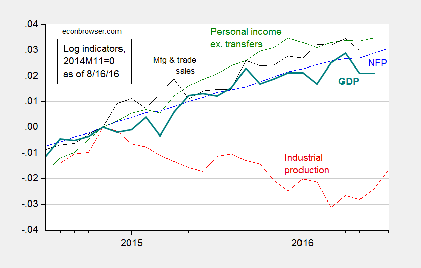
Figure 1: Log nonfarm payroll employment (blue), industrial production (red), personal income excluding transfers, in Ch.2009$ (green), manufacturing and trade sales, in Ch.2009$ (black), and Macroeconomic Advisers monthly GDP series (bold teal), all normalized to 2014M11=0, all as of August 16. Source: BLS (July release), Federal Reserve (June release), Macroeconomic Advisers (August 16), and author’s calculations.
Industrial production is now detectably trending upward. In terms of the tradables sector, manufacturing is also recovering, mitigating some of the concern of external drag.
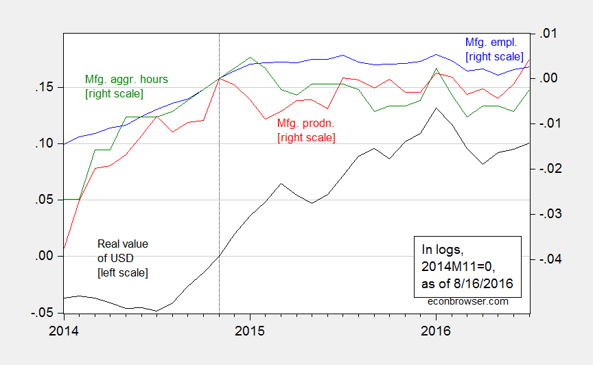
Figure 2: Real value of the US dollar against broad basket (black, left scale), manufacturing production (red, right scale), manufacturing employment (blue, right scale), aggregate hours index for manufacturing production and nonsupervisory workers, all in logs, 2014M11=0. Source: Federal Reserve Board, BLS, and author’s calculations.
Menzie David Chinn's Blog


