
Menzie David Chinn's Blog, page 12
March 20, 2016
Recent moves in oil prices
Today I discuss the factors that brought oil prices so far down and more recently back up.
World oil production was essentially stagnant for seven years beginning in 2005. Field production of crude oil averaged 73.9 million barrels a day in 2005 and averaged 74.7 mb/d in 2011.

Monthly world field production of crude oil in thousands of barrels per day, Jan 1973 to Nov 2015. Vertical line at Jan 2012. Data source: Monthly Energy Review.
That plateau was followed by a dramatic surge in world production of 3.1 mb/d between January 2012 and January 2015. More than all of that increase can be accounted for arithmetically by the 3.2 mb/d increase in U.S. production, spurred by horizontal fracturing of shale formations. Net production outside the U.S. actually decreased 100,000 b/d during these 3 years, though far from uniformly across producing countries, with 800,000 b/d increases each from Iraq and Canada helping to offset production declines in places like Libya, Iran, and Mexico.

Monthly U.S. field production of crude oil in thousands of barrels per day, Jan 1973 to Nov 2015. Data source: Monthly Energy Review.
U.S. production continued to rise in the first few months of last year, but fell almost 400,000 b/d between March and November to end the year about where it began. The EIA’s Drilling Productivity Report model predicts that field production from the major U.S. shale plays will have fallen another 400,000 b/d from November values by April. Last week the Wall Street Journal passed along this assessment:
In the Bakken Shale region, prices will need to be above $60 for benchmark West Texas Intermediate crude for at least three months before the area sees a meaningful uptick in drilling activity, said Lynn Helms, Director of North Dakota’s Department of Mineral Resources.
Actual or expected average daily production (in million barrels per day) from counties associated with the Permian, Eagle Ford, Bakken, and Niobrara plays, monthly Jan 2007 to Apr 2016. Data source: EIA Drilling Productivity Report.
But despite the situation in the U.S., world production of crude oil increased another 1.1 mb/d in the first 11 months of 2015. Here the big story has been Iraq, whose production was up almost 1 mb/d even though ISIS continues to control large non-oil-producing sections of Iraq.

Monthly Iraqi field production of crude oil in thousands of barrels per day, Jan 1973 to Nov 2015. Data source: Monthly Energy Review.
Saudi production was 400,000 b/d higher in November than in January, though that just leaves its current monthly production within the range we’ve been typically seeing over the last three years.

Monthly Saudi Arabian field production of crude oil in thousands of barrels per day, Jan 1973 to Nov 2015. Data source: Monthly Energy Review.
Another key factor keeping oil prices low has been Iran. The country claims to have increased production by 400,000 b/d since sanctions were lifted in January, and has plans for further increases. However, so far Iran has been encountering some logistical problems in selling the oil.
It’s important to emphasize that it’s not just developments on the supply side that have been driving recent oil price movements. The graph below compares the prices of a number of commodities over the last 16 months, which share not only the same dramatic downward trend, but also all experienced price rallies in the spring of last year and again over the last 2 months. This is true not just for the dollar price of copper, silver, lumber, and cattle, but for the dollar price of a euro as well.
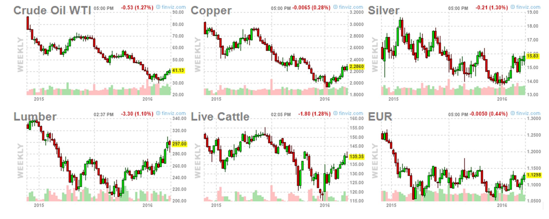
Weekly futures prices, Oct 2014 to Mar 2016. Source: Financial Visualizations.
The recent comovement between the dollar price of oil and the dollar price of the Chinese yuan is even more striking, as plots of the cumulative percent change (measured in 100 log points) in those two series since Sept 2014 demonstrate.
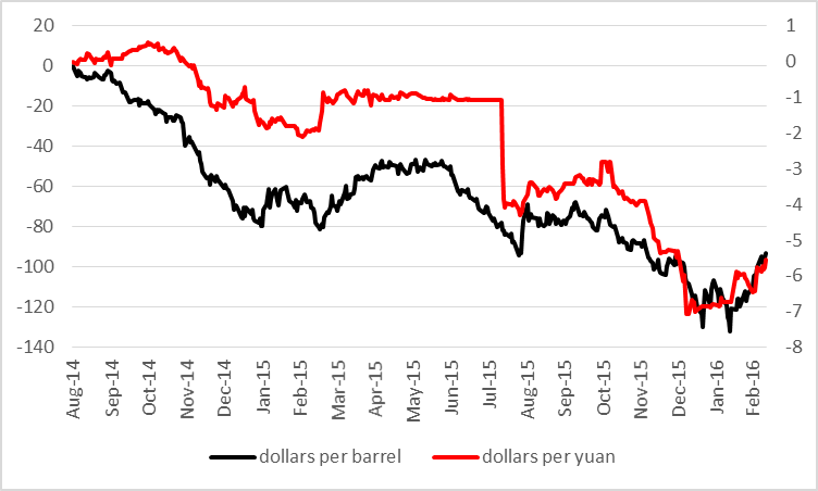
One hundred times the cumulative change since Aug 29, 2014 in the natural logs of the spot price of West Texas Intermediate (left scale, from DCOILWTICO on FRED) and of the dollar price of a euro (right scale, from reciprocal of DEXCHUS on FRED), daily, Aug 29, 2014 through Mar 11, 2016.
Note well that the above graphs do not imply that oil prices did not change if you measured them in euros or yuan. Oil prices and exchange rates in the two last sets of graphs have been plotted on very different scales. The price of oil is up 44% since January 20, but the euro has only appreciated by 2.5% and the yuan by about 1% since then. While it is certainly not the case that movements in the exchange rate are the cause of movements in the price of oil, it is quite clear from the graphs that these variables are responding to some common forces.
One important common factor is concerns about economic weakness in Europe and China, which contributed to their weaker currencies relative to the dollar as well as to slower growth in forecast oil demand. But is there evidence that the economic outlook has improved over the last two months? Chinese leaders have been suggesting that is indeed the case, and IMF Chief Christine Lagarde is encouraged by recent policy moves in Europe, Japan, and China. But many other observers remain pessimistic.
Another factor in the recent retreat of the dollar could be the Fed’s move toward a more dovish posture for 2016. Some have argued that this could mean a faster economic growth rate than might have been forecast in December and thus more robust oil demand. On the other hand, the reason for the Fed’s change would seem to be newly perceived weakness in some of the U.S. and global economic indicators.
To summarize, strong supply and weak demand contributed to the collapse of oil prices through the first part of this year. Which if either of those fundamentals has changed since then is substantially less clear at this point.


March 18, 2016
Guest Contribution: “Did the Markets Overlook Fed Bullishness in the March 16 FOMC Statement? “
Today we are pleased to present a guest contribution written by Jeffrey Frankel, Harpel Professor of Capital Formation and Growth at Harvard University, and former Member of the Council of Economic Advisers, 1997-99.
Financial markets reacted to the outcome of the FOMC meeting on Wednesday, March 16, as if what the Fed had revealed was highly dovish, that is, diminishing expectations regarding future interest rates. Dollar down, stocks and bonds markets up…
The markets were looking at the shift in the “dots plot” which formally rescinded the Fed’s previous forecast that it would raise interest rates four times in 2016. (Now it says twice.) Furthermore, Chair Yellen in her press conference said, “Most Committee participants now expect that achieving economic outcomes similar to those anticipated in December will likely require a somewhat lower path for policy interest rates than foreseen at that time.”
But this is old news. It reflects developments at the start of the year, such as the US report that GDP growth had been weak in the 4th quarter and the global financial market volatility in January and early February (especially related to China). Everyone knew all this a month ago.
The new news pertains to what has happened since mid-February. A lot of trends that had appeared to be negative have reversed in the last month. Statistics on US domestic final sales in January suggest that GDP will likely be stronger in the first quarter. Meanwhile, job gains were back up to 242,000 in February, reaching a record six-year-long streak of private employment growth. And globally, downward pressure on the renminbi, the US stock market, and commodity prices — which had so worried investors – all abated in February-March.
So did the Fed recognize these signs of economic strength in its statement Wednesday? Yes, it did. Gone was the January sentence “…economic growth slowed late last year.” In its place was a note that “economic activity has been expanding at a moderate pace…” (Also “Inflation picked up in recent months.”) Unless I am mistaken that language wasn’t there before, only the longstanding positive language about employment. It seems to me that the markets this week may have missed an acknowledgement from the Fed that things have turned around since the first six weeks of the year.
This post written by Jeffrey Frankel.
March 17, 2016
Not Quite: “…Wisconsin has left its former Democratic party-controlled (Midwest) peers behind”
One conservative meme is that Wisconsin’s apparently poor economic performance relative to other Midwest states is due to an inappropriate choice of reference dates; for instance, a year ago, Political Calculations made the assertion in the title, based on a July 2013 reference date. The logic?
…the tax policy of the previous Democratic party majorities in the state would remain untouched until at least July 2013, when the state’s next biennial budget would go into effect.
As events transpired, thanks to Scott Walker’s victory in the June 2012 gubernatorial recall election and the widening of Republican party control of the state’s elective institutions in subsequent elections, July 2013 marks when the state more fully adopted the Republican party’s preferred suite of economic policies.
Even using this (to me odd) criterion, it would be hard to say Wisconsin has been doing particularly well.
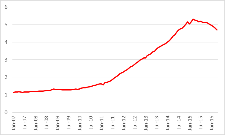
Figure 1: Log coincident index for Minnesota (blue), Wisconsin (red), Illinois (green), Indiana (teal), Michigan (teal), Ohio (chartreuse) and US (black), all normalized to 2013M07=0. Source: Philadelphia Fed and author’s calculations.
Wisconsin is a regional laggard (and as I have documented elsewhere, seems poised to lag further behind, based upon Philly Fed leading indices).
However, July 2013 is only an appropriate reference point if one takes Republican policies in Wisconsin as only having an effect starting in mid-2013. Those of us who lived in the state at the time recall the passage of many provisions [1] [2] [3] that led to a contraction of the economy and a heightening of policy uncertainty: the “budget repair bill” (which strangely enough was not viewed as necessary in the last budget cycle despite similarly tight fiscal conditions — chalk that up to “rosy scenario”), and the passage of Act 10. I think that it remains most appropriate to use a January 2011 reference date. Then, Wisconsin’s truly pathetic macro performance is made manifest.
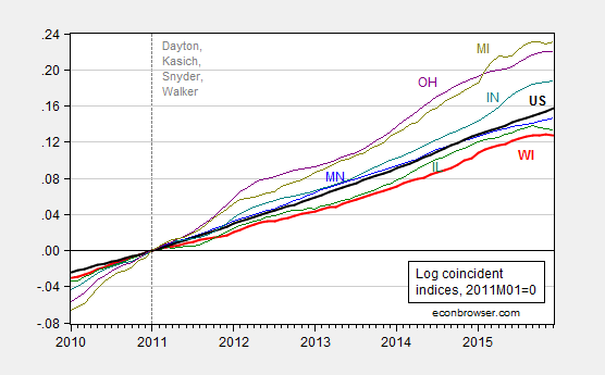
Figure 2: Log coincident index for Minnesota (blue), Wisconsin (red), Illinois (green), Indiana (teal), Michigan (teal), Ohio (chartreuse) and US (black), all normalized to 2013M07=0. Source: Philadelphia Fed and author’s calculations.
Of course, the appropriate comparison is to see whether Wisconsin is doing worse than what it should, based upon other observable factors (besides let’s say economic policies pursued in the state). And here, as shown in Figure 3, it is pretty clear that Wisconsin has been doing poorly, with statistical signficance, relative to a plausible counterfactual (see this post for an explanation of the ex post historical simulation, using US economic activity as an observable, and an error correction model specification):

Figure 3: Wisconsin coincident index (bold red), and dynamic out-of-sample forecast (purple), and 90% band (gray lines). Green denotes in-sample period. Assumes US economic activity is weakly exogenous with respect to Wisconsin. Source: Philadelphia Fed, NBER, author’s calculations.
I am confident that some will continue to try to show that Wisconsin’s performance is, reported data notwithstanding, really, really, really good. Is that mendacity or merely incompetence? I let readers decide.
PS: Does anybody know when Department of Revenue will release the next triannual/quarterly Wisconsin Economic Outlook? The last one was released in May 2015.
March 16, 2016
Guest Contribution: “Liquidity Trap and Excessive Leverage: How Excessive Debt Hurts the Economy and Why to Curb It”
Today we are pleased to present a guest contribution written by Anton Korinek (U.Maryland) and Alp Simsek (MIT).
Deleveraging – the forced and rapid paying down of debt – has been one of the key factors behind the Great Recession of 2008/09 and the ensuing slow recovery of the US economy (see e.g. Mian and Sufi, 2014; Mian, Sufi and Verner, 2015). Figure 1 illustrates the dramatic rise of leverage in the household sector before 2008 as well as the subsequent deleveraging.
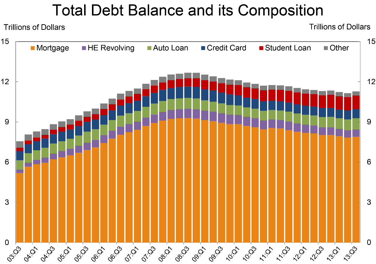
Figure 1: Evolution of household debt in the US around its peak in 2008Q3 (New York Fed).
Deleveraging hurts the economy because it forces borrowers to repay their lenders, but lenders are far thriftier than borrowers. (This is the reason why borrowers are borrowers and lenders are lenders in the first place.) When funds are moved from big spenders to thrifty lenders, it reduces aggregate demand. During normal times, the Federal Reserve can counteract this and restore aggregate demand by cutting interest rates, but monetary stimulus becomes very difficult once interest rates hit zero – a phenomenon frequently referred to as a “liquidity trap.” This is precisely what happened in the US economy starting in December 2008, and as a result, the economy plunged into deep recession (see e.g., Eggertsson and Krugman, 2012, or Guerrieri and Lorenzoni, 2011). Although policymakers have employed a whole battery of monetary and fiscal stimulus tools since, the effectiveness of such stimulus has been limited, and it has taken the US economy a long time to recover.
In our forthcoming paper, “Liquidity Trap and Excessive Leverage” (Korinek and Simsek, 2016), we argue that the right time to counteract a deleveraging-driven crisis is not after the event but at the time when leverage builds up. If we reduce the amount of debt that borrowers take on during the build-up phase, then the next deleveraging episode will be less severe, and the resulting recession will be mitigated.
At the center of our argument is what we call an aggregate demand externality: Individual borrowers, if left to themselves, do not take into account how their behavior affects the economy as a whole. The argument is similar to the case of environmental pollution, when individual polluters find it rational to pollute because they believe that each one of them has just a minuscule effect on overall environmental quality. When individuals take on debt, they recognize the risk that they may have to deleverage in the future, but they do not recognize that this affects aggregate demand since each person’s contribution to aggregate demand is minuscule relative to the total size. However, when a substantial fraction of the economy is forced to deleverage at the same time, the impact on aggregate demand is severe. Furthermore, if the economy is in a liquidity trap, this aggregate demand externality cannot be offset by the central bank and imposes substantial welfare costs on the entire economy. Similar arguments have also been advanced by Farhi and Werning (2012, 2013) and Schmitt-Grohé and Uribe (2016) in the recent literature.
As in the case of environmental pollution, it is desirable to impose regulations in order to reduce borrowing, either in the form of quantity regulations or “Pigouvian taxes,” so that individuals internalize aggregate demand externalities and take into account the negative effects of their behavior. The overarching objective of such macroprudential regulation is to restrict all financial activities that will lead to lower demand during future deleveraging crises. For example, it is desirable to restrict the leverage of borrowers who may be forced into deleveraging during such episodes. Furthermore, it is desirable to encourage insurance against economy-wide deleveraging episodes, such as mandatory insurance in mortgage markets against aggregate price declines that leave homeowners under water.
Our paper also shows how to quantify the externalities from excessive leverage. The primary determinant of aggregate demand is how spendthrift borrowers are compared to lenders or, in more technical jargon, how much they differ in their marginal propensity to spend. According to Jappelli and Pistaferri (2014), borrowers who are among the poorest 10% of households are more than 25% more likely to spend an additional dollar received than rich lenders. After accounting for the multiplier effects of additional spending, reallocating one dollar of income from such borrowers to lenders reduces aggregate demand by about 45 cents. If we assume, conservatively, that an economy experiences a deleveraging-driven crisis and liquidity trap once every thirty years, then borrowing by the most leveraged households creates on average a negative aggregate demand externality of 45%/30 = 1.5% per dollar borrowed per year. This externality could be internalized with a 1.5% Pigouvian tax on leveraged borrowing or the imposition of equivalent debt limits.
Monetary policy is a bad substitute for such macroprudential policy. In recent debates, it has frequently been suggested that monetary policymakers should raise interest rates to reduce the build-up in leverage. In our paper, we consider this argument carefully, but we find that interest rate policy is at best an imperfect substitute for macroprudential policy and may even, perversely, lead to an increase in leverage. The reason for our result is simple: the conventional wisdom hinges on the observation that higher interest rates discourage borrowing when keeping everything else equal. However, everything else is not equal: higher interest rates generate a recession, which temporarily reduces the income of borrowers and encourages extra borrowing to smooth over the shock. If credit availability is ample, as it was during the early 2000s, then the predominant effect of higher interest rates may be to increase leverage. This may explain why the interest rate hikes by the Fed starting in June 2004 were so ineffective in reducing leverage at the time. Moreover, even when the conventional wisdom holds and higher interest rates do indeed reduce leverage, interest rate policy is inferior compared to macroprudential policy because it is too blunt. That is, it affects borrowers and lenders equally and needlessly creates a recession. By contrast, macroprudential regulation discourages borrowing and keeps funds in the hands of lenders without the need to slow down economic activity.
The proposed macroprudential regulation is fundamentally different from traditional financial regulations which are best described as “microprudential:” in past decades, the main goal of financial regulation was to restrict risk-taking and protect individual financial institutions from failure in order to limit the losses of depositors and the risks to deposit insurance funds. By contrast, the new macroprudential approach that we advocate elevates financial regulation from being about the health of individual banks to being a pillar of macroeconomic stabilization policy, akin to monetary and fiscal policy. Limiting leverage can not only protect individual financial institutions but also prevent future deleveraging-driven recessions and stabilize the macroeconomy as a whole.
This article is cross-posted from the INET blog
References:
Eggertsson, Gauti and Paul Krugman. 2012. “Debt, Deleveraging, and the Liquidity Trap.” Quarterly Journal of Economics 127(3): 1469-1513.
Farhi, Emmanuel and Iván Werning. 2012. “Fiscal Unions.” NBER Working Paper 18280.
Farhi, Emmanuel and Iván Werning. 2013. “A Theory of Macroprudential Policies in the Presence of Nominal Rigidities.” NBER Working Paper 19313.
Guerrieri, Veronica and Guido Lorenzoni. 2011. “Credit Crises, Precautionary Savings, and the Liquidity Trap.” NBER Working Paper 17583.
Jappelli, Tullio and Luigi Pistaferri. 2014. “Fiscal Policy and MPC Heterogeneity.” American Economic Journal: Macroeconomics 6(4): 107-136.
Korinek, Anton and Alp Simsek. 2016. “Liquidity Trap and Excessive Leverage,” forthcoming, American Economic Review 106(3).
Mian, Atif and Amir Sufi. 2014. “What Explains the 2007-2009 Drop in Employment?” Econometrica 82(6): 2197-2223.
Mian, Atif, Amir Sufi and Emil Verner. 2015. “Household Debt and Business Cycles Worldwide.” NBER Working Paper 21581.
Schmitt-Grohé, Stephanie and Martín Uribe. 2016. “Downward nominal wage rigidity, currency pegs, and involuntary unemployment.” forthcoming, Journal of Political Economy.
This post written by Anton Korinek and Alp Simsek.
March 14, 2016
Far Left-Far Right Protectionist Dreams
As noted in this post, both Senator Sanders and Mr. Trump share a belief that China should be declared a currency manipulator, so that heavy tariffs can be imposed (Secretary Clinton’s position here). Not that it matters to either individuals’ beliefs, but — based on ongoing research I am conducting with Yin-Wong Cheung (CUHK) and Xin Nong (UW) — the evidence that China is currently manipulating its currency to keep it undervalued is not particularly persuasive.
As I’ve discussed in several previous posts [1] [2] [3], there are various means of assessing currency misalignment, corresponding to different theoretical concepts.
One key approach — central to earlier assertions of massive undervaluation — is to use the Penn effect. The Penn effect is the observation that price levels are higher in higher income countries than in lower income countries. This phenomenon is shown in Figure 1 (regression line and 1 and 2 standard error bands).

Figure 1: Scatterplot of price level against per capita income in PPP terms for full sample, 1970-2011, from Penn World Tables 8.1. OLS regression line (orange), +/- 1,2 standard error bands. Source: Cheung, Chinn, and Nong.
The elasticity of price level with respect to per capita income in PPP terms is 0.242.
One can use the relationship for non-advanced economies to infer the equilibrium price level for China. This is shown in Figure 2, along with the path China has followed (in red). The last observation in 2011.
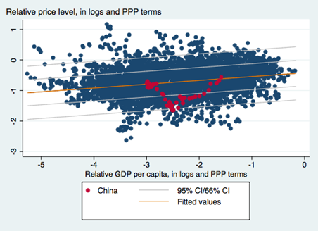
Figure 2: Scatterplot of price level against per capita income in PPP terms for non-advanced country sample, 1970-2011, from Penn World Tables 8.1. OLS regression line (orange), +/- 1,2 standard error bands. China observations in red. Source: Cheung, Chinn, and Nong.
The estimated regression equation is:
pi,t = -0.421 + 0.124yi,t + ui,t
bold figures denote statistically significant coefficients at 5% MSL. Adj.-R2 = 0.062, NObs = 4934, Sample 1970-2011.
Where p is the log price level relative to the US, and y is the per capita income relative to the US level, in logs.
As one can see, the estimated degree of misalignment is 2.81% in 2011.
Obviously, it’s not undervalued in 2011. (There is some degree of imprecision in these estimates; however, using the World Bank’s World Development Indicators data set, and a similar specification, yields estimates of substantial overvaluation, so my guess is undervaluation in 2011 is a tough case to make.) Moreover, in the succeeding years, the yuan has appreciated on a real, trade weighted basis, nearly 25% (in log terms).
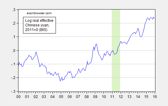
Figure 3: Log real trade weighted Chinese yuan, broad index, 2011=0. Green shading pertains to 2011. Source: Bank for International Settlements, author’s calculations.
The above series is CPI deflated. The degree of appreciation would be decreased if using a PPI to deflate.
Nonetheless, given these data (combined with the fact that Chinese fx reserves have been trending downward), it is not clear that Mr. Trump’s assertion:
Economists estimate the Chinese yuan is undervalued by anywhere from 15% to 40%. This grossly undervalued yuan gives Chinese exporters a huge advantage while imposing the equivalent of a heavy tariff on U.S. exports to China. Such currency manipulation, in concert with China’s other unfair practices, has resulted in chronic U.S. trade deficits, a severe weakening of the U.S. manufacturing base and the loss of tens of millions of American jobs.
Hence, the promise to “On day one of the Trump administration the U.S. Treasury Department will designate China as a currency manipulator”, thence validating imposition of tariffs on China, would require ignoring data (and installing instantaneously a very pliant SecTreas, I’d guess getting confirmation of the new SecTreas before being sworn in himself). (For detailed discussion of the challenges even if there were a lot of measured CNY undervaluation, see this CRS report).
March 13, 2016
2016 Econbrowser NCAA tournament challenge
Sign up for the world famous ninth annual Econbrowser NCAA tournament challenge, in which Econbrowsers are invited to demonstrate their inability to predict the outcome of the U.S. college mens’ basketball tournament. It’s almost as much glory as winning Warren Buffett’s competing pool, but don’t worry, you can enter both! If you want to participate, go to the , do some minor registering to create a free ESPN account if you haven’t used that site before, and fill in your bracket before Thursday at noon.
March 10, 2016
Guest Contribution: “Capital Control Measures: A New Dataset”
Today we are pleased to present a guest contribution written by Andrés Fernández (IDB), Michael W. Klein (Tufts), Alessandro Rebucci (Johns Hopkins Univ.), Martin Schindler (IMF) and Martín Uribe (Columbia Univ.). This post is based upon this paper. The findings, interpretations, and conclusions expressed in this article are entirely those of the authors. They do not necessarily represent the views of the InterAmerican Development Bank, the International Monetary Fund, their Executive Directors, or the countries they represent.
The Great Recession has spurred a reconsideration of the appropriate role of capital controls. The prevailing view among economists in the 1990s was reflected in the title of Rudiger Dornbusch’s 1998 article “Capital Controls: An Idea Whose Time is Gone.” But attitudes began to shift in response to the economic crises in the late 1990s. More recently, even IMF staff studies and policy papers have shown greater acceptance of the use of capital controls, under certain circumstances, as part of a country’s “policy toolkit,” a shift that The Economist magazine dubbed “The Reformation.” This new paradigm is consistent with a recent branch of theoretical research in which capital controls contribute to financial stability and macroeconomic stabilization—see for example Jeanne and Korinek (2010), Schmitt-Grohé and Uribe (2015), and Benigno, Chen, Otrok, Rebucci, and Young (2014). But these theoretical works stand in contrast to a number of empirical analyses that emphasize the ineffectiveness and potential costs of capital controls—e.g., Binici, Hutchison and Schindler (2010), Forbes (2007), and Klein (2012).
The evolving debate on capital controls highlights the importance of careful empirical analyses of these policies. One challenge facing researchers in this area is the availability of indicators of capital controls. In a recent paper, building on the data sets of Schindler (2009), Klein (2012), and Fernández, Rebucci and Uribe (2015), we have constructed a new data set that reports the presence or absence of de jure capital controls, on an annual basis, for 100 countries over the period 1995 to 2013. Like other de jure capital control panel data sets, this data set is based on information in the IMF’s Annual Report on Exchange Arrangements and Exchange Restrictions (AREAER)– Quinn (1997) and Chinn and Ito (first presented in 2006).
The distinguishing and important feature of our data set is its disaggregation of the information down to the level of individual types of transactions between residents and non-residents. This allows for the construction of capital control indices based on information on 32 separate transaction categories. This level of disaggregation of the data allows for a more detailed and nuanced analysis of capital controls than was possible with most other capital control indices. The data allow an examination of controls on different types of assets (e.g., portfolio flows, FDI, real estate and derivatives), on the direction of capital flows (inflows or outflows), on the residency of the agent involved (transactions by residents or non-residents), as well as the location of the transaction (transactions executed onshore or offshore). Furthermore, these data can be easily aggregated into indexes that target a specific research or policy question.
For example, Fernández, Rebucci and Uribe (2015) used these data to show that the presence of capital controls is relatively stable, and they are imposed in an acyclical manner. We also show, in the paper, that the data can be used to distinguish between narrowly targeted, episodic, and longstanding and widely-imposed capital controls; a distinction that Klein (2012) makes between “open”, “gate” and “wall” country cases. Binici, Hutchison and Schindler (2010), in turn, examine the relationship between de jure controls and de facto flows by asset category and directionality and find limited evidence of impact on the overall volume of flows, though some compositional effects.
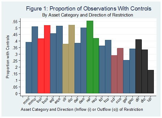
The ten assets in our data set (and their two-letter abbreviations) are money market instruments (mm, fixed income assets with a maturity of less than one year), bonds (bo, which have a maturity of one year or greater), equities (eq), collective investments (ci), financial credits (fc), real estate (re), commercial credits (cc), derivatives (de), direct investment (di) and guarantees, sureties and financial backup facilities (gs). Figure 1 presents information on the prevalence of controls across asset categories (the two-letter asset category abbreviations are followed by either i, for controls on inflows, or o, for controls on outflows, with the 21st category, ldi, representing controls on the liquidation of direct investment). This figure shows that controls are relatively less prevalent on liquidations of direct investment, guaranties and sureties, commercial and financial credits, ranging from 18 percent of observations for ldi, to 55 percent for rei. The figure also show that, in general, that controls on inflows and outflows tend to move together although there is a higher prevalence of controls on outflows than on inflows.
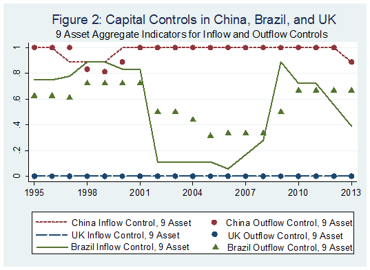
Other important characteristics of our data can be illustrated by means of country examples. Figure 2 presents a 9-asset aggregate indicator (the simple average of all categories except Direct Investment) for China, Brazil, and the United Kingdom: a Wall country, a Gate country and an Open country, respectively, in the terminology of Klein (2012). (According to Klein (2012), “Open” (“Walls”) countries have, on average, capital controls on less than 15 percent (more than 70 percent) of their transactions subcategories over the sample period and do not have any years in which controls are on more than 25 percent (less than 60 percent) of their transaction subcategories. “Gate” countries are neither Walls nor Open.) There were no controls on either inflows or outflows in the United Kingdom throughout the sample period, but at least some controls on virtually all categories of both inflows and outflows in China. Controls in the Gate country, Brazil, are more varied. They were reduced from a value greater than 0.8 in the first seven years of the sample to a value below 0.2 from 2002 to 2006. Then they were re-imposed, beginning in 2007 and 2008, with some controls on inflows subsequently lifted in 2012 and 2013, as the real began to depreciate.
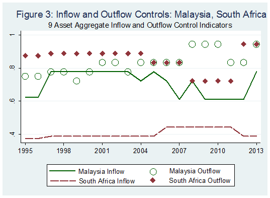
The experience of Malaysia and South Africa shows the importance of having separate indicators for inflow controls and outflow controls, something that is not available with other broad cross-country capital control datasets (Figure 3). In Malaysia, our 9-asset inflow control indicator moved in the opposite direction of the 9-asset outflow control indicator in 2004, and one indicator changed while the other was constant in 1999 – 2003, and 2005, 2008, 2011 and 2012. In these years, an aggregate inflow and outflow indicator would show less variation than the two separate series. South Africa has very different average values for its inflow and outflow indicators, and the two move in opposite directions between 2008 and 2011. During this period, while inflow controls were increasing, outflow controls were being relaxed. An aggregate that represents both inflows and outflows for this country would not show the large differences in its controls on inflows and controls on outflows. Figure 3 also illustrates a caveat regarding our data. The outflow index in Figure 3 does not pick up the tightening of controls on outflows in Malaysia during the crisis in 1998. This is because controls on outflows were already in place in Malaysia on most asset categories in our index at the time, and the policy tightening of controls did not introduce controls on new categories—see our paper for more details on this.
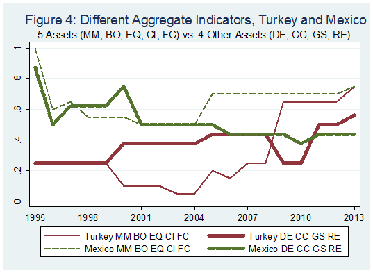
Along with differences in inflow and outflow controls, our data set also enables one to consider differences in controls across categories of assets. To illustrate this, we present in Figure 4 the values, for Turkey and Mexico, of two different aggregates of controls on both inflows and outflows, one for Bonds, Equities, Collective Investments and Financial Credits (mm, bo, eq, ci and fc) and the other for the four other categories (but for direct investment). This figure shows the divergence in these two indicators for Turkey after 1999, with the aggregates moving in different directions in 2000 and 2008. An aggregate of the full set of nine categories would fail to show the divergence in the sub-categories during the 2000 – 2011 period, and indicate more stability in the stance towards controls than the consideration of sub-categories would suggest. In a similar way, there is a divergence in the two sub-categories of controls in Mexico beginning in 2005 that continues for the remaining sample period. The experiences of these two countries show that the ability to distinguish among subcategories of assets may be important for analyses in which theory suggests the role of particular asset categories and where aggregate measures may mask the evolution of controls on those categories of assets.
The role for capital controls is one of the most hotly contested issues in discussions on the international monetary system. The shift in the views of some policymakers and researchers towards a greater acceptance of these rules and regulations in the wake of the economic and financial turmoil of the past several years contrasts with the concerns of others that restricting capital flows tends to be ineffective in reaching desired goals and, moreover, fraught with unintended consequences. Properly addressing the continuing controversies surrounding this topic requires careful, high-quality theoretical and empirical research. Our hope is that this data set proves useful in advancing our understanding of this important topic.
References
Benigno, G., Huigang Chen, Chris Otrok, Alessandro Rebucci, and Eric Young. 2014. “Optimal Capital Controls and Exchange Rate Policy? A Pecuniary Externality Perspective.” CEPR Discussion Paper 9936.
Binici, M., M. Schindler and M. Hutchison. 2010. “Controlling Capital? Legal Restrictions and the Asset Composition of International Financial Flows.” Journal of International Money and Finance 29(4): 666–684.
Chinn, Menzie D. and Hiro Ito (2006). “What Matters for Financial Development? Capital Controls, Institutions, and Interactions”, Journal of Development Economics, 81(1): 163-192.
Dornbusch, Rudiger (1998), “Capital Controls: An Idea Whose Time is Gone”, mimeo.
Fernández, Andrés, Alessandro Rebucci, and Martín Uribe (2015), “Are Capital Controls Countercylical?” Journal of Monetary Economics,.
Fernández, Andrés, Michael W. Klein, Alessandro Rebucci, Martin Schindler and Martín Uribe (2015), “Capital Controls Measures: A New Dataset” NBER Working Paper no. 20,970.
Forbes, Kristin (2007), “One Cost of Chilean Capital Controls: Increased Financial Constraints for Smaller Traded Firms,” Journal of International Economics, 71: 294 – 323.
Jeanne, Olivier and Anton Korinek (2010), “Excessive Volatility in Capital Flows: A Pigouvian Taxation Approach”, American Economic Review Papers and Proceedings, 100(2): 403 – 407.
Klein, M.W. 2012. “Capital Controls: Gates versus Walls.” Brookings Papers on Economic Activity 2012 (Fall): 317-355.
Quinn, Dennis (1997), “The Correlates of Change in International Financial Regulation”, American Political Science Review, 91(3): 531–51.
Schindler, Martin (2009), “Measuring Financial Integration: A New Data Set”, IMF Staff Papers, 56(1): 222–38.
Schmitt-Grohé, S., and M. Uribe. 2012. “Prudential Policy for Peggers.” NBER Working Paper 18031. Cambridge, United States: National Bureau of Economic Research.
This post written by Andrés Fernández, Michael W. Klein, Alessandro Rebucci, Martin Schindler and Martín Uribe.
Benchmarked Wisconsin Private Nonfarm Payroll Declines
While the BLS state level data will come out on Monday (see discussion here), the individual states release slightly earlier. Wisconsin released employment data today.
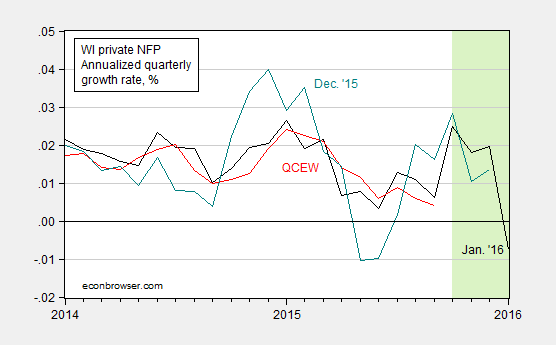
Figure 1: Annualized three month growth rate of private nonfarm payroll employment, benchmarked as measured in January 2016 (black), seasonally adjusted Quarterly Census of Employment and Wages (red), and as reported in December 2015 release (teal); all percent changes calculated as log differences. Light green area denotes dates that do not incorporate contemporaneous QCEW data. QCEW data seasonally adjusted using ARIMA X12 implemented in EViews. Source: DWD1, DWD2, BLS, author’s calculations.
There is in the release no mention of the decrease in employment, now in the third month. The release reads:
“The state’s January 2016 unemployment rate is, in large part, a reflection that Wisconsinites are seeing opportunity and entering the labor market,” Secretary Allen said. “The state’s labor force participated at a higher rate and more Wisconsinites entered the job market in January when compared to December. At the Department of Workforce Development, our focus will remain on equipping workers with skills to fill openings as the private sector continues to add tens of thousands of jobs every year.”
March 9, 2016
The Wisconsin Employment Boom Will Be Revised Away
Not so certain the slowdown will be similarly erased.
Toward the end of 2014 through early 2015, Wisconsin private nonfarm payroll employment surged, as measured by the establishment survey. The just released data associated with the Quarterly Census of Employment and Wages (QCEW) [1] suggests that when the benchmarked state-level establishment series are released on Monday, that surge will be erased.
The blue line in Figure 1 depicts the reported BLS series as of today. The green shaded area denotes the period over which QCEW data will be used to benchmark the establishment series.
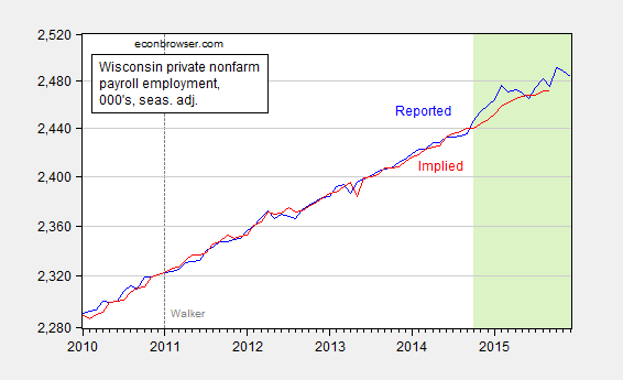
Figure 1: Wisconsin private nonfarm payroll employment as reported (blue), and as predicted using Quarterly Census of Employment and Wages private nonfarm payroll employment (red), in 000’s, seasonally adjusted. Source: BLS and author’s calculations.
The red line is the establishment series predicted using the QCEW series (after seasonal adjustment using ARIMA X12) over the 2004M01-2014M09 period. (For details on the procedure, see this post). Note that the red line is substantially below the blue over the 2014M10-2015M09 period.
This means that the 12 month change will be 1.25%, rather than 1.61%, in the period ending 2015M09. Moreover, the plateau-ing of employment shows up in mid-2015, rather than end-2015.
I would compare the implied current levels against the forecasts from the Wisconsin Economic Outlook, which is apparently supposed to be released quarterly (not so in recent years). Unfortunately, the last available Economic Outlook is from May 2015, nearly ten months ago. Using that measure, we can how the Wisconsin economy has underperformed relative to Walker Administration forecasts.
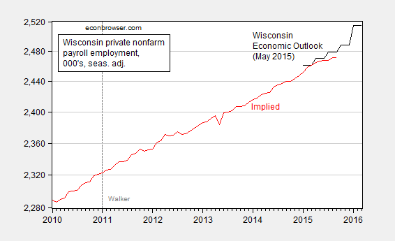
Figure 2: Wisconsin private nonfarm payroll employment as as predicted using Quarterly Census of Employment and Wages private nonfarm payroll employment (red), and forecast from May 2015 Wisconsin Economic Outlook (black), in 000’s, seasonally adjusted. Source: BLS, Wisconsin Economic Outlook (May 2015) and author’s calculations.
However, we can compare employment (as reported) against what should have occurred if historical correlations obtained (see this post):
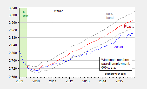
Figure 3: Wisconsin nonfarm payroll employment (blue), forecast from error correction model estimated over 1990M03-2009M06 (red), and 90% confidence band (gray lines), all on log scale. Dashed line at 2011M01 when Walker takes office, and light green denotes sample period. Source: BLS, author’s estimates (as described here).
Note that even using the optimistic pre-benchmark series, Wisconsin private nonfarm payroll employment remains 87,700 below the 250,000 additional new jobs target for January 2015 that Governor Walker committed to in August 2013.
March 8, 2016
China: The Trilemma and Reserves, Again
From Bloomberg:
The yuan strengthened after China’s central bank raised its fixing for a fourth day and data showed a less-than-estimated drop in the nation’s foreign-exchange reserves.
The currency stockpile shrank by $28.6 billion last month, the smallest decline since June, to $3.2 trillion, the People’s Bank of China said on Monday. That’s lower than the $40.9 billion decrease predicted in a Bloomberg survey of economists, and compares with December’s record drop of $108 billion as the monetary authority supported the yuan.
Context
As previously noted, Chinese policymakers have been navigating the trilemma — the proposition that one can only fully achieve two of three goals of exchange rate stability, monetary autonomy and financial openness.
The exchange rate has depreciated over time against the reference basket of currencies, as shown in Figure 1.
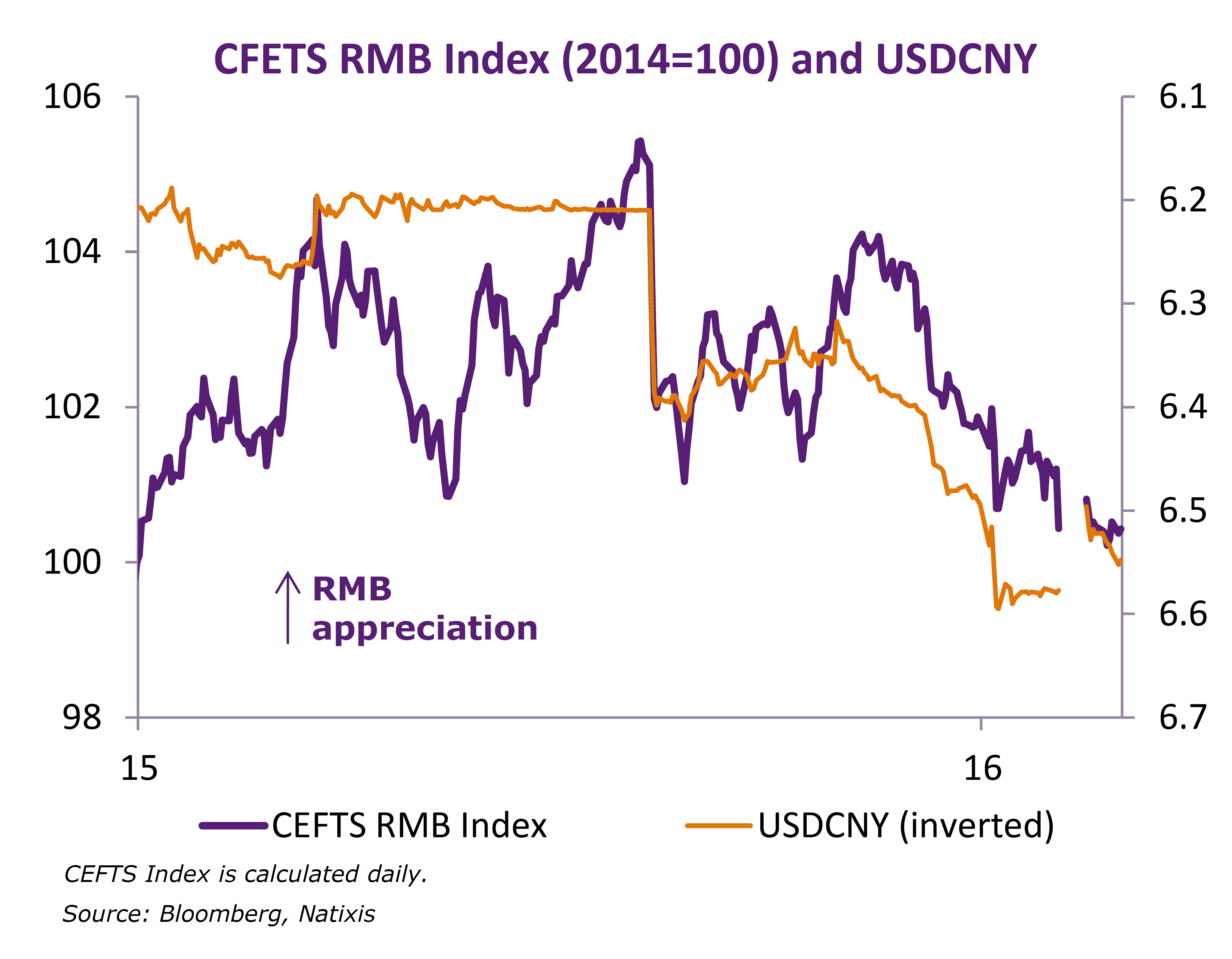
Figure 1: “While CNY appreciated against USD it remained flat against the CFETS currency basket,” from Natixis Economic Research, March 1, 2016.
At the same time, the PBoC is attempting to stimulate the economy — by dropping policy rates and reducing bank required reserve ratios — without further depreciating the currency. These policy actions are shown in Figure 2.
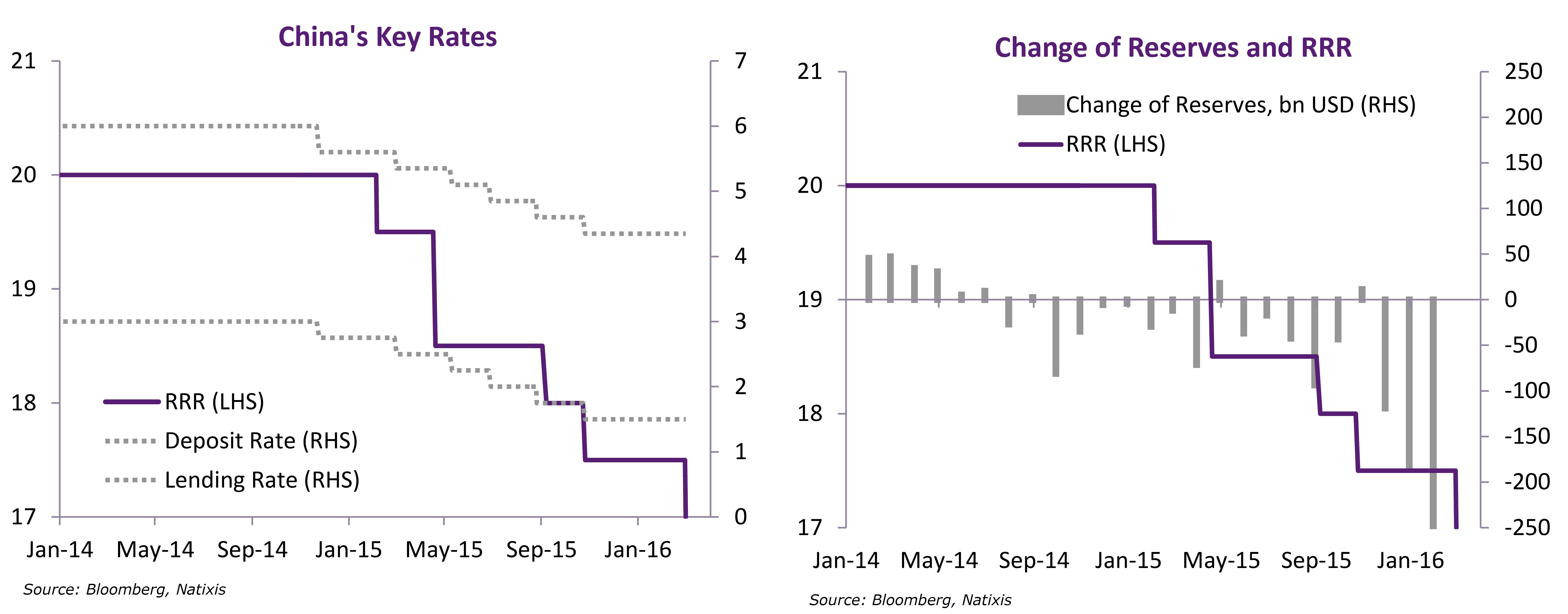
Figure 2: “One more RRR cut to replenish liquidity from loss of FX reserves,” from Natixis Economic Research, March 1, 2016.
Achieving the goal of autonomous monetary policy (in order to sustain growth) can be accomplished by either further currency depreciation, or tightening capital controls. The extent to which a combination of these policies will have to be pursued depends in part on how much capital outflow persist, with some observers holding apocalyptic views (e.g., “people are panicked”). On this count, McCauley and Shu provide a more nuanced view of the source of outflows.
Persistent private capital outflows from China since June 2014 have led to two different narratives. One tells a story of investors selling mainland assets en masse; the other of Chinese firms paying down their dollar debt. Our analysis favours the second view, but also points to what both narratives miss – the shrinkage of offshore renminbi deposits.
Our approach, presented in the September 2015 BIS Quarterly Review, starts from the BIS international banking statistics reported by banks outside China. This contrasts with other analyses which typically take changes in official foreign reserves (plus current account surplus) as capital outflows, which require complicated estimation of valuation and other adjustments. To understand the cross-border outflow of capital in the BIS data, we follow the money from declining offshore renminbi deposits in East Asia and declining foreign currency loans at banks in mainland China, as reported by the People’s Bank of China (PBoC). In addition, we exclude from the BIS data PBoC deposits with overseas banks, using new data consistent with the IMF’s special data dissemination standard (SDDS).
McCauley and Shu highlight the trends in these banking data in a series of graphs.
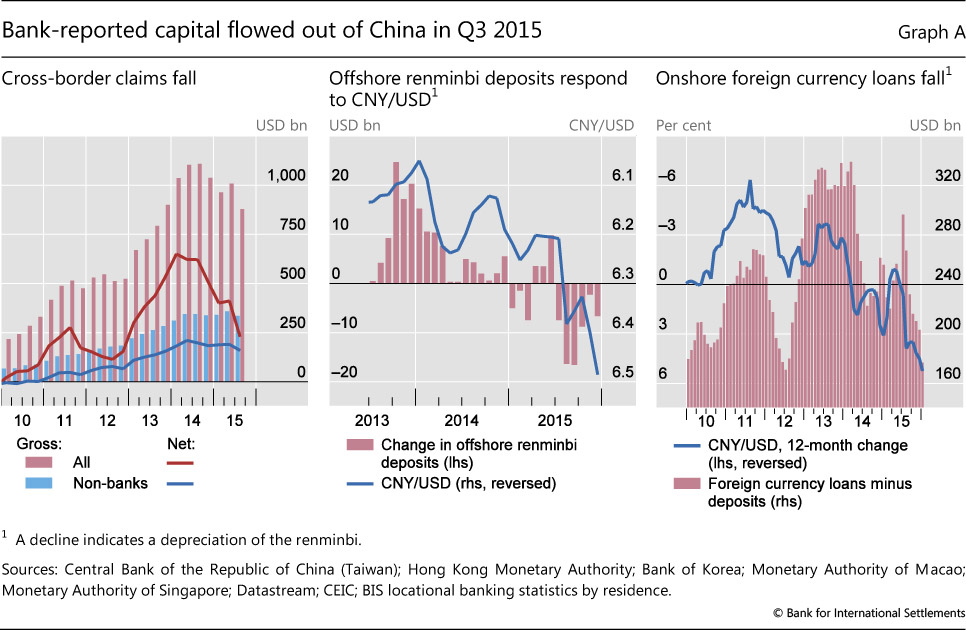
Source: McCauley and Shu (2016).
They conclude:
To recap, our analysis suggests that recent outflows from China can be explained, to a large extent, by continued shrinkage of the offshore renminbi market and Chinese firms’ paydown of net foreign currency debt. The PBoC’s declared intention to keep the renminbi stable in effective terms would imply a weaker renminbi against the dollar were the dollar to appreciate against major currencies. In this event, offshore depositors might not hold onto maturing renminbi deposits and Chinese firms would still have reason to repay dollar-denominated debt.
Of course, just because these factors have been the primary driver of capital outflows in the past doesn’t mean they will continue to be. Moreover, the hit to the trade balance as exports fell in February will, if repeated, add a new strain on forex reserves (as well as growth).
An Observation on “The” Money Supply
As noted previously, the PBoC has reduced policy rates and reduced reserve requirements. It’s interesting to note that M0 (essentially money base, or high powered money) growth has flattened out even as M1 growth has accelerated. This, combined with fairly steady M2 growth (and tighter capital controls), suggests to me that part of these policy moves are aimed at offseting the contractionary effects of forex reserve holding, rather than depreciating the currency.
(For additional reasons why depreciation might not be desirable from the Chinese policymakers’ views, see here).
Menzie David Chinn's Blog


