
Menzie David Chinn's Blog, page 16
February 4, 2016
“China’s efforts to expand the international use of the renminbi”
That’s the title of a new, and illuminating, report written by Eswar Prasad. The entire report is here. This is a must-read for those interested in RMB internationalization.


Mass Shooting Casualties Trending Up (Again)
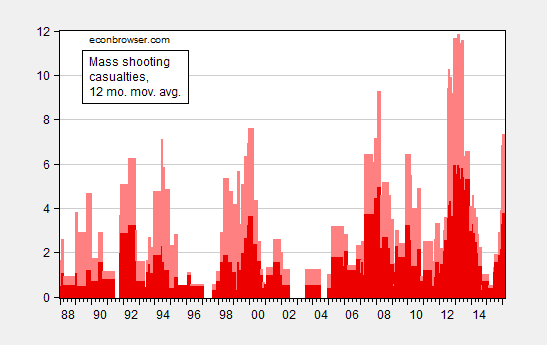
Figure 1: 12 month moving average of mass shooting casualties; deaths (dark red), wounded (pink). Source: Mother Jones, GunViolenceArchive.org. for January 2016, and author’s calculations.
Update, 2/5 1:45PM Pacific: Title amended to address m4570d0n‘s pedantic comment.
Mass Shootings Trending Up (Again)
Figure 1: 12 month moving average of mass shooting casualties; deaths (dark red), wounded (pink). Source: Mother Jones, GunViolenceArchive.org. for January 2016, and author’s calculations.
February 1, 2016
Guest Contribution: “The ECB and the Fed: A Comparative Narrative”
Today, we are fortunate to present a guest contribution written by Dae Woong Kang, Nick Ligthart, and Ashoka Mody, Charles and Marie Visiting Professor in International Economic Policy, Woodrow Wilson School, Princeton University.
Although the Great Recession was viewed—especially in Europe—as mainly a U.S. problem, the eurozone was implicated from the start and felt virtually the same impact in the early stages (Figure 1). The U.S. economy, however recovered much faster. U.S. stock prices and GDP regained their pre-crisis levels by late-2011; the eurozone barely reached that stage in 2015.
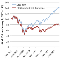
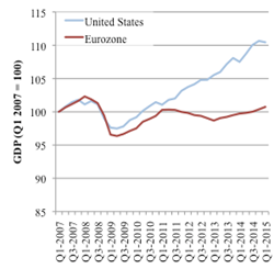
Figure 1: Stock and GDP Price Movements.
The U.S. policy response was much more proactive. Fiscal stimulus was greater than in the euro area in 2008-9; the U.S. also returned to fiscal austerity later, in 2011, rather than in 2010 as the eurozone did (Mody 2015, p. 2). More important was the U.S. authorities’ active resolution of banking stress; eurozone banking problems were allowed to fester. And throughout, U.S. monetary policy was much more aggressive. In a recent paper, we used a narrative approach to identify the role of monetary policy during the Great Recession (Kang, Ligthart, and Mody, 2015).
The U.S. Federal Reserve lowered its policy interest rate (the Fed Funds rate, the rate at which banks lend to each other) from 5¼ percent in September 2007 to 0-0.25 percent in December 2008 (Figure 2). At that point, the Fed also initiated “quantitative easing” and began “forward guidance,” making public its intention to keep interest rates low “for some time.” The ECB’s first reaction to the Great Recession was in July 2008, and it was to raise the policy rate (the main refinancing rate, the interest rate banks pay to borrow from the ECB). After the Lehman bankruptcy in September 2008, the ECB joined an internationally coordinated rate reduction on October 8. But then, the ECB slow pace of rate cuts was interrupted by two more hikes—in April and July 2011. The policy rate was brought to near-zero only in November 2013; modest quantitative easing began in September 2014 and was expanded in January 2015.
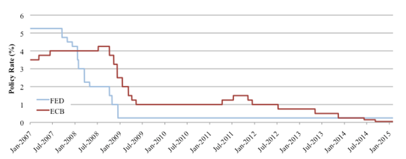
Figure 2: Policy Rates: the U.S. Federal Reserve and the European Central Bank.
Our narrative tracks the stated policy intent, the stock market response following the announcement, and the immediate market commentary. To examine the stock market’s response to the announcement of interest rate cuts, we used an event-study methodology similar to that of Ait-Sahalia et al. (2012). First, the “abnormal difference” was computed for each day following the announcement. This is measured as the change in the stock price minus the average daily change over the twenty days before the announcement (the presumption is that absent the announcement, stock prices would have continued to change at the same pace over the next five days). Adding up the daily abnormal differences, the cumulative abnormal difference shows the post-announcement divergence in the stock price movement from the trend in the preceding twenty days. The results are summarized in Figure 3.
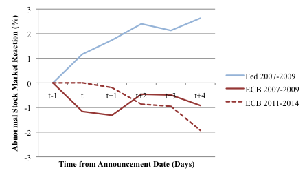
Figure 3: Stock Market Reactions to the Reduction of Interest Rates. Note: In computing the average “abnormal” reaction between 2007 and 2009, we do not include the market reaction on October 8, 2008 because of high volatility in the days following. The results remain unchanged.
The stock market responded positively to the Fed’s rate cuts. In contrast, the market’s reaction to the slower-moving ECB was, on average, negative between 2007 and 2009 and also between 2011 and 2014. Consistent with our findings around the announcements, U.S. stock indices moved ahead of those in the euro area, as seen in Figure 1. Moreover, as Figure 1 also shows, stock prices tracked relative differences in GDP performance, in line with the Akerlof-Shiller (2009) view that improved investor sentiment helps stem the fall and begin the recovery.
Active Stimulus
The anticipation of the announcements was not the primary influence on stock prices. In the U.S., the one unexpected announcement did trigger a strong response; but even the anticipated rate cuts were viewed favorably, especially if they were 50 basis points (0.5 percent) or larger. Researchers at the Chicago Fed find that anticipated policy actions have positive stimulative effects if they signal deviation from historical policy (D’Amico and King 2015, p. 2-3). Thus, while formal “forward guidance” came only on December 16, 2008, the actions up until then established a presumption that the Fed was pursuing a risk management approach and creating a safety net. In Woodford’s (2012) terminology, the Fed was not just responding to news but was changing policy. Specifically, the larger rate cuts and accompanying statements signaled that the Fed was trying to “forestall” financial turmoil from spiraling out of control.
In contrast, even the larger ECBs rate cuts were seen as “too little, too late.” The ECB was reacting to news—building its shelter amidst a raging storm. ECB statements also mused endlessly about rising inflation and hence almost never promised more forthcoming action. The Bank of England was also late, but made up with quicker and much larger rate cuts, followed by quantitative easing.
It is true that the Fed has a clear dual mandate to support employment and maintain price stability. However, the central banks’ differing mandates were not the reason why they acted differently in the Great Recession. The ECB—despite its primary focus on price stability—had previously responded as if it had a dual mandate. Indeed, as Lars Svensson has pointed out, the ECB’s goal of “medium-term” price stability (over a two-year horizon) implied that it would not seek to bring inflation down instantly since attempting to do so would cause an unreasonable drop in output (Svensson 1999, p. 83, 96, and 107). The result, Svensson argues, is that ECB’s stated objective is indistinguishable from that of central banks with dual mandates, as studies have confirmed (Taylor 2010 and Nechio 2011).
Rather, as Alan Blinder pithily states, the Fed operated during the Great Recession on the “dark” view that a huge loss of wealth could tip the economy into a free fall (Blinder 2013, p. 94). The priority was to prevent or manage that risk. Between 2007 and 2009, the Fed made the judgement that inflation risk was low and the main task was to prevent a downward output spiral. Later, the Fed used the same risk management approach to fend off the risk of price deflation.
By contrast, the ECB concluded that a temporary scare had caused banks to hoard cash and restrict lending to other banks (Blinder 2013, p. 94, Stark 2008). Thus, the ECB provided ample liquidity to banks, although no more so than the Fed. As the Fed understood, such passive provision of funds to banks was insufficient to induce banks to lend more and stimulate economic growth (Hetzel 2012). The loss of confidence and severe demand contraction required active monetary stimulus. The ECB insisted that foreign demand would “support ongoing growth” in the eurozone (e.g. Trichet and Papademos 2008).
The essential difference between the Fed and the ECB, therefore, boiled down to how each institution viewed the evolution of the economy. Even though inflation rates in the U.S. and the euro area were nearly identical (Figure 4), the ECB’s overemphasized the risk of a commodity price-wage spiral and underestimated the financial and economic risks (Hetzel 2014). Market commentary repeatedly sent this message, as we document in our paper.
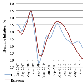
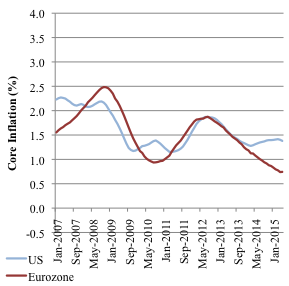
Figure 4: Headline and Core inflation for the US and Eurozone. Note: 12-month moving average of year-on-year inflation.
Forestalling Deflation
The Fed transitioned to worrying about deflation risk as early as June 2010, even though inflation was rising in tandem with the European inflation rate (Figure 4) (Federal Reserve System 2010). The Fed’s main tools now were quantitative easing and forward guidance. As is well-known, in this inglorious interlude, the ECB twice raised interest rates. But even past that point, the ECB continued to reject a risk-management approach and followed rather than anticipated the deceleration in inflation. Because it had delayed stimulus during 2007-9, the ECB needed more aggressive action, rather than continued wait-and-see approach. At a November, 2013 press conference, a journalist described the ECB as a “pea-shooter dealing with an approaching deflationary tank” (Draghi 2013). ECB President Mario Draghi responded that the ECB was waiting for more data, and would do more, “if needed.” Thus, the ECB acted asymmetrically: rising commodity prices were expected to feed persistent inflation but falling commodity prices were expected to reverse course. Once again, markets and analysts reacted impatiently. Interest rate cuts were not enough. The question was why more aggressive “non-standard” actions were not being taken.
Policy Credibility
We conclude also that the Fed gained credibility even though it appeared to temporarily suspend its commitment to price stability. Michael Bordo and Finn Kydland (1995) have argued that setting aside a policy rule to deal with extraordinary contingency is consistent with commitment to long-term goals. The Fed made clear its objective of preventing a meltdown and, as Blinder (2012) has emphasized, credibility principally requires that words be matched with deeds.
In the eurozone, words were often a substitute for deeds. Markets and investors reacted to the tight monetary policy, which added to the economic drag and deflationary tendencies due to fiscal austerity and lingering banking problems. By mid-2009, euro area output had fallen behind that of the U.S., and it never caught up. Delays in stimulating economic recovery have permanent consequences, as recent analysis reaffirms (Fatas and Summers 2015). For all its rear-guard action, the ECB misread the crisis and will be associated with the legacy of a weak recovery and more entrenched deflationary tendencies. If, as is entirely possible, the euro area’s core inflation rate remains below 1 percent a year, the ECB’s credibility will be twice hurt. Not only would it have failed to provide stimulus when needed, but it would have allowed the euro area to slip into a low inflation trap, well below its stated target of 2 percent a year.
References
Aït-Sahalia, Yacine, Jochen Andritzky, Andreas Jobst, Sylwia Nowak, and Natalia Tamirisa, 2012, “Market Response to Policy Initiatives during the Global Financial Crisis,” Journal of International Economics 87(1): 162-177.
Akerlof, George and Robert Shiller, 2009, “Animal Spirits: How Human Psychology Drives the Economy, and Why It Matters for Global Capitalism,” Princeton: Princeton University Press.
Blinder, Alan, 2012, “Central Bank Independence and Credibility During and After a Crisis,” Griswold Center for Economic Policy Studies Working Paper No. 229, September.
Blinder, Alan, 2013, “After the Music Stopped: the Financial Crisis, the Response, and the Work Ahead,” New York: Penguin Press.
Bordo, Michael and Finn Kydland, 1995, “The Gold Standard as a Rule: an Essay in Exploration,” 32: 423-64.
D’Amico, Stefania and Thomas King, 2015, “What Does Anticipated Monetary Policy Do?” Federal Reserve Bank of Chicago, Working Paper 2015-10, November.
Draghi, Mario, 2013, “Introductory statement with Q&A,” European Central Bank, November 7.
Fatas, Antonio and Lawrence Summers, 2015, “The Permanent Effects of Fiscal Consolidations,” Centre for Economic Policy Research Discussion Paper No. 10902, October 2015.
Federal Reserve System, 2010, “Minutes of the Federal Open Market Committee,” June 22-23.
Hetzel, Robert, 2012, “The Great Recession: Market Failure or Policy Failure,” Cambridge: Cambridge University Press.
Hetzel, Robert, 2014, “Contractionary Monetary Policy Caused the Great Recession in the Eurozone: A New Keynesian Perspective” The Federal Reserve Bank of Richmond Working Paper Series, August 22.
Kang, Dae Woong, Nick Ligthart, and Ashoka Mody, 2015, “The European Central Bank: Building a Shelter in a Storm,” Griswold Center for Economic Policy Studies Working Paper No. 248, Princeton University, December.
Mody, Ashoka, 2015, “Living dangerously without a Fiscal Union,” Bruegel Working Paper 2015/03.
Nechio, Fernanda, 2011, “Monetary Policy When One Size Does Not Fit All,” Federal Reserve Bank of San Francisco Economic Letter, June 13.
Svensson, Lars, 1999, “Monetary Policy Issues for the Eurosystem,” Carnegie-Rochester Conference Series on Public Policy 51: 79-136.
Taylor, John, 2010, “Globalization and Monetary Policy: Mission Impossible,” In International Dimensions of Monetary Policy, University of Chicago Press: 609-624.
Trichet, Jean-Claude and Lucas Papademos, 2008b, “Introductory statement with Q&A,” European Central Bank, February 7.
This post written by Dae Woong Kang, Nick Ligthart, and Ashoka Mody.
Philadelphia Fed Coincident Indices: National, Regional and State Trends
More states are slowing even as the Nation continues to expand. The states that contracted include Wisconsin and Kansas, states pursuing a contractionary fiscal policy. Wisconsin’s level of activity lags that predicted by historical correlations.
The Geographic Dispersion of Growth. A diffusion index measures the proportion of individual entities expanding or contracting; a reading greater than 0 indicates a majority (of states, in this case) are expanding.
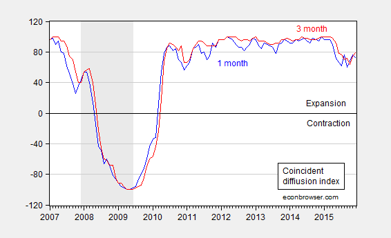
Figure 1: One month diffusion index (blue), and three month diffusion index (red). NBER defined recession dates shaded gray. Source: Philadelphia Fed, NBER.
Faster Growing States, Slower Growing States. A large majority of states are still expanding. This is manifested in a still-rising national coincident index.

Figure 2: Log coincident indices for Minnesota (blue), Wisconsin (red), Kansas (green), California (teal), US (black), all normalized to 2011M01=0. NBER defined recession dates shaded gray. Source: Philadelphia Fed, NBER, author’s calculations.
One of the few (non-energy dependent) states declining on a three month basis (see map) is Wisconsin. Fortunately, Kansas’s poor performance casts in a favorable light Wisconsin’s otherwise lackluster performance.
How Badly Is Wisconsin Lagging? While Wisconsin economic activity is declining, it might be the case that this is because national economic activity is decelerating, and Wisconsin follows the Nation. This hypothesis can be assessed by measuring the historical correlation between Wisconsin and the US up to 2009M06 using an error correction model, and then conducting out-of-sample forecasts (an ex post historical simulation). The forecast plus 90% forecast interval is shown in Figure 3. The methodology is laid out in this post (except a 2 lag specification is used, and is estimated over a sample starting in 1990).
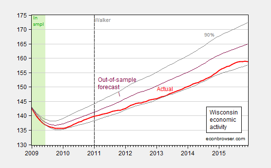
Figure 3: Wisconsin coincident index (bold red), and dynamic out-of-sample forecast (purple), and 90% band (gray lines). Green denotes in-sample period. Source: Philadelphia Fed, NBER, author’s calculations.
The counterfactual takes account of the fact that Wisconsin economic activity has over the long term (1990-2009M06) lagged US economic activity; that is, a one percent increase in national economic activity is associated with a 0.73 percent increase in Wisconsin. For more details on inferring long run relations from error correction models, see here.
I have not assumed weak exogeneity of US economic activity for Wisconsin. Doing so — which seems plausible –yields the following figure.

Figure 4: Wisconsin coincident index (bold red), and dynamic out-of-sample forecast (purple), and 90% band (gray lines). Green denotes in-sample period. Assumes US economic activity is weakly exogenous with respect to Wisconsin. Source: Philadelphia Fed, NBER, author’s calculations.
In other words, Wisconsin is, with statistical significance, underperforming what would have been expected from historical experience. One argument is that Wisconsin’s statistical underperformance, which has intensified in recent months, is due to the dollar’s recent strength. This is a plausible interpretation for the last year [1]; however it fails to explain why underperformance was in evidence during the prior period of dollar weakness.
Fortunately for Wisconsin residents, our Governor Walker has assured us that The state of our state is strong!.
January 29, 2016
The U.S. is not in a recession
The Bureau of Economic Analysis announced today that U.S. real GDP grew at a 0.7% annual rate in the fourth quarter. That’s a bad quarter to be sure, and real GDP is up only 1.8% from a year ago. That’s a weak year judged by the U.S. postwar average of 3.1%, but is not far from the 2.1% annual growth we’ve been averaging since 2009:Q3.
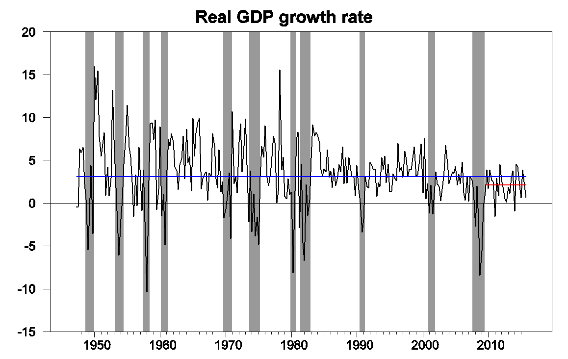
Real GDP growth at an annual rate, 1947:Q2-2015:Q4, with historical average (3.1%) in blue and post-Great-Recession average (2.1%) in red.
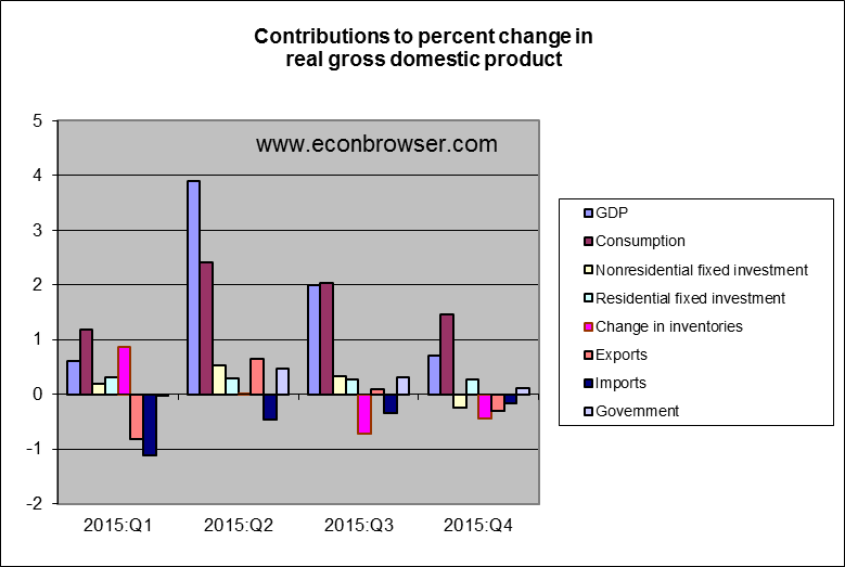
One concerning detail in today’s report was that nonresidential fixed investment fell during the quarter, pulled down in part by slashed capital spending in the oil patch. Inventory drawdown (often an erratic component) and net exports each subtracted almost half a percentage point from the annualized Q4 growth rate.
Weakness in the global economy and strong dollar were surely factors in the drop in net exports. The U.S. is not immune to developing concerns in Europe, China, Japan, and elsewhere.
Source: Jason Furman.
The Q4 GDP numbers produced a modest increase in the Econbrowser Recession Indicator Index up to 10%. The index uses today’s data release to form a picture of where the economy stood as of the end of 2015:Q3. That’s still way below the 67% threshold at which our algorithm would declare that the U.S. had entered a new recession.

GDP-based recession indicator index. The plotted value for each date is based solely on information as it would have been publicly available and reported as of one quarter after the indicated date, with 2015:Q3 the last date shown on the graph. Shaded regions represent the NBER’s dates for recessions, which dates were not used in any way in constructing the index, and which were sometimes not reported until two years after the date.
With much talk of recession in the air these days, I was curious to look at some other indicators. UCLA Professor Ed Leamer suggested four useful rules of thumb. He noted that a recession is usually characterized by an increase in the unemployment rate of 0.8 percentage points over a 6-month period. Today’s unemployment rate is actually 0.3% lower than it was in June.
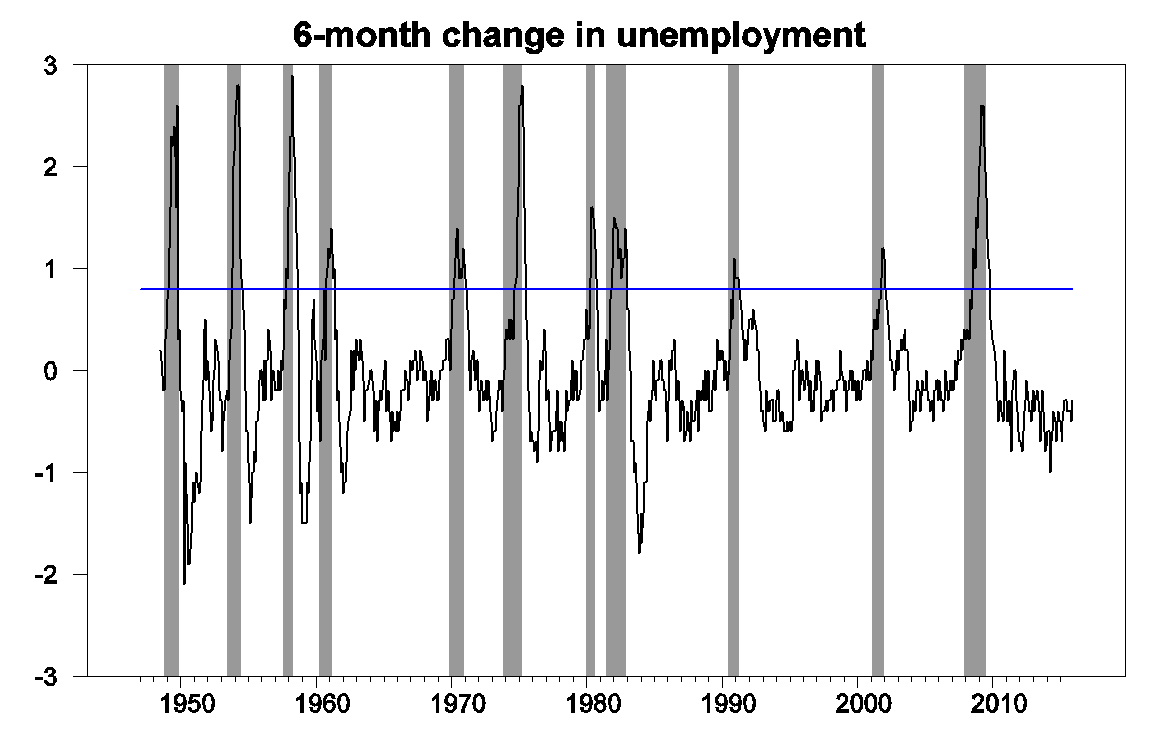
6-month change in civilian unemployment rate, from FRED, with NBER recessions as shaded regions and blue line at +0.8 threshold.
In a recession we’d likely see payrolls of nonfarm establishments fall by more than 0.5% over a 6-month period. They’re up 1% over the last 6 months.
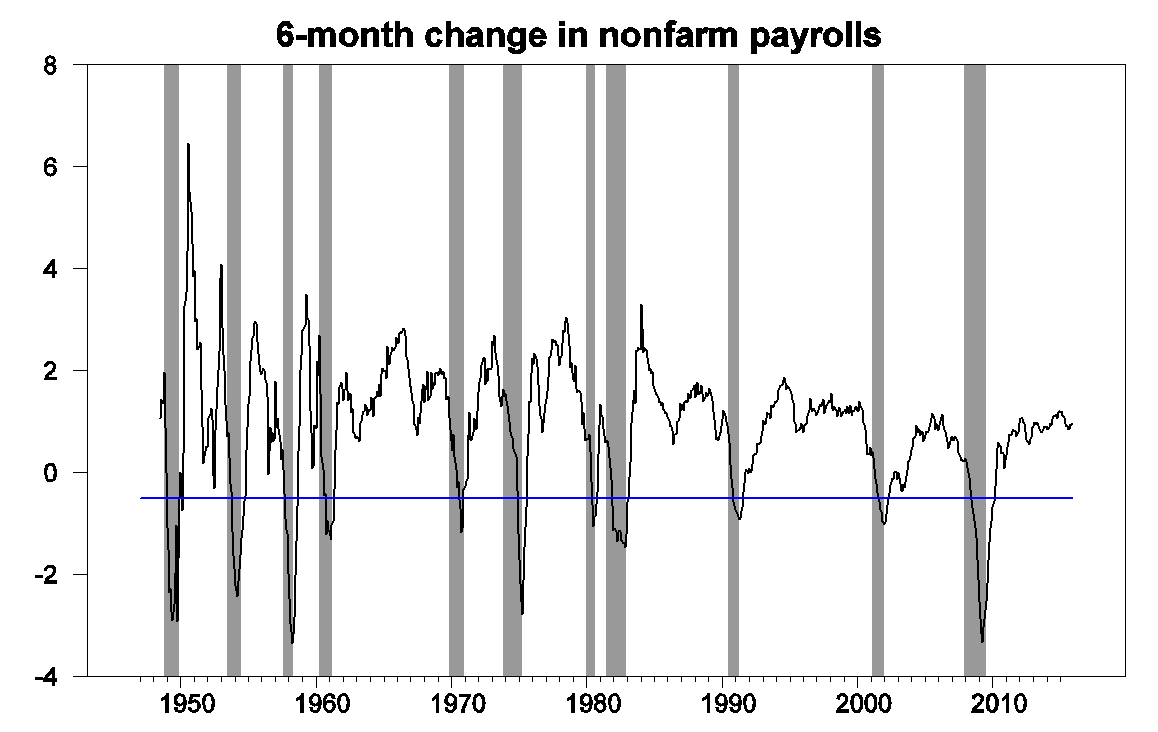
100 times the 6-month change in natural log of seasonally adjusted nonfarm payroll employment, from FRED, with NBER recessions as shaded regions and blue line at -0.5% threshold.
The separate BLS measure of employment based on their survey of households is up 0.8%.
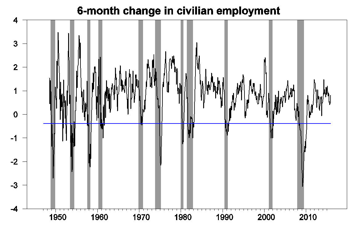
100 times the 6-month change in natural log of civilian employment,
from FRED, with NBER recessions as shaded regions and blue line at -0.4 threshold.
Leamer’s fourth suggested indicator, the Federal Reserve’s index of industrial production is down 0.6% over the last 6 months. But Leamer wanted to see a 6-month drop of more than 3% before calling it a recession.
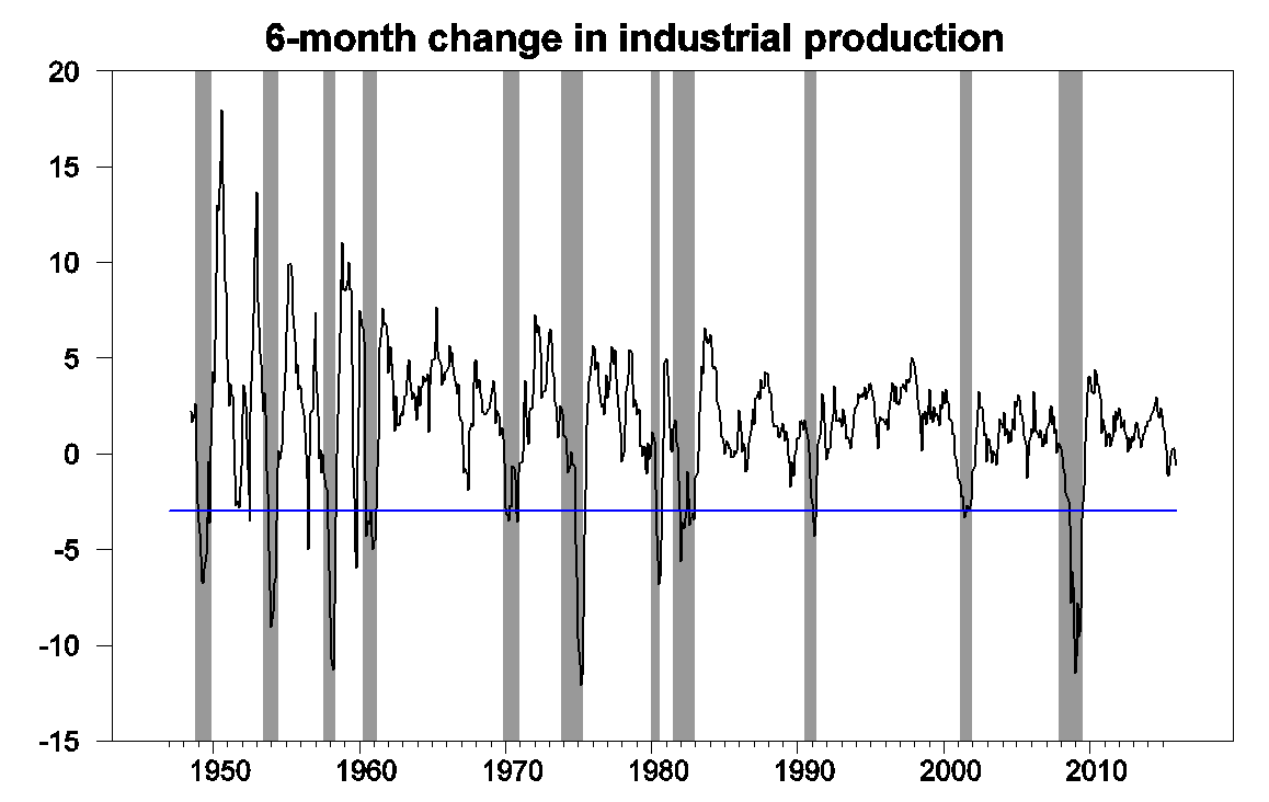
100 times the 6-month change in natural log of index of industrial production, from FRED, with NBER recessions as shaded regions and blue line at -3.0 threshold.
Though I am concerned that even the 12-month change in industrial production is down.

100 times the 12-month change in natural log of index of industrial production, from FRED, with NBER recessions as shaded regions and blue line at 0.0 threshold.
Another indicator of weakness in the manufacturing sector is the ISM Purchasing Manager’s Index, currently at 48.2. Any value below 50 indicates that more responders are indicating declines rather than improvements in key measures. But an analysis of this indicator by Travis Berge and Oscar Jorda concluded that you’d want to see a value below 44.5 before calling it a recession.
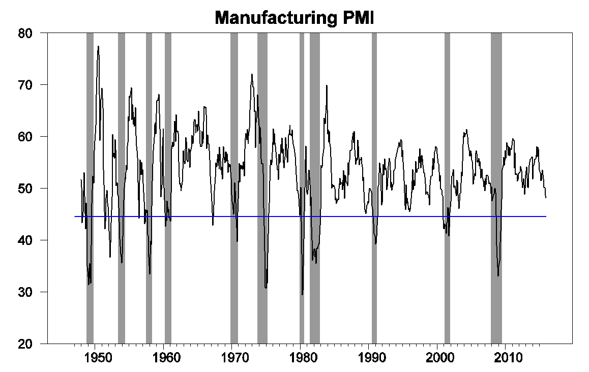
ISM Manufacturing PMI Composite Index, from FRED, with NBER recessions as shaded regions and blue line at 44.48 threshold.
And the non-manufacturing PMI is looking solid.
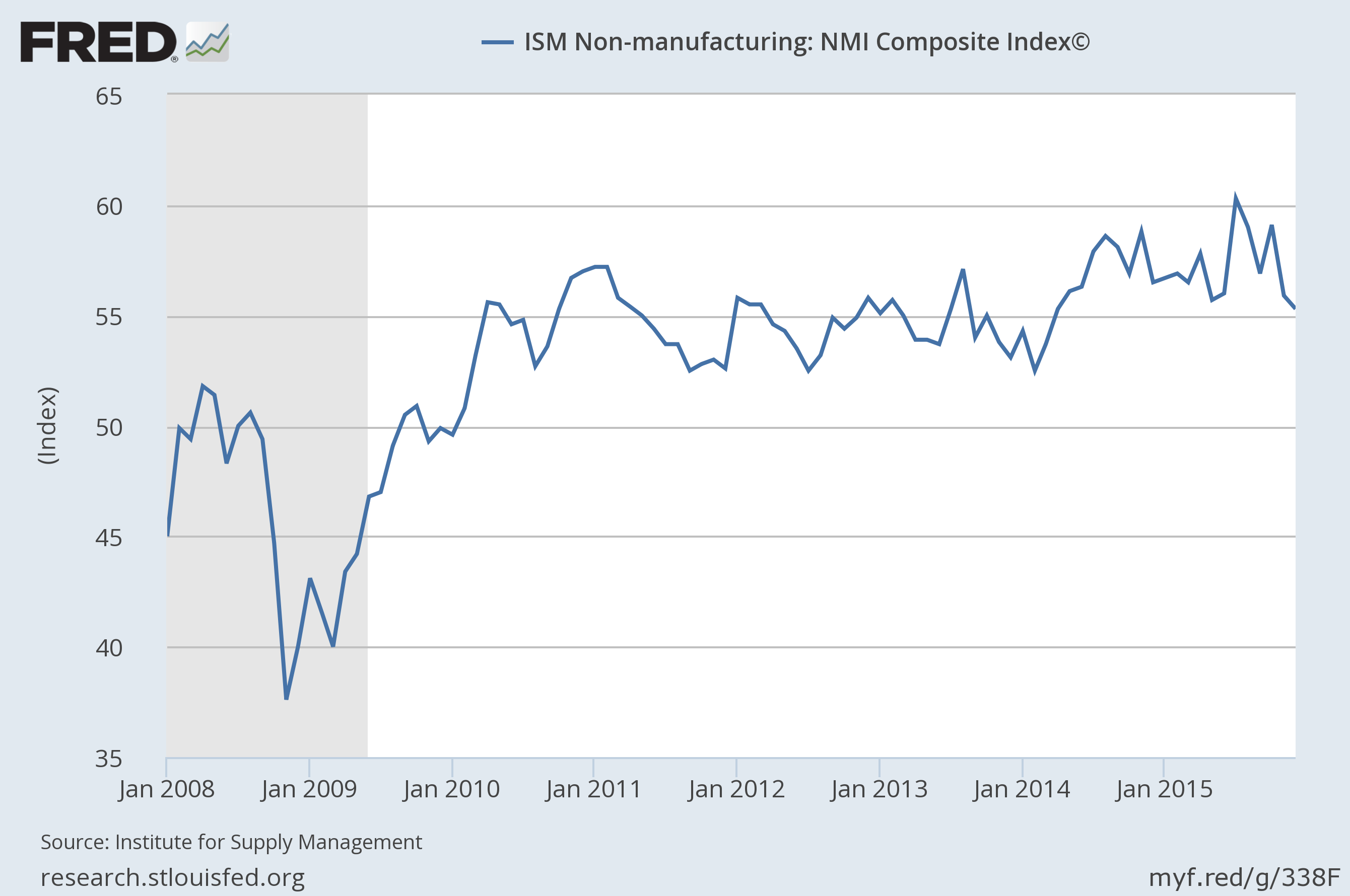
Source: FRED.
To summarize, the U.S. is unquestionably facing some headwinds from slow economic growth elsewhere in the world. But so far none of the indicators are consistent with the conclusion that we’ve already entered a recession.
January 28, 2016
Wisconsin Governor Walker: “The state of our state is strong!”
That’s the first line of an op-ed published Monday. In other news, Wisconsin nonfarm payroll employment (NFP) and private nonfarm payroll employment is decreasing. And NFP lagging what should be the case if the historical correlation between national and Wisconsin employment held, after Governor Walker’s inauguration.
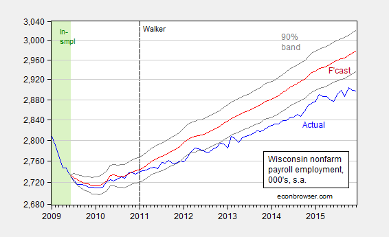
Figure 1: Wisconsin nonfarm payroll employment (blue), forecast from error correction model estimated over 1990M03-2009M06 (red), and 90% confidence band (gray lines), all on log scale. Dashed line at 2011M01 when Walker takes office, and light green denotes sample period. Source: BLS, author’s estimates (as described here).
2015 was the year that witnessed the slowest increase in private NFP employment, and the slowest growth rate, since the end of the last recession.
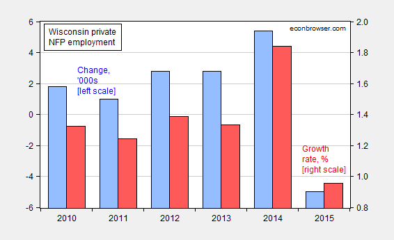
Figure 2: Wisconsin private NFP growth, in levels, 000’s (blue bar, left scale), and percent (red bar, right scale). Source: BLS, DWD, author’s calculations.
And 2015 was the year in which mass layoff notifications jumped.

Figure 3: Wisconsin cumulative mass layoff notifications by end-month, for 2015 (bold blue) and 2014 (red). Source: DWD and author’s calculations.
Makes one wonder what it looks like when the state of the state is weak.
January 26, 2016
Guest Contribution: “Asset Valuations and Recession Risks”
We are fortunate to present today a Guest Contribution written by John Kitchen (U.S. Treasury). Any views or opinions expressed are solely those of the author and not of the Treasury Department or any other institution.
With the recent declines in valuations in financial markets, an analysis based on “Relative Valuations of Fixed Capital and Financial Assets in the United States” indicates that we are in a “gray area” regarding the signaling of a heightened risk of recession.
The recent volatility in financial markets and equity valuations may be a reminder of a lesson economists and policymakers learned from the financial crisis and great recession: that they didn’t fully understand the relationships from the financial sector and financial valuations to real macroeconomic variables and overall economic performance. The paper “Relative Valuations of Fixed Capital and Financial Assets in the United States” uses data from the integrated macroeconomic accounts (IMA) from the Bureau of Economic Analysis and the Federal Reserve to provide more information — and at least an initial effort — for better understanding relationships between the real economy and financial valuations. The analysis examines the various layers of the relationships of asset valuations relative to potential GDP for the private nonfinancial sectors of the U.S. economy, building up from the relative valuations for fixed capital assets (the capital stock), to the relative valuations for total nonfinancial assets (including land), and then to total assets (i.e., including financial assets). Just as the name of the data set from which the information for the paper is drawn implies, the financial and real economy data are fully integrated in the analysis.
While many issues are addressed in the paper, including the observed relative stability of the aggregate capital-output ratio (consistent with a Kaldor “stylized fact”) and the observed volatility of relative financial valuations, one part of the paper addresses the observed cyclical performance of asset valuations and the role as a leading indicator for the economy’s business cycle. In that context and based on historical relationships, the recent declines in equity valuations indicate that we are currently in a situation of somewhat heightened risk of a recession – but at this time it is in a “gray area” that does yet outright indicate a recession compared to what has been observed historically. (Note the financial variables are leading indicators in contrast to the coincident variables recently addressed by Menzie Chinn.)
That conclusion is based on two parts of the analysis of the paper: (1) threshold analysis that looked at the changes (declines) in total asset valuation (relative to potential GDP) that historically were associated with a subsequent recession in the economy; and (2) simple probit analysis for the univariate relationship for the change in total asset valuation to a binary recession indicator (i.e., generating a recession probability estimate based solely on the observed changes in total asset valuations).
Using those relationships and an assumption for financial and equity valuations for the first quarter to be consistent with an S&P500 value of 1877 (Monday’s close), what would that imply? Regarding the total asset valuation, the following chart shows that total asset valuations are behaving suspiciously like they have at previous asset valuation peaks preceding business cycle peaks and recessions.
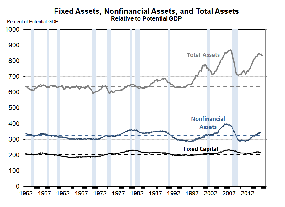
With the further decline in asset values in the first quarter, the two-quarter decline in total asset values would be 0.7 percent and the three-quarter decline would be 1.7 percent – which as discussed in the paper are, relative to historical occurrences, at the threshold of observed prior “no turning back” occurrences for financial peaks and declines prior to recessions.
Regarding the univariate recession probability estimate, the relationship also suggests some heightened risk. The following chart shows the estimates for a probit regression of the binary recession indicator on the current and three lagged values for the change in total asset valuation (the regression results are shown in the paper but the chart shown here is not).
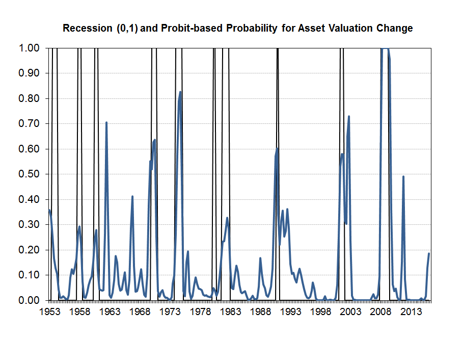
The estimates indicate that the current asset valuation change yields a recession probability of about 19 percent. While there have been various observed “false” signals historically, for periods “sufficiently removed” from a recession period it is rare to see an estimated probability of recession from this indicator this high without subsequently entering recession. The notable exception is for 1966 – and some analysts would agree that a subsequent recession in that case was perhaps the correct call. In various cases in the past, the estimated probability was in roughly the 30 percent to 70 percent range prior to recessions, and only twice did it exceed 80 percent. So, while the predictive ability of the measure is somewhat imprecise, it does suggest somewhat heightened risk.
Bottom line: Declines in equity markets and total asset valuations are flashing warning signs, but are not yet at this time providing an outright indication of recession.
This post written by John Kitchen.
January 24, 2016
Can lower oil prices cause a recession?
Donald Luskin writes in the Wall Street Journal:
The global economy is slipping into recession. The evidence is showing up in all the usual ways: slowing output growth, slumping purchasing-manager indexes, widening credit spreads, declining corporate earnings, falling inflation expectations, receding capital investment and rising inventories. But this is a most unusual recession– the first one ever caused by falling oil prices.
A drop in oil prices means less money in the hands of oil producers but more money in the hands of oil consumers. Currently the U.S. is importing about 5.1 million barrels a day more than we’re exporting of crude oil and petroleum products. At $100 a barrel, that had been a net drain on the U.S. economy of $190 billion each year. That drain that will now be cut by more than half by falling oil prices.
We usually see consumers spend their extra income right away, whereas it takes more time for producers to alter their spending plans. As a result, even if the U.S. was not a net importer of oil, we might still expect to see a short-run positive stimulus from dropping oil prices. The actual change in overall consumption spending in response to the oil price decline through March of last year was about 0.4% smaller than would have been predicted on the basis of the historical correlations. But we see something different when we look at the behavior of individual consumers. A study by the JP Morgan Chase Institute compared the response to lower gasoline prices of people who had previously been buying a lot of gasoline with the responses of people who had been buying relatively little. They found that the first group increased spending relative to the second, with the magnitude of the difference in spending between the two groups consistent with the claim that consumers spent almost all of their windfall. The conclusion I draw from the seemingly conflicting evidence in the macro and micro data is that each consumer spent more than they would have if oil prices had not fallen, but that there were other macro headwinds at the same time that were offsetting some of the positive stimulus of falling oil prices.
In any case, we’ve now had plenty of time for cuts in spending by U.S. oil producers to start to have an economic effect of their own. If there’s an increase in spending by consumers of $1 and a decrease in spending by producers of $1, it’s not really a net wash for the economy. The reason is that the consumers are spending their money in different places and on different items than the producers are cutting. There is a lot of specialized labor and capital that’s involved in oil extraction that can’t move costlessly to some other sector when the oil patch goes sour. I presented a model in 1988 in which an oil price decline could actually result in an increase in unemployment either because it takes time for people in the oil sector to move to the sectors where the jobs are now available, or because unemployed oil workers are still waiting where they were hoping for conditions to improve.
And of course we’re talking here not just about the people who work in the oil industry itself but all the other industries and services that sell to the oil sector and more in turn who sell to these suppliers. A recent analysis by Feyrer, Mansur, and Sacerdote concluded that without new U.S. oil and natural gas extraction, there would have been 725,000 fewer Americans working and a 0.5% higher unemployment rate during the Great Recession.
There are thus some reasons why a decrease in oil prices would be a boost to the U.S. economy and other reasons why it could even be a drag. A number of studies have looked at the effects of oil price decreases and concluded that these have little or no net positive effect on U.S. real GDP growth; see for example this survey. The price of oil fell from $30/barrel in November 1985 to $12 by July of 1986. U.S. real GDP continued growing throughout, logging a 2.9% increase overall for 1986, neither significantly faster nor slower than normal.
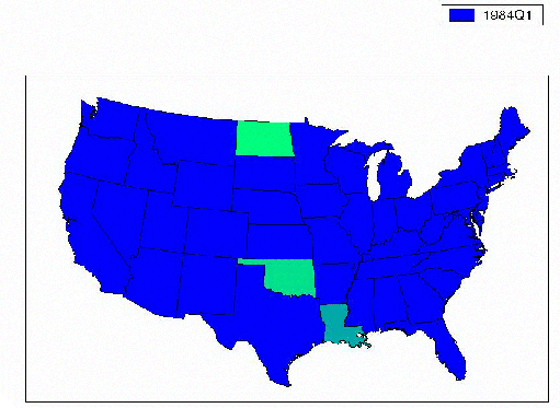
But 1986 was a bad time for Texas and the other oil-producing states. Here’s a graph from some analysis I did with Michael Owyang of the Federal Reserve Bank of St. Louis. We estimated for each state’s employment growth a recession-dating algorithm like the one that Econbrowser updates each quarter for the overall U.S. economy (by the way, a new update will be posted this Friday). In the gif below you can watch the energy-producing states and their neighbors develop their own regional recession during the mid-1980’s even while national U.S. employment and GDP continued to grow.
One of the reasons that more people outside of Texas share Luskin’s worries is the recent striking comovement between oil prices and the U.S. stock market. On days when oil prices go down, U.S. stocks go down, suggesting the market is seeing bad news, not good, in oil price declines.
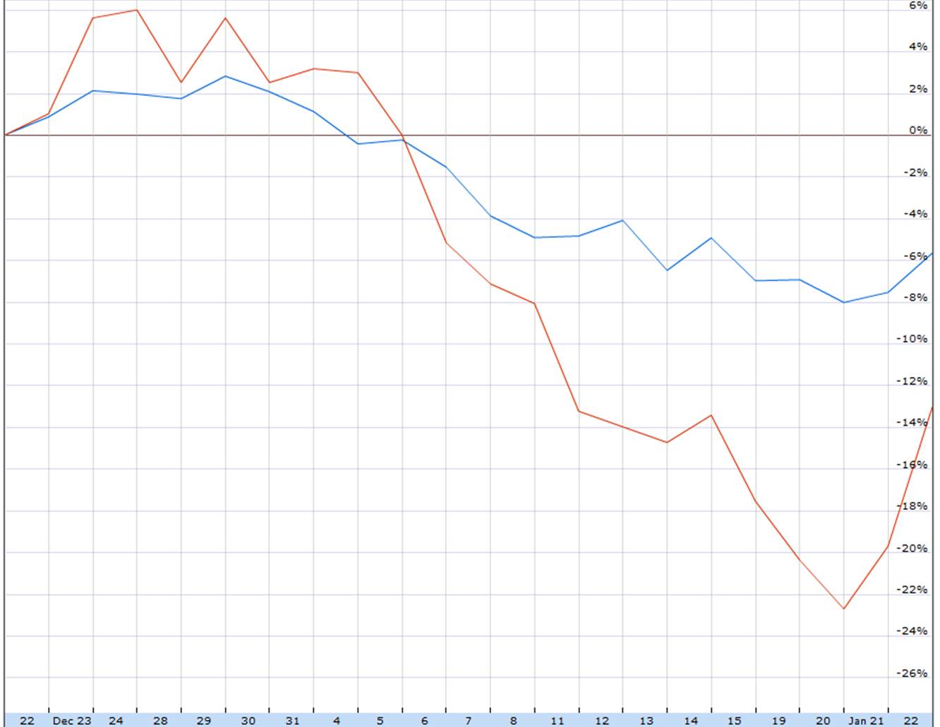
Cumulative percent change since Dec 22 in U.S. stock market (as measured by S&P500, in blue) and U.S. oil prices (as measured by the USO ETF, in red). Source: Google Finance.
The correlation is even more striking if you look at the Chinese stock market instead of the U.S.
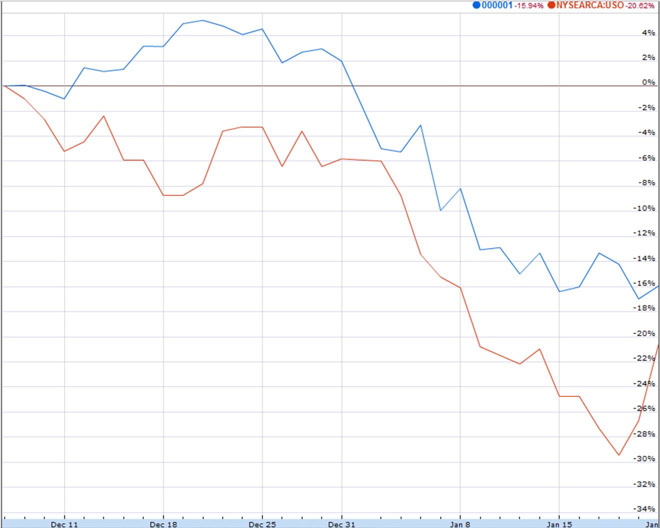
Cumulative percent change since Dec 8 in Chinese stock market (as measured by Shanghai SSE composite, in blue) and U.S. oil prices (as measured by the USO ETF, in red). Source: Google Finance.
And that’s not because of all the carnage that’s in store for Chinese frackers. It’s concerns about China that are driving oil prices, not the other way around. If there is a global slowdown or recession, it certainly would be a factor contributing to lower oil prices.
But regardless of whether it’s oil prices that are moving stock prices or the other way around, folks in Texas and North Dakota have plenty of reason to be concerned.
January 23, 2016
Three Random Graphs: Recession Watch, Wisconsin Employment Decline, Global Temperatures
Industrial production is down. Wisconsin nonfarm payroll employment is down. Global Temperatures hit records in 2014, 2015.
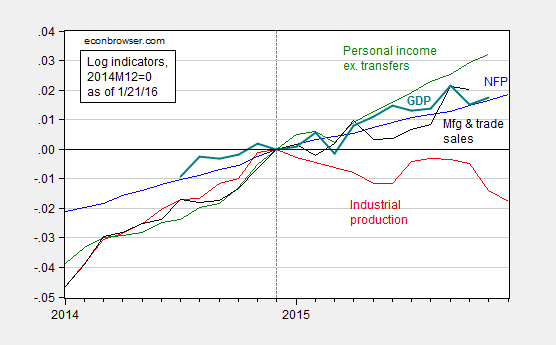
Figure 1: Log nonfarm payroll employment (blue), industrial production (red), personal income ex.-transfers in Ch.09$ (green), manufacturing and trade sales in Ch.09$ (black), and GDP in Ch.09$ (bold teal), all normalized to 2014M12 = 0, accessed 1/21/2016. Source: BLS, Federal Reserve Board, St. Louis Fed, and BEA via FRED, Macroeconomic Advisers January 20th release, and author’s calculations.
Figure 2: Wisconsin nonfarm payroll employment (blue), forecast from error correction model estimated over 1990M03-2009M06 (red), and 90% confidence band (gray lines), all on log scale. Dashed line at 2011M01 when Walker takes office, and light green denotes sample period. Source: BLS, author’s estimates.
The counterfactual forecast is based on a bivariate single equation error correction model involving national and Wisconsin nonfarm payroll employment, with one lag of first differences, and a contemporaneous first difference US NFP (hence, US NFP is weakly exogenous). Notice the sample used for estimation is up to 2009M06 (NBER defined trough), and the forecast tracks well until 2011M01.
Note that the gap between Governor Walker’s August 2013 recommittal to hit the 250,000 new private jobs target and measured employment is actually widening, from 87,200 in October to 95,400 in December.
Here’s what’s in the DWD release of 1/21.
“Under Governor Walker’s leadership, the number of employed Wisconsinites reached a record high in December 2015, meaning more people were employed in Wisconsin than ever before, “DWD Secretary Reggie Newson said. “Additionally, our state’s labor force participation rate grew to 68 percent, which is more than five percentage points higher than the national rate. As the Governor noted Tuesday during his State of the State address, the Wisconsin comeback is real.”
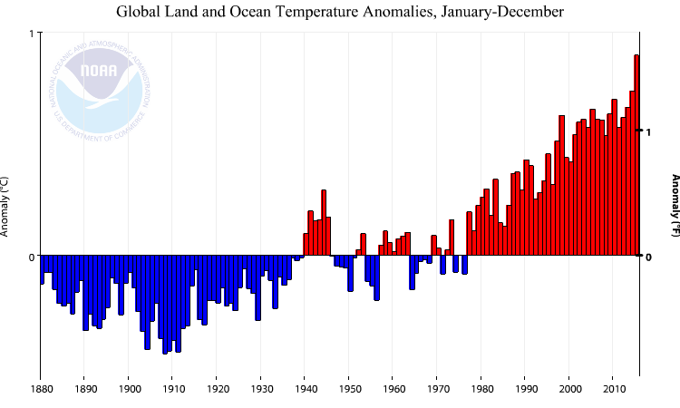
Figure 3: Global land/sea temperature anomaly, for 12 month periods. Source: NOAA.
From NOAA:
The January–December map of temperature anomalies shows that warmer-than-average temperatures occurred across the vast majority of the globe during 2015, combining to bring overall record warmth for 2015, at 0.90°C (1.62°F) above the 20th century average. This easily surpasses the previous record set just last year by 0.16°C (0.29°F). The global temperatures were strongly influenced by the strong El Niño conditions that developed during the year. The 2015 temperature also marks the largest margin by which an annual temperature record has been broken. Prior to this year, the largest margin occurred in 1998, when the annual temperature surpassed the record set in 1997 by 0.12°C (0.22°F). Incidentally, 1997 and 1998 were the last years in which a similarly strong El Niño was occurring. The annual temperature anomalies for 1997 and 1998 were 0.51°C (0.92°F) and 0.63°C (1.13°F), respectively, above the 20th century average, both much lower than the 2015 temperature.
In other words, it was hotter than the last El Niño years.
Menzie David Chinn's Blog


