
Aswath Damodaran's Blog, page 17
January 27, 2019
January 2019 Data Update 6: Profitability and Value Creation!
In my last post, I looked at hurdle rates for companies, across industries and across regions, and argued that these hurdle rates represent benchmarks that companies have to beat, to create value. That said, many companies measure success using lower thresholds, with some arguing that making money (having positive profits) is good enough and others positing that being more profitable than competitors in the same business makes you a good company. In this post, I will look at all three measures of success, starting with the minimal (making money), moving on to relative judgments (and how best to compare profitability across companies of different scales) and ending with the most rigorous one of whether the profits are sufficient to create value.
Measuring Financial SuccessYou may start a business with the intent of meeting a customer need or a societal shortfall but your financial success will ultimately determine your longevity. Put bluntly, a socially responsible company with an incredible product may reap good press and have case studies written about it, but if it cannot establish a pathway to profitability, it will not survive. But how do you measure financial success? In this portion of the post, I will start with the simplest measure of financial viability, which is whether the company is making money, usually from an accounting perspective, then move the goal posts to see if the company is more or less profitable than its competitors, and end with the toughest test, which is whether it is generating enough profits on the capital invested in it, to be a value creator.
Profit MeasuresBefore I present multiple measures of profitability, it is useful to step back and think about how profits should be measured. I will use the financial balance sheet construct that I used in my last post to explain how you can choose the measure of profitability that is right for your analysis: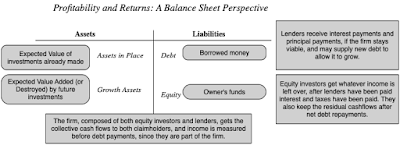
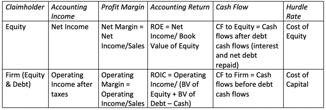
Just as hurdle rates can vary, depending on whether you take the perspective of equity investors (cost of equity) or the entire business (cost of capital), the profit measures that you use will also be different, depending on perspective. If looked at through the eyes of equity investors, profits should be measured after all other claim holders (like debt) and have been paid their dues (interest expenses), whereas using the perspective of the entire firm, profits should be estimated prior to debt payments. In the table below, I have highlighted the various measures of profits and cash flows, depending on claim holder perspective: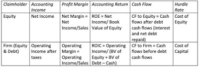 The key, no matter which claim holder perspective you adopt, is to stay internally consistent. Thus, you can discount cash flows to equity (firm) at the cost of equity (capital) or compare the return on equity (capital) to the cost of equity (capital), but you cannot mix and match.
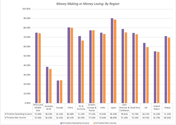
The Minimal Test: Making money?The lowest threshold for success in business is to generate positive profits, perhaps the reason why accountants create measures like breakeven, to determine when that will happen. In my post on measuring risk, I looked at the percentages of firms that meet this threshold on net income (for equity claim holders), an operating income (for all claim holders) and EBITDA (a very rough measure of operating cash flow for all claim holders). Using that statistic for the income over the last twelve month, a significant percentage of publicly traded firms are profitable: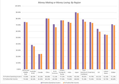 Data, by countryThe push back, even on this simplistic measure, is that just as one swallow does not a summer make, one year of profitability is not a measure of continuing profitability. Thus, you could expand this measure to not just look at average income over a longer period (say 5 to 10 years) and even add criteria to measure sustained profitability (number of consecutive profitable years). No matter which approach you use, you still will have two problems. The first is that because this measure is either on (profitable) or off (money losing), it cannot be used to rank or grade firms, once they have become profitable. The other is that making money is only the first step towards establishing viability, since the capital invested in the firm could have been invested elsewhere and made more money. It is absurd to argue that a company with $10 billion in capital invested in it is successful if it generates $100 in profits, since that capital invested even in treasury bills could have generated vastly more money.
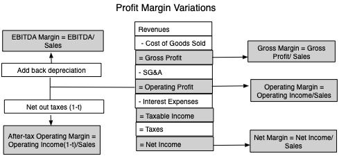
The Relative Test: Scaled ProfitabilityOnce a company starts making money, it is obvious that higher profits are better than lower ones, but unless these profits are scaled to the size of the firm, comparing dollar profits will bias you towards larger firms. The simplest scaling measure is revenues, a data item available for all but financial service firms, and one that is least likely to be affected by accounting choices, and profits scaled to revenues yields profit margins. In a data update post from a year ago, I provided a picture of different margin measures and why they might provide different information about business profitability:
As I noted in my section on claimholders above, you would use net margins to measure profitability to equity investors and operating margins (before or after taxes) to measure profitability to the entire firm. Gross and EBITDA margins are intermediate stops that can be used to assess other aspects of profitability, with gross margins measuring profitability after production costs (but before selling and G&A costs) and EBITDA margins providing a crude measure of operating cash flows.
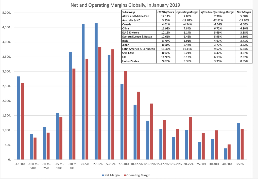
In the graph below, I look at the distribution of pre-tax operating margins and net margins globally, and provide regional medians for the margin measures: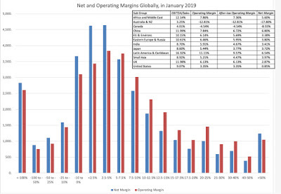
The regional comparisons of margins are difficult to analyze because they reflect the fact that different industries dominate different regions, and margins vary across industries. You can get the different margin measures broken down by industry, in January 2019, for US firms by clicking here. You can download the regional averages using the links at the end of this post.
The Value Test: Beating the Hurdle RateAs a business, making money is easier than creating value, since to create value, you have to not just make money, but more money than you could have if you had invested your capital elsewhere. This innocuous statement lies at the heart of value, and it is in fleshing out the details that we run into practical problems on the three components that go into it:Profits: The profit measures we have for companies reflect their past, not the future, and even the past measures vary over time, and for different proxies for profitability. You could look at net income in the most recent twelve months or average net income over the last ten years, and you could do the same with operating income. Since value is driven by expectations of future profits, it remains an open question whether any of these past measures are good predictors.Invested Capital: You would think that a company would keep a running tab of all the money that is invested in its projects/assets, and in a sense, that is what the book value is supposed to do. However, since this capital gets invested over time, the question of how to adjust capital invested for inflation has remained a thorny one. If you add to that the reality that the invested capital will change as companies take restructuring charges or buy back stock, and that not all capital expenses finds their way on to the balance sheet, the book value of capital may no longer be a good measure of capital invested in existing investments.Opportunity Cost: Since I spent my last post entirely on this question, I will not belabor the estimation challenges that you face in estimating a hurdle rate for a company that is reflective of the risk of its investments.In a perfect world, you would scale your expected cashflows in future years, adjusted for time value of money, to the correct amount of capital invested in the business and compare it to a hurdle rate that reflects both your claim holder choice (equity or the business) but also the risk of the business. In fact, that is exactly what you are trying to do in a good intrinsic or DCF valuation.
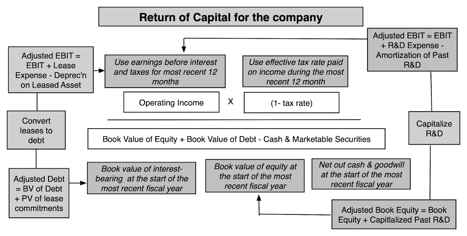
Since it is impossible to do this for 42000 plus companies, on a company-by-company basis, I used blunt instrument measures of each component, measuring profits with last year's operating income after taxes, using book value of capital (book value of debt + book value of equity - cash) as invested capital: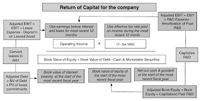
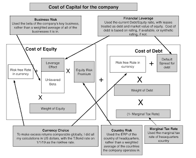
Similarly, to estimate cost of capital, I used short cuts I would not use, if I were called up to analyze a single company:
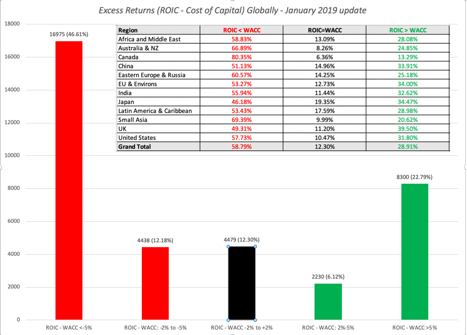
Comparing the return on capital to the cost of capital allows me to estimate excess returns for each of my firms, as the difference between the return on invested capital and the cost of capital. The distribution of this excess return measure globally is in the graph below: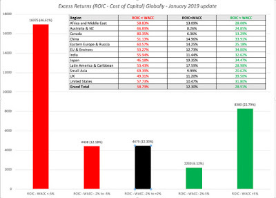 I am aware of the limitations of this comparison. First, I am using the trailing twelve month operating income as profits, and it is possible that some of the firms that measure up well and badly just had a really good (bad) year. It is also biased against young and growing firms, where future income will be much higher than the trailing 12-month value. Second, operating income is an accounting measure, and are affected not just by accounting choices, but are also affected by the accounting mis-categorization of lease and R&D expenses. Third, using book value of capital as a proxy for invested capital can be undercut by not only whether accounting capitalizes expenses correctly but also by well motivated attempts by accountants to write off past mistakes (which create charges that lower invested capital and make return on capital look better than it should). In fact, the litany of corrections that have to be made to return on capital to make it usable and listed in this long and very boring paper of mine. Notwithstanding these critiques, the numbers in this graph tell a depressing story, and one that investors should keep in mind, before they fall for the siren song of growth and still more growth that so many corporate management teams sing. Globally, approximately 60% of all firms globally earn less than their cost of capital, about 12% earn roughly their cost of capital and only 28% earn more than their cost of capital. There is no region of the world that is immune from this problem, with value destroyers outnumbering value creators in every region.
ImplicationsFrom a corporate finance perspective, there are lessons to be learned from the cross section of excess returns, and here are two immediate ones:Growth is a mixed blessing: In 60% of companies, it looks like it destroys value, does not add to it. While that proportion may be inflated by the presence of bad years or companies that are early in the life cycle, I am sure that the proportion of companies where value is being destroyed, when new investments are made, is higher than those where value is created.Value destruction is more the rule than the exception: There are lots of bad companies, if bad is defined as not making your hurdle rate. In some companies, it can be attributed to bad managed that is entrenched and set in its ways. In others, it is because the businesses these companies are in have become bad business, where no matter what management tries, it will be impossible to eke out excess returns.You can see the variations in excess returns across industries, for US companies, by clicking on this link, but there are clearly lots of bad businesses to be in. The same data is available for other regions in the datasets that are linked at the end of this post.
If there is a consolation prize for investors in this graph, it is that the returns you make on your investment in a company are driven by a different dynamic. If stocks are value driven, the stock price for a company will reflect its investment choices, and companies that invest their money badly will be priced lower than companies that invest their money well. The returns you will make on these companies, though, will depend upon whether the excess returns that they deliver in the future are greater or lower than expectations. Thus, a company that earns a return on capital of 5%, much lower than its cost of capital of 10%, which is priced to continue earning the same return will see if its stock price increase, if it can improve its return on capital to 7%, still lower than the cost of capital, but higher than expected. By the same token, a company that earns a return on capital of 25%, well above its cost of capital of 10%, and priced on the assumption that it can continue on its value generating path, will see its stock price drop, if the returns it generates on capital drop to 20%, well above the cost of capital, but still below expectations. That may explain a graph like the following, where researchers found that investing in bad (unexcellent) companies generated far better returns than investing in good (excellent) companies: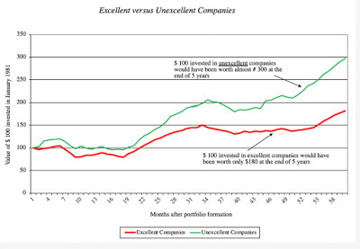 Original Paper: Excellence Revisited, by Michelle KlaymanThe paper is dated, but its results are not, and they have been reproduced using other categorizations for good and bad firms. Thus, investing in the most admired firms generates worse returns for investors than investing in the least admired and investing in popular (with investors) firms under performs investing in unpopular ones. While these results may seem perverse, at first sight, that bad (good) companies can be good (bad) investments, it makes sense, once you factor in the expectations game.
Finally, on the corporate governance front, I feel that we have lost our way. Corporate governance laws and measures have focused on check boxes on director independence and corporate rules, rather than furthering the end game of better managed companies. From my perspective, corporate governance should give stockholders a chance to change the way companies are run, and if corporate governance works well, you should see more management turnover at companies that don't earn what they need to on capital. The fact that six in ten companies across the globe earned well below their cost of capital in 2018, added to the reality that many of these companies have not only been under performing for years, but are still run by the same management, makes me wonder whether the push towards better corporate governance is more talk than action.
YouTube Video
Data Links
Profit Margins: US, Global, Emerging Markets, Europe, Japan, India, China, Aus & CanadaExcess Returns to Equity and Capital: US, Global, Emerging Markets, Europe, Japan, India, China, Aus & CanadaPapers
Return on Capital, Return on Invested Capital and Return on Equity: Measurement and Implications (Warning: It is long and boring!) Related PostsExplaining a Paradox: Why good companies can be bad investments and vice versa
January 2019 Data UpdatesData Update 1: A Reminder that equities are risky, in case you forgot!Data Update 2: The Message from Bond MarketsData Update 3: Playing the Numbers GameData Update 4: The Many Faces of RiskData Update 5: Of Hurdle Rates and Funding Costs!Data Update 6: Profitability and Value Creation!
Measuring Financial SuccessYou may start a business with the intent of meeting a customer need or a societal shortfall but your financial success will ultimately determine your longevity. Put bluntly, a socially responsible company with an incredible product may reap good press and have case studies written about it, but if it cannot establish a pathway to profitability, it will not survive. But how do you measure financial success? In this portion of the post, I will start with the simplest measure of financial viability, which is whether the company is making money, usually from an accounting perspective, then move the goal posts to see if the company is more or less profitable than its competitors, and end with the toughest test, which is whether it is generating enough profits on the capital invested in it, to be a value creator.
Profit MeasuresBefore I present multiple measures of profitability, it is useful to step back and think about how profits should be measured. I will use the financial balance sheet construct that I used in my last post to explain how you can choose the measure of profitability that is right for your analysis:

Just as hurdle rates can vary, depending on whether you take the perspective of equity investors (cost of equity) or the entire business (cost of capital), the profit measures that you use will also be different, depending on perspective. If looked at through the eyes of equity investors, profits should be measured after all other claim holders (like debt) and have been paid their dues (interest expenses), whereas using the perspective of the entire firm, profits should be estimated prior to debt payments. In the table below, I have highlighted the various measures of profits and cash flows, depending on claim holder perspective:
 The key, no matter which claim holder perspective you adopt, is to stay internally consistent. Thus, you can discount cash flows to equity (firm) at the cost of equity (capital) or compare the return on equity (capital) to the cost of equity (capital), but you cannot mix and match.
The Minimal Test: Making money?The lowest threshold for success in business is to generate positive profits, perhaps the reason why accountants create measures like breakeven, to determine when that will happen. In my post on measuring risk, I looked at the percentages of firms that meet this threshold on net income (for equity claim holders), an operating income (for all claim holders) and EBITDA (a very rough measure of operating cash flow for all claim holders). Using that statistic for the income over the last twelve month, a significant percentage of publicly traded firms are profitable:
 Data, by countryThe push back, even on this simplistic measure, is that just as one swallow does not a summer make, one year of profitability is not a measure of continuing profitability. Thus, you could expand this measure to not just look at average income over a longer period (say 5 to 10 years) and even add criteria to measure sustained profitability (number of consecutive profitable years). No matter which approach you use, you still will have two problems. The first is that because this measure is either on (profitable) or off (money losing), it cannot be used to rank or grade firms, once they have become profitable. The other is that making money is only the first step towards establishing viability, since the capital invested in the firm could have been invested elsewhere and made more money. It is absurd to argue that a company with $10 billion in capital invested in it is successful if it generates $100 in profits, since that capital invested even in treasury bills could have generated vastly more money.
The Relative Test: Scaled ProfitabilityOnce a company starts making money, it is obvious that higher profits are better than lower ones, but unless these profits are scaled to the size of the firm, comparing dollar profits will bias you towards larger firms. The simplest scaling measure is revenues, a data item available for all but financial service firms, and one that is least likely to be affected by accounting choices, and profits scaled to revenues yields profit margins. In a data update post from a year ago, I provided a picture of different margin measures and why they might provide different information about business profitability:
As I noted in my section on claimholders above, you would use net margins to measure profitability to equity investors and operating margins (before or after taxes) to measure profitability to the entire firm. Gross and EBITDA margins are intermediate stops that can be used to assess other aspects of profitability, with gross margins measuring profitability after production costs (but before selling and G&A costs) and EBITDA margins providing a crude measure of operating cash flows.
In the graph below, I look at the distribution of pre-tax operating margins and net margins globally, and provide regional medians for the margin measures:
The regional comparisons of margins are difficult to analyze because they reflect the fact that different industries dominate different regions, and margins vary across industries. You can get the different margin measures broken down by industry, in January 2019, for US firms by clicking here. You can download the regional averages using the links at the end of this post.
The Value Test: Beating the Hurdle RateAs a business, making money is easier than creating value, since to create value, you have to not just make money, but more money than you could have if you had invested your capital elsewhere. This innocuous statement lies at the heart of value, and it is in fleshing out the details that we run into practical problems on the three components that go into it:Profits: The profit measures we have for companies reflect their past, not the future, and even the past measures vary over time, and for different proxies for profitability. You could look at net income in the most recent twelve months or average net income over the last ten years, and you could do the same with operating income. Since value is driven by expectations of future profits, it remains an open question whether any of these past measures are good predictors.Invested Capital: You would think that a company would keep a running tab of all the money that is invested in its projects/assets, and in a sense, that is what the book value is supposed to do. However, since this capital gets invested over time, the question of how to adjust capital invested for inflation has remained a thorny one. If you add to that the reality that the invested capital will change as companies take restructuring charges or buy back stock, and that not all capital expenses finds their way on to the balance sheet, the book value of capital may no longer be a good measure of capital invested in existing investments.Opportunity Cost: Since I spent my last post entirely on this question, I will not belabor the estimation challenges that you face in estimating a hurdle rate for a company that is reflective of the risk of its investments.In a perfect world, you would scale your expected cashflows in future years, adjusted for time value of money, to the correct amount of capital invested in the business and compare it to a hurdle rate that reflects both your claim holder choice (equity or the business) but also the risk of the business. In fact, that is exactly what you are trying to do in a good intrinsic or DCF valuation.
Since it is impossible to do this for 42000 plus companies, on a company-by-company basis, I used blunt instrument measures of each component, measuring profits with last year's operating income after taxes, using book value of capital (book value of debt + book value of equity - cash) as invested capital:
Similarly, to estimate cost of capital, I used short cuts I would not use, if I were called up to analyze a single company:

Comparing the return on capital to the cost of capital allows me to estimate excess returns for each of my firms, as the difference between the return on invested capital and the cost of capital. The distribution of this excess return measure globally is in the graph below:
 I am aware of the limitations of this comparison. First, I am using the trailing twelve month operating income as profits, and it is possible that some of the firms that measure up well and badly just had a really good (bad) year. It is also biased against young and growing firms, where future income will be much higher than the trailing 12-month value. Second, operating income is an accounting measure, and are affected not just by accounting choices, but are also affected by the accounting mis-categorization of lease and R&D expenses. Third, using book value of capital as a proxy for invested capital can be undercut by not only whether accounting capitalizes expenses correctly but also by well motivated attempts by accountants to write off past mistakes (which create charges that lower invested capital and make return on capital look better than it should). In fact, the litany of corrections that have to be made to return on capital to make it usable and listed in this long and very boring paper of mine. Notwithstanding these critiques, the numbers in this graph tell a depressing story, and one that investors should keep in mind, before they fall for the siren song of growth and still more growth that so many corporate management teams sing. Globally, approximately 60% of all firms globally earn less than their cost of capital, about 12% earn roughly their cost of capital and only 28% earn more than their cost of capital. There is no region of the world that is immune from this problem, with value destroyers outnumbering value creators in every region.
ImplicationsFrom a corporate finance perspective, there are lessons to be learned from the cross section of excess returns, and here are two immediate ones:Growth is a mixed blessing: In 60% of companies, it looks like it destroys value, does not add to it. While that proportion may be inflated by the presence of bad years or companies that are early in the life cycle, I am sure that the proportion of companies where value is being destroyed, when new investments are made, is higher than those where value is created.Value destruction is more the rule than the exception: There are lots of bad companies, if bad is defined as not making your hurdle rate. In some companies, it can be attributed to bad managed that is entrenched and set in its ways. In others, it is because the businesses these companies are in have become bad business, where no matter what management tries, it will be impossible to eke out excess returns.You can see the variations in excess returns across industries, for US companies, by clicking on this link, but there are clearly lots of bad businesses to be in. The same data is available for other regions in the datasets that are linked at the end of this post.
If there is a consolation prize for investors in this graph, it is that the returns you make on your investment in a company are driven by a different dynamic. If stocks are value driven, the stock price for a company will reflect its investment choices, and companies that invest their money badly will be priced lower than companies that invest their money well. The returns you will make on these companies, though, will depend upon whether the excess returns that they deliver in the future are greater or lower than expectations. Thus, a company that earns a return on capital of 5%, much lower than its cost of capital of 10%, which is priced to continue earning the same return will see if its stock price increase, if it can improve its return on capital to 7%, still lower than the cost of capital, but higher than expected. By the same token, a company that earns a return on capital of 25%, well above its cost of capital of 10%, and priced on the assumption that it can continue on its value generating path, will see its stock price drop, if the returns it generates on capital drop to 20%, well above the cost of capital, but still below expectations. That may explain a graph like the following, where researchers found that investing in bad (unexcellent) companies generated far better returns than investing in good (excellent) companies:
 Original Paper: Excellence Revisited, by Michelle KlaymanThe paper is dated, but its results are not, and they have been reproduced using other categorizations for good and bad firms. Thus, investing in the most admired firms generates worse returns for investors than investing in the least admired and investing in popular (with investors) firms under performs investing in unpopular ones. While these results may seem perverse, at first sight, that bad (good) companies can be good (bad) investments, it makes sense, once you factor in the expectations game.
 Finally, on the corporate governance front, I feel that we have lost our way. Corporate governance laws and measures have focused on check boxes on director independence and corporate rules, rather than furthering the end game of better managed companies. From my perspective, corporate governance should give stockholders a chance to change the way companies are run, and if corporate governance works well, you should see more management turnover at companies that don't earn what they need to on capital. The fact that six in ten companies across the globe earned well below their cost of capital in 2018, added to the reality that many of these companies have not only been under performing for years, but are still run by the same management, makes me wonder whether the push towards better corporate governance is more talk than action.
YouTube Video
Data Links
Profit Margins: US, Global, Emerging Markets, Europe, Japan, India, China, Aus & CanadaExcess Returns to Equity and Capital: US, Global, Emerging Markets, Europe, Japan, India, China, Aus & CanadaPapers
Return on Capital, Return on Invested Capital and Return on Equity: Measurement and Implications (Warning: It is long and boring!) Related PostsExplaining a Paradox: Why good companies can be bad investments and vice versa
January 2019 Data UpdatesData Update 1: A Reminder that equities are risky, in case you forgot!Data Update 2: The Message from Bond MarketsData Update 3: Playing the Numbers GameData Update 4: The Many Faces of RiskData Update 5: Of Hurdle Rates and Funding Costs!Data Update 6: Profitability and Value Creation!


January 24, 2019
January 2019 Data Update 5: Hurdle Rates and Costs of Financing
In the last post, I looked at how to measure risk from different perspectives, with the intent of bringing these risk measures into both corporate finance and valuation. In this post, I will close the circle by converting risk measures into hurdle rates, critical in corporate finance, since they drive whether companies should invest or not, and in valuation, because they determine the values of businesses. As with my other data posts, the focus will remain on what these hurdle rates look like for companies around the world at the start of 2019.
A Quick Introduction
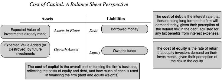
The simplest way to introduce hurdle rates is to look at them from the perspectives of the capital providers to a business. Using a financial balance sheet as my construct, here is a big picture view of these costs: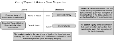
Thus. the hurdle rate for equity investors, i.e., the cost of equity, is the rate that they need to make, to break even, given the risk that they perceive in their equity investments. Lenders, on the other hand, incorporate their concerns about default risk into the interest rates they set on leans, i.e., the cost of debt. From the perspective of a business that raises funds from both equity investors and lenders, it is a weighted average of what equity investors need to make and what lenders demand as interest rates on borrowing, that represents the overall cost of funding, i.e., the cost of capital.
I have described the cost of capital as the Swiss Army Knife of finance, used in many different contexts and with very different meanings. I have reproduced below the different uses in a picture: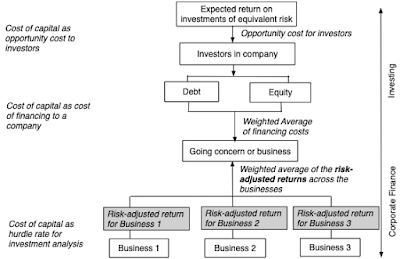 Paper on cost of capitalIt is precisely because the cost of capital is used in so many different places that it is also one of the most misunderstood and misused numbers in finance. The best way to reconcile the different perspectives is to remember that the cost of capital is ultimately determined by the risk of the enterprise raising the funding, and that all of the many risks that a firm faces have to find their way into it. I have always found it easiest to break the cost of capital into parts, and let each part convey a specific risk, since if I am careless, I end up missing or double counting risk. In this post, I will break the risks that a company faces into four groups: the business or businesses the company operates in (business risk), the geographies that it operates in (country risk), how much it has chosen to borrow (financial leverage risk) and the currencies its cash flows are in (currency effects).
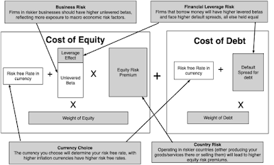
Note that each part of the cost of capital has a key risk embedded in it. Thus, when valuing a company, in US dollars, in a safe business in a risky country, with very little financial leverage, you will see the 10-year US treasury bond rate as my risk free rate, a low beta (reflecting the safety of the business and low debt), but a high equity risk premium (reflecting the risk of the country). The rest of this post will look at each of the outlined risks.
I. Business Risk
In my last post, where I updated risk measures across the world, I also looked at how these measures varied across different industries/businesses. In particular, I highlighted the ten most risky and safest industries, based upon both price variability and earnings variability, and noted the overlap between the two measures. I also looked at how the perceived risk in a business can change, depending upon investor diversification, and captured this effect with the correlation with the overall market. If you are diversified, I argued that you would measure the risk in an investment with the covariance of that investment with the market, or in its standardized form, its beta.
To get the beta for a company, then, you can adopt one of two approaches.
The first, and the one that is taught in every finance class, is to run a regression of returns on the stock against a market index and to use the regression beta. The second, and my preferred approach, is to estimate a beta by looking at the business or businesses a company operates in, and taking a weighted average of the betas of companies in that business. To use the second approach, you need betas by business, and each year, I estimate these numbers by averaging the betas of publicly traded companies in each business. These betas, in addition to reflecting the risk of the business, also reflect the financial leverage of companies in that business (with more debt pushing up betas) and their holdings in cash and marketable securities (which, being close to risk less, push down betas). Consequently, I adjust the average beta for both variables to estimate what is called a pure play or a business beta for each business. (Rather than bore you with the mechanics, please watch this video on how I make these adjustments). The resulting estimates are shown at this link, for US companies. (You can also download the spreadsheets that contain the estimates for other parts of the world, as well as global averages, by going to the end of this post).
To get from these business betas to the beta of a company, you need to first identify what businesses the company operates in, and then how much value it derives from each of the businesses. The first part is usually simple to do, though you may face the challenge of finding the right bucket to put a business into, but the second part is usually difficult, because the individual businesses do not trade. You can use revenues or operating income by business as approximations to estimate weights or apply multiples to each of these variables (by looking at what other companies in the business trade at) to arrive at value weights.
II. Financial LeverageYou can run a company, without ever using debt financing, or you can choose to borrow money to finance operations. In some cases, your lack of access to new equity may force you to borrow money and, in others, you may borrow money because you believe it will lower your cost of capital. In general, the choice of whether you use debt or equity remains one of the key parts of corporate finance, and I will discuss it in one of my upcoming data posts. In this post, though, I will just posit that your cost of capital can be affected by how much you borrow, unless you live in a world where there are no taxes, default risk or agency problems, in which case your cost of capital will remain unchanged as your funding mix changes. If you do borrow money to fund some or a significant portion of your operations, there are three numbers that you need to estimate for your cost of capital:
Debt Ratio: Th mix of debt and equity that you use represents the weights in your cost of capital.Beta Effect: As you borrow money, your equity will become riskier, because it is a residual claim, and having more interest expenses will make that claim more volatile. If you use beta as your measure of risk, this will require you to adjust upwards the business (or unlettered) beta that you obtained in the last part, using the debt to equity ratio of the company. Cost of Debt: The cost of debt, which is set by lenders based upon how much default risk that they see in a company, will enter the cost of capital equation, with an added twist. To the extent that the tax law is tilted towards debt, the after-tax cost of borrowing will reflect that tax benefit. Since this cost of debt is a cost of borrowing money, long term and today, you cannot use a book interest rate or the interest rate on existing debt. Instead, you have to estimate a default spread for the company, based upon either its bond ratings or financial ratios, and add that spread on to the risk free rate:
 I look at the debt effect on the cost of capital in each of the industries that I follow, with all three effects incorporated in this link, for US companies. The data, broken down, by other regional sub-groupings is available at the end of this post.
III. Country Risk
It strikes me as common sense that operating in some countries will expose you to more risk than operating in others, and that the cost of capital (hurdle rate) you use should reflect that additional risk. While there are some who are resistant to this proposition, making the argument that country risk can be diversified by having a global portfolio, that argument is undercut by rising correlations across markets. Consequently, the question becomes not whether you should incorporate country risk, but how best to do it. There are three broad choices:
Sovereign Ratings and Default Spreads: The vast majority of countries have sovereign ratings, measuring their default risk, and since these ratings go with default spreads, there are many who use these default spreads as measures of country risk. Sovereign CDS spreads: The Credit Default Swap (CDS) market is one where you can buy insurance against sovereign default, and it offers a market-based estimate of sovereign risk. While the coverage is less than what you get from sovereign ratings, the number of countries where you can obtain these spreads has increased over time to reach 71 in 2019. Country Risk Premiums: I start with the default spreads, but I add a scaling factor to reflect the reality that equities are riskier than government bonds to come up with country risk premiums. The scaling factor that I use is obtained by dividing the volatility of an emerging market equity index by the volatility of emerging market bonds. To incorporate the country risk into my cost of capital calculations, I start with the implied equity risk premium that I estimated for the US (see my first data post for 2019) or 5.96% and add to it the country risk premium for each country. The full adjustment process is described in this picture:
I also bring in frontier markets, which have no sovereign ratings, using a country risk score estimated by Political Risk Services. The final estimates of equity risk premiums around the world can be seen in the picture below: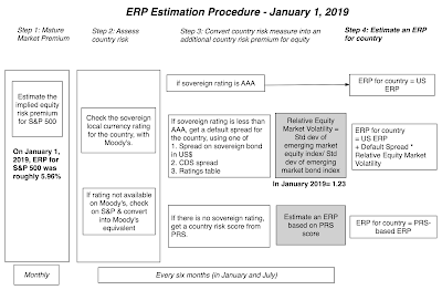
You can see these equity risk premiums as a list by clicking here, or download the entire spreadsheet here. If you prefer a picture of equity risk around the world, my map is below:
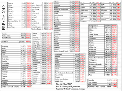 Download spreadsheetI also report regional equity risk premiums, computed by taking GDP-weighted averages of the equity risk premiums of the countries int he region.
IV. Currency Risk
It is natural to mix up countries and currencies, when you do your analysis, because the countries with the most risk often have the most volatile currencies. That said, my suggestion is that you keep it simple, when it comes to currencies, recognizing that they are scaling or measurement variables rather than fundamental risk drivers. Put differently, you can choose to value a Brazilian companies in US dollars, but doing so does not make Brazilian country risk go away.
So, why do currencies matter? It is because each one has different expectations of inflation embedded in it, and when using a currency, you have to remain inflation-consistent. In other words, if you decide to do your analysis in a high inflation currency, your discount rate has to be higher, to incorporate the higher inflation, and so do your cash flows, for the same reason:
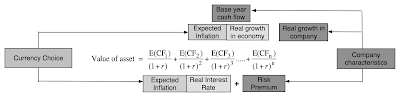
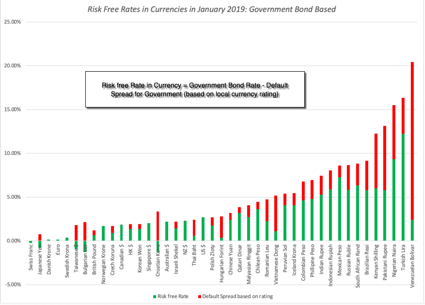
There are two ways in which you can bring inflation into discount rates. The first is to use the risk free rate in that currency as your starting point for the calculation, since risk free rates will be higher for high inflation currencies. The challenge is finding a risk free investment in many emerging market currencies, since even the governments bonds, in those currencies, have default risk embedded in them. I attempt to overcome this problem by starting with the government bond but then netting the default spread for the government in question from that bond to arrive at risk free rates:
 Download raw dataThese rates are only as reliable as the government bond rates that you start with, and since more than two thirds of all currencies don't even have government bonds and even on those that do, the government bond rate does not come from liquid markets, there a second approach that you can use to adjust for currencies. In this approach, you estimate the cost of capital in a currency that you feel comfortable with (in terms of estimating risk free rates and risk premiums) and then add on or incorporate the differential inflation between that currency and the local currency that you want to convert the cost of capital to. Thus, to convert the cost of capital in US $ terms to a different currency, you would do the following:
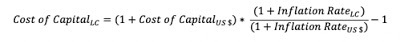
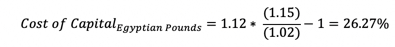
To illustrate, assume that you have a US dollar cost of capital of 12% for an Egyptian company and that the inflation rates are 15% and 2% in Egyptian Pounds and US dollars respectively:
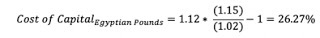 The Egyptian pound cost of capital is 26.27%. Note that there is an approximation that is often used, where the differential inflation is added to the US dollar cost of capital; in this case your answer would have been 25%. The key to this approach is getting estimates of expected inflation, and while every source will come with warts, you can find the IMF's estimates of expected inflation in different currencies at this link.
General Propositions
Every company, small or large, has a hurdle rate, though the origins of the number are murky at most companies. The approach laid out in this post has implications for how hurdle rates get calculated and used.
A hurdle rate for an investment should be more a reflection the risk in the investment, and less your cost of raising funding: I fault terminology for this, but most people, when asked what a cost of capital is, will respond with the answer that it is the cost of raising capital. In the context of its usage as a hurdle rate, that is not true. It is an opportunity cost, a rate of return that you (as a company or investor) can earn on other investments in the market of equivalent risk. That is why, when valuing a target firm in an acquisition, you should always use the risk characteristics of the target firm (its beta and debt capacity) to compute a cost of capital, rather than the cost of capital of the acquiring firm.A company-wide hurdle rate can be misleading and dangerous: In corporate finance, the hurdle rate becomes the number to beat, when you do investment analysis. A project that earns more than the hurdle rate becomes an acceptable one, whether you use cash flows (and compute a positive net present value) or income (and generate a return greater than the hurdle rate). Most companies claim to have a corporate hurdle rate, a number that all projects that are assessed within the company get measured against. If your company operates in only one business and one country, this may work, but to the extent that companies operate in many businesses across multiple countries, you can already see that there can be no one hurdle rate. Even if you use only one currency in analysis, your cost of capital will be a function of which business a project is in, and what country it is aimed at. The consequences of not making these differential adjustments will be that your safe businesses will end up subsidizing your risky businesses, and over time, both will be hurt, in what I term the "curse of the lazy conglomerate".Currency is a choice, but once chosen, should not change the outcome of your analysis: We spend far too much time, in my view, debating what currency to do an analysis in, and too little time working through the implications. If you follow the consistency rule on currency, incorporating inflation into both cash flows and discount rates, your analyses should be currency neutral. In other words, a project that looks like it is a bad project, when the analysis is done in US dollar terms, cannot become a good project, just because you decide to do the analysis in Indian rupees. I know that, in practice, you do get divergent answers with different currencies, but when you do, it is because there are inflation inconsistencies in your assessments of discount rates and cash flows.You cannot (and should not) insulate your cost of capital from market forces: In both corporate finance and investing, there are many who remain wary of financial markets and their capacity to be irrational and volatile. Consequently, they try to generate hurdle rates that are unaffected by market movements, a futile and dangerous exercise, because we have to be price takers on at least some of the inputs into hurdle rates. Take the risk free rate, for instance. For the last decade, there are many analysts who have replaced the actual risk free rate (US 10-year T.Bond rate, for instance) with a "normalized' higher number, using the logic that interest rates are too low and will go up. Holding all else constant, this will push up hurdle rates and make it less likely that you will invest (either as an investor or as a company), but to what end? That uninvested money cannot be invested at the normalized rate, since it is fictional and exists only in the minds of those who created it, but is invested instead at the "too low" rate. Have perspective: In conjunction with the prior point, there seems to be a view in some companies and for some investors, that they can use whatever number they feel comfortable with as hurdle rates. To the extent that hurdle rates are opportunity costs in the market, this is not true. The cost of capital brings together all of the risks that we have listed in this section. If nothing else, to get perspective on what comprises high or low, when it comes to cost of capital, I have computed a histogram of global and US company costs of capital, in US $ terms.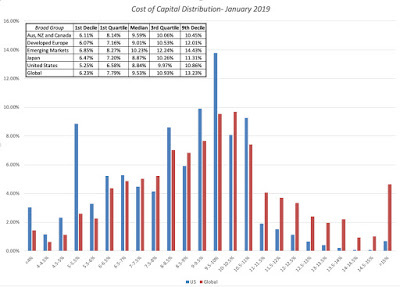
You can convert this table into any currency you want. The bottom line is that, at least at the start of 2019, a dollar cost of capital of 14% or 15% is an extremely high number for any publicly traded company. You can see the costs of capital, in dollar terms, for US companies at this link, and as with betas, you can download the cost of capital, by industry, for other parts of the world in the data links below this post.In short, if you work at a company, and you are given a hurdle rate to use, it behooves you to ask questions about its origins and logic. Often, you will find that no one really seems to know and/or the logic is questionable.
YouTube Video
Data Sets
Betas by Business: US, Global, Emerging Markets, Europe, Japan, India, China, Aus & CanadaSovereign Ratings and CDS Spreads by Country in January 2019Equity Risk Premiums by Country in January 2019Risk free Rates by Currency: Government bond basedCost of Capital in US $ (with conversion equation for other currencies): US, Global, Emerging Markets, Europe, Japan, India, China, Aus & CanadaJanuary 2019 Data UpdatesData Update 1: A Reminder that equities are risky, in case you forgot!Data Update 2: The Message from Bond MarketsData Update 3: Playing the Numbers GameData Update 4: The Many Faces of RiskData Update 5: Of Hurdle Rates and Funding Costs!
A Quick Introduction
The simplest way to introduce hurdle rates is to look at them from the perspectives of the capital providers to a business. Using a financial balance sheet as my construct, here is a big picture view of these costs:
Thus. the hurdle rate for equity investors, i.e., the cost of equity, is the rate that they need to make, to break even, given the risk that they perceive in their equity investments. Lenders, on the other hand, incorporate their concerns about default risk into the interest rates they set on leans, i.e., the cost of debt. From the perspective of a business that raises funds from both equity investors and lenders, it is a weighted average of what equity investors need to make and what lenders demand as interest rates on borrowing, that represents the overall cost of funding, i.e., the cost of capital.
I have described the cost of capital as the Swiss Army Knife of finance, used in many different contexts and with very different meanings. I have reproduced below the different uses in a picture:
 Paper on cost of capitalIt is precisely because the cost of capital is used in so many different places that it is also one of the most misunderstood and misused numbers in finance. The best way to reconcile the different perspectives is to remember that the cost of capital is ultimately determined by the risk of the enterprise raising the funding, and that all of the many risks that a firm faces have to find their way into it. I have always found it easiest to break the cost of capital into parts, and let each part convey a specific risk, since if I am careless, I end up missing or double counting risk. In this post, I will break the risks that a company faces into four groups: the business or businesses the company operates in (business risk), the geographies that it operates in (country risk), how much it has chosen to borrow (financial leverage risk) and the currencies its cash flows are in (currency effects).

Note that each part of the cost of capital has a key risk embedded in it. Thus, when valuing a company, in US dollars, in a safe business in a risky country, with very little financial leverage, you will see the 10-year US treasury bond rate as my risk free rate, a low beta (reflecting the safety of the business and low debt), but a high equity risk premium (reflecting the risk of the country). The rest of this post will look at each of the outlined risks.
I. Business Risk
In my last post, where I updated risk measures across the world, I also looked at how these measures varied across different industries/businesses. In particular, I highlighted the ten most risky and safest industries, based upon both price variability and earnings variability, and noted the overlap between the two measures. I also looked at how the perceived risk in a business can change, depending upon investor diversification, and captured this effect with the correlation with the overall market. If you are diversified, I argued that you would measure the risk in an investment with the covariance of that investment with the market, or in its standardized form, its beta.
To get the beta for a company, then, you can adopt one of two approaches.
The first, and the one that is taught in every finance class, is to run a regression of returns on the stock against a market index and to use the regression beta. The second, and my preferred approach, is to estimate a beta by looking at the business or businesses a company operates in, and taking a weighted average of the betas of companies in that business. To use the second approach, you need betas by business, and each year, I estimate these numbers by averaging the betas of publicly traded companies in each business. These betas, in addition to reflecting the risk of the business, also reflect the financial leverage of companies in that business (with more debt pushing up betas) and their holdings in cash and marketable securities (which, being close to risk less, push down betas). Consequently, I adjust the average beta for both variables to estimate what is called a pure play or a business beta for each business. (Rather than bore you with the mechanics, please watch this video on how I make these adjustments). The resulting estimates are shown at this link, for US companies. (You can also download the spreadsheets that contain the estimates for other parts of the world, as well as global averages, by going to the end of this post).
To get from these business betas to the beta of a company, you need to first identify what businesses the company operates in, and then how much value it derives from each of the businesses. The first part is usually simple to do, though you may face the challenge of finding the right bucket to put a business into, but the second part is usually difficult, because the individual businesses do not trade. You can use revenues or operating income by business as approximations to estimate weights or apply multiples to each of these variables (by looking at what other companies in the business trade at) to arrive at value weights.
II. Financial LeverageYou can run a company, without ever using debt financing, or you can choose to borrow money to finance operations. In some cases, your lack of access to new equity may force you to borrow money and, in others, you may borrow money because you believe it will lower your cost of capital. In general, the choice of whether you use debt or equity remains one of the key parts of corporate finance, and I will discuss it in one of my upcoming data posts. In this post, though, I will just posit that your cost of capital can be affected by how much you borrow, unless you live in a world where there are no taxes, default risk or agency problems, in which case your cost of capital will remain unchanged as your funding mix changes. If you do borrow money to fund some or a significant portion of your operations, there are three numbers that you need to estimate for your cost of capital:
Debt Ratio: Th mix of debt and equity that you use represents the weights in your cost of capital.Beta Effect: As you borrow money, your equity will become riskier, because it is a residual claim, and having more interest expenses will make that claim more volatile. If you use beta as your measure of risk, this will require you to adjust upwards the business (or unlettered) beta that you obtained in the last part, using the debt to equity ratio of the company.
 Cost of Debt: The cost of debt, which is set by lenders based upon how much default risk that they see in a company, will enter the cost of capital equation, with an added twist. To the extent that the tax law is tilted towards debt, the after-tax cost of borrowing will reflect that tax benefit. Since this cost of debt is a cost of borrowing money, long term and today, you cannot use a book interest rate or the interest rate on existing debt. Instead, you have to estimate a default spread for the company, based upon either its bond ratings or financial ratios, and add that spread on to the risk free rate:
 I look at the debt effect on the cost of capital in each of the industries that I follow, with all three effects incorporated in this link, for US companies. The data, broken down, by other regional sub-groupings is available at the end of this post.
III. Country Risk
It strikes me as common sense that operating in some countries will expose you to more risk than operating in others, and that the cost of capital (hurdle rate) you use should reflect that additional risk. While there are some who are resistant to this proposition, making the argument that country risk can be diversified by having a global portfolio, that argument is undercut by rising correlations across markets. Consequently, the question becomes not whether you should incorporate country risk, but how best to do it. There are three broad choices:
Sovereign Ratings and Default Spreads: The vast majority of countries have sovereign ratings, measuring their default risk, and since these ratings go with default spreads, there are many who use these default spreads as measures of country risk. Sovereign CDS spreads: The Credit Default Swap (CDS) market is one where you can buy insurance against sovereign default, and it offers a market-based estimate of sovereign risk. While the coverage is less than what you get from sovereign ratings, the number of countries where you can obtain these spreads has increased over time to reach 71 in 2019. Country Risk Premiums: I start with the default spreads, but I add a scaling factor to reflect the reality that equities are riskier than government bonds to come up with country risk premiums. The scaling factor that I use is obtained by dividing the volatility of an emerging market equity index by the volatility of emerging market bonds. To incorporate the country risk into my cost of capital calculations, I start with the implied equity risk premium that I estimated for the US (see my first data post for 2019) or 5.96% and add to it the country risk premium for each country. The full adjustment process is described in this picture:
I also bring in frontier markets, which have no sovereign ratings, using a country risk score estimated by Political Risk Services. The final estimates of equity risk premiums around the world can be seen in the picture below:

You can see these equity risk premiums as a list by clicking here, or download the entire spreadsheet here. If you prefer a picture of equity risk around the world, my map is below:
 Download spreadsheetI also report regional equity risk premiums, computed by taking GDP-weighted averages of the equity risk premiums of the countries int he region.
IV. Currency Risk
It is natural to mix up countries and currencies, when you do your analysis, because the countries with the most risk often have the most volatile currencies. That said, my suggestion is that you keep it simple, when it comes to currencies, recognizing that they are scaling or measurement variables rather than fundamental risk drivers. Put differently, you can choose to value a Brazilian companies in US dollars, but doing so does not make Brazilian country risk go away.
So, why do currencies matter? It is because each one has different expectations of inflation embedded in it, and when using a currency, you have to remain inflation-consistent. In other words, if you decide to do your analysis in a high inflation currency, your discount rate has to be higher, to incorporate the higher inflation, and so do your cash flows, for the same reason:

There are two ways in which you can bring inflation into discount rates. The first is to use the risk free rate in that currency as your starting point for the calculation, since risk free rates will be higher for high inflation currencies. The challenge is finding a risk free investment in many emerging market currencies, since even the governments bonds, in those currencies, have default risk embedded in them. I attempt to overcome this problem by starting with the government bond but then netting the default spread for the government in question from that bond to arrive at risk free rates:
 Download raw dataThese rates are only as reliable as the government bond rates that you start with, and since more than two thirds of all currencies don't even have government bonds and even on those that do, the government bond rate does not come from liquid markets, there a second approach that you can use to adjust for currencies. In this approach, you estimate the cost of capital in a currency that you feel comfortable with (in terms of estimating risk free rates and risk premiums) and then add on or incorporate the differential inflation between that currency and the local currency that you want to convert the cost of capital to. Thus, to convert the cost of capital in US $ terms to a different currency, you would do the following:
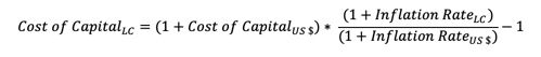
To illustrate, assume that you have a US dollar cost of capital of 12% for an Egyptian company and that the inflation rates are 15% and 2% in Egyptian Pounds and US dollars respectively:
 The Egyptian pound cost of capital is 26.27%. Note that there is an approximation that is often used, where the differential inflation is added to the US dollar cost of capital; in this case your answer would have been 25%. The key to this approach is getting estimates of expected inflation, and while every source will come with warts, you can find the IMF's estimates of expected inflation in different currencies at this link.
General Propositions
Every company, small or large, has a hurdle rate, though the origins of the number are murky at most companies. The approach laid out in this post has implications for how hurdle rates get calculated and used.
A hurdle rate for an investment should be more a reflection the risk in the investment, and less your cost of raising funding: I fault terminology for this, but most people, when asked what a cost of capital is, will respond with the answer that it is the cost of raising capital. In the context of its usage as a hurdle rate, that is not true. It is an opportunity cost, a rate of return that you (as a company or investor) can earn on other investments in the market of equivalent risk. That is why, when valuing a target firm in an acquisition, you should always use the risk characteristics of the target firm (its beta and debt capacity) to compute a cost of capital, rather than the cost of capital of the acquiring firm.A company-wide hurdle rate can be misleading and dangerous: In corporate finance, the hurdle rate becomes the number to beat, when you do investment analysis. A project that earns more than the hurdle rate becomes an acceptable one, whether you use cash flows (and compute a positive net present value) or income (and generate a return greater than the hurdle rate). Most companies claim to have a corporate hurdle rate, a number that all projects that are assessed within the company get measured against. If your company operates in only one business and one country, this may work, but to the extent that companies operate in many businesses across multiple countries, you can already see that there can be no one hurdle rate. Even if you use only one currency in analysis, your cost of capital will be a function of which business a project is in, and what country it is aimed at. The consequences of not making these differential adjustments will be that your safe businesses will end up subsidizing your risky businesses, and over time, both will be hurt, in what I term the "curse of the lazy conglomerate".Currency is a choice, but once chosen, should not change the outcome of your analysis: We spend far too much time, in my view, debating what currency to do an analysis in, and too little time working through the implications. If you follow the consistency rule on currency, incorporating inflation into both cash flows and discount rates, your analyses should be currency neutral. In other words, a project that looks like it is a bad project, when the analysis is done in US dollar terms, cannot become a good project, just because you decide to do the analysis in Indian rupees. I know that, in practice, you do get divergent answers with different currencies, but when you do, it is because there are inflation inconsistencies in your assessments of discount rates and cash flows.You cannot (and should not) insulate your cost of capital from market forces: In both corporate finance and investing, there are many who remain wary of financial markets and their capacity to be irrational and volatile. Consequently, they try to generate hurdle rates that are unaffected by market movements, a futile and dangerous exercise, because we have to be price takers on at least some of the inputs into hurdle rates. Take the risk free rate, for instance. For the last decade, there are many analysts who have replaced the actual risk free rate (US 10-year T.Bond rate, for instance) with a "normalized' higher number, using the logic that interest rates are too low and will go up. Holding all else constant, this will push up hurdle rates and make it less likely that you will invest (either as an investor or as a company), but to what end? That uninvested money cannot be invested at the normalized rate, since it is fictional and exists only in the minds of those who created it, but is invested instead at the "too low" rate. Have perspective: In conjunction with the prior point, there seems to be a view in some companies and for some investors, that they can use whatever number they feel comfortable with as hurdle rates. To the extent that hurdle rates are opportunity costs in the market, this is not true. The cost of capital brings together all of the risks that we have listed in this section. If nothing else, to get perspective on what comprises high or low, when it comes to cost of capital, I have computed a histogram of global and US company costs of capital, in US $ terms.

You can convert this table into any currency you want. The bottom line is that, at least at the start of 2019, a dollar cost of capital of 14% or 15% is an extremely high number for any publicly traded company. You can see the costs of capital, in dollar terms, for US companies at this link, and as with betas, you can download the cost of capital, by industry, for other parts of the world in the data links below this post.In short, if you work at a company, and you are given a hurdle rate to use, it behooves you to ask questions about its origins and logic. Often, you will find that no one really seems to know and/or the logic is questionable.
YouTube Video
Data Sets
Betas by Business: US, Global, Emerging Markets, Europe, Japan, India, China, Aus & CanadaSovereign Ratings and CDS Spreads by Country in January 2019Equity Risk Premiums by Country in January 2019Risk free Rates by Currency: Government bond basedCost of Capital in US $ (with conversion equation for other currencies): US, Global, Emerging Markets, Europe, Japan, India, China, Aus & CanadaJanuary 2019 Data UpdatesData Update 1: A Reminder that equities are risky, in case you forgot!Data Update 2: The Message from Bond MarketsData Update 3: Playing the Numbers GameData Update 4: The Many Faces of RiskData Update 5: Of Hurdle Rates and Funding Costs!
January 21, 2019
January 2019 Data Update 4: The Many Faces of Risk!
I think that all investors would buy into the precept that investing in equities comes with risk, but that is where the consensus seems to end. Everything else about risk is contested, starting with whether it is a good or a bad, whether it should be sought out or avoided, and how it should be measured. It is therefore with trepidation that I approach this post, knowing fully well that I will be saying things about risk that you strongly disagree with, but it is worth the debate.
Risk: Basic Propositions
I. Risk falls on a continuum: Risk is not an on-off switch, where some assets are risky and others are not. Instead, it is better to think of it on a continuum, with investments with very little or close to no risk at one extreme (riskless) to extraordinarily risky investments at the other.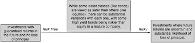
In fact, while most risk and return models start off with the presumption that there exists a riskless asset, one in which you can invest for a guaranteed return and no loss of principal, I think that a reasonable argument can be made that there are no such investments. In abstract settings, we often evade the question by using government bond rates (like the US treasury) as risk free rates, but that assumes:That governments don't default, an assumption that conflicts with the empirical evidence that they do, on both local currency and foreign currency borrowingsThat if the government delivers it's promised coupon we are made whole again, also not true since inflation can be a wild card, rendering the real return on a government bond negative, in some periods. A nominal risk free rate is not a real risk free rate, which is one reason that I track the inflation indexed treasury bond (TIPs) in conjunction with the conventional US treasury bond; the yield on the former is closer to a real risk free rate, if you assume the US treasury has no default risk.If there is one lesson that emerged from the 2008 crisis, it is that there are some periods in market history where there are truly no absolutely safe havens left and investors have to settle for the least stomach churning alternative that they can find, during these crises.
II. For a company, risk has many sources: Following up on the proposition that investing in the equity of a business can expose you to risk, it is worth noting that this risk can come from multiple sources. While a risk profile for a company can have a laundry list of potential risks, I break these risks into broad categories: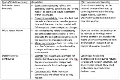 Note that some of these risks are more difficult to estimate and deal with than others, but that does not mean that you can avoid them or not deal with them. In fact, as I have argued repeatedly, your best investment opportunities may be where it is darkest.
III. For investors, risk standing alone can be different from risk added to a portfolio: This is perhaps the most controversial divide in finance, but I will dive right in. The risk of an investment can be different, if it is assessed as a stand-alone investment, as opposed to being part of a portfolio of investments and the reason is simple. Some of the risks that we listed in the table above, to the extent that they are specific to the firm, and can cut in either direction (be positive or negative surprises) will average out across a portfolio. It is simply the law of large numbers at work. In the graph below, I present a simplistic version of diversification at play, by looking at how the standard deviation of returns in a portfolio changes, as the number of investments in it goes up, in a world where the typical investment has a standard deviation of 40%, and for varying correlations across investments.
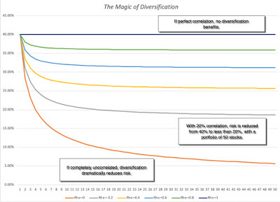 Download diversification benefits spreadsheetIf the assets are uncorrelated, the standard deviation of the portfolio drops to just above 5%, but note that the benefits persist as long as the assets in your portfolio are not perfectly positively correlated, which is good news since stocks are usually positively correlated with each other. Furthermore, the greatest savings occur with the first few stocks that are added on, with about 80% of the benefits accruing by the time you get to a dozen stocks, if they are not all in the same sector or share the same characteristics (in which case the correlation across those stocks will be higher, and the benefit lower).
I know that I am now opening up an age old debate in investing as to whether it is better to have a concentrated portfolio or a diversified one. Rather than argue that one side is right and the other wrong, I will posit that it depends upon how certain you feel about your investment thesis, i.e., that your estimate of value is right and that the market price will correct to that value, with more certainty associated with less diversification. Speaking for myself, I am always uncertain about whether the value that I have estimated is right and even more so about whether the market will come around to my point of view, which also means that it is best for me to spread my bets. You can be a value investor and be diversified at the same time.
IV. Your risk measurement will depend on how and why you invest and your time horizon: Broadly speaking, there are three groups of metrics that you can use to measure the risk in an investment. Price Measures: If an asset/investment is traded, the first set of metrics drawn on the price path and what you can extract from that path as a measure of risk. There are many in investing who bemoan the Markowitz revolution and the rise of modern finance, but one of the byproducts of modern portfolio theory is that price-based measures of risk dominate the risk measurement landscape. Earnings/Cashflow Measures: There are many investors who believe that it is uncertainty about earnings and cash flows that are a true measure of risk. While their argument is that value is driven by earnings and cash flows, not stock price movements, their case is weakened by the fact that (a) earnings are measured by accountants, who tend to smooth out variations in earnings over time and (b) even when earnings are measured right, they are measured, at the most, four times a year, for companies that have quarterly reporting, and less often, for firms that report only annually or semi-annually.Risk Proxies: Some investors measure the risk of an asset, by looking at the grouping it belongs to, arguing that some groupings are more risky than others. For instance, in the four decades since technology stocks became part of the market landscape, "tech" has become a stand in for both high growth and high risk. Similarly, there is the perception that small companies are riskier than larger companies, and that the market capitalization, or level of revenues, should be a good proxy for the risk of a company.While I will report on each of these three groups of risk measures in this post, you can decide which measure best fits you, as an investor, given your investment philosophy.
Price Risk Measures
The most widely accessible measures of risk come from the market, for publicly traded assets, where trading generate prices that change with each trade. That price data is then used to extract risk measures, ranging from intuitive ones (high to low ranges) to statistical measures (such as standard deviation and covariance).
Price Range
When looking at a stock's current price, it is natural to also look at where it stands relative to that stock's own history, which is one reason most stock tables report high and low prices over a period (the most recent 12 months, for instance). While technical analysts use these high/low prices to determine whether a stock is breaking out or breaking down, these prices can also be used as a rough proxy for risk. Put simply, riskier stocks will trade with a wider range of prices than safer stocks.
HiLo Risk Measure
To compute a risk measure from high and low prices that is comparable across stocks, the range has to be scaled to the price level. Otherwise, highly priced stocks will look more risky, because the range between the high and the low price will be greater for a $100 stock than for a $5 stock. One simple scalar is the sum of the high and the low prices, giving the following measure of risk:
HiLo Risk = (High Price - Low Price)/ (High Price + Low Price)To illustrate, consider two stocks, A with a high of $50 and a low of $25 and B with a high of $12 and a low of $8. The risk measures computed will be:
HiLo Risk of stock A = (50-25)/ (50+25) = 0.333HiLo Risk of stock B = (12-8)/ (12 +8) = 0.20Based upon this measure, stock A is riskier than stock B.
Distribution
I compute the HiLo risk measure for all stocks in my data set, to get a sense of what would be high or low, and the results are captured in the distribution below (Q1: First Quartile, Q3: Third Quartile):
 Data at country level Embedded in the distribution is the variation of this measure across regions, with some, at first sight, counterintuitive results. The US, Canada and Australia seem to be riskier than most emerging market regions, but that says more about the risk measure than it does about companies in these countries, as we will argue in the next section. If you want to see these risk measures on a country basis, try this link.
Pluses and Minuses
The high/low risk measure is simple to compute and requires minimal data, since all you need is the high price and the low price for the year. It is even intuitive, especially if you track market prices continuously. It does come with two problems. The first is the flip side of its minimal data usage, insofar as it throws away all data other than the high and the low price. The second is a more general problem with any price based risk measure, which is that for the price to move, there has to be trading, and markets that are liquid will therefore see more price movements, especially over shorter time period, than markets that are not. It is therefore not surprising that US stocks look riskier than African stocks, simply because liquidity is greater in the US. So, why bother? If you are comparing stocks within the same liquidity bucket, say the S&P 500, the high-low risk measure may correlate well with the true risk of the company. However, if your comparisons require you to look across stocks with different liquidity, and especially so if some are traded in small, emerging markets, you should use this or any other price-based measure with caution.
Standard Deviation/Variance
If you have data on stock prices over a period, it would be statistical malpractice not to compute a standard deviation in these prices over time. Those standard deviations are a measure, albeit incomplete and imperfect, of how much price volatility you would have faced as an investor, with the intuitive follow up that safer stocks should be less volatile.
Returns on Stocks
As with the HiLo risk measure, computing a standard deviation in stock prices, without adjusting for price levels, would yield the unsurprising conclusion that higher prices stocks have higher standard deviations. With this measure, the scaling adjustment becomes a simpler one, since using percentage price changes, instead of prices themselves, should level the playing field. In fact, if you wanted a fully integrated measure of returns, you should also include dividends in the periods where you receive them. However, since dividends get paid, at most, once every quarter, analysts who use daily or weekly returns often ignore them.
Distribution
To compute and compare standard deviations in stock returns across companies, I have to make some estimation judgments first, starting with the time period that I plan to look over to compute the standard deviation and the return intervals (daily, weekly, monthly) over that period. I use 2-year weekly standard deviations for all firms in my sample, using the time period available for companies that have listed less than 2 years, and the distribution of annualized standard deviations is in the graph below.
 Data at country level As with the HiLo risk measure, and for the same reasons, the US, Canada and Australia look riskier than most emerging markets. Again, I report on the regional differences in the table embedded in the graph, with country-level statistics available at this link.
Pluses and Minuses
It is Statistics 101! After all, when presented with raw data, one of the first measures that we compute to detect how much spread there is in the data is the standard deviation. Furthermore, the standard deviation can be computed for returns in any asset class, thus allowing us to compare it across stocks, high yield bonds, corporate bonds, real estate or crypto currencies. To the extent that we can also compute historical returns on these same assets, it allows us to relate those returns to the standard deviations and compute the payoff to taking risk in the form of Sharpe ratios or information ratios.
Sharpe Ratio = (Return on Risky Asset - Risk free Rate)/ Standard Deviation of Risky AssetThat said, the flaws in using just standard deviation as a measure of risk in investing have been pointed out by legions of practitioners and researchers.
Not Normal: The only statistical distribution which is completely characterized by the expected return and standard deviation is a normal distribution, and very little in the investment world is normally distributed. To the extent that investment return distributions are skewed (often with long positive tails and sometimes with long negative tails) and have fat tails, there is information in the other moments in the distribution that is relevant to investors.Upside versus Downside Variance: One of the intuitive stumbling blocks that investors have with standard deviation is that it will higher if you have outsized returns, whether they are higher or lower than the average. Since we tend to think of downside movements as risk, not upside, the fact that stocks that have moved up strongly and dropped precipitously can both have high standard deviations makes some investors queasy about using them as measures of risk.Liquidity effects: As with the high low risk measure, liquidity plays a role in how volatile a stock is, with more liquid stocks being characterized with higher standard deviations in stock prices than less liquid ones.Total Risk, rather than risk added to a portfolio: The standard deviation in stock prices measures the total risk in a stock, rather than how much risk it adds to a portfolio, which may make it a poor measure of risk for diversified investors. Put differently, adding a very risky stock, with a high standard deviation, to a portfolio may not add much risk to the portfolio if it does not move with the rest of the investments in the portfolio.In summary, the combination of richer pricing data and access to statistical tools has made it easier than ever to compute standard deviation in prices, but using it as your sole measure of risk can lead you to make bad investment decisions.
Covariance/Beta
In the graph on the effect of diversification on portfolio risk, I noted that the key variable that determines how much benefit there is to adding a stock to portfolio is its correlation with the rest of the portfolio, with higher and more positive correlations associated with less diversification benefit. Building on that theme, you can measure the risk added by an investment to a diversified portfolio by looking at how it moves in relation to the rest of the portfolio with its covariance, a measure that incorporates both the volatility in the investment and its correlation with the portfolio.
 This equation for added risk holds only if the investment added is a small proportion of the diversified portfolio, but if that is the case, you can have a risky investment (with a high standard deviation) that adds very little risk to a portfolio, if the correlation is low enough.
Standardized Measure (Beta)
The covariance measure of risk added to a portfolio, left as is, yields values that are not standardized. Thus, if you were told that the covariance of a stock with a well diversified portfolio is 25%, you may have no sense of whether that is high, low or average. It is to obtain a scaled measure of covariance that we divide the covariance of every investment by the variance of the portfolio that we are measuring it against:

If you are willing to add on whole layers of assumptions about no transactions costs, well functioning markets and complete information, the diversified portfolio that we will all hold will include every traded asset, in proportion to its market value, the capital asset pricing model will unfold and the betas for investments will be computed against this market portfolio. Note though, that even if you are unwilling to go the distance and accept the assumptions of the CAPM, the covariance and correlation remain measures of the risk added by an investment to a portfolio.
Distribution
If you already are well versed in financial theory, and find the lead in to beta in this section simplistic and unnecessary, I apologize, but I think that any discussion of the CAPM and betas very quickly veers off topic into heated debates about efficient markets and the limitations of modern finance. I think it is good to revisit the basics of the model, and even if you disagree with the model's precepts (and I do not think that there is anyone who fully buys into all of its assumptions), decide what parts of the model you want to keep and which ones you want to abandon. Since the key number that drives the covariance and beta of an investment is its correlation with, I report on the global distribution of this statistics:
 Data at country level Unlike the high low risk measure and the standard deviation, where my estimation choices were limited to time period and return interval, the correlation coefficient is also a function of the index or market that is used to compute it. That said, the distribution yields some interesting numbers that you can use, even as a non-believer in the CAPM. The median correlation for a US stock with the market is about 20%, and if you check the graph for savings, that would imply that having a portfolio of ten, twenty or thirty stocks yield substantial benefits. As you move to emerging markets, where the correlations are even lower, especially if you are a global investor, the benefits become even larger. Again, if you want to see this statistic on a country-by-country basis, try this link.
Pluses and Minuses
If you have bought into the benefits of diversification and have your wealth spread out across multiple investments, there is a strong argument to be made that you should be looking at covariance-based measures of risk, when investing. If you use a beta or betas to measure risk in an investment, you get an added bonus, since the number is self standing and gives you all the information you need to make judgments about relative risk. A beta higher (lower) than one is a stock that is riskier (safer) than average, but only if you define risk as risk added to a portfolio.
I use covariance based measures of risk in valuation but I recognize that these measures come with limitations. In addition to all of the caveats that we noted about liquidity's effect on price based measures, the most critical ingredient into covariance is the correlation coefficient and that statistic is both unstable and varies over time. Thus, the covariance (and beta) of the stock of a company that is going through a merger or is in distress will often decrease, since the stock price will move for reasons unrelated to the market. As a result, the covariance measures (and this includes the beta) have substantial estimation error in them, which is one reason that I have long argued against using the beta that you get for one company with one pass of history (a regression beta) in financial analysis. What can you do instead? Since covariance and beta are measures of risk added to a portfolio, they should be more reflective of the businesses (or industries) a company operates in than of company-specific characteristics. Using an industry average beta for steel companies, when valuing US Steel or Nucor, or an industry average beta for software companies, when valuing Adobe, is more prudent than using the regression betas for any of these companies. I will build on this theme in my next post.
Earnings Risk Measures
For many value investors, the biggest problem with using standard deviations or betas is that they come from stock prices. So what? In the value world, it is not markets that should drive our perception of risk, but the fundamentals of the company. Thus, using a price based risk measure when doing intrinsic value is viewed as inconsistent. In this section, I will look at proxies for risk that are built upon a company's performance over time.
Money Losing or Money Making If we define success in a business in terms of making money, the simplest measure of whether a company is risky is whether it generates profits or not. Simplistic though it might be, a money losing company, all held held constant, is riskier than a money making company. That said, investors take multiple cracks at measuring profitability, with some defining it as net profits (after taxes and interest expenses), some more expansively as operating income (to look at pre-debt earnings) and some even more broadly as EBITDA. In the table below, I break down the percentages of companies globally that report positive and negative values, using each measure:
 Data at country level Not surprisingly, in every part of the world, the percentage of firms that have positive EBITDA exceeds the percentage with positive operating income or positive net income. Looking across regions, Japan has the highest percentage of money making firms, with 88.80% making positive net income, and Canada and Australia, with their preponderance of natural resource companies, have the highest percentage of money losers.
Earnings Variance
It is true that whether a company makes money is a very rough measure of risk and a more complete measure of earnings risk would look at earnings variability over time. This is more difficult than it sounds, for three reasons. First, unlike pricing data, earnings data is available only once every quarter in much of the world, and even more infrequently (semi annual or annual) in the rest. Second, unlike price data, which can never be negative, earnings can, and computing variance in earnings, when earnings are negative, are messy. Third, even if you can compute the variance or standard deviation in earnings, it is difficult to compare that number across companies, since companies with higher dollar earnings will have more variance in those earnings in dollar terms. It is for this reason that I compute a coefficient of variation in earnings for each firm, where I divide the standard deviation in earnings by the average earnings over the period of analysis:
Coefficient of variation in earnings = Standard Deviation in Earnings/ Average Earnings over estimation period
When the average earnings are negative, I use the absolute value in the denominator. I computed this measure of earnings variability in both operating and net income for companies that have data going back at least five years, and the distribution is captured below:
 Download country level statisticsThere are some surprises here. While Australia and Canada again score near the top of the risk table, with the highest variation in earnings, Latin American companies have the lowest volatility in operating and net income, if you compare medians. You can take this to mean that Latin American companies are not risky or that there are perils to trusting accountants to measure performance. Finally, the country level risk statistics are available at this link.
Pluses and Minuses While I sympathize with the argument that value investors pose, i.e., that using price based risk measures in intrinsic valuation is inconsistent, I am very quickly brought back to earth by the recognition that computing risk from accounting earnings or financial statements comes with its own limitations, which in my view, quickly overwhelm its benefits. The accounting tendency to smooth things out shows up in earnings streams and if you add to that how the numerous discretionary accounting plays (from how to account for acquisitions to how to measure inventory) play out in stated earnings, I am not sure that I learn much about risk from looking at a time series of accounting earnings. You may find that there are other items in accounting statements that are less susceptible to accounting choices, such as revenues or cash flows, but, for the moment, I remain unconvinced that any of these beat price-based measures of risk.
Risk Proxies
The vast majority of investors never attach risk measures to stocks, choosing instead to proxies or stand-ins for risk. Thus, tech stocks are viewed as riskier than non-tech stocks, small cap stocks are perceived as more risky than large cap stocks and, in some value investing circles, stocks that trade at low PE ratios or have high dividend yields are viewed as safer than stocks with high PE ratios or do not pay dividends. In this section, I look at how the measures of risk that I have computed from price and accounting data correlate with these proxies.
Market Capitalization
It seems like common sense to argue that smaller companies must be riskier than larger companies. After all, they often operate in niche markets, have less access to capital and are often dependent on a few customers for success. That said, though, even these common sense arguments start to break down if you think about investing in portfolios of small cap stocks, as opposed to large ones, since many of these risks are firm specific and could be diversified away across stocks. To examine, whether risk varies across market capitalization classes, I looked at the risk measures that we have computed already in this post:
 Download full market cap risk statisticsThe market capitalization correlates remarkably well with measures of both price and earnings risk, with smaller companies exposed to far more risk than larger firms. The note of caution, though, comes in the correlation numbers, where the smallest companies have the lowest correlation with the market, suggesting that much of the added risk in these companies can be diversified away. Put simply, if you want to own only three or four stocks in your portfolio, it is perfectly appropriate to think of small companies as riskier than large ones, but if you choose to be diversified, company size may no longer be a good proxy for the risk added to your portfolio.
PE Ratios and Dividend Yields
For some value investors, it is an article of faith that the stocks that trade at low multiples of earnings and pay large dividends are safer than stocks that trade at higher multiples and or pay low dividends. That is perhaps the reason why the Graham screens for cheap stocks include ones for low PE and high dividend yields. In the table below, we look at how stocks in different PE ratio classes vary on price and earnings risk measures:
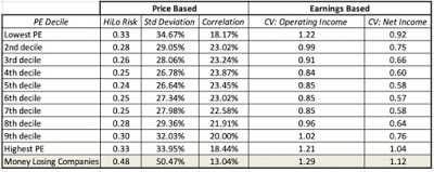 Download risk data for PE ratio classesWe follow up by looking at how stocks broken down into dividend yield classes diverge on price and earnings risk measures:
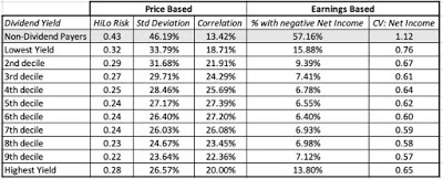 Download data for Dividend Yield classesWith both groups, we notice an interesting pattern. While there is no clear link between how low or high a stock's PE ratio is and its risk measures, money losing companies (where PE ratios are not computed or are not meaningful) are riskier than the rest of the market. Similarly, with dividend yields the link between dividend yields and risk measures is weak, but non-dividend paying companies are riskier than the rest of the market.
Industry Grouping
For decades, investors have used the industry groupings that companies belong to as the basis for risk judgments. Not only does this take the form of conventional investment advice, where risk averse investors are asked to invest in utility stocks, but it is also used to make broad brush statements about tech stocks being risky. Again, there is probably a good reason why these views came into being, at the time that they did, but economies and markets change, and it behooves us to look at the data to see if these rules of thumb still hold. Just as with the market capitalization classes, I have computed the risk statistics for the 94 industries that I categorize all companies into, and you can get the entire list by clicking here. The ten most risky and least risky industries, using price based risk measures are listed below:
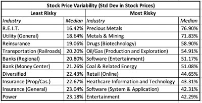 Download full industry listThe least risky firms, looking globally, on a price risk basis, are financial service firms (with banks an and insurance companies making the list) and the most risky firms include natural resource, technology and entertainment companies. Looking at earnings based risk measures, we get the following listing:
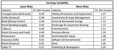 Download full industry listThere is significant overlap between the two measures, with the same industries, for the most part, showing up on both lists. The caveat I would add is that some of these sectors have thousands of companies in them, and that there are wide differences in risk across these companies.
Picking your PoisonThis has become a far longer post than I intended and I want to wrap it up with three suggestions, when it comes to risk.Risk avoidance is not a strategy: During periods of high volatility and market tumult, investors often obsess about risk. While that is natural, it is worth remembering that avoiding risk is not a risk strategy, but a desperation ploy. In investing, the objective is to earn the highest returns you can, with risk operating as a constraint. Unfortunately, in corporate finance, this lesson has been forgotten by risk managers, where the focus has been on products (hedging, derivatives) that companies can use to minimize risk exposure rather than on determining what risks to avoid, what risks to pass through to investors and what risks too seek out to maximize value. (See my book on risk management for an eraboration)Disagree with models but don't abandon first principles: Finance, in both theory and practice, is full of models for and measures of risk. Since these models/measures are built on assumptions, some of which you may disagree with vehemently, you may find yourself unwilling to use them in your investing. That is not only understandable, but healthy, but please do not throw the baby out with the bathwater and abandon first principles. Thus, refusing to use betas to estimate discount rates is okay but leaping to the conclusion that risk should not be considered in investing is absurd.Pick the risk measure that is right for you: We are lucky enough to be able to estimate or access different risk measures, price or earnings based, for companies that we might be interested in investing in. Rather than lecturing you on what I think is the best measure of risk, I would recommend that you look inwards, because you have to find a risk measure that works for you, not for me. Thus, if you are a value investor who buys companies for the long term, because you like their businesses, and you trust accountants, an earnings-based risk measure may appeal to you. In contrast, if you are more of a trader, buying stocks on the expectation that you can sell to someone else at a higher price, a price-based risk measure will fit you better. With both price and earnings measures, the question of whether you want to use individual company risk or risk added to a portfolio will depend upon whether you have a concentrated or diversified portfolio. Finally, the different risk measures that I have listed in this section often move together, as can be seen in this correlation matrix. Thus, while you may use market capitalization as your risk measure and I might use beta, our risk rankings may not be very different. In closing, whatever risk measure you pick to assess investments, I hope that you earn returns that justify the risk taking!
YouTube Video
Data Links
Country Risk Measures (January 2019)Industry Risk Measures (January 2019)Market Cap Risk Measures (January 2019)PE Ratio Risk Measures (January 2019)Dividend Yield Risk Measure (January 2019)
Risk: Basic Propositions
I. Risk falls on a continuum: Risk is not an on-off switch, where some assets are risky and others are not. Instead, it is better to think of it on a continuum, with investments with very little or close to no risk at one extreme (riskless) to extraordinarily risky investments at the other.

In fact, while most risk and return models start off with the presumption that there exists a riskless asset, one in which you can invest for a guaranteed return and no loss of principal, I think that a reasonable argument can be made that there are no such investments. In abstract settings, we often evade the question by using government bond rates (like the US treasury) as risk free rates, but that assumes:That governments don't default, an assumption that conflicts with the empirical evidence that they do, on both local currency and foreign currency borrowingsThat if the government delivers it's promised coupon we are made whole again, also not true since inflation can be a wild card, rendering the real return on a government bond negative, in some periods. A nominal risk free rate is not a real risk free rate, which is one reason that I track the inflation indexed treasury bond (TIPs) in conjunction with the conventional US treasury bond; the yield on the former is closer to a real risk free rate, if you assume the US treasury has no default risk.If there is one lesson that emerged from the 2008 crisis, it is that there are some periods in market history where there are truly no absolutely safe havens left and investors have to settle for the least stomach churning alternative that they can find, during these crises.
II. For a company, risk has many sources: Following up on the proposition that investing in the equity of a business can expose you to risk, it is worth noting that this risk can come from multiple sources. While a risk profile for a company can have a laundry list of potential risks, I break these risks into broad categories:
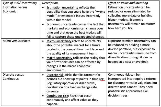 Note that some of these risks are more difficult to estimate and deal with than others, but that does not mean that you can avoid them or not deal with them. In fact, as I have argued repeatedly, your best investment opportunities may be where it is darkest.
III. For investors, risk standing alone can be different from risk added to a portfolio: This is perhaps the most controversial divide in finance, but I will dive right in. The risk of an investment can be different, if it is assessed as a stand-alone investment, as opposed to being part of a portfolio of investments and the reason is simple. Some of the risks that we listed in the table above, to the extent that they are specific to the firm, and can cut in either direction (be positive or negative surprises) will average out across a portfolio. It is simply the law of large numbers at work. In the graph below, I present a simplistic version of diversification at play, by looking at how the standard deviation of returns in a portfolio changes, as the number of investments in it goes up, in a world where the typical investment has a standard deviation of 40%, and for varying correlations across investments.
 Download diversification benefits spreadsheetIf the assets are uncorrelated, the standard deviation of the portfolio drops to just above 5%, but note that the benefits persist as long as the assets in your portfolio are not perfectly positively correlated, which is good news since stocks are usually positively correlated with each other. Furthermore, the greatest savings occur with the first few stocks that are added on, with about 80% of the benefits accruing by the time you get to a dozen stocks, if they are not all in the same sector or share the same characteristics (in which case the correlation across those stocks will be higher, and the benefit lower).
I know that I am now opening up an age old debate in investing as to whether it is better to have a concentrated portfolio or a diversified one. Rather than argue that one side is right and the other wrong, I will posit that it depends upon how certain you feel about your investment thesis, i.e., that your estimate of value is right and that the market price will correct to that value, with more certainty associated with less diversification. Speaking for myself, I am always uncertain about whether the value that I have estimated is right and even more so about whether the market will come around to my point of view, which also means that it is best for me to spread my bets. You can be a value investor and be diversified at the same time.
IV. Your risk measurement will depend on how and why you invest and your time horizon: Broadly speaking, there are three groups of metrics that you can use to measure the risk in an investment. Price Measures: If an asset/investment is traded, the first set of metrics drawn on the price path and what you can extract from that path as a measure of risk. There are many in investing who bemoan the Markowitz revolution and the rise of modern finance, but one of the byproducts of modern portfolio theory is that price-based measures of risk dominate the risk measurement landscape. Earnings/Cashflow Measures: There are many investors who believe that it is uncertainty about earnings and cash flows that are a true measure of risk. While their argument is that value is driven by earnings and cash flows, not stock price movements, their case is weakened by the fact that (a) earnings are measured by accountants, who tend to smooth out variations in earnings over time and (b) even when earnings are measured right, they are measured, at the most, four times a year, for companies that have quarterly reporting, and less often, for firms that report only annually or semi-annually.Risk Proxies: Some investors measure the risk of an asset, by looking at the grouping it belongs to, arguing that some groupings are more risky than others. For instance, in the four decades since technology stocks became part of the market landscape, "tech" has become a stand in for both high growth and high risk. Similarly, there is the perception that small companies are riskier than larger companies, and that the market capitalization, or level of revenues, should be a good proxy for the risk of a company.While I will report on each of these three groups of risk measures in this post, you can decide which measure best fits you, as an investor, given your investment philosophy.
Price Risk Measures
The most widely accessible measures of risk come from the market, for publicly traded assets, where trading generate prices that change with each trade. That price data is then used to extract risk measures, ranging from intuitive ones (high to low ranges) to statistical measures (such as standard deviation and covariance).
Price Range
When looking at a stock's current price, it is natural to also look at where it stands relative to that stock's own history, which is one reason most stock tables report high and low prices over a period (the most recent 12 months, for instance). While technical analysts use these high/low prices to determine whether a stock is breaking out or breaking down, these prices can also be used as a rough proxy for risk. Put simply, riskier stocks will trade with a wider range of prices than safer stocks.
HiLo Risk Measure
To compute a risk measure from high and low prices that is comparable across stocks, the range has to be scaled to the price level. Otherwise, highly priced stocks will look more risky, because the range between the high and the low price will be greater for a $100 stock than for a $5 stock. One simple scalar is the sum of the high and the low prices, giving the following measure of risk:
HiLo Risk = (High Price - Low Price)/ (High Price + Low Price)To illustrate, consider two stocks, A with a high of $50 and a low of $25 and B with a high of $12 and a low of $8. The risk measures computed will be:
HiLo Risk of stock A = (50-25)/ (50+25) = 0.333HiLo Risk of stock B = (12-8)/ (12 +8) = 0.20Based upon this measure, stock A is riskier than stock B.
Distribution
I compute the HiLo risk measure for all stocks in my data set, to get a sense of what would be high or low, and the results are captured in the distribution below (Q1: First Quartile, Q3: Third Quartile):
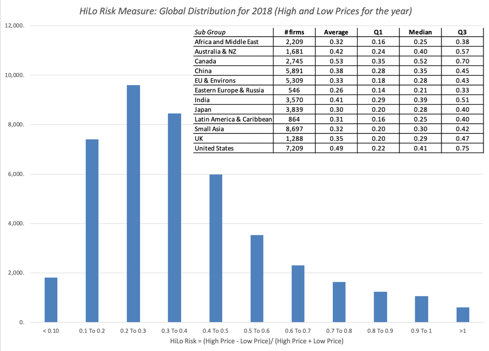 Data at country level Embedded in the distribution is the variation of this measure across regions, with some, at first sight, counterintuitive results. The US, Canada and Australia seem to be riskier than most emerging market regions, but that says more about the risk measure than it does about companies in these countries, as we will argue in the next section. If you want to see these risk measures on a country basis, try this link.
Pluses and Minuses
The high/low risk measure is simple to compute and requires minimal data, since all you need is the high price and the low price for the year. It is even intuitive, especially if you track market prices continuously. It does come with two problems. The first is the flip side of its minimal data usage, insofar as it throws away all data other than the high and the low price. The second is a more general problem with any price based risk measure, which is that for the price to move, there has to be trading, and markets that are liquid will therefore see more price movements, especially over shorter time period, than markets that are not. It is therefore not surprising that US stocks look riskier than African stocks, simply because liquidity is greater in the US. So, why bother? If you are comparing stocks within the same liquidity bucket, say the S&P 500, the high-low risk measure may correlate well with the true risk of the company. However, if your comparisons require you to look across stocks with different liquidity, and especially so if some are traded in small, emerging markets, you should use this or any other price-based measure with caution.
Standard Deviation/Variance
If you have data on stock prices over a period, it would be statistical malpractice not to compute a standard deviation in these prices over time. Those standard deviations are a measure, albeit incomplete and imperfect, of how much price volatility you would have faced as an investor, with the intuitive follow up that safer stocks should be less volatile.
Returns on Stocks
As with the HiLo risk measure, computing a standard deviation in stock prices, without adjusting for price levels, would yield the unsurprising conclusion that higher prices stocks have higher standard deviations. With this measure, the scaling adjustment becomes a simpler one, since using percentage price changes, instead of prices themselves, should level the playing field. In fact, if you wanted a fully integrated measure of returns, you should also include dividends in the periods where you receive them. However, since dividends get paid, at most, once every quarter, analysts who use daily or weekly returns often ignore them.
Distribution
To compute and compare standard deviations in stock returns across companies, I have to make some estimation judgments first, starting with the time period that I plan to look over to compute the standard deviation and the return intervals (daily, weekly, monthly) over that period. I use 2-year weekly standard deviations for all firms in my sample, using the time period available for companies that have listed less than 2 years, and the distribution of annualized standard deviations is in the graph below.
 Data at country level As with the HiLo risk measure, and for the same reasons, the US, Canada and Australia look riskier than most emerging markets. Again, I report on the regional differences in the table embedded in the graph, with country-level statistics available at this link.
Pluses and Minuses
It is Statistics 101! After all, when presented with raw data, one of the first measures that we compute to detect how much spread there is in the data is the standard deviation. Furthermore, the standard deviation can be computed for returns in any asset class, thus allowing us to compare it across stocks, high yield bonds, corporate bonds, real estate or crypto currencies. To the extent that we can also compute historical returns on these same assets, it allows us to relate those returns to the standard deviations and compute the payoff to taking risk in the form of Sharpe ratios or information ratios.
Sharpe Ratio = (Return on Risky Asset - Risk free Rate)/ Standard Deviation of Risky AssetThat said, the flaws in using just standard deviation as a measure of risk in investing have been pointed out by legions of practitioners and researchers.
Not Normal: The only statistical distribution which is completely characterized by the expected return and standard deviation is a normal distribution, and very little in the investment world is normally distributed. To the extent that investment return distributions are skewed (often with long positive tails and sometimes with long negative tails) and have fat tails, there is information in the other moments in the distribution that is relevant to investors.Upside versus Downside Variance: One of the intuitive stumbling blocks that investors have with standard deviation is that it will higher if you have outsized returns, whether they are higher or lower than the average. Since we tend to think of downside movements as risk, not upside, the fact that stocks that have moved up strongly and dropped precipitously can both have high standard deviations makes some investors queasy about using them as measures of risk.Liquidity effects: As with the high low risk measure, liquidity plays a role in how volatile a stock is, with more liquid stocks being characterized with higher standard deviations in stock prices than less liquid ones.Total Risk, rather than risk added to a portfolio: The standard deviation in stock prices measures the total risk in a stock, rather than how much risk it adds to a portfolio, which may make it a poor measure of risk for diversified investors. Put differently, adding a very risky stock, with a high standard deviation, to a portfolio may not add much risk to the portfolio if it does not move with the rest of the investments in the portfolio.In summary, the combination of richer pricing data and access to statistical tools has made it easier than ever to compute standard deviation in prices, but using it as your sole measure of risk can lead you to make bad investment decisions.
Covariance/Beta
In the graph on the effect of diversification on portfolio risk, I noted that the key variable that determines how much benefit there is to adding a stock to portfolio is its correlation with the rest of the portfolio, with higher and more positive correlations associated with less diversification benefit. Building on that theme, you can measure the risk added by an investment to a diversified portfolio by looking at how it moves in relation to the rest of the portfolio with its covariance, a measure that incorporates both the volatility in the investment and its correlation with the portfolio.
 This equation for added risk holds only if the investment added is a small proportion of the diversified portfolio, but if that is the case, you can have a risky investment (with a high standard deviation) that adds very little risk to a portfolio, if the correlation is low enough.
Standardized Measure (Beta)
The covariance measure of risk added to a portfolio, left as is, yields values that are not standardized. Thus, if you were told that the covariance of a stock with a well diversified portfolio is 25%, you may have no sense of whether that is high, low or average. It is to obtain a scaled measure of covariance that we divide the covariance of every investment by the variance of the portfolio that we are measuring it against:

If you are willing to add on whole layers of assumptions about no transactions costs, well functioning markets and complete information, the diversified portfolio that we will all hold will include every traded asset, in proportion to its market value, the capital asset pricing model will unfold and the betas for investments will be computed against this market portfolio. Note though, that even if you are unwilling to go the distance and accept the assumptions of the CAPM, the covariance and correlation remain measures of the risk added by an investment to a portfolio.
Distribution
If you already are well versed in financial theory, and find the lead in to beta in this section simplistic and unnecessary, I apologize, but I think that any discussion of the CAPM and betas very quickly veers off topic into heated debates about efficient markets and the limitations of modern finance. I think it is good to revisit the basics of the model, and even if you disagree with the model's precepts (and I do not think that there is anyone who fully buys into all of its assumptions), decide what parts of the model you want to keep and which ones you want to abandon. Since the key number that drives the covariance and beta of an investment is its correlation with, I report on the global distribution of this statistics:
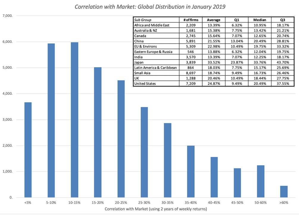 Data at country level Unlike the high low risk measure and the standard deviation, where my estimation choices were limited to time period and return interval, the correlation coefficient is also a function of the index or market that is used to compute it. That said, the distribution yields some interesting numbers that you can use, even as a non-believer in the CAPM. The median correlation for a US stock with the market is about 20%, and if you check the graph for savings, that would imply that having a portfolio of ten, twenty or thirty stocks yield substantial benefits. As you move to emerging markets, where the correlations are even lower, especially if you are a global investor, the benefits become even larger. Again, if you want to see this statistic on a country-by-country basis, try this link.
Pluses and Minuses
If you have bought into the benefits of diversification and have your wealth spread out across multiple investments, there is a strong argument to be made that you should be looking at covariance-based measures of risk, when investing. If you use a beta or betas to measure risk in an investment, you get an added bonus, since the number is self standing and gives you all the information you need to make judgments about relative risk. A beta higher (lower) than one is a stock that is riskier (safer) than average, but only if you define risk as risk added to a portfolio.
I use covariance based measures of risk in valuation but I recognize that these measures come with limitations. In addition to all of the caveats that we noted about liquidity's effect on price based measures, the most critical ingredient into covariance is the correlation coefficient and that statistic is both unstable and varies over time. Thus, the covariance (and beta) of the stock of a company that is going through a merger or is in distress will often decrease, since the stock price will move for reasons unrelated to the market. As a result, the covariance measures (and this includes the beta) have substantial estimation error in them, which is one reason that I have long argued against using the beta that you get for one company with one pass of history (a regression beta) in financial analysis. What can you do instead? Since covariance and beta are measures of risk added to a portfolio, they should be more reflective of the businesses (or industries) a company operates in than of company-specific characteristics. Using an industry average beta for steel companies, when valuing US Steel or Nucor, or an industry average beta for software companies, when valuing Adobe, is more prudent than using the regression betas for any of these companies. I will build on this theme in my next post.
Earnings Risk Measures
For many value investors, the biggest problem with using standard deviations or betas is that they come from stock prices. So what? In the value world, it is not markets that should drive our perception of risk, but the fundamentals of the company. Thus, using a price based risk measure when doing intrinsic value is viewed as inconsistent. In this section, I will look at proxies for risk that are built upon a company's performance over time.
Money Losing or Money Making If we define success in a business in terms of making money, the simplest measure of whether a company is risky is whether it generates profits or not. Simplistic though it might be, a money losing company, all held held constant, is riskier than a money making company. That said, investors take multiple cracks at measuring profitability, with some defining it as net profits (after taxes and interest expenses), some more expansively as operating income (to look at pre-debt earnings) and some even more broadly as EBITDA. In the table below, I break down the percentages of companies globally that report positive and negative values, using each measure:
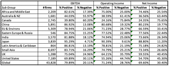 Data at country level Not surprisingly, in every part of the world, the percentage of firms that have positive EBITDA exceeds the percentage with positive operating income or positive net income. Looking across regions, Japan has the highest percentage of money making firms, with 88.80% making positive net income, and Canada and Australia, with their preponderance of natural resource companies, have the highest percentage of money losers.
Earnings Variance
It is true that whether a company makes money is a very rough measure of risk and a more complete measure of earnings risk would look at earnings variability over time. This is more difficult than it sounds, for three reasons. First, unlike pricing data, earnings data is available only once every quarter in much of the world, and even more infrequently (semi annual or annual) in the rest. Second, unlike price data, which can never be negative, earnings can, and computing variance in earnings, when earnings are negative, are messy. Third, even if you can compute the variance or standard deviation in earnings, it is difficult to compare that number across companies, since companies with higher dollar earnings will have more variance in those earnings in dollar terms. It is for this reason that I compute a coefficient of variation in earnings for each firm, where I divide the standard deviation in earnings by the average earnings over the period of analysis:
Coefficient of variation in earnings = Standard Deviation in Earnings/ Average Earnings over estimation period
When the average earnings are negative, I use the absolute value in the denominator. I computed this measure of earnings variability in both operating and net income for companies that have data going back at least five years, and the distribution is captured below:
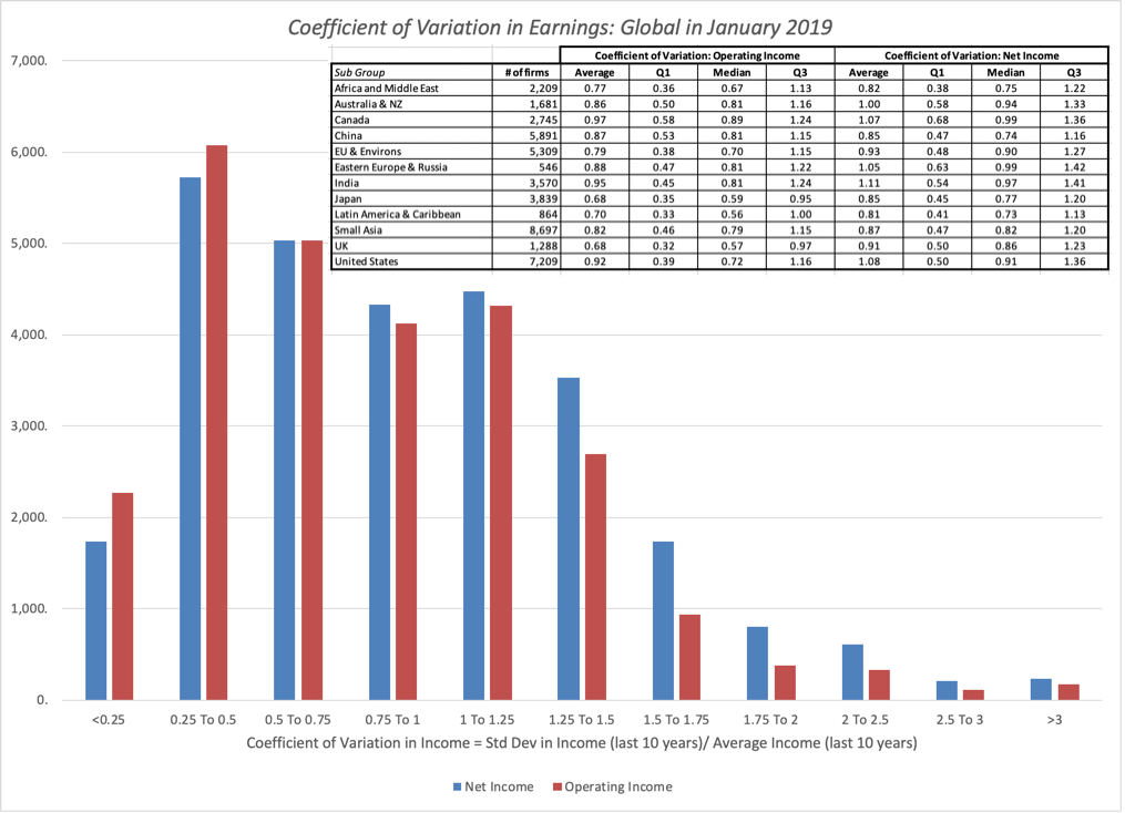 Download country level statisticsThere are some surprises here. While Australia and Canada again score near the top of the risk table, with the highest variation in earnings, Latin American companies have the lowest volatility in operating and net income, if you compare medians. You can take this to mean that Latin American companies are not risky or that there are perils to trusting accountants to measure performance. Finally, the country level risk statistics are available at this link.
Pluses and Minuses While I sympathize with the argument that value investors pose, i.e., that using price based risk measures in intrinsic valuation is inconsistent, I am very quickly brought back to earth by the recognition that computing risk from accounting earnings or financial statements comes with its own limitations, which in my view, quickly overwhelm its benefits. The accounting tendency to smooth things out shows up in earnings streams and if you add to that how the numerous discretionary accounting plays (from how to account for acquisitions to how to measure inventory) play out in stated earnings, I am not sure that I learn much about risk from looking at a time series of accounting earnings. You may find that there are other items in accounting statements that are less susceptible to accounting choices, such as revenues or cash flows, but, for the moment, I remain unconvinced that any of these beat price-based measures of risk.
Risk Proxies
The vast majority of investors never attach risk measures to stocks, choosing instead to proxies or stand-ins for risk. Thus, tech stocks are viewed as riskier than non-tech stocks, small cap stocks are perceived as more risky than large cap stocks and, in some value investing circles, stocks that trade at low PE ratios or have high dividend yields are viewed as safer than stocks with high PE ratios or do not pay dividends. In this section, I look at how the measures of risk that I have computed from price and accounting data correlate with these proxies.
Market Capitalization
It seems like common sense to argue that smaller companies must be riskier than larger companies. After all, they often operate in niche markets, have less access to capital and are often dependent on a few customers for success. That said, though, even these common sense arguments start to break down if you think about investing in portfolios of small cap stocks, as opposed to large ones, since many of these risks are firm specific and could be diversified away across stocks. To examine, whether risk varies across market capitalization classes, I looked at the risk measures that we have computed already in this post:
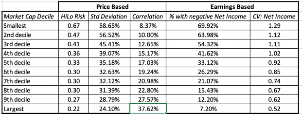 Download full market cap risk statisticsThe market capitalization correlates remarkably well with measures of both price and earnings risk, with smaller companies exposed to far more risk than larger firms. The note of caution, though, comes in the correlation numbers, where the smallest companies have the lowest correlation with the market, suggesting that much of the added risk in these companies can be diversified away. Put simply, if you want to own only three or four stocks in your portfolio, it is perfectly appropriate to think of small companies as riskier than large ones, but if you choose to be diversified, company size may no longer be a good proxy for the risk added to your portfolio.
PE Ratios and Dividend Yields
For some value investors, it is an article of faith that the stocks that trade at low multiples of earnings and pay large dividends are safer than stocks that trade at higher multiples and or pay low dividends. That is perhaps the reason why the Graham screens for cheap stocks include ones for low PE and high dividend yields. In the table below, we look at how stocks in different PE ratio classes vary on price and earnings risk measures:
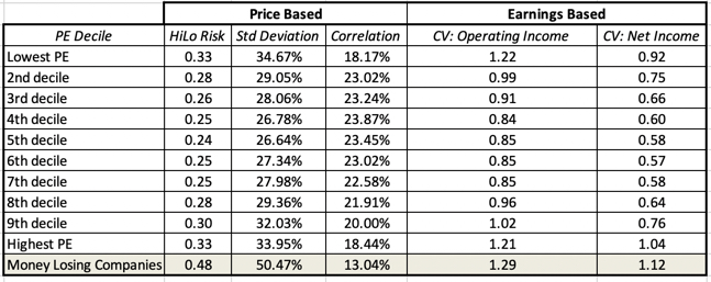 Download risk data for PE ratio classesWe follow up by looking at how stocks broken down into dividend yield classes diverge on price and earnings risk measures:
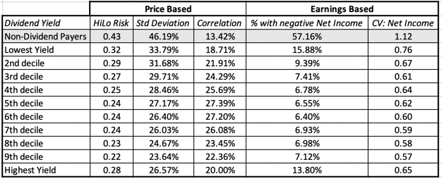 Download data for Dividend Yield classesWith both groups, we notice an interesting pattern. While there is no clear link between how low or high a stock's PE ratio is and its risk measures, money losing companies (where PE ratios are not computed or are not meaningful) are riskier than the rest of the market. Similarly, with dividend yields the link between dividend yields and risk measures is weak, but non-dividend paying companies are riskier than the rest of the market.
Industry Grouping
For decades, investors have used the industry groupings that companies belong to as the basis for risk judgments. Not only does this take the form of conventional investment advice, where risk averse investors are asked to invest in utility stocks, but it is also used to make broad brush statements about tech stocks being risky. Again, there is probably a good reason why these views came into being, at the time that they did, but economies and markets change, and it behooves us to look at the data to see if these rules of thumb still hold. Just as with the market capitalization classes, I have computed the risk statistics for the 94 industries that I categorize all companies into, and you can get the entire list by clicking here. The ten most risky and least risky industries, using price based risk measures are listed below:
 Download full industry listThe least risky firms, looking globally, on a price risk basis, are financial service firms (with banks an and insurance companies making the list) and the most risky firms include natural resource, technology and entertainment companies. Looking at earnings based risk measures, we get the following listing:
 Download full industry listThere is significant overlap between the two measures, with the same industries, for the most part, showing up on both lists. The caveat I would add is that some of these sectors have thousands of companies in them, and that there are wide differences in risk across these companies.
Picking your PoisonThis has become a far longer post than I intended and I want to wrap it up with three suggestions, when it comes to risk.Risk avoidance is not a strategy: During periods of high volatility and market tumult, investors often obsess about risk. While that is natural, it is worth remembering that avoiding risk is not a risk strategy, but a desperation ploy. In investing, the objective is to earn the highest returns you can, with risk operating as a constraint. Unfortunately, in corporate finance, this lesson has been forgotten by risk managers, where the focus has been on products (hedging, derivatives) that companies can use to minimize risk exposure rather than on determining what risks to avoid, what risks to pass through to investors and what risks too seek out to maximize value. (See my book on risk management for an eraboration)Disagree with models but don't abandon first principles: Finance, in both theory and practice, is full of models for and measures of risk. Since these models/measures are built on assumptions, some of which you may disagree with vehemently, you may find yourself unwilling to use them in your investing. That is not only understandable, but healthy, but please do not throw the baby out with the bathwater and abandon first principles. Thus, refusing to use betas to estimate discount rates is okay but leaping to the conclusion that risk should not be considered in investing is absurd.Pick the risk measure that is right for you: We are lucky enough to be able to estimate or access different risk measures, price or earnings based, for companies that we might be interested in investing in. Rather than lecturing you on what I think is the best measure of risk, I would recommend that you look inwards, because you have to find a risk measure that works for you, not for me. Thus, if you are a value investor who buys companies for the long term, because you like their businesses, and you trust accountants, an earnings-based risk measure may appeal to you. In contrast, if you are more of a trader, buying stocks on the expectation that you can sell to someone else at a higher price, a price-based risk measure will fit you better. With both price and earnings measures, the question of whether you want to use individual company risk or risk added to a portfolio will depend upon whether you have a concentrated or diversified portfolio. Finally, the different risk measures that I have listed in this section often move together, as can be seen in this correlation matrix.
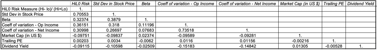 Thus, while you may use market capitalization as your risk measure and I might use beta, our risk rankings may not be very different. In closing, whatever risk measure you pick to assess investments, I hope that you earn returns that justify the risk taking!
YouTube Video
Data Links
Country Risk Measures (January 2019)Industry Risk Measures (January 2019)Market Cap Risk Measures (January 2019)PE Ratio Risk Measures (January 2019)Dividend Yield Risk Measure (January 2019)
January 11, 2019
Back to Class: A Teaching Manifesto!
I am convinced that each of us is granted moments of grace, where, if we are open to the possibility, we find out what we are meant to do with our lives. For me, one of those moments occurred in the second year of my MBA program at UCLA, when, cash poor, I decided to be a teaching assistant for a quarter to earn some money. At the time I made that decision, my plans were typical of many of my MBA cohort, to get a job in consulting or investment banking, and to make my work up the corporate ladder, but the day that I walked in to teach my first session, I knew that I had found my calling. I was going to be a teacher, though I was not sure what I would be teaching, or to whom. As fate would have it, I found myself fascinated by finance, and I ended up as a finance professor at NYU's business school. I have never regretted that choice, but when asked to describe what I do, I still tell people that I am a teacher, not a professor, a researcher or an academic.
Back to the Classroom!
Starting in 1986, I have been teaching almost every semester at Stern, but I have had a break of almost a year and a half from my class room teaching, the first year representing a long-delayed sabbatical and the last half year reflecting a choice that I made to do all my teaching in one semester this academic year (2018-19). During that period, I continued to teach my short-term (2 to 3 day) classes in different parts of the globe, and while I have enjoyed these visits immensely, I have missed my regular classroom. I am therefore looking forward to a new semester and three new classes this spring, a corporate finance class that I teach, primarily to first year MBAs, a valuation class, an elective for mostly second year MBAs, and another valuation class for undergraduates in their sophomore, junior and senior years. If you are not at Stern, you will not be able to sit in the class but through the wonders of technology, you can still take these classes. With no further ado, let me describe them and offer you the choices.
Corporate Finance (MBA)If there is one class in finance that everyone, no matter what their paths in life or business may be, should take, it is corporate finance. Corporate finance is a class that covers the first principles that govern how a business should be run and its reach is complete. Every decision that a firm makes is ultimately a corporate finance decision, no matter which functional area (marketing, production, personnel) it originates from, and that is the perspective I take in the class. I teach the class around what I call my big picture page, where I classify business decisions into investing, finance and dividend groupings and frame how to make those decisions with an end objective of increasing the value of the business.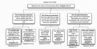 Class webpageYou will notice chapter numbers and sessions under each topic, with the chapters representing chapters in my Applied Corporate Finance book, a book that I loved writing but one that is so hopelessly over priced that I do not require it for my own class, and the sessions showing the sequence of the class through the 26 sessions that start on February 4, 2019 and end on May 13, 2019. The class meets every Monday and Wednesday during this period, barring the break week of May 16-23, and the syllabus for the class can be found at this link. If you cannot be in these classes in person, don't fret since the classes will be recorded and be available for you to watch, not in real time, but about 2-3 hours after each class is done. To follow along with the webcasts (each about 80 minutes long), you can also access the slides that I use for each class, as well as additional material. Finally, I demand a great deal of my class (weekly puzzles, add on videos, exams and a project) and if you want, you can also do the puzzles, take the exams and do the project, though you will have to grade yourself (with a template that I will put online). You can even read the emails I send my class, and I send about a hundred over the course of a semester, at this link. If you prefer your videos on YouTube, you can try the playlist for the class, and if your preference is for an iTunes U version, this link should take you to the site. The good news is that it will cost you nothing (other than your time and perhaps a few relationships) but the bad news is that you will not get any official certification, if that is what you are looking for.
Valuation (Undergraduate and MBA)I have a fondness for this class, since I created and taught the first full-semester version of it, at any business school, in 1987. I was told then that there was not enough "stuff" in valuation to fill a class, and while that might have been true at that time, I have found plenty to fill in the gaps since. As the title of the class indicates, this is a class about valuation. Valuing what, you might ask, and my answer would be "just about everything" from stocks to bitcoin to the Kardashians. The picture below captures the broad reach of the class: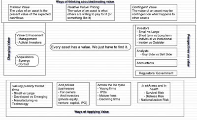 Class webpageAs I teach it, this is a class that is not only about valuing assets but also pricing them (I am afraid that you have to sit in on the class to find out the difference) and it looks at valuation/pricing from a variety of perspectives (investors looking at a stock, managers using value to guide decision making and even accountants writing disclosure and accounting rules). As those of you who read my blog know, my fidelity is to intrinsic value, but I try to keep an open mind on different perspective and approaches in this class.
As with the corporate finance class, we will meet every Monday and Wednesday for 14 (15) weeks, starting February 4 (January 28) for my MBA (undergraduate) class. If you are wondering which version to follow, I will save you the trouble, since the classes are identical in content and delivery, since I don't believe that there is any reason why I should challenge a bright 21-year old less than a bright 28-year old; age and work experience can give the latter more perspective but this is often offset by the extra energy and curiosity that youth brings to the table. The links that you can use to follow the class are in the table below for both versions of the class:
table.tableizer-table { font-size: 12px; border: 1px solid #CCC; font-family: Arial, Helvetica, sans-serif; } .tableizer-table td { padding: 4px; margin: 3px; border: 1px solid #CCC; } .tableizer-table th { background-color: #104E8B; color: #FFF; font-weight: bold; }
Webcast pageYouTube PlaylistiTunes U classStartsEnds# SessionsMBA ValuationLinkLinkLink4-Feb-1913-May-1926Undergraduate ValuationLinkLinkLink28-Jan-1913-May-1928
With both versions of the valuation class, I will also be posting what I call my valuation of the week, a company that I will value, with links to the excel spreadsheet and the story behind the value. I encourage you, if you are taking the class, officially or unofficially, to take my valuation and make it your own, changing the story and the inputs, and then recording your valuation in a shared Google spreadsheet. In a world where crowds decide what movies are successes (Rotten Tomatoes) and which restaurants we eat at (Yelp reviews), we can create our version of crowd valuations. It is an optional exercise, but the more people who participate, the more fun that we can have.
Other Options
I am under no illusions that you are sitting around, wherever you are in the world, with nothing better to do than watching two long sessions each week from February through May. Watching long lecture videos on my tablet is not my idea of fun and while some of you will start with the objective of sitting in on the class, life will get in the way. There are three options that you can consider, depending upon your constraints:
If time is your constraint: One of the advantages of taking the class or classes online is that you do not have to do finish the class in May 2019. In fact, the webcasts for the class will stay on for at least another year after the class ends. So, if you like the long class format, you can stretch the class out for longer, if all you need is more time.If format is your concern: If you find your attention lagging or your brain decomposing because the lectures are too long, I have created online versions of both classes (plus a third one on investment philosophies), where I have compressed my 80 minute sessions into 12-15 minutes each. Without giving away any trade secrets, and at the risk of discounting the value of an MBA, it was not difficult to do. As with the regular classes, these are still free, still come with slides and post class quizzes but offer no official certification.If you want accreditation: Even if you take my classes online religiously, mastering every nook and cranny of the topic, and acing every quiz, I do not have the bandwidth or the authority to hand out accreditation or certificates. Three years ago, I remedied this, with the help of NYU, by creating certificate versions of the online classes (with shorter duration videos). The pluses are that the videos are more polished than the ones I created for the free version, there is more administrative support and an active message board where you can chat with others taking the class and you will get a certificate at the end of the class. I will also, at least for the foreseeable future, also do live hourly WebEx sessions once every two weeks and grade your projects. The minus is that NYU does not give away certificates for free and if you get sticker shock, please don't make me your target. The decision on whether the certificate is worth the fee is yours to make, and the links to both the free and the NYU certificate versions are below. table.tableizer-table { font-size: 12px; border: 1px solid #CCC; font-family: Arial, Helvetica, sans-serif; } .tableizer-table td { padding: 4px; margin: 3px; border: 1px solid #CCC; } .tableizer-table th { background-color: #104E8B; color: #FFF; font-weight: bold; }
Online classNYU Certificate Online classCorporate FinanceLinkLinkValuationLinkLinkInvestment PhilosophyLinkLink
Finally, you are always welcome to pick the parts of each class that interest you and ignore the rest. The end game is learning, and what interests me may not interest you.
Bottom Line
I know that there are some who say that those who can, do, and those who cannot, teach, and I have been told that or variants of it multiple times. I don't mind the insult, since I have a thick skin, but I know that there is nothing else in the world I would rather do. I answer to no one (other than my wife), pick when or where I work (for the most part), get to chance to change how people think and make a decent living. If your desire is to manage other people's money, be an equity research analyst or investment banker, or to start and run your own company, I wish you the very best, but I am lucky to be doing what I love, and I would be foolish to trade it in for more money or prestige. At the risk of recycling a cliche, I have only one life to live!
YouTube Video
Class Links
a. Full Semester Classes (Spring 2019) (Free)
MBA Corporate Finance Class (Spring 2019) (Free)MBA Valuation Class (Spring 2019) (Free)Undergraduate Valuation Class (Spring 2019) (Free)b. Online Classes (Free)
Online Corporate Finance Class (Free)Online Valuation Class (Free)Online Investment Philosophies Class (Free) c. NYU Online Certificate Classes (Not free!)
NYU Online Corporate Finance Certificate ClassNYU Online Valuation Certificate Class
Back to the Classroom!
Starting in 1986, I have been teaching almost every semester at Stern, but I have had a break of almost a year and a half from my class room teaching, the first year representing a long-delayed sabbatical and the last half year reflecting a choice that I made to do all my teaching in one semester this academic year (2018-19). During that period, I continued to teach my short-term (2 to 3 day) classes in different parts of the globe, and while I have enjoyed these visits immensely, I have missed my regular classroom. I am therefore looking forward to a new semester and three new classes this spring, a corporate finance class that I teach, primarily to first year MBAs, a valuation class, an elective for mostly second year MBAs, and another valuation class for undergraduates in their sophomore, junior and senior years. If you are not at Stern, you will not be able to sit in the class but through the wonders of technology, you can still take these classes. With no further ado, let me describe them and offer you the choices.
Corporate Finance (MBA)If there is one class in finance that everyone, no matter what their paths in life or business may be, should take, it is corporate finance. Corporate finance is a class that covers the first principles that govern how a business should be run and its reach is complete. Every decision that a firm makes is ultimately a corporate finance decision, no matter which functional area (marketing, production, personnel) it originates from, and that is the perspective I take in the class. I teach the class around what I call my big picture page, where I classify business decisions into investing, finance and dividend groupings and frame how to make those decisions with an end objective of increasing the value of the business.
 Class webpageYou will notice chapter numbers and sessions under each topic, with the chapters representing chapters in my Applied Corporate Finance book, a book that I loved writing but one that is so hopelessly over priced that I do not require it for my own class, and the sessions showing the sequence of the class through the 26 sessions that start on February 4, 2019 and end on May 13, 2019. The class meets every Monday and Wednesday during this period, barring the break week of May 16-23, and the syllabus for the class can be found at this link. If you cannot be in these classes in person, don't fret since the classes will be recorded and be available for you to watch, not in real time, but about 2-3 hours after each class is done. To follow along with the webcasts (each about 80 minutes long), you can also access the slides that I use for each class, as well as additional material. Finally, I demand a great deal of my class (weekly puzzles, add on videos, exams and a project) and if you want, you can also do the puzzles, take the exams and do the project, though you will have to grade yourself (with a template that I will put online). You can even read the emails I send my class, and I send about a hundred over the course of a semester, at this link. If you prefer your videos on YouTube, you can try the playlist for the class, and if your preference is for an iTunes U version, this link should take you to the site. The good news is that it will cost you nothing (other than your time and perhaps a few relationships) but the bad news is that you will not get any official certification, if that is what you are looking for.
Valuation (Undergraduate and MBA)I have a fondness for this class, since I created and taught the first full-semester version of it, at any business school, in 1987. I was told then that there was not enough "stuff" in valuation to fill a class, and while that might have been true at that time, I have found plenty to fill in the gaps since. As the title of the class indicates, this is a class about valuation. Valuing what, you might ask, and my answer would be "just about everything" from stocks to bitcoin to the Kardashians. The picture below captures the broad reach of the class:
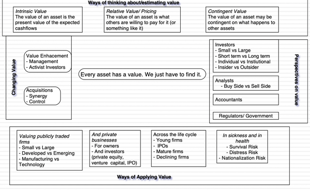 Class webpageAs I teach it, this is a class that is not only about valuing assets but also pricing them (I am afraid that you have to sit in on the class to find out the difference) and it looks at valuation/pricing from a variety of perspectives (investors looking at a stock, managers using value to guide decision making and even accountants writing disclosure and accounting rules). As those of you who read my blog know, my fidelity is to intrinsic value, but I try to keep an open mind on different perspective and approaches in this class.
As with the corporate finance class, we will meet every Monday and Wednesday for 14 (15) weeks, starting February 4 (January 28) for my MBA (undergraduate) class. If you are wondering which version to follow, I will save you the trouble, since the classes are identical in content and delivery, since I don't believe that there is any reason why I should challenge a bright 21-year old less than a bright 28-year old; age and work experience can give the latter more perspective but this is often offset by the extra energy and curiosity that youth brings to the table. The links that you can use to follow the class are in the table below for both versions of the class:
table.tableizer-table { font-size: 12px; border: 1px solid #CCC; font-family: Arial, Helvetica, sans-serif; } .tableizer-table td { padding: 4px; margin: 3px; border: 1px solid #CCC; } .tableizer-table th { background-color: #104E8B; color: #FFF; font-weight: bold; }
Webcast pageYouTube PlaylistiTunes U classStartsEnds# SessionsMBA ValuationLinkLinkLink4-Feb-1913-May-1926Undergraduate ValuationLinkLinkLink28-Jan-1913-May-1928
With both versions of the valuation class, I will also be posting what I call my valuation of the week, a company that I will value, with links to the excel spreadsheet and the story behind the value. I encourage you, if you are taking the class, officially or unofficially, to take my valuation and make it your own, changing the story and the inputs, and then recording your valuation in a shared Google spreadsheet. In a world where crowds decide what movies are successes (Rotten Tomatoes) and which restaurants we eat at (Yelp reviews), we can create our version of crowd valuations. It is an optional exercise, but the more people who participate, the more fun that we can have.
Other Options
I am under no illusions that you are sitting around, wherever you are in the world, with nothing better to do than watching two long sessions each week from February through May. Watching long lecture videos on my tablet is not my idea of fun and while some of you will start with the objective of sitting in on the class, life will get in the way. There are three options that you can consider, depending upon your constraints:
If time is your constraint: One of the advantages of taking the class or classes online is that you do not have to do finish the class in May 2019. In fact, the webcasts for the class will stay on for at least another year after the class ends. So, if you like the long class format, you can stretch the class out for longer, if all you need is more time.If format is your concern: If you find your attention lagging or your brain decomposing because the lectures are too long, I have created online versions of both classes (plus a third one on investment philosophies), where I have compressed my 80 minute sessions into 12-15 minutes each. Without giving away any trade secrets, and at the risk of discounting the value of an MBA, it was not difficult to do. As with the regular classes, these are still free, still come with slides and post class quizzes but offer no official certification.If you want accreditation: Even if you take my classes online religiously, mastering every nook and cranny of the topic, and acing every quiz, I do not have the bandwidth or the authority to hand out accreditation or certificates. Three years ago, I remedied this, with the help of NYU, by creating certificate versions of the online classes (with shorter duration videos). The pluses are that the videos are more polished than the ones I created for the free version, there is more administrative support and an active message board where you can chat with others taking the class and you will get a certificate at the end of the class. I will also, at least for the foreseeable future, also do live hourly WebEx sessions once every two weeks and grade your projects. The minus is that NYU does not give away certificates for free and if you get sticker shock, please don't make me your target. The decision on whether the certificate is worth the fee is yours to make, and the links to both the free and the NYU certificate versions are below. table.tableizer-table { font-size: 12px; border: 1px solid #CCC; font-family: Arial, Helvetica, sans-serif; } .tableizer-table td { padding: 4px; margin: 3px; border: 1px solid #CCC; } .tableizer-table th { background-color: #104E8B; color: #FFF; font-weight: bold; }
Online classNYU Certificate Online classCorporate FinanceLinkLinkValuationLinkLinkInvestment PhilosophyLinkLink
Finally, you are always welcome to pick the parts of each class that interest you and ignore the rest. The end game is learning, and what interests me may not interest you.
Bottom Line
I know that there are some who say that those who can, do, and those who cannot, teach, and I have been told that or variants of it multiple times. I don't mind the insult, since I have a thick skin, but I know that there is nothing else in the world I would rather do. I answer to no one (other than my wife), pick when or where I work (for the most part), get to chance to change how people think and make a decent living. If your desire is to manage other people's money, be an equity research analyst or investment banker, or to start and run your own company, I wish you the very best, but I am lucky to be doing what I love, and I would be foolish to trade it in for more money or prestige. At the risk of recycling a cliche, I have only one life to live!
YouTube Video
Class Links
a. Full Semester Classes (Spring 2019) (Free)
MBA Corporate Finance Class (Spring 2019) (Free)MBA Valuation Class (Spring 2019) (Free)Undergraduate Valuation Class (Spring 2019) (Free)b. Online Classes (Free)
Online Corporate Finance Class (Free)Online Valuation Class (Free)Online Investment Philosophies Class (Free) c. NYU Online Certificate Classes (Not free!)
NYU Online Corporate Finance Certificate ClassNYU Online Valuation Certificate Class
January 9, 2019
January 2019 Data Update 3: Playing the Numbers Game!
Every year, for the last three decades, I have spent the first week of the year, looking at numbers. Specifically, as the calendar year ends, I download raw data on individual companies and try to decipher trends and patterns in the data. Over the years, the raw data has become more easily accessible and richer, but ironically, I have become more wary about trusting the numbers. In this post, I will describe, in broad terms, what the data for 2019 looks like, in terms of geography and industry, and spend the next few posts eking out as much information as I can out of them.
The Data: GeographyMy sample includes all publicly traded firms with a market capitalization greater than zero and all of the information that I get from my data providers is in the public domain. Put differently, for an individual firm, you should be able to extract all of the information that I have for the firms in my sample, and compute the statistics and ratios that I do, if you are so inclined. If you are wondering why I don't screen out firms that have small market capitalizations or are in markets where information disclosure is spotty, it is because any sampling choices that I make to restrict my sample will create biases that may skew the statistics.
For my 2019 data update, I have 43,846 firms in my sample. While these companies are incorporated in 148 countries, I classify them broadly into five geographical groups: table.tableizer-table { font-size: 12px; border: 1px solid #CCC; font-family: Arial, Helvetica, sans-serif; } .tableizer-table td { padding: 4px; margin: 3px; border: 1px solid #CCC; } .tableizer-table th { background-color: #104E8B; color: #FFF; font-weight: bold; }
Geographical GroupingIncludesRationaleAustralia, NZ and CanadaAustralia, New Zealand and CanadaShare a reliance on natural resources.Developed EuropeEU, UK, Switzerland and ScandinaviaIncludes riskier EU countries, but reflects European company pricing and choices.Emerging MarketsAsia other than Japan, Africa, Middle East, Latin America, Eastern Europe & RussiaA really mixed bag of countries from many regions with different characteristics, with variations in added risk.JapanJapanese companiesDifferent enough from the rest of the world that it still deserves its own grouping.United StatesUS companies Accounts for the biggest chunk of world market capitalization.
I will confess up front that there is an element of arbitrariness to this classification, but no classification will ever be immune to that subjectivity. The breakdown of my sample both in terms of numbers of firms and market capitalization is below: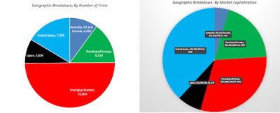
US firms are still the leaders in the market capitalization race, accounting for 38% of overall market value. While emerging market firms account for roughly half the firms in my overall sample, their market capitalization is 30% of the overall global market capitalization. The emerging market grouping includes firms from four continents, listed in countries that range in risk from low risk to extraordinarily high risk. The two biggest emerging markets, in terms of listings and market capitalization, are India and China and I will break out companies listed in those countries separately for computing my numbers.
The Data: Industry GroupingsTo classify companies into industrial groups, I start with the industry listings provided by my raw data providers but add my own twist to create industry groupings. One reason that I do so is to respect my raw data providers' proprietary classifications and the other is to compare across time, since I have classified firms with my groupings for decades. In making my classifications, I will err on the side of broader classifications, rather than narrower one, for two reasons:Law of large numbers: The power of averaging gets stronger, as sample sizes increase, and using broader groupings results in larger samples. To illustrate, I have 1148 apparel firms in my global sample, thus allowing for enough firms in every sub grouping. Better measures: In both valuation and corporate finance, there is an argument to be made that the numbers we obtain for broader groups is a better estimate of where companies will converge than focusing on smaller groups. That said, there will be times where the broad industry classifications that I use will frustrate you, especially on pricing metrics, like PE ratios and EV to EBITDA multiples. I report the industry average PE ratios and EV to EBITDA multiples for specialty retailers collectively, but if you are valuing a luxury retailer, you would have liked to see these averages reported just for luxury retailers. I apologize in advance for that, but the consolation price is that if you want to compute an average across a small sample of companies just like yours, the data to do so is available online and often for free.
In sum, I break companies down into 94 industries and you can see the numbers of firms and market capitalizations of each industry in this file. The ten biggest industries, at the start of 2019, based upon the number of publicly traded firms and market capitalization are reported below: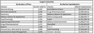 Download full list of industriesWhile I used to provide company level data until 2015, my raw data providers have put restrictions on that and I can no longer do that. If you are interested in finding out which industry grouping a specific company that you are interested in belongs to, you can find out by The Data: StatisticsTiming
I download data from both accounting statements and financial markets and in doing so, I do run into a mild timing issue. The accounting data that I have for most firms on January 1, 2019, is as of the third quarter of 2018 (ending September 30, 2018) and I use the trailing 12-month data as of the most recent financial filing. For companies in countries with semi-annual filings, the data will be even mow dated, but there is little that can be done about that. For market data, I use the market prices and rates, as of December 31, 2018. While you may think of that as a timing inconsistency, I do not, since that is most updated information an investor would have had on January 1, 2019.
Adjustments
With the accounting information, I use my discretion to change accounting rules that I believe not only make no sense but skew our perspectives on companies. The first adjustment that I make is to convert lease commitments to debt, which alters operating income and debt numbers, a modification that I have made for more than 20 years. I am pleased to note that accounting will finally come to its senses and try to do the same starting in 2019 and you should be able to get a preview of how margins, debt ratios and returns on capital will change from my computations. The second adjustment is to convert R&D expenses from an operating expense (which it clearly is not) to a capital expense, which it clearly is, again affecting operating income and invested capital. For purposes of transparency, I report both the adjusted and the unadjusted numbers for the statistics that are affected by it.
Statistics and Ratios
Since my interests lie in corporate finance, valuation and investment management, I compute a wide range of statistics, as can be seen in the table below (reproduced from last year). :
Risk MeasuresCost of FundingPricing Multiples1. Beta1. Cost of Equity1. PE &PEG2. Standard deviation in stock price2. Cost of Debt2. Price to Book3. Standard deviation in operating income3. Cost of Capital3. EV/EBIT, EV/EBITDA and EV/EBITDA4. High-Low Price Risk Measure4. EV/Sales and Price/SalesProfitabilityFinancial LeverageCash Flow Add-ons1. Net Profit Margin1. D/E ratio & Debt/Capital (book & market) (with lease effect)1. Cap Ex & Net Cap Ex2. Operating Margin2. Debt/EBITDA2. Non-cash Working Capital as % of Revenue3. EBITDA, EBIT and EBITDAR&D Margins3. Interest Coverage Ratios3. Sales/Invested CapitalReturnsDividend PolicyRisk Premiums1. Return on Equity1. Dividend Payout & Yield1. Equity Risk Premiums (by country)2. Return on Capital2. Dividends/FCFE & (Dividends Buybacks)/ FCFE2. US equity returns (historical)3. ROE - Cost of Equity4. ROIC - Cost of CapitalYou can click on the links to see the US data for the start of 2019, in html, but I would strongly recommend that you download the data in Excel from my data page. You will not only get data that is easier to work with but you can also download the data for the global sample and geographical groups (as well as India and China).
The Data: UseIt would be presumptuous of me to tell you how to use data, since that is a personal choice, but having worked with this data for almost 30 years, I can offer you some caveats:Don't assume that mean reversion is automatic: A great deal of valuation and investment management is built on the presumption that mean reversion will occur. Thus, low PE stocks will deliver high returns, as the PE converges on the average for the sector. While mean reversion is a strong force, it is not immutable, and when you have structural changes in the economy and sectors, it will break down. Trust, but verify: While I would like to believe that my computations of widely used ratios (from accounting ratios like return on equity and ROIC to pricing metrics like EV to EBITDA) are correct, they represent my views and may differ from yours. It is for this reason that I provide a full listing of how I compute my numbers at this link. If you do find a statistic that I report that you are not clear about, and you cannot find the description of how I computed it, please let me know.The data will age, and some more quickly than others, over the course of the year: I have neither the interest, nor the inclination, to be a full-fledged data service. So, please don't expect daily, weekly or monthly updates of the data. In fact, God willing, the data will be updated a year on January 5, 2020. The only numbers that I plan to update mid year are the country risk premiums.I hope that you find my data useful in whatever you pursue, and if you do use it, you are welcome to it. I find that sharing data that I will need and use anyway costs me nothing, and the only thing that I will ask of you is that you pass on the sharing.
YouTube Video
Data linksSample breakdown- Industry Groups
Data Update 1: A Reminder that equities are risky, in case you forgot!Data Update 2: The Message from Bond MarketsData Update 3: Playing the Numbers Game
The Data: GeographyMy sample includes all publicly traded firms with a market capitalization greater than zero and all of the information that I get from my data providers is in the public domain. Put differently, for an individual firm, you should be able to extract all of the information that I have for the firms in my sample, and compute the statistics and ratios that I do, if you are so inclined. If you are wondering why I don't screen out firms that have small market capitalizations or are in markets where information disclosure is spotty, it is because any sampling choices that I make to restrict my sample will create biases that may skew the statistics.
For my 2019 data update, I have 43,846 firms in my sample. While these companies are incorporated in 148 countries, I classify them broadly into five geographical groups: table.tableizer-table { font-size: 12px; border: 1px solid #CCC; font-family: Arial, Helvetica, sans-serif; } .tableizer-table td { padding: 4px; margin: 3px; border: 1px solid #CCC; } .tableizer-table th { background-color: #104E8B; color: #FFF; font-weight: bold; }
Geographical GroupingIncludesRationaleAustralia, NZ and CanadaAustralia, New Zealand and CanadaShare a reliance on natural resources.Developed EuropeEU, UK, Switzerland and ScandinaviaIncludes riskier EU countries, but reflects European company pricing and choices.Emerging MarketsAsia other than Japan, Africa, Middle East, Latin America, Eastern Europe & RussiaA really mixed bag of countries from many regions with different characteristics, with variations in added risk.JapanJapanese companiesDifferent enough from the rest of the world that it still deserves its own grouping.United StatesUS companies Accounts for the biggest chunk of world market capitalization.
I will confess up front that there is an element of arbitrariness to this classification, but no classification will ever be immune to that subjectivity. The breakdown of my sample both in terms of numbers of firms and market capitalization is below:

US firms are still the leaders in the market capitalization race, accounting for 38% of overall market value. While emerging market firms account for roughly half the firms in my overall sample, their market capitalization is 30% of the overall global market capitalization. The emerging market grouping includes firms from four continents, listed in countries that range in risk from low risk to extraordinarily high risk. The two biggest emerging markets, in terms of listings and market capitalization, are India and China and I will break out companies listed in those countries separately for computing my numbers.
The Data: Industry GroupingsTo classify companies into industrial groups, I start with the industry listings provided by my raw data providers but add my own twist to create industry groupings. One reason that I do so is to respect my raw data providers' proprietary classifications and the other is to compare across time, since I have classified firms with my groupings for decades. In making my classifications, I will err on the side of broader classifications, rather than narrower one, for two reasons:Law of large numbers: The power of averaging gets stronger, as sample sizes increase, and using broader groupings results in larger samples. To illustrate, I have 1148 apparel firms in my global sample, thus allowing for enough firms in every sub grouping. Better measures: In both valuation and corporate finance, there is an argument to be made that the numbers we obtain for broader groups is a better estimate of where companies will converge than focusing on smaller groups. That said, there will be times where the broad industry classifications that I use will frustrate you, especially on pricing metrics, like PE ratios and EV to EBITDA multiples. I report the industry average PE ratios and EV to EBITDA multiples for specialty retailers collectively, but if you are valuing a luxury retailer, you would have liked to see these averages reported just for luxury retailers. I apologize in advance for that, but the consolation price is that if you want to compute an average across a small sample of companies just like yours, the data to do so is available online and often for free.
In sum, I break companies down into 94 industries and you can see the numbers of firms and market capitalizations of each industry in this file. The ten biggest industries, at the start of 2019, based upon the number of publicly traded firms and market capitalization are reported below:
 Download full list of industriesWhile I used to provide company level data until 2015, my raw data providers have put restrictions on that and I can no longer do that. If you are interested in finding out which industry grouping a specific company that you are interested in belongs to, you can find out by The Data: StatisticsTiming
I download data from both accounting statements and financial markets and in doing so, I do run into a mild timing issue. The accounting data that I have for most firms on January 1, 2019, is as of the third quarter of 2018 (ending September 30, 2018) and I use the trailing 12-month data as of the most recent financial filing. For companies in countries with semi-annual filings, the data will be even mow dated, but there is little that can be done about that. For market data, I use the market prices and rates, as of December 31, 2018. While you may think of that as a timing inconsistency, I do not, since that is most updated information an investor would have had on January 1, 2019.
Adjustments
With the accounting information, I use my discretion to change accounting rules that I believe not only make no sense but skew our perspectives on companies. The first adjustment that I make is to convert lease commitments to debt, which alters operating income and debt numbers, a modification that I have made for more than 20 years. I am pleased to note that accounting will finally come to its senses and try to do the same starting in 2019 and you should be able to get a preview of how margins, debt ratios and returns on capital will change from my computations. The second adjustment is to convert R&D expenses from an operating expense (which it clearly is not) to a capital expense, which it clearly is, again affecting operating income and invested capital. For purposes of transparency, I report both the adjusted and the unadjusted numbers for the statistics that are affected by it.
Statistics and Ratios
Since my interests lie in corporate finance, valuation and investment management, I compute a wide range of statistics, as can be seen in the table below (reproduced from last year). :
Risk MeasuresCost of FundingPricing Multiples1. Beta1. Cost of Equity1. PE &PEG2. Standard deviation in stock price2. Cost of Debt2. Price to Book3. Standard deviation in operating income3. Cost of Capital3. EV/EBIT, EV/EBITDA and EV/EBITDA4. High-Low Price Risk Measure4. EV/Sales and Price/SalesProfitabilityFinancial LeverageCash Flow Add-ons1. Net Profit Margin1. D/E ratio & Debt/Capital (book & market) (with lease effect)1. Cap Ex & Net Cap Ex2. Operating Margin2. Debt/EBITDA2. Non-cash Working Capital as % of Revenue3. EBITDA, EBIT and EBITDAR&D Margins3. Interest Coverage Ratios3. Sales/Invested CapitalReturnsDividend PolicyRisk Premiums1. Return on Equity1. Dividend Payout & Yield1. Equity Risk Premiums (by country)2. Return on Capital2. Dividends/FCFE & (Dividends Buybacks)/ FCFE2. US equity returns (historical)3. ROE - Cost of Equity4. ROIC - Cost of CapitalYou can click on the links to see the US data for the start of 2019, in html, but I would strongly recommend that you download the data in Excel from my data page. You will not only get data that is easier to work with but you can also download the data for the global sample and geographical groups (as well as India and China).
The Data: UseIt would be presumptuous of me to tell you how to use data, since that is a personal choice, but having worked with this data for almost 30 years, I can offer you some caveats:Don't assume that mean reversion is automatic: A great deal of valuation and investment management is built on the presumption that mean reversion will occur. Thus, low PE stocks will deliver high returns, as the PE converges on the average for the sector. While mean reversion is a strong force, it is not immutable, and when you have structural changes in the economy and sectors, it will break down. Trust, but verify: While I would like to believe that my computations of widely used ratios (from accounting ratios like return on equity and ROIC to pricing metrics like EV to EBITDA) are correct, they represent my views and may differ from yours. It is for this reason that I provide a full listing of how I compute my numbers at this link. If you do find a statistic that I report that you are not clear about, and you cannot find the description of how I computed it, please let me know.The data will age, and some more quickly than others, over the course of the year: I have neither the interest, nor the inclination, to be a full-fledged data service. So, please don't expect daily, weekly or monthly updates of the data. In fact, God willing, the data will be updated a year on January 5, 2020. The only numbers that I plan to update mid year are the country risk premiums.I hope that you find my data useful in whatever you pursue, and if you do use it, you are welcome to it. I find that sharing data that I will need and use anyway costs me nothing, and the only thing that I will ask of you is that you pass on the sharing.
YouTube Video
Data linksSample breakdown- Industry Groups
Data Update 1: A Reminder that equities are risky, in case you forgot!Data Update 2: The Message from Bond MarketsData Update 3: Playing the Numbers Game
January 7, 2019
January 2019 Data Update 2: The Message from Bond Markets!
I must admit that I don't pay as much attention to fixed income markets, as I do to equity markets, other than to use numbers from the markets as inputs when I value companies or look at equity markets. This year, I decided to look at bond market movements, both in the sovereign bond and corporate bond markets for two reasons. First, bond markets offer predictive information about future economic growth and inflation, and since one of the big uncertainties for equities going into the new year is whether the economy could go into recession, it is worth paying attention to what bond investors are telling us. Second, one of the stories in the equity market during 2018 was that the price of risk, in the form of an equity risk premium, rose and became more volatile, and it makes sense to look at whether the price of risk in the bond market, taking the form of default spreads, also exhibited the same characteristics. Bear in mind, though, that the bond market is not my natural habitat and if you are a fixed income trader or an interest rate prognosticator or even a Fed Watcher, you may find my reasoning to be simplistic and perhaps even wrong.
The US Treasury MarketThe place to start any assessment of interest rates is the US treasury market, with it range of offerings, both in terms of maturity (from 1 month to 30 year) and form (nominal and real). When valuing equities on an intrinsic value basis, it is the long term US treasury that is your opportunity cost (since your cash flows on equity are also long term in intrinsic value) and the ten-year US treasury bond rate is my input. (The 30-year US treasury may actually be better suited to equities, from a maturity perspective, but has less reliable history, more illiquid and subject to behaving in strange ways). The path of the US 10-year T. Bond on a daily basis is captured in the graph below: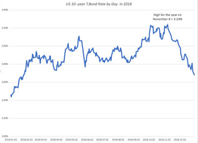
At the start of the year, I had argued that there was a good chance that the 10-year T. Bond would hit 3.5% over the course of the year, but after reaching 3.24% on November 8, the rate dropped back in the last quarter, to end the year at 2.69%.
Returns on T. Bonds and Historical PremiumsIf you bought ten-year treasury bonds on January 1, 2018, the rise in the T.Bond rate translated into a price drop of 2.43%, effectively wiping out the coupon you would have earned and resulting in a return for the year of -0.02%. The consolation price is that you would have still done better than investing in US stocks over the year and generating a return of -4.23%. Updating the historical numbers for the United States, here is the updated score on what US stocks have earned, relative to T.Bonds and T.Bills over time: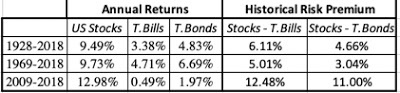 Download historical annual returnsThere is no denying that historically stocks have delivered higher returns that treasuries, but as we saw in the last quarter this year, it is compensation for the risk that you face.
The Yield Curve FlattensThe big story over the course of the year was the flattening of the yield curve, with short term rates rising over the course of the year; the 3-month T.Bill rate rose from 1.44% on January 1, 2018 to 2.45%on December 31, 2018 and the 2-year US treasury bond rate rose from 1.92% on January 1, 2018 to 2.42% on December 31, 2018. The yield curve flattening is shown in the graph below: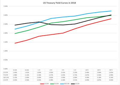
By December, a portion of the yield curve inverted, with 5-year rates dropping below 2-year and 3-year rates, leading to a flood of stories about inverted yield curves predicting recessions. I did post on this question a few weeks ago, and while I will not rehash my arguments, I noted that the slope of the yield curve and economic growth are only loosely connected.
The TIPs Rate and InflationFinally, I looked at the rate on the inflation protected 10-year US treasury bond over the course of the year, in relation to the US 10-year bond.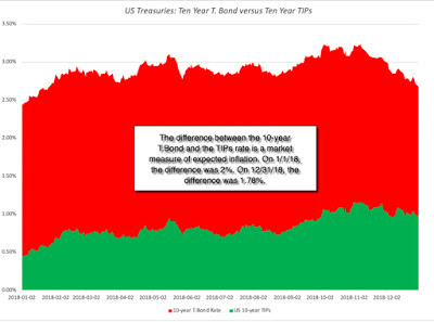
Note that the difference between these 10-year T.Bond rate and the 10-year TIPs rate is a market measure of expected inflation over the next ten years. Over the course of 2018, the "expected inflation" rate has stayed within a fairly tight bound, ranging from a low of 1.70% to a high of 2.18%. In fact, if the return on inflation was on investor minds, the memo seems to have not reached this part of the bond market, with expected inflation decreasing over the course of the year.
What now?At the start of last year, when investors were expecting much stronger growth in the economy and had just seen a drop in corporate tax rates, the debate was about how much the US treasury bond rate would climb over the course of 2018. As we saw in the section above, the 10-year US treasury bond rate did rise, but only moderately so, perhaps because there was a dampening of optimism about future growth in the last quarter. That said, the Federal Reserve and its chair, Jerome Powell, are still the focus of attention for some investors, obsessed with what the central bank will or will not do next year.
Intrinsic Riskfree RatesAs some of you have read this blog know well, I am skeptical about how much power the Fed has to move interest rates, especially at the long end of the spectrum, and the economy. To get perspective on the level and direction of long term interest rates, I find it more useful to construct what I call an intrinsic risk free rate by adding together the inflation rate and real GDP growth rate each year. The figure below provides the long term comparison of the actual treasury bond rate and the intrinsic version of it:
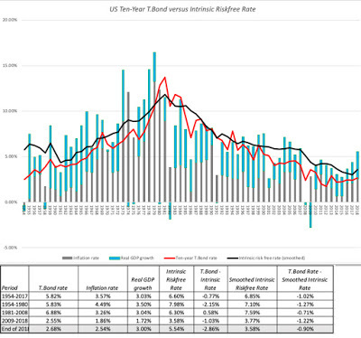 Download raw dataThere are two versions of the intrinsic risk free rate that I report, one using just the current year;'s inflation and real growth and one using a ten-year average of inflation and real GDP growth, which I will termed the smoothed intrinsic risk free rate. This graph explains the main reasons why interest rates dropped after 2008, very low inflation and anemic growth. As growth and inflation have picked up in the last two years, the treasury bond rate has stayed stubbornly low, and for those who blame the Fed for almost everything that happens, this was a period during which the Fed was raising the Fed Funds rate, the only interest rate it directly controls, and scaling back on quantitative easing. At the end of 2018, the treasury bond rate (2.68%) lagged the contemporaneous intrinsic risk free rate (5.54%) by 2.86% and the smoothed rate (3.58%) by 0.90%.
Reading the Tea LeavesWhat does this all mean? I am no bond market soothsayer, but I see two possible explanations. One is that the bond market is right and that expected growth in the next few years will drop dramatically. The other is that bond market investors are being much too pessimistic about future growth, and that rates will rise as the realization hits them. I believe that the truth falls in the middle. Nominal growth in the US economy will drop off from its 2018 levels, but not to the levels imputed by the bond market today, and treasury bond rates will rise to reflect that reality. In the absence of a crystal ball, I will hazard a guess that the US 10-year treasury bond rate will rise to 3.5%, the smoothed out intrinsic rate, by the end of the year, and that GDP growth will drop by a percent (in nominal and real terms) from 2018 levels. As with all my macroeconomics predictions, this comes with a money back guarantee, which explains why I do this for free.
The US Corporate Bond MarketIf the government bond rate offers signals about future inflation and expected growth in the economy, the corporate bond market sends its own messages about the economy, and specifically about risk and its price. In particular, the spread between a US $ corporate bond and the US Treasury bond of equivalent maturity is the price of risk in the bond market. To see how this measure moved over the course of the year, I looked at the yields on a Aaa. Baa and Can 10-year corporate bonds (Moody's) relative to the US 10-year treasury bond over the course of the year: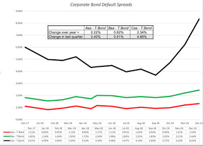
As with the equity risk premium, default spreads widened over the course of the year for all bond ratings classes, but more so for the lower ratings. Also, similar to the pattern in equity markets, all of the widening in the equity risk premium happened in the last quarter of 2018. In fact, the intraday volatility of default spreads increased in October, mirroring what was happening in the equity market. In a later update, I will be looking at country risk, using sovereign default spreads as one measure of that risk. These default spreads also widened in 2018, setting the stage for higher country risk premiums. All in all, 2018 saw the price of risk go up in both the equity and debt markets, and not surprisingly, companies will see higher costs of capital as a consequence.
Bottom LineFor the most part, the bond and stock markets were singing from the same song book this year. Both markets started the year, expecting continued strength in the economy, but both became less upbeat about economic prospects towards the end of the year. For stock markets, this translated into expectations of lower earnings growth and stock prices, and for bond markets, its showed up as lower treasury bond rates and higher default spreads. Investors in both markets became more wary about risk and demanded higher prices for taking risk, with higher equity risk premiums in the stock market and higher default spreads in the bond market.
YouTube Video
DatasetsHistorical Returns on Stocks, T. Bonds and T.Bills - 1928 to 2018T. Bond Rates, Inflation and Real Growth - 1953 to 2018Corporate Bond Default Spreads - Start of 2019
The US Treasury MarketThe place to start any assessment of interest rates is the US treasury market, with it range of offerings, both in terms of maturity (from 1 month to 30 year) and form (nominal and real). When valuing equities on an intrinsic value basis, it is the long term US treasury that is your opportunity cost (since your cash flows on equity are also long term in intrinsic value) and the ten-year US treasury bond rate is my input. (The 30-year US treasury may actually be better suited to equities, from a maturity perspective, but has less reliable history, more illiquid and subject to behaving in strange ways). The path of the US 10-year T. Bond on a daily basis is captured in the graph below:

At the start of the year, I had argued that there was a good chance that the 10-year T. Bond would hit 3.5% over the course of the year, but after reaching 3.24% on November 8, the rate dropped back in the last quarter, to end the year at 2.69%.
Returns on T. Bonds and Historical PremiumsIf you bought ten-year treasury bonds on January 1, 2018, the rise in the T.Bond rate translated into a price drop of 2.43%, effectively wiping out the coupon you would have earned and resulting in a return for the year of -0.02%. The consolation price is that you would have still done better than investing in US stocks over the year and generating a return of -4.23%. Updating the historical numbers for the United States, here is the updated score on what US stocks have earned, relative to T.Bonds and T.Bills over time:
 Download historical annual returnsThere is no denying that historically stocks have delivered higher returns that treasuries, but as we saw in the last quarter this year, it is compensation for the risk that you face.
 The Yield Curve FlattensThe big story over the course of the year was the flattening of the yield curve, with short term rates rising over the course of the year; the 3-month T.Bill rate rose from 1.44% on January 1, 2018 to 2.45%on December 31, 2018 and the 2-year US treasury bond rate rose from 1.92% on January 1, 2018 to 2.42% on December 31, 2018. The yield curve flattening is shown in the graph below:
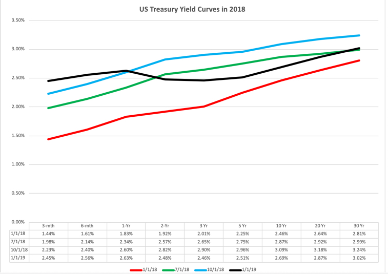
By December, a portion of the yield curve inverted, with 5-year rates dropping below 2-year and 3-year rates, leading to a flood of stories about inverted yield curves predicting recessions. I did post on this question a few weeks ago, and while I will not rehash my arguments, I noted that the slope of the yield curve and economic growth are only loosely connected.
The TIPs Rate and InflationFinally, I looked at the rate on the inflation protected 10-year US treasury bond over the course of the year, in relation to the US 10-year bond.
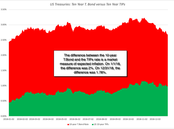
Note that the difference between these 10-year T.Bond rate and the 10-year TIPs rate is a market measure of expected inflation over the next ten years. Over the course of 2018, the "expected inflation" rate has stayed within a fairly tight bound, ranging from a low of 1.70% to a high of 2.18%. In fact, if the return on inflation was on investor minds, the memo seems to have not reached this part of the bond market, with expected inflation decreasing over the course of the year.
What now?At the start of last year, when investors were expecting much stronger growth in the economy and had just seen a drop in corporate tax rates, the debate was about how much the US treasury bond rate would climb over the course of 2018. As we saw in the section above, the 10-year US treasury bond rate did rise, but only moderately so, perhaps because there was a dampening of optimism about future growth in the last quarter. That said, the Federal Reserve and its chair, Jerome Powell, are still the focus of attention for some investors, obsessed with what the central bank will or will not do next year.
Intrinsic Riskfree RatesAs some of you have read this blog know well, I am skeptical about how much power the Fed has to move interest rates, especially at the long end of the spectrum, and the economy. To get perspective on the level and direction of long term interest rates, I find it more useful to construct what I call an intrinsic risk free rate by adding together the inflation rate and real GDP growth rate each year. The figure below provides the long term comparison of the actual treasury bond rate and the intrinsic version of it:
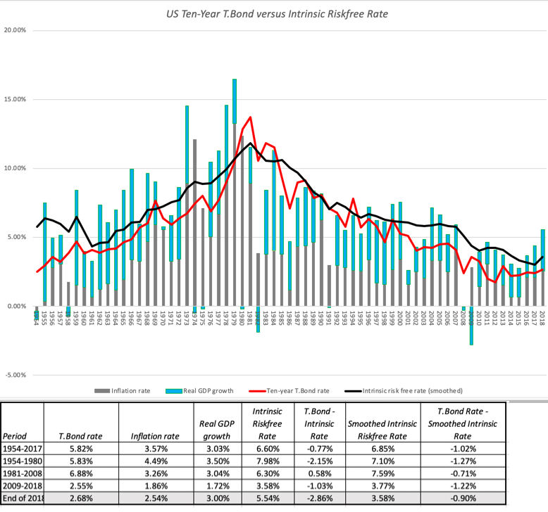 Download raw dataThere are two versions of the intrinsic risk free rate that I report, one using just the current year;'s inflation and real growth and one using a ten-year average of inflation and real GDP growth, which I will termed the smoothed intrinsic risk free rate. This graph explains the main reasons why interest rates dropped after 2008, very low inflation and anemic growth. As growth and inflation have picked up in the last two years, the treasury bond rate has stayed stubbornly low, and for those who blame the Fed for almost everything that happens, this was a period during which the Fed was raising the Fed Funds rate, the only interest rate it directly controls, and scaling back on quantitative easing. At the end of 2018, the treasury bond rate (2.68%) lagged the contemporaneous intrinsic risk free rate (5.54%) by 2.86% and the smoothed rate (3.58%) by 0.90%.
Reading the Tea LeavesWhat does this all mean? I am no bond market soothsayer, but I see two possible explanations. One is that the bond market is right and that expected growth in the next few years will drop dramatically. The other is that bond market investors are being much too pessimistic about future growth, and that rates will rise as the realization hits them. I believe that the truth falls in the middle. Nominal growth in the US economy will drop off from its 2018 levels, but not to the levels imputed by the bond market today, and treasury bond rates will rise to reflect that reality. In the absence of a crystal ball, I will hazard a guess that the US 10-year treasury bond rate will rise to 3.5%, the smoothed out intrinsic rate, by the end of the year, and that GDP growth will drop by a percent (in nominal and real terms) from 2018 levels. As with all my macroeconomics predictions, this comes with a money back guarantee, which explains why I do this for free.
The US Corporate Bond MarketIf the government bond rate offers signals about future inflation and expected growth in the economy, the corporate bond market sends its own messages about the economy, and specifically about risk and its price. In particular, the spread between a US $ corporate bond and the US Treasury bond of equivalent maturity is the price of risk in the bond market. To see how this measure moved over the course of the year, I looked at the yields on a Aaa. Baa and Can 10-year corporate bonds (Moody's) relative to the US 10-year treasury bond over the course of the year:
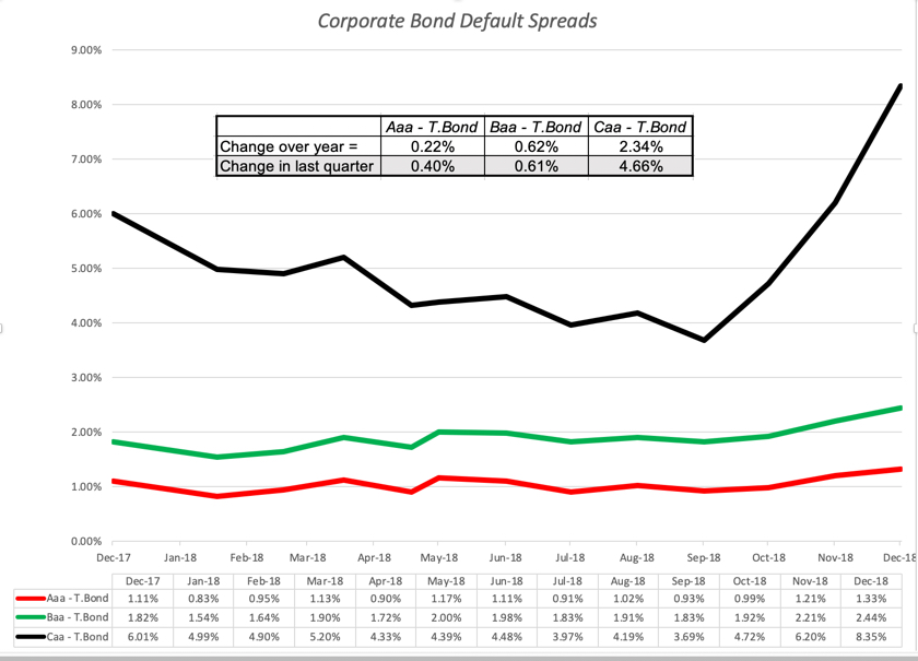
As with the equity risk premium, default spreads widened over the course of the year for all bond ratings classes, but more so for the lower ratings. Also, similar to the pattern in equity markets, all of the widening in the equity risk premium happened in the last quarter of 2018. In fact, the intraday volatility of default spreads increased in October, mirroring what was happening in the equity market. In a later update, I will be looking at country risk, using sovereign default spreads as one measure of that risk. These default spreads also widened in 2018, setting the stage for higher country risk premiums. All in all, 2018 saw the price of risk go up in both the equity and debt markets, and not surprisingly, companies will see higher costs of capital as a consequence.
Bottom LineFor the most part, the bond and stock markets were singing from the same song book this year. Both markets started the year, expecting continued strength in the economy, but both became less upbeat about economic prospects towards the end of the year. For stock markets, this translated into expectations of lower earnings growth and stock prices, and for bond markets, its showed up as lower treasury bond rates and higher default spreads. Investors in both markets became more wary about risk and demanded higher prices for taking risk, with higher equity risk premiums in the stock market and higher default spreads in the bond market.
YouTube Video
DatasetsHistorical Returns on Stocks, T. Bonds and T.Bills - 1928 to 2018T. Bond Rates, Inflation and Real Growth - 1953 to 2018Corporate Bond Default Spreads - Start of 2019
January 2, 2019
January 2019 Data Update 1: A reminder that equities are risky, in case you forgot!
In bull markets, investors, both professional and amateur, often pay lip service to the notion of risk, but blithely ignore its relevance in both asset allocation and stock selection, convinced that every dip in stock prices is a buying opportunity, and soothed by bromides that stocks always win in the long term. It is therefore healthy, albeit painful, to be reminded that the risk in stocks is real, and that there is a reason why investors earn a premium for investing in equities, as opposed to safer investments, and that is the message that markets around the world delivered in the last quarter of 2018.
A Look Back at 2018The stock market started 2018 on a roll, having posted nine consecutive up years, making the crisis of 2008 seem like a distant memory. True to form, stocks rose in January, led by the FAANG (Facebook, Amazon, Apple, Netflix and Google) stocks and momentum investors celebrated. The first wake up call of the year came in February, first as the market responded negatively to macroeconomic reports of higher inflation, and then as Facebook and Google stumbled from self-inflicted wounds.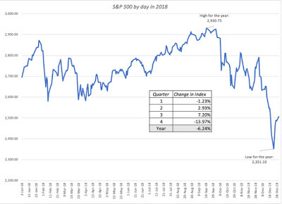
The market shook off its tech blues by the end of March and continued to rise through the summer, with the S&P 500 peaking for the year at 2931 on September 20, 2018. For the many investors who were already counting their winnings for the year, the last quarter of 2018 was a shock, as volatility returned to the market with a vengeance. In October, the S&P 500 dropped by 6.94%, though it felt far worse because of the day-to-day and intraday price swings. In November, the S&P 500 was flat, but volatility continued unabated. In December, US equities finally succumbed to selling pressures, as a sharp selloff pushed stocks close to the "bear market" threshold, before recovering a little towards the end of the year.
Over the course of the year, every major US equity index took a hit, but the variation across the indices was modest.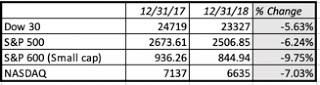 The ranking of returns, with the S&P 600 and the NASDAQ doing worse than the Dow or the SD&P 500 is what you would expect in any down market. With dividends incorporated, the return on the S&P 500 was -4.23%, the first down market in a decade, but only a modestly bad year by historical standards:
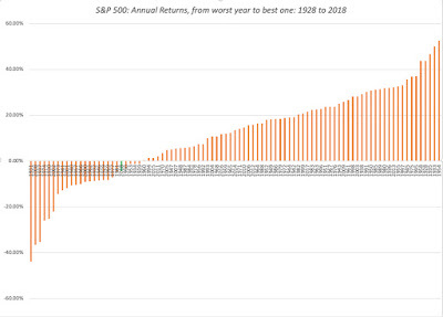
I know that this is small consolation, if you lost money last year, but looking at annual returns on stocks in the last 90 years, there have been twenty years with more negative returns. In short, it was a bad year for stocks, but it felt far worse for three reasons. First, after nine good years for the market, investors were lulled into a false sense of complacency about the capacity of stocks to keep delivering positive returns. Second, the negative returns were all in the last quarter of the year, making the hit seem larger (from the highs of September 2018) and more immediate. Third, the intraday and day-to-day volatility exacerbated the fear factor, and those investors who reacted by trading faced far larger losses.
The Equity Risk PremiumIf you have been a reader of this blog, you know that my favorite device for disentangling the mysteries of the market is the implied equity risk premium, an estimate of the price that investors are demanding for the risk of investing in equities. I back this number out from the current market prices and expected future cash flows, an IRR for equities that is analogous to the yield to maturity on a bond: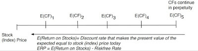
As with any measure of the market, it requires estimates for the future (expected cash flows and growth rates), but it is not only forward looking and dynamic (changing as the market moves), but also surprisingly robust and comprehensive in its coverage of fundamentals.
At the start of 2018, I estimated the equity risk premium, using the index at that point in time (2673.61), the 10-year treasury bond rate on that day (2.41%) and the growth rate that analysts were projecting for earnings for the index (7.09%).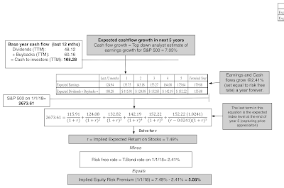 The equity risk premium on January 1, 2018 was 5.09%. As we moved through the year, I computed the equity risk premium at the start of each month, adjusting cash flows on a quarterly basis (which is about as frequently as S&P does it) and using the index level and ten-year T.Bond rate at the start of each month:
While the conventional wisdom about equity risk premiums is the they do not change much on a day to day basis in developed markets, that has not been true since 2008. In 2018, there were two periods, the first week of February and the month of October, where volatility peaked on an intraday basis, and I computed the ERP by day, during the first week of February, and all through October:
During October, for instance, the equity risk premium moved from 5.38% at the start of the month to 5.76% by the end of the month, with wide swings during the course of the month.
After a brutal December, where stocks dropped more than 9% partly on the recognition that global economic growth may slacken faster than expected, I recomputed the equity risk premium at the start of 2019: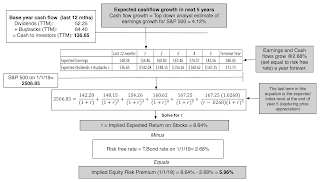
The equity risk premium has increased to 5.96%, but a closer look at the differences between the inputs at the start and end of the year indicates how investor perspectives have shifted over the course of the year: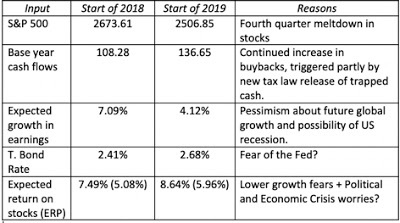
Going into 2019, investors are clearly less upbeat than they were in 2018 about future growth and more worried about future crises, but companies are continuing to return cash at a pace that exceeds expectations.
What now?I know that you are looking for a bottom line here on whether the numbers are aligned for a good or a bad year for stocks, and I will disappoint you up front by admitting that I am a terrible market timer. As an intrinsic value investor, the only market-related question that I ask is whether I find the current price of risk (the implied ERP) to be an acceptable one; if it is too low for my tastes, I would shift away from stocks, and if it is too high, shift more into them. To gain perspective, I graphed the implied ERP from 1960 through 2018 below: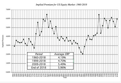
At its current level of 5.96%, the equity risk premium is in the top decile of historical numbers, exceeded only by the equity risk premiums in three other years, 1979, 2009 and 2011. Viewed purely on that basis, the equity market is more under valued than over valued right now.
I am fully aware of the dangers that lurk and how they could quickly change my assessment and they can show up in one or more of the inputs:
Recession and lower growth: While there was almost no talk about a possible recession either globally or in the US, at the start of 2018, some analysts, albeit a minority, are raising the possibility that the economy would slow down enough to push it into recession, at the start of 2019. While the lower earnings growth used in the 2019 computation already incorporates some of this worry, a recession would make even the lower number optimistic. In the table below, I have estimated the effect on the equity risk premium of lower growth, and note that even with a compounded growth rate of -3% a year for the next five years, the ERP stays above the historical average of 4.19%.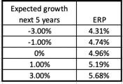 Higher interest rates: The fear of the Fed has roiled markets for much of the last decade, and while it has played out as higher short term interest rates for the last two years, the ten-year bond rate, after a surge over 3% in 2018, is now back to 2.68%. There is the possibility that higher inflation and economic growth rate can push this number higher, but it is difficult to see how this would happen if recession fears pan out. In fact, as I noted in this post from earlier in the year, higher interest rates, if the trigger is higher real growth (and not higher inflation), could be a positive for stocks, not a negative.Pullback on cash flows: US companies have been returning huge amounts of cash in the form of stock buybacks and dividends. In 2018, for instance, dividends and buybacks amounted to 92% of aggregate earnings, higher than the 84.60% paid out, on average, between 2009 and 2018, but still lower than the numbers in excess of 100% posted in 2015 and 2016. Assuming that the payout will adjust over time to 85.07%, reflecting expected long term growth, lowers the ERP to 5.55%, still well above historical levels.Political and Economic Crises: The trade war and the Brexit mess will play out this year and each has the potential to scare markets enough to justify the higher ERP that we are observing. In addition, it goes without saying that there will be at least a crisis or two that are not on the radar right now that will hit markets, an unwanted side effect of globalization.
Looking at how the equity risk premium will be affected by each of these variables, I think that the market has priced in already for shocks on at least two of these variables, in the form of lower growth and political/economic crises, and can withstand fairly significant bad news on the other two.
Bottom LineI have long argued that it is better to be transparently wrong than opaquely right, when making investment forecasts. In keeping with my own advice, I believe that stocks are more likely to go up in 2019, than down, given the information that I have now. That said, if I am wrong, it will be because I have under estimated how much economic growth will slow in the coming year and the magnitude of economic crises. Odds are that I will see the tell tale signs too late to protect myself fully against any resulting market corrections, but that is not my game anyway.
YouTube Video
DatasetsHistorical Returns on Stocks, Bonds and Bills - 1928 to 2018Historical Implied Equity Risk Premiums for US - 1960 to 2018SpreadsheetsImplied ERP for January 1, 2019Data Updates for 2018January 2019 Data Update 1: A Reminder that Equities are risky, in case you forgotJanuary 2019 Data Update 2: Fed Up? The Interest Rate StoryJanuary 2019 Data Update 3: A Big Picture Perspective January 2019 Data Update 4: Currency Crisis, with a nod to the Cryptos!January 2019 Data Update 5: Country Risk - The 2019 versionJanuary 2019 Data Update 6: The Cost of CapitalJanuary 2019 Data Update 7: Corporate Investing- The Good, the Bad and the Indifferent January 2019 Data Update 8: Debt and TaxesJanuary 2019 Data Update 9: The Return of Cash (Dividends and Buybacks)January 2019 Data Update 10: The Pricing Game
A Look Back at 2018The stock market started 2018 on a roll, having posted nine consecutive up years, making the crisis of 2008 seem like a distant memory. True to form, stocks rose in January, led by the FAANG (Facebook, Amazon, Apple, Netflix and Google) stocks and momentum investors celebrated. The first wake up call of the year came in February, first as the market responded negatively to macroeconomic reports of higher inflation, and then as Facebook and Google stumbled from self-inflicted wounds.

The market shook off its tech blues by the end of March and continued to rise through the summer, with the S&P 500 peaking for the year at 2931 on September 20, 2018. For the many investors who were already counting their winnings for the year, the last quarter of 2018 was a shock, as volatility returned to the market with a vengeance. In October, the S&P 500 dropped by 6.94%, though it felt far worse because of the day-to-day and intraday price swings. In November, the S&P 500 was flat, but volatility continued unabated. In December, US equities finally succumbed to selling pressures, as a sharp selloff pushed stocks close to the "bear market" threshold, before recovering a little towards the end of the year.
Over the course of the year, every major US equity index took a hit, but the variation across the indices was modest.
 The ranking of returns, with the S&P 600 and the NASDAQ doing worse than the Dow or the SD&P 500 is what you would expect in any down market. With dividends incorporated, the return on the S&P 500 was -4.23%, the first down market in a decade, but only a modestly bad year by historical standards:

I know that this is small consolation, if you lost money last year, but looking at annual returns on stocks in the last 90 years, there have been twenty years with more negative returns. In short, it was a bad year for stocks, but it felt far worse for three reasons. First, after nine good years for the market, investors were lulled into a false sense of complacency about the capacity of stocks to keep delivering positive returns. Second, the negative returns were all in the last quarter of the year, making the hit seem larger (from the highs of September 2018) and more immediate. Third, the intraday and day-to-day volatility exacerbated the fear factor, and those investors who reacted by trading faced far larger losses.
The Equity Risk PremiumIf you have been a reader of this blog, you know that my favorite device for disentangling the mysteries of the market is the implied equity risk premium, an estimate of the price that investors are demanding for the risk of investing in equities. I back this number out from the current market prices and expected future cash flows, an IRR for equities that is analogous to the yield to maturity on a bond:

As with any measure of the market, it requires estimates for the future (expected cash flows and growth rates), but it is not only forward looking and dynamic (changing as the market moves), but also surprisingly robust and comprehensive in its coverage of fundamentals.
At the start of 2018, I estimated the equity risk premium, using the index at that point in time (2673.61), the 10-year treasury bond rate on that day (2.41%) and the growth rate that analysts were projecting for earnings for the index (7.09%).
 The equity risk premium on January 1, 2018 was 5.09%. As we moved through the year, I computed the equity risk premium at the start of each month, adjusting cash flows on a quarterly basis (which is about as frequently as S&P does it) and using the index level and ten-year T.Bond rate at the start of each month:
While the conventional wisdom about equity risk premiums is the they do not change much on a day to day basis in developed markets, that has not been true since 2008. In 2018, there were two periods, the first week of February and the month of October, where volatility peaked on an intraday basis, and I computed the ERP by day, during the first week of February, and all through October:

During October, for instance, the equity risk premium moved from 5.38% at the start of the month to 5.76% by the end of the month, with wide swings during the course of the month.
After a brutal December, where stocks dropped more than 9% partly on the recognition that global economic growth may slacken faster than expected, I recomputed the equity risk premium at the start of 2019:

The equity risk premium has increased to 5.96%, but a closer look at the differences between the inputs at the start and end of the year indicates how investor perspectives have shifted over the course of the year:

Going into 2019, investors are clearly less upbeat than they were in 2018 about future growth and more worried about future crises, but companies are continuing to return cash at a pace that exceeds expectations.
What now?I know that you are looking for a bottom line here on whether the numbers are aligned for a good or a bad year for stocks, and I will disappoint you up front by admitting that I am a terrible market timer. As an intrinsic value investor, the only market-related question that I ask is whether I find the current price of risk (the implied ERP) to be an acceptable one; if it is too low for my tastes, I would shift away from stocks, and if it is too high, shift more into them. To gain perspective, I graphed the implied ERP from 1960 through 2018 below:

At its current level of 5.96%, the equity risk premium is in the top decile of historical numbers, exceeded only by the equity risk premiums in three other years, 1979, 2009 and 2011. Viewed purely on that basis, the equity market is more under valued than over valued right now.
I am fully aware of the dangers that lurk and how they could quickly change my assessment and they can show up in one or more of the inputs:
Recession and lower growth: While there was almost no talk about a possible recession either globally or in the US, at the start of 2018, some analysts, albeit a minority, are raising the possibility that the economy would slow down enough to push it into recession, at the start of 2019. While the lower earnings growth used in the 2019 computation already incorporates some of this worry, a recession would make even the lower number optimistic. In the table below, I have estimated the effect on the equity risk premium of lower growth, and note that even with a compounded growth rate of -3% a year for the next five years, the ERP stays above the historical average of 4.19%.
 Higher interest rates: The fear of the Fed has roiled markets for much of the last decade, and while it has played out as higher short term interest rates for the last two years, the ten-year bond rate, after a surge over 3% in 2018, is now back to 2.68%. There is the possibility that higher inflation and economic growth rate can push this number higher, but it is difficult to see how this would happen if recession fears pan out. In fact, as I noted in this post from earlier in the year, higher interest rates, if the trigger is higher real growth (and not higher inflation), could be a positive for stocks, not a negative.Pullback on cash flows: US companies have been returning huge amounts of cash in the form of stock buybacks and dividends. In 2018, for instance, dividends and buybacks amounted to 92% of aggregate earnings, higher than the 84.60% paid out, on average, between 2009 and 2018, but still lower than the numbers in excess of 100% posted in 2015 and 2016. Assuming that the payout will adjust over time to 85.07%, reflecting expected long term growth, lowers the ERP to 5.55%, still well above historical levels.Political and Economic Crises: The trade war and the Brexit mess will play out this year and each has the potential to scare markets enough to justify the higher ERP that we are observing. In addition, it goes without saying that there will be at least a crisis or two that are not on the radar right now that will hit markets, an unwanted side effect of globalization.
 Looking at how the equity risk premium will be affected by each of these variables, I think that the market has priced in already for shocks on at least two of these variables, in the form of lower growth and political/economic crises, and can withstand fairly significant bad news on the other two.
Bottom LineI have long argued that it is better to be transparently wrong than opaquely right, when making investment forecasts. In keeping with my own advice, I believe that stocks are more likely to go up in 2019, than down, given the information that I have now. That said, if I am wrong, it will be because I have under estimated how much economic growth will slow in the coming year and the magnitude of economic crises. Odds are that I will see the tell tale signs too late to protect myself fully against any resulting market corrections, but that is not my game anyway.
YouTube Video
DatasetsHistorical Returns on Stocks, Bonds and Bills - 1928 to 2018Historical Implied Equity Risk Premiums for US - 1960 to 2018SpreadsheetsImplied ERP for January 1, 2019Data Updates for 2018January 2019 Data Update 1: A Reminder that Equities are risky, in case you forgotJanuary 2019 Data Update 2: Fed Up? The Interest Rate StoryJanuary 2019 Data Update 3: A Big Picture Perspective January 2019 Data Update 4: Currency Crisis, with a nod to the Cryptos!January 2019 Data Update 5: Country Risk - The 2019 versionJanuary 2019 Data Update 6: The Cost of CapitalJanuary 2019 Data Update 7: Corporate Investing- The Good, the Bad and the Indifferent January 2019 Data Update 8: Debt and TaxesJanuary 2019 Data Update 9: The Return of Cash (Dividends and Buybacks)January 2019 Data Update 10: The Pricing Game
December 7, 2018
Is there a signal in the noise? Yield Curves, Economic Growth and Stock Prices!
The title of this post is not original and draws from Nate Silver's book on why so many predictions in politics, sports and economics fail. It reflects the skepticism with which I view many 'can't fail" predictors of economic growth or stock markets, since they tend to have horrendous track records. Over the last few weeks, as markets have gyrated, market commentators have been hard pressed to explain day-to-day swings, but that has not stopped them from trying. The explanations have shifted and morphed, often in contradictory ways, but few of them have had staying power. On Tuesday (December 4), as the Dow dropped 800 points, following a 300-point up day on Monday, the experts found a new reason for the market drop, in the yield curve, with an "inverted yield curve", or at least a portion of one, predicting an imminent recession. As with all market rules of thumb, there is some basis for the rule, but there are shades of gray that can be seen only by looking at all of the data.
Yield Curves over timeThe yield curve is a simple device, plotting yields across bonds with different maturities for a given issuing entity. US treasuries, historically viewed as close to default free, provide the cleanest measure of the yield curve, and the graph below compares the US treasury yield curve at the start of every year from 2009 to 2018, i.e., the post-crisis years: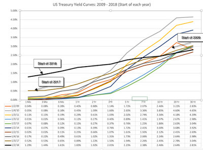 Treasury.gov: Daily Treasury yield curveThe yield curve has been upward sloping, with yields on longer term maturities higher than yields on short term maturities, every year, but it has flattened out the last two years. On December 4, 2018, the yields on treasuries of different maturities were as follows:
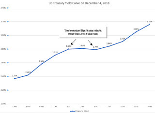 Treasury.gov: Daily Treasury yield curveThe market freak out is in the highlighted portion, with 5-year rates being lower (by 0.01-0.02%) than 2-year or 3-year rates, creating an inverted portion of the yield curve.
Yield Curves and Economic Growth: IntuitionTo understand yield curves, let's start with a simple economic proposition. Embedded in every treasury rate are expectations of expected inflation and expected real real interest rates, and the latter
Interest Rate = Expected Inflation Rate + Expected Real Interest RateOver much of the last century, the US treasury yield curve has been upward sloping, and the standard economic rationalization for it is a simple one. In a market where expectations of inflation are similar for the short term and the long term, investors will demand a "maturity premium" (or a higher real interest rate) for buying longer term bonds, thus causing the upward tilt in the yield curve. That said, there have been periods where the yield curve slopes downwards, and to understand why this may have a link with future economic growth, let's focus on the mechanics of yield curve inversions. Almost every single yield curve inversion historically, in the US, has come from the short end of the curve rising significantly, not a big drop in long term rates. Digging deeper, in almost every single instance of this occurring, short term rates have risen because central banks have hit the brakes on money, either in response to higher inflation or an overheated economy. You can see this in the chart below, where the Fed Funds rate (the Fed's primary mechanism for signaling tight or loose money) is graphed with the 3 month, 2 year and 10 year rates:
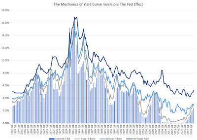 Interest Rate Raw DataAs you can see in this graph, the rises in short term rates that give rise to each of the inverted yield curve episodes are accompanied by increases in the Fed Funds rate. To the extent that the Fed's monetary policy action (of raising the Fed funds rate) accomplishes its objective of slowing down growth, the yield slope metric becomes a stand-in for the Fed effect on the economy, with a more positive slope associated with easier monetary policy. You may or may not find any of these hypotheses to be convincing, but the proof is in the pudding, and the graph below, excerpted from a recent Fed study, seems to indicate that there has been a Fed effect in the US economy, and that the slope of the yield curve has operated as proxy for that effect:
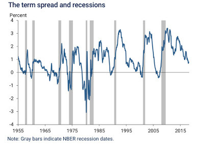 Federal Reserve of San FranciscoThe track record of the inverted yield curve as a predictor of recessions is impressive, since it has preceded the last eight recessions, with only only one false signal in the mid-sixties. If this graph holds, and December 4 was the opening salvo in a full fledged yield curve invasion, the US economy is headed into rough waters in the next year.
Yield Curves and Economic Growth: The DataThe fact that every inversion in the last few decades has been followed by a recession will strike fear into the hearts of investors, but is it that fool proof a predictor? Perhaps, but given that the yield curve slope metrics and economic growth are continuous, not discrete, variables, a more complete assessment of the yield curve's predictive power for the economy would require that we look at the strength of the link between the slope of the yield curve (and not just whether it is inverted or not) and the level of economic growth (and not just whether it is positive or negative).
To begin this assessment, I looked at the rates on three-month and one-year T.Bills and the two, five and ten-year treasury bonds at the end of every quarter from 1962 through the third quarter of 2018: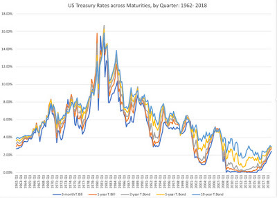 Interest Rate Raw DataFollowing up, I look at five yield curve metrics (1 year versus 3 month, 2 year versus 3 month, 5 year versus 2 year, 10 year versus 2 year and 10 year versus 3 month), on a quarterly basis from 1962 through 2018, with an updated number for December 4, 2018.
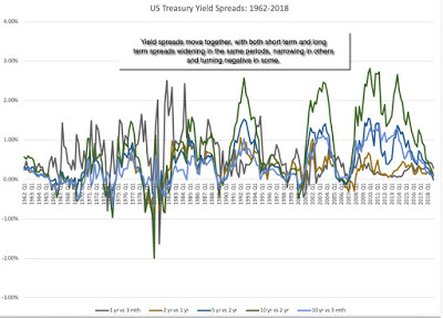 Interest Rate Raw DataFor the most part, the yield curve metrics move together, albeit at different rates. I picked four measures of the spread, one short term (1 year versus 3 month), one medium term (5 year versus 2 year) and two long term (10 year versus 2 year, 10 year versus 3 month) and plotted them against GDP growth in the next quarter and the year after.
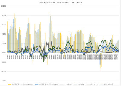 Interest Rate Raw DataThe graph does back up what the earlier Fed study showed, i.e., that negatively sloped yield curves have preceded recessions, but even a cursory glance indicates that the relationship is weak. Not only does there seem to be no relationship between how downwardly sloped the yield curve is and the depth of the recessions that follow, but in periods where the yield curve is flat or mildly positive, subsequent economic growth is unpredictable. To get a little more precision into the analysis, I computed the correlations between the different yield curve slope metrics and GDP growth:

Taking a closer look at the data, here is what I see;It is the short end that has predictive power for the economy: Over the entire time period (1962-2018), the slope of the short end of the yield curve is positively related with economic growth, with more upward sloping yield curves connected to higher economic growth in subsequent time periods. The slope at the long end of the yield curve, including the widely used differential between the 10-year and 2-year rate not only is close to uncorrelated with economic growth (the correlation is very mildly negative).Even that predictive power is muted: Over the entire time period, even for the most strongly linked metric (which is the 2 year versus 1 year), the correlation is only 29%, for GDP growth over the next year, suggesting that there is significant noise in the prediction. And 2008 may have been a structural break: Looking only at the last ten years, the relationship seems to have reversed sign, with flatter yield curves, even at the short end, associated with higher real growth. This may be a hangover from the slow economic growth in the years after the crisis, but it does raise red flags about using this indicator today.How do you reconcile these findings with both the conventional wisdom that inverted yield curves are negative indicators of future growth and the empirical evidence that almost every inversion is followed by a recession? It is possible that it is the moment of inversion that is significant, perhaps as a sign of the Fed's conviction, and that while the slope of the yield curve itself may not be predictive, that moment that the yield curve inverts remains a strong indicator.
Yield Curves and Stock ReturnsAs investors, your focus is often less on the economy, and more on stock prices. After all, strong economies don't always deliver superior stock returns, and weak ones can often be accompanied by strong market performance. From that perspective, the question becomes what the slope of the yield curve and inverted yield curves tell you about future stock returns, not economic growth. I begin the analysis by looking at yield curve metrics over time, graphed against return on US stocks in the next quarter and the next year: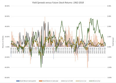 Interest Rate Raw DataIf you see a pattern here, you are a much better chart reader than I am. I therefore followed up the analysis by replicating the correlation table that I reported in the economic growth section, but looking at stock returns in subsequent periods, rather than real GDP growth:
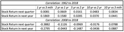 As with the economic growth numbers, if there is any predictive power in the yield curve slope, it is at the short end of the curve and not the long end. And as with the growth numbers, the post-2008 time period is a clear break from the overall numbers.
What does all of this mean for investors today? I think that we may be making two mistakes. One is to take a blip on a day (the inversion in the 2 and 5 year bonds on December 4) and read too much into it, as we are apt to do when we are confused or scared. It is true that a portion of the yield curve inverted, but if history is any guide, its predictive power for the economy is weak and for the market, even weaker. The other is that we are taking rules of thumb developed in the US in the last century and assuming that they still work in a vastly different economic environment.
Bottom LineThere is information in the stope of the US treasury yield curve, but I think that we need to use it with caution. In my view, the flattening of the yield curve in the last two years has been more good news than bad, an indication that we are coming out of the low growth mindset of the post-2008 crisis years. However, I also think that the stalling of the US 10-year treasury bond rate at 3% or less is sobering, a warning that investors are scaling back growth expectations for both the global and US economies, going into 2019. The key tests for stocks lie in whether they can not only sustain earnings growth, in the face of slower economic growth and without the tailwind of a tax cut (like they did last year), but also in whether they can continue to return cash at the rates that they have for the last few years.
YouTube Video
Data
Raw data on US treasury rates, GDP growth and Stock Returns
Yield Curves over timeThe yield curve is a simple device, plotting yields across bonds with different maturities for a given issuing entity. US treasuries, historically viewed as close to default free, provide the cleanest measure of the yield curve, and the graph below compares the US treasury yield curve at the start of every year from 2009 to 2018, i.e., the post-crisis years:
 Treasury.gov: Daily Treasury yield curveThe yield curve has been upward sloping, with yields on longer term maturities higher than yields on short term maturities, every year, but it has flattened out the last two years. On December 4, 2018, the yields on treasuries of different maturities were as follows:
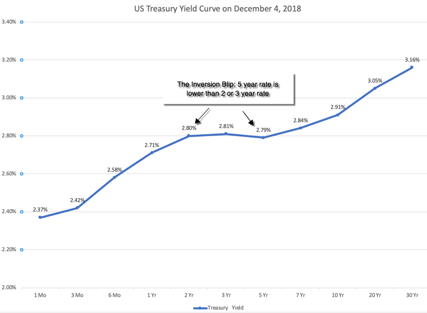 Treasury.gov: Daily Treasury yield curveThe market freak out is in the highlighted portion, with 5-year rates being lower (by 0.01-0.02%) than 2-year or 3-year rates, creating an inverted portion of the yield curve.
 Yield Curves and Economic Growth: IntuitionTo understand yield curves, let's start with a simple economic proposition. Embedded in every treasury rate are expectations of expected inflation and expected real real interest rates, and the latter
Interest Rate = Expected Inflation Rate + Expected Real Interest RateOver much of the last century, the US treasury yield curve has been upward sloping, and the standard economic rationalization for it is a simple one. In a market where expectations of inflation are similar for the short term and the long term, investors will demand a "maturity premium" (or a higher real interest rate) for buying longer term bonds, thus causing the upward tilt in the yield curve. That said, there have been periods where the yield curve slopes downwards, and to understand why this may have a link with future economic growth, let's focus on the mechanics of yield curve inversions. Almost every single yield curve inversion historically, in the US, has come from the short end of the curve rising significantly, not a big drop in long term rates. Digging deeper, in almost every single instance of this occurring, short term rates have risen because central banks have hit the brakes on money, either in response to higher inflation or an overheated economy. You can see this in the chart below, where the Fed Funds rate (the Fed's primary mechanism for signaling tight or loose money) is graphed with the 3 month, 2 year and 10 year rates:
 Interest Rate Raw DataAs you can see in this graph, the rises in short term rates that give rise to each of the inverted yield curve episodes are accompanied by increases in the Fed Funds rate. To the extent that the Fed's monetary policy action (of raising the Fed funds rate) accomplishes its objective of slowing down growth, the yield slope metric becomes a stand-in for the Fed effect on the economy, with a more positive slope associated with easier monetary policy. You may or may not find any of these hypotheses to be convincing, but the proof is in the pudding, and the graph below, excerpted from a recent Fed study, seems to indicate that there has been a Fed effect in the US economy, and that the slope of the yield curve has operated as proxy for that effect:
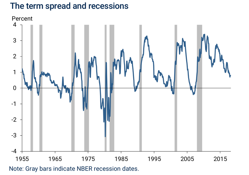 Federal Reserve of San FranciscoThe track record of the inverted yield curve as a predictor of recessions is impressive, since it has preceded the last eight recessions, with only only one false signal in the mid-sixties. If this graph holds, and December 4 was the opening salvo in a full fledged yield curve invasion, the US economy is headed into rough waters in the next year.
Yield Curves and Economic Growth: The DataThe fact that every inversion in the last few decades has been followed by a recession will strike fear into the hearts of investors, but is it that fool proof a predictor? Perhaps, but given that the yield curve slope metrics and economic growth are continuous, not discrete, variables, a more complete assessment of the yield curve's predictive power for the economy would require that we look at the strength of the link between the slope of the yield curve (and not just whether it is inverted or not) and the level of economic growth (and not just whether it is positive or negative).
To begin this assessment, I looked at the rates on three-month and one-year T.Bills and the two, five and ten-year treasury bonds at the end of every quarter from 1962 through the third quarter of 2018:
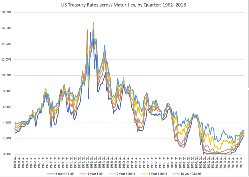 Interest Rate Raw DataFollowing up, I look at five yield curve metrics (1 year versus 3 month, 2 year versus 3 month, 5 year versus 2 year, 10 year versus 2 year and 10 year versus 3 month), on a quarterly basis from 1962 through 2018, with an updated number for December 4, 2018.
 Interest Rate Raw DataFor the most part, the yield curve metrics move together, albeit at different rates. I picked four measures of the spread, one short term (1 year versus 3 month), one medium term (5 year versus 2 year) and two long term (10 year versus 2 year, 10 year versus 3 month) and plotted them against GDP growth in the next quarter and the year after.
 Interest Rate Raw DataThe graph does back up what the earlier Fed study showed, i.e., that negatively sloped yield curves have preceded recessions, but even a cursory glance indicates that the relationship is weak. Not only does there seem to be no relationship between how downwardly sloped the yield curve is and the depth of the recessions that follow, but in periods where the yield curve is flat or mildly positive, subsequent economic growth is unpredictable. To get a little more precision into the analysis, I computed the correlations between the different yield curve slope metrics and GDP growth:
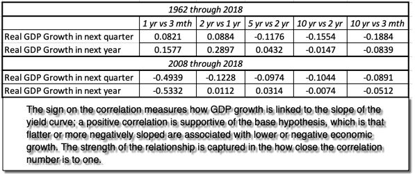
Taking a closer look at the data, here is what I see;It is the short end that has predictive power for the economy: Over the entire time period (1962-2018), the slope of the short end of the yield curve is positively related with economic growth, with more upward sloping yield curves connected to higher economic growth in subsequent time periods. The slope at the long end of the yield curve, including the widely used differential between the 10-year and 2-year rate not only is close to uncorrelated with economic growth (the correlation is very mildly negative).Even that predictive power is muted: Over the entire time period, even for the most strongly linked metric (which is the 2 year versus 1 year), the correlation is only 29%, for GDP growth over the next year, suggesting that there is significant noise in the prediction. And 2008 may have been a structural break: Looking only at the last ten years, the relationship seems to have reversed sign, with flatter yield curves, even at the short end, associated with higher real growth. This may be a hangover from the slow economic growth in the years after the crisis, but it does raise red flags about using this indicator today.How do you reconcile these findings with both the conventional wisdom that inverted yield curves are negative indicators of future growth and the empirical evidence that almost every inversion is followed by a recession? It is possible that it is the moment of inversion that is significant, perhaps as a sign of the Fed's conviction, and that while the slope of the yield curve itself may not be predictive, that moment that the yield curve inverts remains a strong indicator.
Yield Curves and Stock ReturnsAs investors, your focus is often less on the economy, and more on stock prices. After all, strong economies don't always deliver superior stock returns, and weak ones can often be accompanied by strong market performance. From that perspective, the question becomes what the slope of the yield curve and inverted yield curves tell you about future stock returns, not economic growth. I begin the analysis by looking at yield curve metrics over time, graphed against return on US stocks in the next quarter and the next year:
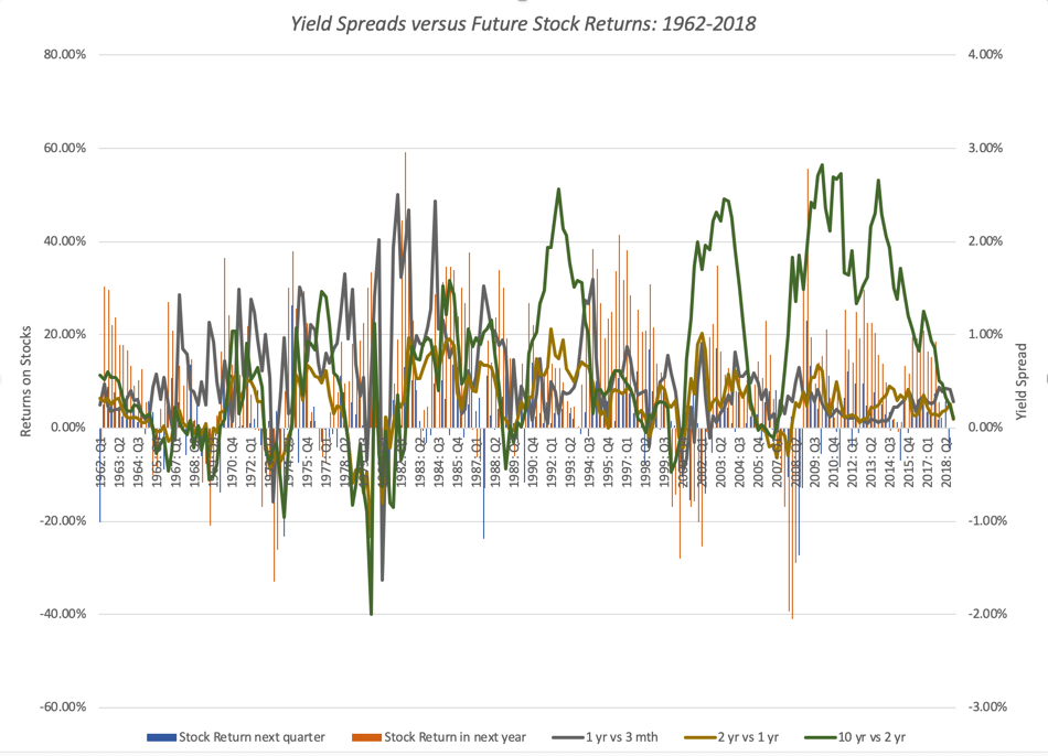 Interest Rate Raw DataIf you see a pattern here, you are a much better chart reader than I am. I therefore followed up the analysis by replicating the correlation table that I reported in the economic growth section, but looking at stock returns in subsequent periods, rather than real GDP growth:
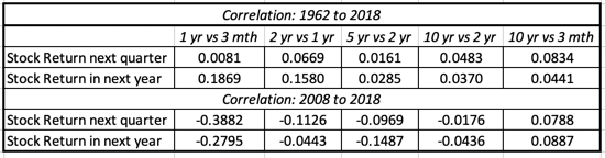 As with the economic growth numbers, if there is any predictive power in the yield curve slope, it is at the short end of the curve and not the long end. And as with the growth numbers, the post-2008 time period is a clear break from the overall numbers.
What does all of this mean for investors today? I think that we may be making two mistakes. One is to take a blip on a day (the inversion in the 2 and 5 year bonds on December 4) and read too much into it, as we are apt to do when we are confused or scared. It is true that a portion of the yield curve inverted, but if history is any guide, its predictive power for the economy is weak and for the market, even weaker. The other is that we are taking rules of thumb developed in the US in the last century and assuming that they still work in a vastly different economic environment.
Bottom LineThere is information in the stope of the US treasury yield curve, but I think that we need to use it with caution. In my view, the flattening of the yield curve in the last two years has been more good news than bad, an indication that we are coming out of the low growth mindset of the post-2008 crisis years. However, I also think that the stalling of the US 10-year treasury bond rate at 3% or less is sobering, a warning that investors are scaling back growth expectations for both the global and US economies, going into 2019. The key tests for stocks lie in whether they can not only sustain earnings growth, in the face of slower economic growth and without the tailwind of a tax cut (like they did last year), but also in whether they can continue to return cash at the rates that they have for the last few years.
YouTube Video
Data
Raw data on US treasury rates, GDP growth and Stock Returns
December 3, 2018
Investing Whiplash: Looking for Closure with Apple and Amazon!
In September, I took a look, in a series of posts, at two companies that had crested the trillion dollar market cap mark, Apple and Amazon, and concluded that series with a post where I argued that both companies were over valued. I also mentioned that I was selling short on both stocks, Amazon for the first time in 22 years of tracking the company, and Apple at a limit price of $230. Two months later, both stocks have taken serious hits in the market, down almost 25% apiece, and one of my short sales has been covered and the other is still looking profitable. It is always nice to have happy endings to my investment stories, but rather than use this as vindication of my valuation or timing skills, I will argue that I just got lucky in terms of timing. That said, given how much these stocks have dropped over the last two months, it is an opportunity to not just revisit my valuations and investment judgments, but also to draw some general lessons about intrinsic valuation and pricing.
My September Valuations: A Look BackIn September, I valued Apple and Amazon and arrived at a value per share of roughly $200 for Apple and $1255 for Amazon, well below their prevailing stock prices of $220 (Apple) and $1950 (Amazon). I was also open about the fact that my valuations reflected my stories for the companies, and that my assumptions were open for debate. In fact, I estimated value distributions for both companies and noted that not only did I face more uncertainty in my Amazon valuation, but also that there was a significant probability in both companies that my assessment (that the stocks were over valued) was wrong. I summarized my results in a table that I reproduce below: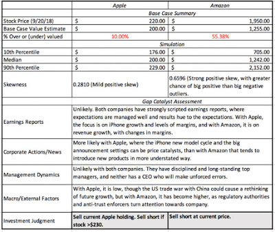 Apple Valuation & Amazon Valuation in September 2018I did follow through on my judgments, albeit with some trepidation, selling short on Amazon at the prevailing market price (about $195) and putting in a limit short sell at $230, which was fulfilled on October 3, as the stock opened above $230. With both stocks, I also put in open orders to cover my short sales at the 60th percentile of my value distributions, i.e., $205 at Apple and $1412 at Amazon, not expecting either to happen in the near term. (Why 60%? Read on...) Over the years, I have learned that investment stories and theses, no matter how well thought out and reasoned, don't always have happy endings, but this one did, and at a speed which I did not expect:
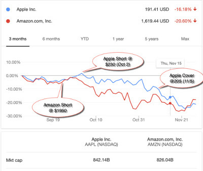 My Apple short sale which was initiated on October 3 was closed out on November 5 at $205, while Amazon got tantalizingly close to my trigger price for covering of $1412 (with a low of $1420 on November 20), before rebounding.
Intrinsic Value Lessons
Every investment, whether it is a winner or a loser, carries investment lessons, and here are mine from my AAPL/AMZN experiences, at least so far:Auto pilot rules to fight behavioral minefields: If you are wondering why I put in limit orders on both my Apple short sale and my covering trades on both stocks, it is because I know my weaknesses and left to my own biases, the havoc that they can wreak on my investment actions. I have never hidden the fact that I love Apple as a company and I was worried that if I did not put in my limit short sell order at $230, and the stock rose to that level, I would find a way to justify not doing it. For the limit buys to cover my short sales, I used the 60th percentile of the value distribution, because my trigger for buying a stock is that it be at least at the 40th percentile of its value distribution and to be consistent, my trigger for selling is set at the 60th percentile. It is my version of margin of safety, with the caveat being that for stocks like Amazon, where uncertainty abounds, this rule can translate into a much bigger percentage price difference than for a stock like Apple, where there is less uncertainty. (The price difference between the 60th and 90th percentile for Apple was just over 10%, whereas the price difference between those same percentiles was 35% for Amazon, in September 2018.)Intrinsic value changes over time: Among some value investors, there is a misplaced belief that intrinsic value is a timeless constant, and that it is the market that is subject to wild swings, driven by changes in mood and momentum. That is not true, since not only do the determinants of value (cash flows, growth and risk) change over time, but so does the price of risk (default spreads, equity risk premiums) in the market. The former occurs every time a company has a financial disclosure, which is one reason that I revalue companies just after earnings reports, or a major news story (acquisition, divestiture, new CEO), and the latter is driven by macro forces. That sounds abstract, but I can use Apple and Amazon to illustrate my point. Since my September valuations for both companies occurred after their most recent earnings reports, there have been no new financial disclosures from either company. There have been a few news stories and we can argue about their consequentiality for future cash flows and growth, but the big change has been in the market. Since September 21, the date of my valuation, equity markets have been in turmoil, with the S&P 500 dropping about 5.5% (through November 30) and the US 10-year treasury bond rate have dropped slightly from 3.07% to 3.01%, over the same period. If you are wondering why this should affect terminal value, it is worth remembering that the price of risk (risk premium) is set by the market, and the mechanism it has for adjusting this price is the level of stock prices, with a higher equity risk premium leading to lower stock prices. In my post at the end of a turbulent October, I traced the change in equity risk premiums, by day, through October and noted that equity risk premiums at the end of the month were up about 0.38% from the start of the month and almost 0.72% higher than they were at the start of September 2018. In contrast, November saw less change in the ERP, with the ERP adjusting to 5.68% at the end of the month.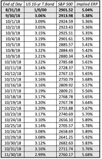 Plugging in the higher equity risk premium and the slightly lower risk free rate into my Apple valuation, leaving the rest of my inputs unchanged, yields a value of $197 for the company, about 1.5% less than my $200 estimate on September 21. With Amazon, the effect is slightly larger, with the value per share dropping from $1255 per share to $1212, about 3.5%. Those changes may seem trivial but if the market correction had been larger and the treasury rate had changed more, the value effect would have been larger.But price changes even more: If the fact that value changes over time, even in the absence of company-specific information, makes you uncomfortable, keep in mind that the market price usually changes even more. In the case of Apple and Amazon, this is illustrated in the graph below, where I compare value to price on September 21 and November 30 for both companies:
 In just over two months, Apple's value has declined from $201 to $196, but the stock price has dropped from $220 to $179, shifting it from being overvalued by 9.54% to undervalued by 9.14%. Amazon has become less over valued over time, with the percentage over valuation dropping from 55.38% to 39.44%. I have watched Apple's value dance with its price for much of this decade and the graph below provides the highlights:
 From my perspective, the story for Apple has remained largely the same for the last eight years, a slow-growth, cash machine that gets the bulk of its profits from one product: the iPhone. However, at regular intervals, usually around a new iPhone model, the market becomes either giddily optimistic about it becoming a growth company (and pushes up the price) or overly pessimistic about the end of the iPhone cash franchise (and pushes the price down too much). In the face of this market bipolarity, this is my fourth round of holding Apple in the last seven years, and I have a feeling that it will not be the last one.Act with no regrets: I did cover my short sale, by buying back Apple at $205, but the stock continued to slide, dropping below $175 early last week. I almost covered my Amazon position at $1412, but since the price dropped only as low as $1420, my limit buy was not triggered, and the stock price is back up to almost $1700. Am I regretful that I closed too early with Apple and did not close out early enough with Amazon? I am not, because if there is one thing I have learned in my years as an investor, it is that you have stay true to your investment philosophy, even if it means that you leave profits on the table sometimes, and lose money at other times. I have faith in value, and that faith requires me to act consistently. I will continue to value Amazon at regular intervals, and it is entirely possible that I missed my moment to sell, but if so, it is a price that I am willing to pay.And flexible time horizons: A contrast that is often drawn between investors and traders is that to be an investor, you need to have a long time horizon, whereas traders operate with windows measured in months, weeks, days or even hours. In fact, one widely quoted precept in value investing is that you should buy good companies and hold them forever. Buy and hold is not a bad strategy, since it minimizes transactions costs, taxes and impulsive actions, but I hope that my Apple analysis leads you to at least question its wisdom. My short sale on Apple was predicated on value, but it lasted only a month and four days, before being unwound. In fact, early last week, I bought Apple at $175, because I believe that it under valued today, giving me a serious case of investing whiplash. I am willing to wait a long time for Apple's price to adjust to value, but I am not required to do so. If the price adjusts quickly to value and then moves upwards, I have to be willing to sell, even if that is only a few weeks from today. In my version of value investing, investors have to be ready to hold for long periods, but also be willing to close out positions sooner, either because their theses have been vindicated (by the market price moving towards value) or because their theses have broken down (in which case they need to revisit their valuations).Bottom Line
As investors, we are often quick to claim credit for our successes and equally quick to blame others for our failures, and I am no exception. While I am sorely tempted to view what has happened at Apple and Amazon as vindication of my value judgments, I know better. I got lucky in terms of timing, catching a market correction and one targeted at tech stocks, and I am inclined to believe that is the main reason why my Apple and Amazon positions have made me money in the last two months. With Amazon, in particular, there is little that has happened in the last two months that would represent the catalysts that I saw in my initial analysis, since it was government actions and regulatory pushback that I saw as the likely triggers for a correction. With Apple, I do have a longer history and a better basis for believing that this is market bipolarity at play, with the stock price over shooting its value, after good news, and over correcting after bad news, but nothing that has happened to the company in the last two month would explain the correction. Needless to say, I will bank my profits, even if they are entirely fortuitous, but I will not delude myself into chalking this up to my investing skills. It is better to be lucky than good!
YouTube Video
Blog PostsApple and Amazon at a Trillion $: A Follow-up on Uncertainty and Catalysts (September 2018)An October Surprise: Making Sense of Market Mayhem (October 2018)
My September Valuations: A Look BackIn September, I valued Apple and Amazon and arrived at a value per share of roughly $200 for Apple and $1255 for Amazon, well below their prevailing stock prices of $220 (Apple) and $1950 (Amazon). I was also open about the fact that my valuations reflected my stories for the companies, and that my assumptions were open for debate. In fact, I estimated value distributions for both companies and noted that not only did I face more uncertainty in my Amazon valuation, but also that there was a significant probability in both companies that my assessment (that the stocks were over valued) was wrong. I summarized my results in a table that I reproduce below:
 Apple Valuation & Amazon Valuation in September 2018I did follow through on my judgments, albeit with some trepidation, selling short on Amazon at the prevailing market price (about $195) and putting in a limit short sell at $230, which was fulfilled on October 3, as the stock opened above $230. With both stocks, I also put in open orders to cover my short sales at the 60th percentile of my value distributions, i.e., $205 at Apple and $1412 at Amazon, not expecting either to happen in the near term. (Why 60%? Read on...) Over the years, I have learned that investment stories and theses, no matter how well thought out and reasoned, don't always have happy endings, but this one did, and at a speed which I did not expect:
 My Apple short sale which was initiated on October 3 was closed out on November 5 at $205, while Amazon got tantalizingly close to my trigger price for covering of $1412 (with a low of $1420 on November 20), before rebounding.
 Intrinsic Value Lessons
Every investment, whether it is a winner or a loser, carries investment lessons, and here are mine from my AAPL/AMZN experiences, at least so far:Auto pilot rules to fight behavioral minefields: If you are wondering why I put in limit orders on both my Apple short sale and my covering trades on both stocks, it is because I know my weaknesses and left to my own biases, the havoc that they can wreak on my investment actions. I have never hidden the fact that I love Apple as a company and I was worried that if I did not put in my limit short sell order at $230, and the stock rose to that level, I would find a way to justify not doing it. For the limit buys to cover my short sales, I used the 60th percentile of the value distribution, because my trigger for buying a stock is that it be at least at the 40th percentile of its value distribution and to be consistent, my trigger for selling is set at the 60th percentile. It is my version of margin of safety, with the caveat being that for stocks like Amazon, where uncertainty abounds, this rule can translate into a much bigger percentage price difference than for a stock like Apple, where there is less uncertainty. (The price difference between the 60th and 90th percentile for Apple was just over 10%, whereas the price difference between those same percentiles was 35% for Amazon, in September 2018.)Intrinsic value changes over time: Among some value investors, there is a misplaced belief that intrinsic value is a timeless constant, and that it is the market that is subject to wild swings, driven by changes in mood and momentum. That is not true, since not only do the determinants of value (cash flows, growth and risk) change over time, but so does the price of risk (default spreads, equity risk premiums) in the market. The former occurs every time a company has a financial disclosure, which is one reason that I revalue companies just after earnings reports, or a major news story (acquisition, divestiture, new CEO), and the latter is driven by macro forces. That sounds abstract, but I can use Apple and Amazon to illustrate my point. Since my September valuations for both companies occurred after their most recent earnings reports, there have been no new financial disclosures from either company. There have been a few news stories and we can argue about their consequentiality for future cash flows and growth, but the big change has been in the market. Since September 21, the date of my valuation, equity markets have been in turmoil, with the S&P 500 dropping about 5.5% (through November 30) and the US 10-year treasury bond rate have dropped slightly from 3.07% to 3.01%, over the same period. If you are wondering why this should affect terminal value, it is worth remembering that the price of risk (risk premium) is set by the market, and the mechanism it has for adjusting this price is the level of stock prices, with a higher equity risk premium leading to lower stock prices. In my post at the end of a turbulent October, I traced the change in equity risk premiums, by day, through October and noted that equity risk premiums at the end of the month were up about 0.38% from the start of the month and almost 0.72% higher than they were at the start of September 2018. In contrast, November saw less change in the ERP, with the ERP adjusting to 5.68% at the end of the month.
 Plugging in the higher equity risk premium and the slightly lower risk free rate into my Apple valuation, leaving the rest of my inputs unchanged, yields a value of $197 for the company, about 1.5% less than my $200 estimate on September 21. With Amazon, the effect is slightly larger, with the value per share dropping from $1255 per share to $1212, about 3.5%. Those changes may seem trivial but if the market correction had been larger and the treasury rate had changed more, the value effect would have been larger.But price changes even more: If the fact that value changes over time, even in the absence of company-specific information, makes you uncomfortable, keep in mind that the market price usually changes even more. In the case of Apple and Amazon, this is illustrated in the graph below, where I compare value to price on September 21 and November 30 for both companies:
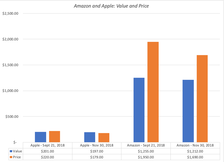 In just over two months, Apple's value has declined from $201 to $196, but the stock price has dropped from $220 to $179, shifting it from being overvalued by 9.54% to undervalued by 9.14%. Amazon has become less over valued over time, with the percentage over valuation dropping from 55.38% to 39.44%. I have watched Apple's value dance with its price for much of this decade and the graph below provides the highlights:
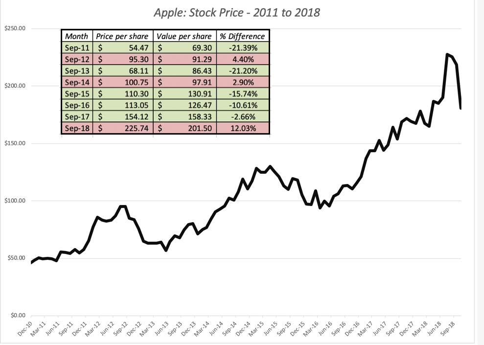 From my perspective, the story for Apple has remained largely the same for the last eight years, a slow-growth, cash machine that gets the bulk of its profits from one product: the iPhone. However, at regular intervals, usually around a new iPhone model, the market becomes either giddily optimistic about it becoming a growth company (and pushes up the price) or overly pessimistic about the end of the iPhone cash franchise (and pushes the price down too much). In the face of this market bipolarity, this is my fourth round of holding Apple in the last seven years, and I have a feeling that it will not be the last one.Act with no regrets: I did cover my short sale, by buying back Apple at $205, but the stock continued to slide, dropping below $175 early last week. I almost covered my Amazon position at $1412, but since the price dropped only as low as $1420, my limit buy was not triggered, and the stock price is back up to almost $1700. Am I regretful that I closed too early with Apple and did not close out early enough with Amazon? I am not, because if there is one thing I have learned in my years as an investor, it is that you have stay true to your investment philosophy, even if it means that you leave profits on the table sometimes, and lose money at other times. I have faith in value, and that faith requires me to act consistently. I will continue to value Amazon at regular intervals, and it is entirely possible that I missed my moment to sell, but if so, it is a price that I am willing to pay.And flexible time horizons: A contrast that is often drawn between investors and traders is that to be an investor, you need to have a long time horizon, whereas traders operate with windows measured in months, weeks, days or even hours. In fact, one widely quoted precept in value investing is that you should buy good companies and hold them forever. Buy and hold is not a bad strategy, since it minimizes transactions costs, taxes and impulsive actions, but I hope that my Apple analysis leads you to at least question its wisdom. My short sale on Apple was predicated on value, but it lasted only a month and four days, before being unwound. In fact, early last week, I bought Apple at $175, because I believe that it under valued today, giving me a serious case of investing whiplash. I am willing to wait a long time for Apple's price to adjust to value, but I am not required to do so. If the price adjusts quickly to value and then moves upwards, I have to be willing to sell, even if that is only a few weeks from today. In my version of value investing, investors have to be ready to hold for long periods, but also be willing to close out positions sooner, either because their theses have been vindicated (by the market price moving towards value) or because their theses have broken down (in which case they need to revisit their valuations).Bottom Line
As investors, we are often quick to claim credit for our successes and equally quick to blame others for our failures, and I am no exception. While I am sorely tempted to view what has happened at Apple and Amazon as vindication of my value judgments, I know better. I got lucky in terms of timing, catching a market correction and one targeted at tech stocks, and I am inclined to believe that is the main reason why my Apple and Amazon positions have made me money in the last two months. With Amazon, in particular, there is little that has happened in the last two months that would represent the catalysts that I saw in my initial analysis, since it was government actions and regulatory pushback that I saw as the likely triggers for a correction. With Apple, I do have a longer history and a better basis for believing that this is market bipolarity at play, with the stock price over shooting its value, after good news, and over correcting after bad news, but nothing that has happened to the company in the last two month would explain the correction. Needless to say, I will bank my profits, even if they are entirely fortuitous, but I will not delude myself into chalking this up to my investing skills. It is better to be lucky than good!
YouTube Video
Blog PostsApple and Amazon at a Trillion $: A Follow-up on Uncertainty and Catalysts (September 2018)An October Surprise: Making Sense of Market Mayhem (October 2018)
November 14, 2018
The GE End Game: Bataan Death March or Turnaround Play?
It seems like ancient history, but it was just 2001, when GE was the most valuable company in the world, commanding a market capitalization in excess of $500 billion. The quintessential conglomerate, with a presence in almost every part of the global economy, it seemed to have been built to withstand economic shocks and was the choice for conservative investors, scared of the short life cycles and the volatile fortunes of its tech challengers. Unlike other aging companies like Sears that have decayed gradually over decades, GE's fall from grace has been precipitous , with the rate of decline accelerating the in the last two years. As a new CEO is brought in, with hopes that he will be a savior, it is the right time to both look back and look forward at one of the globe's most iconic companies.
GE: A Compressed History
GE's roots can be traced back to Thomas Edison and his invention of the light bulb. The company that Edison founded in 1878, Edison General Electric, was combined with two other electric companies to create General Electric in 1892. The company established its first industrial lab in 1900 and it would not be an exaggeration to say that it revolutionized not just the American home, with its appliances, but changed the way Americans live. For much of of the twentieth century, though, GE remained an appliance company, though it made forays into other businesses. It was in 1980, when Jack Welch became the CEO of the company, that the company started its march towards what it has become today.
The Market HistoryThe first place to start, when looking at GE, is to see how markets have viewed it, over its life. Skipping over the first half of GE's life, the graph below looks at the growth (and recent decline) of GE's market capitalization over time: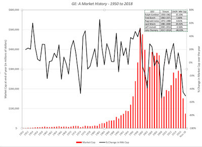
As you can see, GE was a solid but unspectacular investment from 1950 to 1980, and exploded in value in the 1980s and 1990s, with Jack Welch at its helm, and reached its most valuable company in the world status in 2001. Under Jeff Immelt, his successor, the stock continued to do well, but it dropped with the rest of the market as the dot com bubble burst, but then recovered leaving into the 2008 crisis. That crisis was devastating for the company and while it did recover somewhat in the years after, the bottom has clearly dropped out in the last two years, with Jeff Flannery at the top of the company.
The Operating HistoryTo get operating perspective on how the company has evolved over time, we looked at how GE"s key operating metrics (revenues, EBITDA, net income) have evolved since 1950: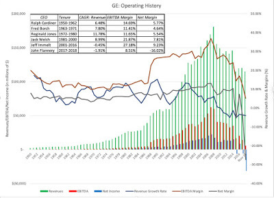
In keeping with our earlier market cap assessment, between 1950 and 1970, GE was a good but not exceptional company, delivering solid revenue growth and decent margins. Under two CEOS, Reginald Jones in the 1970s and Jack Welch in the two decades thereafter, the company transformed itself. Jones helped the company navigate through the turbulent period of high inflation and oil prices, holding margins steady and delivering double digit revenue growth. Welch made himself the stuff of legend, by doubling margins and pushing the company to the top of the market cap ranks by the time he left the firm. His successor Jeff Immelt faced the unenviable task of following Welch, but managed to keep revenues growing and delivered high margins until 2008, when the bottom fell out for the company.
The Business Mix ShiftTo understand GE's current plight, we have to go back to Welch's tenure as CEO, when he remade the firm, by moving it away from its domestic and manufacturing roots and giving it a global and multi-business focus. GE's biggest leap during that period was into the financial services business, and one reason Welch was attracted to the financial services business was its capacity to generate high profits with relatively little investment. By the late 1990s, GE Capital was the engine driving GE's growth, accounting for almost 48% of revenues in 1998 and as you can see in the graph below, it continued to do so for much of the first decade of Immelt's stewardship: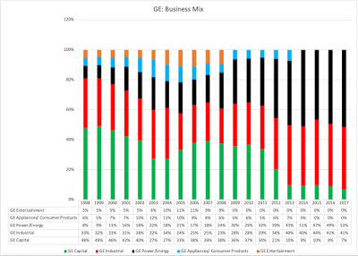
In 2008, when the crisis hit financial service firms had, GE was significantly exposed, and in the years since, GE has retreated not just from the financial services business but also from its entertainment bets (with the sale of NBC to Comcast) and from the appliance business (now owned by Haier). GE's current business mix, broken down into more detail, is shown in the pie chart below: GE Annual Report for 2017 (Invested Capital, allocated based upon assets by business)Today, GE is in three businesses (aviation, healthcare and transportation) that have low growth and high profitability (margins and returns on capital), in three energy-related businesses (power, renewable energy and oil) with higher growth but low profitability (margins & returns on capital), one business (lighting) that is fading quickly and one (capital) that is declining, but dragging value down with it. Note also that the collective profits reported across businesses is before corporate expenses and eliminations of $3.83 billion (not counting a one-time restructuring charge of $4.1 billion) that effectively wipe out about half of the operating profits. When computing return on capital, I allocated these expenses to the businesses, based upon revenues, and used a 25% effective tax rate, and while GE as a whole did not deliver a return that meets its cost of capital requirements in 2017, aviation, healthcare and transportation clear their hurdle rates by plenty. Replacing 2017 income in each business with a normalized value (computed using the average margins in each business between 2013 and 2017) improves the return on capital at the power and renewable energy businesses, but the overall conclusion remains the same. GE, as a company, does not look good, but it does have significant value creating businesses.
Corporate Life Cycle
While there are different ways of framing GE's current standing, I will use the corporate life cycle, since it encapsulates the challenges facing the company.
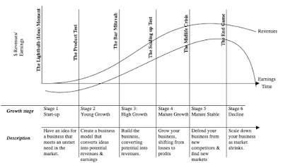
GE's light bulb moment might have been in Thomas Edison's lab in 1878, but at an official corporate age of 126 years, GE is an ancient company and its problems reflect its age. Other than renewable energy, all of GE's businesses are mature or declining, and by the laws of mathematics, GE itself is a mature to declining company. Any story that you tell about GE going forward has to reflect this reality, and there are three possible ones that can lead to different values.1. Break it up: If GE at its peak represented the glory of conglomerates, its current plight is a sign of how far conglomerates have fallen in the world. Across the world, multi business companies are finding themselves under pressure to break up and in many cases, their stockholders will be better off if they do. To gain from a break up, though, here are some of the things that have to be true. Separable businesses: The different businesses have to be separable, since leakages and synergies across businesses can make it more difficult to cleave off pieces to sell or spin off. On this count, GE is probably on safe ground, since its businesses (other than GE Capital) are self standing, for the most part, with little in terms of cross business effects. Willing buyers: There have to be potential buyers who are willing to pay prices for the pieces that exceed what they will generate as value for the holding company, as going concerns, and those higher prices either have to come from potential synergies or changed management. None of GE's businesses seem alluring enough to attract multiple bidders, willing to pay premium prices, and given GE's shaky bargaining position, it is more likely than not that a rush to unload businesses will do more harm than good. Corporate Waste (at HQ): A large chunk of the corporate overhead has to viewed as wasteful, with a big drop in corporate expenses accompanying the breakup. How much of the corporate expense of $3.8 billion that GE reported in 2017 is wasteful and could be eliminated with targeted cost cuts? Looking at the breakdown of these expenses, just about $2.2 billion in for covering pension obligations and breaking up the company will not relieve the company of its contractual obligations. Some of the remaining $1.6 billion may be fat that can be cut, but even cutting the entire amount (which would be a tall order) will not turn the company around.Since GE will be trying to sell these businesses to buyers today, this is a pricing and not a valuation exercise, and I have estimate a pricing for GE's businesses below, using an EBITDA recomputed using the average operating margin in each business over the last five years to compute operating income and allocating corporate expenses to the divisions, based upon revenues. To convert the EBITDA to an estimated value, I used the EV/EBITDA multiples of the peer group:
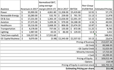 Download spreadsheetIf GE is able to get buyers to pay industry-level multiples of EBITDA for each of these businesses, it will be able to net about $103 billion for its equity investors, higher than the market capitalization on November 14 of $72 billion. The problem, though, is that fire sales of entire companies almost never deliver the expected proceeds, as buyers, recognizing desperation, hold back. In fact, GE's attempts to extricate itself from a portion of its Baker-Hughes investment in the last few days show that these sales will occur at a discount.
2. Retrench and Reshape: The second choice for GE is to retrench and perhaps renew itself, not as a growth company, but as a stable, high margin company in businesses where it has a competitive advantage. In broad terms, the roadmap for GE to succeed in this path is a simple one, shrinking or selling off pieces of its low-margin businesses, exiting the capital business and consolidating its presence in the aviation, healthcare and transportation businesses. To get a better sense of what the businesses would be worth, as continuing operations, I valued each of GE's business, using simplistic assumptions: I used the sector cost of capital for each business, set growth in the next five years equal to revenue growth in each of GE's businesses in the last five years and normalized operating income based upon the average operating margin that each of GE's businesses have delivered over the last five years:
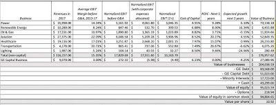 Download spreadsheetThe value that I derive for equity is lower than the $103 billion that I estimated in the last section, but it does not require any near term fire sales at discounts. There are two big challenges that GE will face along the way. The first is that GE is saddled with a significant debt obligation, a legacy of GE Capital, that will not fade away quickly, and the debt obligations represent a clear and present danger to the firm. One reason for the rapid drop in GE's stock price in the last few weeks has been the deterioration in the company's credit standing, as can be seen in the rising default spreads for the company in the CDS market.
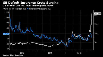 The reason that GE is trying to sell some of its stake in Baker and Hughes to pay down debt, but bond markets are skeptical, with good reason. The second is that GE Capital is now more burden than benefit to investors. In the valuation table, note that the value that I have estimated for GE Capital's operations ($27 billion) is much lower than GE Capital debt ($51 billion); in fact, I derive very similar results in the pricing. Put differently, in my valuation, I foresee the cost of exiting GE capital to be $24 billion in today's terms, but spread out over time. If GE can navigate its way through its debt payments to becoming a more focused company, with constrained ambitions, it could survive and reclaim its place as a holding for a conservative value investor.
3. Reincarnate (or the Bataan Death March): There is a third option that GE shareholders have to hope and pray that GE does not take, where the company tries to recapture its old glory, throwing caution to the winds and reinvesting large amounts in new businesses, or worse still, large acquisitions. While there is no indication that Larry Culp, GE's new CEO, has grandiose plans for the company, that may be because the company is in crisis today. If as the crisis passes, Culp is tempted to make himself the second coming of Jack Welch, the company will follow the path of other aging companies that refuse to act their age, spending billions on cosmetic surgery (acquisitions) before finally capitulating. If there is a role model that Mr. Culp should follow, it is less that of Steve the Visionary, and more that of Larry the Liquidator.
General Lessons
Given its age, it should come as no surprise that GE has been the subject of more case studies than perhaps any other company in the world. In its earlier days, it was used as an example of professional management, and during Jack Welch's years, it was held up as an illustration of how aging manufacturing companies can remake themselves, with enlightened management at the top. Now that it is in trouble, I think that we look back at the last four decades and draw a different set of lessons:Conglomeration was, is and always will be a bad idea: I never understood the allure of conglomerates, even in their heyday. Only a corporate strategist could argue that combining companies in different businesses under one corporate umbrella, paying hefty premiums along the way to acquire these holdings, creates value, ignoring the logic that you and I as stockholders can create our own diversified and customized portfolios, without paying the same premium. If there is a lesson to learn from GE's fall from grace, it is that even the best conglomerates are built on foundations of sand. Note, though, that while this lesson may be learned for the moment, it will be forgotten soon, as are most other business lessons are, and we will surely repeat the cycle again in the future.Complexity has a cost: As I was going through GE's annual report, I was reminded again of why I have always described my vision of hell as having to value GE over and over and over again, for eternity. This company, through its actions and by design, made itself into one of the most complex companies in history, operating in dozens of businesses and across the world, with GE Capital acting as the cherry on the complexity cake, a gigantic financial service firm embedded in a large conglomerate. While that complexity served GE well in its glory days, allowing it to hide mistakes from sloppy acquisition practices and bets gone bad, it has bedeviled the company since 2008. Investors trying to navigate their way through the company's financials often give up and move on to easier prey. It may be too late for GE to do much about this problem, but as Asian companies rise in market capitalization, you are seeing new complex behemoths coming into play across the world.Easy money has a catch: I know that 20/20 hindsight is both easy and unfair, but GE's experiences with GE Capital bring home an age-old business truth that when a business looks like it can make you easy money, there is always a catch. Jack Welch initial foray into and subsequent expansion of GE Capital was built on the allure that it was a lot easier to make money in financial services than in manufacturing. From the perspective of having limited capital investment and growing quickly, that was true, but financial service firms through history have always had periods of plenty interspersed with bouts of gut-wrenching and intense pain, when borrowers start defaulting and capital markets freeze up. By making GE Capital such a big part of GE, Welch bet the farm on its continued success, and that bet went sour in 2008.The Savior CEO is a myth: I come to neither bury nor praise Jack Welch, but notwithstanding the fact that he has been gone almost two decades from the firm, GE remains the house that Jack built. Since Welch got the glory that came from GE's rise in the last twenty years of the last century, he deserves a portion of the blame for what has happened since. Don't get me wrong! Jack Welch was an inspirational top manager, a man with vision and drive, but he was also an imperial CEO, who made his board of directors a rubber stamp for his actions. As we look at a new generation of successful companies, this time in the technology space (the FANG stocks and the Chinese giants), with visionary founders at the top, it is worth remembering that power left unchecked in any person (no matter how smart and visionary) is dangerous.The Bottom LineAs many of you know, I believe that every valuation has to have a story. With some companies, like Amazon and Google, the story is uplifting and optimistic, and the valuations follow, but they still might not be good investments, since their prices may be even higher. My story for GE is not an upbeat one, but if it (and its management) acts its age, accepts that slower or no growth is what lies in the future and does not over reach, it is a good investment. I believe that the market has over corrected for GE's many faults, and at the current stock price, that it is significantly under valued. I will buy GE, but I will do so with open eyes, not expecting (or wanting) dividends to be paid until the debt gets paid down and the company exits the capital business with as much grace (and as few costs) as it can muster.
YouTube Video
AttachmentsGE Pricing and Valuation in November 2018
GE: A Compressed History
GE's roots can be traced back to Thomas Edison and his invention of the light bulb. The company that Edison founded in 1878, Edison General Electric, was combined with two other electric companies to create General Electric in 1892. The company established its first industrial lab in 1900 and it would not be an exaggeration to say that it revolutionized not just the American home, with its appliances, but changed the way Americans live. For much of of the twentieth century, though, GE remained an appliance company, though it made forays into other businesses. It was in 1980, when Jack Welch became the CEO of the company, that the company started its march towards what it has become today.
The Market HistoryThe first place to start, when looking at GE, is to see how markets have viewed it, over its life. Skipping over the first half of GE's life, the graph below looks at the growth (and recent decline) of GE's market capitalization over time:

As you can see, GE was a solid but unspectacular investment from 1950 to 1980, and exploded in value in the 1980s and 1990s, with Jack Welch at its helm, and reached its most valuable company in the world status in 2001. Under Jeff Immelt, his successor, the stock continued to do well, but it dropped with the rest of the market as the dot com bubble burst, but then recovered leaving into the 2008 crisis. That crisis was devastating for the company and while it did recover somewhat in the years after, the bottom has clearly dropped out in the last two years, with Jeff Flannery at the top of the company.
The Operating HistoryTo get operating perspective on how the company has evolved over time, we looked at how GE"s key operating metrics (revenues, EBITDA, net income) have evolved since 1950:

In keeping with our earlier market cap assessment, between 1950 and 1970, GE was a good but not exceptional company, delivering solid revenue growth and decent margins. Under two CEOS, Reginald Jones in the 1970s and Jack Welch in the two decades thereafter, the company transformed itself. Jones helped the company navigate through the turbulent period of high inflation and oil prices, holding margins steady and delivering double digit revenue growth. Welch made himself the stuff of legend, by doubling margins and pushing the company to the top of the market cap ranks by the time he left the firm. His successor Jeff Immelt faced the unenviable task of following Welch, but managed to keep revenues growing and delivered high margins until 2008, when the bottom fell out for the company.
The Business Mix ShiftTo understand GE's current plight, we have to go back to Welch's tenure as CEO, when he remade the firm, by moving it away from its domestic and manufacturing roots and giving it a global and multi-business focus. GE's biggest leap during that period was into the financial services business, and one reason Welch was attracted to the financial services business was its capacity to generate high profits with relatively little investment. By the late 1990s, GE Capital was the engine driving GE's growth, accounting for almost 48% of revenues in 1998 and as you can see in the graph below, it continued to do so for much of the first decade of Immelt's stewardship:

In 2008, when the crisis hit financial service firms had, GE was significantly exposed, and in the years since, GE has retreated not just from the financial services business but also from its entertainment bets (with the sale of NBC to Comcast) and from the appliance business (now owned by Haier). GE's current business mix, broken down into more detail, is shown in the pie chart below:
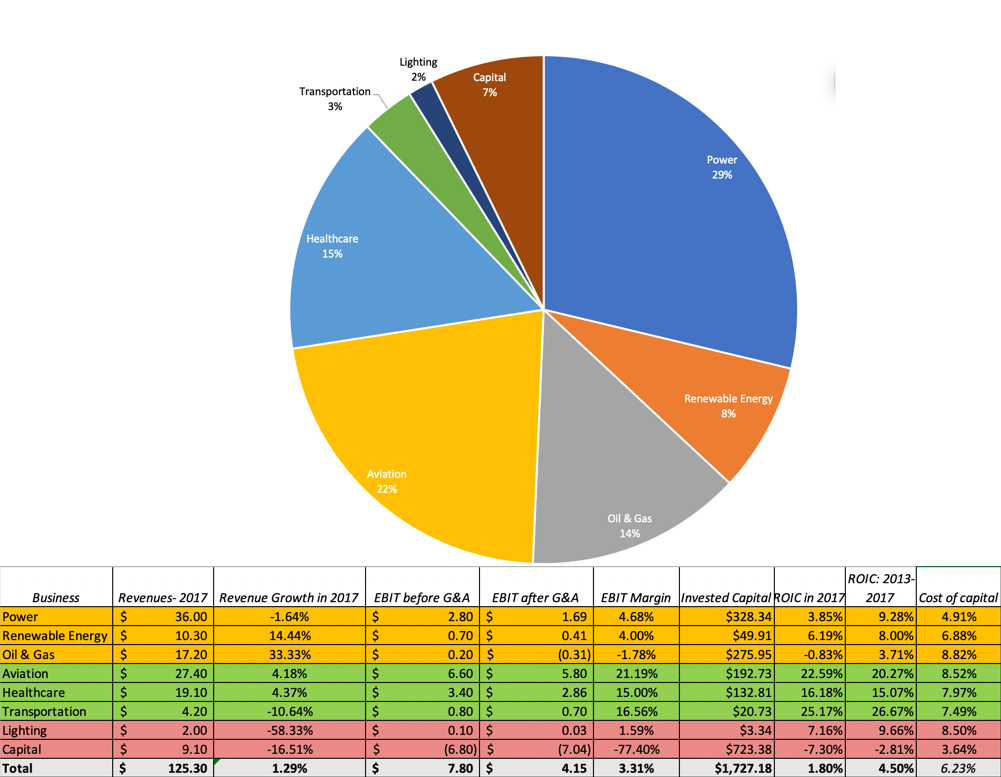 GE Annual Report for 2017 (Invested Capital, allocated based upon assets by business)Today, GE is in three businesses (aviation, healthcare and transportation) that have low growth and high profitability (margins and returns on capital), in three energy-related businesses (power, renewable energy and oil) with higher growth but low profitability (margins & returns on capital), one business (lighting) that is fading quickly and one (capital) that is declining, but dragging value down with it. Note also that the collective profits reported across businesses is before corporate expenses and eliminations of $3.83 billion (not counting a one-time restructuring charge of $4.1 billion) that effectively wipe out about half of the operating profits. When computing return on capital, I allocated these expenses to the businesses, based upon revenues, and used a 25% effective tax rate, and while GE as a whole did not deliver a return that meets its cost of capital requirements in 2017, aviation, healthcare and transportation clear their hurdle rates by plenty. Replacing 2017 income in each business with a normalized value (computed using the average margins in each business between 2013 and 2017) improves the return on capital at the power and renewable energy businesses, but the overall conclusion remains the same. GE, as a company, does not look good, but it does have significant value creating businesses.
Corporate Life Cycle
While there are different ways of framing GE's current standing, I will use the corporate life cycle, since it encapsulates the challenges facing the company.

GE's light bulb moment might have been in Thomas Edison's lab in 1878, but at an official corporate age of 126 years, GE is an ancient company and its problems reflect its age. Other than renewable energy, all of GE's businesses are mature or declining, and by the laws of mathematics, GE itself is a mature to declining company. Any story that you tell about GE going forward has to reflect this reality, and there are three possible ones that can lead to different values.1. Break it up: If GE at its peak represented the glory of conglomerates, its current plight is a sign of how far conglomerates have fallen in the world. Across the world, multi business companies are finding themselves under pressure to break up and in many cases, their stockholders will be better off if they do. To gain from a break up, though, here are some of the things that have to be true. Separable businesses: The different businesses have to be separable, since leakages and synergies across businesses can make it more difficult to cleave off pieces to sell or spin off. On this count, GE is probably on safe ground, since its businesses (other than GE Capital) are self standing, for the most part, with little in terms of cross business effects. Willing buyers: There have to be potential buyers who are willing to pay prices for the pieces that exceed what they will generate as value for the holding company, as going concerns, and those higher prices either have to come from potential synergies or changed management. None of GE's businesses seem alluring enough to attract multiple bidders, willing to pay premium prices, and given GE's shaky bargaining position, it is more likely than not that a rush to unload businesses will do more harm than good. Corporate Waste (at HQ): A large chunk of the corporate overhead has to viewed as wasteful, with a big drop in corporate expenses accompanying the breakup. How much of the corporate expense of $3.8 billion that GE reported in 2017 is wasteful and could be eliminated with targeted cost cuts? Looking at the breakdown of these expenses, just about $2.2 billion in for covering pension obligations and breaking up the company will not relieve the company of its contractual obligations. Some of the remaining $1.6 billion may be fat that can be cut, but even cutting the entire amount (which would be a tall order) will not turn the company around.Since GE will be trying to sell these businesses to buyers today, this is a pricing and not a valuation exercise, and I have estimate a pricing for GE's businesses below, using an EBITDA recomputed using the average operating margin in each business over the last five years to compute operating income and allocating corporate expenses to the divisions, based upon revenues. To convert the EBITDA to an estimated value, I used the EV/EBITDA multiples of the peer group:
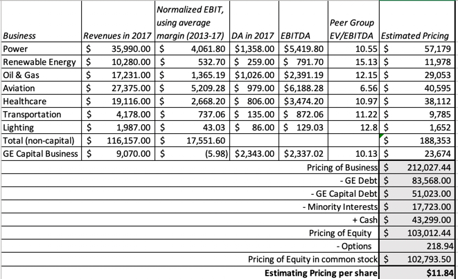 Download spreadsheetIf GE is able to get buyers to pay industry-level multiples of EBITDA for each of these businesses, it will be able to net about $103 billion for its equity investors, higher than the market capitalization on November 14 of $72 billion. The problem, though, is that fire sales of entire companies almost never deliver the expected proceeds, as buyers, recognizing desperation, hold back. In fact, GE's attempts to extricate itself from a portion of its Baker-Hughes investment in the last few days show that these sales will occur at a discount.
2. Retrench and Reshape: The second choice for GE is to retrench and perhaps renew itself, not as a growth company, but as a stable, high margin company in businesses where it has a competitive advantage. In broad terms, the roadmap for GE to succeed in this path is a simple one, shrinking or selling off pieces of its low-margin businesses, exiting the capital business and consolidating its presence in the aviation, healthcare and transportation businesses. To get a better sense of what the businesses would be worth, as continuing operations, I valued each of GE's business, using simplistic assumptions: I used the sector cost of capital for each business, set growth in the next five years equal to revenue growth in each of GE's businesses in the last five years and normalized operating income based upon the average operating margin that each of GE's businesses have delivered over the last five years:
 Download spreadsheetThe value that I derive for equity is lower than the $103 billion that I estimated in the last section, but it does not require any near term fire sales at discounts. There are two big challenges that GE will face along the way. The first is that GE is saddled with a significant debt obligation, a legacy of GE Capital, that will not fade away quickly, and the debt obligations represent a clear and present danger to the firm. One reason for the rapid drop in GE's stock price in the last few weeks has been the deterioration in the company's credit standing, as can be seen in the rising default spreads for the company in the CDS market.
 The reason that GE is trying to sell some of its stake in Baker and Hughes to pay down debt, but bond markets are skeptical, with good reason. The second is that GE Capital is now more burden than benefit to investors. In the valuation table, note that the value that I have estimated for GE Capital's operations ($27 billion) is much lower than GE Capital debt ($51 billion); in fact, I derive very similar results in the pricing. Put differently, in my valuation, I foresee the cost of exiting GE capital to be $24 billion in today's terms, but spread out over time. If GE can navigate its way through its debt payments to becoming a more focused company, with constrained ambitions, it could survive and reclaim its place as a holding for a conservative value investor.
3. Reincarnate (or the Bataan Death March): There is a third option that GE shareholders have to hope and pray that GE does not take, where the company tries to recapture its old glory, throwing caution to the winds and reinvesting large amounts in new businesses, or worse still, large acquisitions. While there is no indication that Larry Culp, GE's new CEO, has grandiose plans for the company, that may be because the company is in crisis today. If as the crisis passes, Culp is tempted to make himself the second coming of Jack Welch, the company will follow the path of other aging companies that refuse to act their age, spending billions on cosmetic surgery (acquisitions) before finally capitulating. If there is a role model that Mr. Culp should follow, it is less that of Steve the Visionary, and more that of Larry the Liquidator.
General Lessons
Given its age, it should come as no surprise that GE has been the subject of more case studies than perhaps any other company in the world. In its earlier days, it was used as an example of professional management, and during Jack Welch's years, it was held up as an illustration of how aging manufacturing companies can remake themselves, with enlightened management at the top. Now that it is in trouble, I think that we look back at the last four decades and draw a different set of lessons:Conglomeration was, is and always will be a bad idea: I never understood the allure of conglomerates, even in their heyday. Only a corporate strategist could argue that combining companies in different businesses under one corporate umbrella, paying hefty premiums along the way to acquire these holdings, creates value, ignoring the logic that you and I as stockholders can create our own diversified and customized portfolios, without paying the same premium. If there is a lesson to learn from GE's fall from grace, it is that even the best conglomerates are built on foundations of sand. Note, though, that while this lesson may be learned for the moment, it will be forgotten soon, as are most other business lessons are, and we will surely repeat the cycle again in the future.Complexity has a cost: As I was going through GE's annual report, I was reminded again of why I have always described my vision of hell as having to value GE over and over and over again, for eternity. This company, through its actions and by design, made itself into one of the most complex companies in history, operating in dozens of businesses and across the world, with GE Capital acting as the cherry on the complexity cake, a gigantic financial service firm embedded in a large conglomerate. While that complexity served GE well in its glory days, allowing it to hide mistakes from sloppy acquisition practices and bets gone bad, it has bedeviled the company since 2008. Investors trying to navigate their way through the company's financials often give up and move on to easier prey. It may be too late for GE to do much about this problem, but as Asian companies rise in market capitalization, you are seeing new complex behemoths coming into play across the world.Easy money has a catch: I know that 20/20 hindsight is both easy and unfair, but GE's experiences with GE Capital bring home an age-old business truth that when a business looks like it can make you easy money, there is always a catch. Jack Welch initial foray into and subsequent expansion of GE Capital was built on the allure that it was a lot easier to make money in financial services than in manufacturing. From the perspective of having limited capital investment and growing quickly, that was true, but financial service firms through history have always had periods of plenty interspersed with bouts of gut-wrenching and intense pain, when borrowers start defaulting and capital markets freeze up. By making GE Capital such a big part of GE, Welch bet the farm on its continued success, and that bet went sour in 2008.The Savior CEO is a myth: I come to neither bury nor praise Jack Welch, but notwithstanding the fact that he has been gone almost two decades from the firm, GE remains the house that Jack built. Since Welch got the glory that came from GE's rise in the last twenty years of the last century, he deserves a portion of the blame for what has happened since. Don't get me wrong! Jack Welch was an inspirational top manager, a man with vision and drive, but he was also an imperial CEO, who made his board of directors a rubber stamp for his actions. As we look at a new generation of successful companies, this time in the technology space (the FANG stocks and the Chinese giants), with visionary founders at the top, it is worth remembering that power left unchecked in any person (no matter how smart and visionary) is dangerous.The Bottom LineAs many of you know, I believe that every valuation has to have a story. With some companies, like Amazon and Google, the story is uplifting and optimistic, and the valuations follow, but they still might not be good investments, since their prices may be even higher. My story for GE is not an upbeat one, but if it (and its management) acts its age, accepts that slower or no growth is what lies in the future and does not over reach, it is a good investment. I believe that the market has over corrected for GE's many faults, and at the current stock price, that it is significantly under valued. I will buy GE, but I will do so with open eyes, not expecting (or wanting) dividends to be paid until the debt gets paid down and the company exits the capital business with as much grace (and as few costs) as it can muster.
YouTube Video
AttachmentsGE Pricing and Valuation in November 2018
Aswath Damodaran's Blog

- Aswath Damodaran's profile
- 725 followers
Aswath Damodaran isn't a Goodreads Author
(yet),
but they
do have a blog,
so here are some recent posts imported from
their feed.

