
Aswath Damodaran's Blog, page 20
March 2, 2018
Interest Rates and Stock Prices: It's Complicated!
Jerome Powell, the new Fed Chair, was on Capitol Hill on February 27, and his testimony was, for the most part, predictable and uncontroversial. He told Congress that he believed that the economy had strengthened over the course of the last year and that the Fed would continue on its path of "raising rates". Analysts have spent the next few days reading the tea leaves of his testimony, to decide whether this would translate into three or four rate hikes and what this would mean for stocks. In fact, the blame for the drop in stocks over the last four trading days has been placed primarily on the Fed bogeyman, with protectionism providing an assist on the last two days. While there may be an element of truth to this, I am skeptical about any Fed-based arguments for market increases and decreases, because I disagree fundamentally with many about how much power central banks have to set interest rates, and how those interest rates affect value.
1. The Fed's power to set interest rates is limitedI have repeatedly pushed back against the notion that the Fed or any central bank somehow sets market interest rates, since it really does not have the power to do so. The only rate that the Fed sets directly is the Fed funds rate, and while it is true that the Fed's actions on that rate send signals to markets, those signals are fuzzy and do not always have predictable consequences. In fact, it is worth noting that the Fed has been hiking the Fed Funds rate since December 2016, when Janet Yellen's Fed initiated this process, raising the Fed Funds rate by 0.25%. In the months since, the effects of the Fed Fund rate changes on long term rates is debatable, and while short term rate have gone up, it is not clear whether the Fed Funds rate is driving short term rates or whether market rates are driving the Fed.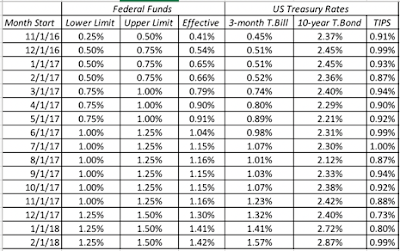
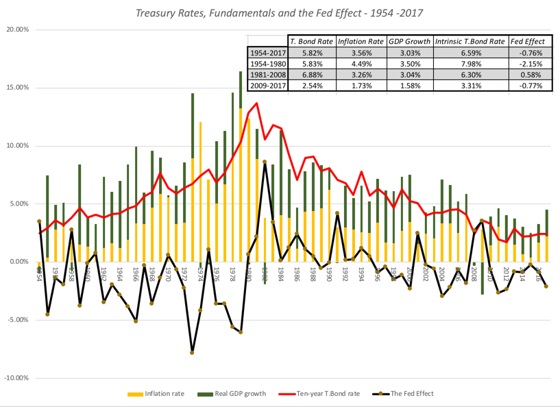
It is true that post-2008, the Fed has been much more aggressive in buying bonds in financial markets in its quantitative easing efforts to keep rates low. While that was started as a response to the financial crisis of 2008, it continued for much of the last decade and clearly has had an impact on interest rates. To those who would argue that it was the Fed, through its Fed Funds rate and quantitative easing policies that kept long term rates low from 2008-2017, I would beg to differ, since there are two far stronger fundamental factors at play - low or no inflation and anemic real economic growth. In the graph below, I have the treasury bond rate compared to the sum of inflation and real growth each year, with the difference being attributed to the Fed effect: Download spreadsheet with raw dataYou have seen me use this graph before, but my point is a simple one. The Fed is less rate-setter, when it comes to market interest rates, than rate-influencer, with the influence depending upon its credibility. While rates were low in the 2009-2017 time period, and the Fed did play a role (the Fed effect lowered rates by 0.77%), the primary reasons for low rates were fundamental. It is for that reason that I described the Fed Chair as the Wizard of Oz, drawing his or her power from the perception that he or she has power, rather than actual power. That said, the Fed effect at the start of 2018, as I noted in a post at the beginning of the year, is larger than it has been at any time in the last decade, perhaps setting the stage for the tumult in stock and bond markets in the last few weeks.
To examine more closely the relationship between moves in the Fed Funds rate and treasury rates, I collected monthly data on the Fed Funds rate, the 3-month US treasury bill rate and the US 10-year treasury bond rate every month from January 1962 to February 2018. The raw data is at the link below, but I regressed the changes in both short term and long term treasuries against changes in the Fed funds rate in the same month: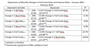 Looking at these regressions, here are some interesting conclusions that emerge:Short term T.Bill rates and the Fed Funds rate move together strongly: The result backs up the intuition that the Fed Funds rate and the short term treasury rate are connected strongly, with an R-squared of 56.5%; a 1% increase in the Fed Funds rate is accompanied by a 0.62% increase in the T.Bill rate, in the same month. Note, though, that this regression, by itself, tells you nothing about the direction of the effect, i.e., whether higher Fed funds rates lead to higher short term treasury rates or whether higher rates in the short term treasury bill market lead the Fed to push up the Fed Funds rate. T.Bond rates move with the Fed Funds rate, but more weakly: The link between the Fed Funds rate and the 10-year treasury bond rate is mush weaker, with an R-squared of 6.7%; a 1% increase in the Fed Funds rate is accompanied by a 0.19% increase in the 10-year treasury bond rate. T. Bill rates lead, Fed Funds rates lag: Regressing changes in Fed funds rates against changes in T.Bill rates in the following period, and then reversing direction and regressing changes in T.Bill rates against changes in the Fed Funds rate in the following period, provide clues to the direction of the relationship. At least over this time period, and using monthly changes, it is changes in T.Bill rates that lead changes in Fed Funds rates more strongly, with an R squared of 23.7%, as opposed to an R-squared of 9% for the alternate hypothesis. With treasury bond rates, there is no lagged effect of Fed funds rate changes (R squared of zero), while changes in T.Bond rates do predict changes in the Fed Funds rate in the subsequent period. The Fed is more a follower of markets, than a leader. The bottom line is that if you are trying to get a measure of how much treasury bond rates will change over the next year or two, you will be better served focusing more on changes in economic fundamentals and less on Jerome Powell and the Fed.
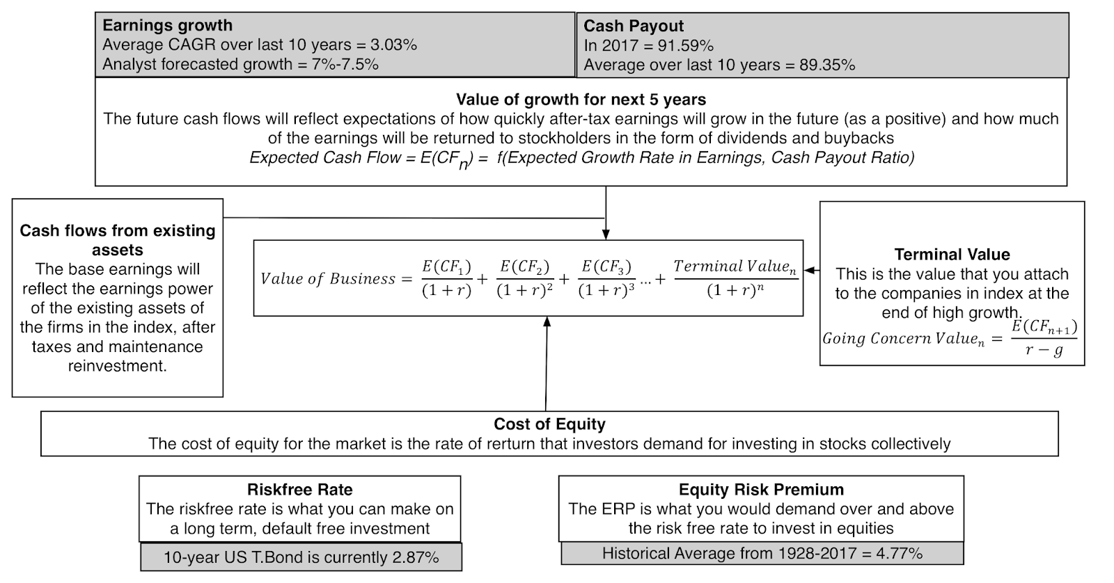
2. The relationship between interest rates and stock market value is complicatedWhen interest rates go up, stock prices should go down, right? Though you may believe or have been told that the answer is obvious, that higher interest rates are bad for stock prices, the answer is not straight forward. To understand why people are drawn to the notion that higher rates are bad for value, all you need to do is go back to the drivers of stock market value: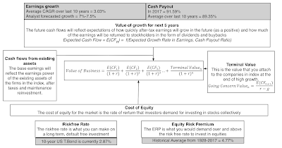
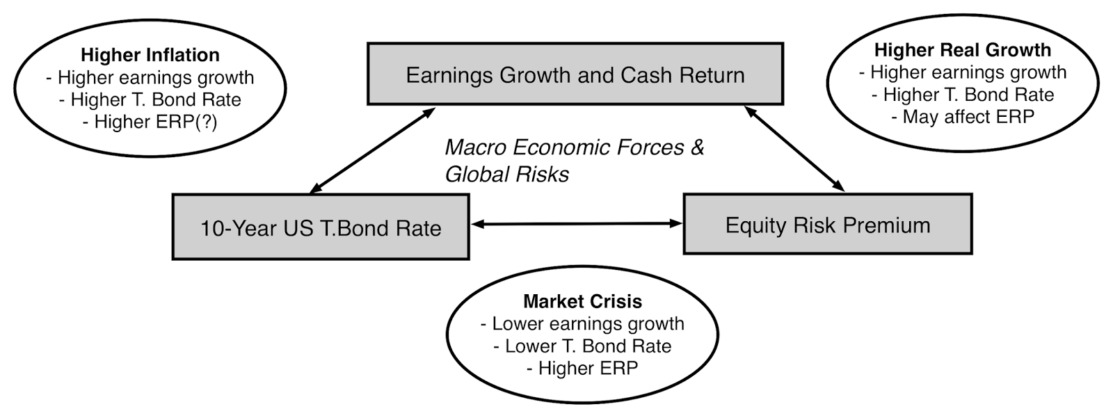
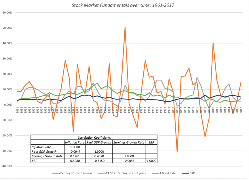
As you can see in this picture, holding all else constant, and raising long term interest rates, will increase the discount rate (cost of equity and capital), and reduce value. That assessment, though, is built on the presumption that the forces that push up interest rates have no effect on the other inputs into value - the equity risk premium, earnings growth and cash flows, a dangerous delusion, since these variables are all connected together to a macro economy.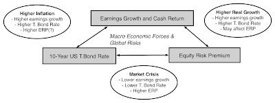 Note that almost any macro economic change, whether it be a surge in inflation, an increase in real growth or a global crisis (political or economic) affects earnings growth, T.Bond rates and the equity risk premiums, making the impact on value indeterminate, until you have worked through the net effect. To illustrate the interconnections between earnings growth rates, equity risk premiums and macroeconomic fundamentals, I looked at data on all of the variables going back to 1961:
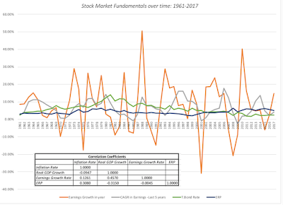 Download spreadsheet with raw dataThe co-movement in the variables and their sensitivity to macro economic fundamentals is captured in the correlation table. Higher inflation, over this period, is accompanied by higher earnings growth but also increases equity risk premiums and suppresses real growth, making its net effect often more negative than positive. Higher real economic growth, on the other hand, by pushing up earnings growth rate and lowering equity risk premiums, has a much more positive effect on value.
3. Value has to be built around a consistent narrativeIn my post from February 10, right after the last market meltdown, I offered an intrinsic valuation model for the S&P 500, with a suggestion that you fill in your inputs and come up with your own estimate of value. Some of you did take me up on my offer, came up with inputs, and entered them into a shared Google spreadsheet and, in your collective wisdom, the market was overvalued by about 3.34% in mid-February. While making assumptions about risk premiums, earnings growth and the treasury bond rate, I should have emphasized the importance of narrative, i.e., the macro and market story that lay behind your numbers, since without it, you can make assumptions that are internally inconsistent. To illustrate, here are two inconsistent story lines that I have seen in the last few weeks, from opposite sides of the spectrum (bearish and bullish).
In the bearish version, which I call the Interest Rate Apocalypse, all of the inputs (earnings growth for the next five years and beyond, equity risk premiums) into value are held constant, while raising the treasury bond rate to 4% or 4.5%. Not surprisingly, the effect on value is calamitous, with the value dropping about 20%. While that may alarm you, it is unclear how the analysts who tell this story explain why the forces that push interest rates upwards have no effect on earnings growth, in the next 5 years or beyond, oron equity risk premiums.In the bullish version, which I will term the Real Growth Fantasy, all of the inputs into value are left untouched, while higher growth in the US economy causes earnings growth rates to pop up. The effect again is unsurprising, with value increasing proportionately. While neither of these narratives is fully worked through, there are three separate narratives about the market that are all internally consistent, that can lead to very different judgments on value.
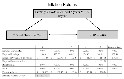
More of the same: In this narrative, you can argue that, as has been so often the case in the last decade, the breakout in the US economy will be short lived and that we will revert back the low growth, low inflation environment that developed economies have been mired in since 2008. In this story, the treasury bond rate will stay low (2.5%), earnings growth will revert back to the low levels of the last decade (3.03%) after the one-time boost from lower taxes fades, and equity risk premiums will stay at post-2008 levels (5.5%). The index value that you obtain is about 2250, about 16.4% below March 2nd levels.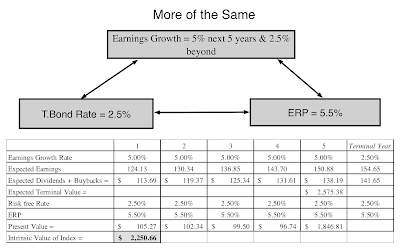 Download spreadsheetThe Return of Inflation: In this story line, inflation returns, though how the story plays out will depend upon how much inflation you foresee. That higher inflation rate will translate into higher earnings growth, though the effect will vary across companies, depending upon their pricing power, but it will also cause T. Bond rates to rise. If the inflation rate in the story is a high one (3% or higher), the equity risk premium may also rise, if history is any guide. With an inflation rate of 3% and an equity risk premium of 6%, the index value that you obtain is about 2133, about 20.7% below March 2nd levels.
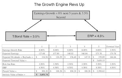
 Download spreadsheetThe Growth Engine Revs Up: In this telling, it is real growth in the US economy that surges, creating tailwinds for growth in the rest of the world. That higher real growth rate, while pushing up earnings growth for US companies (to 8% for the near term), will also increase treasury bond rates (to 3.5%), as in the inflation story, but unlike it, equity risk premiums will drift back to pre-2008 levels (closer to 4.5%). The index value that you obtain is about 3031, about 12.7% above March 2nd levels.
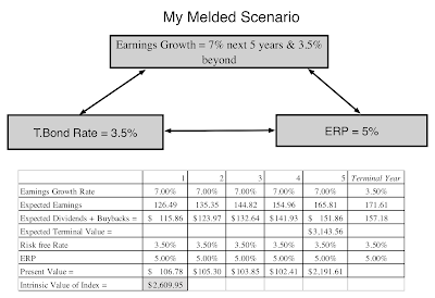
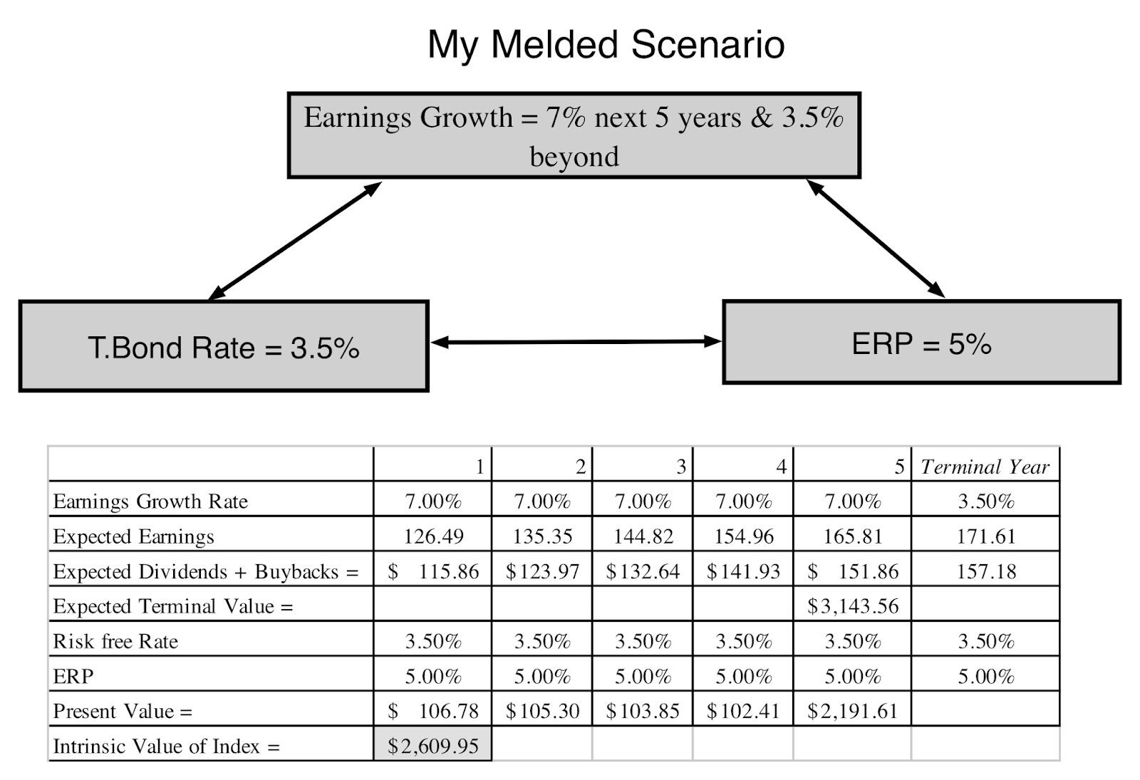
 Download spreadsheetA Melded Version: I believe in a melded version of these stories, where inflation returns (but stays around 2%) and real growth in the economy increases, but only moderately. That will translate into higher treasury bond rates (my guess would be 3.5%), with a proportionate increase in earnings growth (at least in steady state) and an equity risk premium of 5%, splitting the difference between pre-crisis and post-crisis periods. The index value that I obtain, with these assumptions, is about 2610, about 3.1% below March 2nd levels.
 Download spreadsheetYou can see, even from this limited list of scenarios, that to assess how stock prices will move, as interest rates change, you have to also make a judgment on why interest rates are moving. An inflation-driven increase in interest rates is net negative for stocks, but a real-growth driven increase in interest rates is a net positive. In fact, the scenario where interest rates go down sees a much bigger drop in value than two of three scenarios, where interest rates rise.
The Bottom LineWhen macro economic fundamentals change, markets take time to adjust, translating into market volatility. During these adjustment periods, you will hear a great deal of market punditry and much of it will be half baked, with the advisor or analyst focusing on one piece of the valuation puzzle and holding all else constant. Thus, you will read predictions about how much the market will drop if treasury bond rates rise to 4.5% or how much it will rise if earnings growth is 10%. I hope that this post has given you tools that you can use to fill in the rest of the story, since it is possible that stocks could actually go up, even if rates go up to 4.5%, if that rate rise is precipitated by a strong economy, and that stocks could be hurt with 10% earnings growth, if that growth comes mostly from high inflation. I also hope that, after you have listened to the narratives offered by others, for what markets will or will not do, that you start developing your own narrative for the market, as the basis for your investment decisions. You've seen my narrative, but I will leave the feedback loop open, as fresh data on inflation and growth comes in, and I plan to revisit my narrative, tweaking, adjusting or even abandoning it, if the data leads me to.
YouTube Video
Data LinksT.Bond Rates, Inflation and Real GDP Growth - 1954-2017Fed Funds Rate and Treasury Rates - 1962-2017T.Bond Rates, Earnings Growth Rates and ERP - 1961- 2017Spreadsheet LinksIntrinsic Valuation Spreadsheet for S&P 500More of the Same: SpreadsheetThe Return of Inflation: SpreadsheetThe Growth Engine Revs Up: SpreadsheetThe Melded Version: SpreadsheetBlog Post LinksTesting Times: Market Turmoil and Investment Serenity
1. The Fed's power to set interest rates is limitedI have repeatedly pushed back against the notion that the Fed or any central bank somehow sets market interest rates, since it really does not have the power to do so. The only rate that the Fed sets directly is the Fed funds rate, and while it is true that the Fed's actions on that rate send signals to markets, those signals are fuzzy and do not always have predictable consequences. In fact, it is worth noting that the Fed has been hiking the Fed Funds rate since December 2016, when Janet Yellen's Fed initiated this process, raising the Fed Funds rate by 0.25%. In the months since, the effects of the Fed Fund rate changes on long term rates is debatable, and while short term rate have gone up, it is not clear whether the Fed Funds rate is driving short term rates or whether market rates are driving the Fed.

It is true that post-2008, the Fed has been much more aggressive in buying bonds in financial markets in its quantitative easing efforts to keep rates low. While that was started as a response to the financial crisis of 2008, it continued for much of the last decade and clearly has had an impact on interest rates. To those who would argue that it was the Fed, through its Fed Funds rate and quantitative easing policies that kept long term rates low from 2008-2017, I would beg to differ, since there are two far stronger fundamental factors at play - low or no inflation and anemic real economic growth. In the graph below, I have the treasury bond rate compared to the sum of inflation and real growth each year, with the difference being attributed to the Fed effect:
 Download spreadsheet with raw dataYou have seen me use this graph before, but my point is a simple one. The Fed is less rate-setter, when it comes to market interest rates, than rate-influencer, with the influence depending upon its credibility. While rates were low in the 2009-2017 time period, and the Fed did play a role (the Fed effect lowered rates by 0.77%), the primary reasons for low rates were fundamental. It is for that reason that I described the Fed Chair as the Wizard of Oz, drawing his or her power from the perception that he or she has power, rather than actual power. That said, the Fed effect at the start of 2018, as I noted in a post at the beginning of the year, is larger than it has been at any time in the last decade, perhaps setting the stage for the tumult in stock and bond markets in the last few weeks.
 To examine more closely the relationship between moves in the Fed Funds rate and treasury rates, I collected monthly data on the Fed Funds rate, the 3-month US treasury bill rate and the US 10-year treasury bond rate every month from January 1962 to February 2018. The raw data is at the link below, but I regressed the changes in both short term and long term treasuries against changes in the Fed funds rate in the same month:
 Looking at these regressions, here are some interesting conclusions that emerge:Short term T.Bill rates and the Fed Funds rate move together strongly: The result backs up the intuition that the Fed Funds rate and the short term treasury rate are connected strongly, with an R-squared of 56.5%; a 1% increase in the Fed Funds rate is accompanied by a 0.62% increase in the T.Bill rate, in the same month. Note, though, that this regression, by itself, tells you nothing about the direction of the effect, i.e., whether higher Fed funds rates lead to higher short term treasury rates or whether higher rates in the short term treasury bill market lead the Fed to push up the Fed Funds rate. T.Bond rates move with the Fed Funds rate, but more weakly: The link between the Fed Funds rate and the 10-year treasury bond rate is mush weaker, with an R-squared of 6.7%; a 1% increase in the Fed Funds rate is accompanied by a 0.19% increase in the 10-year treasury bond rate. T. Bill rates lead, Fed Funds rates lag: Regressing changes in Fed funds rates against changes in T.Bill rates in the following period, and then reversing direction and regressing changes in T.Bill rates against changes in the Fed Funds rate in the following period, provide clues to the direction of the relationship. At least over this time period, and using monthly changes, it is changes in T.Bill rates that lead changes in Fed Funds rates more strongly, with an R squared of 23.7%, as opposed to an R-squared of 9% for the alternate hypothesis. With treasury bond rates, there is no lagged effect of Fed funds rate changes (R squared of zero), while changes in T.Bond rates do predict changes in the Fed Funds rate in the subsequent period. The Fed is more a follower of markets, than a leader. The bottom line is that if you are trying to get a measure of how much treasury bond rates will change over the next year or two, you will be better served focusing more on changes in economic fundamentals and less on Jerome Powell and the Fed.
2. The relationship between interest rates and stock market value is complicatedWhen interest rates go up, stock prices should go down, right? Though you may believe or have been told that the answer is obvious, that higher interest rates are bad for stock prices, the answer is not straight forward. To understand why people are drawn to the notion that higher rates are bad for value, all you need to do is go back to the drivers of stock market value:
As you can see in this picture, holding all else constant, and raising long term interest rates, will increase the discount rate (cost of equity and capital), and reduce value. That assessment, though, is built on the presumption that the forces that push up interest rates have no effect on the other inputs into value - the equity risk premium, earnings growth and cash flows, a dangerous delusion, since these variables are all connected together to a macro economy.
 Note that almost any macro economic change, whether it be a surge in inflation, an increase in real growth or a global crisis (political or economic) affects earnings growth, T.Bond rates and the equity risk premiums, making the impact on value indeterminate, until you have worked through the net effect. To illustrate the interconnections between earnings growth rates, equity risk premiums and macroeconomic fundamentals, I looked at data on all of the variables going back to 1961:
 Download spreadsheet with raw dataThe co-movement in the variables and their sensitivity to macro economic fundamentals is captured in the correlation table. Higher inflation, over this period, is accompanied by higher earnings growth but also increases equity risk premiums and suppresses real growth, making its net effect often more negative than positive. Higher real economic growth, on the other hand, by pushing up earnings growth rate and lowering equity risk premiums, has a much more positive effect on value.
3. Value has to be built around a consistent narrativeIn my post from February 10, right after the last market meltdown, I offered an intrinsic valuation model for the S&P 500, with a suggestion that you fill in your inputs and come up with your own estimate of value. Some of you did take me up on my offer, came up with inputs, and entered them into a shared Google spreadsheet and, in your collective wisdom, the market was overvalued by about 3.34% in mid-February. While making assumptions about risk premiums, earnings growth and the treasury bond rate, I should have emphasized the importance of narrative, i.e., the macro and market story that lay behind your numbers, since without it, you can make assumptions that are internally inconsistent. To illustrate, here are two inconsistent story lines that I have seen in the last few weeks, from opposite sides of the spectrum (bearish and bullish).
In the bearish version, which I call the Interest Rate Apocalypse, all of the inputs (earnings growth for the next five years and beyond, equity risk premiums) into value are held constant, while raising the treasury bond rate to 4% or 4.5%. Not surprisingly, the effect on value is calamitous, with the value dropping about 20%. While that may alarm you, it is unclear how the analysts who tell this story explain why the forces that push interest rates upwards have no effect on earnings growth, in the next 5 years or beyond, oron equity risk premiums.In the bullish version, which I will term the Real Growth Fantasy, all of the inputs into value are left untouched, while higher growth in the US economy causes earnings growth rates to pop up. The effect again is unsurprising, with value increasing proportionately. While neither of these narratives is fully worked through, there are three separate narratives about the market that are all internally consistent, that can lead to very different judgments on value.
More of the same: In this narrative, you can argue that, as has been so often the case in the last decade, the breakout in the US economy will be short lived and that we will revert back the low growth, low inflation environment that developed economies have been mired in since 2008. In this story, the treasury bond rate will stay low (2.5%), earnings growth will revert back to the low levels of the last decade (3.03%) after the one-time boost from lower taxes fades, and equity risk premiums will stay at post-2008 levels (5.5%). The index value that you obtain is about 2250, about 16.4% below March 2nd levels.
 Download spreadsheetThe Return of Inflation: In this story line, inflation returns, though how the story plays out will depend upon how much inflation you foresee. That higher inflation rate will translate into higher earnings growth, though the effect will vary across companies, depending upon their pricing power, but it will also cause T. Bond rates to rise. If the inflation rate in the story is a high one (3% or higher), the equity risk premium may also rise, if history is any guide. With an inflation rate of 3% and an equity risk premium of 6%, the index value that you obtain is about 2133, about 20.7% below March 2nd levels.
 Download spreadsheetThe Growth Engine Revs Up: In this telling, it is real growth in the US economy that surges, creating tailwinds for growth in the rest of the world. That higher real growth rate, while pushing up earnings growth for US companies (to 8% for the near term), will also increase treasury bond rates (to 3.5%), as in the inflation story, but unlike it, equity risk premiums will drift back to pre-2008 levels (closer to 4.5%). The index value that you obtain is about 3031, about 12.7% above March 2nd levels.
 Download spreadsheetA Melded Version: I believe in a melded version of these stories, where inflation returns (but stays around 2%) and real growth in the economy increases, but only moderately. That will translate into higher treasury bond rates (my guess would be 3.5%), with a proportionate increase in earnings growth (at least in steady state) and an equity risk premium of 5%, splitting the difference between pre-crisis and post-crisis periods. The index value that I obtain, with these assumptions, is about 2610, about 3.1% below March 2nd levels.
 Download spreadsheetYou can see, even from this limited list of scenarios, that to assess how stock prices will move, as interest rates change, you have to also make a judgment on why interest rates are moving. An inflation-driven increase in interest rates is net negative for stocks, but a real-growth driven increase in interest rates is a net positive. In fact, the scenario where interest rates go down sees a much bigger drop in value than two of three scenarios, where interest rates rise.
 The Bottom LineWhen macro economic fundamentals change, markets take time to adjust, translating into market volatility. During these adjustment periods, you will hear a great deal of market punditry and much of it will be half baked, with the advisor or analyst focusing on one piece of the valuation puzzle and holding all else constant. Thus, you will read predictions about how much the market will drop if treasury bond rates rise to 4.5% or how much it will rise if earnings growth is 10%. I hope that this post has given you tools that you can use to fill in the rest of the story, since it is possible that stocks could actually go up, even if rates go up to 4.5%, if that rate rise is precipitated by a strong economy, and that stocks could be hurt with 10% earnings growth, if that growth comes mostly from high inflation. I also hope that, after you have listened to the narratives offered by others, for what markets will or will not do, that you start developing your own narrative for the market, as the basis for your investment decisions. You've seen my narrative, but I will leave the feedback loop open, as fresh data on inflation and growth comes in, and I plan to revisit my narrative, tweaking, adjusting or even abandoning it, if the data leads me to.
YouTube Video
Data LinksT.Bond Rates, Inflation and Real GDP Growth - 1954-2017Fed Funds Rate and Treasury Rates - 1962-2017T.Bond Rates, Earnings Growth Rates and ERP - 1961- 2017Spreadsheet LinksIntrinsic Valuation Spreadsheet for S&P 500More of the Same: SpreadsheetThe Return of Inflation: SpreadsheetThe Growth Engine Revs Up: SpreadsheetThe Melded Version: SpreadsheetBlog Post LinksTesting Times: Market Turmoil and Investment Serenity


February 10, 2018
Testing Times: Market Turmoil and Investment Serenity
The last week has been a roller coaster ride, though more down than up, and investors have done what they always do during market crises. The fear factor rises, some investors sell and head for the safer pastures, some are paralyzed not knowing what to do, and some double down as contrarians, buying into the sell off. In the last week, I found myself drawn to each of three camps, often at different points in the same day, as the market went through wild mood swings. These are my most vulnerable moments as an investor, since good sense is replaced by "animal spirits", and I feel the urge to abandon everything I know about investing, and go with my gut, never a good idea. I know that I have to step back from the action, regain perspective and return to what works for me in markets, and it is for that reason that I find myself going through the same sequence, each time I face a market crisis.
Step 1: Assess the damage and regain perspectiveThe first casualty in a crisis is perspective, as drawn into the news of the day, we tend to lose any sense of proportion. The last week has been an awful week for stocks, with many major indices down by 10% since last Thursday. If your initial investment in stocks was on February 1, 2018, I feel for you, because the pain has no salve, but most of us have had money in stocks for a lot longer than a week. In the table below, I look at the change in the S&P 500 last week and then compare it to the changes since the start of the year (which was less than 6 weeks ago) to a year ago and to ten years ago.
table.tableizer-table { font-size: 12px; border: 1px solid #CCC; font-family: Arial, Helvetica, sans-serif; } .tableizer-table td { padding: 4px; margin: 3px; border: 1px solid #CCC; } .tableizer-table th { background-color: #104E8B; color: #FFF; font-weight: bold; }
2/1/082/1/171/1/182/1/18S&P 500 on date1355227926742822S&P 500 on 2/8/182581258125812581% Change90.48%13.25%-3.48%-8.54%I know that this is small consolation, but if you have been invested in stocks since the start of the year, your portfolio is down, but by less than 3.5%. If you have been invested a year, you are still ahead by 13.25%, even after last week, and if you've been in stocks, since February 2008, you've not only lived through an even bigger market crisis (with the S&P 500 down 38% between September 2008 and March 2009), but you have seen your portfolio climb 90.48% over the entire period, and that does not even include dividends. That is why when confronted by perpetual bears, with their "I told you so" warnings, I try to remember that most of them have been bearish since time immemorial.
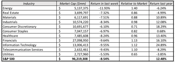
Returning the focus to the last week, let's first look across sectors to see which ones were punished the most and which ones endured. Using the S&P classification for sectors, here is how the sectors performed between February 2, 2018 and February 9, 2018;
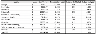 Not surprisingly, every sector had a down week, though energy stocks did worse than the rest of the market, with an oil price drop adding to the pain. Continuing to look at equities, let's now look geographically at returns in different markets over the last week.
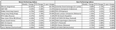 While the S&P 500 had a particularly bad week, the rest of the world felt the pain, with only one index (Colombo, Sri Lanka) on the WSJ international index list showing positive returns for the week. In fact, Asia presents a dichotomy, with the larger markets (China, Japan) among the worst hit and the smaller markets in South Asia (Thailand, Indonesia, Malaysia and Philippines) showing up on the least affected list.
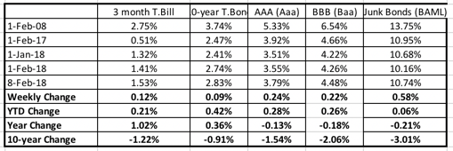
While equities have felt the bulk of the pain, it is interest rates that have been labeled as the source of this market meltdown, and the graph below captures the change in treasury rates and corporate bonds in different ratings classes (AAA, BBB and Junk) over the last week and the last year: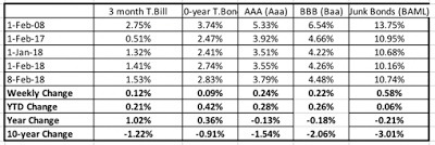 The treasury bond rate rose slightly over the week, at odds with what you usually see in big stock market sell offs, when the flight to safety usually pushes rates down. The increases in default spreads, reflected in the jumps in interest rates increasing with lower ratings, is consistent with a story of a increased risk aversion. Here again, taking a look across a longer time period does provide additional information, with treasury rates at significantly higher levels than a year ago, with a flattening of the yield curve. In summary, this has been an awful week for stocks, across sectors and geographies, and only a mildly bad week for bonds. Looking over the last year, it is bonds that have suffered a bad year, while stocks have done well. That said, the rates that we see on treasuries today are more in keeping with a healthy, growing economy than the rates we saw a year ago.
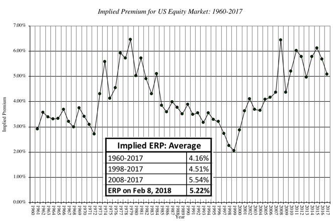
Step 2: Read the tea leavesIt is natural that when faced with large market moves, we look for logical and rational explanations. It is in keeping then that the last week has been full of analysis of the causes and consequences of this market correction. As I see it, there are three possible explanations for any market meltdown over a short period, like this one:Market Meltdowns: Reasons, Symptoms and Consequences Explanation Symptoms Market Consequences Panic Attack Sharp movements in stock prices for no discernible reasons, with surge in fear indices. Market drops sharply, but quickly recovers back most or all of its losses as panic subsides Fundamentals Event or news that causes expected cash flows, growth or perceived risk in equities to change significantly. Market drops sharply and stays down, with price moves tied to the fundamental(s) in focus. Repricing of Risk Event or news that leads to repricing of risk (in the form of equity risk premiums or default spreads). As price of risk is reassessed upwards, market drops until the price of risk finds its new equilibrium. The question in any meltdown is which explanation dominates, since stock market crisis has elements of all three. As I look at what's happened over the last week, I would argue that it was triggered by a fundamental (interest rates rising) leading to a repricing of risk (equity risk premiums going up) and to momentum & fear driven selling. The Fundamentals Trigger: This avalanche of selling was started last Friday (February 1, 2018) by a US unemployment report that contained mostly good news, with 200,000 new jobs created, a continuation of a long string of positive jobs reports. Included in the report, though, was a finding that wages increased 2.9% for US workers, at odds with the mostly flat wage growth over the last decade. That higher wage growth has both positive and negative connotations for stock fundamentals, providing a basis for strong earnings growth at US companies that is built on more than tax cuts, while also sowing the seeds for higher inflation and interest rates, which will make that future growth less valuable. The Repricing of Equity Risk: That expectation of higher interest rates and inflation seems to have caused equity investors to reprice risk by charging higher equity risk premiums, which can be chronicled in a forward-looking estimate of an implied ERP. I last updated that number on January 31, 2018, and I have estimated that premium, by day, over the five trading days between February 1 and February 8, 2018. There is little change in the growth rates and base cash flows, as you go from day to day, partly because neither is updated as frequently as interest rates and stock prices, but holding those numbers, the estimated equity risk premium has increased over the last week from 4.78% at the start of trading on February 1, 2018 to 5.22% at the close of trading on February 8, 2018. Implied ERP, by Day: January 31, 2018 (Close) to February 8, 2018 (Close) Date (Close) S&P 500 T.Bond Rate Implied ERP Link to spreadsheet 31-Jan-18 2823.81 2.74% 4.78% ERP, Jan 31 1-Feb-18 2821.98 2.77% 4.78% ERP, Feb 1 2-Feb-18 2762.13 2.85% 4.88% ERP, Feb 2 5-Feb-18 2648.94 2.79% 5.09% ERP, Feb 5 6-Feb-18 2695.14 2.77% 5.00% ERP, Feb 6 7-Feb-18 2681.66 2.84% 5.02% ERP, Feb 7 8-Feb-18 2581.00 2.83% 5.22% ERP, Feb 8 The Panic Response: Most market players don't buy or sell stocks on fundamentals or actively think about the price of equity risk. Instead, some of them trade, trying to take advantage of shifts in market mood and momentum, and for those traders, the momentum shift in markets is the only reason that they need, to go from being stock buyers to sellers. Others have to sell because their financial positions are imperiled, either because they borrowed money to buy stocks or because they fear irreparable damage to their retirement or savings portfolios. The rise in the volatility indices are a clear indicator of this panic response, with the VIX almost tripling in the course of the week. Just in case you feel the urge to blame millennials, with robo-advisors, for the panic selling, they seem to be staying on the side lines for the most part, and it is the usual culprits, "professional" money managers, that are most panicked of all.At this point, you are probably confused about where to go next. If you are trying to make that judgment, you have to find answers to three questions:Where are interest rates headed? There has been a disconnect between the equity and the bond market, since the 2016 US presidential election, with the equity markets consistently pricing in more optimistic forecasts for the US economy, than the bond markets. Stocks prices rose on the expectation that tax cuts and more robust economic growth, but bond markets were more subdued with rates continuing to stay at the 2.25%-2.5% range that we have seen for much of the last decade. As I noted in my post at the start of this year on equity markets, the gap between the US 10-year T.Bond rate and an intrinsic measure of that rate, computed by adding inflation to real GDP growth, has widened to it's highest level in the last decade. The advent of the new year seems to have caused the bond market to notice this gap, and rates have risen since. If you are optimistic about the US economy and wary about inflation, there is more room for rates to rise, with or without the Fed's active intervention.Is the ERP high enough? Is the repricing of equity risk over? The answer depends upon whether you believe the numbers that underlie my estimates, and if you do, whether you think 5.22% is a sufficient premium for investing in equities. The only way to address that question is to examine it in the context of history, which is what I have done in the picture below: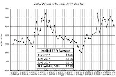 Download historical ERP dataWith all the caveats about the numbers that underlie this graph in place, note that the premium is now solidly in the middle of the distribution. There is always the possibility that the earnings growth estimates that back it up are wrong, but if they are, the interest rate rise that scares markets will also be reversed.When will the panic end? I don't know the answer to the question but I do know that it rests less on economics and more on psychology. There will be a moment, perhaps early next week or in two weeks or in two months, where the fever will pass and the momentum will shift. If you are a trader, you can get rich playing this game, if you play it well, or poor in a hurry, if you play it badly. I choose not to play it all.Is there a way that we can bring this all together into a judgment call in the market. I think so and I will use the same framework that I used for my implied equity risk premium to make my assessment. You will need three numbers, an expected growth rate in earnings for the S&P 500, you estimate of where the 10-year treasury bond rate will end up and what you think is a fair equity risk premium for the S&P 500. For instance, if you accept the analyst forecasted growth in earnings of 7.26% for the next five years as a reasonable estimate, that the the T.Bond rate will settle in at about 3.0% and that 5.0% is a fair value for the equity risk premium, your estimate of value for the S&P 500 is below:
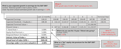 Download spreadsheetWith these estimates, you should be okay with how the market is valuing equities at the close of trading February 8, 2018; it is slightly under valued at 3.90%. To provide a contrast, if you feel that analysts are over estimating the impact of the tax cuts and that the historical earnings growth rate over the last decade (about 3.03%) is a more appropriate forecast for future growth, holding the risk free rate and ERP at 3% and 5% respectively, the value you will get for the index is 2233, about 16% below the index level of February 8, 2018. If you want put in your own estimates of earnings growth, T.Bond rates and equity risk premiums, please download this spreadsheet. In fact, if you are inclined to share your estimates with a group, I have created a shared google spreadsheet for the S&P 500. Let's see what we can get as a crowd valuation.
Step 3: Review your investment philosophyI firmly believe that to be a successful investor, you need a core investment philosophy, a set of beliefs of not just how markets work but who you are as a person, and you need to stay true to that philosophy. It is the one common ingredient that you see across successful investors, whether they succeed as pure traders, growth investors or value investors. The best way that I can think of presenting the different choices you have on investment philosophies is by using my value/price contrast: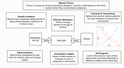 To the question of which of these is the best philosophy, my answer is that there while there is one philosophy that is best for you, there is no one philosophy that is best for all investors. The key to finding that "best" philosophy is to find what makes you tick, as an individual and an investor, not what makes Warren Buffett successful.
I see myself as an investor, not a trader, and that given my tool kit and personality, what works for me is to be a investor grounded in value, though my use of a more expansive definition of value than old-time value investors, allows me to buy both growth stocks and value stocks. I am not a market timer for two reasons.
First, the overall market has too many variables feeding into it that I do not control and cannot forecast, making my valuations inherently too noisy to be useful. Second, I see little that I bring to the overall market in terms of tools or information that will give me an edge over others. The truest test of whether you have a solid investment philosophy is a week like the last one, where you will be tempted to or panicked into abandoning everything that you believe about markets. I would lying if I said that I have not been tempted in the last week to time markets, either because of fear (driving me to sell) or hubris (where I want to play market contrarian), but so far, I have been able to hold out.
Step 4: Act consistently
During every market crisis, you will be tempted to look and ask that ever present question of "What if?", where you think about all of the money you could have saved, if only you had sold last Thursday. Not only is this pointless, unless you have mastered time travel, but it can be damaging to your future returns, as your regrets about past actions taken and not taken play out in new actions that you take. My suggestion is that you return to your core investment philosophy and start to think about the actions that you can take on Monday, when the market opens, that would be consistent with that philosophy. I am taking my own suggestion to heart and have started revisiting the list of companies that I would love to invest in (like Amazon, Netflix and Tesla), but have been priced out of my reach, in the hope that the correction will put some of them into play. More painfully, I have been revaluing every single company in my existing portfolio, with the intent of shedding those that are now over valued, even if they have done well for me. If nothing else, this will keep me busy and perhaps stop me from being caught up in the market frenzy!
YouTube Video
Spreadsheets
S&P 500 Intrinsic Value SpreadsheetGoogle Shared Spreadsheet of Intrinsic Valuations
Step 1: Assess the damage and regain perspectiveThe first casualty in a crisis is perspective, as drawn into the news of the day, we tend to lose any sense of proportion. The last week has been an awful week for stocks, with many major indices down by 10% since last Thursday. If your initial investment in stocks was on February 1, 2018, I feel for you, because the pain has no salve, but most of us have had money in stocks for a lot longer than a week. In the table below, I look at the change in the S&P 500 last week and then compare it to the changes since the start of the year (which was less than 6 weeks ago) to a year ago and to ten years ago.
table.tableizer-table { font-size: 12px; border: 1px solid #CCC; font-family: Arial, Helvetica, sans-serif; } .tableizer-table td { padding: 4px; margin: 3px; border: 1px solid #CCC; } .tableizer-table th { background-color: #104E8B; color: #FFF; font-weight: bold; }
2/1/082/1/171/1/182/1/18S&P 500 on date1355227926742822S&P 500 on 2/8/182581258125812581% Change90.48%13.25%-3.48%-8.54%I know that this is small consolation, but if you have been invested in stocks since the start of the year, your portfolio is down, but by less than 3.5%. If you have been invested a year, you are still ahead by 13.25%, even after last week, and if you've been in stocks, since February 2008, you've not only lived through an even bigger market crisis (with the S&P 500 down 38% between September 2008 and March 2009), but you have seen your portfolio climb 90.48% over the entire period, and that does not even include dividends. That is why when confronted by perpetual bears, with their "I told you so" warnings, I try to remember that most of them have been bearish since time immemorial.
Returning the focus to the last week, let's first look across sectors to see which ones were punished the most and which ones endured. Using the S&P classification for sectors, here is how the sectors performed between February 2, 2018 and February 9, 2018;
 Not surprisingly, every sector had a down week, though energy stocks did worse than the rest of the market, with an oil price drop adding to the pain. Continuing to look at equities, let's now look geographically at returns in different markets over the last week.
 While the S&P 500 had a particularly bad week, the rest of the world felt the pain, with only one index (Colombo, Sri Lanka) on the WSJ international index list showing positive returns for the week. In fact, Asia presents a dichotomy, with the larger markets (China, Japan) among the worst hit and the smaller markets in South Asia (Thailand, Indonesia, Malaysia and Philippines) showing up on the least affected list.
 While equities have felt the bulk of the pain, it is interest rates that have been labeled as the source of this market meltdown, and the graph below captures the change in treasury rates and corporate bonds in different ratings classes (AAA, BBB and Junk) over the last week and the last year:
 The treasury bond rate rose slightly over the week, at odds with what you usually see in big stock market sell offs, when the flight to safety usually pushes rates down. The increases in default spreads, reflected in the jumps in interest rates increasing with lower ratings, is consistent with a story of a increased risk aversion. Here again, taking a look across a longer time period does provide additional information, with treasury rates at significantly higher levels than a year ago, with a flattening of the yield curve. In summary, this has been an awful week for stocks, across sectors and geographies, and only a mildly bad week for bonds. Looking over the last year, it is bonds that have suffered a bad year, while stocks have done well. That said, the rates that we see on treasuries today are more in keeping with a healthy, growing economy than the rates we saw a year ago.
Step 2: Read the tea leavesIt is natural that when faced with large market moves, we look for logical and rational explanations. It is in keeping then that the last week has been full of analysis of the causes and consequences of this market correction. As I see it, there are three possible explanations for any market meltdown over a short period, like this one:Market Meltdowns: Reasons, Symptoms and Consequences Explanation Symptoms Market Consequences Panic Attack Sharp movements in stock prices for no discernible reasons, with surge in fear indices. Market drops sharply, but quickly recovers back most or all of its losses as panic subsides Fundamentals Event or news that causes expected cash flows, growth or perceived risk in equities to change significantly. Market drops sharply and stays down, with price moves tied to the fundamental(s) in focus. Repricing of Risk Event or news that leads to repricing of risk (in the form of equity risk premiums or default spreads). As price of risk is reassessed upwards, market drops until the price of risk finds its new equilibrium. The question in any meltdown is which explanation dominates, since stock market crisis has elements of all three. As I look at what's happened over the last week, I would argue that it was triggered by a fundamental (interest rates rising) leading to a repricing of risk (equity risk premiums going up) and to momentum & fear driven selling. The Fundamentals Trigger: This avalanche of selling was started last Friday (February 1, 2018) by a US unemployment report that contained mostly good news, with 200,000 new jobs created, a continuation of a long string of positive jobs reports. Included in the report, though, was a finding that wages increased 2.9% for US workers, at odds with the mostly flat wage growth over the last decade. That higher wage growth has both positive and negative connotations for stock fundamentals, providing a basis for strong earnings growth at US companies that is built on more than tax cuts, while also sowing the seeds for higher inflation and interest rates, which will make that future growth less valuable. The Repricing of Equity Risk: That expectation of higher interest rates and inflation seems to have caused equity investors to reprice risk by charging higher equity risk premiums, which can be chronicled in a forward-looking estimate of an implied ERP. I last updated that number on January 31, 2018, and I have estimated that premium, by day, over the five trading days between February 1 and February 8, 2018. There is little change in the growth rates and base cash flows, as you go from day to day, partly because neither is updated as frequently as interest rates and stock prices, but holding those numbers, the estimated equity risk premium has increased over the last week from 4.78% at the start of trading on February 1, 2018 to 5.22% at the close of trading on February 8, 2018. Implied ERP, by Day: January 31, 2018 (Close) to February 8, 2018 (Close) Date (Close) S&P 500 T.Bond Rate Implied ERP Link to spreadsheet 31-Jan-18 2823.81 2.74% 4.78% ERP, Jan 31 1-Feb-18 2821.98 2.77% 4.78% ERP, Feb 1 2-Feb-18 2762.13 2.85% 4.88% ERP, Feb 2 5-Feb-18 2648.94 2.79% 5.09% ERP, Feb 5 6-Feb-18 2695.14 2.77% 5.00% ERP, Feb 6 7-Feb-18 2681.66 2.84% 5.02% ERP, Feb 7 8-Feb-18 2581.00 2.83% 5.22% ERP, Feb 8 The Panic Response: Most market players don't buy or sell stocks on fundamentals or actively think about the price of equity risk. Instead, some of them trade, trying to take advantage of shifts in market mood and momentum, and for those traders, the momentum shift in markets is the only reason that they need, to go from being stock buyers to sellers. Others have to sell because their financial positions are imperiled, either because they borrowed money to buy stocks or because they fear irreparable damage to their retirement or savings portfolios. The rise in the volatility indices are a clear indicator of this panic response, with the VIX almost tripling in the course of the week. Just in case you feel the urge to blame millennials, with robo-advisors, for the panic selling, they seem to be staying on the side lines for the most part, and it is the usual culprits, "professional" money managers, that are most panicked of all.At this point, you are probably confused about where to go next. If you are trying to make that judgment, you have to find answers to three questions:Where are interest rates headed? There has been a disconnect between the equity and the bond market, since the 2016 US presidential election, with the equity markets consistently pricing in more optimistic forecasts for the US economy, than the bond markets. Stocks prices rose on the expectation that tax cuts and more robust economic growth, but bond markets were more subdued with rates continuing to stay at the 2.25%-2.5% range that we have seen for much of the last decade. As I noted in my post at the start of this year on equity markets, the gap between the US 10-year T.Bond rate and an intrinsic measure of that rate, computed by adding inflation to real GDP growth, has widened to it's highest level in the last decade. The advent of the new year seems to have caused the bond market to notice this gap, and rates have risen since. If you are optimistic about the US economy and wary about inflation, there is more room for rates to rise, with or without the Fed's active intervention.Is the ERP high enough? Is the repricing of equity risk over? The answer depends upon whether you believe the numbers that underlie my estimates, and if you do, whether you think 5.22% is a sufficient premium for investing in equities. The only way to address that question is to examine it in the context of history, which is what I have done in the picture below:
 Download historical ERP dataWith all the caveats about the numbers that underlie this graph in place, note that the premium is now solidly in the middle of the distribution. There is always the possibility that the earnings growth estimates that back it up are wrong, but if they are, the interest rate rise that scares markets will also be reversed.When will the panic end? I don't know the answer to the question but I do know that it rests less on economics and more on psychology. There will be a moment, perhaps early next week or in two weeks or in two months, where the fever will pass and the momentum will shift. If you are a trader, you can get rich playing this game, if you play it well, or poor in a hurry, if you play it badly. I choose not to play it all.Is there a way that we can bring this all together into a judgment call in the market. I think so and I will use the same framework that I used for my implied equity risk premium to make my assessment. You will need three numbers, an expected growth rate in earnings for the S&P 500, you estimate of where the 10-year treasury bond rate will end up and what you think is a fair equity risk premium for the S&P 500. For instance, if you accept the analyst forecasted growth in earnings of 7.26% for the next five years as a reasonable estimate, that the the T.Bond rate will settle in at about 3.0% and that 5.0% is a fair value for the equity risk premium, your estimate of value for the S&P 500 is below:
 Download spreadsheetWith these estimates, you should be okay with how the market is valuing equities at the close of trading February 8, 2018; it is slightly under valued at 3.90%. To provide a contrast, if you feel that analysts are over estimating the impact of the tax cuts and that the historical earnings growth rate over the last decade (about 3.03%) is a more appropriate forecast for future growth, holding the risk free rate and ERP at 3% and 5% respectively, the value you will get for the index is 2233, about 16% below the index level of February 8, 2018. If you want put in your own estimates of earnings growth, T.Bond rates and equity risk premiums, please download this spreadsheet. In fact, if you are inclined to share your estimates with a group, I have created a shared google spreadsheet for the S&P 500. Let's see what we can get as a crowd valuation.
Step 3: Review your investment philosophyI firmly believe that to be a successful investor, you need a core investment philosophy, a set of beliefs of not just how markets work but who you are as a person, and you need to stay true to that philosophy. It is the one common ingredient that you see across successful investors, whether they succeed as pure traders, growth investors or value investors. The best way that I can think of presenting the different choices you have on investment philosophies is by using my value/price contrast:
 To the question of which of these is the best philosophy, my answer is that there while there is one philosophy that is best for you, there is no one philosophy that is best for all investors. The key to finding that "best" philosophy is to find what makes you tick, as an individual and an investor, not what makes Warren Buffett successful.
I see myself as an investor, not a trader, and that given my tool kit and personality, what works for me is to be a investor grounded in value, though my use of a more expansive definition of value than old-time value investors, allows me to buy both growth stocks and value stocks. I am not a market timer for two reasons.
First, the overall market has too many variables feeding into it that I do not control and cannot forecast, making my valuations inherently too noisy to be useful. Second, I see little that I bring to the overall market in terms of tools or information that will give me an edge over others. The truest test of whether you have a solid investment philosophy is a week like the last one, where you will be tempted to or panicked into abandoning everything that you believe about markets. I would lying if I said that I have not been tempted in the last week to time markets, either because of fear (driving me to sell) or hubris (where I want to play market contrarian), but so far, I have been able to hold out.
Step 4: Act consistently
During every market crisis, you will be tempted to look and ask that ever present question of "What if?", where you think about all of the money you could have saved, if only you had sold last Thursday. Not only is this pointless, unless you have mastered time travel, but it can be damaging to your future returns, as your regrets about past actions taken and not taken play out in new actions that you take. My suggestion is that you return to your core investment philosophy and start to think about the actions that you can take on Monday, when the market opens, that would be consistent with that philosophy. I am taking my own suggestion to heart and have started revisiting the list of companies that I would love to invest in (like Amazon, Netflix and Tesla), but have been priced out of my reach, in the hope that the correction will put some of them into play. More painfully, I have been revaluing every single company in my existing portfolio, with the intent of shedding those that are now over valued, even if they have done well for me. If nothing else, this will keep me busy and perhaps stop me from being caught up in the market frenzy!
YouTube Video
Spreadsheets
S&P 500 Intrinsic Value SpreadsheetGoogle Shared Spreadsheet of Intrinsic Valuations
February 5, 2018
January 2018 Data Update 10: The Price is Right!
In my first nine posts on my data update for 2018, I focused on the costs that companies face in raising equity and debt, and their investment, financing and dividend decisions. In assessing those decisions, though, I looked at their actions through the lens of value creation, arguing that investing in projects that earn less than their cost of capital is not a good use of shareholder capital. While this may seem like a reasonable conclusion, it is built on the implicit assumption that financial markets reward value creation and punish value destruction. As any market observer will tell you, markets have minds of their own, sometimes rewarding companies for bad behavior and punishing companies that take the right actions. In this post, I look at market pricing around the world, and point to potential inconsistencies with the fundamentals.
Value vs PriceIn multiple posts on this blog, I have argued that we need to stop using the words, value and price, interchangeably, that they not only can be very different for the same asset, at any point in time, but that they are driven by different forces, require different mindsets to understand, and give rise to different investment philosophies. The picture below summarizes the key distinctions:
Understanding the difference between value and price, at least for me, is freeing, because it not only makes me aware of the assumptions that I, as an investor who believes in value and convergence, am making, but also makes me respect and recognize those who might have a different perspective. The bottom line, though, is that the pricing process can sometimes reward firms that take actions that no tonly have no effect on value, but may actually destroy value, and punish firms that are following financial first principles. Even though I believe that value ultimately prevails, it behooves to me to try to understand how the market is pricing stocks, since it will help me be a better investor.
The Pricing ProcessI will begin with what sounds like a over-the-top assertion. Much of what we see foisted on us as valuation, including those that you see backing up IPOs, acquisitions or big investment decisions, are really pricing models, masquerading as valuations. In many cases, bankers and analysts use the front of estimating cash flows for a discounted cashflow valuation, while slipping in a multiple to estimate the biggest cash flow (the terminal value) in what I call Trojan Horse DCFs. I am not surprised that pricing is the name of the game in banks and equity research, but I am puzzled at why so much time is wasted on the DCF misdirection play. There are four steps to pricing an asset or company well, and done well, there is no reason to be ashamed of a pricing.
1. Similar, Traded Assets To price an asset, you have to find "similar" assets that are traded in the market. Note the quote marks around similar, because with publicly traded stocks, you will be required to make judgment calls on what you view as similar. The conventional practice in pricing seems to be country and sector focused, where an Indian food processing company is compared to other food processing companies in India, on the implicit assumption that these are the most comparable companies. That practice, though, can not only lead to very small samples in some countries, but also can yield companies that have very different fundamentals from the company that you are valuing.1.1: With equities, there are no perfect matches: If you are valuing a collectible (Tiffany lamp or baseball card), you might be able to find identical assets that have been bought and sold recently. With stocks, there are no identical stocks, since even with companies that are close matches, differences will persist.1.2: Small, more similar, sample or large, more diverse, sample: Given that there are no stocks identical to the one that you are trying to value in the market, you will be faced with two choices. One is to define "similar" narrowly, looking for companies that are listed on the same market as yours, of similar size and serving the same market. The other is to define "similar" more broadly, bringing in companies in other markets and perhaps with different business models. The former will give you more focus and perhaps fewer differences to worry about and the latter a much larger sample, with more tools to control for differences.
2. Pricing Metric To compare pricing across companies, you have to pick a pricing metric and broadly speaking, you have three choices: Post on differences in valueThe market capitalization is the value of equity in a business, the enterprise value is the market value of the operating assets of the firm and the firm value is the market value of the entire firm, including any cash and non-operating assets. While firm value is lightly used, because non-operating assets and cash can skew it, both enterprise value and equity value are both widely used. In computing these metrics, there are three issues that do complicate measurement. One is that market capitalization (market value of equity) is constantly updated, but debt and cash numbers come from the most recent balance sheets, creating a timing mismatch. The second is that the market value of equity is easily observable for publicly traded companies, but debt is often not traded (if bank debt) and book debt is used as a stand in for market debt. Finally, non-operating assets often take the form of holdings in other companies, many of which are private, and the values that you have for them are book values. 2.1: When leverage is different across companies, go with enterprise value: When comparing pricing across companies, it is better to focus on enterprise value, when debt ratios vary widely across the companies, because equity value at highly levered companies is much smaller and more volatile and cannot be easily compared to equity value at lightly levered companies.2.2: With financial service companies, stick with equity: As I have argued in my other posts, debt to a bank, investment bank or insurance company is more raw material than source of capital and defining debt becomes almost impossible to do at financial service firms. Rather than wrestle with his estimation problem, my suggestion is that you stick with equity multiples.
3. Scaling Variable When pricing assets that come in standardized units, you can compare prices directly, but that is never the case with equities, for a simple reason. The number of shares that a company chooses to have will determine the price per share, and arguing that Facebook is more expensive than Twitter because it trades at a higher price per share makes no sense. It is to combat this that we scale prices to a common variable, whether it be earnings, cash flows, book value, revenues or a driver of revenues (users, riders, subscribers etc.).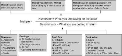
3.1: Be internally consistent: If your pricing metric is an equity value, your scaling variable has to be an equity value (net income, book value of equity). If your pricing metric is enterprise value, your scaling variable has to be an operating variable (revenues, EBITDA or book value of invested capital). 3.2: Life cycle matters: The multiple that you use to judge pricing will change, as a company moves through the life cycle.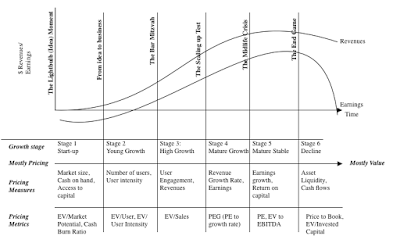 Early in the life cycle, the focus will be on potential market size or revenue drivers, since the company's own revenues are small or non-existent and it is losing money. As it grows and matures, you will see a shift to equity earnings first, since growth companies are mostly equity funded, and then to operating earnings and EBITDA, as mature companies use debt, ending with a focus on book value as a proxy for liquidation value, in decline.
4. Control for differences As we noted, when discussing similar companies, no matter how carefully you pick comparable firms, there will be differences that persist between the company that you are trying to value and the comparable firms. The test of good pricing is whether you detect the variables that cause differences in pricing and how well you control for the differences. In much of equity research, the preferred mode for dealing with these differences is to spin them to justify whatever pre-conceptions you have about a stock.4.1: Check the fundamentals: In intrinsic value, we argued that the value of a company is a function of its cash flows, growth and risk. If you believe that the fundamentals ultimately prevail in markets, you should tie the multiples you use to these fundamentals, and using algebra and a basic discounted cash flow model will lead you to fundamentals drivers of any multiple.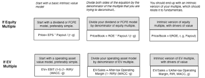
4.2: Let the market tell you what matters: If you are a pure trader, who has little faith that the fundamentals will prevail, you can can take a different path. You can look at other data, related to the companies that you are pricing, and look for correlation. Put simply, you are trying to use the data to back out what variables best explain differences in market pricing, and using those variables to price your company.To illustrate the differences between the two approaches, take a look at my pricing of Severstal, where I used fundamentals to conclude that it was under priced, and my pricing of Twitter, at the time of its IPO, where I backed out the number of users as the key variable driving the market pricing of social media companies and priced Twitter accordingly.
Pricing around the GlobeAssuming that you have had the patience to get to this part of the post, let's look at the pricing numbers at the start of 2018, around the world, starting with earnings multiples (PE and EV/EBITDA), moving on to book value multiples (Price to Book, EV to Invested Capital) and ending with revenue multiples (EV/Sales).
1. Earnings Multiples Earnings multiples have the deepest roots in pricing, with the PE ratio still remaining the most used multiple in the world. In the last two to three decades, there has been a decided shift towards enterprise value multiples, with EV/EBITDA leading the way. While I am skeptical of EBITDA as a measure of accessible cash flow, since it is before taxes and capital expenditures, I understand its pull, especially in aging companies with significant depreciation charges. If you assume that depreciation will need to go back into capital expenditures, there is an intermediate measure of pricing, EV to EBIT.
In the chart below, I look at the distribution of PE ratios globally, and report on the PE ratio distributions, broken down region, at the start of 2018.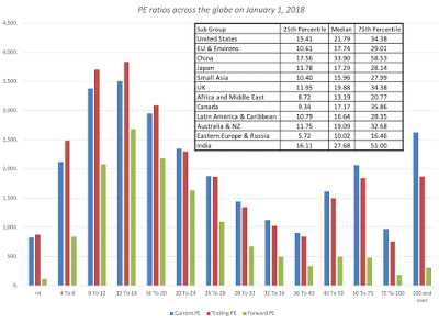
table.tableizer-table { font-size: 12px; border: 1px solid #CCC; font-family: Arial, Helvetica, sans-serif; } .tableizer-table td { padding: 4px; margin: 3px; border: 1px solid #CCC; } .tableizer-table th { background-color: #104E8B; color: #FFF; font-weight: bold; }
I know that it is dangerous to base investment judgments on simple comparisons of pricing multiples, but at the start of 2018, the most expensive market in the world on a PE ratio basis, is China, followed by India, and the cheapest market is Eastern Europe and Russia. If you would like to see the values for earnings multiples, by country, please click at this link.
If you are more interested in operating earnings multiples, the chart below has the distribution of EV/EBIT and EV/EBITDA multiples: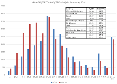 China again tops the scale, with the highest EV/EBITDA multiples, and Eastern Europe and Russia have the lowest EV/EBITDA multiples. Earnings multiples also vary across sectors, with some of the variation attributable to fundamentals (differences in growth, risk and cash flows) and some of it to misplacing. The sectors that trade at the highest and lowest PE ratios are identified below:
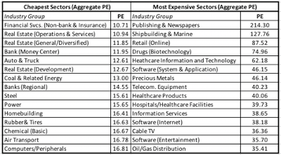 Download industry spreadsheetYou can download the full list of earnings multiples for all of the sectors, by clicking on this link.
2. Book Value Multiples The delusion of fair value accounting is that balance sheets will one day provide better estimates of how much a business in worth than markets, and while I believe that day will never come, even accountants are entitled to their dreams. That said, there are investors who still put their faith in book value and compare market prices to book value, either in equity terms or operating asset terms:
Price to Book Equity = Market Value of Equity / Book Value of EquityEV to Invested Capital = (Market Value of Equity + Market value of Debt - Cash)/ (Book value of equity + Book value of Debt - Cash)In the table below, I report on price to book and enterprise value to invested capital ratios, by sub-region of the world: table.tableizer-table { font-size: 12px; border: 1px solid #CCC; font-family: Arial, Helvetica, sans-serif; } .tableizer-table td { padding: 4px; margin: 3px; border: 1px solid #CCC; } .tableizer-table th { background-color: #104E8B; color: #FFF; font-weight: bold; }
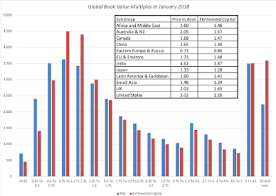
The most expensive sub-region of the world is India, on both a price to book and EV/Invested capital basis, and the lowest priced stocks are again in Eastern Europe and Russia. If you would like to see book value multiples, by country, click at this link. With book value multiples, the differences you observe across sectors not only reflect differences in fundamentals and pricing errors, but also accounting inconsistencies on how capital expenditures in non-manufacturing companies are dealt with, as opposed to manufacturing firms. I tried to correct for these inconsistencies, by capitalizing R&D at all firms, but that correction goes only part way and the most expensive and cheapest sectors, with my corrected book values, are listed below: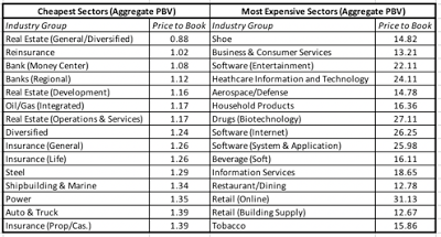 Download industry PBV spreadsheetYou can download the book value multiple data, by sector, by clicking here.
3. Revenue Multiples To the question of why investors and analysts look at multiples of revenues, my one word answer is "desperation". When every other number in your income statement is negative, you have to keep climbing the statement until you hit a positive value. That said, there is value in focusing on a variable that accountants have the least influence over, and the heat map below captures differences in the enterprise value to sales ratios across the globe.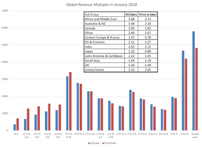
Unlike earnings and book value multiples, which have a pronounced peak in the middle of the distribution, revenue multiples are more evenly distributed, with quite a few firms trading at more than ten times revenues. As with earnings and book value multiples, I report revenue multiples, by country at this link and by sector at this link. Note that there no revenue multiples reported for financial service firms, where neither enterprise value nor revenues can be meaningfully measured or estimated.
ConclusionI am an investor, who believes in value, but it would be foolhardy on my part to ignore the pricing game, since I am dependent upon it ultimately to cash out on my value gains. In this post, I have looked at the pricing differences around the globe, at least based upon market prices at the start of 2018. Of all of my data posts, this is the one that is the most dynamic and likely to change over short periods, since markets can react to change far more quickly than companies can.
YouTube Video
Datasets1. Multiples, by Sector, in January 20182. Multiples, by Country, in January 2018
Data Update PostsJanuary 2018 Data Update 1: Numbers don't lie, or do they?January 2018 Data Update 2: The Buoyancy of US Equities!January 2018 Data Update 3: Taxing Questions on ValueJanuary 2018 Data Update 4: The Currency ConundrumJanuary 2018 Data Update 5: Country Risk UpdateJanuary 2018 Data Update 6: A Cost of Capital PrimerJanuary 2018 Data Update 7: Growth and Value - Investment ReturnsJanuary 2018 Data Update 8: Debt and TaxesJanuary 2018 Data Update 9: Dividends, Buybacks and Cash HoldingsJanuary 2018 Data Update 10: The Pricing Prerogative
Value vs PriceIn multiple posts on this blog, I have argued that we need to stop using the words, value and price, interchangeably, that they not only can be very different for the same asset, at any point in time, but that they are driven by different forces, require different mindsets to understand, and give rise to different investment philosophies. The picture below summarizes the key distinctions:

Understanding the difference between value and price, at least for me, is freeing, because it not only makes me aware of the assumptions that I, as an investor who believes in value and convergence, am making, but also makes me respect and recognize those who might have a different perspective. The bottom line, though, is that the pricing process can sometimes reward firms that take actions that no tonly have no effect on value, but may actually destroy value, and punish firms that are following financial first principles. Even though I believe that value ultimately prevails, it behooves to me to try to understand how the market is pricing stocks, since it will help me be a better investor.
The Pricing ProcessI will begin with what sounds like a over-the-top assertion. Much of what we see foisted on us as valuation, including those that you see backing up IPOs, acquisitions or big investment decisions, are really pricing models, masquerading as valuations. In many cases, bankers and analysts use the front of estimating cash flows for a discounted cashflow valuation, while slipping in a multiple to estimate the biggest cash flow (the terminal value) in what I call Trojan Horse DCFs. I am not surprised that pricing is the name of the game in banks and equity research, but I am puzzled at why so much time is wasted on the DCF misdirection play. There are four steps to pricing an asset or company well, and done well, there is no reason to be ashamed of a pricing.
1. Similar, Traded Assets To price an asset, you have to find "similar" assets that are traded in the market. Note the quote marks around similar, because with publicly traded stocks, you will be required to make judgment calls on what you view as similar. The conventional practice in pricing seems to be country and sector focused, where an Indian food processing company is compared to other food processing companies in India, on the implicit assumption that these are the most comparable companies. That practice, though, can not only lead to very small samples in some countries, but also can yield companies that have very different fundamentals from the company that you are valuing.1.1: With equities, there are no perfect matches: If you are valuing a collectible (Tiffany lamp or baseball card), you might be able to find identical assets that have been bought and sold recently. With stocks, there are no identical stocks, since even with companies that are close matches, differences will persist.1.2: Small, more similar, sample or large, more diverse, sample: Given that there are no stocks identical to the one that you are trying to value in the market, you will be faced with two choices. One is to define "similar" narrowly, looking for companies that are listed on the same market as yours, of similar size and serving the same market. The other is to define "similar" more broadly, bringing in companies in other markets and perhaps with different business models. The former will give you more focus and perhaps fewer differences to worry about and the latter a much larger sample, with more tools to control for differences.
2. Pricing Metric To compare pricing across companies, you have to pick a pricing metric and broadly speaking, you have three choices:
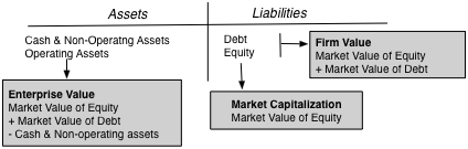 Post on differences in valueThe market capitalization is the value of equity in a business, the enterprise value is the market value of the operating assets of the firm and the firm value is the market value of the entire firm, including any cash and non-operating assets. While firm value is lightly used, because non-operating assets and cash can skew it, both enterprise value and equity value are both widely used. In computing these metrics, there are three issues that do complicate measurement. One is that market capitalization (market value of equity) is constantly updated, but debt and cash numbers come from the most recent balance sheets, creating a timing mismatch. The second is that the market value of equity is easily observable for publicly traded companies, but debt is often not traded (if bank debt) and book debt is used as a stand in for market debt. Finally, non-operating assets often take the form of holdings in other companies, many of which are private, and the values that you have for them are book values. 2.1: When leverage is different across companies, go with enterprise value: When comparing pricing across companies, it is better to focus on enterprise value, when debt ratios vary widely across the companies, because equity value at highly levered companies is much smaller and more volatile and cannot be easily compared to equity value at lightly levered companies.2.2: With financial service companies, stick with equity: As I have argued in my other posts, debt to a bank, investment bank or insurance company is more raw material than source of capital and defining debt becomes almost impossible to do at financial service firms. Rather than wrestle with his estimation problem, my suggestion is that you stick with equity multiples.
3. Scaling Variable When pricing assets that come in standardized units, you can compare prices directly, but that is never the case with equities, for a simple reason. The number of shares that a company chooses to have will determine the price per share, and arguing that Facebook is more expensive than Twitter because it trades at a higher price per share makes no sense. It is to combat this that we scale prices to a common variable, whether it be earnings, cash flows, book value, revenues or a driver of revenues (users, riders, subscribers etc.).
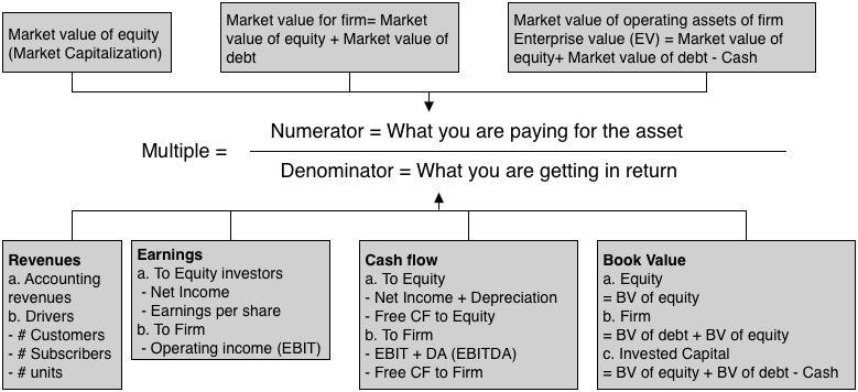
3.1: Be internally consistent: If your pricing metric is an equity value, your scaling variable has to be an equity value (net income, book value of equity). If your pricing metric is enterprise value, your scaling variable has to be an operating variable (revenues, EBITDA or book value of invested capital). 3.2: Life cycle matters: The multiple that you use to judge pricing will change, as a company moves through the life cycle.
 Early in the life cycle, the focus will be on potential market size or revenue drivers, since the company's own revenues are small or non-existent and it is losing money. As it grows and matures, you will see a shift to equity earnings first, since growth companies are mostly equity funded, and then to operating earnings and EBITDA, as mature companies use debt, ending with a focus on book value as a proxy for liquidation value, in decline.
4. Control for differences As we noted, when discussing similar companies, no matter how carefully you pick comparable firms, there will be differences that persist between the company that you are trying to value and the comparable firms. The test of good pricing is whether you detect the variables that cause differences in pricing and how well you control for the differences. In much of equity research, the preferred mode for dealing with these differences is to spin them to justify whatever pre-conceptions you have about a stock.4.1: Check the fundamentals: In intrinsic value, we argued that the value of a company is a function of its cash flows, growth and risk. If you believe that the fundamentals ultimately prevail in markets, you should tie the multiples you use to these fundamentals, and using algebra and a basic discounted cash flow model will lead you to fundamentals drivers of any multiple.

4.2: Let the market tell you what matters: If you are a pure trader, who has little faith that the fundamentals will prevail, you can can take a different path. You can look at other data, related to the companies that you are pricing, and look for correlation. Put simply, you are trying to use the data to back out what variables best explain differences in market pricing, and using those variables to price your company.To illustrate the differences between the two approaches, take a look at my pricing of Severstal, where I used fundamentals to conclude that it was under priced, and my pricing of Twitter, at the time of its IPO, where I backed out the number of users as the key variable driving the market pricing of social media companies and priced Twitter accordingly.
Pricing around the GlobeAssuming that you have had the patience to get to this part of the post, let's look at the pricing numbers at the start of 2018, around the world, starting with earnings multiples (PE and EV/EBITDA), moving on to book value multiples (Price to Book, EV to Invested Capital) and ending with revenue multiples (EV/Sales).
1. Earnings Multiples Earnings multiples have the deepest roots in pricing, with the PE ratio still remaining the most used multiple in the world. In the last two to three decades, there has been a decided shift towards enterprise value multiples, with EV/EBITDA leading the way. While I am skeptical of EBITDA as a measure of accessible cash flow, since it is before taxes and capital expenditures, I understand its pull, especially in aging companies with significant depreciation charges. If you assume that depreciation will need to go back into capital expenditures, there is an intermediate measure of pricing, EV to EBIT.
In the chart below, I look at the distribution of PE ratios globally, and report on the PE ratio distributions, broken down region, at the start of 2018.
table.tableizer-table { font-size: 12px; border: 1px solid #CCC; font-family: Arial, Helvetica, sans-serif; } .tableizer-table td { padding: 4px; margin: 3px; border: 1px solid #CCC; } .tableizer-table th { background-color: #104E8B; color: #FFF; font-weight: bold; }
I know that it is dangerous to base investment judgments on simple comparisons of pricing multiples, but at the start of 2018, the most expensive market in the world on a PE ratio basis, is China, followed by India, and the cheapest market is Eastern Europe and Russia. If you would like to see the values for earnings multiples, by country, please click at this link.
If you are more interested in operating earnings multiples, the chart below has the distribution of EV/EBIT and EV/EBITDA multiples:
 China again tops the scale, with the highest EV/EBITDA multiples, and Eastern Europe and Russia have the lowest EV/EBITDA multiples. Earnings multiples also vary across sectors, with some of the variation attributable to fundamentals (differences in growth, risk and cash flows) and some of it to misplacing. The sectors that trade at the highest and lowest PE ratios are identified below:
 Download industry spreadsheetYou can download the full list of earnings multiples for all of the sectors, by clicking on this link.
 2. Book Value Multiples The delusion of fair value accounting is that balance sheets will one day provide better estimates of how much a business in worth than markets, and while I believe that day will never come, even accountants are entitled to their dreams. That said, there are investors who still put their faith in book value and compare market prices to book value, either in equity terms or operating asset terms:
Price to Book Equity = Market Value of Equity / Book Value of EquityEV to Invested Capital = (Market Value of Equity + Market value of Debt - Cash)/ (Book value of equity + Book value of Debt - Cash)In the table below, I report on price to book and enterprise value to invested capital ratios, by sub-region of the world: table.tableizer-table { font-size: 12px; border: 1px solid #CCC; font-family: Arial, Helvetica, sans-serif; } .tableizer-table td { padding: 4px; margin: 3px; border: 1px solid #CCC; } .tableizer-table th { background-color: #104E8B; color: #FFF; font-weight: bold; }

The most expensive sub-region of the world is India, on both a price to book and EV/Invested capital basis, and the lowest priced stocks are again in Eastern Europe and Russia. If you would like to see book value multiples, by country, click at this link. With book value multiples, the differences you observe across sectors not only reflect differences in fundamentals and pricing errors, but also accounting inconsistencies on how capital expenditures in non-manufacturing companies are dealt with, as opposed to manufacturing firms. I tried to correct for these inconsistencies, by capitalizing R&D at all firms, but that correction goes only part way and the most expensive and cheapest sectors, with my corrected book values, are listed below:
 Download industry PBV spreadsheetYou can download the book value multiple data, by sector, by clicking here.
3. Revenue Multiples To the question of why investors and analysts look at multiples of revenues, my one word answer is "desperation". When every other number in your income statement is negative, you have to keep climbing the statement until you hit a positive value. That said, there is value in focusing on a variable that accountants have the least influence over, and the heat map below captures differences in the enterprise value to sales ratios across the globe.

Unlike earnings and book value multiples, which have a pronounced peak in the middle of the distribution, revenue multiples are more evenly distributed, with quite a few firms trading at more than ten times revenues. As with earnings and book value multiples, I report revenue multiples, by country at this link and by sector at this link. Note that there no revenue multiples reported for financial service firms, where neither enterprise value nor revenues can be meaningfully measured or estimated.
ConclusionI am an investor, who believes in value, but it would be foolhardy on my part to ignore the pricing game, since I am dependent upon it ultimately to cash out on my value gains. In this post, I have looked at the pricing differences around the globe, at least based upon market prices at the start of 2018. Of all of my data posts, this is the one that is the most dynamic and likely to change over short periods, since markets can react to change far more quickly than companies can.
YouTube Video
Datasets1. Multiples, by Sector, in January 20182. Multiples, by Country, in January 2018
Data Update PostsJanuary 2018 Data Update 1: Numbers don't lie, or do they?January 2018 Data Update 2: The Buoyancy of US Equities!January 2018 Data Update 3: Taxing Questions on ValueJanuary 2018 Data Update 4: The Currency ConundrumJanuary 2018 Data Update 5: Country Risk UpdateJanuary 2018 Data Update 6: A Cost of Capital PrimerJanuary 2018 Data Update 7: Growth and Value - Investment ReturnsJanuary 2018 Data Update 8: Debt and TaxesJanuary 2018 Data Update 9: Dividends, Buybacks and Cash HoldingsJanuary 2018 Data Update 10: The Pricing Prerogative
February 4, 2018
January 2018 Data Update 9: Dividends, Stock Buybacks and Cash Holdings
If success for a farmer is measured by his or her harvest, success in a business, from an investors' standpoint, should be measured by its capacity to return cash flows for its owners. That is not belittling the intermediate steps needed to get there, since to be able to generate these cash flows, businesses have to find ways to treat employees well, satisfy customers and leave society at ease with their existence, but the end game does not change. That is why I find it surprising that when companies pay dividends, or worse still, buy back stock, there are so many who seem to view them as failures. Perhaps, that flows from the misguided view that reinvesting cash is good, not just for the company but also for the economy, because it creates growth and returning cash is bad, because it is somehow wasted, both flawed arguments. A company that reinvests cash in a bad business is destroying value, not adding to it, and as we saw in my post on excess returns, a preponderance of companies globally earn less than their costs of capital. Cash that is returned is not lost to the economy, but much of it is reinvested back into other businesses that often have much better investment opportunities. That said, the way companies determine how much to return to shareholders, either as dividends or in the form of buybacks, is grounded in inertia and me-tooism.
Dividends' Place in the Big PictureIn my corporate finance classes, I present what I term the big picture of corporate finance and the first principles that should govern how a business is run: If you view dividends as residual cash flows, which is what they should be, the sequence that leads to dividends is simple. Every business should start by looking at its investment opportunities first, then finding a financing mix that minimizes its hurdle rate and then based upon its investment and financing choices, determine how much to pay out as dividends.
Note that this sequence holds only if capital markets (debt and equity) remain open, accessible and fairly priced, and companies have no self imposed constraints on raising capital or dividend payments. Those are clearly big and perhaps unrealistic assumptions for most companies, especially so for small firms and companies in emerging market, and that is why I have titled it Dividend Utopia. In the real world, there are multiple constraints, some external and some internal, that change the sequence.Capital markets are not always open and accessible: In utopian corporate finance, a company with a good investment opportunity, i.e., one that earns more than the cost of capital can always raise capital from equity or debt market, quickly, at a fair price and with little or no issuance costs. In the real world, capital markets are not that accommodating. Raising capital can be a costly exercise, investors may under price your debt and equity, and the process can take time. It should come as no surprise then that if a company pays too much in dividends in this setting, it will find itself rejecting good investments.Banks may be the only lending option: For many companies, the only option when it comes to borrowing money is to go to a bank, and to the extent that banks face their own constraints on lending, companies may be unable to borrow at what they perceive to be fair rates. This will effectively play out in both investing and financing decisions.Dividends are sticky: If there is one word that characterizes dividend policy around the world, it is that it is "sticky". Companies, once committed to paying dividends, are unwilling to either cut or stop paying dividends, for fear of market punishment. That stickiness translates into companies continuing to pay dividends, even as earnings collapse and/or investment opportunities expand. In a world with these constraints, dividends are no longer a residual cash flow, determined by choices you make on investments and financing, but a determinative cash flow, driving investment and financing decisions. If you add the desire of companies to pay dividends similar to those that they have in the past (inertia) and to be like the rest of the sector (me-too-ism) and irrational fears of dilution and debt, you have the makings of dysfunctional dividends.
In this circular universe, by putting dividend and financing decisions first, companies can end up with too much or too little capital available for projects, and in this dysfunctional universe, they adjust discount rates to make investment demand equate to supply. I never cease to be surprised by companies that claim to use hurdle rates as high as 20% and as low as 3%, both numbers that are out of the range of any reasonable cost of capital computation. In extreme cases, you can have dividend insanity, where companies that are losing money and are already over levered borrow even more money to pay dividends, making their cash flow deficits worse, leading to more losses, more debt and more dividends.
Dividends across the Life Cycle
If dividends are, in fact, a residual cash flow, estimating how much you can afford to pay is a simple exercise of starting with the cash flows from operations that equity investors generate and netting out investment cash flows and cash flows to and from debt.
In effect, everything you need to estimate this potential dividend or free cash flow to equity (FCFE) should be in the statement of cash flows for a firm. This measure of potential dividends can be utilized, with my corporate life cycle framework, to frame how dividend policy should evolve over a company's life, if it were truly residual. Note that the FCFE is the cash that is available for return and that companies can choose to return that cash as traditional dividends or in buybacks. If they choose not to do so, the cash will accumulate as a cash balance at the company.
The Compressed Life Cycle and ConsequencesIn this post from a while back, I argued that as we have shifted from the smoke stack and manufacturing sectors of the last century to the technology and service companies of the modern era, life cycles have compressed, creating challenges for both managers and investors.
That compressed life cycle has consequences for both how much companies can return to shareholders and in what form:Once mature, companies will return more cash over shorter periods: The intensity of both the growth and the decline phases, with compressed life cycles, will mean that companies will become larger much more quickly than they used to, both in terms of revenues and earnings, but once they hit the "growth wall", they will find investment opportunities shrinking much faster, thus allowing for more cash to be returned over shorter time periods.Those cash returns will be more likely to be in buybacks or special dividends, not regular dividends: The sweet spot for conventional dividends is the mature phase, where companies get to enjoy their dominance and rest on their competitive advantages, with large and predictable earnings. With the life cycle shortening and becoming more intense, this sweet spot period has become much briefer. Think of how little time Yahoo! and Blackberry got to enjoy being mature companies, before decline kicked in. Even the rare tech companies, like Microsoft and Apple, that have managed to extend their mature phases have to reinvent themselves to keep generating their earnings, making these earnings more uncertain. Paying large regular dividends in this setting is foolhardy, since investors expect you to keep paying them, in good times and bad.Companies that fight aging will see bigger cash build ups: No company likes to age, and it should not come as a surprise that many tech companies fight the turn in their life cycles, deluding themselves into believing that a rebirth is around the corner and not returning cash., even as free cash flows to equity turn positive. At these companies, cash balances quickly balloon, attracting activist investors.In short, much of what managers and investors know or expect to see in dividend policy reflects a different age and time. It should come as no surprise that older investors, especially ones that grew up with Graham and Dodd as their investing bible find this new world bewildering. I can offer little consolation, since globalization and disruption will only make things more unstable and less suited to paying large, stable dividends.
Cash Return NumbersHaving laid the foundations for understanding the shifts that are occurring in dividend policy, we have a structure for putting the numbers that we will see in this section in perspective. I will start this section by looking at regular dividends and conventional measures of these dividends (dividend yield and payout ratios) but then expand cash return to include stock buybacks and how metrics that capture its magnitude and close by looking at cash balances at companies.
Regular Dividends There are two widely used measures of dividends paid. One is to scale the dividends to the earnings, resulting in a payout ratio. That number, to the extent that you trust accounting income and dividends are the only way of returning cash to stockholders plays a dual role, telling cash-hungry investors how much the company will pay out to them, and growth-seeking investors how much is being put back into the business, to generate future growth (with a retention ratio = 1 - payout ratio). The picture below captures the distribution of payout ratios across the globe, with regional sub-group numbers embedded in a table in the picture:
Note that the payout ratio cannot be computed for companies that pay dividends, while losing money, and that it can be greater than 100% for companies that pay out more than their earnings. Japan has the lowest dividend payout ratio, across regions, a surprise given the lack of growth in the Japanese economy., and Australian companies pay out the higher percentage of their earnings in dividends.
The other measure of dividends paid is the dividend yield, obtained by dividing dividends by the market capitalization. This captures the dividend component of expected return on equities, with the balance coming from expected price appreciation. To the extent that dividends are sticky and thus more likely to continue over time, stocks with higher dividend yields have been viewed as safer investments by old time value investors. The picture below has the distribution of dividend yields for global companies at the start of 2018, with regional sub-group numbers embedded: As with the payout distribution, there are outliers, with companies that deliver dividends yields in the double digits. While these companies may attract your attention, if you are fixated on dividends, these are companies that are almost certainly paying far more dividends that they can afford, and it is only a question of when they will cut dividends, not whether. With both measures of dividends, there is a hidden statistic that needs to be emphasized. While these charts look at aggregate dividends paid by companies and present a picture of dividend plenty, the majority of companies in both the US (75.8%) and globally (57.6%) pay no dividends. The median company in the US and globally pays no dividends.
Buybacks There is a great deal of disinformation out there about stock buybacks and I tried to deal with them in this post from a couple of years ago. The reality is that stock buybacks have largely replaced dividends as the primary mechanism for returning cash to stock holders, at US companies. In 2017, buybacks represented 53.69% of all cash returned by US companies, but the shift to stock buybacks is starting to spread to other parts of the globe, as can be seen in the regional breakdown below: table.tableizer-table { font-size: 12px; border: 1px solid #CCC; font-family: Arial, Helvetica, sans-serif; } .tableizer-table td { padding: 4px; margin: 3px; border: 1px solid #CCC; } .tableizer-table th { background-color: #104E8B; color: #FFF; font-weight: bold; }
Sub GroupNumber of firmsDividends Dividends Buybacks Buybacks as % of Cash ReturnsAfrica and Middle East2,277$65,767 $70,530 6.75%Australia & NZ1,777$50,194 $56,034 10.42%Canada2,850$49,544 $80,470 38.43%China5,552$317,678 $342,282 7.19%EU & Environs5,399$320,027 $514,279 37.77%Eastern Europe & Russia558$21,761 $23,522 7.49%India3,511$20,701 $27,121 23.67%Japan3,755$101,760 $134,087 24.11%Latin America 880$40,395 $47,907 15.68%Small Asia8,630$128,066 $148,607 13.82%UK1,412$101,605 $128,161 20.72%United States7,247$486,009 $1,049,487 53.69%While US companies still return more cash in the form of buybacks than their global counterparts, European and Canadian companies also return approximately 38% of cash returned in buybacks, and even Indian companies are catching on (with about 24% returned in buybacks). If you are interested in how much cash companies in different countries return, and in what form, you can check this list, or the heat map below (you can see the dividend yield and payout ratios, by country, in the live version of the map):
via chartsbin.com
There are differences in how companies return cash, across sectors, and the table below lists the ten sectors that return the most and the least cash, in the form on buybacks, as a percent of cash returned. Download full sector dataCommodity companies and utilities are still more likely to return cash in the form of dividends, while software and technology companies are more likely to use buybacks. If you are interested, you can download the entire sector list, with dividends, buybacks and associated statistics.
Cash Balance
There is one final loose end to tie up on dividends. If companies don't return their FCFE (potential dividends) to stockholders, it accumulates as a cash balance. One way to measure whether companies are returning enough cash is to look at cash balances, scaled to either the market values of these firms or market capitalization. The table below provides the regional statistics on cash balances:
table.tableizer-table { font-size: 12px; border: 1px solid #CCC; font-family: Arial, Helvetica, sans-serif; } .tableizer-table td { padding: 4px; margin: 3px; border: 1px solid #CCC; } .tableizer-table th { background-color: #104E8B; color: #FFF; font-weight: bold; }
Sub GroupCash Balance Cash/Firm ValueCash/ Market CapAfrica and Middle East$490,475 16.13%24.43%Australia & NZ$175,578 6.43%11.37%Canada$183,204 4.66%8.10%China$2,724,851 12.84%21.16%EU & Environs$2,935,769 11.85%22.43%Eastern Europe & Russia$112,480 15.08%24.34%India$99,190 3.31%4.18%Japan$4,185,572 34.47%67.73%Latin America $239,664 7.84%13.06%Small Asia$841,230 9.91%15.19%UK$1,087,286 15.80%29.48%United States$2,206,548 4.73%7.52%Japan is clearly the outlier, with cash representing about 34% of firm value, and an astonishing 68% of market capitalization. It may be a casual empiricism, but it seems to me that Japan is filled with walking dead companies, aging companies whose business models have crumbled but are holding on to cash in desperate hope of reincarnation. It is the Japanese economy that is paying the price for this recalcitrance, as capital stays tied up in bad businesses and does not find it way to younger, more vibrant businesses.
Conclusion
If the end game in business, for investors, is the generation and distribution of cash flows to them, many companies and investors seem to be stuck in the past, where long corporate life cycles and stable earnings allowed companies to pay large, steady and sustained dividends. Facing shorter life cycles, global competition and more unpredictable earnings, it should come as no surprise that companies are looking for more flexible ways of returning cash, than paying dividends and that buybacks have emerged as an alternative. As companies take advantage of the new tax law and bring back trapped cash, some will undoubtedly use the cash to buy back stock, and be loudly declaimed by the usual suspects, for not putting the cash to "productive" uses. I would offer two counters, the first being my post on excess returns where I note that more than 60% of global companies destroy value as they try to reinvest and growth, and the second being that it is better for economies, for aging companies to give cash back to stock holders, to invest in better businesses.
YouTube Video
Data LinksDividend, Buyback and Cash Balance statistics, by CountryDividend, Buyback and Cash Balance statistics, by SectorData Update PostsJanuary 2018 Data Update 1: Numbers don't lie, or do they?January 2018 Data Update 2: The Buoyancy of US Equities!January 2018 Data Update 3: Taxing Questions on ValueJanuary 2018 Data Update 4: The Currency ConundrumJanuary 2018 Data Update 5: Country Risk UpdateJanuary 2018 Data Update 6: A Cost of Capital PrimerJanuary 2018 Data Update 7: Growth and Value - Investment ReturnsJanuary 2018 Data Update 8: Debt and TaxesJanuary 2018 Data Update 9: Dividends, Buybacks and Cash HoldingsJanuary 2018 Data Update 10: The Pricing Prerogative
Dividends' Place in the Big PictureIn my corporate finance classes, I present what I term the big picture of corporate finance and the first principles that should govern how a business is run:
 If you view dividends as residual cash flows, which is what they should be, the sequence that leads to dividends is simple. Every business should start by looking at its investment opportunities first, then finding a financing mix that minimizes its hurdle rate and then based upon its investment and financing choices, determine how much to pay out as dividends.

Note that this sequence holds only if capital markets (debt and equity) remain open, accessible and fairly priced, and companies have no self imposed constraints on raising capital or dividend payments. Those are clearly big and perhaps unrealistic assumptions for most companies, especially so for small firms and companies in emerging market, and that is why I have titled it Dividend Utopia. In the real world, there are multiple constraints, some external and some internal, that change the sequence.Capital markets are not always open and accessible: In utopian corporate finance, a company with a good investment opportunity, i.e., one that earns more than the cost of capital can always raise capital from equity or debt market, quickly, at a fair price and with little or no issuance costs. In the real world, capital markets are not that accommodating. Raising capital can be a costly exercise, investors may under price your debt and equity, and the process can take time. It should come as no surprise then that if a company pays too much in dividends in this setting, it will find itself rejecting good investments.Banks may be the only lending option: For many companies, the only option when it comes to borrowing money is to go to a bank, and to the extent that banks face their own constraints on lending, companies may be unable to borrow at what they perceive to be fair rates. This will effectively play out in both investing and financing decisions.Dividends are sticky: If there is one word that characterizes dividend policy around the world, it is that it is "sticky". Companies, once committed to paying dividends, are unwilling to either cut or stop paying dividends, for fear of market punishment. That stickiness translates into companies continuing to pay dividends, even as earnings collapse and/or investment opportunities expand. In a world with these constraints, dividends are no longer a residual cash flow, determined by choices you make on investments and financing, but a determinative cash flow, driving investment and financing decisions. If you add the desire of companies to pay dividends similar to those that they have in the past (inertia) and to be like the rest of the sector (me-too-ism) and irrational fears of dilution and debt, you have the makings of dysfunctional dividends.
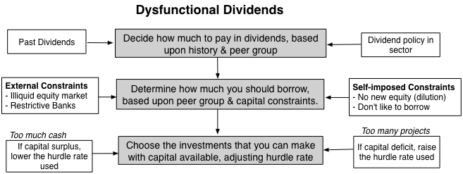
In this circular universe, by putting dividend and financing decisions first, companies can end up with too much or too little capital available for projects, and in this dysfunctional universe, they adjust discount rates to make investment demand equate to supply. I never cease to be surprised by companies that claim to use hurdle rates as high as 20% and as low as 3%, both numbers that are out of the range of any reasonable cost of capital computation. In extreme cases, you can have dividend insanity, where companies that are losing money and are already over levered borrow even more money to pay dividends, making their cash flow deficits worse, leading to more losses, more debt and more dividends.
Dividends across the Life Cycle
If dividends are, in fact, a residual cash flow, estimating how much you can afford to pay is a simple exercise of starting with the cash flows from operations that equity investors generate and netting out investment cash flows and cash flows to and from debt.

In effect, everything you need to estimate this potential dividend or free cash flow to equity (FCFE) should be in the statement of cash flows for a firm. This measure of potential dividends can be utilized, with my corporate life cycle framework, to frame how dividend policy should evolve over a company's life, if it were truly residual.
 Note that the FCFE is the cash that is available for return and that companies can choose to return that cash as traditional dividends or in buybacks. If they choose not to do so, the cash will accumulate as a cash balance at the company.
The Compressed Life Cycle and ConsequencesIn this post from a while back, I argued that as we have shifted from the smoke stack and manufacturing sectors of the last century to the technology and service companies of the modern era, life cycles have compressed, creating challenges for both managers and investors.

That compressed life cycle has consequences for both how much companies can return to shareholders and in what form:Once mature, companies will return more cash over shorter periods: The intensity of both the growth and the decline phases, with compressed life cycles, will mean that companies will become larger much more quickly than they used to, both in terms of revenues and earnings, but once they hit the "growth wall", they will find investment opportunities shrinking much faster, thus allowing for more cash to be returned over shorter time periods.Those cash returns will be more likely to be in buybacks or special dividends, not regular dividends: The sweet spot for conventional dividends is the mature phase, where companies get to enjoy their dominance and rest on their competitive advantages, with large and predictable earnings. With the life cycle shortening and becoming more intense, this sweet spot period has become much briefer. Think of how little time Yahoo! and Blackberry got to enjoy being mature companies, before decline kicked in. Even the rare tech companies, like Microsoft and Apple, that have managed to extend their mature phases have to reinvent themselves to keep generating their earnings, making these earnings more uncertain. Paying large regular dividends in this setting is foolhardy, since investors expect you to keep paying them, in good times and bad.Companies that fight aging will see bigger cash build ups: No company likes to age, and it should not come as a surprise that many tech companies fight the turn in their life cycles, deluding themselves into believing that a rebirth is around the corner and not returning cash., even as free cash flows to equity turn positive. At these companies, cash balances quickly balloon, attracting activist investors.In short, much of what managers and investors know or expect to see in dividend policy reflects a different age and time. It should come as no surprise that older investors, especially ones that grew up with Graham and Dodd as their investing bible find this new world bewildering. I can offer little consolation, since globalization and disruption will only make things more unstable and less suited to paying large, stable dividends.
Cash Return NumbersHaving laid the foundations for understanding the shifts that are occurring in dividend policy, we have a structure for putting the numbers that we will see in this section in perspective. I will start this section by looking at regular dividends and conventional measures of these dividends (dividend yield and payout ratios) but then expand cash return to include stock buybacks and how metrics that capture its magnitude and close by looking at cash balances at companies.
Regular Dividends There are two widely used measures of dividends paid. One is to scale the dividends to the earnings, resulting in a payout ratio. That number, to the extent that you trust accounting income and dividends are the only way of returning cash to stockholders plays a dual role, telling cash-hungry investors how much the company will pay out to them, and growth-seeking investors how much is being put back into the business, to generate future growth (with a retention ratio = 1 - payout ratio). The picture below captures the distribution of payout ratios across the globe, with regional sub-group numbers embedded in a table in the picture:
Note that the payout ratio cannot be computed for companies that pay dividends, while losing money, and that it can be greater than 100% for companies that pay out more than their earnings. Japan has the lowest dividend payout ratio, across regions, a surprise given the lack of growth in the Japanese economy., and Australian companies pay out the higher percentage of their earnings in dividends.
The other measure of dividends paid is the dividend yield, obtained by dividing dividends by the market capitalization. This captures the dividend component of expected return on equities, with the balance coming from expected price appreciation. To the extent that dividends are sticky and thus more likely to continue over time, stocks with higher dividend yields have been viewed as safer investments by old time value investors. The picture below has the distribution of dividend yields for global companies at the start of 2018, with regional sub-group numbers embedded:
 As with the payout distribution, there are outliers, with companies that deliver dividends yields in the double digits. While these companies may attract your attention, if you are fixated on dividends, these are companies that are almost certainly paying far more dividends that they can afford, and it is only a question of when they will cut dividends, not whether. With both measures of dividends, there is a hidden statistic that needs to be emphasized. While these charts look at aggregate dividends paid by companies and present a picture of dividend plenty, the majority of companies in both the US (75.8%) and globally (57.6%) pay no dividends. The median company in the US and globally pays no dividends.
Buybacks There is a great deal of disinformation out there about stock buybacks and I tried to deal with them in this post from a couple of years ago. The reality is that stock buybacks have largely replaced dividends as the primary mechanism for returning cash to stock holders, at US companies. In 2017, buybacks represented 53.69% of all cash returned by US companies, but the shift to stock buybacks is starting to spread to other parts of the globe, as can be seen in the regional breakdown below: table.tableizer-table { font-size: 12px; border: 1px solid #CCC; font-family: Arial, Helvetica, sans-serif; } .tableizer-table td { padding: 4px; margin: 3px; border: 1px solid #CCC; } .tableizer-table th { background-color: #104E8B; color: #FFF; font-weight: bold; }
Sub GroupNumber of firmsDividends Dividends Buybacks Buybacks as % of Cash ReturnsAfrica and Middle East2,277$65,767 $70,530 6.75%Australia & NZ1,777$50,194 $56,034 10.42%Canada2,850$49,544 $80,470 38.43%China5,552$317,678 $342,282 7.19%EU & Environs5,399$320,027 $514,279 37.77%Eastern Europe & Russia558$21,761 $23,522 7.49%India3,511$20,701 $27,121 23.67%Japan3,755$101,760 $134,087 24.11%Latin America 880$40,395 $47,907 15.68%Small Asia8,630$128,066 $148,607 13.82%UK1,412$101,605 $128,161 20.72%United States7,247$486,009 $1,049,487 53.69%While US companies still return more cash in the form of buybacks than their global counterparts, European and Canadian companies also return approximately 38% of cash returned in buybacks, and even Indian companies are catching on (with about 24% returned in buybacks). If you are interested in how much cash companies in different countries return, and in what form, you can check this list, or the heat map below (you can see the dividend yield and payout ratios, by country, in the live version of the map):
via chartsbin.com
There are differences in how companies return cash, across sectors, and the table below lists the ten sectors that return the most and the least cash, in the form on buybacks, as a percent of cash returned.
 Download full sector dataCommodity companies and utilities are still more likely to return cash in the form of dividends, while software and technology companies are more likely to use buybacks. If you are interested, you can download the entire sector list, with dividends, buybacks and associated statistics.
Cash Balance
There is one final loose end to tie up on dividends. If companies don't return their FCFE (potential dividends) to stockholders, it accumulates as a cash balance. One way to measure whether companies are returning enough cash is to look at cash balances, scaled to either the market values of these firms or market capitalization. The table below provides the regional statistics on cash balances:
table.tableizer-table { font-size: 12px; border: 1px solid #CCC; font-family: Arial, Helvetica, sans-serif; } .tableizer-table td { padding: 4px; margin: 3px; border: 1px solid #CCC; } .tableizer-table th { background-color: #104E8B; color: #FFF; font-weight: bold; }
Sub GroupCash Balance Cash/Firm ValueCash/ Market CapAfrica and Middle East$490,475 16.13%24.43%Australia & NZ$175,578 6.43%11.37%Canada$183,204 4.66%8.10%China$2,724,851 12.84%21.16%EU & Environs$2,935,769 11.85%22.43%Eastern Europe & Russia$112,480 15.08%24.34%India$99,190 3.31%4.18%Japan$4,185,572 34.47%67.73%Latin America $239,664 7.84%13.06%Small Asia$841,230 9.91%15.19%UK$1,087,286 15.80%29.48%United States$2,206,548 4.73%7.52%Japan is clearly the outlier, with cash representing about 34% of firm value, and an astonishing 68% of market capitalization. It may be a casual empiricism, but it seems to me that Japan is filled with walking dead companies, aging companies whose business models have crumbled but are holding on to cash in desperate hope of reincarnation. It is the Japanese economy that is paying the price for this recalcitrance, as capital stays tied up in bad businesses and does not find it way to younger, more vibrant businesses.
Conclusion
If the end game in business, for investors, is the generation and distribution of cash flows to them, many companies and investors seem to be stuck in the past, where long corporate life cycles and stable earnings allowed companies to pay large, steady and sustained dividends. Facing shorter life cycles, global competition and more unpredictable earnings, it should come as no surprise that companies are looking for more flexible ways of returning cash, than paying dividends and that buybacks have emerged as an alternative. As companies take advantage of the new tax law and bring back trapped cash, some will undoubtedly use the cash to buy back stock, and be loudly declaimed by the usual suspects, for not putting the cash to "productive" uses. I would offer two counters, the first being my post on excess returns where I note that more than 60% of global companies destroy value as they try to reinvest and growth, and the second being that it is better for economies, for aging companies to give cash back to stock holders, to invest in better businesses.
YouTube Video
Data LinksDividend, Buyback and Cash Balance statistics, by CountryDividend, Buyback and Cash Balance statistics, by SectorData Update PostsJanuary 2018 Data Update 1: Numbers don't lie, or do they?January 2018 Data Update 2: The Buoyancy of US Equities!January 2018 Data Update 3: Taxing Questions on ValueJanuary 2018 Data Update 4: The Currency ConundrumJanuary 2018 Data Update 5: Country Risk UpdateJanuary 2018 Data Update 6: A Cost of Capital PrimerJanuary 2018 Data Update 7: Growth and Value - Investment ReturnsJanuary 2018 Data Update 8: Debt and TaxesJanuary 2018 Data Update 9: Dividends, Buybacks and Cash HoldingsJanuary 2018 Data Update 10: The Pricing Prerogative
January 29, 2018
January 2018 Data Update 8: Debt and Taxes
In the United States, as in much of the rest of the world, and as has been true for most of the last century, the tax code has been tilted towards debt, rewarding firms that borrow money with tax savings, relative to those that use equity to fund their operations. While the original rationale for this debt bias was to allow the large infrastructure companies of the equity markets (railroads, followed by phone and natural resource companies) to raise financing to fund their growth, that reason has long dissipated, but a significant segment of the economy is built on debt. The most revolutionary component of the US tax reform package that passed at the end of last year is that it reduces the benefits of debt in multiple ways, and by doing so, challenges companies that have long depended on debt to reexamine their financing policies.
The Trade Off on Debt and the Tax Reform PackageIn last year’s update on debt, I summarized the trade off on debt, listing both the real pluses and minuses of debt as well as what I called the illusory benefits. In the latter group, I included reasons like debt is cheaper than equity and dilution benefits:
The bottom line is that it is the tax advantage of debt that makes it attractive to equity, and the benefits to borrowing were greater in the United States than in any other country last year, for a simple reason. The US had the highest marginal corporate tax rate in the world, at 40%, and companies that borrowed effectively claimed their tax benefits at that rate. To the oft touted counter that no US companies pay 40%, that is true, but it actually makes the tax benefit of debt even more perverse. Companies in the United States have been able to pay effective tax rates well below 40%, while maximizing their tax benefits from debt. As an example, consider Apple, which paid an effective tax rate of less than 25% on its global income last year, partly because it left so much of its foreign income off shore (as trapped cash). Apple still managed to borrow almost $110 billion in the United States, and claim the interest expenses on that debt as a tax deduction against its highest taxed income (its US income). For those of you who find this unethical, please spare me the moralizing since your disdain should be directed at those who wrote the tax code.
As I noted in my post on the changes that tax reform is bringing, the biggest are going to be to the tax benefits of debt, which will be dramatically decreased starting this year, for two reasons:Lower marginal tax rate: The marginal tax rate for the United States has gone from being the highest in the world to close to the middle. At a 24% marginal tax rate, which is where I think we will end up with state and local taxes added to the new federal tax rate of 21%, you are effectively reducing the tax benefit of debt by about 40% (from 40% to 24%). In the heat map below, I have highlighted marginal tax rates of countries, with a highlighting in shades of rec of those that will have lower marginal tax rates than the US after 2018. To provide a contrast, this picture would have been entirely in shades of red last year, before the tax rate change, since there was no other country with a corporate tax higher than 40%.
via chartsbin.comLimits on interest tax deductions: Until last year, as has been the case for much of the last century, US companies have been able to claim their interest expenses as tax deductions, as long as they have the income to cover these expenses. With the new tax code, there is a limit to how much interest you can deduct, at 30% of adjusted taxable income. Any excess interest expenses that cannot be deducted can be carried forward and claimed in future years, and that provision will help companies with volatile earnings, since they will be able to claim back deductions lost in a bad year, in good years. As is its wont, Congress has chosen to make up its own definitions of adjusted taxable income, with EBITDA standing on for operating income until 2021 and then transitioning to earnings before interest and taxes (EBIT). There are two other provisions in the tax code which will also indirectly affect the debt trade off.Capital Expensing: Attempting to encourage investments in physical assets, especially at manufacturing companies, the tax code will allow companies to expense their capital investments for a temporary period. The resulting tax deductions may be large enough to reduce the benefit to having the interest tax deduction. That effect will be magnified by the fact that the companies that are most likely to be using the capital expensing provisions are also the companies that have used debt the most in funding their operations.Un-trapped Cash: As companies are allowed to pay a one-time tax and bring trapped cash back to the United States, the cash will be now available for other uses and reduce the need for debt as a funding source. Note that estimates of this trapped cash, collectively held by US companies, exceed $3 trillion and that even if only half of this cash is brought back, it would still be a substantial amount.All in all, there are multiple provisions in the tax code that handicap the use of debt and very few, perhaps even none, that would make debt a more attractive source of financing.
Optimal Capital StructureTo quantify the impact of the tax code’s change on how much debt a company should have and how much value it adds, I used an old but flexible optimizing tool: the cost of capital. It is, of course, the number around which a post looking at how it varies around the world and sectors. In the follow up post, I used the cost of capital as a hurdle rate to judge the quality of a company’s investments. In this one, I will use it to talk about the right mix of debt and equity, and how it affects value: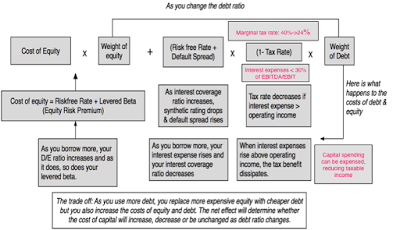
Note that as you borrow more money, your costs of equity and debt go into motion, increasing as the debt increases and the trade off from the last section plays out, with the tax benefits showing up as an after-tax cost of debt and the bankruptcy costs partially captured in the higher costs of both equity and debt and partially as drops in operating income. Note that the key changes in the 2017 tax reform package, at least as they relate to the trade off, are highlighted. I used Disney as an illustrative example, and computed the costs of capital at every debt ratio under the old tax regime and the new one and the results are in the graph below:
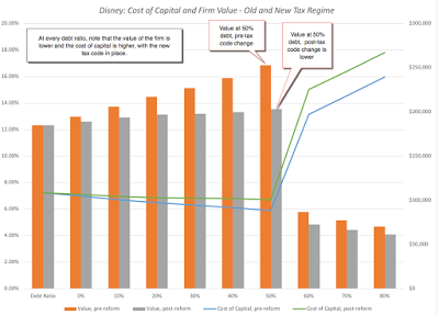 Disney Capital Structure SpreadsheetThe cost of capital is a driver of the value of the operating assets, and since the costs of capital are higher at every debt ratio than they used to be, it should come as no surprise that the value added by debt has dropped at every debt ratio, with the new tax code.
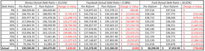 Download spreadsheets: Disney, Facebook & FordThe easiest way to see the effects of the new tax code are to look at how it plays out in the cost of capital and values of real companies. I will use Facebook, Disney and Ford as my examples, partly because they are all high profile and partly because they have widely divergent current debt policies, with Facebook having almost no debt, Disney a moderate amount and Ford more debt. With each firm, I computed the schedule of cost of capital, holding all else constant (both micro variables like EBIT and EBITDA and macro variables like the risk free rate and ERP.), with the old and new tax codes. I do this, not because I believe that these numbers will not be affected by the tax code, but because I want to isolate its impact on debt. For all three firms, the effect of the new tax code is unambiguous. The value added by debt drops with the new tax code and the change is larger at higher debt ratios. Taking away 40% of the tax benefits of debt (by lowering the marginal tax rate from 40% to 24%) has consequences. Note, though, that the lost value is almost entirely hypothetical, for Facebook, since it did not borrow money even under the old code and did not have much capacity to add value from debt in the first place. It is large, for Disney and Ford, as existing debt becomes less valuable, with the new tax reform. Note, though, that both companies will also benefit from the tax code changes, paying lower taxes on income both domestically, with the lowering of the US tax rate, and on foreign income, from the shift to a regional tax model. Ford, in particular, could also benefit from the capital expensing provision. My guess is that both firms will see a net increase in value, with all changes incorporated. With these three firms, at least, the cap on the interest expense deduction (set at 30% of EBITDA for the near term) does not affect value at their existing debt ratios and is not a binding constraint until they get to very high debt ratios.
Debt Ratios- Cross Sectional DistributionsIf you accept my reasoning that the new tax code will lower the value of debt in capital structure, and that the effect will be most visible at firms that borrowed a lot of money under the old tax regime, the only way to assess the tax code’s impact is to look how debt ratios vary across companies, and what type of firms and in what sectors borrow the most.
To get a measure of what comprises a high debt ratio, I started by looking at the distribution of debt ratios across companies, for both US and global companies: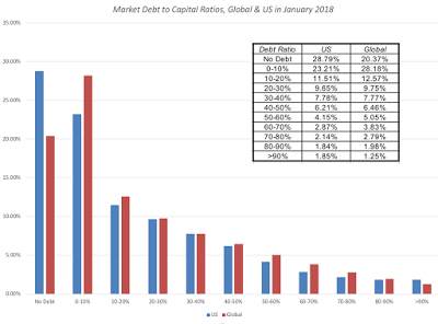 I was surprised by how many firms in the global sample have little or no debit their capital structure, with more than half of all firms in the sample having total debt to capital ratios of less than 10%. In fact, netting cash out from debt would lead to even lower net debt ratios. That said, there is enough debt at the largest firms that the aggregated debt ratios across all firms is significantly higher. Looking at these aggregated debt ratios, you would expect US companies to have been borrowing more money than companies in other parts of the world, and to see if they did, I looked at measures of financial leverage, from debt scaled to capital to debt to EBITDA globally: table.tableizer-table { font-size: 12px; border: 1px solid #CCC; font-family: Arial, Helvetica, sans-serif; } .tableizer-table td { padding: 4px; margin: 3px; border: 1px solid #CCC; } .tableizer-table th { background-color: #104E8B; color: #FFF; font-weight: bold; }
Sub GroupDebt/Capital (Book)Debt/Capital (Market)Net Debt/ Capital (Book)Net Debt/ Capital (Market)Debt/EBITDAAfrica and Middle East45.23%34.00%30.27%21.31%5.99Australia & NZ61.66%43.48%57.82%39.60%8.57Canada55.35%42.42%52.46%39.60%7.16China51.63%39.34%41.83%30.40%8.52EU & Environs60.75%47.17%53.68%40.07%7.78Eastern Europe & Russia31.02%38.05%21.35%27.05%2.47India54.89%20.85%50.58%18.15%3.92Japan56.16%49.11%27.64%22.35%7.61Latin America & Caribbean51.67%40.01%46.23%34.90%5.74Small Asia44.04%34.76%36.01%27.59%4.54UK63.74%46.39%53.68%36.33%7.94United States64.06%37.11%60.86%33.99%7.09The results are mixed. While US companies look like they are the most highly levered in the world, if you scale debt (gross and net) to book value, US companies don’t look like outliers on any of the dimensions. In fact, the only real outliers seem to be East European companies that borrow far less than the rest of the world, relative to EBITDA, and Indian companies, that borrow less, relative to market value. Looking across sectors, you do see clear differences, with some sectors almost completely unburdened with debt and others less so. While you can get the entire list from clicking on this link, the most highly levered sectors in the US are highlight below, relative to both market capital and EBITDA.
 Download full sector spreadsheetI removed financial service firms from this list, since debt to them is a raw material, not a source of capital, and real estate investment trusts, since they do not pay corporate taxes, under the old and new tax regimes. As I noted in my post on tax reform, it is the most highly levered sectors that will be exposed to loss of value and it is entirely possible that the net effect of the tax change can be negative for them.
Implications
You seldom get to observe a real world experiment of the magnitude that we will be faced with in 2018, with the tax code in change and the loss in value added from debt. Given the changes, I would expect the following:Deleveraging at firms that have pushed to their optimal debt ratios, under old tax code: While there are many firms, like Facebook. where debt was never a source of added value, where the tax code will affect that component of value very little, there will be other highly levered firms where the value change will be substantial. In fact, many of these firms, which would have been at the right mix of debt and equity, under the old tax regime, will find themselves over levered and in need of paying down debt. Given that inertia is the primary force in corporate finance, it may them a while to come to this realization.Go slow at firms that have held back: For firms like Facebook that have held back from borrowing, under the old tax code, the new tax code reduces the incentive to add to debt, even as they mature. As you can see from the numbers on Facebook, Disney and Ford, the benefits of debt have been significantly scaled down.Transactions that derive most of their value from leverage will be handicapped: Since the mid-1980s, leveraged transactions have been favored by many private equity investors. While one reason was that they were equity constrained (and that reason remains), the bigger reason was that it allowed them to generate added value from recapitalization. At the risk of over generalizing, I will argue that for a large segment of private equity investors, this was the primary source of their value added and for these investors, the new tax code is unequivocally bad news, and I will shed no tears for them. As I noted at the start of this post, debt is part of the fabric of business in the United States, and there are some businesses and asset classes that have been built on debt. Real estate and infrastructure businesses have historically not only used debt as a primary source of funding but as a value addition, with the added value coming from the tax code. Now that the added value is much lower, it remains to be seen whether asset values will have to adjust.
Conclusion
From financial first principles, there is nothing inherently good or bad about debt. It is a source of financing that you can use to build a business, but by itself, it neither adds nor detracts from the value of the business. It is the addition of tax benefits and bankruptcy costs that makes the use of debt a trade off between its benefits (primarily tax driven) and its costs (from increased distress and agency costs). The new tax code has not removed the tax benefits of debt but it has substantially reduced them, and we should expect to see less debt overall at companies, as a consequence. In my view, that is a positive for the economy, since debt magnifies economic shocks to businesses and not only creates more volatile earnings and value, but deadweight costs for society.
YouTube Video
Datasets
Debt Ratios by Sector, US (January 2018)Debt Ratios by Sector, Global (January 2018)SpreadsheetsCapital Structure Optimizing Spreadsheet (with 2017 US Tax Code changes built in) (with YouTube guide to using this spreadsheet)Disney Optimal Capital Structure Facebook Optimal Capital StructureFord Optimal Capital StructureData Update PostsJanuary 2018 Data Update 1: Numbers don't lie, or do they?January 2018 Data Update 2: The Buoyancy of US Equities!January 2018 Data Update 3: Taxing Questions on ValueJanuary 2018 Data Update 4: The Currency ConundrumJanuary 2018 Data Update 5: Country Risk UpdateJanuary 2018 Data Update 6: A Cost of Capital PrimerJanuary 2018 Data Update 7: Growth and Value - Investment ReturnsJanuary 2018 Data Update 8: Debt and TaxesJanuary 2018 Data Update 9: The Cash Harvest - Dividend PolicyJanuary 2018 Data Update 10: The Pricing Prerogative
The Trade Off on Debt and the Tax Reform PackageIn last year’s update on debt, I summarized the trade off on debt, listing both the real pluses and minuses of debt as well as what I called the illusory benefits. In the latter group, I included reasons like debt is cheaper than equity and dilution benefits:
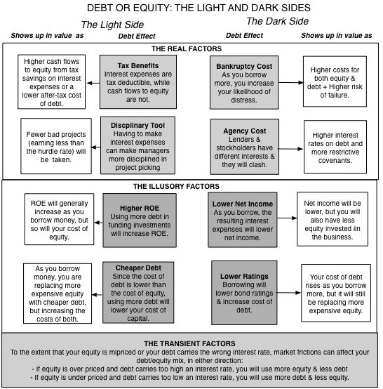
The bottom line is that it is the tax advantage of debt that makes it attractive to equity, and the benefits to borrowing were greater in the United States than in any other country last year, for a simple reason. The US had the highest marginal corporate tax rate in the world, at 40%, and companies that borrowed effectively claimed their tax benefits at that rate. To the oft touted counter that no US companies pay 40%, that is true, but it actually makes the tax benefit of debt even more perverse. Companies in the United States have been able to pay effective tax rates well below 40%, while maximizing their tax benefits from debt. As an example, consider Apple, which paid an effective tax rate of less than 25% on its global income last year, partly because it left so much of its foreign income off shore (as trapped cash). Apple still managed to borrow almost $110 billion in the United States, and claim the interest expenses on that debt as a tax deduction against its highest taxed income (its US income). For those of you who find this unethical, please spare me the moralizing since your disdain should be directed at those who wrote the tax code.
As I noted in my post on the changes that tax reform is bringing, the biggest are going to be to the tax benefits of debt, which will be dramatically decreased starting this year, for two reasons:Lower marginal tax rate: The marginal tax rate for the United States has gone from being the highest in the world to close to the middle. At a 24% marginal tax rate, which is where I think we will end up with state and local taxes added to the new federal tax rate of 21%, you are effectively reducing the tax benefit of debt by about 40% (from 40% to 24%). In the heat map below, I have highlighted marginal tax rates of countries, with a highlighting in shades of rec of those that will have lower marginal tax rates than the US after 2018. To provide a contrast, this picture would have been entirely in shades of red last year, before the tax rate change, since there was no other country with a corporate tax higher than 40%.
via chartsbin.comLimits on interest tax deductions: Until last year, as has been the case for much of the last century, US companies have been able to claim their interest expenses as tax deductions, as long as they have the income to cover these expenses. With the new tax code, there is a limit to how much interest you can deduct, at 30% of adjusted taxable income. Any excess interest expenses that cannot be deducted can be carried forward and claimed in future years, and that provision will help companies with volatile earnings, since they will be able to claim back deductions lost in a bad year, in good years. As is its wont, Congress has chosen to make up its own definitions of adjusted taxable income, with EBITDA standing on for operating income until 2021 and then transitioning to earnings before interest and taxes (EBIT). There are two other provisions in the tax code which will also indirectly affect the debt trade off.Capital Expensing: Attempting to encourage investments in physical assets, especially at manufacturing companies, the tax code will allow companies to expense their capital investments for a temporary period. The resulting tax deductions may be large enough to reduce the benefit to having the interest tax deduction. That effect will be magnified by the fact that the companies that are most likely to be using the capital expensing provisions are also the companies that have used debt the most in funding their operations.Un-trapped Cash: As companies are allowed to pay a one-time tax and bring trapped cash back to the United States, the cash will be now available for other uses and reduce the need for debt as a funding source. Note that estimates of this trapped cash, collectively held by US companies, exceed $3 trillion and that even if only half of this cash is brought back, it would still be a substantial amount.All in all, there are multiple provisions in the tax code that handicap the use of debt and very few, perhaps even none, that would make debt a more attractive source of financing.
Optimal Capital StructureTo quantify the impact of the tax code’s change on how much debt a company should have and how much value it adds, I used an old but flexible optimizing tool: the cost of capital. It is, of course, the number around which a post looking at how it varies around the world and sectors. In the follow up post, I used the cost of capital as a hurdle rate to judge the quality of a company’s investments. In this one, I will use it to talk about the right mix of debt and equity, and how it affects value:

Note that as you borrow more money, your costs of equity and debt go into motion, increasing as the debt increases and the trade off from the last section plays out, with the tax benefits showing up as an after-tax cost of debt and the bankruptcy costs partially captured in the higher costs of both equity and debt and partially as drops in operating income. Note that the key changes in the 2017 tax reform package, at least as they relate to the trade off, are highlighted. I used Disney as an illustrative example, and computed the costs of capital at every debt ratio under the old tax regime and the new one and the results are in the graph below:
 Disney Capital Structure SpreadsheetThe cost of capital is a driver of the value of the operating assets, and since the costs of capital are higher at every debt ratio than they used to be, it should come as no surprise that the value added by debt has dropped at every debt ratio, with the new tax code.
 Download spreadsheets: Disney, Facebook & FordThe easiest way to see the effects of the new tax code are to look at how it plays out in the cost of capital and values of real companies. I will use Facebook, Disney and Ford as my examples, partly because they are all high profile and partly because they have widely divergent current debt policies, with Facebook having almost no debt, Disney a moderate amount and Ford more debt. With each firm, I computed the schedule of cost of capital, holding all else constant (both micro variables like EBIT and EBITDA and macro variables like the risk free rate and ERP.), with the old and new tax codes. I do this, not because I believe that these numbers will not be affected by the tax code, but because I want to isolate its impact on debt. For all three firms, the effect of the new tax code is unambiguous. The value added by debt drops with the new tax code and the change is larger at higher debt ratios. Taking away 40% of the tax benefits of debt (by lowering the marginal tax rate from 40% to 24%) has consequences. Note, though, that the lost value is almost entirely hypothetical, for Facebook, since it did not borrow money even under the old code and did not have much capacity to add value from debt in the first place. It is large, for Disney and Ford, as existing debt becomes less valuable, with the new tax reform. Note, though, that both companies will also benefit from the tax code changes, paying lower taxes on income both domestically, with the lowering of the US tax rate, and on foreign income, from the shift to a regional tax model. Ford, in particular, could also benefit from the capital expensing provision. My guess is that both firms will see a net increase in value, with all changes incorporated. With these three firms, at least, the cap on the interest expense deduction (set at 30% of EBITDA for the near term) does not affect value at their existing debt ratios and is not a binding constraint until they get to very high debt ratios.
 Debt Ratios- Cross Sectional DistributionsIf you accept my reasoning that the new tax code will lower the value of debt in capital structure, and that the effect will be most visible at firms that borrowed a lot of money under the old tax regime, the only way to assess the tax code’s impact is to look how debt ratios vary across companies, and what type of firms and in what sectors borrow the most.
To get a measure of what comprises a high debt ratio, I started by looking at the distribution of debt ratios across companies, for both US and global companies:
 I was surprised by how many firms in the global sample have little or no debit their capital structure, with more than half of all firms in the sample having total debt to capital ratios of less than 10%. In fact, netting cash out from debt would lead to even lower net debt ratios. That said, there is enough debt at the largest firms that the aggregated debt ratios across all firms is significantly higher. Looking at these aggregated debt ratios, you would expect US companies to have been borrowing more money than companies in other parts of the world, and to see if they did, I looked at measures of financial leverage, from debt scaled to capital to debt to EBITDA globally: table.tableizer-table { font-size: 12px; border: 1px solid #CCC; font-family: Arial, Helvetica, sans-serif; } .tableizer-table td { padding: 4px; margin: 3px; border: 1px solid #CCC; } .tableizer-table th { background-color: #104E8B; color: #FFF; font-weight: bold; }
 Sub GroupDebt/Capital (Book)Debt/Capital (Market)Net Debt/ Capital (Book)Net Debt/ Capital (Market)Debt/EBITDAAfrica and Middle East45.23%34.00%30.27%21.31%5.99Australia & NZ61.66%43.48%57.82%39.60%8.57Canada55.35%42.42%52.46%39.60%7.16China51.63%39.34%41.83%30.40%8.52EU & Environs60.75%47.17%53.68%40.07%7.78Eastern Europe & Russia31.02%38.05%21.35%27.05%2.47India54.89%20.85%50.58%18.15%3.92Japan56.16%49.11%27.64%22.35%7.61Latin America & Caribbean51.67%40.01%46.23%34.90%5.74Small Asia44.04%34.76%36.01%27.59%4.54UK63.74%46.39%53.68%36.33%7.94United States64.06%37.11%60.86%33.99%7.09The results are mixed. While US companies look like they are the most highly levered in the world, if you scale debt (gross and net) to book value, US companies don’t look like outliers on any of the dimensions. In fact, the only real outliers seem to be East European companies that borrow far less than the rest of the world, relative to EBITDA, and Indian companies, that borrow less, relative to market value. Looking across sectors, you do see clear differences, with some sectors almost completely unburdened with debt and others less so. While you can get the entire list from clicking on this link, the most highly levered sectors in the US are highlight below, relative to both market capital and EBITDA.
 Download full sector spreadsheetI removed financial service firms from this list, since debt to them is a raw material, not a source of capital, and real estate investment trusts, since they do not pay corporate taxes, under the old and new tax regimes. As I noted in my post on tax reform, it is the most highly levered sectors that will be exposed to loss of value and it is entirely possible that the net effect of the tax change can be negative for them.
 Implications
You seldom get to observe a real world experiment of the magnitude that we will be faced with in 2018, with the tax code in change and the loss in value added from debt. Given the changes, I would expect the following:Deleveraging at firms that have pushed to their optimal debt ratios, under old tax code: While there are many firms, like Facebook. where debt was never a source of added value, where the tax code will affect that component of value very little, there will be other highly levered firms where the value change will be substantial. In fact, many of these firms, which would have been at the right mix of debt and equity, under the old tax regime, will find themselves over levered and in need of paying down debt. Given that inertia is the primary force in corporate finance, it may them a while to come to this realization.Go slow at firms that have held back: For firms like Facebook that have held back from borrowing, under the old tax code, the new tax code reduces the incentive to add to debt, even as they mature. As you can see from the numbers on Facebook, Disney and Ford, the benefits of debt have been significantly scaled down.Transactions that derive most of their value from leverage will be handicapped: Since the mid-1980s, leveraged transactions have been favored by many private equity investors. While one reason was that they were equity constrained (and that reason remains), the bigger reason was that it allowed them to generate added value from recapitalization. At the risk of over generalizing, I will argue that for a large segment of private equity investors, this was the primary source of their value added and for these investors, the new tax code is unequivocally bad news, and I will shed no tears for them. As I noted at the start of this post, debt is part of the fabric of business in the United States, and there are some businesses and asset classes that have been built on debt. Real estate and infrastructure businesses have historically not only used debt as a primary source of funding but as a value addition, with the added value coming from the tax code. Now that the added value is much lower, it remains to be seen whether asset values will have to adjust.
Conclusion
From financial first principles, there is nothing inherently good or bad about debt. It is a source of financing that you can use to build a business, but by itself, it neither adds nor detracts from the value of the business. It is the addition of tax benefits and bankruptcy costs that makes the use of debt a trade off between its benefits (primarily tax driven) and its costs (from increased distress and agency costs). The new tax code has not removed the tax benefits of debt but it has substantially reduced them, and we should expect to see less debt overall at companies, as a consequence. In my view, that is a positive for the economy, since debt magnifies economic shocks to businesses and not only creates more volatile earnings and value, but deadweight costs for society.
YouTube Video
Datasets
Debt Ratios by Sector, US (January 2018)Debt Ratios by Sector, Global (January 2018)SpreadsheetsCapital Structure Optimizing Spreadsheet (with 2017 US Tax Code changes built in) (with YouTube guide to using this spreadsheet)Disney Optimal Capital Structure Facebook Optimal Capital StructureFord Optimal Capital StructureData Update PostsJanuary 2018 Data Update 1: Numbers don't lie, or do they?January 2018 Data Update 2: The Buoyancy of US Equities!January 2018 Data Update 3: Taxing Questions on ValueJanuary 2018 Data Update 4: The Currency ConundrumJanuary 2018 Data Update 5: Country Risk UpdateJanuary 2018 Data Update 6: A Cost of Capital PrimerJanuary 2018 Data Update 7: Growth and Value - Investment ReturnsJanuary 2018 Data Update 8: Debt and TaxesJanuary 2018 Data Update 9: The Cash Harvest - Dividend PolicyJanuary 2018 Data Update 10: The Pricing Prerogative
January 27, 2018
January 2018 Data Update 7: Growth and Value
I have spent the last few posts trying to estimate what firms need to generate as returns on investments, culminating in the cost of capital estimates in the last post. In this post, I will look at the other and perhaps more consequential part of the equation, by looking at what companies generate as profits and returns. Specifically, as I have in prior years, I will examine whether the returns generated by firms are higher than, roughly equal to or lower than their costs of capital, and in the process, answer one on the fundamental questions in investing. Does growth add or destroy value?
ProfitabilityThe simplest and most direct measures of profitability remain profit margins, with profits scaled to revenues for most firms. That said, there are variants of profit margins that can be computed depending on the earnings measure used:
At the risk of stating the obvious, the margins you compute will look larger and healthier, for any firm, as you climb up the income statement. As to which of these various measures of profitability you use, the answer depends on the following:What are you trying to value? If your focus is on just equity investors and you are either doing a DCF built around equity cash flows (Dividends or Free Cash Flow to Equity) or using an equity multiple (PE, Price to Sales or Price to Book), your focus will be on profits to equity investors, i.e,, net margin. In a DCF valuation built around pre-debt cash flows (FCFF) or if you are working with enterprise value multiples EV/FCFF, EV/EBITDA or EV/Sales), your focus will shift to income prior to interest expenses, leaving you with a choice between operating income and EBITDA multiples.What are you trying to measure? If you are attempting to compare production efficiency across firms, the gross margin is your best measure, because it looks at the profits you will generate, per unit sold, after you have covered the direct cost of production. If you are attempting to compare operating efficiency, at the business level, the operating margin is a better device. That is because for companies that have to spend substantially on sales, marketing and other structural operating costs, the operating income can be substantially lower than the gross income. The net margin is almost never a good measure of operating efficiency, simply because it is affected significantly by how you finance your business, with more debt leading to lower net profits and net margins.Where are you in the life cycle? I use the corporate life cycle as a vehicle for talking about transitions in companies, from the right type of CEO for a firm to which pricing metric to use. The profit margins you focus on, to measure success and viability, will also shift as a company moves through the life cycle: What are you selling? For better or worse, business people who are seeking your capital try to frame the profitability of their businesses by pointing to the profit margins. Since margins look better as you move up the income statement, business promoters are more inclined to use gross and EBITDA margins to make their cases than after-tax operating or net margins. While that is perfectly understandable, and even justifiable, for a young company that is scaling up (see life cycle bullet above), it is a sign of desperation when companies continue to point to gross margins as their measures of profitability as they age. With that long set up, let's look at the profitability of publicly traded companies around the world on three dimensions: across time, across companies and across sectors. At the start of 2018, as I have in prior years, I computed gross, EBITDA, operating (pre and post-tax) and net profit margins for every publicly traded company in my sample. The distribution of net and pre-tax operating margins, across all companies globally, can be seen below:
Not only are there no surprises here, but it is not easy to use this cross sectional distribution to pass judgment on your company's relative profitability for a simple reason. The median operating margin across all companies is 4.16% bu it varies widely across different businesses, partly because of differences in operating structure and scaleablity, partly because of competition and partly because of differences in the use of financial leverage (at least for net margins. The picture below reports gross, operating and net margins, by sector, for global companies at the start of 2018: Download spreadsheet with all margin dataI find profit margins to be extraordinarily useful, when valuing companies, both for comparison purposes and as the basis for my forecasts for the future. If you look at almost every valuation that I have done on this blog or in my classes, a key input that drives my forecast of earnings in future years is a target margin (either operating or net). It is also the metric that lends itself well to converting stories to numbers, another obsession of mine. Thus, if your story is that your company will benefit from economies of scale, I reflect that story by letting its operating margins improve over time, and if your narrative is that of a company with a valuable brand name, I endow it with much higher operating margins than other companies in the sector, but there is one limitation of profit margins. If your focus is on answering the question of whether your company is a "good" or a "bad" company, looking at margins may not help very much. There are "low-margin" good companies, like Walmart, that make up for low margins with high sales turnover and "high-margin" bad companies, that invest a great deal and sell very little, with many high-end retailers and manufacturers falling into this grouping. It is to remedy these problems that I will turn to measuring profitability with accounting returns, in the next section.
The Excess Return Picture - GlobalUnlike profit margins, where profits are scaled to revenues, accounting returns scale profits to invested capital. Here, while there are multiple measures that people use, there are only two consistent measures. The first is to scale net income to the equity invested in a company, measured usually by book value of equity, to estimate return on equity. The other is divide operating income, either pre-tax or post-tax, by the capital invested in a company, to estimate return on invested capital. While you will see both in user, there are two key factors that should color which one you focus on and how much to trust that number.Claimholder Consistency: As to which measure of accounting return you should use to measure investment quality, the answer is a familiar one. It depends on whether you are measuring returns from an equity or from a business perspective: Accounting Numbers: The first is that no matter how carefully you work with the numbers, the return on equity and return on capital are quintessentially accounting numbers, with both the numerator (earnings) and denominator (book value of equity or invested capital) being accounting numbers.
 Consequently, any accounting actions, no matter how well intentioned, will affect your return on invested capital. For instance, an accounting write off of a past investment will reduce book value of both equity and invested capital and increase your return on capital. If you want to delve into the details, my condolences, but you can read this really long, really boring paper that I have on measurement issues with the return on equity and capital.Since accounting returns can vary, depending upon your estimation choices, it is important that I be transparent in the choices I made to compute the returns for the 43,884 firms in my sample:
Once I have the measures of these returns, I can compare them with the costs of equity and invested capital that I have estimated already for these companies to estimate excess returns (ROIC - Cost of Capital) for each firm. The distribution across all firms is reported below: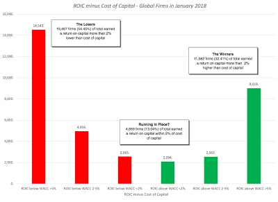 With all the caveats about accounting returns in place, this comparison is one of the most important ones in valuation and finance, for a simple reason. If the accounting return is a good measure of what you actually earn on your invested capital, and the cost of capital is the rate of return that you need to make on that invested capital to break even, a "good" company should generate positive excess returns, a "neutral" company should earn roughly its cost of capital and a " bad" company should have trouble earning its cost of capital. Using 2017 numbers, 22,062 companies, representing 61.7% of the 35,738 companies that I was able to estimate returns on capital for, would have fallen into the "bad" company category. It is true that my accounting returns are based upon one year's earnings, and that even good companies have bad years, and using a normalized return on capital (where I use the average return on capital earned over 10 years) does brighten the picture a bit:
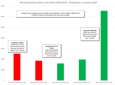 Note, that this is a comparison biased significantly towards finding good news, since by using a ten-average for the return on invested capital, I am reducing my sample to 14,502 survivor firms, more likely to be winners than losers. Even in this more optimistic picture, 2524 firms (30.2%) earn less than the cost of capital and have done so for a decade. Put simply, there are lots of companies that are bad companies, either because they are in bad businesses or because they are badly managed, and many of these companies have been bad for a long time. If there is a better reason for pushing for stronger corporate governance and more activist investors, I cannot think of it.
Exploring the Differences in ReturnsAs you digest the bad news in the cross section, if you are a manager or investor, you are probably already looking for reasons why your company or business is the exception. After all, excess returns can vary across parts of the world, different business or company size. It is in pursuit of that variation that I decided to look at excess returns, broken down on these dimensions.1. GeographicalAre companies in some parts of the world likely to earn better returns on investments than others? Generally, you would expect companies in markets that are more protected from competition (either domestic or global) to do better than companies in markets where competition is fierce. In the table below, I look at excess returns, broken down by region:style type="text/css"> table.tableizer-table { font-size: 12px; border: 1px solid #CCC; font-family: Arial, Helvetica, sans-serif; } .tableizer-table td { padding: 4px; margin: 3px; border: 1px solid #CCC; } .tableizer-table th { background-color: #104E8B; color: #FFF; font-weight: bold; } Sub GroupNumber of firmsReturn on CapitalCost of CapitalROIC - Cost of Capital% with +ve Excess ReturnsAfrica and Middle East2,2775.88%8.76%-2.88%34.55%Australia & NZ1,7774.71%7.97%-3.26%31.88%Canada2,8505.69%8.39%-2.70%19.07%China5,5525.11%8.13%-3.02%45.57%EU & Environs5,3995.50%7.74%-2.24%43.80%Eastern Europe & Russia5589.63%9.03%0.60%41.67%India3,51110.33%8.96%1.38%40.24%Japan3,7555.63%7.74%-2.11%45.06%Latin America & Caribbean8806.68%8.80%-2.12%43.63%Small Asia (wo China, India & Japan)8,6307.21%9.33%-2.12%32.60%UK1,4125.53%7.78%-2.24%47.62%United States7,2476.75%7.50%-0.75%36.41%If you are holding out hope that your region is the exception to the rule, this table probably dispels that hope. One of the two regions of the world where companies earn more than their cost of capital is India, which the cynics will attribute to accounting game playing, but may also reflect the protection from competition that some sectors in India, especially retail and financial services, have been offered from foreign competition. The sobering note, though, is that as India opens these sheltered businesses up for competition, these excess returns will come under pressure and perhaps dissipate. It is interesting that the other part of the only other region of the world where companies earn more than their cost of capital is Eastern Europe and Russia, where competitive barriers to entry remain high. China, the other big market in terms of population, does not seem to offer the same positive excess returns, and that should be a cautionary note for those who tell the China story to justify sky high valuations for companies growing there. With US companies, the returns on capital reflect the effective tax rate paid last year (about 26%) and, if you hold all else constant, you should see an increase in the return on capital in 2018, a point I made in my post on taxes.
2. Business or SectorIt stands to reason that it is easier to earn excess returns in some businesses than others, mostly because there are barriers to entry. Thus, you should expect businesses built on patents and exclusive licenses to offer more positive excess returns than businesses where there are no such barriers. To examine differences across sectors, I looked at excess returns, by sector, for US companies, in January 2018, and classified them into good businesses (earning more than the cost of capital) and bad businesses (earning less than the cost of capital). While the entire sector data is available for both US and Global companies, the list below highlights the non-financial service sectors that earn less than the cost of capital: table.tableizer-table { font-size: 12px; border: 1px solid #CCC; font-family: Arial, Helvetica, sans-serif; } .tableizer-table td { padding: 4px; margin: 3px; border: 1px solid #CCC; } .tableizer-table th { background-color: #104E8B; color: #FFF; font-weight: bold; }
Industry NameROCCost of Capital(ROC - WACC)Electronics (Consumer & Office)-5.54%7.67%-13.21%Oil/Gas (Production and Exploration)0.09%7.76%-7.67%Oil/Gas (Integrated)2.15%8.45%-6.30%Green & Renewable Energy1.94%5.77%-3.83%Shipbuilding & Marine4.88%8.26%-3.38%Real Estate (Development)2.27%5.21%-2.93%Insurance (General)2.82%5.38%-2.55%R.E.I.T.3.08%4.43%-1.35%Real Estate (General/Diversified)4.32%5.58%-1.26%Auto & Truck3.97%5.06%-1.09%Oilfield Svcs/Equip.6.42%7.44%-1.02%Telecom (Wireless)5.43%5.72%-0.29%Some of the sectors that fall into the bad business column did not surprise me, since they have been long standing members of this club. The automobile and shipbuilding businesses have been bad businesses,almost every year that I have looked at it for the last decade. Some of the sectors on this list will attribute their place on the list to macro concerns, with oil companies pointing to low oil prices. There are still others, though, that are recent entrants to this club, and represent the dark side of disruption, where their businesses have been altered by either technology or new entrants. The electronics business is one example, where margins have collapsed and returns have followed The telecommunications business, was for long a solid business, where big infrastructure investments were funded with debt, but the companies (whether they be phone or cable) were able to use their quasi or regulated monopoly status to pass those costs on to their customers, but it has now slipped into the bad business column, as technology has undercut its monopoly powers. With financial service firms, where the excess returns are better measured by looking at the difference between ROE and cost of equity, the excess returns remain positive for the moment, but the future hold sthe terrifying prospect of unbridled competition from the fin tech startups.
3. SizeAre smaller companies likely to earn larger or smaller excess returns than large companies? I could tell you stories that can answer this question differently, but the answer lies in the numbers. I broke global companies down into deciles, based upon market capitalization, to see if I could eke out some answers: table.tableizer-table { font-size: 12px; border: 1px solid #CCC; font-family: Arial, Helvetica, sans-serif; } .tableizer-table td { padding: 4px; margin: 3px; border: 1px solid #CCC; } .tableizer-table th { background-color: #104E8B; color: #FFF; font-weight: bold; }
Market Cap ClassNumber of firmsReturn on CapitalCost of CapitalROIC - Cost of Capital% with +ve Excess ReturnsSmallest4,384-8.37%8.38%-16.75%9.97%2nd decile4,366-9.71%8.71%-18.42%14.13%3rd decile4,388-3.93%8.53%-12.46%20.58%4th decile4,399-0.34%8.38%-8.72%27.66%5th decile4,3872.15%8.32%-6.17%32.86%6th decile4,3843.94%8.27%-4.33%39.65%7th decile4,3842.74%8.07%-5.33%44.30%8th decile4,3865.50%8.05%-2.55%48.22%9th decile4,3856.08%7.90%-1.81%54.12%Largest4,3855.75%7.48%-1.73%62.24%
For proponents of small companies, the results in this table are depressing. Small companies constantly earn much more negative excess returns than large companies. In fact, the largest companies earn positive excess returns, and while I am loath to make too much of one year's results, and recognize that there is some circularity in this table (since the companies with the highest excess returns should see their values go up the most), there is reason to believe that in more and more sectors, we are seeing winner-take-all games played out, where a few companies win, and find it easier to keep winning as they get larger. The Amazon phenomenon, which has so thoroughly upended the retail business, seems to be coming to other businesses as well. It also has implications for investing, and specifically for small cap investing, where investors have historically earned a return premium. The disappearance of this small cap premium, that I have pointed to in this post, may be a reflection of the changing business dynamics.
4. GrowthThe excess returns that we computed are particularly relevant when we think about growth, since for growth to create value, it has to be accompanied by excess returns. If more than 60% of companies have trouble earning their cost of capital, it follows that growth in a company is more likely to destroy value than to add to it. If companies are taking this maxim to heart and responding accordingly, you should expect to see companies with the highest growth also have the most positive excess returns and the companies that are shrinking or have the lowest growth to be the ones that have the most negative returns. I broke companies down into deciles, based upon revenue growth over the last five years, and looked at excess returns, by decile: table.tableizer-table { font-size: 12px; border: 1px solid #CCC; font-family: Arial, Helvetica, sans-serif; } .tableizer-table td { padding: 4px; margin: 3px; border: 1px solid #CCC; } .tableizer-table th { background-color: #104E8B; color: #FFF; font-weight: bold; }
Growth ClassNumber of firmsReturn on CapitalCost of CapitalROIC - Cost of Capital% with +ve Excess ReturnsLowest Growth2,7961.68%8.65%-6.98%10.04%2nd decile2,8236.03%8.48%-2.46%21.47%3rd decile2,8145.60%8.07%-2.48%30.79%4th decile2,8036.33%7.88%-1.54%36.72%5th decile2,8154.93%7.94%-3.01%44.19%6th decile2,8086.39%7.97%-1.58%49.17%7th decile2,8166.44%8.06%-1.62%52.35%8th decile2,7666.59%8.09%-1.50%53.27%9th decile2,8504.13%8.22%-4.09%53.76%Top decile2,8219.54%8.20%1.33%45.49%There is a semblance of good news in this table. Companies in the highest growth class have the most positive excess returns, but as you can see in the table, the results are mixed as you look at the other deciles. The excess returns, in deciles six through nine are about as negative as excess returns, in deciles two through five. It behooves us, as investors, to be wary of growth in companies.
ConclusionThis post has extended way beyond what I initially planned, but the excess returns across companies are such a good window into so many of the phenomena that are convulsing companies today that I could not resist. Not only do the numbers here cast as a lie the notion that growth is always good, but they also let us see how disruption is changing businesses around the world. If there is a common theme, it is that change is now par for the course in almost every business and that inertia on the part of management can be devastating. As I look, in my next two posts, at how companies set debt ratios and decide how much to pay in dividends, where policy seems to be driven by inertia and me-toois, do keep this in mind.
YouTube Video
Data Links
Profit Margins, by Sector (US)Profit Margins, by Sector (Global)Excess Returns (ROIC-Cost of Capital and ROE - Cost of Equity), by Sector (US)Excess Returns (ROIC-Cost of Capital and ROE - Cost of Equity), by Sector (Global)Spreadsheet
Accounting Return CalculatorPapers
Return on Capital (ROC), Return on Invested Capital and Return on Equity: Measurement and ImplicationsData Update PostsJanuary 2018 Data Update 1: Numbers don't lie, or do they?January 2018 Data Update 2: The Buoyancy of US Equities!January 2018 Data Update 3: Taxing Questions on ValueJanuary 2018 Data Update 4: The Currency ConundrumJanuary 2018 Data Update 5: Country Risk UpdateJanuary 2018 Data Update 6: A Cost of Capital PrimerJanuary 2018 Data Update 7: Growth and Value - Investment ReturnsJanuary 2018 Data Update 8: Debt and TaxesJanuary 2018 Data Update 9: The Cash Harvest - Dividend PolicyJanuary 2018 Data Update 10: The Pricing Prerogative
ProfitabilityThe simplest and most direct measures of profitability remain profit margins, with profits scaled to revenues for most firms. That said, there are variants of profit margins that can be computed depending on the earnings measure used:

At the risk of stating the obvious, the margins you compute will look larger and healthier, for any firm, as you climb up the income statement. As to which of these various measures of profitability you use, the answer depends on the following:What are you trying to value? If your focus is on just equity investors and you are either doing a DCF built around equity cash flows (Dividends or Free Cash Flow to Equity) or using an equity multiple (PE, Price to Sales or Price to Book), your focus will be on profits to equity investors, i.e,, net margin. In a DCF valuation built around pre-debt cash flows (FCFF) or if you are working with enterprise value multiples EV/FCFF, EV/EBITDA or EV/Sales), your focus will shift to income prior to interest expenses, leaving you with a choice between operating income and EBITDA multiples.What are you trying to measure? If you are attempting to compare production efficiency across firms, the gross margin is your best measure, because it looks at the profits you will generate, per unit sold, after you have covered the direct cost of production. If you are attempting to compare operating efficiency, at the business level, the operating margin is a better device. That is because for companies that have to spend substantially on sales, marketing and other structural operating costs, the operating income can be substantially lower than the gross income. The net margin is almost never a good measure of operating efficiency, simply because it is affected significantly by how you finance your business, with more debt leading to lower net profits and net margins.Where are you in the life cycle? I use the corporate life cycle as a vehicle for talking about transitions in companies, from the right type of CEO for a firm to which pricing metric to use. The profit margins you focus on, to measure success and viability, will also shift as a company moves through the life cycle:
 What are you selling? For better or worse, business people who are seeking your capital try to frame the profitability of their businesses by pointing to the profit margins. Since margins look better as you move up the income statement, business promoters are more inclined to use gross and EBITDA margins to make their cases than after-tax operating or net margins. While that is perfectly understandable, and even justifiable, for a young company that is scaling up (see life cycle bullet above), it is a sign of desperation when companies continue to point to gross margins as their measures of profitability as they age. With that long set up, let's look at the profitability of publicly traded companies around the world on three dimensions: across time, across companies and across sectors. At the start of 2018, as I have in prior years, I computed gross, EBITDA, operating (pre and post-tax) and net profit margins for every publicly traded company in my sample. The distribution of net and pre-tax operating margins, across all companies globally, can be seen below:

Not only are there no surprises here, but it is not easy to use this cross sectional distribution to pass judgment on your company's relative profitability for a simple reason. The median operating margin across all companies is 4.16% bu it varies widely across different businesses, partly because of differences in operating structure and scaleablity, partly because of competition and partly because of differences in the use of financial leverage (at least for net margins. The picture below reports gross, operating and net margins, by sector, for global companies at the start of 2018:
 Download spreadsheet with all margin dataI find profit margins to be extraordinarily useful, when valuing companies, both for comparison purposes and as the basis for my forecasts for the future. If you look at almost every valuation that I have done on this blog or in my classes, a key input that drives my forecast of earnings in future years is a target margin (either operating or net). It is also the metric that lends itself well to converting stories to numbers, another obsession of mine. Thus, if your story is that your company will benefit from economies of scale, I reflect that story by letting its operating margins improve over time, and if your narrative is that of a company with a valuable brand name, I endow it with much higher operating margins than other companies in the sector, but there is one limitation of profit margins. If your focus is on answering the question of whether your company is a "good" or a "bad" company, looking at margins may not help very much. There are "low-margin" good companies, like Walmart, that make up for low margins with high sales turnover and "high-margin" bad companies, that invest a great deal and sell very little, with many high-end retailers and manufacturers falling into this grouping. It is to remedy these problems that I will turn to measuring profitability with accounting returns, in the next section.
The Excess Return Picture - GlobalUnlike profit margins, where profits are scaled to revenues, accounting returns scale profits to invested capital. Here, while there are multiple measures that people use, there are only two consistent measures. The first is to scale net income to the equity invested in a company, measured usually by book value of equity, to estimate return on equity. The other is divide operating income, either pre-tax or post-tax, by the capital invested in a company, to estimate return on invested capital. While you will see both in user, there are two key factors that should color which one you focus on and how much to trust that number.Claimholder Consistency: As to which measure of accounting return you should use to measure investment quality, the answer is a familiar one. It depends on whether you are measuring returns from an equity or from a business perspective:
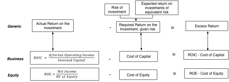 Accounting Numbers: The first is that no matter how carefully you work with the numbers, the return on equity and return on capital are quintessentially accounting numbers, with both the numerator (earnings) and denominator (book value of equity or invested capital) being accounting numbers.
 Consequently, any accounting actions, no matter how well intentioned, will affect your return on invested capital. For instance, an accounting write off of a past investment will reduce book value of both equity and invested capital and increase your return on capital. If you want to delve into the details, my condolences, but you can read this really long, really boring paper that I have on measurement issues with the return on equity and capital.Since accounting returns can vary, depending upon your estimation choices, it is important that I be transparent in the choices I made to compute the returns for the 43,884 firms in my sample:

Once I have the measures of these returns, I can compare them with the costs of equity and invested capital that I have estimated already for these companies to estimate excess returns (ROIC - Cost of Capital) for each firm. The distribution across all firms is reported below:
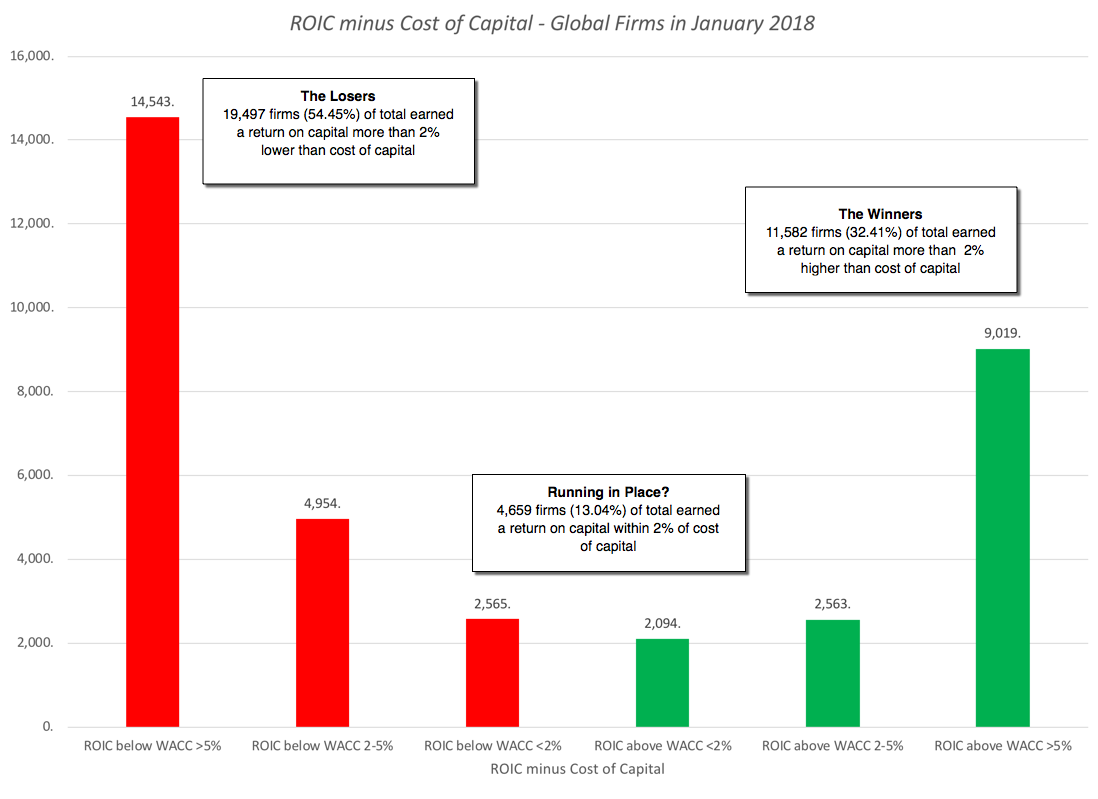 With all the caveats about accounting returns in place, this comparison is one of the most important ones in valuation and finance, for a simple reason. If the accounting return is a good measure of what you actually earn on your invested capital, and the cost of capital is the rate of return that you need to make on that invested capital to break even, a "good" company should generate positive excess returns, a "neutral" company should earn roughly its cost of capital and a " bad" company should have trouble earning its cost of capital. Using 2017 numbers, 22,062 companies, representing 61.7% of the 35,738 companies that I was able to estimate returns on capital for, would have fallen into the "bad" company category. It is true that my accounting returns are based upon one year's earnings, and that even good companies have bad years, and using a normalized return on capital (where I use the average return on capital earned over 10 years) does brighten the picture a bit:
 Note, that this is a comparison biased significantly towards finding good news, since by using a ten-average for the return on invested capital, I am reducing my sample to 14,502 survivor firms, more likely to be winners than losers. Even in this more optimistic picture, 2524 firms (30.2%) earn less than the cost of capital and have done so for a decade. Put simply, there are lots of companies that are bad companies, either because they are in bad businesses or because they are badly managed, and many of these companies have been bad for a long time. If there is a better reason for pushing for stronger corporate governance and more activist investors, I cannot think of it.
Exploring the Differences in ReturnsAs you digest the bad news in the cross section, if you are a manager or investor, you are probably already looking for reasons why your company or business is the exception. After all, excess returns can vary across parts of the world, different business or company size. It is in pursuit of that variation that I decided to look at excess returns, broken down on these dimensions.1. GeographicalAre companies in some parts of the world likely to earn better returns on investments than others? Generally, you would expect companies in markets that are more protected from competition (either domestic or global) to do better than companies in markets where competition is fierce. In the table below, I look at excess returns, broken down by region:style type="text/css"> table.tableizer-table { font-size: 12px; border: 1px solid #CCC; font-family: Arial, Helvetica, sans-serif; } .tableizer-table td { padding: 4px; margin: 3px; border: 1px solid #CCC; } .tableizer-table th { background-color: #104E8B; color: #FFF; font-weight: bold; } Sub GroupNumber of firmsReturn on CapitalCost of CapitalROIC - Cost of Capital% with +ve Excess ReturnsAfrica and Middle East2,2775.88%8.76%-2.88%34.55%Australia & NZ1,7774.71%7.97%-3.26%31.88%Canada2,8505.69%8.39%-2.70%19.07%China5,5525.11%8.13%-3.02%45.57%EU & Environs5,3995.50%7.74%-2.24%43.80%Eastern Europe & Russia5589.63%9.03%0.60%41.67%India3,51110.33%8.96%1.38%40.24%Japan3,7555.63%7.74%-2.11%45.06%Latin America & Caribbean8806.68%8.80%-2.12%43.63%Small Asia (wo China, India & Japan)8,6307.21%9.33%-2.12%32.60%UK1,4125.53%7.78%-2.24%47.62%United States7,2476.75%7.50%-0.75%36.41%If you are holding out hope that your region is the exception to the rule, this table probably dispels that hope. One of the two regions of the world where companies earn more than their cost of capital is India, which the cynics will attribute to accounting game playing, but may also reflect the protection from competition that some sectors in India, especially retail and financial services, have been offered from foreign competition. The sobering note, though, is that as India opens these sheltered businesses up for competition, these excess returns will come under pressure and perhaps dissipate. It is interesting that the other part of the only other region of the world where companies earn more than their cost of capital is Eastern Europe and Russia, where competitive barriers to entry remain high. China, the other big market in terms of population, does not seem to offer the same positive excess returns, and that should be a cautionary note for those who tell the China story to justify sky high valuations for companies growing there. With US companies, the returns on capital reflect the effective tax rate paid last year (about 26%) and, if you hold all else constant, you should see an increase in the return on capital in 2018, a point I made in my post on taxes.
2. Business or SectorIt stands to reason that it is easier to earn excess returns in some businesses than others, mostly because there are barriers to entry. Thus, you should expect businesses built on patents and exclusive licenses to offer more positive excess returns than businesses where there are no such barriers. To examine differences across sectors, I looked at excess returns, by sector, for US companies, in January 2018, and classified them into good businesses (earning more than the cost of capital) and bad businesses (earning less than the cost of capital). While the entire sector data is available for both US and Global companies, the list below highlights the non-financial service sectors that earn less than the cost of capital: table.tableizer-table { font-size: 12px; border: 1px solid #CCC; font-family: Arial, Helvetica, sans-serif; } .tableizer-table td { padding: 4px; margin: 3px; border: 1px solid #CCC; } .tableizer-table th { background-color: #104E8B; color: #FFF; font-weight: bold; }
Industry NameROCCost of Capital(ROC - WACC)Electronics (Consumer & Office)-5.54%7.67%-13.21%Oil/Gas (Production and Exploration)0.09%7.76%-7.67%Oil/Gas (Integrated)2.15%8.45%-6.30%Green & Renewable Energy1.94%5.77%-3.83%Shipbuilding & Marine4.88%8.26%-3.38%Real Estate (Development)2.27%5.21%-2.93%Insurance (General)2.82%5.38%-2.55%R.E.I.T.3.08%4.43%-1.35%Real Estate (General/Diversified)4.32%5.58%-1.26%Auto & Truck3.97%5.06%-1.09%Oilfield Svcs/Equip.6.42%7.44%-1.02%Telecom (Wireless)5.43%5.72%-0.29%Some of the sectors that fall into the bad business column did not surprise me, since they have been long standing members of this club. The automobile and shipbuilding businesses have been bad businesses,almost every year that I have looked at it for the last decade. Some of the sectors on this list will attribute their place on the list to macro concerns, with oil companies pointing to low oil prices. There are still others, though, that are recent entrants to this club, and represent the dark side of disruption, where their businesses have been altered by either technology or new entrants. The electronics business is one example, where margins have collapsed and returns have followed The telecommunications business, was for long a solid business, where big infrastructure investments were funded with debt, but the companies (whether they be phone or cable) were able to use their quasi or regulated monopoly status to pass those costs on to their customers, but it has now slipped into the bad business column, as technology has undercut its monopoly powers. With financial service firms, where the excess returns are better measured by looking at the difference between ROE and cost of equity, the excess returns remain positive for the moment, but the future hold sthe terrifying prospect of unbridled competition from the fin tech startups.
3. SizeAre smaller companies likely to earn larger or smaller excess returns than large companies? I could tell you stories that can answer this question differently, but the answer lies in the numbers. I broke global companies down into deciles, based upon market capitalization, to see if I could eke out some answers: table.tableizer-table { font-size: 12px; border: 1px solid #CCC; font-family: Arial, Helvetica, sans-serif; } .tableizer-table td { padding: 4px; margin: 3px; border: 1px solid #CCC; } .tableizer-table th { background-color: #104E8B; color: #FFF; font-weight: bold; }
Market Cap ClassNumber of firmsReturn on CapitalCost of CapitalROIC - Cost of Capital% with +ve Excess ReturnsSmallest4,384-8.37%8.38%-16.75%9.97%2nd decile4,366-9.71%8.71%-18.42%14.13%3rd decile4,388-3.93%8.53%-12.46%20.58%4th decile4,399-0.34%8.38%-8.72%27.66%5th decile4,3872.15%8.32%-6.17%32.86%6th decile4,3843.94%8.27%-4.33%39.65%7th decile4,3842.74%8.07%-5.33%44.30%8th decile4,3865.50%8.05%-2.55%48.22%9th decile4,3856.08%7.90%-1.81%54.12%Largest4,3855.75%7.48%-1.73%62.24%
For proponents of small companies, the results in this table are depressing. Small companies constantly earn much more negative excess returns than large companies. In fact, the largest companies earn positive excess returns, and while I am loath to make too much of one year's results, and recognize that there is some circularity in this table (since the companies with the highest excess returns should see their values go up the most), there is reason to believe that in more and more sectors, we are seeing winner-take-all games played out, where a few companies win, and find it easier to keep winning as they get larger. The Amazon phenomenon, which has so thoroughly upended the retail business, seems to be coming to other businesses as well. It also has implications for investing, and specifically for small cap investing, where investors have historically earned a return premium. The disappearance of this small cap premium, that I have pointed to in this post, may be a reflection of the changing business dynamics.
4. GrowthThe excess returns that we computed are particularly relevant when we think about growth, since for growth to create value, it has to be accompanied by excess returns. If more than 60% of companies have trouble earning their cost of capital, it follows that growth in a company is more likely to destroy value than to add to it. If companies are taking this maxim to heart and responding accordingly, you should expect to see companies with the highest growth also have the most positive excess returns and the companies that are shrinking or have the lowest growth to be the ones that have the most negative returns. I broke companies down into deciles, based upon revenue growth over the last five years, and looked at excess returns, by decile: table.tableizer-table { font-size: 12px; border: 1px solid #CCC; font-family: Arial, Helvetica, sans-serif; } .tableizer-table td { padding: 4px; margin: 3px; border: 1px solid #CCC; } .tableizer-table th { background-color: #104E8B; color: #FFF; font-weight: bold; }
Growth ClassNumber of firmsReturn on CapitalCost of CapitalROIC - Cost of Capital% with +ve Excess ReturnsLowest Growth2,7961.68%8.65%-6.98%10.04%2nd decile2,8236.03%8.48%-2.46%21.47%3rd decile2,8145.60%8.07%-2.48%30.79%4th decile2,8036.33%7.88%-1.54%36.72%5th decile2,8154.93%7.94%-3.01%44.19%6th decile2,8086.39%7.97%-1.58%49.17%7th decile2,8166.44%8.06%-1.62%52.35%8th decile2,7666.59%8.09%-1.50%53.27%9th decile2,8504.13%8.22%-4.09%53.76%Top decile2,8219.54%8.20%1.33%45.49%There is a semblance of good news in this table. Companies in the highest growth class have the most positive excess returns, but as you can see in the table, the results are mixed as you look at the other deciles. The excess returns, in deciles six through nine are about as negative as excess returns, in deciles two through five. It behooves us, as investors, to be wary of growth in companies.
ConclusionThis post has extended way beyond what I initially planned, but the excess returns across companies are such a good window into so many of the phenomena that are convulsing companies today that I could not resist. Not only do the numbers here cast as a lie the notion that growth is always good, but they also let us see how disruption is changing businesses around the world. If there is a common theme, it is that change is now par for the course in almost every business and that inertia on the part of management can be devastating. As I look, in my next two posts, at how companies set debt ratios and decide how much to pay in dividends, where policy seems to be driven by inertia and me-toois, do keep this in mind.
YouTube Video
Data Links
Profit Margins, by Sector (US)Profit Margins, by Sector (Global)Excess Returns (ROIC-Cost of Capital and ROE - Cost of Equity), by Sector (US)Excess Returns (ROIC-Cost of Capital and ROE - Cost of Equity), by Sector (Global)Spreadsheet
Accounting Return CalculatorPapers
Return on Capital (ROC), Return on Invested Capital and Return on Equity: Measurement and ImplicationsData Update PostsJanuary 2018 Data Update 1: Numbers don't lie, or do they?January 2018 Data Update 2: The Buoyancy of US Equities!January 2018 Data Update 3: Taxing Questions on ValueJanuary 2018 Data Update 4: The Currency ConundrumJanuary 2018 Data Update 5: Country Risk UpdateJanuary 2018 Data Update 6: A Cost of Capital PrimerJanuary 2018 Data Update 7: Growth and Value - Investment ReturnsJanuary 2018 Data Update 8: Debt and TaxesJanuary 2018 Data Update 9: The Cash Harvest - Dividend PolicyJanuary 2018 Data Update 10: The Pricing Prerogative
January 26, 2018
January 2018 Data Update 6: A Cost of Capital Primer
I have long described the cost of capital as the Swiss Army Knife of finance, since it shows up in so many places in finance, albeit in different forms. In corporate finance, it is not only the cost of raising funding for a business but also the hurdle rate to use in capital budgeting and an optimizing tool for capital structure and dividend policy. In valuation, it is the discount rate that we use to value a business and the only mechanism for incorporating the risk of a business into its value. Along the way, it picks up a variety of other names that are used to describe it (with my least favorite one being the WACC acronym) and gets confused or used interchangeably with the cost of equity. In short, it is not surprising that there seems to be little consensus on how to estimate the cost of capital for a business.
The Cost of Capital: DefinitionIt is unfortunate that the name that we have attached to this ubiquitous number is the cost of capital, since it seems to suggest that it is the cost of raising funding for a company. While that definition may sometimes fit, it often leads to destructive consequences, where companies that are safe and can raise equity or borrow money at low rates (and hence have a low cost of funding) think that they are adding value when they go out and take risky investments that earn more than that cost. A company that has a 5% cost of capital is not always adding value if it takes an investment that generates an 8% return, if the investment is risky enough to require a much higher return. A healthier definition of the cost of capital is to think of it as an opportunity cost, i.e., a rate of return that you (as an investor or by extension, a company that the investor has put money in) can make on an investment of equivalent risk. The key words in this definition are "equivalent risk", because that effectively eliminates the subsidy mistake that occurs when a safe company's cost of capital is used to justify taking a risky investment. This is, of course, one of the first principles of finance and it is astonishing that it is open for debate and that so many companies violate it, in their practices. If you are skeptical of my claim, consider the following manifestations of this malpractice:Many multi-business companies continue to have a "single" hurdle rate in capital budgeting: In a survey of "best" practices across companies and advisors, the authors note that almost half of all companies (and advisors) surveyed used a single cost of capital across all investments. That is not only not good practice, but over time, it will ensure that your entire company will become a riskier company that takes bad investments. While I appreciate the work that went into this survey, I would suggest that the authors seriously reconsider using the word "best" to describe many of the horrendous practices that companies use in computing cost of capital. Looking at surveys of how companies compute costs of capital around the world, it seems clear to me that bad practices drive out good ones, a manifestation of Gresham's law in corporate finance practice.In acquisitions, it is routine for companies (and bankers) to use the acquiring company's cost of capital to value the target company: While I cannot point to surveys to back up this statement, in my experience, this happens in more than 60% of acquisitions, with the logic being that it is the acquiring firm that raises the capital and that its costs should therefore be covered. The fact that will lead safe firms to find any risky firm that they look at to be cheap is glossed over. If you are waffling, let me be absolutist. Valuing a target company using an acquiring company's cost of capital is valuation malpractice, and if you do it, you should be stripped of your license to do valuation.Cash is viewed as a value destroying asset: If you follow GAAP or IFRS, for an asset to be categorized with cash and short term investments, it has to be invested in liquid and close to riskless assets. In the last decade, these investments, not surprisingly, have generated extraordinarily low returns, but it is true, no matter what interest rate environment you are in, that cash will earn lower returns than operating investments. There are analysts, and I use the word loosely, who compare the returns generated on cash to the cost of capital of the firm to conclude that cash is a value-destroying asset and that it should be returned. While there are legitimate arguments that can be made that companies should return cash to stockholders, this is not one of them. In fact, cash, if invested in treasury bills or commercial paper, is a value-neutral investment, earning exactly the return that you need it to earn, given its liquid, diskless status.A company that earns a higher return on its projects (higher ROIC) should be valued more highly than a company that earns a lower return on its projects: Without controlling for risk, this is not true. In fact, the right assessment would require comparing the ROIC to the cost of capital to estimate an excess return and a company that earns a higher positive excess return should be valued more highly than one that earns a lower excess return.The key, then, to estimating cost of capital is to to link it directly to a risk measure that can be computed not just for entire companies but for individual projects. It is that pursuit that will drive my estimation process for cost of capital, described in the next section.
The Cost of Capital: Estimation ProcessThere are ultimately only two ways of raising funds to finance a business. One is to borrow the money (debt) and the other is to use your own money (equity). This is captured in one of my favorite corporate finance devices, the financial balance sheet: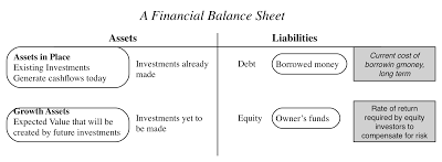
With a small private business, the debt will take the form of a bank loan and the equity will be your savings, but as businesses scale up, debt may expand to include corporate bonds and equity may transition to venture capital, private equity and publicly traded stock. The structure also allows us to boil the cost of capital down to its three ingredients: a cost of equity, an after-tax cost of debt and the weights to attach to the two.
Cost of equityThe End game: In principle, the cost of equity is the rate of return that equity investors in your business need to make to compensate for the risk that they are exposed to.The Practice: For the last few decades, corporate finance has tried, with mixed success, to devise a risk and return model to estimate the cost of equity. While these models vary in complexity and inputs, they generally share a common theme. They estimate the cost of equity to the marginal investors in the business, i.e., investors who own and trade large blocks of shares, and assume that these investors are diversified. These models all share a common structure; they start with a risk free rate and then estimate a risk premium for an investment, by measuring its relative risk (on one or more market risk factors) and the price of risk or risk premiums (for these factors). While it is the subject of substantial abuse, the capital asset pricing model continues to be the default model that most practitioners use in estimating cost of equity. The resulting inputs are shown below: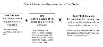 I still use the capital asset pricing model in my valuations and I offer no apologies for doing so, since I find it simple, intuitive and at least as effective as the next best alternative models, most of which add more complexity and deliver little in results. For those who are truly disturbed my the CAPM's limitations, there is an alternative approach worth considering that is agnostic in its assumptions about investor diversification and risk aversion. It is to back out the "implied" cost of equity for stocks within a sector and to use that implied number as the cost of equity in individual companies. If you are puzzled about what this implies, take a look at how I estimated the implied equity risk premium for the S&P 500 in my second data post from a couple of weeks ago and consider extending that approach to the banking index, to get an implied cost of equity for banks, and the energy sector, to estimate the cost of equity for oil companies.
Cost of DebtThe End Game: The cost of debt for a firm is the rate at which it can borrow money, long term and today. The after-tax cost of debt is this borrowing rate, adjusted for any tax benefits that accrue to borrowing money.The Practice: By defining the cost of debt as a current cost of borrowing, rather than the rate at which the firm has borrowed money in the past, I have simplified my estimation problem, since the cost of debt can then be written as the sum of the riskless rate and a default spread, reflecting the company's credit risk:Pre-tax cost of debt = Risk free Rate + Default Spread for the CompanyTo estimate the default spread, you can use one of three approaches, in order of ease.If the firm in question has corporate bonds outstanding, you can use the interest rate on the bond as your pre-tax cost of debt for the firm since it is a current, market-set rate. If a firm has corporate bonds and they are not traded enough or have features that skew the interest rate, you can use the bond rating for the company to estimate a default spread. If the firm has neither bonds nor a rating, a combination that holds for most companies, I would assess a "synthetic rating" for the company, based upon the strength of its financials and its capacity to repay debt.To bring the tax benefit of debt into the after-tax cost of debt, you should use the marginal tax rate, since interest expenses save you taxes at the margin:After-tax cost of debt = (Risk free Rate + Default Spread) (1- Marginal Tax Rate)This cost of debt will be much lower than your cost of equity, for almost all firms.
Debt & Equity WeightsMarket or Book? This choice, at least for me, is an easy one. The cost of capital is a measure for what it will cost you to raise money to fund the business, investment or project today, and since you can raise money only at market value, it is the only relevant number. Current or Target? This is an argument that often consumes analyst time and often misses the point. It is true that the debt ratio for a company can change over time, and if management does have a target, the actual debt ratio may move to the target. Unless this change is instantaneous, it is likely to occur over time and my answer to the question is to use the current debt ratio to estimate the cost of capital at the start of the investment and as the debt ratio is changed over time to the optimal, to change the cost of capital as well.
Cross Sectional EstimationIn choosing my estimation approach to getting cost of capital, do keep in mind that there are 43,848 firms in my sample and since looking at each one individually is out of the question, I will have to make some bludgeon assumptions (that I would not have made if I were estimating the cost of capital for an individual company). The table below summarizes my estimation choices, with the limitations of each: table.tableizer-table { font-size: 12px; border: 1px solid #CCC; font-family: Arial, Helvetica, sans-serif; } .tableizer-table td { padding: 4px; margin: 3px; border: 1px solid #CCC; } .tableizer-table th { background-color: #104E8B; color: #FFF; font-weight: bold; }
Estimation Approach usedPossible limitationsRisk Free RateUS T.Bond RateCost of equity estimated in US dollars.BetaStarted with unlevered beta for sector & levered up using company's D/E (including leases as debt)Used only the primary business that the company was in. With multi-business companies, I am missing the effect of oither businesses on beta.ERP ERP of country that the company is incorporated in.If company operates in other countries, the ERP should be a weighted average.Default SpreadUsed bond rating, if available, to estimate the default spread. Used interest coverage ratio to estimate ratings and default spread, otherwise.Interest coverage ratios may not capture default risk fully, Bringing in other ratios might have provided more refined estimate.Marginal tax rateUse the statutory tax rate of the country in which the company is incorporated.If company operates in many countries, it may be able to place its debt in a country with the higher marginal tax rae.WeightsCurrent market value of equity and debt (including leases) used for weights.Insufficient information to estimate market value of interest-bearing debt.
If you want to estimate the cost of capital, using more refined estimates (country weightings for ERP and business mixes for betas), you are welcome to try my cost of capital calculator. If you are working in another currency, converting my estimates of cost of capital to an alternate currency should be a simple exercise of adding the differential inflation rate between the currency in question and the US dollar to my estimate.
The Cost of Capital - Going Concern ConceptThere is one important caveat to add about cost of capital specifically and discount rates, in discounted cash flow valuations, more generally. In a discounted cash flow valuation, we are implicitly assuming that the business that we are valuing is a going concern that will either survive for a long time or is on its path to a specified and clearly determined liquidation point.
 So what? The reality is that business is risky and the essence of risk is that it can sometime deal out bad enough outcomes to put a company out of business. With a young start up, this may take the form of running of cash and access to capital. With a declining company, it can the failure to make a debt payment and distress. With a bank, it can take the form of a drop in regulatory capital below levels acceptable to the regulatory authorities and a shutting down of the bank. With an emerging market company, even a healthy company may see its survival threatened by a nationalization. These are risks that I call truncation risks and analysts often struggle with how best to bring them into value. One path that they try is to push discount rates (or costs of capital) higher for companies that face significant amounts of truncation risk, but discount rates are blunt instruments for dealing with this type of risk and my suggestion is that you not try to adjust them for the risk. Instead, you should consider using a decision tree front on your valuation, where you can bring in your truncation risk concerns separately from your DCF. With a distressed firm or start up, for instance, where you worry about survival risk, the decision tree will look as follows:
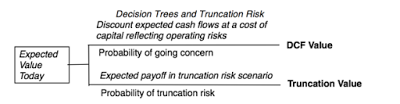
This will not only relieve you of the stress of trying to adjust discount rates for risk that they were never meant to convey but will allow you to focus on the truncation risk more directly. Thinking about the probability that you will not survive as a firm and what you will get, if you don't, is a much healthier exercise than arbitrarily pushing up your discount rate another 2%, because you feel the firm is riskier.
The Cost of Capital - PerspectiveThe cost of capital discussion is permeated with rules of thumb about what comprises reasonable, high or low numbers, many developed in a different time, and for a different market. These rules of thumb skew estimates, since analysts feel the urge to adjust the costs of capitals that they get from models or metrics to match their preconceptions about what they should be. It is my primary objection to the build-up approach for the cost of capital, where analysts add multiple premiums (small cap, illiquidity, company specific) to arrive at a cost of capital that matches what they would have liked to see in the first place. It is to counter this temptation that I will compute costs of capital for US and global companies and present both sector averages as well as the entire distributions for the market.
US CompaniesTo provide perspective on what the cost of capital for the median US company will look like, start with the US 10-year T.Bond rate of 2.41% on January 1, 2018, as the risk free rate and my estimate of the implied ERP of 5.08% for the US on the same date. For an average risk stock, with a beta of one, that would translate into a cost of equity of 7.49%. Bringing in the debt ratio of 23.51% for the typical US firm and a pre-tax cost of debt of 3.91% (1.5% higher than the risk free rate), results in a cost of capital of 6.43%, if we use the marginal tax rate of 24%, post tax reform:Cost of capital for median US firm = (2.41%+5.08%)(1-.2351)+3.91%(1-.24) (.2351) = 6.43%Using the sector-specific debt ratios and betas yields costs of capital for US companies in individual sectors and the resulting costs of capital are reported in the table below: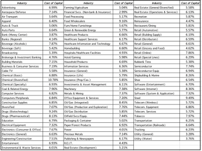 Download full sector cost of capital spreadsheetYou can download the spreadsheet with the details of the cost of capital calculation by clicking on the link below. There is information in the company-specific costs of capital estimates that I have for 7.247 US firms in my sample that I try to capture in a histogram:
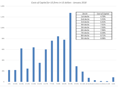 To the question of what comprises a high, low or average cost of capital, I would offer the deciles for the cost of capital estimation in 2018, also shown in the histogram.
Global CompaniesI estimate the costs of capital for global companies, in US dollars, and using the same template that I use for the US. There are two key differences. The first is that I shift from using the US ERP of 5.08% to a GDP-weighted global average ERP of 6.20%, from a US-average debt ratio of 23.51% to to a global-average debt to capital ratio of 26.67%, from a pre-tax cost of debt of 3.91% to 4.91% (reflecting country default risk) and from a marginal tax rate of 24% to a weighted average of 24.63%. The resulting cost of capital for a median global firm is higher than for the US:Cost of capital for median global firm = (2.41%+6.20%)(1-.2667)+4.91%(1-.2463) (.2667) = 7.30%As with the US data, I compute sector averages, using sector average betas and debt ratios and the results are summarized in the picture below: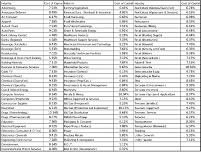 Download full sector cost of capital spreadsheetFinally, the distribution of costs of capital across global companies are captured in the histogram, with deciles specified:
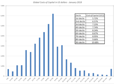
Here again, I would use this distribution to make judgments of what a high, low or average cost of capital would look like in January 2018, and adding inflation differentials would provide analogous numbers in other currencies.
The ConclusionNotwithstanding the length of this post, and the ones leading up to it, I do not believe that the cost of capital is the biggest driver of the value of companies. When you make mistakes in valuation, it is almost always true that the big mistakes are in your cash flow and growth estimates, rather than in your cost of capital. This is especially true when you value young companies, and it is one reason that I am almost casual in my choice of costs of capital in my valuation of Twitter, Uber and Snap, where I have attached costs of capital reflective of the 90th percentile in risk. It is true that as companies mature, the cost of capital becomes a more critical input, but even in these valuations, I would argue that if you are spending more than 20% to 25% of your time estimating it, you have lost your way.
YouTube Video
Paper
Cost of Capital - The Swiss Army Knife of Finance\Datasets
Cost of Capital, by Industry Group - US dataCost of Capital, by Industry Group - GlobalCost of Capital Calculator (Spreadsheet)Data Update PostsJanuary 2018 Data Update 1: Numbers don't lie, or do they?January 2018 Data Update 2: The Buoyancy of US Equities!January 2018 Data Update 3: Taxing Questions on ValueJanuary 2018 Data Update 4: The Currency ConundrumJanuary 2018 Data Update 5: Country Risk UpdateJanuary 2018 Data Update 6: A Cost of Capital PrimerJanuary 2018 Data Update 7: Growth and Value - Investment ReturnsJanuary 2018 Data Update 8: Debt and TaxesJanuary 2018 Data Update 9: The Cash Harvest - Dividend PolicyJanuary 2018 Data Update 10: The Pricing Prerogative
The Cost of Capital: DefinitionIt is unfortunate that the name that we have attached to this ubiquitous number is the cost of capital, since it seems to suggest that it is the cost of raising funding for a company. While that definition may sometimes fit, it often leads to destructive consequences, where companies that are safe and can raise equity or borrow money at low rates (and hence have a low cost of funding) think that they are adding value when they go out and take risky investments that earn more than that cost. A company that has a 5% cost of capital is not always adding value if it takes an investment that generates an 8% return, if the investment is risky enough to require a much higher return. A healthier definition of the cost of capital is to think of it as an opportunity cost, i.e., a rate of return that you (as an investor or by extension, a company that the investor has put money in) can make on an investment of equivalent risk. The key words in this definition are "equivalent risk", because that effectively eliminates the subsidy mistake that occurs when a safe company's cost of capital is used to justify taking a risky investment. This is, of course, one of the first principles of finance and it is astonishing that it is open for debate and that so many companies violate it, in their practices. If you are skeptical of my claim, consider the following manifestations of this malpractice:Many multi-business companies continue to have a "single" hurdle rate in capital budgeting: In a survey of "best" practices across companies and advisors, the authors note that almost half of all companies (and advisors) surveyed used a single cost of capital across all investments. That is not only not good practice, but over time, it will ensure that your entire company will become a riskier company that takes bad investments. While I appreciate the work that went into this survey, I would suggest that the authors seriously reconsider using the word "best" to describe many of the horrendous practices that companies use in computing cost of capital. Looking at surveys of how companies compute costs of capital around the world, it seems clear to me that bad practices drive out good ones, a manifestation of Gresham's law in corporate finance practice.In acquisitions, it is routine for companies (and bankers) to use the acquiring company's cost of capital to value the target company: While I cannot point to surveys to back up this statement, in my experience, this happens in more than 60% of acquisitions, with the logic being that it is the acquiring firm that raises the capital and that its costs should therefore be covered. The fact that will lead safe firms to find any risky firm that they look at to be cheap is glossed over. If you are waffling, let me be absolutist. Valuing a target company using an acquiring company's cost of capital is valuation malpractice, and if you do it, you should be stripped of your license to do valuation.Cash is viewed as a value destroying asset: If you follow GAAP or IFRS, for an asset to be categorized with cash and short term investments, it has to be invested in liquid and close to riskless assets. In the last decade, these investments, not surprisingly, have generated extraordinarily low returns, but it is true, no matter what interest rate environment you are in, that cash will earn lower returns than operating investments. There are analysts, and I use the word loosely, who compare the returns generated on cash to the cost of capital of the firm to conclude that cash is a value-destroying asset and that it should be returned. While there are legitimate arguments that can be made that companies should return cash to stockholders, this is not one of them. In fact, cash, if invested in treasury bills or commercial paper, is a value-neutral investment, earning exactly the return that you need it to earn, given its liquid, diskless status.A company that earns a higher return on its projects (higher ROIC) should be valued more highly than a company that earns a lower return on its projects: Without controlling for risk, this is not true. In fact, the right assessment would require comparing the ROIC to the cost of capital to estimate an excess return and a company that earns a higher positive excess return should be valued more highly than one that earns a lower excess return.The key, then, to estimating cost of capital is to to link it directly to a risk measure that can be computed not just for entire companies but for individual projects. It is that pursuit that will drive my estimation process for cost of capital, described in the next section.
The Cost of Capital: Estimation ProcessThere are ultimately only two ways of raising funds to finance a business. One is to borrow the money (debt) and the other is to use your own money (equity). This is captured in one of my favorite corporate finance devices, the financial balance sheet:

With a small private business, the debt will take the form of a bank loan and the equity will be your savings, but as businesses scale up, debt may expand to include corporate bonds and equity may transition to venture capital, private equity and publicly traded stock. The structure also allows us to boil the cost of capital down to its three ingredients: a cost of equity, an after-tax cost of debt and the weights to attach to the two.
Cost of equityThe End game: In principle, the cost of equity is the rate of return that equity investors in your business need to make to compensate for the risk that they are exposed to.The Practice: For the last few decades, corporate finance has tried, with mixed success, to devise a risk and return model to estimate the cost of equity. While these models vary in complexity and inputs, they generally share a common theme. They estimate the cost of equity to the marginal investors in the business, i.e., investors who own and trade large blocks of shares, and assume that these investors are diversified. These models all share a common structure; they start with a risk free rate and then estimate a risk premium for an investment, by measuring its relative risk (on one or more market risk factors) and the price of risk or risk premiums (for these factors). While it is the subject of substantial abuse, the capital asset pricing model continues to be the default model that most practitioners use in estimating cost of equity. The resulting inputs are shown below:
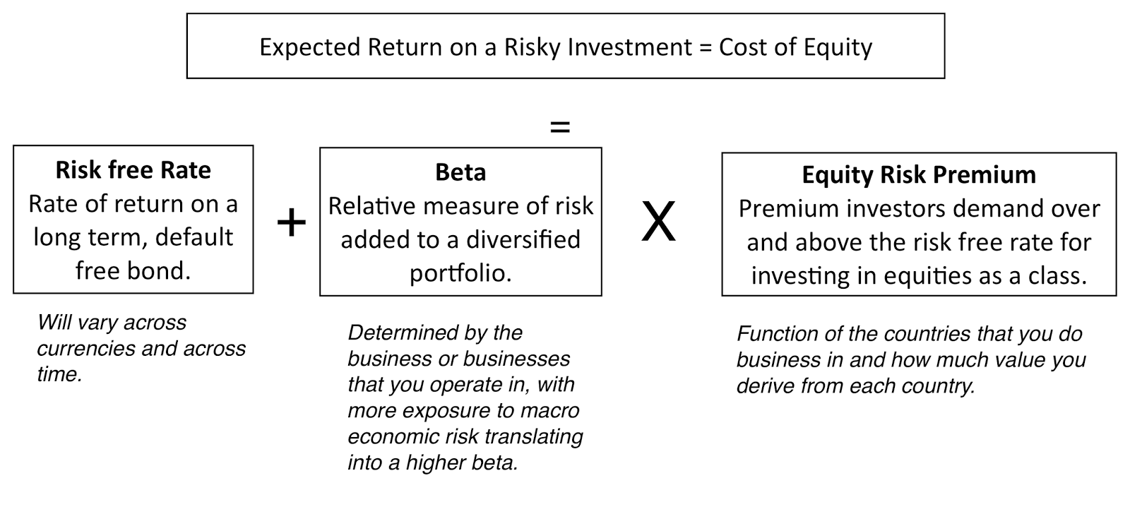 I still use the capital asset pricing model in my valuations and I offer no apologies for doing so, since I find it simple, intuitive and at least as effective as the next best alternative models, most of which add more complexity and deliver little in results. For those who are truly disturbed my the CAPM's limitations, there is an alternative approach worth considering that is agnostic in its assumptions about investor diversification and risk aversion. It is to back out the "implied" cost of equity for stocks within a sector and to use that implied number as the cost of equity in individual companies. If you are puzzled about what this implies, take a look at how I estimated the implied equity risk premium for the S&P 500 in my second data post from a couple of weeks ago and consider extending that approach to the banking index, to get an implied cost of equity for banks, and the energy sector, to estimate the cost of equity for oil companies.
Cost of DebtThe End Game: The cost of debt for a firm is the rate at which it can borrow money, long term and today. The after-tax cost of debt is this borrowing rate, adjusted for any tax benefits that accrue to borrowing money.The Practice: By defining the cost of debt as a current cost of borrowing, rather than the rate at which the firm has borrowed money in the past, I have simplified my estimation problem, since the cost of debt can then be written as the sum of the riskless rate and a default spread, reflecting the company's credit risk:Pre-tax cost of debt = Risk free Rate + Default Spread for the CompanyTo estimate the default spread, you can use one of three approaches, in order of ease.If the firm in question has corporate bonds outstanding, you can use the interest rate on the bond as your pre-tax cost of debt for the firm since it is a current, market-set rate. If a firm has corporate bonds and they are not traded enough or have features that skew the interest rate, you can use the bond rating for the company to estimate a default spread. If the firm has neither bonds nor a rating, a combination that holds for most companies, I would assess a "synthetic rating" for the company, based upon the strength of its financials and its capacity to repay debt.To bring the tax benefit of debt into the after-tax cost of debt, you should use the marginal tax rate, since interest expenses save you taxes at the margin:After-tax cost of debt = (Risk free Rate + Default Spread) (1- Marginal Tax Rate)This cost of debt will be much lower than your cost of equity, for almost all firms.
Debt & Equity WeightsMarket or Book? This choice, at least for me, is an easy one. The cost of capital is a measure for what it will cost you to raise money to fund the business, investment or project today, and since you can raise money only at market value, it is the only relevant number. Current or Target? This is an argument that often consumes analyst time and often misses the point. It is true that the debt ratio for a company can change over time, and if management does have a target, the actual debt ratio may move to the target. Unless this change is instantaneous, it is likely to occur over time and my answer to the question is to use the current debt ratio to estimate the cost of capital at the start of the investment and as the debt ratio is changed over time to the optimal, to change the cost of capital as well.
Cross Sectional EstimationIn choosing my estimation approach to getting cost of capital, do keep in mind that there are 43,848 firms in my sample and since looking at each one individually is out of the question, I will have to make some bludgeon assumptions (that I would not have made if I were estimating the cost of capital for an individual company). The table below summarizes my estimation choices, with the limitations of each: table.tableizer-table { font-size: 12px; border: 1px solid #CCC; font-family: Arial, Helvetica, sans-serif; } .tableizer-table td { padding: 4px; margin: 3px; border: 1px solid #CCC; } .tableizer-table th { background-color: #104E8B; color: #FFF; font-weight: bold; }
Estimation Approach usedPossible limitationsRisk Free RateUS T.Bond RateCost of equity estimated in US dollars.BetaStarted with unlevered beta for sector & levered up using company's D/E (including leases as debt)Used only the primary business that the company was in. With multi-business companies, I am missing the effect of oither businesses on beta.ERP ERP of country that the company is incorporated in.If company operates in other countries, the ERP should be a weighted average.Default SpreadUsed bond rating, if available, to estimate the default spread. Used interest coverage ratio to estimate ratings and default spread, otherwise.Interest coverage ratios may not capture default risk fully, Bringing in other ratios might have provided more refined estimate.Marginal tax rateUse the statutory tax rate of the country in which the company is incorporated.If company operates in many countries, it may be able to place its debt in a country with the higher marginal tax rae.WeightsCurrent market value of equity and debt (including leases) used for weights.Insufficient information to estimate market value of interest-bearing debt.
If you want to estimate the cost of capital, using more refined estimates (country weightings for ERP and business mixes for betas), you are welcome to try my cost of capital calculator. If you are working in another currency, converting my estimates of cost of capital to an alternate currency should be a simple exercise of adding the differential inflation rate between the currency in question and the US dollar to my estimate.
The Cost of Capital - Going Concern ConceptThere is one important caveat to add about cost of capital specifically and discount rates, in discounted cash flow valuations, more generally. In a discounted cash flow valuation, we are implicitly assuming that the business that we are valuing is a going concern that will either survive for a long time or is on its path to a specified and clearly determined liquidation point.
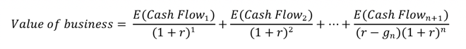 So what? The reality is that business is risky and the essence of risk is that it can sometime deal out bad enough outcomes to put a company out of business. With a young start up, this may take the form of running of cash and access to capital. With a declining company, it can the failure to make a debt payment and distress. With a bank, it can take the form of a drop in regulatory capital below levels acceptable to the regulatory authorities and a shutting down of the bank. With an emerging market company, even a healthy company may see its survival threatened by a nationalization. These are risks that I call truncation risks and analysts often struggle with how best to bring them into value. One path that they try is to push discount rates (or costs of capital) higher for companies that face significant amounts of truncation risk, but discount rates are blunt instruments for dealing with this type of risk and my suggestion is that you not try to adjust them for the risk. Instead, you should consider using a decision tree front on your valuation, where you can bring in your truncation risk concerns separately from your DCF. With a distressed firm or start up, for instance, where you worry about survival risk, the decision tree will look as follows:
This will not only relieve you of the stress of trying to adjust discount rates for risk that they were never meant to convey but will allow you to focus on the truncation risk more directly. Thinking about the probability that you will not survive as a firm and what you will get, if you don't, is a much healthier exercise than arbitrarily pushing up your discount rate another 2%, because you feel the firm is riskier.
The Cost of Capital - PerspectiveThe cost of capital discussion is permeated with rules of thumb about what comprises reasonable, high or low numbers, many developed in a different time, and for a different market. These rules of thumb skew estimates, since analysts feel the urge to adjust the costs of capitals that they get from models or metrics to match their preconceptions about what they should be. It is my primary objection to the build-up approach for the cost of capital, where analysts add multiple premiums (small cap, illiquidity, company specific) to arrive at a cost of capital that matches what they would have liked to see in the first place. It is to counter this temptation that I will compute costs of capital for US and global companies and present both sector averages as well as the entire distributions for the market.
US CompaniesTo provide perspective on what the cost of capital for the median US company will look like, start with the US 10-year T.Bond rate of 2.41% on January 1, 2018, as the risk free rate and my estimate of the implied ERP of 5.08% for the US on the same date. For an average risk stock, with a beta of one, that would translate into a cost of equity of 7.49%. Bringing in the debt ratio of 23.51% for the typical US firm and a pre-tax cost of debt of 3.91% (1.5% higher than the risk free rate), results in a cost of capital of 6.43%, if we use the marginal tax rate of 24%, post tax reform:Cost of capital for median US firm = (2.41%+5.08%)(1-.2351)+3.91%(1-.24) (.2351) = 6.43%Using the sector-specific debt ratios and betas yields costs of capital for US companies in individual sectors and the resulting costs of capital are reported in the table below:
 Download full sector cost of capital spreadsheetYou can download the spreadsheet with the details of the cost of capital calculation by clicking on the link below. There is information in the company-specific costs of capital estimates that I have for 7.247 US firms in my sample that I try to capture in a histogram:
 To the question of what comprises a high, low or average cost of capital, I would offer the deciles for the cost of capital estimation in 2018, also shown in the histogram.
 Global CompaniesI estimate the costs of capital for global companies, in US dollars, and using the same template that I use for the US. There are two key differences. The first is that I shift from using the US ERP of 5.08% to a GDP-weighted global average ERP of 6.20%, from a US-average debt ratio of 23.51% to to a global-average debt to capital ratio of 26.67%, from a pre-tax cost of debt of 3.91% to 4.91% (reflecting country default risk) and from a marginal tax rate of 24% to a weighted average of 24.63%. The resulting cost of capital for a median global firm is higher than for the US:Cost of capital for median global firm = (2.41%+6.20%)(1-.2667)+4.91%(1-.2463) (.2667) = 7.30%As with the US data, I compute sector averages, using sector average betas and debt ratios and the results are summarized in the picture below:
 Download full sector cost of capital spreadsheetFinally, the distribution of costs of capital across global companies are captured in the histogram, with deciles specified:
Here again, I would use this distribution to make judgments of what a high, low or average cost of capital would look like in January 2018, and adding inflation differentials would provide analogous numbers in other currencies.
The ConclusionNotwithstanding the length of this post, and the ones leading up to it, I do not believe that the cost of capital is the biggest driver of the value of companies. When you make mistakes in valuation, it is almost always true that the big mistakes are in your cash flow and growth estimates, rather than in your cost of capital. This is especially true when you value young companies, and it is one reason that I am almost casual in my choice of costs of capital in my valuation of Twitter, Uber and Snap, where I have attached costs of capital reflective of the 90th percentile in risk. It is true that as companies mature, the cost of capital becomes a more critical input, but even in these valuations, I would argue that if you are spending more than 20% to 25% of your time estimating it, you have lost your way.
YouTube Video
Paper
Cost of Capital - The Swiss Army Knife of Finance\Datasets
Cost of Capital, by Industry Group - US dataCost of Capital, by Industry Group - GlobalCost of Capital Calculator (Spreadsheet)Data Update PostsJanuary 2018 Data Update 1: Numbers don't lie, or do they?January 2018 Data Update 2: The Buoyancy of US Equities!January 2018 Data Update 3: Taxing Questions on ValueJanuary 2018 Data Update 4: The Currency ConundrumJanuary 2018 Data Update 5: Country Risk UpdateJanuary 2018 Data Update 6: A Cost of Capital PrimerJanuary 2018 Data Update 7: Growth and Value - Investment ReturnsJanuary 2018 Data Update 8: Debt and TaxesJanuary 2018 Data Update 9: The Cash Harvest - Dividend PolicyJanuary 2018 Data Update 10: The Pricing Prerogative
January 25, 2018
January 2018 Data Update 5: Country Risk Update
In my last post, I looked at the currency confusions that globalization has brought into financial analysis, and how to clean up for them. In this post, I discuss the other aspect of globalization that is forcing analysts to change long accepted practices in estimating equity risk premiums for companies. Taking what they have learned from finance textbooks blindly, practitioners have taken what they learned about equity risk premiums to emerging and frontier equity markets, often with disastrous results. Not only have they practiced denial when it comes to the additional risk that investors face in many markets, from political, economic and legal sources, but they have also considered risk by looking at where a company is incorporated, instead of where it does business. In this post, I will update my country risk measures for the start of 2018, and build on them to measure the equity risk premiums for companies.
Country Default RiskThe more widely measured and accessible measures of sovereign risk are related to sovereign default, and as we noted in the post on currency risk free rates, there are three ways in which default risk in countries can be measured. The first is to use government bonds, denominated in US dollars or Euros, issued by sovereigns and to compare the rates on these bonds to a US treasury or German Euro bond rate. The second is to use the sovereign CDS spreads for countries, market-driven numbers, as default risk measures. The third is to use the sovereign ratings of countries as proxies of default risk and to convert these ratings to default spreads.
1. Sovereign Rating/SpreadThe leading ratings agencies including S&P, Moody’s and Fitch have long since expanded their business of rating bonds for default risk from corporations to looking at entire countries. These “sovereign” ratings are estimated on both foreign currency and local currency terms, with the ratings spectrum ranging from Aaa to D, just as with corporate bonds. One way of capturing the default risk variations across the world is with a heat map, based upon local currency sovereign ratings:
via chartsbin.com
Note that while there are clear differences across regions, with Latin America and Africa containing more risky (red) areas than Europe and North America, there are also differences within regions. You can download the S&P and Moody's ratings, by country, at the start of 2018, by clicking on this link.
2. Sovereign CDS SpreadsWhile sovereign ratings provide accessible measures of default risk in countries, they come with limitations. The ratings agencies are not only sometimes wrong in their default risk assessments, but they are often late in reassessing default risk (and sovereign ratings), when conditions change quickly in countries. It is these weaknesses that are remedied, at least partly, by the sovereign credit default swap (CDS) market, where investors can buy insurance against sovereign default. The market-set prices for sovereign credit default swaps provide updated measures of default risk, at least for the 70 countries that they exist for, and the levels of these spreads are in the table below:
 Download spreadsheetI don’t want to oversell these CDS spreads as better proxies of default risk. While they are certainly more dynamic and reflective of current risk that sovereign ratings, they are market numbers and like all market numbers, they are volatile and reflect market mood and momentum, as much as they do fundamentals.
Country Equity RiskSovereign or country equity risk measures are more difficult to come by than sovereign default spreads. First, there are services that try to measure the political and economic risk in countries with scores, albeit with no standardization. Second, the default risk measures can be converted into equity risk measures by scaling them for the additional risk in equities.
a. Risk ScoresThe World Bank, Political Risk Services (PRS) and the Economist, among others, try to measure the total risk in countries. Those scores have no standardization and cannot be compared across services, but they still represent more comprehensive measures of risk than sovereign ratings or CDS spreads. In the heat map below, you can see the country risk scores reported by PRS, with higher scores indicating lower risk.
via chartsbin.com
Comparing this picture to the sovereign ratings map, there are clearly overlaps, where the country risk scores from PRS and the ratings deliver the same message; Latin America, Eurasia and Africa remain high risk zones and European countries have lower risk.
b. Equity Risk PremiumsThe problem with risk scores is that they cannot be easily converted into risk premiums to use in cost of equity calculations. It is to overcome this problem that I return to sovereign default spreads, not as measures of equity risk, as is often the practice, but to use them as starting points for measuring the equity risk in countries. In particular, I estimate the relative equity market volatility, computed by scaling the volatility or standard deviation in equity to the standard deviation of government bond, and use that to scale up sovereign default risk to sovereign equity risk:
 Using this approach does require traded government bonds, available for only a handful of countries. To generalize this approach, I use the ratio of the volatility in an emerging market equity index to the volatility of an emerging market government bond index, using the most recent five years of data. That ratio, which is 1.12 at the start of January 2018, is used to convert sovereign default spreads to country risk premiums.
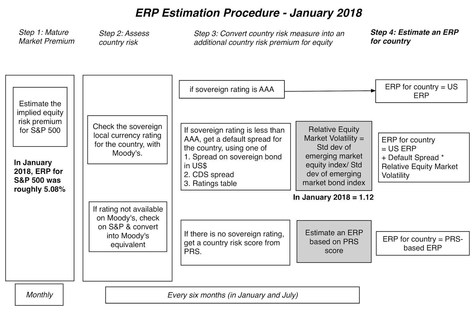 These country risk premiums, when added to the implied US equity risk premium of 5.08%, yield equity risk premiums for countries. The picture below summarizes equity risk premiums around the world.
via chartsbin.com
If the heat map does not provide enough specifics, this picture may be better:
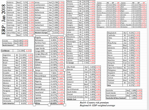
Finally, if you prefer the data as a table, you can download the spreadsheet with the data or my more detailed country risk premium dataset.
Company Equity RiskA company's risk does not come from where it is incorporated, but where it does business. If we adopt this perspective, it is clear that to value a company, you need to see its risk exposure to different countries, either because it has its production and operations in those countries or because it sells its products or services there. That risk exposure, in conjunction with the equity risk premiums of the countries estimated in the earlier section, can be used to compute the company's equity risk premium. To illustrate this concept, consider LATAM, the Chile-based airline. To compute its equity risk premium, I would compute the weighted average of the countries that LATAM derives revenues from which includes most of Latin America and the US. For companies like Coca Cola, which may be in too many countries for this approach to be easily applied or where the country breakdowns are not available, you can use regional equity risk premiums. In the table above, I report on the GDP-weighted average ERP for regions of the world. If you accept this rationale, the following implications follow:
A company cannot change its risk profile by delisting in one market and resisting in another: It is a common play for emerging market companies to delist on their "risky" local markets and to re-list on a more developed markets. While there are some good reasons for doing so, which can potentially increase value, like increased liquidity and transparency, one reason that does not stand up to scrutiny is that the company has become safer, just because of the listing change. A South African mining company that delists in Johannesburg and lists on the London Stock Exchange is still exposed to South African country risk, after the move.A company's equity risk premium should change, as its geographic exposure changes: In estimating the equity risk premium for a company today, we need to consider where it operates today. If we expect that geographic mix to change over time, as it usually will, the equity risk premium that we use in future years should reflect these expected changes. And yes, that will mean that your cost of equity and capital can change over time. Welcome to globalization!When multinationals assess projects, their hurdle rates should vary across geographies: When multinationals assess hurdle rates for projects, those hurdle rates should vary, depending upon where a project will be, even if the hurdle rates are estimated in the same currency. Thus, the US dollar cost of equity that Coca Cola should use for a Canadian beverage expansion should be far lower than the US dollar cost of equity for a Russian investment.It is a pity that accounting disclosure requirements have been so focused on trivial matters that have little effect on value and have not really paid attention to the type of information companies should be disclosing to investors on geographic operations.
ConclusionIf, as the Chinese symbol (危机) for crisis suggests, danger plus opportunity equals risk, it is not surprising that the most risky parts of the world also often provide the most potential for growth. By demanding higher equity risk premiums for investing in these parts of the world, I am not suggesting that you hold back from investing in these risky regions, but only that you demand enough of a premium for exposing yourself to additional risk. After all, investing should never be bungee jumping, where you take risk for the sake of taking risk!
YouTube Video
Datasets
Country Ratings, PRS scores and Equity Risk Premiums (January 2018)Equity Risk Premiums, by Country - Detailed (January 2018)Company Risk Premium Calculator (Spreadsheet)PapersCountry Risk Premiums: Data, Measures and Implications, A 2017 Update (Last version from July 2017)Data Update PostsJanuary 2018 Data Update 1: Numbers don't lie, or do they?January 2018 Data Update 2: The Buoyancy of US Equities!January 2018 Data Update 3: Taxing Questions on ValueJanuary 2018 Data Update 4: The Currency ConundrumJanuary 2018 Data Update 5: Country Risk UpdateJanuary 2018 Data Update 6: Cost of Capital - A Global UpdateJanuary 2018 Data Update 7: Growth and Value - Investment ReturnsJanuary 2018 Data Update 8: Debt and TaxesJanuary 2018 Data Update 9: The Cash Harvest - Dividend PolicyJanuary 2018 Data Update 10: The Pricing Prerogative
January 24, 2018
January 2018 Data Update 4: The Currency Conundrum
There is perhaps no more mangled nor misunderstood part of financial analysis than the handling of currencies, and globalization has only made the problems worse. From the laziness of assuming that government bond rate in a currency is always the risk free rate in that currency, to nonsensical notions like a global risk free rate, to bad practices like discounting peso cash flows with dollar discount rates, the list of currency sins is long. In this post, I look at three of the most common misconceptions related to currencies and use them to update currency related numbers at the start of 2018.
Misconception 1: Governments are Default Free (when they borrow in the local currencies)
I was taught, in my first finance class, to use the US treasury bond rate as the risk free rate, when estimating expected return, reflecting the dollar-centric world of my MBA studies. The notion, though, that the government bond rate, denominated in the local currency, is the risk free rate in that currency persists, albeit expanded to include other currencies. Thus, we are told to use the Brazilian Government $R bond as the $R risk free rate and the Indian Rupee Government bond rate as the Indian Rupee risk free rate. Its proponents argue that governments control the printing of money and hence never have to default, but what they fail to note is that in the last three decades, a significant proportion of all sovereign defaults have been local currency defaults; of the 58 sovereign defaults between 1996 and 2012, 31 were in the local currency. As to why countries would choose to default in the local currency, when they can print enough money to pay off debt, the answer is straight forward. Printing more money debases your currency, and countries, faced with a choice between defaulting and debasing their currencies, often conclude that default is a better option.
So what if sovereigns default on local currency bonds? If a sovereign entity (or government) can default on local currency debt, it stands to reason that the rate on a bond issued by it is no longer a risk free rate. Using that government bond rate, as if it were a risk free rate, can lead to the double counting of risk, especially if analysts use a higher equity risk premium to capture additional country risk. For instance, consider the Nigerian Naira 10-year government bond, trading to yield 14.12% on January 1, 2018. If that rate is used as the risk free rate in Naira for a Nigerian company, in conjunction with a high equity risk premium for Nigeria, you are counting risk twice in your computation, once in your “risky” risk free rate and again in your equity risk premium. To avoid double counting, you have to cleanse the government bond of default risk and to do so, you have to estimate how much of the interest rate on the bond can be attributed to default risk. There are three ways that you can estimate this default spread, though they all come with a catch.
Government Bond Spread: The first is to find a US dollar or Euro government bond issued by the sovereign in question and to net out the US Treasury Bond rate or the German Euro bond rate as the risk free rates. Sovereign CDS Spread: The second is to observe the sovereign Credit Default Swap on the sovereign in question, which is a measure of the default spread of the sovereign. Local Currency Rating: The third is to use the sovereign rating estimated by S&P, Moody’s or Fitch for a country and to estimate the typical spread at which other bonds with the same rating trade at. With the Nigerian Naira, for instance, you have two choices for the default spread; the first is the sovereign CDS spread for Nigeria, which on January 1, 2018, was 4.68% and the second was the 5.64% spread associated with Nigeria's local currency rating of B2 (from Moody's). Using the latter estimate would yield a risk free rate of 8.48% for the Nigerian Naira:Risk free Rate in Nigerian Naira (1/1/18) = 14.12% - 5.64% = 8.48%The problem with all these spreads is that they are dollar-based, not local currency-based, and netting these spreads out from the local currency government bond can create an inconsistency.
This process of estimating risk free rates in different currencies requires the presence of local currency long term government bonds, a requirement that is met by less than fifty currencies at the start of 2018. I used the sovereign ratings to extract default spreads (the third approach described in the last paragraph) and estimated risk free rates in those currencies in the chart below:
 Download spreadsheetThere are three obvious points to make. The first is that risk free rates vary across currencies, ranging from less than zero in a handful of currencies (Yen, Swiss Franc, Croatian Kuna) to more than 8% in others (Nigerian Naira, Turkish Lira and the Venezuelan Bolivar). The second is that for the risk free rates that are negative, it is either because the government bond rate was negative (Swiss Franc or Japanese Yen) or because of the netting out of the default spread from the government bond rate (Croatian Kuna and Hungarian Forint). The third is quality of precision of the risk free rate you get in a currency is only as good as the government bond rate that you start the process with. To the extent that some of the government bond rates on my list do not represent traded bond rates but are government set or manipulated, the rates that emerge from them are flawed. For instance, I don't, for a moment, believe that the risk free rate in Venezuelan Bolivar is less than 10%.
Misconception 2: There is a Global Risk Free Rate It is perhaps understandable that an analyst who looks at the differences in rates across currencies, before or after adjusting for default risk, will conclude that since the risk free rate is the lowest of the rates at which an entity can borrow money, the lowest of the rates across currencies, perhaps the Swiss Franc or the Japanese Yen, is the global risk free rate and that all other currencies are risky. That is a dangerous delusion, since there is a simple reason why risk free rates vary across currencies. The risk free rate in a currency is a reflection of expected inflation in that currency, and risk free rates will be higher in high-inflation currencies than in low-inflation ones, and can become negative in deflationary currencies. There are three implications that follow:1. You cannot blend multiple currencies in the same analysis/valuation: When valuing a company that has operations in many countries and derives its revenues in multiple currencies, you cannot create blended averages of risk free rates or growth rates in different currencies. Doing so would be akin to averaging the temperature in New York (measured in fahrenheit) with the temperature in Frankfurt (measured in celsius) to arrive at an average temperature for the two cities. 2. If you can estimate the expected inflation rate in a currency, you can estimate a risk free rate in that currency: In fact, the risk free rate in a currency can simply be stated as the sum of the expected inflation rate in that currency and the real interest rate. If you are willing to buy into the notion that the real interest rate around the globe should converge on a single number (as would be the case, if capital could flow easily across markets), the risk free rate in any currency can then be estimated by using the differential inflation rate between that currency and one where a risk free rate is observable (like the US dollar or the Euro).
 Note that there is an approximate version of this rate that can be obtained by adding the differential inflation rate to the US dollar risk free rate. If the risk free rate in US dollars is 2.41%, the expected inflation rate in the US is 1.75% and the expected inflation in India is 6%, the risk free rate in Indian rupees can be written as follows;Approximate form = 2.41% + (6% - 1.75%) = 6.66%Precise version = (1.0241) (1.06/1.0175) -1 = 6.68%There are two advantages to the differential inflation approach. The first is that it does not assume that the government bond is traded and it does not have to deal with the currency mismatch of default spreads in US dollars being netted out against local currency bond rates. The second is that this approach can be extended to almost all currencies, since it is built around expected inflation. I have used IMF estimates of expected inflation in currencies to derive local currency risk free rates in more than 150 currencies in the linked dataset. Incidentally, using expected inflation rates yields a risk free rate in Venezuelan Bolivar of 3814%, a much more believable number given the hyper inflation in that country.
3. Pegged exchange rates may be a delusion: There are some currencies that are pegged to the US dollar and for analysts working with these currencies, it has become standard practice to use the US treasury bond rate as the risk free rate in the currency. The danger, though, is that governments that peg currencies can also unpeg them and the differential inflation approach yields a way of finding out when you should worry. If you have a currency pegged to the US dollar, but the inflation rate in that currency is 4% higher than the US dollar, it is only a question of time before the peg will break. In such cases, it may be prudent to replace the US treasury bond rate with a calculated risk free rate, using the differential inflation. (Warning to Middle Eastern analysts: This will cause a significant markdown in value for your Saudi and Emirate equites, but..)
Misconception 3: Currency Choice can drive your valuationWhen valuing a company, analysts often default to valuing it in the local currency, but currency is a choice. I can value Severstal, a Russian steel company, in Russian rubles, US dollars or Euros. At first sight, the fact that risk free rates are lower in US dollars and Euros, relative to the ruble, may seem to suggest that you could inflate Severstal’s value, by switching the valuation currency from rubles to dollars, but you will not. The answer to why lies in the last section, where we noted that risk free rates vary across currencies, because of differential inflation, and tying it in with a simple consistency rule in valuation and capital budgeting: if the cash flows in an analysis are forecast in a specific currency, the discount rate used has to be in the same currency. Consequently, if you value Severstal in Euros, instead of rubles, it is true that your discount rate will be lower (because inflation in the US dollar is lower than in rubles) but it is also true that your cash flows will also grow at lower rates, for the same reason. This is captured in the picture below:
 The proposition that the value of a company should not be a function of the currency that you choose to value that company should also cast as a lie the notion that using an emerging market currency in a valuation brings additional risk into a valuation. If Severstal is a riskier company because of its Russian roots, and it is, that risk premium should be part of the discount rate estimated in US dollar or ruble terms.
 The other push back that you will get is that your views on a currency can cause the value estimated in that currency can diverge. For instance, if you expect the Brazilian Reai to appreciate against the US dollar for the next few years, the value of Embraer will be higher, estimated in $R than in US$. While that is true, the reason for the divergence has nothing to do with the use of the currency and everything to do with bringing your currency views into your valuation. Thus, if the value of Embraer is 20% higher, when you value it in $R than in US$, that 20% difference is entirely due to your view that the $R will strengthen, which if true, you can profit from in simpler and more direct ways than buying Embraer.
One of the most common and deadly mistakes in valuation is mixing different currencies in the same valuation. Valuing an Indian company, by projecting the cash flows in rupees and discounting those cash flows at a US dollar cost of capital, will result in too high a value, since the inflation rate in US$ is significantly lower than the inflation rate in rupees. While that may seem like an obvious mistake, and one easy to avoid, it happens because we are often not explicit about currencies when making estimates. Thus, a US company that estimates a dollar cost of capital for acquiring an Indian company and then obtains expected growth rates for the cash flows from the managers of the Indian company, who naturally think in rupee terms, is setting itself up for the mismatch.
Conclusion If there are lessons to be learned from looking at the dangers of mixing currencies, it is that it is time that we stopped being casual about the currencies that we measure and use in our analysis. At the risk of sounding pedantic, we should never estimate a growth rate, without being explicit about what currency that growth rate is estimated in, or talk about cash flows, without thinking about the inflation that we have embedded in them.
YouTube Video
Datasets/SpreadsheetsRiskfree Rate Estimator (Spreadsheet for estimating riskfree rates)Riskfree Rates in Currencies (using Local Currency Government Bonds)Riskfree Rates in Currencies (using Differential Inflation Rates)Data Update PostsJanuary 2018 Data Update 1: Numbers don't lie, or do they?January 2018 Data Update 2: The Buoyancy of US Equities!January 2018 Data Update 3: Taxing Questions on ValueJanuary 2018 Data Update 4: The Currency ConundrumJanuary 2018 Data Update 5: Country Risk January 2018 Data Update 6: Cost of Capital - A Global UpdateJanuary 2018 Data Update 7: Growth and Value - Investment ReturnsJanuary 2018 Data Update 8: Debt and ValueJanuary 2018 Data Update 9: The Cash Harvest - Dividend PolicyJanuary 2018 Data Update 10: The Pricing Prerogative
January 12, 2018
January 2018 Data Update 3: Taxing Questions on Value
If you have read my prior posts on taxes, you already know my views on the US tax code, especially as it relates to corporate taxes. Without mincing words, the US corporate tax code, as it existed in 2017, was an abomination, a carry over from a prior century where the US was the center of the global economy and companies would do anything demanded of them, to preserve their US incorporation. I was therefore predisposed to favoring tax reform and Congress delivered its version towards the end of 2017. While the process was messy and partisan, it represents the most significant change in corporate taxation in the United States in the my lifetime, and as with all tax reform, it is a mix of the good, the bad and the ugly, with your political priors determining which one you believe dominates. No matter what you think about the tax reform package, there is the one thing that is not debatable: it will impact equity value and affect corporate behavior in the coming year.
The 2017 Tax Reform: Key Changes
The tax reform package that passed Congress is more than a 1000 pages long and it is easy to get lost in the details. While it makes changes in individual, private business and corporate tax law, I will focus this post on the corporate tax law changes. In my view, there are four big changes embedded in this packet that deserve attention:Corporate Tax Rate: The federal corporate tax rate on the income that corporations generate ion the United States has been lowered from 35%, at the federal level, to 21%. This is the portion of the bill that attracted the most media attention, primarily because of the magnitude of the drop, bringing corporate taxes in the United States down to levels not seen in the country since the second world war.Treatment of Foreign Income: The other big change in corporate taxation that attracted less attention but my be just as consequential in the long term is that the US has now joined the rest of the world, replacing its global tax with a regional tax model. Put simply, until 2017, US companies were required to pay the US tax rate on all of their global income, though the differential tax on foreign income does not have to be paid, until repatriated to the US. Starting in 2018, US companies will have to pay only the foreign taxes due on foreign income and will be free to bring the money back, when they want. There are two ancillary changes that the package makes to foreign income. First, it tries to clean up for past sins by imposing a one-time tax to un-trap cash that companies are holding in foreign locales. As I noted in this earlier post, the trapped cash is a predictable side effect of the global tax model, and not surprisingly, companies with global revenues have built up more than $2 trillion in foreign cash cash balances. The one-time tax rate will be 15.5% on cash invested in liquid assets and 8% on harder-to-sell assets. Second, the tax code also tries to put in disincentives for companies moving intangible assets to tax havens, by imposing a minimum tax rate of 13.1% (rising to 16.4% in 2025) on excess profits (over and above a 10% cost of capital) earned in foreign subsidiaries. This seems to be specifically directed at technology and pharmaceutical companies that have found ways to create foreign subsidiaries for intangible assets.Limitation on Interest Deductibility: For the first time, the US tax code will put a limit on the deductibility of interest expenses, restricting it to 30% of the "adjusted taxable income" (with taxable income defined as EBITDA through 2022 and EBIT thereafter). To provide a cushion for companies that may have cyclical income, the lost (non-tax deductible) interest expense deductions can be carried forward and used in future years, with no expiration date.Capital Expensing: US companies will be allowed to deduct their investments in tangible assets in the year of the investment, for taxable income calculations, rather than have to depreciate it over time. This provision will remain intact until 2023 and be phased out by 2027.The two best features of the tax reform package, in my view, are the changes in the taxation of foreign income and in the treatment of debt, and I will trace out the consequences for value in the next section. There are three features of the tax reform that I do not like. First, the package does little to reduce the complexity in the code, and in some cases, adds to that complexity. In particular, I don't like either the capital expensing rule change or the way in which it deals with intangible assets overseas. Second, I don't believe that tax codes are good instruments to do economic engineering and I don't think that the provisions that are in the changed code to encourage companies, especially in old-economy sectors, to reinvest more will make a significant difference. Third, by increasing the divergence in tax rates between individual income, pass-through business income and corporate income (the highest marginal federal tax rates will be 37%, 29.6% and 21% respectively), it is going to encourage tax gaming on the part of those who have a choice.
The Value ChangeAs I read the many assessments of how the tax reform bill will affect stock prices and values, I am reminded of the old parable of the seven blind men and the elephant, where each one after feeling a different part of the elephant's body gives a very different description of the animal. Analysts seem to be picking either one aspect of the tax code (lower tax rates, debt interest restrictions, foreign income taxation) or one dimension of value (cash flows, risk or growth) to arrive at a conclusion that reflects their political biases. Thus, I have seen supporters of the bill zero in on the drop in the tax rate from 35% to 21%, assume that this will increase after-tax income proportionately and extrapolate to a value increase of more than 20%. At the other end of the bias spectrum, there are pessimists who argue that the loss of the tax benefits from debt, from both lower tax rates and interest deductibility restrictions, will push up the after-tax cost of debt and capital for firms, and lower value. Both analyses are incomplete because they are focused on pieces of the valuation puzzle, rather than the entire valuation. The tax code, after all, affects every dimension of value, as can be seen in the picture below: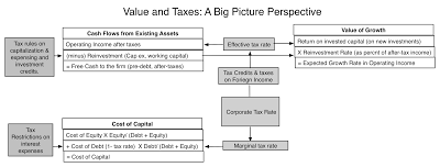 To assess the impact of tax reform on overall equity value, we have to move through each dimension of value. In making these assessments, I will focus on non-financial service firms, partly because the tax effects on debt and value are cleaner and more transparent.The Cash Flow Effect: The cash flows that a firm generates on operations are after taxes, but the relevant tax rate is not the statutory tax rate but the effective rate. It is true that the reduction of the statutory tax rate from 35% to 21%, will reduce taxes paid, but the reduction will be from the aggregated effective tax rate that companies paid in 2017, not the marginal rate. Based upon my estimates, in 2017, US non-financial service companies reported $330.8 billion in taxes on taxable income of $1,342.1 billion, translating into an effective tax rate of 25.19%. Since this tax rate includes state and local taxes and taxes on global income, these companies were paying an effective federal tax rate of closer to 23% on all of their taxable income in 2017. With the drop in the US corporate tax rate and the shift to a regional tax model, we would expect this tax rate to drop, but the magnitude of the decline is likely to be far smaller than optimists are assuming. My guess is that the effective tax rate next year will be about 20%, including state and local taxes, after the tax rate changes, resulting in an increase in after-tax operating earnings of approximately 6.67% [(1-.20)/(1-.2519)] in the next year.
 The Cost of Capital Effect: The cost of capital is a weighted average of the cost of equity and the after-tax cost of debt. In computing the after-tax cost of debt, the tax rate that matters is the marginal tax rate on US income, since even companies that have low effective tax rates, like Apple, have found it in their best interests to borrow money in the US and set off interest expenses against their highest-taxed income. The marginal tax rate for a US company in 2017 was close to 38%, with state and local taxes added to the US federal tax rate of 35%. Moving that tax rate down to 24% (my estimate of the marginal corporate tax rate, with state and local taxes, in 2018) will increase the after-tax cost of debt. In 2017, US non-financial service firms collectively reported a debt to capital ratio, in market value terms, of 23.5% and faced a cost of equity of 7.85% and a pre-tax cost of debt of 3.91%. With a 38% marginal tax rate, that would have resulted in an after-tax cost of debt of 2.42% and a cost of capital of 6.57%. Keeping the pre-tax cost of debt and debt ratio fixed, and reducing the marginal tax rate to 24% will increase the cost of capital to 6.70%.
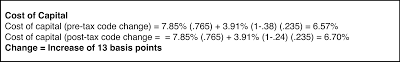 The Growth Effect: The growth effect is the trickiest one to assess, since the value of growth is a function of both how much companies reinvest but also how well they reinvest, measured as the return they earn on investments over and above their cost of capital. We do know that the incentive to reinvest has increased, especially at companies with physical and depreciable assets, because of the capital expensing provision and we also know that excess returns will change, as after-tax earnings and the cost of capital go up. In 2017, non-financial service companies in the US collectively reinvested 59.27% of their after-tax operating income back into their businesses and earned a return of 12.76% on their capital employed; the sustainable growth rate, if those numbers are maintained, is 7.56%. Increasing the return on capital to reflect the growth in after-tax earnings yields 13.65%, and assuming that reinvestment increases marginally to 65% of the after-tax earnings, because of the capital expensing rule change, yields an expected growth rate of 8.87%.
 With these inputs in place, we can value US companies collectively, pre and post tax reform, and the effect on firm value is captured in the table below:
 Download spreadsheetIn making my estimates, I have assumed that the revenues and Note that this is the estimated increase in firm value, but equity value will rise proportionately, if the debt ratio remains unchanged. Does this mean that stock prices will rise 9.70% over the next year? No, and here is why. This tax reform package has been floating around for almost a year now and investors have had a chance to not only read it but incorporate its effects into prices. While the final package contained some surprises, the final version of the bill preserved the key ingredients that we introduced in April 2017. The strong returns posted by US stocks last year already include some of the value effects of the tax law. Note that this does not mean that the effects of the new tax code have already worked their way into prices since we still do not know how companies or the US economy will respond to the changes. This analysis is static, insofar as it does not allow for the changes in investing, financing and dividend behavior that we will see, as a consequence of the tax change. For instance, firms may decrease how much they borrow, since the tax benefit to debt has decreased, and that will lower debt ratios and change the cost of capital further.
Value RedistributionWhile much of the discussion about the tax reform has been about its impact on the overall economy and equity values, the bigger effect of the changes to the code will be redistributive, with some sectors gaining and other losing. To identify the winners and the losers across sectors, we can use the same framework that we used to assess the value change and isolate the value effect on a sector to three variables: table.tableizer-table { font-size: 12px; border: 1px solid #CCC; font-family: Arial, Helvetica, sans-serif; } .tableizer-table td { padding: 4px; margin: 3px; border: 1px solid #CCC; } .tableizer-table th { background-color: #104E8B; color: #FFF; font-weight: bold; }
VariableEffect on ValueProxyEffective tax rateCompanies that are currently paying high effective tax rates (>23%) will benefit the most from the tax reform. Companies that are paying low effective tax rates under existing law may pay higher taxes, if their tax deductions /credit have been removed or restricted.Effective Tax RateReinvestment in fixed assetsCompanies that invest large amounts in tangible assets (that are capitalized under existing law) will benefit the most from the capital expensing provision. Companies that invest in R&D or intangible assets, which are already expensed, will benefit less.Capital Expenditures as % of SalesDebt RatioCompanies that have high debt ratios will see bigger increases in costs of capital, and value decreases, as the tax benefits from debt are reduced. Companies with little or no debt will see little change in the cost of capital.Debt/ (Debt Equity), in market value termsPut simply, companies (sectors) that are currently paying high effective tax rates, invest large amounts in tangible (depreciable) assets and have little or no debt will benefit the most from the tax code changes. Companies (sectors) that are currently paying low effective tax rates, invest little or nothing in tangible (depreciable) assets and have high debt will be hurt the most by the tax code changes. To identify the sectors that will benefit the most or will be hurt the most by the tax reforms, I looked at effective tax rates, capital expenditures/sales and debt ratios across all non-financial service sectors in 2017 and used the market aggregate value as the comparison to identify which side of the divide (higher or lower than the market aggregate) each sector fell. The full list is at the link at the end of this post, but the sectors that delivered the benefit trifecta (high effective tax rate, high cap ex as a percent of sales and low debt ratio) and cost trifecta are listed below:
 Download full sector spreadsheetAll the caveats apply, insofar as we are using effective tax rates and capital expenditures for one year (2017) to make the comparisons. There is one sector, real investment trusts (REITs) that showed up the loser trifecta but it's special tax treatment (where its income is not taxed, but passed through) led to its removal from the lists. Again, this should not be taken as an indication that the market will look favorably on the benefited sectors and punish the hurt sectors, since market prices have had time to adjust to the expected tax code changes. In a later post on how the pricing varies across the sectors, we will revisit this question.
Conclusion
It would be hubris to argue that we know what will happen over the next year, as a result of the tax code, but we know what we should be watching out for:
Taxable income and tax rates: Facing a more benign domestic tax environment, will companies be more expansive in their measurement of taxable income? How much of this income will they pay out in effective taxes? Capital Expenditures in tangible asset sectors: The capital expensing provision should make investing in depreciable assets more attractive, but will that be sufficient to induce companies to reinvest more? If so, how much?The Untrapping of Cash: How much of the trapped cash will companies bring back home, paying the one-time tax penalty? Will they reinvest this cash or return it (in the form of dividends and buybacks)?The Debt Shift: Will highly levered businesses react to the reduction in tax benefits from debt by retiring debt? What effects will a system-wide delevering have on bond default spreads?On top of these company-level concerns are questions about how the economy will react to the tax changes, how much of the benefit will be redirected to employees and what effect there will be on interest rates. It is going to be an interesting year!
YouTube Video
Data/Spreadsheet LinksValue Effect on Market (Spreadsheet)Sector Proxies (Data on tax rates, cap ex and debt ratios by sector)Data Update PostsJanuary 2018 Data Update 1: Numbers don't lie, or do they?January 2018 Data Update 2: The Buoyancy of US Equities!January 2018 Data Update 3: Taxing Questions on ValueJanuary 2018 Data Update 4: The Currency ConundrumJanuary 2018 Data Update 5: Country Risk January 2018 Data Update 6: Cost of Capital - A Global UpdateJanuary 2018 Data Update 7: Growth and Value - Investment ReturnsJanuary 2018 Data Update 8: Debt and ValueJanuary 2018 Data Update 9: The Cash Harvest - Dividend PolicyJanuary 2018 Data Update 10: The Pricing Prerogative
The 2017 Tax Reform: Key Changes
The tax reform package that passed Congress is more than a 1000 pages long and it is easy to get lost in the details. While it makes changes in individual, private business and corporate tax law, I will focus this post on the corporate tax law changes. In my view, there are four big changes embedded in this packet that deserve attention:Corporate Tax Rate: The federal corporate tax rate on the income that corporations generate ion the United States has been lowered from 35%, at the federal level, to 21%. This is the portion of the bill that attracted the most media attention, primarily because of the magnitude of the drop, bringing corporate taxes in the United States down to levels not seen in the country since the second world war.Treatment of Foreign Income: The other big change in corporate taxation that attracted less attention but my be just as consequential in the long term is that the US has now joined the rest of the world, replacing its global tax with a regional tax model. Put simply, until 2017, US companies were required to pay the US tax rate on all of their global income, though the differential tax on foreign income does not have to be paid, until repatriated to the US. Starting in 2018, US companies will have to pay only the foreign taxes due on foreign income and will be free to bring the money back, when they want. There are two ancillary changes that the package makes to foreign income. First, it tries to clean up for past sins by imposing a one-time tax to un-trap cash that companies are holding in foreign locales. As I noted in this earlier post, the trapped cash is a predictable side effect of the global tax model, and not surprisingly, companies with global revenues have built up more than $2 trillion in foreign cash cash balances. The one-time tax rate will be 15.5% on cash invested in liquid assets and 8% on harder-to-sell assets. Second, the tax code also tries to put in disincentives for companies moving intangible assets to tax havens, by imposing a minimum tax rate of 13.1% (rising to 16.4% in 2025) on excess profits (over and above a 10% cost of capital) earned in foreign subsidiaries. This seems to be specifically directed at technology and pharmaceutical companies that have found ways to create foreign subsidiaries for intangible assets.Limitation on Interest Deductibility: For the first time, the US tax code will put a limit on the deductibility of interest expenses, restricting it to 30% of the "adjusted taxable income" (with taxable income defined as EBITDA through 2022 and EBIT thereafter). To provide a cushion for companies that may have cyclical income, the lost (non-tax deductible) interest expense deductions can be carried forward and used in future years, with no expiration date.Capital Expensing: US companies will be allowed to deduct their investments in tangible assets in the year of the investment, for taxable income calculations, rather than have to depreciate it over time. This provision will remain intact until 2023 and be phased out by 2027.The two best features of the tax reform package, in my view, are the changes in the taxation of foreign income and in the treatment of debt, and I will trace out the consequences for value in the next section. There are three features of the tax reform that I do not like. First, the package does little to reduce the complexity in the code, and in some cases, adds to that complexity. In particular, I don't like either the capital expensing rule change or the way in which it deals with intangible assets overseas. Second, I don't believe that tax codes are good instruments to do economic engineering and I don't think that the provisions that are in the changed code to encourage companies, especially in old-economy sectors, to reinvest more will make a significant difference. Third, by increasing the divergence in tax rates between individual income, pass-through business income and corporate income (the highest marginal federal tax rates will be 37%, 29.6% and 21% respectively), it is going to encourage tax gaming on the part of those who have a choice.
The Value ChangeAs I read the many assessments of how the tax reform bill will affect stock prices and values, I am reminded of the old parable of the seven blind men and the elephant, where each one after feeling a different part of the elephant's body gives a very different description of the animal. Analysts seem to be picking either one aspect of the tax code (lower tax rates, debt interest restrictions, foreign income taxation) or one dimension of value (cash flows, risk or growth) to arrive at a conclusion that reflects their political biases. Thus, I have seen supporters of the bill zero in on the drop in the tax rate from 35% to 21%, assume that this will increase after-tax income proportionately and extrapolate to a value increase of more than 20%. At the other end of the bias spectrum, there are pessimists who argue that the loss of the tax benefits from debt, from both lower tax rates and interest deductibility restrictions, will push up the after-tax cost of debt and capital for firms, and lower value. Both analyses are incomplete because they are focused on pieces of the valuation puzzle, rather than the entire valuation. The tax code, after all, affects every dimension of value, as can be seen in the picture below:
 To assess the impact of tax reform on overall equity value, we have to move through each dimension of value. In making these assessments, I will focus on non-financial service firms, partly because the tax effects on debt and value are cleaner and more transparent.The Cash Flow Effect: The cash flows that a firm generates on operations are after taxes, but the relevant tax rate is not the statutory tax rate but the effective rate. It is true that the reduction of the statutory tax rate from 35% to 21%, will reduce taxes paid, but the reduction will be from the aggregated effective tax rate that companies paid in 2017, not the marginal rate. Based upon my estimates, in 2017, US non-financial service companies reported $330.8 billion in taxes on taxable income of $1,342.1 billion, translating into an effective tax rate of 25.19%. Since this tax rate includes state and local taxes and taxes on global income, these companies were paying an effective federal tax rate of closer to 23% on all of their taxable income in 2017. With the drop in the US corporate tax rate and the shift to a regional tax model, we would expect this tax rate to drop, but the magnitude of the decline is likely to be far smaller than optimists are assuming. My guess is that the effective tax rate next year will be about 20%, including state and local taxes, after the tax rate changes, resulting in an increase in after-tax operating earnings of approximately 6.67% [(1-.20)/(1-.2519)] in the next year.
 The Cost of Capital Effect: The cost of capital is a weighted average of the cost of equity and the after-tax cost of debt. In computing the after-tax cost of debt, the tax rate that matters is the marginal tax rate on US income, since even companies that have low effective tax rates, like Apple, have found it in their best interests to borrow money in the US and set off interest expenses against their highest-taxed income. The marginal tax rate for a US company in 2017 was close to 38%, with state and local taxes added to the US federal tax rate of 35%. Moving that tax rate down to 24% (my estimate of the marginal corporate tax rate, with state and local taxes, in 2018) will increase the after-tax cost of debt. In 2017, US non-financial service firms collectively reported a debt to capital ratio, in market value terms, of 23.5% and faced a cost of equity of 7.85% and a pre-tax cost of debt of 3.91%. With a 38% marginal tax rate, that would have resulted in an after-tax cost of debt of 2.42% and a cost of capital of 6.57%. Keeping the pre-tax cost of debt and debt ratio fixed, and reducing the marginal tax rate to 24% will increase the cost of capital to 6.70%.
 The Growth Effect: The growth effect is the trickiest one to assess, since the value of growth is a function of both how much companies reinvest but also how well they reinvest, measured as the return they earn on investments over and above their cost of capital. We do know that the incentive to reinvest has increased, especially at companies with physical and depreciable assets, because of the capital expensing provision and we also know that excess returns will change, as after-tax earnings and the cost of capital go up. In 2017, non-financial service companies in the US collectively reinvested 59.27% of their after-tax operating income back into their businesses and earned a return of 12.76% on their capital employed; the sustainable growth rate, if those numbers are maintained, is 7.56%. Increasing the return on capital to reflect the growth in after-tax earnings yields 13.65%, and assuming that reinvestment increases marginally to 65% of the after-tax earnings, because of the capital expensing rule change, yields an expected growth rate of 8.87%.
 With these inputs in place, we can value US companies collectively, pre and post tax reform, and the effect on firm value is captured in the table below:
 Download spreadsheetIn making my estimates, I have assumed that the revenues and Note that this is the estimated increase in firm value, but equity value will rise proportionately, if the debt ratio remains unchanged. Does this mean that stock prices will rise 9.70% over the next year? No, and here is why. This tax reform package has been floating around for almost a year now and investors have had a chance to not only read it but incorporate its effects into prices. While the final package contained some surprises, the final version of the bill preserved the key ingredients that we introduced in April 2017. The strong returns posted by US stocks last year already include some of the value effects of the tax law. Note that this does not mean that the effects of the new tax code have already worked their way into prices since we still do not know how companies or the US economy will respond to the changes. This analysis is static, insofar as it does not allow for the changes in investing, financing and dividend behavior that we will see, as a consequence of the tax change. For instance, firms may decrease how much they borrow, since the tax benefit to debt has decreased, and that will lower debt ratios and change the cost of capital further.
Value RedistributionWhile much of the discussion about the tax reform has been about its impact on the overall economy and equity values, the bigger effect of the changes to the code will be redistributive, with some sectors gaining and other losing. To identify the winners and the losers across sectors, we can use the same framework that we used to assess the value change and isolate the value effect on a sector to three variables: table.tableizer-table { font-size: 12px; border: 1px solid #CCC; font-family: Arial, Helvetica, sans-serif; } .tableizer-table td { padding: 4px; margin: 3px; border: 1px solid #CCC; } .tableizer-table th { background-color: #104E8B; color: #FFF; font-weight: bold; }
VariableEffect on ValueProxyEffective tax rateCompanies that are currently paying high effective tax rates (>23%) will benefit the most from the tax reform. Companies that are paying low effective tax rates under existing law may pay higher taxes, if their tax deductions /credit have been removed or restricted.Effective Tax RateReinvestment in fixed assetsCompanies that invest large amounts in tangible assets (that are capitalized under existing law) will benefit the most from the capital expensing provision. Companies that invest in R&D or intangible assets, which are already expensed, will benefit less.Capital Expenditures as % of SalesDebt RatioCompanies that have high debt ratios will see bigger increases in costs of capital, and value decreases, as the tax benefits from debt are reduced. Companies with little or no debt will see little change in the cost of capital.Debt/ (Debt Equity), in market value termsPut simply, companies (sectors) that are currently paying high effective tax rates, invest large amounts in tangible (depreciable) assets and have little or no debt will benefit the most from the tax code changes. Companies (sectors) that are currently paying low effective tax rates, invest little or nothing in tangible (depreciable) assets and have high debt will be hurt the most by the tax code changes. To identify the sectors that will benefit the most or will be hurt the most by the tax reforms, I looked at effective tax rates, capital expenditures/sales and debt ratios across all non-financial service sectors in 2017 and used the market aggregate value as the comparison to identify which side of the divide (higher or lower than the market aggregate) each sector fell. The full list is at the link at the end of this post, but the sectors that delivered the benefit trifecta (high effective tax rate, high cap ex as a percent of sales and low debt ratio) and cost trifecta are listed below:
 Download full sector spreadsheetAll the caveats apply, insofar as we are using effective tax rates and capital expenditures for one year (2017) to make the comparisons. There is one sector, real investment trusts (REITs) that showed up the loser trifecta but it's special tax treatment (where its income is not taxed, but passed through) led to its removal from the lists. Again, this should not be taken as an indication that the market will look favorably on the benefited sectors and punish the hurt sectors, since market prices have had time to adjust to the expected tax code changes. In a later post on how the pricing varies across the sectors, we will revisit this question.
Conclusion
It would be hubris to argue that we know what will happen over the next year, as a result of the tax code, but we know what we should be watching out for:
Taxable income and tax rates: Facing a more benign domestic tax environment, will companies be more expansive in their measurement of taxable income? How much of this income will they pay out in effective taxes? Capital Expenditures in tangible asset sectors: The capital expensing provision should make investing in depreciable assets more attractive, but will that be sufficient to induce companies to reinvest more? If so, how much?The Untrapping of Cash: How much of the trapped cash will companies bring back home, paying the one-time tax penalty? Will they reinvest this cash or return it (in the form of dividends and buybacks)?The Debt Shift: Will highly levered businesses react to the reduction in tax benefits from debt by retiring debt? What effects will a system-wide delevering have on bond default spreads?On top of these company-level concerns are questions about how the economy will react to the tax changes, how much of the benefit will be redirected to employees and what effect there will be on interest rates. It is going to be an interesting year!
YouTube Video
Data/Spreadsheet LinksValue Effect on Market (Spreadsheet)Sector Proxies (Data on tax rates, cap ex and debt ratios by sector)Data Update PostsJanuary 2018 Data Update 1: Numbers don't lie, or do they?January 2018 Data Update 2: The Buoyancy of US Equities!January 2018 Data Update 3: Taxing Questions on ValueJanuary 2018 Data Update 4: The Currency ConundrumJanuary 2018 Data Update 5: Country Risk January 2018 Data Update 6: Cost of Capital - A Global UpdateJanuary 2018 Data Update 7: Growth and Value - Investment ReturnsJanuary 2018 Data Update 8: Debt and ValueJanuary 2018 Data Update 9: The Cash Harvest - Dividend PolicyJanuary 2018 Data Update 10: The Pricing Prerogative
Aswath Damodaran's Blog

- Aswath Damodaran's profile
- 725 followers
Aswath Damodaran isn't a Goodreads Author
(yet),
but they
do have a blog,
so here are some recent posts imported from
their feed.

