
Aswath Damodaran's Blog
August 5, 2025
The Imitation Game: Defending against AI's Dark Side!
An Easy Target?
In a post last year, I talked about a bot in my name, that was in development phase at NYU, and while officially sanctioned, it did open up existential challenges for me. In discussing that bot, I noted that this bot had accessed everything that I had ever written, talked about or valued in my lifetime, and that I had facilitated its path by making that access easy. I will explain my rationale for the open access, and provide you with the links if you want to get to them, hoping to pre-empt those who will try to charge you for that content.
My Open Access Policy
I have said this before, but there is no harm in saying it again, but I am a teacher, first and foremost, and almost every choice I make in my profession life reflects that mindset. A teacher, like an actor or singer, craves an audience, and the larger and more enthusiastic that audience, the better. When I started teaching in 1986, my audience was restricted to those in my physical classroom at NYU's business school, and my initial attempts at expanding that audience were very limited. I had video recorders set up to record my lectures, made three copies of each lecture tape, and put them on the shelves at NYU's library for patrons to check out and watch. The internet, for all of its sins, changed the game for me, allowing me to share not only class materials (slides, exams) but also my lecture videos, in online formats. Though my early attempts to make these conversions were primitive, the technology for recording classes and putting them online has made a quantum leap. In spring 2025, every one of my NYU classes was recorded by cameras that are built into classroom, the conversions to online videos happened in minutes, right after the class is done, and YouTube has been a game changer, in allowing access to anyone with an internet connection anywhere in the world.
As the internet has expanded its reach, and social media platforms have joined the mix, I have also shared the other components that go into my classes more widely, starting with the data on industry averages that I need and use in my own valuations, the spreadsheets that contain these valuations and blog posts on markets and companies and any other tools that I use in my own analyses. While I am happy to receive compliments for the sharing and praise for being unselfish, the truth is that my sharing is driven less by altruism (I am no Mother Theresa!) and more by two other forces. The first is that, as I noted in my post on country equity risk premiums last week, there much of what I know or write about is pedestrian, and holding it in secret seems silly. The second is that, while I am not easily outraged, I am driven to outrage by business consultants and experts who state the obvious (replacing words you know with buzzwords and acronyms), while making outrageous claims of what they can deliver and charging their customers absurd amounts for their advice and appraisals. If I can save even a few of these customers from making these payments, I consider it to be a win.
My Sharing Spots
Everything that I have ever written, worked on or taught is somewhere online, almost always with no protective shields (no passwords or subscriptions), and there are four places where you can find them:
Webpage: The oldest platform for my content remains my webpage, damodaran.com, and while it can be creaky, and difficult to navigate, it contains the links to my writing, teaching, data, spreadsheets and other tools. Teaching: I teach two classes at Stern, corporate finance and valuation, and have four other classes - a lead-into-valuation accounting class, a made-for-finance statistics class, a class on investment philosophies and one on corporate life cycles, and I described these classes in a post on teaching at the start of 2025. You can find them all by going to the teaching link on my webpage, https://people.stern.nyu.edu/adamodar/New_Home_Page/teaching.html including my regular classes (class material, lecture notes, exams and quizzes and webcasts of the classes) in real time, as well as archived versions from previous semesters. In addition, the online classes are at the same link, with material, post- class tests and webcasts of sessions for each class. This is also the place where you can find links to seminars that I teach in the rest of the world, with slides and materials that I used for those classes (though I have been tardy about updating these).Data: At the start of every year for the last three decades, I have shared my analysis of data on publicly traded companies, breaking down the data into corporate finance and valuation categories. This link, https://people.stern.nyu.edu/adamodar/New_Home_Page/data.html, will take you to the entry page, and you can then either access the most recent data (from the start of 2025, since I update only once a year, for most datasets) or archived data (from previous years). My raw data comes from a variety of sources, and in the interests of not stepping on the toes of my data providers, my data usually reflects industry averages, rather than company-specific data, but it does include regional breakdowns: US, Europe, Emerging Markets (with India and China broken out individually, Australia & Canada & New Zealand) and Japan. Spreadsheets: I am not an Excel ninja, and while my spreadsheet-building skills are adequate, my capacity to make them look polished is limited. I do share the spreadsheets that I use in my classes and work here, with my most-used (by me) spreadsheet being one that I use to value most companies at this link, with a webcast explaining its usage.Books: I have written eleven books and co-edited one, spread out across corporate finance, valuation and investing, and you can find them all listed here. Many of these books are in their third or fourth editions, but with each one, you should find a webpage that contains supplementary material for that book or edition (slides, answers to questions at the end of each chapter, data, spreadsheets backing the examples). This is the only section of the spreadsheet where you may encounter a gatekeeper, asking you for a password, and only if you seek access to instructor material. If you are wondering what is behind the gate, it is only the powerpoint slides, with my notes on each slide, but the pdf versions of these slides should be somewhere on the same page, without need for a password.Papers: I don't much care much for academic research, but I do like to write about topics that interest or confound me, and you can find these papers at this link. My two most widely downloaded papers are updates I do each year on the equity risk premium (in March) and country risk premiums (in July). Much of the material in these papers has made its way into one or more of my books, and thus, if you find the books unaffordable, you can get that material here for free.Blog posts: I will confess that when I write my first blog post on September 17, 2008, I had no idea what a blog was, what I was doing with it, and whether it would last through the following week. In the years since, this blog has become my first go-to, when I have doubts or questions about something, and I am trying to resolve those doubts for myself. In short, my blog has becoming my therapy spot, in times of uncertainty, and I have had no qualms about admitting to these doubts. During 2020, as COVID made us question almost everything we know about markets and the economy, for instance, I posted on where I was in the uncertainty spectrum every week from February 14, 2020 (when the virus became a global problem, not one restricted to China and cruise ships) to November 2020, when the vaccine appeared. You can get all of those posts in one paper, if you click on this link. While my original blog was on Google, in the last two years, I have replicated these posts on Substack (you need to be a subscriber, but it is free) and on LinkedIn. If you are on the latter, you are welcome to follow me, but I have hit my connections limit (I did not even know there was one, until I hit it) and am unable to add connections.YouTube: For the last decade, I have posted my class videos on YouTube, grouping them into playlists for each class. You can start with the link to my YouTube channel here, but if you are interested in taking a class, my suggestion is that you click on the playlists and pick on the one that corresponds to the class. Here, for instance, are my links to my Spring 2025 MBA valuation class and my Spring 2025 Corporate Finance class. Starting about a decade, I have also accompanied every one of my blog posts with a YouTube video, that contains the same material, and you can find those posts in its own (very long) playlist. X (Twitter): Some of you have strong feelings about X, with some of those feelings reflecting your political leanings and others driven by the sometimes toxic posting on the platform. I have been a user of the platform since April 2009, and I have used it as a bulletin board, to alert people to content being posted elsewhere. In fact, outside of these "alert" posts, I almost never post on X, and steer away as far away as I can from debates and discussions on the platform, since a version of Gresham's law seems to kick in, where the worst and least informed posters hijack the debate and take it in directions that you do not want it to go.I cannot think of a single item of content that I have produced in the last decade that is not on one of these platforms, making my professional life an open book, and thus also accessible to any AI entity. The Damodaran bot that I wrote about last year has access to all of this material, and while I signed off on that and one other variant, there are multiple unauthorized versions that have been works-in-progress.The Commonalities My content has taken many forms including posts, videos, data and spreadsheets, and is on multiple platforms, but there are a few common features that they share:
Low tech: I am decidedly low tech, and it shows in my sharing. My website looks like it was designed two decades ago, because it was, and contains none of the bells and whistles that make for a modern website. My blog remains on Google blogger, notwithstanding everything I have been told about how using WordPress would make it more attractive/adaptable, and my posts are neither short nor punchy. Every week, I get people reaching out to me to tell me that my YouTube videos are far too long and verbose, and that I would get more people watching with shorter videos and catchier descriptions, and much as I appreciate their offers to help, I have not taken them up on it., In addition, I shoot almost every one of my videos in my office, sometimes with my dog in the background, and often with ambient noise and mistakes embedded, making them definitely unpolished. On twitter, I have only recently taken to stringing tweets together and I have never used the long text version that some professional twitter users have mastered. In my defense, I could always claim that I am too old to learn new tricks, but the truth is that I did not start any of my sharing as a means to acquiring a larger social media following, and it may very well be true that keeping my presence low-tech operates as a screener, repelling mismatched users.Process over product: In my writing and teaching, I am often taken to task for not getting to the bottom line (Is the stock cheap or expensive? Should I buy or sell?) quickly, and spending so much time on the why and how, as opposed to the what. Much as my verbosity may frustrate you, it reflects what I think my job is as a teacher, which is to be transparent about process, i.e., explain how I reasoned my way to getting an answer than giving you my answer.Pragmatism over Purity: Though I am often criticized for being an “academic”, I am a terrible one, and if there were an academic fraternity, I would be shunned. I view much of an academic research as navel gazing, and almost everything I write and teach is for practitioners. Consequently, I am quick to adapt and modify models to make them fit both reality and the available data, and make assumptions that would make a purist blanch. No stock picks or investment advice: In all my years of writing about and valuing markets and individual stocks, I have tried my best to steer away from making stock picks or offering investment advice. That may sound odd, since so much of what I do relates to valuation, and the essence of valuation is that you act on your estimates of value, but here is how I explain the contradiction. I value stocks (like Meta or Nvidia or Amazon or Mercado Libre) and I act (buy or sell) those stocks, based on my valuations, but it is neither my place nor my role to try to get other people to do the same. That said, I will share my story and valuation spreadsheet with you, and if you want to adapt that story/spreadsheet to make it your own, I am at peace with that choice, even if it is different from mine. The essence of good investing is taking ownership of your investment actions, and it is antithetical to that view of the world for me or anyone else to be telling you what to buy or sell.No commercial entanglements: If you do explore my content on any of the platforms it is available on, you will notice that they are free, both in terms of what you pay and how you access them. In fact, none of them are monetized, and if you do see ads on my YouTube videos, it is Google that is collecting the revenue, not me. One reason for this practice is that I am lazy, and monetizing any of these platforms requires jumping through hoops and catering to advertisers that I neither have the time nor the inclination to do. The other is that I believe (though this may be more hope than truth) that one of the reasons that people read what I write or listen to me is because, much as they may disagree with me, I am perceived as (relatively) unbiased. I fear that formalizing a link with any commercial entity (bank, consultant, investor), whether as advisor, consultant or as director, opens the door to the perception of bias. The one exception to the "no commercial entranglements' clause is for my teaching engagements, with the NYU Certificate program and for the handful of valuation seminars I teach in person in the rest of the world. I am grateful that NYU has allowed me to share my class recordings with the world, and I will not begrudge them whatever they make on my certificate classes, though I do offer the same content for free online, on my webpage. I am also indebted to the people and organizations that manage the logistics of my seminars in the rest of the world, and if I can make their life easier by posting about these seminars, I will do so.
The Imitation Game
Given that my end game in sharing is to give access to people who want to use my material, I have generally taken a lax view of others borrowing my slides, data, spreadsheets or even webcasts, for their own purposes.
For the most part, I categorize this borrowing as good neighbor sharing, where just as I would lend a neighbor a key cooking ingredient to save them the trouble of a trip to the grocery store, I am at peace with someone using my material to help in their teaching, save time on a valuation or a corporate finance project, prepare for an interview, or even burnish their credentials. An acknowledgement, when this happens, is much appreciated, but I don't take it personally when none is forthcoming. There are less benign copycat versions of the imitation game - selectively using data from my site to back up arguments, misreading or misinterpreting what I have said and reproducing large portions of my writing without acknowledgement. To be honest, if made aware of these transgressions, I have gently nudged the culprits, but I don't have a legal hammer to follow up.The most malignant variations of this game are scams, where the scammers use my content or name to separate people from their money - the education companies that used my YouTube videos and charge for classes, the data sites that copy my data or spreadsheets and sell them to people, and the valuation/investment sites that try to get people to invest money, with my name as a draw. Until now, I have tried, as best as I can, to let people know that they are being victimized, but for the most part, these scams have been so badly designed that they have tended to collapse under the weight of their own contradictions.It is clear to me that AI is now going to change this game, and that I will have to think about new ways to counter its insidious reach. To get a measure of what the current AI scams that are making the rounds get right and wrong, I did take the time to take a closer look at both the Instagram post and the fake video that are making the rounds. What they get right: The Instagram post, which is in shown below, uses language that clearly is drawn from my posts and an image that is clearly mine.
Not only does this post reflect the way I write, but it also picked Nvidia and Palantir as the two firms to highlight, the first a company that I own and have valued on my blog, and the second a company that I have been talking about as one that I am interested in owning, at the right price, giving it a patina of authenticity. The video looks and sounds like me, which should be no surprise since it had thousands of hours of YouTube videos to use as raw data. Using a yiddish word that I picked up in my days in New York, I have the give the scammers credit for chutzpah, on this front,, but I will take a notch off the grade, for the video's slickness, since my videos have much more of a homemade feel to them.

What they struggled with most: The scam does mention that Palantir is "overhyped", a word that I use rarely, and while it talks about the company’s valuation, it is cagey about what that value is and there is little of substance to back up the claim. Palantir is a fascinating company, but to value it, you need a story of a data/software firm, with two channels for value creation, one of which looks at the government as a customer (a lower-margin, stickier and lower growth business) and the other at its commercial market (higher margin, more volatile and higher growth). Each of the stories has shades of grey, with the potential for overlap and conflict, but this is not a company where you can extrapolate the past, slap numbers on revenue growth and profitability, and arrive at a value. This post not only does not provide any tangible backing for its words in terms of value, but it does not even try. If these scammers had truly wanted to pull this off, they could have made their AI bot take my class, construct a plausible Palantir story, put it into my valuation spreadsheet and provide it as a link.

What they get wrong: To get a sense of what this post gets wrong, you should revisit the earlier part of the post where I talk about my sharing philosophy, and with as much distance as I can muster, here are the false notes in this scam. First, this scam pushes people to join an investment club, where I will presumably guide them on what to buy or sell. Given that my view of clubs is very much that of Groucho Marx, which is that I would not be belong to any club which would admit me as a member, the notion of telling people which stocks to buy cuts against every grain of my being. Second, there is a part of this scam where I purportedly promise investors who decide to partake that they will generate returns of 60% or higher, and as someone who has chronicled that not only do most active investors not keep up with the market, and argued that anyone who promises to deliver substantially more than the market in the long term is either a liar or fraud, this is clearly not me.
 In sum, there is good news and bad news in this grading assessment. The good news is that this AI scam gets my language and look right, but it is sloppily done in terms of content and capturing who I am as a person. The bad news is that it if this scammer was less lazy and more willing to put in some work, even with the current state of AI, it would have been easy to bring up the grades on content and message. I will wager that the Damodaran Bot that I mentioned earlier on in this post that is being developed at NYU Stern would have created a post that would have been much more difficult for you to detect as fake, making it a Frankenstein monster perhaps in the making. The worse news is that AI technology is evolving, and it will get better on every one of these fronts at imitating others, and you should prepare yourself for a deluge of investment scams.
An AI Protective Shield
I did think long about writing this post, wondering whether it would make a difference. After all, if you are a frequent reader of this blog or have read this post all the way down to this point, it is unlikely that you were fooled by the Instagram post or video. It remains an uncomfortable truth that the people most exposed to these scams are the ones who have read little or none of what I have written, and I wish there were a way that I could pass on the following suggestions on how they can protect themselves against the other fakes and scams that will undoubtedly be directed at them.
YouTube Video
LinksWebpage: https://pages.stern.nyu.edu/~adamodar/New_Home_Page/home.htm Blog: (1) Google: https://aswathdamodaran.blogspot.com (2) Substack: https://aswathdamodaran.substack.com (3) LinkedIn: https://www.linkedin.com/in/aswathdamodaran/
YouTubehttps://www.youtube.com/channel/UCLvnJL8htRR1T9cbSccaoVw X: https://x.com/aswathdamodaran?lang=en


July 31, 2025
Country Risk 2025: The Story behind the Numbers!
At the start of July, I updated my estimates of equity risk premiums for countries, in an semiannual ritual that goes back almost three decades. As with some of my other data updates, I have mixed feelings about publishing these numbers. On the one hand, I have no qualms about sharing these estimates, which I use when I value companies, because there is no secret sauce or special insight embedded in them. On the other, I worry about people using these premiums in their valuations, without understanding the choices and assumptions that I had to make to get to them. Country risk, in particular, has many components to it, and while you have to ultimately capture them in numbers, I wanted to use this post to draw attention to the many layers of risk that separate countries. I hope, and especially if you are a user of my risk premiums, that you read this post, and if you do have the time and the stomach, a more detailed and much longer update that I write every year.
Country Risk - Dimensions
When assessing business risk from operating in a country, you will be affected by uncertainty that arises from almost every source, with concerns about political structure (democracies have very different risk profiles than authoritarian regimes), exposure to violence (affecting both costs and revenues), corruption (which operates an implicit tax) and legal systems (enforcing ownership rights) all playing out in business risk.

I will start with political structure, where the facile answer is that it less risky to operate a business in a democracy than in an authoritarian regime, but where the often unpalatable truth is that each structure brings its own risks. With democracies, the risk is that newly elected governments can revisit, modify or discard policies that a previous government have adopted, requiring businesses to adapt and change to continuous changes in policy. In contrast, an authoritarian government can provide long term policy continuity, with the catch being that changes in the government, though infrequent, can create wrenching policy shifts that businesses have to learn to live with. Keeping the contrast between the continuous risk of operating in a democracy and the discontinuous risk in an authoritarian structure in mind, take a look at this picture of how the world looked in terms of democracy leading into 2025:
 Source: Economist Intelligence Unit (EIU)
It is worth noting that there are judgment calls that the Economist made in measuring democracy that you and I might disagree with, but not only is a large proportion of the world under authoritarian rule, but the trend lines on this dimension also have been towards more authoritarianism in the last decade.
On the second dimension, exposure to violence, the effects on business are manifold. In addition to the threat that violence can affect operations, its presence shows up as higher operating costs (providing security for employees and factories) and as insurance costs (if the risks can be insured). To measure exposure to violence, from both internal and external sources, I draw on measures developed and updated by the Institute of Economics & Peace across countries in 2024:
 Institute of Economics & Peace
The Russia-Ukraine war has caused risk to flare up in the surrounding states and the Middle East and central Africa continue to be risk cauldrons, but at least according to the Institute's measures, the parts of the world that are least exposed to violence are in Northern Europe, Australia and Canada. Again, there are judgments that are made in computing these scores that will lead you to disagree with specific country measures (according the Peace Institute, the United States and Brazil have higher exposures to violence than Argentina and Chile, and India has more exposure to violence than China), but the bottom line is that there are significant differences in exposure to violence across the world. Corruption is a concern for everyone, but for businesses, it manifests in two ways. First, it puts more honest business operators at a disadvantage in a corrupt environment, since they are less willing to break the rules and go along with corrupt practices than their less scrupulous competitors. Second, even for those businesses that are willing to play the corruption game, it creates costs that I would liken to an implicit tax that reduces profits, cash flows and value. The measure of corruption that I use comes from Transparency International, and leading into July 2025, and the heat map below captures corruption scores (with higher scores indicating less corruption), as well as the ten most and least corrupt countries in the world:
Institute of Economics & Peace
The Russia-Ukraine war has caused risk to flare up in the surrounding states and the Middle East and central Africa continue to be risk cauldrons, but at least according to the Institute's measures, the parts of the world that are least exposed to violence are in Northern Europe, Australia and Canada. Again, there are judgments that are made in computing these scores that will lead you to disagree with specific country measures (according the Peace Institute, the United States and Brazil have higher exposures to violence than Argentina and Chile, and India has more exposure to violence than China), but the bottom line is that there are significant differences in exposure to violence across the world. Corruption is a concern for everyone, but for businesses, it manifests in two ways. First, it puts more honest business operators at a disadvantage in a corrupt environment, since they are less willing to break the rules and go along with corrupt practices than their less scrupulous competitors. Second, even for those businesses that are willing to play the corruption game, it creates costs that I would liken to an implicit tax that reduces profits, cash flows and value. The measure of corruption that I use comes from Transparency International, and leading into July 2025, and the heat map below captures corruption scores (with higher scores indicating less corruption), as well as the ten most and least corrupt countries in the world:
 Transparency International
As you can see from the map, there are vast swaths of the world where businesses have to deal with corruption in almost every aspect of business, and while some may attribute this to cultural factors, I have long argued that corruption almost inevitably follows in bureaucratic settings, where you need licenses and approvals for even the most trivial of actions, and the bureaucrats (who make the licensing decisions) are paid a pittance relative to the businesses that they regulate.
As a final component, I look at legal systems, especially when it comes to enforcing contractual agreements and property rights, central to running successful businesses. Here, I used estimates from the IPRI, a non-profit institution that measures the quality of legal systems around the world. In their latest rankings from 2024, here is how countries measured up in 2024:
 Property Rights Alliance
In making these assessments, you have to consider not just the laws in place but also the timeliness with which these laws get enforced, since a legal system where justice is delayed for years or even decades is almost as bad as one that is capricious and biased.
Country Risk - Measures The simplest and most longstanding measure of country risk takes the form of sovereign ratings, with the same agencies that rate companies (S&P, Moody's and Fitch) also rating countries, with the ratings ranging from Aaa (safest) to D (in default). The number of countries with sovereign ratings available on them has surged in the last few decades; Moody’s rated 13 countries in 1985, but that number increased to 143 in 2025, with the figure below listing the number of rated countries over time:
 Note that that the number of Aaa rated countries stayed at eleven, even while more countries were rated, and has dropped from fifteen just a decade ago, with the UK and France losing their Aaa ratings during that period. In May 2025, Moody's downgraded the United States, bringing them in line with the other ratings agencies; S&P downgraded the US in 2011 and Fitch in 2023. The heat map below captures sovereign ratings across the world in July 2025:
 Moody's
While sovereign ratings are useful risk measures, they do come with caveats. First, their focus on default risk can lead them to be misleading measures of overall country risk, especially in countries that have political risk issues but not much default risk; the Middle East, for instance, has high sovereign ratings. Second, the ratings agencies have blind spots, and some have critiqued these agencies for overrating European countries and underrating Asian, African and Latin American countries. Third, ratings agencies are often slow to react to events on the ground, and ratings changes, when they do occur, often lag changes in default risk. If you are leery about trusting ratings agencies, I understand your distrust, and there is an alternative measure of sovereign default risk, at least for about half of all countries, and that is the sovereign credit default swap (CDS) market, which investors can buy protection against country default. These market-determined numbers will reflect events on the ground almost instantaneously, albeit with more volatility than ratings. At the end of June 2025, there were about 80 countries with sovereign CDS available on them, and the figure below captures the values:

The sovereign CDS spreads are more timely, but as with all market-set numbers, they are subject to mood and momentum swings, and I find using them in conjunction with ratings gives me a better sense of sovereign default risk. If default risk seems like to provide too narrow a focus on countr risk, you can consider using country risk scores, which at least in principle, incorporate other components of country risk. There are many services that estimate country risk scores, including the Economist and the World Bank, but I have long used Political Risk Services (PRS) for my scores.. The PRS country risk scores go from low to high, with the low scores indicative of more country risk, and the table below captures the world (at least according to PRS):
 Political Risk Services (PRS)
There are some puzzling numbers here, with the United States coming in as riskier than Vietnam and Libya, but that is one reason why country risk scores have never acquired traction. They vary across services, often reflecting judgments and choices made by each service, and there is no easy way to convert these scores into usable numbers in business and valuation or compare them across services.
Country Risk - Equity Risk Premiums My interest in country risk stems almost entirely from my work in corporate finance and valuation, since this risk finds its way into the costs of equity and capital that are critical ingredients in both disciplines. To estimate the cost of equity for an investment in a risky country. I will not claim that the approaches I use to compute equity risk premiums for countries are either original or brilliant, but they do have the benefit of consistency, since I have used them every year (with an update at the start of the year and mid-year) since the 1990s. The process starts with my estimate of the implied equity risk premium for the S&P 500, and I make this choice not for parochial reasons but because getting the raw data that you need for the implied equity risk premium is easiest to get for the S&P 500, the most widely tracked index in the world. In particular, the process requires data on dividends and stock buybacks on the stocks in the index, as well as expected growth in these cash flows over time, and involves finding the discount rate (internal rate of return) that makes the present value of cash flows equal to the level of the index. On June 30, 2025, this assessment generated an expected return of 8.45% for the index:
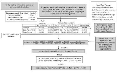 Download ERP spreadsheet
Until May 2025, I just subtracted the US 10-year treasury bond rate from this expected return, to get to an implied equity risk premium for the index, with the rationale that the US T.Bond rate is the riskfree rate in US dollars. The Moody’s downgrade of the US from Aaa to Aa1 has thrown a wrench into the process, since it implies that the T.Bond rate has some default risk associated with it, and thus incorporates a default spread. To remove that risk, I net out the default spread associated with Aa1 rating from the treasury rate to arrive at a riskfree rate in dollars and an equity risk premium based on that:
Riskfree rate in US dollars = T.Bond rate minus Default Spread for Aa1 rating= 4.24% - 0.27% = 3.97%
Implied equity risk premium for US = Expected return on S&P 500 minus US $ riskfree rate= 8.45% - 3.97% = 4.48%Note that this approach to estimating equity risk premiums is model agnostic and reflects what investors are demanding in the market, rather than making a judgment on whether the premium is right or what it should be (which I leave to market timers). To get the equity risk premiums for other countries, I need a base premium for a mature market, i.e., one that has no additional country risk, and here again, the US downgrade has thrown a twist into the process. Rather than use the US equity risk premium as my estimate of the mature market premium, my practice in every update through the start of 2025, I adjusted that premium (4.48%) down to take out the US default spread (0.27%), to arrive at the mature market premium of 4.21%. That then becomes the equity risk premium for the eleven countries that continue to have Aaa ratings, but for all other countries, I estimate default spreads based upon their sovereign ratings. As a final adjustment, I scale these default spreads upwards to incorporate the higher risk of equities, and these become the country risk premiums, which when added to the mature market premium, yields equity risk premiums by country. The process is described below:

The results from following this process are captured in the picture below, where I create both a heat map based on the equity risk premiums, and report on the ratings, country risk premiums and equity risk premiums, by country:
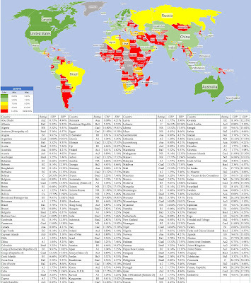 Download equity risk premium, by country
If you compare the equity risk premium heat map with the heat maps on the other dimensions of country risk (political and legal structures, exposure to violence and corruption), you will notice the congruence. The parts of the world that are most exposed to corruption and violence, and have capricious legal systems, tend to have higher equity risk premiums. The effects of the US ratings downgrade also manifest in the table, with the US now having a higher equity risk premium than its Aaa counterparts in Northern Europe, Australia and Canada.
A User's Guide My estimates of equity risk premiums, by country, are available for download, and I am flattered that there are analysts that have found use for these number. One reason may be that they are free, but I do have concerns sometimes that they are misused, and the fault is mine for not clarifying how they should be used. In this section, I will lay out steps in using these equity risk premiums in corporate finance and valuation practice, and if I have still left areas of grey, please let me know.
Step 1: Start with an understanding of what the equity risk premium measures The starting point for most finance classes is with the recognition that investors are collectively risk averse, and will demand higher expected returns on investments with more risk. The equity risk premium is a measure of the “extra” return that investors need to make, over and above the riskfree rate, to compensate for the higher risk that they are exposed to, on equities collectively. In the context of country risk, it implies that investments in riskier countries will need to earn higher returns to beat benchmarks than in safer countries. Using the numbers from July 2025, this would imply that investors need to earn 7.46% more than the riskfree rate to invest in an average-risk investment in India, and 10.87% more than the riskfree rate to invest in an average risk investment in Turkey. It is also worth recognizing how equity risk premiums play out investing and valuation. Increasing the equity risk premium will raise the rate of return you need to make on an investment, and by doing so, reduce its value. That is why equity risk premiums and stock prices move inversely, with the ERP rising as stock prices drop (all other thins being held constant) and falling as stock prices increase.
Step 2: Pick your currency of analysis (and estimate a riskfree rate) I start my discussions of currency in valuation by positing that currency is a choice, and that not only can you assess any project or value any company in any currency, but also that your assessment of project worth or company value should not be affected by that choice. Defining the equity risk premium as the extra return that investors need to make, over and above the risk free rate, may leave you puzzled about what riskfree rate to use, and while the easy answer is that it should be the riskfree rate in the currency you chose to do the analysis in, it is worth emphasizing that this riskfree rate is not always the government bond rate, and especially so, if the government does not have Aaa rating and faces default risk. In that case, you will need to adjust the government bond rate (just as I did with the US dollar) for the default spread, to prevent double counting risk.

Staying with the example of an Indian investment, the expected return on an average-risk investment in Indian rupees would be computed as follows:Indian government bond rate on July 1, 2025 = 6.32%Default spread for India, based on rating on July 1, 2025 = 2.16%Indian rupee risk free rate on July 1, 2025 = 6.32% - 2.16% = 4.16%ERP for India on July 1, 2025 = 7.46%Expected return on average Indian equity in rupees on July 1, 2025 = 4.16% + 7..46% = 11.62%Note also that if using the Indian government bond rate as the riskfree rate in rupees, you would effectively be double counting Indian country risk, once in the government bond rate and once again in the equity risk premium. I know that the ERP is in dollar terms, and adding it to a rupee riskfree rate may seem inconsistent, but it will work well for riskfree rates that are reasonably close to the US dollar risk free rate. For currencies, like the Brazilian real or Turkish lira, it is more prudent to do your calculations entirely in US dollars, and convert using the differential inflation rate:US dollar riskfree rate on July 1, 2025 = 3.97%ERP for Turkey on July 1, 2025 = 10.87%Expected return on average Turkish equity in US $ on July 1, 2025 = 3.97% + 10.87% = 14.84%Expected inflation rate in US dollars = 2.5%; Expected inflation rate in Turkish lira = 20%Expected return on average Turkish equity Turkish lira on July 1, 2025 = 1.1484 *(1.20/1.025) -1 = 34.45%Note that this process scales up the equity risk premium to a higher number for high-inflation currencies.
Step 3: Estimate the equity risk premium or premiums that come into play based on operations Many analysts use the equity risk premiums for a country when valuing companies that are incorporated in that country, but I think that is too narrow a perspective. In my view, the exposure to country risk comes from where a company operates, not where it is incorporated, opening the door for bringing in country risk from emerging markets into the cost of equity for multinationals that may be incorporated in mature markets. I use revenue weights, based on geography, for most companies, but I am open to using production weights, for natural resource companies, and even a mix of the two.

In corporate finance, where you need equity risk premiums to estimate costs of equity and capital in project assessment, the location of the project will determine which country’s equity risk premiums come into play. When Amazon decides to invest in a Brazilian online retail project, it is the equity risk premium for Brazil that should be incorporated, with the choice of currency for analysis determining the riskfree rate.
Step 4: Estimate project-specific or company-specific risk measures and costs The riskfree rate and equity-risk premiums are market-wide numbers, driven by macro forces. To complete this process, you need two company-specific numbers:Not all companies or projects are average risk, for equity investors in them, and for companies that are riskier or safer than average, you need a measure of this relative risk. At the risk of provoking those who may be triggered by portfolio theory or the CAPM, the beta is one such measure, but as I have argued elsewhere, I am completely at home with alternative measures of relative equity risk. The cost of equity is calculated as follows:
Cost of equity = Riskfree rate + Beta × Equity Risk Premium
For the cost of debt, you need to estimate the default spread that the company will face. If the company has a bond rating, you can use this rating to estimate the default spread, and if it is not, you can use the company's financials to assess a synthetic rating.Cost of debt =Riskfree Rate + Default spreadThe beta (relative risk measure) measures the risk of the business that the company/project is in, and for a diversified investor, captures only risk that cannot be diversified away. While we are often taught to use regressions against market indices to get these betas, using industry-average or bottom-up betas yields much better estimates for projects and companies.
Harking back to the discussion of riskfree rates, a company in a country with sovereign default risk will often bear a double burden, carrying default spreads for both itself and the country.
The currency choice made in step two will hold, with the riskfree rate in both the cost of equity and debt being the long-term default free rate in that currency (and not always the government bond rate).
Step 5: Ensure that your cash flows are currency consistent The currency choice made in step 2 determines not only the discount rates that you will be using but also the expected cash flows, with expected inflation driving both inputs. Thus, if you analyze a Turkish project in lira, where the expected inflation rate is 20%, you should expect to see costs of equity and capital that exceed 25%, but you should also see growth rates in the cash flows to be inflated the same expected inflation. If you assess the same project in Euros, where the expected inflation is 2%, you should expect to see much lower discount rates, high county risk notwithstanding, but the expected growth in cash flows will also be muted, because of the low inflation. There is nothing in this process that is original or path-breaking, but it does yield a systematic and consistent process for estimating discount rates, the D in DCF. It works for me, because I am a pragmatist, with a valuation mission to complete, but you should feel free to adapt and modify it to meet your concerns.YouTube Video
PaperCountry Risk Determinants: Determinants, Measures and Implications - The 2025 EditionDatasetsEquity Risk Premiums, by country - July 2025Country Risk LinksEIU Democracy IndexGlobal Peace Index (Exposure to Violence)Corruption IndexInternational Property Rights IndexMoody's Sovereign RatingsPolitical Risk Services (PRS) Country Risk ScoresSpreadsheetsImplied Equity Risk Premium for S&P 500 on July 1, 2025
July 18, 2025
To Bitcoin or not to Bitcoin? A Corporate Cash Question!
In this post, I will bring together two disparate and very different topics that I have written about in the past. The first is the role that cash holdings play in a business, an extension of the dividend policy question, with an examination of why businesses often should not pay out what they have available to shareholders. In my classes and writing on corporate finance, I look at the motives for businesses retaining cash, as well as how much cash is too much cash. The second is bitcoin, which can be viewed as either a currency or a collectible, and in a series of posts, I argued that bitcoin can only be priced, not valued, making debates about whether to buy or not to buy entirely a function of perception. In fact, I have steered away from saying much about bitcoin in recent years, though I did mention it in my post on alternative investments as a collectible (like gold) that can be added to the choice mix. While there may be little that seemingly connects the two topics (cash and bitcoin), I was drawn to write this post because of a debate that seems to be heating up on whether companies should put some or a large portion of their cash balances into bitcoin, with the success of MicroStrategy, a high-profile beneficiary of this action, driving some of this push. I believe that it is a terrible idea for most companies, and before Bitcoin believers get riled up, my reasoning has absolutely nothing to do with what I think of bitcoin as an investment and more to do with how little I trust corporate managers to time trades right. That said, I do see a small subset of companies, where the holding bitcoin strategy makes sense, as long as there are guardrails on disclosure and governance.
Cash in a Going Concern
In a world where businesses can raise capital (equity or debt) at fair prices and in a timely manner, there is little need to hold cash, but that is not the world we live in. For a variety of reasons, some internal and some external, companies are often unable or unwilling to raise capital from markets, and with that constraint in place, it is logical to hold cash to meet unforeseen needs. In this section, I will start by laying out the role that cash holdings play in any business, and examine how much cash is held by companies, broken down by groupings (regional, size, industry).
A Financial Balance Sheet
To understand the place of cash in a business, I will start with a financial balance sheet, a structure for breaking down a business, public or private:

On the asset side of the balance sheet, you start with the operating business or businesses that a company is in, with a bifurcation of value into value from investments already made (assets-in-place) and value from investments that the company expects to make in the future (growth assets). The second asset grouping, non-operating assets, includes a range of investments that a company may make, sometimes to augment its core businesses (strategic investments), and sometimes as side investments, and thus include minority holdings in other companies (cross holdings) and even investments in financial assets. Sometimes, as is the case with family group companies, these cross holdings may be a reflection of the company's history as part of the group, with investments in other group companies for either capital or corporate control reasons. The third grouping is for cash and marketable securities, and this is meant specifically for investments that share two common characteristics - they are riskless or close to riskless insofar as holding their value over time and they are liquid in the sense that they can be converted to cash quickly and with no penalty. For most companies, this has meant investing cash in short-term bonds or bills, issued by either governments (assuming that they have little default risk) or by large, safe companies (in the form of commercial paper issued by highly rated firms).
Note that there are two sources of capital for any business, debt or equity, and in assessing how levered a firm is, investors look at the proportion of the capital that comes from each:
Debt to Equity = Debt/ EquityDebt to Capital = Debt/ (Debt + Equity)In fact, there are many analysts and investors who estimate these debt ratios, using net debt, where they net the cash holdings of a company against the debt, with the rationale, merited or not, that cash can be used to pay down debt.
Net Debt to Equity = (Debt-Cash)/ EquityDebt to Capital = (Debt-Cash)/ (Debt + Equity)All of these ratios can be computed using accounting book value numbers for debt and equity or with market value numbers for both.The Motives for holding Cash
In my introductory finance classes, there was little discussion of cash holdings in companies, outside of the sessions on working capital. In those sessions, cash was introduced as a lubricant for businesses, necessary for day-to-day operations. Thus, a retail store that had scores of cash customers, it was argued, needed to hold more cash, often in the form of currency, to meet its transactional needs, than a company with corporate suppliers and business customers, with predictable patterns in operations. In fact, there were rules of thumb that were developed on how much cash a company needed to have for its operations. As the world shifts away from cash to digital and online payments, this need for cash has decreased, but clearly not disappeared. The one carve out is the financial services sector, where the nature of the business (banking, trading, brokerage) requires companies in the sector to hold cash and marketable securities as part of their operating businesses.
If the only reason for holding cash was to cover operating needs, there would be no way to justify the tens of billions of dollars that many companies hold; Apple alone has often had cash balances that exceeded $200 billion, and the other tech giants are not far behind. For some companies, at least, the rationale for holding far more cash than justified by their operating needs is that it can operate as a shock absorber, something that they can fall back on during periods of crisis or to cover unexpected expenses. That is the reason that cyclical and commodity firms have often offered for holding large cash balances (as a percent of their overall firm value), since a recession or a commodity price downturn can quickly turn profits to losses.
Using the corporate life cycle structure can also provide insight into how the motives for holding cash can change as a company ages.

For start-ups, that are either pre-revenue or have very low revenues, cash is needed to keep the business operating, since employees have to be paid and expenses covered. Young firms that are money-losing and with large negative cash flows, hold cash to cover future cash flow needs and to fend off the risk of failure. In effect, these firms are using cash as life preservers, where they can make it through periods where external capital (venture capital, in particular) dries up, without having to sell their growth potential at bargain basement prices. As firms start to make money, and enter high growth, cash has use as a business scalar, for firms that want to scale up quickly. In mature growth, cash acquires optionality, useful in allowing the business to find new markets for its products or product extensions. Mature firms sometimes hold cash as youth serum, hoping that it can be used to make once-in-a-lifetime investments that may take them back to their growth days, and for declining firms, cash becomes a liquidation manager, allowing for the orderly repayment of debt and sale of assets.
There is a final rationale for holding cash that is rooted in corporate governance and the control and power that comes from holding cash. I have long argued that absent pressure from shareholders, managers at most publicly traded firms would choose to return very little of the cash that they generate, since that cash balance not only makes them more sought after (by bankers and consultants who are endlessly inventive about uses that the cash can be put to) but also gives them the power to build corporate empires and create personal legacies.
Corporate Cash Holdings
Given the multitude of reasons for holding cash, it should come as no surprise that publicly traded companies around the world have significant cash balances. Leading into July 2025, for instance, global non-financial-service firms held almost $11.4 trillion in cash and marketable securities; financial service firms held even more in cash and marketable securities, but those holdings, as we noted earlier, can represent their business needs. Using our earlier breakdown of the asset side of the balance sheet into cash, non-operating and operating assets, this is what non-financial service firms in the aggregate looked like in book value terms (global and just US firms):

Note that cash is about 11% of the book value of total assets, in the aggregate, for global firms, and about 9% of the book value of total assets, for US firms. Global firms do hold a higher percentage of their value in non-operating assets, but US firms are more active on the acquisition front, explaining why goodwill (which is triggered almost entirely by acquisitions) is greater at US firms.
The typical publicly traded firm holds a large cash balance, but there are significant differences in cash holdings, by sector. In the table below, I look at cash as a percent of total assets, a book value measure, as well as cash as a percent of firm value, computed by aggregating market values:

As you can see, technology firms, which presumably face more uncertainty about their future hold far more cash as a percent of book value, but the value that the market attaches to their growth brings down cash as a percent of firm value. Utilities, regulated and often stable businesses, tend to hold the least cash, both in book and market terms.
Breaking down the sample by region, I look at cash holdings, as a percent of total assets and firms, across the globe:

The differences across the globe can be explained by a mix of market access, with countries in parts of the world where it can be difficult to access capital (Latin America, Eastern Europe, Africa) holding more cash. In addition, and corporate governance, with cash holdings being greater in parts of the world (China, Russia) where shareholders have less power over managers.
Given the earlier discussion of how the motives for holding cash can vary across the life cycle, I broke the sample down by age decile, with age measured from the year of founding, and looked at cash holdings, by decile:

The results are mixed, with cash holdings as a percent of total assets being higher for the younger half of the sample (the top five deciles) than for the older half, but the is no discernible pattern, when cash is measured as a percent of firm value (market). Put simple, companies across the life cycle hold cash, though with different motives, with the youngest firms holding on to cash as lifesavers (and for survival) and the older firms keeping cash in the hopes that they can use it to rediscover their youth.
The Magic of Bitcoin
I have been teaching and working with investments now for four decades, and there has been no investment that has received as much attention from both investors and the financial press, relative to its actual value, as has bitcoin. Some of the draw has come from its connections to the digital age, but much of it has come from its rapid rise in price that has made many rich, with intermittent collapses that have made just as many poor. I am a novice when it comes to crypto, and while I have been open about the fact that it is not my investment preference, I understand its draw, especially for younger investors.
The Short, Eventful History of Bitcoin
The origin story for Bitcoin matters since it helps us understand both its appeal and its structure. It was born in November 2008, two months into one of the worst financial crises of the last century, with banks and governments viewed as largely responsible for the mess. Not surprisingly, Bitcoin was built on the presumption that you cannot trust these institutions, and its biggest innovation was the blockchain, designed as a way of crowd-checking transactions and preserving transaction integrity. I have long described Bitcoin as a currency designed by the paranoid for the paranoid, and I have never meant that as a critique, since in the untrustworthy world that we live in, paranoia is a justifiable posture.
From its humble beginnings, where only a few (mostly tech geeks) were aware of its existence, Bitcoin has accumulated evangelists, who argue that it is the currency of the future, and speculators who have used its wild price swings to make and lose tens of millions of dollars. In the chart below, I look at the price of bitcoin over the last decade, as its price has increased from less than $400 in September 2014 to more than $110,000 in June 2025:
 Along the way, Bitcoin has also found some acceptance as a currency, first for illegal activities (drugs on the Silk Road) and then as the currency for countries with failed fiat currencies (like El Salvador), but even Bitcoin advocates will agree that its use in transactions (as the medium of exchange) has not kept pace with its growth as a speculative trade.
Pricing Bitcoin
In a post in 2017, I divided investments into four groups - assets that generate cash flows (stocks, bonds, private businesses), commodities that can be used to produce other goods (oil, iron ore etc), currencies that act as mediums of exchange and stores of value and collectibles that are priced based on demand and supply:

You may disagree with my categorization, and there are shades of gray, where an investment can be in more than one grouping. Gold, for instance, is both a collectible of long standing and a commodity that has specific uses, but the former dominates the latter, when it comes to pricing. In the same vein, crypto has a diverse array of players, with a few meeting the asset test and some (like ethereum) having commodity features. The contrast between the different investment classes also allows for a contrast between investing, where you buy (sell) an investment if it is under (over) valued, and trading, where you buy (sell) an investment if you expect its price to go up (down). The former is a choice, though not a requirement, with an asset (stocks, bonds or private businesses), though there may be others who still trade that asset. With currencies and collectibles, you can only trade, making judgments on price direction, which, in turn, requires assessments of mood and momentum, rather than fundamentals. With bitcoin, this classification allows us to cut through the many distractions that pop up during discussions of its pricing level, since it can be framed either as a currency or a collectible, and thus only priced, not valued. Seventeen years into its existence, Bitcoin has struggled on the currency front, and while there are pockets where it has gained acceptance, its design makes it inefficient and its volatility has impeded its adoption as a medium of exchange. As a collectible, Bitcoin starts with the advantage of scarcity, restricted as it is to 21 million units, but it has not quite measured up, at least so far, when it comes to holding its value (or increasing it) when financial assets are in meltdown mode. In every crisis since 2008, Bitcoin has behaved more like risky stock, falling far more than the average stock, when stocks are down, and rising more, when they recover. I noted this in my posts looking at the performance of investments in both the first quarter of 2020, when COVID laid waste to markets, and in 2022, when inflation ravaged stock and bond markets. That said, it is still early in its life, and it is entirely possible that it may change its behavior as it matures and draws in a wider investor base. The bottom line is that discussions of whether Bitcoin is cheap or expensive are often pointless and sometimes frustrating, since it depends almost entirely on your perspective on how the demand for Bitcoin will shift over time. If you believe that its appeal will fade, and that it will be displaced by other collectibles, perhaps even in the crypto space, you will be in the short selling camp. If you are convinced that its appeal will not just endure but also reach fresh segments of the market, you are on solid ground in assuming that its price will continue to rise. It behooves both groups to admit that neither has a monopoly on the truth, and this is a disagreement about trading and not an argument about fundamentals.
The MicroStrategy Story
It is undeniable that one company, MicroStrategy, has done more to advance the corporate holding of Bitcoin than any other, and that has come from four factors;
A stock market winner: The company's stock price has surged over the last decade, making it one of the best performing stocks on the US exchanges: It is worth noting that almost all of the outperformance has occurred in this decade, with the winnings concentrated into the last two years. With the rise (increasingly) tied to Bitcoin: Almost all of MicroStrategy’s outperformance has come from its holdings of bitcoin, and not come from improvements in business operations. That comes through in the graph below, where I look at the prices of MicroStrategy and Bitcoin since 2014:

Note that MicroStrategy’s stock price has gone from being slightly negatively correlated with Bitcoin’s price between 2014-2018 to tracking Bitcoin in more recent years.And disconnected from operations: In 2014, MicroStrategy was viewed and priced as a software/services tech company, albeit a small one with promise. In the last decade, its operating numbers have stagnated, with both revenues and gross profits declining, but during the same period, its enterprise value has soared from $1 billion in 2014 to more than more than $100 billion in July 2025:

It is clear now that anyone investing in MicroStrategy at its current market cap (>$100 billion) is making a bitcoin play.With a high-profile "bitcoin evangelist" as CEO: MicroStrategy’s CEO, Michael Saylor, has been a vocal and highly visible promoter of bitcoin, and has converted many of his shareholders into fellow-evangelists and convinced at least some of them that he is prescient in detecting price movements. In recent years, he has been public in his plans to issue increasing amounts of stock and using the proceeds to buy more bitcoin.In sum, MicroStrategy is now less a software company and more a Bitcoin SPAC or closed-end fund, where investors are trusting Saylor to make the right trading judgments on when to buy (and sell) bitcoin, and hoping to benefit from the profits.
The “Put your cash in bitcoin” movement
For investors in other publicly traded companies that have struggled delivering value in their operating businesses, MicroStrategy’s success with its bitcoin holdings seems to indicate a lost opportunity, and one that can be remedied by jumping on the bandwagon now. In recent months, even high profile companies, like Microsoft, have seen shareholder proposals pushing them to abandon their conventional practice of holding cash in liquid and close-to-riskless investments and buying Bitcoin instead. Microsoft’s shareholders soundly rejected the proposal, and I will start by arguing that they were right, and that for most companies, investing cash in bitcoin does not make sense, but in the second part, I will carve out the exceptions to this rule.
The General Principle: No to Bitcoin
As a general rule, I think it is not only a bad idea for most companies to invest their cash in bitcoin, but I would go further and also argue that they should banned from doing so. Let me hasten to add that I would make this assertion even if I was bullish on Bitcoin, and my argument would apply just as strongly to companies considering moving their cash into gold, Picassos or sports franchises, for five reasons:
The Carveouts
I do believe that there are cases when you, as a shareholder, may be at peace with the company not only investing cash in bitcoin, but doing so actively and aggressively. Here are four of my carveouts to the general rule on bitcoin:
Even with these exceptions, though, I think that you need guardrails before signing off on opening the door to letting companies hold bitcoin.
Shareholder buy-in: If you are a publicly traded company considering investing some or much of the company's cash in bitcoin, it behooves you to get shareholder approval for that move, since it is shareholder cash that is being deployed. Transparency about Bitcoin transactions/holdings: Once a company invests in bitcoin, it is imperative that there be full and clear disclosure not only on those holdings but also on trading (buying and selling) that occurs. After all, if it is a company's claim that it can time its bitcoin trades better than the average investor, it should reveal the prices at which it bought and sold its bitcoin. Clear mark-to-market rules: If a company invests its cash in bitcoin, I will assume that the value of that bitcoin will be volatile, and accounting rules have to clearly specify how that bitcoin gets marked to market, and where the profits and losses from that marking to market will show up in the financial statements. As bitcoin prices rise to all time highs, there is the danger that regulators and rule-writers will be lax in their rule-writing, opening the door to corporate scandals in the future.Cui Bono?
Bitcoin advocates have been aggressively pushing both institutional investors and companies to include Bitcoin in their investment choices, and it is true that at least first sight, they will benefit from that inclusion. Expanding the demand for bitcoin, an investment with a fixed supply, will drive the price upwards, and existing bitcoin holders will benefit. In fact, much of the rise of bitcoin since the Trump election in November 2024 can be attributed to the perception that this administration will ease the way for companies and investors to join in the crypto bonanza.
For bitcoin holders, increasing institutional and corporate buy-in to bitcoin may seem like an unmixed blessing, but there will be costs that, in the long run, may lead at least some of them to regret this push:
YouTube Video
June 17, 2025
The (Uncertain) Payoff from Alternative Investments: Many a slip between the cup and the lip?
The Alternative Investment Universe The use of the word "alternative" in the alternative investing pitch is premised on the belief that much of investing advice is aimed at long-only investors allocating their portfolios between traded stocks, bonds and cash (close to riskless and liquid investments). In that standard investment model, investors choose a stock-bond mix, for investing, and use cash as a buffer to bring in not only liquidity needs and risk preferences, but also views on stock and bond markets (being over or under priced):

The mix of stocks and bonds is determined both by risk preferences, with more risk taking associated with a higher allocation to stocks, and market timing playing into more invested in stocks (if stocks are viewed as under priced) or more into bonds (if stocks are over priced and bond are viewed as neutral investments). This framework accommodates a range of choices, from the purely mechanical (like the much touted 60% stocks/40% bonds mix) to more flexible, where allocations can vary across time and be a function of market conditions. This general framework allows for variants, including different view on markets (from those who believe that markets are efficient to stock pickers and market timers) as well as investors with very different time horizons and risk levels. However, there are clearly large segments of investing that are left out of this mix from private businesses (since they are not listed and traded) to short selling (where you can have negative portfolio weights not just on individual investments but on entire markets) to asset classes that are not traded. In fact, the best way to structure the alternative investing universe if by looking at alternatives through the lens of these missing pieces.
1. Long-Short In principle, there is little difference between being long on an investment and holding a short position, with the only real difference being in the sequencing of cash flows, with the former requiring a negative cash flow at the time of the action (buying the stock or an asset) and a positive cash flow in a subsequent period (when it is sold), and the latter reversing the process, with the positive cash flow occurring initially (when you sell a stock or an asset that you do not own yet) and the negative cash flow later. That said, they represent actions that you would take with diametrically opposite views of the same stock (asset), with being long (going short) making sense on assets where you expect prices to go up (down). In practice, though, regulators and a subset of investors seem to view short selling more negatively, often not just attaching loaded terms like "speculation" to describe it, but also adding restrictions of how and when it can be done. Many institutional investors, including most mutual, pension and endowment funds, are restricted from taking short positions on investments, with exceptions sometimes carved out for hedging. For close to a century, at least in the United States, hedge funds have been given the freedom to short assets, and while they do not always use that power to benefit, it is undeniable that having that power allows them to create return distributions (in terms of expected returns, volatility and other distributional parameters) that are different from those faced by long-only investors. Within the hedge fund universe, there are diverse strategies that not only augment long-only strategies (value, growth) but also invest across multiple markets (stocks, bonds and convertibles) and geographies. The opening up of derivatives markets has allowed some investors to create investment positions and or structured products that use options, futures, swaps and forwards to create cash flow and return profiles that diverge from stock and bond market returns.
2. Public-Private While much of our attention is spent on publicly traded stocks and bonds, there is a large segment of the economy that is composed of private businesses that are not listed or traded. In fact, there are economies, especially in emerging markets, where the bulk of economic activity occurs in the private business space, with only a small subset of businesses meeting the public listing/trading threshold. Many of these private businesses are owned and funded by their owners, but a significant proportion do need outside equity capital, and historically, there have been two providers:
For young private businesses, and especially those that aspire to become bigger and eventually go public, it is venture capital that fills the void, covering the spectrum from angel financing for idea businesses to growth capital for firms further along in their evolution. From its beginnings in the 1950s, venture capital has grown bigger and carries more heft, especially as technology companies have come to dominate the market in the twenty first century.For more established private businesses, some of which need capital to grow and some of which have owners who want to cash out, the capital has come from private equity investors. Again, while private equity has been part of markets for a century or more, it has become more formalized and spread its reach in the last four decades, with the capacity to raise tens of billions of dollars to back up deal making.On the debt front, the public debt and bank debt market is supplemented by private credit, where investors pool funds to lend to private businesses, with negotiated rates and terms. again a process that has been around a while, but one that has also become formalized and a much larger source of funds. Advocates for private credit investing argue that it can be value-adding partly because of the borrower composition (often cut off from other sources of credit, either because of their size or default history) and partly because private credit providers can be more discerning of true default risk. Even as venture capital, private equity and private credit have expanded as capital sources, they remained out of reach for both institutional and individual investors until a couple of decades ago, but are now integral parts of the alternative investing universe.
3. Asset classes Public equity and debt, at least in the United States, cover a wide spectrum of the economy, and by extension, multiple asset classes and businesses, but there are big investment classes that are either underrepresented in public markets or missing.
Real estate: For much of the twentieth century, real estate remained outside the purview of public markets, with a segmented investor base and illiquid investments, requiring localized knowledge. That started to change with the creation of real estate investment trusts, which securitized a small segment of the market, creating liquidity and standardized units for public market investors. The securitization process gained stream in the 1980s with the advent of mortgage-backed securities. Thus, real estate now has a presence in public markets, but that presence is far smaller than it should be, given the value of real estate in the economy.Collectibles: The collectible asset class spans an array of investment, most of which generate little or no cash flows, but derive their pricing from scarcity and enduring demand. The first and perhaps the longest standing collectible is gold, a draw for investors during inflationary period or when they lose faith in fiat currencies and governments. The second is art, ranging from paintings from the masters to digital art (non-fungible tokens or NFTs), that presumably offers owners not just financial returns but emotional dividends. At the risk of raising the ire of crypto-enthusiasts, I would argue that much of the crypto space (and especially bitcoin) also fall into this grouping, with a combination of scarcity and trading demand determining pricing. Institutional and individual investors have dabbled with adding these asset classes to their portfolios, but the lack of liquidity and standardization and the need for expert assessments (especially on fine art) have limited those attempts.
The Sales Pitch for Alternatives The strongest pitch for adding alternative investments to a portfolio dominated by publicly traded stocks and bonds comes from a basic building block for portfolio theory, which is that adding investments that have low correlation to the existing holdings in a portfolio can create better risk/return tradeoffs for investors. That pitch has been supplemented in the last two decades with arguments that alternative investments also offer a greater chance of finding market mistakes and inefficiencies, partly because they are more likely to persist in these markets, and partly because of superior management skills on the part of alternative investment managers, particularly hedge funds and private equity.
The Correlation Argument Much of portfolio theory as we know it is built on the insight that combining two investments that are not perfectly correlated with each other can yield mixes that deliver higher returns for any given level of risk than holding either of the investments individually. That argument has both a statistical basis, with the covariance between the two investments operating as the mechanism for the risk reduction, and an economic basis that the idiosyncratic movements in each investment can offset to create a less risky combination.
In that vein, the argument for adding alternative investments to a portfolio composed primarily of stocks and bonds rests on a correlation matrix of stocks and bonds with alternative investments (hedge funds, private equity, private credit, fine art, gold and collectibles):
 Guggenheim Investments
While the correlations in this matrix are non-stationary (with the numbers changing both with time periods used and the indices that stand in for the asset classes) and have a variety of measurement issues that I will highlight later in this post, it is undeniable that they at least offer a chance of diversification that may not be available in a long-only stock/bond portfolio. Using historical correlations as the basis, advocates for alternative investments are able to create portfolios, at least on paper, that beat stock/bond combinations on a risk/return tradeoff, as can be see in this graph:
 EquityMultiple Investment Partners, Green Street Advisors, and JPMorgan Asset Management
Note that the comparison is to a portfolio composed 60% of stocks and 40% of bonds, a widely used mix among portfolio managers, and in each of the cases, adding alternative investments to that portfolio results in a mix that yields higher returns with lower risk.
The Alternative Alpha Argument The correlation-based argument for adding alternative investments to a portfolio is neither new nor controversial, since it is built on core portfolio theory arguments for diversification. For some advocates of alternative investments, though, that captures only a portion of the advantage of adding alternative investments. They argue that the investment classes from alternative investments draw on, which include non-traded real estate, collectibles and private businesses (young and old), are also the classes where market mistakes are more likely to persist, because of their illiquidity and opacity, and that alternative asset managers have the localized knowledge and intellectual capacity to find and take advantage of these mistakes. The payoff from doing so takes the form of "excess returns" which will supplement the benefits that flow from just diversification.
This alpha argument is often heard most frequently with those advocating for adding hedge funds, venture capital and private equity to conventional portfolios, where the perception of superior investment management persists, but is that perception backed up by the numbers? In the graph below, I reproduce a study that looks at looked at 20-year annualized returns, from 2003 to 2022, on many alternative asset classes:
 Opto Insights
Given the differences in risk across alternative investment classes, the median returns themselves do not tell us much about whether they earn excess returns, but two facts come through nevertheless. The first is that the variation across managers within investment classes is significant in both private equity and venture capital. The second, and this is not visible in this graph, is that persistence in outperformance is more common in venture capital and private equity than it is in public market investors, with winners more likely to continue winning and losers dropping out. I expanded on some of the reasons for this persistence, at least in venture capital, in a post from some years ago. The bottom line is that there is some basis for the argument that as investment classes, hedge funds, private equity and venture capital, generate excess returns, albeit modest, relative to other investors, but it is unclear whether these excess returns are just compensation for the illiquidity and opacity that go with the investments that they have to make. In addition, given the skewed payoffs, where there are a few big and persistent winners, the median hedge fund, private equity investor or venture capitalist may be no better at generating alpha than the average mutual fund manager.
The Rise of Alternative Investing No matter what you think of the alternative investing sales pitch, it is undeniable that it has worked, at least at the institutional investor level, for some of its adopted, especially in the last two decades. In the graph below, for instance, you can track the rise of alternative investments in pension fund holdings in this graph (from KKR):
 Source: KKR
That move towards alternatives is not just restricted to pension funds, as other allocators have joined the mix:
 Source: KKR
Some of the early movers into alternative asset classes were lauded and used as role models by others in the space. David Swensen, at Yale, for instance, burnished a well-deserved reputation as a pioneer in investment management by moving Yale's endowment into private equity and hedge funds earlier than other Ivy League schools, allowing Yale to outpace them in the returns race for much of this century:

As other fund managers have followed Yale into the space, that surge has been good for private equity and hedge fund managers, who have seen their ranks grow (both in terms of numbers and dollar value under management) over time.
Where's the beef? As funds have increased their allocations to alternative investments, drawn by the perceived gains on paper and the success of early adopters, it is becoming increasingly clear that the results from the move have been underwhelming. In short, the actual effects on returns and risk from adding alternative investments to portfolios are not matching up to the promise, leading to questions of why and where the leakage is occurring.
The Questionable Benefits of Alternative Investing In theory and principle, adding investments from groupings of investments that are less correlated with stocks and bonds should yield benefits for investors, and at least in the aggregate, over long time periods that may hold. Cambridge Associates, in their annual review of endowments, presents this graph of returns and standard deviations, as a function of how much each endowment allocated to private investments over a ten-year period (from 2012-2022):
 Cambridge Associates
With the subset of endowments that Cambridge examined, both annual returns and Sharpe ratios were higher at funds that invested more in private investments (which incorporates much of the alternative investment space). Those results, though, have been challenged by others looking at a broader group of funds. In an article in CFA magazine, Nicolas Rabener looked at the two arguments for adding hedge funds to a portfolio, i.e., that they increase Sharpe ratios and reduce drawdowns in fund value during market downturns, and found both absent in practice:
 Nicolas Ramener, CFA Institute
With hedge funds, admittedly just one component of alternative investing, Rabener finds that notwithstanding the low correlations that some hedge fund strategies have with a conventional equity/bond portfolio, there is no noticeable improvement in Sharpe ratios or decrease in drawdowns from adding them to the portfolio. Richard Ennis, a long-time critic of alternative investing, has a series of papers that question the benefits to funds from adding them to the mix.
 Richard Ennis, SSRN
In the Ennis sample, the excess returns become more negative as the allocation to alternative investments is increased, undercutting a key sales pitch for the allocation. While alternative investing advocates will take issue with the Ennis findings, on empirical and statistical bases, even long-term beneficiaries from alternative investing seem to have become more skeptical about its benefits over time. In a 2018 paper, Fragkiskos, Ryan and Markov noted that among Ivy League endowments, properly adjusting for risk causes any benefits in terms of Sharpe ratios, from adding alternative investments to the mix, to disappear. In perhaps the most telling sign that the bloom is off the alternative investing rose, Yale's endowment announced its intent to sell of billions of dollars of private equity holdings in June 2025, after years of under performance on its holdings in that investment class.
Correlations: Real and Perceived At the start of this post, I noted that a key sales pitch for alternative investments is their low correlation with stock/bond markets, and to the extent that this historical correlations seem to back this pitch, it may be surprising that the actual results don't measure up to what is promised. There are two reasons why these historical correlations may be understated for most private investment classes:
Pricing lags; Unlike publicly traded equities and bonds, where there are observable market prices from current transactions, most private assets are not liquid and the pricing is based upon appraisals. In theory, these appraisers are supposed to mark-to-market, but in practice, the pricing that they attach to private assets lag market changes. Thus, when markets are going up or down quickly, private equity and venture capital can look like they are going up or down less than public equity markets, but that is because of the lagged prices. Market crises: While correlations between investment classes are often based upon long periods, and across up and down markets, the truth is that investors care most about risk (and correlations) during market crises, and many investment classes that exhibit low correlation during sideways or stable markets can have lose that feature and move in lock step with public markets during crisis. That was the case during the banking crisis in the last quarter of 2008 and during the COVID meltdown in the first quarter of 2020, when funds with large private investment allocations felt the same drawdown and pain as funds without that exposure.In my view, this understatement of correlation is most acute in private equity and venture capital, which are after all equity investments in businesses, albeit private, instead of public. It is less likely to be the case for truly differentiated investment classes, such as gold, collectibles and real estate, but even here, correlations with public markets have risen, as they have become more widely held by funds. With hedge funds, it is possible to construct strategies that should have lower correlation with public markets, but some of these strategies can have catastrophic breakdowns (with the potential for wipeout) during market crises.
Illiquidity and Opacity (lack of transparency) Even the strongest advocates for alternative investments accept that they are less liquid than public market investments, but argue that for investors with long time horizons and clearly defined cash flow needs (like pension and endowment funds), that illiquidity should not be a deal breaker. The problem with this argument is that much as investors like to believe that they control their time horizons and cash needs, they do not, and find their need for liquidity rising during acute market crises or panics. The other problem with illiquidity is that it manifests in transactions costs, manifesting both in terms of bid-ask spreads and in price impact that drains from returns. The other aspect of the private investment market that is mentioned but then glossed over is that many of its vehicles tend to be opaque in terms of governance structure and reporting. Investors, including many large institutional players, that invest in hedge funds, private equity and venture capital are often on the outside looking in, as deals get structured and gains get apportioned. Again, that absence of transparency may be ignored in good times, but could make bad times worse.
Disappearing Alphas When alternative investing first became accessible to institutional investors, the presumption was that market-beating opportunities abounded in private markets, and that hedge fund, private equity and venture capital managers brought superior abilities to the investment game. That may have been true then, but that perception has faded for many reasons. First, as the number of funds and money under management in these investment vehicles has increased, the capacity to make easy money has also faded, and in my view, the average venture capital, private equity or hedge fund manager is now no better or worse than the average mutual fund manager. Second, the investment game has also become more difficult to win, as the investment world has become flatter, with many of the advantages that fund managers used to extract excess returns dissipating over time. Third, the entry of passive investment vehicles like exchange traded funds (ETFS) that can spot and replicate active investors who are beating the market has meant that excess returns, even if present, do not last for long. With hedge funds, the fading of excess returns over time has been chronicled. Sullivan looked at hedge funds between 1994 and 2019 and noted that even by 2009, the alpha had dropped to zero or below:
 Sullivan, Hedge fund alpha: Cycle or Sunset
In a companion paper, Sullivan also noted another phenomenon undercutting the benefits of adding hedge funds to a public market portfolio, which is that correlations between hedge fund returns and public market returns have risen over time from 0.65 in the 1990s to 0.87 in the last decade. With private investment funds, the results are similar, when performance is compared over time. A paper looking at private equity returns over time concluded that private equity returns, which ran well above public market returns between 1998 and 2007, have started to resemble public market returns in most recent years.
Sullivan, Hedge fund alpha: Cycle or Sunset
In a companion paper, Sullivan also noted another phenomenon undercutting the benefits of adding hedge funds to a public market portfolio, which is that correlations between hedge fund returns and public market returns have risen over time from 0.65 in the 1990s to 0.87 in the last decade. With private investment funds, the results are similar, when performance is compared over time. A paper looking at private equity returns over time concluded that private equity returns, which ran well above public market returns between 1998 and 2007, have started to resemble public market returns in most recent years.
 Ilmanen, Chandra and McQuinn
The positive notes in both hedge funds and private equity, as we noted in an earlier section on venture capital, is that while the typical manager in each group has converged to the average, the best managers in these groups have shown more staying power than in public markets. Put simple, the hope is that you can invest your money with these superior managers, and ride their success to earn more than you would have earned elsewhere, but there is a catch even with that scenario, which we will explore next.
The Cost Effect Let's assume that even with fading alphas and higher correlations with public markets, some hedge funds and private market investors still provide benefits to funds invested primarily in public markets. Those benefits, though, still come with significant costs, since the managers of these alternative investment vehicles charge far more for their services than their equivalents in public markets. In general, the fees for alternative investments are composed of a management fee, specified as a percent of assets under management, and a performance fee, where the alternative investment manager gets a percent of returns earned over and above a specified benchmark. In the two-and-twenty model that many hedge and PE fund models used to adhere to, the fund managers collect 2% of the assets under management and 20% of returns in excess of the benchmark. Both numbers have been under downward pressure in recent years, as alternative investing has spread:

Even with the decline, though, these costs represent a significant drag on performance, and the chances of gaining a net benefit from adding an alternative investing class to a fund drop towards zero very quickly.
An Epitaph for Alternative Investing? It is clear, looking at the trend lines, that the days of easy money for those selling alternative investments as well as those buying these investments have wound down. Even savvy institutional investors, who have been long-term believers in the benefits of alternative investing, are questioning whether private equity, hedge funds and venture capital have become too big and are too costly to be value-adding. As institutional investors become less willing to jump into the alternative investing fray, it looks like individual investors are now being targeted for the alternative investing sales pitch, and as with all things investing, I would suggest that buyer beware, and that investors, institutions and individual, keep the following in mind, when listening to alternative investing pitches:
Be picky about alternatives: Given that the alpha pitch (that hedge fund and private equity managers deliver excess returns) has lost its heft, it is correlations that should guide investor choices on alternative investments. That will reduce the attractiveness of private equity and venture capital, as investment vehicles, and increase the draw of some hedge funds, gold and many collectibles. As for cryptos, the jury is still out, since bitcoin, the highest profile component, has behaved more like risky equity, rising and falling with the market, than a traditional collectible.Avoid high-cost and exotic vehicles: Investing is a tough enough game to win, without costs, and adding high cost vehicles makes it even more difficult. At the risk of drawing the ire of some, I would argue that any endowment or pension fund managers who pay two-and-twenty to a hedge fund, no matter how great its track record, first needs their heads examined and then summarily fired. On a related noted, alternative investments that are based upon strategies that are so complex that neither the seller nor buyer has an intuitive sense of what exactly they are trying to do should be avoided.Be realistic about time horizon and liquidity needs: As noted many times through this post, alternative investing, no matter how well structured and practiced, will come with less liquidity and transparency than public investing, making it a better choice for investors with longer time horizons and well-specified cash needs. On this front, individual investors need to be honest with themselves about how susceptible they are to panic attacks and peer-group pressure, and institutional investors have to recognize that their time horizons are determined by their clients, and not by their own preferences.Be wary of correlation matrices and historical alphas: The alternative investing sales pitch is juiced by correlation matrices (indicating that the alternative investing vehicle in question does not move with public markets) and historic alphas (showing that vehicle delivering market beating risk/return tradeoffs and Sharpe ratios). If there is one takeaway from this post, I hope that it is that historical correlations, especially when you have non-traded investments at play, are untrustworthy and that alphas fade over time, and more so when the vehicles that delivered them are sold relentlessly.YouTube video
June 2, 2025
Sovereign Ratings, Default Risk and Markets: The Moody's Downgrade Aftermath!
I was on a family vacation in August 2011 when I received an email from a journalist asking me what I thought about the S&P ratings downgrade for the US. Since I stay blissfully unaware of most news stories and things related to markets when I am on the beach, I had to look up what he was talking about, and it was S&P's decision to downgrade the United States, which had always enjoyed AAA, the highest sovereign rating that can be granted to a country, to AA+, reflecting their concerns about both the fiscal challenges faced by the country, with mounting trade and budget deficits, as well as the willingness of its political institutions to flirt with the possibility of default. For more than a decade, S&P remained the outlier, but in 2023, Fitch joined it by also downgrading the US from AAA to AA+, citing the same reasons. That left Moody's, the third of the major sovereign ratings agencies, as the only one that persisted with a Aaa (Moody's equivalent of AAA) for the US, but that changed on May 16, 2025, when it too downgraded the US from Aaa (negative) to Aa1 (stable). Since the ratings downgrade happened after close of trading on a Friday, there was concern that markets would wake up on the following Monday (May 19) to a wave of selling, and while that did not materialize, the rest of the week was a down week for both stocks and US treasury bonds, especially at the longest end of the maturity spectrum. Rather than rehash the arguments about US debt and political dysfunction, which I am sure that you had read elsewhere, I thought I would take this moment to talk about sovereign default risk, how ratings agencies rate sovereigns, the biases and errors in sovereign ratings and their predictive power, and use that discussion as a launching pad to talk about how the US ratings downgrade will affect equity and bond valuations not just in the US, but around the world.
Sovereign Defaults: A History
Through time, governments have often been dependent on debt to finance themselves, some in the local currency and much in a foreign currency. A large proportion of sovereign defaults have occurred with foreign currency sovereign borrowing, as the borrowing country finds itself short of the foreign currency to meet its obligations. However, those defaults, and especially so in recent years, have been supplemented by countries that have chosen to default on local currency borrowings. I use the word "chosen" because most countries have the capacity to avoid default on local currency debt, being able to print money in that currency to pay off debt, but chose not to do so, because they feared the consequences of the inflation that would follow more than the consequences of default. BoC/BoE Sovereign Default Database
While the number of sovereign defaults has ebbed and flowed over time, there are two points worth making about the data. The first is that, over time, sovereign defaults, especially on foreign currency debt, have shifted from bank debt to sovereign bonds, with three times as many sovereign defaults on bonds than on bank loans in 2023. The second is that local currency defaults are persistent over time, and while less frequent than foreign currency defaults, remain a significant proportion of total defaults. The consequences of sovereign default have been both economic and political. Besides the obvious implication that lenders to that government lose some or a great deal of what is owed to them, there are other consequences. Researchers who have examined the aftermath of default have come to the following conclusions about the short-term and long-term effects of defaulting on debt:Default has a negative impact on the economy, with real GDP dropping between 0.5% and 2%, but the bulk of the decline is in the first year after the default and seems to be short lived.Default does affect a country’s long-term sovereign rating and borrowing costs. One study of credit ratings in 1995 found that the ratings for countries that had defaulted at least once since 1970 were one to two notches lower than otherwise similar countries that had not defaulted. In the same vein, defaulting countries have borrowing costs that are about 0.5 to 1% higher than countries that have not defaulted. Here again, though, the effects of default dissipate over time.Sovereign default can cause trade retaliation. One study indicates a drop of 8% in bilateral trade after default, with the effects lasting for up to 15 years, and another one that uses industry level data finds that export-oriented industries are particularly hurt by sovereign default.Sovereign default can make banking systems more fragile. A study of 149 countries between 1975 and 2000 indicates that the probability of a banking crisis is 14% in countries that have defaulted, an eleven percentage-point increase over non-defaulting countries.Sovereign default also increases the likelihood of political change. While none of the studies focus on defaults per se, there are several that have examined the after-effects of sharp devaluations, which often accompany default. A study of devaluations between 1971 and 2003 finds a 45% increase in the probability of change in the top leader (prime minister or president) in the country and a 64% increase in the probability of change in the finance executive (minister of finance or head of central bank).In summary, default is costly, and countries do not (and should not) take the possibility of default lightly. Default is particularly expensive when it leads to banking crises and currency devaluations; the former has a longstanding impact on the capacity of firms to fund their investments whereas the latter create political and institutional instability that lasts for long periods.
Sovereign Ratings: Measures and Process
Since few of us have the resources or the time to dedicate to understanding small and unfamiliar countries, it is no surprise that third parties have stepped into the breach, with their assessments of sovereign default risk. Of these third-party assessors, bond ratings agencies came in with the biggest advantages:They have been assessing default risk in corporations for a hundred years or more and presumably can transfer some of their skills to assessing sovereign risk.Bond investors who are familiar with the ratings measures, from investing in corporate bonds, find it easy to extend their use to assessing sovereign bonds. Thus, a AAA rated country is viewed as close to riskless whereas a C rated country is very risky. Moody’s, Standard and Poor’s and Fitch’s have been rating corporate bond offerings since the early part of the twentieth century. Moody’s has been rating corporate bonds since 1919 and started rating government bonds in the 1920s, when that market was an active one. By 1929, Moody’s provided ratings for almost fifty central governments. With the Great Depression and the Second World War, investments in government bonds abated and with it, the interest in government bond ratings. In the 1970s, the business picked up again slowly. As recently as the early 1980s, only about thirteen governments, mostly in developed and mature markets, had ratings, with most of them commanding the highest level (Aaa). The decade from 1985 to 1994 added 34 countries to the sovereign rating list, with many of them having speculative or lower ratings and by 2024, Moody's alone was rating 143 countries, covering 75% of all emerging market countries and almost every developed market. table.tableizer-table { font-size: 12px; border: 1px solid #CCC; font-family: Arial, Helvetica, sans-serif; } .tableizer-table td { padding: 4px; margin: 3px; border: 1px solid #CCC; } .tableizer-table th { background-color: #104E8B; color: #FFF; font-weight: bold; }
Not only have ratings agencies become more active in adding countries to their ratings list, but they have also expanded their coverage of countries with more default risk/ lower ratings. In fact, the number of Aaa rated countries was the same in 1985, when there were thirteen rated countries, as in 2025, when there were 143 rated countries. In the last two decades, at least five sovereigns, including Japan, the UK, France and now the US, have lost their Aaa ratings. In addition to more countries being rated, the ratings themselves have become richer. Moody’s and S&P now provide two ratings for each country – a local currency rating (for domestic currency debt/ bonds) and a foreign currency rating (for government borrowings in a foreign currency). In assessing these sovereign ratings, ratings agencies draw on a multitude of data, quantitative and qualitative. Moody's describes its sovereign ratings process in the picture below:
 The process is broad enough to cover both political and economic factors, while preserving wiggle room for the ratings agencies to make subjective judgments on default that can lead to different ratings for two countries with similar economic and political profiles. The heat map below provides the sovereign ratings, from Moody's, for all rated countries the start of 2025:
 Moody's sovereign ratings
Note that the greyed out countries are unrated, with Russia being the most significant example; the ratings agencies withdrew their rating for Russia in 2022 and not reinstated it yet. There were only a handful of Aaa rated countries, concentrated in North America (United States and Canada), Northern Europe (Germany, Scandinavia), Australia & New Zealand and Singapore (the only Aaa-rated Asian country. In 2025, there have been a eight sovereign ratings changes, four upgrades and four downgrades, with the US downgrade from Aaa to Aa1 as the highest profile change

With the US downgrade, the list of Aaa-rated countries has become shorter, and as Canada and Germany struggle with budget imbalances, the likelihood is that more companies will drop off the list.
Sovereign Ratings: Performance and Alternatives If sovereign ratings are designed to measure exposure to default risk, how well do they do? The answer depends on how you evaluate their performance. The ratings agencies provide tables that list defaults by rating that back the proposition that sovereign ratings and default are highly correlated. A Moody's update of default rates by sovereign ratings classes, between 1983 and 2024, yielded the following:

Default rates rise as sovereign ratings decline, with a default rate of 24% for speculative grade sovereign debt (Baa2 and below) as opposed to 1.8% for investment grade (Aaa to Baa1) sovereign debt. That said, there are aspects of sovereign ratings that should give pause to anyone considering using them as their proxy for sovereign default, they do come with caveats and limitations:Ratings are upward biased: Ratings agencies have been accused by some of being far too optimistic in their assessments of both corporate and sovereign ratings. While the conflict of interest of having issuers pay for the rating is offered as the rationale for the upward bias in corporate ratings, that argument does not hold up when it comes to sovereign ratings, since not only are the revenues small, relative to reputation loss, but a proportion of sovereigns are rated for no fees.There is herd behavior: When one ratings agency lowers or raises a sovereign rating, other ratings agencies seem to follow suit. This herd behavior reduces the value of having three separate ratings agencies, since their assessments of sovereign risk are no longer independent.Too little, too late: To price sovereign bonds (or set interest rates on sovereign loans), investors (banks) need assessments of default risk that are updated and timely. It has long been argued that ratings agencies take too long to change ratings, and that these changes happen too late to protect investors from a crisis.Vicious Cycle: Once a market is in crisis, there is the perception that ratings agencies sometimes overreact and lower ratings too much, thus creating a feedback effect that makes the crisis worse. This is especially true for small countries that are mostly dependent on foreign capital for their funds.Regional biases: There are many, especially in Asia and Latin America, that believe that the ratings agencies are too lax in assessing default risk for North America and Europe, overrating countries in those regions, while being too stringent in their assessments of default in Asia, Latin America and Africa, underrating countries in those regions. In sum, the evidence suggests that while sovereign ratings are good measures of country default risk, changes in ratings often lag changes on the ground, making them less useful to lenders and investors. If the key limitation of sovereign ratings is that they are not timely assessors of country default risk, that failure is alleviated by the development of the sovereign CDS market, a market where investors can buy insurance against country default risk by paying an (annualized) price. While that market still has issues in terms of counterparty risk and legal questions about what comprises default, it has expanded in the last two decades, and at the start of 2025, there were about 80 countries with sovereign CDS available on them. The heat map below provides a picture of sovereign (10-year) CDS spreads on January 1, 2025:

As you can see, even at the start of 2025, the market was drawing a distinction between the safest Aaa-rated countries (Scandinavia, Switzerland, Australia and New Zealand), all with sovereign CDS spreads of 0.20% or below, and more risky Aaa-rated countries (US, Germany, Canada). During 2025, the market shocks from tariff and trade wars have had an effect, with sovereign CDS spreads increasing, especially in April. The US, which started 2025 with a sovereign CDS spread of 0.41%, saw a widening of the spread to 0.62% in late April, before dropping back a bit in May, with the Moody's downgrade having almost no effect on the US sovereign CDS spread.
The US Downgrade: Lead-in and Aftermath With that background on sovereign default and ratings, let's take a look at the story of the moment, which is the Moody's downgrade of the US from Aaa to Aa1. In the weeks since, we have not seen a major upheaval in markets, and the question that we face as investors and analysts is whether anything of consequence has changed as a result of the downgrade.
The Lead-in As I noted at the start of this post, Moody's was the last of the big three sovereign ratings agencies giving the United States a Aaa rating, with S&P (in 2011) and Fitch (in 2023) having already downgraded the US. In fact, the two reasons that both ratings agencies provided at the time of their downgrades were rising government debt and politically dysfunction were also the reasons that Moody's noted in their downgrade. On the debt front, one of the measures that ratings agencies use to assess a country's financial standing is its debt to GDP ratio, and it is undeniable that this statistic has trended upwards for the United States:

The ramping up of US debt since 2008 is reflected in total federal debt rising from 80% of GDP in 2008 to more than 120% in 2024. While some of the surge in debt can be attributed to the exigencies caused by crises (the 2008 banking crisis and the 2020 COVID bailouts), the troubling truth is that the debt has outlasted the crises and blaming the crises for the debt levels today is disingenuous. The problem with the debt-to-GDP measure of sovereign fiscal standing is that it is an imperfect indicator, as can be seen in this list of countries that scored highest and lowest on this measure in 2023:
 IMFMany of the countries with the highest debt to GDP ratios would be classified as safe and some have Aaa ratings, whereas very few of the countries on the lowest debt to GDP list would qualify as safe. Even if it it the high debt to GDP ratio for the US that triggered the Moody's downgrade, the question is why Moody's chose to do this in 2025 rather than a year or two or even a decade ago, and the answer to that lies, I think, in the political component. A sovereign default has both economic and political roots, since a government that is intent on preserving its credit standing will often find ways to pay its debt and avoid default. For decades now, the US has enjoyed special status with markets and institutions (like ratings agencies), built as much on its institutional stability (legal and regulatory) as it was on its economic power. The Moody's downgrade seems to me a signal that those days might be winding down, and that the United States, like the rest of the world, will face more accountability for lack of discipline in its fiscal and monetary policy.
Market Reaction The ratings downgrade was after close of trading on Friday, May 16, and there was concern about how it would play out in markets, when they opened on Monday, May 19. US equities were actually up on that day, though they lost ground in the subsequent days:

If equity markets were relatively unscathed in the two weeks after the downgrade, what about bond markets, and specially, the US treasury market? After all, an issuer downgrade for any bond is bad news, and rates should be expected to rise to reflect higher default risk:

While rates did go up in the the first few days after the downgrade, the effect was muddled by the passage of a reconciliation bill in the house that potentially could add to the deficit in future years. In fact, by the May 29, 2025, almost all of the downgrade effect had faded, with rates close to where they were at the start of the year. You may be surprised that markets did not react more negatively to the ratings downgrade, but I am not for three reasons:Lack of surprise effect: While the timing of the Moody's downgrade was unexpected, the downgrade itself was not surprising for two reasons. First, since S&P and Fitch had already downgraded the US, Moody's was the outlier in giving the US a Aaa rating, and it was only a matter of time before it joined the other two agencies. Second, in addition to reporting a sovereign rating, Moody's discloses when it puts a country on a watch for a ratings changes, with positive (negative) indicating the possibility of a ratings upgrade (downgrade). Moody's changed its outlook for the US to negative in November 2023, and while the rating remained unchanged until May 2025, it was clearly considering the downgrade in the months leading up to it.Magnitude of private capital: The immediate effect of a sovereign ratings downgrade is on government borrowing, and while the US does borrow vast amounts, private capital (in the form of equity and debt) is a far bigger source of financing and funding for the economy. Ratings change: The ratings downgrade ws more of a blow to pride than to finances, since the default risk (and default spread) difference between an Aaa rating and a Aa1 rating is small. Austria and Finland, for instance, had Aa1 ratings in May 2025, and their ten-year bonds, denominated in Euros, traded at a spread of about 0.15- 0.20% over the German ten-year Euro bond; Germany had a Aaa rating.Consequences for valuation and investment analysis While the immediate economic and financial consequences of a downgrade from Aaa to Aa1 will be small, there are implications for analysts around the world. In particular, analysts will have to take steps when working with US dollars that they may already be taking already when working with most other currencies in estimating basic inputs into financial analysis.
Let's start with the riskfree rate, a basic building block for estimating costs of equity and capital, which are inputs into intrinsic valuation. In principle, the riskfree rate is what you will earn on a guaranteed investment in a currency, and any risk premiums, either for investing in equity (equity risk premium) or in fixed income securities (default spreads), are added to the riskfree rate. It is standard practice in many textbooks and classrooms to use the government bond rate as the risk free rate, but that is built on the presumption that governments cannot default (at least on bonds issued in the local currency). Using a Aaa (AAA) rating as a (lazy) proxy for default-free, that is the rationale we used to justify government bond rates as riskfree rates at the start of 2025, in Australian, Singapore and Canadian dollars, the Euro (Germany). Swiss francs and Danish krone. As we noted in the first section, the assumption that governments don't default is violated in practice, since some countries choose to default on local currency bonds, rather than face up to inflation. If that is the case, the government bond rate is no longer truly a riskfree rate, and getting to a riskfree rate will require netting out a default spread from the government bond rate:
Risk free rate = Government Bond rate − Default spread for the governmentThe default spread can be estimated either from the sovereign bond rating (with a look up table) or a sovereign CDS spread, and we used that process to get riskfree in rates in a host of currencies, where local currency government bonds had default risk, at the start of 2025:

Thus, to get a riskfree rate in Indian rupees, Brazilian reals or Turkish lira, we start with government bonds in these currencies and net out the default spreads for the countries in question. We do this to ensure that we don't double count country risk by first using the government bond (which includes default risk) as a riskfree rate and then using a larger equity risk premium to allow for the same country risk. Now that the US is no longer Aaa rated, we have to follow a similar process to get a riskfree rate in US dollars:
US 10-year treasury bond rate on May 30, 2025 = 4.41%Default spread based on Aa1 rating on May 30, 2025 = 0.40%Riskfree rate in US dollars on May 30, 2025 = US 10-year treasury rate - Aa1 default spread = 4.41% - 0.40% = 4.01%This adjustment yields a riskfree rate of 4.01% in US dollars, and it is also built on the presumption that the default spread manifested after the Moody's downgrade on May 16, when the more realistic reading is that US treasury markets have been carrying a default spread embedded in them for years, and that we are not making it explicit. The ratings downgrade for the US will also affect the equity risk premium computations that I use to estimate the cost of equity for companies. As some of you who track my equity risk premiums by country know, I estimate an equity risk premium for the S&P 500, and at least until the start of this year, I used that as a premium for all mature markets (with a AAA (Aaa) rating as the indicator of maturity). Thus, countries like Canada, Germany, Australia and Singapore were all assigned the same premium as that attributed to the S&P 500. For countries with ratings below Aaa, I added an "extra country risk premium" computed based upon the default spreads that went with the country ratings:

With the ratings downgrade, I will have to modify this process in three ways. The first is that when computing the equity risk premium for the S& P 500, I will have to net out the adjusted riskfree rate in US dollars rather than the US treasury rate, yielding a higher equity risk premium for the US. Second, for Aaa rated countries, to the extent that they are safer than the US will have to be assigned an equity risk premium lower than the US, with the adjustment downward reflecting the Aa1 rating for the US. The third is that for all other countries, the country risk premium will be computed based upon the the their default spreads and the equity risk premium estimated for Aaa rated countries (rather than the US equity risk premium):

How will the cost of equity for a firm with all of its revenues in the United States be affected as a consequence? Let's take three companies, one below-average risk, one average-risk and one above average risk, and compute their costs of equity on May 30, 2025, with and without the downgrade factored in:

As you can see, the expected return on the S&P 500 as of May 30, 2025, reflecting the index level then and the expected cash flows, is 8.64%. Incorporating the effects of the downgrade changes the composition of that expected return, resulting in a lower riskfree rate (4.01% instead of 4.41%) and a higher equity risk premium (4.63% instead of 4.23%). Thus, while the expected return for the average stock remains at 8.64%, the expected return increases slightly for riskier stocks and decreases slightly for safer stocks, but the effects are so small that investors will hardly notice. If there is a lesson for analysts here, it is that the downgrade's effects on the discount rates (costs of equity and capital) are minimal, and that staying with the conventional approach (of using the ten-year US treasury bond rate as the riskfree rate and using that rate to compute the equity risk premium) will continue to work.
Conclusion The Moody's ratings downgrade of the US made the news, and much was made of it during the weekend that followed. The financial and economic consequences, at least so far, have been inconsequential, with equity and bond markets shrugging off the downgrade, perhaps because the surprise factor was minimal. The downgrade also has had only a minimal impact on costs of equity and capital for US companies, and while that may change, the changes will come from macroeconomic news or from crises. For the most part, analysts should be able to continue to work with the US treasury rate as a riskfree rate and forward-looking equity risk premiums, as they did before the downgrade. With all of that said, though, the Moody's action does carry symbolic weight, another indicator that US exceptionalism, which allowed the US to take economic and fiscal actions that would have brought blowback for other countries, especially in emerging markets, is coming to an end. That is healthy, in the long term, for both the United States and the rest of the world, but it will come with short term pain.
YouTube Video
May 3, 2025
The Greed & Fear Tango: The Markets in April 2025!
Equities: Storm Clouds gather (and dissipate)! It would be an understatement to describe equity markets in April 2025 as volatile, with the equity indices going through stomach wrenching up and down movements intraday and across days, as investors struggled to price in a world of tariffs, trade wars and policy uncertainty.

The journey that the indices went through during the course of the month has been extraordinary. Each of the indices lost close to 10% in the first two days of the month, went deeper into the hole in the second week of the month, but by the end of the month, they had each found their way back to almost where they started the month at, with the S&P 500, NASDAQ and the MSCI world index all within 1% of their start-of-the-month levels. As I noted in my post right after the first couple of days of this month, where I framed the market crisis around tariffs, the indices sometimes obscure markets shifts that are occurring under the surface, and that looking at all publicly traded stocks on an aggregated basis provides a more complete picture. I will start by looking at the regional breakdown of what the month delivered in terms of change in market cap, in both dollar and percentage terms:

The crisis may have been birthed in the United States, but as has been the case with market crises in this century, it has spread across the world, with disparate impacts. There are truly no standouts in either direction, with China being the worst performing region, in terms of percentage change in dollar value, down 3.69%, and India and Latin America tied for best performing, up 3.57%. These are dollar returns, and since the US dollar came under selling pressure during the course of the month, the local currency returns were worse, especially in markets, like the EU, where the Euro gained about 5% in the courser of the month. At the start of the month, as has been the case for much of the last decade, the focus was on technology, partly because of its large weight in overall equity value at the start of 2025, and partly because of the punishment meted out to tech stocks during the first quarter of the year. Focusing just on US equities, technology companies, which accounted for 29.4% of the overall market capitalization of all US companies at the start of 2025, lost $2.34 trillion (about 13.19%) in market capitalization in the first quarter of 2025. In the first few days of April, that trend continued as technology initially led the rout, losing an additional $1.78 trillion, but by the end of April, tech had made at least a partial comeback:

As you can see, technology ended the month as the second best performing sector, up 1.67% for the month, and in spite of the handwringing about their poor performance, their share of the market cap pie has barely changed after the first four months of 2025. While the first quarter continues to weigh the sector down, as was the case in 2022, the obituaries written for technology investing may have been premature. Staying in the weeds, I also looked at the push and pull of growth versus value, by breaking US equities down into deciles based on earnings to price ratios and assessing their performance leading into April and in April 2025 alone:

As you can see, while there is no clearly discernible pattern across deciles of US stocks based upon earnings to price ratios, breaking down US stocks into a top and bottom half, based upon the ratio, yields the conclusion that while high PE stocks had a bad start to the year, losing 10.9% of their value in the first quarter, they made a comeback in April, up 1.74% for the year, while low PE stocks were down 2.22% for the month. That pattern of a reversal in April 2025 of trends that had been forming in the first quarter of 2025 shows upon in other proxies for the value versus growth tussle:Looking at companies broken down by market capitalization into deciles, you find that larger cap companies outperformed small cap stocks during April, Breaking down stocks based on dividends, dividend paying stocks and companies buying back stock underperformed non-cash returning stocks, indicating that there was no flight to safety in April. Finally, I classified companies based upon their stock price performance in 2024 to see if what we are seeing in 2025 is just a correction of overreach in 2024. After all, if that is the case, we should see the stocks that have performed the best in 2024 be the ones that have taken the most punishment this year:

As you can see, momentum returned in force in April, with the best performing stocks in 2024 up 0.76% during the month, while the worst performing stocks of 2024 were down 5.31% for the month. In fact, the year-to-date numbers for 2025 indicate that momentum remains in the driver's seat, extending a long period of outperformance. In sum, the market stresses in April 2025 seems to have pushed the market back into its 2024 ways, after a first quarter that promised reversal, as technology, growth and momentum all made a comeback in the last three weeks of April. The performance of the Mag Seven, which represent a combination of all three forces (large, high growth and technology), in April provides a tangible measure of this shift:

The Mag Seven have had a bad year to date, losing $2.6 trillion in market capitalization, but they made a comeback from the depths to finish April at about the same market cap that they had at the start of the month, recovering almost all of the $1.55 trillion that they lost in the first week of the month. In short, not only did equities recover in the last three weeks of April 2025, but there seems have been a shift in sentiment back the forces that have borne markets upwards for the last few years, with technology, growth and momentum returning as market drivers. Of course, three weeks is a short time, but this is a trend worth watching for the rest of this year.
The Rest of the Market: Swirling Winds? As equities careened through April 2025 between panic and delirium, the other asset classes were surprisingly staid, at least on the surface, starting with the US treasuries. Unlike other crises, where US treasuries saws funds flow in, pushing down yields and pushing up prices, treasury rates remained relatively stable through much of April:

Not only did rates remain almost unchanged across the maturity spectrum, but they were stable on a week-to-week basis. The yield curve, downward sloping for much of the last two years, is now u-shaped, with 3-month rates and 2-year rates higher than 5-year rates, before reverting back to higher longer term (10-year and 30-year rates). Coming from the camp that we read too much economic significance into yield curve slopes and dynamics, I am reluctant to draw big conclusions, but some of this can be attributed to expectations of higher inflation in the near term. There is another force at play in this crisis that has not been as visible in past ones, at least in the US treasury market, and that is concerns about the trustworthiness of the US government Though this is still an early indicator, that can be seen in the sovereign CDS market, where investors pay for insurance against default risk, and where the US CDS spread has risen in April:

The sovereign CDS spread for the US has risen about 38% during the course of this month, and the interesting part is that much of that rise happened in the last three weeks of the month, and during the first week, when equities were collapsing. The rise in perceptions of US default risk is more likely to have been precipitated by the threat to fire Jerome Powell, and by extension to the independence of the Fed as an institution. While that threat was withdrawn, the sovereign CDS spread has stayed high, and it will be worth watching whether it will come back down or whether some permanent damage has been done to US treasuries as a safe haven. As some of you who follow my thinking on riskfree rates may know, I argue that the riskfree rate in a currency is not necessarily the government bond rate in that currency, and that the default spread has to netted out from the government bond rate two get to a riskfree rate, if the sovereign in question is not viewed as default-free. Building on that principle, I may soon have to revisit my practice of using the US treasury rate as the riskfree rate in US dollars and net out a default spread for the US from that rate to get to a riskfree rate. During April 2025, commodity prices were also on the move, and in the graph below, I look at oil prices as well as an overall commodity index during the month:

In the first third of the month, oil prices, in particular, and commodity prices, in general, joined equities, as they moved down, but in the last part of the month, they delinked, and stayed down, even as stock prices bounced back up. To the extent that the demand for commodities is driven by real economic growth, that would suggest that at least in the near term, the tariffs that precipitated the crisis will slow down global economies and reduce demand for commodities. The concerns about central banking independence that triggered the surge in the US sovereign CDS spread also played out in currency markets, where the US dollar, already weakened in the first quarter, continued its decline in April. In the graph below, I look at the dollar-euro exchange rate and an index measuring the strength of the dollar against multiples currencies.
 The dollar continued its decline in April, down about 3% against a broad basket of currencies, and more than 5% against the Euro. Finally, I looked at two other investment classes - gold and bitcoin - for the same reasons that I brought them into the discussion at the start of April. They are collectibles, i.e., investments that investors are drawn to during crisis periods or when they lose faith in paper currencies and governments:
 Download dataGold had a good month in April, up about 5.3%, and hitting $3.500 towards the end of the month, but Bitcoin did even better rising almost 14.12% during the course of the month. That said, the fact that financial asset markets (equity and bond) recovered over the second part of the month made this a month where collectibles were not put to their test as crisis investments, and the rise in both can be attributed more to the loss of trust that has driven the sovereign CDS spread up and the US dollar down.
Risk and Co-movement Early in April, I argued that the one number that would track the balance between greed and fear in markets would be the price of risk in markets, and I resolved to estimate that price every day, through April, for both equity and bond markets. With equity markets, the price of risk is the equity risk premium, and at least in my estimation process, it is a forward-looking number determined by the level of stock prices and expected cash flows. In the table below, I report on my estimates of the equity risk premium for the S&P 500 every trading day in April, in conjunction with the VIX, and equity volatility index that should be correlated:
 Download day-to-day data
After rising above 5% in the first third of the month, the equity risk premium decreased in fits and starts over the rest of the month to end at almost the same value (4.58%) as at the start of the month (4.59%). In parallel, the VIX soared in the first few days of the month to peak at 52.33 on April 8, and then decreased over the rest of the month to a level (24.70) close to where it was at the start of the month (22.28). In the bond market, the price of risk takes the form of default spreads, and these spreads followed a similar path to the equity risk measures:
 Download data
The default spread on high yield bonds surged, rising by more than 1% between the start of the month and April 7, before declining, but unlike the equity risk measures, the bond default spreads did end the month at levels higher than at the start, indicating at least at this point that near term concerns about the economy and the ensuing default risk have not subsided. As a final exercise, I looked at the correlation in price changes across investment classes - stocks, treasuries, investment-grade and high-yield corporate bonds, commodities, gold and bitcoin:
 Download data
With the caveat that this is just 22 trading days in one month, it does yield some preliminary results about co-movements. First, stock and treasury bond prices moved together much of the month, not something that you would expect during a crisis, when bond prices gain as stock prices fall. Second, while both gold and bitcoin prices moved with stocks, gold prices movements were more closely tied to stock price movements, at least during the month. In sum, the movement across asset markets affirms our conclusion from looking at company-level data that this was more a month of asset reprising than panic selling or buying. In sum, if I were to summarize what the data is pointing me towards, here are the general conclusions that I would draw, albeit with a small sample:
The market movements through much of the month were less driven by panic and more by investors trying to reprice companies to reflect a world with more trade barriers and tariffs and political turmoil.While equities, in the aggregate, ended the month roughly where they started the month, a shift in sentiment seemed to occur in the last three weeks of the month, as technology, growth and momentum, three forces that seemed to be in retreat in the first quarter of 2025, made a come back.With US treasuries, there was little movement on the rates, but under the surface, there were shifts that could be tectonic in the long term. There was clearly a drop in trust in the US government and its institutions, which played out in rising sovereign CDS spreads and a declining dollar, and trust once lost can be difficult to gain back.The investment classes that are most vulnerable to the real economy, i.e.. commodities and higher yield corporate bonds, were down for the month, indicating a slowing down of global economic growth.In the coming months, we will see whether the last three weeks of April were an aberration or the start of something bigger.
Lessons Learned Every market meltdown carries pain to investors, but that pain is often spread unevenly across these investors, with the variation driven as much as by what they held coming into the crisis, as it is by how they behaved in response to the sell off. I am not sure April 2025 falls into the crisis column, but it did feel like one early in the month, and as I look back at the month, I come back to three market characteristics that stood out.Market resilience: In the last five years, markets have repeatedly not only got the big trends right, but they have also shown far more resilience than any expert group. I would wager that if you had given a group of macro economists or market strategists just the news stories that came out during the course of the month and asked them to guess how they would play out in market reaction, almost none of them would have guessed the actual outcome (of flat markets). At the time of COVID, I argued that one reason for market resilience is that market influence has become diffuse, with social media and alternative sources of information supplementing and often replacing the traditional influencers - the financial press, media and investment talking heads, and market movements are less driven by large portfolio managers exhibiting herd behavior and more by disparate groups of traders, with different motives, models and patterns. Market power: A key reason for the turnaround in markets during April was the administration's decision to walk back, reverse or delay actions that the market reacted to strongly and negatively. The "liberation day" tariffs that triggered the initial sell off have largely been put on hold or suspended, and the talk about replacing the Fed Chair was walked back quickly the week after it was made. In short, an administration that has been impervious to Wall Street journal editorials, warnings from economists and counter threats from other governments has been willing to bend to market selling pressure.Market unpredictability: As markets rose and fell during the course of the month, the debate about the value added by active investing kicked into full gear. I heard quite a few advocates of active investing argue that it was during times like this (volatility and crisis) that the "sage counsel" and "timely decisions" of wealth or fund managers would protect investors on the downside. I would suggest the opposite, and am willing to bet that the extent of damage that April did to investor portfolios was directly proportional to how much time they spent watching CNBC and listening to (or reading) what market experts told them to do.On a personal note, I stuck to my resolution early in the crisis to use it to stay true to my investment philosophy. As someone who stinks at market timing, I made no attempt to buy and sell the market through the month, perhaps leaving a great deal of money on the table, or more likely, saving myself just as much from getting the timing wrong. In the middle of April, I talked about three strands of contrarian investing, and in that post, I put myself in the opportunistic contrarian camp. I did use the mid-month sell off to add BYD, a stock that I like, to my portfolio, when its price dipped below my limit price ($80). Palantir and Mercado Libre (my two other limit buys) came close but not low enough to break through my limits, but I am willing to wait, revisiting my valuations along the way. I do have some portfolio maintenance work that I need to do in the coming weeks, especially on the six of the seven Mag Seven stocks that remain in my portfolio (Tesla is out of my portfolio and Nvidia is at a quarter of my original holding). As these companies report their first quarter earnings, I plan to revisit my valuations from last year, when in the face of mild to moderate over valuation, I chose to maintain my holdings. As in prior years, I will post my assessments of value and my hold/sell judgments, but that has to wait because I do have more immediate priorities. First, as a teacher, with the semester end approaching, I have a stack of grading that has to get done. Second, as a father, I am looking forward to my daughter having her first child next week, and the market and my portfolio take a distant second place to getting acquainted with my new granddaughter.
YouTube Video
My Posts (from April 2025)Anatomy of a Market Crisis: Tariffs, Markets and the Economy!Buy the Dip: The Draws and Dangers of Contrarian Investing
Data LinksDay-to-day numbers (ERP, default spreads and asset prices)
April 20, 2025
Buy the Dip: The Draw and Dangers of Contrarian Investing!
When markets are in free fall, there is a great deal of advice that is meted out to investors, and one is to just buy the dip, i.e., buy beaten down stocks, in the hope that they will recover, or the entire market, if it is down. "Buying the dip" falls into a broad group of investment strategies that can be classified as "contrarian", where investors act in contrast to what the rest of the market is doing at the time, buying (selling) when the vast majority are selling (buying) , and it has been around through all of market history. There are strands of research in both behavioral finance and empirical studies that back up contrarian strategies, but as with everything to do with investing, it comes with caveats and constraints. In this post, I will posit that contrarian investing can take different forms, each based on different assumptions about market behavior, and present the evidence that we have on the successes and failures of each one. I will argue that even if you are swayed intellectually by the arguments for going against the crowd, it may not work for you, if you are not psychologically attuned to the stresses and demands that contrarian strategies bring with them.
Contrarianism - The Different Strands
All contrarian investing is built around a common theme of buying an investment, when its price goes down significantly, but there are wide variations in how it is practiced. In the first, knee-jerk contrarianism, you use a bludgeon, buying either individual companies or the entire market when they are down, on the expectation that you will benefit from an inevitable recovery in prices. In the second, technical contrarianism, you buy beaten-up stocks or the entire market, but only if charting or technical indicators support the decision. In the third, constrained contrarianism, you buy the stocks that are down, but only if they pass your screens for qualify and safety. In the fourth, opportunistic contrarianism, you use a price markdown as an opportunity to buy companies that you have always wanted to hold, but had not been able to buy because they were priced too high.
1. Knee-jerk Contrarianism
The simplest and most direct version of contrarian investing is to buy any traded asset where the price is down substantially from its highs, with the asset sometimes being an individual company, sometimes a sector and sometimes the entire market. Implicit in this strategy is an absolute belief in mean reversion, i.e., that what goes down will almost always go back up, and that buying at the beaten down price and being willing to wait will therefore pay off.
The evidence for this strategy comes from many sources. For the market, it is often built on papers (or books) that look at the historical data on what equity markets have delivered as returns over long periods, relative to what you would have made investing elsewhere. Using data for the United States, a market with the longest and most reliable historical records, you can see the substantial payoff to investing in equities:
 Download historical data
No matter what time period you use for your time horizon, stocks deliver the highest returns, of all asset classes, and there some who look at this record and conclude that "stocks always win in the long term", with the implication that you should stay fully invested in stocks, even through the worst downturns, if you have a reasonably long time horizon. These returns to buying stocks become greater, when you buy them when they are cheaper, measured either through pricing metrics (low PE ratios) or after corrections. There are two problems with the conclusion. The first is that there is selection bias, where using historical data from the United States, one of the most successful equity markets of the last century, to draw general conclusions about the risk and returns of investing in equities will lead you to underestimate equity risk and overestimate equity returns. The second is that, even with US equities, an investor who bought stocks just before a major downturn would have to wait a long time before being made whole again. Thus, investors who put their money in stocks in 1929, just ahead of the Great Depression, would not have recovered until 1954.
With individual stocks, the strongest backing for buying the dip comes from studies of "loser" stocks, i.e., stocks that have gone down the most over a prior period. In a widely cited paper from 1985, DeBondt and Thaler classified stocks based upon stock price performance in the prior three years into winner and loser portfolios, with the top fifty performers going into the "winner" portfolio, and the bottom fifty into the "losers portfolio", and estimated the returns you could have made on each group in the following city months:
 DeBondt and Thaler (1985)
As you can see, the loser portfolio dramatically outperforms the winner portfolio, delivering about 30% more on a cumulative basis than the winner portfolio in the thirty six months after the portfolios are created, which DeBondt and Thaler argued was evidence that markets overreact. About a decade later, Jegadeesh and Titman revisited the study, with more granular data on time horizons, and found that the results were reversed, if you shorten the holding period, with winner stocks continuing to win over the first year after portfolio creation.
 Jegadeesh and Titman (1993)
The reversal eventually kicks in after a year, but over the entire time period, the winner portfolio still outperforms the loser portfolio, on a cumulative basis. Jegadeesh and Titman also noted a skew in the loser portfolio towards smaller market cap and lower-priced stocks, with higher transactions costs (from bid-ask spreads and price impact). As other studies have added to the mix, the consensus on winner versus loser stocks is that there is no consensus, with evidence for both momentum, with winner stocks continuing to win, and for reversal, with loser stocks outperforming, depending on time horizon, and questions about whether these excess returns are large enough to cover the transactions costs involved.
Setting aside the mixed evidence for the moment, the biggest danger in knee-jerk contrarian investing at the market level is that buying the dip in the market is akin to catching a falling knife, since that initial market drop can be a prelude to a much larger sell off, and to the extent that there was an economic or fundamental reason for the sell off (a banking crisis, a severe recession), there may be no near term bounceback. With individual stocks, that danger gets multiplied, with investors buying stocks that are being sold off to for legitimate reasons (a broken business model, dysfunctional management, financial distress) and waiting for a market correction that never comes.
To examine the kinds of companies that you would invest in, with a knee-jerk contrarian investing strategy , I looked at all US stocks with a market capitalization exceeding a billion dollars on December 31, 2024, and found the companies that were the biggest losers, on a percent basis, between March 28 and April 18 of 2025:
 You will note that technology and biotechnology firms are disproportionately represented on the list, but that is the by-product of a bludgeon approach.
2. Technical Contrarianism
In technical contrarianism, you start with the same basis as knee-jerk contrarianism, by looking at stocks and markets that have dropped significantly, but with an added requirement that the price has to meet a charting or technical indicator constraint before becoming a buy. While there are many who consign technical analysis to voodoo investing, I believe that charting patterns and technical indicators can provide signals of shifts in mood and momentum that drive price movements, at least in the near term. Thus, you can view technical contrarianism as buying stocks or markets when they are down, but only if the charts and technical indicators point to a shift in market mood.
One of the problems with testing technical contrarianism, to see if it works, is that even among technical analysts, there seems to be no consensus as to the best indicator to use, but broadly speaking, these indicators can be based on either price and/or volume movements. They range in sophistication from simple measures like relative strength (where you look at percentage price changes over a period) and moving averages to complex ones that combine price and volume. In recent decades, investors have added pricing in other markets to the mix, with the VIX (a traded volatility index) as well as the relative pricing of puts and calls in the options market being used in market timing. In sum, all of these indicators are directed at measuring fear in the market, with a "market capitulation" viewed as a sign that the market has bottomed out.
With market timing indicators, there is research backing up the use of VIX and trading volume as predictors of market movements, though with substantial error.
 Source: S&P
As the VIX rises, the expected return on stocks in future periods goes up, albeit with much higher volatility around these expected returns. It is ironic that some of the best defenses of technical analysis have been offered by academics, especially in their studies of price momentum and reversal. Lo, Wang, and Mamaysky present a fairly convincing defense of technical analysis from the perspective of financial economists. They use daily returns of stocks on the New York Stock Exchange and NASDAQ from 1962 and 1996 and employ sophisticated computational techniques (rather than human visualization) to look for pricing patterns. They find that the most common patterns in stocks are double tops and bottoms, followed by the widely used head and shoulders pattern. In other words, they find evidence that some of the most common patterns used by technical analysts exist in prices. Lest this be cause for too much celebration among chartists, they also point out that these patterns offer only marginal incremental returns (an academic code word for really small) and offer the caveat that these returns may not survive transaction costs.
3. Constrained Contrarianism
If you are in the old-time value investing camp, your approach to contrarian investing will reflect that worldview, where you will buy stocks that have dropped in value, but only if they meet the other criteria that you have for good companies. In short, you will start with a list of beaten up stocks, and then screen them for high profitability, strong moats and low risk, hoping to separate companies that are cheap from those that deserve to be cheap.
As a constrained contrarian, you are hoping to avoid value traps, every value investor's nightmare , where a company looks cheap on a pricing basis (low PE, low price to book) and proceeds to become even cheaper after you buy it. The evidence on whether screening helps avoid value traps comes largely from studies of the interplay between proxies of value (such as low price to book ratios) and proxies for quality, including measures for both operating/capital efficiency (margins and returns on capital) and low risk (low debt ratios and volatility). Proponents of quality screens note that while value proxies alone no longer seem to deliver excess returns, incorporating quality screens seems to preserve these excess returns. Research Affiliates, an investment advisory service, looked at returns to pure value screens versus value plus quality screens and presents the following evidence on how screening for quality improves returns:
 Research Affiliates Study
The evidence is supportive of the hypothesis that adding quality screens improves returns, and does so more for stocks that look cheap (low price to book) than for expensive stocks. That said, the evidence is underwhelming in terms of payoff, at least on an annual return basis, though the payoff is greater, if you factor in volatility and estimate Sharpe ratios (scaling annual return to volatility). While much of the research on quality has been built around value and small cap investing, the findings can be extrapolated to contrarian investing, with the lesson being that rather than buy the biggest losers, you should be buying the losers that pass screening tests for high profitability (high returns on equity or capital) and low risk (low debt ratios and volatility). That may provide a modicum of protection, but the problem with these screens is that they are based upon historical data and do not capture structural changes in the economy or disruption in the industry, both of which have not yet found their way into the fundamentals that are in your screens. To provide just an illustration of constrained contrarianism, I again returned to the universe of about 6,000 publicly traded US stocks on April 18, 2025, and after removing firms with market capitalizations less than $100 million (with the rationale that these companies will have more liquidity risk and transactions costs), I screened first for stocks that lost more than 20% of their market capitalization between March 28 and April 18, and then added three value screens:
A PE ratio less than 15, putting the stock in the bottom quintile of US stocks as of December 31, 2024A dividend yield that exceeded 1%, a paltry number by historical norms, but ensuring that the company was dividend-paying in 2024, a year in which 60% of US stocks paid no dividendsA net debt/EBITDA ratio of less than two, dropping it into the bottom quintile of US companies in terms of debt loadThe six companies that made it through the screens are below:

I am sure that if you are a value investor, you will disagree about both the screens that I used as well as my cut offs, but you are welcome to experiment with your own screens to find bargains.
4. Opportunistic Contrarianism
In a fourth variant of contrarian investing, you use a market meltdown as an opportunity to buy companies that you have always wanted to own but could not because they were over priced before the price drop, but look under priced after. The best place to start an assessment of opportunistic investing is with my post on why good companies are not always good investments, with the first being determined by all of the considerations that go into separating great businesses from bad businesses, including growth and profitability, and the second by the price you have to pay to buy them. In that post, I had a picture drawing the contrast between good companies and good investments:

Put simply, most great companies are neutral or even bad investments, because the market prices them to be great. A year ago, when I valued the Mag Seven stocks, I argued that these were, for the most part, great businesses, with a combination of growth at scale, high profitability and deep moats, but that at the prices that they were trading they were not great investments.

I also argued that even great companies have their market travails, where for periods of time, investors lose faith in them and drive their prices down not just to value, but below. It happened to Microsoft in 2014, Apple in 2017, Nvidia in 2018, Tesla at multiple times in the last decade, and to Facebook, at the height of the Metaverse fiasco. While those corrections were caused by company-specific news stories and issues, the same process can play out, when you have significant market markdowns, as we have had over the last few weeks.
The process of opportunistic contrarianism starts well before a market correction, with the identification of companies that you believe are good or great businesses:
 At the time that you first value them, you are likely to find them to be over valued, which will undoubtedly be frustration. You may be tempted to play with the numbers to make these companies look undervalued, but a better path is to put them on your list of companies you would like to own, and leave them there. During a market crisis, and especially when investors are marking down the prices of everything, without discriminating between good and bad companies, you should revisit that list, with a caveat that you cannot compare the post-correction price to your pre-crisis valuation of your company. Instead, you will have to revalue the company, with adjustments to expected cash flows and risk premiums, given the crisis, and if that value exceeds the price, you should buy the stock.
 Contrarian Investing: The Psychological Tests!
In the abstract, it is easy to understand the appeal of contrarian investing. Both behavioral and empirical research identify the existence of herd behavior in crowds, and point to tipping points where crowd wisdom becomes crowd madness. A rational decision-maker in the midst of animal spirits may feel that he or she has an advantage in this setting, and rightly so. That said, buying when the rest of the market is selling takes a mindset, a time horizon and a stronger stomach than most of us do not have.
The Mindset: Investing against the market will not come easily to those who are easily swayed by peer pressure, since they will have to buy, just as other investors (the peer group) will be selling, and often in companies that the market has turned against. There are some who march to their own drummers, willing to take a path that is different from the rest, and these are better suited to being contrarians.The Time Horizon: To be a contrarian, you don't always need a long time horizon, since correlations can sometimes happen quickly, but you have to be willing to wait for a long period, if that is what is necessary for the correction. Relatively few investors have this capacity, since it is determined as much by your circumstances (age, health and cash needs) as it is by your personality.The Stomach: Even if your buy decision is based on the best thought-through contrarian investing strategies, it is likely that in the aftermath of that decision, momentum will continue to push prices down, testing your faith. Without a strong stomach, you will capitulate, and while your decision may have been right in the long term, your investment will not reflect that success.As you can see, the decision on whether to be a contrarian is not just one that you can make based upon the evidence and theory, but will depend on who you are as a person, and your makeup. I have the luxury of a long time horizon and the luck of a strong stomach, for both food and market surprises. I am not easily swayed by peer pressure, but I am not immune from it either. I know that buying stocks in the face of market selling will not come easily, and that is the reason that I initiated limit buys on three companies that I have wanted to have in my portfolio, BYD, the Chinese electric car maker, Mercado Libre, the Latin American online retail/fintech firm, and Palantir, a company that I believe is closest to delivering on thee promise of AI products and services. The limit buy kicked in on BYD on April 7, when it briefly dipped below $80, my limit price, and while Palantir and Mercado Libre have a way to go before they hit my price limits, the crisis is young and the order is good until canceled!YouTube Video
April 7, 2025
Anatomy of a Market Crisis: Tariffs, Markets and the Economy!
I was boarding a plane for a trip to Latin America late in the evening last Wednesday (April 2), and as is my practice, I was checking the score on the Yankee game, when I read the tariff news announcement. Coming after a few days where the market seemed to have found its bearings (at least partially), it was clear from the initial reactions across the world that the breadth and the magnitude of the tariffs had caught most by surprise, and that a market markdown was coming. Not surprisingly, the markets opened down on Thursday and spent the next two days in that mode, with US equity indices declining almost 10% by close of trading on Friday. Luckily for me, I was too busy on both Thursday and Friday with speaking events, since as the speaker, I did not have the luxury (or the pain) of checking markets all day long. In my second venue, which was Buenos Aires, I quipped that while Argentina was trying its best to make its way back from chaos towards stability, the rest of the world was looking a lot more like Argentina, in terms of uncertainty. On Saturday, on a long flight back to New York, I wrestled with the confusion, denial and panic that come with a market meltdown, and tried to make sense of what had happened, and more importantly of what is coming. That thinking is still a work-in-progress but as in prior crises, I find that putting even unfinished thoughts down on paper (or in a post) is healthy, and perhaps a critical component to finding your way back to serenity.
The Tariffs and Markets
Since talk of tariffs has filled the airwaves for most of this year, you may wonder why markets reacted so strongly to the announcement on Wednesday. One reason might have been that investors and businesses were not expecting the tariff hit to be as wide and as deep as they turned out to be.

Note that while Canada and Mexico were not on the Wednesday list of tariff targets that was released on Wednesday, they have been targeted separately, and that the remaining countries that do not show up on this map (Russia and North Korea, for instance) are under sanctions that prevent them from trading in the first place.
Another reason for the market reaction was that the basis for the tariff estimates, which have now been widely shared, are not easily fixable, since they are not based on tariffs imposed by other countries, but on the magnitude of the trade deficit of the United States with these countries. Thus, any country with which the US runs a significant trade deficit faces a large tariff, and smaller countries are more exposed than larger ones since the trade deficit is computed on a percentage basis, from exports and imports related to that country. Thus, the easy out, where other countries offer to reduce or even remove their tariffs may have no or little effect on the tariffs, to the extent that the trade deficit may have little to do with tariffs.
Equities
The extent of the market hit can be seen by looking at the major US equity indices, the Dow, the S&P 500 and the NASDAQ, all of which shed significant portions of their value on Thursday and Friday:

Looking beyond these indices and across the globe, the negative reaction has been global, as can be seen in the returns to equity across sub-regions, with all returns denominated in US dollars:
 The worst hit regions of the world is Small Asia, which is Asia not counting India, China and Japan, which saw equity values in the aggregate decline by 12.61% in the last week. US equities had the biggest decline in dollar value terms, losing $5.3 trillion in value last week, a 9.24% decline in value from the Friday close on March 28, 2025. China and India have held up the best in the last week, perhaps because both countries have large enough domestic markets to sustain them through a trade war. It is also a factory that with time differences, these markets both closed before the Friday beatdown on Wall Street unfolded, and the open on Monday may give a better indication of the true reaction. Breaking down just US equities, by sector, we can see the damage across sectors:
 The technology sector lost the most in value last week, both in dollar terms, shedding almost $1.8 trillion (and 11.6%) in equity value, and consumer staples and utilities held up the best, dropping 2.30% and 4.40% respectively. In percentage terms, energy stocks have lost the most in value, with market capitalizations dropping by 14.2%, dragged down by declining oil prices. Staying with US equities, and breaking down companies, based upon their market capitalizations coming into 2025, we can again see write downs in equity value across the spectrum from last week's sell off:
 As you can see, it looks like there is little to distinguish across the market cap spectrum, as the pain was widely distributed across the market cap classes, with small and large companies losing roughly the same percent of value. To the extent that market crisis usually cause a flight to safety, I looked at US stocks, broken down by decile into earnings yield (Earnings to price ratios), over the last week:

The lowest earnings to price ratio (highest PE) stocks, in the aggregate, lost 10.91% of their market capitalization last week, compared to the 8.08% decline in market cap at the highest earnings to price (lowest PE ratio) companies, providing some basis for the flight to safety hypothesis. Staying with the safety theme, I looked at US companies, broken down by debt burden (measured as debt to EBITDA):

On this dimension, the numbers actually push against the flight to safety hypothesis, since the companies with the least debt performed worse than those with the most debt. Finally, I looked at whether dividend paying and cash returning companies were better protected in the sell off, by looking at dividend paying (buying back stock) companies versus non-dividend paying (not buying back stock) companies:

While dividend paying stocks did drop by less than non-dividend paying stocks, companies buying back stock underperformed those that did not buy back stock in 2024.
If you came into last week, believing that stocks were over priced, you would expect the correction to be worse at companies that have been bid up the most, and to test this, I classified US stocks based upon percentage stock price performance in 2024:

While the worst performers from last year came into the week down only 1.83% through March 28, whereas the best performers from 2024 were down 6.46% over the same period, there was little to distinguish between the two groups last week. Finally, I looked at the Mag Seven stocks, since they have, in large part, carried US equities for much of the last two years;
 Collectively, the Mag Seven came into last last week, already down 14.79% for the year (2025), but their losses last week, which massive in dollar value terms ($1.55 trillion) were close in percentage terms to the losses in the rest of the market.
Other Markets
As equity markets reacted to the tariff announcement, other markets followed. US treasury rates, which had entered the week down from the start of the year, continued to decline during the course of the week:

While the 3-month treasury bill rate remained fairly close to what it was at the start of the week, the rates at the longer end, from 2-year to 30-year all saw drops during the week, perhaps reflecting a search for safety on the part of investors. The drops, at least so far, have been modest and much smaller than what you would expect from a market sell off, where US equities dropped by $5.3 trillion. Looking past financial markets, I focused on three diverse markets - the oil market as a stand-in for commodity markets overall, the gold market, representing the time-tested collectible, and Bitcoin, which is perhaps the millennial version of gold:

Oil prices dropped last week, especially as financial asset markets melted down on Thursday and Friday, while both gold and bitcoin held their own last week. For bitcoin advocates, that is good news, since in other market crises since its creation, it has behaved more like risky stock than a collectible. Of course, it I still early in this crisis, and the true tests will come in the next few weeks.
Summing up
In sum, the data seems to point more to a mark down in equity values than to panic selling, at least based upon the small sample of two days from last week. There was undoubtedly some panic selling on Friday, but the flight to safety, whether it be in moving into treasuries or high dividend paying stocks, was muted.
The Crisis Cycle
Each crisis is unique both in its origins and in how it plays out, but there is still value in looking across crises, to see how they unfold, what causes them to crest, and how and why they recede. In this section, I will present a crisis cycle, which almost every crisis works its way through, with big differences in how quickly, and with how much damage. The crisis cycle starts with a trigger event, which can be economic, political or financial, though there are often smaller events ahead of is occurrence that point to its coming. The immediate effect is in markets, where investors respond with the only instrument the they control, which is the prices they pay for assets, which they mark down to reflect at least their initial response to the crisis. In the language of risk, they are demanding higher prices for risk, translating into higher risk premiums. In conjunction, they often move their money to safer assets, with treasuries and collectibles historically benefiting from the fund flows. In the days and weeks that follow, there are aftershocks from the trigger event, both on the news and the market fronts, and while these aftershocks can sometimes be positive for markets, the net effect is usually negative. The effects find their way into the real economy, as consumers and businesses pull back, causing an economic slowdown or a recession, with negative effects on earnings and cash flows, at least in the near term. In the long term, the trigger event can change the economic dynamics, causing a resetting of real growth and inflation expectations, which then feed back into markets;

To illustrate, consider the 2008 banking crisis, where the Lehman collapse over the weekend before September 15 triggered a sell off in the stock market that caused equities to drop by 28% between September 12 and December 31, 2008, and triggered a steep recession, causing unemployment to hit double digits in 2009. The earnings for S&P 500 companies took a 40% hit in 2008, and long term, neither the economy nor earnings recovered back to pre-crisis levels until 2012.

During that crisis, I started a practice of estimating equity risk premiums by day, reflecting my belief that it is day-to-day movements in the price of risk that cause equity markets to move as much as they do in a crisis:
 Spreadsheet with raw data
Equity risk premiums which started the crisis at around 4% peaked at almost 8% on November 21, 2008, before ending the year at 6.43%, well above the levels at the start of 2008. Those equity risk premiums did not get back to pre-2008 levels until almost 15 years later. Moving to 2020 and looking at the COVID crisis, the trigger event was a news story out of Italy about COVID cases in the country that could not be traced to either China or cruise ships, shattering the delusion that the pandemic would be contained to those settings. In the weeks after, the S&P 500 shed 33% of its value before bottoming out on March 23, 2020, and treasury rates plunged to historic lows, hitting 0.76% on that day. The key difference from 2008 was that the damage to the economy and earnings was mostly short term, and by the end of the year, both (economy and earnings) were on the mend, helped undoubtedly by multi-trillion dollar government support and central banking activism:

As in 2008, I computed equity risk premiums by day all through 2020, and the graph below tells the story:
 Spreadsheet with raw data
As you can see, the equity risk premium which started at 4.4% on February 14, 2020, peaked a few weeks later at 7.75% on March 23, 2020, and as with the economy and earnings, it was back down to pre-crisis levels by September 2020.
The Perils of Post Mortems
Each crisis gives rise to postmortems, where investors, regulators and researchers pore over the data, often emerging with conclusions that extrapolate too much from what happened.
For investors: The lesson that many investors get out of looking at past crises is that markets come back from even the worst meltdowns, and that contrarian investing with a long time horizon always works. While that may be comforting, this lesson ignores the reality that the fact that a catastrophe did not occur in the crisis in question does not imply that the probability of it occurring was always zero. Markets assess risks in real time.For regulators: To the extent that crises expose the weakest seams in markets and businesses, regulators often come in with fixes for those seams, mostly by dealing with the symptoms, rather than the causes. After the 2008 crisis, the conclusions were that the problems was banks behaving badly and ratings agencies that were not doing their job, both merited judgments, but the question of risk incentives that had led them on their risk taking misadventures were largely left untouched.For researchers: With the benefit of hindsight, regulators weave stories about crises that are built around their own priors, by selectively picking up data items that support them. Thus, behavioral economists find every crisis to be an example of bubbles bursting and corrections for irrational investing, and efficient market theorists use the same crisis as an illustration of the magic of markets working.It is worth remembering that each crisis is a sample size of one, and since each crises is different, aggregating or averaging across them can be difficult to do. Thus, the danger is that we try to learn too much from past crises rather than too little.The Tariff Crisis?
I don't believe that it is premature to put the tariff news and reaction into the crisis category. It has the potential to change the global economic order, and a market reaction is merited. It is, however, early in the process, since we are just past the trigger event (tariff announcement) and the initial market reaction, with lots of unknowns facing us down the road:

There are clearly stages of this crisis that have played out, but based on what we know now, here is how I see them:
After shocks: The tariff story will have after shocks, with both negatives (other countries imposing their own tariffs, and the US responding) and positives (a pause in tariffs, countries dropping tariffs). Those after shocks will create more market volatility, and if history is any guide, there is more downside than upside in the near term. In addition, the market volatility can feed itself, as levered investors are forced to close out positions and fund flows to markets reflect investor concerns and uncertainty. If you add on top of that the possibility that global investors may decide to reduce their US equity holdings, that reallocation will have price effects.Real economy (near term): In the near term, the real economy will slow down, with the plus being that while tariff-related price increases are coming, a cooling down in the economy will dampen inflation. The likelihood of a recession has spiked in the days since the tariff announcement, and while we will have to wait for the numbers on real growth and unemployment to come in, it does look likely that real growth will be impacted negatively. The steep declines in commodity prices suggests that investors see an economic slowdown on the horizon. AsReal economy (long term): Global economic growth will slow, and the US, as the world’s largest economy, will slow with it.. There are other dynamics at play including a restructuring of old economic and political alliances (Is there a point to having a G7 meeting?) and a new more challenging environment for global companies that have spent the last few decades building supply chains that stretch across the globe, and selling to consumers all over.It is worth noting that if we measure winning by not the size of the pie (the size of the entire economy) but who gets what slice of that economy, it is possible that tariffs could reapportion the pie, with capital (equity markets) getting a smaller slice, and workers getting a larger slice,. In fact, much of this administration's defense of the tariff has been on this front, and time will tell whether that works out to be the case. In the two days after the announcement, stock prices have dropped and the price of risk has risen, as investors reassess the economy and markets:
The implied equity risk premium has risen from 4.57% on April 2 to 5.08% by the close of trading on Friday. The road ahead of us is long, but I plan to continue to compute these implied equity risk premiums every day for as long as I believe we are in crisis-mode, and I will keep these updated numbers on my webpage. As stocks have been revalued with higher prices of risk, that same uncertainty is playing out in the corporate bond market, where corporate default spreads widened on Thursday (April 3) and Friday (April 4):
 As with the equity risk premiums, the price of risk in the bond market had already risen between the start of 2025 and March 28, 2025, but they surged last week, with the lowest ratings showing the biggest surges. With treasury rates, equity risk premiums and default spreads all on the move it may be time for companies and investors to be reassessing their costs of equity and capital.
 What now?
If you have stayed with me so far on this long and rambling discourse, you are probably looking for my views on how this crisis will unfold, and how investors should respond now. I am afraid that dishing out investment advice is not my cup of tea, but I will try to explain how I plan to deal with what's coming, with the caveat that what I do may not work for you
A (Personal) Postscript
In the midst of every market meltdown, you will see three groups of experts emerge. The first will be the "I told you so" group, eager to tell you that this is the big one, the threat that they have spent a decade or more warning you about. They will of course not let on that if you had followed their advice from inception, you would have been invested in cash for the last decade, and even with a market crash, you would not be made hold again. The second will include "knee jerk contrarians", arguing that stock markets always come back, and that every market dip is a buying opportunity, an extraordinarily lazy philosophy that gets the rewards (none) that its deserves. The third will be the "indecisives", who will present every side of the argument, conclude that there is too much uncertainty right now to either buy or sell, but to wait until the uncertainty passes. There are elements of truth in all three arguments, but they all have blind spots.
In the midst of a crisis, the market becomes a pricing game, where perception gets the better of reality, momentum overwhelms fundamentals and day-to-day movements cannot be rationalized. Anyone who tells you that their crystal balls, data or charts can predict what's coming is lying or delusional, and there is no one right response to this (or any other) crisis. It will depend on:
Cash needs and time horizon: If you are or will soon be in need of cash, to pay for health care, buy a home or pay tuition, and you are invested in equities, you should take the cash out now. Waiting for a better time to do so, when the clock is ticking is the equivalent of paying Russian Roulette and just as dangerous. Conversely, if you do not need the cash and are patient, you have the flexibility of waiting, though having a longer time horizon does not necessarily mean that you should wait to act.Macro views: The effects on markets and the real economy will depend on how you see the tariffs playing out, with the outcomes ranging from a no-holds-barred trade war (with tariffs and counter tariffs) to a partial trade war (with some countries capitulating and others fighting) to a complete clearing of the air (where the tariff threat is scaled down or put on the back burner). While you may be inclined to turn this over to macro economists, this is less about economics and more about game theory, where an expert poker player will be better positioned to forecast what will happen than an economic think tank.Investment philosophy: I have long argued (and teach a class to that effect) that every investor needs an investment philosophy, attuned to his or her personal make up. That philosophy starts with a set of beliefs about how markets make mistakes and corrects them, and manifests in strategies designed to take advantage of those mistakes.My investment philosophy starts with the belief that markets, for the most part, do a remarkable job in aggregating and reflecting crowd consensus, but that they sometimes make big mistakes that take long periods to correct, especially in periods and portions of the market where there is uncertainty. I am terrible at gauging market mood and momentum, but feel that I have an edge (albeit a small one) in assessing individual companies, though that may be my delusion. My response to this crisis (or any other) will follow this script:
Daily ERP: As in prior crises, I will continue to monitor the equity risk premiums, treasury rates and the expected return on stocks every day until I feel comfortable enough to let go. Note that this process lasted for months after the 2008 and 2020 crises, but as earnings updates for the S&P 500 reflect tariffs, my confidence in my assessments will increase. (As mentioned earlier, you will find these daily updates at this link)Revalue companies in my portfolio: While I was comfortable with the companies in my portfolio on March 28, viewing them as under valued or at least not over valued enough to merit a sell, the tariffs may have an significant effect on their values, and I plan to revalue them in batches, starting with my big tech holdings (the Mag Five, since I did sell Tesla and most of my Nvidia holdings) and working through the rest. Buy value: I have drawn a contrast between great companies and great investments, with the former characterized by large moats, great management and strong earnings power, and the latter by being priced too low. There are companies that I believe are great companies, but are priced so highly by the market that they are sub-standard investments and I choose not to invest in them. During a crisis, where investors often sell without discrimination, there companies can become buys, and I have to be ready to buy at the right price. Since buying in the face of a market meltdown can require fortitude that I may not have, I have been scouring my list of great companies, revaluing them with the tariff effects built in, and putting buys at limit prices below those values. In the last week, both BYD, a company that I said that I liked, a few weeks ago in my post on globalization and disruption, and Mercado Libre, a Latin American powerhouse, that has the disruptive potential of an Amazon combined with a fintech enterprise, have moved from being significantly overvalued to within shouting distance of the limit prices I have on them. Go back to living: I certainly don't see much gain watching the market hour-to-hour and day-to-day, since its doings are out of my control and anything that I do in response is more likely to do harm than good. Instead, I plan on living my life, enjoying life's small pleasures, like a Yankee win or taking my dog for a walk, to big ones, like celebrating my granddaughter's birthday in a couple of days. I hope that you find your own path back to serenity in the face of this market volatility, and that whatever you end up doing with your portfolio allows you to pass the sleep test, where you don't lie awake at night thinking about your portfolio (up or down).YouTube Video
Data LinksEquity risk premiums by day, Banking Crisis in 2008Equity risk premiums by day, COVID Crisis in 2020Equity risk premiums by day, Tariff Crisis in 2025 (ongoing)
March 15, 2025
Investing Politics: Globalization Backlash and Government Disruption!
Globalization – The Rise, Effects and Blowback Globalization has taken different forms through the ages, with some violent and toxic variants, but the current version of globalization kicked into high gear in the 1980s, transforming every aspect of our lives. I am no historian, but in this section, I will start with a very short and personal history of how globalization has played out in my classroom, examine its winners and losers, and end with an assessment of how the financial crisis of 2008 caused the movement to crest and create a political and economic backlash that has led us to today.
A Short (Personal) History of Globalization The best way that I can think of illustrating the rise of globalization is to talk about how it has made its presence felt in my classroom over the last four decades. When I started my teaching journey at the University of California at Berkeley in 1984, business education was dollar-centric, with business schools around the world using textbooks and cases written with US data and starring US companies. My class had a sprinkling of European and Japanese students but students from much of the rest of the world were underrepresented. The companies that they went to work for, after graduation, were mostly domestic in operations and in revenues, and multinationals were more the exception than the rule, with almost all of them headquartered in the United States and Europe. Today, business education, both in terms of location and material, has become global, with European and Asian business schools routinely making the top business school list, and class materials reflecting this trend. My classes at NYU often have more students from outside the United States than from within, and very few will go to work for entities with a purely domestic focus. Many of these hiring firms have supply chains that stretch across the world and sell their products and services in foreign markets. As businesses have globalized, consumers and investors have had no choice but to follow, and the things we buy (from food to furniture) and the companies that we invest in all reflecting these global influences.
The Winners from Globalization As consumers, companies and investors have globalized, there have clearly been many who have benefited from its rise. Without claiming to be comprehensive, here is my list of the biggest winners from globalization. China: The biggest winner from globalization has been China, which has seen its economic and political power surge over the last four decades. Note that the rise has not been all happenstance, and China deserves credit for taking advantage of the opportunities offered by globalization, making itself first the hub for global manufacturing and then using its increasing wealth to build its infrastructure and institutions. To get a measure of China’s rise, I look at its GDP, relative to GDP from the rest of the world over the last few decades:
 Source: World BankChina's share of global GDP increased ten-fold between 1980 and 2023, and its centrality to global economic growth is measured in the table below, where I look at the percentage of the change in global GDP each decade has come from different parts of the world:
 Between 2010 and 2023, China accounted for almost 38% of global economic growth, with only the United States having a larger share, though the winnings for the US were on a larger base and are more attributable to the other global force (disruption) that I will highlight in the next section.Consumers: Consumers have benefited from globalization in many ways, starting with more products to choose from and often at lower prices than in pre-globalization days. From being able to eat whatever we want to, anytime of the year, to wearing apparel that has become so cheap that it has become disposable, many of us, at least on the surface, have more buying power.Global Institutions : While the World Bank and the IMF predate the globalization shift, their power has amped up, at least in many emerging markets, and the developed world has created its own institutions and agreements (EU and NAFTA, to name just two) making it easier for businesses and individuals to operate outside their domestic borders. In parallel, International Commercial Courts have proliferated and been empowered to enforce the laws of commerce, often across borders.Financial Markets (and their centers): Over the last few decades, not only have more companies been able to list themselves on financial markets, but these markets has become more central to public policy. In many cases, the market reaction to spending, tax or economic proposals has become the determinant on whether they get adopted or continued. As financial markets have risen in value and importance, the cities (New York, London, Frankfurt, Shanghai, Tokyo and Mumbai) where these markets are centered have gained in importance and wealth, if not in livability, at the expense of the rest of the world.Experts: We have always looked to experts for guidance, but globalization has given rise to a new cadre of experts, who are positioned to identify what they believe are the world’s biggest problems and offer their solutions in forums like Davos and Aspen, with the world’s policy makers as their audience.
The Losers from Globalization
When globalization was ascendant, its proponents underplayed its costs, but there were losers, and that list would include at least the following: Japan and Europe: The graph that shows the rise of China from globalization also illustrates the fading of Japan and Europe over the period, with the former declining from 17.8% of global GDP in 1995 to 3.96% in 2023 and the latter seeing its share dropping from 25.69% of global GDP in 1990 to 14.86%. You can see this drop off in the graph below:
Between 2010 and 2023, China accounted for almost 38% of global economic growth, with only the United States having a larger share, though the winnings for the US were on a larger base and are more attributable to the other global force (disruption) that I will highlight in the next section.Consumers: Consumers have benefited from globalization in many ways, starting with more products to choose from and often at lower prices than in pre-globalization days. From being able to eat whatever we want to, anytime of the year, to wearing apparel that has become so cheap that it has become disposable, many of us, at least on the surface, have more buying power.Global Institutions : While the World Bank and the IMF predate the globalization shift, their power has amped up, at least in many emerging markets, and the developed world has created its own institutions and agreements (EU and NAFTA, to name just two) making it easier for businesses and individuals to operate outside their domestic borders. In parallel, International Commercial Courts have proliferated and been empowered to enforce the laws of commerce, often across borders.Financial Markets (and their centers): Over the last few decades, not only have more companies been able to list themselves on financial markets, but these markets has become more central to public policy. In many cases, the market reaction to spending, tax or economic proposals has become the determinant on whether they get adopted or continued. As financial markets have risen in value and importance, the cities (New York, London, Frankfurt, Shanghai, Tokyo and Mumbai) where these markets are centered have gained in importance and wealth, if not in livability, at the expense of the rest of the world.Experts: We have always looked to experts for guidance, but globalization has given rise to a new cadre of experts, who are positioned to identify what they believe are the world’s biggest problems and offer their solutions in forums like Davos and Aspen, with the world’s policy makers as their audience.
The Losers from Globalization
When globalization was ascendant, its proponents underplayed its costs, but there were losers, and that list would include at least the following: Japan and Europe: The graph that shows the rise of China from globalization also illustrates the fading of Japan and Europe over the period, with the former declining from 17.8% of global GDP in 1995 to 3.96% in 2023 and the latter seeing its share dropping from 25.69% of global GDP in 1990 to 14.86%. You can see this drop off in the graph below:

While not all growth from globalization is zero-sum, a significant portion during this period was, with economic power and wealth shifting from Europe and Japan to newly ascendant economies.Consumers, on control: I listed consumers as winners from globalization, and they were, on the dimensions of choice and cost, but they also lost in terms of control of where their products were made, and by whom. To provide a simplistic example, the shift from buying your vegetables, fish and meat from local farmers, fishermen and butchers to factory farmers and supermarkets may have made the food more affordable, but it has come at a cost.Small businesses: While there are a host of other factors that have also contributed to the decline of small businesses, globalization has been a major contributor, as smaller businesses now find themselves competing against companies who make their products thousands of miles away, often with very different cost structures and rules restricting them. Larger businesses not only had more power to adapt to the challenges of globalization, but have found ways to benefit from it, by moving their production to the cheapest and least restrictive locales. In one of my data updates for this year, I pointed to the disappearance of the small firm effect, where small firms historically have earned higher returns than large cap companies, and globalization is a contributing factor.Blue-collar workers in developed markets: The flip side of the rise of China and other countries as manufacturing hubs, with lower costs of operation, has been the loss of manufacturing clout and jobs for the West, with factory workers in the United States, UK and Europe bearing the brunt of the cost. While the job losses varied across sectors, with job skills and unionization being determining factors, the top line numbers tell the story. In the United States, the number of manufacturing jobs peaked at close to 20 million in 1979 and dropped to about 13 million in 2024, and manufacturing wages have lagged wage growth in other sectors for much of that period.

Democracy: In my view, globalization has weakened the power of democracy across the world. The fall of the Iron Curtain was greeted by optimists claiming the triumph of democracy over authoritarianism and the dawn of a new age of democratic freedom. That promise has largely been dashed, partly because the biggest winners from the globalization sweepstakes were not paragons of free expression and choice, but also because voters in democracies were frustrated when they voted for change, and found that the policies that followed came from a global script. The Economist, the newsmagazine, measures (albeit with their own biases) democracy in the world, and its findings in its most recent update are troubling.
 Not only does the world tilt more authoritarian than democratic in 2024, the trend line indicates that the world is becoming less democratic over time. While there are other forces (social media, technology) at play that may explain this shift as well, the cynicism that globalization has created about the capacity to create change at home has undoubtedly contributed to the shift away from democracy.I believe that globalization has been a net plus for the global economy, but one reason it is in retreat is because of a refusal on the part of its advocates to acknowledge its costs and the dismissal of opposition to any aspect of globalization as nativist and ignorant.
 The 2008 Crisis and its Aftermath Coming into this century, the march of globalization seemed unstoppable, but the wave crested in 2008, with the financial market crisis. That crisis exposed the failures of the expert class, leading to a loss of trust that has never been recovered. While the initial public responses to the financial crisis were muted, the perception that the world was still being run by hidden (global) forces, unelected and largely unaccountable to anyone, has continued, and I believe that it has played a significant role in British voters choosing Brexit, the rise of nationalist parties in Europe, and in the elections of Donald Trump in the United States. Trump, a real estate developer with multiple international properties, is an imperfect spokesperson of the anti-globalization movement, but it is undeniable that he has tapped into, and benefited from, its anger. While he was restrained by norms and tradition in his first term, those constraints seem to have loosened in this second go around, and he has weilded tariffs as a weapon and is open about his contempt for global organizations. While economists are aghast at the spectacle, and the economic consequences are likely to be damaging, it is not surprising that a portion of the public, perhaps even a majority, are cheering Trump on. To those who are nostalgic for a return to the old times, I don't believe that the globalization genie can go back into the bottle, as it has permeated not only every aspect of business, but also significant portions of our personal lives. The world that will prevail, if a trade war plays out, will be very different than the one that existed before globalization took off. China, the second largest economy in the world today, is not returning to its much smaller stature, pre-globalization, and given the size of its population, it may be able to sustain its economy and grow it, with a domestic market focus. While investors are being sold the India story, it is worth recognizing that India will face much more hostility from the rest of the world, as it tries to grow, than China did during the last few decades. For Europe and Japan, a combination of an aging populations and sclerotic governments limit the chances of recovery, and for the United States, the question is whether technology can continue to be its economic savior, especially if global markets become more difficult to access.
Disruption – Origins and Extensions In the world of my youth, disruption was not used as a compliment and disruptors were consigned to the outside edges of society, labeled as troublemakers or worse. That has changed in this century, as technology evangelists have used disruption as a sword to slay the status quo and offer, at least, in their telling, more efficient and better alternatives.
The Disruptor Playbook I have written about disruption in earlier posts, and at the risk of repeating myself, I will start with a generalized description of the playbook used by disruptors to break up the status quo.Find a business to disrupt: The best businesses to disrupt are large (in terms of dollars spent on their products/services), inefficient in how they make and sell these products, and filled with dissatisfied players, where no one (or at least very few) is happy. For the most part, these businesses have made legacy choices, which made sense at the time they were made, have long outlived their usefulness, but persist, because systems and practices have been built around them, and changes are fought by the beneficiaries of these inefficient systems.Target their weakest links: Legacy businesses have a mix of products and services, and it is inevitable that some of these products are services have high margins and pay for other products that are offered at or below cost. Disruptors go after the former, weaning away unhappy customers by offering them better deals, and in the process, leaving legacy businesses with a less profitable and viable product mix. Move quickly and scale up: Speed is of the essence in disruption, since moving quickly puts status quo companies at a disadvantage, as these companies not only take more time to respond, but must weather fights within their organizations, often driven by politics and money. With access to significant capital from venture capital, private equity and even public investors, disruptors can scale up quickly, unencumbered by the need to have well formed business models or show profits at least in the near term.Break rules, ask for permission later: One feature shared by disruptive models, albeit to varying degrees, has been a willingness to break rules and norms, knowing fully well that their status quo competitors will be more averse to doing so, and that the rule makers and regulators will take time to respond. There is no alternative: By the time the regulators or legal system catches up with the disrupters, they aim to have become so ascendant, and the status quo so damaged, that there is no going back to the old ways.In the last three decades, we have seen this process play out in industry after industry, from the retail business (with Amazon), the music business (with Apple iTunes first and Spotify later), the automobile business (with Tesla) and advertising (with Google and Facebook), to name just a few.
Disruption's Winners and Losers The obvious winners from disruption are the disruptors, but since many of them scaled up with unformed business models, the payoff is less in the form of profits, and more in terms of their market capitalizations, driven by investors dazzled by their potential. That had made the founders of these businesses (Bezos, Musk and Zuckerberg) not only unbelievably wealthy, but also given them celebrity status, and created a host of winners for those in the ecosystem, including the disruptors' employees and investors. As these disrupted businesses prioritized scaling up over profitability, consumers benefited as they received products and services, at bargain-basement prices, sometimes below cost. The clearest loser from disruption is the status quo. As legacy companies melt down, in terms of profitability and value, the damage is felt in concentric circles, with employees facing wage cuts and job losses, and investors seeing write downs in their holdings The peripheral damage is to the regulatory structures that govern these businesses, as the rule breakers became ascendant, leaving rule makers impotent and often on the side lines. To the extent that these regulations and rules were designed to protect the environment and the public, there are side costs for society as well. In short, disruption may have been a net positive for society, but there are casualties on its battlefield. In the battle for the global economic pie, the fact that so much of the disruption has originated in the United States, aided both by access to a capital and a greater tolerance for rule-breaking, has helped the United States maintain and even grow its share of global GDP. In practical terms, this has manifested in the soaring market capitalizations of the biggest technology companies, and it is their presence that has allowed the United States to ward off the decline in economic power and market cap that you have seen in much of the rest of the developed world.
Disruption goes macro For much of its history, disruption has been restricted to the business space and it has had only limited success when directed at systemic inefficiencies in less business-driven settings. Health care clearly meets all of the criteria for a good disruption target, consuming 20% of US GDP, with a host of unhappy constituencies (doctors, patients, hospitals and payers). However, attempts at disruption, whether it be from Mark Cuban’s pharmaceutical start-up or from Google and Amazon’s health care endeavors, have largely left the system intact. I have described education, at the school and college level, as deserving of disruption for more than two decades, but notwithstanding tries at online education, not much has changed at universities (yet). Can entire governments be disrupted? After all, it is hard to find anyone who would describe government organizations and systems as efficient, and the list of unhappy players is a mile long. The pioneers of government disruption have been in Latin America, with El Salvador and Argentina being their venues. Nayib Bukele, in El Salvador, and Javier Milei, in Argentina, have not just pushed back against the norms, but have reveled in doing so, and they were undoubtedly aided by the fact that the governments in both countries were so broken that many of their citizenry viewed any change as improvement. As we watch Elon Musk and DOGE move at hyper speed (by government standards), break age-old systems and push rules and laws to breaking point, I see the disruption playbook at play, and I am torn between two opposing perspectives. On the one hand, it is clear the US government has been broken for decades and tinkering at its edges (which is what every administration has done for the last forty years) has accomplished little to reduce the dysfunctionality of the system (and the deficits and debt that it creates). On the other, though, disrupting the US government is not the same as disrupting a business, since there are millions of vulnerable people (social security, Medicare and veteran care) whose lives rest on government checks, and a break in that process that is not fixed quickly could be catastrophic. There is a middle ground here, and unless DOGE finds it quickly, this disruption story will have lots of casualties.
Market and Micro Effects As I have wrestled with the barrage of news stories in the last few weeks, many with large consequences for economies and markets, I keep going back to what this means for my micro pursuits, i.e., analyzing how companies make decisions on investing, financing and dividends and what the values of these companies are. It is still early in that process, and there is much that I still don’t know the answer to, but here the ways I see this playing out.
In markets There are two key inputs that are market-driven which affect the values of every company. The first is interest rates, across the maturity spectrum, since their gyrations will play out across the market. In the graph below, I look at US treasury rates and how they have moved since the Trump election in early November:

The ten-year US treasury rate has declined from 4.55% on Election Day (November 5) to 4.27% on March 13, 2025, but since that treasury rate is driven of expectations about inflation and real economic growth, Trump supporters will attribute the decline to markets anticipating a drop in inflation in a Trump administration and Trump critics suggesting that the rate drop is an indicator of a slowing economy and perhaps even a recession. The yield curve has flattened out, with the 10-year rate staying higher than the 2-year rate, pushing that very flawed signal of economic recession into neutral territory. The other number that I track is the equity risk premium, which at least in my telling, is a forward-looking number backed out of the market and the receptacle for the greed and fear in markets. In the table below, I show my estimates of the implied equity risk premium for the S&P 500 at the start of every month, since January 2024, and on March 14, 2025.

The equity risk premium at the start of March was at 4.35%, surprisingly close to the 4.28% on Election Day, but that number has jumped to 4.68% in the first two weeks of March, indicating that uncertainty about tariffs and the economy is undercutting the resilience that the market has shown so far this year. In my view, the pathway that the equity risk premium takes for the rest of the year will be the key driver in whether equities level off, continue to decline or make a comeback. If equity risk premiums continue to march upwards, driven by increased uncertainty and the potential for trade wars, stock prices will drop, even if the economy escapes a recession, and adding a recession, with the damage it will create to expected earnings, will only make it worse. In one of the first posts I wrote this year, I looked at US equities, and valued the S&P 500 at 5262, putting it about 12% below the index level (5882) at the start of the year. Even with the drawdown in prices that we have seen through March 10, the index remains above my estimated value, and while that value reflected what I saw at the start of the year, what has happened in the last few weeks has lowered the fair value, not raised it.
In companies Changes in interest rates and risk premiums will affect the valuations of all companies, but assuming that the tariff announcements and government spending cuts will play out over the foreseeable future, there will be disparate effects across companies. I will draw on a familiar structure, where I trace the value of a company to its key drivers:
 By narrowing our focus to the drivers of value, we can look at how company exposure to trade wars and DOGE will play out:1. Revenue growth: On the revenue growth front, companies that derive most or all of their revenues domestically will benefit and companies that are dependent on foreign sales will be hurt by tariff wars. To assess how that exposure varies across sectors, I look at the percentage of revenues s in each sector that companies in the S&P 500 get from foreign markets:
 Based on revenues in 2023Collectively, about 28% of the revenues, in 2023, of the companies in the S&P 500 came from foreign markets, but technology companies are most exposed (with 59% of revenues coming from outside the country) and utilities least exposed (just 2%) to foreign revenue exposure. It is also worth noting that the larger market cap companies of the S&P 500 have a higher foreign market revenue exposure than smaller market cap companies. On the DOGE front, the attempts to cut costs are likely tol hit healthy care and defense, the two businesses that are most dependent on the government spending, most directly, with green energy, a more recent entrant into the government spending sweepstakes, also on the cutting block.2. Operating margins: A company that gets all of its revenues from the domestic markets can still be exposed to trade wars, if its production or supply chains is set in other countries. The data on this front is far less visible or reported than revenue data and will require more company-level research. It is also likely that if the attempts to bring production back to the United States come to fruition, wages for US workers will increase, at least in the longer term, pushing up costs for companies. In short, a tariff war will lower the operating margins for many firms, with the size of the decline depending on their revenues, 3. Reinvestment: To the extent that companies are altering their decisions on where to build their next manufacturing facilities, as a result of tariff fears or in hope of government largesse, there should be an effect on reinvest, with an increase in reinvestment (lower sales to capital ratios) at businesses where this move will create investment costs. Looking across businesses, this effect is likely to be more intense at manufacturing companies, where moving production is more expensive and difficult to do, that at technology or service firms.4. Failure risk: Since 2008, the US government has implicitly, if not explicitly, made clear its preference for stepping in to help firms from failing, especially if they were larger and the cost of failure was perceived as high. It is not clear what the Trump administration's views are on bailing out companies in trouble, but may initial read is that government is less likely to jump in as a capital provider of last resort. There is another way in which you can reframe how the shifts in politics and economics will play out in valuation. I have long argued that every valuation is a bridge between stories and numbers, and that to value a company, you have a start with a business story for the company, check to make sure that it is possible, plausible and probable, and connect the story to valuation inputs (revenue growth, margins, reinvestment and risk). Staying with that structure, I have also posited that the value of a company can sometimes be affected by its political connections or by the government acting as an ally or an adversary, making the government a key player in the company's story. While that feature is not uncommon in many emerging market companies, when analyzing US and European companies, we had the luxury, historically, of keeping governments out of company stories, other than in their roles of tax collectors and regulators. That time may well have passed, and it is entirely possible that when valuing US companies now, you have to bring the government into the story, and in some cases, a company's political connections can make or break the story. The company where you are seeing the interplay between economics and politics play out most visibly right now is Tesla, a company that has had a rollercoaster history with the market. In 2024, its stock soared, especially so after the election, but it has now given up almost of its gains, almost entirely because of its (or more precisely, Elon Musk's) political connections. I revisited my Tesla valuation from January 2024, when I valued the stock at $182, triggering a buy in my portfolio when the stock price dropped to $170. In the intervening year, there were three developments that have affected the Tesla narrative:A rethiinking the "electric cars are inevitable" story: For the last few years, it has become conventional wisdom that electric cars will eventually displace gas cars, and the question has been more about when that would happen, rather than whether. In 2024, you saw second thoughts on that narrative, as hybrids made a comeback, and the environmental consequences of having millions of electric cars on the road came into focus. To the extent that Tesla's value has come from an assumption that the electric car market will be huge, this affects end revenues and value.The rise of BYD as a competitor for electric cars: Since its founding, Tesla has dominated the electric car business, and legacy car makers have struggled to keep up with it. in 2024, BYD, the Chinese electric car company, sold more electric cars than Tesla for the first time in history, and it is clearly beating Tesla not just in China, but in most Asian markets and even in Europe, with lower prices and more choices. Put simply, it feels like Tesla has its first real competitor in the electric car business.The politicization of the Tesla story: There has been a backlash building from those who do not like Musk's political stances and it is spilling over into Tesla's sales, in Europe and the United States. As long as Musk remains at the center of the news cycle, this is likely to continue, and there is the added concern, even for Tesla shareholders who agree with Musk's politics, that he is too distracted now to provide direction to the company. These developments have made me more wary than I was last year on the end game for Tesla. While I do believe that Tesla will be one of the lead players in the electric car market, the pathway to a dominant market share of the electric car market has become rockier, and it seems likely that the electric car market will bifurcate into a lower-priced and a premium market, with BYD leading in the first (lower priced) market, especially in much of Asia, and Tesla holding its own in the premium car market, with a clear advantage in the United States. I remain skeptical that any of the legacy auto companies, notwithstanding the money that they have spend on electric cars and the quality of these cars, will challenge the newcomers on this turf. My updated valuation for Tesla is below:
 Download Tesla valuation (March 2025)
My estimate of value for Tesla stands at about $150 a share, about $30 less than my value last year, and about $70 below its stock price. As an investor, I have been wary of taking a position in BYD, because of its Chinese origins and the presence of Beijing as a player in its story, but given that Tesla is now a political play, it may be time to open the door to the BYD investment, but that will have to wait for another post.
The Bottom Line While it is easy to blame market uncertainty on Trump, tariffs and trade wars for the moment, the truth is that the forces that have led us here have been building for years, both in our political and economic arenas. In short, even if the tariffs cease to be front page news, and the fears of an immediate trade war ease, the underlying forces of anti-globalization that gave rise to them will continue to play out in global commerce and markets. For investors, that will require a shift away from the large cap technology companies that have been the market leaders in the last two decades back to smaller cap companies with a more domestic focus. It will also require an acceptance of the reality that politics and macroeconomic factors will play a larger role in your company assessments, and create a bigger wild card on whether investments in these companies will pay off.
YouTube Video
LinksValuation of Tesla in March 2025<!--
March 5, 2025
Data Update 9 for 2025: Dividends and Buybacks - Inertia and Me-tooism!
The Cash Return Decision
The decision of whether to return cash, and how much to return, should, at least in principle, be the simplest of the three corporate finance decisions, since it does not involve the estimation uncertainties that go with investment decisions and the angst of trading of tax benefits against default risk implicit in financing decisions. In practice, though, there is probably more dysfunctionality in the cash return decision, than the other two, partly driven by deeply held, and often misguided views, of what returning cash to shareholders does or does not do to a business, and partly by the psychology that returning cash to shareholders is an admission that a company's growth days are numbered. In this section, I will start with a utopian vision, where I examine how cash return decisions should play out in a business and follow up with the reality, where bad dividend/cash return decisions can drive a business over a cliff.
The Utopian Version
If, as I asserted in an earlier post, equity investors have a claim the cash flows left over after all needs (from taxes to debt payments to reinvestment needs) are met, dividends should represent the end effect of all of those choices. In fact, in the utopian world where dividends are residual cash flows, here is the sequence you should expect to see at businesses:

In a residual dividend version of the world, companies will start with their cash flows from operations, supplement them with the debt that they think is right for them, invest that cash in good projects and the cash that is left over after all these needs have been met is available for cash return. Some of that cash will be held back in the company as a cash balance, but the balance can be returned either as dividends or in buybacks. If companies following this sequence to determine, here are the implications:The cash returned should not only vary from year to year, with more (less) cash available for return in good (bad) years), but also across firms, as firms that struggle on profitability or have large reinvestment needs might find that not only do they not have any cash to return, but that they might have to raise fresh capital from equity investors to keep going. It also follows that the investment, financing, and dividend decisions, at most firms, are interconnected, since for any given set of investments, borrowing more money will free up more cash flows to return to shareholders, and for any given financing, investing more back into the business will leave less in returnable cash flows. Seen through this structure, you can compute potential dividends simply by looking for each of the cash flow elements along the way, starting with an add back of depreciation and non-cash charges to net income, and then netting out investment needs (capital expenditures, working capital, acquisitions) as well as cash flow from debt (new debt) and to debt (principal repayments).

While this measure of potential dividend has a fanciful name (free cash flow to equity), it is not only just a measure of cash left in the till at the end of the year, after all cash needs have been met, but one that is easy to compute, since every items on the list above should be in the statement of cash flows. As with almost every other aspect of corporate finance, a company's capacity to return cash, i.e., pay potential dividends will vary as it moves through the corporate life cycle, and the graph below traces the path:

There are no surprises here, but it does illustrate how a business transitions from being a young company with negative free cash flows to equity (and thus dependent on equity issuances) to stay alive to one that has the capacity to start returning cash as it moves through the growth cycle before becoming a cash cow in maturity.
The Dysfunctional Version In practice, though, there is no other aspect of corporate finance that is more dysfunctional than the cash return or dividend decision, partly because the latter (dividends) has acquired characteristics that get in the way of adopting a rational policy. In the early years of equity markets, in the late 1800s, companies wooed investors who were used to investing in bonds with fixed coupons, by promising them predictable dividends as an alternative to the coupons. That practice has become embedded into companies, and dividends continue to be sticky, as can be seen by the number of companies that do not change dividends each year in the graph below:

While this graph is only of US companies, companies around the world have adopted variants of this sticky dividend policy, with the stickiness in absolute dividends (per share) in much of the world, and in payout ratios in Latin America. Put simply, at most companies, dividends this year will be equal to dividends last year, and if there is a change, it is more likely to be an increase than a decrease. This stickiness in dividends has created several consequences for firms. First, firms are cautious in initiating dividends, doing so only when they feel secure in their capacity to keep generate earnings. Second, since the punishment for deviating from stickiness is far worse, when you cut dividends, far more firms increase dividends than decrease them. Finally, there are companies that start paying sizable dividends, find their businesses deteriorate under them and cannot bring themselves to cut dividends. For these firms, dividends become the driving force, determining financing and investment decisions, rather than being determined by them.
 This is, of course, dangerous to firm health, but given a choice between the pain of announcing a dividend suspension (or cut) and being punished by the market and covering up operating problems by continuing to pay dividends, many managers choose the latter, laying th e pathway to dividend madness.
Dividends versus Buybacks
As for the choice of how to return that cash, i.e., whether to pay dividends or buy back stock, the basics are simple. Both actions (dividends and buybacks) have exactly the same effect on a company’s business picture, reducing the cash held by the business and the equity (book and market) in the business. It is true that the investors who receive these cash flows may face different tax consequences and that while neither action can create value, buybacks have the potential to transfer wealth from one group of shareholders (either the ones that sell back or the ones who hold on) to the other, if the buyback price is set too low or too high.
It is undeniable that companies, especially in the United States, have shifted away from a policy of returning cash almost entirely in dividends until the early 1980s to one where the bulk of the cash is returned in buybacks. In the chart below, I show this shift by looking at the aggregated dividends and buybacks across S&P 500 companies from the mid-1980s to 2024:

While there are a number of reasons that you can point to for this shift, including tax benefits to investors, the rise of management options and shifting tastes among institutional investors, the primary reason, in my view, is that sticky dividends have outlived their usefulness, in a business age, where fewer and fewer companies feel secure about their earning power. Buybacks, in effect, are flexible dividends, since companies, when faced with headwinds, quickly reduce or cancel buybacks, while continuing to pay dividends: In the table below, I look at the differences between dividends and buybacks:

If earnings variability and unpredictability explains the shifting away from dividends, it stands to reason that this will not just be a US phenomenon, and that you will see buybacks increase across the world. In the next section, we will see if this is happening.
There are so many misconceptions about buybacks that I did write a piece that looks in detail at those reasons. I do want to reemphasize one of the delusions that both buyback supporters and opponents use, i.e., that buybacks create or destroy value. Thus, buyback supporters argue that a company that is buying back its own shares at a price lower than its underlying value, is effectively taking an investment with a positive net present value, and is thus creating value. That is not true, since that action just transfers value from shareholders who sell back (at the too low a price) to the shareholders who hold on to their shares. Similarly, buyback opponents note that many companies buy back their shares, when their stock prices hit new highs, and thus risk paying too high a price, relative to value, thus destroying value. This too is false, since paying too much for shares also is a wealth transfer, this time from those who remain shareholders in the firm to those who sell back their shares.
Cash Return in 2024
Given the push and pull between dividends as a residual cash flow, and the dysfunctional factors that cause companies to deviate from this end game, it is worth examining how much companies did return to their shareholders in 2024, across sectors and regions, to see which forces wins out.
Cash Return in 2024
Let's start with the headline numbers. In 2024, companies across the globe returned $4.09 trillion in cash to their shareholders, with $2.56 trillion in dividends and $1.53 trillion taking the form of stock buybacks. If you are wondering how the market can withstand this much cash being withdrawn, it is worth emphasizing an obvious, but oft overlooked fact, which is that the bulk of this cash found its way back into the market, albeit into other companies. In fact, a healthy market is built on cash being returned by some businesses (older, lower growth) and being plowed back into growth businesses that need that capital.
That lead in should be considered when you look at cash returned by companies, broken down by sector, in the table below, with the numbers reported both in US dollars and scaled to the earnings at these companies:

To make the assessment, I first classified firms into money making and money losing, and aggregated the dividends and buybacks for each group, within each sector. Not surprisingly, the bulk of the cash bering returned is from money making firms, but the percentages of firms that are money making does vary widely across sectors. Utilities and financials have the highest percentage of money makers on the list, and financial service firms were the largest dividend payers, paying $620.3 billion in dividends in 2024, followed by energy ($346.2 billion) and industrial ($305.3 billion). Scaled to net income, dividend payout ratios were highest in the energy sector and technology companies had the lowest payout ratios. Technology companies, with $280.4 billion, led the sectors in buybacks, and almost 58% of the cash returned at money making companies in the sector took that form.
Breaking down global companies by region gives us a measure of variation on cash return across the world, both in magnitude and in the type of cash return:

It should come as no surprise that the United States accounted for a large segment (more than $1.5 trillion) of cash returned by all companies, driven partly by a mature economy and partly by a more activist investor base, and that a preponderance of this cash (almost 60%) takes the form of buybacks. Indian companies return the lowest percentage (31.1%) of their earnings as cash to shareholders, with the benign explanation being that they are reinvesting for growth and the not-so-benign reason being poor corporate governance. After all, in publicly traded companies, managers have the discretion to decide how much cash to return to shareholders, and in the absence of shareholder pressure, they, not surprisingly, hold on to cash, even if they do not have no need for it. It is also interesting that buybacks seems to be making inroads in other paths of the world, with even Chinese companies joining the party.
FCFE and Cash Return
While it is conventional practice to scale dividends to net income, to arrive at payout ratios, we did note, in the earlier section, that you can compute potential dividends from financial statements, Here again, I will start with the headline numbers again. In 2024, companies around the world collectively generated $1.66 trillion in free cash flows to equity:

As you can see in the figure, companies started with net income of $6,324 billion, reinvested $4,582 billion in capital expenditures and debt repayments exceeded debt issuances by $90 billion to arrive at the free cash flow to equity of $1.66 trillion. That said, companies managed to pay out $2,555 billion in dividends and bought back $1,525 billion in stock, a total cash return of almost $4.1 trillion.
As the aggregate numbers indicate, there are many companies with cash return that does not sync with potential dividends or earnings. In the picture below, we highlight four groups of companies, with the first two focused on dividends, relative to earnings, and the other two structured around cash returned relative to free cash flows to equity, where we look at mismatches.

Let's start with the net income/dividend match up. Across every region of the world, 17.5% of money losing companies continue to pay dividends, just as 31% of money-making companies choose not to pay dividends. Using the free cash flows to equity to divide companies, 38% of companies with positive FCFE choose not to return any cash to their shareholder while 48% of firms with negative FCFE continue to pay dividends. While all of these firms claim to have good reasons for their choices, and I have listed some of them, dividend dysfunction is alive and well in the data.
I argued earlier in this post that cash return policy varies as companies go through the life cycle, and to see if that holds, we broke down global companies into deciles, based upon corporate age, from youngest to oldest, and looked at the prevalence of dividends and buybacks in each group:
 As you can see, a far higher percent of the youngest companies are money-losing and have negative FCFE, and it is thus not surprising that they have the lowest percentage of firms that pay dividends or buy back stock. As companies age, the likelihood of positive earnings and cash flows increases, as does the likelihood of dividend payments and stock buybacks.
Conclusion While dividends are often described as residual cash flows, they have evolved over time to take on a more weighty meaning, and many companies have adopted dividend policies that are at odds with their capacity to return cash. There are two forces that feed this dividend dysfunction. The first is inertia, where once a company initiates a dividend policy, it is reluctant to back away from it, even though circumstances change. The second is me-tooism, where companies adopt cash return policies to match their peer groups, paying dividends because other companies are also paying dividends, or buying back stock for the same reasons. These factors explain so much of what we see in companies and markets, but they are particularly effective in explaining the current cash return policies of companies.
YouTube
Data Updates for 2025Data Update 1 for 2025: The Draw (and Danger) of Data!Data Update 2 for 2025: The Party continued for US EquitiesData Update 3 for 2025: The times they are a'changin'!Data Update 4 for 2025: Interest Rates, Inflation and Central Banks!Data Update 5 for 2025: It's a small world, after all!Data Update 6 for 2025: From Macro to Micro - The Hurdle Rate Question!Data Update 7 for 2025: The End Game in Business!Data Update 8 for 2025: Debt, Taxes and Default - An Unholy Trifecta!Data Update 9 for 2025: Dividend Policy - Inertia and Me-tooism Rule!
Data LinksDividend fundamentals, by industry (US, Global, Emerging Markets, Europe, Japan, India, China)Cash return and FCFE, by industry (US, Global, Emerging Markets, Europe, Japan, India, China)
Aswath Damodaran's Blog

- Aswath Damodaran's profile
- 725 followers

