
Aswath Damodaran's Blog, page 2
February 23, 2025
Data Update 8 for 2025: Debt, Taxes and Default - An Unholy Trifecta!
The Debt Trade off As a prelude to examining the debt and equity tradeoff, it is best to first nail down what distinguishes the two sources of capital. There are many who trust accountants to do this for them, using whatever is listed as debt on the balance sheet as debt, but that can be a mistake, since accounting has been guilty of mis-categorizing and missing key parts of debt. To me, the key distinction between debt and equity lies in the nature of the claims that its holders have on cash flows from the business. Debt entitles its holders to contractual claims on cash flows, with interest and principal payments being the most common forms, whereas equity gives its holders a claim on whatever is left over (residual claims). The latter (equity investors) take the lead in how the business is run, by getting a say in choosing who manages the business and how it is run, while lenders act, for the most part, as a restraining influence.

Using this distinction, all interest-bearing debt, short term and long term, clears meets the criteria for debt, but for almost a century, leases, which also clearly meet the criteria (contractually set, limited role in management) of debt, were left off the books by accountants. It was only in 2019 that the accounting rule-writers (IFRS and GAAP) finally did the right thing, albeit with a myriad of rules and exceptions. Every business, small or large, private or public and anywhere in the world, faces a question of whether to borrow money, and if so, how much, and in many businesses, that choice is driven by illusory benefits and costs. Under the illusory benefits of debt, I would include the following:Borrowing increases the return on equity, and is thus good: Having spent much of the last few decades in New York, I have had my share of interactions with real estate developers and private equity investors, who are active and heavy users of debt in funding their deals. One reason that I have heard from some of them is that using debt allows them to earn higher returns on equity, and that it is therefore a better funding source than equity. The first part of the statement, i.e., that borrowing money increases the expected return on equity in an investment, is true, for the most part, since you have to contribute less equity to get the deal done, and the net income you generate, even after interest payments, will be a higher percentage of the equity invested. It is the second part of the statement that I would take issue with, since the higher return on equity, that comes with more debt, will be accompanied by a higher cost of equity, because of the use of that debt. In short, I would be very skeptical of any analysis that claims to turn a neutral or bad project, funded entirely with equity, into a good one, with the use of debt, especially when tax benefits are kept out of the analysis.The cost of debt is lower than the cost of equity: If you review my sixth data update on hurdle rates, and go through my cost of capital calculation, there is one inescapable conclusion. At every level of debt, the cost of equity is generally much higher than the cost of debt for a simple reason. As the last claimants in line, equity investors have to demand a higher expected return than lenders to break even. That leads some to conclude, wrongly, that debt is cheaper than equity and more debt will lower the cost of capital. (I will explain why later in the post.)Under the illusory costs of debt, here are some that come to mind:Debt will reduce profits (net income): On an absolute basis, a business will become less profitable, if profits are defined as net income, if it borrows more money. That additional debt will give rise to interest expenses and lower net income. The problem with using this rationale for not borrowing money is that it misses the other side of debt usage, where using more debt reduces the equity that you will have to invest.Debt will lower bond ratings: For companies that have bond ratings, many decisions that relate to use of debt will take into account what that added debt will do to the company’s rating. When companies borrow more money, it may seem obvious that default risk has increased and that ratings should drop, because that debt comes with contractual commitments. However, remember that the added debt is going into investments (projects, joint ventures, acquisitions), and these investments will generate earnings and cash flows. When the debt is within reasonable bounds (scaling up with the company), a company can borrow money, and not lower its ratings. Even if bond ratings drop, a business may be worth more, at that lower rating, if the tax benefits from the debt offset the higher default risk.Equity is cheaper than debt: There are businesspeople (including some CFOs) who argue that debt is cheaper than equity, basing that conclusion on a comparison of the explicit costs associated with each – interest payments on debt and dividends on equity. By that measure, equity is free at companies that pay no dividends, an absurd conclusion, since investors in equity anticipate and build in an expectation of price appreciation. Equity has a cost, with the expected price appreciation being implicit, but it is more expensive than debt.The picture below captures these illusory benefits and costs:

If the above listed are illusory reasons for borrowing or not borrowing, what are the real reasons for companies borrowing money or not borrowing? The two primary benefits of borrowing are listed below:Tax Benefits of Debt: The interest expenses that you have on debt are tax deductible in much of the world, and that allows companies that borrow money to effectively lower their cost of borrowing:
After-tax cost of debt = Interest rate on debt (1 – tax rate)
In dollar terms, the effect is similar; a firm with a 25% tax rate and $100 million in interest expenses will get a tax benefit of $25 million, from that payment.Debt as a disciplinary mechanism: In some businesses, especially mature ones with lots of earnings and cash flows, managers can become sloppy in capital allocation and investment decisions, since their mistakes can be covered up by the substantial earnings. Forcing these companies to borrow money, can make managers more disciplined in project choices, since poor projects can trigger default (and pain for managers).These have to be weighted off against two key costs:Expected bankruptcy costs: As companies borrow money, the probability that they will be unable to make their contractual payments on debt will always increase, albeit at very different rtes across companies, and across time, and the expected bankruptcy cost is the product of this probability of default and the cost of bankruptcy, including both direct costs (legal and deadweight) and indirect costs (arising from the perception that the business is in trouble).Agency costs: Equity investors and lenders both provide capital to the business, but the nature of their claims (contractual and fixed for debt versus residual for equity) creates very different incentives for the two groups. In short, what equity investors do in their best interests (taking risky projects, borrow more money or pay dividends) may make lenders worse off. As a consequence, when lending money, lenders write in covenants and restrictions on the borrowing businesses, and those constraints will cause costs (ranging from legal and monitoring costs to investments left untaken).The real trade off on debt is summarized in the picture below:

While the choices that businesses make on debt and equity should be structured around expected tax benefits (debt’s biggest plus) and expected bankruptcy costs (debt’s biggest minus), businesses around the world are affected by frictions, some imposed by the markets that they operate in, and some self-imposed. The biggest frictional reasons for borrowing are listed below:Bankruptcy protections (from courts and governments): If governments or courts step in to protect borrowers, the former with bailouts, and the latter with judgments that consistently favor borrowers, they are nullifying the effect of expected bankruptcy costs in restraining companies from borrowing too much. Consequently, companies in these environments will borrow much more than they should.Subsidized Debt: If lenders or governments lend money to firms at below-market reasons for reasons of virtue (green bonds and lending) or for political/economic reasons (governments lending to companies that choose to keep their manufacturing within the domestic economy), it is likely that companies will borrow much more than they would have without these debt subsidies.Corporate control: There are companies that choose to borrow money, even though debt may not be the right choice for them, because the inside investors in these companies (family groups, founders) do not want to raise fresh equity from the market, concerned that the new shares issued will reduce their power to control the firm. The biggest frictional reasons for holding back on borrowing include:Debt covenants: To the extent that debt comes with restrictions, a market where lender restrictions are more onerous in terms of the limits that they put on what borrowers can or cannot do will lead to a subset of companies that value flexibility borrowing less.Overpriced equity: To the extent that markets may become over exuberant about a company's prospects, and price its equity too highly, they also create incentives for these firms to overuse equity (and underutilize debt). Regulatory constraints: There are some businesses where governments and regulators may restrict how much companies operating in them can borrow, with some of these restrictions reflecting concerns about systemic costs from over leverage and others coming from non-economic sources (religious, political).The debt equity trade off, in frictional terms, is in the picture below:

As you look through these trade offs, real or frictional, you are probably wondering how you would put them into practice, with a real company, when you are asked to estimate how much it should be borrow, with more specificity. That is where the cost of capital, the Swiss Army Knife of finance that I wrote about in my sixth data update update, comes into play as a debt optimizing tool. Since the cost of capital is the discount rate that you use to discount cash flows back to get to a value, a lower cost of capital, other things remaining equal, should yield a higher value, and minimizing the cost of capital should maximize firm. With this in place, the “optimal” debt mix of a business is the one that leads to the lowest cost of capital:

You will notice that as you borrow more money, replacing more expensive equity with cheaper debt, you are also increasing the costs of debt and equity, leading to a trade off that can sometimes lower the cost of capital and sometimes increase it. This process of optimizing the debt ratio to minimize the cost of capital is straight forward, and if you are interested, this spreadsheet will help you do this for any company.
Measuring the Debt Burden With that tradeoff in place, we are ready to examine how it played out in 2024, by looking at how much companies around the world borrowed to fund their operations. We can start with dollar value debt, with two broad measures – gross debt, representing all interest-bearing debt and lease debt, and net debt, which nets cash and marketable securities from gross debt. In 2024, here are the gross and net debt values for global companies, broken down by sector and sub-region:

The problem with dollar debt is that absolute values can be difficult to compare across sectors and markets with very different values, I will look at scaled versions of debt, first to total capital (debt plus equity) and then then to rough measures of cash flows (EBITDA) and earnings (EBIT). The picture below lists the scaled versions of debt:
 Debt to Capital: The first measure of debt is as a proportion of total capital (debt plus equity), and it is this version that you use to compute the cost of capital. The ratio, though, can be very different when you use book values for debt and equity then when market values are used. The table below computes debt to capital ratios, in book and market terms, by sector and sub-region:
 I would begin by separating the financial sector from the rest of the market, since debt to banks is raw material, not a source of capital. Breaking down the remaining sectors, real estate and utilities are the heaviest users of debt, and technology and health care the lightest. Across regions, and looking just at non-financial firms, the US has the highest debt ratio, in book value terms, but among the lowest in market value terms. Note that the divergence between book and market debt ratios in the last two columns varies widely across sectors and regions.Debt to EBITDA: Since debt payments are contractually set, looking at how much debt is due relative to measure of operating cash flow making sense, and that ratio of debt to EBITDA provides a measure of that capacity, with higher (lower) numbers indicating more (less) financial strain from debt.Interest coverage ratio: Interest expenses on debt are a portion of the contractual debt payments, but they represent the portion that is due on a periodic basis, and to measure that capacity, I look at how much a business generates as earnings before interest and taxes (operating income), relative to interest expenses. In the table below, I look at debt to EBITDA and interest coverage ratios, by region and sector:
 The results in this table largely reaffirm our findings with the debt to capital ratio. Reda estate and utilities continue to look highly levered, and technology carries the least debt burden. Across regions, the debt burden in the US, stated as a multiple of EBITDA or looking at interest coverage ratios, puts it at or below the global averages, whereas China has the highest debt burden, relative to EBITDA.The Drivers and Consequences of Debt As you look at differences in the use of debt across regions and sectors, it is worth examining how much of these differences can be explained by the core fundamentals that drive the debt choice – the tax benefits of debt and the bankruptcy cost. The tax benefit of debt is the easier half of this equation, since it is directly affected by the marginal tax rate, with a higher marginal tax rate creating a greater tax benefit for debt, and a greater incentive to borrow more. Drawing on a database maintained by PWC that lists marginal tax rates by country, I create a heat map:
 Download corporate tax rates, by country
The country with the biggest changes in corporate tax policy in the world, for much of the last decade, has been the United States, where the federal corporate tax rate, which at 35%, was one of the highest in the world prior to 2017, saw a drop to 21% in 2017, as part of the first Trump tax reform. With state and local taxes added on, the US, at the start of 2025, had a marginal corporate tax rate of 25%, almost perfectly in line with a global norm. The 2017 tax code, though, will sunset at the end of 2025, and corporate tax rates will revert to their old levels, but the Trump presidential win has not only increased the odds that the 2017 tax law changes will be extended for another decade, but opened up the possibility that corporate tax rates may decline further, at least for a subset of companies.
An interesting question, largely unanswered or answered incompletely, is whether the US tax code change in 2017 changed how much US companies borrowed, since the lowering of tax rates should have lowered the tax benefits of borrowing. In the table below, I look at dollar debt due at US companies every year from 2015 to 2024, and the debt to EBITDA multiples each year:

The most commonly used measure of default risk is corporate bond ratings, since ratings agencies respond (belatedly) to concerns about default risk by downgrading companies. The graph below, drawing on data from S&P< looks at the distribution of bond ratings, from S&P, of rated companies, across the globe, and in the table below, we look at the breakdown by sector:
As you can see, the tax reform act has had only a marginal effect on US corporate leverage, albeit in the right direction. While the dollar debt at US companies has continued to rise, even after marginal tax rates in the US declines, the scaled version of debt (debt to capital ratio and debt to EBITDA have both decreased).

The ratings are intended to measure the likelihood of default, and it is instructive to look at actual default rates over time. In the graph below, we look at default rates in 2024, in a historical context:
 S&P
S&PAs you can see in the graph, default rates are low in most periods, but, not surprisingly, spike during recessions and crises. With only 145 corporate defaults, 2024 was a relatively quiet year, since that number was slightly lower than the 153 defaults in 2023, and the default rate dropped slightly (from 3.6% to3.5%) during the year.
The default spread is a price of risk in the bond market, and if you recall, I estimated the price of risk in equity markets, with an implied equity risk premium, in my second data update. To the extent that the price of risk in both the equity and debt markets are driven by the endless tussle between greed and fear, you would expect them to move together much of the time, and as you can see in the graph below, I look at the implied equity risk premium and the default spread on a Baa rated bond:
 Damodaran.com
In 2024, the default spread for a Baa rated dropped from 1.61% to 1.42%, paralleling a similar drop in the implied equity risk premium from 4.60% to 4.33%.
Debt Design There was a time when businesses did not have much choice, when it came to borrowing, and had to take whatever limited choices that banks offered. In the United States, corporate bond markets opened up choices for US companies, and in the last three decades, the rest of the world has started to get access to domestic bond markets. Since corporate bonds lend themselves better than bank loans to customization, it should come as no surprise now that many companies in the world have literally dozens of choices, in terms of maturity, coupon (fixed or floating), equity kickers (conversion options) and variants on what index the coupon payment is tied to. While these choices can be overwhelming for some companies, who then trust bankers to tell them what to do, the truth is that the first principles of debt design are simple. The best debt for a business is one that matches the assets it is being used to fund, with long term assets funded with long term debt, euro assets financed with euro debt, and with coupon payments tied to variables that also affect cash flows.

There is data on debt design, though not all companies are as forthcoming about how their debt is structured. In the table below, I look at broad breakdowns – conventional and lease debt, long term and short debt, by sector and sub-region again:
 The US leads the world in the use of lease debt and in corporate bonds, with higher percentages of total debt coming from those sources. However, floating rate debt is more widely used in emerging markets, where lenders, having been burned by high and volatile inflation, are more likely to tie lending rates to current conditions. While making assessments of debt mismatch requires more company-level analysis, I would not be surprised if inertia (sticking with the same type of debt that you have always uses) and outsourcing (where companies let bankers pick) has left many companies with debt that does not match their assets. These companies then have to go to derivatives markets and hedge that mismatch with futures and options, creating more costs for themselves, but fees and benefits again for those who sell these hedging products.
Bottom Line When interest rates in the United States and Europe rose strongly in 2022, from decade-long lows, there were two big questions about debt that loomed. The first was whether companies would pull back from borrowing, with the higher rates, leading to a drop in aggregate debt. The other was whether there would be a surge in default rates, as companies struggled to generate enough income to cover their higher interest expenses. While it is still early, the data in 2023 and 2024 provide tentative answers to these questions, with the findings that there has not been a noticeable decrease in debt levels, at least in the aggregate, and that while the number of defaults has increased, default rates remain below the highs that you see during recessions and crises. The key test for companies will remain the economy, and the question of whether firms have over borrowed will be a global economic slowdown or recession.
YouTube Video
Data Updates for 2025Data Update 1 for 2025: The Draw (and Danger) of Data!Data Update 2 for 2025: The Party continued for US EquitiesData Update 3 for 2025: The times they are a'changin'!Data Update 4 for 2025: Interest Rates, Inflation and Central Banks!Data Update 5 for 2025: It's a small world, after all!Data Update 6 for 2025: From Macro to Micro - The Hurdle Rate Question!Data Update 7 for 2025: The End Game in Business!Data Update 8 for 2025: Debt, Taxes and Default - An Unholy Trifecta!Data LinksDebt fundamentals, by industry (US, Global, Emerging Markets, Europe, Japan, India & China)Debt details, by industry (US, Global, Emerging Markets, Europe, Japan, India & China)


February 18, 2025
Return on Equity, Earnings Yield and Market Efficiency: Back to Basics!
The Lead In: Business Formation To keep this example as stripped of complexity as I can, at least to begin, I will start with two entrepreneurs who invest $60 million apiece to start new businesses, albeit with very different economics:The first entrepreneur starts business A, with a $60 million investment up front, and that business is expected to generate $15 million in net income every year in perpetuity.The second entrepreneur starts business B, again with a $60 million investment up front, and that investment is expected to generate $3 million every year in perpetuity.With these characteristics, the accounting balance sheets for these companies will be identical right after they start up, and the book value of equity will be $60 million in each company.

The return on equity is an entirely accounting concept, and it can be computed by dividing the net income of each of the two businesses by the book value of equity:Return on equity for Business A = Net income for Business A / Book Value of Equity for Business A = 15/60 = 25%Return on equity for Business B = Net income for Business B / Book Value of Equity for Business B = 3/60 = 5%Assume that both these businesses have the same underlying business risk that translates into a cost of equity of 10%, giving the two businesses the following excess returns:Excess Return for Business A = Return on equity for Business A – Cost of equity for Business A = 25% -10% = 15%Excess Return for Business B = Return on equity for Business B – Cost of equity for Business B = 5% -10% = -5%In the language of my last post, the first business is a good one, because it creates value by earning more than your money would have earned elsewhere on an investment of equivalent risk, and the second is a bad one, because it does not. The return on equity may be an equation that comes from accounting statements, but in keeping with my argument that every number needs a narrative, each of these numbers has a narrative, often left implicit, that should be made explicit.On business A, the story has to be one of strong barriers to entry that allow it to sustain its excess returns in perpetuity, and those could include anything from a superlative brand name to patent protection to exclusive access to a natural resource. In the absence of these competitive advantages, these excess returns would have faded very quickly over time.On business B, you have a challenge, since it does seem irrational that an entrepreneur would enter a bad business, and while that irrationality cannot be ruled out (perhaps the entrepreneur thinks that earning any profit makes for a good business), the reality is that outside events can wreak havoc on the bet paid plans of businesses. For instance, it is possible that the entrepreneur’s initial expectations were that he or she would earn much more than 5%, but a competitor launching a much better product or a regulatory change could have changed those expectations.In sum, the return on equity and its more expansive variant, the return on invested capital, measure what a company is making on the capital it has invested in business, and is a measure of business quality.
The Market Launch Assume now that the owners of both businesses (A and B) list their businesses in the market, disclosing what they expect to generate as net income in perpetuity. Investors in equity markets will now get a chance to price the two companies, and if markets are efficient, they will arrive at the following:
 Thus, a discerning (efficient) market would value business A, with $15 million in net income in perpetuity at $150 million, while valuing business B, with $3 million in net income in perpetuity, at $30 million. If you are wondering why you would discount net income, rather than cash flow, the unique features of these investments (constant net income, no growth and forever lives) makes net income equal to cash flow. Even with this very simplistic example, there are useful implications. The first is that if markets are efficient, the price to book ratios will reflect the quality of these companies. In this example, for instance, business A, with a market value of equity of $150 million and a book value of equity of $60 million, will trade at 2.50 times book value, whereas company B with a market value of equity of $30 million and a book value of equity of $60 million will trade at half of book value. Both companies would be fairly valued, though the first trades at well above book value and the second at well below, thus explaining why a lazy variant of value investing, built almost entirely on buying stocks that trade at low price to book ratio,, will lead you to holding bad businesses, not undervalued ones. As I noted at the start of this post, it was motivated by trying to clear up a fundamental misunderstanding of what return on equity measures. In fact, the working definition that some commenters used for return on equity was obtained by dividing the net income by the market value of equity. That is not return on equity, but an earnings to price ratio, i.e., the earnings yield, and in these examples, with no growth and perpetual (constant) net income, that earnings yield will be equal to the cost of equity in an efficient market.
Extending the Discussion One of the advantages of this very simple illustration is that it now can be used as a launching pad for casting light on some of the most interesting questions in investing:Good companies versus Good Investments: I have written about the contrast between a good company and a good investment, and this example provides an easy way to illustrate the difference. Looking at companies A and B, there is absolutely no debating the fact that company A is better company, with sustainable moats and high returns on equity (25%), than company B, which struggles to make money (return on equity of 5%), and clearly is in a bad business. However, which of these two companies is the better investment rests entirely on how the market prices them:
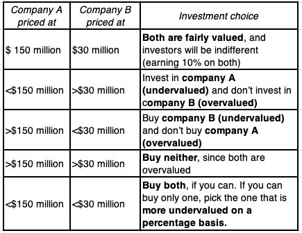
As you can see, the good company (A) can be a good, bad or neutral investment, depending on whether its is priced at less than, greater than or equal to its fair value ($150 million) and the same can be said about the bad company (B), with the price relative to its fair value ($30 million). At fair value, both become neutral investments, generating returns to shareholders that match their cost of equity.The Weakest Link in Excess Returns: The excess return is computed as the difference between return on equity and the cost of equity, and while it is true that different risk and return models and differences in risk parameters (relative risk measures and equity risk premiums) can cause variations in cost of equity calculations, the return on equity is the weaker link in this comparison. To understand some of the ways the return on equity can be skewed, consider the following variants on the simple example in this case:Accounting inconsistencies: As an entirely accounting number, the return on equity is exposed to accounting inconsistencies and miscategorization. To illustrate with our simple example, assume that half the money invested in business A is in R&D, which accountants expense, instead of capitalizing. That business will report a loss of $15 million (with the R&D expense of $30 million more than wiping out the profit of $15 million) in the first year on book capital of $30 million (the portion of the capital invested that is not R&D), but in the years following, it will report a return on capital of 50.00% (since net income will revert back to $15 million, and equity will stay at $30 million). Carrying this through to the real world, you should not be surprised to see technology and pharmaceutical companies, the two biggest spenders on R&D, report much higher accounting returns than they are actually earning on their investments..Aging assets: In our example, we looked at firms an instant after the upfront investment was made, when the book value of investment measures what was paid for the assets acquired. As assets age, two tensions appear that can throw off book value, the first being inflation, which if not adjusted for, will result in the book value being understated, and accounting returns overstated. The other is accounting depreciation, which often has little to do with economic depreciation (value lost from aging), and subject to gaming. Extrapolating, projects and companies with older assets will tend to have overstated accounting returns, as inflation and depreciation lay waste to book values. In fact, with an aging company, and adding in stock buybacks, the book value of equity can become negative (and is negative for about 10% of the companies in my company data sample).Fair Value Accounting: For the last few decades, the notion of fair value accounting has been a fever dream for accounting rule writers, and those rules, albeit in patchwork form, have found their way into corporate balance sheets. In my view, fair value accounting is pointless, and I can use my simple example to illustrate why. If you marked the assets of both company A and company B to market, you would end with book values of $150 million and $30 million for the two companies and returns on equity of 10% for both firms. In short, if fair value accounting does what it is supposed to do, every firm in the market will earn a return on equity (capital) equal to the cost of equity (capital), rendering it useless as a metric for separating good and bad businesses. If fair value accounting fails at what it is supposed to do, which is the more likely scenario, you will end up with book values of equity that measure neither original capital invested nor current market value, and returns on equity and capital that become noise.Growth enters the equation: For companies A and B, in this example, we assumed that the net income was constant, i.e., there is no growth. Introducing growth into the equation changes none of the conclusions that we have drawn so far, but it makes reading both the return on equity and the earnings yield much messier. To see why, assume that company A in the example continues to have no growth, but company B expects to see compounded annual growth of 50% a year in its net income of $3 million for the next decade. We can no longer consign company B to the bad business pile as easily, and the current earnings to price ratio for that company will no longer be equal to the cost of equity, even if markets are efficient. Incorporating growth into the analysis will also mean that net income is not equal to cash flow, since some or a large portion of that net income will have to get reinvested back to deliver the growth. In fact, this is the argument that I used in my second data update to explain why comparing the earnings yield to the treasury bond rate is unlikely to yield a complete assessment of whether stocks are under or over valued, since it ignores growth and reinvestment entirely.Exiting bad businesses: This example also helps to bring home why it is so difficult for companies in bad businesses to fix their "badness" or exit their businesses. In the case of company B, for instance, telling the manager to find projects that earn more than 10% is advice that can be freely dished out, but how exactly do you invent good projects in a business that has turned bad? While exiting the business seems to be a better choice, that presupposes that you will get your capital ($60 million) back when you do, but in the real world, potential buyers will discount that value. In fact, if you divest or sell the bad business for less than $30 million, you are actually worse off than staying in the business and continuing to generate $3 million a year in perpetuity, which has a $30 million value. In the real world, most companies in bad businesses hire new CEOs, restructure their businesses and enter new businesses in a desperate attempt to become good businesses, and enrich consultants and bankers, but not their own shareholders, along the way. Conclusion Many of the comments on my seventh data update, and on my explanation about why ROE and cost of equity don’t have to be equal in an efficient market, came from people with degrees and certifications in finance, and quite a few of the commenters had “finance professional” listed in their profile. Rather than take issue with them, I would argue that this misunderstanding of basics is a damning indictment of how these concepts and topics are taught in the classroom, and since I may very well be one of the culprits, one reason that I wrote this post is to remind myself that I have to revisit the basics, before making ambitious leaps into corporate financial analysis and valuation. For those of you who are not finance professionals, but rely on them for advice, I hope this is a cautionary note on taking these professionals (consultants, appraisers, bankers) at their word. Some of them throw buzzwords and metrics around, with little understanding of what they mean and how they are related, and it is caveat emptor.
YouTube Video
February 12, 2025
Data Update 7 for 2025: The End Game in Business!
I am in the third week of the corporate finance class that I teach at NYU Stern, and my students have been lulled into a false sense of complacency about what's coming, since I have not used a single metric or number in my class yet. In fact, we have spent almost four sessions (that is 15% of the overall class) talking about the end game in business. In an age when ESG, sustainability and stakeholder wealth maximization have all tried to elbow their way to the front of the line, all laying claim to being what business should be about, I have burnished my "moral troglodyte" standing by sticking with my belief that the end game in business is to maximize value, with earnings and cash flows driving that value, and that businesses that are profitable and value creating are in a much better position to do good, if they choose to try. In this post, I will focus on how companies around the world, and in different sectors, performed on their end game of delivering profits, by first focusing on profitability differences across businesses, then converting profitability into returns, and comparing these returns to the hurdle rates that I talked about in my last data update post.
Profitability - Absolute and Relative
While we may all agree with the proverbial bottom line being profits, there seems to be no consensus on how best to measure profitability, either from an accounting or an economic perspective. In this section, I will begin with a simplistic breakdown of the income statement, the financial statement that is supposed to tell us how much a business generated in profits in during a period, and use it as an (imperfect) tool to understand the business economics.
While accountants remain focused on balance sheets, with a fixation of bringing intangibles on to the balance and marking everything up to the market, much of the information that we need to assess the value of a business comes from income and cash flow statements. I am not an accountant, but I do rely on accounting statements for the raw data that I use in corporate finance and valuation. I have tried my hand at financial statement analysis, as practiced by accountants, and discovered that for the most part, the analysis creates more confusions than clarity, as a multiplicity of ratios pull you in different directions. It is for that reason that I created my own version of an accounting class, that you can find on my webpage.
During the course of the class, I assess the income statement, in its most general form, by looking at the multiple measures of earnings at different phases of the statement:

Which of these represents the bottom line for businesses? If you are a shareholder in a company, i.e., an equity investor, the measure that best reflects the profits the company made on the equity you invested in them is the earnings per share. That said, there is information in the measures of earnings as you climb the income statement, and there are reasons why as you move up the income statement, the growth rates you observe may be different:To get from net income to earnings per share, you bring in share count, and actions taken by companies that alter that share count will have effects. Thus, a company that issues new shares to fund its growth may see net income growth, but its earnings per share growth will lag, as the share count increases. Conversely, a company that buys back shares will see share count drop, and earnings per share growth will outpace net income growth.To get from operating income to net income, you have multiple variables to control for. The first is taxes, and incorporating its effect will generally lead to lower net income, and the tax rate that you pay to get from pretax profit to net income is the effective tax rate. To the extent that you have cash on your balance, you will generate interest income which adds on to net income, but interest expenses on debt will reduce income, with the net effect being positive for companies with large cash balance, relative to the debt that they owe, and negative for firms with large net debt outstanding. There is also the twist of small (minority) holdings in other companies and the income you generate from those holdings that affect net income.To get from gross income to operating income, you have to bring in operating expenses that are not directly tied to sales. Thus, if you have substantial general and administrative costs or incur large selling and advertising costs or if you spend money on R&D (which accountants mistakenly still treat as operating expenses), your operating income will be lower than your gross income.Finally, to get from revenues to gross income, you net out the expenses incurred on producing the goods/services that you sell, with these expenses often bundled into a "cost of goods sold" categorization. While depreciation of capital investments made is usually separated out from costs of goods sold, and shown as an operating cost, there are some companies, where it is bundled into costs of goods sold. In many cases, the only statement where you will see depreciation and amortization as a line item is the statement of cash flows.
With that template in place, the place to start the assessment of corporate profitability is to to look at how much companies generated in each of the different earnings metrics around the world in 2024, broken down by sector:

For the financial services sector, note that I have left revenues, gross profit, EBITDA and operating profit as not applicable, because of their unique structure, where debt is raw material and revenue is tough to nail down. (Conventional banks often start their income statements with net interest income, which is interest expense on their debt/deposits netted out against net income, making it closer to nough to categorize and compare to non-financial firms). I have also computed the percentage of firms globally that reported positive profits, a minimalist test on profitability in 2024, and there are interesting findings (albeit some not surprising) in this table:On a net profit basis, there is no contest for the sector that delivers the most net income. It is financials by a wide margin, accounting for a third of the net profits generated by all firms globally in 2024. In fact, technology, which is the sector with the highest market cap in 2024, is third on the list, with industrials taking second place.As you move from down the income statement, the percentage of firms that report negative earnings decreases. Across the globe, close to 84% of firms had positive gross profits, but that drops to 67% with EBITDA, 62% percent with operating income and 61% with net income. Across sectors, health care has the highest percentage of money-losing companies, on every single metric, followed by materials and communication services, whereas utilities had the highest percentage of money makers.While looking at dollar profits yields intriguing results, comparing them across sectors or regions is difficult to do, because they are in absolute terms, and the scale of businesses vary widely. The simple fix for that is to measure profitability relative to revenues, yielding profit margins - gross margins for gross profits, operating margins with operating profits and net margins with net profits. At the risk of stating these margins, not only are these margins not interchangeable, but they each convey information that is useful in understanding the economics of a business:

As you can see, each of the margins provides insight (noisy, but still useful) about different aspects of a business model. With gross margins, you are getting a measure of unit economics, i.e., the cost of producing the next unit of sale. Thus, for a software company, this cost is low or even zero, but for a manufacturing company, no matter how efficient, the cost will be higher. Even within businesses that look similar, subtle differences in business models can translate into different unit economics. For Netflix, adding a subscriber entails very little in additional cost, but for Spotify, a company that pays for the music based on what customers listen to, by the stream, the additional subscriber will come with additional cost. Just to get a big picture perspective on unit economics, I ranked industries based upon gross margin and arrived at the following list of the ten industries with the highest gross margins and the ten with the lowest:
 With the caveat that accounting choices can affect these margins, you can see that the rankings do make intuitive sense. The list of industry groups that have the highest margins are disproportionately in technology, though infrastructure firms (oil and gas, green energy, telecom) also make the list since their investment is up front and not per added product sold. The list of industry group with the lowest margins are heavily tilted towards manufacturing and retail, the former because of the costs of making their products and the latter because of their intermediary status. With operating margins, you are getting a handle on economies of scale. While every companies claims economies of scale as a rationale for why margins should increase as they get larger, the truth is more nuanced. Economies of scale will be a contributor to improving margins only if a company has significant operating expenses (SG&A, Marketing) that grow at a rate lower than revenues. To measure the potential for economies of scale, I looked at the difference between gross and operating margins, across industries, with the rationale that companies with a large difference have a greater potential for economies of scale.

Many of the industry groups in the lowest difference (between gross and operating margin) list were also on the low gross margin list, and the implication is not upbeat. When valuing or analyzing these firms, not only should you expect low margins, but those margins will not magically improve, just because a firm becomes bigger. The EBITDA margin is an intermediate stop, and it serves two purposes. If provides a ranking based upon operating cash flow, rather than operating earnings, and for businesses that have significant depreciation, that difference can be substantial. It is also a rough measure of capital intensity since to generate large depreciation/amortization, these companies also had to have substantial cap ex. Using the difference between EBITDA and operating margin as a measure of capital intensity, the following table lists the industries with the most and least capital intensity:
 Profit margins by industry: US, Global, Emerging Markets, Europe, Japan, India and China
Again, there are few surprises on this list, including the presence of biotech at the top of the most capital intensive list, but that is due to the significant amortization line items on their balance sheets, perhaps from writing off failed R&D, and real estate on the top of the least capital intensive list, but the real estate segment in question is for real estate operations, not ownership. The net margin, in many ways, is the least informative of the profit margins, because there are so many wild cards at play, starting with differences in taxes (higher taxes lower net income), financial leverage (more leverage reduces net margins), cash holdings (interest from higher cash balances increases net income) and cross holdings (with varying effects depending on how they are accounted for, and whether they make or lose money). Ranking companies based upon net margin may measure everything from differences in financial leverage (more net debt should lead to lower margins) to extent of cross holdings and non-operating investments (more of these investments can lead to higher margins).
Accounting Returns
While scaling profits to revenues to get margins provides valuable information about business models and their efficacy, scaling profits to capital invested in a business is a useful tool for assessing the efficiency of capital allocation at the business., The two measures of profits from the previous section that are scaled to capital are operating income (before and after taxes) and net income, with the former measured against total invested capital (from equity and debt) and the latter against just equity capital. Using a financial balance sheet structure again, here is what we get:

The achilles heel for accounting return measures is their almost total dependence on accounting numbers, with operating (net) income coming from income statements and invested capital (equity) from accounting balance sheets. Any systematic mistakes that accountants make (such as not treating leases as debt, which was the default until 2019, and treating R&D as an operating expense, which is still the case) will skew accounting returns. In addition, accounting decisions to write off an asset or take restructuring charges will make the calculation of invested capital more difficult. I wrote a long (and boring) paper on the mechanics of computing accounting returns laying out these and other challenges in computing accounting returns, and you are welcome to browse through it, if you want.
If you are willing to live with the limitations, the accounting returns become proxies for what a business earns on its equity (with return on equity) and as a business (with the cost of capital). Since the essence of creating value is that you need to earn more than your cost of capital, you can synthesize returns with the costs of equity and capital that I talked about in the last post, to get measures of excess returns:

I have the data to compute the accounting returns for the 48,000 publicly traded companies in my sample, though there are estimation choices that I had to make, when computing returns on equity and capital:

Thus, you will note that I have bypassed accounting rules and capitalized R&D and leases (even in countries where it is not required) to come up with my versions of earnings and invested capital. Having computed the return on capital (equity) for each company, I then compared that return to the cost of capital (equity) to get a measure of excess returns for the company. In the table below, I start by breaking companies down by sector, and looking at the statistics on excess returns, by sector:

Note that across all firms, only about 30% of firms earn a return on capital that exceeds the cost of capital. Removing money-losing firms, which have negative returns on capital from the sample, improves the statistic a little, but even across money making firms, roughly half of all firms earn less the the cost of capital.While the proportions of firms that earn returns that exceed the cost of equity (capital) vary across sectors, there is no sector where an overwhelming majority of firms earn excess returns. I disaggregate the sectors into industry groups and rank them based upon excess returns in the table below, with the subtext being that industries that earn well above their cost of capital are value creators (good businesses) and those that earn below are value destroyers (bad businesses):
 Excess returns by industry: US, Global, Emerging Markets, Europe, Japan, India and China
There are some industry groups on this list that point to the weakness of using last year's earnings to get accounting return on capital. You will note that biotech drug companies post disastrously negative returns on capital but many of these firms are young firms, with some having little or no revenues, and their defense would be that the negative accounting returns reflect where they fall in the life cycle. Commodity companies cycle between the most negative and most returns lists, with earnings varying across the cycle; for these firms, using average return on capital over a longer period should provide more credible results. Finally, I look at excess returns earned by non-financial service companies by sub-region, again to see if companies in some parts of the world are better positioned to create value than others:

As you can see, there is no part of the world that is immune from this problem, and only 29% of all firms globally earn more than their cost of capital. Even if you eliminate firms with negative earnings, the proportion of firms that earn more than their cost of capital is only 46.5%.
Implications I have been doing versions of this table every year for the last decade, and the results you see in this year's table, i.e., that 70% of global companies generate returns on equity (capital) that are less tan their hurdle rates, has remained roughly static for that period. Making money is not enough for success: In many businesses, public or private, managers and even owners seem to think that making money (having a positive profit) represents success, not recognizing that the capital invested in these businesses could have been invested elsewhere to earn returns. Corporate governance is a necessity; Marty Lipton, a renowned corporate lawyer and critic of this things activist argued that activist investing was not necessary because most companies were well managed, and did not need prodding to make the right choices. The data in this post suggests otherwise, with most companies needing reminders from outside investors about the opportunity cost of capital.Companies are not fatted calves: In the last few years, two groups of people have targeted companies - politicians arguing that companies are price-gouging and the virtue crowd (ESG, sustainability and stakeholder wealth maximizers) pushing for companies to spend more on making the world a better place. Implicit in the arguments made by both groups is the assumption that companies are, at least collectively, are immensely profitable and that they can afford to share some of those spoils with other stakeholders (cutting prices for customers with the first group and spending lavishly on advancing social agendas with the second). That may be true for a subset of firms, but for most companies, making money has only become more difficult over the decades, and making enough money to cover the cost of the capital that they raise to create their businesses is an even harder reach. Asking these already stretched companies to spend more money to make the world a better place will only add to the likelihood that they will snap, under the pressures. A few months ago, I was asked to give testimony to a Canadian legislative committee that was planning to force Canadian banks to lend less to fossil fuel companies and more to green energy firms, a terrible idea that seems to have found traction in some circles. If you isolate the Canadian banks in the sample, they collectively generated returns on equity of 8.1%, with two thirds of banks earning less than their costs of equity. Pressuring these banks to lend less to their best customers (in terms of credit worthiness) and more to their worst customers (green energy company are, for the most part, financial basket cases) is a recipe for pushing these banks into distress, and most of the costs of that distress will be borne not by shareholders, but by bank depositors.
YouTube Video
Data Updates for 2025Data Update 1 for 2025: The Draw (and Danger) of Data!Data Update 2 for 2025: The Party continued for US EquitiesData Update 3 for 2025: The times they are a'changin'!Data Update 4 for 2025: Interest Rates, Inflation and Central Banks!Data Update 5 for 2025: It's a small world, after all!Data Update 6 for 2025: From Macro to Micro - The Hurdle Rate Question!Data Update 7 for 2025: The End Game in Business!Data LinksExcess returns by industry: US, Global, Emerging Markets, Europe, Japan, India and ChinaProfit margins by industry: US, Global, Emerging Markets, Europe, Japan, India and ChinaPaper LinksReturn on Capital (ROC), Return on Invested Capital (ROIC) and Return on Equity: Measurement and Implications
February 8, 2025
Data Update 6 for 2025: From Macro to Micro - The Hurdle Rate Question!
The Hurdle Rate - Intuition and Uses You don't need to complete a corporate finance or valuation class to encounter hurdle rates in practice, usually taking the form of costs of equity and capital, but taking a finance class both deepens the acquaintance and ruins it. It deepens the acquaintance because you encounter hurdle rates in almost every aspect of finance, and it ruins it, by making these hurdle rates all about equations and models. A few years ago, I wrote a paper for practitioners on the cost of capital, where I described the cost of capital as the Swiss Army knife of finance, because of its many uses. In my corporate finance class, where I look at the first principles of finance that govern how you run a business, the cost of capital shows up in every aspect of corporate financial analysis:In business investing (capital budgeting and acquisition) decisions, it becomes a hurdle rate for investing, where you use it to decide whether and what to invest in, based on what you can earn on an investment, relative to the hurdle rate. In this role, the cost of capital is an opportunity cost, measuring returns you can earn on investments on equivalent risk.

In business financing decisions, the cost of capital becomes an optimizing tool, where businesses look for a mix of debt and equity that reduces the cost of capital, and where matching up the debt (in terms of currency and maturity) to the assets reduces default risk and the cost of capital. In this context, the cost of capital become a measure of the cost of funding a business:

In dividend decisions, i.e., the decisions of how much cash to return to owners and in what form (dividends or buybacks), the cost of capital is a divining rod. If the investments that a business is looking at earn less than the cost of capital, it is a trigger for returning more cash, and whether it should be in the form of dividends or buybacks is largely a function of what shareholders in that company prefer:
 The end game in corporate finance is maximizing value, and in my valuation class, where I look at businesses from the outside (as a potential investor), the cost of capital reappears again as the risk-adjusted discount rate that you use estimate the intrinsic value of a business.

Much of the confusion in applying cost of capital comes from not recognizing that it morphs, depending on where it is being used. An investor looking at a company, looking at valuing the company, may attach one cost of capital to value the company, but within a company, but within a company, it may start as a funding cost, as the company seeks capital to fund its business, but when looking at investment, it becomes an opportunity cost, reflecting the risk of the investment being considered.
The Hurdle Rate - Ingredients
If the cost of capital is a driver of so much of what we do in corporate finance and valuation, it stands to reason that we should be clear about the ingredients that go into it. Using one of my favored structures for understanding financial decision making, a financial balance sheet, a cost of capital is composed of the cost of equity and the cost of debt, and I try to capture the essence of what we are trying to estimate with each one in the picture below:

To go from abstractions about equity risk and default risk to actual costs, you have to break down the costs of equity and debt into parts, and I try to do so, in the picture below, with the factors that you underlie each piece:

As you can see, most of the items in these calculations should be familiar, if you have read my first five data posts, since they are macro variables, having nothing to do with individual companies. The first is, of course, the riskfree rate, a number that varies across time (as you saw in post on US treasury rates in data update 4) and across currencies (in my post on currencies in data update 5). The second set of inputs are prices of risk, in both the equity and debt markets, with the former measured by equity risk premiums, and the latter by default spreads. In data update 2, I looked at equity risk premiums in the United States, and expanded that discussion to equity risk premiums in the rest of the world in data update 5). In data update 4, I looked at movements in corporate default spreads during 2024.There are three company-specific numbers that enter the calculation, all of which contribute to costs of capital varying across companies;Relative Equity Risk, i.e., a measure of how risky a company's equity is, relative to the average company's equity. While much of the discussion of this measure gets mired in the capital asset pricing model, and the supposed adequacies and inadequacies of beta, I think that too much is made of it, and that the model is adaptable enough to allow for other measures of relative risk.
 I am not a purist on this measure, and while I use betas in my computations, I am open to using alternate measures of relative equity risk.Corporate Default Risk, i.e, a measure of how much default risk there is in a company, with higher default risk translating into higher default spreads. For a fairly large subset of firms, a bond rating may stand in as this measure, but even in its absence, you have no choice but to estimate default risk. Adding to the estimation challenge is the fact that as a company borrows more money, it will play out in the default risk (increasing it), with consequences for both the cost of equity and debt (increasing both of those as well).Operating geographies: The equity risk premium for a company does not come from where it is incorporated but from where it does business, both in terms of the production of its products and services and where it generates revenue. That said, the status quo in valuation in much of the world seems to be to base the equity risk premium entirely on the country of incorporation, and I vehemently disagree with that practice:
 Again, I am flexible in how operating risk exposure is measured, basing it entirely on revenues for consumer product and business service companies, entirely on production for natural resource companies and a mix of revenues and production for manufacturing companies.As you can see, the elements that go into a cost of capital are dynamic and subjective, in the sense that there can be differences in how one goes about estimating them, but they cannot be figments of your imagination.
The Hurdle Rate - Estimation in 2025 With that long lead in, I will lay out the estimation choices I used to estimate the costs of equity, debt and capital for the close to 48,000 firms in my sample. In making these choices, I operated under the obvious constraint of the raw data that I had on individual companies and the ease with which I could convert that data into cost of capital inputs.
Riskfree rate: To allow for comparisons and consolidation across companies that operate in different currencies, I chose to estimate the costs of capital for all companies in US dollars, with the US ten-year treasury rate on January 1, 2025, as the riskfree rate.Equity Risk Premium: Much as I would have liked to compute the equity risk premium for every company, based upon its geographic operating exposure, the raw data did not lend itself easily to the computation. Consequently, I have used the equity risk premium of the country in which a company is headquartered to compute the equity risk premium for it.Relative Equity Risk: I stay with beta, notwithstanding the criticism of its effectiveness for two reasons. First, I use industry average betas, adjusted for leverage, rather than the company regression beta, because because the averages (I title them bottom up betas) are significantly better at explaining differences in returns across stocks. Second, and given my choice of industry average betas, none of the other relative risk measures come close, in terms of predictive ability. For individual companies, I do use the beta of their primary business as the beta of the company, because the raw data that I have does not allow for a breakdown into businesses. Corporate default risk: For the subset of the sample of companies with bond ratings, I use the S&P bond rating for the company to estimate the cost of debt. For the remaining companies, I use interest coverage ratios as a first measure to estimate synthetic ratings, and standard deviation in stock prices as back-up measure.Debt mix: I used the market capitalization to measure the market value of equity, and stayed with total debt (including lease debt) to estimate debt to capital and debt to equity ratiosThe picture below summarizes my choices:

There are clearly approximations that I used in computing these global costs of capital that I would not use if I were computing a cost of capital for valuing an individual company, but this approach yields values that can yield valuable insights, especially when aggregated and averaged across groups.
a. Sectors and Industries The risks of operating a business will vary widely across different sectors, and I will start by looking at the resulting differences in cost of capital, across sectors, for global companies:
 There are few surprises here, with technology companies facing the highest costs of capital and financials the lowest, with the former pushed up by high operating risk and a resulting reliance on equity for capital, and the latter holding on because of regulatory protection. Broken down into industries, and ranking industries from highest to lowest costs of capital, here is the list that emerges:
 Download industry costs of capital
The numbers in these tables may be what you would expect to see, but there are a couple of powerful lessons in there that businesses ignore at their own peril. The first is that even a casual perusal of differences in costs of capital across industries indicates that they are highest in businesses with high growth potential and lowest in mature or declining businesses, bringing home again the linkage between danger and opportunity. The second is that multi-business companies should understand that the cost of capital will vary across businesses, and using one corporate cost of capital for all of them is a recipe for cross subsidization and value destruction.
b. Small versus Larger firms In my third data update for this year, I took a brief look at the small cap premium, i.e, the premium that small cap stocks have historically earned over large cap stocks of equivalent risk, and commented on its disappearance over the last four decades. I heard from a few small cap investors, who argued that small cap stocks are riskier than large cap stocks, and should earn higher returns to compensate for that risk. Perhaps, but that has no bearing on whether there is a small cap premium, since the premium is a return earned over and above what you would expect to earn given risk, but I remained curious as to whether the conventional wisdom that small cap companies face higher hurdle rates is true. To answer this question, I examine the relationship between risk and market cap, breaking companies down into market cap deciles at the start of 2025, and estimating the cost of capital for companies within each decile:

The results are mixed. Looking at the median costs of capital, there is no detectable pattern in the cost of capital, and the companies in the bottom decile have a lower median cost of capital (8.88%) than the median company in the sample (9.06%). That said, the safest companies in largest market cap decile have lower costs of capital than the safest companies in the smaller market capitalizations. As a generalization, if small companies are at a disadvantage when they compete against larger companies, that disadvantage is more likely to manifest in difficulties growing and a higher operating cost structure, not in a higher hurdle rate.
c. Global Distribution In the final part of this analysis, I looked at the costs of capital of all publicly traded firms and played some Moneyball, looking at the distribution of costs of capital across all firms. In the graph below,I present the histogram of cost of capital, in US dollar terms, of all global companies at the start of 2025, with a breakdown of costs of capital, by region, below:

I find this table to be one of the most useful pieces of data that I possess and I use it in almost every aspect of corporate finance and valuation:Cost of capital calculation: The full cost of capital calculation is not complex, but it does require inputs about operating risk, leverage and default risk that can be hard to estimate or assess for young companies or companies with little history (operating and market). For those companies, I often use the distribution to estimate the cost of capital to use in valuing the company. Thus, when I valued Uber in June 2014, I used the cost of capital (12%) at the 90th percentile of US companies, in 2014, as Uber's cost of capital. Not only did that remove a time consuming task from my to-do list, but it also allowed me to focus on the much more important questions of revenue growth and margins for a young company. Drawing on my fifth data update, where I talk about differences across currencies, this table can be easily modified into the currency of your choice, by adding differential inflation. Thus, if you are valuing an Indian IPO, in rupees, and you believe it is risky, at the start of 2025, adding an extra 2% (for the inflation differential between rupees and dollars in 2025) to the ninth decile of Indian costs of capital (12.08% in US dollars) will give you a 14.08% Indian rupee cost of capital.Fantasy hurdle rates: In my experience, many investors and companies make up hurdle rates, the former to value companies and the latter to use in investment analysis. These hurdle rates are either hopeful thinking on the part of investors who want to make that return or reflect inertia, where they were set in stone decades ago and have never been revisited. In the context of checking to see whether a valuation passes the 3P test (Is it possible? Is it plausible? Is it probable?), I do check the cost of capital used in the valuation. A valuation in January 2025, in US dollars, that uses a 15% cost of capital for a publicly traded company that is mature is fantasy (since it is in well in excess of the 90th percentile), and the rest of the valuation becomes moot. Time-varying hurdle rates: When valuing companies, I believe in maintaining consistency, and one of the places I would expect it to show up is in hurdle rates that change over time, as the company's story changes. Thus, if you are valuing a money-losing and high growth company, you would expect its cost of capital to be high, at the start of the valuation, but as you build in expectations of lower growth and profitability in future years, I would expect the hurdle rate to decrease (from close to the ninth decile in the table above towards the median).It is worth emphasizing that since my riskfree rate is always the current rate, and my equity risk premiums are implied, i.e., they are backed out from how stocks are priced, my estimates of costs of capital represent market prices for risk, not theoretical models. Thus, if looking at the table, you decide that a number (median for your region, 90th percentile in US) look too low or too high, your issues are with the market, not with me (or my assumptions).
Takeaways I am sorry that this post has gone on as long as it has, but to end, there are four takeaways from looking at the data:
Corporate hurdle rate: The notion that there is a corporate hurdle rate that can be used to assess investments across the company is a myth, and one with dangerous consequences. It plays out in all divisions in a multi-business company using the same (corporate) cost of capital and in acquisitions, where the acquiring firm's cost of capital is used to value the target firm. The consequences are predictable and damaging, since with this practice, safe businesses will subsidize risky businesses, and over time, making the company riskier and worse off over time.Reality check on hurdle rates: All too often, I have heard CFOs of companies, when confronted with a cost of capital calculated using market risk parameters and the company's risk profile, say that it looks too low, especially in the decade of low interest rates, or sometimes, too high, especially if they operate in an risky, high-interest rate environment. As I noted in the last section, making up hurdle rates (higher or lower than the market-conscious number) is almost never a good idea, since it violates the principle that you have live and operate in the world/market you are in, not the one you wished you were in.Hurdle rates are dynamic: In both corporate and investment settings, there is this almost desperate desire for stability in hurdle rates. I understand the pull of stability, since it is easier to run a business when hurdle rates are not volatile, but again, the market acts as a reality check. In a world of volatile interest rates and risk premia, using a cost of capital that is a constant is a sign of denial.Hurdle rates are not where business/valuation battles are won or lost: It is true that costs of capital are the D in a DCF, but they are not and should never be what makes or breaks a valuation. In my four decades of valuation, I have been badly mistaken many times, and the culprit almost always has been an error on forecasting growth, profitability or reinvestment (all of which lead into the cash flows), not the discount rate. In the same vein, I cannot think of a single great company that got to greatness because of its skill in finessing its cost of capital, and I know of plenty that are worth trillions of dollars, in spite of never having actively thought about how to optimize their costs of capital. It follows that if you are spending the bulk of your time in a capital budgeting or a valuation, estimating discount rates and debating risk premiums or betas, you have lost the script. If you are valuing a mature US company at the start of 2025, and you are in a hurry (and who isn't?), you would be well served using a cost of capital of 8.35% (the median for US companies at the start of 2025) and spending your time assessing its growth and profit prospects, and coming back to tweak the cost of capital at the end, if you have the time.YouTube Video
Data Updates for 2025Data Update 1 for 2025: The Draw (and Danger) of Data!Data Update 2 for 2025: The Party continued for US EquitiesData Update 3 for 2025: The times they are a'changin'!Data Update 4 for 2025: Interest Rates, Inflation and Central Banks!Data Update 5 for 2025: It's a small world, after all!Data Update 6 for 2025: From Macro to Micro - The Hurdle Rate Question!Data LinksCost of capital, by industry grouping: US, Global, Emerging Markets, Japan, Europe, India, China)Cost of capital distribution, by industryPaper linksThe Cost of Capital: The Swiss Army Knife of Finance
February 6, 2025
Data Update 5 for 2025: It's a small world, after all!
Returns in 2024 Clearly, the most obvious place to start this post is with market performance, and in the table below, I report the percentage change in index level, for a subset of indices, in 2024:

The best performing index in 2024, at least for the subset of indices that I looked at, was the Merval, up more than 170% in 2024, and that European indices lagged the US in 2024. The Indian and Chinese markets cooled off in 2024, posting single digit gains in price appreciation. There are three problems with comparing returns in indices. First, they are indices and reflect a subset of stocks in each market, with different criteria determining how each index is constructed, and varying numbers of constituents. Second, they are in local currencies, and in nominal terms. Thus, the 172.52% return in the Merval becomes less impressive when inflation in Argentina is taken into account. It is for this reason that I chose to compute returns differently, using the following constructs:I included all publicly traded stocks in each market, or at least those with a market capitalization available for them.I converted all of the market capitalizations into US dollars, just to make them comparable.I aggregated the market capitalizations of all stocks at the end of 2023 and the end of 2024, and computed the percentage change.The results, broken down broadly by geography are in the table below:
 As you can see, the aggregate market cap globally was up 12.17%, but much of that was the result of a strong US equity market. Continuing a trend that has stretched over the last two decades, investors who tried to globally diversify in 2024 underperformed investors who stayed invested only in the United States. I do have the percentage changes in market cap, by country, but you should take those results with a grain of salt, since there are countries with just a handful of listings, where the returns are distorted. Looking at countries with at least ten company listings, I have a list of the ten best and worst performing countries in 2024:

Argentina's returns in US dollar terms is still high enough to put it on top of the list of best-performing countries in the world in 2024 and Brazil is at the top of the list of worst performing countries, at least in US dollar terms.
The Currency Effect As you can see comparing the local index and dollar returns, the two diverge in some parts of the world, and the reason for the divergence is movements in exchange rates. To cast light on this divergence, I looked at the US dollar's movements against other currencies, using three variants of US dollar indices against emerging market currencies, developed market currencies and broadly against all currencies:
 FRED
FREDThe dollar strengthened during 2024, more (10.31%) against emerging market currencies than against developed market currencies (7.66%), and it was up broadly (9.03%). I am no expert on exchange rates, but learning to deal with different currencies in valuation is a prerequisite to valuing companies. Since I value companies in local currencies, I am faced with the task of estimating risk free rates in dozens of currencies, and the difficulty you face in estimating these rates can vary widely (and be close to impossible in some) across currencies. In general, you can break down risk free estimation, in different currencies, in three groupings, from easiest to most difficult:

My process for estimating riskfree rates in a currency starts with a government issuing a long term bond in that currency, and if the government in question has no default risk, it stops there. Thus, the current market interest rate on a long term Swiss government bond, in Swiss Francs, is the risfree rate in that currency. The process gets messier, when there is a long-term, local currency bond that is traded, but the government issuing the bond has default risk. In that case, the default spread on the bond will have to be netted out to get to a riskfree rate in the currency. There are two key estimation questions that are embedded in this approach to estimating riskfree rates. The first is the assessment of whether there is default risk in a government, and I use a simplistic (and flawed) approach, letting the local currency sovereign rating for the government stand in as the measure; I assume that AAA rated government bonds are default-free, and that any rating below is a indication of default risk. The second is the estimation of the default spread, and in my simplistic approach, I use one of two approaches - a default spread based upon the sovereign rating or a sovereign credit default swap spread. At the start of 2025, there were just about three dozen currencies, where I was able to find local-currency government bonds, and I estimated the riskfree rates in these currencies;
 Download data
At the risk of stating the obvious (and repeating what I have said in earlier posts), there is no such thing as a global riskfree rate, since riskfree rates go with currencies, and riskfree rates vary across currencies, with all or most of the difference attributable to differences in expected inflation. High inflation currencies will have high riskfree rates, low inflation currencies low riskfree rates and deflationary currencies can negative riskfree rates. It is the recognition that differences in riskfree rates are primarily due to differences in expected inflation that gives us an opening to estimate riskfree rates in currencies without a government bond rate, or even to run a sanity check on the riskfree rates that you get from government bonds. If you start with a riskfree rate in a currency where you can estimate it (say US dollars, Swiss Francs or Euros), all you need to estimate a riskfree rate in another currency is the differential inflation between the two currencies. Thus, if the US treasury bond rate (4.5%) is the riskfree rate in US dollars, and the expected inflation rates in US dollars and Brazilian reals are 2.5% and 7.5% respectively, the riskier rate in Brazilian reals:
Riskfree rate in $R = (1+ US 10-year T.Bond Rate) * (1 + Expected inflation rate in $R)/ (1+ Expected inflation rate in US $) - 1 = 1.045 *(1.075/1.025) -1 = 9.60%In approximate terms, this can be written as
Riskfree rate in $R = US 10-year T.Bond Rate + (Expected inflation rate in $R) - Expected inflation rate in US $) - 1 = 4.5% - (7.5% - 2.5%) = 9.50%While obtaining an expected inflation rate for the US dollar is easy (you can use the difference between the ten-year US treasury bond rate and the ten-year US TIPs rate), it can be more difficult to obtain this number in Egyptian pounds or in Zimbabwean dollars, but you can get estimates from the IMF or the World Bank.
The Risk Effect
There are emerging markets that have delivered higher returns than developed markets, but in keeping with a core truth in investing and business, these higher returns often go hand-in-hand with higher risk. The logical step in looking across countries is measuring risk in countries, and bringing that risk into your analysis, by incorporating that risk by demanding higher expected returns in riskier countries. That process of risk analysis and estimating risk premiums starts by understanding why some countries are riskier than others. The answers, to you, may seem obvious, but I find it useful to organize the obvious into buckets for analysis. I will use a picture in posts on country risk before to capture the multitude of factors that go into making some countries riskier than others:

To get from these abstractions to country risk measures, I make a lot of compromises, putting pragmatism over purity. While I take a deeper look at the different components of country risk in my annual updates on country risk (with the most recent one from 2024), I will cut to the chase and focus explicitly on my approach to estimating equity risk premiums, using my 2025 data update to illustrate:

With this approach, I estimated equity risk premiums, by country, and organized by region, here is what the world looked like, at the start of 2025:
 Download equity risk premiums by country
Note that I attach the implied equity risk premium for the S&P 500 of 4.33% (see my data update 3 from a couple of weeks ago) to all Aaa rated countries (Australia, Canada, Germany etc.) and an augmented premium for countries that do not have Aaa ratings, with the additional country risk premium determined by local currency sovereign ratings. I am aware of all of the possible flaws in this approach. First, treating the US as default-free is questionable, now that it has threatened default multiple times in the last decade and has lost its Aaa rating with every ratings agency, other than Moody's. That is an easily fixable problem, though, since if you decide to use S&P's AA+ rating for the US, all it would require is that you net out the default spread of 0.40% (for a AA+ rating at the start of 2025) from the US ERP to get a mature market premium of 3.93% (4.33% minus 0.40%). Second, ratings agencies are not always the best assessors of default risk, especially when there are dramatic changes in a country, or when they are biased (towards or against a region). That too has a fix, at least for the roughly 80 countries where there are trade sovereign CDS spreads, and those sovereign CDS spreads can be used instead of the ratings-based spreads for those countries.
The Pricing Effect
As an investor, the discussions about past returns and risk may miss the key question in investing, which is pricing. At the right price, you should be willing to buy stocks even in the riskiest countries, and especially so after turbulent (down) years. At the wrong price, even the safest market with great historical returns are bad investments. To assess pricing in markets, you have to scale the market cap to operating metrics, i.e., estimate a multiple, and while easy enough to do, there are some simple rules to follow in pricing. The first is recognizing that every multiple has a market estimate of value in the numerator, capturing either just equity value (market cap of equity), total firm value (market cap of equity + total debt) or operating asset (enterprise) value (market cap of equity + total debt - cash):

Depending on the scalar (revenues, earnings, book value or cash flow), you can compute a variety of multiples, and if you add on the choices on timing for the scaling variables (trailing, current, forward), the choices multiply. To the question of which multiple is best, a much debated topic among analysts, my answer is ambivalent, since you can use any of them in pricing, as long as you ask the right follow-up questions. To compare how stocks are priced globally, I will use three of these multiples. The first is the price earnings ratio, partly because in spite of all of its faults, it remains the most widely used pricing metric in the world. The second is the polar opposite on the pricing spectrum, which is the enterprise value to sales multiple, where rather than focus on just equity value, I look at operating asset value, and scale it to the broadest of operating metrics, which is revenue. While it takes a lot to get from revenues to earnings, the advantage of using revenues is that it is number least susceptible to accounting gaming, and also the one where you are least likely to lose companies from your sample. (Thousands and thousands of companies in my sample have negative net income, making trailing PE not meaningful, but very few (usually financial service firms) have missing revenues). The third pricing metric I look at is the enterprise value to EBITDA, a multiple that has gone from being lightly used four decades ago to a banking punchline today, where EBITDA represents a rough measure of operating cash flow). With each of these multiples, I make two estimation choices:I stay with trailing values for net income, revenues and EBITDA, because too many of the firms in my 48,000 firm sample have no analysts following them, and hence no forward numbers.I compute two values for each country (region), an aggregated version and the median value. While the latter is simple, i.e., it is the median number across all companies in a country or region, the former is calculated across all companies, by aggregating the values across companies. Thus, the aggregated PE ratio for the United States is 20.51, and it computed by adding up the market capitalizations of all traded US stocks and dividing by the sum of the net income earned by all traded firms, including money losers. Think of it a weighted-average PE, with no sampling bias.With these rules in place, here is what the pricing metrics looked like, by region, at the start of 2025:

The perils of investing based just upon pricing ratios should be visible from this table. Two of the cheapest regions of the world to invest in are Latin America and Eastern Europe, but both carry significant risk with them, and the third, Japan, has an aging population and is a low-growth market. The most expensive market in the world is India, and no amount of handwaving about the India story can justify paying 31 times earnings, 3 times revenue and 20 times EBITDA, in the aggregate, for Indian companies. The US and China also fall into the expensive category, trading at much higher levels than the rest of the world, on all three pricing metrics. Within each of these regions, there are differences across countries, with some priced more richly than others. In the table below, I look at the ten countries, with at least 5 companies listed on their exchanges, that trade at the lowest median trailing PE ratios, and the ten countries that are more expensive using that same metric:

Many of the markets are in the world that trade at the lowest multiples of trailing earnings are in Africa. With Latin America, it is a split decisions, where you have two countries (Colombia and Brazil) on the lowest PE list and one (Argentina) on the highest PE list. In some of the countries, there is a divergence between the aggregated version and the trailing PE, with the aggregated PE higher (lower) than the median value, reflecting larger companies that trade at lower (higher) PE ratios than the rest of the market. Replacing market cap with enterprise value, and net income with revenues, gives you a pricing multiple that lies at the other end of the spectrum, and ranking countries again, based on median EV to sales multiples, here is the list of the ten most expensive and cheapest markets:

On an enterprise value to sales basis, you see a couple of Asian countries (Japan and South Korea) make the ten lowest list, but the preponderance of Middle Eastern countries on ten highest lists may just be a reflection of quirks in sample composition (more financial service firms, which have no revenues, in the sample).
The Year to come
This week has been a rocky one for global equities, and the trigger for the chaos has come from the United States. The announcements, from the Trump administration, of the intent to impose 25% tariffs on Canada and Mexico may have been delayed, and perhaps may not even come into effect, but it seems, at least to me, a signal that globalization, unstoppable for much of the last four decades, has crested, and that nationalism, in politics and economics, is reemerging. As macroeconomists are quick to point out, using the Great Depression and Smoot-Hawley's tariffs in the 1930 to illustrate, tariffs are generally not conducive to global economic health, but it is time that they took some responsibility for the backlash against free global trade and commerce. After all, the notion that globalization was good for everyone was sold shamelessly, even though globalization created winners (cities, financial service firms) and losers (urban areas, developed market manufacturing) , and much of what we have seen transpired over the last decade (from Brexit to Trump) can be viewed as part of the backlash. In spite of the purse clutching at the mention of tariffs, they have been part of global trade as long as there has been trade, and they did not go away after the experiences with the depression. I agree that the end game, if tariffs and trade wars become commonplace, will be a less vibrant global economy, but as with any major macroeconomic shocky, there will be winners and losers. There is, I am sure, a sense of schadenfreude among many in emerging markets, as they watch developed markets start to exhibit the behavior (unpredictable government policy, subservient central banks, breaking of legal and political norms) that emerging markets were critiqued for decades ago, but the truth is that the line between developed and emerging markets has become a hazy one. After the fall of the Iron Curtain, George H.W. Bush (the senior) declared a "new world order", a proclamation turned out to be premature, since the old world order quickly reasserted itself. The political and economic developments of the last decade may signal the arrival of a new world order, though no one in quite sure whether it will be better or worse than the old one.
YouTube Video
Data Updates for 2025Data Update 1 for 2025: The Draw (and Danger) of Data!Data Update 2 for 2025: The Party continued for US EquitiesData Update 3 for 2025: The times they are a'changin'!Data Update 4 for 2025: Interest Rates, Inflation and Central Banks!Data Update 5 for 2025: It's a small world, after all!
Data LinksRiskfree rates, by currency, in January 2025Equity risk premiums, by country, in January 2025Pricing ratios, by country, in January 2025
January 31, 2025
DeepSeek crashes the AI Party: Story Break, Change or Shift?
The AI story, before DeepSeek
The AI story has been building for a while, reflecting the convergence of two forces in technology - more computing power, often in smaller and smaller packages, and the accumulation of data, on technology platforms and elsewhere. That said, the AI story broke out to the public on November 30, 2022, when OpenAI launched ChatGPT, and it made its presence felt in homes, schools and businesses almost instantaneously. It is that wide presence in our daily lives that laid the foundations for the AI story, where evangelists sold us on the notion that AI solutions would make our lives easier and take away the portions of our work that we found most burdensome, and that the businesses that provided these solutions would be worth trillions of dollars. As the number of potential applications of AI proliferated, thus increasing the market for AI products and services, another part of the story was also being put into play. AI was framed as being made possible by the marriage of incredibly powerful computers and deep troves of data, effectively setting the stage for the winners, losers, and wannabes in the story. The first set of companies were perceived as benefiting from building the AI architecture, with the advance spending on this architecture coming from the companies that hoped to be players in the AI product and service markets:Computing Power: In the AI story that was told, the computers that were needed were so powerful that they needed customized chips, more powerful and compact than any made before, and one company (Nvidia), by virtue of its early start and superior chip design capabilities, stood well above the rest. Not only did Nvidia have an 80% market share of the AI chip market, as assessed in 2024, the lead and first-mover advantage that the company possessed would give it a dominant market share, in the much larger AI chip market of the future. Along the way, the the AI story picked up supercomputing companies, as passengers, again on the belief that Ai systems would find a use for them.Power: In the AI story, the coupling of powerful computing and immense data happens in data centers that are power hogs, requiring immense amounts of energy to keep going. Not surprisingly, a whole host of power companies have stepped into the breach, with some increasing capacity entirely to service these data centers. Some of them were new entrants (like Constellation Energy), whereas others were more traditional power companies (Siemens Energy) who saw an opening for growth and profitability in the AI space. Data: A third beneficiary from the architecture part of the AI story were the cloud businesses, where the big data, collected for the AI systems would get stored. The big tech companies with cloud arms, particularly Microsoft (Azure) and Amazon (AWS) have benefited from that demand, as have other cloud businesses.Since the companies involved in building the AI infrastructure are the ones that are most tangibly (and immediately) benefiting from the AI boom, they are also the companies that have seen the biggest boost in market cap, as the AI story heated up. In the graph, I have picked on a subset of high-profile companies that were part of the AI market euphoria and looked at the consequent increase in their market capitalizations:

Using the ChatGPT introduction on November 30, 2022, as the starting point for the AI buzz, in public consciousness and markets, the returns in 2023 and 2024 are a composite (albeit a rough) measure of the benefits that AI has generated for these companies. Note that the biggest percentage winner, at least in this group was Palantir, up 1285% in the last two years, but the biggest winner in absolute terms was Nvidia, which gained almost $ 3 trillion in value in 2023 and 2024. The investments in that AI architecture were being made, with the expectation that companies that invested in the architecture would be able to eventually profit from developing and selling AI products and services. Since the AI storyline required immense upfront investing in computing power and access to big data, the biggest investors in AI architecture were big tech companies, with Microsoft and Meta being the largest customers for Nvidia chips in 2024. In the table below, I look at the Mag Seven, not inclusive of Nvidia, and examine the returns that they have made in 2023 and 2024:

As you can see, the Mag Seven carried the market in the two years, each adding a trillion (or close, in the case of Tesla) dollars in value in the last two years, with some portion of that value attributable to the AI story. With requirements for large investment up front acting as entry barriers, the expectation was these big tech companies would eventually not only be able to develop AI products and services that their customers would want, but charge premium prices (and earn higher margins). In the picture below, I have tried to capture the essence of AI story, with the potential winners and losers at each stage:
There are parts to this story where there is much to be proved, especially on the AI product and service part, and while investors can be accused of becoming excessively exuberant about the story, it is a plausible one. In fact, my most recent (in September 2024) valuation of Nvidia bought into core elements of the story, though I still found it overvalued:
 Nvidia valuation in September 2024 (Pre DeepSeek)
Note that the big AI story plays out in these inputs in multiple places:AI chip market: My September 2024 estimate for the size of the AI chip market was $500 billion, which in turn was justifiable only because the AI product and service market was expected to huge ($3 trillion and beyond).Nvidia market share: In my valuation, I assumed that Nvidia's lead in the AI chip business would give the company a head start, as the business grew, and to the extent that demand is sticky (i.e., once companies start build data centers with Nvidia chips, it would be difficult for them to switch to a competitor), Nvidia would maintain a dominant market share (60%) of the expanded AI chip market.Nvidia margins: Nvidia has had immense pricing power, posting nosebleed-level gross and operating margins, while TSMC (its chip maker) has generated only a fraction of the benefits, and its biggest customers (the big tech companies) have been willing to pay premium prices to get a head start in building their AI architecture. Over time, I assumed that Nvidia would see its margins drop, but even with the drop, their target margin (60%) would resemble those of very successful, software companies, not chip making companies.My concern in September 2024, and in fact for the bulk of the last two years, was not that I had doubts about the core AI story, but that investors were overpaying for the story. That is partly why, I have shed portions of my holdings in Nvidia, selling half my holdings in the summer of 2023 and another quarter in the summer of 2024.
The AI Story, after DeepSeek
I teach valuation, and have done so for close to forty years. One reason I enjoy the class is that you are never quite done with a valuation, because life keeps throwing surprises at you. The first session of my undergraduate valuation class was last Wednesday (January 22), and during the course of the class, I talked about how a good valuation connects narrative to numbers, and followed up by noting that even the most well thought through narratives will change over time. I am not sure how much of that message got through to my studentls, but the message was delivered much more effectively by DeepSeek's entry into the AI story over the weekend, and the market shakeup that followed when markets opened on Monday (January 27).
A DeepSeek Primer
The DeepSeek story is still being told, and there is much we do not know. For the moment, though, here is what we know. In 2010, Liang Wenfeng, a software engineer, founded DeepSeek as a hedge fund in China, with the intent of using artificial intelligence to make money. Unable to get traction in that endeavor, and facing government hostility on speculative trading, he pivoted in 2023 into AI, putting together a team to create a Chinese competitor to OpenAI. Since the intent was to come up with a product that could be sold at bargain prices, DeepSeek did what disruptors have always done, which is look for an alternate path to the same destination (providing AI products that work). Rather than invest in expensive infrastructure (supercomputers and data centers), DeepSeek used much cheaper, less powerful chips, and instead of using immense amounts of data, created an AI prototype that could work with less data, using rule-based logic to fill in the gap. While there has been chatter about DeepSeek for weeks, it became publicly accessible at the end of last week (ending January 24), and within hours, was drawing rave reviews from people well versed in tech, as it matched beat ChatGPT at many tasks, and even performed better on scientific and math queries. There are parts of this story that are clearly for public consumption, more side stories than main story,, and it is best to get them out of the way, before looking at the DeepSeek effect.Cost of development: The notion that DeepSeek was developed for just a few million dollars is fantasy, and while there may have been a portion of the development that cost little, the total was probably in the hundreds of millions of dollars and required a lot more resources (including perhaps even Nvidia chips) than the developers are letting on. No matter what the true cost of development is finally revealed to be, it will be a fraction of the money spent by the existing players in building their systems.Performance tests: The tests of DeepSeek versus OpenAI (or Claude and Gemini) suggests that DeepSeek not only holds it own against the establishment, but even outperforms them on some tasks. That is impressive, but the leap that some are making to concede the entire AI product and service market to DeepSeek is unwarranted. There are clearly aspects of the AI products and service business, where the DeepSeek approach (of using less powerful computing and data) will be good enough, but there will be other aspects of the AI business, where the old paradigm of super computing power and vast data will still hold.A Chinese company: The fact that DeepSeek was developed in China throws a political twist into the story that will undoubtedly play a role in how it develops, but the genie is out of the bottle, even if other governments try to stop its adoption. Adding to the noise is the decision by the company to make DeepSeek open-source, effectively allowing others to adapt and build their own versions.Fair or foul: Finally, there has been some news on the legal front, where OpenAI has argued that DeepSeek unlawfully used data that was generated by OpenAI in building their offering, and while part of that lawsuit may just be showboating, it is possible that portions of the story are true and that legal consequences will follow.While we can debate the what's and why's in this story, the market reaction this week to the story has been swift and decisive. I graph the performance of the five AI stocks highlighted in the earlier section, throwing in the Meta and Microsoft for good measure, on a daily basis in 2025.

As you can see in this chart, Nvidia Broadcom, Constellation and Vistra have had terrible weeks, losing more than 10% in the last week, but just for perspective, also note that Constellation and Vistra are still up strongly for the year. Meta and Microsoft were unaffected, and so was Palantir, Clearly, the DeepSeek story is playing out differently for different companies in the AI space, but its overall market impact has been substantial, and for the most part, negative. What is it that makes the DeepSeek story so compelling? First, is the technological aspect of coming up with a product, with far less in resources that the establishment, and I have nothing but admiration for the DeepSeek creators, but the part of the story that stands out is that the they chose not to go with the prevailing narrative (the one where Nvidia chips and huge data bases are a necessity) and instead asked the question of what the end products and services would look like, and whether there was an easier, quicker and cheaper way of getting there. In hindsight, there are probably others who are looking at DeepSeek and wondering why they did not choose the same path, and the answer is that it takes courage to go against the conventional wisdom, especially when, as AI did over the last two years, it sweeps everyone (from tech titans to individual investors) along with its force. The truth is that even if DeepSeek is stopped through legal or government action or fails to deliver on its promises, what its entry has done to the AI story cannot be undone, since it has broken the prevailing narrative. I would not be surprised if there are a dozen other start-ups, right now, using the DeepSeek playbook to come up with their own lower-cost competitors to prevailing players. Put simply, the AI story's weakest links have been exposed, and if this were the tale about the Emperor's new clothes, the AI emperor is, if not naked, is having a wardrobe malfunction, for all to see.
The Story Effect
In this first week, as is to be expected, the response has been anything but reasoned. If you are a voracious reader of financial news (I am not), you have probably seen dozens of “thought pieces” from both technology and market experts claiming to foretell the future, and even among the few that I have read, the views range the spectrum on how DeepSeek changes the AI story. In my writings on narrative and numbers, where I talk about how every valuation tells a story, I also talk about how stories are dynamic, with a story break representing radical change (where a great story can crash and burn or a small story can break out to become a big one), a story change can be a significant narrative alteration (where a story adds or loses a dimension with big value effects) or a story shift (where the core story remains unchanged, but the parameters can change). Using the pre-DeepSeek story as a starting point, you can classify the narratives on what is coming on the story break/story change/story shift continuum:

With all the caveats, including the fact that I am an AI novice, with a deeper understanding of potato chips than computer chips, and that it is early in the game, I am going to take a stand on where in this continuum I see the DeepSeek effect falling. I believe that DeepSeek does change the AI story, by creating two pathways to the AI product and service endgame. On one path that will lead to what I will term the “low intensity” AI market, it has opened the door to lower cost alternatives, in terms of investments in computing power and data, and competitors will flock in. That said, there will remain a segment of the AI market, where the old story will prevail, and the path of massive investments in computer chips and data centers leading to premium AI products and services will be the one that has to be taken. Note that the entry characteristics for the two paths will also determine the profitability and payoffs from their respective AI product and service markets (that will eventually exist). The “low entry cost” pathway is more likely to lead to commoditization, with lots of competitors and low pricing power, whereas the “high entry cost” path with its requirements for large upfront investment and access to data will create a more restrictive market, with higher priced and more profitable AI products and services. This story leaves me with a judgment call to make about the relative sizes of the markets for the two pathways. I am generalizing, but much of what consumers have seen so far as AI offerings fall into the low cost pathway and I would not be surprised, if that remains true for the most part. The DeepSeek entry has now made it more likely that you and I (as consumers) will see more AI products and services offered to us, at low cost or even for free. There is another segment of the AI products and services market, though, with businesses (or governments) as customers, where significant investments made and refinements will lead to AI products and services, with much higher price points. In this market, I would not be surprised to see networking benefits manifest, where the largest players acquire advantages, leading to winner-take-all markets. In telling this story, I understand that not only am I going to be wrong, perhaps decisively, but also that it could unravel in record time. I make this leap, not out of arrogance or a misplaced desire to change how you think, but because I own a slice of Nvidia (one quarter of the holding that I had two years ago, but still large enough to make a difference in my portfolio), and I cannot value the company without an AI story in place. That said, the feedback loop remains open, and I will listen not only to alternate opinions but also follow real world developments, in the interests of telling a better story.
The Value Effect
Now that my AI story is in the open, I will use it to revisit my valuation of Nvidia, and incorporate my new AI story in that valuation. Even without working through the numbers, it is very difficult to see a scenario where the entry of DeepSeek makes Nvidia a more valuable company, with the biggest change being in the expected size of the AI chip market: table.tableizer-table { font-size: 12px; border: 1px solid #CCC; font-family: Arial, Helvetica, sans-serif; } .tableizer-table td { padding: 4px; margin: 3px; border: 1px solid #CCC; } .tableizer-table th { background-color: #104E8B; color: #FFF; font-weight: bold; }In September 2024 (pre DeepSeek)In January 2025 (post DeepSeek) AI chip market size in 2035$500 billion$300 billion Nvidia's market share60%60% Nvidia's operating margin60%60% Nvidia's risk (cost of capital)10.52% _> 8.49%11.79% -> 8.50% (Higher riskfree rate + higher ERP)
With the changes made, and updating the financials to reflect an additional quarter of data, you can see my Nvidia valuation in the picture below:
 Nvidia valuation in January 2025 (Post DeepSeek)
There are two (unsurprising) results in this valuation. The value per share that I estimate for Nvidia dropped from $87 in September 2024 to $78 in January 2025, much of that change driven by the smaller AI chip market that comes out of the DeepSeek disruption (with the rest of the decline arising for higher riskfree rates and the equity risk premiums). The other is that the stock is overvalued, at its current price of $123 per share, even after the markdown this week. Since I found Nvidia overvalued in September 2024, when the big AI story was still in place, and Nvidia was trading at $109, $14 lower than todays price, estimating a lower value and comparing to a higher price makes it even more over valued.. More generally, the value effect of the DeepSeek disruption will be disparate, more negative for some companies in the AI space than others, and perhaps even positive for a few and I have attempted to capture those effects in the picture below, comparing DeepSeek to a bomb, and looking at the damage zones from the blast:
In my view, the damage, in the near and long term, from DeepSeek will be to the businesses that have been the lead players in building the AI architecture. In addition to Nvidia (and its AI chip business), this includes the energy and gas businesses that have benefited from the tens of billions spent on building AI data centers. It is not that they will currently contracts, but that it is likely that you will see a slowing down of commitments to spend money on AI, as companies examine whether they need them. More companies are therefore likely to follow Apple's path of cautious entry than Meta and Microsoft's headfirst dive into the AI businesses. As for the businesses that are aiming for the AI products and services market, the effect will depend upon how much these products and services need data and computing power. If the proposed AI products and services are low-grade, i.e., they are more rule-based and mechanical and less dependent on incorporating intuition and human behavior, the effect of DeepSeek will be significant, with lower costs to entry and a commoditized marketplace, with lower margins and intense competition, If on the other hand, the AI products and services are high grade, i.e,, trying to imitate human decision making in the face of uncertainty, the effects of the DeepSeek entry are likely to be minimal and perhaps even non-existent. Thus, I would expect a business that is working on an AI product for financial accounting to find its business landscape changed more than Palantir, working on complex AI products for the defense department or commercial businesses. There is a grouping of companies, primarily big tech firms with large platforms, like Meta and Microsoft, where there may be buyer’s remorse about money already spent on AI (buying Nvidia chips and building data centers) but the DeepSea disruption may make it easier to develop low-cost, low-tech AI products and services that they can offer their platform users (either for free or at low costs) to keep them in their ecosystems. When faced with a development that could change the way we live and work, it is natural, especially in the early phases, to give that development a catchy name, and use it as a rationale for investing large amounts (if you are a business) or pushing up what you would pay for the businesses in the space (if you are an investor). In my early piece on AI, I talked about four developments in my lifetime that I would classify as revolutionary – personal computers in the 1980s, the internet in the 1990s, the smartphone in the first decade of the twenty first century and social media in the last decade, and how each of these started as catchall buzzwords, before investors and businesses learned to discriminate. Cisco, AOL and Amazon were all born in the internet era, but they had very different business models, and as the internet matured, faced very different end games. I hope that the DeepSeek entry into the AI narrative, and its disparate effects on different businesses in this space, will lead us to be more focused in our AI conversations. Thus, rather than describe a company as an AI company or describe the AI market as “huge”, we should be more explicit about what part of the AI business a company fits into (architecture, software, data or products/services) and apply the same degree of discrimination when talking about AI markets. If you also buy into my reasoning, you may want to follow up by asking whether the AI offering is more likely to fall into the premium or commoditized grouping.
The Bottom Line
My early entry into Nvidia and my holdings of many of the other Mag Seven stocks have allowed me to ride the AI boom, I have remained a skeptic about the product and service side of AI, for much of the last two years. I can attribute that wariness partly to my age, since I cannot think of a single AI offering that has been made to me in the last two years that I would pay a significant additional amount for. I see AI icons on almost everything that I use, from Zoom to Microsoft Word/Powerpoint/Excel to Apple mail. I must admit that they do neat things, including reword emails to not only clean up for mistakes but change the tone, but I can live without those neat add-ons. Since I work in valuation and corporate finance, not a day goes by without someone contacting me about a new AI product or service in the space. Having tried a few out, my response to many of these products and services is that, at least for me, they don’t do enough for me to bother. In many ways, DeepSeek confirms a long-standing suspicion on my part that most AI products and services that we will see, as consumers and even as businesses, fall into the “that’s cute” or “how neat” category, rather than into the “that would change my life”, If that is the case, it has also struck me as overkill to expend tens of billions of dollars building data centers to develop these products, akin to using a sledgehammer to tap a nail into the wall. Every major innovation of the last few decades, has had its reality check, and has emerged the stronger for it, and this may the first of many such reality checks for AI. I know that much of what I have said here goes against the "happy talk" narrative about AI, emanating from tech titans and business visionaries. I know that Reid Hoffman and Sam Altman believe that AI will be world-changing, in a good way, relieving us of the pain of tasks that are boring and time consuming, and even replacing flawed "human" decisions with be more reasoned AI decisions. They are smart men, but I have two reasons for being cautions. The first is that I have had exposure to smart people in almost every walk of life - smart academics, smart bankers, smart software engineers, smart venture capitalists and yes, even smart regulators - but most of them have had blind spots, perhaps because they hang out with people who think like them. The second, and this perhaps follows from the first, is that I am old enough to have heard this evangelist pitch for a revolutionary change before. In the 1980s, I remember being told that personal computers would eliminate the drudgery of working through ledger sheets with calculators and pencils, but as young financial analysts will tell you today, it has just created a fresh and perhaps even more soul-sucking drudgery, where monstrously large spreadsheets govern their workdays. In the 1990s, the advocates for the internet painted a picture of the world where access to online information would make us all more informed and wiser, but in hindsight, all it has done is weaken our reasoning muscles (by letting us look up answers online) and made us misinformed. In this century, social media too was born on the promise that it would keep us connected with friends, even if they were thousands of miles away, and happier, because of those connections, but as my good friend, Jonathan Haidt, and others have chronicled, it has left many in its orbit more isolated and less happy than before.
YouTube Video
Nvidia ValuationsNvidia valuation in September 2024 (Pre DeepSeek)Nvidia valuation in January 2025 (Post DeepSeek)
January 28, 2025
Data Update 4 for 2025: Interest Rates, Inflation and Central Banks!
It was an interesting year for interest rates in the United States, one in which we got more evidence on the limited power that central banks have to alter the trajectory of market interest rates. We started 2024 with the consensus wisdom that rates would drop during the year, driven by expectations of rate cuts from the Fed. The Fed did keep its end of the bargain, cutting the Fed Funds rate three times during the course of 2024, but the bond markets did not stick with the script, and market interest rates rose during the course of the year. In this post, I will begin by looking at movements in treasury rates, across maturities, during 2024, and the resultant shifts in yield curves. I will follow up by examining changes in corporate bond rates, across the default ratings spectrum, trying to get a measure of how the price of risk in bond markets changed during 2024.
Treasury Rates in 2024
Coming into 2024, interest rates had taken a rollicking ride, surging in 2022, as inflation made its come back, before settling in 2023. At the start of 2024, the ten-year treasury rate stood at 3.88%, unchanged from its level a year prior, but the 3-month treasury bill rate had climbed to 5.40%. In the chart below, we look the movement of treasury rates (across maturities) during the course of 2024:
 Download daily data
During the course of 2024, long term treasury rates climbed in the first half of the year, and dropped in the third quarter, before reversing course and increasing in the fourth quarter, with the 10-year rate ending the year at 4.58%, 0.70% higher than at the start of the year. The 3-month treasury barely budged in the first half of 2024, declined in the third quarter, and diverged from long term rates and continued its decline in the last quarter, to end the year at 4.37%, down 1.03% from the start of the year. I have highlighted the three Fed rate actions, all cuts to the Fed Funds rate, on the chart, and while I will come back to this later in this post, market rates rose after all three.
The divergence between short term and long term rates played out in the yield curve, which started 2024, with a downward slope, but flattened out over the course of the year:
 Download daily data
Writing last year about the yield curve, which was then downward sloping, I argued that notwithstanding prognostications of doom, it was a poor prediction of recessions. This year, my caution would be to not read too much, at least in terms of forecasted economic growth, into the flattening or even mildly upward sloping yield curve. The increase in long term treasury rates during the course of the year was bad news for treasury bond investors, and the increase in the 10-year treasury bond rate during the course of the year translated into an annual return of -1.64% for 2024:

With the inflation of 2.75% in 2024 factored in, the real return on the 10-year bond is -4.27%. With the 20-year and 30-year bonds, the losses become larger, as time value works its magic. It is one reason that I argue that any discussion of riskfree rates that does not mention a time horizon is devoid of a key element. Even assuming away default risk, a ten-year treasury is not risk free, with a one time horizon, and a 3-month treasury is definitely not riskfree, if you have a 10-year time horizon.
The Drivers of Interest Rates
Over the last two decades, for better or worse, we (as investors, consumers and even economics) seem to have come to accept as a truism the notion that central banks set interest rates. Thus, the answer to questions about past interest rate movements (the low rates between 2008 and 2021, the spike in rates in 2022) as well as to where interest rates will go in the future has been to look to central banking smoke signals and guidance. In this section, I will argue that the interest rates ultimately are driven by macro fundamentals, and that the power of central banks comes from preferential access to data about these fundamentals, their capacity to alter those fundamentals (in good and bad ways) and the credibility that they have to stay the course.
Inflation, Real Growth and Intrinsic Riskfree Rates
It is worth noting at the outset that interest rates on borrowing pre-date central banks (the Fed came into being in 1913, whereas bond markets trace their history back to the 1600s), and that lenders and borrowers set rates based upon fundamentals that relate specifically to what the former need to earn to cover expected inflation and default risk, while earning a rate of return for deferring current consumption (a real interest rate). If you set the abstractions aside, and remove default risk from consideration (because the borrower is default-free), a riskfree interest rate in nominal terms can be viewed, in its simplified form, as the sum of the expected inflation rate and an expected real interest rate:
Nominal interest rate = Expected inflation + Expected real interest rate
This equation, titled the Fisher Equation, is often part of an introductory economics class, and is often quickly forgotten as you get introduced to more complex (and seemingly powerful) monetary economics lessons. That is a pity, since so much of misunderstanding of interest rates stems from forgetting this equation. I use this equation to derive what I call an "intrinsic riskfree rate", with two simplifying assumptions:
Expected inflation: I use the current year's inflation rate as a proxy for expected inflation. Clearly, this is simplistic, since you can have unusual events during a year that cause inflation in that year to spike. (In an alternate calculation, I use an average inflation rate over the last ten years as the expected inflation rate.)Expected real interest rate: In the last two decades, we have been able to observe a real interest rate, at least in the US, using inflation-protected treasury bonds(TIPs). Since I am trying to estimate an intrinsic real interest rate, I use the growth rate in real GDP as my proxy for the real interest rate. That is clearly a stretch when it comes to year-to-year movements, but in the long term, the two should converge.With those simplistic proxies in place, my intrinsic riskfree rate can be computed as follows:Intrinsic riskfree rate = Inflation rate in period t + Real GDP growth rate in period tIn the chart below, I compare my estimates of the intrinsic riskfree rate to the observed ten-year treasury bond rate each year: Download data
While the match is not perfect, the link between the two is undeniable, and the intrinsic riskfree rate calculations yield results that help counter the stories about how it is the Fed that kept rates low between 2008 and 2021, and caused them to spike in 2022.
While it is true that the Fed became more active (in terms of bond buying, in their quantitative easing phase) in the bond market in the last decade, the low treasury rates between 2009 and 2020 were driven primarily by low inflation and anemic real growth. Put simply, with or without the Fed, rates would have been low during the period.In 2022, the rise in rates was almost entirely driven by rising inflation expectations, with the Fed racing to keep up with that market sentiment. In fact, since 2022, it is the market that seems to be leading the Fed, not the other way around.Entering 2025, the gap between intrinsic and treasury rates has narrowed, as the market consensus settles in on expectations that inflation will stay about the Fed-targeted 2% and that economic activity will be boosted by tax cuts and a business-friendly administration.
The Fed Effect
I am not suggesting that central banks don't matter or that they do not affect interest rates, because that would be an overreach, but the questions that I would like to address are about how much of an impact central banks have, and through what channels. To the first question of how much of an impact, I started by looking at the one rate that the Fed does control, the Fed Funds rate, an overnight interbank borrowing rate that nevertheless has resonance for the rest of the market. To get a measure of how the Fed Funds rate has evolved over time, take a look at what the rate has done between 1954 and 2024:

As you can see the Fed Funds was effectively zero for a long stretch in the last decade, but has clearly spiked in the last two years. If the Fed sets rates story is right, changes in these rates should cause market set rates to change in the aftermath, and in the graph below, I look at monthly movements in the Fed Funds rate and two treasury rates - the 3-month T.Bill rate and the 10-year T.Bond rate.

The good news for the "Fed did it" story is that the Fed rates and treasury rates clearly move in unison, but all this chart shows is that Fed Funds rate move with treasury rates contemporaneously, with no clear indication of whether market rates lead to Fed Funds rates changing, or vice versa. To look at whether the Fed funds leads the rest of the market, I look at the correlation between changes in the Fed Funds rate and changes in treasury rates in subsequent months.

As you can see from this table, the effects of changes in the Fed Funds rate on short term treasuries is positive, and statistically significant, but the relationship between the Fed Funds rate and 10-year treasuries is only 0.08, and barely meets the statistical significance test. In summary, if there is a case to be made that Fed actions move rates, it is far stronger at the short end of the treasury spectrum than at the long end, and with substantial noise in predictive effects. Just as an add on, I reversed the process and looked to see if the change in treasury rates is a good predictor of change in the Fed Funds rate and obtained correlations that look very similar.

In short, the evidence is just as strong for the hypothesis that market interest rates lead the Fed to act, as they are for "Fed as a leader" hypothesis. As to why the Fed's actions affect market interest rates, it has less to do with the level of the Fed Funds rate and more to do with the market reads into the Fed's actions. Ultimately, a central bank's effect on market interest rates stems from three factors:
Information: It is true that the Fed collects substantial data on consumer and business behavior that it can use to make more reasoned judgments about where inflation and real growth are headed than the rest of the market, and its actions often are viewed as a signal of that information. Thus, an unexpected increase in the Fed Funds rate may signal that the Fed sees higher inflation than the market perceives at the moment, and a big drop in the Fed Funds rates may indicate that it sees the economy weakening at a time when the market may be unaware.Central bank credibility: Implicit in the signaling argument is the belief that the central bank is serious in its intent to keep inflation in check, and that is has enough independence from the government to be able to act accordingly. A central bank that is viewed as a tool for the government will very quickly lose its capacity to affect interest rates, since the market will tend to assume other motives (than fighting inflation) for rate cuts or raises. In fact, a central bank that lowers rates, in the face of high and rising inflation, because it is the politically expedient thing to do may find that market interest move up in response, rather than down.Interest rate level: If the primary mechanism for central banks signaling intent remains the Fed Funds rate (or its equivalent in other markets), with rate rises indicating that the economy/inflation is overheating and rate cuts suggesting the opposite, there is an inherent problem that central banks face, if interest rates fall towards zero. The signaling becomes one sided i.e., rates can be raised to put the economy in check, but there is not much room to cut rates. This, of course, is exactly what the Japanese central bank has faced for three decades, and European and US banks in the last decade, reducing their signal power.The most credible central banks in history, from the Bundesbank in Deutsche Mark Germany to the Fed, after the Volcker years, earned their credibility by sticking with their choices, even in the face of economic disruption and political pushback. That said, in both these instances, central bankers chose to stay in the background, and let their actions speak for themselves. Since 2008, central bankers, perhaps egged on by investors and governments, have become more visible, more active and, in my view, more arrogant, and that, in a strange way, has made their actions less consequential. Put simply, the more the investing world revolves around FOMC meetings and the smoke signals that come out of them, the less these meetings matter to markets.
Forecasting Rates I am wary of Fed watchers and interest rate savants, who claim to be able to sense movements in rates before they happen for two reasons. First, their track records are so awful that they make soothsayers and tarot card readers look good. Second, unlike a company's earnings or risk, where you can claim to have a differential advantage in estimating it, it is unclear to me what any expert, no matter how credentialed, can bring to the table that gives them an edge in forecasting interest rates. In my valuations, this skepticism about interest rate forecasting plays out in an assumption where I do not try to second guess the bond market and replace current treasury bond rates with fanciful estimates of normalized or forecasted rates. If you look back at my S&P 500 valuation in my second data post for this year, you will see that I left the treasury bond rate at 4.58% (its level at the start of 2025) unchanged through time. If you feel the urge to play interest forecaster, I do think that it is good practice to make sure that your views on the direction of interest rates are are consistent with the views of inflation and growth you are building into your cash flows. If you buy into my thesis that it is changes in expected inflation and real growth that causes rates to change in interest rates, any forecast of interest rates has be backed up by a story about changing inflation or real growth. Thus, if you forecast that the ten-year treasury rate will rise to 6% over the next two years, you have to follow through and explain whether rising inflation or higher real growth (or both) that is triggering this surge, since that diagnosis have different consequences for value. Higher interest rates driven by higher inflation will generally have neutral effects on value, for companies with pricing power, and negative effects for companies that do not. Higher interest rates precipitated by stronger real growth is more likely to be neutral for the market, since higher earnings (from the stronger economy) can offset the higher rates. The most empty forecasts of interest rates are the ones where the forecaster's only reason for predicting higher or lower rates is central banks, and I am afraid that the discussion of interest rates has become vacuous over the last two decades, as the delusion that the Fed sets interest rates becomes deeply engrained.
Corporate Bond Rates in 2024
The corporate bond market gets less attention that the treasury bond market, partly because rates in that market are very much driven by what happens in the treasury market. Last year, as the treasury bond rate rose from 3.88% to 4.58%, it should come as no surprise that corporate bond rates rose as well, but there is information in the rate differences between the two markets. That rate difference, of course, is the default spread, and it will vary across different corporate bonds, based almost entirely on perceived default risk.
Default spread = Corporate bond rate - Treasury bond rate on bond of equal maturity
Using bond ratings as measures of default risk, and computing the default spreads for each ratings class, I captured the journey of default spreads during 2024:

During 2024, default spreads decreased over the course of the year, for all ratings classes, albeit more for the lowest rated bonds. Using a different lexicon, the price of risk in the bond market decreased during the course of the year, and if you relate that back to my second data update, where I computed a price of risk for equity markets (the equity risk premium), you can see the parallels. In fact, in the graph below, I compare the price of risk in both the equity and bond markets across time:

In most years, equity risk premiums and bond default spreads move in the same direction, as was the case in 2024. That should come as little surprise, since the forces that cause investors to spike up premiums (fear) or bid them down (hope and greed) cut across both markets. In fact, lookin a the ratio of the equity risk premium to the default spread, you could argue that equity risk premiums are too high, relative to bond default spreads, and that you should see a narrowing of the difference, either with a lower equity premium (higher stock prices) or a higher default spread on bonds.
The decline of fear in corporate bond markets can be captured on another dimension as well, which is in bond issuances, especially by companies that face high default risk. In the graph below, I look at corporate bond issuance in 2024, broken down into investment grade (BBB or higher) and high yield (less than BBB).

Note that high yield issuances which spiked in 2020 and 2021, peak greed years, almost disappeared in 2022. They made a mild comeback in 2023 and that recovery continued in 2024.
Finally, as companies adjust to a new interest rate environment, where short terms rates are no longer close to zero and long term rates have moved up significantly from the lows they hit before 2022, there are two other big shifts that have occurred, and the table below captures those shifts:

First, you will note that after a long stretch, where the percent of bond that were callable declined, they have spiked again. That should come as no surprise, since the option, for a company, to call back a bond is most valuable, when you believe that there is a healthy chance that rates will go down in the future. When corporates could borrow money at 3%, long term, they clearly attached a lower likelihood to a rate decline, but as rates have risen, companies are rediscovering the value of having a calculability option. Second, the percent of bond issuances with floating rate debt has also surged over the last three years, again indicating that when rates are low, companies were inclined to lock them in for the long term with fixed rate issuances, but at the higher rates of today, they are more willing to let those rates float, hoping for lower rates in future years.
In Conclusion I spend much of my time in the equity market, valuing companies and assessing risk. I must confess that I find the bond market far less interesting, since so much of the focus is on the downside, and while I am glad that there are other people who care about that, I prefer to operate in a space where there there is more uncertainty. That said, though, I dabble in bond markets because what happens in those markets, unlike what happens in Las Vegas, does not stay in bond markets. The spillover effects into equity markets can be substantial, and in some cases, devastating. In my posts looking back at 2022, I noted how a record bad year for bond markets, as both treasury and corporate bonds took a beating for the ages, very quickly found its ways into stocks, dragging the market down. On that count, bond markets had a quiet year in 2024, but they may be overdue for a clean up.
YouTube
Data Updates for 2025
Data Links
Intrinsic risk free rates and Nominal interest ratesBond Default Spreads and Equity Risk PremiumsJanuary 26, 2025
Data Update 3 for 2025: The times they are a'changin'!
In my first two data posts for 2025, I looked at the strong year that US equities had in 2024, but a very good year for the overall market does not always translate into equivalent returns across segments of the market. In this post, I will remain focused on US equities, but I will break them into groupings, looking for differences. I first classify US stocks by sector, to see return variations across different industry groupings. I follow up by looking at companies broken down by market capitalization, with an eye on whether the much-vaunted small cap premium has made a comeback. In the process, I also look how much the market owes its winnings to its biggest companies, with the Mag Seven coming under the microscope. In the next section, I look at stock returns for companies in different price to book deciles, in a simplistic assessment of the value premium. With both the size and value premiums, I will extend my assessment over time to see how (and why) these premiums have changed, with lessons for analysts and investors. In the final section, I look at companies categorized by price momentum coming into 2024, to track whether winning stocks in 2023 were more likely to be winners or losers in 2024.
US Stocks, by Sector (and Industry)
It is true that you very seldom see a market advance that is balanced across sectors and industries. This market (US stocks in 2024) spread its winnings across sectors disproportionately, with four sectors - technology, communication services, consumer discretionary and financials - delivering returns in excess of 20% in 2024, and three sectors - health care, materials and real estate delivering returns close to zero:
 Sector Returns - Historical (with $ changes in millions)The performance of technology stocks collectively becomes even more impressive, when you look at the fact that they added almost $4.63 trillion in market cap just in 2024, and that over the last five (ten) years, the sector has added $11.3 trillion ($13.6 trillion) in market cap.
 I break the sectors down into 93 industries, to get a finer layer of detail, and there again there are vast differences between winning and losing industry groups, based upon stock price performance in 2024:
 $ changes in millionsWhile most of the industries on the worst-performing list represent old economy companies (steel, chemicals, rubber & tires), green energy finds itself on the list as well, perhaps because the "virtue trade" (where impact and socially conscious investors bought these companies for their greenness, rather than business models) lost its heft. The top two performers, in 2024, on the best performing industry list, semiconductors and auto & truck, owe much of their overall performance to super-performers in each one (Nvidia with semiconductors and Tesla with auto & truck), but airline companies also had a good year, though it may be premature to conclude that they have finally found working business models that can deliver profitability on a continuous basis.
US Stocks, by Market Cap
For much of the last century, the conventional wisdom has been that small companies, with size measured by market cap, deliver higher returns than larger companies, on a risk-adjusted basis, with the debate being about whether that was because the risk measures were flawed or because small cap stocks were superior investments. That "small cap premium" has found its way into valuation practitioners playbooks, manifesting as an augmentation (of between 3-5%) on the cost of equity of small companies. To get a sense of how market capitalization was related to returns, I classified all publicly traded US companies, by market cap, and looked at their returns in 2024.

The returns across deciles are volatile, and while the lowest deciles in terms of market cap deliver higher percent returns, looking at the top and bottom halves of the market, in terms of market cap, you can see that there is not much setting apart the two groups. To make an assessment of how the performance of small cap stocks in 2024 falls in the historical spectrum, I drew on Ken French's research return data, one of my favorite data sources, and looked at the small cap premium as the difference in compounded annual returns between the lowest and highest deciles of companies, in terms of market cap:
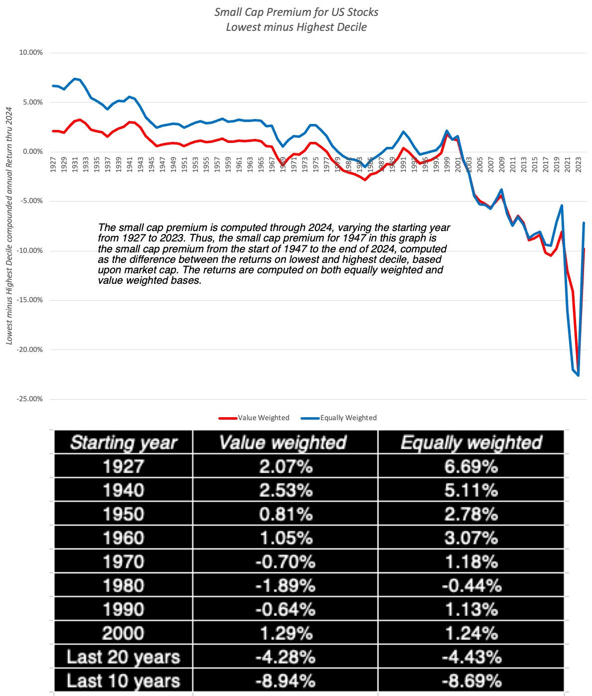 My small cap premium spreadsheet, based on Ken French data
In this graph, you can see the basis for the small cap premium, but only if go back all the way to 1927, and even with that extended time period, it is far stronger with equally weighted than with value weighted returns; the 1927-2024 small cap premium is 2.07% with value-weighted returns and 6.69% in equally weighted terms. It should be noted that even its heyday, the small cap premium had some disconcerting features including the facts that almost of it was earned in one month (January) of each year, and that it was sensitive to starting and end points for annual data, with smaller premium in mid-year starting points. To see how dependent this premium is on the front end of the time period, I estimated the small cap premium with different starting years in the graph (and the table), and as you can see the small cap premium drops to zero with any time period that starts in 1970 and beyond. In fact, the small cap premium has become a large cap premium for much of this century, with small cap returns lagging large cap returns by about 4-4.5% in the last 20 years.
The market skew towards large cap companies can be seen even more dramatically, if you break stocks down by percentile, based upon market cap, and look at how much of the increase in market cap in US equities is accounted for by different percentile groupings:
 US Stocks: Market Cap Change Breakdown
Looking across 6000 publicly traded stocks in 2024, the top percentile (about 60 stocks) accounted for 74% of the increase in market cap, and the top ten percent of all stocks delivered 94% of the change in total market capitalization.
Zeroing in even further and looking at the biggest companies in the top percentile, the Mag Seven, the concentration of winners at the very top is clear:
 $ changes in millions
In 2024, seven companies (Apple, Amazon, Meta, Alphabet, Microsoft, Nvidia and Tesla) increased in market cap by $5.6 trillion, almost of the entire market's gain for the year. While it is not uncommon for stock market returns to be delivered by a few winners at the top, with the Mag Seven, the domination extends over a decade, and in the last ten years (2014-2024), these seven companies have added $15.8 trillion in market cap, about 40% of the increase in market capitalization across all US stocks over the decade. For years now, some investors have bet on a reversal in this trend line, with small cap stocks coming back in favor, and these investors have lagged the market badly. To get a better handle on why large cap stocks have acquired a dominant role, in markets, I look at three explanations that I have seen offered for the phenomenon:Momentum story: Momentum has always been a strong force in markets, in both directions, with price increases in stocks (decreases) followed by more price increases (decreases). In effect, winning stocks continue to win, drawing in new funds and investors, but when these same stocks start losing, the same process plays out in reverse. A reasonable argument can be made that increasing access to information and easing trading, for both individual and institutional investing, with a boost from social media, has increased momentum, and thus the stock prices of large cap stocks. The dark side of this story, though, is that if the momentum ever shifted, these large cap stocks could lose trillions in value.Passive investing: Over the last two decades, passive investing (in the form of index funds and ETFs) has taken market share from active investors, accounting for close to 50% of all invested funds in 2024. That shift has been driven by active investing underperformance and a surge in passive investing vehicles that are accessible to all investors. Since many passive investing vehicles hold all of the stocks in the index in proportion to their market cap, there presence and growth creates fund flows into large cap stocks and keeps their prices elevated. Here again, the dark side is that if fund flows reverse and became negative, i.e., investors start pulling money out of markets, large cap stocks will be disproportionately hurt.Industry economics: In writing about the disruption unleashed by tech start-ups, especially in the last two decades, I have noted the these disruptors have changed industry economics in many established businesses, replacing splintered, dispersed competition with consolidation. Thus, Meta and Alphabet now have dominant market shares of the advertising business, just as Uber, Lyft and Grab have consolidated the car service business. As industries consolidate, we are likely to see them dominated by a few, big winners, which will play out in the stock market as well. It is possible that antitrust laws and regulatory authorities will try to put constraints on these biggest winners, but as I noted in my post on the topic, it will not be easy.In my view, the small cap premium is not coming back, and given that it has been invisible for five decades now, the only explanation for why appraisers and analysts hold on to it is inertia. That said, the large cap premium that we have seen in the last two decades, was businesses have transitioned from splintered to consolidated structure, will also fade. Where does that leave us? Picking a company to invest in, based upon its market capitalization, will be, at best, a neutral strategy, and that should surprise no one.
The Value Premium?
Just as the small cap premium acquired standing as conventional wisdom in the twentieth century, the data and research also indicated that stocks that trade at low price to book ratios earned higher returns that stocks that trade at high price to book ratios, in what was labeled as the value premium. As with the size premium, low price to book (value) stocks have struggled to deliver in the twenty first century, and as with the small size premium, investors have waited for it to return. To see how stocks in different price to book classes performed in 2024, I looked at returns in 2024, for all US stocks, broken down into price to book deciles:
 Deciles created based on price to book ratios at start of 2024
In 2024, at least, it was the companies in the top decile (highest price to book ratios) that delivered the best returns in 2024, and stocks in the lowest decile lagged the market. Here again, Ken French's data is indispensable in gaining historical perspective, as I looked the difference in annual returns between the top decile and bottom decile of stocks, classified by price to book, going back to 1927:
 My value premium spreadsheet, based on Ken French data
In this graph, I am computing the premium earned by low price to book stocks, in the US, with different starting points. Thus, if you go back to 1927 and look at returns on the lowest and highest deciles, the lowest decile earned an annual premium of 2.43%. That premium remains positive until you get to about 1990, when it switches signs; the lowest price to book stocks have earned 0.87% less annually between 1990 and 2024, than the highest price to book stocks. As was the case with the small cap premium, the premium earned by low price to book stocks over high price to book stocks has faded over time, spending more time in negative territory in the last 20 years, than positive. Value investors, or at least the ones that use the conventional proxies for cheapness (low price to book or low PE ratios), have felt the effects, significantly under performing the market for much of the last two decades. While some of them still hold on to the hope that this is just a phase that will reverse, there are three fundamentals at play that may indicate that the low price to book premium will not be back, at least on a sustained basis:Price to book ≠ Value: It is true that using low price to book as an indicator of value is simplistic, and that there are multiple other factors (good management, earnings quality, moats) to consider before making a value judgment. It is also true that as the market's center of gravity has shifted towards companies with intangible assets, the troubles that accountants have had in putting a number on intangible asset investments has made book value less and less meaningful at companies, making it a poorer and poorer indicator of what a company's assets are worth.Momentum: In markets, the returns to value investing has generally moved inversely with the strength of momentum. Thus, the same forces that have strengthened the power of momentum, that we noted in the context of the fading of the small cap premium, have diluted the power of value investing.Structural Shifts: At the heart of the premium earned by low price to book ratios is mean reversion, with much of the high returns earned by these stocks coming from moving towards the average (price to book) over time. While that worked in the twentieth century, when the US was the most mean-reverting and predictable market/economy of all time, it has lost its power as disruption and globalization have weakened mean reversion.So, what does this mean for the future? I see no payoff in investing in low price to book stocks and waiting for the value premium to return. As with market cap, I believe that the value effect will become volatile, with low price to book stocks winning in some years and high price to book stocks in others, and investing in one or another of these groups, just on the basis of their price to book ratios, will no longer deliver excess returns.
Since the fading of the small cap and value premiums can be traced at least partially to the strengthening of momentum, as a market force, I looked at the interplay between momentum and stock returns, by breaking companies into deciles, based upon stock price performance in the previous year (2023), and looking at returns in 2024:
 Deciles formed on percentage returns in 2023
As you can see, barring the bottom decile, which includes the biggest losers of 2023, where there was a strong bounce back (albeit less in dollar terms, than in percent), there was a strong momentum effect in 2024, with the biggest winners from last year (2023) continuing to win in 2024. In short, momentum continued its dominance in 2024, good news for traders who make money in its tailwinds, with the caveat that momentum is a fickle force, and that 2025 may be the year where it reverses.
Implications
The US equity market in 2024 followed a pathway that has become familiar to investor in the last decade, with large companies, many with a tech focus, carried the market, and traditional strategies that delivered higher returns, such as investing in small cap or low price to book stocks, faltered. This is not a passing phase, and reflects the market coming to terms with a changed economic order and investor behavior. There are lessons from the year for almost everyone in the process, from investors to traders to corporate executive and regulators:
For investors: I have said some harsh things about active investing, as practiced today, since much of it is based upon history and mean reversion. A mutual fund manager who screens stocks for low PE ratios and high growth, while demanding a hefty management fee, deserves to be replaced by an ETF or index fund, and that displacement will continue, pruning the active management population. For active investors who hold on to the hope that quant strategies or AI will let them rediscover their mojo, I am afraid that disappointment is awaiting them.For traders: Traders live and die on momentum, and as market momentum continues to get stronger, making money will look easy, until momentum shifts. Coming off a year like 2024, where chasing momentum would have delivered market-beating returns, the market may be setting up traders for a takedown. It may be time for traders to revisit and refine their skills at detecting market momentum shifts.For companies: Companies that measure their success through stock market returns may find that the market price has become a noisier judge of their actions. Thus, a company that takes a value destructive path that feeds into momentum may find the market rewarding it with a higher price, but it is playing a dangerous game that could turn against it. For regulators: With momentum comes volatility and corrections, as momentum shifts, and those corrections will cause many to lose money, and for some, perhaps even their life savings. Regulators will feel the pressure to step in and protect these investors from their own mistakes, but in my view, it will be futile. In the markets that we inhabit, literally any investment can be an instrument for speculation. After all, Gamestop and AMC were fairly stolid stocks until they attracted the meme crowd, and Microstrategy, once a technology firm, has become almost entirely a Bitcoin play.I recently watched Timothy Chalamet play Bob Dylan in the movie, A Complete Unknown, and I was reminded of one of my favorite Dylan tunes, "The times they are a-changin". I started my investing in the 1980s, in a very different market and time, and while I have not changed my investing principles, I have had to modify and adapt them to reflect a changed market environment. You may not agree with my view that both the small cap and value premiums are in our past, but it behooves you to question their existence.
YouTube Video
Data Updates for 2025
Datasets
My small cap premium calculator (based on Ken French data)My value premium calculator (based on Ken French data)January 17, 2025
Data Update 2 for 2025: The Party Continued (for US Equities)
In my last post, I noted that the US has extended its dominance of global equities in recent years, increasing its share of market capitalization from 42% in at the start of 2023 to 44% at the start of 2024 to 49% at the start of 2025. That rise was driven by a surge in US equity values during 2024, with the S&P 500 delivering returns of close to 25%, all the more impressive, given that the index delivered returns in excess of 26% in 2023. In this post, I will zero in on US equities, in the aggregate, first by looking at month-by-month returns during 2024, and then putting their performance in the last two years in a historical context. I will follow up by trying to judge where markets stand at the start of 2025, starting with PE ratios, moving on to earnings yields and ending with a valuation of the index.
US Equities in 2024
Entering 2024, there was trepidation about where stocks would go during the year especially coming off a a strong bounce back year in 2023, and there remained real concerns about inflation and a recession. The hopeful note was that the Fed would lower the Fed Funds rate during the course of the year, triggering (at least in the minds of Fed watchers) lower interest rates across the yield curve, Clearly, the market not only fought through those concerns, but did so in the face of rising treasury rates, especially at the long end of the spectrum.
While the market was up strongly for the year, it is worth remembering that the there were months during 2024, where the market looked shaky, as can be seen in the month to month returns on the S&P 500 during the course of 2024:
 The market’s weakest month was April 2024, and it ended the year or a weak note, down 2.50% in December. Overall, though the index was up 23.31% for the year, and adding the dividend yield of 1.57% (based upon the expected dividends for 2025 and the index at the start of the years) yields a total return 24.88% for the year:
As is almost always the case, the bulk of the returns from equity came from price appreciation, with the caveat that the dividend yield portion has shrunk over the last few decades in the United States.
Historical Context To assess stock returns in 2024, it makes sense to step back and put the year's performance into historical perspective. In the graph below, I look at returns (inclusive of dividends) on the S&P 500 every year from 1928 to 2024.
 Download historical data
Across the 97 years that I have estimated annual returns, stocks have had their ups and downs, delivering positive returns in 71 years and negative returns in the other 26 years. The worst year in history was 1931, with stocks returning -43.84%, and the best year was 1954, when the annual return was 52.56%. If you wanted to pick a benchmark to compare annual returns to pass judgment on whether a year was above or below average, you can can go with either the annual return (11.79%) or the median return (14.82%) across the entire time period. Looking at the 24.88% return in 2024 in terms of rankings, it ranks as the 27th best year across the last 97 years, indicating that while it was a good year, there have been far better years for US stocks. Combining 2023 and 2024 returns yield a cumulative a two-year return for the S&P 500 of 57.42%, making it one the ten best two-year periods in US market history. The riskless alternative to investing in US stocks during this period, in US dollar terms, are US treasuries, and in 2024, that contest was won, hands down, by US equities:Equity risk premium earned in 2024, over 3-month treasury bills = Return on stocks - Return on 3-month treasuries (averaged over 2024) = 24.88% -4.97% = 19.91%Equity risk premium earned in 2024, over 10-year treasuries= Return on stocks - Return on 10-year treasury= 24.88% -(-1.64%) = 26.52%The ten-year treasury return was negative, because treasury bond rates rose during 2024. Equity risk premiums are volatile over time, and averaging them makes sense, and in the table below, I look at the premium that stocks have earned over treasury bills and treasury bonds, going back to 1928, using both simple averages (of the returns each year) and geometric averages (reflecting the compounding effect):
 Download historical data
These returns are nominal returns, and inflation would have taken a bite out of returns each year. Computing the returns in real terms, by taking out inflation in each year from that year's returns, and recomputing the equity risk premiums:
 Download historical data
Note that the equity risk premiums move only slightly, because inflation finds its way into both stock and treasury returns. Many valuation practitioners use these historical averages, when forecasting equity risk premiums in the future, but it is a practice that deserves scrutiny, partly because it is backward looking (with the expectation that things will revert back to the way they used to be), but mostly because the estimates that you get for the equity risk premium have significant error terms (see standard errors listed below the estimates in the table). Thus, if are using the average equity risk premium for the last 97 years of 5.44% (7.00%), i.e., the arithmetic or geometric averages, it behooves you to also inform users that the standard error of 2.12% will create a range of about 4% on either side of the estimate.
Pricing Questions
Coming into 2025, investors are right to be trepidatious, for many reasons, but mostly because we are coming off two extraordinarily good years for the market, and a correction seems due. That is, however, a poor basis for market timing, because stock market history is full of examples to the contrary. There are other metrics, though, which are signaling danger, and in this section, I will wrestle with what they tell us about stocks in 2025.
PE ratios and Earnings Yields
Even as we get new and updated pricing metrics, it is undeniable that the most widely used metric of stock market cheapness or expensiveness is the price earnings ratio, albeit with variations in the earning number that goes into the denominator on timing (current, last 12 months or trailing or next 12 month of forward), share count (diluted, primary) and measurement (ordinary or extraordinary). In the graph below, I focus on trailing earnings for all companies in the S&P 500 and compute the aggregated PE ratio for the index to be 24.16 at the start of 2025, higher than the average value for that ratio in every decade going back to 1970.
 Download data
Just for completeness, I compute two other variants of the PE, the first using average earnings over the previous ten years (normalized) and the second using the average earnings over the last ten years, adjusted for inflation (CAPE or Shiller PE). At the start of 2025, the normalized PE and CAPE also come in at well above historical norms. If I have terrified you with the PE story, and you have undoubtedly heard variants of this story from market experts and strategists for much of the last decade, I would hasten to add that investing on that basis would have kept you out of stocks for much of the last ten years, with catastrophic consequences for your portfolio. For some of this period, at least, you could justify the higher PE ratios with much lower treasury rates than historic norms,, and one way to see this is to compare the earnings yield, i.e., the inverse of the PE ratio, with the treasury yields, which is what I have done in the graph below:
 Download data
If you compare the earnings yield to the ten-year treasury rate, you can see that for much of the last decade, going into 2022, the earnings yield, while low, was in excess of the ten-year rate. As rates have risen, though, the difference has narrowed, and at the start of 2025, the earnings yield exceeded the treasury rate. If you see market strategists or journalists talking about negative equity risk premiums, this (the difference between the earnings yield and the treasury rate) is the number that they are referencing. At this stage, you may be ready to bail on stocks, but I have one final card to play. In a post in 2023, I talked about equity risk premiums, and the implicit assumptions that you make when you use the earning to price ratio as your measure of the expected return on stocks. It works only if you make one of two assumptions:That there will be no growth in earnings in the future, i.e., you will earn last year's earnings every year in perpetuity, making stocks into glorified bonds. In a more subtle variants, there will be growth, but that growth will come from investments that earn returns equal to the cost of equity.The problem with both assumptions is that they are in conflict with the data. First, the earnings on the S&P 500 companies has increased 6.58% a year between 2000 and 2024, making the no-growth assumption a non-started. Second, the return on equity for the S&P 500 companies was 20.61% in 2023, and has averaged 16.38% since 2000, both numbers well in excess of the cost of equity. So, what is the alternative? Starting 30 years ago, I began estimating a more complete expected return on stocks, using the S&P 500, with the level of the index standing in for the price you pay for stocks, and expected earnings and cash flows, based upon consensus estimates of earnings and cash payout ratios. I solve for an internal rate of return for stocks, based upon these expected cash flows:

The expected return from this approach will be different from the earnings to price ratio because it incorporate expected growth and changes in cash flow patterns. The critique that this approach requires assumptions about the future (growth and cash flows) is disingenuous, since the earnings yield approach makes assumptions about both as well (no growth or no excess returns), and I will wager that the full ERP approach is on more defensible ground than the earning yield approach. Using this approach at the start of 2025 to the S&P 500, I back out an implied expect return of 8.91% for the index, and an implied equity risk premium of 4.33% (obtained by netting out the ten-year bond rate on Jan 1, 2025, of 4.58%):
 Implied ERP calculation in 2025
You are welcome to take issue with the number that I use there, lowering the growth rates for the future or changing the assumptions about payout. That is a healthy debate, and one that provides far more room for nuance that looking at the earnings yield. How does an implied equity risk premium play out in market level arguments? Every argument about markets (from them being in a bubble to basement level bargains) can be restated in terms of the equity risk premium. If you believe that the equity risk premium today (4.33%) is too low, you are, in effect, stating that stocks are overvalued, and if you view it as too high, you are taking the opposite position. If you are not in the market timing business, you take the current premium as a fair premium, and move on. To provide perspective on the ERP at the start of 2025, take a look at this graph, that lists implied ERP at the start of each year going back to 1960:
 Historical implied ERP
There is something here for almost point of view. If you are sanguine about stock market levels, you could point to the current premium (4.33%) being close to the historical average across the entire time period (4.25%). If you believe that stocks are over priced, you may base that on the current premium being lower than the average since 2005. I will not hide behind the "one hand, other hand" dance that so many strategists do. I think that we face significant volatility (inflation, tariffs, war) in the year to come, and I would be more comfortable with a higher ERP. At the same time, I don't fall into the bubble crowd, since the ERP is not 2%, as it was at the end of 1999.
Valuation Questions
Pulling together the disparate strands that are part of this post, I valued the index at the start of 2025, using the earnings expectations from analysts as the forecasted earnings for 2025 and 2026, before lowering growth rates to match the risk free rate in 2029. As the growth rates changes, I also adjust the payout ratios, given the return on equity for the S&P 500 companies:
 Download spreadsheet
With the assumption that the equity risk premium will climb back to 4.5%, higher than the average for the 1960-2024 period, but lower than the post-2008 average, the value that I get for the index is about 5260, about 12% lower than the index at the start of the year. Note that this is a value for the index today, and if you wanted to adopt the market strategist approach of forecasting where the index will be a year from now, you would have to grow the value at the price appreciation portion (about 7.5%) of the expected return (which is 9.08%). As I see it, there are two major dangers that lurk, with the first being higher inflation (translating into higher treasury rates) and the second being a market crisis that will push up the equity risk premium, since with those pieces in play, the index becomes much more significantly over valued. From an earnings perspective, the risk is that future earnings will come in well below expectations, either because the economy slows or because of trade frictions. Rather than wring my hands about these uncertainties, I fell back on a tool that I use when confronted with change, which is a simulation:
 Crystal Ball used for simulations
While the base case conclusion that the market is overvalued stays intact, not surprising since my distributions for the input variables were centered on my base assumptions, there is a far richer set of output. Put simply, at today's price levels, there is an 80% chance that stocks are overvalued and only a 20% chance that they are undervalued. That said, though, if you are bullish, I can see a pathway to getting to a higher value, with higher earnings, lower interest rates and a continued decline in the equity risk premium. Conversely, you are bearish, I understand your point of view, especially if you see earnings shocks (from a recession or a tariff war), rising inflation or a market crisis coming up. I don't dish out market advice, and as one whose market timing skills are questionable, you should not take my (or anyone else's) assessments at face value, especially heading into a year, where change will be the byword. It is possible that lower taxes and less regulation may cause to come in higher than expected, and that global investment fund flows will keep interest rates and equity risk premiums low. My advice is that you download the valuation spreadsheet, change the inputs to reflect your views of the world, and value the index yourself. Good investing requires taking ownership of the decisions and judgments you make, and I am glad to provide tools that help you in that process.
YouTube Video
Data Updates for 2025
Data Update 1 for 2025: The Draw (and Danger) of Data!Data Update 2 for 2025: The Party continued for US EquitiesDatasetsHistorical returns on stocks: https://pages.stern.nyu.edu/~adamodar/pc/datasets/histretSP.xlsxHistorical implied ERP: https://pages.stern.nyu.edu/~adamodar/pc/datasets/histimpl.xls PE ratios for the S&P 500: https://pages.stern.nyu.edu/~adamodar/pc/PEforS&P500updatedJan25.xlsxSpreadsheets Implied ERP at the start of 2025: https://pages.stern.nyu.edu/~adamodar/pc/implprem/ERPJan25.xlsxValuation of the index on Jan 1, 2025: https://pages.stern.nyu.edu/~adamodar/pc/blog/S&PValueJan25.xlsx
January 10, 2025
Data Update 1 for 2025: The Draw (and Danger) of Data
The Draw (and Dangers) of Data It is the age of data, as both companies and investors claim to have tamed it to serve their commercial interests. While I believe that data can lead to better decisions, I am wary about the claims made about what it can and cannot do in terms of optimizing decision making. I find its greatest use is on two dimensions:Fact-checking assertions: It has always been true that human beings assert beliefs as facts, but with social media at play, they can now make these assertion to much bigger audiences. In corporate finance and investing, which are areas that I work in, I find myself doing double takes as I listen to politicians, market experts and economists making statements about company and market behavior that are fairy tales, and data is often my weapon for discerning the truth. Noise in predictions: One reason that the expert class is increasingly mistrusted is because of the unwillingness on the part of many in this class to admit to uncertainty in their forecasts for the future. Hiding behind their academic or professional credentials, they ask people to trust them to be right, but that trust has eroded. If these predictions are based upon data, as they claim they are, it is almost always the case that they come with error (noise) and that admitting to this is not a sign of weakness. In some cases, it is true that the size of that errors may be so large that those listening to the predictions may not act on them, but that is a healthy response.As I listen to many fall under the spell of data, with AI and analytics add to its allure, I am uncomfortable with the notion that data has all of the answers, and there two reasons why:Data can be biased: There is a widely held belief that data is objective, at least if it takes numerical form. In the hands of analysts who are biased or have agendas, data can be molded to fit pre-conceptions. I would like to claim to have no bias, but that would be a lie, since biases are often engrained and unconscious, but I have tried, as best as I can, to be transparent about the sample that I use, the data that I work with and how I compute my statistics. In some cases, that may frustrate you, if you are looking for precision, since I offer a range of values, based upon different sampling and estimation choices. Taking a look at my tax rate calculations, by industry, for US companies, int the start of 2025, I report the following tax rates across companies.
 Effective tax rates, by Industry (US)
Note, that the tax rates for US companies range from 6.75% to 26.43%, depending on how I compute the rate, and which companies I use to arrive at that estimate. If you start with the pre-conception that US companies do not pay their fair share in taxes, you will latch on to the 6.75% as your estimated tax rate, whereas if you are in the camp that believes that US companies pay their fair share (or more), you may find 26.43% to be your preferred estimate. Past versus Future: Investors and companies often base their future predictions on the past, and while that is entirely understandable, there is a reason why every investment pitch comes with the disclaimer that “past performance is not a reliable indicator of future performance”. I have written about how mean reversion is at the heart of many active investing strategies, and why assuming that history will repeat can be a mistake. Thus, as you peruse my historical data on implied equity risk premiums or PE ratios for the S&P 500 over time, you may be tempted to compute averages and use them in your investment strategies, or use my industry averages for debt ratios and pricing multiples as the target for every company in the peer group, but you should hold back. The Sample It is undeniable that data is more accessible and available than ever before, and I am a beneficiary. I draw my data from many raw data sources, some of which are freely available to everyone, some of which I pay for and some of which I have access to, because I work at a business school in a university. For company data, my primary source is S&P Capital IQ, augmented with data from a Bloomberg terminal. For the segment of my data that is macroeconomic, my primary source is FRED, the data set maintained by the Federal Reserve Bank, but I supplement with other data that I found online, including NAIC for bond spread data and Political Risk Services (PRS) for country risk scores. My dataset includes all publicly traded companies listed at the start of the year, with a market price available, and there were 47810 firms in my sample, roughly in line with the sample sizes in the last few years. Not surprisingly, the company listings are across the world, and I look at the breakdown of companies, by number and market cap, by geography:
Effective tax rates, by Industry (US)
Note, that the tax rates for US companies range from 6.75% to 26.43%, depending on how I compute the rate, and which companies I use to arrive at that estimate. If you start with the pre-conception that US companies do not pay their fair share in taxes, you will latch on to the 6.75% as your estimated tax rate, whereas if you are in the camp that believes that US companies pay their fair share (or more), you may find 26.43% to be your preferred estimate. Past versus Future: Investors and companies often base their future predictions on the past, and while that is entirely understandable, there is a reason why every investment pitch comes with the disclaimer that “past performance is not a reliable indicator of future performance”. I have written about how mean reversion is at the heart of many active investing strategies, and why assuming that history will repeat can be a mistake. Thus, as you peruse my historical data on implied equity risk premiums or PE ratios for the S&P 500 over time, you may be tempted to compute averages and use them in your investment strategies, or use my industry averages for debt ratios and pricing multiples as the target for every company in the peer group, but you should hold back. The Sample It is undeniable that data is more accessible and available than ever before, and I am a beneficiary. I draw my data from many raw data sources, some of which are freely available to everyone, some of which I pay for and some of which I have access to, because I work at a business school in a university. For company data, my primary source is S&P Capital IQ, augmented with data from a Bloomberg terminal. For the segment of my data that is macroeconomic, my primary source is FRED, the data set maintained by the Federal Reserve Bank, but I supplement with other data that I found online, including NAIC for bond spread data and Political Risk Services (PRS) for country risk scores. My dataset includes all publicly traded companies listed at the start of the year, with a market price available, and there were 47810 firms in my sample, roughly in line with the sample sizes in the last few years. Not surprisingly, the company listings are across the world, and I look at the breakdown of companies, by number and market cap, by geography:

As you can see, the market cap of US companies at the start of 2025 accounted for roughly 49% of the market cap of global stocks, up from 44% at the start of 2024 and 42% at the start of 2023. In the table below, we compare the changes in regional market capitalizations (in $ millions) over time.

Breaking down companies by (S&P) sector, again both in numbers and market cap, here is what I get:

While industrials the most listed stocks, technology accounts for 21% of the market cap of all listed stocks, globally, making it the most valuable sector. Thee are wide differences across regions, though, in sector breakdown:

Much of the increase in market capitalization for US equities has come from a surging technology sector, and it is striking that Europe has the lowest percent of value from tech companies of any of the broad subgroups in this table. I also create a more detailed breakdown of companies into 94 industry groups, loosely structured to stay with industry groupings that I originally created in the 1990s from Value Line data, to allow for comparisons across time. I know that this classification is at odds with the industry classifications based upon SIC or NAICS codes, but it works well enough for me, at least in the context of corporate finance and valuation. For some of you, my industry classifications may be overly broad, but if you want to use a more focused peer group, I am afraid that you will have to look elsewhere. The industry averages that I report are also provided using the regional breakdown above. If you want to check out which industry group a company falls into, please (a very large one that may take a while to download) for that detail.
The Variables
The variables that I report industry-average statistics for reflect my interests, and they range the spectrum, with risk, profitability, leverage, and dividend metrics thrown into the mix. Since I teach corporate finance and valuation, I find it useful to break down the data that I report based upon these groupings. The corporate finance grouping includes variables that help in the decisions that businesses need to make on investing, financing and dividends (with links to the US data for 2025, but you can find more extensive data links here.)
table.tableizer-table { font-size: 12px; border: 1px solid #CCC; font-family: Arial, Helvetica, sans-serif; } .tableizer-table td { padding: 4px; margin: 3px; border: 1px solid #CCC; } .tableizer-table th { background-color: #104E8B; color: #FFF; font-weight: bold; } Corporate Governance & Descriptive 1. Insider, CEO & Institutional holdings 2. Aggregate operating numbers 3. Employee Count & Compensation Investing Principle Financing Principle Dividend Principle Hurdle RateProject ReturnsFinancing MixFinancing TypeCash ReturnDividends/Buybacks1. Beta & Risk1. Return on Equity1. Debt Ratios & Fundamentals1. Debt Details1. Dividends and Potential Dividends (FCFE)1.Buybacks2. Equity Risk Premiums2. Return on (invested) capital2. Ratings & Spreads2. Lease Effect2. Dividend yield & payout 3. Default Spreads3. Margins & ROC3. Tax rates 4. Costs of equity & capital4. Excess Returns on investments 4. Financing Flows 5. Market alpha (If you have trouble with the links, please try a different browser)Many of these corporate finance variables, such as the costs of equity and capital, debt ratios and accounting returns also find their way into my valuations, but I add a few variables that are more attuned to my valuation and pricing data needs as well.
table.tableizer-table { font-size: 12px; border: 1px solid #CCC; font-family: Arial, Helvetica, sans-serif; } .tableizer-table td { padding: 4px; margin: 3px; border: 1px solid #CCC; } .tableizer-table th { background-color: #104E8B; color: #FFF; font-weight: bold; }Valuation Pricing Growth & ReinvestmentProfitabilityRiskMultiples1. Historical Growth in Revenues & Earnings1. Profit Margins1. Costs of equity & capital1. Earnings Multiples2. Fundamental Growth in Equity Earnings2. Return on Equity2. Standard Deviation in Equity/Firm Value2. Book Value Multiples3. Fundamenal Growth in Operating Earnings
3. Revenue Multiples4. Long term Reinvestment (Cap Ex & Acquisitons) 4. EBIT & EBITDA multiples5. R&D 6. Working capital needs (If you have trouble with the links, please try a different browser)Not that while much of this data comes from drawn from financial statements, some of it is market-price driven (betas, standard deviations, trading data), some relates to asset classes (returns on stocks, bonds, real estate) and some are macroeconomic (interest rates, inflation and risk premiums). While some of the variables are obvious, others are subject to interpretation, and I have a glossary, where you can see the definitions that I use for the accounting variables. In addition, within each of the datasets (in excel format), you will find a page defining the variables used in that dataset.
The Timing These datasets were all compiled in the last four days and reflect data available at the start of 2025. For market numbers, like market capitalization, interest rates and risk premiums, these numbers are current, reflecting the market's judgments at the start of 2025. For company financial numbers, I am reliant on accounting information, which gets updated on a quarterly basis. As a consequence, the accounting numbers reflect the most recent financial filings (usually September 30, 2024), and I use the trailing 12-month numbers through the most recent filing for flow numbers (income statement and cash flow statements) and the most recent balance sheet for stock numbers (balance sheet values). While this practice may seem inconsistent, it reflects what investors in the market have available to them, to price stocks. After all, no investor has access to calendar year 2024 accounting numbers at the start of 2025, and it seems entirely consistent to me that the trailing PE ratio at the start of 2025 be computed using the price at the start of 2025 divided by the trailing income in the twelve months ending in September 2024. In the same vein, the expected growth rates for the future and earnings in forward years are obtained by looking at the most updated forecasts from analysts at the start of 2025. Since I update the data only once a year, it will age as we go through 2025, but that aging will be most felt, if you use my pricing multiples (PE, PBV, EV to EBITDA etc.) and not so much with the accounting ratios (accounting returns). To the extent that interest rates and risk premiums will change over the course of the year, the data sets that use them (cost of capital, excess returns) allow for updating these macro numbers. In short, if the ten-year treasury rate climbs to 5% and equity risk premiums surge, you can update those numbers in the cost of capital worksheet, and get updated values.
The Estimation Process While I compute the data variables by company, I am restricted from sharing company-specific data by my raw data providers, and most of the data I report is at the industry level. That said, I have wrestled with how best to estimate and report industry statistics, since almost every statistical measure comes with caveats. For a metric like price earnings ratios, computing an average across companies will result in sampling bias (from eliminating money-losing firms) and be skewed by outliers in one direction (mostly positive, since PE ratios cannot be negative). Since this problem occurs across almost all the variables, I use an aggregated variant, where with PE, for instance, I aggregate the market capitalization of all the companies (including money losing firms) in an industry grouping and divide by the aggregated net income of all the companies, including money losers. Since I include all publicly traded firms in my sample, with disclosure requirements varying across firms, there are variables where the data is missing or not disclosed. Rather than throw out these firms from the sample entirely, I keep them in my universe, but report values for only the firms with non-missing data. One example is my data on employees, a dataset that I added two years ago, where I report statistics like revenue per employee and compensation statistics. Since this is not a data item that is disclosed voluntarily only by some firms, the statistics are less reliable than on where there is universal disclosure. On an upbeat note, and speaking from the perspective of someone who has been doing this for a few decades, accounting standards around the world are less divergent now than in the past, and the data, even in small emerging markets, has far fewer missing items than ten or twenty years ago.
Accessing and Using the Data The data that you will find on my website is for public consumption, and I have tried to organize it to make it easily accessible on my webpage. Note that the current year’s data can be accessed here:https://pages.stern.nyu.edu/~adamodar//New_Home_Page/datacurrent.htmlIf you click on a link and it does not work, please try a different browser, since Google Chrome, in particular, has had issues with downloads on my server. If you are interested in getting the data from previous years, it should be available in the archived data section on my webpage:https://pages.stern.nyu.edu/~adamodar//New_Home_Page/dataarchived.htmlThis data goes back more than twenty years, for some data items and for US data, but only a decade or so for global markets. Finally, the data is intended primarily for practitioners in corporate finance and valuation, and I hope that I can save you some time and help in valuations in real time. It is worth emphasizing that every data item on my page comes from public sources, and that anyone with time and access to data can recreate it. For a complete reading of data usage, try this link:https://pages.stern.nyu.edu/~adamodar//New_Home_Page/datahistory.htmlIf you are in a regulatory or legal dispute, and you are using my data to make your case, you are welcome to do so, but please do not drag me into the fight. As for acknowledgements when using the data, I will repeat that I said in prior years. If you use my data and want to acknowledge that usage, I thank you, but if you skip that acknowledgement, I will not view it as a slight, and I certainly am not going to threaten you with legal consequences. As a final note, please recognize that this I don't have a team working for me, and while that gives me the benefit of controlling the process, unlike the pope, I am extremely fallible. If you find mistakes or missing links, please let me know and I will fix them as quickly as I can. Finally, I have no desire to become a data service, and I cannot meet requests for customized data, no matter how reasonable they may be. I am sorry!
YouTube Video
LinksCurrent data (start of 2025)Archived data (from prior years)Data definitionsData Updates for 2025Data Update 1 for 2025: The Draw (and Danger) of Data!Data Update 2 for 2025: The Resilience of US Equities
Aswath Damodaran's Blog

- Aswath Damodaran's profile
- 725 followers

