
Aswath Damodaran's Blog, page 23
February 17, 2017
My Snap Story: Valuing Snap ahead of it's IPO!
Five years ago, when my daughter asked me whether I had Snapchat installed on my phone, my response was “Snapwhat?". In the weeks following, she managed to convince the rest of us in the family to install the app on our phones, if for no other reason than to admire her photo taking skills. At the time, what made the app stand out was the impermanence of the photos that you shared with your circle, since they disappeared a few seconds after you viewed them, a big selling point for sharers lacking impulse control. In 2013, when Facebook offered $3 billion to buy Snap, it was a clear indication that the new company was making inroads in the social media market, especially with teenagers. When Evan Spiegel and Bobby Murphy, Snap's founders, turned down the offer, I am sure that there were many who viewed them as insane, since Snap had trouble attracting advertisers to its platform and little in revenues, at the time. After all, what advertiser wants advertisements to disappear seconds after you see them? Needless to say, as the IPO nears and it looks like the company will be priced at $20 billion or more, it looks like Snap's founders will have the last laugh!
Snap: A Camera Company?The Snap prospectus leads off with these words: Snap Inc. is a camera company. But is it? When I think of camera companies, I think of Eastman Kodak, Polaroid and the Japanese players (Fuji, Pentax) as the old guard, under assault as they face disruption from smartphone cameras, and companies like GoPro as the new entrants in the space, struggling to convert sales to profits. I don't think that this is the company that Snap aspires to keep and since it does not sell cameras or make money on photos, it is difficult to see it fitting in. If you define business in terms of how a company plans to make money, I would argue that Snap is an advertising business, albeit one in the online or digital space. I do know that Snap has hardware that it is selling in the form of Spectacles, but at least at the moment, the glasses seem to be designed to get users to stay in the Snap ecosystem for longer and see more ads.
So, why does Snap present itself as a camera company? I think that the answer lies in the social media business, as it stands today, and how entrants either carve a niche for themselves or get labeled as me-too companies. Facebook, notwithstanding the additions of Instagram and WhatsApp, is fundamentally a platform for posting to friends, LinkedIn is a your place for business networking, Twitter is where you go if you want to reach lots of people quickly with short messages or news and Snap, as I see it, is trying to position itself as the social media platform built around visual images (photos and video). The question of whether this positioning will work, especially given Facebook's investments in Instagram and new entrants into the market, is central to what value you will attach to Snap.
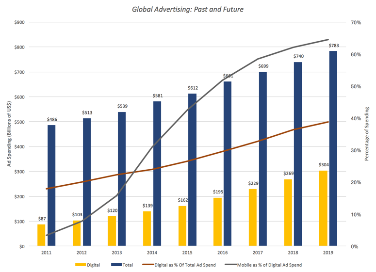
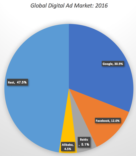
The Online Advertising BusinessIf you classify Snap as an online advertising company, the next step in the process becomes simple: identifying the total market for online advertising, the players in that market and what place you would give Snap in this market. Let’s start with some basic data on the online advertising market.It is a big market, growing and tilting to mobile: The digital online advertising market is growing, mostly at the expense of conventional advertising (newspapers, TV, billboards) etc. You can see this in the graph below, where I plot total advertising expenditures each year and the portion that is online advertising for 2011-2016 and with forecasted values for 2017-2019. In 2016, the digital ad market generated revenues globally of close to $200 billion, up from about $100 billion in 2012, and these revenues are expected to climb to over $300 billion in 2020. As a percent of total ad spending of $660 billion in 2016, digital advertising accounted for about 30% and is expected to account for almost 40% in 2020. The mobile portion of digital advertising is also increasing, claiming from about 3.45% of digital ad spending to about half of all ad spending in 2016, with the expectation that it will account for almost two thirds of all digital advertising in 2020. Sources: MultipleWith two giant players: There are two dominant players in the market, Google with its search engine and Facebook with its social media platforms. These two companies together control about 43% of the overall market, as you can see in this pie chart:
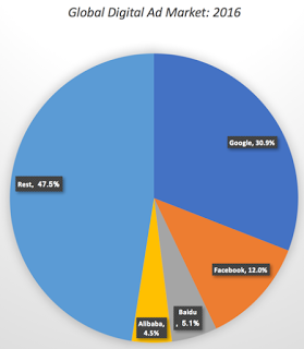 If you are a small player in the US market, the even scarier statistic is that these two giants are taking an even larger percentage of new online advertising than their historical share. In 2015 and 2016, for instance, Google and Facebook accounted for about two-thirds of the growth in the digital ad market. Put simply, these two companies are big and getting bigger and relentlessly aggressive about going after smaller competitors.In a post in August 2015, I argued that the size of the online advertising market may be leading both entrepreneurs and investors to over estimate their chances of both growing revenues and delivering profits, leading to what I termed the big market delusion. As Snap adds its name to the mix, that concern only gets larger, since it is not clear that the market is big enough or growing fast enough to accommodate the expectations of investors in the many companies in the space.
Snap: Possible Story LinesTo value a young company, especially one like Snap, you have to have a vision for what you see as success for the company, since there is little history for you to draw on and there are so many divergent paths that the company can follow, as it ages. That might sound really subjective, but without it, you are at the mercy of historical data that is both scarce and noisy or of metrics (like users and user intensity) that can lead you to misleading valuations.
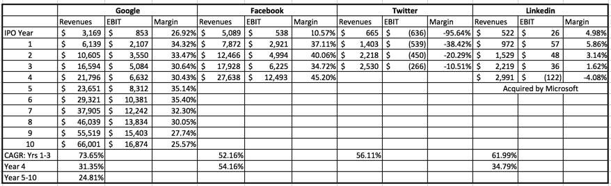
 Link to my bookThat is, of course, another shameless plug for my book on narrative and numbers, and if you have heard it before or have no interest in reading it, I apologize and let's go on. To get perspective on Snap, let’s start by comparing it to three social media companies, Facebook, Twitter and LinkedIn and to Google, the old player in the mix, at the time of their initial public offerings. The table below summarizes key numbers at the time of their IPOs, with a comparison to Snap's numbers. table.tableizer-table { font-size: 12px; border: 1px solid #CCC; font-family: Arial, Helvetica, sans-serif; } .tableizer-table td { padding: 4px; margin: 3px; border: 1px solid #CCC; } .tableizer-table th { background-color: #104E8B; color: #FFF; font-weight: bold; }
GoogleLinkedInFacebookTwitterSnapIPO date19-Aug-0419-May-1118-May-127-Nov-13NARevenues$1,466 $161 $3,711 $449 $405 Operating Income$326 $13 $1,756 $(93)$(521)Net Income$143 $2 $668 $(99)$(515)Number of UsersNA80.6845218161User minutes per day (January 2017)50 (Includes YouTube)NA50225Market Capitalization on offering date$23,000 $9,000 $81,000 $18,000 ?Link to Prospectus (from IPO date)Link Link Link Link Link
At the time of its IPO, Snap has less revenues than any of its peer group, other than LinkedIn, and is losing more money than any of them. Before you view this is a death knell for Snap, one reason for Snap’s big losses is that unlike its competitors, Snap pays for server space as it acquires new users, thus pushing up its operating expenses (and pushing down capital investment in servers). There is one other dimension where Snap measures up more favorably against at least two of the other companies: its users are spending more time on its platform that they were either on Twitter and LinkedIn and it ranks second only to Facebook on this dimension.
The more important question that you face with Snap, then, is which of these companies it will emulate in its post IPO year. The table below provides the contrast rather by looking at the years since the IPO for each company.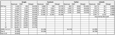 Google and Facebook stand out as success stories, Google because it has maintained high revenue growth for almost a decade with very good profit margins and Facebook doing even better on both dimensions (higher growth in the earlier years and even higher margins). The least successful company in this mix is Twitter which has seen revenue growth that has trailed expectations and has been unable to unlock the secret to monetizing its user base, as it continues to post losses. Linkedin falls in the middle, with solid revenue growth for its first four years and some profits, but its margins are not only small but showed no signs of improvement from year to year. Now that it has been acquired by Microsoft, it will be interesting to see if the combination translates into better growth and margins.
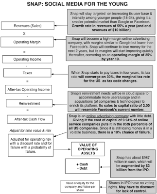
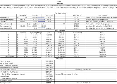
My Snap Story & ValuationTo value Snap, I built my story by looking at what its founders have said about the company, how its structured and the strengths and weaknesses of its platform, at least as I see them. As a consequence, here is what I see the company evolving.Snap will remain focused on online advertising: I believe that Snap's revenues will continue to come entirely or predominantly from advertising. Thus, the payoff to Spectacles or any other hardware offered by the company will be in more advertising for the company. Marketing to younger, tech-savvy users: Snap's platform, with its emphasis on the visual and the temporary, will remain more attractive to younger users. Rather than dilute the platform to go after the bigger market, Snap will create offerings to increase its hold on the youth segment of the market.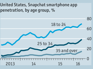 Source: The EconomistWith an emphasis on user intensity over users: Snap's prospectus and public utterances by its founders emphasize user intensity more than the number of users, in contrast to earlier social media companies. This emphasis is backed up by the company's actions: the new features that it has added, like stories and geofilters, seem designed more to increase how much time users spend in the app than on getting new users. Some of that shift in emphasis reflects changes in how investors perceive social media companies, perhaps sobered by Twitter's failure to convert large user numbers into profits, and some of it is in Snap's business model, where adding users is not costless (since it has to pay for server space). These assumptions, in turn, drive my forecasts of revenues, margins and reinvestment. In my story, I don't see Snap reaching revenues of the magnitude delivered by Google and Facebook, the two big market players in the game, settling instead for smaller revenues. If Snap is able to hold on to its target market (young, tech savvy and visually inclined) and keep its users engaged, I think Snap has a chance of delivering high operating profit margins, perhaps not of the magnitude of Facebook today (45% margin) but close to that of Google (25% margin). Finally, its reinvestment will take the form of acquisition of technology and server space to sustain its user base, but by not trying to be the next Facebook, it will not have to over reach. Is there substantial risk that the story may not work out the way I expect it to? Of course! While I will give Snap a cost of capital of close to 10% (and in the 85th percentile of US companies), reflective of its online advertising business, I will also assume that there remains a non-trivial chance (10%) that the company will not make it. The picture below captures my story and the valuation inputs that emerge from it:
To complete the valuation, there are two other details that relate to the IPO.
Share count: For an IPO, share count can be tricky, and especially so for a young tech company with multiple claims on equity in the form of options and restricted stock issues. Looking through the prospectus and adding up the shares outstanding on all three classes of shares, including shares set aside for restricted stock issues and assorted purposes, I get a total of 1,243.10 million shares outstanding in the company. In addition, I estimate that there are 44.90 million options outstanding in the company, with an average exercise price of $2.33 and an assumed maturity of 3 years.IPO Proceeds: This is a factor specific to IPOs and reflect the fact that cash is raised by the company on the offering date. If that cash is retained by the company, it adds to the value of the company (a version of post-money valuation). In the case of Snap, it is estimated that roughly $3 billion in cash from the offering that will be held by the company, to cover costs like the $2 billion that Snap has contracted to pay Google for cloud space for the next five years.These valuation inputs become the basis for my valuation and yield a value of $14.4 billion for the equity (and you can download the spreadsheet at this link).
 Download spreadsheetAllowing for the uncertainty inherent in my estimates, I also computed probability distribution for three key inputs, revenue growth, operating margin and cost of capital, and my value for Snap's equity is in the distribution below:
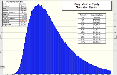 Snap Simulation DetailsAssuming that my share count is right, my value per share is about $11 per share. As you can see though, as is the case with almost any young company where the narrative can take you in other directions, there is a wide range around my expectations, with the lowest value being less than zero and the highest value pushing above $66 billion ($50/share). The median value is $13.3 billion and the average is $14.9 billion; one attractive feature to investors is that there is potential for breakout values (optionality) that exceed $30 billion.
The numbers at the high end of the spectrum reflect a pathway for Snap that I call the Facebook Light story, where it emerges as a serious contender to Facebook in terms of time that users spend on its platform, but with a smaller user base. That leads to revenues of close to $25 billion by 2027, an operating margin of 40% for the company and a value for the equity of $48 billion.The numbers at the other end of the spectrum capture a darker version of the story, that I label Twitter Redux, where user growth slows, user intensity comes under stress and advertising lags expectations. In this variant, Snap will have trouble getting pushing revenue growth past 35%, settling for about $4 billion in revenues in 2027, is able to improve its margin to only 10% in steady state, yielding a value of equity of about $4 billion.As I learned the painful way with my Twitter experiences, the quality of the management at a young company can play a significant role in how the story evolves. I am impressed with both the poise that Snap's founders are showing in their public appearances and the story that they are telling about the company, though I am disappointed that they have followed the Google/Facebook path and consolidated control in the company by creating shares with different voting rights. I know that is in keeping with the tech sector's founder worship and paranoia about "short term" investors , but my advice, unsolicited and perhaps unwelcome, is that Snap's founders should trust markets more. After all, if you welcome me to invest me in your company and I do, you should want my input as well, right?
The Pricing Contrast
As I finish this post, I notice this news story from this morning that suggests that bankers have arrived at an offering price, yielding a pricing for the company of $18.5 billion to $21.5 billion for the company, about $4 billion above my estimate. So, how do I explain the difference between my valuation and this pricing? First, I have never felt the urge to explain what other people pay for a stock, since it is a free market and investors make their own judgments. Second, and this is keeping with a theme that I have promoted repeatedly in my posts, bankers don't value companies; they price them! If you are missing the contrast between value and price, you are welcome to read this piece that I have on the topic, but simply put, your job in pricing is not to assess the fair value of a company but to decide what investors will pay for the company today. The former is determined by cash flows, growth and risk, i.e., the inputs that I have grappled with in my story and valuation, and the latter is set by what investors are paying for other companies in the space. After all, if investors are willing to attach a pricing of $12 billion to Twitter, a social media company seeming incapable of translating potential to profits, and Microsoft is paying $26 billion for LinkedIn, another social media company whose grasp exceeded its reach, why should they not pay $20 billion for Snap, a company with vastly greater user engagement than either LinkedIn or Twitter? With pricing, everything is relative and Snap may be a bargain at $20 billion to a trader.
YouTube Video
Link to book
Narrative and Numbers: The Value of Stories in BusinessAttachments
Snap: Prospectus for IPOSnap: My IPO ValuationSnap: As Facebook LiteSnap: As Twitter ReduxSnap: Simulation Inputs & Output
Snap: A Camera Company?The Snap prospectus leads off with these words: Snap Inc. is a camera company. But is it? When I think of camera companies, I think of Eastman Kodak, Polaroid and the Japanese players (Fuji, Pentax) as the old guard, under assault as they face disruption from smartphone cameras, and companies like GoPro as the new entrants in the space, struggling to convert sales to profits. I don't think that this is the company that Snap aspires to keep and since it does not sell cameras or make money on photos, it is difficult to see it fitting in. If you define business in terms of how a company plans to make money, I would argue that Snap is an advertising business, albeit one in the online or digital space. I do know that Snap has hardware that it is selling in the form of Spectacles, but at least at the moment, the glasses seem to be designed to get users to stay in the Snap ecosystem for longer and see more ads.
So, why does Snap present itself as a camera company? I think that the answer lies in the social media business, as it stands today, and how entrants either carve a niche for themselves or get labeled as me-too companies. Facebook, notwithstanding the additions of Instagram and WhatsApp, is fundamentally a platform for posting to friends, LinkedIn is a your place for business networking, Twitter is where you go if you want to reach lots of people quickly with short messages or news and Snap, as I see it, is trying to position itself as the social media platform built around visual images (photos and video). The question of whether this positioning will work, especially given Facebook's investments in Instagram and new entrants into the market, is central to what value you will attach to Snap.
The Online Advertising BusinessIf you classify Snap as an online advertising company, the next step in the process becomes simple: identifying the total market for online advertising, the players in that market and what place you would give Snap in this market. Let’s start with some basic data on the online advertising market.It is a big market, growing and tilting to mobile: The digital online advertising market is growing, mostly at the expense of conventional advertising (newspapers, TV, billboards) etc. You can see this in the graph below, where I plot total advertising expenditures each year and the portion that is online advertising for 2011-2016 and with forecasted values for 2017-2019. In 2016, the digital ad market generated revenues globally of close to $200 billion, up from about $100 billion in 2012, and these revenues are expected to climb to over $300 billion in 2020. As a percent of total ad spending of $660 billion in 2016, digital advertising accounted for about 30% and is expected to account for almost 40% in 2020. The mobile portion of digital advertising is also increasing, claiming from about 3.45% of digital ad spending to about half of all ad spending in 2016, with the expectation that it will account for almost two thirds of all digital advertising in 2020.
 Sources: MultipleWith two giant players: There are two dominant players in the market, Google with its search engine and Facebook with its social media platforms. These two companies together control about 43% of the overall market, as you can see in this pie chart:
 If you are a small player in the US market, the even scarier statistic is that these two giants are taking an even larger percentage of new online advertising than their historical share. In 2015 and 2016, for instance, Google and Facebook accounted for about two-thirds of the growth in the digital ad market. Put simply, these two companies are big and getting bigger and relentlessly aggressive about going after smaller competitors.In a post in August 2015, I argued that the size of the online advertising market may be leading both entrepreneurs and investors to over estimate their chances of both growing revenues and delivering profits, leading to what I termed the big market delusion. As Snap adds its name to the mix, that concern only gets larger, since it is not clear that the market is big enough or growing fast enough to accommodate the expectations of investors in the many companies in the space.
 Snap: Possible Story LinesTo value a young company, especially one like Snap, you have to have a vision for what you see as success for the company, since there is little history for you to draw on and there are so many divergent paths that the company can follow, as it ages. That might sound really subjective, but without it, you are at the mercy of historical data that is both scarce and noisy or of metrics (like users and user intensity) that can lead you to misleading valuations.
 Link to my bookThat is, of course, another shameless plug for my book on narrative and numbers, and if you have heard it before or have no interest in reading it, I apologize and let's go on. To get perspective on Snap, let’s start by comparing it to three social media companies, Facebook, Twitter and LinkedIn and to Google, the old player in the mix, at the time of their initial public offerings. The table below summarizes key numbers at the time of their IPOs, with a comparison to Snap's numbers. table.tableizer-table { font-size: 12px; border: 1px solid #CCC; font-family: Arial, Helvetica, sans-serif; } .tableizer-table td { padding: 4px; margin: 3px; border: 1px solid #CCC; } .tableizer-table th { background-color: #104E8B; color: #FFF; font-weight: bold; }
 GoogleLinkedInFacebookTwitterSnapIPO date19-Aug-0419-May-1118-May-127-Nov-13NARevenues$1,466 $161 $3,711 $449 $405 Operating Income$326 $13 $1,756 $(93)$(521)Net Income$143 $2 $668 $(99)$(515)Number of UsersNA80.6845218161User minutes per day (January 2017)50 (Includes YouTube)NA50225Market Capitalization on offering date$23,000 $9,000 $81,000 $18,000 ?Link to Prospectus (from IPO date)Link Link Link Link Link
At the time of its IPO, Snap has less revenues than any of its peer group, other than LinkedIn, and is losing more money than any of them. Before you view this is a death knell for Snap, one reason for Snap’s big losses is that unlike its competitors, Snap pays for server space as it acquires new users, thus pushing up its operating expenses (and pushing down capital investment in servers). There is one other dimension where Snap measures up more favorably against at least two of the other companies: its users are spending more time on its platform that they were either on Twitter and LinkedIn and it ranks second only to Facebook on this dimension.
The more important question that you face with Snap, then, is which of these companies it will emulate in its post IPO year. The table below provides the contrast rather by looking at the years since the IPO for each company.
 Google and Facebook stand out as success stories, Google because it has maintained high revenue growth for almost a decade with very good profit margins and Facebook doing even better on both dimensions (higher growth in the earlier years and even higher margins). The least successful company in this mix is Twitter which has seen revenue growth that has trailed expectations and has been unable to unlock the secret to monetizing its user base, as it continues to post losses. Linkedin falls in the middle, with solid revenue growth for its first four years and some profits, but its margins are not only small but showed no signs of improvement from year to year. Now that it has been acquired by Microsoft, it will be interesting to see if the combination translates into better growth and margins.
My Snap Story & ValuationTo value Snap, I built my story by looking at what its founders have said about the company, how its structured and the strengths and weaknesses of its platform, at least as I see them. As a consequence, here is what I see the company evolving.Snap will remain focused on online advertising: I believe that Snap's revenues will continue to come entirely or predominantly from advertising. Thus, the payoff to Spectacles or any other hardware offered by the company will be in more advertising for the company. Marketing to younger, tech-savvy users: Snap's platform, with its emphasis on the visual and the temporary, will remain more attractive to younger users. Rather than dilute the platform to go after the bigger market, Snap will create offerings to increase its hold on the youth segment of the market.
 Source: The EconomistWith an emphasis on user intensity over users: Snap's prospectus and public utterances by its founders emphasize user intensity more than the number of users, in contrast to earlier social media companies. This emphasis is backed up by the company's actions: the new features that it has added, like stories and geofilters, seem designed more to increase how much time users spend in the app than on getting new users. Some of that shift in emphasis reflects changes in how investors perceive social media companies, perhaps sobered by Twitter's failure to convert large user numbers into profits, and some of it is in Snap's business model, where adding users is not costless (since it has to pay for server space). These assumptions, in turn, drive my forecasts of revenues, margins and reinvestment. In my story, I don't see Snap reaching revenues of the magnitude delivered by Google and Facebook, the two big market players in the game, settling instead for smaller revenues. If Snap is able to hold on to its target market (young, tech savvy and visually inclined) and keep its users engaged, I think Snap has a chance of delivering high operating profit margins, perhaps not of the magnitude of Facebook today (45% margin) but close to that of Google (25% margin). Finally, its reinvestment will take the form of acquisition of technology and server space to sustain its user base, but by not trying to be the next Facebook, it will not have to over reach. Is there substantial risk that the story may not work out the way I expect it to? Of course! While I will give Snap a cost of capital of close to 10% (and in the 85th percentile of US companies), reflective of its online advertising business, I will also assume that there remains a non-trivial chance (10%) that the company will not make it. The picture below captures my story and the valuation inputs that emerge from it:
To complete the valuation, there are two other details that relate to the IPO.
Share count: For an IPO, share count can be tricky, and especially so for a young tech company with multiple claims on equity in the form of options and restricted stock issues. Looking through the prospectus and adding up the shares outstanding on all three classes of shares, including shares set aside for restricted stock issues and assorted purposes, I get a total of 1,243.10 million shares outstanding in the company. In addition, I estimate that there are 44.90 million options outstanding in the company, with an average exercise price of $2.33 and an assumed maturity of 3 years.IPO Proceeds: This is a factor specific to IPOs and reflect the fact that cash is raised by the company on the offering date. If that cash is retained by the company, it adds to the value of the company (a version of post-money valuation). In the case of Snap, it is estimated that roughly $3 billion in cash from the offering that will be held by the company, to cover costs like the $2 billion that Snap has contracted to pay Google for cloud space for the next five years.These valuation inputs become the basis for my valuation and yield a value of $14.4 billion for the equity (and you can download the spreadsheet at this link).
 Download spreadsheetAllowing for the uncertainty inherent in my estimates, I also computed probability distribution for three key inputs, revenue growth, operating margin and cost of capital, and my value for Snap's equity is in the distribution below:
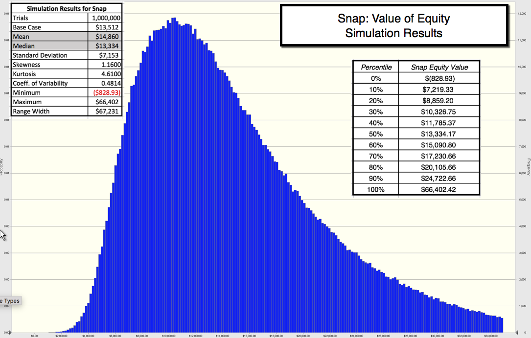 Snap Simulation DetailsAssuming that my share count is right, my value per share is about $11 per share. As you can see though, as is the case with almost any young company where the narrative can take you in other directions, there is a wide range around my expectations, with the lowest value being less than zero and the highest value pushing above $66 billion ($50/share). The median value is $13.3 billion and the average is $14.9 billion; one attractive feature to investors is that there is potential for breakout values (optionality) that exceed $30 billion.
The numbers at the high end of the spectrum reflect a pathway for Snap that I call the Facebook Light story, where it emerges as a serious contender to Facebook in terms of time that users spend on its platform, but with a smaller user base. That leads to revenues of close to $25 billion by 2027, an operating margin of 40% for the company and a value for the equity of $48 billion.The numbers at the other end of the spectrum capture a darker version of the story, that I label Twitter Redux, where user growth slows, user intensity comes under stress and advertising lags expectations. In this variant, Snap will have trouble getting pushing revenue growth past 35%, settling for about $4 billion in revenues in 2027, is able to improve its margin to only 10% in steady state, yielding a value of equity of about $4 billion.As I learned the painful way with my Twitter experiences, the quality of the management at a young company can play a significant role in how the story evolves. I am impressed with both the poise that Snap's founders are showing in their public appearances and the story that they are telling about the company, though I am disappointed that they have followed the Google/Facebook path and consolidated control in the company by creating shares with different voting rights. I know that is in keeping with the tech sector's founder worship and paranoia about "short term" investors , but my advice, unsolicited and perhaps unwelcome, is that Snap's founders should trust markets more. After all, if you welcome me to invest me in your company and I do, you should want my input as well, right?
The Pricing Contrast
As I finish this post, I notice this news story from this morning that suggests that bankers have arrived at an offering price, yielding a pricing for the company of $18.5 billion to $21.5 billion for the company, about $4 billion above my estimate. So, how do I explain the difference between my valuation and this pricing? First, I have never felt the urge to explain what other people pay for a stock, since it is a free market and investors make their own judgments. Second, and this is keeping with a theme that I have promoted repeatedly in my posts, bankers don't value companies; they price them! If you are missing the contrast between value and price, you are welcome to read this piece that I have on the topic, but simply put, your job in pricing is not to assess the fair value of a company but to decide what investors will pay for the company today. The former is determined by cash flows, growth and risk, i.e., the inputs that I have grappled with in my story and valuation, and the latter is set by what investors are paying for other companies in the space. After all, if investors are willing to attach a pricing of $12 billion to Twitter, a social media company seeming incapable of translating potential to profits, and Microsoft is paying $26 billion for LinkedIn, another social media company whose grasp exceeded its reach, why should they not pay $20 billion for Snap, a company with vastly greater user engagement than either LinkedIn or Twitter? With pricing, everything is relative and Snap may be a bargain at $20 billion to a trader.
YouTube Video
Link to book
Narrative and Numbers: The Value of Stories in BusinessAttachments
Snap: Prospectus for IPOSnap: My IPO ValuationSnap: As Facebook LiteSnap: As Twitter ReduxSnap: Simulation Inputs & Output


February 9, 2017
Apple: The Greatest Cash Machine in History?
As as sports fan, watching Brady and Belichick win the Super Bowl, Roger Federer triumph at the Australian Open and LeBron James carry the Cleveland Cavaliers to victory over the Warriors, it struck me how we take uncommon brilliance for granted. It is so easy, in the moment, to find fault, as many have, with these superstars and miss how special they are. That was the same reaction that I had as I watched another earnings report from Apple and the usual mix of reactions to it, some ho hum that the company made only $45 billion last year, some relieved that the company was able to post a 3% growth rate in revenues and the usual breast beating from those who found fault with it for not delivering another earth-shaking disruption. Since this is a company that I have valued after every quarterly earnings report since 2010, I thought this would be a good time to both take stock of what the company has managed to do over the last decade and to value it, given where it stands today.
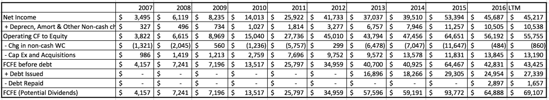
The Cash Machine Revs upIn my last post on dividend payout and cash return globally, I noted that large cash balances don't happen by accident but are a direct result of companies paying out less than they have available as potential dividends or free cash flows to equity, year after year. Since Apple's cash balance almost reached $250 billion in its most recent quarterly report, by far the largest cash balance ever accumulated by a publicly traded company, I decided that the place to start was by looking at how it got to its current level. I started by collecting the operating, debt financing and reinvestment cash flows each year from 2007 to 2016 and computing a free cash flow to equity (or potential dividend) each year.
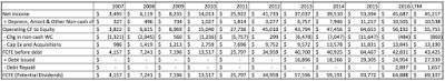 Starting in 2013, when Apple started to tap into its debt capacity, the company has been able to add to its potential dividends each year. In 2015 alone, Apple generated $93.6 billion in FCFE or potential dividends, an astounding amount, larger that the GDP of half the countries in the world in 2015. Each year, I also looked at how much Apple has returned to stockholders in the form of dividends and stock buybacks.
 Note that while Apple took a while to start returning cash, and it needed prompting from David Einhorn and Carl Icahn, it not only initiated dividends in 2012 but has supplemented those dividends with stock buybacks of increasing magnitude each year. In fact, Apple returned $183 billion in cash to stockholders in the last five years, making it, by far, the largest cash-returner in the world over that period.
There are two amazing (at least to me) aspects to this story. The first is that in spite of the immense amounts of cash that Apple has returned each year, its cash balance has increased each year, partly because its operating cash flows are so high and partly because they are being supplemented by debt payments. You can see the cash build up between 2007 and 2016 in the chart below:

Note that while Apple was returning $183 billion in cash between 2013-2016, its cash balance continued to increase, as its cash inflows increased even more. If having a cash spigot that never turns off is a problem, Apple has it, but I am sure that it will not get about as much sympathy from the rest of the world as a supermodel who complains that she cannot put on weight, no matter how much she eats. The other equally surprising feature of this story is that Apple's managers have not felt the urge (yet) to use their huge cash reserves to buy a company, a whole set of companies or even an entire country, a fact that those who like Apple will attribute to the discipline of its management and Apple haters will argue is due to a lack of imagination.
My Apple Valuation HistoryAs many of you who have been reading this blog are aware, I have valued Apple many times before but rather than rehash old history, let me summarize. For Apple, the story that I have been telling about the company for the last five years has been remarkably unchanged. In my July 2012 valuation, where I looked at Apple just after it had become the largest market cap company in the world and had come off perhaps the greatest decade of disruption of any company in history (iTunes, iPod, iPhone and iPad), I concluded that while Apple was one of the great cash machines of all time, its days of disruption were behind it, partly because Steve Jobs was no longer at the helm but mostly because of its size; it is so much more difficult for a $600 billion company to create a significant enough disruption to change the trend lines on earnings, cash flows and value.
So, in my story, I saw Apple continuing to produce cash flows, with low revenue growth and gradually decreasing margins, as the smartphone business became more competitive. I won't make you read all of the posts that I have on Apple, but let me start with a post that I had in August 2015, when I updated the Apple story (and looked at Facebook and Twitter at the same time). The value I estimated for Apple in that post was $130, higher than the stock price of $110 at the time, prompting me to buy the stock. I revisited the story after an earnings report from Apple in February 2016 and compared it to Alphabet. At the time, I valued Apple at about $126 per share, well above the $94/share that it was trading at the time. In May 2016, Carl Icahn, a long time bull on Apple sold his shares, and Warren Buffett, a long time avoider of tech companies, bought shares in the company. In a Apple's Earnings Report & My NarrativeLast week, Apple released its latest 10Q and in conjunction with its latest 10K (Apple's fiscal year end is in September). It contained a modicum of good news, insofar as there was growth in revenues as opposed to the decline posted in the prior quarter and still-solid profit margins, but the revenue growth was only 3% and the margins are still lower than they used to be. Using the numbers in the most recent report, I took at look at my Apple story and guess what? It looks just like it did last year, a great cash machine, with very slow-growing revenues and declining margins. Using the process that I describe, perhaps in too much detail in my book on narrative and numbers, I converted my story in inputs to my valuation: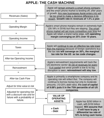
Some of you may find my story too cramped , seeing a greater possibility than I do of Apple breaking through into a new, big market (with Apple Pay or the Apple iCar). If you are in that group, please take my structure and make it yours, with a higher growth rate coming from your disruptive story, accompanied by lower margins and higher reinvestment. Others may find this story too optimistic, perhaps seeing a more precipitous fall of profit margins in the smart phone business and a greater tax liability from trapped cash. You too can alter the inputs to your liking and make your own judgment on Apple!
An Updated Valuation of AppleOnce you have a story for a company and convert that story into valuation inputs, the rest of the process becomes just mechanics. In the picture below, I have my February 2017 valuation of Apple.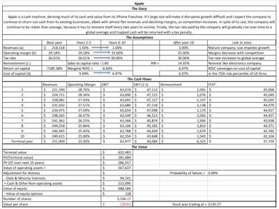 Download spreadsheet with valuationJust as my valuation looked too optimistic a year, when the earnings report contained darker news, it may seem too pessimistic this year, after a much sunnier report. That said, it is worth emphasizing how much Apple is on the iPhone roller coaster ride, reporting better earnings in the quarters immediately after a new iPhone is released and much worse earnings in the quarters thereafter. While the market seems to want to go on a ride with Apple on its ups and downs, my fundamental story for Apple has barely shifted in the last few years and my valuations reflect that story stability.
Apple's Price/Value DynamicsI have taken my share of punishment on investments that have not gone well, with Valeant being a source of continuing pain (which I will return to after its next earnings report). Apple, though, has served me well in the last decade, but even with Apple, I have had extended periods where my faith has been tested. The picture below graphs Apple's stock price from 2010 and 2017 with my valuations shown across time: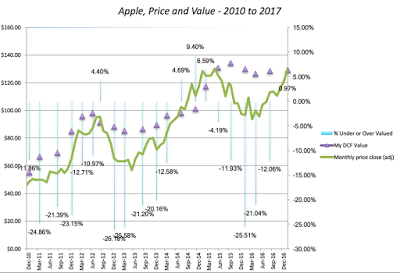
I held Apple from 2010 to 2012, as it traded under my estimated value. I sold in April 2012, just before a brief interlude where the price popped above value in June 2012, it reverted back to being under valued until June 2014. After spending a few months as an overvalued stock, the price plummeted in the late summer of 2015, making me a buyer, but it continued to drop until almost April 2016. It's been a good ride since, and much as I want to attribute this to my valuation insights and brilliant timing, I have a sneaking suspicion that luck had just as much or perhaps more to do with it. Now that the stock is fully valued, decision time is fast approaching and I am ready with my sell trigger at $140/share, the outer end of the range that I have for Apple's value today.
ConclusionApple is the greatest corporate cash machine in history and it is fully deserving of its market value. Its history as a disruptive force has led some investors to expect Apple to continue what it did a decade ago and come up with new products for new markets. Those expectations, though, don't factor in the reality that as a much larger player with huge profit margins, Apple is more likely to be disrupted than be disruptor. Until investors learn to live with the company, as it exists now and not the company that they wish would exist in its place, there will continue to be mood swings in the market translating into the ebbs and flows of its stock price, and I hope to take advantage of them.
YouTube
My book
Narrative and Numbers (Columbia University Press)
Prior Blog Posts on Apple
Narrative Resets: Revisiting a Tech Trio (August 2015)Race to the top: The Duel between Apple and Alphabet (February 2016)Apple: FCFE, Dividends and Cash Build up - 1988-2016Apple: Valuation in February 2017
The Cash Machine Revs upIn my last post on dividend payout and cash return globally, I noted that large cash balances don't happen by accident but are a direct result of companies paying out less than they have available as potential dividends or free cash flows to equity, year after year. Since Apple's cash balance almost reached $250 billion in its most recent quarterly report, by far the largest cash balance ever accumulated by a publicly traded company, I decided that the place to start was by looking at how it got to its current level. I started by collecting the operating, debt financing and reinvestment cash flows each year from 2007 to 2016 and computing a free cash flow to equity (or potential dividend) each year.
 Starting in 2013, when Apple started to tap into its debt capacity, the company has been able to add to its potential dividends each year. In 2015 alone, Apple generated $93.6 billion in FCFE or potential dividends, an astounding amount, larger that the GDP of half the countries in the world in 2015. Each year, I also looked at how much Apple has returned to stockholders in the form of dividends and stock buybacks.
 Note that while Apple took a while to start returning cash, and it needed prompting from David Einhorn and Carl Icahn, it not only initiated dividends in 2012 but has supplemented those dividends with stock buybacks of increasing magnitude each year. In fact, Apple returned $183 billion in cash to stockholders in the last five years, making it, by far, the largest cash-returner in the world over that period.
There are two amazing (at least to me) aspects to this story. The first is that in spite of the immense amounts of cash that Apple has returned each year, its cash balance has increased each year, partly because its operating cash flows are so high and partly because they are being supplemented by debt payments. You can see the cash build up between 2007 and 2016 in the chart below:
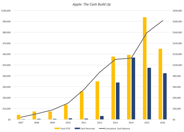
Note that while Apple was returning $183 billion in cash between 2013-2016, its cash balance continued to increase, as its cash inflows increased even more. If having a cash spigot that never turns off is a problem, Apple has it, but I am sure that it will not get about as much sympathy from the rest of the world as a supermodel who complains that she cannot put on weight, no matter how much she eats. The other equally surprising feature of this story is that Apple's managers have not felt the urge (yet) to use their huge cash reserves to buy a company, a whole set of companies or even an entire country, a fact that those who like Apple will attribute to the discipline of its management and Apple haters will argue is due to a lack of imagination.
My Apple Valuation HistoryAs many of you who have been reading this blog are aware, I have valued Apple many times before but rather than rehash old history, let me summarize. For Apple, the story that I have been telling about the company for the last five years has been remarkably unchanged. In my July 2012 valuation, where I looked at Apple just after it had become the largest market cap company in the world and had come off perhaps the greatest decade of disruption of any company in history (iTunes, iPod, iPhone and iPad), I concluded that while Apple was one of the great cash machines of all time, its days of disruption were behind it, partly because Steve Jobs was no longer at the helm but mostly because of its size; it is so much more difficult for a $600 billion company to create a significant enough disruption to change the trend lines on earnings, cash flows and value.
So, in my story, I saw Apple continuing to produce cash flows, with low revenue growth and gradually decreasing margins, as the smartphone business became more competitive. I won't make you read all of the posts that I have on Apple, but let me start with a post that I had in August 2015, when I updated the Apple story (and looked at Facebook and Twitter at the same time). The value I estimated for Apple in that post was $130, higher than the stock price of $110 at the time, prompting me to buy the stock. I revisited the story after an earnings report from Apple in February 2016 and compared it to Alphabet. At the time, I valued Apple at about $126 per share, well above the $94/share that it was trading at the time. In May 2016, Carl Icahn, a long time bull on Apple sold his shares, and Warren Buffett, a long time avoider of tech companies, bought shares in the company. In a Apple's Earnings Report & My NarrativeLast week, Apple released its latest 10Q and in conjunction with its latest 10K (Apple's fiscal year end is in September). It contained a modicum of good news, insofar as there was growth in revenues as opposed to the decline posted in the prior quarter and still-solid profit margins, but the revenue growth was only 3% and the margins are still lower than they used to be. Using the numbers in the most recent report, I took at look at my Apple story and guess what? It looks just like it did last year, a great cash machine, with very slow-growing revenues and declining margins. Using the process that I describe, perhaps in too much detail in my book on narrative and numbers, I converted my story in inputs to my valuation:

Some of you may find my story too cramped , seeing a greater possibility than I do of Apple breaking through into a new, big market (with Apple Pay or the Apple iCar). If you are in that group, please take my structure and make it yours, with a higher growth rate coming from your disruptive story, accompanied by lower margins and higher reinvestment. Others may find this story too optimistic, perhaps seeing a more precipitous fall of profit margins in the smart phone business and a greater tax liability from trapped cash. You too can alter the inputs to your liking and make your own judgment on Apple!
An Updated Valuation of AppleOnce you have a story for a company and convert that story into valuation inputs, the rest of the process becomes just mechanics. In the picture below, I have my February 2017 valuation of Apple.
 Download spreadsheet with valuationJust as my valuation looked too optimistic a year, when the earnings report contained darker news, it may seem too pessimistic this year, after a much sunnier report. That said, it is worth emphasizing how much Apple is on the iPhone roller coaster ride, reporting better earnings in the quarters immediately after a new iPhone is released and much worse earnings in the quarters thereafter. While the market seems to want to go on a ride with Apple on its ups and downs, my fundamental story for Apple has barely shifted in the last few years and my valuations reflect that story stability.
Apple's Price/Value DynamicsI have taken my share of punishment on investments that have not gone well, with Valeant being a source of continuing pain (which I will return to after its next earnings report). Apple, though, has served me well in the last decade, but even with Apple, I have had extended periods where my faith has been tested. The picture below graphs Apple's stock price from 2010 and 2017 with my valuations shown across time:

I held Apple from 2010 to 2012, as it traded under my estimated value. I sold in April 2012, just before a brief interlude where the price popped above value in June 2012, it reverted back to being under valued until June 2014. After spending a few months as an overvalued stock, the price plummeted in the late summer of 2015, making me a buyer, but it continued to drop until almost April 2016. It's been a good ride since, and much as I want to attribute this to my valuation insights and brilliant timing, I have a sneaking suspicion that luck had just as much or perhaps more to do with it. Now that the stock is fully valued, decision time is fast approaching and I am ready with my sell trigger at $140/share, the outer end of the range that I have for Apple's value today.
ConclusionApple is the greatest corporate cash machine in history and it is fully deserving of its market value. Its history as a disruptive force has led some investors to expect Apple to continue what it did a decade ago and come up with new products for new markets. Those expectations, though, don't factor in the reality that as a much larger player with huge profit margins, Apple is more likely to be disrupted than be disruptor. Until investors learn to live with the company, as it exists now and not the company that they wish would exist in its place, there will continue to be mood swings in the market translating into the ebbs and flows of its stock price, and I hope to take advantage of them.
YouTube
My book
Narrative and Numbers (Columbia University Press)
Prior Blog Posts on Apple
Narrative Resets: Revisiting a Tech Trio (August 2015)Race to the top: The Duel between Apple and Alphabet (February 2016)Apple: FCFE, Dividends and Cash Build up - 1988-2016Apple: Valuation in February 2017
February 6, 2017
January 2017 Data Update 9: Dividends and Buybacks
If you are from my generation, I am sure that you remember Rodney Dangerfield, whose comedy routine was built around the fact that "he got no respect". This post is about dividends and cash return, the Rodney Dangerfield of Corporate finance, a decision that gets no respect and very little serious attention from either academics or practitioners. In many companies, the decision of how much to pay on dividends is made either on auto pilot or on a me-too basis, which is surprising, since just as a farmer’s payoff from planting crops comes from the harvest, an investor’s payoff from investing should come from cash flows being returned. The investment decisions get the glory, the financing decisions get in the news but the dividend decisions are what complete the cycle.
The Dividend Decision
The decision of whether to return cash to the owners of a business and if yes, in what form, is the dividend decision. Since these cash flows are to equity investors, who are the residual claim holders in a business, logically, the dividend decision should be determined by and come after the investment and financing decisions made by a business. The picture below captures how dividends would be set, if they were truly residual cash flows: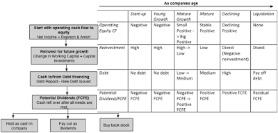
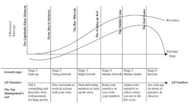
The process, which mirrors what you see in a statement of cash flows, starts with the cash flow to equity from operations, computed by adding back non-cash charges (depreciation and amortization) to net income. From that cash flow, the firm decides how much to reinvest in short term assets (working capital) and long term assets (capital expenditures), supplementing these cash flows with debt issuances and depleting them with debt repayments. If there is any cash flow left over after these actions, and there is not guarantee that there will be, that cash flow is my estimate of potential dividend or if you prefer a buzzier word, the free cash flow to equity. With this free cash flow to equity, the firm can do one of three things: hold the cash (increasing its cash balance), pay a dividend or buy back stock. To the right of the picture, I use a structure that I find useful in corporate finance, which is the corporate life cycle, to illustrate how these numbers change as a company ages.
Early in a company’s life, the operating cash flows are often negative (as the company lose money) and the hole gets deeper as the company has to reinvest to generate future growth and is unable to borrow money. Since the potential dividends (FCFE) are big negative numbers, the company will be raising new equity rather than returning cash. As the company starts to grow, the earnings first turn positive but the large reinvestment needs to sustain future growth will continue to keep potential dividends negative, thus justifying a no-cash return policy still. As the company matures, there will be two developments: the operating cash flows to equity will start exceeding reinvestment needs and the company’s capacity to borrow money will open up. While the initial response of the company to these developments will be denial (about no longer being growth companies), you cannot hide from the truth. The cash balance will mount and the company’s capacity to borrow money will be increasingly obvious and pressure will build on it to return some of its cash and borrow money. Even the most resistant firms will eventually capitulate and they will enter the period of plentiful cash returns, with large dividends supplemented by stock buybacks, at least partially funded by debt. Finally, you arrive at that most depressing phase of the corporate life cycle, decline, when reinvestment is replaced with divestitures (shrinking the firm and increasing free cash flows to equity) and the cash return swells. The company, in a sense, is partially liquidating itself over time.The truth is that there are companies where the decision on how much to pay in dividends in not the final one but the one made first. Put differently, rather than making investment and financing decisions first, based upon what works best for the firm, and paying the residual cash flow as dividends, firms make their dividend decisions (and I include buybacks in dividends) first and then modify their financing and investing decisions, given the dividends.
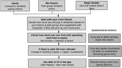
The companies that follow this backward sequence, and there are a lot of them, can easily end up with severely dysfunctional dividend policies that can destroy them, unless good sense prevails. It is an attitude that was best captured by Andrew Mackenzie, CEO of BHP Billiton, who when analysts asked him in 2015 whether he planned to cut dividends, as commodity prices plummeted and earnings dropped, responded by saying "over my dead body".
Dividends, Cash Return and Potential Dividends: The US HistoryLet’s start with some history on dividends, using the US market. In the graph below, I start by providing the basis for my inertia theory of dividends by looking at the proportion of US firms each year that increase dividends, decrease dividends and leave dividends unchanged: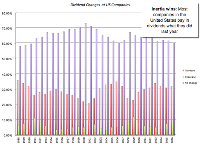
In every year, since 1988, far more firms left dividends untouched than increased or decreased them, and when dividends did get changed, they were far more likely to be increased than decreased.
Let’s follow with another fact about US companies. Increasingly, they are replacing dividends, the time-tested way of returning cash to stockholders, with stock buybacks, as you can see in the figure below, where I graph dividends and stock buybacks from the S&P 500 companies from 1988 to 2016.
The shift is remarkable. In 1988, almost 70% of all cash returned to stockholders took the form of dividends and by 2016, close to 60% of all cash returned took the form of buybacks. I have written about why this shift has occurred in this post and also why much of the breast beating you hear about how buybacks represent the end of the economy is misdirected. That said, the amount of cash that US companies are returning to stockholders is unsustainable, given the earnings and expectations of growth. In the figure below, I look at for the S&P 500, the cash returned to investors as a proportion of earnings each year from 2001 to 2016: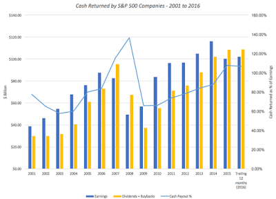
In 2015 and 2016, the companies in the S&P 500 returned more than 100% of earnings to investors. It is the reason that I highlighted the possibility of a pull back on cash flows as on the stock market’s biggest vulnerabilities this year in my post on US equities.
Cash Return: A Global ComparisonHaving looked at US companies, let’s turn the focus to the rest of the world. The stickiness of dividends that we see in the United States is a global phenomenon, though it takes different forms in some parts of the world; in Latin America, for instance, it is payout ratios, not absolute dividends, that companies try to maintain. To provide a measure of cash returned, I report on three statistics: table.tableizer-table { font-size: 12px; border: 1px solid #CCC; font-family: Arial, Helvetica, sans-serif; } .tableizer-table td { padding: 4px; margin: 3px; border: 1px solid #CCC; } .tableizer-table th { background-color: #104E8B; color: #FFF; font-weight: bold; }
Cash Return StatisticDefinitionWhat it measuresDividend YieldDividends/Market CapPortion of equity return that comes from dividends.Dividend PayoutDividends/Net Income (if net income is positive, NA if negative)Proportion of earnings held back by the company for reinvestment or as cash balance.Cash Return/FCFE(Dividends + Buybacks)/FCFE (if FCFE is positive, NA if negative)Percentage of potential dividends returned to stockholders. Remaining goes into cash balance.The picture below looks at these dividend yields and payout ratios across the globe:
 Link to live mapUnlike investment and debt policy, it is difficult to determine what number here would be the “best” number to see. Clearly, over time, you would like companies to return residual cash to stockholders but prudent companies, facing difficult business times, should try to hold back some cash as a buffer. Returning too little cash (low payout ratios) for long periods, though, is indicative of an absence of stockholder power and a sign that managers/insiders are building cash empires. Returning too much cash can mean less cash available for good projects and/or increasing debt ratios. In the table below, you can see the statistics broken down by region:
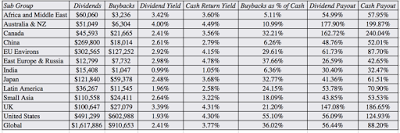 Link to full country spreadsheetLet's take a look at the numbers in this table. The shift towards buybacks which has been so drastic in the United States seems to be wending its way globally. While there are markets like India, where buybacks are still uncommon (comprising only 6.36% of total cash returned), almost 30% of cash returned in Europe and 33% of cash returned in Japan took the form of buybacks. In Canada and Australia, companies returned over 150% of potential dividends to investors, perhaps because natural resource companies are hotbeds of dysfunctional dividend policy, with top managers maintaining dividends even in the face of sustained declines in commodity prices (and corporate earnings). The Mackenzie "over my dead body" dividend policy is live and well at many of other natural resource companies. With buybacks counted in, you see cash return rising above 100% for the US as well, backing up the point made earlier about unsustainable dividends.
Cash Return: A Company and Sector ComparisonDividend policy varies across firms, the result of not only financial factors (where the company is in its life cycle, what type of business it is in and how investors get taxed) but also emotional ones (how risk averse managers are and how much they value control). As a result dividend yields and payout ratios vary widely across companies, and the picture below captures the distribution of both statistics across US and global companies: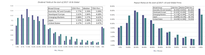 There are wide variations in cash return across sectors, some reflecting where they stand in the life cycle and some just a function of history. In the table below, I highlight the sectors that returned the most cash, as a percent of net income, in the table below:
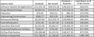
It is difficult to see a common theme here. You can see the residue of sticky dividends and inertia in the high cash return at oil and gas companies, perhaps still struggling to adapt to lower oil prices. There are surprises, with application software and biotech firms making the list. Looking at the sectors that returned the least cash, here is the list of the top ten: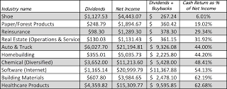
If the cash that companies can return increases as they age, you should see the cash return policies change over time for sectors. Many of the technology firms that were high growth in the 1980s are now ageing and they are returning large amounts of cash to their stockholders; Apple, IBM and Microsoft are at the top of the list of companies that have bought back the most stock in the last decade.
Cash BalancesWhile this post has been about how much cash companies return to stockholders, the inverse of whatever is said about cash return can be said about cash retained in companies, which shows up as cash balances. In fact, if you use potential dividend (FCFE) as your measure of cash that can be returned and dividends plus buybacks as your measure of cash that is actually returned, your cash balance at any point in time for a publicly traded firm can be written as: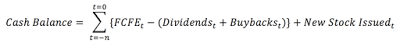 When companies accumulate large cash balances, it is never by accident but a direct consequence of having held back cash for long periods. So, how much cash do publicly traded companies hold? To answer that question for US companies, I look at a distribution of cash as a percent of firm value (market value of equity + total debt) in the figure below:
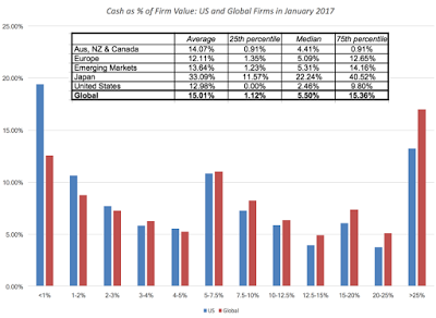
Thus, the median company in the United States at the start of 2017 held 2.45% of its value in cash; remember that with the US tax code’s strictures on foreign income being taxed on repatriation, a significant portion of this cash may be beyond the reach of stockholders, at least for the moment. The median company globally holds 5.50% of value in cash, with small differences across regions with one exception. Japan is the outlier, with the median company holding 22.24% of its value in cash. Expanding the comparison globally, I look at cash as a percent of firm value by country in the picture below: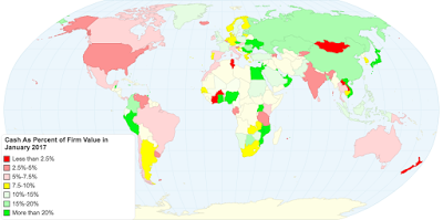 Link to live mapNote that, as with dividend payout, it is difficult to decide what to make of a large (or a small) cash holding. Thus, large cash balances may provide a buffer against bad times, but they may also indicative of poor corporate governance, where stockholders are powerless while manager accumulate cash.
Conclusion
Since equity is a residual claim, it has never made sense to me that companies commit to paying a fixed dividend every year. I know that this is how dividend policy has been set since the beginning of equity markets, but that reflects the fact that stocks, when first traded, were viewed as bonds with price appreciation, with dividends standing in for coupons. As companies increasingly face global competition and much more uncertainty about future earnings, their reluctance to increase dividend commitments is understandable. If you buy into my characterization of dividends as analogous to getting married and buybacks as the equivalent of hooking up, companies and investors are both choosing to hook up, and who can blame them?
YouTube Video
Datasets
Dividend and Cash Return, by CountryDividend and Cash Return, by IndustryData 2017 Posts
Data Update 1: The Promise and Perils of Big DataData Update 2: The Resilience of US EquitiesData Update 3: Cracking the Currency Code - January 2017Data Update 4: Country Risk and Pricing, January 2017Data Update 5: A Taxing Year Ahead?Data Update 6: The Cost of Capital in January 2017Data Update 7: Profitability, Excess Returns and Corporate Governance- January 2017Data Update 8: The Debt Trade off in January 2017Data Update 9: Dividends and Buybacks in 2017Data Update 10: A Pricing Update in January 2017
The Dividend Decision
The decision of whether to return cash to the owners of a business and if yes, in what form, is the dividend decision. Since these cash flows are to equity investors, who are the residual claim holders in a business, logically, the dividend decision should be determined by and come after the investment and financing decisions made by a business. The picture below captures how dividends would be set, if they were truly residual cash flows:
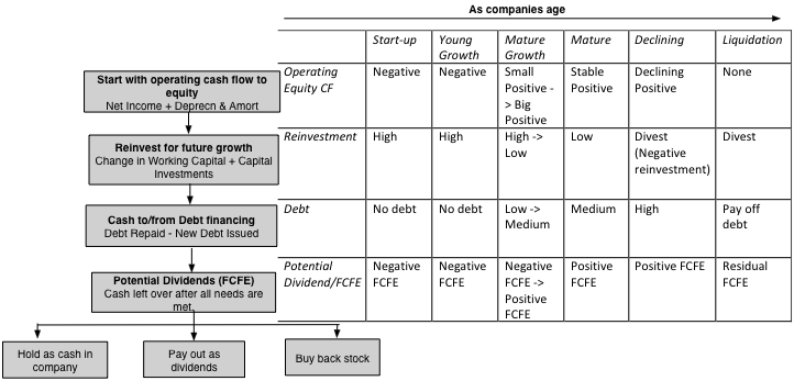
The process, which mirrors what you see in a statement of cash flows, starts with the cash flow to equity from operations, computed by adding back non-cash charges (depreciation and amortization) to net income. From that cash flow, the firm decides how much to reinvest in short term assets (working capital) and long term assets (capital expenditures), supplementing these cash flows with debt issuances and depleting them with debt repayments. If there is any cash flow left over after these actions, and there is not guarantee that there will be, that cash flow is my estimate of potential dividend or if you prefer a buzzier word, the free cash flow to equity. With this free cash flow to equity, the firm can do one of three things: hold the cash (increasing its cash balance), pay a dividend or buy back stock. To the right of the picture, I use a structure that I find useful in corporate finance, which is the corporate life cycle, to illustrate how these numbers change as a company ages.
Early in a company’s life, the operating cash flows are often negative (as the company lose money) and the hole gets deeper as the company has to reinvest to generate future growth and is unable to borrow money. Since the potential dividends (FCFE) are big negative numbers, the company will be raising new equity rather than returning cash. As the company starts to grow, the earnings first turn positive but the large reinvestment needs to sustain future growth will continue to keep potential dividends negative, thus justifying a no-cash return policy still. As the company matures, there will be two developments: the operating cash flows to equity will start exceeding reinvestment needs and the company’s capacity to borrow money will open up. While the initial response of the company to these developments will be denial (about no longer being growth companies), you cannot hide from the truth. The cash balance will mount and the company’s capacity to borrow money will be increasingly obvious and pressure will build on it to return some of its cash and borrow money. Even the most resistant firms will eventually capitulate and they will enter the period of plentiful cash returns, with large dividends supplemented by stock buybacks, at least partially funded by debt. Finally, you arrive at that most depressing phase of the corporate life cycle, decline, when reinvestment is replaced with divestitures (shrinking the firm and increasing free cash flows to equity) and the cash return swells. The company, in a sense, is partially liquidating itself over time.The truth is that there are companies where the decision on how much to pay in dividends in not the final one but the one made first. Put differently, rather than making investment and financing decisions first, based upon what works best for the firm, and paying the residual cash flow as dividends, firms make their dividend decisions (and I include buybacks in dividends) first and then modify their financing and investing decisions, given the dividends.
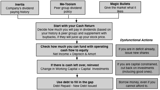
The companies that follow this backward sequence, and there are a lot of them, can easily end up with severely dysfunctional dividend policies that can destroy them, unless good sense prevails. It is an attitude that was best captured by Andrew Mackenzie, CEO of BHP Billiton, who when analysts asked him in 2015 whether he planned to cut dividends, as commodity prices plummeted and earnings dropped, responded by saying "over my dead body".
Dividends, Cash Return and Potential Dividends: The US HistoryLet’s start with some history on dividends, using the US market. In the graph below, I start by providing the basis for my inertia theory of dividends by looking at the proportion of US firms each year that increase dividends, decrease dividends and leave dividends unchanged:

In every year, since 1988, far more firms left dividends untouched than increased or decreased them, and when dividends did get changed, they were far more likely to be increased than decreased.
Let’s follow with another fact about US companies. Increasingly, they are replacing dividends, the time-tested way of returning cash to stockholders, with stock buybacks, as you can see in the figure below, where I graph dividends and stock buybacks from the S&P 500 companies from 1988 to 2016.
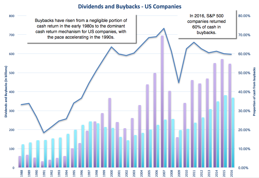
The shift is remarkable. In 1988, almost 70% of all cash returned to stockholders took the form of dividends and by 2016, close to 60% of all cash returned took the form of buybacks. I have written about why this shift has occurred in this post and also why much of the breast beating you hear about how buybacks represent the end of the economy is misdirected. That said, the amount of cash that US companies are returning to stockholders is unsustainable, given the earnings and expectations of growth. In the figure below, I look at for the S&P 500, the cash returned to investors as a proportion of earnings each year from 2001 to 2016:

In 2015 and 2016, the companies in the S&P 500 returned more than 100% of earnings to investors. It is the reason that I highlighted the possibility of a pull back on cash flows as on the stock market’s biggest vulnerabilities this year in my post on US equities.
Cash Return: A Global ComparisonHaving looked at US companies, let’s turn the focus to the rest of the world. The stickiness of dividends that we see in the United States is a global phenomenon, though it takes different forms in some parts of the world; in Latin America, for instance, it is payout ratios, not absolute dividends, that companies try to maintain. To provide a measure of cash returned, I report on three statistics: table.tableizer-table { font-size: 12px; border: 1px solid #CCC; font-family: Arial, Helvetica, sans-serif; } .tableizer-table td { padding: 4px; margin: 3px; border: 1px solid #CCC; } .tableizer-table th { background-color: #104E8B; color: #FFF; font-weight: bold; }
Cash Return StatisticDefinitionWhat it measuresDividend YieldDividends/Market CapPortion of equity return that comes from dividends.Dividend PayoutDividends/Net Income (if net income is positive, NA if negative)Proportion of earnings held back by the company for reinvestment or as cash balance.Cash Return/FCFE(Dividends + Buybacks)/FCFE (if FCFE is positive, NA if negative)Percentage of potential dividends returned to stockholders. Remaining goes into cash balance.The picture below looks at these dividend yields and payout ratios across the globe:
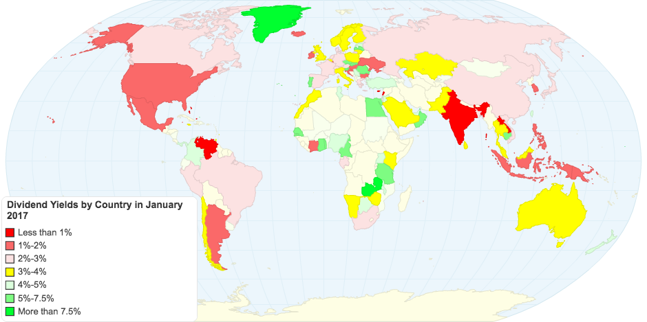 Link to live mapUnlike investment and debt policy, it is difficult to determine what number here would be the “best” number to see. Clearly, over time, you would like companies to return residual cash to stockholders but prudent companies, facing difficult business times, should try to hold back some cash as a buffer. Returning too little cash (low payout ratios) for long periods, though, is indicative of an absence of stockholder power and a sign that managers/insiders are building cash empires. Returning too much cash can mean less cash available for good projects and/or increasing debt ratios. In the table below, you can see the statistics broken down by region:
 Link to full country spreadsheetLet's take a look at the numbers in this table. The shift towards buybacks which has been so drastic in the United States seems to be wending its way globally. While there are markets like India, where buybacks are still uncommon (comprising only 6.36% of total cash returned), almost 30% of cash returned in Europe and 33% of cash returned in Japan took the form of buybacks. In Canada and Australia, companies returned over 150% of potential dividends to investors, perhaps because natural resource companies are hotbeds of dysfunctional dividend policy, with top managers maintaining dividends even in the face of sustained declines in commodity prices (and corporate earnings). The Mackenzie "over my dead body" dividend policy is live and well at many of other natural resource companies. With buybacks counted in, you see cash return rising above 100% for the US as well, backing up the point made earlier about unsustainable dividends.
Cash Return: A Company and Sector ComparisonDividend policy varies across firms, the result of not only financial factors (where the company is in its life cycle, what type of business it is in and how investors get taxed) but also emotional ones (how risk averse managers are and how much they value control). As a result dividend yields and payout ratios vary widely across companies, and the picture below captures the distribution of both statistics across US and global companies:
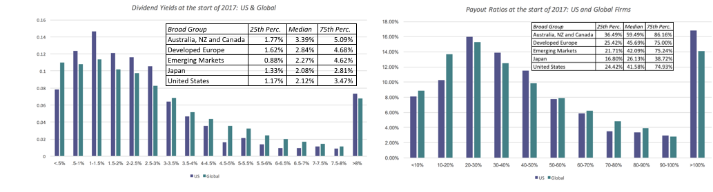 There are wide variations in cash return across sectors, some reflecting where they stand in the life cycle and some just a function of history. In the table below, I highlight the sectors that returned the most cash, as a percent of net income, in the table below:
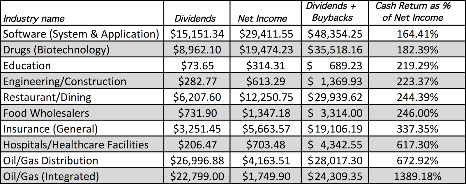
It is difficult to see a common theme here. You can see the residue of sticky dividends and inertia in the high cash return at oil and gas companies, perhaps still struggling to adapt to lower oil prices. There are surprises, with application software and biotech firms making the list. Looking at the sectors that returned the least cash, here is the list of the top ten:

If the cash that companies can return increases as they age, you should see the cash return policies change over time for sectors. Many of the technology firms that were high growth in the 1980s are now ageing and they are returning large amounts of cash to their stockholders; Apple, IBM and Microsoft are at the top of the list of companies that have bought back the most stock in the last decade.
Cash BalancesWhile this post has been about how much cash companies return to stockholders, the inverse of whatever is said about cash return can be said about cash retained in companies, which shows up as cash balances. In fact, if you use potential dividend (FCFE) as your measure of cash that can be returned and dividends plus buybacks as your measure of cash that is actually returned, your cash balance at any point in time for a publicly traded firm can be written as:
 When companies accumulate large cash balances, it is never by accident but a direct consequence of having held back cash for long periods. So, how much cash do publicly traded companies hold? To answer that question for US companies, I look at a distribution of cash as a percent of firm value (market value of equity + total debt) in the figure below:

Thus, the median company in the United States at the start of 2017 held 2.45% of its value in cash; remember that with the US tax code’s strictures on foreign income being taxed on repatriation, a significant portion of this cash may be beyond the reach of stockholders, at least for the moment. The median company globally holds 5.50% of value in cash, with small differences across regions with one exception. Japan is the outlier, with the median company holding 22.24% of its value in cash. Expanding the comparison globally, I look at cash as a percent of firm value by country in the picture below:
 Link to live mapNote that, as with dividend payout, it is difficult to decide what to make of a large (or a small) cash holding. Thus, large cash balances may provide a buffer against bad times, but they may also indicative of poor corporate governance, where stockholders are powerless while manager accumulate cash.
 Conclusion
Since equity is a residual claim, it has never made sense to me that companies commit to paying a fixed dividend every year. I know that this is how dividend policy has been set since the beginning of equity markets, but that reflects the fact that stocks, when first traded, were viewed as bonds with price appreciation, with dividends standing in for coupons. As companies increasingly face global competition and much more uncertainty about future earnings, their reluctance to increase dividend commitments is understandable. If you buy into my characterization of dividends as analogous to getting married and buybacks as the equivalent of hooking up, companies and investors are both choosing to hook up, and who can blame them?
YouTube Video
Datasets
Dividend and Cash Return, by CountryDividend and Cash Return, by IndustryData 2017 Posts
Data Update 1: The Promise and Perils of Big DataData Update 2: The Resilience of US EquitiesData Update 3: Cracking the Currency Code - January 2017Data Update 4: Country Risk and Pricing, January 2017Data Update 5: A Taxing Year Ahead?Data Update 6: The Cost of Capital in January 2017Data Update 7: Profitability, Excess Returns and Corporate Governance- January 2017Data Update 8: The Debt Trade off in January 2017Data Update 9: Dividends and Buybacks in 2017Data Update 10: A Pricing Update in January 2017
February 1, 2017
January 2017 Data Update 8: The Dark and Light Sides of Debt
There is no aspect of corporate finance where morality plays a bigger role than the decision of how much to borrow. That should come as no surprise. For generations, almost every religion has inveighed against debt, with some seeking outright bans and others strongly urging followers to "neither a borrower nor a lender be", and perhaps with good reason. History is filled with instances of human beings, caught up in the mood of the moment, borrowing money and then finding themselves destitute in bad times. That said, there is no denying that the decision of whether to borrow money, and if so how much to borrow, has become a critical part of running a business.
The trade off on debt
In corporate finance, the discussion of debt begins with an examination of the trade offs on using debt, instead of equity, to finance operations. I have described debt as a double-edged sword before, and running out of analogies, I am going to draw on Star Wars framing, and talk about the light side (benefits) of debt and the dark side (costs) of debt. In the course of the discussion, I want to separate the illusory benefits and costs of debt from the real benefits and costs, partly because I see them mixed up in practice all the time.
In terms of the real factors that drive the trade off, debt creates two benefits. The biggest comes from the tilt in the tax code, which allows interest expenses to be tax deductible and cash flows to equity to be not. The secondary benefit is that debt can operate as a disciplinary mechanism, with the discipline of having to make debt payments restraining managers from taking truly abysmal projects. These benefits have to be offset against two big costs, the first and biggest being the increased likelihood of distress and the second being the potential for disagreements between lenders and equity investors about the future of the firm (and how it plays out as debt covenants). All of these factors show up in the cash flows and risk assessment of a business. There are however illusory factors that can be distracting. On the benefit side, there are some who argue that debt is good because it can push up your return on equity or point to the fact that the cost of debt is lower than the cost of equity. Both statements are generally right, but the flaw in reasoning in both is that they assume that as you borrow more money, your cost of equity will remain unchanged, and it will not. In fact, in the absence of debt and distress, the positive and negative effects will offset each other, leading to no value change. On the cost side, debt detractors will note that the interest expenses associated with debt will lower net income, ignoring the fact that the lower net income is now being earned on a lower equity base. If the argument is that debt will increase default risk and the cost of debt, it is worth pointing out that even at the higher cost, debt is still cheaper than equity. Finally, there are transient factors that come from market frictions, where if your equity is mis-priced or the interest rate on your debt is set too low or high (given your default risk), you (as the company) may take advantage of the friction, using more debt if equity is under priced and debt carries too low an interest rate and less debt if equity is over priced and debt carries too high a rate. This, of course, will require CFOs of companies to embark on that most dangerous of expeditions, of judging market assessments of their value and risk. The picture below brings together all of the elements:
As we debate why companies borrow money and how it affects their value, it is good to be clear eyed about how debt changes value. It is almost entirely because of the tax benefit that it is endowed with, and if you take that tax benefit away, the reasons for borrowing quickly dissipate.
The Cross Sectional Distribution Before we embark on an examination of debt loads across companies, let's start by looking at three different measures of financial leverage:Debt to Capital = Debt/ (Debt + Equity): This is a measure of how much of the capital in a company comes from debt. It can be measured as accountants see value (with book values for debt and equity) or as the market sees it (with market values for debt and equity).Debt to Equity = Debt/Equity: This is a close variant of debt to capital, with debt stated as a percent of equity, again in book value or market value terms.Debt to EBITDA = Debt/EBITDA: This measures how much debt a company has relative to the cash it generates from operations, before taxes and capital expenditures.In computing my total debt for the 42,668 companies in my sample, I include all interest bearing debt (short term, as well as long term) as well as the present value of lease commitments (which I treat as debt, and which accountants will start treating as debt in 2018 or 2019). I will start by looking at the distribution of debt to capital ratios, in both book and market terms, across all companies: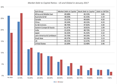
A large percentage of firms, more than 25% in the US and almost 20% globally, have no debt. Regionally, on a market debt to capital ratio, Eastern Europe(with Russia) and Latin America are the most highly levered regions of the world, but in terms of debt as a multiple of EBITDA, Canadian and Chinese companies have the highest debt burden.
I follow up by looking at debt to capital ratios for companies, by country, in the picture below and the statistics for all four measures of leverage in this spreadsheet.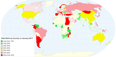 Link to live mapLatin America and Eastern Europe remain the most indebted region in the world, with almost every country in each region having debt ratios of 30% or higher in market value terms and often 50% or higher in book value terms. While some of this can be attributed to the drop in commodity prices over the last few years, I think that one reason is that many Latin American companies are hooked on a combination of high (and often unsustainable) dividends and a desire for control (manifested in an unwillingness to dilute equity ownership). The same factors explain why many Middle Eastern companies, where there is no tax benefit from debt, continue to borrow money.
Industry DifferencesYou would expect companies in different sectors to have very different policies on financial leverage, and most of the differences have to do with where they fall on the debt trade off. In the table below, I list the most highly levered and lightly levered non-financial service sectors in the United States, in terms of market debt to capital ratios.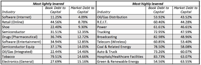 Spreadsheet with debt ratios, by sectorThere are few surprises on this list, as you see technology sectors (software, online retail, semiconductor, semiconductor equipment and electronics) on the least-levered list and capital intensive sectors (power, trucking, telecom) on the most-levered list. It is interesting that integrated oil/gas companies are among the least levered sectors but oil/gas distribution is on the most levered list. If you want to see the full list of industries, not just for the United States but also for other regions of the world, try this spreadsheet.
ClosingIn my earlier post on taxes, I noted that 2017 is likely to be a year of change, at least for the US tax code and almost every version of tax reform that is being talked about will reduce the marginal tax rate and therefore the tax benefits of debt. In fact, there are some versions where the entire tax benefit of debt will be removed. While I believe that this will be healthier in the long term for businesses, it will be a seismic shift that will have massive effects not just on corporate borrowing but on the corporate bond market. I am not sure that we (as investors and companies) are ready for that big a change. So, small steps way from the status quo, which is skewed strongly towards borrowers, may be all that you can expect to see!
YouTube Video
SpreadsheetsCapital Structure OptimizerAPV SpreadsheetDatasetsDebt Ratios, by countryDebt Ratios, by industryData 2017 Posts
Data Update 1: The Promise and Perils of Big DataData Update 2: The Resilience of US EquitiesData Update 3: Cracking the Currency Code - January 2017Data Update 4: Country Risk and Pricing, January 2017Data Update 5: A Taxing Year Ahead?Data Update 6: The Cost of Capital in January 2017Data Update 7: Profitability, Excess Returns and Corporate Governance- January 2017Data Update 8: The Debt Trade off in January 2017Data Update 9: Dividends and Buybacks in 2017Data Update 10: A Pricing Update in January 2017
The trade off on debt
In corporate finance, the discussion of debt begins with an examination of the trade offs on using debt, instead of equity, to finance operations. I have described debt as a double-edged sword before, and running out of analogies, I am going to draw on Star Wars framing, and talk about the light side (benefits) of debt and the dark side (costs) of debt. In the course of the discussion, I want to separate the illusory benefits and costs of debt from the real benefits and costs, partly because I see them mixed up in practice all the time.
In terms of the real factors that drive the trade off, debt creates two benefits. The biggest comes from the tilt in the tax code, which allows interest expenses to be tax deductible and cash flows to equity to be not. The secondary benefit is that debt can operate as a disciplinary mechanism, with the discipline of having to make debt payments restraining managers from taking truly abysmal projects. These benefits have to be offset against two big costs, the first and biggest being the increased likelihood of distress and the second being the potential for disagreements between lenders and equity investors about the future of the firm (and how it plays out as debt covenants). All of these factors show up in the cash flows and risk assessment of a business. There are however illusory factors that can be distracting. On the benefit side, there are some who argue that debt is good because it can push up your return on equity or point to the fact that the cost of debt is lower than the cost of equity. Both statements are generally right, but the flaw in reasoning in both is that they assume that as you borrow more money, your cost of equity will remain unchanged, and it will not. In fact, in the absence of debt and distress, the positive and negative effects will offset each other, leading to no value change. On the cost side, debt detractors will note that the interest expenses associated with debt will lower net income, ignoring the fact that the lower net income is now being earned on a lower equity base. If the argument is that debt will increase default risk and the cost of debt, it is worth pointing out that even at the higher cost, debt is still cheaper than equity. Finally, there are transient factors that come from market frictions, where if your equity is mis-priced or the interest rate on your debt is set too low or high (given your default risk), you (as the company) may take advantage of the friction, using more debt if equity is under priced and debt carries too low an interest rate and less debt if equity is over priced and debt carries too high a rate. This, of course, will require CFOs of companies to embark on that most dangerous of expeditions, of judging market assessments of their value and risk. The picture below brings together all of the elements:

As we debate why companies borrow money and how it affects their value, it is good to be clear eyed about how debt changes value. It is almost entirely because of the tax benefit that it is endowed with, and if you take that tax benefit away, the reasons for borrowing quickly dissipate.
The Cross Sectional Distribution Before we embark on an examination of debt loads across companies, let's start by looking at three different measures of financial leverage:Debt to Capital = Debt/ (Debt + Equity): This is a measure of how much of the capital in a company comes from debt. It can be measured as accountants see value (with book values for debt and equity) or as the market sees it (with market values for debt and equity).Debt to Equity = Debt/Equity: This is a close variant of debt to capital, with debt stated as a percent of equity, again in book value or market value terms.Debt to EBITDA = Debt/EBITDA: This measures how much debt a company has relative to the cash it generates from operations, before taxes and capital expenditures.In computing my total debt for the 42,668 companies in my sample, I include all interest bearing debt (short term, as well as long term) as well as the present value of lease commitments (which I treat as debt, and which accountants will start treating as debt in 2018 or 2019). I will start by looking at the distribution of debt to capital ratios, in both book and market terms, across all companies:

A large percentage of firms, more than 25% in the US and almost 20% globally, have no debt. Regionally, on a market debt to capital ratio, Eastern Europe(with Russia) and Latin America are the most highly levered regions of the world, but in terms of debt as a multiple of EBITDA, Canadian and Chinese companies have the highest debt burden.
I follow up by looking at debt to capital ratios for companies, by country, in the picture below and the statistics for all four measures of leverage in this spreadsheet.
 Link to live mapLatin America and Eastern Europe remain the most indebted region in the world, with almost every country in each region having debt ratios of 30% or higher in market value terms and often 50% or higher in book value terms. While some of this can be attributed to the drop in commodity prices over the last few years, I think that one reason is that many Latin American companies are hooked on a combination of high (and often unsustainable) dividends and a desire for control (manifested in an unwillingness to dilute equity ownership). The same factors explain why many Middle Eastern companies, where there is no tax benefit from debt, continue to borrow money.
Industry DifferencesYou would expect companies in different sectors to have very different policies on financial leverage, and most of the differences have to do with where they fall on the debt trade off. In the table below, I list the most highly levered and lightly levered non-financial service sectors in the United States, in terms of market debt to capital ratios.
 Spreadsheet with debt ratios, by sectorThere are few surprises on this list, as you see technology sectors (software, online retail, semiconductor, semiconductor equipment and electronics) on the least-levered list and capital intensive sectors (power, trucking, telecom) on the most-levered list. It is interesting that integrated oil/gas companies are among the least levered sectors but oil/gas distribution is on the most levered list. If you want to see the full list of industries, not just for the United States but also for other regions of the world, try this spreadsheet.
ClosingIn my earlier post on taxes, I noted that 2017 is likely to be a year of change, at least for the US tax code and almost every version of tax reform that is being talked about will reduce the marginal tax rate and therefore the tax benefits of debt. In fact, there are some versions where the entire tax benefit of debt will be removed. While I believe that this will be healthier in the long term for businesses, it will be a seismic shift that will have massive effects not just on corporate borrowing but on the corporate bond market. I am not sure that we (as investors and companies) are ready for that big a change. So, small steps way from the status quo, which is skewed strongly towards borrowers, may be all that you can expect to see!
YouTube Video
SpreadsheetsCapital Structure OptimizerAPV SpreadsheetDatasetsDebt Ratios, by countryDebt Ratios, by industryData 2017 Posts
Data Update 1: The Promise and Perils of Big DataData Update 2: The Resilience of US EquitiesData Update 3: Cracking the Currency Code - January 2017Data Update 4: Country Risk and Pricing, January 2017Data Update 5: A Taxing Year Ahead?Data Update 6: The Cost of Capital in January 2017Data Update 7: Profitability, Excess Returns and Corporate Governance- January 2017Data Update 8: The Debt Trade off in January 2017Data Update 9: Dividends and Buybacks in 2017Data Update 10: A Pricing Update in January 2017
January 30, 2017
January 2017 Data Update 7: Profitability, Excess Returns and Governance
If asked to describe a successful business, most people will tell you that it is one that makes money and that is not an unreasonable starting point, but it is not a good ending point. For a business to be a success, it is not just enough that it makes money but that it makes enough money to compensate the owners for the capital that they have invested in it, the risk that they are exposed to and the time that they have to wait to get their money back. That, in a nutshell, is how we define investment success in corporate finance and in this post, I would like to use that perspective to measure whether publicly traded companies are successful.
Measuring Investment Returns The first step towards measuring investment success is measuring the return that companies make on their investments. This step, though seemingly simple, is fraught with difficulties. First, corporate measures of profits are not only historical (as opposed to future expectations) but are also skewed by accounting discretion and practice and year-to-year volatility. Second, to measure the capital that a company has invested in its existing investments, you often have begin with what is shown as capital invested in a balance sheet, implicitly assuming that book value is a good proxy for capital invested. Notwithstanding these concerns, analysts often compute a return on invested capital (ROIC) as a measure of investment return earned by a company: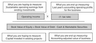
This simple computation has become corporate finance’s most widely computed and used ratio and while I compute it and use it in a variety of contexts, I do so with the recognition that it comes with flaws, some of which can be fatal. In the context of reporting this statistic at the start of last year, I reported my ROIC caveats in a picture: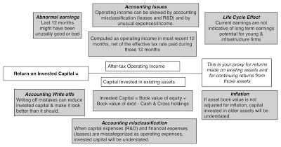
Put simply, it would be unfair of me to tar a young company like Tesla as a failure because it has a negative return on invested capital, and dangerous for me to view HP as a company that has made good investments, because it has a high ROIC, since is only due to the fact that it has written off almost $16 billion of mistakes, reducing its invested capital and inflating its ROIC. I compute the return on invested capital at the start of 2017 for each company in my public company sample of 42,668 firms, using the following judgments in my estimation:
I do make adjustments to operating income and invested capital that reflect my view that accounting miscategorizes R&D and operating leases. I am still using a bludgeon rather than a scalpel here and the returns on invested capital for some companies will be off, either because the last year’s operating income was abnormally high or low and/or accountants have managed to turn the invested capital at this company into a number that has little to do with what is invested in projects. That said, I have the law of large numbers as my ally.
Measuring Excess Returns
If the measure of investment success is that you are earning more on your capital invested than you could have made elsewhere, in an investment of equivalent risk, you can see why the cost of capital becomes the other half of the excess return equation. The cost of capital is measure of what investors can generate in the market on investments of equivalent risk. Thus, a company that can consistently generate returns on its invested capital that exceed its cost of capital is creating value, one that generates returns equal to the cost of capital is running in place and one that generates returns that are less than the cost of capital, it is destroying value. Of course, this comparison can be done entirely on an equity basis, using the cost of equity as the required rate and the return on equity as a measure of return:
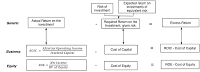
In general, especially when comparing large numbers of stocks across many sectors, the capital comparison is a more reliable one than the equity comparison. My end results for the capital comparison are summarized in the picture below, where I break my global companies into three broad groups. The first, value creators, includes companies that earn a return on invested capital that is at least 2% greater than the cost of capital, the second, value zeros, includes companies that earn within 2% (within my estimation error) of their cost of capital in either direction and the third, value destroyers, that earn a return on invested capital that is 2% lower than the cost of capital or worse.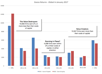
The public market place globally, at least at the start of 2017, has more value destroyers than value creators, at least based upon 2016 trailing returns on capital. The good news is that there are almost 6000 companies that are super value creators, earning returns on capital that earn 10% higher than the cost of capital or more. The bad news is that the value destroying group has almost 20,000 firms (about 63% of all firms) in it and a large subset of these companies are stuck in their value destructive ways, not only continuing to stay invested in bad businesses, but investing more capital.
If you are wary because the returns computed used the most recent 12 months of data, you are right be. To counter that, I also computed a ten-year average ROIC (for those companies with ten years of historical data or more) and that number compared to the cost of capital. As you would expect with the selection bias, the results are much more favorable, with almost 77% of firms earning more than their cost of capital, but even over this much longer time period, 23% of the firms earned less than the cost of capital. Finally, if you are doing this for an individual company, you can use much more finesse in your computation and use this spreadsheet to make your own adjustments to the number.
Regional and Sector Differences
If you accept my numbers, a third of all companies are destroying value, a third are running in place and a third are creating value, but are there differences across countries? I answer that question by computing the excess returns, by country, in the picture below:
 Link to live map
Just a note on caution on reading the numbers. Some of the countries in my sample, like Mali and Kazakhstan have very few companies listed and the numbers should taken with a grain of salt. Breaking out the excess returns by broad regional groupings, here is what I get:
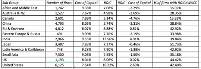 Spreadsheet with country dataFinally, I took a look at excess returns by sector, both globally and for different regions of the world, comparing returns on capital on an aggregated basis to the cost of capital. Focusing on non-financial service sectors, the sectors that delivered the most negative and most positive excess returns (ROIC - Cost of Capital) are listed below:
 Spreadsheet with sector dataMany of the sectors that delivered the worst returns in 2016 were in the natural resource sectors, and depressed commodity prices can be fingered as the culprit. Among the best performing sectors are many with low capital intensity and service businesses, though tobacco tops the list with the highest return spread, partly because the large buybacks/dividends in the sector have shrunk the capital invested in the sector.
For investors, looking at this listing of good and bad businesses in 2017, I would offer a warning about extrapolating to investing choices. The correlation between business quality and investment returns is tenuous, at best, and here is why. To the extent that the market is pricing in investment quality into stock prices, there is a very real possibility that the companies in the worst businesses may offer the best investment opportunities, if markets have over reacted to investment performance, and the companies in the best businesses may be the ones to avoid, if the market has pushed up prices too much. There is, however, a corporate governance lesson worth heeding. Notwithstanding claims to the contrary, there are many companies where managers left to their own devices, will find ways to spend investor money badly and need to be held to account.
What next?
I am not surprised, as some might be, by the numbers above. In many companies, break even is defined as making money and profitable projects are considered to be pulling their weight, even if those profits don’t measure up to alternative investments. A large number of companies, if put on the spot, will not even able to tell you how much capital they have invested in existing assets, either because the investments occurred way in the past or because of the way they are accounted for. It is not only investors who bear the cost of these poor investments but the economy overall, since more capital invested in bad businesses means less capital available for new and perhaps much better businesses, something to think about the next time you read a rant against stock buybacks or dividends.
YouTube Video
Spreadsheet
ROIC CalculatorDatasets
Excess Returns, by Country- January 2017Excess Returns, by Industry - January 2017Data 2017 Posts
Data Update 1: The Promise and Perils of Big DataData Update 2: The Resilience of US EquitiesData Update 3: Cracking the Currency Code - January 2017Data Update 4: Country Risk and Pricing, January 2017Data Update 5: A Taxing Year Ahead?Data Update 6: The Cost of Capital in January 2017Data Update 7: Profitability, Excess Returns and Corporate Governance- January 2017Data Update 8: The Debt Trade off in January 2017Data Update 9: Dividends and Buybacks in 2017Data Update 10: A Pricing Update in January 2017
Measuring Investment Returns The first step towards measuring investment success is measuring the return that companies make on their investments. This step, though seemingly simple, is fraught with difficulties. First, corporate measures of profits are not only historical (as opposed to future expectations) but are also skewed by accounting discretion and practice and year-to-year volatility. Second, to measure the capital that a company has invested in its existing investments, you often have begin with what is shown as capital invested in a balance sheet, implicitly assuming that book value is a good proxy for capital invested. Notwithstanding these concerns, analysts often compute a return on invested capital (ROIC) as a measure of investment return earned by a company:
This simple computation has become corporate finance’s most widely computed and used ratio and while I compute it and use it in a variety of contexts, I do so with the recognition that it comes with flaws, some of which can be fatal. In the context of reporting this statistic at the start of last year, I reported my ROIC caveats in a picture:
Put simply, it would be unfair of me to tar a young company like Tesla as a failure because it has a negative return on invested capital, and dangerous for me to view HP as a company that has made good investments, because it has a high ROIC, since is only due to the fact that it has written off almost $16 billion of mistakes, reducing its invested capital and inflating its ROIC. I compute the return on invested capital at the start of 2017 for each company in my public company sample of 42,668 firms, using the following judgments in my estimation:
I do make adjustments to operating income and invested capital that reflect my view that accounting miscategorizes R&D and operating leases. I am still using a bludgeon rather than a scalpel here and the returns on invested capital for some companies will be off, either because the last year’s operating income was abnormally high or low and/or accountants have managed to turn the invested capital at this company into a number that has little to do with what is invested in projects. That said, I have the law of large numbers as my ally.
Measuring Excess Returns
If the measure of investment success is that you are earning more on your capital invested than you could have made elsewhere, in an investment of equivalent risk, you can see why the cost of capital becomes the other half of the excess return equation. The cost of capital is measure of what investors can generate in the market on investments of equivalent risk. Thus, a company that can consistently generate returns on its invested capital that exceed its cost of capital is creating value, one that generates returns equal to the cost of capital is running in place and one that generates returns that are less than the cost of capital, it is destroying value. Of course, this comparison can be done entirely on an equity basis, using the cost of equity as the required rate and the return on equity as a measure of return:
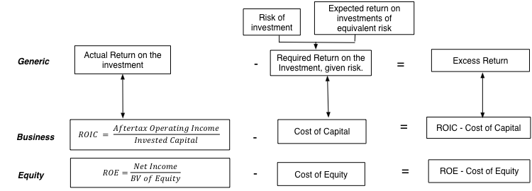
In general, especially when comparing large numbers of stocks across many sectors, the capital comparison is a more reliable one than the equity comparison. My end results for the capital comparison are summarized in the picture below, where I break my global companies into three broad groups. The first, value creators, includes companies that earn a return on invested capital that is at least 2% greater than the cost of capital, the second, value zeros, includes companies that earn within 2% (within my estimation error) of their cost of capital in either direction and the third, value destroyers, that earn a return on invested capital that is 2% lower than the cost of capital or worse.
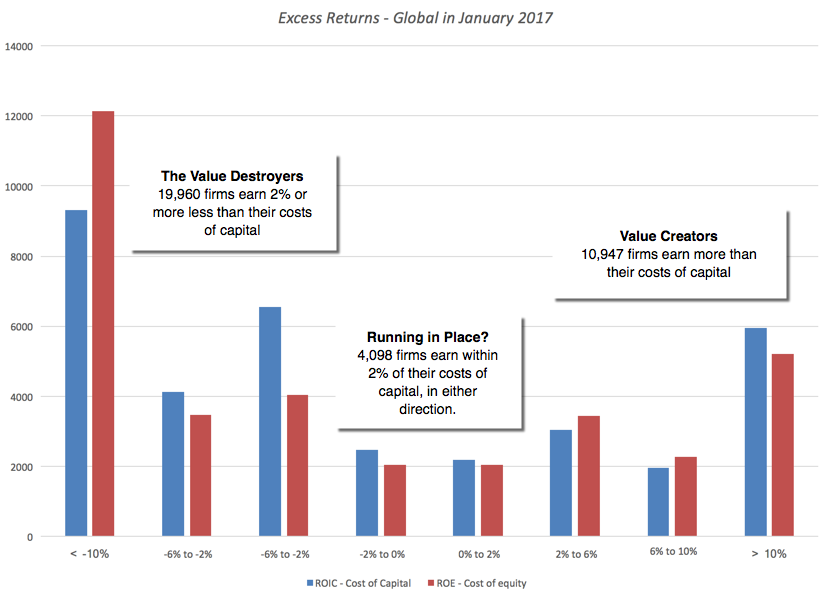
The public market place globally, at least at the start of 2017, has more value destroyers than value creators, at least based upon 2016 trailing returns on capital. The good news is that there are almost 6000 companies that are super value creators, earning returns on capital that earn 10% higher than the cost of capital or more. The bad news is that the value destroying group has almost 20,000 firms (about 63% of all firms) in it and a large subset of these companies are stuck in their value destructive ways, not only continuing to stay invested in bad businesses, but investing more capital.
If you are wary because the returns computed used the most recent 12 months of data, you are right be. To counter that, I also computed a ten-year average ROIC (for those companies with ten years of historical data or more) and that number compared to the cost of capital. As you would expect with the selection bias, the results are much more favorable, with almost 77% of firms earning more than their cost of capital, but even over this much longer time period, 23% of the firms earned less than the cost of capital. Finally, if you are doing this for an individual company, you can use much more finesse in your computation and use this spreadsheet to make your own adjustments to the number.
Regional and Sector Differences
If you accept my numbers, a third of all companies are destroying value, a third are running in place and a third are creating value, but are there differences across countries? I answer that question by computing the excess returns, by country, in the picture below:
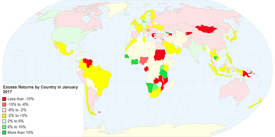 Link to live map
Just a note on caution on reading the numbers. Some of the countries in my sample, like Mali and Kazakhstan have very few companies listed and the numbers should taken with a grain of salt. Breaking out the excess returns by broad regional groupings, here is what I get:
 Spreadsheet with country dataFinally, I took a look at excess returns by sector, both globally and for different regions of the world, comparing returns on capital on an aggregated basis to the cost of capital. Focusing on non-financial service sectors, the sectors that delivered the most negative and most positive excess returns (ROIC - Cost of Capital) are listed below:
 Spreadsheet with sector dataMany of the sectors that delivered the worst returns in 2016 were in the natural resource sectors, and depressed commodity prices can be fingered as the culprit. Among the best performing sectors are many with low capital intensity and service businesses, though tobacco tops the list with the highest return spread, partly because the large buybacks/dividends in the sector have shrunk the capital invested in the sector.
For investors, looking at this listing of good and bad businesses in 2017, I would offer a warning about extrapolating to investing choices. The correlation between business quality and investment returns is tenuous, at best, and here is why. To the extent that the market is pricing in investment quality into stock prices, there is a very real possibility that the companies in the worst businesses may offer the best investment opportunities, if markets have over reacted to investment performance, and the companies in the best businesses may be the ones to avoid, if the market has pushed up prices too much. There is, however, a corporate governance lesson worth heeding. Notwithstanding claims to the contrary, there are many companies where managers left to their own devices, will find ways to spend investor money badly and need to be held to account.
What next?
I am not surprised, as some might be, by the numbers above. In many companies, break even is defined as making money and profitable projects are considered to be pulling their weight, even if those profits don’t measure up to alternative investments. A large number of companies, if put on the spot, will not even able to tell you how much capital they have invested in existing assets, either because the investments occurred way in the past or because of the way they are accounted for. It is not only investors who bear the cost of these poor investments but the economy overall, since more capital invested in bad businesses means less capital available for new and perhaps much better businesses, something to think about the next time you read a rant against stock buybacks or dividends.
YouTube Video
Spreadsheet
ROIC CalculatorDatasets
Excess Returns, by Country- January 2017Excess Returns, by Industry - January 2017Data 2017 Posts
Data Update 1: The Promise and Perils of Big DataData Update 2: The Resilience of US EquitiesData Update 3: Cracking the Currency Code - January 2017Data Update 4: Country Risk and Pricing, January 2017Data Update 5: A Taxing Year Ahead?Data Update 6: The Cost of Capital in January 2017Data Update 7: Profitability, Excess Returns and Corporate Governance- January 2017Data Update 8: The Debt Trade off in January 2017Data Update 9: Dividends and Buybacks in 2017Data Update 10: A Pricing Update in January 2017
January 26, 2017
January 2017 Data Update 6: A Cost of Capital Update!
I have described the cost of capital as the Swiss Army knife of finance, a number that shows up in so many different places in corporate financial and analysis and valuation and in so many different contexts, that it is easy to mangle and misunderstand. In this post, my objective is simple. I will start with a description of the sequence that I use to get to a cost of capital for companies in January 2017, but the bulk of the post will be describing what the cost of capital looks like at the start of 2017 for companies around the world.
The Cost of Capital: Hurdle Rate, Opportunity Cost and Discount Rate
As I move from corporate finance to valuation to investment philosophies, the one number that seems to show up in almost every aspect of analysis is the cost of capital. In corporate finance, it is the hurdle rate that determines whether companies should make new investments, the optimizer for financing mix and the divining rod for how much to return to stockholders in dividends and buybacks. In valuation, it is the discount rate in discounted cash flow valuations and the determinants of enterprise value multiples (of EBITDA and sales).
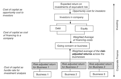
It is perhaps because it is used in so many different contexts by such varied sub-groups that it remains a vastly misunderstood and misused number. If you are interested in reading more about the cost of capital, you may want to try this paper that I have on the topic (it is not technical or theoretical).
The Cost of Capital CalculationThe cost of capital is the weighted average of the costs of equity and debt for a business. While entire books have been written on the measurement questions, I will keep it simple. 1. The cost of equity is the rate of return that the marginal investors, i.e., the investors who are most influential at setting your market price, are demanding to invest in equity in your business. To get to that number, you need three inputs, a risk free rate to get started, a measure of how risky your equity is, from the perspective of the marginal investors, and a price for taking that risk.Cost of Equity = Risk Free Risk + Relative Risk Measure * Price of RiskIn the rarefied world of the capital asset pricing model, you assume that the marginal investor is diversified, beta measures relative risk and the equity risk premium is the price of risk, yielding a cost of equity.2. The cost of debt is the rate at which you can borrow money, long term and today. It is not a historic cost of borrowing, nor can it be influenced by decisions on changing debt maturity. It can be computed by adding a credit or default spread to the risk free rate but it does come, in many markets, with a tax benefit which is captured by netting it out of your cost.After-tax Cost of Debt = (Risk Free Rate + Default Spread) (1- Marginal Tax Rate)The default spread can sometimes be observed, if the company issues long term bonds, sometimes easily estimated, if the company has a bond rating and you trust that rating, and sometimes requires more work, if you have to estimate default risk yourself.3. The weights on debt and equity should be based upon market values, not book values, and can change over time, as your company changes.
Since I want to compute the cost of capital for every one of the 42,668 firms that comprised this year’s sample, I had to make some simplifying (and perhaps even simplistic) assumptions, some of which were necessitated by the size of my sample and some by data limitations. I have summarized them in the picture below.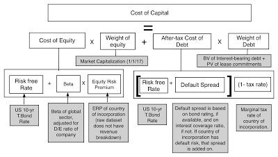
I have computed the costs of capital for all companies in US dollar terms, not for parochial reasons, since converting to another currency is trivial (as I noted in my post on cracking the currency code) but to allow for consolidation and comparison.
The costs of capital that I compute for individual companies have two shortcomings, driven primarily by data limitations. The first is that the beta that I use for a company comes from the business that it is categorized in, rather than a weighted average of the multiple businesses that it may operate in. The second is that I have attached the equity risk premium of the country of incorporation rather than a weighted average of the ERPs of the countries in which a company operates; I had to do this since the revenue breakdowns by country were either not available for many companies or in too difficult a form to work with. If you want to compute the cost of capital for a company using my data, I have a spreadsheet that you can use that will let you break out of these bounds, allowing you to compute a beta across multiple businesses and an equity risk premium across many countries/regions.
Differences across GeographiesThe first comparison I make is in the costs of capital across different countries and regions. The picture below shows cost of capital by country and you can download the data in a spreadsheet at this link. Link to live mapGiven that these are all US-dollar based costs of capital, the differences across countries can be attributed to four factors:Country risk: Country risk shows up in two places in the cost of capital calculation, the equity risk premium for the company (which is set equal to the equity risk premium of the country it is in) and an additional default spread in the cost of debt. Industry concentration: Since my measure of relative risk comes from looking at the global beta for the sector in which a company operates, the cost of capital for a country will reflect the breakdown of industries in that country. Thus, the cost of capital for Peru, a country with a disproportionately large number of natural resource companies, will reflect the beta of mining and natural resource companies.Marginal tax rate: To the extent that a higher marginal tax rate lowers the after-tax cost of debt, holding all else constant, countries with higher marginal tax rates will have lower after-tax costs of debt and perhaps lower costs of capital.Debt ratio: Twinned with the marginal tax rate, in computing how much a company is being helped by the tax benefit of debt, is the amount of debt that the company uses, with higher debt ratios often translating into lower costs of capital.Differences across Industry GroupsI next turn to industry groupings and differences in cost of capital across them. In the table below, I list the ten (non-financial service) industry groupings globally, with the highest costs of capital, and the ten, with the lowest, at the start of 2017.
 Spreadsheet with all industriesThe reason for excluding financial service companies is simple. For banks, insurance companies and investment banks, the only hurdle rate that has relevance is a cost of equity, since debt is more raw material than a source of capital for these firms. You can download the entire industry list (with Global, European, Emerging Market and Australia/Canada worksheets) at this link, but again there are only a few reasons for the differences:Business risk: Some businesses are clearly more risky than others and I am using my sector betas to capture the differences in risk. Leverage differences: Companies in some sectors borrow more than others, with mixed effects on the cost of capital. The resulting higher debt to equity ratios push up sector betas more, leading to higher costs of equity. That, though, is more than partially offset by the benefit of raising financing at the after-tax cost of debt, a bargain relative to equity.Country exposure: Some industry groupings have geographic concentrations and to the extent that those concentrations are in countries with very low or very high risk, relative to the rest of the world, your cost of capital will be skewed low or high.Distributional PerspectiveI have long argued that analysts spend far too much time on tweaking and finessing costs of capital in valuation and not enough on estimating earnings and cash flows, and I base my argument on a very simple fact. The distribution of costs of capital for publicly traded companies is a tight one, with a large proportion of companies falling in a very narrow range. Rather than talk in abstractions, consider the histogram of costs of capital for US and global companies at the start of 2017:
The median US $ cost of capital for a US company is 7.22%, 50% of all US companies have costs of capital between 5.69% and 8.14%, and 80% have costs of capital between 4.59% and 8.87%. If you expand the distribution to include all global stocks, your distribution widens but not by as much as you might think. The median US $ cost of capital for a global company is 8.03%, half of all global companies have costs of capital between 6.88% and 9.15% and 90% of all companies globally have costs of capital between 5.63% and 10.68%. In other words, you don't have a lot of leeway to move your cost of capital for publicly traded firms. It is true that as you bring in other currencies into the mix, you can make the differences larger, but as I noted in my post on currencies, it is because of differences in inflation. You may want to pay heed to these distributions the next time that you see an analyst using a 20% US$ cost of capital to value a "risky" company or a 3% US$ cost of capital for a "safe" company, since neither number looks defensible, given the distribution.
Cost of Capital Maxims
I think that we not only spend too much time on estimating costs of capital in valuation but we also misunderstand what it is designed to measure. At the risk of repeating myself, here are four suggestions that I have on the cost of capital:
Don't make the cost of capital the receptacle of all your hopes and fears: Many analysts take to heart the principle that riskier firms should have higher costs of capital (or discount rates) but then proceed to intuit what that discount rate should be for company, given how risky they think it is. In the process, they often incorporate risks that don't belong in discount rates and attach prices for those risks that reflect their gut responses rather than what the market is paying.Focus on cash flows, not discount rates: When your valuations go awry, it is almost never because of the mistakes that you made on the discount rate and almost always because of errors in your estimates of cash flows (with growth, margins and reinvestment). Spend less time on estimating discount rates: It follows then that when you have a limited amount of time that you can spend on a valuation (and who does not?), that time is better spent on assessing cash flows than in fine tuning the discount rate.An approximation works well : When I am in a hurry to value a company, I use my distributional statistics (see graph above) to get started. Thus, if I am valuing an average risk company in US dollars, I will start off using an 8% cost of capital (the global median is 8.03%) and complete my valuation with that number, and if I still have time, I will come back and tweak the cost of capital. If it is very risky firm, I will start off with a 10.68% cost of capital (the 90th percentile) and gain revisit that number, if I have the time.All in all, if your find yourself obsessing about the minutiae of discount rates in a valuation, it is perhaps because you want to avoid the big questions that make valuation interesting and challenging at the same time.
YouTube Video
Paper on the cost of capital
The Cost of Capital: The Swiss Army Knife of Finance
Spreadsheets
Cost of Capital Calculator for individual company
DatasetsCost of Capital (US$), by Country - January 2017Cost of Capital (US$), by Industry - January 2017US $ Cost of Capital - Percentiles for US and Global companiesData 2017 Posts
Data Update 1: The Promise and Perils of Big DataData Update 2: The Resilience of US EquitiesData Update 3: Cracking the Currency Code - January 2017Data Update 4: Country Risk and Pricing, January 2017Data Update 5: A Taxing Year Ahead?Data Update 6: The Cost of Capital in January 2017Data Update 7: Profitability, Excess Returns and Corporate Governance- January 2017Data Update 8: The Debt Trade off in January 2017Data Update 9: Dividends and Buybacks in 2017Data Update 10: A Pricing Update in January 2017
The Cost of Capital: Hurdle Rate, Opportunity Cost and Discount Rate
As I move from corporate finance to valuation to investment philosophies, the one number that seems to show up in almost every aspect of analysis is the cost of capital. In corporate finance, it is the hurdle rate that determines whether companies should make new investments, the optimizer for financing mix and the divining rod for how much to return to stockholders in dividends and buybacks. In valuation, it is the discount rate in discounted cash flow valuations and the determinants of enterprise value multiples (of EBITDA and sales).
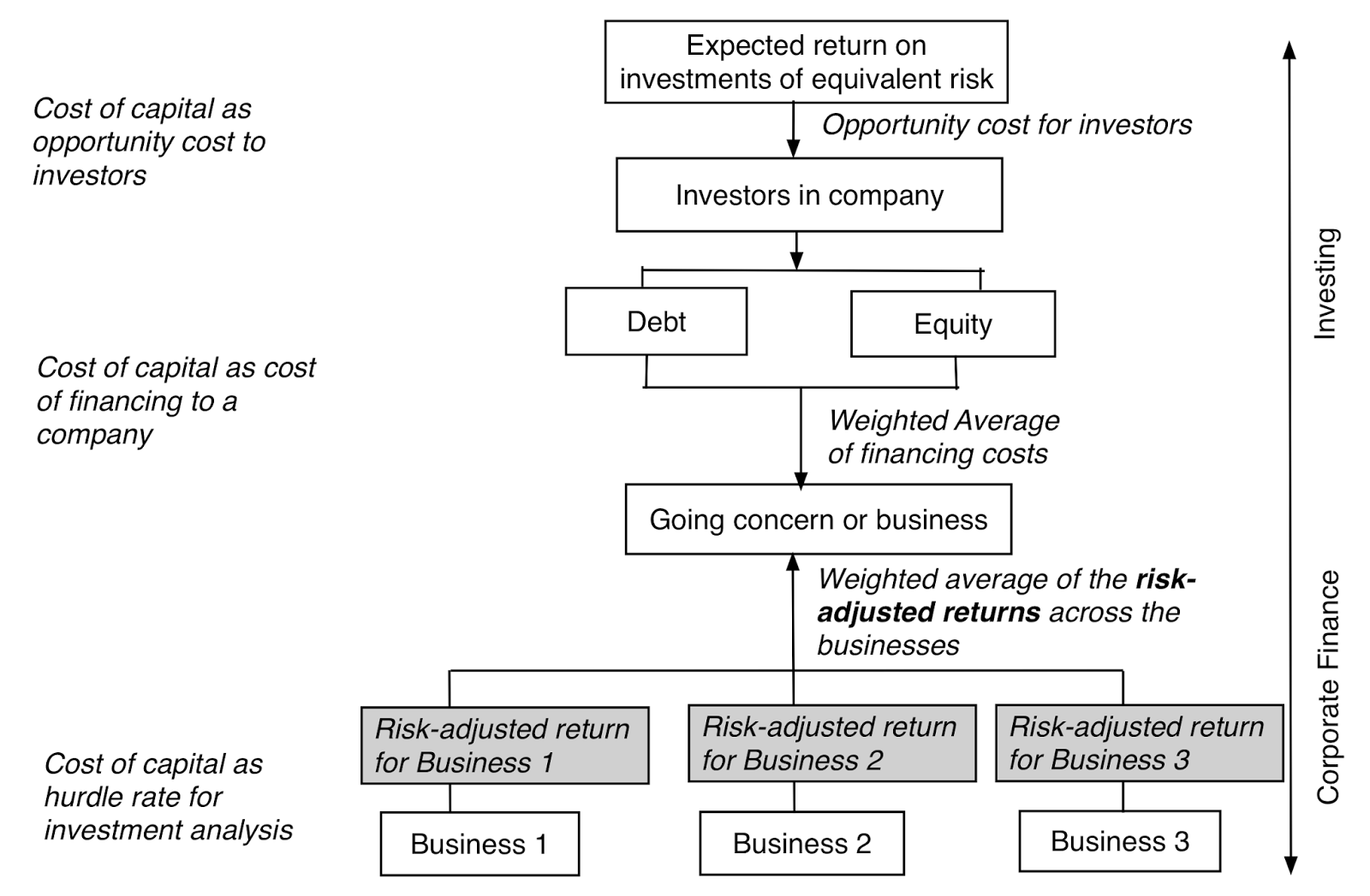
It is perhaps because it is used in so many different contexts by such varied sub-groups that it remains a vastly misunderstood and misused number. If you are interested in reading more about the cost of capital, you may want to try this paper that I have on the topic (it is not technical or theoretical).
The Cost of Capital CalculationThe cost of capital is the weighted average of the costs of equity and debt for a business. While entire books have been written on the measurement questions, I will keep it simple. 1. The cost of equity is the rate of return that the marginal investors, i.e., the investors who are most influential at setting your market price, are demanding to invest in equity in your business. To get to that number, you need three inputs, a risk free rate to get started, a measure of how risky your equity is, from the perspective of the marginal investors, and a price for taking that risk.Cost of Equity = Risk Free Risk + Relative Risk Measure * Price of RiskIn the rarefied world of the capital asset pricing model, you assume that the marginal investor is diversified, beta measures relative risk and the equity risk premium is the price of risk, yielding a cost of equity.2. The cost of debt is the rate at which you can borrow money, long term and today. It is not a historic cost of borrowing, nor can it be influenced by decisions on changing debt maturity. It can be computed by adding a credit or default spread to the risk free rate but it does come, in many markets, with a tax benefit which is captured by netting it out of your cost.After-tax Cost of Debt = (Risk Free Rate + Default Spread) (1- Marginal Tax Rate)The default spread can sometimes be observed, if the company issues long term bonds, sometimes easily estimated, if the company has a bond rating and you trust that rating, and sometimes requires more work, if you have to estimate default risk yourself.3. The weights on debt and equity should be based upon market values, not book values, and can change over time, as your company changes.
Since I want to compute the cost of capital for every one of the 42,668 firms that comprised this year’s sample, I had to make some simplifying (and perhaps even simplistic) assumptions, some of which were necessitated by the size of my sample and some by data limitations. I have summarized them in the picture below.

I have computed the costs of capital for all companies in US dollar terms, not for parochial reasons, since converting to another currency is trivial (as I noted in my post on cracking the currency code) but to allow for consolidation and comparison.
The costs of capital that I compute for individual companies have two shortcomings, driven primarily by data limitations. The first is that the beta that I use for a company comes from the business that it is categorized in, rather than a weighted average of the multiple businesses that it may operate in. The second is that I have attached the equity risk premium of the country of incorporation rather than a weighted average of the ERPs of the countries in which a company operates; I had to do this since the revenue breakdowns by country were either not available for many companies or in too difficult a form to work with. If you want to compute the cost of capital for a company using my data, I have a spreadsheet that you can use that will let you break out of these bounds, allowing you to compute a beta across multiple businesses and an equity risk premium across many countries/regions.
Differences across GeographiesThe first comparison I make is in the costs of capital across different countries and regions. The picture below shows cost of capital by country and you can download the data in a spreadsheet at this link.
 Link to live mapGiven that these are all US-dollar based costs of capital, the differences across countries can be attributed to four factors:Country risk: Country risk shows up in two places in the cost of capital calculation, the equity risk premium for the company (which is set equal to the equity risk premium of the country it is in) and an additional default spread in the cost of debt. Industry concentration: Since my measure of relative risk comes from looking at the global beta for the sector in which a company operates, the cost of capital for a country will reflect the breakdown of industries in that country. Thus, the cost of capital for Peru, a country with a disproportionately large number of natural resource companies, will reflect the beta of mining and natural resource companies.Marginal tax rate: To the extent that a higher marginal tax rate lowers the after-tax cost of debt, holding all else constant, countries with higher marginal tax rates will have lower after-tax costs of debt and perhaps lower costs of capital.Debt ratio: Twinned with the marginal tax rate, in computing how much a company is being helped by the tax benefit of debt, is the amount of debt that the company uses, with higher debt ratios often translating into lower costs of capital.Differences across Industry GroupsI next turn to industry groupings and differences in cost of capital across them. In the table below, I list the ten (non-financial service) industry groupings globally, with the highest costs of capital, and the ten, with the lowest, at the start of 2017.
 Spreadsheet with all industriesThe reason for excluding financial service companies is simple. For banks, insurance companies and investment banks, the only hurdle rate that has relevance is a cost of equity, since debt is more raw material than a source of capital for these firms. You can download the entire industry list (with Global, European, Emerging Market and Australia/Canada worksheets) at this link, but again there are only a few reasons for the differences:Business risk: Some businesses are clearly more risky than others and I am using my sector betas to capture the differences in risk. Leverage differences: Companies in some sectors borrow more than others, with mixed effects on the cost of capital. The resulting higher debt to equity ratios push up sector betas more, leading to higher costs of equity. That, though, is more than partially offset by the benefit of raising financing at the after-tax cost of debt, a bargain relative to equity.Country exposure: Some industry groupings have geographic concentrations and to the extent that those concentrations are in countries with very low or very high risk, relative to the rest of the world, your cost of capital will be skewed low or high.Distributional PerspectiveI have long argued that analysts spend far too much time on tweaking and finessing costs of capital in valuation and not enough on estimating earnings and cash flows, and I base my argument on a very simple fact. The distribution of costs of capital for publicly traded companies is a tight one, with a large proportion of companies falling in a very narrow range. Rather than talk in abstractions, consider the histogram of costs of capital for US and global companies at the start of 2017:

The median US $ cost of capital for a US company is 7.22%, 50% of all US companies have costs of capital between 5.69% and 8.14%, and 80% have costs of capital between 4.59% and 8.87%. If you expand the distribution to include all global stocks, your distribution widens but not by as much as you might think. The median US $ cost of capital for a global company is 8.03%, half of all global companies have costs of capital between 6.88% and 9.15% and 90% of all companies globally have costs of capital between 5.63% and 10.68%. In other words, you don't have a lot of leeway to move your cost of capital for publicly traded firms. It is true that as you bring in other currencies into the mix, you can make the differences larger, but as I noted in my post on currencies, it is because of differences in inflation. You may want to pay heed to these distributions the next time that you see an analyst using a 20% US$ cost of capital to value a "risky" company or a 3% US$ cost of capital for a "safe" company, since neither number looks defensible, given the distribution.
Cost of Capital Maxims
I think that we not only spend too much time on estimating costs of capital in valuation but we also misunderstand what it is designed to measure. At the risk of repeating myself, here are four suggestions that I have on the cost of capital:
Don't make the cost of capital the receptacle of all your hopes and fears: Many analysts take to heart the principle that riskier firms should have higher costs of capital (or discount rates) but then proceed to intuit what that discount rate should be for company, given how risky they think it is. In the process, they often incorporate risks that don't belong in discount rates and attach prices for those risks that reflect their gut responses rather than what the market is paying.Focus on cash flows, not discount rates: When your valuations go awry, it is almost never because of the mistakes that you made on the discount rate and almost always because of errors in your estimates of cash flows (with growth, margins and reinvestment). Spend less time on estimating discount rates: It follows then that when you have a limited amount of time that you can spend on a valuation (and who does not?), that time is better spent on assessing cash flows than in fine tuning the discount rate.An approximation works well : When I am in a hurry to value a company, I use my distributional statistics (see graph above) to get started. Thus, if I am valuing an average risk company in US dollars, I will start off using an 8% cost of capital (the global median is 8.03%) and complete my valuation with that number, and if I still have time, I will come back and tweak the cost of capital. If it is very risky firm, I will start off with a 10.68% cost of capital (the 90th percentile) and gain revisit that number, if I have the time.All in all, if your find yourself obsessing about the minutiae of discount rates in a valuation, it is perhaps because you want to avoid the big questions that make valuation interesting and challenging at the same time.
YouTube Video
Paper on the cost of capital
The Cost of Capital: The Swiss Army Knife of Finance
Spreadsheets
Cost of Capital Calculator for individual company
DatasetsCost of Capital (US$), by Country - January 2017Cost of Capital (US$), by Industry - January 2017US $ Cost of Capital - Percentiles for US and Global companiesData 2017 Posts
Data Update 1: The Promise and Perils of Big DataData Update 2: The Resilience of US EquitiesData Update 3: Cracking the Currency Code - January 2017Data Update 4: Country Risk and Pricing, January 2017Data Update 5: A Taxing Year Ahead?Data Update 6: The Cost of Capital in January 2017Data Update 7: Profitability, Excess Returns and Corporate Governance- January 2017Data Update 8: The Debt Trade off in January 2017Data Update 9: Dividends and Buybacks in 2017Data Update 10: A Pricing Update in January 2017
January 25, 2017
January 2017 Data Update 5: A Taxing Year Ahead?
There are three realities that you cannot avoid in business and investing. The first is that your returns and value are based upon the cash flows you have left over after you pay taxes. The second is that the taxes you pay are a function of both the tax code of the country or countries that you operate in and how you, as a business, work within (or outside) that code. The third is that the tax code itself can change over time, as countries institute changes in both rates and rules. The upcoming year looks like it will be more eventful than most, especially for US companies, as there is talk about major changes coming to both corporate and individual taxation.
Why taxes matter
While we are often casual in our treatment of taxes, the value of a business is a affected substantially by tax policy, with our measures of expected cash flows and discount rates both being affected by taxes. In the numerator, you have expected cash flows after taxes, where the taxes you pay will reflect not only where in the world you generate income (since tax rates and rules vary across countries) but how the country in which you are incorporated in treats that foreign income. The US, for instance, requires US companies to pay the US tax rate even on foreign income, though the additional tax is due only when that income is remitted back to the US, leading to a predictable result. Multinational US companies leave their foreign income un-remitted, leading to the phenomenon of trapped cash (amounting to more than $2 trillion at US companies at the start of 2017).The denominator, which is the discount rate, is also affected by the tax code. To the extent that tax laws in much of the world benefit debt over equity, using more debt in your financing mix can potentially lower your cost of capital. In computing this tax benefit from debt, there are two points to keep in mind. The first is that interest expenses save you taxes at the margin, i.e., your dollar in interest expense offsets your last dollar of income, saving you taxes on that last dollar, making it imperative that you use the marginal tax rate when computing your tax benefit from borrowing. The second is that companies have a choice on where to borrow money and not surprisingly choose those locations where they get the highest tax benefit (with the highest marginal tax rate). Is it any surprise that while Apple generates its income globally and finds ways to pay an effective tax rate of 21% on its taxable income in 2016, almost all of its debt is in the United States, saving taxes at an almost 40% marginal tax rate?Following up, then, the values of all companies in a country can change, some in positive and some in negative ways, when tax codes get rewritten. Even if the corporate tax codes don’t change, a company’s decisions on how to structure itself and where geographically to go for growth will affect its cash flows and discount rates in future years.
Marginal Tax RatesIf the marginal tax rate is the rate that a business pays on its last dollar of income, where in its financial statements are you most likely to find it? The answer in most companies is that you do not, and that you have to look in the tax code instead. Fortunately, KPMG does a yeoman job each year of pulling these numbers together and reporting them and the most recent update can be found here. The map below lists marginal tax rates by country and you also download a spreadsheet with the latest numbers at this link: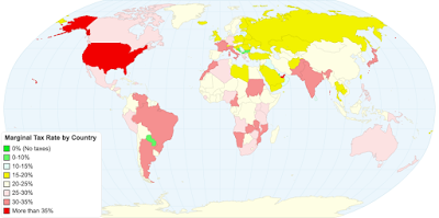 Link to live mapAs you survey the world's marginal tax rates, you can see why trapped cash has become such a common phenomenon at US companies. The US has one of the highest marginal tax rates in the world at 40% (including a federal tax rate of 35%, topped off with state and local taxes) and is one of only a handful of countries that still insist on taxing companies incorporated in their domiciles on their global income, rather than adopting the more defensible practice of territorial taxation, where you require businesses to pay taxes in the countries that they generate their income in. As Congress looks at what to do about “trapped cash”, with many suggesting a one-time special deal where companies will be allowed to bring the cash back, they should also realize that unless the underlying reason for it is fixed, the problem will recur. That will mean either lowering the US marginal tax rate closer to the rest of the world (about 25%) or changing to a territorial tax model.
The marginal tax rate is the number that you use to compute your after-tax cost of debt but that practice is built on the presumption that all interest expenses are tax deductible (and that you have enough taxable income to cover the interest deduction). That is still true in much of the world but there are parts of the world, where you either cannot deduct interest expenses (such as the Middle East) or you have taxes computed on a line item like revenues (thus nullifying the tax benefit of debt), where you will have to alter the practice of giving debt a tax benefit. For multinational companies that face different marginal tax rates in different operating countries, my recommendation is that you use the highest marginal tax rates across countries, since that is where these companies will direct their borrowing.
Effective Tax Rates: Country Level DifferencesIf the marginal tax rate is the tax rate on your last dollar of income, what is the effective tax rate, the number that you often see reported in financial statements? In most cases, it is a computed tax rate that comes directly from the income statement and is computed as follows:Effective Tax Rate = (Accrual) Taxes Payable / (Accrual) Taxable IncomeBoth number are accrual income numbers and thus can be different from cash taxes paid, with the differences usually visible in the statement of cash flows. Let’s start with looking at what companies pay as effective tax rates in the United States, a country with a marginal tax rate of 40%. In the most recent twelve months leading into January 2017, the distribution of effective tax rates paid by tax-paying US companies is captured below.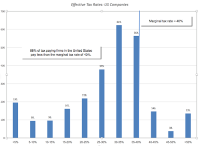
The most interesting numbers in this distribution are the average effective tax rate of 26.42% across profitable US companies, well below the marginal tax rate of 40%. and the fact that 88% of US companies have effective tax rates that are lower than the marginal. The most important reason for this difference, in my view, is foreign operations with those firms that generate revenues outside the United States paying lower taxes, simply because the tax rate on income outside the United States is much lower (and that differential tax is not due until the cash is remitted). While there are some who suggest that a simple fix for this is to force US firms to pay the entire marginal tax rate when they make their income in foreign locales immediately (rather than on repatriation), this will be a powerful incentive for US companies to move their headquarters overseas.
In these populist times, you may be convinced that US companies are not paying their fair share of taxes but is that true? To make that judgment, I looked at effective tax rates paid by companies in different countries in the picture below and you can download the data in a spreadsheet in the link below: Link to live mapAt least, based upon the data on taxes paid in 2017, US companies measure up well against the rest of the world, in terms of paying taxes, with only Japanese companies paying significantly more in taxes; Indian and Australian companies pay about what US companies do and the rest of the world pays less.
table.tableizer-table { font-size: 12px; border: 1px solid #CCC; font-family: Arial, Helvetica, sans-serif; } .tableizer-table td { padding: 4px; margin: 3px; border: 1px solid #CCC; } .tableizer-table th { background-color: #104E8B; color: #FFF; font-weight: bold; }
Sub GroupEffective Tax RateSub GroupEffective Tax RateAfrica and Middle East15.48%India27.65%Australia & NZ26.76%Japan31.07%Canada19.68%Latin America & Caribbean22.91%China21.72%Small Asia21.59%EU & Environs23.03%UK22.26%Eastern Europe & Russia19.88%United States26.22%As US companies market their products and services in other countries, it is true that some of this tax revenue is being collected by foreign governments, but that is the nature of a multinational business and is something that every country in the world with multinational corporations has as a shared problem.
Effective Tax Rates: Industry and Company DifferencesAs a final analysis, I compared the effective tax rates by US companies, categorized by industry. This table, which I have reported before, lists the ten industry groups that pay the highest effective tax rate and the ten that pay the lowest: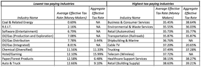 Download spreadsheets with all industries
The entire list can be downloaded here. Again, there are many reasons for the differences, with companies that generate more income from foreign operations paying lower taxes than domestic companies being a primary one. It is also true that the US tax code is filled with sector-specific provisions that provide special treatment for these sectors in the form of generous tax deductions. Most of these tax deductions (like higher depreciation allowances) show up as expenses in the income statement and the taxable income should already reflect them and so should the effective tax rate, but in some cases it does show up as a marginal tax rate.
Download spreadsheets with all industries
The entire list can be downloaded here. Again, there are many reasons for the differences, with companies that generate more income from foreign operations paying lower taxes than domestic companies being a primary one. It is also true that the US tax code is filled with sector-specific provisions that provide special treatment for these sectors in the form of generous tax deductions. Most of these tax deductions (like higher depreciation allowances) show up as expenses in the income statement and the taxable income should already reflect them and so should the effective tax rate, but in some cases it does show up as a marginal tax rate.
While in most years, these differences across sectors is a just a source of discussion or a reason to vent on the unfairness of taxes, I believe that investors, this year, should be paying particular attention to them. If Congress is serious about rewriting the tax code this year, there is reason to believe that the changed tax code is going to create winners and losers, and especially so, if it is designed to be revenue neutral. Those winners and losers will of course be different, depending on which version of corporate tax reform passes.
At one extreme in the version that is least disruptive to the current system, the marginal tax rate for corporations will be lowered, perhaps with a loss of some tax deductions/credits and adjustments on how foreign income gets taxed to reduce the problem of trapped cash. If this change occurs, the effects on value will be mixed, with cash flows increasing for those firms that will have lower effective tax rates as a consequence and the costs of debt and capital increasing as the tax benefits of debt will decrease. The biggest beneficiaries will be firms that pay high effective tax rates today (see the table above for the sectors) and have little debt. The biggest losers will be firms that pay low effective tax rates today and fund their operations with lots of debt.At the other extreme, the House of Representatives is considering a more radical version of tax reform, where the current corporate income tax will be scrapped and replaced with a "Destination Based Cash-flow Tax" (DBCT), a value added tax system, with a deduction for wages, where the tax rate that you pay as a company will be a function of how much of your input material you import and where you sell your output. The first side product of the DBCT will be that debt will lose its historical tax-favored status, relative to equity. The second side product is that, if left unadorned, it will eliminate any incentives to move profits across countries or borders, since the tax is not based on income. Companies who produce their goods with inputs from the US that then export these goods and services will benefit the most, paying the lowest taxes, whereas companies that are heavily reliant on imported inputs that sell their products in the United States would pay the most in taxes. And firms that are heavily debt funded will be adversely affected, relative to those that are not debt funded. There are numerous other proposals that float in the middle, most offering lower corporate tax rates in exchange for loss of tax deductions. It is early in the game and we have no idea what the final version will look like. I will cheerfully confess that I am not expert on tax law and have absolutely no interest in providing specific directions on how the tax code should be rewritten but I will offer two simple pieces of advice having watched other attempts to rework corporate taxes:
Keep it simple: When tax law gets complex, bad corporate behavior seems to follow. Unfortunately, the way legislative processes work seems to conspire against simplicity, as legislators trying to protect specific industries try to make sure that their ox does not get gored. The tax code is not an effective behavior modifier for businesses: I understand the desire of some to use tax law as a corporate behavior modification tool but it is not a very effective one. Thus, if Congress is serious about the DBCT, it should be because they believe it is a more effective revenue generating mechanism that the current complex system and not because it wants to encourage companies to move manufacturing to the United States. If that is a byproduct, that is a plus but it should not be the end game.Make it predictable: Companies have enough uncertainty on their plates to worry about without adding uncertainty about future tax law changes to the mix. It would help if the tax code, once written, was not constantly revisited and revised.I am also a realist and believe that the likelihood of either of these pieces of advice being followed is close to zero.
ClosingIn the process of computing an implied equity risk premium for the S&P 500, I collected analyst estimates of growth in earnings for the S&P 500 companies. Many of these analysts are predicting that earnings for the S&P 500 will grow strongly in 2017 and one shared reason seems to be that companies will pay less in taxes. Since legislative bodies are not known for speedy action, I am not sure that change, even if it does happen, will show up in 2017 earnings but I think that the ultimate test is not in what the tax code does to marginal tax rates (since I think it is a safe assumption that they will come down from) but the changed tax code will mean for effective tax rates. Assuming that the tax code does get rewritten, how will we know whether it is doing more good or harm? I have two tests. First, if companies think about, talk about and factor in taxes less in their decision making, that is a good sign. Second, if fewer people are employed as tax lawyers and in transfer pricers, that is an even better one. I won't be holding my breath on either!
YouTube Video
DatasetsMarginal Tax Rate by Country (Original Source: KPMG)Effective Tax Rate by Country Effective Tax Rate by Industry (broken down by region & global)Data 2017 Posts
Data Update 1: The Promise and Perils of Big DataData Update 2: The Resilience of US EquitiesData Update 3: Cracking the Currency Code - January 2017Data Update 4: Country Risk and Pricing, January 2017Data Update 5: A Taxing Year Ahead?Data Update 6: The Cost of Capital in January 2017Data Update 7: Profitability, Excess Returns and Corporate Governance- January 2017Data Update 8: The Debt Trade off in January 2017Data Update 9: Dividends and Buybacks in 2017Data Update 10: A Pricing Update in January 2017
Why taxes matter
While we are often casual in our treatment of taxes, the value of a business is a affected substantially by tax policy, with our measures of expected cash flows and discount rates both being affected by taxes.
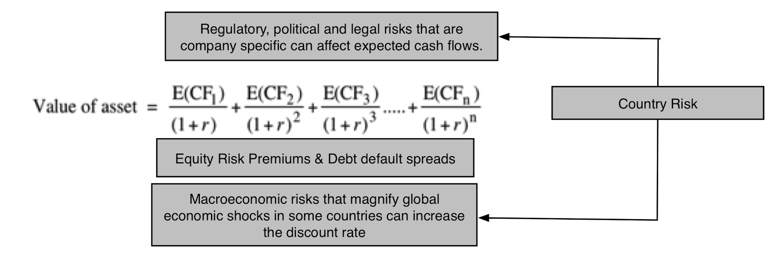 In the numerator, you have expected cash flows after taxes, where the taxes you pay will reflect not only where in the world you generate income (since tax rates and rules vary across countries) but how the country in which you are incorporated in treats that foreign income. The US, for instance, requires US companies to pay the US tax rate even on foreign income, though the additional tax is due only when that income is remitted back to the US, leading to a predictable result. Multinational US companies leave their foreign income un-remitted, leading to the phenomenon of trapped cash (amounting to more than $2 trillion at US companies at the start of 2017).The denominator, which is the discount rate, is also affected by the tax code. To the extent that tax laws in much of the world benefit debt over equity, using more debt in your financing mix can potentially lower your cost of capital. In computing this tax benefit from debt, there are two points to keep in mind. The first is that interest expenses save you taxes at the margin, i.e., your dollar in interest expense offsets your last dollar of income, saving you taxes on that last dollar, making it imperative that you use the marginal tax rate when computing your tax benefit from borrowing. The second is that companies have a choice on where to borrow money and not surprisingly choose those locations where they get the highest tax benefit (with the highest marginal tax rate). Is it any surprise that while Apple generates its income globally and finds ways to pay an effective tax rate of 21% on its taxable income in 2016, almost all of its debt is in the United States, saving taxes at an almost 40% marginal tax rate?Following up, then, the values of all companies in a country can change, some in positive and some in negative ways, when tax codes get rewritten. Even if the corporate tax codes don’t change, a company’s decisions on how to structure itself and where geographically to go for growth will affect its cash flows and discount rates in future years.
Marginal Tax RatesIf the marginal tax rate is the rate that a business pays on its last dollar of income, where in its financial statements are you most likely to find it? The answer in most companies is that you do not, and that you have to look in the tax code instead. Fortunately, KPMG does a yeoman job each year of pulling these numbers together and reporting them and the most recent update can be found here. The map below lists marginal tax rates by country and you also download a spreadsheet with the latest numbers at this link:
 Link to live mapAs you survey the world's marginal tax rates, you can see why trapped cash has become such a common phenomenon at US companies. The US has one of the highest marginal tax rates in the world at 40% (including a federal tax rate of 35%, topped off with state and local taxes) and is one of only a handful of countries that still insist on taxing companies incorporated in their domiciles on their global income, rather than adopting the more defensible practice of territorial taxation, where you require businesses to pay taxes in the countries that they generate their income in. As Congress looks at what to do about “trapped cash”, with many suggesting a one-time special deal where companies will be allowed to bring the cash back, they should also realize that unless the underlying reason for it is fixed, the problem will recur. That will mean either lowering the US marginal tax rate closer to the rest of the world (about 25%) or changing to a territorial tax model.
The marginal tax rate is the number that you use to compute your after-tax cost of debt but that practice is built on the presumption that all interest expenses are tax deductible (and that you have enough taxable income to cover the interest deduction). That is still true in much of the world but there are parts of the world, where you either cannot deduct interest expenses (such as the Middle East) or you have taxes computed on a line item like revenues (thus nullifying the tax benefit of debt), where you will have to alter the practice of giving debt a tax benefit. For multinational companies that face different marginal tax rates in different operating countries, my recommendation is that you use the highest marginal tax rates across countries, since that is where these companies will direct their borrowing.
Effective Tax Rates: Country Level DifferencesIf the marginal tax rate is the tax rate on your last dollar of income, what is the effective tax rate, the number that you often see reported in financial statements? In most cases, it is a computed tax rate that comes directly from the income statement and is computed as follows:Effective Tax Rate = (Accrual) Taxes Payable / (Accrual) Taxable IncomeBoth number are accrual income numbers and thus can be different from cash taxes paid, with the differences usually visible in the statement of cash flows. Let’s start with looking at what companies pay as effective tax rates in the United States, a country with a marginal tax rate of 40%. In the most recent twelve months leading into January 2017, the distribution of effective tax rates paid by tax-paying US companies is captured below.

The most interesting numbers in this distribution are the average effective tax rate of 26.42% across profitable US companies, well below the marginal tax rate of 40%. and the fact that 88% of US companies have effective tax rates that are lower than the marginal. The most important reason for this difference, in my view, is foreign operations with those firms that generate revenues outside the United States paying lower taxes, simply because the tax rate on income outside the United States is much lower (and that differential tax is not due until the cash is remitted). While there are some who suggest that a simple fix for this is to force US firms to pay the entire marginal tax rate when they make their income in foreign locales immediately (rather than on repatriation), this will be a powerful incentive for US companies to move their headquarters overseas.
In these populist times, you may be convinced that US companies are not paying their fair share of taxes but is that true? To make that judgment, I looked at effective tax rates paid by companies in different countries in the picture below and you can download the data in a spreadsheet in the link below:
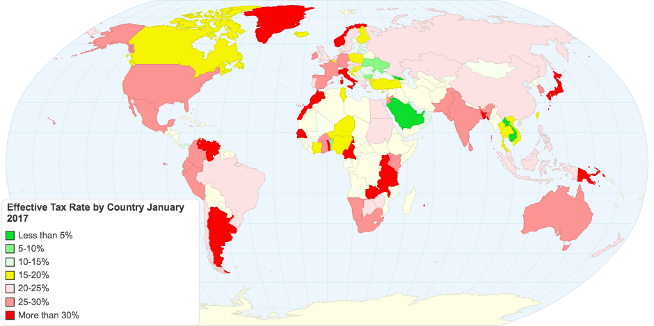 Link to live mapAt least, based upon the data on taxes paid in 2017, US companies measure up well against the rest of the world, in terms of paying taxes, with only Japanese companies paying significantly more in taxes; Indian and Australian companies pay about what US companies do and the rest of the world pays less.
table.tableizer-table { font-size: 12px; border: 1px solid #CCC; font-family: Arial, Helvetica, sans-serif; } .tableizer-table td { padding: 4px; margin: 3px; border: 1px solid #CCC; } .tableizer-table th { background-color: #104E8B; color: #FFF; font-weight: bold; }
Sub GroupEffective Tax RateSub GroupEffective Tax RateAfrica and Middle East15.48%India27.65%Australia & NZ26.76%Japan31.07%Canada19.68%Latin America & Caribbean22.91%China21.72%Small Asia21.59%EU & Environs23.03%UK22.26%Eastern Europe & Russia19.88%United States26.22%As US companies market their products and services in other countries, it is true that some of this tax revenue is being collected by foreign governments, but that is the nature of a multinational business and is something that every country in the world with multinational corporations has as a shared problem.
Effective Tax Rates: Industry and Company DifferencesAs a final analysis, I compared the effective tax rates by US companies, categorized by industry. This table, which I have reported before, lists the ten industry groups that pay the highest effective tax rate and the ten that pay the lowest:
 Download spreadsheets with all industries
The entire list can be downloaded here. Again, there are many reasons for the differences, with companies that generate more income from foreign operations paying lower taxes than domestic companies being a primary one. It is also true that the US tax code is filled with sector-specific provisions that provide special treatment for these sectors in the form of generous tax deductions. Most of these tax deductions (like higher depreciation allowances) show up as expenses in the income statement and the taxable income should already reflect them and so should the effective tax rate, but in some cases it does show up as a marginal tax rate.
Download spreadsheets with all industries
The entire list can be downloaded here. Again, there are many reasons for the differences, with companies that generate more income from foreign operations paying lower taxes than domestic companies being a primary one. It is also true that the US tax code is filled with sector-specific provisions that provide special treatment for these sectors in the form of generous tax deductions. Most of these tax deductions (like higher depreciation allowances) show up as expenses in the income statement and the taxable income should already reflect them and so should the effective tax rate, but in some cases it does show up as a marginal tax rate.While in most years, these differences across sectors is a just a source of discussion or a reason to vent on the unfairness of taxes, I believe that investors, this year, should be paying particular attention to them. If Congress is serious about rewriting the tax code this year, there is reason to believe that the changed tax code is going to create winners and losers, and especially so, if it is designed to be revenue neutral. Those winners and losers will of course be different, depending on which version of corporate tax reform passes.
At one extreme in the version that is least disruptive to the current system, the marginal tax rate for corporations will be lowered, perhaps with a loss of some tax deductions/credits and adjustments on how foreign income gets taxed to reduce the problem of trapped cash. If this change occurs, the effects on value will be mixed, with cash flows increasing for those firms that will have lower effective tax rates as a consequence and the costs of debt and capital increasing as the tax benefits of debt will decrease. The biggest beneficiaries will be firms that pay high effective tax rates today (see the table above for the sectors) and have little debt. The biggest losers will be firms that pay low effective tax rates today and fund their operations with lots of debt.At the other extreme, the House of Representatives is considering a more radical version of tax reform, where the current corporate income tax will be scrapped and replaced with a "Destination Based Cash-flow Tax" (DBCT), a value added tax system, with a deduction for wages, where the tax rate that you pay as a company will be a function of how much of your input material you import and where you sell your output. The first side product of the DBCT will be that debt will lose its historical tax-favored status, relative to equity. The second side product is that, if left unadorned, it will eliminate any incentives to move profits across countries or borders, since the tax is not based on income. Companies who produce their goods with inputs from the US that then export these goods and services will benefit the most, paying the lowest taxes, whereas companies that are heavily reliant on imported inputs that sell their products in the United States would pay the most in taxes. And firms that are heavily debt funded will be adversely affected, relative to those that are not debt funded.
 There are numerous other proposals that float in the middle, most offering lower corporate tax rates in exchange for loss of tax deductions. It is early in the game and we have no idea what the final version will look like. I will cheerfully confess that I am not expert on tax law and have absolutely no interest in providing specific directions on how the tax code should be rewritten but I will offer two simple pieces of advice having watched other attempts to rework corporate taxes:
Keep it simple: When tax law gets complex, bad corporate behavior seems to follow. Unfortunately, the way legislative processes work seems to conspire against simplicity, as legislators trying to protect specific industries try to make sure that their ox does not get gored. The tax code is not an effective behavior modifier for businesses: I understand the desire of some to use tax law as a corporate behavior modification tool but it is not a very effective one. Thus, if Congress is serious about the DBCT, it should be because they believe it is a more effective revenue generating mechanism that the current complex system and not because it wants to encourage companies to move manufacturing to the United States. If that is a byproduct, that is a plus but it should not be the end game.Make it predictable: Companies have enough uncertainty on their plates to worry about without adding uncertainty about future tax law changes to the mix. It would help if the tax code, once written, was not constantly revisited and revised.I am also a realist and believe that the likelihood of either of these pieces of advice being followed is close to zero.
ClosingIn the process of computing an implied equity risk premium for the S&P 500, I collected analyst estimates of growth in earnings for the S&P 500 companies. Many of these analysts are predicting that earnings for the S&P 500 will grow strongly in 2017 and one shared reason seems to be that companies will pay less in taxes. Since legislative bodies are not known for speedy action, I am not sure that change, even if it does happen, will show up in 2017 earnings but I think that the ultimate test is not in what the tax code does to marginal tax rates (since I think it is a safe assumption that they will come down from) but the changed tax code will mean for effective tax rates. Assuming that the tax code does get rewritten, how will we know whether it is doing more good or harm? I have two tests. First, if companies think about, talk about and factor in taxes less in their decision making, that is a good sign. Second, if fewer people are employed as tax lawyers and in transfer pricers, that is an even better one. I won't be holding my breath on either!
YouTube Video
DatasetsMarginal Tax Rate by Country (Original Source: KPMG)Effective Tax Rate by Country Effective Tax Rate by Industry (broken down by region & global)Data 2017 Posts
Data Update 1: The Promise and Perils of Big DataData Update 2: The Resilience of US EquitiesData Update 3: Cracking the Currency Code - January 2017Data Update 4: Country Risk and Pricing, January 2017Data Update 5: A Taxing Year Ahead?Data Update 6: The Cost of Capital in January 2017Data Update 7: Profitability, Excess Returns and Corporate Governance- January 2017Data Update 8: The Debt Trade off in January 2017Data Update 9: Dividends and Buybacks in 2017Data Update 10: A Pricing Update in January 2017
January 24, 2017
January 2017 Data Update 4: Country Risk Update
In my last post, I pointed to currency confusion as one of the side effects of globalization. In this one, I will argue that as companies and investors globalize, investors and analysts have no choice but to learn how to deal with the rest of the world, both in terms of risk and pricing. One reason that I take a detailed look at country risk and pricing numbers every year is that my valuations and corporate finance rest so heavily on them.
Why country risk matters
It seems to me an intuitive proposition that a company’s value and pricing can depend upon the geography of its business. Put simply, cash flows generated in riskier countries should be worth less than equivalent cash flows generated in safer ones but there are two follow up propositions worth emphasizing:Operation, not incorporation: I believe that it is where a company operates that determines its risk exposure, not just where it is incorporated. Thus, you can have US companies like Coca Cola (through its revenues) and Exxon Mobil (from its oil reserves) with substantial emerging market exposure and emerging market companies like Tata Consulting Services and Embraer with significant developed market exposure. In fact, what we face in valuation increasingly are global companies that through the accident of history happen to be incorporated in different countries.Company, Country and Global Risks: Not all country risk is created equal, especially as you are look at that risk as a diversified investor. Some country risk can be isolated to individual companies and is therefore averaged out as you diversify even across companies in that country. Still other country risk is country-specific and can be mitigated as your portfolio includes companies from across the globe. There is, however, increasingly a portion of country risk that is global, where even a global investor remains exposed to the risk and more so in some countries than others. The reason that we draw this distinction is that risks that can be diversified away will affect only the expected cash flows; that adjustment effectively takes the form of taking into account the likelihood and cash flow consequences of the risk occurring when computing the expected cash flow. The risks that are not diversifiable will affect both the expected cash flows and also the discount rates, with the mode of adjustment usually taking the form of higher risk premiums for equity and debt. That may sound like double counting but it is not, since the expected cash flows are adjusted for the likelihood of bad scenarios and their consequences and the discount rate adjustment is to demand a premium for being exposed to that risk: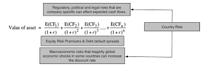 If you make the assumption that all country risk is diversifiable, you arrive at the conclusion that you don't need to adjust discount rates for country risk, a defensible argument when correlations across countries were very low (as in the 1980s) but not any more.Thus, dealing with country risk correctly becomes a key ingredient of both corporate finance, where multinational companies try to measure hurdle rates and returns on projects in different countries and in valuation, where investors try to attach values or prices to the same companies in financial markets.
Country Default RiskSince I have had extended posts on country risk before, I will not repeat much of what I have said before and instead focus this post on just updating the numbers. Simply put, the most easily accessible measures of country risk tend to be measures of default risk:
Sovereign Ratings: Ratings agencies like S&P, Moody’s and Fitch attach sovereign ratings to countries, where they measure the default risk in government borrowing just as they do for individual companies. These ratings agencies often also provide separate ratings for local currency and foreign currency borrowings by the same government. The picture below summarizes ratings by country, in January 2017, and the linked spreadsheet contains the same data.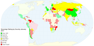 Link to live version of mapGovernment Bond Default Spreads: When a government issues bonds in a foreign currency, that are traded, the interest rate on those bonds can be compared to the risk free rate in a bond issued in the same currency to arrive at measures of default risk for the government. In much of Latin America, for instance, where countries has US-dollar denominated bonds, comparing the rates on those bonds to the US T.Bond rate (of equivalent maturity) provides a snapshot of default risk. The table below summarizes government bond default spreads as of January 1, 2017, for Latin American countries with US dollar denominated bonds:Sovereign CDS Spreads: This measure of default risk is of more recent vintage and is a market-determined number. It is, roughly speaking, a measure of how much you would have to pay, on an annual basis, to insure yourself against country default and unlike ratings can move quickly in response to political or economic developments in a country, making them both more timely and more volatile measures of country risk. In January 2017, sovereign CDS spreads were available for 64 countries and you can see them in the picture below and download them as a spreadsheet at this link.
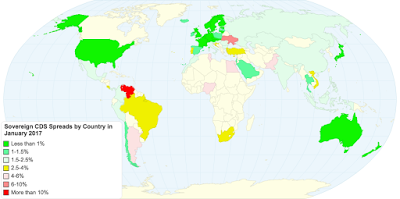 Link to live version of the mapCountry Equity RiskThere are many who use country default spreads as a proxy for the additional risk that you would demand for investing in equity in that country, adding it on to a base equity risk premium (ERP) that they have estimated for a mature market (usually the US).ERP for Country A = ERP for US + Default Spread for Country AThe limitation of the approach is that there are not only are equities affected by a broader set of risks than purely default risk but that even default can have a larger impact on equities in a country than its bonds, since equity investors are the residual claimants of cash flows.
There are broader measures of country risk, taking the form of country risk scores that incorporate political, economic and legal risks, that are estimated by entities, some public (like the World Bank) and some private (like PRS and the Economist). The first is that they tend to be unstandardized, in the sense that each service that measures country risk has its own scoring mechanism, with World Bank scores going from low to high as country risk increases and PRS going from high to low. The second is that they are subjective, with variations in the factors considered and the weights attached to each. That said, there is information in looking at how the scores vary across time and across countries, with the picture below capturing PRS scores by country in January 2017. The numbers are also available in the linked spreadsheet.
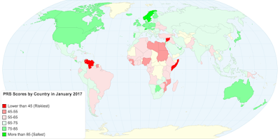 Link to live mapI have my own idiosyncratic way of estimating the country risk premiums that builds off the country default spreads. I use a ratio of market volatility, arguing that default spreads need to be scaled to reflect the higher volatility of equities in a market, relative to government bonds in that market.
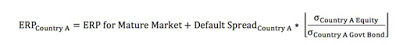
Since the volatility ratio can be both difficult to get at a country level and volatile, especially if the government bond is illiquid, I compute volatilities in an emerging market equity index and an emerging market government bond index and use the resulting ratio as a constant that I apply globally to arrive at equity risk premiums for individual countries. In January 2017, I started my estimates with a 5.69% equity risk premium for mature markets (set equal to the implied premium on January 1, 2017, for the S&P 500) and then used a combination of default spreads for countries and a ratio of 1.23 for relative equity market volatility (from the index volatilities) to arrive at equity risk premiums for individual countries.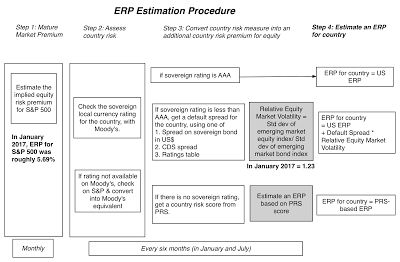
For countries that had both sovereign CDS spreads and sovereign ratings, I was able to get different measures of equity risk premium using either. For countries that had only a sovereign rating, I used the default spread based on that rating to estimate equity risk premiums (see lookup table here). For those countries that also had sovereign CDS spreads, I computed alternate measures of equity risk premiums using those spreads. Finally, for those frontier countries (mostly in the Middle East and Africa) that were neither rated nor had sovereign CDS spreads, I used their PRS scores to attach very rough measures of equity risk premiums (by looking at other rated countries with similar PRS scores). The picture below summarizes equity risk premiums by country and the link will give you the same information in a spreadsheet.
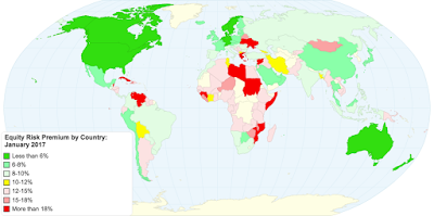 Link to live mapClosingThe one prediction that we can also safely make for next year is that just as we have each year since 2008, there will be at least one and perhaps even two major shocks to the global economic system, precipitated by politics or by economics or both. Those shocks affect all markets globally, but to different degrees and it behooves us to not only be aware of the impact after they happen but be proactive and start building in the expectation that they will happen into our required returns and values.
YouTube Video
Datasets
Sovereign Ratings by Country, S&P and Moody's on January 1, 2017Sovereign CDS spreads (ten-year) on January 1, 2017Political Risk Services (PRS) scores by country, January 1, 2017Equity Risk Premiums and Country Risk Premiums by country on January 1, 2017Data 2017 Posts
Data Update 1: The Promise and Perils of Big DataData Update 2: The Resilience of US EquitiesData Update 3: Cracking the Currency Code - January 2017Data Update 4: Country Risk and Pricing, January 2017Data Update 5: A Taxing Year Ahead?Data Update 6: The Cost of Capital in January 2017Data Update 7: Profitability, Excess Returns and Corporate Governance- January 2017Data Update 8: The Debt Trade off in January 2017Data Update 9: Dividends and Buybacks in 2017Data Update 10: A Pricing Update in January 2017
Why country risk matters
It seems to me an intuitive proposition that a company’s value and pricing can depend upon the geography of its business. Put simply, cash flows generated in riskier countries should be worth less than equivalent cash flows generated in safer ones but there are two follow up propositions worth emphasizing:Operation, not incorporation: I believe that it is where a company operates that determines its risk exposure, not just where it is incorporated. Thus, you can have US companies like Coca Cola (through its revenues) and Exxon Mobil (from its oil reserves) with substantial emerging market exposure and emerging market companies like Tata Consulting Services and Embraer with significant developed market exposure. In fact, what we face in valuation increasingly are global companies that through the accident of history happen to be incorporated in different countries.Company, Country and Global Risks: Not all country risk is created equal, especially as you are look at that risk as a diversified investor. Some country risk can be isolated to individual companies and is therefore averaged out as you diversify even across companies in that country. Still other country risk is country-specific and can be mitigated as your portfolio includes companies from across the globe. There is, however, increasingly a portion of country risk that is global, where even a global investor remains exposed to the risk and more so in some countries than others. The reason that we draw this distinction is that risks that can be diversified away will affect only the expected cash flows; that adjustment effectively takes the form of taking into account the likelihood and cash flow consequences of the risk occurring when computing the expected cash flow. The risks that are not diversifiable will affect both the expected cash flows and also the discount rates, with the mode of adjustment usually taking the form of higher risk premiums for equity and debt. That may sound like double counting but it is not, since the expected cash flows are adjusted for the likelihood of bad scenarios and their consequences and the discount rate adjustment is to demand a premium for being exposed to that risk:
 If you make the assumption that all country risk is diversifiable, you arrive at the conclusion that you don't need to adjust discount rates for country risk, a defensible argument when correlations across countries were very low (as in the 1980s) but not any more.Thus, dealing with country risk correctly becomes a key ingredient of both corporate finance, where multinational companies try to measure hurdle rates and returns on projects in different countries and in valuation, where investors try to attach values or prices to the same companies in financial markets.
 Country Default RiskSince I have had extended posts on country risk before, I will not repeat much of what I have said before and instead focus this post on just updating the numbers. Simply put, the most easily accessible measures of country risk tend to be measures of default risk:
Sovereign Ratings: Ratings agencies like S&P, Moody’s and Fitch attach sovereign ratings to countries, where they measure the default risk in government borrowing just as they do for individual companies. These ratings agencies often also provide separate ratings for local currency and foreign currency borrowings by the same government. The picture below summarizes ratings by country, in January 2017, and the linked spreadsheet contains the same data.
 Link to live version of mapGovernment Bond Default Spreads: When a government issues bonds in a foreign currency, that are traded, the interest rate on those bonds can be compared to the risk free rate in a bond issued in the same currency to arrive at measures of default risk for the government. In much of Latin America, for instance, where countries has US-dollar denominated bonds, comparing the rates on those bonds to the US T.Bond rate (of equivalent maturity) provides a snapshot of default risk. The table below summarizes government bond default spreads as of January 1, 2017, for Latin American countries with US dollar denominated bonds:Sovereign CDS Spreads: This measure of default risk is of more recent vintage and is a market-determined number. It is, roughly speaking, a measure of how much you would have to pay, on an annual basis, to insure yourself against country default and unlike ratings can move quickly in response to political or economic developments in a country, making them both more timely and more volatile measures of country risk. In January 2017, sovereign CDS spreads were available for 64 countries and you can see them in the picture below and download them as a spreadsheet at this link.
 Link to live version of the mapCountry Equity RiskThere are many who use country default spreads as a proxy for the additional risk that you would demand for investing in equity in that country, adding it on to a base equity risk premium (ERP) that they have estimated for a mature market (usually the US).ERP for Country A = ERP for US + Default Spread for Country AThe limitation of the approach is that there are not only are equities affected by a broader set of risks than purely default risk but that even default can have a larger impact on equities in a country than its bonds, since equity investors are the residual claimants of cash flows.
There are broader measures of country risk, taking the form of country risk scores that incorporate political, economic and legal risks, that are estimated by entities, some public (like the World Bank) and some private (like PRS and the Economist). The first is that they tend to be unstandardized, in the sense that each service that measures country risk has its own scoring mechanism, with World Bank scores going from low to high as country risk increases and PRS going from high to low. The second is that they are subjective, with variations in the factors considered and the weights attached to each. That said, there is information in looking at how the scores vary across time and across countries, with the picture below capturing PRS scores by country in January 2017. The numbers are also available in the linked spreadsheet.
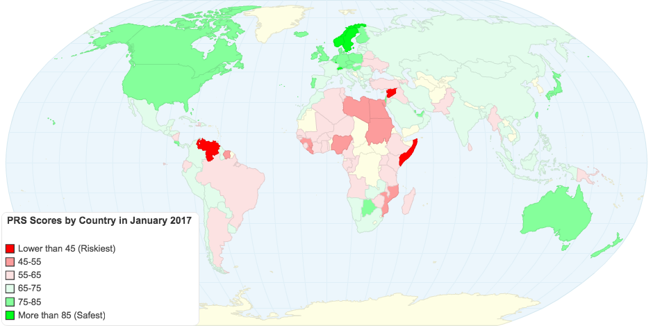 Link to live mapI have my own idiosyncratic way of estimating the country risk premiums that builds off the country default spreads. I use a ratio of market volatility, arguing that default spreads need to be scaled to reflect the higher volatility of equities in a market, relative to government bonds in that market.

Since the volatility ratio can be both difficult to get at a country level and volatile, especially if the government bond is illiquid, I compute volatilities in an emerging market equity index and an emerging market government bond index and use the resulting ratio as a constant that I apply globally to arrive at equity risk premiums for individual countries. In January 2017, I started my estimates with a 5.69% equity risk premium for mature markets (set equal to the implied premium on January 1, 2017, for the S&P 500) and then used a combination of default spreads for countries and a ratio of 1.23 for relative equity market volatility (from the index volatilities) to arrive at equity risk premiums for individual countries.

For countries that had both sovereign CDS spreads and sovereign ratings, I was able to get different measures of equity risk premium using either. For countries that had only a sovereign rating, I used the default spread based on that rating to estimate equity risk premiums (see lookup table here). For those countries that also had sovereign CDS spreads, I computed alternate measures of equity risk premiums using those spreads. Finally, for those frontier countries (mostly in the Middle East and Africa) that were neither rated nor had sovereign CDS spreads, I used their PRS scores to attach very rough measures of equity risk premiums (by looking at other rated countries with similar PRS scores). The picture below summarizes equity risk premiums by country and the link will give you the same information in a spreadsheet.
 Link to live mapClosingThe one prediction that we can also safely make for next year is that just as we have each year since 2008, there will be at least one and perhaps even two major shocks to the global economic system, precipitated by politics or by economics or both. Those shocks affect all markets globally, but to different degrees and it behooves us to not only be aware of the impact after they happen but be proactive and start building in the expectation that they will happen into our required returns and values.
YouTube Video
Datasets
Sovereign Ratings by Country, S&P and Moody's on January 1, 2017Sovereign CDS spreads (ten-year) on January 1, 2017Political Risk Services (PRS) scores by country, January 1, 2017Equity Risk Premiums and Country Risk Premiums by country on January 1, 2017Data 2017 Posts
Data Update 1: The Promise and Perils of Big DataData Update 2: The Resilience of US EquitiesData Update 3: Cracking the Currency Code - January 2017Data Update 4: Country Risk and Pricing, January 2017Data Update 5: A Taxing Year Ahead?Data Update 6: The Cost of Capital in January 2017Data Update 7: Profitability, Excess Returns and Corporate Governance- January 2017Data Update 8: The Debt Trade off in January 2017Data Update 9: Dividends and Buybacks in 2017Data Update 10: A Pricing Update in January 2017
January 20, 2017
January 2017 Data Update 3: Cracking the Currency Code
There was a time in the not so distant past, where analysts could do their analysis in their local currencies and care little or not at all about foreign currencies, how they moved and why. This was particularly true for US analysts in the last half of the last century, where the US dollar was the unchallenged global currency and the US economy bestrode the world. Those days are behind us and it is almost impossible to do valuations or corporate financial analysis without understanding how to deal with currencies correctly. Since the perils of misplaying currencies can be catastrophic, I decided to spend this post getting up to speed on the basics of how currency choices play out in valuation and where the numbers stand at the start of 2017.
A Currency Primer in Valuation
In intrinsic valuation, the value of an asset is the expected cash flows on that asset, discounted back at a risk adjusted discount rate.[image error]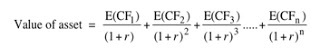 Note that there is no currency specification in the DCF equation and that analysts are given a choice of currencies. So, what currency should you use in valuing a company? While some analysts view this choice rigidly as being determined by the country in which the company operates in or the currency that it reports its financial statements in, there are two basic propositions that govern this choice.The first is that currency is a measurement mechanism and that you should be able to value any company in any currency, since all it will require is restating cash flows, growth rates and discount rates in that currency. The second is that in a robust DCF valuation, your value should be currency invariant. Put differently, the value of Petrobras should be unchanged, whether you value the company in nominal Brazilian Reais ($R), US dollars or Euros. The second proposition may strike some as impractical, since risk free rates vary across currencies and some currencies, like the $R, have higher risk free rates than others, like the US dollar. But the key to understanding currency invariance is recognizing that currency choices affect both your cash flows and your discount rate and if you are being consistent about your currency estimates, those effects should cancel out.
 Intuitively, picking a high inflation currency will lead to higher discount rates but also to higher cash flows and growth rates. In fact, if the currency effect is a pure inflation effect, you can see very quickly that you could make your valuation currency-free by doing your entire analysis in real terms, where you cash flows reflect only real growth (without the boost offered by inflation) and your discount rate is built on top of a real risk free rate. Your value should be again equivalent to the value you would have obtained by using the currency of your choice in your valuation.
To make these estimation choices real, consider valuing a company that derives half its cash flows in the United States (in US dollars) and half in Brazil (in nominal $R). You can value the company in US dollars, and to do so, you would have to estimate its cost of capital in US $ and convert the portion of its cash flows that are in $R to US$ in future years; that would require forecasting exchange rates. Alternatively, you can value the company in $R, converting the portion of cash flows in US$ to $R and then estimating a cost of capital in $R. This may sound simple, even trivial, but a whole host of estimation challenges lie in wait.
Expected Exchange Rates
If you want to make your valuations currency invariant, and inflation is what sets currencies apart, the way to estimate expected future exchange rates is to assume purchasing power parity, where exchange rates move to capture differential inflation. Specifically, you can get from the current exchange rate of local currency (LC) for the foreign currency (FC) to an expected exchange rate in a future year (t) using the expected inflation rates in the two currencies: Simply put, if the inflation in the local currency is 5% higher than the inflation in the US$, you are assuming that the local currency will depreciate about 5% a year. I know that exchange rate movements deviate from purchasing power parity significantly over short and perhaps even extended periods and that expected inflation can be difficult to estimate in many currencies, but there is a simple reason why you should stick with this simplistic way of forecasting exchange rates, at least when it comes to valuation. First, it is far easier (and less expensive) that creating a full-fledged exchange rate forecasting model or paying a forecaster, especially because you have to forecast exchange rate changes over very long time periods. Second, it forces you to be explicit about your inflation expectations and by extension, at least be aware of inconsistencies, where you assume one measure of inflation for exchange rates (and cash flows) and another for discount rates. (You can use forward exchange rates for the near years, as long as you are willing to then use interest rate differentials as proxies for inflation differentials.)
But what if you have strong views on the future direction of exchange rates that deviate from inflation expectations? I would argue that you should not bring them into your company valuations for a simple reason. If you incorporate your idiosyncratic exchange rate forecasts into cash flows and value, your final valuation of a company will be a joint consequence of your views on the company and of your views on exchange rates, with no easy way to separate the two. Thus, if you expect the Indian rupee to appreciate over the next five years, rather than depreciate (given your expectations of inflation in the rupee), you will find most Indian companies that you value to be cheap. If that conclusion is being driven by your exchange rate views, why invest in Indian companies when there are far easier and more profitable ways of playing the exchange rate game?
Currency Costs of Capital
Let's start with the challenge of estimating costs of capital in different currencies. There are two general approaches that you can use to get there. One is to compute the cost of capital in a currency from the ground up, starting with a risk free rate and then estimating and adding on risk premiums to arrives at costs of equity, debt and capital. The other is to compute the cost of capital in a base currency (say the US dollars) and then converting that cost of capital to the local currency.
Currency Risk Free Rates
Every economics student, at some point early in his or her education, has seen the Fisher equation, where the nominal interest rate is broken down into an expected inflation component and an expected real interest rate:Nominal Interest Rate = Expected Inflation + Expected Real Interest RateNote that this is neither a theory nor a hypothesis, but a truism, if you add no constraints on either the expected inflation and real interest rate. It is also a powerful starting point for thinking about what goes into a risk free rate and why it changes over time. It is as you add constraints on the components of interest rates that you start making assumptions which may or may not be true, and require testing. You could assume, for instance, that actual inflation in the most recent periods is a reasonable proxy for expected inflation in the future and that the real interest rate can be approximated to by the real growth rate in the economy in the most recent period (not an unreasonable assumption in mature economies). In fact, it is this proposition that I used in my last post on US markets to estimate intrinsic T.Bond rates that I compared to actual rates. I will use this framework as my back up as I look at four different ways of estimating risk free rates in different currencies.
1. Government Bond Rate
In this, the most common practice in valuation, analysts assume that the local currency government bond rate is the risk free rate in that currency. To justify this usage, they argue that governments will not default on local currency bonds, since they can always print off enough currency to pay off debt. In table 1, I graph local currency 10-year government bond rates as of January 1, 2017 for those currencies where I was able to obtain them.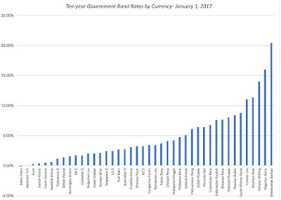
This approach has the advantage of simplicity and is perhaps even intuitively defensible but there are real dangers associated with it. The first is that the government bond may not be liquid and traded and/or the government exercises control over the rate, it is not a market-set rate reflecting demand and supply. The second is that implicit in the use of the government bond rate as the risk free rate is the assumption that governments never default in the local currency. That assumption has been violated at least a half a dozen times just in the last twenty years, thus making the government bond rate a "risky", rather than a risk free, rate. The third is that using government bond rates as local currency risk free rates while using actual inflation rates as expected inflation can lead to both inconsistent and currency dependent valuations. For instance, assume that you decide to value Natura, the Brazilian cosmetics company, in $R and use the Brazilian government $R bond rate of 11.37%, on January 1, 2017, as the risk free rate while using the actual inflation rate of 6.29% (inflation rate last year, according to government statistics) as the expected inflation rate. The value that you estimate for the company will be much lower than the value that you estimate for the company if you valued it in US dollars, with a risk free rate of 2.50% and an expected inflation rate of 2%. The reason for the valuation difference is intuitive. By using the $R numbers, you are effectively using a real risk free rate of 5.08%, when you do your valuation in $R, and only 0.5%, when you do your valuation in US dollars.
2. Government Bond Rate, net of default spread
In this approach, you do not start with the presumption that governments are default free. Instead, you start with the local currency government bond rate and subtract out the portion of that rate that you believe is due to perceived default risk:Risk free rate in local currency = Local Currency Government Bond rate – Default Spread in Local Currency Government Bond rateThe practical question then becomes how best to estimate the local currency default spread and there are a few approaches, though each comes with limitations. The first is to find a US dollar denominated bond issued by the government in question and netting out the US T.Bond rate, thus getting a default spread on the bond. The second is to use a sovereign CDS spread for the country as a proxy for default risk. In the table below, Subtracting these default spreads from the local currency bond rates, on the assumption that default risk in both local and foreign currency borrowing is equivalent, would yield local currency risk free rates. Using the sovereign rating-based default spreads, we can estimate the risk free rates in different currencies in January 2017:
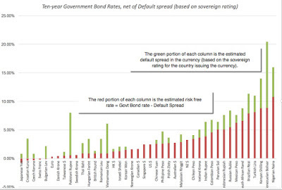
This approach comes with its own perils that are layered on top of the assumption that the government bond rate is a market-set interest rate. First, it assumes that the local currency sovereign rating is measuring the default risk in the currency and that you can estimate the default spread based on it. Second, both the rating-based and sovereign CDS default spreads are US dollar based and netting it out against a local currency government bond rate can be viewed as inconsistent.
3. Differential Inflation Based Rates
The third approach is to ignore government bond rates in the local currency entirely, either because you believe that they are not liquid enough to yield reliable numbers or because they contain default risk. Instead, you start with a risk free rate in a currency where you believe that the government bond rate is a reliable measure of the risk free rate (US Treasury Bond, German Euro Bond) and then add to this number the differential inflation rate between the US dollar and the local currency.Local Currency Risk free Rate = US $ Risk free Rate + (Expected inflation in local currency – Expected inflation in US $)This is an approximation that works reasonably well when local currency inflation is low (close to the US dollar inflation rate) but the more precise version of this formulation will be based upon compounding, just as the Fisher equation was:
 The linked table lists differential inflation based risk free rates in all currencies, using expected inflation rates (the World Bank's estimates) and the US dollar (estimated at about 2%, the difference between the US 10-year T.Bond and TIPs rates). If you are concerned about being able to forecast expected inflation in the local currency, you should rest easy. As long as you use that same expected inflation rate in your cash flow estimation, your valuation will be inflation-invariant and currency consistent, since the effects of under or over estimating inflation will cancel out.
4. Intrinsic Risk Free Rates
In the differential inflation approach, using the US dollar risk-free rate as the starting point, you are assuming a global real risk free rate, set equal to that rate embedded in the US treasury bond rate as the base for all local currency risk free rates. If you feel uncomfortable with this assumption, you can estimate a synthetic risk free rate from scratch, drawing on the Fisher equation:Risk free Rate = Expected Real Interest Rate + Expected inflation rateYou can augment this equation with the assumption that long term real growth in an economy will converge on the long term real interest rate. Expected Real Interest Rate = Expected Real Growth RateSynthetic Risk free Rate = Expected Real Growth Rate + Expected inflation rateThis approach yields the maximum flexibility but it will also create differences in valuations in different currencies. This linked table lists out synthetic risk free rates using this approach, using average real GDP growth as your expected real growth rate. The downside of this approach will be that your valuations will vary across currencies, yielding difficult-to-defend conclusions sometimes, where a company looks cheap when analyzed in US dollars but expensive when valued again in the local currency. The advantage of this approach, as with the differential inflation approach, is that you can estimate risk free rates for many more countries than with the government bond approach.
Currency Cost of Capital If you start with a risk free rate in a local currency and build up to a cost of capital using equity risk premiums and default spreads, often available only in dollar-based markets, you are effectively assuming that risk premiums are absolute numbers that don't change as the risk free rate changes. Thus, the equity risk premium of 5.69%, estimated in a dollar-based US market, applies not only to the US dollar risk free rate of 2.45% but also to the Nigerian Naira risk free rate of 10.77%. That is a stretch, since you would expect to risk premium you charge to be higher with the latter than the former. There is an easy and logical fix for it and it lies in the differential inflation approach. Rather than apply it to adjust the US$ riskfree rate to a local currency rate, you could apply it to the cost of equity or capital instead: Thus, if your cost of capital in US $ is 8%, the inflation rate in $R is 6% and in US$ is 2%, your cost of capital would be 12.24%. (Using the short cut of just adding the differential inflation would yield 12%). As part of my data update, I have reported costs of capital, by industry, in US dollars, for the last two decades. In this year's update, I have added a differential inflation feature allowing you to change that cost of capital to any currency of your choice in this spreadsheet. You will need to input the inflation rate in the local currency to get the costs of capital to update and you are welcome to use either the estimates that I supply in an additional worksheet or enter your own. Remember, though, that you should stay true to whatever this estimate is when estimating growth rates and cash flows in that currency.
The Closing
If your valuations are sensitive to your currency choice, you face a fundamental problem. You can find the same company, at the same pricing and point in time, to be both under and over valued, an indefensible conclusion. That conclusion, though, is being driven by some aspect of your valuation process that is making your company's fundamentals (risk, growth and cash flow potential) look different when you switch currencies. That, in my view, is a violation of intrinsic valuation and it requires you to make your inflation assumptions explicit and check for consistency.
YouTube Video
Datasets
Government Bond Rates, Default Spreads and Risk free Rates - By CurrencyInflation Rates, GDP Growth and Fundamental Growth - By CountryCost of Capital, by Sector - January 2017 (with currency translator)Data 2017 Posts
Data Update 1: The Promise and Perils of Big DataData Update 2: The Resilience of US EquitiesData Update 3: Cracking the Currency Code - January 2017Data Update 4: Country Risk and Pricing, January 2017Data Update 5: A Taxing Year Ahead?Data Update 6: The Cost of Capital in January 2017Data Update 7: Profitability, Excess Returns and Corporate Governance- January 2017Data Update 8: The Debt Trade off in January 2017Data Update 9: Dividends and Buybacks in 2017Data Update 10: A Pricing Update in January 2017
A Currency Primer in Valuation
In intrinsic valuation, the value of an asset is the expected cash flows on that asset, discounted back at a risk adjusted discount rate.[image error]
 Note that there is no currency specification in the DCF equation and that analysts are given a choice of currencies. So, what currency should you use in valuing a company? While some analysts view this choice rigidly as being determined by the country in which the company operates in or the currency that it reports its financial statements in, there are two basic propositions that govern this choice.The first is that currency is a measurement mechanism and that you should be able to value any company in any currency, since all it will require is restating cash flows, growth rates and discount rates in that currency. The second is that in a robust DCF valuation, your value should be currency invariant. Put differently, the value of Petrobras should be unchanged, whether you value the company in nominal Brazilian Reais ($R), US dollars or Euros. The second proposition may strike some as impractical, since risk free rates vary across currencies and some currencies, like the $R, have higher risk free rates than others, like the US dollar. But the key to understanding currency invariance is recognizing that currency choices affect both your cash flows and your discount rate and if you are being consistent about your currency estimates, those effects should cancel out.
 Intuitively, picking a high inflation currency will lead to higher discount rates but also to higher cash flows and growth rates. In fact, if the currency effect is a pure inflation effect, you can see very quickly that you could make your valuation currency-free by doing your entire analysis in real terms, where you cash flows reflect only real growth (without the boost offered by inflation) and your discount rate is built on top of a real risk free rate. Your value should be again equivalent to the value you would have obtained by using the currency of your choice in your valuation.
To make these estimation choices real, consider valuing a company that derives half its cash flows in the United States (in US dollars) and half in Brazil (in nominal $R). You can value the company in US dollars, and to do so, you would have to estimate its cost of capital in US $ and convert the portion of its cash flows that are in $R to US$ in future years; that would require forecasting exchange rates. Alternatively, you can value the company in $R, converting the portion of cash flows in US$ to $R and then estimating a cost of capital in $R. This may sound simple, even trivial, but a whole host of estimation challenges lie in wait.
Expected Exchange Rates
If you want to make your valuations currency invariant, and inflation is what sets currencies apart, the way to estimate expected future exchange rates is to assume purchasing power parity, where exchange rates move to capture differential inflation. Specifically, you can get from the current exchange rate of local currency (LC) for the foreign currency (FC) to an expected exchange rate in a future year (t) using the expected inflation rates in the two currencies:
 Simply put, if the inflation in the local currency is 5% higher than the inflation in the US$, you are assuming that the local currency will depreciate about 5% a year. I know that exchange rate movements deviate from purchasing power parity significantly over short and perhaps even extended periods and that expected inflation can be difficult to estimate in many currencies, but there is a simple reason why you should stick with this simplistic way of forecasting exchange rates, at least when it comes to valuation. First, it is far easier (and less expensive) that creating a full-fledged exchange rate forecasting model or paying a forecaster, especially because you have to forecast exchange rate changes over very long time periods. Second, it forces you to be explicit about your inflation expectations and by extension, at least be aware of inconsistencies, where you assume one measure of inflation for exchange rates (and cash flows) and another for discount rates. (You can use forward exchange rates for the near years, as long as you are willing to then use interest rate differentials as proxies for inflation differentials.)
But what if you have strong views on the future direction of exchange rates that deviate from inflation expectations? I would argue that you should not bring them into your company valuations for a simple reason. If you incorporate your idiosyncratic exchange rate forecasts into cash flows and value, your final valuation of a company will be a joint consequence of your views on the company and of your views on exchange rates, with no easy way to separate the two. Thus, if you expect the Indian rupee to appreciate over the next five years, rather than depreciate (given your expectations of inflation in the rupee), you will find most Indian companies that you value to be cheap. If that conclusion is being driven by your exchange rate views, why invest in Indian companies when there are far easier and more profitable ways of playing the exchange rate game?
Currency Costs of Capital
Let's start with the challenge of estimating costs of capital in different currencies. There are two general approaches that you can use to get there. One is to compute the cost of capital in a currency from the ground up, starting with a risk free rate and then estimating and adding on risk premiums to arrives at costs of equity, debt and capital. The other is to compute the cost of capital in a base currency (say the US dollars) and then converting that cost of capital to the local currency.
Currency Risk Free Rates
Every economics student, at some point early in his or her education, has seen the Fisher equation, where the nominal interest rate is broken down into an expected inflation component and an expected real interest rate:Nominal Interest Rate = Expected Inflation + Expected Real Interest RateNote that this is neither a theory nor a hypothesis, but a truism, if you add no constraints on either the expected inflation and real interest rate. It is also a powerful starting point for thinking about what goes into a risk free rate and why it changes over time. It is as you add constraints on the components of interest rates that you start making assumptions which may or may not be true, and require testing. You could assume, for instance, that actual inflation in the most recent periods is a reasonable proxy for expected inflation in the future and that the real interest rate can be approximated to by the real growth rate in the economy in the most recent period (not an unreasonable assumption in mature economies). In fact, it is this proposition that I used in my last post on US markets to estimate intrinsic T.Bond rates that I compared to actual rates. I will use this framework as my back up as I look at four different ways of estimating risk free rates in different currencies.
1. Government Bond Rate
In this, the most common practice in valuation, analysts assume that the local currency government bond rate is the risk free rate in that currency. To justify this usage, they argue that governments will not default on local currency bonds, since they can always print off enough currency to pay off debt. In table 1, I graph local currency 10-year government bond rates as of January 1, 2017 for those currencies where I was able to obtain them.

This approach has the advantage of simplicity and is perhaps even intuitively defensible but there are real dangers associated with it. The first is that the government bond may not be liquid and traded and/or the government exercises control over the rate, it is not a market-set rate reflecting demand and supply. The second is that implicit in the use of the government bond rate as the risk free rate is the assumption that governments never default in the local currency. That assumption has been violated at least a half a dozen times just in the last twenty years, thus making the government bond rate a "risky", rather than a risk free, rate. The third is that using government bond rates as local currency risk free rates while using actual inflation rates as expected inflation can lead to both inconsistent and currency dependent valuations. For instance, assume that you decide to value Natura, the Brazilian cosmetics company, in $R and use the Brazilian government $R bond rate of 11.37%, on January 1, 2017, as the risk free rate while using the actual inflation rate of 6.29% (inflation rate last year, according to government statistics) as the expected inflation rate. The value that you estimate for the company will be much lower than the value that you estimate for the company if you valued it in US dollars, with a risk free rate of 2.50% and an expected inflation rate of 2%. The reason for the valuation difference is intuitive. By using the $R numbers, you are effectively using a real risk free rate of 5.08%, when you do your valuation in $R, and only 0.5%, when you do your valuation in US dollars.
2. Government Bond Rate, net of default spread
In this approach, you do not start with the presumption that governments are default free. Instead, you start with the local currency government bond rate and subtract out the portion of that rate that you believe is due to perceived default risk:Risk free rate in local currency = Local Currency Government Bond rate – Default Spread in Local Currency Government Bond rateThe practical question then becomes how best to estimate the local currency default spread and there are a few approaches, though each comes with limitations. The first is to find a US dollar denominated bond issued by the government in question and netting out the US T.Bond rate, thus getting a default spread on the bond. The second is to use a sovereign CDS spread for the country as a proxy for default risk. In the table below, Subtracting these default spreads from the local currency bond rates, on the assumption that default risk in both local and foreign currency borrowing is equivalent, would yield local currency risk free rates. Using the sovereign rating-based default spreads, we can estimate the risk free rates in different currencies in January 2017:

This approach comes with its own perils that are layered on top of the assumption that the government bond rate is a market-set interest rate. First, it assumes that the local currency sovereign rating is measuring the default risk in the currency and that you can estimate the default spread based on it. Second, both the rating-based and sovereign CDS default spreads are US dollar based and netting it out against a local currency government bond rate can be viewed as inconsistent.
3. Differential Inflation Based Rates
The third approach is to ignore government bond rates in the local currency entirely, either because you believe that they are not liquid enough to yield reliable numbers or because they contain default risk. Instead, you start with a risk free rate in a currency where you believe that the government bond rate is a reliable measure of the risk free rate (US Treasury Bond, German Euro Bond) and then add to this number the differential inflation rate between the US dollar and the local currency.Local Currency Risk free Rate = US $ Risk free Rate + (Expected inflation in local currency – Expected inflation in US $)This is an approximation that works reasonably well when local currency inflation is low (close to the US dollar inflation rate) but the more precise version of this formulation will be based upon compounding, just as the Fisher equation was:
 The linked table lists differential inflation based risk free rates in all currencies, using expected inflation rates (the World Bank's estimates) and the US dollar (estimated at about 2%, the difference between the US 10-year T.Bond and TIPs rates). If you are concerned about being able to forecast expected inflation in the local currency, you should rest easy. As long as you use that same expected inflation rate in your cash flow estimation, your valuation will be inflation-invariant and currency consistent, since the effects of under or over estimating inflation will cancel out.
4. Intrinsic Risk Free Rates
In the differential inflation approach, using the US dollar risk-free rate as the starting point, you are assuming a global real risk free rate, set equal to that rate embedded in the US treasury bond rate as the base for all local currency risk free rates. If you feel uncomfortable with this assumption, you can estimate a synthetic risk free rate from scratch, drawing on the Fisher equation:Risk free Rate = Expected Real Interest Rate + Expected inflation rateYou can augment this equation with the assumption that long term real growth in an economy will converge on the long term real interest rate. Expected Real Interest Rate = Expected Real Growth RateSynthetic Risk free Rate = Expected Real Growth Rate + Expected inflation rateThis approach yields the maximum flexibility but it will also create differences in valuations in different currencies. This linked table lists out synthetic risk free rates using this approach, using average real GDP growth as your expected real growth rate. The downside of this approach will be that your valuations will vary across currencies, yielding difficult-to-defend conclusions sometimes, where a company looks cheap when analyzed in US dollars but expensive when valued again in the local currency. The advantage of this approach, as with the differential inflation approach, is that you can estimate risk free rates for many more countries than with the government bond approach.
Currency Cost of Capital If you start with a risk free rate in a local currency and build up to a cost of capital using equity risk premiums and default spreads, often available only in dollar-based markets, you are effectively assuming that risk premiums are absolute numbers that don't change as the risk free rate changes. Thus, the equity risk premium of 5.69%, estimated in a dollar-based US market, applies not only to the US dollar risk free rate of 2.45% but also to the Nigerian Naira risk free rate of 10.77%. That is a stretch, since you would expect to risk premium you charge to be higher with the latter than the former. There is an easy and logical fix for it and it lies in the differential inflation approach. Rather than apply it to adjust the US$ riskfree rate to a local currency rate, you could apply it to the cost of equity or capital instead:
 Thus, if your cost of capital in US $ is 8%, the inflation rate in $R is 6% and in US$ is 2%, your cost of capital would be 12.24%. (Using the short cut of just adding the differential inflation would yield 12%). As part of my data update, I have reported costs of capital, by industry, in US dollars, for the last two decades. In this year's update, I have added a differential inflation feature allowing you to change that cost of capital to any currency of your choice in this spreadsheet. You will need to input the inflation rate in the local currency to get the costs of capital to update and you are welcome to use either the estimates that I supply in an additional worksheet or enter your own. Remember, though, that you should stay true to whatever this estimate is when estimating growth rates and cash flows in that currency.
The Closing
If your valuations are sensitive to your currency choice, you face a fundamental problem. You can find the same company, at the same pricing and point in time, to be both under and over valued, an indefensible conclusion. That conclusion, though, is being driven by some aspect of your valuation process that is making your company's fundamentals (risk, growth and cash flow potential) look different when you switch currencies. That, in my view, is a violation of intrinsic valuation and it requires you to make your inflation assumptions explicit and check for consistency.
YouTube Video
Datasets
Government Bond Rates, Default Spreads and Risk free Rates - By CurrencyInflation Rates, GDP Growth and Fundamental Growth - By CountryCost of Capital, by Sector - January 2017 (with currency translator)Data 2017 Posts
Data Update 1: The Promise and Perils of Big DataData Update 2: The Resilience of US EquitiesData Update 3: Cracking the Currency Code - January 2017Data Update 4: Country Risk and Pricing, January 2017Data Update 5: A Taxing Year Ahead?Data Update 6: The Cost of Capital in January 2017Data Update 7: Profitability, Excess Returns and Corporate Governance- January 2017Data Update 8: The Debt Trade off in January 2017Data Update 9: Dividends and Buybacks in 2017Data Update 10: A Pricing Update in January 2017
January 13, 2017
January 2017 Data Update 2: The Resilience of US Equities!
If asked to list the biggest threats to US equities at the start of 2016, most people would have pointed to the Federal Reserve’s imminent retreat from quantitative easing and the possibility of a slowdown in China spilling into lower global growth. Those fears contributed to a very bad start to 2016 for US stock markets, and as stocks dropped by about 5% in January, those who have warned us about a bubble looked prescient. But the stock market, as is its wont, surprised us again. Not only did US equities come back from those setbacks but it weathered other crises during the year, including the decision by UK voters to exit the EU in June and by US voters to elect Donald Trump as president in November to end the year with healthy gains. As we enter a year with potentially big changes to the US tax code and trade policy looming, it is time to take stock of where we are and where we might be going in the next year.
Stocks and Bonds: Looking Back
The best place to see how the year unfolded for stocks is to trace out how the S&P 500 (large cap stocks), the S&P 600 (for small cap stocks) and US ten-year treasury bond rate did on a month by month basis through 2016.
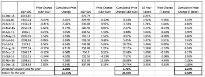 Monthly returns, using month-end valuesTo convert the index values into returns each month, I first computed price changes for the indices each month (and cumulatively over the year) and added the dividends for the year to estimate annual returns of 11.74% for the S&P 500 and 26.46% for the S&P 600; it was a very good year for small cap stocks and a good one for large cap stocks. I converted the treasury bond rates into bond price changes each month and cumulatively (for a 10-year constant maturity bond) over the year and added the coupon at the start of the year to get a return of 0.58% for the year; the rise in interest rates cause bond prices to drop by 1.68% during the year.
To put these returns in perspective, I added the S&P 500 and treasury bond return for 2016 to my historical data series which goes back to 1928 and computed both simple and compounded (geometric) annual averages in both for the entire period and compared them to a annualized 3-month treasury bill return (which you can think of as the return for holding cash).
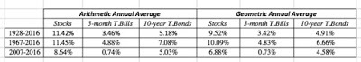 Download spreadsheet with historical data
This table (or some variant of it) is used by practitioners to get the equity risk premium for US markets, by subtracting the average return on treasuries (bills or bonds) from the average return on stocks over a historical time period. Using my estimates, I get the following values for the historical equity risk premium for the US market.
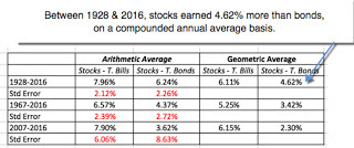 Download spreadsheet with historical dataNote that the equity risk premium varies widely, from 2.3% to 7.96%, depending on how long a time period you use, how you compute averages (simple or compounded) and whether you use treasury bills or bonds as your measure of a risk free investment. Adding a statistical note of caution, each of these estimated premiums comes with a standard error, reported in red numbers below the estimated number. Thus, if you decide to use 6.24%, the difference between the arithmetic average returns on stocks and bonds from 1928-2016, as your historical risk premium, that number comes with a standard error of 2.26%. That would mean that your true equity risk premium, with 95% confidence, could be anywhere from 1.72% to 10.76% (plus and minus two standard errors).
Stocks: Looking forward
Looking at the past may give us comfort but investing is always about the future. I have been a long-time skeptic of historical risk premiums for two reasons. First, as noted in the table above, they are noisy (have high standard errors). Second, they assume mean reversion, i.e., that US equity markets will revert back to what they have historically delivered as returns and that is an increasingly tenuous assumption. It is for this reason that I compute a forward-looking estimate of the equity risk premium for the US, using the S&P 500 Index as my measure of US stocks. Specifically, I estimate expected cash flows from dividends and buybacks from holding the S&P 500 for the next five years, using the trailing 12-month cash flow as my starting point and an expected growth rate in earnings as my proxy for cash flow growth and use these estimates, in conjunction with the index level on January 1, 2017, to compute an internal rate of return (a discount rate that will make the present value of the expected cash flows on the index equal to the traded level of the index).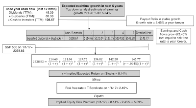 Download spreadsheet to compute implied ERPGiven the level of the index (2238.83 on January 1, 2017) and expected cash flows, I estimate an expected return on 8.14% for stocks and netting out the T.Bond rate of 2.45% on January 1, 2017, yields an implied ERP for the index of 5.69%. That number is down from the 6.12% that I estimated at the start of 2016 but is still well above the historical average (from 1960-2016) for this implied ERP of about 4.11%.
There is one troubling feature to the trailing 12 month cash flows on the S&P 500 that gives me pause. As was the case last year, the cash flows returned by S&P 500 companies represented more than 100% of earnings during the trailing 12 months, an unsustainable pace even in a mature market. I recomputed the ERP on the assumption that the cash payout ratio will decrease over time to sustainable levels, i.e., levels that would allow for enough reinvestment given the growth rate. The results are shown below: Download spreadsheet to compute implied ERPThe implied ERP for the index, with payout adjusting to about 82.3% of earnings in year 5, is 4.50%, still higher than historic norms but with a much slimmer buffer for safety. Looking at the next year, though, the potential for tax law changes will roil estimates. Not only are many analysts expecting significant increases in earnings next year of 12-15%, as they expect corporate tax rates to get lowered (at least in the aggregate) but there may also be a return of some of the trapped cash ($2 trillion or higher) back to the US, if that portion of the law is modified. Either change will relieve the pressure on cash flows and make it less likely that you will see dramatic cuts in stock buybacks or dividends.
Interest Rates: What lies ahead?
With bonds, I will take a different tack. I believe that, rather than waiting on the Fed, the path for interest rates this year will be determined by the path of the economy, with higher real growth and/or higher inflation pushing up rates. Updating a figure that I have used before, where I compare the T.Bond rate to an intrinsic interest rate (computed by adding expected inflation to expected real growth), you do see the beginning of a gap between the two at the end of 2016: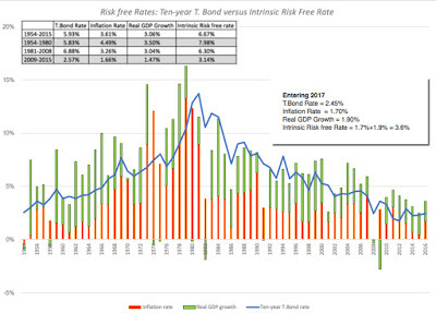 Download spreadsheet with historical ratesEntering 2017, the ten-year treasury bond at 2.45% is well below the intrinsic risk free of 3.60%, obtained by adding the inflation rate to real GDP growth through much of 2016. It is entirely possible that the economy will revert back to its post-2008 sluggishness or that there will be other shocks to the global economic system that will cause inflation and real growth to recede and interest rates to stay low, but for the moment at least, it looks like interest rates are their journey back to a new normal. If I were advising the Fed, my suggestion is for them is to act quickly on rates (perhaps as early as the next meeting) in order to preserve the fiction that it is they who are setting rates, rather than following them.
PE, CAPE and Bond PE Ratios I am not a fan of PE crystal ball gazing but I know that there are many who make their market judgments based on PE ratios. Updating a graph that I last used when I posted on CAPE last year to reflect the numbers at the start of the 2017, here is what the updated PE ratios look like for the S&P 500:
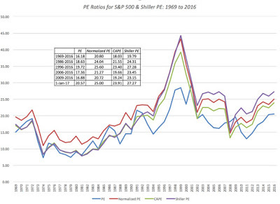 Spreadsheet with dataWhile current PE ratios, in all their variants, are not at 1999 levels, they have clearly climbed back to 2007 levels and are well above historical averages. Scary, right? This will inevitably lead to the warnings about markets overheating and a coming crash, just as it has for much of the last five years. While one of these years, that predicted crash will come, you may want to look at stock PE ratios relative to the PE ratio on a treasury bond today, another comparison that I made in my CAPE post;
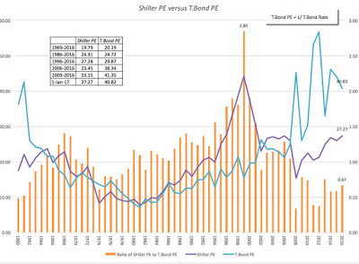 Spreadsheet with dataIt is true that stocks look expensive today (at 27 times earnings) but they start to look much better when you compare them to bonds (at 40 times earnings). If you are concerned that bond rates will climb this year to reflect higher inflation/real growth, you may be forced to take another look at how you are pricing stocks at that time. There is one final divergence that needs explaining. In the last section, I noted that implied equity risk premiums on the US market look reasonable or even high relative to historical norms (a sign that the market is not over valued) but in this section, I have pointed to PE ratios being higher than historical norms (a sign of stock prices overheating). How do you reconcile the two findings? The answer lies in this final graph:
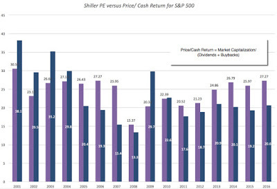 Spreadsheet with dataWhile PE ratios have risen over the last five or six years by almost 35-40%, the ratio of price to cash returned to stockholders (in the form of dividends and buybacks) has barely budged for the last five years. Here again, you should heed the warnings in the last section, where I noted that US companies are returning almost 107% of their earnings as cash to stockholders, unsustainable in the long term. If companies abruptly pull back on stock buybacks, the delicate balance that has allowed for the long bull market will be threatened.
The Closing
In summary, the primary threats to stocks at the start of 2017, whether you look at implied equity risk premiums or PE ratios, come from two sources. The first is that interest rates will rise quickly, without a concurrent increase in earnings, and the second is that companies will scale back the cash they return to stockholders to get back to a sustainable payout. Is there a reasonable probability that these events could occur? Of course, and if they both do, it will be a bad year for stocks. However, there is almost equal likelihood that as interest rates rise, earnings will rise even more (partly because of higher inflation/growth and partly because of cuts in corporate taxes) and that companies are able to sustain or even augment cash returned to stockholders. If this scenario unfolds, it will be a very good year for stocks. I will predict that you will be hearing from absolutists on both sides of this argument, one side preaching gloom and doom and the other predicting a market surge. I am in awe of the conviction that each side has in its market-timing judgment, but I am afraid that my market crystal ball is much too cloudy for me to make strong market predictions. So, I will do what I have always done, invest in individual stocks that I find to be priced right and accept that I have little or no control over the market.
YouTube Video
Datasets
Historical Returns on Stocks, T.Bond and T.Bills from 1928 to 2016Implied Equity Risk Premium - January 2017 (Calculation Spreadsheet)Historical Implied Equity Risk Premiums - 1960 to 2016 T.Bond Rate - Actual versus Implied from 1954-2016PE, CAPE, Shiller PE and Bond PE from 1954-2016Data 2017 Posts
Data Update 1: The Promise and Perils of Big DataData Update 2: The Resilience of US EquitiesData Update 3: Cracking the Currency Code - January 2017Data Update 4: Country Risk and Pricing, January 2017Data Update 5: A Taxing Year Ahead?Data Update 6: The Cost of Capital in January 2017Data Update 7: Profitability, Excess Returns and Corporate Governance- January 2017Data Update 8: The Debt Trade off in January 2017Data Update 9: Dividends and Buybacks in 2017Data Update 10: A Pricing Update in January 2017
Stocks and Bonds: Looking Back
The best place to see how the year unfolded for stocks is to trace out how the S&P 500 (large cap stocks), the S&P 600 (for small cap stocks) and US ten-year treasury bond rate did on a month by month basis through 2016.
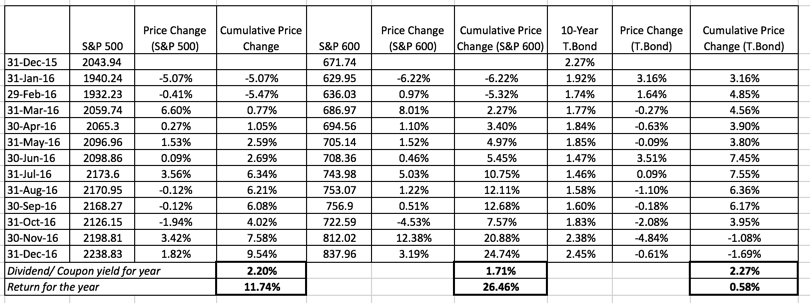 Monthly returns, using month-end valuesTo convert the index values into returns each month, I first computed price changes for the indices each month (and cumulatively over the year) and added the dividends for the year to estimate annual returns of 11.74% for the S&P 500 and 26.46% for the S&P 600; it was a very good year for small cap stocks and a good one for large cap stocks. I converted the treasury bond rates into bond price changes each month and cumulatively (for a 10-year constant maturity bond) over the year and added the coupon at the start of the year to get a return of 0.58% for the year; the rise in interest rates cause bond prices to drop by 1.68% during the year.
To put these returns in perspective, I added the S&P 500 and treasury bond return for 2016 to my historical data series which goes back to 1928 and computed both simple and compounded (geometric) annual averages in both for the entire period and compared them to a annualized 3-month treasury bill return (which you can think of as the return for holding cash).
 Download spreadsheet with historical data
This table (or some variant of it) is used by practitioners to get the equity risk premium for US markets, by subtracting the average return on treasuries (bills or bonds) from the average return on stocks over a historical time period. Using my estimates, I get the following values for the historical equity risk premium for the US market.
 Download spreadsheet with historical dataNote that the equity risk premium varies widely, from 2.3% to 7.96%, depending on how long a time period you use, how you compute averages (simple or compounded) and whether you use treasury bills or bonds as your measure of a risk free investment. Adding a statistical note of caution, each of these estimated premiums comes with a standard error, reported in red numbers below the estimated number. Thus, if you decide to use 6.24%, the difference between the arithmetic average returns on stocks and bonds from 1928-2016, as your historical risk premium, that number comes with a standard error of 2.26%. That would mean that your true equity risk premium, with 95% confidence, could be anywhere from 1.72% to 10.76% (plus and minus two standard errors).
Stocks: Looking forward
Looking at the past may give us comfort but investing is always about the future. I have been a long-time skeptic of historical risk premiums for two reasons. First, as noted in the table above, they are noisy (have high standard errors). Second, they assume mean reversion, i.e., that US equity markets will revert back to what they have historically delivered as returns and that is an increasingly tenuous assumption. It is for this reason that I compute a forward-looking estimate of the equity risk premium for the US, using the S&P 500 Index as my measure of US stocks. Specifically, I estimate expected cash flows from dividends and buybacks from holding the S&P 500 for the next five years, using the trailing 12-month cash flow as my starting point and an expected growth rate in earnings as my proxy for cash flow growth and use these estimates, in conjunction with the index level on January 1, 2017, to compute an internal rate of return (a discount rate that will make the present value of the expected cash flows on the index equal to the traded level of the index).
 Download spreadsheet to compute implied ERPGiven the level of the index (2238.83 on January 1, 2017) and expected cash flows, I estimate an expected return on 8.14% for stocks and netting out the T.Bond rate of 2.45% on January 1, 2017, yields an implied ERP for the index of 5.69%. That number is down from the 6.12% that I estimated at the start of 2016 but is still well above the historical average (from 1960-2016) for this implied ERP of about 4.11%.
There is one troubling feature to the trailing 12 month cash flows on the S&P 500 that gives me pause. As was the case last year, the cash flows returned by S&P 500 companies represented more than 100% of earnings during the trailing 12 months, an unsustainable pace even in a mature market. I recomputed the ERP on the assumption that the cash payout ratio will decrease over time to sustainable levels, i.e., levels that would allow for enough reinvestment given the growth rate. The results are shown below:
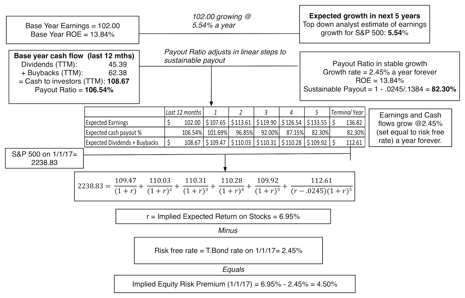 Download spreadsheet to compute implied ERPThe implied ERP for the index, with payout adjusting to about 82.3% of earnings in year 5, is 4.50%, still higher than historic norms but with a much slimmer buffer for safety. Looking at the next year, though, the potential for tax law changes will roil estimates. Not only are many analysts expecting significant increases in earnings next year of 12-15%, as they expect corporate tax rates to get lowered (at least in the aggregate) but there may also be a return of some of the trapped cash ($2 trillion or higher) back to the US, if that portion of the law is modified. Either change will relieve the pressure on cash flows and make it less likely that you will see dramatic cuts in stock buybacks or dividends.
Interest Rates: What lies ahead?
With bonds, I will take a different tack. I believe that, rather than waiting on the Fed, the path for interest rates this year will be determined by the path of the economy, with higher real growth and/or higher inflation pushing up rates. Updating a figure that I have used before, where I compare the T.Bond rate to an intrinsic interest rate (computed by adding expected inflation to expected real growth), you do see the beginning of a gap between the two at the end of 2016:
 Download spreadsheet with historical ratesEntering 2017, the ten-year treasury bond at 2.45% is well below the intrinsic risk free of 3.60%, obtained by adding the inflation rate to real GDP growth through much of 2016. It is entirely possible that the economy will revert back to its post-2008 sluggishness or that there will be other shocks to the global economic system that will cause inflation and real growth to recede and interest rates to stay low, but for the moment at least, it looks like interest rates are their journey back to a new normal. If I were advising the Fed, my suggestion is for them is to act quickly on rates (perhaps as early as the next meeting) in order to preserve the fiction that it is they who are setting rates, rather than following them.
PE, CAPE and Bond PE Ratios I am not a fan of PE crystal ball gazing but I know that there are many who make their market judgments based on PE ratios. Updating a graph that I last used when I posted on CAPE last year to reflect the numbers at the start of the 2017, here is what the updated PE ratios look like for the S&P 500:
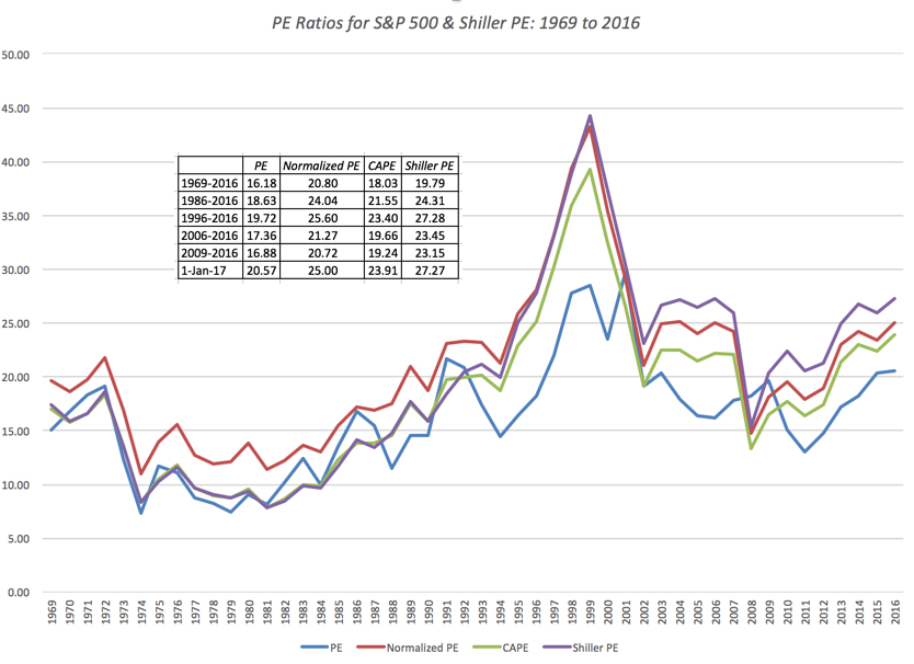 Spreadsheet with dataWhile current PE ratios, in all their variants, are not at 1999 levels, they have clearly climbed back to 2007 levels and are well above historical averages. Scary, right? This will inevitably lead to the warnings about markets overheating and a coming crash, just as it has for much of the last five years. While one of these years, that predicted crash will come, you may want to look at stock PE ratios relative to the PE ratio on a treasury bond today, another comparison that I made in my CAPE post;
 Spreadsheet with dataIt is true that stocks look expensive today (at 27 times earnings) but they start to look much better when you compare them to bonds (at 40 times earnings). If you are concerned that bond rates will climb this year to reflect higher inflation/real growth, you may be forced to take another look at how you are pricing stocks at that time. There is one final divergence that needs explaining. In the last section, I noted that implied equity risk premiums on the US market look reasonable or even high relative to historical norms (a sign that the market is not over valued) but in this section, I have pointed to PE ratios being higher than historical norms (a sign of stock prices overheating). How do you reconcile the two findings? The answer lies in this final graph:
 Spreadsheet with dataWhile PE ratios have risen over the last five or six years by almost 35-40%, the ratio of price to cash returned to stockholders (in the form of dividends and buybacks) has barely budged for the last five years. Here again, you should heed the warnings in the last section, where I noted that US companies are returning almost 107% of their earnings as cash to stockholders, unsustainable in the long term. If companies abruptly pull back on stock buybacks, the delicate balance that has allowed for the long bull market will be threatened.
The Closing
In summary, the primary threats to stocks at the start of 2017, whether you look at implied equity risk premiums or PE ratios, come from two sources. The first is that interest rates will rise quickly, without a concurrent increase in earnings, and the second is that companies will scale back the cash they return to stockholders to get back to a sustainable payout. Is there a reasonable probability that these events could occur? Of course, and if they both do, it will be a bad year for stocks. However, there is almost equal likelihood that as interest rates rise, earnings will rise even more (partly because of higher inflation/growth and partly because of cuts in corporate taxes) and that companies are able to sustain or even augment cash returned to stockholders. If this scenario unfolds, it will be a very good year for stocks. I will predict that you will be hearing from absolutists on both sides of this argument, one side preaching gloom and doom and the other predicting a market surge. I am in awe of the conviction that each side has in its market-timing judgment, but I am afraid that my market crystal ball is much too cloudy for me to make strong market predictions. So, I will do what I have always done, invest in individual stocks that I find to be priced right and accept that I have little or no control over the market.
YouTube Video
Datasets
Historical Returns on Stocks, T.Bond and T.Bills from 1928 to 2016Implied Equity Risk Premium - January 2017 (Calculation Spreadsheet)Historical Implied Equity Risk Premiums - 1960 to 2016 T.Bond Rate - Actual versus Implied from 1954-2016PE, CAPE, Shiller PE and Bond PE from 1954-2016Data 2017 Posts
Data Update 1: The Promise and Perils of Big DataData Update 2: The Resilience of US EquitiesData Update 3: Cracking the Currency Code - January 2017Data Update 4: Country Risk and Pricing, January 2017Data Update 5: A Taxing Year Ahead?Data Update 6: The Cost of Capital in January 2017Data Update 7: Profitability, Excess Returns and Corporate Governance- January 2017Data Update 8: The Debt Trade off in January 2017Data Update 9: Dividends and Buybacks in 2017Data Update 10: A Pricing Update in January 2017
Aswath Damodaran's Blog

- Aswath Damodaran's profile
- 725 followers
Aswath Damodaran isn't a Goodreads Author
(yet),
but they
do have a blog,
so here are some recent posts imported from
their feed.

