
Aswath Damodaran's Blog, page 6
July 17, 2023
Market Resilience or Investors In Denial? A Mid-year Assessment for 2023!
The Start of the Year Blues: Leading into 2023
As we enjoy the moment, with markets buoyant and economists assuring us that the worst is behind us, both in terms of inflation and the economy, it is worth recalling what the conventional wisdom was, coming into 2023. After a bruising year for every asset class, with the riskiest segments in each asset class being damaged the most, there were fears that inflation would not just stay high, but go higher, and that the economy would go into a tailspin. While this may seem perverse, the first step in understanding and assessing where we are in markets now is to go back and examine where things stood then. In my second data update post from the start of this year, I looked at US equities in 2022, with the S&P 500 down almost 20% during the year and the NASDAQ, overweighted in technology, feeling even more pain, down about a third, during the year.
 Looking across company groupings, returns on stocks in 2022 flipped the script on the market performance over much of the prior decade, with the winners from that decade (tech, young companies, growth companies) singled out for the worst punishment during the year. While stocks had a bad year (the eighth worst in the last century), the bond market had an even worse one. In my third post at the start of 2023, I looked at US treasuries, the long-touted haven of safety for investors. In 2022, they were in the eye on the storm, with the ten-year US treasury bond depreciating in price by more than 19% during the year, the worst year for US treasury returns in a century.

The decline in bond prices was driven by surging interest rates, with short term treasuries rising far more than longer term treasuries, and the yield curve inverted towards the end of the year. The rise in US treasury rates spilled over into the corporate bond market, causing corporate bond yields to rise. Exacerbating the pain, corporate default spreads rose during the course of 2022:

While default spreads rose across ratings classes, the rise was much more pronounced for the lowest ratings classes, part of a bigger story about risk capital that spilled across markets and asset classes. After a decade of easy access, translating into low risk premiums and default spreads, accompanied by a surge in IPOs and start-ups funded by venture capital, risk capital moved to the sidelines in 2022.
In sum, investors were shell shocked at the start of 2023, and there seemed to be little reason to expect the coming year to be any different. That pessimism was not restricted to market outlooks. Inflation dominated the headlines and there was widespread consensus among economists that a recession was imminent, with the only questions being about how severe it would be and when it would start.
The Market (and Economy) Surprises: The First Half of 2023
Halfway through 2023, I think it is safe to say that markets have surprised investors and economists again, this year. The combination of high inflation and a recession that was on the bingo cards of some economists at the start of 2023 did not manifest, with inflation declining sooner than most expected during the year:

It is true that the drop in inflation was anticipated by some economists, but most of them also expected that decline to come from a rapidly slowing economy, i.e., a recession and to be Fed-driven. That has not happened either, as employment numbers have stayed strong, housing prices have (at least up till now) absorbed the blows from higher mortgage rates and the economy has continued to grow.

It is true that economic activity has leveled off and housing prices have declined a little, relative to a year ago, but given the rise in rates in 2022, those changes are mild. If anything, the economy seems to have settled into a stable pattern, albeit at the high levels that it reached in the second half of 2021. I know that the game is not done, and the long-promised pain may still arrive in the second half of the year, but for the moment, at least, markets have found some respite.
During the course of 2023, the Fed was at the center of most economic storylines hero to some and villain to many others, with every utterance from Jerome Powell and other Fed officials parsed for signals about future actions. That said, it is worth noting that there is very little of consequence in the economy or the market, in 2023, that you can attribute to Fed activity. The Fed has raised the Fed Funds rate multiple times this year, but those rate increases have clearly done nothing to slow the economy down and inflation has stabilized, not because of the Fed but in spit of it. I know that there are many who still like to believe that the Fed sets interest rates, but here is what market interest rates (in the form of US treasury rates) have done during 2023:

If there is a Fed effect on interest rates, it is almost entirely on the very short end of the spectrum, and not on longer term rates; the ten-year and thirty-year treasury bond rates have declined during the year. That does not surprise me, since I have never bought into the “Fed did it” theme, and have written multiple posts about why it is inflation and economic growth that drive interest rates, not central banks. As inflation has dropped and the economy has kept its footing, the corporate bond market has benefited from default spreads declining, as fears subside:

As in 2022, the change in default spreads is greatest at the lowest ratings, with the key difference being that spreads are declining in 2023, rather than increasing, though the spreads still remain significantly higher than they were at the start of 2022.
Stock Markets Perk Up: The First Half of 2023
I noted that risk capital retreated from markets in 2022, with negative consequences for risky asset classes. To the extent that some of that risk capital is coming back into the markets, equity markets have benefited, with benefits skewing more towards the companies and markets that were punished the most in 2022. To understand the equity comeback in 2023, I start by looking at the increase in market capitalizations, in US $ terms, across the world in the first six months of the year, with the change in market capitalizations in 2022 to provide perspective:

In US dollar terms, global equities have reclaimed $8.6 trillion in market value in the first six months in the year, but the severity of last year's decline has still left them $14.4 trillion below their values from the start of 2022. Looking across regions, US equities have performed the best in the first six months of 2023, adding almost 14% ($5.6 trillion) to market capitalizations, regaining almost half of the value lost in last year's rout. In US dollar terms, China was the worst performing region of the world, with equity values down 1.01% in the first six months on 2023, adding to the 18.7% that was lost last year. The two best performing parts of the world in 2022, Africa and India, performed moderately well in the first half of 2023. In US dollar terms, Latin America was flat in the first half of 2023, though there were a couple of Latin American markets that delivered stellar returns in local currency terms, albeit with high inflation eating away at these returns. It is currency rate changes that explains that contrast between local currency and dollar returns, and in the graph below, I look at the US dollar's performance broadly (against other currencies) as well as against emerging market currencies , between 2020 and 2023;

After strengthening in 2022, the US dollar has weakened against most currencies in 2023, albeit only mildly.
US Equities in 2023: Into the Weeds!
The bulk of the surge in global equities in 2023 has come from US stocks, but there are many investors in US stocks who are looking at their portfolio performance this year, and wondering why they don't seem to be sharing in the upside. In this section, I will start by looking with an overall assessment of US equities (levels and equity risk premiums) before delving into the details of the winners and losers this year.
Stocks and the Equity Risk Premium
I start my assessment of US equities by looking at the performance of the S&P 500 and the NASDAQ during the first half of this year:
 As you can see, why the S&P has had a strong first half of 2023, increasing 15.91%, the NASDAQ has delivered almost twice that return, with its tech focus. One reason for the rise in stock prices, at least in the aggregate, has been a dampening of worries of out-of-control inflation or a deep recession, and this drop in fear can be seen in the equity risk premium, the price of risk in the equity market. In the figure below, I have graphed my estimates of expected returns on stocks and implied equity risk premiums through 2022 and the first six months of 2023:
 After a year for the record books, in 2022, when the expected return on stocks (the cost of equity) increased from 5.75% to 9.82%, the largest one-year increase in that number in history, we have had not just a more subdued year in 2023, but one where the expected return has come back down to 8.81%. In the process, the implied equity risk premium, which peaked at 5.94% on January 1, 2023, is back down to 5% at the start of July 2023. Even after that drop, equity risk premiums are still at roughly the average value since 2008, and significantly higher than the average since 1960. If the essence of a bubble is that equity risk premiums become "too low", the numbers, at least for the moment, don't seem to signaling a bubble (unlike years like 1999, when the equity risk premium dropped to 2%).
Sector and Industry
The divergence between the S&P 500 and the NASDAQ's performance this year provides clues as to which sectors have benefited the most this year, as risk has receded. In the table below, I break all US equities into sectors and report on performance, in 2022 and in the first half of 2023:
 As you can see, four of the twelve sectors have had negative returns in 2023, with energy stocks down more than 17% this year. The biggest winner, and this should come as no surprise, has been technology, with a return of 43% in 2023, and almost entirely recovering its losses in 2022. Financials, handicapped by the bank runs at SVB and First Republic, have been flat for the year, as has been real estate. Communication services and consumer discretionary have had a strong first half of 2023, but remain more than 20% below their levels at the star of 2022. Breaking sectors down into industry-level details, we can identify the biggest winners and losers, among industries. In the table below, I list the ten worst performing and best performing industry groups, based purely on market capitalization change in the first half of 2023:
 Download market performance in 2023, by industry
The worst performing industry groups are in financial services and energy, with oilfield services companies being the worst impacted. The best performing industry group is auto & truck, but those results are skewed upwards, with one big winner (Tesla) accounting for a large portion of the increase in market capitalization in the sector. There are several technology groups that are on the winner list, not just in terms of percentage increases, but also in absolute value changes, with semiconductors, computers/peripherals and software all adding more than a trillion dollars in market capitalization apiece.
Market Capitalization and Profitability
The first six months of the year have also seen concentrated gains in a larger companies and this can be seen in the table below, where I break companies down based upon their market capitalizations at the start of 2023 into deciles, and then break the stocks down in each decile into money-making and money-losing companies, based upon net income in 2022:

Again, the numbers tell a story, with the money-making companies in the largest market cap decile accounting for almost all of the gain in market cap for all US equities; the market capitalization of these large money-making companies increased by $5.3 trillion in the first six months of 2023, 97.2% of the $5.45 trillion increase in value for all US equities.
Value and Growth Over the last decade, I have written many posts about how old-time value investing, with its focus low PE and low price to book stocks, has lagged growth investing, with high growth stocks that trade at higher multiples of earnings and book value delivering much higher returns than old-time value stocks (low PE ratios, high dividend yields etc.). In 2022, old-time value investors felt vindicated, as the damage that year was inflicted on the highest growth companies, especially in technology. That celebration has not lasted long, though, since in 2023, we saw a return to a familiar pattern from the last decade, with the highest price to book stocks earning significantly higher returns than the stocks with the lowest price to book ratios:

As you can see from the chart, almost all of the value increase in US equities has come from the top two deciles of stocks, in terms of price to book ratios. Looking at value and growth go back and forth between the winning and losing columns in 2023, I believe that this is a pattern that will continue to play out for the rest of the decade, with no decisive winner.
An Assessment
I know that one of the critiques of this market rise is that it has been uneven, but almost all market recoveries are uneven, with some groupings of companies always doing better than others. That said, there are lessons to be learned from looking at the winners and the losers in the first half of 2023 market sweepstakes:
It is true that as market rallies lengthen, they draw in more stocks into their orbit, and it is possible that the market rally will broaden over the course of the year. That said, this has been a decade of unpredictability, starting with the first quarter of 2020, where COVID ravaged stocks, and I don't think it makes much sense to take charts from 2008 or 2001 or earlier and extrapolating from those.
The Rest of the Year: What's coming?
The market mood is buoyant, as investors seem to be convinced that we have dodged the bullet, with inflation cooling and a soft landing for the economy. The lesson that I have learned not just from the first six months of 2023, but from market performance over the last three years, has been that macro forecasting is pointless, and that trying to time markets is foolhardy. If I were to make guesses about what the rest of the year will bring, here are my thoughts:
On inflation, the good news on inflation in the first half of the year should not obscure the reality that the inflation rate, at 3% in June, still remains higher than the Fed-targeted value (of 2%). That last stretch getting inflation down from 3% to below 2% will be trench warfare, and we will be exposed to macro shocks (from energy prices or regional unrest) that can create inflationary shocks.On the economy, notwithstanding good employment numbers, there are signs that the economy is cooling and it is again entirely possible that this turns into a slow-motion recession, as real estate (especially commercial) succumbs to higher interest rates and consumers start retrenching. On interest rates, I do think that hoping and praying that rates will go back to 2% or lower is a pipe dream, as long as inflation stays at 3% or higher. In short, with or without the Fed, long term treasury rates have found a steady state at 3.5% to 4%, and companies and investors will have to learn to live with those rates. I have never attached much significance to the yield curve inversion as a predictor of economic growth, but that inversion is unlikely to go away soon, as near term inflation remains higher than long term expectations.On equities, the one certainty is that there will be uncertainties, and it is unlikely that the market will repeat its success in the second half of 2023. I did value the S&P 500 at the start of the year, and and argued that it was close to fairly valued then. Updating this valuation to reflect updated perspectives on both dimensions, as well as an index price that is about 16% higher, here is what I see: Download spreadsheet with valuation
Note that I have used the analyst projections of earnings for the index for 2023 to 2025, and adjusted the cash payout over time to reflect reinvestment needed to sustain growth in the long term (set to 3.88%, after 2027). After the run up in stock prices in the first six months, stocks look fairly valued, given estimated earnings and cash flows, and assuming that long term rates have found their steady state. (Unlike market strategies who provide target levels for the index, an intrinsic value delivers a value for the index today; to get an estimate of what translates into as a target level of the index, you can apply the cost of equity as the expected return factor to get index levels in future time periods.)It goes without saying, but I will say it anyway, that the economy may still go into a recession, analysts may be over estimating earnings and inflation may make a come back (pushing up long term rates). If you have concerns on those fronts, your investing should reflect those worries, but your returns will be only as good as your macro forecasting abilities. Mine are not that good, and it is why I steer away from grandiose statements about equities being in a bubble or a bargain. While uncertainties abound, there is one thing I am certain about. I will be wrong on almost every single one of these forecasts, and there is little that I can or want to do about that. That is why I demand an equity risk premium in the first place, and all I can do is hope that it large enough to cover those uncertainties.
A Time for Humility If the greatest sin in investing is arrogance, markets exist to bring us back to earth and teach us humility. The first half of 2023 was a reminder that no matter who you are as an analyst, and how well thought through your investment thesis is, the market has other plans. As you listen to market gurus spin tales about markets, sometimes based upon historical data and compelling charts, it is worth remembering that forecasting where the entire market is going is, by itself, an act of hubris. In the spirit of humility, I would suggest that if you were a winner in the first half of this year, recognize that much of that can be attributed to luck, and what the market gives, it can take away. By the same token, if you were a loser over the course of the last six months, regret should not lead you to try to load up on the winners over that period. That ship has sailed, and who knows? Your loser portfolio may be well positioned to take advantage of whatever is coming in the next six months.
YouTube Video
Data SpreadsheetsMarket Performance in first half of 2023, by countryMarket Performance in first half of 2023, by industryValuation SpreadsheetsValuation of the S&P 500 on July 1, 2023


May 7, 2023
Good (Bad) Banks and Good (Bad) Investments: At the right price...
In my last post, I looked at banking as a business, and used a simple banking framework to advance the notion that the key ingredient tying together the banks that have failed so far in 2023 is an absence of stickiness in deposits, created partially by depositor and deposit characteristics (older are stickier than younger) and partly by growth in deposits (high growth increases stickiness). I also used the banking framework to argue that good banks have stickier deposits, with a higher precent of these deposits being non-interest bearing, that they invest in loans and investment securities on which they earn interest rates that cover and exceed the default risk in these investments. While differentiating between good and bad banks can be straightforward, it does not follow that buying good banks and selling bad banks is a good investment strategy, since its success depends entirely on what the market is incorporating into stock prices. An investor who buys a good bank at too high a price, given its goodness, will underperform one who buys a bad bank at too low a price, given its badness. In this post, I will begin by looking at how to value banks and follow up with an examination of investor views of banking have changed, by looking at pricing, before examining divergences in how banks are priced in the market today.
The Intrinsic Value of Bank Equity
I am a dabbler in all things valuation-related, and I find the process fascinating, as stories about businesses get translated into valuation inputs, and finally into value. I enjoy challenging valuations, but banks remain, at least for me, the last frontier in valuation, simply because so much of what we do in conventional valuation does not work with banks, and a crisis or panic can upend even the most carefully done bank valuation.
All Equity, All the time!
With most non-financial service businesses, you face a choice in how you approach valuation. You can value the enterprise or the entire business, focusing on valuing the operations or assets of the business, and consider capital as inclusive of both debt and equity. Alternatively, you can value just the equity in the business, focusing on cash flows left over after debt payments and discounting back at a rate of return that reflects the risk that equity investors face:
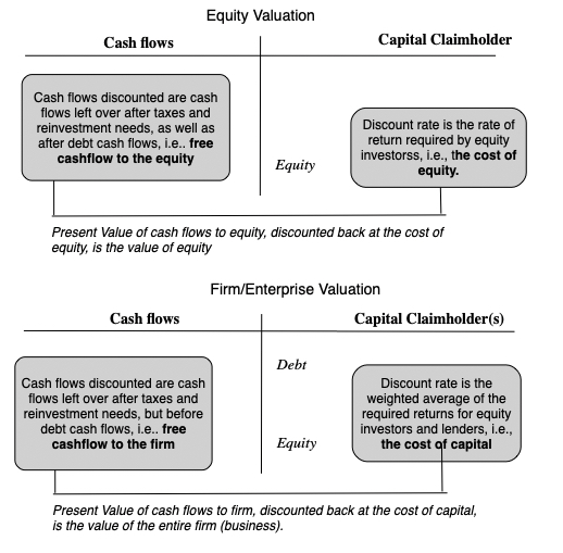
With banks, this choice does not exist, since debt to a bank can be expansively defined to include deposits as well, making it effectively raw material for the bank's operations, where the objective is borrow money (from depositors and lenders) at a low rate and lend it out or invest it at a higher rate. Consequently, you can only value the equity in a bank, and by extension, the only pricing multiples you can use to price banks are equity multiples (PE, Price to Book etc.). The notion of computing a cost of capital for a bank is fanciful and fruitless, and any attempt to compute an enterprise value for a bank is destined to end in failure.
Equity Valuation 101 and Dividend Discount Model
Staying on equity valuation, the intrinsic value of equity can be written as a function of the cash flows left for equity investors, after reinvestment and taxes, and after all other claim holders have been paid, and the cost of equity:

Over the decades, analysts trying to put this model into practice with banks have run into trouble estimating cash flows for banks, using the traditional structure, since items like capital expenditures and working capital are impossible to measure at banks. It should come as no surprise that, at least with banks, analysts fell back on the only observable cash flows to equity, i.e., dividends;

It is this line of reasoning, i.e., that it is difficult, if not impossible, to estimate banking free cashflows to equity, that I used prior to 2008, when I argued for the use of the dividend discount model to value banks In using the dividend discount model, I was making two implicit assumptions. The first was that banks were run by sensible people, who paid out what they could afford to in dividends, neither holding back on paying dividends nor paying too much in dividends. The other was that the bank regulatory framework operated effectively, preventing banks from overreaching on risk or being under capitalized.
A Bank FCFE Model
The events of 2008 dispelled me of both delusions that allowed for the use of the dividend discount model, as it became clear that the managers of banks were anything but sensible and the regulatory framework had large holes in it that were exploited. In the years after, I have replaced dividends with a variant on free cash flow to equity, defined through the lens of a banking business, discounted back at a cost of equity reflecting banking risks (duration mismatches, low regulatory capital and riskiness of loan/investment portfolios).

Note the differences between the bank FCFE and bank dividend discount models.
The first is that unlike dividends, which are floored at zero, the free cash flow to equity for a growing or severely undercapitalized bank can be negative, reflecting the need to raise fresh equity to survive. The other is that by tying cashflows to capitalization, it allows us to bring in that same factor into risk and costs of equity, with under capitalized banks have higher costs of equity. As a final component of bank equity value, and 2023 has brought this home to us is the reality that even a healthy, profitable bank can see its value melt away in days, if its depositors decide, for good, bad or no reasons at all, to withdraw their deposits and put the bank into the death spiral from which recovery can be close to impossible. Since this risk is existential, it is almost impossible to build into a discounted cash flow model, which is for a going-concern, and has to be incorporated as a risk of failure.In short, the banking version of a FCFE model gives us access to levers that allow us to differentiate across banks and bring in the elements that make some banks better than others.Valuing Citi
Intrinsic valuation models connect only when applied to real companies, and in the table below, I used the Bank FCFE model described above in my valuation of Citi (a choice that may strike you as odd, but which you will understand if you read the rest of my post). To set the table, in the battle of big banks for investor acclaim, Citi has clearly lost the battle not only against JP Morgan Chase, but against most of the other big US banks. It has delivered low growth and subpar profitability, but it has built up buffers in its capital ratios and still has a banking model that delivers a lucrative interest rate spread.
In my valuation, I will assume that Citi will continue on its cautious, low-growth path, growing its risk-adjusted assets at 3% a year in perpetuity, a little lower than its 3.74% growth rate over the last 5 years. Over time, I expect some improvement in the return on equity, which was 8.78% in 2022, to its five-year average of 9.50%, which is still lower than the cost of equity of 11.67% that I am using for large commercial banks (see picture below for how I am computing an implied cost of equity for the 25 largest banks). Finally, I will assume that the bank will continue to marginally improve its Tier 1 capital ratio, currently at 14.80% to reach a target of 15.00%, in five years:
 Download spreadsheet to value Citi (or any bank)
Note that the combination of low growth and a healthy, current regulatory capital ratio keep the needs for reinvesting in regulatory capital low, allowing for large potential dividends. Those high cash flows, even though they are delivered by a bank that earns and expects to continue to earn an ROE less than its cost of equity translate into a value of equity for Citi of about $69, making it about 32% under valued auto the stock price of $46.32, at close of trading on May 5, 2023. Obviously, you will have very different views about Citi than I do, and you are welcome to download the spreadsheet and input your numbers not just for Citi, but for any bank.
The Pricing of Bank Equity
You have heard me say this before, but I don't think there is any harm in repeating this. Value and price are words that are often used interchangeably, but they come from different processes and can yield different numbers for the same asset or company.

Since pricing requires comparison across companies, often with different units (numbers of shares outstanding), we generally convert market values into pricing multiples, to allow for this comparison. As we noted in the last section, the pricing multiples that we use to compare banks have to be equity multiples, with price earnings rations and price to book ratios being the most common choices.
Price to Book Ratio: Choice and Drivers
There is no sector where price to book ratios get used more than in banking and financial services, for two reasons. The first is that the book value of equity for a bank, by becoming the basis for regulatory capital, has operating consequences, since actions or events that lower than book value of equity (an unexpected loss, a regulatory fine, a trading shortfall) can cause a bank to become undercapitalized and go out of business. The other is that marking to market is more common in banks than at other sectors, the hold-to-maturity loophole notwithstanding, and that should make book value of equity a more meaningful figure than book value of equity at a software or a consumer product company.
To use the price to book ratio to price banks, I begin by identifying its drivers, and that is simple to do, if you start with an intrinsic equity valuation model. In fact, using the simplest equity valuation model that I can think of, which is a stable growth dividend discount model, we get:

Dividing both sides by book value of equity, and setting growth rate = (1- Payout ratio) ROE, we can simplify this equation:

This equation, in its simple, stable growth form, suggests that whether a bank trades at below or above its book value of equity will be driven by whether investors expect banks to earn more than their cost of equity (price to book>1), roughly the cost of equity (price to book = 1) or less than the cost of equity (price to book <1).
Price to Book for Banks: Over time
To get a measure of how banks are being priced today, it is worth getting perspective as to how investor views on bank profitability and risk have changed over time. To gain this perspective, I looked at the aggregated price to book ratio of all US banks, obtained by first aggregating the market capitalizations of all banks and dividing by the aggregated book equity from 2004 to 2022, at the end of each year, and in May 2023:

If there is a lesson in the graph, it is that the 2008 crisis has left a lasting impression, as US banks have struggled since that crisis to elevate price to book ratios. Even as returns on equity have slowly recovered close to pre-2008 levels, the price to book ratios have not recovered, even as the rest of the market has seen rising price to book ratios, due to lower interest rates. In fact, the 2023 crisis has reduced the aggregate price to book ratio for US banks to close to one, the Maginot line below which investors are assuming that banks will generate return on equity roughly equal to their cost of equity in the long term. For some, this drop in price to book ratios over time is a sign of market overreaction, and there are some value investors who have overweighted their bank holdings as a consequence. That may very well be the case, but I think it is prudent to see if there are fundamental reasons for the shift:
Higher Risk : One explanation is that investors perceive banks to be riskier than they were prior to 2008, and at first sight, that seems puzzling since banks have become better capitalized over the last decade, as the regulatory authorities have reacted to the 2008 crisis by tightening safety capital requirements:

As you can see the Tier 1 capital at US banks collectively has risen to 13-14% from 10-11% in the years leading into the 2008 crisis and after. It is true, though, that equity as a percent of total assets dipped especially in 2020 and 2021, before bouncing back, but even that statistic has shown little change over the decade. Lower Profitabilit y: Another is that investors don't trust net income reported by banks as final numbers, given the propensity of some banks to surprise them with after-the fact and unexpected losses (from trading mistakes and asset write-downs) or believe that banks are becoming less profitable over time. To see if this is the case, I looked at the interest income and expenses over time at banks:
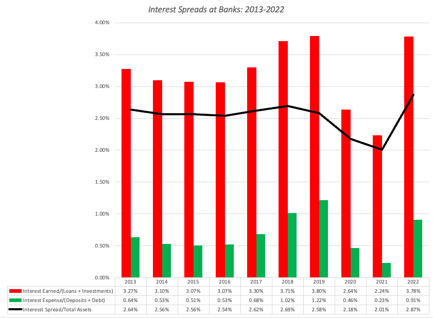
Like the book equity, the spread dropped in 2020 and 2021, with 2022 showing a recovery. However, as interest rates have risen, it is likely that rates on deposits will rise faster than rates earned on loans and investments in the near term, perhaps a source of concern for investors. Business Economics ; If banks are not more risky, at least collectively, and interest spreads have held their own, the only remaining explanation is that investors believe that the banking business is much less likely to be value-adding now than two decades ago. Almost every aspect of banking is under stress, with deposits becoming less sticky, increased competition for the loan business from fintech and other disruptors and increased risks of contagion and crisis, and while banks remain profitable on the surface, investors have good reason to wonder whether the good times will last.I know that a contrarian take, especially after the last few months, would suggest investing in banking as a sector, but I believe that the long term trends for the business are negative.
The Pricing of Banks - Across Banks
Even though I would not make a collective bet on banks collectively, I do believe that, as in any crisis, individual banks are getting mis-placed. Thus, as investors panic and sell regional banks, it is likely that good regional banks and lumped in bad ones, in the sell off, and if that money is being redirected to the bigger banks, some of those banks may not merit the price increases. Staying with price to book as my pricing metric for banks, I looked at the distribution of price to book ratios across banks, both at the end of 2022, and in May 2023, as the banking crisis has unfolded:

As you can see, the crisis has lowered price to book ratios across the board, with the median price to book ratio dropping from 1.12 at the end of 2022 to 0.94 in May 2022. That decline is almost entirely the result of a decline in market capitalization, since the book values of equity for banks were little changed between the third quarter of 2022 (used for the end of 2022 calculation) and the end of 2022 (used for the May 2023 calculation).
Since the key driver of price to book ratio is the return on equity, I looked at the distribution of returns on equity at US banks in 2021 and 2022:

Unlike companies in other sectors, where there are wide variations across companies, the returns on equity at banks is tightly clustered, with 50% of banks having 9.38% (9.24%) and 14.80% (13.75%) in 2021 (2022). However, there are clearly banks that generate higher returns on equity than other banks, and that should play a role in explaining differences in price to book ratios. To check how closely price to book ratios at banks hew to the returns on equities generated by banks, I did a scatter plot of price to book against ROE, both at the end of 2022 and again in May 2023:

While banks with higher ROE generally trade at higher price to book ratios, there is significant noise in the relationship, though more in May 2023 (with an R squared just above 11%) than in December 2022 (with an R squared just above 14%). In a final visual display, I looked a 3D scatter plot, of PBV against ROE and Tier 1 capital ratios:

I have highlighted the combination that characterizes the most under valued banks (low price to book, high ROE and a high Tier 1 capital ratio) as well as the combination for the most over valued banks (high price to book, low ROE and low Tier 1 capital
The Biggest Banks- Trawling for Bargains!
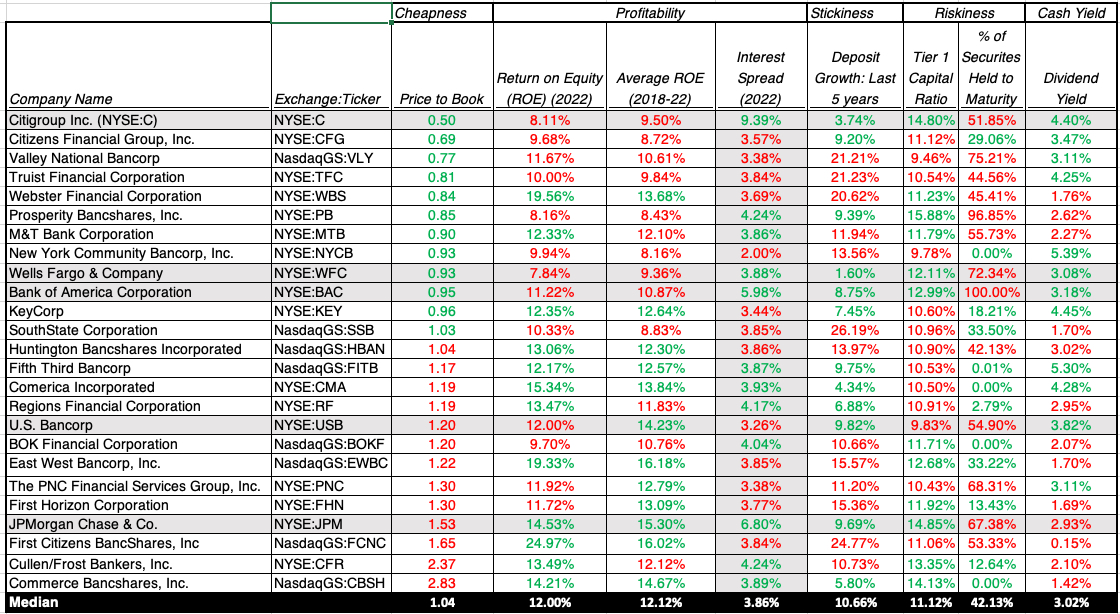
One of the exercises that I find useful, when pricing, is to look for the perfect underpriced stock, one that looks cheap with no good reason for why it is so cheap. Applying that practice to banks, here is what you would want to see in your underpriced bank:
 Applying this approach to the 25 largest banks, for instance, I computed the median values for each of these variables for the 25 largest US banks, in terms of market cap, and used it as the dividing line for good and bad on each of the variables. Thus, a return on equity higher than the median of 12% is considered a good (and in green) and less than 12% is considered bad (and in red).
 Source: S&P Capital IQ
Put simply, you are looking for a preponderance of green numbers for your under priced banks, and while there no all green banks, Citi comes closest to meeting the tests, scoring well on risk (with a higher than median Tier 1 capital ratio and a lower percent of securities held to maturity among the five biggest banks), deposit stickiness (with low deposit growth) and trades at half of book value (the lowest price to book ratio). Its weakest link is a return on equity of 8.11% (in 2022) and 9.50% (average from 2018-2022), lower than the median for US banks, and while that would suggest a lower than median price to book ratio, the discount at Citi exceeds that expectation. Citi's banking business, though slow growing, remains lucrative with the higher interest rate spread in this sample. I will be adding Citi to my portfolio, since it offers the best mix of cheapness and low risk, and hope that it can at least maintain its profitability, though an increase would be icing on the cake. It is a slow-growth, stodgy bank that seems to be priced on the presumption that it will not only never earn a ROE even close to its cost of equity, and that makes it a good investment. At the other end of the expectation scales, JP Morgan Chase scores well on operating metrics, with a high ROE, low deposit growth and a high Tier 1 capital ratio, but it trades at a much higher price to book ratio than the other banks, and iwith a lower dividend yield. I have owned JPM Chase for close to a decade in my portfolio, and I don't see anything in this table that would lead me to sell, though I would not be in a hurry to buy either, at today's prices, if I did not own it. As a value investor, I would be uncomfortable making an investment in Citi, purely based upon this pricing analysis, and it is for that reason that I retraced my steps to do the intrinsic valuation of the bank that you saw in the last section. That reinforces a more general point that even investors who are true believers in valuation can benefit from understanding and using pricing, just as traders, who play the pricing game, can benefit from an understanding of the core principles of intrinsic valuation.
Wrapping upIn my last post, my focus was on the qualities that made for the distinction between good and bad banks, and those qualities includes deposit stickiness, a low interest rate on deposits combined with a high interest rate (given default risk) on loans and investments and a big buffer against shocks (with high book equity and Tier 1 capital ratios). In this post, I shifted attention to the investing side of the picture, and that puts the price you pay to acquire banks on center stage. Acquiring a good bank, while paying too high a price, will make for a bad investment, just as acquiring a bad bank, at a bargain price, will be a good investment. On the contest of banking quality, JP Morgan Chase would beat Citi handily, with a high return on equity and continued growth, combined with safety, but in the contest for investing dollars, Citi is the better priced bank. Since I will have both stocks in my portfolio starting tomorrow, I will have a ringside seat to watch this contest play out over the next few years.
YouTube Video
Posts on the Banking Crisis 2023
Breach of Trust: Decoding the Banking Crisis (of 2023)Good (Bad) Banks and Good (Bad) Investments: At the right price...Bank Valuation Spreadsheet
Bank Valuation Spreadsheet (with Citi Valuation)May 5, 2023
Breach of Trust: Decoding the Banking Crisis
In March 2023, the fall of Silicon Valley Bank shocked investors not only because it was unforeseen, but also because of the speed with which it unfolded. That failure has had a domino effect, with Signature Bank falling soon after, followed by Credit Suisse in April 2023 and by First Republic last week. The banks that have fallen so far collectively controlled more deposits than all of the banks that failed in 2008, but unlike that period, equity markets in the United States have stayed resilient, and even within banking, the damage has varied widely across different segments, with regional banks seeing significant draw downs in deposits and market capitalization. The overarching questions for us all are whether this crisis will spread to the rest of the economy and market, as it did in 2008, and how banking as a business, at least in the US, will be reshaped by this crisis, and while I am more a dabbler than an expert in banking, I am going to try answering those questions.
The Value of a Bank
Banks have been an integral part of business for centuries, and while we have benefited from their presence, we have also been periodically put at risk, when banks over reach or get into trouble, with their capacity to create costs that the rest of us have to bear. After every banking crisis, new rules are put into place to reduce or minimize these risks to the economic system, but in spite of these rules or sometimes because of them, there are new crisis. To understand the roots of bank troubles, it is important that we understand how the banking business works, with the intent of creating criteria that we can use to separate good banks from average or bad ones.
The Banking Business Model
The banking business, when stripped down to basics, is a simple one. A bank collects deposits from customers, offering the quid quo pro of convenience, safety and sometimes interest income (on those deposits that are interest-beating) and either lends this money out to borrowers (individuals and businesses), charging an interest rate that is high enough to cover defaults and leave a surplus profit for the bank. In addition, banks can also invest some of the cash in securities, usually fixed-income, and with varying maturities and degrees of default risk, again earning income from these holdings. The profitability of a bank rests on the spread between its interest income (from loans and financial investments) and its interest expenses (on deposits and debt), and the leakages from that spread to cover defaulted loans and losses on investment securities:

To ensure that a bank survives, it's owners have to hold enough equity capital to buffer against unanticipated defaults or losses.
The Bank Regulators
If you are wondering where bank regulators enter the business model, it is worth remembering that banks predate regulators, and for centuries, were self regulated, i.e., were responsible for ensuring that they had enough equity capital to cover unexpected losses. Predictably, bank runs were frequent and the banks that survived and prospered set themselves apart from the others by being better capitalized and better assessors of default risk than their competition. In the US, it was during the civil war that the National Banking Act was passed, laying the groundwork for chartering banks and requiring them to maintain safety reserves. After a banking panic in 1907, where it fell upon J.P. Morgan and other wealthy bankers to step in and save the system, the Federal Reserve Bank was created in 1913. The Great Depression gave rise to the Glass-Steagall Act in 1933 which restricted banks to commercial banking, with the intent of preventing them from investing their deposit money in riskier businesses. The notion of regulatory capital has always been part of bank regulation, with the FDIC defining "capital adequacy" as having enough equity capital to cover one-tenth of assets. In subsequent decades, these capital adequacy ratios were refined to allow for risk variations across banks, with the logic that riskier assets needed more capital backing than safer ones. These regulatory capital needs were formalized and globalized after the G-10 countries created the Basel Committee on Banking Supervision and explicitly created the notions of "risk-weighted assets" and "Tier 1 capital", composed of equity and equity-like instruments, as well as specify minimum capital ratios that banks had to meet to continue to operate. Regulators were given punitive powers, ranging from restrictions of executive pay and acquisitions at banks that fell below the highest capitalization ranks to putting banks that were undercapitalized into receivership.
The Basel accord and the new rules on regulatory capital have largely shaped banking for the last few decades, and while they have provided a safety net for depositors, they have also given rise to a dangerous game, where some banks arrived at the distorted conclusion that their end game was exploiting loopholes in regulatory capital rules, rather than build solid banking businesses. In short, these banks found ways of investing in risky assets that the regulators did not recognize as risky, either because they were new or came in complex packages, and using non-equity capital (debt and deposits), while getting that capital classified as equity or equity-like for regulatory purposes. The 2008 crisis exposed the ubiquity and consequences of this regulatory capital game, but at great cost to the economy and tax payers, with the troubled assets relief program (TARP) investing $426 billion in bank stocks and mortgage-backed securities to prop up banks that had over reached, mostly big, money-center banks, rather than small or regional banks. The phrase "too big to fail" has been over used, but it was the rationale behind TARP and is perhaps at the heart of today's banking crisis.
Good and Bad Banks
If the banking business is a simple one, what is that separates good from bad banks? If you look back at the picture of the banking business, you can see that I have highlighted key metrics at banks that can help gauge not just current risk but their exposure to future risk.
Deposits: Every banks is built around a deposit base, and there are deposit base characteristics that clearly determine risk exposure. First, to the extent that some deposits are not interest-bearing (as is the case with most checking accounts), banks that have higher percentages of non-interest bearing deposits start off at an advantage, lowering the average interest rate paid on deposits. Second, since a big deposit base can very quickly become a small deposit base, if depositors flee, having a stickier deposit base gives a bank a benefit. As to the determinants of this stickiness, there are numerous factors that come into play including deposit size (bigger and wealthier depositors tend to be more sensitive to risk whispers and to interest rate differences than smaller ones), depositor homogeneity (more diverse depositor bases tend to be less likely to indulge in group-think) and deposit age (depositors who have been with a bank longer are more sticky). In addition to these bank-specific characteristics, there are two other forces that are shaping deposit stickiness in 2023. One is that the actions taken to protect the largest banks after 2008 have also tilted the scales of stickiness towards them, since the perception, fair or unfair, among depositions is that your deposits are safer at a Chase or Citi than they are at a regional bank. The other is the rise of social media and online news made deposits less sticky, across the board, since rumors (based on truth or otherwise) can spread much, much faster now than a few decades ago.Equity and Regulatory Capital: Banks that have more book equity and Tier 1 capital have built bigger buffers against shocks that banks without those buffers. Within banks that have high accumulated high amounts of regulatory capital, I would argue that banks that get all or the bulk of that capital from equity are safer than those that have created equity-like instruments that get counted as equity. Loans: While your first instinct on bank loans is to look for banks that have lent to safer borrowers (less default risk), it is not necessarily the right call, when it comes to measuring bank quality. A bank that lends to safe borrowers, but charges them too low a rate, even given their safer status, is undercutting its value, whereas a bank that lends to riskier borrowers, but charges them a rate that incorporates that risk and more, is creating value. In short, to assess the quality of a bank's loan portfolio, you need to consider the interest rate earned on loans in conjunction with the expected loan losses on that loan portfolio, with a combination of high (low) interest rates on loans and low (high) loan losses characterizing good (bad) banks. In addition, banks that lend to a more diverse set of clients (small and large, across different business) are less exposed to risk than banks that lend to homogeneous clients (similar profiles or operate in the same business), since default troubles often show up in clusters.Investment Securities: In the aftermath of the 2008 crisis, where banks were burned by their holdings in riskier mortgage-backed securities, regulators pushed for more safety in investment securities held by banks, with safety defined around default and liquidity risk. While that push was merited, and banks with safer and more liquid holdings are safer than banks with riskier, illiquid holdings, there are two other components that also determine risk exposure. The first is the duration of these securities, relative to the duration of the deposit base, with a greater mismatch associated with more risk. A bank that is funded primarily with demand deposits, which invests in 10-year bonds, is exposed to more risk than if invests in commercial paper or treasury bills. The second is whether these securities, as reported on the balance sheet, are marked to market or not, a choice determined (at least currently) by how banks classify these holdings, with assets held to maturity being left at original cost and assets held for trading, being marked to market. As an investor, you have more transparency about the value of what a company holds and, by extension, its equity and Tier 1 capital, when securities are marked to market, as opposed to when they are not.At the risk of over simplifying the discussion, the picture below draws a contrast between good and bad banks, based upon the discussion above: Banks with sticky deposits, on which they pay low interest rates (because a high percentage are non-interest bearing) and big buffers on equity and Tier 1 capital, which also earn "fair interest rates", given default risk, on the loans and investments they make, add more value and are usually safer than banks with depositor bases that are sensitive to risk perceptions and interest rates paid, while earning less than they should on loans and investments, given their default risk.
 Macro Stressors
While we can differentiate between good and bad banks, and some of these differences are driven by choices banks make on how they build their deposit bases and the loans and investments that they make with that deposit money, these differences are often either ignored or overlooked in the good times by investors and regulators. If often requires a crisis for both groups to wake up and respond, and these crises are usually macro-driven:
Recessions: Through banking history, it is the economy that has been the biggest stressor of the banking system, since recessions increase default across the board, but more so at the most default-prone borrowers and investment securities. Since regulatory capital requirements were created in response to one of the most severe recessions in history (the Great Depression), it is not surprising that regulatory capital rules are perhaps most effective in dealing with this stress test.Overvalued Asset Classes: While banks should lend money using a borrower's earnings capacity as collateral, it is a reality that many bankers lend against the value of assets, rather than their earning power. The defense that bankers offer is that these assets can be sold, if borrowers default, and the proceeds used to cover the outstanding dues. That logic breaks down when asset classes get overvalued, since the loans made against the assets can no longer be covered by selling these assets, if prices correct. This boom and bust cycle has long characterized lending in real estate, but became the basis for the 2008 crisis, as housing prices plunged around the country, taking down not just lenders but also holders of real-estate based securities. In short, when these corrections happen, no matter what the asset class involved, banks that are over exposed to that asset class will take bigger losses, and perhaps risk failure.Inflation and Interest Rates: Rising inflation and interest rates are a mixed blessing for banks. On the one hand, as rates rise, longer life loans and longer term securities will become less valuable, causing losses.. After all, the market price of even a default-free bond will change, when interest rates change, and bonds that were acquired when interest rates were lower will become less valuable, as interest rates rise. In most years, those changes in rates, at least in developed markets like the US, are small enough that they create little damage, but 2022 was an uncommon year, as the treasury bond rate rose from 1.51% to 3.88%, causing the price of a ten-year treasury bond to drop by more than 19%.
Put simply, every bank holding ten-year treasury bonds in 2022 would have seen a mark down of 19% in the value of these holdings during the year, but as investors, you would have seen the decline in value only at those few banks which classified these holdings as held for sale. That pain becomes worse with bonds with default-risk, with Baa (investment grade) corporate bonds losing 27% of their value. On the other hand, banks that have higher percentages of non-interest bearing deposits will gain value from accessing these interest-free deposits in a high interest world. The net effect will determine how rising rates play out in bank value, and may explain why the damage from the crisis has varied across US banks in 2023.
The Banks in Crisis
It is worth noting that all of the pain that was coming from writing down investment security holdings at banks, from the surge in interest rates, was clearly visible at the start of 2023, but there was no talk of a banking crisis. The implicit belief was that banks would be able to gradually realize or at least recognize these losses on the books, and use the time to fix the resulting drop in their equity and regulatory capital. That presumption that time was an ally was challenged by the implosion of Silicon Valley Bank in March 2023, where over the course of a week, a large bank effectively was wiped out of existence. To see why Silicon Valley Bank (SVB) was particularly exposed, let us go back and look at it through the lens of good/bad banks from the last section:
An Extraordinary Sensitive Deposit Base: SVB was a bank designed for Silicon Valley (founders, VCs, employees) and it succeeded in that mission, with deposits almost doubling in 2021. That success created a deposit base that was anything but sticky, sensitive to rumors of trouble, with virally connected depositors drawn from a common pool and big depositors who were well positioned to move money quickly to other institutions. Equity and Tier 1 capital that was overstated: While SVB's equity and Tier 1 capital looked robust at the start of 2023, that look was deceptive, since it did not reflect the write-down in investment securities that was looming. While it shared this problem with other banks, SVB's exposure was greater than most (see below for why) and explains its attempt to raise fresh equity to cover the impending shortfall.Loans: A large chunk of SVB's loan portfolio was composed of venture debt, i.e., lending to pre-revenue and money-losing firms, and backed up by expectations of cash inflows from future rounds of VC capital. Since the expected VC rounds are conditional on these young companies being repriced at higher and higher prices over time, venture debt is extraordinarily sensitive to the pricing of young companies. In 2022, risk capital pulled back from markets and as venture capital investments dried up, and down rounds proliferated, venture debt suffered. Investment Securities: All banks put some of their money in investment securities, but SVB was an outlier in terms of how much of its assets (55-60%) were invested in treasury bonds and mortgage-backed securities. Part of the reason was the surge in deposits in 2021, as venture capitalists pulled back from investing and parked their money in SVB, and with little demand for venture debt, SVB had no choice but to invest in securities. That said, the choice to invest in long term securities was one that was made consciously by SVB, and driven by the interest rate environment in 2021 and early 2022, where short term rates were close to zero and long term rates were low (1.5-2%), but still higher than what SVB was paying its depositors. If there is an original sin in this story, it is in this duration mismatch, and it is this mismatch that caused SVB's fall.
In short, if you were building a bank that would be susceptible to a blow-up, from rising rates, SVB would fit the bill, but its failure opened the door for investors and depositors to reassess risk at banks at precisely the time when most banks did not want that reassessment done.
In the aftermath of SVB's failure, Signature Bank was shut down in the weeks after and First Republic has followed, and the question of what these banks shared in common is one that has to be answered, not just for intellectual curiosity, because that answer will tell us whether other banks will follow. It should be noted that neither of these banks were as exposed as SVB to the macro shocks of 2022, but the nature of banking crises is that as banks fall, each subsequent failure will be at a stronger bank than the one that failed before.
With Signature Bank, the trigger for failure was a run on deposits, since more than 90% of deposits at the bank were uninsured, making those depositors far more sensitive to rumors about risk. The FDIC, in shuttering the bank, also pointed to "poor management" and failure to heed regulatory concerns, which clearly indicate that the bank had been on the FDIC's watchlist for a which.With First Republic bank, a bank that has a large and lucrative wealth management arm, it was a dependence on those wealthy clients that increased their exposure. Wealthy depositors not only are more likely to have deposits that exceed $250,000, technically the cap on deposit insurance, but also have access to information on alternatives and the tools to move money quickly. Thus, in the first quarter of 2023, the bank reported a 41% drop in deposits, triggering forced sale of investment securities, and the realization of losses on those sales.In short, it is the stickiness of deposits that seems to be the biggest indicator of banks getting into trouble, rather than the composition of their loan portfolios or even the nature of their investment securities, though having a higher percentage invested in long term securities leaves you more exposed, given the interest rate environment. That does make this a much more challenging problem for banking regulators, since deposit stickiness is not part of the regulatory overlay, at least at the moment. One of the outcomes of this crisis may be that regulators monitor information on deposits that let them make this judgment, including:Depositor Characteristics: As we noted earlier, depositor age and wealth can be factors that determine stickiness, with younger and wealthier depositors being less sticky that older and poorer depositors. At the risk of opening a Pandora's box, depositors with more social media presence (Twitter, Facebook, LinkedIn) will be more prone to move their deposits in response to news and rumors than depositors without that presence.Deposit age: As in other businesses, a bank customer who has been a customer for longer is less likely to move his or her deposit, in response to fear, than one who became a customer recently. Perhaps, banks should follow subscriber/user based companies in creating deposit cohort tables, breaking deposits down based upon how long that customer has been with the bank, and the stickiness rate in each group. Deposit growth: In the SVB discussion, I noted that one reason that the bank was entrapped was because deposits almost doubled in 2021. Not only do very few banks have the capacity to double their loans, with due diligence on default risk, in a year, but these deposits, being recent and large, are also the least sticky deposits at the bank. In short, banks with faster growth in their deposit bases also are likely to have less sticky depositors.Deposit concentration: To the extent that the deposits of a bank are concentrated in a geographic region, it is more exposed to deposit runs than one that has a more geographically diverse deposit base. That would make regional bank deposits more sensitive that national bank deposits, and sector-focused banks (no matter what the sector) more exposed to deposit runs than banks that lend across businesses. Some of this information is already collected at the bank level, but it may be time for bank regulators to work on measures of deposit stickiness that will then become part of the panel that they use to judge exposure to risk at banks.The Market Reaction The most surprising feature of the 2023 banking crisis has been the reaction of US equity markets, which have been resilient, rising in the face of a wall of worry. To illustrate how the market reaction has played out at different levels, I looked at four indices, starting with the S&P 500, moving on the S&P Financials and Banks Index to the S&P Select Bank Index and finally, the S&P Regional Bank Index.

The S&P 500 index is up 6.5% this year, indicative of the resilience on the part of the market, or denial on the part of investors, depending on your perspective. The S&P Financial Sectors index is down 5.72%, but the S&P Select Banks index is down 26.2% and the regional bank index has taken a pummeling, down more than 35%. The damage from this banking crisis, in short, has been isolated to banks, and within banks, has been greater at regional banks than at the national banks. The conventional wisdom seems to bethat big banks have gained at the expense of smaller banks, but the data is more ambiguous. I looked at the 641 publicly traded US banks, broken down by market capitalization at the start of 2023 into ten deciles and looked at the change in aggregate market cap within each decile.

As you can see the biggest percentage declines in market cap are bunched more towards the bigger banks, with the biggest drops occurring in the eighth and ninth deciles of banks, not the smallest banks. After all, the highest profile failures so far in 2023 have been SVB, Signature Bank and First Republic Bank, all banks of significant size. If my hypothesis about deposit stickiness is right, it is banks with the least stick deposits that should have seen the biggest declines in market capitalization. My proxies for deposit stickiness are limited, given the data that I have access to, but I used deposit growth over the last five years (2017-2022) as my measure of stickiness (with higher deposit growth translating into less stickiness):
 The results are surprisingly decisive, with the biggest market capitalization losses, in percentage terms, in banks that have seen the most growth in deposits in the last five years. To the extent that this is correlated with bank size (smaller banks should be more likely to see deposit growth), it is by no means conclusive evidence, but it is consistent with the argument that the stickiness of deposits is the key to unlocking this crisis.
Implications I do believe that there are more dominos waiting to fall in the US banking business, with banks that have grown the most in the last few years at the most risk, but I also believe that unlike 2008, this crisis will be more likely to redistribute wealth across banks than it is to create costs for the rest of us. Unlike 2008, when you could point to risk-seeking behavior on the part of banks as the prime reason for banking failures, this one was triggered by the search for high growth and a failure to adhere to first principles when it comes to duration mismatches. That said, I would expect the following changes in the banking structure:Continued consolidation: Over the last few decades, the US banking business has consolidated, with the number of banks operating dropping 14,496 in 1984 to 4,844 in 2022. The 2023 bank failures will accelerate this consolidation, especially as small regional banks, with concentrated deposit bases and loan portfolios are assimilated into larger banks, with more diverse structure.Bank profitability: For some, that consolidation is worrisome since it raises the specter of banks facing less competition and thus charging higher prices. I may be naive but I think that as banks consolidate, they will struggle to maintain profitability, and perhaps even see profits drop, as disruptors from fintech and elsewhere eat away at their most profitable segments. In short, the biggest banks may get bigger, but they may not get more profitable.Accounting rule changes for banks: The fact that SVB's failure was triggered by a drop in value of the bank's investments in bonds and mortgage backed securities, and that this write down came as a shock to in investors, because SVB classified these securities as being held till maturity (and thus not requiring of mark-to-market) will inevitably draw the attention of accounting rule writers. While I don't foresee a requirement that every investment security be marked to market, a rule change that will create its own dangers, I expect the rules on when securities get marked to market to be tightened.Regulatory changes: The 2023 crises have highlighted two aspects of bank behavior that are either ignored or sufficiently weighted into current regulatory rules on banks. The first is duration mismatches at banks, which clearly expose even banks that invest in default free securities, like SVB, to risk. The other is deposit stickiness, where old notions of when depositors panic and how quickly they react will have to be reassessed, given how quickly risk whispers about banks turned into deposit flight at First Republic and Signature Bank. I expect that there will be regulatory changes forthcoming that will try to incorporate both of these issues, but I remain unsure about the form that these changes will take.I know I have said very little in this post about whether banks are good investments today, either collectively or subsets (large money center, regional etc.), and have focused mostly on what makes for good and bad banks. The reason is simple. Investing is not about judging the quality of businesses, but about buying companies at the right price, and that discussion requires a focus on what expectations markets are incorporating into stock prices. I will address the investing question in my next post, which I hope to turn to very soon!
YouTube Video
March 8, 2023
Data Update 7 for 2023: Dividends, Buybacks and Cash Flows
Dividend Policy in Corporate Finance
To understand where dividend policy fits in the larger context of running a business, consider the following big picture description of corporate finance, where every decision that a business makes is put into one of three buckets - investing, financing and dividends, with each one having an overriding principle governing decision-making within its contours.
 In my fifth data update for 2023, I focused on the investment principle, which states that businesses should invest in projects/assets only if they expect to earn returns greater than their hurdle rates, and presented evidence that using the return on capital as a proxy for returns and costs of capital as a measure of hurdle rates, 70% of global companies fell short in 2022. In my sixth data update, I looked at the trade off that should determine how much companies borrow, where the tax benefits are weighed off against bankruptcy costs, but noted that firm often choose to borrow money for illusory reasons and because of me-tooism or inertia. The dividend principle, which is the focus of this post is built on a very simple principle, which is that if a company is unable to find investments that make returns that meet its hurdle rate thresholds, it should return cash back to the owners in that business. Viewed in that context, dividends as just as integral to a business, as the investing and financing decisions. Thus, the notion that a company that pays dividends is viewed as a failure strikes me as odd, since just farmers seed fields in order to harvest them, we start businesses because we plan to eventually collect cash flows from them. Put in logical sequence, dividends should be the last step in the business sequence, since they represent residual cash flows. In that sequence, firms will make their investment decisions first, with financing decisions occurring concurrently or right after, and if there are any cash flows left over, those can be paid out to shareholders in dividends or buybacks, or held as cash to create buffers against shocks or for investments in future years:
 In practice, though, and especially when companies feel that they have to pay dividends, either because of their history of doing so (inertia) or because everyone else in their peer group pays dividends (me-tooism), dividend decisions startthe sequence, skewing the investment and financing decisions that follow. Thus, a firm that chooses to pay out more dividends than it should, will then turn out and either reject value-adding projects that it should have invested in or borrow more than it can afford to, and this dysfunctional dividend sequence is described below:
In this dysfunctional dividend world, some companies will pay out far more dividends than they should, hurting the very shareholders that they think that they are benefiting with their generous dividends.
Measuring Potential Dividends
In the discussion of dysfunctional dividends, I argued that some companies pay out far more dividends than they should, but that statement suggests that you can measure how much the "right" dividends should be. In this section, I will argue that such a measure not only exists, but is easily calculated for any business, from its statement of cash flows.
Free Cash Flows to Equity (Potential Dividends)
The most intuitive way to think about potential dividends is to think of it as the cash flow left over after every conceivable business need has been met (taxes, reinvestments, debt payments etc.). In effect, it is the cash left in the till for the owner. Defined thus, you can compute this potential dividend from ingredients that are listed on the statement of cash flows for any firm:

Note that you start with net income (since you are focused on equity investors), add back non-cash expenses (most notably depreciation and amortization, but including other non-cash charges as well) and net out capital expenditures (including acquisitions) and the change in non-cash working capital (with increases in working capital decreasing cash flows, and decreases increasing them). The last adjustment is for debt payments, since repaying debt is a cash outflow, but raising fresh debt is a cash inflow, and the net effect can either augment potential dividends (for a firm that is increasing its debt) or reduce it (for a firm that is paying down debt).
Delving into the details, you can see that a company can have negative free cash flows to equity, either because it is a money losing company (where you start the calculation with a net loss) or is reinvesting large amounts (with capital expenditures running well ahead of depreciation or large increases in working capital). That company is obviously in no position to be paying dividends, and if it does not have cash balances from prior periods to cover its FCFE deficit, will have to raise fresh equity (by issuing shares to the market).
FCFE across the Life Cycle
I know that you are probably tired of my use of the corporate life cycle to contextualize corporate financial policy, but to understand why dividend policies vary across companies, there is no better device to draw on.
 Young companies are unlikely to return cash to shareholders, because they are not only more likely to be money-losing, but also because they have substantial reinvestment needs (in capital expenditures and working capital) to generate future growth, resulting in negative free cash flows to equity. As companies transition to growth companies, they may become money-making, but at the height of their growth, they will continue to have negative free cash flows to equity, because of reinvestment needs. As growth moderates and profitability improves, free cash flows to equity will turn positive, giving these firms the capacity to return cash. Initially, though, it is likely that they will hold back, hoping for a return to their growth days, and that will cause cash balances to build up. As the realization dawns that they have aged, companies will start returning more cash, and as they decline, cash returns will accelerate, as firms shrink and liquidate themselves. Of course, you are skeptical and I am sure that you can think of anecdotal evidence that contradicts this life cycle theory, and I can too, but the ultimate test is to look at the data to see if there is support for it. At the start of 2023, I classified all publicly traded firms globally, based upon their corporate ages (measured from the year of founding through 2022) into ten deciles, from youngest and oldest, and looked at free cash flows and cash return for each group:
 As you can see, the youngest firms in the market are the least likely to return cash to shareholders, but they have good reasons for that behavior, since they are also the most likely to be money losing and have negative freee cash flows to equity. As firms age, they are more likely to be money-making, have the potential to pay dividends (positive FCFE) and return cash in the form of dividends or buybacks.
 Dividends and Buybacks: Fact and Fiction
Until the early 1980s, there was only one conduit for publicly traded companies to return cash to owner, and that was paying dividends. In the early 1980s, US firms, in particular, started using a second option for returning cash, by buying back stock, and as we will see in this section, it has become (and will stay) the predominant vehicle for cash return not only for US companies, but increasingly for firms around the world.
The Facts
Four decades into the buyback surge, there are enough facts that we can extract by looking at the data that are worth highlighting. First, it is undeniable that US companies have moved dramatically away from dividends to buybacks, as their primary mode of cash return, and that companies in the rest of the world are starting to follow suit. Second, that shift is being driven by the recognition on the part of firms that earnings, even at the most mature firms, have become more volatile, and that initiating and paying dividends can trap firms into . Third, while much has been made of the tax benefits to shareholders from buybacks, as opposed to dividends, that tax differential has narrowed and perhaps even disappeared over time.
1. Buybacks are supplanting dividends as a mode of cash return
I taught my first corporate finance class in 1984, and at the time, almost all of the cash returned by companies to shareholders took the form of dividends, and buybacks were uncommon. In the graph below, you can see how cash return behavior has changed over the last four decades, and the trend lines are undeniable;
 The move to buybacks started in earnest in the mid 1980s and by 1988, buybacks were about a third of all cash returned to shareholders. In 1998, buybacks exceeded dividends for the first time in US corporate history and by last year, buybacks accounted for almost two thirds of all cash returned to shareholders. In short, the default mechanism for returning cash at US companies has become buybacks, not dividends. Lest you start believing that buybacks are a US-centric phenomenon, take a look at global dividends and buybacks, in the aggregate, broken down by region in 2022:

Note that while the US is the leader of the pack, with 64% of cash returned in buybacks, the UK, Canada, Japan and Europe are also seeing a third or more of cash returned in buybacks, as opposed to dividends. Among the emerging market regions, Latin America has the highest percent of cash returned in buybacks, at 26.90%, and India and China are still nascent markets for buybacks. The shift to buybacks that started in the United States clearly has now become a global phenomenon and any explanation for its growth has to be therefore global as well.
2. Buybacks are more flexible than dividends
If you buy into the notion of a free cash flow to equity as a potential cash return, companies face a choice between paying dividends and buying back stock, and at first sight, the impact on the company of doing either is exactly the same. The same amount of cash is paid out in either case, the effects on equity are identical (in both book value and market value terms) and the operations of the company remain unchanged. The key to understanding why companies may choose one over the other is to start with the recognition that in much of the world, dividends are sticky, i.e., once initiated and set, it is difficult for companies to suspend or cut dividends without a backlash, as can be seen in this graph that looks at the percent of US companies that increase, decrease and do nothing to dividends each year:
 Note that the number of dividend-paying companies that leave dividends unchanged dominates companies that change dividends every single year, and that when companies change dividends, they are far more likely to increase than cut dividends. The striking feature of the graph is that even in crisis years like 2008 and 2020, more companies increased than cut dividends, testimonial to its stickiness. In contrast, companies are far more willing and likely to revisit buybacks and slash or suspend them, if the circumstances change, making it a far more flexible way of returning cash:

At the core, this flexibility is at the heart of the shift to buybacks, especially as fewer and fewer companies have the confidence that they can deliver stable and predictable earnings in the future, some because globalization has removed local market advantages and some because their businesses are being disrupted. It is true that there is a version of dividends, i.e., special dividends, that may offer the same flexibility, and it will be interesting to see if their usage increases as governments target companies buying back stock for punishment or higher taxes.
3. There are tax benefits (to shareholders) from buybacks, but they have decreased over time
From the perspective of shareholders, dividends and buybacks create different tax consequences, and those can affect which option they prefer. A dividend gives rise to taxable income in the period that it is paid, and taxpayer have little or no way of delaying or evading paying taxes. A buyback gives investors a choice, with those opting to sell back their shares receiving a realized capital gain, which will be taxed at the capital gains tax rate, or not selling them back, giving rise to an unrealized capital gain, which will be taxed in a future period, when the stock is sold. For much of the last century, dividends were taxed in the US as ordinary income, at rates much higher than that paid on capital gains.
 While the differential tax benefit in the last century is often mentioned as the reason for the rise of buybacks, note that the tax differential was even worse prior to 1980, when dividends essentially dominated, to the post-1980 period, when buybacks came into vogue. For much of this century, at least in the US, dividends and buybacks have been taxed at the same rate, starting at 15% in 2003 and rising to 23.8% in 2011 (a 20% capital gains rate + 3.8% Medicare tax on all income), thus erasing much of the difference between dividends and realized capital gains for shareholder tax burdens. However, shareholders still get a benefit with unrealized capital gains that can be carried forward to a future tax-advantageous year or even passed on in inheritance as untaxed gains.
 Until last year, there were no differences in tax consequences to companies from paying dividends or buying back stock, but the Inflation Reduction Act of 2022 introduced a 1% tax rate on buybacks, thus creating at least a marginal additional cost to companies that bough back stock, instead of paying dividends. If the only objective of this buyback tax is raising revenues, I don't have a problem with that because it will help close the budget gap, but to the extent that this is designed to change corporate behavior by inducing companies to not buy back stock or to invest more back into businesses, it is both wrong headed and will be ineffective, as I will argue in the next section.
The Fiction
The fictions about buybacks are widespread and are driven as much by ideological blinders as they are by a failure to understand what a business is, and how to operate it. The first is that buybacks can increase or decrease the value of a business, with buyback advocates making the former argument and buyback critics the latter. They are both wrong, since buybacks can only redistribute value, not create it. The second is that surge in buybacks has been fed by debt financing, and it is part of a larger and darker picture of over levered companies catering to greedy, short term shareholders. The third is that buybacks are bad for an economy, with the logic that the cash that is being used for the buybacks is not being invested back in the business, and that the latter is better for economic growth. The final argument is that the large buybacks at US companies represent cash that is being taken away from other stakeholders, including employees and customers, and is thus unfair.
1. Buybacks increase (decrease) value
Value in a business comes from its capacity to invest money and generate cash flows into the future, and defined as such, the act of returning cash by itself, either as dividends or buybacks cannot create or destroy value. It is true that the way in which dividends and buybacks are funded or the consequences that they have for investing can have value effects, but those value effects do not come from the cash return, but from investing and financing dysfunction. The picture below captures the pathways by which the way dividends and buybacks are funded can affect value:
 The implications are straight forward and common sense. While a buyback or dividend, by itself, cannot affect value, the way it is funded and the investments that it displaces can determine whether value is added or destroyed.Leverage effect: If a company that is already at its right mix of debt (see my last post) choose to add to that debt to fund its dividend payments or buybacks, it is hurting its value by increasing its cost of capital and exposure to default risk. However, a firm that is under levered, i.e., has too little debt, may be able to increase its value by borrowing money to fund its cash return, with the increase coming from the skew in the tax code towards debt.Investment effect: If a company has a surplus of value-adding projects that it can take, and it chooses not to take those projects so as to be able to pay dividends or buy back stock, it is hurting it value. By the same token, a company that is in a bad business and is struggling to make its cost of capital will gain in value by taking the cash it would have invested in projects and returning that cash to shareholders.Finally, there is a subset of companies that buy back stock, not with the intent of reducing equity and share count, but to cover shares needed to cover stock-based compensation (option grants). Thus, when management options get exercised, rather than issue new shares and dilute the ownership of existing shareholders, these companies use shares bought back to cover the exercise. The value effect of doing so is equivalent to buybacks that reduce share count, because not issuing shares each year to cover option exercises is effecting accomplishing the same objective of keeping share count lower.
 There is an element where there dividends and buybacks can have contrasting effects. Dividends are paid to all shareholders, and thus cannot make one group of shareholders better or worse off than others. Buybacks are selective, since only those shareholders who sell their shares back receive the buyback price, and they have the potential to redistribute value. In what sense? A company that buys back stock at too high a price, relative to its intrinsic value, is redistributing value from the shareholders who remain in the company to those who sell their shares back. In contrast, a company that buys back shares at a low price, relative to its intrinsic value, is redistributing value from the shareholders who sell their shares back to those who stay shareholders in the firm. This is at the heart of Warren Buffet's defense of buybacks at Berkshire Hathaway as a tool, since he adds the constraint that the buybacks will continue only if they can be done at less than intrinsic value, and the assumption is that Buffet does have a better sense of the intrinsic value of his company than market participants. It is true that some companies buy back stock at the high prices, and if that is your reason, as a shareholder in the company for taking a stand against buybacks, I have a much simpler and more effective response than banning buybacks. Just sell your shares back and be on the right side of the redistribution game!
2. Buybacks are being financed with debt
As I noted in my lead in to this section, a company that borrows money that it cannot afford to borrow to buy back stock is not just damaging its value but putting its corporate existence at risk. I have heard a few critics of buybacks contend that buybacks are being funded primarily or predominantly with debt, using anecdotal examples of companies that have followed this script, to back up their claim. But is this true across companies? To address this, I looked companies in the US (because this critique seems to be directed primarily at them), broken down by whether they did buybacks in 2022, and then examined debt loads within each group:

You can be the judge, using both the debt to capital ratio and the debt to EBITDA multiple, that companies that buy back stock have lower debt loads than companies that don't buy back stock, at odds with the "debts fund buybacks" story. Are there firms that are using debt to buy back stock and putting their survival at risk? Of course, just as there are companies that choose other dysfunctional corporate finance choices. In the cross section, though, there is little evidence that you can point to that buybacks have precipitated a borrowing binge at US companies.
3. Buybacks are bad for the economy
The final argument against buybacks has little to do with shareholder value or debt but is centered around a mathematical truth. Companies that return cash to shareholders, whether as dividends or buybacks, are not reinvesting the cash, and to buyback critics, that fact alone is sufficient to argue against buybacks. There are two premises on which this argument is built and they are both false.
The first is that a company investing back into its own business is always better for the economy than that company not investing, and that misses the fact that investing in bad businesses, just for the sake of investing is not good for either shareholders or the economy. Is there anyone who would argue with a straight face that we would be all better off if Bed Bath and Beyond had built more stores in the last decade than they already have? Alternatively, would we not all have been better served if GE had liquidated itself as a company a decade ago, when they could have found eager buyers and returned the cash to their shareholders, instead of continuing as a walking dead company? The second is that the money returned in buybacks, which exceeded a trillion dollars last year, somehow disappeared into a black hole, when the truth is that much of that money got reinvested back into the market in companies that were in better businesses and needed capital to grow? Put simply, the money got invested either way, but by companies other than GE and Bed Bath and Beyond, and that counts as a win for me.Watching the debate on buybacks in the Senate last year, I was struck by how disconnected senators were from the reality of buybacks, which is that they bulk of buybacks come from companies that have no immediate use for the money, or worse, bad uses for the monty, and the effect of buybacks is that this money gets redirected to companies that have investment opportunities and operate in better businesses.4. Buybacks are unfair to other stakeholders
If the argument against buybacks is that the money spent on buybacks could have been spent paying higher wages to employees or improving product quality, that is true. That argument is really one about how the pie is being split among the different shareholders, and whether companies are generating profits that excessive, relative to the capital invested. I argued in my fifth data post that if there is backing for a proposition, it is that companies are not earning enough on capital invested, not that they are earning too much. I will wager that if you did break down pay per hour or employee benefits, they will be much better at companies that are buying back stock than at companies that don't. Unfortunately, I do not have access to that data at the company-level on either statistic, but I am willing to consider evidence to the contrary.
The Bottom Line
It is telling that some of the most vehement criticism of buybacks come from people who least understand business or markets, and that the legislative solutions that they craft reflect this ignorance. Taxing buybacks because you are unable to raise corporate tax rates may be an effective revenue generator for the moment, but pushing that rate up higher will only cause the cash return to take different forms. Just as the attempts to curb top management compensation in the early 1990s gave rise to management options and a decade of even higher compensation, attempts to tax buybacks may backfire. If the end game in taxing buybacks is to change corporate behavior, trying to induce invest more in their businesses, it will be for the most part futile, and if it does work, will do more harm than good.
YouTube Video
Data Links
Dividend Statistics, by Industry: US and GlobalDividends, Buybacks and FCFE, by Industry: US and GlobalData Update Posts for 2023
Data Update 1 for 2023: Setting the Table!Data Update 2 for 2023: A Rocky year for Equities!Data Update 3 for 2023: Inflation and Interest RatesData Update 4 for 2023: Country Risk - Measures and ImplicationsData Update 5 for 2023: The Earnings TestData Update 6 for 2023: A Wake up call for the Indebted?Data Update 7 for 2023: Dividends, Buybacks and Cash Flows
February 27, 2023
Data Update 6 for 2023: A Wake up call for the Indebted?
Debt's place in business
To understand debt's role in a business, I will start with a big picture perspective, where you break a business down into assets-in-place, i.e., the value of investments it has already made and growth assets, the value of investments you expect it to make in the future. To fund the business, you can either use borrowed money (debt) or owner's funds (equity), and while both are sources of capital, they represent different claims on the business. Debt provides contractual claims, in the form on interest payments and principal repayments, whereas equity is a residual claim, i.e., you receive whatever cash flows, if any, that are left over after other claim holders have been paid:
 This breakdown should take out the mystery out of debt, since it converts it into a source of capital, and the question of whether you should borrow to fund a business, and if yes, how much you should borrow becomes one of choosing between a source of capital that gives rise to contractual claims, with all of its pluses and minuses, and one that gives rise to residual claims, with all of its benefits and costs. Note that this framework applies for all businesses, from the smallest, privately owned businesses, where debt takes the form of bank loans and even credit card borrowing and equity is owner savings, the largest publicly traded companies, where debt can be in the form of corporate bonds and equity is shares held by public market investors. Even government-owned businesses fall under its umbrella, with the key difference being that equity is provided by the taxpayers.
Good Reasons for Borrowing
What are the pluses and minuses of borrowing, if you take a clear-eyed look at it just as a capital source? First, borrowing money cannot alter the operating risk in a business, which comes from the assets that it holds, either in-place or as growth investments, but it will affect the risk to equity investors in that business, by making their residual claim (earnings) more volatile, In addition, the contractual claim that comes with debt can create truncation risk, because failing to make interest or principal payments can result in bankruptcy, and effective loss of equity. Second, borrowing money at a lower rate, by itself, cannot alter your overall cost of funding, since that cost is determined by the risk of your assets. Hence, the benefits of borrowing at a lower rate will always be offset by a higher cost for equity investors, leaving the cost of funding unchanged, unless a finger is put on the scale, giving one source special benefits. In much of the world, governments have written tax codes that do exactly this, by making interest payments on debt tax-deductible, while requiring that cash flows to equity be made out of after-tax cash flows. That tax benefit of debt will increase with the marginal tax rate, making it much more beneficial to borrow in countries with high tax rates (Germany, Japan, US) over those with lower tax rates (Ireland, much of Eastern Europe). The chart below lists the tax benefits as the primary benefit of borrowing and the expected bankruptcy cost as the primary downside of debt:
 There are also ancillary benefits and costs that the chart notes, with debt operating as a disciplinary tool in some businesses, when managers consider taking new projects, since bad projects can plunge the firm into bankruptcy (and cause managers to lose their jobs), and the challenge of managing the conflicting interests of equity investors and lenders, that manifest in covenants, restrictions, and legal costs.
 Bad Reasons for Borrowing
There are many bad reasons for borrowing, and some companies seem intent on using these bad reasons. The first, and the one offered by most debt-heavy entities is that using more debt will result in higher returns on equity, since there is less equity at play. That is technically true, for the most part, but since the cost of equity rises proportionately, that benefit is an illusion. The second is that debt is cheaper than equity, to which your response should be that this is true for every business, and the reason lies in the fact that lenders have first claim on the cash flows and equity investors are last in line, not in some inherent cheapness of debt. The chart below lists these illusory benefits:
On the other side of the ledger, there are some companies that refuse to borrow money for bad reasons as well. The first is that borrowing money will lower net income, as interest expenses get deducted from operating income, but that lower net income will be accompanied by less equity invested in the firm, often leading to higher earnings per share, albeit with higher volatility. The second is that borrowing money will increase perceived default risk, and if the company is rated, lower ratings, and that too is true, but borrowing money at a BBB rating, with the tax benefit incorporated, might still yield a lower cost of funding that staying at a AA rating, with no debt in use.
The "Right" Financing Mix
Is there an optimal mix of debt and equity for a business? The answer is yes, though the payoff, in terms of value, from moving to that optimal may be so small that it is sometimes better to hold back from borrowing. In this section, I will lay out a mechanism for evaluating the effects of borrowing on the cost of funding a business, i.e., the cost of capital, and talk about why firms may under or overshoot this optimal.
An Optimizing Tool
In my second and third data posts for this year, I chronicled the effects of rising interest rates and risk premiums on costs of equity and capital. In computing the latter, I used the current debt ratios for firms, but made no attempt to evaluate whether these mixes were "right" or not. That said, the cost of capital can be used as an optimizing tool in assessing the right mix of debt and equity, with the optimal mix being the one that yields the lowest cost of capital. That computation, though, is a dynamic one, since both the cost of equity and the cost of debt will change as a business changes its debt ratio:

In effect, you are trading off the benefits of replacing more expensive equity with lower-rate debt against the resulting higher costs of equity and debt, when you borrow more. As you can see, the net effect of raising the debt ratio on the cost of capital will depend on where a firm stands, relative to its optimal, with under levered firms seeing costs of capital decrease, as debt ratio increases, and over levered firms seeing the opposite effect.
As to the variables that determine what that optimal debt ratio is for a firm, and why the optimal debt ratio can range from 0% for some firms to close to 90% for others, they are simple and intuitive:
Marginal tax rate: If the primary benefit of borrowing is a tax benefit, the higher the marginal tax rate, the higher its optimal debt ratio. In fact, at a zero percent tax rate, the optimal debt ratio, if you define it as the mix that minimizes cost of capital is zero. The picture below captures differences in corporate marginal tax rates, entering 2023, across the world: Download marginal tax rates, by country
As you can see from the heat map and table, most countries have converged around a tax rate of 25%, with a few outliers in Eastern Europe and parts of Middle East having marginal tax rates of 15% or lower, and a few outliers, including Australia, India and parts of Africa with marginal tax rates that exceed 30%. Of these countries, Australia does offer protection from double taxation for equity investors, effectively endowing equity with some tax benefits as well, and reducing the marginal tax benefits from adding debt.Cash generating capacity: Debt payments are serviced with operating cash flows, and the more operating cash flows that firms generate, as a percent of their market value, the more that they can afford to borrow. One simplistic proxy for this cash generating capacity is EBITDA as a percent of enterprise value (EV), with higher (lower) values indicating greater (lesser) cash flow generating capacity. In fact, that may explain why firms that trade at low EV to EBITDA multiples are more likely to become targets in leveraged buyouts (LBOs) or leveraged recapitalizations..Business risk: Not surprisingly, for any given level of cash flows and marginal tax rate, riskier firms will be capable of carrying less debt than safer firms. That risk can come from many sources, some related to the firm (young, evolving business model, highly discretionary products/services), some to the sector (cyclical, commodity) and some to the overall economy (unstable). The company-specific factors show up in the risk parameters that you use for the firm (beta, rating) and the macro and market-wide factors show up in the macro inputs (riskfree rates, equity risk premiums)
If you are interested in checking how this optimization works, download this spreadsheet, and try changing the inputs to see the effect on the optimal. I looked Adani Enterprises, the holding company for the Adani Group and estimated the cost of capital and estimated value at different debt ratios:

In my assessment, Adani Enterprise carries too much debt, with actual debt of 413,443 million more than double its optimal debt of 185,309 million, and reducing its debt load will not just lower its risk of failure, but also lower its cost of capital. This company is part of a family group, where higher debt at one of the Adani companies may be offset by less debt at another. To deal with this cross subsidization, I aggregated numbers across all seven publicly traded Adani companies and estimated the optimal debt mix, relative to the combined enterprise values:

The Adani Group collectively carries about three times as much debt as it should, confirming that the group is over levered as well, but note that this is bad business practice, not a con. In fact, as you can see from the cost of capital graph, there is little, if any, benefit in terms of value added to Adani from using debt, and significant downside risk, unless the debt is being subsidized by someone (government, sloppy bankers, green bondholders).
If you have taken a corporate finance class sometime in your past life are probably wondering how this approach reconciles with the Miller-Modigliani theorem, a key component of most corporate finance classes, which posits that there is no optimal debt ratio, and that the debt mix does not affect the value of a business. That theorem deserves the credit that it gets for setting up the framework that we use to assess debt today, but it also makes two key assumptions, with the first being that there are no taxes and the second being that there is no default. Removing debt's biggest benefit and cost from the equation effectively negates its effect on value. Changing your debt ratio, in the Miller-Modigliani world, will leave your cost of capital unchanged. In the real world, though, where both taxes and default exist, there is a "right" mix (albeit an approximate one) of debt and equity, and companies can borrow too much or too little.
Effect on value
If you can see the mechanics of how changing debt ratio changes the cost of capital, but are unclear on how lowering the cost of capital changes the value of a business, the link is a simple one. The intrinsic value of a business is the present value of its expected free cash flows to the firm, computed after taxes but before debt payments, discounted back at its cost of capital:

As you borrow more, your free cash flows to the firm should remain unaffected, in most cases, since they are pre-debt cash flows, and a lower cost of capital will translate into a higher value, with one caveat. As you borrow more and the risk of failure/bankruptcy increases, there is the possibility that customers may stop buying your products, suppliers may demand cash and your employees may start abandoning ship, creating a death spiral, where operating income and cash flows are affected, in what is termed "indirect bankruptcy costs". In that case, the optimal debt ratio for a company is the one that maximizes value, not necessarily the one at which the cost of capital is minimized.
Do companies optimize financing mix?
Do companies consider the trade off between tax benefits and bankruptcy costs when borrowing money? Furthermore, do they optimize they debt ratios to deliver the lowest hurdle rates. The answer may be yes for a few firms, but for many, debt policy is driven by factors that have little to do with value and more with softer factors:
Inertia: In my view, at most companies the key determinant of debt policy, as it is of most other aspects of corporate finance, is inertia. In other words, companies continue the debt policies that they have used in the past, on the mistaken view that if it worked then, it should work now, ignoring changes in the business and in the macro economy. That, for instance, is the only way to explain why older telecom companies, which developed a practice of borrowing large amounts during their time as monopoly phone businesses, continue that practice, even as their business have evolved into intensely competitive, technology businesses. Me-to-ism: The second and almost as powerful a force in determining debt policy is peer group behavior. Staying with the telecom firm theme, newer telecom companies entering the space feel the urge to borrow in large quantities, because other telecom companies borrow. It is for this reason that debt policy is far more likely to vary across industry groups than it is to vary within an industry group.Because lenders are willing to lend me money: There is a final perspective on debt that can lead companies to borrow money, even if that borrowing is inimical to their own well being, and it is that if lenders offer them the money, you cannot turn them away. In fact, it is the excuse that real estate developers use after every boom and bust cycle to explain away why they chose to borrow as much as they did. The "lenders made me do it" excuse for borrowing money is about as bad as the "the buffet lunch made me overeat" excuse used by dieters, and it just as futile, because ultimately, the damage is self inflicted.Control: In my post on the Adani Group, I noted that in their zeal for control, insiders, founders and families sometimes make dysfunctional choices, and one of those is on borrowing. A growing firm needs capital to fund its growth, and that capital has to come from equity issuances or new borrowing. When control becoming the dominant prerogative for those running the firm, they may choose to borrow money, even if it pushes up the cost of funding and increases truncation risk, rather than issue shares to the the public (and risk dilution their control of the firm). The bottom line is that since firms borrow based upon their own past histories and their peer group policies on borrowing, there will always be firms that have too much debt, given their capacity to borrow, just as there will be firms at the other end of the spectrum that refuse to borrow, even though they can, because they have never borrowed money or because they operate in industry groupings, where no one borrows.Measuring Debt Loads
With the long lead in on the trade off that animates the borrowing decision, let us talk about how to measure the debt load at a company. While the answer may seem obvious to you, it is not to me, and I will start by looking at debt scaled to capital, a measure of debt's place in the financing mix, and then look at debt scaled to cash flows or earnings, often a better measure of potential default risk.
Debt to Capital Ratios
In the financial balance sheet that I used at the start of this post, I noted that there are two ways of raising capital to fund a business, debt, with its contractual claims on cash flows, or equity, with its residual claims. Following up, it does make sense to look at the proportions of each that a firm uses in funding and that can be measured by looking at debt, as a percent of capital in the firm. That said, there are (at least) four variants that you will see in practice, depending on the composition of total debt, and whether capital is obtained from an accounting balance sheet (book value) or a financial balance sheet (market value):Gross versus Net Debt: The gross debt is the total debt owed by a firm, long and short term, whereas the net debt is estimated by netting out cash and marketable securities from the total debt. While there is nothing inherently that makes one measure superior to the other, it is important to remember that gross debt can never be less than zero, but net debt can, for firms that have cash balances that exceed their debt.Book versus Market: The book debt ratio is built around using the accounting measure of equity, usually shareholder's equity, as the value of equity. The market debt ratio, in contrast, uses the market's estimate of the value of equity, i.e., its market capitalization, as the value of equity. While accountants, CFOs and bankers are fond of the book value measure, almost everything in corporate finance revolves around market value weights, including the debt to equity ratios we use to adjust betas and costs of equity and the debt to capital ratios used in computing the cost of capital.There are sub-variants, within these four variants, with debates about whether to use only long-term debt or all debt and about whether lease debt should be treated as debt. My advice is that you consider all interest-bearing debt is debt, and that picking and choosing what to include is an exercise in futility.
I computed gross and net debt ratios for all publicly traded, non-financial service firms, at the start of 2023, relative to both book and market value, with the distribution of debt ratios at the start of 2023 below:
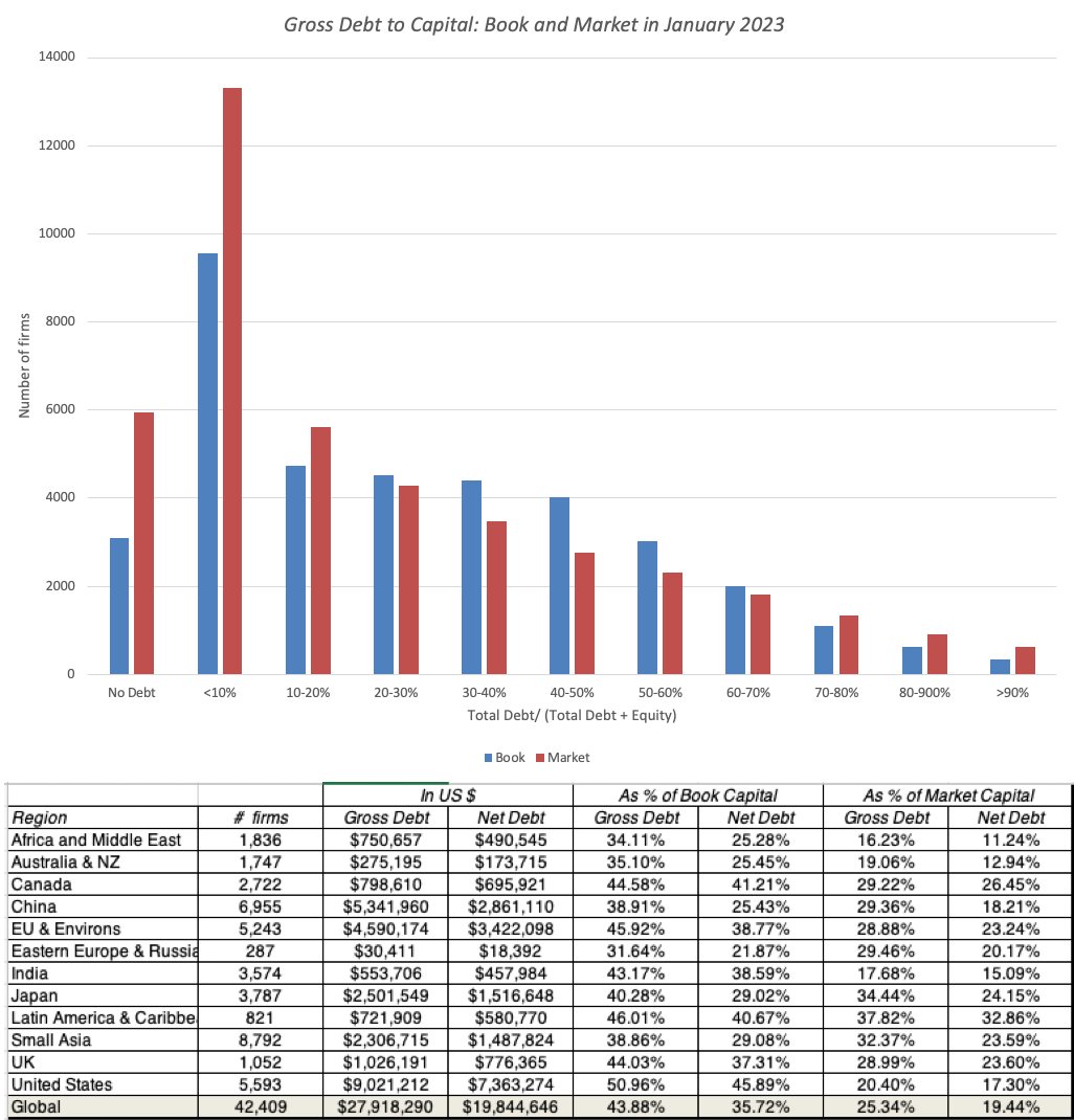
If you have been fed a steady diet of stories of rising indebtedness and profligate companies, you will be surprised by the results. The median debt ratio, defined both in book and market terms, for a global firm at the start of 2023 was between 10% and 20% of overall capital. It is true that there are differences across regions, as you can see in the table below, which computes the debt ratios based upon aggregated debt and equity across all firms and is thus closer to a weighted average. On a book debt ratio basis, the United States, as a region, has the highest debt ratio in the world, but on a market debt ratio basis, Latin America and Canada have the highest debt loads.
The problem with using debt to capital ratios to make judgments on whether firms are carrying too much, or too little, debt is that, at the risk of stating the obvious, you cannot make interest payments or repay debt using capital, book or market. Put simply, you can have a firm with a high debt to capital ratio with low default risk, just as you can have a firm with low debt to capital with high default risk. It is one reason that a banking focus on total assets and market value, when lending to a firm, can lead to dysfunctional lending and troubled banks. To the retort from some bankers that you can liquidate the assets and recover your loans, I have two responses. First, assuming that book value is equal to liquidation value may let bankers sleep better at night, but it can be delusional in industries where they're no ready buyers for those assets. Second, even if liquidation is an option, a banker who relies on liquidating assets to collect on loans has already lost at the lending game, where the objective is to collect interest and principal on loans, while minimizing defaults and liquidations.
Debt to EBITDA, Interest Coverage Ratios
If debt to capital is not a good measure for judging over or under leverage, what is? The answer lies in looking at a company's earnings and cash flow capacity, relative to its debt obligations. The interest coverage ratio is the first of two ratios that I will use to measure this capacity:
Interest Coverage Ratio = Earnings before interest and taxes/ Interest expenses
As a lender, higher interest coverage ratios indicate a bigger buffer and thus more safety, other things remaining equal, than lower interest coverage ratios. While the interest coverage ratio is a widely used proxy for default risk, and the one ratio that best explains differences in bond ratings for a firm, its limit is its focus on interest expenses, to the exclusion of debt principal payments that may be coming due. The second ratio remedies this problem by looking at debt as a multiple of EBITDA:Debt to EBITDA = Total Debt/ EBITDA
The logic behind this measure is simple. The denominator is a measure of operating cash flows, prior to a whole host of cash outflows, but a firm that borrows too much relative to EBITDA is stretching its capacity to repay that debt.
I compute both ratios (interest coverage and Debt to EBITDA) for all publicly traded firms and the results are graphed below, with the important caveat that they move in opposing directions, when measuring safety, with safer firms having higher interest coverage rations and lower Debt to EBITDA multiples;

Not only do interest coverage ratios and debt to EBITDA multiples vary widely across firms, but they also vary across sectors. On a pure numbers-basis, utilities look like they are the most dangerous firms to lend to, with skintight interest coverage ratios (1.17, in the aggregate) and sky high total debt to EBITDA, but that can be misleading since many of these utilities are monopolies with predictable earnings streams and the capacity to pass interest costs down to their customers. At the other end of the spectrum, technology and energy companies look the safest on an interest coverage ratio basis, but with both groups, you worry about year-to-year volatility in earnings.
To get a closer look at difference across companies, I looked at the 94 industry groups that I break down companies into, and look at the most highly levered (with total debt to EBITDA as my primary sorting proxy, but reporting my other debt load measures) and least highly levered industry groups, looking at just US publicly traded companies:
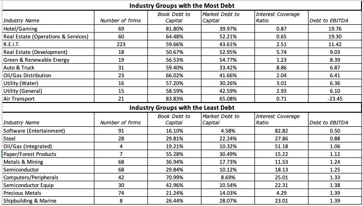 Download all industry group data
Real estate and real estate-based business dominate he most levered industry groups, with utilities, auto and airports rounding out the list, reflecting their history as well as the willingness of bankers to lend on tangible assets. Technology and commodity industry groups proliferate on the least levered list, reflecting the higher uncertainty about future earnngs and banking unease with lending against intangibles. (at least with technology companies).
The Default Question
The biggest downside of debt is that it increases exposure to default risk, and as the last part of this analysis, I will look at default rates over time, culminating in 2022, and then look ahead to the challenges that companies will face in 2023 and beyond.
Business Default: The what and the why
Defaults – Historical
In my lead in to this section, I noted that defaulting on a loan or contractual obligation does not always lead to business default or bankruptcy, and that many bankruptcies do not conclude in liquidations. That said, though, the three data series (loan delinquencies, business defaults and business liquidations) do move together, with spikes in one coinciding with spikes in the other, In the graph below, I look at bank loan delinquencs in the United States and default rates among speculative grade companies over time:
 Sources: Loan Delinquencies from Federal Reserve Site (FRED) and Corporate Defaults from S&PNote that the series go through cycles, with increases in delinquencies and defaults triggered by macroeconomic or market-wide factors. In the late 1990s, it was an economic recession that was the precipitating factor, but the last three increases in delinquencies have had their origins in other forces. The increase in delinquencies in the early part of the 2000s started with the dot-com bust and made worse by the 9/11 attack, and subsequent economic weakness. The 2008 market crisis had the most damaging and longest lasting effect on defaults, partly because it originated with banks, and partly because of the long term damage it did to housing prices and the economy. The 2020 increase in default rate was triggered by the COVID shutdown, but was not only milder, but also passed quickly, with large bailout packages from the government being the difference. Looking at 2022, the most striking aspect of the time series is that there is almost no discernible change in delinquencies or defaults in the year, with both remaining at the low rates that we have seen for much of the decade. It is true that in the last half of the year, there were signs of trouble, with an uptick in delinquencies and an increase in the number of corporate defaults. Since interest rates rose during the year, the absence of an effect on defaults may surprise you, but there are two considerations to keep in mind. The first is that rising interest rates usually have a lagged effect on defaults, since it is only as companies refinance that they face the higher costs. The second is that the US economy stayed strong through 2022, notwithstanding headwinds, and corporate earnings stayed resilient.
 Ratings Actions and The Year Ahead
If defaults measure the inability of companies to meet their contractual obligations, the actions taken by ratings agencies to change the bond ratings of the companies that they rate can operate as a leading indicator of expected defaults in the future. Put simply, ratings agencies are more likely to downgrade companies, if they foresee a potential uptick in defaults, and upgrade them, if they expect defaults to decline. While the actual defaults in 2022 remained low, it is clear that ratings agencies were becoming more concerned about the future, as can be seen in the number of ratings downgrades in the later parts of 2022, relative to upgrades:
 S&P Default and Distress, Feb 2023
Note again that the downgrades in 2022 are nowhere near the downgrades that you saw in 2008, during the banking crisis, and one reason was that rising interest payments notwithstanding, the economy stayed robust during the year. Looking ahead to 2023, ratings agencies are forecasting rising default rates, perhaps because they see an economic slowdown coming. As with my forecasts for the S&P 500 and interest rates, you see a familiar duo of macroeconomic forces driving default risk:

Not surprisingly, a combination of high inflation and a steep recession will create the most defaults, as the vice of lower earnings and higher interest rates will ensnare more firms. At the other end of the spectrum, a swift drop off in inflation with no recession will create the most benign environment for lenders, allowing default to remain low.
A Wrap
In both our personal and business lives, there are good reasons for borrowing money and bad ones. After all, the politicians who lecture businesses about borrowing too much are also the ones who write the tax code that tilts the playing field towards debt, and by bailing out businesses or individuals that get into trouble by borrowing too much, they reduce its dangers. That said, there is little evidence to back up the proposition that a decade of low interest rates has led companies collectively to borrow too much, but there are some that certainly have tested the limits of their borrowing capacity. For those firms, the coming year will be a test, as that debt gets rolled over or refinanced, and there are pathways back to financial sanity that they can take.
YouTube Video
Datasets
Debt ratios, by industry groupings (US, Global)Delinquency rates on bank loans, by Quarter (US): 1985- 2022SpreadsheetsGeneral Capital Structure Optimizing SpreadsheetAdani Enterprises: Optimal Financing MixAdani Group: Optimal Financing MixFebruary 15, 2023
Data Update 5 for 2023: The Earnings Test
As I have argued in all four of my posts, so far, about 2022, it was year when we saw a return to normalcy on many fronts, as treasury rates reverted back to pre-2008 levels, and risk capital discovered that risk has a downside. During the course of the year, investors also rediscovered that the essence of business is not growing revenues or adding users, but making profits from that growth. In this post, I will focus on trend lines in profitability at companies in 2022, with the intent of addressing multiple questions. The first is to see how the increase in inflation in 2021 and 2021 has played out in profitability for companies, since inflation can increase profits for some firms, and lower them for others. The second is on whether these profit effects vary across geographies and sectors, by estimating profitability measures across regions and industries. The third is to revisit the link between profitability and value at companies, since making money is a first step for any business to survive, but making enough money to create value in business is a much more stringent test for businesses, and one that many fail.
Profits: Levels and Trends
The end game for any business, no matter how noble its mission and how much good its products and services do, is to make money, since without profits, the business will soon run out of capital and sink into oblivion. That said, if you own the business, you may decide to accept less profits in return for social good, as you pursue your business, but you may not get the same degrees of freedom, if you are a manager at a publicly traded company, since you will now be doing good, with other people's money. Even in these cases, where you constrain your profits for the greater good, you still cannot stay on an endless path of losses. That said, there is surprising confusion about what it means for a company to make money, with different measures of profit used by investors, analysts and companies to bolster their priors about companies. To set the stage, I will start by laying out the differences measure of earnings that reported on an income statement:

At the top of the profit ladder is gross income, the earnings left over after a company has covered the direct cost of producing whatever it sells. Netting out other operating expenses, not directly related to units sold but still an integral part of operating a business (like selling and G&A expenses) yields operating income. Subtracting out interest expenses, and adding interest income and income from non-operating assets results in taxable income or pre-tax profit, and after taxes, you have the proverbial bottom line, the net income. Not surprising, there is many a cost between the gross and the net versions of earnings, and while there remain a few firms, especially young and start-up, with negative gross income, the likelihood of losses gets progressively greater as you move down the income statement. In the graph below, I look at all publicly traded firms, listed globally at the start of 2023, and at the percent of firms, within each sector, that have positive earnings using gross, pre-tax operating and net income:

Not surprisingly, while more than 85-90% of all firms report positive gross income, that number drops down to just about 60%, with net income. All of the sectors are subject to the same phenomenon, but there are outliers in both directions, with health care have the highest drop off in money makers, as you go from gross to net income, and real estate and utilities having the smallest. Finally, I look at the aggregated values across all companies on all three income measures, across all global companies, again broken down by sector:

Collectively, global companies reported $16.9 billion in gross profit in the last twelve months leading into 2023, but operating income drops off to $6.4 billion and need income is only $4.3 billion. With financial service firms, where gross and operating income are meaningless, we report only net income, and the sector remains the largest contributor to net income across companies.
Profit Margins
While absolute profits are a useful measure of profitability, you have to scale profits to a common scaling variable, to compare companies of different scale. One common scaling measure is revenues, and that scaling, of course, yields profit margins. The graph below draws a distinction between a medley of margins that are in use:
 In addition to scaling gross, operating and net profits to revenues, to get to gross, operating and net margins, I have also added two variants. One is to compute the taxes you would have paid on operating income, if it had been fully taxable, to get after-tax operating income and margin, and the other is to add back depreciation to operating income to get EBITDA and EBITDA margin. Starting with gross margins, and computing the number for all non-financial service firms, we report the distribution of gross margins across publicly traded companies at the start of 2023, again based upon gross income and sales in the most recent twelve months:
While the median gross margin across all publicly traded global firms is about 30%., there are variations across the globe, with Chinese companies reporting the lowest gross margins and Australian companies having the highest. Some of that variation can be attributed to different mixes of businesses in different regions, since unit economics will result in higher gross margins for technology companies and commodity companies, in years when commodity prices are high, and lower gross margins for heavy manufacturing and retail businesses. To explore differences in profit margins across industry groups, I broke stocks down into 94 industry groups, and sorted industries, based upon operating margin, from highest to lowest. In the table below, I list the ten industry groups with the lowest margins in the twelve months leading into 2023 and the ten industry groups with the highest:
 Download spreadsheet with margins for all industry groups
The money-losers include four industry group from the retail space, a business with a history of low operating margins, a young industry in online software, a couple of industries in long-term trouble in airlines and hotel/gaming. The money makers include a large number of energy groupings, reflecting oil prices being elevated through much of the reporting period (October 2021-September 2022), a few technology groupings (software and semiconductors) and a declining, but high-profit business in tobacco.
Accounting Returns
While profit margins tell a part of the profitability story, a high margin, by itself, may be insufficient to make a judgment on whether a business is a good one, i.e,, a business that consistently generates returns that exceed the cost of funding it. It is to remedy this defect that analysts scale profits to invested capital, with equity and capital variants:
 In the equity version, you divide net income by book equity to estimate a return on equity, a measure of what equity investors are generating on the capital they have invested in a company. In the firm version, you divide after-tax operating income, again acting like the entire operating income would have been taxable, by total invested capital, the sum of book equity and book debt, with cash netted out, to obtain return on capital. The latter has several different names (return on capital employed, return on invested capital) with some mild variants on calculation, but all sharing the same end game. Both accounting returns are computed based upon book value, not because we have suddenly developed trust in accounting, but because the objective is to estimate what investors have earned on what they originally invested in a company, rather than an updated or a marked-to market value. I know that ROIC has acquired a loyal, perhaps even fanatical, following among financial analysts, and there are a few like Michael Mauboussin who use it to extract valuable insights about business economics and value creation, but I find that many analysts who use the measure are unaware, or unwilling, to learn about the limits of accounting returns. I have a long and extremely boring paper on the fixes that you need to make to the computation, especially with older companies and companies where accounting is inconsistent in its classification of expenses.
 Notwithstanding its many limits, I do think there is value in knowing what return on invested capital a company is generating, and I do compute the return on invested capital for every publicly traded non-financial firm in the world, and the calculation details are below:

The distribution of resulting returns on capital for the 42,000 publicly traded, non-financial firms are shown below:

The after-tax returns on capital, at least in the aggregate, are unimpressive, with the median return on capital of a US (global) firm being 7.44% (5.19%). There are a significant number of outliers in both directions, with about 10% of all firms having returns on capital that exceed 50% and 10% of all firms delivering returns that are worse than -50%.
Excess Returns
If your reaction to the median return on capital being 7.44% for US companies and 5.19% for global companies is that they are making money, you are right, but when you invest capital in risky businesses you need to not just make money, but make enough to cover what you could have earned on investments of equivalent risk. It was in attempting to estimate the latter that I computed the costs of equity in my second post and costs of capital in my third. In fact, comparing the accounting returns from the last section to the costs of equity and capital that we computed earlier allows us to compute excess returns to equity and the firm:
 Put simply, value creation comes from delivering returns on equity and capital that are higher than the costs of equity and capital, and while you can take issue with using accounting returns from the most twelve months as a proxy for long term returns, the comparison is still a useful one to make:
 As you can see in this table, almost 70% of all listed companies earned accounting returns that were lower than their costs of equity or capital. On a regional basis, US companies have the highest percent of companies that earn more than the cost of capital, but still falling short of 50%, and Canadian companies performed the worst, with more than 80% of companies delivering returns that were lower than the cost of capital. It is certainly true that while the typical company had trouble making its costs of equity or capital, there are industry groups that generate returns that significantly exceed their costs, just as there are industry groups that operate as drags on the market. I look at the ten industry groups with the most positive and the most negative excess returns in the table below:
 Download spreadsheet with excess returns for all industry groups
The rankings are similar to those that we got with margins, but it is clearly an ESG advocate's nightmare, as the list of companies that deliver the most positive excess returns are a who's who of companies that would be classified as bad, with tobacco, oil and mining dominating the list.
Conclusion If 2022 was a reminder to investors that the end game for every business is to not just generate profits, but to generate enough profits to cover its opportunity costs, i.e, the returns you can make on investments of equivalent risk, and that game became a lot more difficult to win in 2022. As I noted in my second and third posts, a combination of rising risk free rates and surging risk premiums (equity risk premiums and default spreads) has conspired to push the cost of capital of both US and global companies more than any year in my recorded history (which goes back to 1960). A company generating a 7.44% return on capital (the median value at the start of 2023) in the US, would have comfortably cleared the 5.60% cost of capital that prevailed at the start of 2022, but not the 9.63% cost of capital at the start of 2023. There will be, and has already been, investor remorse about investments taken a year or more ago, but hoping that the cost of capital will come back to 2021 levels is not the solution. While there is little that can be done about past mistakes, we can at least stop adding to those mistakes, and one place to start is by updating hurdle rates, as investors and businesses, to reflect the world we live in, rather than some normalized past version of it.
YouTube Video
Data LinksProfit Margins (US, Emerging Markets, Europe, Japan, Global)Excess Returns (US, Emerging Markets, Europe, Japan, Global)
PapersReturn on Capital, Return on Invested Capital and Return on Equity: Measurement and Implications
February 11, 2023
Data Update 4 for 2023: Country Risk - Measures and Implications
I describe myself as a dabbler, and it does get in the way of my best laid plans. A few weeks ago, I posted my first data update pulling together what I had learned from looking at the data in 2023, and promised many more on the topic. In the month since, I have added two more data updates, one on US equities and one on interest rates, but my attention was drawn away by other interesting stories. Thus, I took a detour to value Tesla, around the time of their most recent earnings report on January 26, and added a second post to respond to the pushback that I got. About a week and a half ago, just as I was getting ready to start on my fourth data update, I got distracted again, this time by a story of a short seller (Hindenburg) targeting one of India's most visible companies (Adani Group) and I don't regret it, because that story is a good lead in to talking about country risk, which is the topic of my fourth data update. Irrespective of whether you think Hindenburg's short selling thesis against the Adani Group has legs, it is undeniable that the fate and value of this family group's companies is intertwined with the India story. A strongly growing India needs massive investments in infrastructure to succeed, and the Adani Group seemed uniquely qualified because of its perceived capacity to deliver on its promises, as well as its political connections.
Country Risk - The Ingredients
At the outset of this discussion, it is worth emphasizing that there is risk in investing in every country in the world, with the differences being one of degree. Thus, you would be making a mistake, if you assume that this discussion only applies if you are investing in India, Brazil or Belarus, and that it does not, if your investments are in the United States, Germany or Australia. The developed/emerging market divide was created by practitioners as a convenience, and while it sometimes has consequential effects, as is the case when a company is reclassified as developed from emerging, or vice versa, much of what I will say about how governments, legal systems and regulatory frameworks can affect corporate value applies to all countries.
Determinants
If you accept my premise that not only is it more risky to operate in some parts of the world than others, but also that risk varies across countries and time, the next question become one of deciding what determines the magnitude of country risk in a country. In my annual updates on country risk, I go through these determinants in detail, but the picture below summarizes the drivers of country risk:

It should come as no surprise that the determinants of country cut across all dimensions, with politics, exposure to violence, legal systems and corruption all determining country risk exposure. It is not required, but it is generally true, that countries that score poorly on one dimension tend to also score poorly on others, with countries that are most exposed to war and violence also having dysfunctional or nonfunctioning governments and courts.
A Life Cycle Perspective
When asked to explain differences in country risk around the world, it is unfortunately true that much of that categorization is lazy and overly broad, often centered around geography, culture and race. Thus, Asian countries were viewed as incapable of reaching first-world status, until Singapore showed that this was not true, at least on the city-state level, and Japan established its falsehood, with explosive growth and prosperity in the 1970s and 1980s. The stigma of being a Latin American or African economy persists, but there are success stories in both continents. At the same time, there are others who argue that groups with shared cultural or racial identities are incapable of elevate their countries to developed status. That is nonsense, since individuals within these groups often become success stories in a different setting or economy, unencumbered by the systemic inadequacies of their own countries. I believe that any country is capable of being a "first world" country, if it works systematically at creating a system that is perceived to be fair, timely in delivering legal redress and blessed with a government that has the interests of its populace as its first priority. By the same token, a country that is viewed as "first world" can lose that status, if people start perceiving the system as unfair, legal systems filled with delay and waster and a government that becomes capricious in its actions, or worse.
On the specific question of how much governments matter in determining country risk exposure, I am going to adapt a structure that I use to look at companies, the life cycle, and apply it to countries: In my simplistic picture, you can see how as countries evolve through the life cycle, the influence of government and country narratives changes on investment success/failure:
Role of Governments: In younger economies, the influence of government is central, in both good and bad ways, since these economies are almost entirely dependent on growth, and a combination of good (bad) tax, licensing and regulatory policies by the government can an act as a growth accelerator (destroyer). As economies mature, the effect that governments have on companies will recede, at lease on overall growth, though tax policy can still redistribute that wealth and influence business behavior. When countries decline, government attempts to stem or slow decline can make them relevant again, in good and bad ways.Country versus Investment/Company Narrative: That structure explains why when investing in a company in some countries, you have to not only do due diligence on these countries, but also form a narrative for how these countries will evolve over time. After all, your investment in Dangote Cement, a cement company with a dominant position in Nigeria nd West Africa, will do much better if that part of the world does well and will be handicapped, perhaps even fatally, if there is political and economic upheaval. In contrast, your investment in Krupps is less likely to be affected much by your views on the German economy.Uncertainty: When investing, uncertainty is part of the process, but when that investment is in a project or company in a young country, a significant portion of the uncertainty is about the country, rather than about the company or investment. Put simply, you are unlikely to find safe projects in risky countries, since country risk will undercut whatever perceived stability there is in the project's cash flows.If your views on investing and valuation were formed by reading Ben Graham, and nurtured by listening to Warren Buffett, it is worth remembering the time and the setting for their sage advice. Put simply, the rostrum that when investing in a company, you should focus on the company's management and moats, and pay little or no heed to governments or macroeconomic indicators, may have worked for value investors in the United States, in the 1980s, but will not hold up not just in other parts of the world, but even in the United States in the 2020s. Globalization and the emergence of a world economy that is no longer centered on the United States has made it an imperative for all investors to think about and understand country risk.
Country Risk: The Measures
If investors have no choice but to deal with country risk frontally, in most parts of the world, it follows that we have to come up with measures of country risk that can be incorporated into investment decisions. In this section, I will begin measures of country default risk, including sovereign ratings and CDS spreads, before moving to more expansive measures of country risk before concluding with measures of equity risk premiums for countries, a pre-requisite for estimating the values of companies with operations in those countries.
Default Risk
As with individuals and businesses, governments (sovereigns) borrow money and sometimes struggle to pay them back, leading to to the specter of sovereign default. Through time, these defaults have led to consequences that range from mildly negative to catastrophic, with some defaults triggering invasions and political revolutions. It is also the aspect of country risk, where there is the longest history of measurement, and there are widely used measurement tools.
1. History of Sovereign Default
In 2022, there were five sovereign defaults, with three (Russia, Belarus and Ukraine) a direct consequence of Russia's invasion of Ukraine, and Sri Lanka and Ghana joining the ranks, for different reasons. Those sovereign defaults are the latest in a long list of defaults that stretches back into the nineteenth century, and the graph below shows defaults in the most recent few decades, across geographies:
 Source paper
For much of the documented history, Latin America has been the epicenter for sovereign defaults, though there has been an upswing in Africa in recent years. Looking at the defaults over time, it is also worth noting that local currency defaults (where a sovereign defaults on a bond denominated in the local currency) have comprised a sizable portion of defaults over time, as can be seen in the graph below:
 Source paper
What does this all mean? The conventional practice, when estimating risk free rates, has been to use the government bond rate in the local currency, if available, as the riskfree rate in that currency, and that practice is wrong when markets perceive default risk in the sovereign and build that into the government bond rate. It is for this reason that I net out default spreads, based upon local currency ratings, from government bond rates to estimate riskfree rates in multiple currencies at the start of 2023:
 Download data
The differences in riskfree rates across currencies can be attributed to differences in expected inflation, which is at the heart of why a valuation that is consistent in its treatment of that inflation will be currency invariant. (Valuing a company in Turkish Lira should give you the same value as valuing the same company in Euros, differences in riskfree rates notwithstanding.)
2. Sovereign Ratings
The ratings agencies that rate corporate default with ratings have also had a long history of assessing sovereign default risk, with sovereign ratings, with the numbers of rated countries increasing dramatically over time, with the number of countries rated by Moody's (S&) increasing from 33 (35) in 1990 to 152 (131) at the start of 2023. Sovereign ratings, like corporate ratings, range from Aaa (AAA) in Moody's (S&P's) scale, to D (in default, with a couple of differences in how you read the ratings:
While each company generally gets one rating, countries are usually assigned two ratings, one for local currency borrowings and one for foreign currency borrowings.The fundamentals that feed corporate ratings come primarily from its financial disclosures, though qualitative factors play a role. Sovereign ratings start with quantitative measures of a country's economic standing, but there are far more non-financial forces that seem to come into play.No matter what you think about sovereign ratings as a measure of default risk, they are the most freely accessible measures of country default risk. At the start of 2023, I summarize the sovereign ratings for countries in the heat map below:
The red and orange part of the worlds have the highest default risk, at least according to Moody's, and you can see it covers large swaths of Latin America, Africa and Eurasia. While sovereign rating agencies have been accused of bias, with a skew towards giving lower ratings to emerging market countries, while over rating developed market countries, I believe that their real sin is that they are late in reacting to changes in default risk. The last year (2022) was one that saw more bad news than good news on the ratings front, with Fitch downgrading 21 countries and S&P downgrading 16 countries (while posting a negative outlook, a pre-cursor to a ratings downgrade for 8 countries).
3. Sovereign CDS spreads
The sovereign CDS market, a relatively recent entrant into the sovereign default risk game, has for the last two decades offered investors a market where they can buy insurance against default risk by sovereigns, and by doing so, provided a constantly updated, albeit noisy, measure of the default spreads of countries. In January 2023, there were 76 countries with sovereign CDS spreads available on the market, and they are listed below:

During 2022, there was a suspension on trading on sovereign Russian and Ukrainian CDS, leaving us at the tender mercies of just the ratings agencies, It is worth noting that despite the abuse that ratings agencies get for ineptitude and bias, there is a signifiant overlap between their assessments and the market's assessments of country risk.
Overall Risk
While default risk measures are widely available and used, they can be rightly challenged as taking too narrow a view of risk. After all, there are countries that score low on the default risk dimension but are exposed to political and economic risks that are considerable, as is the case with much of the oil-rich countries of the Middle East. There are no easy remedies for this problem, but there are services that generate country risk scores that bring in multiple measures of risk. While the Economist, the World Bank and private services provide country risk scores, I will stay with Political Risk Services, a data service I have used for a long time, more because of my familiarity with it than for any perceived superiority in how it measures risk. The PRS reports risk scores for different dimensions of country risk, and a composite risk score, that includes all of them. The heat map below reports on PRS scores, by country, at the start of 2023:

More than in prior years, this year's PRS map reveals a divide between the default risk perspective on risk and the PRS perspective. For instance, India is viewed as marginally less risky than China, and both are viewed as riskier than Kazakhstan., and the United States is perceived as much riskier than Germany or the Scandinavian countries.
Equity Risk
Having traveled the long and winding road from talking about the drivers of country risk to measuring country risk, we can take a shot at estimating the risk premiums we would use when investing in businesses, as equity investors, in these countries. Rather than bore with you the details of my approach to estimating equity risk premiums, which are described in excruciating detail in my paper on equity risk premiums (linked below), I will summarize how I estimated the equity risk premiums for countries at the start of 2023:

I start with the implied equity risk premium for the S&P 500 of 5.94% (see my second data update for 2023 for details) as my premium for mature market, and build up to the premiums for other markets from that, using default spreads as my starting point, and scaling them for the additional risk of equities. The resulting equity risk premiums, by country, are shown in the picture below:

With all of the caveats about country ratings and default spreads, the map still provides consistent estimates of equity risk premiums around the world. In fact, there are about a dozen countries that are unrated, where I have used their PRS scores to make estimates of their equity risk premiums.
Company Risk Exposure to Country Risk
As a final piece of this post, I want to contest what seems to be the default assumption in much of valuation, which is that the risk of a company comes from where it is incorporated and traded, rather than where it does business. Effectively, it is what leads analysts to value US companies using the US equity risk premium and Indian companies with the Indian equity risk premium, even though both groups of companies may make their products in and derive their revenues from other parts of the world. I believe that a company's exposure to country risk should be based upon where it operates, though we can debate how best to measure this country exposure, with revenues, production or a mix of the two in play, for weighting.
 I know that there are risks that derive from where a company is incorporated, and that its regulatory and tax structure may be affected by that choice, but to argue that this is the dominant risk at play does not stand up to common sense. The implications for investment and valuation are simple. Investors and analysts who paint country risk with a broad brush, using country of incorporation to measure equity risk premiums, will over value developed market companies like Coca Cola, Apple and Netflix, with significant operating exposure in emerging markets and under value companies like Infosys (India), Embraer (Brazil) and Vinamilk (Vietnam) by assigning the domestic equity risk premium to them, even though they generate large portions of revenues from foreign, and often much safer, markets.
 The End Game for Governments I know that I am going against the current political trend, but I believe that the end game for a good government is analogous to that of a good founder, and that is, once it has provided the structure and the basis for economic growth and prosperity, it should make itself less central to the economy, not more so. Note that while this may seem like the libertarian position, there are significant differences. I do believe that it is a government's role to craft laws and regulations that minimize the externalities that businesses create, but those laws/regulations should be few in number and changes, when they happen, should be reasoned and infrequent and enforcement should be fair and timely. There is nothing more unsettling than being a business person, consumer or citizen in a setting, where you are faced an avalanche of rules, sometimes contradictory, that are constantly changing, and enforced inconsistently.
YouTube Video
DataSovereign Ratings, by Country (January 2023)Sovereign CDS Spreads, by Country (January 2023)Equity Risk Premiums, by Country (January 2023)
Papers/PostsCountry Risk: Determinants, Measures and Implications - The 2022 Edition
February 4, 2023
Control, Complexity and Politics: Deconstructing the Adani Affair!
The India Rising story hit some turbulence last week, as one of its biggest corporate success stories, the Adani Group, was hit with a report from Hindenburg Research, an investing group that specializes in targeting and shorting companies that it believes have dubious accounting and business practices. In response, people have fallen into two groups, with the Adani family and its supporters arguing that the short selling report is a hit job by a "foreign" entity to bring down not just the company, but also the country, and others noting that the report just reinforces what has troubled them about the company's meteoric rise in the last decade. I will confess that I know very little about the Adani Group, and I have nothing invested financially or emotionally in the company's fortunes. If you are looking for advice on whether you should buy or sell Adani shares, based upon my analysis, you will be disappointed. Instead, I will argue that the ingredients that led to the Adani stock price meltdown last week, which include an ambitious family group obsessed with control, a financial market where trading momentum trumps financial fundamentals and a capital market (debt and equity) where governments and regulators put their thumbs on the scale, are embedded in many Indian companies, and represent the weakest links in the India story.
The Lead In
As noted in the introductory paragraph, I start from a position of ignorance about the Adani Group, and it thus made sense to fill in that gap. In doing so, I will undoubtedly bore those of you who have followed the company closely, and know far more than I do, and I apologize.
The History
The Adani Group, founded by Gautam Adani, started life as a commodity trading partnership business in Gujarat, and listed on stock markets in 1994, as Adani Exports, with a large chunk of its revenues coming from its operation of a local port in Mundra, with a subsequent entry into the edible oil business. The group's investments were regionally concentrated, but over time, they have expanded into other businesses and across India, and while I seldom draw on corporate presentations, I will make an exception and use a slide from Adani's January 2023 pitch to describe their business mix:
 Link to Adani Corporate Presentation
With the exception of Adani Wilmar, a food processing business that has recently been bolstered by acquisition of leading brands, the rest of the Adani businesses share some common characteristics. First, they are infrastructure businesses, requiring large up-front investments and having long gestation periods, with regulatory and government oversight. Second, an increasing proportion of the company's investments are related to energy, in green energy and gas transmission/distribution, but the company's most significant investments are in logistics, especially in airports and ports . While each of these businesses is operated by a stand-alone Adani company, the businesses flow through a holding company, Adani Enterprises. The percentages of each company that is held by the Adani family is shown in brackets in the picture, and we will return to examine the implications later in this section.
The Rise to Market ProminenceThe Indian economy, in general, and Indian public markets, in specific, have always been dominated by family group companies, with many of the family groups tracing their history back a century or more. Given the historical roots of the biggest Indian family groups, the Adani Group has been a recent entrant, not making the top ten list (in terms of either operating metrics like revenues or market-based numbers like market capitalization or enterprise value) as recently as ten years ago, and barely making the top ten list five or six years ago. That has clearly changed, and at the start of 2023, four Adani companies were in the top twenty Indian companies, in terms of market capitalization, and the collective value of the seven publicly traded Adani companies was $220 billion (₹ 17,600 billion), greater than the market capitalization of Reliance, the Ambani family flagship, and India's largest company. In fact, for a brief period at the start of 2023, Gautam Adani was the second richest man in the world, based upon his holdings in his group's companies:

The surge in market capitalization at the any company, by itself, is not surprising, especially after a decade where companies (like Tesla and Facebook) have added (and lost) hundreds of billions in market capitalization in individual years. The surprise, though, is that this dramatic boost in market capitalization happened at a family group built around infrastructure businesses, where investors have to wait for decades for payoffs, and often not driven to sudden changes in value assessment.
Adani's Operating History
In an attempt to understand Adani's rise to market prominence, I started by looking at revenues and operating income at Adani Enterprises, the flagship company for the group:
 Download data
I broke the 20-year history into three sub-periods, the 2022-2015 time period, where the company grew its revenues steadily and reported solid, albeit low, profitability, the 2016-2021 time period after a major restructuring in 2015 that spun off Adani Ports Adani Power and Adani Transmission, as separate companies, and the most recent year and a half (from March 2021 to September 2022), where the company's acquisitions of Holcim's cement business holdings (Ambuja and ACC) in India, led to a quantum leap in revenues. While the revenue part of the story is one of almost unstoppable growth, it is worth noting that through its entire operating history, the Adani Group has had low operating margins, with the trend lines in the wrong direction. While some of the decline can be attributed to the revving up of reinvestment in new businesses, it is also worth emphasizing that even when these investments start paying off, these will remain low-margin businesses.
Adani's Investment Push
It is rare to see infrastructure companies grow as quickly as Adani has, and the reason is that growth in this business requires large investments in capacity. Looking at the capital invested at Adani Enterprises provides us with a sense of how much capital this company has employed over the last twenty years to get to its current standing.
 Download data
Again, the steep drop off in invested capital that you see in 2015 is just a reflection of the restructuring of the company that year, as the invested capital in Adani Ports and Power was removed from the mix. Bringing in the operating income from the previous section, and adjusting for taxes, I scale those after-tax operating earnings to invested capital to estimate a return on invested capital at Adani Enterprises, and as you can see the Adani success story hits a roadblock. The company's return on invested capital has steadily declined, even as it has scaled up, hovering just over 3% in 2021-2022. Again, it is true that in infrastructure businesses, returns on capital improve as assets age, partly driven by higher operating income and partly by declining invested capital, but as with margins, the reality check is that these businesses will struggle to earn their costs of capital.
Adani's Debt Load
The investment side of the Adani story is not complete without bringing in the financing part, since the money for these investments has to come from somewhere, either internally, residual cash flows from existing operations, or externally, from new debt or equity. Using the statement of cashflows from Adani Enterprises, I present a picture of how the company funded its investments:
 Download data
As you can see from the percentages of financing that Adani Enterprises raised from debt and equity, it is incontestable that the company funded almost all of its growth with debt through this period. In fact, the company continued to pay a dividend to shareholders, even as it raised fresh debt to keep growing, in effect using debt to pay dividends during the 2016-2021 time period,. In the most recent period (2021-22), there does seem to be a push to raise fresh equity, and that may or may not be in response to pressures from investors and lenders to reduce the debt burden. The cumulated effects of adding to debt each year, as Adani Enterprises has grown, can be seen in three debt metrics that I report for the company in the graph below: debt as a percent of book capital (debt plus book equity), debt as a percent of market capital (debt plus market capitalization) and an interest coverage ratio, estimated by dividing operating income by the interest expenses:
 Download data
The debt to book capital ratio has stayed high through the period, but the rise in market capitalization in 2021 and 2022 lowered the debt to market capital ratio. The interest coverage ratio better captures the limited buffer that the company has on its debt load, since the operating income is barely higher than interest expenses.
In defense of the Adanis, it is not uncommon for infrastructure companies to borrow money and carry heavy debt loads, especially as they make new investments, on the expectation that as their projects mature, this debt will be repaid as well. What sets Adani apart thought is it scale, since a failure on its part to make debt payments will create ripple effects that are vastly greater than a much smaller infrastructure company.
Adani's Ownership Structure
It is no secret that family group companies are controlled by the families that run them, but the degree of ownership that the Adanis have in their companies is high, even by Indian family group companies. In fact, the slide that I drew from the company's own slide deck is open about the family's percentage ownership of each of the Adani companies. Consolidating across the Adani companies, it looks like the family owns about 73% of the outstanding equity in these companies:
 (Afro Asia, Universal Trade, Worldwide Emerging and Flourishing Trade are counted as part of Adani holdings)
This not a secret and these details are available from an Adani SEBI filing, where the family also includes the holdings of four corporate bodies that they control, as extensions of their holdings. While a family controlling a significant portion of the equity in a family group may not surprise you, the fact that this ownership stake has hardly budged over a decade where the company has increased in scale more than ten-fold, with dependence on external capital for that growth, is striking. The reason, of course, lies in the earlier graph, where we looked at how dependent the Adani companies have been on debt for their funding, rather than equity. There is a control story here that needs to be told, and we will come back to it.
Of the 27.5% that is not held by the family, a significant percentage is held by foreign institutional investors, with Vanguard and Blackrock making the list, largely through their index funds holdings. Among Indian institutions, LIC is the largest holder with just over 4% of the shares, but the retail investor presence in this company is small, largely because of the low float, though the surge in the company's price in the last two years has drawn some traders to it.
Adani's Market Capitalization
In our final assessment, I look at how the market have priced Adani Enterprises over time, looking at the multiples that investors have been willing to pay for its operating numbers from earnings to revenues to EBITDA, as well as relative to its accounting value (book value):
 Download data
With every pricing metric, the surge in the last two years is striking. The PE ratio for the stock has gone from a modest 15 times earnings in the 2016-21 time period to 214 times earnings in the most recent two years, and the enterprise value has jumped from about 12 times EBITDA during 2016-21 to 53 times EBITDA in the most recent two years. You see similar movements in the price to book, where the stock has gone from trading under book value to 6.7 times book value, and the enterprise value, which was less than revenue in 2016-21 to 2.71 times revenues in the most recent two years.
By itself, the surge in pricing multiples is a feature of volatile markets, and it is a phenomenon that we saw with technology companies in the last decade. What makes it surprising at Adani is the fact that this is an infrastructure company, and the irrational exuberance that animates pricing in tech or software usually has little play in this sector. In addition, the question of which group of investors is leading the push to higher prices is a puzzle, since, unlike an Agatha Christie mystery, the list of suspects (see ownership structure) is short. One benign explanation is that foreign institutional investors are using Adani listed shares to make a joint bet on Indian growth, infrastructure investment and Indian politics, and that the pricing is being pushed up because of the limited float, but as we will see when we get to the short sellers' thesis, there are more malignant explanations, as well.
The Shorts Speak up
All of the information that I used in the last section came from publicly disclosed documents, and there are no secrets. In fact, it is common knowledge that the Adani Group has grown, with a disproportionate dependence on debt, and that the rise in stock prices in the last two years has worked to the family's advantage, as it considers selling some of its ownership stake to raise fresh capital. It is also widely known that one of the competitive advantages of the group is its closeness to political power, and arguing that the company is benefiting from its political connections is neither novel nor uncommon in Indian business setting.
When the Hindenburg Research report targeting the Adani Group came out a couple of weeks ago, I was surprised for a simple reason. I have seen this group target companies before, using the game plan that they are using with Adani, but their typical target firms are usually much smaller, under-the-radar firms, where public market investors may have missed troubling aspects of operations. The Adani Group is a huge target, by the standards of any market, and it is one of most widely talked-about Indian firms. I must confess that I find the Hindenburg shock-and-awe approach of throwing up dozens, perhaps hundreds of accusations of wrong doings at a firm, hoping that something sticks, off putting, since even if I am in agreement, I find myself spending time trying to separate the wheat from the chaff, the big wrongdoings from the minor distractions. I may be doing a disservice to Hindenburg and other Adani naysayers, but it seems to me that what they call the "biggest con" in history has three legs to it, and everything in the report feeds into one of the legs:

Almost every contention in the Hindenburg report can be traced to one of these three groupings, and I will try to regroup them on that basis.
Use of Shell companies: The most damaging of the Hindenburg contentions is that Vinod Adani, Gautam Adani's oldest brother has created a large number (38, by Hindenburg's count) of shell companies, based in Mauritius, and used them specifically for "(1) stock parking / stock manipulation (2) and laundering money through Adani’s private companies onto the listed companies’ balance sheets in order to maintain the appearance of financial health",Dubious intra-party transactions: Hindenburg contends that the Adani Group has used its shell companies, in conjunction with transactions among its holding companies, some of which are privately owned by the family, to "inflate revenues" and for "manipulate earnings" at their listed companies.Inexperienced (or worse) auditors: Hindenburg notes that the accounts at Adani Enterprises and Adani Total Gas are audited by a tiny and largely unknown auditing firm, Shah Dhandaria, with four partners and eleven employees, some young and inexperienced. Implicit in this statement is the contention that this auditing firm is either incapable of or unwilling to highlight the accounting irregularities at the Adani companies.Listing rules: Publicly traded companies are required to have at 25% of their shares be held by non-promoters to stay listed on exchanges. Hindenburg contends that there are some of the foreign funds that the Adani Group lists as non-promoter holding to pass the listing threshold are almost entirely invested in Adani companies, and controlled by the Adani family. In short, Adani is being accused of violating listing rules, and covering it up.Stock as collateral for debt: The motive for the stock price manipulation, at least according to Hindenburg, is that some of the debt in the Adani companies has been backed up or secured by shares in the company, with a higher market capitalization then allowing these companies to borrow more than they should.Guilt by association: Along the way, Hindenburg notes connections that the Adani Group has to a host of individuals, some within the family (Samir Vora, Vinod Adani and Rajesh Adani) and many outside, who have been accused of fraud and manipulation, or in some cases, been found found guilty and barred from trading.Hindenburg should be complimented for their legwork, but their critique of the Adani Group rests on a mix of serious contentions, circumstantial evidence and questionable claims. On the first, I would include the Mauritius-based shell entities, with no real operating purpose, and their links to the Adani Group companies. In the second, I would list many of the stock price manipulation charges, since the primary evidence offered is that the Mauritius shell companies hold material stakes in the company, with secondary evidence on delivery volume. To be able to manipulate and move the market capitalization of a company by a hundred billion, roughly the increase in value in 2022, you would expect to see huge numbers of shares being traded by these entities, and I don't see that. On the questionable claims are the ones to do with earnings manipulation, since if Adani is manipulating earnings, it is not doing a very good job, reporting low margins and return. I am puzzled that Hindenburg's short thesis spends as much time as it does trying to convince us that the company is over levered. Even if you believe Hindenburg's contention that a low current ratio equates to higher default risk, being over levered is not a con game, but a risk, perhaps a poorly thought through one, but one that equity investors in many investments take to increase their returns. In fact, the infrastructure business is full of companies that borrow heavily, with little or no earnings buffer, and I am not sure that many of them will withstand the Hindenburg test for over leverage.My Adani Assessment In sum, I am willing to believe that the Adani Group has played fast and loose with exchange listing rules, that it has used intra-party transactions to make itself look more credit-worthy than it truly is and that even if it has not manipulated its stock price directly, it has used the surge in its market capitalization to its advantage, especially when raising fresh capital. As for the institutions involved, which include banks, regulatory authorities and LIC, I have learned not to attribute to venality or corruption that which can be attributed to inertia and indifference. It is possible that Hindenburg was indulging in hyperbole when it described Adani to be "the biggest con" in history. A con game to me has no substance at its core, and its only objective is to fool other people, and part them from their money. Adani, notwithstanding all of its flaws, is a competent player in a business (infrastructure), which, especially in India, is filled with frauds and incompetents,. A more nuanced version of the Adani story is that the family group has exploited the seams and weakest links in the India story, to its advantage, and that there are lessons for the nation as a whole, as it looks towards what it hopes will be its decade of growth. First, in spite of the broadening of India's economy, it remains dependent on family group businesses, some public and many private, for its sustenance and growth. While there is much that is good in family businesses, the desire for control, sometimes at all cost, can damage not just these businesses but operate as a drag on the economy. Family businesses, especially those that are growth-focused, need to be more willing to look outside the family for good management and executive talent.Second, Indian stock markets are still dominated by momentum traders, and while that is not unusual, there is a bias towards bullish momentum over its bearish counterpart. In short, when traders, with no good fundamental rationale, push up stock prices, they are lauded as heroes and winners, but when they, even with good reason, sell stocks, they are considered pariahs. The restrictions on naked short selling, contained in this SEBI addendum, capture that perspective, and it does mean that when companies or traders prop up stock prices, for good or bad reasons, the pushback is inadequate.Third, I believe that stock market regulators in India are driven by the best of intentions, but so much of what they do seems to be focused on protecting retail investors from their own mistakes. While I understand the urge, it is worth remembering that the retail investors in India who are most likely to be caught up in trading scams and squeezes are the ones who seek them out in the first place, and that the best lessons about risk are learnt by letting them lose their money, for over reaching.Fourth, Indian banks have always felt more comfortable lending to family businesses than stand alone enterprises for two reasons. The first is that the bankers and family group members often are members of the social networks, making it difficult for the former to be objective lenders. The second is the perception, perhaps misplaced, that a family's worries about reputation and societal standing will lead them to step in and pay of the loans of a family group business, even if that business is unable to. It is easy to inveigh against the crony relationships between banks and their borrowers, but it will take far more than a Central Banking edict or harshly worded journalistic pieces to change decades of learned behavior.I know that there are some of you who may view me as unpatriotic for pointing to these flaws, but I think that for the India story to unfold, it has to deal with these weaknesses. The short thesis against Adani can start that process, and I hope that the foreigner card does not get played on Hindenburg, dismissing its claims. There are plenty of Indians (analysts, investors, fund managers) who have been saying and thinking what is made explicit in the Hindenburg report, and the question that we should be asking is why they have not been given bigger platforms to air out their views. There is another seam or weakness in the global economic setting that Adani Enterprises exploited, and that is ESG, an acronym far more deserving of the "biggest con" label than Adani, since it is threatening to lay waster to trillions of dollars, not billions. If you review the Adani website and sales pitch, it is quite clear that the company learned to play the ESG game well, creating an entire ESG universe to underpin its companies, and exploiting the green bond market, presumably for its green energy business. The notion that a family group that build ports, airports and gas transmission lines qualifies for green bond issuance, tells you less about the group making the issuance, and more about the emptiness of the green bond promise. In fact, if Adani happens to default on its debt, I hope that it starts with the green bond holders, since I cannot think of a group that deserves default more.
Valuation and Investment Judgment I know that your intent in reading this thesis might be a more pragmatic one, where you wonder whether the Adani companies were over valued at the start of this year, when they hit their all time high, and whether they are a bargain, at half that price today. On the first question, I don't think that there is much doubt that the market was over stretched when it valued the Adani companies collectively at $220 billion (₹ 17,600 billion) and Adani Enterprises at $53 billion (₹ 4,243 billion). In fact, a valuation of Adani Enterprises with upbeat assumptions on revenue growth and operating margins, and without factoring any of the Hindenburg accusations of fraud and malfeasance, yields a value of just about ₹ 945 per share, well below the stock price of ₹ 3,858 per share.
 Download spreadsheet with valuation
On the second question, even with the share price at 1,531 per share, I still think the company is priced too high, given its fundamentals (cash flows, growth and risk) and before factoring the damage that might have done to the company's reputation and long term value, by this short selling episode. Even with a further share drop, I am not tempted to buy shares in Adani companies, and it has little to do with the Hindenburg report. I have likened buying shares in a family group company to getting married, and then having all of your in-laws move into the bedroom with you. Investors in family group companies, no matter how honorable the family, are buying into cross holdings, opacity and the possibility of wealth transfers across family group companies. Those risks increase, if the family group companies are built around political connections, where you are one political election loss away your biggest competitive advantage. It is true that at the right price, I would be willing to expose myself to those risks, but it would require a significant discount on intrinsic value, and we are not even to close to that point yet. In short, I will watch this tussle between the Adani Group and Hindenburg from the sidelines, with less interest in the firm and more in what changes it may (or may not) bring to business, investing and regulatory practices in India.
Download spreadsheet with valuation
On the second question, even with the share price at 1,531 per share, I still think the company is priced too high, given its fundamentals (cash flows, growth and risk) and before factoring the damage that might have done to the company's reputation and long term value, by this short selling episode. Even with a further share drop, I am not tempted to buy shares in Adani companies, and it has little to do with the Hindenburg report. I have likened buying shares in a family group company to getting married, and then having all of your in-laws move into the bedroom with you. Investors in family group companies, no matter how honorable the family, are buying into cross holdings, opacity and the possibility of wealth transfers across family group companies. Those risks increase, if the family group companies are built around political connections, where you are one political election loss away your biggest competitive advantage. It is true that at the right price, I would be willing to expose myself to those risks, but it would require a significant discount on intrinsic value, and we are not even to close to that point yet. In short, I will watch this tussle between the Adani Group and Hindenburg from the sidelines, with less interest in the firm and more in what changes it may (or may not) bring to business, investing and regulatory practices in India.YouTube Video
DatasetsAdani Enterprises- Historical Financial Data
SpreadsheetsValuation of Adani Enterprises on February 4, 2023
February 2, 2023
Disagreements and First Principles: The Pushback on my Tesla Valuation
I wrote about my most recent valuation of Tesla just over a week ago, and as has always been the case when I value this company, I have heard from both sides of the Tesla divide. Some of you believe that I am being far too generous in my forecasts of revenues and profitability for a company that is facing significant competition, as it pursues growth, especially with questions about who's in charge of the company. Others, just as passionately, have argued that I am under estimating the company's capacity to grow, enter new businesses and generate additional profits, and have pointed to my history of undershooting with the company. I am not defensive about my valuations, and am completely unfazed by the pushback, but I do think that since some of the pushback revolves around first principles of intrinsic value, rather than specifics about the company, there is value in discussing the issues raised.
My Tesla Valuation: Filling in the Missing Pieces
When I posted my Tesla valuation, I hoped, perhaps naively, that it would be self-standing, with the combination of the valuation picture and the spreadsheet filling in the details. Based at least on the reactions, I have realized that some may be misreading my story and valuation, ore reacting just to a picture in a tweet. To fill in the missing pieces, I redid the valuation picture, adding the revenue growth rate, by year:
 Download spreadsheet
As you look at the sheet, it is worth emphasizing a few estimation details that you may have missed in my original post:First, the revenue growth rate, at least for me, is a means to an end, not an end in itself. A few of you did take issue with the fact that the growth rate that I used for the first five years dropped from 35%, in my November 2021 valuation, to 24%, in my most recent one. That may seem like a negative reassessment of the company, but growth rates can deceptive as companies get larger, and my revenues in 2032 in both valuations converge on almost exactly the same number ($420 billion in November 2021 valuation and $412 billion in this one). Just to provide perspective, using a 35% growth rate now would inflate revenues to $600 billion in 2032 or higher, requiring a very different narrative for the company.Second, as you get past year 5, the revenue growth rate does not drop precipitously to 3.47% in year 6 (more on that in the next bullet), and instead declines, in linear terms, between years 6 and 10 to approach 3.47% in 2032. In short, the company has ten years of growth, not five, but growth rates have to get smaller as revenues gets bigger.Third, if it is what happens after year 10 that puzzles you, it has less to do with Tesla the company and more to do with answers to two questions. The first of the is as companies scale up, there will be a point where they will hit a growth wall, and their growth will converge on the growth rate for the economy. The second is the question of what the nominal growth in the global economy, in US dollar terms, will be, and my best answer to that question is the nominal risk free rate, which was 3.47% at the time of this valuation. I am assuming that Tesla will hit its growth wall at about $400 billion in annual revenues, but as I will note in the next section, that can be debated, but the growth rate forever is bound by mathematical constraints to override.Fourth, on my operating margin assumptions, it does look like I am downbeat about the near future, since my operating margin is dropping from 17.93% to 16% over the next five years, but that is because the former is the operating margin during 2022, and the number careened wildly during the course of the year from more than 19% in the first quarter of the year, to just about 16% in the last quarter. In short, I am assuming that the price cuts and cost pressures of the fourth quarter are more representative of what Tesla will face in the future, as competition steps up.Finally, my starting cost of capital of 10.15% reflects the reality that the riskfree rate and equity risk premiums have risen over 2022, and my ending number of 9% is an indication that I expect Tesla to become less risky over time. There is not much room to maneuver on either number, since half of all US companies have costs of capital between 7.3% and 10.9%.
Download spreadsheet
As you look at the sheet, it is worth emphasizing a few estimation details that you may have missed in my original post:First, the revenue growth rate, at least for me, is a means to an end, not an end in itself. A few of you did take issue with the fact that the growth rate that I used for the first five years dropped from 35%, in my November 2021 valuation, to 24%, in my most recent one. That may seem like a negative reassessment of the company, but growth rates can deceptive as companies get larger, and my revenues in 2032 in both valuations converge on almost exactly the same number ($420 billion in November 2021 valuation and $412 billion in this one). Just to provide perspective, using a 35% growth rate now would inflate revenues to $600 billion in 2032 or higher, requiring a very different narrative for the company.Second, as you get past year 5, the revenue growth rate does not drop precipitously to 3.47% in year 6 (more on that in the next bullet), and instead declines, in linear terms, between years 6 and 10 to approach 3.47% in 2032. In short, the company has ten years of growth, not five, but growth rates have to get smaller as revenues gets bigger.Third, if it is what happens after year 10 that puzzles you, it has less to do with Tesla the company and more to do with answers to two questions. The first of the is as companies scale up, there will be a point where they will hit a growth wall, and their growth will converge on the growth rate for the economy. The second is the question of what the nominal growth in the global economy, in US dollar terms, will be, and my best answer to that question is the nominal risk free rate, which was 3.47% at the time of this valuation. I am assuming that Tesla will hit its growth wall at about $400 billion in annual revenues, but as I will note in the next section, that can be debated, but the growth rate forever is bound by mathematical constraints to override.Fourth, on my operating margin assumptions, it does look like I am downbeat about the near future, since my operating margin is dropping from 17.93% to 16% over the next five years, but that is because the former is the operating margin during 2022, and the number careened wildly during the course of the year from more than 19% in the first quarter of the year, to just about 16% in the last quarter. In short, I am assuming that the price cuts and cost pressures of the fourth quarter are more representative of what Tesla will face in the future, as competition steps up.Finally, my starting cost of capital of 10.15% reflects the reality that the riskfree rate and equity risk premiums have risen over 2022, and my ending number of 9% is an indication that I expect Tesla to become less risky over time. There is not much room to maneuver on either number, since half of all US companies have costs of capital between 7.3% and 10.9%.In short, my value of $130/share reflects the confluence of these assumptions, and as I conceded, I can and will be wrong on each of them.
The Pushback
I must confess that I have not read every single comment and critique of my valuation, since they are dispersed over multiple platforms, but I do know that the pushback has come from both sides. There are Tesla bulls who are convinced that I am understating its value, and Tesla bears, who are just as convinced that I am overstating its value. Some of the reasons provided are substantive, and merit serious debate, others reflect a serious misreading of intrinsic valuation and a few are just assertions, with nothing to debate.
From Tesla Bulls
Given that I found Tesla to be overvalued, albeit only mildly, about three quarters of the disagreements posted online to the valuation came from Tesla bulls, some of whom have disagreed with me for a decade, and have, for the most part, been on the right side of the Tesla trade and made a lot of money on the stock. In the section below, I will summarize some of the key arguments, with my responses.

Since the $400 billion is in 2032 dollars, I have also reported companies with revenues that exceed $300 billion in 2023 on the table and the list expands, but only to ten firms. There are three lessons that I draw from this table. The first is that while $400 billion in revenues is clearly plausible, it is a difficult target for a firm to hit, and while you can use a higher growth rate than I use, and arrive at end revenues of a $1 trillion or more, you are estimating revenues that no company in history has ever generated. The second is that barring the oil companies, whose revenues and margins ebb and flow with oil prices, the only firm on this list that generates double digit margins is Apple, which has been rewarded with the largest market capitalization of any company in the world. Put simply, there are very, very few companies that generate big revenues and earn high margins at the same time. Third, there are only two companies on this list that have had double digit revenue growth rates in the last decade, Amazon and United Health, and the former generates operating margins in the low single digits. Firms with large revenues find it difficult to maintain high growth, as they scale up.Operating margins of only 16%: The second critique of my valuation is that I am using an operating margin of "only 16%", backed by two arguments. The first is that Tesla has a superior product to sell and that its customers are loyal, giving it pricing power, and that should lead to higher margins. The second, and more compelling one, is that Tesla has actually been able to deliver margins that exceed 16%, and that as it scales up, economies of scale will lead to increasing margins. On both fronts, I am more cautious. The operating margins that you can deliver as a company depend on product quality and pricing power, but they are also underpinned by unit economics. The companies that deliver the highest margins incur very low costs in producing the next units that they sell, and that is why software companies, tobacco companies and Aramco have sky-high margins. The bulk of Tesla's revenues, in my view, will come from its auto business (cars, trucks, automated cars...) and the costs of manufacturing an automobile, no matter how efficient you are at operations, are substantial. With legacy auto companies, the median operating margin is about 5-6%, with very few (perhaps a few luxury or niche auto companies) with double-digit margins. It is true that Tesla has businesses, perhaps in energy and software, where it can generate operating margins that are higher, but these businesses, by their very nature, are more likely to deliver billions of dollars in revenues, rather than hundred of billions. On the second point, the notion that economies of scale continue to show up no matter how large a company is a myth; economies of scale are greatest as companies go from small to large, but they level off once you scale up. I believe that Tesla has already harvested the bulk of its economies of scale benefits, and will face a tougher grind going forward , and time will tell whether I am wrong on this front.Multiple Businesses: One of the most common critiques from Tesla bulls is that my valuation fails to incorporate all of the businesses that Tesla operates in, and that I was valuing it as an auto company. That is not true! In fact, it is precisely because Tesla has other businesses (software, energy, batteries) that it can use to augment its core auto revenues that I assume that revenues can get to $400 billion, making it larger than any other auto company in the world by a third and that operating margins will stay at 16%, which no auto company can sustain. It is true that I don't break revenues down, by business, but that reflects my view that breaking things into detail, without any real basis for forecasting detailed line items creates the illusion of precision, while actually making your valuation less so. The only business, which if it comes to fruition, that could materially affect the revenues is autonomous driving, and I have to confess that I find that there is more loose talk than analysis on that front. In fact, if the reason that you are buying Tesla is because you believe that they have the lead in this space, you may want to pause and ask what part of autonomous driving will be occupied by the company. The revenue/margin/reinvestment assumptions that you will make will be very different if Tesla just manufactures and sell cars with autonomous driving capacity to others (private car owners, ride sharing companies) in the space than if Tesla owned the cars and operates the autonomous business itself. Having watched ridesharing companies like Uber, Lyft and Didi struggle to make money in that business, I remain skeptical about this space being a gold mine for Tesla.Angst about terminal value: As I noted in the last section, the questions around the growth rate I assume in year 10, and the 3.47% growth rate forever have less to do with Tesla and more to do with the economy. Every company, as it scales up, will hit a wall, where it has become so large that it can grow, at best, at the rate that the economy (domestic or global) that the company operates in. For some companies, that wall comes with larger revenues than others, and the very best companies are able to delay hitting the wall for longer. I have assumed that Tesla reaches this status, when it has revenues of $400 billion, and around year 10. You may decide that this is too pessimistic, but if you do so, the response is not to increase the growth rate from 3.47% to a higher value after year 10, but to either use higher growth in the next ten years to reach revenues of $500 or $600 billion in year 10, or lengthen the growth period to 15 or 20 years. If you do the latter, remember that growth dissipates between 4-6 years for most growth companies, ten years is already at the 90th percentile of growth periods for the companies and using 20-25 years of growth risks making your company a unicorn.Exceptional company: I know that none of what I have said so far will be convincing for some of you, who believe that Tesla is not just the next great company, but a one-of-a-kind company, and I accept that. If you believe that, you may very well be okay with letting Tesla's annual revenues hit a trillion and pushing operating margins to 20%. However, exceptional companies may or may not be exceptional or even good investments, if the market prices in their payoff, just as abysmal companies may not bad investments, if the market prices that in. The picture below simplifies the choice:

In short, making the argument that Tesla is a very good, great or even exceptional company is only half the investment game, with assessing what the market is pricing in being the other half. It was the reason that I argued at a $1.2 trillion dollar market capitalization, in November 2021, even Tesla exceptionalists should reconsider investing in the company, since paying an upfront price for a company to be exceptional leaves you no upside. At best, the company will deliver on its exceptionalism, and you will make a fair return (essentially equivalent to what you would earn on an index fund), and at worst, the company may turn out to be only great or very good, both of which are now negative surprises. I am valuing Tesla to be an immensely successful company, and at the right price ($12 in 2019, $97 in December 2022), I believe that it is a good, perhaps even a great, investment. Premiums for Vision: There is a final critique that I find almost incomprehensible, where Tesla is posited to be so special a company and Musk such an out-of-the-box visionary that you cannot capture its value in earnings and cash flows. That is sophistry, at best, since when you pay a price for Tesla's shares, you are putting a value to these ephemeral qualities, with the only difference being that you implicitly assume that these qualities will justify the price that you are paying and in an intrinsic valuation, you have to explicitly work out how these qualities translate into earnings, growth and risk characteristics.
From Tesla Bears
For the moment, Tesla bears seem to be happier with me than Tesla bulls, though that may change on my next valuation. Their arguments, though, are that I am over estimating value, and their critiques can be summarized below.
Conclusion
I know that you may not believe me on this claim, but I am in neither the Tesla bull nor the Tesla bear camp. It is true that in my valuations of the company, I have found it to be overvalued more frequently than I have have found it to be under valued. That said, I did buy Tesla in 2019, and while I held the stock for only seven months, before I sold it, I am clearly not in the "I will never buy Tesla" camp. If your counter is that I would have been far richer, if I had just bought Tesla and held, that is true, but I would have to abandon an investment philosophy that has not only worked for me, but also allows me to pass the sleep test.
Finally, while the dissent and disagreement was mostly polite (and I thank you for that!), I am puzzled by some of the vitriol on the part of those who disagree with my Tesla story and valuation. I am not in the business of dishing out investment advice, and the only person that my valuation was meant for, was me, and I aim to act on it. I am not trying to convince you, if you are a Tesla bull, that you are wrong and should sell your stock, or if you are a Tesla bear, that you should buy the stock, if it drops below $130. The very fact that you are letting my valuation, which reflects my view and value, shake your conviction should tell you more about your conviction (or perhaps the lack of it) than about my valuation. So buy Tesla, sell Tesla or sit on the sidelines, but no matter what you do, God speed, and good luck!
YouTube Video
January 30, 2023
Data Update 3 for 2023: Inflation and Interest Rates
If 2022 was an unsettling year for equities, as I noted in my second data post, it was an even more tumultuous year for the bond market. The US treasury market, considered by some still as a safe haven, was anything but safe or a haven, especially at the long maturities, as long term rates soared, with inflation (not the Fed) being the key driver. As a result, treasury bond investors faced one of their worst years in history, losing close to a fifth of their principal, as bonds were repriced. The rise in rates transmitted to corporate bond market rates, with a concurrent rise in default spreads exacerbating the damage to investors. Just as rising equity risk premiums push up the cost of equity, rising default spreads push up the cost of debt of companies, with the added complication of higher default risk for those companies that had pushed to the limits of their borrowing capacity in a low interest-rate environment.
US Treasuries: Risk and Time Horizon
In classrooms and in wealth managers’ offices, it has been standard practice to push US treasuries and highly rated corporate bonds as safe, and even with price changes factored in, as a portfolio stabilizer, with a mix of stocks and bonds forming a “balanced” portfolio. That is good advice in most years, but 2022 was not one of those years.
US Treasury Rates and Returns in 2022
To say that 2022 was an eventful year for US treasuries is an understatement, as treasury rates, which started the year close to historic lows, soared during the course of the year.
 Download data
US Treasury rates rose across all maturities, but more so at the short end of the term structure (3 months, 1 year and 2 year) than at the long end (10 year or 30 year). The magnitude of the rises were also of historic proportions, with long term rates more than doubling, and short term rates climbing above the 4% mark. As a result of these rate changes, the term structure which started the year as upward sloping, ended the year downward sloping, giving rise to the usual talk of an imminent recession. As I have argued in prior posts, I believe too much is made of this indicator, but that is a subject for a different time.
Download data
US Treasury rates rose across all maturities, but more so at the short end of the term structure (3 months, 1 year and 2 year) than at the long end (10 year or 30 year). The magnitude of the rises were also of historic proportions, with long term rates more than doubling, and short term rates climbing above the 4% mark. As a result of these rate changes, the term structure which started the year as upward sloping, ended the year downward sloping, giving rise to the usual talk of an imminent recession. As I have argued in prior posts, I believe too much is made of this indicator, but that is a subject for a different time.Returns in 2022
In my first classes in finance, as a student, I was taught that the US treasury rate was a risk free rate, with the logic being that since the US treasury could always print money, it would not default. Whether that is true is a debate with having, but even if you believe that there is no default risk in a US treasury, there is price risk, insofar as the price of a bond can and will move as interest changes change. In normal years, those price changes are small, and the return on a T.Bond, with coupons counted in will tend to be positive, but in years when rates move a lot, the price change effect can be considerable, with prices dropping (rising) as rates increase (decrease). Note also that the percentage price change for a given change in interest rates will be greater, for lower starting rates; an increase in the T.Bond rate from 2% to 3% will create a more negative percentage price change than an increase the T.Bond rate from 5% to 6%.
With this context, it is easy to see why US treasury bonds were hit by the perfect storm in 2022, starting the year at a historically low level (1.51%) and going up by a historically high amount (up from 1.51% to 3.88%, an increase of 2.37%). The resulting price change and total return are shown below:
 For simplicity, I have assumed annual rather than semi-annual coupons and for consistency, I have kept the maturity of the bond constant at ten years rather than drop it to nine years, after a year.
The total return on a ten-year T.Bond in 2022 was -17.83%, putting it almost on par with the negative returns on stocks in 2022 (-18.01%). Since inflation was 6.42% in 2022, the real return on a US 10-year treasury bond was -22.79%.
Historical Context
In my earlier post, I noted that US equity market performance in 2022 made it the seventh worst year in stock market history, if you go back to 1928. The T.bond market performance put equities to shame, as it delivered the worst annual returns, in both nominal and real terms, in the 1928-2022 time period:

There were other measures on which the market set historical records, especially if you consider the co-performance of equity and bond markets. By themselves, stocks have had 26 negative return years in the last 95 years and, by themselves, bonds have had 19 negative returns over that period. That said, it is seldom that they have both delivered negative returns in the same year, as can be seen in the table below:
Over the 95-year period, there have been only five years where stocks and bonds have delivered negative returns in the same year, and of those five years, there has bee only one year where there were negative returns exceeding -10% in both markets, and that was 2022. Investing is full of rules of thumb, and one of those rules that wealth managers have faithfully transmitted to their clients is the notion of a 60:40 mix in asset allocation, with 60% in stocks and 40% in bonds, backed up by the logic that this mix would deliver a more stable measure of returns over time. I will not take issue with that advice, though I find it far too rigid to work for all investor groupings, but in 2022, a 60:40 portfolio would have done little to insulate investors against risk, since stocks and bonds both delivered roughly the same returns (about -18%).
The Drivers of Interest Rates
It the question is why interest rates rose a lot in 2022, and if your answer to that question is the Fed, you have, in my view, lost the script. I know that in the last decade, it has become fashionable to attribute powers to the Fed that it does not have and view it as the ultimate arbiter of rates. That view has never made sense, because central banking power over rates is at the margin, and the key fundamental drivers of rates are expected inflation and real growth.
To immunize yourself against the Fed story, start with his graph, where I look at T.Bond rates over time, and compare them to what I term an intrinsic risk free rate, a simplistic measure obtained by adding the actual inflation rate each year to real GDP growth that year, in the US:
 Download data
The mythology that it was that the Fed that kept rates low in the last decade (2011-2020) with quantitative easing and other rate gymnastics is quickly dispelled by this graph. It was the combination of low inflation and anemic growth that was at the heart of low rates, though the Fed did influence rates at the margin, perhaps pushing them down below their intrinsic levels with its machinations. As inflation has surged in the last two years, treasury bond rates have climbed, albeit at a much slower pace than inflation. That can be explained by the simple truth that it is expected inflation that is incorporated into interest rates, not actual inflation, and that expected inflation has been slow to change in the face of the inflation surprises of the last two years. In the graph below, I present one measure of expected inflation, obtained by taking the difference between the ten-year T.Bond rate and ten-year TIPs (inflation-protected treasury rate):
Download data
The mythology that it was that the Fed that kept rates low in the last decade (2011-2020) with quantitative easing and other rate gymnastics is quickly dispelled by this graph. It was the combination of low inflation and anemic growth that was at the heart of low rates, though the Fed did influence rates at the margin, perhaps pushing them down below their intrinsic levels with its machinations. As inflation has surged in the last two years, treasury bond rates have climbed, albeit at a much slower pace than inflation. That can be explained by the simple truth that it is expected inflation that is incorporated into interest rates, not actual inflation, and that expected inflation has been slow to change in the face of the inflation surprises of the last two years. In the graph below, I present one measure of expected inflation, obtained by taking the difference between the ten-year T.Bond rate and ten-year TIPs (inflation-protected treasury rate):
 Download data
This "market-imputed" inflation rate has leveled out between 2-2.5% in 2022, higher than the 1- 1.5% imputed inflation of the prior decade.
Download data
This "market-imputed" inflation rate has leveled out between 2-2.5% in 2022, higher than the 1- 1.5% imputed inflation of the prior decade. If you still insist claiming that the Fed sets interest rates, it is time to face up to reality. There is no "interest rate room" in the Fed, where the Fed chair or FOMC committee, move the levers to set treasury or mortgage rates. The only rate that the Fed does set is the Fed Funds rate, and it is true that you have seen that rate jump from close to zero to just above 4% in 2022. Before you feel the urge to say "I told you so", take a look at US treasury rates (3-month and 10-year) on this graph, in relation to the Fed Funds rate, and make your own judgment on whether the rates climb after the Fed hikes the Fed Funds rate (which would you be your working hypothesis if the Fed sets rates) or if the Fed hikes rates in response to market rates going up:
 Download data
You may come to a different conclusion that I do, but to me, it seems clear that the Fed (and other central banks) are following the market, not leading it, and that inflation is driving both. Just as a thought experiment, consider a world where there was no central bank or Fed, and ask yourself what would have happened to treasury bond rates in 2022, with the inflation news that was hitting markets. I will wager that you would have seen rates go up, with or without the Fed. I do think that the Fed and other Central Banks, in the aftermath of the 2008 crisis, overcorrected and misread their mission as keeping economies afloat and financial markets booming, and in the process, they gave risk capital a false sense that it could take huge risks, without demanding sufficient premiums, and come in for soft landings. Much as we bemoan our portfolio performance during 2022, the market developments of the year are, on balance, healthy insofar as they bring risk capital back to earth. That said, I think that the fixation with the Fed is both unhealthy and counter productive. It has not only made investors passive bystanders in the great interest rate resetting, but has also given poorly performing active investors, individual and institutional, an easy excuse for their underperformance.
Download data
You may come to a different conclusion that I do, but to me, it seems clear that the Fed (and other central banks) are following the market, not leading it, and that inflation is driving both. Just as a thought experiment, consider a world where there was no central bank or Fed, and ask yourself what would have happened to treasury bond rates in 2022, with the inflation news that was hitting markets. I will wager that you would have seen rates go up, with or without the Fed. I do think that the Fed and other Central Banks, in the aftermath of the 2008 crisis, overcorrected and misread their mission as keeping economies afloat and financial markets booming, and in the process, they gave risk capital a false sense that it could take huge risks, without demanding sufficient premiums, and come in for soft landings. Much as we bemoan our portfolio performance during 2022, the market developments of the year are, on balance, healthy insofar as they bring risk capital back to earth. That said, I think that the fixation with the Fed is both unhealthy and counter productive. It has not only made investors passive bystanders in the great interest rate resetting, but has also given poorly performing active investors, individual and institutional, an easy excuse for their underperformance.Corporate Bonds: Risk Plus!
As treasury bonds went on their roller coaster ride in 2022, corporate bonds could not escape the excitement, first because the rising rates on treasuries transmitted into rising corporate bond rates, and second, because default spreads, i.e., the added premium added to treasury rates when lending to riskier entities also exploded during the year.
Default Risk and Spreads
There is default risk, when companies borrow either from banks or by issuing bonds, and lenders try, sometimes well and sometimes badly, to incorporate that default risk when setting interest rates on bonds. Thus, at least in the corporate bond market, the default spread(s) become the market price of risk or risk premium for debt markets. To set the stage for what 2022 delivered in this market, it is worth noting that default spreads have been low for much of the last decade, and after a brief bout of fear in the first half of 2020, when COVID hit, approached historical lows in 2021. In short, lenders (banks and bond investors) seemed to have decided that the risk of corporate defaults had dropped and priced bonds accordingly. In 2022, that perception changed and corporate default spreads moved up during of the year: Download data
Note again that the increase in spreads diverged across the ratings classes, in 2022, nudging up only a little across the highest ratings classes (AAA, AA), but jumping dramatically in the lower ratings (BB and below). While we have seen other years, such as 2008, where default spreads have spiked, the effect on corporate bond rates in 2022 was exaggerated by the increase in treasury rates that we pointed to in the last section. Thus, a company with an investment-grade rating (say BBB), that issued ten-year bonds would have seen the interest rate on these bonds spike from 2.71% at the start of 2022 to 5.60% at the start of 2023.
As with treasury rates, the best way to see how increasing rates affect investors is to estimate the return that investors in corporate bonds would have made, as corporate bonds rates doubled or more, during the year:
 For simplicity, I have assumed annual rather than semi-annual coupons and for consistency, I have kept the maturity of the bond constant at ten years rather than drop it to nine years, after a year.
The return on a ten-year, Baa corporate bond in 2022, with the price change included would have been -23.99% in nominal terms and -31.12% in real terms, making it the worst year in at least my version of recorded history (1928- 2022) for the corporate bond market. The carnage clearly gets worse as you move to high yield bonds, where rising rates pushed down the prices of some of these bonds by 50% or more. Note that all of these calculations keep the bond rating for the company intact, as you move through 2022, but higher inflation and concerns about the economy caused some companies to be downgraded, exacerbating the damage.
Consequences for Companies
In my second post, from a little more a week ago, on my data updates for 2023, I noted that rising riskfree rates and equity risk premiums have pushed up the costs of equity for companies significantly in 2022. As the discussion in the last section should make clear, those rising rates were not restricted to equity, but also to debt, as companies ended 2023 with significantly higher costs of debt than at the start of the year. Bringing in the changes in both components, debt and equity, into the assessment, we computed the costs of capital for US and global companies in US dollar terms, in the graph below:
Just as a comparison, take a look at the equivalent table from the start of 2022:

The cost of capital for a median US (global) company rose from 5.77% (6.33%) at the start of 2022 to 9.63% (10.60%) at the start of 2023. To understand the implications of a rising cost of capital, it is worth remembering that the cost of capital is the Swiss Army knife of corporate finance, affecting almost every decision within a business, and in the graph below, I look at the implications:

Higher costs of capital, in addition to making it more difficult for companies to find new investments (projects, acquisitions), also have unpredictable effects on the mix of debt and equity used in funding (with the effect depending on whether the equity risk premiums rise more or less than default spreads) and increase the propensity of companies to return cash.
Interest Rates in 2023: Playing Prognosticator
Now that 2022 is behind us, the question that you undoubtedly have is where rates are going in 2023, and as with equity returns, I will argue that it rests almost entirely on how inflation evolves over the course of the year. If inflation stays stubbornly high, rates will stay high as well, and inflation drops precipitously, expect rates to follow them down. On the corporate bond front, the real economy will come into play. If the economy weakens, and that weakness plays out as lower earnings, there will be defaults, as companies that borrowed to the hilt, when rates were low, will now find themselves facing higher interest payments on that debt, that they may not be able to make. That will keep default spreads high, and keep corporate bond rates at their elevated levels. If the economy manages to dodge a recession, there is a strong chance that default spreads will start to drift down, especially in the low-inflation scenario,Borrowing on the inflation/economy matrix that I used in my post on equities, here is how I see the combination of inflation and the real economy playing out in interest rates.
 The Fed will spend the entire year chasing market interest rates, and market experts will spend their time watching the Federal Open Market Committee, and telling the rest of us that it is the Fed that is in charge of where rates go next. As in my assessment of equities, I believe that the Fed will add more smoke than fire to this mix, and my advice to you would be to sleep through every FOMC meeting this year and focus instead on the numbers on inflation and the real economy.
 YouTube Video
DatasetsUS Treasury rates in 2022Intrinsic versus Actual T. Bond Rate - 1950-2022Bond Default Spreads in 2022
Aswath Damodaran's Blog

- Aswath Damodaran's profile
- 725 followers

