
Aswath Damodaran's Blog, page 13
June 19, 2020
A Viral Market Update X: A Corporate Life Cycle Perspective
Fear and greed are dueling forces in financial markers at all times, but especially so in periods of uncertainty, when they pull in opposite directions, causing wild market swings and momentum shifts. I think that no matter what your market views are right now, you would agree that we are in a period of intense uncertainty, with divergent views on how this pandemic will play out, not just in the coming months, but in the coming years. It is this divergence that have been at the heart of both the steep fall in equity markets in February and March, and the equally precipitous rise in April and May. As US equity markets climb back towards pre-crisis levels, the focus on market levels may be missing the underlying shift in value that has occurred across companies. In this post, I will focus on this shift, using the framework of a corporate life cycle, and record a redistribution of value from older, low growth, more capital intensive companies to younger, high growth companies. It is possible that this shift is the result of irrational exuberance on the part of young, inexperienced investors, but I think that a more plausible explanation is that it reflects not only the unique nature of this crisis, but also a changing business landscape.
Updating the MarketAs with my previous updates, I will start with a chronicling of how markets have behaved in the two weeks since my last update, and overall, during the crisis. Let's start with equity indices, where we saw one week of relative stability (5/29-6/5) and a week of drama (6/5-6/12), after surges in April and May: Download dataFor those who thought that the worst of the crisis was behind them, June 11 delivered the message that this crisis is not quite done, as the S&P 500 dropped 7%, and markets around the world followed. I have computed the returns since February 14, broken down into two time periods, with the first stretching from February 14 to March 20, and the second from March 20 to June 12. Every equity index that I list in this table dropped in the first phase, with some indices losing more than 30%, as fear stalked markets around the world. In the second phase, every index posted positive returns, with some climbing back almost to pre-crisis levels. I will return to look at equities in more detail in the next section, but as stocks were going through contortions, US treasury yields were also on the move:
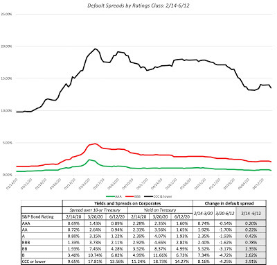
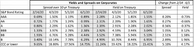
 Download dataUS treasury rates dropped in the first weeks of the crisis, and with 3-month yields dropping close to zero and 10-year rates declining below 1%. While it is convenient to attribute everything that happens to interest rates to the Fed, note that much of the drop in rates occurred before the Fed's two big moves, the first one on March 15, where the Fed Funds rate was cut by 0.5% (almost to zero) and a $700 billion quantitative easing plan was announced, and the second one on March 23, when the Fed lifted the cap on its easing plan and extended its role as a backstop in the corporate bond and lending markets. While treasury rates were not affected much by the Fed's actions, its entry into the corporate bond market played a key role in turning the tide, where default spreads across ratings classes had been on the rise since February 14:
 Download data
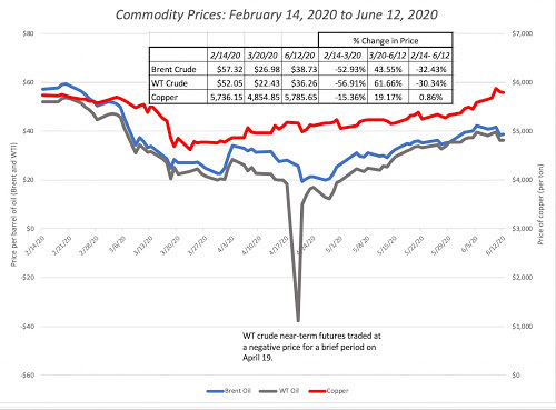
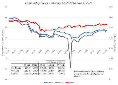
Default spreads followed the path of equities, widening significantly between February 14 and March 20, and falling back by June 12, albeit to levels higher then on February 14. The fear about how the pandemic would slow economic growth also affected commodity prices, and I chart the path of copper and oil, two commodities sensitive to global economic growth below:
 Download data
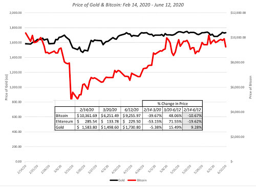
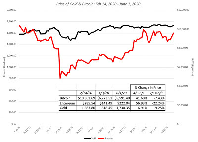
As with corporate bonds and equities, it is a tale of two periods, with commodity prices dropping between February 14 and March 20, before clawing their way back in the subsequent period. With copper, the market has retraced its entire decline, and it is now back to where it was trading at, on February 14. With oil, it is a different story, with a decline of more than 50% between February 14 and March 20 in both Brent and West Texas crude. and oil prices, notwithstanding a strong recovery between March 20 and June 12, are about 30% lower than they were on February 14. Finally, I look at gold and bitcoin, gold, because it has historically been a crisis asset and bitcoin, because it has been marketed by some as an alternative asset:
 Download data
Gold has held its value and is up 9.28% during the crisis, though it saw less upside during the first few weeks of this crisis than in prior ones. Bitcoin has behaved more like equity, and very risky equity at that, during this crisis, dropping almost 40% between February 14 and March 20, before recovering to close down only 10.67% by June 12.
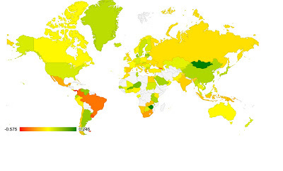
Equities: A BreakdownIn keeping with a practice I have adopted on my prior updates, I downloaded individual stock data on 37,050 publicly traded global companies, with market capitalizations exceeding $5 million, and computed changes in market cap, by region: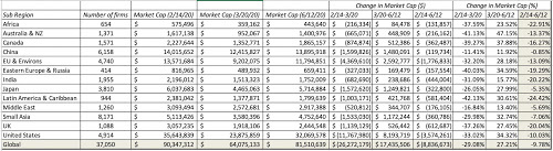 Download data
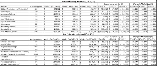
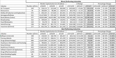
Looking at overall returns from February 14 to June 12, the worst performing regions in the world are mostly in emerging markets (India, Latin America and Africa), with the UK as the worst performing developing market, down about 20%. Breaking down the companies by sector, I look at returns across the period, broken down into two sub periods: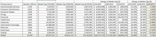 Download dataThe sectors with double digit negative returns over the entire period are energy, utilities, real estate, industrials and financials, with the first four being punished for their capital intensity and debt dependence, and financials reflecting the fear of debt defaults. Health care shows almost no change in value over the entire period, and tech is down only 3.2%. Breaking the sectors down into industries, and looking at returns over the crisis period, I list out the ten worst and best performing industries between February 14 and June 12, 2020:
 Download data
There are no surprises here, given the earlier sector assessment, with a strong representation of infrastructure and financial service companies among the worst performing sectors, and health care and technology on the best performing list.
Crisis Effects across the Corporate Life CycleIn each update on the crisis, I have tried to look at a different facet of market performance, hoping to get some understanding of what the market is pricing in, and whether it makes sense. This week, I will use the concept of a corporate life cycle, a structure that I have found useful in thinking about both corporate financial questions and in valuation, and look at how this crisis has played out across the life cycle.
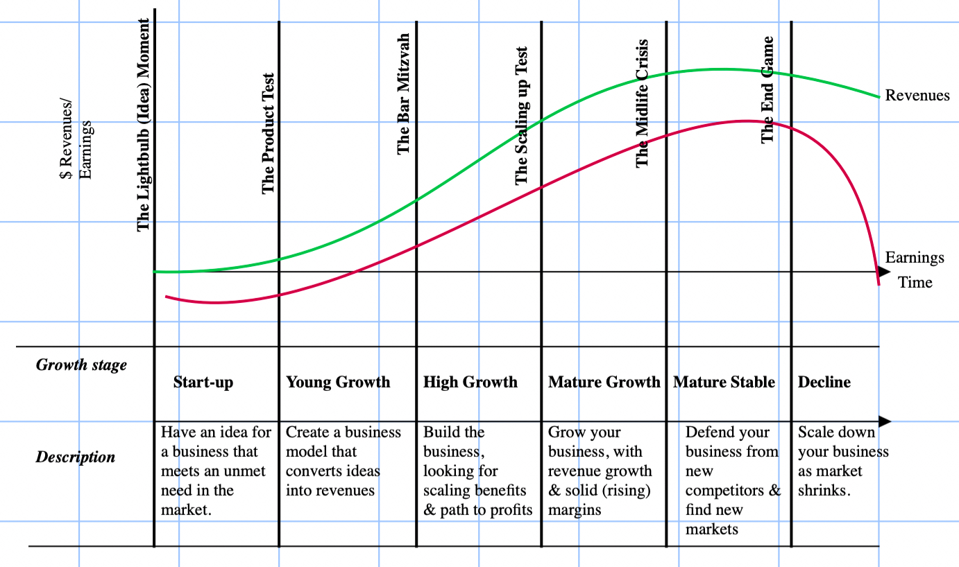
The Corporate Life CycleI believe that companies, like humans, go through a life cycle from newborn (start up) to toddler to teenager, peaking as successful growth companies, before becoming middle aged (mature) and then declining.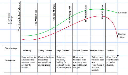
While there are companies that find pathways to reincarnation (IBM in 1992, Apple in 1999, Microsoft in 2013), they remain the exceptions to the rule that fighting corporate aging creates more costs than benefits. The life cycle is useful not just as a device for chronicling corporate age but also in identifying the challenges that companies face at each stage. It is also worth noting that the free cash flows, i.e., cash flows left over after taxes and reinvestment, vary as companies move through the life cycle:

In general, negative cash flows (cash burn) are a feature of young companies, cash build ups occur as companies grow and mature, and declining companies return cash as they shrink. Finally, to understand how companies change as they move through the life cycle, I will draw on another general construct, the financial balance sheet: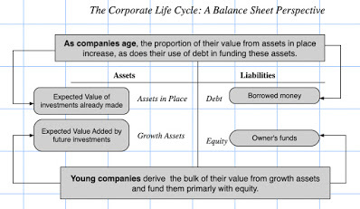
Note that young companies derive their value mostly or even entirely from growth assets, i.e., the value of investments that they are expected to make in the future, and that the portion that is attributable to assets in place increases as companies age, with mature and aging firms deriving most or all of their value from existing investments. Young companies, lacking the earnings and cash flows to service debt, are also more dependent on equity to fund their businesses than mature firms.
The Crisis Effect across the Life CycleA crisis tests all companies, but the dimensions on which they get tested will vary depending on where they fall in the life cycle. Start up and very young companies: For young companies, the challenge is survival, since they mostly have small or no revenues, and are money losers. They need capital to make it to the next and more lucrative phases in the life cycle, and in a crisis, access to capital (from venture capitalists or public equity) can shut down or become prohibitively expensive, as investors become more fearful. These companies will either have to shut down or sell themselves at bargain basement prices to larger, deeper-pocketed competitors.Young growth companies: For young growth companies that have turned the corner on profitability, capital access still remains critical since it is needed for future growth. Without that capital, the values of these firms will shrink towards assets in place, and in a crisis, these firms have to hunker down and scale back their growth ambitions.Mature firms: For mature firms, the bigger damage from a crisis is the punishment it metes to assets in place, as the economy slows or goes into recession, and consumers cut back on spending. The effect will be greater on companies that sell discretionary products than on companies that sell staples.Declining firms: For declining firms, especially those with substantial debt, a crisis can tip them into distress and default, especially if access to risk capital declines, and risk premiums increase. In summary, the answer to the question of which companies (young or old) get affected more in a crisis will depend on how the crisis affects the real economy and capital access. In most crises, it is access to capital that takes the early hit, with the pain from economic effects showing up more gradually. As a result, in the first parts of the crisis, it is the firms at either end of the life cycle (young companies and declining ones) that are most dependent on new capital to survive that are hurt the most, with the pain spreading more slowly to mature firms, and least to firms that sell consumer staples. How has this crisis played out in terms of damage to companies across the life cycle? Let me start with a very simplistic measure of life cycle, company age, as measured from the year of founding: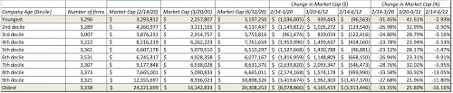 Download dataThe table tells an interesting story. In the down phase (2/14-3/20), there was little distinction between younger and older firms, as firms in every age group lost about 30% of value. In the second phase from 3/20 to June 12, younger companies have seen a much more robust comeback than older firms, resulting in much lower negative returns over the entire period for younger firms (the bottom five deciles) than older ones (the top five deciles). You could argue that company age is not a composite measure of where a company falls in the life cycle, since some companies move through the life cycle faster than others. To counter this critique, I break firms down by expected revenue growth, as estimated prior to the crisis, building on the assumption that expected revenue growth should be highest for young firms and lower for firms further along in the life cycle:
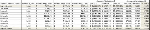 Download dataNote that expected revenue growth estimates are available for just over a third of all the firms in my sample, and across those firms, the differences are stark. Firms in the lowest revenue growth decile are down substantially over the crisis period (2/14 - 6/12) whereas the firms with the highest expected revenue growth, coming into the crisis, have seen their values increase over the same period.
In summary, this crisis seems to have had a much greater negative impact on older, more mature companies than on younger, high growth ones. perhaps because it started at a time, when capital markets were buoyant and investors were eagerly taking on risk, with risk premiums in both equity and bond markets at close to decade-level lows, with a global economic shut down, with a cessation of most business activity. That shut down came with a time frame, though there was uncertainty not only about when economic activity would start up again, but how vigorously it would return. Young companies have also benefited from the fact, that after being on hold in the first few weeks of the crisis, risk capital came back in the middle of March, both in public and private markets. The big story, still unfolding, from this crisis is that access to risk capital has held up remarkably well, coming back into markets earlier and in larger magnitudes, than in prior crisis. The Fed has undoubtedly played a role in this comeback, especially with its intervention in lending markets, but it has succeeded only because it tapped a willing investor base.That access to risk capital has also benefited distressed companies at the other end of the life cycle, explaining why you have seen surges in airline stock prices and in portions of the oil sector. To those who attribute the shift to amateur investors, subject to so much scorn from market watchers, there is collectively too little capital in the hands of these investors to have caused this much of a change in markets.
The divergence in the market treatment between young and older companies during this crisis also explains why value has underperformed growth, since value investing strategies skew towards more mature companies and growth investing is more focused on younger companies. It may also explain why so many market "pros" have been left in the dust by amateurs, since many of the former have been using scripts developed in prior crisis to decide when and where to invest, and this one has followed a different path. While value investors and pros may still be vindicated, the lesson that I would take from this crisis is that while it is true that those who do not remember history are destined to repeat it, it is also true that those who let history alone drive their investment decisions are in just as much danger.
ConclusionThe trajectory of markets in this crisis has followed the path of the virus, with markets rising and falling on news about viral breakouts in different parts of the world, and vaccines/medication to mitigate its effects. It should therefore come as no surprise that just as the virus has had its most deadly effects on the elderly and the infirm, the market is meting out its biggest punishment to mature and aging companies. As we pass the four-month mark since this crisis started roiling financial markets in the US and Europe, it is still an evolving story and there will be more twists and turns before it is done.
YouTube Video<iframe width="560" height="315" src="https://www.youtube.com/embed/NR0Blxm..." frameborder="0" allow="accelerometer; autoplay; encrypted-media; gyroscope; picture-in-picture" allowfullscreen></iframe>
Data
Market data (June 12, 2020)Regional breakdown - Market Changes and Pricing (June 12, 2020)Country breakdown - Market Changes and Pricing (June 12, 2020)Sector breakdown - Market Changes and Pricing (June 12, 2020)Industry breakdown - Market Changes and Pricing (June 12, 2020)Age breakdown - Market Changes and Pricing (June 12, 2020)Growth breakdown - Market Changes and Pricing (June 12, 2020)Viral Market Update PostsA Viral Market Meltdown: Fear or Fundamentals?A Viral Market Meltdown II: Pricing or Valuing? Investing or Trading?A Viral Market Meltdown III: Clues in the Market DebrisA Viral Market Meltdown IV: Investing for a post-virus EconomyA Viral Market Meltdown V: Back to BasicsA Viral Market Meltdown VI: The Price of RiskA Viral Market Meltdown VII: Market MultiplesA Viral Market Meltdown VIII: Value vs Growth, Active vs Passive, Small Cap vs Large!A Viral Market Meltdown IX: A Do-it-Yourself S&P 500 ValuationA Viral Market Meltdown X: A Corporate Life Cycle Perspective
Updating the MarketAs with my previous updates, I will start with a chronicling of how markets have behaved in the two weeks since my last update, and overall, during the crisis. Let's start with equity indices, where we saw one week of relative stability (5/29-6/5) and a week of drama (6/5-6/12), after surges in April and May:
 Download dataFor those who thought that the worst of the crisis was behind them, June 11 delivered the message that this crisis is not quite done, as the S&P 500 dropped 7%, and markets around the world followed. I have computed the returns since February 14, broken down into two time periods, with the first stretching from February 14 to March 20, and the second from March 20 to June 12. Every equity index that I list in this table dropped in the first phase, with some indices losing more than 30%, as fear stalked markets around the world. In the second phase, every index posted positive returns, with some climbing back almost to pre-crisis levels. I will return to look at equities in more detail in the next section, but as stocks were going through contortions, US treasury yields were also on the move:
 Download dataUS treasury rates dropped in the first weeks of the crisis, and with 3-month yields dropping close to zero and 10-year rates declining below 1%. While it is convenient to attribute everything that happens to interest rates to the Fed, note that much of the drop in rates occurred before the Fed's two big moves, the first one on March 15, where the Fed Funds rate was cut by 0.5% (almost to zero) and a $700 billion quantitative easing plan was announced, and the second one on March 23, when the Fed lifted the cap on its easing plan and extended its role as a backstop in the corporate bond and lending markets. While treasury rates were not affected much by the Fed's actions, its entry into the corporate bond market played a key role in turning the tide, where default spreads across ratings classes had been on the rise since February 14:
 Download data
Default spreads followed the path of equities, widening significantly between February 14 and March 20, and falling back by June 12, albeit to levels higher then on February 14. The fear about how the pandemic would slow economic growth also affected commodity prices, and I chart the path of copper and oil, two commodities sensitive to global economic growth below:
 Download data
As with corporate bonds and equities, it is a tale of two periods, with commodity prices dropping between February 14 and March 20, before clawing their way back in the subsequent period. With copper, the market has retraced its entire decline, and it is now back to where it was trading at, on February 14. With oil, it is a different story, with a decline of more than 50% between February 14 and March 20 in both Brent and West Texas crude. and oil prices, notwithstanding a strong recovery between March 20 and June 12, are about 30% lower than they were on February 14. Finally, I look at gold and bitcoin, gold, because it has historically been a crisis asset and bitcoin, because it has been marketed by some as an alternative asset:
 Download data
Gold has held its value and is up 9.28% during the crisis, though it saw less upside during the first few weeks of this crisis than in prior ones. Bitcoin has behaved more like equity, and very risky equity at that, during this crisis, dropping almost 40% between February 14 and March 20, before recovering to close down only 10.67% by June 12.
Equities: A BreakdownIn keeping with a practice I have adopted on my prior updates, I downloaded individual stock data on 37,050 publicly traded global companies, with market capitalizations exceeding $5 million, and computed changes in market cap, by region:
 Download data
Looking at overall returns from February 14 to June 12, the worst performing regions in the world are mostly in emerging markets (India, Latin America and Africa), with the UK as the worst performing developing market, down about 20%. Breaking down the companies by sector, I look at returns across the period, broken down into two sub periods:
 Download dataThe sectors with double digit negative returns over the entire period are energy, utilities, real estate, industrials and financials, with the first four being punished for their capital intensity and debt dependence, and financials reflecting the fear of debt defaults. Health care shows almost no change in value over the entire period, and tech is down only 3.2%. Breaking the sectors down into industries, and looking at returns over the crisis period, I list out the ten worst and best performing industries between February 14 and June 12, 2020:
 Download data
There are no surprises here, given the earlier sector assessment, with a strong representation of infrastructure and financial service companies among the worst performing sectors, and health care and technology on the best performing list.
Crisis Effects across the Corporate Life CycleIn each update on the crisis, I have tried to look at a different facet of market performance, hoping to get some understanding of what the market is pricing in, and whether it makes sense. This week, I will use the concept of a corporate life cycle, a structure that I have found useful in thinking about both corporate financial questions and in valuation, and look at how this crisis has played out across the life cycle.
The Corporate Life CycleI believe that companies, like humans, go through a life cycle from newborn (start up) to toddler to teenager, peaking as successful growth companies, before becoming middle aged (mature) and then declining.
While there are companies that find pathways to reincarnation (IBM in 1992, Apple in 1999, Microsoft in 2013), they remain the exceptions to the rule that fighting corporate aging creates more costs than benefits. The life cycle is useful not just as a device for chronicling corporate age but also in identifying the challenges that companies face at each stage. It is also worth noting that the free cash flows, i.e., cash flows left over after taxes and reinvestment, vary as companies move through the life cycle:

In general, negative cash flows (cash burn) are a feature of young companies, cash build ups occur as companies grow and mature, and declining companies return cash as they shrink. Finally, to understand how companies change as they move through the life cycle, I will draw on another general construct, the financial balance sheet:

Note that young companies derive their value mostly or even entirely from growth assets, i.e., the value of investments that they are expected to make in the future, and that the portion that is attributable to assets in place increases as companies age, with mature and aging firms deriving most or all of their value from existing investments. Young companies, lacking the earnings and cash flows to service debt, are also more dependent on equity to fund their businesses than mature firms.
The Crisis Effect across the Life CycleA crisis tests all companies, but the dimensions on which they get tested will vary depending on where they fall in the life cycle. Start up and very young companies: For young companies, the challenge is survival, since they mostly have small or no revenues, and are money losers. They need capital to make it to the next and more lucrative phases in the life cycle, and in a crisis, access to capital (from venture capitalists or public equity) can shut down or become prohibitively expensive, as investors become more fearful. These companies will either have to shut down or sell themselves at bargain basement prices to larger, deeper-pocketed competitors.Young growth companies: For young growth companies that have turned the corner on profitability, capital access still remains critical since it is needed for future growth. Without that capital, the values of these firms will shrink towards assets in place, and in a crisis, these firms have to hunker down and scale back their growth ambitions.Mature firms: For mature firms, the bigger damage from a crisis is the punishment it metes to assets in place, as the economy slows or goes into recession, and consumers cut back on spending. The effect will be greater on companies that sell discretionary products than on companies that sell staples.Declining firms: For declining firms, especially those with substantial debt, a crisis can tip them into distress and default, especially if access to risk capital declines, and risk premiums increase. In summary, the answer to the question of which companies (young or old) get affected more in a crisis will depend on how the crisis affects the real economy and capital access. In most crises, it is access to capital that takes the early hit, with the pain from economic effects showing up more gradually. As a result, in the first parts of the crisis, it is the firms at either end of the life cycle (young companies and declining ones) that are most dependent on new capital to survive that are hurt the most, with the pain spreading more slowly to mature firms, and least to firms that sell consumer staples. How has this crisis played out in terms of damage to companies across the life cycle? Let me start with a very simplistic measure of life cycle, company age, as measured from the year of founding:
 Download dataThe table tells an interesting story. In the down phase (2/14-3/20), there was little distinction between younger and older firms, as firms in every age group lost about 30% of value. In the second phase from 3/20 to June 12, younger companies have seen a much more robust comeback than older firms, resulting in much lower negative returns over the entire period for younger firms (the bottom five deciles) than older ones (the top five deciles). You could argue that company age is not a composite measure of where a company falls in the life cycle, since some companies move through the life cycle faster than others. To counter this critique, I break firms down by expected revenue growth, as estimated prior to the crisis, building on the assumption that expected revenue growth should be highest for young firms and lower for firms further along in the life cycle:
 Download dataNote that expected revenue growth estimates are available for just over a third of all the firms in my sample, and across those firms, the differences are stark. Firms in the lowest revenue growth decile are down substantially over the crisis period (2/14 - 6/12) whereas the firms with the highest expected revenue growth, coming into the crisis, have seen their values increase over the same period.
 In summary, this crisis seems to have had a much greater negative impact on older, more mature companies than on younger, high growth ones. perhaps because it started at a time, when capital markets were buoyant and investors were eagerly taking on risk, with risk premiums in both equity and bond markets at close to decade-level lows, with a global economic shut down, with a cessation of most business activity. That shut down came with a time frame, though there was uncertainty not only about when economic activity would start up again, but how vigorously it would return. Young companies have also benefited from the fact, that after being on hold in the first few weeks of the crisis, risk capital came back in the middle of March, both in public and private markets. The big story, still unfolding, from this crisis is that access to risk capital has held up remarkably well, coming back into markets earlier and in larger magnitudes, than in prior crisis. The Fed has undoubtedly played a role in this comeback, especially with its intervention in lending markets, but it has succeeded only because it tapped a willing investor base.That access to risk capital has also benefited distressed companies at the other end of the life cycle, explaining why you have seen surges in airline stock prices and in portions of the oil sector. To those who attribute the shift to amateur investors, subject to so much scorn from market watchers, there is collectively too little capital in the hands of these investors to have caused this much of a change in markets.
The divergence in the market treatment between young and older companies during this crisis also explains why value has underperformed growth, since value investing strategies skew towards more mature companies and growth investing is more focused on younger companies. It may also explain why so many market "pros" have been left in the dust by amateurs, since many of the former have been using scripts developed in prior crisis to decide when and where to invest, and this one has followed a different path. While value investors and pros may still be vindicated, the lesson that I would take from this crisis is that while it is true that those who do not remember history are destined to repeat it, it is also true that those who let history alone drive their investment decisions are in just as much danger.
ConclusionThe trajectory of markets in this crisis has followed the path of the virus, with markets rising and falling on news about viral breakouts in different parts of the world, and vaccines/medication to mitigate its effects. It should therefore come as no surprise that just as the virus has had its most deadly effects on the elderly and the infirm, the market is meting out its biggest punishment to mature and aging companies. As we pass the four-month mark since this crisis started roiling financial markets in the US and Europe, it is still an evolving story and there will be more twists and turns before it is done.
YouTube Video<iframe width="560" height="315" src="https://www.youtube.com/embed/NR0Blxm..." frameborder="0" allow="accelerometer; autoplay; encrypted-media; gyroscope; picture-in-picture" allowfullscreen></iframe>
Data
Market data (June 12, 2020)Regional breakdown - Market Changes and Pricing (June 12, 2020)Country breakdown - Market Changes and Pricing (June 12, 2020)Sector breakdown - Market Changes and Pricing (June 12, 2020)Industry breakdown - Market Changes and Pricing (June 12, 2020)Age breakdown - Market Changes and Pricing (June 12, 2020)Growth breakdown - Market Changes and Pricing (June 12, 2020)Viral Market Update PostsA Viral Market Meltdown: Fear or Fundamentals?A Viral Market Meltdown II: Pricing or Valuing? Investing or Trading?A Viral Market Meltdown III: Clues in the Market DebrisA Viral Market Meltdown IV: Investing for a post-virus EconomyA Viral Market Meltdown V: Back to BasicsA Viral Market Meltdown VI: The Price of RiskA Viral Market Meltdown VII: Market MultiplesA Viral Market Meltdown VIII: Value vs Growth, Active vs Passive, Small Cap vs Large!A Viral Market Meltdown IX: A Do-it-Yourself S&P 500 ValuationA Viral Market Meltdown X: A Corporate Life Cycle Perspective


June 4, 2020
A Viral Market Update IX: A Do-it-Yourself S&P 500 Valuation
It has been close to four weeks since my last viral market update, and I could come up with a whole host of excuses for the delay, but the truth is that I have not had much to say that is original, and I am naturally lazy. That said, markets have settled in, mostly with an upward bias in these last few weeks, and the big question, as US equities climb back towards pre-crisis levels is whether the market has lost its bearings. After all, the news, whether on macroeconomic indicators or company-level earnings, is not just bad, but historically so, and it seems incongruous that markets should be rising, when consumer confidence and spending are plummeting, the ranks of the unemployed rising and professional economists are painting a picture of impending doom. There are some market gurus who are pointing to this disconnect as evidence that markets are just wrong and that a major correction is around the corner, but their credibility is undercut by the fact that many in this group have been forecasting this correction for the last decade, and with metrics (PE, CAPE, Shiller PE) that have lost their potency. I have absolutely no shame in admitting that I am not a market timer, but I do believe that embedded in market action is always a link, though sometimes tenuous, to fundamentals. In this post, I will start with my usual updates of what has transpired in the last few weeks across markets, in general, and equities, in particular. I will then revisit my framework for valuing the S&P index, which I first presented in my first viral market post on February 27 and then expanded on in subsequent posts on March 9 and March 16. While I will update my valuation of the index, given what we have learned since, I will also follow a template that I developed when I valued Tesla earlier this year, and offer a Do-it-yourself (DIY) valuation of the index.
Market UpdateMy crisis clock started on February 14, 2020, shortly after US equities hit all time highs, and in the weeks since, I have tracked the ups and downs of equity indices.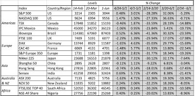 Download dataBetween February 14 and March 20, it was a precipitous drop with almost equity index in the world down between 30-40%, with the Chinese markets being the exceptions, a bear market compressed into five weeks. Since March 20, though, it has been not just an up market, but one that has climbed steeply. For instance, the S&P 500 which dropped a little over 28% between February 14 and March 20, had recouped most of those losses by June 1, and is now down only 5.29% since February 14. Two emerging market indices, the Bovespa (Brazil) and the Sensex (India), and one developed market index, the CAC (France), have still lost more than 20% of their value over the period. Moving on to treasuries, the immediate effect of the crisis was a flight to US treasuries, where yields dropped across the board:
[image error]
Download dataNote that almost all of the yield drop occurred before March 15, when the Fed announced its quantitative easing actions. The fear factor in the first few weeks that caused the flight to treasuries also pushed up default spreads on corporate bonds:
Download dataBetween February 14 and March 20, it was a precipitous drop with almost equity index in the world down between 30-40%, with the Chinese markets being the exceptions, a bear market compressed into five weeks. Since March 20, though, it has been not just an up market, but one that has climbed steeply. For instance, the S&P 500 which dropped a little over 28% between February 14 and March 20, had recouped most of those losses by June 1, and is now down only 5.29% since February 14. Two emerging market indices, the Bovespa (Brazil) and the Sensex (India), and one developed market index, the CAC (France), have still lost more than 20% of their value over the period. Moving on to treasuries, the immediate effect of the crisis was a flight to US treasuries, where yields dropped across the board:
[image error]
Download dataNote that almost all of the yield drop occurred before March 15, when the Fed announced its quantitative easing actions. The fear factor in the first few weeks that caused the flight to treasuries also pushed up default spreads on corporate bonds:
 Download dataNote the dramatic surge in spreads between February 14 an April 3, with a tripling in the spread on BBB rated bonds. Like equities, corporate bonds seem to have entered a more sanguine period, with spreads on June 1, 2020, down significantly from their highs in early April. I have also been tracking two commodities, oil and copper, to measure how a global economic showdown is affecting prices:
 Download dataCopper prices are down about 7% on June 1, from February 14 levels, but that is as improvement from the almost 14% drop in mid-March. The oil market has had volatility that cannot just be explained by the COVID crisis, as oil prices plunged in late April, with West Texas crude dropping below zero on April 19, but even oil prices have seen recovery in the last few weeks. Finally, I look at gold and bitcoin, the former a crisis asset of long standing and the latter a new entrant.
 Download dataGold has held up, and is up just over 9% in the weeks since February 14, but bitcoin has behaved more like a risky speculative investment than a crisis asset, dropping more than 50% by mid March before recouping most of its losses, as equities came back April and May.
Equity BreakdownI have been downloading company-level data on publicly traded companies, at the end of each week for the last 15 weeks, and looking at changes in market capitalization across different classes of stocks. That allows me to see to not only get a more complete measure of market damage than just looking at indices, but to also use the data to double check assertions about causality.
RegionThe problem with indices, especially those that contain only handfuls of stock, is that it is easy to miss changes that are occurring at smaller and lower profile companies. I used the company-level data to break down the market changes since February 14 by region: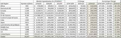 Download dataAs with the equity indices, the divide is clear, both in terms of time, with the drop occurring between February 14 and March 20 and the rise from March 20 to June 1, but also in terms of geography, with emerging markets showing bigger declines in percentage terms over the entire period. If you prefer your data on a country level, you may find this picture more revealing:
 Download country-level dataThe full list of countries is available at this link. Note that all of the values in the data are in US dollar terms to allow for comparability, but that does mean that exchange rate effects will add to local stock market effects.
Sector/ IndustryWhile market behavior was characterized as chaotic in the first few weeks, this is clearly a market that has been orderly in how it doles out rewards and metes out punishment, as you can see in the breakdown of market cap changes by sector in the table below: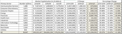 Download dataAs you browse the table, note that health care, as a sector, is now in the plus column and that technology and consumer goods (both staple and discretionary) show much less damage than the rest of the market. In effect, the overall market may have recovered much of its losses, but along the way, value has been reallocated from financials, real estate and energy into health care and technology. Breaking down sectors into industries provides for more detail, and the ten best performing and ten worst performing industries between February 14 and June 1, 2020 are listed below:
 Download dataThe list of best and worst performing industries has stayed stable for most of the last seven to eight weeks, but the rise in the market in the last few weeks has led to some of the best performing industries now delivering positive returns, with software, precious metal, biotech and healthcare info/tech now posting returns exceeding 10%, since February 14, 2020.
The Mystery of MarketsAs markets have recovered from their mid-March lows, there are many who are puzzled by the rise. For some, the skepticism comes from the disconnect with macroeconomic numbers that are abysmal, as unemployment claims climb into the tens of millions and consumer confidence hovers around historic lows. I will spend the first part of this section arguing that this reflects a fundamental misunderstanding of what markets try to do, and a misreading of history. For others, the question is whether markets are adequately reflecting the potential for long term damage to earnings and cash flows, as well as the cost of defaults, from this crisis. Since that answer to that question lies in the eyes of the beholder, I will provide a framework for converting your fears and hopes into numbers and a value for the market.
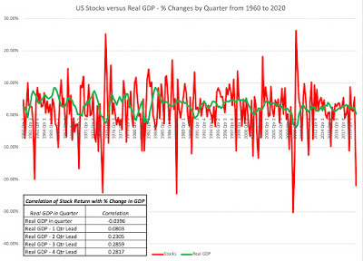
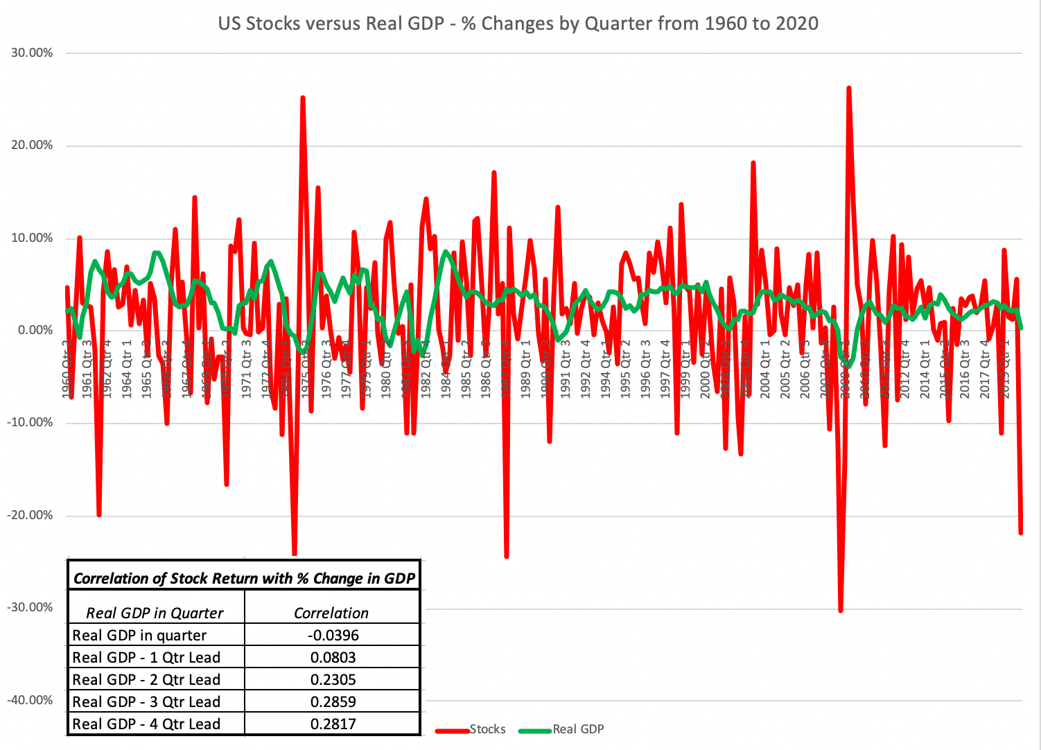
Markets and the EconomyThe notion that stock markets and economies are closely tied together is deeply held, simply because it appeals to intuition. After all, how can stocks keep going up if the economy is doing badly? While I concede that the right answer is they cannot, there are three factors that may delink the two.The first is that stocks are driven by earnings, not real growth in the economy or employment, and to the extent that companies can continue to generate income, even in stagnant or declining economies, you may see stock prices rise. The second is that the “economy” that stocks are tied to does not always have to be the domestic one, since globalization has made it possible for companies to continue to prosper in slow-growing economies. The third is time, since stock markets are prediction machines, albeit with a lot of noise and error, the link between markets and the economy, even if it exists, will be with a lag of months or longer. To those who prefer a data-based argument, the graph below plots US stock market returns against real GDP growth in the United States, using quarterly data.
 Download data
Note that there is almost no correlation between stock returns and real GDP growth contemporaneously, and while the correlation grows as you look at GDP is subsequent quarters, it is still modest even four quarters ahead. If the relationship between stock returns and measures of economic activity is weak, as both logic and the data suggest, it should be even weaker right now, where every measure of economic activity is ravaged by the crisis-driven shutdown. To those in the media and the investment community who profess to be shocked by the latest economic numbers, my question is whether you are just as shocked to see your speedometer at zero, when your car is parked in the driveway, or when your pie does not bake in an oven that is not turned on? In short, there is almost nothing of use to investors from poring over current macroeconomic data, which is one reason why markets have started ignoring them. That will change, as the economy opens up again, and markets start looking at the data for cues on how quickly it is coming back to life.
Valuing the Market
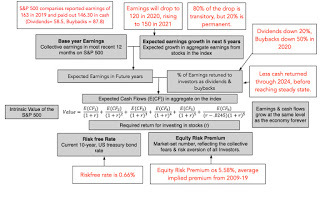
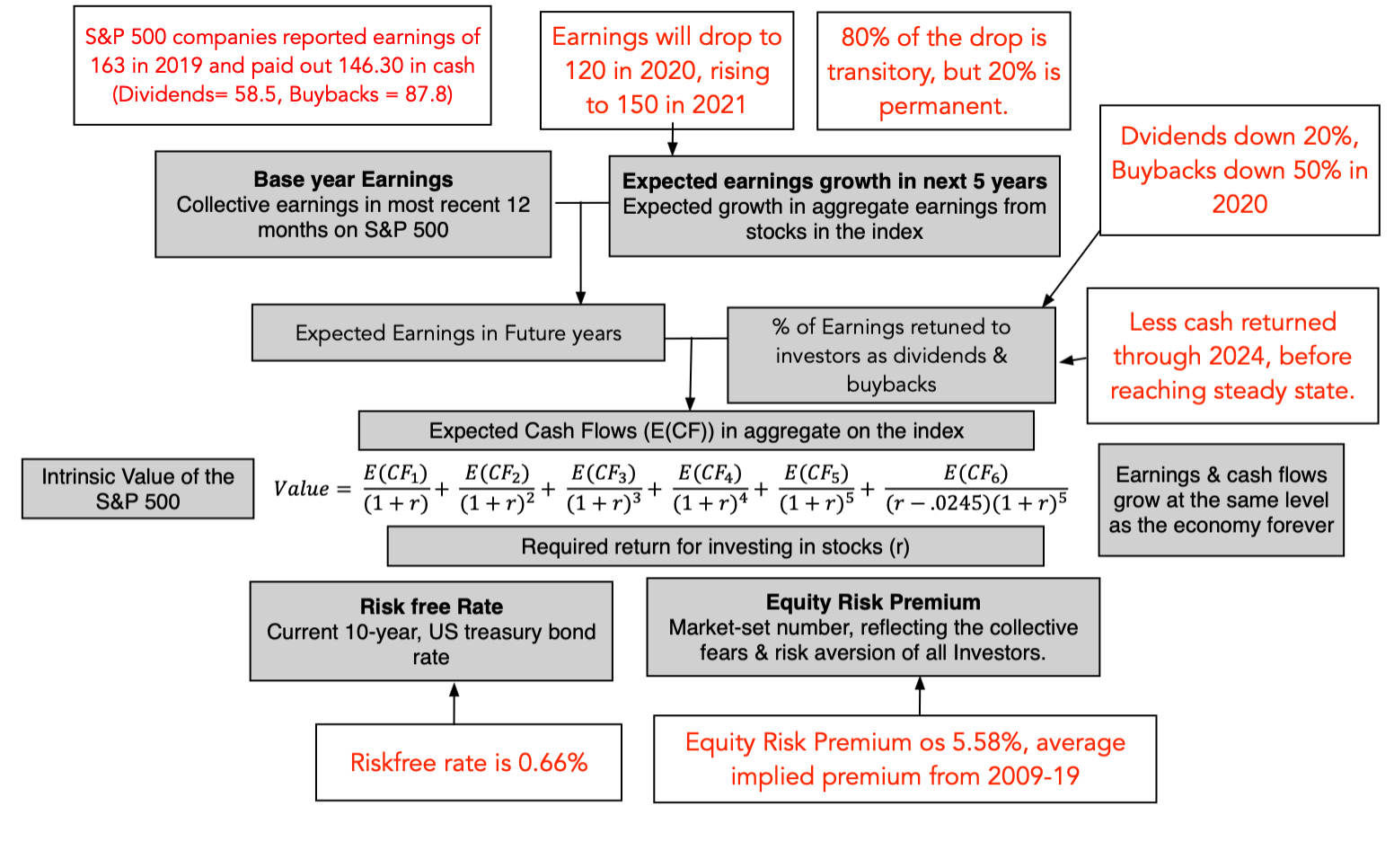
In my first viral market update, I sketched a picture of the drivers of value for the market, drawing on fundamentals. I revisited that picture and tweaked it to reflect the uncertainties that investors face about the future, broke down into near term (2020 & 2021) and the long term (in the years through 2024):
[image error]
While the picture looks daunting and your estimates are fraught with uncertainty, we are now in a better position to estimate the effects than even a few weeks ago:Earnings and Growth: In 2019, the companies in the S&P 500 reported 163 in earnings, and analysts were forecasting modest growth of about 4% over the next five years, prior to the crisis. It is beyond debate that the economic shut down will be devastating for earnings in 2020, with the damage spilling over in 2021. In my valuation in March 2020, there was almost no information on the extent of this damage, but as companies have reported first quarter earnings, we are getting. preliminary estimates of future earnings. In the picture below, I look at three sets of predictions from analysts who trace the index: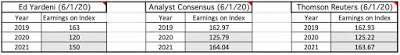 Sources: Yardeni, Thomson Reuters, FactsetI follow up by also reporting on what market strategists at major banks are forecasting:
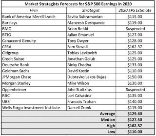 As of right now, there seems to be only nascent attempts to forecast long term damage to earnings, but a consensus is forming that there will be some.Cash Return: In 2019, companies in the index returned 146.30 in cash to stockholders, 57.5 in dividends and 87.8 in buybacks, amounting to 89.75% of earnings in that year. This represented a continuation of a trend through the decade of increasing buybacks and cash return:
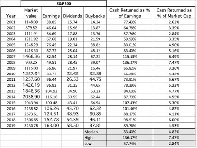 As with earnings, this crisis will result in cash flow shocks, and dividends and buybacks will drop this year. Given that dividends tend to be stickier than buybacks, the drop will be lower fro the former than the latter. Analysts vary on how much, though, with a range of a drop of 30-70% in buybacks and 10-30% in dividends.Risk: Every crisis has consequences for risk premiums, as I noted in this post, and it is for that reason that I have been updating equity risk premiums, by day, since February 14.
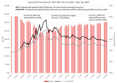 Add captionIn the early weeks of this crisis, equity risk premiums soared, peaking at more than 7% in mid-March, and have steadily dropping since, though at 5.3-5.5% on June 1, they remain above pre-crisis levels.Using this information, I made my best judgments, assuming that earnings for the S&P 500 will be 120 in 2020 and 150 in 2021, at the more conservative end of the analyst estimates, and that dividends and buybacks would drop in 2020, the former by 20% and the latter by 50%. I also assume that companies will return far less cash in future years, partly in response to the crisis:
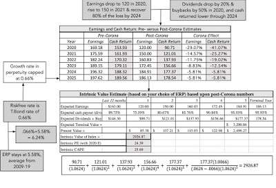
 With these assumptions, I can value the index and I capture the valuation in the picture below. My estimated value for the index is about 2926, which would lead to a judgment that the index was over valued by about 6% (based upon the level on June 1, 2020).
 As with my March 2020 valuation, I am fully aware that my numbers are just a reflection of my story and that each of the inputs has a range around it, and I have brought in that uncertainty into a simulation below:
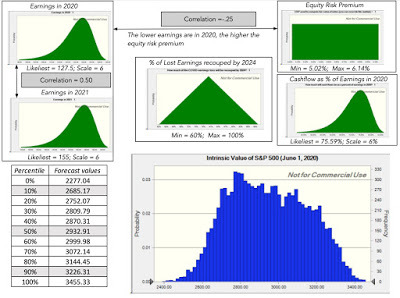 Download simulation results (Oracle Crystal Ball used in simulation)Note that I have centered the simulations around the median estimates of earnings for 2020 and 2021 from analysts, while building in the range in the estimates into the distributions. The median value from the simulation is 2932. On June 1, the S&P 500 was trading at close to 3100, putting it near the 80th percentile of the distribution, bolstering the "market has gotten ahead of itself" camp, but there is something here for everyone. If you are more optimistic about earnings in 2020 and 2021 than the the median analyst, and about how quickly and completely the market will recover from the crisis shock, you will arrive at a higher value than mine. If you are more pessimistic about the future, perhaps because you think the market is under estimating the likelihood of a second wave of shutdowns or a surge in company defaults, your valuations will be much lower.
In all of this discussion, you will note that I have not mentioned the Fed, and to those who are Fed-focused, it may seem like I am ignoring the elephant in the room. I have argued, for much of the last decade, that analysts and investors over estimate the effect that the Fed has on markets. To the counter that it is low interest rates that are keeping the index level high, my response is that low interest rates cut both ways, first by lowering the discount rate (and thus increasing value) but also by signaling much lower growth in the long term (which I capture by lowering growth in perpetuity to the risk free rate). In fact, in my valuation spreadsheet, I offer the option of raising interest rates to what you may believe are more normal levels over time, and you can check out the effect on value, and don't be surprised if it is not as large as you expect it to be, since I also adjust growth rates and equity risk premiums to reflect changed rates. In fact, use the spreadsheet to and make your disagreements with me explicit, come up with your value for the index, and let's get a crowd valuation of the S&P 500 going. (It is a google shared spreadsheet, where you can enter your estimated value for the index).
Bottom Line
Every investor has a narrative, sometimes explicit and sometimes implicit, about how the economy and markets will evolve over time. Markets reflect a collective narrative across investors, and there are times when your narrative will be at odds with that of the market. It is during those times that you will feel the urge to label markets as crazy or irrational, and to view yourself as the last sane investor left on the planet. While I understand that urge, it is my experience that projecting your personal fears and hopes on to the market, and then getting angry when the market responds differently is a recipe for frustration and dysfunctional investing. That is not to say that markets cannot be wrong, but even if they are, a dose of humility is always in order, and there is always something that can be learned fro market movements. Right now, it is true that markets are collectively more upbeat about the future than most economists/market experts, but given their relative track records over time, are you really more willing to trust the latter? I most certainly am not!
YouTube Videos
Data
Market data (June 1, 2020)Regional breakdown - Market Changes and Pricing (June 1, 2020)Country breakdown - Market Changes and Pricing (June 1, 2020)Sector breakdown - Market Changes and Pricing (June 1, 2020)Industry breakdown - Market Changes and Pricing (June 1, 2020)Equity Risk Premium, by day (Updated through June 1, 2020)Spreadsheets
Spreadsheet to value the index (June 1, 2020)Simulation results for S&P 500 valuation (June 1, 2020)Google Shared Spreadsheet (for your S&P 500 valuations)Google Shared SpreadsheetViral Market Update PostsA Viral Market Meltdown: Fear or Fundamentals?A Viral Market Meltdown II: Pricing or Valuing? Investing or Trading?A Viral Market Meltdown III: Clues in the Market DebrisA Viral Market Meltdown IV: Investing for a post-virus EconomyA Viral Market Meltdown V: Back to BasicsA Viral Market Meltdown VI: The Price of RiskA Viral Market Meltdown VII: Market MultiplesA Viral Market Meltdown VIII: Value vs Growth, Active vs Passive, Small Cap vs Large!A Viral Market Meltdown IX: A Do-it-Yourself S&P 500 Valuation
Market UpdateMy crisis clock started on February 14, 2020, shortly after US equities hit all time highs, and in the weeks since, I have tracked the ups and downs of equity indices.
 Download dataBetween February 14 and March 20, it was a precipitous drop with almost equity index in the world down between 30-40%, with the Chinese markets being the exceptions, a bear market compressed into five weeks. Since March 20, though, it has been not just an up market, but one that has climbed steeply. For instance, the S&P 500 which dropped a little over 28% between February 14 and March 20, had recouped most of those losses by June 1, and is now down only 5.29% since February 14. Two emerging market indices, the Bovespa (Brazil) and the Sensex (India), and one developed market index, the CAC (France), have still lost more than 20% of their value over the period. Moving on to treasuries, the immediate effect of the crisis was a flight to US treasuries, where yields dropped across the board:
[image error]
Download dataNote that almost all of the yield drop occurred before March 15, when the Fed announced its quantitative easing actions. The fear factor in the first few weeks that caused the flight to treasuries also pushed up default spreads on corporate bonds:
Download dataBetween February 14 and March 20, it was a precipitous drop with almost equity index in the world down between 30-40%, with the Chinese markets being the exceptions, a bear market compressed into five weeks. Since March 20, though, it has been not just an up market, but one that has climbed steeply. For instance, the S&P 500 which dropped a little over 28% between February 14 and March 20, had recouped most of those losses by June 1, and is now down only 5.29% since February 14. Two emerging market indices, the Bovespa (Brazil) and the Sensex (India), and one developed market index, the CAC (France), have still lost more than 20% of their value over the period. Moving on to treasuries, the immediate effect of the crisis was a flight to US treasuries, where yields dropped across the board:
[image error]
Download dataNote that almost all of the yield drop occurred before March 15, when the Fed announced its quantitative easing actions. The fear factor in the first few weeks that caused the flight to treasuries also pushed up default spreads on corporate bonds:
 Download dataNote the dramatic surge in spreads between February 14 an April 3, with a tripling in the spread on BBB rated bonds. Like equities, corporate bonds seem to have entered a more sanguine period, with spreads on June 1, 2020, down significantly from their highs in early April. I have also been tracking two commodities, oil and copper, to measure how a global economic showdown is affecting prices:
 Download dataCopper prices are down about 7% on June 1, from February 14 levels, but that is as improvement from the almost 14% drop in mid-March. The oil market has had volatility that cannot just be explained by the COVID crisis, as oil prices plunged in late April, with West Texas crude dropping below zero on April 19, but even oil prices have seen recovery in the last few weeks. Finally, I look at gold and bitcoin, the former a crisis asset of long standing and the latter a new entrant.
 Download dataGold has held up, and is up just over 9% in the weeks since February 14, but bitcoin has behaved more like a risky speculative investment than a crisis asset, dropping more than 50% by mid March before recouping most of its losses, as equities came back April and May.
Equity BreakdownI have been downloading company-level data on publicly traded companies, at the end of each week for the last 15 weeks, and looking at changes in market capitalization across different classes of stocks. That allows me to see to not only get a more complete measure of market damage than just looking at indices, but to also use the data to double check assertions about causality.
RegionThe problem with indices, especially those that contain only handfuls of stock, is that it is easy to miss changes that are occurring at smaller and lower profile companies. I used the company-level data to break down the market changes since February 14 by region:
 Download dataAs with the equity indices, the divide is clear, both in terms of time, with the drop occurring between February 14 and March 20 and the rise from March 20 to June 1, but also in terms of geography, with emerging markets showing bigger declines in percentage terms over the entire period. If you prefer your data on a country level, you may find this picture more revealing:
 Download country-level dataThe full list of countries is available at this link. Note that all of the values in the data are in US dollar terms to allow for comparability, but that does mean that exchange rate effects will add to local stock market effects.
Sector/ IndustryWhile market behavior was characterized as chaotic in the first few weeks, this is clearly a market that has been orderly in how it doles out rewards and metes out punishment, as you can see in the breakdown of market cap changes by sector in the table below:
Download dataAs you browse the table, note that health care, as a sector, is now in the plus column and that technology and consumer goods (both staple and discretionary) show much less damage than the rest of the market. In effect, the overall market may have recovered much of its losses, but along the way, value has been reallocated from financials, real estate and energy into health care and technology. Breaking down sectors into industries provides for more detail, and the ten best performing and ten worst performing industries between February 14 and June 1, 2020 are listed below:
 Download dataThe list of best and worst performing industries has stayed stable for most of the last seven to eight weeks, but the rise in the market in the last few weeks has led to some of the best performing industries now delivering positive returns, with software, precious metal, biotech and healthcare info/tech now posting returns exceeding 10%, since February 14, 2020.
 The Mystery of MarketsAs markets have recovered from their mid-March lows, there are many who are puzzled by the rise. For some, the skepticism comes from the disconnect with macroeconomic numbers that are abysmal, as unemployment claims climb into the tens of millions and consumer confidence hovers around historic lows. I will spend the first part of this section arguing that this reflects a fundamental misunderstanding of what markets try to do, and a misreading of history. For others, the question is whether markets are adequately reflecting the potential for long term damage to earnings and cash flows, as well as the cost of defaults, from this crisis. Since that answer to that question lies in the eyes of the beholder, I will provide a framework for converting your fears and hopes into numbers and a value for the market.
Markets and the EconomyThe notion that stock markets and economies are closely tied together is deeply held, simply because it appeals to intuition. After all, how can stocks keep going up if the economy is doing badly? While I concede that the right answer is they cannot, there are three factors that may delink the two.The first is that stocks are driven by earnings, not real growth in the economy or employment, and to the extent that companies can continue to generate income, even in stagnant or declining economies, you may see stock prices rise. The second is that the “economy” that stocks are tied to does not always have to be the domestic one, since globalization has made it possible for companies to continue to prosper in slow-growing economies. The third is time, since stock markets are prediction machines, albeit with a lot of noise and error, the link between markets and the economy, even if it exists, will be with a lag of months or longer. To those who prefer a data-based argument, the graph below plots US stock market returns against real GDP growth in the United States, using quarterly data.
 Download data
Note that there is almost no correlation between stock returns and real GDP growth contemporaneously, and while the correlation grows as you look at GDP is subsequent quarters, it is still modest even four quarters ahead. If the relationship between stock returns and measures of economic activity is weak, as both logic and the data suggest, it should be even weaker right now, where every measure of economic activity is ravaged by the crisis-driven shutdown. To those in the media and the investment community who profess to be shocked by the latest economic numbers, my question is whether you are just as shocked to see your speedometer at zero, when your car is parked in the driveway, or when your pie does not bake in an oven that is not turned on? In short, there is almost nothing of use to investors from poring over current macroeconomic data, which is one reason why markets have started ignoring them. That will change, as the economy opens up again, and markets start looking at the data for cues on how quickly it is coming back to life.
Valuing the Market
In my first viral market update, I sketched a picture of the drivers of value for the market, drawing on fundamentals. I revisited that picture and tweaked it to reflect the uncertainties that investors face about the future, broke down into near term (2020 & 2021) and the long term (in the years through 2024):
[image error]
While the picture looks daunting and your estimates are fraught with uncertainty, we are now in a better position to estimate the effects than even a few weeks ago:Earnings and Growth: In 2019, the companies in the S&P 500 reported 163 in earnings, and analysts were forecasting modest growth of about 4% over the next five years, prior to the crisis. It is beyond debate that the economic shut down will be devastating for earnings in 2020, with the damage spilling over in 2021. In my valuation in March 2020, there was almost no information on the extent of this damage, but as companies have reported first quarter earnings, we are getting. preliminary estimates of future earnings. In the picture below, I look at three sets of predictions from analysts who trace the index:
 Sources: Yardeni, Thomson Reuters, FactsetI follow up by also reporting on what market strategists at major banks are forecasting:
 As of right now, there seems to be only nascent attempts to forecast long term damage to earnings, but a consensus is forming that there will be some.Cash Return: In 2019, companies in the index returned 146.30 in cash to stockholders, 57.5 in dividends and 87.8 in buybacks, amounting to 89.75% of earnings in that year. This represented a continuation of a trend through the decade of increasing buybacks and cash return:
 As with earnings, this crisis will result in cash flow shocks, and dividends and buybacks will drop this year. Given that dividends tend to be stickier than buybacks, the drop will be lower fro the former than the latter. Analysts vary on how much, though, with a range of a drop of 30-70% in buybacks and 10-30% in dividends.Risk: Every crisis has consequences for risk premiums, as I noted in this post, and it is for that reason that I have been updating equity risk premiums, by day, since February 14.
 Add captionIn the early weeks of this crisis, equity risk premiums soared, peaking at more than 7% in mid-March, and have steadily dropping since, though at 5.3-5.5% on June 1, they remain above pre-crisis levels.Using this information, I made my best judgments, assuming that earnings for the S&P 500 will be 120 in 2020 and 150 in 2021, at the more conservative end of the analyst estimates, and that dividends and buybacks would drop in 2020, the former by 20% and the latter by 50%. I also assume that companies will return far less cash in future years, partly in response to the crisis:
 With these assumptions, I can value the index and I capture the valuation in the picture below. My estimated value for the index is about 2926, which would lead to a judgment that the index was over valued by about 6% (based upon the level on June 1, 2020).
 As with my March 2020 valuation, I am fully aware that my numbers are just a reflection of my story and that each of the inputs has a range around it, and I have brought in that uncertainty into a simulation below:
 Download simulation results (Oracle Crystal Ball used in simulation)Note that I have centered the simulations around the median estimates of earnings for 2020 and 2021 from analysts, while building in the range in the estimates into the distributions. The median value from the simulation is 2932. On June 1, the S&P 500 was trading at close to 3100, putting it near the 80th percentile of the distribution, bolstering the "market has gotten ahead of itself" camp, but there is something here for everyone. If you are more optimistic about earnings in 2020 and 2021 than the the median analyst, and about how quickly and completely the market will recover from the crisis shock, you will arrive at a higher value than mine. If you are more pessimistic about the future, perhaps because you think the market is under estimating the likelihood of a second wave of shutdowns or a surge in company defaults, your valuations will be much lower.
In all of this discussion, you will note that I have not mentioned the Fed, and to those who are Fed-focused, it may seem like I am ignoring the elephant in the room. I have argued, for much of the last decade, that analysts and investors over estimate the effect that the Fed has on markets. To the counter that it is low interest rates that are keeping the index level high, my response is that low interest rates cut both ways, first by lowering the discount rate (and thus increasing value) but also by signaling much lower growth in the long term (which I capture by lowering growth in perpetuity to the risk free rate). In fact, in my valuation spreadsheet, I offer the option of raising interest rates to what you may believe are more normal levels over time, and you can check out the effect on value, and don't be surprised if it is not as large as you expect it to be, since I also adjust growth rates and equity risk premiums to reflect changed rates. In fact, use the spreadsheet to and make your disagreements with me explicit, come up with your value for the index, and let's get a crowd valuation of the S&P 500 going. (It is a google shared spreadsheet, where you can enter your estimated value for the index).
Bottom Line
Every investor has a narrative, sometimes explicit and sometimes implicit, about how the economy and markets will evolve over time. Markets reflect a collective narrative across investors, and there are times when your narrative will be at odds with that of the market. It is during those times that you will feel the urge to label markets as crazy or irrational, and to view yourself as the last sane investor left on the planet. While I understand that urge, it is my experience that projecting your personal fears and hopes on to the market, and then getting angry when the market responds differently is a recipe for frustration and dysfunctional investing. That is not to say that markets cannot be wrong, but even if they are, a dose of humility is always in order, and there is always something that can be learned fro market movements. Right now, it is true that markets are collectively more upbeat about the future than most economists/market experts, but given their relative track records over time, are you really more willing to trust the latter? I most certainly am not!
YouTube Videos
Data
Market data (June 1, 2020)Regional breakdown - Market Changes and Pricing (June 1, 2020)Country breakdown - Market Changes and Pricing (June 1, 2020)Sector breakdown - Market Changes and Pricing (June 1, 2020)Industry breakdown - Market Changes and Pricing (June 1, 2020)Equity Risk Premium, by day (Updated through June 1, 2020)Spreadsheets
Spreadsheet to value the index (June 1, 2020)Simulation results for S&P 500 valuation (June 1, 2020)Google Shared Spreadsheet (for your S&P 500 valuations)Google Shared SpreadsheetViral Market Update PostsA Viral Market Meltdown: Fear or Fundamentals?A Viral Market Meltdown II: Pricing or Valuing? Investing or Trading?A Viral Market Meltdown III: Clues in the Market DebrisA Viral Market Meltdown IV: Investing for a post-virus EconomyA Viral Market Meltdown V: Back to BasicsA Viral Market Meltdown VI: The Price of RiskA Viral Market Meltdown VII: Market MultiplesA Viral Market Meltdown VIII: Value vs Growth, Active vs Passive, Small Cap vs Large!A Viral Market Meltdown IX: A Do-it-Yourself S&P 500 Valuation
May 13, 2020
A Viral Market Update VIII: A Crisis Test - Value vs Growth, Active vs Passive, Small Cap vs Large!
In the weeks since my first update on the crisis on February 26, 2020, the markets have been on a roller coaster ride, as equity markets around the world collectively lost $30 trillion in market cap between February 14, 2020 and March 20, 2020, and then clawed back more than half of the loss in the following month. Having lived through market crises in the past, I know that this one is not quite done, but I believe we now have lived through enough of it to be able to start separating winners from losers, and use this winnowing process to address three big questions that have dominated investing for the last decade:Has this crisis allowed active investors to shine, and use that performance to stop or even reverse the loss of market share to passive vehicles (ETFs and index funds) that has occurred over the last decade? Will this market correction lead to growth/momentum investing losing its mojo and allow value investors to reclaim what they believe is their rightful place on top of the investing food chain? Will the small cap premium, missing for so many decades, be rediscovered after this market shock?I know each of these is a hot button issue, and I welcome disagreement, but I will try to set my biases aside and let the data speak for itself.
Market ActionAs with my prior updates, I will begin by surveying the market action, first over the two weeks (4/17-5/1), following my last update, and then looking at the returns since February 14, the date that I started my crisis clock. First up, I look at returns on stock indices around the world, breaking them up into two periods, from February 14 to March 20, roughly the low point for markets during this crisis and from March 20 to May 1, as they mounted a comeback.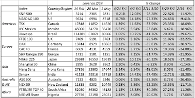 Download dataThe divide in the two periods is clear. Consider the S&P 500, down 28.28% between 2/14 and 3/20, but up 22.82% from March 20 and May 1, resulting in an overall return of -11.92% over the period. While the magnitudes vary across the indices, the pattern repeats, with the Shanghai 50 close to breaking even over the entire period, and the Bovespa (Brazil) and the ASX 200 (Australia) delivering the worst cumulative returns between 2/14 and 5/1. As stock markets have swooned and partially recovered, the yields on US treasuries dropped sharply early in the crisis and have stayed low since.
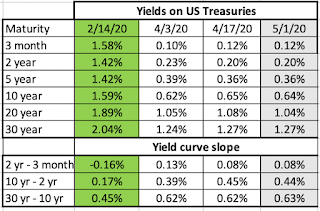 Download dataThe 3-month treasury bill rate, which was 1.58% on February 14, has dropped close to zero on May 1, and the treasury bond rate has declined from 1.59% to 0.64% over the same period. The much talked about inverted yield curve late last year, that led to so many prognostications of gloom and doom, has become upward sloping, and staying consistent with my argument that too much was being made of the former as a predictor of recession, I will not read too much into its slope now. Moving to the corporate bond market, I focused on 10-year corporates in different ratings classes:
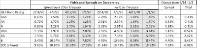 Download dataEarly in this crisis, the corporate bond markets did not reflect the worry and fear that equity investors were exhibiting, but they caught on with a vengeance a couple of weeks in, and the damage was clearly visible by April 3, 2020, with default spreads almost tripling across the board for all ratings classes. Since April 3, the spreads have declined, but remain well above pre-crisis levels. There should be no surprise that the price of risk in the bond market has risen, and as the crisis has taken hold, I have been updating equity risk premiums daily for the S&P 500 since February 14, 2020:
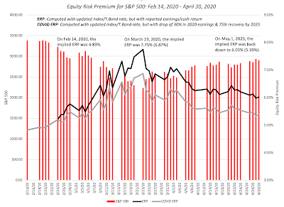 Download dataThe equity risk premium surged early in the crisis, hitting a high of 7.75% on March 23, but that number has been dropping back over the last weeks, as the market recovers. By May 1, 2020, the premium was back down to 6.03%, with pre-crisis earnings and cash flows left intact, and building in a 30% drop in earnings and a 50% decline in buybacks yields an equity risk premium of 5.39%. For good reasons or bad, the price of risk in the equity market seems to be moving back to pre-crisis levels. I don’t track commodity prices on a regular basis, but I chose to track oil and copper prices since February 14:
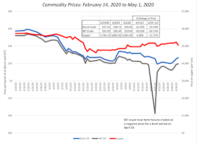 Download dataAt the risk of repeating what I have said in prior weeks, the drop in copper prices is consistent with an expectation of a global economic showdown but the drop in oil prices reflects something more. In fact, a comparison of Brent and West Texas crude oil prices highlights one of the more jaw-dropping occurrences during this crisis, when the price of the latter dropped below zero on April 19. The oil business deserves a deeper look and I plan to turn to that in the next few weeks. Finally, I look at gold and bitcoin prices during the crisis, with the intent of examining their performance as crisis assets:
 Download dataGold has held its own, but I think that the fact that it is up only 7.4% must be disappointing to true believers, and Bitcoin has behave more like equities than a crisis asset, and very risky equities at that, dropping more than 50% during the weeks when stocks were down, and rising in the next few weeks, as stocks rose, to end the period with a loss of 16.37% between February 14 and May 1.
Equities: A BreakdownStarting with the market capitalizations of individual companies, I measured the change in market capitalization on a week to week basis, allowing me to slice and dice the data to chronicle where the damage has been greatest and where it has been the least. Breaking down companies by region, here is what the numbers updated through May 1 look like: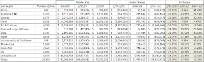 Add captionLatin America has been the worst performing region in the world, with Africa, Australia and Russia right behind and China and the Middle East have been the best performing regions between February 14 and May 1. I continue the breakdown on a sector-basis in the table below:
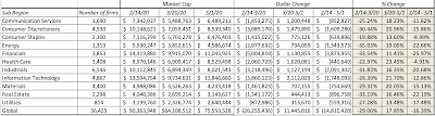 Add captionHealth care, consumer staples and technology have been the best performing sectors and financials are now the biggest losers. Extending the analysis to industries and looking at the updated list of worst and best performing industries:
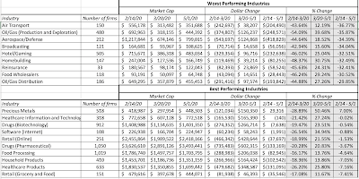 Add captionRepeating a refrain from my updates in earlier weeks, this has been, as crises go, about as orderly a retreat as any that I have seen. The selling has been more focused on sectors that have heavy capital investment and oil-focused, burdened with debt, and has been much more muted in sectors that have low capital intensity and less debt.
Value versus Growth InvestingIn the tussle between value and growth investing, value investors have held the upper hand for a long time. In addition to laying claim to being the custodians of value, they also seemed to have all the numbers on their side of the argument, as they pointed to decades of outperformance by value stocks, at least in the United States. The last decades, though, have delivered numbers that are more favorable to growth investors, and this crisis is perhaps as good a time as any to reexamine the debate.
The DifferenceFor decades, we have accepted a lazy categorization of stocks on the value versus growth dimension. Stocks that trade at low PE or low price to book ratios are considered value stocks, and stocks that trade at high multiples of earnings and book value are growth stocks. In fact, the value factor in investing is built around price to book ratios. If you are a value investor, your reaction to this categorization is that this is no way to describe value and that true value investing incorporates many other dimensions including management quality, sustainable moats and low leverage. Conceding all those points, I would argue that the key difference between value and growth investing can be captured by looking at a financial balance sheet: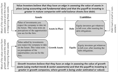
Thus, the real difference between value and growth investors lies not in whether they care about value (sensible investors in both groups do), but where they believe the investing payoff is greater. Value investors believe that it is assets in place that markets get wrong, and that their best opportunities for finding "under valued" stocks is in mature companies with mispriced assets in place. Growth investors, on the other hand, assert that they are more likely to find mispricing in high growth companies, where the market is either missing or misestimating key elements of growth.
The Lead InUntil the last decade, it was conventional wisdom that value investing beat growth investing, especially over longer time horizon, and the backing for this statement took the form of either anecdotal evidence (with the list of illustrious value investors much longer than the list of legendary growth investors) or historical data showing that low price to book stocks have delivered higher returns than high price to book stocks: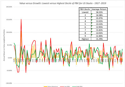 Source: Raw Data from Ken FrenchLooking across the entire period (1927-2019), low price to book stocks have clearly won this battle, delivering 5.22% more than high price to book stocks, and this excess return is almost impervious to risk and transaction cost adjustments. Value investors entered the last decade, convinced of the superiority of their philosophy, and in the table below, I look at the difference in returns between low and high PE and PBV stocks, each decade going back to the 1920s.
 It is quite clear that 2010-2019 looks very different from prior decades, as high PE and high PBV stocks outperformed low PE and low PBV stocks by substantial margins. The under performance of value has played out not only in the mutual fund business, with value funds lagging growth funds, but has also brought many legendary value investors down to earth. Pushed to explain why, the defense that value investors offered was that the 2008 crisis, Fed interventions and the rise of the FAANG stocks created a perfect storm that rewarded momentum and growth investing, at the expense of value. Implicit in this argument is the belief that this phase would pass and that value investing would regain its rightful place.
The COVID Crisis In the early days of the crisis, there were many value investors who viewed at least some of the market correction as punishment for investor overreach on growth and momentum stocks in the past decade. As the weeks have progressed, that argument has been quelled by the cumulating evidence that the market punishment perversely has been far worse for value stocks, i.e., stocks with low PE ratios and high dividend yields than for momentum or growth stocks. To illustrate this, I first look at how the market effects have varied across stocks in different PE ratio classes: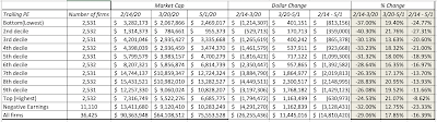
Note that it is the lowest PE stocks that have lost the most market capitalization (almost 25%) between February 14 and May 1, whereas the highest PE stocks have lost only 8.62%, and to add insult to injury, even money losing companies have done better than the lowest PE stocks. I follow up by looking at stocks broken down by price to book ratios: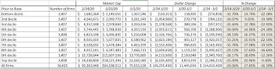
The results mirror what we saw with PE stocks, with low price to book stocks losing far more value than the highest price to book stocks. I then break down stocks based upon dividend yields: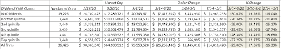 Low dividend yield stocks and even non-dividend paying stocks have fared far better than high dividend yield stocks. Finally I look at companies, based upon net debt ratios:
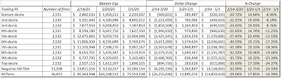
Put simply, here is what I see in the data. If I had followed old-time value investing rules and had bought stocks with low PE ratios and high dividends in pre-COVID times, I would have lost far more than if I bought high PE stocks or stocks that trade at high multiples of book value, paying little or no dividends. The only fundamental that has worked in favor of value investors is avoiding companies with high leverage.
A Personal ViewpointI believe that value investing has lost its way, a point of view I espoused to portfolio managers in Omaha a few years ago, in a talk, and in a paper on value investing, titled Value Investing: Investing for Grown Ups? In the talk and in the paper, I argued that much of value investing had become rigid (with meaningless rules and static metrics), ritualistic (worshiping at the altar of Buffett and Munger, and paying lip service to Ben Graham) and righteous (with finger wagging and worse reserved for anyone who invested in growth or tech companies). I also presented evidence that it was bringing less to the table than active growth investing, by noting that the average active value investor underperformed a value index fund by more than the average growth investor lagged growth index funds. I also think that fundamental shifts in the economy, and in corporate behavior, have rendered book value, still a key tool in the value investor's tool kit, almost worthless in sectors other than financial services, and accounting inconsistencies have made cross company comparisons much more difficult to make. On a hopeful note, I think that value investing can recover, but only if it is open to more flexible thinking about value, less hero worship and less of a sense of entitlement (to rewards). If you are a value investor, you will be better served accepting the reality that you can do everything right on the valuation front, and still make less money than your neighbor who picks stocks based upon astrological signs, and that luck trumps skill and hard work, even over long time periods.
Active versus Passive InvestingSome of the readers of this blog are in the active investing business and I apologize in advance for raising questions about your choice of profession. After all, any discussion of active versus passive investing that comes down on the side of the latter implicitly is a judgment of whether you are adding value by trying to pick stocks or time markets. Consequently, these discussions quickly turn rancid and personal, and I hope this one does not.
The DifferenceIn passive investing, as an investor, you allocate your wealth across asset classes (equities, bonds, real assets) based upon your risk aversion, liquidity needs and time horizon, and within each class, rather than pick individual stocks, bonds or real assets, you invest in index funds or exchange traded funds (ETFs) to cover the spectrum of choices. In active investing, you try to time markets (by allocating more money to asset classes that you believe are under valued and less to those that you think are over valued) or pick individual assets that you believe offer the potential for higher returns. Active investing covers a whole range of different philosophies from day trading to buying entire companies and holding them for the long term.
Put simply, active investing covers a range of philosophies with different time horizons, different and often contradictory views about how markets make mistakes and correct them,
The Lead InUntil the 1970s, active investing dominated passive investing for two simple reasons. The first was the presumption that institutional investors were smarter, and had access to more information than the rest of us, and should thus do better with our money. The second was that there were no passive investing vehicles available for average investors. Both delusions came crashing down in the late sixties and early seventies.First, the pioneering studies of mutual fund performance, including this famous one that introduced Jensen's alpha, came to the surprising conclusion that rather than outperform markets, mutual funds under performed by non-trivial amounts. In the years since, there have been literally hundreds of studies that have asked the same question about mutual funds, hedge funds and private equity, using far richer data sets and more sophisticated risk adjustment models to arrive at the same result. You can see Morningstar's 10-year excess return distribution for all active large-blend mutual funds, from 2010-2019, below (with similar graphs for other classes of active mutual funds):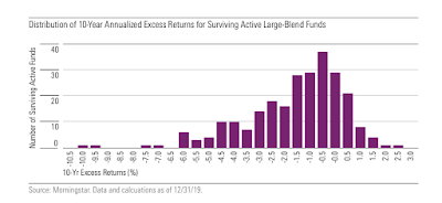 If the counter is that it is hedge and private equity funds where the smart money resides today, the evidence with those funds, once you adjust for reporting and survivor bias, mirrors the mutual fund results. Put bluntly, "smart" money is not that smart, and the advantages that it possesses (bright people, more data, powerful models) don't translate into returns for its investors. Ironically, over the same period, there were hundreds of other studies that claimed to find market inefficiencies, at least on paper, suggesting that there is no internal inconsistency in believing that markets are inefficient and also believing that bearing these markets is really, really difficult to do.Second, Jack Bogle upended investment management in 1976 with the Vanguard 500 Index fund, the most disruptive change in the history of the investment business. Over the next three decades, the index fund concept expanded to cover geographies and asset classes, allowing investors unhappy with their investment advisors and mutual funds to switch to low-cost alternatives that delivered higher returns. The entry of ETFs tilted the game even further in favor of passive investing, while also offering active investors new ways of playing sectors and markets.The shift of funds from passive to active has been occurring for a long time, but the shift was small early in the process. In 1995, less than 5% of money was passively invested (almost entirely in index funds) and that percentage rose to about 10% in 2002 and 20% in 2010. In the last decade, that shift has accelerated, as you can see in the graph below:
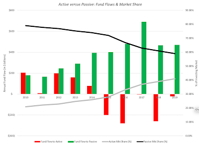
The increase in passive investing's market share has come primarily from almost $4 trillion in funds flowing into passive vehicles, but active investing has also seen outflows in the last five years. While some have attributed this to failures of active investors in the last decade, I believe that active investing has been a loser's game, as Charley Ellis aptly described it, for decades, and that the shift can be more easily explained by investors having more choices, as trading moves online and becomes close to costless, and readier access to information on how their portfolios are performing.
The Crisis PerformanceActive investors have argued that their failures were due to an undisciplined bull market, where their stock pricing expertise was being discounted, and that their time would come when the next crisis hit. There were also dark warnings about how passive investing would lead to liquidity meltdowns and make the next crisis worse. If active investors wanted to have a chance to shine, they have got in their wish in the last few weeks, where their market timing and stock picking skills were in the spotlight. With their expertise, they should have managed to not only to avoid the worst of the damage in the first few weeks, but should have then gained on the upside, by redeploying assets to the sectors/stocks recovering the quickest. While there is anecdotal evidence that some investors were able to do this, with Bill Ackman's prescient hedge against the COVID collapse getting much attention, I am sure that there were plenty of other smart investors who not only did not see it coming, but made things worse by doubling down on losing bets or cashing out too early.
As we look at the bigger picture, the results are, at best, mixed, and hopes that this crisis would vindicate active investors have not come to fruition, at least yet. I looked at Morningstar's assessment of returns on equity mutual funds in the first quarter of 2020, measured against returns on passive indices for each fund class: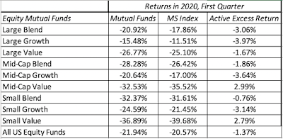 Source: MorningstarNote that the first quarter included the worst weeks of the crisis (February 14- March 20), and there is little evidence that mutual funds were able to get ahead of their passive counterparts, with only two groups showing outperformance (small and mid-cap value), but active funds collectively under performed by 1.37% during this period. Focusing on market timing skills, tactical asset allocation funds (whose selling pitch is that they can help investors avoid market crisis and bear markets) were down 13.87% during the quarter, at first sight beating the overall US equity market, which was down 20.57%. That comparison is skewed in favor of these funds, though, since tactical asset allocation funds typically tend to invest about 60% in equities, and when adjusted for that equity allocation, they too underperformed the market. Looking at hedge funds in the first quarter of 2020, the weighted hedge fund index was down 8.5% and saw $33 billion in fund outflows, though there were some bright spots, with macro hedge funds performing much better. Overall, though, there was little to celebrate on the active investing front during this crisis. On the market liquidity front, while much has been made of the swings up and down in the market during this crisis, the market has held up remarkably well. A comparison to the chaos in the last quarter of 2008 suggests that the market has dealt with and continues to deal with this crisis with far more equanimity than it did in 2008. In fact, I think that the financial markets have done far better than politicians, pandemic specialists and market gurus during the last weeks, in the face of uncertainty.
A Personal ViewpointI have been skeptical about both the reasons given for active investing's slide over the last decade and the dire consequences of passive investing, and this crisis has only reinforced that skepticism. For active investing to deal with its very real problems, it has to get past denial (that there is a problem), delusion (that active investing is actually working, based upon anecdotal evidence) and blame (that it is all someone else's fault). Coming out of this crisis, I think that more money will leave active investing and flow into passive investing, that active investing will continue to shrink as a business, but that there will be a subset of active investing that survives and prospers. I don't believe that artificial intelligence and big data will rescue active investing, since any investment strategies built purely around numbers and mechanics will be quickly replicated and imitated. Instead, the future will belong to multidisciplinary money managers, who have well thought-out and deeply held investment philosophies, but are willing to learn and quickly adapt investment strategies to reflect market realities.
Small versus Large Cap The small cap premium was among the earliest anomalies uncovered by researchers in the 1970s and it came from the recognition that small market capitalization stocks earned higher returns than the rest of the market, after adjusting for risk. That premium has become part of financial practice, driving some investors to allocate disproportionate portions of their portfolios to small cap funds and appraisers to add small cap premiums to discount rates, when valuing small companies.
The DifferenceThere are two things worth noting at the outset about the small cap premiums. The first is that market capitalization is the proxy for size in the small cap studio, not revenues or earnings. Thus, you can have a young company with little or no revenues and large losses with a large market capitalization and a mature company with large revenues and a small market capitalization. The second is that to define a small capitalization stock, you have to think in relative terms, by comparing market capitalizations across companies. In fact, much of the relevant research on small cap stocks has been based on breaking companies down by market capitalization into deciles and looking at returns on each decile. One reason that the small cap premium resonates so strongly with investors is because it seems to make intuitive sense, since it seems reasonable that small companies, with less sustainable business models, less access to capital and greater key person risk, should be riskier than larger companies.
The Lead InAs with value investing, the strongest arguments for the small cap premium come from looking at historical returns on US stocks, broken down by decile, into market cap classes.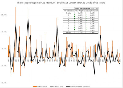 Going back to 1927, the smallest cap stocks have delivered about 3.47% more annually than than the rest of the market, on a value-weighted basis. That outperformance though obscures a troubling trend in the data, which is that the small cap premium has disappeared since 1980; small cap stocks have earned about 0.10% less than the average stock between 1980 and 2019. The table below breaks down the small cap premium, by decade:
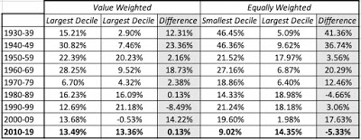 The data in this table is testimony to two phenomena. The first is the belief in mean reversion that lies at the heart of so many investment strategies, with the mean being computed over long time periods, and primarily with US stocks. The second is that once bad valuation practices, once embedded in the status quo, are very difficult to remove. In my view, the use of small cap premiums in valuation practice have no basis in the data, but that does not mean that people will stop using them.
The Crisis PerformanceAs with active and value investing, there are some who believe that the fading of the small cap premium is temporary and that it will return, when markets change. To the extent that this crisis may constitute a market shift, I examined the performance of stocks, broken down by market capitalization into deciles between February 14, 2020 and May 1, 2020.
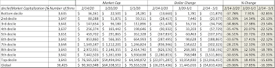 I know that it is still early in this crisis, but looking at the numbers so far, there is little good news for small cap investors, with stocks in the lowest two declines suffering more than the rest of the market. In fact, if there is a message in these returns, it is that the post-COVID economy will be tilted even more in favor of large companies, at the expense of small ones, as other businesses follow the tech model of concentrated market power.
A Personal ViewpointIt is still possible that the shifts in investor behavior and corporate performance could benefit small companies in the future, but I am hard pressed trying to think of reasons why. It is my belief that forces that allowed small cap stocks to earn a premium over large cap stocks have largely faded. I am not arguing that investing in small cap stocks is a bad strategy, but investing in small companies, just because they are small, and expecting to get rewarded for doing so, is asking to be rewarded for doing very little. Markets are unlikely to oblige. It is possible that you can build more discriminating strategies around small cap stocks that can make money, but that will require again bringing something else to the equation that is not being tracked or priced in by the market already.
YouTube Video
DataMarket data (May 1, 2020)Regional breakdown - Market Changes and Pricing (May 1, 2020)Sector breakdown - Market Changes and Pricing (May 1, 2020)Industry breakdown - Market Changes and Pricing (May 1, 2020)Equity Risk Premium, by day (Updated through May 1, 2020)Small Cap versus Large Cap Stocks (1927-2019)Small Cap - Market Changes and Pricing (May 1, 2020)Value versus Growth ((1927-2019)PE breakdown - Market Changes and Pricing (May 1, 2020)PBV breakdown - Market Changes and Pricing (May 1, 2020)Dividend Yield breakdown - Market Changes and Pricing (May 1, 2020)Viral Market Update PostsA Viral Market Meltdown: Fear or Fundamentals?A Viral Market Meltdown II: Pricing or Valuing? Investing or Trading?A Viral Market Meltdown III: Clues in the Market DebrisA Viral Market Meltdown IV: Investing for a post-virus EconomyA Viral Market Meltdown V: Back to BasicsA Viral Market Meltdown VI: The Price of RiskA Viral Market Meltdown: Market MultiplesA Viral Market Meltdown: Value vs Growth, Active vs Passive, Small Cap vs Large!
Market ActionAs with my prior updates, I will begin by surveying the market action, first over the two weeks (4/17-5/1), following my last update, and then looking at the returns since February 14, the date that I started my crisis clock. First up, I look at returns on stock indices around the world, breaking them up into two periods, from February 14 to March 20, roughly the low point for markets during this crisis and from March 20 to May 1, as they mounted a comeback.
 Download dataThe divide in the two periods is clear. Consider the S&P 500, down 28.28% between 2/14 and 3/20, but up 22.82% from March 20 and May 1, resulting in an overall return of -11.92% over the period. While the magnitudes vary across the indices, the pattern repeats, with the Shanghai 50 close to breaking even over the entire period, and the Bovespa (Brazil) and the ASX 200 (Australia) delivering the worst cumulative returns between 2/14 and 5/1. As stock markets have swooned and partially recovered, the yields on US treasuries dropped sharply early in the crisis and have stayed low since.
 Download dataThe 3-month treasury bill rate, which was 1.58% on February 14, has dropped close to zero on May 1, and the treasury bond rate has declined from 1.59% to 0.64% over the same period. The much talked about inverted yield curve late last year, that led to so many prognostications of gloom and doom, has become upward sloping, and staying consistent with my argument that too much was being made of the former as a predictor of recession, I will not read too much into its slope now. Moving to the corporate bond market, I focused on 10-year corporates in different ratings classes:
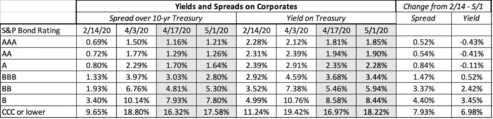 Download dataEarly in this crisis, the corporate bond markets did not reflect the worry and fear that equity investors were exhibiting, but they caught on with a vengeance a couple of weeks in, and the damage was clearly visible by April 3, 2020, with default spreads almost tripling across the board for all ratings classes. Since April 3, the spreads have declined, but remain well above pre-crisis levels. There should be no surprise that the price of risk in the bond market has risen, and as the crisis has taken hold, I have been updating equity risk premiums daily for the S&P 500 since February 14, 2020:
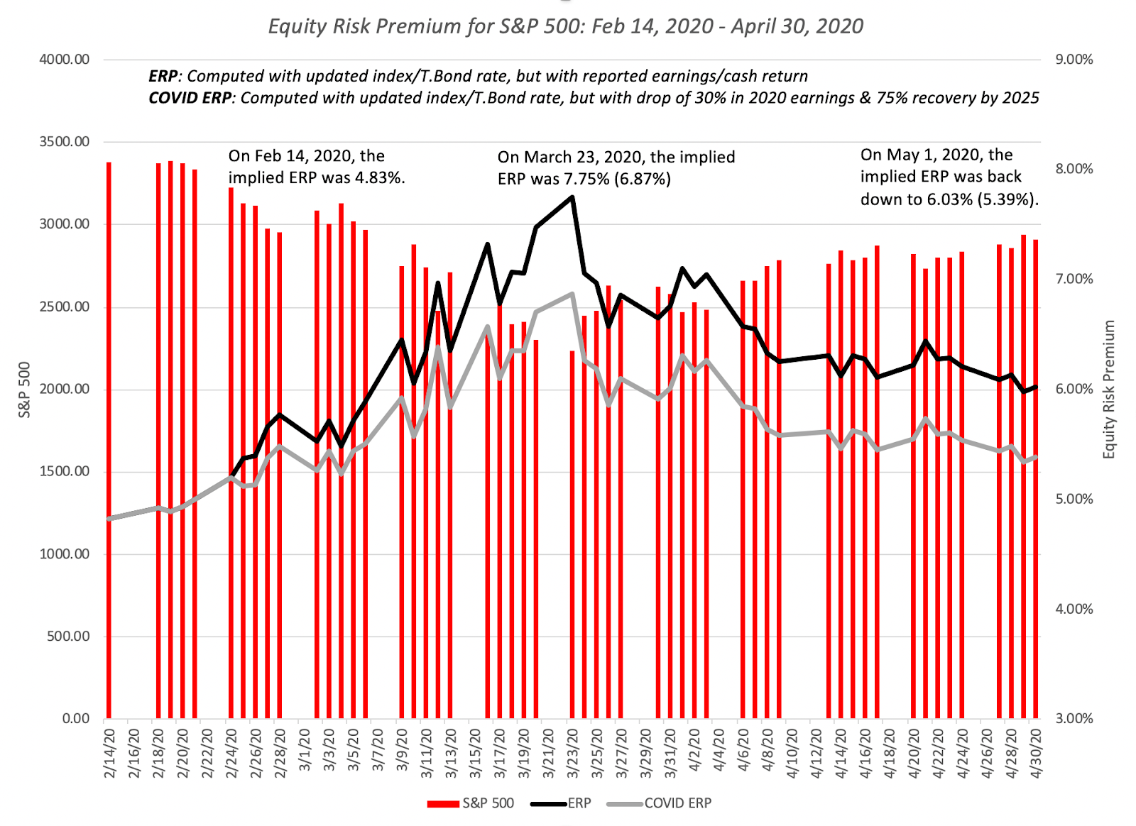 Download dataThe equity risk premium surged early in the crisis, hitting a high of 7.75% on March 23, but that number has been dropping back over the last weeks, as the market recovers. By May 1, 2020, the premium was back down to 6.03%, with pre-crisis earnings and cash flows left intact, and building in a 30% drop in earnings and a 50% decline in buybacks yields an equity risk premium of 5.39%. For good reasons or bad, the price of risk in the equity market seems to be moving back to pre-crisis levels. I don’t track commodity prices on a regular basis, but I chose to track oil and copper prices since February 14:
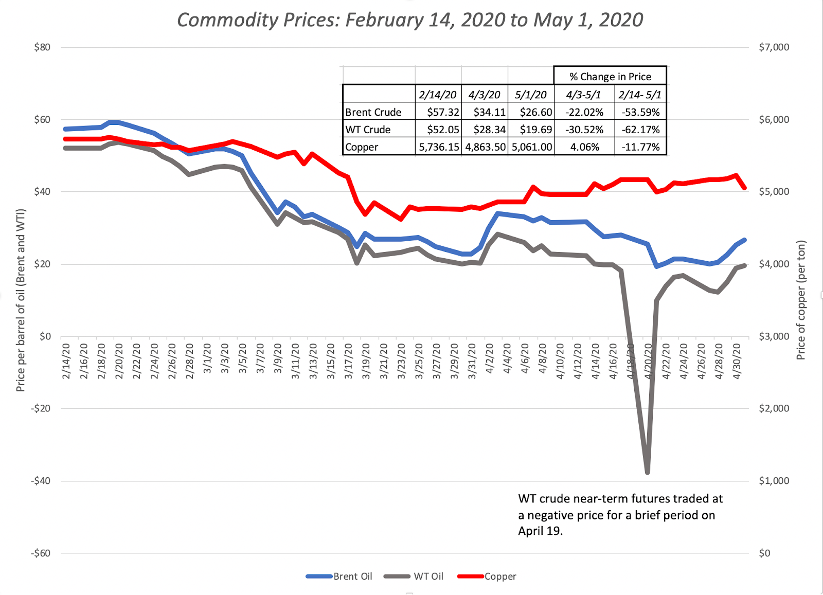 Download dataAt the risk of repeating what I have said in prior weeks, the drop in copper prices is consistent with an expectation of a global economic showdown but the drop in oil prices reflects something more. In fact, a comparison of Brent and West Texas crude oil prices highlights one of the more jaw-dropping occurrences during this crisis, when the price of the latter dropped below zero on April 19. The oil business deserves a deeper look and I plan to turn to that in the next few weeks. Finally, I look at gold and bitcoin prices during the crisis, with the intent of examining their performance as crisis assets:
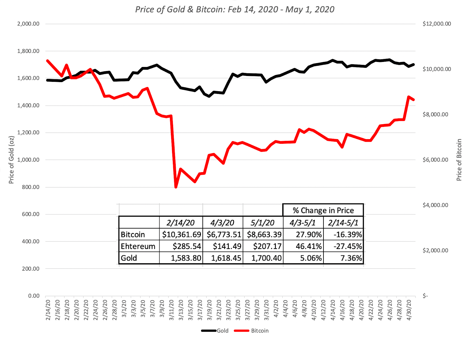 Download dataGold has held its own, but I think that the fact that it is up only 7.4% must be disappointing to true believers, and Bitcoin has behave more like equities than a crisis asset, and very risky equities at that, dropping more than 50% during the weeks when stocks were down, and rising in the next few weeks, as stocks rose, to end the period with a loss of 16.37% between February 14 and May 1.
Equities: A BreakdownStarting with the market capitalizations of individual companies, I measured the change in market capitalization on a week to week basis, allowing me to slice and dice the data to chronicle where the damage has been greatest and where it has been the least. Breaking down companies by region, here is what the numbers updated through May 1 look like:
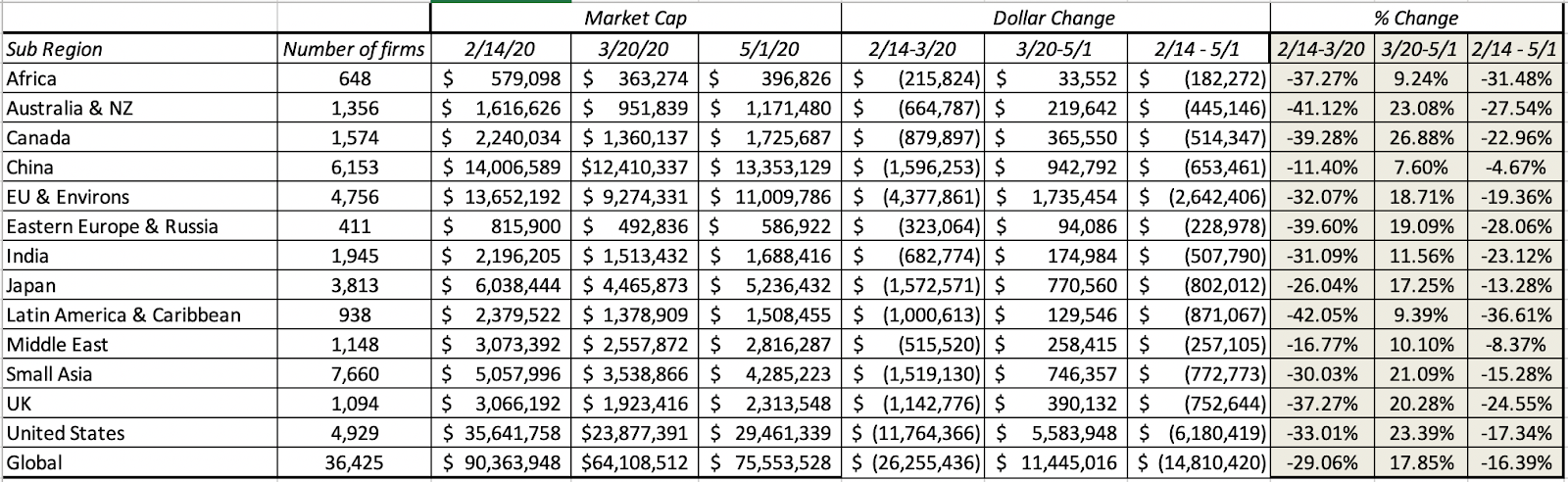 Add captionLatin America has been the worst performing region in the world, with Africa, Australia and Russia right behind and China and the Middle East have been the best performing regions between February 14 and May 1. I continue the breakdown on a sector-basis in the table below:
 Add captionHealth care, consumer staples and technology have been the best performing sectors and financials are now the biggest losers. Extending the analysis to industries and looking at the updated list of worst and best performing industries:
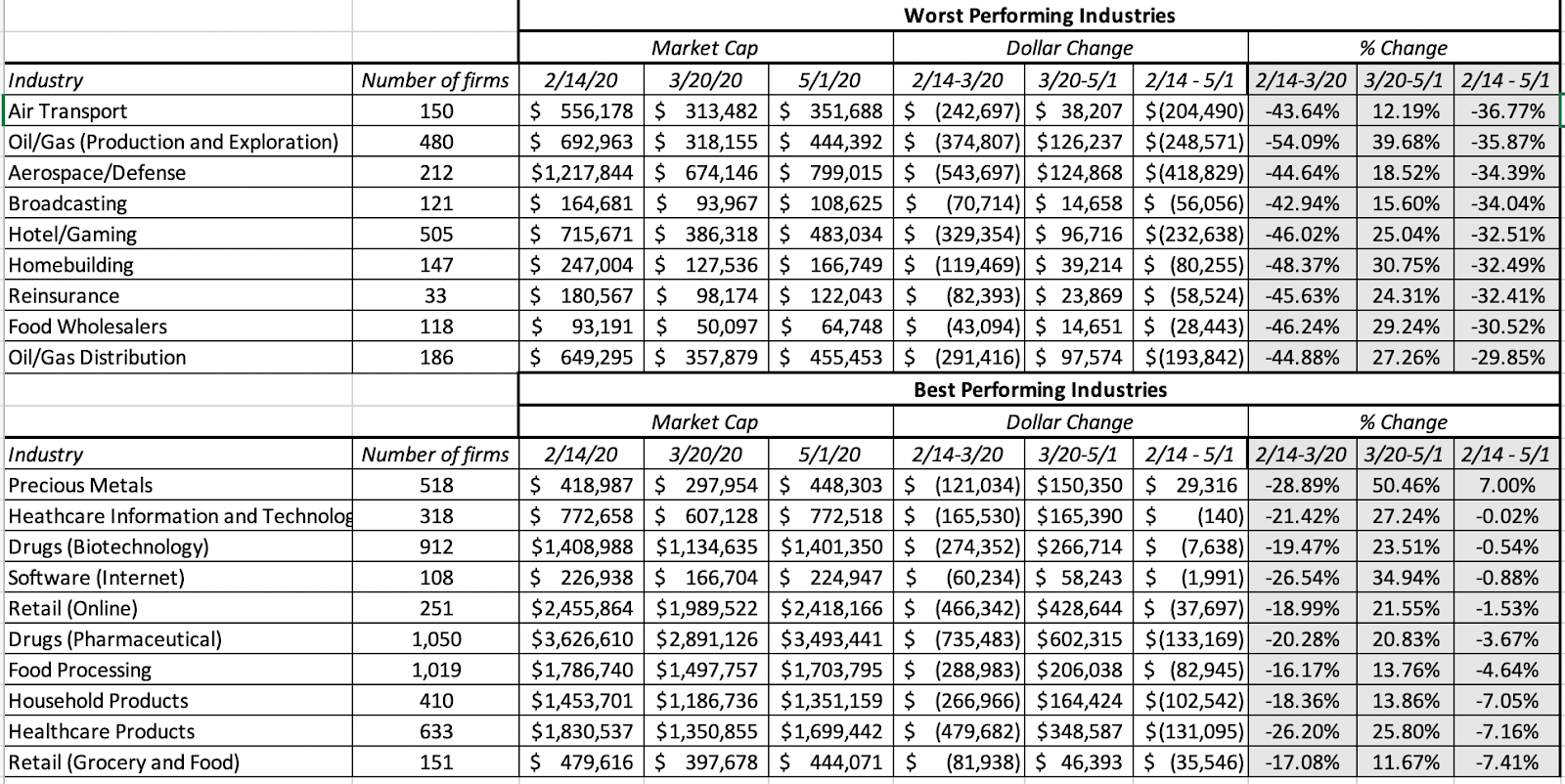 Add captionRepeating a refrain from my updates in earlier weeks, this has been, as crises go, about as orderly a retreat as any that I have seen. The selling has been more focused on sectors that have heavy capital investment and oil-focused, burdened with debt, and has been much more muted in sectors that have low capital intensity and less debt.
Value versus Growth InvestingIn the tussle between value and growth investing, value investors have held the upper hand for a long time. In addition to laying claim to being the custodians of value, they also seemed to have all the numbers on their side of the argument, as they pointed to decades of outperformance by value stocks, at least in the United States. The last decades, though, have delivered numbers that are more favorable to growth investors, and this crisis is perhaps as good a time as any to reexamine the debate.
The DifferenceFor decades, we have accepted a lazy categorization of stocks on the value versus growth dimension. Stocks that trade at low PE or low price to book ratios are considered value stocks, and stocks that trade at high multiples of earnings and book value are growth stocks. In fact, the value factor in investing is built around price to book ratios. If you are a value investor, your reaction to this categorization is that this is no way to describe value and that true value investing incorporates many other dimensions including management quality, sustainable moats and low leverage. Conceding all those points, I would argue that the key difference between value and growth investing can be captured by looking at a financial balance sheet:

Thus, the real difference between value and growth investors lies not in whether they care about value (sensible investors in both groups do), but where they believe the investing payoff is greater. Value investors believe that it is assets in place that markets get wrong, and that their best opportunities for finding "under valued" stocks is in mature companies with mispriced assets in place. Growth investors, on the other hand, assert that they are more likely to find mispricing in high growth companies, where the market is either missing or misestimating key elements of growth.
The Lead InUntil the last decade, it was conventional wisdom that value investing beat growth investing, especially over longer time horizon, and the backing for this statement took the form of either anecdotal evidence (with the list of illustrious value investors much longer than the list of legendary growth investors) or historical data showing that low price to book stocks have delivered higher returns than high price to book stocks:
 Source: Raw Data from Ken FrenchLooking across the entire period (1927-2019), low price to book stocks have clearly won this battle, delivering 5.22% more than high price to book stocks, and this excess return is almost impervious to risk and transaction cost adjustments. Value investors entered the last decade, convinced of the superiority of their philosophy, and in the table below, I look at the difference in returns between low and high PE and PBV stocks, each decade going back to the 1920s.
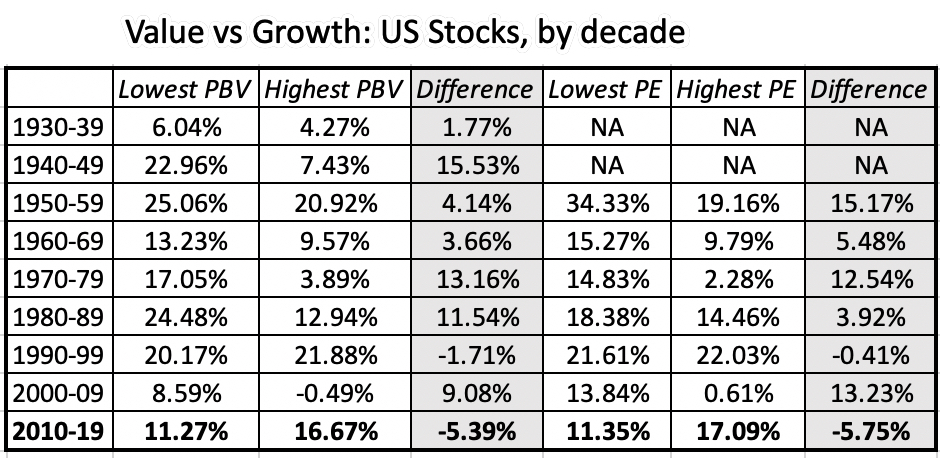 It is quite clear that 2010-2019 looks very different from prior decades, as high PE and high PBV stocks outperformed low PE and low PBV stocks by substantial margins. The under performance of value has played out not only in the mutual fund business, with value funds lagging growth funds, but has also brought many legendary value investors down to earth. Pushed to explain why, the defense that value investors offered was that the 2008 crisis, Fed interventions and the rise of the FAANG stocks created a perfect storm that rewarded momentum and growth investing, at the expense of value. Implicit in this argument is the belief that this phase would pass and that value investing would regain its rightful place.
The COVID Crisis In the early days of the crisis, there were many value investors who viewed at least some of the market correction as punishment for investor overreach on growth and momentum stocks in the past decade. As the weeks have progressed, that argument has been quelled by the cumulating evidence that the market punishment perversely has been far worse for value stocks, i.e., stocks with low PE ratios and high dividend yields than for momentum or growth stocks. To illustrate this, I first look at how the market effects have varied across stocks in different PE ratio classes:
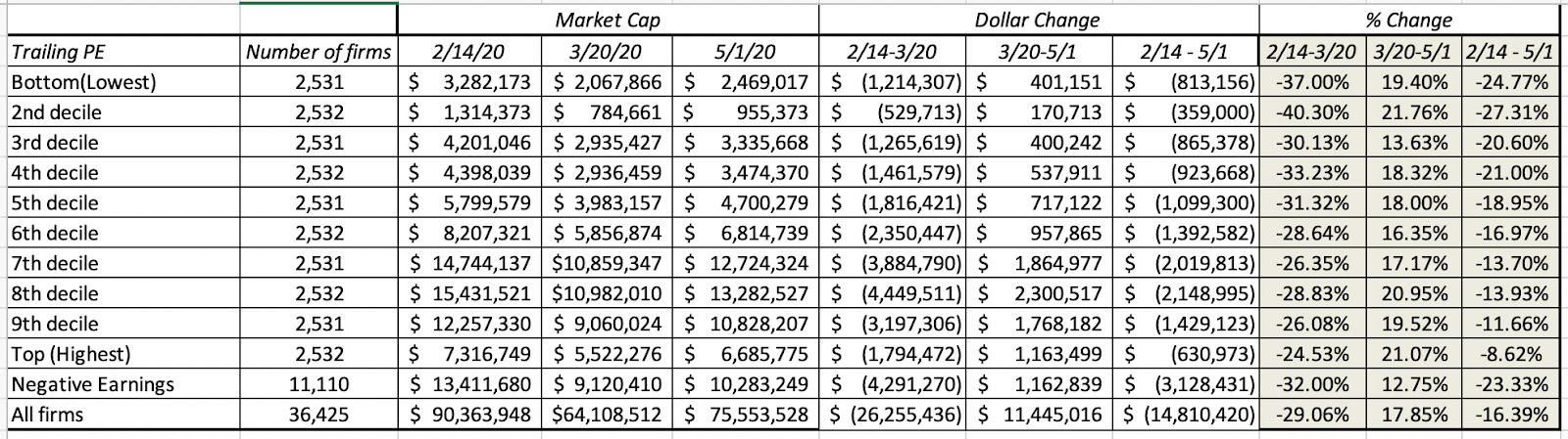
Note that it is the lowest PE stocks that have lost the most market capitalization (almost 25%) between February 14 and May 1, whereas the highest PE stocks have lost only 8.62%, and to add insult to injury, even money losing companies have done better than the lowest PE stocks. I follow up by looking at stocks broken down by price to book ratios:
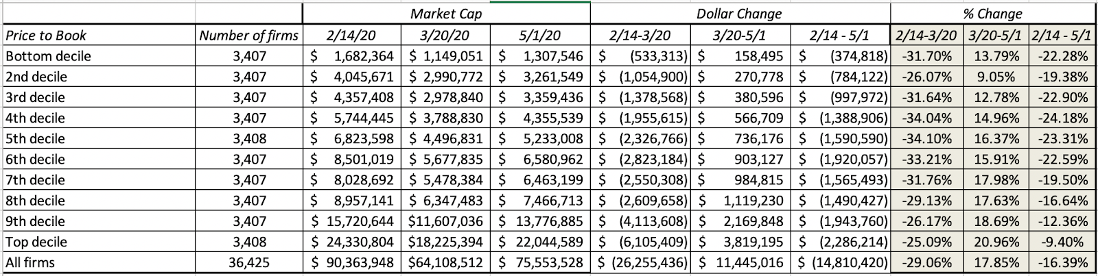
The results mirror what we saw with PE stocks, with low price to book stocks losing far more value than the highest price to book stocks. I then break down stocks based upon dividend yields:
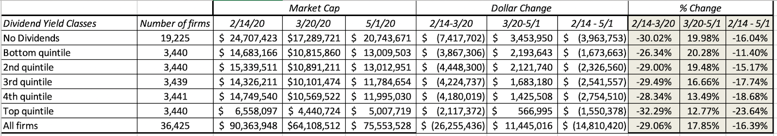 Low dividend yield stocks and even non-dividend paying stocks have fared far better than high dividend yield stocks. Finally I look at companies, based upon net debt ratios:
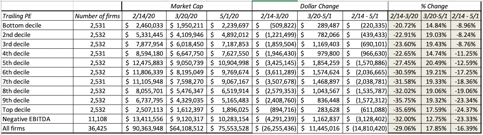
Put simply, here is what I see in the data. If I had followed old-time value investing rules and had bought stocks with low PE ratios and high dividends in pre-COVID times, I would have lost far more than if I bought high PE stocks or stocks that trade at high multiples of book value, paying little or no dividends. The only fundamental that has worked in favor of value investors is avoiding companies with high leverage.
A Personal ViewpointI believe that value investing has lost its way, a point of view I espoused to portfolio managers in Omaha a few years ago, in a talk, and in a paper on value investing, titled Value Investing: Investing for Grown Ups? In the talk and in the paper, I argued that much of value investing had become rigid (with meaningless rules and static metrics), ritualistic (worshiping at the altar of Buffett and Munger, and paying lip service to Ben Graham) and righteous (with finger wagging and worse reserved for anyone who invested in growth or tech companies). I also presented evidence that it was bringing less to the table than active growth investing, by noting that the average active value investor underperformed a value index fund by more than the average growth investor lagged growth index funds. I also think that fundamental shifts in the economy, and in corporate behavior, have rendered book value, still a key tool in the value investor's tool kit, almost worthless in sectors other than financial services, and accounting inconsistencies have made cross company comparisons much more difficult to make. On a hopeful note, I think that value investing can recover, but only if it is open to more flexible thinking about value, less hero worship and less of a sense of entitlement (to rewards). If you are a value investor, you will be better served accepting the reality that you can do everything right on the valuation front, and still make less money than your neighbor who picks stocks based upon astrological signs, and that luck trumps skill and hard work, even over long time periods.
Active versus Passive InvestingSome of the readers of this blog are in the active investing business and I apologize in advance for raising questions about your choice of profession. After all, any discussion of active versus passive investing that comes down on the side of the latter implicitly is a judgment of whether you are adding value by trying to pick stocks or time markets. Consequently, these discussions quickly turn rancid and personal, and I hope this one does not.
The DifferenceIn passive investing, as an investor, you allocate your wealth across asset classes (equities, bonds, real assets) based upon your risk aversion, liquidity needs and time horizon, and within each class, rather than pick individual stocks, bonds or real assets, you invest in index funds or exchange traded funds (ETFs) to cover the spectrum of choices. In active investing, you try to time markets (by allocating more money to asset classes that you believe are under valued and less to those that you think are over valued) or pick individual assets that you believe offer the potential for higher returns. Active investing covers a whole range of different philosophies from day trading to buying entire companies and holding them for the long term.
Put simply, active investing covers a range of philosophies with different time horizons, different and often contradictory views about how markets make mistakes and correct them,
The Lead InUntil the 1970s, active investing dominated passive investing for two simple reasons. The first was the presumption that institutional investors were smarter, and had access to more information than the rest of us, and should thus do better with our money. The second was that there were no passive investing vehicles available for average investors. Both delusions came crashing down in the late sixties and early seventies.First, the pioneering studies of mutual fund performance, including this famous one that introduced Jensen's alpha, came to the surprising conclusion that rather than outperform markets, mutual funds under performed by non-trivial amounts. In the years since, there have been literally hundreds of studies that have asked the same question about mutual funds, hedge funds and private equity, using far richer data sets and more sophisticated risk adjustment models to arrive at the same result. You can see Morningstar's 10-year excess return distribution for all active large-blend mutual funds, from 2010-2019, below (with similar graphs for other classes of active mutual funds):
 If the counter is that it is hedge and private equity funds where the smart money resides today, the evidence with those funds, once you adjust for reporting and survivor bias, mirrors the mutual fund results. Put bluntly, "smart" money is not that smart, and the advantages that it possesses (bright people, more data, powerful models) don't translate into returns for its investors. Ironically, over the same period, there were hundreds of other studies that claimed to find market inefficiencies, at least on paper, suggesting that there is no internal inconsistency in believing that markets are inefficient and also believing that bearing these markets is really, really difficult to do.Second, Jack Bogle upended investment management in 1976 with the Vanguard 500 Index fund, the most disruptive change in the history of the investment business. Over the next three decades, the index fund concept expanded to cover geographies and asset classes, allowing investors unhappy with their investment advisors and mutual funds to switch to low-cost alternatives that delivered higher returns. The entry of ETFs tilted the game even further in favor of passive investing, while also offering active investors new ways of playing sectors and markets.The shift of funds from passive to active has been occurring for a long time, but the shift was small early in the process. In 1995, less than 5% of money was passively invested (almost entirely in index funds) and that percentage rose to about 10% in 2002 and 20% in 2010. In the last decade, that shift has accelerated, as you can see in the graph below:

The increase in passive investing's market share has come primarily from almost $4 trillion in funds flowing into passive vehicles, but active investing has also seen outflows in the last five years. While some have attributed this to failures of active investors in the last decade, I believe that active investing has been a loser's game, as Charley Ellis aptly described it, for decades, and that the shift can be more easily explained by investors having more choices, as trading moves online and becomes close to costless, and readier access to information on how their portfolios are performing.
The Crisis PerformanceActive investors have argued that their failures were due to an undisciplined bull market, where their stock pricing expertise was being discounted, and that their time would come when the next crisis hit. There were also dark warnings about how passive investing would lead to liquidity meltdowns and make the next crisis worse. If active investors wanted to have a chance to shine, they have got in their wish in the last few weeks, where their market timing and stock picking skills were in the spotlight. With their expertise, they should have managed to not only to avoid the worst of the damage in the first few weeks, but should have then gained on the upside, by redeploying assets to the sectors/stocks recovering the quickest. While there is anecdotal evidence that some investors were able to do this, with Bill Ackman's prescient hedge against the COVID collapse getting much attention, I am sure that there were plenty of other smart investors who not only did not see it coming, but made things worse by doubling down on losing bets or cashing out too early.
As we look at the bigger picture, the results are, at best, mixed, and hopes that this crisis would vindicate active investors have not come to fruition, at least yet. I looked at Morningstar's assessment of returns on equity mutual funds in the first quarter of 2020, measured against returns on passive indices for each fund class:
 Source: MorningstarNote that the first quarter included the worst weeks of the crisis (February 14- March 20), and there is little evidence that mutual funds were able to get ahead of their passive counterparts, with only two groups showing outperformance (small and mid-cap value), but active funds collectively under performed by 1.37% during this period. Focusing on market timing skills, tactical asset allocation funds (whose selling pitch is that they can help investors avoid market crisis and bear markets) were down 13.87% during the quarter, at first sight beating the overall US equity market, which was down 20.57%. That comparison is skewed in favor of these funds, though, since tactical asset allocation funds typically tend to invest about 60% in equities, and when adjusted for that equity allocation, they too underperformed the market. Looking at hedge funds in the first quarter of 2020, the weighted hedge fund index was down 8.5% and saw $33 billion in fund outflows, though there were some bright spots, with macro hedge funds performing much better. Overall, though, there was little to celebrate on the active investing front during this crisis. On the market liquidity front, while much has been made of the swings up and down in the market during this crisis, the market has held up remarkably well. A comparison to the chaos in the last quarter of 2008 suggests that the market has dealt with and continues to deal with this crisis with far more equanimity than it did in 2008. In fact, I think that the financial markets have done far better than politicians, pandemic specialists and market gurus during the last weeks, in the face of uncertainty.
A Personal ViewpointI have been skeptical about both the reasons given for active investing's slide over the last decade and the dire consequences of passive investing, and this crisis has only reinforced that skepticism. For active investing to deal with its very real problems, it has to get past denial (that there is a problem), delusion (that active investing is actually working, based upon anecdotal evidence) and blame (that it is all someone else's fault). Coming out of this crisis, I think that more money will leave active investing and flow into passive investing, that active investing will continue to shrink as a business, but that there will be a subset of active investing that survives and prospers. I don't believe that artificial intelligence and big data will rescue active investing, since any investment strategies built purely around numbers and mechanics will be quickly replicated and imitated. Instead, the future will belong to multidisciplinary money managers, who have well thought-out and deeply held investment philosophies, but are willing to learn and quickly adapt investment strategies to reflect market realities.
Small versus Large Cap The small cap premium was among the earliest anomalies uncovered by researchers in the 1970s and it came from the recognition that small market capitalization stocks earned higher returns than the rest of the market, after adjusting for risk. That premium has become part of financial practice, driving some investors to allocate disproportionate portions of their portfolios to small cap funds and appraisers to add small cap premiums to discount rates, when valuing small companies.
The DifferenceThere are two things worth noting at the outset about the small cap premiums. The first is that market capitalization is the proxy for size in the small cap studio, not revenues or earnings. Thus, you can have a young company with little or no revenues and large losses with a large market capitalization and a mature company with large revenues and a small market capitalization. The second is that to define a small capitalization stock, you have to think in relative terms, by comparing market capitalizations across companies. In fact, much of the relevant research on small cap stocks has been based on breaking companies down by market capitalization into deciles and looking at returns on each decile. One reason that the small cap premium resonates so strongly with investors is because it seems to make intuitive sense, since it seems reasonable that small companies, with less sustainable business models, less access to capital and greater key person risk, should be riskier than larger companies.
The Lead InAs with value investing, the strongest arguments for the small cap premium come from looking at historical returns on US stocks, broken down by decile, into market cap classes.
 Going back to 1927, the smallest cap stocks have delivered about 3.47% more annually than than the rest of the market, on a value-weighted basis. That outperformance though obscures a troubling trend in the data, which is that the small cap premium has disappeared since 1980; small cap stocks have earned about 0.10% less than the average stock between 1980 and 2019. The table below breaks down the small cap premium, by decade:
 The data in this table is testimony to two phenomena. The first is the belief in mean reversion that lies at the heart of so many investment strategies, with the mean being computed over long time periods, and primarily with US stocks. The second is that once bad valuation practices, once embedded in the status quo, are very difficult to remove. In my view, the use of small cap premiums in valuation practice have no basis in the data, but that does not mean that people will stop using them.
The Crisis PerformanceAs with active and value investing, there are some who believe that the fading of the small cap premium is temporary and that it will return, when markets change. To the extent that this crisis may constitute a market shift, I examined the performance of stocks, broken down by market capitalization into deciles between February 14, 2020 and May 1, 2020.
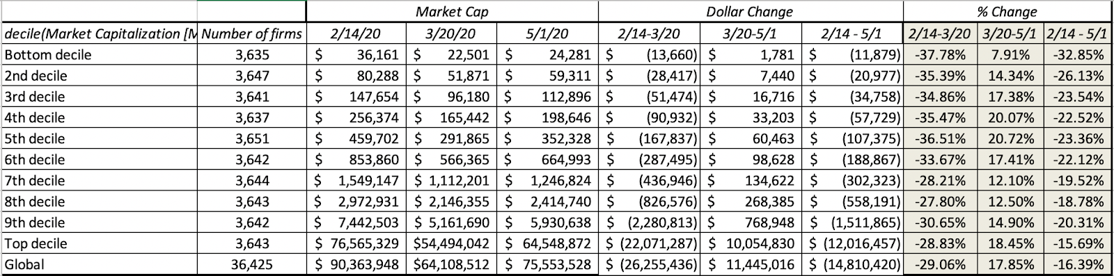 I know that it is still early in this crisis, but looking at the numbers so far, there is little good news for small cap investors, with stocks in the lowest two declines suffering more than the rest of the market. In fact, if there is a message in these returns, it is that the post-COVID economy will be tilted even more in favor of large companies, at the expense of small ones, as other businesses follow the tech model of concentrated market power.
 A Personal ViewpointIt is still possible that the shifts in investor behavior and corporate performance could benefit small companies in the future, but I am hard pressed trying to think of reasons why. It is my belief that forces that allowed small cap stocks to earn a premium over large cap stocks have largely faded. I am not arguing that investing in small cap stocks is a bad strategy, but investing in small companies, just because they are small, and expecting to get rewarded for doing so, is asking to be rewarded for doing very little. Markets are unlikely to oblige. It is possible that you can build more discriminating strategies around small cap stocks that can make money, but that will require again bringing something else to the equation that is not being tracked or priced in by the market already.
YouTube Video
DataMarket data (May 1, 2020)Regional breakdown - Market Changes and Pricing (May 1, 2020)Sector breakdown - Market Changes and Pricing (May 1, 2020)Industry breakdown - Market Changes and Pricing (May 1, 2020)Equity Risk Premium, by day (Updated through May 1, 2020)Small Cap versus Large Cap Stocks (1927-2019)Small Cap - Market Changes and Pricing (May 1, 2020)Value versus Growth ((1927-2019)PE breakdown - Market Changes and Pricing (May 1, 2020)PBV breakdown - Market Changes and Pricing (May 1, 2020)Dividend Yield breakdown - Market Changes and Pricing (May 1, 2020)Viral Market Update PostsA Viral Market Meltdown: Fear or Fundamentals?A Viral Market Meltdown II: Pricing or Valuing? Investing or Trading?A Viral Market Meltdown III: Clues in the Market DebrisA Viral Market Meltdown IV: Investing for a post-virus EconomyA Viral Market Meltdown V: Back to BasicsA Viral Market Meltdown VI: The Price of RiskA Viral Market Meltdown: Market MultiplesA Viral Market Meltdown: Value vs Growth, Active vs Passive, Small Cap vs Large!
April 24, 2020
A Viral Market Update VII: Mayhem with Multiples
I get a sense that I am approaching the end of this series of weekly posts, or perhaps I am just hoping that it is true, as the COVID crisis continued to play out in markets in the last two weeks, albeit on a more subdued scale and with a more positive twist. In this post, I will, as in the prior weeks, update the prior weeks’ market action (for two weeks, from April 4 to April 17) in different asset classes, and within equities, across regions, sectors and stock classifications. I will close this post by looking at how pricing tools, including a range of multiples (from PE ratios to price to book to EV to EBITDA multiples) will become shakier and less reliable in the aftermath of the crisis, and suggest ways in which we can compensate for the uncertainties.
Asset ClassesI started my crisis clock on February 14, reflecting the fact that I am US-based, and markets outside China did not wake up to the crisis until that week. In the weeks since, we have seen volatility rise and equity markets get whipsawed, with much of the pain being dispensed in February and the first three weeks in March. In the last month, equity indices around the world have seen positive returns, and in some cases, very good positive returns, as can be seen in the table below. Download dataThe week of April 10 to April 17 was a benign week, at least in sum, even though individual days still brought big movements, with most indices flat for the week. Moving on to the treasury market, we also saw steadiness, with both short and long term rates staying close to the lows that they hit just two weeks ago.
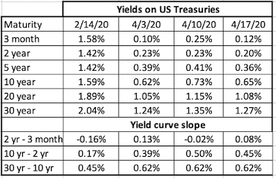 Download dataLooking at commodity prices, the divergence between oil and copper illustrated again the unique travails of oil, where a detente between Russia and China did little to stop oil prices from continuing to drop, while copper prices changed little.
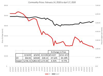 Download dataIn the two months since February 14, oil prices have dropped more than 65%, providing a contrast to copper, another commodity sensitive to the global economy, which has declined less than 10%. (To top of the craziness, the price of futures on Texas crude dropped below zero on April 20, but that is a story for another day/post.)
To complete the picture, I looked at gold and bitcoin, and while both have settled into holding patterns, the divergence since February 14 is stark.
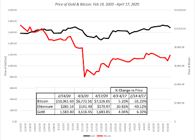 Download dataIn sum, gold has held its own, increasing 6.3% since February 14, though investors holding it were undoubtedly expecting a bigger pop, given the economic and market chaos, but bitcoin has disappointed those who believed it would play the role of a crisis asset, down 31% since the start of this crisis.
Risk UpdateIn my last post, I focused on how the price of risk has changed since February 14, 2020, starting with the corporate bond market, where default spreads have changed significantly over the last few weeks.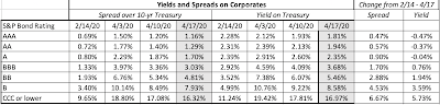 Download dataNote the surge in default spreads across bond ratings classes from February 14, 2020 to March 3, 2020, though there has been a drop off from highs in the last two weeks. The fear that has played out in the bond market has also affected the price of risk in equity markets. In the graph below, I updated the equity risk premiums, by day, that I computed in my post two weeks ago, through April 17.
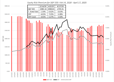 Download spreadsheetThe implied equity risk premium which I computed to be 6.01% on April 1, 2020, has declined to 6.27% if I compute the risk premium using the (now stale) earnings and cash flows, and 5.60%, if I assume a 30% drop in S&P 500 earnings this year and a substantial drop in buybacks. I have a feeling that this roller coaster ride is not quite done and I will continue to estimate the numbers daily.
Equities BreakdownIn keeping with my practice in my prior posts, I looked at market capitalizations of all publicly traded companies (36,481 companies with market caps exceeding $5 million on February 14, 2020) and started by computing changes in market capitalization, by region: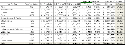 Download dataLooking at the aggregated returns since February 14, 2020, the worst performing regions in the world are Africa and Latin America, and China remains the standout as the best performing market. Australian and Canadian stocks have been punished, largely because of their natural resource focus, and globally, stocks have lost $15.2 trillion in value, a huge amount but about half as large as the loss was four weeks ago. In the next table, I break market cap changes down by sector:
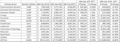 Download dataThere are few surprises in this table, with healthcare and consumer staples being the best performers, and energy and financial services the worst. Breaking down the sectors into finer detail, I look at companies classified into 95 industries, and list the ten best and worst performers over the crisis period (2/14 - 4/17):
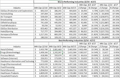 Download dataI know that it fashionable to talk about how inefficient and volatile markets are but this crisis, in many ways, has been surprisingly orderly and markets have dispensed punishment judiciously, for the most part.
I also looked at other classifications, from pricing levels (PE and PBV) to momentum to dividends/buybacks and found no significant differences across companies. In fact, the evidence seems to more strongly support the notion that the market is punishing low PE, high dividend yield stocks that had little momentum coming into this crisis more than high PE , non-dividend paying stocks. That is disappointing news for value purists who have been waiting a long time to say "I told you so" to momentum and growth investors. In fact, the only variable that seems to offer support for financial moralists is financial leverage, as can be seen in the table below, where I break down global stocks based upon how much debt they had at the start of the crisis: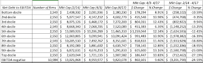 Download dataThe most highly levered companies, with leverage measured as debt scaled to EBITDA, have suffered more damage as this crisis has played out.
Pricing UpdateIn my earlier posts, I argued that just because uncertainty has increased, there is no excuse for abandoning valuation first principles or process; you can still value companies, albeit with a much wider range of outcomes. One common counter that I got to this argument was that valuation is pointless when the uncertainty is so great and while most of those marking this argument did not bother presenting alternatives, my guess is that many will fall back on pricing metrics to decide what to buy or sell. Put simply, they will use a PE ratio or an enterprise value multiple of EBITDA or sales to decide what stocks to buy or sell, acting under the delusion that this will allow them to escape having to make assumptions in the future. In this section, I will start by breaking down pricing multiples and then use simple valuation algebra to argue that there are assumptions about cash flows, growth and risk embedded in every pricing multiple. I will close by noting how multiples behave in a crisis, and report on pricing multiples, broken down by region, sector and industry, pre and post crisis.
Anatomy of a MultipleI think of multiples as standardized prices, allowing investors to get past the challenge of comparing per share values, which are determined by share count. That said, it is easy to be overwhelmed by the number of multiples you see in practice, with some in wide use (PE, Price to Book, EV to EBITDA) and some obscure (EV per subscriber, EV to Invested capital). To put these in perspective, I will start by breaking down the choices that you have in constructing a multiple and using it to make a pricing judgment: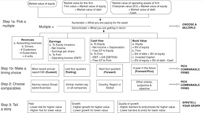
The numerator for any pricing multiple is a market value of equity, firm or operating assets, and the denominator is a scaling variable: revenues, earnings, cash flows or book value. There is no one "best" multiple or timing choice, since that will vary across time and across sectors, but here are two simple consistency rules to keep in mind, when constructing and using multiples:Equity/Firm: If the numerator is an equity value, the denominator should be an equity value as well, while if the numerator is a firm or enterprise value, the denominator has to be an operating value. Thus, PE (market cap, an equity value, is divided by earnings per share, an equity value) and EV to EBITDA (EV is a market value of operating assets and EBITDA is a measure of operating cash flow) are consistent, but Price to EBITDA is an inconsistent abomination and Price to Sales is almost as badly constructed.Timing: Multiples are constructed for comparisons across companies, not as stand alone measures. It follows therefore that you should be consistent in the timing you use for your scaling variable (revenues, book value, earnings) across companies. Thus, if you choose to use trailing earnings for your company to compute PE, you have to use trailing earnings for all your companies.Put simply, in pricing, you estimate a value for a business or its equity, based upon how "similar" companies (equities) are being priced in the market place.
Determinants of MultiplesMany analysts who use multiples to find under and over priced stocks do so because they do not want to confront the uncertainty associated with forecasting future growth, margins and cash flows in intrinsic valuation. That is an illusion, since embedded in every multiple are assumptions about growth, risk and investment efficiency. When you pay a hundred times earnings for a stock or ten times book value, you are assuming high growth in earnings for the former and a monstrously high return on equity for the latter. In the picture below, I list out the fundamentals that are embedded in each multiple: This cheat sheet, designed to find the variables that are embedded in a multiple, brings home a reality about pricing that should make anyone using it uncomfortable. The difference between intrinsic value, where you try (sometimes desperately) to forecast future growth and cash flows, and pricing, where you use a multiple, is that you are explicit about your assumptions in the future, making them both more transparent and easier to critique, and that you are implicit in your assumptions with the latter, making them easier to defend but also more dangerous.
Pricing and Crisis - A Time Line
In the aftermath of every crisis, investors abandon fealty to fundamentals, on the premise that they are in unique times and fall back on pricing. I am sure that will happen with this one as well, but if you decide to go this route, the nature of this crisis will make pricing much more difficult. To see why, take a look at how multiples will move as this crisis unfolds: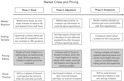 In phase one of this crisis, the market reacts to the crisis by marking down stock prices almost immediately, but the scaling variable (revenues, earnings, book value) does not, partly because it takes time for the crisis to show up in operating numbers and even longer for accountants to record that in the financial statements. Consequently, as the crisis first unfolds, stocks will look cheaper on a trailing basis, as the market price drops and earnings/revenues/cashflows stay stagnant, and analysts/companies are too uncertain to offer guidance about future operating results. In phase two, analysts and companies start to provide forward guidance, and you can switch to forward values, if you trust them, but since the crisis can cause more companies to lose money, you will also see a greater dependence on revenue multiples in pricing. In phase three, as operating results more completely reflect crisis effects, trailing multiples will reflect the updated operating results, but you should not be surprised to see companies trade at much higher multiples of trailing earnings (if earnings are still positive), or have earnings multiples that are not meaningful. Again, a naive comparison of the trailing PE to historic norms will lead you to conclude that everything is over priced, even when that is not the case.No matter which phase you are in, you ultimately have to make judgments about whether the company will come out of the crisis, and if it does, what it will generate as earnings, to make sensible investment decisions. Just as there is no room for lazy and mechanistic valuation, in the midst of a crisis, there is no payoff to lazy and mechanistic pricing.
Pricing Effects
We are still in phase one of this crisis, though we are hopefully approaching its tail end. Not surprisingly, as market prices have dropped and trailing operating numbers reflect what companies did in 2019 (pre-crisis), there has been a drop in trailing pricing multiples across all regions of the world: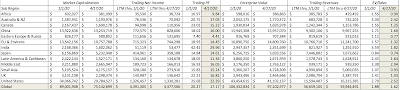 Download dataThe same story unfolds across different sectors:
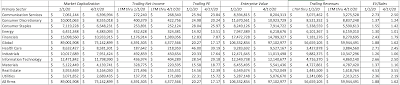 Download dataIn some sectors, such as financial services, energy and airlines, where the punishment meted out by the market has been severe, you should not be surprised to see stocks trade at extraordinarily low multiples of trailing earnings. At the same time, companies have been reluctant to offer guidance for the coming year, making it difficult to shift to forward values. You could, of course, get ahead of the curve and try to forecast earnings in a post-virus world, say in 2022 or even 2025, and scale market capitalizations to those values.
As companies start to report their first quarter earnings, you are starting to get a glimpse of the damage created by the crisis and my guess is that you will start to see more analysts and companies start to forecast forward numbers. For those companies where forward earnings are positive, you can switch to forward PE ratios, but expect these numbers to be much, much higher than historical norms. For those companies that expect losses in the next year, you will see revenue multiples or creative variations on future earnings, from earnings before COVID to earnings in 2025 used as the scalar. Later this year, as companies report numbers for the second and third quarters of 2020, the trailing operating numbers will finally catch up with the crisis, but they will come with caveats. Put simply, if you are abandoning or refusing to do intrinsic valuation, because you feel uncomfortable with having to make assumptions, the same uncertainty is going to pervade your pricing as well.
YouTube
Data
Market data (April 17, 2020)Regional breakdown - Market Changes and Pricing (April 17, 2020)Sector breakdown - Market Changes and Pricing (April 17, 2020)Industry breakdown - Market Changes and Pricing (April 17, 2020)Equity Risk Premium, by day (Updated through April 22, 2020)
Viral Market Update Posts
A Viral Market Meltdown: Fear or Fundamentals?A Viral Market Meltdown II: Pricing or Valuing? Investing or Trading?A Viral Market Meltdown III: Clues in the Market DebrisA Viral Market Meltdown IV: Investing for a post-virus EconomyA Viral Market Meltdown V: Back to BasicsA Viral Market Meltdown VI: The Price of RiskA Viral Market Meltdown: Market Multiples
Asset ClassesI started my crisis clock on February 14, reflecting the fact that I am US-based, and markets outside China did not wake up to the crisis until that week. In the weeks since, we have seen volatility rise and equity markets get whipsawed, with much of the pain being dispensed in February and the first three weeks in March. In the last month, equity indices around the world have seen positive returns, and in some cases, very good positive returns, as can be seen in the table below.
 Download dataThe week of April 10 to April 17 was a benign week, at least in sum, even though individual days still brought big movements, with most indices flat for the week. Moving on to the treasury market, we also saw steadiness, with both short and long term rates staying close to the lows that they hit just two weeks ago.
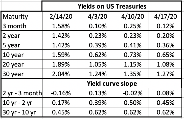 Download dataLooking at commodity prices, the divergence between oil and copper illustrated again the unique travails of oil, where a detente between Russia and China did little to stop oil prices from continuing to drop, while copper prices changed little.
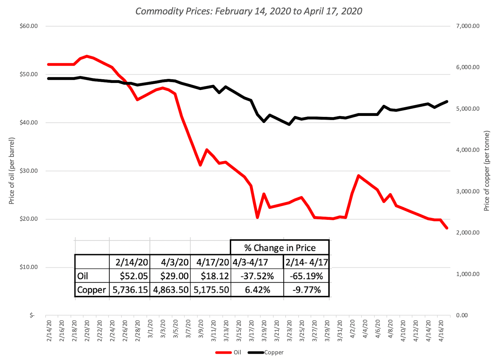 Download dataIn the two months since February 14, oil prices have dropped more than 65%, providing a contrast to copper, another commodity sensitive to the global economy, which has declined less than 10%. (To top of the craziness, the price of futures on Texas crude dropped below zero on April 20, but that is a story for another day/post.)
 To complete the picture, I looked at gold and bitcoin, and while both have settled into holding patterns, the divergence since February 14 is stark.
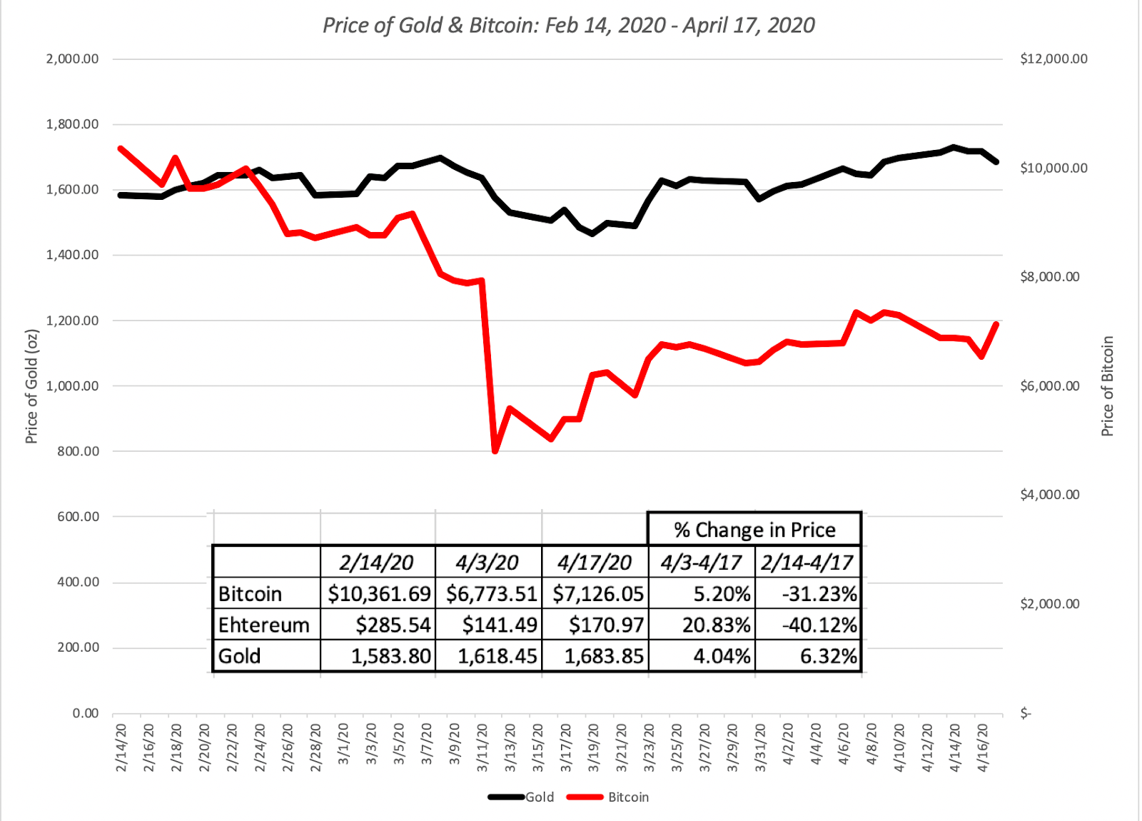 Download dataIn sum, gold has held its own, increasing 6.3% since February 14, though investors holding it were undoubtedly expecting a bigger pop, given the economic and market chaos, but bitcoin has disappointed those who believed it would play the role of a crisis asset, down 31% since the start of this crisis.
Risk UpdateIn my last post, I focused on how the price of risk has changed since February 14, 2020, starting with the corporate bond market, where default spreads have changed significantly over the last few weeks.
 Download dataNote the surge in default spreads across bond ratings classes from February 14, 2020 to March 3, 2020, though there has been a drop off from highs in the last two weeks. The fear that has played out in the bond market has also affected the price of risk in equity markets. In the graph below, I updated the equity risk premiums, by day, that I computed in my post two weeks ago, through April 17.
 Download spreadsheetThe implied equity risk premium which I computed to be 6.01% on April 1, 2020, has declined to 6.27% if I compute the risk premium using the (now stale) earnings and cash flows, and 5.60%, if I assume a 30% drop in S&P 500 earnings this year and a substantial drop in buybacks. I have a feeling that this roller coaster ride is not quite done and I will continue to estimate the numbers daily.
Equities BreakdownIn keeping with my practice in my prior posts, I looked at market capitalizations of all publicly traded companies (36,481 companies with market caps exceeding $5 million on February 14, 2020) and started by computing changes in market capitalization, by region:
 Download dataLooking at the aggregated returns since February 14, 2020, the worst performing regions in the world are Africa and Latin America, and China remains the standout as the best performing market. Australian and Canadian stocks have been punished, largely because of their natural resource focus, and globally, stocks have lost $15.2 trillion in value, a huge amount but about half as large as the loss was four weeks ago. In the next table, I break market cap changes down by sector:
 Download dataThere are few surprises in this table, with healthcare and consumer staples being the best performers, and energy and financial services the worst. Breaking down the sectors into finer detail, I look at companies classified into 95 industries, and list the ten best and worst performers over the crisis period (2/14 - 4/17):
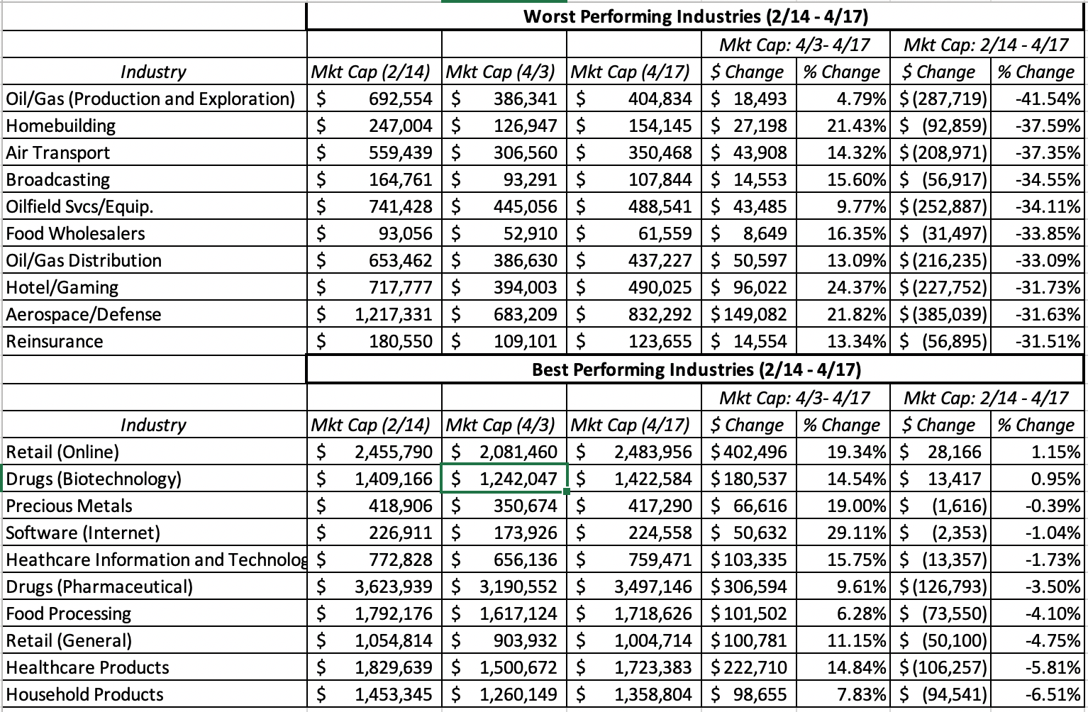 Download dataI know that it fashionable to talk about how inefficient and volatile markets are but this crisis, in many ways, has been surprisingly orderly and markets have dispensed punishment judiciously, for the most part.
 I also looked at other classifications, from pricing levels (PE and PBV) to momentum to dividends/buybacks and found no significant differences across companies. In fact, the evidence seems to more strongly support the notion that the market is punishing low PE, high dividend yield stocks that had little momentum coming into this crisis more than high PE , non-dividend paying stocks. That is disappointing news for value purists who have been waiting a long time to say "I told you so" to momentum and growth investors. In fact, the only variable that seems to offer support for financial moralists is financial leverage, as can be seen in the table below, where I break down global stocks based upon how much debt they had at the start of the crisis:
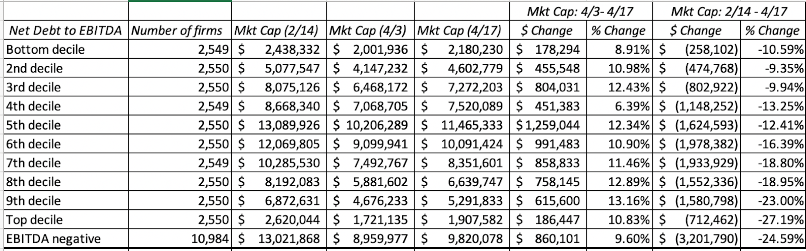 Download dataThe most highly levered companies, with leverage measured as debt scaled to EBITDA, have suffered more damage as this crisis has played out.
 Pricing UpdateIn my earlier posts, I argued that just because uncertainty has increased, there is no excuse for abandoning valuation first principles or process; you can still value companies, albeit with a much wider range of outcomes. One common counter that I got to this argument was that valuation is pointless when the uncertainty is so great and while most of those marking this argument did not bother presenting alternatives, my guess is that many will fall back on pricing metrics to decide what to buy or sell. Put simply, they will use a PE ratio or an enterprise value multiple of EBITDA or sales to decide what stocks to buy or sell, acting under the delusion that this will allow them to escape having to make assumptions in the future. In this section, I will start by breaking down pricing multiples and then use simple valuation algebra to argue that there are assumptions about cash flows, growth and risk embedded in every pricing multiple. I will close by noting how multiples behave in a crisis, and report on pricing multiples, broken down by region, sector and industry, pre and post crisis.
Anatomy of a MultipleI think of multiples as standardized prices, allowing investors to get past the challenge of comparing per share values, which are determined by share count. That said, it is easy to be overwhelmed by the number of multiples you see in practice, with some in wide use (PE, Price to Book, EV to EBITDA) and some obscure (EV per subscriber, EV to Invested capital). To put these in perspective, I will start by breaking down the choices that you have in constructing a multiple and using it to make a pricing judgment:

The numerator for any pricing multiple is a market value of equity, firm or operating assets, and the denominator is a scaling variable: revenues, earnings, cash flows or book value. There is no one "best" multiple or timing choice, since that will vary across time and across sectors, but here are two simple consistency rules to keep in mind, when constructing and using multiples:Equity/Firm: If the numerator is an equity value, the denominator should be an equity value as well, while if the numerator is a firm or enterprise value, the denominator has to be an operating value. Thus, PE (market cap, an equity value, is divided by earnings per share, an equity value) and EV to EBITDA (EV is a market value of operating assets and EBITDA is a measure of operating cash flow) are consistent, but Price to EBITDA is an inconsistent abomination and Price to Sales is almost as badly constructed.Timing: Multiples are constructed for comparisons across companies, not as stand alone measures. It follows therefore that you should be consistent in the timing you use for your scaling variable (revenues, book value, earnings) across companies. Thus, if you choose to use trailing earnings for your company to compute PE, you have to use trailing earnings for all your companies.Put simply, in pricing, you estimate a value for a business or its equity, based upon how "similar" companies (equities) are being priced in the market place.
Determinants of MultiplesMany analysts who use multiples to find under and over priced stocks do so because they do not want to confront the uncertainty associated with forecasting future growth, margins and cash flows in intrinsic valuation. That is an illusion, since embedded in every multiple are assumptions about growth, risk and investment efficiency. When you pay a hundred times earnings for a stock or ten times book value, you are assuming high growth in earnings for the former and a monstrously high return on equity for the latter. In the picture below, I list out the fundamentals that are embedded in each multiple:
 This cheat sheet, designed to find the variables that are embedded in a multiple, brings home a reality about pricing that should make anyone using it uncomfortable. The difference between intrinsic value, where you try (sometimes desperately) to forecast future growth and cash flows, and pricing, where you use a multiple, is that you are explicit about your assumptions in the future, making them both more transparent and easier to critique, and that you are implicit in your assumptions with the latter, making them easier to defend but also more dangerous.
Pricing and Crisis - A Time Line
In the aftermath of every crisis, investors abandon fealty to fundamentals, on the premise that they are in unique times and fall back on pricing. I am sure that will happen with this one as well, but if you decide to go this route, the nature of this crisis will make pricing much more difficult. To see why, take a look at how multiples will move as this crisis unfolds:
 In phase one of this crisis, the market reacts to the crisis by marking down stock prices almost immediately, but the scaling variable (revenues, earnings, book value) does not, partly because it takes time for the crisis to show up in operating numbers and even longer for accountants to record that in the financial statements. Consequently, as the crisis first unfolds, stocks will look cheaper on a trailing basis, as the market price drops and earnings/revenues/cashflows stay stagnant, and analysts/companies are too uncertain to offer guidance about future operating results. In phase two, analysts and companies start to provide forward guidance, and you can switch to forward values, if you trust them, but since the crisis can cause more companies to lose money, you will also see a greater dependence on revenue multiples in pricing. In phase three, as operating results more completely reflect crisis effects, trailing multiples will reflect the updated operating results, but you should not be surprised to see companies trade at much higher multiples of trailing earnings (if earnings are still positive), or have earnings multiples that are not meaningful. Again, a naive comparison of the trailing PE to historic norms will lead you to conclude that everything is over priced, even when that is not the case.No matter which phase you are in, you ultimately have to make judgments about whether the company will come out of the crisis, and if it does, what it will generate as earnings, to make sensible investment decisions. Just as there is no room for lazy and mechanistic valuation, in the midst of a crisis, there is no payoff to lazy and mechanistic pricing.
Pricing Effects
We are still in phase one of this crisis, though we are hopefully approaching its tail end. Not surprisingly, as market prices have dropped and trailing operating numbers reflect what companies did in 2019 (pre-crisis), there has been a drop in trailing pricing multiples across all regions of the world:
 Download dataThe same story unfolds across different sectors:
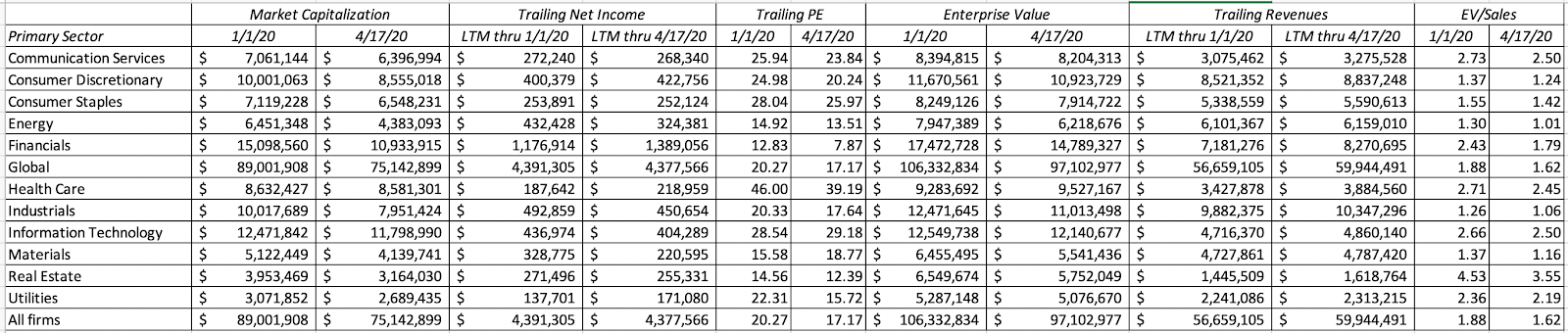 Download dataIn some sectors, such as financial services, energy and airlines, where the punishment meted out by the market has been severe, you should not be surprised to see stocks trade at extraordinarily low multiples of trailing earnings. At the same time, companies have been reluctant to offer guidance for the coming year, making it difficult to shift to forward values. You could, of course, get ahead of the curve and try to forecast earnings in a post-virus world, say in 2022 or even 2025, and scale market capitalizations to those values.
As companies start to report their first quarter earnings, you are starting to get a glimpse of the damage created by the crisis and my guess is that you will start to see more analysts and companies start to forecast forward numbers. For those companies where forward earnings are positive, you can switch to forward PE ratios, but expect these numbers to be much, much higher than historical norms. For those companies that expect losses in the next year, you will see revenue multiples or creative variations on future earnings, from earnings before COVID to earnings in 2025 used as the scalar. Later this year, as companies report numbers for the second and third quarters of 2020, the trailing operating numbers will finally catch up with the crisis, but they will come with caveats. Put simply, if you are abandoning or refusing to do intrinsic valuation, because you feel uncomfortable with having to make assumptions, the same uncertainty is going to pervade your pricing as well.
YouTube
Data
Market data (April 17, 2020)Regional breakdown - Market Changes and Pricing (April 17, 2020)Sector breakdown - Market Changes and Pricing (April 17, 2020)Industry breakdown - Market Changes and Pricing (April 17, 2020)Equity Risk Premium, by day (Updated through April 22, 2020)
Viral Market Update Posts
A Viral Market Meltdown: Fear or Fundamentals?A Viral Market Meltdown II: Pricing or Valuing? Investing or Trading?A Viral Market Meltdown III: Clues in the Market DebrisA Viral Market Meltdown IV: Investing for a post-virus EconomyA Viral Market Meltdown V: Back to BasicsA Viral Market Meltdown VI: The Price of RiskA Viral Market Meltdown: Market Multiples
April 8, 2020
A Viral Market Meltdown VI: The Price of Risk
It is a sign of how volatile the last few weeks have been, that a week like the last one, where index levels move only 2-3% a day, high by historic standards, felt stable. As in prior weeks, I will start this one by looking at how the market action last week played out across asset classes, and within equity, across regions and industries first, but the bulk of this post will be an update on the price of risk, and how it has changed in both bond and stock markets over the last six weeks. In the process, I will compare this six-week periods to the 2008 crisis, which was also global, and shook the faith people had in markets, institutions and companies.
The Markets last weekThe market action last week was more muted than it had been in prior weeks, but that is a relative statement, as we still saw big swings in almost every asset class. Using the same sequencing that I have used for the last few weeks, I will start with a review of equity indices globally: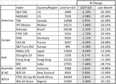 Download raw dataIt was a quiet week for most markets, with the Nikkei and the Sensex being the exceptions, dropping 8,09% and 7.46% respectively. Over the last month, every market has seen double digit negative returns, with Shanghai being the only exception. Moving on to US treasuries, we saw more calm than in prior weeks, with rates staying close to where they were in the previous week:
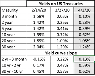 Download raw dataThe (relative) calm in equity and treasury markets also played out in the corporate bond market, with spreads decreasing slightly for higher rated bonds and increasing marginally for lower rated bonds.
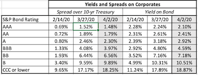 Download raw dataThe commodity markets continued on their wild ride, with oil again diverging significantly from copper:
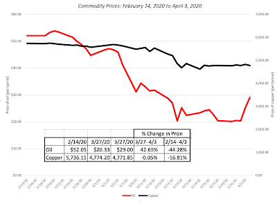 Download raw dataOil prices surged dramatically towards the end of the week, mostly on rumors that Saudi Arabia and Russia would come to an agreement on oil production, but copper prices stayed stable. Completing the analysis, I looked at gold and bitcoin last week:
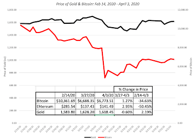 Both gold and bitcoin saw little price action during the week, not a bad development in a crisis market. In summary, looking at returns across asset classes last week, and comparing those returns to prior weeks, it is clear that last week saw a reduction in the volatility that has characterized previous weeks. It is unclear, though, whether the week is just the calm before another storm, or a true break in the crisis. The next few weeks will tell!
Breaking down the weekly movementsAs in prior weeks, I start by looking at publicly traded companies around the world, and looking at how they did, in market capitalization terms, last week, and break down the information by region, sector/industry and classes (PE, momentum, debt etc.). I start with the regional breakdowns: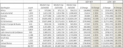 As with the market indices, it was a week of losses, albeit small ones, in much of the world, with the outliers being Eastern Europe & Russia, which saw a gain of 9.07%, and Japan, which lost 9.38% in market capitalization. Collectively, global stocks lost $1.6 trillion in the week of March 27-April 3, and have lost $22.7 trillion in market capitalization since February 14, 2020, a decline of 25.08%. Moving on to the sector breakdown:
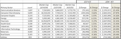
The rise in oil prices pushed up the market capitalization of the energy sector by 6.31%, but most of the other sectors saw losses during the week of 3/27-4/3/20. Incorporating the last week into the data, financial service firms have now taken the dubious lead among sectors, of biggest percentage drop in market capitalization since February 14, 2020, and consumer staples and health care still lead the list of least damaged sectors. Honing down to the industry level and updating the list of ten most hurt and least hurt industries: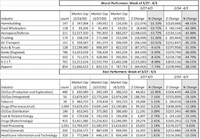 Data on all industriesThe loser list has many of the same infrastructure industries that showed up in last week’s list, but the winner list has a healthy sprinkling of energy stocks, pushed up by the rise in oil prices during the week. I also did the breakdown, looking at companies in PE classes, momentum classes (based upon price change over the year leading into 2/14/20, net debt classes and dividend/buyback classes) and found that the only categorization where there is significant differentiation in market damage is net debt, where more highly levered companies continue to be punished more than less levered companies. You can find these categorizations and results by clicking on this link. I did extend the analysis to look at companies that have bond ratings, a subset of 2271 Firms out of the total sample of 36,789 firms, and the results reinforce the finding that leverage has the biggest explanatory power for damage from this crisis:
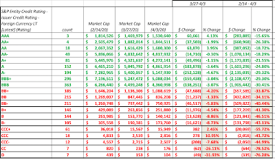 As bond ratings drop, the decline in market value is more precipitous, with the ratings below investment grade (below BBB, in red) being particularly hit.
The Price of RiskIn the last few weeks, as markets have tumbled, I have held back on reporting on a measure that I update every month, which is the equity risk premium. That said, the last six weeks reinforces a lesson that I learned the hard way in 2008, which is that dependence on a static, historical estimate makes no sense in a dynamic, shifting market. In this section, I want to focus on how the price of risk has changed over the last six weeks, and what lessons, if any, we can glean from those changes.
Determinants In a post from earlier this year on the topic, I argued that every risky asset class market has a price of risk, though that price is more observable in some markets than others. The price of risk changes on a day-to-day basis, and is determined by a combination of variables that encompass almost everything going on in the world from uncertainty about future economic growth (more uncertainty -> higher price for risk) to political stability (more instability -> higher price for risk) to worries about catastrophes/disasters (more worries -> higher price for risk) to investor risk aversion (greater risk aversion -> higher price for risk) to information availability/reliability (less reliable and accessible information -> higher risk premiums). I know that I am giving short shrift to weighty topics, and if you are interested in a more in depth assessment of these variables, you can read my 2020 update on equity risk premiums here. (Be warned. It is long and boring, and may put you to sleep, but that may be a good thing..) The more general point though that emerges from identifying the determinants is that changes in these variables will change the prices for risk, and since investing and valuation has to be based upon updated prices for risk, you need measurement approaches that capture these changes.
Bond Market Price of Risk In the bond market, the price of risk is observable, since as investors see more default risk in the future, and demand higher prices for risk, bond prices drop and interest rates on bonds increase. That is what I chronicled when I reported on the default spreads on bonds in different ratings classes in the last section, and looked at how these spreads changed over the last few weeks of this crisis. It is true that default spreads, for a given default risk class, don't change much in mature markets during periods of stability, and this can be seen in the graph below, where I look at the default spreads on Moody's Baa rated bonds (translating into an S&P BBB rating) since 1960: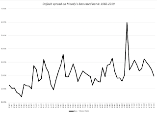 Download raw dataEven during this period, there have been sub-periods of tumult, as evidenced by the change in default spreads in the 2008 crisis. Looking more closely at the the period between September 12, 2008 to December 31, 2008 at the spreads on bonds, here is what you saw:
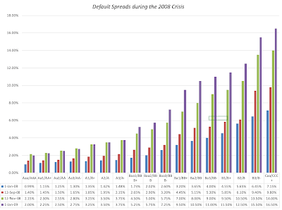
In 2008, default spreads doubled between September 12, 2008 and December 31, 2008. In the last six weeks (February 14, 2020- April 3, 2020), the default spreads on bonds in every ratings class have widened, not surprising given both the economic damage done by the crisis and the higher likelihood of default and the fear factor: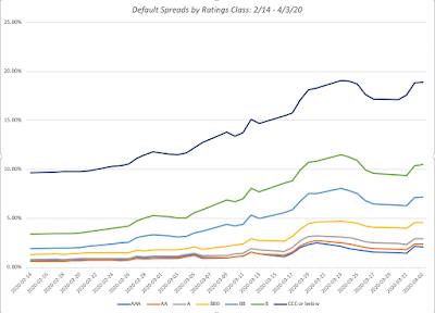 It is interesting that the default spreads did not show much effect during the first two weeks of this crisis (February 14- February 28), but woke up to the crisis in the third week. Over the six weeks, spreads have almost doubled for the highest risk classes, and have increased significantly even for higher rated bonds.
Equity Market Price of Risk Unlike the bond market, it is more difficult to measure a forward-looking and dynamic measure of equity risk, though there are short cuts that people have employed. For instance, there are some investors who use the earnings yield (the inverse of the PE ratio) as a rough proxy, arguing that it should be higher, when equity investors are demanding a higher price for risk. There are others who focus on the VIX, a traded measure of volatility that is observable and is a gauge of fear and worry, rising during crisis and market downturns. In the last six weeks, the VIX has gone on a wild ride, as can be seen in the graph below, peaking at 85.47 on March 18, 2020.
While the VIX is an instrument for measuring market fear, it is not a direct measure of the equity risk premium. My preference is an implied equity risk premium, computed by estimating the internal rate of return investors can expect to earn, given what they pay for stocks and expected cash flows in the future, and netting out the risk free rate: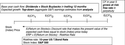
As some of you who have visited my website know, I update this equity risk premium (ERP) at the start of every year, and the graph below summarizes the implied equity risk premiums on the S&P 500 at the start of every year from 1960 to 2020.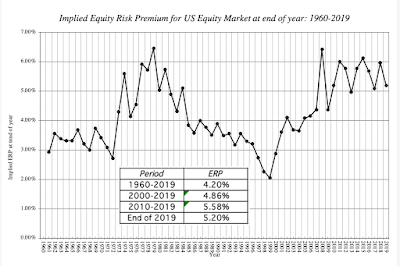 Download historical implied ERPNote that the equity risk premium stood at 5.20% at the end of 2019, but is has been more volatile since the 2008 crisis, than prior to it. It was during that crisis that I developed the practice of computing the premium on a day-to-day basis to capture the battle between fear and greed that characterize every crisis. In the figure below,I graph the implied ERP from September 12, 2008 (the Friday before Lehman’s collapse) until December 31, 2008:

Note that on September 12, 2008, which was the triggering point for the 2008 crisis, the equity risk premium for the S&P 500 was 4.22% but during the next eight weeks, the ERP rose sharply to reach a high of 7.83% on November 20, 2008, before subsiding somewhat to end the year at 6.43%. One of the limitations that I faced during that period is that while I was able to update the index values and treasury bond rates every day, the earnings and cash flow numbers were being updated with a substantial lag, with the full changes not showing up until several months later.
I decided to do the same day-to-day calculation for the implied equity risk premium, with an augmentation. Rather than allow earnings and cash flows to remain stagnant, in the face of a crisis that will almost certaintly decimate both, I computed a COVID-adjusted ERP as well, with estimated drops in earnings and cash flows. In making these judgments, I did change my estimates across time, starting with a 15% drop in earning in the first two weeks of this crisis, and ending with a 30% drop in earnings for the S&P in the most recent two. Those changes may reflect my slow learning, as the gravity of the crisis magnified each week:
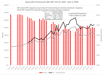 Download raw dataI understand that this crisis is by no means over, and I intend to keep computing the implied equity risk premium daily for as long as I think necessary, but if your estimates are close to mine, the equity risk premium for the S&P 500 was 6.01% (with the adjusted numbers) on April 1, 2020.
Country Risk Premiums At the start of each year, I compute equity risk premiums, by country, with the intent of using these numbers when I value companies, and leave them unchanged for the first half of the year. This year, though, the crisis has caused the numbers to change, and in some cases, dramatically. First, the base premium that I use is the US implied equity risk premium which has jumped from 5.20% to 6.01% (see above). Second, the additional risk premiums for countries are based upon sovereign default spreads, which like corporate bond spreads, have widened significantly. My updated basis for computing the country equity risk premiums is below: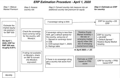
My global picture of equity risk premiums at the start of April 2020 is provided below: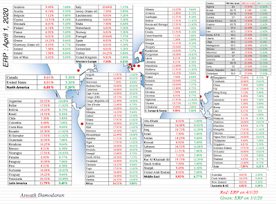 Download spreadsheetJust to illustrate how much of a difference a few weeks can make to your estimates, I have also included the ERP from January 1, 2020, for comparison. Note that the premiums have not only climbed in every country, but they have increased more in the riskiest countries.
ConclusionOne of the lessons that I learned from the 2008 crisis was to move away from static approaches for computing equity risk premiums, dependent on looking at long periods of history. What I learned during the last three months of 2008 made me switch to using implied equity risk premiums in my valuation and corporate financial analysis, and to compute them on a monthly basis. This crisis has reinforced that practice. I have always found it difficult to grasp how companies can use hurdle rates that are not only set in stone, but set in stone a decade or two ago, even as the market environment shifts and the price of risk changes. The median cost of capital for a global company, which was 7.6% at the start of 2020, is now closer to 8%, with the increase in risk premiums more than compensating for the decline in risk free rates in much of the world and the rise in cost of capital, in US dollar terms, steeper in emerging markets than developed markets.
YouTube Video
Paper on Equity Risk Premiums
Equity Risk Premiums: Determinants, Estimation and Implications- The 2020 EditionDatasets
Market Changes by Asset Class, 2/14 - 4/03Equity Market Changes by Industry, 2/14 - 4/03PE, Momentum & Dividend classes, 2/14-4/03Equity Risk Premium by day, 2/14 - 4/03Updated Equity Risk Premiums, by country (April 1, 2020)SpreadsheetsEquity Risk Premium Calculator, April 1, 2020
The Markets last weekThe market action last week was more muted than it had been in prior weeks, but that is a relative statement, as we still saw big swings in almost every asset class. Using the same sequencing that I have used for the last few weeks, I will start with a review of equity indices globally:
 Download raw dataIt was a quiet week for most markets, with the Nikkei and the Sensex being the exceptions, dropping 8,09% and 7.46% respectively. Over the last month, every market has seen double digit negative returns, with Shanghai being the only exception. Moving on to US treasuries, we saw more calm than in prior weeks, with rates staying close to where they were in the previous week:
 Download raw dataThe (relative) calm in equity and treasury markets also played out in the corporate bond market, with spreads decreasing slightly for higher rated bonds and increasing marginally for lower rated bonds.
 Download raw dataThe commodity markets continued on their wild ride, with oil again diverging significantly from copper:
 Download raw dataOil prices surged dramatically towards the end of the week, mostly on rumors that Saudi Arabia and Russia would come to an agreement on oil production, but copper prices stayed stable. Completing the analysis, I looked at gold and bitcoin last week:
 Both gold and bitcoin saw little price action during the week, not a bad development in a crisis market. In summary, looking at returns across asset classes last week, and comparing those returns to prior weeks, it is clear that last week saw a reduction in the volatility that has characterized previous weeks. It is unclear, though, whether the week is just the calm before another storm, or a true break in the crisis. The next few weeks will tell!
Breaking down the weekly movementsAs in prior weeks, I start by looking at publicly traded companies around the world, and looking at how they did, in market capitalization terms, last week, and break down the information by region, sector/industry and classes (PE, momentum, debt etc.). I start with the regional breakdowns:
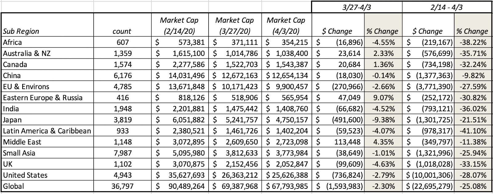 As with the market indices, it was a week of losses, albeit small ones, in much of the world, with the outliers being Eastern Europe & Russia, which saw a gain of 9.07%, and Japan, which lost 9.38% in market capitalization. Collectively, global stocks lost $1.6 trillion in the week of March 27-April 3, and have lost $22.7 trillion in market capitalization since February 14, 2020, a decline of 25.08%. Moving on to the sector breakdown:

The rise in oil prices pushed up the market capitalization of the energy sector by 6.31%, but most of the other sectors saw losses during the week of 3/27-4/3/20. Incorporating the last week into the data, financial service firms have now taken the dubious lead among sectors, of biggest percentage drop in market capitalization since February 14, 2020, and consumer staples and health care still lead the list of least damaged sectors. Honing down to the industry level and updating the list of ten most hurt and least hurt industries:
 Data on all industriesThe loser list has many of the same infrastructure industries that showed up in last week’s list, but the winner list has a healthy sprinkling of energy stocks, pushed up by the rise in oil prices during the week. I also did the breakdown, looking at companies in PE classes, momentum classes (based upon price change over the year leading into 2/14/20, net debt classes and dividend/buyback classes) and found that the only categorization where there is significant differentiation in market damage is net debt, where more highly levered companies continue to be punished more than less levered companies. You can find these categorizations and results by clicking on this link. I did extend the analysis to look at companies that have bond ratings, a subset of 2271 Firms out of the total sample of 36,789 firms, and the results reinforce the finding that leverage has the biggest explanatory power for damage from this crisis:
 As bond ratings drop, the decline in market value is more precipitous, with the ratings below investment grade (below BBB, in red) being particularly hit.
 The Price of RiskIn the last few weeks, as markets have tumbled, I have held back on reporting on a measure that I update every month, which is the equity risk premium. That said, the last six weeks reinforces a lesson that I learned the hard way in 2008, which is that dependence on a static, historical estimate makes no sense in a dynamic, shifting market. In this section, I want to focus on how the price of risk has changed over the last six weeks, and what lessons, if any, we can glean from those changes.
Determinants In a post from earlier this year on the topic, I argued that every risky asset class market has a price of risk, though that price is more observable in some markets than others. The price of risk changes on a day-to-day basis, and is determined by a combination of variables that encompass almost everything going on in the world from uncertainty about future economic growth (more uncertainty -> higher price for risk) to political stability (more instability -> higher price for risk) to worries about catastrophes/disasters (more worries -> higher price for risk) to investor risk aversion (greater risk aversion -> higher price for risk) to information availability/reliability (less reliable and accessible information -> higher risk premiums). I know that I am giving short shrift to weighty topics, and if you are interested in a more in depth assessment of these variables, you can read my 2020 update on equity risk premiums here. (Be warned. It is long and boring, and may put you to sleep, but that may be a good thing..) The more general point though that emerges from identifying the determinants is that changes in these variables will change the prices for risk, and since investing and valuation has to be based upon updated prices for risk, you need measurement approaches that capture these changes.
Bond Market Price of Risk In the bond market, the price of risk is observable, since as investors see more default risk in the future, and demand higher prices for risk, bond prices drop and interest rates on bonds increase. That is what I chronicled when I reported on the default spreads on bonds in different ratings classes in the last section, and looked at how these spreads changed over the last few weeks of this crisis. It is true that default spreads, for a given default risk class, don't change much in mature markets during periods of stability, and this can be seen in the graph below, where I look at the default spreads on Moody's Baa rated bonds (translating into an S&P BBB rating) since 1960:
 Download raw dataEven during this period, there have been sub-periods of tumult, as evidenced by the change in default spreads in the 2008 crisis. Looking more closely at the the period between September 12, 2008 to December 31, 2008 at the spreads on bonds, here is what you saw:
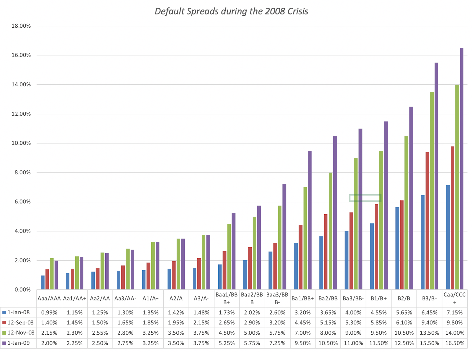
In 2008, default spreads doubled between September 12, 2008 and December 31, 2008. In the last six weeks (February 14, 2020- April 3, 2020), the default spreads on bonds in every ratings class have widened, not surprising given both the economic damage done by the crisis and the higher likelihood of default and the fear factor:
 It is interesting that the default spreads did not show much effect during the first two weeks of this crisis (February 14- February 28), but woke up to the crisis in the third week. Over the six weeks, spreads have almost doubled for the highest risk classes, and have increased significantly even for higher rated bonds.
Equity Market Price of Risk Unlike the bond market, it is more difficult to measure a forward-looking and dynamic measure of equity risk, though there are short cuts that people have employed. For instance, there are some investors who use the earnings yield (the inverse of the PE ratio) as a rough proxy, arguing that it should be higher, when equity investors are demanding a higher price for risk. There are others who focus on the VIX, a traded measure of volatility that is observable and is a gauge of fear and worry, rising during crisis and market downturns. In the last six weeks, the VIX has gone on a wild ride, as can be seen in the graph below, peaking at 85.47 on March 18, 2020.

While the VIX is an instrument for measuring market fear, it is not a direct measure of the equity risk premium. My preference is an implied equity risk premium, computed by estimating the internal rate of return investors can expect to earn, given what they pay for stocks and expected cash flows in the future, and netting out the risk free rate:

As some of you who have visited my website know, I update this equity risk premium (ERP) at the start of every year, and the graph below summarizes the implied equity risk premiums on the S&P 500 at the start of every year from 1960 to 2020.
 Download historical implied ERPNote that the equity risk premium stood at 5.20% at the end of 2019, but is has been more volatile since the 2008 crisis, than prior to it. It was during that crisis that I developed the practice of computing the premium on a day-to-day basis to capture the battle between fear and greed that characterize every crisis. In the figure below,I graph the implied ERP from September 12, 2008 (the Friday before Lehman’s collapse) until December 31, 2008:
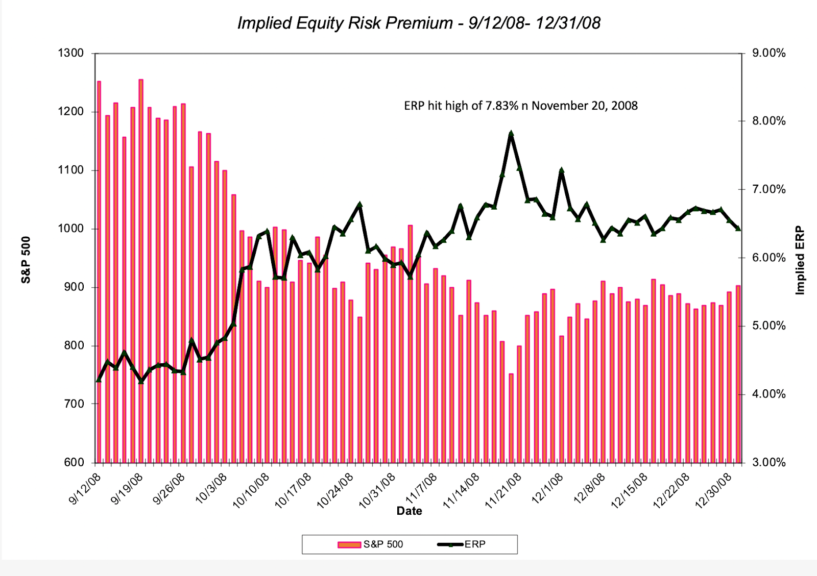
Note that on September 12, 2008, which was the triggering point for the 2008 crisis, the equity risk premium for the S&P 500 was 4.22% but during the next eight weeks, the ERP rose sharply to reach a high of 7.83% on November 20, 2008, before subsiding somewhat to end the year at 6.43%. One of the limitations that I faced during that period is that while I was able to update the index values and treasury bond rates every day, the earnings and cash flow numbers were being updated with a substantial lag, with the full changes not showing up until several months later.
I decided to do the same day-to-day calculation for the implied equity risk premium, with an augmentation. Rather than allow earnings and cash flows to remain stagnant, in the face of a crisis that will almost certaintly decimate both, I computed a COVID-adjusted ERP as well, with estimated drops in earnings and cash flows. In making these judgments, I did change my estimates across time, starting with a 15% drop in earning in the first two weeks of this crisis, and ending with a 30% drop in earnings for the S&P in the most recent two. Those changes may reflect my slow learning, as the gravity of the crisis magnified each week:
 Download raw dataI understand that this crisis is by no means over, and I intend to keep computing the implied equity risk premium daily for as long as I think necessary, but if your estimates are close to mine, the equity risk premium for the S&P 500 was 6.01% (with the adjusted numbers) on April 1, 2020.
 Country Risk Premiums At the start of each year, I compute equity risk premiums, by country, with the intent of using these numbers when I value companies, and leave them unchanged for the first half of the year. This year, though, the crisis has caused the numbers to change, and in some cases, dramatically. First, the base premium that I use is the US implied equity risk premium which has jumped from 5.20% to 6.01% (see above). Second, the additional risk premiums for countries are based upon sovereign default spreads, which like corporate bond spreads, have widened significantly. My updated basis for computing the country equity risk premiums is below:

My global picture of equity risk premiums at the start of April 2020 is provided below:
 Download spreadsheetJust to illustrate how much of a difference a few weeks can make to your estimates, I have also included the ERP from January 1, 2020, for comparison. Note that the premiums have not only climbed in every country, but they have increased more in the riskiest countries.
ConclusionOne of the lessons that I learned from the 2008 crisis was to move away from static approaches for computing equity risk premiums, dependent on looking at long periods of history. What I learned during the last three months of 2008 made me switch to using implied equity risk premiums in my valuation and corporate financial analysis, and to compute them on a monthly basis. This crisis has reinforced that practice. I have always found it difficult to grasp how companies can use hurdle rates that are not only set in stone, but set in stone a decade or two ago, even as the market environment shifts and the price of risk changes. The median cost of capital for a global company, which was 7.6% at the start of 2020, is now closer to 8%, with the increase in risk premiums more than compensating for the decline in risk free rates in much of the world and the rise in cost of capital, in US dollar terms, steeper in emerging markets than developed markets.
YouTube Video
Paper on Equity Risk Premiums
Equity Risk Premiums: Determinants, Estimation and Implications- The 2020 EditionDatasets
Market Changes by Asset Class, 2/14 - 4/03Equity Market Changes by Industry, 2/14 - 4/03PE, Momentum & Dividend classes, 2/14-4/03Equity Risk Premium by day, 2/14 - 4/03Updated Equity Risk Premiums, by country (April 1, 2020)SpreadsheetsEquity Risk Premium Calculator, April 1, 2020
March 31, 2020
A Viral Market Meltdown V: Back to Basics!
My first post on this blog was on September 17, 2008, a week into the 2008 crisis, and I honestly did not expect to be posting for long, anticipating that after a few posts, that crisis would be behind us, and that we could go back to our lives. That of course turned out not to be the case, as the crisis not only extended for months, but left its imprint on almost everything market or economy related for the next decade. Almost twelve years later, and six weeks into another market crisis, I have a sense of deja vu, as the days of volatility stretch into weeks, and each week brings new surprises. Unlike my four previous updates, this one will describe a week of market recovery, at least in sum, but like the previous weeks, the increase in market values came with wide swings, and continued uncertainty and volatility. It was also a week that saw governments around the world rush to pass rescue packages designed to get both individuals and businesses through a period where the global economic machine has been shut down. These bailouts, in addition to being many times larger than prior bailouts, have also reignited debates about what governments should be demanding in return. In the United States, a central issue that is being argued is how much stock buybacks done by companies in the last decade are contributing to the pain that companies are facing, and whether there need to be restrictions on them. While I will consider this issue in depth in a post later this week, I will look at the interaction between dividends, buybacks and market damage in this post.
A Macro ReviewAs in prior weeks, I will start this week's post by updating how the different asset classes performed last week, partly to put the six-week period (from February 14, 2020 - March 27, 2020) in perspective and partly to get a sense of where we are going next. The place to start is with equities, and in the table below, I look at the changes in equity indices across the world, both in the last week (March 20 - March 27) and the last month.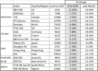 Download dataMarkets around the world had a good week, with the US and Japan delivering the most positive returns. Even those solid weekly returns were insufficient to make up for an otherwise painful month, where most indices lost 20% or more of their value. Moving on to US treasuries, in a week where the Fed continued to aggressively support the market, rates dropped across maturity classes, with treasury bill rates again hovering around zero. The ten-year rate ended the week at 0.72% and the 30-year rate at 1.29%
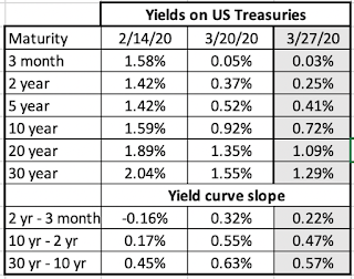 Download dataAs in the previous week, stocks and bonds moved together, albeit with positive, not negative, returns. The positive mood in the equity and treasury markets spilled over into the corporate bond markets, where default spreads that had spiked in the previous week dropped during the week, as default risk fears subsided strongly for the higher ratings and mildly for the lowest ratings.
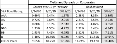 Download dataMoving on to oil and copper, the two commodities that I reported on last week, it was a week of divergence, with copper having a flat week but oil continued its fall, as Russia and Saudi Arabia tried, but failed to reach a detente.
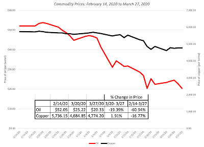 Download dataFinally, I look at gold and Bitcoin, my stand-ins for crisis assets and both gained for the week, though Bitcoin had a much larger deficit to make up, from its drop in prior weeks.
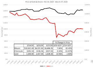 Download dataAll in all, it is telling that last week, with all its volatility, felt calmer than prior weeks, perhaps because more of it was on the upside and it is all relative. That said, we are still on a roller coaster and there are more thrills to come in the coming weeks.
Equity Market BreakdownIn keeping with my practice in prior weeks, I will break down the equity movement last week by region and sector first, looking to see if there are divergences. I begin by breaking down the change in market value, in both dollar and percentage terms, by region during the 3/20-3/27 week:
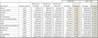 In the aggregate, Japanese stocks had the strongest returns this week (3/20-3/27), followed by US and UK stocks. In fact, last week was the strongest week for US equities since the 1930s, with stocks up more than 10% for the week. Globally, stocks added $5.7 trillion in market cap, but remain down $21 trillion since February 14, 2020, even with that revival. Moving on to sectors, and looking at the same metrics, I get the following:
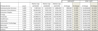 The results here are consistent with the earlier findings that corporate bond default spreads declined last week, after the surge in the prior one, and the most highly levered sectors (real estate and utilities) benefited. Updating the list of the ten industries that have been hurt the most and least during this crisis (dating back to February 14, 2020, I get this list:
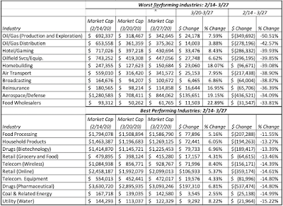 Download full list of industriesSome of the worst performing industries over the six-week period had the best weekly performance last week, but remain deeply damaged.
In previous weeks, I have looked at classes of stocks, focusing on a different dimension each week. in the first two weeks, I looked at stocks classified based upon growth/value (with PE standing in as proxy) and momentum (based upon the stock performance in the year leading into February 14, 2020) and found little differentiation in market damage across the classes. Put simply, there is very little evidence, at least during these six weeks, that the market is punishing high growth stocks or high momentum stocks more or less than other stocks. In last week's update, I noted that companies with high financial leverage were more exposed to damage at least during the week than less levered companies. In this week's update, I focus on another variable that people have pointed to, often with nothing more than anecdotal evidence, as a potential culprit in the crisis, and that is stock buybacks. Their argument is that companies that have bought back stock, often with borrowed money, are the ones that have led us to the precipice, and that the viral shock to the economy is just a tipping point for these companies. To test this hypothesis, I classified global companies into those that bought back stock last year and those that did not, and looked at the market damage across the two classes:
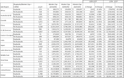 It is true that companies that bought back stock last year were slightly more exposed to market damage than companies that did not, but the differences are small. Globally, buyback-companies have lost about 25% of their market capitalization between February 14, 2020 and March 27, 2020, whereas non-buyback companies have lost 21% of their market capitalization; for US companies, the analogous numbers were 26% for buyback-companies and 23% for non-buyback firms. To see if it was buybacks that were the drivers of this difference, I also classified firms into those that paid dividends in 2019 and those that did not, and got results very similar to the ones with the buyback categorization.
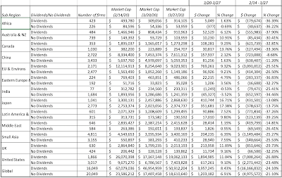 Companies that paid dividends suffered more market damage of almost the same magnitude as the the buyback companies did, suggesting that the old value investing adage of buying companies with big dividends is providing little solace in this crisis.
Finally, I returned to buybacks and focused just on US companies, where the buyback phenomenon has been most pronounced, but looked at the cross effect of leverage and buybacks, to test the proposition that it is not buybacks per se that are the problem, but buybacks by companies that either already carry high debt loads or borrow money to fund the buybacks: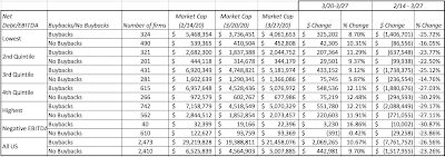
There are two groups, where buybacks make a discernible difference on returns. The first are companies with negative EBITDA that bought back stock (which strikes me as foolhardy), with market values dropping about 31% from 2/14/20 to 3/20/20, relative to negative EBITDA companies that did not buy stock, where market values dropped only 24%. The second is in the companies with the least debt, where market values for buyback companies declined 26%, as opposed to 16% for non-buyback companies. All in all, while it is true that some of the companies that are the recipients of government bailouts have bought back stock in past years, there is little evidence for the proposition that without the buybacks, they would not need the bailouts. I know that I am giving short shrift to buyback arguments, for and against, but I will return to this question, with a more in-depth breakdown in a post later this week.
Back to BasicsAs with all of my viral update posts, I will end with a focus on the future and a return to fundamentals, by looking at how to value companies in the midst of a market and economic crisis unlike any in history. While many investors have put their valuation tools away, using the argument that there is too much uncertainty now to even try, I will argue that this is exactly the time to go back to basics and try valuing companies, uncertainty notwithstanding.
The Dark Side beckons..If your concept of valuation is downloading last year's financials for a company into a spread sheet and then using historical growth rates, with some mean reversion thrown in, to forecast future numbers, you are probably feeling lost right now, and with good reason. Specifically, the last six weeks have upended almost all of the assumptions, explicit and implicit, that justified this practice.Historical data may be recent, but it is already dated: For most companies globally, the most recent financial statements are for 2019, and in calendar time, these financials are only a few weeks old. As the global economy shuts down, though, the one thing we know with certainty is that the revenues and earnings numbers reported in those recent financial statements are almost useless, a reflection of a different economic setting. The same can be said about equity risk premiums and default spreads, as I am painfully aware, since the numbers that I updated on January 1, 2020, are so completely out of sync with where the market is today that I plan to do a full update at the end of today. (March 31, 2020).This year will deliver bad news: There is almost no doubt that 2020 will be a bad year for all companies, with the key questions being how much of a drop in revenues companies will see this year, and how this will translate into earnings shocks. It is true that there are a handful of companies, like Zoom, Slack and Instacart, to name just three, that may actually benefit from the global quarantine, but they are the exceptions. Survival has become a central question: The magnitude of the shock to corporate bottom lines and the speed with which it has happened has put companies at risk, leaving debt-burdened and young companies exposed to default and distress. While some of the largest may get help from governments to make it through this crisis, their smaller and lower-profile peers may have to shut down or let themselves be acquired.The post-virus economy will be different from the pre-crisis version: Every major crisis creates changes in business environment, regulations and business models that reshapes the economy and resets competitive games, setting the stage for new winners and losers. Thus, for some companies, the bad news on revenues and earnings this year may be a precursor to superior operating performance in the post-virus economy, as their competition fades Put simply, this is not the time for purely mechanical number crunching and a blind trust in mean reversion, since the landscape has changed. It is also not a time to wring our hands, complain that there is too much uncertainty and argue that the fundamentals don't matter. If you do so, you will be drawn to the dark side of investing, where fundamentals don't matter (paradigm shifts, anyone?), new pricing metrics get invented and you are at the mercy of mood and momentum. Ironically, it is precisely at times like these that you need to go back to basics.
A Jedi Guide to Valuation
With these lessons in mind, I decided to revisit my basic valuation model, which has always been built around fundamentals:
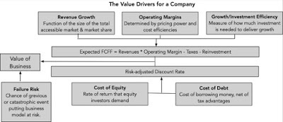
While the fundamentals remain the same, I considered how best to incorporate the effects of this crisis into the model and arrived at the following:
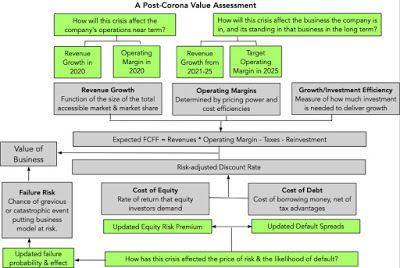
Note that this post-Corona valuation model stays true to the fundamentals but introduces three crisis-specific inputs into the valuation:
Revenue Change & Operating Margin in 2020: These are the inputs that will reflect the effects of the global economic shut down on your company's revenues and operating margin in the next 12 months. For companies close to the center of the viral storm (travel-related companies, people-intensive businesses and producers of discretionary products), the revenue decline this year will be large and they will almost certainly lose money. (See my third viral market update for a way of visualizing this damage)Expected Revenue Growth in 2021-2025 and Target Operating Margin: If you feel drained from having to estimate the 2020 number, I don't blame you, but the more forward-looking part of this valuation is estimating how your company will fare in the post-virus economy (assuming it does not fail). For some companies, like cruise liners, the answers will be depressing, because the sights of large cruise ships stranded on the high seas, and acting as Petri dishes for spreading diseases will linger, but other companies will find themselves in a stronger position in the post-viral economy, partly because of their product offerings but also because of their financial strengths. In the tales told about Amazon, people often forget how much its current stature and success is due to the dot com bust (not the boom) of 2001, which wiped out their online competitors and handicapped their brick-and-mortar competitors.Failure probability and consequences: In good times and when valuing mature companies, we become lazy and forget that conventional valuation approaches, where you project cash flows as far as the eye can see and beyond, and discount them back at a risk adjusted discount rate, are designed for going concerns. These are not good times, and even mature companies are facing threats to survival. It is almost impossible to adjust for this concern in discount rates and it is therefore imperative that you make judgments about the likelihood that your company will not make it, and this probability will be higher for smaller companies, young companies and more indebted companies. Even with large companies that may be recipients of bail outs, because they are too big to fail, your equity may go to zero, if that is one of the conditions of the bailout (as was the case in the 2009 GM bailout).I have updated the equity risk premiums (not only for the US but the rest of the world) to reflect the market convulsions over the last few weeks, as well as default spreads for debt, and suffice to say that there has been a surge in the price of risk. I know that that you are trying to make a judgment call in a period of incredible volatility, where no one (managers, analysts, governments) know what is coming, but your reasoned guess is as good as anyone's estimate. So, be bold, make your best estimate and move on! If you get a chance, you may also want to watch this video guide I put together last Friday for using my spreadsheet:
I value Boeing in the webcast but rather than focus on my story and valuation of the company, please focus on the process, so that you make it your own. There is nothing magical in the spreadsheet, and I am sure that there are flaws in it and that you can make it better. Use it as a starting point, adapt it and make it better. Carpe diem!
YouTube Video
Data Links
Macro Market data (stocks, bonds, commodities, gold) on March 27, 2020Industry Breakdown on March 27, 2020
Spreadsheets
A Post-Corona Valuation spreadsheet (with a video guide on how to use it)Viral Market Meltdown UpdatesA Viral Market Meltdown: Fear or Fundamentals?A Viral Market Meltdown II: Pricing or Valuing? Investing or Trading?A Viral Market Meltdown III: Clues in the Market DebrisA Viral Market Meltdown IV: Investing for a post-virus EconomyA Viral Market Meltdown V: Back to Basics
A Macro ReviewAs in prior weeks, I will start this week's post by updating how the different asset classes performed last week, partly to put the six-week period (from February 14, 2020 - March 27, 2020) in perspective and partly to get a sense of where we are going next. The place to start is with equities, and in the table below, I look at the changes in equity indices across the world, both in the last week (March 20 - March 27) and the last month.
 Download dataMarkets around the world had a good week, with the US and Japan delivering the most positive returns. Even those solid weekly returns were insufficient to make up for an otherwise painful month, where most indices lost 20% or more of their value. Moving on to US treasuries, in a week where the Fed continued to aggressively support the market, rates dropped across maturity classes, with treasury bill rates again hovering around zero. The ten-year rate ended the week at 0.72% and the 30-year rate at 1.29%
 Download dataAs in the previous week, stocks and bonds moved together, albeit with positive, not negative, returns. The positive mood in the equity and treasury markets spilled over into the corporate bond markets, where default spreads that had spiked in the previous week dropped during the week, as default risk fears subsided strongly for the higher ratings and mildly for the lowest ratings.
 Download dataMoving on to oil and copper, the two commodities that I reported on last week, it was a week of divergence, with copper having a flat week but oil continued its fall, as Russia and Saudi Arabia tried, but failed to reach a detente.
 Download dataFinally, I look at gold and Bitcoin, my stand-ins for crisis assets and both gained for the week, though Bitcoin had a much larger deficit to make up, from its drop in prior weeks.
 Download dataAll in all, it is telling that last week, with all its volatility, felt calmer than prior weeks, perhaps because more of it was on the upside and it is all relative. That said, we are still on a roller coaster and there are more thrills to come in the coming weeks.
Equity Market BreakdownIn keeping with my practice in prior weeks, I will break down the equity movement last week by region and sector first, looking to see if there are divergences. I begin by breaking down the change in market value, in both dollar and percentage terms, by region during the 3/20-3/27 week:
 In the aggregate, Japanese stocks had the strongest returns this week (3/20-3/27), followed by US and UK stocks. In fact, last week was the strongest week for US equities since the 1930s, with stocks up more than 10% for the week. Globally, stocks added $5.7 trillion in market cap, but remain down $21 trillion since February 14, 2020, even with that revival. Moving on to sectors, and looking at the same metrics, I get the following:
 The results here are consistent with the earlier findings that corporate bond default spreads declined last week, after the surge in the prior one, and the most highly levered sectors (real estate and utilities) benefited. Updating the list of the ten industries that have been hurt the most and least during this crisis (dating back to February 14, 2020, I get this list:
 Download full list of industriesSome of the worst performing industries over the six-week period had the best weekly performance last week, but remain deeply damaged.
In previous weeks, I have looked at classes of stocks, focusing on a different dimension each week. in the first two weeks, I looked at stocks classified based upon growth/value (with PE standing in as proxy) and momentum (based upon the stock performance in the year leading into February 14, 2020) and found little differentiation in market damage across the classes. Put simply, there is very little evidence, at least during these six weeks, that the market is punishing high growth stocks or high momentum stocks more or less than other stocks. In last week's update, I noted that companies with high financial leverage were more exposed to damage at least during the week than less levered companies. In this week's update, I focus on another variable that people have pointed to, often with nothing more than anecdotal evidence, as a potential culprit in the crisis, and that is stock buybacks. Their argument is that companies that have bought back stock, often with borrowed money, are the ones that have led us to the precipice, and that the viral shock to the economy is just a tipping point for these companies. To test this hypothesis, I classified global companies into those that bought back stock last year and those that did not, and looked at the market damage across the two classes:
 It is true that companies that bought back stock last year were slightly more exposed to market damage than companies that did not, but the differences are small. Globally, buyback-companies have lost about 25% of their market capitalization between February 14, 2020 and March 27, 2020, whereas non-buyback companies have lost 21% of their market capitalization; for US companies, the analogous numbers were 26% for buyback-companies and 23% for non-buyback firms. To see if it was buybacks that were the drivers of this difference, I also classified firms into those that paid dividends in 2019 and those that did not, and got results very similar to the ones with the buyback categorization.
 Companies that paid dividends suffered more market damage of almost the same magnitude as the the buyback companies did, suggesting that the old value investing adage of buying companies with big dividends is providing little solace in this crisis.
 Finally, I returned to buybacks and focused just on US companies, where the buyback phenomenon has been most pronounced, but looked at the cross effect of leverage and buybacks, to test the proposition that it is not buybacks per se that are the problem, but buybacks by companies that either already carry high debt loads or borrow money to fund the buybacks:

There are two groups, where buybacks make a discernible difference on returns. The first are companies with negative EBITDA that bought back stock (which strikes me as foolhardy), with market values dropping about 31% from 2/14/20 to 3/20/20, relative to negative EBITDA companies that did not buy stock, where market values dropped only 24%. The second is in the companies with the least debt, where market values for buyback companies declined 26%, as opposed to 16% for non-buyback companies. All in all, while it is true that some of the companies that are the recipients of government bailouts have bought back stock in past years, there is little evidence for the proposition that without the buybacks, they would not need the bailouts. I know that I am giving short shrift to buyback arguments, for and against, but I will return to this question, with a more in-depth breakdown in a post later this week.
Back to BasicsAs with all of my viral update posts, I will end with a focus on the future and a return to fundamentals, by looking at how to value companies in the midst of a market and economic crisis unlike any in history. While many investors have put their valuation tools away, using the argument that there is too much uncertainty now to even try, I will argue that this is exactly the time to go back to basics and try valuing companies, uncertainty notwithstanding.
The Dark Side beckons..If your concept of valuation is downloading last year's financials for a company into a spread sheet and then using historical growth rates, with some mean reversion thrown in, to forecast future numbers, you are probably feeling lost right now, and with good reason. Specifically, the last six weeks have upended almost all of the assumptions, explicit and implicit, that justified this practice.Historical data may be recent, but it is already dated: For most companies globally, the most recent financial statements are for 2019, and in calendar time, these financials are only a few weeks old. As the global economy shuts down, though, the one thing we know with certainty is that the revenues and earnings numbers reported in those recent financial statements are almost useless, a reflection of a different economic setting. The same can be said about equity risk premiums and default spreads, as I am painfully aware, since the numbers that I updated on January 1, 2020, are so completely out of sync with where the market is today that I plan to do a full update at the end of today. (March 31, 2020).This year will deliver bad news: There is almost no doubt that 2020 will be a bad year for all companies, with the key questions being how much of a drop in revenues companies will see this year, and how this will translate into earnings shocks. It is true that there are a handful of companies, like Zoom, Slack and Instacart, to name just three, that may actually benefit from the global quarantine, but they are the exceptions. Survival has become a central question: The magnitude of the shock to corporate bottom lines and the speed with which it has happened has put companies at risk, leaving debt-burdened and young companies exposed to default and distress. While some of the largest may get help from governments to make it through this crisis, their smaller and lower-profile peers may have to shut down or let themselves be acquired.The post-virus economy will be different from the pre-crisis version: Every major crisis creates changes in business environment, regulations and business models that reshapes the economy and resets competitive games, setting the stage for new winners and losers. Thus, for some companies, the bad news on revenues and earnings this year may be a precursor to superior operating performance in the post-virus economy, as their competition fades Put simply, this is not the time for purely mechanical number crunching and a blind trust in mean reversion, since the landscape has changed. It is also not a time to wring our hands, complain that there is too much uncertainty and argue that the fundamentals don't matter. If you do so, you will be drawn to the dark side of investing, where fundamentals don't matter (paradigm shifts, anyone?), new pricing metrics get invented and you are at the mercy of mood and momentum. Ironically, it is precisely at times like these that you need to go back to basics.
A Jedi Guide to Valuation
With these lessons in mind, I decided to revisit my basic valuation model, which has always been built around fundamentals:

While the fundamentals remain the same, I considered how best to incorporate the effects of this crisis into the model and arrived at the following:

Note that this post-Corona valuation model stays true to the fundamentals but introduces three crisis-specific inputs into the valuation:
Revenue Change & Operating Margin in 2020: These are the inputs that will reflect the effects of the global economic shut down on your company's revenues and operating margin in the next 12 months. For companies close to the center of the viral storm (travel-related companies, people-intensive businesses and producers of discretionary products), the revenue decline this year will be large and they will almost certainly lose money. (See my third viral market update for a way of visualizing this damage)Expected Revenue Growth in 2021-2025 and Target Operating Margin: If you feel drained from having to estimate the 2020 number, I don't blame you, but the more forward-looking part of this valuation is estimating how your company will fare in the post-virus economy (assuming it does not fail). For some companies, like cruise liners, the answers will be depressing, because the sights of large cruise ships stranded on the high seas, and acting as Petri dishes for spreading diseases will linger, but other companies will find themselves in a stronger position in the post-viral economy, partly because of their product offerings but also because of their financial strengths. In the tales told about Amazon, people often forget how much its current stature and success is due to the dot com bust (not the boom) of 2001, which wiped out their online competitors and handicapped their brick-and-mortar competitors.Failure probability and consequences: In good times and when valuing mature companies, we become lazy and forget that conventional valuation approaches, where you project cash flows as far as the eye can see and beyond, and discount them back at a risk adjusted discount rate, are designed for going concerns. These are not good times, and even mature companies are facing threats to survival. It is almost impossible to adjust for this concern in discount rates and it is therefore imperative that you make judgments about the likelihood that your company will not make it, and this probability will be higher for smaller companies, young companies and more indebted companies. Even with large companies that may be recipients of bail outs, because they are too big to fail, your equity may go to zero, if that is one of the conditions of the bailout (as was the case in the 2009 GM bailout).I have updated the equity risk premiums (not only for the US but the rest of the world) to reflect the market convulsions over the last few weeks, as well as default spreads for debt, and suffice to say that there has been a surge in the price of risk. I know that that you are trying to make a judgment call in a period of incredible volatility, where no one (managers, analysts, governments) know what is coming, but your reasoned guess is as good as anyone's estimate. So, be bold, make your best estimate and move on! If you get a chance, you may also want to watch this video guide I put together last Friday for using my spreadsheet:
I value Boeing in the webcast but rather than focus on my story and valuation of the company, please focus on the process, so that you make it your own. There is nothing magical in the spreadsheet, and I am sure that there are flaws in it and that you can make it better. Use it as a starting point, adapt it and make it better. Carpe diem!
YouTube Video
Data Links
Macro Market data (stocks, bonds, commodities, gold) on March 27, 2020Industry Breakdown on March 27, 2020
Spreadsheets
A Post-Corona Valuation spreadsheet (with a video guide on how to use it)Viral Market Meltdown UpdatesA Viral Market Meltdown: Fear or Fundamentals?A Viral Market Meltdown II: Pricing or Valuing? Investing or Trading?A Viral Market Meltdown III: Clues in the Market DebrisA Viral Market Meltdown IV: Investing for a post-virus EconomyA Viral Market Meltdown V: Back to Basics
March 23, 2020
A Viral Market Meltdown IV: Investing for a post-virus Economy
At the end of each of the weeks leading into the last one, I have done a market update, reflecting the changes that occurred in the week, not just to market values, but also to investor psyches, and each week, I have hoped that it would be the last one needed for this crisis. That hope was dashed last week, as markets continued on their downward spiral, and here I am again, writing another viral market update. In this week's update, I will begin by again first chronicling the market damage, across asset classes, and within equities, across sectors, industries and company types, but I will follow up by looking at four different investment strategies for those who have the capacity and the willingness to look past the near term, recognizing that many of you might not have that luxury.
Surveying the MarketIn what has now become a common component of each of these weekly updates, I will start with a survey of overall market performance in different asset classes, and and then break down the damage in equity markets across the globe.
The Macro Picture As was the case in 2008, it was difficult, perhaps impossible, to find a safe place to hold your money last week and no market was spared during the week. It was a week when equities lost trillions in value, across the world, but it was also a week when treasuries that had appreciated in prior weeks due to a flight to quality also saw no gain, oil continued its falls to multi-decade lows, and gold did not play its historic role as a crisis asset. Let's start with equities. The week started badly and did not get much better, as fear ruled across markets: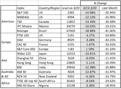 Download spreadsheetThe European equity markets, at least collectively, did better than the American and Australian markets between March 6 and March 13, with the Asian and African markets falling in the middle. When equities are in free fall, US treasuries are usually the beneficiary, but last week proved to be an exception, as treasury rates at the long end stabilized, perhaps spooked by the prospect of inflation from the trillions of dollars in rescue packages being proposed:
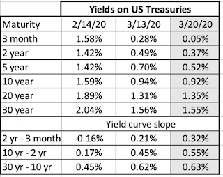 Download spreadsheetThe fears that this crisis will create an extended and deep recession, which, in turn, will cause corporate defaults to rise, especially in natural resource and travel-related companies, caused corporate bonds to have their worst week of this five-week crisis period:
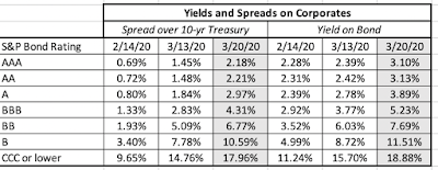 Download spreadsheetThe damage in the corporate bond market, not surprisingly, was worse for lower-rating bonds, but the even highest rated bonds were not spared. Speaking of natural resource companies, oil continued on its downward trend, falling well below what many analysts had pronounced as its floor:
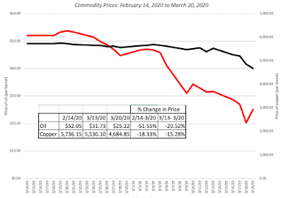 Download spreadsheetThe fact that copper, another commodity sensitive to global growth, has not dropped as much shows how much of an effect the Russia-Saudi tussle is having on oil prices. Closing off, gold had a better week than stocks, but it too was down, but bitcoin ended the week on a little bit of an upswing.
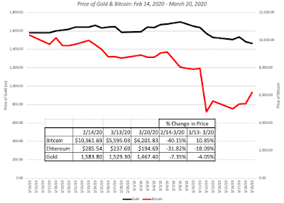 Download spreadsheetAll in all, no asset class was safe and creative asset allocation would have best reduced the pain, not eliminated it.
The Breakdown As in the weeks before, I will take apart the drop in equities around the world and look at the differences meted out, both in the last week and cumulatively over the five weeks since February 14.
Sector and IndustryI start by looking at the loss in value, broken down by sector, with the percentage changes in value computed over a week and over five weeks: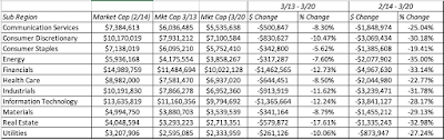 Energy remains the most damaged sector, with financial services and real estate close behind., and consumer staples and health care have held up the best. Breaking the sectors down to industries, and looking at the ten best and worst performers last week:
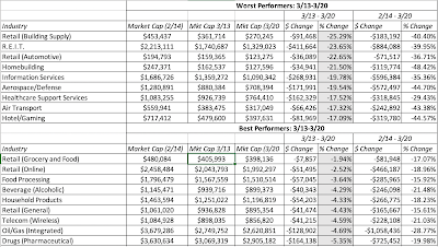 Download spreadsheetThe industries that were worst hit were infrastructure companies (with the exception of healthcare support services and automotive retail) that tend to have debt. Read in conjunction with the earlier table on the widening of default spreads for corporate bonds, last week's market collapse seems to have been driven more by default risk concerns than the prior weeks. The least affected businesses tend to be those that cater to non-discretionary demand.
RegionEarlier in this post, I looked at market indices around the world to conclude that stocks listed on the American and Australian continents were more affected than European stocks. Expanding on that proposition, I look at the market value lost, both in dollar and percentage terms, across regions: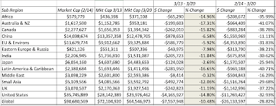 Globally, companies have lost $26.1 trillion in market capitalization over the last five weeks, and US stocks alone have lost $11.8 trillion in market cap. Canadian, Australian and Latin American stocks have been worst hit, in percentage terms, and China and the Middle East have taken the smallest hits, in percentage terms.
Net Debt and ProfitabilityIt looks like debt concerns rose to the top of the worry heap last week, and to see how this shows up at the company level, I broke companies down into five quintiles, in terms of net debt ratios, and five quintiles in terms of operating profit margins. Specifically, I want to see how much having a profit buffer and low debt has protected companies during this meltdown.
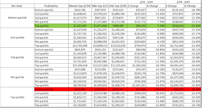 I apologize if this table is a little overwhelming, but the way to read it to look at the combinations of net debt and profitability. For instance, companies with the least debt are in the bottom quintile of the net debt column and companies with the highest profitability are the top quintile of the profitability column. I don't want to read too much into this table, but if you look at last week's action, stocks with lower net debt ratios (in the bottom two quintiles) did much better than stocks in the top debt quintile. At least for the moment, the profitability effect is being drowned out by the debt effect, since there is little discernible relationship between operating profit margins and market markdown. If you squint hard enough, you may be able to find something, especially in the middle quintile, but I will leave that up to you.
Looking Past the CrisisIn one on my first posts on this viral market crisis, I mentioned that the first casualty in a crisis is perspective. As you get deeper and deeper into the specifics of the crisis, you will find yourself not only getting bogged down in numbers, and in despair. I have had moments in the last few weeks, when I have had to force myself to step back from the abyss, think about a post-virus world and to reclaim the initiative as an investor. If you are a pessimist, you may view this as being in denial about what you see as an economic catastrophe that is about to unfold, but I am a natural optimist, and I believe that this too shall pass!
The Economy There is no disagreement that the virus will cause the economy to go into a deep recession, since commerce is effectively shut down for at least a few weeks. During that period, economic indicators such as unemployment claims and measures of economic activity will hit levels not seen before, bur that should come as no surprise, given how large and broadly based the shock thas been. There are two questions, though, where there can be disagreement.How quickly will the global economy come back from the shut down, and when it does how completely will it recover?How much permanent change will be created by this crisis in terms of both consumer (and investor) behavior and economic structure?There are some who are more optimistic than others, arguing that once the viral fears disappear, there will be a return to business as usual for most parts of the global economy, stretched out over months rather than years, and that the changes to consumer behavior and economic structure will be small. At the other end, there are many more who feel that economies take time, measured in many years,to recover from shocks of this magnitude and also that there will be significant changes in consumer behavior and economic structure in the making.
Investment Strategies Your views on the economy, both in terms of how quickly it will come back from this shock and how much change you see in economic structure, will determine your next steps in investing. If you believe that recovery will be quicker and with less structural change, there are two strategies you can adopt. Bargain Basement: In this strategy, you focus on stocks that have been pounded in the last few weeks, losing 50% or more of market value, but which have the ingredients that you believe will allow them to survive, perhaps stronger, in the post-virus economy. Key among these ingredients will be low net debt ratios (Net Debt to EBITDA less than one) and pre-virus operating margins that were solid enough to take the hit from the crisis. To the extent that survival until the turnaround occurs is key, you may also keep your search restricted to larger market cap companies.Distressed Equity: There is a more risky strategy you can adopt, where you also look for stocks that have seen a significant loss in value over the last five weeks, but focus on the most endangered of these, with high net debt and fixed costs. You are effectively buying options, with some already out-of-the-money, and as with any strategy built around doing that, you will see a significant number of your investments go to zero. The payoff from this strategy comes the companies that make it back to life, with equity values increasing by enough to cover your losses. At first sight, the airlines and Boeing meet these criteria, but there is a catch, insofar as they are large enough to be targeted for government bailouts, which are a mixed blessing, since they allow companies to survive, while wiping out or severely constraining equity claims. Thus, smaller companies that have to make it through on their own may be better candidates for this strategy than companies that are too big to fail, that attract large bailouts. If you are more pessimistic about economic recovery, both in terms of its length and strength, and believe that the recovery will restructure the economy and how companies operate in many businesses, there are two strategies that you may find work for you:Safety at a Reasonable Price (SARP): Here, you focus on companies that are best positioned to not just survive a long downturn, but have the ammunition to make it work to their advantage. Large market cap firms with low debt ratios and high cash balances, that had high growth and profit margins in the pre-virus economy, would be good candidates. Facebook, Alphabet, Apple and Microsoft, for instance, clearly fit these criteria, but since these companies are already sought after in a market where safety is rare and highly valued, you should add pricing screens that allow you to get them at reasonable prices. Change Agents: This is as much a bet on changes in consumer behavior and economic structure as it is on individual companies. Thus, if you believe that this crisis will make people more comfortable with delivery services for a wider range of goods and online interaction (in business and education), you could seek out companies that are innovators in these spaces. Again, the highest profile players, like Zoom, may be priced out of your reach, but there are others like Chegg that may meet your criteria.The picture below summarizes the four strategies:
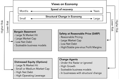
My views on the economy are mixed. I do think that the global economy will come back, but it will take more than a few months, and there will be structural changes in some sectors. I ran screens for all of the strategies, other than the Change Agents strategy (which is less about screening, and more about detecting macro trends), across all publicly traded stocks (about 40,000+) on March 20, 2020. As I look at the companies that go through the screens, I realize that there is more work to be done and better screens that can be devised, but think of it as work in progress, and if you have access to a large database, try your own.
YouTube Video
DataMarket Changes by Asset Class, through March 20, 2020Market Changes by Industry, through March 20, 2020Screened StocksBargain Basement, as of March 20, 2020Distressed Equity (Options), as of March 20, 2020Safety at a Reasonable Price (SARP), as of March 20, 2020 (Add your pricing screen)
Surveying the MarketIn what has now become a common component of each of these weekly updates, I will start with a survey of overall market performance in different asset classes, and and then break down the damage in equity markets across the globe.
The Macro Picture As was the case in 2008, it was difficult, perhaps impossible, to find a safe place to hold your money last week and no market was spared during the week. It was a week when equities lost trillions in value, across the world, but it was also a week when treasuries that had appreciated in prior weeks due to a flight to quality also saw no gain, oil continued its falls to multi-decade lows, and gold did not play its historic role as a crisis asset. Let's start with equities. The week started badly and did not get much better, as fear ruled across markets:
 Download spreadsheetThe European equity markets, at least collectively, did better than the American and Australian markets between March 6 and March 13, with the Asian and African markets falling in the middle. When equities are in free fall, US treasuries are usually the beneficiary, but last week proved to be an exception, as treasury rates at the long end stabilized, perhaps spooked by the prospect of inflation from the trillions of dollars in rescue packages being proposed:
 Download spreadsheetThe fears that this crisis will create an extended and deep recession, which, in turn, will cause corporate defaults to rise, especially in natural resource and travel-related companies, caused corporate bonds to have their worst week of this five-week crisis period:
 Download spreadsheetThe damage in the corporate bond market, not surprisingly, was worse for lower-rating bonds, but the even highest rated bonds were not spared. Speaking of natural resource companies, oil continued on its downward trend, falling well below what many analysts had pronounced as its floor:
 Download spreadsheetThe fact that copper, another commodity sensitive to global growth, has not dropped as much shows how much of an effect the Russia-Saudi tussle is having on oil prices. Closing off, gold had a better week than stocks, but it too was down, but bitcoin ended the week on a little bit of an upswing.
 Download spreadsheetAll in all, no asset class was safe and creative asset allocation would have best reduced the pain, not eliminated it.
The Breakdown As in the weeks before, I will take apart the drop in equities around the world and look at the differences meted out, both in the last week and cumulatively over the five weeks since February 14.
Sector and IndustryI start by looking at the loss in value, broken down by sector, with the percentage changes in value computed over a week and over five weeks:
 Energy remains the most damaged sector, with financial services and real estate close behind., and consumer staples and health care have held up the best. Breaking the sectors down to industries, and looking at the ten best and worst performers last week:
 Download spreadsheetThe industries that were worst hit were infrastructure companies (with the exception of healthcare support services and automotive retail) that tend to have debt. Read in conjunction with the earlier table on the widening of default spreads for corporate bonds, last week's market collapse seems to have been driven more by default risk concerns than the prior weeks. The least affected businesses tend to be those that cater to non-discretionary demand.
RegionEarlier in this post, I looked at market indices around the world to conclude that stocks listed on the American and Australian continents were more affected than European stocks. Expanding on that proposition, I look at the market value lost, both in dollar and percentage terms, across regions:
 Globally, companies have lost $26.1 trillion in market capitalization over the last five weeks, and US stocks alone have lost $11.8 trillion in market cap. Canadian, Australian and Latin American stocks have been worst hit, in percentage terms, and China and the Middle East have taken the smallest hits, in percentage terms.
Net Debt and ProfitabilityIt looks like debt concerns rose to the top of the worry heap last week, and to see how this shows up at the company level, I broke companies down into five quintiles, in terms of net debt ratios, and five quintiles in terms of operating profit margins. Specifically, I want to see how much having a profit buffer and low debt has protected companies during this meltdown.
 I apologize if this table is a little overwhelming, but the way to read it to look at the combinations of net debt and profitability. For instance, companies with the least debt are in the bottom quintile of the net debt column and companies with the highest profitability are the top quintile of the profitability column. I don't want to read too much into this table, but if you look at last week's action, stocks with lower net debt ratios (in the bottom two quintiles) did much better than stocks in the top debt quintile. At least for the moment, the profitability effect is being drowned out by the debt effect, since there is little discernible relationship between operating profit margins and market markdown. If you squint hard enough, you may be able to find something, especially in the middle quintile, but I will leave that up to you.
Looking Past the CrisisIn one on my first posts on this viral market crisis, I mentioned that the first casualty in a crisis is perspective. As you get deeper and deeper into the specifics of the crisis, you will find yourself not only getting bogged down in numbers, and in despair. I have had moments in the last few weeks, when I have had to force myself to step back from the abyss, think about a post-virus world and to reclaim the initiative as an investor. If you are a pessimist, you may view this as being in denial about what you see as an economic catastrophe that is about to unfold, but I am a natural optimist, and I believe that this too shall pass!
The Economy There is no disagreement that the virus will cause the economy to go into a deep recession, since commerce is effectively shut down for at least a few weeks. During that period, economic indicators such as unemployment claims and measures of economic activity will hit levels not seen before, bur that should come as no surprise, given how large and broadly based the shock thas been. There are two questions, though, where there can be disagreement.How quickly will the global economy come back from the shut down, and when it does how completely will it recover?How much permanent change will be created by this crisis in terms of both consumer (and investor) behavior and economic structure?There are some who are more optimistic than others, arguing that once the viral fears disappear, there will be a return to business as usual for most parts of the global economy, stretched out over months rather than years, and that the changes to consumer behavior and economic structure will be small. At the other end, there are many more who feel that economies take time, measured in many years,to recover from shocks of this magnitude and also that there will be significant changes in consumer behavior and economic structure in the making.
Investment Strategies Your views on the economy, both in terms of how quickly it will come back from this shock and how much change you see in economic structure, will determine your next steps in investing. If you believe that recovery will be quicker and with less structural change, there are two strategies you can adopt. Bargain Basement: In this strategy, you focus on stocks that have been pounded in the last few weeks, losing 50% or more of market value, but which have the ingredients that you believe will allow them to survive, perhaps stronger, in the post-virus economy. Key among these ingredients will be low net debt ratios (Net Debt to EBITDA less than one) and pre-virus operating margins that were solid enough to take the hit from the crisis. To the extent that survival until the turnaround occurs is key, you may also keep your search restricted to larger market cap companies.Distressed Equity: There is a more risky strategy you can adopt, where you also look for stocks that have seen a significant loss in value over the last five weeks, but focus on the most endangered of these, with high net debt and fixed costs. You are effectively buying options, with some already out-of-the-money, and as with any strategy built around doing that, you will see a significant number of your investments go to zero. The payoff from this strategy comes the companies that make it back to life, with equity values increasing by enough to cover your losses. At first sight, the airlines and Boeing meet these criteria, but there is a catch, insofar as they are large enough to be targeted for government bailouts, which are a mixed blessing, since they allow companies to survive, while wiping out or severely constraining equity claims. Thus, smaller companies that have to make it through on their own may be better candidates for this strategy than companies that are too big to fail, that attract large bailouts. If you are more pessimistic about economic recovery, both in terms of its length and strength, and believe that the recovery will restructure the economy and how companies operate in many businesses, there are two strategies that you may find work for you:Safety at a Reasonable Price (SARP): Here, you focus on companies that are best positioned to not just survive a long downturn, but have the ammunition to make it work to their advantage. Large market cap firms with low debt ratios and high cash balances, that had high growth and profit margins in the pre-virus economy, would be good candidates. Facebook, Alphabet, Apple and Microsoft, for instance, clearly fit these criteria, but since these companies are already sought after in a market where safety is rare and highly valued, you should add pricing screens that allow you to get them at reasonable prices. Change Agents: This is as much a bet on changes in consumer behavior and economic structure as it is on individual companies. Thus, if you believe that this crisis will make people more comfortable with delivery services for a wider range of goods and online interaction (in business and education), you could seek out companies that are innovators in these spaces. Again, the highest profile players, like Zoom, may be priced out of your reach, but there are others like Chegg that may meet your criteria.The picture below summarizes the four strategies:

My views on the economy are mixed. I do think that the global economy will come back, but it will take more than a few months, and there will be structural changes in some sectors. I ran screens for all of the strategies, other than the Change Agents strategy (which is less about screening, and more about detecting macro trends), across all publicly traded stocks (about 40,000+) on March 20, 2020. As I look at the companies that go through the screens, I realize that there is more work to be done and better screens that can be devised, but think of it as work in progress, and if you have access to a large database, try your own.
YouTube Video
DataMarket Changes by Asset Class, through March 20, 2020Market Changes by Industry, through March 20, 2020Screened StocksBargain Basement, as of March 20, 2020Distressed Equity (Options), as of March 20, 2020Safety at a Reasonable Price (SARP), as of March 20, 2020 (Add your pricing screen)
March 21, 2020
Data Update 7 for 2020: Debt Delusions and Reality
In the midst of a crisis, it is very difficult to think about life in its aftermath, but there will come a time, when investors and companies will shift their focus. To be able to do so, they have to survive the crisis, and for many companies, that has become the immediate challenge. In the last post, I looked at one factor that will determine survival risk, and that is the buffer than companies have on growth, profitability and reinvestment, with companies in higher margin businesses being more protected than companies in businesses with slim or negative margins. In this one, I look at the other factor that will determine survival and that is the debt burden on firms, since companies with higher debt burdens, other things remaining equal, will be more exposed to failure and distress than companies without those burdens. I will look at the degree of indebtedness of companies around the world, broken out by industry and region, partly with an eye on assessing how much danger they are exposed to right now, as their near term business prospects collapse, and partly to see which firms, industries and regions are best positioned to make it through this crisis.
The Debt Trade OffThe question of how much a firm should borrow is one of the three questions that comprise corporate finance, but there are a number of delusions about debt that need to be dispelled first. The picture below, that I also used in last year's debt update captures what I term the "illusory benefits" of debt:
Thus, the argument that borrowing money lowers your cost of capital, just because it costs less to borrow than to raise equity, does not hold up, since the risk from the investments taken with the capital raised remain unchanged, no matter what the debt mix. The counter argument that you should never borrow money, since borrowing money will lower your net income, misses the fact that borrowing money to fund a company leads to fewer shares outstanding.
The real trade off on debt is determined by the tax benefits that are endowed on debt by tax law in much of the world, with interest expenses being tax deductible and cash flows to equity not, and the offsetting effects of expected distress costs, low for firms with stable, predictable earnings and in good economic times, and high for firms with more unstable earnings and more unstable economic settings. There are a couple of secondary factors, with debt acting as a mechanism to keep managers from taking investments that are bad enough to put the company's survival (and management jobs) at risk and the costs associated with managing the conflict of interests between stockholders and bondholders. This trade off, intuitive and simple, can be a powerful device for making predictions about what should happen to the use of debt over time. In the United States, for instance, the corporate tax reform act of 2017, in addition to lowering the federal corporate tax to 21% from 35, also put limits on interest deductions, thus making debt significantly less beneficial to companies. Even before this crisis hit, there were questions about whether a long stretch of good times for companies had made them too complacent about distress risks and expected bankruptcy costs, and now after the crisis, there is no debating that many companies have too much debt, given near term earnings and perhaps even long term earnings.
The Debt BurdenAs companies scramble to get out from under their debt burdens, they will face challenges, and to see the magnitude of the tasks they face, I will chronicle how much debt was held across the world at the start of 2020. I will also break the debt down by region, and by industry, to see how steep the climb will be for companies, and to assess which sectors have the largest capacity to withstand the earnings shocks that are sure to come.
Defining Debt As a prelude to assessing the debt burden at companies, I want to start by deciding what to include in debt. For those who trust accountants, this may seem redundant, given that there is a debt number listed on balance sheets, reflecting what companies owe at least on the date of the statement. As someone who does not share that trust, I use a two-part test to determine whether to include a claim in debt or not:
Does the claim give rise to a contractual commitment that you have to meet in good times and in bad? If you fail to meet that commitment, are there consequences that result in the business shutting down or assets being controlled by lenders?To start, a bank loan or corporate bond clearly meets both requirements, with interest expenses and principal payments being contractual commitments, and failure to meet those can result in either default or loss of control over the business.
All interest bearing debt, short term as well as long term, floating or fixed, meets the requirements for debt. Accounts payable and supplier credit don't meet that test, because they do not have explicit interest expenses; to the extent that you get less favorable terms or lose a discount by using supplier credit, there are implicit interest expenses, and if you are willing to make those explicit, they can be treated as debt. All lease commitments are debt, though we can debate the maturity of the commitment (based upon escape clauses and renewal terms in the leases) and whether it is secured or unsecured debt. In fact, converting lease commitments to debt is a simple present value exercise, where the contractual commitments for future years are discounted back to today using the pre-tax cost of debt as the discount rate, a practice that I have followed all through my valuation years. Until 2019, accountants followed a misguided practice, allowing companies to categorize leases, based upon whether they had ownership of the asset, into operating and capital leases, with only the latter being treated as debt. In the process, operating leases became the biggest source of off-balance sheet debt for retailers, restaurants and other big lessees. In 2019, both GAAP (FASB 842) and IFRS (IAS 16) came to their senses and required companies to treat all leases as debt, creating a significant change in balance sheet debt at many companies. Later in this post, I will compare my calculations of lease debt to the accounting lease debt, to probe differences. Debt Measures
There are different measures of the debt burden, with each measure serving a different purpose. Broadly speaking, these measures can either look at debt as a percent of the total capital invested in business or look at debt payments due, relative to earnings and cash flows of the company. The first becomes an input into hurdle rates and the latter becomes a measure of the buffer against downturns and crisis:
To the extent that having cash on your balance sheet offsets some of the debt burden, you can compute all of these measures, using net debt ratio (where cash is netted out against total debt) and net interest expenses (where interest income from cash is netted out from interest expenses). Note that the two approaches measuring debt can give different signals. Thus, a company can have a low debt ratio (as a percent of capital, in either book value or market value terms), an indicator of a low debt burden, while having dangerously low interest coverage ratios and high debt as a multiple of EBITDA. The table below captures the possible combinations:
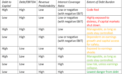
Note that the predictably of revenues and earnings brings an additional dimension brought into the comparison. To the extent that some companies have more predictable earnings than others, because they sell more non-discretionary products and services, they are less exposed to risk than other companies, with similar debt burdens; a discount retailer with a debt to EBITDA multiple of four is safer than a luxury retailer with a debt to EBITDA multiple of four.
Interest Bearing Debt & Lease Commitments in 2020 I begin by looking at debt burdens, relative to both book and market capital, across the world. In making this assessment, note that I have done the following:I have counted all interest bearing debt, as reported by the company, on its most recent financial statements. I use this book value of debt as roughly equivalent to the market value of debt, because much of the debt taken by companies taken by companies is in the form of bank loans, and there is no observable market value. While there are ways of converting book value of debt to market value of debt, they require inputs on debt maturity that are not available for many companies.I have computed the lease debt, using lease commitments and an estimated cost of debt for each company, rather than trust the accounting estimates of this debt, at least for 2019. That is partly because the rule change applies only to those sections of the world that are covered by IFRS and GAAP and partly because I don't trust accountants yet, on this measure.To compute the net debt, I subtract out the cash and marketable securities that the company reports on its latest financial statements.Since debt to a financial service firm is more raw material than capital, and determining what comprises debt is almost an unsolvable puzzle, I have excluded banks, insurance companies and brokerage firms/investment banks from my sample.Recognizing that the most recent financial statements for most companies in my January 2020 update are from September 2019 and with the even more important caveat that the market capitalization, while updated through March 16, 2020, is a moving target in a market like this one.
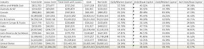 Download spreadsheetOn a book capital basis, US companies have the highest proportion of debt, but relative to market value, Canadian companies have the most debt. Across global non-financial service companies, total debt is about 34% of market capital and 49% about book capital. Doing the same analysis across industries, again excluding financial service firms, the ten industries with the highest debt to market cap ratios and the ten with the lowest are listed below:
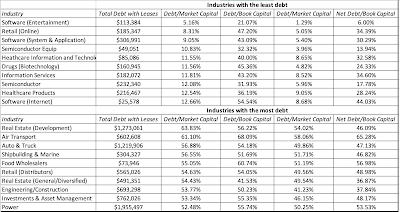 Download spreadsheetNotice the preponderance of technology firms on the least levered list and the bunching up of infrastructure and manufacturing companies on the most levered list. All of the numbers reported above for debt include my estimate of the lease debt, and since the accounting rule changes this year have brought lease debt on to balance sheets, I can compare my estimates to the accounting numbers. For non-financial firms collectively, my estimate of lease debt is about 60% higher in the aggregate that the accounting estimates, reflecting partly the additional information that accountants have on lease specifics that I do not, partly the fact that there are segments of the world where leases are still not treated as debt and partly the complexity of accounting rules on lease debt.
Earnings and Cashflow Coverage As we noted earlier, companies that look lightly levered, when debt is measured against capital, can still face a significant burden if their earnings and cash flows are insufficient to meet debt payments. In the table below, I look at the regional differences on debt as a multiple of EBITDA and interest coverage ratios:
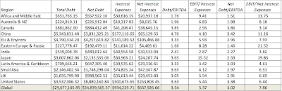 Download spreadsheetWith the caveat that the EBITDA and operating income numbers are from 2019 and do not reflect the damage that is going to be caused by the virus, companies in Africa/Middle East and Eastern Europe have the least debt, relative to EBITDA, but Japanese companies have the most buffer, based upon interest coverage ratio. Canadian and Indian companies have the least buffer, on an interest coverage ratio basis. Extending this analysis to industries and looking at the ten industries with the most buffer and the ten with the least:
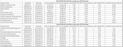 Download spreadsheetWhile most of the firms in the most buffered list mirror the earlier ranking based upon low debt levels, the presence of integrated oil and oil production companies indicates how transient these buffers may be, since the dramatic drop in oil prices in the last few weeks will ravage the EBITDA and operating income numbers at these companies. Among the least buffered list are utilities, which may be able to weather the storm with stable revenues, and a number of real estate related industries, which will be exposed if real estate values drop. At the top of the list of the most exposed industries are investment and asset management companies, reflecting both their access to and use of debt to accentuate returns to equity investors.
Lessons from a CrisisEvery crisis teaches investors and companies lessons that are temporarily learned, but quickly forgotten. This one is a reminder to firms that debt, while making good times better for equity investors, makes bad times worse. For some of these firms, that debt will threaten their continued existence and result in liquidations, fire sales and distress. For others, it will create constraints for the near future on growth and investment, and change business plans. For firms that are lightly burdened, it may create opportunities, as they use their liquidity as a strategic weapon to fund acquisitions and to increase market share. If you were worried about winner take all markets before this crisis, you should be doubly worried now!
YouTube Video
Datasets
Debt measures, by regionDebt measures, by industryLease effects on profitability and debt measures, by industry
The Debt Trade OffThe question of how much a firm should borrow is one of the three questions that comprise corporate finance, but there are a number of delusions about debt that need to be dispelled first. The picture below, that I also used in last year's debt update captures what I term the "illusory benefits" of debt:

Thus, the argument that borrowing money lowers your cost of capital, just because it costs less to borrow than to raise equity, does not hold up, since the risk from the investments taken with the capital raised remain unchanged, no matter what the debt mix. The counter argument that you should never borrow money, since borrowing money will lower your net income, misses the fact that borrowing money to fund a company leads to fewer shares outstanding.
The real trade off on debt is determined by the tax benefits that are endowed on debt by tax law in much of the world, with interest expenses being tax deductible and cash flows to equity not, and the offsetting effects of expected distress costs, low for firms with stable, predictable earnings and in good economic times, and high for firms with more unstable earnings and more unstable economic settings. There are a couple of secondary factors, with debt acting as a mechanism to keep managers from taking investments that are bad enough to put the company's survival (and management jobs) at risk and the costs associated with managing the conflict of interests between stockholders and bondholders.
 This trade off, intuitive and simple, can be a powerful device for making predictions about what should happen to the use of debt over time. In the United States, for instance, the corporate tax reform act of 2017, in addition to lowering the federal corporate tax to 21% from 35, also put limits on interest deductions, thus making debt significantly less beneficial to companies. Even before this crisis hit, there were questions about whether a long stretch of good times for companies had made them too complacent about distress risks and expected bankruptcy costs, and now after the crisis, there is no debating that many companies have too much debt, given near term earnings and perhaps even long term earnings.
The Debt BurdenAs companies scramble to get out from under their debt burdens, they will face challenges, and to see the magnitude of the tasks they face, I will chronicle how much debt was held across the world at the start of 2020. I will also break the debt down by region, and by industry, to see how steep the climb will be for companies, and to assess which sectors have the largest capacity to withstand the earnings shocks that are sure to come.
Defining Debt As a prelude to assessing the debt burden at companies, I want to start by deciding what to include in debt. For those who trust accountants, this may seem redundant, given that there is a debt number listed on balance sheets, reflecting what companies owe at least on the date of the statement. As someone who does not share that trust, I use a two-part test to determine whether to include a claim in debt or not:
Does the claim give rise to a contractual commitment that you have to meet in good times and in bad? If you fail to meet that commitment, are there consequences that result in the business shutting down or assets being controlled by lenders?To start, a bank loan or corporate bond clearly meets both requirements, with interest expenses and principal payments being contractual commitments, and failure to meet those can result in either default or loss of control over the business.
All interest bearing debt, short term as well as long term, floating or fixed, meets the requirements for debt. Accounts payable and supplier credit don't meet that test, because they do not have explicit interest expenses; to the extent that you get less favorable terms or lose a discount by using supplier credit, there are implicit interest expenses, and if you are willing to make those explicit, they can be treated as debt. All lease commitments are debt, though we can debate the maturity of the commitment (based upon escape clauses and renewal terms in the leases) and whether it is secured or unsecured debt. In fact, converting lease commitments to debt is a simple present value exercise, where the contractual commitments for future years are discounted back to today using the pre-tax cost of debt as the discount rate, a practice that I have followed all through my valuation years. Until 2019, accountants followed a misguided practice, allowing companies to categorize leases, based upon whether they had ownership of the asset, into operating and capital leases, with only the latter being treated as debt. In the process, operating leases became the biggest source of off-balance sheet debt for retailers, restaurants and other big lessees. In 2019, both GAAP (FASB 842) and IFRS (IAS 16) came to their senses and required companies to treat all leases as debt, creating a significant change in balance sheet debt at many companies. Later in this post, I will compare my calculations of lease debt to the accounting lease debt, to probe differences. Debt Measures
There are different measures of the debt burden, with each measure serving a different purpose. Broadly speaking, these measures can either look at debt as a percent of the total capital invested in business or look at debt payments due, relative to earnings and cash flows of the company. The first becomes an input into hurdle rates and the latter becomes a measure of the buffer against downturns and crisis:

To the extent that having cash on your balance sheet offsets some of the debt burden, you can compute all of these measures, using net debt ratio (where cash is netted out against total debt) and net interest expenses (where interest income from cash is netted out from interest expenses). Note that the two approaches measuring debt can give different signals. Thus, a company can have a low debt ratio (as a percent of capital, in either book value or market value terms), an indicator of a low debt burden, while having dangerously low interest coverage ratios and high debt as a multiple of EBITDA. The table below captures the possible combinations:
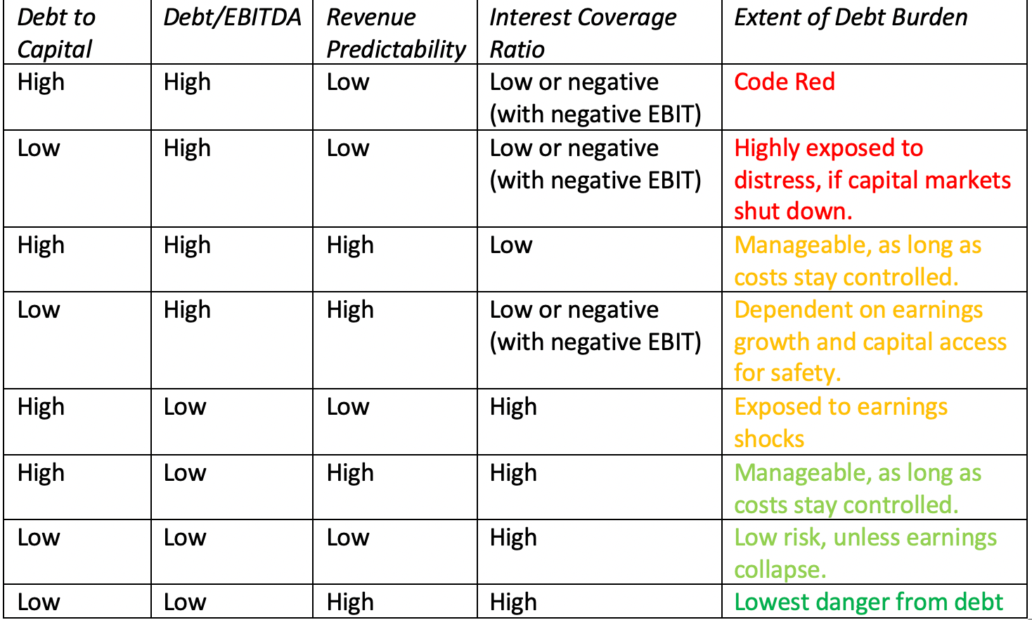
Note that the predictably of revenues and earnings brings an additional dimension brought into the comparison. To the extent that some companies have more predictable earnings than others, because they sell more non-discretionary products and services, they are less exposed to risk than other companies, with similar debt burdens; a discount retailer with a debt to EBITDA multiple of four is safer than a luxury retailer with a debt to EBITDA multiple of four.
Interest Bearing Debt & Lease Commitments in 2020 I begin by looking at debt burdens, relative to both book and market capital, across the world. In making this assessment, note that I have done the following:I have counted all interest bearing debt, as reported by the company, on its most recent financial statements. I use this book value of debt as roughly equivalent to the market value of debt, because much of the debt taken by companies taken by companies is in the form of bank loans, and there is no observable market value. While there are ways of converting book value of debt to market value of debt, they require inputs on debt maturity that are not available for many companies.I have computed the lease debt, using lease commitments and an estimated cost of debt for each company, rather than trust the accounting estimates of this debt, at least for 2019. That is partly because the rule change applies only to those sections of the world that are covered by IFRS and GAAP and partly because I don't trust accountants yet, on this measure.To compute the net debt, I subtract out the cash and marketable securities that the company reports on its latest financial statements.Since debt to a financial service firm is more raw material than capital, and determining what comprises debt is almost an unsolvable puzzle, I have excluded banks, insurance companies and brokerage firms/investment banks from my sample.Recognizing that the most recent financial statements for most companies in my January 2020 update are from September 2019 and with the even more important caveat that the market capitalization, while updated through March 16, 2020, is a moving target in a market like this one.
 Download spreadsheetOn a book capital basis, US companies have the highest proportion of debt, but relative to market value, Canadian companies have the most debt. Across global non-financial service companies, total debt is about 34% of market capital and 49% about book capital. Doing the same analysis across industries, again excluding financial service firms, the ten industries with the highest debt to market cap ratios and the ten with the lowest are listed below:
 Download spreadsheetNotice the preponderance of technology firms on the least levered list and the bunching up of infrastructure and manufacturing companies on the most levered list. All of the numbers reported above for debt include my estimate of the lease debt, and since the accounting rule changes this year have brought lease debt on to balance sheets, I can compare my estimates to the accounting numbers. For non-financial firms collectively, my estimate of lease debt is about 60% higher in the aggregate that the accounting estimates, reflecting partly the additional information that accountants have on lease specifics that I do not, partly the fact that there are segments of the world where leases are still not treated as debt and partly the complexity of accounting rules on lease debt.
Earnings and Cashflow Coverage As we noted earlier, companies that look lightly levered, when debt is measured against capital, can still face a significant burden if their earnings and cash flows are insufficient to meet debt payments. In the table below, I look at the regional differences on debt as a multiple of EBITDA and interest coverage ratios:
 Download spreadsheetWith the caveat that the EBITDA and operating income numbers are from 2019 and do not reflect the damage that is going to be caused by the virus, companies in Africa/Middle East and Eastern Europe have the least debt, relative to EBITDA, but Japanese companies have the most buffer, based upon interest coverage ratio. Canadian and Indian companies have the least buffer, on an interest coverage ratio basis. Extending this analysis to industries and looking at the ten industries with the most buffer and the ten with the least:
 Download spreadsheetWhile most of the firms in the most buffered list mirror the earlier ranking based upon low debt levels, the presence of integrated oil and oil production companies indicates how transient these buffers may be, since the dramatic drop in oil prices in the last few weeks will ravage the EBITDA and operating income numbers at these companies. Among the least buffered list are utilities, which may be able to weather the storm with stable revenues, and a number of real estate related industries, which will be exposed if real estate values drop. At the top of the list of the most exposed industries are investment and asset management companies, reflecting both their access to and use of debt to accentuate returns to equity investors.
Lessons from a CrisisEvery crisis teaches investors and companies lessons that are temporarily learned, but quickly forgotten. This one is a reminder to firms that debt, while making good times better for equity investors, makes bad times worse. For some of these firms, that debt will threaten their continued existence and result in liquidations, fire sales and distress. For others, it will create constraints for the near future on growth and investment, and change business plans. For firms that are lightly burdened, it may create opportunities, as they use their liquidity as a strategic weapon to fund acquisitions and to increase market share. If you were worried about winner take all markets before this crisis, you should be doubly worried now!
YouTube Video
Datasets
Debt measures, by regionDebt measures, by industryLease effects on profitability and debt measures, by industry
Data Update 6 for 2020: Profitability, Returns and the value of Growth
In an age, where scaling up and growth seems to have won out over building business models and profitability, as the most desirable business traits, it is worth stating the obvious. The measure of a good business is its capacity to generate not just profits, but also to convert these profits into cash flows that investors can collect. If we needed a reminder of this age-old premise, the last three weeks should have provided a wake-up call. In fact, if your central concern is about the negative economic consequences of the viral meltdown, in the short and the long term, higher growth and margin companies will be best suited to not just survive them, but emerge stronger in the post-virus economy. In this post, I will try to look at growth, earnings and cash flows, and how they interact in value, and use that framework to examine how companies around the world, in different sectors, measure up.
Growth, Profits and Cash FlowsThe trickiest part of valuation is negotiating a balance between growth, profitability and reinvestment, with a plausible story holding them together, to derive value.The Scaling Factor: Growth plays the 'good guy' role, allowing small companies to become big, and big firms to become even bigger. While a growth rate can be computed on any metric, the metric that best reflects operating growth is revenue growth, accomplished by either selling more units or racing prices.The Profitability Driver: Growth, by itself, can only scale up a firm's operations and revenues, but for that scaling up to pay off, it has to become profitable. Again, while there are many measures of profitability, scaling profits to revenues to arrive at profit margins makes the most sense.The Reinvestment Lever: To grow, a company has to reinvest in capacity, in whatever form, and this reinvestment can drain cash flows. This reinvestment can be tied to earnings, as a retention ratio or a reinvestment rate, or to sales, as a sales to invested capital ratio.If that sounds familiar, it is perhaps because you have seen me value many companies on this blog, using these three variables, added on to a risk component, to value companies as diverse as Kraft Heinz to Tesla to Beyond Meat. In fact, the cash flows that you observe for a firm can be captured by the interactions between these three forces, and those interactions let us differentiate between great, average and bad firms: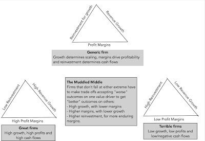
The extremes represent the best and worst possible combinations of these variables. Great firms pull off the trifecta, scaling up revenues with relatively little reinvestment, while deliver high margins. Terrible firms are saddled with the worst possible mix of low revenue growth, low or even negative margins and large capital investment requirements to deliver even their growth. The bulk of the business world falls in the middle, facing tradeoffs that determine value. Some trade off low margins for high growth, hoping that the dollar profits they deliver will be large enough, simply because of scale. Others are willing to reinvest more in the short term, to build barriers to entry and generate higher and more sustainable margins and returns for the long term. In the rest of this post, I plan to look at how companies around the world measure up on each of these dimensions, beginning with the growth that they have recorded in the recent past, moving on to measures of profitability and ending with reinvestment numbers. I will then close by bringing in the hurdle rates that I estimated in my last post as benchmarks, to measure how firms measure up on value creation or destruction.
Growth The first variable that I will look at is growth, and focus primarily on past growth in different metrics, ranging from revenues (the top line) to net income (the bottom line). Along the way, I will argue that the way growth rates are estimated and the periods used for the estimation can have large effects on the numbers that emerge, and that bias, as with everything else in valuation, can affect choices.
Growth MetricsInvestors often make the mistake of assuming that, since the past is behind the, a historical growth rate for a company is a fact, not an estimate. That is a myth, since the historical growth rate that is reported for a company is a function of multiple choices made on estimation, as can be seen in the picture below: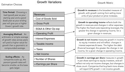
So what? First, it is worth remembering that that the biases an investor brings to the table will often determine how, and in what metric, growth is computed. In general, at least in good times, earnings per share growth will be the mantra of bullish investors in a stock, whereas top line growth will the number offered by more pessimistic about the stock. Second, if you are using growth rates for companies from a data service, it is always worth asking questions about the approach used to compute growth (arithmetic or compounded) and time period used (starting and ending years), since they can skew growth rates up or down.
Growth Rates - A Global OverviewIn keeping with the theme that with growth rates, it behooves us to be transparent about estimation choices, I will start by explaining my choices when it comes to growth. For historical growth rates, computed at the start of 2020, I use the compounded average growth rate in the previous five financial years. For most firms in my sample, this is the geometric average growth rate from 2014, as the base year, to 2019, as the final year in the sample. I will also compute growth rates in revenues (top line) and net income (the proverbial bottom line). With the latter, there will no growth rates computed for companies that are money losing, since the growth rate becomes a meaningless number. With that lead-in, I start by estimating growth rates by industry group, and in the table below, I list the ten industries with the highest growth rate in revenues in the last 5 years (2014-19) and the ten with the lowest:
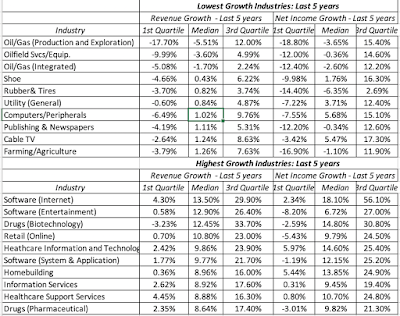 Download spreadsheetNote that even before the crisis, oil companies were shrinking, computers/peripherals had close to flat sales, and software dominates the list of high growth businesses. For a full list of growth rates, by industry, please click here. To see if there are differences in growth in different parts of the world, I then break down growth rates in revenues and net income, by region, between 2014 and 2019.
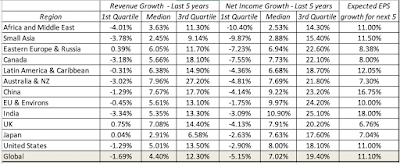 Download spreadsheetNote that more than a quarter of all publicly traded firms saw revenues shrink, in US dollar terms, over the last five years, and that across all firms, the median growth rate in net income is much higher than the median growth rate in revenues, across all regions. However, the range on net income growth is wider than the range on revenue growth. Finally, it is worth noting that investing is based upon future growth, not past growth, and I use estimates of expected growth rate in earnings per share as my proxy. Notwithstanding the biases that analysts bring into this estimation process, it remains a forward-looking number, and I look at how expected growth in earnings per share varies across companies in different PE ratio classes:
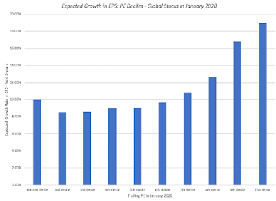
While this data is too raw to draw big conclusions from, higher PE stocks have, not surprisingly, have higher expected growth rates than low PE stocks. As investors, though, that tells you little about whether high PE stocks are good, bad or neutral investments, since the enduring question becomes whether (a) the high expected growth reflects reality or hopeful thinking on the part of analysts and (b) the PE ratio fully, under or over reflects this expected growth rate. It is one reason that I remain wary of using pricing screens to pick stocks, since there is no short cut or formula, that will answer this question. That will require a deep dive into the company's business model and full forecasting of earnings, cash flows and risk, i.e., an intrinsic valuation.
ProfitabilityGrowth is only one part of the valuation puzzle, since without profits that come with it, it will be wasted. In this section, I will look at profitability across regions, sectors and subsets of stocks, again with the intent of eking out lessons that I can to in corporate finance, investing and valuation.
Margin Definitions & UsageWith profit margins, you scale profits to revenues, and as with growth, there are multiple metrics that can be used to compute margins, and which one is used is often a reflection of the biases that investors bring to the game. In the picture below, I look at a list of possible profit margins, and what each one is trying to measure: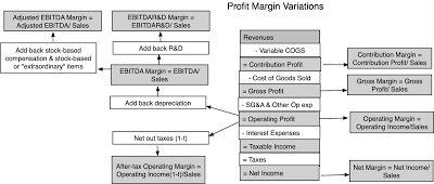
By itself, each margin serves a purpose and tells a tale, and is worth calculating. Thus, the contribution margin measures the pure profits that you generate with every marginal unit you sell, since it nets out only the variable cost associated with producing that unit, giving many software companies close to 100% contribution margins. Gross margins are a close relative, providing a direct measure of marginal profitability and an indirect measure of how revenue increases flow into profits. To illustrate, Zoom, one of the few stocks that has seen its value increase during the crisis, reported a gross margin of 92% in 2019. Operating margins measure what is left after the other operating expenses of the company, which cannot be directly traced to individual unit sales, but are nevertheless necessary for its operations. Thus, R&D expenses and SG&A costs are netted out from gross profit to get to operating profit, yielding a measure that will capture economies of scale, as the company scales up. Netting out taxes and interest expenses, and adding back income from cash and cross holdings, yields net margin, a measure of what equity investors get to keep out of every dollar of revenues. It is a mixed and noisy measure, reflecting a company's operating model, its tax liabilities and its financial leverage (since debt creates interest expenses and affects taxes), as well as non-operating assets. Along the way, there are diversions. If you take the operating income, act like you have no debt and net the taxes you would have paid on that operating income, you get after-tax operating margin, a measure of operating profitability that takes into account taxes. If you take operating income, and add back depreciation and amortization, you get EBITDA margin, a measure of operating cash flows, before reinvestment. In recent year, companies with large stock based employee compensation have taken the tack that since it is in the form of shares or options, it is not an expense, and have added back this and other "extraordinary" expenses (with lots of leeway on what comprises extraordinary) to compute adjusted EBITDA margins that supposedly capture even better the cash flows at the firm.
As you look at margins, whether reported by a company or computed by a third party (including me), here are some general principles to keep in mind. First, desperation drives a money-losing company up the income statement to use more expansive forms of margin. Notice that Microsoft, which has operating margins of close to 35% and net margins of 20% plus, never talks about gross margins, whereas some of Tesla's biggest promoters keep bring up the fact that its gross margin is 25%. Boasting that your gross margin is positive is akin to being on a diet and claiming that you consume only 1800 calories a day, but that is before you count the calories in the second courses at meals, desserts and snacks. Second, not all adjustments are created equal. I have long argued that while adding back depreciation and amortization to get to an EBITDA margin may be justifiable, adding back stock based compensation is not, since it is effectively using a barter system to evade cash flows. Put differently, you could have issued those restricted shares or options in the market, and used the cash to pay your employees, and chose not to.
Margins: A Global OverviewAs with growth rates, I am going to begin by offering some background on the data that I use to compute my margins, and the adjustments that I make along the way. I use the revenues and income numbers from the trailing 12 months, which at the start of 2020, would give me the financials for most firms from October 2018 to September 2019. While that may seem short sighted, I have the archived numbers from the last decade on my website, for you to download and make your own judgments. Of course, with the market crisis fully upon us and a recession looming, you will be well served looking at the historical data. I start looking at margins across industries, to get a rough measure of how revenues flow through as earnings to the firm and its equity investors. In the table below, I list the ten industry groups with the highest and lowest operating margins, using global companies: Download spreadsheetNote that retail is particularly exposed in this crisis, simply because margins were low to begin with, though the question of how much will vary across retail. Thus, grocery and online retail may be more resilient than automotive and general retail from a prolonged shut down of commerce. Among the highest margin businesses, there are many that will see margins deteriorate very quickly from this crisis, with energy (both oil and green) showing the biggest near term hits. Real estate will also be exposed if there is a deep recession, but software, beverages and tobacco should see profitability hold up better. Looking across regions, I compute profitability measures across all companies in each region, recognizing that the industries that dominate each region be very different.
 Download spreadsheetNote that the Asia had the lowest margins in 2019, a warning that high growth does not always translate into profitability. Conversely, Eastern European & Russian companies have high margins, albeit with low growth. African and Middle Eastern companies have sky high margins, reflecting domestic companies that dominate local markets with little competition.
Reinvestment EfficiencyIf revenue growth captures the scaling up factor, and margins the profitability of a business, the last part of the story has to be about the efficiency with which the growth is delivered. For manufacturing companies, this will be captured in how much they spend in adding production capacity, and how efficiently they use this added capacity to produce more units. For non-manufacturing companies, the investment may be in research and development, acquisitions and other "intangibles", but it too is reinvestment and its payoff in growth affects value. For retail firms, it may take the form of inventory, accounts receivable and other ingredients of working capital, and how well they can manage these as they grow.
Reinvestment Efficiency: Definitions & Usage
Unlike revenue growth and margins, which has widely accepted proxies and measures, reinvestment efficiency remains more of a smorgasbord of different measures. Broadly speaking, these measures scale how much capital is invested either to the operating income that is created, in returns on capital measures, or to revenues, by relating capital invested to revenue growth.
In sum, reinvestment in any period is defined broadly to include not just investments in plant and capacity, the accountant's traditional cap ex measure, but also working capital, acquisitions and investments in research and development and intangible assets.
Reinvestment = (Cap Ex - Depreciation & Amortization) + Change in non-cash Working Capital + Acquisitions + (R&D expenses - Amortization of R&D)
That reinvestment accumulated over time comprises the invested capital of the firm, and both numbers (reinvestment and invested capital) can be scaled to either after-tax operating income or to revenues. When margins are stable, the two approaches are equivalent, but when the margins are changing, the revenue-scaled measures become more useful.
Reinvestment Measures: A Global Overview I noted at the start of this post that "ease of scaling up" has become a central theme of young growth companies reaching into new and often very large markets. While this has always been a selling point for conventional software and technology firms, it has expanded its reach into other businesses, from Uber in car service/logistics to Casper in mattress sales. In essence, the selling point for these models is that they can reinvest much more efficiently than their established competitors, though their growth pitch is still more focused on sales than on profits. In this section, I report on investment efficiency numbers, staying true to my premise that reinvestment has to include acquisitions and R&D. To get a sense of how investment efficiency varies across industries, I computed sales to invested capital and returns on capital, across industry groups, and in the table below, I report on the ten most and ten least efficient industries, at least when it comes to delivering revenues for every dollar of capital invested. Download spreadsheetLooking at regional differences, again recognizing that the industry concentrations vary geographically, I find the following:
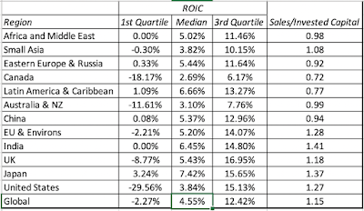 Download spreadsheetNote that the concentration of natural resource companies in Australia, New Zealand and Canada, which lowered profitability, is also showing up as lower returns on capital. The more troubling number is the 4.55% median return on capital delivered by the median global company in 2019, not only well below the cost of capital globally, but also likely to see a major hit this year, as the Corona Virus works through the global economy.
Excess ReturnsI talked about risk and hurdle rates in my four earlier data posts, where I started with the price of risk in markets (equity risk premiums and default spreads) and then about relative risk measures. In this last section, I will bring together the return measures discussed in the last section with the hurdle rates estimated in prior posts to create composite measures of excess returns, as measures of value creation.
Excess Returns Definitions and UsageWhile businesses that make money are viewed as successful, that is a low hurdle for success. After all, capital is invested in businesses and that capital invested elsewhere, in equivalent risk investments, could have earned a return. That return is what we were trying to estimate, with all of its complications, in my previous updates on risk free rates, equity risk premiums and relative risk measures.
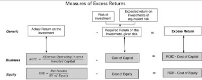 These comparisons, which are at first sight simple, are complicated by how well we can measure how much capital is invested in a project or existing assets and how closely the accounting earnings capture true earnings. Adding to the measurement issues is the fact that earnings are volatile and using a single year's number can skew our conclusions.
Excess Returns: A Global Overview
With the caveat in mind that the returns on capital that I compute for individual companies reflects operating income in 2019, a potential problem given that it is just one year and a number that clearly will change (and fairly dramatically so) because of the virus, I compared the return on capital to the cost of capital for each of the 39,000 non-financial service companies in my sample and used that comparison to create a global distribution of excess returns:
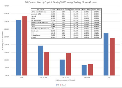
The story here is a depressing one, at least for this comparison, as 54% of global companies generated returns on capital that were lower than their costs of capital by 2% or more, and 32% of global companies earned returns that exceeded their costs of capital by 2% or more; 14% of companies earned returns that were within 2% of their costs of capital. The only part of the world where more companies earned more than their cost of capital than earned less was Japan, and even there, there are questions about whether this is an artifact of Japanese accounting practices rather than a sign of value creation. To complete the assessment, I looked at excess returns generated, by industry, and created a listing of the five industry groups with the most positive and the five with most negative median excess returns:
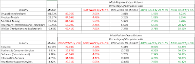 Download spreadsheetYou may be surprised to see biotechnology and healthcare IT at the top of the list of negative excess return businesses, but given that many of the companies in these industries are still young, money-losing firms with promising products in the pipeline, this may be more a reflection of the limitations of using return on capital with young companies, than a true measure of excess returns. The presence of mining and oil/gas on the list is more troubling, since it suggests that even before the brutal shocks meted out in markets in the last few weeks, these sectors were struggling. It should be no surprise that the businesses that have the highest excess returns are mostly service companies, with low capital intensity, with the exception of tobacco, a high-margin business that also has the benefit of providing a non-discretionary product.
Wrapping up
Heading into a post-virus economy, where there will be wrenching changes in most sectors, you may wonder why I even bother looking at the profitability and excess returns from 2019. After all, every one of the numbers reported in this post will be dated, as companies update their financials to reflect the damage done. That said, I think it still makes sense to look at growth, profitability and reinvesting, pre-crisis, to get a sense of how much punishment companies can take. In businesses that already had anemic revenue growth, low margins and poor investment efficiency, the effects of the crisis will be far more devastating than in businesses with higher growth, margins and efficient investment. There is a reason why airlines, retail and oil are in the front lines of this war, suffering the most casualties, and why technology and heath care are doing better.
YouTube Video
Data
1. Growth, Profit Margins, Reinvestment Efficiency and Excess Returns, by Region: 2020
2. Growth, Profit Margins, Reinvestment Efficiency and Excess Returns, by Industry: 2020
Growth, Profits and Cash FlowsThe trickiest part of valuation is negotiating a balance between growth, profitability and reinvestment, with a plausible story holding them together, to derive value.The Scaling Factor: Growth plays the 'good guy' role, allowing small companies to become big, and big firms to become even bigger. While a growth rate can be computed on any metric, the metric that best reflects operating growth is revenue growth, accomplished by either selling more units or racing prices.The Profitability Driver: Growth, by itself, can only scale up a firm's operations and revenues, but for that scaling up to pay off, it has to become profitable. Again, while there are many measures of profitability, scaling profits to revenues to arrive at profit margins makes the most sense.The Reinvestment Lever: To grow, a company has to reinvest in capacity, in whatever form, and this reinvestment can drain cash flows. This reinvestment can be tied to earnings, as a retention ratio or a reinvestment rate, or to sales, as a sales to invested capital ratio.If that sounds familiar, it is perhaps because you have seen me value many companies on this blog, using these three variables, added on to a risk component, to value companies as diverse as Kraft Heinz to Tesla to Beyond Meat. In fact, the cash flows that you observe for a firm can be captured by the interactions between these three forces, and those interactions let us differentiate between great, average and bad firms:

The extremes represent the best and worst possible combinations of these variables. Great firms pull off the trifecta, scaling up revenues with relatively little reinvestment, while deliver high margins. Terrible firms are saddled with the worst possible mix of low revenue growth, low or even negative margins and large capital investment requirements to deliver even their growth. The bulk of the business world falls in the middle, facing tradeoffs that determine value. Some trade off low margins for high growth, hoping that the dollar profits they deliver will be large enough, simply because of scale. Others are willing to reinvest more in the short term, to build barriers to entry and generate higher and more sustainable margins and returns for the long term. In the rest of this post, I plan to look at how companies around the world measure up on each of these dimensions, beginning with the growth that they have recorded in the recent past, moving on to measures of profitability and ending with reinvestment numbers. I will then close by bringing in the hurdle rates that I estimated in my last post as benchmarks, to measure how firms measure up on value creation or destruction.
Growth The first variable that I will look at is growth, and focus primarily on past growth in different metrics, ranging from revenues (the top line) to net income (the bottom line). Along the way, I will argue that the way growth rates are estimated and the periods used for the estimation can have large effects on the numbers that emerge, and that bias, as with everything else in valuation, can affect choices.
Growth MetricsInvestors often make the mistake of assuming that, since the past is behind the, a historical growth rate for a company is a fact, not an estimate. That is a myth, since the historical growth rate that is reported for a company is a function of multiple choices made on estimation, as can be seen in the picture below:

So what? First, it is worth remembering that that the biases an investor brings to the table will often determine how, and in what metric, growth is computed. In general, at least in good times, earnings per share growth will be the mantra of bullish investors in a stock, whereas top line growth will the number offered by more pessimistic about the stock. Second, if you are using growth rates for companies from a data service, it is always worth asking questions about the approach used to compute growth (arithmetic or compounded) and time period used (starting and ending years), since they can skew growth rates up or down.
Growth Rates - A Global OverviewIn keeping with the theme that with growth rates, it behooves us to be transparent about estimation choices, I will start by explaining my choices when it comes to growth. For historical growth rates, computed at the start of 2020, I use the compounded average growth rate in the previous five financial years. For most firms in my sample, this is the geometric average growth rate from 2014, as the base year, to 2019, as the final year in the sample. I will also compute growth rates in revenues (top line) and net income (the proverbial bottom line). With the latter, there will no growth rates computed for companies that are money losing, since the growth rate becomes a meaningless number. With that lead-in, I start by estimating growth rates by industry group, and in the table below, I list the ten industries with the highest growth rate in revenues in the last 5 years (2014-19) and the ten with the lowest:
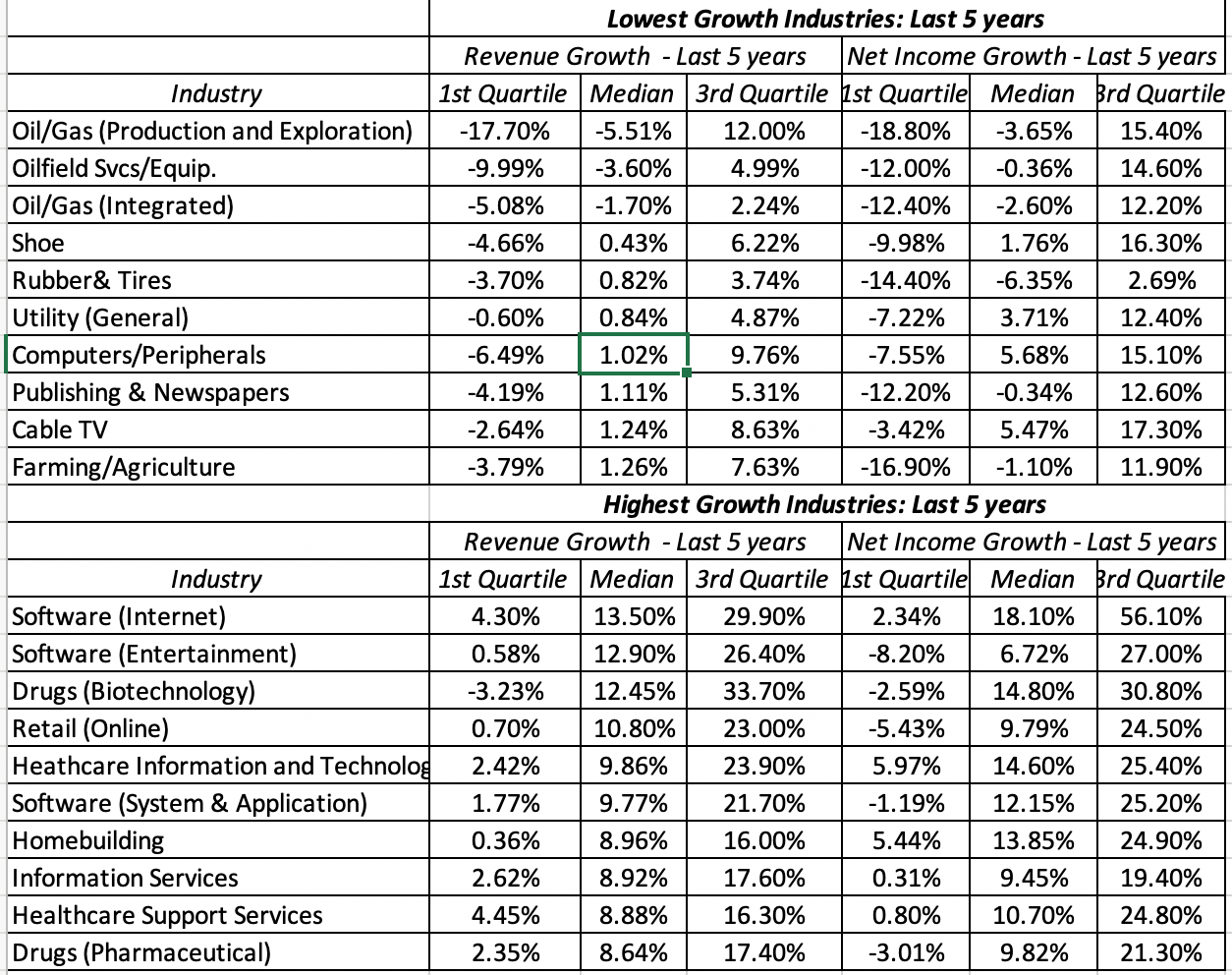 Download spreadsheetNote that even before the crisis, oil companies were shrinking, computers/peripherals had close to flat sales, and software dominates the list of high growth businesses. For a full list of growth rates, by industry, please click here. To see if there are differences in growth in different parts of the world, I then break down growth rates in revenues and net income, by region, between 2014 and 2019.
 Download spreadsheetNote that more than a quarter of all publicly traded firms saw revenues shrink, in US dollar terms, over the last five years, and that across all firms, the median growth rate in net income is much higher than the median growth rate in revenues, across all regions. However, the range on net income growth is wider than the range on revenue growth. Finally, it is worth noting that investing is based upon future growth, not past growth, and I use estimates of expected growth rate in earnings per share as my proxy. Notwithstanding the biases that analysts bring into this estimation process, it remains a forward-looking number, and I look at how expected growth in earnings per share varies across companies in different PE ratio classes:

While this data is too raw to draw big conclusions from, higher PE stocks have, not surprisingly, have higher expected growth rates than low PE stocks. As investors, though, that tells you little about whether high PE stocks are good, bad or neutral investments, since the enduring question becomes whether (a) the high expected growth reflects reality or hopeful thinking on the part of analysts and (b) the PE ratio fully, under or over reflects this expected growth rate. It is one reason that I remain wary of using pricing screens to pick stocks, since there is no short cut or formula, that will answer this question. That will require a deep dive into the company's business model and full forecasting of earnings, cash flows and risk, i.e., an intrinsic valuation.
ProfitabilityGrowth is only one part of the valuation puzzle, since without profits that come with it, it will be wasted. In this section, I will look at profitability across regions, sectors and subsets of stocks, again with the intent of eking out lessons that I can to in corporate finance, investing and valuation.
Margin Definitions & UsageWith profit margins, you scale profits to revenues, and as with growth, there are multiple metrics that can be used to compute margins, and which one is used is often a reflection of the biases that investors bring to the game. In the picture below, I look at a list of possible profit margins, and what each one is trying to measure:

By itself, each margin serves a purpose and tells a tale, and is worth calculating. Thus, the contribution margin measures the pure profits that you generate with every marginal unit you sell, since it nets out only the variable cost associated with producing that unit, giving many software companies close to 100% contribution margins. Gross margins are a close relative, providing a direct measure of marginal profitability and an indirect measure of how revenue increases flow into profits. To illustrate, Zoom, one of the few stocks that has seen its value increase during the crisis, reported a gross margin of 92% in 2019. Operating margins measure what is left after the other operating expenses of the company, which cannot be directly traced to individual unit sales, but are nevertheless necessary for its operations. Thus, R&D expenses and SG&A costs are netted out from gross profit to get to operating profit, yielding a measure that will capture economies of scale, as the company scales up. Netting out taxes and interest expenses, and adding back income from cash and cross holdings, yields net margin, a measure of what equity investors get to keep out of every dollar of revenues. It is a mixed and noisy measure, reflecting a company's operating model, its tax liabilities and its financial leverage (since debt creates interest expenses and affects taxes), as well as non-operating assets. Along the way, there are diversions. If you take the operating income, act like you have no debt and net the taxes you would have paid on that operating income, you get after-tax operating margin, a measure of operating profitability that takes into account taxes. If you take operating income, and add back depreciation and amortization, you get EBITDA margin, a measure of operating cash flows, before reinvestment. In recent year, companies with large stock based employee compensation have taken the tack that since it is in the form of shares or options, it is not an expense, and have added back this and other "extraordinary" expenses (with lots of leeway on what comprises extraordinary) to compute adjusted EBITDA margins that supposedly capture even better the cash flows at the firm.
As you look at margins, whether reported by a company or computed by a third party (including me), here are some general principles to keep in mind. First, desperation drives a money-losing company up the income statement to use more expansive forms of margin. Notice that Microsoft, which has operating margins of close to 35% and net margins of 20% plus, never talks about gross margins, whereas some of Tesla's biggest promoters keep bring up the fact that its gross margin is 25%. Boasting that your gross margin is positive is akin to being on a diet and claiming that you consume only 1800 calories a day, but that is before you count the calories in the second courses at meals, desserts and snacks. Second, not all adjustments are created equal. I have long argued that while adding back depreciation and amortization to get to an EBITDA margin may be justifiable, adding back stock based compensation is not, since it is effectively using a barter system to evade cash flows. Put differently, you could have issued those restricted shares or options in the market, and used the cash to pay your employees, and chose not to.
Margins: A Global OverviewAs with growth rates, I am going to begin by offering some background on the data that I use to compute my margins, and the adjustments that I make along the way. I use the revenues and income numbers from the trailing 12 months, which at the start of 2020, would give me the financials for most firms from October 2018 to September 2019. While that may seem short sighted, I have the archived numbers from the last decade on my website, for you to download and make your own judgments. Of course, with the market crisis fully upon us and a recession looming, you will be well served looking at the historical data. I start looking at margins across industries, to get a rough measure of how revenues flow through as earnings to the firm and its equity investors. In the table below, I list the ten industry groups with the highest and lowest operating margins, using global companies:
 Download spreadsheetNote that retail is particularly exposed in this crisis, simply because margins were low to begin with, though the question of how much will vary across retail. Thus, grocery and online retail may be more resilient than automotive and general retail from a prolonged shut down of commerce. Among the highest margin businesses, there are many that will see margins deteriorate very quickly from this crisis, with energy (both oil and green) showing the biggest near term hits. Real estate will also be exposed if there is a deep recession, but software, beverages and tobacco should see profitability hold up better. Looking across regions, I compute profitability measures across all companies in each region, recognizing that the industries that dominate each region be very different.
 Download spreadsheetNote that the Asia had the lowest margins in 2019, a warning that high growth does not always translate into profitability. Conversely, Eastern European & Russian companies have high margins, albeit with low growth. African and Middle Eastern companies have sky high margins, reflecting domestic companies that dominate local markets with little competition.
Reinvestment EfficiencyIf revenue growth captures the scaling up factor, and margins the profitability of a business, the last part of the story has to be about the efficiency with which the growth is delivered. For manufacturing companies, this will be captured in how much they spend in adding production capacity, and how efficiently they use this added capacity to produce more units. For non-manufacturing companies, the investment may be in research and development, acquisitions and other "intangibles", but it too is reinvestment and its payoff in growth affects value. For retail firms, it may take the form of inventory, accounts receivable and other ingredients of working capital, and how well they can manage these as they grow.
Reinvestment Efficiency: Definitions & Usage
Unlike revenue growth and margins, which has widely accepted proxies and measures, reinvestment efficiency remains more of a smorgasbord of different measures. Broadly speaking, these measures scale how much capital is invested either to the operating income that is created, in returns on capital measures, or to revenues, by relating capital invested to revenue growth.

In sum, reinvestment in any period is defined broadly to include not just investments in plant and capacity, the accountant's traditional cap ex measure, but also working capital, acquisitions and investments in research and development and intangible assets.
Reinvestment = (Cap Ex - Depreciation & Amortization) + Change in non-cash Working Capital + Acquisitions + (R&D expenses - Amortization of R&D)
That reinvestment accumulated over time comprises the invested capital of the firm, and both numbers (reinvestment and invested capital) can be scaled to either after-tax operating income or to revenues. When margins are stable, the two approaches are equivalent, but when the margins are changing, the revenue-scaled measures become more useful.
Reinvestment Measures: A Global Overview I noted at the start of this post that "ease of scaling up" has become a central theme of young growth companies reaching into new and often very large markets. While this has always been a selling point for conventional software and technology firms, it has expanded its reach into other businesses, from Uber in car service/logistics to Casper in mattress sales. In essence, the selling point for these models is that they can reinvest much more efficiently than their established competitors, though their growth pitch is still more focused on sales than on profits. In this section, I report on investment efficiency numbers, staying true to my premise that reinvestment has to include acquisitions and R&D. To get a sense of how investment efficiency varies across industries, I computed sales to invested capital and returns on capital, across industry groups, and in the table below, I report on the ten most and ten least efficient industries, at least when it comes to delivering revenues for every dollar of capital invested.
 Download spreadsheetLooking at regional differences, again recognizing that the industry concentrations vary geographically, I find the following:
 Download spreadsheetNote that the concentration of natural resource companies in Australia, New Zealand and Canada, which lowered profitability, is also showing up as lower returns on capital. The more troubling number is the 4.55% median return on capital delivered by the median global company in 2019, not only well below the cost of capital globally, but also likely to see a major hit this year, as the Corona Virus works through the global economy.
Excess ReturnsI talked about risk and hurdle rates in my four earlier data posts, where I started with the price of risk in markets (equity risk premiums and default spreads) and then about relative risk measures. In this last section, I will bring together the return measures discussed in the last section with the hurdle rates estimated in prior posts to create composite measures of excess returns, as measures of value creation.
Excess Returns Definitions and UsageWhile businesses that make money are viewed as successful, that is a low hurdle for success. After all, capital is invested in businesses and that capital invested elsewhere, in equivalent risk investments, could have earned a return. That return is what we were trying to estimate, with all of its complications, in my previous updates on risk free rates, equity risk premiums and relative risk measures.
 These comparisons, which are at first sight simple, are complicated by how well we can measure how much capital is invested in a project or existing assets and how closely the accounting earnings capture true earnings. Adding to the measurement issues is the fact that earnings are volatile and using a single year's number can skew our conclusions.
Excess Returns: A Global Overview
With the caveat in mind that the returns on capital that I compute for individual companies reflects operating income in 2019, a potential problem given that it is just one year and a number that clearly will change (and fairly dramatically so) because of the virus, I compared the return on capital to the cost of capital for each of the 39,000 non-financial service companies in my sample and used that comparison to create a global distribution of excess returns:
The story here is a depressing one, at least for this comparison, as 54% of global companies generated returns on capital that were lower than their costs of capital by 2% or more, and 32% of global companies earned returns that exceeded their costs of capital by 2% or more; 14% of companies earned returns that were within 2% of their costs of capital. The only part of the world where more companies earned more than their cost of capital than earned less was Japan, and even there, there are questions about whether this is an artifact of Japanese accounting practices rather than a sign of value creation. To complete the assessment, I looked at excess returns generated, by industry, and created a listing of the five industry groups with the most positive and the five with most negative median excess returns:
 Download spreadsheetYou may be surprised to see biotechnology and healthcare IT at the top of the list of negative excess return businesses, but given that many of the companies in these industries are still young, money-losing firms with promising products in the pipeline, this may be more a reflection of the limitations of using return on capital with young companies, than a true measure of excess returns. The presence of mining and oil/gas on the list is more troubling, since it suggests that even before the brutal shocks meted out in markets in the last few weeks, these sectors were struggling. It should be no surprise that the businesses that have the highest excess returns are mostly service companies, with low capital intensity, with the exception of tobacco, a high-margin business that also has the benefit of providing a non-discretionary product.
Wrapping up
Heading into a post-virus economy, where there will be wrenching changes in most sectors, you may wonder why I even bother looking at the profitability and excess returns from 2019. After all, every one of the numbers reported in this post will be dated, as companies update their financials to reflect the damage done. That said, I think it still makes sense to look at growth, profitability and reinvesting, pre-crisis, to get a sense of how much punishment companies can take. In businesses that already had anemic revenue growth, low margins and poor investment efficiency, the effects of the crisis will be far more devastating than in businesses with higher growth, margins and efficient investment. There is a reason why airlines, retail and oil are in the front lines of this war, suffering the most casualties, and why technology and heath care are doing better.
YouTube Video
Data
1. Growth, Profit Margins, Reinvestment Efficiency and Excess Returns, by Region: 2020
2. Growth, Profit Margins, Reinvestment Efficiency and Excess Returns, by Industry: 2020
March 16, 2020
A Viral Market Meltdown III: Pricing or Value? Trading or Investing?
This is the third, and I hope the last, of my viral market updates, reflecting how much change a week can deliver, and last week delivered more change than most investors could handle. Not only did we see two of the worst market days in history, in absolute terms, we also saw the worst single day in US market history since October 19, 1987, in percentage terms. In fact, the price change this week has been so dramatic that it makes the tables that I provided last week on market damage, across sectors and regions, seem dated. In this post, I will update those tables, but I want to focus on a much larger question of how investors should craft a response to the market meltdown, and how that response cannot be one-size-fits-all.
Price versus ValueI have long drawn a distinction between price and value, two terms that get used interchangeably in both academia and practice, but with very different drivers and implications. As we watch stock indices around the world gain and lose trillions each day, it is worth remembering that markets are pricing mechanisms, not value mechanisms, or as Ben Graham would put it, they are voting machines, not weighting machines, at least in the short term.
The Drivers To draw the contrast between price and value, I will use a picture that I have used many times before, where I outline the drivers of value and contrast them with the determinants of price:
Note that the drivers of value are cash flows, growth and risk, familiar ingredients in both intrinsic value and fundamental analysis. The determinants of price are both less complicated and more powerful, demand and supply, and all of the forces that drive them. While rational investors may use only fundamentals in setting demand and supply, we know, both from research and experience, that fundamentals are drowned out in markets, by mood and momentum. Markets have always been pricing games, with the degree of weight put on fundamentals ebbing and flowing over time, with less weight assigned in good times, and more after market corrections. During periods like the last three weeks, the market is all pricing all the time, with fundamentals not even on the radar. That does not make markets wrong, but it does make them difficult to decipher and tricky to navigate.
The Differences If you accept the distinction between price and value that I have drawn, it can be used to draw out why price and value diverge, and frame investment philosophies around those divergences.
1. Price has no upper or lower bound. Value does.Since price is determined by demand and supply, and there is nothing that constrains those buying and selling in markets, at least in the near term, it follows that there is no upper or lower bound to prices. In short, the prices of stocks can move towards infinity or towards zero, depending on where mood and momentum take them. Value on the other hand has both upper and lower bounds, with both bounds being set by expected cash flows, growth and risk. The upper bound is set by those who are more optimistic about a stock and what they forecast the fundamentals to be (high cash flows, high growth and low risk) and the lower bound by those who are most pessimistic about that same stock, in terms of future expectations or liquidation value. It is true that reasonable investors can disagree about where these bounds lie, but they should disagree about the existence of these bounds. It is possible, for some stocks, especially early in the life cycle and with substantial uncertainty about the future, for the lower bound on value to be zero, but stocks collectively cannot have that lower bound. For equities collectively to be worth nothing, you would require an apocalyptic scenario, one in which there is little point thinking about investments anyway.
2. Price is reactive, Value is proactive!Information is the lubricant for market movements, but information works differently in the pricing and value processes, on two dimensions:Incremental Information versus Fundamental Information: If pricing is driven by mood and momentum, those forces can take information that, at least at first sight, seems insignificant, from a value perspective, and cause price changes that are disproportional. Thus, when the mood is upbeat, small pieces of good news can result in big jumps in stock prices, but if that mood turns sour, small pieces of bad news can cause large drops in stock prices. To illustrate, the 10% plus drop in US stocks on Thursday (3/12) was supposedly caused by the Trump Administration's decision to bar flights from Europe for thirty days, and the almost equivalent jump the next day (3/13) by its decision to declare an emergency. Reactive versus Proactive: Since pricing is determined entirely be demand and supply, and there is no value center to it, it is, by its very nature, reactive. Put simply, traders react to the incremental information to adjust the price, and put little thought into whether the starting price itself has a basis to it. Thus, a starting price that is too high (low) will only get higher (lower), if the incremental news that comes out is good (bad). On the other hand, value is driven by expectations of cash flows, growth and risk, and incremental information has to be used to reassess those expectations, a more difficult task, but one that forces you to separate the wheat from the chaff. In periods of pricing tumult, like the last three weeks, it is both futile and perhaps counter productive to try to explain big pricing moves, especially on a day-to-day basis, with the language and tools of value. If I could make a suggestion to the financial news channels now, here is what it would be. Remove all the talking heads (including me) from the screen, and just show the stock indices in real time. This is a market that needs no commentary!
3. Equity prices may never converge on value (at least in your lifetime or mine).Old time value investors live by the adage that prices can go up and down, with little relationship to value, but that they eventually converge on value. That sounds reasonable until you consider what "eventually" means, at least in the context of equity in a publicly traded company. Absent a catalyst causing the convergence, it is true that price will not only diverge from value in the short term, but it could do for very long time periods. Put simply, assuming that you will be rewarded for being right on value can be a pipe dream, and Keynes was correct when he said that the "market can stay irrational longer than you and I can stay solvent". So what is it that keeps investors toiling at the fundamentals, hoping to get rewarded? The answer is faith, faith that they can estimate value and faith that the price will adjust to value. It is faith because I can offer you no proof for either proposition, and it is faith, because its strength will be tested by markets like this one.
An Investing Game PlanIf you are wondering what all of this discussion of price and value has to do with how you should react to the market drop, I will argue that your response has to be tailored to (a) whether you have faith in investing (b) how much liquidity you have or need and (c) where you see yourself as having the biggest edge over the rest of the market.
Do you have faith? In the abstract, most market participants describe themselves as long term, patient and believers in value. Books about Warren Buffett outnumber those sold about any other market player, by ten to one, but I think one of his pithier sayings comes to mind, when evaluating whether people mean what they say about being long term value investors. Buffett once said that it is only when the tide goes out that you can tell who’s been swimming naked, and it is only when the market goes into crisis mode that you can tell the investors from the traders. So, if you came into the February 2020, describing yourself as a believer in value, do you still believe? If yes, what have you done or not done during the last three weeks that is consistent with that faith? My faith in value and price adjusting to value is strong, but it is not absolute. I have found myself questioning my own beliefs at times during these weeks, just I did in 2008, and I believe that is not only natural, but healthy. WMy faith still holds, but I have a feeling that there are more tests to come.
Are you selling or buying liquidity? There is no stronger resource to have during a crisis than a cash cushion, since investors seek out liquidity and are willing to pay handsomely for it. That said, whether you can buy or sell liquidity may not be in your control and is affected by outside forces:Income Predictability: If you are feeling a little less secure about your income prospects after the last three weeks, you are not alone, and while this will pass, it does affect how much cash you need to conserve, just in case.Cash Needs: Virus or no virus, house payments have to be made, credit card bills paid and unexpected costs covered, and a shakier economy make all of these obligations more onerous.Personal make up: I believe that the key to picking an investment philosophy that is right for you is to make sure that you can pass the sleep test, with it. Put simply, if you lie awake at night thinking about your portfolio, you’ve failed the test. If you are naturally impatient, your time horizon is shortened, and no lecture on the importance of long term investing or data backing up that it works, can change that.If you add mortality to this list, and the fact that if you manage other people's money (in a mutual or hedge fund), it is their time horizon that may matter, not yours, it is easy to see why what is perceived as liquidity in good times very quickly dissipates in bad one. If you are sitting on a cash cushion, you are already in a much better spot than those who do not have that luxury, but there are two uses that you can put the cash to, one passive and other active. The passive response would be to hold on to the cash, preserve your sanity and pass the sleep test, as markets stay volatile. The active response is to use the cash to take positions, though what you will invest in will depend on whether you believe in value or price, and within each of these, where you think that market is mistaken. If you are in the less enviable position of needing cash quickly, either to meet a liquidity crunch or to stop failing the sleep test, you should sell some of your holdings, though what you sell will reflect again your beliefs about market mistakes.
What is your edge? To succeed as an active market player, you have to bring something to the table, and recognizing the edge that you bring is key to success, and that is true whether you are an investor (who believes in value) or a trader (who plays the pricing game).As an investor, your skills may lie in assessing the entire market, sectors or individual stocks, and this crisis has brought those all into sharper focus. As a trader, you can be good at riding momentum or detecting shifts in it and making money from reversals, and the opportunities for both have expanded, as market volatility has expanded.In either case, you will get an opportunity in the coming weeks to plot your own path through this crisis, and as I mentioned at the start of this post, it will not be one size fits all.
Choosing your Game Plan In the picture below, I have outlined how your faith or its absence, liquidity or lack thereof and your perceived edge will all come into play in determining what is your best path of action.
I have never believed in offering investing frameworks, without being open about the choices that I am making, not because they are the “right” ones, but because they are the ones that work for me. I believe in value, and I am lucky enough to have liquidity. I believe that I can bring more to the table, when valuing individual stocks, than I can, in assessing sectors or markets.
What now?I know that this post has meandered and I am sorry, but in this last section, I will come back to the numbers, by first updating my valuation of the S&P 500 and then moving on to both update the tables on market damage from March 6 to reflect the last week's market action.
Valuing the Index While some of you will view this as a futile exercise, I revisited my S&P 500 valuation spreadsheet that I created two weeks ago, and updated it, to reflect an expectation that the earnings damage this year is likely to be larger than I initially estimated. Rather than provide a single value estimate for the S&P 500, I have run a Monte Carlo simulation around the four key inputs: earnings drop this year, the percentage that will be recouped by 2025, the percent that will be returned as cash flows and the equity risk premium:
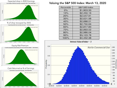 Download spreadsheet & Simulation resultsNote that on the earnings drop and subsequent recovery, I have used distributions with more downside surprises than upside, reflecting my belief that there is a chance of significantly greater damage than expected, albeit with small probabilities. The median value of 2750 is marginally higher than 2011, the level of the index on Friday, March 13, but this is not an investment for the faint of heart.
Valuing Individual Stocks/Sectors I have held back on individual stock valuations for the last two weeks, but I will start looking, and to help decide where to start, I created this very simple structure for thinking about what companies are most affected and least affected by the virus:
Using this framework, firms that sell non-discretionary products, are non-travel related, have low leverage (operating and financial) and are cash flow positive should be least affected by the virus, and discretionary product/service or travel-related companies with high fixed costs and debt, should be most affected. In the table below, I have updated both my sector and industry tables that I had posted last week, to reflect the additional damage from last week: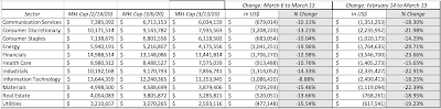 Download spreadsheetThe ten industry groups that were affected most and least by the market turmoil are below:
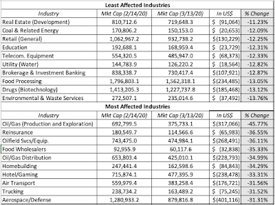 Download spreadsheetUpdating the regional tables to include the last week’s data:
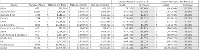 Download spreadsheetI also rechecked the momentum and PE tables, and while every decile of each lost money last week, there was no discernible pattern in either. Finally, I broke firms down by debt ratio (as percent of total market value of the firm), to see if firms with more debt were being punished by the market more than less indebted firms, and see only a mild relationship. You can download all of this data by clicking on this link. Collectively, global equity markets have lost a staggering $18.65 trillion in market capitalization, with US stocks accounting for $7.6 trillion in those losses. Note that the market damage lines up well with our priors, which is what makes investing tricky. In fact, there are two perspectives that you can bring to surveying these stocks, leading to contradictory strategies.If you believe that markets have over reacted, your best chance at finding value might be to look in the rubble, the worst affected regions, sectors and companiesIf you think that markets have not fully incorporated the economic damage from the virus, you should look at the regions, sectors and companies that are more protected.The first two stocks on my radar for in-depth intrinsic valuation are Zoom, one of the few stocks that has benefited from this crisis, and Boeing, a stock that has lost more than half of its market capitalization, as its high-leverage, travel-focused business is put to the test by this virus. Implicit in both these valuations will be my own views on the macro and timing effects of this virus, but that is something that I cannot avoid taking a point of view on. Stay tuned!
YouTube Video
Spreadsheets/Data
Spreadsheet to value S&P 500, March 13, 2020Simulation Results for S&P 500 (Run using Crystal Ball)Market Capitalization Changes, February 14- March 13, 2020
Price versus ValueI have long drawn a distinction between price and value, two terms that get used interchangeably in both academia and practice, but with very different drivers and implications. As we watch stock indices around the world gain and lose trillions each day, it is worth remembering that markets are pricing mechanisms, not value mechanisms, or as Ben Graham would put it, they are voting machines, not weighting machines, at least in the short term.
The Drivers To draw the contrast between price and value, I will use a picture that I have used many times before, where I outline the drivers of value and contrast them with the determinants of price:

Note that the drivers of value are cash flows, growth and risk, familiar ingredients in both intrinsic value and fundamental analysis. The determinants of price are both less complicated and more powerful, demand and supply, and all of the forces that drive them. While rational investors may use only fundamentals in setting demand and supply, we know, both from research and experience, that fundamentals are drowned out in markets, by mood and momentum. Markets have always been pricing games, with the degree of weight put on fundamentals ebbing and flowing over time, with less weight assigned in good times, and more after market corrections. During periods like the last three weeks, the market is all pricing all the time, with fundamentals not even on the radar. That does not make markets wrong, but it does make them difficult to decipher and tricky to navigate.
The Differences If you accept the distinction between price and value that I have drawn, it can be used to draw out why price and value diverge, and frame investment philosophies around those divergences.
1. Price has no upper or lower bound. Value does.Since price is determined by demand and supply, and there is nothing that constrains those buying and selling in markets, at least in the near term, it follows that there is no upper or lower bound to prices. In short, the prices of stocks can move towards infinity or towards zero, depending on where mood and momentum take them. Value on the other hand has both upper and lower bounds, with both bounds being set by expected cash flows, growth and risk. The upper bound is set by those who are more optimistic about a stock and what they forecast the fundamentals to be (high cash flows, high growth and low risk) and the lower bound by those who are most pessimistic about that same stock, in terms of future expectations or liquidation value. It is true that reasonable investors can disagree about where these bounds lie, but they should disagree about the existence of these bounds. It is possible, for some stocks, especially early in the life cycle and with substantial uncertainty about the future, for the lower bound on value to be zero, but stocks collectively cannot have that lower bound. For equities collectively to be worth nothing, you would require an apocalyptic scenario, one in which there is little point thinking about investments anyway.
2. Price is reactive, Value is proactive!Information is the lubricant for market movements, but information works differently in the pricing and value processes, on two dimensions:Incremental Information versus Fundamental Information: If pricing is driven by mood and momentum, those forces can take information that, at least at first sight, seems insignificant, from a value perspective, and cause price changes that are disproportional. Thus, when the mood is upbeat, small pieces of good news can result in big jumps in stock prices, but if that mood turns sour, small pieces of bad news can cause large drops in stock prices. To illustrate, the 10% plus drop in US stocks on Thursday (3/12) was supposedly caused by the Trump Administration's decision to bar flights from Europe for thirty days, and the almost equivalent jump the next day (3/13) by its decision to declare an emergency. Reactive versus Proactive: Since pricing is determined entirely be demand and supply, and there is no value center to it, it is, by its very nature, reactive. Put simply, traders react to the incremental information to adjust the price, and put little thought into whether the starting price itself has a basis to it. Thus, a starting price that is too high (low) will only get higher (lower), if the incremental news that comes out is good (bad). On the other hand, value is driven by expectations of cash flows, growth and risk, and incremental information has to be used to reassess those expectations, a more difficult task, but one that forces you to separate the wheat from the chaff. In periods of pricing tumult, like the last three weeks, it is both futile and perhaps counter productive to try to explain big pricing moves, especially on a day-to-day basis, with the language and tools of value. If I could make a suggestion to the financial news channels now, here is what it would be. Remove all the talking heads (including me) from the screen, and just show the stock indices in real time. This is a market that needs no commentary!
3. Equity prices may never converge on value (at least in your lifetime or mine).Old time value investors live by the adage that prices can go up and down, with little relationship to value, but that they eventually converge on value. That sounds reasonable until you consider what "eventually" means, at least in the context of equity in a publicly traded company. Absent a catalyst causing the convergence, it is true that price will not only diverge from value in the short term, but it could do for very long time periods. Put simply, assuming that you will be rewarded for being right on value can be a pipe dream, and Keynes was correct when he said that the "market can stay irrational longer than you and I can stay solvent". So what is it that keeps investors toiling at the fundamentals, hoping to get rewarded? The answer is faith, faith that they can estimate value and faith that the price will adjust to value. It is faith because I can offer you no proof for either proposition, and it is faith, because its strength will be tested by markets like this one.
An Investing Game PlanIf you are wondering what all of this discussion of price and value has to do with how you should react to the market drop, I will argue that your response has to be tailored to (a) whether you have faith in investing (b) how much liquidity you have or need and (c) where you see yourself as having the biggest edge over the rest of the market.
Do you have faith? In the abstract, most market participants describe themselves as long term, patient and believers in value. Books about Warren Buffett outnumber those sold about any other market player, by ten to one, but I think one of his pithier sayings comes to mind, when evaluating whether people mean what they say about being long term value investors. Buffett once said that it is only when the tide goes out that you can tell who’s been swimming naked, and it is only when the market goes into crisis mode that you can tell the investors from the traders. So, if you came into the February 2020, describing yourself as a believer in value, do you still believe? If yes, what have you done or not done during the last three weeks that is consistent with that faith? My faith in value and price adjusting to value is strong, but it is not absolute. I have found myself questioning my own beliefs at times during these weeks, just I did in 2008, and I believe that is not only natural, but healthy. WMy faith still holds, but I have a feeling that there are more tests to come.
Are you selling or buying liquidity? There is no stronger resource to have during a crisis than a cash cushion, since investors seek out liquidity and are willing to pay handsomely for it. That said, whether you can buy or sell liquidity may not be in your control and is affected by outside forces:Income Predictability: If you are feeling a little less secure about your income prospects after the last three weeks, you are not alone, and while this will pass, it does affect how much cash you need to conserve, just in case.Cash Needs: Virus or no virus, house payments have to be made, credit card bills paid and unexpected costs covered, and a shakier economy make all of these obligations more onerous.Personal make up: I believe that the key to picking an investment philosophy that is right for you is to make sure that you can pass the sleep test, with it. Put simply, if you lie awake at night thinking about your portfolio, you’ve failed the test. If you are naturally impatient, your time horizon is shortened, and no lecture on the importance of long term investing or data backing up that it works, can change that.If you add mortality to this list, and the fact that if you manage other people's money (in a mutual or hedge fund), it is their time horizon that may matter, not yours, it is easy to see why what is perceived as liquidity in good times very quickly dissipates in bad one. If you are sitting on a cash cushion, you are already in a much better spot than those who do not have that luxury, but there are two uses that you can put the cash to, one passive and other active. The passive response would be to hold on to the cash, preserve your sanity and pass the sleep test, as markets stay volatile. The active response is to use the cash to take positions, though what you will invest in will depend on whether you believe in value or price, and within each of these, where you think that market is mistaken. If you are in the less enviable position of needing cash quickly, either to meet a liquidity crunch or to stop failing the sleep test, you should sell some of your holdings, though what you sell will reflect again your beliefs about market mistakes.
What is your edge? To succeed as an active market player, you have to bring something to the table, and recognizing the edge that you bring is key to success, and that is true whether you are an investor (who believes in value) or a trader (who plays the pricing game).As an investor, your skills may lie in assessing the entire market, sectors or individual stocks, and this crisis has brought those all into sharper focus. As a trader, you can be good at riding momentum or detecting shifts in it and making money from reversals, and the opportunities for both have expanded, as market volatility has expanded.In either case, you will get an opportunity in the coming weeks to plot your own path through this crisis, and as I mentioned at the start of this post, it will not be one size fits all.
Choosing your Game Plan In the picture below, I have outlined how your faith or its absence, liquidity or lack thereof and your perceived edge will all come into play in determining what is your best path of action.

I have never believed in offering investing frameworks, without being open about the choices that I am making, not because they are the “right” ones, but because they are the ones that work for me. I believe in value, and I am lucky enough to have liquidity. I believe that I can bring more to the table, when valuing individual stocks, than I can, in assessing sectors or markets.
What now?I know that this post has meandered and I am sorry, but in this last section, I will come back to the numbers, by first updating my valuation of the S&P 500 and then moving on to both update the tables on market damage from March 6 to reflect the last week's market action.
Valuing the Index While some of you will view this as a futile exercise, I revisited my S&P 500 valuation spreadsheet that I created two weeks ago, and updated it, to reflect an expectation that the earnings damage this year is likely to be larger than I initially estimated. Rather than provide a single value estimate for the S&P 500, I have run a Monte Carlo simulation around the four key inputs: earnings drop this year, the percentage that will be recouped by 2025, the percent that will be returned as cash flows and the equity risk premium:
 Download spreadsheet & Simulation resultsNote that on the earnings drop and subsequent recovery, I have used distributions with more downside surprises than upside, reflecting my belief that there is a chance of significantly greater damage than expected, albeit with small probabilities. The median value of 2750 is marginally higher than 2011, the level of the index on Friday, March 13, but this is not an investment for the faint of heart.
Valuing Individual Stocks/Sectors I have held back on individual stock valuations for the last two weeks, but I will start looking, and to help decide where to start, I created this very simple structure for thinking about what companies are most affected and least affected by the virus:

Using this framework, firms that sell non-discretionary products, are non-travel related, have low leverage (operating and financial) and are cash flow positive should be least affected by the virus, and discretionary product/service or travel-related companies with high fixed costs and debt, should be most affected. In the table below, I have updated both my sector and industry tables that I had posted last week, to reflect the additional damage from last week:
 Download spreadsheetThe ten industry groups that were affected most and least by the market turmoil are below:
 Download spreadsheetUpdating the regional tables to include the last week’s data:
 Download spreadsheetI also rechecked the momentum and PE tables, and while every decile of each lost money last week, there was no discernible pattern in either. Finally, I broke firms down by debt ratio (as percent of total market value of the firm), to see if firms with more debt were being punished by the market more than less indebted firms, and see only a mild relationship. You can download all of this data by clicking on this link. Collectively, global equity markets have lost a staggering $18.65 trillion in market capitalization, with US stocks accounting for $7.6 trillion in those losses. Note that the market damage lines up well with our priors, which is what makes investing tricky. In fact, there are two perspectives that you can bring to surveying these stocks, leading to contradictory strategies.If you believe that markets have over reacted, your best chance at finding value might be to look in the rubble, the worst affected regions, sectors and companiesIf you think that markets have not fully incorporated the economic damage from the virus, you should look at the regions, sectors and companies that are more protected.The first two stocks on my radar for in-depth intrinsic valuation are Zoom, one of the few stocks that has benefited from this crisis, and Boeing, a stock that has lost more than half of its market capitalization, as its high-leverage, travel-focused business is put to the test by this virus. Implicit in both these valuations will be my own views on the macro and timing effects of this virus, but that is something that I cannot avoid taking a point of view on. Stay tuned!
YouTube Video
Spreadsheets/Data
Spreadsheet to value S&P 500, March 13, 2020Simulation Results for S&P 500 (Run using Crystal Ball)Market Capitalization Changes, February 14- March 13, 2020
Aswath Damodaran's Blog

- Aswath Damodaran's profile
- 725 followers
Aswath Damodaran isn't a Goodreads Author
(yet),
but they
do have a blog,
so here are some recent posts imported from
their feed.


![[image error]](https://1.bp.blogspot.com/-hPeFjkWbvVA/XtV2AcXEY2I/AAAAAAAAG0o/jnauIk93aEc5pq3dWN_0lhtlPkJL38YegCNcBGAsYHQ/s1600/Treasuries.jpg)
![[image error]](https://1.bp.blogspot.com/-4qQfEectl_M/Xtfm_bzRvDI/AAAAAAAAG2Q/OhU-46qSNfgA1hGbYdnxtCWYIBEk5WwUACNcBGAsYHQ/s1600/ImplPremDriversCoronaVirus.jpg)