
Nate Silver's Blog, page 171
June 13, 2014
Spain Is Now an Underdog to Make the Knockout Stage
This sort of thing just doesn’t happen to Spain. The Spanish lost their World Cup opener in 2010 — but not like this. The last time Spain conceded five or more goals in a match, as it did on Friday in a 5-1 loss to the Netherlands, was exactly 51 years ago, in a friendly against Scotland on June 13, 1963. Indeed, while Spain has excelled at all phases of the game in recent years, it has been especially adept at goal-prevention, having allowed just two goals during the 2010 World Cup (including none at all in the knockout phase; Spain won the tournament with a string of four 1-0 victories).
What were the odds of Friday’s scoreline? The Netherlands has a vibrant offense, but still, our Soccer Power Index (SPI) match predictor gave the Oranje just a 0.4 percent chance of scoring five or more goals against Spain.
Let’s waste no further time on trivia. This result puts Spain in enormous trouble. Its chances of advancing from Group B are now just 34 percent, down from 79 percent. The Spanish have only a 7 percent chance of winning the group, down from 48 percent.
Our model was a little bit bearish on Spain as compared to the consensus, but we certainly wouldn’t have expected this result. Our simulation algorithm now puts Spain’s chances of winning the World Cup at only 2 percent, down from 8 percent before the tournament — and that may be optimistic, for a reason I’ll explain in a moment.
Spain’s problems are pretty easy to sum up. First, there are two other very strong teams in its group, the Netherlands and Chile. And the Dutch already tallied three points. (If Australia defies the odds by drawing or beating Chile later Friday night, Spain’s case will be helped, but a Chile win would put the Spanish in even more trouble.)
Next, Spain is not in a position to win very many tiebreakers with a -4 goal differential so far, although the Red Fury surely will try to run up the score in their game against Australia later this month.
Third, even if Spain comes back to advance from Group B, it will probably do so as the second-place team. And the No. 2 team from Group B will face the No. 1 team from Group A in the Round of 16. There is a 97 percent chance that team will be Brazil, according to our simulation.
It gets worse: Spain’s odds will deteriorate a little more when we re-run the numbers Saturday morning.
As I explained on Thursday, the projection updates we run immediately after a match account for the score of the game and its effect on the group standings — but not its effect on our estimate of a team’s quality going forward. Instead, those changes take place overnight when the Soccer Power Index updates. In this case, the overnight update will hurt Spain’s odds further. In addition to having dug itself a huge hole, Spain may not be the soccer team we thought it was. Its SPI defensive rating, which was previously tied for No. 1 in the world, will decline some.
The Netherlands, of course, which had the misfortune of drawing a very tough group, has greatly helped its chances. Its odds of advancing have more than doubled — from 44 percent before the match to 91 percent now. The Dutch will rise a little further in Saturday morning’s update once SPI accounts for their 5-1 victory against what we thought was the world’s best defensive soccer team.


The Search for America’s Best Burrito
We analyzed data on 67,391 restaurants to find the 64 top burritos in America. Then we went on the road to taste them all. Want to know which one is best?

June 12, 2014
Brazil’s (Ugly) Win Didn’t Change Its Prospects All That Much
Brazil defeated Croatia 3-1 in the opening match of the World Cup on Thursday — while looking about as bad as it could while winning by that scoreline. Its go-ahead goal came on a penalty kick following a dubious call by referee Yuichi Nishimura. Its third goal perhaps ought to have been stopped by Croatian goalkeeper Stipe Pletikosa. And the one it conceded was an own goal by Marcelo.
FiveThirtyEight’s World Cup forecasts have been updated to reflect the results of the match, as they will be at the conclusion of each game. The projections don’t account for style points — it’s the scoreline that matters — so Brazil won’t be harmed by winning ugly.
A bit more about how these updates work in a moment, but one soccer-related thought first. Some of Brazil’s edge — it had an 88 percent chance of beating Croatia in our pre-match predictions — was because of home-field advantage. Some of that advantage, as Tobias Moskowitz and Jon Wertheim have found, comes because home teams are more likely to benefit from refereeing decisions. Soccer has an especially large home-field advantage, in part because the officiating plays such a large role in the sport, especially in calling penalties and issuing red cards. Would Nishimura have made that (mistaken) penalty call had the game been played in Dubrovnik, rather than Sao Paulo? We’ll never know for sure, but the odds say it’s less likely.
Back to our forecasts: Technically speaking, there are two programs that our colleagues at ESPN Stats & Info run to generate our World Cup forecasts. One program is a match simulator that plays out the results of the rest of the tournament 10,000 times. The other is the Soccer Power Index algorithm itself, which informs the match simulator’s estimate of how strong each team is.
We’ll be running the match simulator at the end of each game (there will usually be a lag of 20 to 30 minutes before we get the new results on the site). However, the Soccer Power Index (SPI) program, which is computationally intensive, runs only once per day, overnight after all games have concluded.
I’ll explain why this distinction matters by asking you to imagine that Brazil had drawn 1-1 with Croatia, rather than pulling out the win. This would hurt Brazil in two ways: First, it would increase the odds that it would fail to advance from its group. (Granted, Brazil’s odds would still be very high.) That change would be reflected immediately in our forecasts based on the match simulator.
But a draw would also have lowered SPI’s estimate of Brazil’s strength. (SPI rates recent matches heavily, and it regards Brazil very highly, so a draw might have had a fair amount of impact.) That change, however, would not be reflected until our overnight update.
There are also some other, more subtle things that can go on with SPI in the overnight updates. It’s learning more about which players a team has in its starting lineup, which reflects the player-rating component of the model. It also learns more about the relative strength of the continents. A draw for Brazil, for instance, would have (very slightly) lowered SPI’s estimate of the chances for Argentina, Colombia, and so forth, as the match would represent one data point showing that South America was not quite as strong as assumed.
As far as the actual scoreline goes — Brazil 3, Croatia 1 — it won’t do much to improve SPI’s view on Brazil, either, since SPI had Brazil winning against Croatia by slightly more than two goals on average.
Based on the results of the match simulator, however, Brazil’s odds of advancing from Group A have risen to 99.8 percent from 99.3 percent before the match. It’s usually not worth sweating the decimal places since there can sometimes be noise introduced by the match simulator — 10,000 simulations is a lot, but not enough to entirely remove the margin of error. In this case, however, the match simulator is just pointing out the obvious: It was going to be really hard for Brazil to fail to advance, and it will be even harder now that it’s picked up three points.
How much were Croatia’s advancement odds hurt? They weren’t, actually — instead, they rose slightly to 37.5 percent from 36.6 percent. Some of this probably reflects the statistical noise that I referred to earlier. However, there is one way in which the match helped Croatia: Losing to Brazil by only two goals is not such a bad result. Mexico and Cameroon, the other two teams in Group A, could lose to Brazil by larger margins. In fact, SPI has Mexico as a 2.6-goal underdog, and Cameroon as a 3.2-goal underdog. That could make a difference if the second advancement position from Group A comes down to a tiebreaker based on goal differential, as it might. And FIFA’s next tiebreaker is based on goals scored, so losing 3-1 is better than losing 2-0. I doubt the Croats will be happy with the result of Thursday’s game, however.

The History of the World Cup in 20 Charts
Brazil, the World Cup host and the clear favorite (in our view), will start off the tournament Thursday with a match against Croatia. Soon after, 30 other countries will take to the pitch with varying prospects of achieving their World Cup dreams. See the FiveThirtyEight World Cup predictions for more on that.
But first: a brief tour of World Cup history. We wanted to answer a few basic questions: How often do favorites win? How often do host nations win? Is the spread of soccer talent throughout the world becoming more top-heavy or more even?
The 20 charts below provide some answers. They rank each team that entered the World Cup based on its Elo ratings before the tournament.
These Elo ratings, which were adopted from a system developed for chess, have relatively little meaning in an absolute sense. We could say, for example, that Italy has an Elo rating of 1879 — but it’s not clear what you’d do with that.
The Elo system is set up such that the average team has a rating of 1500. There are more than 200 countries that field national soccer teams, however, so being average (as Cape Verde or Trinidad and Tobago are, according to Elo) won’t normally get a team into the World Cup field, much less win it the trophy.
So instead we’ve compared each team’s rating with that of the 32nd-best team in the world, according to Elo (whether or not team No. 32 qualified for the World Cup), at the time the World Cup began.1 The 32nd-best team has gotten quite a bit better over the years, having gone from an Elo rating of 1540 in 1930, to one of 1707 this year. (The 32nd-best team in the world is currently Costa Rica, according to Elo.) Of course, the field has also expanded — from 13 teams in 1930 to 32 in World Cups played since 1998.
The charts include one other important adjustment: We’ve given a 100-point bonus, in accordance with the Elo system’s recommended value, to the host nation.2
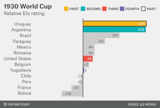
The 1930 World Cup, the first on our tour, was one where the home-nation adjustment makes a difference. Held in Uruguay, it was composed mostly of teams from the Americas; few European nations were willing to make the journey. Argentina and Uruguay were the two best teams in the field by some margin, with Argentina just slightly ahead in the Elo ratings. But Uruguay’s home-nation status was enough to make it the favorite. The two met in the finals in Montevideo, with Uruguay winning 4-2. More surprising: The United States and Yugoslavia won their groups and advanced to the semifinal, ahead of the higher-rated Brazil and Paraguay.
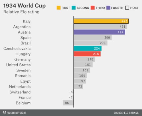
Italy played host to the 1934 World Cup. Several South American teams, including Uruguay, declined to participate, as did the countries of the United Kingdom. Overall, however, the field was deeper and had more parity than four years earlier. Italy, Argentina and Austria would essentially have been co-favorites before the tournament began, with Italy slightly ahead on the basis of the home-country effect. Indeed, Italy won.
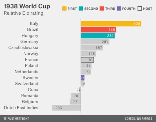
Italy was also the favorite in the 1938 World Cup, which was played in France under the cloud of creeping European fascism. Italy was a clear favorite because Argentina, No. 2 in the Elo ratings at the time and disappointed that Europe had hosted two World Cups in a row, refused to participate. Italy won, keeping the streak alive for Elo favorites.
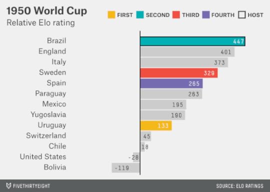
But when the World Cup returned in 1950 after a 12-year hiatus because of World War II and its aftermath, there was a surprise in store. Brazil hosted the tournament and, with its home-country boost, would have been the slight favorite per Elo. But it was a deep field — with England participating for the first time, and strong entrants from Italy, Sweden and several other countries (although Argentina again declined to enter). Uruguay, just the ninth-best team in the field, according to Elo, prevailed in a famous upset.
We’ll accelerate our pace a bit now that we’ve gotten the hang of this. The 1954 World Cup, held in Switzerland, featured another famous upset in the final, with West Germany defeating heavily favored Hungary in the so-called Miracle of Bern.

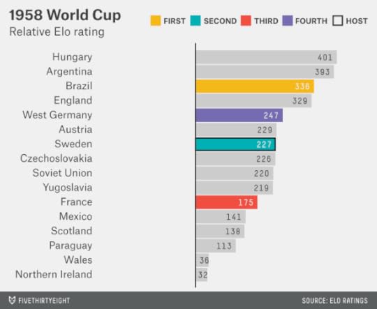
The 1958 World Cup featured a deep and competitive field. Hungary or Argentina would probably have been the favorite, but Brazil and England were not far behind them. Brazil won for the first time.
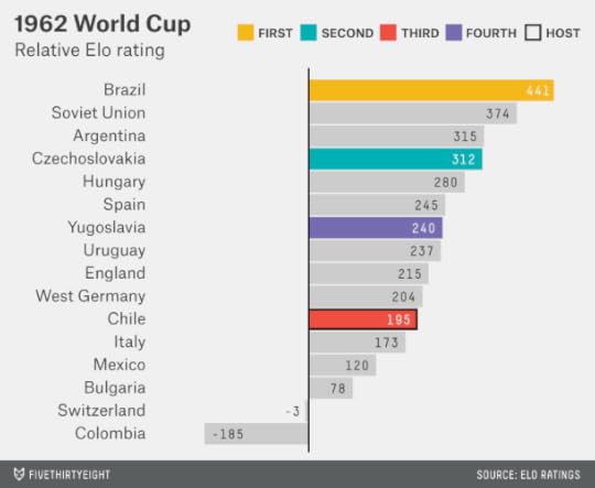
This touched off Brazil’s golden era, helmed by its star Pelé. The team entered the 1962 World Cup in Chile as the favorite, and it won — marking the last time a team has won two consecutive World Cups.
By 1966, Brazil’s Elo rating had slipped closer to the rest of the world. Among a deep group of contenders, England would have been the Elo favorite because of its host-nation status. And just this once, England won.

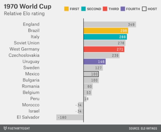
The 1970 World Cup, held in Mexico, featured one of the deepest fields ever. England was nominally the favorite again, according to Elo, but five other countries were within 100 points of it — including the eventual winner, Brazil.
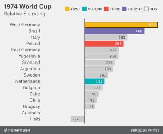
The 1974 World Cup, by contrast, had a relatively clear favorite. West Germany and Brazil were the best teams in the world by some margin, but West Germany, led by Franz Beckenbauer and having built momentum by winning the 1972 European Championships, played host to the tournament and won.
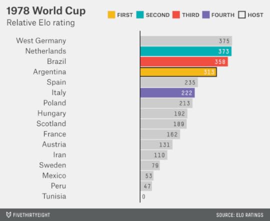
The 1978 World Cup, held in and won by Argentina, is one of the least fondly remembered. Argentina was ruled by a military junta, which had come to power in 1976 after the overthrow of Isabel Perón. That World Cup has also long been associated with accusations of match-fixing. Was Argentina’s home-country advantage, for whatever reason, larger than usual? It’s hard to say; Argentina was a good team on its football merits, and the customary 100-point home-country boost would have put it in a group of front-runners that included West Germany, the Netherlands and Brazil.
Spain hosted the World Cup in 1982; West Germany and Brazil would have been the favorites, according to Elo. Instead, it was Italy — just the 12th-best team in the field — that won.

The 1986 World Cup initiated an era of relative parity. It would have been hard to pick a favorite: 14 teams, including the host, Mexico, were stacked within 140 Elo points of one another, and they weren’t that far ahead of some of the also-rans. Argentina won, not uncontroversially, on Diego Maradona’s “Hand of God” goal.

The 1990 World Cup also featured a fairly flat distribution of talent, although the host, Italy, would have been the nominal favorite on the basis of the home-country advantage. West Germany won instead after a low-scoring and poorly played World Cup.

The World Cup returned to the Americas in 1994, when it was held in the United States. This was perhaps the first time that the host nation had no real chance of winning; the U.S. was rated as just the 18th-best team, despite its home-country boost. Much like the 1986 tournament, there was a large group of good-but-not-great teams atop the field. The Brazilian team, led by Romário and Bebeto, won in Pasadena, California, after Roberto Baggio’s penalty kick sailed over the crossbar.

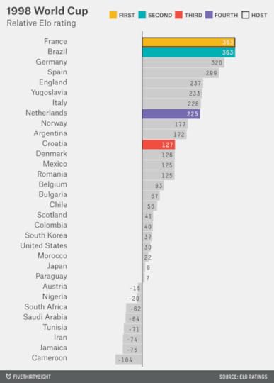
The 1998 World Cup featured co-favorites, according to Elo: France and Brazil were tied in Elo entering the tournament (after giving France its 100-point home-country bonus). Those two teams met in the final, and France won 3-0.
The 2002 World Cup, co-hosted by Japan and South Korea, was one of the oddest tournaments. France was the best team entering the tournament, according to Elo, but it went winless in the group stage. The final featured some customary names — Brazil and Germany, with Brazil winning — but neither the Brazilian or German teams were especially strong by the Elo ratings. Turkey took third place despite being just the 23rd-best team in the field.

The 2006 World Cup also featured a great deal of parity, with at least 10 plausible winners, including the host, Germany. It was Italy who prevailed over France on penalties in a final remembered for Zinedine Zidane’s headbutt.

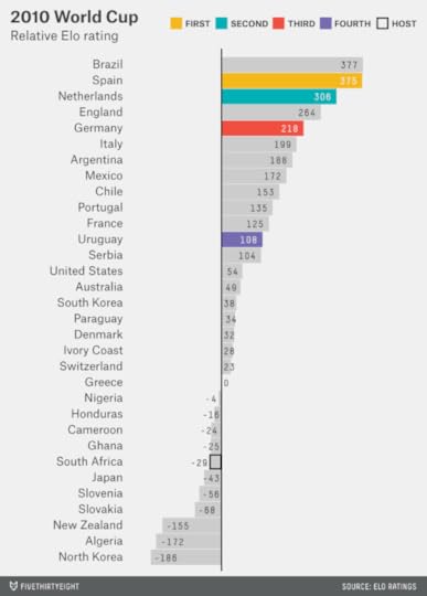
The past two World Cups, however, have seen a reversal in the trend of greater equality among footballing nations. Brazil and Spain entered the 2010 World Cup in South Africa as the front-runners, with Brazil just two points ahead of Spain in Elo entering the tournament. In the final, Spain defeated the Netherlands, ranked third in the world per Elo.
That brings us back, finally, to this year’s tournament. Here are the Elo ratings, and then a few closing observations.

Brazil is the best team in the world, according to Elo, as it is in our Soccer Power Index. There have been several other times when a home country was close enough to the top in Elo that it would have been the favorite after accounting for its home-country bonus. However, this is the first time the No. 1-ranked Elo team also played host.
That gives Brazil a significant edge on the rest of the field. In fact, the 506-point gap between Brazil (accounting for its home-country bonus) and the 32nd-best team in the world (Costa Rica) is the largest ever in the World Cup. The 127-point gap between Brazil and the second-best team, Spain, is the second-largest after Italy in 1938.
That’s not to say Spain, Argentina and Germany are poor teams. Spain’s Elo rating — 379 points ahead of the No. 32 team — would have made it the favorite in any World Cup played from 1986 through 2010. Argentina and Germany are strong enough that they would have been the favorites in a number of recent World Cups as well. Any of them would be a worthy champion, but they’ll have to get by Brazil.

How FiveThirtyEight’s World Cup Predictions Compare to Other Ratings
On Monday we released FiveThirtyEight’s World Cup predictions, which are based on an algorithm I created with ESPN in 2010, the Soccer Power Index (SPI). Our model has Brazil as the clear frontrunner — partly because of the substantial advantage to the host nation in the World Cup, and partly because SPI rates Brazil as the best team in the world to begin with.
But not everyone agrees with the latter assessment. So we thought we’d compare SPI against three other systems that rank national soccer teams:
First, the Elo ratings, maintained at www.eloratings.net. The Elo ratings were originally developed for chess but have since been adopted to soccer and other competitions. The system is transparent, simple and relatively elegant. Elo ratings tend to be highly correlated with SPI.Next, the FIFA/Coca Cola World Ranking. I’m not a big fan of this system. Like the old BCS formula for American football, it’s full of arbitrary parameters and coefficients that are constantly changing in response to controversy, but which only wind up generating new problems; FIFA had Brazil ranked as just the 22nd-best team in the world as of a year ago, for instance. Unfortunately, these ratings have a lot of influence in soccer, in part because FIFA uses them to place teams into groups in the World Cup and other tournaments.Finally, the cumulative market value of each nation’s players as estimated by the German website Transfermarkt (www.transfermarkt.com). Transfermarkt does not estimate the team figures directly; it only lists the value of individual players. But we’ve seen several websites roll them up to the team level (the version we’re using in this article is from Time). I’m intrigued by these — SPI is also partly based on evaluating the skill of individual players — but there are two potential problems: First, a team may be more or less than the sum of its parts, and second, Transfermarkt’s method for determining player values is a little opaque.All of these ratings systems are on different scales — Transfermarkt’s figures are in dollars (or euros), for instance, while Elo ratings are denominated in points. So, we’ve standardized them to make them comparable to one another. The numbers listed below are z-scores. A score of zero represents an average World Cup team according to the system in question. Positive scores are associated with above-average teams. For instance, a score of +1 represents a team that’s one standard deviation better than the mean. Negative scores are associated with below-average teams. (I also made one other adjustment to correct for the fact that SPI ratings are slightly nonlinear with respect to team quality, though it makes very little difference for this analysis.)
Here’s how the systems compare:

SPI and Elo both put Brazil on top. Our system gives it a 45 percent chance of winning the World Cup, while an analysis by Goldman Sachs based on the Elo ratings puts Brazil’s chances at 49 percent. Transfermarkt and FIFA rate Spain as the best team in the world. (This does not necessarily imply that Spain would be the favorite to win the World Cup according to these systems — Brazil’s home-field advantage and easier group might be enough to increase its chances.)
SPI is more pessimistic about the U.S. than both FIFA and Elo — but not quite as pessimistic as Transfermarkt. FIFA is the most bullish on the men’s national team (which should probably make U.S. fans bearish).
SPI has the lowest rating of any system for the following teams: Spain, England, Portugal, Italy, Switzerland, Croatia and Algeria. In other words, SPI is considerably more bearish on Europe than the other systems, particularly as compared to FIFA and Transfermarkt. It’s bullish, by contrast, on South America. Of the four systems, SPI has the best rating for Argentina, Colombia, Chile and Ecuador, along with Bosnia-Herzegovina, Ghana, Nigeria and Ivory Coast.
Aside from coming to different assessments about the comparative strength of the continents, the systems differ mostly based on whether they seek to evaluate individual players or only the teams’ records in national games. For example, SPI and Transfermarkt, which include a player-rating component, are considerably higher on France, a team that has a lot of talent but inconsistent results in international play.

June 11, 2014
Eric Cantor’s Loss Was Like an Earthquake
Few people expected Eric Cantor to lose his primary in Virginia on Tuesday night. The House majority leader was up 13 points in the polls, though there were few in the race, and he had cash, incumbency and the Republican establishment on his side. He’d won his last general election, in 2012, with 58 percent of the vote. But one challenge of election analysis is that primaries and general elections are sometimes more different than alike, and primaries are more likely to be catastrophes.
Below is a chart of general elections. It’s a frequency distribution showing the vote share received by incumbent Republican senators1 in every November election since 2004, rounded to the nearest 10 percent increment.
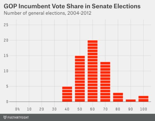
That’s a nice bell curve distribution, centered around 60 percent of the vote. Incumbents sometimes lose in November, but they almost never get less than 40 percent of the vote. They also almost never get more than 70 or 80 percent of the vote unless they’re running unopposed.
Now a chart showing primary election results. This one looks a lot different. It shows the share of the primary vote received by all incumbent Republican senators who ran for renomination since 2004.2
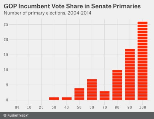
Most of the senators are clustered along the right wall of the chart, having won their primary elections unopposed or with 80 percent or more of the vote. Some do slightly worse than that. But every now and then they do a lot worse, getting less than 50 percent of the vote and losing their nominations — a catastrophic outcome from their standpoint.
Commentators from CBS News’ Major Garrett to the former Republican congressman Vin Weber are describing Cantor’s defeat as the political equivalent of an earthquake. As metaphors go, it’s not bad. Here’s a chart showing every earthquake of magnitude 3.5 or greater in Southern California since 1999:
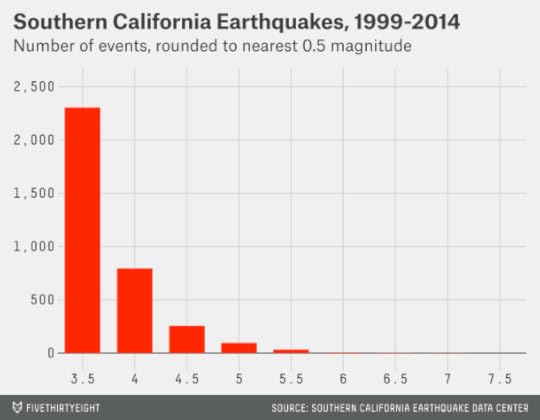
The comparison isn’t perfect. The earthquake distribution has a much steeper slope (there are about 10 magnitude-5 earthquakes for every magnitude-6 earthquake, for instance). Also, earthquake magnitudes are logarithmic — a magnitude-6 earthquake releases about 32 times more energy than a magnitude 5.3 Nevertheless, the analogy tells us a few useful things about Cantor’s loss and the properties of primary challenges.
Like earthquakes, primary challenges rarely produce catastrophic outcomes.
There are thousands of earthquakes around the world each day, most of them too small to be detected. Only a tiny fraction produce substantial damage on a human scale. Likewise, although Republican primary challenges have been a constant source of news media attention for the past four years, few have succeeded. Only seven Republicans running for the U.S. House have lost their primaries since 2010, counting Cantor but not those in redistricting races. That would put the success rate of challenges in the range of 1 percent to 2 percent. It’s been higher in the Senate — between 10 percent and 20 percent depending on how you count a couple of cases — but still low.
Like earthquakes, primary challenges are hard to predict.
Although scientists understand the cause (plate tectonics) of earthquakes in a broad sense, they’ve tried and failed to understand why any one earthquake occurs in any one place on any one day. There have been failed theories implicating everything from radon gas to the behavior of frogs. There have been predictions of spectacular earthquakes — including a magnitude-9.5 earthquake in Lima, Peru — that failed to occur. There have also been false negatives: For instance, some Japanese seismologists were convinced that the Tōhoku region couldn’t possibly produce an earthquake as large as the magnitude-9 quake that actually happened there in 2011.
After an earthquake, scientists seek to piece its causes together. But it’s hard to monitor tectonic behavior directly because the activity is underground. Indirect attempts to model earthquake activity are prone to overfitting, a fancy term for picking up on coincidences that apply to a few incidents but that don’t generalize well enough to explain a system’s underlying dynamics.
In the case of Cantor’s defeat, as Bloomberg’s Ramesh Ponnuru points out, a good model would not only explain why challenger David Brat’s campaign succeeded but also why so many others like it failed. On Tuesday alone, Sen. Lindsey Graham won renomination in South Carolina despite having given far more explicit support to immigration reform than Cantor did. Sen. Susan Collins won renomination in Maine unopposed, despite having a far more moderate voting record. Cantor himself offers an interesting comparison: In 2012, he faced a primary challenge from a tea party candidate — and won 79 percent of the vote.
That’s not to say we’re completely in the dark. As my colleague Harry Enten pointed out, Cantor’s loss appeared to have something to do with the fact that he is deeply identified with the Republican establishment. But the statistical model Harry developed would not have predicted Cantor’s ouster — instead it might have suggested just a marginally heightened risk that he would lose (perhaps a 5 percent chance against a baseline rate of 2 percent). When it comes to predicting the outcome of any one primary, we’re much closer to ignorance than to knowledge.
Like earthquakes, primary challenges are inevitable so we should monitor for signs of risk.
There is one method that works reasonably well to predict the long-term risk of a catastrophic earthquake. That technique is to monitor the number of smaller earthquakes. As I mentioned earlier, earthquakes become about 10 times less frequent for every one-point increase in magnitude: This is an empirical property known as the Gutenberg-Richter law. For example, if you’ve detected one magnitude-6 earthquake in a certain region of Iran every five years, you might infer that the same region would have a magnitude-7 earthquake once every 50 years.
The limitation is that the forecast is not time-specific. You might know there’s a 1-in-50 chance of a severe earthquake each year in a certain part of Iran. But you might go hundreds of years without one — and then you might have several major earthquakes within a decade or two. (It’s largely a myth that a region may be “due” for an earthquake.)
In Cantor’s case, we had some evidence about the hazard he faced — that the baseline rate of successful primary challenges to Republican incumbents was somewhat higher than in the past — even if it was hard to know whether he might have been one of the victims.

We also might have derived some information from primary challenges even when they didn’t succeed in unseating the incumbent — much as seismologists can draw inferences about the chance of a magnitude-7 earthquake by observing the number of magnitude 6s.
As I pointed out at the time, the news media may have drawn several incorrect lessons from Senate Minority Leader Mitch McConnell’s victory against a conservative challenger in Kentucky last month. McConnell’s challenger, Matt Bevin, lost the race with 35 percent of the vote to McConnell’s 60 percent. In a general election, that would constitute a blowout — nowhere near close. In the context of a primary, Bevin did much better than challengers normally do. Between much lower turnout and a much higher rate of persuadable voters (in general elections, perhaps 85 percent of voters are choosing candidates based on party labels — but all candidates belong to the same party in a primary) it may not take all that much for a challenger to go from winning 35 percent of the vote to 55 percent instead.
However, like any one earthquake, one primary doesn’t tell us much.
A corollary to the principles above is that when you have a reasonably good estimate of the hazard, the occurrence of any one catastrophic event shouldn’t really change that estimate. For instance, if there’s a magnitude-7 earthquake in Los Angeles tomorrow, it wouldn’t greatly change the odds we’d place on another such earthquake happening in 2024. We already have good data on Southern California’s seismicity, and we know magnitude 7s will happen there once in a while. (If the earthquake occurred in a part of the world with poorer geological records, it would change our estimate of the odds more.)
Similarly, we know that primary challenges succeed sometimes — it’s dramatic when they do and more dramatic when the victim is a politician of Cantor’s stature. But we ought to have known that before Tuesday. Part of the shock from Cantor’s defeat may be in reaction to the news media’s narrative that the threat to GOP incumbents had ebbed — an all-clear signal that was never supported by much evidence.
I don’t mean to suggest that this is the sole correct interpretation of Cantor’s defeat — but there’s an entirely prudent interpretation along the these lines:
The incidence of successful primary challenges to Republican incumbents is high by historical standards. But we knew that already, and it’s not all that high in an absolute sense. Cantor’s defeat doesn’t tell us that much about the risk — nor did McConnell’s victory. We can perform an autopsy on Cantor’s campaign — and he should probably fire his pollster. But many Republicans won renomination easily under similar circumstances. Primary challenges are stochastic and there is some danger in “overfitting” our model and overreacting to this one.
I’d expect few people to react in this way. The tea party versus establishment storyline is a great storyline for the news media. It’s a great storyline for Democrats. It’s a great story line for the tea party. It’s a terrible story line for the Republican establishment — but they may be scared. Unlike earthquakes, which don’t give a rip about how we react to them, politicians do. So there may be a number of aftershocks, even if they’re man-made.

June 10, 2014
The Rangers Needed Better CPU Assistance
For most of the first period at Madison Square Garden on Monday night, the newly renovated scoreboard above center ice displayed only the time remaining and a 0-0 score — not shots on goal, face-off percentage or the other data that it normally tracks.
I thought this might be a ploy by New York Rangers coach Alain Vigneault. In Games 1 and 2 of the series — both comeback wins by the Los Angeles Kings — the Kings’ peripheral stats were more impressive than the Rangers’ (the Kings led the Rangers 87-65 in shots on goal, for example). Indeed, Los Angeles has a well-deserved reputation as a stat-savvy team that focuses on metrics related to puck possession and scoring opportunities, which can better predict game results than goals scored and allowed.
No #fancystats for you, LA Kings! No moral victory on the strength of Zone Start Adjusted Corsi! You’ll have to win this hockey game the old-fashioned way: by scoring more goals than the other team!
The stats clicked back on to the MSG scoreboard late in the first period. Soon after, the Kings scored, and they went on to beat the Rangers 3-0.
But it was the Rangers who had more scoring opportunities. They had 32 shots on goal, compared with 15 for LA. Counting missed shots and blocked shots, their edge was 59-33.
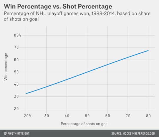
It can be tempting, if you have a passing familiarity with advanced hockey metrics, to take solace when outcomes like these occur or to curse your favorite team’s bad luck. How often does a team lose despite outshooting its opponent by a 2-1 margin, for instance?
Actually, teams lose often. In playoff games since 1988, teams that took about two-thirds of the shots in a game (somewhere between 65 and 70 percent) won only 62 percent of the time. The chart below generalizes this data based on logistic regression and estimates how often teams win a game based on the number of shots they take.
Much of this is simply a reflection of the fact that goals scored and allowed are a noisy statistic. A lucky deflection or two for the Kings, a great save or two by Jonathan Quick, and all those extra shots often go for naught.
But another reason is that play changes once a team finds itself trailing. The shot count was even at 4-4 when the Kings scored with one second left in the first period. The Rangers piled on shots only once they trailed.
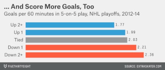
The chart below shows how often a team shoots based on the game score. The data is based on playoff games since 2012. It includes blocked shots and missed shots, as well as shots on goal (these are called Corsi events in #fancystats terms) in 5-on-5 play.

Teams down by one goal are shooting about 25 percent more often than their opponents at even strength. Teams down by two or more goals are shooting about 40 percent more often.
Are those extra shots translating into goals? Actually, yes. In cases when it trails by two goals or more, a team scores about 2.4 goals per 60 minutes of ice time at even strength, compared with 1.8 goals for the leading team.
So, at least in the playoffs, there’s been some tendency for the trailing team to recover (despite that it should be the slightly weaker team on average for having fallen behind). It’s like a mild version of the CPU Assistance that allowed the computer to make spectacular comebacks in games such as NBA Jam just when you thought you had everything wrapped up.
It isn’t clear whether this represents rational behavior on the part of the leading team. It would be one thing if it were stalling just to get the game over with, reducing shots and scoring for both teams. But it’s actually allowing its opponents more shots and more goals — at the same time it’s taking fewer of its own.
One possible explanation is the avoidance of penalties (to the extent they can be averted through more passive play). In playoff games since 2012, teams are scoring 6.3 goals per 60 minutes on the power play — nearly three times their rate at even strength. Shorthanded teams score 0.8 shorthanded goals per 60 minutes. Those long-term averages didn’t help the Rangers on Monday night, who went scoreless in six power play opportunities.

June 9, 2014
It’s Brazil’s World Cup to Lose
Looking for a World Cup favorite? All you really need to know is this: The World Cup gets underway Thursday in Sao Paulo, and it’s really hard to beat Brazil in Brazil.
Today we’re launching an interactive that calculates every team’s chances of advancing past the group stage and eventually winning the tournament. The forecasts are based on the Soccer Power Index (SPI), an algorithm I developed in conjunction with ESPN in 2010. SPI has Brazil as the heavy favorite, with a 45 percent chance of winning the World Cup, well ahead of Argentina (13 percent), Germany (11 percent) and Spain (8 percent).1
Here’s where I’d insert the punchline about how you didn’t need a computer to tell you that Brazil is the favorite. But some of you apparently did.
True, Brazil is the betting favorite to win the World Cup — but perhaps not by as wide a margin as it should be. The team’s price at the betting market Betfair as of early Sunday evening implied that it has about a 23 percent chance of winning the World Cup2 — only a little better than Argentina (19 percent), Germany (13 percent) and Spain (13 percent).
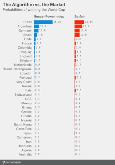
Argentina, Germany and Spain, like Brazil, are wonderful soccer teams. You could perhaps debate which of the four would be favored if the World Cup were played on a hastily constructed soccer pitch somewhere in the middle of the desert.
But this World Cup is being played in Brazil. No country has beaten Brazil on its home turf in almost 12 years. Brazil’s last loss at home came in a friendly on Aug. 21, 2002. That game against Paraguay, incidentally, is one the Brazilians may not have been particularly interested in winning. Brazil had won the World Cup in Japan earlier that summer; the Paraguay match was the team’s homecoming. Although Brazil started most of its regulars, by midway through the game it substituted out almost all of its stars.
To a find a loss at home in a match that mattered to Brazil — in a World Cup qualifier, or as part of some other tournament — you have to go back to 1975, when Brazil lost the first leg of the Copa América semifinal to Peru. None of the players on Brazil’s current World Cup roster was alive at the time.
It may be that the impact of home-field advantage is gradually declining in international soccer. Travel conditions are somewhat better than they were a few decades ago — provided you’re not flying coach, which international soccer stars normally aren’t. Meanwhile, the rise of the international transfer market means that those stars may be playing far from home to begin with. Of the 23 men coach Luiz Felipe Scolari selected for the Brazilian team, all but five play for club teams in Europe. (It’s hard to know for sure, but one imagines that if Pelé were playing today, it might be for Real Madrid or Bayern Munich — not Santos.)
Even so, home-field advantage is large in soccer as compared with other sports — especially in transcontinental competition, where travel distances are longer. In World Cups since 1990, a period that includes several hosted by countries that didn’t have winning soccer traditions, home teams have a record of 27 wins, six draws, and six defeats.3 SPI’s estimates of home-field advantage are based on more recent data still — games from late 2006 onward.
But Brazil’s edge is not based solely on home-field advantage.
The challenge of rating international soccer teams
Suppose we insist on a purist’s approach to rating the teams. First, we look only at relatively recent matches (those since the completion of the previous World Cup in South Africa). Second, we look only at important games, excluding all friendlies. Third, we pay no attention to the scoring margin — wins, losses and draws are all that matter. And fourth, we look only at games against top-flight competition — specifically against other teams that qualified for this year’s World Cup. Each team’s record in such games is as follows4:
Our first problem comes with the small sample sizes. Brazil and Germany have played just six of these games in the almost four years since South Africa, for example. But it gets a lot worse. England has played only four. The Netherlands has played only two. Cameroon and Ghana haven’t played any at all. This isn’t a completely useless list. In fact, Brazil, Argentina, Spain and Germany emerge as a reasonably clear top four.
The other big problem is that almost all of this play occurred within continents, such as for continental championships and in World Cup qualifying matches. (The Confederations Cup, held in Brazil last year and dominated by the home team, was the major exception.) The United States’ record of five wins, three losses and one draw looks relatively promising, for instance. But all those games were played against the three other North American teams who qualified: Mexico, Honduras and Costa Rica. It’s pretty well established that the U.S. usually gets the better of Costa Rica and Honduras, and can hold its own against Mexico. That doesn’t say much about whether the U.S. can beat Germany, Ghana or Portugal.
There simply isn’t much information about how particular national soccer teams play against one another when they have the most on the line, especially in games involving teams from different continents. That’s why they play the World Cup, of course. But that isn’t very helpful in trying to anticipate the tournament’s outcome.
A quick introduction to SPI
I designed SPI to address some of these problems. SPI is a little complex as compared with something like our NCAA basketball projection model. Complexity isn’t necessarily a good thing when it comes to a forecasting model. Among other problems, more complex models may require more computational power (SPI takes a long time to run) and more time to prepare and clean data (SPI requires us to link players between club and international competition, not so easy given the state of soccer data). Also, more complex models may be less transparent and harder to explain. There’s something to be said for a simple model that you know to be flawed, so long as you can point out when and where those flaws are likely to occur.
With that said, we’ve been reasonably pleased with SPI’s results in 2010 and since, and it’s less complex in principle than in practice. The principles behind it are as follows:
It’s predictive, rather than retrospective. It’s not trying to reward teams for good play — it’s trying to guess who would win in a match played tomorrow.It weights matches on a varying scale of importance based on the composition of lineups. Sometimes even friendly matches are taken quite seriously, such as if a team is playing against a historic rival, or if it badly needs a tune-up before an upcoming tournament. Sometimes even tournament matches are blown off if a team has already clinched its position. Where there is sufficient data to do so, SPI evaluates whether a team has its best lineup in the game by comparing it against the lineups used in the most important matches. We’d know that Brazil wasn’t taking its 2002 friendly against Paraguay all that seriously, for instance, because it pulled all the players who helped it win the World Cup just months earlier.It assigns both offensive and defensive ratings to teams (as some basketball-rating systems like Ken Pomeroy’s do). The offensive and defensive ratings are meant to reflect how many goals a team would score and allow if it played an average international team.5 A lower defensive rating is therefore better, while a high offensive rating is good. Soccer is a fluid sport, so offense and defense aren’t easy to separate. Nevertheless, there are some useful reasons to handle things in this way. In particular, we’ve found that SPI defensive ratings have a little more predictive power than offensive ratings in games against elite competition, like most of those matches that will be played in the World Cup. This may reflect the fact that high offensive ratings can result from running up the score against inferior competition. (Among the “big four” teams this year, Germany is notable for having a prolific offense but a back line that sometimes concedes soft goals.)Finally, in addition to rating national teams, SPI uses data from major international club leagues (England, Spain, Germany, Italy and, newly this year, France) and competitions (like the Champions League and the Europa League) to rate their players. This works by assigning a plus-minus rating to each player on the pitch for a given match (see here for much more detail). The plus-minus system isn’t that advanced because the data isn’t either — we basically have to make a lot of inferences from goals, bookings and starting lineups and substitutions. Still, merely knowing that a player is in the starting lineup for FC Barcelona or Chelsea tells you a fair amount about him.Technically speaking, SPI is two rating systems rolled into one: one based solely on a national team’s play, and one that reflects a composite of player ratings for what SPI projects to be a team’s top lineup. Usually the two components are strongly correlated with one another. But there are some minor exceptions. The United States, for instance, would rank something like 15th in the world based solely on our national team’s play, but SPI has us a little lower because American players aren’t accomplishing much in Europe. The contrast would be a team like France — its national team results have been inconsistent, but it always has a lot of talent, which may or may not come together.
A tiny bit more housekeeping about SPI and the interactive: First, in addition to an offensive and defensive rating, each team also has an overall SPI rating (for instance, 89.1 for Spain). This reflects what percentage of the possible points a team would accumulate6 if it played a round-robin against every other national team.
This definition is fairly obscure; the more interesting question is about a team’s chances against the others it will actually face in Brazil. These are also listed in the interactive: For instance, the United States has a 38 percent chance of beating Ghana and a 29 percent chance of drawing with it. We’ll be updating the numbers at the conclusion of each match.7
There’s a lot more detail available on SPI here and here. The main improvement in the model since 2010 is that Alok Pattani and his colleagues at ESPN Stats & Info have put a lot more work into using SPI to predict the results of individual matches, and particularly the distribution of possible final scores. These match projections are calibrated based on the historical results that most resemble the World Cup, i.e. competitive (non-friendly) matches between the top 100 SPI teams. They use something called a diagonal inflated bivariate Poisson regression to estimate the distribution of possible outcomes. The fancy math is necessary because goals scored and goals allowed are used as tiebreakers in qualifying out of World Cup groups, so knowing the chance of a 1-0 win compared to a 2-1 win or a 2-0 win is sometimes important.
Travel distance and South America vs. Europe
We also put a lot of research into evaluating whether travel distance matters (above and beyond home-field advantage). Is it important, for instance, that Uruguay is traveling much less far to Brazil than Russia or Japan is?
Our findings were a bit ambiguous. We found, first of all, that east-west distance traveled matters much more than north-south distance. In other words, any geographic advantage may reflect the avoidance of jet lag rather than the mere fact of being close to home. However, we also found that while the travel effect was reasonably significant when evaluated based on all World Cup matches dating back to 1952, it’s been much less significant in competitive matches taken from the era for which SPI has highly detailed data (from late 2006 onward).
This may be for the reasons I described above — international travel has probably improved, and the notion of a home country is a little different in a period when most of the best players for Brazil or Argentina now play in Europe anyway. We had a lot of debate about whether to include a “strong” adjustment for east-west distance traveled (one calibrated based on data from 1952 onward), a “weak” adjustment (one based on the much weaker signal from 2006 onward) or not to include it at all, and wound up going with the weak adjustment. The weak adjustment makes little difference — it might reduce the advancement odds for a team like Japan by a couple of percentage points, for instance, but not more than that.
You’ll notice that SPI is nevertheless favorably disposed toward the South American teams. It’s not just Brazil — SPI is also slightly higher on teams like Chile, Uruguay and Colombia than other systems are. (The same was true in 2010, when Uruguay and Chile were good bets against the prevailing odds, according to the system.)
The South American teams to qualify for this year’s World Cup have compiled 16 wins, 11 losses and 14 draws against European qualifiers in games played since the completion of the last World Cup. All those matches except those in the Confederations Cup were friendlies, so they may not be that informative. Nevertheless, SPI is placing a big bet on the notion that the level of competition between national teams in South America is at least the equal of and perhaps slightly superior to the level of competition between national teams in Europe. Historically at least, the odds have been somewhat in South America’s favor when games are played in this hemisphere. In World Cups in the Americas since 1950, South American teams have 39 wins, 21 losses and 15 draws in games played against teams from Europe.8 Indeed, no European team has ever won a World Cup played in the Americas.
A whirlwind tour of the eight groupsOn the off chance that your eyes didn’t glaze over after “diagonal inflated bivariate Poisson regression,” here’s how SPI sees the groups — and the United States’ chance of advancing.
Group A: Brazil, Cameroon, Croatia, Mexico
There’s little doubt that Brazil is the class of the group — SPI gives the team a 99.3 percent chance of advancing to the knockout stage — and that Cameroon is the weakest link. Just how weak is an open question given Cameroon’s lack of competitive matches against top-flight teams and a threatened boycott over how much its athletes will be paid. But most likely the second knockout slot will go to Mexico or Croatia.
SPI is not fond of either team. It sees Croatia as having the slightly better player talent but Mexico as playing a little better as a unit — despite its struggle to qualify for the World Cup at all. It’s worth mentioning that Mexico’s international record is not so bad outside of this cycle’s World Cup qualification — it dominated the 2011 Gold Cup, for instance.
Part of this is about how much to weigh a longer history of results against more recent ones. The SPI view is that a team’s form can vary a lot from competition to competition but not necessarily in a predictable way, and that you should generally err on the side of the team with the better long-term history. Either way, Brazil (and SPI) would really have to blow it to not pass through the group stage with relative ease.
Group B: Australia, Chile, Netherlands, Spain
This group — not the one the United States is in — is the “Group of Death,” with three teams ranked in the SPI top 10. That’s unfortunate for Australia, which is the odd team out and has less chance than any other squad of advancing to the knockout stage, according to SPI.
Instead the questions are, first, whether the Netherlands or Chile is superior, and second, whether both might be strong enough to deny Spain a place in the knockout stage.
SPI’s answer to the first question is Chile — but both teams are hard to rate. Chile has been prone to playing well against weaker competition but not so well against the world’s elite; that could be a sample-size fluke or it could be something real. The Netherlands, meanwhile, played quite miserably in Euro 2012 after advancing to the World Cup final in 2010. That could also be a fluke, but the team is aging, as Robin Van Persie, Wesley Sneijder and Arjen Robben each recently celebrated their 30th birthdays.
Put it like that, and Spain seems safe. But SPI estimates there’s a 20 percent chance that both the Netherlands and Chile play up to the higher end of the range, or they get a lucky bounce, or Australia pulls off a miracle, and Spain fails to advance despite wholly deserving to.
Group C: Colombia, Greece, Ivory Coast, Japan
This is one of the weaker groups and sets up nicely for Colombia, which has plenty to recommend it despite playing in its first World Cup since 1998. In contrast to Chile, Colombia has held up reasonably well against the world’s elite: a draw against the Netherlands in the Netherlands and against Argentina in Argentina; a win against Belgium in Belgium. The team also has some questionable results, however, like draws in friendlies against Senegal and Tunisia.
But who can challenge Colombia? Greece is just the sort of team that SPI usually isn’t keen on: a mid-tier European squad that lacks elite talent. However, the alternatives are Japan and Ivory Coast, and this does not look like a promising year for teams outside of Europe and South America, who collectively have just a 2.2 percent chance of winning the World Cup. Japan also has as far to travel as any team in the field and is indeed nearly antipodal to Brazil. The better bet is probably Ivory Coast, which is well ahead of both Japan and Greece in the player-ranking component of SPI, but whose captain, Didier Drogba, is now 36 years old. It’s a flawed group of opponents, although Colombia has sometimes lost or drawn against flawed opponents.
Group D: Costa Rica, England, Italy, Uruguay
Betting markets see England, Italy and Uruguay as about equally likely to advance while Costa Rica is in a distant fourth place. SPI, by contrast, has England and Uruguay ahead of Italy and views the group as middling enough that Costa Rica could pull off a huge upset.
Both England and Italy rank more highly according to the player-rating component of SPI than based on their play as national teams. This is a common state of affairs for England but less so for Italy, which rarely has among the best offenses in the world but which has normally played more consistent defense. Instead, Italy conceded 10 goals in five matches in the Confederations Cup last year.
It also might not matter much in the end. England, Italy and Uruguay are the sort of teams that might be able to entertain championship dreams in a World Cup with more parity, but not in one where they would have to overcome Brazil, Argentina, Germany or Spain at some point.
Group E: Ecuador, France, Honduras, Switzerland
SPI is bearish on most European teams as compared to the consensus. France is one of the closer things to an exception: SPI has it as the seventh-best team in the world, whereas it ranks 12th in the Elo ratings and 17th according to FIFA. (As a side note, the Elo ratings are perfectly reasonable whereas the FIFA ratings are not. FIFA ranked Brazil as just the 22nd-best team in the world a year ago — it has since climbed to third — a proposition about as ridiculous as hoping to host a World Cup in Qatar.) The reason is the player-rating side of SPI. France has arguably as much player talent as any team but Brazil, Germany, Spain or Argentina — but its national team results have been inconsistent for a long while.
But France is drawn into a reasonably good group. Switzerland, for some reason, ranks sixth in the world in the FIFA rankings but Elo has it 16th and we have it 21st. Ecuador, which has some credible results against European teams (a draw last month in the Netherlands; a win last year against Portugal) might be the tougher out.
Group F: Argentina, Bosnia-Herzegovina, Iran, Nigeria
It would be a major upset if Argentina failed to advance to the knockout stage — SPI gives the team a 93 percent chance of doing so, the second-highest total in the field after Brazil. SPI also has Argentina as the second-best team in the world, so that’s no huge surprise, but it has an easier draw than Germany or Spain.
Still, Bosnia-Herzegovina, playing in its first World Cup under that flag, is the 13th-best team in the world according to SPI. It’s also one of the most offense-minded teams in the field and not one that will allow opponents to play it safe. For that reason, the first match of the group — between Argentina and Bosnia-Herzegovina on Sunday — could dictate how the rest of the group plays out. Even a loss, however, probably wouldn’t prevent Argentina and Lionel Messi from advancing.
Group G: Germany, Ghana, Portugal, United States
American coach Jurgen Klinsmann is the anti-Joe Namath: He made news by predicting that the United States wouldn’t win the World Cup, and suggested that the team’s goal instead was to advance to the knockout stage.
Statistically speaking, Klinsmann’s assessment is prudent. The U.S., according to SPI, has a 36 percent chance of advancing through Group G, but only a 0.4 percent probability (about 1 chance in 250) of coming home with the World Cup trophy.
Every now and then teams defy the odds. The Villanova Wildcats had
June 8, 2014
FiveThirtyEight Senate Forecast: Toss-Up or Tilt GOP?
We last issued a U.S. Senate forecast in mid-March. Not a lot has changed since then.
The Senate playing field remains fairly broad. There are 10 races where we give each party at least a 20 percent chance of winning,1 so there is a fairly wide range of possible outcomes. But all but two of those highly competitive races (the two exceptions are Georgia and Kentucky) are in states that are currently held by Democrats. Furthermore, there are three states — South Dakota, West Virginia, and Montana2 — where Democratic incumbents are retiring, and where Republicans have better than an 80 percent chance of making a pickup, in our view.
So it’s almost certain that Republicans are going to gain seats. The question is whether they’ll net the six pickups necessary to win control of the Senate. If the Republicans win only five seats, the Senate would be split 50-50 but Democrats would continue to control it because of the tie-breaking vote of Vice President Joseph Biden.
Our March forecast projected a Republicans gain of 5.8 seats. You’ll no doubt notice the decimal place; how can a party win a fraction of a Senate seat? It can’t, but our forecasts are probabilistic; a gain of 5.8 seats is the total you get by summing the probabilities from each individual race. Because 5.8 seats is closer to six (a Republican takeover) than five (not quite), we characterized the GOP as a slight favorite to win the Senate.
The new forecast is for a Republican gain of 5.7 seats. So it’s shifted ever so slightly — by one-tenth of a seat — toward being a toss-up. Still, if asked to place a bet at even odds, we’d take a Republican Senate.

Of course, it can be silly to worry about distinctions that amount to a tenth of a seat, or a couple of percentage points. Nobody cares all that much about the difference between 77 percent and 80 percent and 83 percent. But this race is very close. When you say something has a 47 percent chance of happening, people interpret that a lot differently than if you say 50 percent or 53 percent — even though they really shouldn’t.3
It’s important to clarify that these forecasts are not the results of a formal model or statistical algorithm — although it’s based on an assessment of the same major factors that our algorithm uses. (Our
tradition is to switch over to fully automated and algorithmic Senate forecasts at some point during the summer.)
The political landscape
We usually begin these forecast updates with a broad view of the political landscape. Not all that much has changed over the past couple of months.
President Obama remains fairly unpopular with an approval rating of about 43 or 44 percent. His numbers haven’t changed much since March (perhaps they’ve improved by half a percentage point). It may be that modestly improved voter perceptions about the economy are being offset by increasing dissatisfaction of his handling of foreign policy.The generic congressional ballot remains very close between Democrats and Republicans and also has not changed much since March. Note, however, that many generic ballot polls are conducted among registered voters; a tie among registered voters usually translates to a small Republican advantage among likely voters.Both Democratic and Republican voters report lower levels of enthusiasm today than they did in 2010 (perhaps for good reason). But Republican voters are more enthusiastic than Democrats on a relative basis. That will potentially translate to an “enthusiasm gap” which favors the GOP, but not as much as it did in 2010.Republicans’ recruiting of viable candidates is going better than in 2010 and 2012 although not uniformly so: they face potential issues in Mississippi and Oregon, for instance.The quality of polling is somewhat problematic. Much of it comes from firms like Public Policy Polling and Rasmussen Reports with dubious methodologies, explicitly partisan polling firms or new companies that so far have little track record. As a potential bright spot for Democrats, polling firms that use industry-standard methodologies seem to show slightly better results for them, on average. However, these high-quality polls are mostly reporting results among registered voters only, rather than likely voters. Thus, they aren’t yet accounting for the GOP’s potential turnout advantage.If the macro environment hasn’t changed much, what about the environment in individual states and races? There have been a few shifts since March, but they mostly offset one another. We’ll start with the races where Democratic prospects look brighter than before.
Races where Democratic chances have improved
In March, we gave Arkansas Sen. Mark Pryor just a 30 percent chance of holding his seat for Democrats. But five of the seven polls since then have put Pryor ahead of his Republican opponent, Rep. Tom Cotton.
Does that mean Pryor should be thought of as the favorite instead? Not quite, in our view. Most of the polls showing him ahead are among registered voters. Also, it’s not necessarily wise to dismiss earlier polling, most of which showed Cotton with the lead. There can sometimes be temporary fluctuations in the polling, as candidates, for example, buy a large amount of advertising but then revert to the mean. Pryor is also running for re-election in a state where Barack Obama’s approval rating is somewhere in the mid-30s. However, it seems clear that Pryor has done a better job of separating himself from the national environment than former Sen. Blanche Lincoln did four years ago, and we now have his chances at 45 percent.
Michigan is the other state where there’s been a clear improvement in Democratic prospects. That race looked like a toss-up in March, but the Democratic candidate, Rep. Gary Peters, has held a lead of about five percentage points in several polls since then. Our guess is that the race will tighten some; the GOP has a pretty good candidate in Terri Lynn Land, the former secretary of state. Furthermore, while Michigan is somewhat blue-leaning, that’s offset by a slightly GOP-leaning national environment. Still, we now have Peters’ odds at 65 percent, up from 55 percent previously.
The other changes are minor. In New Hampshire, we’ve never thought there was too much reason for Republicans to be optimistic about the opportunity for former Massachusetts Sen. Scott Brown. The problem is not with Brown so much as with his Democratic opponent, Sen. Jeanne Shaheen, who retains fairly high approval ratings. Shaheen has held a lead of between three and 12 points in polls since March, although the polls are a mixed bag in terms of quality. Because New Hampshire polling can be volatile, and because Brown’s relative moderation could potentially offset some of Shaheen’s popularity4, we don’t think it’s safe to say she has the race in the bag (two other models give Shaheen a 98 percent chance of victory). But we do put her chances at 80 percent, up slightly from 75 percent before.
In two other states, poor Republican candidates may help Democrats, although both states were on the fringes of being competitive to begin with. One case is Oregon, where Republicans nominated Monica Wehby, a pediatric neurosurgeon, despite accusations that she had stalked and harassed her ex-husband and ex-boyfriend. Wehby wasn’t a great candidate to begin with — her fundraising has been mediocre, and candidates without prior experience in elected office don’t tend to hold up as well over the course of a Senate campaign (even if they have impressive accomplishments in other domains). The harassment allegations are another complication for a candidate who needed a lot of things to break in her direction. Thus, we have the Democratic Sen. Jeff Merkley with a 95 percent chance of surviving, up from 90 percent in March.
How about Mississippi, where the incumbent Sen. Thad Cochran was forced into a runoff by his conservative Republican opponent, Chris McDaniel? Democrats have a reasonably good and moderate candidate there in former Rep. Travis Childers.
Real Clear Politics’ elections analyst Sean Trende has a good rundown of the difficulties that Childers might face. First, let’s assume for a moment that McDaniel wins the runoff. While he might be “too” conservative for some states, Mississippi is very conservative itself. McDaniel would probably also have to make gaffes or misstatements on the campaign trail, as Richard Mourdock did for the Republicans in Indiana in 2012, or create trouble for himself. Second, Mississippi is not just conservative but highly “inelastic”, meaning that there are few swing voters there and it can be hard for any Democrat to cobble together a 50 percent coalition. Third, McDaniel still has to win the runoff for Childers to even have a chance at winning, and that might not happen.
The race could badly use some better polling: all we have on the McDaniel-Childers matchup is a Rasmussen poll from March and a Public Policy Polling survey from November (not two of our favorite polling companies). For now, we have Childers’ chances at 10 percent in Mississippi, up from 5 percent before, on the assumption that he’d have perhaps a 20 percent chance against McDaniel but almost none against Cochran.
Races where Republican chances have improved
These favorable developments for Democrats have been offset by other cases in which Republican odds now look somewhat better.
The most notable case is in Iowa, where we had previously given the Democratic Rep. Bruce Braley a 75 percent chance of being elected. That was before a tape was released showing Braley referring to Iowa Sen. Chuck Grassley as a “farmer from Iowa who never went to law school” — not a smart statement in a state that relies heavily on agriculture. Meanwhile, Republicans got their preferred candidate in state senator Joni Ernst, who won the Republican primary last week.
Braley had held onto his lead in several polls since the “farmer” comments, but two released last week after Ernst’s primary victory had her ahead instead. There’s some reason to be skeptical of these polls: one was from Rasmussen Reports, and the other was from Loras College, which has not previously done much public polling. Furthermore, candidates sometimes get a temporary bounce from the favorable publicity surrounding a primary win, which then fades. (A case in point is the Democrat Creigh Deeds in the 2009 gubernatorial race in Virginia.) We now put Braley’s chances at 60 percent.
The other Republican gains reflect minor adjustments. In Alaska, it now looks unlikely that Republicans will nominate Joe Miller, who won his 2010 primary against Lisa Murkowski but lost to her when she ran as a write-in candidate in the general election. Miller is very unpopular with the general electorate and might have given the incumbent Democratic Sen. Mark Begich a free pass. Instead, Begich will likely now face either lieutenant governor Mead Treadwell or former Alaska attorney general Daniel S. Sullivan. We give Begich a 50 percent chance of surviving that contest, down from 55 percent before.
In Kentucky, incumbent Sen. Mitch McConnell won his primary and is seeing his head-to-head polling improve ever so slightly against Alison Lundegran Grimes, the Democrat. Grimes is fighting an uphill battle against Kentucky’s Republican-leaning partisan gravity and against McConnell’s financial advantages, so the slight uptick in McConnell’s polling puts the race somewhat more in line with the fundamentals of the state, as we see them. We have Grimes’ chances down slightly to 20 percent from 25 percent.
Montana is one state where statistical models and qualitative forecasters disagree. Whereas groups like Cook Political Report characterize the race as merely leaning toward the Republican, Rep. Steve Daines, the polling-driven models have him as almost certain to win.
The case for the Democrat, the appointed incumbent Sen. John Walsh, would rely on citing Montana’s recent political history (Democrats have performed well and closed well in non-presidential races there) and Walsh’s political pedigree (he is Montana’s former lieutenant governor). It seems like a stretch to us (and may result partly from the erroneous assumption that all incumbents are equal, when in fact appointed incumbents like Walsh run far worse than elected ones do). In any event, Walsh will need to make up a lot of ground in the polling. We have Walsh’s chances at 15 percent for now, down from 20 percent in March. He and Daines just won their primaries, and if Walsh doesn’t see some improvement in his polling soon, Democrats may need to write the race off.
Finally, in South Dakota, the former Republican Gov. Mike Rounds won his primary last week. He’s the far stronger candidate than the Democrat, Rick Weiland, who lost election attempts to the U.S. House in 1996 and 2002. Plus, South Dakota is a red state. We give Republicans a 95 percent chance of victory, up from 90 percent before.
Incidentally, there’s one race where Republicans are absolutely certain to win. That’s Alabama, where the Republican Sen. Jeff Sessions won his primary unopposed last week — and is also unopposed in the general election. Congratulations to him on a fourth term in the Senate.

June 5, 2014
In Search of America’s Best Burrito
Seven years ago, I moved to Wicker Park, Chicago. The neighborhood, once heavily Hispanic, was being inundated by hipsters and yuppies, and its taquerias, some run by Mexican families who had immigrated to Chicago a generation earlier, were finding new audiences for their wares: the creative professional on her lunch break, the bro on his late-night bar crawl.
I was destined to be one of their best customers. I’m a burritophile. But of the 19 taquerias within a short walk of my apartment, which was the best? I decided to try them all, comparing them two at a time by ordering the same food item (say, a carne asada burrito) and knocking out the weaker alternative in an NCAA-style elimination tournament. Thus began the Burrito Bracket.
The Wicker Park version of the burrito bracket played down to a final five and then I got distracted, partly because I was beginning work on what would eventually become FiveThirtyEight. (I think of La Pasadita, the No. 1 seed, as the unofficial champion.) My burrito dreams were deferred. But I’d still like to know where to find the best burrito in Chicago. In fact, I’d like to find the best burrito in the country.
That’s what we’re about to do. We’re launching a national, 64-restaurant Burrito Bracket. We’ve convened a Burrito Selection Committee. We’ve hired an award-winning journalist, Anna Maria Barry-Jester, to be our burrito correspondent. She’s already out traveling the country and sampling burritos from every establishment that made the bracket. 
It’s a little crazy, but we think it needs to be done. And we think we’re the right people to do it. One reason is that narrowing the field to 64 contenders is a massive problem of time and scale. It perhaps couldn’t be done adequately if not for a little data mining and number crunching. In 2007, I was able to sample every burrito restaurant — in one neighborhood, in one city. But there are 67,391 restaurants in the United States that serve a burrito. (I’ll tell you how we came up with that figure in a moment.) To try each one, even if you consumed a different burrito for breakfast, lunch and dinner each day, would require more than 60 years and run you close to 50 million calories.
We need some way to narrow the list of possibilities. Fortunately, Anna and I were able to enlist some help. The past seven years have produced explosive growth for crowdsourced review sites like Yelp. Yelp provided us with statistics on every burrito-selling establishment in the United States.
The Yelp data was the starting point for FiveThirtyEight’s Burrito Bracket, which will officially launch early next week and whose solemn (but not sole) mission is to find America’s best burrito. There are three major phases in the project, each of which I’ve already hinted at:
Step 1: Data mining. Analyze the Yelp data to create an overall rating called Value Over Replacement Burrito (VORB) and provide guidance for the next stages of the project. (This step is already done, and I’ll be describing the process in some detail in this article.) Step 2: Burrito Selection Committee. Convene a group of burrito experts from around the country, who will use the VORB scores and other resources to scout for the nation’s best burritos and vote the most promising candidates into a 64-restaurant bracket — 16 contenders in each of four regions: California, West, South and Northeast. (The committee has already met, and we’ll reveal the 64 entrants in a series of articles later this week and this weekend.) Step 3: Taste test. Have Anna visit each of the 64 competitors, eat their burritos, rate and document her experiences, and eventually choose one winner in a multi-round tournament. (Anna will be posting her first reviews early next week. She’s worked as a documentary photographer and multimedia journalist, and as a producer at ABC News and Univision, where she’s spent years reporting on Hispanic-American culture.1)This project involves a mix of seriousness and whimsy. Anna and I both have a lifelong obsession with Mexican-American food. We also know that burritos are not a matter of great national importance.
But the question of how consumers might use crowdsourced data to make better decisions is an important one. Billions of dollars turn upon customer reviews at sites like Yelp, Amazon, Netflix and HealthGrades. How should you evaluate crowdsourced reviews as compared to the recommendations from a professional critic, or a trusted friend? Are there identifiable biases in the review sites and ways to correct for them? When using sites like Yelp, should you pay more attention to the number of reviews, or to the average rating?
We’re only going to be able to scratch the surface of these questions, some of which have received too little empirical study. But burritos provide a good way to experiment precisely because they represent a relatively narrow range of experience. There are different burrito styles across the country — more than you might gather if your burrito-eating ambitions have never ventured beyond Taco Bell. But there are fewer parameters to control for when rating burritos than when comparing movies, or doctors, or colleges.
We’ll eventually crown a national champion burrito, but with no illusions that the bracket can offer a definitive result. We hope, nevertheless, that there is some value in our approach of blending analytics and first-hand experience. It isn’t a perfect analogy, but in some ways this project represents an attempt to engage in a “Moneyball”-style experiment pitting statistics (as represented by the Yelp ratings) against “scouts” (as represented by the members of the Burrito Selection Committee — all of whom have extensive experience working in or writing about the food industry). During our deliberations, our professionals sometimes had strident disagreements with the Yelp ratings. So Anna (who had not previously been a professional food reviewer) will visit restaurants that are rated highly by Yelp but that our “scouts” consider mediocre, and others that they vouch for but that Yelpers largely dislike or ignore.
The rest of this article will describe our procedures for working through the Yelp data and selecting the field of 64 burrito-selling establishments. If you have more of an appetite for burritos than for detail, you might want to scroll through this quickly and check back over the next few days as we begin to reveal and review our selections.
 A burrito from Garbo’s Grill in Key West, Florida. Photo by Anna Barry-Jester.Step 1: Data mining
The data we got from Yelp contained 67,391 listings for businesses that had at least one review mentioning “burrito” or “burritos” and were open as of Feb. 1 of this year.2 I use the term burrito-selling establishments (BSEs) to describe them because the list was not strictly limited to businesses categorized as “restaurants” by Yelp: food trucks and grocery stores are also potentially eligible, for example, so long as they make something clearly recognizable as a burrito available for commercial sale.3
What is a burrito, you might ask? In developing VORB, I resolved this question by basing the scores solely on those Yelp reviews that mentioned “burrito” or “burritos.”4 This was a subject of considerable debate among the Burrito Selection Committee, however. For instance, a Japanese restaurant in Plano, Texas, came up fairly high on the VORB list because it sells a highly regarded item called a “superman burrito.” The “superman burrito,” however, is really a Texas-sized sushi roll. One of our panelists, worried about the dishonor to Texas’s reputation, threatened bodily harm to anyone who voted to include it in the bracket. More often, however, our group was tolerant and inclusive, so Anna’s itinerary will include breakfast burritos, vegan burritos, Korean fusion burritos, a chimichanga and even something called a “Mexican hamburger.”
Quality vs. quantity of reviews
Another challenge was in making the best use of the different types of data that Yelp made available to us. For instance, would you rather go to a restaurant rated at 4.5 stars based on 50 reviews, or one rated at 4.1 stars based on 500 reviews? (Yelp ratings range between 1 and 5 stars, with higher ratings being more favorable.)
One issue is that the restaurant with 50 reviews has a larger margin of error. Yelp reviews take a long time to converge to the mean. Restaurant reviews are not like movie reviews or book reviews where everyone is evaluating the same product. Instead, customers with different tastes are evaluating many different menu items. They’re also having different customer service experiences, and they might be more or less sensitive to factors like price, décor or portion size.
Based on an analysis of Yelp’s publicly-available Academic Dataset, which covers all reviews in Phoenix, Arizona, I developed a formula that accounts for the degree of mean-reversion and predicts what a restaurant’s average review will be going forward (as well as the margin of error associated with the prediction). I found that a higher volume of reviews is a fairly powerful signal in predicting future review quality.5 Even mediocre reviews tend to favorably predict star ratings going forward, provided that there are a lot of them.
This may still undersell the importance of a restaurant’s popularity, however. Popular restaurants tend to attract a wider and less experienced set of reviewers,6 who may view the restaurant differently and be less predisposed toward liking it.7 In addition, my research found that the volume of reviews — and not just the average rating — was a fairly powerful indicator of a restaurant’s likelihood of appearing on “best of” lists as prepared by professional food critics and may therefore serve as a useful proxy for “expert” judgment.
The formula I developed, VORB, is inspired by the baseball statistic VORP, or Value Over Replacement Player. Just as VORP measures both the quality of a baseball player’s performance and how often he plays, VORB accounts for both the quality and the quantity of a restaurant’s reviews.
Regional and other adjustments to Yelp reviews
Also like VORP, which adjusts a player’s statistics for his environment (it’s easier to post superficially better batting statistics in a small ballpark like Fenway Park than in a cavernous one like Dodger Stadium), VORB considers a restaurant’s location.
Yelp was founded in San Francisco and adopted early there and elsewhere in California. Even now, Yelp’s usage is considerably heavier in urban areas, and urban areas have much greater population densities and potentially more visitors per restaurant. So it’s much easier for a restaurant to accumulate a large number of Yelp reviews in San Francisco or Los Angeles than in Spokane, Washington, or Lafayette, Louisiana.
The solution was to use chain restaurants as a common denominator. While not all Chipotles or Taco Bells are identical to one another, they control for a lot more variables than two independent taquerias do.
More specifically, the geographic adjustment is based on the number of reviews for the 50 Mexican chain restaurants nearest to a BSE’s ZIP code.8 The most extreme cases were several ZIP codes near San Francisco, where chain restaurants were reviewed almost six times more often than the same chains elsewhere in the country, and ZIP code 25704 (Huntington, West Virginia), where nearby chain restaurants were reviewed almost 17 times less often than the national average. Roughly speaking, we’d need to divide the number of Yelp reviews for San Francisco restaurants by six, and multiply the number of Yelp reviews for Huntington restaurants by 17 to make them comparable.
I also discovered substantial differences in average star ratings between the same chains in different parts of the country. Orlando, Florida, is the biggest outlier; chain restaurants there were rated 0.5 stars higher than the same chains elsewhere in the country. (Reviews of one Baja Fresh location in Orlando, for example, contain the sort of praise that is usually lavished upon restaurants like L’Arpège.) By contrast, the stingiest chain reviews were in the 90021 ZIP code, Los Angeles, where Mexican chains were rated about 0.4 stars lower than the national average. This presumably implies, among other things, that the standards for Mexican food are much higher in Los Angeles than in Orlando. Scores for BSEs were adjusted accordingly.9
I made two other minor adjustments to the Yelp ratings. One is for how recently a restaurant opened: Accumulating 100 reviews in six months is more impressive than doing so in six years.10 Another rewards restaurants that have a higher share of 5-star reviews: My analysis of the Phoenix data found that the proportion of 5-star reviews favorably predicted future star ratings, even after accounting for the average star rating.11
The best burritos according to VORB
Another similarity between VORB and VORP is that both rely on the notion of “replacement level.” In baseball, a replacement-level player is one who is just on the fringe of being a major leaguer — perhaps a third baseman who hits about .245. The analogous concept in the restaurant industry would be an establishment that is just on the fringe of being a viable business. Imagine a generic-looking Chinese takeout place, serving plates of General Tso’s chicken to a lonely customer or two.
On Yelp’s rating scale, replacement level appears to be somewhere near 3.3 stars. In the Phoenix data, 3.3 stars represented the breakpoint in predicting future star ratings. That is to say, ratings above 3.3 stars tended to favorably predict future star ratings, while those below 3.3 stars tended to negatively predict them.12 Also, average reviews for lightly reviewed businesses — like the Chinese restaurant I asked you to imagine — tend to cluster around 3.3 stars.
I suspect you’re hungry for some data. (A more complete derivation of the VORB formula can be found in the footnotes.13) The BSEs with the 20 highest VORB scores in the country are as follows:
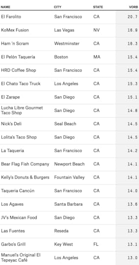
The list is heavy on California restaurants, despite the regional adjustment that corrects for the fact that California businesses are heavily reviewed by Yelpers. The top-rated burrito-selling establishment, according to VORB, is El Farolito in San Francisco’s Mission District. As of Feb. 1, it had 1,840 reviews that mentioned burritos, with an average rating of 4.25 stars. Only Lucha Libre Gourmet Taco Shop in San Diego had more burrito reviews, and its star rating was not as strong.
El Farolito’s presence on this list was no surprise to us. Last year, it won Esquire’s billing as “the most life-changing burrito in America.” I’ve been there myself a few times and can vouch for it serving a darned good burrito. But “life-changing”? I’d want to have a lot more burrito-eating experiences — in different parts of the country — before conceding the top spot to El Farolito.
That’s what Anna is going to do. This list of 20 restaurants ought to formulate a very good first cut. You’d do much better to walk into any of them than to pick a burrito place at random. But some of our purpose is to evaluate the reliability of crowdsourced reviews, rather than to take them for granted. Our test will be to taste the results for ourselves. Anna will visit most of the restaurants you see on the top 20 list14 and a number of others in the top 50 or the top 100. She’ll also be visiting some others with average or even poor VORB scores. We’ll see how many false positives and false negatives there are.
Step 2: Burrito Selection CommitteeI’m a fan of sites like Yelp, but they have some complicated aspects, such as that previous reviews can potentially influence future reviews. (I’d recommend Duncan Watts’ book “Everything is Obvious” for some research on this.) Moreover, Yelp reviewers are within their rights to consider a restaurant’s price, service and decor in addition to the quality of its food. There might also be other biases: A restaurant known to serve margaritas to underage patrons might receive good ratings for all the wrong reasons. We’re concerned only with the food.
It’s for reasons like these that we formed the Burrito Selection Committee, rather than simply sending Anna to the restaurants with the highest VORB scores. Sixty-four burritos is a lot, but not compared to a field of more than 67,000 candidates. We hope the committee can prevent Anna from wasting time at boozy brunch joints that have little chance of serving America’s best burrito, or missing those that Yelpers downrate because of the surly service but where the burritos are top-notch.
Finally, there are still a few parts of the country — the rural South and Southwest, predominantly Spanish-speaking neighborhoods in mid-sized cities — where Yelp usage is so sparse as to not provide much of a signal at all. The committee wanted a few representatives from these locales.
Professional reviewers can have their own biases, of course. Sometimes this is because they are after different things — Oklahoma Joe’s Barbecue, which is located in a gas station in Kansas City, Kansas, is rated as the third-best restaurant in the country, according to Yelp. Oklahoma Joe’s is, in fact, a life-changing experience,15 but not likely to make the Michelin Guide.
Burritos represent less of a trade-off between fancy and folksy food — they’re almost always on the unpretentious side of the scale. Nonetheless, there were some restaurants in the VORB Top 20 that our panelists insisted were mediocre at best, and others resturants that they thought Yelpers were crazy for rating so poorly. In these cases, was the crowd wrong, or were our panelists snobs? Anna will be taste-testing her way to a view on that question.
The regions
Before I introduce the members of the panel, a little more about the bracket itself. The first thing I did, even before receiving the data from Yelp, was to divide the country into four regions, as the NCAA basketball tournament does. The idea was to split the 50 states and the District of Columbia into four regions of roughly equal burrito strength. These divisions were based on a combination of three factors, weighted equally: (i) the Mexican-American population in each state; (ii) the number of Mexican restaurants in each state; and (iii) the relative popularity of the word “burrito” as a Google search term in each state, multiplied by the state’s population. The regions I came up with were as follows:
California, the Burrito State;The Northeast, a burrito-sparse region that stretches all the way from Missouri to Maine16;The South, including parts of Texas and Oklahoma;The West, excluding California, but otherwise consisting of the western half of the continental U.S., plus Alaska and Hawaii.Texas and Oklahoma were the only states split across regions; I messed with Texas because failing to do so would have produced a potentially imbalanced map. (Specifically, the states are split at 97°24’ West longitude, which is close to the center of population of each state. Dallas, Houston and Tulsa are east of this line and placed in the South region; Austin, San Antonio, El Paso and Oklahoma City are west of it and are in the West region.)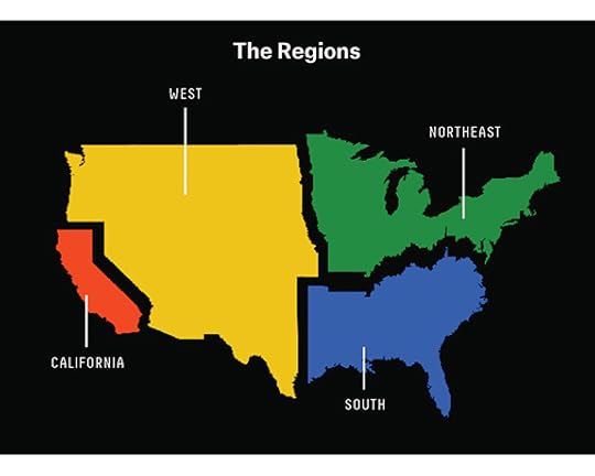 As it turns out, the regions may be somewhat imbalanced anyway. Based on the cumulative VORB of all BSEs in each region, California has more than twice as much burrito goodness as the West and Northeast, and about four times more than the South.
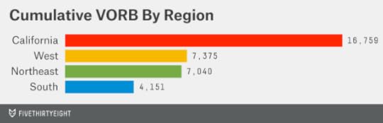
One reason may be that burritos figure especially prominently in Cal-Mex cuisine (as opposed to Tex-Mex cuisine, which is more focused on tacos, enchiladas, fajitas and so forth). If we were basing the regions on solely on VORB, a roughly even division might be: (i) Northern California; (ii) Southern California; (iii) everywhere west of the Mississippi, except California; and (iv) everywhere else.
But it could also be that there’s something about Yelp reviews, or about the VORB calculations, that biases them in favor of California. (For instance, the regional adjustments in VORB might be suspect.) Moreover, there is something to be said for burrito diversity: Does the 17th-most-promising burrito in California deserve to go in ahead of the best one in Alabama? For now, California looks like the grupo burrito de la muerte — but we’re curious to see whether it completely dominates the tournament or winds up being overhyped.
The bracket
In contrast to the NCAA basketball tournament, which requires six rounds to pare 64 teams to one champion, the Burrito Bracket will consist of three rounds. In each round, Anna will choose one BSE from among four to advance to the next stage.
The first round consists of intra-region competition and will reduce 64 competitors to 16. Within each region, the top four entrants were ranked and seeded by the selection committee, while the other 12 contenders went unseeded. Somewhat like in a tennis tournament, the seeded BSEs are protected from facing one another in the first round. Instead, they are grouped into pods with three unseeded BSEs; Anna and I chose these groupings based on geography and other thematic factors.
In the second round, the surviving BSEs will again be matched up four at a time. In contrast to the first round, the second round will consist of competition across regions. (This will be when California has a chance to assert itself.) The total number of BSEs will be reduced from 16 to four.
The third round simply consists of determining one national champion burrito from among the final four.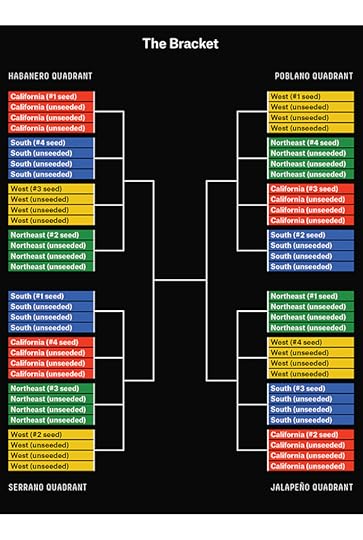 Members of the committee
The Burrito Selection Committee consisted of six members: Anna, me and one representative from each of the four regions:
Gustavo Arellano represents California. He is an editor at OC Weekly and has a weekly syndicated column called “Ask A Mexican.” He is the author of “Taco USA: How Mexican Food Conquered America.”Jeffrey Pilcher, representing the West, is the author of “Planet Taco: A Global History of Mexican Food” and a professor of history at the University of Minnesota.David Chang is the Northeast correspondent. He was the winner of the 2013 James Beard Foundation Outstanding Chef award and is the founder and owner of the Momofuku Restaurant Group.17Finally, Bill Addison represents the South. He recently became the restaurant editor at Eater and was formerly at Atlanta Magazine and the San Francisco Chronicle, where he once ate 100 burritos in 10 weeks.Our deliberations
Anna will be introducing the committee members to you at more length in the coming days. She’ll also be describing the deliberation process and its results in some detail, so what follows is just a quick summary.
The committee met in New York in early March.18 Before the meeting, each regional representative prepared a cheat sheet listing potential entrants from his region. Anna and I encouraged the panelists to look at VORB scores along with other factors, including other crowdsourced review sites (e.g. TripAdvisor), professional reviews and “best of” lists, and first-hand knowledge or experience.
The degree to which the committee members weighed the Yelp ratings against the other factors varied. Some of that was smoothed out during the deliberation process, where all six members had a vote. (I generally played the role of advocating for more rather than less emphasis on the VORB scores.) But each region contains a mix of BSEs that were rated very highly by VORB and others that were not.
We told the committee members to focus on evaluating the potential quality of the burritos themselves — including their taste, the quality of the ingredients and the balance of flavors — while ignoring price, service, atmosphere and the quality of non-burrito dishes on the menu. We also told them to look for evidence of a “house specialty,” meaning a particular type of burrito that receives especially rave reviews. (Technically speaking, we are hoping to find the best burrito in America rather than the best taqueria or burrito-selling establishment. If it’s clear, for example, that the carnitas burrito is amazing at Barney’s Burrito Castle, we shouldn’t care that Barney also serves a mediocre chicken burrito.)
We also told the committee to consider, as a secondary factor, the representativeness and diversity of their lists, such as by geography or by different styles of cuisine. The purpose of this was not to engage in “burrito affirmative action” (as one of our panelists described it) but instead to avoid duplicative or “second-best” experiences.19 The committee generally preferred to send Anna to high-risk, high-upside BSEs over those that were thought to be very good but which had little chance of providing the very best burrito in the United States.
The voting process itself was Customers wait at Garbo’s Grill in Key West, Florida. Photo by Anna Barry-Jester.Step 3: Taste test
Anna has already made her initial visit to many of the BSEs, and has come up with a 5-factor system to rate their burritos on a scale of 0 to 100. She and I also agreed upon several additional ground rules before she began her visits:
She should seek to identify the “house specialty” burrito at each restaurant, consulting the chefs or owners for advice where necessary (her Spanish fluency has proved to help in some cases).She should attempt to consume at least half of the burrito unless it literally or figuratively proves to be inedible.She should concentrate on the quality of the burrito alone rather than other factors.She should judge each BSE based on its performance on the day of her visit, rather than hedging it against her previous expectations.She should attempt to avoid experiences that would not be available to an anonymous patron — although we recognize that this will become harder as the identity of the list becomes more public.Anna’s having a lot of fun on her travels so far. Now’s the time to hand the project over to her; we hope you’ll join along the way.

Nate Silver's Blog

- Nate Silver's profile
- 729 followers

