
Nate Silver's Blog, page 172
June 4, 2014
The Stanley Cup Center of Gravity Is Somewhere in Lake Huron
With the elimination of the Montreal Canadiens from the playoffs last week, Canada will extend its streak to 20 NHL seasons without a Stanley Cup. But Canadian hockey fans might have a mild rooting interest in the outcome of the Stanley Cup Final in favor of the New York Rangers. If the Los Angeles Kings win, it would move the Stanley Cup Center of Gravity further in the direction of the United States.

What the H-E-double-hockey-sticks is the Stanley Cup Center of Gravity? It’s a concept we came up with, which is calculated by averaging the geographic location of all Stanley Cup winners. (There’s some room for debate about which team qualifies as the first champion, but we date the series back to 1915 and the Vancouver Millionaires.)
After 1968, for example — the first Stanley Cup contested during the NHL’s expansion era — the Stanley Cup Center of Gravity was in southern Ontario, a little to the northwest of Toronto. It steadily moved eastward through 1983, with teams such as the Canadiens, the Boston Bruins and the New York Islanders winning the Stanley Cup consistently. At one point, it breached the shores of Lake Ontario.
The rest of the 1980s saw a sharp shift in a west-northwest direction, as the Edmonton Oilers won five Stanley Cups and the Calgary Flames added another. As of 1990, the Stanley Cup Center of Gravity was somewhere near Owen Sound, Ontario.
The long streak of U.S.-based winners has since moved the Center of Gravity to the south-southeast. It crossed into Lake Huron a few years ago. And, after the Kings won their first Stanley Cup in 2012, it shifted to the American side of the maritime border. U.S.A.!
A Rangers win would move the Center of Gravity eastward toward Ontario — not enough to bring it back into Canadian waters, but it would be close. By comparison, another Kings win would shift it to the south and west, putting it on the U.S. mainland for the first time in many decades — near Sandusky, Michigan.
P.S. Ever hear the one about the statistician who drowned crossing a river that was 3 feet deep, on average?


The Political Media Still Fall for the Hot-Hand Fallacy
The most important lesson of the 2012 presidential campaign, in my view, was not that polling-based models are foolproof ways to assess the political environment, but instead that undisciplined ways of evaluating polls and political events can lead to flawed conclusions. On several occasions during the race, news media commentators either overrated the amount of information contained in outlier polls and jumped the gun on declaring a change in momentum — or insisted that a candidate had the “momentum” in the race when there was little evidence of it.
The past year-and-a-half hasn’t made me optimistic that things are getting better. Late last year, the news media badly overrated the political consequences of the government shutdown. Just a couple of months later, it somewhat overhyped the lasting impact of the botched rollout of Obamacare. (I think that case is more debatable, but President Obama’s approval ratings have improved by about 4 percentage points from their lows in December.)
The general flaw is in overestimating the importance of recent events and assuming that short-term trends will continue indefinitely: that a candidate rising in the polls will continue to do so, for example. In fact, especially in general elections, candidates gaining in the polls see their position revert to the mean as often as they continue to gain ground.
The political news media are by no means alone in committing this mistake. It’s a close cousin of the hot-hand fallacy. This is the tendency — also evident in sports commentary — to place too much evidence on recent events, which may be idiosyncratic or essentially random compared with longer-term averages and patterns.
Still, the news media may be especially prone toward overhyping purported “game-changers” that make for snappy headlines. Two weeks ago, after Sen. Mitch McConnell beat a more conservative rival in the Republican primary in Kentucky, some in the political media were ready to declare another momentum shift, claiming that the tea party was “losing steam” to the GOP establishment. But Tuesday night in Mississippi, incumbent Sen. Thad Cochran received fewer votes than challenger Chris McDaniel, a state senator who is often associated with the tea party. (McDaniel appears as though he’ll finish with just under 50 percent of the vote, however, so the race is probably headed to a June 24 runoff.)
As I wrote after McConnell’s win, the “tea party” may no longer be a useful analytical concept. But how Republican incumbents are faring against their challengers is a more tangible measure. For example, we can chart the share of the vote received by Republican incumbents in their Senate primaries back to 2004.
The medium-term trend has been toward more competitive Republican primaries. McConnell’s race was consistent with the pattern — the 60 percent of the vote he received led to a comfortable victory but was less than most incumbents have received in the past. Here’s what our chart looked like after his victory:
And here’s what the chart looks like after Tuesday’s results, accounting for Cochran’s race in Mississippi and Sen. Jeff Sessions’s uncontested win in Alabama, which we count as 100 percent of the vote.
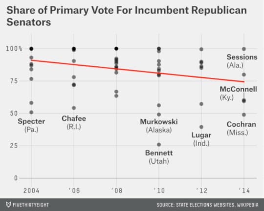
The charts are not that different; in fact, the trend line hasn’t really budged one bit. But the news media’s narrative about the tea party will probably shift a lot — especially if McDaniel prevails in the runoff.
The trend toward more competitive Republican primaries may eventually revert to the mean, too. Over the years, incumbent losses in the primaries have been fairly rare, but they’ve gone through cycles of occurring relatively more and less often. There were seven incumbent defeats (among both parties) in Senate primaries between 1978 and 1980, for example, but then none for 12 years. At least this is a trend that has taken shape over a decade, and not just a few weeks.

June 2, 2014
New York Is 85 Percent Better Than LA (According to Aggregate Personal Income in the Metropolitan Statistical Areas)
When the Los Angeles Kings and New York Rangers meet Wednesday for Game 1 of the Stanley Cup Final, it will be the first time since 1981 that teams with “Los Angeles” and “New York” in their names have vied for a major sports championship. That year, the Los Angeles Dodgers beat the New York Yankees in the World Series, avenging losses in 1977 and 1978.
But it was for entirely different reasons that Los Angeles seemed ascendant in 1981. The 1970s had been a horrendous decade for New York, marked by a near-bankruptcy, a daylong blackout and a crime epidemic.
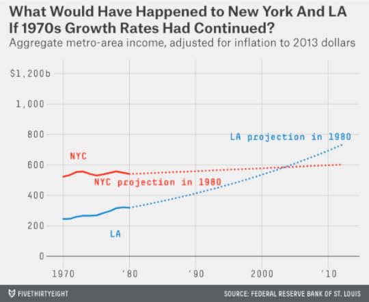
New York City lost more than 10 percent of its population in the 1970s. Some of that loss was to its suburbs. But even accounting for New York’s entire metro area (which includes Long Island, northern New Jersey and parts of the Hudson Valley), its economy barely grew during the decade. I estimate, based on per-capita income and population figures from the Federal Reserve Bank of St. Louis, that the metro area earned an aggregate $523 billion in 1970. (All figures listed here are adjusted for inflation to 2013 dollars.) By 1980, the number was barely larger, $541 billion, representing an annual growth rate of just 0.3 percent. Metropolitan Los Angeles, by comparison — if not quite experiencing the prodigious growth that it did in the first couple of decades after World War II — saw its income grow by 2.6 percent per year during the 1970s.

It might even have been possible to imagine Los Angeles overtaking New York as the United States’ preeminent economic city. The Los Angeles Times, in 1985, ran an article based on Commerce Department projections which said that Los Angeles would become more populous than New York by 2000. That particular claim was based on an odd definition of metro areas that included most of Los Angeles’s suburbs but few of New York’s. Nevertheless, had the entire Los Angeles and New York metro areas (as according to the Census Bureau’s definitions) maintained the income-growth rates that they did during the 1970s, LA would have seen its income become larger than New York’s at some point during the mid-2000s:
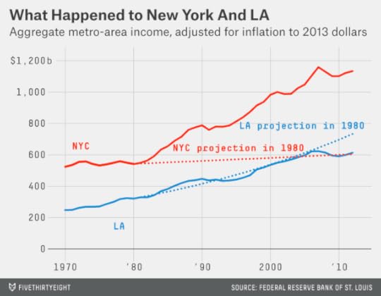
It turned out a lot differently: New York in 1981 was on the verge of remarkable rebound. The 1980s were a good decade for Los Angeles, which hosted a memorable (and unusually profitable) Olympic Games and saw its income grow by 3.4 percent per year. But New York, with a falling crime rate and a burgeoning financial sector, did even better, growing its income at 3.8 percent per year.
The 1990s also saw reinvigorated growth for New York City itself, with its population passing 8 million for the first time by the end of the decade. Meanwhile, Los Angeles struggled with the Rodney King riots and a high crime rate, and unemployment in Los Angeles County peaked at nearly 11 percent in 1992.
LA experienced an economic recovery during the second half of the 1990s, but it wasn’t enough to overtake New York. In 1980, New York and Los Angeles had nearly equal per-capita incomes. By 1999, per-capita income in the New York metro area was about $51,500 as compared with $42,500 for LA.
The New York metro area, despite the Sept. 11 attacks and the financial crisis, also grew its income slightly faster than Los Angeles during the 2000s. As a result, instead of having lost its economic crown to Los Angeles, New York’s metro-area income is now 85 percent larger than Los Angeles’s — a wider margin than in 1977, when Reggie Jackson won World Series for the Yankees by hitting three home runs in Game 6.
None of this is meant to slight Los Angeles. (I live in New York, but I can claim neutrality: My dad grew up in the San Fernando Valley. I still get a small thrill whenever I fly from JFK to LAX.) If the city has lost some of its Tinseltown shine, it now has some of the hallmarks of a mature metropolis: great food, great art, great architecture, quite a bit of history, improving public transit and so forth. As compared with a few decades ago, perhaps both New York and LA have more reason to feel secure about their place in the world — and less of the existential angst that can fuel sports rivalries.

May 29, 2014
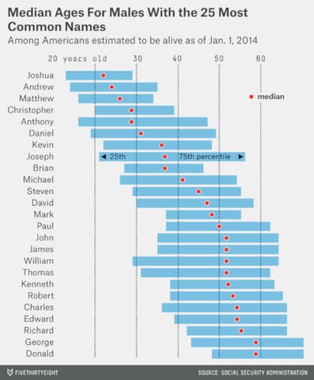
How to Tell Someone’s Age When All You Know Is Her Name
Picture Mildred, Agnes, Ethel and Blanche. Perhaps you imagine the Golden Girls or your grandmother’s poker game. These are names for women of age, wisdom and distinction. The median living Mildred in the United States is now 78 years old.
Now imagine Madison, Sydney, Alexa and Hailey. They sound like the starting midfield on a fourth-grade girls’ soccer team. And they might as well be: the median American females with these names are between 9 and 12 years old.
There are quite a lot of websites devoted to
The peak year for boys named Joseph was 1914 — when about 39,000 of them were born. Those 1914 Josephs would be due to celebrate their 100th birthdays at some point this year. But only about 130 of them were still alive as of Jan. 1.
Joseph has been one of the most enduring American names; it’s never gone out of fashion. So knowing that a man is named Joseph doesn’t tell you very much about his age. The median living Joseph is 37 years old, and the interquartile range (that is, the range spanning the 25th through 75th percentiles) runs from 21 to 56. In other words, a quarter of living Josephs are older than 56 and a quarter are younger than 21; the rest are somewhere in between. Not very helpful.
By contrast, you can make much stronger inferences about a woman named Brittany. That name was very popular from the mid-1980s through the mid-1990s, but it wasn’t all that common before and hasn’t been since. If you know a Brittany, she is probably of college age or just a bit older. Half of living American Brittanys5 are between the ages of 19 and 25.6

We can run these calculations for any name in the SSA’s database — for instance, for the 25 most popular male names since 1900. Joshuas, Andrews and Matthews are the youngest of these, with median ages of 22, 24 and 26. Georges and Donalds are the oldest, each with a median age of 59.
The data for the top 25 female names is more dynamic. The median Emily is just 17 years old; the median Dorothy is 74.
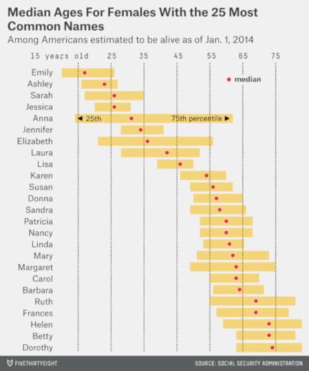
Girls’ names typically cycle in and out of fashion more quickly than boys’ names, which means that they have narrower interquartile ranges. For instance, almost half of living Lisas are now in their 40s, meaning that they were born at some point between 1964 and 1973.
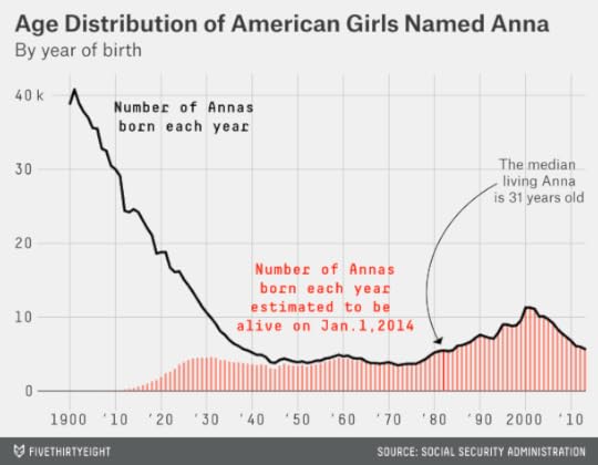
However, there are some exceptions — most notably Anna, which is a remarkably well-enduring girl’s name. The name Anna steadily declined in popularity from 1900 to 1950; however, many of those older Annas are no longer with us, and the name has remained at reasonably steady levels of popularity since then. Thus, while a quarter of living Annas are younger than 14, another quarter are older than 62.
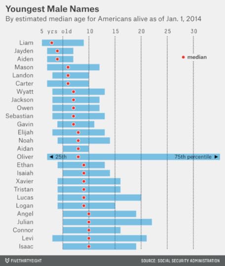
Boys are catching up when it comes to fashionable names that reveal a lot about their age. Do you know a Liam, an Aiden, a Jayden or a Mason? Their median ages are 3, 4, 4 and 6, respectively. How about a Noah, an Elijah or an Isaiah? They are 8, 8 and 9. (The charts that follow are restricted to birth names given to at least 100,000 Americans of a particular gender since 1900.)
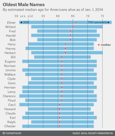
By contrast, the majority of living Hermans, Howards, Harrys, Harolds, Harveys and Herberts are in their 60s, or older. And the oldest male name is Elmer, with a median age of 66.
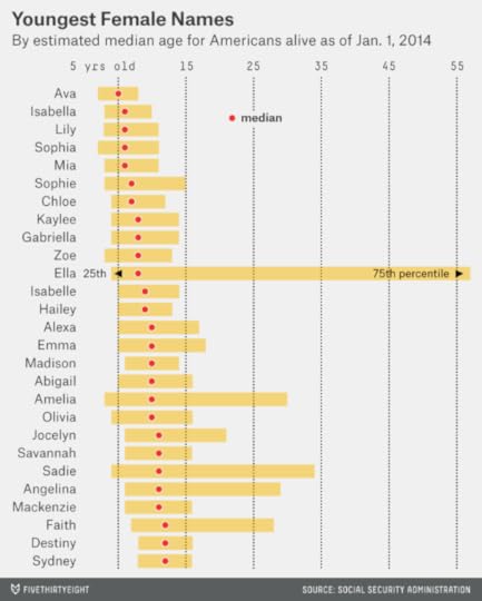
Eva, Mia, Sophia, Ella and Isabella might be friends with Mason and Liam in their kindergarten classes. The median girls with these names are between 5 and 8 years old.
We’ve already listed some of the oldest female names, but we didn’t mention the oldest of all: Gertrude. The median living Gertrude is 80 years old; a quarter of Gertrudes are older than 87. (Note also the presence of Betty and Wilma, the names of the “Flintstones” wives, on the oldest names list. Betty and Wilma are not quite prehistoric. But they are each now a median of 73 years old.)

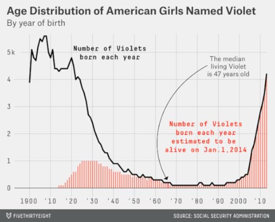
Other names have unusual distributions. What if you know a woman — or a girl — named Violet? The median living Violet is 47 years old. However, you’d be mistaken in assuming that a given Violet is middle-aged. Instead, a quarter of Violets are older than 78, while another quarter are younger than 4. Only about 4 percent of Violets are within five years of 47.
Lolas, Stellas and Claras also have highly bimodal distributions.

This pattern is slightly less common among male names. But it does occur occasionally, perhaps partly as an unfortunate consequence of the movie “Titanic.” The two male names with the widest age spreads are Leo (as in DiCaprio7) and Jack (as in Dawson, the character he played in the film).
Jack died in the end, so let’s end on a morbid note. Out of all Americans given a particular name since 1900, how many have since died?
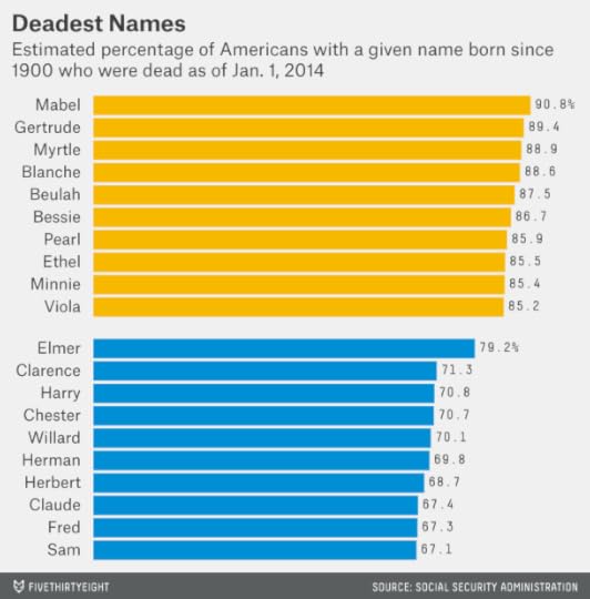
These results are highly similar to the lists of the oldest names, although slightly more Mabels (90.8 percent) have died than Gertrudes (89.4 percent). Elmer is the deadest common male name, at a 79.2 percent fatality rate. But if the list were liberalized to include more infrequent names, Hyman (91.3 percent), Eino (89.7 percent) and Isidore (87.2 percent) would do a better job of keeping up with the ladies, ’til death did they part.

May 27, 2014
Be Skeptical of Both Piketty And His Skeptics
Data never has a virgin birth. It can be tempting to assume that the information contained in a spreadsheet or a database is pure or clean or beyond reproach. But this is almost never the case. All data is collected and compiled by someone — either an individual researcher or a government agency or a scientific laboratory or a news organization or someone or something else. Sometimes, the data collection process is automated or programmatic. But that automation process is initiated by human beings who write code or programs or algorithms; those programs can have bugs, which will be faithfully replicated by the computers.
This is another way of saying that almost all data is subject to human error. It’s important both to reduce the error rate and to develop methods that are more robust to the presence of error.1 And it’s important to keep expectations in check when a controversy like the one surrounding the French economist Thomas Piketty arises.
Piketty’s 696-page book “Capital in the Twenty-First Century” has become an unlikely best-seller in the United States. That’s perhaps because it was published at a time when there is rapidly increasing interest in the subject of economic inequality in the U.S.2 But on Friday, the Financial Times’ Chris Giles published a list of apparent errors and methodological questions in the data underpinning Piketty’s work. Piketty has so far responded to the Financial Times only in general terms.
My goal here is not to litigate the individual claims made by Giles; see The New York Times’ Neil Irwin or The Economist’s Ryan Avent for more detail on that. Rather, I hope to provide some broad perspective about data collection, publication and analysis. A series of disclosures: First, my economic priors and preferences are closer to The Economist’s than to Piketty’s.3 Second, I haven’t finished Piketty’s book, although I’ve spent some time exploring his data. Third, I’m no expert on macroeconomic policy or macroeconomic data. Fourth, this comment rather liberally takes advantage of our footnote system; there’s a short version (sans footnotes) and a long version (avec).
My perspective is that of someone who has spent a lot of time compiling and analyzing moderately complex data sets of different kinds. Also, I’m someone who, like Piketty, has seen his public profile grow unexpectedly in recent years. I consider myself extremely fortunate for this — however, I know that attention can sometimes yield disproportionate praise and criticism. Throat-clearing aside, here’s what I have to offer.
Piketty’s data sets are very detailed, and they aggregate data from many original sources. For instance, the data Piketty and the economist Gabriel Zucman compiled on wealth inequality in the United Kingdom for their paper “Capital is Back: Wealth-Income Ratios in Rich Countries, 1700-2010″ contains about 220 data series for the U.K. alone which are hard-coded into their spreadsheet. These data series are compiled from a wide array of original sources, which are reasonably well documented in the spreadsheet.
This type of data-collection exercise — many different data series over many different years, compiled from many countries and many sources — offers many opportunities for error. Part of the reason Piketty’s efforts are potentially valuable is because data on wealth inequality is lacking. But that also means his numbers will not have received as much scrutiny as other data sets.
An extreme contrast would be to something like Major League Baseball statistics, almost every detail of which have been scrubbed and scrutinized by enthusiasts for decades. Even so, they contain errors from time to time. There are, however, usually larger gains to be had when data or methods or findings are relatively new — as they are in Piketty’s case. (An analogy is the way a vacuum’s first sweep of the living-room floor picks up a lot more dust and dirt than the second and third attempts.) Perhaps Piketty is guilty of coming to some fairly grand conclusions based on data that has not yet received all that much scrutiny.
What error rate is acceptable? The right answer is probably not “zero.” If researchers kept scrubbing data until it were perfect, they’d never have time for analysis. There comes a point of diminishing returns; that Hack Wilson had 191 RBIs during the 1930 season rather than 190 ought not have a material impact on any analysis of baseball player performance. At other times, entire articles or analyses or theories or paradigms are developed on the basis of deeply flawed data.
I don’t know where Piketty sits on this spectrum. However, I think Giles (and some of the commentary surrounding his work) could do a better job of describing Piketty’s error rate relative to the overall volume of data that was examined. If Giles scrutinized all of Piketty’s data and found a handful of errors, that would be very different from taking a small subsample of that data and finding it rife with mistakes.
All of this is part of the peer-review process. Academics sometimes think of peer review as a relatively specific activity undertaken by other academics before academic papers or journal articles are published. This process of peer review has been much studied over the years (often in peer-reviewed articles, naturally), and scholars have come to different conclusions about how effective it is in avoiding various types of errors in published research.
I’m not necessarily opposed to this type of peer review. But I think it defines peer review too narrowly and confines it too much to the academy. Peer review, to my mind, should be thought of as a continuous process: It starts from the moment a researcher first describes her result to a colleague over coffee and it never ends, even after her work has been published in a peer-reviewed journal (or a best-selling book). Many findings are contradicted or even retracted years after being published, and replication rates for peer-reviewed academic studies across a variety of disciplines are disturbingly low.
I have a dog in this fight, obviously. I think journalistic organizations from the Financial Times to FiveThirtyEight should be thought of as prospective participants in the peer-review process, meaning both that we provide peer review and that our work is subject to peer review.
I can’t speak for the FT, but I know that FiveThirtyEight gets some things badly wrong from time to time. It’s helpful to have readers who hold us to a very high standard. (A terrific question is whether FiveThirtyEight and other news organizations are transparent enough about their research to be full-fledged participants in the peer-review process. That’s something I should probably address more completely in a separate post, but see the footnotes for some discussion about it.4)
Piketty’s errors would not have been detected so soon had he not published his data in detail. That’s not to say that transparency is an absolute defense.5 But one should also assume that there are as many problems (probably more) with unpublished data, or poorly explained methods.6
The peer-review process ideally involves both exactly replicating a research finding and replicating it in principle. It would be problematic if other researchers couldn’t duplicate Piketty’s data. But it would be at least as problematic — I’d argue more so — if they could replicate it but found that Piketty’s conclusions were not very robust to changes in assumptions or data sources.
Some of Giles’s critique of Piketty gets at this problem. For instance, he calls into question Piketty’s finding that wealth inequality is rising throughout Western Europe, a result which he says depends on a particular series of assumptions and choices that Piketty made.7
Of course, Giles’s methodological choices can be scrutinized, too. Perhaps there’s some reasonable set of assumptions under which wealth inequality is not rising at all in Western Europe, another under which it’s increasing modestly, and a third under which it’s increasing substantially.
In the medium term, the better test might be one of research that’s built up from scratch and largely independently of both Piketty and Giles. How robust are their findings to reasonable changes in data and assumptions?8
And in the long run, the best test might be whether Piketty’s hypothesis makes a good prediction about wealth inequality, i.e. whether wealth inequality continues to rise. The prediction won’t be as easy to evaluate as election forecasts are.9 Still, Piketty’s book comes closer to making a testable prediction than much other macroeconomic work.
Science is messy, and the social sciences are messier than the hard sciences. Research findings based on relatively new and novel data sets (like Piketty’s) are subject to one set of problems — the data itself will have been less well scrutinized and is more likely to contain errors, small and large. Research on well-worn datasets are subject to another. Such data is probably in better shape, but if researchers are coming to some new and novel conclusions from it, that may reflect some flaw in their interpretation or analysis.
The closest thing to a solution is to remain appropriately skeptical, perhaps especially when the research finding is agreeable to you. A lot of apparently damning critiques prove to be less so when you assume from the start that data analysis and empirical research, like other forms of intellectual endeavor, are not free from human error. Nonetheless, once the dust settles, it seems likely that both Piketty and Giles will have moved us toward an improved understanding of wealth inequality and its implications.

May 24, 2014
When to Sign an NBA Player to the Max
The Cleveland Cavaliers won the lottery on Tuesday and will make the NBA’s No. 1 overall draft pick for the third time in four seasons. There’s a lot riding on whom they choose. Earlier this week I looked at the value produced by first-round NBA draft picks. These players, especially the highest draft picks, are valuable assets while they’re still on rookie-scale contracts. The average No. 1 overall pick produces the equivalent of $63 million in value during his first five NBA seasons, based on the number of wins he generates for his club. Yet the player drafted first overall this year can be had for about $35 million in salary. These averages, of course, conceal a wide range of outcomes — from LeBron James to Anthony Bennett — but the odds of acquiring a valuable player at a discount are stacked in the team’s favor.
Edges like those aren’t easy to come by in the NBA, however. And the Cavs’ most difficult choice this summer may not be between Andrew Wiggins and Joel Embiid, but what to do about Kyrie Irving, their No. 1 overall pick three drafts ago. They’ll need to determine whether to offer Irving a maximum extension, which would kick in during the 2015-16 season and pay him around $90 million through 2019-20.
These decisions can easily go wrong. The very best players in the league might be worth 20 wins per season or more, which can translate into valuations in the range of $40 million a year — much higher than the maximum salary. However, only the top few players in the league — James, Kevin Durant, Chris Paul and perhaps a half-dozen others — are worth considerably more than the max. And not all players who look to be on a LeBronian trajectory stay the course. The Chicago Bulls’ Derrick Rose won the MVP after his terrific 2010-11 season — a lot more than Irving has accomplished — and the Bulls signed him to a “supermax” extension afterward through 2016-17. Rose has played in just 49 regular-season games since; the deal could wind up being a curse for Chicago.
My earlier article considered cases like these on an anecdotal basis; this one will do so in a more formal way. Here’s the issue: Irving has played his first three NBA seasons, and his team needs to decide whether to offer him a maximum extension. This is a fairly common dilemma for NBA teams; the Indiana Pacers faced it last year with Paul George, for instance, and the Houston Rockets did two years ago with James Harden.
Maximum extensions lock up a player for five years,1 for his fifth through ninth NBA seasons. If you’ve been reading carefully, you may be wondering what happened to a player’s fourth season. The short answer is that the team needs to decide on a max extension a year ahead of time. Essentially, it loses out on a year’s worth of information. This makes more difference than you might think2; the fourth season is sometimes pivotal in young players’ development. Penny Hardaway’s performance regressed significantly during his fourth season, for instance, the start of a rather steep decline, and his fourth season is when Rose’s injury problems began.
As the name implies, a maximum extension is for the league’s maximum salary and maximum annual raises of 7.5 percent. The maximum salary for a player in his fifth NBA season was $13.7 million last season. However, assuming inflation under the salary cap is 3.5 percent per season,3 it will be closer to $16.3 million by 2018-19, when the players chosen in the draft this June will enter their fifth year. Factoring in annual raises, that means the price of a maximum extension will be about $94.5 million over five years when Andrew Wiggins or Julius Randle become eligible for one. Or, Wiggins or Randle instead could be eligible for a supermax extension if they meet certain criteria, such as starting on the All-Star team at least twice. Those supermax extensions are 20 percent more expensive, or $113.4 million over five years.
My apologies if this has begun to read like a legal brief. The NBA’s contract rules aren’t simple; there’s a reason that Larry Coon’s salary cap FAQ runs for more than 60,000 words. The “fun” part of the story starts now.
First, let’s look at the typical aging curves for NBA players, based on their position in the draft and the number of years since they were drafted.
The chart shows that the typical first-round draft pick improves significantly during his first and second seasons in the league. Then he has a long and relatively flat peak that persists from about his third through eighth NBA seasons. After that, he begins to decline. The shape of the aging curve is fairly similar regardless of where a player is chosen in the draft. Players chosen higher in the draft are better as rookies, better at their peak, and better in their declining years — but they don’t peak substantially earlier or later than other players.
This represents a reasonably favorable set of circumstances for an NBA team considering a max extension. In buying up a player’s fifth through ninth NBA seasons, it’s still getting him at something close to peak performance.4 The situation is better than in baseball, when the average player doesn’t hit the free-agent market until he’s something like 30 years old, and already in his decline phase.
So suppose that the No. 1 overall draft pick was always signed to a max extension. Would teams come out ahead on those deals on average?
No; this would be a silly strategy. Based on the past performance of No. 1 overall picks, you’d expect the player chosen first this year to produce the equivalent of $80.5 million in market value from 2018-19 to 2022-23.5 That’s not bad, but his max deal would cost his team $94.5 million instead.
So let’s allow teams to take a more sophisticated approach. They run a regression on all first-round picks from the lottery era, which provides them with a projection of their player’s performance in his fifth through ninth seasons based on his age, his draft position and his performance in his first three seasons (as measured by win shares).6 If the player’s projection comes out in the 80th percentile or higher, they offer a max extension. This means that 20 percent of first-round draft picks would get max extensions, or an average of six players per draft class.
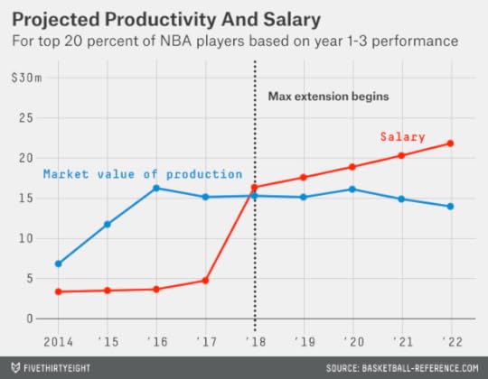
This strategy is also not any good for the teams; it’s much too liberal in giving out max contracts. The average player from this group produces about $75 million worth of market value in his extension seasons — about $20 million less than his team would need to pay him.
We have to set the bar a lot higher. Suppose teams extend only the top 5 percent of players, or the equivalent of one or two players per draft class. These players do provide some surplus value during their extension years. Their performance is worth an average of $105.7 million in market value, compared to their $94.5 million in salary. That’s a profit of about $11 million for the teams.
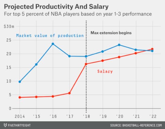
Even so, most of these are good deals for the teams rather than great ones. The majority of these players are worthwhile at the maximum salary, but the majority would not be worth the supermax salary of $113.4 million.7
To find players worth the supermax deal, teams need to be pickier still — offering it only to players who rank in the 99th percentile of all first-round picks. There are about 700 players in our sample of lottery-era first-round picks, which means only seven meet this definition: James, Durant, Paul, Hardaway, Shaquille O’Neal, Grant Hill and Tim Duncan. This is a noisy estimate because of the small sample size,8 but these players produced an average of about $130 million worth of value in their fifth through ninth seasons, well more than both the max and supermax contracts.9
But it’s not much of a challenge to identify the 99th percentile players. Instead, the hard part is distinguishing between players in the 95th through 98th percentiles, who generally are worth max extensions, and those in the 90th through 94th percentiles, who usually are not. According to our model, in fact, players in the 90th through 94th percentiles are expected to produce a significantly negative return on investment when signed to max extensions, receiving almost $20 million more in salary than their production is worth.

This is an awfully abstract way to think about NBA players, so let’s look at some examples. The table below lists all players from 2000 through 2014 who would be classified in each grouping after their third NBA season. The guys on the right are the ones you’d have wanted to extend — given what you knew about them at the time. The guys on the left are the ones you wouldn’t.

Each side of the list has a few mild oddities (Ronnie Brewer?), but for the most part the breakdown is reasonably intuitive. The guys on the right side are those who by their third season in the league were serious candidates for one of the three All-NBA teams. In fact, 57 percent of the players on the right-hand list had made at least one All-NBA team by their third season, and almost all the others would have been very reasonable picks. By contrast, just two of the 21 players on the left-hand list had done so (the exceptions were Russell Westbrook and Paul George and they both rated in the 94th percentile, just barely missing the right-hand side of the list).
If you were an NBA team actually contemplating a max-extension offer, you’d want to do more homework on the decision. Still, the following is a pretty good rule of thumb:
Has your guy made an All-NBA team, or would it have been entirely reasonable for him to do so? Then offer him the max extension. If not, then don’t.
If it’s a close call, you might consider the player’s age, his injury history, his advanced defensive metrics, his leadership abilities, positional scarcity, your cap flexibility or whatever else pleases you.
Kyrie Irving hasn’t made an All-NBA team and he isn’t going to this season. But is he a close call or a flat ‘no’? He’s squarely on the left-hand side of our chart10 based on win shares — and that metric likes Irving a lot better than some other systems. ESPN’s NBA real plus-minus rated Irving as just the 37th (!) best point guard in the league, by contrast, in large part because it rates his defense as awful.
Perhaps Irving’s disappointing season had more to do with motivation and mindset than talent. But it’s important to consider the downside as well as the upside of a max deal. Unless you have a potential 99th percentile player on your hands, the downside is sometimes larger. A very, very good but not quite world-class NBA player — say, Russell Westbrook — is worth a little more than the maximum salary. But a guy who gets hurt or who burns out early — say, Steve Francis — can be a huge albatross. If Irving has a 50 percent chance of turning into Westbrook and a 50 percent chance of following the Francis course, the Cavs probably shouldn’t sign him. (The team also has other options to explore: trading him, locking up his fifth season by making him a qualifying offer, and so forth.)
This analysis also implies that there isn’t much intrinsic value in a draft pick above and beyond what a player gives you while he’s still on the rookie salary scale. Your player will be worth signing to a max extension only 5 percent of the time, and your expected profit on those extensions is only $11 million a pop. Having a 5 percent chance at an $11 million profit is worth just $550,000. By contrast, being too liberal about giving out max extensions to players like Irving can chip away at the value gained from them during their first several seasons.

May 22, 2014
‘Tea Party’ Has Outlived Its Usefulness
Here’s a familiar-seeming political tale. An incumbent Republican senator, from a famous political family and with a long history of moderation, is challenged by an upstart candidate in the GOP primary. The upstart is a successful entrepreneur turned talk-radio host and small-town mayor with a reputation for slashing spending and fighting unions; the Club for Growth endorses him. The Republican establishment rallies to the incumbent’s side. Karl Rove works for the incumbent; Mitch McConnell and John McCain stump for the incumbent. In the end, the incumbent wins, but barely. Then the incumbent goes on to lose to the Democrat in November in a race that may have tipped the balance in the Senate.
You might assume that this story refers to something from the 2010 or 2012 election cycles, when — so the narrative goes — tea party candidates caused all sorts of grief for the Republican establishment and potentially cost the GOP control of the Senate. But the details don’t quite fit any election in those years. Instead, this is the story of the 2006 Republican primary in Rhode Island. Lincoln Chafee was the incumbent; Steve Laffey was the upstart; Sheldon Whitehouse was the Democrat who beat Chafee that November, when Democrats took control of the Senate, 51-49.
With McConnell having defeated his challenger, Matt Bevin, in the Republican primary in Kentucky this week, there’s been a lot of talk about whether the influence of the tea party is waning. According to a series of mainstream media accounts, McConnell “crushed” the tea party in “the latest big beat” for the movement, which is “losing steam” as the economy improves.
There are a couple of problems with this story. The most important is that the tea party is hard to define. Take that Rhode Island race in 2006. Steve Laffey had all the hallmarks of what now might be called a tea party candidate. (Laffey, in fact, has now moved to Colorado where he is running for Congress and speaking to tea party rallies.) But the term wasn’t used in its current political context back then.
Furthermore, as Slate’s Dave Weigel pointed out earlier this week, the term “tea party” is applied very loosely by the political media. Was Missouri Rep. Todd Akin a member of the tea party, for instance? Weigel says no: Most groups associated with the tea party endorsed either Sarah Steelman or John Brunner in the 2012 Republican primary in Missouri. I think the case is considerably more ambiguous: Akin was listed as a member of the Tea Party Caucus on Michele Bachmann’s website in 2012. But these ambiguities arise all the time. Marco Rubio was once strongly associated with the tea party but is now somewhat estranged from it. Sometimes the term seems to serve as a euphemism for “crazy Republican” rather than anything substantive.
What is the tea party, exactly? That’s not so clear. There are a constellation of groups, like Tea Party Patriots, FreedomWorks and Americans for Prosperity, who sometimes associate themselves with the movement or are associated with it. But their agendas can range from libertarian to populist and do not always align. As in Missouri, they often do not endorse the same candidate. Nor do they always endorse the candidate who self-identifies as member of the tea party.
Is the tea party opposed to the Republican establishment or has it been co-opted by it? That’s also hard to say. The Tea Party Caucus no longer exists in a substantive way in the House. A group that called itself the Senate Tea Party Caucus did hold a meeting at some point last summer. The attendees included McConnell and McCain — those establishment stalwarts — who are therefore now listed as former members of the Tea Party Caucus at Wikipedia.
Perhaps it’s time to discourage the use of “tea party.” Or, at the very least, not to capitalize it as The New York Times and some other media organizations do. “Tea Party” looks better aesthetically than “tea party,” but triggers associations with a proper noun and risks misinforming the reader by implying that the tea party has a much more formal organizational infrastructure than it really does.
We got along perfectly well without the term. In 2006, nobody had a problem with describing Laffey as a “feisty conservative” challenger. In 2004, Rep. Pat Toomey, who nearly defeated Sen. Arlen Specter in the Republican primary in Pennsylvania, was “a conservative who has attacked Mr. Specter as a Ted Kennedy liberal too supportive of abortion rights and the United Nations,” according to The New York Times. That gets the point across every bit as well as describing Toomey as a “Tea Party candidate,” as the Times would when he ran again (and won) in 2010.
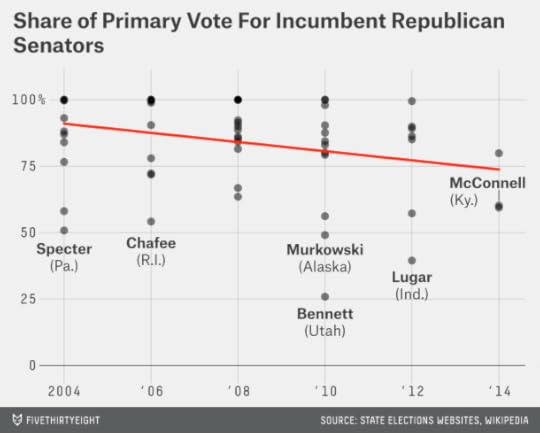
Nor is it clear that these challenges are becoming less common or less successful. The chart, below, depicts the share of the vote received by Republican incumbent senators in their primaries or party conventions dating back to 2004.

The downward trend in the chart is statistically significant as that term is usually defined (“statistical significance” is every bit as thorny of a concept as “tea party” — but that’s a subject for another post!). From 2004 to 2008, Republican incumbents got an average of 88 percent of the vote in their party primaries, compared to 78 percent from 2010 to 2012.
Has the trend reversed itself? So far in 2014, the three incumbent Republican senators to have had their primaries (these are McConnell, John Cornyn of Texas and Jim Risch of Idaho) received an average of 67 percent of the vote, a little worse than the party average in 2010 and 2012. Obviously, the sample size is small, and the data is fairly noisy. But that’s precisely the reason to avoid jumping to conclusions. For all the talk of the rise of the of the tea party, only three out of 19 incumbent Republican senators in 2010 and 2012 were defeated. (One of them, Lisa Murkowski of Alaska, went on to win the general election anyway as a write-in candidate.) That the so-called tea party candidate lost one race in Kentucky this year but got a much higher share of the vote than challengers usually do doesn’t tell us very much.
Whether the Republican Party continues its drift to the right — something that I don’t think should be taken for granted — is an important question. The evidence for it will manifest only noisily in individual races, however. Narratives centered on the rise and fall of the tea party may not give us a clearer perspective.

May 20, 2014
Our Story About What the Media Said About What Karl Rove Said About Hillary Clinton’s Health
Thirty days in the hospital. And when she reappears, she’s wearing glasses that are only for people who have traumatic brain injury? We need to know what’s up with that.
That’s what Karl Rove, the Republican strategist and pundit, said about Hillary Clinton, at least according to a report a little more than a week ago by the New York Post.
The reported remarks prompted outrage from Clinton’s spokespersons and Clinton’s husband and newspaper editorial pages and several of Rove’s fellow Republicans. Rebukes rolled in from fact-checking sites, pointing out that while Clinton had a concussion in 2012, Rove misstated the number of days she spent in the hospital, and that whether a concussion is a “traumatic brain injury” is open to debate.
But the comments drew a lot of press coverage, and they will probably get a more now that former Alaska governor Sarah Palin has come to Rove’s defense. Peter Beinart, writing for The Atlantic last week, likened Rove’s comments to a “dirty trick”:
Why does Rove allegedly smear his opponents this way? Because it works. Consider the Clinton “brain damage” story. Right now, the press is slamming Rove for his vicious, outlandish comments. But they’re also talking about Clinton’s health problems as secretary of state, disrupting the story she wants to tell about her time in Foggy Bottom in her forthcoming memoir.
Let’s test Beinart’s hypothesis: Is the news media actually talking more about Clinton’s health?
I ran a search on Lexis-Nexis’s database of news articles, counting the number of citations each day that referred to Clinton’s health. The search string is a little complicated in an effort to minimize the number of false negatives and false positives. I required that the citation use Clinton’s full name (Hillary Clinton or Hillary Rodham Clinton). I also required that it used her last name, Clinton, within 30 words of one of the following terms: health, healthy, injury, injured, brain or concussion. I omitted citations where health was the only one of these terms used and was mentioned within five words of the terms care, reform or insurance, which may refer to U.S. health care policy rather than Clinton’s personal health.
This search shows an eightfold increase in news articles that mention Clinton’s health since Rove’s remarks, from an average of 16 hits per day in the two weeks before his remarks to 130 per day since then.
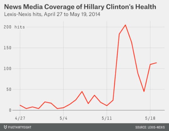
It appears that Beinert is right. But I’d add one caveat: Many of these articles — like this one — are referring to the media controversy over Rove’s remarks rather than providing substantive reporting about Clinton’s health. We can check this by omitting articles that would otherwise qualify but that also mention Rove.
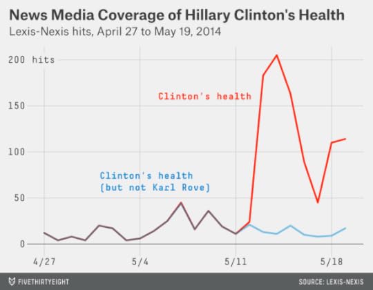
Articles that mention Clinton’s health but not Rove haven’t become any more common. There were 16 of those per day before Rove’s comments, and there have been 13 per day since then. It’s possible that some of the articles are deeper looks into Clinton’s health that mention Rove only in passing, but after perusing them, I doubt that more than a handful would belong in that category.
If Rove’s goal were to gain a lot of attention for himself while simultaneously upping the number of passing references to Clinton’s health, he’s succeeded. If Rove’s goal were to jump start a deep, substantive discussion of Clinton’s health, it’s less clear. (As an aside, it may also be that Rove’s remarks had no strategic purpose. I’ve spoken at enough public events to know that a lot of words are expected from you, including some that later you might regret having said.)

How Much Is Winning the (NBA Draft) Lottery Really Worth?
The rags-to-riches tale is a cultural archetype, but so is its reverse: the reminder to be careful what you wish for. Social science journals are full of cases of sweepstakes winners who wound up no happier in the end. Sometimes winning the lottery doesn’t work out so well for NBA teams, either.
The Portland Trail Blazers weren’t blessed by winning the prize of the first draft pick in 2007 and choosing Greg Oden. The Washington Wizards won the lottery and took Kwame Brown in 2001; had they stayed in their expected position, they might have gotten Pau Gasol instead.1
That’s not to say that the 13 NBA teams2 that will vie for the first pick in Tuesday night’s draft lottery would be better off losing out. Drafting in the NBA isn’t quite as unpredictable as it is in the NFL. The first pick, in particular, produces a high rate of return. But the impact of winning the draft lottery is not quite as impressive as you might assume.
It’s tempting to go through something like the following thought process: The league’s superstar players, like LeBron James and Kevin Durant, are worth perhaps worth $40 million per season or more. Imagine having the chance to employ the next LeBron for a decade. That’s a $400-million player up for grabs based on the bounce of a few ping-pong balls!
Things rarely work out so smoothly, however, and there are three gigantic problems with this analysis. First, drafting is an imperfect science: Durant, for example, was the second pick in 2007, behind Oden.3 Second, even if a player produces a lot of value, you’re still going to pay him something. Third, the player may not stay around long enough to win his team a title: Instead, teams are guaranteed control of their first-round picks for only five years.
The difference between the Milwaukee Bucks winning the lottery Tuesday night (they have the best chance of doing so) and falling to the fourth pick probably amounts to the equivalent of around $11 million in long-term profits.4 That’s not chump change, but it’s World Series of Poker money — not Powerball dough.
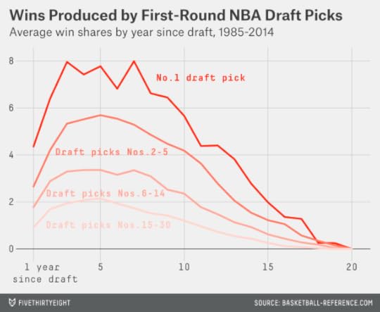
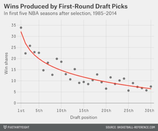
The NBA draft lottery was instituted in 1985. I looked up how many wins (as measured by Basketball-Reference.com’s win shares) each player chosen in the first round since then produced during his first five NBA seasons,5 based on the slot where he was selected.6 The analysis accounts for the fact that the most recent selections, such as the New Orleans Pelicans’ Anthony Davis, have not yet seen five seasons.7
The average number of wins produced by draft selections Nos. 1 through 308 appears in the graphic below. The pattern is fairly nonlinear: No. 1 overall picks have produced an average of 33.9 wins in the five seasons following their pick, as compared to 22.3 for No. 2 overall selections. It takes a logarithmic curve, with a fairly sharp uptick for the No. 1 overall pick, to do an adequate job of fitting past years’ results.
With a bit more work, we can translate wins into dollars. In particular, during the previous NBA regular season, a total of $1.78 billion was paid to players who weren’t still on rookie-scale contracts. Collectively, those players produced just over 1,000 win shares. That implies that the market rate for a win in the NBA is about $1.75 million.
The players on rookie-scale contracts were bargains by comparison, coming at a cost of about $900,000 per win last season. (For much more detail on how rookie contracts work, see Larry Coon’s salary cap FAQ.)
But how much does the price per win vary based on where a player was chosen in the draft?
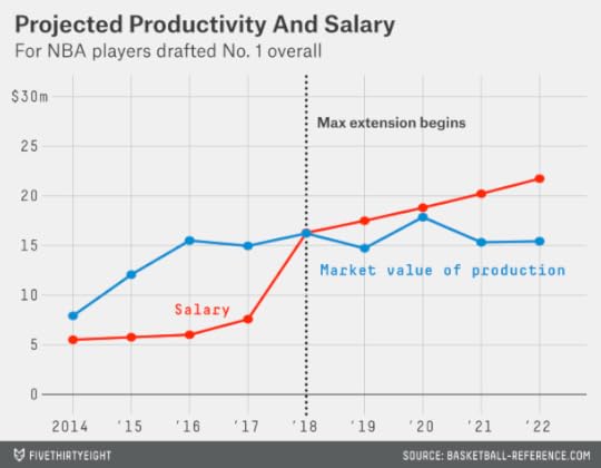
The next chart compares the market value produced by the player against his rookie-scale contract figures, using the following assumptions. First, the market rate for an NBA player is increasing at 3.5 percent per year.9 Second, teams pick up their option for each first-round pick for the player’s third and fourth seasons (this assumption might seem dubious — we’ll test it in a moment), and they make the players a qualifying offer before his fifth seasons, which comes to represent his annual salary during that year.10 Third, the team is paying the player the maximum amount allowed under the rookie scale in the NBA’s collective bargaining agreement.11 Fourth, I’m using smoothed values for the wins produced by each pick based on our previous chart.
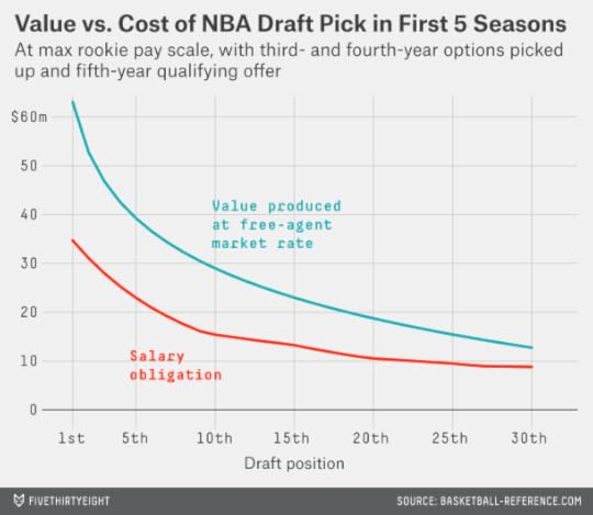
In this analysis, the first overall pick produces about $63 million worth of market value during the first five NBA seasons after he’s drafted; by comparison, under our assumptions, his team would be obligated to pay him $35 million over five years. That means a discount of about $28 million for the team.
The other first-round picks are also bargains by this measure, although the value diminishes the later a player goes in the draft. The fourth overall selection — the worst the Bucks could wind up with tonight — produces a profit of just under $18 million. The 30th and last pick in first round, held this year by the San Antonio Spurs, brings an expected profit of about $4 million.
As I mentioned, these figures assume that an NBA team will employ a drafted player for five seasons. However, NBA teams are obligated to keep first-round draft picks for only two years. They have the unilateral option to extend the contract for a third and fourth year, and then to make the player a qualifying offer for his fifth season. This potentially gives the teams some option value in that they can extend their more successful picks on reasonably favorable terms, while cutting bait on the weaker players.
To an extent, these options are more appealing in theory than in practice. One problem is that an NBA team must determine whether to offer a player his third- and fourth-year options a year ahead of time, or before he starts his second and third seasons. In practice, it’s quite rare for a team to fail to exercise its third-year option.
I attempted to simulate this decision-making process. I assumed that an NBA team made a projection12 of a player’s third-year value based on his win-shares total as a rookie and the draft slot where he was chosen. If the player’s rookie-scale contract salary was at least 20 percent higher13 than his projected value for his third season, I assumed that the team dropped him. However, these conditions only applied to about 2.5 percent of draft picks. (A player basically has to be a complete and utter disaster to get dropped: This algorithm would have the Cleveland Cavaliers failing to pick up their third-year option on Anthony Bennett, the first overall pick in last year’s draft, for instance.)
The fourth-year option represents more of a real choice. A team still has to decide on it a year in advance. But it has two years of player performance to evaluate, and not just one. Meanwhile, the player may be improving slowly — if he’s still improving at all14 — while he’s due for a hefty raise under the rookie pay scale. I assumed that teams would drop players whose fourth-year salaries were projected to be at least 10 percent higher than their value in that season, and found they would fail to extend 28 percent of players15 by these rules.
Finally, a team gets to decide after a player’s fourth season whether to make him a qualifying offer for his fifth season. Using a similar method, I found that about 32 percent of players who hadn’t been dropped after their third or fourth seasons would be let go at that point.16
We can now re-run our estimates of the net value of each draft pick excluding both the win shares associated with the dropped players and the cost of their contracts. You’d expect this to increase the profitability associated with the picks, since the teams are dropping precisely those players they expect to produce a negative return on investment. It does increase the profitability, but the difference isn’t all that great — the net value associated with the average first-round draft pick improves by 18 percent. Most of the improvement in profitability comes from selections chosen late in the first round. That’s because they’re due for proportionately larger pay increases under the league’s rookie pay scale and should be dropped more often.

My revised estimates of the net profitability associated with each first-round draft pick are in the table below. To be clear, these are general estimates built from how all draft picks have performed since 1985, and don’t say anything in particular about Andrew Wiggins, or other projected top picks this year.17 For readability, figures are rounded to the nearest $50,000 increment.

The first overall draft pick is worth about $30 million by this measure, compared to $23.5 million for the second pick, $20.5 million for the third pick and $18.8 million for the fourth pick. The 14th selection — the last lottery pick — is worth about $12 million, while the final overall pick in the first round is worth $7.3 million.
But these figures only estimate the profit associated with a player during his first five seasons. What happens after that?
Usually teams aim to act proactively before getting to that point, especially for their most talented players. They’ll try to extend those players’ contracts.
These options become pretty complex. To go through a full empirical analysis of the profit or loss associated with these extensions and long-term deals would require an article with even more footnotes than this one. That may be a challenge that we’ll undertake in the future.
In the meantime, let’s try a slightly gentler approach. I looked up the players whose rookie seasons came 10 years ago (in the 2003-04 NBA season) or later and found who produced the most win shares over their first four NBA seasons. Did they turn out to produce happy endings for the teams who originally drafted them? Here are the top 15, in order:
Chris Paul (Hornets): Traded to the Clippers after he made clear to New Orleans that he wouldn’t sign an extension with them.LeBron James (Cavaliers): Took his talents to South Beach.Blake Griffin (Clippers): Signed through 2016-17. This could turn out happily, but it’s too early to say.Dwyane Wade (Heat): This has to be considered a big success based on what he and the Heat have accomplished so far, though going forward Wade may not be worth as much as he’s paid.Dwight Howard (Magic): Forced a trade to the Lakers.Kevin Durant (Sonics/Thunder): Extended through 2015-16. This has to count as a smashing success, even if the Thunder never win a title.Brandon Roy (Trail Blazers): Signed an extension with Portland, but the contract turned into a disaster after injuries robbed Roy of his game. The Blazers eventually used their amnesty provision on him.James Harden (Thunder): Preemptively traded to Houston, in part because the Thunder wanted to avoid a massive luxury tax bill.Al Horford (Hawks): Signed an extension — in what initially looked like a pretty good deal for Atlanta — but he’s since missed most of the 2011-12 and 2013-14 seasons with injuries.Chris Bosh (Raptors): Signed one extension and then to South Beach he took his talents.Kevin Love (Timberwolves): One more guaranteed year on his deal and then he reportedly wants out of Minnesota.Andre Iguodala (76ers): Now we’ve begun to reach those players who are fine NBAers, but probably worth something near the maximum NBA salary and not a lot more than that.Marc Gasol (Grizzlies): See above.Derrick Rose (Bulls): Signed an extension, which looked to have plenty of upside for the Bulls — but his injuries mean it could turn into a problem for them instead.Deron Williams (Jazz): Forced a trade out of Utah. His performance has regressed in Brooklyn and the trade is looking like a blessing in disguise for the Jazz.Get the drift? These players produced a ton of surplus value for their teams during their first three or four or five seasons. Those rookie-scale contracts are really favorable to NBA teams.
However, we’ve already accounted for the profit a team achieves on a player over his first five seasons. And after that, things get much dicier. The attrition rate is high. Players can leave in free agency, or force a trade, or get hurt, or perform at a perfectly decent level but not necessarily any better than what they’re being paid. And this is a list we’ve formulated with the benefit of hindsight, knowing exactly how valuable the players were during their first four seasons.
After winning the draft lottery, a team essentially needs to get lucky three times over in order to have a storybook ending. First, it has to draft the right player. Next, it has to convince him to stay in town. Finally, he has to play up to his new contract. The odds are that something will go wrong. In 1997, the San Antonio Spurs chose Tim Duncan at No. 1 and went on to win four NBA titles with him on the roster. None of the teams to make the first overall pick since has won a championship.

May 18, 2014
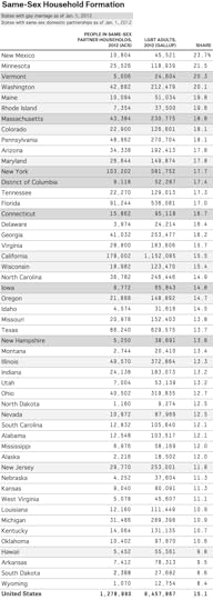
Same-Sex Couples Settle Down More Often in States That Welcome Them
Estimating the number of gay, lesbian and bisexual people in the U.S. has always been challenging. Sexual identity can be fluid. What people do in their private lives may not match what they tell pollsters. And categories relating to gender identity are sometimes lumped together with those that describe sexual orientation.
In recent years, however, there has been a new and potentially reliable1 source of data from the Census Bureau. The decennial census, and the ongoing American Community Survey (ACS), now ask detailed questions about the relationships between adults living in the same household, including categories for both unmarried and married same-sex partners.2
Combining the new Census data with other polling data, I wanted to see what percentage of gays and lesbians live together as partners, and whether this percentage varies substantially from state to state.
In 2012, Gallup published data on the percentage of adults who identify themselves as lesbian, gay, bisexual or transgender (LGBT) in each state. It found that about 3.5 percent of Americans do, with a range from 1.7 percent in North Dakota to 5.1 percent in Hawaii (and 10.0 percent in the District of Columbia). That would imply there are about 8.5 million LGBT adults in the United States — roughly the same as the population of Virginia or New Jersey.
By comparison, the ACS estimated that there were about 640,000 same-sex partner households in 2012. At two persons per couple, that means there were about 1.3 million gays and lesbians living together as partners, or about 15 percent of the LGBT population overall. This rate is considerably lower than the 54 percent of non-LGBT adults living together in 2012.
But the rates of same-sex household formation are a little higher in states that are more tolerant toward gays and lesbians. In the six states (and the District of Columbia) that permitted gay marriage as of Jan. 1, 2012, 17.6 percent of LGBT adults lived in same-sex domestic households. By comparison, 15.3 percent did in states that recognized domestic partnerships (but not gay marriage), and 14.4 percent in those that allowed neither option.
Alternatively, we can measure tolerance for gays and lesbians as a function of the estimated public support for gay marriage in each state (based on polling and demographic data), as opposed to whether the states actually had gay marriage in place by 2012.

This relationship is somewhat noisy3 but nevertheless highly statistically significant. The regression line in the chart implies that, in a state where 30 percent of the adult population supports gay marriage, about 11 percent of LGBT adults will live together as couples. By comparison, in a state where support for gay marriage is 60 percent, 17 percent will.
These results probably should not be surprising: forming a household with a same-sex partner is a fairly visible and public act, if not quite as public as marriage. By comparison, disclosing one’s LGBT identity to a pollster in an anonymous survey is more private and might depend less on perceived support from one’s community. There are also some LGBT Americans who are so closeted that they won’t tell pollsters about it. Google’s Seth Stephens-Davidowitz recently found that searches for gay male pornography (the link is safe for work) occur at about the same rate in each state regardless of how publicly tolerant it is.
A more complicated task is figuring out what is responsible for increased household formation among LGBT adults. Is it the institutions of gay marriage and domestic partnership themselves or a greater societal tolerance for gays and lesbians? It’s a challenging question because whether a state permitted gay marriage and what percentage of the population favored it were of course strongly related to one another, especially prior to last year’s Supreme Court decision in United States v. Windsor, which ruled that a ban on federal benefits for same-sex couples was unconstitutional.
One approach is to run a regression analysis that estimates same-sex household formation as a function of both its public support for gay marriage and its legal status as of 2012. This regression finds that public support remains a statistically significant predictor of household formation while the legal status of gay marriage is not. However, this result may not be all that meaningful. One problem is that gay marriage is a relatively new institution (and it was even newer as of 2012) and is only starting to affect how LGBT Americans live their lives. Another is that regression estimates can be unreliable when explanatory variables are highly correlated with one another, as they are in this case.
In that sense, the Windsor decision, which has triggered court decisions to permit gay marriage in states ranging from Arkansas to Idaho, could be a boon to social scientists as well as to gay couples. (In a number of states, including Idaho, these decisions are on hold.) These decisions appear to be happening in states fairly randomly, instead of being highly correlated with public opinion. That creates a randomized trial of sorts. If, say, Idaho permits gay marriage while its neighbor Wyoming does not for several years, we might learn a lot more about whether the availability of same-sex marriage increases same-sex household formation.
Or it could be that the Supreme Court soon finds an explicit constitutional requirement for same-sex marriage in all 50 states. Will household formation among same-sex couples come close to resembling that for heterosexual couples 10, 20 or 30 years from now?
I have no idea. For right now, same-sex couples are more likely to form households when they enjoy high social status. As of 2012, 41 percent of same-sex households had a joint income of at least $100,000, compared to 33 percent of opposite-sex households. They were also considerably more likely to be non-Hispanic white, and have high levels of educational attainment. The biggest opportunity for gains is among Americans who may feel marginalized not only because they are gay or lesbian, but for other reasons as well.

Nate Silver's Blog

- Nate Silver's profile
- 729 followers

