
Nate Silver's Blog, page 176
April 6, 2014
The Historic Rarity of a Double Bracket-Busting NCAA Championship Game
Connecticut and Kentucky entered the NCAA tournament as No. 7 and No. 8 seeds. Participants in the


April 4, 2014
How Rare Are Anti-Gay-Marriage Donations in Silicon Valley?
Brendan Eich, the co-founder of Mozilla Corp. and its newly appointed CEO, resigned his position Thursday after less than two weeks on the job. Eich stepped down following a controversy over his $1,000 donation in support of Proposition 8, the 2008 ballot measure that banned same-sex marriage in California.
Since Eich became CEO, both Mozilla employees and external groups registered their discontent with his appointment. The dating website OkCupid supplanted its regular landing page for users of Mozilla’s Firefox browser and encouraged them to download another browser instead.
My purpose here is not to weigh in on the ethics of Eich’s resignation or the protests of his appointment (see Andrew Sullivan and Will Oremus for different views on those topics). But I can provide some context about just how unusual Eich’s financial support of Proposition 8 was in Silicon Valley.
Proposition 8 passed with 52 percent of the vote in 2008, although it was opposed by 56 percent of voters in Santa Clara County and 62 percent of voters in San Mateo County, which are the two most associated with Silicon Valley. However, technology companies have a reputation for being liberal or libertarian on social issues, even by California standards.
The Los Angeles Times maintains a database of contributions for and against Proposition 8. The database includes the names of a donor’s employer, as is required by campaign finance law. I checked the records for some of the largest technology companies in Silicon Valley: specifically those that were in the Fortune 500 as of 2008. The list includes Hewlett-Packard, Intel, Cisco Systems, Apple, Google, Sun Microsystems, eBay, Oracle, Yahoo, Advanced Micro Devices (AMD) and Symantec. I limited the search to donors who listed California as their location.
In total between these 11 companies, 83 percent of employee donations were in opposition to Proposition 8. So Eich was in a 17 percent minority relative to the top companies in Silicon Valley.
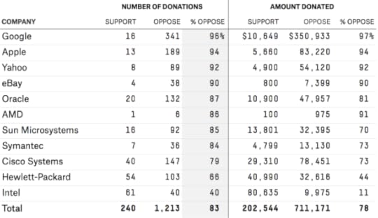
However, there was quite a bit of variation from business to business. At Intel, 60 percent of employee donations were in support of Proposition 8. By contrast, at Apple, 94 percent of employee donations were made in opposition to Proposition 8. The opposition was even higher at Google, where 96 percent of employee donations were against it, including $100,000 from co-founder Sergey Brin.
There isn’t much data on Mozilla. Only four
The ‘Big Five’ in North American Pro Sports
Yesterday, Ritchie King and I ran the numbers on the most popular teams in the NFL, NBA, NHL, Major League Baseball and the English Premier League, according to the number of Google searches they generate.
The rankings compared teams within each league. But we can also make cross-sport comparisons. What’s the most popular North American professional team in any sport, as judged by Google search frequency globally?
It’s either the New York Yankees or the Boston Red Sox. Each generates about 30 percent more Google searches worldwide than the most popular NFL team, the Dallas Cowboys, and almost 40 percent more than the most popular NBA team, the Los Angeles Lakers. You can skip down to the giant chart at the end of this blog post to see how all teams in the NBA, NFL, NHL and MLB compare to one another.
The Montreal Canadiens, the most popular NHL team, aren’t particularly close to the most-searched teams in other leagues. Does that mean there’s really a “Big Three” rather than a “Big Four”? (Disclosure: ESPN doesn’t broadcast NHL games, and the league isn’t the subject of all that much focus at the network.)
I’d say that the NHL’s status as a major league isn’t in question. The average NHL team generates about two-thirds as much Google search traffic as the average NBA team. There’s a gap there, but it’s no larger than the one separating the NBA and MLB. Furthermore, there’s a lot of overlap in the rankings. The 60th-percentile NHL team (roughly speaking, the Washington Capitals) is about as popular as the 40th percentile NBA team (the Philadelphia 76ers).
Keep in mind that these figures are based on global search traffic, so that includes traffic in Canada. Canada — despite its much smaller population — generates almost as much revenue and fan interest for the NHL as the United States.
But if we’ve included the NHL, what about Major League Soccer, the Canadian Football League and the WNBA?
We have bad news for fans of women’s basketball. The most popular WNBA team, the Seattle Storm, generates only about one-quarter as much search traffic as the least popular Big Four team, the Columbus Blue Jackets.
MLS has a better argument. Its most popular teams, the LA Galaxy and the Seattle Sounders, generate more search traffic than the Blue Jackets. The Galaxy and Sounders also earn about as much search traffic as the least popular NBA team, the Milwaukee Bucks.
If MLS has a case, the CFL probably does, too. Two of its teams, the Saskatchewan Roughriders and the Edmonton Eskimos, also surpass the Blue Jackets in search popularity.
But we’ve neglected the league that has the strongest case for inclusion alongside the Big Four. You may have heard of Mexico. It has the 11th-largest population and the 14th-largest economy in the world. It’s a part of North America. And soccer is awfully popular there.
In fact, Mexico’s top professional soccer league, Liga MX, is comparable to the NHL in terms of global popularity. Liga MX’s most popular team on Google, C.D. Guadalajara, produces about as much search traffic as the Canadiens, the Seattle Seahawks, the San Francisco Giants and the Chicago Bulls.
So, if we’re talking North America — not just the U.S. — there’s really a “Big Five”: the NFL, the MLB, the NBA, the NHL and Liga MX. The most popular teams in MLS and the CFL are more popular than the least popular teams in the Big Five, but their inclusion is debatable, especially because they are surpassed by other leagues playing the same sport on the same continent.
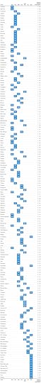
In the spirit of inclusivity, we’ve ranked the teams in all seven North American leagues in the humongous chart below. (Rankings are taken relative to the average team across all seven leagues, which works out to be roughly the Buffalo Bills or the Cincinnati Reds.) We haven’t included the English Premier League. The top teams in the EPL swamp everybody else in global search traffic; even the Yankees are no match for Man U.

April 3, 2014
The Gender Balance in Tech, in New York And Beyond
On Wednesday, HR&A Advisors, a consultancy firm, published a report showing that among New York’s tech jobs, men outnumber women 7 to 3.
How does this fit with the national picture? We looked at census data on employment in computer occupations — roles such as programmers, software engineers and computer scientists. The census category isn’t a perfect measure of the size of the tech sector, but it gives us a good indication of the gender balance within it.
The data shows that there’s nothing particularly unusual about New York. Of the 1.7 million people employed in computer occupations in the U.S., 74.5 percent are men, according to the Census Bureau. Even once you look below that countrywide total, there’s little variation: In 230 of the 360 metropolitan areas we looked at, men made up somewhere between 70 percent and 80 percent of those employed in computer-focused occupations.
Sure, there were a couple of outliers, the most extreme of which was Pine Bluff, Ark. In Pine Bluff, men made up just 20 percent of computer professionals. But Pine Bluff has just 296 such workers total.
Among the 16 metropolitan areas with more than 50,000 people working in computing, the gender balance closely mirrors New York’s. Keep in mind that a metropolitan area, according to the Census Bureau, includes the city listed below, as well as its surrounding areas. For example, the Seattle metropolitan area includes Seattle, Tacoma and Bellevue.


April 2, 2014
The Distribution of Fandom in Pro Leagues
On Tuesday, we looked at the relative popularity of Major League Baseball teams as based on Google searches. That resulted in the following chart:
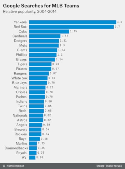
The Yankees and Red Sox are popular? Quelle surprise! Nonetheless, sources such as Google and Facebook give us access to new types of data on fandom and provide a little more precision than the conventional wisdom.
We’ve also run the numbers for the NBA, NHL, NFL and English Premier League. This data can tell us something not only about which teams are most popular, but also about the structure of sports leagues. The ground rules were the same as for our baseball figures:
The data is taken from Google Trends and is based on searches worldwide for each team since 2004. The exceptions are expansion teams or relocated franchises, when the data is run from the team’s first month of operation in its new location.Google organizes individual search strings into topics — for instance, “NY Rangers” and “rangers hockey” should be counted as searches for “New York Rangers.” The process is undoubtedly imperfect, but it works well in most cases (for example, “New Orleans Hornets” seems to transition seamlessly into “New Orleans Pelicans”).All figures are taken relative to the league average; a score of 1.00 represents a team with league-average popularity.Here’s the data for the NBA:
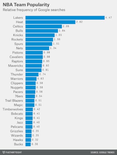
It’s not surprising to see the Lakers on top, but the extent to which they lap the field is striking: The Lakers are about as popular as the Knicks and Heat combined. (Keep in mind that this data dates back 10 years. In the past 12 months, during which time the Lakers have stunk, the Heat have been searched far more often.)
But overall — despite the NBA’s reputation for being a league of superstar players and dominant franchises — the distribution between the haves and have-nots is not that different than in baseball. In the NBA, the 90th percentile team is searched for 5.3 times more often than the 10th percentile team; in MLB, the ratio is 4.0 instead. This may reflect the fact that the correlation between market size and team success has been extremely low in the NBA. (The Knicks can blow up the Internet when they do well, but they usually don’t do well.) In baseball, by contrast, the most successful teams tend to play in bigger markets, with both factors contributing to their popularity.
Next up is the NHL:
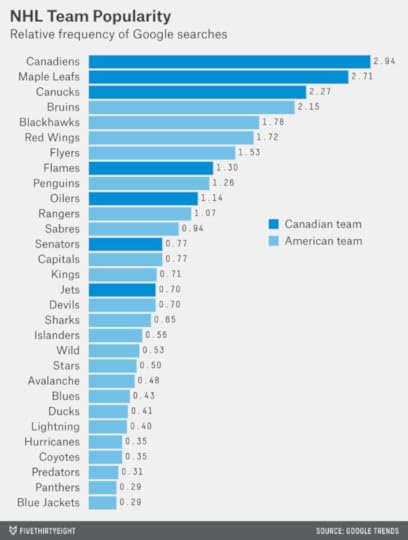
As FiveThirtyEight has written, Canadian NHL teams (which we’ve highlighted in the chart) are disproportionately popular. The Edmonton television market is only about one-fourth the size of the Dallas market, but the Oilers generate more than twice as much Google activity as the Stars. (Neither team has been much good over the past several seasons, so this would seem to reflect hockey’s intrinsically higher popularity in Canada.) Bring back the Nordiques!
The NFL has a reputation for parity because of its strict salary cap, revenue-sharing rules and a short schedule that has teams vaulting up and down the standings every season. This parity is also reflected in its Google data:

The Cowboys are the NFL’s most popular team. But they are searched for only 2.4 times as often as the league average — not as disproportionate a ratio as the Canadiens (2.9), Yankees (3.8) or Lakers (4.5) in the other sports. Meanwhile, only one NFL team — the Jaguars — has a popularity rating of 0.4 or below; that compares with six in the NBA and the NHL, and four in baseball.
What about a notoriously inequal league: the English Premiership? Since the Premier League was founded in 1992, three clubs — Manchester United, Arsenal and Chelsea — have won 19 of its 21 championships. Those clubs and a fourth, Liverpool, also account for 70 percent of Google searches. Manchester United alone is as popular as the bottom 14 teams in the Premiership combined.

Our data, incidentally, only reflects searches from those seasons in which a team actually played in the Premiership (rather than a lower division); otherwise the gap between the most and least popular teams would be even greater. But there is very little resembling a middle class in English football, with the possible exception of Tottenham Hotspur.
One of us (Nate) has said that American sports leagues are socialist and European sports leagues are capitalist. It’s only a modest exaggeration.
Economists use something called the Gini coefficient to measure inequality within a country. A maximally equal country (where everyone has exactly the same amount of wealth) would have a Gini coefficient of 0.00. A maximally unequal country (one person has all the money) would have a Gini coefficient of 1.00. In practice, countries range from 0.23 (Sweden) to 0.63 (Lesotho) on this scale, as based on the CIA’s World Factbook.
The sports leagues we’ve studied occupy nearly as wide a range. The NFL’s Gini coefficient, based on the distribution of Google searches for each team, is 0.27. That’s similar to Sweden, Finland (0.27), Germany (0.27) and Iceland (0.28), countries with high rates of taxation and government spending.

The Premier League’s Gini coefficient is 0.60, much like Lesotho, Sierra Leone (0.63) or Haiti (0.59), whose economies are extremely unequal and verge on being anarchic. The NBA (0.41), NHL (0.38) and baseball (0.36) fall in a middle range, somewhere between the United States (0.45) and Canada (0.32) on the spectrum.

April 1, 2014
Which MLB Teams Overperform in Popularity?
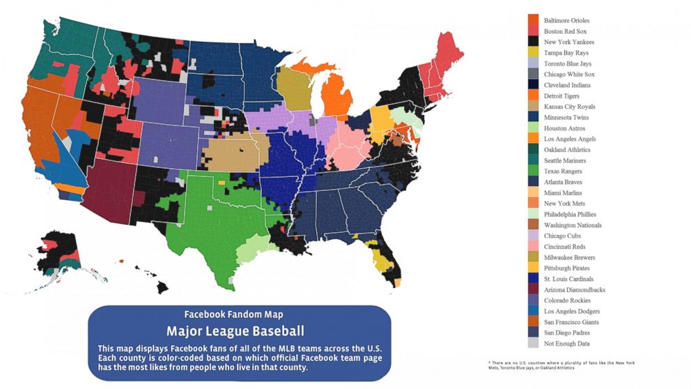
Facebook maps of sports fandom, such as the one Facebook just published about Major League Baseball, are one of my favorite things:
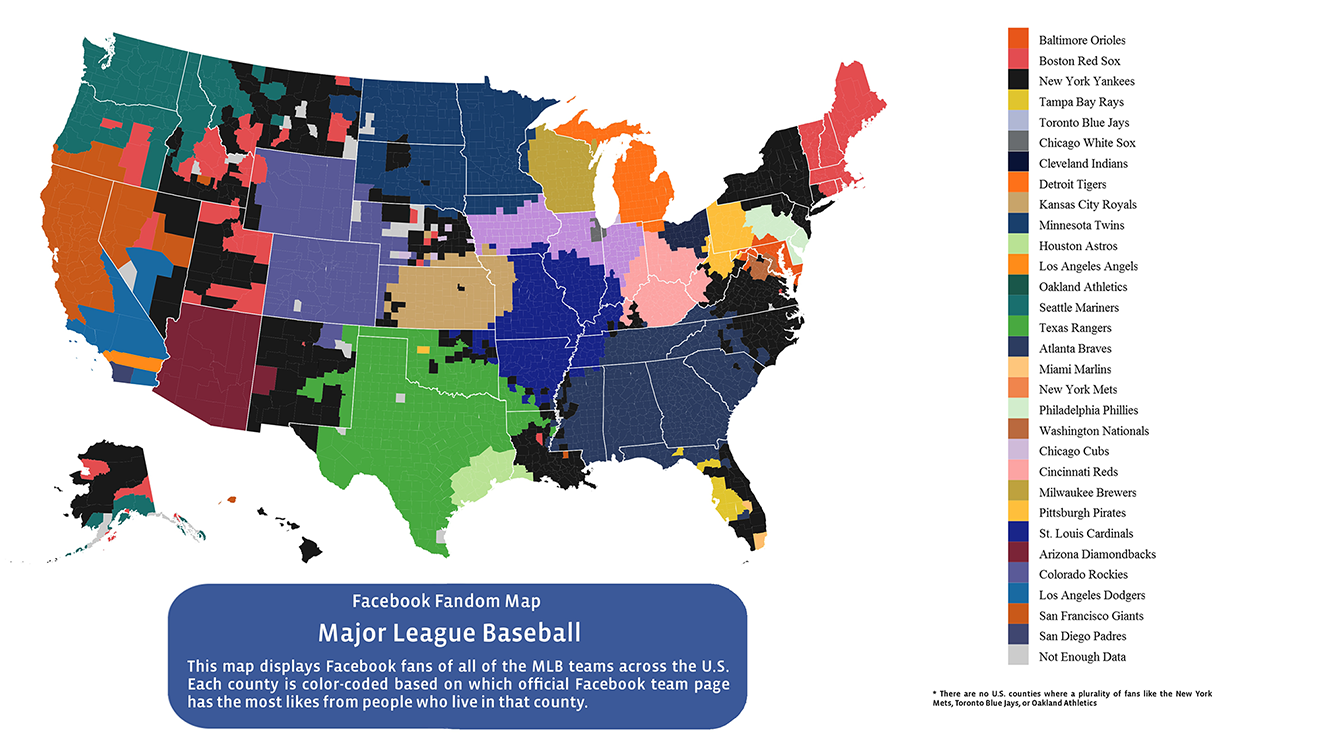
But as Will Oremus of Slate notes, this approach conceals important information. Facebook’s map, which identifies the team with the most “likes” in each U.S. county, might give you the idea that the Texas Rangers, Colorado Rockies and Minnesota Twins are exceptionally popular. Indeed, they are reasonably well-liked over a broad geographical area. But most of the counties in their territories are rural and have low populations. The problem is analogous to looking at maps of presidential election results by county, which might convey the impression that Mitt Romney won the 2012 election when he did not.
Another way to evaluate a baseball team’s popularity is to look at data from Google Trends.
Google Trends recently unveiled a beta feature in which it aggregates search terms into topics. For example, searches for “St. Louis Cardinals,” “Saint Louis Cardinals,” “cardinals baseball” and so forth, are grouped under the same topic heading. (The feature can also theoretically avoid false positives; for example, searches for “Texas Ranger” that were seeking information on the defunct television show will not be confused with those for the baseball team.) In most cases, this functionality seems to be quite smart; the topic “Miami Marlins” seems to pick up searches for “Florida Marlins” as well, as the team was known prior to 2012.
The chart below lists the number of Google searches for the topic associated with each MLB team. The figures listed are relative to the league average. (The Atlanta Braves’ popularity, for example, is listed as 1.14, which means that they are searched for 1.14 times as often as the average MLB club.) They reflect Google searches worldwide since 2004, except in the case of the Washington Nationals, where I’ve run the numbers from April 2005 forward, because the team played in Montreal before that time.
By Google searches, the Rangers have only about average popularity, while the Twins and the Rockies are below average. Conversely, the New York Mets, who didn’t win a single county in the Facebook map, are the sixth-most searched for team worldwide.
The most striking feature of the Google data, however, is the dominance of the New York Yankees and Boston Red Sox. They are searched for 3.8 and 3.7 times, respectively, more often than the league average, and more than 10 times as often as the least popular teams.
The Yankees, of course, have a large population to draw from: There are roughly 20 million people in the New York metro area. How does each team’s Google search popularity compare to the size of its television market?
We make that comparison in the table below. I’ve listed each team’s popularity on Google, the relative size of its TV market (markets with two teams are divided evenly between them), and then taken the ratio between the two.
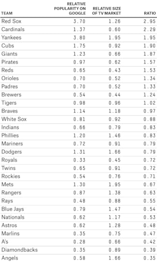
The Yankees rank third even by this standard. But the Red Sox are a clear No. 1 and are about three times as popular as you’d guess from the size of the Boston media market. The Cardinals, Cubs, Giants, Pirates and Reds also over-perform relative to their market size.
Red Sox haters might complain that the team’s market is much bigger than Boston alone: They are also the “local” team in the rest of New England (except for western Connecticut).
But extent to which a team’s popularity expands may have a lot to do with how well the team is run — and how often it wins. The Toronto Blue Jays theoretically have a whole country to themselves — but they are unpopular relative to the size of the Toronto market itself, let alone as compared to the population of Canada. The correlation between a team’s Google search popularity and its number of post-season appearances since 2004 is .62, a fair amount higher than that between its popularity and its market size (.38).
Performing worst relative to its population are the Los Angeles Angels of Anaheim. I’m somewhat suspicious of this datapoint, however. There are so many variations on the team’s name (“LA Angels,” “Anaheim Angels,” “That Team With Mike Trout and 24 Other People”) that Google Trends might not be picking up on all the ways to search for them, even with its new-and-improved algorithms.

A Gaffe Can Matter When It Motivates the Base
We recently published a forecast that described the GOP as more likely than not to win the U.S. Senate in November. But our analysis was less bullish on Republicans’ prospects of flipping the seat in Iowa currently held by Democratic Sen. Tom Harkin, who is retiring. There, Democrats appeared to have a strong candidate in Rep. Bruce Braley, who has cleared his primary field. Republicans, meanwhile, face a contentious primary with a number of candidates who have never won races for statewide or federal office.
After we published our forecast, the Republican PAC America Rising released a video of Braley, who represents the 1st Congressional District, referring to Iowa’s other senator, Chuck Grassley, as a “farmer from Iowa who never went to law school.” The comment might seem ill-considered in a state that generates the fourth-highest income per capita from crop production. It has sparked plenty of attention in the local news media; the Des Moines Register, Iowa’s newspaper of record, has published at least 14 pieces on Braley’s comment.
Is Braley’s remark another thing for Democrats to worry about — or is it the latest example of a purported “game changer” that will prove to have little effect?
Gaffes often resonate more with the news media than with voters. A reasonably large body of political science research has found their impact is usually overstated by those who cover campaigns. Take the examples of two other incidents that Braley’s comment has been compared to.
The first is Barack Obama’s remark at a San Francisco fundraiser about voters who “cling to guns and religion,” which was first reported by the journalist Mayhill Fowler on Apr. 11, 2008. Then-candidate Obama’s comment generated more than 2,500 news articles by the end of that month, according to a search of records at NewsLibrary.com. But it had no effect on the polls, either nationally or in Pennsylvania, which was the next state to vote in the Obama vs. Clinton Democratic primary. Instead, Hillary Clinton’s win in Pennsylvania was in line with demographic trends from earlier primaries.
What about Mitt Romney’s “47 percent” comments during the general election campaign in 2012? They barely moved the polls; there was a swing of perhaps one percentage point toward President Obama.
These examples, however – and most others from the political science literature – are drawn from presidential campaigns. Races for the Senate differ in some important ways.
First, the candidates are usually less well-known to voters. Braley has strong name recognition in the northeastern quadrant of Iowa, which he represents in Congress. But statewide, 46 percent of Iowans hadn’t known enough about him to form an opinion, according to a Quinnipiac University poll conducted before the release of the “farmer” video. For some of them, the “farmer” comment will represent their first impression of the candidate.
The second difference is that the presidential race is never a sideshow. Even contests as lopsided as Reagan vs. Mondale in 1984 generate a disproportionate amount of media attention. By contrast, senatorial campaigns compete against one another for scarce resources, such as funds from campaign committees, and attention from activists and the national press.
Braley’s remark might not matter much unto itself. But it’s plausible that it could spur activists and the news media into evaluating the Iowa race differently. That could matter, because Iowa’s competitiveness was previously in some doubt. In the abstract, a race with no incumbent in a swing state in a Republican-leaning national climate would represent a good opportunity for the GOP. However, parties sometimes squander these opportunities by failing to nominate strong candidates or by failing to provide marginal ones with sufficient support.
Moreover, gaffes have helped upend Senate campaigns in the past. Case in point: Virginia in 2006. The Republican candidate was Sen. George Allen, an incumbent who may have been hoping to use his re-election bid as a springboard to the 2008 presidential race. The Democratic nominee was James Webb, a former secretary of the Navy who was a favorite of the Democratic “netroots.”
The race was only on the fringe of being competitive as of early 2006; Virginia had not yet begun to behave as a purple state, and Allen maintained a double-digit lead in all nonpartisan polls. Then, on Aug. 14, a video was released by Webb’s campaign of Allen referring to S.R. Sidarth, an Indian-American volunteer for the Webb campaign, by the term “macaca.” The word, which can be considered a racial slur, created a frenzy of attention, and Webb moved to within 3 to 5 percentage points of Allen in polls conducted immediately afterward by SurveyUSA and Rasmussen Reports.
Just as important as the gaffe itself was its staying power. That may have had a lot to do with the netroots.
The political scientist David Karpf studied the Virginia campaign in
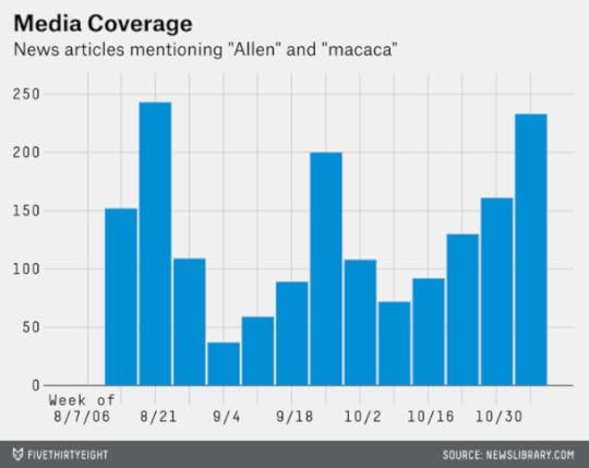
Meanwhile, the comment had a long lifespan in the mainstream media. The next chart shows the number of news articles each week that mentioned both “Allen” and “macaca,” according to a search at NewsLibrary.com. Coverage reached a peak during the week of Aug. 21, a week after the release of the video clip on YouTube. But it remained at reasonably high levels from then until the November election. Part of the problem for Allen was that the news media uncovered other instances of racially insensitive remarks in his past, which triggered renewed interest in the “macaca” story. Google searches for the term followed a similar pattern.
It’s not easy to separate the impact of Webb’s improved polling, his accelerated fundraising, the higher volume of news media attention devoted to his campaign and the greater attention paid to it by the netroots. These factors probably all contributed to one another in what worked out to be a virtuous cycle for Democrats. On Nov. 7, Webb defeated Allen by about 9,000 votes — and Democrats won exactly enough Senate seats, 51, to take control of the chamber.
I want to be clear that this analysis of Virginia represents a case study, rather than a prediction, of how Iowa will turn out. A gaffe swinging the balance in a race is more the exception than the rule. The reason why Allen’s comment mattered in Virginia had to do with three major factors, in my view.
First, the race was on the fringe of being competitive before the gaffe. Webb’s campaign wasn’t a lost cause, but Allen was not an easy target, even in a Democratic-leaning environment. Webb probably needed some catalyst to generate more attention for his race and push him over the finish line.
Second, the news media found other examples of intemperate or insensitive remarks by Allen, which gave the story life and made it a prism for interpreting the campaign.
Third, the gaffe helped to mobilize the Democratic base around Webb’s campaign. Although Webb was already a favorite of the netroots, Allen’s comment dramatically increased their attention on Virginia. And the netroots maintained their heightened attention right up through the November election.
I’d argue that the first condition is replicated in Iowa. This was just the sort of race that may have needed an external stimulus to kickstart it into higher levels of activist and news media attention. But it’s unclear whether the second and third conditions will be met.
Does Braley have a track record of making remarks that seem elitist, classist or otherwise disparaging of rural life, or will he make such comments in the future? And will Republican activists and officials maintain their focus on Iowa, rather than treating it as a passing fancy?
One problem for the GOP is that the Republican field in Iowa remains divided, with at least four plausible nominees. Joni Ernst, a state senator who has recently been endorsed by Romney and Sarah Palin, has so far done the most to play up her farming heritage and pivot off of Braley’s remark. But she was polling at just 13 percent before Braley’s comment. (There have been no polls of the primary since then.)
Furthermore, the decisions about which races deserve party resources involve trade-offs. Had Democrats lost Virginia by 9,000 votes in 2006, rather than winning it by that margin, their attention to the state might have seemed imprudent in retrospect.
But Iowa is a more plausible option for Republicans than it was a week ago. Braley has made their path to a Senate majority a little more robust.

March 31, 2014
The Most Impressive Run to the Final Four (And It’s Not Kentucky’s)
Which team had the most impressive run to the Final Four?
The question might seem like the sports equivalent of “Which of your children do you love the most?” Any team that wins four straight games in the NCAA men’s basketball tournament has a lot to be proud of. Papa Brackets thinks all the Final Four teams — Florida, Connecticut, Kentucky and Wisconsin — are very special.
But conventional wisdom appears to hold Kentucky’s path in ever-so-slightly higher regard than the other schools’. The Wildcats defeated an unbeaten No. 1 seed (Wichita State) and both of last year’s finalists (Michigan and Louisville) en route to Arlington.
Kentucky has been great. Despite entering the tournament as a No. 8 seed, it has a 19 percent chance of winning the NCAA championship, according to the FiveThirtyEight forecast model. That’s up from only a 2 percent chance before the tournament began.
Still, Connecticut’s run has been slightly more special than Kentucky’s so far. And Wisconsin’s, even more so.
The FiveThirtyEight model has a particular way of answering our question. It evaluates teams not in any absolute sense, but relative to its expectations. And it accounts not only for wins and losses (by definition, any team that makes to the Final Four has won at least four straight games), but also for margin of victory.
To be more specific, the model calculates not only the win probability for each game, but also an implicit point spread. For example, it gives Florida a 69.9 percent chance of beating Connecticut on Saturday. That translates into Florida being 5.5 point favorites. The model has Wisconsin with a 58.2 percent chance of beating Kentucky, which would equate to the Badgers being favored by two points.
How a team fares relative to this point spread affects how the model evaluates it going forward. Why? Tournament results are quite predictive of future tournament results: A team that is terrific in the early rounds often does well in later ones.
Occasionally, a team can end up in worse shape despite winning its game. This happens when the model expects a blowout and the team wins by a smaller margin.
A case in point is Florida in its opening-round game against Albany. The model had the Gators as 24-point favorites, but Florida won by 12 points (in fact, the game was a little closer than the scoreline implies).
What about Florida’s three other wins? It was clear that the Gators were the favorite in each game, but they performed about in line with the model’s expectations — beating its point spread by six points against Pittsburgh and four points against UCLA, and underperforming it by two points in their win Saturday against Dayton. To be clear, the Gators have been great — and the model has them as the plurality favorite to win the tournament. But Florida was a great team going in. It has performed roughly as expected against a relatively easy draw.

How about Kentucky? If viewed as a No. 8 seed, the Wildcats have been extremely impressive — not least on account of the quality of competition they’ve faced. But Kentucky was no typical No. 8. The Wildcats ranked first in the country in the preseason AP and USA Today Coaches polls, a factor for which the FiveThirtyEight model accounts. They took 10 losses in the regular season, but they faced a tough schedule; all but two of the losses, both to Florida, came by single digits.
Kentucky was badly underseeded to begin with, in other words. The FiveThirtyEight model actually had Kentucky as slight favorites against Michigan, despite the Wildcats’ inferior seed. The Wildcats were underdogs against Louisville and Wichita State, but only modest ones, and both games were close. Kentucky outperformed the FiveThirtyEight point spread by two points against Michigan, four points against Wichita State and 10 points against Louisville.
By this standard, both Connecticut and Wisconsin have done more to exceed expectations. The Huskies were the narrowest of favorites against Iowa State on Friday, in part because Madison Square Garden is a de facto home court for them. (Geographic distance from a team’s home campus is another factor that the FiveThirtyEight model accounts for; the author of this article went to the games at MSG for “research purposes” and can confirm that there was a lot of Huskies love there.) But Connecticut also won as underdogs against Michigan State and Villanova. The Villanova win, which came by 12 points, was relatively emphatic.
The improvement in the model’s esteem for Wisconsin is partially the result of the Badgers’ upset of No. 1 seed Arizona on Saturday. But it has more to do with the their performance in earlier rounds. Wisconsin thrashed Baylor by 17 points Thursday, and the Badgers beat American University by 40 points in their opening game. On average, Wisconsin has outperformed the FiveThirtyEight point spread by 12 points, as compared with nine points for Connecticut and four for Kentucky.
Evaluating teams by their margins of victory is unpopular; it may seem as heartless as rating your kids by their SAT scores. We’re fans of systems such as the Basketball Power Index (BPI) that account for the scoring margins throughout games and not just at the final buzzer. But margin of victory predicts future performance reasonably well —
March 28, 2014
Cabrera’s Millions And Baseball’s Billions
I was surprised by my colleague Neil Paine’s analysis of Miguel Cabrera’s record-breaking new contract extension. I thought the Detroit Tigers would come out looking much worse.
According to Neil’s estimate, which used projections from Baseball Prospectus’ PECOTA system, Cabrera’s market value for the next 10 years is roughly $275 million. That’s not as much as the $292 million that the Tigers will be paying him, but the difference is modest.
Neil’s valuation assumed that teams are willing to pay about $6.5 million per additional win in the free-agent market, based on research from Dave Cameron and Lewie Pollis. These estimates come from comparing the salaries given to free agents against their expected on-field production. (Neil further assumed that the market price of a win will increase by 5 percent per year.)
In other words, Cabrera isn’t that vastly overpaid as compared to recent free agents. If Mike Napoli is making $16 million per year, then Cabrera’s $29 million per year doesn’t look so bad.
But Cabrera’s market value is not the same as Cabrera’s economic value to the Tigers. It could be that free agents as a group are vastly overpaid, relative to the revenue they bring to their teams.
In the 2006 book “Baseball Between the Numbers,” I estimated the marginal value of a win to a baseball team, based on how responsive different categories of revenue (such as ticket sales and TV deals) are to a team’s quality. I estimated that an additional game won added only about $1.2 million to a team’s bottom line, after subtracting revenue-sharing payments. (This assumes that the value of a win is constant from team to team, which it isn’t, but we’ll leave that aside for now.)
That estimate is now eight years old. Total gross revenue accruing to the 30 Major League Baseball clubs has increased since then; it was $7.1 billion in 2013, according to Forbes, as compared to $4.7 billion in 2005.
If the marginal economic value of a win has increased proportionately, a win would now be worth about $1.8 million. That’s still far less than the $6.5 million that teams are willing to pay for a win. Are baseball owners being irrational?
Perhaps, but their motivation to own a baseball team may not be based solely in profits and losses. They may just be having fun. (I can think of a lot of worse ways to splurge.)
And they may know that if they choose to sell their teams, they can do so — probably at a significant profit. The market value of an MLB franchise has increased by more than 600 percent since 1990, according to valuations from Financial World and Forbes magazine (see Rodney Fort’s website for the data). By comparison, the Standard & Poor’s 500 index rose by about 450 percent between March 27, 1990, and March 27, 2014. (Framed in terms of compound annual growth rates, baseball teams have increased in value by 8.5 percent per year since 1990, as compared with 7.3 percent for the stock market.)
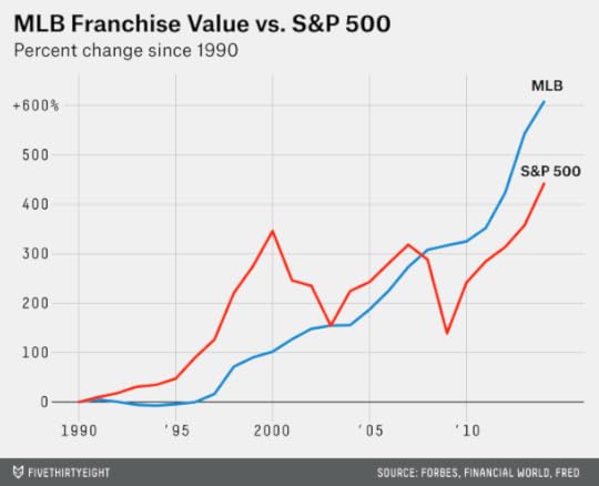
Not only have baseball franchises outperformed the stock market, but the patterns in their growth rates have been quite different. The stock market rose dramatically in the 1990s, but has teetered back and forth since then. By contrast, the rise in MLB franchise values has been much steadier.
What accounts for this?
Here’s a theory. The average baseball franchise is now worth $817 million, according to Forbes. Loosely speaking, you need to be a billionaire to afford one. And there are a lot more billionaires than there used to be.
Forbes estimates that there are 492 billionaires in the United States, as compared to 99 in 1990. The increase in the number of billionaires, like the increase in baseball franchise values, has been relatively steady. (The number of American billionaires fell after the financial crisis of 2007-09 but has risen to a new high since then.)

In a sense, the Tigers may be betting less on Cabrera’s performance and more on economic and regulatory conditions. If the number of billionaires continues to rise, Tigers owner Mike Ilitch (worth $3.6 billion) should find plenty of buyers should he sell the team down the line. Cabrera’s presence might make the Tigers a more attractive purchase — or if not, the liability might be modest as compared with the Tigers’ resale price. But if the rise of the billionaire reverses, Cabrera’s contract might come to look like the peak of a bubble.

FiveThirtyEight to Commission Response to Disputed Climate Article
FiveThirtyEight relaunched less than two weeks ago. It’s been a heck of a learning experience. When you’re trying something new, it’s going to take some time to get everything right, and you’re going to get criticism from all quarters.
There are two types of criticism that we’re most concerned with. First is criticism of our execution: How well are we living up to the standards that we’ve set for ourselves? Second is criticism that comes from our broader community of readers, such as on Twitter, by email or in the comments section of our website (as opposed to criticism from other people in the news media).
One article on FiveThirtyEight has been disproportionately responsible for substantive criticism from readers. That was a piece we ran March 19 from Roger Pielke Jr., a freelance contributor to FiveThirtyEight and a professor of environmental studies at the University of Colorado Boulder. The story concerned the economic costs of climate-related disasters. The central thesis of the piece was that although these costs are increasing, the rise can be accounted for by the growing wealth of the global population, rather than by a rise in the number of disaster events due to climate change.
Reception to the article ran about 80 percent negative in the comments section and on social media. A reaction like that compels us to think carefully about the piece and our editorial process.
The responses have fallen into about four broad categories. I list these in order of most to least concern to us:
Criticisms of Roger’s central thesis about disaster costsConcern about how FiveThirtyEight will be covering climate topicsCriticisms of other claims Roger made in the article, such as those about the overall incidence of weather-related disastersCriticisms of things Roger has said or written in other venues, sometimes including ad-hominem attacks against RogerLet me deal with category No. 4 first. Roger and his critics can kick up a lot of dust everywhere they go. Some of the criticisms of Roger have been unfair. For instance, Roger is not a climate “skeptic” or “denier.” He has written at FiveThirtyEight — and he has
Nate Silver's Blog

- Nate Silver's profile
- 729 followers

