
Nate Silver's Blog, page 167
August 6, 2014
What Happens To Injured NBA Stars Like Paul George?
Sports fans have selective memories. Most of us NBA geeks know that Bernard King, the former New York Knicks forward, was never the same after tearing his anterior cruciate ligament in a 1985 game. We remember that Grant Hill’s ankle injury in 2000 permanently dimmed his star status, and that Gilbert Arenas’s career went into a downward spiral after he blew out his knee in 2007.
But we forget the cases where a serious injury was just a footnote to a long career. Mark Price, the Cleveland Cavaliers’ point guard, tore his ACL early in the 1990-91 season and was out most of the year. He returned to make the NBA All-Star team in each of his next three seasons. A shoulder injury, and eventual shoulder surgery, cost Chris Webber more than a season’s worth of games between 1994-95 and 1995-96, but he wound up as a borderline Hall of Famer. Michael Jordan broke his foot in his second NBA season, missing 64 games in 1985-86. His career turned out pretty well.
If we want to get a better sense of the future of Paul George, the Indiana Pacers star who fractured his right leg while scrimmaging with Team USA last week, we need a more comprehensive way of identifying star players who got hurt. I searched our NBA database for players since 1976-77 to whom the following happened:
First, the player had an All-Star-caliber season. I define this as a player worth at least 7.5 wins above replacement (WAR) as based on statistical plus-minus (see more about that statistic here). There are about 25 players who meet this threshold each year in the NBA, about as many as make one of the league All-Star teams.Then, the next season, he played in 20 or fewer games for reasons having principally to do with his injury.Price, for instance, produced 9.7 wins in 1989-90 then played in just 16 games in 1990-91, so he qualifies. So do 24 other players, counting the oft-injured Anfernee Hardaway twice. Those players are listed in the chart below, which tracks how their careers progressed before and after their injuries.1
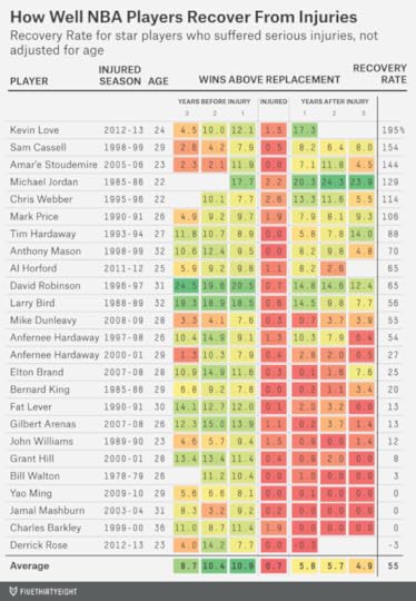
You probably get the general sense for how the chart works — green numbers are good and red ones are bad — but there’s some terminology to sort out:
Injured Season refers to the season in which the player was limited to 20 or fewer games because of an injury. This holds even if his actual injury came late in the prior season: For instance, Derrick Rose tore his ACL during the 2011-2012 season’s playoffs, but 2012-13 is listed as his Injured Season because that’s the year he sat out.2Recovery Rate represents how much of his value the player retained after his injury. It’s calculated by dividing a player’s average WAR in the three seasons after his Injured Season by the three seasons before it. The higher the Recovery Rate the better. I exclude seasons from the average if they haven’t yet occurred3 or if the player was not yet in the NBA at the time.4 However, I include seasons — and list the player as having zero value — if the player was forced into retirement by the injury.This is not a list of every NBA star who suffered a severe injury — for instance, my selection process will tend to miss star players whose injuries came in the middle of a season instead of toward the beginning or the end. So there are some false negatives. But there shouldn’t be any false positives — I screened out players who missed time due to illness, suspension, a retirement not forced by injury, or some other reason.5 All these players were producing at an All-Star level at the time of their injuries.
It’s a noisy set of examples. Six of the 25 players, like Jordan and Webber, had Recovery Rates above 100 percent, which means that they were actually better after their injuries than before. Another six, like Arenas and Yao Ming, had Recovery Rates of 10 percent or below, meaning that they lost almost all their value (although some, like Grant Hill, recovered to be productive role players later in their careers).
The average Recovery Rate is just 55 percent, meaning that the typical player was only about half as good after his injury as beforehand. But that paints too pessimistic a picture for George and the Pacers.
The reason is that there’s a correlation between Recovery Rate and age. With some exceptions, the players who returned to have productive careers after their injuries were young at the time they got hurt, while the ones who didn’t were in the middle to late stage of their careers:
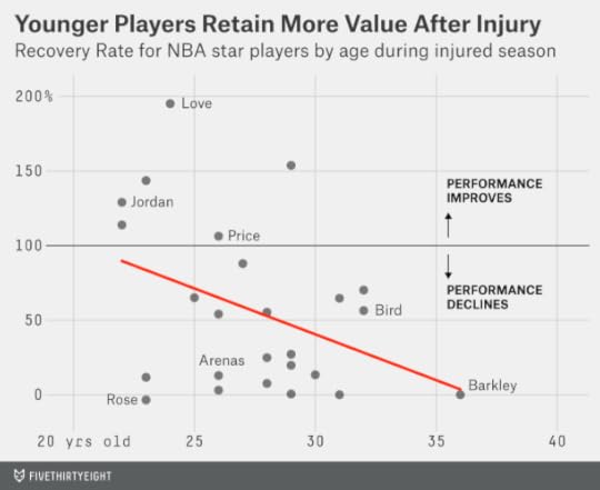
George recently turned 24. The regression line in the chart above implies that the average player who is injured at that age will come back to be 75 percent to 80 percent as productive as he was before. If George came back at 75 percent to 80 percent of his former self, that would not be such a bad outcome for the Pacers. Between 2011-12 and 2013-14, George was worth an average of 11 wins per season; 80 percent of that would make him a 9-win player instead between 2015-16 and 2017-18, the last three guaranteed years of his contract. Wins above replacement in the NBA are worth about $3 million a pop, so that means he’d be producing $27 million worth of value per season for the Pacers — on a contract that will pay him about $18 million per year instead.
But we haven’t accounted for how George would project if he hadn’t been hurt. For that matter, we haven’t compared our injured stars against a control group of other All-Star-caliber NBA players.
Take David Robinson, who missed almost all of the 1996-97 season with a back injury.6 His Recovery Rate is calculated at 65 percent, which implies that he lost something after returning from the injury. But Robinson was already 31 years old at the time — most basketball players are in decline at that age even if they stay relatively healthy. Was Robinson’s decline worse than what we would have expected without the injury?
That’s the calculation I’ve made in the chart below. It compares the Recovery Rate for injured stars against the same calculation for all NBA players who had a 7.5 WAR season, whether or not they got hurt the next year.7
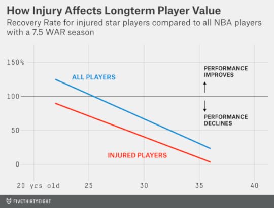
In Robinson’s case, a player at his age would typically retain 60 percent of his value. Robinson retained 65 percent instead. The injury didn’t really have any lasting effects; Robinson resumed a typical aging curve after missing most of 1996-97.
This also tells us a more nuanced story about George. It’s not that young players like him recover better from injury so much as that they were on more of an upward trajectory to begin with. In fact, the two lines in the chart are almost parallel. That implies the impact of a severe injury is fairly constant regardless of a player’s age. More specifically, it reduces his long-term value by 30 percent, on average. George is projected to be about 80 percent as good as he was before his injury. But if he hadn’t gotten hurt, he’d project to be about 110 percent as good as he was instead.8
In other words, young players can suffer a setback and still be very good. A player who was already in decline and then suffers a serious injury often has too much working against him.
But each of these outcomes describes an average — and there’s a huge amount of variation around those averages. It’s entirely plausible that George will never again be a productive player in the NBA. And it’s entirely plausible that he’ll come back even better than before. Perhaps in April 2017 Zach Lowe will be writing about how George was forced to become a better spot-up shooter while his mobility was limited after his initial return from injury — but then his quickness came back, making him a more multidimensional player than before. Here’s hoping that 10 years from now the injury won’t be the first thing we think about when we think about Paul George.


August 4, 2014
Republicans Remain Slightly Favored To Take Control Of The Senate
If Americans elected an entirely new set of senators every two years — as they elect members of the House of Representatives — this November’s Senate contest would look like a stalemate. President Obama remains unpopular; his approval ratings have ticked down a point or two over the past few months. But the Republican Party remains a poor alternative in the eyes of many voters, which means it may not be able to exploit Obama’s unpopularity as much as it otherwise might.
Generic Congressional ballot polls — probably the best indicator of the public’s overall mood toward the parties — suggest a relatively neutral partisan environment. Most of those polls show Democrats with a slight lead, but many of them are conducted among registered voters, meaning they can overstate Democrats’ standing as compared with polls of the people most likely to vote. Republicans usually have a turnout advantage, especially in midterm years, and their voters appear to be more enthusiastic about this November’s elections. Still, the gap is not as wide as it was in 2010.
The problem for Democrats is that this year’s Senate races aren’t being fought in neutral territory. Instead, the Class II senators on the ballot this year come from states that gave Obama an average of just 46 percent of the vote in 2012.1
Democrats hold the majority of Class II seats now, but that’s because they were last contested in 2008, one of the best Democratic years of the past half-century. That year, Democrats won the popular vote for the U.S. House by almost 11 percentage points. Imagine if 2008 had been a neutral partisan environment instead. We can approximate this by applying a uniform swing of 11 percentage points toward Republicans in each Senate race. In that case, Democrats would have lost the races in Alaska, Colorado, Louisiana, Minnesota, New Hampshire, North Carolina and Oregon — and Republicans would already hold a 52-48 majority in the Senate.
It therefore shouldn’t be surprising that we continue to see Republicans as slightly more likely than not to win a net of six seats this November and control of the Senate. A lot of it is simply reversion to the mean.2 This may not be a “wave” election as 2010 was, but Republicans don’t need a wave to take over the Senate.
However, I also want to advance a cautionary note. It’s still early, and we should not rule out the possibility that one party could win most or all of the competitive races.
It can be tempting, if you cover politics for a living, to check your calendar, see that it’s already August, and conclude that if there were a wave election coming we would have seen more signs of it by now. But political time is nonlinear and a lot of waves are late-breaking, especially in midterm years. Most forecasts issued at this point in the cycle would have considerably underestimated Republican gains in the House in 1994 or 2010, for instance, or Democratic gains in the Senate in 2006. (These late shifts don’t always work to the benefit of the minority party; in 2012, the Democrats’ standing in Senate races improved considerably after Labor Day.) A late swing toward Republicans this year could result in their winning as many as 10 or 11 Senate seats. Democrats, alternatively, could limit the damage to as few as one or two races. These remain plausible scenarios — not “Black Swan” cases.
Still, the most likely outcome involves the Republicans winning about the six seats they need to take over the Senate, give or take a couple. What follows are probabilistic estimates of each party winning each race. (These forecasts are not the result of a formal model or statistical algorithm — although they’re based on an assessment of the same major factors that our algorithm uses.)
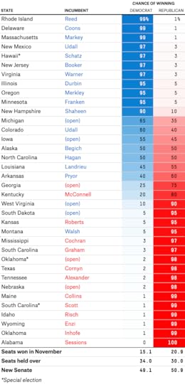
Summing the probabilities of each race yields an estimate of 51 seats3 for Republicans. That makes them very slight favorites — perhaps somewhere in the neighborhood of 60-40 — to take control of the Senate, but also doesn’t leave them much room for error. This bottom line is not much changed from our forecasts in June or in March (or even the one we issued last July).
The outlook in some races has changed — but most of these changes are minor. At this point in the cycle, I’d be suspicious of a large swing in a forecast in the absence of some precipitating event. Most voters are not paying much attention to the campaigns yet — in 2010, Google search traffic for the term “midterm elections” was only about one-sixth as high in August as in October. Furthermore, many important races lack high-quality polling. Apparent shifts may reflect pollster “house effects” — or statistical noise. After Labor Day, polling changes will be more likely to reflect true changes in voter sentiment.
Races where Republican chances have improved
There are shifts working to the GOP’s benefit in five states.4 The largest change is in Montana, where we’d previously given the Democratic Sen. John Walsh, who was appointed to replace the retiring Sen. Max Baucus earlier this year, just a 15 percent chance of retaining his seat. Now we have his chances even lower, at 5 percent. The main reason is the revelation that Walsh plagiarized passages of his master’s thesis at the United States Army War College. Walsh was already well behind his Republican opponent, Rep. Steve Daines, in the polls and was going to need almost everything to break right to come back in the race. This was like an NFL team throwing a pick-six when it was already down 17-3.
Two other changes are the result of Republican primaries. In Mississippi, incumbent Sen. Thad Cochran won his runoff against Chris McDaniel, partly with the help of African-American voters. Most of those African-Americans will wind up voting for the Democrat, Travis Childers, in November. But Mississippi’s white voters represent the majority of its turnout and are overwhelmingly Republican; there aren’t many swing voters in the state and it would take a truly awful Republican nominee to put the party at much risk. Cochran is comfortably ahead in polls since the runoff.
We also have Republican chances slightly improved — to 75 percent from 70 percent — in Georgia, where the party has nominated David Perdue, a former CEO. This is Perdue’s first campaign, and ordinarily there’s reason to be suspicious of candidates who haven’t previously held elected office; our research shows they tend to underperform their early polling. However, this is also the first time the Democratic nominee, Michelle Nunn, has run for office. Furthermore, Perdue is running as a pragmatic, “Main Street” conservative. The bigger risk to Republicans would have been nominating an extremely conservative candidate who might have lost votes in the Atlanta suburbs.
Perdue has also pulled slightly ahead of Nunn in the polls. It’s a dubious bunch of surveys, full of partisan polls and “robopolls.” In the absence of high-quality polling, one should default toward placing more weight on the “fundamentals” of the race. In our view, those don’t favor Democrats in a midterm year. President Obama wasn’t that far from winning Georgia in 2008, but he came close because of votes from African-Americans and college students — groups that don’t turn out as reliably in the midterms.
In Arkansas, we have have Republican Rep. Tom Cotton with a 60 percent chance of defeating the Democratic incumbent, Sen. Mark Pryor — up from 55 percent in June. A few other statistical forecasts have the race shifting more in Cotton’s direction, while “subjective” forecasts like that by the Cook Political Report still have the race as a true toss-up.
The reason we’re hedging is because of the low quality of the polling. A number of recent polls have shown Cotton ahead — but almost all of them use non-traditional methodologies, are partisan polls, or both. The last “gold standard” poll in the state came way back in May, from Marist College, and had Pryor with an 11-point lead.
Pryor almost certainly isn’t that far ahead. His campaign’s internal poll, released last week, put him six points in front. But the polls a campaign releases to the media are usually badly biased in favor of its candidate; on average, campaigns exaggerate their candidate’s standing by about six percentage points. That would imply that Pryor’s poll sees the race as a toss-up once “unskewed.”
If the polls of the race are confusing, shouldn’t we turn to the fundamentals? The problem is that they’re also hard to pin down. Arkansas has become an extremely red state, but Pryor is a moderate Democrat while Cotton is a conservative Republican who is sometimes associated with the Tea Party. Pryor won re-election without drawing a Republican challenger in 2008 — but his former Democratic colleague in the Senate, Blanche Lincoln, lost by 21 percentage points in 2010. Arkansas is a race that calls for some caution until we get some better polling.
Iowa is another tricky case. There, we have Republican Joni Ernst with a 45 percent chance (up from 40 percent in June) of defeating Democratic Rep. Bruce Braley. The polling in Iowa has been more consistent than in Arkansas and has the race virtually tied.
Our model will view the fundamentals of the race as slightly favoring Braley. The candidate-quality measures it evaluates all come out in his favor: He rates as being slightly closer to the center of the electorate than Ernst, he’s been elected to a higher office, and he’s raised considerably more money. Iowa is normally as purple as purple states get — the sort of state where candidate quality can make a difference.
But Braley lost ground in the polls after referring to Iowa Republican Sen. Chuck Grassley as a “farmer from Iowa who never went to law school.” And President Obama’s approval ratings have been conspicuously low in Iowa. It’s hard to say why — we haven’t observed a similar pattern in demographically similar states like Minnesota and Wisconsin — and it may be a statistical fluke.5
There are some very tricky races this year and perhaps we’ll see more disagreement between forecasts than we did in 2010 or 2012, depending on what factors they emphasize.
Races where Democratic chances have improved
There are also a couple of changes that favor Democrats. One is in New Hampshire, where we have Sen. Jeanne Shaheen’s chances of holding her seat at 90 percent, up from 80 percent. In Minnesota, meanwhile, we have Sen. Al Franken as a 95 percent favorite, up from 90 percent before.
In theory, both Franken and Shaheen are somewhat vulnerable. New Hampshire is an extraordinarily “swingy” state and Shaheen’s opponent, the former Massachusetts Sen. Scott Brown, is well credentialed. Franken won his election by the narrowest possible margin in 2008 and has a very liberal voting record in Minnesota, which is not as much of a blue state as it once was.
But both also have reasonably good approval ratings. And they’ve held fairly consistent leads in head-to-head polls — by about 12 points in Franken’s case and eight points in Shaheen’s. Furthermore, both have often been at or above 50 percent of the vote in polls of likely voters — incumbents who achieve that distinction very rarely lose.
Minnesota and New Hampshire may be cases that speak to the differences between the 2010 and 2014 political environments. In 2010, a Republican wave year, the Democratic incumbent Sen. Russ Feingold lost re-election despite his passable approval ratings. This year, Shaheen and Franken seem pretty safe.
The other change favoring Democrats is very minor: In Kansas, we give them a 5 percent chance of winning, up from 1 percent in June. Those slim chances probably depend upon Milton Wolf, an extremely conservative candidate, upsetting the incumbent Sen. Pat Roberts in the Republican primary this week. (Roberts is favored in the primary, but polling in congressional primaries can be erratic.) More likely, however, Republicans’ larger concern in Kansas will be Gov. Sam Brownback, whose approval ratings are underwater and who is in a close race against Democrat Paul Davis.
There are also a couple of races where other forecasters have shown a change in favor of Democrats but where we don’t think there’s enough information to merit a shift and have the races at 50-50 instead. In North Carolina, the majority of recent polling has shown Democratic Sen. Kay Hagan slightly ahead of Republican Thom Tillis. But the polls are of dubious quality — and some are of registered voters, a big deal in North Carolina, where midterm-year turnout looks a lot different from turnout in presidential years. Some polls also give a fair amount of the vote to the Libertarian candidate, Sean Haugh — with most of those votes presumably taken from Tillis — but third-party candidates often see their polling fade down the stretch.
Meanwhile, in Alaska – which has a track record of inaccurate polling — some models now perceive a slight advantage for the incumbent, Democratic Sen. Mark Begich. We think the polling is too thin and too inconsistent to warrant that prediction, particularly given that the GOP has not yet held its Aug. 19 primary.

August 2, 2014
Pacers And George Still Have Plenty To Play For
Indiana Pacers star Paul George suffered a horrifying injury on Friday night in a scrimmage with his teammates on the United States national team. The good news is that surgery on George’s right leg was successful, and he’s in admirable spirits. Furthermore, George’s history of staying relatively healthy in the past could portend a quicker and more complete recovery.
Thanks everybody for the love and support.. I'll be ok and be back better than ever!!! Love y'all!! #YoungTrece—
Paul George (@Paul_George24) August 02, 2014
Still, George is expected to miss all of next season. The Pacers went 56-26 last season with George, a total that is only occasionally good enough to translate into a title. The NBA is not a very forgiving sport; any and all weaknesses are exposed over the course of a full season: Losing George would almost almost certainly take them out of title contention for next year.
But like the Chicago Bulls — who adapted around a season-ending injury to Derrick Rose last year — the Pacers are a well-coached and well-managed team in a reasonably good salary cap situation. That means they could maintain respectability next season even without George — or rebuild for 2015-16 and beyond with him.
We can consider what the Pacers might look like next season assuming that George doesn’t play but they otherwise don’t make changes to their roster. I’ll do that by running a projection based on the technique described here, which evaluates players based on their age and performance over the past three regular seasons. In contrast to the previous article, which used a metric called statistical-plus minus, I used ESPN’s NBA Real Plus Minus, which better accounts for a player’s defense — a key consideration whenever you’re talking about the Pacers. (The projection for Croatian Damjan Rudez, the recent Pacers pick up who has not played in the NBA, assumes that he’ll be halfway between league-average and replacement level.)

This method projects the Pacers to a 44-38 record, which last year would have translated into a No. 5 or No. 6 seed in the Eastern Conference. It assumes the Pacers will stand pat with their current roster, but they may have the opportunity to sign another rotation player by using a disabled player exception to the salary cap.
Obviously, there’s a huge amount of uncertainty around this forecast. An unselfish roster like Indiana’s might seem better equipped to adapt to the loss of any one player. But the Pacers already had a lot of trouble generating shots with George in the lineup — it will be even harder without him. And while the Pacers should still be strong on defense, the ferocious effort they put forth on the defensive side of the ball could vary as the team’s spirits do.
The Pacers’ other option would be sacrifice the season by dealing Roy Hibbert and David West. That would leave them with only George, point guard George Hill, Rudez and Ian Mahimni signed for the 2015-16 season — a salary commitment of just $30 million total. With cap room and draft picks and good coaching and scouting, there would be the opportunity to build another very good lineup around George, who would be just 25 years old at the start of the 2015-16 season. The injury was an unfair blow to George, but if he can recover, he and the Pacers still have plenty to look forward to.

Pacers and George Still Have Plenty to Play For
Indiana Pacers star Paul George suffered a horrifying injury on Friday night in a scrimmage with his teammates on the United States national team. The good news is that surgery on George’s right leg was successful, and he’s in admirable spirits. Furthermore, George’s history of staying relatively healthy in the past could portend a quicker and more complete recovery.
Thanks everybody for the love and support.. I'll be ok and be back better than ever!!! Love y'all!! #YoungTrece—
Paul George (@Paul_George24) August 02, 2014
Still, George is expected to miss all of next season. The Pacers went 56-26 last season with George, a total that is only occasionally good enough to translate into a title. The NBA is not a very forgiving sport; any and all weaknesses are exposed over the course of a full season: Losing George would almost almost certainly take them out of title contention for next year.
But like the Chicago Bulls — who adapted around a season-ending injury to Derrick Rose last year — the Pacers are a well-coached and well-managed team in a reasonably good salary cap situation. That means they could maintain respectability next season even without George — or rebuild for 2015-16 and beyond with him.
We can consider what the Pacers might look like next season assuming that George doesn’t play but they otherwise don’t make changes to their roster. I’ll do that by running a projection based on the technique described here, which evaluates players based on their age and performance over the past three regular seasons. In contrast to the previous article, which used a metric called statistical-plus minus, I used ESPN’s NBA Real Plus Minus, which better accounts for a player’s defense — a key consideration whenever you’re talking about the Pacers. (The projection for Croatian Damjan Rudez, the recent Pacers pick up who has not played in the NBA, assumes that he’ll be halfway between league-average and replacement level.)
This method projects the Pacers to a 44-38 record, which last year would have translated into a No. 5 or No. 6 seed in the Eastern Conference. It assumes the Pacers will stand pat with their current roster, but they may have the opportunity to sign another rotation player by using a disabled player exception to the salary cap.
Obviously, there’s a huge amount of uncertainty around this forecast. An unselfish roster like Indiana’s might seem better equipped to adapt to the loss of any one player. But the Pacers already had a lot of trouble generating shots with George in the lineup — it will be even harder without him. And while the Pacers should still be strong on defense, the ferocious effort they put forth on the defensive side of the ball could vary as the team’s spirits do.
The Pacers’ other option would be sacrifice the season by dealing Roy Hibbert and David West. That would leave them with only George, point guard George Hill, Rudez and Ian Mahimni signed for the 2015-16 season — a salary commitment of just $30 million total. With cap room and draft picks and good coaching and scouting, there would be the opportunity to build another very good lineup around George, who would be just 25 years old at the start of the 2015-16 season. The injury was an unfair blow to George, but if he can recover, he and the Pacers still have plenty to look forward to.
July 30, 2014
Democrats Are Way More Obsessed With Impeachment Than Republicans
House Speaker John Boehner said Tuesday that Republicans have no plans to impeach President Obama, and that all the impeachment talk was driven by Democrats hoping to stir up their base.
Boehner’s statement isn’t literally true: There have been mentions of impeachment around the edges of the GOP and by some Republican members of Congress. But on the whole, Democrats are spending a lot more time talking about impeachment than Republicans.
Consider, for example, the Sunlight Foundation’s Capitol Words database, which tracks words spoken in the House and Senate. So far in July, there have been 10 mentions of the term “impeachment” in Congress and four others of the term “impeach.” Eleven of the 14 mentions have been made by Democratic rather than Republican members of Congress, however.
Impeachment chatter has also become common on cable news. On Fox News this month, Sarah Palin, the former Alaska governor, called for Obama’s impeachment, for instance. But for every mention of impeachment on Fox News in July, there have been five on liberal-leaning MSNBC.
This data comes from a Lexis-Nexis search of transcripts on each network. It counts each mention of the words “impeach” or “impeachment.” The terms were used 32 times in a single episode of MSNBC’s “The Ed Show” on Monday. (Ordinarily, I’d adjust for the overall volume of words spoken on each network, but I know from my previous research that MSNBC and Fox News have about the same number of words recorded in Lexis-Nexis.)
The scoreboard so far in July: Fox News has 95 mentions of impeachment, and MSNBC 448. That works out to about 2.7 mentions per hour of original programming on MSNBC, or once every 22 minutes. (This data is as of late Tuesday afternoon.)
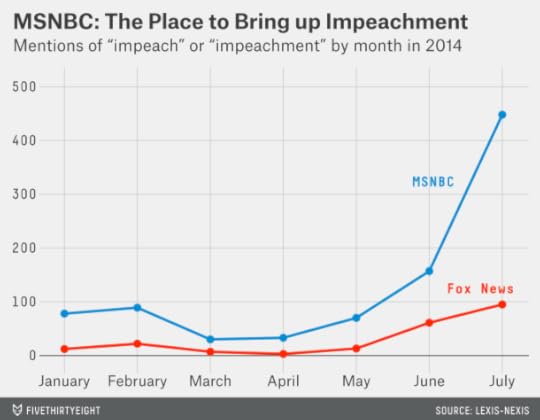
MSNBC hasn’t become quite as obsessed with impeachment as CNN was with Malaysia Airlines Flight 370, but it may be getting there. Impeachment mentions on MSNBC increased sixfold from May to July. Overall, since Jan. 1, MSNBC has mentioned impeachment 905 times to Fox News’s 213.
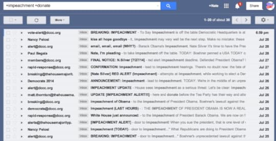
Some of the impeachment discussion from Democratic politicians and liberal commentators has a kind of a Br’er Rabbit quality. “Only please, Br’er Republicans, don’t impeach President Obama!” they say. But Democrats know such a move would be highly unpopular with the public and might be one of the few things that would revive their long-shot chances of recapturing the House of Representatives in November. In the meantime, Democrats have raised a bundle of money — at least $2.1 million — through emails like these:
The Democrats’ strategy has a parallel in 2006. That year, Republicans tried to rally their base around purported Democratic threats to impeach President George W. Bush. Back then, Fox News was more likely to invoke the specter of impeachment, with 374 mentions of the term from Jan. 1 to July 29, 2006, compared with MSNBC’s 206.

July 28, 2014
Group of Liberal New Yorkers Wants to Legalize Weed
The New York Times Editorial Board endorsed the legalization of recreational marijuana last weekend. I personally share its position, and I appreciate the thorough and well-written series on drug policy it’s preparing. But I was surprised by one aspect of the endorsement: I’d assumed the Times would have taken a pro-legalization position a long time ago.
True, it’s only been recently that polls have shown a majority of Americans in favor of marijuana legalization. But the Times’ editorial board isn’t like most Americans. Instead — we’ll get more precise about this in a moment — it consists of a bunch of well-off liberals living in (or near) New York. If you met folks like that at a dinner party, it would be safe to assume that most of them supported marijuana legalization and had done so for years.
This analysis is similar to the one I conducted of Hillary Clinton last month, which pointed out that most women with her demographic profile have supported gay marriage for many years (Clinton endorsed gay marriage in 2013). As it happens, we’ve been collecting detailed data on how different demographic groups feel about marijuana policy, as we have for same-sex marriage.
Specifically, we’ve compiled individual-level responses for eight polls on marijuana legalization conducted between 2012 and 2014 — an overall sample of more than 11,000 people. This data allows us to be quite precise about how various demographic variables work together to predict someone’s support for marijuana legalization.
So let’s assemble a fake editorial board from that sample. I selected respondents with the following characteristics:
Lives in New YorkAge 45 or olderCollege-educated or graduate degreeIncome of $75,000 per year or aboveLiberal or moderateDemocratic or independentThis demographic profile ought to describe all or almost all members of the Times’ editorial board. (Perhaps a couple of them live in Connecticut, or one or two of them are younger than 45, or there’s a Rockefeller Republican thrown in, but it should peg them well on the whole.) I didn’t make any assumptions about the race, gender or religious preferences of the editorial board, although I’d note that a majority of the board members are men, and men are more likely than women to support legalizing pot.
Some 60 respondents met all these criteria and stated a position (pro- or anti-) on marijuana policy. Of those, 77 percent said marijuana should be legal. The proportion is slightly higher, 81 percent, using the demographic weights contained in the original polls. Either way, people with this demographic profile are somewhere around 25 or 30 percentage points more supportive of marijuana legalization than the average American. That implies that back in 2000, when only about 30 percent of Americans supported legalization, perhaps 55 or 60 percent of these people did. The margin of error on this estimate is fairly high — about 10 percent — but not enough to call into question that most people like those on the Times’ editorial board have privately supported legalization for a long time. The question is why it took them so long to take such a stance publicly.
So … who cares? Some of it is that I get irked when elites get credit for publicly taking “bold” positions that other folks came to much sooner. This is particularly the case when the position is one you’d expect them to have held in their private lives all along.
But there’s a particularly large gap between elite and popular opinion on marijuana policy. Consider that, according to The Huffington Post, none of the 50 U.S. governors or the 100 U.S. senators had endorsed fully legal recreational marijuana as of this April — even though some of them are very liberal on other issues, and even though an increasing number of them represent states where most voters support legalizing pot.
Perhaps some of this is smart politics — older Americans are less likely to support marijuana legalization and more likely to vote. But there’s also a more cynical interpretation: racial minorities, low-income Americans and young people are disproportionately more likely to be arrested for marijuana offenses than senators or newspaper editorial board members (or their sons and daughters). The elites may be setting the policy, but they’re out of touch with its effects.

Which Players Will Be Most Affected by the Hall of Fame’s New Rules?
As Greg Maddux, Tom Glavine and Frank Thomas celebrated their inductions in Cooperstown this weekend, the Baseball Hall of Fame announced a change that will make it harder for others to join them. Instead of having 15 years of eligibility for consideration by the Baseball Writers’ Association of America (BBWAA), players will now be limited to 10.1
One theory is that the change is designed to exclude players like Barry Bonds and Roger Clemens, who are known or suspected to have used performance-enhancing drugs.2 But an attempt to target Bonds and Clemens could produce collateral damage. Players such as Curt Schilling, Edgar Martinez, Mike Mussina and Larry Walker — who are not strongly associated with PED use — could also be less likely to get in.
Take the case of Mussina, who received 20 percent of the vote on this year’s ballot, his first year of eligibility. He might seem like a hopeless case — players need 75 percent of the vote to be elected to the Hall of Fame. But players generally gain ground the longer they remain on the ballot. Sometimes they need the full 15 years to get there.
Consider other players who received somewhere between 15 and 25 percent of the vote in their first eligible season. There were 16 such players between 1966, when the Hall of Fame began holding elections every year instead of every other one, and 2000, the most recent class of players to have exhausted their 15-year eligibility window:
Two of these players, Don Drysdale and Billy Williams, gained ground quickly enough to be elected to the Hall of Fame within their first 10 eligible seasons.Another three — Bruce Sutter, Bert Blyleven and Duke Snider — were elected by the BBWAA at some point between their 11th and 15th eligible seasons.One player, Red Schoendienst, was elected later by the Veterans Committee.The 10 remaining players — Gil Hodges, Jack Morris, Roger Maris, Tommy John, Mickey Lolich, Jim Kaat, Dale Murphy, Dave Parker, Thurmon Munson and Tony Oliva — have not yet made the Hall of Fame, though some are plausible candidates for election by the Veterans Committee at a later date.So by a quick-and-dirty rendering, Mussina’s chances of getting elected to the Hall of Fame by the BBWAA have been sliced from 5 in 16 (representing the five players who made it within 15 seasons) to 2 in 16 (only Drysdale and Williams made it within their first 10 seasons). He might also have some chances with the Veterans Committee. But the Veterans Committee has been stingy about electing players in recent years. The point is that players like Mussina need all the chances they can get.
We can formalize this analysis by running a set of logistic regressions that estimate a player’s likelihood of eventually making the Hall of Fame based on his performance in his first year on the BBWAA ballot. First, I ran a regression to consider whether players were selected by the BBWAA within 15 seasons.3 Then I ran another regression to evaluate whether players made it within their first 10 eligible seasons. (Among players who first appeared on the ballot in 1966 or later, those who were elected by the BBWAA somewhere between their 11th and 15th seasons were Snider, Sutter, Blyleven and Jim Rice.)4 Finally, I considered whether players made the Hall of Fame at all — whether through the BBWAA or the Veterans Committee.5 The results are represented in the chart below.
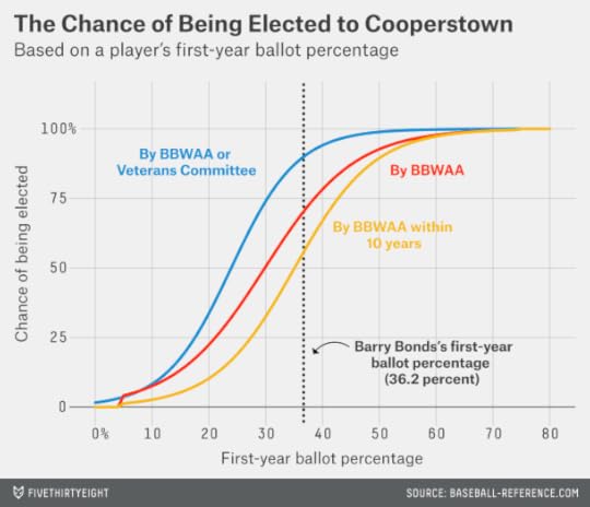
To read the chart, scan across until you find a player’s vote share in his first year of eligibility — then scan up to see where the various curves intersect it. For instance, for a player like Mussina who got 20 percent of the vote in his first year:
There is a 10 percent chance he gets elected within his first 10 years of BBWAA eligibility, according to the regression analysis. (This is the yellow curve.)There is a 23 percent chance he gets elected within the 15-year eligibility window. (The red curve.)There is a 34 percent chance he gets elected by either the BBWAA or eventually by the Veterans Committee. (The blue curve.)These answers aren’t too far from the quick-and-dirty numbers that I came up with before. They suggest that Mussina is an underdog to make the Hall of Fame — but more of an underdog now that he’ll have only 10 years of eligibility to do so.
What about a player — such as Bonds — who got 36 percent of the vote in his first season of eligibility?
He’d have a 53 percent chance of being elected by the BBWAA within 10 years.His odds of being elected within 15 years are higher — 69 percent.He has an 89 percent chance of being elected by some means — either the BBWAA or the Veterans Committee.So a player like this will also see his chances of being elected by the BBWAA decrease with the rule change. But he has a much better backstop: The Veterans Committee has usually elected players like this even when they were bypassed by the writers. That hasn’t been true for players like Mussina.
Of course, Bonds and Clemens are no ordinary cases — and this method may not do a very good job of describing their chances. There are a couple of other objections that we need to consider first, however.
One is that the change in rules could affect voter behavior. Players sometimes receive a boost in their vote share in their 15th and final year of eligibility. Now, knowing that it’s their last chance, the writers could rally around a player in his 10th year instead.
That might protect a few players — Snider, for instance, got 71 percent of the vote in his 10th year of eligibility and might have made it then if a few more writers thought it was their last opportunity to elect him. But Blyleven had only 48 percent of the vote in his 10th year. His case, which was pushed by stat-savvy baseball fans for years, needed some extra time to marinate.
Another consideration is that rotating players off the ballot sooner could clear slots for more recently retired players. BBWAA voters are limited to naming 10 players on their ballots. A few of them might have run out of room for Mussina this year, for instance, because they were reserving space for Alan Trammell, Jack Morris, or other players between their 11th and 15th years of eligibility.
Indeed, this could be of some help to players like Mussina. But there would be a more direct means of providing relief — by liberalizing or eliminating the 10-player limit. Players from the 1980s, 1990s and 2000s are badly underrepresented in the Hall of Fame relative to players who had the good fortune to be born earlier.
The rule change, in other words, seems designed to make the Hall of Fame more exclusive, not less so. But how might it affect Bonds and Clemens in particular?
As I mentioned, they aren’t ordinary cases. For a player like Mussina, a large fraction of the BBWAA electorate might be thought of as “swing voters” — they could live with him in the Hall of Fame or without. Given how strong feelings are on the issue of performance-enhancing drugs, the choice is likely to be much more binary for Bonds and Clemens. For that reason, their vote shares might not increase as much in future seasons. (Another PED user, Mark McGwire, has been on the ballot for eight seasons and has seen his vote share decrease in almost every one.) Personally, I’d wager a fair amount of money against Bonds or Clemens ever being elected to the Hall of Fame by the writers, whether in 10 years or 15.
Nevertheless, baseball’s hive mind could change its stance on PED use with the benefit of hindsight. It’s not that hard to conceive of alternate realities. NFL players who were suspended for PED use, like the former San Diego Chargers linebacker Shawne Merriman, barely seem to suffer any lasting damage to their reputations. (Merriman made the Pro Bowl in 2006, the same year he was suspended for four games.)
One scenario could involve a known PED user who is otherwise a more sympathetic case than Bonds or Clemens making the Hall of Fame.6 For instance, Andy Pettitte, who admitted to using human growth hormone, is due to become eligible for the Hall of Fame in 2019. Pettitte’s case is not clear-cut on the statistical merits, but suppose he made it in 2023, his fifth year on the ballot. Under the old rules, Bonds and Clemens would have had a few years left on the ballot with that precedent in place. Now, they’ll already have exhausted their eligibility.
Bonds and Clemens would still be eligible for consideration by the Veterans Committee. But whatever misgivings you might have about the BBWAA, the Veterans Committee has been far more problematic. Its rules are constantly changing, its process is not very transparent, and it has oscillated from being far too liberal to being very stingy about letting in players. Depending on the rules it drew up, the Hall of Fame could design a Veterans Committee that was relatively sympathetic to Bonds or Clemens — or firmly opposed to their election.
Another theory is that the Hall of Fame doesn’t have strong feelings about Bonds and Clemens per se, but implemented the rule change in the hopes of putting the PED issue behind it sooner. It’s certainly not good advertising for Cooperstown when discussions are dominated every year by arguments over steroids.
But these cases won’t go away anytime soon. Pettitte will become eligible in a few years — and a few years after him, Alex Rodriguez. Ryan Braun, another known PED user who could eventually build Hall of Fame statistics, is many years from retirement. In the meantime, players like Mussina could be caught in the crossfire.

July 25, 2014
What is Americans’ Favorite Global Cuisine?
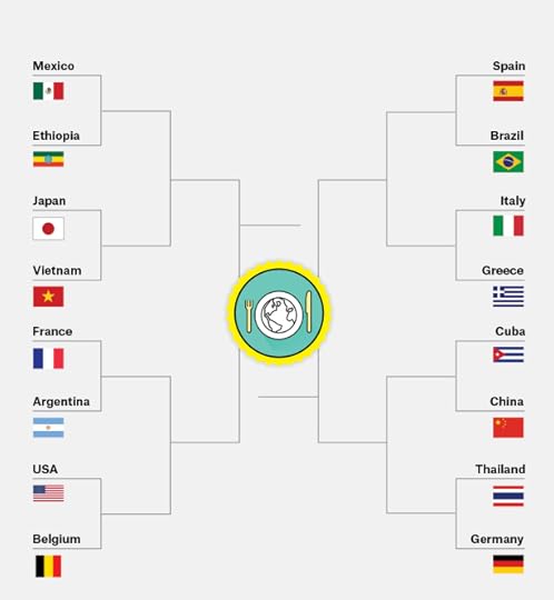
During the World Cup, we wondered how the countries would fare if it wasn’t their soccer teams but their national cuisines playing for glory. So we launched the FiveThirtyEight International Food Association’s (FIFA) 2014 World Cup.
The group phase of the competition identified a few front-runners. Some, such as Italy, are also good at soccer. (The Italians might have done better in the soccer World Cup, but Uruguay’s Luis Suarez, apparently confused about which tournament he was playing in, decided to take a bite out of one of them). Others countries, like Mexico, will have a chance to avenge their soccer disappointments. We also introduced a few ringers, such as China, that didn’t qualify for the soccer World Cup but that belong in any discussion of the world’s best cuisines.
Because the competition is based on surveying Americans, we mostly wound up with a bracket full of the general pantheon of takeout cuisine; the competition will get tougher now that almost all the remaining cuisines are familiar to Americans. The United States itself is also a threat, having skated through the group stage undefeated. It will face Belgium in the Round of 16, just as it did in the soccer World Cup.
To play out the rest of the tournament, we ran a fresh series of surveys through SurveyMonkey Audience, each with about 725 respondents. We put each country head to head, just as they would be in the knockout phase of the World Cup. Respondents were also allowed to say they couldn’t choose between the two.1
In addition to revealing their food preferences, respondents were rated on a six-point scale depending on how much interest and experience they claimed to have in international cuisine. As during the group phase, we weighted the results of more experienced voters more heavily — we called those voters “likely eaters.” This turned out to make a big difference in at least one knockout-phase matchup.
Here’s how it went down.
Total of 723 respondents, weighted by likely eaters, June 26
Mexico beats Ethiopia, 81 percent to 9 percent (10 percent undecided)Japan beats Vietnam, 58 percent to 21 percent (21 percent undecided)France beats Argentina, 54 percent to 23 percent (23 percent undecided)United States beats Belgium, 68 percent to 16 percent (17 percent undecided)Spain beats Brazil, 42 percent to 22 percent (36 percent undecided)Italy beats Greece, 62 percent to 19 percent (19 percent undecided)China beats Cuba, 59 percent to 26 percent (15 percent undecided)Thailand beats Germany, 52 percent to 33 percent (15 percent undecided)Generally speaking, there was nothing too shocking in this round. All of the favorites won, just as in the Round of 16 in the soccer World Cup.
The closest contest was Thailand against Germany. Had we used unweighted responses, it would have been even closer, with Thailand winning by 45 percent to 37 percent — but its margin increased when weighting by culinary experience. Germany will have to content itself with having possibly the best national soccer team ever assembled.
Spain vs. Brazil produced a lot of equivocation; more than a third of respondents couldn’t choose between them. But Spain won over people able to choose by a 2-to-1 margin. Still, this was an underwhelming win for Spain after having gone undefeated in the group stage. They’ll have to cook up a better result to have any chance against Italy in the quarterfinals.
Mexico crushed Ethiopia, taking 81 percent of the vote. The battle of the Ionian Sea — Italy vs. Greece — proved to be nearly as one-sided.
More gratifyingly, the U.S. routed Belgium, racking up 68 percent of the vote to Belgium’s frankly laughable 16 percent. When we consider a matchup between the Belgians and the U.S., the limitations of Belgian cuisine come out in force. Their most well-known breakfast food, the waffle, is the Spirit Airlines of the breakfast buffet: You go with it only when there’s nothing else available. And Belgian fries are even worse. When “pour mayonnaise on it” is how a civilization tries to spice up its food, something is wrong.
In fairness to Belgium, we’re probably not over that soccer game.
There are some epic matchups in the quarterfinals. This round is where the titans of the takeout menu go at it.
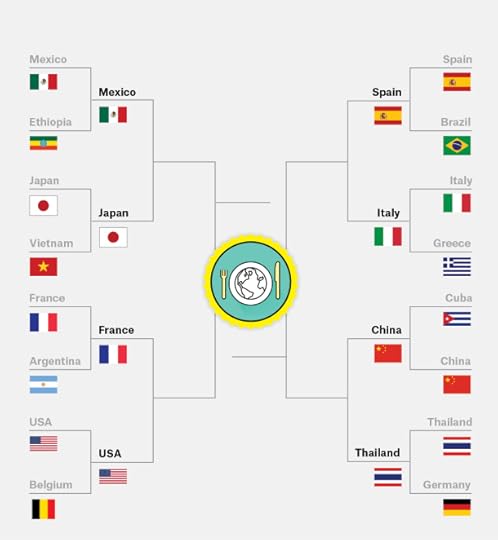
727 respondents, weighted by likely eaters, July 1
Three of the matches had a clear winner:
Italy beats Spain, 79 percent to 10 percent (11 percent undecided)We saw Italy as the favorite going into the competition, but we didn’t expect such a dominant performance (it’s not just Americans gorging themselves on all-you-can-eat mozzarella sticks either). Among respondents rated at five or above on the six-point likely eater scale, Italy won by nearly as wide a margin, 75 percent to 11 percent.
Mexico beats Japan, 57 percent to 29 percent (15 percent undecided)We’re happy about Mexico advancing, but there is some evidence that Japanese food involves more of a learning curve. Mexico won 73 percent to 13 percent among the least adventurous eaters — those who rated themselves two or below on the likely eater scale. But it was considerably closer — Mexico 45 percent, Japan 31 percent — among those rated at five or above.
United States beats France, 60 percent to 28 percent (12 percent undecided)In defense of the French, the survey population may have included a few of those people who called fried potatoes “freedom fries” a few years ago. Among voters rated at two or below on the likely eater scale, the U.S. won 80 percent to 10 percent. But France edged the U.S., 46 percent to 42 percent, among respondents rated at five or above.
Thailand beats China, 46 percent to 39 percent (15 percent undecided)Finally, we have a contest where the likely eater adjustment swung the outcome. The raw vote count slightly favored China, 44 percent to 38 percent. But Thailand did better among the likeliest eaters.
Actually, the story is slightly more nuanced than that. Let’s look at the vote in more detail:
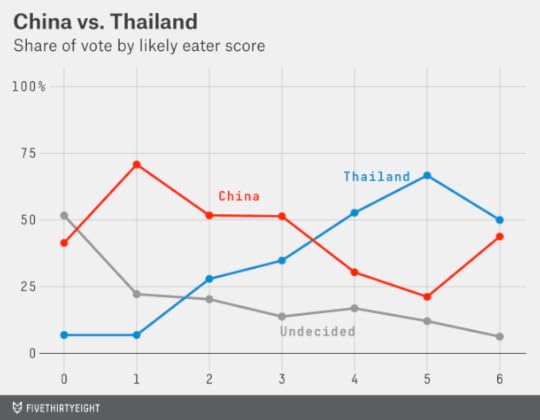
China crushed Thailand among the voters lowest on the likely eater scale, although there were a significant number of undecideds. Thailand dominated among voters rated at four or five. Because those votes are weighted more heavily, it prevailed in our contest.
But look at what happened among the voters rated at six on the likely eater scale. It’s a tiny sample size — only 16 respondents — but the vote was nearly even (Thailand eight votes, China seven, one undecided). It may be a statistical fluke — but it seems plausible to us that these super-foodies may have been able to experience the sort of Chinese food only available in a few parts of the country, such as New York and California. We’re talking places like Spicy & Tasty and Xi’an Famous Foods, which venture beyond General Tso’s chicken and into all sorts of regional delights.
Not to take anything away from Thailand, which retains its undefeated record in the tournament and advances to the semifinals against Italy. In the other semifinal, Mexico and the U.S. will engage in a battle for North American culinary supremacy.
Semifinals732 respondents, weighted by likely eaters, conducted July 2
Italy beats Thailand, 61 percent to 24 percent (15 percent undecided)Let’s take a moment to appreciate Thailand. Its miracle run started with its seeding as a wildcard squad — Thailand is known for many things, and one of them is not soccer — and continued with going 4 and 0 against Belgium, South Korea, Algeria and Russia in its division. We saw it knock out Germany and then shock everyone by downing culinary juggernaut China. But in this battle of peninsular nations with strong culinary traditions, Italy pulls off a decisive win.
The results were somewhat closer among the likeliest eaters — Italy won 47 percent to 33 percent among respondents rated at five or above on the scale. But as we identified at the outset of the competition, what makes Italy so dangerous is that it’s the cuisine that food snobs and food noobs can agree on.
The other result was much closer:
United States beats Mexico, 44 percent to 38 percent (18 percent undecided)It was fun to see the U.S. crush Belgium. We were fine with it beating France. But we think this result is a gross injustice, like that Arjen Robben dive.
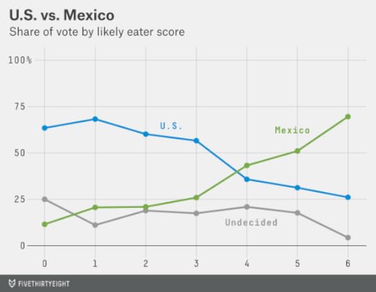
Mexico gained ground with every tick of the likely eater scale, and it won voters rated at five or above by 55 percent to 30 percent. The Americans, however, built up too large of a lead among less experienced eaters for Mexico to overcome. We’re hopeful that our quest to improve Americans’ burrito knowledge will help Mexico next time around.
Third-place match727 respondents, weighted by likely eaters, conducted July 2
Mexico beats Thailand, 51 percent to 35 percent (15 percent undecided)
The soccer World Cup, for no good reason, plays a third-place consolation game between the semifinal losers. We decided to do so as well. The Mexicans get a bit of redemption by beating Thailand and winning … a bronze skillet?
Final727 respondents, weighted by likely eaters, conducted July 2
Italy beats United States, 60 percent to 27 percent (13 percent undecided)
Home-plate advantage only goes so far. It turns out that Americans like Italian food better than their own.
The Italians’ margin was boosted some by the likely voter weighting — the raw tallies favored them 53 percent to 34 percent.2 Nevertheless, this was a definitive result. The Italians played eight matches throughout the tournament and won by an average margin of 70 percent to 13 percent; the U.S. came closer than everyone else and still lost by a 2-to-1 margin. Americans reportedly planned to celebrate the win by consuming unlimited mozzarella sticks at TGI Fridays.


July 21, 2014
A Statistical Appreciation of the Washington Generals And Harlem Globetrotters
Red Klotz, the founder and longtime coach of the Washington Generals, the Harlem Globetrotters’ perpetually feeble opponents, died at age 93 last week (I highly recommend Joe Posnanski’s remembrance). Klotz’s all-time record as a head coach of the Generals and their namesakes was something like six wins and 14,000 losses — they lost 99.96 percent of the time.
How exactly did the Generals lose so consistently? How much of it was their conceding games on purpose, as opposed to simply being really bad at basketball?
Let’s first get a sense for how good the Globetrotters were. How have they performed in competitive games. Wait, the Globetrotters sometimes played serious basketball? Yes — from 2000 to 2003 they played a series of games against NCAA teams. (The NCAA banned the practice in 2004.) News accounts of these games insist that they were taken seriously by both the Globetrotters and their NCAA opponents.
As best as I can tell — statistical records for anything involving the Globetrotters are sketchy — they went 13-9 in games against Division I opponents while winning by an average of about five points per game. This is reasonably impressive. As a barnstorming team, all of the Globetrotters’ games were played on the road, and some of their opponents were pretty good: Michigan State, Syracuse, Connecticut and so on.
We can come to an estimate of the Globetrotters’ strength by looking up the SRS rating of their college opponents. SRS (Simple Rating System) is a Sports-Reference.com invention which accounts for a team’s margin of victory and strength of schedule. A team’s SRS rating represents how much it would outscore (or be outscored by) an average opponent from its league.
Take one of the Globetrotters’ opponents from 2001, the Iowa Hawkeyes. The Hawkeyes had an SRS rating of about +12 that season, which implies they’d beat an average Division I team by a dozen points. But the Globetrotters beat Iowa by three points. Furthermore, the game was on the road, and home-court advantage is worth about four points in college basketball. So to get an SRS rating for the Globetrotters, we start with Iowa’s rating of +12, then add three points for the Globetrotters’ margin of victory, and four more since the Globetrotters were playing on the road.
That gets us to an implied SRS of +19 for the Globetrotters. We can repeat this process for all the games the Globetrotters played against Division I opponents and then average the result. (There were also some inglorious moments, like when the Globetrotters lost to Central Connecticut State.)

The Globetrotters come out with an SRS of about +17 based on our sample. That’s pretty good — it’s similar to the SRS rating that Syracuse, Ohio State, Baylor, Wichita State and the national champion Connecticut Huskies had last season. If they entered the NCAA tournament, the Globetrotters would deserve to be slotted in as something like a No. 4 or 5 seed.
Let’s return to the case of the Generals. In Posnanski’s accounting, the Generals usually played straight up on offense. And they played straight up on defense about 40 percent of the time. The other 60 percent of the time, when the Globetrotters were in one of their “reams” (trick-play routines), the Generals’ job was to play the stooge and ensure the Globetrotters looked good.
Here’s how this might translate in terms of advanced stats:
We know that when playing straight-up basketball, the Globetrotters are equivalent to a No. 4 or 5 seed in the NCAA tournament. Per Ken Pomeroy’s data, a team like that would expect to score about 1.13 points per possession against an average NCAA opponent and allow 0.97 points per possession.But the Generals are probably slightly worse than an average NCAA team; most of their current roster either played for middling Division I schools or didn’t play in Division I at all. So let’s tweak the Globetrotters’ projected offense up slightly to 1.15 points scored per possession, and their defense to 0.95 points allowed per possession in straight-up play against the Generals.Let’s guess that Globetrotters games feature an average of 55 possessions per team, lower than the rate of about 65 possessions per team for an average NCAA game. From what I can tell, Globetrotters games generally last 40 minutes — the same as in college basketball. But team also plays without a shot clock, and its routines can last for minutes at a time (while violating all other sorts of basketball rules).Based on these assumptions, if the Globetrotters and Generals played straight-up basketball, the Globetrotters would win by an average score of 63-52. (You can get to these numbers by multiplying each team’s points per possession by 55 possessions per game.) This would translate into their beating the Generals 94 percent of the time by basketball’s Pythagorean formula. Had the Generals played to win on every possession, Klotz would have finished with a career record of about 840 and 12,166.
That’s … not great. But it gives Klotz about 834 more wins.
As a gut check on this back-of-the-envelope calculation, let’s account for what happens when the Globetrotters employ a trick play, as they did 60 percent of the time in Posnanski’s estimation. Let’s assume that their scoring efficiency in these cases is two points per possession, equivalent to scoring a two-point field goal every time down the court. In practice, the Globetrotters no doubt miss some baskets, even when the Generals are laying down to them. But they could also boost their scoring efficiency through 3-pointers (and in the Globetrotters’ case, 4-pointers!) and offensive rebounds.
Scoring 1.15 points per possession 40 percent of the time (when playing straight up) and two points per possession 60 percent of the time (in trick-play mode) yields an overall average of 1.66 points per possession. In a 50-possession game, that would make the average score 91-52 in favor of the Globetrotters. That implies the Globetrotters would beat the Generals 99.96 percent of the time per the Pythagorean formula — exactly their historical winning percentage against them.

July 18, 2014
Should Travelers Avoid Flying Airlines That Have Had Crashes in the Past?
The downing of Malaysia Airlines Flight 17 in Ukraine on Thursday, following the disappearance of its Flight 370 in March, is the second mysterious incident involving the airline this year. The incidents don’t appear to be related, but that isn’t preventing people from insisting that they’ll never fly Malaysia Airlines again. Some of them will follow through — academic studies have found that high-profile crashes can shift passenger demand away from the airlines involved in the disasters.
Is this behavior rational? Should we really be less inclined to fly airlines that have had fatal crashes in the past — even when the crashes don’t appear to be their fault? Or are crashes essentially random events that occur at about the same rate on all airlines over the long run? (The two fatal accidents involving Malaysia Airlines this year were the first for the carrier since 1995.)
We can study this by looking at safety records for major commercial airlines over the past 30 years, as based on the Aviation Safety Network’s database. The method is relatively simple. I’ll break the 30-year period down into two halves: first from 1985 to 1999, and then from 2000 to 2014. Then I’ll look to see whether there was a correlation in crash rates from one half of the dataset to the other. If we identify a correlation, that will imply that crash risk is persistent — predictable to some extent based on the airline.
I’ll be making a couple of simplifying assumptions:
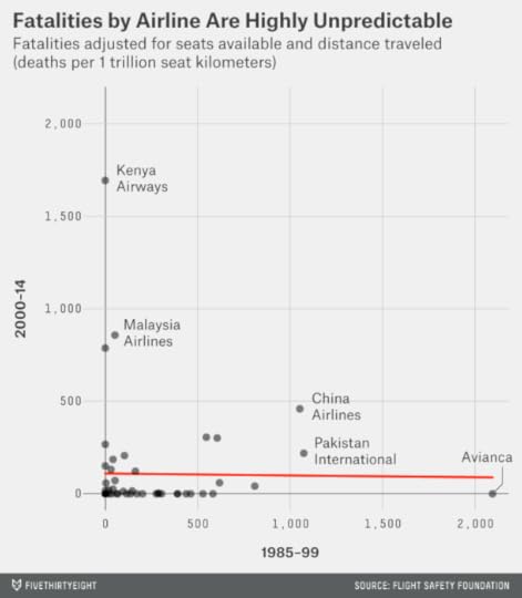
First, I’ll include all crashes regardless of their cause. The airline is clearly more culpable in cases such as the 1977 Tenerife disaster than others like Flight 17. But the causes of many other disasters (such as Malaysia Flight 370) are controversial or poorly understood — I’m not going to try to assign blame.Next, I’ll take crash rates on the basis of the number of available seat kilometers (ASKs), which is defined as the number of seats multiplied by the number of kilometers the airline flies.1 ASK figures are taken as of December, 2012. This implicitly assumes that the number of ASKs has been constant for each airline since 1985, which is obviously not true — some airlines have grown while others have shrunk — but this is a necessary simplification until we can track down some older data. I do, however, exclude any airlines that were not operational as of Jan. 1, 19852, and account for some major mergers (so Northwest’s data is combined into Delta’s, and so forth). I also include data for regional subsidiaries under the flagship carrier — so incidents for American Eagle are grouped with the data for American Airlines, for instance.I’ll define crashes in three ways:First, based on the rate of incidents as listed in the database, whether or not they resulted in a fatality.Next, based on the rate of fatal accidents.3Finally, by the rate of fatalities among passengers and crew on the airline.Here’s the data for 56 airlines that were in the global top 100 as of December 2012 and which have operated continuously since Jan. 1, 1985. Airlines are sorted based on the rate of fatalities per ASK.

As you should see, the number of fatalities is not very consistent from the first half of the dataset to the next. Avianca, the national airline of Colombia, had a series of major crashes from 1983 through 1990. But it has had almost no problems since then — no fatal accidents since 1990, and no incidents of any kind since 1999. By contrast, Kenya Airways was fatality-free until 2000 but has had two major accidents since then and ranks as the worst airline since 2000 based on the number of fatalities per ASK.
One or two other carriers, such as Taiwan’s China Airlines (not be confused with Beijing’s Air China4), have had problems in both halves of the dataset. But these cases are more the exception than the rule. Overall, there is no correlation in the rate of fatalities from one period to the next.
Accidents that produce a massive number of fatalities are rare as compared to fatal accidents of any kind, however. And fatal accidents represent only about one-quarter of all incidents listed in the database. So it may be better to compare airlines on the basis of their number of incidents, whether or not they resulted in a fatality, which has the effect of increasing the sample size. These near-misses can still produce non-fatal injuries. They may also provide useful evidence about the overall hazard associated with flying a given airline, in the same way that the number of smaller earthquakes in a region over a period of time can be used to predict the likelihood of a catastrophic one.5
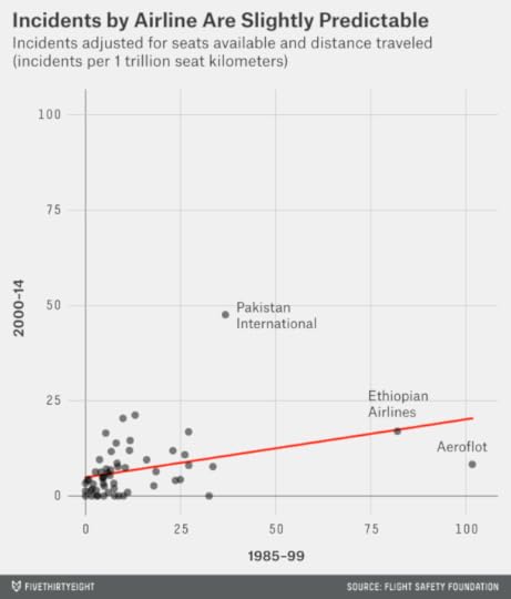
Viewed this way, there is a modest correlation from one period to the next.6 There are also a few major outliers in the chart: two are Pakistan International Airlines and Ethiopian Airlines, which have had a persistently high rate of incidents. A third outlier, Russia’s Aeroflot, had an extraordinarily high number of reported incidents in the 1990s — many of them attempted hijackings around the time of the breakup of the Soviet Union — but only an average number in recent years. There is still a positive correlation even if those three airlines are excluded, however, which rates as modestly statistically significant7 — some airlines are slightly safer to fly than others.
Our preliminary answer, then, is that an airline’s track record tells you something about its probability of future crashes — although not a lot, and only if looked at in the right way. In particular, you should look toward an airline’s rate of dangerous incidents of any kind rather than its number of fatalities or fatal accidents. These near-misses are more consistent from period to period — and could result in a deadly crash the next time around.
But there’s a better rule to follow. If you’re insistent on minimizing your crash risk, you should avoid airlines from developing countries.
Let’s combine our three measures of crash rates — incidents, fatal accidents and fatalities — into a single measure which I’ll call the airline’s safety score. I calculate it as follows:
For each category, subtract an airline’s crash rate from the average for all airlines since 1985. This gives safer airlines positive scores and less safe airlines negative scores.Multiply the result by the square root of the number of seat kilometers flown. This gives more credit to an airline that has achieved a strong safety record over a larger sample of flights.Standardize the score in each category to calculate how many standard deviations an airline is above or below the mean. Then average the scores from the three categories together. This is the safety score.Positive scores indicate a safe track record — Australia’s Qantas, for instance, which is famous for avoiding crashes — has a safety score of +0.70. By contrast, Pakistan International Airlines has a score of -1.44.
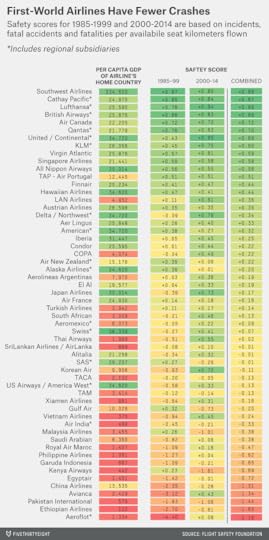
The chart also lists the per capita GDP for the airline’s home country as of 1999 (the middle of the 30-year period). The correlation between a country’s wealth and the crash rates of its airlines is quite strong8. Over the past 30 years, the top 10 safety scores belong to two airlines from the United States (Southwest Airlines and United Airlines), two from the United Kingdom, and one each from Canada, Australia, Hong Kong, Singapore, Germany and the Netherlands. By contrast, the 10 worst scores are for airlines from Colombia, Egypt, Ethiopia, Indonesia, Kenya, Malaysia, Morocco, Pakistan, Russia, Taiwan. In fact, if you want to predict an airline’s future rate of crashes, you’re best off looking at its home country’s GDP and largely ignoring its track record.9
Perhaps this shouldn’t be surprising. Commercial airlines are subject to extremely stringent safety standards, and the same standards are applied to all airlines from the same country or region. Richer countries, in air travel and many other aspects of public planning, can afford to buy more safety in the form of higher prices and more expensive regulations.
So should you never fly an airline from a developing country again? No, that would be silly — commercial airline travel is an extraordinarily safe means of transit overall. What you should do is avoid airlines on blacklists, such as that periodically put out by the European Union. (None of the airlines on the list of 56 above is currently on the EU’s blacklist, although one, Pakistan International Airlines, has been in the recent past.) Otherwise — even on Malaysia Airlines — the risk of being involved in a crash is very low, and that risk doesn’t increase much after a recent disaster.

Nate Silver's Blog

- Nate Silver's profile
- 729 followers

