
Nate Silver's Blog, page 166
September 3, 2014
The Senate Race In Kansas Just Got Crazy
The past few weeks haven’t produced much good news for Democrats’ hopes of retaining the Senate. While their position is far from catastrophic — the Senate playing field is broad this year, and the outcome of many races is uncertain — Democrats’ chances of keeping the Senate were down to 35 percent as of the FiveThirtyEight forecast late Wednesday afternoon.
Part of the problem is that Democrats are almost entirely playing defense, with few prospects to pick up Republican-held seats. Georgia, where we have the Democrat Michelle Nunn’s odds at about 30 percent, looks like their best opportunity. It’s also too early to foreclose the possibility of Democrats winning Kentucky, but Republican Minority Leader Mitch McConnell has not trailed in a nonpartisan poll since May, and two new surveys Wednesday put him ahead.
Kansas, however, had become an under-the-radar opportunity for Democrats. The Republican incumbent there, Pat Roberts, barely survived his primary and has extremely low approval ratings. Several recent polls had put the race in single digits between Roberts and his Democratic opponent, Chad Taylor, with the independent candidate Greg Orman getting about 20 percent of the vote. As of Wednesday, the FiveThirtyEight forecast gave Roberts an 80 percent chance of winning. That’s not bad, but it’s not any better than McConnell, who also has about an 80 percent chance of holding on in a race that has gotten far more attention.
Late Wednesday afternoon, however, Taylor announced his withdrawal from the race, setting up a contest between Orman and Roberts. (There is also a Libertarian candidate, Randall Baston, on the ballot.)
Why would Taylor leave the race right when polls showed it tightening?
Perhaps because he and Orman share a lot in common philosophically. Based on the ideological ratings we track (more background on those here), both Taylor and Orman rate as the equivalent of moderate Democrats. Orman, in fact, ran as a Democratic candidate for the Senate in 2008, although he withdrew from the race during the primary.
But Orman had raised more money than Taylor — about $625,000 in individual contributions to Taylor’s $120,000 as of July 13 — and probably had more momentum, having recently received endorsements from a bipartisan group of legislators.
There was also a recent survey, from Public Policy Polling (PPP), which showed Orman ahead of Roberts 43-33 in a potential two-way race. The same poll had shown Taylor trailing Roberts by 4 percentage points in the event Orman dropped out.
If the PPP survey is accurate, this is a huge problem for Republicans. Suddenly, they’re behind in a race against a former Democrat who might caucus with the Democratic Party should he make it to the Senate.
There is ample reason to be skeptical, however. Although our model largely relies on polls, it also evaluates other factors on a state-by-state basis, which we refer to as the “fundamentals.” One of these is the candidates’ ideology scores. In a deeply red state like Kansas, a fairly moderate Republican like Roberts rates as much closer to the median voter than a center-left candidate like Orman. Orman has also never been elected to office before, a factor which makes a candidate more likely to underperform in his polls, perhaps because of a lack of campaign experience.
In fact, our fundamentals-based estimate would put Orman 25 points behind Roberts — not 10 points ahead. It’s rare to see a discrepancy even half as large as that.
The fundamentals-based estimate is not so accurate, however. It won’t capture some of the more subtle qualities of the campaign, and on average it misses the final margin in the race by about 9 percentage points. By comparison, the average poll is off by something like 6 or 7 percentage points at this stage of a Senate campaign. The fundamentals estimate is mostly meant to serve as a stand-in when there is little or no polling data available. Otherwise, it doesn’t receive much weight in the model and mostly acts as a tiebreaker when the polls are very close.
In this case, however, we have only one poll of the Orman-Roberts matchup (and it was from the polling firm PPP, which has a series of methodological problems and which surveyed the matchup when it was still just a hypothetical possibility). So the model comes out somewhere between the survey and the fundamentals rating. It projects a narrow 2-point victory for Roberts, and gives him a 56 percent chance of winning against 44 percent for Orman.
For all intents and purposes, that makes the race a tossup. But it’s also a totally wild guess. The model is designed to recognize that the outcome is extraordinarily uncertain when the polls and the fundamentals diverge so much. So the margin of error on the forecast is enormous — the 90 percent confidence interval on the forecast runs from a 20-point Orman win to a 23-point victory for Roberts.
But if Roberts winds up beating Orman by a few percentage points, it wouldn’t be so surprising. That’s about the margin by which McConnell leads Democrat Alison Lundgren Grimes in Kentucky, after having trailed in several previous polls. McConnell, like Roberts, has extremely low approval ratings, but the partisan gravity of Kentucky may prevail in the end.
Another question is which party Orman might caucus with should he win. The default answer would be the Democrats. Orman was formerly a Democrat, he’s mostly taken the political positions of a moderate Democrat, and the Democratic candidate just dropped out of the race.
But the more Orman appears to be affiliated with the Democratic Party, the less attractive he might be to Kansas’s red-leaning electorate. Orman is suddenly about to become much better known to Kansas voters and to the national media. That could help him in some ways, but it will also increase scrutiny on his political stances. Furthermore, some voters, especially Republicans who voted against Roberts in the primary, might have considered voting for Orman as protest before — and they may reconsider those plans now that he has a chance to win.
If we do program the model to treat an Orman win as a Democratic pickup, then the Democrats’ chances of retaining the Senate would improve to 38 percent from 35 percent. We’re going to do some further thinking overnight about how to handle the case.


FiveThirtyEight’s Senate Model Is Back And It Gives Republicans The Edge
The FiveThirtyEight Senate model is launching Wednesday. We’ll be rolling it out in stages, with additional features, functionality and further methodological detail. We’ll also be unveiling our new set of pollster ratings and publicly releasing our database of all the polls used to calculate them. So there’s a lot more to come.
But if you’re looking for a headline, we have two. First, Republicans are favored to take the Senate, at least in our view; the FiveThirtyEight forecast model gives them a 64 percent chance of doing so.
The reasons for the GOP advantage are pretty straightforward. Midterm elections are usually poor for the president’s party, and the Senate contests this year are in states where, on average, President Obama won just 46 percent of the vote in 2012.1 Democrats are battling a hangover effect in these states, most of which were last contested in 2008, a high-water mark for the party. On the basis of polling and the other indicators our model evaluates, Republicans are more likely than not to win the six seats they need to take over the Senate. This isn’t news, exactly; the same conditions held way back in March.
An equally important theme is the high degree of uncertainty around that outcome. A large number of states remain competitive, and Democrats could easily retain the Senate. It’s also possible that the landscape could shift further in Republicans’ direction. Our model regards a true Republican wave as possible: It gives the party almost a 25 percent chance of finishing with 54 or more Senate seats once all the votes are counted.2
Why so much uncertainty? Consider some of the challenges that election forecasters face this year:
The quality and quantity of polling has been poor. We have stunningly few polls in some states. In Colorado, for example, which could easily determine the balance of the Senate, no polls at all were published in August. And in many states, most of the polls we do have are from non-traditional polling firms, including those that conduct “robopolls” or Internet polls, or which have an explicitly partisan affiliation.In contrast to 2010, when major swing states like Pennsylvania, Ohio and Wisconsin were key to the Senate picture, this year’s races take us all over the country, including to politically idiosyncratic states like Arkansas and Alaska. These states are harder to pin down: Arkansas has begun to vote strongly Republican for president, for example, but sometimes still elects Democrats to other offices. In certain other states, polls and partisanship diverge. Ordinarily in a year like this one, you’d give Democrats no chance at all in Kansas, for example. But polls show a somewhat close race there, and there’s further uncertainty because of the presence of an independent candidate.Readings of the national mood are ambiguous. President Obama remains unpopular — and the president’s party has a long history of performing poorly in midterm election years. However, Democrats remain roughly tied with Republicans on the generic congressional ballot. That may reflect the Republican Party’s poor image, which remains quite a bit worse than that of the Democratic Party. But it could also mean there’s some upside for Republicans. On average in midterm years since 1990, the generic ballot has favored the opposition party by 5 percentage points by Election Day instead of being even.We don’t yet have a good sense for the potential turnout and enthusiasm advantage. It’s reasonably safe to assume it will benefit Republicans; their (older, whiter) demographics are usually associated with higher turnout at the midterms. But we don’t have much evidence yet about the magnitude of this effect. One way of measuring the turnout edge is to compare polls that release results among both registered and likely voters in the same state. In 2010, Republicans polled a net of 6 percentage points better in the likely-voter surveys, a historic high. Compare that with a GOP advantage of about 2 percentage points on average in midterms from 1990 to 2006. This year, however, we’ve seen very few polls to release both registered and likely-voter results in the same state. That leaves us somewhat in the dark about whether 2010’s turnout pattern was a fluke.Another complication is the broad Senate playing field. There are, according to our model, either nine or 10 races in which each party has at least a 20 percent chance of winning.3 There are several others in which each party’s chances are at least 10 percent.
The Republicans’ edge comes from an abundance of opportunity. They are almost certain to win the Democratic-held seats in Montana and West Virginia, and very likely to do so in South Dakota. That gives them three of the six seats they need. Beyond that, they have few guarantees but a lot of good prospects:
Republicans are slightly favored, though far from certain, to oust Democratic incumbents in Louisiana and Arkansas.Four more Democratic-held seats — in Alaska, Colorado, Iowa and North Carolina — rate as tossups.While Democrats are favored in Michigan and New Hampshire, Republicans retain some chances to win those states as well.Democrats, by contrast, have plausible chances to win only three Republican-held seats — in Georgia, Kentucky and Kansas — and they aren’t favored in any of those races.
In some ways, Republicans’ position resembles that of President Obama against Mitt Romney during the 2012 presidential campaign. Even though Obama’s edge was relatively narrow for most of the campaign in swing states like Ohio, Florida, Nevada, Virginia and Colorado, he needed to win only a couple of them to have a winning electoral map, whereas Romney, with fewer electoral votes in his base, would have had to almost sweep them.
In the end, Obama won almost all the swing states instead, save North Carolina. Something similar could happen in the Senate this year — most or all of the competitive races could break in the same direction. This is a reasonably common pattern: In 1994, for example, Republicans benefited from a late surge. In 1998, Democrats did (under President Clinton, which demonstrates that midterm surges don’t always work to the benefit of the opposition party). In 2006, Democrats gained ground in Senate races almost up to the last minute.
This is the advantage of having something like the FiveThirtyEight model — we can run thousands of simulations of these outcomes each day, accounting for the historical extent to which the results in different states are correlated with one another. How often, for example, do Republicans win six Democratic-held seats, but then get tripped up because they lose Georgia or Kentucky? How often does a state like Michigan or New Hampshire put the GOP over the top even though other states seem like easier “gets”? How often do Republicans sweep almost everything — or get shut out beyond Montana, West Virginia and South Dakota? These scenarios are hard to calculate by hand, but they’re the model’s bread and butter.
We’re aware that there are a lot of other Senate forecasting models. I think some are pretty good. I have methodological disagreements with others — but I’d trust them before I’d believe the typical television pundit. Still, a few of them share a flaw: They assume the result in each state is independent from the next one instead of being partially correlated.4 Models that fail to account for the correlation between states will have too narrow a spread in their outcomes and neglect the possibility that I mentioned before — a late surge by one party, as has occurred several times in recent elections.
The models also vary in the probability they assign to a Republican takeover. There are several others which, like ours, put Republicans’ chances somewhere in the range of 60 percent to 65 percent — and others which show Democrats with a slight edge. Soon we’ll be releasing a more detailed description of the FiveThirtyEight model and how it compares to the others. But most of the differences boil down to one or two factors.
First is whether the model treats polls of registered and likely voters in the same way. Our model doesn’t. This might seem like a trivial detail, but it isn’t — not when so many Senate races are so close. Historically, as I mentioned, likely-voter polls are more favorable to Republicans in midterm years. So our model shifts registered-voter polls toward Republicans to make them more comparable to surveys of likely voters. For the time being, this adjustment is based on the historical average of likely voter polls being 2 points or 3 points more favorable to Republicans than registered-voter ones. The model will automatically update its estimate as we collect more data on what the turnout gap looks like this year.
That’s enough to potentially change the outcome in several states. In Iowa, Colorado and Alaska, for example, we have Democrats very narrowly favored on the basis of the raw polling average — but their edge is so narrow that Republicans pull ahead slightly if we adjust the registered-voter polls in these states to a likely-voter basis.
The other consideration is which factors, if any, the model incorporates above and beyond polling. These fall into two broad categories: those that are associated with a particular state, and those that are applied to all races nationwide.
The state-by-state factors are not bad for Democrats — some are even pretty good. One variable that our model and several others incorporate is fundraising. On the basis of individual contributions from the public (not counting PAC contributions or outside spending), the Democratic nominee has raised more money than the Republican in almost all of the most competitive Senate races.5
Several models also incorporate various measures of candidate quality. Ours, for instance, evaluates it by considering the highest office the candidate has been elected to in the past. The FiveThirtyEight model also takes into account the candidates’ liberal-conservative ideology as measured by various systems and how it compares to voters in their states. Democrats have nominated some pretty good candidates by these measures, but the GOP has, too. In contrast to 2010 and 2012, when problematic candidates helped undermine Republicans’ chances, this year the party has nominated fairly moderate candidates in Iowa, Georgia, North Carolina and Alaska in lieu of more conservative alternatives.
Some models also incorporate national factors, like presidential approval ratings, or the historical tendency of president’s party to perform poorly at the midterms. Those that do so tend to show poorer results for Democrats.
It’s very possible to go overboard with these factors — similar models in presidential years have a mediocre track record. Our model does not look at presidential approval ratings, for example. It does, however, include a modest adjustment to account for the tendency of the president’s party to perform poorly in midterm years. (This is a new feature in the model this year.) Specifically, it assumes the generic ballot has some tendency to revert to the historical mean of favoring the opposition party by 5 percentage points by Election Day.
Is it too late in the political cycle to expect such a shift? Yes and no. Remember those late-breaking elections like 2006 — historically they’ve been somewhat more likely to favor the opposition party. But in many other elections, the state-by-state indicators have usually incorporated most evidence about the national mood by this point in the race. The effect of additional mean-reversion, as our model calculates it, is fairly minimal — it raises Republicans’ chance of a Senate takeover to 64 percent from 60 percent otherwise.
In some ways, this helps to explain the Democrats’ predicament. As measured by the generic ballot, the political climate is fairly neutral right now — better than it normally is for the president’s party at the midterms. But trying to defend the many red-state Senate seats they won in 2008 is a tall order under any circumstance. Republicans could win the Senate — with one seat to spare — by winning Alaska, Arkansas, Louisiana, Montana, North Carolina, South Dakota and West Virginia, all of which voted for Romney in 2012. Even in a neutral political climate, Democrats might lose several of those states. If the climate shifts further toward the historical average of favoring the opposition party, their losses could be much greater, including losses in purple states such as New Hampshire and Iowa and mildly blue ones such as Michigan.
Still, Democrats have plenty of campaigning left to do. Our forecast rates about 10 Senate races as still highly competitive, as compared with five to seven in most of the other models I’ve looked at. Some of this is because of the issues I described earlier. The margin of error is larger in states where there’s been little recent polling, or where those polls are of low quality. It’s larger in states where the polls disagree more with one another. It’s larger in states where the polls diverge from the “fundamentals” of the state — as in Kansas, for instance. All of these problems are pertinent this year. There hasn’t been much polling and the polls we do have are a middling lot. There are states like Georgia where recent polls show everything from a 9-point lead for the Republican, David Purdue, to a 7-point lead for the Democrat, Michelle Nunn. And a lot of the most important Senate races are in states with idiosyncratic demographics. This is the sort of year in which there are likely to be several missed calls — it would be a minor miracle if any of the models, certainly including ours, manage to go 35-for-36 or 36-for-36.
Nonetheless, Republicans have the more robust map and more tolerance for error. That’s why the odds are in their favor.

August 29, 2014
Migration Isn’t Turning Red States Blue
Last week, The New York Times’s Robert Gebeloff and David Leonhardt published an article, “The Growing Blue-State Diaspora,” which made the case that transplants from blue states are making red states purple. “This pattern has played an important role in helping the Democratic Party win the last two presidential elections and four of the last six,” they wrote.
It’s a fascinating hypothesis, but it’s overstated, in our view. The first problem is that the predominant political trend of the past two decades has not been consistently better performance by Democrats, but instead greater polarization across partisan and geographic lines. Remember, the GOP controls the House of Representatives, a plurality of state legislatures and a majority of governor’s mansions, and Republicans are slight favorites to take the Senate in November. Democrats have done well in recent presidential elections, but if Republicans take the Senate and hold the House, then by 2016 the GOP will have had control of the Senate for 12.5 of the past 24 years and the House for 18 of 24.
We’re not saying we’d rather have had Republicans’ hand to play. But the balance of power in the country has been reasonably equivocal, as it tends to be over the long run.
By contrast, the trend toward greater polarization has been clear and sweeping. It’s been clear in races for the House; there are far fewer swing districts than there once were, even after accounting for the effects of gerrymandering. It’s been clear in gubernatorial races, which now bear a much stronger correlation to presidential elections and other races for federal office. And it’s been clear in races for the presidency. In 1992, when Democrat Bill Clinton beat Republican George H.W. Bush, there were no states — none — where either candidate won by 20 or more percentage points. In 2012, there were 18 of them, 11 of which were won by Republican Mitt Romney. A few states (such as West Virginia and Colorado) have switched party loyalties, but for the most part, red states have gotten redder and blue states have gotten bluer; theories about the role played by migration need to reconcile with this evidence.
But this presents a challenge. It might seem to follow that if there’s more mixing of Americans across state lines, then everything might converge to a shade of political purple. Why have we seen the opposite pattern instead?
One part of the answer is straightforward: Interstate migration is not increasing. Instead, it has been on a downward trend since the 1980s; fewer Americans (as a share of the population) are relocating across state lines than a couple of decades ago.
The other part is a little more complicated. People who leave an area don’t necessarily resemble the ones who stay. Instead, there’s evidence that migrants’ political beliefs mirror those of voters in their new destination. Many people moving from a liberal state to a conservative state may be conservative, or may at least end up that way before long. People moving from a conservative state to a liberal state may be liberal.
Of course, there are certain states that attract certain types of voters when their job opportunities change — such as in North Carolina’s research triangle, for instance. But as the Times noted, a number of red states (such as Idaho and South Carolina) are home to many blue state transplants yet continue to vote reliably Republican. There’s little sign that’s changing.
If anything, movers generally have more extreme political views than natives: Those people moving to the West Coast or New England, for example, are more liberal than people who grew up there. Thus, the process of intra-country migration could be contributing to political polarization rather than making states more purple.
We can get a sense for this from the General Social Survey, a national biannual poll conducted by the University of Chicago. The GSS asks respondents to rate themselves as liberal or conservative. The GSS also asks which census division respondents live in, and which they lived in when they were 16 years old.
Using the GSS data, we can figure out the percentage of people who consider themselves liberal among different groups:
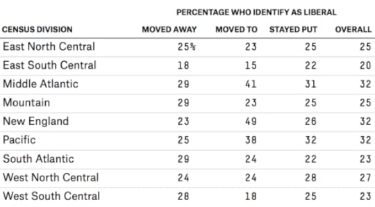
Long-term residents: people who lived in the region when they were 16 and remain there now;Former residents: people who lived in the region when they were 16 and live in a different one now;New residents: people who live in a region now but didn’t when they were 16.This method is imperfect: Census divisions don’t overlay perfectly with political regions, and the GSS doesn’t drill down to the state level. Also, although we’ve gathered data from each version of the GSS since 2004, the sample sizes aren’t huge.
Still, the data is enough to suggest that the people moving away from a region are ideologically distinct from those who continue to live there. For example, the people who moved away from the South Atlantic region (which includes a number of fairly conservative states) are as liberal as the people who moved away from New England and other regions. This is despite the fact that only 22 percent of people who stayed in the South Atlantic division consider themselves liberal, compared with 27 percent of Americans overall.
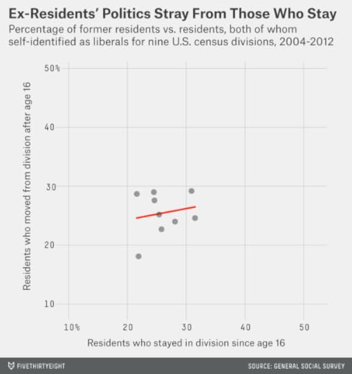
Instead, movers have more in common with their new neighbors; liberals are attracted to liberal regions, and conservatives to conservative regions. As the next plot shows, the politics of long-term residents correlates reasonably well with the politics of new residents.
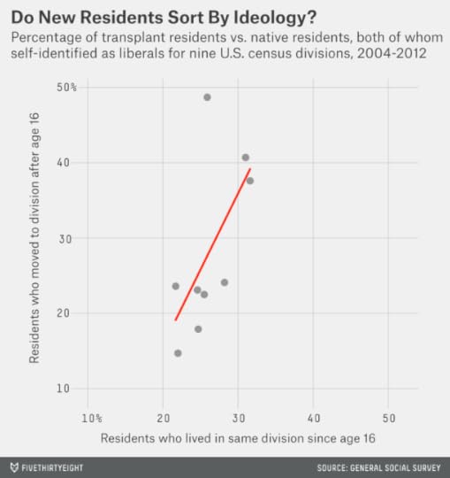
The relationship isn’t perfect (the correlation coefficient is .62), but the trend is reasonably clear. For example, the Middle Atlantic and Pacific divisions have relatively liberal long-term residents and relatively liberal new residents; the West South Central and East South Central divisions have conservative long-term residents and conservative new residents.
New England makes for an interesting case: It may be migrants who have made the region so blue. Whereas only 26 percent of people who were born and stayed in New England describe themselves as liberal — about the same as the national average — 49 percent of those who have migrated there do. Some of this may be a sample-size fluke (New England has the smallest population of any census division and therefore the largest margin of error). Still, it makes sense given how much bluer New England has become. Vermont was once a reliably Republican state.
Outside of New England, the importance of migration in reshaping political coalitions may be fairly minimal. Most people live in the same region where they grew up, and as we’ve mentioned, those who move tend to adopt the politics of their new homes (or they’ve had those politics all along).
In all census divisions but New England, the percentage of liberals among native residents is within a point or two of that among all residents (after accounting for moves to and away from the division). Other factors may be more responsible for the changing tones of the red-blue political map.
Still, to the extent migration has mattered, it has probably been in contributing to political polarization rather than blurring the country into shades of purple. This fits with the idea proposed in the book “The Big Sort”: People are increasingly living near those who are politically like-minded. A 18-year-old from South Carolina might go to college in Boston if she has liberal political leanings or stay in South Carolina if she’s more conservative. The patterns can be self-reinforcing. If liberal residents are more likely to leave South Carolina, that means a higher percentage of the ones who remain are conservatives.
The “Big Sort” hypothesis has its own problems; it’s unclear how the causality works, for example. Does the 18-year-old become more liberal once she gets to California, or is she more inclined to move to California because she was already liberal? (We’ve been a little slippery about this distinction here.) We’ll be on the lookout for further research, especially for data that looks at states rather than census regions.
But let’s not add the liberal diaspora to the emerging Democratic majority theory yet.

August 25, 2014
Is The Polling Industry In Stasis Or In Crisis?
There is no shortage of reasons to worry about the state of the polling industry. Response rates to political polls are dismal. Even polls that make every effort to contact a representative sample of voters now get no more than 10 percent to complete their surveys — down from about 35 percent in the 1990s.
And there are fewer high-quality polls than there used to be. The cost to commission one can run well into five figures, and it has increased as response rates have declined.1 Under budgetary pressure, many news organizations have understandably preferred to trim their polling budgets rather than lay off newsroom staff.
Cheaper polling alternatives exist, but they come with plenty of problems. “Robopolls,” which use automated scripts rather than live interviewers, often get response rates in the low to mid-single digits. Most are also prohibited by law from calling cell phones, which means huge numbers of people are excluded from their surveys.
How can a poll come close to the outcome when so few people respond to it? One way is through extremely heavy demographic weighting. Some of these polls are more like polling-flavored statistical models than true surveys of public opinion. But when the assumptions in the model are wrong, the results can turn bad in a hurry. (To take one example, the automated polling firm Rasmussen Reports got fairly good results from 2004 through 2008, but has been extremely inaccurate since.) Furthermore, demographic weighting is an insufficient remedy for the failure to include cellphone-only voters, who differ from landline respondents in ways that go beyond easily identified demographic categories.
Another tactic is for a pollster to copy off its neighbors. As my colleague Harry Enten described earlier this month, and as other researchers have found, robopolls and other polls that take methodological shortcuts show better results when there are also traditional, live-interviewer polls surveying the same races. The cheap polls may “herd” off stronger polls, tweaking their results to match them. This can make them superficially more accurate, but they add little value. Where there are better polls available, the cheap poll duplicates the results already in hand. Where there aren’t, the cheap poll may stray far from an accurate and representative sample of the race.
Then there are the companies that have cheated in a much more explicit way: by fabricating data. There is strong evidence that Strategic Vision and Research 2000 faked some or all of their survey results. The odds are that there are more firms out there like them.
Internet-based polling has been a comparative bright spot. In fact, the average online poll was more accurate than the average telephone poll in the 2012 presidential election. However, there is not yet a consensus in the industry about best practices for online polls. Some online methods do not use probability sampling, traditionally the bedrock of polling theory and practice. This has worked well enough in some cases but not so well in others.
But all of this must be weighed against a stubborn fact: We have seen no widespread decline in the accuracy of election polls, at least not yet. Despite their challenges, the polls have reflected the outcome of recent presidential, Senate and gubernatorial general elections reasonably well. If anything, the accuracy of election polls has continued to improve.
I’ve spent much of the past few weeks updating our polling database in preparation for the launch of our 2014 Senate forecasts. In conjunction with those forecasts, we’ll also release our first full set of pollster ratings since 2010. But for now, my aim will be to consider the results for the polls as a whole: how accurate the average poll is in different types of races — presidential elections, gubernatorial elections and so forth — and how this has changed over time.
I’ll conduct this analysis in the context of the seeming contradiction we identified: The polls have managed to produce high-quality output (pretty good forecasts of election outcomes) with worse and worse input (fewer and fewer people responding to them). It’s something of a paradox.
A few unavoidable technical details: Our pollster ratings database contains about 6,600 polls conducted in the final three weeks of each campaign. In theory, every poll of presidential, Senate, gubernatorial and U.S. House general elections since 1998 should be included, along with polls of presidential primaries and caucuses.2 Detail-oriented readers can find a few more notes about what’s included in the polling database in the footnotes.3
I’ll be evaluating poll accuracy by comparing the difference between the polled and actual margin for the top two finishers in the race. For instance, if a poll projects the Democrat to beat the Republican by 3 percentage points and she wins by 7 points, that counts as a 4-point error. In races with multiple viable candidates (as in the case of many presidential primaries), the error calculation is still based on the margin separating the top two finishers.4
Let’s start by considering the polls from gubernatorial races. Like the rest of the polls, they present opportunities for different interpretations of the evidence. You can tell a tale of continuous improvement in the polls — or see a reminder about how prone to failure they can be.
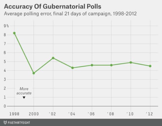
Between 2000 and 2012, gubernatorial polls did reasonably well, averaging an error of 4 to 5 percentage points. It’s important to note that the accuracy of the average poll — what these figures describe — is not the same thing as the accuracy of the polling average. The polling average will cancel out some of the errors from individual polls provided that the misses come in opposite directions.5
But at other times, almost all the errors are in the same direction.6 This was the case in 1998, for instance, when Democrats did surprisingly well in the midterm elections. Between House, Senate and gubernatorial polls that year, about 75 percent underestimated the Democratic candidate’s performance. The misses were especially bad in gubernatorial races; many polls called for Republicans to win the gubernatorial races in Iowa and Georgia, for example, when Democrats won them by a solid margin instead. Overall, the average gubernatorial poll in 1998 was 8 percentage points off the final margin.
Perhaps it can be viewed as a hopeful sign that we haven’t had such a disastrous year since then. But 1998 serves as testimony that when the polls have a bad year, they often make the same mistakes in a number of states, systematically underestimating the performance of Democratic or Republican candidates. That means you can have one election cycle, or several in a row, when the polls get almost every state right — followed by another where there are misses all over the map.7 Another bad polling year might be lurking around the corner.
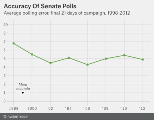
The results for polls of Senate elections have been similar. Since 2000, the average Senate poll has missed the final margin in the race by about 5 percentage points. However, the average error was considerably larger in 1998 — 6.8 percentage points — with most of those errors underestimating the performance of the Democratic candidate.
Polls for elections to the U.S. House8 have been somewhat more error-prone. On average since 1998, they’ve missed the final margin by 6.2 percentage points (as compared to 5.2 points for gubernatorial polls and 5.1 points for Senate polls). Some of this is because a higher share of House polls are partisan surveys, which present their own set of problems and sometimes wildly exaggerate their candidate’s standing.

But as a rule, polling error increases the farther you go down the ballot. It’s not uncommon for a House candidate to lose her race despite leading in the polls by 5 percentage points or more. Of the House polls in our database that show one candidate leading by between 5 and 10 percentage points, 23 percent picked the wrong winner. The same was true for only 8 percent of such polls of the presidential general election.
Indeed, the November presidential election has usually been the easiest one for pollsters. Since 2000, the average state poll in a presidential race has missed the final margin by 3.8 percentage points.9 This is impressive given that a 900-person poll — roughly the average sample size of the presidential polls in our database — will miss the result by an average of about 2.7 percentage points on the basis of random sampling error alone.10 In 2004, the average presidential poll missed the final margin in its state by just 3.3 percentage points, barely larger than than this theoretical, unavoidable minimum error; 2008 and 2012, each with an average error of 3.6 percentage points, were nearly as good. The 2000 presidential election was associated with a somewhat larger average error of 4.6 percentage points.

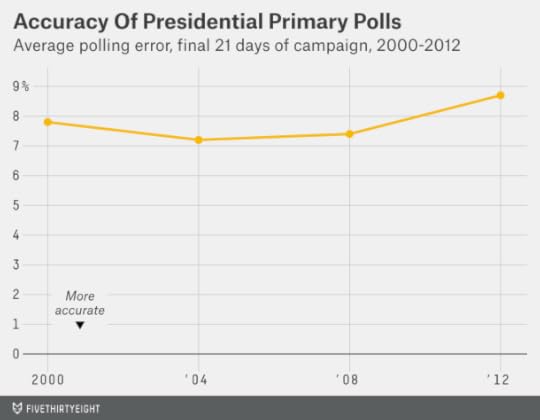
Polls of presidential primaries and caucuses are another matter entirely; they haven’t been much good. The average error for presidential primary polls since 2000 has been 7.7 percentage points — about twice as large as for presidential general elections. The polls were especially bad in the 2012 Republican primaries, when they missed by an average of 8.7 percentage points.
This is an important Psephology 101 finding — polls of primaries are much less accurate than polls of general elections. Perhaps this isn’t emphasized enough. It seems that every election cycle, people are surprised by how wild and inaccurate polls of the primaries can be, and equally shocked at how stable and reliable polls of the general election are. Keep that in mind when everyone freaks out in 2016 because Elizabeth Warren or Rand Paul wins the New Hampshire primary after trailing in the final University of New Hampshire poll by 8 points.11 These outcomes are par for the course.
Nevertheless, it’s worth reflecting on why there’s been such a big difference in primary and general election polls. One reason is that there are a lot more swing voters in the primaries, which can make public opinion more volatile. Most Democratic voters really liked both Hillary Clinton and Barack Obama in 2008, for instance; it would not have taken much to sway them from one candidate to the other. By contrast, perhaps only 10 percent to 15 percent of voters would seriously have considered voting for both Obama and John McCain later that year. When a pollster can predict 85 percent of votes on the basis of party identification alone, it isn’t so hard to get close to the eventual result.
However, the increased volatility of polling in the primaries does not account for all their differences with general election polls. If we limit our study to polls conducted only in the final three days of the campaign — right on the eve of the election, when there’s little time remaining for news events to sway voter preferences — the primary polls still had an average error of 6.4 percentage points. That compares to 3.5 percentage points for polls in the final three days before presidential general elections.
Another factor may be the lower turnout in primaries. Polls can go wrong in essentially two ways: by misestimating candidate preferences, or by misestimating who will turn out to vote. The latter mistake is easier to make when voter participation is low. In Iowa, for instance, only 92,000 people voted in the Republican caucuses in 2012, as compared to the 730,000 who would vote for Mitt Romney in the general election later that year. In that sort of environment, a candidate really can win by turning out his or her supporters when other candidates don’t. The importance of turnout may be overstated in general elections but not in the primaries.
But I suspect there’s third factor at play — one that explains something about the polling paradox. In the general election, you can model someone’s vote quite accurately by knowing a few things about him, such as his race, age, place of residence and education status. Demographic weighting can cover for a lot of problems with low and unrepresentative response rates. That doesn’t work nearly as well in the primaries, where votes don’t break down as cleanly along demographic lines. On the basis of demographics alone, distinguishing a Ron Paul voter from a Rick Santorum voter from a Newt Gingrich voter would have been all but impossible in 2012.
Put another way, the polling results from the primaries — which have been pretty bad and which are perhaps getting worse — may be the better reflection of polls in their naked form, before demographic weighting is applied.
Demographic weighting is a legitimate and necessary practice. The past decade or so has seen stronger and stronger partisanship, stronger and stronger alignment of voting in different states, stronger correlations between up- and down-ballot voting (there are fewer split tickets than there used to be), and stronger predictability of voting behavior on the basis of demographics. All of that makes demographic weighting more powerful. It has become easier to project election outcomes on the basis of informed priors — without conducting polls.
If my hypothesis is right — the relatively steady accuracy of the polls is the result of the increasing demographic predictability of elections helping to offset lower response rates — we could see a disastrous year for the polls if and when political coalitions are realigned. A black or Hispanic Republican presidential candidate could scramble the demographic coalitions that prevailed between 2000 and 2012, as might a moderate blue-collar Democratic nominee, or a certain type of third-party candidate. None of these things is especially likely to happen in the near term, but the current political coalitions won’t hold forever. The 2012 presidential map looks fairly similar to the one in 2008, or 2004, or 2000, for instance, but rather different from the one in 1996 or in years before that, when states now seen as locks for one party or the other were considered swing states instead.
But if we should be skeptical of the polls, we should also be rooting for them to succeed. One of the reasons news organizations bother to conduct expensive surveys is to serve as a check on the misrepresentative opinions of elites, including those of their own reporters. Even a deeply flawed poll may be a truer reflection of public opinion than the “vibrations” felt by a columnist situated in Georgetown or Manhattan.

August 20, 2014
Most Police Don’t Live In The Cities They Serve
In Ferguson, Missouri, where protests continue following the shooting of a teenager by a police officer this month, more than two-thirds of the civilian population is black. Only 11 percent of the police force is. The racial disparity is troubling enough on its own, but it’s also suggestive of another type of misrepresentation. Given Ferguson’s racial gap, it’s likely that many of its police officers live outside city limits.
If so, Ferguson would have something in common with most major American cities. In about two-thirds of the U.S. cities with the largest police forces, the majority of police officers commute to work from another town.
This statistic is intimately tied to the diversity of the police force: Black and Hispanic officers are considerably more likely to reside in the cities they police than white ones. In New York, for example, 62 percent of the police force resides within the five boroughs — a comparatively high figure. But there’s a stark racial divide. Seventy-seven percent of black New York police officers live in the city, and 76 percent of Hispanic ones do, but the same is true for only 45 percent of white officers.
This data comes from the U.S. Equal Employment Opportunity Commission (EEOC) and the Census Bureau, which together provide detail on the racial composition of government workers in large American cities. We were alerted to the data set by a Washington Post analysis of the racial demographics of each city’s police force. The census data also includes detail on how many police officers live in the cities where they serve.
On average, among the 75 U.S. cities with the largest police forces, 60 percent of police officers reside outside the city limits. (These figures exclude Honolulu, for which detailed data on residency was not available.) But the share varies radically from city to city. In Chicago, 88 percent of police officers live within the city boundaries — and in Philadelphia, 84 percent do. But only 23 percent do so in Los Angeles. Just 12 percent of Washington police live in the District — and only 7 percent of officers in Miami live within city limits.
These differences reflect a combination of three major factors: a city’s racial composition, whether it has a residency requirement for police and its geography.
On average among the 75 cities, 49 percent of black police officers and 47 percent of Hispanic officers live within the city limits. But just 35 percent of white police officers do. The disparity is starkest in cities with largely black populations. In Detroit, for example, 57 percent of black police officers live in the city but just 8 percent of white ones do. Memphis, Tennessee; Baltimore; Birmingham, Alabama; and Jackson, Mississippi — also majority black — likewise have large racial gaps in where their police officers live.
Cities may also vary in their residency requirements — for example, Los Angeles doesn’t require police to live in the city; Philadelphia used to require that its officers live within the city boundaries. Furthermore, such regulations are enforced to varying degrees. Whereas Boston ostensibly has a residency requirement for police, for example, it’s routinely flouted — and the Census Bureau data suggests that about half of Boston’s police officers live outside the city.
Geography also plays some role. Jacksonville, Florida, has more than 80 percent of its police officers living within the city limits. That may reflect its sprawling boundaries; the city proper has an unusually high share of the metro area’s population. By contrast, the city of Atlanta, which is small compared with metro Atlanta’s population, has just 14 percent of its police force living in town.

The city of St. Louis, near Ferguson, has a residency requirement with an out clause. There, police are allowed to move outside the city after seven years on the force. White police officers have been more likely to take advantage of the provision; 46 percent of them live outside St. Louis, whereas 32 percent of its black ones do.
There isn’t detailed data available on Ferguson, whose population is too small to have required detailed reporting to the EEOC. But in our effort to spot-check the census data, we discovered that many communities with a strict police residency requirement have an active debate about whether to relax the requirement — while nearly every town without one is arguing about whether to impose one. Ferguson is no outlier in this regard, but the events there may shape the debates for years to come.
Further details on these 75 cities are included in the searchable table below (asterisks mean there were fewer than 100 officers in the category) and can be found on GitHub.
NOTE TO READERS (Aug. 21, 1:39 p.m.): The Census Bureau numbers we are using are potentially going to differ from other counts for three reasons:
The census category for police officers also includes sheriffs, transit police and others who might not be under the same jurisdiction as a city’s police department proper. The census category won’t include private security officers.The census data is estimated from 2006 to 2010; police forces may have changed in size since then.There is always a margin of error in census numbers; they are estimates, not complete counts.CORRECTION (Aug. 20, 5:07 p.m.): A previous version of this article said Philadelphia police officers are currently required to live within city limits. They are not.

August 18, 2014
The Countries Where You’re Surrounded By Tourists
When traveling in Tokyo a couple of years ago, I was struck by how few tourists there were. Sure, taking advice from an English-language website or guidebook could still lead you to a place with plenty of gaijin. But I didn’t have the sense of being surrounded by fellow tourists that one sometimes gets in Rome or Paris or Barcelona.
The statistics bear this out. Barcelona gets about twice as many international tourists each year as Tokyo. But that’s only part of the story. Barcelona’s metro-area population is about 4.7 million — compared to 39.4 million for Tokyo. Relative to the size of its population, Barcelona has about 16 times more tourists.
That’s the ratio you notice when walking around a city: how many of the people around you are tourists and how many are locals. We can also study this phenomenon at the country level, where the data is slightly more comprehensive. (Our focus will be on international tourists — not, for example, New Yorkers visiting the Grand Canyon.)
Countries vary in how welcoming, accessible and attractive they are to visitors. But as a general rule, the number of tourists doesn’t scale up linearly with the number of residents. China gets roughly 10 times more tourists than tiny Bahrain but has 1,000 times Bahrain’s population. That means Bahrain has about 100 times more tourists as a share of its population.
More formally, we might define this ratio as the tourist percentage — the number of international tourists in a country on an average day throughout the year as a share of the total number of people present:

To calculate tourist percentage, you need data on a country’s population and on the number of international tourists present on an average day. The population numbers are easy to find, but figuring out the number of tourists isn’t so simple.
The World Bank collects data on the annual number of international tourist arrivals in each country. (A tourist arrival, by the World Bank’s definition, occurs whenever someone enters a country from abroad and stays overnight.1 I used the most recent year of data available from the World Bank — usually 2012 — although had to turn to other sources in a couple of cases that I’ll note in the text below.) The challenge is in going from annual tourist arrivals to an estimate of how many tourists are present on an average day. If we knew how long the average tourist stayed, we could calculate it as follows:

But there isn’t comprehensive data on the duration of tourist visits. In 2010, the U.S. Travel Association estimated the average length of a vacation taken by an American as 3.8 days (and falling). But foreign trips are presumably longer than average vacations — and American workers receive less time off than people in most other countries, so their vacations may be shorter. A week — seven days — probably works better as an estimate of the average international trip.
But there’s another issue: The length of an average visit presumably varies some from country to country. Compare Austria and Australia, for example, the two countries that your fourth-grade teacher admonished you not to confuse.
Austria is a small country in the middle of Europe. It’s easy to pass through Austria en route to somewhere else — on a train from Munich to Venice, for example. The World Bank wouldn’t count that particular journey as a tourist visit unless you stayed in Austria overnight. Nevertheless, a night or two spent in Vienna might be just one hop on a longer European trip. Australia, by contrast, is a giant island thousands of miles from the world’s population centers. That’s part of what makes visiting there fun: You really feel like you’ve gotten away. But you probably don’t go to Australia just for a day or two.
So to estimate the average length of a tourist visit, I used another World Bank data series on the annual amount of tourism income in each country. The ratio of tourism income to tourist arrivals ought to provide a rough proxy for the length of a journey: You’ll spend more money on a two-week vacation than a weekend holiday. The ratio will also be affected by other factors, however, such as the strength of a country’s currency and the wealth of the people who visit it.
I ran a regression on the ratio of tourism spending to tourist visits as a function of two geographic factors: the number of land borders that a country has and its area.2 The regression implies that more isolated countries receive more money per visit, and that larger countries receive more money than smaller ones. These factors probably do tell us something about the average length of a visit; they imply that the average trip to Australia lasts about 50 percent longer than that the average trip elsewhere, for instance.3 We’ve estimated that the average international trip worldwide lasts seven days, so that means an average trip to Australia would last 10 to 11 days instead.
One country requires special handling: the Vatican. Lots of people visit it — in 2013, about 5.5 million people visited the Vatican Museums while 6.6 million attended some sort of public event with the Pope, such as in St. Peter’s Square. Even assuming that there was some overlap between these groups,4 that’s an awful lot of tourists in a country with a population of barely more than 800 people. On the other hand, visits to the Vatican are very short; there are no hotels there, so you need to have the invitation of the Pope or someone else important to stay there overnight. I assumed an average visit of four hours instead.
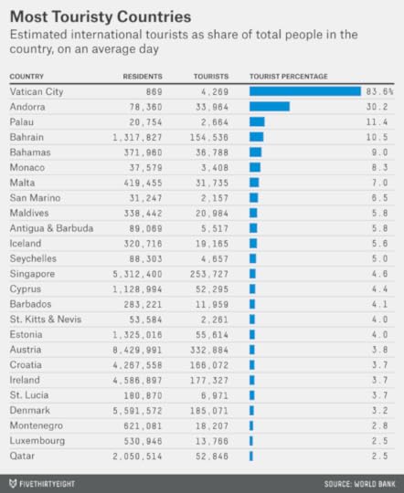
The Vatican still qualifies as a huge outlier relative to the rest of the world. My method estimates that there are about five tourists there on average for every one resident, or a tourist percentage of 83 percent. Surely the tourist percentage is higher still during the hours when the Vatican Museums are open or when the Pope is hosting a major public event.
Ranking second in the world is tiny Andorra, with a tourist percentage of 29 percent. The numbers drop off quickly after that; it’s about 11 percent in Palau and Bahrain, for example, 9 percent in the Bahamas and 8 percent in Monaco.
There’s an economic lesson here: Even in places whose economies are dominated by tourism, and where it may seem like you’re completely surrounded by tourists, you’ll generally find a number of locals for every tourist. Hotels can employ one employee per guest room or even more in parts of the world where labor is cheap but tourist dollars are plentiful. Tourists also need dining, transportation and entertainment options. Meanwhile, all the people who work in the tourism industry have families and needs of their own. This is why tourism is associated with a multiplier effect; it produces secondary and tertiary sources of income and employment in addition to the revenues received directly from tourists.
By contrast, tourists can represent a vanishingly small part of the population in large countries. This next chart lists the tourist percentage for the top 25 countries in the world by GDP:
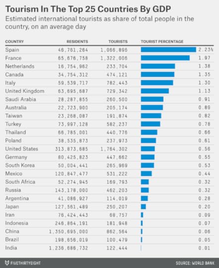
Among these high-GDP countries, Spain ranks as the most touristy. On average throughout the year, about 2 percent of the people there are tourists, I estimate. (Obviously the percentage is going to be higher at certain places and times: during high season in Ibiza, for instance.) France is next at 1.7 percent, followed by Canada, the Netherlands, Italy and the United Kingdom. Australia isn’t far behind.
In Japan, however, the tourist percentage is only 0.2 percent. And it’s lower still in some other places: just 0.05 percent in China, 0.04 percent in Brazil, and 0.01 percent in India, meaning that only about 1 in 10,000 people is an international tourist there at any given time. These countries do attract reasonable numbers of tourists — but their native populations are very large, so tourists represent a tiny fraction of the population.
Some countries outside the top 25 in GDP undoubtedly have lower tourist percentages still. Afghanistan gets an estimated 3,500 tourists per year, for example, compared with a population of 30 million. Assuming an average visit there lasts seven days, that implies a tourist ratio of 0.0002 percent, or about one tourist for every 500,000 Afghanis. However, countries with very limited tourist economies generally don’t publish reliable data on the industry, so it’s hard to know exactly which country ranks at the bottom.
Those countries probably aren’t at the top of most tourists’ bucket lists anyway. But Brazil, China, India and Japan have incredible experiences to offer. The choice is clear: If you want to get away from tourist traps, go to places where there are more locals.

August 16, 2014
The English Premier League Starts Today; Here’s One Reason To Watch
Americans’ interest in soccer is about three times higher during the World Cup than it usually is, judging by how often they search for the sport on Google. But that isn’t true for other countries. In England, where the English Premier League will kick off its season on Saturday, club play is followed almost as enthusiastically as international competition. The same is true in Spain, Italy, Brazil and Mexico.
What accounts for the international appeal of soccer? One factor may be the comparative simplicity of its rulebook. Product designers have long appreciated the value of simplicity, which offers a gentler learning curve and fewer opportunities for mistranslation.
I downloaded the FIFA Laws of the Game along with the rulebooks for the NFL, NBA, NHL and Major League Baseball. Then I counted the number of words in each one, excluding indices. This is a simple proxy for the complexity of each sport.
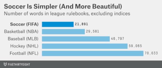
Soccer is doing more with less; FIFA’s rulebook has just over 20,000 words. By contrast, the NBA’s has 30,000, MLB’s is close to 50,000, the NHL’s is nearly 60,000 and the NFL’s is 70,000.
The correlation between the simplicity of a sport’s rulebook and its global popularity is almost one to one. Soccer, with its simple rulebook, is followed in almost every country. Basketball increasingly is, too. The more complex sports have less global appeal. Baseball is popular in the Americas and Japan but not yet elsewhere. Hockey fans are almost exclusively concentrated in the U.S., Canada, Northern Europe and Russia. American football has few fans outside America itself.
Philosophers have also long recognized a connection between simplicity and beauty (indeed, long before soccer came to be known as “The Beautiful Game,” it was known as “The Simplest Game” instead). This June, when I attended a couple of World Cup matches at the Maracanã, in Rio de Janeiro, I was struck by how rich the experience was with so few frills. There was no 60-yard-long Jumbotron — there were hardly any scoreboards. There weren’t many words spoken, on or off the pitch.
Soccer can get away with this minimalist presentation because of the simplicity of its rulebook; you don’t need Ed Hochuli to come out and explain the difference between offsides and encroachment and a neutral zone infraction.
Instead, when Chile scored against Spain in their Group B match, it sounded something like this (sorry about my shaky camera work):
Beautiful, ain’t it?

August 13, 2014
Hillary Clinton Doesn’t Have A Problem On Her Left
Hillary Clinton’s recent hawkish comments about foreign policy, in which she expressed some disagreements with President Obama, have inspired reporting and speculation that liberal Democrats will grow disillusioned with her ahead of a possible presidential bid in 2016. There is a ”pattern that has emerged in almost every recent interview Clinton has given: liberals walk away unnerved,” Ezra Klein wrote at Vox.
The Vox headline proclaimed that Clinton is “not inevitable” — that is, not the inevitable Democratic nominee. That’s right, narrowly speaking. Few things are inevitable, and Clinton’s nomination is no exception. Although she’s performing most or all of the activities that we’d associate with a future presidential candidate, she’s not yet officially declared for the race and could still decide against doing so. She could have health problems, or a heretofore unknown scandal could emerge, or she could decide that the 2016 climate has become grim enough for Democrats that the nomination isn’t worth seeking.
But the odds that a challenger will emerge from the left flank of the Democratic Party and overtake Clinton remain low.
As my colleague Harry Enten pointed out in May, Clinton has generally done as well or better in polls of liberal Democrats as among other types of Democrats. Between September and March, an average of 70 percent of liberal Democrats named her as their top choice for the 2016 nomination as compared to 65 percent of Democrats overall. An ABC News/Washington Post poll conducted more recently showed Clinton with 72 percent of the primary vote among liberal Democrats as compared to 66 percent of all Democrats. And a CNN poll conducted last month gave her 66 percent of the liberal Democratic vote against 67 percent of all Democrats.
The CNN poll is slightly more recent than the others, but if there’s been a meaningful change in how rank-and-file liberal Democrats perceive Clinton, you’d have to squint to see it. Perhaps more important, it’s extremely rare to see a non-incumbent candidate poll so strongly so early. In the earliest stages of the 2008 Democratic nomination race, Clinton was polling between 25 percent and 40 percent of the vote — not between 60 percent and 70 percent, as she is now. Clinton could lose quite a bit of Democratic support and still be in a strong position.
But suppose you see those polls as a lagging indicator. Another early measure of a candidate’s strength that can have predictive power is the amount of support she receives from elites in her party, as measured by endorsements from elected officials. Clinton, despite not having declared her candidacy, has already picked up 60 endorsements from Democrats in Congress. As far as I can tell, there isn’t any precedent for something like this. A database of primary endorsements we compiled in 2012 found only a handful of endorsements of a presidential candidate so early in the race.
Moreover, these endorsements are coming from across the Democratic Party’s ideological spectrum, including some of the most liberal Democrats. The chart below depicts current Democratic senators ranked from left to center based on their DW-Nominate scores (a statistical system that estimates a member of Congress’s ideological position based on her roll call votes) and shows which ones have already endorsed Clinton. (The chart excludes Montana Sen. John Walsh, who took over for Max Baucus in February and has not yet been scored by DW-Nominate.)
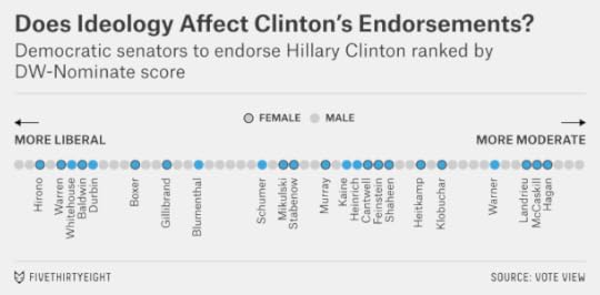
Regardless of ideology, every Democratic woman in the Senate has endorsed Clinton — ranging from very liberal Democrats like Massachusetts Sen. Elizabeth Warren to relatively conservative ones like Louisiana Sen. Mary Landrieu. (If she appeals in the same way to women in the electorate, who made up a majority of Democratic primary voters in 2008, she’ll be well positioned in 2016.)
If you placed her on the chart, Clinton would fit squarely in the middle of other Democrats in Congress based on her DW-Nominate score in 2007-08, her last full term as a senator. That’s a good place to be, electorally speaking. Presidential nominees tend to be pretty close to their party’s ideological median as voters and party elites try to weigh electability against ideological orthodoxy.
But aren’t Democrats growing more liberal? Yes, there’s some evidence they are. Still, Democrats hold a fairly diverse range of interests and ideologies. In the 2008 Iowa Caucus, 46 percent of Democratic voters identified themselves as moderate or conservative; just 18 percent described themselves as “very liberal.” (By comparison, only 11 percent of Republican voters in that year’s GOP caucus said they were moderate or liberal, while 45 percent said they were “very conservative.”) Democrats could get quite a bit more liberal without being at risk of leaving Clinton behind. Her base is broad and includes not only coastal liberals but also groups such as baby-boomer women and working-class Democrats whose views tend toward the center-left.
None of this is to say that Clinton should blithely dismiss criticism from liberals. It could make it more likely that some credentialed candidate to her left also runs for the Democratic nomination. That could have negative consequences for Clinton even if the challenge is unlikely to succeed. But for Clinton to lose the Democratic nomination for ideological reasons would require a pronounced leftward shift in the party — something close to an ideological realignment — and not incremental change over the next two years.
CORRECTION (Aug. 13, 7:00 p.m.): An earlier version of the chart in this post omitted several of the senators who have endorsed Hillary Clinton. From left to right, they were: Richard Durbin, Richard Blumenthal, Tim Kaine, Martin Heinrich and Mark Warner.

August 7, 2014
With LeBron And Love, The Cavs Have About 65 Wins On Their Roster
The Cleveland Cavaliers are set up to be really good.
Cleveland will acquire Kevin Love from the Minnesota Timberwolves in exchange for Andrew Wiggins and Anthony Bennett, the No. 1 overall picks in the past two NBA drafts, according to Yahoo Sports’ Adrian Wojnarowski.
The trade had been anticipated even before LeBron James announced he would return to Cleveland. In fact, we had already run a projection of what the Cavs would look like with James and Love on the roster. That projection pegged them for a 63-19 record.
But our hypothetical roster had imagined Cleveland would give up its starting center, Anderson Varejao, in the Love deal — and the team’s reportedly managed to keep him. That will considerably bolster its front-court depth.
I’ve also rerun the projection based on NBA Real Plus Minus (RPM) instead of Statistical Plus Minus (SPM). My colleague Neil Paine and I are due to provide you with an overview of these various systems and their strengths and weaknesses — but the gist is that RPM is based on play-by-play data instead of box-score data and can better account for a player’s defense. Compared with SPM, RPM is higher on James and Varejao — strong defensive players — but less keen on Love. It’s also down on Kyrie Irving, the Cavs’ starting point guard, because it rates him as playing poor defense.
Still, Cavaliers fans will be pleased with the new projection: a 65-17 record.
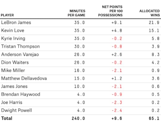
That figure reflects an over-under line. I might take the under if offered it by Vegas for a couple of reasons. One, the projection assumes the Cavaliers stay relatively healthy, and there’s no guarantee of that. Second, the Cavaliers are so clearly ahead of anyone else in the Eastern Conference — especially with the injury to Indiana’s Paul George — that they might rest their stars or coast down the stretch. That could help them in the playoffs, where rest matters quite a bit, but could shave a couple of wins off their regular-season record.
In addition, there’s always uncertainty about how high-volume scorers like James, Love and Irving will mesh together, and it may take Cleveland the better part of the season to figure out how to distribute possessions. A lot of statistical projections overrated the Miami Heat’s regular-season win total for the 2010-11 season, their first year with James, Dwyane Wade and Chris Bosh.
But there’s also a case our projection for Cavs is too pessimistic. The case turns on Irving improving his defense. Irving is a good athlete, and with James mentoring him and a championship to play for, his results on the defensive end could improve. The same holds for other young Cavaliers, such as Dion Waiters and Tristan Thompson, which RPM also rates as poor defenders.
Either way, the trade should make Cleveland a championship contender. Before adding Love, it projected to a win total in the low-to-mid 50s. A team like that will win the NBA title less than 5 percent of the time. By comparison, a team with 60 regular season wins will win the title about 20 percent of the time, and a 65-win team will win the title about 60 percent of the time.


August 6, 2014
Republicans Have More Reason Than Ever To Worry About Primary Challenges
One of the most universal lessons of sports prediction is that margins matter. An NFL team that wins a number of games by less than a touchdown might get banner headlines for its clutch performance. But a team’s record in close games is mostly just luck. A football team that thrives on winning close games is likely to see its luck revert to the mean and start losing its fair share of them. The same is true in baseball, basketball and most other sports.
In fact, at least in my experience, this is close to being a universal maxim for statistical prediction of all kinds: Mind the margin. Oftentimes, we’re interested in some binary outcome. Does the team win the game? Does the Democrat win the election? Do the floodwaters breach the levees? But those binary outcomes result from some continuous variable: The floodwaters breach the levees at 60 feet but not at 59. When building a model around historical data, you’ll almost always make better forecasts by looking at the continuous variable instead of the binary one. Close calls count. Like the NFL team that keeps winning games by a field goal, the levee that is at the brink of being topped during every hurricane is likely to fail sooner or later.
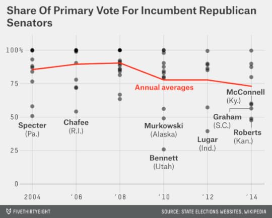
So, while Republican incumbent senators have gotten some credit lately for their clutch performances in Kansas, Mississippi and other states, where they’ve fended off challenges from more conservative opponents, the GOP still has plenty to worry about. There have been far more close calls to its incumbents than usual.
Kansas Sen. Pat Roberts, for instance, won just 48 percent of the vote Tuesday in defeating Milton Wolf, a radiologist with no prior experience running for elected office. Mississippi’s Thad Cochran initially placed second against Chris McDaniel, a state senator, before barely winning the runoff election, in part because of votes from African-American Democrats.
Sen. Mitch McConnell’s win in Kentucky in May, where he got 60 percent of the vote to challenger Matt Bevin’s 35 percent, was more emphatic. Still, it was much closer than Senate primaries normally are.
Between 2004 and 2008, just four of 39 Republican senators running for renomination, or 10 percent of them, got less than 65 percent of the primary vote. This year, five of 10 have fallen below that threshold: not only Roberts, Cochran and McConnell, but also Lindsey Graham of South Carolina and John Cornyn of Texas, who both benefited from running against divided fields.
In fact, the average share of the primary vote received by Republican incumbent senators so far this year is 73 percent. Not only is that lower than 2004 through 2008, when incumbents averaged 89 percent of the vote — it’s also lower than 2010 and 2012, the years when the tea party was supposedly in ascendency, when GOP incumbents got an average of 78 percent.
So, though this year’s primary season is almost over — on Thursday, Tennessee’s Lamar Alexander will be the last Republican incumbent to face a competitive primary — there’s no evidence the threat from primary challenges has been reduced going forward. It may even still be increasing. Beware of mainstream media narratives that state the contrary; they often draw too many conclusions from idiosyncratic results or fail to appreciate the differences between primaries and general elections.

Nate Silver's Blog

- Nate Silver's profile
- 729 followers

