
Nate Silver's Blog, page 164
September 30, 2014
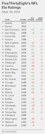
NFL Week 5 Elo Ratings And Playoff Odds
The perception after the NFL’s fourth week of play is that parity reigns supreme. Only two teams, the Arizona Cardinals and Cincinnati Bengals, remain undefeated — and they’re both 3-0 rather than 4-0, having had a bye last week. No one else seems to have much momentum. Consider the Atlanta Falcons, who crushed the Tampa Bay Buccaneers 56-14 two Thursdays ago in one of the most dominant single-game performances in NFL history. Last week, the Falcons lost by 13 points to the Minnesota Vikings. The Buccaneers? They upset the Pittsburgh Steelers, who were coming off a big win against the Carolina Panthers.
Here’s the thing: All of this is pretty normal. Parity exerts a profound gravitational pull on the NFL. It’s a league of short careers, hard salary caps and redistributive schedules that punish winning teams. Its season is just 16 games. There’s always a lot of parity in the league.
The question is whether there’s more than usual, and as best as I can tell, the answer is no. One way to evaluate this is through FiveThirtyEight’s NFL Elo ratings. (For the methodology, see here.) We can look at the standard deviation of each team’s Elo ratings through the first four weeks of the season. The higher it is, the less parity.
After the first four weeks this year, the standard deviation is 92 Elo points. That doesn’t mean much except by comparison to past seasons; but by comparison, it’s about average. In 2013, the standard deviation through Week 4 was … 92 Elo points. In 2012, it was 87 points. In 2011, it was 90 points. The average since 1970 has been about 90 points.
Some of the perceived party in Week 4 is because a number of the best teams were out of action, including the Bengals, Cardinals, Seattle Seahawks and Denver Broncos.
Meanwhile, there are at least two really terrible teams in the NFL, and terrible teams count as much as great ones when measuring standard deviation. The Oakland Raiders squandered one of their better opportunities to pick up a win in a London game against the Miami Dolphins last week and now project to win only 2.4 games, according to the Elo simulations. That’s in part because of a tough schedule. (The Raiders have about a 10 percent chance of going 0-16.) The Jacksonville Jaguars have a more forgiving schedule, but they’re worse than the Raiders, according to Elo.
We haven’t, however, seen much turnover in which teams might be considered great, average or poor. Before the season began — based on their Elo ratings at the end of 2013 — Elo’s top 10 teams were, in order, the Seahawks, San Francisco 49ers, Broncos, New England Patriots, Panthers, New Orleans Saints, Bengals, San Diego Chargers, Cardinals and Indianapolis Colts.
Are any of those teams clearly outside of the top 10 now? Only the Panthers and Saints have fallen out of the Elo top 10; they rank at No. 14 and 15, respectively. You could also make a case for the Patriots after their disastrous performance Monday night. But if there’s anything Week 4 demonstrated, it’s that one game may not tell us much.
Meanwhile, the worst 10 teams at the start of the year were — from the bottom up — the Jaguars, Raiders, Houston Texans, Cleveland Browns, Washington Redskins, Buccaneers, Buffalo Bills, Falcons, New York Jets and Tennessee Titans. Nine of those teams remain in the bottom 10. The exception is Atlanta, which has climbed to 22nd place.
We’ve seen more reshuffling in the middle tier of teams. The Dallas Cowboys are the biggest gainers so far on the season, having added 61 Elo points. Still, the Cowboys’ schedule has been easy, and Elo will need to see more from them before it concludes they’re anything beyond slightly above average. The same might be said for the Detroit Lions, who are the next-biggest gainers, with 54 Elo points added.
But if the early games have not done much to contradict preseason expectations, they have had a pronounced impact on playoff odds. A 10-6 team almost always makes the playoffs, an 8-8 team almost never does and a 9-7 team does about half the time. A “bad” or unlucky or uncharacteristic loss still matters a great deal whether it comes in Week 4 or Week 17. So, which teams have dug themselves the biggest holes, and which have more slack?
The Patriots, despite their loss in Kansas City, are still more likely than not to make the playoffs. There are three major reasons for this: The Bills, Dolphins and Jets, the other teams in the AFC East. The Jets project to just a 5-11 record. Buffalo and Miami are better, but with each team at 2-2, Elo is still putting its money on a diminished version of Tom Brady rather than a team with an actual quarterback controversy.
The Saints, 1-3 after a loss in Dallas, have seen their playoff chances fall more than any other team since the start of the season (they’ve dropped from 56 percent to 30 percent). Still, New Orleans got a reprieve because division rivals Carolina and Atlanta also lost last week. Every team in the NFC South now projects to finish the season with a negative point differential, and none projects to win more than 8.3 games. That means New Orleans can recover with a merely good — rather than extraordinary — performance. In our simulations, the Saints made the playoffs about 60 percent of the time when they finished 9-7, and almost 25 percent of the time when they went 8-8.
The 49ers, on the other hand, still have their work cut out for them despite having secured a victory against Philadelphia last week and ranking third overall in the Elo ratings. They play in the NFC West, by far the NFL’s toughest division. In our simulations, a 9-7 record won San Francisco the NFC West only 1 percent of the time (although it was occasionally good enough to back the Niners into a wild card). The 49ers’ playoff chances improved, but only to 47 percent, from 40 percent a week ago.
The loss hurt the Eagles more than the win helped San Francisco; Philadelphia’s playoff chances fell from 65 percent to 51 percent, in part because Dallas (now the divisional favorite) and the New York Giants won.
The NFC North, meanwhile, has parity befitting the NFL’s old Norris Division: All four teams have an Elo rating between 1489 and 1521. But the Lions have three wins when everyone else has two, and that makes them the best bet to make the playoffs.
Elo ratings can also be used to project point spreads. Since the start of the season, we’ve been recommending that you don’t bet on them, and we hope you’ve heeded that advice. They went 5-7-1 against closing betting lines in Week 4 and are 25-33-2 overall on the season. (As an aside, the Elo point spreads would have had you take Miami over Oakland against the point spread last week if we’d realized the game was in England instead of California. But that wasn’t the forecast we published, so we’ll take the loss.) On the positive side, Elo’s picks are 41-20 straight up this year, including a 10-3 performance in Week 4.

In contrast to Week 4, when there were a number of “pick ‘em” games, Week 5 features some easier calls, in part because the stronger teams tend to be playing at home. Straight-up (not against the point spread), Elo would have you take the home team in 13 of 15 games. The exceptions are clear: No home-field advantage would be enough to make Washington favored over Seattle, or Jacksonville over Pittsburgh.
Compared against early Vegas point spreads, there are several cases with a discrepancy of at least a field goal. Against the point spreads, Elo would have you bet on the Chargers and Cowboys and against the Packers, Saints and Broncos. But to reiterate, we don’t recommend that you do this. I have nothing against gambling; I have something against losing money.


September 29, 2014
MLB’s Biggest Star Is 40 (And He Just Retired). That Could Be A Problem.
“If Mike Trout walked into your neighborhood bar, would you recognize him?” The New Yorker’s Ben McGrath raised that question in a provocative essay last month.
I’m reasonably certain that I would recognize the MLB outfielder if he walked into One Star. But McGrath’s point is well-taken. Despite being (as McGrath aptly calls him) a “once-in-a-generation talent,” Trout is relatively anonymous. Based on Google search traffic so far in 2014, Trout is only about as famous as Henrik Lundqvist, the New York Rangers goaltender. He’s one-fifth as famous as Peyton Manning — and one-twentieth as famous as LeBron James or Lionel Messi.
Trout’s also much less famous than Derek Jeter, a shortstop who hit .256, with four home runs, this year.
That Jeter fellow, as you may have heard, played his last baseball games Sunday. Jeter’s case for being a once-in-a-generation talent is weaker than Trout’s. Jeter never won an MVP (although he probably should have won one in 1999). He rarely led his league in any offensive category. He was one of the best baseball players for a very long time — but he was not clearly the best player at any given time. In that respect, he’s more similar to Pete Rose or Nolan Ryan or Warren Moon or Patrick Ewing or Nicklas Lidstrom — great players all — than generational talents like Peyton Manning or LeBron James or Willie Mays or Ted Williams.
Jeter, however, was probably the most famous baseball player of his generation.
Google Trends maintains data on Google search traffic since 2004, a period that captures the second half of Jeter’s career. Google searches aren’t a perfect proxy for popularity — as you’ll see, infamy can also get you a lot of Google traffic — but they’re a reasonably objective approximation of it.
I looked up the search traffic for Jeter, along with that for every other baseball player to post at least 30 wins above replacement (WAR) from 2004 through 2014. (Jeter’s WAR, controversially, was only 31.4 during this period; about 50 players rated ahead of him.) I also included every MLB MVP winner since 2004 — along with Trout, who might finally win an MVP this year. The chart below lists everyone else’s search traffic relative to Jeter’s.

Jeter leads in Google traffic. The only players within 50 percent of him are Alex Rodriguez, Barry Bonds and Ichiro Suzuki.
Rodriguez and Bonds, of course, have made news in recent years, mostly for their use of performance-enhancing drugs. Suzuki is a better comparison, but most of his search traffic is because of his extraordinary popularity in Japan. In the United States, Jeter generated five or six times as much Google interest as Suzuki did.
Otherwise, Jeter laps the field. Based on the Google numbers, he’s been about nine times as famous as his Yankee contemporary Mariano Rivera. He’s been about five times as famous as David Ortiz, another legendarily “clutch” performer. He’s been about 30 times as famous as Jimmy Rollins, a fellow East Coast shortstop and one who did win an MVP award.
Jeter’s also considerably more famous than today’s best-in-a-generation players. Even in 2013 — when he was hurt and played in only 17 games — Jeter was about as popular as Trout, Clayton Kershaw and Andrew McCutchen combined, at least according to Google.
Playing in New York almost certainly had something to do with this. Lots of Yankees and Mets rank high on the Google list. Robinson Cano, the former Yankee, has gotten twice as much search traffic as the Philadelphia Phillies’ Chase Utley though the two are highly similar statistically.
But I hope that Trout, Kershaw, McCutchen or Bryce Harper does something extraordinary this postseason and begins to build a legend of his own. It’s not healthy for a sport when its most popular player is 40 years old.

September 28, 2014
Senate Update: When Should Democrats Panic?
The Des Moines Register’s Iowa Poll always makes news and with good reason: The pollster that conducts it, Selzer & Company, is among the best in the country, according to FiveThirtyEight’s pollster ratings. On Saturday evening, the poll had an especially interesting result in Iowa’s Senate race. It put the Republican candidate Joni Ernst six points ahead of the Democrat, Representative Bruce Braley. Most other recent polls of the state had shown a roughly tied race.
 Consider the implications. Republicans need to pick up six seats to win the Senate. Right now, they’re favored to win the Democratic-held seats in Alaska, Arkansas, Louisiana, Montana, South Dakota and West Virginia, according to the FiveThirtyEight forecast. That’s six seats right there. In Kansas, however, the independent candidate Greg Orman is a slight favorite to defeat the Republican incumbent Pat Roberts — and Orman could caucus with Democrats if he wins. If he does, Republicans would need to pick up one more seat somewhere.
That’s where Iowa comes into play. If Republicans are favored there also, they have a path to a Senate majority without having to worry about the crazy race in Kansas. Nor is Iowa their only option. Polls have also moved toward Republicans in Colorado, where their candidate Cory Gardner is now a slight favorite.
This is an awfully flexible set of outcomes for Republicans. Win the six “path of least resistance” states that I mentioned before, avoid surprises in races like Kentucky, and all Republicans need to do is win either Iowa or Colorado to guarantee a Senate majority. Or they could have Roberts hold on in Kansas. Or Orman could win that race, but the GOP could persuade him to caucus with them.
Sounds like it’s time for Democrats to panic?
Not quite, at least according to the FiveThirtyEight model. Republicans are favored to take control of the Senate but the race is close; essentially the same conditions have held all year. As of Sunday morning, the GOP’s odds of winning the Senate are 60 percent in the forecast, only half a percentage point better than where they were after our previous update on Friday.
What’s the flaw with the narrative I described above? It conceals too much of the uncertainty in the outlook. Republicans, for instance, are almost certain to win the Democrat-held seats in Montana, South Dakota and West Virginia. But Alaska, Arkansas and Louisiana are closer calls. Republicans have between a 70 and a 75 percent chance of winning each state, according to the FiveThirtyEight model. It’s proper to describe the GOP candidates as favored, but that’s much different than they’re being guaranteed to win. (Democrats were aided slightly by a CNN poll of Louisiana, also out on Sunday, which had their incumbent Senator Mary Landrieu behind but by a closer margin than other recent surveys have shown.) It’s also not certain that Republicans will hold all their own seats apart from Kansas. Georgia, where our forecast gives the Democrat Michelle Nunn a 27 percent chance, remains somewhat competitive.
As for Iowa itself, the Des Moines Register’s poll may be a great one — our forecast model weighs it more heavily than any other in the state, and Ernst’s chances improved to 56 percent from 48 percent as a result — but it’s still just one poll. As I described last week, it’s usually a mistake to bank on any one poll as opposed to the average or consensus. There are intrinsic limits on how accurate one poll can be, especially if it has a small sample size as the Register’s poll did (546 likely voters).
Finally, we still have more than five weeks to go until the election. If I reprogram the model, telling it the election will be held today (Sunday, Sept. 28) — I hope you can get to the ballot booth in between watching football — Republicans would be somewhat heavier favorites, about 70 percent to take the Senate.
But there’s still a lot of campaigning to do, and one should be careful about concluding that Republicans have the “momentum” (a concept that is constantly misused and misunderstood by other media outlets). Just two weeks ago, it was Democrats who’d gotten a string of strong polls. The FiveThirtyEight model is pretty conservative compared to most others out there. It didn’t show as large a swing toward Democrats as others did two weeks ago — they never quite pulled even in the forecast — and it’s not showing quite as large a swing back toward Republicans now.
So what conditions would merit outright panic from Democrats?
They should keep a close eye on North Carolina and Kansas. These states have been moving toward Democrats in our forecast, helping them offset Republican gains elsewhere.
But these are also races in which the Democrat is doing better than the “fundamentals” of the states might suggest. The Democratic incumbent in North Carolina, Kay Hagan, is pretty clearly ahead in the polls today (including in a CNN survey that was released on Sunday). However, two other states with vulnerable Democratic incumbents, Colorado and Alaska, have shifted toward Republicans. Perhaps if the Republican challenger Thom Tillis can equalize the ad spending in the Tar Heel State, the polls will show a more even race there as well.
And the Kansas race is still in its formative stages. No one has yet polled the race after the Democratic candidate, Chad Taylor, was officially allowed to remove his name from the ballot on Sept. 18. Since then, the ad spending has become more even after nearly a month in which Orman had a pronounced advantage over Roberts. In about 7 percent of our forecast model’s simulations, Democrats held the Senate solely because they won Kansas and Orman elected to caucus with them; without it, Republicans would already be 2-to-1 favorites to take the Senate.
Democrats should also monitor the polls in Louisiana, Arkansas and Alaska. As I mentioned, if these go from being probable GOP pickups to near-certain ones, it will make a lot of difference in the model.
A more macro-level concern for Democrats is that some of the highest-quality polls, like the Des Moines Register poll, tend to show the worst results for them. Quinnipiac University polls, which also have a good track record, have recently shown clear Republican leads in Iowa and Colorado. And the highest-rated polls of the generic Congressional ballot tend to show a Republican lead. This pattern is the reverse of 2012, when Democrats tended to do better in more highly-rated surveys. It may be that some of the mediocre polls will converge toward the stronger polls in states like Iowa and Colorado; a Public Policy Polling survey of Iowa to be released later this week is also likely to show Ernst ahead, for instance.
Still, the whole advantage of having a statistical model like ours is that it provides for some discipline — a rule-driven approach that doesn’t flinch just because the media narrative does. Democrats may have had a restless Saturday night, but no one poll ought to change your perception of the campaign all that much.
Check out FiveThirtyEight’s latest Senate forecast.

September 27, 2014
An NFL Team Will Probably Win 14 Games. We Just Don’t Know Which Team.
As my colleague Neil Paine explained earlier this week, the Cincinnati Bengals now project to finish with the best record in the NFL — at least according to FiveThirtyEight’s NFL Elo ratings. The Bengals probably are not the best team in the league; Seattle ranks ahead of them in the Elo ratings, as do Denver and New England. But Cincinnati is 3-0 so far, and those other teams are 2-1. That extra win coupled with a relatively favorable schedule puts the Bengals slightly ahead of the others in projected wins.
And yet, the Elo simulations have the Bengals finishing with an average record of 11-5 (11.2 wins and 4.8 losses if you want more precision). Doesn’t the best team in the NFL usually do better than that?
It usually does — in fact, it always does. The NFL has completed 34 16-game seasons since it expanded its schedule in 1978 (excluding the 1982 and 1987 seasons, which were shortened by labor disputes). All of those seasons featured at least one team that won at least 12 games. And about 60 percent had at least one team that won 14 or more games.
But here’s the thing: the Elo simulations do expect there to be at least one 14-2 team this year. We’re just not sure which team.
The chart below depicts the distribution of possible win totals, after thousands of simulations, for the Bengals along with the five other teams with the highest projected win totals. (Those are the Seahawks, Patriots, Arizona Cardinals, San Diego Chargers and Denver Broncos). As the chart should make clear, the Bengals’ 11.2-win projection is just an average outcome. Usually, they came pretty close to that average; they won between nine and 13 games in about 70 percent of simulations. But they also won 14 or more games 16 percent of the time. In about 6 percent of simulations, meanwhile, the Bengals wound up with a losing record.
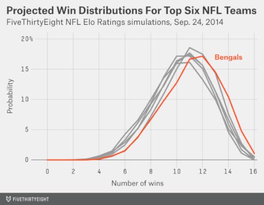
And the Bengals are not alone in having a chance to win 14 games. The Seahawks have a 10 percent chance. The Patriots have an 8 percent chance. The Cardinals, Chargers and Broncos are somewhere in the same ballpark, as are other teams like the Philadelphia Eagles and Carolina Panthers.
Overall, at least one team won 14 or more games in 62 percent of our simulations, which is right in line with the historical average.
Is this just a matter of one team getting hot? That’s a big part of it — it’s not so hard for a team to get lucky over a 16-game schedule. But it’s not the whole story. It’s early in the season, and it could also be that we’re underestimating how strong some of the teams are. Our simulations account for this possibility.
Take the Detroit Lions, for example. They’re certainly not among the more likely teams to win 14 games; they rate as almost exactly league average, according to Elo, and already have one loss. They’d need to win at least 12 of their remaining 13 games.
If you assume the Lions have a 50 percent chance of winning each remaining game, they’d need to do the equivalent of coming up with heads 12 or 13 times in 13 coin tosses. The probability of that is only 0.17 percent, or about one chance in 600, according to a binomial distribution.
But that isn’t the right assumption. It assumes that our projection of how the Lions will perform in one game should be independent from how they perform in the next. But this isn’t the case. Let’s put it this way: If the Lions are 7-1 by the time they reach their bye week in Week 9, would you still give them just a 50 percent chance of winning their remaining games? You wouldn’t — and neither does our Elo simulator.
Instead, the simulations are dynamic. We play out the rest of the season one week at a time, and a team’s Elo rating is affected by how it did in the previous week. If the Lions happen to win their game Sunday against the New York Jets in one simulation, for example, it will boost their Elo rating when the simulation gets to Week 5, making them more likely to win that game as well. And if they win that game too, they’ll be still more likely to win their Week 6 game.
This might seem like a trivial detail, but it isn’t. It reflects the fact that there’s considerable uncertainty about how strong each team is. And it has a meaningful effect on the odds. Because they’re dynamic, our simulations give the Lions about 1-in-75 chance of winning at least 14 games. Those are still very long odds, but you’d make a huge amount of money over the long run if you got paid out 600 times your wager on bets that actually had a 1-in-75 chance of coming through.
Accounting for this properly helps our simulations closely match the historical distribution of NFL win totals. In the chart below, I’ve compared how many teams won a given number of games in an average Elo simulation against the historical figures for 16-game NFL seasons. (The historical average in the chart is adjusted for the fact that there were formerly fewer than 32 NFL teams.) For instance, an average of 1.3 teams per season finished with 13 wins in our simulations, which almost perfectly matches the historical figure.
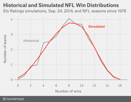
If we didn’t account for this properly, there would be too many teams bunched in the middle with records like 10-6 and 7-9 and too few with records like 14-2 and 1-15. That still doesn’t mean you should bet on any particular team to go 14-2. But the odds are that at least one of them will get there.

September 25, 2014
Senate Update: A Troubling Trend For Democrats In Colorado
The battle for Senate control has been close all year, but also remarkably consistent. Way back in March, we described Republicans as slight favorites to pick up the chamber. And since FiveThirtyEight officially launched its forecast model this month, Republicans have had between a 53 and a 65 percent chance of winning the Senate. Our most recent update, as of Thursday evening, is close to the middle of that range, putting Republicans’ takeover chances at about 58 percent.
There’s no guarantee things will remain this way. At just about this time two years ago, Democrats broke open what had been a stalemate in the battle for Senate control. The FiveThirtyEight forecast had the race almost even at the beginning of September 2012, but had Democrats as an 80 percent favorite by the end of that month.
This year, however, has been characterized by what Charlie Cook calls “head fakes.” Just 10 days ago, Democrats had been benefiting from a string of good polls in Colorado. Since then, the Democratic incumbent in Colorado, Sen. Mark Udall, has seen his situation worsen, with the past five polls showing a lead for Republican Cory Gardner instead.
The chart below tracks polls of Colorado’s Senate race since June 1. It lists both the margin as originally provided in the poll, and the margin the FiveThirtyEight model uses after the various adjustments it applies. A few of the earlier polls were of registered voters, rather than likely voters, so the model adjusts those toward the Republican, Gardner. On the other hand, some of the more recent polls have had a Republican-leaning “house effect,” so the model adjusts those toward Udall.
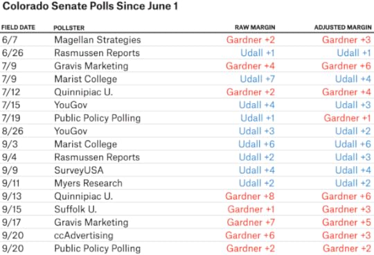
Even with these adjustments, the trend isn’t favorable for Udall. All five polls between Aug. 26 and Sept. 11 had him ahead. All five since have shown him behind.
Could this just be a coincidence? Absolutely. If you’re tracking dozens of races for months at a time, you’re going to find a few weird patterns like these — and sometimes they’re just statistical noise. The FiveThirtyEight forecast still sees the race as very close. Gardner is only a 56 percent favorite, in part because the model places a fair amount of weight on the earlier polls.
In this case, however, there’s a credible hypothesis to explain the trend toward Gardner. Whereas a few weeks ago, Udall had a heavy advertising advantage in Colorado, more recent ad placements have been almost even, according to data from Echelon Insights, a Republican analytics and consulting firm. Advertising blasts can sometimes produce temporary bounces in the polls; perhaps Udall had one a few weeks ago.
The troublesome implication for Udall is that race may slightly favor Gardner when ad spending is even.
The silver lining for Udall is that perhaps he’ll be able to regain an advertising advantage when it matters most, in the closing days of the campaign. As of June 30, Udall had $5.7 million in cash on hand compared to Gardner’s $3.4 million, according to the Federal Election Commission.
But those figures are somewhat out of date; the FEC will release new ones next month. Which candidate raised more money in the third fiscal quarter? Which one had a higher burn rate? Which one will be helped more by outside groups? Which one is doing a better job of buying the right ad placements?
These aren’t sexy questions, but they’re important for understanding the movement in the polls — and they may determine who controls the Senate next year.

How FiveThirtyEight Calculates Pollster Ratings
See FiveThirtyEight’s pollster ratings.
Pollster ratings were one of the founding features of FiveThirtyEight. I was rating pollsters before I was building election models. I was eagerly updating the ratings after every major batch of election results. I rated pollsters while walking two miles uphill … barefoot … in the snow. And then I got a little burned out on them. We last issued a major set of pollster ratings in June 2010 and made only a cursory update before the 2012 elections.
What happened? Well, when you publish a set of pollster ratings, people are understandably fixated upon how you’ve rated the individual polling firms: Is Pollster XYZ better than Pollster PDQ?
Naturally, we hope the pollster ratings can give you a better basis for understanding the polls as a news consumer. However, discussions about individual polling firms — there are now more than 300 of them in our database — can sometimes miss the point. I’m more interested in the big-picture questions. Are some pollsters consistently better than others, as measured by how accurately they predict election results? In other words, is pollster performance predictable? And if so, are a pollster’s past results the better predictor — or are its methodological standards more telling?
The short answer is that pollster performance is predictable — to some extent. Polling data is noisy and bad pollsters can get lucky. But pollster performance is predictable on the scale of something like the batting averages of Major League Baseball players.
Let me take that analogy a bit further. In baseball, there isn’t much difference in an absolute sense between a .300 hitter and a .260 hitter — it amounts to getting about one extra hit during each week of the baseball season. Likewise, the differences in poll accuracy aren’t that large. We estimate that the very best pollsters might be about 1 percentage point more accurate than the average pollster over the long run. However, the average poll in our database missed the final election outcome by 5.3 percentage points. That means even the best poll would still be off by 4.3 points. It’s almost always better to take an average of polls rather than hoping for any one of them to “hit a bullet with a bullet.”
What about the very worst pollsters? Well, we estimate that the absolute worst ones might introduce 2 to 3 points of error, as compared with average polls, based on poor methodology. That means that the worst polls are worse (further below average) than the best polls are good (above average). While there are intrinsic limits to how accurate any poll can be (because of sampling error and other factors), there is no shortage of ways to screw up.
But just as most baseball players hit somewhere around .260, most pollsters tend to be about average. Or at least, that’s the best guess we can make based on examining their past results. Poll accuracy statistics, like batting averages, take a long time to converge to the mean. You shouldn’t assume a polling firm is awesome just because it nailed the most recent election any more than you should mistake a shortstop who went 2-for-5 one day for a .400 hitter.
Nonetheless, when you aggregate results over a number of elections and the sample sizes become larger, you’ll find that there is some consistency in pollster performance.
Before we go any further, I’d encourage you to download the database of polls that we’ve used to construct the pollster ratings. We’re making it public for the first time. The database includes (with just a few minor exceptions that I’ll describe below) every poll conducted in the last three weeks of a presidential, U.S. Senate, U.S. House or gubernatorial campaign since 1998, along with polls in the final three weeks of presidential primaries and caucuses since 2000. Test everything out for yourself — probably you’ll agree with some elements of our approach and disagree with others. Better yet, maybe you’ll discover a bunch of cool things that we hadn’t thought to look for. We think there should be more pollster ratings — FiveThirtyEight shouldn’t have the last word on them.
Perhaps the simplest measure of poll accuracy is how far the poll’s margin was from the actual election result. For instance, if a poll had the Democrat ahead by 10 percentage points and she actually won by 3 points, that would represent a 7-point error. In the table below, I’ve listed polling firms’ average error for elections from 1998 through 2007, and again for the same polling firms for elections from 2008 onward. (About half the polls in our database are from 2008 or later, so this is a logical dividing point.) I’ve restricted the list to the 28 firms with at least 10 polls in both halves of the sample.
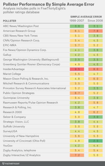
As you can see, there’s a fair amount of consistency in these results; the correlation coefficient (where 1 is a perfect correlation and 0 is no correlation) is about 0.6. InsiderAdvantage and American Research Group were among the least accurate pollsters in both halves of the sample; polls from ABC News and The Washington Post (who usually conduct polls jointly) were among the most accurate in both cases. (ABC News, like ESPN and FiveThirtyEight, is owned by the Walt Disney Company.)
But there are a number of other things we’ll want to account for. In particular, we’ll want to know how much of the error had to do with circumstantial factors. For instance, polls of presidential primaries are associated with much more error than polls of general elections. This is a consequence of factors intrinsic to primaries (for instance, turnout is far lower) and mostly isn’t the pollsters’ fault. One more baseball analogy: Polling primaries is like hitting in Dodger Stadium against Clayton Kershaw, whereas polling general elections is like hitting in Coors Field.
How do we account for factors like these? It takes some work — the balance of this article will be devoted to describing our process. This year, we’re publishing a variety of different versions of the pollster ratings that range from simple to more complex. If at any point you think we’ve made one assumption too many, you can take the exit ramp and use one of the simpler versions. Or you can download the raw data and construct your own.
Our overall method is largely the same as in 2010. That year, for the first time, we introduced a consideration of a poll’s methodological standards in addition to its past accuracy. We think the case for doing so has probably grown stronger since then, but you can find a number of versions of the pollster ratings based on past accuracy alone if you prefer them.
There are also a few things I’ve come to think about differently since 2010.
First, the case against Internet-based polls has grown much weaker in the last four years. At that time, the most prominent Internet pollster was Zogby Interactive (it has since been re-branded as JZ Analytics), which used a poor methodology and got equally poor results. But Internet penetration has increased considerably since then (it now exceeds landline telephone penetration) and a number of Internet-based polling firms with more thoughtful methodologies have come along. In 2012, the Internet-based polls did a little better than the telephone polls as a group (especially compared to telephone polls that did not call cellphones). There are still some reasons to be skeptical of Internet polls — especially those that do not use probability sampling. But the FiveThirtyEight pollster ratings no longer include an explicit penalty for Internet polls1 as they did in 2010.
Second, it has become harder to distinguish a “partisan” poll. As I described earlier this month, FiveThirtyEight has been applying a more relaxed standard for what we define as “partisan” polls since 2012. The challenge in trying to use a more restrictive standard had been that there were too many borderline cases — and we didn’t like having to make a lot of ad hoc decisions about which polls to include. Some polling firms, like Public Policy Polling, conduct polls on behalf of interest groups and campaigns but pay for others themselves. Blogs like Daily Kos and Red Racing Horses now sponsor polls. And in some cases, it isn’t clear who’s paying for a poll. Only the most unambiguously partisan polls — those sponsored by candidates or by party groups like the Republican National Committee — are excluded from the FiveThirtyEight forecast models.
But we still keep track of polls even when we don’t use them in our forecast models — and their results are reflected in the pollster ratings. These polls are labeled with a partisan “flag” in the database.2 The idea is that a polling firm ought to be held accountable for any poll it puts out for public consumption. If a polling firm releases biased and inaccurate polls on behalf of candidates, that will be reflected in its pollster rating — even if it does better work when conducting polls on behalf of a media organization.
Our pollster ratings database also includes a couple of ways for you to track potential bias in the polls. The term bias itself refers to how much a polling firm’s results have erred toward one party or the other as compared against actual election results. House effect, by contrast, refers to how a firm’s results compare against other polls. If Pollster PDQ had the Democrat ahead by 5 points in an election where every other pollster had the race tied, it would have a Democratic house effect. But if the Democrat turned out to win by 10 points, PDQ would have a Republican bias as compared against the actual election results. As is the case for measures of poll accuracy, measures of bias and house effects can sometimes reflect statistical noise rather than anything systematic. But if they occur over dozens or hundreds of surveys, they should be a concern.
Third, we’re seeing clearer evidence of pollster “herding.” Herding is the tendency of some polling firms to be influenced by others when issuing poll results. A pollster might want to avoid publishing a poll if it perceives that poll to be an outlier. Or it might have a poor methodology and make ad hoc adjustments so that its poll is more in line with a stronger one.
The problem with herding is that it reduces polls’ independence. One benefit of aggregating different polls is that you can account for any number of different methods and perspectives. But take the extreme case where there’s only one honest pollster in the field and a dozen herders who look at the honest polling firm’s results to calibrate their own. (For instance, if the honest poll has the Democrat up by 6 points, perhaps all the herders will list the Democrat as being ahead by somewhere between 4 and 8 points.) In this case, you really have just one poll that provides any information — everything else is just a reflection of its results. And if the honest poll happens to go wrong, so will everyone else’s results.3
There’s reasonably persuasive evidence that herding has occurred in polls of Senate elections, presidential primaries and the most recent presidential general election. It seems to be more common among pollsters that take methodological shortcuts.
Paradoxically, while herding may make an individual polling firm’s results more accurate, it can make polling averages worse. There’s some tentative evidence that this is already happening. From our polling database, I compared two quantities: First, how accurate the average individual poll was; and second, how accurate the polling average was.4 I limited the analysis to general election races where at least three polls had been conducted.
From 1998 through 2007, the average poll in these races missed the final margin by 4.7 percentage points. The average error has been somewhat lower — 4.3 percentage points — in races from 2008 onward.
But the polling average hasn’t gotten any better — if anything it’s gotten slightly worse. From 1998 through 2007, the polling average missed the final margin in an election by an average of 3.7 percentage points. Since 2008, the error has been 3.9 percentage points instead.
So this is something we’re concerned about — the benefit of aggregating polls together will decline if herding behavior continues to increase. This year’s pollster ratings introduce a couple of attempts to account for such behavior.
Now let’s get into the details — what follows is a reasonably comprehensive description of how we calculate the pollster ratings.
Step 1: Collect and classify pollsAlmost all of the work is in this step; we’ve spent hundreds of hours over the years collecting polls. The ones represented in the pollster ratings database meet three simple criteria:
They were conducted in 1998 or later;They were conducted in the final three weeks of the campaign;They were conducted in one of the following types of elections:Presidential general elections;Presidential primaries;Senate elections;Gubernatorial elections;U.S. House elections.Of course, it’s not quite that simple; a number of other considerations come up from time to time:
Sample sizes are sometimes missing from older polls. In these cases, we’ve estimated a poll’s sample size from its reported margin of error or from how many people a polling firm surveyed in other polls where the sample size was listed.5 As a last resort, we use 600 as a default sample size.If a pollster listed results among likely voters and registered voters (or all adults), we list only the likely voter version in the database. Because the database covers the final three weeks of the campaign and almost all polling firms publish likely voter polls by that time, almost all polls in the database should be likely voter surveys.When a pollster publishes multiple versions of the same survey (for example, versions of the poll with and without a third-party candidate included), FiveThirtyEight’s policy is to average the versions together. However, some of the polls in our database were taken from sources that may have followed different rules, so the treatment of these cases may be inconsistent.Polls of special elections are included.Polls of nonpartisan primaries (such as in Louisiana) are included.6National polls for the presidential popular vote and the generic congressional ballot are included.7The use of tracking polls is restricted to non-overlapping dates. For instance, if a firm’s final tracking poll was conducted on the Friday through the Sunday before an election, we wouldn’t also list the version that covered Thursday through Saturday.Polls are included in the database even if they were not used in the FiveThirtyEight forecasts.8A poll’s date as listed in the database reflects the median date the poll was in the field — not the date the poll was released. For example, a poll conducted from Oct. 20 to Oct. 22 and released on Oct. 25 would have its date listed as Oct. 21.Although in general all polls within the final three weeks of a campaign are included, there are minor exceptions in the case of the presidential primaries. No polls of the New Hampshire primary are included until after the Iowa caucus has been completed, and no polls of states beyond New Hampshire are included until New Hampshire has voted.9Sources for the data include previous iterations of FiveThirtyEight, along with HuffPost Pollster, Real Clear Politics, PollingReport.com, the Internet Archive, and searches of Google News and other newspaper archives. They also include data sent to us by various polling firms — however, we have sought to verify that such polls were in fact released to the public in advance of each election10 and that the pollster did not cherry-pick the results sent to us.
We’ve chosen 1998 as the cutoff point because there are multiple sources covering that election onward, meaning that the data ought to be reasonably comprehensive. Nevertheless, we’re certain that there are omissions from the database. We’re equally certain that there are any number of errors — some that were included in the original sources, and some that we’ve introduced ourselves. We’re hoping that releasing the data publicly will allow people to check for potential errors and omissions.11
A big challenge comes in how to identify the pollster we associate with each survey. For instance, Marist College has recently begun to conduct polls for NBC News. Are these classified as Marist College polls, NBC News polls, NBC/Marist polls, or something else?
The answer is that they’re Marist College polls. Our policy is to classify the poll with the pollster itself rather than the media sponsor.
However, a few media companies like CBS News and The New York Times have in-house polling operations.12 Confusingly, media companies sometimes also act as the sponsors of polls conducted by other firms. Our goal is to associate the poll with the company that, in our estimation, contributed the most intellectual property to the survey’s methodology. For instance, the set of polls conducted earlier this year by YouGov for CBS News and The New York Times are classified as YouGov polls, not CBS News/New York Times polls.13
Polling firms sometimes operate under multiple brand names and add or subtract partners. Some cases are reasonably clear — for instance, Rasmussen Reports is a subsidiary of Pulse Opinion Research, so polls marketed under each name are classified together. Other cases are more ambiguous; we’ve simply had to apply our best judgment about where one polling firm ends and another begins.
In previous versions of the pollster ratings, we included separate entries for telephone and Internet polls from the same company — for instance, Ipsos conducts both types of polls and they’re listed separately in the database. This is becoming increasingly impractical as polling firms adopt mixed-mode samples (polls with Internet and telephone responses combined together) or otherwise fail to clearly differentiate one mode from the other. For now, we have grandfathered in preexisting cases like Ipsos and continued to list their Internet and telephone polls as separate entries. However, this will very likely change with the next major release of the pollster ratings database after the 2014 election.
Step 2: Calculate simple average errorThis part’s really simple: We compare the margin in the poll against the election result and see how far apart they were. If the poll projected the Republican to win by 4 points and he won by 9 instead, that reflects a 5-point error. (Our preferred source for election results is Dave Leip’s Atlas of U.S. Presidential Elections.)
The error is calculated based on the margin separating the top two finishers in the election — and not the top two candidates in the poll. For instance, if a certain poll had the 2008 Iowa Democratic caucus with Hillary Clinton at 32 percent, Barack Obama with 30 percent and John Edwards with 28 percent, we’d look at how much it projected Obama to win over Edwards since they were the top two finishers (Clinton narrowly finished third).
The database also includes a column indicating whether a poll “called” the winner of the race correctly. But we think this is generally a poor measure of poll accuracy. In a race that the Democrat won by 1 percentage point, a poll that had the Republican winning by 1 point did a pretty good job, whereas one that had the Democrat winning by 13 was wildly off the mark.
Step 3: Calculate Simple Plus-MinusAs I mentioned, some elections are more conducive to accurate polling. In particular, presidential general elections are associated with accurate polling while presidential primaries are much more challenging to poll.14 Polls of general elections for Congress and for governor are somewhere in between.
This step seeks to account for that consideration along with a couple of other factors. We run a regression analysis that predicts polling error based on the type of election surveyed,15 a poll’s sample size,16 and the number of days17 separating the poll from the election.18
We then calculate a plus-minus score by comparing a poll’s average error against the error one would expect from these factors. For instance, Quinnipiac University polls have an average error of 4.6 percentage points. By comparison, the average pollster, surveying the same types of races on the same dates and with the same sample sizes, would have an error of 5.3 points according to the regression. Quinnipiac therefore gets a Simple Plus-Minus score of -0.7. This is a good score: As in golf, negative scores indicate better-than-average performance. Specifically, it means Quinnipiac polls have been 0.7 percentage points more accurate than other polls under similar circumstances.
A few words about the other factors Simple Plus-Minus considers: In the past, we’ve described the error in polls as resulting from three major components: sampling error, temporal error and pollster-induced error. They are related by a sum of squares formula:
\[Total\ Error=\sqrt{Sampling\ Error + Temporal\ Error + Pollster\text{-}Induced\ Error}\]
Sampling error reflects the fact that a poll surveys only some portion of the electorate rather than everybody. This matters less than you might expect; a poll of 1,000 voters will miss the final margin in the race by an average of only about 2.5 percentage points because of sampling error alone — even in a state with 10 million voters.19 Unfortunately, sampling error isn’t the only problem pollsters have to worry about.
Another concern is that polls are (almost) never conducted on Election Day itself. I refer to this property as temporal (or time-dependent) error. There have been elections when important news events occurred in the 48 to 72 hours that separated the final polls from the election, such as the New Hampshire Democratic primary debate in 2008, or the revelation of George W. Bush’s 1976 DUI arrest before the 2000 presidential election.
If late-breaking news can sometimes affect the outcome of elections, why go back three weeks in evaluating pollster accuracy? Well, there are a number of considerations we need to balance against the possibility of last-minute shifts in the polls:
The overwhelming majority of elections do not feature important late-breaking developments. There will often be head-fakes and media-hyped “game changers,” but they rarely make much difference upon careful analysis.Herding (see above) becomes more prominent in the final few days before an election. It’s fairly common for a pollster to publish some wild-seeming results — which can affect media coverage of the campaign — only to “fall in line” with its final poll.Some of the apparent movement in the polls in the late days of the election is probably artificial, reflecting response bias (voters for a certain candidate might be more likely to respond to polls after the candidate has a strong news cycle) and badly designed turnout models rather than genuine changes in public opinion.“Election Day” is something of a misnomer. Many states accept ballots by mail or provide for early voting; in the 2012 presidential election, about one-quarter of the votes nationwide were cast before Nov. 6.Accounting for all polls in the final three weeks of the campaign increases the sample size.Three weeks is an arbitrary cutoff point; I’d have no profound objection to expanding the interval to a month or narrowing it to two weeks, or to using a slightly different standard for primaries and general elections. But we feel strongly that evaluating a polling firm’s accuracy based only on its very last poll is a mistake.
Nonetheless, the pollster ratings account for the fact that polling on the eve of the election is slightly easier than doing so a couple of weeks out. So a firm shouldn’t be at any advantage or disadvantage because of when it surveys a race.
The final component is what we’ve referred to in the past as pollster-induced error; it’s the residual error component that can’t be explained by sampling error or temporal error. I’ve grown to dislike the term “pollster-induced error”; it sounds more accusatory than it should. Certain things (like projecting turnout) are inherently pretty hard and it may not be the pollster’s fault when it fails to do them perfectly. Our research suggests that even if all polls were conducted on Election Day itself (no temporal error) and took an infinite sample size (no sampling error) the average one would still miss the final margin in the race by about 2 percentage points.
However, some polling firms are associated with more of this type of error. That’s what our plus-minus scores seek to evaluate.
Step 4: Calculate Advanced Plus-MinusEarlier this year, House majority leader Eric Cantor lost his Republican primary to David Brat, a college professor, in Virginia’s 7th congressional district. It was a stunning upset, at least according to the polls. For instance, a Vox Populi poll had put Cantor ahead by 12 points. Instead, Brat won by 12 points. The Vox Populi poll missed by 24 points.
According to Simple Plus-Minus, that poll would score very poorly. We don’t have a comprehensive database of House primary polls and don’t include them in the pollster ratings, but I’d guess that such polls are off by something like 10 percentage points on average. Vox Populi’s poll missed by 24, so it would get a Simple Plus-Minus score of +14.
That seems pretty terrible — until you compare it to the only other poll of the race, an internal poll released by McLaughlin & Associates on behalf of Cantor’s campaign. That poll had Cantor up by 34 points — a 46-point error! If we calculated something called Relative Plus-Minus (how the poll compares against others of the same race) the Vox Populi poll would get a score of -22, since it was 22 points more accurate than the McLaughlin survey.
Advanced Plus-Minus, the next step in the calculation, seeks to balance these considerations. It weights Relative Plus-Minus based on the number of distinct polling firms20 that surveyed the same race, then treats Simple Plus-Minus as equivalent to three polls. For example, if six other polling firms surveyed a certain race, Relative Plus-Minus would get two-thirds of the weight and Simple Plus-Minus would get one-third.
The short version: When there are a lot of polls in the field, Advanced Plus-Minus is mostly based on how well a poll did in comparison to others of the same election. But when there is scant polling, it’s mostly based on a comparison to polls of the same type of election (for example, other presidential primaries).
Meticulous readers might wonder about another problem. If we’re comparing a poll against its competitors, shouldn’t we account for the strength of the competition? If a pollster misses every election by 40 points, it’s easy to look good by comparison if you happen to poll the same races. The problem is similar to the one you’ll encounter if you try to design college football or basketball rankings: Ideally, you’ll want to account for strength of schedule in addition to wins and losses and margin of victory. Advanced Plus-Minus addresses this by means of iteration (see a good explanation here), a technique commonly applied in sports power ratings.
Advanced Plus-Minus also addresses another problem. As I’ve mentioned, polls tend to be more accurate when there are more of them in the field. This may reflect herding, selection bias (pollsters may be more inclined to survey easier races; consider how many of them are avoiding the challenging Senate races in Kansas and Alaska this year), or some combination thereof. So Advanced-Plus Minus also adjusts scores based on how many other polling firms surveyed the same election. This has the effect of rewarding polling firms that survey races few other pollsters do and penalizing those that swoop in only after there are already a dozen polls in the field.
Two final wrinkles. Advanced Plus-Minus puts slightly more weight on more recent polls.21 It also contains a subtle adjustment to account for the higher volatility of certain election types, especially presidential primaries.22
Before we proceed to the final step, let’s pause to re-examine the results for the 28 polling firms we listed before, but this time using Advanced Plus-Minus rather than Simple Average Error.

There’s still a correlation — although it’s somewhat weaker than before (the correlation coefficient is roughly 0.45 instead of 0.60). Accounting for the fact that American Research Group polls a lot of primaries makes the firm look somewhat less bad, for instance.
But pollster performance still looks to be predictable to some extent. As I’ll describe next, it’s more predictable if you look at a poll’s methodological standards in addition to its past performance.
Step 5: Calculate Predictive Plus-MinusWhen we last updated the pollster ratings in 2010, I failed to be explicit enough about our goal: to predict which polling firms would be most accurate going forward. This is useful to know if you’re using polls to forecast election results, for example.
But that may not be your purpose. If you’re interested in a purely retrospective analysis of poll accuracy, there are a number of measures of it in our pollster ratings spreadsheet. For instance, you’ll find each pollster’s Simple Plus-Minus and Advanced Plus-Minus scores. The version I’d personally recommend is called “Mean-Reverted Advanced Plus-Minus,” which is retrospective but discounts the results for pollsters with a small number of polls in the database.23
The difference with Predictive Plus-Minus is that it also accounts for a polling firm’s methodological standards — albeit in a slightly roundabout way. In 2010, we looked at whether a polling firm was a member of the National Council on Public Polls (NCPP) or a supporter of the American Association for Public Opinion Research (AAPOR) Transparency Initiative.24
One other thing I was probably not clear enough about in 2010 was that participation in these organizations was intended as a proxy variable for methodological quality. That is, it’s a correlate of methodological quality rather than a direct measure of it.25 Nevertheless, polling firms that participated in one of these initiatives tended to have more accurate polls prior to 2010. Have they also been more accurate since?
Yes they have — and by a wide margin. The chart below tracks the performance of polling firms based on whether they were members of NCPP or the AAPOR Transparency Initiative as of June 6, 2010, when FiveThirtyEight last released a full set of pollster ratings.26
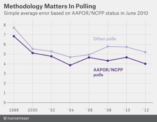
From 1998 through 2009, the average poll from an AAPOR/NCPP polling firm had an error of 4.6 percentage points, compared with an average error of 5.5 percentage points for firms that did not participate in one of these groups. While this difference is highly statistically significant, it isn’t that impressive. The reason is that we evaluated participation in AAPOR/NCPP only after the fact. Perhaps polling firms with terrible track records didn’t survive long enough to participate in AAPOR/NCPP as of June 2010, or perhaps AAPOR/NCPP didn’t admit them.
What is impressive is that the difference has continued to be just as substantial since June 2010. In the general election in November 2010, polls from firms that had participated in AAPOR/NCPP as of that June were associated with an average error of 4.7 percentage points, compared with 5.7 percentage points for those that hadn’t. And throughout 2012 (including both the presidential primaries and the general election), the AAPOR/NCPP polls were associated with an average error of 4.0 percentage points, versus 5.2 points for nonparticipants.
For clarity: The 2010 and 2012 results are true out-of-sample tests. In the chart above, the polling firms are classified based on the way FiveThirtyEight had them in June 2010 — before these elections occurred. In my view, this is reasonably persuasive evidence that methodology matters, at least to the extent we can infer something about it from AAPOR/NCPP participation.
This year, we’ve introduced a two-pronged test for methodological quality. The first test is similar to before: Is a polling firm a member of NCPP, a participant in the AAPOR Transparency Initiative, or does it release its raw data to the Roper Center Archive?27 And second, does the firm regularly call cellphones in addition to landlines? Each firm gets a methodological score between 0 and 2 based on the answers to these questions.
Tracking which firms call cellphones is tricky. We’ve done a reasonably extensive search through recent polls to see whether they document calling cellphones. However, we do not list a polling firm as calling cellphones until we have some evidence that it does. There are undoubtedly some false negatives on our list; we encourage polling firms to contact us with documentation that they’ve been calling cellphones.28
So let’s say you have one polling firm that passes our methodological tests but hasn’t been so accurate, and another that doesn’t meet the methodological standards but has a reasonably good track record. Which one should you expect to be more accurate going forward?
That’s the question Predictive Plus-Minus ratings are intended to address. But the answer isn’t straightforward; it depends on how large a sample of polls you have from each firm. Our finding is that past performance reflects more noise than signal until you have about 30 polls to evaluate, so you should probably go with the firm with the higher methodological standards up to that point. If you have 100 polls from each pollster, however, you should tend to value past performance over methodology.29
One further complication is herding. The methodologically inferior pollster may be posting superficially good results by manipulating its polls to match those of the stronger polling firms. If left to its own devices — without stronger polls to guide it — it might not do so well.
My colleague Harry Enten looked at Senate polls since 2006 and found that methodologically poor pollsters improve their accuracy by roughly 2 percentage points when there are also strong polls in the field. My own research on the broader polling database did not find quite so large an effect; instead it was closer to 0.6 percentage points. Still, the effect was highly statistically significant. As a result, Predictive Plus-Minus includes a “herding penalty” for pollsters with low methodology ratings.30
The formula for how to calculate Predictive Plus-Minus is included in the footnotes.31 Basically, it’s a version of Advanced Plus-Minus where scores are reverted toward a mean, where the mean depends on whether the poll passed one or both methodological standards.32 The fewer polls a firm has, the more its score is reverted toward this mean. So Predictive Plus-Minus is mostly about a poll’s methodological standards for firms with only a few surveys in the database, and mostly about its past results for those with many.33
As a final step, we’ve translated each firm’s Predictive Plus-Minus rating into a letter grade, from A+ to F. One purpose of this is to make clear that the vast majority of polling firms cluster somewhere in the middle of the spectrum; about 84 percent of polling firms receive grades in the B or C range.
There are a whole bunch of other goodies in the pollster ratings spreadsheet, including various measures of bias and house effects. We think the pollster ratings are a valuable tool, so we wanted to make sure you had a few more options for how to use them.

September 19, 2014
Senate Update: Democrats Add By Subtraction In Kansas
You know it’s a strange election year when a party benefits from the removal of its own candidate from the ballot. But that’s exactly what’s happened in Kansas. On Thursday, the Kansas Supreme Court ruled that the Democratic candidate, Chad Taylor, who earlier withdrew from the race, did not need to have his name listed on the state’s U.S. Senate ballot.
The ruling provides a boost to the independent candidate in Kansas, Greg Orman, who takes center-left policy positions and could caucus with the Democrats if he wins. (See here for more detail on how the FiveThirtyEight forecast model handles Orman; it assumes there’s a 75 percent chance he’ll caucus with the Democrats if his decision would determine majority control.)
Although recent polls had shown Taylor’s share of the vote diminishing, they had also shown Orman performing better against the Republican incumbent, Pat Roberts, if Taylor’s name wasn’t included. With the court’s ruling, the FiveThirtyEight model is now using only those polls that didn’t include Taylor. As a result, it has Orman as a 64 percent favorite to win the race, up from 50 percent before.
But there’s still an enormous amount of uncertainty in Kansas. The surveys testing matchups without Taylor were polling what was — until Thursday — a hypothetical race. Furthermore, the polls that didn’t list Taylor also didn’t include the Libertarian candidate, Randall Batson, as an option. Roberts has relatively poor approval ratings among Republicans, and it could be that conservative voters who are dissatisfied with him will opt for Batson before Orman. Or perhaps not — but it’s a choice they’ll get to make in November, so the polls should probably allow them the option, too.
The FiveThirtyEight model does hedge against the polls somewhat with its “state fundamentals” estimate — a forecast of the election outcome that doesn’t rely on head-to-head polls. You can find much more detail about how the FiveThirtyEight model works here. But the intuition behind it is pretty simple: Kansas is a very red state, and this is a somewhat Republican-leaning year. If you weren’t allowed to look at polls, you’d presume that Roberts would be heavily favored.
The FiveThirtyEight model, however, puts a very light touch on the fundamentals. Even in Kansas, they represent just 15 percent of the forecast — polls get 85 percent — and that proportion will fall into the single digits as more polls are released that test the matchup without Taylor’s name included.
For what it’s worth (not a lot) my subjective feeling is that the race is still more like a true tossup, and Roberts will improve his standing among Republican voters as they contemplate electing a relatively liberal candidate who could give Democrats control of the Senate.
This phenomenon has already manifested itself in Kentucky. Democrats there have a compelling and moderate nominee in Alison Lundergan Grimes, and the Republican incumbent, Mitch McConnell, is deeply unpopular. But McConnell has pulled into a consistent lead in the polls.
And the phenomenon manifested itself in a different way in a special election last year in South Carolina, where former Gov. Mark Sanford eventually won his U.S. House race against the Democrat, Elizabeth Colbert Busch, despite very low favorability ratings (a result of Sanford’s extramarital affair). We’re living in a very partisan country, and partisanship usually wins out in the long run.
Nonetheless, Orman only needs to hold his lead in the polls for another 46 days, and Roberts’s campaign had a very slow start, with paltry fundraising numbers for an incumbent and a host of other problems. Roberts will have to accomplish in mere weeks what candidates like McConnell have had months to achieve.
Overall, the FiveThirtyEight forecast has Republicans with a 55 percent chance of winning the Senate, down slightly from 57 percent before the Kansas ruling. (There were also a couple of new polls out on Friday, but they were in line with our previous projections in those states; the change in Kansas is what accounts for the slight boost to Democrats.)
As has usually been the case, the FiveThirtyEight model’s forecast is similar to that of other systems, whether they use polls only or polls along with other factors:
The Daily Kos Poll Explorer model, developed by Drew Linzer, uses polls only and gives Republicans a 54 percent chance of a Senate takeover.The HuffPost Pollster model is also “polls only” and puts the GOP’s chances at 56 percent.The Washington Post’s Election Lab model, which includes fundamentals, has Republicans’ chances at 62 percent.The New York Times’ “Leo” model, which uses polls and fundamentals, has the GOP’s chances at 58 percent.Sam Wang’s “Princeton Election Consortium” model is the outlier, suggesting Democrats would have a 93 percent chance of keeping the Senate in an election held today and a 70 percent chance in November. (I’ve raised a few questions about Wang’s methodology.)
The Scotland Independence Polls Were Pretty Bad
About a year ago, I was on a book tour in Edinburgh and was asked by a couple of reporters about Scotland’s upcoming vote on whether to secede from the United Kingdom. The “yes” vote (a vote to secede) had “virtually no chance” of prevailing, I said. “For the most part it looks like it’s a question of how much the ‘no’ side will win by, not what the outcome might be.”
Now that the “no” side has won by what looks to be a definitive margin, I suppose I should be touting that prediction. But despite the outcome, it was one of the worst predictions I’ve made. I’d spent all of 15 minutes studying the issue before weighing in. That’s not enough — and it’s not what we’re all about at FiveThirtyEight. We take predictions seriously, and there’s usually a heck of a lot of research involved before we make one. My Scotland prediction failed that test.
So I don’t pretend to have any particular authority to discuss Scotland’s results. But the “no” side’s margin of victory, by 10 to 11 percentage points, might give us some pause.
To be clear, most of the polls had “no” ahead in the closing days of the campaign. But they suggested a considerably closer election than actually happened. There’s a parallel to the final days of the 2012 U.S. presidential election, when the polls showed Barack Obama ahead of Mitt Romney. Those polls “called” most outcomes correctly but nevertheless had a significant bias, underrating how well Obama — and Democratic candidates for the Senate — might do.
Out of all of the polls in our (soon to be publicly released) polling database (which includes polls for the Senate, the presidency, and gubernatorial and U.S. House campaigns), the average survey understated the Democratic candidate’s performance in 2012 by almost 3 percentage points. Had the error run in the opposite direction — had Republicans outperformed their polls by that margin instead of Democrats — Romney might have won states like Colorado, Ohio and Florida and possibly have become president. The GOP perhaps would not have taken the Senate, but Republicans would have been highly competitive in states including Montana, North Dakota, New Mexico, Massachusetts, Wisconsin, Ohio and Virginia and made it very close.
Suspend your disbelief for a moment, and imagine I’ve persuaded you that the margin between actual and predicted results — not the number of correct “calls” — is what counts in polling. What then accounted for the mediocre results in Scotland?
I have only a theory: Scotland’s results may have had something to do with the “Shy Tory Factor.” This was the tendency of conservatives (Tories) to outperform their polls during a number of U.K. elections in the 1990s and especially in the U.K. general election of 1992. The idea is that conservatives were less enthusiastic than Labour voters and therefore less likely to declare their support for a conservative government to pollsters. Nevertheless, they turned out to vote.
U.K. pollsters responded to these elections in a variety of ways, including by weighting their results based on voters’ party preference in prior elections. But this may have been a patch that failed to address the underlying issue: Voters are not equally likely to respond to polls; those who are more enthusiastic about an upcoming election are more likely to do so.
This potentially leads to a double-counting of enthusiastic voters if turnout models are not applied carefully.
The problem could become worse as response rates to polls decline. Furthermore, many polls of the Scottish independence referendum were Internet-based, and some of those polls did not use probability sampling, historically the bedrock for demographic weighting. A YouGov poll earlier this month, for example — one of the few to show the “yes” side ahead — did so only because of its weighting procedures. On an unweighted basis, it had “no” ahead by about 6 percentage points.
Almost everyone in Scotland voted in the referendum. Less enthusiastic voters — Shy Unionists? — may have been missed by pollsters, but they may have made the difference.

September 17, 2014
NFL Week 3 Elo Ratings And Playoff Odds
It’s been hard for me to escape the feeling that something’s off about NFL games this year. But that may be the league’s off-field problems coloring my perception of the on-field play — or the inevitable consequence of living in New York City and having the Jets and Giants force-fed into my living room. Statistically, everything has been pretty normal. Through the first two weeks of the season, the average margin of victory has been 12 points — exactly in line with the historical average. There have been a number of upsets, but not any more or fewer than usually occur early in the year.
Week 3 is headlined by a marquee matchup: The Denver Broncos are traveling to Seattle for a Super Bowl rematch against the Seahawks. A less sexy but perhaps equally important game will take place in Glendale, Arizona: the San Francisco 49ers vs. the Arizona Cardinals. The Seahawks and 49ers lost last week, and both play in the NFL’s toughest division, the NFC West. So another loss could be trouble.
Let’s go to the magnetic data-storage tape, or rather, to FiveThirtyEight’s NFL Elo ratings. Elo ratings are a “vintage” statistical formula that we’ve brought to life for the NFL. They account for margin of victory, home-field advantage, strength of schedule, prior years’ performance and nothing else — for more on how they work, click here.
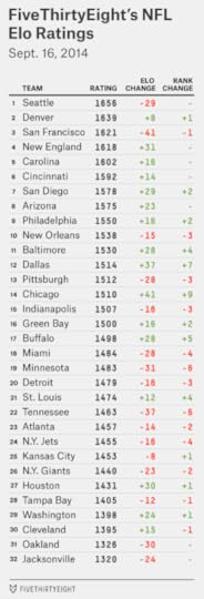
Last week, we referred to the presence of a “Big Three” in the NFL: the Seahawks, 49ers and Broncos. Those teams remain on top of the Elo ratings, although by a narrower margin. The Niners shed 41 Elo points last week, more than any other team, and the New England Patriots nearly overtook them. Perhaps Tom Brady and Bill Belichick have a vintage year left in them?
Any matchup involving the Seahawks, Broncos, 49ers and Patriots would be a good one for the NFL; they are among the more popular teams in the league. The NFL has been fairly lucky over the past several years to have high-profile or big-market teams involved late in the season. But it doesn’t always work out that way. I’m interested in the “Little Four” that lurk just behind the Big Three and rank No. 5 through No. 8 — in order: the Carolina Panthers, Cincinnati Bengals, San Diego Chargers and Arizona Cardinals. These are good football teams, at least in Elo’s estimation. If you’re rooting for the underdog (and/or bad Super Bowl ratings), perhaps a Large Feline Bowl between the Panthers and Bengals is what you’re after.
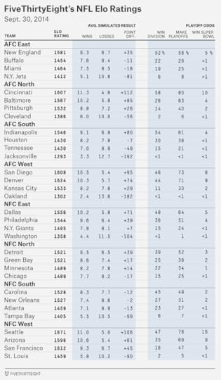
Below are the projected standings and playoff odds for each NFL team, which are calculated by taking the Elo ratings and simulating the rest of the season thousands of times.

Seattle is 71 percent to make the playoffs. That isn’t bad, but it’s a little lower than you might expect for the best team in the league (and down from 81 percent last week). The problem is its division, which also includes the 49ers and the Cardinals; Elo has the Seahawks winning it just 40 percent of the time.
The 49ers have still less room for error. Last week’s loss against the Chicago Bears dropped San Francisco to 57 percent to make the postseason, down from 78 percent after Week 1. A loss to a division rival like the Cardinals would probably push the Niners below even money.
Other putative playoff contenders have lost twice — most notably, the Indianapolis Colts. The Colts’ probability of making the playoffs is just 40 percent, according to Elo, and they project to an 8-8 record.
But the average 0-2 team makes the playoffs only 12 percent of the time. So Colts fans should be thankful. After facing good teams in Weeks 1 and 2, Indy has one of the league’s easiest remaining schedules. You could debate whether the Colts’ AFC South or the NFC East is the league’s worst division (Elo says it’s the AFC South). Indianapolis can be our randomized control trial — it gets to play both! Nine of the Colts’ remaining 14 games are against a team from one of these divisions.
Furthermore, the Colts could win the AFC South with a middling record. In our simulations, they made the playoffs 60 percent of the time when they finished 9-7. And they did so a quarter of the time they ended the year at 8-8. Even a 7-9 record was good enough to get Indianapolis into the playoffs 7 percent of the time.
For a down-on-its-luck team whose season is already over, look at the Oakland Raiders. They project to just a 3-13 record, according to Elo. And they have less than a 1 percent chance (0.8 percent, if you like decimal places) of making the playoffs.
As bad as the Raiders are, those seem like aggressive calls so early in the year. But the Raiders have a tough schedule, with a game against the Patriots this week, two remaining games each against the Broncos and the Chargers, and games against all four NFC West teams. There’s even some chance of a winless season: the Raiders finished at 0-16 in about 6 percent of the Elo simulations. That’s not often, but it’s six times as often as they made the playoffs.
Elo ratings can also be used to project point spreads, although we doubt you’d make a profit by betting on them. Last week, Elo had a 8-7 record against the betting lines as listed at Pro-Football-Reference.com, sitting out one game where its spread exactly matched the Vegas line. The Elo point spreads are 16-15 on the season so far against Vegas.
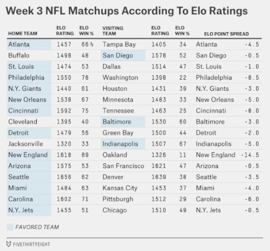
This week, Elo has the Seahawks as three-and-a-half-point favorites against the Broncos, compared to four-and-a-half or five points in the Vegas line. That reflects a bigger difference of opinion than you might think; a four-point Broncos loss (as in Seattle 21, Denver 17) is a plausible enough outcome. But to reiterate, we’re not recommending any bets. Among the many factors that Vegas considers but Elo doesn’t is that the Seahawks have historically had a large home-field advantage.
There’s a bigger discrepancy in the Cardinals-49ers matchup. Bookmakers have the 49ers favored by a field goal, whereas Elo sees the game as a pick ‘em and would bet on the Cardinals if forced to lay down some action. Perhaps you could make a case for the Cardinals, who Elo likes because they finished at 10-6 last year despite a tough schedule and because they’ve beaten a playoff team and won a road game so far this year. But never mind the betting line. In terms of playoff implications, this might be the most important game of the young season.

September 15, 2014
Senate Update: Democrats Draw Almost Even. Is It The Money?
When we officially launched our forecast model two weeks ago, it had Republicans with a 64 percent chance of taking over the Senate after this fall’s elections. Now Republican chances are about 55 percent instead. We’ve never quite settled on the semantics of when to call an election a “tossup.” A sports bettor or poker player would grimace and probably take a 55-45 edge. But this Senate race is pretty darned close.
What’s happened? The chart below lists the change in our forecast in each state between Sept. 3 (when our model launched) and our current (Sept. 15) update.

As you can see, there hasn’t been an across-the-board shift. Republicans’ odds have improved in several important races since the launch of our model. Democrats’ odds have improved in several others. But the two states with the largest shifts have been Colorado and North Carolina — in both cases, the movement has been in Democrats’ direction. That accounts for most of the difference in the forecast.
It might help to break the states down into several groups:
Republican defenses (Georgia, Kansas, Kentucky). These are the three Republican-held seats where Democrats have some chance for a pickup. Democrats got good news in Kansas two weeks ago when their own candidate, Chad Taylor, ceased his campaign in the state — improving the odds for the center-left independent candidate, Greg Orman. Orman, however, is a slight underdog against the Republican incumbent Pat Roberts, and Orman isn’t certain to caucus with Democrats if he wins. Meanwhile, Democrats’ odds have declined somewhat in Georgia and Kentucky. Taken as a group then, these states have not produced much change in the overall forecast.Republican path of least resistance states (Alaska, Arkansas, Louisiana, Montana, South Dakota, West Virginia). These are the six Democratic-held seats in deeply red states. If the GOP wins each one — while holding all their own seats — they’ll win the Senate. Republicans remain favored in each of these six races, and their odds haven’t changed much since we launched our forecast. (They’re doing a tiny bit better in Alaska and a tiny bit worse in Louisiana, but these changes cancel out.)Highly competitive purple states (Colorado, Iowa, Michigan, New Hampshire, North Carolina). These are the five competitive Senate races — all seats are currently held by Democrats — in states generally considered presidential swing states. It’s here where Democrats have gained ground. There have been numerous recent polls in North Carolina, including two released on Monday, showing Democratic Sen. Kay Hagan ahead. Her odds of holding her seat have improved to 68 percent from 46 percent when the model launched. Colorado has followed a similar path, with Democratic Sen. Mark Udall’s chances of keeping his seat improving to 69 percent from 47 percent. Democrats have also made smaller gains in Iowa and Michigan. New Hampshire has been an exception. The model isn’t buying that the race is tied, as a CNN poll implied Monday, but it does have Democratic Sen. Jeanne Shaheen’s chances falling from 81 percent to 75 percent.Republican reaches (Illinois, Minnesota, New Jersey, Virginia). These states are only on the fringe of being competitive and haven’t received much attention from the news media or from pollsters. But each has been polled at least twice since our model launched. Those polls haven’t shown Democrats gaining or losing any ground — but they have confirmed Democrats are ahead, often by double-digit margins. Our model shows more confidence as the volume of polling increases, so these polls have also slightly helped Democrats.Most of the Democrats’ gains, however, have come from the purple states. What’s perplexing is that this has happened right as Democrats’ position on the generic congressional ballot — probably the best indicator of the national mood — has deteriorated. Historically, the generic ballot and state-by-state Senate polls — while not perfectly correlated — have moved in tandem more often than not. On average since 1990, a one-percentage-point change in the generic ballot has translated to a half-point change (in the same party’s direction) in the average Senate race.
Might Democrats be benefiting from strong voter outreach in these states — perhaps the residue of President Obama’s “ground game” in 2012? You could make that case in North Carolina, where two polls released on Monday showed a smaller gap between registered and likely voters than most other states that have been polled this year. But this story isn’t so consistent. By contrast, CNN’s poll of New Hampshire on Monday had a conspicuously large turnout gap. And in 2010, presidential swing states showed an especially large turnout drop-off for Democrats.
Money could be a more important factor. Consider the states with the largest polling movement: In North Carolina, Hagan had $8.7 million in cash on hand as of June 30 as compared with just $1.5 million for her Republican opponent, Thom Tillis. In Colorado, Udall had $5.7 million as compared with $3.4 million for Republican Cory Gardner.
These totals do not account for outside spending. But in stark contrast to 2010, liberal and Democratic “super PACs” have spent slightly more money so far than conservative and Republican ones, according to the the Center for Responsive Politics. (One caveat for Democrats is that when money is spent on advertising, it can sometimes have short-lived effects.)
Whatever the reason, the GOP’s path to a Senate majority is less robust than before. They still look pretty good in the “path of least resistance” states. But while West Virginia, Montana and South Dakota are extremely likely pickups, Alaska, Arkansas and Louisiana are not sure things. Meanwhile, Republicans have fewer top-tier backup options, as states like North Carolina and Colorado have trended away from them. Republicans may need to decide whether to consolidate their resources. It won’t help them if they lose each of Colorado, Iowa, New Hampshire and North Carolina by a couple of percentage points — and in the process blow a state like Arkansas.

Nate Silver's Blog

- Nate Silver's profile
- 729 followers

