
Nate Silver's Blog, page 154
May 1, 2015
The Most Diverse Cities Are Often The Most Segregated
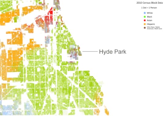
When I was a freshman at the University of Chicago in 1996, I heard the same thing again and again: Do not leave the boundaries of Hyde Park. Do not go north of 47th Street. Do not go south of 61st Street. Do not go west of Cottage Grove Avenue. 1
These boundaries were fairly explicit, almost to the point of being an official university policy. The campus police department was not committed to protecting students beyond the area,2 and the campus safety brochure advised students not to use the “El” train stops just a couple of blocks beyond them unless “traveling in groups and during the daytime.”
What usually wasn’t said — on a campus that brags about the diversity of its urban setting but where only about 5 percent of students are black — was that the neighborhoods beyond these boundaries were overwhelmingly black and poor. The U. of C. has, for many decades, treated Hyde Park as its “fortress on the South Side,” and its legacy of trying to keep its students within the neighborhood — and the black residents of surrounding communities out — has left its mark on Chicago.
On Dustin Cable’s interactive “Dot Map” of racial residency patterns, Hyde Park appears as an island of blue and red dots — meaning, mostly white and Asian students and residents — in contrast to Chicago’s almost uniformly black South Side, designated in green dots. Washington Park, the neighborhood just to Hyde Park’s west, is 97 percent black3. Woodlawn — the neighborhood on the other side of 60th Street — is 87 percent black.
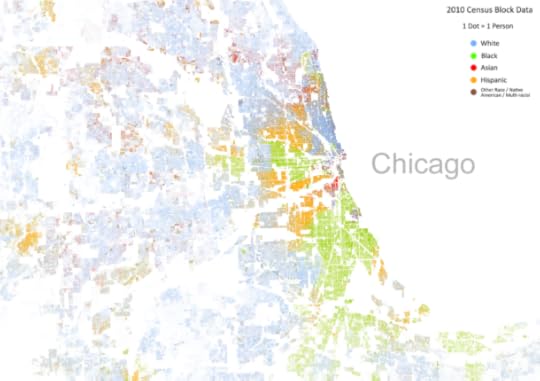
Chicago deserves its reputation as a segregated city. But it is also an extremely diverse city. And the difference between those terms — which are often misused and misunderstood — says a lot about how millions of American city dwellers live. It is all too common to live in a city with a wide variety of ethnic and racial groups — including Chicago, New York, and Baltimore — and yet remain isolated from those groups in a racially homogenous neighborhood.
You can see that by zooming out on Cable’s map and taking the 30,000-foot view of Chicago. Things start to look a little different: You notice the city’s diversity as much as its segregation. Citywide, Chicago’s population is almost evenly divided between non-Hispanic blacks (33 percent of its population), non-Hispanic whites (32 percent) and Hispanics (29 percent). So at a macro level, Chicago is quite diverse. At a neighborhood level, it isn’t.
The contrast to Chicago is a city like Lincoln, Nebraska. By one statistical measure of racial segregation called the index of dissimilarity, Lincoln counts as being highly racially integrated — it’s more integrated than New York, according to this statistic! But what does that integration look like? Here’s Cable’s map again:
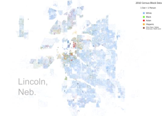
In Lincoln, this supposed integration looks awfully blue — which is to say, awfully white, since blue is Cable’s color for caucasians, who make up 83 percent of Lincoln’s population. True, Lincoln’s few nonwhite residents are fairly evenly distributed throughout the city. But while Lincoln may be integrated, it’s not very diverse.
So let’s aim to develop a slightly richer vocabulary. I’m going to describe three statistical measures of segregation and diversity. Like any statistical definitions, they are precise but limited in scope. They refer to racial diversity only and not economic diversity or diversity within racial groups. They pertain to where people live, and not where they work or go to school. In other words: They’re a starting point and not an end point. No one of them is inherently more valid than the others; it’s best if you look at them holistically.
The data we’ll use is drawn from Brown University’s American Communities Project, which is, in turn, based on the 2010 Census. Brown’s data defines five racial groups: whites, blacks, Hispanics, Asians and “other,” where “other” principally refers to Native Americans. The groups are exhaustive (they add up to 100 percent of the population) and mutually exclusive (they don’t overlap). 4
In this article, we’ll look at cities proper rather than metropolitan areas. Venturing beyond the city limits and into the surrounding area can sometimes lead you to different conclusions about a city’s demographic makeup, so we’ll look at those in a follow-up post. But cities themselves matter too, especially for questions of urban planning and city-administered services like schooling and policing.
In order to provoke a few questions, I’m going to list the top 10 and bottom 10 U.S. cities by each of the these measures (out of the 100 most populous cities). Chicago, for example, ranks near the top of the charts by one metric, but is at the very bottom on another.
The first measure is the citywide diversity index. It’s defined as the answer to this question: For an average resident in the city, what percent of the people belong to a different racial group?5
The lowest possible citywide diversity index is 0 percent, which is what you get if everyone is the same race. The highest possible one is 80 percent. Why not 100 percent? Because the Brown data only includes five racial groups. Even if the population is divided exactly evenly between these groups, you’ll still have 20 percent of the people belong to the same race as you.
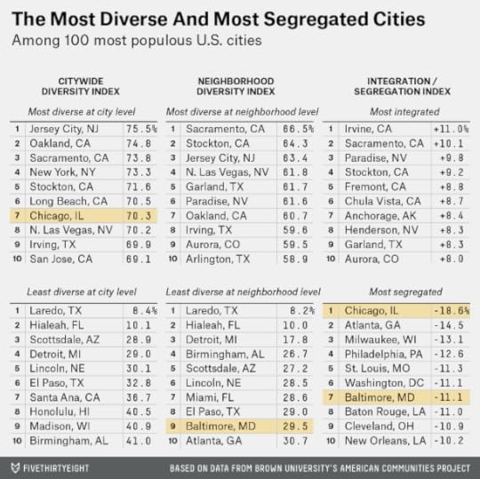
A few cities actually get pretty close to this ideal of complete diversity. Oakland, California, is not far from being evenly divided between whites, blacks, Hispanics and Asians; its citywide diversity index is 75 percent. New York’s is 73 percent. And Chicago’s is 70 percent.
At the low end of the scale are extremely white cities like Lincoln and Scottsdale, Arizona. There’s also extremely black cities like Detroit, and extremely Hispanic cities like Laredo, Texas. Laredo, which is almost entirely Hispanic, has a citywide diversity index of just 8 percent.
There’s something else important here. The term “diverse” is sometimes used colloquially as a euphemism for “nonwhite.” But our statistics don’t handle whites differently than the other racial groups. One advantage of this approach is that it can account for the degree of segregation between different nonwhite groups. While blacks and Hispanics are highly segregated from one another in Chicago, for example, they’re reasonably well integrated in Phoenix.
The counterpart to the citywide diversity index is the neighborhood diversity index.6It answers basically the same question we asked above, but applied at the neighborhood level. That is: For an average resident in the city, what percent of the people in her neighborhood belong to a different racial group? (I’m using the term “neighborhood” loosely. More precisely, the index is based on census tracts, which are units of about 4,000 people.7)
The neighborhood diversity index is always equal to or lower than the citywide diversity index. In other words, if a city doesn’t have much diversity overall, it can’t have racially diverse neighborhoods.
But the reverse can be true, and often is: You can have a diverse city, but not diverse neighborhoods. Whereas Chicago’s citywide diversity index is 70 percent, seventh best out of the 100 most populous U.S. cities, its neighborhood diversity index is just 36 percent, which ranks 82nd. New York also has a big gap. Its citywide diversity index is 73 percent, fourth highest in the country, but its neighborhood diversity index is 47 percent, which ranks 49th.
To be clear, New York and Chicago are still more diverse than cities like Lincoln, even at the neighborhood level. But as the numbers show, they are segregated because they underachieve their potential to have racially diverse neighborhoods.
This is what the final metric, the integration-segregation index, gets at. It’s defined by the relationship between citywide and neighborhood diversity scores. If we graph the 100 most populous cities on a scatterplot, they look like this:
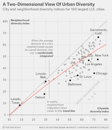
This chart is key to understanding our approach, so let’s take a quick tour, starting in the top-right corner of the chart and moving counterclockwise.
The top-right quadrant contains cities like Sacramento, California, that have high neighborhood and citywide diversity scores. They’re both diverse and integrated.The top-left quadrant is empty. In theory, you’d place cities here if they had high neighborhood diversity but poor citywide diversity. But as we’ve said, you can’t have diverse neighborhoods if there’s no diversity in the overall population.In the bottom-left quadrant are cities like Laredo and Lincoln that score poorly on both neighborhood and citywide diversity. Because they’re so racially uniform, you can’t really define them as being either segregated or integrated.The bottom-right quadrant contains highly segregated cities like Chicago, Baltimore and St. Louis. They have average-to-good citywide diversity, but poor neighborhood diversity.The largest group of cities, including those like Los Angeles, are clustered just above these in the middle-right portion of the chart. They’re near the red regression line8 that indicates the typical relationship between citywide diversity and neighborhood diversity. These cities are reasonably diverse, but a very long way from being perfectly integrated. However, they’re not quite as segregated as cities like Chicago.The integration-segregation index is determined by how far above or below a city is from the regression line. Cities below the line are especially segregated. Chicago, which has a -19 score, is the most segregated city in the country. It’s followed by Atlanta, Milwaukee, Philadelphia, St. Louis, Washington and Baltimore.
Cities above the red line have positive scores, which mean they’re comparatively well-integrated. Sacramento’s score is a +10, for instance.
But here’s the awful thing about that red line. It grades cities on a curve. It does so because there aren’t a lot of American cities that meet the ideal of being both diverse and integrated. There are more Baltimores than Sacramentos.
Furthermore, most of the exceptions are cities like Sacramento that have large Hispanic or Asian populations. Cities with substantial black populations tend to be highly segregated. Of the top 100 U.S. cities by population, 35 are at least one-quarter black, and only 6 of those cities have positive integration scores.9
So while Chicago really is something of an extraordinary case, Baltimore isn’t an outlier, exactly. Most cities east of the Rocky Mountains with substantial black populations are quite segregated. There’s not a lot to distinguish Baltimore from Cleveland, Memphis, Milwaukee, New Orleans, Philadelphia or St. Louis.
We’ll follow this up with an analysis of what these numbers look like when taken at the the metro rather than city level. In the meantime, you can find where your city ranks below:


April 28, 2015
Jeb Bush Has The Cash, But Not The GOP Support
Jeb Bush is expected to declare a fundraising total in the “high tens of millions of dollars,” The New York Times reported on Monday. Any talk of record fundraising totals ought to account for inflation — as well as the fact that it’s easier to raise big dollars since the Citizens United decision (most of the contributions to Bush will go to his Super PAC). Nonetheless, Bush’s haul should be an impressive figure.
But money is unlikely to be Bush’s problem in this campaign, and cash may be a less valuable resource than another sort of currency in which he is lacking: the support of influential Republicans, like current senators and governors, especially those who publicly endorse a candidate. Historically, these endorsements have been the best proxy for support in the “invisible primary” and a leading indicator for which candidates may emerge victorious through the rough-and-tumble nomination race.
So far, Bush has won very few endorsements. No current Republican senators or governors have endorsed him, and only five members of the House of Representatives have done so, all from his home state of Florida.
Fortunately for Bush, none of his rivals are doing much better. Rand Paul, with seven endorsements from the House along one from a senator — his Kentucky colleague, Mitch McConnell — is nominally the endorsement leader.10. But the overwhelming majority of Republican officials have stayed on the sidelines, at least publicly.
Isn’t it a little early to worry about the endorsement count? We’re still 265 days away from the projected date of the Iowa Caucus, Jan. 18, 2016.
But in some campaigns in the past, there had been plenty of endorsements at this stage of the cycle. For instance, Jeb Bush’s brother, George W. Bush, had been endorsed by 16 governors, six Senators, and 64 members of the House by the end of April 1999, according to data from the political scientist Marty Cohen.
We’ve compiled this data11 for each open12 nomination campaign since 1980, based on endorsements through April 30 in the year before the election.13 We give each candidate “endorsement points” based on endorsements received from governors and members of Congress, which work like this: 10 points for each governor who endorses you, 5 points for each senator, and one point for each member of the House.14
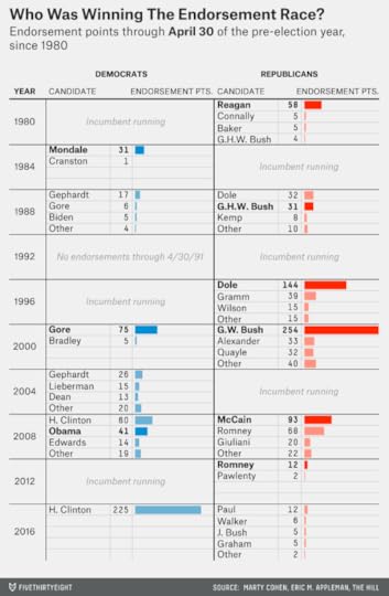
Republicans have a reputation for “falling in line” and consolidating their support behind one or two establishment-backed candidates early in the race. And you can see evidence of that in the chart. The 2000 campaign was the signature example: George W. Bush had accumulated 254 endorsement points through April 30, 1999, far outdistancing Lamar Alexander’s 33 points.
Bob Dole also had a substantial early lead in endorsements in the 1996 campaign, as Ronald Reagan did in 1980, and both won their nominations with comparative ease.
The other Republican races have been tighter. In the 1988 race, there was a virtual tie atop the endorsement scoreboard at this date in the cycle, with Dole at 32 endorsement points and George H.W. Bush at 31. Bush won the nomination.
GOP endorsements came fairly early in the 2008 campaign, but they were spread across several candidates. Still, the early leader in endorsements, John McCain, went on to win the nomination.
Meanwhile, the paltry endorsement total for Rudy Giuliani that year — at a time he was riding high in the polls and raising plenty of money — was an early sign of trouble for his campaign. If influential Republicans decide Jeb Bush is too liberal — that he’s more like Giuliani than Mitt Romney or McCain — he’ll have little shot at the nomination.
The 2012 campaign is a more favorable precedent for Jeb Bush. Few endorsements of any kind had been made through April 30, 2011, although Romney did lead among those who had endorsed and maintained that lead throughout the race.
Are campaigns simply getting off to a later start now? That’s hard to say. There hasn’t been much of a pattern (other than that the Democratic nominations in 1972 and 1992 got off to especially slow starts). The 2012 Republican campaign began relatively late, based on when candidates either officially announced for the race or opened an exploratory commission with the FEC. But with the advent of Super PACs, which allow a candidate to raise money without filing with the FEC, the official announcement date has become less important. And candidates don’t need to officially announce their bids to win press attention: Plenty of news outlets, including FiveThirtyEight, will cover them whether or not they’ve gone through the pretense of declaring their bids officially.
What’s clearer is that this remains a very active Republican campaign. Bush didn’t deter his fellow Floridian, Sen. Marco Rubio, from running. Nor has he intimidated other moderates from considering a bid. Gov. John Kasich of Ohio is thinking about a run, as is Chris Christie of New Jersey. Sen. Lindsey Graham of South Carolina, the sort of establishment Republican whose endorsement Bush might hope for, is instead running for president himself. Gov. Rick Snyder of Michigan, another moderate, is the latest to consider a bid.
Some of these candidates have more realistic hopes of winning the nomination than others. And some will drop out before Iowa (or will never officially declare). But the sheer volume of credible candidates stands in contrast to 2012, when Romney was able to keep candidates like Christie, Mitch Daniels, and Paul Ryan — along with Jeb Bush himself — mostly on the sidelines.
So is Bush losing the invisible primary? Not exactly. Let’s consider a few points in his defense:
Unlike Giuliani in 2008 or Phil Gramm in 1996 — other candidates who raised lots of money early on but received relatively few endorsements — no other candidate is doing much better in securing endorsements.Fundraising can be one sign of invisible primary support. Data geeks tend to downplay it because of cases like Giuliani and Gramm. But usually, endorsements and fundraising are highly correlated. There aren’t that many useful examples of candidates analogous to Bush who raised money well without winning many endorsements, or vice versa.Perhaps Bush has some endorsements in his pocket, which he’ll roll out once he declares officially. (Endorsements can precede an official announcement, however. Hillary Clinton had been endorsed by 27 Democratic senators before officially launching her bid earlier this month.)But if Bush isn’t losing the invisible primary, he isn’t winning it either. This Republican campaign is not following the trajectory of races like the Republican nominations of 1980, 1996 and 2000, or the Democratic nomination of 2000, where one candidate was a clear invisible primary leader (and went on to easily win his nomination). Furthermore, establishment Republicans have some reasons to prefer candidates like Rubio, Kasich and Gov. Scott Walker of Wisconsin to Bush. Not only are they more conservative — they can make a case for being more “electable” too.

April 27, 2015
Six Things I Learned While Traveling The United Kingdom In An Airstream Trailer
If you take a data-driven approach to election forecasting, it’s not immediately clear how much you might expect to learn by traveling around the country talking to voters. Polls can reach far more voters (and a far more representative sample of them) than a reporter might by knocking on doors or accosting voters at the shopping center. And if you’re not careful, it can be easy to cherry-pick the anecdotal evidence and read the “vibrations” in a way that confirms your biases.
But last month, I spent a week and a half on the ground in the United Kingdom. I visited a number of locations across the nation as part of an edition of BBC’s “Panorama” program, which will air Monday night in the U.K. I visited shipyards, bingo halls, town squares, quite a few pubs and even a sheep auction. Along with the host of the program, Richard Bacon, I spoke with dozens of voters.
Nothing that I learned changed my forecast of the U.K. election, which will be held May 7. That’s partly because I, personally, don’t have a forecast of the U.K. election. Instead, after a less-than-brilliant performance going at it on our own in 2010, FiveThirtyEight has partnered with the three U.K.-based academics behind electionforecast.co.uk, whose forecast you can find here.
But my visit did help me understand more about why the polls behave as they do in the U.K. and why the three academics behind our forecast — Chris Hanretty, Ben Lauderdale and Nick Vivyan — designed their model as they did. It also helped me understand more about the differences between the U.S. and U.K. election systems — and why this U.K. election is so hard to call.
1. Tactical voting can have a major impact in the U.K. When there are only two major candidates, the choice isn’t very complicated. Which candidate do you like better? Great — go ahead and pick her.
But the U.K. has become less and less of a two-party system. While the Conservatives and Labour collectively accounted for about 90 percent of the vote through the election of 1970, they’ll be down to somewhere in the neighborhood of 65 percent to 70 percent this year.
So voters in the U.K. have two types of tactical concerns that don’t really apply in two-way elections in the U.S.
First: Does the candidate you prefer have a chance to win locally? If not, your vote might be wasted.Second: Will the candidate’s party have any influence in who forms the next government?There’s a lot of academic evidence for tactical voting. But it also wasn’t hard to find voters who were thinking about these considerations. We met with some left-of-center voters in North Devon, for instance, who might ordinarily prefer to vote for Labour or the Green Party. But because the top two candidates in their constituency are a Liberal Democrat and a Conservative, they said they might vote for the Liberal Democrat instead.
For what it’s worth — maybe not much — the voters we spoke with seemed less likely to be swayed by the second type of tactical consideration: What type of influence is a candidate’s party likely to have in the next government? That’s not because they didn’t care about this — they did — but because they saw the post-May 7 landscape as messy and unpredictable. Better to vote for the candidate you like — provided she has a chance to win locally — and hope for the best after that.
Incidentally, this type of tactical voting can mean the polls themselves have influence on the race. If voters in that Devon constituency saw a poll showing that the Labour candidate was within a few points of the lead, they might vote for her after all. There’s even the potential for a polling surge to become a self-fulfilling prophecy, as can sometimes happen in the early stages of the U.S. presidential primaries.
2. There really are “shy Tories.” The Shy Tory Factor refers to a phenomenon, observed in several U.K. elections in the 1990s, in which Tories (Conservatives) outperformed their polls on election day. One explanation for this is that these voters were less likely to disclose their vote to pollsters, claiming they were undecided instead.
Indeed, we came across several voters who initially told us that they were undecided, only to prove quite ready to declare a candidate preference after gentle questioning. A young entrepreneur we met from an immigrant family in Bury, for example, eventually said he planned to vote Conservative — in contrast to most of his friends and relatives, who were voting for Labour.
But none of the voters we encountered were really all that shy. They were willing to talk about their vote in front of a BBC camera crew, after all. But the polls may be underrepresenting voters who are less enthusiastic and outspoken, like “no” voters in last year’s Scottish referendum, for instance. While there are some “shy” Tories, there are undoubtedly some shy Labour voters and shy Liberal Democrats, too.
Is there any way to account for this in a forecast? Our U.K. academic partners have found that swings from the previous election tend to be overstated in the polls. For instance, if a party that won 10 percent of the vote last time around is polling at 20 percent, they might project it to win more like 17 percent or 18 percent of the vote instead. Some of this — there are other reasons that we’ll get to in a moment — may be because voters who would prefer to preserve the status quo are less enthusiastic and less likely to show up in polls.
3. Incumbency can matter, and its effects won’t always show up in the polls. Another way to put this is that incumbents may overperform their polls on election day. There’s a good reason for this: Most polls in the U.K. don’t mention the names of the candidates. Instead, they’ll ask a “generic ballot” question like this one — “How do you plan to vote, if at all, in the general election that will take place on the 7th May?” — and then provide a list of the parties rather than the candidates.
Even polls of individual constituencies — and there are far more of them this year — sometimes just ask about the parties rather than the candidates. So well-known and well-liked incumbents — like Nick Harvey, the Liberal Democrat MP from the North Devon constituency we visited — may overperform their polls when voters see their names on the ballot.
4. SNP and UKIP voters have more in common than you might assume. We visited one constituency, Boston and Skegness, where the right-wing party, the U.K. Independence Party (UKIP), has a shot to pick up a seat. UKIP has campaigned heavily on anti-immigrant and anti-EU policies, and UKIP voters in Skegness almost invariably brought these issues up when we spoke with them. A few — not all or necessarily most, but some — also made statements that were xenophobic and racist.
These voters have a lot of economic frustrations. The constituency’s per-capita income is among England’s lowest — median earnings were under £17,000 per year (about $26,000) in Boston and Skegness in 2011.
Glasgow, meanwhile, which we also visited, has turned into a hotbed of support for the Scottish National Party (SNP). It voted for independence last year — and Labour is all but certain to lose most of the seats it holds in and around the city, once a Labour stronghold. Glasgow also has low incomes, sluggish economic growth, low life expectancies and — in some places like the Glasgow Central constituency we visited — abject poverty.
SNP voters and UKIP voters wouldn’t see eye to eye on most issues. SNP is explicitly left-wing and supports EU integration. But economic welfare is a powerful determinant of voting in the U.K., as it is in the United States, and they’re both drawing support from economically marginalized areas.
I don’t mean to presume that UKIP voters don’t care about immigration or that SNP voters don’t care about Scottish independence. But voters are complex, and if you talk to enough of them, you’ll find that they have all sorts of concerns that the national parties don’t have much to do with. One elderly voter in Devon, for instance, said he wished the government would do more about loneliness among pensioners, while one UKIP voter in Skegness was frustrated by her inability to find child care for her developmentally disabled son. Voters may choose their parties — influenced by personal circumstances, economic conditions and other things — and then adopt their policy positions later.15
5. The centrism of the major parties may have enabled the SNP surge. In North Devon, the Lib Dem stronghold, I asked every voter I met to explain the principal philosophical and policy differences between Labour and the Liberal Democrats. From my point of view as a “dumb American,” it’s hard to find all that many policies on which they really disagree.
Most voters instead responded with descriptions of the geographic and demographic differences between the parties — like that Liberal Democrats have traditionally been rural, for example, and that the party has strong historical roots in Methodism. They also seemed to agree that the differences had become harder to articulate since Labour became “New Labour” and moved to the center under Tony Blair — while Conservatives, simultaneously, have de-emphasized divisive cultural issues.16
This centrism stands in contrast to the U.S., where the parties have become more and more polarized by pretty much every available measure. By contrast, in the United Kingdom, voters frustrated with their personal situations and with the state of their communities may need to move to one of the wings to reject the status quo. That can manifest itself in a left-wing resurgence in some communities and a right-wing one in others.
What makes SNP unique, however, is that its vote is concentrated entirely in — of course — Scotland. So even though SNP may win no more than perhaps 4 percent or 5 percent of the vote throughout Great Britain17 — far less than UKIP and perhaps even less than the Green Party — it will translate into the party winning most, perhaps even almost all, of the 59 seats in Scotland.18
6. Some people still think I’m a “magic nerd.” I gained a lot of notoriety in the 2008 and 2012 U.S. presidential elections by forecasting that Barack Obama was quite likely to win even though many media accounts portrayed the races as being too close to call.
I’m glad my predictions turned out right. But partly as a result, I’m now sometimes known as the guy who can make highly confident and precise predictions in the face of what everyone says is impossible uncertainty.
The irony is that U.S. elections are really the exception and not the rule. Because of a fairly unique set of circumstances — the pathologies of the American political media on the one hand, and the simplicity of the two-party system on the other hand — it’s often prudent to bet fairly heavily on the favorite.
But far more often, as I describe in the book, experts are too confident in their predictions. (This tends to hold whether they use statistical systems to make forecasts or just wing it instead.)
And consider the challenges this year’s U.K. election presents:
There’s still the possibility of a late polling swing, especially given the multi-party nature of the contest.The polls could be off on election day itself — because of “shy Tories” or for other reasons. Since 1979, the final U.K. polls have missed the spread between the Labour and Conservative vote by an average of 4 percentage points.Although we’re getting some help from local constituency polls, it’s still quite challenging to know how the vote share will translate into the number of seats.And most importantly, it appears highly unlikely that any party will receive an outright majority on May 7. And the aftermath could be extremely messy. It’s possible that the Conservatives will win the most seats but that Labour will seek to form a government with the consent of SNP, for instance.We do know a few things, of course. SNP is going to gain a ton of seats. The Liberal Democrats will lose some. UKIP isn’t likely to win as many as the party had hoped. There probably won’t be a majority for any party.
And it wouldn’t take that much of a late polling shift to make sorting out the election aftermath easier. If the Conservatives beat their current polls by a couple of percentage points, they’ll be close enough to a majority that they could form another coalition with the Liberal Democrats. If Labour beats their polls by the same amount, they’ll have the plurality of seats, and Ed Miliband should have lots of options for how to form a government.
But what if the polls are exactly right? Who’s going to be the next prime minister? Sometimes you can gather all the data you like and the best forecast is ¯\_(ツ)_/¯.
Check out our 2015 general election predictions and full U.K. election coverage .

April 24, 2015
How Google Searches Can Predict Hockey Ticket Sales
You may have doubts, as some readers did, about whether Google searches are a reliable way to predict that an NHL expansion team would struggle in Las Vegas. But it’s actually a pretty good way to forecast this kind of thing, and there’s another way to prove it:
It turns out that there’s a strong relationship between Google searches and an NHL team’s bottom line. How often fans are Googling the term “NHL” in a metro area reliably predicts how much they’re spending on hockey tickets.
In the chart below, I’ve estimated how much fans spent on tickets at each NHL arena during the past regular season. The process is simple: I just took total home attendance and multiplied it by the average ticket price.1 Then I compared ticket spending against the estimated number of NHL fans in each market based on Google search traffic.2
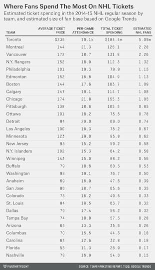
As you can see, there’s a strong correlation. Nine of the 10 most popular teams based on Google searches also ranked in the top 10 in ticket sales this season, the exception being the Philadelphia Flyers.
Further, there are huge differences in ticket sales between the top and bottom teams. Whereas fans spent only $27 million on Florida Panthers tickets this season, they shelled out more than $184 million (in U.S. dollars) to see the Toronto Maple Leafs play.
Most of the differences are based on discrepancies in ticket prices rather than attendance. The NHL is a terrific live-spectator experience — I say this as someone who spends way too much on Rangers tickets — and most NHL teams can sell out their arenas if they charge the right price. But the right price varies. Whereas the average ticket cost $236 in Toronto, it was $74 in Tampa.
The relationship is even clearer if we chart the data:
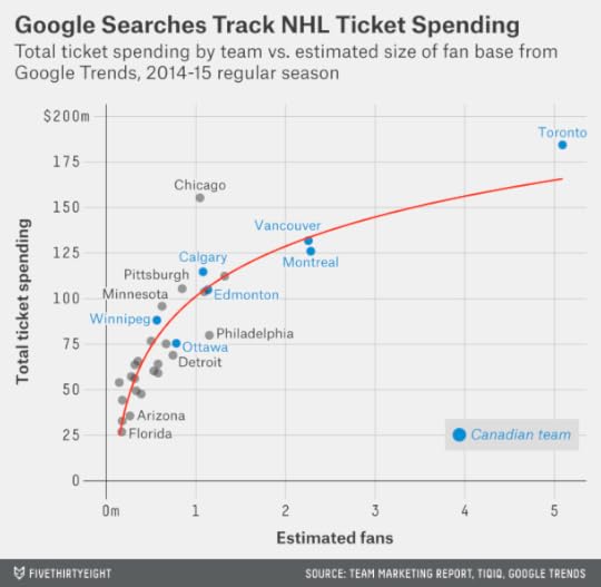
You’ll notice that there are some diminishing returns to having more fans in your area.3 Perhaps this is because there are only so many good seats available for each game or because larger markets like Toronto and New York have more non-hockey substitutes for the fan’s entertainment dollar.
Still, the correlation is clear, and very strong. The size of the fan base, based on Google searches, accounts for 81 percent of the differences in ticket sales.4
You could undoubtedly do a bit better still by accounting for other factors, like how well the team has played recently. The on-ice success of the Chicago Blackhawks may explain why they do so well at the box office, for instance.
But there aren’t a lot of exceptions, and there aren’t a lot of favorable precedents for a hockey team in Las Vegas. The Nashville Predators are a comparative success story — they’re a very good team that’s made some inroads in a highly non-traditional hockey market. And yet, while the Preds are usually selling out their rink, fans are paying comparatively little for tickets. So Nashville ranked just 24th in NHL ticket spending this year, and the Predators have barely been breaking even financially.
Several other teams in non-traditional hockey markets — the Arizona Coyotes and Florida Panthers, for instance — are losing money. And most of them play in metro areas with considerably larger populations than Las Vegas.
When should you be skeptical of Google Trends data? Sometimes ambiguities of language can cause problems. (Do you mean Kenny Rogers the singer or Kenny Rogers the pitcher?) And as the complexity of the analysis increases, so can the potential for error. It proved to be more difficult than Google expected to determine which searches predicted flu outbreaks, for example — although that was more an issue of flawed analysis than faulty data.
In this case, though, Google is just stating the obvious: Putting an NHL team in a small market in the middle of the desert isn’t a good gamble.

April 22, 2015
Las Vegas Is A Terrible Place For An NHL Team
There ought to be more NHL teams in Canada, which has only seven of the 30 NHL franchises despite having about as many hockey fans as the United States.
And there perhaps ought to be fewer in midsize American markets, especially those far from the Canadian border. According to my previous research, the six current NHL markets with the fewest number of hockey fans are Nashville, Miami, Raleigh, Columbus, Phoenix and Tampa. Those franchises lost a collective $51 million in 2013-14, according to Forbes.
Now there’s momentum to place an NHL expansion team in Las Vegas, another idea that makes little sense.
Our 2013 analysis estimated that there are just 91,000 NHL fans in metro Las Vegas. That’s tiny even by comparison to the six smallest NHL markets that I mentioned before, which have between 146,000 (Nashville) and 279,000 (Tampa) hockey fans. And it’s well below Seattle’s 241,000 or Quebec City’s 530,000 fans.
But here’s another reason to be skeptical about Las Vegas: The city has had several professional sports franchises (albeit none from the four or five largest North American sports leagues), and it hasn’t supported them very well.
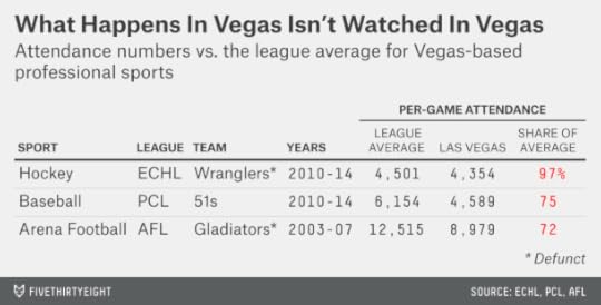
Consider that the city’s Triple-A baseball franchise, the Las Vegas 51s of the Pacific Coast League, had the lowest attendance in the PCL last year.
Or that the city’s professional hockey franchise, the Las Vegas Wranglers of the ECHL, disbanded earlier this year after years of middling attendance and an inability to find a suitable home arena.
The Las Vegas Gladiators of the Arena Football League were relocated to Cleveland in 2007 after five seasons of attendance well below AFL averages. Las Vegas has a new AFL team this season, the Las Vegas Outlaws, but their attendance was poor in their first two games.
You could make an optimist’s case for the NHL in Las Vegas. The number of fans will grow, undoubtedly, if the league places a franchise there. The city gets a lot of tourists (it has about 150,000 hotel rooms), which adds to the functional size of its population.5 And Las Vegas’s population is growing, although the rate of growth has slowed since the housing bust.
But it’s asking a lot for Las Vegas to support a major league team when it’s struggled to support pretty much every minor league team that’s tried to play there. If the city has some positives, it also has some negatives, like irregular working hours, middling public transit and abundant competition for the entertainment dollar, which may depress sports attendance.
To their credit, the backers of the Las Vegas NHL franchise, after a monthslong campaign, have gotten commitments from about 11,000 would-be season ticket holders. That sounds impressive until you consider that the Winnipeg Jets sold out their entire allotment of 13,000 season tickets in 17 minutes after the Atlanta Thrashers were relocated there in 2011. Hockey’s a bit more popular on the frozen tundra than in the middle of the desert.
There is a much better case for an NBA team in Las Vegas. NBA avidity is already well above average there, based on the number of Google searches for NBA-related topics. The NBA, unlike the NHL, has had success in similar markets, like San Antonio and Oklahoma City. And the only sports team that’s consistently been a good draw in Las Vegas is a basketball team: The UNLV Runnin’ Rebels averaged almost 14,000 fans per game from 2009-10 through 2013-14.6

April 17, 2015
Is Vegas Underrating The Warriors?
Our NBA playoff projections, which are based on a version of Jeremias Engelmann and Steve Ilardi’s Real Plus-Minus ratings (RPM), give the Golden State Warriors a 48 percent chance of winning the NBA title. Other statistical systems hold the Dubs in similarly high regard: The playoff probabilities at Basketball-Reference.com give them a 47 percent chance of winning a ring, and John Hollinger’s playoff odds put their chances at 38 percent.
Gambling markets are more skeptical of Golden State. According to PredictWise, which compiles odds from Betfair and removes the “vig” (house cut), bettors have the Warriors with a 27 percent chance to win the title. And a number of sportsbooks consider LeBron James’s Cleveland Cavaliers to be the title favorites.
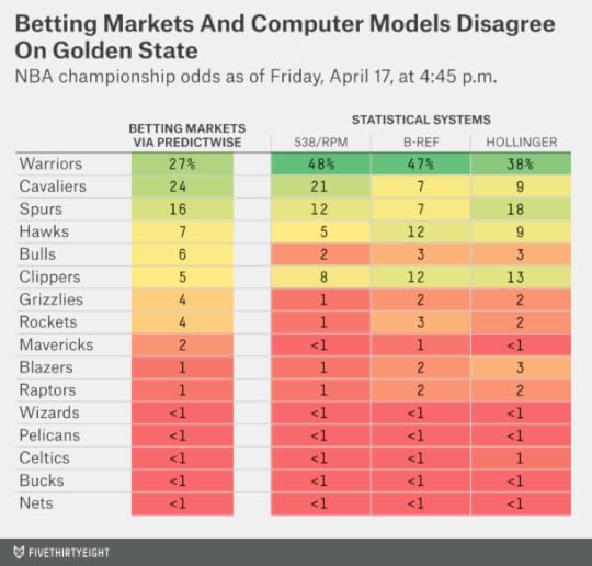
So here’s a gut-check. The Warriors, with a 67-15 regular-season record, are the top overall seed and will have home-court advantage throughout the playoffs. How often does the top overall seed1 win the title?
The answer — since the NBA expanded the playoffs to 16 teams in 1984 — is 45 percent of the time, almost exactly the chances RPM assigns to the Warriors. The top seed has won 14 titles in 31 attempts.
YEARTEAMREGULAR-SEASON RECORDWON TITLE1996Bulls72-10✔1997Bulls69-13✔1986Celtics67-15✔1992Bulls67-15✔2000Lakers67-15✔2007Mavericks67-152008Celtics66-16✔2009Cavaliers66-162013Heat66-16✔1987Lakers65-17✔2006Pistons64-181985Celtics63-191989Pistons63-19✔1990Lakers63-191991Blazers63-191994Sonics63-192012Spurs50-161984Celtics62-20✔1988Lakers62-20✔1993Suns62-201995Spurs62-201998Jazz*62-202005Suns62-202011Bulls62-202014Spurs62-20✔2002Kings61-212004Pacers61-212010Cavaliers61-211999Spurs37-13✔2003Spurs60-22✔2001Spurs58-24And the Warriors, with 67 wins, are better than your average top seed. Since 1984, nine other top seeds have finished within two games of the Warriors’ regular-season win total (somewhere between 65 and 69 wins). Those teams went 7 for 9 in winning titles. In contrast to the single-elimination NCAA basketball tournament, the best-of-seven format in the NBA playoffs has historically allowed elite teams to rise to the top.
We certainly do not recommend you naively trust statistical systems ahead of the handicappers. Vegas is really tough to beat. Gamblers can account for all the information in systems like RPM — plus whatever other data they think is relevant, like postseason experience or how teams match up with one another or the San Antonio Spurs beating the odds again and again.
Still, we’re a little more likely to give credence to complex systems like RPM when they’re also able to pass simple gut-checks like this one.

Is Bush Doomed In The General? (Or: A Lesson In Conditional Probability)
If you compare Hillary Clinton’s favorability ratings to Jeb Bush’s, you’ll find what seems like a sign of impending doom for the Republican should he face her in the general election. Whereas Clinton’s favorability ratings are break-even,1 Bush’s are poor, with a 31 percent favorable rating and a 45 percent unfavorable rating.
Most of the time you’re better off ignoring these early polls. Some of this is on general principle: A lot can and will change between now and next November.
But there’s also a particular reason for Democrats not to get giddy about Bush’s polling: He’s a long way from winning the Republican nomination. In fact, his poor favorability ratings are in substantial part the result of his tepid support among fellow Republicans. Either Bush will become more popular among Republicans — or they won’t pick him. So citing his current favorability numbers as a general election weakness doesn’t make a lot of sense.
In the graphic below, I’ve listed current favorability ratings for Clinton, Bush and some other candidates (real and potential), broken out by party.2 As you can see, there’s very little support across party lines. Clinton and Joe Biden get terrible ratings among Republicans. None of the Republican candidates get much support among Democrats.
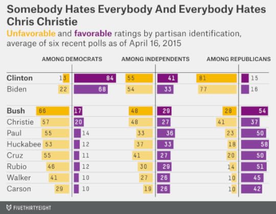
But whereas Clinton and Biden have stellar favorability ratings among fellow Democrats, Republicans are more critical of some of their candidates. As compared to Clinton’s 84 percent favorable rating within her party, Bush’s favorable rating is just 54 percent, with an unfavorable rating of 28 percent, among GOP voters. (It could be worse: Chris Christie’s favorability ratings are net-negative even within the GOP.)
But Republicans can afford to be picky with a deep and talented field of candidates. So one of two things is likely to happen between now and the time the general election race heats up:
Either Bush will gain enough support among Republicans to win the nomination, also boosting his favorability rating overall.Or his lack of support among Republicans will prevent him from being picked. In that case, the relevant comparison is between Clinton and alternatives like Scott Walker or Marco Rubio (or even John Kasich). Walker’s and Rubio’s favorability ratings, like Clinton’s, are about break-even, although with much lower name recognition. Few pollsters have bothered to test Kasich’s numbers yet.Perhaps there are some in-between cases — Bush emerges as the wounded nominee of the Republican Party. Especially in the early stages of the primary, the GOP candidates will be subject to attacks from their competitors, harming their image among some Republicans as they seek to endear themselves to others.
But even then, most Republicans will come around to the nominee at some point between the end of the primaries and the late stages of the general election. They did for Mitt Romney in 2012; he eventually won 93 percent of the GOP vote despite a sometimes bumpy road in the primaries.
Bush’s favorability ratings are also not very good among independents, at 29 percent favorable and 48 percent unfavorable. But Clinton’s aren’t much better: 41 percent favorable, 55 percent unfavorable. True, Democratic candidates can tolerate mediocre numbers among independents because there are usually more Democrats than Republicans in the electorate in presidential years. (In 2012, Obama won the overall popular vote by 4 percentage points despite losing independents by 5 percentage points.) So perhaps you can read a stalemate among independents as a good sign for Clinton.
But there’s no guarantee that things will stay that way. Bush, who has fairly moderate policy positions, should theoretically be a good fit for moderates in the electorate once they get to know him better. There’s more evidence that candidate ideology matters than that early-stage favorability ratings do.
Or perhaps Bush really is a dud of a candidate. Indeed, we at FiveThirtyEight are mildly bearish on Bush relative to the consensus. If he’s not able to make a good electability case — and his favorability ratings don’t help — Republicans have little reason to pick him ahead of alternatives who are closer to the base ideologically.
But it’s Bush’s nomination chances we’re bearish about — in many ways, the nomination is the tougher hurdle since it’s a multi-candidate race. In analyzing the general election race, it’s only the conditional probabilities that matter. If Bush is good enough to win the primary, he’s probably good enough to give Republicans about a 50-50 shot of winning next November.

April 14, 2015
A Simple, Knicks-Proof Proposal To Improve The NBA’s Draft Lottery
The New York Knicks did something unusual Monday night: They won a basketball game — just their 17th this season. What wasn’t so unusual — from a franchise that starred in such tragicomedies as Amar’e Stoudemire punching a fire extinguisher and Andrea Bargnani nearly snatching defeat from the jaws of victory — was the Knicks’ poor sense of timing. Having spent most of the season ridding their roster of anyone who could possibly help them win, the Knicks have now won twice in a row.
Those two wins could make a lot of difference to the Knicks’ chance of drafting Jahlil Okafor or Karl-Anthony Towns. With one game left for each team, the Knicks are 17-64, a game better than the Minnesota Timberwolves at 16-65. The Philadelphia 76ers have the third-worst record at 18-63.
Let’s say each team loses its final game. Under the NBA’s lottery formula, the Timberwolves would have a 25.0 percent chance of landing the first pick, the Knicks would have a 19.9 percent shot, and the Sixers a 15.6 percent chance.
That seems like an awfully big difference for teams that are separated by just one or two games in the standings. But it’s how the NBA’s rules work. The number of losses doesn’t matter, only the order of the teams.3
There’s a better way to award those pingpong balls, one that maintains the spirit of the current lottery system without allowing a one-game difference to matter so much.
Here’s how it works. Take each team’s number of losses. Subtract 41 (41-41 represents a breakeven record in the NBA). Then square the result. That’s how many pingpong balls a team gets. (OK, one more provision: A team gets a minimum of 10 lottery balls, including if it has a winning record.4)
That might seem arbitrary — but it produces results that are remarkably similar to the current formula, only fairer. What chance would each team have at the first pick this year, for example? Assuming each team’s final game goes according to the FiveThirtyEight NBA Power Ratings,5 that would leave the Wolves with a 22.0 percent chance at the first pick, the Knicks at 20.3 percent and the Sixers at 18.6 percent.
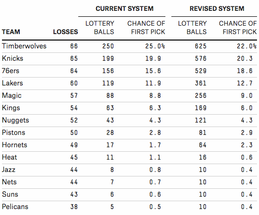
That’s more proportionate to the small difference separating Minnesota, New York and Philly in the standings.
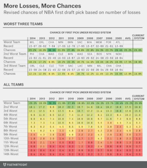
Here’s how the lottery balls would have been distributed in each of the past 10 seasons.6 On average, the worst team would have had about a 25 percent chance of winding up with the top pick, as it does now. But those chances would have been as high as 38.5 percent (for the record-setting 2012 Charlotte Bobcats) or as low as 19.0 percent (for the 2013 Orlando Magic), depending on how much separated the very worst team from the almost-as-bad ones. In a year like 2010, in which there was a big gap between the second-worst team (the 15-67 Timberwolves) and the third-worst (the 25-57 Sacramento Kings), that’s where the sharpest break in lottery chances would have been.
It’s not the radical change that I’d prefer! But it’s a simple enough reform that even the Knicks couldn’t screw it up.
CORRECTION (April 15, 3:36 p.m.): An earlier version of the chart in this post gave the incorrect location of the second-worst NBA team in 2005. At that time, the Hornets were located in New Orleans, not Charlotte.

Kasich Could Be The GOP’s Moderate Backstop
Does Ohio Governor John Kasich, who is reportedly considering a presidential bid, have much chance against Republican heavyweights like Jeb Bush, Scott Walker and Marco Rubio? He might, if the party decides it prefers a moderate to a conservative.
There’s nothing wrong with Kasich’s credentials. He won re-election by 31 points last year in the swingiest swing state in the land, and he maintains sky-high approval ratings in Ohio.
But he starts at a substantial name-recognition deficit. Even among Iowa Republican caucus-goers — perhaps the nation’s most informed group of GOP voters — just 36 percent knew enough about Kasich to have formed an opinion of him.
But nothing cures a name-recognition deficit like money to run advertisements and build a campaign operation, and Kasich is no fundraising lightweight. He brought in $21 million in his re-election bid last year, a solid total for a noncompetitive race.
Still, how does he position himself against candidates like Bush who have gotten off to a faster start?
The answer is pretty simple: Kasich can be the most electable representative of the moderate wing of the Republican Party.
Kasich has a relatively moderate track record, according to the various statistical systems that measure a candidate’s ideology. In fact, he’s right between Jeb Bush and Mitt Romney on the ideological spectrum:

But Kasich can position himself as being more electable than Bush, who has dismal favorability ratings with the broader electorate, or New Jersey Governor Chris Christie, whose ratings are even worse (there’s barely any national polling data on Kasich’s favorability):
Bush’s favorability ratings may improve. It’s strange, in some ways, that so many voters have an opinion about him, since he last ran for election in 2002. Some voters may be mistaking him for his brother, former President George W. Bush, when asked about him in polls.
But suppose that Republicans do know who Jeb Bush is and have reason to worry that he would underperform on the fundamentals against Hillary Clinton. And assume, as we do, that Christie has little chance to see his favorability ratings recover. That leaves some room for Kasich, who can brag about his big victory margins in Ohio.
Of course, if Republicans are satisfied that they can nominate an electable conservative, like Rubio or Walker, that would trump the rationale for choosing an electable moderate. That’s why we think the most likely outcome — if Bush has a rough rollout — is an improved chance for Rubio and Walker. But Kasich may have as good a shot as anyone outside the GOP’s top tier.

April 12, 2015
Clinton Begins The 2016 Campaign, And It’s A Toss-up
There’s already plenty of bad punditry regarding the chances of Hillary Clinton — who officially announced her candidacy on Sunday — to become the 45th president. You can find Democrats boasting about their “blue wall” in the Electoral College and how hard this will make it for any Republican to win. Or Republicans warning that the Democratic Party rarely wins three elections in a row.
Most of this analysis is flimsy. So is the commentary about the ups-and-downs in early swing state polls. And when you see some pundit declaring a minor misstep to be a “game changer,” find someone else to follow on Twitter.
The truth is that a general election win by Clinton — she’s very likely to become the Democratic nominee — is roughly a 50/50 proposition. And we’re not likely to learn a lot over the rest of 2015 to change that. Here’s why:
Incumbency and Obama’s Approval Rating. Start with the fact that there’s no incumbent president running. There actually haven’t been a lot of cases that precisely meet the circumstances voters will face next year: Barack Obama, assuming he serves out the rest of his term, will become just the fifth president limited by the 22nd Amendment from seeking an additional term in office.1 This is slightly different from the case where an incumbent voluntarily declines to run again.2 Still, the evidence we have from presidential elections and from other contexts like gubernatorial elections is that these cases default to being toss-ups.
Clinton’s chances will be affected by Obama’s popularity as he exits office. The relationship between the popularity of the previous president and the performance of the new nominee from his party isn’t perfect — Al Gore (narrowly) lost in 2000 despite Bill Clinton’s popularity, for example — but it certainly matters some, especially given that Clinton served in Obama’s cabinet.
However, Obama currently has an approval rating of about 45 percent, and a favorability rating of 48 percent — about average, in other words. If those numbers decline into the low 40s or climb into the 50s, they could matter more, producing either a “hangover effect” or “halo effect” for Clinton. But don’t bet on this: Obama’s approval ratings have been extraordinarily stubborn for most of his presidency, rarely deviating much from the mid-40s.
The Economy. I’d warn against simplistic economic “fundamentalism,” the notion that the economy is pretty much the only thing that matters. We’ll save the technical discussion for later, but because of a problem known as overfitting, statistical models that claim to make remarkably precise predictions about election outcomes from economic variables alone (without looking at polls) have a mediocre track record.
Still, the economy will matter a lot to voters, and a better economy will help Clinton, the candidate from the incumbent party. As Byron York points out, you should be wary of claims that 2016 will be a “foreign policy election.”3
Like Obama’s approval ratings, however, the performance of the American economy has been about average recently. GDP grew by 2.4 percent in 2014, adjusted for inflation, close to the historical average. Furthermore, we know relatively little about what economic growth will look like a year from now, when the general election campaign heats up. Historically, economists have shown almost no ability to predict the rate of economic growth more than six months in advance.
The Electoral College And The “Emerging Democratic Majority.” What about that “blue wall” — the supposed advantage that Democrats hold in the Electoral College?
Mostly, the “blue wall” was the effect of Obama’s success in 2008 and 2012, not the cause of it. If the economy had collapsed in the summer of 2012, Obama would probably have lost the election, and most of those blue states would have turned red.
It’s true that in both elections, the “tipping-point state” (in both years it was Colorado) was slightly more Democratic than the country as a whole. That implies Obama would have won if the popular vote had been very close. But it would have had to be very close indeed — within a percentage point or two.
That advantage is small enough that it might have been the result of circumstances peculiar to Obama and his campaign. If Clinton has an ever-so-slightly different coalition — say more working-class whites vote for her but fewer African-Americans — this small advantage could evaporate or reverse itself. (The Electoral College favored Republicans as recently as 2000, after all.) The same might be true if she isn’t as effective as Obama at mobilizing voters in swing states.
Another theory — the so-called “Emerging Democratic Majority” — holds that demographic trends favor the Democratic Party. We’ll have a lot more to say about this theory between now and next November, but it’s probably dubious too.4 As Sean Trende has pointed out, it relies on a selective reading of the evidence — emphasizing 2012, 2008 and 2006 but ignoring 2014, 2010, and 2004. Perhaps more important, predictions made on the premise of “emerging” majorities have a miserable track record: Republicans were bragging about their “permanent” majority in 2004, for instance, only to get their butts kicked in 2006 and 2008.
Clinton and the Republican Candidates. The factors I’ve described so far are sometimes referred to as the “fundamentals” — those things that matter regardless of the candidates and their campaigns. The closer these basic factors are, the more difference the candidates could make.5
Nonetheless, the candidates matter less in U.S. presidential elections than in just about any other type of electoral contest. The reason is that the arduous, 50-state nomination process (and the “invisible primary” before it) screens out most candidates who would be huge liabilities to their party. An underqualified or unvetted or politically extreme or profoundly unpopular candidate might win one primary or caucus, but voters and the political parties will move to stop him in his tracks after that, as Republicans did to Newt Gingrich in 2012.
Consider the three measurable factors that our U.S. Senate model uses to evaluate candidates. One of them is their qualifications on a 4-point scale as measured by their highest elected office, where the highest rating goes to those candidates previously elected as governors or senators. Almost all presidential candidates — including Hillary Clinton and the viable Republican candidates this cycle — rate as extremely well qualified by that standard.
Another factor is fundraising, which is important unto itself, but also as a proxy for a candidate’s organizational strength. We’re not breaking any news here, but Clinton and the Republican nominee are going to raise oodles of money — probably in excess of $1 billion each, beyond what Obama and Mitt Romney did in 2012. That’s well past the point of diminishing returns. The candidates may struggle to make good use of all the money they’ve raised, in fact, and if one brings in 10 or 20 percent more than the other, it’s not likely to matter very much at the margin.
The third factor is a candidate’s ideology as measured on a left-right scale. “Extreme” candidates (like Barry Goldwater) suffer an electoral penalty, while moderate ones (like Dwight Eisenhower) usually perform well.
But nominees like Goldwater (or George McGovern) are rare. So are those like Eisenhower, for that matter. Usually a party nominates a candidate closer to the median of its voters and elected officials.
That’s part of why Clinton is such a safe bet to be the Democratic nominee. Her political positions are essentially those of a “generic Democrat.” She’s neither a true centrist, nor extremely far to the left, so she’s not especially vulnerable to a challenge from either flank of her party.
Republicans have a choice between more moderate and more conservative candidates. Jeb Bush’s positions might be just moderate enough to give Republicans a slight advantage next November, other factors held constant, while Scott Walker’s might be conservative enough that they could harm Republicans.
But the positions of the Republican candidates are likely to converge toward one another. Bush, in the primaries, will seek to prove his conservative credentials, while Walker, should he become the frontrunner after the first few primaries and caucuses, will work to reassure GOP elites that he’s an “electable” alternative and not the next Goldwater. By next November, the difference might boil down to the equivalent of couple of percentage points on the general-election ballot. It could matter in an a close election, but not one where the fundamentals have shifted strongly to one party by then.
Finally we can look at what the polls say right now. If you’re going to do this, you should take the polls with whole tablespoons full of salt. And it’s probably best to look at the favorability ratings for each candidate rather than head-to-head polls, since favorability polls allow voters to say they don’t know enough about the candidates to have formulated an opinion. (Head-to-head polls taken this far out from the election will tend to favor candidates like Clinton with strong name recognition, by contrast.)
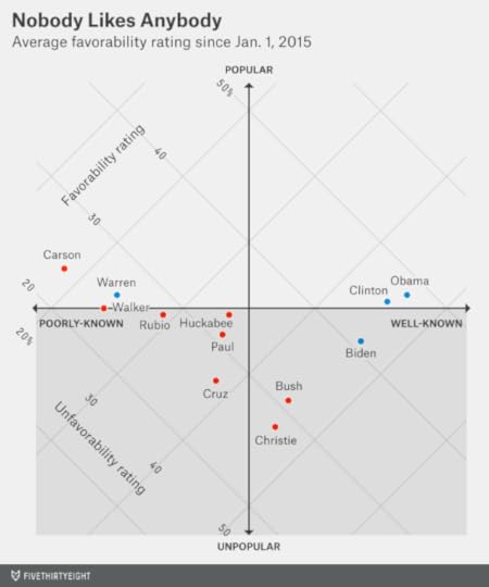
In the chart below, I’ve compiled favorability rating averages for each candidate based on polls conducted since Jan. 1.6 The chart plots the candidates in two dimensions: the vertical axis indicates how popular the candidate is (how much the candidate’s favorable rating exceeds his or her unfavorable rating) while the horizontal axis plots how well-known the candidate is.
Hillary Clinton is extremely well-known, but her favorability ratings are now only break-even: 46 percent favorable and 45 percent unfavorable. These are nearly identical to President Obama’s ratings, which are 48 percent favorable and 46 percent unfavorable.
Clinton’s ratings are down sharply from her tenure as Secretary of State. However, as we’ve been warning Democrats for a long time, a lot of this was predictable. Clinton’s numbers have often been about break-even when she’s been a highly partisan figure — during the early stages of the 2008 campaign, for example — and better only when she’s been above the fray of day-to-day partisan politics.
Break-even favorability ratings don’t look so bad, however, when compared to some of the alternatives. Vice President Biden’s are net-negative, for instance. On the Republican side, Walker and Marco Rubio aren’t all that well-known yet, but their ratings are also about break-even. Chris Christie’s are terrible (28 percent favorable, 46 percent unfavorable). Jeb Bush’s are quite poor too. His unfavorable rating is already as high as Clinton’s, 45 percent, but his favorable rating is just 31 percent.7
Clinton is so well-known, in fact, that it’s almost as if voters are dispensing with all the formalities and evaluating her as they might when she’s on the ballot next November. About half of them would like to see her become president and about half of them wouldn’t. Get ready for an extremely competitive election.
Editor’s note: This article was updated to reflect Clinton’s announcement of her candidacy this afternoon.

Nate Silver's Blog

- Nate Silver's profile
- 729 followers

