
Nate Silver's Blog, page 152
June 9, 2015
Blatter’s Reign At FIFA Hasn’t Helped Soccer’s Poor
It might seem hard to defend Sepp Blatter, the FIFA president who announced his resignation last week in the wake of a global soccer corruption investigation by the U.S. Department of Justice.
But a few brave souls have tried. Branko Milanović, a developmental economist at the City University of New York Graduate Center, wrote that while FIFA’s corruption may be regrettable, the decentralization of power under Blatter has at least contributed to the “spread of the game to the rest of the world” beyond the traditional European and South American soccer powers.
FIFA’s governing structure and its corruption are clearly related. Through its “one country, one vote” principle and its policy of allocating development funds fairly evenly across countries — Comoros and Brunei get about as much money from it as China and Brazil — Blatter can command the loyalty of a majority of FIFA’s members even if they represent a minority of the world’s population, soccer audience and soccer revenue stream.
But here’s the problem. Despite FIFA’s having earmarked more than $2 billion in soccer development funds under Blatter, there’s no evidence that the soccer playing field has become more level — at least not when measured by success on the pitch. In international play, the European and South American countries are as dominant as ever, while Africa has made little progress and Asia has perhaps regressed. Nor is there any evidence that poorer countries have become more competitive in soccer relative to wealthier ones. If anything, the disparity has grown since Blatter became president in 1998.
The rest of this analysis will be pretty simple. We’ll compare the Elo rating for each country’s men’s7 national team as it was on June 8, 1998 — the day Blatter took over as FIFA president, a few days before the 1998 World Cup — to what it is now.8 (For more background on Elo ratings, see here. Higher ratings are better, and 1500 represents an average team. You can find all of the data we’re using in this article at GitHub.)
First, we’ll look at performance by region, with countries divided according to the six continental confederations under FIFA.9 For each confederation, we’ve listed Elo ratings for the 10 largest countries in descending order of population, along with the confederation average,10 weighted by population.11
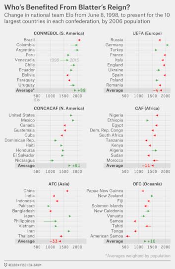
Europe (UEFA) and South America (CONMEBOL) remain the dominant soccer continents. Although some individual countries in Europe (Germany, Turkey) have improved their national teams since 1998 and others have seen them decline slightly (Italy, Russia), the continent as a whole has seen little overall change under Blatter. UEFA’s average Elo rating, weighted by population, is 1793, almost identical to its 1797 rating when Blatter took over.
South America, however, has improved considerably. Although Brazil’s Elo rating is not much changed from where it was in 1998, five of the 10 CONMEBOL countries (Argentina, Chile, Colombia, Venezuela and Uruguay) have improved their Elo rating by more than 100 points. This is interesting given that CONMEBOL is poorly represented under “one country, one vote,” representing 4.8 percent of FIFA members but 13.5 percent of the World Cup audience.
But what about the rest of the world?
The closest thing to a success story is the North American confederation, CONCACAF, which has improved its Elo rating by a population-weighted average of 61 points since 1998. Partly that reflects the continued development of the U.S. and Mexican national teams, since the United States and Mexico represent more than three-quarters of CONCACAF’s population, though other members of the confederation have improved on average too. Still, while that might be good news for North American soccer fans, it doesn’t help Blatter’s argument that he’s helped spread the wealth: CONCACAF has the highest per capita GDP among the six confederations.
The poorest confederation, by contrast, is Africa (CAF), but it’s shown little improvement soccerwise. In the 2014 World Cup, its countries combined for three wins, three draws and 11 losses.12 The 2010 World Cup, held in South Africa, wasn’t much better, with only Ghana advancing to the knockout stage among the six African entrants. Overall, Africa’s combined Elo rating is 1483, no better (indeed, slightly worse) than it was 17 years ago.
Asian (AFC) teams seemed to have nowhere to go but up in 1998, with a continental average Elo rating of just 1323 when Blatter took over. The expansion of the World Cup from 24 to 32 teams in 1998 doubled the number of Asian participants, and the continent was host to the World Cup for the first time (in Japan and South Korea) in 2002. Instead, however, Asian nations have mostly seen their performance decline. Of the 45 AFC members to field a national team in 1998, 28 have a lower Elo rating now. This includes the two most-populous countries in the world. China’s men’s team has stagnated, still having qualified for the World Cup only once in its history (2002), while its women’s team, once the major global rival to the United States and Germany, has regressed. India, meanwhile, hasn’t come close to qualifying for the World Cup for many years, a description that also holds for other poor but populous Asian countries such as Indonesia, Pakistan and Vietnam.
Finally, in the Oceania confederation (OFC), New Zealand has improved its performance since 1998, while the other, poorer members of the confederation have declined on average. (Australia, which defected from the OFC to the AFC in 2006, is counted under Asia instead.)
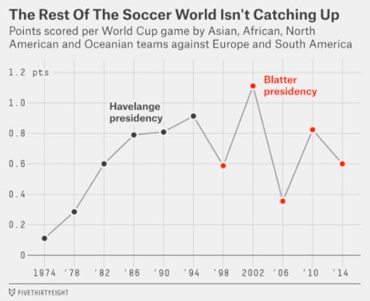
As a sanity check, I’ve also listed the World Cup record of teams from “the rest of the world” — that is, CONCACAF, AFC, CAF and OFC — in matches against Europe and South America.13 In the five men’s World Cups contested under Blatter, the rest of the world had 25 wins, 42 draws and 98 losses against Europe and South America, accumulating 0.71 points per match.14 That’s slightly worse than the final three World Cups, 1986, 1990 and 1994, under Blatter’s predecessor João Havelange. And while progress was steadily upward under Havelange — points per match for the rest of the world increased in each World Cup from 1974 through 1994 — their best performance under Blatter, 2002, is now four World Cups behind us.
Nor have poorer nations improved their performance relative to wealthier ones. The next chart divides countries into quintiles based on their per capita GDP15 and tracks how their Elo ratings have changed since 1998:
GDP PER CAPITA PERCENTILEAVERAGE ELO CHANGE, POP. WEIGHTED80-100th+1560-79th+3440-59th+420-39th-340-19th-8There’s not much of a pattern. But if anything, the wealthier countries have gained ground on the poorer ones. The top two quintiles (the richest 40 percent of countries) have seen their Elo ratings improve by a population-weighted average of 24 points, while the bottom two (the poorest 40 percent) have seen them decline by 30 points. In particular, a number of high-population countries that rank somewhere between the 20th and 39th percentile in per capita income, like China, India, Indonesia and Nigeria, have failed to improve their soccer programs at all, at least judging by their results in international play.16
One last question. Have low-population countries gained ground relative to high-population ones? It’s not clear that this is a desirable outcome, but it might be what we’d expect given that under Blatter, FIFA has allocated developmental funds almost without regard to population. (A few million dollars should go much further in a country of 500,000 people than one of 50 million.) But there’s no evidence of this either. Countries with a population of less than 10 million people had an average Elo rating of 1280 in 1998; it’s virtually unchanged at 1283 now.
Perhaps FIFA’s development funds are too small to make a difference. Or perhaps, given the corruption in the organization, a lot of the money earmarked for soccer development is being used to enrich local plutocrats at the expense of their countries’ soccer programs.


June 8, 2015
‘Live By The Three, Die By The Three’ Is Mostly A Myth
“You’ll shoot your eye out,” I kept thinking while watching Game 2 of the NBA Finals on Sunday. The Warriors hoisted 35 3-point attempts and made only eight of them en route to scoring just 93 points. It was a maddening, sloppy game full of what-ifs. So … what if the Warriors had sunk threes at their normal accuracy rate?17 They would have won 111-95.
Were the Warriors just unlucky? Their opponents, the Cleveland Cavaliers, were not a particularly good defensive team during the regular season, either overall or against perimeter shooters, although they may be better with Iman Shumpert and Matthew Dellavedova and Tristan Thompson getting more minutes because of injuries. The Cavs forced the Warriors into some bad possessions, but the Dubs also missed on some good looks, shooting just 2-for-11 on corner threes.
But there’s also the old adage: Live by the three, die by the three. If your shooters are going to get crazy hot on some nights, isn’t it inevitable that they’ll shoot a bunch of bricks on another, rendering a team’s offense more inconsistent and making it more upset-prone?
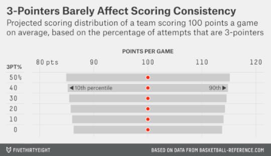
Let’s look at some data from the 2014-15 regular season. In the chart below, I’ve sorted teams by the percentage of their field goals that were taken from 3-point range. Then I’ve looked at their game-by-game scoring, calculating their scoring range (as I’ll describe it throughout this article) as the span including the middle 80 percent of their games (that is, throwing out their top 10 percent and bottom 10 percent of performances).
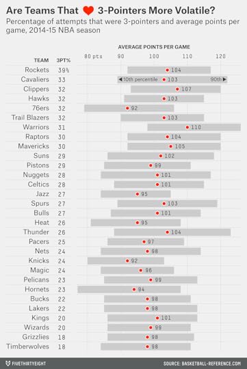
The Warriors, for instance, averaged 110 points per game in the regular season, while their scoring range ran from 98 points (at the 10th percentile) to 126 points (at the 90th percentile), a 28-point difference. That seems like a wide range … but it’s perfectly normal. The average NBA team this season had a 27-point scoring range. The average range since 1979-80 (when the 3-point shot was introduced) is 28 points.
The Warriors weren’t the league’s most three-happy team, however. They were just seventh — behind the Houston Rockets, Cleveland Cavaliers, Los Angeles Clippers, Atlanta Hawks, Philadelphia 76ers and Portland Trail Blazers. So maybe the Dubs were pretty steady, but were those other teams inconsistent?
The Cavaliers were inconsistent: Their scoring range spanned 33 points, tied for the second-highest total in the league after Oklahoma City.18 But Houston, which took 39 percent of its attempts from long range (easily an NBA record), had a scoring range of just 25 points, below the NBA average. The three-happy Atlanta Hawks had a scoring range of just 24 points.
What’s going on here? Are teams that shoot a lot of threes actually more consistent than others? (Maybe they’re more resilient when facing different types of defenses or benefit from having better floor spacing?)
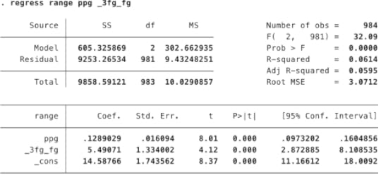
Actually, it’s mostly just because this data is pretty noisy. I ran a regression on all NBA teams since 1979-80 to predict their scoring range based on (i) the percentage of their field goal attempts that came from behind the arc and (ii) their per-game scoring average. Both variables have a positive and highly statistically significant relationship with a team’s scoring range. Teams that score more points have a wider scoring range, and, once you control for that, teams that shoot more threes do also.
But statistical significance is not the same thing as practical significance. In the context of an actual basketball team, this result will make very little difference.
Suppose, for instance, that a team scores 100 points per game and that 40 percent of its field-goal attempts are 3-pointers — higher, even, than this year’s record-setting Rockets. Its scoring range, according to the regression analysis, projects to be 29.7 points.
What about a team that scores 100 points but does so with only 10 percent of its shots being threes? No team has shot such a low percentage of 3-pointers since the 1999-2000 Philadelphia 76ers, but we’ll run the numbers just for fun. That team, according to the regression, would have a scoring range of 28.0 points. So it’s more consistent, but only barely so; its scoring range is only 6 percent narrower. This just really doesn’t matter much.
What matters a lot more, of course, is how effective a team is at scoring overall. The Oklahoma City Thunder, as I mentioned, had the most inconsistent offense in the regular season. But their 10th percentile score, 88 points, was still better than two-thirds of the league because they had a high per game scoring average.
And Golden State’s 10th percentile score, 98 points, was better than what almost a third of NBA teams scored on average per game. The Warriors will have better shooting nights than they did Sunday, but their bad nights aren’t indicative of a fundamental problem — they’re just bad nights.
CORRECTION (June 9, 11:45 a.m.): An earlier version of this article incorrectly said that if the Golden State Warriors had made 3-pointers at their regular-season accuracy rate, they would have won Sunday’s NBA Finals game 117-95. They would have won 111-95.

June 5, 2015
What Kyrie Irving’s Injury Could Mean For The Cavs’ Chances
Maybe God really does hate Cleveland. The Cleveland Cavaliers led for much of Game 1 of the finals against the Golden State Warriors and had a better than 70 percent shot at winning it when LeBron James put the Cavs up by four with 5:08 left to play. They lost anyway, and they lost their point guard, Kyrie Irving, in the process. Irving, who played brilliantly in Game 1, is now out for the season after fracturing his knee cap in overtime.
Cleveland entered the series as the underdog — its chances of winning were 25 percent according to our Elo ratings, and 24 percent according to a more advanced system based on Real-Plus Minus.
The Game 1 loss reduced the Cavs’ chances to 17 percent, according to Elo. But Elo is just accounting for the result of the game and not Irving’s injury. How much further might the injury hurt their chances?
There’s actually quite a bit of argument about just how good Irving is, with various statistical systems rating him as everything from a superstar to a merely slightly-above-average player. Rather than seeking to resolve that debate now, I’ll instead take a choose-your-own adventure approach.
Suppose, for instance, that you think losing Irving will hurt Cleveland by a net of 3 points per game, considering both his offensive and defensive contributions and his potential replacements. Three basketball points is equivalent to 84 Elo ratings points.1 So we can re-run the Elo forecasts with Cleveland’s rating 84 points lower than it was originally. That would reduce Cleveland’s chances of winning the series to just 7 percent, according to Elo.
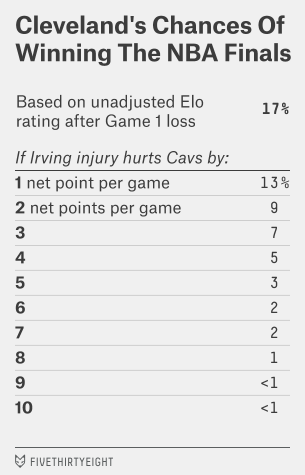 Or, if Irving’s absence hurts the Cavs by 5 points per game, their chances are just 3 percent. You can see the full rundown in the table to the left.
Seven percent is not nothing: amazing and unlikely things happen in sports, especially when a team has LeBron James on the roster. Still, if Cleveland can somehow win without Irving and after losing the first game, the championship could be up there in the curse-breaking pantheon with the Boston Red Sox overcoming a 3-0 A.L. Championship Series deficit against the New York Yankees in 2004.

June 4, 2015
LeBron’s Greatest Challenge: The NBA Finals Aren’t Kind To Underdogs
Let’s play FiveThirtyEight Family Feud. Twenty seconds on the clock.
Name an animal that begins with the letter ‘F’ .
Fox!
Name a famous Super Bowl upset.
Name a famous NBA Finals upset.
I mean… umm, uh.
Uhhhhhhrrrrrrrmm.
That isn’t an easy question. Didn’t Bill Russell’s Celtics once lose in the finals? (They did, exactly once, in 1958 to the St. Louis Hawks.) Wasn’t it kind of an upset when Dwyane Wade and Shaq led the 52-30 Miami Heat to a title in 2006? (It was, though not by much.) The NBA doesn’t lend itself to upsets. When each team has around 100 possessions per game, small differences tend to add up. And the differences really compound over a seven-game series. This has been particularly true in the NBA Finals. Whether by chance or because of the conditions under which finals games are played, underdogs have had an especially low success rate.
The 2015 NBA Finals, which begin Thursday night in Oakland, look like a compelling matchup. Our Elo ratings provisionally rate the Golden State Warriors as the third-best NBA team of all time based on their performance to date. (There’s no big secret here. A 79-18 record — that counts the playoffs — is pretty amazing against this season’s Western Conference competition.) But the Cleveland Cavaliers’ Elo rating has been rising and is at its high point for the season, 1712. Only three finals matchups started with a higher combined Elo rating, and all three involved Michael Jordan’s Bulls.
Maybe LeBron James really is good enough to overcome a middling supporting cast. But his odds aren’t great. The Cavaliers would be only about a 3-point underdog on a neutral court, according to Elo. Over a seven-game series, however — and with the Warriors having home-court advantage in a potential Game 7 — that adds up to just a 25 percent chance of the Cavs winning the series.1 (That matches the odds according to another statistical system we’ve been using to handicap the NBA.) And that may be optimistic if history is any guide.
Elo’s a really simple formula, so there’s a lot it doesn’t account for. You can make a case — we could argue about this for a long time — that past NBA Finals experience matters and could help James. Any lingering effects from the injuries sustained by Stephen Curry and Klay Thompson could matter a great deal to the Warriors, of course. Then again, Cleveland’s also pretty beat up,2 and James’s superpowers were nowhere near enough against the San Antonio Spurs last year.
The other thing is that underdogs have historically been bad bets in the NBA Finals. Here’s every NBA Finals matchup in history, with each team’s Elo rating going into the series and the probability Elo would have assigned to each team winning the series beforehand.
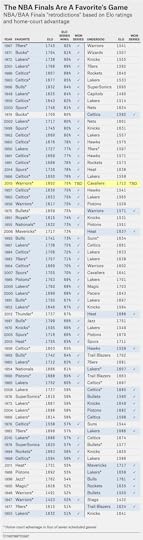
It’s not just your lack of imagination: It really is hard to find monumental upsets in the NBA Finals. By Elo’s reckoning, the biggest one came in 1974, when the Boston Celtics beat the Milwaukee Bucks in seven games. That’s mostly because the Celtics looked worn down during the stretch run, finishing the regular season 27-20 in their final 47 games and deflating their Elo rating. (Plus, the Bucks were no fluke, with both Kareem Abdul-Jabbar and Oscar Robertson on the roster.)
Overall, however, of the 39 series in which Elo would have given one team at least a 2-in-3 chance of winning, the favorite in fact won 35 times, or almost 90 percent of the time.
Why such a high success rate? It could be a statistical fluke; we aren’t looking at all that large a sample. But this phenomenon isn’t unique to the NBA: It also holds for the NFL playoffs, we’ve found. Elo ratings treat regular-season games and playoff games the same. But in both the NBA and NFL, favorites tend to be more dominant in the playoffs, especially late in the playoffs, than they are in the regular season.
The reason may be that some of the “noise” that affects teams in the regular season is absent in the playoffs. No team is coming off a back-to-back, for instance. Teams are going all-out to win, instead of potentially testing out new strategies or resting starters. And at least in theory — although there a lot of NBA fans who would dispute this when refs like Joey Crawford are often involved — the games are adjudicated by the best officials. When you remove some of the quirky circumstances that can cost teams games — bad refs, funky schedules — the best teams tend to prevail more often.
That’s bad news for James, but it will add all the more to his legacy if the Cavs pull the upset off.

June 3, 2015
Memo From A Bitter Rangers Fan: The NHL Just Missed A Ratings Bonanza
The Stanley Cup Final, which begins Wednesday night in Tampa, should be a terrific series for hockey die-hards. The Tampa Bay Lightning play relentless hockey, skating well and shooting well, and led the NHL in goals per game during the regular season. Their opponents, the Chicago Blackhawks, are a fast team and led the league in shots on goal with their precision passing and star talent. What’s more, both teams are relatively healthy despite the grueling playoff chase they’ve endured. The Blackhawks are betting favorites in the series, but only barely.
The thing about the NHL in the United States, though — Canada is totally different — is that it’s very much a local sport. There aren’t a lot of NHL die-hards: There are Blackhawks die-hards and Boston Bruins die-hards and Detroit Red Wings die-hards and, though fewer, Tampa Bay Lightning die-hards.
This is evident in past TV ratings for the Stanley Cup Final. Since NBC and its affiliates took over U.S. coverage in 2006, the series-average rating has been as high as 3.4, when the Blackhawks played another popular American team, the Philadelphia Flyers, and as low as 1.2, when the Ottawa Senators played the Anaheim Ducks. That’s a pretty wide spread: nearly a threefold ratings difference.
There’s not that much mystery to this. You can estimate NBC’s Stanley Cup ratings quite accurately3 based on three factors. First, what game of the series it is — ratings increase the further you go, especially in Game 7.4 Second, whether NBC broadcast the game on its flagship network or on a cable channel like NBCSN. And third and most important, the combined number of NHL fans the two Stanley Cup Final participants have in their local markets, as based on my previous estimates.
Since we’re looking at only U.S. ratings, Canadian teams are treated as having no local market. Keep in mind that Canada has at least as many NHL fans as the U.S. despite its much smaller population, however. Game 7 of the 2011 Stanley Cup Final, between a popular American team (the Bruins) and a Canadian team (the Vancouver Canucks), featured about 8.5 million American viewers and 8.8 million Canadian viewers.
Here’s how the formula, which is based on regression analysis, estimates that NBC will do in the U.S. with the Blackhawks-Lightning matchup (the margin of error on the game-by-game estimates is about plus or minus 1.0 ratings points).
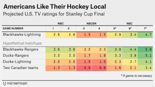
The Blackhawks are a pretty good draw for NBC. Among U.S.-based NHL teams, they have the fourth-largest fan base. The Lightning, however, are sixth from the bottom. It’s roughly an average matchup for NBC, and the series is liable to get about average ratings: probably in the neighborhood of 2.5 for the first two games, 1.5 for Games 3 and 4 on NBCSN, and then 3.0 or higher if the series makes it to Game 5 and beyond.
But what if the New York Rangers had beaten the Lightning instead of not showing up for Game 7, like the Carl Hagelin jersey that was mailed to my apartment two days too late? (I’m not bitter.5) That would be the best possible matchup for NBC. Among U.S.-based teams, the Blackhawks have the best local hockey market in the Western Conference, while the Rangers have the best one in the Eastern Conference (despite sharing it with two other teams). Ratings would likely have been well into the 3s for the series, with a potentially massive number — the model estimates it at 5.8 — in the event of a Game 7.
By contrast, a final between the Lightning and Anaheim Ducks wouldn’t have gotten a great rating. And one between two Canadian teams might have gotten only about half as many U.S. viewers as Blackhawks-Lightning.
This poses some interesting questions for the NHL. The league isn’t all that dependent on its American TV rights — instead, it’s real cash cows are from ticket sales and its Canadian TV contract. But recent Stanley Cup Finals have featured appearances by plenty of popular American teams, like the Blackhawks, Bruins, Flyers, Rangers, Red Wings and Pittsburgh Penguins. One downside of expansion into smaller American markets is that it would reduce the chance for one of the popular teams to make a deep playoff run, possibly reducing the long-term value of the NHL’s American TV rights as a result.
CORRECTION (June 3, 10:42 p.m.): A previous version of this article incorrectly identified one of the teams in the Stanley Cup Final matchup with a 3.4 series-average TV rating in the United States. The Philadelphia Flyers faced the Chicago Blackhawks in that series, not the Boston Bruins.

Polling Is Getting Harder, But It’s A Vital Check On Power
There was plenty of apprehension at the annual conference of the American Association for Public Opinion Research, which I attended last month,6 about the state of the polling industry.
The problem is simple but daunting. The foundation of opinion research has historically been the ability to draw a random sample of the population. That’s become much harder to do, at least in the United States. Response rates to telephone surveys have been declining for years and are often in the single digits, even for the highest-quality polls. The relatively few people who respond to polls may not be representative of the majority who don’t. Last week, the Federal Communications Commission proposed new guidelines that could make telephone polling even harder by enabling phone companies to block calls placed by automated dialers, a tool used in almost all surveys.7
What about Internet-based surveys? They’ll almost certainly be a big part of polling’s future. But there’s not a lot of agreement on the best practices for online surveys. It’s fundamentally challenging to “ping” a random voter on the Internet in the same way that you might by giving her an unsolicited call on her phone.8 Many pollsters that do Internet surveys eschew the concept of the random sample, instead recruiting panels that they claim are representative of the population.
If you’ve been reading FiveThirtyEight, you know that we’ve been writing about these challenges for a long time (as have many of our friends elsewhere). Pollsters have long been worried about these issues too, of course. But until recently, the problems seemed to have relatively little impact on the accuracy of polling. In fact, the polls had a series of American election cycles — especially 2004, 2008 and 2010 — in which they were quite accurate. And while the polls weren’t great in 2012, missing low on President Obama’s performance and that of Democrats generally, they still pointed mostly in the right direction.
But lately, there have been a series of relatively poor outcomes. Polls of the U.S. midterms last year badly underestimated the Republican vote. And there have been mishaps in other Western democracies. Last month, polls of the U.K. election — most of them conducted online — projected a photo-finish for Parliament instead of a Conservative majority.9 The polls also had fairly poor results in last year’s Scottish independence referendum and this year’s Israeli general election.
So if the polls fared poorly, does that mean you should have listened to the pundits after all? Not really: In these elections, the speculation among media insiders was usually no better than the polls and was often worse. Almost no one, save perhaps Mick Jagger, assigned much of a chance to the Conservatives’ big win in the U.K. last month, with some betting shops offering odds of 25-to-1 against a Conservative majority. In the last two U.S. elections, meanwhile, the polling error ran in the opposite direction of what the conventional wisdom anticipated. In 2012, there was a lot of media discourse about how polls might be “skewed” against Republicans. As it happened, the polls were skewed that year but toward Republicans, with Democrats beating the predicted outcome in almost every state. Then in 2014, exactly the opposite occurred. The media discourse was mostly about whether the polls would underestimate Democrats again, but instead they were biased toward Democrats.10
This may not be a coincidence. The views of pollsters, polling aggregators and pundits may feed back upon one another, even or perhaps especially when they’re incorrect. (When to expect a surprise? When no one expects one.) In fact, there’s increasing evidence of a pollster phenomenon known as “herding.” Toward the end of a campaign, pollsters’ results often fall artificially in line with one another as the conventional wisdom forms about the race. In some cases, pollsters have admitted to suppressing polls they deem to be outliers but that would have turned out to be just right. The U.K. pollster Survation, for instance, declined to release a poll showing Conservatives ahead of Labour by 6 points — about the actual margin of victory — because the results seemed “so ‘out of line’ with all the polling,” the company later disclosed. And in the U.S. last year, at least two polling firms declined to publish surveys showing a tight Senate race in Virginia, which in the end was decided by only 18,000 votes in what was almost a historic upset.
There was a lot of discussion about herding at AAPOR. It’s something that probably always has gone on, to some extent. On the eve of an election, if pollsters have one turnout model that shows a result right in line with the FiveThirtyEight or Real Clear Politics average and another showing a “surprising” result, they may not be eager to risk their reputation by publishing the “outlier.”11 But there’s more potential for herding as the fundamentals of polling deteriorate and as polling becomes more technique- and assumption-driven.
The FCC’s proposed restrictions on automated calls could make this worse. At FiveThirtyEight, we’re not huge fans of “robopolls,” which are polls conducted by means of a pre-recorded script. With some exceptions like SurveyUSA, the pollsters who use this tool generally receive poor pollster ratings and are often among the worst herders. But lots of traditional pollsters also use automated dialers to randomly select and dial a number before a human jumps on to conduct the interview. The regulations could make their surveys more expensive as well.
The concern isn’t solely with pre-election “horse race” polls, however. Although they receive a lot of attention, they represent a small fraction of what the public opinion industry does. At AAPOR, there were also representatives of groups ranging from government agencies like the Census Bureau and the Centers for Disease Control and Prevention to commercial measurement groups like the Nielsen Co. All of them rely on random-sample surveys of some kind or another. So do economists; many essential statistics, from the monthly jobs report to consumer confidence figures, are drawn from surveys.
Polls are also essential to understanding public opinion on a host of issues that people never get a chance to vote upon. How do Americans feel about higher taxes on the rich? The Keystone XL pipeline? Abortion? Capital punishment? Obamacare?
Left to their own devices, politicians are not particularly good at estimating prevailing public opinion. Neither, for the most part, are journalists. One reason that news organizations like The New York Times and (FiveThirtyEight partner) ABC News continue to conduct polls — at great expense and at a time when their newsrooms are under budgetary pressure — is as a corrective to inaccurate or anecdotal representations of public opinion made by reporters based mostly in New York and Washington. Polling isn’t a contrast to “traditional” reporting. When done properly, it’s among the most rigorous types of reporting, consisting of hundreds or thousands of interviews with statistically representative members of a particular community.
So then … what should we do if polling is getting harder?
For data-driven journalists like us at FiveThirtyEight, some of the answers are obvious. There’s a lot of reporting and research to be done on under what circumstances polls perform relatively better and worse. Other answers are more esoteric. For instance, if pollsters move away from purely random samples toward other techniques, the error distributions may change too.12 At the most basic level, it’s important for news organizations like FiveThirtyEight to continue forecasting elections. It can be easy to sit on the sidelines and criticize after the fact — we’ve done it ourselves at times — but given the pitfalls of hindsight bias that does little to advance knowledge or accountability.13
Likewise, it’s essential for polling firms to continue publishing pre-election surveys. While horse-race polls represent a small fraction of all surveys, they provide for relatively rare “natural experiments” by allowing survey research techniques to be tested against objective real-world outcomes.14
And the FCC probably ought to go back to policing “wardrobe malfunctions” and not making pollsters’ jobs any harder. Without accurate polling, government may end up losing its most powerful tool to know what the people who elect it really think.

June 2, 2015
How Our Women’s World Cup Model Works
Check out FiveThirtyEight’s Women’s World Cup predictions.
Women’s sports don’t have the same rich data that men’s sports do. So what do you do if you want to forecast the Women’s World Cup? You gather up everything you can get.
We put together a database of about 8,000 international women’s soccer matches since 1971 — as many games as we could find. And we used these to develop a set of women’s national team ratings — we call them WSPI (Women’s Soccer Power Index) — and projections for the 2015 World Cup. The United States and Germany enter as front-runners, and you can read more about all the elite teams, the dark horses and the players to watch in our colleague Allison McCann’s World Cup preview. We’re here to take you through the methodology behind these projections.
WSPI ratings are based on a simplified version of the Soccer Power Index (SPI), a system that Nate developed in conjunction with ESPN in 2009 to rate men’s soccer teams. Men’s SPI is based on two components: a team rating derived from scores of international matches and a player rating, which is primarily based on results from club play for the individual players on each national team’s roster. For WSPI, we use only the team ratings component because detailed data on club play is not readily available for women’s soccer.
Otherwise, the major features of WSPI are similar to the team-rating component of SPI:
Ratings account for the final score of each match, including whether the match went into extra time or a shootout, and the location of the game.Ratings also account for the importance of the match: A World Cup match counts far more than a friendly.A team’s rating varies continuously over time. For example, China had a considerably stronger WSPI in 1999, when it played the United States in the World Cup final, than they do now.WSPI ratings, like SPI ratings, are broken down into offensive and defensive components. The offensive rating can be interpreted as how many goals we would expect the team to score in an average competitive international match,1 while the defensive rating is how many goals it would concede in such a match, controlling for strength of schedule. Higher offensive ratings are better. Lower defensive ratings are better.The offensive and defensive components are combined into an overall WSPI rating, which reflects the percentage of possible points we would expect the team to score in a hypothetical round-robin tournament against every other team in the world.Let’s look at a more detailed example of how a team’s WSPI rating is calculated. Here are some of the United States’ recent results, along with the ratings the team received for each match and the weight WSPI gives to the match: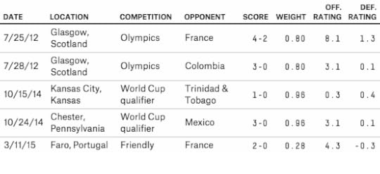
You can see some of the key features of WSPI in these examples (a team’s overall offensive and defensive ratings are a weighted average of these game-by-game ratings). The USWNT’s March 11, 2015, match against France receives relatively little weight, even though it was played fairly recently, because it was a friendly. The 2012 Olympics still receive quite a lot of weight, however, given their importance.2 (The maximum possible weight for a match, in case you’re wondering, is 1.68.)
Meanwhile, you can see how much strength of schedule matters in WSPI. The USWNT gets a higher offensive rating for beating France 2-0 than for beating Mexico 3-0 because France has a tougher defense. It’s not uncommon for a team to win a match against a weak opponent but receive poor adjusted ratings because it didn’t win by as much as WSPI expected. Conversely, a team can receive a good offensive rating just by scoring on a very good team, even if it loses. The location of a match is also important: Home advantage in competitive matches has historically been worth about 0.35 goals and would make the home team about a 60-40 favorite in a matchup between two equally rated teams.
Once we’ve generated WSPI ratings for every team in the world, we can estimate the probability that any team will beat any other team.3 More specifically, we first calculate the expected number of goals that each team will score in a given match and then convert these into a matrix of possible outcomes using Poisson distributions. Thus, in any given match, we’ve estimated the probability that it will end in a 0-0 tie, a 1-0 victory, a 2-3 loss or any other possible scoreline. Knowing this distribution of possible scores is important because the tiebreaker to advance to the knockout stage of the World Cup takes goals scored and allowed into account.
With these individual match probabilities in hand, we can calculate the chance that each team in the tournament will advance to the knockout round or eventually win the tournament. To do so, we simulate the tournament 20,000 times: If the U.S. has a 28 percent chance of winning the tournament, this means that it won in approximately 5,600 out of 20,000 simulations. As simulations are played out, each team’s WSPI is updated to reflect its results in that simulation. Loosely speaking, this accounts for the possibility that a team will “get hot” during the tournament and considerably outperform its pre-World Cup WSPI.4
Matches in the knockout round continue into extra time if they are tied at the end of regulation and a shootout if tied after that, so we’ve spent some time making sure our simulations handle these cases accurately. Extra time is treated as a shortened match in which teams score at a slower rate than during regulation.5 Shootout win probabilities are also derived from WSPI instead of being treated as random. There is evidence that shootouts are skill-based — the team with the better WSPI rating has won 58 percent of shootouts in our database — but good teams don’t tend to be as dominant in shootouts as they are in regular time. For example, the USWNT would be more than a 90 percent favorite to beat Thailand in a regular game, but only a 71 percent favorite to win in a shootout. For this reason, it’s usually in the interest of the weaker team to play for a shootout even though it’d be an underdog if one occurred.
Have any more questions? See Nate’s 2009 article and FAQ for more of the technical details and philosophy behind SPI, most of which also apply to WSPI. Or drop us a note here. We hope you’ll enjoy following the women’s tournament with us.

May 28, 2015
How To Break FIFA
It’s hard to know whether the indictment of a bunch of FIFA officials by the U.S. Justice Department on Wednesday will be the first step toward a less corrupt FIFA — or the beginning of its end. On Thursday, Michel Platini, president of the European football federation UEFA, said its 54 countries might quit FIFA if Sepp Blatter is re-elected as FIFA president. Indeed, since FIFA inexplicably awarded the 2022 World Cup to Qatar, some of the world’s most well-off footballing nations have considered going rogue.
Other organizations, including the presidents of the African and Asian football federations, have publicly backed FIFA and Blatter since the indictments. But the UEFA threat is potentially a credible one. The European countries and a handful of others — Brazil, Mexico, United States, Japan and China — have a lot of economic leverage over soccer’s future. They’re disproportionately responsible for bringing revenues into FIFA, while FIFA’s current organizational structure, which gives Bahrain as much voting power as Brazil and distributes development funds about equally by country instead of in proportion to population or GDP, doesn’t give them much back.
FIFA claims to make about 90 percent of its money by selling licensing rights to its quadrennial men’s World Cup, the plurality of which comes through television licensing fees. There isn’t a lot of reliable reporting on exactly what networks around the world pay to televise the World Cup.1 However, we can come to some reasonable estimates of how lucrative each country’s TV market is.
Following the 2010 World Cup in South Africa, FIFA published detailed data on how wide an audience the World Cup reached on television in different countries. (FIFA has yet to report this data for the 2014 World Cup.) FIFA’s data is quite comprehensive, listing the size of TV audiences for more than 170 countries.2 All I’m going to do is take FIFA’s estimate of television viewers3 in each country and weight it by that country’s per-capita, purchasing-power GDP.4 This reflects that, for better or worse, a viewer in a country with high disposable income is more valuable to sponsors than one from a developing nation, making the wealthier nation’s TV rights more lucrative.
The 2010 World Cup reached more viewers in China than anywhere else, according to FIFA’s data. When viewers are weighted by GDP, however, the United States comes out slightly on top. Although the U.S. had slightly below-average World Cup viewership relative to its population,5 its large, wealthy population was enough to make up for that. In total, it represented 11 percent of the GDP-weighted audience for the 2010 World Cup, followed by Japan (9 percent), China (7 percent), Germany (6 percent), Brazil (5 percent), and the United Kingdom, Italy and France (4 percent each). Those eight countries alone accounted for more than half of the GDP-weighted World Cup audience. (You can see these figures for all countries that represented at least 0.5 percent of the GDP-weighted audience in the table below, or download them for all countries at GitHub.)
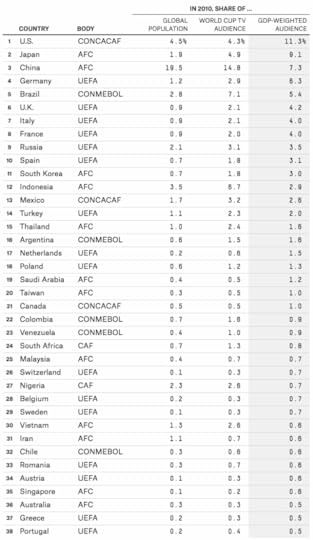
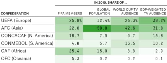
We can also aggregate these numbers by each of FIFA’s six continental confederations and compare them to the share of FIFA members each confederation has. In 2010, African countries represented about 25 percent of FIFA members but (even though the World Cup was played in Africa) only about 3 percent of the tournament’s GDP-weighted TV audience. By contrast, Asia and South America are underrepresented in FIFA. So is UEFA if you measure it by its GDP-weighted TV audience, although not if you measure it by population.
You can argue, of course, that it isn’t a bad thing for FIFA to give more representation to developing countries. I’d have a few counterarguments to make. First, it doesn’t square with FIFA’s decision to give the 2022 World Cup to Qatar, which has the world’s highest per-capita GDP by some estimates. And second, as my colleague Carl Bialik wrote this week, FIFA’s governing procedures happen to suit the interests of the plutocrats who run it very well.
And in some ways, these estimates make favorable assumptions for developing countries. Purchasing-power parity (PPP) GDP, the version I’ve used here, shows less stark wealth differences than GDP based on official exchange rates.
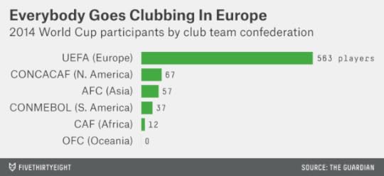
Furthermore, these figures reflect viewership for the World Cup, as opposed to club football, where a few countries are even more responsible for bringing an audience to the game and cultivating the world’s soccer talent. Of the 736 players on the roster for the 2014 World Cup, 563 (or 76 percent) played their club football in a UEFA country. Relations between the European club teams and FIFA are already tense, in part because a winter World Cup in Qatar would require interrupting the club season. (FIFA compensates the clubs for releasing their players for international matches, which they are not required to do.)
So how many countries would need to defect from FIFA to break it? UEFA represents 39 percent of the GDP-weighted World Cup audience; that’s a start. But it also includes some countries whose interests don’t always align. Russia, in particular, is extremely unlikely to break from FIFA, having been awarded the 2018 World Cup (Russian President Vladimir Putin responded to the indictments by accusing the U.S. of trying to derail Blatter’s re-election). And having European nations only would mean there couldn’t be a transcontinental competition to rival the World Cup.
But what if you used the 34 OECD members as the foundation of a new football federation? The OECD doesn’t include Russia but does have most of the large European economies, including Germany, the U.K., France, Italy and Spain. It also has the United States and a foothold in the Asia-Pacific region (Japan, South Korea, Australia) and Latin America (Mexico, Chile). These OECD members account for more than 60 percent of the GDP-weighted World Cup audience and about 80 percent of the club-team representation in the 2014 World Cup.
Convince Brazil and Argentina to join the breakaway foundation, and you’re doing even better. You’d be up to almost 70 percent of the GDP-weighted World Cup audience, and you’d have 11 of the 16 countries that advanced to the knockout stage of last year’s World Cup. You’d have more than reached critical mass, and you’d probably have your pick of whichever other countries — Colombia, Nigeria, New Zealand — wanted to flee FIFA.
It probably won’t happen; it’s probably just a bluff. But there are some parallels to the formation of the English Premier League, which occurred in 1992 when teams from England’s First Division resigned en masse from the then-104-year-old Football League to take advantage of a favorable TV deal. In the end, the change was relatively seamless from the fan’s point of view6 and meant a new period of prosperity for English club football. Institutional power is hard to break, but sometimes money can motivate change.

May 26, 2015
Are The Rangers And Blackhawks Clutch — Or Lucky?
Fear not, Blackhawks fans. Your team might have lost to the Anaheim Ducks on Monday night, going down three games to two in the insane Western Conference finals. But the Blackhawks have battled back before. Since 2010, when faced with elimination from the playoffs, they have an excellent 9-3 record.
And there’s hope for you, too, Rangers fans. Your team also needs a win — on Tuesday night against the Tampa Bay Lightning in the Eastern Conference finals — to stay alive. But the Rangers have been through this before — a lot. Since 2010, they have been faced with playoff elimination 18 times. They are 14-4 in those games.
There’s just one problem. Having a good record in elimination games doesn’t seem to predict much about how a team will fare the next time it must win or go home.
In the table below, I’ve listed all instances in the NHL expansion era7 in which an NHL team faced elimination in the playoffs but came in with a “hot” record in previous such games. A team qualified as “hot” if it was at least five games over .500 in playoff elimination games8 in the current season plus the past five seasons.9
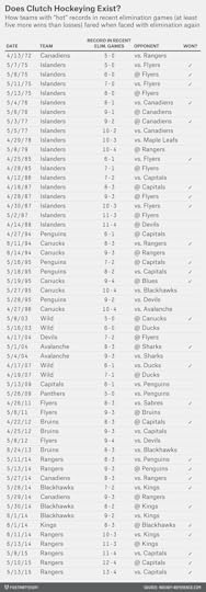
How did these “hot” teams fare? They played 56 games … and won 28, or exactly half. So they’re basically doing as well as you would by flipping a coin. Previous clutch performance in playoff games doesn’t seem to count for much.
There’s just a teensy tiny bit of good news for Blackhawks and Rangers fans. While a 50 percent winning percentage isn’t great, it’s slightly better than the overall winning percentage for teams facing elimination, which is 45 percent. (Teams facing elimination are usually underdogs because of selection bias: If they were playing as well as their opponents, they probably wouldn’t be facing elimination to begin with.) The difference is too small to be statistically significant, however.10
The Rangers may have some other advantages late in playoff series. They have Henrik Lundqvist. And they’re an excellent five-on-five team, whereas their special teams are just average. Games 6 and 7 of playoff series historically feature relatively few penalties, which could play to the Rangers’ strengths.
The problem is that Tampa Bay has been a very good five-on-five team, too. And should the series go to Game 7, the Lightning have also been pretty good in the clutch, with a 6-2 record in elimination games since 2010. But, hey: Having to win two coin flips isn’t so bad; the Rangers have come back from much worse odds before.

Bill Russell’s Celtics Were Great. Tim Duncan’s Spurs Have Been Better.
WTF, nerds? You’re telling us that this season’s Golden State Warriors, who haven’t won anything yet, are better than Bill Russell’s Celtics, who won eight titles in a row and 11 in 13 seasons?
Actually, no. It would be ridiculous to say that. Last week, we released an interactive graphic, “The Complete History of the NBA,” which uses a relatively simple formula called Elo to rate NBA teams. Indeed, it currently ranks this year’s Warriors as the fourth-best team in NBA history, although they may rise or fall depending on how the rest of their playoff run goes. Meanwhile, no single season from the 1960s Celtics dynasty ranks higher than 47th on the all-time list.
But Elo’s claim is that the 2014-15 Warriors season has been better than any single season in the Celtics’ run. In terms of long-term accomplishments, of course, it’s not even close. The 1960s Celtics’ competition comes, instead, from about who you’d expect: the 1990s Bulls, the current Spurs dynasty and the 1980s Lakers and Celtics.
I’ve thought a lot about how to use Elo to rate sports dynasties. It’s a tricky problem, in part because you have to define when a dynasty begins and ends. Almost all of us would agree, I assume, that Michael Jordan’s Bulls were one continuous dynasty even though Jordan temporarily retired in the middle of it. But what about Kobe Bryant’s Lakers? Should the three titles they won from 2000 to 2002 be considered part of the same dynasty as the two they won in 2009 and 2010?
Here’s one fairly simple approach (let us know down in the comments if you have a better method): We’ll define a dynasty as ending when a team’s Elo rating falls below 1500, which is the long-term league average. This is a reasonably forgiving standard, since teams carry over part of their rating from one season to the next. For instance, the Oklahoma City Thunder’s Elo rating never fell below 1500 this season even though they started out 3-12.
By this definition, Jordan’s six titles do get grouped together. The Bulls’ rating never fell below 1527 even when Jordan was playing outfield for the Birmingham Barons. But Kobe’s five titles are not considered part of the same dynasty since the Lakers’ Elo rating was below 1500 for part of the 2004-05, 2005-06 and 2006-07 seasons.
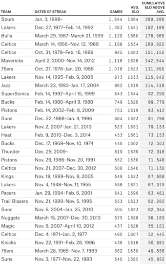
The longest streak of above-average play belongs to the San Antonio Spurs. Their Elo rating rose above 1500 on Jan. 3, 1998, and hasn’t fallen below it since, a period that covers more than 17 years, or 1,644 games11 and counting. That’s impressive even compared to the Celtics, who had an above-average Elo rating from March 14, 1956 to Nov. 12, 1969. Insanely great — 13.5 years and 1,198 games — but not as great as the Spurs.
The 1980s Lakers also had a longer streak (1,363 games) than the Celtics. But maybe, even if the Celtics’ streak was slightly shorter, they were playing at a slightly higher level than those other teams?
Not according to Elo. The Spurs had an average Elo rating of 1664 during their streak, as compared with 1634 for the 1960s Celtics. The Lakers’ Elo rating, 1641, was also slightly higher than the Celtics’.
We can also assign an overall score to each dynasty by taking a team’s average Elo rating during the streak, subtracting the league-average rating of 1500, and multiplying it by the number of games the streak lasted.12 Overall, this method has the Spurs way out in front — 40 percent better than any other dynasty. The 1980s Lakers are in second, while the 1990s Bulls jump ahead of the 1960s Celtics to place third. (What about the the Warriors? Their current “dynasty” ranks as only the 47th-best all-time. Check back in 2023.)
But: the rings! How can you ignore 11 championships?
You could certainly develop a dynasty-rating method that puts more emphasis on winning titles. The simple method we’re using in this article gives no special credit for them, which is why — once you get past the canonical dynasties in the top five — it likes teams like the Dallas Mavericks from 2000 to 2012, who won just one title, and the 1990s Utah Jazz, who won none.
But there’s something to keep in mind when you consider the 1960s Celtics and their rings. It’s much easier to win a championship in a 10-team league, like the NBA was, on average, when they were playing, than in the 30-team league we have now.
Here’s an illustration of that. I divided the 30 current NBA franchises into three “leagues” of 10 teams each:
The Eastern League consists of franchises currently in the NBA’s Atlantic and Southeast divisions.The Central League consists of franchises currently in the Central and Southwest divisions.The Western League includes franchises from the Pacific and Northwest divisions.Then, for each season since the NBA-ABA merger in 1976-77, I assigned a champion to each “league” based on which of its 10 teams advanced furthest in the actual NBA playoffs. When there were ties — for instance, if the last two teams from a “league” were both eliminated in the NBA conference finals — I broke them based on which team had the higher year-end Elo rating. Check out what happens:

Russell’s 11 rings are still impressive, but they’re no longer such an outlier when looked at in this way. Or here’s another method: Instead of assigning hypothetical championships, take away some credit for championships that were won in a smaller league. For instance, if a team won a championship in a 10-team NBA, it would get credit for one-third of a championship in a 30-team league.
By that calculation, the Celtics’ 11 championships are equivalent to three or four championships in a 30-team league.13 The other dynasties aren’t affected as much. Duncan’s Spurs still pretty much get full credit for all five championships. Jordan’s Bulls get credit for five or six, and the 1980s Lakers about four.
You can argue, of course, that the Celtics were so far ahead of the pack that they’d have held on to most of their championships even in a 30-team league. But they weren’t that dominant in the regular season. In Russell’s tenure with the team, they averaged the equivalent of a 58-24 regular-season record. That’s very good — but not much better than, say, Dirk Nowitzki’s Mavericks over the past 15 seasons. They weren’t even especially dominant in the playoffs! In their 11 championship seasons, Russell’s Celtics won 67 percent of their playoff games. Other NBA champions throughout history have won 73 percent of theirs.
The Celtics came through in the clutch, obviously, just about every time it mattered — Russell was 10-0 for his career in Game 7s! But if you’re accused of benefiting from playing middling competition,14 the more persuasive rebuttal comes from blowing your opponents out.
One final objection we anticipate hearing from Celtics fans: Isn’t it harder, in some sense, to win a championship in a 10-team league since the player talent pool is more concentrated? In a literal sense, the answer is “no”; it’s easier to win a championship when there are more championships to go around per team.15
But it could be argued that the average quality of competition was higher during the 1960s, with just 10 teams or so, instead of 30. Elo doesn’t make too many assumptions about this.16 I’m not sure it’s a winning argument, however. Consider:
In the 1960s NBA, there were still remnants of a racist quota system that limited teams to three or four African-Americans.There were almost no international players in the 1960s, whereas now they make up about a quarter of league rosters.The U.S. population has increased by about 75 percent since 1960.Basketball has become a far more prominent and lucrative sport; in the mid-1960s, the NBA averaged only about 5,000 fans per game. A talented amateur athlete might have opted for another sport before basketball, and it was not uncommon for high NBA draft picks to bypass the league for another option.In other words, it seems likely that the NBA talent pool has grown at least as fast as the number of franchises since the 1960s. The 1960s didn’t even feature particularly great “fundamental” basketball. League-wide free-throw percentages were typically about 72 percent or 73 percent, compared with more like 75 percent or 76 percent now. The Celtics were the best team of their era, but also a product of it, and that era isn’t as rich for NBA competition as the one we have now.

Nate Silver's Blog

- Nate Silver's profile
- 729 followers

