
Nate Silver's Blog, page 151
July 1, 2015
The U.S. Women May Be The Greatest World Cup Dynasty
The U.S. and Germany are the only teams to have won the Women’s World Cup twice. So the United States’ 2-0 win over Germany in the World Cup semifinal on Tuesday night wasn’t only the most important game of this year’s tournament. It also helps to settle a score about which country has the greatest overall run of Women’s World Cup success.
The U.S. women now have a chance to win a third title in Sunday’s final game in Vancouver, British Columbia. But even if they should lose, they’ll have appeared in the World Cup final four times to Germany’s three. The Americans have also reached the semifinals in all seven Women’s World Cups, including this year’s, while Germany failed to do so in 1999 and 2011.
In fact, the seven-tournament run for the U.S. women looks a lot like the best such streaks from the men’s World Cup, which belong to Brazil and West Germany. And if the U.S. women win in Vancouver, they’ll be able to argue that their streak has been slightly more impressive.
We can be somewhat more precise about this, building a simple statistical system that places a lot of emphasis on winning it all. We’ll award a country four “dynasty points” if it wins the World Cup, two points if it’s the runner-up, and one point if it loses in the semifinal. (FIFA plays a third-place playoff between the two semifinal losers, but since many soccer fans ignore it, our system will too.) Then we’ll see which men’s and women’s teams accumulated the most dynasty points over consecutive tournaments.1 Here’s how the numbers shake out:
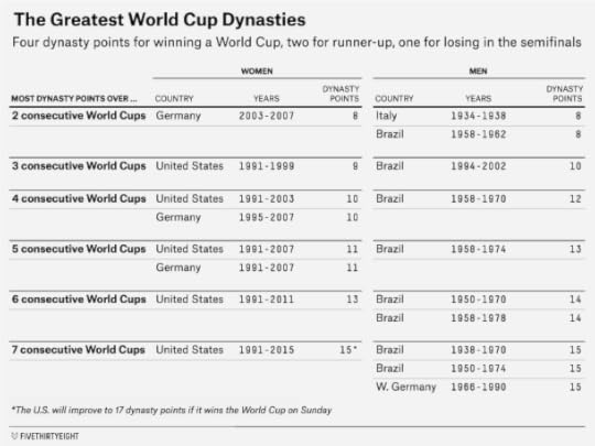
The best you can do over two consecutive World Cups, of course, is to win the tournaments back to back, which would give you eight dynasty points. Germany (in 2003 and 2007) is the only women’s team to have done that, although defending champs Japan will join them if they win this year’s tournament. The only men’s teams with back-to-back titles are Italy (in 1934 and 1938) and Brazil (in 1958 and 1962).
No men’s or women’s team has won three consecutive World Cups. The next-best accomplishment (worth 10 dynasty points) comes from winning two titles over the course of three tournaments and finishing as the runner-up in the third one. The Brazilian men did that, with championships in 1994 and 2002 bookending a second-place finish in 1998. The U.S. came closest on the women’s side, with wins in 1991 and 1999 and a third-place finish in 1995.
Brazil is the only country, men’s or women’s, to have won three World Cups in four tries, as its men’s team did from 1958 through 1970. The German women could have equaled that feat with a title this year, but Hope Solo, Carli Lloyd and Kelley O’Hara prevented that.
So if you’re looking at the best three- or four-tournament streaks, the Brazilian men are a bit ahead of what any women’s team has done.
The Women’s World Cup has been played only seven times, however. And the U.S. women have accumulated 15 dynasty points over those seven tournaments, matching the best total for men’s teams over seven-tournament periods, a record shared by three teams. Here’s each team’s record in slightly more detail:
Brazilian men (1938-1970): Five semifinals appearances, four finals appearances, three championships.Brazilian men (1950-1974): Same as above.West German2 men (1966-1990): Six semifinals appearances, five finals appearances, two championships.U.S. women (1991-2015): Seven semifinals appearances, four finals appearances, two championships (with an opportunity to win a third championship).As you can see, those are pretty similar résumés. Which streak you like best depends on how you weigh semifinals appearances, finals appearances and championships. Our dynasty points system happens to like each streak equally well.
If the U.S. women win on Sunday, however, bringing home their third World Cup in seven tries, they’ll pull narrowly ahead with 17 dynasty points. Brazil is the only men’s team with three titles over a seven-tournament stretch, and the U.S. women would rank slightly ahead of them by virtue of having appeared in seven semifinals to Brazil’s five. The U.S. women would have more championships and more semifinals appearances than the West German men from 1966 to 1990, meanwhile, outweighing West Germany’s higher number of finals appearances.
The argument is a little more complicated than this, of course. Since the men’s World Cup was staged 14 times before the women played their first one, the guys have had a lot more opportunities to pull successful streaks together, whether by virtue of luck or talent. On the other hand, women’s soccer is not as deep as the men’s game is, with the best teams tending to be more dominant in all competitions. But the U.S. women have been great however you cut the numbers.


June 26, 2015
Change Doesn’t Usually Come This Fast
I was raised in East Lansing, Michigan. It was a great place to grow up: a college town with good public schools, a beautiful campus, a modicum of diversity, and an active, walkable downtown.
But I came along just a few years too soon (I was born in 1978) to really consider coming out as gay when growing up. There were no openly gay students in my high school. And there were few gay role models in American society: certainly not on television and in the movies, which invariably portrayed gay men as camp characters, or freaks, or AIDS victims.
If coming out was hard to contemplate, however, the possibility of gay marriage was unthinkable. At the time Andrew Sullivan wrote his now-famous essay in support of gay marriage in The New Republic in 1989, almost no polling firms even bothered asking questions about gay marriage. One that did — the General Social Survey — found that just 12 percent of the population was in favor of it.
But today, after a Supreme Court decision, same-sex marriage is the law of the land in all 50 states.
Progress has come remarkably fast. There was no legal gay marriage in the United States until Massachusetts permitted it in 2004. At this point four years ago, only 5 percent of the U.S. population lived in states where gay marriage was legal. And in 2008, not only Republican candidates but also Barack Obama and Hillary Clinton were publicly (if not privately) opposed to gay marriage. On the same day that Obama became the first African-American elected to the White House, voters in liberal California approved Proposition 8, which enacted a constitutional ban on gay marriage in the state.
Today, however, a number of states more conservative than California have voted to approve gay marriage on the ballot. And almost 60 percent of Americans support gay marriage in public opinion polls:
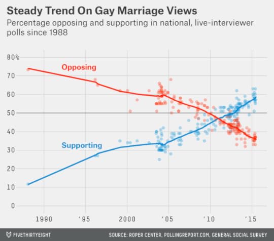
In one sense, the rise in support for gay marriage has been predictable. Since 2004, support for gay marriage has been increasing steadily by about 2.5 percentage points per year. Forecasts that I made in 2009, 2011 and 2012 about the rise of support for gay marriage on state ballot initiatives, which once seemed remarkably optimistic, now seem too conservative.
But it may also be dangerous to conclude that the rise in support for gay marriage has been inevitable. In fact, it’s been an unusual issue. Interracial marriage took much longer to be legalized, by comparison. Public opinion on abortion has been relatively steady for years.
So why has gay marriage been different? Some of it is generational; older voters have gradually been replaced in the electorate by younger ones who are more likely to support gay marriage.
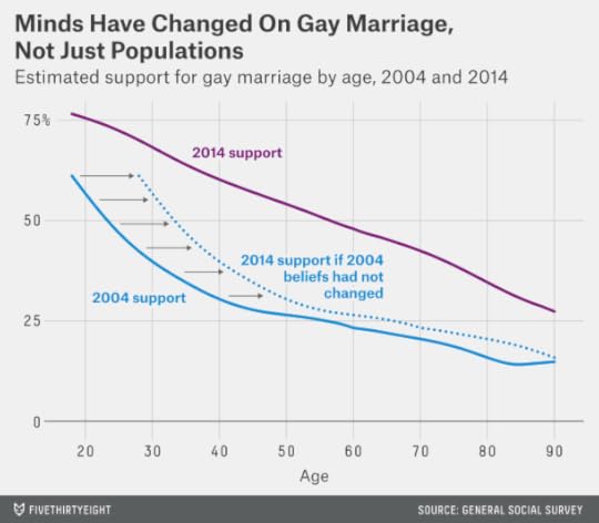
However, many people have also changed their minds. In the next chart, I’ve estimated support for gay marriage by age based on the versions of the General Social Survey conducted in 2004 (when 31 percent of respondents supported gay marriage overall in the poll) and 2014 (when 57 percent did). The rise in support far exceeds what can be explained by generational turnover alone. For example, someone (like me) born in 1978 would have a 45 percent chance of supporting gay marriage as a 26-year-old in 2004. As a 36-year-old in 2014, they’d have a 63 percent chance of supporting it. Probably one-half to two-thirds of the rise in support for gay marriage has been a result of people changing their minds on the issue.
The shift in opinion has had many causes. Some of it has taken place household by household and neighborhood by neighborhood; voters are considerably more likely to support same-sex marriage if they know a gay or lesbian person personally. Meanwhile, gay characters are now much more common, and are portrayed far more positively, on television and in the movies. The hard work of thought leaders like Sullivan (who is a friend of mine) and activists like Evan Wolfson has helped to catalyze the process.
My personal bias is also to think that gay marriage simply has the more persuasive side of the argument. You can argue for it from the point of view of enhancing equality, but also from the standpoint of enhancing liberty. Furthermore, you can make a conservative case for gay marriage, as Sullivan and others have, which champions the role of marriage as an institution that increases family and community stability. (That was one of the points made by Justice Anthony Kennedy in his opinion for the Court on Friday.)
But there’s another lesson about the rise in support for gay marriage that seems less likely to be heeded. It’s that society’s collective moral judgment is highly imperfect and subject to revision. As Paul Graham wrote in the essay “What You Can’t Say” in 2004:
It seems to be a constant throughout history: In every period, people believed things that were just ridiculous, and believed them so strongly that you would have gotten in terrible trouble for saying otherwise.
Is our time any different? To anyone who has read any amount of history, the answer is almost certainly no. It would be a remarkable coincidence if ours were the first era to get everything just right.
In the United States, gay marriage has gone from unthinkable to the law of the land in just a couple of decades. Homosexuality has gone from “the love that dare not speak its name” — something that could get you locked up, beat up, ostracized or killed, as is still the case in much of the world — into something that’s out-and-proud, so to speak.
In my view, of course, Americans have gotten the question of gay marriage right. So I’ll be among the 60 percent celebrating the decision tonight.
But as Graham writes, there are any number of issues on which the moral consensus we have today will be regarded as backward by our children or grandchildren. So as you celebrate or commiserate tonight, maintain some humility too. Gay marriage wasn’t the first issue on which society changed its mind, and it surely won’t be the last. What makes it unusual is that the shift has occurred within our generation, fast enough for us Americans to experience it firsthand.

June 23, 2015
Leave O’Hare Airport Alone
You know that Twitter hashtag #ConfessYourUnpopularOpinion? Here’s mine: I sort of like Chicago’s O’Hare International Airport.
What’s O’Hare got going for it? A nice public transit connection to downtown Chicago. Cool architecture. The PA announcements sound like Chicago instead of a generic newscaster. The signage is good. It’s pretty clean. There’s Tortas Frontera!
There’s just one big problem. O’Hare Airport is a nightmare for delays. Between bad weather and congested air space, the airport adds, on average, 14 minutes to every departure and 20 minutes to every arrival. That’s 34 extra minutes every time you take a round trip from O’Hare or connect through it. Among major U.S. airports, only Newark, JFK and LaGuardia are slower, according to FiveThirtyEight’s fastest flights analysis.
So I understand why O’Hare constantly appears on “worst airports” lists. Particularly if you only need a connecting airport — with no time to grab a torta or ride the Blue Line to the Loop — it will often be worth avoiding, if you can.
But if you separate delays from everything else you experience at an airport, you can find the airport’s underlying virtues (or faults). It’s not O’Hare’s doing, exactly, that Chicago has bad weather, or that both United and American decided to place a hub there, which substantially adds to the congestion.
Here’s one way to do that. For each airport that the Federal Aviation Administration classifies as a “Large Hub” — those are the 30 busiest airports in the country — I compared the average Yelp review over the 12-month period from May 2014 to April 2015 to its FiveThirtyEight delay statistics over the same period.1 As you might expect, there’s a relationship:
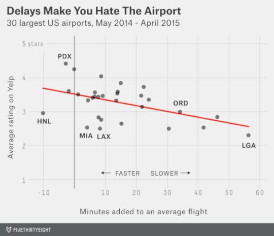
For every additional 10 minutes of delays, an airport’s Yelp rating declines by about 0.2 stars. I strongly suspect the relationship is causal.2 Delays suck and also make every other aspect of the airport experience worse: Long lines become longer and surly people become surlier, even if your flight is one of the lucky ones getting away on time.
So while O’Hare’s Yelp rating isn’t good — 20th among the 30 largest airports — it also isn’t so bad considering how delay-prone it is. According to the regression line in the chart I just showed you, we’d ordinarily expect an airport with delays as bad as O’Hare’s to be rated at 2.9 Yelp stars. O’Hare’s actual rating is 3.0 stars. Once you control for delays, in other words, Yelp travelers rate the other aspects of O’Hare as about average or even slightly above-average.
The best contrast to O’Hare is Honolulu International Airport (HNL). It’s also rated a mediocre 3.0 stars on Yelp — even though flights are almost never delayed there. To get such a mediocre rating despite so few delays implies that Honolulu otherwise has to be a poor airport. And it is, at least in my experience. It’s basically what would happen if they took LaGuardia and put it in paradise. HNL is oddly laid out, there are very few places to eat or drink, the rental car lines are miserably long, and while some parts of the airport are outdoors, the insides are pretty dingy. Fortunately almost everything else about Hawaii is pretty great.
To be more precise about this, I estimate that Honolulu’s lack of delays add about 0.4 stars to its Yelp rating. But its poor facilities subtract about 0.7 stars from it, leaving it with a somewhat below-average rating overall. I’ve run this calculation for all 30 airports in the chart that follows:
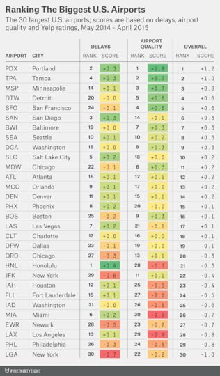
The top five airports, according to Yelp, are Portland, Tampa, Minneapolis, Detroit and San Francisco. Those five remain that way if you control for delays, although Detroit and San Francisco swap places.
After that, however, you begin to see some differences. San Diego has the 6th-best Yelp rating, but that’s mostly on account of its lack of delays. In the residual (everything-but-delays) category that I call “airport quality” in the chart, San Diego is about average, ranking 14th. The same general theme holds for Salt Lake City and Orlando. These are totally pleasant, adequate airports, but the fact that flights are rarely delayed there makes them seem a lot nicer.
By contrast, some northeastern airports move up the list. Boston’s Logan Airport is in the middle of the pack overall, but that’s a matter of bad delays counteracting otherwise-pretty-nice facilities; it ranks 9th out of 30 for airport quality. JFK ranks 29th for delays, but 11th for airport quality.
So which airports really are the worst? LaGuardia has the lowest Yelp rating, reflecting its combination of awful delays and out-of-date facilities.
But for airport quality alone, Miami International — a disorganized mess that recalls the worst characteristics of a shopping mall and a Department of Motor Vehicles office — ranks last. Mercifully, flights usually leave MIA on time, so if you can make it to your gate you can get the hell out.

June 18, 2015
Black Americans Are Killed At 12 Times The Rate Of People In Other Developed Countries
“We as a country will have to reckon with the fact that this type of mass violence does not happen in other advanced countries,” President Obama said earlier today, in reaction to the killing of nine people at a historically black church in Charleston, South Carolina, on Wednesday. The details of the case, including the motivations of the suspect, Dylann Roof, are still unfolding. (We encourage you to read coverage broadly, including from our colleagues at ABC News.) But I wanted to add just a little bit of context to Obama’s remarks — how the U.S. compares to other countries overall, and how that comparison obscures a wide racial divide: Black Americans are far more likely to be homicide victims than white Americans.
We’re looking for good data on the incidence of mass shootings in different countries. There doesn’t appear to be all that much of it. But mass shootings represent a tiny fraction of homicides overall. And thanks to recent efforts by the United Nations Office on Drugs and Crime (UNODC), which published data on homicide rates for almost every country, we can compare the overall homicide death rate in the U.S. to those elsewhere.
According to the CDC’s WONDER database, 5.2 out of every 100,000 Americans were homicide victims, on average, from 2010 to 2012. That’s not especially high by global standards; the median country had 4.7 homicide deaths per 100,000 persons over the same period,1 according to the UNODC data. The highest homicide rate in the world was in Honduras, with 87.9 homicide deaths per 100,000 persons.
But the homicide death rate in the U.S. — as Obama intimated — is more unusual in comparison with other highly developed countries. In the chart below, I’ve compared each country’s rate of homicide deaths against its Human Development Index (HDI), an overall measure of welfare and the standard of living.2

Whether the U.S.’s homicide rate qualifies as an outlier depends on exactly where you set the cutoff for an “advanced” country. Among countries with an HDI of .850 or higher — these are the 31 most well-off countries in the world — the U.S.’s rate of homicide deaths, 5.2 per 100,000 persons, is easily the highest. The next-highest are Brunei (2.0), Finland (2.0) and Israel (1.9). And the U.S. homicide death rate is more than three times higher than neighboring Canada (1.5).
The U.N., however, sets a slightly lower threshold for a developed country, describing all countries with an HDI of .800 or higher as having “very high human development.” Several countries with an HDI between .800 and .850 have a homicide death rate comparable to the U.S., including Lithuania (6.9), Argentina (5.5), Estonia (5.2), Cuba (4.2) and Latvia (3.8). The U.S.’s homicide death rate is also much lower than Mexico’s (22.0), though Mexico’s HDI is just .755.
But these comparisons neglect a massively important fact, and one that is especially pertinent in the wake of the Charleston shootings.
Extending on an analysis by the academic Kieran Healy, I calculated the rate of U.S. homicide deaths by racial group, based on the CDC WONDER data.3 From 2010 through 2012, the annual rate of homicide deaths among non-Hispanic white Americans was 2.5 per 100,000 persons, meaning that about one in every 40,000 white Americans is a homicide victim each year. By comparison, the rate of homicide deaths among non-Hispanic black Americans is 19.4 per 100,000 persons, or about 1 in 5,000 people per year.
Black Americans are almost eight times as likely as white ones to be homicide victims, in other words.
So for white Americans, the homicide death rate is not so much of an outlier. It’s only modestly higher than in Finland, Belgium or Greece, for instance, and lower than in Chile or Latvia.

But there’s no other highly industrialized country with a homicide death rate similar to the one black Americans experience. Their homicide death rate, 19.4 per 100,000 persons, is about 12 times higher than the average rate among all people4 in other developed countries.
Instead, you’d have to look toward developing countries such as Mexico (22.0), Brazil (23.6), Nigeria (20.0), Rwanda (23.1) or Myanmar (15.2) to find a comparable rate. The Charleston killings were unusual in that it was a mass shooting — and also in that the suspect is of a different race than the victims (both black and white homicide victims are much more likely to be killed by someone of their own race.) But that doesn’t negate that the threat black Americans face from homicide is radically different from the one whites do.

June 17, 2015
The Warriors Could Be The 1990s Bulls. Or The 1970s Bucks.
We here at FiveThirtyEight have been riding the Warriors bandwagon for a long time. Good thing they won the championship Tuesday! But now the question is how many more titles Steph Curry and company might expect in their future.
Let’s take a really simple approach. We’ll identify other teams that, like the Warriors, had a big breakthrough and quickly went from being good to really great. More specifically, we’ll look for teams that had a composite Elo rating of 1700 or higher, which is a rating that we’d ordinarily associate with a championship-caliber team, and whose Elo rating improved by at least 100 points from the previous season.
There were only 13 of these teams before the Warriors, it turns out. You can find them below.
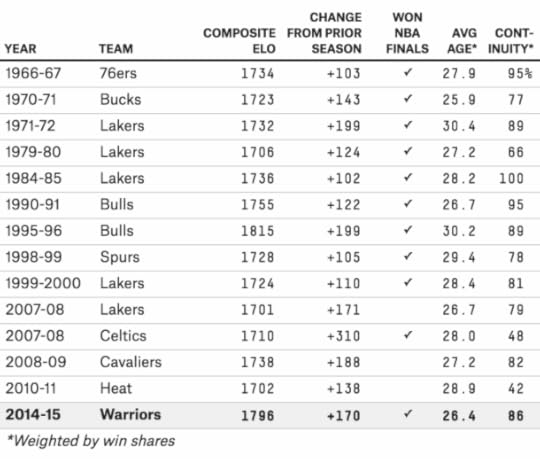
That’s a pretty good group. You see Michael Jordan’s Bulls (twice), along with Tim Duncan’s Spurs and several of the Lakers’ mini-dynasties. But there are also a couple of cases of teams that didn’t quite live up to their promise. The next chart shows how many games each team won in the seven seasons after its breakthrough, along with whether it reached or won the NBA Finals.
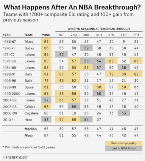
On average, these teams won 1.5 additional championships in the seven seasons after their breakthrough year.5 But the average, of course, conceals a lot of variation. Eight of the 13 teams won multiple additional titles, while the other five won no more.
The Warriors look pretty good even compared to this elite group of teams, however. Their Elo rating is the second-highest — after the 1995-96 Chicago Bulls — while their average team age, 26.4 weighted by win shares, is the second-youngest, behind the 1970-71 Milwaukee Bucks.
The Warriors have also gotten better “organically” with the same core group of talent. Their continuity percentage, which I calculate as the percentage of a team’s win shares that came from players who were also on the roster in the previous season, is 86 percent. Interestingly, going from good to great organically seems to be the more common path than doing it by signing a bunch of superstars. The 2007-08 Boston Celtics and the 2010-11 Miami Heat are the only real exceptions on the list above.
Based on a nearest neighbor analysis,6 the most similar team to this year’s Warriors is the 1990-91 Chicago Bulls. The Bulls’ three best players that year — Jordan, Scottie Pippen and Horace Grant — were 27 years old, 25 and 25. By comparison, Curry was 26 this season, while Klay Thompson and Draymond Green were 24.
That’s a fortuitous comparison, of course, since the Bulls’ 1991 championship was the first of six they’d win in eight seasons. The second-most similar team, however, is the 1970-71 Bucks. They had all the talent in the world — Oscar Robertson and Kareem Abdul-Jabbar (then Lew Alcindor7) on the same team! But after going 66-16 and romping their way to a title in 1971, the Bucks wouldn’t win one again. They ran into a 69-13 Lakers team in the 1972 playoffs and then were upset (by the Warriors) in the 1973 playoffs. They did reach the finals again in 1974 but lost to an underdog Celtics team. Robertson retired after that season, and Abdul-Jabbar left for Los Angeles a year later. And that was it.
At least the Bucks were highly competitive, though, averaging 61 wins in the three seasons after their breakthrough. If the Warriors fail to win another title, it’s likely to be because of a Bucks-like circumstance of running into some other really hot team in the playoffs or blowing a couple of playoff series that they ought to win — rather than (barring an injury to Curry) because of a sudden and dramatic collapse. Winning an NBA championship is never easy. But the Warriors are very good, very young and have many players locked up to long-term contracts. Teams in similar circumstances usually haven’t been one-year wonders and instead are able to make several more runs at a championship.

The Best And Worst Airlines, Airports And Flights, Summer 2015 Update
If you’re like me, your Facebook and Twitter timelines are filled with friends, colleagues and celebrities who suffer from Airport Rage. Ordinarily good-natured, they turn into a cross between Alec Baldwin and Gerard Depardieu when their flight is late.
Sometimes, they have every reason to be upset (like the guy whose dog was lost in transit somewhere between Cuba and Canada). But many other instances of Airport Rage can be prevented with FiveThirtyEight’s fastest-flights interactive. It’ll tell you which airlines are most likely to get you to your destination on time. Over the past year, for example, Virgin America has flown from San Francisco to Los Angeles an average of 28 minutes faster than Southwest Airlines, after accounting for delays and cancellations.
For way more detail about how this works — and why we think our method is better than on-time statistics you’ll see elsewhere — you can check out our previous articles here and here. But the basics are pretty straightforward:
In our method, airlines can’t cheat by padding their schedules and “beating” an unrealistically long flight time. Instead, we compare their actual travel times against other airlines on the same routes.Likewise, we adjust for how hard it is to fly out of different airports at different times of the year. It’s much easier to fly out of Honolulu in June than Chicago in January, for example. Some airlines that perform poorly in conventional statistics, such as JetBlue, do relatively well in ours because they’re making the most out of difficult conditions.We account for cancellations and diverted flights, which usually cost travelers the equivalent of several hours. They’re far worse than regular delays but are all but ignored in most on-time statistics.The rest of this article will take a 35,000-foot view of how airlines and airports have performed over the past year, according to the latest
Not all airports have seen improved performance, however. The next chart tracks the delay statistics for the 30 airports that the Federal Aviation Administration classifies as “Large Hubs.” (You can find these numbers for a more comprehensive list of airports, more than 300 of them, in our interactive.) Our method calculates delay statistics for departures and arrivals separately, but we can add them together for a round-trip.
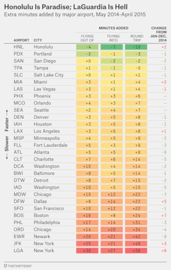
Among major airports, the fastest are Honolulu, Portland (Oregon), San Diego, Tampa and Salt Lake City. The common bond, not surprisingly, is that these airports have relatively good and predictable weather, along with modest air traffic volumes.
The worst airports? The New York metro area wins the Triple Crown of flight delays, with LaGuardia, JFK and Newark ranking as the three slowest major airports, in that order. Chicago O’Hare is the fourth-worst, while Philadelphia is fifth from the bottom. Boston has fallen to sixth-worst, undoubtedly because of its record-setting winter snowfalls.
Frequent fliers in New York and Chicago do at least have a choice of airports. Travel times at Newark have gotten better: round-trip delays were 42 minutes per flight over the past 12 months, improved from 50 minutes in 2014. That’s not good, but it’s better than JFK, where delays have gotten worse and may remain awful through September because of a shuttered runway. (United Airlines, perhaps after looking at data like this, is abandoning JFK for more flights at Newark.) And delays are worse still at LaGuardia, now averaging 56 minutes per round-trip flight.
In Chicago, meanwhile, Midway airport is about 12 minutes faster per round-trip flight than O’Hare.
In many cities, though, travelers don’t have a choice of airports and (considering how many of them are dominated by a single carrier) are lucky enough to have a choice of airlines. So here’s how the 11 major carriers that report their data to the government have performed so far in 2015 and over the past 12 months overall. Keep in mind that these are relative figures, measuring how much time the airlines cost or save you relative to others flying the same routes.
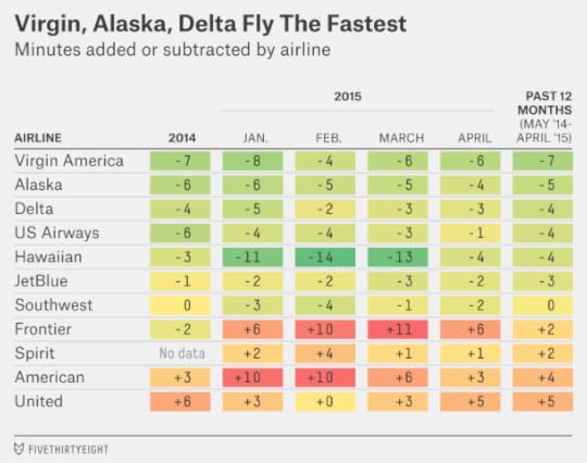
Ranking the airlines from best to worst:
#1. Virgin America, which ranked first in our original analysis, remains in the top slot. It saves you about seven minutes per flight segment, which amounts to almost a half-hour on a round-trip with a connection.
#2. Alaska, along with Delta, has been the most consistent performer in the industry, saving fliers at least four minutes per segment in every month that we’ve tracked. And it’s becoming an option for more travelers by adding capacity, with 10 percent more flights in April 2015 than a year earlier, according to the government’s data.
#3. Delta is the most reliable of the mega-sized carriers, saving travelers about four minutes per segment relative to the average carrier. And it saves travelers nine minutes per segment relative to the slowest carrier, United. These differences are extremely consistent: Delta beats United on 80 of the 89 routes that they both fly frequently.
#4. US Airways is better by our numbers than its middling customer satisfaction numbers might suggest. It may not fly the most glamorous routes, but it’s generally faster than other airlines out of its hubs — Phoenix, Philadelphia and Charlotte — saving about four minutes per segment overall. The bad news: US Airways has fallen to fourth place from second, as its performance over the first four months of 2015 was worse than the same period in 2014. That’s perhaps a bad sign as US Airways is becoming increasingly integrated with delay-prone American Airlines, with which it is merging.
#5. Hawaiian is not quite as amazing as traditional on-time percentages imply. While 90 percent or more of its flights routinely arrive on time by the government’s definition, the same is often true of other carriers when flying to or within Hawaii. But it’s certainly a reliable option, saving travelers about four minutes per segment relative to other airlines on the same routes. In fact, Hawaiian did way better than that in the first three months of this year, saving fliers 13 minutes per segment from January through March. It also performed extremely well in January through March 2014 before regressing to the mean somewhat in the summer, so this may reflect some seasonal advantages from the way it structures its route network.1
#6. JetBlue is another sometimes-maligned airline that comes out looking reasonably good in our analysis. On the surface, it’s delay-prone, with its average flight arriving 18 minutes late.2 But other airlines do even worse on the same routes. JetBlue is about six minutes faster than American on flights originating out of JFK, for example. It has been inconsistent, though. While it had a reasonably good winter in 2015, it was a nightmare to fly in January 2014.
#7. Southwest is at the dividing line between fast and slow airlines, according to our analysis. But it has been showing signs of improvement, with relatively good numbers over the first four months of 2015 after a disappointing 2014. It’s always worth checking on individual routes when you fly Southwest, which relies less than most airlines on a hub-and-spoke network. It rates as the fastest airline out of Nashville, for instance, but the slowest out of San Francisco.
#8. Frontier has seen its performance decline. While it saved fliers two minutes per segment in 2014, it’s cost them eight minutes per flight — worst in the industry — so far in 2015. Frontier still rates pretty well on flights to or from Denver, but it’s usually among the worst performers at the other airports it serves.
#9. Spirit is a new entry, having reported detailed on-time data to the government for the first time in January. So far, it rates as slightly below average, costing travelers two minutes per segment. Like with Southwest and Frontier, its performance varies from airport to airport. It’s slow out of Los Angeles, Denver and Minneapolis, for instance. But it’s faster than most of its competitors on flights from LaGuardia and Dallas, if you’re willing to tolerate the add-on fees.
#10. American has a lot going on, completing a merger with US Airways and turning over much of its fleet. But it may not be smooth skies for fliers in the interim. It’s had the worst start to 2015 after Frontier, costing fliers an average of seven minutes per segment so far this year and leaving it barely ahead of bottom-ranked United over the 12-month average.
#11. United ranks last, as it did in our initial analysis. It has at least been marginally better so far in 2015 than in 2014, costing travelers three minutes per segment instead of six. But when you’re flying more than a million flights a year, it can take some time to change course.

June 15, 2015
Yeah, The Blackhawks Are A Dynasty
The Chicago Blackhawks will take the ice tonight for the chance to win their third Stanley Cup in six seasons. For NHL fans whose memories stretch back to the 1970s and 1980s, such a feat might not seem all that impressive. The NHL was once extremely friendly to dynasties: The Montreal Canadiens won four consecutive Stanley Cups from 1976 to 1979, the New York Islanders did so from 1980 to 1983 and then the Edmonton Oilers won five Stanley Cups in seven seasons from 1984 through 1990.
But this isn’t the same league: No team has won back-to-back Stanley Cups since the Detroit Red Wings in 1997 and 1998. And cases like the Blackhawks’ — where teams win championships separated by a couple of seasons, as they did in 2010 and 2013, or as the Los Angeles Kings did in 2012 and 2014 — are fairly rare, too.
In the series of charts below, I’ve tracked the share of NHL, NBA, NFL and MLB champions who were repeat winners, along with the share who had won at least one title in any of the three previous seasons.1 These trends can also ebb and flow over time. After the Boston Celtics won 11 championships in 13 seasons from 1957 through 1969, the NBA then went 19 seasons without a repeat champion until the Los Angeles Lakers did it in 1987 and 1988. Since this data can be a bit noisy, I’ve stretched it over a fairly long time frame, showing trailing 20-year windows for each sport.
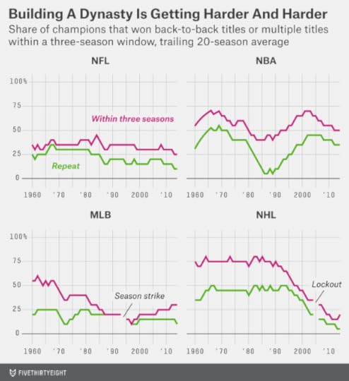
Over its past 20 seasons, the NHL has the lowest share of repeat winners among the major sports leagues — the Red Wings in 1997 and 1998 were the only one — along with the lowest share of teams to repeat within a three-season window (four out of the past 20 Stanley Cup champions did so). By contrast, before about 1990, it was probably the easiest sport for repeat winners. From 1971 to 1990, for instance, 45 percent of Stanley Cup winners had also won the championship in the previous season, and 75 percent had won a Stanley Cup within the previous three years.
The reasons for this are obvious enough: The NHL has expanded rapidly, from six teams in 1966-67 to 30 teams today. It implemented a hard and unforgiving salary cap in 2004-05. And it’s a fairly random sport: Compared with something like basketball, the best team won’t necessarily prevail, even over a seven-game series.
Still, the differences are striking. Given the difficulties of keeping a team together in the modern NHL, winning three championships within six years, as the Blackhawks will do if they can finish off Tampa Bay, would perhaps be no less impressive a feat than what the Islanders did by winning four in a row, for example. And they’ll have done it with largely the same group of talent. Nine of the Blackhawks’ top 10 players by point shares this season, including Duncan Keith, Patrick Kane and Jonathan Toews, were also members of the franchise in 20102; the only exception is left wing Brandon Saad, who had not yet been drafted.

June 12, 2015
The Iowa Straw Poll Is Dead. What Could Kill Off The Iowa Caucus?
It consists of a tiny and unrepresentative sample of voters in a small, overwhelmingly white state. Its importance depends almost entirely on the perceptions of the political elites and the news media. The spin after the vote often matters as much as the vote itself. Its rules can be surprisingly informal, to the point that baked goods are sometimes exchanged for the promise of a vote. And it has a terrible track record at predicting the GOP’s presidential nominee.
If you’ve been following the news, you might assume that I’m referring to the Iowa Straw Poll, which the Iowa Republican Party decided to cancel on Friday. But all the points I raised above also apply to the Iowa caucus:
In 2012, around 120,000 Iowans voted in the Republican caucuses. That’s only about 20 percent of Iowa’s registered Republicans and 5 percent of its overall population. It’s also only about 0.2 percent of the 60 million people who would eventually vote Republican for president in the United States that November.The Iowa caucuses haven’t always been so self-evidently important. The Democratic caucuses were all but ignored by the press in 1992 because Iowa Sen. Tom Harkin was running and took 77 percent of the vote. They were also a relatively obscure event before 1980, but their reputation was buoyed when Jimmy Carter performed well in the 1976 Democratic caucuses and went on to win the nomination.Historically, the share of the vote that a candidate receives in Iowa doesn’t matter very much in predicting how he’ll perform in New Hampshire and subsequent states. But how he performs relative to his polls — in other words, relative to expectations — matters quite a lot. In the 1984 Democratic caucus, Gary Hart got hugely favorable press attention and dramatically boosted his standing in New Hampshire despite finishing with 17 percent of the Iowa vote to Walter Mondale’s 49 percent, all because he won the expectation game.In the Iowa Democratic caucuses, voters literally gather together to express their support for a candidate, and “precinct leaders attempt to corral as many people into their corner as possible, using such enticements as food — cookies, cake, or even sandwiches,” according to one academic study. The Republican caucuses don’t use this process but are fairly informal, too. Some precincts still vote by show of hands, for instance. And the votes are nonbinding for delegate selection.While the Democratic caucuses have a decent track record at picking winners,1 the Iowa GOP caucuses don’t. In competitive Republican nomination contests,2 the eventual nominee has won the Iowa caucus just 2 of 6 times. That’s not really any better than the Iowa Straw Poll, which was 2 for 7.3

Iowa Republicans are aware of these parallels, which (as this excellent reporting from the Des Moines Register’s Jennifer Jacobs describes) may have been some of their motivation to cancel the straw poll. If the Iowa Straw Poll seems too much like a political carnival and too rarely picks viable candidates, “it’s a pretty easy leap in terms of logic to take the next step and say the caucuses aren’t important,” said Drew Ivers, chairman of Ron Paul’s 2012 Iowa campaign, in an interview with Jacobs.
But it’s also important to consider the straw poll — and the caucuses — from the standpoint of Republicans outside of Iowa. The entire presidential nomination process is largely controlled by the parties. Voters play an important role in vetting and vetoing candidates, especially when there are too many candidates whom party leaders find acceptable or too few. But both formal (state and national Republican party organizations) and informal (Republican elected officials, donors, operatives and commentators) party networks have an almost unlimited set of tools at their disposal to influence events. They set the schedule for primaries and caucuses and control the method of delegate selection. They can direct financial resources and favorable media attention toward a candidate or “nuke” him when he becomes a threat to a preferred nominee. And they can nudge the scales when officiating disputes: It wasn’t an accident that Iowa Republicans quickly and prematurely declared the establishment-backed Mitt Romney as the winner of their 2012 caucus and then only reluctantly acknowledged that it had been Rick Santorum instead after an error in vote tabulations was uncovered.
From the standpoint of the parties, the purpose of the Iowa Straw Poll is not necessarily to pick winners but to narrow (or “winnow”) the field. (In some years, this applies to the Iowa caucus too.4) In that sense, the biggest danger from the straw poll is not a “false positive” — an insurgent candidate like Michele Bachmann winning when she has little shot at the nomination — but rather a “false negative,” meaning an establishment candidate like Tim Pawlenty making a big bet on the straw poll and coming up with a disappointing performance, as happened four years ago.
But given that Pawlenty’s case was often cited as a reason to discontinue the straw poll, we should ask how much it actually mattered. Did it really eliminate him from contention in the 2012 race? And if so, was this really such a bad outcome for Republicans? Pawlenty’s campaign had a series of problems — notably, poor fundraising and an inability to draw contrasts between him and other GOP candidates. And he was polling in the low single digits nationally at the time of the straw poll. If the straw poll hadn’t provoked him to end his campaign, some other event might have just as easily.
Besides, it might be argued, party leaders can choose to interpret the straw poll results however they like. In 2012, for instance, they might have argued to the press that Pawlenty’s third-place finish (behind Bachmann and another insurgent candidate, Ron Paul) was a sign that he was the most viable establishment candidate and had some momentum in Iowa.
What Republicans seem to have concluded is that the straw poll was producing more noise than signal. Especially with more Republican candidates avoiding active participation in the straw poll, it was becoming less clear how its results might be interpreted.
In other words, it’s one thing to have a miscalibrated signal; it’s another to have a signal that you’re not sure how to read. In the Iowa caucuses, at least, Republicans (and the mainstream media) have some sense for how to interpret the results: Very conservative candidates, especially Christian conservatives, are expected to do well. More moderate and establishment-backed candidates are graded on a curve, although they won’t necessarily be forgiven for skipping Iowa entirely.
By extension, one reason the parties have been deferential to Iowa and New Hampshire and allowed them to maintain their first-in-the-nation status is because the parties have some experience in how to evaluate the results they produce. If, say, Oregon and Indiana were the first states to vote instead, the parties might not be sure what to make of them. Would an Oregon primary favor evangelicals or moderate Republicans, for instance? If the parties don’t know, that introduces more noise into the system and increases the probability of an unwanted nominee.
So what could really threaten Iowa’s first-in-the-nation position? One possibility: If a candidate proved he was able to ignore Iowa entirely and win the nomination despite it. That’s never really happened, except in the special circumstance of Bill Clinton in 1992.
Another would be if the party seems to have lost control of the nomination process. If an insurgent candidate like Rand Paul or Ted Cruz is nominated with little establishment support or an establishment-backed candidate is chosen but only after a lot of bloodletting and perhaps even a deadlocked convention, the whole nomination process could be blown up before 2020, with Iowa being collateral damage.

Why The Warriors Are So Tough To Beat
Through the first three games of the NBA Finals, the storylines were intricate and rich:
Could LeBron James carry one of the worst supporting casts in recent finals history to an NBA title?Was James’s experience — and sheer force of will — trumping the Golden State Warriors’ youth?Was Steph Curry just in a shooting slump, or was he rattled by his scary injury against the Houston Rockets?Could the Cleveland Cavaliers keep playing stifling defense, or might Golden State’s smallball lineup be its ace in the hole?Were Cleveland’s poor finishes — it was outscored by a combined margin of 105-84 in the fourth quarter and overtime of the first three games5 — the sign of a spent team?Was Kevin Love’s injury (suffered in the opening round against the Boston Celtics) the ultimate example of Bill Simmons’s Ewing Theory? And maybe Kyrie Irving’s injury too?Is Matthew Dellavedova the Australian Tim Tebow?Does God hate Cleveland?But after a 103-82 Golden State win in Game 4, it all seems so simple.
The Warriors are really, really good. You have a shot at beating them if their shooting goes ice-cold. Otherwise, it’s next to impossible.
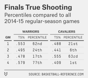 Let’s review the series from the standpoint of true shooting percentage (TS%), a relatively simple stat that gives appropriate credit for 3-pointers and free throws along with 2-point shooting attempts. Golden State led the NBA with a .571 TS% during the regular season, while Cleveland (.557) ranked fourth. The adjacent table lists each team’s TS% in each finals game so far, along with its percentile rank as compared to all NBA games during the 2014-15 regular season.
Game 4 was the first time we’ve seen the Warriors shoot like they typically did during the regular season. Their .579 TS% was close to their regular-season average, and — since an average Golden State performance is so good — ranks in the 77th percentile as compared to all NBA games.
But the Warriors’ defense has also been very good. It held Cleveland to a .409 TS% in Game 4, which ranks in just the 1st percentile. And it kept the Cavaliers to a .441 TS%, in the 6th percentile, in Game 2 on Sunday night.
Wait — didn’t the Cavs win Game 2? They did (in overtime). The team with the higher TS% wins about 85 percent of the time6 — this was one of the exceptions. Cleveland was able to take seven more field-goal attempts and 15 more free-throw attempts than the Warriors as a result of rebounding, turnovers and fouls. You can win as the slightly less efficient team when there’s a big differential in those categories.
Still, Cleveland wouldn’t have won Game 2 had Golden State shot a little better. If the Warriors had hit shots at the NBA average TS% of .535 (never mind that the team’s TS% is typically way better than that), they’d have scored an additional eight points and won 101-95.
And that’s the thing: The Warriors don’t have to shoot the lights out to win. If they shoot as well as the average NBA team, they’re very likely to win also.
In the next chart, I’ve tracked each team’s record based on its TS% during the regular season. I divide games into three categories, which include about a third of regular-season games each:
Good shooting — a TS% of .560 or higher.Poor shooting — a TS% of .510 or lower.Average shooting — anything in between.
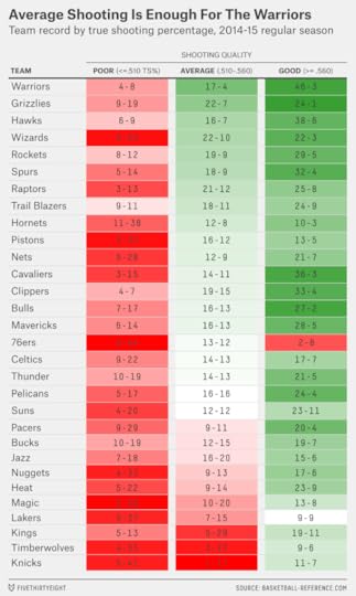
The Warriors were 17-4 during the regular season with average shooting. That equals a .810 winning percentage — tops in the the NBA — or the equivalent of a 66-16 record over an 82-game schedule.
The reason for the Warriors’ strong record with average shooting is simple: They also play great defense. It gets overlooked because they play at a frenetic pace, but the Dubs held opponents to a .514 TS% during the regular season, the third-best figure in the league after Chicago and Portland.
It can get even worse for opponents, and it often does: The Warriors went 46-3 with good shooting during the regular season. But “pretty good” shooting — average shooting, even — is usually plenty good enough for the Warriors. They’ll need to throw up a lot of bricks the rest of the way. Otherwise, James — as brilliant as he’s been — may become the first finals MVP in a losing cause since Jerry West in 1969.

June 9, 2015
Podcast: Lonely LeBron, Dominant Serena, And Nate vs. A 12-Year-Old
Welcome to this week’s episode of Hot Takedown, our podcast where the hot sports takes of the week meet the numbers that prove them right or tear them down. On this week’s show (June 9, 2015), we discuss whether LeBron James can continue to win NBA Finals games by himself, whether Serena Williams can set the record for most Grand Slams ever and what we’ve learned after the first batch of women’s World Cup games. Plus, a special Significant Digit — Nate Silver talks with 12-year-old Simon Bazelon (son of New York Times writer and Slate podcast host Emily Bazelon), who has some criticisms about FiveThirtyEight’s NBA Elo ratings.
Stream the episode by clicking the play button, or subscribe using one of the podcast clients we’ve linked to above.
Below are some links to what we discuss in this week’s show:
Nate Silver takes on the adage, “Live by the three, die by the three.” It’s mostly not true.Neil Paine on the Cavs’ Game 2 win, in context.Williams is really, really clutch.Grantland assesses Williams’ remarkable career arc.We’re offering continually updated women’s World Cup predictions, and our latest model shows that Germany is slightly more likely to win than the U.S.Significant Digit: 11 championships. That’s the number Bill Russell’s Celtics won, in 13 years, but our Elo ratings still say they weren’t the most dominant dynasty of all time. Special guest Simon Bazelon (12 years old) debates Nate and presents his own data. Simon is the son of Emily Bazelon, who recently mentioned his analysis on Slate’s “Political Gabfest” podcast.If you’re a fan of our podcasts, be sure to subscribe on iTunes and leave a rating/review. That helps spread the word to other listeners. And get in touch by email, on Twitter or in the comments. Tell us what you think, send us hot takes to discuss and tell us why we’re wrong.

Nate Silver's Blog

- Nate Silver's profile
- 729 followers

