
Nate Silver's Blog, page 157
February 23, 2015
How History Judges The Oscars’ Closest Calls
I’d love to tell you that the Oscars get the close calls wrong — that when the Academy spurns one credible best picture nominee for another, it errs on the side of the shlocky, the safe, the self-referential: the films that cater to Hollywood’s pathology in the present day and not necessarily those that will hold up better historically.
You could accuse the Academy of that after Sunday night, when it went with “Birdman” (a film about a washed-up actor) over the more critically acclaimed “Boyhood.” (I was rooting for “Boyhood” even though our statistical model said to bet on “Birdman.”) But these films haven’t had any chance to ripen.
So let’s look at some for which we have a little more perspective: the most controversial Oscar winners of the past 25 years, based on my colleague Walt Hickey’s lists of the biggest upsets and the closest calls during this period. Walt’s lists are derived from our statistical model, which assesses best picture nominees based on which other awards the films won. So it assesses those cases where there was a significant controversy at the time, not others, like the 1990 contest, when a film (“Dances With Wolves”) was winning everything even if another choice (“Goodfellas”) looks a little better now.
Still, we can be a little more data-driven when evaluating these films and their closest competitors. For instance, we can look at the American Film Institute’s (AFI) list of the 100 greatest American films of all time, along with similar lists put together by critics and movie buffs; Empire Magazine’s recent list of the top 301 films of all time is a particularly useful data source. We can also look at IMDb and Netflix ratings for which films still have the most cultural resonance.
Spoiler alert: My initial bias — that Hollywood gets the close calls wrong — doesn’t hold up so well according to this evidence. We’ll find that there are a few obvious miscalls but at least as many cases where history has validated the Academy’s verdict. We’ll also find that some of the notoriously “bad” choices were symptoms of poor years for film all around and the selections may have been as good as any of a weak lot.
Year 1 : 1989
Oscar Winner: “Driving Miss Daisy” (Empire Top 301 ranking: not ranked; IMDb rating: 7.4)
Spurned Film: “Born on the Fourth of July” (Empire: not ranked; IMDb: 7.2)
“Driving Miss Daisy” was something of an upset winner at the time, partly because Bruce Beresford wasn’t nominated for best director that year. Nor does it receive much praise from either critics or popular audiences today. It seems like an obvious “miss.”
But 1989 was a weak year for best picture nominees. The other awards were split, enough so that “Driving Miss Daisy” might have been considered a plurality favorite along with “Born on the Fourth of July,” according to our model. “Born on the Fourth of July” has also not held up so well; it doesn’t rank anywhere in the Empire or AFI lists.
In fact, the best films of 1989 may not even have been nominated. The 20/20 Awards, which revote on the Academy Awards 20 years later, went with the bypassed “Crimes and Misdemeanors” when it considered the case a few years ago. Spike Lee’s “Do the Right Thing,” which was infamously bypassed for a nomination, is the only film from the year to rank in the AFI top 100. “Indiana Jones and the Last Crusade,” also not nominated, is the only 1989 release among the IMDb top 250.
Year: 1992
Oscar Winner: “Unforgiven” (Empire: No. 150; IMDb: 8.3)
Spurned Film: “The Crying Game” (Empire: not ranked; IMDb: 7.3)
“Unforgiven,” the Oscar winner, still looks like the best choice. It ranks in the Empire top 301 and the AFI top 100, won the 20/20 Award, and maintains a considerably better IMDb rating than its closest competitor, “The Crying Game.” Incidentally, “The Crying Game” doesn’t receive all that much credit from contemporary critics for having compelled greater awareness of transgender people; instead, it’s sometimes remembered for having sparked transphobic reactions in its audience.
Year: 1995
Oscar Winner: “Braveheart” (Empire: No. 174; IMDb: 8.3)
Spurned Films: “Apollo 13” (Empire: not ranked; IMDb: 7.6), “Sense and Sensibility” (Empire: not ranked; IMDb: 7.7)
“Braveheart” looks like another correct call for the Academy. And credit where credit is due: It was an upset winner at the time. Mass audiences continue to love “Braveheart” — note the stellar IMDb rating — and if critics’ views aren’t in much consensus, the major alternatives (“Apollo 13” and “Sense of Sensibility”) do no better. Perhaps “Toy Story,” the only 1995 film in the AFI top 100, could make a case for itself.
Year: 1998
Oscar Winner: “Shakespeare in Love” (Empire: not ranked; IMDb: 7.2)
Spurned Film: “Saving Private Ryan” (Empire: No. 76; IMDb: 8.5)
This is among the biggest Oscar upsets of the past three decades — and the one that remains the hardest to fathom now. “Shakespeare in Love,” the winner, is almost completely forgotten about today except when it’s mentioned in articles like this one. “Saving Private Ryan,” conversely, rates as the third best film of the 1990s (behind “Schindler’s List” and “Unforgiven”) on the AFI list.
Year: 2000
Oscar Winner: “Gladiator” (Empire: No. 27; IMDb: 8.5)
Spurned Film: “Crouching Tiger, Hidden Dragon” (Empire: not ranked; IMDb: 7.9)
This case resembles 1995. It features another historical war epoch (“Gladiator”) that remains epic in audiences’ minds today versus a perfectly decent alternative (“Crouching Tiger, Hidden Dragon”) that hasn’t gained much historical esteem. Unlike in 1995, the win wasn’t an upset — “Gladiator” would have been the modest favorite, according to our model.
Year: 2004
Oscar Winner: “Million Dollar Baby” (Empire: not ranked; IMDb: 8.1)
Spurned Films: “The Aviator” (Empire: not ranked; IMDb: 7.5), “Sideways” (Empire: No. 277; IMDb: 7.6)
This was a close three-way race in a weak year for best picture nominees — no 2004 releases rank in the AFI top 100, and none of the Oscar nominees did especially well at the box office. “Million Dollar Baby,” the Academy’s choice, has the highest IMDb rating among the nominated films. “Sideways” was the only one to make the Empire top 301, although it did so only barely and continues to generate polarizing reactions among filmgoers and oenophiles.
Year: 2005
Oscar Winner: “Crash” (Empire: not ranked; IMDb: 7.9)
Spurned Film: “Brokeback Mountain” (Empire: No. 222; IMDb: 7.7)
I remarked on Twitter on Sunday night that “Crash” over “Brokeback Mountain” looks like an even worse choice in retrospect. Indeed, “Crash” has become something of a running punchline for Hollywood’s failings. The movie’s IMDb ratings are actually not bad, but I feel safe asserting that they don’t reflect the critical consensus of how “Crash” is viewed today.
The thing is, though, that if “Crash” hadn’t won, some other film would have had to. And while “Brokeback Mountain” was an important film — especially for an industry that spent so long in the closet — it wasn’t necessarily a great film. Although it ranks in the Empire top 301, its IMDb rating is just decent, and Netflix reviewers barely even give it three stars. It’s not even talked about that much anymore except when the subject of Oscar snubs comes up.
Perhaps that’s because there’s a much fuller breadth of gay characters on television and movie screens today, including the hosts of the past two Oscar ceremonies. Ellen DeGeneres and “Modern Family” are likely to loom a lot larger in the historical imagination than “Crash” — but also larger than “Brokeback Mountain.”
Year: 2006
Oscar Winner: “The Departed” (Empire: No. 55; IMDb: 8.5)
Spurned Film: “Little Miss Sunshine” (Empire: No. 202; IMDb: 7.9)
Two well-liked films, “The Departed” and “Little Miss Sunshine,” were the main competitors. Academy voters went with “The Departed” then; it also rates slightly higher today, according to IMDb, Empire and Netflix.
Year: 2010
Oscar Winner: “The King’s Speech” (Empire: not ranked; IMDb: 8.1)
Spurned Film: “The Social Network” (Empire: No. 148; IMDb: 7.8)
We’ve gotten to the point where the films are too recent to allow for much additional perspective. You could cobble together a case for “The Social Network” having held up better; it’s not as though Facebook has become any less relevant, and “The Social Network” ranks in the Empire top 301 while “The King’s Speech” does not. Perhaps “The Social Network” will come to seem more iconic over time. But it could also feel dated and slightly hackneyed, in the same way that 1987’s “Wall Street” now does (rewatch “Wall Street” to see what I mean). “The King’s Speech,” for now, has incrementally better IMDb and Netflix ratings.
Year: 2013
Oscar Winner: “12 Years a Slave” (Empire: No. 119; IMDb: 8.1)
Spurned Film: “Gravity” (Empire: No. 35; IMDb: 7.9)
Based on my personal preferences, this ought not have been a tough call to begin with. I’d have cast my lot with “12 Years a Slave,” which I thought was the better film on its face and the one that’s likely to hold up better historically. But one year tells us almost nothing further about them. At least the Academy didn’t spurn “12 Years a Slave” and “Selma” in consecutive years.
So if you’re scoring at home, the Academy made the wrong choice with “Shakespeare in Love” in 1998, according to just about any measure you might look at. Its 2005 selection of “Crash” looks bad, too — but not necessarily because “Brokeback Mountain” was a great film. You can critique it for not having nominated the right films (like “Do the Right Thing”) in 1989 more than for choosing the wrong film among those nominees.
Otherwise it acquits itself reasonably well. Its choices in 1992, 1995, 2000 and probably 2006 have held up better than the main alternatives; 2004 was going to be a close call either way. It’s too early to judge 2010 or 2013; perhaps the evidence weighs slightly toward the Academy in 2013 and against it in 2010. But its track record isn’t as bad as I suspected. Maybe in a decade or two, “Boyhood” will be a held up as a nonpareil work of filmmaking and “Birdman” as no better than “Shakespeare in Love” — but maybe not.


February 22, 2015
Rich Data, Poor Data
This story appears in ESPN The Magazine’s March 2 Analytics Issue. Subscribe today!
In the 2000 edition of Baseball Prospectus, Keith Woolner identified 23 problems — avenues of analysis that had been dead ends for turn-of-the-millennium statheads. (For instance, No. 10: “Projecting minor league pitchers accurately.”) Woolner named these Hilbert Problems, after mathematician David Hilbert, who in 1900 outlined his own set of 23 vexing mathematical problems that he hoped would be solved in the 20th century.
Of Hilbert’s 23 math problems, just 10 have been answered — not a great track record for more than a century’s worth of work. While Woolner’s baseball problems don’t lend themselves to mathematics’ hard-and-fast proofs, we have become a lot better at, say, “measuring the catcher’s role in run prevention” (No. 3). There’s still a margin of error in calculating how valuable Yadier Molina is to the Cardinals; nevertheless, the progress in baseball is remarkable.
Analysts have made huge strides in “separating defense into pitching and fielding” (problem No. 1): The discovery that pitchers have relatively little control over balls in play has increased the value put on fielding and pitchers’ strikeout ability. And research into “determining optimal pitcher usage strategies” (No. 20) has led teams to transform struggling starters into top-shelf middle relievers with ERAs that would make Bob Gibson blush. Indeed, the shift toward pitching and defense reflects the rise of sabermetrics as much as the decline of juiced balls or juiced players.
And all of this has taken 15 years, rather than since William McKinley was president. Sure, teams could still glean more about “assessing the ‘coachability’ of players” (No. 13) or “quantifying the manager’s impact on winning” (No. 22). But baseball analysts can’t complain, unlike their counterparts in other fields.
As I describe in my book “The Signal and the Noise: Why So Many Predictions Fail but Some Don’t,” the rapid and tangible progress in sports analytics is more the exception than the rule. It’s important to remind sports nerds — who, as they look at streams of PER or wRC+ numbers, have become a bit spoiled — of this fair and maybe even obvious point. Because out there in the wider world, questions far more basic than Woolner’s remain unresolved. We still have tremendous trouble predicting how the economy will perform more than a few months in advance, or understanding why a catastrophic earthquake occurs at a particular place and time, or knowing whether a flu outbreak will turn into a bad one.
It’s not for any lack of interest in data and analytics. For a while, I gave a lot of talks to promote my book and met a lot of people I might not encounter otherwise: from Hollywood producers and CEOs of major companies to the dude from India who hoped to be the Billy Beane of cricket.
But there’s a perfect storm of circumstances in sports that makes rapid analytical progress possible decades before other fields have their Moneyball moments. Here are three reasons sports nerds have it easy:
1. Sports has awesome data.Give me a sec. Really, I’ll only need a second. I just went to Baseball-Reference.com and looked up how many at-bats have been taken in major league history. It’s 14,260,129.
The volume is impressive. But what’s more impressive is that I can go to RetroSheet.org and, for many of those 14 million at-bats, look up the hitter, the pitcher, who was on base, how many people attended the game and whether the second baseman wore boxers or briefs. It’s not just “big data.” It’s something much better: rich data.
By rich data, I mean data that’s accurate, precise and subjected to rigorous quality control. A few years ago, a debate raged about how many RBIs Cubs slugger Hack Wilson had in 1930. Researchers went to the microfiche, looked up box scores and found that it was 191, not 190. Absolutely nothing changed about our understanding of baseball, but it shows the level of scrutiny to which stats are subjected.
Compare that to something like evaluating the American economy. The problems aren’t in the third decimal place: We sometimes don’t even know whether the sign is positive or negative. When the recession hit in December 2007 — the worst economic collapse since the Great Depression — most economists didn’t believe we were in one at all. The recession wasn’t officially identified until December 2008. Imagine what this would be like in sports! We’re not sure how many points Damian Lillard scored last night, but we’re reasonably confident it was between 27 and negative 2. Check back in a few months.
As if statheads weren’t spoiled enough, we’re getting more data all the time. From PITCHf/x to SportVU, we have nearly a three-dimensional record of every object on the field in real time. Questions once directed at scouts — Does Carmelo really get back on defense? What’s the break on Kershaw’s curve? — are now measurable.
2. In sports, we know the rules.And they don’t change much. As I noted, there has been little progress in predicting earthquakes. We know a few basic things — you’re more likely to experience an earthquake in California than in New Jersey — but not a lot more.
What’s the problem? “We’re looking at rock,” one seismologist lamented to me for my book. Unlike a thunderstorm, we can’t see an earthquake coming, nor can we directly observe what triggers it. Scientists have identified lots of correlations in earthquake data, but they have relatively little understanding of what causes one at any particular time. If there are a billion possible relationships in geology’s historical data, you’ll come up with a thousand million-to-one coincidences on the basis of chance alone. In seismology, for instance, there have been failed predictions about earthquake behavior in locations from Peru to Sumatra — all based on patterns that looked foolproof in the historical data but were random after all.
False positives are less of an issue in sports, where rules are explicit and where we know a lot about causality. Take how we evaluate pitcher performance. It turns out that if you want to forecast a pitcher’s future win-loss record, just about the last thing to look at is his previous record. Instead, focus on his ERA, or better yet his strikeout-to-walk ratio, or maybe even the PITCHf/x data on pitch velocity and location.
Why? Winning is the name of the game, and you win by allowing fewer runs than your opponent. So ERA says more about winning than a pitcher’s record. But you can do even better: Runs are prevented by striking out batters (and not walking them), and strikeouts are generated by throwing good pitches, which is why WHIP and strikeouts per nine innings also serve predictive purposes. Understanding the structure of the system gives statistical analysis a much higher batting average.
3. Sports offers fast feedback and clear marks of success.One hallmark of analytically progressive fields is the daily collection of new data that allows researchers to rapidly test ideas and chuck the silly ones. One example: dramatically improved weather forecasts. The accuracy of hurricane landfall predictions, for instance, has almost tripled over the past 30 years.
Sports, especially baseball, fits in this category too. In Billy Beane’s first few years running the A’s, the team had awful defenses — bad enough that Matt Stairs briefly played center. Beane theorized that because defense was so hard to quantify, he shouldn’t focus on it. His assumption turned out to be completely wrong. As statheads came to learn about defense, it proved to be more important than everyone thought, not less. Because the A’s were playing every day and Beane could study the defensive metrics like dWAR that emerged, he learned quickly and adjusted his approach. His more recent teams have had much-improved defenses.
Contrast this with something like presidential elections, in which lessons come once every four years, if at all. Mitt Romney’s belief that the 2012 election was his for the taking (it wasn’t, according to both public polls and political science research) may have led him to underinvest in his get-out-the-vote operations. He underestimated Barack Obama’s popularity and his own ability to sway voters with his message. Republicans will have to wait until 2016 to improve their approach.
It also helps that sports has a clear objective: winning. Obvious? Sure. But that’s not the case in other subjects. What counts as “winning” for the U.S. economy, for instance? Is it low inflation or high growth? If it’s growth, does it matter how the income is distributed? You have opinions about that, and I do too, and we might not agree even given all the data in the world.
But the zero-sum nature of sports competition (there are a finite number of wins and championships to go around) also yields the greatest risk to continued innovation. When I was working for Baseball Prospectus a decade ago, most of the innovation was occurring among outsiders like us. It was competitive, but the point of getting a data “scoop” was to publish it for the rest of the world to see.
Now almost all MLB teams employ a statistical analyst, if not a small gaggle of them. But those analysts are working on behalf of just one team — and have less incentive to share. At the MIT Sloan Sports Analytics Conference every year, the panels featuring current employees of major league teams are deathly dull because if the panelists said anything useful to a roomful of their competitors, they would be fired. Sports analytics runs the risk of losing the momentum of the past 15 years.
Woolner, for his part, is now the director of baseball analytics for the Indians. No doubt he has 23 new problems to solve. But now it will take the rest of us longer to know when he has cracked them.

February 19, 2015
Marco Rubio And The Pareto Frontier
There’s still plenty of room for Marco Rubio. Two years ago, I described the Florida senator as the “electable conservative.” While Rubio has taken fewer tangible steps toward officially running for president than rivals like Jeb Bush and Scott Walker, he still does reasonably well by that rubric. Perhaps along with Walker, he can make the most credible case for meeting William F. Buckley’s standard as the most viable conservative candidate.
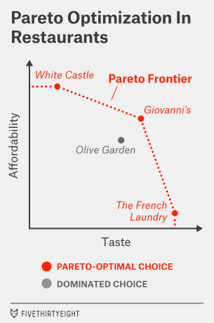
Let’s formalize our understanding of this a bit. In economics, there’s a concept known as Pareto efficiency. It means that you ought to be able to eliminate any choice if another one dominates it along every dimension. The remaining choices sit along what’s called the Pareto frontier.
Suppose, for example, that you’re trying to choose a restaurant for dinner and the criteria are taste and price. If you want to maximize on taste, you might choose, say, The French Laundry. If you want to maximize on price, you might choose White Castle.
I’m not here to tell you whether it’s going to be a 12-sack of sliders for $2.99 or a 12-course tasting menu for $299. In fact, I don’t need to know anything about how you weigh taste and price. But I can at least eliminate some other choices for you.
Imagine that in addition to White Castle and The French Laundry, there are two Italian restaurants in your neighborhood. One is the chain restaurant Olive Garden. You actually like Olive Garden perfectly well. But down the block is a local red-sauce joint called Giovanni’s. The food is a little better there than at Olive Garden (although not as good as at The French Laundry), and it’s a little cheaper than Olive Garden (although not as cheap as White Castle). So you can eliminate Olive Garden from your repertoire; it’s dominated along both dimensions by Giovanni’s.
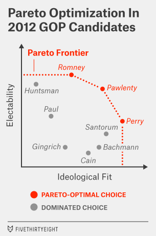
You’ve probably inferred how we might apply this to presidential candidates. In this case, the dimensions, following Buckley’s lead, are electability and ideological “fit.” (For the most part, ideological fit means being more conservative in the case of a Republican and more liberal in the case of a Democrat. But there are some candidates who might be too conservative or too liberal even for their party bases.)
Below is a semi-hypothetical conception of the 2012 Republican field with this distinction in mind. (By semi-hypothetical, I mean that the placement of the candidates isn’t totally arbitrary but also isn’t determined by any hard-and-fast formula.) It conceives of Mitt Romney, Tim Pawlenty and Rick Perry as Pareto-optimal candidates, with the other candidates, like Newt Gingrich, dominated by at least one of these choices.
It’s easier to produce one of these charts with the benefit of hindsight, of course. For now, the positions of the 2016 candidates are a long way from being defined. But there’s some preliminary evidence that Bush is vulnerable on the ideology dimension, without being particularly strong on electability. It’s easy to imagine Republicans preferring Rubio to Bush in a two-way race. Defeating Walker could be a tougher task for Rubio, but Rubio could remain a Pareto-optimal choice if he were seen as the more electable of the two.
Ideological fit is probably the easier of the dimensions to measure at this stage. This is an experienced and well-credentialed Republican field, and the candidates have left a lot of clues behind about where they line up on the issues. One technique is to look at the various statistical systems that measure ideology on the basis of policy statements, congressional voting records and other factors. As I wrote two years ago, that analysis comes out looking pretty good for Rubio. He’s quite conservative, but not ultraconservative — instead he’s close to the median of Republicans who have been elected to Congress in recent elections.
Another way is to talk to Republican voters directly — or at least to poll them, as The Des Moines Register and Bloomberg Politics recently did in Iowa. That poll asked potential Republican caucusgoers whether they saw each of their candidates as “too conservative,” “too moderate” or “just right.” I’ve re-created that data below, removing voters who said they weren’t sure about the candidate from the sample.
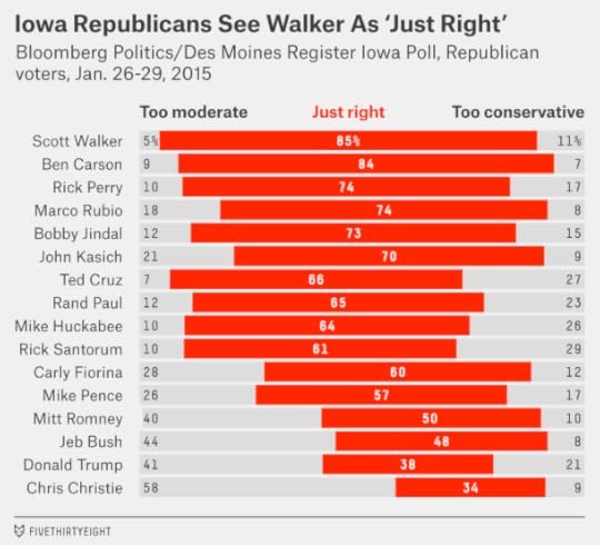
These numbers look really good for Walker. Among voters with an opinion about him, 85 percent rated his ideological views as “just right,” the highest in the Republican field. But Rubio isn’t far behind; 74 percent of voters described him the same way, placing him in a tie for third place with Perry. Most of the difference is because 18 percent of Iowa Republicans think Rubio is “too moderate,” versus 5 percent who say that of Walker. But in other states like New Hampshire — where the Republican electorate is more moderate — the advantage could tip to Rubio instead.
By contrast, Bush’s numbers are awful in the Iowa poll, with only 48 percent saying he is “just right.” Chris Christie’s are even worse — behind even Donald Trump’s.
What about electability? We know less about that so far. Head-to-head polls comparing Republican candidates against Hillary Clinton are tests of name recognition as much as anything else at this stage. For now, arguments about electability will mostly be made among those Republican elites who make up the invisible primary and who may not want to donate to or endorse a candidate they perceive to be a general-election loser.
But let’s take a very cautious look at favorability ratings among the broader electorate, which if nothing else could affect the perception of these elites. Huffington Post Pollster has favorability-rating data on eight potential Republican candidates. For each one, I’ve computed a Real Clear Politics-style polling average, meaning that I’ve taken the most recent survey from each polling firm and averaged them together.1
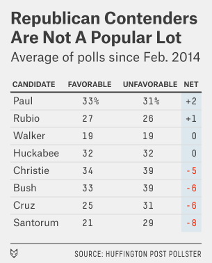
Let me be really careful here. These numbers don’t look great for Republicans, but they can change. To a first approximation, it’s best to assume that next year’s general election race is a 50-50 proposition. And Clinton’s favorability ratings — which would be 51 percent favorable and 42 percent unfavorable by this method and which have gradually been falling — aren’t so hot either.
Still, the eight Republicans listed here either qualify as relatively unknown or relatively unpopular. For Rubio and Walker, who at least have break-even favorability ratings so far with a lot of room to define themselves, that isn’t too much of a problem. For Bush and Christie, though, it could be. Both are fairly well-known to voters, and yet both have net-negative favorability ratings.
This is unusual because normally candidates who are closer to the center of the electorate, such as Bush and Christie, fare better among general-election voters. It’s possible that some of Bush’s poor ratings have to do with his last name; some voters may even confuse him with former President George W. Bush. As Jeb Bush becomes better known, voters will have new information with which to evaluate him and may find him more likable. Christie’s problems may be a little more intractable.
But either way, Bush and Christie are going to have more trouble making the electability argument than relatively moderate candidates usually would. Christie, in particular, is close to being the worst of all worlds, viewed as an ideological misfit by Republicans while being among the least popular Republicans with general-election voters. On the Pareto chart, Christie and Bush are at more risk of being dominated than dominating other candidates.
Rubio and Walker, being lesser known, have more chance to shape their image. And they can make some electability arguments of their own. In Rubio’s case, it’s about being a Hispanic candidate from a swing state with a good life story; in Walker’s, it’s about having been elected in a blue-leaning swing state three times in four years.
They also have vulnerabilities. Walker so far has not gotten a great reception from the mainstream media, which is fond of playing up the “crazy tea partyer” characterization of him. Pushing back against alleged or actual media bias is a part of the Republican playbook, but it requires some dexterity; it worked well for George W. Bush but not so well for Sarah Palin in the end, for instance. Rubio, for his part, has not shown a lot of political dexterity either, having lost more than he gained when he advocated for immigration reform.
But Rubio may have been right last week when he said he wasn’t running against Bush. It’s possible that Bush will be easy for Republicans to eliminate, leaving Rubio and Walker running against each other.

February 2, 2015
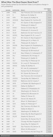
Counterpoint: Super Bowl XLIX Was Among The Most Exciting Super Bowls Ever
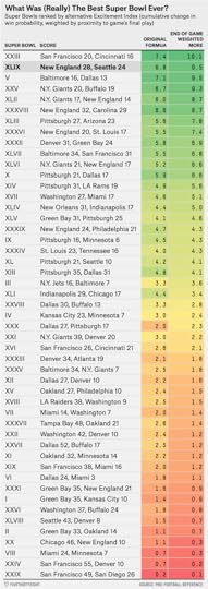
In the immediate aftermath of the New England Patriots’ 28-24 Super Bowl victory over the Seattle Seahawks Sunday night, we gave a preliminary measurement of how exciting the game was using what Brian Burke of Advanced Football Analytics calls the “Excitement Index.” This index tracks the cumulative change in win probability throughout a game, the logic being that bigger swings in win probability indicate a more thrilling game.
By NumberFire’s live in-game probability model, the Excitement Index of Super Bowl XLIX was curiously modest, ranking just 12th all time. But, as we noted, win probability models can vary to a surprisingly large degree, so we wanted to recalculate the Excitement Index using data from Pro-Football-Reference.com, which hadn’t yet updated Sunday night. (We used Pro-Football-Reference in our original ranking of the most exciting Super Bowls last week.)
The difference between the two sources is bigger than you might think. If we run the Pro-Football-Reference numbers, Sunday’s game comes in at No. 3 all time, a much higher — and, in our subjective view, more deserving — placement than we’d originally calculated.
In addition to the vagaries of competing win probability metrics, it’s also worth noting that the Excitement Index has obvious limitations. Similar to the way the coastline paradox makes it difficult to pin down the true length of a landmass’s coastline, a bunch of incremental changes to win probability can add up quickly for a game’s Excitement Index even if the overall trend of a game is in the same direction.
The Excitement Index (as originally defined by Burke) also counts a swing in win probability from, say, the first quarter the same as one from the fourth quarter. In terms of leverage index, this is entirely appropriate — but it may not track as well with the subjective feeling of excitement we tend to experience as fans, where late-game moments are given much more weight.
To try to capture some of that feeling, we also calculated an alternative version of the Excitement Index that puts more weight on the end of the game. Here’s how it works: A play at the very end of the game receives a weight of 2, halftime receives a weight of 1, and the opening kickoff gets a weight of 0. It’s a bit ad hoc, we know, but it seems to produce ratings that match the perceived excitement of Super Bowls better than an unweighted sum of win-probability changes.
Using our alternative Excitement metric, Super Bowl XLIX is second all time. (See the table below for the updated ranking by this method.)
Then again, as we wrote last night, no index can ever really put a number on the elation felt by Patriots fans — and the corresponding despair of those rooting for the Seahawks — at the end of a game like Sunday’s.

Are The Patriots Now The Greatest NFL Dynasty Of All Time?
New England Patriots quarterback Tom Brady grew up in the San Francisco Bay Area idolizing Joe Montana, Steve Young and the San Francisco 49ers. Now, after winning his fourth Super Bowl on Sunday, Brady has helped the Patriots cement their place alongside the 49ers among the top NFL dynasties of all time.
Whether the Patriots or the 49ers rank as the top modern NFL dynasty depends on the length of the period you consider. In the chart below, I’ve measured the top franchises over periods ranging from one year to 25 years.1 Rankings are based on a team’s average Elo rating at the end of each season. (We’ve calculated Elo ratings back to the AFL-NFL merger year of 1970, so great teams before that — like the Green Bay Packers of the 1960s — are not considered.) Here’s the list:
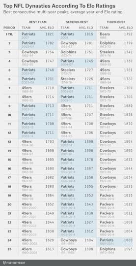
Brady’s 2007 Patriots finished with the highest single-season Elo rating ever, despite being upset in the Super Bowl by the New York Giants. Even if you’re no fan of the 2007 Patriots, another Brady team ranks second: the 2004 Patriots.
But when we’re thinking about dynasties, we’re thinking about success over a multi-year period. Brady’s 2003 and 2004 Patriots are one of seven franchises to have won consecutive Super Bowls, and on the Elo list they’re essentially tied with the 1992-93 Dallas Cowboys and 1972-73 Miami Dolphins for the best two-year runs ever. The early 1990s Cowboys earn the nod for the top three- and four-year peaks, although it’s a close call in each case.
For periods of longer than four years, the top two franchises become pretty clear: the Patriots and the 49ers:
The Patriots rate as having the best five- and six-year runs;The 49ers have the best seven- and eight-year stretches;The Patriots then overtake the Niners as the best dynasty for periods of nine through 12 years;But the 49ers win again for periods of 13 years and longer.The 1970s Pittsburgh Steelers is the other franchise that can make a case for being the top modern dynasty. The Steelers won four Super Bowls in a six-year stretch in the 1974 through 1979 seasons and are extremely competitive with the Patriots and the 49ers in Elo for the top six- and seven-year runs.
But those Steelers did not have the longevity of the 49ers or the Patriots. Pittsburgh’s quarterback, Terry Bradshaw, was not terribly effective before or after his Super Bowl run. Brady, by contrast, has been anywhere from good to MVP-caliber since he first took over the Patriots’ starting job in 2001, and the Patriots have not had a losing year since. The 49ers, meanwhile, had 16 consecutive winning seasons from 1983 to 1998.

February 1, 2015
The Super Bowl Point Spread Has A Strange, Strange History
I have almost no recollection of Super Bowl XXIX — and not just because the Super Bowl was terrible. It was January 1995, I was a junior in high school, and my debate team was busy preparing for the state finals. We had the game on in the background somewhere but between cutting cards and practicing our 2NRs, we weren’t paying much attention.
But we didn’t miss much. The San Francisco 49ers, 19-point betting favorites, scored on the fourth play of the game when Steve Young tossed a 44-yard touchdown to Jerry Rice. They never looked back and beat the San Diego Chargers 49-26. It was, by one measure, the least exciting Super Bowl in history.
If you were a teenager in the 1990s, the Super Bowl had been terrible for as long as you could remember. From Super Bowl XIX in 1985 (the first one I remember watching — the 49ers crushed the Dolphins 38-16) through Super Bowl XXIX, the average margin of victory was 22 points.
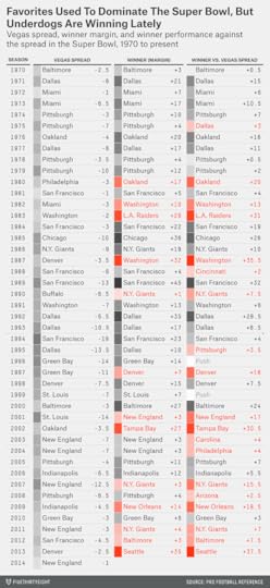
The betting public undoubtedly noticed this too, which may have been why the point spread for the Super Bowl was often extremely large. The point spread for Super Bowl XXIX — 19 points — looks absolutely crazy in retrospect. You almost never see a line that wide in the NFL. Since 19782, only 14 other NFL games (regular season or postseason) have featured a spread that large. It happens about once every third season, and usually requires the absolute best team in the league to be playing the absolute worst one. This time it happened in the Super Bowl.
But it seemed perfectly sensible at the time. Between Super Bowl V — the first one after the AFL-NFL merger in 1970 — and that 49ers-Chargers blowout in Super Bowl XXIX, the betting favorite covered the spread 18 of 25 times. Could this just have been random? Maybe, but an 18-7 record can’t be dismissed out of hand: If you flip a fair coin 25 times, the probability of coming up with heads 18 or more times is just 2.2 percent.
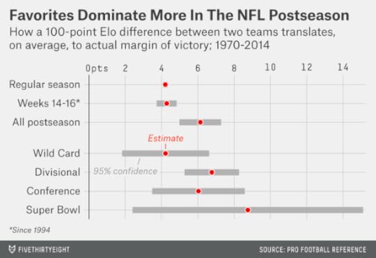
We can show how handicappers were treating the Super Bowl differently through FiveThirtyEight’s Elo ratings, which we’ve run retroactively back to 1970. The Elo ratings are a simple formula — they account for only wins and losses, margin of victory, home field advantage and strength of schedule — but they usually match Vegas point spreads pretty well. While they can disagree with Vegas on the strength of particular teams, they aren’t routinely recommending that you bet on underdogs instead of favorites, for instance.
But in Super Bowls, Elo-generated point spreads have been systematically different from Vegas lines. In Super Bowls since 1970, Elo would have recommended a bet on the Super underdog 40 times — and the favorite just three times.

Because these underdogs were getting crushed up through the mid-1990s, Elo’s betting strategy would be getting crushed too. Its record up through and including Super Bowl XXIX — when it would have had the Chargers as only 5-point underdogs instead of 19-point ones — would be just 7-18.
So maybe Super Bowl betting strategy is simple? Bet on the favorite, stupid.
Except, maybe not. You can probably guess what’s happened since 1995. In the 19 Super Bowls since that time, underdogs have been on a tear, having gone 12-5-2 against the point spread. On average, underdogs have beaten the point spread by more than 6 points during this period. Lately, they’ve won quite a few games outright too, including each of the last three Super Bowls and five of the last seven.
Here’s one chart that summarizes this history. It compares the Vegas point spread (in light grey), the Elo point spread3 (in dark grey) and the actual result (in red), using a polynomial smoother to more clearly show the long-term trends.
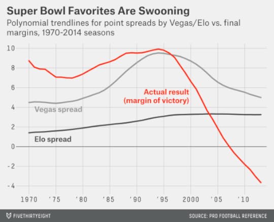
In the chart, you can see how favorites outperform Vegas point spreads in Super Bowls throughout the 1970s and 1980s. But Vegas is trying to catch up and keeps listing wider and wider point spreads for the games. (These increasingly wide point spreads are not justified according to Elo, which don’t see the Super Bowls of the era as featuring especially lopsided matchups.) By the mid-1990s, Vegas has fully caught up to the historical tendency of favorites to perform well in the Super Bowl. Right about at that time, however, underdogs go on a run instead.
Perhaps Vegas bookmakers were just catering to the whims of the betting public? If the public was used to seeing lopsided Super Bowls — as it was in the 1990s — Vegas might need some very wide point spreads to tempt people to bet on the underdog and even out the betting action.4
From Elo’s point of view, these point spreads became wide enough to seem almost irrational. On average for Super Bowls played in the 1990s, Elo would have expected to win a bet placed on the underdog 70 percent of the time.5 That’s a huge edge: even the best sports bettors in the world struggle to win more than 55 percent of the time.
But we should be careful about asserting that bookmakers and the betting public were just being foolish. Indeed, pretty much any time you claim to have a 70 percent edge against Vegas, you’re the one who’s being foolish. (This holds especially true given Elo’s record against Vegas in Super Bowls: Just 16-24-2 overall, although better in recent years.)6. So don’t be so quick to lay down a bet on the Seahawks, whom Elo has favored this year.
Besides, there are some entirely rational reasons why favorites might perform especially well in Super Bowls. Super Bowls are different from regular-season games in several important ways:
They’re played after a two-week break, allowing more time for recovery from injury and fatigue. They also feature a much longer halftime, further reducing the effect of fatigue.They’re played at neutral sites, and almost always in warm-weather cities or in domes.They’re theoretically officiated by the best referees.They’re the last game of the season, so a team has no reason to leave anything on the table. Teams may be more inclined to run up the score.They’re the culmination of an elimination tournament. Both teams will go into the Super Bowl “hot” by virtue of having won earlier in the playoffs to get there.They’re contested between teams from different conferences, who are less likely to have played one another recently.They’re spectacular events. Perhaps only the World Cup and Champions’ League Finals and the Summer Olympics draw more worldwide spectator interest.Some of these factors, especially the first four, might help favorites by reducing the amount of luck in the game. Even great teams have trouble avoiding bad breaks from injuries, poor field conditions, or poor officiating decisions. But the impact of each of these factors is reduced in the Super Bowl.
There’s also some evidence that favorites perform well in the playoff games leading up to the Super Bowl. In the chart below, I’ve run a regression on NFL games since 1970, where the independent variable is the difference in Elo rating between the teams (accounting for home-field advantage) and the dependent variable is the margin of victory or defeat. In the regular season, a team with a 100-point Elo advantage has won by about 4 points on average. (This edge is fairly consistent throughout the regular season; it doesn’t become larger in the final weeks of the year.7) In the postseason, however, the same 100-point Elo advantage has translated to more like a 6-point margin of victory. The difference is statistically significant.
So perhaps those Super Bowl betting lines got a little bit carried away in the 1990s. No matter how mediocre the 1994 Chargers were, they probably shouldn’t have been 19-point underdogs to anyone.
But postseason games differ from regular season games — and Super Bowls differ from regular playoff games. Even in the era of “Moneyball,” the postseason is an understudied topic — and stat geeks shouldn’t be so quick to dismiss what happens in the Super Bowl as luck.

January 30, 2015
The Patriots And Seahawks Are The Best. This Could Be The Worst Super Bowl Ever.
So what if the pregame story lines have been asinine and absurd? On Sunday, the New England Patriots and Seattle Seahawks will be among the most talented teams to take the field in the Super Bowl.
According to FiveThirtyEight’s NFL Elo ratings, this year’s Seahawks are the fifth-best team to participate in a Super Bowl since the AFC-NFC merger. And the Patriots aren’t far behind. The average Elo rating of the teams this year is the second-best in a Super Bowl since that merger, trailing only Super Bowl XIII when the Dallas Cowboys played the Pittsburgh Steelers.

Elo’s lofty ranking of the game might seem surprising given that the Seahawks and Patriots each went 12-4 in the regular season, excellent but hardly extraordinary records. Those records probably underestimates their strength, however. Both teams played relatively tough schedules, and both finished the season stronger than they started it — notwithstanding the Patriots’ throwaway loss in Week 17, when they rested their stars against the Buffalo Bills.
Furthermore, both teams have been at the top of the league for some time. That matters when assessing the historical strength of an NFL team: 16 regular-season games just isn’t all that large a sample, so Elo ratings predict performance better because they carry over some of a team’s rating from one season to the next. The Seahawks and Patriots entered this season ranked No. 1 and No. 3 in Elo, respectively, based on their ratings at the end of 2013. It’s not as though either of these teams backed into the Super Bowl — as, for instance, the 2003 Carolina Panthers did when reaching the title game with a 11-5 record. (Those same Panthers went 1-15 in 2001, 7-9 in 2002 and 7-9 in 2004.)

But it’s not only that the Seahawks and Patriots are strong teams: They’re just about evenly matched. The Vegas line opened as a pick ’em, and most sports books have the Patriots as mere one-point favorites. Elo, which loves the Seahawks, differs slightly here: It has Seattle as 2.5-point favorites. But that’s partly because the system, in its simplicity, punished the Patriots for their meaningless Week 17 loss against Buffalo. Without that game, the Patriots’ Elo rating would be 1756, which would make Seattle only one-point favorites and which would vault this matchup ahead of Super Bowl XIII into the top slot of all time.
We can place past Super Bowls into four quadrants, as we have in the chart below. The horizontal axis represents the average Elo rating of the two participants; the vertical axis represents the Elo-rating difference between the teams. (The years in the chart correspond to the year of the NFL regular season. For example, Super Bowl XX, played Jan. 26, 1986, is designated as 1985 because that’s the year most of us would associate with the 1985 Chicago Bears.)
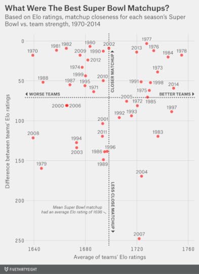
The top-left quadrant represents games in which the teams were fairly evenly matched but not particularly great — like the Super Bowl we had two seasons ago between the San Francisco 49ers and Baltimore Ravens. The bottom-right quadrant is for Super Bowls when the average Elo rating was high but because of one spectacular team, like when the undefeated 2007 Patriots played (and lost to) the New York Giants.
It’s the games in the top-right quadrant that had both things going for them, as this one does: great teams but also a reasonably even matchup.
But here’s the catch: Those great-seeming matchups didn’t translate into great Super Bowls.
Below, we’ve ranked the 48 prior Super Bowls based on a version of the Excitement Index, which measures the quality of a game based on how much win probability changes over the course of it. This season’s NFC Championship would, obviously, qualify as an extraordinarily exciting game — the Seahawks’ win probability shifted from near zero to very likely late in the fourth quarter, and then back to basically 50-50 after the Packers kicked a field goal to send the game to overtime, and then up to 100 percent once the Seahawks won in OT. By contrast, the AFC Championship — the Patriots were favored, pulled ahead early and never looked back — would have a low Excitement Index.

The Excitement Index is not perfect — compared with how we would rank the games intuitively, it seems to give too little credit to unlikely fourth-quarter comebacks, for instance. But it does a reasonable job of ranking the Super Bowls. The top Super Bowl of all time, according to the Excitement Index, was Super Bowl XXIII, played after the 1988 regular season between the 49ers and Cincinnati Bengals. Most of the other obvious candidates — like Wide Right and the Giants’ upset of the Patriots in Super Bowl XLII — also rank highly.
The win probability data we’re using is from Pro-Football-Reference.com, and accounts for the point spread, so a game that turns out to be lopsided between teams that looked evenly matched beforehand (like last year’s Super Bowl or Super Bowl XVIII) will get a bit of credit. A game in which a heavy favorite romps to victory (like Super Bowl XXIX, when the 49ers, as 19-point (!) favorites against the San Diego Chargers, were ahead 14-0 after four minutes of play) will get almost none.
But the hope is for a Super Bowl that stays tight from wire to wire with plenty of drama in between. And if you’re looking at those matchups that looked best on paper going in — those from the top-right quadrant of the chart — you won’t find many that turned into great games.
There’s one very encouraging precedent. The aforementioned Super Bowl XIII, played after the 1978 regular season, had a lot of parallels to this one. The Cowboys, like this year’s Seahawks, were a 12-4 team coming off a Super Bowl championship. The Steelers, like this year’s Patriots, were an aging dynasty hoping for one more ring. (As it turns out, they’d win two more.) The Steelers won 35-31, and the outcome might have different if not for a dropped touchdown catch by Cowboys tight end Jackie Smith. Super Bowl XIII ranks very well in the Excitement Index and even higher on subjective lists of the best Super Bowls, one of which has it as the best game ever.
But pretty much every other game in the top-right quadrant stunk:
There’s last year’s Seahawks-Denver Broncos debacle.There’s Super Bowl XIX (played after the 1984 regular season). What was supposed to be a spectacular matchup between Joe Montana and Dan Marino turned into a rout as the 49ers clobbered the Miami Dolphins 38-16.There’s Super Bowl XII (1977), which never really became competitive; the Cowboys’ win probability was up to 95 percent by the middle of the second quarter and they coasted to a 27-10 win over the Broncos.There’s Super Bowl VIII (1973), one of several poor Super Bowls involving the Minnesota Vikings. The Vikings didn’t score until the fourth quarter and lost to the Dolphins 24-7.There’s another Vikings stinker from a few years later, Super Bowl XI, when they lost to the Oakland Raiders 32-14.There’s Super Bowl XXVI (1991), when the Bills were down 24-0 to the Washington Redskins before scoring a few “junk time” touchdowns and losing 37-24.There’s Super Bowl XXXIII (1998), won by John Elway’s Broncos over the Atlanta Falcons, which proved anti-climactic after the Falcons upset the 15-1 Vikings in the NFC Championship.We wouldn’t say to expect a bad Super Bowl on Sunday. This is a noisy data set. It’s probably a fluke that the games that looked best on paper turned out to be among the worst on the field.
But that’s the point: Any one game won’t tell you all that much, and as we’ve pointed out before, an NFL matchup that looks just about even beforehand is only slightly more likely than average to result in a great game. This could be a super Super Bowl — but it could just as easily turn out to be a dud, in which case Deflate-gate and Katy Perry will burn an SEO-optimized hole into our collective memories.

The Patriots and Seahawks Are The Best. This Could Be The Worst Super Bowl Ever.
So what if the pregame story lines have been asinine and absurd? On Sunday, the New England Patriots and Seattle Seahawks will be among the most talented teams to take the field in the Super Bowl.
According to FiveThirtyEight’s NFL Elo ratings, this year’s Seahawks are the fifth-best team to participate in a Super Bowl since the AFC-NFC merger. And the Patriots aren’t far behind. The average Elo rating of the teams this year is the second-best in a Super Bowl since that merger, trailing only Super Bowl XIII when the Dallas Cowboys played the Pittsburgh Steelers.
Elo’s lofty ranking of the game might seem surprising given that the Seahawks and Patriots each went 12-4 in the regular season, excellent but hardly extraordinary records. Those records probably underestimates their strength, however. Both teams played relatively tough schedules, and both finished the season stronger than they started it — notwithstanding the Patriots’ throwaway loss in Week 17, when they rested their stars against the Buffalo Bills.
Furthermore, both teams have been at the top of the league for some time. That matters when assessing the historical strength of an NFL team: 16 regular-season games just isn’t all that large a sample, so Elo ratings predict performance better because they carry over some of a team’s rating from one season to the next. The Seahawks and Patriots entered this season ranked No. 1 and No. 3 in Elo, respectively, based on their ratings at the end of 2013. It’s not as though either of these teams backed into the Super Bowl — as, for instance, the 2003 Carolina Panthers did when reaching the title game with a 11-5 record. (Those same Panthers went 1-15 in 2001, 7-9 in 2002 and 7-9 in 2004.)
But it’s not only that the Seahawks and Patriots are strong teams: They’re just about evenly matched. The Vegas line opened as a pick ’em, and most sports books have the Patriots as mere one-point favorites. Elo, which loves the Seahawks, differs slightly here: It has Seattle as 2.5-point favorites. But that’s partly because the system, in its simplicity, punished the Patriots for their meaningless Week 17 loss against Buffalo. Without that game, the Patriots’ Elo rating would be 1756, which would make Seattle only one-point favorites and which would vault this matchup ahead of Super Bowl XIII into the top slot of all time.
We can place past Super Bowls into four quadrants, as we have in the chart below. The horizontal axis represents the average Elo rating of the two participants; the vertical axis represents the Elo-rating difference between the teams. (The years in the chart correspond to the year of the NFL regular season. For example, Super Bowl XX, played Jan. 26, 1986, is designated as 1985 because that’s the year most of us would associate with the 1985 Chicago Bears.)
The top-left quadrant represents games in which the teams were fairly evenly matched but not particularly great — like the Super Bowl we had two seasons ago between the San Francisco 49ers and Baltimore Ravens. The bottom-right quadrant is for Super Bowls when the average Elo rating was high but because of one spectacular team, like when the undefeated 2007 Patriots played (and lost to) the New York Giants.
It’s the games in the top-right quadrant that had both things going for them, as this one does: great teams but also a reasonably even matchup.
But here’s the catch: Those great-seeming matchups didn’t translate into great Super Bowls.
Below, we’ve ranked the 48 prior Super Bowls based on a version of the Excitement Index, which measures the quality of a game based on how much win probability changes over the course of it. This season’s NFC Championship would, obviously, qualify as an extraordinarily exciting game — the Seahawks’ win probability shifted from near zero to very likely late in the fourth quarter, and then back to basically 50-50 after the Packers kicked a field goal to send the game to overtime, and then up to 100 percent once the Seahawks won in OT. By contrast, the AFC Championship — the Patriots were favored, pulled ahead early and never looked back — would have a low Excitement Index.
The Excitement Index is not perfect — compared with how we would rank the games intuitively, it seems to give too little credit to unlikely fourth-quarter comebacks, for instance. But it does a reasonable job of ranking the Super Bowls. The top Super Bowl of all time, according to the Excitement Index, was Super Bowl XXIII, played after the 1988 regular season between the 49ers and Cincinnati Bengals. Most of the other obvious candidates — like Wide Right and the Giants’ upset of the Patriots in Super Bowl XLII — also rank highly.
The win probability data we’re using is from Pro-Football-Reference.com, and accounts for the point spread, so a game that turns out to be lopsided between teams that looked evenly matched beforehand (like last year’s Super Bowl or Super Bowl XVIII) will get a bit of credit. A game in which a heavy favorite romps to victory (like Super Bowl XXIX, when the 49ers, as 19-point (!) favorites against the San Diego Chargers, were ahead 14-0 after four minutes of play) will get almost none.
But the hope is for a Super Bowl that stays tight from wire to wire with plenty of drama in between. And if you’re looking at those matchups that looked best on paper going in — those from the top-right quadrant of the chart — you won’t find many that turned into great games.
There’s one very encouraging precedent. The aforementioned Super Bowl XIII, played after the 1978 regular season, had a lot of parallels to this one. The Cowboys, like this year’s Seahawks, were a 12-4 team coming off a Super Bowl championship. The Steelers, like this year’s Patriots, were an aging dynasty hoping for one more ring. (As it turns out, they’d win two more.) The Steelers won 35-31, and the outcome might have different if not for a dropped touchdown catch by Cowboys tight end Jackie Smith. Super Bowl XIII ranks very well in the Excitement Index and even higher on subjective lists of the best Super Bowls, one of which has it as the best game ever.
But pretty much every other game in the top-right quadrant stunk:
There’s last year’s Seahawks-Denver Broncos debacle.There’s Super Bowl XIX (played after the 1984 regular season). What was supposed to be a spectacular matchup between Joe Montana and Dan Marino turned into a rout as the 49ers clobbered the Miami Dolphins 38-16.There’s Super Bowl XII (1977), which never really became competitive; the Cowboys’ win probability was up to 95 percent by the middle of the second quarter and they coasted to a 27-10 win over the Broncos.There’s Super Bowl VIII (1973), one of several poor Super Bowls involving the Minnesota Vikings. The Vikings didn’t score until the fourth quarter and lost to the Dolphins 24-7.There’s another Vikings stinker from a few years later, Super Bowl XI, when they lost to the Oakland Raiders 32-14.There’s Super Bowl XXVI (1991), when the Bills were down 24-0 to the Washington Redskins before scoring a few “junk time” touchdowns and losing 37-24.There’s Super Bowl XXXIII (1998), won by John Elway’s Broncos over the Atlanta Falcons, which proved anti-climactic after the Falcons upset the 15-1 Vikings in the NFC Championship.We wouldn’t say to expect a bad Super Bowl on Sunday. This is a noisy data set. It’s probably a fluke that the games that looked best on paper turned out to be among the worst on the field.
But that’s the point: Any one game won’t tell you all that much, and as we’ve pointed out before, an NFL matchup that looks just about even beforehand is only slightly more likely than average to result in a great game. This could be a super Super Bowl — but it could just as easily turn out to be a dud, in which case Deflate-gate and Katy Perry will burn an SEO-optimized hole into our collective memories.
January 26, 2015
Big Blizzards Have Become More Common In New York
It’s snowing less in New York, and it’s snowing more. Let me explain.
If you read my colleague Harry Enten’s Sunday piece — or if you’ve been living in New York for the past few years — you’ll know that the city has recently endured some awful snowstorms. Of the top 10 snowfalls on record at Central Park dating to 1869, five have occurred since 2003. This week, they could be joined by a blizzard dubbed Winter Storm Juno.
So, has New York become snowier? I downloaded Central Park’s daily snowfall totals for the past 100 winters (1914-15 through 2013-14) from the National Climatic Data Center. I then broke the data down into five-year periods — for instance, the winters of 1989-90 through 1994-95 — and calculated how much snow there has been on average at Central Park each winter:

The past five winters in New York — 2009-10 through 2013-14 — have been among the snowiest of the century, with average snowfall totals of 41 inches per year. But winters in the 1990s and 2000s featured just average snowfall totals. Overall, the trend over the past 100 years is flat. Smooth out the year-to-year fluctuations, and Central Park is getting about as much snow as it always has.
But while the total amount of snow has been about the same as usual, it has been snowing less often in New York. From 1914-15 through 1938-39, Central Park recorded an average of 37 days per winter on which there was at least a trace of snow. For the past 25 winters, there have been an average of 28 snow days instead. Alternatively, we can look at the number of days with more than a trace of snowfall. (A trace of snow is defined as any amount less than 0.05 inches.) These have decreased, too — in fact, they’ve fallen pretty sharply. A linear trend line drawn from the data suggests New York is getting about 10 days per winter with more than a trace of snow, compared to 18 a century ago.

If the overall amount of snow has held steady while the number of snow days has decreased, that necessarily implies New York has been getting some heavy snowfalls to make up for the decreased frequency.
This isn’t a total surprise to climatologists. Severe winter weather has received less study by climatologists than other impacts of climate change. But an increasing amount of research has suggested we might expect to experience this pattern in certain climates, mostly because a warmer atmosphere can carry more moisture.
There’s some statistical evidence for this in the Central Park data. In the chart below, I’ve run a loess regression on the 100-year data set to estimate the average snowfall based on the high temperature at Central Park. There’s a peak that runs from about 20 to 32 degrees. It’s something of a myth that it can be “too cold to snow,” but very cold air tends to be much drier.
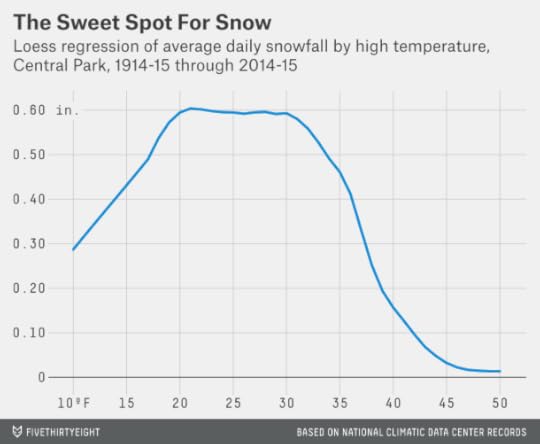
In fact, this chart understates the point. In the next graphic, I’ve charted the amount of liquid equivalent precipitation that fell on January days in Central Park based on the high temperature, without regard to whether it came as rain, snow or something else. At a high temperature of 50 degrees, there’s about six times as much precipitation as at 20 degrees.
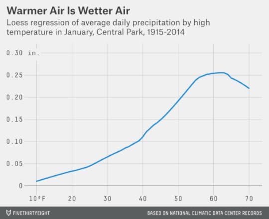
The point is that temperatures just below freezing can be something of a sweet spot for major snowstorms. There’s considerably more moisture than when the temperature’s colder, but it will still be cool enough for it to fall as snow instead of rain.1
Still, climatological data is volatile. What’s the probability that the heavy snowfall totals in New York recently have occurred by chance alone?
I set up a simple simulation to test this. From Jan. 1, 1869, through this past Sunday, 53,350 days elapsed. Of those, 5,502, or about 10 percent, have occurred since Jan. 1, 2000. So in each simulation, I assigned each of the 10 snowiest days a 10 percent chance of having occurred since 2000. In only 0.2 percent of the simulations (out of 1 million trials) did I wind up with at least five of these days having occurred since 2000.
Based on this experiment, in other words, the fact that New York has had so many record-setting snowfalls recently probably isn’t just a coincidence or a fluke.
Here’s another test. In the winters of 1999-2000 through 2013-14, there were a total of 19 days, or about 1.3 per winter, with a snowfall total of at least 6 inches at Central Park. By comparison, there were 0.8 of them per winter on average from 1914-15 through 1998-99. How likely is this to have occurred by chance alone?
We can calculate this by means of a binomial test. From 1914-15 through 1998-99 there was about a 0.2 percent chance a given day in New York would feature at least 6 inches of snow.2 If the baseline rate is 0.2 percent, what’s the probability you’d wind up with at least 19 such days in the past 15 years on account of chance alone? It’s about 4 percent, according to the binomial test. So, this evidence isn’t quite as impressive as the answer we got by looking at record-setting snowfalls, but it points in the same general direction.
It’s harder to know whether the pattern will continue. Anthropogenic global warming, as I’ve said, is a plausible cause. But there’s a relatively narrow range of climates, according to research by MIT’s Paul O’Gorman, in which you’d expect a higher number of severe snowfalls but steady or declining snowfall overall. Eventually if it gets warm enough, we’d wind up in the winter-storm sweet spot less often.

January 23, 2015
Planes, Trains And Taxis: When To Take Public Transit From The Airport
You can’t spell “New York City’s LaGuardia Airport” without C-A-B.
Er … actually you can. But for many New Yorkers, a journey to LaGuardia and a taxi ride are synonymous. There’s no train or subway connection to the airport, and while there’s a bus, most routes require multiple connections and an hour or more’s travel. So, in transit-friendly but time-conscious New York, only a small fraction of passengers arrive at LaGuardia by public transit.
New York Gov. Andrew Cuomo hopes to change that. On Tuesday, he revealed a proposal that would build an AirTrain connection from LaGuardia to Mets-Willets Point station, which serves the subway’s 7 train and a branch of the Long Island Rail Road.
Cuomo’s plan has received a tepid response from public transit geeks such as Benjamin Kabak of the blog 2nd Ave. Sagas. The problem is that the proposed AirTrain would initially route Brooklyn- and Manhattan-bound travelers in the wrong direction — farther into Queens — requiring them to double back to reach their destinations and reducing any potential time savings. Kabak and others would prefer a route that runs south from LaGuardia toward Jackson Heights, or that extends the N train to reach the airport from Astoria, Queens as Rudy Giuliani proposed in the 1990s. (The plan died because of community opposition.)

So, Cuomo’s AirTrain — if it gets built — would be far from the platonic ideal of airport travel embodied by the Heathrow Express, which whisks travelers from Heathrow Airport to London’s Paddington Station in 15 minutes. (The same trip can easily take an hour or more by car). But LaGuardia is not alone in offering meager public transit options. In fact, the choices there are pretty average compared with other U.S. airports, including the other airports that serve New York.
By public transit, an average weekday journey from LaGuardia to New York City Hall in downtown Manhattan requires 65 minutes, according to an analysis of Google Maps data. A trip from Newark Liberty Airport to downtown Manhattan also takes about 65 minutes on public transit; one from John F. Kennedy Airport takes about 75 minutes. (These estimates account for waiting and connection time; more details on the methodology in a moment.) In each case, a taxi journey will usually be slightly faster, although this depends greatly on traffic — especially from JFK.
At some other airports, public transit isn’t really an option. On average, it would take more than two-and-a-half hours to get from the Detroit Metro Airport to downtown Detroit, accounting for waiting time. Detroit, as in so many other respects, is something of an outlier. But there are not many major U.S. airports at which a journey downtown is as fast by public transit as it is by car. And there’s perhaps only one at which it’s predictably faster.
I made these calculations using Google Maps, taking a sample of six weekday arrival times — 8 a.m., 10:08 a.m., 12:15 p.m., 2:52 p.m., 6:30 p.m. and 8:45 p.m.1 — and looking up how long it would to get from an airport to a city’s downtown 2 on average using public transit.
I took whichever route Google Maps said would get me downtown soonest but counted the time spent waiting for the bus (or train) to arrive. For instance, if for an 8 a.m. arrival the fastest way to get downtown is via a bus that leaves the airport at 8:15 and arrives at 8:45, that would count as a 45-minute trip.
For comparison, I evaluated the journey times along the same routes at the same times of day3 by car using Waze, an app that allows users to predict journey times accounting for typical traffic patterns at different times of day.
The equation can be complicated. Waze’s predictions do not specify a day of the week; because I used a weekday schedule for public transit, I also increased car travel times by 10 percent to account for heavier weekday traffic. And just as a train doesn’t always materialize right when you want one, neither does a private car; unless you have a really nice friend or a really fancy limo service ready to pick you up curbside, you’ll have to spend some time waiting for a taxi or a rental car or getting to a parking facility. It’s hard to come up with a one-size-fits-all estimate for how long this takes,4 but I’ve added 10 minutes to the Waze travel times to account for it. The comparison between driving and public transit for the 40 busiest U.S. airports is below.5
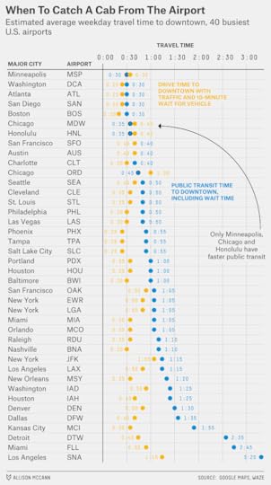
These travel times are a rough guide; you should check conditions upon arrival at the airport. But they should provide a sense for where public transit is competitive with or potentially superior to a trip by private vehicle, at least from the perspective of time saved. (It’s up to you, of course, how to balance time savings and cost, comfort and other factors.) We can group the cities into a few major categories:
Both options are good. Boston, Atlanta and Washington’s Reagan National Airport offer excellent public transit links to the central city. But that’s partly because these airports are conveniently situated to downtown. Driving can be extremely fast, too, or even faster. In Minneapolis, likewise, a light rail system covers the 10-mile distance between the airport and downtown frequently and quickly. But Minneapolis traffic usually isn’t bad, so a car can be a good option.
As I mentioned, you should be in the habit of checking out your transportation options given traffic conditions upon arrival. (It’s a fun way to pass the time when you’re stuck on the tarmac because that 737 is blocking your arrival gate.) But San Francisco International and Chicago’s Midway are two airports where this is especially important. At each one, travel times by car are about as fast as those by train on average. But while public transit times are fairly constant, a car trip downtown can take anywhere from 20 minutes to an hour or more, depending on traffic.
Public transit can be competitive but sometimes doesn’t run frequently enough. St. Louis and Philadelphia belong in the “honorable mention” category. A journey on SEPTA’s Airport Line to Philadelphia City Hall takes just 25 minutes, but the Airport Line runs only once per half-hour. St. Louis’s MetroLink, a light rail system, offers transit times downtown that are competitive with driving if you catch the trains at exactly the right time. But the trains are spaced out by more than 20 minutes for much of the day.6
Driving is fine; public transit stinks. I already mentioned Detroit, where a journey downtown by public transit clocks in at 2 hours, 35 minutes. Detroit’s Metro Airport is a fair ways from downtown Detroit, but a journey by car there is considerably faster at 45 minutes.
The major airports in Houston, Dallas and Miami abide by the same pattern, as do those in most midsize cities in the South and Midwest, including Kansas City and New Orleans. These are car-dominated cities, and the public transit options from the airport are no better than you’d expect.
Then there are the airports where a car journey downtown is cumbersome but a trip by public transit is even worse. Some of them, like Dulles International Airport in suburban Washington, deserve a mulligan because the airports are designed more for suburban travelers than for those headed to the central city. You’d have to have gotten a hell of an airfare to voluntarily fly into John Wayne Airport (SNA) in Santa Ana, Calif., if you were staying in downtown Los Angeles, for instance. But if you decided to take public transit from SNA to downtown LA, it would take you three hours, 20 minutes.
Denver International Airport is notoriously far from the center city despite being the only major commercial airport there. For the time being, however, you’ll probably want to buck up and take the taxi. Our method estimates that a car trip to downtown Denver will take 50 minutes vs. an hour and a half on public transit.
This will change once Denver completes the East Rail Line, which projects to make the journey downtown in just 35 minutes. Los Angeles may also one day have a train connection to LAX airport; a car will usually be the least-worst option in the meantime.
Both options stink. In a few other cities, traffic can be so bad that a journey by public transit is worth checking out even if it isn’t that quick. JFK and Newark, as I mentioned, fall into this category. While a journey to downtown Manhattan from JFK projects at 75 minutes by public transit, the car trip isn’t much better at 65 minutes on average and can be much worse on some days.
LaGuardia arguably belongs in this category, too. Accounting for a 10-minute wait for a cab, a car trip downtown projects to take 50 minutes (journeys to Midtown Manhattan or to some parts of Brooklyn will be faster). That’s not so much worse than the 65-minute journey downtown by way of the bus.
This is part of why the routing of the proposed AirTrain matters so much. If it winds up shaving only five minutes off travel times to Manhattan — and some analysts are skeptical it will save any time at all — it will be a good backup plan for budget-conscious travelers or when the taxi queue runs to Citi Field, but a car will usually be faster. If the AirTrain knocks 15 minutes off instead, it will be an option worth considering under a much broader range of circumstances.
Take the train. Finally, there’s one airport where the train will often be the best choice — even for expense-account travelers. It’s Chicago’s O’Hare Airport. The “L” train does not run express to downtown Chicago like Heathrow Express does to London, but the Blue Line is a quick and reliable route with frequent service throughout the day — our method projects it will save you 15 minutes on average compared to battling traffic on the Kennedy Expressway.

Nate Silver's Blog

- Nate Silver's profile
- 729 followers

