
Josh Clark's Blog, page 27
November 22, 2011
Making Stuff
The conventional wisdom about the iPad is that it's for leaning back: reading, watching, browsing, a consumption device for a consumer market. Let the information wash over you, the thinking goes, because it's just not a good device for making stuff.
The iPad is a device suited for sitting or reclining, which certainly makes it a device of contemplation, and yep, that's the perfect state of mind for reading or watching a movie. But it's a mistake to think of it as "only" a new-fangled book or tv screen. Contemplation is not the same as passivity.
True enough, you'll never beat the world record for typing speed on the thing (216 words per minute, it turns out), but typing is only one form of input. Stubbornly linking productivity to typing speed ignores opportunities for what this new form factor of computing will yet enable. The tablet's easygoing touchscreen input makes it particularly promising for art-making, whether that's 3D modeling, music, drawing, or even collaborative collage.
So I was especially pleased to see the iPad ad that Apple released just yesterday. As usual, Apple emphasizes personal connection and emotion rather than technology in the new ad. But in a departure, it also shows people making stuff with iPad: designing basketball plays, mixing music, cutting a skate video, building a model car. Leaning back? It sure looks like everyone's leaning in to me.
"Getting lost in the things we love has never felt quite like this," the ad finishes. Perhaps the most exciting aspect of the era we live in is how easy it is for any of us to grab a tool and start making. The iPad is just one of them, and it's a heckuva thing.


November 2, 2011
Tapworthy in China (and Japan! and Spain!)
"Touch People's Hearts." That's the translated title of the Chinese edition of my book Tapworthy (触动人心), and I couldn't be more tickled. Indefatigable translator Jason Bao sent me this copy, and it just arrived today:
[image error]
Tapworthy is also available in:
Japanese (_思わずタップしたくなるアプリのデザイン, or "Applications you'll want to tap involuntarily")
Spanish (Diseño y usabilidad de aplicaciones iPhone, or rather dryly, "Design and usability of iPhone applications")
English, my mother tongue… and the only one, it seems, where the word "Tapworthy" makes any sense.
Tags:
books,
publishing,
tapworthy
October 31, 2011
Creature Cups
Another Halloween find: Creature Cups plant hidden critters at the bottom of your cup o' Joe. Totally tentacular.

Augmented Unreality

The game gets under your skin.
Skin-invading aliens seem like the perfect topic for Halloween, no? Because here's the hard reality of my world, friends: In the past few days I've stood by as hungry beasties devoured my eyeballs, laid eggs in my face, and made my brain their home.
Bedbugs? Nothing so fearsome. It's an iOS game called Skinvaders and an example of the best (and perhaps most commercially viable) flavor of augmented reality. After scanning your face, Skinvaders turns your head into a battlefield as little monsters crawl across it, bombard it with eggs, It's gross, twisted, totally fun. Give it to your 10-year old and let 'er rip.
My favorite examples of augmented reality have been games like this, apps that inject a whimsical (or ghoulish) element into your surroundings. The Hidden Park, for example, is a game that lets youngsters see dragons, fairies, and other magical creatures in parks around the world. Aim the camera at a tree, see winged creatures flying among its branches.

The Hidden Park.
Life of George is a more down-to-earth example of using the phone's camera for play, kind of like pictionary for LEGO. The game challenges you to build pictures from LEGOs and, when you think you've got it, stop the clock and take a picture of your creation. The app reads the blocks, confirms if you've got it right, and the game marches on. (You can also create your own LEGO challenges and use the camera to add them to the game.)
Augmented-reality browsers like Layar have an undeniable first-blush novelty, imposing signposts on your phone's camera view to show nearby subway stops, restaurants, and city landmarks. As technically impressive as these heads-up displays might be, I have to confess I've found little practical use for them. In the end, traditional map views seem to be most useful and efficient.
For me personally, the how'd-they-do-it magic of Word Lens is the only info-based augmented reality app that I've found useful day to day. (The app translates Spanish to English in real time, amazing.)
But in games, wow, augmented reality can paint an imaginative layer on everyday surroundings, making your world instantly more playful. Or gross. Happy Hallowen.
Tags:
augmented reality,
games,
mobile
October 28, 2011
Newsstand Revisited

Hot on the heels of yesterday's post about Newsstand, I had exchanges with a few folks whose work touches the publishing industry. A few themes kept coming back...
1. Newsstand is swell for magazines, not so much for newspapers
Apple requires Newsstand apps to update their icon with every background update. "This stinks," Rusty Mitchell told me. Rusty is creative director of Mercury Intermedia, the shop that built the USA Today apps, among many others. He shared some thoughts in an email and generously allowed me to echo them here:
The updating icon might work fine for magazines, where the covers
are more simplified and the app more closely matches the print
product, but they generally suck for newspapers. Apple created a
requirement there that they didn't think through. For a magazine that
releases monthly and has a defined cover, it isn't a big deal.
Newspaper covers tend to be more dense, though. I think the newspaper
icons are terrible. They don't look as good as the standard icons, the
branding is minimized, all of the newspaper app icons look too
similar, and most damning, the icon is a representation of the days'
paper instead of what will actually be in the app.
Wait, what? The icon doesn't represent what's actually in the app? That's because Mewsstand apps are allowed to update in the background only once per day. For apps that update throughout the day (and really, why wouldn't any media source update more than once?), that means that the icon will quickly become out of sync with its content.
This one-a-day policy also means that background updating doesn't do much to speed frequently updated apps. It might be fine for The Daily, which releases its content just once per day (a policy I question), but it's no good at all for outfits with rolling publication. When they launch, those apps will still have to download all the content accumulated since the daily background sync. In those cases, we'll be stuck with the same load times that we've already seen.
2. Who's in Newsstand and who's not?
Not all newsy apps make the cut. It sounds like TV news sources won't be allowed in Newsstand, for example. So now we're making content/format-based distinctions about what kinds of media are even allowed in the service. It's murky: The New York Times has video, but they're allowed; CNN has text articles, but they're not. Hm. Meanwhile, other organizations simply opt out of Newsstand, balking at Apple's 30-percent take of subscription sales.
For readers, the result is that we have some of our news apps bolted down in the Newsstand folder, and others aren't. This arbitrariness could damage non-Newsstand apps. "I don't like the fact that some news apps can roam free outside of the Newsstand folder," Rusty wrote me, "but don't have access to some of the Newsstand features."
Making this a bit messier for consumers is the fact that the App Store now has its own app category, separate from the News category. Newsstand apps appear in both sections, while non-Newsstand apps appear only in the News category. Confusing.
3. Are issues really so bad?
I had a brief Twitter tête-à-tête today with Mandy Brown, Frank Chimero, and David Sleight about my contention that publishing in editions is quaint and perhaps even arrogant in the digital content. "Issues are the way publishers understand content, not readers," I wrote. "Issues also create an artifically imposed embargo. Why do I have to wait a week to get an article from Time if it's already been written?" To which a thoughtful (for Twitter) conversation ensued about whether the problem is really collections of content or just the arbitrary way they're gathered.
Me, I remain skeptical about the value of bundling articles into frozen blocks of content. For that matter, I'm skeptical that we should always treat articles or stories as the base level of content. I think that being able to address content at finer levels of detail than a page will be increasingly important and useful.
That said, I've got no beef with bundling sets of thematic content together; perhaps they're better called anthologies than issues. (Such anthologies tend to be most useful to me as a reader when the content comes from varied sources.) In any case, I should be able to scan and download those individual articles separately, without being obliged to download an entire issue at once.
In general, I think that publish-all-at-once issues are likely to become the exception rather than the rule. To the extent that they remain, these collections should be the result of a thoughtful editorial conceit, not the arbitrary daily, weekly, or monthly schedule that holds sway now.
Tags:
ios5,
mobile,
newsstand,
publishing
October 26, 2011
Newsstand Is Promising, Yay! But Enough with Issue-Based Publishing
We'll see if it lasts, but for now, Newsstand is a read-all-about-it moment for publishers. Newsstand is the new feature in iOS 5 that collects newspaper and magazine apps into a single folder, downloading new content automatically in the background. Whether through novelty or bonafide new habit, readers seem to love it so far. This makes me happy, but we can't let this recent spike distract us from real problems with the issue-based publishing model Newsstand supports.
First things first. Let's look at Newsstand's remarkable success in its first two weeks:
Condé Nast reports a 268 percent hike in its weekly rate of new digital subscriptions since the Newsstand launch. Single-copy sales are also up 142 percent compared to the previous eight weeks. (Condé Nast publishes nine iPad titles, including The New Yorker, Wired, Glamour, and Vanity Fair.) (source)
The New York Times iPhone app saw 85 times more new user downloads in Newsstand's first week than the week before (1.8 million compared to 21,000). The Times' iPad app saw a more modest, but still impressive, jump of seven times as many new downloads (189,000 compared to 27,000). (source)
National Geographic's rate of new iPad subscriber growth grew five times since the launch of Newsstand. (source)
Future Publishing reports two million downloads of magazine "containers" in the first four days of Newsstand, more than they see in a typical month. Future is a British publisher with titles including .net, Total Film, and Digital Camera. (source)
Exact Editions says downloads of its free sample editions jumped by 14 times in just a few days, while some titles' actual sales more than doubled. (source)
You get the idea: people are digging it.
What's the scoop?
No doubt, much of this spike is a novelty effect. As adoring iPhone and iPad owners explore the new features in iOS 5, they're kicking the tires of Newsstand's digital editions, too. Will people actually keep reading the titles they've signed up for? There are some behavior-changing factors at work that suggest they might.
Location, location, location
The Newsstand folder landed on the home screen of every iPhone and iPad. People can move it, of course, but you shouldn't underestimate our species' essential laziness about stuff like this. For many, these digital magazines are going to remain front and center.
Speed kills
Background downloading is a big, big improvement over the painfully slow entire-issue downloads that came before. In the wilderness of hotel internet, for example, it often takes me 15 minutes to download an issue of The New Yorker. That wait is now invisible to me as Newsstand handles the download for me.
It's hard to overstate how important this is. Studies say delays of microseconds (microseconds!) can reduce browser traffic by as much as 20 percent in some contexts. Imagine how damaging a 15-minute wait can be.
This just in
In Newsstand, app icons change when a publication gets new content, just like the conver of a new magazine issue. Combined with home-screen placement, Newsstand's fresh icons draw you in like magazines in the supermarket checkout line.
Collector instinct
The Newsstand icon starts out as a bare shelf, and it's hard to resist loading it up. Tap that bare shelf, and the Store button gives you a quick way to fill it.
Are digital editions saved?
We still have a long way to go. While Newsstand will likely expose tons of new people to the pleasures of iPhone and iPad magazines and newspapers, there remain serious problems with the whole concept of media companies' stubbornly issue-based approach to publishing.
Until Newsstand, the speed problem was a tough one. By requiring users to download tens or hundreds of articles at a time in big blobs called issues, delays were inevitable. The new background downloading knocks that problem out.
But there are more fundamental problems beyond the technical. Issue-based publishing forces readers into a monolothic visual and navigational metaphor that doesn't reflect the way we gather information now. Issues are the way publishers understand content, not readers. As readers, we're engaged by individual stories and, online, tend to pluck out just the ones we want.
Digital magazines remind me of music before MP3s. Remember those bad old days? You had to buy the whole album just to have the one song you wanted. That's how magazines feel today: all this overhead of extra content that's sent my way whether I want it or not. Magazines smell spammy.
Issues also create an artifically imposed embargo. Why do I have to wait a week to get an article from Time if it's already been written?
Publishers and designers have to start thinking about content at a more atomic level, not in aggregated issues. That's how we already understand news as consumers, and we have to start thinking that way as publishers, too. This is why Flipboard, Instapaper, and other aggregators are so interesting: they give you one container for the whole universe of content, unbound to any one publisher.
Why does print get primacy?
The biggest reason publishers hew to issue-based publishing is that it's what they know—as a business, as a workflow, and even in terms of tools.
Many publishers use products like Adobe Digital Publishing Suite or Woodwing, tools that let you take print layouts from InDesign, adapt them for the iPad, and pump them out to iOS apps. You can use the same tools, the same staff, and largely the same workflow as you do for print. Woodwing's website trumpets the convenience: "It's just like designing a print product."
You can see the enormous appeal this has for publishers. With little overhead, you can turn the corner from print to iPad.
Thing is, designing an iPad app shouldn't be "just like designing a print product." It's not the same design you want to bring to new platforms, it's the content. Issue-based publishing puts a straitjacket on digital content, freezing it into a big arbitrary block of pages and articles, sealed with print metaphors. This approach privileges print and its design conventions, imposing them on new platforms. And why should that be the case? Looking out five or ten years, will print be the winner among these platforms? Nope. So why should we rely on print's design conventions and workflows now?
Or for that matter, why should any single platform's design conventions—web, phone, tablet, print, you name it—have primacy? Each of these devices should have their own conventions, standing shoulder to shoulder as peers without imposing the design values of each on one another. Print is just another platform and, for better or worse, will only become a more and more minor one over time.
Respect print's lessons, but don't be beholden
We have centuries of useful knowledge about designing words, and we should embrace that know-how. But we also have to be prepared to jettison how we package those designed words. The form and containers of our words are changing. It's no longer about a monolithic issue or even a monolithic page. We have to be prepared to move in new directions that are appropriate to each medium.
I'm pleased to see that Newsstand has gotten some early traction with readers, and I hope it proves profitable for publishers. I'm sympathetic to the legitimate business and creative reasons for sticking with issue-based publishing for iOS. It's a sensible short-term approach for getting on these platforms in the first place. But looking further out, magazine issues are already old news.
Tags:
apple,
content strategy,
ffly,
ipad,
mobile,
newsstand,
publishing
Chatterbot Chit-Chat: Siri vs Eliza
Jordan Mechner had the inspired idea of introducing Apple superbot Siri to classic chatterbot Eliza. I've totally overheard conversations like this before:
ELIZA
Hello, I am Eliza.
SIRI
Hi.
ELIZA
How are you today? What would you like to discuss?
SIRI
I'm fine. Thanks for asking.
ELIZA
How long have you been fine. Thanks for asking?
SIRI
Hmm... Let me think...
ELIZA
Do you doubt you?
SIRI
I found three hotels matching "W" fairly close to you.
ELIZA
Oh...?
Read the whole transcript of the Siri-Eliza encounter…
Tags:
fun,
ios5,
psychology,
siri
Notes from An Event Apart, Washington DC

I had the good fortune this week to attend the storied An Event Apart conference for the first time. This Washington DC installment was a welcome glimpse at what I'm getting myself into when I join the Event Apart show in Atlanta in February. Lordy, what a smart crew both onstage and in the audience.
I took a slew of notes via the Twitters, but given the ephemeral nature of that particular channel, I figured I'd collect 'em here to share. Herewith, a few of the gems spilling from the lips of some of the best thinkers in our industry.
Jeffrey Zeldman, "Content First!"
Standards stalwart and web godfather Jeffrey Zeldman kicked off this hootenanny, setting the stage for the next two days with a content-focused overview of current challenges facing web builders. Specifically, he argued (and I couldn't agree more) that designers have less control than ever over our audience's visual experience. Among other things, he explored how a mobile (or small screen) strategy can help improve content, rethink the web experience, and put the user first.
My notes on Jeffrey's talk, "Content First!" (19 tweets)
Jeremy Keith, "Design Principles"
Big thinker Jeremy Keith revealed the big principles behind the web and nudged us all to be explicit about the big principles behind our own projects. A project's goals, he explained, shape its design principles which in turn determine the form of the design that emerges. Along the way, Jeremy also announced that his excellent book HTML5 for Web Designers is now available for free on the web.
My notes on Jeremy's talk, "Design Patterns" (20 tweets)
Andy Budd, "Persuasive Web Design"
Interaction designer Andy Budd got inside our heads with a look at how marketers deploy cognitive psychology to subtly persuade us in contexts as varied as the casino and the supermarket. Andy explained how we can make use of those gentle cues to coax web audiences, too, not as tricky manipulation but to help people make choices in their own interest.
My notes on Andy's talk, "Persuasive Web Design" (15 tweets)
Luke Wroblewski, "Mobile Web Design Moves"
Mobile design guru and smartypants entrepreneur Luke Wroblewski taught us some new dance moves (Thriller!) and more than a few new gyrations for the mobile-web disco, too. Luke offered a data-rich explanation of why mobile is important now (and why it's not just native apps). He looked at new design patterns that depart from desktop norms and closed with a call to action to push our interfaces into new frontiers.
My notes on Luke's talk, "Mobile Web Design Moves" (25 tweets)
Karen McGrane, "Adapting Ourselves to Adaptive Content"
Content strategist and information architect Karen McGrane gave a barnstormer of a talk about how this emerging era of a jillion connected devices requires more than new design techniques; we have to create, organize, and store content in new ways, too. She took a hard look at the publishing industry with case studies showing what's working and what's not. What worked for the desktop web simply won't work for mobile, Karen argued. As our design and development processes evolve, our content workflow has to keep up.
My notes on Karen's talk, "Adapting Ourselves to Adaptive Content" (49 tweets)
Ethan Marcotte, "The Responsive Designer's Workflow"
Mr. Responsive Web Design (and dapper dresser) Ethan Marcotte spilled the details on what went into designing the new Boston Globe website, which looks great on devices ranging from the fanciest phones to a 15-year-old Apple Newton. Ethan covered how the team adapted the design process itself then dove into the nitty-gritty of how the site is built: flexible grid, flexible images, and media queries to target common device sizes.
My notes on Ethan's talk, "The Responsive Designer's Workflow" (20 tweets)
Aarron Walter, "Idea to Interface"
Just about every person in the Event Apart audience makes stuff for a living. Professional makers. So it might seem a little counter-intuitive that UX designer Aarron Walter took the stage to coax us to just please make something. The difference: Aarron wants us to make things for ourselves, and urged managers to give employees room to do it. When you're working for the man, Aaron said, it's hard to find time to make something fun for yourself. You've got ideas swimming around in your head for your next website or app, but translating abstract thoughts into a usable, successful interface is no easy task. Aarron talked up the whys and hows of getting independent projects off the ground. Put that taco down, and work on those ideas.
My notes on Aarron's talk, "Idea to Interface" (16 tweets)
Andy Clarke, "Smoke Gets in Your Eyes"
CSS3 ain't just drop shadows and rounded corners. That stuff can dance. Hard-boiled CSS slinger Andy "Malarkey" Clarke showed off spiffy films, games, and animations made with nothing but HTML, CSS, and a few whiffs of JavaScript. The lesson: CSS can make animations that give Flash a run for its money. Andy used the remarkable CSS-powered Madmanimation, a recreation of the Mad Men opening sequence, as the working example, walking through the code for the whole thing.
My notes on Andy's talk, "Smoke Gets in Your Eyes" (11 tweets)
Kristina Halvorson, "A Content Strategy Roadmap"
Content strategy maven Kristina Halvorson was wearing boots made for talkin'. She surveyed the workflow process for making sure that great content is at the center of your design. It's more than just writing, Kristina said, it's wrangling. She covered topics from content audits to style guides to editorial calendars and more.
My notes on Kristina's talk, "A Content Strategy Roadmap" (16 tweets)
Jared Spool, "The Secret Life of Links"
You think you know your links, don't you? You don't know 'em the way Jared Spool knows 'em. (For that matter, you don't know Beyonce dance moves the way Jared knows 'em, another tale entirely.) Jared took up the content, design, and placement of links that create a strong "information scent" for users to follow to their desired destination. Links never smelled so good.
My notes on Jared's talk, "The Secret Life of Links" (11 tweets)
I regret that early-morning phone calls and emails meant that I missed the CSS wizardry of Eric Meyer and the UX principles of Whitney Hess. Bummed.
Tags:
aea,
conference,
design,
mobile,
webdev
October 24, 2011
Icons for Teaching Touch
"Cue" is a clever set of icons for teaching touch. Designer P.J. Onori created the icons for mobile interfaces or wireframes to prompt touch interactions, and they take a fresh point of view on the challenge.
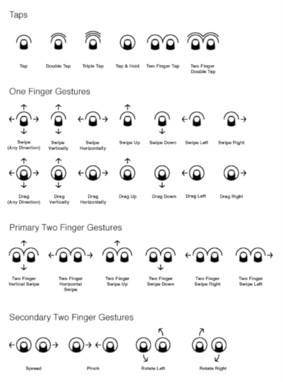
What's the big deal?
Buttons are a hack, I'm fond of saying. The abstractions and workarounds we've created to support 30 years of graphical user interfaces are weak replacements for direct interaction. Touch lets us consider whether we need these workarounds and, where appropriate, sweep them aside to create the illusion of touching the content itself.
Touch is leading us to a future with less and less chrome, possibly even none at all, as gestures replace familiar buttons, menus, and tabs. But if there are no visible controls, how do users figure out how to use the damn thing? In recent talks, I've been talking a lot lately about practical solutions to this problem, explaining how to make gestures discoverable without visible controls. (Download the presentation PDF.)
We'll all eventually learn gestures the same way we learn everything else in the real world. Experience and visual cues will lead us to try things, and the response will tell us whether it's right. The better the visual cues we provide, the more likely we are to figure things out. This is the way the world works. So, even if the gestures themselves are invisible, the coaching prompts we provide must be visible.
We have a lot of tools we can use: user observation, contextual help, animation, forced pauses, and perhaps most important... good signage.
That's where Cue comes in.
Refined to the basics
The best icons are almost always the simplest, a rich reduction of the fundamental action the icon represents. Cue offers a fine example of this, by emphasizing the touch itself far more than other systems which typically illustrate the entire hand. Here's a comparison of the swipe gesture in Cue (left) to excellent but more complex icons from Gesture Icons, Luke Wroblewski, and GestureWorks:
The compact simplicity and ability to scale to small sizes makes Cue a useful building block for touch prompts in mobile interfaces. P.J. says he had four principles that drove the icon design process:
Create a core visual language that all gestures could build from.
Gestures will come, go and change over time. The system should be able to support that.
Distill each gesture to its core action.
The illustrative nature of most gesture icons reduce focus from the fundmental interaction being performed.
Represent each gesture in a non-literal, yet clear way.
Not everyone is right handed, nor do they perform gestures uniformly which makes literal expression less than optimal.
Design forms that would be legible at small sizes.
Mobile devices are already space-constrained. My goal was to create icons that could take up little space in a mobile interface if needed.
Good stuff here. Cue is licensed under a Creative Commons license and available in multiple formats: PNG (4 sizes), SVG, Omnigraffle and InDesign formats. The icons come with and without labels.
Fine work, P.J. Now go get 'em.
October 23, 2011
Apple, Kindly Remove Your OS Gestures from My App Canvas
Big touchscreens demand big gestures. The iPad in particular begs for swipes and multitouch combos that let you slap at the whole screen to control apps instead of tapping delicately at tiny buttons.
iPad apps like Facebook and Twitter, for example, demonstrate that it's much easier to move through your history by nudging the canvas back and forth than it is to hit Safari's tiny Back button. Small touchscreen buttons require extra thought and motor control—brain and strain—compared to coarse gestures that let you fling screens aside.
With iOS 5, the iPad finally gets exactly those kinds of coarse gestures to move between apps. Yay, right? Swipe left or right with four or five fingers to switch among recent apps, or pinch with four or five fingers to close an app and zip out to the home screen. No need to find the iPad's elusive Home button; you can just paw at the whole screen to navigate apps.
I'm a huge fan of the spirit of these gestures, but I'm not crazy about the excution. I wish Apple had followed the interaction already adopted by other platforms, including BlackBerry Playbook, Nokia N9, and the next version of Microsoft Windows. All of these platforms use edge gestures, a technique that is at once more internally consistent and more deferential to individual apps.
The operating system is the frame
With iOS 5, iPad gets welcome app-switching gestures. But touch actions that should be limited to the edges are encroaching on app real estate.
Edge gestures let you move back and forth among apps by swiping from the edge of the screen. You start on the frame, or bezel, of the device and swipe into the canvas, creating the illusion of knocking screens aside by pushing them at the edge. If a swipe starts at pixel zero, in other words, it's interpreted as an operating-system gesture for moving among apps. In Windows, Microsoft refers to this as "Edge UI." See for yourself how it works:
Video: Windows 8 touch demo and overview
Video: Nokia N9 and MeeGo demo
Overview of BlackBerry PlayBook gestures
This approach is elegant for more than its simplicity. Edge gestures match physical action with the conceptual metaphor of the operating system. If you consider apps as the front-and-center canvas of the device, then the operating system is the frame, the infrastructure that supports and presents the canvas. When OS-level gestures start on the bezel frame of the device, action matches expectation: this gesture works outside the current app. You're working on the frame—the operating system—both physically and metaphorically.
iPad's new app-switching actions are not edge gestures. Instead, these four- and five-finger swipes work within the canvas itself, territory that is supposed to be dedicated entirely to the current app. This creates some confusing competition with app interaction: will this gesture apply at the app level or at the operating-system level? Apple could have avoided this ambiguity by using edge gestures to switch apps. Likewise, to close an app and return to the home screen, a four- or five-finger swipe down from the top edge would fit the bill.
This isn't only about metaphor, though. I'm jealous that Apple appropriated these gestures for the operating system.
Apple bogarted some sweet moves
We are in the earliest stages of developing a touchscreen gesture vocabulary and, in particular, of exploring the possibilities of multitouch gestures. Multifinger swipes, taps, and pinches promise to help us create interfaces that we play like an instrument more than we use like a tool.
My favorite example of this is Uzu, an addictive visual toy for iPad. The app has ten modes triggered by holding one to ten fingers to the screen. Here's a demo by Uzu designer Jason Smith, who gradually begins to direct the app like a full visual orchestra:
This sort of full-hand use of touchscreen apps is promising. Just like expert typists fly through words, or power users deploy keyboard shortcuts fly through tasks, multitouch gestures can likewise help us to move just as effortlessly through touch interfaces. Abstract multitouch gestures are the keyboard shortcuts of touch. If done right, they will be expressions for fluidly transforming intent into action.
In that context, full-hand swipes and pinches would be mighty handy gestures for designers to deploy at the app level. Alas, Apple instead hijacked them for the operating system. By putting these gestures inside the canvas instead of at the edge, Apple has swiped some great gestures from designers' arsenals.


![[image error]](http://globalmoxie.com/bm~pix/img_6136~s800x800.jpg)
![[image error]](http://globalmoxie.com/bm~pix/newsstand~s800x800.jpg)