
Josh Clark's Blog, page 25
July 9, 2012
Survey: Tablets, Windows Phone Hit Tipping Point with Developers
A survey of mobile developers reveals trends in the platforms and motivations that intrigue app builders. The study by VisionMobile asked 1500 developers about their preferred operating systems, their reasons for choosing a platform, and the associated costs of building apps for those platforms.
A few highlights:
Tablets are heating up. More than 50% of developers are now targeting tablets, with iOS developers most likely (74%) to do so.
Windows Phone becoming attractive. A majority of developers (57%) plan to adopt Windows Phone.
Reach over revenue? 54% of developers say user reach most important for choosing a platform; only 30% cite revenue potential.
One in three developers lives below "the app poverty line." 35% of apps generate only $1 – $500.
Apps cost. iOS earns the most for developers, costing an average of $27,000 per app, 21% more than Android.
Apps take time. The average mobile app takes three man months to develop.


July 8, 2012
Sync O'Reilly Ebooks to Dropbox
My publisher O'Reilly Media just rolled out a nifty feature, letting you sync your O'Reilly ebooks with Dropbox. Buy a book, and it pops up in your Dropbox automagically. You can choose which of the many available formats to sync (ePub, PDF, Kindle, DAISY, or Android), all of them DRM-free.
And hey, your first test run might as well be with my book, Tapworthy: Designing Great iPhone Apps, if I may be so bold. If you have the print edition but not the ebook version, you can snap up the ebook for just $4.99. Just register the print book with O'Reilly, and you'll see the option to "upgrade" to ebook on your products page.
Got it? Start syncing that awesomeness to Dropbox.
Tags:
publishing,
tapworthy
April 23, 2012
"Small Screens, Big Changes": Full-Day Mobile Workshops in Europe
Karen McGrane and I are taking a European road trip. We’re leaving the backpacks at home, though, and instead bringing mountains of mobile know-how.
We’re teaming up to give full-day workshops in three cities—Amsterdam, Hamburg, and Barcelona. Karen McGrane, as you no doubt already know, is a whip-smart (and hilarious) content strategist and internet genius. She’s also author of Content Strategy for Mobile, a forthcoming book from A Book Apart. She’ll be delivering the goods on how to navigate content strategy in a multichannel world, while I’ll focus on crafting finger-friendly touchscreen interfaces.
It’s a heckuva one-two punch. Actually, scratch that. IT'S A FRICKIN' MOBILE KNOWLEDGE EXPLOSION.

The sensational Karen McGrane.
You can register and get more details here: “Small Screens, Big Changes: A Full-Day Mobile Workshop with Josh Clark and Karen McGrane.” But before you head over, here’s the quick gist:
Mobile represents a massive shift in how users interact with content
and interfaces. Are you ready? Spend a whole day learning how to make
the most of mobile.
Designing for Touch. The morning session with Josh Clark
presents nitty-gritty “rule of thumb” design techniques that together
form a framework for crafting finger-friendly interface metaphors,
affordances, and gestures for a new generation of mobile apps that
inform and delight.
Content Strategy for Mobile. The afternoon session with Karen
McGrane explores the challenges and constraints of presenting content
in mobile interfaces and contexts. Desktop websites have gotten
cluttered with useless information that doesn’t meet user needs.
Mobile offers an opportunity to re-prioritize messages, rewrite
jargon, and remove outdated information. You’ll learn how to use
mobile as a wedge to create a better experience for ALL users.
Three Cities
Amsterdam: May 30, 2012
Barcelona: June 1, 2012
Hamburg: June 5, 2012
The workshops run from 10am to 6pm each day, with lunch included.
Extra Bonus Talks!
Whether or not you attend the workshop, you’re invited to join Karen and me for a free mobile salon. The evening before the workshop in each city, we’ll each give a talk while we ply you with delicious and intoxicating liquids. Details and venues are coming soon. Watch the workshop website, or follow along on Twitter.
Hope to see you in Amsterdam, Barcelona, or Hamburg!
Tags:
content strategy,
josh,
karen mcgrane,
mobile,
touch,
workshops
April 13, 2012
Mobile Isn't the Lite Version
Jakob Nielsen's dubious guidelines for mobile websites got a rise out of me this week. After conducting usability tests on hundreds of websites, his advice included these guidelines, all of which made me shudder:
Build a separate website for mobile
Cut features to eliminate things that are not core to the mobile use case
For removed content and features, link to the desktop site
I don't doubt his research, but I do doubt its assumptions and conclusions. The notion that mobile should be a lite version of the "real" and complete desktop website is a popular one, but wow is it problematic. It makes a host of assumptions about what the mobile use case is that I find to be out of step with how smartphones are actually used.
So when .Net magazine sent me a note to ask me my thoughts about his recommendations, a quick email response turned into an email essay. The editors asked if they could publish my email as its own opinion piece, which they published under the uncomfortably provocative title, "Jakob Nielsen is wrong on mobile." An excerpt:
Nielsen is confusing device context with user intent. All that we can really know about mobile users is that they’re on a small screen, and we can’t divine user intent from that. Just because I’m on a small screen doesn’t mean I’m interested in less content or want to do less.
Stripping out content from a mobile website is like a book author stripping out chapters from a paperback just because it’s smaller. We use our phones for everything now; there’s no such thing as “this is mobile content, and this is not.”
Read the rest of my thoughts and concerns here.
For what it's worth, I do wholeheartedly agree with one of his recommendations, which is to defer secondary information to secondary pages. The web has made us skittish about extra clicks or taps, thanks to network latency. But in many cases, crafty caching, and pre-fetching reduce that problem so that there's no latency between taps. Instead, you organizing screens for a single idea or action works well. Tap quality, in other words, is more important than tap quantity.
So, yeah, feel free to reprioritize content for different devices, but don't start cutting content and features willy-nilly. Mobile isn't a lesser platform than desktop; it's just one of many platforms among equals.
Update: .Net posted Jakob Nielsen's response to the criticism, and I'm afraid my mind isn't eased. His counsel — "If users do want the longer and more complex information, they are always able to click through to the full site" — feels more like an admission of defeat than a content strategy. Also, his suggestion that user experience can be separated from technical implementation worries me. More than ever, UX designers have to have a sophisticated notion of the possibilities and drawbacks of various technical approaches in order to properly craft a stunning experience.
Tags:
content strategy,
design,
mobile,
responsive
March 9, 2012
Designing for "Context" Is Tricky Business
"Designing for context" is a popular phrase these days, and it makes me a little antsy. Designers often conflate device context with user context—or worse, with user intent. "This is mobile, so they'll never want to do that." "This is mobile, so it's aimed only at users on the go." Friends, this is hooey.
I shared a few thoughts about this on Twitter last night, and Scott Klein helpfully gathered them into a single view at Storify. For what it's worth, I thought I'd post 'em here, too:
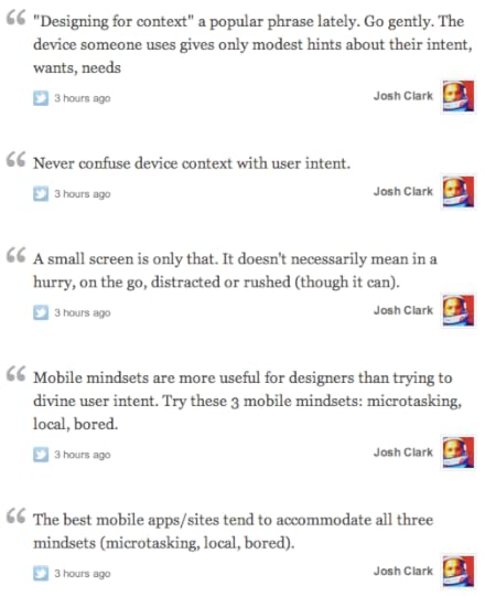
View the story "Mobile Mindsets" on Storify
Tags:
design,
mobile,
psychology
March 8, 2012
Designing for “Context” Is Tricky Business
“Designing for context” is a popular phrase these days, and it makes me a little antsy. Designers often conflate device context with user context—or worse, with user intent. “This is mobile, so they’ll never want to do that.” ”This is mobile, so it’s aimed only at users on the go.” Friends, this is hooey.
I shared a few thoughts about this on Twitter last night, and Scott Klein helpfully gathered them into a single view at Storify. For what it’s worth, I thought I’d post ‘em here, too:
View the story "Mobile Mindsets" on Storify
Tags:
design,
mobile,
psychology
"Buttons Were an Inspired UI Hack, but Now We've Got Better Options"
The good folks at O'Reilly interviewed me this week about how new technologies change how we should think about interface design as both consumers and designers. It's a long interview, but here's a quick excerpt:
It's a really exciting time for interaction design
because so many new technologies are becoming mature
and affordable. Touch got there a few years ago. Speech
is just now arriving. Computer vision with face recognition
and gesture recognition like Kinect are coming along.
So, we have all these areas where computers are learning
to understand our particularly human forms of communication.
In
the past, we had to learn to act and think like the
machine. At the command line, we had to write in the
computer's language, not our own. The desktop graphical
user interface was a big step forward in making things
more humane through visuals, but it was still oriented
around how computers saw the world, not humans. When
you consider the additions of touch, speech, facial
expression, and physical gesture, you have nearly the
whole range of human (and humane) communication tools.
As computers learn the subtleties of those expressions,
our interfaces can become more human and more intuitive,
too.
Touchscreens are leading this charge for now, but touch
isn't appropriate in every context. Speech is obviously
great for the car, for walking, for any context where
you need your eyes elsewhere. We're going to see interfaces
that use these different modes of communication in
context-appropriate combinations. But that means we
have to start thinking hard about how our content works
in all these different contexts. So many are struggling
just to figure out how to make the content adapt to
a smaller screen. How about how your content sounds
when spoken? How about when it can be touched, or how
it should respond to physical gestures or facial expressions?
There's lots of work ahead.
And hey, if this stuff interests you and you happen to be in Austin for SXSW this week, I'm giving a talk about the future of touch-based interfaces on Friday. In particular, I'm focusing on how you can use gestures to create experiences that are more fun, more intuitive, and more efficient. At least as important, the talk will explore how to make gestures easy to discover, too:
Teaching Touch: Tapworthy Touchscreen Design
Friday, March 9, 3:30–4:30pm
Ballroom A, Austin Convention Center
Discover the rules of thumb for finger-friendly design. Touch gestures are sweeping away buttons, menus and windows from mobile devices—and even from the next version of Windows. Find out why those familiar desktop widgets are weak replacements for manipulating content directly, and learn to craft touchscreen interfaces that effortlessly teach users new gesture vocabularies.
The challenge: gestures are invisible, without the visual cues offered by buttons and menus. As your touchscreen app sheds buttons, how do people figure out how to use the damn thing? Learn to lead your audience by the hand (and fingers) with practical techniques that make invisible gestures obvious. Designer Josh Clark (author of O'Reilly books "Tapworthy" and "Best iPhone Apps") mines a variety of surprising sources for interface inspiration and design patterns. Along the way, discover the subtle power of animation, why you should be playing lots more video games, and why a toddler is your best beta tester.
See you there!
3.1 Million Pixels Are Heavy

As everyone in the world knows by now, Apple bumped the iPad's screen to retina-display density, quadrupling the number of pixels to a whopping 3.1 million. That's fantastic news for iPad owners—the display will be gorgeous—but it also means more headaches for designers and a potential blight on your bandwidth bill and download speed.
In bandwidth terms, pixels are heavy, and four times the pixels means four times the image size for bitmap images, give or take. If you want to take advantage of this gorgeous screen, every image you push down the wire is about to put on a ton of weight. That has implications in lots of places.
Trouble for magazine publishers
For utterly understandable business and workflow reasons, a vast number of publishers have adopted platforms like Woodwing and Adobe's Digital Publishing Suite.1 Trouble is, these tools publish images of pages, not actual text-and-image layouts. They're giant bitmaps.
These big bundles of pixels already make for mammoth file sizes for individual issues, and downloads can take a long time. (Apple's Newsstand does its best to make this invisible by downloading issues in the background for you.) For publishers who want to take advantage of the new iPad display—that is, all of them—they're gonna see these already giant files quadruple in size. As David Sleight wrote this morning:
Now apply the volumetric increase in pixels that's upon us, and it's
easy to see why the size of an average iPad magazine issue is about to
go through the roof. Very roughly speaking, a single page of text
built this way and saved using light JPG compression weighs in at
around 150-350kB. At the new Retina dimensions these same app
platforms will generate pages on the order of 2MB. That's per page.
This isn't just a question of the bandwidth these apps will devour
while downloading issues, it's also a question of whether or not a
user can actually store these things anywhere. The screen volume may
have quadrupled, but the new iPad still ships with the same three
memory options: 16, 32, and 64GB. As I noted on
Twitter,
the growth rate of the potential payload size just outgrew the growth
rate of device storage exponentially.
This is obviously untenable, and publishers either have to start thinking (and fast) about new tools and workflows, or toolmakers need to start thinking about generating these app magazines in leaner formats. A recent briefing from Condé Nast hinted that Adobe is starting to move to HTML5 layouts for its tools. That would be good news for file sizes and would almost certainly benefit the reading experience, too. Readers would finally be able to select text, copy it, resize it, and so on.
But that still won't get us completely out of the woods. Web technologies like HTML5 are going to have issues to manage with a retina-display iPad, too.
Trouble for responsive designers
Building just one website for all devices and platforms should be the ideal for every webslinger, the starting point for every project. Ask yourself: can we create just one base set of HTML and then use responsive design and progressive enhancement to gracefully adapt that HTML to any screen? (This one-web approach isn't always practical, and as always, it depends on the project.)
As an industry, we're still learning the right way to do responsive design, and one of the big sticking points is how to cope with images. While it's easy enough to make the browser resize a big image to fit a tiny display, bandwidth concerns suggest we shouldn't send that big file to devices that can't use the extra pixels. The new iPad only magnifies this problem. Sending a full-screen iPad image (1536x2048) to an iPod Touch browser (320x480) is overkill to the tune of 25 times the file size. Over a wireless connection, that's gonna smart.
This isn't a new problem. Folks at the forefront of mobile web design have been wrestling with this responsive-image problem for the past year. How do we nudge the server to send a properly sized image instead of sending a giant one-size-fits-all file?
We don't have a good answer yet. Jason Grigsby has outlined a slew of techniques (and more and more), none of them perfect, and Matt "Wilto" Marquis suggests a way forward by extending HTML itself. Whatever the ultimate solution, though, that means image editors will have to start adding more and more cut sizes to their server-side arsenal. And yep, that means:
Trouble for content creators
I recently did some work for a magazine website. Over the years, their various image contexts had sprawled so that they were doing as many as ten different crops and sizes for any one photo. Thumbnail images, gallery images, primary and secondary article images, you get the idea. Lots of image sizes to accommodate various layouts. This had all evolved in a single-platform environment—the desktop—and didn't even begin to contemplate the varied screen resolutions of the desknot devices of recent years.
Here's the kicker: for all those image sizes, almost all were too small for mobile. You heard me right. Max image dimensions of 600x600 have, until recently, been plenty big for a website. On the desktop, that's pleasingly large, even for a magnified view. But that won't even fill the screen of a retina-display iPhone. The physical dimensions of the latest phones might be small, but the screen resolutions of some desknots are much higher than the desktop. Cut sizes have to adapt to match those resolutions.
To accommodate the iPhone and iPad, the magazine created a new cut size, up to 768x1024. But now they'll have to consider adding at least another cut size, perhaps several. Some of this work can be automated, sure, but in many cases, adding new sizes means adding new crops, and that's necessarily manual editorial work. So the growing variety and size of screen resolutions means more work, more disk space, more database management.
Trouble for iOS designers
And finally, of course, we've got more work for iOS designers. As they did for iPhone 4 and 4S, designers will have to generate yet more image sizes for icons, app graphics, and so on. The already large list of icon sizes for a universal app has just grown. Louie Mantia kindly shared a Photoshop template cheatsheet to help you keep track of your icon efforts.

Don't be glum: this is awesome
Look, this is hard work. We have tons of devices to support, and we have to create designs and assets that not only fit their new screens, but also fit the new interaction models of each. Our job is getting harder, and this is only the beginning of it.
But man, it's in the service of something really incredible. The proliferation of devices is all in the service of creating technologies that adapt to our specific contexts. Beautiful tablet screens, speech interfaces, gestural interactions—all of these things are going to tax us as designers and content creators. But wow, such creative opportunities! As both a user and a designer, I for one welcome my new 3.1-million-pixel overlord.
Woodwing and Digital Publishing Suite tools are essentially plugins for Adobe InDesign. They let you convert print issues into reasonably interactive iPad editions. That lets publishers use the same essential designs, workflow, and staff to sling print content onto the iPad platform. The process has tons of disadvantages from a UX perspective, but I'm sympathetic to the decision to use them. These tools represent a transitional stage that allowed publishers get on the iPad (relatively) quickly and (relatively) cheaply. The next phase is about figuring out how to create experiences that feel more native to tablets, or whatever platform publishers choose to target. First-generation tools like Woodwing and Digital Publishing Suite are a necessary evil. ↩
“Buttons Were an Inspired UI Hack, but Now We’ve Got Better Options”
The good folks at O’Reilly interviewed me this week about how new technologies change how we should think about interface design as both consumers and designers. It's a long interview, but here's a quick excerpt:
It's a really exciting time for interaction design
because so many new technologies are becoming mature
and affordable. Touch got there a few years ago. Speech
is just now arriving. Computer vision with face recognition
and gesture recognition like Kinect are coming along.
So, we have all these areas where computers are learning
to understand our particularly human forms of communication.
In
the past, we had to learn to act and think like the
machine. At the command line, we had to write in the
computer's language, not our own. The desktop graphical
user interface was a big step forward in making things
more humane through visuals, but it was still oriented
around how computers saw the world, not humans. When
you consider the additions of touch, speech, facial
expression, and physical gesture, you have nearly the
whole range of human (and humane) communication tools.
As computers learn the subtleties of those expressions,
our interfaces can become more human and more intuitive,
too.
Touchscreens are leading this charge for now, but touch
isn't appropriate in every context. Speech is obviously
great for the car, for walking, for any context where
you need your eyes elsewhere. We're going to see interfaces
that use these different modes of communication in
context-appropriate combinations. But that means we
have to start thinking hard about how our content works
in all these different contexts. So many are struggling
just to figure out how to make the content adapt to
a smaller screen. How about how your content sounds
when spoken? How about when it can be touched, or how
it should respond to physical gestures or facial expressions?
There's lots of work ahead.
And hey, if this stuff interests you and you happen to be in Austin for SXSW this week, I'm giving a talk about the future of touch-based interfaces on Friday. In particular, I'm focusing on how you can use gestures to create experiences that are more fun, more intuitive, and more efficient. At least as important, the talk will explore how to make gestures easy to discover, too:
Teaching Touch: Tapworthy Touchscreen Design
Friday, March 9, 3:30–4:30pm
Ballroom A, Austin Convention Center
Discover the rules of thumb for finger-friendly design. Touch gestures are sweeping away buttons, menus and windows from mobile devices—and even from the next version of Windows. Find out why those familiar desktop widgets are weak replacements for manipulating content directly, and learn to craft touchscreen interfaces that effortlessly teach users new gesture vocabularies.
The challenge: gestures are invisible, without the visual cues offered by buttons and menus. As your touchscreen app sheds buttons, how do people figure out how to use the damn thing? Learn to lead your audience by the hand (and fingers) with practical techniques that make invisible gestures obvious. Designer Josh Clark (author of O'Reilly books "Tapworthy" and "Best iPhone Apps") mines a variety of surprising sources for interface inspiration and design patterns. Along the way, discover the subtle power of animation, why you should be playing lots more video games, and why a toddler is your best beta tester.
See you there!
February 20, 2012
Workshops for Learning Mobile Design

Join me for close-up advice and nitty-gritty techniques about mobile design.
I'm teaching workshops in several cities in the coming months, and I invite you to join me for a roll-up-your-sleeves day of mobile design. These things tend to sell out quickly, so book your ticket sooner than later.
Although many of these workshops are part of a conference, most allow you to enroll separately in the workshop without conference attendance. If you care about mobile design, you're welcome to join a workshop, no matter what the the topic of the larger conference. (If you're not in the health-care industry, for example, you're welcome to attend my workshop at Health Care Experience Design without signing up for the whole ride.)
Here's the schedule so far, and descriptions of the workshops follow below:
March 21, 2012: Tapworthy iPad Design
New Orleans: IA Summit
Register for the workshop
March 27, 2012: Designing for Touch
Boston: Health Care Experience Design conference
Register for the workshop
April 18, 2012: Designing for Touch
Orlando: Breaking Development conference
Register for the workshop
April 20, 2012: Designing Tapworthy Mobile Apps
McLean, Virginia: MoDevUX
Register for the workshop
April 27, 2012: Designing for Touch
Dublin, Ireland: Úll conference
Register for the workshop
April 30, 2012: Designing Tapworthy Mobile Apps
Las Vegas: Future Insights conference
workshops


