
Josh Clark's Blog, page 28
October 10, 2011
"Don't Confuse Context with Intent"
The good folks at Webdesigner Depot asked me and several other folks to share advice for web designers interested in making the leap to mobile apps. The result is a meaty rundown of mobile app design considerations for web designers.
Me, I did my best to share some future-friendly thinking about adapting to the needs of a whole universe of connected devices. Here's an excerpt of my comments:
There's a common instinct to oversimplify mobile apps,
to make them desktop lite. That's wrong. We do everything
on our phones these days, and every time you say, "People
don't want to do that on mobile," you're wrong. We've
all had that experience where you go to a website on
your smartphone, and you're bumped to the mobile version
of the site, where they've stripped out exactly the
feature or content you're looking for. Just because
you're on a small screen rarely means you want to do
less. It's like saying that just because a paperback
book is smaller, we should remove chapters. Don't confuse
device content with intent.
What I'm saying is that I believe that in most cases,
mobile apps and websites should have thematically similar
content and features to their desktop cousins. The
presentation and priority may very well change to fit
mobile mindsets, but the content should almost always
be the same. In fact, in many cases, the mobile versions
should do more, because the devices are capable of
more.…
For web designers, this means that you have to start
thinking more flexibly about how to build websites.
We've been doing it wrong for over 15 years, building
websites only for desktop browsing. That's not what
the web was designed for. It was designed to be platform
neutral, to be displayed on any kind of screen or device.
You just don't know how your website will be viewed
now. There are a jillion devices all with different
form factors that can access your website now, and
that means it's important to build websites that can
adapt to any device. For most of us, this is a new
way to think about building websites — it's not a matter
of generating a separate mobile website and a separate
desktop website. Instead, it means building a single
website that gracefully adapts to each device's constraints
and capabilities.
Incidentally, I'll be talking about these very ideas in a keynote speech at Do It With Drupal this week. If you're in Brooklyn, you should swing by for what promises to be a pretty sensational gathering of web and CMS smarties.


October 9, 2011
An Unwitting Tribute
Last week's surreal series of events
began, for me, with my face on CNN—or more accurately, on an iPhone talking about the iPhone on CNN. Very meta.
You might've heard that Apple announced a new phone last week, and as per usual, the media mobilized for the unveiling. CNN reporter George Howell invited me to pitch in for his piece about how smartphones have changed the texture of our lives. This hootenanny came off well enough, I think, and I managed to maintain my dignity, probably the best one can hope for in a television appearance. Here's the piece:
My money quote from the story happens to be both heartfelt and true:
This is in many ways the first time in my adult life with this device that my childhood vision of the future has come to life.
The idea of a device like the iPhone first captured the imagination of a six-year-old Josh in 1977. In the 30 years while I waited for its arrival, I contented myself to learn technology through Apple products. In the summer of 1980, my pal John Quaintance and I invested hours—weeks!—in front of his Apple ][ inputing page after page of hex bytes from print magazines, all to play the video games that lurked within that code. I learned BASIC on that Apple. My first summer job, in 1983, was devoted to earning enough to buy myself an Apple ][e, this despite a well-meaning friend who suggested that I instead spend the cash on better clothes—a completely sensible suggestion given my wardrobe of the era. Two years later, my summer wages went to the so-called Fat Mac, the second-generation Macintosh, sporting a remarkable 512K of RAM.
Apple sparked not only my interest in technology, but my passion for it, too. That's always been Apple's magic under Steve Jobs: to warm hardware and software with a sense of wonder and possibility, elevating technology beyond tool to genuine experience. There's plenty of invention outside of Apple, sure, but it's inarguable that the iPhone kicked off the current era of smartphone innovation—not by inventing the form but by refining and humanizing it.
So I was happy to say as much in my first national news appearance. I thought I was marking the next generation of a device, but it was instead an unwitting tribute to a man.
A phone call
Hours after this thing aired, I was having dinner with an old friend and found a voicemail waiting for me afterward. A friend had called to share news I hadn't yet heard:
Steve Jobs is dead, and I thought I should call to tell you in case you didn't know. I mean... Steve Jobs is dead. I hope you're okay.
"I hope you're okay," is a strange thing to say about the death of an aloof billionaire CEO, right? But it's true: I wasn't okay. The voicemail left me stricken. I was driving, and I had to pull over. Gather myself. I was surprised how affected I was by this news. I wasn't alone, as the flood of articles, tweets, blog posts, and general rending of garments demonstrated over the next few days.
Everything I've learned about Steve Jobs suggests that he was a bully. He intimidated. He was blunt and unkind. He was arrogant. He told people their ideas were "dumb" if he didn't agree. His mind and imagination operated at a different level, and one has the impression that he looked down on the rest of us as half-brained monkeys wallowing in our own poo.
Geniuses often have surly reputations. It must be frustrating to be surrounded by people who slow you down, who can't understand your vision, who grasp only the bare surface of the ideas you try to communicate. Perfectionism is rarely pretty.
And yet I loved this guy. What a beautiful S.O.B.
For all of his disdain and impatience, the wonder of Steve Jobs is that he seemed genuinely motivated by the idea of making life better for the rest of us half-brained monkeys. He talked in terms of culture and art and liberal arts, notions that are not typically associated with circuit boards. His Willy Wonka laboratories of gizmos and movies churned out consumer products intended both to delight and elevate.
PostIt notes, shrines, and Tufte

Notes and tributes to Steve Jobs outside the 14th Street Apple Store.
Yesterday I was back in New York, and I happened by the Apple Store on 14th Street. The windows are festooned with PostIt notes with personal messages to Steve. There are some drawings, too, and several little shrines made of flowers, some of apples. A little throng of people were gathered on the sidewalk, apparently taking a moment to remember the man, to take in how much he meant to others, too.
Again, I was surprise how affected I was, not only by my own emotion about Steve's passing, but by the fact that this aloof industrialist had somehow touched so many others, too.
I wandered over to the nearby galleries in Chelsea and wandered into Edward Tufte's ET Modern gallery where I was surprised to find the man himself. Tufte was charming and eager to talk about his art. The gallery is full of his enormous installation sculpture, as well as his collection of highway-style warning signs, which by chance included a pair of phrases now strongly associated with Steve Jobs: "stay hungry" and "stay foolish."

Edward Tufte, "Stay Hungry. Stay Foolish."
"You probably know that line 'stay hungry, stay foolish' from Steve Jobs' commencement address," Tufte said to me. "But it's actually from the Whole Earth Catalog." Indeed, it was the farewell text of the back cover of the counter-culture magazine's last issue. Jobs' commencement address was in part a meditation on death, a farewell text in itself and an appropriate sign-off for a counter-cultural hero who somehow moved himself to the center of culture.[1]
Jobs was an innovator in culture perhaps even more than business or technology. On Friday, two days after Steve's death, my friend Karen McGrane gave a lively talk about the history of technology and interaction design. Much of this history includes tales of very smart people whom most folks have never heard of—and likely never will.[2] These were the inventors, the people who figured out how to make technology do new things. But their creations—the ENIAC or NLS computers, for example—lacked humanity, their complexity buried under impenatrable complication. Steve Jobs' contribution—why his name will be remembered while those of crucial inventors won't—was to take existing technology and humanize it. "That's what Steve Jobs engineered," Karen said: "The triumph of design over invention."
In today's New York Times, Ross Douthat got at a similar idea:
There would have been some sort of desktop computer without the Macintosh, some sort of popular smartphone without the iPhone, some kind of big-screen computer animation without Pixar. But there was no guarantee that any of these technological wonders would be so exquisite, or that the age of information would also be an age of artistry.…If [tomorrow's innovators] learn anything from Jobs, it should be that their vocation isn't just about uniting commerce and technology. It's about making the modern world more beautiful as well.
Steve, you were the one who figured out how to put the ghost in the machine. Thank you, you beautiful S.O.B.
1. "But what a terrible thing to say to a bunch of 20-year olds," Tufte joked. "I've done some of these commencement addresses myself, and I know what I'm talking about here. 'Stay hungry, stay foolish' is the last thing you should say to a bunch of young people who all want to be investment bankers." Back
2. Karen talked about pioneers Pres Eckert and John Mauchly, who despite being inventors of THE FIRST COMPUTER are hardly household names. Ditto for Vannevar Bush and his Whirlwind project at MIT or Ivan Sutherland and his Sketchpad interface, the ancestor of the modern graphic user interface. Back
September 21, 2011
Future Friendly at Mobilewood
Something magic happens
when you let clever people do a slow simmer together. In an era of one-liner tweets and hasty blog posts, it's all too rare to share extended face-to-face time stewing over tough problems.
Last week, I was privileged to do exactly that, secluded with nine of the smartest people I know to think, tussle, and talk about the challenges we face at the frontiers of mobile and web. We settled into a redonkulous house in the Tennessee woods for three days, and we wore space helmets. We called this hootenanny "Mobilewood."
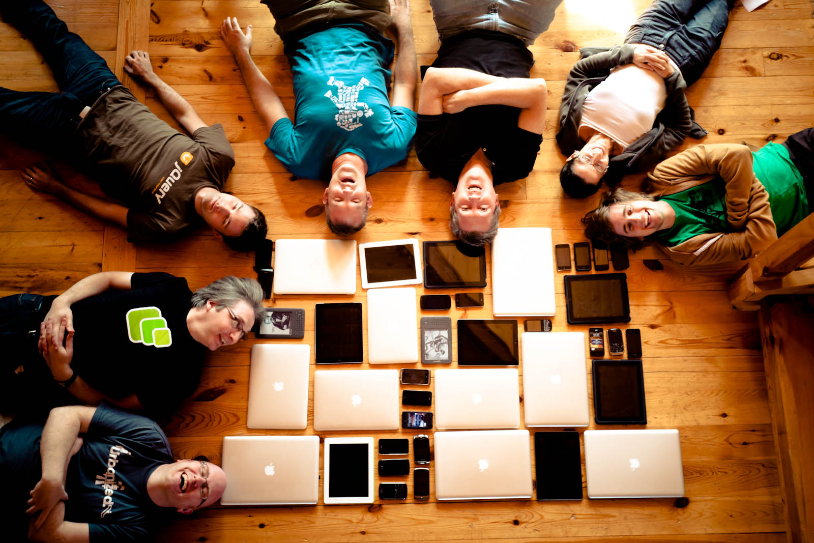
Photo: Lyza Danger Gardner
Selected #mobilewood tweets give some flavor of the Mobilewood vibe, but here's a more orderly look at what we did and what we produced.
We worked
Everyone brought passion and intensity to tackling this giddy era of connected devices. We talked about the onslaught of device platforms. We talked about the opportunities and shortfalls of the web in addressing this avalanche. We debated just about every topic that touches mobile/portable content: technology, content strategy, publishing workflow, art direction, interaction design, user behavior, data structure, data transport, and the standards process.
My brain buzzed, and my little geek heart sang.
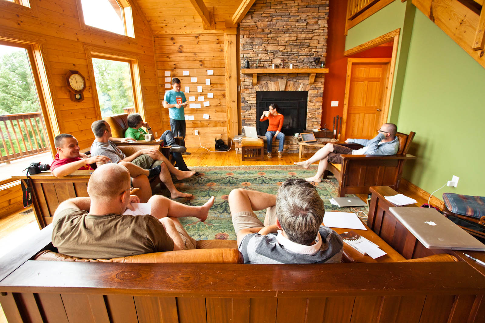
Photo: Lyza Danger Gardner
We tried hard to look outside immediate problems to name the broad challenges of the next decade and instead struggle toward high-level approaches that might guide us through this period of exciting chaos. What we found along the way:
Wow, designing for a multidevice world is hard.
It's only going to get harder.
There are no black-and-white answers.
An era of rapid innovation is, by definition, an era of surprises. None of us pretend to know the future.
That means it's not possible to be future proof in our strategies for technology, design, and content.
If we can't be future proof, we can at least be future friendly .
Being future friendly, we agreed, means thinking beyond any single platform, any single app, any single website so that we can focus on building services for the long haul.
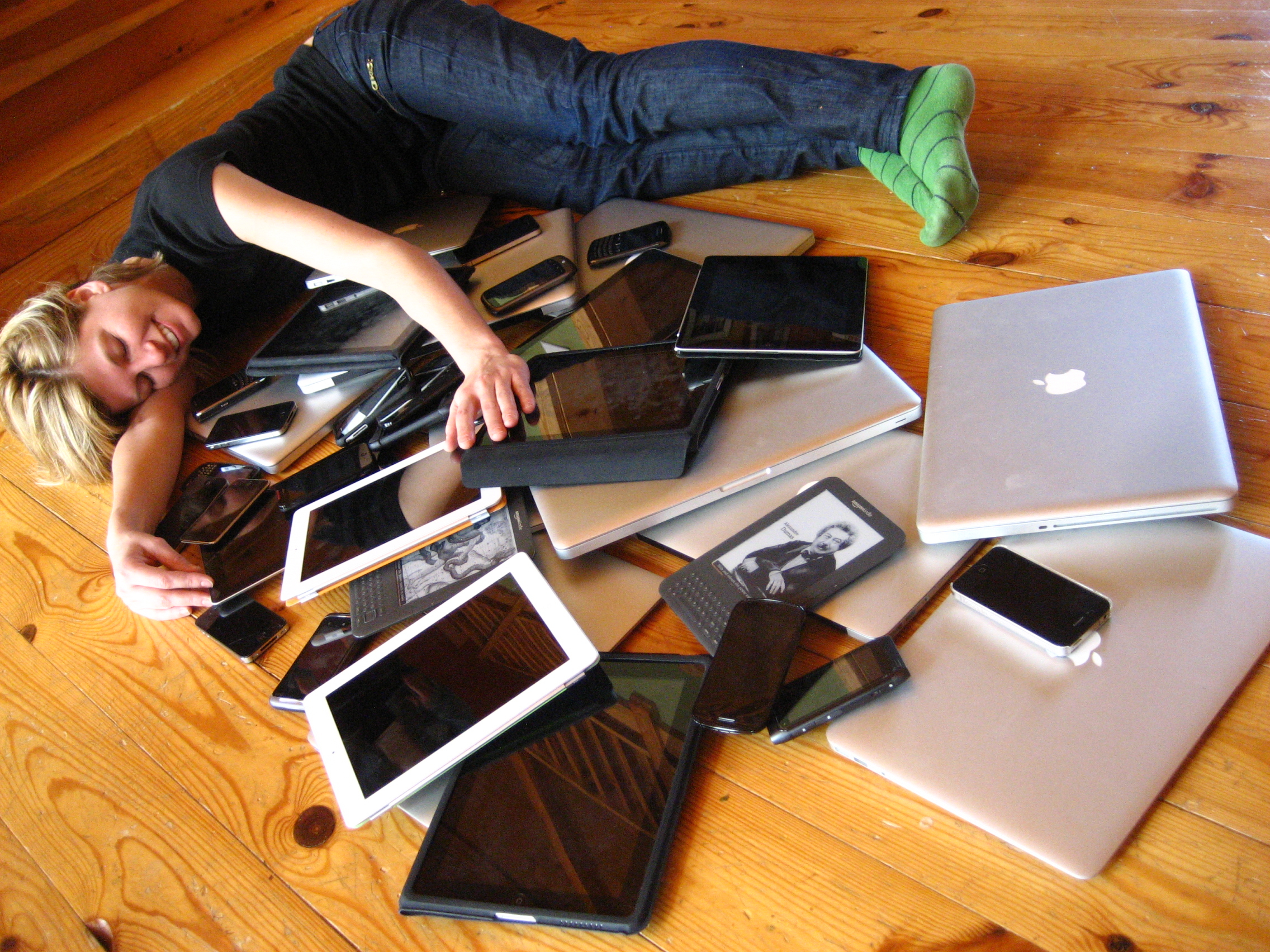
Photo: Jeremy Keith
We wrote it all down
Please visit the brand new Future Friendly website, where you'll find our statement of truths, an exploratory outline of future-friendly thinking, and some resources to help all of us stake out a friendly future. Go get it:

We're the first to admit that a) we don't have all the answers, and b) the content at Future Friendly is more broadly directional than practically prescriptive. That means there's much more work to be done. Over the next few weeks, you can expect to see more commentary from the Mobilewood group (including yours truly) about these big-picture ideas. Those ideas will orbit the future-friendly themes staked out at the website, but will also tackle practical techniques that you can put to work today.
To keep up with all of this, follow the future-friendly hashtag #ffly at Twitter as well as the blogs and twitter accounts of the Mobilewood group:
Brad Frost (Twitter: @brad_frost)
Bryan Rieger (Twitter: @bryanrieger)
Jason Grigsby (Twitter: @grigs)
Jeremy Keith (Twitter: @adactio)
Luke Wroblewski (Twitter: @lukew)
Lyza Danger Gardner (Twitter: @lyzadanger)
Scott Jehl (Twitter: @scottjehl)
Scott Jenson (Twitter: @scottjenson)
Stephanie Rieger (Twitter: @stephanierieger)
You are welcome (encouraged!) to contribute your ideas, too. More on that in a bit. First, some more about what else we did at Mobilewood.
We played
Sure, sure, work is its own reward. But it turns out there's a ton to be said for camp fires, hot tubs, hikes, cooking, swimming, guitar-strumming, and immoderate quenching of thirst. Friends, we had a huge amount of fun at Mobilewood.
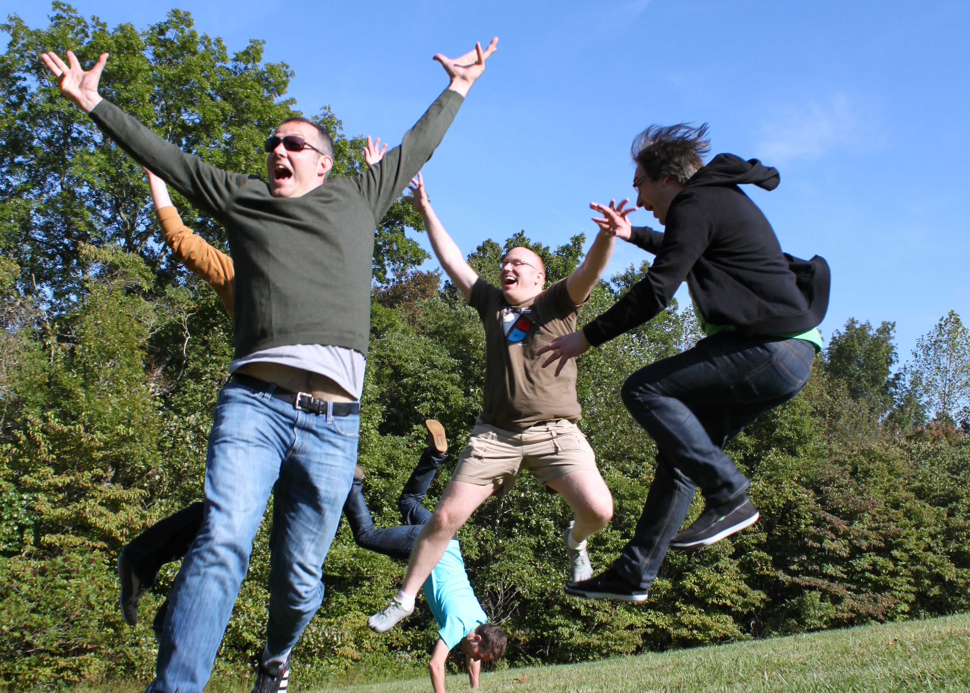
Photo: Luke Wroblewski
A playful spirit infused the whole thing. We laughed about night donkeys, turDOMkens, harpsichordists, and cinnamon-candy whiskey. Brad's funky ukelele bass lines mingled in an unholy alliance with Jeremy's Irish mandolin. After I found a cache of toys and silly hats in an upstairs closet, we gave them an immediate workout. A battered toy space helmet was especially popular, and it became the Mobilewood totem—and eventually the future-friendly logo, too (props to Bryan Rieger for that one).
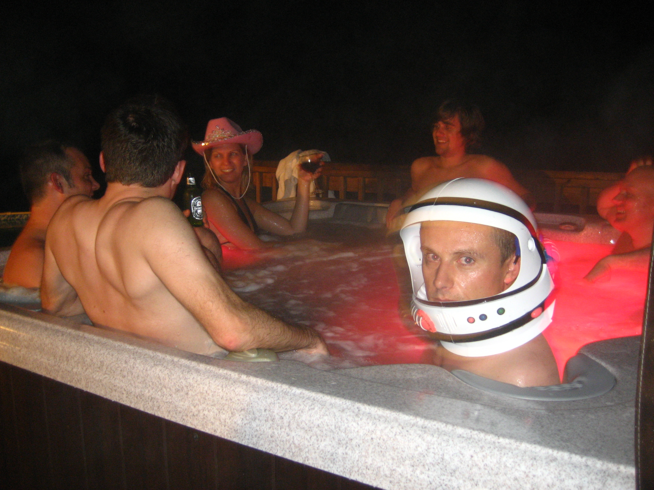
Photo: Jeremy Keith
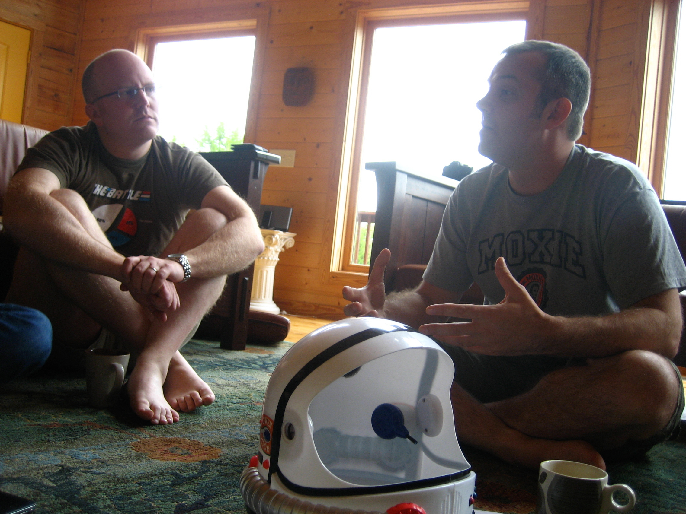
Photo: Jeremy Keith

Photo: Lyza Danger Gardner
We spent hours every day in deep conversation, but we punctuated those sessions with frankly zany activity. There is something heady about being with people who can switch so effortlessly from smart to silly. Future and friendly indeed.
We bonded
When I arrived at Mobilewood, I brought a metric ton of respect for everyone else at the event. I'd had the good fortune to meet and mingle with many of them before. Others I knew only by reputation or through the occasional twitter or email exchange. Across the board, though, I thought of this group as serious, smart, and generally intimidating.
When I left, I took with me genuine affection and wonder for all of them. I was surprised by how personally affected I was by this gathering. It was an emotional thing when the event drew to a close. The mix of work and play—of conversations both professional and personal—was powerful. Lyza captured the spirit in her kind string of farewell tweets.
The bonding was important to our work. Throughout Mobilewood, we inevitably disagreed, floated dopey ideas, shared unformed thoughts. We could do all those things because we understood that we were among friends. Everyone was generous with their ideas and patient with those of others. We were in it together. It was remarkable.
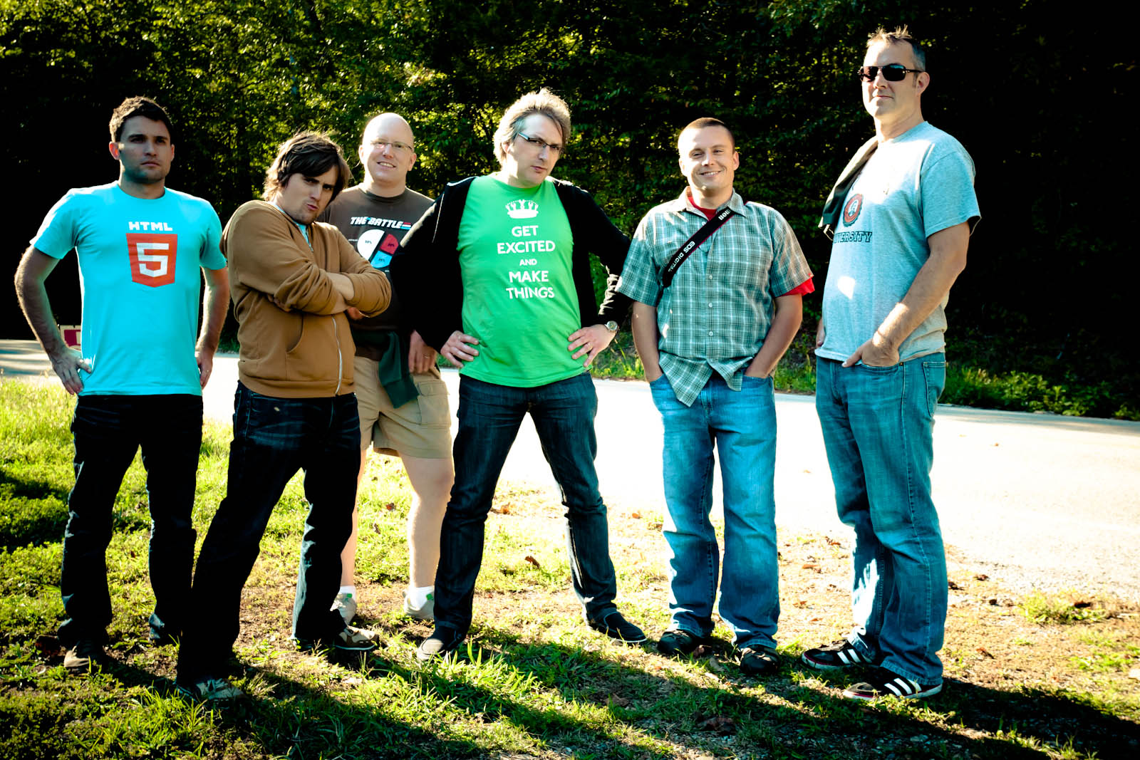
Photo: Lyza Danger Gardner
We became a tight group, but not a closed clique. This is not an exclusive club. On the contrary, we want you to join.
You're invited
I worry sometimes about how gatherings like this are perceived. Words like "secret" and "elite" were used alongside the #mobilewood hashtag by folks who weren't there. Perhaps that's to be expected.
But Mobilewood was neither more nor less than a group of likeminded people gathered to share experiences and ideas. The kind of magic we wanted to spark for ourselves and for one another is possible only in a small group. The work, play, and bonding I describe above can't click in when you go beyond ten. Rest assured: if there had only been room, you would've been invited to the hot tub, too.
Our goal is to share what came out of Mobilewood as a base of conversation. That's what the Future Friendly site is all about. By sharing how this small group aligned itself last week, our hope is that others will find similar alignment. But we're also aware that this early effort may need some course correction.
Talk to us, share with us, teach us
Use the future-friendly hashtag #ffly to share your observations and ideas. Tell us about you've begun to implement some of these ideas. Explain where you think our future-friendly themes need refinement. Share the big-picture ideas and nitty-gritty practices that you think need more attention.
This stuff is hard, and we need to do it together. This is a time to be generous, and it's a time for conversation. Let's get after it.
Tags:
community,
conference,
ffly,
manifesto,
mobile,
mobilewood
September 1, 2011
For Your Consideration: "Teaching Touch" at SXSW
It's that time of year again. The silly season of SXSW pitches is upon us, this time with over 3200 proposals for around 300 slots, and as per usual I'm throwing my lot in with the rest. If you think the topic would be useful, please consider giving a thumbs up to Teaching Touch: Tapworthy Touchscreen Design. (The deadline is noon Central Time on Friday, September 2.)
Here's the skinny:
Discover the rules of thumb for finger-friendly design.
Touch gestures are sweeping away buttons, menus and
windows from mobile devices—and even from the next
version of Windows. Find out why those familiar desktop
widgets are weak replacements for manipulating content
directly, and learn to craft touchscreen interfaces
that effortlessly teach users new gesture vocabularies.
The challenge: gestures are invisible, without the
visual cues offered by buttons and menus. As your touchscreen
app sheds buttons, how do people figure out how to
use the damn thing? Learn to lead your audience by
the hand (and fingers) with practical techniques that
make invisible gestures obvious.
Designer Josh Clark
(author of O'Reilly books "Tapworthy" and
"Best iPhone Apps") mines a variety of surprising
sources for interface inspiration and design patterns.
Along the way, discover the subtle power of animation,
why you should be playing lots more video games, and
why a toddler is your best beta tester.
Questions Answered
How should UI layouts evolve to accommodate the ergonomics
of fingers and thumbs?
Why are buttons a hack? Why aren't they as effective
as more direct touch gestures?
How can users understand how to use apps that have
no labeled menus or buttons?
What's the proper role of skeuomorphic design (realistic
3D metaphors) in teaching touch?
How can animation provide contextual help to teach
gestures effortlessly? How does game design point the
way here?
Vote me up, and thanks!

Tags:
conference,
design,
josh,
sxsw,
touch
July 23, 2011
Page One: Banish Multi-Page Articles
I despise multi-page articles with the heat of a million suns. The Page One extension for Safari and Chrome fixes them, automatically displaying the single-page version of articles for several popular news sites. Install the extension now:

Install the Page One extension for Safari.

Install the Page One extension for Chrome.
Why This Is Awesome
You know the drill: instead of letting you read articles all at once, too many websites chunk them up into multiple pages, interrupting the flow for the cynical purpose of inflating page views for advertisers. That's not only annoying and time consuming, but it also screws up "read it later" services like the excellent Instapaper. Instead of saving the entire article for later reading, you get only the first page—a big drag if you're using the Instapaper app offline.
Web publishers know this is annoying and so they frequently throw us a bone by offering a single-page view of articles. That's what they should do in the first place, and the Page One extension makes it so. I built the creation for myself for sites I use frequently and so, for the moment, it gives you single-page articles for only these sites:
The New York Times
The New Yorker
The Atlantic
Slate
Wired
Vanity Fair
The New York Observer
Details
Gourmet
Let me know if there are other sites you'd like to see supported, and I'll be happy to take a look. Meantime, happy uninterrupted reading!
Tags:
browser,
chrome,
instapaper,
pageone,
readability,
safari
July 22, 2011
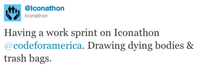
Iconathon!
Designers, on your marks! Pixel slingers, grab your javelins! Icon acrobats, get limber! The Iconathon is here, and it's an AWESOME concept.
The Iconathon is a collaboration between the icon geniuses of The Noun Project and the civic-minded geeks at Code for America. The gist: gather a slew of designers together in cities around the nation for a full day of brainstorming and designing the icons needed in civic signage. The result will be a set of public-domain symbols that can be used by public and private organizations to communicate visual concepts to urban denizens. You know the kind:

This means that you, me, anybody can be part of creating the next generation of everybody-knows-em signs and symbols. Looking for a bathroom, for parking, for an airport? Look for YOUR icon. How cool is that.
Each participating city will have a topic and a set
of about 30-50 civic concepts to choose from to design.
For example, participants can modernize icons such
as 'family' to reflect the makeup of modern families,
create icons for new civic services like 311 (symbols
for 'potholes' and 'graffitti') and icons for community
spaces ('local', 'community meeting,' 'community news.')
Iconathon events will include design charrettes, design workshops
and networking opportunities for local designers, urban
planners, city staffers and developers who are passionate
about civic design. Participants will sketch ideas
and concepts during the events, and refine them from
their home or design studios while continuing the collaboration
process through social media. Each group working on
a symbol concept may also be matched with a respected
designer to get feedback on their designs. All designs
will be submitted to The Noun Project, which will curate
them based on technical and stylistic guidelines. A
series of blog posts will follow events in each city.
The iconathons haven't even gotten rolling yet, but a few designers are starting to limber up with some early drafts:
...including, well why not, an abandoned car icon:
If you live in or near one of the Iconathon cities (San Francisco, New York, Los Angeles, Boston, or Chicago), give it a spin—even if you can't draw. And hey, the Iconathon crew is also still looking for help: graphic designers to lead sessions, sponsors whose products support the creative industry (looking at you Adobe and Apple), and sponsors for food, drinks, furniture rentals, art supplies, etc. If you can help, drop 'em a line at iconathon@codeforamerica.org or @Iconathon.
Me, I plan to attend the Iconathon on September 10 in New York City, where the icon theme will be transportation. It's the day before the tenth anniversary of an awful day in the city's history, and I can't think of a better way to mark that occasion than to offer my humble skills to a city I love.
What? You don't know about The Noun Project? Holy cats, waste no time and get over there, pronto. It's a great, free resource for icons and pictograms, which happen to be especially ideal for tab-bar icons in iOS apps. You're welcome.
June 2, 2011
Digital Life: Today & Tomorrow
This fun and wide-ranging infoviz video provides a nifty snapshot of how quickly our digital lives are changing, with some predictions for what this all might look like in 2015. (Remember when 2015 seemed like an impossibly distant year?)
The video was researched by Madrid consulting firm Mitsue Venture and animated by Neo Labels for their project Digital Life: Today & Tomorrow.
Do watch the whole thing, but here are a few appetizer stats:
2010 numbers: 600 million paid tv subscribers, compared to 5 billion mobile accounts.
We spend 16% of our online time on social-networking sites. Only 6.6% on email.
Email use is falling for people under 35, but going up for people over 35.
A multi-device world. We read news on different devices depending on time of day. Context matters.
By 2015, the digital traffic consumed by just 20 households will match the traffic of the entire 1995 internet.
April 19, 2011
Belly Flop: Retailers Dive into Mobile Ecommerce

Photo by blmiers2.
"Who wants to spend their time pinching screens and mistyping links?" asks Forrester's Sucharita Mulpuru, quoted in a barnburner of a piece in today's New York Times about the sorry state of mobile ecommerce sites—or more precisely: the overall lack of mobile ecommerce sites. It's a missed opportunity, and even those who are trying to grasp it are groping with backwards ideas about delivering lite versions of the "real" website.
Many retailers seem under the assumption that few shoppers actually want to do said shopping on tiny screens. As of mid-2010, just 12 percent of the top 500 United States online retailers had mobile websites. Only seven percent had apps.
Whether those low numbers are because of disinterest or paralysis (mobile design is hard, folks), it's certainly a missed opportunity as more and more people use their phones as a browsing device on equal footing with—or even in preference to—traditional PCs. The Times piece refers to a juicy research report from Tealeaf Technology which shows not only broad interest in mobile shopping, but also indicates its high stakes. (Slideshow of Tealeaf's findings) A few nuggets:
High mobile expectations. 80 percent expect the mobile experience to be at least as good as in-store shopping. 85 percent expect it to be at least as good as using a traditional PC.
Risk of losing customers. 63 percent of online adults said they would be less likely to buy from the same company via other purchase channels if they ran into trouble with a mobile transaction.
Mounting frustration. Mobile users say they find mobile transaction problems more frustrating than going to the DMV or being stuck in traffic. 23 percent have cursed at their phones. 11 percent have screamed at their phones. 4 percent have thrown their mobile devices (presumably also while cursing and screaming).
Clear lesson: retailers should build great mobile experiences. But it seems there's some confusion about exactly how to do it. Too many assume that the right thing to do is deliver "website lite" to mobile devices. Granted, mobile requires focused, simple interfaces. Those interfaces should prioritize content and features that rhyme with common mobile use cases and shopping habits. But that doesn't mean that retailers should willy-nilly remove features or content.
I say this all the time, but it's worth repeating as many times as it takes: our job as designers is not to remove complexity; our job is to make complexity uncomplicated. Customers don't want dumbed-down apps; they want uncomplicated apps, and that's a big difference. It's a mistake to think that mobile means stripping out features until the app or website is toothless.
So I was a little alarmed to see the Times article holding up Alibris' approach as a good practice:
"When you transform a giant PC screen onto a little device, you have to decide what not to bring along," said Jeanie Bunker, general manager of Alibris Retail. "So we basically stripped out all the things we thought were not relevant to the mobile user."
For instance, it removed the rare-books tab, assuming that someone spending hundreds on a book would want to do extensive research.
Eek. No. Just because a screen is small doesn't mean that someone doesn't want to make a serious purchase (3 or 4 Ferraris are sold every month on eBay's mobile apps). This is the thinking that so often forces frustrated users to dig for the "full desktop version" link on mobile websites. Mobile users want full content. Refer to that Tealeaf stat above: 85 percent expect the mobile experience to be as good or better than a laptop/desktop experience.
Mobile apps and sites should strive to match desktop sites feature for feature, and in many cases even provide more features. In particular, mobile apps should use sensors like the camera (scanning, product recognition) or microphone (speech to text) to speed data entry and searching. Instead of thinking, "how can we do less with mobile," the better question is "how can we do more?"
This is hard. Organizing and managing complex information and tasks into small screens takes careful planning and discipline. And yes, truly worthless features should be thrown out (as they should on the desktop). But don't throw out the good stuff. Alibris, for example, is essentially hiding its entire rare-book collection from mobile users, for seemingly arbitrary reasons.
Amazon's mobile apps and website, meanwhile, give essentially full access to the desktop features, but Amazon also carefully creates interfaces to make searching as effortless as possible. From the Times article:
Many retailers point to Amazon's apps as worthy models. Unlike most retailers, Amazon started developing mobile Web sites in 2006, before the first iPhone was available. To minimize typing, Amazon offers bar code scanning, voice search and automatic fill-in on typed searches. Type "Har," for instance, and it displays Harry Potter books.
Another benefit of Amazon's app: most of its customers are existing online customers, and once they sign on to the mobile app, they don't need to re-enter billing and shipping information.
The point, in other words, is not to simplify mobile experiences by stripping out content but rather by streamlining its presentation and improving the search and input process. The Times also notes another good example of this in Hipmunk:
Hipmunk, a site for searching flights and hotels, made sure its iPhone app took into account a phone's limitations. Search results on the phone are displayed in short lists for readability, and the app magnifies those results, rather than loading a new page, which can take longer
Hipmunk also figured that the best way to deal with the biggest nuisance in mobile commerce — entering a credit card number to check out — was to avoid the mobile part. So Hipmunk offers two choices that allow buyers to pay later on a computer, instead of on the phone; it will e-mail a link, or generate a secret password to enter on the computer.
All of this takes creativity and fresh thinking: what novel methods can we use to make it easier to find, scan, and digest content on mobile devices? Hint: the answer is not "kill the content."
The potential gains are substantial. A measly two percent of retail sales happen on mobile now, but success stories like eBay's mobile unit show it doesn't have to be that way. Over 20 percent of eBay's revenues come from mobile sales, with a purchase made every second through one of their mobile apps. Those little purchases add up to the tune of $2 billion for eBay.
And friends, it's design that makes the difference. Respect your mobile users as full-fledged citizens. Don't patronize them with dumbed-down websites and apps. Use thoughtful design to make browsing easier, and put device sensors to work to make searching faster. It's an old saw that the best camera is the one that's with you. It's just as true of computers: the best web browser—for ecommerce or otherwise—is the one you've got with you. And for many, that's the phone. Don't underestimate the potential and seriousness of the mobile web; it's not desktop lite.
April 17, 2011
Over Half the People on Earth Have a Mobile Phone
Tomi Ahonen shared his snapshot of global mobile stats this week and cast his eye toward the end of 2011, too. The whole thing is worth a look, but here are a few eye-popping nuggets to get you started:
There are 7 billion people on earth, but already an astounding 5.3 billion mobile phone accounts (around 3.9 billion unique mobile phone owners, or 55.7% population, with about 4.6 billion individual phones).
Only 17% of phones are smartphones, but even the feature phones have a pretty impressive set of basic functionality: 96% of all phones have at least a basic browser (WAP or HTML); 94% have color screen; 77% have a camera. (This means that more than 3.5 billion cameraphones are in use; literally half the world's population has a camera in their pocket.)
71% of all phones have a HTML web browser (not just WAP), or 3.3 billion. That's almost three times the number of internet-connected PCs.
1.8 billion Nokia phones are in the wild, which means 27% of the world's population has a Nokia phone in their pocket.
SMS text use is approaching global literacy rates. It literally can't get bigger. 85% of Europe mobile subscribers are active SMS users. In China it's 90%. USA is past 74%. By end of year, we'll see 4.5 billion active SMS users, "the most widely used data application on the planet." Domino's Pizza and Coca Cola are aggressively using the platform for marketing.
More: Communities Dominate Brands: Some Milestones We Will See This Year in Mobile Statistics
April 7, 2011
Buttons Are a Hack
We've only just scratched the surface of touchscreen interface design. Done right, touch allows us to create the illusion of working directly with content, instead of through the abstract metaphors of menus, buttons, tabs, and assorted "administrative debris" that we've adopted over the last 30 years of desktop interfaces.
This is a Very Big Deal. Manipulating content through direct physical action rhymes with how our brains naturally perceive the world and make for easy, obvious use. Just watch a toddler use an iPad, and you'll see how quickly they latch onto its familiar, direct interactions. Friends, I'm not kidding: we should design with toddlers in mind. They get this stuff better than we do.
As designers, we have some deprogramming to do. We've soaked so long in the necessary metaphor hacks of the desktop, that it's hard to imagine interfaces that are free of buttons and menus. There's still a role for those time-tested gizmos, and I'm not suggesting that we throw them out entirely. But as I wrote recently, here's the thing:
Buttons are a hack. As in the real world, they're often necessary, but they work at a distance—secondary tools to work on primary objects. A light switch here turns on a lightbulb there. These indirect interactions must be learned; they're not contextually obvious. The revolution that touchscreen devices are working is that they allow us, more and more, to use primary content as a control, to create the illusion of direct interaction.
I don't mean to suggest that we throw out all of our familiar buttons entirely. Light switches shall remain necessary, after all, and so shall buttons, especially where it's necessary to trigger abstract actions ("share via Twitter," for example). But it's important to recognize those devices for what they are: necessary hacks for moments when direct interaction isn't possible. Touchscreen interfaces allow that direct interaction in many more contexts. As new solutions arise, we should be open to putting our time-tested workarounds aside. When designing an interaction for touch, always ask: do I really need another button or control for this?
This is a topic that constantly occupies me. And I plan to write and talk about it a lot, so brace yourself. I kicked off my public campaign against buttons at New Zealand's amazing Webstock conference in February. Here's the video: Buttons Are a Hack: The New Rules of Designing for Touch. I hope you'll take a peek.

(Also, man, my talk's not bad, but there were some seriously high-test talks at Webstock. Waste no time: watch the rest of the conference videos immediately.)
Tags:
conference,
design,
gestures,
ipad,
josh,
touch,
webstock


